プレビュー準備中デザインリファレンスを見る
DESIGN REFERENCE
猿人 ENJIN TOKYO|白黒・縦組み・罫線で構成する企業サイト
巨大なロゴ、問いかけが連なる帯、縦組みの見出し、罫線で区切る実績一覧が特徴。写真の色彩と白黒の編集的な構成を組み合わせた、クリエイティブエージェンシーのデザインリファレンス。
ENJIN TOKYO — Style Reference
A monochrome agency broadsheet: monumental lettering, a wall of questions, and a portfolio ruled into columns.
Website / original URL: enjintokyo.com
Final URL: https://enjintokyo.com/, unchanged; supplied HTTP status 200.
Theme: white content surfaces and black opening/information fields; no selectable theme was demonstrated.
Inspected: September 24, 2026, 06:27:31 JST; evidence timestamp September 23, 2026, 21:27:31.162 UTC.
Viewports: desktop 1440 × 1000 and mobile 390 × 844 CSS pixels.
Scope: the current Japanese corporate homepage and portfolio gateway, using the supplied original-page screenshots, rendered text, link destinations, custom properties, and computed element measurements. Coverage includes the opening identity, question strips, navigation states, news, ten selected projects, service categories, office imagery, company/about/awards links, contact area, and footer. Destination pages and activated menu, hover, and question-reveal states were not inspected.
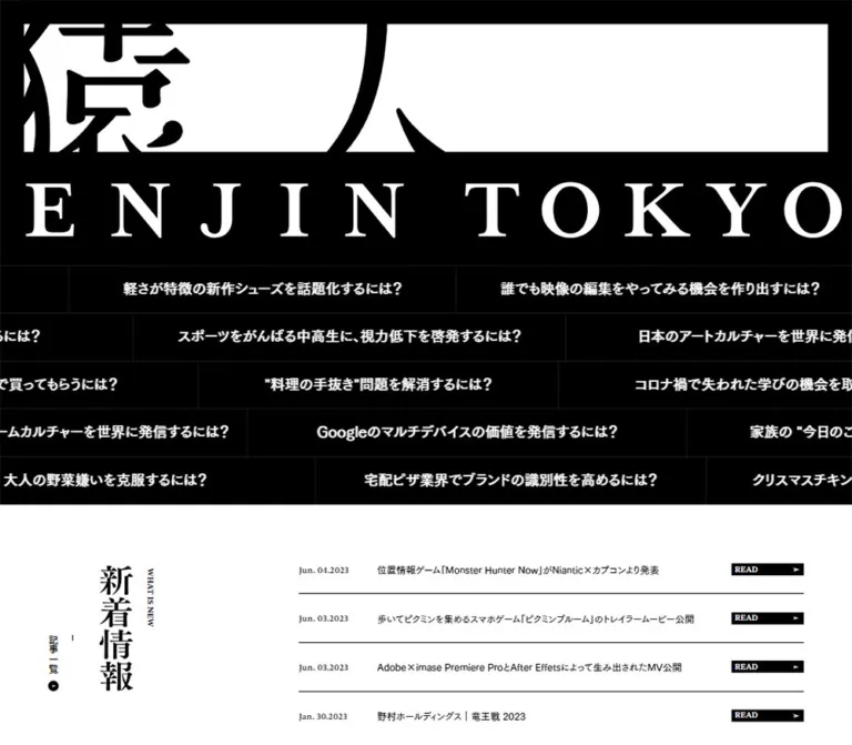
ENJIN TOKYO makes typography and page structure carry the identity. The opening combines a dramatically cropped Japanese brand graphic with a widely spaced English wordmark. Beneath it, questions about client challenges run through narrow black bands. The rest of the page alternates white editorial space, densely divided project entries, broad photography, and black information areas.
The central relationship is between oversized graphic lettering and small, orderly information. English navigation and labels use Sentient; Japanese body copy uses the declared Tsukushi Gothic families. Thin rules connect neighboring entries into a continuous page. Vertical titles occupy dedicated edge columns, and circular arrow marks punctuate otherwise rectangular geometry. On mobile, the site preserves these edge columns while changing the main content to one column and placing its visible navigation bar at the bottom.
閉じる
ENJIN TOKYO — Style Reference
A monochrome agency broadsheet: monumental lettering, a wall of questions, and a portfolio ruled into columns.
Website / original URL: enjintokyo.com
Final URL: https://enjintokyo.com/, unchanged; supplied HTTP status 200.
Theme: white content surfaces and black opening/information fields; no selectable theme was demonstrated.
Inspected: September 24, 2026, 06:27:31 JST; evidence timestamp September 23, 2026, 21:27:31.162 UTC.
Viewports: desktop 1440 × 1000 and mobile 390 × 844 CSS pixels.
Scope: the current Japanese corporate homepage and portfolio gateway, using the supplied original-page screenshots, rendered text, link destinations, custom properties, and computed element measurements. Coverage includes the opening identity, question strips, navigation states, news, ten selected projects, service categories, office imagery, company/about/awards links, contact area, and footer. Destination pages and activated menu, hover, and question-reveal states were not inspected.
ENJIN TOKYO makes typography and page structure carry the identity. The opening combines a dramatically cropped Japanese brand graphic with a widely spaced English wordmark. Beneath it, questions about client challenges run through narrow black bands. The rest of the page alternates white editorial space, densely divided project entries, broad photography, and black information areas.
The central relationship is between oversized graphic lettering and small, orderly information. English navigation and labels use Sentient; Japanese body copy uses the declared Tsukushi Gothic families. Thin rules connect neighboring entries into a continuous page. Vertical titles occupy dedicated edge columns, and circular arrow marks punctuate otherwise rectangular geometry. On mobile, the site preserves these edge columns while changing the main content to one column and placing its visible navigation bar at the bottom.
How to Read This Reference
- Measured means supplied DOM geometry, computed styles, or an explicit custom-property value. Measurements describe the captured state, including elements positioned outside the viewport.
- Visually observed means visible in the five supplied original-page captures. Pixel dimensions estimated from these images are marked approximate.
- Calculated means arithmetic using measured values, such as converting the source root unit into pixels.
- Recommended means guidance for a new implementation. Breakpoints, accessibility additions, unverified interaction details, and approximation CSS are not claims about the original implementation.
- Implementation tokens are descriptive aliases unless explicitly identified as source variables.
- The element samples do not include every descendant, pseudo-element, image, or stylesheet rule. A wrapper's computed font size or color does not necessarily describe its visible child lettering.
The desktop document measured approximately 9803.33px high; mobile measured 10591.78px. This is a long scrolling homepage with multiple editorial sections.
Tokens — Colors
Default Palette
| Name | Value | Source token | Role and evidence |
|---|---|---|---|
| White | #ffffff |
--color-bg, --color-white |
Measured body background; news, project information, service cells, navigation strip, and footer surfaces |
| Black | #000000 |
--color-text, --color-black, --color-border |
Main text and rules; measured masthead background and READ fills; visibly used for question strips and the awards field |
| Dark Rule | #1d1d1d |
--color-border-dark |
Declared dark divider color, consistent with the subtle divisions visible inside black areas |
| Snow | #fafafa |
--color-snow |
Declared supporting color; no distinct large surface was established in the supplied captures |
| Muted Gray | #cccccc |
--color-muted |
Declared supporting color; its specific visible component assignment was not established |
The visible interface is principally black and white. Warm timber, cool daylight, clothing colors, and the blue footer badge belong to imagery rather than a general UI accent system.
Question text is visibly white on black, although the sampled question wrappers report black text. Their visible descendant styling is not included in the extract. Use the rendered appearance as the visual authority; do not reproduce black-on-black text from the wrapper measurement.
The custom-property inventory also includes WordPress color, gradient, and shadow presets, plus danger colors. Their declaration is not evidence that the homepage uses colorful gradients, elevated cards, or red actions.
Theme Presets
No theme selector or alternate user-selectable palette was demonstrated. Black and white sections coexist within one design. Preserve their placement and contrast instead of treating the entire page as one uniform light or dark theme.
Tokens — Typography
Sentient — English Editorial Type
- Measured source stack:
Sentient, sans-serif. - Source variable:
--font-family-sans. - Appearance: serif lettering in navigation, dates, small English labels, and service headings. The variable name does not describe the face's visible classification.
- Measured weights:
700for navigation and WHAT IS NEW;500for dates, READ, project inventory labels, and the sampled service heading. - Implementation alias:
--font-editorial.
Keep the exact declared fallback when documenting the source. A serif fallback in a new implementation is a deliberate adaptation, not the observed stack.
Tsukushi Gothic — Japanese Copy
| Role | Measured or declared source stack | Notes |
|---|---|---|
| Body and news titles | 'FOT-筑紫ゴシック Pr5 D', TsukuGoPr5-D, sans-serif |
Source --font-family-base and --font-family-gothic; sampled weight 400 |
| Strong questions and project headings | 'FOT-筑紫ゴシック Pro B', TsukuGoPro-B, sans-serif |
Source --font-family-gothic-b; sampled weight remains 400 |
| Project teaser text | 'FOT-筑紫ゴシック Pro E', TsukuGoPro-E, sans-serif |
Source --font-family-gothic-e; present in repeated teaser elements |
| Form-oriented fallback stack | 'Hiragino Kaku Gothic ProN', 'Hiragino Sans', meiryo, sans-serif |
Declared as --font-family-form; no form was inspected |
The B and E variants are selected through family names in the supplied styles. Do not automatically add synthetic bold to every element because its appearance is heavy.
Graphic Lettering
The masthead and several section headings have empty extracted heading text but clearly visible graphic lettering. Their exact asset format and underlying Japanese typeface were not supplied. The prominent Japanese forms have contrasting strokes and editorial character, but assigning a specific Mincho family would be unsupported.
Treat the brand lockup and supplied heading artwork as graphics with deliberate proportions. The computed 16px on the desktop H1 is a wrapper value, not the size of the enormous logo.
Type Scale
All values below are measured unless marked approximate. Sizes describe the sampled element, which may be a wrapper.
| Role | Desktop | Mobile | Weight / spacing |
|---|---|---|---|
| Body and news title | 16px / 25.6px |
14.56px / 23.296px |
400, normal tracking |
| Primary navigation | 14px / 22.4px |
18.72px / 29.952px in the offscreen menu |
Sentient 700 |
| EN / JP | 14px / 22.4px |
16.64px / 26.624px in the offscreen menu |
Sentient 700 |
| Question wrapper | 24px / 38.4px |
Visible lettering approximately 16–17px; exact text descendant not sampled |
Pro B on desktop |
| WHAT IS NEW | 12px / 12px |
11.44px / 11.44px |
Sentient 700 |
| News date | 14px / 14px |
12.48px / 12.48px |
Sentient 500 |
| READ | 12px / 12px |
11.44px / 11.44px |
Sentient 500 |
| Project inventory label / number | 12px / 19.2px |
6.24px / 9.984px |
Sentient 500; 0.2em tracking |
| Project title wrapper | 32px / 44.8px |
21.84px / 30.576px |
Pro B, sampled weight 400 |
| Project client line | Visible desktop lettering approximately 14–16px; sampled parent reports 32px |
11.44px / 16.016px |
Child-level desktop sizing is unresolved |
| Service heading | Approximately 36px in the desktop image |
27.04px / 32.448px |
Mobile Sentient 500, -0.04em tracking |
| SERVICE 01 | Not sampled | 16.64px / 19.968px |
Sentient 500, 0.02em tracking |
| Service description | Not sampled | 11.44px / 18.304px |
Body family, 400 |
The 6.24px mobile inventory-label measurement is unusually small. It establishes source geometry, not a recommended reading size; its prominence or visibility in the rendered mobile project state was not confirmed.
Leading and Tracking
The source exposes line-height values 1.2, 1.4, and 1.6. These match service titles, project titles, and body text respectively in the sampled elements.
Declared tracking values are 0, 0.02em, 0.05em, 0.2em, and -0.04em. Use wide tracking for inventory-like English labels and negative tracking for the large service headings where measured. The English logo's spacing belongs to the graphic; its exact letter-spacing value was not provided.
Tokens — Spacing & Shapes
Responsive Unit
The source uses a small, viewport-related root unit:
| Property | Desktop at 1440px | Mobile at 390px |
|---|---|---|
--rounded-rem |
calc(100vw / 144) |
calc(100vw / 75) |
| Measured HTML font size | 10px |
5.2px |
--header-height |
4rem → 40px |
10rem → 52px |
--padding-base |
8rem → 80px |
6rem → 31.2px |
--column-width |
8rem → 80px |
11rem → 57.2px |
--padding-end |
12rem → 120px |
12rem → 62.4px |
These formulas agree with the measured root sizes at the two inspected widths. The full breakpoint rules and any additional clamping are not available.
In this document, u means one source root unit: 10px on the inspected desktop and 5.2px on the inspected phone. The Quick Start expresses this through a custom property, leaving the browser's normal root font size intact.
Spacing Scale
| Use | Desktop evidence | Mobile evidence |
|---|---|---|
| Fine divider | Approximately 1px; adjacent row geometry confirms 1px separators |
Approximately 1px |
| Project inventory inset | 10px from the card edge |
Approximately 5.2px |
| Project title inset | Approximately 11px, including the edge relationship |
Approximately 10.4px |
| Masthead vertical padding | 40px |
20.8px |
| News outer padding | 102px 80px 80px |
62.4px 31.2px |
| News row vertical padding | 27px each side |
31.2px each side |
| News date column | 130px |
Stacks above the title |
| News title trailing padding | 50px |
0px |
| Desktop office-photo surround | Approximately 40px |
Full mobile photo framing was not captured |
| Footer content inset from its left rail | Approximately 40px |
Approximately 21–22px |
Border Radius
| Element | Treatment |
|---|---|
| News strips, project entries, service cells, photo edges | Square corners; sampled radii are 0px |
| READ marker | Square black rectangle |
| Arrow discs | Circular; approximately 30px on desktop project entries and 40px on the desktop contact row |
| Large awards arrow | Approximately 120px circular white field in the visible desktop fragment |
There is no visible general-purpose shadow or elevation system. Adjacent borders, negative space, and black/white inversion establish hierarchy.
Layout Measurements
| Element | Desktop | Mobile |
|---|---|---|
| Masthead H1 box | 1440 × 440.91px |
390 × 155.38px |
| Question field | Five strips; sampled content height 78px, with a 79px row step |
Ten strips; sampled content height 46.80px, with a 47.80px row step |
| Start of news | Document y ≈ 836.91px |
Document y ≈ 634.34px |
| News section height | 469.38px |
828.08px |
| News list | x = 520px, width 840px |
x ≈ 31.19px, width 327.63px |
| News link height | 79.59px, plus separators between rows |
148.05px, plus separators between rows |
| READ marker | 120 × 20px |
Approximately 83.19 × 19.75px |
| News heading artwork box | 60 × 208px |
Approximately 31.19 × 108.11px |
| Selected-work content | Two 640px columns between edge rails |
One 332.81px column, with a right rail |
| Work section height | 3323.39px |
4105.31px |
| Service grid | Three columns visible across approximately 1280px |
First sampled card width 332.81px, to the right of a left rail |
| Daylight office photograph | Approximately 1360 × 480px in the desktop capture |
No complete mobile image measurement |
Card heights depend on their text. The first desktop project row measures about 718.38px; later sampled rows measure about 628.78px. Mobile project entries range from roughly 385px to 447px. Do not force every title into a fixed one-line slot.
Components
Identity Masthead
Role: introduce the agency through its graphic identity.
A full-width black H1 region contains a broad white strip with oversized, cropped Japanese brand forms and an English ENJIN TOKYO line beneath it. The Japanese crop is intentional: portions of the glyphs extend beyond the white strip's visible bounds. The English lettering is widely distributed across the width.
At desktop size, the masthead has 40px vertical padding and occupies about 441px of document height. On mobile it contracts to about 155px, with 20.8px vertical padding. The white graphic strip has approximately 40px horizontal clearance on desktop and approximately 10px on mobile.
Use the actual identity artwork when available. A text heading set in an arbitrary serif cannot reproduce the logo's shapes, crop, and spacing. Keep an accessible site name even if the visible H1 consists of graphic content; the empty extracted string does not establish whether the source already provides an accessible name.
Question Wall
Role: connect concrete business challenges to project examples.
The desktop arrangement consists of five full-width black tracks. Each contains several individually divided question links, with content repeated beyond both viewport edges. Sampled cells vary from approximately 599px to 747px wide. Questions remain on one line, centered vertically inside 78px content boxes, separated by dark rules.
The content is specific and conversational. Examples include 1日60gの野菜不足を解消するには? and 軽さが特徴の新作シューズを話題化するには?. The first links to /works/seiyu-ctv/; the second links to /works/flying-shoe-store/.
Each desktop link's DOM also contains IDEA and a short response. Those responses are not visible in the supplied resting screenshot. Their presence supports a question/answer content model, but it does not establish the exact hover animation or reveal trigger.
Mobile uses ten approximately 47.8px strips, each repeating one question across its width. The DOM includes button controls and separate MORE links associated with projects. A sampled MORE box is approximately 105.23 × 46.80px, with a white background, but it is not visibly exposed in the resting screenshot. Treat its activated presentation as unverified.
Repeated strings, clipped edges, and translated coordinates support a marquee-like design. They do not provide a reliable speed, direction, loop duration, or randomization rule. Preserve the horizontal-track composition without hardcoding the captured left offsets as permanent layout positions.
Desktop Navigation and Mobile Menu Bar
Role: provide site-wide navigation while allowing the opening identity to dominate.
The desktop bar is a 40px white strip with a thin lower rule. A cropped brand mark sits at the left; eight uppercase links occupy the middle; Facebook, X, Instagram, and EN / JP occupy the right. Navigation links use Sentient at 14px, weight 700, with approximately 10px padding.
The initial desktop measurement places the bar at y = -40px, above the viewport. Both lower desktop captures show it at the top. This supports a hidden opening state and a later visible top-bar state, but the exact scroll threshold and direction logic were not supplied.
On mobile, the lower-page capture shows a 52px bar at the bottom: white brand area on the left and a black MENU area on the right. The measured button width is approximately 114.39px. The initial sample places the entire menu container below the viewport at y = 844px.
The offscreen mobile navigation has a black background and two columns of white links. Its sampled full container height is approximately 379.19px; this is not the closed bar's height. MENU and CLOSE labels are present in the DOM, but opening, closing, focus behavior, and scroll locking were not tested.
Vertical Section Rails
Role: label major sections without placing a conventional horizontal heading above every grid.
The desktop work section sits between two approximately 80px edge columns. The lower work capture shows oversized vertical English lettering on the left and a Japanese heading plus 実績一覧 on the right. The service section reverses the emphasis, placing large Japanese lettering along the left edge and a small decorative mark at the far right.
On mobile, the selected-work grid retains a right rail of approximately 57.2px while its left rail disappears. Service content instead starts to the right of a left rail. The footer keeps its own left copyright rail.
Small vertical index links combine Japanese text, a short rule, and a tiny circular arrow. Use vertical writing for ordinary labels, while preserving dedicated artwork for large graphic headings where provided. The supplied evidence does not establish that every rail is sticky.
News Section and News Row
Role: present recent agency activity as a compact editorial index.
Desktop separates a broad heading area on the left from an 840px list on the right. The heading group combines the vertical Japanese artwork, WHAT IS NEW, and the 記事一覧 link. Four dated entries appear in the supplied DOM, starting with August 10, 2026.
Each news entry is one link containing three aligned parts:
- A Sentient date in a
130pxcolumn. - A Japanese title in a flexible column, with
50pxtrailing padding. - A
120 × 20pxblack READ marker with a small right-pointing dart.
The READ rectangle is a visual part of the row link, not a separately evidenced button. Its height is deliberately small because the entire approximately 80px row is the navigation target.
Mobile centers the vertical heading group above the list. Each entry then stacks date, title, and READ, left aligned within approximately 31.2px side margins. The row link has 31.2px vertical padding and measures approximately 148px high in the supplied state. Allow titles to grow when content or font metrics change.
Selected-Work Entry
Role: show project media, identity, and client attribution in a continuous portfolio grid.
Ten projects are present. Desktop uses two adjoining columns; mobile uses one column beside the right section rail. Thin shared boundaries connect the entries; there are no gutters that separate them into floating cards.
The observed anatomy is:
- A small inventory line: ENJIN TOKYO WORKS at the left and No.001–No.010 at the right.
- A media region. Some entries also contain repeated teaser text in the DOM.
- A large Japanese or mixed-language title.
- A small client line.
- A circular right-arrow mark near the title area's upper-right corner, visible in the desktop capture.
The inventory strip's sampled height is approximately 47.19px on desktop. Mobile teaser wrappers measure approximately 41.59px; not all inventory text appears in the mobile rendered-text summary. These measurements should not be interpreted as proof of a particular animation state.
The whole entry is an anchor to its project page. The first two desktop cards occupy 640px columns, with a one-pixel difference in internal link width caused by the boundary. Mobile cards occupy approximately 332.81px.
Project titles use a measured 32px / 1.4 wrapper on desktop and 21.84px / 1.4 on mobile. Long titles produce taller entries. The desktop client paragraph inherits 32px in the sample even though visible client lettering is much smaller; use the image and child-level uncertainty rather than making clients headline-sized.
Media-element dimensions and asset URLs were not included. A 10:7 media box is a useful implementation estimate from the space between the inventory band and title, not a measured source aspect-ratio declaration.
Office Photograph Break
Role: create a visual pause between the work index and service categories.
The desktop capture shows two people seated with laptops in a bright meeting room. A wide window and sky occupy the right side; the subjects sit lower and left of center. The photograph has approximately 40px of white space around a 1360 × 480px image area.
This is a broad, natural-color image with square corners. Preserve the balance between people, architecture, and empty daylight. A tight face crop or a decorative tint would change its function. The complete mobile treatment was not visible, so any mobile crop must be labeled an adaptation and checked against the chosen image.
Service Grid
Role: explain the agency's capabilities and connect them to categorized work.
The DOM identifies seven categories: integrated marketing communication, digital experience, branded content, PR / social issue, inbound / tourism promotion, new business development, and CI/VI development.
The desktop capture shows three adjacent columns. Large, tightly set Sentient headings use deliberate line breaks and align toward the right side of each main text area. A narrow vertical Japanese descriptor occupies a separate position near the cell's right edge. Borders divide the cells.
The first measured mobile cell is approximately 332.81px wide and 292.84px high. Its English heading occupies a 265.23px box at 27.04px / 1.2, with -0.04em tracking. SERVICE 01 sits lower in the cell. A short Japanese paragraph occupies only about 150.84px in the lower-right portion, creating an intentional offset between the broad heading and narrow description.
Service anchors point to work-filter URLs such as /works/?works_category=digital-experience. They are navigation links, not an evidenced in-place tab filter.
A following 仕事の流れを見る text block introduces the work process. Its expanded behavior or destination was not established in the supplied link inventory.
Company, About, and Awards Links
Role: connect the portfolio to information about the agency.
COMPANY, ABOUT, and AWARDS are confirmed homepage links, each accompanied by explanatory Japanese copy. The visible awards fragment uses a black field, an image of award identities at the left, white copy in the middle, a large white circular arrow toward the right, and a vertical edge heading.
The imagery and full layouts of the COMPANY and ABOUT entries were not sufficiently exposed to specify independently. Reusing the same border, type, and arrow vocabulary is a recommendation; do not invent unseen photo compositions or hover effects for them.
Contact Photograph and Contact Row
Role: turn the final section into a direct invitation to contact the agency.
The contact photograph shows a dark office with timber desks, black chairs, and repeated articulated desk lamps. White Japanese lettering reading 猿人に訊く sits over the image, with a small vertical CONTACT label. The timber grain and pools of warm light provide the strongest sustained color in the lower page.
On desktop, the photograph begins to the right of an approximately 80px copyright rail and extends to the right viewport edge. The visible image block is approximately 490px high. On mobile, the left rail remains approximately 57px wide and the photograph is tightly cropped beside it; the image's top is outside the supplied lower-page capture, so its full mobile height cannot be measured.
A separate white row below the photograph links to /contact/. Desktop displays お仕事のご相談や採用のお問合せはこちら on one line, with a black circular arrow at the far right. Mobile uses two lines and an approximately 31px arrow disc. The visible row heights are approximately 138px and 96px respectively.
Keep the link invitation separate from the image lettering. This gives the final action a stable, readable surface regardless of the photograph's crop.
Footer and Copyright Rail
Role: provide a compact agency statement and practical information.
A narrow white rail repeats © ENJIN Inc. ALL RIGHTS RESERVED. vertically. The adjacent main footer contains an agency statement, ACCESS, SNS, OTHER, and a blue privacy-related badge linked to https://privacymark.jp/.
Desktop distributes the agency statement and details horizontally. Mobile stacks the statement above a compact label/value layout. Social links become separate lines, and the address wraps naturally. The mobile details begin about 21–22px inside the main footer column.
The blue badge is an image-level exception to the monochrome UI. It does not establish blue as a general action color. Repeated copyright text is visible, but its movement was not demonstrated.
Tokens — Motion & Interaction
Measured Transition Declarations
| Element | Supplied transition | What it establishes |
|---|---|---|
| Masthead H1 | transform 1.2s cubic-bezier(0.77, 0, 0.175, 1) |
A transform transition is defined; its complete entrance sequence was not recorded |
| Desktop header | transform 0.48s cubic-bezier(0.165, 0.84, 0.44, 1), visibility 0s 0.48s |
Timed header movement and delayed visibility change |
| Mobile header | transform 0.5s cubic-bezier(0.165, 0.84, 0.44, 1) |
Mobile container movement is defined |
| Desktop question-cell border | border-right-color 0.2s, with delays 1.30–1.62s |
Five sampled row delays increase in 80ms steps; this is not a ticker-loop duration |
| News row | color 0.2s |
Short text-color transition; endpoint not supplied |
| News date and title | transform 0.6s cubic-bezier(0.165, 0.84, 0.44, 1) |
Shared content-motion timing |
| READ marker | filter 0.2s plus the same 0.6s transform |
Filter and movement declarations; exact active appearance unverified |
| VIEW MORE helper | visibility 0s 0.8s, transform 0.8s cubic-bezier(0.215, 0.61, 0.355, 1) |
A 100 × 100px helper exists in the DOM; visible pointer-following behavior was not established |
The source declares --ease-out-enjin: cubic-bezier(0.165, 0.84, 0.44, 1) and --ease-in-enjin: cubic-bezier(0.895, 0.03, 0.685, 0.22). The first is directly reflected in the sampled header and news transitions. The second is declared but not tied to a specific demonstrated interaction here.
Evidence and Limits
The captures show resting compositions and different scroll positions, not an interaction recording. Repeated offscreen question strings and repeated project teasers are consistent with moving text tracks. Their speed, direction, hover pausing, touch behavior, and continuous-loop mechanism remain unverified.
Sampled wrappers report animation: none. This does not exclude animation on descendants, pseudo-elements, or through JavaScript. Likewise, a transition declaration does not prove that an associated state was exercised.
Recommended implementation: keep finite UI transitions close to the measured timings. Treat ticker motion as an optional enhancement with an explicit pause mechanism and a readable static mode. Do not invent a precise source loop duration.
Surfaces
| Surface | Appearance | Purpose |
|---|---|---|
| Opening identity | Solid black with white graphic regions | Maximum brand scale and contrast |
| Question field | Black, white lettering, dark thin rules | Dense challenge-to-project browsing |
| News | White with black typography and horizontal dividers | Quiet editorial index |
| Project grid | White information areas, square media, shared rules | Continuous portfolio structure |
| Service grid | White, border-divided cells, large serif titles | Capability organization |
| Awards fragment | Black with white copy and white arrow disc | Strong lower-page contrast |
| Photography | Natural color, broad square-edged crops | Human and spatial context |
| Contact and footer | White, thin black divisions, left copyright rail | Clear final navigation and details |
Keep surface transitions abrupt and structural. The supplied screenshots show neither blurred glass panels nor soft card shadows.
Imagery
Two office treatments are directly visible. The service introduction uses bright daylight, a wide window, a pale room, and a quiet working conversation. The contact image uses dark surroundings, warm plywood surfaces, repeating lamps, and an unoccupied workspace. Together they show the agency as both a place for discussion and a place for making work.
Preserve those lighting differences rather than applying a uniform monochrome filter. The black-and-white page frame allows the photographs to retain their own color.
The selected-project titles cover advertising, music, retail, tourism, and digital experiences. Their titles alone do not establish the appearance of every campaign image. Most project imagery is not sufficiently exposed in the supplied screenshots for a reliable per-project color or crop analysis.
Arrows are small solid right-pointing darts, frequently inside circles. They are visually sharper and more compact than large outlined chevrons. Social symbols and the footer badge should remain recognizable at their small sizes.
Observed Asset References
No original image src inventory was supplied. The references below identify visible assets without inventing file paths.
| Asset | Original-page evidence | Reuse guidance |
|---|---|---|
| Japanese / English brand lockup | Opening desktop and mobile captures; empty-text H1 wrapper | Preserve original proportions and intentional crop |
| Vertical news heading | Original-page captures and measured H2 artwork boxes | Use supplied artwork where available; generic vertical text is an approximation |
| Work and service rail headings | Desktop lower-work/service capture; mobile DOM geometry | Maintain their relationship to the side columns |
| Daylight office image | Desktop work-to-service transition | Retain the window, people, and broad horizontal composition |
| Dark office contact image | Desktop and mobile footer captures | Art-direct mobile cropping around timber, lamps, and the white title |
| Awards identity image | Upper portion of the desktop contact-area capture | Preserve the actual award artwork rather than substituting generic badges |
| Privacy-related badge | Desktop and mobile footer captures; original-page outbound link | Keep it small and distinct from primary navigation |
Use normal, smooth image rendering for these photographs. No pixel-art or dither treatment is evidenced.
Layout & Responsive Behavior
Desktop: Continuous Columns and Edge Labels
At 1440px, the masthead and question tracks span the viewport. The news section uses 80px outer padding, with its list starting at x = 520px. Selected work then fills the central 1280px between two 80px rails, producing two 640px columns.
The visible service row divides the same broad central area into three cells. The office photograph temporarily uses approximately 40px outer padding instead of the 80px column system, creating a wider visual break. The contact section then occupies everything to the right of its left copyright rail.
Mobile: Reorganized Content, Retained Rails
At 390px, the masthead becomes much shorter, but the question field changes from five multi-subject tracks to ten single-subject tracks. This is a structural adaptation rather than proportional shrinking of the desktop hero.
News changes from a horizontal heading/list split to a centered heading group above stacked entries. The work grid becomes one column at approximately 332.81px, retaining its right rail. Service content uses the same approximate width with the rail on the left. Footer content also preserves a left copyright strip.
The source root changes from 10px to 5.2px, but individual component multipliers also change. Body text only decreases from 16px to 14.56px; project titles become 21.84px; the navigation bar becomes taller at 52px. A single global scale factor would not reproduce these relationships.
Unverified Responsive Details
The exact breakpoint between layouts, tablet composition, landscape behavior, browser safe-area handling, and intermediate font-size limits were not supplied. The Quick Start uses 768px as a recommended implementation breakpoint, not a discovered source breakpoint.
Horizontal clipping is intentional inside question tracks and graphic lettering. Keep it scoped to those components; do not allow the whole document to acquire accidental horizontal scrolling.
Do’s and Don’ts
Do
- Build the page around black, white, thin rules, and a small number of circular arrow marks.
- Preserve the cropped Japanese brand graphic and the expansive English wordmark as coordinated artwork.
- Pair Sentient English labels with the declared Japanese Gothic families.
- Use adjacent, border-connected project entries with generous media areas.
- Retain vertical section rails on mobile where the evidence shows them.
- Stack mobile news dates, titles, and READ markers instead of compressing the desktop row.
- Keep service titles tightly set, deliberately broken across lines, and paired with narrow vertical descriptors.
- Preserve the different daylight and warm-night office treatments.
- Let long project titles determine entry height.
- Distinguish verified link destinations from untested reveals and animation sequences.
Don’t
- Don’t convert every section into rounded, detached cards with shadows.
- Don’t add a bright brand accent to buttons merely because photography or the footer badge contains color.
- Don’t interpret
--font-family-sansas evidence that Sentient is visually sans-serif. - Don’t use wrapper font sizes to typeset the graphic masthead or the visibly smaller desktop client text.
- Don’t paste source
remcounts into a conventional16pxroot without conversion. - Don’t collapse every mobile section to full width and remove its edge label.
- Don’t assume the mobile menu was opened or the question answers were revealed during inspection.
- Don’t treat repeated ticker copies as additional unique projects.
- Don’t infer campaign art direction from project names alone.
- Don’t present the measured
6.24pxmobile metadata as a desirable reading size.
Recommended Implementation Additions
These are recommendations for a new implementation, not verified features of the original:
- Give graphic headings, the home logo, social links, and arrow-only actions meaningful accessible names. Verify existing SVG titles or alternative text before diagnosing the original empty text extraction as an accessibility defect.
- Keep one accessible instance of each repeated ticker message. Decorative duplicates should not create repeated keyboard stops or repeated announcements.
- Offer pause and reduced-motion behavior for any continuous text movement. The static alternative must expose complete questions and project links.
- If questions reveal answers, support keyboard and touch activation. Use a clear disclosure control and a separate destination link without nesting interactive elements.
- Provide menu expanded-state semantics, focus management, and Escape handling. Hidden menu links should not remain keyboard-focusable.
- Increase tiny metadata to a practical minimum, such as
11–12px, while retaining its secondary hierarchy. - Keep arrow discs visually compact but make the surrounding row or card the large interaction target. Standalone controls should receive larger hit areas.
- Add bottom safe-area clearance and content padding around the mobile navigation bar.
- Load the intended fonts before final visual comparison; fallback metrics can change service line breaks and portfolio row heights.
- Reserve image space and provide responsive crops, especially for the office photographs and changing mobile column width.
Agent Prompt Guide
Quick Color Reference
- Main canvas, news, service cells, project information, and footer:
#ffffff. - Text, primary rules, READ markers, and filled arrow discs:
#000000. - Opening field and question tracks: black with white lettering.
- Dividers within black fields: source
#1d1d1d. - Color accents: carried by photography and specific image assets, not a general CTA color.
- Shape language: square surfaces, one-pixel divisions, circular arrow exceptions.
Overall Prompt
“Create a Japanese creative-agency homepage inspired by ENJIN TOKYO's current editorial structure. Use pure black and white, thin shared borders, an oversized cropped Japanese identity graphic, and an expansive English wordmark. Place five black question tracks beneath the desktop masthead and ten shorter tracks on mobile. Pair Sentient English navigation and service headings with Japanese Gothic copy. Follow with an asymmetric news index, a two-column connected portfolio grid, a broad daylight office photograph, and a three-column service grid. Use vertical section rails, small black READ strips, and solid dart arrows inside circles. On mobile, stack news and work entries, preserve the appropriate side rails, and provide a bottom brand/menu bar. Finish with a warm dark-office contact image, a separate white contact row, and a compact footer beside a vertical copyright strip. Keep unverified ticker timing and reveal behavior configurable.”
Example Component Prompts
- Question wall: “Build five full-width black desktop strips with white Japanese questions, dark one-pixel dividers, and repeated horizontal content clipped at the edges. Associate each question with an idea and a project destination. On mobile, use ten shorter single-question strips. Provide a readable static mode; no specific loop speed is established.”
- News row: “Create a white editorial link row with a 130px serif date column, flexible Japanese title, and a 120 × 20px black READ marker ending in a small white dart. Use fine horizontal separators and 27px vertical padding. On mobile, stack all three parts with approximately 31px vertical padding.”
- Portfolio entry: “Create a square-edged project entry connected to neighboring entries by one-pixel rules. Include a small tracked inventory label and project number, a large media area, a strong Japanese title, a modest client line, and a circular dart arrow. Use two columns on desktop and one beside a narrow right rail on mobile.”
- Service cell: “Create a white bordered service cell with a large right-aligned multiline Sentient heading, slightly negative tracking, a narrow vertical Japanese descriptor, a service number, and a short description offset toward the lower right. Use three desktop columns and a single mobile column beside a left heading rail.”
- Contact section: “Place a natural-color photograph of a dark timber office beside a vertical copyright strip. Overlay white vertical Japanese contact lettering. Below the image, add a white invitation row with strong Japanese copy and a black circular dart at the far right. Keep mobile copy on two lines and preserve the left strip.”
Quick Start
CSS Custom Properties
This is an implementation scaffold, not extracted production CSS. It preserves the observed endpoint proportions using --u, while retaining a conventional document root. The 768px breakpoint, static scrollable question tracks, readable metadata floors, service spacing, and estimated media ratio are recommendations. Supply actual graphic assets and licensed font files separately; no image paths or font-loading URLs are invented here.
:root {
  /* Source-derived colors */
  --paper: #ffffff;
  --ink: #000000;
  --dark-rule: #1d1d1d;

  /* Observed family stacks */
  --font-editorial: Sentient, sans-serif;
  --font-body: 'FOT-筑紫ゴシック Pr5 D', TsukuGoPr5-D, sans-serif;
  --font-strong: 'FOT-筑紫ゴシック Pro B', TsukuGoPro-B, sans-serif;

  /* One source unit equals 10px at the inspected desktop width */
  --u: calc(100vw / 144);
  --rail: calc(8 * var(--u));
  --gutter: calc(8 * var(--u));
  --bar-height: calc(4 * var(--u));
  --body-size: max(14px, calc(1.6 * var(--u)));
  --work-title: max(22px, calc(3.2 * var(--u)));
  --service-title: max(28px, calc(3.6 * var(--u)));
  --question-size: max(18px, calc(2.4 * var(--u)));
  --question-height: calc(7.8 * var(--u) + 1px);

  --rule: 1px;
  --ease-enjin: cubic-bezier(0.165, 0.84, 0.44, 1);
  --ease-masthead: cubic-bezier(0.77, 0, 0.175, 1);
  --header-motion: 480ms var(--ease-enjin);
  --content-motion: 600ms var(--ease-enjin);
}

.enjin-reference,
.enjin-reference * {
  box-sizing: border-box;
}

.enjin-reference {
  margin: 0;
  color: var(--ink);
  background: var(--paper);
  font: 400 var(--body-size) / 1.6 var(--font-body);
}

.enjin-reference :where(h1, h2, h3, p, figure) {
  margin: 0;
}

.enjin-reference a {
  color: inherit;
  text-decoration: none;
}

.enjin-reference img {
  display: block;
  max-inline-size: 100%;
}

/* Graphic assets determine the exact brand crop and letterforms. */
.brand-hero {
  display: grid;
  align-items: center;
  min-block-size: calc(44.09 * var(--u));
  padding: calc(4 * var(--u));
  color: var(--paper);
  background: var(--ink);
}

.brand-lockup {
  inline-size: 100%;
  block-size: auto;
}

/* Static, manually scrollable alternative to unverified ticker motion. */
.question-wall {
  color: var(--paper);
  background: var(--ink);
}

.question-row {
  min-block-size: var(--question-height);
  overflow-x: auto;
  border-block-start: var(--rule) solid var(--dark-rule);
}

.question-track {
  display: flex;
  inline-size: max-content;
  min-inline-size: 100%;
}

.question-link {
  display: flex;
  align-items: center;
  justify-content: center;
  min-block-size: var(--question-height);
  padding-inline: calc(4 * var(--u));
  border-inline-end: var(--rule) solid var(--dark-rule);
  font: 400 var(--question-size) / 1.6 var(--font-strong);
  white-space: nowrap;
}

.site-bar {
  position: fixed;
  z-index: 100;
  inset: 0 0 auto;
  display: flex;
  align-items: center;
  justify-content: space-between;
  min-block-size: var(--bar-height);
  border-block-end: var(--rule) solid var(--ink);
  background: var(--paper);
  transition: transform var(--header-motion);
}

.site-bar[data-hidden='true'] {
  transform: translateY(-100%);
}

.primary-nav {
  display: flex;
  align-items: center;
}

.primary-nav a {
  padding: 10px;
  font: 700 14px / 1.6 var(--font-editorial);
}

.menu-toggle {
  display: none;
}

.news {
  display: grid;
  grid-template-columns: minmax(0, 36fr) minmax(0, 84fr);
  gap: calc(8 * var(--u));
  padding: calc(10.2 * var(--u)) var(--gutter) var(--gutter);
}

.news-heading {
  display: flex;
  align-items: flex-start;
  gap: calc(2.2 * var(--u));
}

.news-heading-art {
  inline-size: calc(6 * var(--u));
  block-size: auto;
}

.vertical-label {
  writing-mode: vertical-rl;
  font: 700 12px / 1 var(--font-editorial);
}

.news-row {
  display: grid;
  grid-template-columns: calc(13 * var(--u)) minmax(0, 1fr) calc(12 * var(--u));
  align-items: center;
  padding-block: calc(2.7 * var(--u));
}

.news-row + .news-row {
  border-block-start: var(--rule) solid var(--ink);
}

.news-date {
  font: 500 14px / 1 var(--font-editorial);
}

.news-title {
  padding-inline-end: calc(5 * var(--u));
  font: inherit;
}

.read-mark {
  display: flex;
  align-items: center;
  justify-content: space-between;
  inline-size: calc(12 * var(--u));
  block-size: 20px;
  padding-inline: 5px 7px;
  color: var(--paper);
  background: var(--ink);
  font: 500 12px / 1 var(--font-editorial);
}

/* Reusable solid dart, approximating the visible arrow silhouette. */
.dart {
  display: inline-block;
  inline-size: 12px;
  block-size: 8px;
  background: currentColor;
  clip-path: polygon(0 0, 100% 50%, 0 100%, 30% 50%);
}

.arrow-disc {
  display: grid;
  place-items: center;
  flex: none;
  inline-size: 30px;
  block-size: 30px;
  border-radius: 50%;
  color: var(--paper);
  background: var(--ink);
}

.work-shell,
.service-shell {
  display: grid;
  grid-template-columns: var(--rail) minmax(0, 1fr) var(--rail);
  border-block: var(--rule) solid var(--ink);
}

.section-rail {
  grid-row: 1;
  min-inline-size: 0;
  overflow: clip;
}

.section-rail--left { grid-column: 1; }
.section-rail--right { grid-column: 3; }

.work-grid,
.service-grid {
  grid-column: 2;
  grid-row: 1;
  display: grid;
  min-inline-size: 0;
  border-inline-start: var(--rule) solid var(--ink);
}

.work-grid {
  grid-template-columns: repeat(2, minmax(0, 1fr));
}

.work-card {
  display: flex;
  flex-direction: column;
  min-inline-size: 0;
  border-inline-end: var(--rule) solid var(--ink);
  border-block-end: var(--rule) solid var(--ink);
}

.work-meta {
  display: flex;
  justify-content: space-between;
  gap: 12px;
  padding: calc(1.4 * var(--u)) var(--u);
  font: 500 max(11px, calc(1.2 * var(--u))) / 1.6 var(--font-editorial);
  letter-spacing: 0.2em;
}

/* Estimated media ratio, not a recovered source declaration. */
.work-media {
  inline-size: 100%;
  aspect-ratio: 10 / 7;
  object-fit: cover;
}

.work-copy {
  display: grid;
  grid-template-columns: minmax(0, 1fr) 30px;
  gap: 16px 20px;
  flex: 1;
  padding: 10px 10px 26px;
}

.work-title {
  font: 400 var(--work-title) / 1.4 var(--font-strong);
  overflow-wrap: anywhere;
}

.work-client {
  grid-column: 1 / -1;
  align-self: end;
  font: 400 16px / 1.4 var(--font-strong);
}

.photo-break {
  padding: calc(4 * var(--u));
}

.photo-break img {
  inline-size: 100%;
  aspect-ratio: 17 / 6;
  object-fit: cover;
}

.service-grid {
  grid-template-columns: repeat(3, minmax(0, 1fr));
}

.service-cell {
  position: relative;
  min-inline-size: 0;
  padding: calc(3 * var(--u)) calc(6.5 * var(--u)) calc(2 * var(--u)) calc(2 * var(--u));
  border-inline-end: var(--rule) solid var(--ink);
  border-block-end: var(--rule) solid var(--ink);
}

.service-title {
  font: 500 var(--service-title) / 1.2 var(--font-editorial);
  letter-spacing: -0.04em;
  text-align: right;
}

.service-number {
  margin-block-start: calc(6 * var(--u));
  font: 500 16px / 1.2 var(--font-editorial);
  letter-spacing: 0.02em;
}

.service-description {
  inline-size: 57%;
  margin-block-start: 12px;
  margin-inline-start: auto;
  font-size: max(12px, calc(1.2 * var(--u)));
}

.service-descriptor {
  position: absolute;
  inset-block-start: calc(3 * var(--u));
  inset-inline-end: calc(2 * var(--u));
  writing-mode: vertical-rl;
  font-size: 13px;
}

.contact-shell {
  display: grid;
  grid-template-columns: var(--rail) minmax(0, 1fr);
}

.copyright-rail {
  grid-column: 1;
  border-inline-end: var(--rule) solid var(--ink);
  font: 700 12px / 1 var(--font-editorial);
  writing-mode: vertical-rl;
}

.contact-main {
  grid-column: 2;
  min-inline-size: 0;
}

.contact-photo {
  position: relative;
  background: var(--ink);
}

.contact-photo > img {
  inline-size: 100%;
  block-size: calc(49 * var(--u));
  object-fit: cover;
}

.contact-lettering {
  position: absolute;
  inset-inline-start: calc(4 * var(--u));
  inset-block-end: calc(4 * var(--u));
  max-inline-size: 35%;
}

.contact-link {
  display: flex;
  align-items: center;
  justify-content: space-between;
  gap: 24px;
  min-block-size: 138px;
  padding: 24px calc(4 * var(--u));
  border-block-end: var(--rule) solid var(--ink);
  font-family: var(--font-strong);
  font-size: 20px;
}

.contact-link .arrow-disc {
  inline-size: 40px;
  block-size: 40px;
}

.footer-details {
  display: grid;
  grid-template-columns: 1.4fr 1fr;
  gap: 40px;
  padding: calc(4 * var(--u));
}

/* Recommended focus and hover feedback; original endpoints were not tested. */
.enjin-reference :focus-visible {
  outline: 2px solid currentColor;
  outline-offset: 4px;
}

@media (hover: hover) {
  .news-row:hover .news-title {
    text-decoration: underline;
    text-underline-offset: 0.2em;
  }
}

/* Recommended breakpoint; only the two endpoint widths were inspected. */
@media (max-width: 768px) {
  :root {
    --u: calc(100vw / 75);
    --rail: calc(11 * var(--u));
    --gutter: calc(6 * var(--u));
    --bar-height: calc(10 * var(--u));
    --body-size: max(14px, calc(2.8 * var(--u)));
    --work-title: max(20px, calc(4.2 * var(--u)));
    --service-title: max(24px, calc(5.2 * var(--u)));
    --question-size: max(16px, calc(3.2 * var(--u)));
    --question-height: calc(9 * var(--u) + 1px);
    --header-motion: 500ms var(--ease-enjin);
  }

  .enjin-reference {
    padding-block-end: calc(var(--bar-height) + env(safe-area-inset-bottom, 0px));
  }

  .brand-hero {
    min-block-size: calc(29.88 * var(--u));
    padding: calc(4 * var(--u)) calc(2 * var(--u));
  }

  .site-bar {
    inset: auto 0 0;
    border-block-start: var(--rule) solid var(--ink);
    border-block-end: 0;
    padding-block-end: env(safe-area-inset-bottom, 0px);
  }

  .site-bar[data-hidden='true'] {
    transform: translateY(100%);
  }

  .primary-nav { display: none; }

  .menu-toggle {
    display: flex;
    align-items: center;
    justify-content: center;
    inline-size: calc(22 * var(--u));
    min-block-size: var(--bar-height);
    border: 0;
    color: var(--paper);
    background: var(--ink);
    font: 700 14px / 1 var(--font-editorial);
  }

  .news {
    display: block;
    padding: calc(12 * var(--u)) var(--gutter);
  }

  .news-heading {
    justify-content: center;
  }

  .news-row {
    grid-template-columns: minmax(0, 1fr);
    gap: calc(2.4 * var(--u));
    padding-block: calc(6 * var(--u));
  }

  .news-date { font-size: 12.48px; }
  .news-title { padding-inline-end: 0; }

  .read-mark {
    inline-size: calc(16 * var(--u));
    block-size: calc(3.8 * var(--u));
    margin-block-start: var(--u);
    font-size: max(11px, calc(2.2 * var(--u)));
  }

  .work-shell {
    grid-template-columns: minmax(0, 1fr) var(--rail);
  }

  .work-shell > .section-rail--left { display: none; }
  .work-shell > .section-rail--right { grid-column: 2; }

  .work-grid {
    grid-column: 1;
    grid-template-columns: minmax(0, 1fr);
    border-inline-start: 0;
  }

  .work-copy { padding-inline: calc(2 * var(--u)); }
  .work-client { font-size: 12px; }

  .service-shell {
    grid-template-columns: var(--rail) minmax(0, 1fr);
  }

  .service-grid {
    grid-template-columns: minmax(0, 1fr);
  }

  .service-shell > .section-rail--right { display: none; }

  .service-cell {
    padding: calc(3.6 * var(--u)) var(--rail) calc(2 * var(--u)) calc(2 * var(--u));
  }

  .service-number { font-size: 16.64px; }

  /* Mobile photo dimensions are adaptation choices, not source measurements. */
  .photo-break img { aspect-ratio: 4 / 3; }
  .contact-photo > img { block-size: 320px; }

  .contact-link {
    min-block-size: 96px;
    padding: 20px calc(4 * var(--u));
    font-size: 18px;
  }

  .contact-link .arrow-disc {
    inline-size: calc(6 * var(--u));
    block-size: calc(6 * var(--u));
  }

  .footer-details {
    grid-template-columns: minmax(0, 1fr);
    gap: 48px;
  }
}

@media (prefers-reduced-motion: reduce) {
  .site-bar {
    transition: none;
  }
}
A minimal news-row example uses one link for the whole entry. The arrow is decorative because the title already identifies the destination:
<a class='news-row' href='/news/toray-recruit2026/'>
  <time class='news-date' datetime='2026-08-10'>Aug. 10.2026</time>
  <h3 class='news-title'>新卒採用広告「東レで働くって、大変だ。」</h3>
  <span class='read-mark' aria-hidden='true'>
    READ <span class='dart'></span>
  </span>
</a>
Header state changes and a working mobile disclosure require behavior beyond this CSS. If continuous tracks are added, provide pause and reduced-motion logic and keep complete content available without animation.
Tailwind v4 Token Mapping
Optional aliases for a project already using Tailwind v4. This does not identify the original site's implementation framework. Define the properties above first.
@theme inline {
  --color-paper: var(--paper);
  --color-ink: var(--ink);
  --color-rule-dark: var(--dark-rule);

  --font-editorial: var(--font-editorial);
  --font-japanese: var(--font-body);
  --font-japanese-strong: var(--font-strong);

  --text-copy: var(--body-size);
  --text-project: var(--work-title);
  --text-service: var(--service-title);

  --spacing-rail: var(--rail);
  --spacing-gutter: var(--gutter);
  --spacing-navigation: var(--bar-height);
}
When integrating this optional block, use a separate alias for the editorial font property to avoid a self-reference, for example declare --enjin-editorial: Sentient, sans-serif in :root and map --font-editorial: var(--enjin-editorial) in @theme inline.
Sources & Evidence
- ENJIN TOKYO — current Japanese homepage: supplied original and final URL, HTTP
200, page identity, rendered text, destination links, computed element styles, and custom properties. - Capture timestamp: September 23, 2026,
21:27:31.162 UTC, equivalent to September 24, 2026,06:27:31.162 JST. - Desktop evidence: three supplied original-page captures at
1440 × 1000, covering the opening, lower work/service transition, and contact/footer region. DOM geometry includes the opening, news, and early portfolio entries. Lower-image measurements are explicitly approximate where computed rectangles were absent. - Mobile evidence: two supplied original-page captures at
390 × 844, covering the opening and contact/footer region. DOM geometry additionally establishes the stacked news and work layouts and the first service cell. - Inspection procedure supplied with the evidence: an initial observation of at least five seconds, readiness checks for finite animation and visible image decoding, temporary pausing of perpetual animation during stability checks, and scrolling through intermediate positions. These checks do not establish every delayed state or interaction.
- Interaction limits: no activated mobile menu, question-answer reveal, hover endpoint, form submission, language switch, or destination-page visit was supplied. Link destinations are DOM evidence only. Animation timing claims are restricted to the recorded transition declarations.
- Environment limits: shared workers and service workers were disabled during collection. Cached or standalone behavior was not assessed. No additional browsing, commands, or file access were performed for this reference.
This document describes the supplied current homepage evidence. Unseen asset paths, complete animation sequences, intermediate breakpoints, and untested interactions remain unspecified; the CSS scaffold labels its adaptations separately.
# ENJIN TOKYO — Style Reference

> A monochrome agency broadsheet: monumental lettering, a wall of questions, and a portfolio ruled into columns.

**Website / original URL:** [enjintokyo.com](https://enjintokyo.com/)
**Final URL:** [https://enjintokyo.com/](https://enjintokyo.com/), unchanged; supplied HTTP status `200`.
**Theme:** white content surfaces and black opening/information fields; no selectable theme was demonstrated.
**Inspected:** September 24, 2026, 06:27:31 JST; evidence timestamp September 23, 2026, `21:27:31.162 UTC`.
**Viewports:** desktop `1440 × 1000` and mobile `390 × 844` CSS pixels.
**Scope:** the current Japanese corporate homepage and portfolio gateway, using the supplied original-page screenshots, rendered text, link destinations, custom properties, and computed element measurements. Coverage includes the opening identity, question strips, navigation states, news, ten selected projects, service categories, office imagery, company/about/awards links, contact area, and footer. Destination pages and activated menu, hover, and question-reveal states were not inspected.

ENJIN TOKYO makes typography and page structure carry the identity. The opening combines a dramatically cropped Japanese brand graphic with a widely spaced English wordmark. Beneath it, questions about client challenges run through narrow black bands. The rest of the page alternates white editorial space, densely divided project entries, broad photography, and black information areas.

The central relationship is between oversized graphic lettering and small, orderly information. English navigation and labels use Sentient; Japanese body copy uses the declared Tsukushi Gothic families. Thin rules connect neighboring entries into a continuous page. Vertical titles occupy dedicated edge columns, and circular arrow marks punctuate otherwise rectangular geometry. On mobile, the site preserves these edge columns while changing the main content to one column and placing its visible navigation bar at the bottom.
閉じる
# ENJIN TOKYO — Style Reference

> A monochrome agency broadsheet: monumental lettering, a wall of questions, and a portfolio ruled into columns.

**Website / original URL:** [enjintokyo.com](https://enjintokyo.com/)
**Final URL:** [https://enjintokyo.com/](https://enjintokyo.com/), unchanged; supplied HTTP status `200`.
**Theme:** white content surfaces and black opening/information fields; no selectable theme was demonstrated.
**Inspected:** September 24, 2026, 06:27:31 JST; evidence timestamp September 23, 2026, `21:27:31.162 UTC`.
**Viewports:** desktop `1440 × 1000` and mobile `390 × 844` CSS pixels.
**Scope:** the current Japanese corporate homepage and portfolio gateway, using the supplied original-page screenshots, rendered text, link destinations, custom properties, and computed element measurements. Coverage includes the opening identity, question strips, navigation states, news, ten selected projects, service categories, office imagery, company/about/awards links, contact area, and footer. Destination pages and activated menu, hover, and question-reveal states were not inspected.

ENJIN TOKYO makes typography and page structure carry the identity. The opening combines a dramatically cropped Japanese brand graphic with a widely spaced English wordmark. Beneath it, questions about client challenges run through narrow black bands. The rest of the page alternates white editorial space, densely divided project entries, broad photography, and black information areas.

The central relationship is between oversized graphic lettering and small, orderly information. English navigation and labels use Sentient; Japanese body copy uses the declared Tsukushi Gothic families. Thin rules connect neighboring entries into a continuous page. Vertical titles occupy dedicated edge columns, and circular arrow marks punctuate otherwise rectangular geometry. On mobile, the site preserves these edge columns while changing the main content to one column and placing its visible navigation bar at the bottom.

## How to Read This Reference

- **Measured** means supplied DOM geometry, computed styles, or an explicit custom-property value. Measurements describe the captured state, including elements positioned outside the viewport.
- **Visually observed** means visible in the five supplied original-page captures. Pixel dimensions estimated from these images are marked approximate.
- **Calculated** means arithmetic using measured values, such as converting the source root unit into pixels.
- **Recommended** means guidance for a new implementation. Breakpoints, accessibility additions, unverified interaction details, and approximation CSS are not claims about the original implementation.
- **Implementation tokens** are descriptive aliases unless explicitly identified as source variables.
- The element samples do not include every descendant, pseudo-element, image, or stylesheet rule. A wrapper's computed font size or color does not necessarily describe its visible child lettering.

The desktop document measured approximately `9803.33px` high; mobile measured `10591.78px`. This is a long scrolling homepage with multiple editorial sections.

## Tokens — Colors

### Default Palette

| Name | Value | Source token | Role and evidence |
| --- | --- | --- | --- |
| White | `#ffffff` | `--color-bg`, `--color-white` | Measured body background; news, project information, service cells, navigation strip, and footer surfaces |
| Black | `#000000` | `--color-text`, `--color-black`, `--color-border` | Main text and rules; measured masthead background and READ fills; visibly used for question strips and the awards field |
| Dark Rule | `#1d1d1d` | `--color-border-dark` | Declared dark divider color, consistent with the subtle divisions visible inside black areas |
| Snow | `#fafafa` | `--color-snow` | Declared supporting color; no distinct large surface was established in the supplied captures |
| Muted Gray | `#cccccc` | `--color-muted` | Declared supporting color; its specific visible component assignment was not established |

The visible interface is principally black and white. Warm timber, cool daylight, clothing colors, and the blue footer badge belong to imagery rather than a general UI accent system.

Question text is visibly white on black, although the sampled question wrappers report black text. Their visible descendant styling is not included in the extract. Use the rendered appearance as the visual authority; do not reproduce black-on-black text from the wrapper measurement.

The custom-property inventory also includes WordPress color, gradient, and shadow presets, plus danger colors. Their declaration is not evidence that the homepage uses colorful gradients, elevated cards, or red actions.

### Theme Presets

No theme selector or alternate user-selectable palette was demonstrated. Black and white sections coexist within one design. Preserve their placement and contrast instead of treating the entire page as one uniform light or dark theme.

## Tokens — Typography

### Sentient — English Editorial Type

- **Measured source stack:** `Sentient, sans-serif`.
- **Source variable:** `--font-family-sans`.
- **Appearance:** serif lettering in navigation, dates, small English labels, and service headings. The variable name does not describe the face's visible classification.
- **Measured weights:** `700` for navigation and WHAT IS NEW; `500` for dates, READ, project inventory labels, and the sampled service heading.
- **Implementation alias:** `--font-editorial`.

Keep the exact declared fallback when documenting the source. A serif fallback in a new implementation is a deliberate adaptation, not the observed stack.

### Tsukushi Gothic — Japanese Copy

| Role | Measured or declared source stack | Notes |
| --- | --- | --- |
| Body and news titles | `'FOT-筑紫ゴシック Pr5 D', TsukuGoPr5-D, sans-serif` | Source `--font-family-base` and `--font-family-gothic`; sampled weight `400` |
| Strong questions and project headings | `'FOT-筑紫ゴシック Pro B', TsukuGoPro-B, sans-serif` | Source `--font-family-gothic-b`; sampled weight remains `400` |
| Project teaser text | `'FOT-筑紫ゴシック Pro E', TsukuGoPro-E, sans-serif` | Source `--font-family-gothic-e`; present in repeated teaser elements |
| Form-oriented fallback stack | `'Hiragino Kaku Gothic ProN', 'Hiragino Sans', meiryo, sans-serif` | Declared as `--font-family-form`; no form was inspected |

The B and E variants are selected through family names in the supplied styles. Do not automatically add synthetic bold to every element because its appearance is heavy.

### Graphic Lettering

The masthead and several section headings have empty extracted heading text but clearly visible graphic lettering. Their exact asset format and underlying Japanese typeface were not supplied. The prominent Japanese forms have contrasting strokes and editorial character, but assigning a specific Mincho family would be unsupported.

Treat the brand lockup and supplied heading artwork as graphics with deliberate proportions. The computed `16px` on the desktop H1 is a wrapper value, not the size of the enormous logo.

### Type Scale

All values below are measured unless marked approximate. Sizes describe the sampled element, which may be a wrapper.

| Role | Desktop | Mobile | Weight / spacing |
| --- | --- | --- | --- |
| Body and news title | `16px / 25.6px` | `14.56px / 23.296px` | `400`, normal tracking |
| Primary navigation | `14px / 22.4px` | `18.72px / 29.952px` in the offscreen menu | Sentient `700` |
| EN / JP | `14px / 22.4px` | `16.64px / 26.624px` in the offscreen menu | Sentient `700` |
| Question wrapper | `24px / 38.4px` | Visible lettering approximately `16–17px`; exact text descendant not sampled | Pro B on desktop |
| WHAT IS NEW | `12px / 12px` | `11.44px / 11.44px` | Sentient `700` |
| News date | `14px / 14px` | `12.48px / 12.48px` | Sentient `500` |
| READ | `12px / 12px` | `11.44px / 11.44px` | Sentient `500` |
| Project inventory label / number | `12px / 19.2px` | `6.24px / 9.984px` | Sentient `500`; `0.2em` tracking |
| Project title wrapper | `32px / 44.8px` | `21.84px / 30.576px` | Pro B, sampled weight `400` |
| Project client line | Visible desktop lettering approximately `14–16px`; sampled parent reports `32px` | `11.44px / 16.016px` | Child-level desktop sizing is unresolved |
| Service heading | Approximately `36px` in the desktop image | `27.04px / 32.448px` | Mobile Sentient `500`, `-0.04em` tracking |
| SERVICE 01 | Not sampled | `16.64px / 19.968px` | Sentient `500`, `0.02em` tracking |
| Service description | Not sampled | `11.44px / 18.304px` | Body family, `400` |

The `6.24px` mobile inventory-label measurement is unusually small. It establishes source geometry, not a recommended reading size; its prominence or visibility in the rendered mobile project state was not confirmed.

### Leading and Tracking

The source exposes line-height values `1.2`, `1.4`, and `1.6`. These match service titles, project titles, and body text respectively in the sampled elements.

Declared tracking values are `0`, `0.02em`, `0.05em`, `0.2em`, and `-0.04em`. Use wide tracking for inventory-like English labels and negative tracking for the large service headings where measured. The English logo's spacing belongs to the graphic; its exact letter-spacing value was not provided.

## Tokens — Spacing & Shapes

### Responsive Unit

The source uses a small, viewport-related root unit:

| Property | Desktop at 1440px | Mobile at 390px |
| --- | --- | --- |
| `--rounded-rem` | `calc(100vw / 144)` | `calc(100vw / 75)` |
| Measured HTML font size | `10px` | `5.2px` |
| `--header-height` | `4rem` → `40px` | `10rem` → `52px` |
| `--padding-base` | `8rem` → `80px` | `6rem` → `31.2px` |
| `--column-width` | `8rem` → `80px` | `11rem` → `57.2px` |
| `--padding-end` | `12rem` → `120px` | `12rem` → `62.4px` |

These formulas agree with the measured root sizes at the two inspected widths. The full breakpoint rules and any additional clamping are not available.

In this document, **u means one source root unit**: `10px` on the inspected desktop and `5.2px` on the inspected phone. The Quick Start expresses this through a custom property, leaving the browser's normal root font size intact.

### Spacing Scale

| Use | Desktop evidence | Mobile evidence |
| --- | --- | --- |
| Fine divider | Approximately `1px`; adjacent row geometry confirms `1px` separators | Approximately `1px` |
| Project inventory inset | `10px` from the card edge | Approximately `5.2px` |
| Project title inset | Approximately `11px`, including the edge relationship | Approximately `10.4px` |
| Masthead vertical padding | `40px` | `20.8px` |
| News outer padding | `102px 80px 80px` | `62.4px 31.2px` |
| News row vertical padding | `27px` each side | `31.2px` each side |
| News date column | `130px` | Stacks above the title |
| News title trailing padding | `50px` | `0px` |
| Desktop office-photo surround | Approximately `40px` | Full mobile photo framing was not captured |
| Footer content inset from its left rail | Approximately `40px` | Approximately `21–22px` |

### Border Radius

| Element | Treatment |
| --- | --- |
| News strips, project entries, service cells, photo edges | Square corners; sampled radii are `0px` |
| READ marker | Square black rectangle |
| Arrow discs | Circular; approximately `30px` on desktop project entries and `40px` on the desktop contact row |
| Large awards arrow | Approximately `120px` circular white field in the visible desktop fragment |

There is no visible general-purpose shadow or elevation system. Adjacent borders, negative space, and black/white inversion establish hierarchy.

### Layout Measurements

| Element | Desktop | Mobile |
| --- | --- | --- |
| Masthead H1 box | `1440 × 440.91px` | `390 × 155.38px` |
| Question field | Five strips; sampled content height `78px`, with a `79px` row step | Ten strips; sampled content height `46.80px`, with a `47.80px` row step |
| Start of news | Document y ≈ `836.91px` | Document y ≈ `634.34px` |
| News section height | `469.38px` | `828.08px` |
| News list | x = `520px`, width `840px` | x ≈ `31.19px`, width `327.63px` |
| News link height | `79.59px`, plus separators between rows | `148.05px`, plus separators between rows |
| READ marker | `120 × 20px` | Approximately `83.19 × 19.75px` |
| News heading artwork box | `60 × 208px` | Approximately `31.19 × 108.11px` |
| Selected-work content | Two `640px` columns between edge rails | One `332.81px` column, with a right rail |
| Work section height | `3323.39px` | `4105.31px` |
| Service grid | Three columns visible across approximately `1280px` | First sampled card width `332.81px`, to the right of a left rail |
| Daylight office photograph | Approximately `1360 × 480px` in the desktop capture | No complete mobile image measurement |

Card heights depend on their text. The first desktop project row measures about `718.38px`; later sampled rows measure about `628.78px`. Mobile project entries range from roughly `385px` to `447px`. Do not force every title into a fixed one-line slot.

## Components

### Identity Masthead

**Role:** introduce the agency through its graphic identity.

A full-width black H1 region contains a broad white strip with oversized, cropped Japanese brand forms and an English ENJIN TOKYO line beneath it. The Japanese crop is intentional: portions of the glyphs extend beyond the white strip's visible bounds. The English lettering is widely distributed across the width.

At desktop size, the masthead has `40px` vertical padding and occupies about `441px` of document height. On mobile it contracts to about `155px`, with `20.8px` vertical padding. The white graphic strip has approximately `40px` horizontal clearance on desktop and approximately `10px` on mobile.

Use the actual identity artwork when available. A text heading set in an arbitrary serif cannot reproduce the logo's shapes, crop, and spacing. Keep an accessible site name even if the visible H1 consists of graphic content; the empty extracted string does not establish whether the source already provides an accessible name.

### Question Wall

**Role:** connect concrete business challenges to project examples.

The desktop arrangement consists of five full-width black tracks. Each contains several individually divided question links, with content repeated beyond both viewport edges. Sampled cells vary from approximately `599px` to `747px` wide. Questions remain on one line, centered vertically inside `78px` content boxes, separated by dark rules.

The content is specific and conversational. Examples include `1日60gの野菜不足を解消するには?` and `軽さが特徴の新作シューズを話題化するには?`. The first links to `/works/seiyu-ctv/`; the second links to `/works/flying-shoe-store/`.

Each desktop link's DOM also contains IDEA and a short response. Those responses are not visible in the supplied resting screenshot. Their presence supports a question/answer content model, but it does not establish the exact hover animation or reveal trigger.

Mobile uses ten approximately `47.8px` strips, each repeating one question across its width. The DOM includes button controls and separate MORE links associated with projects. A sampled MORE box is approximately `105.23 × 46.80px`, with a white background, but it is not visibly exposed in the resting screenshot. Treat its activated presentation as unverified.

Repeated strings, clipped edges, and translated coordinates support a marquee-like design. They do not provide a reliable speed, direction, loop duration, or randomization rule. Preserve the horizontal-track composition without hardcoding the captured left offsets as permanent layout positions.

### Desktop Navigation and Mobile Menu Bar

**Role:** provide site-wide navigation while allowing the opening identity to dominate.

The desktop bar is a `40px` white strip with a thin lower rule. A cropped brand mark sits at the left; eight uppercase links occupy the middle; Facebook, X, Instagram, and EN / JP occupy the right. Navigation links use Sentient at `14px`, weight `700`, with approximately `10px` padding.

The initial desktop measurement places the bar at y = `-40px`, above the viewport. Both lower desktop captures show it at the top. This supports a hidden opening state and a later visible top-bar state, but the exact scroll threshold and direction logic were not supplied.

On mobile, the lower-page capture shows a `52px` bar at the bottom: white brand area on the left and a black MENU area on the right. The measured button width is approximately `114.39px`. The initial sample places the entire menu container below the viewport at y = `844px`.

The offscreen mobile navigation has a black background and two columns of white links. Its sampled full container height is approximately `379.19px`; this is not the closed bar's height. MENU and CLOSE labels are present in the DOM, but opening, closing, focus behavior, and scroll locking were not tested.

### Vertical Section Rails

**Role:** label major sections without placing a conventional horizontal heading above every grid.

The desktop work section sits between two approximately `80px` edge columns. The lower work capture shows oversized vertical English lettering on the left and a Japanese heading plus `実績一覧` on the right. The service section reverses the emphasis, placing large Japanese lettering along the left edge and a small decorative mark at the far right.

On mobile, the selected-work grid retains a right rail of approximately `57.2px` while its left rail disappears. Service content instead starts to the right of a left rail. The footer keeps its own left copyright rail.

Small vertical index links combine Japanese text, a short rule, and a tiny circular arrow. Use vertical writing for ordinary labels, while preserving dedicated artwork for large graphic headings where provided. The supplied evidence does not establish that every rail is sticky.

### News Section and News Row

**Role:** present recent agency activity as a compact editorial index.

Desktop separates a broad heading area on the left from an `840px` list on the right. The heading group combines the vertical Japanese artwork, WHAT IS NEW, and the `記事一覧` link. Four dated entries appear in the supplied DOM, starting with August 10, 2026.

Each news entry is one link containing three aligned parts:

1. A Sentient date in a `130px` column.
2. A Japanese title in a flexible column, with `50px` trailing padding.
3. A `120 × 20px` black READ marker with a small right-pointing dart.

The READ rectangle is a visual part of the row link, not a separately evidenced button. Its height is deliberately small because the entire approximately `80px` row is the navigation target.

Mobile centers the vertical heading group above the list. Each entry then stacks date, title, and READ, left aligned within approximately `31.2px` side margins. The row link has `31.2px` vertical padding and measures approximately `148px` high in the supplied state. Allow titles to grow when content or font metrics change.

### Selected-Work Entry

**Role:** show project media, identity, and client attribution in a continuous portfolio grid.

Ten projects are present. Desktop uses two adjoining columns; mobile uses one column beside the right section rail. Thin shared boundaries connect the entries; there are no gutters that separate them into floating cards.

The observed anatomy is:

1. A small inventory line: ENJIN TOKYO WORKS at the left and No.001–No.010 at the right.
2. A media region. Some entries also contain repeated teaser text in the DOM.
3. A large Japanese or mixed-language title.
4. A small client line.
5. A circular right-arrow mark near the title area's upper-right corner, visible in the desktop capture.

The inventory strip's sampled height is approximately `47.19px` on desktop. Mobile teaser wrappers measure approximately `41.59px`; not all inventory text appears in the mobile rendered-text summary. These measurements should not be interpreted as proof of a particular animation state.

The whole entry is an anchor to its project page. The first two desktop cards occupy `640px` columns, with a one-pixel difference in internal link width caused by the boundary. Mobile cards occupy approximately `332.81px`.

Project titles use a measured `32px / 1.4` wrapper on desktop and `21.84px / 1.4` on mobile. Long titles produce taller entries. The desktop client paragraph inherits `32px` in the sample even though visible client lettering is much smaller; use the image and child-level uncertainty rather than making clients headline-sized.

Media-element dimensions and asset URLs were not included. A `10:7` media box is a useful implementation estimate from the space between the inventory band and title, not a measured source aspect-ratio declaration.

### Office Photograph Break

**Role:** create a visual pause between the work index and service categories.

The desktop capture shows two people seated with laptops in a bright meeting room. A wide window and sky occupy the right side; the subjects sit lower and left of center. The photograph has approximately `40px` of white space around a `1360 × 480px` image area.

This is a broad, natural-color image with square corners. Preserve the balance between people, architecture, and empty daylight. A tight face crop or a decorative tint would change its function. The complete mobile treatment was not visible, so any mobile crop must be labeled an adaptation and checked against the chosen image.

### Service Grid

**Role:** explain the agency's capabilities and connect them to categorized work.

The DOM identifies seven categories: integrated marketing communication, digital experience, branded content, PR / social issue, inbound / tourism promotion, new business development, and CI/VI development.

The desktop capture shows three adjacent columns. Large, tightly set Sentient headings use deliberate line breaks and align toward the right side of each main text area. A narrow vertical Japanese descriptor occupies a separate position near the cell's right edge. Borders divide the cells.

The first measured mobile cell is approximately `332.81px` wide and `292.84px` high. Its English heading occupies a `265.23px` box at `27.04px / 1.2`, with `-0.04em` tracking. SERVICE 01 sits lower in the cell. A short Japanese paragraph occupies only about `150.84px` in the lower-right portion, creating an intentional offset between the broad heading and narrow description.

Service anchors point to work-filter URLs such as `/works/?works_category=digital-experience`. They are navigation links, not an evidenced in-place tab filter.

A following `仕事の流れを見る` text block introduces the work process. Its expanded behavior or destination was not established in the supplied link inventory.

### Company, About, and Awards Links

**Role:** connect the portfolio to information about the agency.

COMPANY, ABOUT, and AWARDS are confirmed homepage links, each accompanied by explanatory Japanese copy. The visible awards fragment uses a black field, an image of award identities at the left, white copy in the middle, a large white circular arrow toward the right, and a vertical edge heading.

The imagery and full layouts of the COMPANY and ABOUT entries were not sufficiently exposed to specify independently. Reusing the same border, type, and arrow vocabulary is a recommendation; do not invent unseen photo compositions or hover effects for them.

### Contact Photograph and Contact Row

**Role:** turn the final section into a direct invitation to contact the agency.

The contact photograph shows a dark office with timber desks, black chairs, and repeated articulated desk lamps. White Japanese lettering reading `猿人に訊く` sits over the image, with a small vertical CONTACT label. The timber grain and pools of warm light provide the strongest sustained color in the lower page.

On desktop, the photograph begins to the right of an approximately `80px` copyright rail and extends to the right viewport edge. The visible image block is approximately `490px` high. On mobile, the left rail remains approximately `57px` wide and the photograph is tightly cropped beside it; the image's top is outside the supplied lower-page capture, so its full mobile height cannot be measured.

A separate white row below the photograph links to `/contact/`. Desktop displays `お仕事のご相談や採用のお問合せはこちら` on one line, with a black circular arrow at the far right. Mobile uses two lines and an approximately `31px` arrow disc. The visible row heights are approximately `138px` and `96px` respectively.

Keep the link invitation separate from the image lettering. This gives the final action a stable, readable surface regardless of the photograph's crop.

### Footer and Copyright Rail

**Role:** provide a compact agency statement and practical information.

A narrow white rail repeats `© ENJIN Inc. ALL RIGHTS RESERVED.` vertically. The adjacent main footer contains an agency statement, ACCESS, SNS, OTHER, and a blue privacy-related badge linked to `https://privacymark.jp/`.

Desktop distributes the agency statement and details horizontally. Mobile stacks the statement above a compact label/value layout. Social links become separate lines, and the address wraps naturally. The mobile details begin about `21–22px` inside the main footer column.

The blue badge is an image-level exception to the monochrome UI. It does not establish blue as a general action color. Repeated copyright text is visible, but its movement was not demonstrated.

## Tokens — Motion & Interaction

### Measured Transition Declarations

| Element | Supplied transition | What it establishes |
| --- | --- | --- |
| Masthead H1 | `transform 1.2s cubic-bezier(0.77, 0, 0.175, 1)` | A transform transition is defined; its complete entrance sequence was not recorded |
| Desktop header | `transform 0.48s cubic-bezier(0.165, 0.84, 0.44, 1), visibility 0s 0.48s` | Timed header movement and delayed visibility change |
| Mobile header | `transform 0.5s cubic-bezier(0.165, 0.84, 0.44, 1)` | Mobile container movement is defined |
| Desktop question-cell border | `border-right-color 0.2s`, with delays `1.30–1.62s` | Five sampled row delays increase in `80ms` steps; this is not a ticker-loop duration |
| News row | `color 0.2s` | Short text-color transition; endpoint not supplied |
| News date and title | `transform 0.6s cubic-bezier(0.165, 0.84, 0.44, 1)` | Shared content-motion timing |
| READ marker | `filter 0.2s` plus the same `0.6s` transform | Filter and movement declarations; exact active appearance unverified |
| VIEW MORE helper | `visibility 0s 0.8s, transform 0.8s cubic-bezier(0.215, 0.61, 0.355, 1)` | A `100 × 100px` helper exists in the DOM; visible pointer-following behavior was not established |

The source declares `--ease-out-enjin: cubic-bezier(0.165, 0.84, 0.44, 1)` and `--ease-in-enjin: cubic-bezier(0.895, 0.03, 0.685, 0.22)`. The first is directly reflected in the sampled header and news transitions. The second is declared but not tied to a specific demonstrated interaction here.

### Evidence and Limits

The captures show resting compositions and different scroll positions, not an interaction recording. Repeated offscreen question strings and repeated project teasers are consistent with moving text tracks. Their speed, direction, hover pausing, touch behavior, and continuous-loop mechanism remain unverified.

Sampled wrappers report `animation: none`. This does not exclude animation on descendants, pseudo-elements, or through JavaScript. Likewise, a transition declaration does not prove that an associated state was exercised.

**Recommended implementation:** keep finite UI transitions close to the measured timings. Treat ticker motion as an optional enhancement with an explicit pause mechanism and a readable static mode. Do not invent a precise source loop duration.

## Surfaces

| Surface | Appearance | Purpose |
| --- | --- | --- |
| Opening identity | Solid black with white graphic regions | Maximum brand scale and contrast |
| Question field | Black, white lettering, dark thin rules | Dense challenge-to-project browsing |
| News | White with black typography and horizontal dividers | Quiet editorial index |
| Project grid | White information areas, square media, shared rules | Continuous portfolio structure |
| Service grid | White, border-divided cells, large serif titles | Capability organization |
| Awards fragment | Black with white copy and white arrow disc | Strong lower-page contrast |
| Photography | Natural color, broad square-edged crops | Human and spatial context |
| Contact and footer | White, thin black divisions, left copyright rail | Clear final navigation and details |

Keep surface transitions abrupt and structural. The supplied screenshots show neither blurred glass panels nor soft card shadows.

## Imagery

Two office treatments are directly visible. The service introduction uses bright daylight, a wide window, a pale room, and a quiet working conversation. The contact image uses dark surroundings, warm plywood surfaces, repeating lamps, and an unoccupied workspace. Together they show the agency as both a place for discussion and a place for making work.

Preserve those lighting differences rather than applying a uniform monochrome filter. The black-and-white page frame allows the photographs to retain their own color.

The selected-project titles cover advertising, music, retail, tourism, and digital experiences. Their titles alone do not establish the appearance of every campaign image. Most project imagery is not sufficiently exposed in the supplied screenshots for a reliable per-project color or crop analysis.

Arrows are small solid right-pointing darts, frequently inside circles. They are visually sharper and more compact than large outlined chevrons. Social symbols and the footer badge should remain recognizable at their small sizes.

### Observed Asset References

No original image `src` inventory was supplied. The references below identify visible assets without inventing file paths.

| Asset | Original-page evidence | Reuse guidance |
| --- | --- | --- |
| Japanese / English brand lockup | Opening desktop and mobile captures; empty-text H1 wrapper | Preserve original proportions and intentional crop |
| Vertical news heading | Original-page captures and measured H2 artwork boxes | Use supplied artwork where available; generic vertical text is an approximation |
| Work and service rail headings | Desktop lower-work/service capture; mobile DOM geometry | Maintain their relationship to the side columns |
| Daylight office image | Desktop work-to-service transition | Retain the window, people, and broad horizontal composition |
| Dark office contact image | Desktop and mobile footer captures | Art-direct mobile cropping around timber, lamps, and the white title |
| Awards identity image | Upper portion of the desktop contact-area capture | Preserve the actual award artwork rather than substituting generic badges |
| Privacy-related badge | Desktop and mobile footer captures; original-page outbound link | Keep it small and distinct from primary navigation |

Use normal, smooth image rendering for these photographs. No pixel-art or dither treatment is evidenced.

## Layout & Responsive Behavior

### Desktop: Continuous Columns and Edge Labels

At `1440px`, the masthead and question tracks span the viewport. The news section uses `80px` outer padding, with its list starting at x = `520px`. Selected work then fills the central `1280px` between two `80px` rails, producing two `640px` columns.

The visible service row divides the same broad central area into three cells. The office photograph temporarily uses approximately `40px` outer padding instead of the `80px` column system, creating a wider visual break. The contact section then occupies everything to the right of its left copyright rail.

### Mobile: Reorganized Content, Retained Rails

At `390px`, the masthead becomes much shorter, but the question field changes from five multi-subject tracks to ten single-subject tracks. This is a structural adaptation rather than proportional shrinking of the desktop hero.

News changes from a horizontal heading/list split to a centered heading group above stacked entries. The work grid becomes one column at approximately `332.81px`, retaining its right rail. Service content uses the same approximate width with the rail on the left. Footer content also preserves a left copyright strip.

The source root changes from `10px` to `5.2px`, but individual component multipliers also change. Body text only decreases from `16px` to `14.56px`; project titles become `21.84px`; the navigation bar becomes taller at `52px`. A single global scale factor would not reproduce these relationships.

### Unverified Responsive Details

The exact breakpoint between layouts, tablet composition, landscape behavior, browser safe-area handling, and intermediate font-size limits were not supplied. The Quick Start uses `768px` as a **recommended implementation breakpoint**, not a discovered source breakpoint.

Horizontal clipping is intentional inside question tracks and graphic lettering. Keep it scoped to those components; do not allow the whole document to acquire accidental horizontal scrolling.

## Do’s and Don’ts

### Do

- Build the page around black, white, thin rules, and a small number of circular arrow marks.
- Preserve the cropped Japanese brand graphic and the expansive English wordmark as coordinated artwork.
- Pair Sentient English labels with the declared Japanese Gothic families.
- Use adjacent, border-connected project entries with generous media areas.
- Retain vertical section rails on mobile where the evidence shows them.
- Stack mobile news dates, titles, and READ markers instead of compressing the desktop row.
- Keep service titles tightly set, deliberately broken across lines, and paired with narrow vertical descriptors.
- Preserve the different daylight and warm-night office treatments.
- Let long project titles determine entry height.
- Distinguish verified link destinations from untested reveals and animation sequences.

### Don’t

- Don’t convert every section into rounded, detached cards with shadows.
- Don’t add a bright brand accent to buttons merely because photography or the footer badge contains color.
- Don’t interpret `--font-family-sans` as evidence that Sentient is visually sans-serif.
- Don’t use wrapper font sizes to typeset the graphic masthead or the visibly smaller desktop client text.
- Don’t paste source `rem` counts into a conventional `16px` root without conversion.
- Don’t collapse every mobile section to full width and remove its edge label.
- Don’t assume the mobile menu was opened or the question answers were revealed during inspection.
- Don’t treat repeated ticker copies as additional unique projects.
- Don’t infer campaign art direction from project names alone.
- Don’t present the measured `6.24px` mobile metadata as a desirable reading size.

## Recommended Implementation Additions

These are recommendations for a new implementation, not verified features of the original:

- Give graphic headings, the home logo, social links, and arrow-only actions meaningful accessible names. Verify existing SVG titles or alternative text before diagnosing the original empty text extraction as an accessibility defect.
- Keep one accessible instance of each repeated ticker message. Decorative duplicates should not create repeated keyboard stops or repeated announcements.
- Offer pause and reduced-motion behavior for any continuous text movement. The static alternative must expose complete questions and project links.
- If questions reveal answers, support keyboard and touch activation. Use a clear disclosure control and a separate destination link without nesting interactive elements.
- Provide menu expanded-state semantics, focus management, and Escape handling. Hidden menu links should not remain keyboard-focusable.
- Increase tiny metadata to a practical minimum, such as `11–12px`, while retaining its secondary hierarchy.
- Keep arrow discs visually compact but make the surrounding row or card the large interaction target. Standalone controls should receive larger hit areas.
- Add bottom safe-area clearance and content padding around the mobile navigation bar.
- Load the intended fonts before final visual comparison; fallback metrics can change service line breaks and portfolio row heights.
- Reserve image space and provide responsive crops, especially for the office photographs and changing mobile column width.

## Agent Prompt Guide

### Quick Color Reference

- Main canvas, news, service cells, project information, and footer: `#ffffff`.
- Text, primary rules, READ markers, and filled arrow discs: `#000000`.
- Opening field and question tracks: black with white lettering.
- Dividers within black fields: source `#1d1d1d`.
- Color accents: carried by photography and specific image assets, not a general CTA color.
- Shape language: square surfaces, one-pixel divisions, circular arrow exceptions.

### Overall Prompt

“Create a Japanese creative-agency homepage inspired by ENJIN TOKYO's current editorial structure. Use pure black and white, thin shared borders, an oversized cropped Japanese identity graphic, and an expansive English wordmark. Place five black question tracks beneath the desktop masthead and ten shorter tracks on mobile. Pair Sentient English navigation and service headings with Japanese Gothic copy. Follow with an asymmetric news index, a two-column connected portfolio grid, a broad daylight office photograph, and a three-column service grid. Use vertical section rails, small black READ strips, and solid dart arrows inside circles. On mobile, stack news and work entries, preserve the appropriate side rails, and provide a bottom brand/menu bar. Finish with a warm dark-office contact image, a separate white contact row, and a compact footer beside a vertical copyright strip. Keep unverified ticker timing and reveal behavior configurable.”

### Example Component Prompts

1. **Question wall:** “Build five full-width black desktop strips with white Japanese questions, dark one-pixel dividers, and repeated horizontal content clipped at the edges. Associate each question with an idea and a project destination. On mobile, use ten shorter single-question strips. Provide a readable static mode; no specific loop speed is established.”
2. **News row:** “Create a white editorial link row with a 130px serif date column, flexible Japanese title, and a 120 × 20px black READ marker ending in a small white dart. Use fine horizontal separators and 27px vertical padding. On mobile, stack all three parts with approximately 31px vertical padding.”
3. **Portfolio entry:** “Create a square-edged project entry connected to neighboring entries by one-pixel rules. Include a small tracked inventory label and project number, a large media area, a strong Japanese title, a modest client line, and a circular dart arrow. Use two columns on desktop and one beside a narrow right rail on mobile.”
4. **Service cell:** “Create a white bordered service cell with a large right-aligned multiline Sentient heading, slightly negative tracking, a narrow vertical Japanese descriptor, a service number, and a short description offset toward the lower right. Use three desktop columns and a single mobile column beside a left heading rail.”
5. **Contact section:** “Place a natural-color photograph of a dark timber office beside a vertical copyright strip. Overlay white vertical Japanese contact lettering. Below the image, add a white invitation row with strong Japanese copy and a black circular dart at the far right. Keep mobile copy on two lines and preserve the left strip.”

## Quick Start

### CSS Custom Properties

This is an implementation scaffold, not extracted production CSS. It preserves the observed endpoint proportions using `--u`, while retaining a conventional document root. The `768px` breakpoint, static scrollable question tracks, readable metadata floors, service spacing, and estimated media ratio are recommendations. Supply actual graphic assets and licensed font files separately; no image paths or font-loading URLs are invented here.

```css
:root {
  /* Source-derived colors */
  --paper: #ffffff;
  --ink: #000000;
  --dark-rule: #1d1d1d;

  /* Observed family stacks */
  --font-editorial: Sentient, sans-serif;
  --font-body: 'FOT-筑紫ゴシック Pr5 D', TsukuGoPr5-D, sans-serif;
  --font-strong: 'FOT-筑紫ゴシック Pro B', TsukuGoPro-B, sans-serif;

  /* One source unit equals 10px at the inspected desktop width */
  --u: calc(100vw / 144);
  --rail: calc(8 * var(--u));
  --gutter: calc(8 * var(--u));
  --bar-height: calc(4 * var(--u));
  --body-size: max(14px, calc(1.6 * var(--u)));
  --work-title: max(22px, calc(3.2 * var(--u)));
  --service-title: max(28px, calc(3.6 * var(--u)));
  --question-size: max(18px, calc(2.4 * var(--u)));
  --question-height: calc(7.8 * var(--u) + 1px);

  --rule: 1px;
  --ease-enjin: cubic-bezier(0.165, 0.84, 0.44, 1);
  --ease-masthead: cubic-bezier(0.77, 0, 0.175, 1);
  --header-motion: 480ms var(--ease-enjin);
  --content-motion: 600ms var(--ease-enjin);
}

.enjin-reference,
.enjin-reference * {
  box-sizing: border-box;
}

.enjin-reference {
  margin: 0;
  color: var(--ink);
  background: var(--paper);
  font: 400 var(--body-size) / 1.6 var(--font-body);
}

.enjin-reference :where(h1, h2, h3, p, figure) {
  margin: 0;
}

.enjin-reference a {
  color: inherit;
  text-decoration: none;
}

.enjin-reference img {
  display: block;
  max-inline-size: 100%;
}

/* Graphic assets determine the exact brand crop and letterforms. */
.brand-hero {
  display: grid;
  align-items: center;
  min-block-size: calc(44.09 * var(--u));
  padding: calc(4 * var(--u));
  color: var(--paper);
  background: var(--ink);
}

.brand-lockup {
  inline-size: 100%;
  block-size: auto;
}

/* Static, manually scrollable alternative to unverified ticker motion. */
.question-wall {
  color: var(--paper);
  background: var(--ink);
}

.question-row {
  min-block-size: var(--question-height);
  overflow-x: auto;
  border-block-start: var(--rule) solid var(--dark-rule);
}

.question-track {
  display: flex;
  inline-size: max-content;
  min-inline-size: 100%;
}

.question-link {
  display: flex;
  align-items: center;
  justify-content: center;
  min-block-size: var(--question-height);
  padding-inline: calc(4 * var(--u));
  border-inline-end: var(--rule) solid var(--dark-rule);
  font: 400 var(--question-size) / 1.6 var(--font-strong);
  white-space: nowrap;
}

.site-bar {
  position: fixed;
  z-index: 100;
  inset: 0 0 auto;
  display: flex;
  align-items: center;
  justify-content: space-between;
  min-block-size: var(--bar-height);
  border-block-end: var(--rule) solid var(--ink);
  background: var(--paper);
  transition: transform var(--header-motion);
}

.site-bar[data-hidden='true'] {
  transform: translateY(-100%);
}

.primary-nav {
  display: flex;
  align-items: center;
}

.primary-nav a {
  padding: 10px;
  font: 700 14px / 1.6 var(--font-editorial);
}

.menu-toggle {
  display: none;
}

.news {
  display: grid;
  grid-template-columns: minmax(0, 36fr) minmax(0, 84fr);
  gap: calc(8 * var(--u));
  padding: calc(10.2 * var(--u)) var(--gutter) var(--gutter);
}

.news-heading {
  display: flex;
  align-items: flex-start;
  gap: calc(2.2 * var(--u));
}

.news-heading-art {
  inline-size: calc(6 * var(--u));
  block-size: auto;
}

.vertical-label {
  writing-mode: vertical-rl;
  font: 700 12px / 1 var(--font-editorial);
}

.news-row {
  display: grid;
  grid-template-columns: calc(13 * var(--u)) minmax(0, 1fr) calc(12 * var(--u));
  align-items: center;
  padding-block: calc(2.7 * var(--u));
}

.news-row + .news-row {
  border-block-start: var(--rule) solid var(--ink);
}

.news-date {
  font: 500 14px / 1 var(--font-editorial);
}

.news-title {
  padding-inline-end: calc(5 * var(--u));
  font: inherit;
}

.read-mark {
  display: flex;
  align-items: center;
  justify-content: space-between;
  inline-size: calc(12 * var(--u));
  block-size: 20px;
  padding-inline: 5px 7px;
  color: var(--paper);
  background: var(--ink);
  font: 500 12px / 1 var(--font-editorial);
}

/* Reusable solid dart, approximating the visible arrow silhouette. */
.dart {
  display: inline-block;
  inline-size: 12px;
  block-size: 8px;
  background: currentColor;
  clip-path: polygon(0 0, 100% 50%, 0 100%, 30% 50%);
}

.arrow-disc {
  display: grid;
  place-items: center;
  flex: none;
  inline-size: 30px;
  block-size: 30px;
  border-radius: 50%;
  color: var(--paper);
  background: var(--ink);
}

.work-shell,
.service-shell {
  display: grid;
  grid-template-columns: var(--rail) minmax(0, 1fr) var(--rail);
  border-block: var(--rule) solid var(--ink);
}

.section-rail {
  grid-row: 1;
  min-inline-size: 0;
  overflow: clip;
}

.section-rail--left { grid-column: 1; }
.section-rail--right { grid-column: 3; }

.work-grid,
.service-grid {
  grid-column: 2;
  grid-row: 1;
  display: grid;
  min-inline-size: 0;
  border-inline-start: var(--rule) solid var(--ink);
}

.work-grid {
  grid-template-columns: repeat(2, minmax(0, 1fr));
}

.work-card {
  display: flex;
  flex-direction: column;
  min-inline-size: 0;
  border-inline-end: var(--rule) solid var(--ink);
  border-block-end: var(--rule) solid var(--ink);
}

.work-meta {
  display: flex;
  justify-content: space-between;
  gap: 12px;
  padding: calc(1.4 * var(--u)) var(--u);
  font: 500 max(11px, calc(1.2 * var(--u))) / 1.6 var(--font-editorial);
  letter-spacing: 0.2em;
}

/* Estimated media ratio, not a recovered source declaration. */
.work-media {
  inline-size: 100%;
  aspect-ratio: 10 / 7;
  object-fit: cover;
}

.work-copy {
  display: grid;
  grid-template-columns: minmax(0, 1fr) 30px;
  gap: 16px 20px;
  flex: 1;
  padding: 10px 10px 26px;
}

.work-title {
  font: 400 var(--work-title) / 1.4 var(--font-strong);
  overflow-wrap: anywhere;
}

.work-client {
  grid-column: 1 / -1;
  align-self: end;
  font: 400 16px / 1.4 var(--font-strong);
}

.photo-break {
  padding: calc(4 * var(--u));
}

.photo-break img {
  inline-size: 100%;
  aspect-ratio: 17 / 6;
  object-fit: cover;
}

.service-grid {
  grid-template-columns: repeat(3, minmax(0, 1fr));
}

.service-cell {
  position: relative;
  min-inline-size: 0;
  padding: calc(3 * var(--u)) calc(6.5 * var(--u)) calc(2 * var(--u)) calc(2 * var(--u));
  border-inline-end: var(--rule) solid var(--ink);
  border-block-end: var(--rule) solid var(--ink);
}

.service-title {
  font: 500 var(--service-title) / 1.2 var(--font-editorial);
  letter-spacing: -0.04em;
  text-align: right;
}

.service-number {
  margin-block-start: calc(6 * var(--u));
  font: 500 16px / 1.2 var(--font-editorial);
  letter-spacing: 0.02em;
}

.service-description {
  inline-size: 57%;
  margin-block-start: 12px;
  margin-inline-start: auto;
  font-size: max(12px, calc(1.2 * var(--u)));
}

.service-descriptor {
  position: absolute;
  inset-block-start: calc(3 * var(--u));
  inset-inline-end: calc(2 * var(--u));
  writing-mode: vertical-rl;
  font-size: 13px;
}

.contact-shell {
  display: grid;
  grid-template-columns: var(--rail) minmax(0, 1fr);
}

.copyright-rail {
  grid-column: 1;
  border-inline-end: var(--rule) solid var(--ink);
  font: 700 12px / 1 var(--font-editorial);
  writing-mode: vertical-rl;
}

.contact-main {
  grid-column: 2;
  min-inline-size: 0;
}

.contact-photo {
  position: relative;
  background: var(--ink);
}

.contact-photo > img {
  inline-size: 100%;
  block-size: calc(49 * var(--u));
  object-fit: cover;
}

.contact-lettering {
  position: absolute;
  inset-inline-start: calc(4 * var(--u));
  inset-block-end: calc(4 * var(--u));
  max-inline-size: 35%;
}

.contact-link {
  display: flex;
  align-items: center;
  justify-content: space-between;
  gap: 24px;
  min-block-size: 138px;
  padding: 24px calc(4 * var(--u));
  border-block-end: var(--rule) solid var(--ink);
  font-family: var(--font-strong);
  font-size: 20px;
}

.contact-link .arrow-disc {
  inline-size: 40px;
  block-size: 40px;
}

.footer-details {
  display: grid;
  grid-template-columns: 1.4fr 1fr;
  gap: 40px;
  padding: calc(4 * var(--u));
}

/* Recommended focus and hover feedback; original endpoints were not tested. */
.enjin-reference :focus-visible {
  outline: 2px solid currentColor;
  outline-offset: 4px;
}

@media (hover: hover) {
  .news-row:hover .news-title {
    text-decoration: underline;
    text-underline-offset: 0.2em;
  }
}

/* Recommended breakpoint; only the two endpoint widths were inspected. */
@media (max-width: 768px) {
  :root {
    --u: calc(100vw / 75);
    --rail: calc(11 * var(--u));
    --gutter: calc(6 * var(--u));
    --bar-height: calc(10 * var(--u));
    --body-size: max(14px, calc(2.8 * var(--u)));
    --work-title: max(20px, calc(4.2 * var(--u)));
    --service-title: max(24px, calc(5.2 * var(--u)));
    --question-size: max(16px, calc(3.2 * var(--u)));
    --question-height: calc(9 * var(--u) + 1px);
    --header-motion: 500ms var(--ease-enjin);
  }

  .enjin-reference {
    padding-block-end: calc(var(--bar-height) + env(safe-area-inset-bottom, 0px));
  }

  .brand-hero {
    min-block-size: calc(29.88 * var(--u));
    padding: calc(4 * var(--u)) calc(2 * var(--u));
  }

  .site-bar {
    inset: auto 0 0;
    border-block-start: var(--rule) solid var(--ink);
    border-block-end: 0;
    padding-block-end: env(safe-area-inset-bottom, 0px);
  }

  .site-bar[data-hidden='true'] {
    transform: translateY(100%);
  }

  .primary-nav { display: none; }

  .menu-toggle {
    display: flex;
    align-items: center;
    justify-content: center;
    inline-size: calc(22 * var(--u));
    min-block-size: var(--bar-height);
    border: 0;
    color: var(--paper);
    background: var(--ink);
    font: 700 14px / 1 var(--font-editorial);
  }

  .news {
    display: block;
    padding: calc(12 * var(--u)) var(--gutter);
  }

  .news-heading {
    justify-content: center;
  }

  .news-row {
    grid-template-columns: minmax(0, 1fr);
    gap: calc(2.4 * var(--u));
    padding-block: calc(6 * var(--u));
  }

  .news-date { font-size: 12.48px; }
  .news-title { padding-inline-end: 0; }

  .read-mark {
    inline-size: calc(16 * var(--u));
    block-size: calc(3.8 * var(--u));
    margin-block-start: var(--u);
    font-size: max(11px, calc(2.2 * var(--u)));
  }

  .work-shell {
    grid-template-columns: minmax(0, 1fr) var(--rail);
  }

  .work-shell > .section-rail--left { display: none; }
  .work-shell > .section-rail--right { grid-column: 2; }

  .work-grid {
    grid-column: 1;
    grid-template-columns: minmax(0, 1fr);
    border-inline-start: 0;
  }

  .work-copy { padding-inline: calc(2 * var(--u)); }
  .work-client { font-size: 12px; }

  .service-shell {
    grid-template-columns: var(--rail) minmax(0, 1fr);
  }

  .service-grid {
    grid-template-columns: minmax(0, 1fr);
  }

  .service-shell > .section-rail--right { display: none; }

  .service-cell {
    padding: calc(3.6 * var(--u)) var(--rail) calc(2 * var(--u)) calc(2 * var(--u));
  }

  .service-number { font-size: 16.64px; }

  /* Mobile photo dimensions are adaptation choices, not source measurements. */
  .photo-break img { aspect-ratio: 4 / 3; }
  .contact-photo > img { block-size: 320px; }

  .contact-link {
    min-block-size: 96px;
    padding: 20px calc(4 * var(--u));
    font-size: 18px;
  }

  .contact-link .arrow-disc {
    inline-size: calc(6 * var(--u));
    block-size: calc(6 * var(--u));
  }

  .footer-details {
    grid-template-columns: minmax(0, 1fr);
    gap: 48px;
  }
}

@media (prefers-reduced-motion: reduce) {
  .site-bar {
    transition: none;
  }
}
```

A minimal news-row example uses one link for the whole entry. The arrow is decorative because the title already identifies the destination:

```html
<a class='news-row' href='/news/toray-recruit2026/'>
  <time class='news-date' datetime='2026-08-10'>Aug. 10.2026</time>
  <h3 class='news-title'>新卒採用広告「東レで働くって、大変だ。」</h3>
  <span class='read-mark' aria-hidden='true'>
    READ <span class='dart'></span>
  </span>
</a>
```

Header state changes and a working mobile disclosure require behavior beyond this CSS. If continuous tracks are added, provide pause and reduced-motion logic and keep complete content available without animation.

### Tailwind v4 Token Mapping

Optional aliases for a project already using Tailwind v4. This does not identify the original site's implementation framework. Define the properties above first.

```css
@theme inline {
  --color-paper: var(--paper);
  --color-ink: var(--ink);
  --color-rule-dark: var(--dark-rule);

  --font-editorial: var(--font-editorial);
  --font-japanese: var(--font-body);
  --font-japanese-strong: var(--font-strong);

  --text-copy: var(--body-size);
  --text-project: var(--work-title);
  --text-service: var(--service-title);

  --spacing-rail: var(--rail);
  --spacing-gutter: var(--gutter);
  --spacing-navigation: var(--bar-height);
}
```

When integrating this optional block, use a separate alias for the editorial font property to avoid a self-reference, for example declare `--enjin-editorial: Sentient, sans-serif` in `:root` and map `--font-editorial: var(--enjin-editorial)` in `@theme inline`.

## Sources & Evidence

- [ENJIN TOKYO — current Japanese homepage](https://enjintokyo.com/): supplied original and final URL, HTTP `200`, page identity, rendered text, destination links, computed element styles, and custom properties.
- **Capture timestamp:** September 23, 2026, `21:27:31.162 UTC`, equivalent to September 24, 2026, `06:27:31.162 JST`.
- **Desktop evidence:** three supplied original-page captures at `1440 × 1000`, covering the opening, lower work/service transition, and contact/footer region. DOM geometry includes the opening, news, and early portfolio entries. Lower-image measurements are explicitly approximate where computed rectangles were absent.
- **Mobile evidence:** two supplied original-page captures at `390 × 844`, covering the opening and contact/footer region. DOM geometry additionally establishes the stacked news and work layouts and the first service cell.
- **Inspection procedure supplied with the evidence:** an initial observation of at least five seconds, readiness checks for finite animation and visible image decoding, temporary pausing of perpetual animation during stability checks, and scrolling through intermediate positions. These checks do not establish every delayed state or interaction.
- **Interaction limits:** no activated mobile menu, question-answer reveal, hover endpoint, form submission, language switch, or destination-page visit was supplied. Link destinations are DOM evidence only. Animation timing claims are restricted to the recorded transition declarations.
- **Environment limits:** shared workers and service workers were disabled during collection. Cached or standalone behavior was not assessed. No additional browsing, commands, or file access were performed for this reference.

This document describes the supplied current homepage evidence. Unseen asset paths, complete animation sequences, intermediate breakpoints, and untested interactions remain unspecified; the CSS scaffold labels its adaptations separately.関連するデザイン
スタイルやページの種類、ジャンルが近いデザインを集めました。