DESIGN REFERENCE
mount inc.|余白と映像が主役のデザインプラクティス
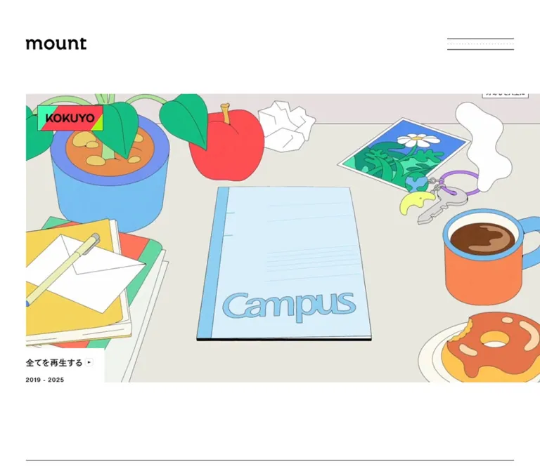
白と黒を基調に、大きな映像、繊細な罫線、豊かな余白で構成されたmount inc.の企業サイト。6カラムの整列と、モバイルで組み替わるフッターが特徴です。
オリジナルサイトを見るmount inc. — Style Reference
A white editorial canvas where moving work, precise rules, and generous gaps carry the identity.
Website: mount.jp Original URL: https://mount.jp/ Final URL: https://mount.jp/ Theme: white canvas, black headings, near-black text, and pale gray rules Inspected: September 12, 2026; supplied evidence retrieved at 08:14:15.169 UTC / 17:14:15.169 JST Viewports: 1440 × 1000 desktop and 390 × 844 mobile, in CSS pixels Scope: the current Japanese homepage: masthead, work reel and playback affordances, practice introduction, five destination links, magazine and news indexes, inquiry treatments, lower office imagery, and footer. Destination pages, an opened menu, and active playback were not inspected.
mount inc. describes itself on the homepage as a Tokyo-based design practice working across brand strategy, language, digital experiences, imagery, graphics, interaction, and spatial expression. The homepage operates as a practice overview and directory, with an unusually large opening work reel and a compact editorial index farther down the page.
The shell remains quiet while the work supplies visual variety. White margins, a lowercase black wordmark, a wide three-line menu symbol, and small outlined arrows establish continuity across very different media. The strongest spatial gesture is the opening reel: it starts at the left content inset and reaches the right viewport edge. Below it, a regular desktop grid organizes text, navigation, and dates. Office photography and an asymmetric footer give the closing portion a more personal scale.
How to Read This Reference
- Measured values come from the supplied rendered DOM rectangles, computed properties, and CSS custom properties. Values are rounded where browser subpixel precision adds little practical value.
- Visually estimated values come from the supplied current-page screenshots. These include visible lettering sizes, small icon radii, and the consultation button’s shadow.
- Calculated values are arithmetic derived from the measurements, such as the six-column desktop grid.
- Recommended values describe the reusable implementation below. They are not claims about the original source.
- Typography limitation: many sampled text wrappers report a font size of
1pxon desktop and0.955882pxon mobile. Those numbers do not describe the visible lettering. The descendant rendering details needed to recover exact visible type sizes were not supplied. - Interaction limitation: links, buttons, and one header transition declaration are evidenced. Menu opening, playback results, hover feedback, and sticky positioning were not exercised.
The first five supplied images document the current page. Desktop screenshots cover the opening, editorial/contact area, and footer; mobile screenshots cover the opening and footer. DOM measurements additionally describe the intervening introduction and directory.
Tokens — Colors
Default Palette
Names in the alias column are descriptive implementation names. Source variables are identified separately.
| Name | Value | Alias / source variable | Role and evidence |
|---|---|---|---|
| Canvas White | #ffffff |
--color-canvas / source --bgColor, --bgColorLight |
Active page background; also the measured playback-label background |
| Heading Black | #000000 |
--color-heading / source --headingColor, --headingColorLight |
Active heading token; visually consistent with the wordmark and strong rules |
| Text Ink | #1a1a1a |
--color-text / source --textColor, --textColorLight |
Measured text color on sampled elements |
| Fine Rule | #dfdfdf |
--color-rule / source --borderColor, --borderColorLight |
Active border token; matches the pale editorial and social separators |
| Quiet Hover | #f7f7f7 |
--color-hover / source --hoverBgColor, --hoverBgColorLight |
Defined active hover token; its application to individual components was not tested |
| Muted Date | Approximately #8c8c8c |
--color-muted-estimate |
Screenshot estimate for dates and the current Japanese language label; no corresponding child color was measured |
The visible interface does not establish a saturated action color. Blue, green, and warm wood tones belong to the current media and photography. Keep those colors in the assets instead of promoting them into unrelated navigation accents.
Additional Declared Palette
The following dark values appear in the supplied custom properties. The inspected homepage is light, and no theme control or dark-state activation was verified.
| Source variable | Declared value | Status |
|---|---|---|
--bgColorDark |
#2a2a2a |
Available declaration; inactive in the supplied light-state measurements |
--headingColorDark |
#ffffff |
Available declaration |
--textColorDark |
#dcdcdc |
Available declaration |
--borderColorDark |
#404040 |
Available declaration |
--hoverBgColorDark |
#323232 |
Available declaration |
These declarations do not establish a visitor-selectable theme system.
Tokens — Typography
Source Family Stack
The body and sampled descendants report:
font-family: tkgd, HelveticaNowText-Regular, TsukuGoPr5-D, sans-serif;
font-weight: 400;
Preserve these spellings when documenting the source. The evidence does not establish which face supplies each visible glyph, how tkgd is defined, or which font files are loaded. Do not invent a font service, substitute family attribution, or download path.
The root element reports Times, but the body supplies the stack above. A root fallback declaration is not evidence that the visible homepage uses Times as its editorial face.
Visible Character
The interface combines compact Latin sans-serif lettering with substantial Japanese lettering. Navigation and inquiry copy look firm and legible, while dates are lighter in color and more widely spaced. Text links in the editorial lists are underlined. Most hierarchy comes from placement, whitespace, and the difference between modest labels and larger statements.
The lowercase mount wordmark has its own proportions. Treat it as brand artwork when an authorized asset is available. Neither the sampled h1 font size nor a generic bold sans-serif substitution reliably reproduces it.
The white Japanese lettering in the desktop reel and the large serif lettering in the mobile resort frame belong to the media. They should not become the homepage’s global heading styles.
Type Scale
Visible size estimates below refer to optical appearance, not verified font-size declarations.
| Role | Desktop evidence | Mobile evidence | Practical interpretation |
|---|---|---|---|
| Header wordmark | Measured identity slot approximately 162px wide; link rectangle 176.59 × 46.13px |
Identity slot 154.86px wide; link rectangle 168.80 × 44.09px |
Use an asset with controlled width; link bounds include extra extent around the visible mark |
| Footer wordmark | Link rectangle 176.59 × 46.13px |
Link rectangle 212.20 × 55.44px; visibly larger than the mobile header mark |
Mobile footer branding increases rather than shrinking with the layout |
| Playback label | Visually approximately 22–24px |
Visually approximately 22–23px |
Strong, compact single-line label |
| Reel year range | Present in DOM; below the first desktop screenshot’s crop | Visually approximately 14–15px |
Small supporting line beneath the playback label |
| Editorial section heading | Visually approximately 20–22px |
Wrapper height measured at 18.36px; visible lettering not separately captured |
A modest heading, not a large display title |
| Editorial title and date | Visually approximately 15–16px |
Exact visible size unavailable | Use roughly 14–16px as an implementation starting range |
| Desktop footer navigation | Visually approximately 17–18px |
Visually approximately 16–17px |
Compact links with ample vertical separation |
| Social and language links | Visually approximately 14–16px |
Visually approximately 14–15px |
Quiet utilities |
| Contact statement | Visually approximately 30–32px, arranged in three lines |
Text rectangle measured, but no corresponding mobile screenshot supplied | Use a separate responsive statement scale; mobile values require implementation judgment |
| Introduction and directory copy | Block geometry measured; visible glyph size unavailable | Block geometry measured; visible glyph size unavailable | Use live-text prototypes and compare wrapping before claiming fidelity |
Recommended fallback behavior: use regular body text and a moderate 600 weight for labels where needed. This is an adaptation for ordinary live text. Do not assume that applying a synthetic bold weight to the original source aliases matches their rendering.
Tokens — Spacing & Shapes
Responsive Unit
The site uses a small root unit for layout. In this document, 1u means one source rem, not a conventional 16px rem.
| Measurement | Desktop | Mobile |
|---|---|---|
| Viewport | 1440 × 1000px |
390 × 844px |
| Computed root size | 1px |
0.955882px |
| Supplied scale expression reduces to | 1440 / 1440 = 1 |
390 / 408 ≈ 0.955882 |
| Therefore | 1u = 1px |
1u ≈ 0.955882px |
The supplied scale expressions use tan(atan2(...)) to obtain a unitless viewport width. These observations establish the two sampled states. They do not expose every clamp, intermediate-width rule, or large-screen limit.
Spacing Scale
Several variable names retain their desktop number while their mobile value changes.
| Source token | Desktop declaration → pixels | Mobile declaration → pixels | Typical role |
|---|---|---|---|
--space15 |
15rem → 15px |
15rem → 14.34px |
Label-to-arrow spacing and mobile row gaps |
--space30 |
30rem → 30px |
30rem → 28.68px |
Section internals, directory padding, playback-label inset |
--space60 |
60rem → 60px |
45rem → 43.01px |
Separation between editorial groups |
--space120 |
120rem → 120px |
60rem → 57.35px |
Header-to-reel gap and directory-to-magazine gap |
--space150 |
150rem → 150px |
120rem → 114.71px |
Reel-to-introduction and introduction-to-directory separation |
--space210 |
210rem → 210px |
150rem → 143.38px |
Larger sectional spacing token |
--edgePadding |
70rem → 70px |
30rem → 28.68px |
Main horizontal inset |
--columnGap |
44rem → 44px |
30rem → 28.68px |
Main grid gutter |
--headAreaHeight |
134rem → approximately 134px |
75rem → approximately 71.69px |
Measured masthead area |
Grid Arithmetic
The desktop content width is approximately 1300px:
1440 − 2 × 70 = 1300
6 × 180 + 5 × 44 = 1300
This six-column rhythm explains several otherwise different components:
| Span | Calculated desktop width | Observed use |
|---|---|---|
| One column | 180px |
Date column, social column, menu graphic width |
| Two columns plus one gutter | 404px |
Footer navigation region; approximately the square office photograph width |
| Three columns plus two gutters | 628px |
Each directory tile; footer brand region |
| Four columns plus three gutters | 852px |
Practice introduction |
| Six columns plus five gutters | 1300px |
Editorial lists and main content rules |
At mobile, the underlying two-column rhythm is:
2 × 159u + 30u = 348u ≈ 332.65px
390 − 2 × 28.6765 ≈ 332.65px
Those two columns remain useful for the small office photograph and social links. Other components become full-width rows within the inset.
Border Radius and Linework
| Element | Observed or estimated treatment | Status |
|---|---|---|
| Work reel | Square corners | Visible |
| Office photographs | Square corners | Visible |
| Content sections and sampled links | 0px wrapper radius |
Measured |
| Editorial and social rules | Approximately 1px, pale gray |
Visible; color token measured |
| Menu | Two thin solid horizontal rules with a dotted middle line | Visible |
| Small arrow box | Approximately 4px radius |
Screenshot estimate |
| Larger inquiry arrow box | Approximately 6px radius |
Screenshot estimate |
| Consultation surface | Approximately 6px radius with a soft shadow |
Screenshot estimate; outer visual treatment was not measured on the sampled anchor |
| Contact phrase emphasis | Thin oval/capsule outline with a faint gray interior treatment | Visible; exact construction unavailable |
The small rounded controls punctuate an otherwise square, open layout. They do not establish a general rounded-card system.
Layout Measurements
| Element | Desktop | Mobile |
|---|---|---|
| Content inset | 69.98px measured left edge |
28.67px measured left edge |
| Content width | 1300.03px |
332.66px |
| Menu button rectangle | 179.98 × 29.98px |
64.03 × 28.67px |
| Reel origin | x 69.98, y 253.98px |
x 28.67, y 129.03px |
| Reel size | 1370.03 × 770.64px |
361.33 × 627.06px |
| Playback-label rectangle | 212.58 × 92.72px |
205.11 × 74.28px |
| Introduction rectangle | 851.98 × 103.53px |
332.66 × 213.63px |
| Directory tile | Approximately 628 × 184.16px |
332.66 × 176.05px |
| Editorial row | 1300.03 × 48.50px |
Usually 332.66 × 116.78px; one longer news row is 135.91px high |
| Footer grid | 627.98 / 403.98 / 179.98px, with 44px gutters |
One 332.66px column before internal social subdivision |
| Document height | 5240.78px |
4887.52px |
Document height is a property of this content and capture state. Do not use it as a fixed implementation target.
Components
Masthead
Role: establish identity and expose the primary navigation affordance.
The lowercase wordmark sits on the left content axis. A deliberately wide menu symbol sits at the right inset. On desktop, the menu is approximately one grid column wide: 180px. Its solid top and bottom rules enclose a centered dotted line, giving the control more personality than a conventional three-solid-line icon.
The measured header area is approximately 134px high on desktop and 71.69px on mobile. The reel begins another 120px below the desktop header area and 57.35px below the mobile header area. This creates a generous opening without introducing a separate display headline.
The mobile menu graphic narrows to approximately 64px, while the wordmark remains close to its desktop optical size. Preserve that difference in scaling. The full menu panel, accessible button name, focus behavior, and open/close animation were not inspected.
Work Reel
Role: present the practice through work before explanatory copy.
The reel is a large button-backed media area. Its left edge follows the content inset; its right edge reaches the viewport boundary. This relationship is present at both inspected widths.
Desktop source text explicitly exposes aspect-ratio: 16/9 at min-width: 768px. The measured mobile rectangle has a width-to-height ratio of approximately 0.5762. That is consistent with 378 / 656; however, the supplied mobile CSS fragment ends at 378/, so the denominator is a calculated approximation rather than a verified declaration.
The desktop frame is nearly black with large white Japanese lettering. The mobile frame shows coastal resort imagery, the AYANA identity, and large serif lettering embedded in the image. These are different captured media states, not competing interface palettes.
On mobile, a white square with a black play triangle is visible at the media center. The supplied desktop frame does not show the same center control. Do not infer that it is permanently absent on desktop or that playback is already running.
Playback Label
Role: expose the full reel and identify its date range.
A white rectangular label overlaps the reel’s lower-left corner. It reads 全てを再生する, includes a tiny outlined play symbol, and places 2019 - 2025 beneath the main label. Its square geometry creates a white cutout in the image rather than a floating pill.
The measured label uses 30u top and right padding, with no left or bottom padding. It begins approximately 1u to the left of the media boundary. The desktop rectangle is about 213 × 93px; the mobile rectangle is about 205 × 74px.
The sampled row gap changes from approximately 30px on desktop to 14.34px on mobile. The year remains present in the DOM even where it falls below the first desktop screenshot’s bottom edge.
Both the media area and this label are reported as buttons. Their resulting player, overlay, sound state, and navigation behavior remain unverified. A new implementation should make them sibling controls rather than nesting one button inside another.
Practice Introduction
Role: explain what the organization does after the visual opening.
A single paragraph introduces mount inc. and its cross-disciplinary practice. It sits approximately 150px below the desktop reel and 114.71px below the mobile reel.
On desktop, the paragraph occupies four grid columns, approximately 852px, leaving two columns of empty space to the right. On mobile, it uses the full inset width of approximately 333px. Its measured height grows from 103.53px to 213.63px as the copy reflows.
This is sustained editorial copy, not a centered slogan. Keep the left alignment and the deliberate desktop width limit. Exact visible font size and line height cannot be recovered from the supplied wrapper styles.
Practice Directory
Role: route visitors to the practice’s main information areas.
Five large destination links follow the introduction:
| Source label | Observed destination | Content role |
|---|---|---|
私たちについて |
/about/ |
Principles and attitude toward work |
アプローチの仕方 |
/process/ |
Project process |
サービス領域 |
/services/ |
Breadth of services |
ポートフォリオ |
/projects/ |
Work and problem-solving experience |
メンバー |
/members/ |
People in the practice |
Desktop uses two outer columns, each approximately 628px wide, separated by 44px. The fifth item occupies the left side of a third row. Mobile uses five full-width rows.
Each link retains an internal two-column composition: a category label at left and explanatory copy at right. Mobile does not stack the label above the description. The internal columns are content-dependent: the first desktop tile measures approximately 293.11 / 334.91px; its mobile counterpart measures 180.34 / 152.31px. Other tiles use different splits.
The anchors have 30u vertical padding. A sampled gap: 60px normal on desktop refers to the row gap and a normal column gap; it is not evidence of a 60px horizontal gutter between the two text columns. The supplied column widths already sum to the tile width.
These are open, square destination regions. Thin separation is consistent with their measured one-pixel offsets and the rest of the page, but the directory itself was not included in a supplied screenshot. Its exact rule treatment and visible copy styling therefore require caution.
Magazine and News Lists
Role: provide a compact, current editorial index.
The マガジン and お知らせ sections share the same anatomy: heading, three linked rows, and a right-aligned 一覧を見る link with a small arrow box.
On desktop, each row uses a 180px date column, a 44px gutter, and a flexible title column of approximately 1076px. Dates begin at the common left inset; titles begin at approximately x 294px. Fine gray rules separate the rows. Titles are visibly underlined, while dates remain muted.
The measured desktop row padding is 17px 0, with a total rectangle height of 48.5px. Because the visible text rendering is not fully exposed, an ordinary live-text implementation may produce a taller row with those same padding values. Preserve readability rather than forcing the line box to match an unexplained wrapper height.
On mobile, each row becomes one column: date first, title below, with 14.34px between the grid rows and 28.68px vertical padding. Most measured rows are 116.78px high. The longest news title produces a 135.91px row, demonstrating content-driven height.
Both sections retain three entries in the supplied desktop and mobile evidence. There is no evidence of a mobile carousel or a shortened mobile article set.
Inline Arrow Link
Role: indicate a destination while keeping the interface visually light.
A text label sits beside a small outlined square containing a right arrow. Editorial list links use a measured group height of approximately 30px on desktop and 28.67px on mobile. The text-to-icon gap is 15u.
The larger contact link uses an approximately 45px arrow box on desktop and 43px on mobile. Its whole link measures 167.78 × 44.98px and 160.34 × 43px, respectively.
The border is pale, the arrow is dark, and the corner radius is small. The action relies on direction and typography rather than a colored fill. In a reusable implementation, expand the interactive area without enlarging every visible icon.
Consultation Callout
Role: provide a more conspicuous inquiry route near the lower editorial area.
The desktop screenshot shows 相談・お問い合わせ on a white raised rectangle, aligned toward the right. A pale rim, modest corner rounding, and a soft surrounding shadow distinguish it from the page’s otherwise flat links.
The sampled anchor rectangle is approximately 214.11 × 77.98px on desktop and 180.13 × 43px on mobile. The desktop visual surface extends beyond the anchor measurement; the screenshot suggests an outer size near 224 × 88px.
Its position looks detached from the text list, but the supplied evidence does not include the positioning properties needed to establish fixed or sticky behavior. Do not reconstruct a scroll-following widget from that appearance alone. The CSS Quick Start provides a normal-flow placement as a recommendation.
Contact Statement Band
Role: end the informational sequence with a direct invitation to discuss a problem.
Thin black rules frame a broad horizontal band. At left, the source statement reads:
つくることではなく、課題の解決が目的です。ぜひお悩みからお聞かせください。
The desktop capture arranges it in three substantial lines. The phrase 課題の解決 has an outlined capsule-like emphasis with a faint gray interior treatment. This is a local typographic accent, not a reusable badge for unrelated content.
The お問い合わせ arrow link sits on the right, vertically centered against the statement. On mobile, the measured statement rectangle and link positions show that the link moves below the copy and remains aligned to the right content edge.
The paragraph’s sampled bounding box extends slightly left of the common inset. Its visible lettering aligns more closely with the main content axis. Avoid positioning ordinary live text by copying that bounding-box offset without understanding the original rendering.
Office Imagery
Role: connect the practice’s work to a physical, human environment.
The lower desktop capture shows the bottom of a full-width interior photograph: warm timber, upholstered seating, a table, and a blurred passing figure. Below it, a square portrait-like photograph sits at the left content inset, approximately 404 × 404px in the screenshot.
The smaller photograph shows a seated person in glasses, photographed across furniture with shelves and warm ambient light behind them. On mobile, the visible photograph occupies approximately one small grid column, about 152–153px wide.
Two small pale dots appear near the right edge of the desktop image section. Their function was not tested. They should not be documented as working carousel controls without additional evidence.
The full image sequence, its native asset dimensions, and its scroll behavior were not supplied. Do not manufacture large spacer sections to imitate the measured total document height.
Footer Sitemap, Language, and Social Links
Role: offer a complete secondary navigation system and a final brand signature.
Desktop uses three main grid regions: approximately 628px for the left brand area, 404px for two groups of internal links, and 180px for social links. The wordmark sits low in the left region; the link groups sit higher, creating an intentionally asymmetric composition.
The first internal group contains seven links, from 私たちについて through 受賞歴. The second contains five links, from 採用 through お問い合わせ, followed by 日本語 / English. The Japanese label is visibly muted. The observed English destination is /en/; it was not opened.
The social column contains X, Instagram, Facebook, and note. Each row has pale horizontal rules and a tiny outlined external-arrow box at the right. Desktop social rows measure approximately 44px high.
Mobile changes both order and grouping. The twelve internal links form one vertical list at the left inset. The language links follow a short rule and a small gap. After a large white interval, the wordmark appears larger and right-aligned. Social links then form a two-column grid: X and Instagram on the first row, Facebook and note on the second.
The mobile footer measures approximately 705px high, compared with approximately 181px for the desktop footer grid. Its large blank interval and enlarged wordmark are part of the observed composition.
Tokens — Motion & Interaction
| Treatment | Evidence | What can be stated |
|---|---|---|
| Header transform | transform 0.4s cubic-bezier(0, 0.5, 0, 1) |
A 400ms transform transition is defined; its trigger and endpoint states are unverified |
| Header height | height 0.4s cubic-bezier(0, 0.5, 0, 1) |
A matching height transition is defined |
| Reel content | Different media frames in desktop and mobile captures; playback buttons in DOM | The opening is a media presentation; autoplay, sequencing, looping, and sound are unverified |
| Center play affordance | White square and black triangle visible in mobile capture | A visible playback invitation exists in that state |
| Full-reel action | Button labeled 全てを再生する |
Button presence and label are verified; resulting UI is not |
| Hover background | --hoverBgColor: #f7f7f7 |
A hover token exists; particular hover selectors and transitions were not inspected |
| Consultation placement | Detached appearance in a desktop scroll capture | Fixed/sticky behavior is unverified |
| Lower-section dots | Two pale dots visible | Meaning and interaction are unverified |
| Other sampled wrappers | animation: none; many transitions serialized as all |
No specific animation can be inferred from these wrapper samples |
The header timing can be preserved directly:
transition:
  transform 0.4s cubic-bezier(0, 0.5, 0, 1),
  height 0.4s cubic-bezier(0, 0.5, 0, 1);
A plain transition: all sample does not establish a nonzero duration or an animated interaction. Likewise, animation: none on a wrapper does not rule out motion in media or descendants.
The capture process waited for loading and sampled layout stability, temporarily pausing perpetual animations during readiness checks. This supports the supplied geometry, but it does not prove that every delayed or interactive state was observed.
Recommended motion approach: let the reel carry most of the movement. Keep utility feedback restrained, preserve the known header easing where relevant, and add explicit playback state and reduced-motion behavior in the implementation. Do not introduce parallax, automatic carousels, or an invented menu choreography as original-page findings.
Surfaces
| Surface | Appearance | Purpose |
|---|---|---|
| Main canvas | Solid white | Holds the wide gaps and shared alignment axes |
| Work reel | Square media rectangle reaching the right viewport edge | Main visual emphasis |
| Playback label | White square-cornered cutout overlapping the reel | Legible playback action across changing imagery |
| Directory and editorial rows | Open canvas with typographic structure and fine separation | Information browsing |
| Arrow boxes | Small white/transparent interiors with pale outlines | Lightweight directional cues |
| Consultation callout | White surface, pale rim, soft shadow | Locally increased inquiry emphasis |
| Contact statement band | White field between black rules | Closing statement and inquiry route |
| Office photography | Unframed rectangular imagery | Warmth, people, and physical context |
| Footer | Same white canvas with ruled social rows | Navigation and final identity |
Elevation is exceptional. The consultation surface is the visible shadow treatment; it should not be generalized to the directory, editorial links, or photographs.
Imagery
The current opening captures demonstrate a broad media range: a black film-like frame with white Japanese copy on desktop, and blue-green resort scenery with embedded branding on mobile. The neutral shell is what connects these states. Preserve sharp rectangular cropping and keep the media’s own typography inside the media component.
The lower imagery is warmer and more observational. Timber, fabric, shelves, imperfect movement, and an informal seated portrait soften the otherwise exact layout. The small square photograph does not expand to fill the empty desktop space beside it. That imbalance is a useful part of the composition.
Use normal photographic rendering. There is no evidence for a global duotone filter, pixelated image treatment, or site-wide grain overlay. Texture visible in a particular reel frame belongs to that content unless separately demonstrated.
Observed Asset References
The supplied evidence does not expose image, video, poster, or wordmark asset URLs. The references below identify visible uses without inventing paths.
| Asset role | Current-page reference | Geometry or treatment | Availability limitation |
|---|---|---|---|
| Header wordmark | Desktop and mobile opening captures | Lowercase black mark | Exact asset format and URL unavailable |
| Desktop reel frame | Desktop opening capture | 16:9 media area; dark frame with white Japanese lettering |
Video URL and playback state unavailable |
| Mobile reel frame | Mobile opening capture | Portrait media area with resort scenery and central play affordance | Mobile media source and crop implementation unavailable |
| Broad office photograph | Upper strip of desktop footer capture | Full viewport width; warm interior | Full image bounds and source dimensions unavailable |
| Square office portrait | Desktop footer capture and partial mobile footer capture | Approximately 404px desktop and 152–153px mobile width |
Native asset URL unavailable |
| Footer wordmark | Desktop and mobile footer captures | Larger relative presence on mobile | Exact asset format unavailable |
Use authorized brand and media assets when available. Placeholder media can validate layout, but it cannot establish fidelity to the work shown in the captures.
Layout & Responsive Behavior
The page combines a regular content grid with a few deliberate departures: the reel reaches the right viewport edge, the contact phrase has a local emphasis shape, and the footer brand occupies an unexpectedly large empty region.
| Relationship | Desktop observation | Mobile observation |
|---|---|---|
| Horizontal inset | 70px |
Approximately 28.68px |
| Masthead menu | Wide 180px graphic |
Narrow approximately 64px graphic |
| Reel | 16:9, approximately 1370px wide |
Approximately 361 × 627px, portrait |
| Reel’s right edge | At viewport boundary | At viewport boundary |
| Introduction | Four of six columns | Full inset width |
| Directory | Two outer columns, five items | One outer column, five items |
| Directory internals | Label left, description right | Same two-part arrangement, with narrower content-dependent columns |
| Editorial rows | Date and title side by side | Date above title |
| Contact band | Statement left, action right | Action below statement, aligned right |
| Small office photograph | Approximately two desktop columns | Approximately one mobile column |
| Footer internal links | Two groups beside the brand region | One vertical list above the wordmark |
| Footer wordmark | Lower left | Larger, lower right |
| Social links | One column of four | Two columns of two |
The explicit 768px breakpoint is present in the reel’s supplied CSS fragment. The other desktop-to-mobile rearrangements are measured at the two viewports, but their exact switching thresholds are not independently exposed. Using the same breakpoint for the reusable scaffold is a recommendation.
Useful vertical landmarks from the DOM are the introduction at approximately y 1174.61px desktop / 870.80px mobile, the directory at 1428.13px / 1199.13px, and the magazine section at 2105.58px / 2142.70px. Mobile’s taller directory offsets its shorter opening, so these landmarks do not scale by one constant ratio.
The footer grid begins near y 4939.81px on desktop and 4153.42px on mobile. The supplied lower imagery is only partially represented by screenshots and element samples; those positions should be used as evidence of overall rhythm, not as fixed spacer instructions.
Do’s and Don’ts
Do
- Preserve the white canvas, near-black text, and pale
#dfdfdfseparators. - Use the six-column desktop rhythm to relate dates, introduction width, directory tiles, and footer regions.
- Let the reel reach the right viewport edge while retaining the left content inset.
- Keep the playback label as a white rectangular overlap at the reel’s lower-left corner.
- Retain the solid–dotted–solid menu motif and its different desktop/mobile widths.
- Preserve underlined editorial titles and muted date columns.
- Keep category labels and descriptions side by side inside mobile directory rows.
- Reorder the mobile footer deliberately, including the enlarged right-aligned wordmark.
- Let warm office photography sit within generous empty space.
- Distinguish measured wrapper geometry from estimated visible lettering.
Don’t
- Don’t replace the practice overview with an unrelated sequence of feature cards, pricing blocks, or testimonial panels.
- Don’t center the reel inside symmetrical margins.
- Don’t keep the desktop landscape reel ratio on the inspected mobile composition.
- Don’t turn every destination into a rounded, shadowed card.
- Don’t derive a global brand palette or heading font from lettering inside a media frame.
- Don’t copy
70reminto a conventional 16px-root page without converting the unit system. - Don’t treat
font-size: 1pxon sampled wrappers as the intended visible text size. - Don’t force all directory tiles to use an allegedly measured identical internal column split.
- Don’t apply a fixed height to mobile news rows; the evidence includes a taller wrapped entry.
- Don’t claim autoplay, parallax, a sticky inquiry widget, or an opened menu design without additional inspection.
Recommended Implementation Additions
These are recommendations for a new implementation, not verified original-site features:
- Give the menu and media buttons explicit accessible names. Connect the menu button’s expanded state to an actual navigation region.
- Use semantic links for destinations,
timeelements for dates, and buttons for playback actions. Keep the reel’s two buttons as siblings. - Preserve a visible keyboard focus outline and increase small controls’ interactive areas to at least
44pxwhere practical. - Keep the current language distinguishable through semantics as well as muted color.
- Test the estimated gray date color for text contrast. The CSS below uses
#767676as an accessible substitute for the lighter screenshot estimate. - Use live text for body copy and navigation. Verify wrapping with the final Japanese font instead of recreating unexplained wrapper metrics.
- Provide a poster, explicit playback state, and appropriate media alternatives. Let a deliberate user action control audible playback.
- Respect reduced-motion preferences in both CSS transitions and the media controller; CSS alone does not pause a video.
- Keep image focal points intentional at both reel ratios and reserve media dimensions to reduce layout movement.
- Test intermediate widths, zoom, long article titles, and keyboard navigation. Only the two documented viewports were supplied.
Agent Prompt Guide
Quick Color Reference
- Canvas and playback-label surface:
#ffffff. - Strong headings and wordmark: black appearance; source heading token
#000000. - Main UI text:
#1a1a1a. - Fine separators and small control borders:
#dfdfdf. - Defined hover surface:
#f7f7f7; individual hover behavior is unverified. - Dates and current-language label: approximately
#8c8c8cvisually; use a darker value if needed for accessible text. - Saturated colors: supplied by media, not by a general CTA system.
Overall Prompt
“Create a Japanese design-practice homepage with a white canvas, black lowercase brand artwork, near-black sans-serif text, pale gray rules, and generous whitespace. At a 1440px viewport, use 70px side insets and a six-column grid with 180px columns and 44px gutters. Place a wide solid–dotted–solid menu graphic at the upper right. Start a large 16:9 work reel below the masthead, aligned to the left inset and extending to the right viewport edge. Overlap its lower-left corner with a square white playback label and small year range.
Follow the reel with a left-aligned introduction spanning four desktop columns, five directory links in two outer columns, two compact date-and-title editorial lists, and a ruled inquiry statement. Close with warm office imagery and an asymmetric sitemap footer. At 390px, use approximately 29px insets, a portrait reel, a single directory list that retains internal label/description columns, stacked editorial dates and titles, and a footer with navigation first, an enlarged right-aligned wordmark below, and two columns of social links. Treat visible type sizes as estimates and keep unverified motion out of the reconstruction.”
Example Component Prompts
- Masthead: “A white masthead with authorized lowercase black wordmark artwork at the left content inset. At right, use a 180px-wide menu graphic made from a thin solid top rule, a dotted middle line, and a thin solid bottom rule. Reduce the graphic to about 64px on mobile while keeping the brand near its original optical width.”
- Work reel: “A square-cornered work-reel area beginning at the page’s left inset and touching the right viewport edge. Use 16:9 on desktop and approximately 378:656 on mobile. Add a white lower-left overlap containing
全てを再生する, a small outlined play symbol, and2019 - 2025. Keep text embedded in the reel separate from interface typography.” - Editorial list: “A full-width white news index with fine gray horizontal rules, muted dates in a 180px desktop column, a 44px gutter, and underlined Japanese titles. On mobile, place the date above the title with approximately 14px between them and generous vertical padding. End with a right-aligned text link and small outlined arrow square.”
- Contact statement: “A white band between thin black rules. Use substantial black Japanese copy on the left, with a small outlined capsule emphasizing
課題の解決. Place a restrained inquiry link and a 45px outlined arrow box on the right; move that link below the statement on mobile.” - Footer: “An asymmetric white footer with a low left wordmark, two compact internal-link groups near the center-right, and a narrow ruled social column at the far right. On mobile, form one list of internal links, then language choices, a large white interval, a larger right-aligned wordmark, and a two-column social grid.”
Quick Start
CSS Custom Properties
This is a recommended live-text scaffold, not a recovered stylesheet. It keeps a conventional root font size and uses --u for source-like geometry. The unit formulas match the two inspected widths; the added clamps are implementation safeguards, not measured source limits. Typography, small radii, shadow values, and untested hover treatments are explicitly approximate.
Expected anatomy: .masthead contains a .brand-link with authorized wordmark artwork and a .menu-button containing .menu-mark. .reel contains sibling .reel-open and .reel-all buttons. Place the introduction, directory, editorial sections, consultation link, and contact band inside .content-shell. The footer contains .footer-brand, .footer-navigation with two .footer-group regions, and .social-links.
:root {
  /* Measured active palette */
  --color-canvas: #ffffff;
  --color-heading: #000000;
  --color-text: #1a1a1a;
  --color-rule: #dfdfdf;
  --color-hover: #f7f7f7;

  /* Estimated source appearance and recommended text substitute */
  --color-muted-estimate: #8c8c8c;
  --color-muted: #767676;

  /* Observed family aliases; authorized font files are not included */
  --font-ui: tkgd, HelveticaNowText-Regular, TsukuGoPr5-D, sans-serif;

  /* Recommended bounds; 1u equals 1px at the inspected desktop width */
  --u: clamp(0.8px, calc(100vw / 1440), 1.15px);
  --edge: calc(70 * var(--u));
  --column-gap: calc(44 * var(--u));
  --head-height: calc(134 * var(--u));
  --menu-width: calc(180 * var(--u));

  --space-15: calc(15 * var(--u));
  --space-30: calc(30 * var(--u));
  --space-60: calc(60 * var(--u));
  --space-120: calc(120 * var(--u));
  --space-150: calc(150 * var(--u));
  --space-210: calc(210 * var(--u));

  /* Recommended live-text sizes, not measured source font sizes */
  --text-small: clamp(0.875rem, calc(15 * var(--u)), 1.0625rem);
  --text-body: clamp(0.9375rem, calc(16 * var(--u)), 1.125rem);
  --text-label: clamp(1rem, calc(18 * var(--u)), 1.25rem);
  --text-heading: clamp(1.125rem, calc(22 * var(--u)), 1.5rem);
  --text-directory: clamp(1.125rem, calc(24 * var(--u)), 1.625rem);
  --text-statement: clamp(1.5rem, calc(32 * var(--u)), 2.5rem);

  /* Estimated small-control geometry */
  --radius-small: 4px;
  --radius-contact: 6px;
  --contact-shadow: 0 0 14px rgb(0 0 0 / 20%);

  /* Measured header timing */
  --header-ease: cubic-bezier(0, 0.5, 0, 1);
}

* { box-sizing: border-box; }

body {
  margin: 0;
  color: var(--color-text);
  background: var(--color-canvas);
  font-family: var(--font-ui);
  font-size: var(--text-body);
  line-height: 1.6;
}

button, a { -webkit-tap-highlight-color: transparent; }
button { font: inherit; color: inherit; }
a { color: inherit; }
img, video { display: block; max-inline-size: 100%; }

.content-shell { margin-inline: var(--edge); }

.masthead {
  position: relative;
  height: var(--head-height);
  transition:
    transform 0.4s var(--header-ease),
    height 0.4s var(--header-ease);
}

.brand-link {
  position: absolute;
  inset-inline-start: var(--edge);
  inset-block-end: 0;
  display: block;
}

.brand-link img,
.footer-brand img {
  inline-size: calc(162 * var(--u));
  block-size: auto;
}

.menu-button {
  position: absolute;
  inset-inline-end: var(--edge);
  inset-block-end: 0;
  inline-size: var(--menu-width);
  block-size: max(44px, calc(30 * var(--u)));
  padding: 0;
  border: 0;
  background: transparent;
  cursor: pointer;
}

.menu-mark {
  position: absolute;
  inset-inline: 0;
  inset-block-end: 0;
  block-size: calc(30 * var(--u));
  border-block: 1px solid var(--color-heading);
}

.menu-mark::after {
  content: '';
  position: absolute;
  inset-inline: 0;
  top: 50%;
  height: 2px;
  transform: translateY(-50%);
  background:
    radial-gradient(circle, currentColor 0.9px, transparent 1.1px)
    left center / 8px 2px repeat-x;
}

.reel {
  position: relative;
  margin-block-start: var(--space-120);
  margin-inline-start: var(--edge);
  inline-size: calc(100% - var(--edge));
  aspect-ratio: 16 / 9;
}

.reel-open {
  position: absolute;
  inset: 0;
  inline-size: 100%;
  block-size: 100%;
  padding: 0;
  border: 0;
  background: #000000;
  cursor: pointer;
}

.reel-open > img,
.reel-open > video {
  inline-size: 100%;
  block-size: 100%;
  object-fit: cover;
}

.reel-play {
  position: absolute;
  top: 50%;
  left: 50%;
  display: grid;
  place-items: center;
  inline-size: 44px;
  block-size: 44px;
  transform: translate(-50%, -50%);
  color: #000000;
  background: #ffffff;
}

/* The media controller decides when the center affordance is visible. */
.reel-play[hidden] { display: none; }

.reel-all {
  position: absolute;
  inset-inline-start: calc(-1 * var(--u));
  inset-block-end: 0;
  display: grid;
  justify-items: start;
  gap: var(--space-30);
  padding: var(--space-30) var(--space-30) 0 0;
  border: 0;
  border-radius: 0;
  color: var(--color-text);
  background: var(--color-canvas);
  text-align: start;
  cursor: pointer;
}

.reel-all strong {
  font-size: var(--text-heading);
  font-weight: 600;
  line-height: 1;
}

.reel-years {
  font-size: var(--text-small);
  line-height: 1;
}

.intro {
  inline-size: calc((100% - 5 * var(--column-gap)) / 6 * 4
    + 3 * var(--column-gap));
  margin-block: var(--space-150);
  line-height: 1.7;
}

.directory {
  display: grid;
  grid-template-columns: repeat(2, minmax(0, 1fr));
  column-gap: var(--column-gap);
}

.directory-link {
  display: grid;
  grid-template-columns: minmax(0, 1fr) minmax(0, 1.12fr);
  align-content: start;
  min-block-size: calc(184 * var(--u));
  padding-block: var(--space-30);
  border-block-start: 1px solid var(--color-rule);
  text-decoration: none;
}

/* Internal column proportions are an approximation, not recovered rules. */
.directory-label,
.directory-copy { margin: 0; }
.directory-label { font-size: var(--text-label); font-weight: 600; }
.directory-copy { font-size: var(--text-directory); line-height: 1.65; }

.updates {
  display: grid;
  gap: var(--space-30);
  margin-block-start: var(--space-120);
}

.updates + .updates { margin-block-start: var(--space-60); }

.section-title {
  margin: 0;
  font-size: var(--text-heading);
  font-weight: 600;
  line-height: 1.2;
}

.update-list { border-block-start: 1px solid var(--color-rule); }

.update-row {
  display: grid;
  grid-template-columns:
    calc((100% - 5 * var(--column-gap)) / 6)
    minmax(0, 1fr);
  column-gap: var(--column-gap);
  padding-block: calc(17 * var(--u));
  border-block-end: 1px solid var(--color-rule);
  font-size: var(--text-small);
  line-height: 1.5;
  text-decoration: none;
}

.update-row time {
  color: var(--color-muted);
  letter-spacing: 0.08em;
}

.update-title {
  min-inline-size: 0;
  overflow-wrap: anywhere;
  text-decoration: underline;
  text-underline-offset: 0.12em;
}

.arrow-link {
  justify-self: end;
  display: inline-flex;
  align-items: center;
  gap: var(--space-15);
  min-block-size: 44px;
  font-size: var(--text-label);
  font-weight: 600;
  text-decoration: none;
}

.arrow-box {
  display: grid;
  place-items: center;
  flex: none;
  inline-size: calc(30 * var(--u));
  aspect-ratio: 1;
  border: 1px solid var(--color-rule);
  border-radius: var(--radius-small);
  font-size: 1rem;
  line-height: 1;
}

/* Recommended normal-flow placement; original positioning is unverified. */
.consultation {
  display: flex;
  justify-content: flex-end;
  margin-block: var(--space-60) calc(80 * var(--u));
}

.consultation > a {
  display: inline-flex;
  align-items: center;
  justify-content: center;
  min-block-size: calc(88 * var(--u));
  padding-inline: var(--space-30);
  border: 5px solid var(--color-hover);
  border-radius: var(--radius-contact);
  background: var(--color-canvas);
  box-shadow: var(--contact-shadow);
  font-size: var(--text-label);
  font-weight: 600;
  text-decoration: none;
}

.contact-band {
  display: grid;
  grid-template-columns: minmax(0, 1fr) auto;
  align-items: center;
  gap: var(--space-30);
  padding-block: calc(50 * var(--u));
  border-block: 1px solid var(--color-heading);
}

.contact-copy {
  max-inline-size: calc(510 * var(--u));
  margin: 0;
  color: var(--color-heading);
  font-size: var(--text-statement);
  font-weight: 600;
  line-height: 1.25;
}

.contact-emphasis {
  padding-inline: 0.25em;
  border: 1px solid currentColor;
  border-radius: 999px;
  background: var(--color-hover);
  box-decoration-break: clone;
}

.contact-band .arrow-box {
  inline-size: calc(45 * var(--u));
  border-radius: var(--radius-contact);
}

/* Supply the broad image's intended crop; its full ratio was not measured. */
.office-wide { inline-size: 100%; block-size: auto; }

.office-detail {
  inline-size: calc((100% - 2 * var(--edge) - 5 * var(--column-gap))
    / 6 * 2 + var(--column-gap));
  aspect-ratio: 1;
  margin: var(--space-60) var(--edge);
  object-fit: cover;
}

.site-footer {
  display: grid;
  grid-template-columns: repeat(6, minmax(0, 1fr));
  gap: var(--column-gap);
  align-items: end;
  margin: var(--space-60) var(--edge) var(--space-120);
}

.footer-brand { grid-column: span 3; }

.footer-navigation {
  grid-column: span 2;
  align-self: start;
  display: grid;
  grid-template-columns: calc((100% - var(--column-gap)) / 2) 1fr;
}

.footer-group {
  display: flex;
  flex-direction: column;
  align-items: flex-start;
  gap: calc(12.5 * var(--u));
}

.footer-group > a {
  font-size: var(--text-label);
  line-height: 1.2;
  text-decoration: none;
}

.language-switch {
  display: flex;
  align-items: center;
  gap: var(--space-15);
  margin-block-start: var(--space-30);
  font-size: var(--text-small);
}

.language-switch a { text-decoration: none; }
.language-switch [aria-current] { color: var(--color-muted); }

.social-links {
  grid-column: span 1;
  display: grid;
  border-block-start: 1px solid var(--color-rule);
}

.social-links > a {
  display: flex;
  align-items: center;
  justify-content: space-between;
  gap: var(--space-15);
  min-block-size: max(44px, calc(45 * var(--u)));
  padding-block: calc(12 * var(--u));
  border-block-end: 1px solid var(--color-rule);
  font-size: var(--text-small);
  text-decoration: none;
}

.external-mark {
  display: grid;
  place-items: center;
  flex: none;
  inline-size: 18px;
  aspect-ratio: 1;
  border: 1px solid var(--color-rule);
  border-radius: 3px;
  font-size: 10px;
  line-height: 1;
}

@media (max-width: 767px) {
  :root {
    /* Matches 390 / 408 at the inspected mobile width. */
    --u: clamp(0.88px, calc(100vw / 408), 1.05px);
    --edge: calc(30 * var(--u));
    --column-gap: calc(30 * var(--u));
    --head-height: calc(75 * var(--u));
    --menu-width: calc(67 * var(--u));
    --space-60: calc(45 * var(--u));
    --space-120: calc(60 * var(--u));
    --space-150: calc(120 * var(--u));
    --space-210: calc(150 * var(--u));
    --text-directory: clamp(1rem, calc(20 * var(--u)), 1.375rem);
    --text-statement: clamp(1.25rem, calc(24 * var(--u)), 1.625rem);
  }

  /* Calculated from the measured rectangle; source denominator unavailable. */
  .reel { aspect-ratio: 378 / 656; }
  .reel-all { gap: var(--space-15); }
  .intro { inline-size: 100%; }
  .directory { grid-template-columns: minmax(0, 1fr); }

  .directory-link {
    grid-template-columns: minmax(0, 1fr) minmax(0, 1fr);
  }

  .update-row {
    grid-template-columns: minmax(0, 1fr);
    row-gap: var(--space-15);
    padding-block: var(--space-30);
  }

  .consultation > a { min-block-size: 53px; }

  .contact-band {
    grid-template-columns: minmax(0, 1fr);
    padding-block: var(--space-30);
  }

  .contact-copy { max-inline-size: 100%; }

  .office-detail {
    inline-size: calc((100% - 2 * var(--edge) - var(--column-gap)) / 2);
  }

  .site-footer {
    grid-template-columns: minmax(0, 1fr);
    row-gap: var(--space-30);
    margin-block-end: var(--edge);
  }

  .footer-navigation {
    grid-column: 1;
    grid-row: 1;
    display: flex;
    flex-direction: column;
    gap: var(--space-15);
  }

  .footer-group { gap: var(--space-15); }

  .footer-brand {
    grid-column: 1;
    grid-row: 2;
    justify-self: end;
    margin-block-start: var(--space-150);
  }

  .footer-brand img { inline-size: calc(204 * var(--u)); }

  .social-links {
    grid-column: 1;
    grid-row: 3;
    grid-template-columns: repeat(2, minmax(0, 1fr));
    column-gap: var(--column-gap);
  }
}

/* Recommended feedback using the observed hover token. */
@media (hover: hover) {
  .directory-link:hover,
  .update-row:hover { background: var(--color-hover); }
}

:where(a, button):focus-visible {
  outline: 2px solid var(--color-heading);
  outline-offset: 4px;
}

@media (prefers-reduced-motion: reduce) {
  .masthead { transition: none; }
}
The CSS reserves the observed media shapes and reorganizes the major regions. It does not supply media assets, player logic, an opened menu, or the unmeasured lower-image sequence. Natural live-text line boxes may increase heights relative to the sampled wrappers.
Tailwind v4 Token Mapping
Optional aliases for a project already using Tailwind v4. This is an implementation convenience, not evidence that the original site uses Tailwind. Define the custom properties above first.
@theme inline {
  --color-canvas: #ffffff;
  --color-heading: #000000;
  --color-ink: #1a1a1a;
  --color-rule: #dfdfdf;
  --color-quiet: #f7f7f7;
  --color-muted: #767676;

  --font-practice: tkgd, HelveticaNowText-Regular, TsukuGoPr5-D, sans-serif;

  --spacing-unit: var(--u);
  --spacing-edge: var(--edge);
  --spacing-column-gap: var(--column-gap);
  --spacing-section: var(--space-150);

  --text-practice-small: var(--text-small);
  --text-practice-body: var(--text-body);
  --text-practice-label: var(--text-label);
  --text-practice-heading: var(--text-heading);
  --text-practice-statement: var(--text-statement);

  --radius-practice-control: 4px;
  --radius-practice-contact: 6px;
}
Sources & Evidence
- Inspected original and final page: mount inc.. Both supplied URLs are identical; the reported HTTP status is
200. - Inspection date: September 12, 2026. The supplied original-page evidence was retrieved at
2026-09-12T08:14:15.169Z, equivalent to17:14:15.169in Japan. - Desktop evidence: three current-page captures at
1440 × 1000, plus rendered text, link destinations, custom properties, and element rectangles. The measured document height is approximately5240.78px. - Mobile evidence: two current-page captures at
390 × 844, plus the same categories of rendered DOM evidence. The measured document height is approximately4887.52px. - Style evidence: active light palette variables, additional inactive dark declarations, responsive spacing values, the body family stack, root-unit measurements, grid tracks, paddings, and the header’s 400ms transition declarations.
- Identity evidence: the inspected homepage title and introduction identify mount inc. and describe its Tokyo-based design practice. No production-credit claim is made for the current homepage.
- Navigation evidence: destination URLs were present in the rendered homepage. The destination pages themselves were not inspected.
- Interaction scope: supplied loading and scroll captures establish visible states and layout. Menu activation, full-reel playback, sound, hover, focus, theme activation, and the function of the lower-section dots remain unverified.
- Inspection limits: the collection process awaited document load, sampled stability, finite motion, and visible image decoding within bounded time limits. SharedWorkers and service workers were disabled. These conditions do not establish semantic completeness or all delayed states.
This reference analyzes the supplied current-page evidence only. No additional browsing, command execution, or file access was used. Measured values, optical estimates, calculated relationships, and implementation recommendations are separated throughout.
# mount inc. — Style Reference

> A white editorial canvas where moving work, precise rules, and generous gaps carry the identity.

**Website:** [mount.jp](https://mount.jp/)
**Original URL:** https://mount.jp/
**Final URL:** https://mount.jp/
**Theme:** white canvas, black headings, near-black text, and pale gray rules
**Inspected:** September 12, 2026; supplied evidence retrieved at 08:14:15.169 UTC / 17:14:15.169 JST
**Viewports:** 1440 × 1000 desktop and 390 × 844 mobile, in CSS pixels
**Scope:** the current Japanese homepage: masthead, work reel and playback affordances, practice introduction, five destination links, magazine and news indexes, inquiry treatments, lower office imagery, and footer. Destination pages, an opened menu, and active playback were not inspected.

mount inc. describes itself on the homepage as a Tokyo-based design practice working across brand strategy, language, digital experiences, imagery, graphics, interaction, and spatial expression. The homepage operates as a practice overview and directory, with an unusually large opening work reel and a compact editorial index farther down the page.

The shell remains quiet while the work supplies visual variety. White margins, a lowercase black wordmark, a wide three-line menu symbol, and small outlined arrows establish continuity across very different media. The strongest spatial gesture is the opening reel: it starts at the left content inset and reaches the right viewport edge. Below it, a regular desktop grid organizes text, navigation, and dates. Office photography and an asymmetric footer give the closing portion a more personal scale.

## How to Read This Reference

- **Measured** values come from the supplied rendered DOM rectangles, computed properties, and CSS custom properties. Values are rounded where browser subpixel precision adds little practical value.
- **Visually estimated** values come from the supplied current-page screenshots. These include visible lettering sizes, small icon radii, and the consultation button’s shadow.
- **Calculated** values are arithmetic derived from the measurements, such as the six-column desktop grid.
- **Recommended** values describe the reusable implementation below. They are not claims about the original source.
- **Typography limitation:** many sampled text wrappers report a font size of `1px` on desktop and `0.955882px` on mobile. Those numbers do not describe the visible lettering. The descendant rendering details needed to recover exact visible type sizes were not supplied.
- **Interaction limitation:** links, buttons, and one header transition declaration are evidenced. Menu opening, playback results, hover feedback, and sticky positioning were not exercised.

The first five supplied images document the current page. Desktop screenshots cover the opening, editorial/contact area, and footer; mobile screenshots cover the opening and footer. DOM measurements additionally describe the intervening introduction and directory.

## Tokens — Colors

### Default Palette

Names in the alias column are descriptive implementation names. Source variables are identified separately.

| Name | Value | Alias / source variable | Role and evidence |
| --- | --- | --- | --- |
| Canvas White | `#ffffff` | `--color-canvas` / source `--bgColor`, `--bgColorLight` | Active page background; also the measured playback-label background |
| Heading Black | `#000000` | `--color-heading` / source `--headingColor`, `--headingColorLight` | Active heading token; visually consistent with the wordmark and strong rules |
| Text Ink | `#1a1a1a` | `--color-text` / source `--textColor`, `--textColorLight` | Measured text color on sampled elements |
| Fine Rule | `#dfdfdf` | `--color-rule` / source `--borderColor`, `--borderColorLight` | Active border token; matches the pale editorial and social separators |
| Quiet Hover | `#f7f7f7` | `--color-hover` / source `--hoverBgColor`, `--hoverBgColorLight` | Defined active hover token; its application to individual components was not tested |
| Muted Date | Approximately `#8c8c8c` | `--color-muted-estimate` | Screenshot estimate for dates and the current Japanese language label; no corresponding child color was measured |

The visible interface does not establish a saturated action color. Blue, green, and warm wood tones belong to the current media and photography. Keep those colors in the assets instead of promoting them into unrelated navigation accents.

### Additional Declared Palette

The following dark values appear in the supplied custom properties. The inspected homepage is light, and no theme control or dark-state activation was verified.

| Source variable | Declared value | Status |
| --- | --- | --- |
| `--bgColorDark` | `#2a2a2a` | Available declaration; inactive in the supplied light-state measurements |
| `--headingColorDark` | `#ffffff` | Available declaration |
| `--textColorDark` | `#dcdcdc` | Available declaration |
| `--borderColorDark` | `#404040` | Available declaration |
| `--hoverBgColorDark` | `#323232` | Available declaration |

These declarations do not establish a visitor-selectable theme system.

## Tokens — Typography

### Source Family Stack

The body and sampled descendants report:

```css
font-family: tkgd, HelveticaNowText-Regular, TsukuGoPr5-D, sans-serif;
font-weight: 400;
```

Preserve these spellings when documenting the source. The evidence does not establish which face supplies each visible glyph, how `tkgd` is defined, or which font files are loaded. Do not invent a font service, substitute family attribution, or download path.

The root element reports `Times`, but the body supplies the stack above. A root fallback declaration is not evidence that the visible homepage uses Times as its editorial face.

### Visible Character

The interface combines compact Latin sans-serif lettering with substantial Japanese lettering. Navigation and inquiry copy look firm and legible, while dates are lighter in color and more widely spaced. Text links in the editorial lists are underlined. Most hierarchy comes from placement, whitespace, and the difference between modest labels and larger statements.

The lowercase `mount` wordmark has its own proportions. Treat it as brand artwork when an authorized asset is available. Neither the sampled `h1` font size nor a generic bold sans-serif substitution reliably reproduces it.

The white Japanese lettering in the desktop reel and the large serif lettering in the mobile resort frame belong to the media. They should not become the homepage’s global heading styles.

### Type Scale

Visible size estimates below refer to optical appearance, not verified `font-size` declarations.

| Role | Desktop evidence | Mobile evidence | Practical interpretation |
| --- | --- | --- | --- |
| Header wordmark | Measured identity slot approximately `162px` wide; link rectangle `176.59 × 46.13px` | Identity slot `154.86px` wide; link rectangle `168.80 × 44.09px` | Use an asset with controlled width; link bounds include extra extent around the visible mark |
| Footer wordmark | Link rectangle `176.59 × 46.13px` | Link rectangle `212.20 × 55.44px`; visibly larger than the mobile header mark | Mobile footer branding increases rather than shrinking with the layout |
| Playback label | Visually approximately `22–24px` | Visually approximately `22–23px` | Strong, compact single-line label |
| Reel year range | Present in DOM; below the first desktop screenshot’s crop | Visually approximately `14–15px` | Small supporting line beneath the playback label |
| Editorial section heading | Visually approximately `20–22px` | Wrapper height measured at `18.36px`; visible lettering not separately captured | A modest heading, not a large display title |
| Editorial title and date | Visually approximately `15–16px` | Exact visible size unavailable | Use roughly `14–16px` as an implementation starting range |
| Desktop footer navigation | Visually approximately `17–18px` | Visually approximately `16–17px` | Compact links with ample vertical separation |
| Social and language links | Visually approximately `14–16px` | Visually approximately `14–15px` | Quiet utilities |
| Contact statement | Visually approximately `30–32px`, arranged in three lines | Text rectangle measured, but no corresponding mobile screenshot supplied | Use a separate responsive statement scale; mobile values require implementation judgment |
| Introduction and directory copy | Block geometry measured; visible glyph size unavailable | Block geometry measured; visible glyph size unavailable | Use live-text prototypes and compare wrapping before claiming fidelity |

**Recommended fallback behavior:** use regular body text and a moderate `600` weight for labels where needed. This is an adaptation for ordinary live text. Do not assume that applying a synthetic bold weight to the original source aliases matches their rendering.

## Tokens — Spacing & Shapes

### Responsive Unit

The site uses a small root unit for layout. In this document, **1u means one source rem**, not a conventional 16px rem.

| Measurement | Desktop | Mobile |
| --- | --- | --- |
| Viewport | `1440 × 1000px` | `390 × 844px` |
| Computed root size | `1px` | `0.955882px` |
| Supplied scale expression reduces to | `1440 / 1440 = 1` | `390 / 408 ≈ 0.955882` |
| Therefore | `1u = 1px` | `1u ≈ 0.955882px` |

The supplied scale expressions use `tan(atan2(...))` to obtain a unitless viewport width. These observations establish the two sampled states. They do not expose every clamp, intermediate-width rule, or large-screen limit.

### Spacing Scale

Several variable names retain their desktop number while their mobile value changes.

| Source token | Desktop declaration → pixels | Mobile declaration → pixels | Typical role |
| --- | --- | --- | --- |
| `--space15` | `15rem` → `15px` | `15rem` → `14.34px` | Label-to-arrow spacing and mobile row gaps |
| `--space30` | `30rem` → `30px` | `30rem` → `28.68px` | Section internals, directory padding, playback-label inset |
| `--space60` | `60rem` → `60px` | `45rem` → `43.01px` | Separation between editorial groups |
| `--space120` | `120rem` → `120px` | `60rem` → `57.35px` | Header-to-reel gap and directory-to-magazine gap |
| `--space150` | `150rem` → `150px` | `120rem` → `114.71px` | Reel-to-introduction and introduction-to-directory separation |
| `--space210` | `210rem` → `210px` | `150rem` → `143.38px` | Larger sectional spacing token |
| `--edgePadding` | `70rem` → `70px` | `30rem` → `28.68px` | Main horizontal inset |
| `--columnGap` | `44rem` → `44px` | `30rem` → `28.68px` | Main grid gutter |
| `--headAreaHeight` | `134rem` → approximately `134px` | `75rem` → approximately `71.69px` | Measured masthead area |

### Grid Arithmetic

The desktop content width is approximately `1300px`:

```text
1440 − 2 × 70 = 1300
6 × 180 + 5 × 44 = 1300
```

This six-column rhythm explains several otherwise different components:

| Span | Calculated desktop width | Observed use |
| --- | --- | --- |
| One column | `180px` | Date column, social column, menu graphic width |
| Two columns plus one gutter | `404px` | Footer navigation region; approximately the square office photograph width |
| Three columns plus two gutters | `628px` | Each directory tile; footer brand region |
| Four columns plus three gutters | `852px` | Practice introduction |
| Six columns plus five gutters | `1300px` | Editorial lists and main content rules |

At mobile, the underlying two-column rhythm is:

```text
2 × 159u + 30u = 348u ≈ 332.65px
390 − 2 × 28.6765 ≈ 332.65px
```

Those two columns remain useful for the small office photograph and social links. Other components become full-width rows within the inset.

### Border Radius and Linework

| Element | Observed or estimated treatment | Status |
| --- | --- | --- |
| Work reel | Square corners | Visible |
| Office photographs | Square corners | Visible |
| Content sections and sampled links | `0px` wrapper radius | Measured |
| Editorial and social rules | Approximately `1px`, pale gray | Visible; color token measured |
| Menu | Two thin solid horizontal rules with a dotted middle line | Visible |
| Small arrow box | Approximately `4px` radius | Screenshot estimate |
| Larger inquiry arrow box | Approximately `6px` radius | Screenshot estimate |
| Consultation surface | Approximately `6px` radius with a soft shadow | Screenshot estimate; outer visual treatment was not measured on the sampled anchor |
| Contact phrase emphasis | Thin oval/capsule outline with a faint gray interior treatment | Visible; exact construction unavailable |

The small rounded controls punctuate an otherwise square, open layout. They do not establish a general rounded-card system.

### Layout Measurements

| Element | Desktop | Mobile |
| --- | --- | --- |
| Content inset | `69.98px` measured left edge | `28.67px` measured left edge |
| Content width | `1300.03px` | `332.66px` |
| Menu button rectangle | `179.98 × 29.98px` | `64.03 × 28.67px` |
| Reel origin | `x 69.98`, `y 253.98px` | `x 28.67`, `y 129.03px` |
| Reel size | `1370.03 × 770.64px` | `361.33 × 627.06px` |
| Playback-label rectangle | `212.58 × 92.72px` | `205.11 × 74.28px` |
| Introduction rectangle | `851.98 × 103.53px` | `332.66 × 213.63px` |
| Directory tile | Approximately `628 × 184.16px` | `332.66 × 176.05px` |
| Editorial row | `1300.03 × 48.50px` | Usually `332.66 × 116.78px`; one longer news row is `135.91px` high |
| Footer grid | `627.98 / 403.98 / 179.98px`, with `44px` gutters | One `332.66px` column before internal social subdivision |
| Document height | `5240.78px` | `4887.52px` |

Document height is a property of this content and capture state. Do not use it as a fixed implementation target.

## Components

### Masthead

**Role:** establish identity and expose the primary navigation affordance.

The lowercase wordmark sits on the left content axis. A deliberately wide menu symbol sits at the right inset. On desktop, the menu is approximately one grid column wide: `180px`. Its solid top and bottom rules enclose a centered dotted line, giving the control more personality than a conventional three-solid-line icon.

The measured header area is approximately `134px` high on desktop and `71.69px` on mobile. The reel begins another `120px` below the desktop header area and `57.35px` below the mobile header area. This creates a generous opening without introducing a separate display headline.

The mobile menu graphic narrows to approximately `64px`, while the wordmark remains close to its desktop optical size. Preserve that difference in scaling. The full menu panel, accessible button name, focus behavior, and open/close animation were not inspected.

### Work Reel

**Role:** present the practice through work before explanatory copy.

The reel is a large button-backed media area. Its left edge follows the content inset; its right edge reaches the viewport boundary. This relationship is present at both inspected widths.

Desktop source text explicitly exposes `aspect-ratio: 16/9` at `min-width: 768px`. The measured mobile rectangle has a width-to-height ratio of approximately `0.5762`. That is consistent with `378 / 656`; however, the supplied mobile CSS fragment ends at `378/`, so the denominator is a calculated approximation rather than a verified declaration.

The desktop frame is nearly black with large white Japanese lettering. The mobile frame shows coastal resort imagery, the `AYANA` identity, and large serif lettering embedded in the image. These are different captured media states, not competing interface palettes.

On mobile, a white square with a black play triangle is visible at the media center. The supplied desktop frame does not show the same center control. Do not infer that it is permanently absent on desktop or that playback is already running.

### Playback Label

**Role:** expose the full reel and identify its date range.

A white rectangular label overlaps the reel’s lower-left corner. It reads `全てを再生する`, includes a tiny outlined play symbol, and places `2019 - 2025` beneath the main label. Its square geometry creates a white cutout in the image rather than a floating pill.

The measured label uses `30u` top and right padding, with no left or bottom padding. It begins approximately `1u` to the left of the media boundary. The desktop rectangle is about `213 × 93px`; the mobile rectangle is about `205 × 74px`.

The sampled row gap changes from approximately `30px` on desktop to `14.34px` on mobile. The year remains present in the DOM even where it falls below the first desktop screenshot’s bottom edge.

Both the media area and this label are reported as buttons. Their resulting player, overlay, sound state, and navigation behavior remain unverified. A new implementation should make them sibling controls rather than nesting one button inside another.

### Practice Introduction

**Role:** explain what the organization does after the visual opening.

A single paragraph introduces mount inc. and its cross-disciplinary practice. It sits approximately `150px` below the desktop reel and `114.71px` below the mobile reel.

On desktop, the paragraph occupies four grid columns, approximately `852px`, leaving two columns of empty space to the right. On mobile, it uses the full inset width of approximately `333px`. Its measured height grows from `103.53px` to `213.63px` as the copy reflows.

This is sustained editorial copy, not a centered slogan. Keep the left alignment and the deliberate desktop width limit. Exact visible font size and line height cannot be recovered from the supplied wrapper styles.

### Practice Directory

**Role:** route visitors to the practice’s main information areas.

Five large destination links follow the introduction:

| Source label | Observed destination | Content role |
| --- | --- | --- |
| `私たちについて` | `/about/` | Principles and attitude toward work |
| `アプローチの仕方` | `/process/` | Project process |
| `サービス領域` | `/services/` | Breadth of services |
| `ポートフォリオ` | `/projects/` | Work and problem-solving experience |
| `メンバー` | `/members/` | People in the practice |

Desktop uses two outer columns, each approximately `628px` wide, separated by `44px`. The fifth item occupies the left side of a third row. Mobile uses five full-width rows.

Each link retains an internal two-column composition: a category label at left and explanatory copy at right. Mobile does not stack the label above the description. The internal columns are content-dependent: the first desktop tile measures approximately `293.11 / 334.91px`; its mobile counterpart measures `180.34 / 152.31px`. Other tiles use different splits.

The anchors have `30u` vertical padding. A sampled `gap: 60px normal` on desktop refers to the row gap and a normal column gap; it is not evidence of a `60px` horizontal gutter between the two text columns. The supplied column widths already sum to the tile width.

These are open, square destination regions. Thin separation is consistent with their measured one-pixel offsets and the rest of the page, but the directory itself was not included in a supplied screenshot. Its exact rule treatment and visible copy styling therefore require caution.

### Magazine and News Lists

**Role:** provide a compact, current editorial index.

The `マガジン` and `お知らせ` sections share the same anatomy: heading, three linked rows, and a right-aligned `一覧を見る` link with a small arrow box.

On desktop, each row uses a `180px` date column, a `44px` gutter, and a flexible title column of approximately `1076px`. Dates begin at the common left inset; titles begin at approximately `x 294px`. Fine gray rules separate the rows. Titles are visibly underlined, while dates remain muted.

The measured desktop row padding is `17px 0`, with a total rectangle height of `48.5px`. Because the visible text rendering is not fully exposed, an ordinary live-text implementation may produce a taller row with those same padding values. Preserve readability rather than forcing the line box to match an unexplained wrapper height.

On mobile, each row becomes one column: date first, title below, with `14.34px` between the grid rows and `28.68px` vertical padding. Most measured rows are `116.78px` high. The longest news title produces a `135.91px` row, demonstrating content-driven height.

Both sections retain three entries in the supplied desktop and mobile evidence. There is no evidence of a mobile carousel or a shortened mobile article set.

### Inline Arrow Link

**Role:** indicate a destination while keeping the interface visually light.

A text label sits beside a small outlined square containing a right arrow. Editorial list links use a measured group height of approximately `30px` on desktop and `28.67px` on mobile. The text-to-icon gap is `15u`.

The larger contact link uses an approximately `45px` arrow box on desktop and `43px` on mobile. Its whole link measures `167.78 × 44.98px` and `160.34 × 43px`, respectively.

The border is pale, the arrow is dark, and the corner radius is small. The action relies on direction and typography rather than a colored fill. In a reusable implementation, expand the interactive area without enlarging every visible icon.

### Consultation Callout

**Role:** provide a more conspicuous inquiry route near the lower editorial area.

The desktop screenshot shows `相談・お問い合わせ` on a white raised rectangle, aligned toward the right. A pale rim, modest corner rounding, and a soft surrounding shadow distinguish it from the page’s otherwise flat links.

The sampled anchor rectangle is approximately `214.11 × 77.98px` on desktop and `180.13 × 43px` on mobile. The desktop visual surface extends beyond the anchor measurement; the screenshot suggests an outer size near `224 × 88px`.

Its position looks detached from the text list, but the supplied evidence does not include the positioning properties needed to establish fixed or sticky behavior. Do not reconstruct a scroll-following widget from that appearance alone. The CSS Quick Start provides a normal-flow placement as a recommendation.

### Contact Statement Band

**Role:** end the informational sequence with a direct invitation to discuss a problem.

Thin black rules frame a broad horizontal band. At left, the source statement reads:

> つくることではなく、課題の解決が目的です。ぜひお悩みからお聞かせください。

The desktop capture arranges it in three substantial lines. The phrase `課題の解決` has an outlined capsule-like emphasis with a faint gray interior treatment. This is a local typographic accent, not a reusable badge for unrelated content.

The `お問い合わせ` arrow link sits on the right, vertically centered against the statement. On mobile, the measured statement rectangle and link positions show that the link moves below the copy and remains aligned to the right content edge.

The paragraph’s sampled bounding box extends slightly left of the common inset. Its visible lettering aligns more closely with the main content axis. Avoid positioning ordinary live text by copying that bounding-box offset without understanding the original rendering.

### Office Imagery

**Role:** connect the practice’s work to a physical, human environment.

The lower desktop capture shows the bottom of a full-width interior photograph: warm timber, upholstered seating, a table, and a blurred passing figure. Below it, a square portrait-like photograph sits at the left content inset, approximately `404 × 404px` in the screenshot.

The smaller photograph shows a seated person in glasses, photographed across furniture with shelves and warm ambient light behind them. On mobile, the visible photograph occupies approximately one small grid column, about `152–153px` wide.

Two small pale dots appear near the right edge of the desktop image section. Their function was not tested. They should not be documented as working carousel controls without additional evidence.

The full image sequence, its native asset dimensions, and its scroll behavior were not supplied. Do not manufacture large spacer sections to imitate the measured total document height.

### Footer Sitemap, Language, and Social Links

**Role:** offer a complete secondary navigation system and a final brand signature.

Desktop uses three main grid regions: approximately `628px` for the left brand area, `404px` for two groups of internal links, and `180px` for social links. The wordmark sits low in the left region; the link groups sit higher, creating an intentionally asymmetric composition.

The first internal group contains seven links, from `私たちについて` through `受賞歴`. The second contains five links, from `採用` through `お問い合わせ`, followed by `日本語 / English`. The Japanese label is visibly muted. The observed English destination is `/en/`; it was not opened.

The social column contains `X`, `Instagram`, `Facebook`, and `note`. Each row has pale horizontal rules and a tiny outlined external-arrow box at the right. Desktop social rows measure approximately `44px` high.

Mobile changes both order and grouping. The twelve internal links form one vertical list at the left inset. The language links follow a short rule and a small gap. After a large white interval, the wordmark appears larger and right-aligned. Social links then form a two-column grid: `X` and `Instagram` on the first row, `Facebook` and `note` on the second.

The mobile footer measures approximately `705px` high, compared with approximately `181px` for the desktop footer grid. Its large blank interval and enlarged wordmark are part of the observed composition.

## Tokens — Motion & Interaction

| Treatment | Evidence | What can be stated |
| --- | --- | --- |
| Header transform | `transform 0.4s cubic-bezier(0, 0.5, 0, 1)` | A 400ms transform transition is defined; its trigger and endpoint states are unverified |
| Header height | `height 0.4s cubic-bezier(0, 0.5, 0, 1)` | A matching height transition is defined |
| Reel content | Different media frames in desktop and mobile captures; playback buttons in DOM | The opening is a media presentation; autoplay, sequencing, looping, and sound are unverified |
| Center play affordance | White square and black triangle visible in mobile capture | A visible playback invitation exists in that state |
| Full-reel action | Button labeled `全てを再生する` | Button presence and label are verified; resulting UI is not |
| Hover background | `--hoverBgColor: #f7f7f7` | A hover token exists; particular hover selectors and transitions were not inspected |
| Consultation placement | Detached appearance in a desktop scroll capture | Fixed/sticky behavior is unverified |
| Lower-section dots | Two pale dots visible | Meaning and interaction are unverified |
| Other sampled wrappers | `animation: none`; many transitions serialized as `all` | No specific animation can be inferred from these wrapper samples |

The header timing can be preserved directly:

```css
transition:
  transform 0.4s cubic-bezier(0, 0.5, 0, 1),
  height 0.4s cubic-bezier(0, 0.5, 0, 1);
```

A plain `transition: all` sample does not establish a nonzero duration or an animated interaction. Likewise, `animation: none` on a wrapper does not rule out motion in media or descendants.

The capture process waited for loading and sampled layout stability, temporarily pausing perpetual animations during readiness checks. This supports the supplied geometry, but it does not prove that every delayed or interactive state was observed.

**Recommended motion approach:** let the reel carry most of the movement. Keep utility feedback restrained, preserve the known header easing where relevant, and add explicit playback state and reduced-motion behavior in the implementation. Do not introduce parallax, automatic carousels, or an invented menu choreography as original-page findings.

## Surfaces

| Surface | Appearance | Purpose |
| --- | --- | --- |
| Main canvas | Solid white | Holds the wide gaps and shared alignment axes |
| Work reel | Square media rectangle reaching the right viewport edge | Main visual emphasis |
| Playback label | White square-cornered cutout overlapping the reel | Legible playback action across changing imagery |
| Directory and editorial rows | Open canvas with typographic structure and fine separation | Information browsing |
| Arrow boxes | Small white/transparent interiors with pale outlines | Lightweight directional cues |
| Consultation callout | White surface, pale rim, soft shadow | Locally increased inquiry emphasis |
| Contact statement band | White field between black rules | Closing statement and inquiry route |
| Office photography | Unframed rectangular imagery | Warmth, people, and physical context |
| Footer | Same white canvas with ruled social rows | Navigation and final identity |

Elevation is exceptional. The consultation surface is the visible shadow treatment; it should not be generalized to the directory, editorial links, or photographs.

## Imagery

The current opening captures demonstrate a broad media range: a black film-like frame with white Japanese copy on desktop, and blue-green resort scenery with embedded branding on mobile. The neutral shell is what connects these states. Preserve sharp rectangular cropping and keep the media’s own typography inside the media component.

The lower imagery is warmer and more observational. Timber, fabric, shelves, imperfect movement, and an informal seated portrait soften the otherwise exact layout. The small square photograph does not expand to fill the empty desktop space beside it. That imbalance is a useful part of the composition.

Use normal photographic rendering. There is no evidence for a global duotone filter, pixelated image treatment, or site-wide grain overlay. Texture visible in a particular reel frame belongs to that content unless separately demonstrated.

### Observed Asset References

The supplied evidence does not expose image, video, poster, or wordmark asset URLs. The references below identify visible uses without inventing paths.

| Asset role | Current-page reference | Geometry or treatment | Availability limitation |
| --- | --- | --- | --- |
| Header wordmark | Desktop and mobile opening captures | Lowercase black mark | Exact asset format and URL unavailable |
| Desktop reel frame | Desktop opening capture | `16:9` media area; dark frame with white Japanese lettering | Video URL and playback state unavailable |
| Mobile reel frame | Mobile opening capture | Portrait media area with resort scenery and central play affordance | Mobile media source and crop implementation unavailable |
| Broad office photograph | Upper strip of desktop footer capture | Full viewport width; warm interior | Full image bounds and source dimensions unavailable |
| Square office portrait | Desktop footer capture and partial mobile footer capture | Approximately `404px` desktop and `152–153px` mobile width | Native asset URL unavailable |
| Footer wordmark | Desktop and mobile footer captures | Larger relative presence on mobile | Exact asset format unavailable |

Use authorized brand and media assets when available. Placeholder media can validate layout, but it cannot establish fidelity to the work shown in the captures.

## Layout & Responsive Behavior

The page combines a regular content grid with a few deliberate departures: the reel reaches the right viewport edge, the contact phrase has a local emphasis shape, and the footer brand occupies an unexpectedly large empty region.

| Relationship | Desktop observation | Mobile observation |
| --- | --- | --- |
| Horizontal inset | `70px` | Approximately `28.68px` |
| Masthead menu | Wide `180px` graphic | Narrow approximately `64px` graphic |
| Reel | `16:9`, approximately `1370px` wide | Approximately `361 × 627px`, portrait |
| Reel’s right edge | At viewport boundary | At viewport boundary |
| Introduction | Four of six columns | Full inset width |
| Directory | Two outer columns, five items | One outer column, five items |
| Directory internals | Label left, description right | Same two-part arrangement, with narrower content-dependent columns |
| Editorial rows | Date and title side by side | Date above title |
| Contact band | Statement left, action right | Action below statement, aligned right |
| Small office photograph | Approximately two desktop columns | Approximately one mobile column |
| Footer internal links | Two groups beside the brand region | One vertical list above the wordmark |
| Footer wordmark | Lower left | Larger, lower right |
| Social links | One column of four | Two columns of two |

The explicit `768px` breakpoint is present in the reel’s supplied CSS fragment. The other desktop-to-mobile rearrangements are measured at the two viewports, but their exact switching thresholds are not independently exposed. Using the same breakpoint for the reusable scaffold is a recommendation.

Useful vertical landmarks from the DOM are the introduction at approximately `y 1174.61px` desktop / `870.80px` mobile, the directory at `1428.13px` / `1199.13px`, and the magazine section at `2105.58px` / `2142.70px`. Mobile’s taller directory offsets its shorter opening, so these landmarks do not scale by one constant ratio.

The footer grid begins near `y 4939.81px` on desktop and `4153.42px` on mobile. The supplied lower imagery is only partially represented by screenshots and element samples; those positions should be used as evidence of overall rhythm, not as fixed spacer instructions.

## Do’s and Don’ts

### Do

- Preserve the white canvas, near-black text, and pale `#dfdfdf` separators.
- Use the six-column desktop rhythm to relate dates, introduction width, directory tiles, and footer regions.
- Let the reel reach the right viewport edge while retaining the left content inset.
- Keep the playback label as a white rectangular overlap at the reel’s lower-left corner.
- Retain the solid–dotted–solid menu motif and its different desktop/mobile widths.
- Preserve underlined editorial titles and muted date columns.
- Keep category labels and descriptions side by side inside mobile directory rows.
- Reorder the mobile footer deliberately, including the enlarged right-aligned wordmark.
- Let warm office photography sit within generous empty space.
- Distinguish measured wrapper geometry from estimated visible lettering.

### Don’t

- Don’t replace the practice overview with an unrelated sequence of feature cards, pricing blocks, or testimonial panels.
- Don’t center the reel inside symmetrical margins.
- Don’t keep the desktop landscape reel ratio on the inspected mobile composition.
- Don’t turn every destination into a rounded, shadowed card.
- Don’t derive a global brand palette or heading font from lettering inside a media frame.
- Don’t copy `70rem` into a conventional 16px-root page without converting the unit system.
- Don’t treat `font-size: 1px` on sampled wrappers as the intended visible text size.
- Don’t force all directory tiles to use an allegedly measured identical internal column split.
- Don’t apply a fixed height to mobile news rows; the evidence includes a taller wrapped entry.
- Don’t claim autoplay, parallax, a sticky inquiry widget, or an opened menu design without additional inspection.

## Recommended Implementation Additions

These are recommendations for a new implementation, not verified original-site features:

- Give the menu and media buttons explicit accessible names. Connect the menu button’s expanded state to an actual navigation region.
- Use semantic links for destinations, `time` elements for dates, and buttons for playback actions. Keep the reel’s two buttons as siblings.
- Preserve a visible keyboard focus outline and increase small controls’ interactive areas to at least `44px` where practical.
- Keep the current language distinguishable through semantics as well as muted color.
- Test the estimated gray date color for text contrast. The CSS below uses `#767676` as an accessible substitute for the lighter screenshot estimate.
- Use live text for body copy and navigation. Verify wrapping with the final Japanese font instead of recreating unexplained wrapper metrics.
- Provide a poster, explicit playback state, and appropriate media alternatives. Let a deliberate user action control audible playback.
- Respect reduced-motion preferences in both CSS transitions and the media controller; CSS alone does not pause a video.
- Keep image focal points intentional at both reel ratios and reserve media dimensions to reduce layout movement.
- Test intermediate widths, zoom, long article titles, and keyboard navigation. Only the two documented viewports were supplied.

## Agent Prompt Guide

### Quick Color Reference

- Canvas and playback-label surface: `#ffffff`.
- Strong headings and wordmark: black appearance; source heading token `#000000`.
- Main UI text: `#1a1a1a`.
- Fine separators and small control borders: `#dfdfdf`.
- Defined hover surface: `#f7f7f7`; individual hover behavior is unverified.
- Dates and current-language label: approximately `#8c8c8c` visually; use a darker value if needed for accessible text.
- Saturated colors: supplied by media, not by a general CTA system.

### Overall Prompt

“Create a Japanese design-practice homepage with a white canvas, black lowercase brand artwork, near-black sans-serif text, pale gray rules, and generous whitespace. At a 1440px viewport, use 70px side insets and a six-column grid with 180px columns and 44px gutters. Place a wide solid–dotted–solid menu graphic at the upper right. Start a large 16:9 work reel below the masthead, aligned to the left inset and extending to the right viewport edge. Overlap its lower-left corner with a square white playback label and small year range.

Follow the reel with a left-aligned introduction spanning four desktop columns, five directory links in two outer columns, two compact date-and-title editorial lists, and a ruled inquiry statement. Close with warm office imagery and an asymmetric sitemap footer. At 390px, use approximately 29px insets, a portrait reel, a single directory list that retains internal label/description columns, stacked editorial dates and titles, and a footer with navigation first, an enlarged right-aligned wordmark below, and two columns of social links. Treat visible type sizes as estimates and keep unverified motion out of the reconstruction.”

### Example Component Prompts

1. **Masthead:** “A white masthead with authorized lowercase black wordmark artwork at the left content inset. At right, use a 180px-wide menu graphic made from a thin solid top rule, a dotted middle line, and a thin solid bottom rule. Reduce the graphic to about 64px on mobile while keeping the brand near its original optical width.”
2. **Work reel:** “A square-cornered work-reel area beginning at the page’s left inset and touching the right viewport edge. Use 16:9 on desktop and approximately 378:656 on mobile. Add a white lower-left overlap containing `全てを再生する`, a small outlined play symbol, and `2019 - 2025`. Keep text embedded in the reel separate from interface typography.”
3. **Editorial list:** “A full-width white news index with fine gray horizontal rules, muted dates in a 180px desktop column, a 44px gutter, and underlined Japanese titles. On mobile, place the date above the title with approximately 14px between them and generous vertical padding. End with a right-aligned text link and small outlined arrow square.”
4. **Contact statement:** “A white band between thin black rules. Use substantial black Japanese copy on the left, with a small outlined capsule emphasizing `課題の解決`. Place a restrained inquiry link and a 45px outlined arrow box on the right; move that link below the statement on mobile.”
5. **Footer:** “An asymmetric white footer with a low left wordmark, two compact internal-link groups near the center-right, and a narrow ruled social column at the far right. On mobile, form one list of internal links, then language choices, a large white interval, a larger right-aligned wordmark, and a two-column social grid.”

## Quick Start

### CSS Custom Properties

This is a recommended live-text scaffold, not a recovered stylesheet. It keeps a conventional root font size and uses `--u` for source-like geometry. The unit formulas match the two inspected widths; the added clamps are implementation safeguards, not measured source limits. Typography, small radii, shadow values, and untested hover treatments are explicitly approximate.

Expected anatomy: `.masthead` contains a `.brand-link` with authorized wordmark artwork and a `.menu-button` containing `.menu-mark`. `.reel` contains sibling `.reel-open` and `.reel-all` buttons. Place the introduction, directory, editorial sections, consultation link, and contact band inside `.content-shell`. The footer contains `.footer-brand`, `.footer-navigation` with two `.footer-group` regions, and `.social-links`.

```css
:root {
  /* Measured active palette */
  --color-canvas: #ffffff;
  --color-heading: #000000;
  --color-text: #1a1a1a;
  --color-rule: #dfdfdf;
  --color-hover: #f7f7f7;

  /* Estimated source appearance and recommended text substitute */
  --color-muted-estimate: #8c8c8c;
  --color-muted: #767676;

  /* Observed family aliases; authorized font files are not included */
  --font-ui: tkgd, HelveticaNowText-Regular, TsukuGoPr5-D, sans-serif;

  /* Recommended bounds; 1u equals 1px at the inspected desktop width */
  --u: clamp(0.8px, calc(100vw / 1440), 1.15px);
  --edge: calc(70 * var(--u));
  --column-gap: calc(44 * var(--u));
  --head-height: calc(134 * var(--u));
  --menu-width: calc(180 * var(--u));

  --space-15: calc(15 * var(--u));
  --space-30: calc(30 * var(--u));
  --space-60: calc(60 * var(--u));
  --space-120: calc(120 * var(--u));
  --space-150: calc(150 * var(--u));
  --space-210: calc(210 * var(--u));

  /* Recommended live-text sizes, not measured source font sizes */
  --text-small: clamp(0.875rem, calc(15 * var(--u)), 1.0625rem);
  --text-body: clamp(0.9375rem, calc(16 * var(--u)), 1.125rem);
  --text-label: clamp(1rem, calc(18 * var(--u)), 1.25rem);
  --text-heading: clamp(1.125rem, calc(22 * var(--u)), 1.5rem);
  --text-directory: clamp(1.125rem, calc(24 * var(--u)), 1.625rem);
  --text-statement: clamp(1.5rem, calc(32 * var(--u)), 2.5rem);

  /* Estimated small-control geometry */
  --radius-small: 4px;
  --radius-contact: 6px;
  --contact-shadow: 0 0 14px rgb(0 0 0 / 20%);

  /* Measured header timing */
  --header-ease: cubic-bezier(0, 0.5, 0, 1);
}

* { box-sizing: border-box; }

body {
  margin: 0;
  color: var(--color-text);
  background: var(--color-canvas);
  font-family: var(--font-ui);
  font-size: var(--text-body);
  line-height: 1.6;
}

button, a { -webkit-tap-highlight-color: transparent; }
button { font: inherit; color: inherit; }
a { color: inherit; }
img, video { display: block; max-inline-size: 100%; }

.content-shell { margin-inline: var(--edge); }

.masthead {
  position: relative;
  height: var(--head-height);
  transition:
    transform 0.4s var(--header-ease),
    height 0.4s var(--header-ease);
}

.brand-link {
  position: absolute;
  inset-inline-start: var(--edge);
  inset-block-end: 0;
  display: block;
}

.brand-link img,
.footer-brand img {
  inline-size: calc(162 * var(--u));
  block-size: auto;
}

.menu-button {
  position: absolute;
  inset-inline-end: var(--edge);
  inset-block-end: 0;
  inline-size: var(--menu-width);
  block-size: max(44px, calc(30 * var(--u)));
  padding: 0;
  border: 0;
  background: transparent;
  cursor: pointer;
}

.menu-mark {
  position: absolute;
  inset-inline: 0;
  inset-block-end: 0;
  block-size: calc(30 * var(--u));
  border-block: 1px solid var(--color-heading);
}

.menu-mark::after {
  content: '';
  position: absolute;
  inset-inline: 0;
  top: 50%;
  height: 2px;
  transform: translateY(-50%);
  background:
    radial-gradient(circle, currentColor 0.9px, transparent 1.1px)
    left center / 8px 2px repeat-x;
}

.reel {
  position: relative;
  margin-block-start: var(--space-120);
  margin-inline-start: var(--edge);
  inline-size: calc(100% - var(--edge));
  aspect-ratio: 16 / 9;
}

.reel-open {
  position: absolute;
  inset: 0;
  inline-size: 100%;
  block-size: 100%;
  padding: 0;
  border: 0;
  background: #000000;
  cursor: pointer;
}

.reel-open > img,
.reel-open > video {
  inline-size: 100%;
  block-size: 100%;
  object-fit: cover;
}

.reel-play {
  position: absolute;
  top: 50%;
  left: 50%;
  display: grid;
  place-items: center;
  inline-size: 44px;
  block-size: 44px;
  transform: translate(-50%, -50%);
  color: #000000;
  background: #ffffff;
}

/* The media controller decides when the center affordance is visible. */
.reel-play[hidden] { display: none; }

.reel-all {
  position: absolute;
  inset-inline-start: calc(-1 * var(--u));
  inset-block-end: 0;
  display: grid;
  justify-items: start;
  gap: var(--space-30);
  padding: var(--space-30) var(--space-30) 0 0;
  border: 0;
  border-radius: 0;
  color: var(--color-text);
  background: var(--color-canvas);
  text-align: start;
  cursor: pointer;
}

.reel-all strong {
  font-size: var(--text-heading);
  font-weight: 600;
  line-height: 1;
}

.reel-years {
  font-size: var(--text-small);
  line-height: 1;
}

.intro {
  inline-size: calc((100% - 5 * var(--column-gap)) / 6 * 4
    + 3 * var(--column-gap));
  margin-block: var(--space-150);
  line-height: 1.7;
}

.directory {
  display: grid;
  grid-template-columns: repeat(2, minmax(0, 1fr));
  column-gap: var(--column-gap);
}

.directory-link {
  display: grid;
  grid-template-columns: minmax(0, 1fr) minmax(0, 1.12fr);
  align-content: start;
  min-block-size: calc(184 * var(--u));
  padding-block: var(--space-30);
  border-block-start: 1px solid var(--color-rule);
  text-decoration: none;
}

/* Internal column proportions are an approximation, not recovered rules. */
.directory-label,
.directory-copy { margin: 0; }
.directory-label { font-size: var(--text-label); font-weight: 600; }
.directory-copy { font-size: var(--text-directory); line-height: 1.65; }

.updates {
  display: grid;
  gap: var(--space-30);
  margin-block-start: var(--space-120);
}

.updates + .updates { margin-block-start: var(--space-60); }

.section-title {
  margin: 0;
  font-size: var(--text-heading);
  font-weight: 600;
  line-height: 1.2;
}

.update-list { border-block-start: 1px solid var(--color-rule); }

.update-row {
  display: grid;
  grid-template-columns:
    calc((100% - 5 * var(--column-gap)) / 6)
    minmax(0, 1fr);
  column-gap: var(--column-gap);
  padding-block: calc(17 * var(--u));
  border-block-end: 1px solid var(--color-rule);
  font-size: var(--text-small);
  line-height: 1.5;
  text-decoration: none;
}

.update-row time {
  color: var(--color-muted);
  letter-spacing: 0.08em;
}

.update-title {
  min-inline-size: 0;
  overflow-wrap: anywhere;
  text-decoration: underline;
  text-underline-offset: 0.12em;
}

.arrow-link {
  justify-self: end;
  display: inline-flex;
  align-items: center;
  gap: var(--space-15);
  min-block-size: 44px;
  font-size: var(--text-label);
  font-weight: 600;
  text-decoration: none;
}

.arrow-box {
  display: grid;
  place-items: center;
  flex: none;
  inline-size: calc(30 * var(--u));
  aspect-ratio: 1;
  border: 1px solid var(--color-rule);
  border-radius: var(--radius-small);
  font-size: 1rem;
  line-height: 1;
}

/* Recommended normal-flow placement; original positioning is unverified. */
.consultation {
  display: flex;
  justify-content: flex-end;
  margin-block: var(--space-60) calc(80 * var(--u));
}

.consultation > a {
  display: inline-flex;
  align-items: center;
  justify-content: center;
  min-block-size: calc(88 * var(--u));
  padding-inline: var(--space-30);
  border: 5px solid var(--color-hover);
  border-radius: var(--radius-contact);
  background: var(--color-canvas);
  box-shadow: var(--contact-shadow);
  font-size: var(--text-label);
  font-weight: 600;
  text-decoration: none;
}

.contact-band {
  display: grid;
  grid-template-columns: minmax(0, 1fr) auto;
  align-items: center;
  gap: var(--space-30);
  padding-block: calc(50 * var(--u));
  border-block: 1px solid var(--color-heading);
}

.contact-copy {
  max-inline-size: calc(510 * var(--u));
  margin: 0;
  color: var(--color-heading);
  font-size: var(--text-statement);
  font-weight: 600;
  line-height: 1.25;
}

.contact-emphasis {
  padding-inline: 0.25em;
  border: 1px solid currentColor;
  border-radius: 999px;
  background: var(--color-hover);
  box-decoration-break: clone;
}

.contact-band .arrow-box {
  inline-size: calc(45 * var(--u));
  border-radius: var(--radius-contact);
}

/* Supply the broad image's intended crop; its full ratio was not measured. */
.office-wide { inline-size: 100%; block-size: auto; }

.office-detail {
  inline-size: calc((100% - 2 * var(--edge) - 5 * var(--column-gap))
    / 6 * 2 + var(--column-gap));
  aspect-ratio: 1;
  margin: var(--space-60) var(--edge);
  object-fit: cover;
}

.site-footer {
  display: grid;
  grid-template-columns: repeat(6, minmax(0, 1fr));
  gap: var(--column-gap);
  align-items: end;
  margin: var(--space-60) var(--edge) var(--space-120);
}

.footer-brand { grid-column: span 3; }

.footer-navigation {
  grid-column: span 2;
  align-self: start;
  display: grid;
  grid-template-columns: calc((100% - var(--column-gap)) / 2) 1fr;
}

.footer-group {
  display: flex;
  flex-direction: column;
  align-items: flex-start;
  gap: calc(12.5 * var(--u));
}

.footer-group > a {
  font-size: var(--text-label);
  line-height: 1.2;
  text-decoration: none;
}

.language-switch {
  display: flex;
  align-items: center;
  gap: var(--space-15);
  margin-block-start: var(--space-30);
  font-size: var(--text-small);
}

.language-switch a { text-decoration: none; }
.language-switch [aria-current] { color: var(--color-muted); }

.social-links {
  grid-column: span 1;
  display: grid;
  border-block-start: 1px solid var(--color-rule);
}

.social-links > a {
  display: flex;
  align-items: center;
  justify-content: space-between;
  gap: var(--space-15);
  min-block-size: max(44px, calc(45 * var(--u)));
  padding-block: calc(12 * var(--u));
  border-block-end: 1px solid var(--color-rule);
  font-size: var(--text-small);
  text-decoration: none;
}

.external-mark {
  display: grid;
  place-items: center;
  flex: none;
  inline-size: 18px;
  aspect-ratio: 1;
  border: 1px solid var(--color-rule);
  border-radius: 3px;
  font-size: 10px;
  line-height: 1;
}

@media (max-width: 767px) {
  :root {
    /* Matches 390 / 408 at the inspected mobile width. */
    --u: clamp(0.88px, calc(100vw / 408), 1.05px);
    --edge: calc(30 * var(--u));
    --column-gap: calc(30 * var(--u));
    --head-height: calc(75 * var(--u));
    --menu-width: calc(67 * var(--u));
    --space-60: calc(45 * var(--u));
    --space-120: calc(60 * var(--u));
    --space-150: calc(120 * var(--u));
    --space-210: calc(150 * var(--u));
    --text-directory: clamp(1rem, calc(20 * var(--u)), 1.375rem);
    --text-statement: clamp(1.25rem, calc(24 * var(--u)), 1.625rem);
  }

  /* Calculated from the measured rectangle; source denominator unavailable. */
  .reel { aspect-ratio: 378 / 656; }
  .reel-all { gap: var(--space-15); }
  .intro { inline-size: 100%; }
  .directory { grid-template-columns: minmax(0, 1fr); }

  .directory-link {
    grid-template-columns: minmax(0, 1fr) minmax(0, 1fr);
  }

  .update-row {
    grid-template-columns: minmax(0, 1fr);
    row-gap: var(--space-15);
    padding-block: var(--space-30);
  }

  .consultation > a { min-block-size: 53px; }

  .contact-band {
    grid-template-columns: minmax(0, 1fr);
    padding-block: var(--space-30);
  }

  .contact-copy { max-inline-size: 100%; }

  .office-detail {
    inline-size: calc((100% - 2 * var(--edge) - var(--column-gap)) / 2);
  }

  .site-footer {
    grid-template-columns: minmax(0, 1fr);
    row-gap: var(--space-30);
    margin-block-end: var(--edge);
  }

  .footer-navigation {
    grid-column: 1;
    grid-row: 1;
    display: flex;
    flex-direction: column;
    gap: var(--space-15);
  }

  .footer-group { gap: var(--space-15); }

  .footer-brand {
    grid-column: 1;
    grid-row: 2;
    justify-self: end;
    margin-block-start: var(--space-150);
  }

  .footer-brand img { inline-size: calc(204 * var(--u)); }

  .social-links {
    grid-column: 1;
    grid-row: 3;
    grid-template-columns: repeat(2, minmax(0, 1fr));
    column-gap: var(--column-gap);
  }
}

/* Recommended feedback using the observed hover token. */
@media (hover: hover) {
  .directory-link:hover,
  .update-row:hover { background: var(--color-hover); }
}

:where(a, button):focus-visible {
  outline: 2px solid var(--color-heading);
  outline-offset: 4px;
}

@media (prefers-reduced-motion: reduce) {
  .masthead { transition: none; }
}
```

The CSS reserves the observed media shapes and reorganizes the major regions. It does not supply media assets, player logic, an opened menu, or the unmeasured lower-image sequence. Natural live-text line boxes may increase heights relative to the sampled wrappers.

### Tailwind v4 Token Mapping

Optional aliases for a project already using Tailwind v4. This is an implementation convenience, not evidence that the original site uses Tailwind. Define the custom properties above first.

```css
@theme inline {
  --color-canvas: #ffffff;
  --color-heading: #000000;
  --color-ink: #1a1a1a;
  --color-rule: #dfdfdf;
  --color-quiet: #f7f7f7;
  --color-muted: #767676;

  --font-practice: tkgd, HelveticaNowText-Regular, TsukuGoPr5-D, sans-serif;

  --spacing-unit: var(--u);
  --spacing-edge: var(--edge);
  --spacing-column-gap: var(--column-gap);
  --spacing-section: var(--space-150);

  --text-practice-small: var(--text-small);
  --text-practice-body: var(--text-body);
  --text-practice-label: var(--text-label);
  --text-practice-heading: var(--text-heading);
  --text-practice-statement: var(--text-statement);

  --radius-practice-control: 4px;
  --radius-practice-contact: 6px;
}
```

## Sources & Evidence

- **Inspected original and final page:** [mount inc.](https://mount.jp/). Both supplied URLs are identical; the reported HTTP status is `200`.
- **Inspection date:** September 12, 2026. The supplied original-page evidence was retrieved at `2026-09-12T08:14:15.169Z`, equivalent to `17:14:15.169` in Japan.
- **Desktop evidence:** three current-page captures at `1440 × 1000`, plus rendered text, link destinations, custom properties, and element rectangles. The measured document height is approximately `5240.78px`.
- **Mobile evidence:** two current-page captures at `390 × 844`, plus the same categories of rendered DOM evidence. The measured document height is approximately `4887.52px`.
- **Style evidence:** active light palette variables, additional inactive dark declarations, responsive spacing values, the body family stack, root-unit measurements, grid tracks, paddings, and the header’s 400ms transition declarations.
- **Identity evidence:** the inspected homepage title and introduction identify mount inc. and describe its Tokyo-based design practice. No production-credit claim is made for the current homepage.
- **Navigation evidence:** destination URLs were present in the rendered homepage. The destination pages themselves were not inspected.
- **Interaction scope:** supplied loading and scroll captures establish visible states and layout. Menu activation, full-reel playback, sound, hover, focus, theme activation, and the function of the lower-section dots remain unverified.
- **Inspection limits:** the collection process awaited document load, sampled stability, finite motion, and visible image decoding within bounded time limits. SharedWorkers and service workers were disabled. These conditions do not establish semantic completeness or all delayed states.

This reference analyzes the supplied current-page evidence only. No additional browsing, command execution, or file access was used. Measured values, optical estimates, calculated relationships, and implementation recommendations are separated throughout.