DESIGN REFERENCE
BrewGood|大きなセリフ体と余白が印象的な企業サイト
白地に大きな欧文セリフ体、明朝体の見出し、日本語の本文を組み合わせた企業サイト。非対称の配置、広い余白、細い罫線、黒い問い合わせボタンが特徴です。
オリジナルサイトを見るBrewGood — Style Reference
Monumental serif lettering, small Japanese explanations, and long stretches of white space.
Website: brewgood.jp Original URL: https://brewgood.jp/ Final URL: https://brewgood.jp/ Theme: white canvas with charcoal typography and black utility accents in the supplied current captures Inspected: September 13, 2026, at 02:53:54 JST; supplied retrieval timestamp: September 12, 2026, at 17:53:54.663 UTC Viewports: desktop 1440 × 1000 CSS pixels; mobile 390 × 844 CSS pixels Scope: the current corporate homepage, including its opening identity composition, an About narrative position, service and project content, news, Contact section, and footer. Visual evidence consists of three desktop captures and two mobile captures. The middle service, project, and news sections are supported primarily by rendered text and computed element measurements. Destination pages, an opened menu, form behavior, and hover states were not inspected.
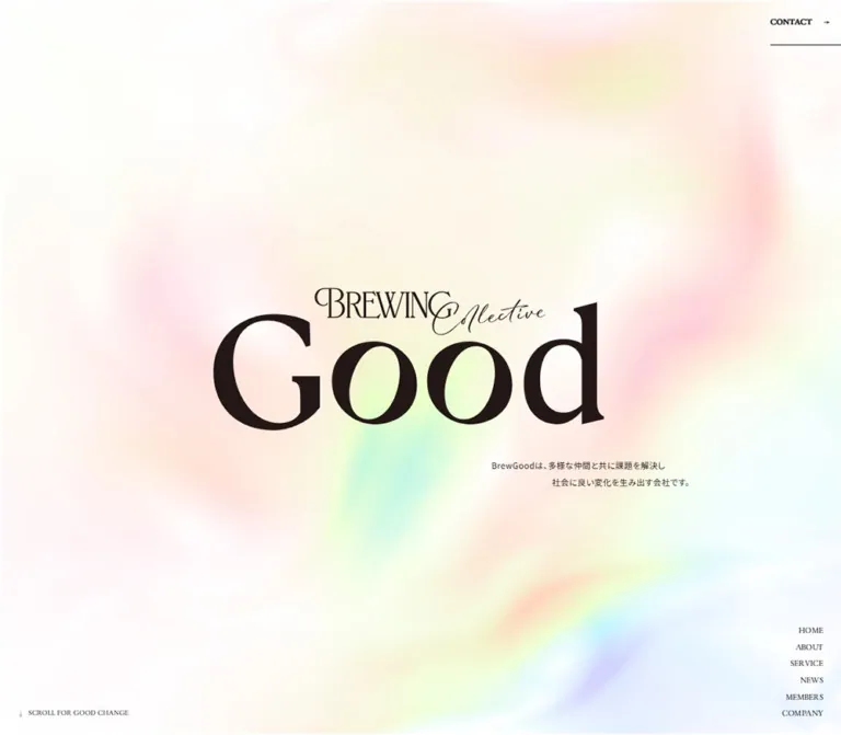
BrewGood presents its corporate identity through scale and restraint. The opening screen places a large, composed “Brewing Collective Good” mark in an almost empty white field. Small navigation labels occupy the edges; a short Japanese explanation sits below the mark. Further down, enormous English serif headings accompany much smaller Japanese prose. Thin rules and a single black contact bar provide structure without introducing a general card system.
The page is a corporate homepage with several routes and a substantial editorial sequence: About, services, projects, news, and contact information. Its character comes from the relationship between expansive display lettering and compact information. Preserve that hierarchy, the changing column widths, and the generous vertical pacing when adapting the design.
How to Read This Reference
- Measured means a value is present in the supplied rendered DOM or computed-style evidence. Values are rounded to useful precision unless a decimal explains alignment.
- Visual estimate means a dimension, color impression, or shape is inferred from the supplied current screenshots. It is not a sampled source declaration.
- Calculated means a value is derived from measured coordinates or colors; the calculation is identified.
- Recommendation means guidance for a new implementation. This includes the Quick Start breakpoint, interpolation formulas, accessible control sizes, and unverified hover treatments.
- Font-family names are the computed CSS stacks. The evidence does not separately confirm downloaded font files or which face rendered every glyph.
- An element with a nonzero rectangle is not necessarily visible. The export includes menu content and header elements that do not appear in the opening captures.
- Desktop and mobile measurements establish two actual layouts. They do not reveal the original media-query thresholds or every intermediate behavior.
Tokens — Colors
Default Palette
| Name | Value | Suggested token | Evidence and role |
|---|---|---|---|
| White Canvas | #ffffff |
--color-canvas |
Measured HTML background at both viewports; also the measured News section background. Visually dominates all supplied current captures. |
| Charcoal Ink | #1b1b1b |
--color-ink |
Measured body, display-heading, paragraph, and ordinary navigation color. |
| Black Utility | #000000 |
--color-strong |
Measured default button foreground; visually the Contact Form bar and mobile circular menu surface are black. The bar fill is a screenshot observation, not the sampled anchor background. |
| Reverse White | #ffffff |
--color-on-strong |
Measured Contact Form anchor foreground and visibly the label on the black contact bar. |
| Muted Footer Caption | rgba(0, 0, 0, 0.6) |
--color-muted |
Measured mobile footer group-label color; equivalent to #666666 over white. |
| Muted Menu Caption | rgba(27, 27, 27, 0.6) |
--color-menu-muted |
Measured mobile menu-content caption color; approximately #767676 when composited over white. Menu opening was not visually tested. |
| Subdued Project Title | rgba(27, 27, 27, 0.2) |
--color-project-subdued |
Measured for desktop project titles 02–04 in the supplied state; approximately #d1d1d1 over white. These titles use full charcoal on mobile. |
| Footer Rule | Approximately #d1d1d1 |
--color-rule |
Visual estimate for the thin pale divider above the footer. Its source border color was not supplied. |
The opening mark appears slightly warmer than the ordinary charcoal text. Its actual artwork fill was not included in the element samples, so retain the authorized mark’s own color instead of assigning it an invented exact brown.
Rendered appearance and raw styles differ on layered controls. The sampled Contact Form anchors report white text and a white background, while the screenshots show white serif lettering on a black rectangle. The top Contact link similarly reports a white foreground while appearing dark. The supplied evidence does not identify the responsible descendants, pseudo-elements, or compositing. Use the screenshots for the visible result and the DOM for the measured control geometry; do not reproduce white text on a white surface.
Declared Gradient Variables
These exact custom properties exist in both viewport exports. Their visible application is unverified in the current captures.
| Source variable | Declared value | Hex equivalent | Status |
|---|---|---|---|
--gradient-1 |
rgb(241, 251, 167) |
#f1fba7 |
Declared; visible use not established |
--gradient-2 |
rgb(194, 213, 255) |
#c2d5ff |
Declared; visible use not established |
--gradient-3 |
rgb(179, 254, 221) |
#b3fedd |
Declared; visible use not established |
--gradient-4 |
rgb(175, 196, 255) |
#afc4ff |
Declared; visible use not established |
--gradient-5 |
rgb(255, 205, 223) |
#ffcddf |
Declared; visible use not established |
These declarations do not establish a visible gradient, a theme picker, or an animation. The Quick Start therefore uses the observed white surface. The exported --swiper-theme-color: #007aff is also not evidence of a visible blue accent or a functioning carousel.
Tokens — Typography
English Display and Navigation
- Computed stack:
drummond-variable, serif. - Large display weight:
300for “Brewing Collective Good,” Service, News, and Contact. - Navigation weights:
500in the opening navigation; desktop footer links use400, while mobile footer links use600. - Underlined utility-link weight:
600for About BrewGood and Learn More. - Character: large, light serif forms with strong contrast between the display scale and the small interface labels.
- Implementation alias:
--font-display.
Keep the distinction between the live three-line “Brewing Collective Good” heading and the opening composed mark. The mark combines oversized Roman lettering with smaller ornamental and script lettering. Its typography cannot be inferred solely from the live heading’s font stack.
Japanese Editorial Headings
- Computed stack:
"Shippori Mincho", serif. - Weight:
500. - Tracking:
-0.04em, measured as approximately-1.44pxat 36px,-1.28pxat 32px, and-0.96pxat 24px. - Role: Japanese service statements, numbered service headings, and project titles.
- Character: a restrained Mincho counterpoint to the large English serif headings.
Japanese Body Copy
Two body treatments are present; the source does not apply one family uniformly to every paragraph.
| Treatment | Computed stack | Measured use |
|---|---|---|
| Editorial body | "Noto Sans JP", serif |
Service introduction, planning description, project descriptions, news excerpt, and Contact paragraph |
| Inherited system body | "Hiragino Kaku Gothic ProN", "Hiragino Sans", Meiryo, sans-serif |
Body default and several other service descriptions |
Editorial paragraphs generally use 0.04em tracking. The sampled inherited service paragraphs use normal tracking. Preserve this distinction when documenting the source; a new implementation may deliberately consolidate body styles.
The serif fallback after Noto Sans JP is the supplied source stack. The Quick Start recommends Japanese system sans-serif fallbacks for more consistent rendering when the preferred font is unavailable.
Type Scale
The measured root font size is approximately 10px at both viewports: 10.0008px on desktop and 10.0004px on mobile. The original root-sizing formula was not supplied. Values below are CSS pixels, not conventional 16px-based rem values.
| Role | Desktop size / line height | Mobile size / line height | Weight and tracking |
|---|---|---|---|
| Body default | 14 / 24.08px |
14 / 24.08px |
400, normal |
| Service and Contact section heading | 140 / 140px |
58 / 58px |
Display serif, 300 |
| News heading | 140 / 280px |
58 / 116px |
Display serif, 300; unusually tall line box |
| Three-word About display | 130 / 156px |
58 / 69.6px |
Display serif, 300 |
| Japanese service introduction heading | 36 / 54px |
24 / 36px |
Mincho, 500, -0.04em |
| Numbered service heading | 32 / 41.6px |
24 / 31.2px |
Mincho, 500, -0.04em |
| Project heading | 32 / 32px |
24 / 31.2px |
Mincho, 500, -0.04em |
| Editorial body paragraph | 16 / 32px |
13 / 26px |
400, usually 0.04em |
| News pickup excerpt | 14 / 28px |
13 / 26px |
Noto Sans JP stack, 400, 0.04em |
| Service category label | 14 / 28px |
13 / 13px |
Display serif, 300 |
| Opening navigation | 14 / 28px |
13 / 23.4px |
Display serif, 500 |
| About BrewGood link | 16 / 27.52px |
15 / 25.8px |
Display serif, 600, 0.04em |
| News Learn More link | 16 / 27.52px |
15 / 25.8px |
Display serif, 600, 0.04em |
| Header Contact link | 14 / 24.08px |
14 / 24.08px |
Display serif, 600, 0.04em |
| Footer navigation | 14 / 24.08px |
14 / 28px |
Display serif, 400 desktop; 600 mobile |
| Footer group labels | 14 / 24.08px |
13 / 13px |
Display serif, 400 |
| Menu-content links, DOM only | 28 / 28px |
30 / 30px |
Display serif, 500; open state unverified |
The hero explanation looks approximately 14px on desktop and 12px on mobile, but its own computed paragraph style was not supplied. Treat those as visual estimates. Likewise, the visible Contact Form label is serif, although the sampled outer anchor reports an inherited Japanese sans-serif stack; the label’s child style was not captured.
Tokens — Spacing & Shapes
Density: low overall, with compact text inside very large white regions.
Spacing system: the measurements support several recurring scales, but no complete original spacing-token system was supplied. The aliases below are practical groupings, not recovered source variable names.
Spacing Scale
| Use | Desktop | Mobile | Evidence |
|---|---|---|---|
| Fine interface rule | Approximately 1px |
Approximately 1px |
Visual estimate |
| Underlined text-link bottom padding | 9px |
9px on About link |
Measured |
| News-row horizontal gap | 10px |
Export retains 10px; layout becomes block |
Measured |
| Header brand left inset | 30px |
20px |
Measured |
| General mobile content inset | — | 19.5–20px |
Measured; 19.5px equals 5% of 390px |
| Social-icon gap in footer | 20px |
20px |
Calculated from 20px icons separated by 40px starts |
| Service intro column gap | Approximately 80px |
Stacked | Calculated from measured column bounds |
| Service-block label to heading | Approximately 30–34px |
22px |
Calculated from measured text boxes |
| Service-block heading to paragraph | Approximately 40–50px |
22px |
Calculated from measured text boxes |
| Contact title to paragraph | Parallel columns | 28px |
Measured positions |
| Contact paragraph to button | 36px |
27px |
Calculated from measured bounds |
| Contact button to footer divider | 112px |
113px |
Desktop section padding; mobile section-to-footer gap |
| News to Contact section | Approximately 370px |
155px |
Calculated from section bounds |
Border Radius
| Element | Treatment | Evidence |
|---|---|---|
| Contact Form bar | Square corners | Screenshot and measured 0px anchor radius |
| Underlined links | No enclosing rounded surface | Screenshot |
| Ordinary text and content blocks | Measured radius 0px |
Sampled elements |
| Mobile floating menu decoration | Circular, approximately 42 × 42px |
Screenshot estimate; the sampled button rectangle is only 30 × 20px |
There is no visible pill-button language or shadow-based elevation in the supplied captures. Do not extend that observation into a claim about every unseen middle-page surface.
Layout Measurements
| Element | Desktop 1440 × 1000 | Mobile 390 × 844 | Interpretation |
|---|---|---|---|
| Document height | 13,321.33px |
13,063.83px |
Measured at capture time |
| Opening screen | Next section starts at y = 1000px |
Next section starts at y = 844px |
Exactly one inspected viewport before the next section |
| Header box | 1440 × 90px |
390 × 60px |
Measured |
| Header brand link | 120px wide at x = 30px |
104px wide at x = 20px |
Nonzero DOM bounds do not establish opening-state visibility |
| Opening composed mark | Approximately 660 × 240px |
Approximately 280 × 102px |
Visual artwork bounds, not source element dimensions |
| Opening navigation right inset | 30px |
20px |
Measured |
| About display container | Approximately 800px wide |
351px wide |
Measured |
| About narrative section height | 6000.47px |
5000.19px |
Large scroll allocation; behavior not established |
| Service intro text column | 492.55px wide at x = 759.98px |
351px wide at x = 19.5px |
Two-column desktop introduction becomes stacked |
| Typical numbered-service prose | 560.03px wide at x = 439.98px |
260px wide at x = 65px |
A deliberately narrower inner column |
| Project link width | 576.56px |
351px |
Measured |
| News list width | 800.06px at x = 522.34px |
350px at x = 20px |
Right-offset desktop rail becomes nearly full-width mobile |
| Contact paragraph and CTA | 436.67px at x = 799.86px |
351px at x = 19.5px |
Measured |
| Contact Form CTA height | 48px |
48px |
Measured main-page CTA |
| Footer outer divider | Approximately 1280px, with 80px side margins |
Approximately 366px, with 12px side margins |
Screenshot estimate; inner mobile text is further inset |
| Footer section height | 255.80px |
475.19px |
Measured; excludes the mobile gap above the footer |
The source is not governed by one universal content width. Its footer, service introduction, service prose, project entries, news rail, and contact column use different alignments. Those shifts are central to the composition.
Components
Global Header
Role: keeps the contact route available and introduces compact identity and menu controls in the scrolled captures.
The desktop header has three separated anchors: the BrewGood wordmark at the upper left, a two-line menu symbol near the horizontal center, and an underlined Contact link at the far right. It has no visible enclosing panel or full-width bottom rule. Only the contact link carries a local underline.
The measured desktop brand link starts at (30, 27) and is 120px wide. The menu button rectangle is approximately (705, 30, 30, 20). On mobile, the brand starts at (20, 14.5) and is 104px wide; the header height decreases from 90px to 60px.
In the opening screenshots, the left wordmark and menu control are not visible, while Contact is visible. They appear in the lower-page captures. This is evidence of a visibility difference across supplied states, not proof of the original trigger or exact transition sequence.
The Contact link’s sampled box extends about 20px beyond the right viewport edge at both sizes. The visible underline reaches the edge. Reproduce the edge alignment without introducing horizontal page overflow; do not copy the out-of-bounds rectangle mechanically.
Opening Identity Hero
Role: communicates the company’s central phrase before detailed business content.
Use a viewport-height white region. The central mark is a composed graphic: “Good” dominates, while “Brewing” and script “Collective” overlap above it. In the desktop capture, its visible bounds are approximately 660 × 240px, centered slightly left of the viewport center. On mobile, the mark is approximately 280 × 102px and occupies about 72% of the screen width.
The explanation reads:
BrewGoodは、多様な仲間と共に課題を解決し
社会に良い変化を生み出す会社です。
On desktop, this two-line paragraph sits below and to the right of the mark, beginning around x = 840px. On mobile, it becomes centered beneath the mark. The opening contains no large filled CTA next to the identity; the small Contact route and edge navigation provide access.
For an implementation, preserve the original mark as authorized artwork. Do not approximate its script and ornamental lettering with an arbitrary display font and claim fidelity.
Opening Navigation and Scroll Cue
Role: provides a compact site index while preserving the open central field.
The six links are HOME, ABOUT, SERVICE, NEWS, MEMBERS, and COMPANY. They form a right-aligned vertical stack near the bottom-right corner at both viewports. Desktop links use 14px type with 28px line height; mobile links use 13px type with 23.4px line height.
On desktop the stack ends approximately 21px above the viewport bottom; on mobile it ends approximately 7px above it. The mobile layout retains these visible navigation links instead of replacing the opening screen with only a hamburger.
“SCROLL FOR GOOD CHANGE” sits at the lower left. A small downward arrow is visible in the mobile capture. Its animation and whether the cue is clickable were not established.
The repeated strings such as HOMEHOME in the DOM export do not represent twelve visible navigation items. The captures show one label per route. Layered text is a possible explanation, but a rollover effect was not exercised.
Menu Content — DOM Evidence Only
Role: the exported markup contains a larger navigation composition with Content, Social, and Contact Form areas.
The measured desktop menu links form two columns and three rows at 28px. Mobile menu links form one column at 30px, with approximately 62px between successive row starts. A Contact Form link and Facebook/note links follow.
This structure is present in the DOM but is not shown as an opened menu in the supplied screenshots. Its background, entrance direction, focus behavior, scroll locking, and dismissal interaction remain unverified. It should not be treated as an observed modal specification.
About Narrative and Three-Word Display
Role: develops the company’s purpose through a long section and a large typographic composition.
The rendered content includes a Japanese statement about co-creation and problem solving, followed by “Brewing Collective Good.” The supplied desktop About capture shows these three English words stepping diagonally across a broad central region: Brewing to the left, Collective nearer the middle, and Good toward the right.
The live heading uses the display-serif stack at 130px, weight 300, with a 156px line height. Its measured container is approximately 800px wide and 428px tall. The height is not simply three independent 156px rows, so a naive three-line text block will not exactly reproduce the arrangement.
The underlined About BrewGood link is 160px wide and sits beneath the composition. On mobile, the heading remains in the measured DOM at 58px within a 351px container, although no matching middle-page mobile screenshot was supplied. Its absence from one flattened text summary does not prove that the element is removed.
The narrative section occupies approximately 6000px on desktop and 5000px on mobile. This establishes substantial scroll allocation, but not a specific pinning, scrubbing, or reveal implementation. Do not recreate it as thousands of empty pixels without a verified narrative sequence.
Service Introduction
Role: introduces the company’s service range before the numbered details.
At desktop width, an enormous “Service” heading occupies the left side. A Japanese Mincho statement, a paragraph, and Learn More occupy a right column approximately 493px wide. The left and right columns are separated by about 80px.
The Japanese statement is 36px with 54px leading and negative tracking. Its paragraph uses 16px type with 32px leading. The underlined Learn More link measures 150px wide.
On mobile, the title, Japanese statement, and paragraph stack within a 351px column. Type decreases to 58px for Service, 24px for the Japanese heading, and 13px for the paragraph. The measured gap between the Service line box and Japanese heading is 14px; the heading-to-paragraph gap is 18px.
The visible-text and link evidence places the mobile service Learn More after the project sequence rather than immediately under this introduction. Its behavior and complete visual treatment were not tested.
Numbered Service Block
Role: explains four capabilities without reducing them to short promotional cards.
The content sequence is:
- PLANNING — regional and new-business planning.
- BRANDING & MARKETING — brand and marketing support.
- TRAINING PROGRAMS — practical training.
- HOPS R&D AND BREWING — hops research and brewing.
Each block contains a two-digit number, a small English category, a Japanese Mincho heading, and explanatory Japanese prose. Number styling was not individually sampled, so no exact numeral scale is asserted.
Most desktop prose columns are approximately 560px wide and centered. Some headings use wider containers: Branding spans approximately 920px, and the hops heading spans approximately 720px. This permits headings to extend beyond the narrower reading column.
On mobile, these blocks use a 260px inner column with 65px side margins. The Japanese headings use 24px type and 31.2px leading; the paragraphs use 13px type and 26px leading. A 22px gap separates the category from the heading and the heading from the paragraph. This narrower measure distinguishes detailed service explanations from the wider introduction and project sections.
The evidence establishes hierarchy and geometry. It does not establish the full visual treatment of surrounding artwork or section backgrounds.
Our Projects
Role: connects capabilities to four named initiatives.
The entries are ビールの里構想, GOOD HOPS, TONO Japan Hop Country, and 視察・研修の受け入れ. Each link contains a number, a project title, an English service category, and a description in the supplied content.
The measured desktop state is compact and uneven: the first link is approximately 212px tall, while the next three are 84px tall. Titles 02–04 use charcoal at 20% alpha. Descriptions remain present in the DOM, with some bounds extending beyond the corresponding compact link rectangle. This may reflect stateful presentation or clipping, but it is insufficient evidence to specify an accordion, hover preview, or image switcher.
Mobile entries are substantially taller: approximately 659px, 657px, 690px, and 659px, all at 351px wide. Their titles use full charcoal. The long TONO Japan Hop Country title wraps across two lines. Descriptions are inset to x = 49.5px and use a 321px measure.
A large interval separates mobile titles from their descriptions. The supplied evidence does not identify the contents of that interval. Do not invent photographs, image aspect ratios, or media interactions to fill it.
News Pickup and List
Role: combines one featured announcement with a chronological list of other updates.
The section contains a large News heading, a Pickup label, one featured link with date, category, title, and excerpt, followed by five additional news links and Learn More. The featured item is dated December 31, 2025, while the list begins with May 21, 2026; featured placement is therefore distinct from simple newest-first ordering.
On desktop, the News heading begins near x = 96px, while the list begins at x = 522px and is approximately 800px wide. The featured link has a 560px-wide measured region. This creates a left display heading beside an offset editorial rail.
The regular desktop links use flex layout with approximately 28px top and 32px bottom padding; their measured heights are approximately 186–187px. On mobile they become block elements with about 19px top and 18px bottom padding, producing content-dependent heights of approximately 85–110px.
The mobile list is 350px wide at x = 20px. The pickup region is narrower, at 300px. No supplied middle-page screenshot establishes the pickup’s image content or full media treatment.
Underlined Arrow Link
Role: provides secondary navigation with minimal visual weight.
About BrewGood and the desktop service Learn More use a serif label on the left, a small right arrow on the right, and a thin bottom rule. The About link is 160px wide; the service link is 150px wide. Both use 16px type, weight 600, 0.04em tracking, and 9px bottom padding on desktop.
Keep the rule local to the link, not across the entire section. Use the arrow as a separate decorative element so the label remains a clear accessible name. A 400ms transition is declared on these anchors, but its complete visual endpoint was not captured.
Contact Section and Contact Form Bar
Role: closes the business narrative with a clear route for service inquiries, media requests, visits, lectures, and collaboration.
On desktop, “Contact” is a 140px serif heading on the left. A 436.67px column on the right contains four 32px-high lines of Japanese prose, then a 48px-high black bar. The paragraph starts 28px below the top of the section. There is a 36px gap from the paragraph’s bottom to the CTA.
The bar’s anatomy is unusually restrained: a broad empty area on the left, “CONTACT FORM” toward the right, a short vertical dotted divider, and a right arrow in a narrow terminal area. It has square corners and no visible shadow. It links to /contact/; the contact form itself was not inspected.
On mobile, the heading, paragraph, and bar stack within a 351px column. The heading is 58px; the paragraph is 13px with 26px leading. The title-to-paragraph gap is 28px, followed by 27px before the bar. The CTA retains its 48px height and right-weighted internal composition.
The mobile bottom capture partially cuts off the Contact heading at the viewport top, where the header wordmark overlaps it. This is a captured scroll position near the document end, not evidence that the heading should be intentionally cropped in normal layout.
Footer
Role: supplies company identity, physical address, repeated navigation, and social destinations.
A thin pale rule separates the footer from the contact region. The original page identifies the operator as 株式会社BrewGood and prints its address in Tono, Iwate. This is independently supported by the homepage footer.
On desktop, the wordmark and address occupy the left side; Content begins near x = 800px; Social begins near x = 1164px. The six navigation links form three columns and two rows. The footer brand link is measured at 172px wide, though its inline rectangle does not capture the complete visible artwork height.
On mobile, the 120px-wide brand and address sit above two parallel groups: Content at x = 19.5px and Social at x = 204px. Content becomes a six-row vertical list, using 14px serif type and 28px leading. Facebook and note marks retain 20 × 20px link boxes and sit 40px apart by their left edges.
The copyright moves to the lower-left portion of the footer. A black circular menu decoration appears at the viewport’s lower right in the mobile bottom capture. Its visual diameter is approximately 42px; the DOM button’s smaller rectangle should not be treated as a recommended touch target.
Tokens — Motion & Interaction
| Treatment | Supplied style or observation | What can be concluded |
|---|---|---|
| Ordinary anchors | border 0.1s, background 0.1s, color 0.1s |
These properties have a declared 100ms transition; actual hover endpoints were not exercised. |
| Header Contact, About, and Learn More anchors | 0.4s |
A 400ms transition is declared; the export does not fully describe its properties or easing. |
| Menu button | opacity 0.6s, visibility 0.6s |
Supports a defined visibility transition. The original trigger was not captured. |
| Contact Form anchor | background 1.2s |
A 1200ms background transition is declared; the complete layered visual mechanism is unknown. |
| Sampled element animations | animation: none |
No named CSS animation was reported on these sampled elements at that state. This does not exclude JavaScript, pseudo-element, or unsampled animation. |
| Header visibility | Brand and menu absent in opening captures, present in lower captures | A state difference is visible, but timing and scroll threshold are unverified. |
| Repeated navigation text | Duplicate strings in DOM, single labels in screenshots | Possible layered presentation; no demonstrated rollover behavior. |
| Long About section | Approximately 6000px desktop and 5000px mobile | Large scroll allocation is measured; no specific scroll-linked choreography is proven. |
| Navigation and CTA destinations | Rendered href values |
Links exist; successful destination navigation and form behavior were not tested. |
Verified Link Structure
| Visible label | Original-page destination |
|---|---|
| HOME | https://brewgood.jp/ |
| ABOUT / About BrewGood | https://brewgood.jp/about/ |
| SERVICE | https://brewgood.jp/service/ |
| NEWS | https://brewgood.jp/news/ |
| MEMBERS | https://brewgood.jp/about#member/ |
| COMPANY | https://brewgood.jp/about#company/ |
| CONTACT / CONTACT FORM | https://brewgood.jp/contact/ |
The fragment spelling above is preserved from the rendered links; target resolution was not checked. Project links likewise target service-page fragments rather than proving in-place expansion.
Recommended motion direction: keep ordinary interaction feedback small and subordinate to typography. Preserve any verified narrative behavior only after its sequence has been separately observed. Do not add automatic marquees, parallax, animated color fields, or carousel behavior on the basis of variable names or static composition alone.
Surfaces
| Layer | Observed appearance | Practical role |
|---|---|---|
| Main canvas | White | Provides the large negative spaces around identity and section typography |
| Header | Visually open, without an enclosing panel in the captures | Places identity and controls over the page field |
| Editorial content | Primarily text on the canvas in the supplied visible regions | Establishes hierarchy through width, alignment, and type scale |
| Contact Form bar | Black rectangle with white label | Strongest visible action surface |
| Footer | White with a pale top rule | Separates company details from the contact invitation |
| Mobile menu decoration | Black circle with thin light lines | Compact lower-right control treatment |
| Open menu | Not visually supplied | Do not assign an observed backdrop or surface treatment |
No visible shadow hierarchy is needed to reproduce the documented opening and closing regions. The middle-page evidence is not complete enough to catalog every surface there.
Imagery
The supplied current screenshots are dominated by lettering. The opening mark functions as the principal artwork: a large “Good,” a smaller ornamental “Brewing,” and script “Collective.” The header and footer use a simpler BrewGood wordmark. These are separate identity roles, not interchangeable uses of one heading style.
The visible utility graphics are sparse: thin directional arrows, a two-line menu symbol, Facebook and note marks, and a dotted divider inside the contact bar. No raster texture, photograph, or project image can be reliably described from the supplied visible regions.
Observed Asset References
No original asset URLs or filenames were included in the supplied evidence. The following are visible roles, not an invented asset manifest.
| Asset role | Evidence | Implementation guidance |
|---|---|---|
| Opening composed identity | Desktop and mobile opening captures | Use authorized original artwork; preserve its lettering relationships and approximate 2.75:1 visible proportions. |
| Header BrewGood wordmark | Lower-page desktop and mobile captures | Preserve the compact horizontal mark; measured link widths are 120px desktop and 104px mobile. |
| Footer BrewGood wordmark | Footer captures | Use the larger footer treatment: measured link widths 172px desktop and 120px mobile. |
| Facebook and note marks | Footer captures and corresponding rendered links | Retain recognizable marks; provide accessible destination names. |
| Arrow and menu linework | Opening, header, contact, and mobile footer captures | Simple CSS or SVG is a suitable recommendation; the original asset format is unverified. |
| Project and pickup media | Content regions exist, but imagery is not supplied | Obtain direct media evidence before specifying subjects, crops, aspect ratios, or animation. |
A new implementation should remain coherent when optional media is absent. Do not fill unknown regions with generic brewery, hop-field, workshop, or team photography and present it as an observed design choice.
Layout & Responsive Behavior
The desktop layout combines several spatial systems. The opening is viewport-based; the About phrase sits in an approximately 800px region; the service introduction spans two roughly 493px columns; detailed service prose narrows to 560px; the news list shifts right; the contact paragraph narrows again to approximately 437px. The footer then opens to approximately 1280px.
Mobile does more than shrink this system. It centers the hero explanation, stacks introduction and contact columns, narrows service details to 260px, expands project entries vertically, changes news rows from flex to block layout, and reorganizes the footer.
| Feature | Desktop observation | Mobile observation |
|---|---|---|
| Hero mark | Approximately 46% of viewport width | Approximately 72% of viewport width |
| Hero explanation | Below and right of the mark | Centered below the mark |
| Opening site index | Lower-right vertical list | Lower-right vertical list retained |
| Large section title | 140px | 58px |
| Service introduction | Large heading left, statement and prose right | One stacked 351px column |
| Detailed service prose | Usually 560px wide | 260px wide, noticeably inset |
| Projects | First entry taller; later titles subdued in measured state | All entries tall; titles use full charcoal |
| News rows | 800px rail, flex layout | 350px rail, block layout |
| Contact | Display title and prose in separate columns | Title, prose, and CTA stacked |
| Footer navigation | Three columns, two rows | One column, six rows |
| Menu control in lower capture | Small central header linework | Circular decoration near viewport bottom-right |
The mobile document is only about 257.5px shorter than the desktop document despite the radically narrower viewport. The shorter About allocation is offset by the taller mobile service/project sequence. Do not equate mobile adaptation with uniformly reducing all vertical spacing.
Recommended breakpoint: the Quick Start uses 48rem as an implementation choice. It is not the recovered original breakpoint. Test intermediate widths, landscape phones, browser zoom, long Japanese strings, and font-loading changes independently.
Do’s and Don’ts
Do
- Use white as the current observed canvas and charcoal as the default text color.
- Preserve the opening mark as composed artwork rather than ordinary headline text.
- Keep English section headings dramatically larger than Japanese body copy.
- Pair the declared English display-serif treatment with Japanese Mincho headings and readable Japanese sans-serif prose.
- Preserve the distinct widths of the introduction, service prose, news rail, and contact column.
- Retain the lower-right opening navigation on mobile.
- Use thin local underlines and small arrows for secondary links.
- Keep the Contact Form bar square, black, 48px high, and visually weighted toward its right side.
- Maintain the footer’s company, navigation, and social groupings through the mobile reflow.
- Treat computed values, screenshot estimates, and implementation recommendations as separate evidence levels.
Don’t
- Don’t recast the corporate homepage as a single-purpose conversion page with repeated large buttons.
- Don’t replace its staggered editorial layout with a uniform rounded-card grid.
- Don’t apply the declared pastel variables as a visible background without current visual confirmation.
- Don’t assume the opening mark uses the same font as the live About heading.
- Don’t infer a carousel from a Swiper variable or an accordion from compact project rectangles.
- Don’t render duplicate navigation labels because the text export repeats them.
- Don’t copy white-on-white raw anchor styles when the actual control renders as a black bar.
- Don’t manufacture project imagery or unknown asset paths.
- Don’t copy the long narrative section as empty fixed-height space.
- Don’t reproduce the mobile end-capture heading overlap as an intentional layout feature.
- Don’t copy 10px-root source dimensions into a 16px-root project without converting units.
Recommended Implementation Additions
These are recommendations for a new implementation, not verified features of the original website:
- Give the menu button an explicit accessible name and connect its state with
aria-expandedandaria-controls. - If the menu behaves as an overlay, implement keyboard access, Escape dismissal, focus return, and appropriate background interaction handling.
- Keep visible linework compact while increasing icon-control hit areas to at least 44 × 44px. The original sampled menu rectangle is smaller.
- Give brand links and social links meaningful accessible names. Empty exported text alone does not prove that the original accessible name is missing.
- Add a visible focus outline that works on both white surfaces and the black contact bar.
- Consider 14–15px mobile prose where the measured 13px becomes difficult to read; retain generous leading and the hierarchy.
- Ensure subdued project styling does not make essential information depend on low contrast. Preserve a usable focus and selected state.
- Provide a complete normal-flow narrative when animation is unavailable or reduced motion is requested.
- Use stable image dimensions and meaningful alternatives once verified project assets are available.
- Test fixed controls and section anchors so headings remain readable beneath the header.
- Validate any time-sensitive business statements before reusing the copy; rendered content includes both recent news and older forward-looking project wording.
Agent Prompt Guide
Quick Color Reference
- Canvas:
#ffffff. - Main type:
#1b1b1b. - Strong action surface: visually black,
#000000as a direct-color adaptation. - Reversed action label:
#ffffff. - Mobile footer captions: source
rgba(0, 0, 0, 0.6). - Pale footer rule: approximately
#d1d1d1, a visual estimate. - Declared pastel variables: document them separately; do not apply them as an observed surface.
Overall Prompt
“Create a corporate homepage inspired by the documented current BrewGood composition. Use a white canvas, charcoal text, exceptionally large light English serif headings, Japanese Mincho subheadings, and small Japanese sans-serif paragraphs with generous leading. Begin with a full-viewport identity region using approved composed brand artwork, a short explanation, a small underlined Contact link at the upper right, and a six-link vertical site index at the lower right. Build an editorial sequence of About, services, projects, news, and contact using different column widths and substantial white space. Finish with a 48px-high black contact bar and a quiet ruled footer. At 390px width, stack the major content columns, use 58px section titles, retain the opening site index, and turn footer navigation into a vertical list. Do not invent unverified images, gradients, or scroll effects.”
Example Component Prompts
- Opening identity: “A white 1440 × 1000 opening screen with approved Brewing Collective Good artwork approximately 660px wide near the center. Place a small two-line Japanese explanation below and to its right, a local underlined Contact link at the upper-right edge, a six-item serif navigation stack at the lower right, and a restrained scroll cue at the lower left. On a 390 × 844 phone, make the mark approximately 280px wide and center the explanation beneath it.”
- Service introduction: “Use a 140px light English serif Service heading on the left and a roughly 493px right column containing a 36px Japanese Mincho heading, 16px body copy at 32px leading, and a 150px underlined Learn More link. On mobile, stack everything within 90% width and reduce the hierarchy to 58px, 24px, and 13px respectively.”
- Numbered service: “Create a numbered capability block with a small uppercase English category, a Japanese Mincho heading, and generous Japanese prose. Use a centered 560px reading column on desktop and a deliberately narrower 260px column on a 390px phone. Keep mobile category-to-heading and heading-to-copy gaps at 22px. Do not turn it into a rounded card.”
- Contact: “Place a huge light serif Contact heading beside a 437px Japanese text column. Below the copy, add a square black bar 48px high with CONTACT FORM toward the right, a short dotted vertical divider, and a narrow arrow area. On mobile, use a 351px stacked column and retain the bar height.”
- Footer: “Create a white footer separated by a thin pale rule. Put the BrewGood identity and address left, six serif links in a three-column arrangement toward the right, and small Facebook and note marks farther right. On mobile, place identity first, then parallel Content and Social groups, with the navigation reduced to a single vertical list.”
Quick Start
CSS Custom Properties
This is a recommended static adaptation, not recovered source CSS. It uses ordinary pixel tokens with a conventional root size. It reproduces the documented hierarchy and opening/closing layouts without inventing the long section’s animation. The 48rem breakpoint, fluid interpolation, hover endpoints, and 44px menu target are implementation choices.
Load the declared fonts only when available and appropriately licensed. No font-file URL or brand-asset URL was supplied. The hero and brand classes expect approved artwork supplied by the implementation.
:root {
  /* Measured colors, with a screenshot-based divider approximation. */
  --color-canvas: #ffffff;
  --color-ink: #1b1b1b;
  --color-strong: #000000;
  --color-on-strong: #ffffff;
  --color-muted: rgb(0 0 0 / 0.6);
  --color-rule: #d1d1d1;

  /* Source family names; Japanese body fallbacks are recommended. */
  --font-display: "drummond-variable", serif;
  --font-heading-ja: "Shippori Mincho", serif;
  --font-body: "Noto Sans JP", "Hiragino Kaku Gothic ProN",
    "Hiragino Sans", Meiryo, sans-serif;

  /* Endpoint-based interpolation, not the original sizing formula. */
  --text-section: clamp(58px, 9.7222vw, 140px);
  --text-phrase: clamp(58px, 9.0278vw, 130px);
  --text-intro-ja: 36px;
  --text-service-ja: 32px;
  --text-body: 16px;
  --text-nav: 14px;
  --leading-body: 2;
  --tracking-body: 0.04em;
  --tracking-heading-ja: -0.04em;

  --width-editorial: 1065px;
  --width-prose: 560px;
  --width-news: 800px;
  --width-contact: 436.67px;
  --width-footer: 1280px;
  --header-height: 90px;
  --cta-height: 48px;
  --rule-width: 1px;

  --motion-link: 400ms;
  --motion-chrome: 600ms;
  --motion-cta: 1200ms;
}

* {
  box-sizing: border-box;
}

body {
  margin: 0;
  color: var(--color-ink);
  background: var(--color-canvas);
  font-family: var(--font-body);
  font-size: 14px;
  line-height: 1.72;
}

a {
  color: inherit;
}

button {
  font: inherit;
}

img,
svg {
  max-inline-size: 100%;
}

.site-header {
  position: fixed;
  inset: 0 0 auto;
  block-size: var(--header-height);
  z-index: 20;
  pointer-events: none;
}

.site-header a,
.site-header button {
  pointer-events: auto;
}

.site-brand {
  position: absolute;
  inset-block-start: 27px;
  inset-inline-start: 30px;
  inline-size: 120px;
}

.site-brand img,
.footer-brand img {
  display: block;
  inline-size: 100%;
  block-size: auto;
}

.header-contact {
  position: absolute;
  inset-block-start: 27px;
  inset-inline-end: 0;
  display: flex;
  align-items: center;
  justify-content: space-between;
  inline-size: 120px;
  min-block-size: 44px;
  padding: 0 20px 25px 0;
  border-block-end: 1px solid currentColor;
  font: 600 14px / 1.72 var(--font-display);
  letter-spacing: 0.04em;
  text-decoration: none;
  text-transform: uppercase;
}

.menu-toggle {
  position: absolute;
  inset-block-start: 18px;
  inset-inline-start: 50%;
  display: grid;
  place-content: center;
  gap: 5px;
  inline-size: 44px;
  block-size: 44px;
  padding: 0;
  border: 0;
  color: var(--color-strong);
  background: transparent;
  transform: translateX(-50%);
  cursor: pointer;
}

.menu-toggle span {
  display: block;
  inline-size: 30px;
  block-size: 1px;
  background: currentColor;
}

.site-brand,
.menu-toggle {
  transition: opacity var(--motion-chrome),
    visibility var(--motion-chrome);
}

/* Optional application state; the original trigger is unverified. */
.site-header.is-opening .site-brand,
.site-header.is-opening .menu-toggle {
  visibility: hidden;
  opacity: 0;
}

.hero {
  position: relative;
  min-block-size: 100vh;
  min-block-size: 100svh;
}

/* Screenshot-based placement for approved composed artwork. */
.hero-mark {
  position: absolute;
  inset-block-start: 48.6%;
  inset-inline-start: 50%;
  inline-size: min(45.833vw, 660px);
  transform: translate(-53%, -50%);
}

.hero-mark img,
.hero-mark svg {
  display: block;
  inline-size: 100%;
  block-size: auto;
}

.hero-copy {
  position: absolute;
  inset-block-start: 65.4%;
  inset-inline-start: 58.333%;
  inline-size: 340px;
  max-inline-size: 36vw;
  margin: 0;
  font-size: 14px;
  line-height: 2;
  text-align: right;
}

.hero-nav {
  position: absolute;
  inset-inline-end: 30px;
  inset-block-end: 21px;
  display: flex;
  flex-direction: column;
  align-items: flex-end;
  font: 500 14px / 28px var(--font-display);
}

.hero-nav a {
  text-decoration: none;
}

.scroll-cue {
  position: absolute;
  inset-inline-start: 48px;
  inset-block-end: 30px;
  margin: 0;
  font: 400 12px / 1.2 var(--font-display);
  text-transform: uppercase;
}

.editorial-container {
  inline-size: min(90%, var(--width-editorial));
  margin-inline: auto;
}

.about-words {
  display: grid;
  inline-size: min(90%, 800px);
  margin: 0 auto;
  font: 300 var(--text-phrase) / 1.2 var(--font-display);
}

.about-words span:nth-child(2) {
  justify-self: center;
}

.about-words span:nth-child(3) {
  justify-self: end;
  margin-block-start: -0.3em;
}

.section-title {
  inline-size: fit-content;
  margin: 0;
  font: 300 var(--text-section) / 1 var(--font-display);
}

.service-intro {
  display: grid;
  grid-template-columns: repeat(2, minmax(0, 1fr));
  gap: 80px;
}

.heading-ja {
  margin: 0;
  font: 500 var(--text-intro-ja) / 1.5 var(--font-heading-ja);
  letter-spacing: var(--tracking-heading-ja);
}

.editorial-copy {
  margin: 0;
  font-size: var(--text-body);
  line-height: var(--leading-body);
  letter-spacing: var(--tracking-body);
  overflow-wrap: anywhere;
}

.service-intro .editorial-copy {
  margin-block-start: 40px;
}

.service-block {
  inline-size: min(90%, var(--width-prose));
  margin: 120px auto 0;
}

.service-category {
  margin: 0 0 32px;
  font: 300 14px / 28px var(--font-display);
  text-transform: uppercase;
}

.service-block .heading-ja {
  font-size: var(--text-service-ja);
  line-height: 1.3;
}

.service-block .editorial-copy {
  margin-block-start: 40px;
}

.text-link {
  display: inline-flex;
  align-items: center;
  justify-content: space-between;
  gap: 20px;
  inline-size: 160px;
  padding-block-end: 9px;
  border-block-end: 1px solid currentColor;
  font: 600 16px / 1.72 var(--font-display);
  letter-spacing: 0.04em;
  text-decoration: none;
  transition: opacity var(--motion-link);
}

.news-list {
  inline-size: min(90%, var(--width-news));
  margin-inline: auto max(5%, calc((100vw - 1205px) / 2));
}

.news-row {
  display: flex;
  gap: 10px;
  padding-block: 28px 32px;
  color: inherit;
  text-decoration: none;
}

/* Normal-flow contact layout; no invented scroll choreography. */
.contact {
  display: grid;
  grid-template-columns: minmax(0, 1fr)
    minmax(0, var(--width-contact));
  column-gap: 80px;
  inline-size: min(90%, var(--width-editorial));
  margin: 370px auto 0;
  padding-inline-end: 16px;
  padding-block-end: 112px;
}

.contact-body {
  min-inline-size: 0;
  padding-block-start: 28px;
}

.contact-link {
  display: flex;
  align-items: center;
  justify-content: flex-end;
  gap: 24px;
  min-block-size: var(--cta-height);
  margin-block-start: 36px;
  padding-inline-start: 16px;
  border-radius: 0;
  color: var(--color-on-strong);
  background: var(--color-strong);
  font: 400 16px / 1.2 var(--font-display);
  text-decoration: none;
  text-transform: uppercase;
  transition: background-color var(--motion-cta);
}

.cta-arrow {
  display: grid;
  place-items: center;
  flex: 0 0 52px;
  block-size: 22px;
  border-inline-start: 1px dotted rgb(255 255 255 / 0.4);
}

.site-footer {
  inline-size: min(94%, var(--width-footer));
  margin-inline: auto;
  padding-block: 60px;
  border-block-start: 1px solid var(--color-rule);
}

.footer-grid {
  display: grid;
  grid-template-columns: 56.25% 28.48% minmax(0, 1fr);
}

.footer-brand {
  display: block;
  inline-size: 172px;
}

.footer-address {
  margin-block-start: 26px;
  font-size: 12px;
  font-style: normal;
  line-height: 1.5;
}

.footer-label {
  margin: 0 0 31px;
  font: 400 14px / 1.72 var(--font-display);
}

.footer-nav {
  display: grid;
  grid-template-columns: repeat(3, max-content);
  column-gap: 34px;
  row-gap: 2px;
  font: 400 14px / 24px var(--font-display);
}

.footer-nav a {
  text-decoration: none;
}

.social-links {
  display: flex;
  gap: 20px;
}

.social-links a {
  display: block;
  inline-size: 20px;
  block-size: 20px;
}

.footer-copyright {
  margin: 24px 0 0;
  font-size: 12px;
}

/* Recommended focus and hover states, not captured originals. */
:where(a, button):focus-visible {
  outline: 2px solid currentColor;
  outline-offset: 4px;
}

.contact-link:focus-visible {
  outline-color: var(--color-ink);
}

@media (hover: hover) {
  .text-link:hover {
    opacity: 0.65;
  }

  .contact-link:hover {
    background-color: var(--color-ink);
  }
}

@media (max-width: 48rem) {
  :root {
    --header-height: 60px;
    --text-section: 58px;
    --text-phrase: 58px;
    --text-intro-ja: 24px;
    --text-service-ja: 24px;
    --text-body: 13px;
    --text-nav: 13px;
  }

  .site-brand {
    inset-block-start: 14.5px;
    inset-inline-start: 20px;
    inline-size: 104px;
  }

  .header-contact {
    inset-block-start: 12px;
    inline-size: 110px;
    padding-block-end: 12px;
  }

  .menu-toggle {
    position: fixed;
    inset: auto 12px calc(8px + env(safe-area-inset-bottom, 0px)) auto;
    border-radius: 50%;
    color: white;
    background: black;
    transform: none;
  }

  .menu-toggle span {
    inline-size: 16px;
  }

  .hero-mark {
    inset-block-start: 45%;
    inline-size: 71.8%;
    transform: translate(-52%, -50%);
  }

  .hero-copy {
    inset-block-start: 54.9%;
    inset-inline-start: 50%;
    inline-size: calc(100% - 40px);
    max-inline-size: 350px;
    font-size: 12px;
    text-align: center;
    transform: translateX(-50%);
  }

  .hero-nav {
    inset-inline-end: 20px;
    inset-block-end: 7px;
    font-size: 13px;
    line-height: 23.4px;
  }

  .scroll-cue {
    inset-inline-start: 20px;
    inset-block-end: 14px;
    font-size: 11px;
  }

  .about-words span:nth-child(3) {
    margin-block-start: -0.17em;
  }

  .service-intro {
    grid-template-columns: minmax(0, 1fr);
    gap: 14px;
  }

  .service-intro .editorial-copy {
    margin-block-start: 18px;
  }

  .service-block {
    inline-size: min(66.667%, 560px);
    margin-block-start: 108px;
  }

  .service-category {
    margin-block-end: 22px;
    font-size: 13px;
    line-height: 1;
  }

  .service-block .editorial-copy {
    margin-block-start: 22px;
  }

  .text-link {
    font-size: 15px;
  }

  .news-list {
    inline-size: calc(100% - 40px);
    margin-inline: auto;
  }

  .news-row {
    display: block;
    padding-block: 19px 18px;
  }

  .contact {
    grid-template-columns: minmax(0, 1fr);
    gap: 28px;
    margin-block-start: 155px;
    padding: 0;
  }

  .contact-body {
    padding-block-start: 0;
  }

  .contact-link {
    margin-block-start: 27px;
  }

  .site-footer {
    margin-block-start: 113px;
    padding: 44px 2vw 46px;
  }

  .footer-grid {
    grid-template-columns: repeat(2, minmax(0, 1fr));
    gap: 42px 18px;
  }

  .footer-identity {
    grid-column: 1 / -1;
  }

  .footer-brand {
    inline-size: 120px;
  }

  .footer-label {
    margin-block-end: 20px;
    color: var(--color-muted);
    font-size: 13px;
    line-height: 1;
  }

  .footer-nav {
    grid-template-columns: max-content;
    gap: 0;
    font-size: 14px;
    font-weight: 600;
    line-height: 28px;
  }

  .footer-copyright {
    margin-block-start: 44px;
    color: var(--color-muted);
    font-size: 10px;
  }
}

@media (prefers-reduced-motion: reduce) {
  .site-brand,
  .menu-toggle,
  .text-link,
  .contact-link {
    transition: none;
  }
}
The CSS intentionally does not create an unverified project accordion, menu panel, media region, or 5000–6000px narrative spacer. Add those only when their content and behavior are specified. The opening placement rules are screenshot-based approximations and should be checked with the actual brand artwork.
Minimal Contact Markup
This component works with the CSS above and uses the observed contact route. Replace the example paragraph with approved business copy when adapting it to another organization.
<section class="contact" aria-labelledby="contact-title">
  <h2 class="section-title" id="contact-title">Contact</h2>

  <div class="contact-body">
    <p class="editorial-copy" lang="ja">
      BrewGoodへご興味をお持ちいただき、ありがとうございます。サービス内容に関するご相談をはじめ、メディア取材や視察・講演のご依頼、協業のご相談など、下記フォームよりどうぞお気軽にご連絡ください。
    </p>

    <a class="contact-link" href="/contact/">
      <span>Contact Form</span>
      <span class="cta-arrow" aria-hidden="true">→</span>
    </a>
  </div>
</section>
Tailwind v4 Token Mapping
Optional aliases for a project that already uses Tailwind v4. This is not evidence that the original website uses Tailwind. Define the custom properties above first.
@theme inline {
  --color-canvas: #ffffff;
  --color-ink: #1b1b1b;
  --color-strong: #000000;
  --color-rule: #d1d1d1;

  --font-display: "drummond-variable", serif;
  --font-mincho: "Shippori Mincho", serif;
  --font-japanese: "Noto Sans JP", "Hiragino Sans", Meiryo, sans-serif;

  --text-section: var(--text-section);
  --text-editorial-body: var(--text-body);
  --text-japanese-heading: var(--text-service-ja);

  --spacing-contact-height: 48px;
  --spacing-service-column: 560px;
  --spacing-news-column: 800px;
  --radius-square: 0px;
}
For an actual Tailwind build, avoid defining an alias with the same name as its referenced runtime variable. Rename the runtime section-size variable, for example to --size-section-heading, and map --text-section to it; alternatively use the literal endpoint-based clamp() expression directly.
Sources & Evidence
- BrewGood current homepage: original and final URL are identical; the supplied browser observation reports HTTP 200 and the page title “BrewGood|多様な仲間と共創し、社会に良い変化を生み出す”.
- Capture timestamp:
2026-09-12T17:53:54.663Z, equivalent to September 13, 2026, 02:53:54.663 JST. This is the provided capture session’s timestamp; no independent later visit was performed for this reference. - Desktop evidence: 1440 × 1000 CSS-pixel viewport; opening, About display, and Contact/footer screenshots; rendered text, links, custom properties, computed typography, transitions, and element rectangles. Measured document height: approximately 13,321.33px.
- Mobile evidence: 390 × 844 CSS-pixel viewport; opening and Contact/footer screenshots; corresponding DOM and computed-style evidence. Measured document height: approximately 13,063.83px.
- Original-page identity evidence: the rendered footer names 株式会社BrewGood and provides its address. No production-credit claim is made from the supplied original-page evidence.
- Capture readiness: the supplied procedure observed the initial page for at least five seconds and checked document load, visible-image decoding, finite animation readiness, and sampled layout/text stability within bounded waits. Perpetual animations were paused during readiness checks and then resumed. Scroll traversal used intermediate positions and bounded settling checks. SharedWorkers and service workers were disabled.
- Limitations: these checks do not establish semantic completeness or every delayed state. No opened menu, hover sequence, contact-form interaction, destination-page visit, font-file verification, complete animation timeline, or visually complete middle-page media inventory was supplied. Screenshot estimates and recommended CSS must not be mistaken for recovered implementation details.
This reference describes the supplied current homepage evidence and its two measured viewport layouts. It provides a practical static starting point while leaving unverified media and interaction behavior explicitly unspecified.
# BrewGood — Style Reference

> Monumental serif lettering, small Japanese explanations, and long stretches of white space.

**Website:** [brewgood.jp](https://brewgood.jp/)
**Original URL:** https://brewgood.jp/
**Final URL:** https://brewgood.jp/
**Theme:** white canvas with charcoal typography and black utility accents in the supplied current captures
**Inspected:** September 13, 2026, at 02:53:54 JST; supplied retrieval timestamp: September 12, 2026, at 17:53:54.663 UTC
**Viewports:** desktop 1440 × 1000 CSS pixels; mobile 390 × 844 CSS pixels
**Scope:** the current corporate homepage, including its opening identity composition, an About narrative position, service and project content, news, Contact section, and footer. Visual evidence consists of three desktop captures and two mobile captures. The middle service, project, and news sections are supported primarily by rendered text and computed element measurements. Destination pages, an opened menu, form behavior, and hover states were not inspected.

BrewGood presents its corporate identity through scale and restraint. The opening screen places a large, composed “Brewing Collective Good” mark in an almost empty white field. Small navigation labels occupy the edges; a short Japanese explanation sits below the mark. Further down, enormous English serif headings accompany much smaller Japanese prose. Thin rules and a single black contact bar provide structure without introducing a general card system.

The page is a corporate homepage with several routes and a substantial editorial sequence: About, services, projects, news, and contact information. Its character comes from the relationship between expansive display lettering and compact information. Preserve that hierarchy, the changing column widths, and the generous vertical pacing when adapting the design.

## How to Read This Reference

- **Measured** means a value is present in the supplied rendered DOM or computed-style evidence. Values are rounded to useful precision unless a decimal explains alignment.
- **Visual estimate** means a dimension, color impression, or shape is inferred from the supplied current screenshots. It is not a sampled source declaration.
- **Calculated** means a value is derived from measured coordinates or colors; the calculation is identified.
- **Recommendation** means guidance for a new implementation. This includes the Quick Start breakpoint, interpolation formulas, accessible control sizes, and unverified hover treatments.
- Font-family names are the **computed CSS stacks**. The evidence does not separately confirm downloaded font files or which face rendered every glyph.
- An element with a nonzero rectangle is not necessarily visible. The export includes menu content and header elements that do not appear in the opening captures.
- Desktop and mobile measurements establish two actual layouts. They do not reveal the original media-query thresholds or every intermediate behavior.

## Tokens — Colors

### Default Palette

| Name | Value | Suggested token | Evidence and role |
| --- | --- | --- | --- |
| White Canvas | `#ffffff` | `--color-canvas` | Measured HTML background at both viewports; also the measured News section background. Visually dominates all supplied current captures. |
| Charcoal Ink | `#1b1b1b` | `--color-ink` | Measured body, display-heading, paragraph, and ordinary navigation color. |
| Black Utility | `#000000` | `--color-strong` | Measured default button foreground; visually the Contact Form bar and mobile circular menu surface are black. The bar fill is a screenshot observation, not the sampled anchor background. |
| Reverse White | `#ffffff` | `--color-on-strong` | Measured Contact Form anchor foreground and visibly the label on the black contact bar. |
| Muted Footer Caption | `rgba(0, 0, 0, 0.6)` | `--color-muted` | Measured mobile footer group-label color; equivalent to `#666666` over white. |
| Muted Menu Caption | `rgba(27, 27, 27, 0.6)` | `--color-menu-muted` | Measured mobile menu-content caption color; approximately `#767676` when composited over white. Menu opening was not visually tested. |
| Subdued Project Title | `rgba(27, 27, 27, 0.2)` | `--color-project-subdued` | Measured for desktop project titles 02–04 in the supplied state; approximately `#d1d1d1` over white. These titles use full charcoal on mobile. |
| Footer Rule | Approximately `#d1d1d1` | `--color-rule` | Visual estimate for the thin pale divider above the footer. Its source border color was not supplied. |

The opening mark appears slightly warmer than the ordinary charcoal text. Its actual artwork fill was not included in the element samples, so retain the authorized mark’s own color instead of assigning it an invented exact brown.

**Rendered appearance and raw styles differ on layered controls.** The sampled Contact Form anchors report white text and a white background, while the screenshots show white serif lettering on a black rectangle. The top Contact link similarly reports a white foreground while appearing dark. The supplied evidence does not identify the responsible descendants, pseudo-elements, or compositing. Use the screenshots for the visible result and the DOM for the measured control geometry; do not reproduce white text on a white surface.

### Declared Gradient Variables

These exact custom properties exist in both viewport exports. Their visible application is **unverified in the current captures**.

| Source variable | Declared value | Hex equivalent | Status |
| --- | --- | --- | --- |
| `--gradient-1` | `rgb(241, 251, 167)` | `#f1fba7` | Declared; visible use not established |
| `--gradient-2` | `rgb(194, 213, 255)` | `#c2d5ff` | Declared; visible use not established |
| `--gradient-3` | `rgb(179, 254, 221)` | `#b3fedd` | Declared; visible use not established |
| `--gradient-4` | `rgb(175, 196, 255)` | `#afc4ff` | Declared; visible use not established |
| `--gradient-5` | `rgb(255, 205, 223)` | `#ffcddf` | Declared; visible use not established |

These declarations do not establish a visible gradient, a theme picker, or an animation. The Quick Start therefore uses the observed white surface. The exported `--swiper-theme-color: #007aff` is also not evidence of a visible blue accent or a functioning carousel.

## Tokens — Typography

### English Display and Navigation

- **Computed stack:** `drummond-variable, serif`.
- **Large display weight:** `300` for “Brewing Collective Good,” Service, News, and Contact.
- **Navigation weights:** `500` in the opening navigation; desktop footer links use `400`, while mobile footer links use `600`.
- **Underlined utility-link weight:** `600` for About BrewGood and Learn More.
- **Character:** large, light serif forms with strong contrast between the display scale and the small interface labels.
- **Implementation alias:** `--font-display`.

Keep the distinction between the live three-line “Brewing Collective Good” heading and the opening composed mark. The mark combines oversized Roman lettering with smaller ornamental and script lettering. Its typography cannot be inferred solely from the live heading’s font stack.

### Japanese Editorial Headings

- **Computed stack:** `"Shippori Mincho", serif`.
- **Weight:** `500`.
- **Tracking:** `-0.04em`, measured as approximately `-1.44px` at 36px, `-1.28px` at 32px, and `-0.96px` at 24px.
- **Role:** Japanese service statements, numbered service headings, and project titles.
- **Character:** a restrained Mincho counterpoint to the large English serif headings.

### Japanese Body Copy

Two body treatments are present; the source does not apply one family uniformly to every paragraph.

| Treatment | Computed stack | Measured use |
| --- | --- | --- |
| Editorial body | `"Noto Sans JP", serif` | Service introduction, planning description, project descriptions, news excerpt, and Contact paragraph |
| Inherited system body | `"Hiragino Kaku Gothic ProN", "Hiragino Sans", Meiryo, sans-serif` | Body default and several other service descriptions |

Editorial paragraphs generally use `0.04em` tracking. The sampled inherited service paragraphs use normal tracking. Preserve this distinction when documenting the source; a new implementation may deliberately consolidate body styles.

The serif fallback after Noto Sans JP is the supplied source stack. The Quick Start recommends Japanese system sans-serif fallbacks for more consistent rendering when the preferred font is unavailable.

### Type Scale

The measured root font size is approximately **10px at both viewports**: `10.0008px` on desktop and `10.0004px` on mobile. The original root-sizing formula was not supplied. Values below are CSS pixels, not conventional 16px-based rem values.

| Role | Desktop size / line height | Mobile size / line height | Weight and tracking |
| --- | --- | --- | --- |
| Body default | `14 / 24.08px` | `14 / 24.08px` | `400`, normal |
| Service and Contact section heading | `140 / 140px` | `58 / 58px` | Display serif, `300` |
| News heading | `140 / 280px` | `58 / 116px` | Display serif, `300`; unusually tall line box |
| Three-word About display | `130 / 156px` | `58 / 69.6px` | Display serif, `300` |
| Japanese service introduction heading | `36 / 54px` | `24 / 36px` | Mincho, `500`, `-0.04em` |
| Numbered service heading | `32 / 41.6px` | `24 / 31.2px` | Mincho, `500`, `-0.04em` |
| Project heading | `32 / 32px` | `24 / 31.2px` | Mincho, `500`, `-0.04em` |
| Editorial body paragraph | `16 / 32px` | `13 / 26px` | `400`, usually `0.04em` |
| News pickup excerpt | `14 / 28px` | `13 / 26px` | Noto Sans JP stack, `400`, `0.04em` |
| Service category label | `14 / 28px` | `13 / 13px` | Display serif, `300` |
| Opening navigation | `14 / 28px` | `13 / 23.4px` | Display serif, `500` |
| About BrewGood link | `16 / 27.52px` | `15 / 25.8px` | Display serif, `600`, `0.04em` |
| News Learn More link | `16 / 27.52px` | `15 / 25.8px` | Display serif, `600`, `0.04em` |
| Header Contact link | `14 / 24.08px` | `14 / 24.08px` | Display serif, `600`, `0.04em` |
| Footer navigation | `14 / 24.08px` | `14 / 28px` | Display serif, `400` desktop; `600` mobile |
| Footer group labels | `14 / 24.08px` | `13 / 13px` | Display serif, `400` |
| Menu-content links, DOM only | `28 / 28px` | `30 / 30px` | Display serif, `500`; open state unverified |

The hero explanation looks approximately 14px on desktop and 12px on mobile, but its own computed paragraph style was not supplied. Treat those as visual estimates. Likewise, the visible Contact Form label is serif, although the sampled outer anchor reports an inherited Japanese sans-serif stack; the label’s child style was not captured.

## Tokens — Spacing & Shapes

**Density:** low overall, with compact text inside very large white regions.

**Spacing system:** the measurements support several recurring scales, but no complete original spacing-token system was supplied. The aliases below are practical groupings, not recovered source variable names.

### Spacing Scale

| Use | Desktop | Mobile | Evidence |
| --- | --- | --- | --- |
| Fine interface rule | Approximately `1px` | Approximately `1px` | Visual estimate |
| Underlined text-link bottom padding | `9px` | `9px` on About link | Measured |
| News-row horizontal gap | `10px` | Export retains `10px`; layout becomes block | Measured |
| Header brand left inset | `30px` | `20px` | Measured |
| General mobile content inset | — | `19.5–20px` | Measured; 19.5px equals 5% of 390px |
| Social-icon gap in footer | `20px` | `20px` | Calculated from 20px icons separated by 40px starts |
| Service intro column gap | Approximately `80px` | Stacked | Calculated from measured column bounds |
| Service-block label to heading | Approximately `30–34px` | `22px` | Calculated from measured text boxes |
| Service-block heading to paragraph | Approximately `40–50px` | `22px` | Calculated from measured text boxes |
| Contact title to paragraph | Parallel columns | `28px` | Measured positions |
| Contact paragraph to button | `36px` | `27px` | Calculated from measured bounds |
| Contact button to footer divider | `112px` | `113px` | Desktop section padding; mobile section-to-footer gap |
| News to Contact section | Approximately `370px` | `155px` | Calculated from section bounds |

### Border Radius

| Element | Treatment | Evidence |
| --- | --- | --- |
| Contact Form bar | Square corners | Screenshot and measured `0px` anchor radius |
| Underlined links | No enclosing rounded surface | Screenshot |
| Ordinary text and content blocks | Measured radius `0px` | Sampled elements |
| Mobile floating menu decoration | Circular, approximately `42 × 42px` | Screenshot estimate; the sampled button rectangle is only `30 × 20px` |

There is no visible pill-button language or shadow-based elevation in the supplied captures. Do not extend that observation into a claim about every unseen middle-page surface.

### Layout Measurements

| Element | Desktop 1440 × 1000 | Mobile 390 × 844 | Interpretation |
| --- | --- | --- | --- |
| Document height | `13,321.33px` | `13,063.83px` | Measured at capture time |
| Opening screen | Next section starts at `y = 1000px` | Next section starts at `y = 844px` | Exactly one inspected viewport before the next section |
| Header box | `1440 × 90px` | `390 × 60px` | Measured |
| Header brand link | `120px` wide at `x = 30px` | `104px` wide at `x = 20px` | Nonzero DOM bounds do not establish opening-state visibility |
| Opening composed mark | Approximately `660 × 240px` | Approximately `280 × 102px` | Visual artwork bounds, not source element dimensions |
| Opening navigation right inset | `30px` | `20px` | Measured |
| About display container | Approximately `800px` wide | `351px` wide | Measured |
| About narrative section height | `6000.47px` | `5000.19px` | Large scroll allocation; behavior not established |
| Service intro text column | `492.55px` wide at `x = 759.98px` | `351px` wide at `x = 19.5px` | Two-column desktop introduction becomes stacked |
| Typical numbered-service prose | `560.03px` wide at `x = 439.98px` | `260px` wide at `x = 65px` | A deliberately narrower inner column |
| Project link width | `576.56px` | `351px` | Measured |
| News list width | `800.06px` at `x = 522.34px` | `350px` at `x = 20px` | Right-offset desktop rail becomes nearly full-width mobile |
| Contact paragraph and CTA | `436.67px` at `x = 799.86px` | `351px` at `x = 19.5px` | Measured |
| Contact Form CTA height | `48px` | `48px` | Measured main-page CTA |
| Footer outer divider | Approximately `1280px`, with `80px` side margins | Approximately `366px`, with `12px` side margins | Screenshot estimate; inner mobile text is further inset |
| Footer section height | `255.80px` | `475.19px` | Measured; excludes the mobile gap above the footer |

The source is not governed by one universal content width. Its footer, service introduction, service prose, project entries, news rail, and contact column use different alignments. Those shifts are central to the composition.

## Components

### Global Header

**Role:** keeps the contact route available and introduces compact identity and menu controls in the scrolled captures.

The desktop header has three separated anchors: the BrewGood wordmark at the upper left, a two-line menu symbol near the horizontal center, and an underlined Contact link at the far right. It has no visible enclosing panel or full-width bottom rule. Only the contact link carries a local underline.

The measured desktop brand link starts at `(30, 27)` and is 120px wide. The menu button rectangle is approximately `(705, 30, 30, 20)`. On mobile, the brand starts at `(20, 14.5)` and is 104px wide; the header height decreases from 90px to 60px.

In the opening screenshots, the left wordmark and menu control are not visible, while Contact is visible. They appear in the lower-page captures. This is evidence of a visibility difference across supplied states, not proof of the original trigger or exact transition sequence.

The Contact link’s sampled box extends about 20px beyond the right viewport edge at both sizes. The visible underline reaches the edge. Reproduce the edge alignment without introducing horizontal page overflow; do not copy the out-of-bounds rectangle mechanically.

### Opening Identity Hero

**Role:** communicates the company’s central phrase before detailed business content.

Use a viewport-height white region. The central mark is a composed graphic: “Good” dominates, while “Brewing” and script “Collective” overlap above it. In the desktop capture, its visible bounds are approximately 660 × 240px, centered slightly left of the viewport center. On mobile, the mark is approximately 280 × 102px and occupies about 72% of the screen width.

The explanation reads:

> BrewGoodは、多様な仲間と共に課題を解決し
> 社会に良い変化を生み出す会社です。

On desktop, this two-line paragraph sits below and to the right of the mark, beginning around `x = 840px`. On mobile, it becomes centered beneath the mark. The opening contains no large filled CTA next to the identity; the small Contact route and edge navigation provide access.

For an implementation, preserve the original mark as authorized artwork. Do not approximate its script and ornamental lettering with an arbitrary display font and claim fidelity.

### Opening Navigation and Scroll Cue

**Role:** provides a compact site index while preserving the open central field.

The six links are HOME, ABOUT, SERVICE, NEWS, MEMBERS, and COMPANY. They form a right-aligned vertical stack near the bottom-right corner at both viewports. Desktop links use 14px type with 28px line height; mobile links use 13px type with 23.4px line height.

On desktop the stack ends approximately 21px above the viewport bottom; on mobile it ends approximately 7px above it. The mobile layout retains these visible navigation links instead of replacing the opening screen with only a hamburger.

“SCROLL FOR GOOD CHANGE” sits at the lower left. A small downward arrow is visible in the mobile capture. Its animation and whether the cue is clickable were not established.

The repeated strings such as `HOMEHOME` in the DOM export do not represent twelve visible navigation items. The captures show one label per route. Layered text is a possible explanation, but a rollover effect was not exercised.

### Menu Content — DOM Evidence Only

**Role:** the exported markup contains a larger navigation composition with Content, Social, and Contact Form areas.

The measured desktop menu links form two columns and three rows at 28px. Mobile menu links form one column at 30px, with approximately 62px between successive row starts. A Contact Form link and Facebook/note links follow.

This structure is present in the DOM but is not shown as an opened menu in the supplied screenshots. Its background, entrance direction, focus behavior, scroll locking, and dismissal interaction remain unverified. It should not be treated as an observed modal specification.

### About Narrative and Three-Word Display

**Role:** develops the company’s purpose through a long section and a large typographic composition.

The rendered content includes a Japanese statement about co-creation and problem solving, followed by “Brewing Collective Good.” The supplied desktop About capture shows these three English words stepping diagonally across a broad central region: Brewing to the left, Collective nearer the middle, and Good toward the right.

The live heading uses the display-serif stack at 130px, weight 300, with a 156px line height. Its measured container is approximately 800px wide and 428px tall. The height is not simply three independent 156px rows, so a naive three-line text block will not exactly reproduce the arrangement.

The underlined About BrewGood link is 160px wide and sits beneath the composition. On mobile, the heading remains in the measured DOM at 58px within a 351px container, although no matching middle-page mobile screenshot was supplied. Its absence from one flattened text summary does not prove that the element is removed.

The narrative section occupies approximately 6000px on desktop and 5000px on mobile. This establishes substantial scroll allocation, but not a specific pinning, scrubbing, or reveal implementation. Do not recreate it as thousands of empty pixels without a verified narrative sequence.

### Service Introduction

**Role:** introduces the company’s service range before the numbered details.

At desktop width, an enormous “Service” heading occupies the left side. A Japanese Mincho statement, a paragraph, and Learn More occupy a right column approximately 493px wide. The left and right columns are separated by about 80px.

The Japanese statement is 36px with 54px leading and negative tracking. Its paragraph uses 16px type with 32px leading. The underlined Learn More link measures 150px wide.

On mobile, the title, Japanese statement, and paragraph stack within a 351px column. Type decreases to 58px for Service, 24px for the Japanese heading, and 13px for the paragraph. The measured gap between the Service line box and Japanese heading is 14px; the heading-to-paragraph gap is 18px.

The visible-text and link evidence places the mobile service Learn More after the project sequence rather than immediately under this introduction. Its behavior and complete visual treatment were not tested.

### Numbered Service Block

**Role:** explains four capabilities without reducing them to short promotional cards.

The content sequence is:

1. PLANNING — regional and new-business planning.
2. BRANDING & MARKETING — brand and marketing support.
3. TRAINING PROGRAMS — practical training.
4. HOPS R&D AND BREWING — hops research and brewing.

Each block contains a two-digit number, a small English category, a Japanese Mincho heading, and explanatory Japanese prose. Number styling was not individually sampled, so no exact numeral scale is asserted.

Most desktop prose columns are approximately 560px wide and centered. Some headings use wider containers: Branding spans approximately 920px, and the hops heading spans approximately 720px. This permits headings to extend beyond the narrower reading column.

On mobile, these blocks use a 260px inner column with 65px side margins. The Japanese headings use 24px type and 31.2px leading; the paragraphs use 13px type and 26px leading. A 22px gap separates the category from the heading and the heading from the paragraph. This narrower measure distinguishes detailed service explanations from the wider introduction and project sections.

The evidence establishes hierarchy and geometry. It does not establish the full visual treatment of surrounding artwork or section backgrounds.

### Our Projects

**Role:** connects capabilities to four named initiatives.

The entries are ビールの里構想, GOOD HOPS, TONO Japan Hop Country, and 視察・研修の受け入れ. Each link contains a number, a project title, an English service category, and a description in the supplied content.

The measured desktop state is compact and uneven: the first link is approximately 212px tall, while the next three are 84px tall. Titles 02–04 use charcoal at 20% alpha. Descriptions remain present in the DOM, with some bounds extending beyond the corresponding compact link rectangle. This may reflect stateful presentation or clipping, but it is insufficient evidence to specify an accordion, hover preview, or image switcher.

Mobile entries are substantially taller: approximately 659px, 657px, 690px, and 659px, all at 351px wide. Their titles use full charcoal. The long TONO Japan Hop Country title wraps across two lines. Descriptions are inset to `x = 49.5px` and use a 321px measure.

A large interval separates mobile titles from their descriptions. The supplied evidence does not identify the contents of that interval. Do not invent photographs, image aspect ratios, or media interactions to fill it.

### News Pickup and List

**Role:** combines one featured announcement with a chronological list of other updates.

The section contains a large News heading, a Pickup label, one featured link with date, category, title, and excerpt, followed by five additional news links and Learn More. The featured item is dated December 31, 2025, while the list begins with May 21, 2026; featured placement is therefore distinct from simple newest-first ordering.

On desktop, the News heading begins near `x = 96px`, while the list begins at `x = 522px` and is approximately 800px wide. The featured link has a 560px-wide measured region. This creates a left display heading beside an offset editorial rail.

The regular desktop links use flex layout with approximately 28px top and 32px bottom padding; their measured heights are approximately 186–187px. On mobile they become block elements with about 19px top and 18px bottom padding, producing content-dependent heights of approximately 85–110px.

The mobile list is 350px wide at `x = 20px`. The pickup region is narrower, at 300px. No supplied middle-page screenshot establishes the pickup’s image content or full media treatment.

### Underlined Arrow Link

**Role:** provides secondary navigation with minimal visual weight.

About BrewGood and the desktop service Learn More use a serif label on the left, a small right arrow on the right, and a thin bottom rule. The About link is 160px wide; the service link is 150px wide. Both use 16px type, weight 600, `0.04em` tracking, and 9px bottom padding on desktop.

Keep the rule local to the link, not across the entire section. Use the arrow as a separate decorative element so the label remains a clear accessible name. A 400ms transition is declared on these anchors, but its complete visual endpoint was not captured.

### Contact Section and Contact Form Bar

**Role:** closes the business narrative with a clear route for service inquiries, media requests, visits, lectures, and collaboration.

On desktop, “Contact” is a 140px serif heading on the left. A 436.67px column on the right contains four 32px-high lines of Japanese prose, then a 48px-high black bar. The paragraph starts 28px below the top of the section. There is a 36px gap from the paragraph’s bottom to the CTA.

The bar’s anatomy is unusually restrained: a broad empty area on the left, “CONTACT FORM” toward the right, a short vertical dotted divider, and a right arrow in a narrow terminal area. It has square corners and no visible shadow. It links to `/contact/`; the contact form itself was not inspected.

On mobile, the heading, paragraph, and bar stack within a 351px column. The heading is 58px; the paragraph is 13px with 26px leading. The title-to-paragraph gap is 28px, followed by 27px before the bar. The CTA retains its 48px height and right-weighted internal composition.

The mobile bottom capture partially cuts off the Contact heading at the viewport top, where the header wordmark overlaps it. This is a captured scroll position near the document end, not evidence that the heading should be intentionally cropped in normal layout.

### Footer

**Role:** supplies company identity, physical address, repeated navigation, and social destinations.

A thin pale rule separates the footer from the contact region. The original page identifies the operator as 株式会社BrewGood and prints its address in Tono, Iwate. This is independently supported by the homepage footer.

On desktop, the wordmark and address occupy the left side; Content begins near `x = 800px`; Social begins near `x = 1164px`. The six navigation links form three columns and two rows. The footer brand link is measured at 172px wide, though its inline rectangle does not capture the complete visible artwork height.

On mobile, the 120px-wide brand and address sit above two parallel groups: Content at `x = 19.5px` and Social at `x = 204px`. Content becomes a six-row vertical list, using 14px serif type and 28px leading. Facebook and note marks retain 20 × 20px link boxes and sit 40px apart by their left edges.

The copyright moves to the lower-left portion of the footer. A black circular menu decoration appears at the viewport’s lower right in the mobile bottom capture. Its visual diameter is approximately 42px; the DOM button’s smaller rectangle should not be treated as a recommended touch target.

## Tokens — Motion & Interaction

| Treatment | Supplied style or observation | What can be concluded |
| --- | --- | --- |
| Ordinary anchors | `border 0.1s, background 0.1s, color 0.1s` | These properties have a declared 100ms transition; actual hover endpoints were not exercised. |
| Header Contact, About, and Learn More anchors | `0.4s` | A 400ms transition is declared; the export does not fully describe its properties or easing. |
| Menu button | `opacity 0.6s, visibility 0.6s` | Supports a defined visibility transition. The original trigger was not captured. |
| Contact Form anchor | `background 1.2s` | A 1200ms background transition is declared; the complete layered visual mechanism is unknown. |
| Sampled element animations | `animation: none` | No named CSS animation was reported on these sampled elements at that state. This does not exclude JavaScript, pseudo-element, or unsampled animation. |
| Header visibility | Brand and menu absent in opening captures, present in lower captures | A state difference is visible, but timing and scroll threshold are unverified. |
| Repeated navigation text | Duplicate strings in DOM, single labels in screenshots | Possible layered presentation; no demonstrated rollover behavior. |
| Long About section | Approximately 6000px desktop and 5000px mobile | Large scroll allocation is measured; no specific scroll-linked choreography is proven. |
| Navigation and CTA destinations | Rendered `href` values | Links exist; successful destination navigation and form behavior were not tested. |

### Verified Link Structure

| Visible label | Original-page destination |
| --- | --- |
| HOME | `https://brewgood.jp/` |
| ABOUT / About BrewGood | `https://brewgood.jp/about/` |
| SERVICE | `https://brewgood.jp/service/` |
| NEWS | `https://brewgood.jp/news/` |
| MEMBERS | `https://brewgood.jp/about#member/` |
| COMPANY | `https://brewgood.jp/about#company/` |
| CONTACT / CONTACT FORM | `https://brewgood.jp/contact/` |

The fragment spelling above is preserved from the rendered links; target resolution was not checked. Project links likewise target service-page fragments rather than proving in-place expansion.

**Recommended motion direction:** keep ordinary interaction feedback small and subordinate to typography. Preserve any verified narrative behavior only after its sequence has been separately observed. Do not add automatic marquees, parallax, animated color fields, or carousel behavior on the basis of variable names or static composition alone.

## Surfaces

| Layer | Observed appearance | Practical role |
| --- | --- | --- |
| Main canvas | White | Provides the large negative spaces around identity and section typography |
| Header | Visually open, without an enclosing panel in the captures | Places identity and controls over the page field |
| Editorial content | Primarily text on the canvas in the supplied visible regions | Establishes hierarchy through width, alignment, and type scale |
| Contact Form bar | Black rectangle with white label | Strongest visible action surface |
| Footer | White with a pale top rule | Separates company details from the contact invitation |
| Mobile menu decoration | Black circle with thin light lines | Compact lower-right control treatment |
| Open menu | Not visually supplied | Do not assign an observed backdrop or surface treatment |

No visible shadow hierarchy is needed to reproduce the documented opening and closing regions. The middle-page evidence is not complete enough to catalog every surface there.

## Imagery

The supplied current screenshots are dominated by lettering. The opening mark functions as the principal artwork: a large “Good,” a smaller ornamental “Brewing,” and script “Collective.” The header and footer use a simpler BrewGood wordmark. These are separate identity roles, not interchangeable uses of one heading style.

The visible utility graphics are sparse: thin directional arrows, a two-line menu symbol, Facebook and note marks, and a dotted divider inside the contact bar. No raster texture, photograph, or project image can be reliably described from the supplied visible regions.

### Observed Asset References

No original asset URLs or filenames were included in the supplied evidence. The following are visible roles, not an invented asset manifest.

| Asset role | Evidence | Implementation guidance |
| --- | --- | --- |
| Opening composed identity | Desktop and mobile opening captures | Use authorized original artwork; preserve its lettering relationships and approximate 2.75:1 visible proportions. |
| Header BrewGood wordmark | Lower-page desktop and mobile captures | Preserve the compact horizontal mark; measured link widths are 120px desktop and 104px mobile. |
| Footer BrewGood wordmark | Footer captures | Use the larger footer treatment: measured link widths 172px desktop and 120px mobile. |
| Facebook and note marks | Footer captures and corresponding rendered links | Retain recognizable marks; provide accessible destination names. |
| Arrow and menu linework | Opening, header, contact, and mobile footer captures | Simple CSS or SVG is a suitable recommendation; the original asset format is unverified. |
| Project and pickup media | Content regions exist, but imagery is not supplied | Obtain direct media evidence before specifying subjects, crops, aspect ratios, or animation. |

A new implementation should remain coherent when optional media is absent. Do not fill unknown regions with generic brewery, hop-field, workshop, or team photography and present it as an observed design choice.

## Layout & Responsive Behavior

The desktop layout combines several spatial systems. The opening is viewport-based; the About phrase sits in an approximately 800px region; the service introduction spans two roughly 493px columns; detailed service prose narrows to 560px; the news list shifts right; the contact paragraph narrows again to approximately 437px. The footer then opens to approximately 1280px.

Mobile does more than shrink this system. It centers the hero explanation, stacks introduction and contact columns, narrows service details to 260px, expands project entries vertically, changes news rows from flex to block layout, and reorganizes the footer.

| Feature | Desktop observation | Mobile observation |
| --- | --- | --- |
| Hero mark | Approximately 46% of viewport width | Approximately 72% of viewport width |
| Hero explanation | Below and right of the mark | Centered below the mark |
| Opening site index | Lower-right vertical list | Lower-right vertical list retained |
| Large section title | 140px | 58px |
| Service introduction | Large heading left, statement and prose right | One stacked 351px column |
| Detailed service prose | Usually 560px wide | 260px wide, noticeably inset |
| Projects | First entry taller; later titles subdued in measured state | All entries tall; titles use full charcoal |
| News rows | 800px rail, flex layout | 350px rail, block layout |
| Contact | Display title and prose in separate columns | Title, prose, and CTA stacked |
| Footer navigation | Three columns, two rows | One column, six rows |
| Menu control in lower capture | Small central header linework | Circular decoration near viewport bottom-right |

The mobile document is only about 257.5px shorter than the desktop document despite the radically narrower viewport. The shorter About allocation is offset by the taller mobile service/project sequence. Do not equate mobile adaptation with uniformly reducing all vertical spacing.

**Recommended breakpoint:** the Quick Start uses `48rem` as an implementation choice. It is not the recovered original breakpoint. Test intermediate widths, landscape phones, browser zoom, long Japanese strings, and font-loading changes independently.

## Do’s and Don’ts

### Do

- Use white as the current observed canvas and charcoal as the default text color.
- Preserve the opening mark as composed artwork rather than ordinary headline text.
- Keep English section headings dramatically larger than Japanese body copy.
- Pair the declared English display-serif treatment with Japanese Mincho headings and readable Japanese sans-serif prose.
- Preserve the distinct widths of the introduction, service prose, news rail, and contact column.
- Retain the lower-right opening navigation on mobile.
- Use thin local underlines and small arrows for secondary links.
- Keep the Contact Form bar square, black, 48px high, and visually weighted toward its right side.
- Maintain the footer’s company, navigation, and social groupings through the mobile reflow.
- Treat computed values, screenshot estimates, and implementation recommendations as separate evidence levels.

### Don’t

- Don’t recast the corporate homepage as a single-purpose conversion page with repeated large buttons.
- Don’t replace its staggered editorial layout with a uniform rounded-card grid.
- Don’t apply the declared pastel variables as a visible background without current visual confirmation.
- Don’t assume the opening mark uses the same font as the live About heading.
- Don’t infer a carousel from a Swiper variable or an accordion from compact project rectangles.
- Don’t render duplicate navigation labels because the text export repeats them.
- Don’t copy white-on-white raw anchor styles when the actual control renders as a black bar.
- Don’t manufacture project imagery or unknown asset paths.
- Don’t copy the long narrative section as empty fixed-height space.
- Don’t reproduce the mobile end-capture heading overlap as an intentional layout feature.
- Don’t copy 10px-root source dimensions into a 16px-root project without converting units.

## Recommended Implementation Additions

These are recommendations for a new implementation, not verified features of the original website:

- Give the menu button an explicit accessible name and connect its state with `aria-expanded` and `aria-controls`.
- If the menu behaves as an overlay, implement keyboard access, Escape dismissal, focus return, and appropriate background interaction handling.
- Keep visible linework compact while increasing icon-control hit areas to at least 44 × 44px. The original sampled menu rectangle is smaller.
- Give brand links and social links meaningful accessible names. Empty exported text alone does not prove that the original accessible name is missing.
- Add a visible focus outline that works on both white surfaces and the black contact bar.
- Consider 14–15px mobile prose where the measured 13px becomes difficult to read; retain generous leading and the hierarchy.
- Ensure subdued project styling does not make essential information depend on low contrast. Preserve a usable focus and selected state.
- Provide a complete normal-flow narrative when animation is unavailable or reduced motion is requested.
- Use stable image dimensions and meaningful alternatives once verified project assets are available.
- Test fixed controls and section anchors so headings remain readable beneath the header.
- Validate any time-sensitive business statements before reusing the copy; rendered content includes both recent news and older forward-looking project wording.

## Agent Prompt Guide

### Quick Color Reference

- Canvas: `#ffffff`.
- Main type: `#1b1b1b`.
- Strong action surface: visually black, `#000000` as a direct-color adaptation.
- Reversed action label: `#ffffff`.
- Mobile footer captions: source `rgba(0, 0, 0, 0.6)`.
- Pale footer rule: approximately `#d1d1d1`, a visual estimate.
- Declared pastel variables: document them separately; do not apply them as an observed surface.

### Overall Prompt

“Create a corporate homepage inspired by the documented current BrewGood composition. Use a white canvas, charcoal text, exceptionally large light English serif headings, Japanese Mincho subheadings, and small Japanese sans-serif paragraphs with generous leading. Begin with a full-viewport identity region using approved composed brand artwork, a short explanation, a small underlined Contact link at the upper right, and a six-link vertical site index at the lower right. Build an editorial sequence of About, services, projects, news, and contact using different column widths and substantial white space. Finish with a 48px-high black contact bar and a quiet ruled footer. At 390px width, stack the major content columns, use 58px section titles, retain the opening site index, and turn footer navigation into a vertical list. Do not invent unverified images, gradients, or scroll effects.”

### Example Component Prompts

1. **Opening identity:** “A white 1440 × 1000 opening screen with approved Brewing Collective Good artwork approximately 660px wide near the center. Place a small two-line Japanese explanation below and to its right, a local underlined Contact link at the upper-right edge, a six-item serif navigation stack at the lower right, and a restrained scroll cue at the lower left. On a 390 × 844 phone, make the mark approximately 280px wide and center the explanation beneath it.”
2. **Service introduction:** “Use a 140px light English serif Service heading on the left and a roughly 493px right column containing a 36px Japanese Mincho heading, 16px body copy at 32px leading, and a 150px underlined Learn More link. On mobile, stack everything within 90% width and reduce the hierarchy to 58px, 24px, and 13px respectively.”
3. **Numbered service:** “Create a numbered capability block with a small uppercase English category, a Japanese Mincho heading, and generous Japanese prose. Use a centered 560px reading column on desktop and a deliberately narrower 260px column on a 390px phone. Keep mobile category-to-heading and heading-to-copy gaps at 22px. Do not turn it into a rounded card.”
4. **Contact:** “Place a huge light serif Contact heading beside a 437px Japanese text column. Below the copy, add a square black bar 48px high with CONTACT FORM toward the right, a short dotted vertical divider, and a narrow arrow area. On mobile, use a 351px stacked column and retain the bar height.”
5. **Footer:** “Create a white footer separated by a thin pale rule. Put the BrewGood identity and address left, six serif links in a three-column arrangement toward the right, and small Facebook and note marks farther right. On mobile, place identity first, then parallel Content and Social groups, with the navigation reduced to a single vertical list.”

## Quick Start

### CSS Custom Properties

This is a **recommended static adaptation**, not recovered source CSS. It uses ordinary pixel tokens with a conventional root size. It reproduces the documented hierarchy and opening/closing layouts without inventing the long section’s animation. The `48rem` breakpoint, fluid interpolation, hover endpoints, and 44px menu target are implementation choices.

Load the declared fonts only when available and appropriately licensed. No font-file URL or brand-asset URL was supplied. The hero and brand classes expect approved artwork supplied by the implementation.

```css
:root {
  /* Measured colors, with a screenshot-based divider approximation. */
  --color-canvas: #ffffff;
  --color-ink: #1b1b1b;
  --color-strong: #000000;
  --color-on-strong: #ffffff;
  --color-muted: rgb(0 0 0 / 0.6);
  --color-rule: #d1d1d1;

  /* Source family names; Japanese body fallbacks are recommended. */
  --font-display: "drummond-variable", serif;
  --font-heading-ja: "Shippori Mincho", serif;
  --font-body: "Noto Sans JP", "Hiragino Kaku Gothic ProN",
    "Hiragino Sans", Meiryo, sans-serif;

  /* Endpoint-based interpolation, not the original sizing formula. */
  --text-section: clamp(58px, 9.7222vw, 140px);
  --text-phrase: clamp(58px, 9.0278vw, 130px);
  --text-intro-ja: 36px;
  --text-service-ja: 32px;
  --text-body: 16px;
  --text-nav: 14px;
  --leading-body: 2;
  --tracking-body: 0.04em;
  --tracking-heading-ja: -0.04em;

  --width-editorial: 1065px;
  --width-prose: 560px;
  --width-news: 800px;
  --width-contact: 436.67px;
  --width-footer: 1280px;
  --header-height: 90px;
  --cta-height: 48px;
  --rule-width: 1px;

  --motion-link: 400ms;
  --motion-chrome: 600ms;
  --motion-cta: 1200ms;
}

* {
  box-sizing: border-box;
}

body {
  margin: 0;
  color: var(--color-ink);
  background: var(--color-canvas);
  font-family: var(--font-body);
  font-size: 14px;
  line-height: 1.72;
}

a {
  color: inherit;
}

button {
  font: inherit;
}

img,
svg {
  max-inline-size: 100%;
}

.site-header {
  position: fixed;
  inset: 0 0 auto;
  block-size: var(--header-height);
  z-index: 20;
  pointer-events: none;
}

.site-header a,
.site-header button {
  pointer-events: auto;
}

.site-brand {
  position: absolute;
  inset-block-start: 27px;
  inset-inline-start: 30px;
  inline-size: 120px;
}

.site-brand img,
.footer-brand img {
  display: block;
  inline-size: 100%;
  block-size: auto;
}

.header-contact {
  position: absolute;
  inset-block-start: 27px;
  inset-inline-end: 0;
  display: flex;
  align-items: center;
  justify-content: space-between;
  inline-size: 120px;
  min-block-size: 44px;
  padding: 0 20px 25px 0;
  border-block-end: 1px solid currentColor;
  font: 600 14px / 1.72 var(--font-display);
  letter-spacing: 0.04em;
  text-decoration: none;
  text-transform: uppercase;
}

.menu-toggle {
  position: absolute;
  inset-block-start: 18px;
  inset-inline-start: 50%;
  display: grid;
  place-content: center;
  gap: 5px;
  inline-size: 44px;
  block-size: 44px;
  padding: 0;
  border: 0;
  color: var(--color-strong);
  background: transparent;
  transform: translateX(-50%);
  cursor: pointer;
}

.menu-toggle span {
  display: block;
  inline-size: 30px;
  block-size: 1px;
  background: currentColor;
}

.site-brand,
.menu-toggle {
  transition: opacity var(--motion-chrome),
    visibility var(--motion-chrome);
}

/* Optional application state; the original trigger is unverified. */
.site-header.is-opening .site-brand,
.site-header.is-opening .menu-toggle {
  visibility: hidden;
  opacity: 0;
}

.hero {
  position: relative;
  min-block-size: 100vh;
  min-block-size: 100svh;
}

/* Screenshot-based placement for approved composed artwork. */
.hero-mark {
  position: absolute;
  inset-block-start: 48.6%;
  inset-inline-start: 50%;
  inline-size: min(45.833vw, 660px);
  transform: translate(-53%, -50%);
}

.hero-mark img,
.hero-mark svg {
  display: block;
  inline-size: 100%;
  block-size: auto;
}

.hero-copy {
  position: absolute;
  inset-block-start: 65.4%;
  inset-inline-start: 58.333%;
  inline-size: 340px;
  max-inline-size: 36vw;
  margin: 0;
  font-size: 14px;
  line-height: 2;
  text-align: right;
}

.hero-nav {
  position: absolute;
  inset-inline-end: 30px;
  inset-block-end: 21px;
  display: flex;
  flex-direction: column;
  align-items: flex-end;
  font: 500 14px / 28px var(--font-display);
}

.hero-nav a {
  text-decoration: none;
}

.scroll-cue {
  position: absolute;
  inset-inline-start: 48px;
  inset-block-end: 30px;
  margin: 0;
  font: 400 12px / 1.2 var(--font-display);
  text-transform: uppercase;
}

.editorial-container {
  inline-size: min(90%, var(--width-editorial));
  margin-inline: auto;
}

.about-words {
  display: grid;
  inline-size: min(90%, 800px);
  margin: 0 auto;
  font: 300 var(--text-phrase) / 1.2 var(--font-display);
}

.about-words span:nth-child(2) {
  justify-self: center;
}

.about-words span:nth-child(3) {
  justify-self: end;
  margin-block-start: -0.3em;
}

.section-title {
  inline-size: fit-content;
  margin: 0;
  font: 300 var(--text-section) / 1 var(--font-display);
}

.service-intro {
  display: grid;
  grid-template-columns: repeat(2, minmax(0, 1fr));
  gap: 80px;
}

.heading-ja {
  margin: 0;
  font: 500 var(--text-intro-ja) / 1.5 var(--font-heading-ja);
  letter-spacing: var(--tracking-heading-ja);
}

.editorial-copy {
  margin: 0;
  font-size: var(--text-body);
  line-height: var(--leading-body);
  letter-spacing: var(--tracking-body);
  overflow-wrap: anywhere;
}

.service-intro .editorial-copy {
  margin-block-start: 40px;
}

.service-block {
  inline-size: min(90%, var(--width-prose));
  margin: 120px auto 0;
}

.service-category {
  margin: 0 0 32px;
  font: 300 14px / 28px var(--font-display);
  text-transform: uppercase;
}

.service-block .heading-ja {
  font-size: var(--text-service-ja);
  line-height: 1.3;
}

.service-block .editorial-copy {
  margin-block-start: 40px;
}

.text-link {
  display: inline-flex;
  align-items: center;
  justify-content: space-between;
  gap: 20px;
  inline-size: 160px;
  padding-block-end: 9px;
  border-block-end: 1px solid currentColor;
  font: 600 16px / 1.72 var(--font-display);
  letter-spacing: 0.04em;
  text-decoration: none;
  transition: opacity var(--motion-link);
}

.news-list {
  inline-size: min(90%, var(--width-news));
  margin-inline: auto max(5%, calc((100vw - 1205px) / 2));
}

.news-row {
  display: flex;
  gap: 10px;
  padding-block: 28px 32px;
  color: inherit;
  text-decoration: none;
}

/* Normal-flow contact layout; no invented scroll choreography. */
.contact {
  display: grid;
  grid-template-columns: minmax(0, 1fr)
    minmax(0, var(--width-contact));
  column-gap: 80px;
  inline-size: min(90%, var(--width-editorial));
  margin: 370px auto 0;
  padding-inline-end: 16px;
  padding-block-end: 112px;
}

.contact-body {
  min-inline-size: 0;
  padding-block-start: 28px;
}

.contact-link {
  display: flex;
  align-items: center;
  justify-content: flex-end;
  gap: 24px;
  min-block-size: var(--cta-height);
  margin-block-start: 36px;
  padding-inline-start: 16px;
  border-radius: 0;
  color: var(--color-on-strong);
  background: var(--color-strong);
  font: 400 16px / 1.2 var(--font-display);
  text-decoration: none;
  text-transform: uppercase;
  transition: background-color var(--motion-cta);
}

.cta-arrow {
  display: grid;
  place-items: center;
  flex: 0 0 52px;
  block-size: 22px;
  border-inline-start: 1px dotted rgb(255 255 255 / 0.4);
}

.site-footer {
  inline-size: min(94%, var(--width-footer));
  margin-inline: auto;
  padding-block: 60px;
  border-block-start: 1px solid var(--color-rule);
}

.footer-grid {
  display: grid;
  grid-template-columns: 56.25% 28.48% minmax(0, 1fr);
}

.footer-brand {
  display: block;
  inline-size: 172px;
}

.footer-address {
  margin-block-start: 26px;
  font-size: 12px;
  font-style: normal;
  line-height: 1.5;
}

.footer-label {
  margin: 0 0 31px;
  font: 400 14px / 1.72 var(--font-display);
}

.footer-nav {
  display: grid;
  grid-template-columns: repeat(3, max-content);
  column-gap: 34px;
  row-gap: 2px;
  font: 400 14px / 24px var(--font-display);
}

.footer-nav a {
  text-decoration: none;
}

.social-links {
  display: flex;
  gap: 20px;
}

.social-links a {
  display: block;
  inline-size: 20px;
  block-size: 20px;
}

.footer-copyright {
  margin: 24px 0 0;
  font-size: 12px;
}

/* Recommended focus and hover states, not captured originals. */
:where(a, button):focus-visible {
  outline: 2px solid currentColor;
  outline-offset: 4px;
}

.contact-link:focus-visible {
  outline-color: var(--color-ink);
}

@media (hover: hover) {
  .text-link:hover {
    opacity: 0.65;
  }

  .contact-link:hover {
    background-color: var(--color-ink);
  }
}

@media (max-width: 48rem) {
  :root {
    --header-height: 60px;
    --text-section: 58px;
    --text-phrase: 58px;
    --text-intro-ja: 24px;
    --text-service-ja: 24px;
    --text-body: 13px;
    --text-nav: 13px;
  }

  .site-brand {
    inset-block-start: 14.5px;
    inset-inline-start: 20px;
    inline-size: 104px;
  }

  .header-contact {
    inset-block-start: 12px;
    inline-size: 110px;
    padding-block-end: 12px;
  }

  .menu-toggle {
    position: fixed;
    inset: auto 12px calc(8px + env(safe-area-inset-bottom, 0px)) auto;
    border-radius: 50%;
    color: white;
    background: black;
    transform: none;
  }

  .menu-toggle span {
    inline-size: 16px;
  }

  .hero-mark {
    inset-block-start: 45%;
    inline-size: 71.8%;
    transform: translate(-52%, -50%);
  }

  .hero-copy {
    inset-block-start: 54.9%;
    inset-inline-start: 50%;
    inline-size: calc(100% - 40px);
    max-inline-size: 350px;
    font-size: 12px;
    text-align: center;
    transform: translateX(-50%);
  }

  .hero-nav {
    inset-inline-end: 20px;
    inset-block-end: 7px;
    font-size: 13px;
    line-height: 23.4px;
  }

  .scroll-cue {
    inset-inline-start: 20px;
    inset-block-end: 14px;
    font-size: 11px;
  }

  .about-words span:nth-child(3) {
    margin-block-start: -0.17em;
  }

  .service-intro {
    grid-template-columns: minmax(0, 1fr);
    gap: 14px;
  }

  .service-intro .editorial-copy {
    margin-block-start: 18px;
  }

  .service-block {
    inline-size: min(66.667%, 560px);
    margin-block-start: 108px;
  }

  .service-category {
    margin-block-end: 22px;
    font-size: 13px;
    line-height: 1;
  }

  .service-block .editorial-copy {
    margin-block-start: 22px;
  }

  .text-link {
    font-size: 15px;
  }

  .news-list {
    inline-size: calc(100% - 40px);
    margin-inline: auto;
  }

  .news-row {
    display: block;
    padding-block: 19px 18px;
  }

  .contact {
    grid-template-columns: minmax(0, 1fr);
    gap: 28px;
    margin-block-start: 155px;
    padding: 0;
  }

  .contact-body {
    padding-block-start: 0;
  }

  .contact-link {
    margin-block-start: 27px;
  }

  .site-footer {
    margin-block-start: 113px;
    padding: 44px 2vw 46px;
  }

  .footer-grid {
    grid-template-columns: repeat(2, minmax(0, 1fr));
    gap: 42px 18px;
  }

  .footer-identity {
    grid-column: 1 / -1;
  }

  .footer-brand {
    inline-size: 120px;
  }

  .footer-label {
    margin-block-end: 20px;
    color: var(--color-muted);
    font-size: 13px;
    line-height: 1;
  }

  .footer-nav {
    grid-template-columns: max-content;
    gap: 0;
    font-size: 14px;
    font-weight: 600;
    line-height: 28px;
  }

  .footer-copyright {
    margin-block-start: 44px;
    color: var(--color-muted);
    font-size: 10px;
  }
}

@media (prefers-reduced-motion: reduce) {
  .site-brand,
  .menu-toggle,
  .text-link,
  .contact-link {
    transition: none;
  }
}
```

The CSS intentionally does not create an unverified project accordion, menu panel, media region, or 5000–6000px narrative spacer. Add those only when their content and behavior are specified. The opening placement rules are screenshot-based approximations and should be checked with the actual brand artwork.

### Minimal Contact Markup

This component works with the CSS above and uses the observed contact route. Replace the example paragraph with approved business copy when adapting it to another organization.

```html
<section class="contact" aria-labelledby="contact-title">
  <h2 class="section-title" id="contact-title">Contact</h2>

  <div class="contact-body">
    <p class="editorial-copy" lang="ja">
      BrewGoodへご興味をお持ちいただき、ありがとうございます。サービス内容に関するご相談をはじめ、メディア取材や視察・講演のご依頼、協業のご相談など、下記フォームよりどうぞお気軽にご連絡ください。
    </p>

    <a class="contact-link" href="/contact/">
      <span>Contact Form</span>
      <span class="cta-arrow" aria-hidden="true">→</span>
    </a>
  </div>
</section>
```

### Tailwind v4 Token Mapping

Optional aliases for a project that already uses Tailwind v4. This is not evidence that the original website uses Tailwind. Define the custom properties above first.

```css
@theme inline {
  --color-canvas: #ffffff;
  --color-ink: #1b1b1b;
  --color-strong: #000000;
  --color-rule: #d1d1d1;

  --font-display: "drummond-variable", serif;
  --font-mincho: "Shippori Mincho", serif;
  --font-japanese: "Noto Sans JP", "Hiragino Sans", Meiryo, sans-serif;

  --text-section: var(--text-section);
  --text-editorial-body: var(--text-body);
  --text-japanese-heading: var(--text-service-ja);

  --spacing-contact-height: 48px;
  --spacing-service-column: 560px;
  --spacing-news-column: 800px;
  --radius-square: 0px;
}
```

For an actual Tailwind build, avoid defining an alias with the same name as its referenced runtime variable. Rename the runtime section-size variable, for example to `--size-section-heading`, and map `--text-section` to it; alternatively use the literal endpoint-based `clamp()` expression directly.

## Sources & Evidence

- [BrewGood current homepage](https://brewgood.jp/): original and final URL are identical; the supplied browser observation reports HTTP 200 and the page title “BrewGood|多様な仲間と共創し、社会に良い変化を生み出す”.
- **Capture timestamp:** `2026-09-12T17:53:54.663Z`, equivalent to September 13, 2026, 02:53:54.663 JST. This is the provided capture session’s timestamp; no independent later visit was performed for this reference.
- **Desktop evidence:** 1440 × 1000 CSS-pixel viewport; opening, About display, and Contact/footer screenshots; rendered text, links, custom properties, computed typography, transitions, and element rectangles. Measured document height: approximately 13,321.33px.
- **Mobile evidence:** 390 × 844 CSS-pixel viewport; opening and Contact/footer screenshots; corresponding DOM and computed-style evidence. Measured document height: approximately 13,063.83px.
- **Original-page identity evidence:** the rendered footer names 株式会社BrewGood and provides its address. No production-credit claim is made from the supplied original-page evidence.
- **Capture readiness:** the supplied procedure observed the initial page for at least five seconds and checked document load, visible-image decoding, finite animation readiness, and sampled layout/text stability within bounded waits. Perpetual animations were paused during readiness checks and then resumed. Scroll traversal used intermediate positions and bounded settling checks. SharedWorkers and service workers were disabled.
- **Limitations:** these checks do not establish semantic completeness or every delayed state. No opened menu, hover sequence, contact-form interaction, destination-page visit, font-file verification, complete animation timeline, or visually complete middle-page media inventory was supplied. Screenshot estimates and recommended CSS must not be mistaken for recovered implementation details.

This reference describes the supplied current homepage evidence and its two measured viewport layouts. It provides a practical static starting point while leaving unverified media and interaction behavior explicitly unspecified.