DESIGN REFERENCE
大洲カンパニー|愛媛県大洲市公式関係人口プラットフォーム
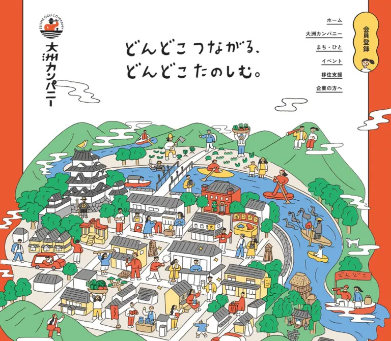
手描きの城下町イラストと鮮やかなオレンジ、黄色の会員登録導線が印象的な地域交流サイト。イベントや地域の人々を紹介し、大洲とのつながりを育むデザイン。
オリジナルサイトを見る大洲カンパニー / Ozu Company — Style Reference
A lively illustrated castle town framed by orange, with small yellow invitations to join its community.
Website: ozu-company.com
Original URL: https://ozu-company.com/
Final URL: https://ozu-company.com/
Response: HTTP 200; original and final URLs are identical.
Theme: white illustration canvas, orange content fields, yellow controls, and a dark brown footer. No selectable theme was evidenced.
Inspected: September 13, 2026, Japan Standard Time. The supplied evidence timestamp is 2026-09-12T18:40:51.899Z, equivalent to September 13 at 03:40:51.899 JST.
Viewports: desktop 1440 × 1000 CSS pixels; mobile 390 × 844 CSS pixels.
Scope: the current homepage of an official platform connecting people with Ozu, Ehime. Visual evidence covers the desktop opening, event section, and footer, plus the mobile opening and footer. Rendered DOM measurements additionally cover the introduction, membership invitations, people/interview section, and contact section. Linked pages and registration destinations were not inspected.
Ozu Company presents a place through the activities of its people. A castle, tiled roofs, shops, vegetable plots, paddlers, farmers, and pedestrians form one densely populated illustration. Uneven black outlines and hand-drawn lettering give the identity a friendly, local character. Ordinary navigation and editorial text use a measured Japanese sans-serif system, allowing the illustration to remain expressive without making practical information difficult to scan.
The homepage is a long community and editorial gateway. It introduces the platform, invites membership, presents dated events and local people, and ends with contact information and a substantial footer. Its distinctive relationship is between a quiet white opening, an expansive illustrated town, strong orange content sections, and compact yellow controls. The desktop identity occupies the sides of the page; mobile rearranges it into a small horizontal header and a persistent menu button.
How to Read This Reference
- Measured means supplied rendered DOM geometry or computed styles. Decimal values describe the inspected state, not necessarily authored CSS constants.
- Calculated means arithmetic applied to those measurements, such as a rail pitch or viewport percentage.
- Visual estimate means an approximation from the five current-page captures. It is not an exact pixel sample or stylesheet value.
- Recommended means implementation guidance for a new build. Breakpoints, accessible states, and the Quick Start belong to this category unless explicitly identified otherwise.
- Tokens are descriptive implementation aliases. The evidence did not expose a site-specific semantic token system.
- Visibility matters: a DOM rectangle can belong to a concealed menu or an offscreen carousel item. Geometry alone does not prove that an element was visible or interactive in the captured state.
Tokens — Colors
Default Palette
| Name | Value | Suggested token | Evidence and role |
|---|---|---|---|
| Town Orange | #EA5932 |
--color-orange |
Measured body background, rgb(234, 89, 50). Forms the opening side rails and visible event/contact fields. |
| Invitation Yellow | #FDD462 |
--color-yellow |
Measured desktop registration and back-to-top backgrounds, rgb(253, 212, 98). Yellow also appears visually in the menu and carousel controls. |
| Drawing Ink | #222222 |
--color-ink |
Measured body, navigation, and card text. A close visual match for interface outlines; exact illustration stroke colors were not supplied. |
| White | #FFFFFF |
--color-white |
Measured reversed text. The hero canvas and event cards also appear white in the captures. Their own surface declarations were not included. |
| Footer Brown | #3B3232 |
--color-footer |
Measured footer background, rgb(59, 50, 50). A warm dark brown, rather than neutral black. |
Illustration Palette
These are visual estimates for briefing new artwork, not measured source tokens.
| Name | Approximate value | Role |
|---|---|---|
| Mountain Green | #7EC58B |
Broad rolling hills surrounding the town. |
| Tree Green | #23AE69 |
Denser trees, shrubs, and cultivated vegetation. |
| River Blue | #69ADDA |
The winding river and water activities. |
| Street Cream | #EEE8DD |
Ground planes between white buildings and gray roofs. |
| Roof Gray | #777777 |
Layered tiled roofs, balanced by black contours. |
Orange and yellow are interface colors; green and blue chiefly belong to the illustration. Keep that distinction when extending the system. A green mountain does not establish green as a secondary button color.
The supplied custom-property inventory contains many WordPress preset colors, gradients, and shadows. Their presence does not establish their use in the visible design. In particular, those generic presets are not a reason to add gradients or card elevation.
Tokens — Typography
Japanese Sans-Serif — Navigation and Editorial Content
Measured computed family: "Zen Kaku Gothic Antique", sans-serif.
The body, navigation links, paragraphs, event titles, interview titles, and footer samples use this family declaration. The evidence identifies the computed stack; it does not independently establish font-file delivery or the face used for every glyph.
- Weight
400: explanatory paragraphs, dates, addresses, and copyright. - Weight
600: body default, navigation, utility links, and membership labels. - Weight
700: ordinary headings and editorial titles. - Paragraph line height:
1.75on both inspected widths. - Typical paragraph and heading tracking:
0.04em. - Body-default tracking:
0.02em; some smaller links inherit the body’s absolute tracking value.
Identity and Display Lettering
The main slogan, logo, and several section titles have a visibly drawn character. The slogan reads “どんどこ つながる、どんどこ たのしむ。” across two lines.
The corresponding logo and several heading elements have empty extracted text despite visible lettering in the screenshots. Treat these as graphic-led identity elements. The evidence does not identify their asset format or a display font. Do not apply the measured wrapper font size to the visible artwork and call it the slogan’s type size.
The mobile phone and email display also look heavier and more rounded than ordinary paragraphs. Their specific font or graphic implementation was not supplied.
Type Scale
All values below are measured computed styles. Size and leading are in CSS pixels.
| Role | Desktop size / leading | Mobile size / leading | Weight | Desktop → mobile tracking |
|---|---|---|---|---|
| Body default | 18 / 27 |
14 / 21 |
600 |
0.36 → 0.28px |
| Explanatory paragraph | 18 / 31.5 |
14 / 24.5 |
400 |
0.72 → 0.56px |
| Primary navigation | 16 / 24 |
16 / 24 |
600 |
0.36 → 0.28px |
| Event title | 20 / 30 |
15 / 22.5 |
700 |
0.8 → 0.6px |
| Event date | 14 / 21 |
12 / 18 |
400 |
0.56 → 0.48px |
| Interview title | 28 / 42 |
18 / 27 |
700 |
1.12 → 0.72px |
| Section heading wrapper | 36 / 54 |
20 / 30 |
700 |
1.44 → 0.8px |
| Inline membership label | 18 / 27 |
15 / 22.5 |
600 |
0.36 → 0.28px |
| Section index link | 18 / 27 |
14 / 21 |
600 |
0.36 → 0.28px |
| Contact organization heading | 22 / 33 |
16 / 24 |
700 |
0.88 → 0.64px |
| Footer navigation | 18 / 27 |
14 / 21 |
600 |
0.36 → 0.28px |
| Footer organization name | 18 / 27 |
16 / 24 |
700 |
0.72 → 0.64px |
| Social caption | 14 / 21 |
12 / 18 |
600 |
0.36 → 0.28px |
| Copyright and project note | 12 / 21 |
11 / 19.25 |
400 |
0.48 → 0.44px |
The section heading row describes wrappers, including graphic-led headings; the contact heading has actual extracted text. Mobile primary-navigation measurements describe DOM elements whose open-menu appearance was not captured.
The original root computes to 10px at both widths. The root’s Times declaration does not describe the visible body typography. The Quick Start uses explicit pixel tokens with a conventional root instead of assuming that source rem values can be copied unchanged.
Tokens — Spacing & Shapes
Spacing Scale
The site combines generous section intervals with compact card information. There is no evidence of one universal spacing unit.
| Use | Desktop | Mobile | Evidence |
|---|---|---|---|
| Opening outer rail | 72px each side |
13.70px each side |
Measured section position. |
| Main introduction text width | 813.75px |
319.72px |
Measured paragraph box. |
| Introduction text left edge | 313.13px |
35.14px |
Measured within the viewport. |
| Event text inset from anchor edge | 35px |
27.30px |
Calculated from title and anchor rectangles. |
| Event title-to-date gap | 10px |
6px |
Calculated between measured boxes. |
| Interview title inset | 50px |
19.5px |
Calculated from title and anchor rectangles. |
| Event section bottom padding | 120px |
78px |
Measured computed padding. |
| People section vertical padding | 120px |
62.4px |
Measured computed padding. |
| Footer vertical padding | 160px |
46.8px |
Measured computed padding. |
| Footer horizontal padding | 125.19px |
23.4px |
Measured computed padding. |
| Section index-link arrow allowance | 45px right padding |
45px right padding |
Measured computed padding. |
Border Radius and Outlines
| Element | Treatment | Evidence |
|---|---|---|
| White opening panel | Straight black vertical rules, approximately 1–2px |
Visual estimate. |
| Event card exterior | Approximately 2px ink outline and 10px corner radius |
Visual estimate; wrapper border styles were not supplied. |
| Event photograph | Approximately 10–12px corner radius |
Visual estimate. |
| Desktop registration tab | Irregular vertical scalloped silhouette with an ink edge | Visually observed; its anchor reports border-radius: 0. |
| Carousel arrows | Yellow circles with black outlines, approximately 60px diameter |
Visual estimate. |
| Mobile menu button | Yellow outlined circle, approximately 44px diameter |
Visual estimate. |
| Back-to-top | Circular; 60 × 60px desktop, 30 × 30px mobile |
Measured geometry; source radius is large enough to form a circle. |
An anchor with zero radius can contain or be covered by a shaped graphic. Do not convert the membership tab into a rectangle merely because the anchor’s radius is zero.
Layout Measurements
| Element | Desktop | Mobile |
|---|---|---|
| Opening section | 1296 × 1506.52px |
362.59 × 858px |
| Header identity box | 88.55 × 336.28px, at 110, 40 |
156 × 35.39px, at 117, 23.39 |
| Inline registration anchor | 362 × 115px |
241 × 75px |
| Event anchor | 308.97 × 454.22px |
250.30 × 355.97px |
| Interview anchor | 559.36px wide; 623.47–654.97px high |
318.11px wide; 507.13–526.38px high |
| Footer wordmark box | 302 × 68.53px |
240.25 × 54.52px |
| Footer navigation cell | 234px wide |
171.61px wide |
| Footer social-link box | 100 × 101px |
70 × 74px |
Event anchor measurements exclude the visually apparent outer wrapper edge. The desktop screenshot’s card exterior is approximately 313 × 458px, consistent with roughly two pixels of border on each side of the measured anchor.
Components
Desktop Identity Rail and Navigation
Role: keep the brand and main destinations available around the illustrated opening and during scrolling.
The opening desktop header has no measured flow height. Its visible identity sits at the upper left: a circular emblem above a tall vertical wordmark. The initial identity box is 88.55 × 336.28px. The right side contains a right-aligned stack of underlined links: “ホーム”, “大洲カンパニー”, “まち・ひと”, “イベント”, “移住支援”, and “企業の方へ”.
Navigation links use 16px / 24px, weight 600. Their sampled vertical positions are separated by 41px. Underlines follow the text width rather than spanning a menu column.
A separate yellow “会員登録” tab sits at x: 1333px, y: 33px, measuring 74 × 171px. It uses vertical lettering, an irregular pinched outline, and a small illustrated face near its base. The supplied destination is an external FANTS registration URL; its destination page was not opened.
The event and footer captures retain the identity and navigation near the same screen edges, supporting a persistent placement interpretation. The scrolled logo and registration tab appear smaller: approximately 55px wide for the logo and 58 × 136px for the tab. These are visual estimates of another state, not additional computed measurements.
Mobile Header and Closed Menu Control
Role: retain identity and navigation access without using the narrow screen’s side rails.
The mobile opening separates the identity into a small emblem at the left and a centered horizontal wordmark with a tiny slogan above it. The emblem is approximately 50px across. The measured central wordmark is 156 × 35.39px. The header box measures 82.17px high.
A yellow circular hamburger control appears near the upper-right corner, approximately 44px across. It remains visible in the mobile footer capture while the opening wordmark does not. This supports a persistent menu-control treatment, rather than a complete fixed header bar.
Only the closed menu was visually supplied. The DOM contains a column of primary links approximately 239.22 × 46.59px, two smaller town/people links, and a 241 × 75px registration anchor. These are useful structural clues, but they do not establish the open panel’s background, entrance motion, focus behavior, or dismissal mechanism.
Illustrated Opening
Role: communicate the town’s identity before presenting explanatory copy.
The white panel occupies exactly 90% of the inspected desktop width, calculated from 1296 / 1440. On mobile it occupies approximately 93%, leaving narrow orange rails. Thin black boundaries make the white area feel like a printed sheet.
At desktop size, the two-line slogan occupies roughly 500 × 145px near the upper center. The illustrated landscape begins around y: 310px and extends below the first viewport. Its hills, clouds, and buildings cross the panel’s lateral rules in places, preventing the white frame from behaving like a rigid image crop.
On mobile, the slogan is approximately 250px wide and begins around y: 130px. The town illustration runs from roughly y: 230px to y: 785px. It fills the screen laterally and crops the wider scene at the sides. Characters remain large enough to recognize, while distant parts of the panorama disappear.
Preserve the specific scene hierarchy: castle toward the left, bridge near the center, blue river curving through the town, layered gray roofs, and people distributed across multiple activities. There is no ordinary large rectangular CTA placed over the hero artwork.
Platform Introduction and Membership Invitation
Role: explain why the platform exists and how to become involved.
The DOM places the platform introduction immediately after the opening. Its content includes the official-platform statement, a collection of topic hashtags, substantial explanatory paragraphs, and an “大洲カンパニーについて” link.
Paragraphs use the centered 813.75px desktop column and a 319.72px mobile column, with 1.75 line height. This narrower reading measure is distinct from the full-width editorial rails.
Membership copy explains participation, exchanges with local people, benefits, and use of the FANTS app. The inline registration anchor measures 362 × 115px on desktop and 241 × 75px on mobile. Its desktop computed background is yellow; its mobile anchor background is transparent. The latter is not proof of a visually unfilled button because child graphics and pseudo-elements were not inventoried.
These sections were measured in the DOM but were not supplied as complete visual captures. Their precise illustrations, button silhouettes, and hashtag movement remain unverified.
Section Heading and Index Link
Role: introduce an editorial collection without using a conventional boxed section header.
The visible event heading is centered white lettering reading “イベント”. A short white wavy rule sits beneath it. The wave is approximately 140px wide in the desktop capture. A centered explanatory sentence follows with generous vertical separation.
The section’s concluding “イベント一覧” link is plain white text accompanied by a rightward arrow. Its measured right padding is 45px, reserving space for the arrow treatment. The people index link uses the same measured allowance.
Use the heading artwork and wave as separate compositional elements where appropriate. Their visible scale should not be inferred solely from the empty heading wrapper’s computed font size.
Event Card
Role: present a specific, dated local activity as one coherent link.
The visible card anatomy is:
- White exterior with a thin dark outline and modest rounded corners.
- Landscape photograph, approximately
269 × 202pxon desktop, inset about20pxfrom the anchor’s sides and top. - Bold title, inset more deeply than the photograph:
35pxfrom the anchor edge on desktop. - A smaller date block with reserved room for wrapping.
- A full-width thin divider.
- Bottom row containing a small orange category symbol, “体験プログラム”, and “詳細” with an orange chevron.
The whole card is represented by one anchor containing the title, date, category, and detail text. Reproduce it as a single link rather than nesting a second detail link inside it.
Desktop titles use 20px / 30px and occupy measured 60px title boxes. Dates use 14px / 21px in 42px boxes. On mobile those become 15px / 22.5px titles in 45px boxes and 12px / 18px dates in 36px boxes. For a new implementation, use these as minimum reservations so longer content and enlarged text can expand.
Visible photography includes a brick brewery beneath yellow foliage, paired views of traditional houses, and a bottle beside a stream. The photos remain natural color and provide documentary specificity alongside the illustrated identity.
Event Rail and Arrow Controls
Role: expose several programs while suggesting additional horizontal content.
The desktop capture shows three complete cards with neighboring cards clipped at both viewport edges. Large yellow previous/next circles sit over the rail near the left and right sides. These controls have dark outlines and simple dark chevrons. There is no visible dot-pagination row in this capture.
Calculated spacing between corresponding anchor positions is 375.58px on desktop and 288.20px on mobile. Subtracting anchor widths gives 66.61px and 37.91px respectively. These are anchor-to-anchor gaps; gaps between visible outer borders are slightly smaller.
The mobile DOM places a 250.30px card near the center at x: 70.04px, consistent with a single prominent card and small neighboring previews. No mobile event screenshot was supplied, so arrow placement and photograph cropping at that width remain unverified.
Six distinct event destinations appear in three repeated sets. This is consistent with a loopable carousel implementation; it is not eighteen unique events. The screenshot and DOM also show different item alignment. They establish multiple rail states, but not autoplay speed, direction, or the action that changed the alignment.
People and Interview Teasers
Role: connect the platform to named local participants and businesses.
The DOM identifies three distinct editorial destinations, repeated across a horizontal track. Each includes a headline, person or business context, and “詳細”. The measured desktop anchors are much wider than event anchors: approximately 559px, with 28px / 42px titles. Mobile anchors are approximately 318px wide, with 18px / 27px titles.
Title insets change from 50px to 19.5px. Person names and affiliations wrap onto separate lines in the mobile text evidence. Preserve that content hierarchy rather than forcing everything into one short byline.
A strip of green foliage photography is visible immediately below the desktop event section. The complete people section was not captured visually. Its full image treatment, card borders, and any overlay on photography cannot be reconstructed from the supplied evidence.
Contact Block
Role: provide a direct human point of contact after the final membership invitation.
The DOM identifies a full-width contact section with white content, a heading, organization text, phone number, office hours, and email address. The mobile capture confirms the orange field and a compact centered arrangement of phone, hours, and email, with small white telephone and envelope symbols.
The contact organization heading changes from 22px / 33px on desktop to 16px / 24px on mobile. The mobile organization name wraps into two lines in the supplied text evidence.
Telephone and email text are present, but their functional tel: and mailto: destinations were not included in the link inventory. Treat click-to-call and email-link behavior as recommended additions unless independently verified.
Footer and Back-to-Top
Role: close the page with complete navigation, social access, and organizational information.
The footer uses measured #3B3232 with white content. On desktop it is approximately 850px tall, with 160px vertical padding. A white horizontal wordmark sits above a three-column navigation group on the left. Social links and organization details occupy the right side. Copyright and the public-project note sit low on the left.
The navigation columns begin around x: 125, 359, and 593px, each with a measured 234px cell width. Link boxes are 40px high on a 45px vertical pitch. Underlines remain local to the lettering. Town and people sublinks have a measured 14.4px left indentation on desktop.
Instagram and LINE symbols sit between two illustrated people, with small curved annotations above the figures. These characters extend the town illustration into the practical footer. The social caption remains beneath each symbol. Brand colors are retained: orange for Instagram and green for LINE.
The original page identifies the secretariat as “一般社団法人キタ・マネジメント” and links to https://kita-m.com/. This organizational identification is independently supported by the inspected contact and footer content.
On mobile, the footer becomes approximately 654px tall with 46.8px 23.4px padding. Its sequence is centered wordmark, two columns of navigation, illustrated social row, organization details, then the copyright/project note. “移住支援” and “企業の方へ” occupy the bottom navigation row. Link boxes measure 33px high on a 38px pitch.
The desktop back-to-top control is a 60px yellow circle near the footer’s lower-right corner. Mobile changes it to a 30px dark circle with a white outline and chevron. Its supplied anchor targets #pagetop; actual scrolling speed was not tested.
Tokens — Motion & Interaction
| Treatment | Evidence | What can be concluded |
|---|---|---|
| Ordinary anchors | Computed 0.2s ease-in-out transition |
A short link transition is declared. The changed property and hover appearance were not supplied. |
| Header identity | Computed 1s cubic-bezier(0.65, 0, 0.35, 1) |
A slower eased transition is declared; captures show a smaller scrolled identity state. Exact trigger and interpolation are unverified. |
| Header registration anchor | Computed 1s cubic-bezier(0.65, 0, 0.35, 1) |
Same timing family as the identity. Do not infer continuous wobbling from its irregular shape. |
| Event rail | Repeated item sets, clipped neighbors, visible arrow controls, different sampled alignment | Horizontal carousel structure is supported. Autoplay, drag, looping behavior, and timing were not exercised. |
| People rail | Repeated links and horizontally spaced rectangles | A horizontal track is supported by DOM geometry. Its controls were not visually inspected. |
| Mobile menu | Closed hamburger visible; menu links present in DOM | Menu access is indicated. Open-state animation, backdrop, and keyboard behavior are unknown. |
| Back-to-top | Link to #pagetop |
Target is known; smooth scrolling is not established. |
| Hero, clouds, and hashtags | Static supplied captures; no relevant animation inventory | Movement, parallax, and marquee behavior remain unverified. |
Many sampled elements report animation: none, and some report only a generic transition value of all. These values do not establish either a fully static page or an animated illustration: descendants, pseudo-elements, and JavaScript motion were not exhaustively sampled.
Recommended motion vocabulary: use brief 200ms ease-in-out feedback for links and preserve the slower one-second identity transition only if implementing the observed compact header state. Add motion to the illustrations only after obtaining direct evidence or making an explicitly new creative decision. Respect reduced-motion preferences.
Surfaces
| Surface | Appearance | Structural purpose |
|---|---|---|
| Opening sheet | White, straight dark side rules, orange outside | Frames the slogan and gives the illustration a clear starting canvas. |
| Town illustration | Flat colored regions with uneven dark outlines | Supplies density, local detail, and personality. |
| Event field | Solid orange with white section text | Separates editorial programs from the white opening. |
| Event card | White fill, dark outline, slight rounding | Keeps photographs and dense dates readable. |
| Utility control | Yellow fill, dark symbol and outline | Marks navigation and membership affordances. |
| Footer | Warm dark brown with white type and colored social marks | Provides a substantial, calm endpoint. |
No soft shadow or glossy elevation system is visible in the inspected components. Separation comes from fill changes, outlines, whitespace, and image boundaries. A dark footer does not indicate a page-wide dark mode.
Imagery
The signature illustration is a populated map-like scene rather than an abstract brand ornament. Activities matter: farming, paddling, carrying produce, visiting shops, walking, and gathering around local buildings make the platform’s purpose visible without explanatory labels on every scene.
The drawing uses irregular black contours, flat greens and blues, gray tiled roofs, white walls, and orange/yellow clothing accents. Faces and hands remain simple. Clouds are long, curling white shapes outlined in ink. The scene has layered depth, but avoids photorealistic perspective, polished 3D shading, or a uniform geometric icon style.
Photography has a different job. Event photos show actual places, products, and activities in natural color, placed inside consistent landscape frames. Preserve this division: illustrations communicate community character; photographs describe particular programs.
Observed Asset References
No original image URLs, filenames, native dimensions, or font-file URLs were included in the supplied evidence. The following is an asset-role inventory, not a source-path list.
| Asset role | Directly visible evidence | Implementation requirement |
|---|---|---|
| Emblem and vertical identity | Desktop opening and scrolled captures | Preserve the relationship between circular emblem and tall lettering. |
| Horizontal identity | Mobile header and both footers | Use the appropriate horizontal lockup; do not simply rotate the vertical one. |
| Two-line slogan | Desktop and mobile opening | Preserve hand-drawn lettering and line break. |
| Town landscape | Desktop and mobile opening | Use responsive art direction or a controlled mobile crop. |
| Registration tab | Desktop captures | Requires the irregular outline and small character detail. |
| Event heading and wave | Desktop event capture | Preserve the graphic heading and short wave treatment. |
| Event photographs | Desktop event capture | Use landscape documentary images with modest corner rounding. |
| Footer people and social symbols | Desktop and mobile footer | Retain the illustrated figures around the two social destinations. |
Use authorized original assets where available. CSS can approximate the framing and card system, but cannot reproduce the identity carried by the town drawing. Do not invent asset paths or replace the illustration with unrelated stock artwork while claiming fidelity.
Layout & Responsive Behavior
Observed Page Structure
Positions below are measured document coordinates, rounded to two decimals.
| Section | Desktop top / height | Mobile top / height | Evidence scope |
|---|---|---|---|
| Opening | 0 / 1506.52px |
0 / 858px |
Visual captures and DOM. |
| Introduction and first membership invitation | 1506.52 / 1682.08px |
858 / 1492.19px |
DOM; complete appearance not supplied. |
| Events | 3310.59 / 885.72px |
2391.19 / 650.55px |
Desktop visual capture; DOM at both widths. |
| People | 4196.31 / 1269.06px |
3041.73 / 867.73px |
DOM; only a narrow photographic boundary visible. |
| Final membership invitation | 5425.38 / 757.06px |
3869.47 / 685.72px |
DOM. |
| Contact | 6142.44 / 550px |
4515.19 / 345.44px |
DOM and partial mobile capture. |
| Footer | 6692.44 / 849.83px |
4860.63 / 653.95px |
Visual captures and DOM. |
The reported document heights are 7542px desktop and 5515px mobile. Some adjacent section boxes overlap by approximately 40px, notably around the final membership and contact regions. Do not sum all section heights as independent stacked blocks or infer the unseen decorative join from the overlap alone.
What Changes on Mobile
- The opening panel grows from
90%to approximately93%of viewport width, leaving much narrower orange rails. - The vertical desktop identity becomes a centered horizontal wordmark with a separate emblem.
- Persistent desktop text navigation and the vertical registration tab are replaced visually by a circular menu control.
- The illustration is shown at a larger relative scale with lateral cropping. It is not a miniature of the entire desktop panorama.
- Paragraph text changes from
18pxto14px, while retaining1.75line height. - Event cards remain in a horizontal track, changing from about
309pxto250pxanchor width. - Interview cards become about
318pxwide, with names and affiliations wrapping more readily. - The footer changes from a broad asymmetric arrangement to a centered vertical sequence with two navigation columns.
- Back-to-top appearance and size change as well as position: yellow
60pxdesktop, dark30pxmobile.
The exact media-query breakpoint and behavior at intermediate widths were not supplied. The Quick Start uses a recommended breakpoint for a new implementation; test tablet and short landscape layouts before treating that breakpoint as final.
Do’s and Don’ts
Do
- Build the identity around the specific town scene, its people, and its activities.
- Preserve orange
#EA5932, yellow#FDD462, ink#222222, and footer brown#3B3232as distinct semantic roles. - Keep the white opening spacious above the dense illustration.
- Use the measured Japanese sans-serif stack for practical text and separate artwork for drawn identity lettering.
- Retain thin dark outlines, restrained card rounding, and text-width navigation underlines.
- Give event titles, dates, category labels, and detail affordances a consistent order.
- Preserve the narrower prose column and the wider editorial rails.
- Art-direct the mobile illustration so people and buildings remain legible.
- Carry the illustrated characters into the footer’s social area.
Don’t
- Don’t reduce this community homepage to a generic single-purpose sales layout.
- Don’t replace the town illustration with abstract blobs or anonymous office stock photography.
- Don’t infer a display font from an empty logo or heading wrapper.
- Don’t turn the scalloped registration tab into a square box based on the anchor’s zero radius.
- Don’t introduce gradients, glass blur, or soft card shadows from unused framework presets.
- Don’t shrink the entire desktop panorama until every mobile detail becomes tiny.
- Don’t interpret repeated carousel clones as unique editorial entries.
- Don’t claim autoplay, parallax, menu-open styling, or hover effects that were not observed.
- Don’t assign dates, source paths, production credits, or responsive formulas beyond the supplied evidence.
Recommended Implementation Additions
These are recommendations for a new implementation, not verified features of the original page.
- Provide accessible text for graphic logos and headings. Decorative characters and clouds can have empty alternatives; meaningful town imagery needs a concise description.
- Make the menu a real button with an accessible name,
aria-expanded, andaria-controls. If implemented as a modal panel, manage focus, Escape dismissal, and restoration to the opener. - Use keyboard-operable carousel controls with specific names. Prevent cloned slides from creating duplicate focus stops, and expose a useful event list if the carousel script fails.
- Preserve complete event titles and dates at increased text size. Use minimum row heights rather than clipping fixed-height text boxes.
- Give the mobile back-to-top control at least a
44pxinteractive area even if its visible circle remains30px. - Check contrast against actual surfaces. White against measured orange is approximately
3.5:1, calculated from the supplied RGB values; ordinary small text needs a stronger pairing. The desktop dark navigation also remains visible over the dark footer in the capture, suggesting a need for a light-on-dark navigation state. - Add visible focus indicators and reduced-motion handling. If autoplay is introduced or confirmed, provide a way to pause it.
- Make phone and email details actionable with appropriate link schemes. Preserve the visible office-hours context.
- Distinguish past programs from currently available registration. The displayed event dates do not, by themselves, establish booking availability.
Agent Prompt Guide
Quick Color Reference
- Main orange field:
#EA5932— measured. - Yellow invitation/control fill:
#FDD462— measured on desktop anchors. - Text and interface ink:
#222222— measured. - White canvas/card appearance and reversed text:
#FFFFFF. - Footer:
#3B3232— measured. - Artwork briefing only: mountain green approximately
#7EC58B, river blue approximately#69ADDA. - Structure: outlines and solid fills; no general shadow system.
Overall Prompt
“Create a Japanese community-platform homepage inspired by Ozu Company’s observed visual system. Frame a white opening with orange #EA5932 side rails and thin ink rules. Use a large hand-drawn town scene containing a castle, tiled-roof streets, a winding blue river, green hills, and people farming, paddling, shopping, and gathering. Place a two-line drawn slogan above the scene. On desktop, put a vertical identity at upper left, underlined navigation at upper right, and a yellow #FDD462 scalloped membership tab beside it. Follow with readable explanatory copy, horizontal event cards, people stories, membership and contact information, and a dark brown #3B3232 footer. Use Zen Kaku Gothic Antique with a sans-serif fallback for interface text. On mobile, use a horizontal identity and circular yellow menu control, and crop the town scene without making its people tiny. Treat unverified interactions and artwork as separate implementation work.”
Example Component Prompts
- Event card: “Design a roughly 313px-wide white event card with a 2px dark outline and about 10px rounded corners. Use a 4:3 natural-color photograph with a 20px inset, a 20px bold Japanese title, a 14px date block, and a ruled bottom row containing an orange category symbol, category text, and a detail chevron. Make the entire card one link and allow longer text to expand.”
- Opening illustration: “Compose a crowded but readable Japanese castle town using uneven black outlines and flat color. Put the castle left of a central bridge, curve a blue river through the scene, surround gray tiled roofs with green hills, and distribute small people doing distinct local activities. Leave white sky for a two-line slogan. Prepare a tighter mobile crop that preserves recognizable people and buildings.”
- Desktop navigation: “Arrange compact, underlined Japanese navigation as a right-aligned vertical stack with 16px type and approximately 41px row pitch. Place a separate yellow scalloped vertical membership tab with a small drawn face alongside it. Preserve clear space around the central slogan.”
- Mobile footer: “Use a warm dark brown footer with a centered white horizontal wordmark, two balanced columns of underlined links, and an Instagram/LINE row flanked by illustrated people. Stack organization details and a small project note below. Keep the layout flat, with no cards or shadows.”
- Responsive event rail: “Keep events in a horizontal sequence with neighboring content previews. Target approximately 309px anchor width on desktop and 250px at a 390px mobile viewport. Use measured 20px desktop and 15px mobile titles. Provide accessible manual navigation; do not invent autoplay timing.”
Quick Start
CSS Custom Properties
This is a recommended implementation scaffold, not extracted source CSS. Exact measured colors and type sizes are combined with estimated outer-card geometry. The breakpoint, hero sizing between captures, native scroll-snap fallback, and interaction states are recommendations.
Apply ozu-page to the page wrapper or body. An event card contains one event-link, with an image, an event-copy region, and an event-meta row. Footer links use the data-slot names defined below so the same eight links can rearrange between three and two columns.
Supply authorized logo, slogan, town, wave, and registration-shape assets separately. The illustration crop and drawn lettering cannot be generated by these CSS rules. The mobile menu button and any carousel arrow buttons require their own behavior; this scaffold does not claim to implement the original scripts.
:root {
  /* Measured colors */
  --color-orange: #ea5932;
  --color-yellow: #fdd462;
  --color-ink: #222222;
  --color-white: #ffffff;
  --color-footer: #3b3232;

  /* Measured family and desktop type */
  --font-body: 'Zen Kaku Gothic Antique', sans-serif;
  --text-ui: 18px;
  --text-body: 18px;
  --text-event: 20px;
  --text-date: 14px;
  --text-section: 36px;
  --leading-body: 1.75;
  --tracking-body: 0.04em;

  /* Reference-fit geometry; formulas are recommendations */
  --rail: 5vw;
  --copy-width: 813.75px;
  --content-gutter: 24px;
  --section-space: 120px;
  --event-width: 313px;
  --event-gap: 62.6px;
  --event-text-inset: 35px;
  --event-photo-inset: 20px;
  --radius-card: 10px;
  --rule: 2px;
  --motion-link: 200ms ease-in-out;
  --motion-brand: 1s cubic-bezier(0.65, 0, 0.35, 1);
}

.ozu-page,
.ozu-page * {
  box-sizing: border-box;
}

.ozu-page {
  margin: 0;
  color: var(--color-ink);
  background: var(--color-orange);
  font-family: var(--font-body);
  font-size: var(--text-ui);
  font-weight: 600;
  line-height: 1.5;
  letter-spacing: 0.02em;
}

.ozu-page img {
  display: block;
  max-width: 100%;
}

.ozu-page a {
  color: inherit;
  text-underline-offset: 5px;
  text-decoration-thickness: 1.5px;
}

.ozu-page button {
  font: inherit;
}

.ozu-copy {
  width: min(var(--copy-width), calc(100% - 2 * var(--content-gutter)));
  margin-inline: auto;
  font-size: var(--text-body);
  font-weight: 400;
  line-height: var(--leading-body);
  letter-spacing: var(--tracking-body);
}

/* Identity artwork supplies its own lettering. */
.ozu-brand-vertical {
  position: fixed;
  z-index: 20;
  top: 40px;
  left: calc(var(--rail) + 38px);
  width: 88.55px;
  transform-origin: top left;
  transition: transform var(--motion-brand);
}

/* Recommended state hook for the visually smaller scrolled identity. */
.ozu-page[data-scrolled='true'] .ozu-brand-vertical {
  transform: scale(0.625);
}

.ozu-desktop-nav {
  position: fixed;
  z-index: 20;
  top: 52px;
  right: calc(var(--rail) + 64px);
  display: flex;
  flex-direction: column;
  align-items: flex-end;
  gap: 17px;
  font-size: 16px;
  line-height: 24px;
}

.ozu-registration-tab {
  position: fixed;
  z-index: 21;
  top: 33px;
  right: 33px;
  display: grid;
  place-items: center;
  width: 74px;
  height: 171px;
  color: var(--color-ink);
  text-decoration: none;
}

/* Supply the actual scalloped outline as an authorized graphic. */
.ozu-registration-tab__shape {
  position: absolute;
  inset: 0;
  width: 100%;
  height: 100%;
}

.ozu-registration-tab__label {
  position: relative;
  padding-bottom: 20px;
  writing-mode: vertical-rl;
}

.ozu-mobile-identity,
.ozu-menu-toggle {
  display: none;
}

/* Calibrated to the desktop capture, not a recovered source formula. */
.ozu-hero {
  position: relative;
  width: calc(100% - 2 * var(--rail));
  min-height: clamp(980px, 104.62vw, 1507px);
  margin-inline: auto;
  padding-top: 78px;
  border-inline: 1.5px solid var(--color-ink);
  background: var(--color-white);
}

.ozu-hero__slogan {
  width: min(500px, calc(100% - 32px));
  height: auto;
  margin-inline: auto;
}

.ozu-hero__art {
  position: absolute;
  top: 300px;
  left: 50%;
  width: calc(100% + 2 * var(--rail));
  transform: translateX(-50%);
}

.ozu-hero__art img {
  width: 100%;
  height: auto;
}

.event-section {
  padding-bottom: var(--section-space);
  background: var(--color-orange);
}

.ozu-section-heading {
  margin: 0 auto 40px;
  color: var(--color-white);
  font-size: var(--text-section);
  font-weight: 700;
  line-height: 1.5;
  letter-spacing: 0.04em;
  text-align: center;
}

.ozu-section-heading__wave {
  width: 140px;
  height: auto;
  margin: 24px auto 0;
}

/* Ink is a recommended contrast improvement for small orange-field copy. */
.event-section__intro {
  margin-bottom: 64px;
  color: var(--color-ink);
  text-align: center;
}

/* Usable manual fallback; does not reproduce source carousel cloning. */
.event-track {
  display: flex;
  align-items: stretch;
  gap: var(--event-gap);
  overflow-x: auto;
  padding: 2px max(24px, calc((100% - 1064px) / 2)) 12px;
  scroll-snap-type: x proximity;
}

.event-card {
  flex: 0 0 var(--event-width);
  overflow: hidden;
  border: var(--rule) solid var(--color-ink);
  border-radius: var(--radius-card);
  background: var(--color-white);
  scroll-snap-align: center;
}

.event-link {
  display: flex;
  flex-direction: column;
  height: 100%;
  text-decoration: none;
}

.event-image {
  width: calc(100% - 2 * var(--event-photo-inset));
  aspect-ratio: 4 / 3;
  margin: var(--event-photo-inset) auto 0;
  border-radius: 10px;
  object-fit: cover;
}

.event-copy {
  flex: 1;
  padding: 25px var(--event-text-inset) 30px;
}

.event-title {
  min-height: 3em;
  margin: 0 0 10px;
  font-size: var(--text-event);
  font-weight: 700;
  line-height: 1.5;
  letter-spacing: 0.04em;
}

.event-date {
  min-height: 3em;
  margin: 0;
  font-size: var(--text-date);
  font-weight: 400;
  line-height: 1.5;
  letter-spacing: 0.04em;
}

.event-meta {
  display: flex;
  justify-content: space-between;
  align-items: center;
  gap: 12px;
  min-height: 66px;
  padding: 16px 20px;
  border-top: 1px solid var(--color-ink);
  font-size: 14px;
  line-height: 1.5;
}

.event-category {
  display: inline-flex;
  align-items: center;
  gap: 8px;
}

.event-category__icon,
.event-detail__arrow {
  color: var(--color-orange);
}

.ozu-round-control {
  display: grid;
  place-items: center;
  width: 60px;
  height: 60px;
  padding: 0;
  border: 2px solid var(--color-ink);
  border-radius: 50%;
  color: var(--color-ink);
  background: var(--color-yellow);
  cursor: pointer;
}

.ozu-index-link {
  display: table;
  margin: 52px auto 0;
  font-size: var(--text-ui);
  text-decoration: none;
}

.ozu-index-link::after {
  content: '→';
  margin-left: 12px;
}

.ozu-footer {
  display: grid;
  grid-template-columns: minmax(0, 1fr) minmax(0, 377.64px);
  gap: 40px 110px;
  padding: 160px 8.694vw;
  color: var(--color-white);
  background: var(--color-footer);
}

.ozu-footer__brand {
  grid-column: 1 / -1;
  width: 302px;
}

.ozu-footer-nav {
  display: grid;
  grid-template-columns: repeat(3, minmax(0, 1fr));
  grid-template-areas:
    'home town support'
    'about town-page businesses'
    'events people .';
  align-content: start;
  gap: 5px 0;
}

.ozu-footer-nav a {
  min-height: 40px;
  padding-bottom: 5px;
}

[data-slot='home'] { grid-area: home; }
[data-slot='about'] { grid-area: about; }
[data-slot='events'] { grid-area: events; }
[data-slot='town'] { grid-area: town; }
[data-slot='town-page'] { grid-area: town-page; }
[data-slot='people'] { grid-area: people; }
[data-slot='support'] { grid-area: support; }
[data-slot='businesses'] { grid-area: businesses; }

.ozu-footer__social {
  display: flex;
  align-items: flex-end;
  justify-content: center;
  gap: 18px;
}

.ozu-footer__organization {
  grid-column: 2;
  font-size: 18px;
  font-weight: 400;
  line-height: 1.75;
}

.ozu-footer__note {
  grid-column: 1;
  grid-row: 3;
  align-self: end;
  margin: 0;
  font-size: 12px;
  font-weight: 400;
  line-height: 1.75;
}

/* Recommended visible keyboard state. */
.ozu-page :is(a, button):focus-visible {
  outline: 3px solid currentColor;
  outline-offset: 5px;
}

.event-card:focus-within {
  outline: 3px solid var(--color-ink);
  outline-offset: 4px;
}

/* Recommended feedback; original hover appearance was not supplied. */
@media (hover: hover) {
  .ozu-round-control {
    transition: transform var(--motion-link);
  }
  .ozu-round-control:hover {
    transform: translateY(-2px);
  }
  .event-link:hover .event-title {
    text-decoration: underline;
  }
}

/* Recommended breakpoint; test intermediate widths separately. */
@media (max-width: 70rem) {
  :root {
    --rail: 3.514vw;
    --copy-width: 319.72px;
    --content-gutter: 21.45px;
    --text-ui: 14px;
    --text-body: 14px;
    --text-event: 15px;
    --text-date: 12px;
    --text-section: 20px;
    --section-space: 78px;
    --event-width: 254.3px;
    --event-gap: 33.9px;
    --event-text-inset: 27.3px;
    --event-photo-inset: 16px;
  }

  .ozu-brand-vertical,
  .ozu-desktop-nav,
  .ozu-registration-tab {
    display: none;
  }

  .ozu-mobile-identity {
    position: absolute;
    z-index: 20;
    top: 23.4px;
    left: 50%;
    display: block;
    width: 156px;
    transform: translateX(-50%);
  }

  .ozu-menu-toggle {
    position: fixed;
    z-index: 30;
    top: 18.5px;
    right: 6vw;
    display: grid;
    place-items: center;
    width: 44px;
    height: 44px;
    padding: 0;
    border: 2px solid var(--color-ink);
    border-radius: 50%;
    color: var(--color-ink);
    background: var(--color-yellow);
  }

  .ozu-hero {
    min-height: 858px;
    padding-top: 130px;
  }

  .ozu-hero__slogan {
    width: 250px;
  }

  .ozu-hero__art {
    top: 230px;
    height: 556px;
  }

  .ozu-hero__art img {
    width: 100%;
    height: 100%;
    object-fit: cover;
    object-position: center;
  }

  .ozu-section-heading {
    margin-bottom: 23.4px;
  }

  .event-section__intro {
    margin-bottom: 40px;
  }

  .event-track {
    padding-inline: max(16px, calc((100% - var(--event-width)) / 2));
  }

  .event-copy {
    padding-top: 18px;
    padding-bottom: 22px;
  }

  .event-title {
    margin-bottom: 6px;
  }

  .event-meta {
    min-height: 54px;
    padding: 12px 16px;
    font-size: 12px;
  }

  .ozu-footer {
    grid-template-columns: minmax(0, 1fr);
    gap: 31.2px;
    padding: 46.8px 6vw;
    text-align: center;
  }

  .ozu-footer__brand {
    width: min(240.25px, 100%);
    margin-inline: auto;
  }

  .ozu-footer-nav {
    grid-template-columns: repeat(2, minmax(0, 1fr));
    grid-template-areas:
      'home town'
      'about town-page'
      'events people'
      'support businesses';
  }

  .ozu-footer-nav a {
    min-height: 33px;
  }

  .ozu-footer__organization,
  .ozu-footer__note {
    grid-column: auto;
    grid-row: auto;
  }

  .ozu-footer__organization {
    font-size: 14px;
  }

  .ozu-footer__note {
    font-size: 11px;
  }
}

@media (prefers-reduced-motion: reduce) {
  .ozu-brand-vertical,
  .ozu-round-control {
    transition: none;
  }
  .event-track {
    scroll-behavior: auto;
  }
}
The 858px mobile hero height is a reference fit for the supplied phone capture, not a universal mobile requirement. Adjust it alongside the authorized illustration at other aspect ratios. The native event rail intentionally supplies manual overflow behavior without asserting the original carousel library or initial slide ordering.
Tailwind v4 Token Mapping
Optional aliases for a project already using Tailwind v4. This is not evidence that the original website uses Tailwind. Define the properties above first.
@theme inline {
  --color-town-orange: var(--color-orange);
  --color-invitation: var(--color-yellow);
  --color-drawing-ink: var(--color-ink);
  --color-footer-brown: var(--color-footer);
  --font-community: var(--font-body);
  --text-community-body: var(--text-body);
  --text-event-title: var(--text-event);
  --text-event-date: var(--text-date);
  --text-community-section: var(--text-section);
  --spacing-event-card: var(--event-width);
  --spacing-event-gap: var(--event-gap);
  --spacing-community-section: var(--section-space);
  --radius-community-card: var(--radius-card);
}
Sources & Evidence
- Ozu Company homepage: the inspected original and final URL, reported HTTP 200, page title, extracted text, destination links, rendered geometry, and computed styles.
- Evidence timestamp:
2026-09-12T18:40:51.899Z, September 13, 2026 in Japan. This is the supplied capture-batch timestamp; individual image timestamps were not provided. - Desktop evidence:
1440 × 1000CSS-pixel viewport, reported document height7542px; current-page captures of the opening, event section, and footer. - Mobile evidence:
390 × 844CSS-pixel viewport, reported document height5515px; current-page captures of the opening and footer/contact boundary. - Inspection preparation waited for document load, finite animation settling, sampled text/layout stability, and visible image decoding within stated limits. The initial observation lasted at least five seconds. These readiness checks do not establish every delayed or interactive state.
- The supplied process traversed intermediate scroll positions. No explicit click, hover, drag, menu-open, registration, or keyboard interaction results were supplied. Persistent controls and changing carousel alignment are interpreted from captures and geometry with the limitations stated above.
- No additional browsing, command execution, asset retrieval, or local-file inspection was performed for this reference. Original asset paths, complete stylesheet rules, exact breakpoints, and production-credit claims are outside the evidence available for this document.
This reference describes the current supplied homepage evidence. Measurements, visual estimates, and recommended implementation choices are deliberately distinguished throughout.
# 大洲カンパニー / Ozu Company — Style Reference

> A lively illustrated castle town framed by orange, with small yellow invitations to join its community.

**Website:** [ozu-company.com](https://ozu-company.com/)
**Original URL:** https://ozu-company.com/
**Final URL:** https://ozu-company.com/
**Response:** HTTP 200; original and final URLs are identical.
**Theme:** white illustration canvas, orange content fields, yellow controls, and a dark brown footer. No selectable theme was evidenced.
**Inspected:** September 13, 2026, Japan Standard Time. The supplied evidence timestamp is `2026-09-12T18:40:51.899Z`, equivalent to September 13 at 03:40:51.899 JST.
**Viewports:** desktop `1440 × 1000` CSS pixels; mobile `390 × 844` CSS pixels.
**Scope:** the current homepage of an official platform connecting people with Ozu, Ehime. Visual evidence covers the desktop opening, event section, and footer, plus the mobile opening and footer. Rendered DOM measurements additionally cover the introduction, membership invitations, people/interview section, and contact section. Linked pages and registration destinations were not inspected.

Ozu Company presents a place through the activities of its people. A castle, tiled roofs, shops, vegetable plots, paddlers, farmers, and pedestrians form one densely populated illustration. Uneven black outlines and hand-drawn lettering give the identity a friendly, local character. Ordinary navigation and editorial text use a measured Japanese sans-serif system, allowing the illustration to remain expressive without making practical information difficult to scan.

The homepage is a long community and editorial gateway. It introduces the platform, invites membership, presents dated events and local people, and ends with contact information and a substantial footer. Its distinctive relationship is between a quiet white opening, an expansive illustrated town, strong orange content sections, and compact yellow controls. The desktop identity occupies the sides of the page; mobile rearranges it into a small horizontal header and a persistent menu button.

## How to Read This Reference

- **Measured** means supplied rendered DOM geometry or computed styles. Decimal values describe the inspected state, not necessarily authored CSS constants.
- **Calculated** means arithmetic applied to those measurements, such as a rail pitch or viewport percentage.
- **Visual estimate** means an approximation from the five current-page captures. It is not an exact pixel sample or stylesheet value.
- **Recommended** means implementation guidance for a new build. Breakpoints, accessible states, and the Quick Start belong to this category unless explicitly identified otherwise.
- **Tokens** are descriptive implementation aliases. The evidence did not expose a site-specific semantic token system.
- **Visibility matters:** a DOM rectangle can belong to a concealed menu or an offscreen carousel item. Geometry alone does not prove that an element was visible or interactive in the captured state.

## Tokens — Colors

### Default Palette

| Name | Value | Suggested token | Evidence and role |
| --- | --- | --- | --- |
| Town Orange | `#EA5932` | `--color-orange` | Measured body background, `rgb(234, 89, 50)`. Forms the opening side rails and visible event/contact fields. |
| Invitation Yellow | `#FDD462` | `--color-yellow` | Measured desktop registration and back-to-top backgrounds, `rgb(253, 212, 98)`. Yellow also appears visually in the menu and carousel controls. |
| Drawing Ink | `#222222` | `--color-ink` | Measured body, navigation, and card text. A close visual match for interface outlines; exact illustration stroke colors were not supplied. |
| White | `#FFFFFF` | `--color-white` | Measured reversed text. The hero canvas and event cards also appear white in the captures. Their own surface declarations were not included. |
| Footer Brown | `#3B3232` | `--color-footer` | Measured footer background, `rgb(59, 50, 50)`. A warm dark brown, rather than neutral black. |

### Illustration Palette

These are visual estimates for briefing new artwork, not measured source tokens.

| Name | Approximate value | Role |
| --- | --- | --- |
| Mountain Green | `#7EC58B` | Broad rolling hills surrounding the town. |
| Tree Green | `#23AE69` | Denser trees, shrubs, and cultivated vegetation. |
| River Blue | `#69ADDA` | The winding river and water activities. |
| Street Cream | `#EEE8DD` | Ground planes between white buildings and gray roofs. |
| Roof Gray | `#777777` | Layered tiled roofs, balanced by black contours. |

Orange and yellow are interface colors; green and blue chiefly belong to the illustration. Keep that distinction when extending the system. A green mountain does not establish green as a secondary button color.

The supplied custom-property inventory contains many WordPress preset colors, gradients, and shadows. Their presence does not establish their use in the visible design. In particular, those generic presets are not a reason to add gradients or card elevation.

## Tokens — Typography

### Japanese Sans-Serif — Navigation and Editorial Content

**Measured computed family:** `"Zen Kaku Gothic Antique", sans-serif`.

The body, navigation links, paragraphs, event titles, interview titles, and footer samples use this family declaration. The evidence identifies the computed stack; it does not independently establish font-file delivery or the face used for every glyph.

- Weight `400`: explanatory paragraphs, dates, addresses, and copyright.
- Weight `600`: body default, navigation, utility links, and membership labels.
- Weight `700`: ordinary headings and editorial titles.
- Paragraph line height: `1.75` on both inspected widths.
- Typical paragraph and heading tracking: `0.04em`.
- Body-default tracking: `0.02em`; some smaller links inherit the body’s absolute tracking value.

### Identity and Display Lettering

The main slogan, logo, and several section titles have a visibly drawn character. The slogan reads “どんどこ つながる、どんどこ たのしむ。” across two lines.

The corresponding logo and several heading elements have empty extracted text despite visible lettering in the screenshots. Treat these as graphic-led identity elements. The evidence does not identify their asset format or a display font. Do not apply the measured wrapper font size to the visible artwork and call it the slogan’s type size.

The mobile phone and email display also look heavier and more rounded than ordinary paragraphs. Their specific font or graphic implementation was not supplied.

### Type Scale

All values below are measured computed styles. Size and leading are in CSS pixels.

| Role | Desktop size / leading | Mobile size / leading | Weight | Desktop → mobile tracking |
| --- | --- | --- | --- | --- |
| Body default | `18 / 27` | `14 / 21` | `600` | `0.36 → 0.28px` |
| Explanatory paragraph | `18 / 31.5` | `14 / 24.5` | `400` | `0.72 → 0.56px` |
| Primary navigation | `16 / 24` | `16 / 24` | `600` | `0.36 → 0.28px` |
| Event title | `20 / 30` | `15 / 22.5` | `700` | `0.8 → 0.6px` |
| Event date | `14 / 21` | `12 / 18` | `400` | `0.56 → 0.48px` |
| Interview title | `28 / 42` | `18 / 27` | `700` | `1.12 → 0.72px` |
| Section heading wrapper | `36 / 54` | `20 / 30` | `700` | `1.44 → 0.8px` |
| Inline membership label | `18 / 27` | `15 / 22.5` | `600` | `0.36 → 0.28px` |
| Section index link | `18 / 27` | `14 / 21` | `600` | `0.36 → 0.28px` |
| Contact organization heading | `22 / 33` | `16 / 24` | `700` | `0.88 → 0.64px` |
| Footer navigation | `18 / 27` | `14 / 21` | `600` | `0.36 → 0.28px` |
| Footer organization name | `18 / 27` | `16 / 24` | `700` | `0.72 → 0.64px` |
| Social caption | `14 / 21` | `12 / 18` | `600` | `0.36 → 0.28px` |
| Copyright and project note | `12 / 21` | `11 / 19.25` | `400` | `0.48 → 0.44px` |

The section heading row describes wrappers, including graphic-led headings; the contact heading has actual extracted text. Mobile primary-navigation measurements describe DOM elements whose open-menu appearance was not captured.

The original root computes to `10px` at both widths. The root’s `Times` declaration does not describe the visible body typography. The Quick Start uses explicit pixel tokens with a conventional root instead of assuming that source `rem` values can be copied unchanged.

## Tokens — Spacing & Shapes

### Spacing Scale

The site combines generous section intervals with compact card information. There is no evidence of one universal spacing unit.

| Use | Desktop | Mobile | Evidence |
| --- | --- | --- | --- |
| Opening outer rail | `72px` each side | `13.70px` each side | Measured section position. |
| Main introduction text width | `813.75px` | `319.72px` | Measured paragraph box. |
| Introduction text left edge | `313.13px` | `35.14px` | Measured within the viewport. |
| Event text inset from anchor edge | `35px` | `27.30px` | Calculated from title and anchor rectangles. |
| Event title-to-date gap | `10px` | `6px` | Calculated between measured boxes. |
| Interview title inset | `50px` | `19.5px` | Calculated from title and anchor rectangles. |
| Event section bottom padding | `120px` | `78px` | Measured computed padding. |
| People section vertical padding | `120px` | `62.4px` | Measured computed padding. |
| Footer vertical padding | `160px` | `46.8px` | Measured computed padding. |
| Footer horizontal padding | `125.19px` | `23.4px` | Measured computed padding. |
| Section index-link arrow allowance | `45px` right padding | `45px` right padding | Measured computed padding. |

### Border Radius and Outlines

| Element | Treatment | Evidence |
| --- | --- | --- |
| White opening panel | Straight black vertical rules, approximately `1–2px` | Visual estimate. |
| Event card exterior | Approximately `2px` ink outline and `10px` corner radius | Visual estimate; wrapper border styles were not supplied. |
| Event photograph | Approximately `10–12px` corner radius | Visual estimate. |
| Desktop registration tab | Irregular vertical scalloped silhouette with an ink edge | Visually observed; its anchor reports `border-radius: 0`. |
| Carousel arrows | Yellow circles with black outlines, approximately `60px` diameter | Visual estimate. |
| Mobile menu button | Yellow outlined circle, approximately `44px` diameter | Visual estimate. |
| Back-to-top | Circular; `60 × 60px` desktop, `30 × 30px` mobile | Measured geometry; source radius is large enough to form a circle. |

An anchor with zero radius can contain or be covered by a shaped graphic. Do not convert the membership tab into a rectangle merely because the anchor’s radius is zero.

### Layout Measurements

| Element | Desktop | Mobile |
| --- | --- | --- |
| Opening section | `1296 × 1506.52px` | `362.59 × 858px` |
| Header identity box | `88.55 × 336.28px`, at `110, 40` | `156 × 35.39px`, at `117, 23.39` |
| Inline registration anchor | `362 × 115px` | `241 × 75px` |
| Event anchor | `308.97 × 454.22px` | `250.30 × 355.97px` |
| Interview anchor | `559.36px` wide; `623.47–654.97px` high | `318.11px` wide; `507.13–526.38px` high |
| Footer wordmark box | `302 × 68.53px` | `240.25 × 54.52px` |
| Footer navigation cell | `234px` wide | `171.61px` wide |
| Footer social-link box | `100 × 101px` | `70 × 74px` |

Event anchor measurements exclude the visually apparent outer wrapper edge. The desktop screenshot’s card exterior is approximately `313 × 458px`, consistent with roughly two pixels of border on each side of the measured anchor.

## Components

### Desktop Identity Rail and Navigation

**Role:** keep the brand and main destinations available around the illustrated opening and during scrolling.

The opening desktop header has no measured flow height. Its visible identity sits at the upper left: a circular emblem above a tall vertical wordmark. The initial identity box is `88.55 × 336.28px`. The right side contains a right-aligned stack of underlined links: “ホーム”, “大洲カンパニー”, “まち・ひと”, “イベント”, “移住支援”, and “企業の方へ”.

Navigation links use `16px / 24px`, weight `600`. Their sampled vertical positions are separated by `41px`. Underlines follow the text width rather than spanning a menu column.

A separate yellow “会員登録” tab sits at `x: 1333px`, `y: 33px`, measuring `74 × 171px`. It uses vertical lettering, an irregular pinched outline, and a small illustrated face near its base. The supplied destination is an external FANTS registration URL; its destination page was not opened.

The event and footer captures retain the identity and navigation near the same screen edges, supporting a persistent placement interpretation. The scrolled logo and registration tab appear smaller: approximately `55px` wide for the logo and `58 × 136px` for the tab. These are visual estimates of another state, not additional computed measurements.

### Mobile Header and Closed Menu Control

**Role:** retain identity and navigation access without using the narrow screen’s side rails.

The mobile opening separates the identity into a small emblem at the left and a centered horizontal wordmark with a tiny slogan above it. The emblem is approximately `50px` across. The measured central wordmark is `156 × 35.39px`. The header box measures `82.17px` high.

A yellow circular hamburger control appears near the upper-right corner, approximately `44px` across. It remains visible in the mobile footer capture while the opening wordmark does not. This supports a persistent menu-control treatment, rather than a complete fixed header bar.

Only the closed menu was visually supplied. The DOM contains a column of primary links approximately `239.22 × 46.59px`, two smaller town/people links, and a `241 × 75px` registration anchor. These are useful structural clues, but they do not establish the open panel’s background, entrance motion, focus behavior, or dismissal mechanism.

### Illustrated Opening

**Role:** communicate the town’s identity before presenting explanatory copy.

The white panel occupies exactly `90%` of the inspected desktop width, calculated from `1296 / 1440`. On mobile it occupies approximately `93%`, leaving narrow orange rails. Thin black boundaries make the white area feel like a printed sheet.

At desktop size, the two-line slogan occupies roughly `500 × 145px` near the upper center. The illustrated landscape begins around `y: 310px` and extends below the first viewport. Its hills, clouds, and buildings cross the panel’s lateral rules in places, preventing the white frame from behaving like a rigid image crop.

On mobile, the slogan is approximately `250px` wide and begins around `y: 130px`. The town illustration runs from roughly `y: 230px` to `y: 785px`. It fills the screen laterally and crops the wider scene at the sides. Characters remain large enough to recognize, while distant parts of the panorama disappear.

Preserve the specific scene hierarchy: castle toward the left, bridge near the center, blue river curving through the town, layered gray roofs, and people distributed across multiple activities. There is no ordinary large rectangular CTA placed over the hero artwork.

### Platform Introduction and Membership Invitation

**Role:** explain why the platform exists and how to become involved.

The DOM places the platform introduction immediately after the opening. Its content includes the official-platform statement, a collection of topic hashtags, substantial explanatory paragraphs, and an “大洲カンパニーについて” link.

Paragraphs use the centered `813.75px` desktop column and a `319.72px` mobile column, with `1.75` line height. This narrower reading measure is distinct from the full-width editorial rails.

Membership copy explains participation, exchanges with local people, benefits, and use of the FANTS app. The inline registration anchor measures `362 × 115px` on desktop and `241 × 75px` on mobile. Its desktop computed background is yellow; its mobile anchor background is transparent. The latter is not proof of a visually unfilled button because child graphics and pseudo-elements were not inventoried.

These sections were measured in the DOM but were not supplied as complete visual captures. Their precise illustrations, button silhouettes, and hashtag movement remain unverified.

### Section Heading and Index Link

**Role:** introduce an editorial collection without using a conventional boxed section header.

The visible event heading is centered white lettering reading “イベント”. A short white wavy rule sits beneath it. The wave is approximately `140px` wide in the desktop capture. A centered explanatory sentence follows with generous vertical separation.

The section’s concluding “イベント一覧” link is plain white text accompanied by a rightward arrow. Its measured right padding is `45px`, reserving space for the arrow treatment. The people index link uses the same measured allowance.

Use the heading artwork and wave as separate compositional elements where appropriate. Their visible scale should not be inferred solely from the empty heading wrapper’s computed font size.

### Event Card

**Role:** present a specific, dated local activity as one coherent link.

The visible card anatomy is:

1. White exterior with a thin dark outline and modest rounded corners.
2. Landscape photograph, approximately `269 × 202px` on desktop, inset about `20px` from the anchor’s sides and top.
3. Bold title, inset more deeply than the photograph: `35px` from the anchor edge on desktop.
4. A smaller date block with reserved room for wrapping.
5. A full-width thin divider.
6. Bottom row containing a small orange category symbol, “体験プログラム”, and “詳細” with an orange chevron.

The whole card is represented by one anchor containing the title, date, category, and detail text. Reproduce it as a single link rather than nesting a second detail link inside it.

Desktop titles use `20px / 30px` and occupy measured `60px` title boxes. Dates use `14px / 21px` in `42px` boxes. On mobile those become `15px / 22.5px` titles in `45px` boxes and `12px / 18px` dates in `36px` boxes. For a new implementation, use these as minimum reservations so longer content and enlarged text can expand.

Visible photography includes a brick brewery beneath yellow foliage, paired views of traditional houses, and a bottle beside a stream. The photos remain natural color and provide documentary specificity alongside the illustrated identity.

### Event Rail and Arrow Controls

**Role:** expose several programs while suggesting additional horizontal content.

The desktop capture shows three complete cards with neighboring cards clipped at both viewport edges. Large yellow previous/next circles sit over the rail near the left and right sides. These controls have dark outlines and simple dark chevrons. There is no visible dot-pagination row in this capture.

Calculated spacing between corresponding anchor positions is `375.58px` on desktop and `288.20px` on mobile. Subtracting anchor widths gives `66.61px` and `37.91px` respectively. These are anchor-to-anchor gaps; gaps between visible outer borders are slightly smaller.

The mobile DOM places a `250.30px` card near the center at `x: 70.04px`, consistent with a single prominent card and small neighboring previews. No mobile event screenshot was supplied, so arrow placement and photograph cropping at that width remain unverified.

Six distinct event destinations appear in three repeated sets. This is consistent with a loopable carousel implementation; it is not eighteen unique events. The screenshot and DOM also show different item alignment. They establish multiple rail states, but not autoplay speed, direction, or the action that changed the alignment.

### People and Interview Teasers

**Role:** connect the platform to named local participants and businesses.

The DOM identifies three distinct editorial destinations, repeated across a horizontal track. Each includes a headline, person or business context, and “詳細”. The measured desktop anchors are much wider than event anchors: approximately `559px`, with `28px / 42px` titles. Mobile anchors are approximately `318px` wide, with `18px / 27px` titles.

Title insets change from `50px` to `19.5px`. Person names and affiliations wrap onto separate lines in the mobile text evidence. Preserve that content hierarchy rather than forcing everything into one short byline.

A strip of green foliage photography is visible immediately below the desktop event section. The complete people section was not captured visually. Its full image treatment, card borders, and any overlay on photography cannot be reconstructed from the supplied evidence.

### Contact Block

**Role:** provide a direct human point of contact after the final membership invitation.

The DOM identifies a full-width contact section with white content, a heading, organization text, phone number, office hours, and email address. The mobile capture confirms the orange field and a compact centered arrangement of phone, hours, and email, with small white telephone and envelope symbols.

The contact organization heading changes from `22px / 33px` on desktop to `16px / 24px` on mobile. The mobile organization name wraps into two lines in the supplied text evidence.

Telephone and email text are present, but their functional `tel:` and `mailto:` destinations were not included in the link inventory. Treat click-to-call and email-link behavior as recommended additions unless independently verified.

### Footer and Back-to-Top

**Role:** close the page with complete navigation, social access, and organizational information.

The footer uses measured `#3B3232` with white content. On desktop it is approximately `850px` tall, with `160px` vertical padding. A white horizontal wordmark sits above a three-column navigation group on the left. Social links and organization details occupy the right side. Copyright and the public-project note sit low on the left.

The navigation columns begin around `x: 125`, `359`, and `593px`, each with a measured `234px` cell width. Link boxes are `40px` high on a `45px` vertical pitch. Underlines remain local to the lettering. Town and people sublinks have a measured `14.4px` left indentation on desktop.

Instagram and LINE symbols sit between two illustrated people, with small curved annotations above the figures. These characters extend the town illustration into the practical footer. The social caption remains beneath each symbol. Brand colors are retained: orange for Instagram and green for LINE.

The original page identifies the secretariat as “一般社団法人キタ・マネジメント” and links to `https://kita-m.com/`. This organizational identification is independently supported by the inspected contact and footer content.

On mobile, the footer becomes approximately `654px` tall with `46.8px 23.4px` padding. Its sequence is centered wordmark, two columns of navigation, illustrated social row, organization details, then the copyright/project note. “移住支援” and “企業の方へ” occupy the bottom navigation row. Link boxes measure `33px` high on a `38px` pitch.

The desktop back-to-top control is a `60px` yellow circle near the footer’s lower-right corner. Mobile changes it to a `30px` dark circle with a white outline and chevron. Its supplied anchor targets `#pagetop`; actual scrolling speed was not tested.

## Tokens — Motion & Interaction

| Treatment | Evidence | What can be concluded |
| --- | --- | --- |
| Ordinary anchors | Computed `0.2s ease-in-out` transition | A short link transition is declared. The changed property and hover appearance were not supplied. |
| Header identity | Computed `1s cubic-bezier(0.65, 0, 0.35, 1)` | A slower eased transition is declared; captures show a smaller scrolled identity state. Exact trigger and interpolation are unverified. |
| Header registration anchor | Computed `1s cubic-bezier(0.65, 0, 0.35, 1)` | Same timing family as the identity. Do not infer continuous wobbling from its irregular shape. |
| Event rail | Repeated item sets, clipped neighbors, visible arrow controls, different sampled alignment | Horizontal carousel structure is supported. Autoplay, drag, looping behavior, and timing were not exercised. |
| People rail | Repeated links and horizontally spaced rectangles | A horizontal track is supported by DOM geometry. Its controls were not visually inspected. |
| Mobile menu | Closed hamburger visible; menu links present in DOM | Menu access is indicated. Open-state animation, backdrop, and keyboard behavior are unknown. |
| Back-to-top | Link to `#pagetop` | Target is known; smooth scrolling is not established. |
| Hero, clouds, and hashtags | Static supplied captures; no relevant animation inventory | Movement, parallax, and marquee behavior remain unverified. |

Many sampled elements report `animation: none`, and some report only a generic transition value of `all`. These values do not establish either a fully static page or an animated illustration: descendants, pseudo-elements, and JavaScript motion were not exhaustively sampled.

**Recommended motion vocabulary:** use brief `200ms ease-in-out` feedback for links and preserve the slower one-second identity transition only if implementing the observed compact header state. Add motion to the illustrations only after obtaining direct evidence or making an explicitly new creative decision. Respect reduced-motion preferences.

## Surfaces

| Surface | Appearance | Structural purpose |
| --- | --- | --- |
| Opening sheet | White, straight dark side rules, orange outside | Frames the slogan and gives the illustration a clear starting canvas. |
| Town illustration | Flat colored regions with uneven dark outlines | Supplies density, local detail, and personality. |
| Event field | Solid orange with white section text | Separates editorial programs from the white opening. |
| Event card | White fill, dark outline, slight rounding | Keeps photographs and dense dates readable. |
| Utility control | Yellow fill, dark symbol and outline | Marks navigation and membership affordances. |
| Footer | Warm dark brown with white type and colored social marks | Provides a substantial, calm endpoint. |

No soft shadow or glossy elevation system is visible in the inspected components. Separation comes from fill changes, outlines, whitespace, and image boundaries. A dark footer does not indicate a page-wide dark mode.

## Imagery

The signature illustration is a populated map-like scene rather than an abstract brand ornament. Activities matter: farming, paddling, carrying produce, visiting shops, walking, and gathering around local buildings make the platform’s purpose visible without explanatory labels on every scene.

The drawing uses irregular black contours, flat greens and blues, gray tiled roofs, white walls, and orange/yellow clothing accents. Faces and hands remain simple. Clouds are long, curling white shapes outlined in ink. The scene has layered depth, but avoids photorealistic perspective, polished 3D shading, or a uniform geometric icon style.

Photography has a different job. Event photos show actual places, products, and activities in natural color, placed inside consistent landscape frames. Preserve this division: illustrations communicate community character; photographs describe particular programs.

### Observed Asset References

No original image URLs, filenames, native dimensions, or font-file URLs were included in the supplied evidence. The following is an asset-role inventory, not a source-path list.

| Asset role | Directly visible evidence | Implementation requirement |
| --- | --- | --- |
| Emblem and vertical identity | Desktop opening and scrolled captures | Preserve the relationship between circular emblem and tall lettering. |
| Horizontal identity | Mobile header and both footers | Use the appropriate horizontal lockup; do not simply rotate the vertical one. |
| Two-line slogan | Desktop and mobile opening | Preserve hand-drawn lettering and line break. |
| Town landscape | Desktop and mobile opening | Use responsive art direction or a controlled mobile crop. |
| Registration tab | Desktop captures | Requires the irregular outline and small character detail. |
| Event heading and wave | Desktop event capture | Preserve the graphic heading and short wave treatment. |
| Event photographs | Desktop event capture | Use landscape documentary images with modest corner rounding. |
| Footer people and social symbols | Desktop and mobile footer | Retain the illustrated figures around the two social destinations. |

Use authorized original assets where available. CSS can approximate the framing and card system, but cannot reproduce the identity carried by the town drawing. Do not invent asset paths or replace the illustration with unrelated stock artwork while claiming fidelity.

## Layout & Responsive Behavior

### Observed Page Structure

Positions below are measured document coordinates, rounded to two decimals.

| Section | Desktop top / height | Mobile top / height | Evidence scope |
| --- | --- | --- | --- |
| Opening | `0 / 1506.52px` | `0 / 858px` | Visual captures and DOM. |
| Introduction and first membership invitation | `1506.52 / 1682.08px` | `858 / 1492.19px` | DOM; complete appearance not supplied. |
| Events | `3310.59 / 885.72px` | `2391.19 / 650.55px` | Desktop visual capture; DOM at both widths. |
| People | `4196.31 / 1269.06px` | `3041.73 / 867.73px` | DOM; only a narrow photographic boundary visible. |
| Final membership invitation | `5425.38 / 757.06px` | `3869.47 / 685.72px` | DOM. |
| Contact | `6142.44 / 550px` | `4515.19 / 345.44px` | DOM and partial mobile capture. |
| Footer | `6692.44 / 849.83px` | `4860.63 / 653.95px` | Visual captures and DOM. |

The reported document heights are `7542px` desktop and `5515px` mobile. Some adjacent section boxes overlap by approximately `40px`, notably around the final membership and contact regions. Do not sum all section heights as independent stacked blocks or infer the unseen decorative join from the overlap alone.

### What Changes on Mobile

- The opening panel grows from `90%` to approximately `93%` of viewport width, leaving much narrower orange rails.
- The vertical desktop identity becomes a centered horizontal wordmark with a separate emblem.
- Persistent desktop text navigation and the vertical registration tab are replaced visually by a circular menu control.
- The illustration is shown at a larger relative scale with lateral cropping. It is not a miniature of the entire desktop panorama.
- Paragraph text changes from `18px` to `14px`, while retaining `1.75` line height.
- Event cards remain in a horizontal track, changing from about `309px` to `250px` anchor width.
- Interview cards become about `318px` wide, with names and affiliations wrapping more readily.
- The footer changes from a broad asymmetric arrangement to a centered vertical sequence with two navigation columns.
- Back-to-top appearance and size change as well as position: yellow `60px` desktop, dark `30px` mobile.

The exact media-query breakpoint and behavior at intermediate widths were not supplied. The Quick Start uses a recommended breakpoint for a new implementation; test tablet and short landscape layouts before treating that breakpoint as final.

## Do’s and Don’ts

### Do

- Build the identity around the specific town scene, its people, and its activities.
- Preserve orange `#EA5932`, yellow `#FDD462`, ink `#222222`, and footer brown `#3B3232` as distinct semantic roles.
- Keep the white opening spacious above the dense illustration.
- Use the measured Japanese sans-serif stack for practical text and separate artwork for drawn identity lettering.
- Retain thin dark outlines, restrained card rounding, and text-width navigation underlines.
- Give event titles, dates, category labels, and detail affordances a consistent order.
- Preserve the narrower prose column and the wider editorial rails.
- Art-direct the mobile illustration so people and buildings remain legible.
- Carry the illustrated characters into the footer’s social area.

### Don’t

- Don’t reduce this community homepage to a generic single-purpose sales layout.
- Don’t replace the town illustration with abstract blobs or anonymous office stock photography.
- Don’t infer a display font from an empty logo or heading wrapper.
- Don’t turn the scalloped registration tab into a square box based on the anchor’s zero radius.
- Don’t introduce gradients, glass blur, or soft card shadows from unused framework presets.
- Don’t shrink the entire desktop panorama until every mobile detail becomes tiny.
- Don’t interpret repeated carousel clones as unique editorial entries.
- Don’t claim autoplay, parallax, menu-open styling, or hover effects that were not observed.
- Don’t assign dates, source paths, production credits, or responsive formulas beyond the supplied evidence.

## Recommended Implementation Additions

These are recommendations for a new implementation, not verified features of the original page.

- Provide accessible text for graphic logos and headings. Decorative characters and clouds can have empty alternatives; meaningful town imagery needs a concise description.
- Make the menu a real button with an accessible name, `aria-expanded`, and `aria-controls`. If implemented as a modal panel, manage focus, Escape dismissal, and restoration to the opener.
- Use keyboard-operable carousel controls with specific names. Prevent cloned slides from creating duplicate focus stops, and expose a useful event list if the carousel script fails.
- Preserve complete event titles and dates at increased text size. Use minimum row heights rather than clipping fixed-height text boxes.
- Give the mobile back-to-top control at least a `44px` interactive area even if its visible circle remains `30px`.
- Check contrast against actual surfaces. White against measured orange is approximately `3.5:1`, calculated from the supplied RGB values; ordinary small text needs a stronger pairing. The desktop dark navigation also remains visible over the dark footer in the capture, suggesting a need for a light-on-dark navigation state.
- Add visible focus indicators and reduced-motion handling. If autoplay is introduced or confirmed, provide a way to pause it.
- Make phone and email details actionable with appropriate link schemes. Preserve the visible office-hours context.
- Distinguish past programs from currently available registration. The displayed event dates do not, by themselves, establish booking availability.

## Agent Prompt Guide

### Quick Color Reference

- Main orange field: `#EA5932` — measured.
- Yellow invitation/control fill: `#FDD462` — measured on desktop anchors.
- Text and interface ink: `#222222` — measured.
- White canvas/card appearance and reversed text: `#FFFFFF`.
- Footer: `#3B3232` — measured.
- Artwork briefing only: mountain green approximately `#7EC58B`, river blue approximately `#69ADDA`.
- Structure: outlines and solid fills; no general shadow system.

### Overall Prompt

“Create a Japanese community-platform homepage inspired by Ozu Company’s observed visual system. Frame a white opening with orange `#EA5932` side rails and thin ink rules. Use a large hand-drawn town scene containing a castle, tiled-roof streets, a winding blue river, green hills, and people farming, paddling, shopping, and gathering. Place a two-line drawn slogan above the scene. On desktop, put a vertical identity at upper left, underlined navigation at upper right, and a yellow `#FDD462` scalloped membership tab beside it. Follow with readable explanatory copy, horizontal event cards, people stories, membership and contact information, and a dark brown `#3B3232` footer. Use Zen Kaku Gothic Antique with a sans-serif fallback for interface text. On mobile, use a horizontal identity and circular yellow menu control, and crop the town scene without making its people tiny. Treat unverified interactions and artwork as separate implementation work.”

### Example Component Prompts

1. **Event card:** “Design a roughly 313px-wide white event card with a 2px dark outline and about 10px rounded corners. Use a 4:3 natural-color photograph with a 20px inset, a 20px bold Japanese title, a 14px date block, and a ruled bottom row containing an orange category symbol, category text, and a detail chevron. Make the entire card one link and allow longer text to expand.”
2. **Opening illustration:** “Compose a crowded but readable Japanese castle town using uneven black outlines and flat color. Put the castle left of a central bridge, curve a blue river through the scene, surround gray tiled roofs with green hills, and distribute small people doing distinct local activities. Leave white sky for a two-line slogan. Prepare a tighter mobile crop that preserves recognizable people and buildings.”
3. **Desktop navigation:** “Arrange compact, underlined Japanese navigation as a right-aligned vertical stack with 16px type and approximately 41px row pitch. Place a separate yellow scalloped vertical membership tab with a small drawn face alongside it. Preserve clear space around the central slogan.”
4. **Mobile footer:** “Use a warm dark brown footer with a centered white horizontal wordmark, two balanced columns of underlined links, and an Instagram/LINE row flanked by illustrated people. Stack organization details and a small project note below. Keep the layout flat, with no cards or shadows.”
5. **Responsive event rail:** “Keep events in a horizontal sequence with neighboring content previews. Target approximately 309px anchor width on desktop and 250px at a 390px mobile viewport. Use measured 20px desktop and 15px mobile titles. Provide accessible manual navigation; do not invent autoplay timing.”

## Quick Start

### CSS Custom Properties

This is a recommended implementation scaffold, not extracted source CSS. Exact measured colors and type sizes are combined with estimated outer-card geometry. The breakpoint, hero sizing between captures, native scroll-snap fallback, and interaction states are recommendations.

Apply `ozu-page` to the page wrapper or body. An event card contains one `event-link`, with an image, an `event-copy` region, and an `event-meta` row. Footer links use the `data-slot` names defined below so the same eight links can rearrange between three and two columns.

Supply authorized logo, slogan, town, wave, and registration-shape assets separately. The illustration crop and drawn lettering cannot be generated by these CSS rules. The mobile menu button and any carousel arrow buttons require their own behavior; this scaffold does not claim to implement the original scripts.

```css
:root {
  /* Measured colors */
  --color-orange: #ea5932;
  --color-yellow: #fdd462;
  --color-ink: #222222;
  --color-white: #ffffff;
  --color-footer: #3b3232;

  /* Measured family and desktop type */
  --font-body: 'Zen Kaku Gothic Antique', sans-serif;
  --text-ui: 18px;
  --text-body: 18px;
  --text-event: 20px;
  --text-date: 14px;
  --text-section: 36px;
  --leading-body: 1.75;
  --tracking-body: 0.04em;

  /* Reference-fit geometry; formulas are recommendations */
  --rail: 5vw;
  --copy-width: 813.75px;
  --content-gutter: 24px;
  --section-space: 120px;
  --event-width: 313px;
  --event-gap: 62.6px;
  --event-text-inset: 35px;
  --event-photo-inset: 20px;
  --radius-card: 10px;
  --rule: 2px;
  --motion-link: 200ms ease-in-out;
  --motion-brand: 1s cubic-bezier(0.65, 0, 0.35, 1);
}

.ozu-page,
.ozu-page * {
  box-sizing: border-box;
}

.ozu-page {
  margin: 0;
  color: var(--color-ink);
  background: var(--color-orange);
  font-family: var(--font-body);
  font-size: var(--text-ui);
  font-weight: 600;
  line-height: 1.5;
  letter-spacing: 0.02em;
}

.ozu-page img {
  display: block;
  max-width: 100%;
}

.ozu-page a {
  color: inherit;
  text-underline-offset: 5px;
  text-decoration-thickness: 1.5px;
}

.ozu-page button {
  font: inherit;
}

.ozu-copy {
  width: min(var(--copy-width), calc(100% - 2 * var(--content-gutter)));
  margin-inline: auto;
  font-size: var(--text-body);
  font-weight: 400;
  line-height: var(--leading-body);
  letter-spacing: var(--tracking-body);
}

/* Identity artwork supplies its own lettering. */
.ozu-brand-vertical {
  position: fixed;
  z-index: 20;
  top: 40px;
  left: calc(var(--rail) + 38px);
  width: 88.55px;
  transform-origin: top left;
  transition: transform var(--motion-brand);
}

/* Recommended state hook for the visually smaller scrolled identity. */
.ozu-page[data-scrolled='true'] .ozu-brand-vertical {
  transform: scale(0.625);
}

.ozu-desktop-nav {
  position: fixed;
  z-index: 20;
  top: 52px;
  right: calc(var(--rail) + 64px);
  display: flex;
  flex-direction: column;
  align-items: flex-end;
  gap: 17px;
  font-size: 16px;
  line-height: 24px;
}

.ozu-registration-tab {
  position: fixed;
  z-index: 21;
  top: 33px;
  right: 33px;
  display: grid;
  place-items: center;
  width: 74px;
  height: 171px;
  color: var(--color-ink);
  text-decoration: none;
}

/* Supply the actual scalloped outline as an authorized graphic. */
.ozu-registration-tab__shape {
  position: absolute;
  inset: 0;
  width: 100%;
  height: 100%;
}

.ozu-registration-tab__label {
  position: relative;
  padding-bottom: 20px;
  writing-mode: vertical-rl;
}

.ozu-mobile-identity,
.ozu-menu-toggle {
  display: none;
}

/* Calibrated to the desktop capture, not a recovered source formula. */
.ozu-hero {
  position: relative;
  width: calc(100% - 2 * var(--rail));
  min-height: clamp(980px, 104.62vw, 1507px);
  margin-inline: auto;
  padding-top: 78px;
  border-inline: 1.5px solid var(--color-ink);
  background: var(--color-white);
}

.ozu-hero__slogan {
  width: min(500px, calc(100% - 32px));
  height: auto;
  margin-inline: auto;
}

.ozu-hero__art {
  position: absolute;
  top: 300px;
  left: 50%;
  width: calc(100% + 2 * var(--rail));
  transform: translateX(-50%);
}

.ozu-hero__art img {
  width: 100%;
  height: auto;
}

.event-section {
  padding-bottom: var(--section-space);
  background: var(--color-orange);
}

.ozu-section-heading {
  margin: 0 auto 40px;
  color: var(--color-white);
  font-size: var(--text-section);
  font-weight: 700;
  line-height: 1.5;
  letter-spacing: 0.04em;
  text-align: center;
}

.ozu-section-heading__wave {
  width: 140px;
  height: auto;
  margin: 24px auto 0;
}

/* Ink is a recommended contrast improvement for small orange-field copy. */
.event-section__intro {
  margin-bottom: 64px;
  color: var(--color-ink);
  text-align: center;
}

/* Usable manual fallback; does not reproduce source carousel cloning. */
.event-track {
  display: flex;
  align-items: stretch;
  gap: var(--event-gap);
  overflow-x: auto;
  padding: 2px max(24px, calc((100% - 1064px) / 2)) 12px;
  scroll-snap-type: x proximity;
}

.event-card {
  flex: 0 0 var(--event-width);
  overflow: hidden;
  border: var(--rule) solid var(--color-ink);
  border-radius: var(--radius-card);
  background: var(--color-white);
  scroll-snap-align: center;
}

.event-link {
  display: flex;
  flex-direction: column;
  height: 100%;
  text-decoration: none;
}

.event-image {
  width: calc(100% - 2 * var(--event-photo-inset));
  aspect-ratio: 4 / 3;
  margin: var(--event-photo-inset) auto 0;
  border-radius: 10px;
  object-fit: cover;
}

.event-copy {
  flex: 1;
  padding: 25px var(--event-text-inset) 30px;
}

.event-title {
  min-height: 3em;
  margin: 0 0 10px;
  font-size: var(--text-event);
  font-weight: 700;
  line-height: 1.5;
  letter-spacing: 0.04em;
}

.event-date {
  min-height: 3em;
  margin: 0;
  font-size: var(--text-date);
  font-weight: 400;
  line-height: 1.5;
  letter-spacing: 0.04em;
}

.event-meta {
  display: flex;
  justify-content: space-between;
  align-items: center;
  gap: 12px;
  min-height: 66px;
  padding: 16px 20px;
  border-top: 1px solid var(--color-ink);
  font-size: 14px;
  line-height: 1.5;
}

.event-category {
  display: inline-flex;
  align-items: center;
  gap: 8px;
}

.event-category__icon,
.event-detail__arrow {
  color: var(--color-orange);
}

.ozu-round-control {
  display: grid;
  place-items: center;
  width: 60px;
  height: 60px;
  padding: 0;
  border: 2px solid var(--color-ink);
  border-radius: 50%;
  color: var(--color-ink);
  background: var(--color-yellow);
  cursor: pointer;
}

.ozu-index-link {
  display: table;
  margin: 52px auto 0;
  font-size: var(--text-ui);
  text-decoration: none;
}

.ozu-index-link::after {
  content: '→';
  margin-left: 12px;
}

.ozu-footer {
  display: grid;
  grid-template-columns: minmax(0, 1fr) minmax(0, 377.64px);
  gap: 40px 110px;
  padding: 160px 8.694vw;
  color: var(--color-white);
  background: var(--color-footer);
}

.ozu-footer__brand {
  grid-column: 1 / -1;
  width: 302px;
}

.ozu-footer-nav {
  display: grid;
  grid-template-columns: repeat(3, minmax(0, 1fr));
  grid-template-areas:
    'home town support'
    'about town-page businesses'
    'events people .';
  align-content: start;
  gap: 5px 0;
}

.ozu-footer-nav a {
  min-height: 40px;
  padding-bottom: 5px;
}

[data-slot='home'] { grid-area: home; }
[data-slot='about'] { grid-area: about; }
[data-slot='events'] { grid-area: events; }
[data-slot='town'] { grid-area: town; }
[data-slot='town-page'] { grid-area: town-page; }
[data-slot='people'] { grid-area: people; }
[data-slot='support'] { grid-area: support; }
[data-slot='businesses'] { grid-area: businesses; }

.ozu-footer__social {
  display: flex;
  align-items: flex-end;
  justify-content: center;
  gap: 18px;
}

.ozu-footer__organization {
  grid-column: 2;
  font-size: 18px;
  font-weight: 400;
  line-height: 1.75;
}

.ozu-footer__note {
  grid-column: 1;
  grid-row: 3;
  align-self: end;
  margin: 0;
  font-size: 12px;
  font-weight: 400;
  line-height: 1.75;
}

/* Recommended visible keyboard state. */
.ozu-page :is(a, button):focus-visible {
  outline: 3px solid currentColor;
  outline-offset: 5px;
}

.event-card:focus-within {
  outline: 3px solid var(--color-ink);
  outline-offset: 4px;
}

/* Recommended feedback; original hover appearance was not supplied. */
@media (hover: hover) {
  .ozu-round-control {
    transition: transform var(--motion-link);
  }
  .ozu-round-control:hover {
    transform: translateY(-2px);
  }
  .event-link:hover .event-title {
    text-decoration: underline;
  }
}

/* Recommended breakpoint; test intermediate widths separately. */
@media (max-width: 70rem) {
  :root {
    --rail: 3.514vw;
    --copy-width: 319.72px;
    --content-gutter: 21.45px;
    --text-ui: 14px;
    --text-body: 14px;
    --text-event: 15px;
    --text-date: 12px;
    --text-section: 20px;
    --section-space: 78px;
    --event-width: 254.3px;
    --event-gap: 33.9px;
    --event-text-inset: 27.3px;
    --event-photo-inset: 16px;
  }

  .ozu-brand-vertical,
  .ozu-desktop-nav,
  .ozu-registration-tab {
    display: none;
  }

  .ozu-mobile-identity {
    position: absolute;
    z-index: 20;
    top: 23.4px;
    left: 50%;
    display: block;
    width: 156px;
    transform: translateX(-50%);
  }

  .ozu-menu-toggle {
    position: fixed;
    z-index: 30;
    top: 18.5px;
    right: 6vw;
    display: grid;
    place-items: center;
    width: 44px;
    height: 44px;
    padding: 0;
    border: 2px solid var(--color-ink);
    border-radius: 50%;
    color: var(--color-ink);
    background: var(--color-yellow);
  }

  .ozu-hero {
    min-height: 858px;
    padding-top: 130px;
  }

  .ozu-hero__slogan {
    width: 250px;
  }

  .ozu-hero__art {
    top: 230px;
    height: 556px;
  }

  .ozu-hero__art img {
    width: 100%;
    height: 100%;
    object-fit: cover;
    object-position: center;
  }

  .ozu-section-heading {
    margin-bottom: 23.4px;
  }

  .event-section__intro {
    margin-bottom: 40px;
  }

  .event-track {
    padding-inline: max(16px, calc((100% - var(--event-width)) / 2));
  }

  .event-copy {
    padding-top: 18px;
    padding-bottom: 22px;
  }

  .event-title {
    margin-bottom: 6px;
  }

  .event-meta {
    min-height: 54px;
    padding: 12px 16px;
    font-size: 12px;
  }

  .ozu-footer {
    grid-template-columns: minmax(0, 1fr);
    gap: 31.2px;
    padding: 46.8px 6vw;
    text-align: center;
  }

  .ozu-footer__brand {
    width: min(240.25px, 100%);
    margin-inline: auto;
  }

  .ozu-footer-nav {
    grid-template-columns: repeat(2, minmax(0, 1fr));
    grid-template-areas:
      'home town'
      'about town-page'
      'events people'
      'support businesses';
  }

  .ozu-footer-nav a {
    min-height: 33px;
  }

  .ozu-footer__organization,
  .ozu-footer__note {
    grid-column: auto;
    grid-row: auto;
  }

  .ozu-footer__organization {
    font-size: 14px;
  }

  .ozu-footer__note {
    font-size: 11px;
  }
}

@media (prefers-reduced-motion: reduce) {
  .ozu-brand-vertical,
  .ozu-round-control {
    transition: none;
  }
  .event-track {
    scroll-behavior: auto;
  }
}
```

The `858px` mobile hero height is a reference fit for the supplied phone capture, not a universal mobile requirement. Adjust it alongside the authorized illustration at other aspect ratios. The native event rail intentionally supplies manual overflow behavior without asserting the original carousel library or initial slide ordering.

### Tailwind v4 Token Mapping

Optional aliases for a project already using Tailwind v4. This is not evidence that the original website uses Tailwind. Define the properties above first.

```css
@theme inline {
  --color-town-orange: var(--color-orange);
  --color-invitation: var(--color-yellow);
  --color-drawing-ink: var(--color-ink);
  --color-footer-brown: var(--color-footer);
  --font-community: var(--font-body);
  --text-community-body: var(--text-body);
  --text-event-title: var(--text-event);
  --text-event-date: var(--text-date);
  --text-community-section: var(--text-section);
  --spacing-event-card: var(--event-width);
  --spacing-event-gap: var(--event-gap);
  --spacing-community-section: var(--section-space);
  --radius-community-card: var(--radius-card);
}
```

## Sources & Evidence

- [Ozu Company homepage](https://ozu-company.com/): the inspected original and final URL, reported HTTP 200, page title, extracted text, destination links, rendered geometry, and computed styles.
- Evidence timestamp: `2026-09-12T18:40:51.899Z`, September 13, 2026 in Japan. This is the supplied capture-batch timestamp; individual image timestamps were not provided.
- Desktop evidence: `1440 × 1000` CSS-pixel viewport, reported document height `7542px`; current-page captures of the opening, event section, and footer.
- Mobile evidence: `390 × 844` CSS-pixel viewport, reported document height `5515px`; current-page captures of the opening and footer/contact boundary.
- Inspection preparation waited for document load, finite animation settling, sampled text/layout stability, and visible image decoding within stated limits. The initial observation lasted at least five seconds. These readiness checks do not establish every delayed or interactive state.
- The supplied process traversed intermediate scroll positions. No explicit click, hover, drag, menu-open, registration, or keyboard interaction results were supplied. Persistent controls and changing carousel alignment are interpreted from captures and geometry with the limitations stated above.
- No additional browsing, command execution, asset retrieval, or local-file inspection was performed for this reference. Original asset paths, complete stylesheet rules, exact breakpoints, and production-credit claims are outside the evidence available for this document.

This reference describes the current supplied homepage evidence. Measurements, visual estimates, and recommended implementation choices are deliberately distinguished throughout.