DESIGN REFERENCE
ゴンチャ「いちご杏仁」2025 特設サイト
桜といちごの写真、淡いピンク、赤いアクセントが春らしさを演出。中央430pxの縦長コンテンツと固定サイド表示、ミントグリーンのSNS領域が特徴の特設サイト。
オリジナルサイトを見るGong cha / Strawberry Almond Jelly 2025 — Style Reference
A narrow spring drink poster surrounded by soft blossoms, vivid strawberries, and a persistent invitation to order.
Website: Gong cha — Strawberry Almond Jelly 2025
Original URL: https://campaign.gongcha.co.jp/ichigoannin-2025/index.html
Final URL: https://campaign.gongcha.co.jp/ichigoannin-2025/index.html
Theme: light; blush pink, strawberry red, mint green, and warm brown.
Inspected: September 13, 2026, at 04:04:55.447 JST, corresponding to September 12, 2026, at 19:04:55.447 UTC. This is the supplied capture timestamp.
Viewports: desktop 1440 × 1000 CSS pixels; mobile 390 × 844 CSS pixels.
Scope: desktop opening, collaboration excerpt, and ending captures; mobile opening and ending captures; full-page rendered text and selected element geometry/computed styles at both sizes.
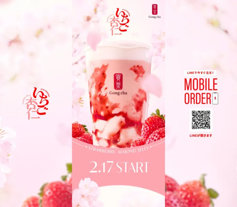
Gong cha’s spring campaign presents a strawberry and almond-jelly drink as a large, tactile centerpiece. White foam, translucent pink tea, irregular white jelly, and saturated fruit are framed by pale cherry blossoms. Red campaign lettering and condensed ordering graphics provide sharp focal points within the soft photographic atmosphere. The lower page introduces mint green, coral controls, nostalgic illustrated collaboration material, and a dark brown brand footer.
The defining structure is a long, phone-width composition retained on desktop. At 1440px, the main column is exactly 430px wide, with 505px of space on each side. Those margins contain blossom scenery, a repeated campaign mark on the left, and a mobile-order QR graphic on the right. At 390px, the central composition fills the viewport and the desktop side material is absent. The experience remains one continuous vertical campaign story rather than expanding into a wide desktop layout.
The supplied record reports HTTP 200 and an unchanged final URL. It shows the design currently served at this address, including its 2025 promotional copy. Dates such as 2.17 START describe the page’s content; they are not the inspection date or confirmation that an offer remains available.
How to Read This Reference
- Measured means a value supplied in rendered element bounds, computed styles, or CSS custom properties. Measurements are CSS pixels unless stated otherwise.
- Visual estimate means an approximate dimension or treatment read from the supplied original-page screenshots. It is not a pixel-sampled color or a recovered CSS declaration.
- Derived means a calculation from measured values. The 375-unit scaling model below fits many measurements, but the complete source formulas and breakpoint rules were not supplied.
- Recommended means an implementation choice for reuse. The CSS and prompts are adaptations, not recovered production code.
- Artwork lettering is separate from interface typography. Several visually prominent headings have empty extracted text and inherited font metrics. Their parent font size does not measure the visible lettering.
- Only the supplied evidence was analyzed. No additional browsing, linked-document inspection, asset retrieval, or interaction testing was performed.
Tokens — Colors
Default Palette
Hex values in this table are measured source custom-property values. Roles are established by the screenshots and, where available, matching computed text or background colors. Photographic assets can contain nearby shades that do not correspond exactly to a CSS token.
| Name | Value | Source token | Role and evidence |
|---|---|---|---|
| Petal Pink | #FFA6B1 |
--color-pink-1 |
Main pink campaign field; visually corresponds to the launch-date band beneath the drink |
| Strawberry Coral | #EF4A5F |
--color-pink-2 |
Collaboration emphasis, prominent action faces, and sharing graphics |
| Campaign Red | #FB0000 |
--color-red-1 |
Measured color of section captions; visually echoed by campaign lettering and the ordering graphic |
| Spring Mint | #87DCAC |
--color-green-1 |
Visually corresponds to the closing campaign/share field and date ribbon |
| Pale Blush | #FFF3F3 |
--color-pink-8 |
Light panel tone; useful as a reusable fallback behind campaign content |
| Body Gray | #595757 |
--color-black-3 |
Measured collaboration paragraphs and explanatory copy |
| Tea Brown | #763B2F |
--color-brown-1 |
Measured introductory narrative text |
| Dark Wine | #2E0B0E |
--color-black-6 |
Measured coupon explanation, participation steps, and lower rules link |
| Footer Brown | #382B20 |
--color-black-2 |
Measured solid footer background |
| White | #FFFFFF |
--color-white-1 |
Measured participation-button surfaces and reversed text; visible social icons and footer wordmark |
The pale central collaboration area appears slightly warmer and lighter than some inset blush panels. Its exact painted background declaration was not included. Do not claim that every pale region is a flat #FFF3F3 fill: photography, graphic assets, and overlapping surfaces contribute to the appearance.
Supporting Source Colors
The record also declares #FFD0D0, #FFC9C8, #FFEAE5, #F5929F, and #FFB0B7 as additional pink tones. Fine pink rules are visible in the collaboration excerpt, but their exact declaration was not isolated. Using #FFC9C8 for those rules is a recommended mapping.
Neutral declarations include #000000, #4D4D4D, and #E6E6E6. A #FFFF00 token is present, but the supplied screenshots do not establish a major yellow interface role. Token presence alone is not a reason to add another prominent accent.
The page’s hierarchy depends on distinct jobs for its stronger colors: red identifies and attracts attention, coral supports campaign actions, mint marks the closing social chapter, and brown carries brand closure and readable text.
Tokens — Typography
Main Japanese Text
- Measured stack:
"Noto Sans JP", sans-serif, supplied through--ff-root. - Measured weights:
700for introductory and collaboration lead copy;500for several explanatory paragraphs. - Character: clear Japanese sans-serif typography with generous line spacing. Longer paragraphs remain compact in width but open vertically.
- Measured color roles: tea brown in the introduction; gray in collaboration descriptions; red in section captions.
A computed family stack establishes the declared typography, not independent proof that every named font file loaded successfully.
Campaign Instructions and Utility Copy
- Measured stack:
"Zen Kaku Gothic New", sans-serif, supplied through--ff-ZenKakuGothicNew. - Measured uses: the photo-frame link, collaboration prize explanation, coupon copy, participation steps, rules links, and final legal text.
- Weights: generally
700for instructions and actions;500for the closing disclaimer. - Tracking: varies by role rather than following one global value. The coupon description is slightly tightened; step labels have a small positive spacing.
Display Lettering and Brand Artwork
The campaign mark combines expressive Japanese lettering with small curved English text. The launch date is a thin, high-contrast serif composition. MOBILE ORDER is tall and condensed, while FOLLOW US uses widely spanning white serif capitals. The Gong cha marks retain their supplied brand treatment.
These visible styles must not be assigned a fabricated font family. Several relevant heading elements have no extracted text, and their measured parent fonts are ordinary inherited sans-serif values. Treat the display lettering as authored artwork until the actual assets or child styles are available.
The source declares --ff-lato: "Lato", serif, but the supplied element sample does not establish where it is used. It is not evidence that the launch date, footer lettering, or ordering graphic uses Lato.
Type Scale
Desktop values refer to the 430px content column; mobile values refer to the 390px viewport. Values are rounded for readability.
| Role | Family | Weight | Desktop size / line height | Mobile size / line height | Tracking |
|---|---|---|---|---|---|
| Introductory narrative | Noto Sans JP | 700 | 18.35 / 38.99px |
16.64 / 35.36px |
0.05em; final paragraph 0.07em |
Section captions such as ラインナップ |
Noto Sans JP | 700 | 20.64 / 35.55px |
18.72 / 32.24px |
0.05em for lineup; normal for features |
| Collaboration lead | Noto Sans JP | 700 | 18.35 / 32.11px |
16.64 / 29.12px |
-0.01em |
| Sticker explanation | Noto Sans JP | 500 | 16.05 / 29.81px |
14.56 / 27.04px |
0.05em |
| Photo-frame explanation | Noto Sans JP | 500 | 16.05 / 29.81px |
14.56 / 27.04px |
0.04em |
| Calendar explanation | Noto Sans JP | 500 | 16.05 / 29.81px |
14.56 / 27.04px |
0.06em |
| Photo-frame link | Zen Kaku Gothic New | 700 | 14.91 / 22.36px |
13.52 / 20.28px |
-0.06em |
| Collaboration prize explanation | Zen Kaku Gothic New | 700 | 18.35 / 33.02px |
16.64 / 29.95px |
-0.01em |
| Coupon description | Zen Kaku Gothic New | 700 | 18.35 / 27.52px |
16.64 / 24.96px |
-0.04em |
| Follow/repost instructions | Zen Kaku Gothic New | 700 | 14.91 / 22.36px |
13.52 / 20.28px |
0.01em |
| First campaign rules link | Zen Kaku Gothic New | 700 | 13.76 / 22.93px |
12.48 / 20.80px |
0.05em |
| Closing legal copy | Zen Kaku Gothic New | 500 | 14.91 / 25.23px |
13.52 / 22.88px |
Normal |
Visual estimates for artwork: the launch-date lettering spans approximately 280–285px on desktop and 255px on mobile. The FOLLOW US lettering spans approximately 290px and 265px respectively. These are visible graphic spans, not recovered font sizes. The desktop collaboration headline appears approximately 30px tall in its larger lines; its corresponding mobile middle section was not supplied as a screenshot.
Tokens — Spacing & Shapes
Base composition: a 375-unit design expanded to a 430px desktop column or a 390px mobile column.
Density: large photographic and decorative intervals around narrower, relatively dense explanatory text.
Shape language: curved chapter boundaries, lightly rounded action panels, a slanted date ribbon, and mostly unboxed imagery.
Responsive Unit
The source exposes --design-width: 375 and --contents-width: 375. The desktop sample also exposes --contents-width-pc: 430.
Many measured values fit this derived model:
W = rendered content-column width
1u = W / 375

Desktop: W = 430px; 1u ≈ 1.146667px
Mobile:  W = 390px; 1u = 1.04px
For example, 14u gives the measured explanatory text sizes of 16.0533px and 14.56px; 10u gives the measured button radii of 11.4667px and 10.4px.
This is a reuse model inferred from measurements, not a verbatim source stylesheet formula.
The root font size has a separate behavior: desktop HTML computes to 16px, while mobile HTML computes to 33.28px, with --root-fz changing from 16 to 32. Actual mobile paragraph text is much smaller than that inherited root value. Do not copy the mobile root size as a body-copy specification, or paste source-looking rem values into a conventional root without conversion.
Spacing Scale
| Use | Derived design value | Desktop | Mobile | Evidence |
|---|---|---|---|---|
| Extra inset inside explanatory paragraphs | 10u |
11.47px |
10.40px |
Measured padding |
| Participation-button vertical padding | 13u |
14.91px |
13.52px |
Measured padding |
| Photo-frame link top/bottom padding | 15u |
17.20px |
15.60px |
Measured padding |
| Header brand top/right offset | Approximately 17u |
19.48px |
17.67px |
Measured position |
| Participation-button horizontal padding | 20u |
22.93px |
20.80px |
Measured padding |
| Legal-text outer inset | Approximately 23u |
26.36px |
23.91px |
Measured position |
| Collaboration content outer inset | 26.5u |
30.39px |
27.56px |
Measured position |
| Campaign mark top offset | 32u |
36.69px |
33.27px |
Measured position |
| Introduction top padding | 71u |
81.41px |
73.84px |
Measured padding |
Large lower padding values also appear: the introduction has approximately 424.27px on desktop and 384.80px on mobile. These belong to its illustrated composition. They should not become a generic spacing token applied to ordinary text sections.
Border Radius
| Element | Value | Status |
|---|---|---|
| Two white participation controls | 11.47px desktop; 10.40px mobile |
Measured |
| Small white promotional pill | 34.40px desktop; 31.20px mobile |
Measured |
| Visible share-button faces | Approximately 4–5px |
Visual estimate |
| Outer white coupon panel and blush inset | Approximately 10–13px |
Visual estimate |
| Main column | No visible rounded outer container | Screenshot observation |
| Date ribbon | Angled strip with a folded-looking tip | Artwork geometry, not a rounded card |
Layout Measurements
| Element | Desktop 1440 × 1000 | Mobile 390 × 844 |
|---|---|---|
| Main column | 430px, starting at x = 505px |
390px, starting at x = 0 |
| Header layout box | 430 × 177.44px |
390 × 160.92px |
| Campaign H1 artwork box | 107.78 × 128.14px |
97.75 × 116.22px |
| Header brand anchor | 55.03 × 66.25px |
49.91 × 60.08px |
| Collaboration content width | 369.22px |
334.88px |
| Photo-frame anchor | 229.33 × 56.73px |
208 × 51.45px |
| First white participation button | 338.27 × 59.34px |
306.80 × 53.81px |
| Second white participation button | 338.27 × 61.11px |
306.80 × 55.41px |
| Lower X account anchor | Approximately 318.83 × 81.98px |
Approximately 289.13 × 74.34px |
| Legal text region | 377.28px wide |
342.19px wide |
| Footer | 430 × 128.05px |
390 × 133.13px |
| Full document height | 14149.41px |
12909.31px |
DOM anchor rectangles and visible painted button faces are not interchangeable. Several actions appear to include artwork padding or shadow space inside a larger anchor box.
Components
Desktop Scenery and Side Rails
Role: maintain campaign identity and ordering visibility while the central story scrolls.
The main column leaves two equal 505px side regions at the inspected desktop size. A soft, nearly white pink background fills them, with blurred blossoms above and large strawberries rising from the bottom edge. The center drink is much sharper than this surrounding scenery.
A red-and-pink campaign mark sits near the center of the left region. Its visible footprint is approximately 125 × 150px. The right region contains a vertically stacked order graphic approximately 160 × 310px: a white capsule carrying LINEで今すぐ注文!, large red MOBILE ORDER lettering, a small phone illustration, a black-and-white QR code in a white frame, and a short red caption.
These elements remain in the same screen locations across the desktop opening, middle, and ending captures. This establishes a screen-anchored appearance; the exact fixed/sticky declarations and background-sizing rules were not supplied.
The QR code’s destination was not decoded, and no corresponding ordering URL was identified in the supplied link list. Preserve its visual role without inventing its target.
Campaign Header and Product Hero
Role: establish product identity before explanatory text.
The campaign mark is centered near the top, while a smaller linked Gong cha mark occupies the upper-right corner of the content column. There is no visible navigation bar in the opening capture. The brand anchor points to the official Gong cha website.
The photographic composition continues behind the header. A large cup fills most of the column width: a softly domed white top, pink liquid, bright strawberry streaks, and large irregular white jelly pieces. Whole strawberries frame the lower cup and overlap the composition’s edge. Cherry blossoms soften the perimeter without competing with the drink’s texture.
At mobile width, preserve the full cup-and-fruit composition rather than replacing it with a shallow landscape crop. The header artwork scales proportionally: the campaign mark is about 97.75px wide at 390px and 107.78px at 430px.
Launch-Date Band and Curved Chapter Edges
Role: turn the product image into a seasonal announcement and connect it to the story below.
A saturated pink band rises along the sides of the fruit image and dips beneath the center of the cup. A fine white curved rule, small endpoint dots, and STRAWBERRY ALMOND JELLY follow that contour. Large thin serif lettering announces 2.17 START.
The band ends in another broad curved edge against the pale next section. Blossoms overlap this transition in the mobile opening capture. These are large compositional curves, not ordinary card corners.
Use authorized artwork or a purpose-built vector treatment for the curved lettering and seams. Generic border-radius on a rectangle will not reproduce their geometry. Avoid drawing the date twice if the supplied hero asset already contains it.
Introductory Copy and Section Titles
Role: move from sensory photography into the product story.
The DOM records an introduction beginning near document y = 827.89px on desktop and 773.75px on mobile. It contains an artwork-style heading followed by three groups of Japanese narrative copy. The text is bold tea brown, with unusually generous line height: approximately 2.125 times the font size.
The next two major sections use separate prominent heading graphics and smaller red Japanese captions, including ラインナップ and 特長. Their sampled caption size is 20.64px on desktop and 18.72px on mobile.
These sections are not fully represented in the supplied screenshots. Their text, heading bounds, and section geometry are documented; their complete image arrangements are not.
Product Lineup and Ingredient Story
Role: explain the three drink variants and the ingredients behind the campaign.
The rendered text identifies three variants: milk tea, frozen tea, and almond milk tea, with corresponding iced/frozen and size labels. The feature section then describes strawberry almond jelly, jasmine green tea, and strawberry sauce with fruit pieces.
The lineup occupies approximately 1281.97px of desktop document height and 1162.72px on mobile. The feature section occupies approximately 2419.92px and 2176.50px. These measurements establish substantial illustrated chapters, not compact utility lists.
The screenshots supplied for this task do not show the complete lineup or ingredient section. Do not infer a carousel, card grid, product-selection interaction, pricing layout, or exact ingredient-image crop from the text alone.
Collaboration Story and Date Ribbon
Role: introduce the 一期一会 collaboration and its sequential activities.
The central collaboration region is pale and approximately 369.22px wide inside the 430px column. Explanatory paragraphs add another 11.47px of padding on each side, placing their desktop text approximately 42px inward from the column edge.
The visible desktop excerpt shows two illustrated sticker examples above a paragraph. The pieces are slightly rotated in opposite directions, with small gray shadows and pastel blue/pink backgrounds. Their schoolgirl illustrations and handwritten Japanese lettering introduce a nostalgic printed-stationery character within the photographic campaign.
A mint date ribbon interrupts the left edge above the next activity. It reads 2.10 MON ~, slopes upward toward the right by approximately eight degrees, and has a folded-looking tip. This angle is a visual estimate. Below it, centered coral headings are separated from the body by fine pink rules.
The photo-frame heading has two levels: a smaller line explaining the five random designs, followed by a larger two-line activity title. The explanatory paragraph returns to left-aligned gray text with a generous line height. Preserve this alternation between graphic announcements and readable body copy.
Photo-Frame Access and Participation Controls
Role: connect the campaign page to an external photo-frame experience and participation information.
The フォトフレーム anchor points to an external AR experience. Its measured width is 200u: 229.33px on desktop and 208px on mobile. Its font is Zen Kaku Gothic New, bold, with tightened tracking and extra right padding.
The page text states that the photo-frame experience supports smartphones only and lists recommended operating-system/browser versions. Those are visible page statements; the destination and its present compatibility were not tested.
Further down, two native white buttons are measured at approximately 295u wide, with 10u corner radii and flex layout. Their extracted text is empty. The record does not establish their accessible names, click results, expanded state, or relationship to any hidden content. Do not describe them as confirmed accordions, tabs, or modal triggers.
Official X and Instagram anchors and a rules-document link are also present. The link labeled 応募要項を見る has a fine underline and a small document-style indicator in the visible lower campaign area. Linked documents were not opened.
Coupon Campaign Panel
Role: present a short participation sequence within the mint closing chapter.
The visible lower campaign uses a white rounded outer panel with a pale blush inset. Within the inset, an X mark sits above two compact instruction rows. Each row begins with an outlined coral step label, STEP1 or STEP2, followed by dark-wine text such as @gongcha_japanをフォロー and 対象ポストをリポスト.
A broad coral official-account action follows. Its visible face has rounded corners and a soft downward shadow. The measured enclosing X anchor is approximately 318.83 × 81.98px on desktop; the painted coral rectangle in the screenshot is smaller, approximately 290 × 54px. Preserve that distinction when translating an image-based action into live HTML.
The rules link sits below the inset on the white outer surface, centered with substantial breathing room. Its dark text and thin underline create a quieter secondary action.
Share Actions
Role: offer a compact social-sharing pair before the follow section.
A small white invitation line arcs gently above two side-by-side pale buttons. Fine diagonal strokes at its ends reinforce the cheerful announcement treatment.
The visible desktop button faces are approximately 180 × 68px, separated by about 22px. On mobile they are approximately 164 × 62px, with about 20px between them. These are screenshot estimates. The actual anchor bounds are larger: roughly 202 × 90px on desktop and 184 × 82px on mobile.
Each face contains a coral brand symbol and short sharing label. Both X and LINE use the campaign’s coral palette rather than separate platform-colored button fills. The supplied hrefs identify an X/Twitter sharing intent and a LINE text-sharing endpoint carrying the campaign URL and promotional text. Opening behavior was not tested.
Follow Section
Role: close the promotional story with ongoing brand channels.
Large white FOLLOW US lettering spans most of the mint column. Thin white rules extend from both sides toward the column edges. Below, Instagram, X, and TikTok symbols form a centered horizontal row.
The sampled anchor widths are approximately 34px, 35px, and 34px at both viewports. Their inline DOM heights differ with the inherited line box, so those heights should not be treated as the artwork’s visible dimensions.
This area is open and unboxed. Maintain generous vertical intervals between the share buttons, heading, social icons, and legal copy rather than enclosing each item in another card.
Legal Copy and Brand Footer
Role: conclude the page with product conditions and brand identity.
The legal paragraph is white Zen Kaku Gothic New at 14.91 / 25.23px on desktop and 13.52 / 22.88px on mobile. Its region is approximately 87.7% of the column width, with modest side insets.
The footer switches abruptly to the measured brown #382B20. A centered white Gong cha wordmark links to the official website, followed by a small copyright line identifying Gong cha Japan and 2025. The logo anchor is 168.55px wide on desktop and 152.88px on mobile.
The footer measures 128.05px tall on desktop and 133.13px on mobile. It is a useful reminder that the page does not scale as one uniform bitmap: inherited line boxes and local responsive rules affect the final result.
Tokens — Motion & Interaction
| Treatment | Supplied evidence | What can be concluded |
|---|---|---|
| Campaign H1 transition | opacity 0.75s 0.2s, transform 0.75s 0.2s |
A transition is defined for opacity and transform, with a 200ms delay; initial/final transform values and triggering logic were not supplied |
| Link and button transition | opacity 0.3s on numerous anchors and buttons |
A short opacity transition is defined |
| Hover configuration | --hover-duration: .3s; --hover-opacity-ratio: 0.8 |
These source values support a reusable fade treatment, but a hovered endpoint was not captured |
| Desktop side content | Same screen placement in three different scroll captures | Persistent screen-anchored appearance is observed |
| Decorative petals | Petals are visible in opening compositions | Static screenshots do not establish their animation path, speed, loop, or trigger |
| Sampled element animations | animation: none on the listed nodes |
No keyframe animation is reported for those nodes; this does not rule out animated descendants, pseudo-elements, or other layers |
| Sharing and external actions | Destinations are present in anchor hrefs | Link intent is known; successful navigation, app handoff, and destination behavior are unverified |
| Two participation buttons | Native button elements and geometry are present | Activation behavior is unverified |
The capture system initially observed the page for at least five seconds and checked loading, finite animation, layout stability, and image decoding within stated limits. Perpetual animations were paused during readiness checks and resumed afterward. Those procedures improve screenshot readiness; they do not provide a complete motion recording.
For reuse, keep the page visually complete without animation. A short logo entrance and subtle link fade fit the measured settings. Any falling-petal animation is an optional new treatment and must not be represented as a recovered original behavior.
Surfaces
| Layer | Appearance | Structural purpose |
|---|---|---|
| Desktop scenery | Pale photographic blossom field with blurred fruit and flowers | Creates atmosphere around the narrow column |
| Hero | Sharp drink photography with overlapping fruit and blossoms | Carries the strongest sensory detail |
| Launch band | Solid pink, white lettering, broad curved boundaries | Announces the date and bridges into the narrative |
| Collaboration content | Pale warm surface, thin pink rules, coral headings | Supports longer explanatory material |
| Closing chapter | Flat mint field | Separates campaign participation and social closure |
| Outer campaign panel | White rounded surface | Groups instructions and secondary information |
| Inset panel | Very pale blush | Separates the short step sequence |
| Action face | Coral or pale pink, with restrained soft shadow | Supplies localized emphasis and touch affordance |
| Footer | Solid dark brown with white identity | Finishes the page with strong brand contrast |
There is no visible shadow around the main column. Shadows are local to selected actions and illustrated pieces. The blurred background is photographic depth, not evidence of a glass or backdrop-filter system.
Imagery
The hero depends on appetizing physical detail: moisture on the cup, small strawberry seeds, glossy fruit, soft foam, translucent pink liquid, and irregular jelly pieces. Preserve those differences in texture. A flat drink illustration would lose much of the source’s impact.
The surrounding scenery uses shallow-focus blossoms and strawberries with a very light pink cast. It supports the hero by lowering detail and contrast at the edges. The sharply focused center and blurred margins are more important than adding extra decorative objects.
The collaboration stickers introduce another deliberate visual language: small illustrated school scenes, pastel stationery colors, irregular lettering, and slightly rotated paper. Keep that material recognizably distinct from the product photography while tying it back through pink and red accents.
Campaign marks, curved English lettering, launch-date graphics, and branded social symbols should retain their authored proportions. The evidence does not identify their file formats or an icon library.
Observed Asset References
No image/SVG URLs, intrinsic dimensions, or asset manifest were included in the supplied record. These are observed asset roles, not proposed source filenames.
| Asset role | Where observed | Treatment to preserve |
|---|---|---|
| Drink hero composition | Desktop and mobile opening | Full-height cup, sharp fruit and jelly, soft blossom perimeter |
| Desktop scenery | All desktop screenshots | Low-contrast blur; flowers above and strawberries near the bottom |
| Campaign lettering | Header and desktop left side | Two-tone Japanese mark and small curved English lettering |
| Launch-date composition | Desktop and mobile opening | Thin serif date, curved caption/rule, broad pink band |
| Collaboration sticker examples | Desktop middle excerpt | Two tilted illustrated pieces with pastel backgrounds and small shadows |
| Mobile-order graphic and QR | Desktop right side | Tall red lettering and crisp black/white code within a white frame |
| Share and social graphics | Desktop and mobile ending | Coral sharing symbols; white follow icons |
| Footer wordmark | Desktop and mobile ending | White brand artwork on dark brown |
Use authorized assets where available. For a new implementation, reserve image dimensions to prevent layout shifts, provide suitable high-density variants, and keep QR edges crisp. Do not use pixelated rendering for the photography.
Layout & Responsive Behavior
The desktop is a three-region composition at the viewport level: atmospheric left margin, narrow central story, and atmospheric right margin. The central content itself remains a single vertical sequence. On mobile, only that central sequence is visible.
The two measured states support a reusable width: min(100%, 430px) column. They do not reveal the exact breakpoint at which the original hides its side material. A 960px threshold is a reasonable implementation recommendation because it leaves room for a 430px column and two usable side regions; it is not a measured source breakpoint.
The derived scale ratio is 430 / 390 ≈ 1.10256. Many widths, text sizes, and insets follow it closely. Some inline artwork line boxes, chapter offsets, and footer heights do not.
| Chapter | Desktop top / height | Mobile top / height | Evidence boundary |
|---|---|---|---|
| Introduction | 827.89 / 982.31px |
773.75 / 891.03px |
Text and geometry supplied; opening screenshots show its upper decorative boundary |
| Lineup | 1810.20 / 1281.97px |
1664.78 / 1162.72px |
DOM text and geometry; complete visuals not supplied |
| Features | 3008.47 / 2419.92px |
2751.59 / 2176.50px |
DOM text and geometry; complete visuals not supplied |
| Collaboration | 5308.00 / 5122.70px |
4818.91 / 4665.20px |
DOM evidence plus a desktop middle excerpt |
| Lower coupon campaign | 12685.97 / 752.98px |
11529.59 / 670.08px |
DOM evidence and partial ending screenshots |
| Follow/legal section | 13729.11 / 292.25px |
12475.72 / 300.47px |
DOM evidence and ending screenshots |
Some section rectangles overlap. For example, the feature section begins approximately 84px before the desktop lineup rectangle ends, and approximately 76px before it ends on mobile. The exact CSS mechanism was not supplied. Preserve the visually connected chapter boundaries rather than assuming every section needs another independent margin or card wrapper.
Keep the main document naturally scrollable. The observed document heights are approximately 14.15k pixels on desktop and 12.91k pixels on mobile; this is not a fixed-height application shell. Additional tablet widths, landscape behavior, safe-area handling, and zoom states were not inspected.
Do’s and Don’ts
Do
- Keep the desktop content column at the observed 430px scale and center it within broad photographic margins.
- Let the same composition fill the 390px mobile viewport.
- Preserve the contrast between a sharp drink hero and soft peripheral blossoms.
- Use the distinct pink, red, coral, mint, and brown roles rather than spreading every color evenly.
- Retain the oversized cup, visible jelly pieces, and strawberry foreground.
- Treat the campaign mark, curved lettering, and date as authored display material.
- Use measured Noto Sans JP and Zen Kaku Gothic New stacks for the corresponding live-text roles.
- Preserve the generous Japanese paragraph line heights and narrow text regions.
- Keep the collaboration’s tilted paper artwork, mint date strip, and thin pink dividers.
- Retain the side-by-side X and LINE share buttons on the inspected mobile width.
- Separate the open mint follow area from the compact dark brown footer.
- Distinguish painted artwork dimensions from enclosing anchor and line-box measurements.
Don’t
- Don’t expand the campaign into a wide desktop product grid without a new design rationale.
- Don’t replace the opening with a shallow banner that cuts off the cup or jelly.
- Don’t assign a guessed font family to the launch date, order lettering, or brand marks.
- Don’t treat the mobile
33.28pxroot size as the intended paragraph size. - Don’t flatten all copy into images simply because some headings use artwork.
- Don’t add a shadow or rounded frame around the entire central column.
- Don’t turn the page into a repeated stack of generic cards; much of its identity comes from continuous illustrated chapters.
- Don’t assume the two native participation buttons are accordions or tabs.
- Don’t fabricate a QR destination, current prize availability, or successful external app handoff.
- Don’t claim falling petals, parallax, or other motion from static composition alone.
- Don’t impose fixed section heights when the corresponding artwork and content are unavailable.
Recommended Implementation Additions
These are recommendations for a new implementation, not verified features of the original page:
- Give image-based headings and actions appropriate text alternatives. Empty extracted text does not prove missing accessible names, so inspect actual alt text and SVG labeling before deciding what needs repair.
- Keep explanatory and legal copy as selectable text. Use real heading levels even when an authorized graphic supplies the visible lettering.
- Provide visible keyboard focus for brand links, share actions, rules links, and participation controls. Expand small social-icon hit areas without enlarging the visible marks unnecessarily.
- Review small white text on mint and white action text on coral for contrast. For legal copy, dark wine on mint is a practical accessible variation that preserves the palette.
- Keep the QR’s white quiet zone intact and provide a text-link alternative when a verified ordering destination is available.
- Provide reduced-motion behavior and a complete static composition. Do not make content visibility depend on an animation successfully running.
- Preserve image aspect ratios, prioritize the opening hero, and defer lower-page imagery where appropriate. Avoid stretching one low-resolution desktop screenshot across multiple viewport sizes.
- Test the recommended side-rail breakpoint, narrow screens, zoom, long translated copy, and footer wrapping. Do not assume the two captured viewports cover those states.
- If rebuilding participation controls, define their actual behavior and keyboard semantics before choosing disclosure, tab, or dialog patterns.
Agent Prompt Guide
Quick Color Reference
- Hero band: petal pink
#FFA6B1. - Campaign labels and strongest red artwork:
#FB0000. - Collaboration emphasis and primary action faces: coral
#EF4A5F. - Closing social chapter: mint
#87DCAC. - Pale panel fallback:
#FFF3F3; photographed pale regions may differ. - Explanatory copy: gray
#595757. - Introductory copy: tea brown
#763B2F. - Participation instructions: dark wine
#2E0B0E. - Brand footer: brown
#382B20with white artwork.
Overall Prompt
“Create a spring beverage campaign reference using a single 430px centered content column on desktop and a full-width column at 390px mobile. Surround the desktop column with very pale pink, softly blurred cherry-blossom scenery and strawberries near the bottom. Place campaign artwork in the left side region and a tall red mobile-order graphic with an authorized QR asset in the right region; keep their screen positions stable as the document scrolls. Lead with a large, sharply photographed pink drink containing white jelly and strawberry pieces, a centered campaign mark, and a small brand mark at the upper right. Follow it with a pink launch-date band using curved white lettering and thin serif date artwork. Continue into narrow Japanese explanatory copy, nostalgic illustrated collaboration material, a mint date ribbon, coral headings, and pale panels. Finish with mint social sections and a dark brown footer. Use the measured body typography and spacing model; keep authored lettering separate from live text. Treat unrecorded motion and button behavior as implementation decisions.”
Example Component Prompts
- Hero: “Compose a tall strawberry-and-jelly drink photograph for a 375-unit design canvas. Keep white foam, translucent pink tea, white jelly, and vivid red fruit distinct. Frame the lower cup with whole strawberries and the outer edges with pale blossoms. Preserve room for an authorized campaign mark and small top-right brand link. Avoid a landscape crop.”
- Desktop frame: “Center a 430px campaign column in a 1440px viewport, leaving two 505px scenery regions. Position a roughly 125 × 150px campaign mark near the left region’s center and a roughly 160 × 310px order graphic near the right region’s center. Use a fixed-position adaptation for the rails and hide them below a separately tested breakpoint.”
- Collaboration activity: “Build a pale campaign section with two slightly tilted illustrated sticker pieces, gray Japanese copy, and a mint date strip angled upward by about eight degrees. Place a small coral descriptor above a larger centered two-line headline and separate the text with fine pink rules. Use a 322-unit inner region with 10-unit additional paragraph padding.”
- Participation panel: “Place a white rounded panel on mint green, with a pale blush inset, two outlined coral step tags, dark-wine instructions, and a wide coral account action with a restrained shadow. Put the underlined rules link below the inset. Define the real action behavior separately; do not imply an unverified accordion.”
- Social ending: “Use two pale share buttons in one row, with coral X and LINE graphics. Below them, add large white serif-style FOLLOW US artwork between thin horizontal rules, followed by white Instagram, X, and TikTok marks. Keep the area open and end with a brown footer carrying white brand artwork.”
Quick Start
CSS Custom Properties
This is a reusable HTML/CSS adaptation. It preserves the measured column width and the derived 375-unit proportions while keeping a conventional root font size. The 960px rail breakpoint, CSS-drawn button faces, shadows, and display-font fallback are recommendations. The hero composition, logos, curved date lettering, and QR require appropriate assets; the snippet does not invent their URLs.
Suggested structure: a decorative .desktop-scenery, optional .desktop-rail elements, and one .campaign-column containing the hero, content chapters, campaign panels, share/follow blocks, and footer. Scope the rules to a page dedicated to this composition.
:root {
  /* Measured source palette, with semantic adaptation aliases. */
  --gc-pink: #ffa6b1;
  --gc-coral: #ef4a5f;
  --gc-red: #fb0000;
  --gc-mint: #87dcac;
  --gc-paper: #fff3f3;
  --gc-gray: #595757;
  --gc-tea: #763b2f;
  --gc-wine: #2e0b0e;
  --gc-footer: #382b20;
  --gc-white: #fff;
  --gc-rule: #ffc9c8;

  /* Measured family stacks; load licensed font files separately. */
  --font-body: 'Noto Sans JP', sans-serif;
  --font-campaign: 'Zen Kaku Gothic New', sans-serif;
  --font-display-fallback: serif;

  /* Derived scaling model, not recovered source CSS. */
  --content-max: 430px;
  --u: calc(min(100vw, 430px) / 375);
  --text-copy: calc(14 * var(--u));
  --text-lead: calc(16 * var(--u));
  --text-caption: calc(18 * var(--u));
  --text-action: calc(13 * var(--u));
  --radius-control: calc(10 * var(--u));
  --inset-inner: calc(10 * var(--u));

  /* Source transition configuration. */
  --hover-duration: 300ms;
  --hover-opacity: 0.8;

  /* Recommended shadow approximation. */
  --shadow-action: 0 6px 10px rgb(56 43 32 / 16%);
}

* {
  box-sizing: border-box;
}

html {
  font-size: 16px;
}

body {
  margin: 0;
  color: var(--gc-gray);
  background: var(--gc-paper);
  font-family: var(--font-body);
}

img {
  max-width: 100%;
}

.desktop-scenery {
  position: fixed;
  inset: 0;
  z-index: 0;
  pointer-events: none;
  background-color: var(--gc-paper);
  /* Set this property to an authorized scenery image. */
  background-image: var(--desktop-scenery-image, none);
  background-position: center;
  background-size: cover;
}

.campaign-column {
  position: relative;
  z-index: 1;
  width: min(100%, var(--content-max));
  margin-inline: auto;
  background: var(--gc-paper);
}

.desktop-rail {
  display: none;
}

/* Recommended breakpoint; the original threshold was not supplied. */
@media (min-width: 960px) {
  .desktop-rail {
    position: fixed;
    inset-block: 0;
    z-index: 2;
    display: grid;
    place-items: center;
    width: calc((100vw - var(--content-max)) / 2);
    pointer-events: none;
  }

  .desktop-rail--left {
    left: 0;
  }

  .desktop-rail--right {
    right: 0;
  }

  .desktop-rail a {
    pointer-events: auto;
  }

  .rail-campaign-mark {
    display: block;
    width: 128px;
  }

  .rail-order-art {
    display: block;
    width: 160px;
  }
}

.hero {
  position: relative;
  isolation: isolate;
}

.hero__scene,
.launch-art {
  display: block;
  width: 100%;
  height: auto;
}

/* Use separate marks only when they are absent from the scene asset. */
.hero__campaign-mark {
  position: absolute;
  z-index: 2;
  top: calc(32 * var(--u));
  left: 50%;
  width: calc(94 * var(--u));
  margin: 0;
  transform: translateX(-50%);
  transition: opacity 750ms 200ms, transform 750ms 200ms;
}

.hero__brand-link {
  position: absolute;
  z-index: 2;
  top: calc(17 * var(--u));
  right: calc(17 * var(--u));
  display: block;
  width: calc(48 * var(--u));
}

.hero__campaign-mark img,
.hero__brand-link img {
  display: block;
  width: 100%;
  height: auto;
}

.content-inner {
  width: calc(322 * var(--u));
  max-width: 100%;
  margin-inline: auto;
}

.intro-copy {
  color: var(--gc-tea);
  font-size: var(--text-lead);
  font-weight: 700;
  line-height: 2.125;
  letter-spacing: 0.05em;
  text-align: center;
}

.section-caption {
  color: var(--gc-red);
  font-size: var(--text-caption);
  font-weight: 700;
  line-height: calc(31 * var(--u));
  text-align: center;
}

.collaboration-lead {
  font-size: var(--text-lead);
  font-weight: 700;
  line-height: 1.75;
  letter-spacing: -0.01em;
}

.body-copy {
  padding-inline: var(--inset-inner);
  font-size: var(--text-copy);
  font-weight: 500;
  line-height: calc(26 * var(--u));
  letter-spacing: 0.05em;
  overflow-wrap: anywhere;
}

/* Live-text approximation of the visible collaboration heading. */
.event-heading {
  padding-block: calc(20 * var(--u));
  border-block: 1px solid var(--gc-rule);
  color: var(--gc-coral);
  font-size: calc(26 * var(--u));
  font-weight: 700;
  line-height: 1.35;
  text-align: center;
}

.date-ribbon {
  position: relative;
  display: inline-flex;
  align-items: center;
  gap: calc(6 * var(--u));
  padding: calc(6 * var(--u)) calc(20 * var(--u));
  color: var(--gc-white);
  background: var(--gc-mint);
  transform: rotate(-8deg);
  transform-origin: left center;
}

.mint-chapter {
  background: var(--gc-mint);
}

.campaign-panel {
  width: 86.7%;
  margin-inline: auto;
  padding: calc(15 * var(--u));
  border-radius: var(--radius-control);
  background: var(--gc-white);
}

.campaign-panel__inset {
  padding: calc(20 * var(--u));
  border-radius: var(--radius-control);
  color: var(--gc-wine);
  background: var(--gc-paper);
  font-family: var(--font-campaign);
}

.participation-control {
  display: flex;
  align-items: center;
  justify-content: space-between;
  width: calc(295 * var(--u));
  max-width: 100%;
  margin-inline: auto;
  padding: calc(13 * var(--u)) calc(20 * var(--u));
  border: 0;
  border-radius: var(--radius-control);
  background: var(--gc-white);
  cursor: pointer;
}

.step-row {
  display: flex;
  align-items: baseline;
  gap: calc(10 * var(--u));
  margin-block: calc(8 * var(--u));
  font-size: var(--text-action);
  font-weight: 700;
  line-height: 1.5;
  letter-spacing: 0.01em;
}

.step-label {
  flex: none;
  padding-inline: 0.4em;
  border: 1px solid var(--gc-coral);
  border-radius: 3px;
  color: var(--gc-coral);
  background: var(--gc-white);
}

.action-link {
  display: flex;
  align-items: center;
  justify-content: center;
  min-height: calc(48 * var(--u));
  padding: calc(13 * var(--u)) calc(15 * var(--u));
  border-radius: var(--radius-control);
  color: var(--gc-white);
  background: var(--gc-coral);
  box-shadow: var(--shadow-action);
  font-family: var(--font-campaign);
  font-size: var(--text-action);
  font-weight: 700;
  line-height: 1.5;
  text-align: center;
  text-decoration: none;
}

.rules-link {
  display: table;
  margin: calc(26 * var(--u)) auto calc(15 * var(--u));
  padding-bottom: calc(5 * var(--u));
  border-bottom: 1px solid currentColor;
  color: var(--gc-wine);
  font-family: var(--font-campaign);
  font-size: var(--text-action);
  font-weight: 700;
  text-decoration: none;
}

.share-links {
  display: grid;
  grid-template-columns: repeat(2, minmax(0, 1fr));
  gap: calc(19 * var(--u));
  padding-inline: calc(21 * var(--u));
}

.share-link {
  display: flex;
  align-items: center;
  justify-content: center;
  gap: calc(10 * var(--u));
  min-height: calc(60 * var(--u));
  padding: calc(10 * var(--u));
  border-radius: calc(4 * var(--u));
  color: var(--gc-coral);
  background: var(--gc-paper);
  box-shadow: var(--shadow-action);
  font-size: var(--text-action);
  font-weight: 700;
  text-decoration: none;
}

.follow-block {
  padding-block: calc(60 * var(--u)) calc(20 * var(--u));
  color: var(--gc-white);
}

/* Generic serif fallback; replace with authorized display artwork. */
.follow-heading {
  display: flex;
  align-items: center;
  gap: calc(14 * var(--u));
  margin: 0;
  font-family: var(--font-display-fallback);
  font-size: calc(38 * var(--u));
  font-weight: 400;
  line-height: 1;
  white-space: nowrap;
}

.follow-heading::before,
.follow-heading::after {
  content: '';
  flex: 1;
  border-top: 1px solid currentColor;
}

.social-links {
  display: flex;
  justify-content: center;
  gap: calc(36 * var(--u));
  margin-block: calc(34 * var(--u)) calc(44 * var(--u));
}

/* Recommended hit area; the source inline boxes were smaller. */
.social-link {
  display: grid;
  place-items: center;
  width: 44px;
  min-height: 44px;
  color: inherit;
}

.social-link img,
.social-link svg {
  display: block;
  width: 34px;
  height: 40px;
  object-fit: contain;
}

.legal-copy {
  width: calc(329 * var(--u));
  max-width: 100%;
  margin-inline: auto;
  font-family: var(--font-campaign);
  font-size: var(--text-action);
  font-weight: 500;
  line-height: calc(22 * var(--u));
}

/* Recommended contrast variation for small text on mint. */
.legal-copy--contrast {
  color: var(--gc-wine);
}

.brand-footer {
  padding: calc(25 * var(--u)) 12px calc(14 * var(--u));
  color: var(--gc-white);
  background: var(--gc-footer);
  text-align: center;
}

.brand-footer__logo {
  display: block;
  width: calc(147 * var(--u));
  margin-inline: auto;
}

.brand-footer__logo img {
  display: block;
  width: 100%;
  height: auto;
}

/* Copyright size is a recommendation, not a measured source value. */
.brand-footer__copyright {
  margin: calc(26 * var(--u)) 0 0;
  font-size: 11px;
  line-height: 1.5;
  letter-spacing: 0.04em;
}

.campaign-column a,
.campaign-column button,
.desktop-rail a {
  transition: opacity var(--hover-duration);
}

@media (hover: hover) {
  .campaign-column a:hover,
  .campaign-column button:hover,
  .desktop-rail a:hover {
    opacity: var(--hover-opacity);
  }
}

/* Recommended keyboard focus treatment. */
.campaign-column :focus-visible,
.desktop-rail a:focus-visible {
  outline: 3px solid var(--gc-wine);
  outline-offset: 4px;
}

.brand-footer :focus-visible {
  outline-color: var(--gc-white);
}

@media (prefers-reduced-motion: reduce) {
  .campaign-column *,
  .campaign-column *::before,
  .campaign-column *::after,
  .desktop-rail * {
    animation: none !important;
    transition: none !important;
  }
}
The hero remains visible by default. Its transition declaration alone does not recreate the original entrance trigger. Add any reveal logic only after defining a reliable visible fallback. Decorative seams and the date band should be supplied as artwork rather than approximated through arbitrary section heights.
Tailwind v4 Token Mapping
Optional aliases for a project that already uses Tailwind v4. Define the custom properties above first. This mapping does not imply that the original site uses Tailwind.
@theme inline {
  --color-petal: var(--gc-pink);
  --color-coral: var(--gc-coral);
  --color-campaign-red: var(--gc-red);
  --color-mint: var(--gc-mint);
  --color-blush: var(--gc-paper);
  --color-copy-gray: var(--gc-gray);
  --color-tea: var(--gc-tea);
  --color-wine: var(--gc-wine);
  --color-footer-brown: var(--gc-footer);

  --font-japanese: 'Noto Sans JP', sans-serif;
  --font-campaign: 'Zen Kaku Gothic New', sans-serif;
  --font-display: serif;

  --text-copy: calc(14 * var(--u));
  --text-lead: calc(16 * var(--u));
  --text-section-caption: calc(18 * var(--u));
  --text-action: calc(13 * var(--u));

  --spacing-design-unit: var(--u);
  --spacing-content-column: 430px;
  --spacing-content-inner: calc(322 * var(--u));
  --spacing-copy-inset: calc(10 * var(--u));

  --radius-control: calc(10 * var(--u));
  --radius-share: calc(4 * var(--u));
}
Sources & Evidence
- Original and final page: Gong cha — Strawberry Almond Jelly 2025. The supplied browser record reports HTTP 200 and identical original/final URLs.
- Actual capture timestamp:
2026-09-12T19:04:55.447Z, or September 13, 2026, at 04:04:55.447 JST. - Desktop evidence: 1440 × 1000 CSS-pixel opening, collaboration excerpt, and ending screenshots; rendered text, selected element rectangles, computed styles, custom properties, and link destinations. Document height: approximately
14149.41px. - Mobile evidence: 390 × 844 CSS-pixel opening and ending screenshots, with the corresponding rendered DOM/style sample. Document height: approximately
12909.31px. - Original-page identity: the page title identifies Gong cha Japan, the footer says
Copyright (C) 2025 Gong cha Japan. All Rights Reserved., and header/footer brand anchors point tohttps://www.gongcha.co.jp/. No production credit was established from the inspected original-page evidence. - Observed behavior: multiple scroll positions show persistent desktop side material. H1 and link transition declarations were supplied. Link destinations are recorded, but click outcomes, the QR destination, participation-button behavior, external photo-frame operation, and document contents were not tested.
- Inspection limits: only selected chapters have screenshots. The complete asset manifest, source breakpoint rules, motion keyframes, font-loading results, accessible-name attributes, and additional viewport states were not supplied. Capture readiness checks do not prove semantic completeness or reveal delayed and unexercised states.
This reference describes the page present in the supplied current capture. Measured values, visual estimates, derived scaling, and recommended implementation choices are identified separately throughout.
# Gong cha / Strawberry Almond Jelly 2025 — Style Reference

> A narrow spring drink poster surrounded by soft blossoms, vivid strawberries, and a persistent invitation to order.

**Website:** [Gong cha — Strawberry Almond Jelly 2025](https://campaign.gongcha.co.jp/ichigoannin-2025/index.html)
**Original URL:** https://campaign.gongcha.co.jp/ichigoannin-2025/index.html
**Final URL:** https://campaign.gongcha.co.jp/ichigoannin-2025/index.html
**Theme:** light; blush pink, strawberry red, mint green, and warm brown.
**Inspected:** September 13, 2026, at 04:04:55.447 JST, corresponding to September 12, 2026, at 19:04:55.447 UTC. This is the supplied capture timestamp.
**Viewports:** desktop 1440 × 1000 CSS pixels; mobile 390 × 844 CSS pixels.
**Scope:** desktop opening, collaboration excerpt, and ending captures; mobile opening and ending captures; full-page rendered text and selected element geometry/computed styles at both sizes.

Gong cha’s spring campaign presents a strawberry and almond-jelly drink as a large, tactile centerpiece. White foam, translucent pink tea, irregular white jelly, and saturated fruit are framed by pale cherry blossoms. Red campaign lettering and condensed ordering graphics provide sharp focal points within the soft photographic atmosphere. The lower page introduces mint green, coral controls, nostalgic illustrated collaboration material, and a dark brown brand footer.

The defining structure is a long, phone-width composition retained on desktop. At 1440px, the main column is exactly 430px wide, with 505px of space on each side. Those margins contain blossom scenery, a repeated campaign mark on the left, and a mobile-order QR graphic on the right. At 390px, the central composition fills the viewport and the desktop side material is absent. The experience remains one continuous vertical campaign story rather than expanding into a wide desktop layout.

The supplied record reports HTTP 200 and an unchanged final URL. It shows the design currently served at this address, including its 2025 promotional copy. Dates such as `2.17 START` describe the page’s content; they are not the inspection date or confirmation that an offer remains available.

## How to Read This Reference

- **Measured** means a value supplied in rendered element bounds, computed styles, or CSS custom properties. Measurements are CSS pixels unless stated otherwise.
- **Visual estimate** means an approximate dimension or treatment read from the supplied original-page screenshots. It is not a pixel-sampled color or a recovered CSS declaration.
- **Derived** means a calculation from measured values. The 375-unit scaling model below fits many measurements, but the complete source formulas and breakpoint rules were not supplied.
- **Recommended** means an implementation choice for reuse. The CSS and prompts are adaptations, not recovered production code.
- **Artwork lettering is separate from interface typography.** Several visually prominent headings have empty extracted text and inherited font metrics. Their parent font size does not measure the visible lettering.
- Only the supplied evidence was analyzed. No additional browsing, linked-document inspection, asset retrieval, or interaction testing was performed.

## Tokens — Colors

### Default Palette

Hex values in this table are measured source custom-property values. Roles are established by the screenshots and, where available, matching computed text or background colors. Photographic assets can contain nearby shades that do not correspond exactly to a CSS token.

| Name | Value | Source token | Role and evidence |
| --- | --- | --- | --- |
| Petal Pink | `#FFA6B1` | `--color-pink-1` | Main pink campaign field; visually corresponds to the launch-date band beneath the drink |
| Strawberry Coral | `#EF4A5F` | `--color-pink-2` | Collaboration emphasis, prominent action faces, and sharing graphics |
| Campaign Red | `#FB0000` | `--color-red-1` | Measured color of section captions; visually echoed by campaign lettering and the ordering graphic |
| Spring Mint | `#87DCAC` | `--color-green-1` | Visually corresponds to the closing campaign/share field and date ribbon |
| Pale Blush | `#FFF3F3` | `--color-pink-8` | Light panel tone; useful as a reusable fallback behind campaign content |
| Body Gray | `#595757` | `--color-black-3` | Measured collaboration paragraphs and explanatory copy |
| Tea Brown | `#763B2F` | `--color-brown-1` | Measured introductory narrative text |
| Dark Wine | `#2E0B0E` | `--color-black-6` | Measured coupon explanation, participation steps, and lower rules link |
| Footer Brown | `#382B20` | `--color-black-2` | Measured solid footer background |
| White | `#FFFFFF` | `--color-white-1` | Measured participation-button surfaces and reversed text; visible social icons and footer wordmark |

The pale central collaboration area appears slightly warmer and lighter than some inset blush panels. Its exact painted background declaration was not included. Do not claim that every pale region is a flat `#FFF3F3` fill: photography, graphic assets, and overlapping surfaces contribute to the appearance.

### Supporting Source Colors

The record also declares `#FFD0D0`, `#FFC9C8`, `#FFEAE5`, `#F5929F`, and `#FFB0B7` as additional pink tones. Fine pink rules are visible in the collaboration excerpt, but their exact declaration was not isolated. Using `#FFC9C8` for those rules is a recommended mapping.

Neutral declarations include `#000000`, `#4D4D4D`, and `#E6E6E6`. A `#FFFF00` token is present, but the supplied screenshots do not establish a major yellow interface role. Token presence alone is not a reason to add another prominent accent.

The page’s hierarchy depends on distinct jobs for its stronger colors: red identifies and attracts attention, coral supports campaign actions, mint marks the closing social chapter, and brown carries brand closure and readable text.

## Tokens — Typography

### Main Japanese Text

- **Measured stack:** `"Noto Sans JP", sans-serif`, supplied through `--ff-root`.
- **Measured weights:** `700` for introductory and collaboration lead copy; `500` for several explanatory paragraphs.
- **Character:** clear Japanese sans-serif typography with generous line spacing. Longer paragraphs remain compact in width but open vertically.
- **Measured color roles:** tea brown in the introduction; gray in collaboration descriptions; red in section captions.

A computed family stack establishes the declared typography, not independent proof that every named font file loaded successfully.

### Campaign Instructions and Utility Copy

- **Measured stack:** `"Zen Kaku Gothic New", sans-serif`, supplied through `--ff-ZenKakuGothicNew`.
- **Measured uses:** the photo-frame link, collaboration prize explanation, coupon copy, participation steps, rules links, and final legal text.
- **Weights:** generally `700` for instructions and actions; `500` for the closing disclaimer.
- **Tracking:** varies by role rather than following one global value. The coupon description is slightly tightened; step labels have a small positive spacing.

### Display Lettering and Brand Artwork

The campaign mark combines expressive Japanese lettering with small curved English text. The launch date is a thin, high-contrast serif composition. `MOBILE ORDER` is tall and condensed, while `FOLLOW US` uses widely spanning white serif capitals. The Gong cha marks retain their supplied brand treatment.

These visible styles must not be assigned a fabricated font family. Several relevant heading elements have no extracted text, and their measured parent fonts are ordinary inherited sans-serif values. Treat the display lettering as authored artwork until the actual assets or child styles are available.

The source declares `--ff-lato: "Lato", serif`, but the supplied element sample does not establish where it is used. It is not evidence that the launch date, footer lettering, or ordering graphic uses Lato.

### Type Scale

Desktop values refer to the 430px content column; mobile values refer to the 390px viewport. Values are rounded for readability.

| Role | Family | Weight | Desktop size / line height | Mobile size / line height | Tracking |
| --- | --- | --- | --- | --- | --- |
| Introductory narrative | Noto Sans JP | 700 | `18.35 / 38.99px` | `16.64 / 35.36px` | `0.05em`; final paragraph `0.07em` |
| Section captions such as `ラインナップ` | Noto Sans JP | 700 | `20.64 / 35.55px` | `18.72 / 32.24px` | `0.05em` for lineup; normal for features |
| Collaboration lead | Noto Sans JP | 700 | `18.35 / 32.11px` | `16.64 / 29.12px` | `-0.01em` |
| Sticker explanation | Noto Sans JP | 500 | `16.05 / 29.81px` | `14.56 / 27.04px` | `0.05em` |
| Photo-frame explanation | Noto Sans JP | 500 | `16.05 / 29.81px` | `14.56 / 27.04px` | `0.04em` |
| Calendar explanation | Noto Sans JP | 500 | `16.05 / 29.81px` | `14.56 / 27.04px` | `0.06em` |
| Photo-frame link | Zen Kaku Gothic New | 700 | `14.91 / 22.36px` | `13.52 / 20.28px` | `-0.06em` |
| Collaboration prize explanation | Zen Kaku Gothic New | 700 | `18.35 / 33.02px` | `16.64 / 29.95px` | `-0.01em` |
| Coupon description | Zen Kaku Gothic New | 700 | `18.35 / 27.52px` | `16.64 / 24.96px` | `-0.04em` |
| Follow/repost instructions | Zen Kaku Gothic New | 700 | `14.91 / 22.36px` | `13.52 / 20.28px` | `0.01em` |
| First campaign rules link | Zen Kaku Gothic New | 700 | `13.76 / 22.93px` | `12.48 / 20.80px` | `0.05em` |
| Closing legal copy | Zen Kaku Gothic New | 500 | `14.91 / 25.23px` | `13.52 / 22.88px` | Normal |

**Visual estimates for artwork:** the launch-date lettering spans approximately 280–285px on desktop and 255px on mobile. The `FOLLOW US` lettering spans approximately 290px and 265px respectively. These are visible graphic spans, not recovered font sizes. The desktop collaboration headline appears approximately 30px tall in its larger lines; its corresponding mobile middle section was not supplied as a screenshot.

## Tokens — Spacing & Shapes

**Base composition:** a 375-unit design expanded to a 430px desktop column or a 390px mobile column.
**Density:** large photographic and decorative intervals around narrower, relatively dense explanatory text.
**Shape language:** curved chapter boundaries, lightly rounded action panels, a slanted date ribbon, and mostly unboxed imagery.

### Responsive Unit

The source exposes `--design-width: 375` and `--contents-width: 375`. The desktop sample also exposes `--contents-width-pc: 430`.

Many measured values fit this derived model:

```text
W = rendered content-column width
1u = W / 375

Desktop: W = 430px; 1u ≈ 1.146667px
Mobile:  W = 390px; 1u = 1.04px
```

For example, `14u` gives the measured explanatory text sizes of `16.0533px` and `14.56px`; `10u` gives the measured button radii of `11.4667px` and `10.4px`.

This is a reuse model inferred from measurements, not a verbatim source stylesheet formula.

The root font size has a separate behavior: desktop HTML computes to `16px`, while mobile HTML computes to `33.28px`, with `--root-fz` changing from `16` to `32`. Actual mobile paragraph text is much smaller than that inherited root value. Do not copy the mobile root size as a body-copy specification, or paste source-looking rem values into a conventional root without conversion.

### Spacing Scale

| Use | Derived design value | Desktop | Mobile | Evidence |
| --- | --- | --- | --- | --- |
| Extra inset inside explanatory paragraphs | `10u` | `11.47px` | `10.40px` | Measured padding |
| Participation-button vertical padding | `13u` | `14.91px` | `13.52px` | Measured padding |
| Photo-frame link top/bottom padding | `15u` | `17.20px` | `15.60px` | Measured padding |
| Header brand top/right offset | Approximately `17u` | `19.48px` | `17.67px` | Measured position |
| Participation-button horizontal padding | `20u` | `22.93px` | `20.80px` | Measured padding |
| Legal-text outer inset | Approximately `23u` | `26.36px` | `23.91px` | Measured position |
| Collaboration content outer inset | `26.5u` | `30.39px` | `27.56px` | Measured position |
| Campaign mark top offset | `32u` | `36.69px` | `33.27px` | Measured position |
| Introduction top padding | `71u` | `81.41px` | `73.84px` | Measured padding |

Large lower padding values also appear: the introduction has approximately `424.27px` on desktop and `384.80px` on mobile. These belong to its illustrated composition. They should not become a generic spacing token applied to ordinary text sections.

### Border Radius

| Element | Value | Status |
| --- | --- | --- |
| Two white participation controls | `11.47px` desktop; `10.40px` mobile | Measured |
| Small white promotional pill | `34.40px` desktop; `31.20px` mobile | Measured |
| Visible share-button faces | Approximately `4–5px` | Visual estimate |
| Outer white coupon panel and blush inset | Approximately `10–13px` | Visual estimate |
| Main column | No visible rounded outer container | Screenshot observation |
| Date ribbon | Angled strip with a folded-looking tip | Artwork geometry, not a rounded card |

### Layout Measurements

| Element | Desktop 1440 × 1000 | Mobile 390 × 844 |
| --- | --- | --- |
| Main column | `430px`, starting at `x = 505px` | `390px`, starting at `x = 0` |
| Header layout box | `430 × 177.44px` | `390 × 160.92px` |
| Campaign H1 artwork box | `107.78 × 128.14px` | `97.75 × 116.22px` |
| Header brand anchor | `55.03 × 66.25px` | `49.91 × 60.08px` |
| Collaboration content width | `369.22px` | `334.88px` |
| Photo-frame anchor | `229.33 × 56.73px` | `208 × 51.45px` |
| First white participation button | `338.27 × 59.34px` | `306.80 × 53.81px` |
| Second white participation button | `338.27 × 61.11px` | `306.80 × 55.41px` |
| Lower X account anchor | Approximately `318.83 × 81.98px` | Approximately `289.13 × 74.34px` |
| Legal text region | `377.28px` wide | `342.19px` wide |
| Footer | `430 × 128.05px` | `390 × 133.13px` |
| Full document height | `14149.41px` | `12909.31px` |

DOM anchor rectangles and visible painted button faces are not interchangeable. Several actions appear to include artwork padding or shadow space inside a larger anchor box.

## Components

### Desktop Scenery and Side Rails

**Role:** maintain campaign identity and ordering visibility while the central story scrolls.

The main column leaves two equal 505px side regions at the inspected desktop size. A soft, nearly white pink background fills them, with blurred blossoms above and large strawberries rising from the bottom edge. The center drink is much sharper than this surrounding scenery.

A red-and-pink campaign mark sits near the center of the left region. Its visible footprint is approximately `125 × 150px`. The right region contains a vertically stacked order graphic approximately `160 × 310px`: a white capsule carrying `LINEで今すぐ注文!`, large red `MOBILE ORDER` lettering, a small phone illustration, a black-and-white QR code in a white frame, and a short red caption.

These elements remain in the same screen locations across the desktop opening, middle, and ending captures. This establishes a screen-anchored appearance; the exact fixed/sticky declarations and background-sizing rules were not supplied.

The QR code’s destination was not decoded, and no corresponding ordering URL was identified in the supplied link list. Preserve its visual role without inventing its target.

### Campaign Header and Product Hero

**Role:** establish product identity before explanatory text.

The campaign mark is centered near the top, while a smaller linked Gong cha mark occupies the upper-right corner of the content column. There is no visible navigation bar in the opening capture. The brand anchor points to the official Gong cha website.

The photographic composition continues behind the header. A large cup fills most of the column width: a softly domed white top, pink liquid, bright strawberry streaks, and large irregular white jelly pieces. Whole strawberries frame the lower cup and overlap the composition’s edge. Cherry blossoms soften the perimeter without competing with the drink’s texture.

At mobile width, preserve the full cup-and-fruit composition rather than replacing it with a shallow landscape crop. The header artwork scales proportionally: the campaign mark is about `97.75px` wide at 390px and `107.78px` at 430px.

### Launch-Date Band and Curved Chapter Edges

**Role:** turn the product image into a seasonal announcement and connect it to the story below.

A saturated pink band rises along the sides of the fruit image and dips beneath the center of the cup. A fine white curved rule, small endpoint dots, and `STRAWBERRY ALMOND JELLY` follow that contour. Large thin serif lettering announces `2.17 START`.

The band ends in another broad curved edge against the pale next section. Blossoms overlap this transition in the mobile opening capture. These are large compositional curves, not ordinary card corners.

Use authorized artwork or a purpose-built vector treatment for the curved lettering and seams. Generic border-radius on a rectangle will not reproduce their geometry. Avoid drawing the date twice if the supplied hero asset already contains it.

### Introductory Copy and Section Titles

**Role:** move from sensory photography into the product story.

The DOM records an introduction beginning near document `y = 827.89px` on desktop and `773.75px` on mobile. It contains an artwork-style heading followed by three groups of Japanese narrative copy. The text is bold tea brown, with unusually generous line height: approximately `2.125` times the font size.

The next two major sections use separate prominent heading graphics and smaller red Japanese captions, including `ラインナップ` and `特長`. Their sampled caption size is `20.64px` on desktop and `18.72px` on mobile.

These sections are not fully represented in the supplied screenshots. Their text, heading bounds, and section geometry are documented; their complete image arrangements are not.

### Product Lineup and Ingredient Story

**Role:** explain the three drink variants and the ingredients behind the campaign.

The rendered text identifies three variants: milk tea, frozen tea, and almond milk tea, with corresponding iced/frozen and size labels. The feature section then describes strawberry almond jelly, jasmine green tea, and strawberry sauce with fruit pieces.

The lineup occupies approximately `1281.97px` of desktop document height and `1162.72px` on mobile. The feature section occupies approximately `2419.92px` and `2176.50px`. These measurements establish substantial illustrated chapters, not compact utility lists.

The screenshots supplied for this task do not show the complete lineup or ingredient section. Do not infer a carousel, card grid, product-selection interaction, pricing layout, or exact ingredient-image crop from the text alone.

### Collaboration Story and Date Ribbon

**Role:** introduce the `一期一会` collaboration and its sequential activities.

The central collaboration region is pale and approximately `369.22px` wide inside the 430px column. Explanatory paragraphs add another `11.47px` of padding on each side, placing their desktop text approximately 42px inward from the column edge.

The visible desktop excerpt shows two illustrated sticker examples above a paragraph. The pieces are slightly rotated in opposite directions, with small gray shadows and pastel blue/pink backgrounds. Their schoolgirl illustrations and handwritten Japanese lettering introduce a nostalgic printed-stationery character within the photographic campaign.

A mint date ribbon interrupts the left edge above the next activity. It reads `2.10 MON ~`, slopes upward toward the right by approximately eight degrees, and has a folded-looking tip. This angle is a visual estimate. Below it, centered coral headings are separated from the body by fine pink rules.

The photo-frame heading has two levels: a smaller line explaining the five random designs, followed by a larger two-line activity title. The explanatory paragraph returns to left-aligned gray text with a generous line height. Preserve this alternation between graphic announcements and readable body copy.

### Photo-Frame Access and Participation Controls

**Role:** connect the campaign page to an external photo-frame experience and participation information.

The `フォトフレーム` anchor points to an external AR experience. Its measured width is `200u`: `229.33px` on desktop and `208px` on mobile. Its font is Zen Kaku Gothic New, bold, with tightened tracking and extra right padding.

The page text states that the photo-frame experience supports smartphones only and lists recommended operating-system/browser versions. Those are visible page statements; the destination and its present compatibility were not tested.

Further down, two native white buttons are measured at approximately `295u` wide, with `10u` corner radii and flex layout. Their extracted text is empty. The record does not establish their accessible names, click results, expanded state, or relationship to any hidden content. Do not describe them as confirmed accordions, tabs, or modal triggers.

Official X and Instagram anchors and a rules-document link are also present. The link labeled `応募要項を見る` has a fine underline and a small document-style indicator in the visible lower campaign area. Linked documents were not opened.

### Coupon Campaign Panel

**Role:** present a short participation sequence within the mint closing chapter.

The visible lower campaign uses a white rounded outer panel with a pale blush inset. Within the inset, an X mark sits above two compact instruction rows. Each row begins with an outlined coral step label, `STEP1` or `STEP2`, followed by dark-wine text such as `@gongcha_japanをフォロー` and `対象ポストをリポスト`.

A broad coral official-account action follows. Its visible face has rounded corners and a soft downward shadow. The measured enclosing X anchor is approximately `318.83 × 81.98px` on desktop; the painted coral rectangle in the screenshot is smaller, approximately `290 × 54px`. Preserve that distinction when translating an image-based action into live HTML.

The rules link sits below the inset on the white outer surface, centered with substantial breathing room. Its dark text and thin underline create a quieter secondary action.

### Share Actions

**Role:** offer a compact social-sharing pair before the follow section.

A small white invitation line arcs gently above two side-by-side pale buttons. Fine diagonal strokes at its ends reinforce the cheerful announcement treatment.

The visible desktop button faces are approximately `180 × 68px`, separated by about `22px`. On mobile they are approximately `164 × 62px`, with about `20px` between them. These are screenshot estimates. The actual anchor bounds are larger: roughly `202 × 90px` on desktop and `184 × 82px` on mobile.

Each face contains a coral brand symbol and short sharing label. Both X and LINE use the campaign’s coral palette rather than separate platform-colored button fills. The supplied hrefs identify an X/Twitter sharing intent and a LINE text-sharing endpoint carrying the campaign URL and promotional text. Opening behavior was not tested.

### Follow Section

**Role:** close the promotional story with ongoing brand channels.

Large white `FOLLOW US` lettering spans most of the mint column. Thin white rules extend from both sides toward the column edges. Below, Instagram, X, and TikTok symbols form a centered horizontal row.

The sampled anchor widths are approximately `34px`, `35px`, and `34px` at both viewports. Their inline DOM heights differ with the inherited line box, so those heights should not be treated as the artwork’s visible dimensions.

This area is open and unboxed. Maintain generous vertical intervals between the share buttons, heading, social icons, and legal copy rather than enclosing each item in another card.

### Legal Copy and Brand Footer

**Role:** conclude the page with product conditions and brand identity.

The legal paragraph is white Zen Kaku Gothic New at `14.91 / 25.23px` on desktop and `13.52 / 22.88px` on mobile. Its region is approximately `87.7%` of the column width, with modest side insets.

The footer switches abruptly to the measured brown `#382B20`. A centered white Gong cha wordmark links to the official website, followed by a small copyright line identifying Gong cha Japan and 2025. The logo anchor is `168.55px` wide on desktop and `152.88px` on mobile.

The footer measures `128.05px` tall on desktop and `133.13px` on mobile. It is a useful reminder that the page does not scale as one uniform bitmap: inherited line boxes and local responsive rules affect the final result.

## Tokens — Motion & Interaction

| Treatment | Supplied evidence | What can be concluded |
| --- | --- | --- |
| Campaign H1 transition | `opacity 0.75s 0.2s, transform 0.75s 0.2s` | A transition is defined for opacity and transform, with a 200ms delay; initial/final transform values and triggering logic were not supplied |
| Link and button transition | `opacity 0.3s` on numerous anchors and buttons | A short opacity transition is defined |
| Hover configuration | `--hover-duration: .3s`; `--hover-opacity-ratio: 0.8` | These source values support a reusable fade treatment, but a hovered endpoint was not captured |
| Desktop side content | Same screen placement in three different scroll captures | Persistent screen-anchored appearance is observed |
| Decorative petals | Petals are visible in opening compositions | Static screenshots do not establish their animation path, speed, loop, or trigger |
| Sampled element animations | `animation: none` on the listed nodes | No keyframe animation is reported for those nodes; this does not rule out animated descendants, pseudo-elements, or other layers |
| Sharing and external actions | Destinations are present in anchor hrefs | Link intent is known; successful navigation, app handoff, and destination behavior are unverified |
| Two participation buttons | Native button elements and geometry are present | Activation behavior is unverified |

The capture system initially observed the page for at least five seconds and checked loading, finite animation, layout stability, and image decoding within stated limits. Perpetual animations were paused during readiness checks and resumed afterward. Those procedures improve screenshot readiness; they do not provide a complete motion recording.

For reuse, keep the page visually complete without animation. A short logo entrance and subtle link fade fit the measured settings. Any falling-petal animation is an optional new treatment and must not be represented as a recovered original behavior.

## Surfaces

| Layer | Appearance | Structural purpose |
| --- | --- | --- |
| Desktop scenery | Pale photographic blossom field with blurred fruit and flowers | Creates atmosphere around the narrow column |
| Hero | Sharp drink photography with overlapping fruit and blossoms | Carries the strongest sensory detail |
| Launch band | Solid pink, white lettering, broad curved boundaries | Announces the date and bridges into the narrative |
| Collaboration content | Pale warm surface, thin pink rules, coral headings | Supports longer explanatory material |
| Closing chapter | Flat mint field | Separates campaign participation and social closure |
| Outer campaign panel | White rounded surface | Groups instructions and secondary information |
| Inset panel | Very pale blush | Separates the short step sequence |
| Action face | Coral or pale pink, with restrained soft shadow | Supplies localized emphasis and touch affordance |
| Footer | Solid dark brown with white identity | Finishes the page with strong brand contrast |

There is no visible shadow around the main column. Shadows are local to selected actions and illustrated pieces. The blurred background is photographic depth, not evidence of a glass or backdrop-filter system.

## Imagery

The hero depends on appetizing physical detail: moisture on the cup, small strawberry seeds, glossy fruit, soft foam, translucent pink liquid, and irregular jelly pieces. Preserve those differences in texture. A flat drink illustration would lose much of the source’s impact.

The surrounding scenery uses shallow-focus blossoms and strawberries with a very light pink cast. It supports the hero by lowering detail and contrast at the edges. The sharply focused center and blurred margins are more important than adding extra decorative objects.

The collaboration stickers introduce another deliberate visual language: small illustrated school scenes, pastel stationery colors, irregular lettering, and slightly rotated paper. Keep that material recognizably distinct from the product photography while tying it back through pink and red accents.

Campaign marks, curved English lettering, launch-date graphics, and branded social symbols should retain their authored proportions. The evidence does not identify their file formats or an icon library.

### Observed Asset References

No image/SVG URLs, intrinsic dimensions, or asset manifest were included in the supplied record. These are observed asset roles, not proposed source filenames.

| Asset role | Where observed | Treatment to preserve |
| --- | --- | --- |
| Drink hero composition | Desktop and mobile opening | Full-height cup, sharp fruit and jelly, soft blossom perimeter |
| Desktop scenery | All desktop screenshots | Low-contrast blur; flowers above and strawberries near the bottom |
| Campaign lettering | Header and desktop left side | Two-tone Japanese mark and small curved English lettering |
| Launch-date composition | Desktop and mobile opening | Thin serif date, curved caption/rule, broad pink band |
| Collaboration sticker examples | Desktop middle excerpt | Two tilted illustrated pieces with pastel backgrounds and small shadows |
| Mobile-order graphic and QR | Desktop right side | Tall red lettering and crisp black/white code within a white frame |
| Share and social graphics | Desktop and mobile ending | Coral sharing symbols; white follow icons |
| Footer wordmark | Desktop and mobile ending | White brand artwork on dark brown |

Use authorized assets where available. For a new implementation, reserve image dimensions to prevent layout shifts, provide suitable high-density variants, and keep QR edges crisp. Do not use pixelated rendering for the photography.

## Layout & Responsive Behavior

The desktop is a three-region composition at the viewport level: atmospheric left margin, narrow central story, and atmospheric right margin. The central content itself remains a single vertical sequence. On mobile, only that central sequence is visible.

The two measured states support a reusable `width: min(100%, 430px)` column. They do not reveal the exact breakpoint at which the original hides its side material. A 960px threshold is a reasonable implementation recommendation because it leaves room for a 430px column and two usable side regions; it is not a measured source breakpoint.

The derived scale ratio is `430 / 390 ≈ 1.10256`. Many widths, text sizes, and insets follow it closely. Some inline artwork line boxes, chapter offsets, and footer heights do not.

| Chapter | Desktop top / height | Mobile top / height | Evidence boundary |
| --- | --- | --- | --- |
| Introduction | `827.89 / 982.31px` | `773.75 / 891.03px` | Text and geometry supplied; opening screenshots show its upper decorative boundary |
| Lineup | `1810.20 / 1281.97px` | `1664.78 / 1162.72px` | DOM text and geometry; complete visuals not supplied |
| Features | `3008.47 / 2419.92px` | `2751.59 / 2176.50px` | DOM text and geometry; complete visuals not supplied |
| Collaboration | `5308.00 / 5122.70px` | `4818.91 / 4665.20px` | DOM evidence plus a desktop middle excerpt |
| Lower coupon campaign | `12685.97 / 752.98px` | `11529.59 / 670.08px` | DOM evidence and partial ending screenshots |
| Follow/legal section | `13729.11 / 292.25px` | `12475.72 / 300.47px` | DOM evidence and ending screenshots |

Some section rectangles overlap. For example, the feature section begins approximately 84px before the desktop lineup rectangle ends, and approximately 76px before it ends on mobile. The exact CSS mechanism was not supplied. Preserve the visually connected chapter boundaries rather than assuming every section needs another independent margin or card wrapper.

Keep the main document naturally scrollable. The observed document heights are approximately 14.15k pixels on desktop and 12.91k pixels on mobile; this is not a fixed-height application shell. Additional tablet widths, landscape behavior, safe-area handling, and zoom states were not inspected.

## Do’s and Don’ts

### Do

- Keep the desktop content column at the observed 430px scale and center it within broad photographic margins.
- Let the same composition fill the 390px mobile viewport.
- Preserve the contrast between a sharp drink hero and soft peripheral blossoms.
- Use the distinct pink, red, coral, mint, and brown roles rather than spreading every color evenly.
- Retain the oversized cup, visible jelly pieces, and strawberry foreground.
- Treat the campaign mark, curved lettering, and date as authored display material.
- Use measured Noto Sans JP and Zen Kaku Gothic New stacks for the corresponding live-text roles.
- Preserve the generous Japanese paragraph line heights and narrow text regions.
- Keep the collaboration’s tilted paper artwork, mint date strip, and thin pink dividers.
- Retain the side-by-side X and LINE share buttons on the inspected mobile width.
- Separate the open mint follow area from the compact dark brown footer.
- Distinguish painted artwork dimensions from enclosing anchor and line-box measurements.

### Don’t

- Don’t expand the campaign into a wide desktop product grid without a new design rationale.
- Don’t replace the opening with a shallow banner that cuts off the cup or jelly.
- Don’t assign a guessed font family to the launch date, order lettering, or brand marks.
- Don’t treat the mobile `33.28px` root size as the intended paragraph size.
- Don’t flatten all copy into images simply because some headings use artwork.
- Don’t add a shadow or rounded frame around the entire central column.
- Don’t turn the page into a repeated stack of generic cards; much of its identity comes from continuous illustrated chapters.
- Don’t assume the two native participation buttons are accordions or tabs.
- Don’t fabricate a QR destination, current prize availability, or successful external app handoff.
- Don’t claim falling petals, parallax, or other motion from static composition alone.
- Don’t impose fixed section heights when the corresponding artwork and content are unavailable.

## Recommended Implementation Additions

These are recommendations for a new implementation, not verified features of the original page:

- Give image-based headings and actions appropriate text alternatives. Empty extracted text does not prove missing accessible names, so inspect actual alt text and SVG labeling before deciding what needs repair.
- Keep explanatory and legal copy as selectable text. Use real heading levels even when an authorized graphic supplies the visible lettering.
- Provide visible keyboard focus for brand links, share actions, rules links, and participation controls. Expand small social-icon hit areas without enlarging the visible marks unnecessarily.
- Review small white text on mint and white action text on coral for contrast. For legal copy, dark wine on mint is a practical accessible variation that preserves the palette.
- Keep the QR’s white quiet zone intact and provide a text-link alternative when a verified ordering destination is available.
- Provide reduced-motion behavior and a complete static composition. Do not make content visibility depend on an animation successfully running.
- Preserve image aspect ratios, prioritize the opening hero, and defer lower-page imagery where appropriate. Avoid stretching one low-resolution desktop screenshot across multiple viewport sizes.
- Test the recommended side-rail breakpoint, narrow screens, zoom, long translated copy, and footer wrapping. Do not assume the two captured viewports cover those states.
- If rebuilding participation controls, define their actual behavior and keyboard semantics before choosing disclosure, tab, or dialog patterns.

## Agent Prompt Guide

### Quick Color Reference

- Hero band: petal pink `#FFA6B1`.
- Campaign labels and strongest red artwork: `#FB0000`.
- Collaboration emphasis and primary action faces: coral `#EF4A5F`.
- Closing social chapter: mint `#87DCAC`.
- Pale panel fallback: `#FFF3F3`; photographed pale regions may differ.
- Explanatory copy: gray `#595757`.
- Introductory copy: tea brown `#763B2F`.
- Participation instructions: dark wine `#2E0B0E`.
- Brand footer: brown `#382B20` with white artwork.

### Overall Prompt

“Create a spring beverage campaign reference using a single 430px centered content column on desktop and a full-width column at 390px mobile. Surround the desktop column with very pale pink, softly blurred cherry-blossom scenery and strawberries near the bottom. Place campaign artwork in the left side region and a tall red mobile-order graphic with an authorized QR asset in the right region; keep their screen positions stable as the document scrolls. Lead with a large, sharply photographed pink drink containing white jelly and strawberry pieces, a centered campaign mark, and a small brand mark at the upper right. Follow it with a pink launch-date band using curved white lettering and thin serif date artwork. Continue into narrow Japanese explanatory copy, nostalgic illustrated collaboration material, a mint date ribbon, coral headings, and pale panels. Finish with mint social sections and a dark brown footer. Use the measured body typography and spacing model; keep authored lettering separate from live text. Treat unrecorded motion and button behavior as implementation decisions.”

### Example Component Prompts

1. **Hero:** “Compose a tall strawberry-and-jelly drink photograph for a 375-unit design canvas. Keep white foam, translucent pink tea, white jelly, and vivid red fruit distinct. Frame the lower cup with whole strawberries and the outer edges with pale blossoms. Preserve room for an authorized campaign mark and small top-right brand link. Avoid a landscape crop.”
2. **Desktop frame:** “Center a 430px campaign column in a 1440px viewport, leaving two 505px scenery regions. Position a roughly 125 × 150px campaign mark near the left region’s center and a roughly 160 × 310px order graphic near the right region’s center. Use a fixed-position adaptation for the rails and hide them below a separately tested breakpoint.”
3. **Collaboration activity:** “Build a pale campaign section with two slightly tilted illustrated sticker pieces, gray Japanese copy, and a mint date strip angled upward by about eight degrees. Place a small coral descriptor above a larger centered two-line headline and separate the text with fine pink rules. Use a 322-unit inner region with 10-unit additional paragraph padding.”
4. **Participation panel:** “Place a white rounded panel on mint green, with a pale blush inset, two outlined coral step tags, dark-wine instructions, and a wide coral account action with a restrained shadow. Put the underlined rules link below the inset. Define the real action behavior separately; do not imply an unverified accordion.”
5. **Social ending:** “Use two pale share buttons in one row, with coral X and LINE graphics. Below them, add large white serif-style FOLLOW US artwork between thin horizontal rules, followed by white Instagram, X, and TikTok marks. Keep the area open and end with a brown footer carrying white brand artwork.”

## Quick Start

### CSS Custom Properties

This is a reusable HTML/CSS adaptation. It preserves the measured column width and the derived 375-unit proportions while keeping a conventional root font size. The 960px rail breakpoint, CSS-drawn button faces, shadows, and display-font fallback are recommendations. The hero composition, logos, curved date lettering, and QR require appropriate assets; the snippet does not invent their URLs.

Suggested structure: a decorative `.desktop-scenery`, optional `.desktop-rail` elements, and one `.campaign-column` containing the hero, content chapters, campaign panels, share/follow blocks, and footer. Scope the rules to a page dedicated to this composition.

```css
:root {
  /* Measured source palette, with semantic adaptation aliases. */
  --gc-pink: #ffa6b1;
  --gc-coral: #ef4a5f;
  --gc-red: #fb0000;
  --gc-mint: #87dcac;
  --gc-paper: #fff3f3;
  --gc-gray: #595757;
  --gc-tea: #763b2f;
  --gc-wine: #2e0b0e;
  --gc-footer: #382b20;
  --gc-white: #fff;
  --gc-rule: #ffc9c8;

  /* Measured family stacks; load licensed font files separately. */
  --font-body: 'Noto Sans JP', sans-serif;
  --font-campaign: 'Zen Kaku Gothic New', sans-serif;
  --font-display-fallback: serif;

  /* Derived scaling model, not recovered source CSS. */
  --content-max: 430px;
  --u: calc(min(100vw, 430px) / 375);
  --text-copy: calc(14 * var(--u));
  --text-lead: calc(16 * var(--u));
  --text-caption: calc(18 * var(--u));
  --text-action: calc(13 * var(--u));
  --radius-control: calc(10 * var(--u));
  --inset-inner: calc(10 * var(--u));

  /* Source transition configuration. */
  --hover-duration: 300ms;
  --hover-opacity: 0.8;

  /* Recommended shadow approximation. */
  --shadow-action: 0 6px 10px rgb(56 43 32 / 16%);
}

* {
  box-sizing: border-box;
}

html {
  font-size: 16px;
}

body {
  margin: 0;
  color: var(--gc-gray);
  background: var(--gc-paper);
  font-family: var(--font-body);
}

img {
  max-width: 100%;
}

.desktop-scenery {
  position: fixed;
  inset: 0;
  z-index: 0;
  pointer-events: none;
  background-color: var(--gc-paper);
  /* Set this property to an authorized scenery image. */
  background-image: var(--desktop-scenery-image, none);
  background-position: center;
  background-size: cover;
}

.campaign-column {
  position: relative;
  z-index: 1;
  width: min(100%, var(--content-max));
  margin-inline: auto;
  background: var(--gc-paper);
}

.desktop-rail {
  display: none;
}

/* Recommended breakpoint; the original threshold was not supplied. */
@media (min-width: 960px) {
  .desktop-rail {
    position: fixed;
    inset-block: 0;
    z-index: 2;
    display: grid;
    place-items: center;
    width: calc((100vw - var(--content-max)) / 2);
    pointer-events: none;
  }

  .desktop-rail--left {
    left: 0;
  }

  .desktop-rail--right {
    right: 0;
  }

  .desktop-rail a {
    pointer-events: auto;
  }

  .rail-campaign-mark {
    display: block;
    width: 128px;
  }

  .rail-order-art {
    display: block;
    width: 160px;
  }
}

.hero {
  position: relative;
  isolation: isolate;
}

.hero__scene,
.launch-art {
  display: block;
  width: 100%;
  height: auto;
}

/* Use separate marks only when they are absent from the scene asset. */
.hero__campaign-mark {
  position: absolute;
  z-index: 2;
  top: calc(32 * var(--u));
  left: 50%;
  width: calc(94 * var(--u));
  margin: 0;
  transform: translateX(-50%);
  transition: opacity 750ms 200ms, transform 750ms 200ms;
}

.hero__brand-link {
  position: absolute;
  z-index: 2;
  top: calc(17 * var(--u));
  right: calc(17 * var(--u));
  display: block;
  width: calc(48 * var(--u));
}

.hero__campaign-mark img,
.hero__brand-link img {
  display: block;
  width: 100%;
  height: auto;
}

.content-inner {
  width: calc(322 * var(--u));
  max-width: 100%;
  margin-inline: auto;
}

.intro-copy {
  color: var(--gc-tea);
  font-size: var(--text-lead);
  font-weight: 700;
  line-height: 2.125;
  letter-spacing: 0.05em;
  text-align: center;
}

.section-caption {
  color: var(--gc-red);
  font-size: var(--text-caption);
  font-weight: 700;
  line-height: calc(31 * var(--u));
  text-align: center;
}

.collaboration-lead {
  font-size: var(--text-lead);
  font-weight: 700;
  line-height: 1.75;
  letter-spacing: -0.01em;
}

.body-copy {
  padding-inline: var(--inset-inner);
  font-size: var(--text-copy);
  font-weight: 500;
  line-height: calc(26 * var(--u));
  letter-spacing: 0.05em;
  overflow-wrap: anywhere;
}

/* Live-text approximation of the visible collaboration heading. */
.event-heading {
  padding-block: calc(20 * var(--u));
  border-block: 1px solid var(--gc-rule);
  color: var(--gc-coral);
  font-size: calc(26 * var(--u));
  font-weight: 700;
  line-height: 1.35;
  text-align: center;
}

.date-ribbon {
  position: relative;
  display: inline-flex;
  align-items: center;
  gap: calc(6 * var(--u));
  padding: calc(6 * var(--u)) calc(20 * var(--u));
  color: var(--gc-white);
  background: var(--gc-mint);
  transform: rotate(-8deg);
  transform-origin: left center;
}

.mint-chapter {
  background: var(--gc-mint);
}

.campaign-panel {
  width: 86.7%;
  margin-inline: auto;
  padding: calc(15 * var(--u));
  border-radius: var(--radius-control);
  background: var(--gc-white);
}

.campaign-panel__inset {
  padding: calc(20 * var(--u));
  border-radius: var(--radius-control);
  color: var(--gc-wine);
  background: var(--gc-paper);
  font-family: var(--font-campaign);
}

.participation-control {
  display: flex;
  align-items: center;
  justify-content: space-between;
  width: calc(295 * var(--u));
  max-width: 100%;
  margin-inline: auto;
  padding: calc(13 * var(--u)) calc(20 * var(--u));
  border: 0;
  border-radius: var(--radius-control);
  background: var(--gc-white);
  cursor: pointer;
}

.step-row {
  display: flex;
  align-items: baseline;
  gap: calc(10 * var(--u));
  margin-block: calc(8 * var(--u));
  font-size: var(--text-action);
  font-weight: 700;
  line-height: 1.5;
  letter-spacing: 0.01em;
}

.step-label {
  flex: none;
  padding-inline: 0.4em;
  border: 1px solid var(--gc-coral);
  border-radius: 3px;
  color: var(--gc-coral);
  background: var(--gc-white);
}

.action-link {
  display: flex;
  align-items: center;
  justify-content: center;
  min-height: calc(48 * var(--u));
  padding: calc(13 * var(--u)) calc(15 * var(--u));
  border-radius: var(--radius-control);
  color: var(--gc-white);
  background: var(--gc-coral);
  box-shadow: var(--shadow-action);
  font-family: var(--font-campaign);
  font-size: var(--text-action);
  font-weight: 700;
  line-height: 1.5;
  text-align: center;
  text-decoration: none;
}

.rules-link {
  display: table;
  margin: calc(26 * var(--u)) auto calc(15 * var(--u));
  padding-bottom: calc(5 * var(--u));
  border-bottom: 1px solid currentColor;
  color: var(--gc-wine);
  font-family: var(--font-campaign);
  font-size: var(--text-action);
  font-weight: 700;
  text-decoration: none;
}

.share-links {
  display: grid;
  grid-template-columns: repeat(2, minmax(0, 1fr));
  gap: calc(19 * var(--u));
  padding-inline: calc(21 * var(--u));
}

.share-link {
  display: flex;
  align-items: center;
  justify-content: center;
  gap: calc(10 * var(--u));
  min-height: calc(60 * var(--u));
  padding: calc(10 * var(--u));
  border-radius: calc(4 * var(--u));
  color: var(--gc-coral);
  background: var(--gc-paper);
  box-shadow: var(--shadow-action);
  font-size: var(--text-action);
  font-weight: 700;
  text-decoration: none;
}

.follow-block {
  padding-block: calc(60 * var(--u)) calc(20 * var(--u));
  color: var(--gc-white);
}

/* Generic serif fallback; replace with authorized display artwork. */
.follow-heading {
  display: flex;
  align-items: center;
  gap: calc(14 * var(--u));
  margin: 0;
  font-family: var(--font-display-fallback);
  font-size: calc(38 * var(--u));
  font-weight: 400;
  line-height: 1;
  white-space: nowrap;
}

.follow-heading::before,
.follow-heading::after {
  content: '';
  flex: 1;
  border-top: 1px solid currentColor;
}

.social-links {
  display: flex;
  justify-content: center;
  gap: calc(36 * var(--u));
  margin-block: calc(34 * var(--u)) calc(44 * var(--u));
}

/* Recommended hit area; the source inline boxes were smaller. */
.social-link {
  display: grid;
  place-items: center;
  width: 44px;
  min-height: 44px;
  color: inherit;
}

.social-link img,
.social-link svg {
  display: block;
  width: 34px;
  height: 40px;
  object-fit: contain;
}

.legal-copy {
  width: calc(329 * var(--u));
  max-width: 100%;
  margin-inline: auto;
  font-family: var(--font-campaign);
  font-size: var(--text-action);
  font-weight: 500;
  line-height: calc(22 * var(--u));
}

/* Recommended contrast variation for small text on mint. */
.legal-copy--contrast {
  color: var(--gc-wine);
}

.brand-footer {
  padding: calc(25 * var(--u)) 12px calc(14 * var(--u));
  color: var(--gc-white);
  background: var(--gc-footer);
  text-align: center;
}

.brand-footer__logo {
  display: block;
  width: calc(147 * var(--u));
  margin-inline: auto;
}

.brand-footer__logo img {
  display: block;
  width: 100%;
  height: auto;
}

/* Copyright size is a recommendation, not a measured source value. */
.brand-footer__copyright {
  margin: calc(26 * var(--u)) 0 0;
  font-size: 11px;
  line-height: 1.5;
  letter-spacing: 0.04em;
}

.campaign-column a,
.campaign-column button,
.desktop-rail a {
  transition: opacity var(--hover-duration);
}

@media (hover: hover) {
  .campaign-column a:hover,
  .campaign-column button:hover,
  .desktop-rail a:hover {
    opacity: var(--hover-opacity);
  }
}

/* Recommended keyboard focus treatment. */
.campaign-column :focus-visible,
.desktop-rail a:focus-visible {
  outline: 3px solid var(--gc-wine);
  outline-offset: 4px;
}

.brand-footer :focus-visible {
  outline-color: var(--gc-white);
}

@media (prefers-reduced-motion: reduce) {
  .campaign-column *,
  .campaign-column *::before,
  .campaign-column *::after,
  .desktop-rail * {
    animation: none !important;
    transition: none !important;
  }
}
```

The hero remains visible by default. Its transition declaration alone does not recreate the original entrance trigger. Add any reveal logic only after defining a reliable visible fallback. Decorative seams and the date band should be supplied as artwork rather than approximated through arbitrary section heights.

### Tailwind v4 Token Mapping

Optional aliases for a project that already uses Tailwind v4. Define the custom properties above first. This mapping does not imply that the original site uses Tailwind.

```css
@theme inline {
  --color-petal: var(--gc-pink);
  --color-coral: var(--gc-coral);
  --color-campaign-red: var(--gc-red);
  --color-mint: var(--gc-mint);
  --color-blush: var(--gc-paper);
  --color-copy-gray: var(--gc-gray);
  --color-tea: var(--gc-tea);
  --color-wine: var(--gc-wine);
  --color-footer-brown: var(--gc-footer);

  --font-japanese: 'Noto Sans JP', sans-serif;
  --font-campaign: 'Zen Kaku Gothic New', sans-serif;
  --font-display: serif;

  --text-copy: calc(14 * var(--u));
  --text-lead: calc(16 * var(--u));
  --text-section-caption: calc(18 * var(--u));
  --text-action: calc(13 * var(--u));

  --spacing-design-unit: var(--u);
  --spacing-content-column: 430px;
  --spacing-content-inner: calc(322 * var(--u));
  --spacing-copy-inset: calc(10 * var(--u));

  --radius-control: calc(10 * var(--u));
  --radius-share: calc(4 * var(--u));
}
```

## Sources & Evidence

- **Original and final page:** [Gong cha — Strawberry Almond Jelly 2025](https://campaign.gongcha.co.jp/ichigoannin-2025/index.html). The supplied browser record reports HTTP 200 and identical original/final URLs.
- **Actual capture timestamp:** `2026-09-12T19:04:55.447Z`, or September 13, 2026, at 04:04:55.447 JST.
- **Desktop evidence:** 1440 × 1000 CSS-pixel opening, collaboration excerpt, and ending screenshots; rendered text, selected element rectangles, computed styles, custom properties, and link destinations. Document height: approximately `14149.41px`.
- **Mobile evidence:** 390 × 844 CSS-pixel opening and ending screenshots, with the corresponding rendered DOM/style sample. Document height: approximately `12909.31px`.
- **Original-page identity:** the page title identifies Gong cha Japan, the footer says `Copyright (C) 2025 Gong cha Japan. All Rights Reserved.`, and header/footer brand anchors point to `https://www.gongcha.co.jp/`. No production credit was established from the inspected original-page evidence.
- **Observed behavior:** multiple scroll positions show persistent desktop side material. H1 and link transition declarations were supplied. Link destinations are recorded, but click outcomes, the QR destination, participation-button behavior, external photo-frame operation, and document contents were not tested.
- **Inspection limits:** only selected chapters have screenshots. The complete asset manifest, source breakpoint rules, motion keyframes, font-loading results, accessible-name attributes, and additional viewport states were not supplied. Capture readiness checks do not prove semantic completeness or reveal delayed and unexercised states.

This reference describes the page present in the supplied current capture. Measured values, visual estimates, derived scaling, and recommended implementation choices are identified separately throughout.