
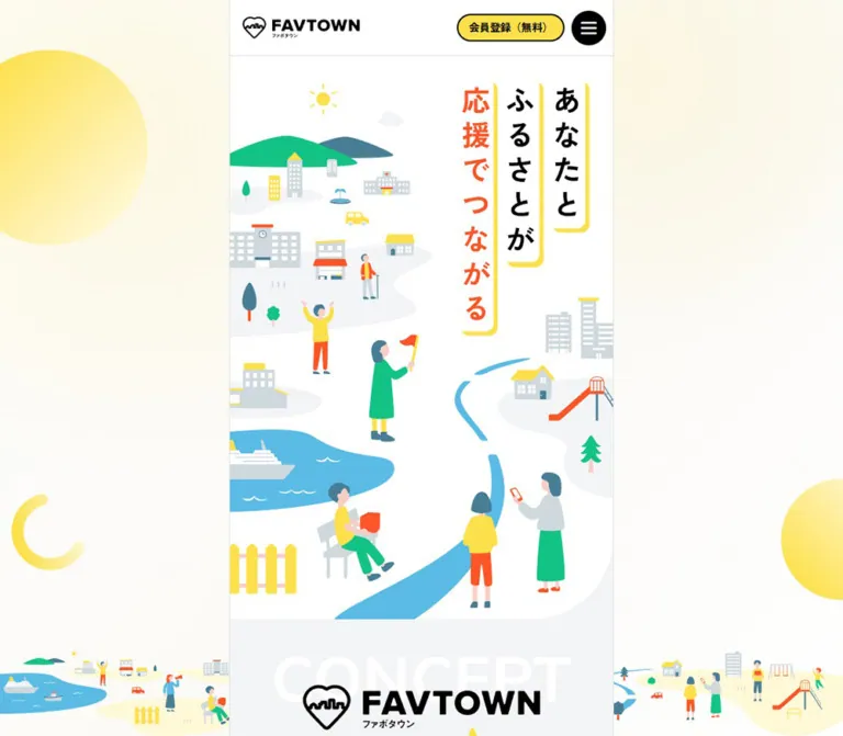
DESIGN REFERENCE
FAVTOWN|ふるさとと応援でつながる地域交流サイト
黄色と白、親しみやすい街のイラスト、縦書きコピーが特徴。中央の細いコンテンツ列にプロジェクトや地域情報をまとめ、デスクトップでは固定サイドナビと円形ボタンで回遊を支えています。
オリジナルサイトを見るFAVTOWN — Style Reference
A compact community portal surrounded by a sunny illustrated town.
Website: FAVTOWN
Original URL: https://www.favtown.jp/
Final URL: https://www.favtown.jp/
Theme: light surfaces, yellow highlights, black controls, and a black legal footer.
Inspected: September 12, 2026. Supplied evidence was retrieved at 2026-09-12T12:32:54.740Z, equivalent to 21:32:54.740 JST.
Viewports: desktop 1440 × 1000; mobile 390 × 844 CSS pixels.
Scope: the current public homepage, including its illustrated opening, promotional banners, member voices, project collections, prefecture directory, partner area, news, concept content, sitemap, and footer. Visual captures cover the opening, a desktop directory/partner position, and the footer. Rendered DOM and computed styles supply additional measurements for intervening content. Linked pages, account flows, and the opened menu were not inspected.
FAVTOWN presents regional participation through an approachable combination of people, small buildings, water, trees, and everyday activities. Bright yellow marks registration, framing, and community identity. Black supplies clear navigation and action contrast; orange emphasizes selected messages. White content panels and pale gray separators keep the substantial information architecture legible.
The defining desktop composition is a 500px central column with an illustrated environment on either side. A white navigation panel stays in the left margin, while two large circular account links occupy the right. The narrow center contains the actual browsing experience: promotional images, compact cards, location metadata, directories, and announcements. On mobile, the surrounding navigation and scenery disappear, while the central sequence and two-column card layouts remain.
This is a service homepage and community discovery hub. Its visual system must support repeat browsing, project status, local identity, and account access as well as the opening brand message.
How to Read This Reference
- Measured means a value appears in the supplied rendered DOM or computed-style evidence.
- Declared means a CSS custom property was recorded. Its presence does not establish that every component uses it.
- Calculated means arithmetic based on measured dimensions or declared tokens, such as converting source
remvalues to pixels. - Estimated means a visual approximation from the current-page screenshots. Estimates are not sampled colors or recovered CSS.
- Recommended means implementation guidance for a new build. New class names, breakpoint choices, and interaction endpoints in Quick Start belong to this category.
The source root font size measured 18px on desktop and 16.64px on mobile. All source rem conversions below use those respective values. The original root-sizing formula and responsive breakpoint declarations were not supplied.
The screenshots have a 15px right-side area outside the measured document width: the desktop document is 1425px wide and the mobile document is 375px wide. This is consistent with a reserved scrollbar gutter in the capture environment. Do not reproduce it as a hardcoded mobile margin.
Tokens — Colors
Default Palette
| Name | Exact source value | Source token | Role and evidence |
|---|---|---|---|
| Community Yellow | #fde04b |
--color-primary |
Computed fill of registration controls; visual identity also uses yellow frames and motifs |
| Soft Yellow | #fff9d7 |
--color-primary-light |
Declared companion tint; the outer illustrated environment visibly uses pale yellow, but its complete background treatment was not sampled |
| White | #ffffff |
--color-white |
Computed header, project sections, directory cards, and member cards |
| Black | #000000 |
--color-black, --color-text-primary |
Main text and filled controls; the footer is visually black |
| Quiet Gray | #777777 |
--color-text-secondary, --color-dark-gray |
Computed inactive sidebar labels; visually subdued footer copyright |
| Divider Gray | #dde4e7 |
--color-middle-gray |
Declared border color; visually consistent with fine shell and tile boundaries |
| Section Gray | #f2f4f6 |
--color-bg-light, --color-light-gray |
Computed body and member-voice background; visible spacing bands between white sections |
| Message Orange | #fc5527 |
--color-secondary |
Computed member-voice heading; similar orange appears in the hero lettering and illustrations |
| Soft Orange | #ffeae5 |
--color-secondary-light |
Declared tint; the product banner has a pale peach field, with its exact asset colors unmeasured |
| Community Green | #13c285 |
--color-accent, --color-focus |
Declared accent and focus color; illustrations also contain green, without a verified one-to-one token mapping |
| Soft Green | #edfff8 |
--color-accent-light |
Declared supporting tint; specific visible use unverified |
| Attention Red | #ff3a4d |
--color-attention, --color-error |
Declared status/error color; no error state was inspected |
| Soft Attention | #ffdcdf |
--color-attention-light |
Declared status tint; specific visible use unverified |
Separate interface colors from artwork colors. The computed registration yellow is authoritative for CSS controls. Yellow baked into an illustration or promotional image may differ. Similarly, the blue river, blue-gray buildings, and skin tones are artwork colors rather than verified interface tokens.
Palette Behavior
White and pale gray carry most central content. Yellow is used in memorable shapes: a navigation outline, registration fills, circular background motifs, the letter banner frame, and the skyline divider near the footer. Black buttons punctuate these light surfaces.
The exterior looks warmer than the computed gray body because decorative layers cover much of it. Their exact gradient, opacity, and stacking rules were not supplied. A soft cream-to-white background is a reasonable implementation approximation, but it is not a recovered source declaration.
No alternate theme or theme-switching control was evidenced.
Tokens — Typography
Main Interface Stack
Measured source stack:
font-family:
  Mulish,
  'Mulish Fallback',
  'Zen Kaku Gothic New',
  'Zen Kaku Gothic New Fallback',
  'Noto Sans JP',
  sans-serif;
Both --font-family-base and --font-family-heading declare this stack. The body uses weight 500; measured section headings, directory names, project titles, and navigation labels use 700.
Mulish leads the Latin stack, followed by Japanese-capable families. Computed family lists do not identify the font that supplied every individual glyph. The generated fallback family names should not be copied into a new project without their corresponding font definitions.
The visible character is friendly and compact: clear Japanese sans-serif text, firm bold headings, and relatively generous line height. There is no need for a large typographic jump between ordinary content and section titles.
Button Stack
Measured header buttons and directory buttons use:
font-family:
  'Zen Kaku Gothic New',
  'Zen Kaku Gothic New Fallback',
  'Noto Sans JP',
  sans-serif;
Buttons use weight 700. Small header labels have a 1.75 line-height ratio, while the measured directory button label uses a line height equal to its font size.
Hero Lettering and Wordmark
The visible hero consists of three vertical message strips reading “あなたと”, “ふるさとが”, and “応援でつながる”. Black lettering occupies the first two strips; orange occupies the third. White strips have offset yellow edges and rounded lower corners.
The DOM H1 has a 1 × 1px rendered box, despite a computed font size of 36px on desktop and 33.28px on mobile. It appears to provide a hidden textual equivalent. Its computed font size must not be treated as a measurement of the visible illustration lettering.
The logo is a supplied graphic. Its letterforms and the hero's visible lettering cannot be assigned a font from the evidence available.
Type Scale
Pixel equivalents below are calculated from the declared source tokens. Actual element uses are identified explicitly.
| Source token | Source size | Desktop | Mobile | Evidence or intended tier |
| --- | --- | --- | --- | --- | --- |
| --body-3xs-size | 0.625rem | 11.25px | 10.4px | Declared smallest utility tier |
| --body-2xs-size | 0.75rem | 13.5px | 12.48px | Measured header button labels match this tier |
| --body-xs-size | 0.8125rem | 14.625px | 13.52px | Measured project titles and member quotations |
| --body-s-size | 0.875rem | 15.75px | 14.56px | Measured directory button labels |
| --body-m-size | 1rem | 18px | 16.64px | Measured body copy and prefecture names |
| --heading-xs-size | 1.125rem | 20.25px | 18.72px | Declared heading tier |
| --heading-s-size | 1.25rem | 22.5px | 20.8px | Declared heading tier |
| --heading-m-size | 1.375rem | 24.75px | 22.88px | Declared heading tier |
| --heading-l-size | 1.5rem | 27px | 24.96px | Measured project, directory, partner, and member-voice headings |
| --heading-xl-size | 1.75rem | 31.5px | 29.12px | Declared heading tier |
| --heading-2xl-size | 2rem | 36px | 33.28px | Declared largest heading tier; matches the hidden H1 size |
Line Height and Tracking
| Role | Measured or declared treatment |
|---|---|
| Body | Weight 500; 1.75 line height; 0.01em tracking |
| Section heading | Weight 700; 1.5 line height; 0.01em tracking |
| Project title | Weight 700; 25.5938px desktop / 23.66px mobile line height |
| Member quotation | Weight 500; same small-text line height as project titles |
| Desktop sidebar label | 16px, weight 700, 24px line height, 0.8px tracking |
| Directory name | Weight 700; 31.5px desktop / 29.12px mobile line height |
The sidebar is an important exception to the source rem scale: its labels measured a fixed 16px at the desktop viewport.
Tokens — Spacing & Shapes
Spacing Scale
| Source token | Source value | Desktop equivalent | Mobile equivalent | Confirmed use or practical tier |
|---|---|---|---|---|
--spacing-2xs |
0.25rem |
4.5px | 4.16px | Header button vertical padding; internal member-card gap |
--spacing-xs |
0.5rem |
9px | 8.32px | Header control spacing and outer header inset |
--spacing-s |
0.75rem |
13.5px | 12.48px | Card padding and button padding |
--spacing-m |
1rem |
18px | 16.64px | Central section inset, card gap, banner gap |
--spacing-l |
1.5rem |
27px | 24.96px | Section vertical padding and separator rhythm |
--spacing-xl |
2rem |
36px | 33.28px | Available larger spacing tier |
--spacing-2xl |
2.5rem |
45px | 41.6px | Available larger spacing tier |
--spacing-3xl |
3rem |
54px | 49.92px | Matches the measured clearance before the first partner-logo row |
Additional declared spacing tiers are 3.5rem, 4.5rem, 5.5rem, 6.5rem, and 7.5rem. Their presence does not imply a uniform large-section padding system. The inspected central sections generally use the smaller 1rem and 1.5rem tiers.
Border Radius
| Element or source token | Desktop | Mobile | Evidence |
|---|---|---|---|
--radius-xs: 0.25rem |
4.5px | 4.16px | Declared |
Prefecture card / --radius-s |
9px | 8.32px | Measured |
Project card / --radius-m |
18px | 16.64px | Measured |
| Member card | 0 18px 18px 18px |
0 16.64px 16.64px 16.64px |
Measured; square upper-left corner |
--radius-l: 1.5rem |
27px | 24.96px | Declared |
--radius-xl: 3.5rem |
63px | 58.24px | Declared |
--radius-2xl: 5rem |
90px | 83.2px | Declared |
| Header and directory pills | 100px | 100px | Measured |
| Desktop account circles | 9999px | Not displayed | Measured |
| Menu button | 50% | 50% | Measured |
| Desktop navigation panel | Approximately 24px | Not displayed | Screenshot estimate |
The promotional links themselves have a measured radius of zero. Their visibly rounded yellow and peach artwork therefore belongs to the image or an unsampled descendant, rather than that anchor's computed border radius.
Layout Measurements
| Element | Desktop measurement | Mobile measurement |
|---|---|---|
| Document width | 1425px within a 1440px capture | 375px within a 390px capture |
| Central shell | 500px outer width, approximately 1px side rules | 375px, filling the document width |
| Main content width | 498px | 375px |
| Header height | 73px | 67.55px |
| Logo link box | 166.5 × 42.75px | Approximately 148 × 39.52px |
| Menu control | 45 × 45px | 41.59 × 41.59px |
| Hero | 498 × 560.41px | 375 × 422px |
| Promotional image link | 462 × 242.70px | 341.75 × 179.53px |
| Two-column card gap | 18px | Approximately 16.63px after layout rounding |
| Project card width | 222px | 162.56px |
| Representative project card height | 293.20px | 248.72px |
| Prefecture card | 222 × 170.55px | 162.56 × 124.89px |
| Member card | 280 × 164.03px | 240 × 151.86px |
| Partner link tile | 180 × 90px | 166.39 × 83.19px |
| Directory CTA | 175.95 × 53.5px | 162.92 × 49.73px |
| Desktop account control | 130 × 130px | Not displayed |
| Captured document height | Approximately 11,615px | Approximately 10,073px |
Project heights vary with content and row layout. The examples above are measurements, not a recommendation to impose a fixed card height. Document heights are also specific to the captured content state.
Components
Desktop Surround and Side Navigation
Role: keep navigation and account access available around a long, narrow homepage.
The central column is flanked by a pale illustrated environment. Large yellow circles, a partial ring, and town scenes anchored near the bottom establish continuity with the opening artwork. Across the three desktop captures, the side navigation, account circles, tagline, and lower town scenes retain their viewport positions while the center changes its scroll position. This is strong visual evidence of a fixed desktop surround.
The left navigation panel is approximately 258 × 460px, beginning near x=106px and y=270px in the desktop screenshots. It has a white fill, an approximately 4px yellow outline, rounded corners, and generous internal margins.
Its anatomy is:
- Eight primary links with a monochrome icon followed by a bold label.
- A fine gray separator.
- A final audience link, “自治体の方へ”.
Measured link rows are 27px high with 43px between successive row starts, giving a 16px inter-row interval. Icon-to-label gap is 8px. The active “トップ” label is black; inactive labels are gray.
The icon text in the DOM includes home, help, mark_as_unread, distance, and package_2. These are glyph identifiers in the extraction, not text to display beside the labels. The exact icon font family was not recorded.
Desktop Account Circles and Tagline
Role: make account entry obvious without occupying the central content column.
Two 130px circles stack with a 16px gap. At the measured viewport they occupy x=1125px, with top positions of 362px and 508px. The first is black with white “ログイン”; the second is yellow with black “新規登録” and a smaller “(無料)” line. The registration circle has a visible black outline, approximately 2px thick.
A separate tagline sits near the upper-right corner in two white horizontal labels with yellow offset edges. It repeats the hero message using black and orange text. Keep the tagline visually separate from the account stack.
Central Header
Role: provide identity, login, registration, and a menu control within the browsing column.
A white strip with a fine gray lower rule contains the logo at left and three compact controls at right: black login pill, yellow registration pill with a black outline, and black circular menu button with white horizontal strokes.
The desktop header pills each measure approximately 85.55 × 36.63px. Their padding is 4.5px 13.5px, with a 9px gap between controls. The menu button measures 45px square.
The supplied mobile capture exposes a fit problem: “ログイン” wraps, producing a roughly 72.9 × 56px black control, while registration stays on one line at approximately 79.36 × 34.16px. Record this as current behavior. For a new implementation, reserve the label width and allow the logo to shrink first.
Header visibility varies across captures: it appears at entry and in the desktop footer capture, but is absent from the desktop middle capture and the mobile footer capture. Duplicate header elements also occur in the DOM. The evidence does not establish the exact scroll-direction trigger or positioning logic. Do not assume an always-visible sticky header.
Illustrated Hero
Role: express the relationship between people and their hometowns before presenting discovery content.
The hero fills the central column with a composition approximately 8:9 in width-to-height ratio. The visible message sits in three vertical strips toward the upper-right. A blue river bends through the lower half, linking the people and buildings compositionally. Hills, civic buildings, houses, a boat, a bench, trees, and small human activities fill the remaining space.
People are simplified into flat silhouettes and blocks of color. Faces and limbs contain few details; the gestures communicate participation and everyday connection. White negative space is essential between the illustrated objects.
The lower-right edge has a broad rounded white contour against the gray section below. Treat this as part of the composition rather than applying the same radius to every section.
The mobile hero preserves the vertical message and river composition at a smaller width. It is followed directly by the current promotional banners.
Promotional Banner Stack
Role: introduce a letter-based service and regional support products with large image links.
Two banners stack on the gray background with a 1rem gap and 1rem horizontal inset. The first begins 1.5rem below the hero. Their observed width-to-height ratio is approximately 1.9035:1 at both viewports.
The first banner links to /about-letter. A thick yellow frame encloses white letter paper with fine horizontal lines, envelope and postmark imagery, a “FAVTOWNレター” heading, and a small yellow pill within the artwork. The paper corners have decorative cutouts.
The second links to /partner-items. Its visible upper area uses a peach field, stylized packages, scattered confetti, and a diagonal green “受付中” ribbon. The screenshots show only part of this banner; the complete lower artwork should not be reconstructed from that crop.
Each whole banner is the link target. The pill drawn inside the first artwork should not become an additional nested interactive control.
Member-Voice Cards
Role: connect personal experiences to specific places and projects.
The measured section uses gray fill, 1.5rem vertical padding, a centered orange heading “会員から届いた声!”, and two horizontal sequences of white cards.
Each card contains a quotation, location icon and locality, project title, and forward-arrow cue. The square upper-left corner distinguishes the card from the fully rounded project cards. Measured padding is 0.75rem, with a 0.25rem internal gap.
Cards measure 280px wide on desktop and 240px on mobile. Quotation text uses the small body tier at weight 500. Long text occupies approximately three measured lines; the exact truncation mechanism was not supplied.
Repeated card sequences and off-column coordinates are compatible with looping tracks. They do not establish autoplay speed, direction, pause behavior, or keyboard support. Preserve the component anatomy without inventing those behaviors.
Section Heading
Role: make the long homepage easy to scan.
The project, prefecture, partner, and news areas use a small uppercase English eyebrow associated with a yellow heart, followed by a bold Japanese H2. The H2 is measured at 27px desktop and 24.96px mobile, with a 1.5 line height.
The partner screenshot also shows a small cluster of illustrated buildings at the upper-right of its heading region. The Japanese heading and supporting paragraph remain left aligned. The illustration adds identity without replacing the text hierarchy.
Project Collection and Project Card
Role: organize opportunities by availability while preserving locality and participation context.
The collection is a white section with 1.5rem vertical padding and 1rem horizontal padding. Cards form two columns on both inspected viewports.
The captured content has three groups: “まもなく終了” with six items, “受付中” with five items, and “結果報告” with a displayed total of 41. Eight result cards are present before “もっと見る”. These totals are content state, not fixed design constants.
The evidenced card anatomy includes:
- An upper media/status area.
- Support direction such as “応援を送る” or “応援を受け取る”.
- Availability such as “受付中” or “受付終了”.
- A bold project title.
- Locality with a location icon.
- A participation count when available.
- A deadline or urgency message when applicable.
The measured card is a single anchor with white background, 1rem radius, and a transform transition. Its title has approximately 0.75rem horizontal inset. The supplied screenshots do not show the project collection directly, and the element sample does not include media rectangles or badge colors. Exact thumbnail crop ratios, badge placement, and status-color mapping therefore remain unverified.
Keep card height content-driven. Some desktop cards measure 267.61px, while others measure 293.20px. Mobile rows also vary, including approximately 248.72px and 273.59px examples.
“もっと見る” is a real button in the DOM. Its expanded result, loading behavior, and subsequent count were not tested.
Prefecture Directory Card
Role: provide an immediately recognizable entry into a region.
A landscape photograph fills the top of a white card, followed by a centered bold prefecture name. The desktop screenshot shows an urban view, tea fields, a castle, coastal islands and bridges, and a city beneath a mountain. Photographs supply concrete geographic identity within the surrounding illustration system.
Cards use a small 0.5rem radius and a restrained visible shadow. Two equal columns continue on mobile according to the measured card coordinates. Five cards leave the last item in the left column.
The photo band appears roughly 2:1 in the desktop screenshot; that ratio is a visual estimate because image rectangles were not included in the DOM sample. The outer card dimensions are measured separately in the layout table.
Below the grid, a centered black pill reads “都道府県一覧” and includes a small white circle containing a forward arrow. It leads to /furusato.
Partner Introduction and Logo Tiles
Role: show participating organizations as part of the community network.
A heading and short explanatory paragraph precede rows of logo tiles. In the desktop capture, recognizable logos sit within white rounded rectangles outlined in pale gray. The logos retain their original colors and have space around them.
The measured link boxes are 180 × 90px on desktop and approximately 166.39 × 83.19px on mobile, corresponding to roughly 10rem × 5rem. They extend beyond the central viewport and occur in repeated sequences in the DOM.
This supports a horizontal track structure. Automatic movement and its timing are unverified. A static, horizontally scrollable track is a suitable recommended baseline when those behaviors are not being implemented.
Use contained logo images. Cropping them like landscape photography would remove identifying marks. Partner presence is not evidence of website production involvement.
News and Concept Content
Role: communicate current activity and then restate the community proposition.
The DOM records a news heading followed by dated linked entries, optional NEW markers, a title, an announcement category, and locality. Five entries are present in the captured state. The latest shown date is September 10, 2026.
The later concept content includes the English label CONCEPT, short Japanese statements about hometown connection and the circulation of support, and a link to /about.
These sections are supported by rendered text and links but are not directly pictured in the supplied screenshots, and their detailed element styles are outside the provided sample. Their exact card treatment, illustration placement, and spacing should remain open implementation details rather than asserted observations.
Sitemap and Registration Strip
Role: give visitors a complete set of onward routes before the legal footer.
The white sitemap repeats the main destinations as bold link rows with black circular forward-arrow icons. Prefecture links are nested beneath the regional directory entry. A wide yellow registration pill with a black outline follows the navigation.
In the screenshots, the registration pill is approximately 444 × 48px on desktop and 325 × 44px on mobile. These are visual estimates. Its label is “会員登録(無料)”.
Below it, substantial white space leads to a continuous yellow line that rises into a simplified house-and-building skyline. The line spans the central column. Its stroke appears approximately 8px on desktop and 6px on mobile; those are screenshot estimates.
Legal Footer
Role: separate contact, organizational, and policy information from discovery content.
The footer changes to a flat black field. Its top row presents three contact/audience links with white circular arrows, followed by a thin dark-gray rule. Policy and organizational links form a compact left column; a circular white LINE mark and subdued copyright occupy the right side.
The mobile capture retains this side-by-side arrangement. Longer policy and company names wrap into multiple lines. The footer continues with a substantial black lower area in both captured endings.
Under “運営会社”, the inspected page directly lists シナジーマーケティング株式会社 and 株式会社オモワク. These are operating-company disclosures. No production-credit claim is established by this footer.
Tokens — Motion & Interaction
Recorded Transitions
| Target | Recorded declaration | What can be concluded |
|---|---|---|
| Desktop navigation links | color 0.2s |
Color changes have a 200ms transition; target hover colors were not tested |
| Desktop account circles | opacity 0.2s, transform 0.1s |
Opacity and transform feedback are defined; endpoint values are unknown |
| Logo link | opacity 0.2s |
A short opacity transition is available |
| Header controls | 0.15s |
A 150ms transition is defined; affected states were not exercised |
| Promotional links | transform 0.2s |
Transform feedback is defined; direction and scale are unknown |
| Project cards | transform 0.2s |
Same short transform timing |
| Prefecture cards | transform 0.2s, box-shadow 0.2s |
Both movement and elevation can transition |
| Partner links | transform 0.2s |
Tile feedback is defined |
| Directory and more-results buttons | 0.15s |
Short button transition; resulting states unverified |
The generic value transition: all appears on many sampled elements without a positive duration. It should not be interpreted as evidence that those elements visibly animate.
Declared State and Focus Tokens
--state-layer-dark:
  linear-gradient(rgba(0,0,0,0.08), rgba(0,0,0,0.08));
--state-layer-light:
  linear-gradient(rgba(255,255,255,0.16), rgba(255,255,255,0.12));
--color-focus: #13c285;
--focus-outline-width: 2px;
--focus-outline-offset: 2px;
These tokens were recorded, but their application to particular hovered, pressed, or focused elements was not observed.
Motion Limitations
The supplied collection process waited for loading and finite motion to settle, and temporarily paused perpetual animations during readiness checks. Those collection rules do not establish which animations this website actually uses.
Sampled card elements report animation: none. Animation could still exist on track wrappers, descendants, artwork, or JavaScript-driven elements outside the sample. Repeated member and partner sequences suggest loop-compatible structures, but there is no supplied motion trace from which to recover duration, easing, direction, or pause conditions.
Only page traversal and settled screenshots are evidenced. Menu opening, hover endpoints, account navigation, focus order, carousel dragging, and “もっと見る” activation remain unverified.
Surfaces
| Layer | Treatment | Purpose |
|---|---|---|
| Desktop environment | Warm, very light field with yellow circles and town illustrations | Extends the brand around the narrow content column |
| Central shell | White and pale gray, with fine desktop side rules | Defines the browsing area |
| Content section | White with modest internal padding | Groups projects, directory entries, and supporting information |
| Section interval | Pale gray band, commonly around 1.5rem | Separates adjacent white sections |
| Member card | White with one square and three rounded corners | Gives personal quotations a distinct visual identity |
| Directory card | White, small radius, subtle shadow | Separates image-led regional entries |
| Partner tile | White, pale outline, rounded visible boundary | Contains differently shaped logos consistently |
| Primary registration | Yellow fill, black text and outline | Account creation emphasis |
| Navigation CTA | Black fill, white label and circular arrow | Strong onward direction |
| Footer | Black with white links and quieter secondary text | Establishes a clear legal and organizational endpoint |
Two shadow tokens are declared:
--drop-shadow-m: 0px 2px 8px 0px rgba(0,0,0,0.08);
--drop-shadow-l: 0px 4px 16px 0px rgba(0,0,0,0.08);
A subtle shadow is visible on directory cards and promotional artwork, but the sampled records do not map every shadow to one of these tokens. Keep elevation restrained and subordinate to color, framing, and imagery.
Imagery
Illustration Language
Use flat, clean shapes with a small set of saturated colors against white. Green clothing and hills, yellow clothing and accents, orange gestures, blue water, and blue-gray architecture create variety without making the interface itself multicolored.
The hero's river is a major organizing shape. It leads the eye through the lower scene while preserving white space for people and buildings. The desktop lower-corner town scenes repeat this vocabulary at a smaller scale. Illustrations should feel related across placements rather than being independent stock graphics.
Avoid adding heavy outlines to every object. Much of the observed illustration relies on adjacent flat fills and selective small details. The overall feeling is optimistic, local, and ordinary rather than futuristic or monumental.
Photography and Logos
Photography is used for identifiable regions. Preserve recognizable landmarks and landscape structure when cropping. Partner logos retain their native proportions and colors; a shared white tile supplies consistency.
Promotional imagery uses a different but related format: the letter banner resembles stationery, while the product banner uses packages, a diagonal ribbon, and confetti. These assets remain subordinate to the same yellow, orange, green, and light-surface palette.
Observed Asset References
The supplied evidence does not include image src URLs or an asset manifest. No asset filenames can be established safely. The following are evidenced image placements and link destinations, not downloadable asset paths.
| Placement | Current evidence | Link destination where recorded |
|---|---|---|
| FAVTOWN logo | Header graphic in desktop and mobile captures | / |
| Town hero | Current opening captures; hidden textual H1 in DOM | No hero action established |
| Letter banner | Yellow stationery artwork | /about-letter |
| Product banner | Partially visible peach product artwork | /partner-items |
| Prefecture photographs | Five regional cards in the directory | /furusato/hokkaido, /furusato/shizuoka, /furusato/wakayama, /furusato/ehime, /furusato/kagoshima |
| Partner logos | Rounded logo tiles and individual partner links | Individual paths under /partners/ |
| Yellow skyline | Divider above the black footer | Decorative |
| LINE mark | White circular placement in footer | Destination not supplied |
Use approved original assets when available. CSS can reproduce the shell, spacing, controls, and card surfaces; it cannot recover the exact town illustration or graphic lettering from the DOM text.
Layout & Responsive Behavior
Desktop Composition
The 500px outer shell is centered within the measured 1425px document width:
(1425 - 500) / 2 = 462.5px
This matches the outer header's measured x position. The 498px inner content starts at x=463.5px. Standard section padding leaves 462px for banners and grids.
The two-column grid follows:
(498 - 2 × 18 - 18) / 2 = 222px per card
Keep this content width stable on large screens. The remaining width provides the navigation, account controls, and illustrated setting.
Mobile Composition
The mobile main area fills the measured 375px document width. The desktop side navigation, account circles, exterior tagline, and peripheral town scenes are not visible.
The corresponding grid calculation is:
(375 - 2 × 16.64 - 16.64) / 2 ≈ 162.54px per card
The measured width is 162.5625px after browser layout rounding. Two columns therefore persist, producing compact project titles at 13.52px and prefecture names at 16.64px.
The hero and promotional banners scale with their available width. In contrast, the desktop account circles are fixed-size controls that disappear from the mobile composition. Do not scale the entire desktop canvas down as one image.
Page Flow and Unknown Breakpoints
The homepage uses a long document flow. Its captured heights exceed 10,000px at both viewports. The side environment stays in place on desktop while the central sequence advances.
Only two viewport sizes were supplied. The exact width at which the side surround appears, the behavior at tablet sizes, and the source interpolation between root font sizes are unknown. Quick Start uses explicitly recommended thresholds and an interpolation that matches the measured endpoints.
Header visibility also requires separate verification before implementing scroll-dependent behavior. A normal-flow header is the conservative baseline provided below.
Do’s and Don’ts
Do
- Preserve the 500px desktop column and the role of its surrounding illustrated environment.
- Keep yellow registration controls, black navigation controls, and restrained orange emphasis distinct.
- Use the measured font stacks for interface text, while treating the logo and hero lettering as artwork.
- Maintain white sections separated by pale gray intervals.
- Retain two-column project and prefecture grids at the inspected phone width.
- Keep locality, availability, support direction, and participation information together inside each project link.
- Distinguish member cards with a square upper-left corner.
- Use landscape photographs for regions and contained, uncropped partner logos.
- Repeat the town vocabulary in the hero, desktop surround, heading illustrations, and skyline divider.
- Preserve the black footer as a substantial endpoint to the white sitemap.
Don’t
- Don’t expand the desktop content into a conventional wide three- or four-column portal.
- Don’t replace the illustrated hero with a generic photo-and-headline split layout.
- Don’t use the hidden H1's computed size as the visible artwork lettering specification.
- Don’t assign exact CSS colors to illustration details without asset or pixel evidence.
- Don’t turn project status groups into tabs unless that interaction is independently specified.
- Don’t interpret duplicated track items as additional unique content.
- Don’t invent autoplay timings, hover scales, or menu animations from static captures.
- Don’t copy the mobile login wrapping as a desired new-build behavior.
- Don’t crop partner logos or flatten them into a single brand color.
- Don’t hardcode the capture environment's 15px gutter into the page layout.
Recommended Implementation Additions
These are recommendations for a new implementation, not verified features of the inspected homepage:
- Prevent account labels from wrapping. Allow the logo area to shrink, adjust header gaps, and preserve a usable menu target.
- Give the menu button an accessible name, an expanded state, and a controlled navigation region. Add keyboard and dismissal behavior when implementing the opened menu.
- Use one accessible interactive element for each navigation action. The directory CTA is recorded as a button inside a link; a single styled anchor is a better implementation structure.
- Provide a readable text equivalent for the hero message. Avoid announcing the same message twice through both an image alternative and a hidden H1.
- If tracks move automatically, provide pause controls, stop movement during keyboard interaction, and offer a reduced-motion presentation. Exclude visual clones from the accessibility tree and tab order.
- Keep project status understandable through text as well as color. Preserve a full accessible project title when visible text is shortened.
- Test the compact two-column cards with text enlargement. Allow a one-column fallback when necessary for legibility rather than fixing card heights.
- Expand small control hit areas toward 44px without forcing every visible pill to become bulky.
- Verify focus contrast on yellow, white, and black surfaces. The declared green focus token alone does not demonstrate sufficient contrast in every placement.
- Give the long homepage a skip link and coherent heading hierarchy. Decorative scenery should not receive keyboard focus.
- Supply image dimensions and responsive sources so banners, photos, and logos do not shift the page while loading.
Agent Prompt Guide
Quick Color Reference
- Registration and identity yellow:
#fde04b. - Main surface:
#ffffff. - Section spacing background:
#f2f4f6. - Main text, navigation buttons, footer:
#000000. - Secondary text:
#777777. - Fine borders:
#dde4e7. - Message emphasis:
#fc5527. - Declared green accent:
#13c285. - Artwork blue and warm exterior tones: visually observed, exact values unmeasured.
Overall Prompt
“Create a Japanese regional-community homepage inspired by the current FAVTOWN structure. Center a 500px content column on desktop, with a white navigation panel outlined in yellow on the left and stacked 130px black and yellow account circles on the right. Surround it with a pale illustrated town environment and yellow circular motifs. Use a flat town illustration with a blue river and three vertical Japanese message strips for the opening. Follow it with two large promotional banners, member quotations, two-column project cards, photographic prefecture cards, partner logos, news, concept content, a sitemap, a yellow skyline divider, and a black legal footer. Use Mulish and Zen Kaku Gothic New where available, compact bold labels, white surfaces, pale gray section gaps, and restrained shadows. On phones, hide the desktop surround and retain the narrow browsing sequence and two-column cards. Treat unknown menu and track motion as separate implementation decisions.”
Example Component Prompts
- Desktop navigation: “Create a roughly 258px-wide white navigation panel with a 4px yellow outline and 24px corner radius. Stack monochrome icons and 16px bold Japanese labels with 8px icon gaps and 16px row spacing. Use black for the active destination and gray for the others. Separate the final audience link with a fine rule.”
- Project card: “Build a compact regional project link for a two-column grid. Use white fill, an 18px desktop corner radius, a media region, textual support direction and availability, a bold small title, locality, optional participant count, and deadline. Keep height content-driven. Treat media ratio and badge colors as choices requiring their own specification.”
- Prefecture card: “Place a recognizable regional landscape above a centered bold prefecture name in a white card with a 9px desktop radius and a subtle shadow. Use two equal columns with an 18px desktop gap. End the section with a black pill and a white circular forward-arrow cue.”
- Letter banner: “Create a wide stationery-themed promotional graphic with a thick yellow frame, white lined paper, envelope and postmark details, a bold service title, and a small yellow callout. Make the complete graphic one accessible link and preserve its approximately 1.9:1 proportions.”
- Footer transition: “Follow a white sitemap and wide yellow registration pill with generous white space and a continuous yellow line that rises into a small town skyline. Below it, use a black footer containing three audience/contact links, a fine divider, compact policy links, operating-company disclosures, and a small right-side social mark.”
Quick Start
CSS Custom Properties
This is a recommended adaptation, not extracted source CSS. It keeps a conventional document root and uses --unit to reproduce the source proportions. The chosen interpolation matches 16.64px at a 390px viewport and reaches 18px on desktop with a default 16px browser root; the original formula is unknown. The 1200px surround breakpoint is also a recommendation.
Use .favtown-column for the central document and an optional sibling .desktop-frame containing .desktop-left and .desktop-right. Supply approved images inside the named media elements. Header behavior is normal flow; track behavior is manual horizontal scrolling. The CSS does not implement an opened menu, automatic tracks, or project loading.
:root {
  /* Source colors */
  --yellow: #fde04b;
  --yellow-soft: #fff9d7;
  --orange: #fc5527;
  --green: #13c285;
  --white: #ffffff;
  --ink: #000000;
  --muted: #777777;
  --rule: #dde4e7;
  --canvas: #f2f4f6;

  /* Recommended interpolation; original formula unavailable */
  --unit: clamp(1rem, 4.266667vw, 1.125rem);
  --column-width: 500px;

  /* Load the actual fonts separately when available */
  --font-base: 'Mulish', 'Zen Kaku Gothic New', 'Noto Sans JP', sans-serif;
  --font-button: 'Zen Kaku Gothic New', 'Noto Sans JP', sans-serif;
  --text-small: calc(0.8125 * var(--unit));
  --text-button: calc(0.875 * var(--unit));
  --text-heading: calc(1.5 * var(--unit));

  --space-xs: calc(0.25 * var(--unit));
  --space-s: calc(0.5 * var(--unit));
  --space-card: calc(0.75 * var(--unit));
  --space-m: var(--unit);
  --space-l: calc(1.5 * var(--unit));

  --radius-small: calc(0.5 * var(--unit));
  --radius-card: var(--unit);
  --radius-pill: 100px;
  --shadow-m: 0 2px 8px rgba(0, 0, 0, 0.08);
  --shadow-l: 0 4px 16px rgba(0, 0, 0, 0.08);
}

* { box-sizing: border-box; }
html { font-size: 100%; }
body {
  margin: 0;
  color: var(--ink);
  background: var(--canvas);
  font: 500 var(--unit)/1.75 var(--font-base);
  letter-spacing: 0.01em;
}
img { display: block; max-width: 100%; }
button { font: inherit; cursor: pointer; }
a { color: inherit; }

.favtown-column {
  position: relative;
  z-index: 1;
  width: min(100%, var(--column-width));
  margin-inline: auto;
  border-inline: 1px solid var(--rule);
  background: var(--canvas);
}

/* Normal-flow baseline; captured scroll visibility is unverified */
.site-header {
  display: flex;
  align-items: center;
  gap: var(--space-s);
  min-height: calc(4 * var(--unit) + 1px);
  padding-inline: var(--space-s);
  border-bottom: 1px solid var(--rule);
  background: var(--white);
}
.brand {
  flex: 1 1 calc(9.25 * var(--unit));
  min-width: 0;
}
.brand img {
  width: calc(9.25 * var(--unit));
  height: auto;
}
.header-action {
  flex: 0 0 auto;
  display: inline-flex;
  align-items: center;
  justify-content: center;
  padding: var(--space-xs) var(--space-card);
  border: 2px solid var(--ink);
  border-radius: var(--radius-pill);
  background: var(--ink);
  color: var(--white);
  font: 700 calc(0.75 * var(--unit))/1.75 var(--font-button);
  white-space: nowrap;
  text-decoration: none;
  transition: opacity 150ms;
}
.header-action.is-register {
  background: var(--yellow);
  color: var(--ink);
}
.menu-button {
  flex: 0 0 auto;
  display: grid;
  place-items: center;
  width: calc(2.5 * var(--unit));
  aspect-ratio: 1;
  padding: 0;
  border: 0;
  border-radius: 50%;
  color: var(--white);
  background: var(--ink);
}
.menu-button svg { width: 60%; height: 60%; }

.hero {
  position: relative;
  background: var(--white);
}
.hero-art { width: 100%; height: auto; }
.sr-only {
  position: absolute;
  width: 1px;
  height: 1px;
  padding: 0;
  margin: -1px;
  overflow: hidden;
  clip-path: inset(50%);
  white-space: nowrap;
  border: 0;
}
.promo-stack {
  display: grid;
  gap: var(--space-m);
  padding: var(--space-l) var(--space-m);
}
.promo-link {
  display: block;
  transition: transform 200ms;
}
.promo-link img { width: 100%; height: auto; }

.content-section {
  margin-block-start: var(--space-l);
  padding: var(--space-l) var(--space-m);
  background: var(--white);
}
.section-eyebrow {
  display: flex;
  align-items: center;
  gap: var(--space-s);
  margin: 0;
  font-size: calc(0.75 * var(--unit));
}
.section-eyebrow svg {
  width: 1em;
  height: 1em;
  fill: var(--yellow);
}
.section-title {
  margin: 0 0 var(--space-m);
  font-size: var(--text-heading);
  font-weight: 700;
  line-height: 1.5;
}
.card-grid {
  display: grid;
  grid-template-columns: repeat(2, minmax(0, 1fr));
  gap: var(--space-m);
  margin: 0;
  padding: 0;
  list-style: none;
}
.project-card,
.region-card {
  min-width: 0;
  overflow: hidden;
  background: var(--white);
  text-decoration: none;
  transition: transform 200ms, box-shadow 200ms;
}
.project-card {
  display: flex;
  flex-direction: column;
  border-radius: var(--radius-card);
}
.project-media img { width: 100%; height: auto; }
.project-body { padding: var(--space-card); }
.project-title {
  margin: 0 0 var(--space-s);
  font-size: var(--text-small);
  line-height: 1.75;
  font-weight: 700;
}
.project-status,
.project-meta {
  display: flex;
  flex-wrap: wrap;
  align-items: center;
  gap: var(--space-xs) var(--space-s);
  font-size: calc(0.75 * var(--unit));
}
.project-meta { color: var(--muted); }
.region-card {
  display: block;
  border-radius: var(--radius-small);
  box-shadow: var(--shadow-m);
}
.region-card img {
  width: 100%;
  aspect-ratio: 2 / 1; /* Approximation from the desktop image */
  object-fit: cover;
}
.region-name {
  margin: 0;
  padding: var(--space-card);
  text-align: center;
  font-weight: 700;
}

.pill {
  display: inline-flex;
  align-items: center;
  justify-content: center;
  gap: var(--space-card);
  min-height: 44px;
  padding: var(--space-card) var(--space-l);
  border: 2px solid var(--ink);
  border-radius: var(--radius-pill);
  color: var(--white);
  background: var(--ink);
  font: 700 var(--text-button)/1 var(--font-button);
  text-decoration: none;
  transition: opacity 150ms, transform 100ms;
}
.pill.is-register { background: var(--yellow); color: var(--ink); }
.pill.is-outline { background: var(--white); color: var(--ink); }
.pill-arrow {
  display: grid;
  place-items: center;
  width: calc(1.25 * var(--unit));
  aspect-ratio: 1;
  border-radius: 50%;
  color: var(--ink);
  background: var(--white);
}
.section-action { margin-top: var(--space-l); text-align: center; }

.voice-section { padding-block: var(--space-l); }
.voice-section .section-title { text-align: center; color: var(--orange); }
.voice-track,
.partner-track {
  display: flex;
  gap: var(--space-m);
  overflow-x: auto;
  padding: 3px var(--space-m) var(--space-s);
}
.voice-track + .voice-track { margin-top: var(--space-m); }
.voice-card {
  flex: 0 0 240px;
  padding: var(--space-card);
  border-radius: 0 var(--radius-card) var(--radius-card) var(--radius-card);
  background: var(--white);
  font-size: var(--text-small);
  text-decoration: none;
}
.voice-card p { margin: 0 0 var(--space-xs); }
.partner-tile {
  flex: 0 0 calc(10 * var(--unit));
  display: grid;
  place-items: center;
  aspect-ratio: 2 / 1;
  padding: var(--space-card);
  border: 1px solid var(--rule);
  border-radius: var(--radius-card);
  background: var(--white);
}
.partner-tile img { width: 100%; height: 100%; object-fit: contain; }

.sitemap { padding: var(--space-l); background: var(--white); }
.sitemap-link {
  display: flex;
  align-items: center;
  gap: var(--space-s);
  min-height: 44px;
  font-weight: 700;
  text-decoration: none;
}
.sitemap .pill { width: 100%; margin-top: var(--space-l); }
.skyline-divider { width: 100%; height: auto; color: var(--yellow); }
.site-footer {
  padding: var(--space-l) var(--space-m) calc(5 * var(--unit));
  color: var(--white);
  background: var(--ink);
  font-size: calc(0.75 * var(--unit));
}
.footer-contact {
  display: flex;
  flex-wrap: wrap;
  justify-content: space-between;
  gap: var(--space-s);
  padding-bottom: var(--space-m);
  border-bottom: 1px solid #333;
}
.footer-details {
  display: grid;
  grid-template-columns: minmax(0, 1fr) minmax(80px, 0.55fr);
  gap: var(--space-m);
  padding-top: var(--space-m);
}
.footer-details a { overflow-wrap: anywhere; }
.footer-secondary { text-align: right; color: var(--muted); }

.desktop-frame { display: none; }
@media (min-width: 1200px) {
  .desktop-frame {
    position: fixed;
    inset: 0;
    display: grid;
    grid-template-columns: minmax(0, 1fr) 500px minmax(0, 1fr);
    pointer-events: none;
    /* Approximation; supply the separate town artwork */
    background: linear-gradient(180deg, #fffced, #fff 70%);
  }
  .desktop-left,
  .desktop-right { display: grid; place-items: center; }
  .desktop-left { grid-column: 1; }
  .desktop-right { grid-column: 3; }
  .side-nav {
    width: 258px;
    padding: 32px;
    border: 4px solid var(--yellow);
    border-radius: 24px;
    background: var(--white);
    pointer-events: auto;
  }
  .side-nav ul {
    display: grid;
    gap: 16px;
    margin: 0;
    padding: 0;
    list-style: none;
  }
  .side-nav a {
    display: flex;
    align-items: center;
    gap: 8px;
    min-height: 27px;
    color: var(--muted);
    font: 700 16px/24px var(--font-base);
    letter-spacing: 0.05em;
    text-decoration: none;
    transition: color 200ms;
  }
  .side-nav a[aria-current='page'] { color: var(--ink); }
  .side-nav .audience {
    margin-top: 16px;
    padding-top: 16px;
    border-top: 1px solid var(--rule);
  }
  .side-actions { display: grid; gap: 16px; pointer-events: auto; }
  .account-circle {
    display: flex;
    flex-direction: column;
    align-items: center;
    justify-content: center;
    width: 130px;
    height: 130px;
    border: 2px solid var(--ink);
    border-radius: 50%;
    background: var(--ink);
    color: var(--white);
    font-weight: 700;
    text-decoration: none;
    transition: opacity 200ms, transform 100ms;
  }
  .account-circle.is-register { background: var(--yellow); color: var(--ink); }
  .voice-card { flex-basis: 280px; }
}
@media (max-width: 500px) {
  .favtown-column { border-inline: 0; }
  .region-name { padding-block: var(--space-s); }
}

/* Recommended feedback endpoints; only source timings are known */
@media (hover: hover) and (pointer: fine) {
  .project-card:hover,
  .region-card:hover,
  .promo-link:hover { transform: translateY(-2px); }
  .region-card:hover { box-shadow: var(--shadow-l); }
  .header-action:hover,
  .account-circle:hover,
  .pill:hover { opacity: 0.85; }
}
:where(a, button):focus-visible {
  outline: 2px solid var(--ink);
  outline-offset: 3px;
}
.site-footer :where(a, button):focus-visible { outline-color: var(--white); }
@media (prefers-reduced-motion: reduce) {
  .favtown-column *,
  .desktop-frame * {
    animation: none !important;
    transition: none !important;
    scroll-behavior: auto !important;
  }
  .project-card:hover,
  .region-card:hover,
  .promo-link:hover { transform: none; }
}
The CSS intentionally leaves graphic assets, exact project badges, and unverified interactive states to their own implementation. It has not been executed against the original site. Validate the supplied asset proportions and content wrapping before using it as a production layout.
Tailwind v4 Token Mapping
Optional aliases for a project already using Tailwind v4. These names are new implementation tokens and do not imply that the original site uses Tailwind. Define the custom properties above first.
@theme inline {
  --color-fav-yellow: var(--yellow);
  --color-fav-yellow-soft: var(--yellow-soft);
  --color-fav-orange: var(--orange);
  --color-fav-green: var(--green);
  --color-fav-ink: var(--ink);
  --color-fav-muted: var(--muted);
  --color-fav-rule: var(--rule);
  --color-fav-canvas: var(--canvas);

  --font-fav: var(--font-base);
  --font-fav-button: var(--font-button);
  --text-fav-small: var(--text-small);
  --text-fav-heading: var(--text-heading);

  --spacing-fav-unit: var(--unit);
  --spacing-fav-section: var(--space-l);
  --radius-fav-card: var(--radius-card);
  --radius-fav-small: var(--radius-small);
  --shadow-fav-card: var(--shadow-m);
}
Sources & Evidence
- Inspected original and final page: https://www.favtown.jp/. The supplied record reports HTTP 200 with identical original and final URLs.
- Capture evidence: three desktop images at
1440 × 1000, covering entry, prefecture/partner content, and footer; two mobile images at390 × 844, covering entry and footer. - Retrieval timestamp:
2026-09-12T12:32:54.740Z. Separate timestamps for individual screenshots were not provided. - Rendered evidence: page text, link destinations, CSS custom properties, element rectangles, font stacks, colors, spacing, radii, and transition declarations for both viewport sizes. Detailed element samples extend into the partner area; later news, concept, and footer content has text evidence and, for the footer, screenshots.
- Observed page traversal: multiple settled scroll positions. Fixed desktop side elements are supported by their repeated positions across captures. Header visibility varies, without a supplied trigger trace.
- Inspection limitations: no additional browsing or file access was performed for this reference. Image source URLs, complete stylesheets, opened menus, form flows, hover endpoints, keyboard behavior, track animation parameters, and additional breakpoints were unavailable. Service workers and SharedWorkers were disabled in the supplied inspection environment.
All design observations above describe the current supplied homepage evidence. Calculated values, screenshot estimates, and recommended implementation behavior are labeled separately.
# FAVTOWN — Style Reference

> A compact community portal surrounded by a sunny illustrated town.

**Website:** [FAVTOWN](https://www.favtown.jp/)
**Original URL:** https://www.favtown.jp/
**Final URL:** https://www.favtown.jp/
**Theme:** light surfaces, yellow highlights, black controls, and a black legal footer.
**Inspected:** September 12, 2026. Supplied evidence was retrieved at `2026-09-12T12:32:54.740Z`, equivalent to 21:32:54.740 JST.
**Viewports:** desktop `1440 × 1000`; mobile `390 × 844` CSS pixels.
**Scope:** the current public homepage, including its illustrated opening, promotional banners, member voices, project collections, prefecture directory, partner area, news, concept content, sitemap, and footer. Visual captures cover the opening, a desktop directory/partner position, and the footer. Rendered DOM and computed styles supply additional measurements for intervening content. Linked pages, account flows, and the opened menu were not inspected.

FAVTOWN presents regional participation through an approachable combination of people, small buildings, water, trees, and everyday activities. Bright yellow marks registration, framing, and community identity. Black supplies clear navigation and action contrast; orange emphasizes selected messages. White content panels and pale gray separators keep the substantial information architecture legible.

The defining desktop composition is a **500px central column** with an illustrated environment on either side. A white navigation panel stays in the left margin, while two large circular account links occupy the right. The narrow center contains the actual browsing experience: promotional images, compact cards, location metadata, directories, and announcements. On mobile, the surrounding navigation and scenery disappear, while the central sequence and two-column card layouts remain.

This is a service homepage and community discovery hub. Its visual system must support repeat browsing, project status, local identity, and account access as well as the opening brand message.

## How to Read This Reference

- **Measured** means a value appears in the supplied rendered DOM or computed-style evidence.
- **Declared** means a CSS custom property was recorded. Its presence does not establish that every component uses it.
- **Calculated** means arithmetic based on measured dimensions or declared tokens, such as converting source `rem` values to pixels.
- **Estimated** means a visual approximation from the current-page screenshots. Estimates are not sampled colors or recovered CSS.
- **Recommended** means implementation guidance for a new build. New class names, breakpoint choices, and interaction endpoints in Quick Start belong to this category.

The source root font size measured **18px on desktop** and **16.64px on mobile**. All source `rem` conversions below use those respective values. The original root-sizing formula and responsive breakpoint declarations were not supplied.

The screenshots have a 15px right-side area outside the measured document width: the desktop document is 1425px wide and the mobile document is 375px wide. This is consistent with a reserved scrollbar gutter in the capture environment. Do not reproduce it as a hardcoded mobile margin.

## Tokens — Colors

### Default Palette

| Name | Exact source value | Source token | Role and evidence |
| --- | --- | --- | --- |
| Community Yellow | `#fde04b` | `--color-primary` | Computed fill of registration controls; visual identity also uses yellow frames and motifs |
| Soft Yellow | `#fff9d7` | `--color-primary-light` | Declared companion tint; the outer illustrated environment visibly uses pale yellow, but its complete background treatment was not sampled |
| White | `#ffffff` | `--color-white` | Computed header, project sections, directory cards, and member cards |
| Black | `#000000` | `--color-black`, `--color-text-primary` | Main text and filled controls; the footer is visually black |
| Quiet Gray | `#777777` | `--color-text-secondary`, `--color-dark-gray` | Computed inactive sidebar labels; visually subdued footer copyright |
| Divider Gray | `#dde4e7` | `--color-middle-gray` | Declared border color; visually consistent with fine shell and tile boundaries |
| Section Gray | `#f2f4f6` | `--color-bg-light`, `--color-light-gray` | Computed body and member-voice background; visible spacing bands between white sections |
| Message Orange | `#fc5527` | `--color-secondary` | Computed member-voice heading; similar orange appears in the hero lettering and illustrations |
| Soft Orange | `#ffeae5` | `--color-secondary-light` | Declared tint; the product banner has a pale peach field, with its exact asset colors unmeasured |
| Community Green | `#13c285` | `--color-accent`, `--color-focus` | Declared accent and focus color; illustrations also contain green, without a verified one-to-one token mapping |
| Soft Green | `#edfff8` | `--color-accent-light` | Declared supporting tint; specific visible use unverified |
| Attention Red | `#ff3a4d` | `--color-attention`, `--color-error` | Declared status/error color; no error state was inspected |
| Soft Attention | `#ffdcdf` | `--color-attention-light` | Declared status tint; specific visible use unverified |

**Separate interface colors from artwork colors.** The computed registration yellow is authoritative for CSS controls. Yellow baked into an illustration or promotional image may differ. Similarly, the blue river, blue-gray buildings, and skin tones are artwork colors rather than verified interface tokens.

### Palette Behavior

White and pale gray carry most central content. Yellow is used in memorable shapes: a navigation outline, registration fills, circular background motifs, the letter banner frame, and the skyline divider near the footer. Black buttons punctuate these light surfaces.

The exterior looks warmer than the computed gray body because decorative layers cover much of it. Their exact gradient, opacity, and stacking rules were not supplied. A soft cream-to-white background is a reasonable implementation approximation, but it is not a recovered source declaration.

No alternate theme or theme-switching control was evidenced.

## Tokens — Typography

### Main Interface Stack

**Measured source stack:**

```css
font-family:
  Mulish,
  'Mulish Fallback',
  'Zen Kaku Gothic New',
  'Zen Kaku Gothic New Fallback',
  'Noto Sans JP',
  sans-serif;
```

Both `--font-family-base` and `--font-family-heading` declare this stack. The body uses weight `500`; measured section headings, directory names, project titles, and navigation labels use `700`.

Mulish leads the Latin stack, followed by Japanese-capable families. Computed family lists do not identify the font that supplied every individual glyph. The generated fallback family names should not be copied into a new project without their corresponding font definitions.

The visible character is friendly and compact: clear Japanese sans-serif text, firm bold headings, and relatively generous line height. There is no need for a large typographic jump between ordinary content and section titles.

### Button Stack

Measured header buttons and directory buttons use:

```css
font-family:
  'Zen Kaku Gothic New',
  'Zen Kaku Gothic New Fallback',
  'Noto Sans JP',
  sans-serif;
```

Buttons use weight `700`. Small header labels have a `1.75` line-height ratio, while the measured directory button label uses a line height equal to its font size.

### Hero Lettering and Wordmark

The visible hero consists of three vertical message strips reading “あなたと”, “ふるさとが”, and “応援でつながる”. Black lettering occupies the first two strips; orange occupies the third. White strips have offset yellow edges and rounded lower corners.

The DOM H1 has a **1 × 1px rendered box**, despite a computed font size of 36px on desktop and 33.28px on mobile. It appears to provide a hidden textual equivalent. Its computed font size must not be treated as a measurement of the visible illustration lettering.

The logo is a supplied graphic. Its letterforms and the hero's visible lettering cannot be assigned a font from the evidence available.

### Type Scale

Pixel equivalents below are calculated from the declared source tokens. Actual element uses are identified explicitly.

| Source token | Source size | Desktop | Mobile | Evidence or intended tier |
| --- | --- | --- | --- | --- | --- |
| `--body-3xs-size` | `0.625rem` | 11.25px | 10.4px | Declared smallest utility tier |
| `--body-2xs-size` | `0.75rem` | 13.5px | 12.48px | Measured header button labels match this tier |
| `--body-xs-size` | `0.8125rem` | 14.625px | 13.52px | Measured project titles and member quotations |
| `--body-s-size` | `0.875rem` | 15.75px | 14.56px | Measured directory button labels |
| `--body-m-size` | `1rem` | 18px | 16.64px | Measured body copy and prefecture names |
| `--heading-xs-size` | `1.125rem` | 20.25px | 18.72px | Declared heading tier |
| `--heading-s-size` | `1.25rem` | 22.5px | 20.8px | Declared heading tier |
| `--heading-m-size` | `1.375rem` | 24.75px | 22.88px | Declared heading tier |
| `--heading-l-size` | `1.5rem` | 27px | 24.96px | Measured project, directory, partner, and member-voice headings |
| `--heading-xl-size` | `1.75rem` | 31.5px | 29.12px | Declared heading tier |
| `--heading-2xl-size` | `2rem` | 36px | 33.28px | Declared largest heading tier; matches the hidden H1 size |

### Line Height and Tracking

| Role | Measured or declared treatment |
| --- | --- |
| Body | Weight 500; `1.75` line height; `0.01em` tracking |
| Section heading | Weight 700; `1.5` line height; `0.01em` tracking |
| Project title | Weight 700; 25.5938px desktop / 23.66px mobile line height |
| Member quotation | Weight 500; same small-text line height as project titles |
| Desktop sidebar label | **16px**, weight 700, **24px** line height, **0.8px** tracking |
| Directory name | Weight 700; 31.5px desktop / 29.12px mobile line height |

The sidebar is an important exception to the source `rem` scale: its labels measured a fixed 16px at the desktop viewport.

## Tokens — Spacing & Shapes

### Spacing Scale

| Source token | Source value | Desktop equivalent | Mobile equivalent | Confirmed use or practical tier |
| --- | --- | --- | --- | --- |
| `--spacing-2xs` | `0.25rem` | 4.5px | 4.16px | Header button vertical padding; internal member-card gap |
| `--spacing-xs` | `0.5rem` | 9px | 8.32px | Header control spacing and outer header inset |
| `--spacing-s` | `0.75rem` | 13.5px | 12.48px | Card padding and button padding |
| `--spacing-m` | `1rem` | 18px | 16.64px | Central section inset, card gap, banner gap |
| `--spacing-l` | `1.5rem` | 27px | 24.96px | Section vertical padding and separator rhythm |
| `--spacing-xl` | `2rem` | 36px | 33.28px | Available larger spacing tier |
| `--spacing-2xl` | `2.5rem` | 45px | 41.6px | Available larger spacing tier |
| `--spacing-3xl` | `3rem` | 54px | 49.92px | Matches the measured clearance before the first partner-logo row |

Additional declared spacing tiers are `3.5rem`, `4.5rem`, `5.5rem`, `6.5rem`, and `7.5rem`. Their presence does not imply a uniform large-section padding system. The inspected central sections generally use the smaller 1rem and 1.5rem tiers.

### Border Radius

| Element or source token | Desktop | Mobile | Evidence |
| --- | --- | --- | --- |
| `--radius-xs: 0.25rem` | 4.5px | 4.16px | Declared |
| Prefecture card / `--radius-s` | 9px | 8.32px | Measured |
| Project card / `--radius-m` | 18px | 16.64px | Measured |
| Member card | `0 18px 18px 18px` | `0 16.64px 16.64px 16.64px` | Measured; square upper-left corner |
| `--radius-l: 1.5rem` | 27px | 24.96px | Declared |
| `--radius-xl: 3.5rem` | 63px | 58.24px | Declared |
| `--radius-2xl: 5rem` | 90px | 83.2px | Declared |
| Header and directory pills | 100px | 100px | Measured |
| Desktop account circles | 9999px | Not displayed | Measured |
| Menu button | 50% | 50% | Measured |
| Desktop navigation panel | Approximately 24px | Not displayed | Screenshot estimate |

The promotional links themselves have a measured radius of zero. Their visibly rounded yellow and peach artwork therefore belongs to the image or an unsampled descendant, rather than that anchor's computed border radius.

### Layout Measurements

| Element | Desktop measurement | Mobile measurement |
| --- | --- | --- |
| Document width | 1425px within a 1440px capture | 375px within a 390px capture |
| Central shell | 500px outer width, approximately 1px side rules | 375px, filling the document width |
| Main content width | 498px | 375px |
| Header height | 73px | 67.55px |
| Logo link box | 166.5 × 42.75px | Approximately 148 × 39.52px |
| Menu control | 45 × 45px | 41.59 × 41.59px |
| Hero | 498 × 560.41px | 375 × 422px |
| Promotional image link | 462 × 242.70px | 341.75 × 179.53px |
| Two-column card gap | 18px | Approximately 16.63px after layout rounding |
| Project card width | 222px | 162.56px |
| Representative project card height | 293.20px | 248.72px |
| Prefecture card | 222 × 170.55px | 162.56 × 124.89px |
| Member card | 280 × 164.03px | 240 × 151.86px |
| Partner link tile | 180 × 90px | 166.39 × 83.19px |
| Directory CTA | 175.95 × 53.5px | 162.92 × 49.73px |
| Desktop account control | 130 × 130px | Not displayed |
| Captured document height | Approximately 11,615px | Approximately 10,073px |

Project heights vary with content and row layout. The examples above are measurements, not a recommendation to impose a fixed card height. Document heights are also specific to the captured content state.

## Components

### Desktop Surround and Side Navigation

**Role:** keep navigation and account access available around a long, narrow homepage.

The central column is flanked by a pale illustrated environment. Large yellow circles, a partial ring, and town scenes anchored near the bottom establish continuity with the opening artwork. Across the three desktop captures, the side navigation, account circles, tagline, and lower town scenes retain their viewport positions while the center changes its scroll position. This is strong visual evidence of a fixed desktop surround.

The left navigation panel is approximately **258 × 460px**, beginning near x=106px and y=270px in the desktop screenshots. It has a white fill, an approximately 4px yellow outline, rounded corners, and generous internal margins.

Its anatomy is:

1. Eight primary links with a monochrome icon followed by a bold label.
2. A fine gray separator.
3. A final audience link, “自治体の方へ”.

Measured link rows are 27px high with 43px between successive row starts, giving a 16px inter-row interval. Icon-to-label gap is 8px. The active “トップ” label is black; inactive labels are gray.

The icon text in the DOM includes `home`, `help`, `mark_as_unread`, `distance`, and `package_2`. These are glyph identifiers in the extraction, not text to display beside the labels. The exact icon font family was not recorded.

### Desktop Account Circles and Tagline

**Role:** make account entry obvious without occupying the central content column.

Two 130px circles stack with a **16px gap**. At the measured viewport they occupy x=1125px, with top positions of 362px and 508px. The first is black with white “ログイン”; the second is yellow with black “新規登録” and a smaller “(無料)” line. The registration circle has a visible black outline, approximately 2px thick.

A separate tagline sits near the upper-right corner in two white horizontal labels with yellow offset edges. It repeats the hero message using black and orange text. Keep the tagline visually separate from the account stack.

### Central Header

**Role:** provide identity, login, registration, and a menu control within the browsing column.

A white strip with a fine gray lower rule contains the logo at left and three compact controls at right: black login pill, yellow registration pill with a black outline, and black circular menu button with white horizontal strokes.

The desktop header pills each measure approximately **85.55 × 36.63px**. Their padding is `4.5px 13.5px`, with a 9px gap between controls. The menu button measures 45px square.

The supplied mobile capture exposes a fit problem: “ログイン” wraps, producing a roughly **72.9 × 56px** black control, while registration stays on one line at approximately **79.36 × 34.16px**. Record this as current behavior. For a new implementation, reserve the label width and allow the logo to shrink first.

Header visibility varies across captures: it appears at entry and in the desktop footer capture, but is absent from the desktop middle capture and the mobile footer capture. Duplicate header elements also occur in the DOM. The evidence does not establish the exact scroll-direction trigger or positioning logic. Do not assume an always-visible sticky header.

### Illustrated Hero

**Role:** express the relationship between people and their hometowns before presenting discovery content.

The hero fills the central column with a composition approximately **8:9 in width-to-height ratio**. The visible message sits in three vertical strips toward the upper-right. A blue river bends through the lower half, linking the people and buildings compositionally. Hills, civic buildings, houses, a boat, a bench, trees, and small human activities fill the remaining space.

People are simplified into flat silhouettes and blocks of color. Faces and limbs contain few details; the gestures communicate participation and everyday connection. White negative space is essential between the illustrated objects.

The lower-right edge has a broad rounded white contour against the gray section below. Treat this as part of the composition rather than applying the same radius to every section.

The mobile hero preserves the vertical message and river composition at a smaller width. It is followed directly by the current promotional banners.

### Promotional Banner Stack

**Role:** introduce a letter-based service and regional support products with large image links.

Two banners stack on the gray background with a 1rem gap and 1rem horizontal inset. The first begins 1.5rem below the hero. Their observed width-to-height ratio is approximately **1.9035:1** at both viewports.

The first banner links to `/about-letter`. A thick yellow frame encloses white letter paper with fine horizontal lines, envelope and postmark imagery, a “FAVTOWNレター” heading, and a small yellow pill within the artwork. The paper corners have decorative cutouts.

The second links to `/partner-items`. Its visible upper area uses a peach field, stylized packages, scattered confetti, and a diagonal green “受付中” ribbon. The screenshots show only part of this banner; the complete lower artwork should not be reconstructed from that crop.

Each whole banner is the link target. The pill drawn inside the first artwork should not become an additional nested interactive control.

### Member-Voice Cards

**Role:** connect personal experiences to specific places and projects.

The measured section uses gray fill, 1.5rem vertical padding, a centered orange heading “会員から届いた声!”, and two horizontal sequences of white cards.

Each card contains a quotation, location icon and locality, project title, and forward-arrow cue. The square upper-left corner distinguishes the card from the fully rounded project cards. Measured padding is 0.75rem, with a 0.25rem internal gap.

Cards measure 280px wide on desktop and 240px on mobile. Quotation text uses the small body tier at weight 500. Long text occupies approximately three measured lines; the exact truncation mechanism was not supplied.

Repeated card sequences and off-column coordinates are compatible with looping tracks. They do not establish autoplay speed, direction, pause behavior, or keyboard support. Preserve the component anatomy without inventing those behaviors.

### Section Heading

**Role:** make the long homepage easy to scan.

The project, prefecture, partner, and news areas use a small uppercase English eyebrow associated with a yellow heart, followed by a bold Japanese H2. The H2 is measured at 27px desktop and 24.96px mobile, with a 1.5 line height.

The partner screenshot also shows a small cluster of illustrated buildings at the upper-right of its heading region. The Japanese heading and supporting paragraph remain left aligned. The illustration adds identity without replacing the text hierarchy.

### Project Collection and Project Card

**Role:** organize opportunities by availability while preserving locality and participation context.

The collection is a white section with 1.5rem vertical padding and 1rem horizontal padding. Cards form **two columns on both inspected viewports**.

The captured content has three groups: “まもなく終了” with six items, “受付中” with five items, and “結果報告” with a displayed total of 41. Eight result cards are present before “もっと見る”. These totals are content state, not fixed design constants.

The evidenced card anatomy includes:

1. An upper media/status area.
2. Support direction such as “応援を送る” or “応援を受け取る”.
3. Availability such as “受付中” or “受付終了”.
4. A bold project title.
5. Locality with a location icon.
6. A participation count when available.
7. A deadline or urgency message when applicable.

The measured card is a single anchor with white background, 1rem radius, and a transform transition. Its title has approximately 0.75rem horizontal inset. The supplied screenshots do not show the project collection directly, and the element sample does not include media rectangles or badge colors. Exact thumbnail crop ratios, badge placement, and status-color mapping therefore remain unverified.

Keep card height content-driven. Some desktop cards measure 267.61px, while others measure 293.20px. Mobile rows also vary, including approximately 248.72px and 273.59px examples.

“もっと見る” is a real button in the DOM. Its expanded result, loading behavior, and subsequent count were not tested.

### Prefecture Directory Card

**Role:** provide an immediately recognizable entry into a region.

A landscape photograph fills the top of a white card, followed by a centered bold prefecture name. The desktop screenshot shows an urban view, tea fields, a castle, coastal islands and bridges, and a city beneath a mountain. Photographs supply concrete geographic identity within the surrounding illustration system.

Cards use a small 0.5rem radius and a restrained visible shadow. Two equal columns continue on mobile according to the measured card coordinates. Five cards leave the last item in the left column.

The photo band appears roughly 2:1 in the desktop screenshot; that ratio is a visual estimate because image rectangles were not included in the DOM sample. The outer card dimensions are measured separately in the layout table.

Below the grid, a centered black pill reads “都道府県一覧” and includes a small white circle containing a forward arrow. It leads to `/furusato`.

### Partner Introduction and Logo Tiles

**Role:** show participating organizations as part of the community network.

A heading and short explanatory paragraph precede rows of logo tiles. In the desktop capture, recognizable logos sit within white rounded rectangles outlined in pale gray. The logos retain their original colors and have space around them.

The measured link boxes are **180 × 90px** on desktop and approximately **166.39 × 83.19px** on mobile, corresponding to roughly `10rem × 5rem`. They extend beyond the central viewport and occur in repeated sequences in the DOM.

This supports a horizontal track structure. Automatic movement and its timing are unverified. A static, horizontally scrollable track is a suitable recommended baseline when those behaviors are not being implemented.

Use contained logo images. Cropping them like landscape photography would remove identifying marks. Partner presence is not evidence of website production involvement.

### News and Concept Content

**Role:** communicate current activity and then restate the community proposition.

The DOM records a news heading followed by dated linked entries, optional `NEW` markers, a title, an announcement category, and locality. Five entries are present in the captured state. The latest shown date is September 10, 2026.

The later concept content includes the English label `CONCEPT`, short Japanese statements about hometown connection and the circulation of support, and a link to `/about`.

These sections are supported by rendered text and links but are not directly pictured in the supplied screenshots, and their detailed element styles are outside the provided sample. Their exact card treatment, illustration placement, and spacing should remain open implementation details rather than asserted observations.

### Sitemap and Registration Strip

**Role:** give visitors a complete set of onward routes before the legal footer.

The white sitemap repeats the main destinations as bold link rows with black circular forward-arrow icons. Prefecture links are nested beneath the regional directory entry. A wide yellow registration pill with a black outline follows the navigation.

In the screenshots, the registration pill is approximately **444 × 48px on desktop** and **325 × 44px on mobile**. These are visual estimates. Its label is “会員登録(無料)”.

Below it, substantial white space leads to a continuous yellow line that rises into a simplified house-and-building skyline. The line spans the central column. Its stroke appears approximately 8px on desktop and 6px on mobile; those are screenshot estimates.

### Legal Footer

**Role:** separate contact, organizational, and policy information from discovery content.

The footer changes to a flat black field. Its top row presents three contact/audience links with white circular arrows, followed by a thin dark-gray rule. Policy and organizational links form a compact left column; a circular white LINE mark and subdued copyright occupy the right side.

The mobile capture retains this side-by-side arrangement. Longer policy and company names wrap into multiple lines. The footer continues with a substantial black lower area in both captured endings.

Under “運営会社”, the inspected page directly lists [シナジーマーケティング株式会社](https://corp.synergy-marketing.co.jp/company) and [株式会社オモワク](https://omo-waku.jp/). These are operating-company disclosures. No production-credit claim is established by this footer.

## Tokens — Motion & Interaction

### Recorded Transitions

| Target | Recorded declaration | What can be concluded |
| --- | --- | --- |
| Desktop navigation links | `color 0.2s` | Color changes have a 200ms transition; target hover colors were not tested |
| Desktop account circles | `opacity 0.2s, transform 0.1s` | Opacity and transform feedback are defined; endpoint values are unknown |
| Logo link | `opacity 0.2s` | A short opacity transition is available |
| Header controls | `0.15s` | A 150ms transition is defined; affected states were not exercised |
| Promotional links | `transform 0.2s` | Transform feedback is defined; direction and scale are unknown |
| Project cards | `transform 0.2s` | Same short transform timing |
| Prefecture cards | `transform 0.2s, box-shadow 0.2s` | Both movement and elevation can transition |
| Partner links | `transform 0.2s` | Tile feedback is defined |
| Directory and more-results buttons | `0.15s` | Short button transition; resulting states unverified |

The generic value `transition: all` appears on many sampled elements without a positive duration. It should not be interpreted as evidence that those elements visibly animate.

### Declared State and Focus Tokens

```css
--state-layer-dark:
  linear-gradient(rgba(0,0,0,0.08), rgba(0,0,0,0.08));
--state-layer-light:
  linear-gradient(rgba(255,255,255,0.16), rgba(255,255,255,0.12));
--color-focus: #13c285;
--focus-outline-width: 2px;
--focus-outline-offset: 2px;
```

These tokens were recorded, but their application to particular hovered, pressed, or focused elements was not observed.

### Motion Limitations

The supplied collection process waited for loading and finite motion to settle, and temporarily paused perpetual animations during readiness checks. Those collection rules do not establish which animations this website actually uses.

Sampled card elements report `animation: none`. Animation could still exist on track wrappers, descendants, artwork, or JavaScript-driven elements outside the sample. Repeated member and partner sequences suggest loop-compatible structures, but there is no supplied motion trace from which to recover duration, easing, direction, or pause conditions.

Only page traversal and settled screenshots are evidenced. Menu opening, hover endpoints, account navigation, focus order, carousel dragging, and “もっと見る” activation remain unverified.

## Surfaces

| Layer | Treatment | Purpose |
| --- | --- | --- |
| Desktop environment | Warm, very light field with yellow circles and town illustrations | Extends the brand around the narrow content column |
| Central shell | White and pale gray, with fine desktop side rules | Defines the browsing area |
| Content section | White with modest internal padding | Groups projects, directory entries, and supporting information |
| Section interval | Pale gray band, commonly around 1.5rem | Separates adjacent white sections |
| Member card | White with one square and three rounded corners | Gives personal quotations a distinct visual identity |
| Directory card | White, small radius, subtle shadow | Separates image-led regional entries |
| Partner tile | White, pale outline, rounded visible boundary | Contains differently shaped logos consistently |
| Primary registration | Yellow fill, black text and outline | Account creation emphasis |
| Navigation CTA | Black fill, white label and circular arrow | Strong onward direction |
| Footer | Black with white links and quieter secondary text | Establishes a clear legal and organizational endpoint |

Two shadow tokens are declared:

```css
--drop-shadow-m: 0px 2px 8px 0px rgba(0,0,0,0.08);
--drop-shadow-l: 0px 4px 16px 0px rgba(0,0,0,0.08);
```

A subtle shadow is visible on directory cards and promotional artwork, but the sampled records do not map every shadow to one of these tokens. Keep elevation restrained and subordinate to color, framing, and imagery.

## Imagery

### Illustration Language

Use flat, clean shapes with a small set of saturated colors against white. Green clothing and hills, yellow clothing and accents, orange gestures, blue water, and blue-gray architecture create variety without making the interface itself multicolored.

The hero's river is a major organizing shape. It leads the eye through the lower scene while preserving white space for people and buildings. The desktop lower-corner town scenes repeat this vocabulary at a smaller scale. Illustrations should feel related across placements rather than being independent stock graphics.

Avoid adding heavy outlines to every object. Much of the observed illustration relies on adjacent flat fills and selective small details. The overall feeling is optimistic, local, and ordinary rather than futuristic or monumental.

### Photography and Logos

Photography is used for identifiable regions. Preserve recognizable landmarks and landscape structure when cropping. Partner logos retain their native proportions and colors; a shared white tile supplies consistency.

Promotional imagery uses a different but related format: the letter banner resembles stationery, while the product banner uses packages, a diagonal ribbon, and confetti. These assets remain subordinate to the same yellow, orange, green, and light-surface palette.

### Observed Asset References

The supplied evidence does **not** include image `src` URLs or an asset manifest. No asset filenames can be established safely. The following are evidenced image placements and link destinations, not downloadable asset paths.

| Placement | Current evidence | Link destination where recorded |
| --- | --- | --- |
| FAVTOWN logo | Header graphic in desktop and mobile captures | `/` |
| Town hero | Current opening captures; hidden textual H1 in DOM | No hero action established |
| Letter banner | Yellow stationery artwork | `/about-letter` |
| Product banner | Partially visible peach product artwork | `/partner-items` |
| Prefecture photographs | Five regional cards in the directory | `/furusato/hokkaido`, `/furusato/shizuoka`, `/furusato/wakayama`, `/furusato/ehime`, `/furusato/kagoshima` |
| Partner logos | Rounded logo tiles and individual partner links | Individual paths under `/partners/` |
| Yellow skyline | Divider above the black footer | Decorative |
| LINE mark | White circular placement in footer | Destination not supplied |

Use approved original assets when available. CSS can reproduce the shell, spacing, controls, and card surfaces; it cannot recover the exact town illustration or graphic lettering from the DOM text.

## Layout & Responsive Behavior

### Desktop Composition

The 500px outer shell is centered within the measured 1425px document width:

```text
(1425 - 500) / 2 = 462.5px
```

This matches the outer header's measured x position. The 498px inner content starts at x=463.5px. Standard section padding leaves 462px for banners and grids.

The two-column grid follows:

```text
(498 - 2 × 18 - 18) / 2 = 222px per card
```

Keep this content width stable on large screens. The remaining width provides the navigation, account controls, and illustrated setting.

### Mobile Composition

The mobile main area fills the measured 375px document width. The desktop side navigation, account circles, exterior tagline, and peripheral town scenes are not visible.

The corresponding grid calculation is:

```text
(375 - 2 × 16.64 - 16.64) / 2 ≈ 162.54px per card
```

The measured width is 162.5625px after browser layout rounding. Two columns therefore persist, producing compact project titles at 13.52px and prefecture names at 16.64px.

The hero and promotional banners scale with their available width. In contrast, the desktop account circles are fixed-size controls that disappear from the mobile composition. Do not scale the entire desktop canvas down as one image.

### Page Flow and Unknown Breakpoints

The homepage uses a long document flow. Its captured heights exceed 10,000px at both viewports. The side environment stays in place on desktop while the central sequence advances.

Only two viewport sizes were supplied. The exact width at which the side surround appears, the behavior at tablet sizes, and the source interpolation between root font sizes are unknown. Quick Start uses explicitly recommended thresholds and an interpolation that matches the measured endpoints.

Header visibility also requires separate verification before implementing scroll-dependent behavior. A normal-flow header is the conservative baseline provided below.

## Do’s and Don’ts

### Do

- Preserve the 500px desktop column and the role of its surrounding illustrated environment.
- Keep yellow registration controls, black navigation controls, and restrained orange emphasis distinct.
- Use the measured font stacks for interface text, while treating the logo and hero lettering as artwork.
- Maintain white sections separated by pale gray intervals.
- Retain two-column project and prefecture grids at the inspected phone width.
- Keep locality, availability, support direction, and participation information together inside each project link.
- Distinguish member cards with a square upper-left corner.
- Use landscape photographs for regions and contained, uncropped partner logos.
- Repeat the town vocabulary in the hero, desktop surround, heading illustrations, and skyline divider.
- Preserve the black footer as a substantial endpoint to the white sitemap.

### Don’t

- Don’t expand the desktop content into a conventional wide three- or four-column portal.
- Don’t replace the illustrated hero with a generic photo-and-headline split layout.
- Don’t use the hidden H1's computed size as the visible artwork lettering specification.
- Don’t assign exact CSS colors to illustration details without asset or pixel evidence.
- Don’t turn project status groups into tabs unless that interaction is independently specified.
- Don’t interpret duplicated track items as additional unique content.
- Don’t invent autoplay timings, hover scales, or menu animations from static captures.
- Don’t copy the mobile login wrapping as a desired new-build behavior.
- Don’t crop partner logos or flatten them into a single brand color.
- Don’t hardcode the capture environment's 15px gutter into the page layout.

## Recommended Implementation Additions

These are recommendations for a new implementation, not verified features of the inspected homepage:

- Prevent account labels from wrapping. Allow the logo area to shrink, adjust header gaps, and preserve a usable menu target.
- Give the menu button an accessible name, an expanded state, and a controlled navigation region. Add keyboard and dismissal behavior when implementing the opened menu.
- Use one accessible interactive element for each navigation action. The directory CTA is recorded as a button inside a link; a single styled anchor is a better implementation structure.
- Provide a readable text equivalent for the hero message. Avoid announcing the same message twice through both an image alternative and a hidden H1.
- If tracks move automatically, provide pause controls, stop movement during keyboard interaction, and offer a reduced-motion presentation. Exclude visual clones from the accessibility tree and tab order.
- Keep project status understandable through text as well as color. Preserve a full accessible project title when visible text is shortened.
- Test the compact two-column cards with text enlargement. Allow a one-column fallback when necessary for legibility rather than fixing card heights.
- Expand small control hit areas toward 44px without forcing every visible pill to become bulky.
- Verify focus contrast on yellow, white, and black surfaces. The declared green focus token alone does not demonstrate sufficient contrast in every placement.
- Give the long homepage a skip link and coherent heading hierarchy. Decorative scenery should not receive keyboard focus.
- Supply image dimensions and responsive sources so banners, photos, and logos do not shift the page while loading.

## Agent Prompt Guide

### Quick Color Reference

- Registration and identity yellow: `#fde04b`.
- Main surface: `#ffffff`.
- Section spacing background: `#f2f4f6`.
- Main text, navigation buttons, footer: `#000000`.
- Secondary text: `#777777`.
- Fine borders: `#dde4e7`.
- Message emphasis: `#fc5527`.
- Declared green accent: `#13c285`.
- Artwork blue and warm exterior tones: visually observed, exact values unmeasured.

### Overall Prompt

“Create a Japanese regional-community homepage inspired by the current FAVTOWN structure. Center a 500px content column on desktop, with a white navigation panel outlined in yellow on the left and stacked 130px black and yellow account circles on the right. Surround it with a pale illustrated town environment and yellow circular motifs. Use a flat town illustration with a blue river and three vertical Japanese message strips for the opening. Follow it with two large promotional banners, member quotations, two-column project cards, photographic prefecture cards, partner logos, news, concept content, a sitemap, a yellow skyline divider, and a black legal footer. Use Mulish and Zen Kaku Gothic New where available, compact bold labels, white surfaces, pale gray section gaps, and restrained shadows. On phones, hide the desktop surround and retain the narrow browsing sequence and two-column cards. Treat unknown menu and track motion as separate implementation decisions.”

### Example Component Prompts

1. **Desktop navigation:** “Create a roughly 258px-wide white navigation panel with a 4px yellow outline and 24px corner radius. Stack monochrome icons and 16px bold Japanese labels with 8px icon gaps and 16px row spacing. Use black for the active destination and gray for the others. Separate the final audience link with a fine rule.”
2. **Project card:** “Build a compact regional project link for a two-column grid. Use white fill, an 18px desktop corner radius, a media region, textual support direction and availability, a bold small title, locality, optional participant count, and deadline. Keep height content-driven. Treat media ratio and badge colors as choices requiring their own specification.”
3. **Prefecture card:** “Place a recognizable regional landscape above a centered bold prefecture name in a white card with a 9px desktop radius and a subtle shadow. Use two equal columns with an 18px desktop gap. End the section with a black pill and a white circular forward-arrow cue.”
4. **Letter banner:** “Create a wide stationery-themed promotional graphic with a thick yellow frame, white lined paper, envelope and postmark details, a bold service title, and a small yellow callout. Make the complete graphic one accessible link and preserve its approximately 1.9:1 proportions.”
5. **Footer transition:** “Follow a white sitemap and wide yellow registration pill with generous white space and a continuous yellow line that rises into a small town skyline. Below it, use a black footer containing three audience/contact links, a fine divider, compact policy links, operating-company disclosures, and a small right-side social mark.”

## Quick Start

### CSS Custom Properties

This is a **recommended adaptation**, not extracted source CSS. It keeps a conventional document root and uses `--unit` to reproduce the source proportions. The chosen interpolation matches 16.64px at a 390px viewport and reaches 18px on desktop with a default 16px browser root; the original formula is unknown. The 1200px surround breakpoint is also a recommendation.

Use `.favtown-column` for the central document and an optional sibling `.desktop-frame` containing `.desktop-left` and `.desktop-right`. Supply approved images inside the named media elements. Header behavior is normal flow; track behavior is manual horizontal scrolling. The CSS does not implement an opened menu, automatic tracks, or project loading.

```css
:root {
  /* Source colors */
  --yellow: #fde04b;
  --yellow-soft: #fff9d7;
  --orange: #fc5527;
  --green: #13c285;
  --white: #ffffff;
  --ink: #000000;
  --muted: #777777;
  --rule: #dde4e7;
  --canvas: #f2f4f6;

  /* Recommended interpolation; original formula unavailable */
  --unit: clamp(1rem, 4.266667vw, 1.125rem);
  --column-width: 500px;

  /* Load the actual fonts separately when available */
  --font-base: 'Mulish', 'Zen Kaku Gothic New', 'Noto Sans JP', sans-serif;
  --font-button: 'Zen Kaku Gothic New', 'Noto Sans JP', sans-serif;
  --text-small: calc(0.8125 * var(--unit));
  --text-button: calc(0.875 * var(--unit));
  --text-heading: calc(1.5 * var(--unit));

  --space-xs: calc(0.25 * var(--unit));
  --space-s: calc(0.5 * var(--unit));
  --space-card: calc(0.75 * var(--unit));
  --space-m: var(--unit);
  --space-l: calc(1.5 * var(--unit));

  --radius-small: calc(0.5 * var(--unit));
  --radius-card: var(--unit);
  --radius-pill: 100px;
  --shadow-m: 0 2px 8px rgba(0, 0, 0, 0.08);
  --shadow-l: 0 4px 16px rgba(0, 0, 0, 0.08);
}

* { box-sizing: border-box; }
html { font-size: 100%; }
body {
  margin: 0;
  color: var(--ink);
  background: var(--canvas);
  font: 500 var(--unit)/1.75 var(--font-base);
  letter-spacing: 0.01em;
}
img { display: block; max-width: 100%; }
button { font: inherit; cursor: pointer; }
a { color: inherit; }

.favtown-column {
  position: relative;
  z-index: 1;
  width: min(100%, var(--column-width));
  margin-inline: auto;
  border-inline: 1px solid var(--rule);
  background: var(--canvas);
}

/* Normal-flow baseline; captured scroll visibility is unverified */
.site-header {
  display: flex;
  align-items: center;
  gap: var(--space-s);
  min-height: calc(4 * var(--unit) + 1px);
  padding-inline: var(--space-s);
  border-bottom: 1px solid var(--rule);
  background: var(--white);
}
.brand {
  flex: 1 1 calc(9.25 * var(--unit));
  min-width: 0;
}
.brand img {
  width: calc(9.25 * var(--unit));
  height: auto;
}
.header-action {
  flex: 0 0 auto;
  display: inline-flex;
  align-items: center;
  justify-content: center;
  padding: var(--space-xs) var(--space-card);
  border: 2px solid var(--ink);
  border-radius: var(--radius-pill);
  background: var(--ink);
  color: var(--white);
  font: 700 calc(0.75 * var(--unit))/1.75 var(--font-button);
  white-space: nowrap;
  text-decoration: none;
  transition: opacity 150ms;
}
.header-action.is-register {
  background: var(--yellow);
  color: var(--ink);
}
.menu-button {
  flex: 0 0 auto;
  display: grid;
  place-items: center;
  width: calc(2.5 * var(--unit));
  aspect-ratio: 1;
  padding: 0;
  border: 0;
  border-radius: 50%;
  color: var(--white);
  background: var(--ink);
}
.menu-button svg { width: 60%; height: 60%; }

.hero {
  position: relative;
  background: var(--white);
}
.hero-art { width: 100%; height: auto; }
.sr-only {
  position: absolute;
  width: 1px;
  height: 1px;
  padding: 0;
  margin: -1px;
  overflow: hidden;
  clip-path: inset(50%);
  white-space: nowrap;
  border: 0;
}
.promo-stack {
  display: grid;
  gap: var(--space-m);
  padding: var(--space-l) var(--space-m);
}
.promo-link {
  display: block;
  transition: transform 200ms;
}
.promo-link img { width: 100%; height: auto; }

.content-section {
  margin-block-start: var(--space-l);
  padding: var(--space-l) var(--space-m);
  background: var(--white);
}
.section-eyebrow {
  display: flex;
  align-items: center;
  gap: var(--space-s);
  margin: 0;
  font-size: calc(0.75 * var(--unit));
}
.section-eyebrow svg {
  width: 1em;
  height: 1em;
  fill: var(--yellow);
}
.section-title {
  margin: 0 0 var(--space-m);
  font-size: var(--text-heading);
  font-weight: 700;
  line-height: 1.5;
}
.card-grid {
  display: grid;
  grid-template-columns: repeat(2, minmax(0, 1fr));
  gap: var(--space-m);
  margin: 0;
  padding: 0;
  list-style: none;
}
.project-card,
.region-card {
  min-width: 0;
  overflow: hidden;
  background: var(--white);
  text-decoration: none;
  transition: transform 200ms, box-shadow 200ms;
}
.project-card {
  display: flex;
  flex-direction: column;
  border-radius: var(--radius-card);
}
.project-media img { width: 100%; height: auto; }
.project-body { padding: var(--space-card); }
.project-title {
  margin: 0 0 var(--space-s);
  font-size: var(--text-small);
  line-height: 1.75;
  font-weight: 700;
}
.project-status,
.project-meta {
  display: flex;
  flex-wrap: wrap;
  align-items: center;
  gap: var(--space-xs) var(--space-s);
  font-size: calc(0.75 * var(--unit));
}
.project-meta { color: var(--muted); }
.region-card {
  display: block;
  border-radius: var(--radius-small);
  box-shadow: var(--shadow-m);
}
.region-card img {
  width: 100%;
  aspect-ratio: 2 / 1; /* Approximation from the desktop image */
  object-fit: cover;
}
.region-name {
  margin: 0;
  padding: var(--space-card);
  text-align: center;
  font-weight: 700;
}

.pill {
  display: inline-flex;
  align-items: center;
  justify-content: center;
  gap: var(--space-card);
  min-height: 44px;
  padding: var(--space-card) var(--space-l);
  border: 2px solid var(--ink);
  border-radius: var(--radius-pill);
  color: var(--white);
  background: var(--ink);
  font: 700 var(--text-button)/1 var(--font-button);
  text-decoration: none;
  transition: opacity 150ms, transform 100ms;
}
.pill.is-register { background: var(--yellow); color: var(--ink); }
.pill.is-outline { background: var(--white); color: var(--ink); }
.pill-arrow {
  display: grid;
  place-items: center;
  width: calc(1.25 * var(--unit));
  aspect-ratio: 1;
  border-radius: 50%;
  color: var(--ink);
  background: var(--white);
}
.section-action { margin-top: var(--space-l); text-align: center; }

.voice-section { padding-block: var(--space-l); }
.voice-section .section-title { text-align: center; color: var(--orange); }
.voice-track,
.partner-track {
  display: flex;
  gap: var(--space-m);
  overflow-x: auto;
  padding: 3px var(--space-m) var(--space-s);
}
.voice-track + .voice-track { margin-top: var(--space-m); }
.voice-card {
  flex: 0 0 240px;
  padding: var(--space-card);
  border-radius: 0 var(--radius-card) var(--radius-card) var(--radius-card);
  background: var(--white);
  font-size: var(--text-small);
  text-decoration: none;
}
.voice-card p { margin: 0 0 var(--space-xs); }
.partner-tile {
  flex: 0 0 calc(10 * var(--unit));
  display: grid;
  place-items: center;
  aspect-ratio: 2 / 1;
  padding: var(--space-card);
  border: 1px solid var(--rule);
  border-radius: var(--radius-card);
  background: var(--white);
}
.partner-tile img { width: 100%; height: 100%; object-fit: contain; }

.sitemap { padding: var(--space-l); background: var(--white); }
.sitemap-link {
  display: flex;
  align-items: center;
  gap: var(--space-s);
  min-height: 44px;
  font-weight: 700;
  text-decoration: none;
}
.sitemap .pill { width: 100%; margin-top: var(--space-l); }
.skyline-divider { width: 100%; height: auto; color: var(--yellow); }
.site-footer {
  padding: var(--space-l) var(--space-m) calc(5 * var(--unit));
  color: var(--white);
  background: var(--ink);
  font-size: calc(0.75 * var(--unit));
}
.footer-contact {
  display: flex;
  flex-wrap: wrap;
  justify-content: space-between;
  gap: var(--space-s);
  padding-bottom: var(--space-m);
  border-bottom: 1px solid #333;
}
.footer-details {
  display: grid;
  grid-template-columns: minmax(0, 1fr) minmax(80px, 0.55fr);
  gap: var(--space-m);
  padding-top: var(--space-m);
}
.footer-details a { overflow-wrap: anywhere; }
.footer-secondary { text-align: right; color: var(--muted); }

.desktop-frame { display: none; }
@media (min-width: 1200px) {
  .desktop-frame {
    position: fixed;
    inset: 0;
    display: grid;
    grid-template-columns: minmax(0, 1fr) 500px minmax(0, 1fr);
    pointer-events: none;
    /* Approximation; supply the separate town artwork */
    background: linear-gradient(180deg, #fffced, #fff 70%);
  }
  .desktop-left,
  .desktop-right { display: grid; place-items: center; }
  .desktop-left { grid-column: 1; }
  .desktop-right { grid-column: 3; }
  .side-nav {
    width: 258px;
    padding: 32px;
    border: 4px solid var(--yellow);
    border-radius: 24px;
    background: var(--white);
    pointer-events: auto;
  }
  .side-nav ul {
    display: grid;
    gap: 16px;
    margin: 0;
    padding: 0;
    list-style: none;
  }
  .side-nav a {
    display: flex;
    align-items: center;
    gap: 8px;
    min-height: 27px;
    color: var(--muted);
    font: 700 16px/24px var(--font-base);
    letter-spacing: 0.05em;
    text-decoration: none;
    transition: color 200ms;
  }
  .side-nav a[aria-current='page'] { color: var(--ink); }
  .side-nav .audience {
    margin-top: 16px;
    padding-top: 16px;
    border-top: 1px solid var(--rule);
  }
  .side-actions { display: grid; gap: 16px; pointer-events: auto; }
  .account-circle {
    display: flex;
    flex-direction: column;
    align-items: center;
    justify-content: center;
    width: 130px;
    height: 130px;
    border: 2px solid var(--ink);
    border-radius: 50%;
    background: var(--ink);
    color: var(--white);
    font-weight: 700;
    text-decoration: none;
    transition: opacity 200ms, transform 100ms;
  }
  .account-circle.is-register { background: var(--yellow); color: var(--ink); }
  .voice-card { flex-basis: 280px; }
}
@media (max-width: 500px) {
  .favtown-column { border-inline: 0; }
  .region-name { padding-block: var(--space-s); }
}

/* Recommended feedback endpoints; only source timings are known */
@media (hover: hover) and (pointer: fine) {
  .project-card:hover,
  .region-card:hover,
  .promo-link:hover { transform: translateY(-2px); }
  .region-card:hover { box-shadow: var(--shadow-l); }
  .header-action:hover,
  .account-circle:hover,
  .pill:hover { opacity: 0.85; }
}
:where(a, button):focus-visible {
  outline: 2px solid var(--ink);
  outline-offset: 3px;
}
.site-footer :where(a, button):focus-visible { outline-color: var(--white); }
@media (prefers-reduced-motion: reduce) {
  .favtown-column *,
  .desktop-frame * {
    animation: none !important;
    transition: none !important;
    scroll-behavior: auto !important;
  }
  .project-card:hover,
  .region-card:hover,
  .promo-link:hover { transform: none; }
}
```

The CSS intentionally leaves graphic assets, exact project badges, and unverified interactive states to their own implementation. It has not been executed against the original site. Validate the supplied asset proportions and content wrapping before using it as a production layout.

### Tailwind v4 Token Mapping

Optional aliases for a project already using Tailwind v4. These names are new implementation tokens and do not imply that the original site uses Tailwind. Define the custom properties above first.

```css
@theme inline {
  --color-fav-yellow: var(--yellow);
  --color-fav-yellow-soft: var(--yellow-soft);
  --color-fav-orange: var(--orange);
  --color-fav-green: var(--green);
  --color-fav-ink: var(--ink);
  --color-fav-muted: var(--muted);
  --color-fav-rule: var(--rule);
  --color-fav-canvas: var(--canvas);

  --font-fav: var(--font-base);
  --font-fav-button: var(--font-button);
  --text-fav-small: var(--text-small);
  --text-fav-heading: var(--text-heading);

  --spacing-fav-unit: var(--unit);
  --spacing-fav-section: var(--space-l);
  --radius-fav-card: var(--radius-card);
  --radius-fav-small: var(--radius-small);
  --shadow-fav-card: var(--shadow-m);
}
```

## Sources & Evidence

- **Inspected original and final page:** [https://www.favtown.jp/](https://www.favtown.jp/). The supplied record reports HTTP 200 with identical original and final URLs.
- **Capture evidence:** three desktop images at `1440 × 1000`, covering entry, prefecture/partner content, and footer; two mobile images at `390 × 844`, covering entry and footer.
- **Retrieval timestamp:** `2026-09-12T12:32:54.740Z`. Separate timestamps for individual screenshots were not provided.
- **Rendered evidence:** page text, link destinations, CSS custom properties, element rectangles, font stacks, colors, spacing, radii, and transition declarations for both viewport sizes. Detailed element samples extend into the partner area; later news, concept, and footer content has text evidence and, for the footer, screenshots.
- **Observed page traversal:** multiple settled scroll positions. Fixed desktop side elements are supported by their repeated positions across captures. Header visibility varies, without a supplied trigger trace.
- **Inspection limitations:** no additional browsing or file access was performed for this reference. Image source URLs, complete stylesheets, opened menus, form flows, hover endpoints, keyboard behavior, track animation parameters, and additional breakpoints were unavailable. Service workers and SharedWorkers were disabled in the supplied inspection environment.

All design observations above describe the current supplied homepage evidence. Calculated values, screenshot estimates, and recommended implementation behavior are labeled separately.