
DESIGN REFERENCE
強羅花壇富士ゴルフ|自然と余白が際立つ公式サイト
富士山や森の大きなビジュアルと、温かなグレーの背景、明朝体、広い余白で構成されたゴルフ場の公式サイト。控えめな予約導線と、食・温泉・ウェルネスを紹介する写真中心の編集的レイアウトが特徴です。
オリジナルサイトを見るGORA KADAN FUJI GOLF — Style Reference
A cinematic golf retreat framed by warm gray space, restrained serif typography, and quiet reservation controls.
Website / Original URL: gorakadan.com/fuji/golf Final URL: https://www.gorakadan.com/fuji/golf/ Response: HTTP 200; original and final URLs are identical. Theme: dark scenic opening, followed by a light warm-gray document; no user-selectable theme was verified. Inspected: September 12, 2026, at 13:50:34 UTC / 22:50:34 JST, through the supplied browser evidence. Viewports: desktop 1440 × 1000 and mobile 390 × 844 CSS pixels. Scope: the current Japanese golf venue homepage within the wider resort website. Visual evidence covers the desktop opening, wellness section, check-in area and footer, plus the mobile opening and footer. Rendered text and computed styles additionally cover course introduction, dining, facilities, news, movie labeling, and navigation inventory. Linked pages and expanded navigation were not independently inspected.
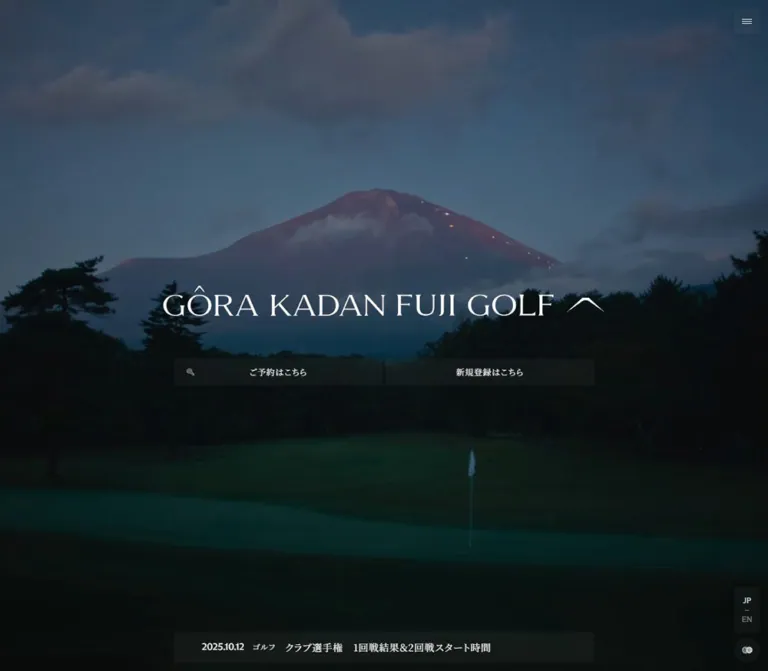
The page opens with a landscape occupying the entire viewport: Mount Fuji above a dark golf course on desktop, and a close view of a mossy rock against a misty course on mobile. A white wordmark sits within the scene. Two subdued reservation and registration controls preserve a practical route into booking without competing with the landscape.
Below this opening, the visual language changes to warm gray, black text, square photographs, and substantial empty space. Japanese serif copy describes golf, dining, bathing, and recovery. English labels provide concise navigation and section markers. The strongest visible editorial composition pairs a broad course photograph with a narrow portrait of flowing water, then introduces three wellness images on a slightly darker surface.
This is a substantial official venue homepage with information and service navigation. Preserve its sequence of landscape, editorial content, practical information, and booking access when adapting the design.
How to Read This Reference
- Measured means a value explicitly present in the supplied rendered DOM or computed-style evidence.
- Declared means a source custom property or transition exists, without proof that it produces a particular visible treatment.
- Estimated means an approximate dimension or appearance read from a supplied original-page screenshot.
- Calculated means arithmetic derived from supplied measurements; it is not an additional browser measurement.
- Recommended means an implementation choice for a new project. The Quick Start is a proposed adaptation, not recovered source code.
- Font-family records establish the computed CSS stack. They do not independently identify which font file painted every glyph.
A Measurement Caveat That Affects This Page
Several story-section rectangles appear scaled relative to settled screenshots and their own computed layout dimensions. For example, the mobile news grid has computed columns totaling 306px, while its reported outer rectangle is 263.16px wide: 263.16 / 306 = 0.86. Its reported left edge, 63.42px, is also consistent with scaling a 42px inset around the 195px viewport center.
A comparable desktop relationship exists between the approximately 74px screenshot inset and the sampled 164.44px inset: 720 + (74 − 720) × 0.86 = 164.44.
These calculations indicate a sampled transformed state. The actual ancestor transform and its trigger were not supplied. Keep computed font sizes, sampled rectangles, and settled screenshot estimates distinct. In particular, do not implement 63.42px as the universal mobile gutter or infer the entire scroll animation from this relationship.
Tokens — Colors
Working Palette
| Name | Value | Evidence | Role |
|---|---|---|---|
| Warm Gray Canvas | #E5E5E1 |
Measured body and footer background: rgb(229, 229, 225) |
Main editorial canvas and footer |
| Black Ink | #000000 |
Measured text color across editorial and footer elements | Headings, paragraphs, navigation, and dark-state symbols |
| Reversed White | #FFFFFF |
Measured opening-control text; declared --c-white-01 |
Wordmark and controls over scenic media |
| Stone Surface | #DEDED7 |
Declared --c-white-04; visually consistent with the wellness band |
Recommended token for the slightly deeper neutral section surface |
| Pale Surface | #F4F4F4 |
Declared --c-white-02 |
Available source neutral; specific visible application not established |
| Utility Wash | rgba(172, 172, 172, 0.05) |
Measured background on opening actions and right-side utilities | A faint transparent control layer |
| Charcoal Action | Approximately #333333 |
Estimated from the visible check-in button | Solid-looking dark action surface |
The check-in link itself reports a transparent computed background despite its visibly charcoal rectangle. The visible fill may belong to another layer or pseudo-element; the evidence does not identify that layer. Use the estimated charcoal directly when reproducing the visible result.
The opening controls likewise sit within a darkened scene. Their measured 5% gray fill does not explain every aspect of their final appearance. Do not treat that declaration as the complete compositing recipe.
Declared Media Gradient
The source includes the unusually spelled property --c-bradient-01:
linear-gradient(70deg, #00000070 15%, #00000000 70%)
This is a black-to-transparent gradient, starting at approximately 44% opacity. Its exact application to the supplied hero was not established. The hero clearly has a dark photographic treatment, but a full overlay stack cannot be recovered from the available records.
Color Discipline
Blue sky, dark trees, green turf, turquoise water, amber timber, and stone textures belong to the photography. They are not independently verified interface accent tokens. The visible interface uses neutral contrast rather than a bright booking color.
The custom-property dump also contains generic CMS gradients, shadow presets, and library defaults. Their presence does not make them part of the observed design palette.
Tokens — Typography
Japanese Editorial Stack
Measured computed family: "Noto Serif JP", 游明朝, "Yu Mincho", YuMincho, "Hiragino Mincho Pro", serif.
Japanese headings, descriptive copy, reservation labels, and contact information use this stack at weight 400. The effect is restrained and literary. Headlines generally remain around 22–24px, while paragraphs use generous leading at 14px.
The body inherits 0.7px letter spacing. The introductory paragraph increases this to 0.98px, while several Japanese headings use 2.2px or 2.4px. These are meaningful differences: headline tracking is more open than ordinary interface copy.
English Display and Utility Stack
Measured computed family name: "ABC Arizona Flare Variable Unlicensed Trial".
This exact string appears on English navigation, wellness labels, movie labeling, and footer branding. Some elements append the Japanese serif stack; others expose only this family name. The source record does not provide a font file or prove the resolved face for each element.
Use this as evidence of the declared typography, not as a downloadable asset reference. The Quick Start uses a generic serif fallback that can be replaced with the project’s available display font.
Wordmark
The large opening wordmark has a different role from ordinary headings. On desktop it is a wide horizontal composition with the mountain symbol at the right. On mobile the mountain symbol moves above a two-line name. Preserve this artwork and its responsive arrangement when authorized assets are available.
The 52px category headings found in the DOM are not measurements of the opening wordmark. Their overlapping rectangles indicate a separate layered text arrangement whose sequence was not visually verified.
Type Scale
All values below are computed CSS pixels before any ancestor scaling.
| Role | Desktop size / line height | Mobile size / line height | Tracking and qualification |
|---|---|---|---|
| Scenic category labels | 52 / 85.8px |
30 / 49.5px |
Normal; DOM evidence, not the visible logo |
| Movie label | 28 / 46.2px |
24 / 39.6px |
Normal; English display stack |
| Introductory Japanese heading | 24 / 39px |
22 / 31.9px |
2.4px / 2.2px |
| Wellness and facility heading | 24 / 34.8px |
22 / 30.25px |
0.96px / 2.2px |
| Dining heading | 22 / 30.25px |
22 / 30.25px |
2.2px |
| Introductory paragraph | 14 / 25.9px |
14 / 25.9px |
0.98px |
| General editorial paragraph | 14 / 23.8–24.5px |
14 / 24.5px |
Usually 0.7px |
| Wellness description | 17 / 27.2px |
16 / 25.6px |
0.7px |
| Wellness English label | 14 / 24.5px |
14 / 24.5px |
Normal |
| Main news title | 16 / 28px |
13 / 22.75px |
0.7px |
| Opening action label | 12 / 21px |
13 / 22.75px |
Child text; outer anchor remains 12px |
| Right-side utility label | 11 / 18.15px |
11 / 18.15px |
0.7px |
| Check-in explanatory paragraph | 14 / 23.8px |
13 / 22.1px |
0.7px |
| Footer brand | 19 / 31.35px |
17 / 28.05px |
Normal |
| Footer navigation | 13 / 15.6px |
14 / 16.8px |
Normal; slightly larger on mobile |
| Footer address | 13 / 22.75px |
11 / 19.25px |
0.7px |
| Copyright | 11 / 19.25px |
11 / 19.25px |
Normal |
The measured root font size is 10px at both viewports. Source expressions such as max(1.5vw, 2.4rem) therefore have a 24px minimum in this inspection. Do not copy those rem values into a project with a 16px root and expect the same result.
Tokens — Spacing & Shapes
Density: sparse editorial layout with small, closely grouped utility controls. Primary geometry: square imagery, unboxed text, shallow rectangles, and a single circular crest link.
Declared Spacing Scale
These source variables exist at both inspected widths. Their existence does not establish usage on every component.
| Source token | Formula | At 1440px wide | At 390px wide |
|---|---|---|---|
--s-more-4 |
max(0.3vw, 4px) |
4.32px |
4px |
--s-more-8 |
max(0.6vw, 8px) |
8.64px |
8px |
--s-more-12 |
max(0.8vw, 12px) |
12px |
12px |
--s-more-30 |
max(2vw, 30px) |
30px |
30px |
--s-more-40 |
max(2.7vw, 40px) |
40px |
40px |
--s-more-60 |
max(4vw, 60px) |
60px |
60px |
--s-more-80 |
max(5.44vw, 80px) |
80px |
80px |
--s-more-96 |
max(6.4vw, 96px) |
96px |
96px |
--s-more-120 |
max(8vw, 120px) |
120px |
120px |
--s-more-200 |
max(13.5vw, 200px) |
200px |
200px |
This is a minimum-based fluid system, not a uniformly shrinking scale. Mobile layouts also have explicit overrides, demonstrated by the footer and opening controls.
Component Geometry
| Element | Desktop | Mobile | Evidence |
|---|---|---|---|
| Opening action group | 600px overall width |
358px from x=14 to x=372 |
Measured action rectangles and gaps |
| Individual opening action | 297.84 × 37.78px |
177 × 46.75px |
Measured |
| Opening action gap | 4.31px |
4px |
Calculated from measured bounds |
| Opening action radius | 4px |
4px |
Measured |
| Visible news window | 600 × 44px |
362 × 44px |
Link measurements plus screenshot visibility |
| Utility rail width | 36px |
35px |
Measured |
| Rail right clearance | 12px |
4px |
Calculated from viewport and bounds |
| Rail item gap | 6px |
6px |
Calculated |
| Registration rail item | 106.41px high |
91px high |
Measured |
| Reservation rail item | 112.95px high |
93.55px high |
Measured |
| Language rail item | 66px high |
66px high |
Measured |
| Rectangular rail radius | 2px |
2px |
Measured |
| Crest link | 36px circle |
35px circle |
Measured size and 100% radius |
| Check-in action | 236.34 × 38.22px |
306 × 45.44px |
Measured; square corners |
Editorial Layout Measurements
| Feature | Approximate settled appearance | Qualification |
|---|---|---|
| Desktop wellness content bounds | x=74 to x=1366, approximately 1292px wide |
Screenshot estimate |
| Broad course photograph | Approximately 736 × 415px |
Screenshot estimate; close to 16:9 |
| Water photograph | Approximately 316 × 422px |
Screenshot estimate; close to 3:4 |
| Empty space between those images | Approximately 240px |
Screenshot estimate |
| Wellness card photographs | Approximately 298 × 198px each |
Screenshot estimate; close to 3:2 |
| Wellness image gaps | Approximately 28px |
Screenshot estimate |
| Wellness band top inset | Approximately 96px |
Screenshot estimate |
| Footer padding | 120px 60px 20px 80px |
Measured desktop |
| Footer padding | 120px 42px 15px |
Measured mobile |
| Mobile footer content width | 306px |
Measured |
| Check-in device | Approximately 210 × 430px desktop, 136 × 280px mobile |
Screenshot estimates |
There is no visible general-purpose elevation system. Photos and content groups are separated by spacing and subtle background changes, not rounded containers and shadows.
Components
Scenic Opening
Role: establish the place and provide immediate booking access.
The scene fills the viewport edge to edge, with no visible opaque header strip. The desktop wordmark occupies approximately 630px in width around the upper-middle of the screen. Two equal actions sit below it at y≈533px. A separate news strip rests close to the bottom edge.
On mobile, the centered identity changes to a compact stacked composition. The action pair moves to y≈737px, above the news window at y≈792px. The buttons become taller rather than simply shrinking with the viewport.
The visible desktop and mobile scenes differ. A still capture cannot determine whether this is responsive art direction, different frames of scenic media, or another media-selection mechanism. Reproduce the observed crops without claiming a particular playback implementation.
Reservation and Registration Pair
Anatomy: equal-width linked rectangles, centered Japanese labels, a small reservation symbol toward the left of the first link, faint transparent surfaces, and 4px corners.
Observed labels are ご予約はこちら and 新規登録はこちら. Their destinations are separate reservation and registration URLs on grain-players.net.
Desktop padding is 8.4px 18px; mobile padding is 12px 18px. The label grows from 12px to 13px on mobile. This creates a compact desktop control and a more usable phone control while maintaining the same quiet appearance.
Keep the two actions visually equal. The current design does not distinguish registration with a bright secondary color or a pill outline.
Opening News Window
Anatomy: a shallow darkened container holding a linked date, optional category, and title.
One item is visible in each opening screenshot, while the DOM contains three news links in vertically adjacent 44px rows. This supports a clipped news-window structure. It does not establish autoplay timing, transition direction, or manual controls.
Desktop uses a 600px-wide strip, 40px horizontal link padding, and a 14px gap. Mobile uses a 362px-wide strip, 15px horizontal padding, and a 10px gap. The opening category label ゴルフ is visible on desktop and omitted from the mobile rendered text.
Keep the full news list later in the document so the opening strip remains a concise entry point rather than the only way to access updates.
Persistent Identity and Menu Trigger
The scrolled screenshots show a small wordmark centered near the top of the viewport. Its measured link width is 240px on desktop and 195px on mobile. In the initial DOM sample, this link sits slightly above the viewport, consistent with a hidden or transitioning header state.
A small hamburger symbol remains at the upper-right corner. It appears white over the opening media and black over the light document. Its visible lines are much smaller than the surrounding control area.
The expanded menu was not captured. Do not derive an open-panel width, background, focus behavior, or animation path from the closed trigger alone.
Navigation Inventory — DOM Evidence
The rendered document contains public navigation for course information, pricing, dining, facilities, news, access, contact, and a fact sheet. It also contains a members-only group with course, competition, fee, and news links for several membership categories.
English primary links such as THE DINING and FACILITY have measured 28px display text. Secondary English links such as NEWS and ACCESS measure 22px on desktop and 17px on mobile. Smaller Japanese navigation measures around 13–14px.
These observations establish content hierarchy and declared type treatments. Some navigation rectangles overlap or extend outside the mobile viewport in the sample; this is not proof of the appearance or usability of the opened menu.
Right-Side Utility Rail
Role: preserve access to registration, reservation, language, and the golf homepage while the visitor reads.
The rail sits close to the lower-right edge. It stacks registration, reservation, a two-line JP / EN language treatment, and a circular crest link. Japanese booking labels read vertically. The reservation symbol precedes its label.
The language anchor points to the English page. The crest anchor points to the golf homepage; it is not evidence of a settings or theme control.
The body screenshots show dark symbols and labels over the light canvas. The desktop opening shows the lower language and crest utilities in white; the registration and reservation rail items are not visibly presented there. The mobile opening does not visibly show the rail. DOM presence alone does not prove visibility in these states.
Editorial Story Sections
The document sequence introduces the golf course, dining, wellness, facilities, and news. Japanese headlines remain modest in size, letting photography and space provide scale.
The introductory copy uses a measured 14px size and 25.9px line height. Supporting links include ゴルフコースの詳細を見る, 詳細を見る, and 施設一覧. These are transparent editorial links in the sampled styles, with substantial lower padding, rather than filled booking buttons.
The complete visual compositions of the course, dining, and facility sections are not supplied. Their text, destinations, and typography are established by DOM evidence; apply the photographed wellness section’s spatial principles to new sections as a recommendation, not as a claim that every original section shares the same grid.
Asymmetric Wellness Image Pair
Role: connect the landscape of play with the sensory detail of bathing.
The desktop composition places a broad course view on the left and a narrow image of water flowing from a dark spout on the right. The photographs have similar heights but markedly different widths. A large empty interval between them is a defining part of the composition.
Below the images, the Japanese heading sits on the left and explanatory copy begins around x=782px on the right. This is a second alignment relationship, not a caption centered under each image.
Preserve square corners, photographic detail, and the uneven image proportions. The water image should remain a close material study rather than another distant landscape.
Wellness Feature Band
Anatomy: a slightly deeper neutral background, an introductory label and Japanese title at left, and three linked photo-and-copy items at right.
The visible labels are SPA, ONSEN, and SAUNA. Each item contains a landscape crop, a small English category, a larger Japanese description, and a サイトを見る link label in the rendered text. Cards have no individual filled shells or visible elevation.
The desktop screenshots show approximately 298px-wide photographs. The source image attributes are nearly square, so the visible landscape presentation involves cropping rather than preserving their native aspect ratio.
Mobile DOM positions place all three items at the same y-coordinate, with later items extending to the right of the viewport. This establishes a horizontal arrangement. Swipe, drag, snapping, and arrow controls were not exercised. A horizontal scroller is a suitable recommended implementation, but a specific carousel behavior is unverified.
All three supplied wellness link records point to /fuji/wellness/spa/. Do not invent distinct destination paths from the three category names.
Main News List
Anatomy: repeated linked rows with a compact date/category area and a wider title area, followed by 一覧を見る.
Desktop computed grid columns total 728px, divided approximately 18% / 82%. Mobile computed columns total 306px, divided approximately 30% / 70%. The reported outer rectangles are smaller in the sampled transformed state.
Desktop rows have 16px vertical padding and 16px title text. Mobile rows use 18.2px vertical padding and 13px title text. The larger metadata proportion on mobile provides space for a date and category while the title wraps in its own column.
Only the opening news strip has direct screenshot coverage. The main list’s structure and sizes are DOM observations; borders and hover styling were not established.
Movie Area
The document includes a MOVIE label immediately before the check-in/footer area. A dark media rectangle approximately 776px wide is partially visible at the top of the desktop footer capture.
The complete media frame, playback controls, duration, audio state, and interaction behavior were not supplied. The existence of this section does not establish that the opening scene uses the same media asset or playback system.
Smart Check-In
Role: explain the venue’s cashless process and link visitors to their account area.
Desktop uses three separated zones: SMART CHECK IN at left, a tall phone mockup near the center, and a cashless-payment heading, explanatory paragraph, and charcoal action at right.
The phone is presented as an image. Its screen shows a check-in record and barcode; it is not evidence of an embedded functional account interface on this page. The action label is マイページへ, with a small external-link-style symbol at the right. Its recorded destination is the reservation URL. The symbol does not independently prove a new-tab target.
On mobile, the cashless heading appears above the device in the DOM order and layout evidence, followed by the centered phone, a left-aligned paragraph, and a full-width 306px button. This is a deliberate rearrangement, not a scaled three-column desktop composition.
Footer Information
The footer continues the same canvas without a dark closing panel. On desktop, the brand and six navigation links sit at left, while address and telephone information align to the right. Copyright sits near the lower-left corner.
On mobile, the brand is followed by a three-column, two-row menu. The order is ABOUT US, THE DINING, FACILITY, then NEWS, ACCESS, CONTACT. Contact information becomes left aligned below the menu.
Measured mobile spacing provides useful anchors: 60px from the check-in action’s bottom to the brand, 28px from the brand’s bottom to navigation, 14px between navigation rows, 50px before contact information, and another 50px before copyright.
Tokens — Motion & Interaction
Declared Transitions
These values come from computed transition declarations. They are evidence of intended transitions, not a recording of every interaction being performed.
| Element or property | Declared timing | Evidence boundary |
|---|---|---|
| Navigation-link opacity and filter | 0.95s linear |
Trigger and start/end filter values unverified |
| Navigation-link transform | 0.95s cubic-bezier(0.67, 0.31, 0.15, 1) |
Transform distance and direction unverified |
| Secondary navigation stagger | Delays of 0.03s, 0.06s, 0.09s, 0.12s |
Ordered declarations; opened sequence not captured |
| Other navigation entry delay | 0.15s |
Present on several main links |
| Small centered identity | 1s transform with the same easing; 1s linear opacity |
Consistent with changing header visibility |
| Opening-action background | 0.4s linear |
Actual hover colors unverified |
| Opening-action backdrop filter | 2s linear |
Does not establish a blur radius |
| Opening-action width | 1s with the source easing |
Trigger and alternate width unverified |
| Booking rail opacity/background | 0.6s linear |
Context and hover outcomes not separately exercised |
| Crest transform | 1.4s with the source easing |
No verified rotation or movement amplitude |
The easing is explicitly declared as --easing-easeOut01: cubic-bezier(0.67, 0.31, 0.15, 1).
What the Captures Establish
The page has distinct opening and scrolled visual states, and the DOM bounds show a likely transformed sampling state. Opening screenshots also expose different news entries. These observations support a staged presentation, but they do not establish a complete scroll timeline or news cycle.
The sampled elements report animation: none. That does not rule out transitions, ancestor transforms, JavaScript-driven changes, or media playback.
The collection process waited for initial readiness and traversed intermediate scroll positions. It temporarily paused perpetual animations during readiness checks, then resumed them. Consequently, the captures should not be treated as a frame-by-frame motion record.
Recommended Motion Adaptation
Use the recorded easing for gentle identity and navigation transitions. Keep movement secondary to the imagery and preserve readable content throughout. If implementing a news rotation or scenic video, provide a stable paused state and reduced-motion behavior. Duration, autoplay, sound, looping, and scroll pinning require separate design decisions because they were not verified here.
Surfaces
| Layer | Appearance | Structural purpose |
|---|---|---|
| Opening scene | Dark, full-viewport photographic field | Establishes place and atmosphere |
| Opening actions/news | Faint translucent rectangles with white text | Keeps service access within the scene |
| Editorial canvas | Solid #E5E5E1 |
Quiet background for text and photography |
| Wellness band | Slightly deeper stone neutral | Groups related retreat experiences |
| Wellness items | Photographs and text directly on the band | Avoids an independent card-shell system |
| Check-in action | Approximately #333333 with white text |
Clear account-entry action |
| Utility rail | Small contextual washes and one circle | Persistent services without a full sidebar |
Broad separation comes from space and neutral surface changes. The circular crest is a specific brand element, not the beginning of a pill-shaped component language.
Imagery
The visual subjects are specific to the venue: a golf course beneath Mount Fuji, forested hills, mossy rock, running water, treatment rooms, a bath facing a garden, and a softly illuminated curved sauna interior.
Landscape photographs establish scale. Close views of water, stone, timber, and treatment activity introduce touch and warmth. The desktop wellness composition places these two image roles together rather than filling every slot with a wide scenic panorama.
The opening has deep shadows and subdued highlights. Interior wellness photographs retain warm material colors. These differences should remain photographic; a single heavy color filter applied to every image would flatten the sequence.
Use object-fit: cover for the cropped editorial photographs and object-fit: contain for the phone mockup and wordmark. Preserve a separate mobile wordmark composition. A dedicated mobile scenic crop may be appropriate, but the current evidence cannot prove whether separate source media is used.
Observed Asset References
The following paths were exposed by rendered image markup. They are relative to the original website and were not separately fetched.
| Asset | Observed path | Native attributes | Visible role |
|---|---|---|---|
| Spa photograph | /fuji/golf/wp-content/uploads/2025/09/wellness-slider-01.jpg |
542 × 528 |
Treatment scene, cropped to a landscape presentation |
| Onsen photograph | /fuji/golf/wp-content/uploads/2025/09/wellness-slider-02.jpg |
544 × 528 |
Bath and garden view |
| Sauna photograph | /fuji/golf/wp-content/uploads/2025/09/wellness-slider-03.jpg |
546 × 528 |
Curved interior and warm indirect light |
The supplied evidence does not expose complete URLs for the opening media, responsive wordmarks, phone mockup, or movie asset. Do not invent their paths or replace brand artwork with an assumed font rendering.
Layout & Responsive Behavior
Page Structure
The rendered document is approximately 11,055px tall on desktop and 11,000px on mobile. These are snapshot measurements, not target heights for a new implementation.
The body’s sampled origin is 1500px on desktop and 1266px on mobile, exactly 1.5 times each viewport height. Together with the full-screen opening, this suggests layered or staged document geometry. It does not justify inserting a blank 150vh margin or establish how long any section remains pinned.
Observed Responsive Changes
| Feature | Desktop observation | Mobile observation |
|---|---|---|
| Opening identity | Wide horizontal wordmark | Mountain symbol above a two-line name |
| Opening actions | Centered beneath the identity | Positioned above the bottom news strip |
| Action height | Approximately 38px | Approximately 47px |
| Opening news category | Visible | Omitted |
| Scrolled identity | 240px link width | 195px link width |
| Japanese section titles | Usually 24px | Usually 22px with more wrapping |
| Wellness items | Three items beside an introductory column | Items continue horizontally beyond the viewport |
| Main news grid | Approximately 18% metadata / 82% title | Approximately 30% metadata / 70% title |
| Check-in presentation | Separated horizontal zones | Heading, device, paragraph, and action stack |
| Account action | Approximately 236px wide | Full 306px content width |
| Footer navigation | Single horizontal row | Three columns and two rows |
| Contact information | Right aligned | Left aligned |
Only the two stated viewport widths were inspected. The precise breakpoint is unknown. The Quick Start uses 900px as a recommended adaptation breakpoint, not a recovered source value.
Keep the right-side rail outside the main reading measure. At 390px, the 306px footer column ends at x=348 and the rail starts at x=351, leaving very little separation. Any enlargement of the rail’s interactive area should account for that clearance rather than covering adjacent content.
Do’s and Don’ts
Do
- Use the measured warm-gray canvas
#E5E5E1as the main document surface. - Let landscape and material photography carry the strongest visual contrast.
- Keep Japanese headings restrained, with regular weight and deliberate tracking.
- Preserve the contrast between the horizontal desktop wordmark and stacked mobile identity.
- Pair very wide and narrow photographs with substantial space between them.
- Keep wellness items square-edged and directly on the shared section background.
- Move opening actions toward the bottom on mobile and increase their height.
- Preserve date/category/title hierarchy in both the opening news window and full list.
- Keep booking utilities compact and aligned to the right edge.
- Use the phone mockup as an explanatory image with a separate account link.
Don’t
- Don’t replace the official venue homepage with a generic conversion-only layout.
- Don’t add a bright accent color simply to make every booking link dominant.
- Don’t turn the wellness band into rounded, shadowed feature cards.
- Don’t make every Japanese heading oversized or bold.
- Don’t identify the opening wordmark’s font from unrelated 52px DOM headings.
- Don’t use the sampled 0.86-scaled rectangles as universal layout widths.
- Don’t infer carousel swiping, video autoplay, or menu focus behavior from static captures.
- Don’t describe the crest link as a theme or settings control.
- Don’t assume the external-link-style icon proves a new-tab interaction.
- Don’t promote generic CMS color and shadow presets into the site’s visual system.
Recommended Implementation Additions
These are recommendations for a new implementation, not verified features of the original page:
- Use semantic navigation links and an actual button for the menu trigger, with an accessible name and expanded state.
- Keep focus indicators visible over both the scenic opening and the warm-gray document. Give the crest link a meaningful accessible name.
- Improve the rail’s touch-target area where possible while retaining clearance from the content column. Its observed 35–36px width is visually compact.
- Make a mobile wellness scroller keyboard accessible and keep all item links reachable without requiring dragging.
- If news rotates, pause rotation on interaction and avoid repeatedly announcing every automatic change to assistive technology. Keep complete titles available in the main list.
- Provide a static scenic poster and a reduced-motion path. Essential text should remain visible if animation initialization fails.
- Give the check-in image a concise descriptive alternative rather than treating its sample barcode and account details as live interface data.
- Reserve image dimensions and load below-fold imagery progressively. Supply suitable mobile crops without delaying the primary opening image.
Agent Prompt Guide
Quick Color Reference
- Main document:
#E5E5E1. - Main text:
#000000. - Reversed opening identity and labels:
#FFFFFF. - Secondary wellness surface:
#DEDED7, a declared source token consistent with the visible band. - Account action: approximately
#333333, a visual approximation. - Scenic controls: very subdued transparent panels; no bright accent treatment.
Overall Prompt
“Create an official golf retreat homepage with a full-viewport scenic opening, a white responsive wordmark, paired Japanese reservation and registration links, a single shallow news window, and a small upper-right menu trigger. Continue into a warm-gray #E5E5E1 editorial document with black regular-weight Japanese serif text, modest 22–24px headings, generous leading, square photography, and broad empty spaces. Pair a wide course photograph with a narrow water detail. Add a slightly deeper neutral wellness band containing an introductory title and three unboxed photo-and-copy features. End with a phone-based check-in explanation and a quiet information footer. Keep a compact vertical booking and language rail at the right in scrolled states.”
Example Component Prompts
- Opening: “Design a 1440 × 1000 scenic golf opening with a horizontal white wordmark approximately 630px wide, a 600px pair of understated booking links beneath it, and a 600 × 44px news window near the bottom. At 390 × 844, stack the wordmark, retain two 177px-wide actions, and position them above the bottom news window. Do not invent a playback system.”
- Wellness image pair: “On a warm-gray canvas, place an approximately 736 × 415px course photograph at left and a 316 × 422px water detail at right. Leave roughly 240px of empty space between them. Beneath the pair, align a modest Japanese serif heading left and a short paragraph toward the right.”
- Wellness band: “Create a flat stone-colored section with a small English label and Japanese title at left, then three square-edged landscape photographs with SPA, ONSEN, and SAUNA labels and 17px Japanese descriptions. Use approximately 28px image gaps and no individual card backgrounds. On mobile, retain a horizontal sequence with accessible overflow navigation.”
- Utility rail: “Create a narrow lower-right stack with vertical Japanese registration and reservation labels, a compact JP/EN language link, and a circular brand crest linking home. Use 35–36px visual widths, 6px gaps, and black or white details appropriate to the background. Keep its interactive area clear of body copy.”
- Check-in and footer: “Place a check-in heading at left, a roughly 210 × 430px phone image near the center, and a short Japanese explanation with a 236px charcoal action at right. On mobile, stack the content in a 306px column and use a 136 × 280px phone image. Follow with a three-column, two-row navigation menu, contact text, and a small copyright line.”
Quick Start
CSS Custom Properties
This is a proposed implementation of the visible design relationships. It uses a conventional root size and explicit component values. The gutter formula, 900px breakpoint, composite hero shades, and layout grids are recommendations. The original scroll staging, menu-open state, and media behavior require separate implementation.
Supply authorized wordmark, scenic, wellness, and device assets. The CSS does not reference guessed source paths. For the check-in layout, use a title, a phone image, and a neutral .checkin__details wrapper containing its subheading, paragraph, and action. The mobile grid reorders those details without duplicating their text.
:root {
  /* Measured colors and a declared secondary neutral */
  --page-canvas: #e5e5e1;
  --page-ink: #000;
  --page-reverse: #fff;
  --surface-stone: #deded7;
  --utility-wash: rgb(172 172 172 / 5%);

  /* Recommended approximations of visible composite surfaces */
  --action-charcoal: #333;
  --hero-panel: rgb(24 24 22 / 58%);
  --hero-shade: rgb(0 0 0 / 40%);

  /* Load available project fonts separately */
  --font-ja: 'Noto Serif JP', 'Yu Mincho', YuMincho,
    'Hiragino Mincho Pro', serif;
  --font-display: serif;
  --text-body: 14px;
  --text-title: 24px;
  --text-caption: 11px;
  --tracking-body: 0.7px;

  /* Recommended fluid gutter matching the supplied endpoints */
  --page-inset: clamp(42px, 5.14vw, 96px);
  --feature-gap: 28px;
  --section-space: 120px;
  --hero-controls-width: 600px;
  --rail-width: 36px;
  --rail-edge: 12px;

  /* Source easing and measured transition durations */
  --ease-retreat: cubic-bezier(0.67, 0.31, 0.15, 1);
  --motion-control: 400ms linear;
  --motion-rail: 600ms linear;
}

* { box-sizing: border-box; }

body {
  margin: 0;
  color: var(--page-ink);
  background: var(--page-canvas);
  font-family: var(--font-ja);
  font-size: var(--text-body);
  font-weight: 400;
  line-height: 1.75;
  letter-spacing: var(--tracking-body);
}

img { display: block; max-width: 100%; }
a { color: inherit; }
button { font: inherit; }

.content-shell { margin-inline: var(--page-inset); }
.section-title {
  margin: 0;
  font-size: var(--text-title);
  font-weight: 400;
  line-height: 1.45;
  letter-spacing: 0.04em;
}

/* Ordinary document flow; unresolved scroll staging is separate. */
.hero {
  position: relative;
  min-height: 100vh;
  min-height: 100svh;
  overflow: hidden;
  color: var(--page-reverse);
  background: #17221e;
}
.hero-media,
.hero-shade {
  position: absolute;
  inset: 0;
  width: 100%;
  height: 100%;
}
.hero-media { object-fit: cover; }
.hero-shade {
  background: var(--hero-shade);
  pointer-events: none;
}
.hero-brand {
  position: absolute;
  top: 45%;
  left: 50%;
  width: min(630px, 70vw);
  transform: translate(-50%, -50%);
}
.hero-brand img { width: 100%; height: auto; }
.hero-actions {
  position: absolute;
  top: 53.27%;
  left: 50%;
  display: grid;
  grid-template-columns: repeat(2, minmax(0, 1fr));
  gap: 4.32px;
  width: min(var(--hero-controls-width), calc(100% - 48px));
  transform: translateX(-50%);
}
.action {
  position: relative;
  display: flex;
  align-items: center;
  justify-content: center;
  padding: 8.4px 18px;
  border: 0;
  border-radius: 4px;
  color: var(--page-reverse);
  background: var(--hero-panel);
  font-size: 12px;
  line-height: 1.75;
  text-align: center;
  text-decoration: none;
  transition: background-color var(--motion-control);
}
.action-icon {
  position: absolute;
  left: 18px;
  width: 12px;
  height: 12px;
}
.action-icon--end { right: 18px; left: auto; }
.hero-news {
  position: absolute;
  bottom: max(12px, env(safe-area-inset-bottom, 0px));
  left: 50%;
  display: flex;
  align-items: center;
  gap: 14px;
  width: min(var(--hero-controls-width), calc(100% - 48px));
  height: 44px;
  padding-inline: 40px;
  border-radius: 4px;
  background: var(--hero-panel);
  transform: translateX(-50%);
  text-decoration: none;
}
.hero-news time { flex: none; font-size: 13px; }
.hero-news-category { flex: none; font-size: 11px; }
.hero-news-title {
  min-width: 0;
  overflow: hidden;
  font-size: 14px;
  white-space: nowrap;
  text-overflow: ellipsis;
}

/* State attributes are an adaptation, not original selectors. */
.header-brand {
  position: fixed;
  z-index: 20;
  top: 24px;
  left: 50%;
  width: 240px;
  transform: translateX(-50%);
  transition: opacity 1s linear, transform 1s var(--ease-retreat);
}
.menu-trigger {
  position: fixed;
  z-index: 30;
  top: 12px;
  right: var(--rail-edge);
  display: grid;
  place-items: center;
  width: var(--rail-width);
  height: var(--rail-width);
  padding: 0;
  border: 0;
  color: var(--page-ink);
  background: transparent;
  cursor: pointer;
}
.utility-rail {
  position: fixed;
  z-index: 20;
  right: var(--rail-edge);
  bottom: max(12px, env(safe-area-inset-bottom, 0px));
  display: grid;
  gap: 6px;
}
.utility-item {
  display: flex;
  flex-direction: column;
  align-items: center;
  justify-content: center;
  width: var(--rail-width);
  border-radius: 2px;
  color: var(--page-ink);
  background: var(--utility-wash);
  font-size: 11px;
  line-height: 1.65;
  text-decoration: none;
  transition: background-color var(--motion-rail);
}
.utility-register { height: 106.4px; }
.utility-reserve { height: 112.95px; gap: 4px; }
.utility-label { writing-mode: vertical-rl; text-orientation: upright; }
.utility-language { height: 66px; }
.utility-crest { height: var(--rail-width); border-radius: 50%; }
[data-hero-active='true'] .header-brand {
  visibility: hidden;
  opacity: 0;
}
[data-hero-active='true'] .menu-trigger,
[data-hero-active='true'] .utility-item { color: var(--page-reverse); }
[data-hero-active='true'] .utility-booking { visibility: hidden; }

.image-pair {
  display: grid;
  grid-template-columns: 57% 24.5%;
  justify-content: space-between;
  align-items: start;
}
.image-pair img { width: 100%; object-fit: cover; }
.image-pair-wide { aspect-ratio: 16 / 9; }
.image-pair-portrait { aspect-ratio: 3 / 4; }
.story-caption {
  display: grid;
  grid-template-columns: minmax(0, 1fr) 45.2%;
  gap: 7%;
  margin-top: 52px;
  padding-bottom: 96px;
}
.story-caption p { margin: 0; line-height: 1.7; }
.wellness-band {
  display: grid;
  grid-template-columns: minmax(0, 1fr) minmax(0, 3fr);
  gap: var(--feature-gap);
  padding: 96px var(--page-inset);
  background: var(--surface-stone);
}
.wellness-cards {
  display: grid;
  grid-template-columns: repeat(3, minmax(0, 1fr));
  gap: var(--feature-gap);
  min-width: 0;
}
.wellness-card { min-width: 0; text-decoration: none; }
.wellness-card img {
  width: 100%;
  aspect-ratio: 3 / 2;
  object-fit: cover;
  border-radius: 0;
}
.wellness-label {
  margin: 16px 0 8px;
  font-family: var(--font-display);
  font-size: 14px;
  letter-spacing: normal;
}
.wellness-description { margin: 0; font-size: 17px; line-height: 1.6; }
.news-row {
  display: grid;
  grid-template-columns: 18% minmax(0, 1fr);
  padding-block: 16px;
  font-size: 16px;
  text-decoration: none;
}
.news-row p { margin: 0; }

.site-footer { padding: 120px 60px 20px 80px; }
.checkin {
  display: grid;
  grid-template-columns: minmax(0, 1fr) minmax(0, 1fr) minmax(0, 355px);
  gap: 60px;
  align-items: center;
}
.checkin-title {
  align-self: start;
  margin: 0;
  font-family: var(--font-display);
  font-size: 28px;
  font-weight: 400;
  letter-spacing: normal;
}
.checkin-phone { width: 210px; height: auto; justify-self: center; }
.checkin__details h3 { margin: 0; font-size: 14px; font-weight: 400; }
.checkin__details p { margin: 20px 0 0; line-height: 1.7; }
.checkin__details .action {
  width: 236px;
  margin-top: 50px;
  border-radius: 0;
  background: var(--action-charcoal);
}
.footer-info {
  display: grid;
  grid-template-columns: repeat(2, minmax(0, 1fr));
  margin-top: 60px;
}
.footer-brand {
  font-family: var(--font-display);
  font-size: 19px;
  line-height: 1.65;
  letter-spacing: normal;
  text-decoration: none;
}
.footer-nav { display: flex; gap: 40px; margin-top: 26px; }
.footer-nav a {
  font-family: var(--font-display);
  font-size: 13px;
  line-height: 1.2;
  letter-spacing: normal;
  text-decoration: none;
}
.footer-address { margin: 0; font-size: 13px; text-align: right; }
.copyright {
  margin: 96px 0 0;
  font-family: var(--font-display);
  font-size: 11px;
  letter-spacing: normal;
}

/* Recommended responsive adaptation; exact source breakpoint unknown. */
@media (max-width: 900px) {
  :root { --rail-width: 35px; --rail-edge: 4px; --text-title: 22px; }
  .section-title { line-height: 1.375; letter-spacing: 0.1em; }
  .hero-brand { top: 50%; width: 220px; }
  .hero-actions {
    top: auto;
    right: 18px;
    bottom: calc(60px + env(safe-area-inset-bottom, 0px));
    left: 14px;
    width: auto;
    gap: 4px;
    transform: none;
  }
  .hero-actions .action { padding-block: 12px; font-size: 13px; }
  .hero-news {
    right: 14px;
    bottom: calc(8px + env(safe-area-inset-bottom, 0px));
    left: 14px;
    width: auto;
    gap: 10px;
    padding-inline: 15px;
    transform: none;
  }
  .hero-news-title { font-size: 13px; }
  .hero-news-category { display: none; }
  .header-brand { top: 14px; width: 195px; }
  .menu-trigger { top: 4px; }
  .utility-rail { bottom: max(8px, env(safe-area-inset-bottom, 0px)); }
  .utility-register { height: 91px; }
  .utility-reserve { height: 93.55px; }
  [data-hero-active='true'] .utility-rail { display: none; }
  .image-pair { grid-template-columns: 1fr; gap: 40px; }
  .image-pair-portrait { width: 65%; justify-self: end; }
  .story-caption { grid-template-columns: 1fr; gap: 24px; }
  .wellness-band { grid-template-columns: 1fr; gap: 40px; }
  .wellness-cards {
    grid-template-columns: none;
    grid-auto-flow: column;
    grid-auto-columns: calc(100vw - 2 * var(--page-inset));
    margin-inline-end: calc(-1 * var(--page-inset));
    padding-inline-end: var(--page-inset);
    overflow-x: auto;
    scroll-snap-type: x proximity;
  }
  .wellness-card { scroll-snap-align: start; }
  .wellness-description { font-size: 16px; }
  .news-row {
    grid-template-columns: 30% minmax(0, 1fr);
    padding-block: 18.2px;
    font-size: 13px;
  }
  .site-footer { padding: 120px 42px 15px; }
  .checkin {
    grid-template-columns: minmax(0, 1fr);
    grid-template-areas: 'title' 'caption' 'phone' 'copy' 'action';
    gap: 0;
  }
  .checkin-title { grid-area: title; font-size: 24px; text-align: center; }
  .checkin-phone { grid-area: phone; width: 136px; margin-bottom: 40px; }
  .checkin__details { display: contents; }
  .checkin__details h3 {
    grid-area: caption;
    margin: 10px 0 30px;
    font-size: 15px;
    text-align: center;
  }
  .checkin__details p { grid-area: copy; margin: 0; font-size: 13px; }
  .checkin__details .action {
    grid-area: action;
    width: 100%;
    margin-top: 40px;
    padding-block: 12px;
  }
  .footer-info { grid-template-columns: 1fr; }
  .footer-brand { font-size: 17px; }
  .footer-nav {
    display: grid;
    grid-template-columns: repeat(3, minmax(0, 1fr));
    gap: 14px 12px;
    margin-top: 28px;
  }
  .footer-nav a { font-size: 14px; }
  .footer-address { margin-top: 50px; font-size: 11px; text-align: left; }
  .copyright { margin-top: 50px; }
}

/* Recommended accessibility and feedback additions */
:where(a, button):focus-visible {
  outline: 2px solid currentColor;
  outline-offset: 4px;
}
@media (hover: hover) {
  .action:hover { background-color: #454541; }
  .footer-nav a:hover { text-decoration: underline; text-underline-offset: 4px; }
}
@media (prefers-reduced-motion: reduce) {
  .header-brand, .action, .utility-item { transition: none; }
  .wellness-cards { scroll-snap-type: none; }
}
The mobile image-pair arrangement and native wellness scroller above are recommended adaptations because their complete mobile visual and interaction states were not captured. The CSS was not executed or browser-tested in this analysis. Media pause behavior and accessible menu operation require application logic beyond these styles.
Tailwind v4 Token Mapping
Optional aliases for an implementation already using Tailwind v4. This mapping is a recommendation, not evidence of the original framework. Define the properties above first.
@theme inline {
  --color-canvas: var(--page-canvas);
  --color-ink: var(--page-ink);
  --color-reverse: var(--page-reverse);
  --color-stone: var(--surface-stone);
  --color-charcoal: var(--action-charcoal);
  --font-editorial: var(--font-ja);
  --font-display: serif;
  --text-copy: 14px;
  --text-caption: 11px;
  --text-section: var(--text-title);
  --spacing-page: var(--page-inset);
  --spacing-feature: var(--feature-gap);
  --spacing-section: var(--section-space);
  --radius-action: 4px;
  --radius-utility: 2px;
  --ease-retreat: cubic-bezier(0.67, 0.31, 0.15, 1);
}
Sources & Evidence
- Original and final Japanese golf homepage: HTTP 200, retrieved September 12, 2026, at
2026-09-12T13:50:34.476Z. This is the authority for the page identity and the supplied current-page observations. - Desktop original-page captures: 1440 × 1000 CSS pixels, covering the opening, wellness composition, and check-in/footer area.
- Mobile original-page captures: 390 × 844 CSS pixels, covering the opening and lower check-in/footer area.
- Rendered DOM and computed styles: text, link destinations, element bounds, typography, colors, padding, radii, grid columns, custom properties, and transition declarations at both viewports. The sample includes layered or potentially hidden elements; their presence is not equivalent to screenshot visibility.
- Image evidence: three wellness image paths and native dimensions appear directly in rendered original-page markup. Other major asset URLs were not provided.
- Inspection limitations: no additional browsing, file access, or command execution was performed. The supplied browser session waited for readiness and traversed scroll positions, but expanded navigation, hover outcomes, language switching, reservation flows, carousel gestures, movie playback, and the exact scroll timeline were not verified. Destination URLs are recorded link evidence, not inspections of the linked services.
This reference describes the supplied current page. Measured declarations, screenshot estimates, calculated transform relationships, and proposed implementation choices are distinguished throughout.
# GORA KADAN FUJI GOLF — Style Reference

> A cinematic golf retreat framed by warm gray space, restrained serif typography, and quiet reservation controls.

**Website / Original URL:** [gorakadan.com/fuji/golf](https://www.gorakadan.com/fuji/golf/)
**Final URL:** [https://www.gorakadan.com/fuji/golf/](https://www.gorakadan.com/fuji/golf/)
**Response:** HTTP 200; original and final URLs are identical.
**Theme:** dark scenic opening, followed by a light warm-gray document; no user-selectable theme was verified.
**Inspected:** September 12, 2026, at 13:50:34 UTC / 22:50:34 JST, through the supplied browser evidence.
**Viewports:** desktop 1440 × 1000 and mobile 390 × 844 CSS pixels.
**Scope:** the current Japanese golf venue homepage within the wider resort website. Visual evidence covers the desktop opening, wellness section, check-in area and footer, plus the mobile opening and footer. Rendered text and computed styles additionally cover course introduction, dining, facilities, news, movie labeling, and navigation inventory. Linked pages and expanded navigation were not independently inspected.

The page opens with a landscape occupying the entire viewport: Mount Fuji above a dark golf course on desktop, and a close view of a mossy rock against a misty course on mobile. A white wordmark sits within the scene. Two subdued reservation and registration controls preserve a practical route into booking without competing with the landscape.

Below this opening, the visual language changes to warm gray, black text, square photographs, and substantial empty space. Japanese serif copy describes golf, dining, bathing, and recovery. English labels provide concise navigation and section markers. The strongest visible editorial composition pairs a broad course photograph with a narrow portrait of flowing water, then introduces three wellness images on a slightly darker surface.

This is a substantial official venue homepage with information and service navigation. Preserve its sequence of landscape, editorial content, practical information, and booking access when adapting the design.

## How to Read This Reference

- **Measured** means a value explicitly present in the supplied rendered DOM or computed-style evidence.
- **Declared** means a source custom property or transition exists, without proof that it produces a particular visible treatment.
- **Estimated** means an approximate dimension or appearance read from a supplied original-page screenshot.
- **Calculated** means arithmetic derived from supplied measurements; it is not an additional browser measurement.
- **Recommended** means an implementation choice for a new project. The Quick Start is a proposed adaptation, not recovered source code.
- Font-family records establish the computed CSS stack. They do not independently identify which font file painted every glyph.

### A Measurement Caveat That Affects This Page

Several story-section rectangles appear scaled relative to settled screenshots and their own computed layout dimensions. For example, the mobile news grid has computed columns totaling 306px, while its reported outer rectangle is 263.16px wide: `263.16 / 306 = 0.86`. Its reported left edge, 63.42px, is also consistent with scaling a 42px inset around the 195px viewport center.

A comparable desktop relationship exists between the approximately 74px screenshot inset and the sampled 164.44px inset: `720 + (74 − 720) × 0.86 = 164.44`.

These calculations indicate a sampled transformed state. The actual ancestor transform and its trigger were not supplied. Keep computed font sizes, sampled rectangles, and settled screenshot estimates distinct. In particular, do not implement 63.42px as the universal mobile gutter or infer the entire scroll animation from this relationship.

## Tokens — Colors

### Working Palette

| Name | Value | Evidence | Role |
| --- | --- | --- | --- |
| Warm Gray Canvas | `#E5E5E1` | Measured body and footer background: `rgb(229, 229, 225)` | Main editorial canvas and footer |
| Black Ink | `#000000` | Measured text color across editorial and footer elements | Headings, paragraphs, navigation, and dark-state symbols |
| Reversed White | `#FFFFFF` | Measured opening-control text; declared `--c-white-01` | Wordmark and controls over scenic media |
| Stone Surface | `#DEDED7` | Declared `--c-white-04`; visually consistent with the wellness band | Recommended token for the slightly deeper neutral section surface |
| Pale Surface | `#F4F4F4` | Declared `--c-white-02` | Available source neutral; specific visible application not established |
| Utility Wash | `rgba(172, 172, 172, 0.05)` | Measured background on opening actions and right-side utilities | A faint transparent control layer |
| Charcoal Action | Approximately `#333333` | Estimated from the visible check-in button | Solid-looking dark action surface |

The check-in link itself reports a transparent computed background despite its visibly charcoal rectangle. The visible fill may belong to another layer or pseudo-element; the evidence does not identify that layer. Use the estimated charcoal directly when reproducing the visible result.

The opening controls likewise sit within a darkened scene. Their measured 5% gray fill does not explain every aspect of their final appearance. Do not treat that declaration as the complete compositing recipe.

### Declared Media Gradient

The source includes the unusually spelled property `--c-bradient-01`:

```css
linear-gradient(70deg, #00000070 15%, #00000000 70%)
```

This is a black-to-transparent gradient, starting at approximately 44% opacity. Its exact application to the supplied hero was not established. The hero clearly has a dark photographic treatment, but a full overlay stack cannot be recovered from the available records.

### Color Discipline

Blue sky, dark trees, green turf, turquoise water, amber timber, and stone textures belong to the photography. They are not independently verified interface accent tokens. The visible interface uses neutral contrast rather than a bright booking color.

The custom-property dump also contains generic CMS gradients, shadow presets, and library defaults. Their presence does not make them part of the observed design palette.

## Tokens — Typography

### Japanese Editorial Stack

**Measured computed family:** `"Noto Serif JP", 游明朝, "Yu Mincho", YuMincho, "Hiragino Mincho Pro", serif`.

Japanese headings, descriptive copy, reservation labels, and contact information use this stack at weight `400`. The effect is restrained and literary. Headlines generally remain around 22–24px, while paragraphs use generous leading at 14px.

The body inherits `0.7px` letter spacing. The introductory paragraph increases this to `0.98px`, while several Japanese headings use `2.2px` or `2.4px`. These are meaningful differences: headline tracking is more open than ordinary interface copy.

### English Display and Utility Stack

**Measured computed family name:** `"ABC Arizona Flare Variable Unlicensed Trial"`.

This exact string appears on English navigation, wellness labels, movie labeling, and footer branding. Some elements append the Japanese serif stack; others expose only this family name. The source record does not provide a font file or prove the resolved face for each element.

Use this as evidence of the declared typography, not as a downloadable asset reference. The Quick Start uses a generic serif fallback that can be replaced with the project’s available display font.

### Wordmark

The large opening wordmark has a different role from ordinary headings. On desktop it is a wide horizontal composition with the mountain symbol at the right. On mobile the mountain symbol moves above a two-line name. Preserve this artwork and its responsive arrangement when authorized assets are available.

The 52px category headings found in the DOM are not measurements of the opening wordmark. Their overlapping rectangles indicate a separate layered text arrangement whose sequence was not visually verified.

### Type Scale

All values below are computed CSS pixels before any ancestor scaling.

| Role | Desktop size / line height | Mobile size / line height | Tracking and qualification |
| --- | --- | --- | --- |
| Scenic category labels | `52 / 85.8px` | `30 / 49.5px` | Normal; DOM evidence, not the visible logo |
| Movie label | `28 / 46.2px` | `24 / 39.6px` | Normal; English display stack |
| Introductory Japanese heading | `24 / 39px` | `22 / 31.9px` | `2.4px` / `2.2px` |
| Wellness and facility heading | `24 / 34.8px` | `22 / 30.25px` | `0.96px` / `2.2px` |
| Dining heading | `22 / 30.25px` | `22 / 30.25px` | `2.2px` |
| Introductory paragraph | `14 / 25.9px` | `14 / 25.9px` | `0.98px` |
| General editorial paragraph | `14 / 23.8–24.5px` | `14 / 24.5px` | Usually `0.7px` |
| Wellness description | `17 / 27.2px` | `16 / 25.6px` | `0.7px` |
| Wellness English label | `14 / 24.5px` | `14 / 24.5px` | Normal |
| Main news title | `16 / 28px` | `13 / 22.75px` | `0.7px` |
| Opening action label | `12 / 21px` | `13 / 22.75px` | Child text; outer anchor remains 12px |
| Right-side utility label | `11 / 18.15px` | `11 / 18.15px` | `0.7px` |
| Check-in explanatory paragraph | `14 / 23.8px` | `13 / 22.1px` | `0.7px` |
| Footer brand | `19 / 31.35px` | `17 / 28.05px` | Normal |
| Footer navigation | `13 / 15.6px` | `14 / 16.8px` | Normal; slightly larger on mobile |
| Footer address | `13 / 22.75px` | `11 / 19.25px` | `0.7px` |
| Copyright | `11 / 19.25px` | `11 / 19.25px` | Normal |

The measured root font size is `10px` at both viewports. Source expressions such as `max(1.5vw, 2.4rem)` therefore have a 24px minimum in this inspection. Do not copy those rem values into a project with a 16px root and expect the same result.

## Tokens — Spacing & Shapes

**Density:** sparse editorial layout with small, closely grouped utility controls.
**Primary geometry:** square imagery, unboxed text, shallow rectangles, and a single circular crest link.

### Declared Spacing Scale

These source variables exist at both inspected widths. Their existence does not establish usage on every component.

| Source token | Formula | At 1440px wide | At 390px wide |
| --- | --- | --- | --- |
| `--s-more-4` | `max(0.3vw, 4px)` | `4.32px` | `4px` |
| `--s-more-8` | `max(0.6vw, 8px)` | `8.64px` | `8px` |
| `--s-more-12` | `max(0.8vw, 12px)` | `12px` | `12px` |
| `--s-more-30` | `max(2vw, 30px)` | `30px` | `30px` |
| `--s-more-40` | `max(2.7vw, 40px)` | `40px` | `40px` |
| `--s-more-60` | `max(4vw, 60px)` | `60px` | `60px` |
| `--s-more-80` | `max(5.44vw, 80px)` | `80px` | `80px` |
| `--s-more-96` | `max(6.4vw, 96px)` | `96px` | `96px` |
| `--s-more-120` | `max(8vw, 120px)` | `120px` | `120px` |
| `--s-more-200` | `max(13.5vw, 200px)` | `200px` | `200px` |

This is a minimum-based fluid system, not a uniformly shrinking scale. Mobile layouts also have explicit overrides, demonstrated by the footer and opening controls.

### Component Geometry

| Element | Desktop | Mobile | Evidence |
| --- | --- | --- | --- |
| Opening action group | `600px` overall width | `358px` from x=14 to x=372 | Measured action rectangles and gaps |
| Individual opening action | `297.84 × 37.78px` | `177 × 46.75px` | Measured |
| Opening action gap | `4.31px` | `4px` | Calculated from measured bounds |
| Opening action radius | `4px` | `4px` | Measured |
| Visible news window | `600 × 44px` | `362 × 44px` | Link measurements plus screenshot visibility |
| Utility rail width | `36px` | `35px` | Measured |
| Rail right clearance | `12px` | `4px` | Calculated from viewport and bounds |
| Rail item gap | `6px` | `6px` | Calculated |
| Registration rail item | `106.41px` high | `91px` high | Measured |
| Reservation rail item | `112.95px` high | `93.55px` high | Measured |
| Language rail item | `66px` high | `66px` high | Measured |
| Rectangular rail radius | `2px` | `2px` | Measured |
| Crest link | `36px` circle | `35px` circle | Measured size and `100%` radius |
| Check-in action | `236.34 × 38.22px` | `306 × 45.44px` | Measured; square corners |

### Editorial Layout Measurements

| Feature | Approximate settled appearance | Qualification |
| --- | --- | --- |
| Desktop wellness content bounds | x=74 to x=1366, approximately `1292px` wide | Screenshot estimate |
| Broad course photograph | Approximately `736 × 415px` | Screenshot estimate; close to 16:9 |
| Water photograph | Approximately `316 × 422px` | Screenshot estimate; close to 3:4 |
| Empty space between those images | Approximately `240px` | Screenshot estimate |
| Wellness card photographs | Approximately `298 × 198px` each | Screenshot estimate; close to 3:2 |
| Wellness image gaps | Approximately `28px` | Screenshot estimate |
| Wellness band top inset | Approximately `96px` | Screenshot estimate |
| Footer padding | `120px 60px 20px 80px` | Measured desktop |
| Footer padding | `120px 42px 15px` | Measured mobile |
| Mobile footer content width | `306px` | Measured |
| Check-in device | Approximately `210 × 430px` desktop, `136 × 280px` mobile | Screenshot estimates |

There is no visible general-purpose elevation system. Photos and content groups are separated by spacing and subtle background changes, not rounded containers and shadows.

## Components

### Scenic Opening

**Role:** establish the place and provide immediate booking access.

The scene fills the viewport edge to edge, with no visible opaque header strip. The desktop wordmark occupies approximately 630px in width around the upper-middle of the screen. Two equal actions sit below it at y≈533px. A separate news strip rests close to the bottom edge.

On mobile, the centered identity changes to a compact stacked composition. The action pair moves to y≈737px, above the news window at y≈792px. The buttons become taller rather than simply shrinking with the viewport.

The visible desktop and mobile scenes differ. A still capture cannot determine whether this is responsive art direction, different frames of scenic media, or another media-selection mechanism. Reproduce the observed crops without claiming a particular playback implementation.

### Reservation and Registration Pair

**Anatomy:** equal-width linked rectangles, centered Japanese labels, a small reservation symbol toward the left of the first link, faint transparent surfaces, and 4px corners.

Observed labels are `ご予約はこちら` and `新規登録はこちら`. Their destinations are separate reservation and registration URLs on `grain-players.net`.

Desktop padding is `8.4px 18px`; mobile padding is `12px 18px`. The label grows from 12px to 13px on mobile. This creates a compact desktop control and a more usable phone control while maintaining the same quiet appearance.

Keep the two actions visually equal. The current design does not distinguish registration with a bright secondary color or a pill outline.

### Opening News Window

**Anatomy:** a shallow darkened container holding a linked date, optional category, and title.

One item is visible in each opening screenshot, while the DOM contains three news links in vertically adjacent 44px rows. This supports a clipped news-window structure. It does not establish autoplay timing, transition direction, or manual controls.

Desktop uses a 600px-wide strip, 40px horizontal link padding, and a 14px gap. Mobile uses a 362px-wide strip, 15px horizontal padding, and a 10px gap. The opening category label `ゴルフ` is visible on desktop and omitted from the mobile rendered text.

Keep the full news list later in the document so the opening strip remains a concise entry point rather than the only way to access updates.

### Persistent Identity and Menu Trigger

The scrolled screenshots show a small wordmark centered near the top of the viewport. Its measured link width is 240px on desktop and 195px on mobile. In the initial DOM sample, this link sits slightly above the viewport, consistent with a hidden or transitioning header state.

A small hamburger symbol remains at the upper-right corner. It appears white over the opening media and black over the light document. Its visible lines are much smaller than the surrounding control area.

The expanded menu was not captured. Do not derive an open-panel width, background, focus behavior, or animation path from the closed trigger alone.

### Navigation Inventory — DOM Evidence

The rendered document contains public navigation for course information, pricing, dining, facilities, news, access, contact, and a fact sheet. It also contains a members-only group with course, competition, fee, and news links for several membership categories.

English primary links such as `THE DINING` and `FACILITY` have measured 28px display text. Secondary English links such as `NEWS` and `ACCESS` measure 22px on desktop and 17px on mobile. Smaller Japanese navigation measures around 13–14px.

These observations establish content hierarchy and declared type treatments. Some navigation rectangles overlap or extend outside the mobile viewport in the sample; this is not proof of the appearance or usability of the opened menu.

### Right-Side Utility Rail

**Role:** preserve access to registration, reservation, language, and the golf homepage while the visitor reads.

The rail sits close to the lower-right edge. It stacks registration, reservation, a two-line `JP` / `EN` language treatment, and a circular crest link. Japanese booking labels read vertically. The reservation symbol precedes its label.

The language anchor points to the English page. The crest anchor points to the golf homepage; it is not evidence of a settings or theme control.

The body screenshots show dark symbols and labels over the light canvas. The desktop opening shows the lower language and crest utilities in white; the registration and reservation rail items are not visibly presented there. The mobile opening does not visibly show the rail. DOM presence alone does not prove visibility in these states.

### Editorial Story Sections

The document sequence introduces the golf course, dining, wellness, facilities, and news. Japanese headlines remain modest in size, letting photography and space provide scale.

The introductory copy uses a measured 14px size and 25.9px line height. Supporting links include `ゴルフコースの詳細を見る`, `詳細を見る`, and `施設一覧`. These are transparent editorial links in the sampled styles, with substantial lower padding, rather than filled booking buttons.

The complete visual compositions of the course, dining, and facility sections are not supplied. Their text, destinations, and typography are established by DOM evidence; apply the photographed wellness section’s spatial principles to new sections as a recommendation, not as a claim that every original section shares the same grid.

### Asymmetric Wellness Image Pair

**Role:** connect the landscape of play with the sensory detail of bathing.

The desktop composition places a broad course view on the left and a narrow image of water flowing from a dark spout on the right. The photographs have similar heights but markedly different widths. A large empty interval between them is a defining part of the composition.

Below the images, the Japanese heading sits on the left and explanatory copy begins around x=782px on the right. This is a second alignment relationship, not a caption centered under each image.

Preserve square corners, photographic detail, and the uneven image proportions. The water image should remain a close material study rather than another distant landscape.

### Wellness Feature Band

**Anatomy:** a slightly deeper neutral background, an introductory label and Japanese title at left, and three linked photo-and-copy items at right.

The visible labels are `SPA`, `ONSEN`, and `SAUNA`. Each item contains a landscape crop, a small English category, a larger Japanese description, and a `サイトを見る` link label in the rendered text. Cards have no individual filled shells or visible elevation.

The desktop screenshots show approximately 298px-wide photographs. The source image attributes are nearly square, so the visible landscape presentation involves cropping rather than preserving their native aspect ratio.

Mobile DOM positions place all three items at the same y-coordinate, with later items extending to the right of the viewport. This establishes a horizontal arrangement. Swipe, drag, snapping, and arrow controls were not exercised. A horizontal scroller is a suitable recommended implementation, but a specific carousel behavior is unverified.

All three supplied wellness link records point to `/fuji/wellness/spa/`. Do not invent distinct destination paths from the three category names.

### Main News List

**Anatomy:** repeated linked rows with a compact date/category area and a wider title area, followed by `一覧を見る`.

Desktop computed grid columns total 728px, divided approximately 18% / 82%. Mobile computed columns total 306px, divided approximately 30% / 70%. The reported outer rectangles are smaller in the sampled transformed state.

Desktop rows have 16px vertical padding and 16px title text. Mobile rows use 18.2px vertical padding and 13px title text. The larger metadata proportion on mobile provides space for a date and category while the title wraps in its own column.

Only the opening news strip has direct screenshot coverage. The main list’s structure and sizes are DOM observations; borders and hover styling were not established.

### Movie Area

The document includes a `MOVIE` label immediately before the check-in/footer area. A dark media rectangle approximately 776px wide is partially visible at the top of the desktop footer capture.

The complete media frame, playback controls, duration, audio state, and interaction behavior were not supplied. The existence of this section does not establish that the opening scene uses the same media asset or playback system.

### Smart Check-In

**Role:** explain the venue’s cashless process and link visitors to their account area.

Desktop uses three separated zones: `SMART CHECK IN` at left, a tall phone mockup near the center, and a cashless-payment heading, explanatory paragraph, and charcoal action at right.

The phone is presented as an image. Its screen shows a check-in record and barcode; it is not evidence of an embedded functional account interface on this page. The action label is `マイページへ`, with a small external-link-style symbol at the right. Its recorded destination is the reservation URL. The symbol does not independently prove a new-tab target.

On mobile, the cashless heading appears above the device in the DOM order and layout evidence, followed by the centered phone, a left-aligned paragraph, and a full-width 306px button. This is a deliberate rearrangement, not a scaled three-column desktop composition.

### Footer Information

The footer continues the same canvas without a dark closing panel. On desktop, the brand and six navigation links sit at left, while address and telephone information align to the right. Copyright sits near the lower-left corner.

On mobile, the brand is followed by a three-column, two-row menu. The order is `ABOUT US`, `THE DINING`, `FACILITY`, then `NEWS`, `ACCESS`, `CONTACT`. Contact information becomes left aligned below the menu.

Measured mobile spacing provides useful anchors: 60px from the check-in action’s bottom to the brand, 28px from the brand’s bottom to navigation, 14px between navigation rows, 50px before contact information, and another 50px before copyright.

## Tokens — Motion & Interaction

### Declared Transitions

These values come from computed transition declarations. They are evidence of intended transitions, not a recording of every interaction being performed.

| Element or property | Declared timing | Evidence boundary |
| --- | --- | --- |
| Navigation-link opacity and filter | `0.95s linear` | Trigger and start/end filter values unverified |
| Navigation-link transform | `0.95s cubic-bezier(0.67, 0.31, 0.15, 1)` | Transform distance and direction unverified |
| Secondary navigation stagger | Delays of `0.03s`, `0.06s`, `0.09s`, `0.12s` | Ordered declarations; opened sequence not captured |
| Other navigation entry delay | `0.15s` | Present on several main links |
| Small centered identity | `1s` transform with the same easing; `1s linear` opacity | Consistent with changing header visibility |
| Opening-action background | `0.4s linear` | Actual hover colors unverified |
| Opening-action backdrop filter | `2s linear` | Does not establish a blur radius |
| Opening-action width | `1s` with the source easing | Trigger and alternate width unverified |
| Booking rail opacity/background | `0.6s linear` | Context and hover outcomes not separately exercised |
| Crest transform | `1.4s` with the source easing | No verified rotation or movement amplitude |

The easing is explicitly declared as `--easing-easeOut01: cubic-bezier(0.67, 0.31, 0.15, 1)`.

### What the Captures Establish

The page has distinct opening and scrolled visual states, and the DOM bounds show a likely transformed sampling state. Opening screenshots also expose different news entries. These observations support a staged presentation, but they do not establish a complete scroll timeline or news cycle.

The sampled elements report `animation: none`. That does not rule out transitions, ancestor transforms, JavaScript-driven changes, or media playback.

The collection process waited for initial readiness and traversed intermediate scroll positions. It temporarily paused perpetual animations during readiness checks, then resumed them. Consequently, the captures should not be treated as a frame-by-frame motion record.

### Recommended Motion Adaptation

Use the recorded easing for gentle identity and navigation transitions. Keep movement secondary to the imagery and preserve readable content throughout. If implementing a news rotation or scenic video, provide a stable paused state and reduced-motion behavior. Duration, autoplay, sound, looping, and scroll pinning require separate design decisions because they were not verified here.

## Surfaces

| Layer | Appearance | Structural purpose |
| --- | --- | --- |
| Opening scene | Dark, full-viewport photographic field | Establishes place and atmosphere |
| Opening actions/news | Faint translucent rectangles with white text | Keeps service access within the scene |
| Editorial canvas | Solid `#E5E5E1` | Quiet background for text and photography |
| Wellness band | Slightly deeper stone neutral | Groups related retreat experiences |
| Wellness items | Photographs and text directly on the band | Avoids an independent card-shell system |
| Check-in action | Approximately `#333333` with white text | Clear account-entry action |
| Utility rail | Small contextual washes and one circle | Persistent services without a full sidebar |

Broad separation comes from space and neutral surface changes. The circular crest is a specific brand element, not the beginning of a pill-shaped component language.

## Imagery

The visual subjects are specific to the venue: a golf course beneath Mount Fuji, forested hills, mossy rock, running water, treatment rooms, a bath facing a garden, and a softly illuminated curved sauna interior.

Landscape photographs establish scale. Close views of water, stone, timber, and treatment activity introduce touch and warmth. The desktop wellness composition places these two image roles together rather than filling every slot with a wide scenic panorama.

The opening has deep shadows and subdued highlights. Interior wellness photographs retain warm material colors. These differences should remain photographic; a single heavy color filter applied to every image would flatten the sequence.

Use `object-fit: cover` for the cropped editorial photographs and `object-fit: contain` for the phone mockup and wordmark. Preserve a separate mobile wordmark composition. A dedicated mobile scenic crop may be appropriate, but the current evidence cannot prove whether separate source media is used.

### Observed Asset References

The following paths were exposed by rendered image markup. They are relative to the original website and were not separately fetched.

| Asset | Observed path | Native attributes | Visible role |
| --- | --- | --- | --- |
| Spa photograph | `/fuji/golf/wp-content/uploads/2025/09/wellness-slider-01.jpg` | `542 × 528` | Treatment scene, cropped to a landscape presentation |
| Onsen photograph | `/fuji/golf/wp-content/uploads/2025/09/wellness-slider-02.jpg` | `544 × 528` | Bath and garden view |
| Sauna photograph | `/fuji/golf/wp-content/uploads/2025/09/wellness-slider-03.jpg` | `546 × 528` | Curved interior and warm indirect light |

The supplied evidence does not expose complete URLs for the opening media, responsive wordmarks, phone mockup, or movie asset. Do not invent their paths or replace brand artwork with an assumed font rendering.

## Layout & Responsive Behavior

### Page Structure

The rendered document is approximately 11,055px tall on desktop and 11,000px on mobile. These are snapshot measurements, not target heights for a new implementation.

The body’s sampled origin is 1500px on desktop and 1266px on mobile, exactly 1.5 times each viewport height. Together with the full-screen opening, this suggests layered or staged document geometry. It does not justify inserting a blank 150vh margin or establish how long any section remains pinned.

### Observed Responsive Changes

| Feature | Desktop observation | Mobile observation |
| --- | --- | --- |
| Opening identity | Wide horizontal wordmark | Mountain symbol above a two-line name |
| Opening actions | Centered beneath the identity | Positioned above the bottom news strip |
| Action height | Approximately 38px | Approximately 47px |
| Opening news category | Visible | Omitted |
| Scrolled identity | 240px link width | 195px link width |
| Japanese section titles | Usually 24px | Usually 22px with more wrapping |
| Wellness items | Three items beside an introductory column | Items continue horizontally beyond the viewport |
| Main news grid | Approximately 18% metadata / 82% title | Approximately 30% metadata / 70% title |
| Check-in presentation | Separated horizontal zones | Heading, device, paragraph, and action stack |
| Account action | Approximately 236px wide | Full 306px content width |
| Footer navigation | Single horizontal row | Three columns and two rows |
| Contact information | Right aligned | Left aligned |

Only the two stated viewport widths were inspected. The precise breakpoint is unknown. The Quick Start uses 900px as a recommended adaptation breakpoint, not a recovered source value.

Keep the right-side rail outside the main reading measure. At 390px, the 306px footer column ends at x=348 and the rail starts at x=351, leaving very little separation. Any enlargement of the rail’s interactive area should account for that clearance rather than covering adjacent content.

## Do’s and Don’ts

### Do

- Use the measured warm-gray canvas `#E5E5E1` as the main document surface.
- Let landscape and material photography carry the strongest visual contrast.
- Keep Japanese headings restrained, with regular weight and deliberate tracking.
- Preserve the contrast between the horizontal desktop wordmark and stacked mobile identity.
- Pair very wide and narrow photographs with substantial space between them.
- Keep wellness items square-edged and directly on the shared section background.
- Move opening actions toward the bottom on mobile and increase their height.
- Preserve date/category/title hierarchy in both the opening news window and full list.
- Keep booking utilities compact and aligned to the right edge.
- Use the phone mockup as an explanatory image with a separate account link.

### Don’t

- Don’t replace the official venue homepage with a generic conversion-only layout.
- Don’t add a bright accent color simply to make every booking link dominant.
- Don’t turn the wellness band into rounded, shadowed feature cards.
- Don’t make every Japanese heading oversized or bold.
- Don’t identify the opening wordmark’s font from unrelated 52px DOM headings.
- Don’t use the sampled 0.86-scaled rectangles as universal layout widths.
- Don’t infer carousel swiping, video autoplay, or menu focus behavior from static captures.
- Don’t describe the crest link as a theme or settings control.
- Don’t assume the external-link-style icon proves a new-tab interaction.
- Don’t promote generic CMS color and shadow presets into the site’s visual system.

## Recommended Implementation Additions

These are recommendations for a new implementation, not verified features of the original page:

- Use semantic navigation links and an actual button for the menu trigger, with an accessible name and expanded state.
- Keep focus indicators visible over both the scenic opening and the warm-gray document. Give the crest link a meaningful accessible name.
- Improve the rail’s touch-target area where possible while retaining clearance from the content column. Its observed 35–36px width is visually compact.
- Make a mobile wellness scroller keyboard accessible and keep all item links reachable without requiring dragging.
- If news rotates, pause rotation on interaction and avoid repeatedly announcing every automatic change to assistive technology. Keep complete titles available in the main list.
- Provide a static scenic poster and a reduced-motion path. Essential text should remain visible if animation initialization fails.
- Give the check-in image a concise descriptive alternative rather than treating its sample barcode and account details as live interface data.
- Reserve image dimensions and load below-fold imagery progressively. Supply suitable mobile crops without delaying the primary opening image.

## Agent Prompt Guide

### Quick Color Reference

- Main document: `#E5E5E1`.
- Main text: `#000000`.
- Reversed opening identity and labels: `#FFFFFF`.
- Secondary wellness surface: `#DEDED7`, a declared source token consistent with the visible band.
- Account action: approximately `#333333`, a visual approximation.
- Scenic controls: very subdued transparent panels; no bright accent treatment.

### Overall Prompt

“Create an official golf retreat homepage with a full-viewport scenic opening, a white responsive wordmark, paired Japanese reservation and registration links, a single shallow news window, and a small upper-right menu trigger. Continue into a warm-gray `#E5E5E1` editorial document with black regular-weight Japanese serif text, modest 22–24px headings, generous leading, square photography, and broad empty spaces. Pair a wide course photograph with a narrow water detail. Add a slightly deeper neutral wellness band containing an introductory title and three unboxed photo-and-copy features. End with a phone-based check-in explanation and a quiet information footer. Keep a compact vertical booking and language rail at the right in scrolled states.”

### Example Component Prompts

1. **Opening:** “Design a 1440 × 1000 scenic golf opening with a horizontal white wordmark approximately 630px wide, a 600px pair of understated booking links beneath it, and a 600 × 44px news window near the bottom. At 390 × 844, stack the wordmark, retain two 177px-wide actions, and position them above the bottom news window. Do not invent a playback system.”
2. **Wellness image pair:** “On a warm-gray canvas, place an approximately 736 × 415px course photograph at left and a 316 × 422px water detail at right. Leave roughly 240px of empty space between them. Beneath the pair, align a modest Japanese serif heading left and a short paragraph toward the right.”
3. **Wellness band:** “Create a flat stone-colored section with a small English label and Japanese title at left, then three square-edged landscape photographs with SPA, ONSEN, and SAUNA labels and 17px Japanese descriptions. Use approximately 28px image gaps and no individual card backgrounds. On mobile, retain a horizontal sequence with accessible overflow navigation.”
4. **Utility rail:** “Create a narrow lower-right stack with vertical Japanese registration and reservation labels, a compact JP/EN language link, and a circular brand crest linking home. Use 35–36px visual widths, 6px gaps, and black or white details appropriate to the background. Keep its interactive area clear of body copy.”
5. **Check-in and footer:** “Place a check-in heading at left, a roughly 210 × 430px phone image near the center, and a short Japanese explanation with a 236px charcoal action at right. On mobile, stack the content in a 306px column and use a 136 × 280px phone image. Follow with a three-column, two-row navigation menu, contact text, and a small copyright line.”

## Quick Start

### CSS Custom Properties

This is a proposed implementation of the visible design relationships. It uses a conventional root size and explicit component values. The gutter formula, 900px breakpoint, composite hero shades, and layout grids are recommendations. The original scroll staging, menu-open state, and media behavior require separate implementation.

Supply authorized wordmark, scenic, wellness, and device assets. The CSS does not reference guessed source paths. For the check-in layout, use a title, a phone image, and a neutral `.checkin__details` wrapper containing its subheading, paragraph, and action. The mobile grid reorders those details without duplicating their text.

```css
:root {
  /* Measured colors and a declared secondary neutral */
  --page-canvas: #e5e5e1;
  --page-ink: #000;
  --page-reverse: #fff;
  --surface-stone: #deded7;
  --utility-wash: rgb(172 172 172 / 5%);

  /* Recommended approximations of visible composite surfaces */
  --action-charcoal: #333;
  --hero-panel: rgb(24 24 22 / 58%);
  --hero-shade: rgb(0 0 0 / 40%);

  /* Load available project fonts separately */
  --font-ja: 'Noto Serif JP', 'Yu Mincho', YuMincho,
    'Hiragino Mincho Pro', serif;
  --font-display: serif;
  --text-body: 14px;
  --text-title: 24px;
  --text-caption: 11px;
  --tracking-body: 0.7px;

  /* Recommended fluid gutter matching the supplied endpoints */
  --page-inset: clamp(42px, 5.14vw, 96px);
  --feature-gap: 28px;
  --section-space: 120px;
  --hero-controls-width: 600px;
  --rail-width: 36px;
  --rail-edge: 12px;

  /* Source easing and measured transition durations */
  --ease-retreat: cubic-bezier(0.67, 0.31, 0.15, 1);
  --motion-control: 400ms linear;
  --motion-rail: 600ms linear;
}

* { box-sizing: border-box; }

body {
  margin: 0;
  color: var(--page-ink);
  background: var(--page-canvas);
  font-family: var(--font-ja);
  font-size: var(--text-body);
  font-weight: 400;
  line-height: 1.75;
  letter-spacing: var(--tracking-body);
}

img { display: block; max-width: 100%; }
a { color: inherit; }
button { font: inherit; }

.content-shell { margin-inline: var(--page-inset); }
.section-title {
  margin: 0;
  font-size: var(--text-title);
  font-weight: 400;
  line-height: 1.45;
  letter-spacing: 0.04em;
}

/* Ordinary document flow; unresolved scroll staging is separate. */
.hero {
  position: relative;
  min-height: 100vh;
  min-height: 100svh;
  overflow: hidden;
  color: var(--page-reverse);
  background: #17221e;
}
.hero-media,
.hero-shade {
  position: absolute;
  inset: 0;
  width: 100%;
  height: 100%;
}
.hero-media { object-fit: cover; }
.hero-shade {
  background: var(--hero-shade);
  pointer-events: none;
}
.hero-brand {
  position: absolute;
  top: 45%;
  left: 50%;
  width: min(630px, 70vw);
  transform: translate(-50%, -50%);
}
.hero-brand img { width: 100%; height: auto; }
.hero-actions {
  position: absolute;
  top: 53.27%;
  left: 50%;
  display: grid;
  grid-template-columns: repeat(2, minmax(0, 1fr));
  gap: 4.32px;
  width: min(var(--hero-controls-width), calc(100% - 48px));
  transform: translateX(-50%);
}
.action {
  position: relative;
  display: flex;
  align-items: center;
  justify-content: center;
  padding: 8.4px 18px;
  border: 0;
  border-radius: 4px;
  color: var(--page-reverse);
  background: var(--hero-panel);
  font-size: 12px;
  line-height: 1.75;
  text-align: center;
  text-decoration: none;
  transition: background-color var(--motion-control);
}
.action-icon {
  position: absolute;
  left: 18px;
  width: 12px;
  height: 12px;
}
.action-icon--end { right: 18px; left: auto; }
.hero-news {
  position: absolute;
  bottom: max(12px, env(safe-area-inset-bottom, 0px));
  left: 50%;
  display: flex;
  align-items: center;
  gap: 14px;
  width: min(var(--hero-controls-width), calc(100% - 48px));
  height: 44px;
  padding-inline: 40px;
  border-radius: 4px;
  background: var(--hero-panel);
  transform: translateX(-50%);
  text-decoration: none;
}
.hero-news time { flex: none; font-size: 13px; }
.hero-news-category { flex: none; font-size: 11px; }
.hero-news-title {
  min-width: 0;
  overflow: hidden;
  font-size: 14px;
  white-space: nowrap;
  text-overflow: ellipsis;
}

/* State attributes are an adaptation, not original selectors. */
.header-brand {
  position: fixed;
  z-index: 20;
  top: 24px;
  left: 50%;
  width: 240px;
  transform: translateX(-50%);
  transition: opacity 1s linear, transform 1s var(--ease-retreat);
}
.menu-trigger {
  position: fixed;
  z-index: 30;
  top: 12px;
  right: var(--rail-edge);
  display: grid;
  place-items: center;
  width: var(--rail-width);
  height: var(--rail-width);
  padding: 0;
  border: 0;
  color: var(--page-ink);
  background: transparent;
  cursor: pointer;
}
.utility-rail {
  position: fixed;
  z-index: 20;
  right: var(--rail-edge);
  bottom: max(12px, env(safe-area-inset-bottom, 0px));
  display: grid;
  gap: 6px;
}
.utility-item {
  display: flex;
  flex-direction: column;
  align-items: center;
  justify-content: center;
  width: var(--rail-width);
  border-radius: 2px;
  color: var(--page-ink);
  background: var(--utility-wash);
  font-size: 11px;
  line-height: 1.65;
  text-decoration: none;
  transition: background-color var(--motion-rail);
}
.utility-register { height: 106.4px; }
.utility-reserve { height: 112.95px; gap: 4px; }
.utility-label { writing-mode: vertical-rl; text-orientation: upright; }
.utility-language { height: 66px; }
.utility-crest { height: var(--rail-width); border-radius: 50%; }
[data-hero-active='true'] .header-brand {
  visibility: hidden;
  opacity: 0;
}
[data-hero-active='true'] .menu-trigger,
[data-hero-active='true'] .utility-item { color: var(--page-reverse); }
[data-hero-active='true'] .utility-booking { visibility: hidden; }

.image-pair {
  display: grid;
  grid-template-columns: 57% 24.5%;
  justify-content: space-between;
  align-items: start;
}
.image-pair img { width: 100%; object-fit: cover; }
.image-pair-wide { aspect-ratio: 16 / 9; }
.image-pair-portrait { aspect-ratio: 3 / 4; }
.story-caption {
  display: grid;
  grid-template-columns: minmax(0, 1fr) 45.2%;
  gap: 7%;
  margin-top: 52px;
  padding-bottom: 96px;
}
.story-caption p { margin: 0; line-height: 1.7; }
.wellness-band {
  display: grid;
  grid-template-columns: minmax(0, 1fr) minmax(0, 3fr);
  gap: var(--feature-gap);
  padding: 96px var(--page-inset);
  background: var(--surface-stone);
}
.wellness-cards {
  display: grid;
  grid-template-columns: repeat(3, minmax(0, 1fr));
  gap: var(--feature-gap);
  min-width: 0;
}
.wellness-card { min-width: 0; text-decoration: none; }
.wellness-card img {
  width: 100%;
  aspect-ratio: 3 / 2;
  object-fit: cover;
  border-radius: 0;
}
.wellness-label {
  margin: 16px 0 8px;
  font-family: var(--font-display);
  font-size: 14px;
  letter-spacing: normal;
}
.wellness-description { margin: 0; font-size: 17px; line-height: 1.6; }
.news-row {
  display: grid;
  grid-template-columns: 18% minmax(0, 1fr);
  padding-block: 16px;
  font-size: 16px;
  text-decoration: none;
}
.news-row p { margin: 0; }

.site-footer { padding: 120px 60px 20px 80px; }
.checkin {
  display: grid;
  grid-template-columns: minmax(0, 1fr) minmax(0, 1fr) minmax(0, 355px);
  gap: 60px;
  align-items: center;
}
.checkin-title {
  align-self: start;
  margin: 0;
  font-family: var(--font-display);
  font-size: 28px;
  font-weight: 400;
  letter-spacing: normal;
}
.checkin-phone { width: 210px; height: auto; justify-self: center; }
.checkin__details h3 { margin: 0; font-size: 14px; font-weight: 400; }
.checkin__details p { margin: 20px 0 0; line-height: 1.7; }
.checkin__details .action {
  width: 236px;
  margin-top: 50px;
  border-radius: 0;
  background: var(--action-charcoal);
}
.footer-info {
  display: grid;
  grid-template-columns: repeat(2, minmax(0, 1fr));
  margin-top: 60px;
}
.footer-brand {
  font-family: var(--font-display);
  font-size: 19px;
  line-height: 1.65;
  letter-spacing: normal;
  text-decoration: none;
}
.footer-nav { display: flex; gap: 40px; margin-top: 26px; }
.footer-nav a {
  font-family: var(--font-display);
  font-size: 13px;
  line-height: 1.2;
  letter-spacing: normal;
  text-decoration: none;
}
.footer-address { margin: 0; font-size: 13px; text-align: right; }
.copyright {
  margin: 96px 0 0;
  font-family: var(--font-display);
  font-size: 11px;
  letter-spacing: normal;
}

/* Recommended responsive adaptation; exact source breakpoint unknown. */
@media (max-width: 900px) {
  :root { --rail-width: 35px; --rail-edge: 4px; --text-title: 22px; }
  .section-title { line-height: 1.375; letter-spacing: 0.1em; }
  .hero-brand { top: 50%; width: 220px; }
  .hero-actions {
    top: auto;
    right: 18px;
    bottom: calc(60px + env(safe-area-inset-bottom, 0px));
    left: 14px;
    width: auto;
    gap: 4px;
    transform: none;
  }
  .hero-actions .action { padding-block: 12px; font-size: 13px; }
  .hero-news {
    right: 14px;
    bottom: calc(8px + env(safe-area-inset-bottom, 0px));
    left: 14px;
    width: auto;
    gap: 10px;
    padding-inline: 15px;
    transform: none;
  }
  .hero-news-title { font-size: 13px; }
  .hero-news-category { display: none; }
  .header-brand { top: 14px; width: 195px; }
  .menu-trigger { top: 4px; }
  .utility-rail { bottom: max(8px, env(safe-area-inset-bottom, 0px)); }
  .utility-register { height: 91px; }
  .utility-reserve { height: 93.55px; }
  [data-hero-active='true'] .utility-rail { display: none; }
  .image-pair { grid-template-columns: 1fr; gap: 40px; }
  .image-pair-portrait { width: 65%; justify-self: end; }
  .story-caption { grid-template-columns: 1fr; gap: 24px; }
  .wellness-band { grid-template-columns: 1fr; gap: 40px; }
  .wellness-cards {
    grid-template-columns: none;
    grid-auto-flow: column;
    grid-auto-columns: calc(100vw - 2 * var(--page-inset));
    margin-inline-end: calc(-1 * var(--page-inset));
    padding-inline-end: var(--page-inset);
    overflow-x: auto;
    scroll-snap-type: x proximity;
  }
  .wellness-card { scroll-snap-align: start; }
  .wellness-description { font-size: 16px; }
  .news-row {
    grid-template-columns: 30% minmax(0, 1fr);
    padding-block: 18.2px;
    font-size: 13px;
  }
  .site-footer { padding: 120px 42px 15px; }
  .checkin {
    grid-template-columns: minmax(0, 1fr);
    grid-template-areas: 'title' 'caption' 'phone' 'copy' 'action';
    gap: 0;
  }
  .checkin-title { grid-area: title; font-size: 24px; text-align: center; }
  .checkin-phone { grid-area: phone; width: 136px; margin-bottom: 40px; }
  .checkin__details { display: contents; }
  .checkin__details h3 {
    grid-area: caption;
    margin: 10px 0 30px;
    font-size: 15px;
    text-align: center;
  }
  .checkin__details p { grid-area: copy; margin: 0; font-size: 13px; }
  .checkin__details .action {
    grid-area: action;
    width: 100%;
    margin-top: 40px;
    padding-block: 12px;
  }
  .footer-info { grid-template-columns: 1fr; }
  .footer-brand { font-size: 17px; }
  .footer-nav {
    display: grid;
    grid-template-columns: repeat(3, minmax(0, 1fr));
    gap: 14px 12px;
    margin-top: 28px;
  }
  .footer-nav a { font-size: 14px; }
  .footer-address { margin-top: 50px; font-size: 11px; text-align: left; }
  .copyright { margin-top: 50px; }
}

/* Recommended accessibility and feedback additions */
:where(a, button):focus-visible {
  outline: 2px solid currentColor;
  outline-offset: 4px;
}
@media (hover: hover) {
  .action:hover { background-color: #454541; }
  .footer-nav a:hover { text-decoration: underline; text-underline-offset: 4px; }
}
@media (prefers-reduced-motion: reduce) {
  .header-brand, .action, .utility-item { transition: none; }
  .wellness-cards { scroll-snap-type: none; }
}
```

The mobile image-pair arrangement and native wellness scroller above are recommended adaptations because their complete mobile visual and interaction states were not captured. The CSS was not executed or browser-tested in this analysis. Media pause behavior and accessible menu operation require application logic beyond these styles.

### Tailwind v4 Token Mapping

Optional aliases for an implementation already using Tailwind v4. This mapping is a recommendation, not evidence of the original framework. Define the properties above first.

```css
@theme inline {
  --color-canvas: var(--page-canvas);
  --color-ink: var(--page-ink);
  --color-reverse: var(--page-reverse);
  --color-stone: var(--surface-stone);
  --color-charcoal: var(--action-charcoal);
  --font-editorial: var(--font-ja);
  --font-display: serif;
  --text-copy: 14px;
  --text-caption: 11px;
  --text-section: var(--text-title);
  --spacing-page: var(--page-inset);
  --spacing-feature: var(--feature-gap);
  --spacing-section: var(--section-space);
  --radius-action: 4px;
  --radius-utility: 2px;
  --ease-retreat: cubic-bezier(0.67, 0.31, 0.15, 1);
}
```

## Sources & Evidence

- [Original and final Japanese golf homepage](https://www.gorakadan.com/fuji/golf/): HTTP 200, retrieved September 12, 2026, at `2026-09-12T13:50:34.476Z`. This is the authority for the page identity and the supplied current-page observations.
- **Desktop original-page captures:** 1440 × 1000 CSS pixels, covering the opening, wellness composition, and check-in/footer area.
- **Mobile original-page captures:** 390 × 844 CSS pixels, covering the opening and lower check-in/footer area.
- **Rendered DOM and computed styles:** text, link destinations, element bounds, typography, colors, padding, radii, grid columns, custom properties, and transition declarations at both viewports. The sample includes layered or potentially hidden elements; their presence is not equivalent to screenshot visibility.
- **Image evidence:** three wellness image paths and native dimensions appear directly in rendered original-page markup. Other major asset URLs were not provided.
- **Inspection limitations:** no additional browsing, file access, or command execution was performed. The supplied browser session waited for readiness and traversed scroll positions, but expanded navigation, hover outcomes, language switching, reservation flows, carousel gestures, movie playback, and the exact scroll timeline were not verified. Destination URLs are recorded link evidence, not inspections of the linked services.

This reference describes the supplied current page. Measured declarations, screenshot estimates, calculated transform relationships, and proposed implementation choices are distinguished throughout.