DESIGN REFERENCE
ギフティグループ株式会社|コーポレートサイト
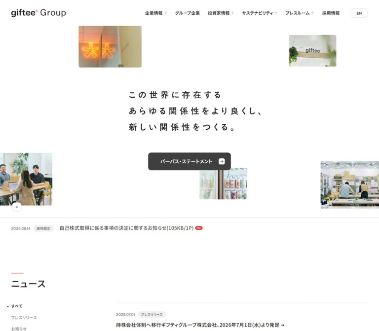
広い余白に職場写真を散りばめた、白基調のコーポレートサイト。読みやすい和文、細い罫線、チャコールのボタンでニュースやIR情報を整理。
オリジナルサイトを見るgiftee Group — Style Reference
A spacious corporate directory, with everyday workplace photographs surrounding a quietly stated purpose.
Website: giftee-group.com Original URL: https://giftee-group.com/ Final URL: https://giftee-group.com/ Theme: white content canvas with charcoal controls and a charcoal footer; no selectable theme was evidenced. Inspected: September 12, 2026, at 06:47:55 UTC / 15:47:55 JST, according to the supplied capture record. Viewports: desktop 1440 × 1000 and mobile 390 × 844 CSS pixels. Scope: the current Japanese corporate homepage: closed navigation, purpose composition, latest disclosure, news and IR lists, group overview, investor navigation, sustainability section, recruitment section, and footer. Visual captures cover the desktop opening, selected middle content, and page ending, plus the mobile opening and footer. Other section details come from the supplied rendered DOM.
The homepage combines a broad white canvas with small photographs of offices, colleagues, signage, and working environments. A widely spaced, three-line Japanese purpose statement occupies the center of the opening composition. The photographs sit at different sizes and offsets around it, including partially clipped images at the viewport edges. Their color and human detail provide warmth while the interface remains almost entirely neutral.
Below the opening, the page becomes a structured corporate information system. A narrow introductory column sits far to the left of a broad list, image, or navigation area. Moderate headings, tiny category badges, outlined destination cards, and generous vertical intervals create hierarchy. Coral appears as a small identifying accent. A substantial charcoal footer closes the long page and repeats the primary navigation.
How to Read This Reference
- Measured means a value supplied by the rendered element measurements or computed styles. Decimal values are rounded for readability.
- Declared means a custom property or transition present in the evidence. Its presence does not establish that every related component was visible or exercised.
- Estimated means an approximate visual measurement from a supplied screenshot.
- Calculated means a result derived from supplied measurements or formulas.
- Recommended means guidance for a new implementation, including the CSS adaptation below.
- Token aliases are descriptive unless explicitly identified as source properties.
The captures and DOM complement each other. The purpose lettering is visible in the screenshots but has no individual text-style sample. Conversely, desktop submenu entries have DOM measurements even though the screenshots show closed navigation. Neither situation should be treated as proof of an unobserved interaction.
Tokens — Colors
Default Palette
| Name | Value | Source property / implementation alias | Role and evidence |
|---|---|---|---|
| Canvas White | #ffffff |
Source --color-surface-primary |
Declared surface color; measured header background and card surfaces. The page appears white throughout the content area. |
| Primary Text | #232323 |
Source --color-text-primary |
Measured body, headings, navigation, and article text. |
| Secondary Text | #6c6c6c |
Source --color-text-secondary |
Measured category text and inactive desktop filters. |
| Charcoal | #3f3f3f |
Source --color-icon; alias --color-charcoal |
Measured primary purpose button, mobile menu button, and footer background. |
| Quiet Surface | #f6f6f6 |
Source --color-surface-secondary |
Measured inactive mobile filters; visually consistent with the large pale group-identity panel, whose fill was not separately sampled. |
| Badge Surface | #eeeeee |
Source --color-surface-tertiary |
Measured disclosure/news category badges and sampled submenu close controls. |
| Light Rule | #dddddd |
Source --color-border-default |
Declared border color; corresponds visually to the fine separators and outlined controls. Individual border declarations were not included. |
| Strong Rule | #505050 |
Source --color-border-strong |
Declared stronger border color; suitable for the subtle outlines visible against charcoal. |
| Brand Coral | #e76746 |
Source --color-brand |
Declared brand token. Small coral accents are visible, but individual heading-rule fills were not sampled. |
| Soft Coral | #f08b71 |
Source --color-brand-accent |
Declared accent token. The wordmark includes a coral asterisk; its graphic fill was not individually sampled. |
| Document Red | #cf3132 |
Source --color-icon-accent |
Declared icon accent; the screenshots show small red PDF indicators. |
| Brand Black | #000000 |
Source --color-brand-black |
Declared brand color; the large group wordmark appears black on a pale panel. |
Keep the neutral colors dominant. The main action is charcoal, so the coral accent does not need to become a large button fill or section background.
Declared Supporting Colors
The evidence also includes --color-chart-light: #ffccbe, --color-chart-mid: #ffae99, and --color-chart-bold: #f89075. No chart is visible in the supplied homepage captures. Retain these as potential supporting tokens without adding a chart to the homepage reference.
An overlay token is declared as rgb(63 63 63 / 40%). No open overlay was captured, so its actual application and compositing remain unverified.
Tokens — Typography
Japanese Interface Typography
The computed body family begins with Noto Sans JP, followed by Hiragino Sans, Hiragino Kaku Gothic variants, Meiryo, MS PGothic, and generic sans-serif fallbacks. Body text is regular, section headings use weight 500, and navigation and destination controls generally use 600.
The measured body tracking is 0.04em: 0.64px at desktop and approximately 0.601px at mobile. This slight openness continues through most Japanese controls and headings. Paragraphs use a generous 1.75 line height.
These are computed family declarations. The evidence does not independently identify which font rendered each glyph. The root HTML element's browser-serif default is overridden by the body and is not the visible interface font.
English Utility Typography
The EN control explicitly reports Geist, sans-serif, at 12px, weight 600, 20.4px line height, and 0.24px tracking. A separate English-family custom property starts with Noto Sans, but the sampled language control uses Geist through an override. Preserve this distinction rather than assigning Geist to all English text.
Brand and Purpose Lettering
The wordmark is a graphic identity: bold lowercase giftee, a small coral asterisk, and a lighter Group. Its font cannot be established from the surrounding element's inherited font family. Use an authorized logo asset when implementing the identity.
The purpose statement is visibly more widely tracked than ordinary interface text. Its exact family, font size, tracking, and rendering method were not supplied. Visual targets are approximately 24–26px desktop and 20px mobile, with line-to-line spacing around 53px and 40px, respectively. These are estimates, not computed typography tokens.
Type Scale
| Role | Desktop measurement | Mobile measurement | Weight and tracking |
|---|---|---|---|
| Body and section introductions | 16px / 28px |
15.022px / 26.289px |
400, 0.04em |
| Main section headings | 32px / 48px |
22.143px / 33.214px |
500, 0.04em |
| Primary purpose link | 16px / 28px |
15.022px / 26.289px |
600, 0.04em |
| Standard section destination link | Usually 16px / 28px |
Usually 15.022px / 26.289px |
600, 0.04em |
| Desktop primary navigation | 14px / 23.8px |
Replaced by menu control | 600, 0.04em |
| Footer navigation | 14px / 23.8px |
13.022px / 22.138px |
600, 0.04em |
| Article headline | 16px / 28px |
15.022px / 26.289px |
500, 0.04em |
| Category filter | 13px / 22.75px |
13px / 22.75px |
600 selected, 400 otherwise; tracking inherited from body |
| Category badge | 11px / 18.7px |
Same | 500, 0.44px |
| Press utility-card label | 20px / 32px |
16.058px / 25.693px |
600, 0.04em |
| Language control | 12px / 20.4px |
Same | Geist, 600, 0.02em |
| Privacy link | 12px / 20.4px |
Same | 400, 0.04em |
The mobile IR archive link is a measured exception: it reports 16.058px / 25.693px. Investor-card anchors report body-sized typography, while the visible desktop labels appear larger. The internal label elements were not individually sampled; do not treat an ancestor's font size as a verified label size.
Fluid Type Rules
At both inspected widths the root font size is 16px. The source defines a scale equivalent to:
S = max(1, viewport width / 1440)
source pixel unit = 1px × S
source rem unit = 1rem × S
Since S = 1 at 390px and 1440px, the measured body and section-heading formulas can be expressed as:
/* Equivalent at the inspected widths with a 16px root. */
--text-body: clamp(0.9375rem, calc(0.916rem + 0.09392vw), 1rem);
--text-section: clamp(1.375rem, calc(1.155rem + 0.9392vw), 2rem);
The source also declares heading ranges of 16–20px, 18–24px, 20–28px, and 24–36px before any scaling above 1440px. They are available tokens, not proof that every size appears in the captured homepage.
Tokens — Spacing & Shapes
Density: very open between sections, with compact metadata and restrained control sizing.
Spacing Scale
| Use | Value | Evidence |
|---|---|---|
| Navigation label to plus symbol | 5px |
Measured desktop grid gap |
| Heading accent to heading line box | 10px |
Measured heading grid gap |
| Article metadata to headline | 10px |
Measured anchor grid gap |
| Desktop filter separation | Approximately 15px |
Calculated from button positions |
| Common button vertical padding | 15px |
Measured |
| Common button horizontal padding | 20px |
Measured; purpose link uses 40px at the left |
| Card-grid gap | 20px desktop; 10px mobile |
Calculated from card positions |
| Section heading to following layout | 40px |
Measured in news and several content sections |
| Introductory paragraph to section link | Usually 60px desktop; 40px mobile |
Calculated from measured bounds; sustainability uses 40px on desktop |
| Main section gap | 120px desktop; 80.584px mobile |
Measured main grid gap |
| Ruled feature-section top padding | 120px desktop; 80.584px mobile |
Measured |
| Footer vertical padding and principal gaps | 80px desktop; approximately 60.323px mobile |
Measured |
The desktop layout often combines the main grid's 120px gap with the next section's own 120px top padding. Preserve the distinction between space outside a section and space inside its ruled boundary.
Border Radius
| Element | Radius | Evidence |
|---|---|---|
| Section links, primary CTA, language control | 10px |
Measured |
| Mobile menu and pause control | 10px |
Measured |
| Large destination cards | 10px |
Measured |
| Mobile filter chips | 5px |
Measured |
| Category badges | 100px |
Measured pill radius |
| Photographs and large identity panel | Approximately 4–5px |
Visual estimate |
| Small arrow tiles | Approximately 5px |
Visual estimate |
Corners soften the interface without making every element a pill. Photographs stay rectangular; only category badges are fully rounded.
Layout Measurements
| Element | Desktop: 1440 × 1000 | Mobile: 390 × 844 |
|---|---|---|
| Document height | 5918.719px measured |
6556.156px measured |
| Initial header height | 90.391px measured |
50.469px measured |
| Header logo box | 190 × 30px measured |
126.922 × 20.031px measured |
| Main horizontal inset | 40px measured |
Approximately 20.29px measured |
| Usable content width | 1360px measured |
349.438px measured |
| Introductory rail | 260px measured |
Full content width |
| Broad content area | 960px, beginning at x = 440px |
Full content width, with some card groups inset by another 10px |
| Empty interval between desktop columns | 140px calculated |
Removed |
| Purpose CTA | 273.313 × 58px |
262.703 × 56.266px |
| Standard section CTA | 260 × 58px |
Usually 260 × 56.266px, centered |
| Large destination card | 470 × 112px |
329.438 × 85.969px |
| Pause control | 30 × 30px |
30 × 30px |
| Latest disclosure strip | 69px high |
123.047px high |
| Footer | 488.984px high |
739.672px high |
The source gutter formula, at the inspected scale, is equivalent to clamp(20px, 12.958px + 1.88vw, 40px). This explains the slightly fractional mobile inset rather than an exact 20px measurement.
Components
Application Header
Role: persistent corporate identity and access to six principal information areas.
At desktop, the initial white header is approximately 90px high. Place the 190px-wide logo at a 40px left inset. The navigation is grouped at the right, followed by a small outlined EN control. Main navigation labels use 14px, weight 600, with approximately 30px between top-level items.
Four labels show a small plus symbol: 企業情報, 投資家情報, サステナビリティ, and プレスルーム. Their sampled elements are buttons. グループ企業 and 採用情報 are direct anchors. Preserve the distinction between disclosure triggers and navigation links.
In the scrolled desktop captures, the header remains at the top and is approximately 60px high, with the logo reduced to roughly 127px wide. This supports a persistent compact state. The exact positioning mechanism and scroll threshold were not supplied.
At mobile, the header measures about 50px high. The logo sits at the normal 20.29px inset; the desktop navigation is replaced by a charcoal 60 × 30px rounded control containing two fine white horizontal strokes. No open mobile menu was captured.
Navigation Disclosure Structure
Evidence scope: DOM structure and computed styles; no opened-panel screenshot or activation test.
The desktop evidence contains submenu destinations, including company information, investor categories, sustainability topics, and press resources. The company submenu samples show a 260px introductory area and two columns of approximately 465px destination links. Sampled links use 14px / 23.8px, weight 600, 20px padding, and 10px corners.
The investor submenu has a denser hierarchy, including four groups of approximately 306px-wide category areas and smaller 12px secondary links. Close controls labeled 閉じる are also present in the DOM.
These measurements establish available navigation structure. They do not establish opening on hover, focus behavior, backdrop appearance, or panel animation.
Purpose Composition
Role: introduces the group's purpose through an open photographic composition.
The visible statement is arranged in three left-aligned lines:
この世界に存在する
あらゆる関係性をより良くし、
新しい関係性をつくる。
On desktop, the text begins around x = 520px and occupies the central white area. The centered charcoal purpose link sits at x = 583.344px, y = 520px. Its destination is /company/purpose/.
Five photographic fragments are visible around the statement: an orange illuminated brand mark, office signage, a meeting, a small outdoor group, and a working environment with shelving. The small outdoor group sits partly behind the CTA. Edge images are deliberately clipped by the viewport, creating a composition that extends beyond the visible canvas.
On mobile, the statement starts around x = 40px, while the header and ordinary sections use approximately 20px insets. The CTA remains centered at x = 63.641px, y = 356.625px. Three photographic fragments are visible in this capture: the illuminated mark above, a cropped meeting at lower left, and the outdoor group at lower right. The evidence does not establish whether the other desktop images are hidden, repositioned outside the viewport, or absent at that moment.
The opening photo-and-purpose area extends to the disclosure strip at y = 738px desktop and y = 553.203px mobile. These are captured positions, not a universal full-screen-height rule.
Primary and Secondary Destination Links
Role: consistent navigation affordances across the page.
The primary purpose link has a charcoal fill, white text, 10px corners, and measured padding of 15px 20px 15px 40px. A small white rounded square at the right contains a dark arrow.
Secondary section links use a white or transparent surface, a fine gray outline, dark text, and a dark arrow tile with a white arrow. Typical desktop dimensions are 260 × 58px. On mobile, the 260px width is retained and the link is centered beneath its section content.
The arrow tile is visually about 20 × 20px. Keep the label and arrow inside one link rather than making the arrow a separate interaction target.
Pause Control
Role: visible control associated with the opening imagery.
A white 30 × 30px button with a fine outline and 10px corners appears near the lower-left edge of the opening composition. Its visible symbol is a pair of narrow pause bars. It sits at 40, 688px desktop and 20, 503.203px mobile.
The control suggests a pauseable visual sequence. Its accessible name, state changes, controlled media, and functional effect were not supplied. Do not assign an autoplay duration or movement path based on the icon alone.
Latest Disclosure Strip
Role: exposes one timely investor announcement immediately after the purpose composition.
The whole strip is an anchor. It combines a date, a small gray category pill labeled 適時開示, a Japanese announcement title, document-size/page-count text, and a small red PDF indicator. A fine top rule separates it from the imagery.
At desktop it is a 69px-high horizontal row with 20px 40px padding and a 20px horizontal gap. At mobile, the date and category remain together on the first line while the title moves below and wraps. The resulting height is approximately 123px, with 20px 20.29px padding and a 10px vertical gap.
Preserve the document context as text. The red icon is a supporting cue, not the only indication of file type.
Section Heading
Role: marks major sections with minimal decoration.
A short coral horizontal stroke sits above a medium-weight Japanese heading. The stroke is visually approximately 40 × 2px; the exact pseudo-element color and size were not separately sampled. The measured heading container uses a 10px gap above its text line.
Desktop headings use 32px / 48px, producing a total box height of 60px. Mobile headings use 22.143px / 33.214px, with a total height of approximately 45.203px. Keep the heading flush with the section's left inset.
News and IR Lists
Role: makes corporate updates and investor disclosures easy to scan.
Desktop news uses a 260px control rail at x = 40px and a 960px article area at x = 440px. The left rail contains a vertical filter list and an outlined archive link. The right area contains linked articles whose date/category metadata sits above the headline with a 10px gap.
The news section contains two visible entries in the supplied DOM. The IR section contains five. Article-anchor boxes are around 60–61px tall on desktop; their top positions are roughly 120–121px apart. The measurements establish generous separation between anchors, but do not expose every containing row's border or padding.
At mobile, article anchors span approximately 349px. Long titles wrap naturally to two or three lines. Archive links move below their respective lists and become centered 260px controls. Preserve the full titles and document metadata rather than clipping them into equal-height cards.
The news section also includes プレスキット and 公開データ destination cards below its article area.
Category Filters and Badges
Role: distinguishes selectable filtering controls from article metadata.
Desktop filters are unboxed text buttons stacked vertically. The selected すべて is dark and semibold; inactive filters are gray and regular. Their measured transition targets background-size, but the completed hover or selection transition was not observed.
Mobile filters become a horizontal row of rounded rectangular chips. Each uses 13px / 22.75px, 2px 10px 4px padding, and a 5px radius. The selected chip has a charcoal background and white text; inactive chips use #f6f6f6 with gray text. Gaps are 10px.
Article badges remain smaller at both sizes: 11px text, approximately 20–21px high, 10px horizontal padding, a pale gray fill, and a 100px radius. Filter buttons and category badges should remain visibly different in size and purpose.
Group Overview
Role: introduces the group's businesses and provides access to the group-company directory.
The desktop section pairs a 260px text rail with a large pale identity panel in the 960px-wide right area. The rail contains a section heading, a six-line paragraph at 16px / 28px, and a 260px outlined link. The panel centers an enlarged black-and-coral group wordmark.
A full 960 × 540px panel is consistent with the measured section bounds and the partially clipped middle screenshot. This 16:9 geometry is a calculated fit; the image element itself was not sampled.
Mobile headings and paragraphs occupy the full content width, and the section link is centered below the paragraph. A substantial interval between heading and paragraph indicates intervening media. Its precise image bounds and crop were not visually captured.
Investor Destination Grid
Role: routes visitors to six investor-information categories.
The desktop introductory paragraph and section link occupy the left rail. Six large outlined cards form a two-column, three-row grid to the right. Each card measures 470 × 112px, uses 10px corners and 40px 30px padding, and places a simple arrow near the right edge. The grid has 20px horizontal and vertical gaps.
The destinations are 投資家の皆様へ, 経営情報, 業績・財務情報, IRライブラリー, 株式情報, and IRカレンダー.
At mobile, the cards form one column. Their measured width is approximately 329.438px, with an additional 10px inset inside the ordinary section content area. Heights are approximately 85.969px, padding is about 30.143px 20.141px, and gaps are 10px. The general 投資家情報 link follows the complete card list.
A small photograph of plants by office windows appears at the upper right in the desktop capture. Its visual size is approximately 150 × 100px. Its mobile treatment was not captured.
Sustainability Section
Role: introduces sustainability information and links to its dedicated area.
The supplied desktop DOM reports the same 260px introductory rail, 32px heading, 16px body, and 260px destination link used elsewhere. The section has 120px top padding. Mobile uses the full content width and approximately 80.584px top padding.
The section's imagery is outside the supplied screenshot crops. Describe its layout from the measurements without inventing an environmental illustration or photographic subject.
Recruitment Section
Role: connects the group's purpose to its working culture and recruitment information.
The desktop ending capture shows a large photograph of four colleagues around a table on the left, with a narrow text column beginning at x = 740px. The visible image width is about 660px. A full 660 × 440px, 3:2 image fits the measured section bounds, but the photograph's upper portion is clipped in the supplied capture.
The text column is 260px wide and uses the same section heading, six-line introduction, and outlined destination control as the group overview. The CTA aligns with the photograph's lower edge in the visible composition. A smaller photograph is partly visible near the upper-right edge.
On mobile, the measured heading and paragraph occupy the full content width, followed by a centered CTA. Image placement within the intervening space is not directly pictured.
Corporate Footer
Role: provides a complete closing navigation area with contact, language, and legal links.
The footer is a solid #3f3f3f field with white text. Desktop vertical padding and principal row gaps are 80px. The first row contains the 190px-wide reversed wordmark, an outlined EN control beside it, and an outlined contact link aligned to the far right. Six primary links form a horizontal row below.
A subtle full-width separator introduces the legal row. The privacy link sits at the left and the copyright at the right. There are no visible social icons, newsletter form, or additional promotional panels in the supplied footer.
Mobile retains the same content with a different arrangement: a 120px-wide wordmark and EN share the first row; contact becomes a full-width outlined link; the six navigation links stack vertically; privacy and copyright occupy separate lower rows. The copyright remains right-aligned. Vertical padding and major gaps are approximately 60.323px, producing a footer nearly 740px tall.
Tokens — Motion & Interaction
| Treatment | Supplied value or observation | Confidence and limitation |
|---|---|---|
| Header background transition | 0.35s cubic-bezier(0.215, 0.61, 0.355, 1) |
Declared on sampled header; endpoint colors were not exercised. |
| Desktop logo width transition | 0.9s cubic-bezier(0.23, 1, 0.32, 1) |
Declared on desktop logo wrapper; separate captures show large and compact header states. |
| Purpose-link background transition | 0.6s cubic-bezier(0.23, 1, 0.32, 1) |
Declared; hover fill was not captured. |
| Disclosure-strip opacity transition | 0.6s cubic-bezier(0.23, 1, 0.32, 1) |
Declared; actual hover opacity was not supplied. |
| Desktop filters and footer links | background-size 0.6s cubic-bezier(0.23, 1, 0.32, 1) |
Declared; exact animated decoration remains unverified. |
| Submenu close-control background | 0.6s cubic-bezier(0.23, 1, 0.32, 1) |
DOM evidence only; no opened menu was captured. |
| Opening pause affordance | Pause symbol visible at both viewports | Function, playback state, and visual sequence were not tested. |
| General duration property | --duration: 1s |
Declared custom property with no established component assignment. |
These transitions suggest gently decelerating interface changes. They do not establish an entrance sequence, parallax system, photograph loop, or page-transition choreography.
The collection process waited for initial rendering and sampled layout stability, temporarily pausing perpetual animations during readiness checks before resuming them. Static captures cannot recover the original movement path or timing. Sampled elements reporting animation: none also do not rule out motion in unsampled descendants, pseudo-elements, or script-controlled graphics.
For an adaptation, begin with a static photo composition and add motion only with an explicit specification. Preserve a functional pause control if any persistent decorative motion is introduced.
Surfaces
| Layer | Appearance | Purpose |
|---|---|---|
| Header and page canvas | White, flat, with little visual separation at the opening | Keeps identity, photography, and typography prominent |
| Article areas | Open white space with compact metadata | Supports scanning long titles without card clutter |
| Identity panel | Large pale-gray rectangle with modest corner rounding | Gives the group wordmark a quiet visual field |
| Destination cards | White, fine gray outline, 10px corners | Makes broad navigation targets recognizable |
| Primary action | Charcoal with white text and reversed arrow tile | Establishes one clear action within the purpose composition |
| Category badge | Pale-gray pill with muted small text | Adds classification without competing with titles |
| Footer | Full-width charcoal with white content and subtle rules | Creates a strong ending and repeats corporate navigation |
No visible gradient, glass surface, or general elevation-shadow system is needed. Separation comes from whitespace, fine rules, outlines, and the change to charcoal at the footer.
Imagery
Use natural workplace photography: people conversing, office vegetation, glass and signage, working tables, shelves, and small groups outside buildings. The photographs include warm orange illumination, green plants, neutral interiors, and blue seating. Keep these colors within the photography rather than expanding the interface palette to match every image.
The opening uses small photographic fragments as spatial accents. The recruitment section uses a larger contextual photograph. These are different image roles: preserve the contrast between scattered small scenes and a substantial editorial image.
Crop carefully around faces and work activity. The source visibly clips some opening images at the viewport edges; this does not justify arbitrary clipping of important content photographs. Maintain crisp, natural photographic rendering and small corner radii.
Observed Asset References
No photograph, logo, or purpose-graphic asset URLs were included in the supplied asset evidence. The following references identify visible subjects and placements, not downloadable filenames.
| Visual | Observed placement | Approximate visible geometry |
|---|---|---|
| Orange illuminated brand mark | Upper-left area of opening composition | Desktop 240 × 160px; mobile approximately 124 × 83px |
| Office sign among plants | Upper-right area of desktop opening | Approximately 180 × 120px |
| Colleagues in a meeting | Opening, clipped at the left edge | Visible desktop portion approximately 188 × 200px; full asset bounds unknown |
| Small outdoor group | Below/right of the purpose CTA | Desktop approximately 180 × 120px; mobile approximately 94 × 63px |
| Working area with shelves | Opening, clipped at the right edge | Visible desktop portion approximately 232 × 180px |
| Enlarged group wordmark | Pale panel in group overview | Centered graphic; exact asset bounds unavailable |
| Plants by office windows | Investor-section upper right | Approximately 150 × 100px desktop |
| Four colleagues at a table | Recruitment section | Approximately 660px wide desktop; top portion clipped in supplied capture |
These sizes are screenshot estimates. Original image resolution, file format, responsive sources, and focal-point metadata were not supplied. Use authorized assets for implementation and keep their aspect ratios explicit to prevent layout shifts.
Layout & Responsive Behavior
The page is a long scrolling corporate homepage. Its section order remains consistent: purpose, latest disclosure, news, IR news, group companies, investor information, sustainability, recruitment, and footer.
The desktop system depends on repeated alignments: x = 40px for section introductions, x = 440px for the broad content area, and x = 1400px for its far edge. A 260px rail plus a 140px interval leaves 960px for content. The recruitment section deliberately changes this relationship by placing a large image at the left and its text at x = 740px.
Observed Responsive Changes
| Feature | Desktop | Mobile |
|---|---|---|
| Header navigation | Six visible categories and EN |
Logo and compact menu control |
| Purpose statement | Central placement with broad surrounding space | Left-aligned around a 40px inset, with shorter line spacing |
| Opening photographs | Five visible fragments | Three visible fragments in the supplied frame |
| Disclosure strip | Date, badge, and title share one row | Metadata above wrapping title |
| News filters | Vertical, unboxed text | Horizontal filled/quiet chips |
| News and IR content | Rail plus wide article area | Single content column |
| Archive controls | In the left rail | Centered below their lists |
| Investor cards | Two columns, three rows | One column, six rows |
| Section paragraphs | Usually 260px wide | Approximately 349px wide |
| Footer navigation | Horizontal | Vertical |
| Footer contact | Compact, top-right | Full content width beneath identity row |
| Legal information | One widely separated row | Separate privacy and copyright rows |
The actual breakpoint declarations were not supplied. The CSS Quick Start uses 64rem as a recommended layout threshold, chosen to give the desktop navigation and two-column content enough room. It is not a recovered source breakpoint.
The source's --scale increases above 1440px. Its maximum-width expression also scales, so --mw: 1440px should not be read as a confirmed fixed content cap. Wider desktop behavior was not visually inspected. The adaptation below targets the supplied 390px and 1440px layouts and keeps conventional capped typography beyond them.
Do’s and Don’ts
Do
- Keep the white canvas dominant and preserve the large intervals around the purpose statement.
- Use small workplace photographs with varied positions and sizes in the opening.
- Preserve the 260px introductory rail and broad 960px content area at the inspected desktop width.
- Use Noto Sans JP as the first requested Japanese family, with appropriate system fallbacks.
- Keep body line height around
1.75and ordinary tracking around0.04em. - Use medium-weight section headings and semibold controls without making all text bold.
- Distinguish tiny category pills from selectable mobile filter chips.
- Repeat the outlined section link and small arrow-tile anatomy consistently.
- Move archive links below their lists on mobile and stack investor cards in their existing order.
- Preserve the spacious charcoal footer and its complete navigation.
Don’t
- Don’t replace the opening with one full-bleed photograph or a giant promotional headline.
- Don’t fill the whitespace with additional cards, slogans, decorative icons, or repeated CTAs.
- Don’t turn the homepage into a single conversion funnel; it serves several corporate information needs.
- Don’t apply coral to every button or use chart colors as unrelated section themes.
- Don’t reproduce the graphic wordmark by guessing its font.
- Don’t treat the unsampled purpose lettering as confirmed Noto Sans JP text.
- Don’t make all mobile buttons full-width; most section links remain 260px and centered.
- Don’t truncate long disclosure titles to force equal-height news cards.
- Don’t infer hover menus, automatic photo movement, or parallax from static captures.
- Don’t use hidden submenu measurements as proof that those panels were visually open.
Recommended Implementation Additions
These are recommendations for a new implementation, not verified behavior of the inspected site:
- Preserve the existing skip-link destination concept and verify that it becomes visible on keyboard focus and moves focus to main content.
- Give the logo link, menu control, and pause control meaningful accessible names. Empty extracted text does not establish whether the originals already have accessible names.
- Implement disclosure buttons with accurate
aria-expandedandaria-controlsvalues. Define keyboard dismissal and focus behavior before introducing an overlay. - Implement filters as buttons with a communicated selected state, such as
aria-pressed. Use tab semantics only if the content and keyboard behavior follow the tab pattern. - Provide larger touch hit areas for the 30px-high controls and approximately 29px filter chips while retaining their visual proportions.
- Keep purpose copy available as meaningful text or an equivalent accessible description if a graphic is used.
- Respect reduced-motion preferences, provide a static composition, and make any persistent decorative animation pauseable.
- Use semantic dates and retain document type and file-size information as readable text.
- Supply responsive images with dimensions and appropriate alternative text. Avoid repeating the same description for decorative photographs.
- Test long Japanese labels, enlarged text, intermediate widths, and visible keyboard focus against both white and charcoal surfaces.
Agent Prompt Guide
Quick Color Reference
- Main canvas and outlined-card surfaces:
#ffffff. - Main text:
#232323. - Secondary text:
#6c6c6c. - Primary CTA, selected mobile chip, and footer:
#3f3f3f. - Quiet surface:
#f6f6f6; category badges:#eeeeee. - Fine outlines:
#dddddd; subtle dark-surface outlines:#505050. - Declared brand accents:
#e76746and#f08b71, used sparingly. - Document indicator accent:
#cf3132.
Overall Prompt
“Create a Japanese corporate group homepage using a white canvas, dark-gray text, small coral accents, and natural workplace photography. Build a spacious opening with a three-line, widely tracked purpose statement and a centered charcoal destination link. Arrange small rectangular photographs asymmetrically around the copy, with selected edge images clipped. Below it, add a latest-disclosure strip, separate news and IR lists, group information, investor destination cards, sustainability, recruitment, and a substantial charcoal footer. At 1440px, use 40px gutters, a 260px introductory rail, a 140px interval, and a 960px content area. Use Noto Sans JP, 16px body text with 28px line height, 32px medium-weight section headings, 10px control corners, and small arrow tiles. At 390px, use approximately 20px gutters, 15px body text, 22px headings, horizontal filter chips, stacked cards, and centered 260px section links. Keep any unverified motion static.”
Example Component Prompts
- Purpose composition: “Create an airy white opening with three left-aligned Japanese purpose lines near the desktop center. Place a charcoal rounded link beneath them, containing a white arrow tile. Scatter small office and colleague photographs around the perimeter. Keep the text unobstructed and use a separate 30px visual pause control only when functional motion is implemented.”
- News section: “Create a corporate news section with a short coral stroke above a 32px medium-weight heading. Use a 260px filter rail and a 960px article column at desktop. Each article has small date/category metadata above a readable Japanese headline. On mobile, place filters in a horizontal chip row and the centered archive link below the articles.”
- Destination link: “Create a 260px-wide white outlined navigation link, 10px corners, semibold Japanese label, and a 20px charcoal arrow tile at the right. Use generous horizontal spacing and no elevation shadow. Provide a visible keyboard focus state.”
- Investor grid: “Create six white outlined investor-navigation cards in two desktop columns. Target 470 × 112px, 10px corners, 40px vertical and 30px horizontal padding, and a simple right arrow. Stack them on mobile with 10px gaps and slightly inset card edges.”
- Recruitment section: “Pair a substantial natural photograph of colleagues around a table with a narrow 260px text column. Use the same coral-stroke heading and outlined section link as the rest of the corporate site. Maintain clear image/text alignment and generous white space.”
- Footer: “Create a charcoal corporate footer with a reversed wordmark, outlined EN utility, contact link, six navigation destinations, privacy, and copyright. Use 80px desktop row spacing. On mobile, put contact beneath the identity row, stack navigation vertically, and right-align copyright on its own lower row.”
Quick Start
CSS Custom Properties
This is a recommended implementation scaffold, not recovered source code. Color values and several fluid tokens come directly from the evidence. The 64rem breakpoint, static hero positioning, hover endpoints, and intermediate spacing interpolation are adaptation choices. Purpose typography remains an approximation until its original asset or typography specification is available.
The stylesheet expects semantic page markup. .gf-news-layout uses children named .gf-filters, .gf-news-list, .gf-archive, and .gf-resources so the archive link can move without duplicating it. Disclosure, filtering, compact-header state, and pause behavior require separate application logic.
:root {
  /* Source colors with implementation aliases. */
  --color-canvas: #fff;
  --color-text: #232323;
  --color-muted: #6c6c6c;
  --color-charcoal: #3f3f3f;
  --color-quiet: #f6f6f6;
  --color-badge: #eee;
  --color-line: #ddd;
  --color-line-dark: #505050;
  --color-brand: #e76746;
  --color-brand-soft: #f08b71;
  --color-document: #cf3132;

  /* Shortened fallback stack; load fonts separately when available. */
  --font-ja: 'Noto Sans JP', 'Hiragino Sans',
    'Hiragino Kaku Gothic ProN', 'Hiragino Kaku Gothic Pro',
    Meiryo, 'MS PGothic', sans-serif;
  --font-language: Geist, sans-serif;
  --text-body: clamp(.9375rem, calc(.916rem + .09392vw), 1rem);
  --text-small: clamp(.8125rem, calc(.791rem + .09392vw), .875rem);
  --text-section: clamp(1.375rem, calc(1.155rem + .9392vw), 2rem);
  --text-card: clamp(1rem, calc(.912rem + .376vw), 1.25rem);
  --leading-body: 1.75;
  --tracking-body: .04em;

  --gutter: clamp(20px, calc(12.958px + 1.88vw), 40px);
  --section-space: clamp(80px, calc(65.92px + 3.76vw), 120px);
  --rail-width: 260px;
  --rail-gap: clamp(40px, 9.7222vw, 140px);
  --radius-control: 10px;
  --radius-photo: 5px;
  --header-space: 90px;
  --ease-soft: cubic-bezier(.23, 1, .32, 1);
  --ease-header: cubic-bezier(.215, .61, .355, 1);
}

* { box-sizing: border-box; }

body {
  margin: 0;
  color: var(--color-text);
  background: var(--color-canvas);
  font-family: var(--font-ja);
  font-size: var(--text-body);
  line-height: var(--leading-body);
  letter-spacing: var(--tracking-body);
}

button, input, select, textarea { font: inherit; }
button { cursor: pointer; }
a { color: inherit; }
img { display: block; max-width: 100%; }

.gf-page { padding-top: var(--header-space); }
.gf-main { display: grid; gap: var(--section-space); }
.gf-inset { padding-inline: var(--gutter); }

.gf-header {
  position: fixed;
  inset: 0 0 auto;
  z-index: 20;
  height: 90px;
  background: var(--color-canvas);
  transition: background-color .35s var(--ease-header);
}

.gf-header-inner {
  display: flex;
  align-items: center;
  justify-content: space-between;
  gap: 40px;
  height: 100%;
  padding-inline: var(--gutter);
}

.gf-logo {
  display: block;
  width: 190px;
  flex: none;
  transition: width .9s var(--ease-soft);
}

.gf-logo img { width: 100%; height: auto; }
.gf-nav { display: flex; align-items: center; gap: 30px; }
.gf-nav a, .gf-nav button { font-size: 14px; font-weight: 600; }
.gf-nav a { text-decoration: none; }
.gf-nav button { border: 0; padding: 0; background: none; color: inherit; }
.gf-header.is-compact { height: 60px; border-bottom: 1px solid var(--color-line); }
.gf-header.is-compact .gf-logo { width: 126.67px; }

.gf-language {
  display: inline-grid;
  place-items: center;
  padding: 5px 20px;
  border-radius: var(--radius-control);
  outline: 1px solid var(--color-line);
  outline-offset: -1px;
  font-family: var(--font-language);
  font-size: 12px;
  font-weight: 600;
  line-height: 1.7;
  letter-spacing: .02em;
  text-decoration: none;
}

.gf-menu { display: none; }

/* Static approximation of the photographed opening composition. */
.gf-hero {
  position: relative;
  isolation: isolate;
  height: 648px;
  overflow: clip;
}

.gf-purpose {
  position: absolute;
  z-index: 2;
  top: 214px;
  left: 50%;
  width: 400px;
  margin: 0;
  transform: translateX(-50%);
  font-size: 25px;
  font-weight: 600;
  line-height: 2.12;
  letter-spacing: .25em;
}

.gf-purpose span { display: block; white-space: nowrap; }
.gf-hero-action { position: absolute; z-index: 3; top: 430px; left: 50%; transform: translateX(-50%); }
.gf-photo { position: absolute; margin: 0; border-radius: var(--radius-photo); overflow: hidden; }
.gf-photo img { width: 100%; height: 100%; object-fit: cover; }
.gf-photo--neon { left: 20.2778%; top: 0; width: 240px; height: 160px; }
.gf-photo--sign { left: 75.8333%; top: 40px; width: 180px; height: 120px; }
.gf-photo--meeting { left: -112px; top: 408px; width: 300px; height: 200px; }
.gf-photo--group { left: 51.9444%; top: 468px; width: 180px; height: 120px; }
.gf-photo--work { left: 83.8889%; top: 438px; width: 270px; height: 180px; }

.gf-cta {
  display: inline-flex;
  align-items: center;
  justify-content: space-between;
  gap: 20px;
  width: 260px;
  max-width: 100%;
  padding: 14px 19px;
  border: 1px solid var(--color-line);
  border-radius: var(--radius-control);
  background: var(--color-canvas);
  color: var(--color-text);
  font-weight: 600;
  text-decoration: none;
  transition: background-color .6s var(--ease-soft);
}

.gf-cta--primary {
  width: max-content;
  border: 0;
  padding: 15px 20px 15px 40px;
  background: var(--color-charcoal);
  color: #fff;
  white-space: nowrap;
}

.gf-arrow-chip {
  display: inline-grid;
  place-items: center;
  flex: none;
  width: 20px;
  height: 20px;
  border-radius: 5px;
  background: var(--color-charcoal);
  color: #fff;
  font-size: 13px;
  line-height: 1;
  letter-spacing: 0;
}

.gf-cta--primary .gf-arrow-chip { background: #fff; color: var(--color-charcoal); }

.gf-pause {
  position: absolute;
  z-index: 4;
  bottom: 20px;
  left: 40px;
  width: 30px;
  height: 30px;
  padding: 0;
  border: 1px solid var(--color-line);
  border-radius: 10px;
  background: #fff;
  color: var(--color-text);
}

.gf-disclosure {
  display: flex;
  align-items: center;
  gap: 10px 20px;
  padding: 20px var(--gutter);
  border-top: 1px solid var(--color-line);
  text-decoration: none;
  transition: opacity .6s var(--ease-soft);
}

.gf-meta { display: flex; align-items: center; flex-wrap: wrap; gap: 10px; }
.gf-date { color: var(--color-muted); font-size: 12px; letter-spacing: 0; }
.gf-badge {
  display: inline-block;
  padding: 1px 10px;
  border-radius: 100px;
  color: var(--color-muted);
  background: var(--color-badge);
  font-size: 11px;
  font-weight: 500;
  line-height: 1.7;
  letter-spacing: .04em;
}

.gf-section { padding-inline: var(--gutter); }
.gf-section--ruled { padding-top: var(--section-space); border-top: 1px solid var(--color-line); }
.gf-section-title {
  display: grid;
  gap: 10px;
  margin: 0;
  font-size: var(--text-section);
  font-weight: 500;
  line-height: 1.5;
}

.gf-section-title::before { content: ''; width: 40px; height: 2px; background: var(--color-brand); }
.gf-section-body { margin-top: 40px; }
.gf-split { display: grid; grid-template-columns: var(--rail-width) minmax(0, 1fr); gap: var(--rail-gap); }
.gf-intro p { margin: 40px 0 60px; }

.gf-news-layout {
  display: grid;
  grid-template-columns: var(--rail-width) minmax(0, 1fr);
  grid-template-areas: 'filters list' 'archive list' '. resources';
  grid-template-rows: auto 1fr auto;
  gap: 60px var(--rail-gap);
  align-items: start;
  margin-top: 40px;
}

.gf-filters { grid-area: filters; display: flex; flex-direction: column; align-items: flex-start; gap: 15px; }
.gf-filter { padding: 0; border: 0; background: none; color: var(--color-muted); font-size: 13px; line-height: 1.75; }
.gf-filter[aria-pressed='true'] { color: var(--color-text); font-weight: 600; }
.gf-news-list { grid-area: list; margin: 0; padding: 0; list-style: none; }
.gf-news-item { padding-block: 30px; }
.gf-news-item a { display: grid; gap: 10px; text-decoration: none; }
.gf-news-item p { margin: 0; font-weight: 500; }
.gf-archive { grid-area: archive; }
.gf-resources { grid-area: resources; }

.gf-card-grid { display: grid; grid-template-columns: repeat(2, minmax(0, 1fr)); gap: 20px; }
.gf-card {
  display: flex;
  align-items: center;
  justify-content: space-between;
  gap: 20px;
  min-height: 112px;
  padding: 39px 29px;
  border: 1px solid var(--color-line);
  border-radius: 10px;
  background: #fff;
  font-size: var(--text-card);
  font-weight: 600;
  line-height: 1.6;
  text-decoration: none;
}

.gf-identity-panel { display: grid; place-items: center; aspect-ratio: 16 / 9; border-radius: 5px; background: var(--color-quiet); }
.gf-identity-panel img { width: 40%; height: auto; }
.gf-editorial-image { width: 100%; height: auto; border-radius: 5px; }

.gf-footer { display: grid; gap: 80px; margin-top: var(--section-space); padding-block: 80px; color: #fff; background: var(--color-charcoal); }
.gf-footer-head { display: grid; grid-template-columns: auto auto 1fr; align-items: center; gap: 20px; }
.gf-footer-logo { width: 190px; }
.gf-footer .gf-language { outline-color: var(--color-line-dark); }
.gf-footer-contact { justify-self: end; width: auto; padding: 9px 14px; border-color: var(--color-line-dark); background: transparent; color: #fff; font-size: var(--text-small); }
.gf-footer-contact .gf-arrow-chip { background: #fff; color: var(--color-charcoal); }
.gf-footer-nav { display: flex; flex-wrap: wrap; gap: 30px; }
.gf-footer-nav a { font-size: var(--text-small); font-weight: 600; text-decoration: none; }
.gf-footer-legal { display: flex; justify-content: space-between; gap: 30px; padding-top: 80px; border-top: 1px solid var(--color-line-dark); font-size: 12px; }
.gf-footer-legal a { text-decoration: none; }
.gf-footer-legal p { margin: 0; }

/* Recommended interaction endpoints and accessible focus. */
@media (hover: hover) {
  .gf-cta:hover { background: var(--color-quiet); }
  .gf-cta--primary:hover { background: var(--color-line-dark); }
  .gf-footer-contact:hover { background: var(--color-line-dark); }
}

:where(a, button):focus-visible { outline: 2px solid currentColor; outline-offset: 4px; }

/* Recommended breakpoint; the original breakpoint is unverified. */
@media (max-width: 63.999rem) {
  :root { --header-space: 50px; }
  .gf-header, .gf-header.is-compact { height: 50px; }
  .gf-logo, .gf-header.is-compact .gf-logo { width: 127px; }
  .gf-nav { display: none; }
  .gf-menu { display: grid; place-content: center; gap: 4px; width: 60px; height: 30px; padding: 0; border: 0; border-radius: 10px; background: var(--color-charcoal); }
  .gf-menu::before, .gf-menu::after { content: ''; width: 20px; height: 1px; background: #fff; }

  .gf-hero { height: 503px; }
  .gf-purpose { top: 156px; left: 40px; width: calc(100% - 60px); transform: none; font-size: 20px; line-height: 2; letter-spacing: .17em; }
  .gf-hero-action { top: 306.6px; }
  .gf-photo--neon { left: 12.05%; top: 11px; width: 124px; height: 83px; }
  .gf-photo--meeting { left: -83px; top: 359px; width: 156px; height: 104px; }
  .gf-photo--group { left: auto; right: 10px; top: 359px; width: 94px; height: 63px; }
  .gf-photo--sign, .gf-photo--work { display: none; }
  .gf-pause { left: 20px; }

  .gf-disclosure { align-items: flex-start; flex-direction: column; }
  .gf-split { grid-template-columns: minmax(0, 1fr); gap: 40px; }
  .gf-intro p { margin-block: 40px; }
  .gf-intro .gf-cta { display: flex; margin-inline: auto; }
  .gf-news-layout { grid-template-columns: minmax(0, 1fr); grid-template-areas: 'filters' 'list' 'archive' 'resources'; grid-template-rows: auto; gap: 40px; }
  .gf-filters { flex-direction: row; flex-wrap: wrap; gap: 10px; }
  .gf-filter { padding: 2px 10px 4px; border-radius: 5px; background: var(--color-quiet); }
  .gf-filter[aria-pressed='true'] { background: var(--color-charcoal); color: #fff; }
  .gf-news-item { padding-block: 20px; }
  .gf-archive { justify-self: center; }
  .gf-card-grid { grid-template-columns: minmax(0, 1fr); gap: 10px; padding: 10px; }
  .gf-card { min-height: 86px; padding: 29px 19px; }

  .gf-footer { gap: 60px; padding-block: 60px; }
  .gf-footer-head { grid-template-columns: 1fr auto; row-gap: 60px; }
  .gf-footer-logo { width: 120px; }
  .gf-footer-contact { grid-column: 1 / -1; width: 100%; padding: 7px 14px; }
  .gf-footer-nav { flex-direction: column; gap: 15px; }
  .gf-footer-legal { display: grid; gap: 60px; padding-top: 60px; }
  .gf-footer-legal p { justify-self: end; }
}

/* Recommended static behavior for reduced-motion users. */
@media (prefers-reduced-motion: reduce) {
  .gf-header, .gf-logo, .gf-cta, .gf-disclosure { transition: none; }
  .gf-photo { animation: none; }
}
The mobile CSS deliberately shows three static photo fragments to approximate the supplied frame. That visibility rule is an implementation choice, not evidence of the original image-hiding mechanism. For widths narrower than the inspected phone, allow the purpose lines to wrap or reduce their tracking instead of clipping meaningful text.
Example destination-link anatomy:
<a class="gf-cta gf-cta--primary" href="/company/purpose/">
  <span>パーパス・ステートメント</span>
  <span class="gf-arrow-chip" aria-hidden="true">→</span>
</a>
Use a supplied arrow graphic when available; the text arrow above is a functional scaffold. Keep all destination links in logical reading order and use semantic buttons for controls that change state.
Tailwind v4 Token Mapping
Optional aliases for an implementation already using Tailwind v4. This does not identify the original site's framework or styling system. Define the properties above first.
@theme inline {
  --color-canvas: var(--color-surface-primary, #fff);
  --color-ink: #232323;
  --color-muted: #6c6c6c;
  --color-charcoal: #3f3f3f;
  --color-quiet: #f6f6f6;
  --color-line: #ddd;
  --color-brand: #e76746;
  --color-brand-soft: #f08b71;

  --font-corporate: var(--font-ja);
  --text-corporate-body: var(--text-body);
  --text-corporate-section: var(--text-section);
  --text-corporate-card: var(--text-card);

  --spacing-page: var(--gutter);
  --spacing-section: var(--section-space);
  --spacing-rail: 260px;
  --radius-control: 10px;
  --radius-photo: 5px;
}
Sources & Evidence
- Inspected original and final page: giftee Group Japanese homepage. Both recorded URLs are identical; the supplied response status is HTTP 200.
- Capture record: September 12, 2026,
06:47:55.484Z, equivalent to15:47:55.484 JST. This reference analyzes the supplied browser observations; it does not represent an additional browsing session. - Desktop evidence: 1440 × 1000 viewport; opening, selected group/investor content, and recruitment/footer captures. Rendered document height approximately 5918.719px.
- Mobile evidence: 390 × 844 viewport; opening and footer captures, with rendered element measurements across the homepage. Document height approximately 6556.156px.
- Rendered DOM and computed styles: page title, navigation and destination URLs, body and component typography, custom properties, element bounds, spacing, corner radii, footer colors, and specific transition declarations.
- Identity evidence: the original page title names ギフティグループ株式会社, and the footer carries
© giftee Group, Inc.. No production credits were independently established from the inspected homepage. - Interaction limits: the evidence includes scrolled captures and declared transitions, but no documented activation tests for navigation panels, filters, language switching, pause behavior, or destination pages. Linked resources were not inspected.
- Visual limits: image asset URLs, individual purpose-lettering styles, several internal label styles, mobile middle-section imagery, and full motion sequences were not supplied. Measurements from screenshots are explicitly marked as estimates.
This reference describes the current homepage observed on the recorded date. Its reusable code and accessibility additions are implementation recommendations grounded in the supplied visual and rendered evidence.
# giftee Group — Style Reference

> A spacious corporate directory, with everyday workplace photographs surrounding a quietly stated purpose.

**Website:** [giftee-group.com](https://giftee-group.com/)
**Original URL:** https://giftee-group.com/
**Final URL:** https://giftee-group.com/
**Theme:** white content canvas with charcoal controls and a charcoal footer; no selectable theme was evidenced.
**Inspected:** September 12, 2026, at 06:47:55 UTC / 15:47:55 JST, according to the supplied capture record.
**Viewports:** desktop 1440 × 1000 and mobile 390 × 844 CSS pixels.
**Scope:** the current Japanese corporate homepage: closed navigation, purpose composition, latest disclosure, news and IR lists, group overview, investor navigation, sustainability section, recruitment section, and footer. Visual captures cover the desktop opening, selected middle content, and page ending, plus the mobile opening and footer. Other section details come from the supplied rendered DOM.

The homepage combines a broad white canvas with small photographs of offices, colleagues, signage, and working environments. A widely spaced, three-line Japanese purpose statement occupies the center of the opening composition. The photographs sit at different sizes and offsets around it, including partially clipped images at the viewport edges. Their color and human detail provide warmth while the interface remains almost entirely neutral.

Below the opening, the page becomes a structured corporate information system. A narrow introductory column sits far to the left of a broad list, image, or navigation area. Moderate headings, tiny category badges, outlined destination cards, and generous vertical intervals create hierarchy. Coral appears as a small identifying accent. A substantial charcoal footer closes the long page and repeats the primary navigation.

## How to Read This Reference

- **Measured** means a value supplied by the rendered element measurements or computed styles. Decimal values are rounded for readability.
- **Declared** means a custom property or transition present in the evidence. Its presence does not establish that every related component was visible or exercised.
- **Estimated** means an approximate visual measurement from a supplied screenshot.
- **Calculated** means a result derived from supplied measurements or formulas.
- **Recommended** means guidance for a new implementation, including the CSS adaptation below.
- Token aliases are descriptive unless explicitly identified as source properties.

The captures and DOM complement each other. The purpose lettering is visible in the screenshots but has no individual text-style sample. Conversely, desktop submenu entries have DOM measurements even though the screenshots show closed navigation. Neither situation should be treated as proof of an unobserved interaction.

## Tokens — Colors

### Default Palette

| Name | Value | Source property / implementation alias | Role and evidence |
| --- | --- | --- | --- |
| Canvas White | `#ffffff` | Source `--color-surface-primary` | Declared surface color; measured header background and card surfaces. The page appears white throughout the content area. |
| Primary Text | `#232323` | Source `--color-text-primary` | Measured body, headings, navigation, and article text. |
| Secondary Text | `#6c6c6c` | Source `--color-text-secondary` | Measured category text and inactive desktop filters. |
| Charcoal | `#3f3f3f` | Source `--color-icon`; alias `--color-charcoal` | Measured primary purpose button, mobile menu button, and footer background. |
| Quiet Surface | `#f6f6f6` | Source `--color-surface-secondary` | Measured inactive mobile filters; visually consistent with the large pale group-identity panel, whose fill was not separately sampled. |
| Badge Surface | `#eeeeee` | Source `--color-surface-tertiary` | Measured disclosure/news category badges and sampled submenu close controls. |
| Light Rule | `#dddddd` | Source `--color-border-default` | Declared border color; corresponds visually to the fine separators and outlined controls. Individual border declarations were not included. |
| Strong Rule | `#505050` | Source `--color-border-strong` | Declared stronger border color; suitable for the subtle outlines visible against charcoal. |
| Brand Coral | `#e76746` | Source `--color-brand` | Declared brand token. Small coral accents are visible, but individual heading-rule fills were not sampled. |
| Soft Coral | `#f08b71` | Source `--color-brand-accent` | Declared accent token. The wordmark includes a coral asterisk; its graphic fill was not individually sampled. |
| Document Red | `#cf3132` | Source `--color-icon-accent` | Declared icon accent; the screenshots show small red PDF indicators. |
| Brand Black | `#000000` | Source `--color-brand-black` | Declared brand color; the large group wordmark appears black on a pale panel. |

Keep the neutral colors dominant. The main action is charcoal, so the coral accent does not need to become a large button fill or section background.

### Declared Supporting Colors

The evidence also includes `--color-chart-light: #ffccbe`, `--color-chart-mid: #ffae99`, and `--color-chart-bold: #f89075`. No chart is visible in the supplied homepage captures. Retain these as potential supporting tokens without adding a chart to the homepage reference.

An overlay token is declared as `rgb(63 63 63 / 40%)`. No open overlay was captured, so its actual application and compositing remain unverified.

## Tokens — Typography

### Japanese Interface Typography

The computed body family begins with **Noto Sans JP**, followed by Hiragino Sans, Hiragino Kaku Gothic variants, Meiryo, MS PGothic, and generic sans-serif fallbacks. Body text is regular, section headings use weight `500`, and navigation and destination controls generally use `600`.

The measured body tracking is `0.04em`: `0.64px` at desktop and approximately `0.601px` at mobile. This slight openness continues through most Japanese controls and headings. Paragraphs use a generous `1.75` line height.

These are computed family declarations. The evidence does not independently identify which font rendered each glyph. The root HTML element's browser-serif default is overridden by the body and is not the visible interface font.

### English Utility Typography

The `EN` control explicitly reports **Geist, sans-serif**, at `12px`, weight `600`, `20.4px` line height, and `0.24px` tracking. A separate English-family custom property starts with Noto Sans, but the sampled language control uses Geist through an override. Preserve this distinction rather than assigning Geist to all English text.

### Brand and Purpose Lettering

The wordmark is a graphic identity: bold lowercase `giftee`, a small coral asterisk, and a lighter `Group`. Its font cannot be established from the surrounding element's inherited font family. Use an authorized logo asset when implementing the identity.

The purpose statement is visibly more widely tracked than ordinary interface text. Its exact family, font size, tracking, and rendering method were not supplied. Visual targets are approximately **24–26px desktop** and **20px mobile**, with line-to-line spacing around **53px** and **40px**, respectively. These are estimates, not computed typography tokens.

### Type Scale

| Role | Desktop measurement | Mobile measurement | Weight and tracking |
| --- | --- | --- | --- |
| Body and section introductions | `16px / 28px` | `15.022px / 26.289px` | `400`, `0.04em` |
| Main section headings | `32px / 48px` | `22.143px / 33.214px` | `500`, `0.04em` |
| Primary purpose link | `16px / 28px` | `15.022px / 26.289px` | `600`, `0.04em` |
| Standard section destination link | Usually `16px / 28px` | Usually `15.022px / 26.289px` | `600`, `0.04em` |
| Desktop primary navigation | `14px / 23.8px` | Replaced by menu control | `600`, `0.04em` |
| Footer navigation | `14px / 23.8px` | `13.022px / 22.138px` | `600`, `0.04em` |
| Article headline | `16px / 28px` | `15.022px / 26.289px` | `500`, `0.04em` |
| Category filter | `13px / 22.75px` | `13px / 22.75px` | `600` selected, `400` otherwise; tracking inherited from body |
| Category badge | `11px / 18.7px` | Same | `500`, `0.44px` |
| Press utility-card label | `20px / 32px` | `16.058px / 25.693px` | `600`, `0.04em` |
| Language control | `12px / 20.4px` | Same | Geist, `600`, `0.02em` |
| Privacy link | `12px / 20.4px` | Same | `400`, `0.04em` |

The mobile IR archive link is a measured exception: it reports `16.058px / 25.693px`. Investor-card anchors report body-sized typography, while the visible desktop labels appear larger. The internal label elements were not individually sampled; do not treat an ancestor's font size as a verified label size.

### Fluid Type Rules

At both inspected widths the root font size is `16px`. The source defines a scale equivalent to:

```text
S = max(1, viewport width / 1440)
source pixel unit = 1px × S
source rem unit = 1rem × S
```

Since `S = 1` at 390px and 1440px, the measured body and section-heading formulas can be expressed as:

```css
/* Equivalent at the inspected widths with a 16px root. */
--text-body: clamp(0.9375rem, calc(0.916rem + 0.09392vw), 1rem);
--text-section: clamp(1.375rem, calc(1.155rem + 0.9392vw), 2rem);
```

The source also declares heading ranges of `16–20px`, `18–24px`, `20–28px`, and `24–36px` before any scaling above 1440px. They are available tokens, not proof that every size appears in the captured homepage.

## Tokens — Spacing & Shapes

**Density:** very open between sections, with compact metadata and restrained control sizing.

### Spacing Scale

| Use | Value | Evidence |
| --- | --- | --- |
| Navigation label to plus symbol | `5px` | Measured desktop grid gap |
| Heading accent to heading line box | `10px` | Measured heading grid gap |
| Article metadata to headline | `10px` | Measured anchor grid gap |
| Desktop filter separation | Approximately `15px` | Calculated from button positions |
| Common button vertical padding | `15px` | Measured |
| Common button horizontal padding | `20px` | Measured; purpose link uses `40px` at the left |
| Card-grid gap | `20px` desktop; `10px` mobile | Calculated from card positions |
| Section heading to following layout | `40px` | Measured in news and several content sections |
| Introductory paragraph to section link | Usually `60px` desktop; `40px` mobile | Calculated from measured bounds; sustainability uses `40px` on desktop |
| Main section gap | `120px` desktop; `80.584px` mobile | Measured main grid gap |
| Ruled feature-section top padding | `120px` desktop; `80.584px` mobile | Measured |
| Footer vertical padding and principal gaps | `80px` desktop; approximately `60.323px` mobile | Measured |

The desktop layout often combines the main grid's `120px` gap with the next section's own `120px` top padding. Preserve the distinction between space outside a section and space inside its ruled boundary.

### Border Radius

| Element | Radius | Evidence |
| --- | --- | --- |
| Section links, primary CTA, language control | `10px` | Measured |
| Mobile menu and pause control | `10px` | Measured |
| Large destination cards | `10px` | Measured |
| Mobile filter chips | `5px` | Measured |
| Category badges | `100px` | Measured pill radius |
| Photographs and large identity panel | Approximately `4–5px` | Visual estimate |
| Small arrow tiles | Approximately `5px` | Visual estimate |

Corners soften the interface without making every element a pill. Photographs stay rectangular; only category badges are fully rounded.

### Layout Measurements

| Element | Desktop: 1440 × 1000 | Mobile: 390 × 844 |
| --- | --- | --- |
| Document height | `5918.719px` measured | `6556.156px` measured |
| Initial header height | `90.391px` measured | `50.469px` measured |
| Header logo box | `190 × 30px` measured | `126.922 × 20.031px` measured |
| Main horizontal inset | `40px` measured | Approximately `20.29px` measured |
| Usable content width | `1360px` measured | `349.438px` measured |
| Introductory rail | `260px` measured | Full content width |
| Broad content area | `960px`, beginning at `x = 440px` | Full content width, with some card groups inset by another `10px` |
| Empty interval between desktop columns | `140px` calculated | Removed |
| Purpose CTA | `273.313 × 58px` | `262.703 × 56.266px` |
| Standard section CTA | `260 × 58px` | Usually `260 × 56.266px`, centered |
| Large destination card | `470 × 112px` | `329.438 × 85.969px` |
| Pause control | `30 × 30px` | `30 × 30px` |
| Latest disclosure strip | `69px` high | `123.047px` high |
| Footer | `488.984px` high | `739.672px` high |

The source gutter formula, at the inspected scale, is equivalent to `clamp(20px, 12.958px + 1.88vw, 40px)`. This explains the slightly fractional mobile inset rather than an exact 20px measurement.

## Components

### Application Header

**Role:** persistent corporate identity and access to six principal information areas.

At desktop, the initial white header is approximately 90px high. Place the 190px-wide logo at a 40px left inset. The navigation is grouped at the right, followed by a small outlined `EN` control. Main navigation labels use `14px`, weight `600`, with approximately 30px between top-level items.

Four labels show a small plus symbol: `企業情報`, `投資家情報`, `サステナビリティ`, and `プレスルーム`. Their sampled elements are buttons. `グループ企業` and `採用情報` are direct anchors. Preserve the distinction between disclosure triggers and navigation links.

In the scrolled desktop captures, the header remains at the top and is approximately 60px high, with the logo reduced to roughly 127px wide. This supports a persistent compact state. The exact positioning mechanism and scroll threshold were not supplied.

At mobile, the header measures about 50px high. The logo sits at the normal 20.29px inset; the desktop navigation is replaced by a charcoal `60 × 30px` rounded control containing two fine white horizontal strokes. No open mobile menu was captured.

### Navigation Disclosure Structure

**Evidence scope:** DOM structure and computed styles; no opened-panel screenshot or activation test.

The desktop evidence contains submenu destinations, including company information, investor categories, sustainability topics, and press resources. The company submenu samples show a 260px introductory area and two columns of approximately 465px destination links. Sampled links use `14px / 23.8px`, weight `600`, 20px padding, and 10px corners.

The investor submenu has a denser hierarchy, including four groups of approximately 306px-wide category areas and smaller 12px secondary links. Close controls labeled `閉じる` are also present in the DOM.

These measurements establish available navigation structure. They do not establish opening on hover, focus behavior, backdrop appearance, or panel animation.

### Purpose Composition

**Role:** introduces the group's purpose through an open photographic composition.

The visible statement is arranged in three left-aligned lines:

> この世界に存在する
> あらゆる関係性をより良くし、
> 新しい関係性をつくる。

On desktop, the text begins around `x = 520px` and occupies the central white area. The centered charcoal purpose link sits at `x = 583.344px`, `y = 520px`. Its destination is `/company/purpose/`.

Five photographic fragments are visible around the statement: an orange illuminated brand mark, office signage, a meeting, a small outdoor group, and a working environment with shelving. The small outdoor group sits partly behind the CTA. Edge images are deliberately clipped by the viewport, creating a composition that extends beyond the visible canvas.

On mobile, the statement starts around `x = 40px`, while the header and ordinary sections use approximately 20px insets. The CTA remains centered at `x = 63.641px`, `y = 356.625px`. Three photographic fragments are visible in this capture: the illuminated mark above, a cropped meeting at lower left, and the outdoor group at lower right. The evidence does not establish whether the other desktop images are hidden, repositioned outside the viewport, or absent at that moment.

The opening photo-and-purpose area extends to the disclosure strip at `y = 738px` desktop and `y = 553.203px` mobile. These are captured positions, not a universal full-screen-height rule.

### Primary and Secondary Destination Links

**Role:** consistent navigation affordances across the page.

The primary purpose link has a charcoal fill, white text, 10px corners, and measured padding of `15px 20px 15px 40px`. A small white rounded square at the right contains a dark arrow.

Secondary section links use a white or transparent surface, a fine gray outline, dark text, and a dark arrow tile with a white arrow. Typical desktop dimensions are `260 × 58px`. On mobile, the 260px width is retained and the link is centered beneath its section content.

The arrow tile is visually about `20 × 20px`. Keep the label and arrow inside one link rather than making the arrow a separate interaction target.

### Pause Control

**Role:** visible control associated with the opening imagery.

A white `30 × 30px` button with a fine outline and 10px corners appears near the lower-left edge of the opening composition. Its visible symbol is a pair of narrow pause bars. It sits at `40, 688px` desktop and `20, 503.203px` mobile.

The control suggests a pauseable visual sequence. Its accessible name, state changes, controlled media, and functional effect were not supplied. Do not assign an autoplay duration or movement path based on the icon alone.

### Latest Disclosure Strip

**Role:** exposes one timely investor announcement immediately after the purpose composition.

The whole strip is an anchor. It combines a date, a small gray category pill labeled `適時開示`, a Japanese announcement title, document-size/page-count text, and a small red PDF indicator. A fine top rule separates it from the imagery.

At desktop it is a 69px-high horizontal row with `20px 40px` padding and a 20px horizontal gap. At mobile, the date and category remain together on the first line while the title moves below and wraps. The resulting height is approximately 123px, with `20px 20.29px` padding and a 10px vertical gap.

Preserve the document context as text. The red icon is a supporting cue, not the only indication of file type.

### Section Heading

**Role:** marks major sections with minimal decoration.

A short coral horizontal stroke sits above a medium-weight Japanese heading. The stroke is visually approximately `40 × 2px`; the exact pseudo-element color and size were not separately sampled. The measured heading container uses a 10px gap above its text line.

Desktop headings use `32px / 48px`, producing a total box height of 60px. Mobile headings use `22.143px / 33.214px`, with a total height of approximately 45.203px. Keep the heading flush with the section's left inset.

### News and IR Lists

**Role:** makes corporate updates and investor disclosures easy to scan.

Desktop news uses a 260px control rail at `x = 40px` and a 960px article area at `x = 440px`. The left rail contains a vertical filter list and an outlined archive link. The right area contains linked articles whose date/category metadata sits above the headline with a 10px gap.

The news section contains two visible entries in the supplied DOM. The IR section contains five. Article-anchor boxes are around 60–61px tall on desktop; their top positions are roughly 120–121px apart. The measurements establish generous separation between anchors, but do not expose every containing row's border or padding.

At mobile, article anchors span approximately 349px. Long titles wrap naturally to two or three lines. Archive links move below their respective lists and become centered 260px controls. Preserve the full titles and document metadata rather than clipping them into equal-height cards.

The news section also includes `プレスキット` and `公開データ` destination cards below its article area.

### Category Filters and Badges

**Role:** distinguishes selectable filtering controls from article metadata.

Desktop filters are unboxed text buttons stacked vertically. The selected `すべて` is dark and semibold; inactive filters are gray and regular. Their measured transition targets `background-size`, but the completed hover or selection transition was not observed.

Mobile filters become a horizontal row of rounded rectangular chips. Each uses `13px / 22.75px`, `2px 10px 4px` padding, and a 5px radius. The selected chip has a charcoal background and white text; inactive chips use `#f6f6f6` with gray text. Gaps are 10px.

Article badges remain smaller at both sizes: 11px text, approximately 20–21px high, 10px horizontal padding, a pale gray fill, and a 100px radius. Filter buttons and category badges should remain visibly different in size and purpose.

### Group Overview

**Role:** introduces the group's businesses and provides access to the group-company directory.

The desktop section pairs a 260px text rail with a large pale identity panel in the 960px-wide right area. The rail contains a section heading, a six-line paragraph at `16px / 28px`, and a 260px outlined link. The panel centers an enlarged black-and-coral group wordmark.

A full `960 × 540px` panel is consistent with the measured section bounds and the partially clipped middle screenshot. This 16:9 geometry is a calculated fit; the image element itself was not sampled.

Mobile headings and paragraphs occupy the full content width, and the section link is centered below the paragraph. A substantial interval between heading and paragraph indicates intervening media. Its precise image bounds and crop were not visually captured.

### Investor Destination Grid

**Role:** routes visitors to six investor-information categories.

The desktop introductory paragraph and section link occupy the left rail. Six large outlined cards form a two-column, three-row grid to the right. Each card measures `470 × 112px`, uses 10px corners and `40px 30px` padding, and places a simple arrow near the right edge. The grid has 20px horizontal and vertical gaps.

The destinations are `投資家の皆様へ`, `経営情報`, `業績・財務情報`, `IRライブラリー`, `株式情報`, and `IRカレンダー`.

At mobile, the cards form one column. Their measured width is approximately 329.438px, with an additional 10px inset inside the ordinary section content area. Heights are approximately 85.969px, padding is about `30.143px 20.141px`, and gaps are 10px. The general `投資家情報` link follows the complete card list.

A small photograph of plants by office windows appears at the upper right in the desktop capture. Its visual size is approximately `150 × 100px`. Its mobile treatment was not captured.

### Sustainability Section

**Role:** introduces sustainability information and links to its dedicated area.

The supplied desktop DOM reports the same 260px introductory rail, 32px heading, 16px body, and 260px destination link used elsewhere. The section has 120px top padding. Mobile uses the full content width and approximately 80.584px top padding.

The section's imagery is outside the supplied screenshot crops. Describe its layout from the measurements without inventing an environmental illustration or photographic subject.

### Recruitment Section

**Role:** connects the group's purpose to its working culture and recruitment information.

The desktop ending capture shows a large photograph of four colleagues around a table on the left, with a narrow text column beginning at `x = 740px`. The visible image width is about 660px. A full 660 × 440px, 3:2 image fits the measured section bounds, but the photograph's upper portion is clipped in the supplied capture.

The text column is 260px wide and uses the same section heading, six-line introduction, and outlined destination control as the group overview. The CTA aligns with the photograph's lower edge in the visible composition. A smaller photograph is partly visible near the upper-right edge.

On mobile, the measured heading and paragraph occupy the full content width, followed by a centered CTA. Image placement within the intervening space is not directly pictured.

### Corporate Footer

**Role:** provides a complete closing navigation area with contact, language, and legal links.

The footer is a solid `#3f3f3f` field with white text. Desktop vertical padding and principal row gaps are 80px. The first row contains the 190px-wide reversed wordmark, an outlined `EN` control beside it, and an outlined contact link aligned to the far right. Six primary links form a horizontal row below.

A subtle full-width separator introduces the legal row. The privacy link sits at the left and the copyright at the right. There are no visible social icons, newsletter form, or additional promotional panels in the supplied footer.

Mobile retains the same content with a different arrangement: a 120px-wide wordmark and `EN` share the first row; contact becomes a full-width outlined link; the six navigation links stack vertically; privacy and copyright occupy separate lower rows. The copyright remains right-aligned. Vertical padding and major gaps are approximately 60.323px, producing a footer nearly 740px tall.

## Tokens — Motion & Interaction

| Treatment | Supplied value or observation | Confidence and limitation |
| --- | --- | --- |
| Header background transition | `0.35s cubic-bezier(0.215, 0.61, 0.355, 1)` | Declared on sampled header; endpoint colors were not exercised. |
| Desktop logo width transition | `0.9s cubic-bezier(0.23, 1, 0.32, 1)` | Declared on desktop logo wrapper; separate captures show large and compact header states. |
| Purpose-link background transition | `0.6s cubic-bezier(0.23, 1, 0.32, 1)` | Declared; hover fill was not captured. |
| Disclosure-strip opacity transition | `0.6s cubic-bezier(0.23, 1, 0.32, 1)` | Declared; actual hover opacity was not supplied. |
| Desktop filters and footer links | `background-size 0.6s cubic-bezier(0.23, 1, 0.32, 1)` | Declared; exact animated decoration remains unverified. |
| Submenu close-control background | `0.6s cubic-bezier(0.23, 1, 0.32, 1)` | DOM evidence only; no opened menu was captured. |
| Opening pause affordance | Pause symbol visible at both viewports | Function, playback state, and visual sequence were not tested. |
| General duration property | `--duration: 1s` | Declared custom property with no established component assignment. |

These transitions suggest gently decelerating interface changes. They do not establish an entrance sequence, parallax system, photograph loop, or page-transition choreography.

The collection process waited for initial rendering and sampled layout stability, temporarily pausing perpetual animations during readiness checks before resuming them. Static captures cannot recover the original movement path or timing. Sampled elements reporting `animation: none` also do not rule out motion in unsampled descendants, pseudo-elements, or script-controlled graphics.

For an adaptation, begin with a static photo composition and add motion only with an explicit specification. Preserve a functional pause control if any persistent decorative motion is introduced.

## Surfaces

| Layer | Appearance | Purpose |
| --- | --- | --- |
| Header and page canvas | White, flat, with little visual separation at the opening | Keeps identity, photography, and typography prominent |
| Article areas | Open white space with compact metadata | Supports scanning long titles without card clutter |
| Identity panel | Large pale-gray rectangle with modest corner rounding | Gives the group wordmark a quiet visual field |
| Destination cards | White, fine gray outline, 10px corners | Makes broad navigation targets recognizable |
| Primary action | Charcoal with white text and reversed arrow tile | Establishes one clear action within the purpose composition |
| Category badge | Pale-gray pill with muted small text | Adds classification without competing with titles |
| Footer | Full-width charcoal with white content and subtle rules | Creates a strong ending and repeats corporate navigation |

No visible gradient, glass surface, or general elevation-shadow system is needed. Separation comes from whitespace, fine rules, outlines, and the change to charcoal at the footer.

## Imagery

Use natural workplace photography: people conversing, office vegetation, glass and signage, working tables, shelves, and small groups outside buildings. The photographs include warm orange illumination, green plants, neutral interiors, and blue seating. Keep these colors within the photography rather than expanding the interface palette to match every image.

The opening uses small photographic fragments as spatial accents. The recruitment section uses a larger contextual photograph. These are different image roles: preserve the contrast between scattered small scenes and a substantial editorial image.

Crop carefully around faces and work activity. The source visibly clips some opening images at the viewport edges; this does not justify arbitrary clipping of important content photographs. Maintain crisp, natural photographic rendering and small corner radii.

### Observed Asset References

No photograph, logo, or purpose-graphic asset URLs were included in the supplied asset evidence. The following references identify visible subjects and placements, not downloadable filenames.

| Visual | Observed placement | Approximate visible geometry |
| --- | --- | --- |
| Orange illuminated brand mark | Upper-left area of opening composition | Desktop `240 × 160px`; mobile approximately `124 × 83px` |
| Office sign among plants | Upper-right area of desktop opening | Approximately `180 × 120px` |
| Colleagues in a meeting | Opening, clipped at the left edge | Visible desktop portion approximately `188 × 200px`; full asset bounds unknown |
| Small outdoor group | Below/right of the purpose CTA | Desktop approximately `180 × 120px`; mobile approximately `94 × 63px` |
| Working area with shelves | Opening, clipped at the right edge | Visible desktop portion approximately `232 × 180px` |
| Enlarged group wordmark | Pale panel in group overview | Centered graphic; exact asset bounds unavailable |
| Plants by office windows | Investor-section upper right | Approximately `150 × 100px` desktop |
| Four colleagues at a table | Recruitment section | Approximately 660px wide desktop; top portion clipped in supplied capture |

These sizes are screenshot estimates. Original image resolution, file format, responsive sources, and focal-point metadata were not supplied. Use authorized assets for implementation and keep their aspect ratios explicit to prevent layout shifts.

## Layout & Responsive Behavior

The page is a long scrolling corporate homepage. Its section order remains consistent: purpose, latest disclosure, news, IR news, group companies, investor information, sustainability, recruitment, and footer.

The desktop system depends on repeated alignments: `x = 40px` for section introductions, `x = 440px` for the broad content area, and `x = 1400px` for its far edge. A 260px rail plus a 140px interval leaves 960px for content. The recruitment section deliberately changes this relationship by placing a large image at the left and its text at `x = 740px`.

### Observed Responsive Changes

| Feature | Desktop | Mobile |
| --- | --- | --- |
| Header navigation | Six visible categories and `EN` | Logo and compact menu control |
| Purpose statement | Central placement with broad surrounding space | Left-aligned around a 40px inset, with shorter line spacing |
| Opening photographs | Five visible fragments | Three visible fragments in the supplied frame |
| Disclosure strip | Date, badge, and title share one row | Metadata above wrapping title |
| News filters | Vertical, unboxed text | Horizontal filled/quiet chips |
| News and IR content | Rail plus wide article area | Single content column |
| Archive controls | In the left rail | Centered below their lists |
| Investor cards | Two columns, three rows | One column, six rows |
| Section paragraphs | Usually 260px wide | Approximately 349px wide |
| Footer navigation | Horizontal | Vertical |
| Footer contact | Compact, top-right | Full content width beneath identity row |
| Legal information | One widely separated row | Separate privacy and copyright rows |

The actual breakpoint declarations were not supplied. The CSS Quick Start uses 64rem as a recommended layout threshold, chosen to give the desktop navigation and two-column content enough room. It is not a recovered source breakpoint.

The source's `--scale` increases above 1440px. Its maximum-width expression also scales, so `--mw: 1440px` should not be read as a confirmed fixed content cap. Wider desktop behavior was not visually inspected. The adaptation below targets the supplied 390px and 1440px layouts and keeps conventional capped typography beyond them.

## Do’s and Don’ts

### Do

- Keep the white canvas dominant and preserve the large intervals around the purpose statement.
- Use small workplace photographs with varied positions and sizes in the opening.
- Preserve the 260px introductory rail and broad 960px content area at the inspected desktop width.
- Use Noto Sans JP as the first requested Japanese family, with appropriate system fallbacks.
- Keep body line height around `1.75` and ordinary tracking around `0.04em`.
- Use medium-weight section headings and semibold controls without making all text bold.
- Distinguish tiny category pills from selectable mobile filter chips.
- Repeat the outlined section link and small arrow-tile anatomy consistently.
- Move archive links below their lists on mobile and stack investor cards in their existing order.
- Preserve the spacious charcoal footer and its complete navigation.

### Don’t

- Don’t replace the opening with one full-bleed photograph or a giant promotional headline.
- Don’t fill the whitespace with additional cards, slogans, decorative icons, or repeated CTAs.
- Don’t turn the homepage into a single conversion funnel; it serves several corporate information needs.
- Don’t apply coral to every button or use chart colors as unrelated section themes.
- Don’t reproduce the graphic wordmark by guessing its font.
- Don’t treat the unsampled purpose lettering as confirmed Noto Sans JP text.
- Don’t make all mobile buttons full-width; most section links remain 260px and centered.
- Don’t truncate long disclosure titles to force equal-height news cards.
- Don’t infer hover menus, automatic photo movement, or parallax from static captures.
- Don’t use hidden submenu measurements as proof that those panels were visually open.

## Recommended Implementation Additions

These are recommendations for a new implementation, not verified behavior of the inspected site:

- Preserve the existing skip-link destination concept and verify that it becomes visible on keyboard focus and moves focus to main content.
- Give the logo link, menu control, and pause control meaningful accessible names. Empty extracted text does not establish whether the originals already have accessible names.
- Implement disclosure buttons with accurate `aria-expanded` and `aria-controls` values. Define keyboard dismissal and focus behavior before introducing an overlay.
- Implement filters as buttons with a communicated selected state, such as `aria-pressed`. Use tab semantics only if the content and keyboard behavior follow the tab pattern.
- Provide larger touch hit areas for the 30px-high controls and approximately 29px filter chips while retaining their visual proportions.
- Keep purpose copy available as meaningful text or an equivalent accessible description if a graphic is used.
- Respect reduced-motion preferences, provide a static composition, and make any persistent decorative animation pauseable.
- Use semantic dates and retain document type and file-size information as readable text.
- Supply responsive images with dimensions and appropriate alternative text. Avoid repeating the same description for decorative photographs.
- Test long Japanese labels, enlarged text, intermediate widths, and visible keyboard focus against both white and charcoal surfaces.

## Agent Prompt Guide

### Quick Color Reference

- Main canvas and outlined-card surfaces: `#ffffff`.
- Main text: `#232323`.
- Secondary text: `#6c6c6c`.
- Primary CTA, selected mobile chip, and footer: `#3f3f3f`.
- Quiet surface: `#f6f6f6`; category badges: `#eeeeee`.
- Fine outlines: `#dddddd`; subtle dark-surface outlines: `#505050`.
- Declared brand accents: `#e76746` and `#f08b71`, used sparingly.
- Document indicator accent: `#cf3132`.

### Overall Prompt

“Create a Japanese corporate group homepage using a white canvas, dark-gray text, small coral accents, and natural workplace photography. Build a spacious opening with a three-line, widely tracked purpose statement and a centered charcoal destination link. Arrange small rectangular photographs asymmetrically around the copy, with selected edge images clipped. Below it, add a latest-disclosure strip, separate news and IR lists, group information, investor destination cards, sustainability, recruitment, and a substantial charcoal footer. At 1440px, use 40px gutters, a 260px introductory rail, a 140px interval, and a 960px content area. Use Noto Sans JP, 16px body text with 28px line height, 32px medium-weight section headings, 10px control corners, and small arrow tiles. At 390px, use approximately 20px gutters, 15px body text, 22px headings, horizontal filter chips, stacked cards, and centered 260px section links. Keep any unverified motion static.”

### Example Component Prompts

1. **Purpose composition:** “Create an airy white opening with three left-aligned Japanese purpose lines near the desktop center. Place a charcoal rounded link beneath them, containing a white arrow tile. Scatter small office and colleague photographs around the perimeter. Keep the text unobstructed and use a separate 30px visual pause control only when functional motion is implemented.”
2. **News section:** “Create a corporate news section with a short coral stroke above a 32px medium-weight heading. Use a 260px filter rail and a 960px article column at desktop. Each article has small date/category metadata above a readable Japanese headline. On mobile, place filters in a horizontal chip row and the centered archive link below the articles.”
3. **Destination link:** “Create a 260px-wide white outlined navigation link, 10px corners, semibold Japanese label, and a 20px charcoal arrow tile at the right. Use generous horizontal spacing and no elevation shadow. Provide a visible keyboard focus state.”
4. **Investor grid:** “Create six white outlined investor-navigation cards in two desktop columns. Target 470 × 112px, 10px corners, 40px vertical and 30px horizontal padding, and a simple right arrow. Stack them on mobile with 10px gaps and slightly inset card edges.”
5. **Recruitment section:** “Pair a substantial natural photograph of colleagues around a table with a narrow 260px text column. Use the same coral-stroke heading and outlined section link as the rest of the corporate site. Maintain clear image/text alignment and generous white space.”
6. **Footer:** “Create a charcoal corporate footer with a reversed wordmark, outlined EN utility, contact link, six navigation destinations, privacy, and copyright. Use 80px desktop row spacing. On mobile, put contact beneath the identity row, stack navigation vertically, and right-align copyright on its own lower row.”

## Quick Start

### CSS Custom Properties

This is a recommended implementation scaffold, not recovered source code. Color values and several fluid tokens come directly from the evidence. The 64rem breakpoint, static hero positioning, hover endpoints, and intermediate spacing interpolation are adaptation choices. Purpose typography remains an approximation until its original asset or typography specification is available.

The stylesheet expects semantic page markup. `.gf-news-layout` uses children named `.gf-filters`, `.gf-news-list`, `.gf-archive`, and `.gf-resources` so the archive link can move without duplicating it. Disclosure, filtering, compact-header state, and pause behavior require separate application logic.

```css
:root {
  /* Source colors with implementation aliases. */
  --color-canvas: #fff;
  --color-text: #232323;
  --color-muted: #6c6c6c;
  --color-charcoal: #3f3f3f;
  --color-quiet: #f6f6f6;
  --color-badge: #eee;
  --color-line: #ddd;
  --color-line-dark: #505050;
  --color-brand: #e76746;
  --color-brand-soft: #f08b71;
  --color-document: #cf3132;

  /* Shortened fallback stack; load fonts separately when available. */
  --font-ja: 'Noto Sans JP', 'Hiragino Sans',
    'Hiragino Kaku Gothic ProN', 'Hiragino Kaku Gothic Pro',
    Meiryo, 'MS PGothic', sans-serif;
  --font-language: Geist, sans-serif;
  --text-body: clamp(.9375rem, calc(.916rem + .09392vw), 1rem);
  --text-small: clamp(.8125rem, calc(.791rem + .09392vw), .875rem);
  --text-section: clamp(1.375rem, calc(1.155rem + .9392vw), 2rem);
  --text-card: clamp(1rem, calc(.912rem + .376vw), 1.25rem);
  --leading-body: 1.75;
  --tracking-body: .04em;

  --gutter: clamp(20px, calc(12.958px + 1.88vw), 40px);
  --section-space: clamp(80px, calc(65.92px + 3.76vw), 120px);
  --rail-width: 260px;
  --rail-gap: clamp(40px, 9.7222vw, 140px);
  --radius-control: 10px;
  --radius-photo: 5px;
  --header-space: 90px;
  --ease-soft: cubic-bezier(.23, 1, .32, 1);
  --ease-header: cubic-bezier(.215, .61, .355, 1);
}

* { box-sizing: border-box; }

body {
  margin: 0;
  color: var(--color-text);
  background: var(--color-canvas);
  font-family: var(--font-ja);
  font-size: var(--text-body);
  line-height: var(--leading-body);
  letter-spacing: var(--tracking-body);
}

button, input, select, textarea { font: inherit; }
button { cursor: pointer; }
a { color: inherit; }
img { display: block; max-width: 100%; }

.gf-page { padding-top: var(--header-space); }
.gf-main { display: grid; gap: var(--section-space); }
.gf-inset { padding-inline: var(--gutter); }

.gf-header {
  position: fixed;
  inset: 0 0 auto;
  z-index: 20;
  height: 90px;
  background: var(--color-canvas);
  transition: background-color .35s var(--ease-header);
}

.gf-header-inner {
  display: flex;
  align-items: center;
  justify-content: space-between;
  gap: 40px;
  height: 100%;
  padding-inline: var(--gutter);
}

.gf-logo {
  display: block;
  width: 190px;
  flex: none;
  transition: width .9s var(--ease-soft);
}

.gf-logo img { width: 100%; height: auto; }
.gf-nav { display: flex; align-items: center; gap: 30px; }
.gf-nav a, .gf-nav button { font-size: 14px; font-weight: 600; }
.gf-nav a { text-decoration: none; }
.gf-nav button { border: 0; padding: 0; background: none; color: inherit; }
.gf-header.is-compact { height: 60px; border-bottom: 1px solid var(--color-line); }
.gf-header.is-compact .gf-logo { width: 126.67px; }

.gf-language {
  display: inline-grid;
  place-items: center;
  padding: 5px 20px;
  border-radius: var(--radius-control);
  outline: 1px solid var(--color-line);
  outline-offset: -1px;
  font-family: var(--font-language);
  font-size: 12px;
  font-weight: 600;
  line-height: 1.7;
  letter-spacing: .02em;
  text-decoration: none;
}

.gf-menu { display: none; }

/* Static approximation of the photographed opening composition. */
.gf-hero {
  position: relative;
  isolation: isolate;
  height: 648px;
  overflow: clip;
}

.gf-purpose {
  position: absolute;
  z-index: 2;
  top: 214px;
  left: 50%;
  width: 400px;
  margin: 0;
  transform: translateX(-50%);
  font-size: 25px;
  font-weight: 600;
  line-height: 2.12;
  letter-spacing: .25em;
}

.gf-purpose span { display: block; white-space: nowrap; }
.gf-hero-action { position: absolute; z-index: 3; top: 430px; left: 50%; transform: translateX(-50%); }
.gf-photo { position: absolute; margin: 0; border-radius: var(--radius-photo); overflow: hidden; }
.gf-photo img { width: 100%; height: 100%; object-fit: cover; }
.gf-photo--neon { left: 20.2778%; top: 0; width: 240px; height: 160px; }
.gf-photo--sign { left: 75.8333%; top: 40px; width: 180px; height: 120px; }
.gf-photo--meeting { left: -112px; top: 408px; width: 300px; height: 200px; }
.gf-photo--group { left: 51.9444%; top: 468px; width: 180px; height: 120px; }
.gf-photo--work { left: 83.8889%; top: 438px; width: 270px; height: 180px; }

.gf-cta {
  display: inline-flex;
  align-items: center;
  justify-content: space-between;
  gap: 20px;
  width: 260px;
  max-width: 100%;
  padding: 14px 19px;
  border: 1px solid var(--color-line);
  border-radius: var(--radius-control);
  background: var(--color-canvas);
  color: var(--color-text);
  font-weight: 600;
  text-decoration: none;
  transition: background-color .6s var(--ease-soft);
}

.gf-cta--primary {
  width: max-content;
  border: 0;
  padding: 15px 20px 15px 40px;
  background: var(--color-charcoal);
  color: #fff;
  white-space: nowrap;
}

.gf-arrow-chip {
  display: inline-grid;
  place-items: center;
  flex: none;
  width: 20px;
  height: 20px;
  border-radius: 5px;
  background: var(--color-charcoal);
  color: #fff;
  font-size: 13px;
  line-height: 1;
  letter-spacing: 0;
}

.gf-cta--primary .gf-arrow-chip { background: #fff; color: var(--color-charcoal); }

.gf-pause {
  position: absolute;
  z-index: 4;
  bottom: 20px;
  left: 40px;
  width: 30px;
  height: 30px;
  padding: 0;
  border: 1px solid var(--color-line);
  border-radius: 10px;
  background: #fff;
  color: var(--color-text);
}

.gf-disclosure {
  display: flex;
  align-items: center;
  gap: 10px 20px;
  padding: 20px var(--gutter);
  border-top: 1px solid var(--color-line);
  text-decoration: none;
  transition: opacity .6s var(--ease-soft);
}

.gf-meta { display: flex; align-items: center; flex-wrap: wrap; gap: 10px; }
.gf-date { color: var(--color-muted); font-size: 12px; letter-spacing: 0; }
.gf-badge {
  display: inline-block;
  padding: 1px 10px;
  border-radius: 100px;
  color: var(--color-muted);
  background: var(--color-badge);
  font-size: 11px;
  font-weight: 500;
  line-height: 1.7;
  letter-spacing: .04em;
}

.gf-section { padding-inline: var(--gutter); }
.gf-section--ruled { padding-top: var(--section-space); border-top: 1px solid var(--color-line); }
.gf-section-title {
  display: grid;
  gap: 10px;
  margin: 0;
  font-size: var(--text-section);
  font-weight: 500;
  line-height: 1.5;
}

.gf-section-title::before { content: ''; width: 40px; height: 2px; background: var(--color-brand); }
.gf-section-body { margin-top: 40px; }
.gf-split { display: grid; grid-template-columns: var(--rail-width) minmax(0, 1fr); gap: var(--rail-gap); }
.gf-intro p { margin: 40px 0 60px; }

.gf-news-layout {
  display: grid;
  grid-template-columns: var(--rail-width) minmax(0, 1fr);
  grid-template-areas: 'filters list' 'archive list' '. resources';
  grid-template-rows: auto 1fr auto;
  gap: 60px var(--rail-gap);
  align-items: start;
  margin-top: 40px;
}

.gf-filters { grid-area: filters; display: flex; flex-direction: column; align-items: flex-start; gap: 15px; }
.gf-filter { padding: 0; border: 0; background: none; color: var(--color-muted); font-size: 13px; line-height: 1.75; }
.gf-filter[aria-pressed='true'] { color: var(--color-text); font-weight: 600; }
.gf-news-list { grid-area: list; margin: 0; padding: 0; list-style: none; }
.gf-news-item { padding-block: 30px; }
.gf-news-item a { display: grid; gap: 10px; text-decoration: none; }
.gf-news-item p { margin: 0; font-weight: 500; }
.gf-archive { grid-area: archive; }
.gf-resources { grid-area: resources; }

.gf-card-grid { display: grid; grid-template-columns: repeat(2, minmax(0, 1fr)); gap: 20px; }
.gf-card {
  display: flex;
  align-items: center;
  justify-content: space-between;
  gap: 20px;
  min-height: 112px;
  padding: 39px 29px;
  border: 1px solid var(--color-line);
  border-radius: 10px;
  background: #fff;
  font-size: var(--text-card);
  font-weight: 600;
  line-height: 1.6;
  text-decoration: none;
}

.gf-identity-panel { display: grid; place-items: center; aspect-ratio: 16 / 9; border-radius: 5px; background: var(--color-quiet); }
.gf-identity-panel img { width: 40%; height: auto; }
.gf-editorial-image { width: 100%; height: auto; border-radius: 5px; }

.gf-footer { display: grid; gap: 80px; margin-top: var(--section-space); padding-block: 80px; color: #fff; background: var(--color-charcoal); }
.gf-footer-head { display: grid; grid-template-columns: auto auto 1fr; align-items: center; gap: 20px; }
.gf-footer-logo { width: 190px; }
.gf-footer .gf-language { outline-color: var(--color-line-dark); }
.gf-footer-contact { justify-self: end; width: auto; padding: 9px 14px; border-color: var(--color-line-dark); background: transparent; color: #fff; font-size: var(--text-small); }
.gf-footer-contact .gf-arrow-chip { background: #fff; color: var(--color-charcoal); }
.gf-footer-nav { display: flex; flex-wrap: wrap; gap: 30px; }
.gf-footer-nav a { font-size: var(--text-small); font-weight: 600; text-decoration: none; }
.gf-footer-legal { display: flex; justify-content: space-between; gap: 30px; padding-top: 80px; border-top: 1px solid var(--color-line-dark); font-size: 12px; }
.gf-footer-legal a { text-decoration: none; }
.gf-footer-legal p { margin: 0; }

/* Recommended interaction endpoints and accessible focus. */
@media (hover: hover) {
  .gf-cta:hover { background: var(--color-quiet); }
  .gf-cta--primary:hover { background: var(--color-line-dark); }
  .gf-footer-contact:hover { background: var(--color-line-dark); }
}

:where(a, button):focus-visible { outline: 2px solid currentColor; outline-offset: 4px; }

/* Recommended breakpoint; the original breakpoint is unverified. */
@media (max-width: 63.999rem) {
  :root { --header-space: 50px; }
  .gf-header, .gf-header.is-compact { height: 50px; }
  .gf-logo, .gf-header.is-compact .gf-logo { width: 127px; }
  .gf-nav { display: none; }
  .gf-menu { display: grid; place-content: center; gap: 4px; width: 60px; height: 30px; padding: 0; border: 0; border-radius: 10px; background: var(--color-charcoal); }
  .gf-menu::before, .gf-menu::after { content: ''; width: 20px; height: 1px; background: #fff; }

  .gf-hero { height: 503px; }
  .gf-purpose { top: 156px; left: 40px; width: calc(100% - 60px); transform: none; font-size: 20px; line-height: 2; letter-spacing: .17em; }
  .gf-hero-action { top: 306.6px; }
  .gf-photo--neon { left: 12.05%; top: 11px; width: 124px; height: 83px; }
  .gf-photo--meeting { left: -83px; top: 359px; width: 156px; height: 104px; }
  .gf-photo--group { left: auto; right: 10px; top: 359px; width: 94px; height: 63px; }
  .gf-photo--sign, .gf-photo--work { display: none; }
  .gf-pause { left: 20px; }

  .gf-disclosure { align-items: flex-start; flex-direction: column; }
  .gf-split { grid-template-columns: minmax(0, 1fr); gap: 40px; }
  .gf-intro p { margin-block: 40px; }
  .gf-intro .gf-cta { display: flex; margin-inline: auto; }
  .gf-news-layout { grid-template-columns: minmax(0, 1fr); grid-template-areas: 'filters' 'list' 'archive' 'resources'; grid-template-rows: auto; gap: 40px; }
  .gf-filters { flex-direction: row; flex-wrap: wrap; gap: 10px; }
  .gf-filter { padding: 2px 10px 4px; border-radius: 5px; background: var(--color-quiet); }
  .gf-filter[aria-pressed='true'] { background: var(--color-charcoal); color: #fff; }
  .gf-news-item { padding-block: 20px; }
  .gf-archive { justify-self: center; }
  .gf-card-grid { grid-template-columns: minmax(0, 1fr); gap: 10px; padding: 10px; }
  .gf-card { min-height: 86px; padding: 29px 19px; }

  .gf-footer { gap: 60px; padding-block: 60px; }
  .gf-footer-head { grid-template-columns: 1fr auto; row-gap: 60px; }
  .gf-footer-logo { width: 120px; }
  .gf-footer-contact { grid-column: 1 / -1; width: 100%; padding: 7px 14px; }
  .gf-footer-nav { flex-direction: column; gap: 15px; }
  .gf-footer-legal { display: grid; gap: 60px; padding-top: 60px; }
  .gf-footer-legal p { justify-self: end; }
}

/* Recommended static behavior for reduced-motion users. */
@media (prefers-reduced-motion: reduce) {
  .gf-header, .gf-logo, .gf-cta, .gf-disclosure { transition: none; }
  .gf-photo { animation: none; }
}
```

The mobile CSS deliberately shows three static photo fragments to approximate the supplied frame. That visibility rule is an implementation choice, not evidence of the original image-hiding mechanism. For widths narrower than the inspected phone, allow the purpose lines to wrap or reduce their tracking instead of clipping meaningful text.

Example destination-link anatomy:

```html
<a class="gf-cta gf-cta--primary" href="/company/purpose/">
  <span>パーパス・ステートメント</span>
  <span class="gf-arrow-chip" aria-hidden="true">→</span>
</a>
```

Use a supplied arrow graphic when available; the text arrow above is a functional scaffold. Keep all destination links in logical reading order and use semantic buttons for controls that change state.

### Tailwind v4 Token Mapping

Optional aliases for an implementation already using Tailwind v4. This does not identify the original site's framework or styling system. Define the properties above first.

```css
@theme inline {
  --color-canvas: var(--color-surface-primary, #fff);
  --color-ink: #232323;
  --color-muted: #6c6c6c;
  --color-charcoal: #3f3f3f;
  --color-quiet: #f6f6f6;
  --color-line: #ddd;
  --color-brand: #e76746;
  --color-brand-soft: #f08b71;

  --font-corporate: var(--font-ja);
  --text-corporate-body: var(--text-body);
  --text-corporate-section: var(--text-section);
  --text-corporate-card: var(--text-card);

  --spacing-page: var(--gutter);
  --spacing-section: var(--section-space);
  --spacing-rail: 260px;
  --radius-control: 10px;
  --radius-photo: 5px;
}
```

## Sources & Evidence

- **Inspected original and final page:** [giftee Group Japanese homepage](https://giftee-group.com/). Both recorded URLs are identical; the supplied response status is HTTP 200.
- **Capture record:** September 12, 2026, `06:47:55.484Z`, equivalent to `15:47:55.484 JST`. This reference analyzes the supplied browser observations; it does not represent an additional browsing session.
- **Desktop evidence:** 1440 × 1000 viewport; opening, selected group/investor content, and recruitment/footer captures. Rendered document height approximately 5918.719px.
- **Mobile evidence:** 390 × 844 viewport; opening and footer captures, with rendered element measurements across the homepage. Document height approximately 6556.156px.
- **Rendered DOM and computed styles:** page title, navigation and destination URLs, body and component typography, custom properties, element bounds, spacing, corner radii, footer colors, and specific transition declarations.
- **Identity evidence:** the original page title names ギフティグループ株式会社, and the footer carries `© giftee Group, Inc.`. No production credits were independently established from the inspected homepage.
- **Interaction limits:** the evidence includes scrolled captures and declared transitions, but no documented activation tests for navigation panels, filters, language switching, pause behavior, or destination pages. Linked resources were not inspected.
- **Visual limits:** image asset URLs, individual purpose-lettering styles, several internal label styles, mobile middle-section imagery, and full motion sequences were not supplied. Measurements from screenshots are explicitly marked as estimates.

This reference describes the current homepage observed on the recorded date. Its reusable code and accessibility additions are implementation recommendations grounded in the supplied visual and rendered evidence.