DESIGN REFERENCE
シーサイドイタリアン カンティーナ|逗子のレストラン公式サイト
海辺の風景と店内写真を大きく見せ、青と白、幾何学的なロゴ、ゆったりした余白で逗子の空気感を伝えるレストランサイト。
オリジナルサイトを見るCANTINA — Style Reference
A seaside restaurant framed by ocean blue, expansive scenery, and geometric white lettering.
Website / Original URL: www.cantina-zushi.com Final URL: https://www.cantina-zushi.com/ Theme: a white document canvas with blue sections and photography; no theme selector was observed. Inspected: September 13, 2026, Japan Standard Time. Supplied retrieval timestamp: September 12, 2026, 17:31:58.593 UTC. Viewports: 1440 × 1000 desktop and 390 × 844 mobile, in CSS pixels. Scope: the current restaurant homepage: opening scene, persistent header, Concept, Menu, Party/Buffet, extended visual chapters, News, Access, My CANTINA, takeout and reservation links, and ocean footer. Navigation-panel content and a sample-viewer control are documented from DOM evidence; their opened states were not demonstrated.
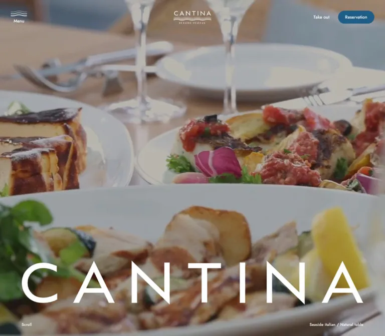
CANTINA presents the restaurant through its setting. The opening desktop capture fills the screen with cane-backed chairs, timber tables, and tall windows. The mobile opening shows a quiet shoreline. A large CANTINA wordmark sits near the bottom, while a much smaller identity mark and a few utilities occupy the top edge. The contrast between enormous lettering and restrained interface text creates the hierarchy.
The page continues as a substantial restaurant website, with practical information distributed through a long visual sequence. Blue menu sections, widely spaced Japanese copy, seasonal news, access details, membership services, and booking destinations support the atmospheric presentation. The footer returns to a full-width sea image and repeats the large wordmark, giving the beginning and ending a shared composition.
How to Read This Reference
- Measured values come from the supplied rendered DOM, computed styles, and element rectangles. Decimal measurements are rounded in descriptive tables where useful.
- Visually observed details come from the five supplied current-page captures: three desktop views and two mobile views.
- Estimated values describe screenshot geometry or appearance that was not independently recorded in computed styles.
- Recommended values and implementation choices are adaptations for reuse, rather than claims about the original implementation.
- Source tokens retain their recorded CSS custom-property names. Other aliases are introduced for the Quick Start.
- Interior content sections have detailed DOM measurements but limited screenshot coverage. Their geometry and typography are better established than their complete image composition or decorative layers.
- A wrapper's computed font, background, or radius does not necessarily describe its painted descendants. This matters particularly for the wordmark, header graphics, and capsule button.
Tokens — Colors
Default Palette
The same custom-property values were recorded at both inspected widths.
| Name | Value | Source token | Evidence and role |
|---|---|---|---|
| White | #FFFFFF |
--color-base |
Measured body background; measured reversed text in the menu, concept copy, and footer |
| Main Blue | #1A4F71 |
--color-main |
Measured Party/Buffet heading color; primary brand-blue token |
| Section Blue | #194F73 |
--color-main-light |
Measured Menu section background and News/Access heading color |
| Ocean Accent | #1E5D87 |
--color-assort |
Declared token, visually consistent with the Reservation capsule; its painted child layer was not measured |
| Deep Navy | #100A63 |
--color-main-deep |
Declared token, visually consistent with the dark logo and wave icon over the bright terrace capture; exact assignment remains unverified |
| Body Ink | #151515 |
--color-font-bk |
Measured Japanese body text on the white canvas |
The three medium blues are close but distinct. Preserve the measured #194F73 menu surface and #1A4F71 display-heading color when matching the supplied implementation. A simplified adaptation may consolidate them, but that would be a deliberate change.
Supporting Source Colors
| Name | Value | Source token | Limitation |
|---|---|---|---|
| Gray | #C5C5C5 |
--color-gray |
Declared; a particular visible divider or component assignment was not supplied |
| Light Gray | #F5F5F5 |
--color-gray-light |
Declared; its visible use was not established |
| Red | #DC3232 |
--color-red |
Declared; no red interface state was demonstrated |
Do not promote every declared color into the visible brand palette. The captured interface is dominated by white, blue, and the natural colors of its imagery.
Color Behavior
The header appears white over the opening interior and ocean scenes, then dark blue over the bright terrace scene. Its background remains visually transparent. This establishes contrasting header treatments, but the exact trigger—section state, scroll position, or another mechanism—was not recorded.
The opening imagery is subdued enough to carry white lettering. An overlay, media grading, or both could produce that appearance. No scrim opacity was measured. The Quick Start uses an explicitly recommended overlay value.
Tokens — Typography
Japanese Body Copy
Recorded family stack: YakuHanJP, "Noto Sans JP", 游ゴシック, "Yu Gothic", YuGothic, メイリオ, "Hiragino Kaku Gothic Pro", "ヒラギノ角ゴ Pro W3", "Lucida Grande", Osaka, Verdana, "MS Pゴシック", sans-serif.
The default weight is 400. Desktop body text is 16px with 1.6px tracking. Most informational copy uses substantially more leading than the body's default 24px: Concept uses 48px, Party/Buffet uses 40px, and Access and membership copy use 32px.
This loose vertical rhythm is central to the design. Japanese text occupies relatively narrow measures, leaving the surrounding image or white canvas to supply openness. The Party/Buffet helper label is a documented exception to the regular weight: 14px, weight 600, with 0.14px tracking.
English Display and Utilities
English section headings, the Natural Table display, navigation-panel links, hero captions, and footer information declare Jost, followed by the Japanese/system fallback stack.
Jost is used at regular weight rather than as a heavy headline face. Large headings rely on scale and line spacing. Small English captions use approximately 0.05em tracking. Most large English headings use normal tracking.
Header action wrappers inherit the Japanese body stack in the supplied measurements. Their individual animated letters were not sampled, so the evidence does not establish that every English control uses Jost.
These are recorded family declarations, not an independent audit of the font file used for every rendered glyph.
Brand Artwork
The large CANTINA lettering has distinctive triangular A forms, angular N forms, and generous distribution across the width. Treat it as brand artwork.
The desktop H1 reports a 16px inherited font size while its layout box is 170px high. That inherited value does not describe the visible lettering. The supplied evidence does not identify the wordmark's asset format or font family. Reuse authorized artwork; do not substitute an assumed display font and call it an exact reproduction.
The small header identity combines CANTINA, horizontal wave lines, and the SEASIDE ITALIAN descriptor. Its link box is larger than some of the visible artwork inside it.
Type Scale
Values below are computed sizes and line heights. They describe the named text element, rather than the full height of a stretched flex item.
| Role | Desktop size / leading | Mobile size / leading | Weight and tracking |
|---|---|---|---|
| Default body | 16 / 24px |
16.5984 / 24.8976px |
400; 0.1em |
| Concept prose | 16 / 48px |
16.5984 / 49.7952px |
400; 0.1em |
| Party/Buffet prose | 16 / 40px |
16.5984 / 41.496px |
400; 0.1em |
| Access and membership prose | 16 / 32px |
16.5984 / 33.1968px |
400; 0.1em |
| Standard section heading | 32 / 48px |
24.8976 / 37.3464px |
Jost 400; normal tracking |
| Natural Table / Party/Buffet display | 96 / 115.2px |
49.7952 / 59.7542px |
Jost 400; normal tracking |
| My CANTINA heading | 48 / 57.6px |
29.0472 / 34.8566px |
Jost 400; normal tracking |
| Navigation-panel links, offscreen | 88 / 132px |
41.496 / 62.244px |
Jost 400; normal tracking |
| Hero bottom captions | 14 / 21px |
12.4488 / 18.6732px |
Jost 400; 0.05em |
| News date and summary | 14 / 28px |
13.4862 / 26.9724px |
400; dates use 0.1em |
| Footer hours and address | 12 / 18px |
10.374 / 15.561px |
Jost 400; 0.05em |
| Membership registration action | 18 / 27px |
18.6732 / 28.0098px |
400; inherited body tracking |
The root font size is measured at 10px on desktop and 10.374px on mobile. The responsive formula was not supplied. Notably, mobile body copy becomes slightly larger while major headings become smaller; this is a change in hierarchy, not uniform scaling of the desktop page.
Tokens — Spacing & Shapes
Density: sparse at the page level, with compact utility controls and exceptionally generous narrative leading.
Spacing Scale
| Use | Desktop measurement | Mobile measurement | Interpretation |
|---|---|---|---|
| Main horizontal gutter | 80px |
20.748px computed |
Shared alignment for headings, text, hero lettering, and lower content |
| Initial header inset | 40px top; side controls at 40px |
24.8976px padding |
Header has its own spacing system |
| Compact header inset | Approximately 20px in scrolled captures |
Approximately 20px in footer capture |
Visual estimate; exact state rule unverified |
| Hero caption bottom clearance | 32px |
Approximately 20.74px |
Derived from caption bounds and viewport height |
| Concept top padding | 300px |
207.48px |
A long pause after the opening scene |
| Menu vertical padding | 140px top, 145px bottom |
103.74px top and bottom |
Measured section padding |
| Menu heading-to-panel gap | 80px |
Approximately 41.48px |
Derived from adjacent bounds |
| Party/Buffet, News, Access top padding | 240px |
124.488px |
Repeated major-section rhythm |
| News row vertical padding | 32px |
16.5984px |
Text wraps more on mobile despite reduced padding |
| Lower service-block gap | 80px horizontally |
Approximately 82.98px vertically |
The two large links change from a row to a stack |
Do not use the Party/Buffet section's unusually large bottom padding as a general spacing token. Its recorded 1381px desktop and approximately 777.53px mobile bottom padding belongs to the longer visual composition around that part of the page.
Border Radius
| Element | Evidence | Reuse guidance |
|---|---|---|
| Reservation capsule | Visibly fully rounded; desktop box 133 × 48px |
Use a pill radius; approximately 24px visible end radius |
| Menu link wrappers | Computed radius 0 |
Preserve square outer geometry unless a painted child proves otherwise |
| Large takeout/reservation wrappers | Computed radius 0 |
Keep the measured block geometry; image-layer treatment is unverified |
| Wave menu control | Unboxed icon and caption | Avoid adding a conspicuous circular container |
| Instagram mark | Approximately 24px wide on desktop |
Rounded geometry belongs to the icon artwork |
The Reservation anchor itself reports a transparent background and zero radius. The screenshot nevertheless shows a blue capsule. This is evidence of styling on another painted layer, not evidence that the visible button is square or transparent.
Layout Measurements
| Element | Desktop | Mobile |
|---|---|---|
| Opening scene | 1440 × 1000px |
390 × 844px |
| Initial header logo link | 140 × 53.125px, at 650, 40 |
Approximately 93.36 × 49.78px, at 24.89, 24.89 |
| Menu trigger box | 60 × 50px, at 40, 40 |
Approximately 37.34 × 49.78px, at 327.77, 16.59 |
| Hero H1 wrapper | 1440 × 170px, top 720px, 80px side padding |
390 × 50.81px, top 724.73px, 20.748px side padding |
| Concept text column | 480px wide |
Approximately 348.53px wide |
| Menu link | Three adjoining 480 × 641px blocks |
Three stacked 348.53 × 475.06px blocks |
| News content | 320px heading column and 960px list |
Approximately 348.53px list below heading |
| News entry | 960 × 120px |
Approximately 348.53 × 207.42px |
| Large service link | 600 × 524px |
Approximately 348.53 × 304.38px |
| Footer section | Approximately 1224.80px high |
Approximately 1063.27px high |
| Full document | Approximately 16969.17px high |
Approximately 16227.70px high |
The large service links preserve an approximately 150:131 outer-box ratio across the two widths. That ratio is measured for the linked block, not necessarily for an image inside it.
Components
Persistent Header
Role: retain identity and access to navigation while imagery occupies the page.
The desktop opening has three visual zones: a wave-over-Menu control at the left, a centered logo, and Take out plus Reservation at the right. The logo is geometrically centered rather than centered between unequal side groups. Take out is a plain text link; Reservation is the stronger blue capsule.
The measured desktop action gap is 32px: Take out ends at 1235px, and Reservation begins at 1267px. The capsule is 133 × 48px and ends 40px from the right edge.
On mobile, the logo moves to the left and the wave menu moves to the right. The separate desktop header action pair is absent from the supplied mobile header and link inventory; both destinations remain present in navigation content and later page sections.
The header is visible in opening, intermediate, and footer captures. Its inset becomes smaller in the scrolled desktop views, and its foreground changes over the bright terrace. These observations support a persistent overlay implementation. The exact CSS positioning mode and hide/show behavior were not supplied.
Wave Menu Control
Role: open the site's navigation.
Several thin horizontal wave strokes sit above the word Menu. The icon echoes the small logo's wave motif and the sea imagery. There is no visible button fill, border, or shadow.
The mobile control has a measured width of only about 37.34px. A reusable implementation should preserve the visible artwork while extending the invisible interactive area to at least 44px.
Navigation Panel — DOM Evidence
Role: section navigation plus restaurant utilities.
The DOM contains Concept, Menu, News, and Access anchors, followed by restaurant identity, hours, address, telephone, Instagram, Take out, Reservation, and copyright information.
Desktop link bounds begin around x = 160px, while information begins at x = 880px, indicating a two-region composition. On mobile, links and information share an approximately 20.73px left alignment and are vertically arranged. Navigation links reduce from 88px to 41.496px.
These elements have large negative vertical coordinates in the supplied snapshots. They document offscreen content, not an opened-menu screenshot. The panel's complete surface, entrance direction, close behavior, focus management, and active-link treatment remain unverified.
Opening Scene and Wordmark
Role: establish the restaurant's atmosphere before presenting detailed information.
The first section matches the viewport height. Imagery covers the entire field with no visible image border or surrounding card. The desktop interior photograph uses warm furniture against cool window light; the mobile shoreline places a dark headland toward the right edge.
Place the large brand artwork low in the composition. Its available width is approximately 88.9% of desktop width and 89.4% of mobile width after gutters. The relationship remains broad and horizontal even though the wordmark's height shrinks sharply on mobile.
A final utility line places Scroll at the left and Seaside italian / Natural table at the right. These captions align with the wordmark's inner edges. Scroll is recorded as paragraph content, so click-to-scroll behavior is not established.
The desktop and mobile opening backgrounds differ. Still captures alone cannot distinguish a media sequence from responsive asset selection or other timing differences.
Concept Section
Role: connect the setting with the restaurant's Natural Table philosophy.
The desktop text column starts at x = 80px and is 480px wide. A 32px Concept label precedes the two-line Natural Table display at 96px / 1.2. The heading box ends approximately 53px before the Japanese prose starts.
The prose uses 16px type with 48px leading and a 48px paragraph-group gap. On mobile, the column expands to the available inner width, the display becomes approximately 49.8px, and the very open prose leading remains.
The measured foreground is white. The section wrapper is transparent, so its underlying visual layer cannot be identified from that wrapper's background property alone.
Menu Panels
Role: provide direct access to Lunch, Dinner, and Drink menu documents.
The Menu section has a measured #194F73 background and white text. Desktop uses three full-width adjoining anchors of 480px each. Each anchor contains a heading-and-hours group near the top and a View Menu PDF affordance near the bottom.
The desktop anchor padding is 120px 0 64px; its measured internal grid gap is 276px. This large separation is part of the panel composition. It is not a compact list of download buttons.
Mobile stacks the anchors inside the main gutters. Each is approximately 475px high, separated by about 51.86px. Padding becomes approximately 83px above and 51.87px below. The allergen-document link follows the group and aligns toward the right.
The complete anchors point to menu PDFs, rather than only the repeated View Menu PDF text. The sampled H3 wrapper inherits the body size; its internal display-label size was not separately measured. Individual panel imagery and separator styling are not established by the supplied screenshots.
Party/Buffet Section
Role: explain private events and provide a party-plan document.
Desktop places a large blue Party/Buffet heading on the left and Japanese explanation on the right. The heading box is approximately 469.16px wide; the copy begins at x = 719.16px and occupies approximately 640.84px. The measured horizontal separation is 150px.
Copy uses 16px / 40px, followed by a slightly heavier helper label and a 170 × 48px View Menu PDF control. Mobile places the heading, copy, helper, and control in a single column. The button becomes approximately 176.34 × 49.78px.
The heading's large desktop element height can include layout stretching. It should not be interpreted as a measured font size or a confirmed line-break pattern.
Extended Visual Chapters
Role: let the restaurant's spaces and setting occupy substantial scrolling distance.
The intermediate desktop capture shows a bright terrace with navy parasols, white architecture, and the sea, followed immediately by a full-width interior image. The image boundary is flush, without a card frame or visible gutter.
Between the end of Party/Buffet and the start of News, the measured page span is 6000px on desktop and 5064px on mobile—six inspected viewport heights in both cases. Three caption groups, labeled Lunch, Lunch, and Dinner, occur at two-viewport intervals.
This supports a deliberately extended visual sequence. It does not prove scroll pinning, parallax, a particular slideshow, or scroll snapping. Recreate its spacious pacing with actual media and content; do not reproduce the measured distance as empty spacer elements.
News List
Role: publish current seasonal announcements and link to their documents.
Desktop uses a narrow heading column and a wider list. Each 960px row contains a 160px date region, a 616px summary region, and the remaining action region. Dates and summaries use 14px / 28px; summaries include 40px right padding.
The four measured rows are 120px high with approximately 1px between row starts after accounting for their heights. A fine divider is a suitable adaptation, but the border style itself was not recorded.
Mobile moves the heading above the list and stacks each row's date, summary, and action content. Entries grow to approximately 207.42px high. The latest supplied item is dated 2026.09.08. Each complete entry is an anchor to its associated document.
Access Information
Role: make location and arrival details available within the main page.
Desktop places the address and travel instructions in a 640px left region. The Google map link sits in the right-side region. Mobile stacks the information and subsequent map-related region, with a recorded 62.244px flex gap.
Body copy uses 16px / 32px on desktop and approximately 16.6px / 33.2px on mobile. Telephone values are real tel: links. The map destination is present in the DOM, but its destination page and any embedded map behavior were not inspected.
My CANTINA Membership Callout
Role: explain membership and separate registration from account maintenance.
The desktop section is inset 80px from the viewport. Its internal heading starts another 80px inward, while the description occupies a 560px right column. Heading and prose are white. The registration action has blue text and a 240 × 60px layout box; modification and withdrawal actions are smaller text treatments.
Mobile uses a narrower inner text width of approximately 296.69px. The heading precedes the description. Registration is centered on its own row, followed by modification and withdrawal side by side.
The painted inner background was not included in the sampled element styles. The Quick Start recommends the established section blue for this reversed-text callout; that assignment is an adaptation.
Takeout and Reservation Blocks
Role: provide prominent final routes to the takeout menu and booking service.
Desktop places two 600 × 524px linked blocks in a row with an 80px gap. Mobile stacks them as approximately 348.53 × 304.38px blocks. Preserve their large target areas and consistent outer proportions.
The header Reservation link points to #reservation within the homepage. The lower Reservation block points to the external booking service. Likewise, the header Take out link points to #takeout, while the lower block links directly to the takeout PDF. These are two stages of the observed navigation, not interchangeable destinations.
Sample-Viewer Trigger
Role: offer examples of cakes, dessert plates, and flowers.
A small text button follows the reservation area. It measures approximately 405.5 × 18px on desktop and wraps into a 348.53 × 37.34px mobile box. A Close control also exists in the DOM.
The evidence establishes the trigger and close-control content. It does not establish the opened viewer's layout, image count, backdrop, keyboard behavior, or transitions. A Close button returning a rectangle is not proof that its containing interface was visible.
Ocean Footer
Role: close with the same strong identity as the opening while supplying practical details.
An expansive sea image fills the footer. White foam gives the background texture; white brand lettering spans nearly the entire inner width. Below it, desktop places SEASIDE ITALIAN and copyright at the left, hours near the center, address toward the right, and an Instagram icon at the far right.
Mobile reorders the information visually: large wordmark, hours, address and telephone, then SEASIDE ITALIAN and copyright, with Instagram beside the final identity area. The footer's small informational text measures only 10.374px on mobile.
The footer is taller than one viewport at both inspected sizes. The supplied footer screenshots show its final viewport, rather than the complete height of the section. Preserve the long sea field above the information without assuming a strict 100vh footer.
Tokens — Motion & Interaction
| Treatment | Recorded value or evidence | What is established |
|---|---|---|
| Default transition | --transition-default: 0.4s ease |
Source timing token |
| Navigation timing | --transition-nav: calc(0.4s * 2) ease |
An 800ms source timing; opened navigation behavior unverified |
| Button timing | --transition-button: calc(0.4s * 2) cubic-bezier(0.625, 0.05, 0, 1) |
Source timing and easing |
| Header geometry | transform and padding, 0.8s cubic-bezier(0.625, 0.05, 0, 1) |
Computed transition declarations; different header insets visible across captures |
| Header color layers | color, fill, and opacity, 0.4s |
Computed declarations; white and dark foreground treatments visible |
| News date and summary | transform 0.8s cubic-bezier(0.625, 0.05, 0, 1) |
Transform transitions declared; displacement and trigger unverified |
| Instagram link | opacity 0.4s |
Computed footer-link transition |
| Hover opacity | --hover-opacity: 0.7 |
Available source value; specific activated hover states were not supplied |
| Repeated letter labels | Duplicate text layers and individual letters in DOM extraction | Consistent with a text-transition construction; exact animation remains unverified |
| Opening and footer media | Different still compositions and ocean imagery | Media format, playback, looping, and timing are unknown |
The split-letter extraction should not be reproduced as visible duplicate words. A reusable implementation should expose one accessible label and hide any decorative animation duplicate from assistive technology.
Several sampled wrappers report animation: none. This does not exclude motion on children, pseudo-elements, media elements, or JavaScript-managed properties. The capture procedure also temporarily paused perpetual animations during readiness checks. Neither fact establishes a motion-free page.
For an adaptation, use the recorded 400ms and 800ms timings selectively for opacity, surface changes, and restrained text movement. Any proposed hover trajectory or media loop must be labeled as a new implementation decision.
Surfaces
| Layer | Observed appearance | Implementation implication |
|---|---|---|
| Document | White body canvas | Use white as the informational base |
| Opening scene | Full-width imagery with white lettering | Keep media flush to the viewport and foreground readable |
| Header | Transparent over imagery, with contrasting foreground states | Avoid an opaque navigation bar in the opening composition |
| Menu | Solid #194F73 section with white content |
Use a continuous blue field across the panel group |
| Informational content | Dark Japanese text and blue headings on the white document base | Separate sections primarily through spacing |
| Membership content | White heading and prose; blue registration text | Inner painted surface unrecorded; blue is a recommended adaptation |
| Footer | Full-width sea imagery and white content | Repeat the opening's immersive scale |
| Reservation control | Visible blue pill | Use filled contrast for this compact priority action |
No card-shadow system is visible in the supplied captures. The strongest divisions are image edges, large color fields, and changes in spacing. Shadow properties were not part of the supplied measurement set, so this observation should not be extended into a claim about every hidden component.
Imagery
The current visual evidence centers on the physical restaurant and its coast. Interior imagery combines warm cane and wood, pale tableware, dark window frames, and cool daylight. The terrace image is brighter: white architecture, deep blue parasols, and a low sea horizon. The mobile opening is quieter and more muted, with gray-blue water and an overcast sky. The footer uses a closer sea texture with diagonal areas of white foam.
Compose large images with room for the interface. In the opening, the wordmark occupies the lower portion while the top remains available for navigation. The photographs retain environmental depth and material texture; they are not cutout objects on abstract backgrounds.
The wave motif links three scales: the menu icon, the small logo, and the ocean itself. Preserve that relationship when introducing any additional interface artwork.
Observed Asset References
No image, logo, or video asset URLs were included in the supplied evidence. The following identifies visual references without inventing filenames.
| Reference | Where observed | Treatment |
|---|---|---|
| Dining interior | Desktop opening | Edge-to-edge composition, subdued contrast, foreground furniture |
| Terrace and interior sequence | Intermediate desktop capture | Flush full-width images; blue parasols, white building, warm interior lighting |
| Shoreline | Mobile opening | Portrait crop with water, sky, and a right-side headland |
| Ocean texture | Desktop and mobile footer | Full-bleed blue water and white foam behind reversed information |
| CANTINA identity and wave marks | Header, opening, footer | Crisp brand artwork at very different scales |
Use authorized original assets when available. object-fit: cover is a useful recommended media implementation, but the original fit rule and focal coordinates were not provided. Brand artwork should retain its intrinsic proportions rather than be cropped like photography.
Layout & Responsive Behavior
The page remains a long vertical restaurant experience at both widths. Desktop measures approximately seventeen viewport heights; mobile measures approximately nineteen. Its content is not condensed into a short mobile summary.
| Relationship | Desktop observation | Mobile observation |
|---|---|---|
| Header identity | Centered logo | Left-aligned logo |
| Menu control | Upper left | Upper right |
| Header action pair | Visible Take out and Reservation | Not present in the separate header area |
| Hero wordmark | Wide, 170px wrapper height |
Similarly wide proportionally, approximately 50.81px high |
| Concept | Narrow 480px column |
Available inner width |
| Menu | Three adjoining columns | Three inset vertical panels |
| Party/Buffet | Heading and copy side by side | Heading above copy |
| News | Heading beside list; horizontal row anatomy | Heading above list; vertically arranged entries |
| Access | Information and right-side region | Stacked regions |
| Membership | Heading beside description and actions | Heading, description, registration, then secondary actions |
| Final service links | Two columns | One column |
| Footer information | Horizontal distribution | Hours and address precede the final identity block |
The exact breakpoint is unknown. The Quick Start uses 767px as a recommended implementation boundary and reproduces the observed scale at 390px. It does not claim to reconstruct the source's responsive formula at every intermediate width.
No landscape-phone, tablet, zoom, safe-area, or browser-toolbar transition captures were supplied. Flexible heights and safe-area padding are recommended for a new implementation rather than documented source behavior.
Do’s and Don’ts
Do
- Anchor the composition in full-width restaurant and coastal imagery.
- Keep the large wordmark close to nine tenths of the viewport width after gutters.
- Preserve the contrast between monumental brand artwork and small utility labels.
- Use regular Jost for measured English display roles and the recorded Japanese sans-serif stack for prose.
- Retain the unusually generous
2–3line-height range in Japanese narrative sections. - Keep the desktop logo centered independently of the side controls.
- Move the logo left and menu right on mobile.
- Preserve full-panel links for the menu documents and the large final service blocks.
- Carry the wave motif through the logo, menu control, and imagery.
- Keep practical information available through the long page and its footer.
Don’t
- Do not replace the distinctive wordmark with an unverified font.
- Do not derive visible wordmark size from the H1's inherited body font.
- Do not turn every section into a rounded card or add a general shadow system.
- Do not replace the ocean-blue palette with unrelated action colors.
- Do not apply desktop columns unchanged to the mobile menu or news list.
- Do not make footer text smaller simply to preserve desktop line breaks.
- Do not render duplicated DOM labels twice for users or screen readers.
- Do not claim video, parallax, scroll snapping, or a particular hover animation from still images alone.
- Do not treat offscreen navigation or a hidden Close control as an inspected open state.
- Do not reproduce long visual chapters using blank fixed-height spacers.
Recommended Implementation Additions
These are recommendations for a new implementation, not verified features of the original site:
- Give the wave menu a clear accessible name,
aria-expanded, and a relationship to its controlled navigation region. When a modal navigation pattern is used, implement appropriate focus entry and return. - Extend small icon and text targets to at least
44 × 44pxwithout enlarging all visible artwork. - Expose one meaningful text label per animated link. Mark duplicate decorative letter layers as hidden from accessibility APIs.
- Offer readable HTML equivalents for essential menu and allergen information alongside document links.
- Raise essential mobile footer information toward
12–14px; allow the footer to grow instead of compressing it. - Supply visible keyboard focus and check foreground contrast against every chosen media crop.
- If motion media is used, provide reduced-motion and static-poster behavior. CSS transition overrides alone do not pause video or JavaScript animation.
- Use responsive image sources and intentional portrait focal points. Reserve media dimensions so delayed decoding does not move nearby content.
- Keep repeated hours, telephone numbers, and destinations in shared content data so the navigation, visual chapters, and footer remain consistent.
Agent Prompt Guide
Quick Color Reference
- Document canvas:
#FFFFFF. - Japanese body text:
#151515. - Large Party/Buffet heading:
#1A4F71. - Menu surface and standard informational headings:
#194F73. - Reservation accent: use
#1E5D87as the source-token-based approximation. - Header over bright imagery: use the declared deep navy
#100A63as an adaptation. - Over-image text and brand artwork: white.
Overall Prompt
“Create a long restaurant website inspired by CANTINA's current seaside presentation. Use full-width coastal and restaurant imagery, white and ocean-blue surfaces, regular Jost display headings, and Japanese sans-serif copy with generous leading. Place authorized geometric brand artwork across nearly ninety percent of the opening width near the bottom. On desktop, overlay a wave Menu control at upper left, a centered small logo, and Take out plus a blue Reservation pill at upper right. On mobile, place the logo left and Menu right. Continue with Concept, three menu-document panels, Party/Buffet, expansive visual chapters, seasonal news, access information, membership, service links, and an ocean footer. Preserve measured layout relationships; label any invented media behavior or interaction as an adaptation.”
Example Component Prompts
- Opening scene: “Build a viewport-height restaurant opening with edge-to-edge imagery, a broad white brand wordmark near the lower edge, and small opposing Scroll and Seaside italian / Natural table captions. Use 80px desktop content gutters and approximately 21px at 390px width. Keep the brand artwork distinct from live text typography.”
- Header: “Create a transparent desktop header with independently centered logo, unboxed wave-over-Menu control at left, and a 133 × 48px blue Reservation capsule beside a plain Take out link. Support white and dark foreground states. At mobile width, move the logo left and Menu right.”
- Menu section: “Create a continuous #194F73 menu section with three equal desktop link panels. Place the meal heading and hours near the top and View Menu PDF near the bottom. Stack the panels within approximately 21px mobile gutters, retaining generous vertical separation and full-panel link semantics.”
- News list: “Create a white seasonal-news section with a 320px desktop heading region beside a 960px list at 1440px width. Use regular blue Jost for the section heading and 14px Japanese text with 28px leading. Stack dates and summaries on mobile. A thin gray divider is a recommended addition, not a verified source border.”
- Ocean footer: “Create a tall sea-image footer with a broad white wordmark and small practical information. Distribute identity, hours, address, and Instagram horizontally on desktop. On mobile, place hours and address above the final identity and copyright group. Allow height to increase for readable text.”
Quick Start
CSS Custom Properties
This CSS is a usable adaptation of the measured shell and component relationships. It keeps a conventional root font size and introduces --u as a pixel-based scale. At the recommended mobile breakpoint, --u: 1.0374px reproduces the measured scale at 390px; it is not the original responsive formula.
Use .scene__media for a supplied image or deliberately chosen media element. Place authorized artwork inside .wordmark and .brand-link. Application logic must manage header state classes and any navigation or media behavior. Long visual chapters require actual content and assets.
The overlay opacity, menu-label display sizes, membership fill, service-placeholder surface, news divider, and breakpoint below are recommendations. The source did not supply all of their painted details.
:root {
  /* Source colors */
  --color-base: #ffffff;
  --color-main: #1a4f71;
  --color-main-light: #194f73;
  --color-main-deep: #100a63;
  --color-assort: #1e5d87;
  --color-font-bk: #151515;
  --color-gray: #c5c5c5;
  --color-gray-light: #f5f5f5;

  /* Shortened adaptation of the recorded font stacks */
  --font-jp: YakuHanJP, 'Noto Sans JP', 'Yu Gothic', YuGothic,
    Meiryo, 'Hiragino Kaku Gothic Pro', Verdana, sans-serif;
  --font-latin: Jost, 'Noto Sans JP', 'Yu Gothic', sans-serif;
  --u: 1px;
  --text-body: calc(16 * var(--u));
  --text-section: calc(32 * var(--u));
  --text-display: calc(96 * var(--u));
  --text-news: calc(14 * var(--u));
  --gutter: calc(80 * var(--u));
  --section-space: calc(240 * var(--u));
  --radius-pill: 999px;

  /* Recorded timings; recommended media shade */
  --motion-default: 400ms ease;
  --motion-button: 800ms cubic-bezier(0.625, 0.05, 0, 1);
  --hover-opacity: 0.7;
  --media-shade: 0.22;
}

* { box-sizing: border-box; }

body {
  margin: 0;
  color: var(--color-font-bk);
  background: var(--color-base);
  font-family: var(--font-jp);
  font-size: var(--text-body);
  font-weight: 400;
  line-height: 1.5;
  letter-spacing: 0.1em;
}

a { color: inherit; }
button { font: inherit; }
h1, h2, h3, p { margin: 0; }
h1, h2, h3 { font-weight: 400; }

.section-title,
.display-title {
  font-family: var(--font-latin);
  font-weight: 400;
  letter-spacing: normal;
}

.section-title {
  font-size: var(--text-section);
  line-height: 1.5;
}

.display-title {
  font-size: var(--text-display);
  line-height: 1.2;
}

.site-header {
  --header-ink: #ffffff;
  position: fixed;
  inset: 0 0 auto;
  z-index: 20;
  display: grid;
  grid-template-columns: 1fr auto 1fr;
  align-items: start;
  padding: 40px;
  color: var(--header-ink);
  transition: padding var(--motion-button),
    transform var(--motion-button), color var(--motion-default);
}

.site-header.is-compact { padding: 20px; }
.site-header.is-on-light { --header-ink: var(--color-main-deep); }

.menu-trigger {
  justify-self: start;
  display: grid;
  justify-items: center;
  align-content: start;
  width: 60px;
  min-width: 44px;
  min-height: 50px;
  padding: 0;
  border: 0;
  color: inherit;
  background: transparent;
  cursor: pointer;
  letter-spacing: normal;
}

.menu-mark { display: block; width: 60px; }

.brand-link {
  display: grid;
  place-items: start center;
  width: 140px;
  height: 53.125px;
}

.brand-link > :is(img, svg) {
  display: block;
  max-width: 100%;
  max-height: 100%;
}

.header-actions {
  justify-self: end;
  display: flex;
  align-items: center;
  gap: 32px;
}

.header-actions a { text-decoration: none; }

.reservation-pill {
  display: grid;
  place-items: center;
  width: 133px;
  min-height: 48px;
  padding: 10px 18px;
  border-radius: var(--radius-pill);
  color: #ffffff;
  background: var(--color-assort);
  letter-spacing: normal;
  transition: opacity var(--motion-default);
}

.scene {
  position: relative;
  isolation: isolate;
  min-height: 100svh;
  color: #ffffff;
  background: var(--color-main-light);
}

.scene__media {
  position: absolute;
  inset: 0;
  z-index: -2;
  width: 100%;
  height: 100%;
  object-fit: cover;
}

.scene::before {
  content: '';
  position: absolute;
  inset: 0;
  z-index: -1;
  background: rgb(0 0 0 / var(--media-shade));
  pointer-events: none;
}

.wordmark > :is(img, svg) {
  display: block;
  width: 100%;
  height: 100%;
  object-fit: contain;
}

.hero__wordmark {
  position: absolute;
  inset-inline: var(--gutter);
  bottom: 110px;
  height: 170px;
}

.hero-meta {
  position: absolute;
  inset-inline: var(--gutter);
  bottom: 32px;
  display: flex;
  justify-content: space-between;
  gap: 16px;
  font-family: var(--font-latin);
  font-size: 14px;
  line-height: 1.5;
  letter-spacing: 0.05em;
}

.concept {
  padding: calc(300 * var(--u)) var(--gutter)
    calc(200 * var(--u));
}

.concept__copy { max-width: calc(480 * var(--u)); }
.concept .display-title { margin-top: calc(76 * var(--u)); }
.concept__prose { margin-top: calc(53 * var(--u)); line-height: 3; }
.concept__prose p + p { margin-top: calc(48 * var(--u)); }

.menu-section {
  padding-block: calc(140 * var(--u)) calc(145 * var(--u));
  color: #ffffff;
  background: var(--color-main-light);
}

.menu-section > .section-title { padding-inline: var(--gutter); }

.menu-grid {
  display: grid;
  grid-template-columns: repeat(3, minmax(0, 1fr));
  margin-top: calc(80 * var(--u));
}

.menu-card {
  display: flex;
  flex-direction: column;
  align-items: center;
  justify-content: space-between;
  min-height: calc(641 * var(--u));
  padding: calc(120 * var(--u)) 20px calc(64 * var(--u));
  color: inherit;
  text-align: center;
  text-decoration: none;
  font-family: var(--font-latin);
  letter-spacing: normal;
}

/* Recommended label size; inner source lettering was not measured. */
.menu-card__title { font-size: calc(64 * var(--u)); line-height: 1.2; }
.menu-card__hours { margin-top: 16px; }
.menu-card__action { font-size: var(--text-body); }

.party {
  display: grid;
  grid-template-columns: minmax(0, 5fr) minmax(0, 7fr);
  gap: clamp(40px, 10.42vw, 150px);
  padding: var(--section-space) var(--gutter);
}

.party .display-title { color: var(--color-main); }
.party__copy { line-height: 2.5; }
.party__copy p + p { margin-top: calc(40 * var(--u)); }

.photo-panel { display: block; width: 100%; height: auto; }

.news {
  display: grid;
  grid-template-columns: calc(320 * var(--u)) minmax(0, 1fr);
  padding: var(--section-space) var(--gutter) 0;
}

.news > .section-title { color: var(--color-main-light); }

.news-row {
  display: grid;
  grid-template-columns: calc(160 * var(--u)) minmax(0, 1fr) auto;
  padding-block: calc(32 * var(--u));
  border-top: 1px solid var(--color-gray);
  font-size: var(--text-news);
  line-height: 2;
  text-decoration: none;
}

.news-row:last-child { border-bottom: 1px solid var(--color-gray); }
.news-row__summary { padding-right: calc(40 * var(--u)); }

/* Recommended surface for the measured reversed membership content. */
.membership {
  display: grid;
  grid-template-columns: repeat(2, minmax(0, 1fr));
  margin: var(--section-space) var(--gutter) 0;
  padding: calc(80 * var(--u));
  color: #ffffff;
  background: var(--color-main-light);
}

.membership__title {
  font-family: var(--font-latin);
  font-size: calc(48 * var(--u));
  line-height: 1.2;
  letter-spacing: normal;
}

.membership__copy { line-height: 2; }
.membership__actions { display: flex; flex-wrap: wrap; gap: 20px; margin-top: 40px; }

.service-grid {
  display: grid;
  grid-template-columns: repeat(2, minmax(0, 1fr));
  gap: var(--gutter);
  padding: var(--section-space) var(--gutter);
}

/* Neutral placeholder until the intended visual assets are supplied. */
.service-link {
  display: grid;
  place-items: center;
  aspect-ratio: 150 / 131;
  padding: 24px;
  background: var(--color-gray-light);
  text-decoration: none;
}

.site-footer {
  display: flex;
  flex-direction: column;
  justify-content: flex-end;
  gap: calc(56 * var(--u));
  min-height: 125svh;
  padding: 80px var(--gutter) max(40px, env(safe-area-inset-bottom));
}

.site-footer > .wordmark { height: calc(170 * var(--u)); }

.footer-details {
  display: grid;
  grid-template-columns: 50% 26% minmax(0, 1fr) 24px;
  font-family: var(--font-latin);
  letter-spacing: normal;
}

.footer-hours,
.footer-address {
  font-size: calc(12 * var(--u));
  line-height: 1.5;
  letter-spacing: 0.05em;
}

.footer-address { margin-left: 32px; }
.footer-category { font-size: calc(32 * var(--u)); line-height: 1.2; }
.footer-copyright { margin-top: 8px; font-size: calc(10 * var(--u)); }
.footer-social { width: 24px; min-height: 44px; }

:where(a, button):focus-visible {
  outline: 2px solid currentColor;
  outline-offset: 4px;
}

@media (hover: hover) {
  .reservation-pill:hover { opacity: var(--hover-opacity); }
}

/* Recommended breakpoint; this scale matches the 390px observation. */
@media (max-width: 767px) {
  :root {
    --u: 1.0374px;
    --gutter: calc(20 * var(--u));
    --section-space: calc(120 * var(--u));
    --text-section: calc(24 * var(--u));
    --text-display: calc(48 * var(--u));
    --text-news: calc(13 * var(--u));
  }

  .site-header {
    grid-template-columns: 1fr auto;
    padding: calc(24 * var(--u));
  }

  .site-header.is-compact { padding: var(--gutter); }
  .brand-link { grid-column: 1; grid-row: 1; width: calc(90 * var(--u)); height: calc(48 * var(--u)); }
  .menu-trigger { grid-column: 2; grid-row: 1; justify-self: end; width: 44px; }
  .menu-mark { width: calc(36 * var(--u)); }
  .header-actions { display: none; }

  .hero__wordmark { bottom: calc(66 * var(--u)); height: calc(49 * var(--u)); }
  .hero-meta { bottom: var(--gutter); font-size: calc(12 * var(--u)); gap: 12px; }

  .concept { padding-block: calc(200 * var(--u)); }
  .concept__copy { max-width: none; }
  .concept .display-title { margin-top: calc(60 * var(--u)); }
  .concept__prose { margin-top: calc(40 * var(--u)); }

  .menu-section { padding-block: calc(100 * var(--u)); }
  .menu-grid { grid-template-columns: 1fr; gap: calc(50 * var(--u)); margin-top: calc(40 * var(--u)); padding-inline: var(--gutter); }
  .menu-card { min-height: calc(458 * var(--u)); padding-block: calc(80 * var(--u)) calc(50 * var(--u)); }
  .menu-card__title { font-size: calc(40 * var(--u)); }

  .party, .news, .membership, .service-grid { grid-template-columns: 1fr; }
  .party, .news { gap: calc(40 * var(--u)); }
  .news-row { grid-template-columns: 1fr; gap: calc(10 * var(--u)); padding-block: calc(16 * var(--u)); }
  .news-row__summary { padding-right: 0; }

  .membership { gap: calc(40 * var(--u)); padding: calc(80 * var(--u)) calc(25 * var(--u)); }
  .membership__title { font-size: calc(28 * var(--u)); }
  .membership__actions { justify-content: center; }
  .service-grid { gap: calc(80 * var(--u)); }

  .site-footer { gap: calc(32 * var(--u)); padding-bottom: max(var(--gutter), env(safe-area-inset-bottom)); }
  .site-footer > .wordmark { height: calc(49 * var(--u)); }
  .footer-details { grid-template-columns: minmax(0, 1fr) calc(24 * var(--u)); row-gap: calc(16 * var(--u)); }
  .footer-hours { grid-area: 1 / 1; }
  .footer-address { grid-area: 2 / 1; margin-left: 0; }
  .footer-identity { grid-area: 3 / 1; margin-top: calc(16 * var(--u)); }
  .footer-social { grid-area: 3 / 2; align-self: end; }
  .footer-category { font-size: calc(24 * var(--u)); }

  /* Readability recommendation above the observed 10.374px size. */
  .footer-hours, .footer-address { font-size: 12px; }
}

@media (prefers-reduced-motion: reduce) {
  .site-header, .reservation-pill { transition: none; }
  html { scroll-behavior: auto; }
  /* Pause motion media separately in application logic. */
}
Tailwind v4 Token Mapping
Optional aliases for a project that already uses Tailwind v4. Define the custom properties above first. This mapping does not imply that the original website uses Tailwind.
@theme inline {
  --color-cantina-white: #ffffff;
  --color-cantina-blue: #1a4f71;
  --color-cantina-section: #194f73;
  --color-cantina-navy: #100a63;
  --color-cantina-accent: #1e5d87;
  --color-cantina-ink: #151515;
  --font-japanese: var(--font-jp);
  --font-english: var(--font-latin);
  --text-cantina-body: var(--text-body);
  --text-cantina-section: var(--text-section);
  --text-cantina-display: var(--text-display);
  --spacing-cantina-gutter: var(--gutter);
  --spacing-cantina-section: var(--section-space);
  --radius-cantina-pill: 999px;
}
Sources & Evidence
- CANTINA official homepage: original and final URL, supplied HTTP status
200, current page title, rendered text, link destinations, computed custom properties, and element bounds. - Capture timestamp: September 12, 2026,
17:31:58.593 UTC, equivalent to September 13, 2026,02:31:58.593 JST. - Desktop evidence:
1440 × 1000CSS-pixel viewport; opening interior, intermediate terrace/interior composition, and ocean-footer captures; approximately16969.17pxdocument height. - Mobile evidence:
390 × 844CSS-pixel viewport; shoreline opening and ocean-footer captures; approximately16227.70pxdocument height. - Rendered section evidence: Concept, Menu, News, Access, Takeout, and Reservation. These anchors and their associated content were recorded in the supplied homepage DOM.
- Inspection procedure supplied with the evidence: initial observation lasted at least five seconds; captures waited for document readiness, relevant finite motion, sampled layout/text stability, and visible image decoding within stated limits. Scrolling traversed intermediate positions. Perpetual animations were temporarily paused during readiness checks and resumed. SharedWorkers and service workers were disabled.
- Limits: no additional browsing was performed for this reference. Open navigation, sample-viewer behavior, hover trajectories, keyboard behavior, media format, playback timing, complete asset URLs, and the original breakpoint formula were not demonstrated. Linked PDFs, membership pages, maps, social pages, and the external booking flow were not inspected beyond their recorded homepage links.
This reference describes the current supplied website evidence. Measured values, visual estimates, and recommended implementation choices are distinguished throughout.
# CANTINA — Style Reference

> A seaside restaurant framed by ocean blue, expansive scenery, and geometric white lettering.

**Website / Original URL:** [www.cantina-zushi.com](https://www.cantina-zushi.com/)
**Final URL:** [https://www.cantina-zushi.com/](https://www.cantina-zushi.com/)
**Theme:** a white document canvas with blue sections and photography; no theme selector was observed.
**Inspected:** September 13, 2026, Japan Standard Time. Supplied retrieval timestamp: September 12, 2026, 17:31:58.593 UTC.
**Viewports:** 1440 × 1000 desktop and 390 × 844 mobile, in CSS pixels.
**Scope:** the current restaurant homepage: opening scene, persistent header, Concept, Menu, Party/Buffet, extended visual chapters, News, Access, My CANTINA, takeout and reservation links, and ocean footer. Navigation-panel content and a sample-viewer control are documented from DOM evidence; their opened states were not demonstrated.

CANTINA presents the restaurant through its setting. The opening desktop capture fills the screen with cane-backed chairs, timber tables, and tall windows. The mobile opening shows a quiet shoreline. A large CANTINA wordmark sits near the bottom, while a much smaller identity mark and a few utilities occupy the top edge. The contrast between enormous lettering and restrained interface text creates the hierarchy.

The page continues as a substantial restaurant website, with practical information distributed through a long visual sequence. Blue menu sections, widely spaced Japanese copy, seasonal news, access details, membership services, and booking destinations support the atmospheric presentation. The footer returns to a full-width sea image and repeats the large wordmark, giving the beginning and ending a shared composition.

## How to Read This Reference

- **Measured** values come from the supplied rendered DOM, computed styles, and element rectangles. Decimal measurements are rounded in descriptive tables where useful.
- **Visually observed** details come from the five supplied current-page captures: three desktop views and two mobile views.
- **Estimated** values describe screenshot geometry or appearance that was not independently recorded in computed styles.
- **Recommended** values and implementation choices are adaptations for reuse, rather than claims about the original implementation.
- **Source tokens** retain their recorded CSS custom-property names. Other aliases are introduced for the Quick Start.
- Interior content sections have detailed DOM measurements but limited screenshot coverage. Their geometry and typography are better established than their complete image composition or decorative layers.
- A wrapper's computed font, background, or radius does not necessarily describe its painted descendants. This matters particularly for the wordmark, header graphics, and capsule button.

## Tokens — Colors

### Default Palette

The same custom-property values were recorded at both inspected widths.

| Name | Value | Source token | Evidence and role |
| --- | --- | --- | --- |
| White | `#FFFFFF` | `--color-base` | Measured body background; measured reversed text in the menu, concept copy, and footer |
| Main Blue | `#1A4F71` | `--color-main` | Measured Party/Buffet heading color; primary brand-blue token |
| Section Blue | `#194F73` | `--color-main-light` | Measured Menu section background and News/Access heading color |
| Ocean Accent | `#1E5D87` | `--color-assort` | Declared token, visually consistent with the Reservation capsule; its painted child layer was not measured |
| Deep Navy | `#100A63` | `--color-main-deep` | Declared token, visually consistent with the dark logo and wave icon over the bright terrace capture; exact assignment remains unverified |
| Body Ink | `#151515` | `--color-font-bk` | Measured Japanese body text on the white canvas |

The three medium blues are close but distinct. Preserve the measured `#194F73` menu surface and `#1A4F71` display-heading color when matching the supplied implementation. A simplified adaptation may consolidate them, but that would be a deliberate change.

### Supporting Source Colors

| Name | Value | Source token | Limitation |
| --- | --- | --- | --- |
| Gray | `#C5C5C5` | `--color-gray` | Declared; a particular visible divider or component assignment was not supplied |
| Light Gray | `#F5F5F5` | `--color-gray-light` | Declared; its visible use was not established |
| Red | `#DC3232` | `--color-red` | Declared; no red interface state was demonstrated |

Do not promote every declared color into the visible brand palette. The captured interface is dominated by white, blue, and the natural colors of its imagery.

### Color Behavior

The header appears white over the opening interior and ocean scenes, then dark blue over the bright terrace scene. Its background remains visually transparent. This establishes contrasting header treatments, but the exact trigger—section state, scroll position, or another mechanism—was not recorded.

The opening imagery is subdued enough to carry white lettering. An overlay, media grading, or both could produce that appearance. No scrim opacity was measured. The Quick Start uses an explicitly recommended overlay value.

## Tokens — Typography

### Japanese Body Copy

**Recorded family stack:** `YakuHanJP, "Noto Sans JP", 游ゴシック, "Yu Gothic", YuGothic, メイリオ, "Hiragino Kaku Gothic Pro", "ヒラギノ角ゴ Pro W3", "Lucida Grande", Osaka, Verdana, "MS Pゴシック", sans-serif`.

The default weight is `400`. Desktop body text is `16px` with `1.6px` tracking. Most informational copy uses substantially more leading than the body's default `24px`: Concept uses `48px`, Party/Buffet uses `40px`, and Access and membership copy use `32px`.

This loose vertical rhythm is central to the design. Japanese text occupies relatively narrow measures, leaving the surrounding image or white canvas to supply openness. The Party/Buffet helper label is a documented exception to the regular weight: `14px`, weight `600`, with `0.14px` tracking.

### English Display and Utilities

English section headings, the Natural Table display, navigation-panel links, hero captions, and footer information declare **Jost**, followed by the Japanese/system fallback stack.

Jost is used at regular weight rather than as a heavy headline face. Large headings rely on scale and line spacing. Small English captions use approximately `0.05em` tracking. Most large English headings use normal tracking.

Header action wrappers inherit the Japanese body stack in the supplied measurements. Their individual animated letters were not sampled, so the evidence does not establish that every English control uses Jost.

These are recorded family declarations, not an independent audit of the font file used for every rendered glyph.

### Brand Artwork

The large CANTINA lettering has distinctive triangular A forms, angular N forms, and generous distribution across the width. Treat it as brand artwork.

The desktop H1 reports a `16px` inherited font size while its layout box is `170px` high. That inherited value does not describe the visible lettering. The supplied evidence does not identify the wordmark's asset format or font family. Reuse authorized artwork; do not substitute an assumed display font and call it an exact reproduction.

The small header identity combines CANTINA, horizontal wave lines, and the SEASIDE ITALIAN descriptor. Its link box is larger than some of the visible artwork inside it.

### Type Scale

Values below are computed sizes and line heights. They describe the named text element, rather than the full height of a stretched flex item.

| Role | Desktop size / leading | Mobile size / leading | Weight and tracking |
| --- | --- | --- | --- |
| Default body | `16 / 24px` | `16.5984 / 24.8976px` | `400`; `0.1em` |
| Concept prose | `16 / 48px` | `16.5984 / 49.7952px` | `400`; `0.1em` |
| Party/Buffet prose | `16 / 40px` | `16.5984 / 41.496px` | `400`; `0.1em` |
| Access and membership prose | `16 / 32px` | `16.5984 / 33.1968px` | `400`; `0.1em` |
| Standard section heading | `32 / 48px` | `24.8976 / 37.3464px` | Jost `400`; normal tracking |
| Natural Table / Party/Buffet display | `96 / 115.2px` | `49.7952 / 59.7542px` | Jost `400`; normal tracking |
| My CANTINA heading | `48 / 57.6px` | `29.0472 / 34.8566px` | Jost `400`; normal tracking |
| Navigation-panel links, offscreen | `88 / 132px` | `41.496 / 62.244px` | Jost `400`; normal tracking |
| Hero bottom captions | `14 / 21px` | `12.4488 / 18.6732px` | Jost `400`; `0.05em` |
| News date and summary | `14 / 28px` | `13.4862 / 26.9724px` | `400`; dates use `0.1em` |
| Footer hours and address | `12 / 18px` | `10.374 / 15.561px` | Jost `400`; `0.05em` |
| Membership registration action | `18 / 27px` | `18.6732 / 28.0098px` | `400`; inherited body tracking |

The root font size is measured at `10px` on desktop and `10.374px` on mobile. The responsive formula was not supplied. Notably, mobile body copy becomes slightly larger while major headings become smaller; this is a change in hierarchy, not uniform scaling of the desktop page.

## Tokens — Spacing & Shapes

**Density:** sparse at the page level, with compact utility controls and exceptionally generous narrative leading.

### Spacing Scale

| Use | Desktop measurement | Mobile measurement | Interpretation |
| --- | --- | --- | --- |
| Main horizontal gutter | `80px` | `20.748px` computed | Shared alignment for headings, text, hero lettering, and lower content |
| Initial header inset | `40px` top; side controls at `40px` | `24.8976px` padding | Header has its own spacing system |
| Compact header inset | Approximately `20px` in scrolled captures | Approximately `20px` in footer capture | Visual estimate; exact state rule unverified |
| Hero caption bottom clearance | `32px` | Approximately `20.74px` | Derived from caption bounds and viewport height |
| Concept top padding | `300px` | `207.48px` | A long pause after the opening scene |
| Menu vertical padding | `140px` top, `145px` bottom | `103.74px` top and bottom | Measured section padding |
| Menu heading-to-panel gap | `80px` | Approximately `41.48px` | Derived from adjacent bounds |
| Party/Buffet, News, Access top padding | `240px` | `124.488px` | Repeated major-section rhythm |
| News row vertical padding | `32px` | `16.5984px` | Text wraps more on mobile despite reduced padding |
| Lower service-block gap | `80px` horizontally | Approximately `82.98px` vertically | The two large links change from a row to a stack |

Do not use the Party/Buffet section's unusually large bottom padding as a general spacing token. Its recorded `1381px` desktop and approximately `777.53px` mobile bottom padding belongs to the longer visual composition around that part of the page.

### Border Radius

| Element | Evidence | Reuse guidance |
| --- | --- | --- |
| Reservation capsule | Visibly fully rounded; desktop box `133 × 48px` | Use a pill radius; approximately `24px` visible end radius |
| Menu link wrappers | Computed radius `0` | Preserve square outer geometry unless a painted child proves otherwise |
| Large takeout/reservation wrappers | Computed radius `0` | Keep the measured block geometry; image-layer treatment is unverified |
| Wave menu control | Unboxed icon and caption | Avoid adding a conspicuous circular container |
| Instagram mark | Approximately `24px` wide on desktop | Rounded geometry belongs to the icon artwork |

The Reservation anchor itself reports a transparent background and zero radius. The screenshot nevertheless shows a blue capsule. This is evidence of styling on another painted layer, not evidence that the visible button is square or transparent.

### Layout Measurements

| Element | Desktop | Mobile |
| --- | --- | --- |
| Opening scene | `1440 × 1000px` | `390 × 844px` |
| Initial header logo link | `140 × 53.125px`, at `650, 40` | Approximately `93.36 × 49.78px`, at `24.89, 24.89` |
| Menu trigger box | `60 × 50px`, at `40, 40` | Approximately `37.34 × 49.78px`, at `327.77, 16.59` |
| Hero H1 wrapper | `1440 × 170px`, top `720px`, `80px` side padding | `390 × 50.81px`, top `724.73px`, `20.748px` side padding |
| Concept text column | `480px` wide | Approximately `348.53px` wide |
| Menu link | Three adjoining `480 × 641px` blocks | Three stacked `348.53 × 475.06px` blocks |
| News content | `320px` heading column and `960px` list | Approximately `348.53px` list below heading |
| News entry | `960 × 120px` | Approximately `348.53 × 207.42px` |
| Large service link | `600 × 524px` | Approximately `348.53 × 304.38px` |
| Footer section | Approximately `1224.80px` high | Approximately `1063.27px` high |
| Full document | Approximately `16969.17px` high | Approximately `16227.70px` high |

The large service links preserve an approximately `150:131` outer-box ratio across the two widths. That ratio is measured for the linked block, not necessarily for an image inside it.

## Components

### Persistent Header

**Role:** retain identity and access to navigation while imagery occupies the page.

The desktop opening has three visual zones: a wave-over-Menu control at the left, a centered logo, and Take out plus Reservation at the right. The logo is geometrically centered rather than centered between unequal side groups. Take out is a plain text link; Reservation is the stronger blue capsule.

The measured desktop action gap is `32px`: Take out ends at `1235px`, and Reservation begins at `1267px`. The capsule is `133 × 48px` and ends `40px` from the right edge.

On mobile, the logo moves to the left and the wave menu moves to the right. The separate desktop header action pair is absent from the supplied mobile header and link inventory; both destinations remain present in navigation content and later page sections.

The header is visible in opening, intermediate, and footer captures. Its inset becomes smaller in the scrolled desktop views, and its foreground changes over the bright terrace. These observations support a persistent overlay implementation. The exact CSS positioning mode and hide/show behavior were not supplied.

### Wave Menu Control

**Role:** open the site's navigation.

Several thin horizontal wave strokes sit above the word Menu. The icon echoes the small logo's wave motif and the sea imagery. There is no visible button fill, border, or shadow.

The mobile control has a measured width of only about `37.34px`. A reusable implementation should preserve the visible artwork while extending the invisible interactive area to at least `44px`.

### Navigation Panel — DOM Evidence

**Role:** section navigation plus restaurant utilities.

The DOM contains Concept, Menu, News, and Access anchors, followed by restaurant identity, hours, address, telephone, Instagram, Take out, Reservation, and copyright information.

Desktop link bounds begin around `x = 160px`, while information begins at `x = 880px`, indicating a two-region composition. On mobile, links and information share an approximately `20.73px` left alignment and are vertically arranged. Navigation links reduce from `88px` to `41.496px`.

These elements have large negative vertical coordinates in the supplied snapshots. They document offscreen content, not an opened-menu screenshot. The panel's complete surface, entrance direction, close behavior, focus management, and active-link treatment remain unverified.

### Opening Scene and Wordmark

**Role:** establish the restaurant's atmosphere before presenting detailed information.

The first section matches the viewport height. Imagery covers the entire field with no visible image border or surrounding card. The desktop interior photograph uses warm furniture against cool window light; the mobile shoreline places a dark headland toward the right edge.

Place the large brand artwork low in the composition. Its available width is approximately `88.9%` of desktop width and `89.4%` of mobile width after gutters. The relationship remains broad and horizontal even though the wordmark's height shrinks sharply on mobile.

A final utility line places Scroll at the left and Seaside italian / Natural table at the right. These captions align with the wordmark's inner edges. Scroll is recorded as paragraph content, so click-to-scroll behavior is not established.

The desktop and mobile opening backgrounds differ. Still captures alone cannot distinguish a media sequence from responsive asset selection or other timing differences.

### Concept Section

**Role:** connect the setting with the restaurant's Natural Table philosophy.

The desktop text column starts at `x = 80px` and is `480px` wide. A `32px` Concept label precedes the two-line Natural Table display at `96px / 1.2`. The heading box ends approximately `53px` before the Japanese prose starts.

The prose uses `16px` type with `48px` leading and a `48px` paragraph-group gap. On mobile, the column expands to the available inner width, the display becomes approximately `49.8px`, and the very open prose leading remains.

The measured foreground is white. The section wrapper is transparent, so its underlying visual layer cannot be identified from that wrapper's background property alone.

### Menu Panels

**Role:** provide direct access to Lunch, Dinner, and Drink menu documents.

The Menu section has a measured `#194F73` background and white text. Desktop uses three full-width adjoining anchors of `480px` each. Each anchor contains a heading-and-hours group near the top and a View Menu PDF affordance near the bottom.

The desktop anchor padding is `120px 0 64px`; its measured internal grid gap is `276px`. This large separation is part of the panel composition. It is not a compact list of download buttons.

Mobile stacks the anchors inside the main gutters. Each is approximately `475px` high, separated by about `51.86px`. Padding becomes approximately `83px` above and `51.87px` below. The allergen-document link follows the group and aligns toward the right.

The complete anchors point to menu PDFs, rather than only the repeated View Menu PDF text. The sampled H3 wrapper inherits the body size; its internal display-label size was not separately measured. Individual panel imagery and separator styling are not established by the supplied screenshots.

### Party/Buffet Section

**Role:** explain private events and provide a party-plan document.

Desktop places a large blue Party/Buffet heading on the left and Japanese explanation on the right. The heading box is approximately `469.16px` wide; the copy begins at `x = 719.16px` and occupies approximately `640.84px`. The measured horizontal separation is `150px`.

Copy uses `16px / 40px`, followed by a slightly heavier helper label and a `170 × 48px` View Menu PDF control. Mobile places the heading, copy, helper, and control in a single column. The button becomes approximately `176.34 × 49.78px`.

The heading's large desktop element height can include layout stretching. It should not be interpreted as a measured font size or a confirmed line-break pattern.

### Extended Visual Chapters

**Role:** let the restaurant's spaces and setting occupy substantial scrolling distance.

The intermediate desktop capture shows a bright terrace with navy parasols, white architecture, and the sea, followed immediately by a full-width interior image. The image boundary is flush, without a card frame or visible gutter.

Between the end of Party/Buffet and the start of News, the measured page span is `6000px` on desktop and `5064px` on mobile—six inspected viewport heights in both cases. Three caption groups, labeled Lunch, Lunch, and Dinner, occur at two-viewport intervals.

This supports a deliberately extended visual sequence. It does not prove scroll pinning, parallax, a particular slideshow, or scroll snapping. Recreate its spacious pacing with actual media and content; do not reproduce the measured distance as empty spacer elements.

### News List

**Role:** publish current seasonal announcements and link to their documents.

Desktop uses a narrow heading column and a wider list. Each `960px` row contains a `160px` date region, a `616px` summary region, and the remaining action region. Dates and summaries use `14px / 28px`; summaries include `40px` right padding.

The four measured rows are `120px` high with approximately `1px` between row starts after accounting for their heights. A fine divider is a suitable adaptation, but the border style itself was not recorded.

Mobile moves the heading above the list and stacks each row's date, summary, and action content. Entries grow to approximately `207.42px` high. The latest supplied item is dated 2026.09.08. Each complete entry is an anchor to its associated document.

### Access Information

**Role:** make location and arrival details available within the main page.

Desktop places the address and travel instructions in a `640px` left region. The Google map link sits in the right-side region. Mobile stacks the information and subsequent map-related region, with a recorded `62.244px` flex gap.

Body copy uses `16px / 32px` on desktop and approximately `16.6px / 33.2px` on mobile. Telephone values are real `tel:` links. The map destination is present in the DOM, but its destination page and any embedded map behavior were not inspected.

### My CANTINA Membership Callout

**Role:** explain membership and separate registration from account maintenance.

The desktop section is inset `80px` from the viewport. Its internal heading starts another `80px` inward, while the description occupies a `560px` right column. Heading and prose are white. The registration action has blue text and a `240 × 60px` layout box; modification and withdrawal actions are smaller text treatments.

Mobile uses a narrower inner text width of approximately `296.69px`. The heading precedes the description. Registration is centered on its own row, followed by modification and withdrawal side by side.

The painted inner background was not included in the sampled element styles. The Quick Start recommends the established section blue for this reversed-text callout; that assignment is an adaptation.

### Takeout and Reservation Blocks

**Role:** provide prominent final routes to the takeout menu and booking service.

Desktop places two `600 × 524px` linked blocks in a row with an `80px` gap. Mobile stacks them as approximately `348.53 × 304.38px` blocks. Preserve their large target areas and consistent outer proportions.

The header Reservation link points to `#reservation` within the homepage. The lower Reservation block points to the external booking service. Likewise, the header Take out link points to `#takeout`, while the lower block links directly to the takeout PDF. These are two stages of the observed navigation, not interchangeable destinations.

### Sample-Viewer Trigger

**Role:** offer examples of cakes, dessert plates, and flowers.

A small text button follows the reservation area. It measures approximately `405.5 × 18px` on desktop and wraps into a `348.53 × 37.34px` mobile box. A Close control also exists in the DOM.

The evidence establishes the trigger and close-control content. It does not establish the opened viewer's layout, image count, backdrop, keyboard behavior, or transitions. A Close button returning a rectangle is not proof that its containing interface was visible.

### Ocean Footer

**Role:** close with the same strong identity as the opening while supplying practical details.

An expansive sea image fills the footer. White foam gives the background texture; white brand lettering spans nearly the entire inner width. Below it, desktop places SEASIDE ITALIAN and copyright at the left, hours near the center, address toward the right, and an Instagram icon at the far right.

Mobile reorders the information visually: large wordmark, hours, address and telephone, then SEASIDE ITALIAN and copyright, with Instagram beside the final identity area. The footer's small informational text measures only `10.374px` on mobile.

The footer is taller than one viewport at both inspected sizes. The supplied footer screenshots show its final viewport, rather than the complete height of the section. Preserve the long sea field above the information without assuming a strict `100vh` footer.

## Tokens — Motion & Interaction

| Treatment | Recorded value or evidence | What is established |
| --- | --- | --- |
| Default transition | `--transition-default: 0.4s ease` | Source timing token |
| Navigation timing | `--transition-nav: calc(0.4s * 2) ease` | An `800ms` source timing; opened navigation behavior unverified |
| Button timing | `--transition-button: calc(0.4s * 2) cubic-bezier(0.625, 0.05, 0, 1)` | Source timing and easing |
| Header geometry | `transform` and `padding`, `0.8s cubic-bezier(0.625, 0.05, 0, 1)` | Computed transition declarations; different header insets visible across captures |
| Header color layers | `color`, `fill`, and `opacity`, `0.4s` | Computed declarations; white and dark foreground treatments visible |
| News date and summary | `transform 0.8s cubic-bezier(0.625, 0.05, 0, 1)` | Transform transitions declared; displacement and trigger unverified |
| Instagram link | `opacity 0.4s` | Computed footer-link transition |
| Hover opacity | `--hover-opacity: 0.7` | Available source value; specific activated hover states were not supplied |
| Repeated letter labels | Duplicate text layers and individual letters in DOM extraction | Consistent with a text-transition construction; exact animation remains unverified |
| Opening and footer media | Different still compositions and ocean imagery | Media format, playback, looping, and timing are unknown |

The split-letter extraction should not be reproduced as visible duplicate words. A reusable implementation should expose one accessible label and hide any decorative animation duplicate from assistive technology.

Several sampled wrappers report `animation: none`. This does not exclude motion on children, pseudo-elements, media elements, or JavaScript-managed properties. The capture procedure also temporarily paused perpetual animations during readiness checks. Neither fact establishes a motion-free page.

For an adaptation, use the recorded `400ms` and `800ms` timings selectively for opacity, surface changes, and restrained text movement. Any proposed hover trajectory or media loop must be labeled as a new implementation decision.

## Surfaces

| Layer | Observed appearance | Implementation implication |
| --- | --- | --- |
| Document | White body canvas | Use white as the informational base |
| Opening scene | Full-width imagery with white lettering | Keep media flush to the viewport and foreground readable |
| Header | Transparent over imagery, with contrasting foreground states | Avoid an opaque navigation bar in the opening composition |
| Menu | Solid `#194F73` section with white content | Use a continuous blue field across the panel group |
| Informational content | Dark Japanese text and blue headings on the white document base | Separate sections primarily through spacing |
| Membership content | White heading and prose; blue registration text | Inner painted surface unrecorded; blue is a recommended adaptation |
| Footer | Full-width sea imagery and white content | Repeat the opening's immersive scale |
| Reservation control | Visible blue pill | Use filled contrast for this compact priority action |

No card-shadow system is visible in the supplied captures. The strongest divisions are image edges, large color fields, and changes in spacing. Shadow properties were not part of the supplied measurement set, so this observation should not be extended into a claim about every hidden component.

## Imagery

The current visual evidence centers on the physical restaurant and its coast. Interior imagery combines warm cane and wood, pale tableware, dark window frames, and cool daylight. The terrace image is brighter: white architecture, deep blue parasols, and a low sea horizon. The mobile opening is quieter and more muted, with gray-blue water and an overcast sky. The footer uses a closer sea texture with diagonal areas of white foam.

Compose large images with room for the interface. In the opening, the wordmark occupies the lower portion while the top remains available for navigation. The photographs retain environmental depth and material texture; they are not cutout objects on abstract backgrounds.

The wave motif links three scales: the menu icon, the small logo, and the ocean itself. Preserve that relationship when introducing any additional interface artwork.

### Observed Asset References

No image, logo, or video asset URLs were included in the supplied evidence. The following identifies visual references without inventing filenames.

| Reference | Where observed | Treatment |
| --- | --- | --- |
| Dining interior | Desktop opening | Edge-to-edge composition, subdued contrast, foreground furniture |
| Terrace and interior sequence | Intermediate desktop capture | Flush full-width images; blue parasols, white building, warm interior lighting |
| Shoreline | Mobile opening | Portrait crop with water, sky, and a right-side headland |
| Ocean texture | Desktop and mobile footer | Full-bleed blue water and white foam behind reversed information |
| CANTINA identity and wave marks | Header, opening, footer | Crisp brand artwork at very different scales |

Use authorized original assets when available. `object-fit: cover` is a useful recommended media implementation, but the original fit rule and focal coordinates were not provided. Brand artwork should retain its intrinsic proportions rather than be cropped like photography.

## Layout & Responsive Behavior

The page remains a long vertical restaurant experience at both widths. Desktop measures approximately seventeen viewport heights; mobile measures approximately nineteen. Its content is not condensed into a short mobile summary.

| Relationship | Desktop observation | Mobile observation |
| --- | --- | --- |
| Header identity | Centered logo | Left-aligned logo |
| Menu control | Upper left | Upper right |
| Header action pair | Visible Take out and Reservation | Not present in the separate header area |
| Hero wordmark | Wide, `170px` wrapper height | Similarly wide proportionally, approximately `50.81px` high |
| Concept | Narrow `480px` column | Available inner width |
| Menu | Three adjoining columns | Three inset vertical panels |
| Party/Buffet | Heading and copy side by side | Heading above copy |
| News | Heading beside list; horizontal row anatomy | Heading above list; vertically arranged entries |
| Access | Information and right-side region | Stacked regions |
| Membership | Heading beside description and actions | Heading, description, registration, then secondary actions |
| Final service links | Two columns | One column |
| Footer information | Horizontal distribution | Hours and address precede the final identity block |

The exact breakpoint is unknown. The Quick Start uses `767px` as a recommended implementation boundary and reproduces the observed scale at `390px`. It does not claim to reconstruct the source's responsive formula at every intermediate width.

No landscape-phone, tablet, zoom, safe-area, or browser-toolbar transition captures were supplied. Flexible heights and safe-area padding are recommended for a new implementation rather than documented source behavior.

## Do’s and Don’ts

### Do

- Anchor the composition in full-width restaurant and coastal imagery.
- Keep the large wordmark close to nine tenths of the viewport width after gutters.
- Preserve the contrast between monumental brand artwork and small utility labels.
- Use regular Jost for measured English display roles and the recorded Japanese sans-serif stack for prose.
- Retain the unusually generous `2–3` line-height range in Japanese narrative sections.
- Keep the desktop logo centered independently of the side controls.
- Move the logo left and menu right on mobile.
- Preserve full-panel links for the menu documents and the large final service blocks.
- Carry the wave motif through the logo, menu control, and imagery.
- Keep practical information available through the long page and its footer.

### Don’t

- Do not replace the distinctive wordmark with an unverified font.
- Do not derive visible wordmark size from the H1's inherited body font.
- Do not turn every section into a rounded card or add a general shadow system.
- Do not replace the ocean-blue palette with unrelated action colors.
- Do not apply desktop columns unchanged to the mobile menu or news list.
- Do not make footer text smaller simply to preserve desktop line breaks.
- Do not render duplicated DOM labels twice for users or screen readers.
- Do not claim video, parallax, scroll snapping, or a particular hover animation from still images alone.
- Do not treat offscreen navigation or a hidden Close control as an inspected open state.
- Do not reproduce long visual chapters using blank fixed-height spacers.

## Recommended Implementation Additions

These are recommendations for a new implementation, not verified features of the original site:

- Give the wave menu a clear accessible name, `aria-expanded`, and a relationship to its controlled navigation region. When a modal navigation pattern is used, implement appropriate focus entry and return.
- Extend small icon and text targets to at least `44 × 44px` without enlarging all visible artwork.
- Expose one meaningful text label per animated link. Mark duplicate decorative letter layers as hidden from accessibility APIs.
- Offer readable HTML equivalents for essential menu and allergen information alongside document links.
- Raise essential mobile footer information toward `12–14px`; allow the footer to grow instead of compressing it.
- Supply visible keyboard focus and check foreground contrast against every chosen media crop.
- If motion media is used, provide reduced-motion and static-poster behavior. CSS transition overrides alone do not pause video or JavaScript animation.
- Use responsive image sources and intentional portrait focal points. Reserve media dimensions so delayed decoding does not move nearby content.
- Keep repeated hours, telephone numbers, and destinations in shared content data so the navigation, visual chapters, and footer remain consistent.

## Agent Prompt Guide

### Quick Color Reference

- Document canvas: `#FFFFFF`.
- Japanese body text: `#151515`.
- Large Party/Buffet heading: `#1A4F71`.
- Menu surface and standard informational headings: `#194F73`.
- Reservation accent: use `#1E5D87` as the source-token-based approximation.
- Header over bright imagery: use the declared deep navy `#100A63` as an adaptation.
- Over-image text and brand artwork: white.

### Overall Prompt

“Create a long restaurant website inspired by CANTINA's current seaside presentation. Use full-width coastal and restaurant imagery, white and ocean-blue surfaces, regular Jost display headings, and Japanese sans-serif copy with generous leading. Place authorized geometric brand artwork across nearly ninety percent of the opening width near the bottom. On desktop, overlay a wave Menu control at upper left, a centered small logo, and Take out plus a blue Reservation pill at upper right. On mobile, place the logo left and Menu right. Continue with Concept, three menu-document panels, Party/Buffet, expansive visual chapters, seasonal news, access information, membership, service links, and an ocean footer. Preserve measured layout relationships; label any invented media behavior or interaction as an adaptation.”

### Example Component Prompts

1. **Opening scene:** “Build a viewport-height restaurant opening with edge-to-edge imagery, a broad white brand wordmark near the lower edge, and small opposing Scroll and Seaside italian / Natural table captions. Use 80px desktop content gutters and approximately 21px at 390px width. Keep the brand artwork distinct from live text typography.”
2. **Header:** “Create a transparent desktop header with independently centered logo, unboxed wave-over-Menu control at left, and a 133 × 48px blue Reservation capsule beside a plain Take out link. Support white and dark foreground states. At mobile width, move the logo left and Menu right.”
3. **Menu section:** “Create a continuous #194F73 menu section with three equal desktop link panels. Place the meal heading and hours near the top and View Menu PDF near the bottom. Stack the panels within approximately 21px mobile gutters, retaining generous vertical separation and full-panel link semantics.”
4. **News list:** “Create a white seasonal-news section with a 320px desktop heading region beside a 960px list at 1440px width. Use regular blue Jost for the section heading and 14px Japanese text with 28px leading. Stack dates and summaries on mobile. A thin gray divider is a recommended addition, not a verified source border.”
5. **Ocean footer:** “Create a tall sea-image footer with a broad white wordmark and small practical information. Distribute identity, hours, address, and Instagram horizontally on desktop. On mobile, place hours and address above the final identity and copyright group. Allow height to increase for readable text.”

## Quick Start

### CSS Custom Properties

This CSS is a usable adaptation of the measured shell and component relationships. It keeps a conventional root font size and introduces `--u` as a pixel-based scale. At the recommended mobile breakpoint, `--u: 1.0374px` reproduces the measured scale at 390px; it is not the original responsive formula.

Use `.scene__media` for a supplied image or deliberately chosen media element. Place authorized artwork inside `.wordmark` and `.brand-link`. Application logic must manage header state classes and any navigation or media behavior. Long visual chapters require actual content and assets.

The overlay opacity, menu-label display sizes, membership fill, service-placeholder surface, news divider, and breakpoint below are recommendations. The source did not supply all of their painted details.

```css
:root {
  /* Source colors */
  --color-base: #ffffff;
  --color-main: #1a4f71;
  --color-main-light: #194f73;
  --color-main-deep: #100a63;
  --color-assort: #1e5d87;
  --color-font-bk: #151515;
  --color-gray: #c5c5c5;
  --color-gray-light: #f5f5f5;

  /* Shortened adaptation of the recorded font stacks */
  --font-jp: YakuHanJP, 'Noto Sans JP', 'Yu Gothic', YuGothic,
    Meiryo, 'Hiragino Kaku Gothic Pro', Verdana, sans-serif;
  --font-latin: Jost, 'Noto Sans JP', 'Yu Gothic', sans-serif;
  --u: 1px;
  --text-body: calc(16 * var(--u));
  --text-section: calc(32 * var(--u));
  --text-display: calc(96 * var(--u));
  --text-news: calc(14 * var(--u));
  --gutter: calc(80 * var(--u));
  --section-space: calc(240 * var(--u));
  --radius-pill: 999px;

  /* Recorded timings; recommended media shade */
  --motion-default: 400ms ease;
  --motion-button: 800ms cubic-bezier(0.625, 0.05, 0, 1);
  --hover-opacity: 0.7;
  --media-shade: 0.22;
}

* { box-sizing: border-box; }

body {
  margin: 0;
  color: var(--color-font-bk);
  background: var(--color-base);
  font-family: var(--font-jp);
  font-size: var(--text-body);
  font-weight: 400;
  line-height: 1.5;
  letter-spacing: 0.1em;
}

a { color: inherit; }
button { font: inherit; }
h1, h2, h3, p { margin: 0; }
h1, h2, h3 { font-weight: 400; }

.section-title,
.display-title {
  font-family: var(--font-latin);
  font-weight: 400;
  letter-spacing: normal;
}

.section-title {
  font-size: var(--text-section);
  line-height: 1.5;
}

.display-title {
  font-size: var(--text-display);
  line-height: 1.2;
}

.site-header {
  --header-ink: #ffffff;
  position: fixed;
  inset: 0 0 auto;
  z-index: 20;
  display: grid;
  grid-template-columns: 1fr auto 1fr;
  align-items: start;
  padding: 40px;
  color: var(--header-ink);
  transition: padding var(--motion-button),
    transform var(--motion-button), color var(--motion-default);
}

.site-header.is-compact { padding: 20px; }
.site-header.is-on-light { --header-ink: var(--color-main-deep); }

.menu-trigger {
  justify-self: start;
  display: grid;
  justify-items: center;
  align-content: start;
  width: 60px;
  min-width: 44px;
  min-height: 50px;
  padding: 0;
  border: 0;
  color: inherit;
  background: transparent;
  cursor: pointer;
  letter-spacing: normal;
}

.menu-mark { display: block; width: 60px; }

.brand-link {
  display: grid;
  place-items: start center;
  width: 140px;
  height: 53.125px;
}

.brand-link > :is(img, svg) {
  display: block;
  max-width: 100%;
  max-height: 100%;
}

.header-actions {
  justify-self: end;
  display: flex;
  align-items: center;
  gap: 32px;
}

.header-actions a { text-decoration: none; }

.reservation-pill {
  display: grid;
  place-items: center;
  width: 133px;
  min-height: 48px;
  padding: 10px 18px;
  border-radius: var(--radius-pill);
  color: #ffffff;
  background: var(--color-assort);
  letter-spacing: normal;
  transition: opacity var(--motion-default);
}

.scene {
  position: relative;
  isolation: isolate;
  min-height: 100svh;
  color: #ffffff;
  background: var(--color-main-light);
}

.scene__media {
  position: absolute;
  inset: 0;
  z-index: -2;
  width: 100%;
  height: 100%;
  object-fit: cover;
}

.scene::before {
  content: '';
  position: absolute;
  inset: 0;
  z-index: -1;
  background: rgb(0 0 0 / var(--media-shade));
  pointer-events: none;
}

.wordmark > :is(img, svg) {
  display: block;
  width: 100%;
  height: 100%;
  object-fit: contain;
}

.hero__wordmark {
  position: absolute;
  inset-inline: var(--gutter);
  bottom: 110px;
  height: 170px;
}

.hero-meta {
  position: absolute;
  inset-inline: var(--gutter);
  bottom: 32px;
  display: flex;
  justify-content: space-between;
  gap: 16px;
  font-family: var(--font-latin);
  font-size: 14px;
  line-height: 1.5;
  letter-spacing: 0.05em;
}

.concept {
  padding: calc(300 * var(--u)) var(--gutter)
    calc(200 * var(--u));
}

.concept__copy { max-width: calc(480 * var(--u)); }
.concept .display-title { margin-top: calc(76 * var(--u)); }
.concept__prose { margin-top: calc(53 * var(--u)); line-height: 3; }
.concept__prose p + p { margin-top: calc(48 * var(--u)); }

.menu-section {
  padding-block: calc(140 * var(--u)) calc(145 * var(--u));
  color: #ffffff;
  background: var(--color-main-light);
}

.menu-section > .section-title { padding-inline: var(--gutter); }

.menu-grid {
  display: grid;
  grid-template-columns: repeat(3, minmax(0, 1fr));
  margin-top: calc(80 * var(--u));
}

.menu-card {
  display: flex;
  flex-direction: column;
  align-items: center;
  justify-content: space-between;
  min-height: calc(641 * var(--u));
  padding: calc(120 * var(--u)) 20px calc(64 * var(--u));
  color: inherit;
  text-align: center;
  text-decoration: none;
  font-family: var(--font-latin);
  letter-spacing: normal;
}

/* Recommended label size; inner source lettering was not measured. */
.menu-card__title { font-size: calc(64 * var(--u)); line-height: 1.2; }
.menu-card__hours { margin-top: 16px; }
.menu-card__action { font-size: var(--text-body); }

.party {
  display: grid;
  grid-template-columns: minmax(0, 5fr) minmax(0, 7fr);
  gap: clamp(40px, 10.42vw, 150px);
  padding: var(--section-space) var(--gutter);
}

.party .display-title { color: var(--color-main); }
.party__copy { line-height: 2.5; }
.party__copy p + p { margin-top: calc(40 * var(--u)); }

.photo-panel { display: block; width: 100%; height: auto; }

.news {
  display: grid;
  grid-template-columns: calc(320 * var(--u)) minmax(0, 1fr);
  padding: var(--section-space) var(--gutter) 0;
}

.news > .section-title { color: var(--color-main-light); }

.news-row {
  display: grid;
  grid-template-columns: calc(160 * var(--u)) minmax(0, 1fr) auto;
  padding-block: calc(32 * var(--u));
  border-top: 1px solid var(--color-gray);
  font-size: var(--text-news);
  line-height: 2;
  text-decoration: none;
}

.news-row:last-child { border-bottom: 1px solid var(--color-gray); }
.news-row__summary { padding-right: calc(40 * var(--u)); }

/* Recommended surface for the measured reversed membership content. */
.membership {
  display: grid;
  grid-template-columns: repeat(2, minmax(0, 1fr));
  margin: var(--section-space) var(--gutter) 0;
  padding: calc(80 * var(--u));
  color: #ffffff;
  background: var(--color-main-light);
}

.membership__title {
  font-family: var(--font-latin);
  font-size: calc(48 * var(--u));
  line-height: 1.2;
  letter-spacing: normal;
}

.membership__copy { line-height: 2; }
.membership__actions { display: flex; flex-wrap: wrap; gap: 20px; margin-top: 40px; }

.service-grid {
  display: grid;
  grid-template-columns: repeat(2, minmax(0, 1fr));
  gap: var(--gutter);
  padding: var(--section-space) var(--gutter);
}

/* Neutral placeholder until the intended visual assets are supplied. */
.service-link {
  display: grid;
  place-items: center;
  aspect-ratio: 150 / 131;
  padding: 24px;
  background: var(--color-gray-light);
  text-decoration: none;
}

.site-footer {
  display: flex;
  flex-direction: column;
  justify-content: flex-end;
  gap: calc(56 * var(--u));
  min-height: 125svh;
  padding: 80px var(--gutter) max(40px, env(safe-area-inset-bottom));
}

.site-footer > .wordmark { height: calc(170 * var(--u)); }

.footer-details {
  display: grid;
  grid-template-columns: 50% 26% minmax(0, 1fr) 24px;
  font-family: var(--font-latin);
  letter-spacing: normal;
}

.footer-hours,
.footer-address {
  font-size: calc(12 * var(--u));
  line-height: 1.5;
  letter-spacing: 0.05em;
}

.footer-address { margin-left: 32px; }
.footer-category { font-size: calc(32 * var(--u)); line-height: 1.2; }
.footer-copyright { margin-top: 8px; font-size: calc(10 * var(--u)); }
.footer-social { width: 24px; min-height: 44px; }

:where(a, button):focus-visible {
  outline: 2px solid currentColor;
  outline-offset: 4px;
}

@media (hover: hover) {
  .reservation-pill:hover { opacity: var(--hover-opacity); }
}

/* Recommended breakpoint; this scale matches the 390px observation. */
@media (max-width: 767px) {
  :root {
    --u: 1.0374px;
    --gutter: calc(20 * var(--u));
    --section-space: calc(120 * var(--u));
    --text-section: calc(24 * var(--u));
    --text-display: calc(48 * var(--u));
    --text-news: calc(13 * var(--u));
  }

  .site-header {
    grid-template-columns: 1fr auto;
    padding: calc(24 * var(--u));
  }

  .site-header.is-compact { padding: var(--gutter); }
  .brand-link { grid-column: 1; grid-row: 1; width: calc(90 * var(--u)); height: calc(48 * var(--u)); }
  .menu-trigger { grid-column: 2; grid-row: 1; justify-self: end; width: 44px; }
  .menu-mark { width: calc(36 * var(--u)); }
  .header-actions { display: none; }

  .hero__wordmark { bottom: calc(66 * var(--u)); height: calc(49 * var(--u)); }
  .hero-meta { bottom: var(--gutter); font-size: calc(12 * var(--u)); gap: 12px; }

  .concept { padding-block: calc(200 * var(--u)); }
  .concept__copy { max-width: none; }
  .concept .display-title { margin-top: calc(60 * var(--u)); }
  .concept__prose { margin-top: calc(40 * var(--u)); }

  .menu-section { padding-block: calc(100 * var(--u)); }
  .menu-grid { grid-template-columns: 1fr; gap: calc(50 * var(--u)); margin-top: calc(40 * var(--u)); padding-inline: var(--gutter); }
  .menu-card { min-height: calc(458 * var(--u)); padding-block: calc(80 * var(--u)) calc(50 * var(--u)); }
  .menu-card__title { font-size: calc(40 * var(--u)); }

  .party, .news, .membership, .service-grid { grid-template-columns: 1fr; }
  .party, .news { gap: calc(40 * var(--u)); }
  .news-row { grid-template-columns: 1fr; gap: calc(10 * var(--u)); padding-block: calc(16 * var(--u)); }
  .news-row__summary { padding-right: 0; }

  .membership { gap: calc(40 * var(--u)); padding: calc(80 * var(--u)) calc(25 * var(--u)); }
  .membership__title { font-size: calc(28 * var(--u)); }
  .membership__actions { justify-content: center; }
  .service-grid { gap: calc(80 * var(--u)); }

  .site-footer { gap: calc(32 * var(--u)); padding-bottom: max(var(--gutter), env(safe-area-inset-bottom)); }
  .site-footer > .wordmark { height: calc(49 * var(--u)); }
  .footer-details { grid-template-columns: minmax(0, 1fr) calc(24 * var(--u)); row-gap: calc(16 * var(--u)); }
  .footer-hours { grid-area: 1 / 1; }
  .footer-address { grid-area: 2 / 1; margin-left: 0; }
  .footer-identity { grid-area: 3 / 1; margin-top: calc(16 * var(--u)); }
  .footer-social { grid-area: 3 / 2; align-self: end; }
  .footer-category { font-size: calc(24 * var(--u)); }

  /* Readability recommendation above the observed 10.374px size. */
  .footer-hours, .footer-address { font-size: 12px; }
}

@media (prefers-reduced-motion: reduce) {
  .site-header, .reservation-pill { transition: none; }
  html { scroll-behavior: auto; }
  /* Pause motion media separately in application logic. */
}
```

### Tailwind v4 Token Mapping

Optional aliases for a project that already uses Tailwind v4. Define the custom properties above first. This mapping does not imply that the original website uses Tailwind.

```css
@theme inline {
  --color-cantina-white: #ffffff;
  --color-cantina-blue: #1a4f71;
  --color-cantina-section: #194f73;
  --color-cantina-navy: #100a63;
  --color-cantina-accent: #1e5d87;
  --color-cantina-ink: #151515;
  --font-japanese: var(--font-jp);
  --font-english: var(--font-latin);
  --text-cantina-body: var(--text-body);
  --text-cantina-section: var(--text-section);
  --text-cantina-display: var(--text-display);
  --spacing-cantina-gutter: var(--gutter);
  --spacing-cantina-section: var(--section-space);
  --radius-cantina-pill: 999px;
}
```

## Sources & Evidence

- [CANTINA official homepage](https://www.cantina-zushi.com/): original and final URL, supplied HTTP status `200`, current page title, rendered text, link destinations, computed custom properties, and element bounds.
- **Capture timestamp:** September 12, 2026, `17:31:58.593 UTC`, equivalent to September 13, 2026, `02:31:58.593 JST`.
- **Desktop evidence:** `1440 × 1000` CSS-pixel viewport; opening interior, intermediate terrace/interior composition, and ocean-footer captures; approximately `16969.17px` document height.
- **Mobile evidence:** `390 × 844` CSS-pixel viewport; shoreline opening and ocean-footer captures; approximately `16227.70px` document height.
- **Rendered section evidence:** [Concept](https://www.cantina-zushi.com/#concept), [Menu](https://www.cantina-zushi.com/#menu), [News](https://www.cantina-zushi.com/#news), [Access](https://www.cantina-zushi.com/#access), [Takeout](https://www.cantina-zushi.com/#takeout), and [Reservation](https://www.cantina-zushi.com/#reservation). These anchors and their associated content were recorded in the supplied homepage DOM.
- **Inspection procedure supplied with the evidence:** initial observation lasted at least five seconds; captures waited for document readiness, relevant finite motion, sampled layout/text stability, and visible image decoding within stated limits. Scrolling traversed intermediate positions. Perpetual animations were temporarily paused during readiness checks and resumed. SharedWorkers and service workers were disabled.
- **Limits:** no additional browsing was performed for this reference. Open navigation, sample-viewer behavior, hover trajectories, keyboard behavior, media format, playback timing, complete asset URLs, and the original breakpoint formula were not demonstrated. Linked PDFs, membership pages, maps, social pages, and the external booking flow were not inspected beyond their recorded homepage links.

This reference describes the current supplied website evidence. Measured values, visual estimates, and recommended implementation choices are distinguished throughout.