DESIGN REFERENCE
うちのこcat|愛猫の似顔絵メーカー
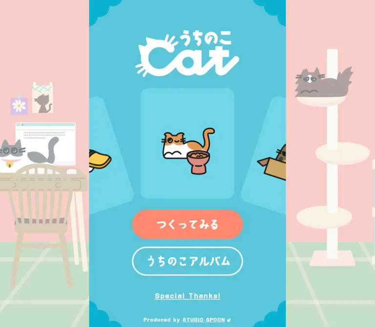
ターコイズの画面に手描き風の猫と丸いボタンを配置した似顔絵メーカー。デスクトップでは和室のイラストが中央の操作画面を囲み、モバイルでは画面全体がシンプルな入口になります。
オリジナルサイトを見るうちのこcat — Style Reference
A playful cat portrait maker presented as a small illustrated world, with a turquoise menu at its center.
Original URL: https://www.uchinoko-cat.com/ Final URL: https://www.uchinoko-cat.com/ Theme: bright turquoise interface with white lettering, coral emphasis, and pastel room illustrations. Inspected evidence: September 13, 2026, Japan Standard Time. The supplied observation batch was retrieved on September 12, 2026, at 16:49:49.654 UTC, equivalent to September 13 at 01:49:49.654 JST. Individual screenshot timestamps were not supplied. Viewports: desktop 1440 × 1000 and mobile 390 × 844 CSS pixels. Scope: the current homepage entry screen, including its illustrated wordmark, cat-preview composition, navigation links, desktop room scenery, and production footer. The editor, album, and acknowledgements destinations were not inspected.
The homepage is a single-screen entrance to a cat portrait maker. Its hierarchy is unusually economical: a large illustrated logo, a cat preview, two rounded navigation buttons, an acknowledgements link, and a small production credit. There is no explanatory paragraph competing with the artwork. The cats and domestic setting establish the subject immediately.
On desktop, a 600px-wide turquoise panel sits inside a much wider illustrated Japanese room. On mobile, the same turquoise surface fills the available width. White lettering and a coral primary button remain clear visual landmarks in both compositions. Rounded handwritten characters, scalloped corner decorations, and irregular cat outlines give the screen a friendly, lightly mischievous character.
How to Read This Reference
- Measured means a value appears in the supplied rendered DOM or computed-style evidence. Element coordinates and dimensions are CSS pixels.
- Calculated means a relationship was derived from those measured values. Equivalent unit values do not establish the original stylesheet syntax.
- Estimated means an approximate visual reading of the supplied original-page screenshots. The cyan and illustration colors below were not extracted with a pixel sampler.
- Recommended means implementation guidance for an adaptation. These additions are not verified features of the original website.
- Named tokens are descriptive aliases introduced here, not recovered source variable names.
- Only the homepage was observed. A visible link establishes its destination, but does not establish the behavior or appearance of the destination page.
The evidence includes a large collection of generic color, shadow, spacing, and duration variables. Their presence does not show that the visible homepage uses them. This reference prioritizes rendered components and their applied styles.
Tokens — Colors
Interface Palette
| Name | Value | Suggested token | Evidence and role |
|---|---|---|---|
| Turquoise Canvas | Approximately #59C3D6 |
--cat-canvas |
Visual estimate of the dominant central panel; use as a reconstruction starting point |
| Light Cyan Preview | Approximately #6BD0E0 |
--cat-tile |
Visual estimate of the central and partially visible preview tiles |
| Scallop Cyan | Approximately #08AEC8 |
--cat-scallop |
Visual estimate of the stronger cyan corner ornaments |
| Action Coral | #FF896E |
--cat-coral |
Measured primary-link background, computed as rgb(255, 137, 110) |
| Interface White | #FFFFFF |
--cat-white |
Measured link and footer text; also visibly used by the wordmark and secondary outline |
| Cat Outline | Approximately #252824 |
--cat-ink |
Visual estimate of the dark foreground illustration strokes; not the general interface text color |
The panel, preview tiles, and corner ornaments form three related cyan levels. The coral button is the only large warm accent inside the central interface. Keep that division of labor: the background supports the characters, while coral identifies the most prominent navigation action.
The measured HTML and body backgrounds are transparent. The supplied element sample does not expose the wrapper or artwork responsible for the turquoise field, so its exact CSS color remains unverified.
Desktop Illustration Palette
These are visual estimates for the current room artwork, not measured brand colors.
| Name | Approximate value | Role |
|---|---|---|
| Warm Wall | #F8EFE0 |
Large quiet wall areas |
| Pale Timber | #EBD5AA |
Sliding-door frames and wood details |
| Tatami Green | #D0DDB6 |
Broad floor planes |
| Tatami Seam | #9BC69A |
Floor divisions and green trim |
| Muted Beam | #B0A0A0 |
Structural framing and muted background cats |
| Cushion Lavender | #D7C1E6 |
Small domestic accent at the lower right |
The scenery is less saturated and less sharply outlined than the active cat preview. This contrast establishes depth without a shadow-based elevation system.
Tokens — Typography
Rounded Handwritten Interface
- Measured family:
ab-kokoro-no3, sans-serifon the body, heading container, navigation links, and footer elements. - Measured weight:
400throughout the sampled interface. - Character: rounded, irregular, handwritten-looking Japanese forms with friendly Latin lettering.
- Role: makes the navigation feel continuous with the illustration style.
- Limit: the computed family declaration is available, but font files, licensing, and independent font-loading verification were not supplied.
The apparent thickness of the letters should not be reproduced by automatically changing the weight to 700. The sampled controls use regular weight. Their character comes from the font design and large size.
Wordmark
The white wordmark combines the Japanese name with a large stylized Latin cat motif. Its broad curves, ear-like projections, and whisker strokes are artwork, not a heading typeset in the body font.
The sampled H1 has no extracted text and spans the panel width. That does not establish whether the original logo has an accessible image alternative. Preserve the graphic silhouette and provide an accessible name in an implementation.
Type Scale
For comparison, 1u equals the measured root font size: 15px on desktop and 10.4px on mobile. These values describe the two observed layouts; the original responsive formula was not supplied.
| Role | Calculated size | Desktop size / line height | Mobile size / line height | Tracking |
|---|---|---|---|---|
| HTML root | 1u |
15 / 22.5px |
10.4 / 15.6px |
Normal |
| Body baseline | 1.6u |
24 / 36px |
16.64 / 24.96px |
Normal |
| Primary and album links | 2.4u |
36 / 54px |
24.96 / 37.44px |
-0.1em |
| Acknowledgements link | 1.4u |
21 / 31.5px |
14.56 / 21.84px |
Normal |
| Production paragraph container | 1.6u |
24 / 36px |
16.64 / 24.96px |
Normal |
| Company-name link | 1u |
15 / 22.5px |
10.4 / 15.6px |
Normal |
The production paragraph's inherited font size is larger than the measured company-name link inside it. Do not use the paragraph's 24px desktop size for every visible footer character. The screenshot shows a small production line, and the nested link is explicitly measured at 15px.
The two main labels have measured letter spacing of -3.6px on desktop and -2.496px on mobile. Both equal -0.1em. Other sampled links have normal tracking; their visibly spaced appearance should not be treated as proof of a positive letter-spacing rule.
Tokens — Spacing & Shapes
Scaling Relationship
Most measured interface dimensions follow the root-size ratio:
10.4 / 15 ≈ 0.6933.
The central panel follows a different width ratio:
390 / 600 = 0.65.
Consequently, uniformly scaling a 600px desktop composition down to 390px would make the controls slightly too small. Preserve an independently sized panel and interface unit.
A recommended approximation for the two observed sizes is:
--u: min(15px, 2.6666667vw);
This produces 15px at the desktop viewport and 10.4px at 390px. It is an adaptation formula, not a recovered source declaration. Behavior between or beyond the supplied viewports remains unverified.
Measured Spacing
Values are rounded to two decimals where appropriate.
| Relationship | Desktop | Mobile | Calculated equivalent |
|---|---|---|---|
| Panel top to heading container | 93px |
64.47px |
Approximately 6.2u |
| Main-link horizontal padding | 19.5px |
13.52px |
1.3u |
| Main-link vertical padding | 13.5px |
9.36px |
0.9u |
| Gap between main links | 22.5px |
15.59px |
Approximately 1.5u |
| Album-link bottom to acknowledgements box | 45px |
31.19px |
Approximately 3u |
| Acknowledgements box bottom to production paragraph | 37.5px |
26px |
2.5u |
| Production paragraph bottom to viewport bottom | 7.5px |
5.19px |
Approximately 0.5u |
Shapes
| Element | Evidence | Implementation guidance |
|---|---|---|
| Primary and secondary controls | Measured radii of 1440px desktop and 844px mobile |
Both render as full pills; 9999px is a practical equivalent |
| Main control outline | White secondary outline visible at approximately 4px desktop and 3px mobile | Source border declarations were not included |
| Preview tile | Visually about 24px desktop and 17px mobile corner radius | Start near 1.6u; estimate only |
| Panel | Straight vertical edges, no visible enclosing border | Keep the panel flush with the viewport top and bottom |
| Corner ornaments | Flat scalloped cyan silhouettes | Use artwork or a deliberate shape treatment rather than a rounded panel container |
| Illustration linework | Rounded, uneven dark strokes | Preserve variation in the drawings instead of imposing a uniform UI stroke width |
The main-link box height exceeds its line height plus vertical padding by approximately 8px on desktop and 6px on mobile. That is consistent with roughly 4px and 3px per vertical edge, respectively. It supports a shared border allowance for both buttons, but does not prove the original primary link uses a transparent border.
Layout Measurements
| Element | Desktop 1440 × 1000 | Mobile 390 × 844 | Evidence |
|---|---|---|---|
| Document height | 1000px |
844px |
Measured |
| Central panel | 600px wide, beginning at x = 420 |
Full width, beginning at x = 0 |
Desktop heading/footer bounds plus screenshot; mobile bounds |
| Heading container | 600 × 143.03px, y = 93 |
390 × 99.16px, y = 64.47 |
Measured |
| Visible wordmark width | About 318px |
About 221px |
Screenshot estimate; not the heading-box width |
| Central preview tile | About 285 × 338px, near x = 578, y = 270 |
About 198 × 234px, near x = 96, y = 262 |
Screenshot estimate |
| Primary link | 337.5 × 89px, x = 551.25, y = 642 |
234 × 62.14px, x = 78, y = 594.95 |
Measured |
| Album link | 337.5 × 89px, y = 753.5 |
234 × 62.14px, y = 672.69 |
Measured |
| Acknowledgements link | 200.52 × 31.5px, y = 887.5 |
139.03 × 21.84px, y = 766.02 |
Measured |
| Production paragraph | 600 × 36px, y = 956.5 |
390 × 24.95px, y = 813.86 |
Measured |
Components
Illustrated Desktop Surround
Role: establishes a domestic world around the application menu.
The current desktop scene includes pale walls, a hanging scroll, a low covered table, tatami flooring, sliding panels, a cushion, and several cats integrated into the room. Large architectural shapes carry most of the composition. The decorative cats are quieter in contrast than the central preview.
At 1440px wide, the central panel leaves 420px of scene visible on each side. The panel covers the middle of the room without a bezel, floating shadow, or gap around its edges.
On the supplied phone screenshots, no surrounding room is visible. The evidence establishes the visual result, but does not reveal whether the scenery is hidden by a media query, covered by the full-width panel, or positioned outside the viewport.
Central Application Panel
Role: contains the complete homepage navigation hierarchy.
A solid turquoise vertical surface runs from the top to the bottom of the viewport. Its order is wordmark, flexible preview area, primary link, secondary link, acknowledgements link, and production line. Stronger cyan scallops decorate all four corners.
This is the homepage itself, not a transient loading splash. Both supplied viewport documents are exactly one viewport tall, and the supplied captures expose the same navigation hierarchy without an additional content section.
Graphic Wordmark
Role: gives the screen its identity before any explanatory copy is needed.
Center the white artwork near the top. The visible logo is approximately 318px wide on desktop and 221px on mobile. Its measured heading container is wider than the artwork, so avoid stretching the logo to the full 600px desktop panel width.
The source name and cat-shaped lettering should remain a single coherent composition. Replacing the graphic with ordinary text would lose the ear, whisker, and flowing letter details.
Cat Preview Composition
Role: demonstrates the visual character of the portrait maker.
An upright, lighter-cyan rounded tile sits at the center. Neighboring tiles enter from both sides at an angle and are clipped by the panel boundary. Their partial visibility suggests a sequence of examples. No visible arrow buttons or pagination dots appear in the supplied frames.
The desktop active example is a reclining patterned cat with heart-shaped green eyewear. The mobile active example is a pale, fluffy cat with blue eyes and a pink ribbon-like prop. The characters have dark, irregular outlines and substantial transparent space around them.
The active tile is approximately 19u × 22.5u. Adjacent tiles appear tilted by roughly 18 degrees; this is a visual estimate, not a measured transform. Their exact grouping, transforms, and positioning were not exposed in the DOM sample.
The desktop and mobile images show different examples. That difference does not prove automatic rotation or a responsive rule that swaps cats. Treat the supplied images as two observed preview states.
Visible character size varies by composition. The desktop active drawing occupies roughly half the tile width, while the mobile fluffy-cat composition occupies closer to four fifths. Preserve intentional transparent margins and prop proportions rather than forcing every animal silhouette into an identical bounding box.
Primary Navigation Link
Label: つくってみる
Observed destination: https://www.uchinoko-cat.com/edit/
This is a semantic anchor styled as a large coral pill. Center its white handwritten label, use regular weight, and retain the measured negative tracking. Its width is 22.5u: 337.5px desktop and 234px mobile.
The mobile control occupies 60% of the panel width, while the desktop control occupies 56.25%. A universal width: 60% would therefore miss the measured desktop geometry.
The label and URL identify the creation entry point. The editing interface, available choices, and resulting output were not observed.
Album Navigation Link
Label: うちのこアルバム
Observed destination: https://www.uchinoko-cat.com/gallery/
Use the same width, height, typography, and pill silhouette as the primary link. Its fill is transparent, allowing the turquoise panel to show through. The white outline supplies the secondary hierarchy.
The two links form a consistent vertical pair, separated by approximately 1.5u. The album's contents, ownership model, and persistence behavior are unverified.
Acknowledgements Link
Label: Special Thanks!
Observed destination: https://www.uchinoko-cat.com/credits/
A centered white text link with an underline, placed 3u below the album link. Its 1.4u text size makes it visibly subordinate to the two main actions without introducing a different font style.
Keep it unboxed. The destination page was not inspected, so no modal, transition, or credits-page design can be inferred from this link.
Production Footer
Observed text: Produced by STUDIO SPOON
The small centered production line sits near the panel's bottom edge. The company name is underlined and links to https://studio-spoon.co.jp/. A tiny external-link-style mark is visible beside it; the browsing target behavior was not supplied.
The homepage independently supports this production attribution. It does not establish individual production roles in the supplied evidence.
Scalloped Corner Ornaments
Role: soften the rectangular stage and repeat the rounded visual language.
Darker cyan lobes enter inward from each corner. The upper ornaments visually bracket the wordmark; the lower pair bracket the production line. Their approximate extent is 103 × 84px on desktop and 72 × 58px on mobile.
Keep these shapes flat and behind the content. Their silhouettes matter more than adding depth or texture.
Tokens — Motion & Interaction
| Element or behavior | Evidence | What can be concluded |
|---|---|---|
| Main navigation | Four anchors with explicit destinations | Link targets are verified; destination interfaces were not exercised |
| Preview sequence | Central tile and angled neighboring tiles | Carousel-like composition is visible; input and playback behavior are unverified |
| Different active cats | Desktop and mobile show different examples | Multiple preview states exist in the supplied evidence; their cause is unknown |
| Sampled text and links | Computed animation: none |
No CSS animation is reported for those sampled elements |
| Sampled transitions | Evidence reports transition: all without useful timing |
No duration, easing, or visible transition can be established |
| Generic duration variables | Values such as .2s and .4s are present |
Their use by any visible homepage component is unverified |
| Initial readiness process | Observation lasted at least five seconds; perpetual animations were paused during readiness checks and resumed | Captures are settled observations, not a motion recording |
| Hover, keyboard focus, swipe, drag, autoplay, and route transitions | No exercised-state evidence supplied | Treat all as unverified |
Do not derive an animation specification from repeated still captures. The sampled elements also omit the preview track and most illustration nodes, so animation: none on text links does not establish that the entire page is static.
Recommended adaptation: start with a static preview arrangement. If a changing sequence is needed, implement explicit controls, a pause mechanism where appropriate, and reduced-motion behavior. A brief 140ms press response with a scale near 0.98 is a reasonable optional button treatment, but is not an observed source value.
Surfaces
| Layer | Appearance | Purpose |
|---|---|---|
| Desktop room | Muted flat illustration with pale architectural planes | Establishes the cat's domestic setting |
| Central panel | Continuous turquoise fill | Groups all navigation and identity elements |
| Preview tiles | Slightly lighter cyan with rounded corners | Frames individual cat compositions |
| Foreground cats | Dark irregular linework and restrained color fills | Supplies personality and visual detail |
| Primary action | Coral pill with white text | Gives the creation entry point the strongest emphasis |
| Secondary action | Transparent pill with white outline | Offers a clear parallel destination with less emphasis |
| Supporting links | White underlined text | Keeps secondary navigation lightweight |
| Corner ornaments | Stronger cyan scallops | Adds decorative framing without elevation |
No shadow or glass treatment is visible on the central UI surfaces. Separation comes from flat color changes, clipping, whitespace, and illustration contrast.
Imagery
The artwork uses simple silhouettes, rounded corners, short whisker strokes, small expressive eyes, and uneven dark outlines. Foreground cats can look sleepy, unimpressed, curious, or comically adorned. Their small props contribute to each composition without becoming detailed still-life scenes.
The current desktop environment is a Japanese room. The hanging scroll, tatami seams, sliding panels, and low covered table provide specific domestic cues. Preserve their broad, muted shapes so the scenery remains supportive of the turquoise interface.
The foreground and background use different levels of emphasis. Central cats have strong dark outlines. Background cats and architectural details use softer, lower-contrast colors. Applying equally dark outlines to every background object would flatten this hierarchy.
No photography is visible in the inspected homepage captures. The artwork appears smoothly rendered rather than deliberately pixelated. Preserve its aspect ratios and rounded line quality; do not introduce image-rendering: pixelated.
Observed Asset References
No image source URLs or file formats were included in the supplied DOM evidence. The following are visual asset roles, not invented file paths.
| Asset role | Observed content | Implementation requirement |
|---|---|---|
| Wordmark | White Japanese/Latin cat-shaped logo | Use authorized artwork with an accessible name |
| Active desktop preview | Reclining patterned cat with green heart eyewear | Preserve the small visible silhouette within a larger tile |
| Active mobile preview | Fluffy pale cat, blue eyes, and pink prop | Preserve the wider composition and irregular fur outline |
| Neighboring previews | Partial cats and props on angled cyan tiles | Retain intentional panel-edge clipping |
| Desktop room | Tatami, sliding panels, scroll, covered table, cushion, and cats | Use coordinated illustration rather than unrelated decorative assets |
| Corner decorations | Four stronger-cyan scalloped shapes | Keep crisp, flat edges and corner anchoring |
| Footer mark | Small external-link-style symbol | Keep secondary to the tiny production text |
CSS can reproduce the layout and controls. Accurate character, logo, and room reproduction requires appropriate artwork; their source files were not supplied.
Layout & Responsive Behavior
The desktop and mobile screenshots share one vertical hierarchy. The room surrounds the panel on desktop, while the phone dedicates its entire width to the turquoise interface. There is no observed mobile navigation replacement or alternate text hierarchy.
The most useful layout relationship is the flexible space between the wordmark and the action group. On desktop, the central preview tile starts about 34px below the heading container and finishes about 34px above the primary link. On mobile, those clearances are approximately 99px and 98px. The tile therefore appears centered within the remaining vertical space rather than attached to the logo with a constant margin.
The lower navigation stack is more stable. Its measured gaps scale with the root size, and the production paragraph ends approximately 0.5u above the viewport bottom in both views. A practical reconstruction uses a column layout with a sized wordmark, a flexible preview region, and a compact lower navigation group.
The primary link starts at y = 642px on desktop and y ≈ 594.95px on mobile. Those are different percentages of viewport height. A single absolute top percentage would not accurately reproduce both arrangements.
Observed limits: only 1440 × 1000 and 390 × 844 were supplied. Tablet widths, landscape phones, browser zoom, safe-area behavior, short viewports, and dynamic browser-toolbar resizing were not tested. Generic breakpoint variables in the evidence do not identify the breakpoint that controls the room or panel.
Recommended adaptation: cap the panel at 600px, let it fill narrower viewports, and allow the page to become taller on short screens. Preserve access to all links instead of clipping the lower menu to enforce a single-screen composition.
Do’s and Don’ts
Do
- Keep the homepage focused on the wordmark, cat preview, and two primary navigation destinations.
- Preserve the 600px desktop panel and full-width mobile presentation.
- Use the measured coral
#FF896Efor the primary link. - Maintain three related cyan levels for canvas, preview tiles, and corner decoration.
- Use
ab-kokoro-no3, sans-serifwhen the appropriate font is available and authorized. - Retain regular weight and
-0.1emtracking on the two main labels. - Keep both main controls the same size, with solid and outlined treatments.
- Let the preview occupy the flexible space between the logo and lower menu.
- Preserve the partial, tilted neighboring tiles and intentional edge clipping.
- Keep the desktop scenery muted and the foreground cats more sharply outlined.
- Treat transparent space around each cat as part of its composition.
Don’t
- Don’t expand the screen into a generic sequence of promotional sections.
- Don’t scale the entire desktop panel uniformly to produce the mobile layout.
- Don’t stretch the graphic logo to the full width of its heading container.
- Don’t replace the handwritten interface with an arbitrary bold rounded font and assume it is equivalent.
- Don’t add shadows, glass panels, or glossy treatments to the flat cyan surfaces.
- Don’t make the album link another coral-filled action.
- Don’t use every generic color or shadow variable found in the DOM as a design token.
- Don’t assume the preview autoplays, accepts swipes, or changes cats at a breakpoint.
- Don’t infer editor functionality, album persistence, or credits-page contents from their navigation labels.
- Don’t mistake screenshot color estimates for recovered CSS values.
Recommended Implementation Additions
These recommendations extend the observed design; they are not verified original-site features.
- Give the graphic wordmark an accessible name. The empty extracted heading text alone is insufficient to assess the original accessibility implementation.
- Keep navigation as semantic anchors and add a clearly visible dark focus outline.
- Address contrast deliberately. White on the measured coral fill is approximately 2.3:1, calculated from
#FFFFFFand#FF896E, below the 3:1 threshold for large text. Dark lettering or an adjusted fill can provide an accessible adaptation. Test white text against the final, verified cyan color as well. - Increase very small supporting text where readability is more important than exact proportions. The measured mobile company link is only 10.4px.
- Let increased text size and short viewport heights produce page scrolling without hiding controls.
- Keep decorative room art and corner ornaments out of the accessibility tree. Give meaningful previews useful text alternatives if they convey information beyond decoration.
- If preview navigation is added, expose keyboard-operable controls and clear state. Avoid making visual movement the only way to discover examples.
- Respect reduced motion and provide control over any automatically changing preview sequence.
- Add safe-area clearance for supported devices, then check the lower production line against actual browser chrome.
Agent Prompt Guide
Quick Color Reference
- Central canvas: approximately
#59C3D6; verify against original assets for close reproduction. - Preview tiles: approximately
#6BD0E0. - Scalloped corners: approximately
#08AEC8. - Primary action: measured
#FF896E. - Interface labels and secondary outline: measured
#FFFFFF. - Foreground cat linework: approximately
#252824. - Desktop surround: muted cream, pale timber, tatami green, and small lavender accents.
Overall Prompt
“Create a homepage entry screen for a playful Japanese cat portrait maker. Center a turquoise panel capped at 600px inside a muted illustrated Japanese room on desktop; let the panel fill a narrow phone viewport. Place a white cat-shaped wordmark near the top, a lighter-cyan portrait tile in the flexible middle area, and partial tilted preview tiles clipped at either side. Use expressive flat cat illustrations with irregular dark outlines and generous transparent space. Near the bottom, stack a coral pill labeled ‘つくってみる’, a matching white-outlined pill labeled ‘うちのこアルバム’, an underlined ‘Special Thanks!’ link, and a small production line. Use regular-weight handwritten typography, darker cyan scalloped corner ornaments, and flat surfaces. Preserve the spacious mobile preview area and keep unsupported carousel behavior configurable.”
Example Component Prompts
- Navigation pair: “Create two equal-width pill links. Use a
22.5uwidth,2.4uregular handwritten type,1.5line height, and-0.1emtracking. Fill the first with#FF896E; leave the second transparent with a white outline. Separate them by1.5u. Use the exact labels ‘つくってみる’ and ‘うちのこアルバム’.” - Cat preview: “Arrange an upright light-cyan rounded tile approximately
19u × 22.5uin the center, with tilted neighboring tiles entering from the sides. Clip the outer tiles at the turquoise panel boundary. Keep the cat illustration uncropped, with asset-specific transparent margins. Build a static composition first; motion timing is not specified.” - Desktop scenery: “Draw a quiet pastel Japanese room around a central application panel. Include tatami flooring, sliding panels, a hanging scroll, a low covered table, a cushion, and a few resting cats. Use pale cream, muted timber, soft greens, and restrained lavender. Keep background outlines softer than those of the main cat preview.”
- Responsive shell: “Use a centered panel capped at 600px, with an independently scaled UI unit. Match 15px per unit on a 1440px desktop and 10.4px on a 390px phone. Keep the logo near the top and the link stack near the bottom. Center the preview within the space remaining between them, allowing more breathing room on the tall phone.”
- Supporting footer: “Place a centered underlined ‘Special Thanks!’ link
3ubelow the outlined album control. Follow it with a small production line after2.5u. Keep the typography in the same handwritten family and use a subtle external-link mark beside the company link.”
Quick Start
CSS Custom Properties
This adaptation matches the measured interface scale and lower-stack spacing at the two supplied viewports. The cyan colors, tile radius, adjacent-card transforms, and corner dimensions are estimates. The minimum page height and press feedback are recommended additions.
Use a conventional root font size for the surrounding application. All reconstruction dimensions below use an explicit --u, so they do not depend on changing the document root to 15px or 10.4px.
The expected structure is .home-shell containing .home-brand, .portrait-stage, .home-actions, .thanks-link, and .home-credit, in that order. Place the corner images absolutely inside the shell. The preview stage contains three .portrait-card elements, each with a .portrait-art image. Use actual authorized image sources; none were exposed by the supplied evidence.
:root {
  /* Exact measured interface colors */
  --cat-coral: #ff896e;
  --cat-white: #ffffff;

  /* Visual estimates for reconstruction */
  --cat-canvas: #59c3d6;
  --cat-tile: #6bd0e0;
  --cat-scallop: #08aec8;
  --cat-ink: #252824;
  --cat-room: #f8efe0;

  /* Observed family; load an authorized font separately */
  --font-cat: 'ab-kokoro-no3', sans-serif;

  /* Two-viewport approximation, not recovered source CSS */
  --u: min(15px, 2.6666667vw);
  --panel-width: 600px;
  --preview-width: calc(19 * var(--u));
  --preview-height: calc(22.5 * var(--u));
  --control-width: calc(22.5 * var(--u));
  --preview-offset: calc(23.3 * var(--u));

  /* Recommended feedback timing */
  --press-transition: 140ms ease-out;
}

* {
  box-sizing: border-box;
}

body {
  margin: 0;
  background: var(--cat-room);
}

.room-scene {
  position: fixed;
  inset: 0;
  pointer-events: none;
  background-color: var(--cat-room);
  /* Set --room-art to an authorized image URL in your project. */
  background-image: var(--room-art, none);
  background-position: center;
  background-size: cover;
}

.home-shell {
  position: relative;
  z-index: 1;
  isolation: isolate;
  display: flex;
  flex-direction: column;
  align-items: center;
  inline-size: min(100%, var(--panel-width));
  block-size: 100svh;
  /* Recommended overflow allowance for short viewports. */
  min-block-size: calc(65 * var(--u));
  margin-inline: auto;
  padding-block: calc(6.2 * var(--u)) calc(0.5 * var(--u));
  overflow-x: clip;
  color: var(--cat-white);
  background: var(--cat-canvas);
  font-family: var(--font-cat);
  font-size: calc(1.6 * var(--u));
  font-weight: 400;
  line-height: 1.5;
}

@supports (height: 100dvh) {
  .home-shell {
    block-size: 100dvh;
  }
}

.home-brand {
  position: relative;
  z-index: 1;
  display: grid;
  place-items: center;
  flex: none;
  inline-size: 100%;
  block-size: calc(9.535 * var(--u));
  margin: 0;
}

.home-brand img {
  display: block;
  inline-size: calc(21.25 * var(--u));
  max-inline-size: 90%;
  block-size: 100%;
  object-fit: contain;
}

.portrait-stage {
  position: relative;
  z-index: 1;
  align-self: stretch;
  flex: 1 0 calc(24.5 * var(--u));
  min-block-size: calc(24.5 * var(--u));
}

.portrait-card {
  position: absolute;
  top: 50%;
  left: 50%;
  display: grid;
  place-items: center;
  inline-size: var(--preview-width);
  block-size: var(--preview-height);
  border-radius: calc(1.6 * var(--u));
  background: var(--cat-tile);
  transform: translate(-50%, -50%);
}

.portrait-art {
  display: block;
  /* Adjust per composition; visible cat sizes differ. */
  inline-size: var(--portrait-art-width, 75%);
  max-block-size: 70%;
  block-size: auto;
  object-fit: contain;
}

/* Static side-card reconstruction from screenshot estimates. */
.portrait-card--previous {
  top: calc(50% + 3 * var(--u));
  left: calc(50% - var(--preview-offset));
  transform: translate(-50%, -50%) rotate(-18deg);
}

.portrait-card--next {
  top: calc(50% + 3 * var(--u));
  left: calc(50% + var(--preview-offset));
  transform: translate(-50%, -50%) rotate(18deg);
}

.home-actions {
  position: relative;
  z-index: 1;
  display: grid;
  flex: none;
  gap: calc(1.5 * var(--u));
  inline-size: min(
    var(--control-width),
    calc(100% - 2 * var(--u))
  );
}

.home-action {
  display: block;
  padding: calc(0.9 * var(--u)) calc(1.3 * var(--u));
  /* Approximation of the visible border and measured box allowance. */
  border: calc(0.3 * var(--u)) solid var(--cat-white);
  border-radius: 9999px;
  color: var(--cat-white);
  background: transparent;
  font-family: inherit;
  font-size: calc(2.4 * var(--u));
  font-weight: 400;
  line-height: 1.5;
  letter-spacing: -0.1em;
  text-align: center;
  text-decoration: none;
  white-space: nowrap;
  transition: transform var(--press-transition);
}

.home-action--primary {
  border-color: var(--cat-coral);
  background: var(--cat-coral);
}

.thanks-link {
  position: relative;
  z-index: 1;
  display: block;
  flex: none;
  margin-block-start: calc(3 * var(--u));
  color: inherit;
  font-size: calc(1.4 * var(--u));
  line-height: 1.5;
  text-decoration: underline;
}

.home-credit {
  position: relative;
  z-index: 1;
  align-self: stretch;
  flex: none;
  margin: calc(2.5 * var(--u)) 0 0;
  font-size: calc(1.6 * var(--u));
  line-height: 1.5;
  text-align: center;
}

.home-credit small {
  font-size: calc(1 * var(--u));
  line-height: 1.5;
}

.home-credit a {
  color: inherit;
  text-decoration: underline;
}

/* Use a supplied upper-left corner asset and mirror as needed. */
.corner-art {
  position: absolute;
  z-index: 0;
  inline-size: calc(6.9 * var(--u));
  block-size: calc(5.6 * var(--u));
  object-fit: contain;
  pointer-events: none;
}

.corner-art--top-left {
  top: 0;
  left: 0;
}

.corner-art--top-right {
  top: 0;
  right: 0;
  transform: scaleX(-1);
}

.corner-art--bottom-left {
  bottom: 0;
  left: 0;
  transform: scaleY(-1);
}

.corner-art--bottom-right {
  bottom: 0;
  right: 0;
  transform: rotate(180deg);
}

/* Recommended keyboard and press feedback. */
.home-shell a:focus-visible {
  outline: 3px solid var(--cat-ink);
  outline-offset: 4px;
}

.home-action:active {
  transform: scale(0.98);
}

@media (prefers-reduced-motion: reduce) {
  .home-action {
    transition: none;
  }

  .home-action:active {
    transform: none;
  }
}
The border approximation can produce fractional rounding differences between browsers. Compare the final rendered link boxes against the measured 89px and 62.14px heights after loading the actual font.
For the footer, place the small production text and company anchor inside the .home-credit paragraph using a small element. This preserves the distinction between its larger paragraph line box and smaller visible text.
The room layer naturally becomes covered when the central panel fills the viewport width. This reproduces the two supplied visual outcomes without claiming to recover the original scenery breakpoint.
Tailwind v4 Token Mapping
Optional aliases for a project already using Tailwind v4. Define the properties above first. This mapping does not identify the framework used by the original website.
@theme inline {
  --color-cat-canvas: var(--cat-canvas);
  --color-cat-tile: var(--cat-tile);
  --color-cat-scallop: var(--cat-scallop);
  --color-cat-coral: var(--cat-coral);
  --color-cat-white: var(--cat-white);
  --color-cat-ink: var(--cat-ink);

  --font-cat-ui: var(--font-cat);

  --text-cat-action: calc(2.4 * var(--u));
  --text-cat-thanks: calc(1.4 * var(--u));
  --text-cat-credit: calc(1 * var(--u));

  --spacing-cat-unit: var(--u);
  --spacing-cat-control: calc(22.5 * var(--u));
  --spacing-cat-preview: calc(19 * var(--u));

  --radius-cat-tile: calc(1.6 * var(--u));
  --radius-cat-pill: 9999px;
}
Sources & Evidence
- Original and final website: https://www.uchinoko-cat.com/. The supplied browser observation reports HTTP 200 and an unchanged final URL.
- Observation date: batch retrieved September 12, 2026, at 16:49:49.654 UTC, or September 13, 2026, at 01:49:49.654 JST. Separate timestamps for each capture were not provided.
- Desktop evidence: three supplied original-page captures at 1440 × 1000, with rendered element bounds and computed typography, colors, spacing, and link destinations. Reported document height: 1000px.
- Mobile evidence: two supplied original-page captures at 390 × 844, with corresponding DOM and computed-style observations. Reported document height: 844px.
- Observed navigation destinations:
/edit/,/gallery/, and/credits/on the original website, plus the studio link in the homepage production footer. These were identified from anchors; their destination pages were not inspected. - Inspection limits: no motion recording, exercised hover or focus states, preview interaction tests, full stylesheet, image source paths, or additional viewport sizes were supplied. Settled capture checks do not prove that delayed content or unexercised interactions are absent. Shared workers and service workers were disabled during the supplied inspection.
This reference analyzes the supplied current-page evidence. Measured values, visual estimates, calculated relationships, and recommended implementation choices are identified separately throughout.
# うちのこcat — Style Reference

> A playful cat portrait maker presented as a small illustrated world, with a turquoise menu at its center.

**Original URL:** [https://www.uchinoko-cat.com/](https://www.uchinoko-cat.com/)
**Final URL:** [https://www.uchinoko-cat.com/](https://www.uchinoko-cat.com/)
**Theme:** bright turquoise interface with white lettering, coral emphasis, and pastel room illustrations.
**Inspected evidence:** September 13, 2026, Japan Standard Time. The supplied observation batch was retrieved on September 12, 2026, at 16:49:49.654 UTC, equivalent to September 13 at 01:49:49.654 JST. Individual screenshot timestamps were not supplied.
**Viewports:** desktop 1440 × 1000 and mobile 390 × 844 CSS pixels.
**Scope:** the current homepage entry screen, including its illustrated wordmark, cat-preview composition, navigation links, desktop room scenery, and production footer. The editor, album, and acknowledgements destinations were not inspected.

The homepage is a single-screen entrance to a cat portrait maker. Its hierarchy is unusually economical: a large illustrated logo, a cat preview, two rounded navigation buttons, an acknowledgements link, and a small production credit. There is no explanatory paragraph competing with the artwork. The cats and domestic setting establish the subject immediately.

On desktop, a 600px-wide turquoise panel sits inside a much wider illustrated Japanese room. On mobile, the same turquoise surface fills the available width. White lettering and a coral primary button remain clear visual landmarks in both compositions. Rounded handwritten characters, scalloped corner decorations, and irregular cat outlines give the screen a friendly, lightly mischievous character.

## How to Read This Reference

- **Measured** means a value appears in the supplied rendered DOM or computed-style evidence. Element coordinates and dimensions are CSS pixels.
- **Calculated** means a relationship was derived from those measured values. Equivalent unit values do not establish the original stylesheet syntax.
- **Estimated** means an approximate visual reading of the supplied original-page screenshots. The cyan and illustration colors below were not extracted with a pixel sampler.
- **Recommended** means implementation guidance for an adaptation. These additions are not verified features of the original website.
- **Named tokens** are descriptive aliases introduced here, not recovered source variable names.
- Only the homepage was observed. A visible link establishes its destination, but does not establish the behavior or appearance of the destination page.

The evidence includes a large collection of generic color, shadow, spacing, and duration variables. Their presence does not show that the visible homepage uses them. This reference prioritizes rendered components and their applied styles.

## Tokens — Colors

### Interface Palette

| Name | Value | Suggested token | Evidence and role |
| --- | --- | --- | --- |
| Turquoise Canvas | Approximately `#59C3D6` | `--cat-canvas` | Visual estimate of the dominant central panel; use as a reconstruction starting point |
| Light Cyan Preview | Approximately `#6BD0E0` | `--cat-tile` | Visual estimate of the central and partially visible preview tiles |
| Scallop Cyan | Approximately `#08AEC8` | `--cat-scallop` | Visual estimate of the stronger cyan corner ornaments |
| Action Coral | `#FF896E` | `--cat-coral` | Measured primary-link background, computed as `rgb(255, 137, 110)` |
| Interface White | `#FFFFFF` | `--cat-white` | Measured link and footer text; also visibly used by the wordmark and secondary outline |
| Cat Outline | Approximately `#252824` | `--cat-ink` | Visual estimate of the dark foreground illustration strokes; not the general interface text color |

The panel, preview tiles, and corner ornaments form three related cyan levels. The coral button is the only large warm accent inside the central interface. Keep that division of labor: the background supports the characters, while coral identifies the most prominent navigation action.

The measured HTML and body backgrounds are transparent. The supplied element sample does not expose the wrapper or artwork responsible for the turquoise field, so its exact CSS color remains unverified.

### Desktop Illustration Palette

These are visual estimates for the current room artwork, not measured brand colors.

| Name | Approximate value | Role |
| --- | --- | --- |
| Warm Wall | `#F8EFE0` | Large quiet wall areas |
| Pale Timber | `#EBD5AA` | Sliding-door frames and wood details |
| Tatami Green | `#D0DDB6` | Broad floor planes |
| Tatami Seam | `#9BC69A` | Floor divisions and green trim |
| Muted Beam | `#B0A0A0` | Structural framing and muted background cats |
| Cushion Lavender | `#D7C1E6` | Small domestic accent at the lower right |

The scenery is less saturated and less sharply outlined than the active cat preview. This contrast establishes depth without a shadow-based elevation system.

## Tokens — Typography

### Rounded Handwritten Interface

- **Measured family:** `ab-kokoro-no3, sans-serif` on the body, heading container, navigation links, and footer elements.
- **Measured weight:** `400` throughout the sampled interface.
- **Character:** rounded, irregular, handwritten-looking Japanese forms with friendly Latin lettering.
- **Role:** makes the navigation feel continuous with the illustration style.
- **Limit:** the computed family declaration is available, but font files, licensing, and independent font-loading verification were not supplied.

The apparent thickness of the letters should not be reproduced by automatically changing the weight to 700. The sampled controls use regular weight. Their character comes from the font design and large size.

### Wordmark

The white wordmark combines the Japanese name with a large stylized Latin cat motif. Its broad curves, ear-like projections, and whisker strokes are artwork, not a heading typeset in the body font.

The sampled `H1` has no extracted text and spans the panel width. That does not establish whether the original logo has an accessible image alternative. Preserve the graphic silhouette and provide an accessible name in an implementation.

### Type Scale

For comparison, **1u equals the measured root font size**: 15px on desktop and 10.4px on mobile. These values describe the two observed layouts; the original responsive formula was not supplied.

| Role | Calculated size | Desktop size / line height | Mobile size / line height | Tracking |
| --- | --- | --- | --- | --- |
| HTML root | `1u` | `15 / 22.5px` | `10.4 / 15.6px` | Normal |
| Body baseline | `1.6u` | `24 / 36px` | `16.64 / 24.96px` | Normal |
| Primary and album links | `2.4u` | `36 / 54px` | `24.96 / 37.44px` | `-0.1em` |
| Acknowledgements link | `1.4u` | `21 / 31.5px` | `14.56 / 21.84px` | Normal |
| Production paragraph container | `1.6u` | `24 / 36px` | `16.64 / 24.96px` | Normal |
| Company-name link | `1u` | `15 / 22.5px` | `10.4 / 15.6px` | Normal |

The production paragraph's inherited font size is larger than the measured company-name link inside it. Do not use the paragraph's 24px desktop size for every visible footer character. The screenshot shows a small production line, and the nested link is explicitly measured at 15px.

The two main labels have measured letter spacing of `-3.6px` on desktop and `-2.496px` on mobile. Both equal `-0.1em`. Other sampled links have normal tracking; their visibly spaced appearance should not be treated as proof of a positive letter-spacing rule.

## Tokens — Spacing & Shapes

### Scaling Relationship

Most measured interface dimensions follow the root-size ratio:

`10.4 / 15 ≈ 0.6933`.

The central panel follows a different width ratio:

`390 / 600 = 0.65`.

Consequently, uniformly scaling a 600px desktop composition down to 390px would make the controls slightly too small. Preserve an independently sized panel and interface unit.

A recommended approximation for the two observed sizes is:

```css
--u: min(15px, 2.6666667vw);
```

This produces 15px at the desktop viewport and 10.4px at 390px. It is an adaptation formula, not a recovered source declaration. Behavior between or beyond the supplied viewports remains unverified.

### Measured Spacing

Values are rounded to two decimals where appropriate.

| Relationship | Desktop | Mobile | Calculated equivalent |
| --- | --- | --- | --- |
| Panel top to heading container | `93px` | `64.47px` | Approximately `6.2u` |
| Main-link horizontal padding | `19.5px` | `13.52px` | `1.3u` |
| Main-link vertical padding | `13.5px` | `9.36px` | `0.9u` |
| Gap between main links | `22.5px` | `15.59px` | Approximately `1.5u` |
| Album-link bottom to acknowledgements box | `45px` | `31.19px` | Approximately `3u` |
| Acknowledgements box bottom to production paragraph | `37.5px` | `26px` | `2.5u` |
| Production paragraph bottom to viewport bottom | `7.5px` | `5.19px` | Approximately `0.5u` |

### Shapes

| Element | Evidence | Implementation guidance |
| --- | --- | --- |
| Primary and secondary controls | Measured radii of `1440px` desktop and `844px` mobile | Both render as full pills; `9999px` is a practical equivalent |
| Main control outline | White secondary outline visible at approximately 4px desktop and 3px mobile | Source border declarations were not included |
| Preview tile | Visually about 24px desktop and 17px mobile corner radius | Start near `1.6u`; estimate only |
| Panel | Straight vertical edges, no visible enclosing border | Keep the panel flush with the viewport top and bottom |
| Corner ornaments | Flat scalloped cyan silhouettes | Use artwork or a deliberate shape treatment rather than a rounded panel container |
| Illustration linework | Rounded, uneven dark strokes | Preserve variation in the drawings instead of imposing a uniform UI stroke width |

The main-link box height exceeds its line height plus vertical padding by approximately 8px on desktop and 6px on mobile. That is consistent with roughly 4px and 3px per vertical edge, respectively. It supports a shared border allowance for both buttons, but does not prove the original primary link uses a transparent border.

### Layout Measurements

| Element | Desktop 1440 × 1000 | Mobile 390 × 844 | Evidence |
| --- | --- | --- | --- |
| Document height | `1000px` | `844px` | Measured |
| Central panel | `600px` wide, beginning at `x = 420` | Full width, beginning at `x = 0` | Desktop heading/footer bounds plus screenshot; mobile bounds |
| Heading container | `600 × 143.03px`, `y = 93` | `390 × 99.16px`, `y = 64.47` | Measured |
| Visible wordmark width | About `318px` | About `221px` | Screenshot estimate; not the heading-box width |
| Central preview tile | About `285 × 338px`, near `x = 578, y = 270` | About `198 × 234px`, near `x = 96, y = 262` | Screenshot estimate |
| Primary link | `337.5 × 89px`, `x = 551.25, y = 642` | `234 × 62.14px`, `x = 78, y = 594.95` | Measured |
| Album link | `337.5 × 89px`, `y = 753.5` | `234 × 62.14px`, `y = 672.69` | Measured |
| Acknowledgements link | `200.52 × 31.5px`, `y = 887.5` | `139.03 × 21.84px`, `y = 766.02` | Measured |
| Production paragraph | `600 × 36px`, `y = 956.5` | `390 × 24.95px`, `y = 813.86` | Measured |

## Components

### Illustrated Desktop Surround

**Role:** establishes a domestic world around the application menu.

The current desktop scene includes pale walls, a hanging scroll, a low covered table, tatami flooring, sliding panels, a cushion, and several cats integrated into the room. Large architectural shapes carry most of the composition. The decorative cats are quieter in contrast than the central preview.

At 1440px wide, the central panel leaves 420px of scene visible on each side. The panel covers the middle of the room without a bezel, floating shadow, or gap around its edges.

On the supplied phone screenshots, no surrounding room is visible. The evidence establishes the visual result, but does not reveal whether the scenery is hidden by a media query, covered by the full-width panel, or positioned outside the viewport.

### Central Application Panel

**Role:** contains the complete homepage navigation hierarchy.

A solid turquoise vertical surface runs from the top to the bottom of the viewport. Its order is wordmark, flexible preview area, primary link, secondary link, acknowledgements link, and production line. Stronger cyan scallops decorate all four corners.

This is the homepage itself, not a transient loading splash. Both supplied viewport documents are exactly one viewport tall, and the supplied captures expose the same navigation hierarchy without an additional content section.

### Graphic Wordmark

**Role:** gives the screen its identity before any explanatory copy is needed.

Center the white artwork near the top. The visible logo is approximately 318px wide on desktop and 221px on mobile. Its measured heading container is wider than the artwork, so avoid stretching the logo to the full 600px desktop panel width.

The source name and cat-shaped lettering should remain a single coherent composition. Replacing the graphic with ordinary text would lose the ear, whisker, and flowing letter details.

### Cat Preview Composition

**Role:** demonstrates the visual character of the portrait maker.

An upright, lighter-cyan rounded tile sits at the center. Neighboring tiles enter from both sides at an angle and are clipped by the panel boundary. Their partial visibility suggests a sequence of examples. No visible arrow buttons or pagination dots appear in the supplied frames.

The desktop active example is a reclining patterned cat with heart-shaped green eyewear. The mobile active example is a pale, fluffy cat with blue eyes and a pink ribbon-like prop. The characters have dark, irregular outlines and substantial transparent space around them.

The active tile is approximately `19u × 22.5u`. Adjacent tiles appear tilted by roughly 18 degrees; this is a visual estimate, not a measured transform. Their exact grouping, transforms, and positioning were not exposed in the DOM sample.

The desktop and mobile images show different examples. That difference does not prove automatic rotation or a responsive rule that swaps cats. Treat the supplied images as two observed preview states.

Visible character size varies by composition. The desktop active drawing occupies roughly half the tile width, while the mobile fluffy-cat composition occupies closer to four fifths. Preserve intentional transparent margins and prop proportions rather than forcing every animal silhouette into an identical bounding box.

### Primary Navigation Link

**Label:** `つくってみる`

**Observed destination:** [https://www.uchinoko-cat.com/edit/](https://www.uchinoko-cat.com/edit/)

This is a semantic anchor styled as a large coral pill. Center its white handwritten label, use regular weight, and retain the measured negative tracking. Its width is `22.5u`: 337.5px desktop and 234px mobile.

The mobile control occupies 60% of the panel width, while the desktop control occupies 56.25%. A universal `width: 60%` would therefore miss the measured desktop geometry.

The label and URL identify the creation entry point. The editing interface, available choices, and resulting output were not observed.

### Album Navigation Link

**Label:** `うちのこアルバム`

**Observed destination:** [https://www.uchinoko-cat.com/gallery/](https://www.uchinoko-cat.com/gallery/)

Use the same width, height, typography, and pill silhouette as the primary link. Its fill is transparent, allowing the turquoise panel to show through. The white outline supplies the secondary hierarchy.

The two links form a consistent vertical pair, separated by approximately `1.5u`. The album's contents, ownership model, and persistence behavior are unverified.

### Acknowledgements Link

**Label:** `Special Thanks!`

**Observed destination:** [https://www.uchinoko-cat.com/credits/](https://www.uchinoko-cat.com/credits/)

A centered white text link with an underline, placed `3u` below the album link. Its `1.4u` text size makes it visibly subordinate to the two main actions without introducing a different font style.

Keep it unboxed. The destination page was not inspected, so no modal, transition, or credits-page design can be inferred from this link.

### Production Footer

**Observed text:** `Produced by STUDIO SPOON`

The small centered production line sits near the panel's bottom edge. The company name is underlined and links to [https://studio-spoon.co.jp/](https://studio-spoon.co.jp/). A tiny external-link-style mark is visible beside it; the browsing target behavior was not supplied.

The homepage independently supports this production attribution. It does not establish individual production roles in the supplied evidence.

### Scalloped Corner Ornaments

**Role:** soften the rectangular stage and repeat the rounded visual language.

Darker cyan lobes enter inward from each corner. The upper ornaments visually bracket the wordmark; the lower pair bracket the production line. Their approximate extent is 103 × 84px on desktop and 72 × 58px on mobile.

Keep these shapes flat and behind the content. Their silhouettes matter more than adding depth or texture.

## Tokens — Motion & Interaction

| Element or behavior | Evidence | What can be concluded |
| --- | --- | --- |
| Main navigation | Four anchors with explicit destinations | Link targets are verified; destination interfaces were not exercised |
| Preview sequence | Central tile and angled neighboring tiles | Carousel-like composition is visible; input and playback behavior are unverified |
| Different active cats | Desktop and mobile show different examples | Multiple preview states exist in the supplied evidence; their cause is unknown |
| Sampled text and links | Computed `animation: none` | No CSS animation is reported for those sampled elements |
| Sampled transitions | Evidence reports `transition: all` without useful timing | No duration, easing, or visible transition can be established |
| Generic duration variables | Values such as `.2s` and `.4s` are present | Their use by any visible homepage component is unverified |
| Initial readiness process | Observation lasted at least five seconds; perpetual animations were paused during readiness checks and resumed | Captures are settled observations, not a motion recording |
| Hover, keyboard focus, swipe, drag, autoplay, and route transitions | No exercised-state evidence supplied | Treat all as unverified |

Do not derive an animation specification from repeated still captures. The sampled elements also omit the preview track and most illustration nodes, so `animation: none` on text links does not establish that the entire page is static.

**Recommended adaptation:** start with a static preview arrangement. If a changing sequence is needed, implement explicit controls, a pause mechanism where appropriate, and reduced-motion behavior. A brief 140ms press response with a scale near `0.98` is a reasonable optional button treatment, but is not an observed source value.

## Surfaces

| Layer | Appearance | Purpose |
| --- | --- | --- |
| Desktop room | Muted flat illustration with pale architectural planes | Establishes the cat's domestic setting |
| Central panel | Continuous turquoise fill | Groups all navigation and identity elements |
| Preview tiles | Slightly lighter cyan with rounded corners | Frames individual cat compositions |
| Foreground cats | Dark irregular linework and restrained color fills | Supplies personality and visual detail |
| Primary action | Coral pill with white text | Gives the creation entry point the strongest emphasis |
| Secondary action | Transparent pill with white outline | Offers a clear parallel destination with less emphasis |
| Supporting links | White underlined text | Keeps secondary navigation lightweight |
| Corner ornaments | Stronger cyan scallops | Adds decorative framing without elevation |

No shadow or glass treatment is visible on the central UI surfaces. Separation comes from flat color changes, clipping, whitespace, and illustration contrast.

## Imagery

The artwork uses simple silhouettes, rounded corners, short whisker strokes, small expressive eyes, and uneven dark outlines. Foreground cats can look sleepy, unimpressed, curious, or comically adorned. Their small props contribute to each composition without becoming detailed still-life scenes.

The current desktop environment is a Japanese room. The hanging scroll, tatami seams, sliding panels, and low covered table provide specific domestic cues. Preserve their broad, muted shapes so the scenery remains supportive of the turquoise interface.

The foreground and background use different levels of emphasis. Central cats have strong dark outlines. Background cats and architectural details use softer, lower-contrast colors. Applying equally dark outlines to every background object would flatten this hierarchy.

No photography is visible in the inspected homepage captures. The artwork appears smoothly rendered rather than deliberately pixelated. Preserve its aspect ratios and rounded line quality; do not introduce `image-rendering: pixelated`.

### Observed Asset References

No image source URLs or file formats were included in the supplied DOM evidence. The following are visual asset roles, not invented file paths.

| Asset role | Observed content | Implementation requirement |
| --- | --- | --- |
| Wordmark | White Japanese/Latin cat-shaped logo | Use authorized artwork with an accessible name |
| Active desktop preview | Reclining patterned cat with green heart eyewear | Preserve the small visible silhouette within a larger tile |
| Active mobile preview | Fluffy pale cat, blue eyes, and pink prop | Preserve the wider composition and irregular fur outline |
| Neighboring previews | Partial cats and props on angled cyan tiles | Retain intentional panel-edge clipping |
| Desktop room | Tatami, sliding panels, scroll, covered table, cushion, and cats | Use coordinated illustration rather than unrelated decorative assets |
| Corner decorations | Four stronger-cyan scalloped shapes | Keep crisp, flat edges and corner anchoring |
| Footer mark | Small external-link-style symbol | Keep secondary to the tiny production text |

CSS can reproduce the layout and controls. Accurate character, logo, and room reproduction requires appropriate artwork; their source files were not supplied.

## Layout & Responsive Behavior

The desktop and mobile screenshots share one vertical hierarchy. The room surrounds the panel on desktop, while the phone dedicates its entire width to the turquoise interface. There is no observed mobile navigation replacement or alternate text hierarchy.

The most useful layout relationship is the flexible space between the wordmark and the action group. On desktop, the central preview tile starts about 34px below the heading container and finishes about 34px above the primary link. On mobile, those clearances are approximately 99px and 98px. The tile therefore appears centered within the remaining vertical space rather than attached to the logo with a constant margin.

The lower navigation stack is more stable. Its measured gaps scale with the root size, and the production paragraph ends approximately `0.5u` above the viewport bottom in both views. A practical reconstruction uses a column layout with a sized wordmark, a flexible preview region, and a compact lower navigation group.

The primary link starts at `y = 642px` on desktop and `y ≈ 594.95px` on mobile. Those are different percentages of viewport height. A single absolute `top` percentage would not accurately reproduce both arrangements.

**Observed limits:** only 1440 × 1000 and 390 × 844 were supplied. Tablet widths, landscape phones, browser zoom, safe-area behavior, short viewports, and dynamic browser-toolbar resizing were not tested. Generic breakpoint variables in the evidence do not identify the breakpoint that controls the room or panel.

**Recommended adaptation:** cap the panel at 600px, let it fill narrower viewports, and allow the page to become taller on short screens. Preserve access to all links instead of clipping the lower menu to enforce a single-screen composition.

## Do’s and Don’ts

### Do

- Keep the homepage focused on the wordmark, cat preview, and two primary navigation destinations.
- Preserve the 600px desktop panel and full-width mobile presentation.
- Use the measured coral `#FF896E` for the primary link.
- Maintain three related cyan levels for canvas, preview tiles, and corner decoration.
- Use `ab-kokoro-no3, sans-serif` when the appropriate font is available and authorized.
- Retain regular weight and `-0.1em` tracking on the two main labels.
- Keep both main controls the same size, with solid and outlined treatments.
- Let the preview occupy the flexible space between the logo and lower menu.
- Preserve the partial, tilted neighboring tiles and intentional edge clipping.
- Keep the desktop scenery muted and the foreground cats more sharply outlined.
- Treat transparent space around each cat as part of its composition.

### Don’t

- Don’t expand the screen into a generic sequence of promotional sections.
- Don’t scale the entire desktop panel uniformly to produce the mobile layout.
- Don’t stretch the graphic logo to the full width of its heading container.
- Don’t replace the handwritten interface with an arbitrary bold rounded font and assume it is equivalent.
- Don’t add shadows, glass panels, or glossy treatments to the flat cyan surfaces.
- Don’t make the album link another coral-filled action.
- Don’t use every generic color or shadow variable found in the DOM as a design token.
- Don’t assume the preview autoplays, accepts swipes, or changes cats at a breakpoint.
- Don’t infer editor functionality, album persistence, or credits-page contents from their navigation labels.
- Don’t mistake screenshot color estimates for recovered CSS values.

## Recommended Implementation Additions

These recommendations extend the observed design; they are not verified original-site features.

- Give the graphic wordmark an accessible name. The empty extracted heading text alone is insufficient to assess the original accessibility implementation.
- Keep navigation as semantic anchors and add a clearly visible dark focus outline.
- Address contrast deliberately. White on the measured coral fill is approximately **2.3:1**, calculated from `#FFFFFF` and `#FF896E`, below the 3:1 threshold for large text. Dark lettering or an adjusted fill can provide an accessible adaptation. Test white text against the final, verified cyan color as well.
- Increase very small supporting text where readability is more important than exact proportions. The measured mobile company link is only 10.4px.
- Let increased text size and short viewport heights produce page scrolling without hiding controls.
- Keep decorative room art and corner ornaments out of the accessibility tree. Give meaningful previews useful text alternatives if they convey information beyond decoration.
- If preview navigation is added, expose keyboard-operable controls and clear state. Avoid making visual movement the only way to discover examples.
- Respect reduced motion and provide control over any automatically changing preview sequence.
- Add safe-area clearance for supported devices, then check the lower production line against actual browser chrome.

## Agent Prompt Guide

### Quick Color Reference

- Central canvas: approximately `#59C3D6`; verify against original assets for close reproduction.
- Preview tiles: approximately `#6BD0E0`.
- Scalloped corners: approximately `#08AEC8`.
- Primary action: measured `#FF896E`.
- Interface labels and secondary outline: measured `#FFFFFF`.
- Foreground cat linework: approximately `#252824`.
- Desktop surround: muted cream, pale timber, tatami green, and small lavender accents.

### Overall Prompt

“Create a homepage entry screen for a playful Japanese cat portrait maker. Center a turquoise panel capped at 600px inside a muted illustrated Japanese room on desktop; let the panel fill a narrow phone viewport. Place a white cat-shaped wordmark near the top, a lighter-cyan portrait tile in the flexible middle area, and partial tilted preview tiles clipped at either side. Use expressive flat cat illustrations with irregular dark outlines and generous transparent space. Near the bottom, stack a coral pill labeled ‘つくってみる’, a matching white-outlined pill labeled ‘うちのこアルバム’, an underlined ‘Special Thanks!’ link, and a small production line. Use regular-weight handwritten typography, darker cyan scalloped corner ornaments, and flat surfaces. Preserve the spacious mobile preview area and keep unsupported carousel behavior configurable.”

### Example Component Prompts

1. **Navigation pair:** “Create two equal-width pill links. Use a `22.5u` width, `2.4u` regular handwritten type, `1.5` line height, and `-0.1em` tracking. Fill the first with `#FF896E`; leave the second transparent with a white outline. Separate them by `1.5u`. Use the exact labels ‘つくってみる’ and ‘うちのこアルバム’.”
2. **Cat preview:** “Arrange an upright light-cyan rounded tile approximately `19u × 22.5u` in the center, with tilted neighboring tiles entering from the sides. Clip the outer tiles at the turquoise panel boundary. Keep the cat illustration uncropped, with asset-specific transparent margins. Build a static composition first; motion timing is not specified.”
3. **Desktop scenery:** “Draw a quiet pastel Japanese room around a central application panel. Include tatami flooring, sliding panels, a hanging scroll, a low covered table, a cushion, and a few resting cats. Use pale cream, muted timber, soft greens, and restrained lavender. Keep background outlines softer than those of the main cat preview.”
4. **Responsive shell:** “Use a centered panel capped at 600px, with an independently scaled UI unit. Match 15px per unit on a 1440px desktop and 10.4px on a 390px phone. Keep the logo near the top and the link stack near the bottom. Center the preview within the space remaining between them, allowing more breathing room on the tall phone.”
5. **Supporting footer:** “Place a centered underlined ‘Special Thanks!’ link `3u` below the outlined album control. Follow it with a small production line after `2.5u`. Keep the typography in the same handwritten family and use a subtle external-link mark beside the company link.”

## Quick Start

### CSS Custom Properties

This adaptation matches the measured interface scale and lower-stack spacing at the two supplied viewports. The cyan colors, tile radius, adjacent-card transforms, and corner dimensions are estimates. The minimum page height and press feedback are recommended additions.

Use a conventional root font size for the surrounding application. All reconstruction dimensions below use an explicit `--u`, so they do not depend on changing the document root to 15px or 10.4px.

The expected structure is `.home-shell` containing `.home-brand`, `.portrait-stage`, `.home-actions`, `.thanks-link`, and `.home-credit`, in that order. Place the corner images absolutely inside the shell. The preview stage contains three `.portrait-card` elements, each with a `.portrait-art` image. Use actual authorized image sources; none were exposed by the supplied evidence.

```css
:root {
  /* Exact measured interface colors */
  --cat-coral: #ff896e;
  --cat-white: #ffffff;

  /* Visual estimates for reconstruction */
  --cat-canvas: #59c3d6;
  --cat-tile: #6bd0e0;
  --cat-scallop: #08aec8;
  --cat-ink: #252824;
  --cat-room: #f8efe0;

  /* Observed family; load an authorized font separately */
  --font-cat: 'ab-kokoro-no3', sans-serif;

  /* Two-viewport approximation, not recovered source CSS */
  --u: min(15px, 2.6666667vw);
  --panel-width: 600px;
  --preview-width: calc(19 * var(--u));
  --preview-height: calc(22.5 * var(--u));
  --control-width: calc(22.5 * var(--u));
  --preview-offset: calc(23.3 * var(--u));

  /* Recommended feedback timing */
  --press-transition: 140ms ease-out;
}

* {
  box-sizing: border-box;
}

body {
  margin: 0;
  background: var(--cat-room);
}

.room-scene {
  position: fixed;
  inset: 0;
  pointer-events: none;
  background-color: var(--cat-room);
  /* Set --room-art to an authorized image URL in your project. */
  background-image: var(--room-art, none);
  background-position: center;
  background-size: cover;
}

.home-shell {
  position: relative;
  z-index: 1;
  isolation: isolate;
  display: flex;
  flex-direction: column;
  align-items: center;
  inline-size: min(100%, var(--panel-width));
  block-size: 100svh;
  /* Recommended overflow allowance for short viewports. */
  min-block-size: calc(65 * var(--u));
  margin-inline: auto;
  padding-block: calc(6.2 * var(--u)) calc(0.5 * var(--u));
  overflow-x: clip;
  color: var(--cat-white);
  background: var(--cat-canvas);
  font-family: var(--font-cat);
  font-size: calc(1.6 * var(--u));
  font-weight: 400;
  line-height: 1.5;
}

@supports (height: 100dvh) {
  .home-shell {
    block-size: 100dvh;
  }
}

.home-brand {
  position: relative;
  z-index: 1;
  display: grid;
  place-items: center;
  flex: none;
  inline-size: 100%;
  block-size: calc(9.535 * var(--u));
  margin: 0;
}

.home-brand img {
  display: block;
  inline-size: calc(21.25 * var(--u));
  max-inline-size: 90%;
  block-size: 100%;
  object-fit: contain;
}

.portrait-stage {
  position: relative;
  z-index: 1;
  align-self: stretch;
  flex: 1 0 calc(24.5 * var(--u));
  min-block-size: calc(24.5 * var(--u));
}

.portrait-card {
  position: absolute;
  top: 50%;
  left: 50%;
  display: grid;
  place-items: center;
  inline-size: var(--preview-width);
  block-size: var(--preview-height);
  border-radius: calc(1.6 * var(--u));
  background: var(--cat-tile);
  transform: translate(-50%, -50%);
}

.portrait-art {
  display: block;
  /* Adjust per composition; visible cat sizes differ. */
  inline-size: var(--portrait-art-width, 75%);
  max-block-size: 70%;
  block-size: auto;
  object-fit: contain;
}

/* Static side-card reconstruction from screenshot estimates. */
.portrait-card--previous {
  top: calc(50% + 3 * var(--u));
  left: calc(50% - var(--preview-offset));
  transform: translate(-50%, -50%) rotate(-18deg);
}

.portrait-card--next {
  top: calc(50% + 3 * var(--u));
  left: calc(50% + var(--preview-offset));
  transform: translate(-50%, -50%) rotate(18deg);
}

.home-actions {
  position: relative;
  z-index: 1;
  display: grid;
  flex: none;
  gap: calc(1.5 * var(--u));
  inline-size: min(
    var(--control-width),
    calc(100% - 2 * var(--u))
  );
}

.home-action {
  display: block;
  padding: calc(0.9 * var(--u)) calc(1.3 * var(--u));
  /* Approximation of the visible border and measured box allowance. */
  border: calc(0.3 * var(--u)) solid var(--cat-white);
  border-radius: 9999px;
  color: var(--cat-white);
  background: transparent;
  font-family: inherit;
  font-size: calc(2.4 * var(--u));
  font-weight: 400;
  line-height: 1.5;
  letter-spacing: -0.1em;
  text-align: center;
  text-decoration: none;
  white-space: nowrap;
  transition: transform var(--press-transition);
}

.home-action--primary {
  border-color: var(--cat-coral);
  background: var(--cat-coral);
}

.thanks-link {
  position: relative;
  z-index: 1;
  display: block;
  flex: none;
  margin-block-start: calc(3 * var(--u));
  color: inherit;
  font-size: calc(1.4 * var(--u));
  line-height: 1.5;
  text-decoration: underline;
}

.home-credit {
  position: relative;
  z-index: 1;
  align-self: stretch;
  flex: none;
  margin: calc(2.5 * var(--u)) 0 0;
  font-size: calc(1.6 * var(--u));
  line-height: 1.5;
  text-align: center;
}

.home-credit small {
  font-size: calc(1 * var(--u));
  line-height: 1.5;
}

.home-credit a {
  color: inherit;
  text-decoration: underline;
}

/* Use a supplied upper-left corner asset and mirror as needed. */
.corner-art {
  position: absolute;
  z-index: 0;
  inline-size: calc(6.9 * var(--u));
  block-size: calc(5.6 * var(--u));
  object-fit: contain;
  pointer-events: none;
}

.corner-art--top-left {
  top: 0;
  left: 0;
}

.corner-art--top-right {
  top: 0;
  right: 0;
  transform: scaleX(-1);
}

.corner-art--bottom-left {
  bottom: 0;
  left: 0;
  transform: scaleY(-1);
}

.corner-art--bottom-right {
  bottom: 0;
  right: 0;
  transform: rotate(180deg);
}

/* Recommended keyboard and press feedback. */
.home-shell a:focus-visible {
  outline: 3px solid var(--cat-ink);
  outline-offset: 4px;
}

.home-action:active {
  transform: scale(0.98);
}

@media (prefers-reduced-motion: reduce) {
  .home-action {
    transition: none;
  }

  .home-action:active {
    transform: none;
  }
}
```

The border approximation can produce fractional rounding differences between browsers. Compare the final rendered link boxes against the measured 89px and 62.14px heights after loading the actual font.

For the footer, place the small production text and company anchor inside the `.home-credit` paragraph using a `small` element. This preserves the distinction between its larger paragraph line box and smaller visible text.

The room layer naturally becomes covered when the central panel fills the viewport width. This reproduces the two supplied visual outcomes without claiming to recover the original scenery breakpoint.

### Tailwind v4 Token Mapping

Optional aliases for a project already using Tailwind v4. Define the properties above first. This mapping does not identify the framework used by the original website.

```css
@theme inline {
  --color-cat-canvas: var(--cat-canvas);
  --color-cat-tile: var(--cat-tile);
  --color-cat-scallop: var(--cat-scallop);
  --color-cat-coral: var(--cat-coral);
  --color-cat-white: var(--cat-white);
  --color-cat-ink: var(--cat-ink);

  --font-cat-ui: var(--font-cat);

  --text-cat-action: calc(2.4 * var(--u));
  --text-cat-thanks: calc(1.4 * var(--u));
  --text-cat-credit: calc(1 * var(--u));

  --spacing-cat-unit: var(--u);
  --spacing-cat-control: calc(22.5 * var(--u));
  --spacing-cat-preview: calc(19 * var(--u));

  --radius-cat-tile: calc(1.6 * var(--u));
  --radius-cat-pill: 9999px;
}
```

## Sources & Evidence

- **Original and final website:** [https://www.uchinoko-cat.com/](https://www.uchinoko-cat.com/). The supplied browser observation reports HTTP 200 and an unchanged final URL.
- **Observation date:** batch retrieved September 12, 2026, at 16:49:49.654 UTC, or September 13, 2026, at 01:49:49.654 JST. Separate timestamps for each capture were not provided.
- **Desktop evidence:** three supplied original-page captures at 1440 × 1000, with rendered element bounds and computed typography, colors, spacing, and link destinations. Reported document height: 1000px.
- **Mobile evidence:** two supplied original-page captures at 390 × 844, with corresponding DOM and computed-style observations. Reported document height: 844px.
- **Observed navigation destinations:** `/edit/`, `/gallery/`, and `/credits/` on the original website, plus the studio link in the homepage production footer. These were identified from anchors; their destination pages were not inspected.
- **Inspection limits:** no motion recording, exercised hover or focus states, preview interaction tests, full stylesheet, image source paths, or additional viewport sizes were supplied. Settled capture checks do not prove that delayed content or unexercised interactions are absent. Shared workers and service workers were disabled during the supplied inspection.

This reference analyzes the supplied current-page evidence. Measured values, visual estimates, calculated relationships, and recommended implementation choices are identified separately throughout.