DESIGN REFERENCE
BOK|株式会社BBSアウトソーシング熊本
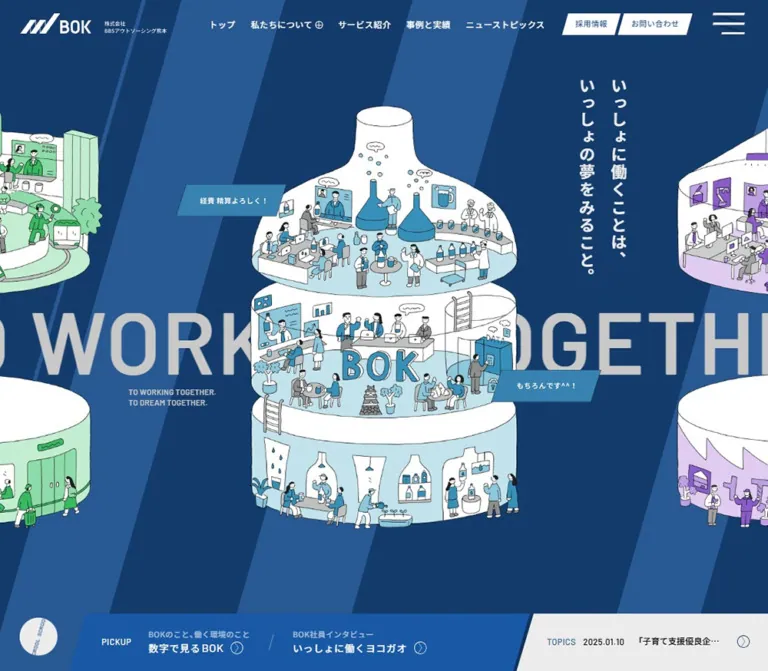
ボトル型の職場イラストと斜めのブルーストライプが印象的なBPO企業のサイト。大きな英字と落ち着いたグレーの情報面を組み合わせ、サービス紹介と採用情報を展開しています。
オリジナルサイトを見るBOK — Style Reference
Illustrated miniature workplaces, blue diagonal bands, and a quiet gray framework for corporate information.
Website: bok.co.jp/home.php Original URL: https://bok.co.jp/home.php Final URL: https://bok.co.jp/home.php Response: HTTP 200 in the supplied browser evidence; no redirect recorded. Theme: blue introductory presentation followed by gray and off-white content surfaces. No selectable theme was evidenced. Inspected: supplied evidence retrieved September 13, 2026, at 03:08 JST — September 12, 2026, at 18:08 UTC. Individual screenshot timestamps were not supplied. Viewports: 1440 × 1000 desktop and 390 × 844 mobile, in CSS pixels. Scope: the current home page, including its hero, company introduction, cases gateway, services, gallery, recruitment features, news, destination links, and footer. Visual captures cover the desktop hero, services, and footer, plus the mobile hero and footer. Other sections are documented from rendered DOM measurements rather than complete visual captures.
BOK presents business process outsourcing through drawings of people working together inside open, bottle-shaped buildings. The hero surrounds these scenes with broad blue diagonals, enormous cropped English lettering, small conversational ribbons, and a Japanese statement about shared work and dreams. Its personality comes from the relationship between precise corporate geometry and informal human illustration.
The rest of the page provides substantial corporate navigation: company information, services, cases, recruitment, news, contact, and FAQ. Although the browser title is 採用TOP | 株式会社BBSアウトソーシング熊本, the inspected page serves both business and recruitment audiences. Preserve that breadth when adapting the design.
The strongest reusable rules are a consistent diagonal angle, restrained Japanese typography paired with Barlow, oversized English words used as scenery, and open information layouts separated by fine rules. Rounded shapes and shadows appear selectively in section tabs and the group-network card.
How to Read This Reference
- Measured means a value appears in the supplied computed styles or element rectangles. Measurements are rounded where additional decimals would not help implementation.
- Source token means a custom property was present. Its presence alone does not establish which visible element uses it.
- Estimated means a dimension or color was judged from an original-page screenshot. These estimates were not obtained through pixel sampling.
- Recommended means a proposed implementation choice, including accessibility improvements and the Quick Start.
- Token aliases in this document are descriptive unless an original property name is explicitly identified.
- The source root is 10px at both inspected widths. Therefore,
13remis 130px in this page. The Quick Start uses explicit sizes and does not change a host application's root size. - A wrapper's font size may differ from that of its children or embedded artwork. The hero motto, logo, and several section labels must not be reconstructed from their wrapper font sizes alone.
- Menu-related elements have rectangles in the DOM even though the supplied screenshots show the closed menu. Those entries are not evidence that the menu was visibly open.
Tokens — Colors
Default Palette
| Name | Value | Evidence / token | Role |
|---|---|---|---|
| Corporate Navy | #133b6b |
Measured service titles, recruitment tab text, and news heading | Principal dark blue for headings and directional details |
| Corporate Blue | #285993 |
Source --color-main2; measured navigation CTA text in the hero, dates, and utility labels |
Secondary brand blue; visually consistent with the brighter hero diagonals |
| Page White | #f9f9f9 |
Measured body background at both widths | General page canvas and recruitment/news surfaces |
| Service Gray | #dbdbdb |
Measured service-section background | Large neutral field behind the service list and illustration |
| Text Charcoal | #333333 |
Source --color-txt; measured body and paragraphs |
Main reading text |
| Soft Silver | #c8c8c8 |
Source --color-txt16 and --solid; measured hero marquee |
Oversized background lettering and fine structural rules |
| White | #ffffff |
Measured hero navigation and introduction text | Reversed interface text and bright artwork areas |
| Soft White | #ececec |
Measured hero-motto wrapper color | Hero statement; the scrolled header and topics surface appear similarly pale, but their fills were not separately measured |
| Service Caption Gray | #797979 |
Measured English service captions | Quiet secondary labels |
| Introductory Blue Gray | #6b84a2 |
Measured introduction eyebrow and ABOUT US caption |
Lower-contrast Latin text on the introductory presentation |
The dark hero field is visibly navy, but its own computed fill is absent from the supplied element sample. Do not describe the heading value #133b6b as a measured hero-background value. The Quick Start reuses it as a close implementation recommendation.
Illustration and Feature Accents
| Accent | Value | Status | Use |
|---|---|---|---|
| Pickup Blue | Approximately #205da6 |
Screenshot estimate | Hero's lower recruitment-information ribbon |
| Scene Cyan | Approximately #3986ad |
Screenshot estimate | Blue-scene speech ribbons and stronger illustration fills |
| Pale Cyan | Approximately #bde1ea |
Screenshot estimate | Floors, walls, and supporting shapes in the blue workplace scene |
| Mint | Approximately #b9e9c8 |
Screenshot estimate | Green workplace variation |
| Pale Lavender | Approximately #dac8ed |
Screenshot estimate | Purple workplace variation visible at the hero edges |
| Recruitment Lavender | #b79fdc |
Measured PICKUP 01 text |
Numbers feature accent |
| Recruitment Teal | #00a7a3 |
Measured PICKUP 02 text |
Employee-interview feature accent |
The illustration contains stronger greens and purples as well as these pale fills. Preserve the full artwork palette instead of globally tinting every scene blue.
Declared Colors with Limited Visual Evidence
The source also declares --color-main4: #174b7f, --color-bg7: #f3f3f3, and --color-accent: #d14600. Their declarations are confirmed, but the supplied screenshots do not establish a general orange action system or an additional theme. They are not necessary for reproducing the principal captured appearance.
Tokens — Typography
Japanese Interface and Reading Text
- Measured stack:
YakuHanJP, 'Noto Sans JP', sans-serif. - Common weight:
500for navigation, headings, introductory copy, and news titles. - Paragraph weight:
400for service descriptions and recruitment explanatory copy. - Character: restrained, clear Japanese sans-serif with deliberate tracking. Most headings gain prominence through spacing and scale rather than extreme weight.
- Implementation alias:
--font-jp.
YakuHanJP appears first in the declared stack. Do not replace the Japanese interface with a Latin-only family or infer the appearance of the logo from this stack.
Latin Labels and Display Type
- Measured family:
Barlow, sans-serif. - Source property:
--font-sans-serif: 'Barlow',sans-serif. - Weights: generally
500;600for the hero's large repeated phrase and the introduction's English eyebrow. - Tracking: often
0.04emon small labels,0.02emon oversized repeated phrases, and0.03emon the introductory English line. - Roles: dates,
TOPICS,PICKUP, service translations, gallery labels and counters, and large English scenery.
The source also declares --font-sans-serif-bottom: -0.091em. Several Latin text rectangles are shorter than their declared font size. Treat their measured font size and line height as authoritative; do not use the visible rectangle height as a replacement type size.
Type Scale
Values below are measured unless explicitly marked as estimates. Desktop and mobile values refer only to the two inspected widths.
| Role | Desktop size / line height | Mobile size / line height | Weight / tracking |
|---|---|---|---|
| Main navigation | 14 / 14px |
Hidden in the captured header | 500, 0.04em |
| Header recruitment/contact links | 13 / 13px |
Hidden in the captured header | 500, 0.04em |
| Hero repeated English phrase | 130 / 130px |
51 / 51px |
Barlow 600, 0.02em |
| Cases repeated English phrase | 130 / 130px |
61 / 61px |
Barlow 500, 0.02em |
| Hero Japanese motto | Approximately 24px |
Approximately 15px |
Screenshot estimates; child typography not sampled |
| Introduction English eyebrow | 28 / 28px |
16 / 16px |
Barlow 600, 0.03em |
| Introduction paragraphs | 16 / 32px |
14 / 27px |
500; tracking 0.1em → 0.04em |
| About navigation label | 30 / 30px |
18 / 18px |
500; tracking 0.04em → 0.06em |
| Cases Japanese heading | 36 / 36px |
20 / 20px |
500; tracking 0.08em → 0.04em |
| Service Japanese titles | 22 / 22px |
18 / 18px |
500; tracking 0.1em → 0.06em |
| Service English captions | 12 / 12px |
10 / 10px |
Barlow 500, 0.04em |
| Service descriptions | 14 / 26px |
12 / 22px |
400, 0.02em |
| Recruitment heading | 36 / 36px |
22 / 39px |
500, 0.06em |
| Recruitment explanatory copy | 14 / 30px |
12 / 22px |
400, 0.04em |
| Recruitment feature titles | 34 / 34px |
22 / 22px |
500, 0.04em |
| News section heading | 30 / 30px |
18 / 18px |
500, 0.04em |
| News article titles | 15 / 22.5px |
14 / 24.5px |
500; tracking 0.06em → 0.02em |
| News-list dates | 14 / 14px |
11 / 11px |
Barlow 500, 0.04em |
| Hero topics label and date | 12 / 12px |
7 / 7px |
Barlow 500, 0.04em |
| Hero pickup descriptions | 11 / 11px |
9 / 9px |
500; tracking 0.04em → approximately -0.007em |
The 7px mobile ticker labels are part of the measured design, not a recommended accessibility baseline. An adaptation can retain their hierarchy while increasing their size.
The hero pickup title wrappers report 11.7px, but their desktop children occupy taller visual compositions. Their final desktop glyph size is not independently established. Likewise, the introduction's large Japanese heading should not be assigned the sampled wrapper's 15px size.
Tokens — Spacing & Shapes
The Diagonal System
The source exposes --slope-tan: 0.2867453858. This is approximately tan(16°).
Use 16° from vertical as the calculated geometric reference for slanted ribbon ends and dividers. A vertical rise of 100px corresponds to about 28.7px of horizontal displacement. Across a 36px-high header CTA, that gives approximately 10.3px of slant.
This calculation supports a shared angle; it does not prove that every diagonal is generated by the same CSS transform. The screenshots show the motif in the hero background, action shapes, pickup separators, custom menu graphic, and footer navigation rules.
Spacing Scale
The page does not expose a single verified spacing grid. These recurring measurements provide a practical vocabulary.
| Use | Desktop | Mobile | Evidence |
|---|---|---|---|
| Logo left inset | 33px |
16px |
Measured |
| Logo top inset in hero | 22px |
14px |
Measured |
| Main-navigation gaps | Approximately 25px between ordinary items |
Not applicable | Calculated from measured link positions |
| CTA horizontal padding | 22px |
Not visible in header | Measured |
| Service-title icon gap | 18px |
11px |
Measured |
| English service-caption indent | 44px below the linked title |
Caption moves alongside the title | Measured |
| Service-description left padding | 34px after the divider |
Description begins 32px inside the title-link start |
Measured |
| Service-row vertical pitch | 167px |
Approximately 151px |
Calculated from successive title positions |
| Section-tab horizontal padding | 62px |
34px |
Measured |
| Main trailing space before destination links | 186px |
126px |
Measured main padding |
Border Radius and Elevation
| Element | Desktop | Mobile | Interpretation |
|---|---|---|---|
| Section-tab upper corners | 10px |
5px |
Measured; lower corners remain square |
| Header CTAs and scene ribbons | Square, slanted edges | Square, slanted edges | Visible geometry |
| Circular directional symbols | Approximately 21–26px visible diameter |
Approximately 12–21px, depending on component |
Screenshot estimates and selected measured controls |
| Group-network card | Square rectangle with a soft shadow | Same treatment | Screenshot evidence |
| Generic source small radius | 0.4rem = 4px |
4px at the inspected root |
Declared token, not a universal component radius |
Several drop-shadow presets are declared. For example, --shadow5 changes from drop-shadow(10px 10px 15px rgba(0,0,0,.15)) on desktop to drop-shadow(5px 5px 10px rgba(0,0,0,.15)) on mobile. The final footer card's exact preset assignment is not supplied. Use its visible soft shadow as the reference instead of assuming an assignment.
Layout Measurements
| Element | Desktop | Mobile | Status |
|---|---|---|---|
| Document height | Approximately 8348.4px |
Approximately 7979.3px |
Measured body rectangles |
| First-screen composition | 1440 × 1000px |
390 × 844px |
Next section starts at the viewport height |
| Hero logo lockup | 241.2 × 33px |
188 × 25.7px |
Measured |
| Hero menu graphic/control box | 53 × 36px |
32 × 22px |
Measured; accessible hit area not established |
| Scrolled header strip | Approximately 70px high |
Approximately 46px high |
Screenshot estimates |
| Central hero illustration | Approximately 500 × 790px |
Approximately 265 × 410px |
Screenshot estimates; different scenes are captured |
| Hero topics section | 476.1 × 95px |
361 × 44px |
Measured |
| Hero pickup section | 871.9 × 95px |
381 × 64px |
Measured |
| Service content header width | 1200px, starting at x=120 |
312px, starting at x=39 |
Measured |
| Service title/description columns | 225px + 325px |
Linked heading row 292px; paragraph 260px |
Measured |
| Service tab | 238.9 × 64px |
144.6 × 44px |
Measured wrapper |
| News-list width | 1248px, starting at x=96 |
332.8px, starting at x≈28.6 |
Measured |
| Normal-footer group card | Approximately 345 × 102px |
Approximately 272 × 79px |
Screenshot estimates |
The declared --contents-md changes from 73.33333vw to 85.33333vw, equivalent to 1056px and 332.8px at the inspected widths. Other measured sections use different widths. Do not impose this variable on every container.
Components
Persistent Brand Header
Role: maintain identity and access to the wider website.
At the hero, the BOK lockup is white, positioned over the blue background. The desktop header places ordinary navigation across the upper-right portion, followed by two white slanted links and a custom menu mark. The small official company name sits beside the larger BOK wordmark within the lockup.
The navigation includes トップ, a 私たちについて button, service and cases links, news, recruitment, and contact. Recruitment and contact use 36px-high parallelogram surfaces with 13px text and 22px horizontal padding. Their text remains upright.
Scrolled captures retain the header at the top with a pale surface, a blue/black logo, dark navigation, and navy action fills. This establishes a persistent visual header and contrasting states. The exact positioning rule and scroll threshold were not included in the evidence.
On mobile, the visible header contains the logo and menu mark. The desktop navigation and CTA pair disappear. Preserve the complete identity lockup rather than retaining only its symbol.
Menu and Company Submenu
Role: expose the full site hierarchy.
The DOM includes a company submenu with links to the about page, SDGs information, and company information. It also includes a larger menu with bilingual destination labels, CONTENTS, a GRAND TOP link, company details, and a group-network link.
The menu rectangles suggest a two-row, five-item desktop arrangement and a mobile arrangement with full-width first/last entries around paired middle entries. These are DOM-only layout observations. No open-menu screenshot, keyboard sequence, or click result was supplied.
Do not use the menu's early footer measurements as dimensions for the normal page footer. Its group card, for example, has different dimensions from the card visible at the bottom of the page.
Illustrated Hero Stage
Role: make shared work the central brand idea.
Build the visual stack from back to front:
- A full-width navy field with broad, uninterrupted blue diagonal bands.
- An oversized repeated
TO WORKING TOGETHER.line crossing the middle of the viewport. - A complete central workplace illustration, with neighboring scenes cropped at the left and right edges.
- Two slanted conversational ribbons associated with the active scene.
- The Japanese motto and a small two-line English companion statement.
- The topics and pickup bands at the bottom.
The desktop illustration is approximately 500px wide and extends from roughly y=85 to y=875. Its white shell and pale cyan floors remain distinct against the darker background. The repeated English text sits behind the illustration and is intentionally cut off at the viewport edges.
The desktop motto occupies two vertical columns near x=1040–1114. The source copy is いっしょに働くことは、いっしょの夢をみること。. On mobile, it becomes two horizontal lines near the upper-left corner; the small English statement moves to the upper right.
The mobile capture centers a green scene lower in the available space, with substantial blue breathing room above and below it. Different scene colors across the captures establish available visual variations. They do not establish that green is a mobile-only choice or that blue is always the first desktop slide.
Conversational Scene Ribbons
Role: add human exchanges to the illustrated world.
The blue desktop scene includes 経費 精算よろしく! and もちろんです^^!; the green mobile scene includes 決算お願いします! and 承知いたしました!.
The desktop ribbon wrappers measure about 207 × 61px; the mobile wrappers are about 129 × 36–38px. Their pointed direction comes from slanted ends rather than speech-bubble tails. Fill color follows the scene accent, and the text is small, white, and centered.
These elements appear as paragraph/graphic wrappers, not evidenced links. Preserve them as scene annotations unless a new implementation explicitly gives them a function.
Topics and Pickup Bands
Role: provide immediate access to fresh information and employee-related content without competing with the illustration.
Desktop places the blue pickup band along the lower left and the pale topics band at the lower right, both 95px high. Their diagonal edges join the background's geometry. A separate circular scroll cue appears near the bottom-left corner.
The pickup band contains a small English label and two editorial links. Each combines a quiet Japanese description, a stronger title, and a small outlined circular arrow. A slanted rule separates the two links.
The topics band combines TOPICS, a Barlow date, a clipped article title, and a circular arrow. Only one article is visible in the screenshot, although multiple article links are present in the DOM.
Mobile stacks the topics band first at y=733, followed by the pickup band at y=780. Their left starts are staggered at 29px and 9px. The pickup links remain side by side. These bands belong to the first-screen composition; persistent fixation during later scrolling is not established.
Company Introduction
Role: explain the company proposition before the more specific navigation sections.
The DOM records an English eyebrow, a large two-line Japanese statement, two paragraphs, and an about-page link. The measured paragraphs are white and generously led: 16px type on 32px lines on desktop.
Desktop paragraphs occupy an approximately 541px-wide reading column beginning near x=184. Mobile uses 312px at x=39, with 14px text on 27px lines. The mobile English eyebrow drops from 28px to 16px.
The large measured section height — approximately 1998px desktop and 1637px mobile — leaves significant space beyond the text itself. The supplied captures do not show that whole section, so its complete image composition and use of this space remain visually unverified. Do not fill it with invented feature cards.
Cases Gateway
Role: link the entire presentation area to the cases page.
The rendered section is one large anchor, 1440 × 727px on desktop and 390 × 440px on mobile. It includes a raised CASES & RESULTS tab, a Japanese heading, a short positioning sentence, and repeated oversized English text at the lower boundary.
The heading changes from 36px desktop to 20px mobile. The supporting sentence becomes a compact two-line statement on mobile. The complete visual background is not shown in the supplied screenshots, so a particular case-study photograph or overlay treatment cannot be specified as an observation.
Section Tab
Role: identify major sections while making the background feel like a continuous material.
OUR SERVICE, RECRUIT, and NEWS TOPICS use compact tab-like shapes. Their upper corners are rounded, their lower edges merge into the section, and their surfaces match the surrounding field. The desktop service capture shows a soft shadow around its upper outline.
The measured height is 64px desktop and 44px mobile. Horizontal padding reduces from 62px to 34px; upper radii reduce from 10px to 5px. Desktop tabs can align toward a content edge, while the measured mobile service, recruitment, and news tabs are centered.
Treat these as section labels, not interactive tab controls. No switching behavior is evidenced.
Service Directory
Role: explain three service families and link directly to their detailed anchors.
The desktop composition places three text rows on the left and a large blue workplace illustration on the right. A tall Together for Value graphic runs down the far-right edge. The field is measured #dbdbdb.
Each row consists of:
- A circular outline arrow and Japanese service title.
- An uppercase English caption below the title.
- A fine vertical divider.
- A short paragraph describing the work.
The link column is 225px wide; the description box is 325px wide, including 34px of left padding. The three titles are 人事給与業務, 財務経理業務, and 総務業務, linking respectively to #area-personnel, #area-finance, and #area-general on the service page.
The measured anchors wrap the title/caption group; the adjacent descriptions are separate paragraphs. Do not assume the whole row is clickable.
The desktop screenshot independently confirms reuse of the blue hero illustration within the service section. On mobile, the DOM places the vertical graphic region above the service links. Each mobile link becomes one horizontal Japanese/English heading row, followed by an indented paragraph. Exact mobile illustration cropping is not visually confirmed.
Photo Gallery
Role: introduce photography into the workplace story.
The gallery is a measured 545px-high section on desktop and 280px high on mobile. Its desktop controls form a narrow right-side rail: a rotated PHOTO GALLERY label, two 25px buttons, and a numeric indicator. Mobile moves the label and 21px buttons into a horizontal arrangement near the bottom of the gallery.
The recorded indicators are 2 and 6 on desktop and 3 and 6 on mobile, consistent with different selected positions in a six-item gallery. The actual photo set, button actions, autoplay interval, and gesture support were not captured. Do not invent specific employee portraits or an exact carousel library.
Recruitment Introduction and Feature Links
Role: connect the service proposition with the people delivering it.
A section tab introduces a Japanese heading and explanatory text. Two large linked features follow: 数字で見るBOK and いっしょに働くヨコガオ. Their labels use separate lavender and teal accents.
On desktop, each feature rectangle is approximately 829 × 767px. They begin at x≈0 and x≈611, creating about 218px of bounding-box overlap. This is evidence of overlapping geometry, not a conventional pair of equal cards with a gutter.
On mobile, each feature is approximately 390 × 454px. The second begins 389px after the first, producing about 65px of vertical overlap. Both remain full width, with white titles at 22px.
The large clickable compositions are established by the DOM. Their full imagery and exact clipping masks are not visible in the supplied captures. Preserve the overlap and editorial hierarchy without inventing their image subjects.
News Directory
Role: provide a readable archive preview and category navigation.
Desktop groups the Japanese heading, VIEW ALL, and category links across one broad header. Each article is a wide horizontal link with a date column, title, category, and room for a directional affordance. Measured rows are approximately 102px high, with 38px vertical padding and a 103px pitch.
Mobile separates the heading, archive link, and category controls vertically. Each article places its date and category above the title. Titles wrap at 14px on 24.5px lines, producing measured row heights of approximately 126.5px or 151px depending on content length.
The three categories are actual links to category archive URLs. No in-place filtering behavior was tested. The DOM contains four articles, including one NEW marker; its precise visual styling is not sufficiently sampled to assign a color.
Pre-Footer Destination Links
Role: give readers direct paths to contact, recruitment, and FAQ.
The mobile DOM confirms three full-width linked rows, approximately 145px, 144px, and 144px high, separated by 1px intervals. Each combines a small Japanese label with a larger 16px Barlow English label.
The desktop footer capture shows a broad office-sign photograph above the sitemap, divided by fine vertical rules. The photograph's visible crop is approximately 1344 × 297px, with 48px outside margins. Its complete destination-label presentation is not visible in that crop. Do not treat the three divisions as proof of three separate image files.
Sitemap and Identity Footer
Role: close the site with complete navigation, company identity, and group affiliation.
The desktop sitemap is spacious and mostly unboxed. GRAND TOP occupies a narrow left area, followed by two navigation groups separated by long diagonal hairlines. Smaller child links are indented beneath their parent categories. A white group-network card sits to the right with the BBS mark and GROUP NETWORKS label.
Below a horizontal rule, the desktop footer arranges the larger BOK lockup, Japanese company details, copyright, a blue circular certification mark, and an outlined upward arrow across a broad row.
Mobile centers the group card and places a long separator below it. The final identity area stacks the tagline, large logo, company name, address, and telephone details. The copyright and small circular marks sit much lower, preserving substantial whitespace.
The normal footer identifies the operator as 株式会社BBSアウトソーシング熊本. It links GROUP NETWORKS to https://www.bbs.co.jp/.
Keep two different navigation meanings distinct: GRAND TOP points to the site's root, while the bottom upward-arrow link points to home.php#document-top. The latter destination is evidenced; its scroll animation was not tested.
Tokens — Motion & Interaction
Measured Transitions
| Element or treatment | Recorded value | What is established |
|---|---|---|
| Logo link | Opacity 400ms cubic-bezier(0.215, 0.61, 0.355, 1) |
A defined opacity transition; endpoint not sampled |
| Logo wrapper | Width and top margin 400ms |
Header geometry can transition; trigger not established |
| Ordinary desktop navigation | Color 400ms |
Defined color feedback |
| Header recruitment/contact links | Background color and color 400ms |
Defined surface/text transition; hover endpoint not supplied |
| Hero conversational ribbons | Transform 1000ms cubic-bezier(0.075, 0.82, 0.165, 1), delayed 1200ms |
Defined delayed entrance or state movement |
| Introduction and section reveal wrappers | Opacity and transform 800ms cubic-bezier(0.215, 0.61, 0.355, 1), commonly delayed 200ms |
Defined reveal treatment; some elements use a 360ms delay |
| Tall service-side graphic | Opacity 1300ms cubic-bezier(0.215, 0.61, 0.355, 1), delayed 200ms |
Defined slower fade |
| News rows | Background color and color 400ms cubic-bezier(0.215, 0.61, 0.355, 1) |
Defined row feedback |
| Gallery controls | 400ms cubic-bezier(0.215, 0.61, 0.355, 1) |
Defined control transition; exact changed property not established |
| Mobile pre-footer links | Backdrop filter 600ms cubic-bezier(0.215, 0.61, 0.355, 1) |
A filter transition exists; blur amount and endpoint not supplied |
Declared Motion Tokens
The source contains a 1200ms slider transition, a 1100ms mask transition, a 700ms modal transition, scale(1.08) as a hover-scale preset, and 0.5 as a hover-opacity preset. These are available source values, not verified assignments to every image, menu, or carousel.
Repeated hero and cases phrases are laid out in long horizontal sequences, and captures contain different scene, topic, and gallery states. This supports a design with multiple presentation states. It does not establish a specific autoplay interval, swipe behavior, looping direction, or JavaScript implementation.
The sampled elements generally report animation: none. That does not exclude movement on ancestors, pseudo-elements, or script-driven transforms. Conversely, a bare transition: all without a meaningful duration is not evidence of a visible animation.
Recommended adaptation: retain the measured 400ms interaction rhythm and selective 800ms reveals. Keep content visible by default, and enable reveals only after scripting initializes. Provide a stable hero and manually usable gallery when reduced motion is requested.
Surfaces
| Surface | Appearance | Purpose |
|---|---|---|
| Hero field | Navy and brighter blue diagonal bands | Large expressive brand environment |
| Illustration | White shells, fine dark outlines, pale colored interiors | Human detail and primary visual focus |
| Conversational ribbon | Flat scene-color parallelogram | Short exchanges embedded in the artwork |
| Pickup band | Strong blue with white text | Recruitment-related shortcuts |
| Topics band | Pale neutral with dark text and blue utility details | News access within the hero |
| Service field | Solid #dbdbdb |
Calm contrast for dense illustration and service explanations |
| Main light canvas | #f9f9f9 |
Recruitment, news, and footer continuity |
| Section tab | Matching field color, rounded upper corners, selective shadow | Section identification without a separate card |
| Group-network card | White, square, softly shadowed | A clearly grouped external destination |
| Dividers | Thin gray lines, sometimes diagonal | Structure without heavy containers |
This page does not establish a general rounded-card elevation system. Most content rests directly on broad fields. Preserve the relatively rare use of a shadow so the group-network card and section tabs retain their distinction.
Imagery
The central illustration depicts small people working across three open levels of a bottle-like building. Thin, slightly irregular outlines describe desks, screens, stairs, equipment, shared spaces, and plants. White outer forms keep the silhouette readable; pale colored floors group the activity within each scene.
The drawing balances considerable detail with a clear overall shape. At desktop size, individual activities can be explored. At mobile size, the tiered architecture remains recognizable even when faces and equipment become tiny.
The hero contains blue, green, and purple scene variations. The desktop services capture reuses the blue scene at a slightly smaller scale. Preserve that relationship between hero imagery and service explanation. The illustration should remain uncropped within its principal slot, while neighboring scenes can deliberately extend beyond the viewport.
Photography provides another register. The supplied footer capture shows an office-sign close-up in subdued cool tones, while the DOM establishes a separate photo gallery. The other gallery images are not visible in the evidence.
Logos, the custom menu mark, certification artwork, and the tall service slogan require particular care. Their exact asset paths and file formats were not included, and the sampled text wrappers do not establish their internal typography.
Observed Asset References
No original image URLs or asset filenames were supplied. These are confirmed visual assets, not downloadable file references.
| Asset | Where confirmed | Treatment |
|---|---|---|
| White BOK identity lockup | Desktop and mobile hero captures | Preserve symbol, wordmark, and small company-name relationship |
| Blue/black BOK lockup | Scrolled header and footer captures | Use an appropriate light-background variant |
| Blue workplace illustration | Desktop hero and services captures | Transparent-looking outer silhouette; full main scene remains visible |
| Green workplace illustration | Mobile hero and desktop edge crop | Independent scene palette and details |
| Purple workplace illustration | Hero edge crops | Partial neighboring scene |
| Office-sign photograph | Desktop footer capture | Broad, subdued architectural crop |
| BBS group mark | Desktop and mobile footer captures | Placed inside a white destination card |
| Circular blue certification mark | Desktop and mobile footer captures | Small supporting identity element |
Use approved artwork in a real implementation. The CSS below reproduces the surrounding geometry, not the hand-drawn content or brand marks.
Layout & Responsive Behavior
Page Sequence and Section Heights
These are measured section rectangles, not recommended fixed heights for arbitrary content.
| Section | Desktop height | Mobile height | Interpretation |
|---|---|---|---|
| Hero | 1000px |
844px |
Exactly one inspected viewport before the introduction begins |
| Company introduction | 1997.7px |
1637.2px |
Large editorial presentation; full visuals not captured |
| Cases gateway | 727px |
440px |
Whole-section destination |
| Services | 980px |
1098.4px |
Mobile grows as information becomes vertically arranged |
| Photo gallery | 545px |
280px |
Shallower mobile media section |
| Recruitment | 1243.4px |
1250.4px |
Similar total height despite different feature arrangements |
| News | 570px |
726.9px |
Mobile growth follows header stacking and title wrapping |
| Normal mobile footer | Not fully measured in the supplied desktop element sample | 1141.4px |
Includes sitemap, group card, and final identity area |
Confirmed Changes
The desktop hero uses vertical Japanese copy beside the scene; mobile moves that copy above the illustration and changes it to horizontal lines. The marquee shrinks from 130px to 51px but remains intentionally clipped. The hero's two information bands change from side-by-side to stacked.
Service typography does more than scale down. English captions move beside their Japanese titles, and descriptions move underneath. Mobile paragraphs are 260px wide and begin 32px inward from the heading-link start. The desktop list's vertical text divider no longer defines a side-by-side paragraph column.
Recruitment feature rectangles overlap horizontally on desktop and vertically on mobile. News items change from horizontal date/title/category rows to metadata above wrapping headlines. The gallery control rail becomes a horizontal control group.
The footer changes from a broad horizontal identity row to a centered stack with generous vertical separation. Its whitespace is part of the composition and should not be collapsed into a dense mobile legal block.
Breakpoints and Unverified Widths
The source exposes --mqDown-md: 767, along with larger breakpoint tokens. A mobile boundary near 767px is therefore source-supported as a token. The exact media-query assignments for each component were not provided.
Only 390px and 1440px widths were inspected. Tablet navigation, landscape phones, intermediate overlap geometry, and ultrawide illustration scaling remain unverified. The Quick Start uses a 767px mobile boundary and an additional recommended navigation-collapse boundary to avoid crowding at intermediate widths.
Do’s and Don’ts
Do
- Carry the approximately 16° diagonal motif through backgrounds, ribbon ends, and selected dividers.
- Keep the principal workplace illustration complete and clearly separated from the blue field.
- Let adjacent scenes crop at the viewport edges to suggest a larger visual world.
- Pair measured Japanese typography with Barlow for Latin labels, dates, and display phrases.
- Use enormous English lettering as scenery while keeping functional Japanese headings readable.
- Preserve the desktop service directory's title, translation, divider, and paragraph anatomy.
- Recompose service rows, recruitment features, and news entries for mobile.
- Keep scene ribbons visually distinct from actual navigation controls.
- Use gray and off-white as large uninterrupted surfaces.
- Reserve soft shadows for the components where they have a clear visual role.
- Retain separate corporate, recruitment, news, and contact destinations.
Don’t
- Don’t reduce the page to a recruitment-only conversion funnel.
- Don’t replace the illustrated world with a grid of generic icons.
- Don’t skew Japanese or English text merely because its surrounding ribbon is slanted.
- Don’t put the primary illustration inside a rounded card or crop away its outer tiers.
- Don’t assign the source's declared orange accent to prominent CTAs without evidence.
- Don’t copy 130px display type to mobile; the measured hero size there is 51px.
- Don’t apply a 10px body-reading size because it appears on the source body wrapper.
- Don’t treat hidden-menu rectangles as visible footer measurements.
- Don’t claim autoplay timing, touch gestures, menu behavior, or hover endpoints that were not inspected.
- Don’t invent image paths, font names for graphic lettering, or production credits.
Recommended Implementation Additions
These are recommendations for an adaptation, not verified features of the original page.
- Give the menu button a programmatic name,
aria-expanded, and an association with its controlled menu. Ensure closed menu contents are not keyboard-focusable. - Increase mobile control hit areas to at least 44px while keeping the visible arrow and menu marks small.
- Raise very small ticker dates and utility labels where necessary for readability. Preserve hierarchy through contrast and spacing rather than relying on 7px text.
- Hide duplicate decorative marquee phrases from assistive technology and expose essential wording once.
- Keep scene annotations noninteractive unless they perform an explicit action.
- Provide meaningful illustration alternatives where they explain the service story; decorative neighboring duplicates can use empty alternatives.
- If the hero, topics, or gallery advances automatically, provide pause behavior and usable manual controls.
- Keep all text visible when JavaScript fails and when reduced motion is requested.
- Use visible keyboard focus that remains outside slanted surface geometry rather than being clipped with it.
- Account for the persistent header when navigating to anchors, including
#document-topand service destinations. - Test intermediate widths, long news titles, 200% zoom, and small mobile screens before fixing section heights or preserving overlaps.
Agent Prompt Guide
Quick Color Reference
- Measured heading navy:
#133b6b. - Measured secondary blue:
#285993. - Measured service field:
#dbdbdb. - Measured page canvas:
#f9f9f9. - Main text:
#333333. - Rules and hero display lettering:
#c8c8c8. - Estimated pickup ribbon blue: approximately
#205da6. - Illustration: white shells with pale cyan, mint, and lavender interiors.
- Recruitment feature-label accents:
#b79fdcand#00a7a3.
Overall Prompt
“Create a Japanese corporate home page for a business process outsourcing company, with company, services, cases, recruitment, news, contact, and FAQ destinations. Build a full-viewport navy hero with broad blue diagonals based on a 16-degree slant. Place an approved illustration of people working inside a three-tier bottle-shaped building at the center, with cropped neighboring scenes and enormous silver Barlow words behind it. Add two small scene-colored conversational ribbons. Use a vertical Japanese motto on desktop and two horizontal lines above the scene on mobile. Pair Noto Sans JP with Barlow. Continue into large gray and off-white sections, raised section-label tabs, open service rows, overlapping recruitment features, and a restrained news list. Finish with diagonal sitemap dividers, a square white group-network card, and a spacious identity footer.”
Example Component Prompts
- Hero: “A navy first screen with broad medium-blue diagonal bands, a complete miniature workplace illustration in the center, and cropped neighboring scenes. Place oversized silver English lettering behind the artwork. Keep the Japanese motto to the right in vertical columns on desktop. Put small topics and pickup bands along the lower edge.”
- Service directory: “On a solid
#dbdbdbfield, place three open service rows to the left of a large pale-cyan workplace illustration. Each row contains a thin circular arrow, a 22px navy Japanese title, a 12px gray Barlow translation, a vertical hairline, and a 14px description on 26px lines. Use no enclosing cards.” - Mobile service row: “Place an 18px Japanese service title and a 10px Barlow English caption on one linked line. Put a 12px description on 22px lines below, indented 32px from the link's left edge. Allow the content to determine the row height.”
- News row: “Create a wide off-white linked row with a blue Barlow date, a restrained Japanese headline, a category, and a small directional mark. Separate rows with fine gray rules. On mobile, place date and category above a wrapping 14px headline.”
- Footer: “Use an off-white corporate footer with generous whitespace, thin diagonal sitemap dividers, an isolated square white group-network card with a soft shadow, and a large BOK identity area. Center the logo and company details on mobile while preserving generous vertical gaps.”
Quick Start
CSS Custom Properties
This is a reusable approximation of the captured design. It uses measured colors and typography where available, plus explicitly estimated ribbon colors and recommended responsive rules. It does not reproduce unavailable image assets, original text-metric adjustments, slider logic, or untested menu behavior.
The header's .is-solid class must be controlled by the host implementation; no original scroll threshold is asserted. Hero artwork and conversational-ribbon positions should be adjusted to the selected illustration. The base implementation is static and readable without animation.
:root {
  /* Measured colors */
  --color-navy: #133b6b;
  --color-blue: #285993;
  --color-page: #f9f9f9;
  --color-service: #dbdbdb;
  --color-ink: #333333;
  --color-rule: #c8c8c8;
  --color-caption: #797979;
  --color-white: #ffffff;
  --color-feature-one: #b79fdc;
  --color-feature-two: #00a7a3;

  /* Screenshot approximations */
  --color-pickup: #205da6;
  --color-scene: #3986ad;
  --color-pale-surface: #ececec;

  /* Observed family stacks; font files are not bundled here */
  --font-jp: YakuHanJP, 'Noto Sans JP', sans-serif;
  --font-latin: 'Barlow', sans-serif;

  /* Measured desktop typography */
  --text-nav: 14px;
  --text-display: 130px;
  --text-service-title: 22px;
  --text-service-caption: 12px;
  --text-service-body: 14px;
  --leading-service: 26px;

  /* Calculated angle and recommended layout aliases */
  --brand-angle: 16deg;
  --page-gutter: clamp(20px, 8.33333vw, 120px);
  --header-height: 80px;
  --radius-tab: 10px;
  --tab-height: 64px;
  --tab-padding: 62px;

  /* Measured transition rhythm */
  --ease-out: cubic-bezier(0.215, 0.61, 0.355, 1);
  --motion-hover: 400ms;
  --motion-reveal: 800ms;
}

* {
  box-sizing: border-box;
}

body {
  margin: 0;
  background: var(--color-page);
  color: var(--color-ink);
  font-family: var(--font-jp);
  font-size: 14px;
  font-weight: 500;
  line-height: 1.85;
}

img,
svg {
  display: block;
  max-width: 100%;
}

a {
  color: inherit;
}

button {
  font: inherit;
}

.container {
  width: min(
    1200px,
    calc(100% - var(--page-gutter) - var(--page-gutter))
  );
  margin-inline: auto;
}

/* Keep focus outside the slanted visual surface. */
:where(a, button):focus-visible {
  outline: 2px solid currentColor;
  outline-offset: 5px;
}

[id] {
  scroll-margin-top: 90px;
}

/* Skew only the surface; text stays upright. */
.slant {
  position: relative;
  isolation: isolate;
}

.slant::before {
  position: absolute;
  z-index: -1;
  inset: 0;
  content: '';
  background: var(--slant-fill, var(--color-blue));
  transform: skewX(calc(-1 * var(--brand-angle)));
  transition: background-color var(--motion-hover) var(--ease-out);
}

.site-header {
  position: fixed;
  z-index: 50;
  inset: 0 0 auto;
  display: flex;
  align-items: center;
  height: var(--header-height);
  padding-inline: 33px 38px;
  color: var(--color-white);
  transition:
    height 400ms,
    color 400ms,
    background-color 400ms;
}

.site-header.is-solid {
  height: 70px;
  color: var(--color-navy);
  background: var(--color-pale-surface);
}

.brand-lockup {
  display: block;
  flex: 0 0 auto;
  width: 241px;
}

.site-nav {
  display: flex;
  align-items: center;
  gap: 25px;
  margin-left: auto;
  font-size: var(--text-nav);
  line-height: 1;
  letter-spacing: 0.04em;
}

.site-nav a {
  text-decoration: none;
}

.header-actions {
  display: flex;
  gap: 6px;
  margin-left: 28px;
}

.header-cta {
  --slant-fill: var(--color-white);
  display: inline-flex;
  align-items: center;
  justify-content: center;
  min-height: 36px;
  padding-inline: 22px;
  color: var(--color-blue);
  font-size: 13px;
  line-height: 1;
  letter-spacing: 0.04em;
  text-decoration: none;
}

.is-solid .header-cta {
  --slant-fill: var(--color-navy);
  color: var(--color-white);
}

.menu-toggle {
  display: grid;
  flex: 0 0 auto;
  place-items: center;
  width: 53px;
  min-height: 44px;
  margin-left: 33px;
  padding: 0;
  border: 0;
  color: inherit;
  background: transparent;
  cursor: pointer;
}

.menu-mark {
  width: 53px;
  height: 36px;
}

/* Static hero approximation; approved artwork supplies its detail. */
.hero {
  position: relative;
  isolation: isolate;
  height: 100svh;
  min-height: 640px;
  overflow: hidden;
  color: var(--color-white);
  background: var(--color-navy);
}

.hero::before {
  position: absolute;
  z-index: -1;
  inset: -20%;
  content: '';
  background: repeating-linear-gradient(
    106deg,
    var(--color-navy) 0 205px,
    var(--color-blue) 205px 350px,
    var(--color-navy) 350px 470px
  );
}

.hero-marquee {
  position: absolute;
  top: 46.8%;
  left: -9%;
  margin: 0;
  color: var(--color-rule);
  font-family: var(--font-latin);
  font-size: var(--text-display);
  font-weight: 600;
  line-height: 1;
  letter-spacing: 0.02em;
  white-space: nowrap;
  pointer-events: none;
}

.hero-artwork {
  position: absolute;
  top: 8.5%;
  left: 50%;
  width: min(35vw, 510px);
  margin: 0;
  transform: translateX(-50%);
}

.hero-artwork img {
  width: 100%;
  height: auto;
}

.hero-artwork--previous {
  left: -5.5%;
}

.hero-artwork--next {
  left: 105.5%;
}

.hero-copy {
  position: absolute;
  top: 11.3%;
  right: 22.6%;
  display: flex;
  flex-direction: row-reverse;
  gap: 26px;
  margin: 0;
  color: var(--color-pale-surface);
}

.hero-copy span {
  writing-mode: vertical-rl;
  font-size: 24px;
  line-height: 1;
  letter-spacing: 0.12em;
}

.hero-caption {
  position: absolute;
  top: 58.9%;
  left: 20.83%;
  margin: 0;
  font-family: var(--font-latin);
  font-size: 11px;
  line-height: 1.5;
}

.scene-note {
  --slant-fill: var(--color-scene);
  position: absolute;
  display: grid;
  place-items: center;
  width: 207px;
  min-height: 61px;
  margin: 0;
  padding: 10px 20px;
  font-size: 14px;
  line-height: 1.4;
  letter-spacing: 0.04em;
}

.scene-note--first {
  top: 23.1%;
  left: 23%;
}

.scene-note--second {
  top: 57.9%;
  left: 64%;
}

.hero-bottom {
  position: absolute;
  inset: auto 0 0;
  display: grid;
  grid-template-columns: minmax(0, 1fr) 476px;
  grid-template-areas: 'pickup topics';
  padding-left: 114px;
}

.hero-pickup {
  --slant-fill: var(--color-pickup);
  grid-area: pickup;
  display: flex;
  align-items: center;
  gap: 28px;
  min-width: 0;
  min-height: 95px;
  padding-inline: 52px 28px;
}

.hero-topics {
  --slant-fill: var(--color-pale-surface);
  grid-area: topics;
  display: grid;
  grid-template-columns: 42px 63px minmax(0, 1fr) 22px;
  align-items: center;
  gap: 12px;
  min-width: 0;
  min-height: 95px;
  padding-inline: 50px 30px;
  color: var(--color-ink);
}

.utility-label,
.topic-date {
  margin: 0;
  font-family: var(--font-latin);
  font-size: 12px;
  line-height: 1;
  letter-spacing: 0.04em;
}

.hero-topics .utility-label {
  color: var(--color-blue);
}

.topic-title {
  min-width: 0;
  overflow: hidden;
  font-size: 14px;
  text-overflow: ellipsis;
  white-space: nowrap;
}

.pickup-link {
  min-width: 0;
  text-decoration: none;
}

.pickup-kicker {
  display: block;
  font-size: 11px;
  line-height: 1.4;
}

.pickup-title {
  display: block;
  margin-top: 5px;
  font-size: 16px;
  line-height: 1.4;
}

.services {
  padding-block: 220px 150px;
  background: var(--color-service);
}

.section-tab {
  display: flex;
  align-items: center;
  justify-content: center;
  width: max-content;
  min-height: var(--tab-height);
  margin: 0 0 0 20px;
  padding-inline: var(--tab-padding);
  border-radius: var(--radius-tab) var(--radius-tab) 0 0;
  background: inherit;
  color: var(--color-navy);
  font-family: var(--font-latin);
  font-size: 18px;
  font-weight: 500;
  line-height: 1;
  box-shadow: 0 -8px 28px rgb(0 0 0 / 10%);
}

.service-layout {
  display: grid;
  grid-template-columns: 550px minmax(0, 1fr);
  align-items: center;
  gap: 65px;
  margin-top: 90px;
}

.service-list {
  display: grid;
  gap: 75px;
}

.service-row {
  display: grid;
  grid-template-columns: 225px minmax(0, 1fr);
  align-items: center;
  min-height: 92px;
}

.service-link {
  text-decoration: none;
}

.service-title {
  display: flex;
  align-items: center;
  gap: 18px;
  margin: 0;
  color: var(--color-navy);
  font-size: var(--text-service-title);
  font-weight: 500;
  line-height: 1;
  letter-spacing: 0.1em;
}

.circle-arrow {
  display: inline-grid;
  flex: 0 0 auto;
  place-items: center;
  width: 26px;
  height: 26px;
  border: 1px solid currentColor;
  border-radius: 50%;
}

.circle-arrow::after {
  width: 7px;
  height: 7px;
  border-top: 1px solid currentColor;
  border-right: 1px solid currentColor;
  content: '';
  transform: translateX(-2px) rotate(45deg);
}

.service-caption {
  display: block;
  margin: 21px 0 0 44px;
  color: var(--color-caption);
  font-family: var(--font-latin);
  font-size: var(--text-service-caption);
  line-height: 1;
  letter-spacing: 0.04em;
}

.service-description {
  margin: 0;
  padding-left: 34px;
  border-left: 1px solid var(--color-rule);
  font-size: var(--text-service-body);
  font-weight: 400;
  line-height: var(--leading-service);
  letter-spacing: 0.02em;
}

.service-visual {
  margin: -210px 0 0;
}

.service-visual img {
  width: 100%;
  height: auto;
}

.news-list {
  width: min(1248px, 86.66667%);
  margin-inline: auto;
}

.news-row {
  display: grid;
  grid-template-columns: 162px minmax(0, 1fr) auto;
  align-items: center;
  gap: 40px;
  padding: 38px 40px 38px 0;
  border-bottom: 1px solid var(--color-rule);
  text-decoration: none;
  transition:
    color var(--motion-hover) var(--ease-out),
    background-color var(--motion-hover) var(--ease-out);
}

.news-date {
  color: var(--color-blue);
  font-family: var(--font-latin);
  font-size: 14px;
  line-height: 1;
  letter-spacing: 0.04em;
}

.news-title {
  margin: 0;
  font-size: 15px;
  font-weight: 500;
  line-height: 1.5;
  letter-spacing: 0.06em;
}

.news-category {
  font-size: 12px;
  line-height: 1;
  letter-spacing: 0.06em;
}

.group-card {
  display: flex;
  align-items: center;
  justify-content: space-between;
  gap: 32px;
  width: 345px;
  min-height: 102px;
  padding: 28px 46px;
  background: var(--color-white);
  box-shadow: 8px 10px 20px rgb(0 0 0 / 10%);
  text-decoration: none;
}

.footer-rule {
  margin-block: 64px;
  border: 0;
  border-top: 1px solid var(--color-rule);
}

/* Recommended intermediate-width protection, not a measured breakpoint. */
@media (min-width: 768px) and (max-width: 1279px) {
  .site-nav,
  .header-actions {
    display: none;
  }

  .menu-toggle {
    margin-left: auto;
  }

  .service-layout {
    grid-template-columns: minmax(0, 1fr) 38%;
    gap: 30px;
  }

  .service-row {
    grid-template-columns: minmax(180px, 42%) minmax(0, 1fr);
  }

  .hero-bottom {
    grid-template-columns: minmax(0, 1fr) 40%;
    padding-left: 30px;
  }

  .hero-pickup {
    gap: 16px;
    padding-inline: 28px;
  }

  .hero-topics {
    padding-inline: 25px 20px;
  }
}

@media (max-width: 767px) {
  :root {
    --page-gutter: 10vw;
    --header-height: 54px;
    --text-display: 51px;
    --text-service-title: 18px;
    --text-service-caption: 10px;
    --text-service-body: 12px;
    --leading-service: 22px;
    --radius-tab: 5px;
    --tab-height: 44px;
    --tab-padding: 34px;
  }

  .site-header {
    padding-inline: 16px 10px;
  }

  .site-header.is-solid {
    height: 46px;
  }

  .brand-lockup {
    width: 188px;
  }

  .site-nav,
  .header-actions {
    display: none;
  }

  .menu-toggle {
    width: 44px;
    margin-left: auto;
  }

  .menu-mark {
    width: 32px;
    height: 22px;
  }

  .hero-copy {
    top: 67px;
    right: auto;
    left: 5.33333%;
    flex-direction: column;
    gap: 10px;
  }

  .hero-copy span {
    writing-mode: horizontal-tb;
    font-size: 15px;
    letter-spacing: 0.04em;
  }

  .hero-caption {
    top: 70px;
    right: 5.33333%;
    left: auto;
    font-size: 7px;
  }

  .hero-marquee {
    top: 49.2%;
    left: -49%;
  }

  .hero-artwork {
    top: 25.8%;
    width: 68%;
  }

  .hero-artwork--previous {
    left: -30%;
  }

  .hero-artwork--next {
    left: 130%;
  }

  .scene-note {
    width: 129px;
    min-height: 37px;
    padding: 8px 12px;
    font-size: 8px;
  }

  .scene-note--first {
    top: 25.4%;
    right: 16px;
    left: auto;
  }

  .scene-note--second {
    top: 55.1%;
    left: 8px;
  }

  .hero-bottom {
    grid-template-columns: minmax(0, 1fr);
    grid-template-areas: 'topics' 'pickup';
    gap: 3px;
    padding-left: 0;
  }

  .hero-topics {
    grid-template-columns: 24px 37px minmax(0, 1fr) 14px;
    gap: 12px;
    min-height: 44px;
    margin-left: 29px;
    padding-inline: 23px 14px;
  }

  .hero-pickup {
    gap: 14px;
    min-height: 64px;
    margin-left: 9px;
    padding-inline: 25px;
  }

  .utility-label,
  .topic-date {
    font-size: 7px;
  }

  .topic-title {
    font-size: 10px;
  }

  .pickup-kicker {
    font-size: 9px;
  }

  .pickup-title {
    font-size: 12px;
  }

  .services {
    padding-block: 112px 110px;
  }

  .section-tab {
    margin-inline: auto;
    font-size: 12px;
  }

  .service-layout {
    display: flex;
    flex-direction: column;
    gap: 60px;
    margin-top: 55px;
  }

  .service-visual {
    order: -1;
    width: min(100%, 290px);
    margin: 0 auto;
  }

  .service-list {
    width: 100%;
    gap: 45px;
  }

  .service-row {
    display: block;
    min-height: 0;
  }

  .service-link {
    display: flex;
    flex-wrap: wrap;
    align-items: center;
    gap: 10px;
  }

  .service-title {
    gap: 11px;
    letter-spacing: 0.06em;
  }

  .circle-arrow {
    width: 20px;
    height: 20px;
  }

  .service-caption {
    margin: 0;
  }

  .service-description {
    margin: 18px 0 0 32px;
    padding: 0;
    border: 0;
  }

  .news-list {
    width: 85.33333%;
  }

  .news-row {
    grid-template-columns: auto minmax(0, 1fr);
    gap: 12px;
    padding: 27px 5px 34px 2px;
  }

  .news-date {
    font-size: 11px;
  }

  .news-category {
    grid-column: 2;
    grid-row: 1;
    justify-self: start;
    font-size: 10px;
  }

  .news-title {
    grid-column: 1 / -1;
    font-size: 14px;
    line-height: 1.75;
    letter-spacing: 0.02em;
  }

  .group-card {
    width: min(272px, calc(100% - 40px));
    min-height: 79px;
    margin-inline: auto;
    padding: 22px 36px;
  }

  .footer-identity {
    display: grid;
    justify-items: center;
    text-align: center;
  }
}

/* Recommended accessibility behavior. */
@media (prefers-reduced-motion: reduce) {
  html {
    scroll-behavior: auto;
  }

  .site-header,
  .slant::before,
  .news-row {
    transition: none;
  }

  .hero-marquee,
  .hero-artwork,
  .scene-note,
  .reveal {
    animation: none !important;
  }

  .reveal {
    opacity: 1 !important;
    transform: none !important;
  }
}
Minimal Component Markup
This example demonstrates the service-row classes. The image placeholder must be replaced with a supplied artwork URL; it is not an observed original asset path. Repeat the article for the other two service families.
<section class="services" aria-labelledby="service-heading">
<div class="container">
<h2 class="section-tab" id="service-heading">OUR SERVICE</h2>
<div class="service-layout">
<div class="service-list">
<article class="service-row">
<a class="service-link" href="/service/#area-personnel">
<h3 class="service-title">
<span class="circle-arrow" aria-hidden="true"></span>
人事給与業務
</h3>
<span class="service-caption" lang="en">
PERSONNEL & PAYROLL
</span>
</a>
<p class="service-description">
Payroll, benefits, and support throughout the employee lifecycle.
</p>
</article>
</div>
<figure class="service-visual">
<img
src="YOUR_AUTHORIZED_WORKPLACE_ARTWORK"
alt="People working together across three open levels of a miniature workplace"
>
</figure>
</div>
</div>
</section>
Tailwind v4 Token Mapping
Optional aliases for a project already using Tailwind v4. This does not imply that the original website uses Tailwind. Define the custom properties above first.
@theme inline {
  --color-bok-navy: var(--color-navy);
  --color-bok-blue: var(--color-blue);
  --color-bok-page: var(--color-page);
  --color-bok-service: var(--color-service);
  --color-bok-ink: var(--color-ink);
  --color-bok-rule: var(--color-rule);
  --color-bok-pickup: var(--color-pickup);

  --font-japanese: var(--font-jp);
  --font-display: var(--font-latin);

  --text-hero: var(--text-display);
  --text-service-heading: var(--text-service-title);
  --text-service-copy: var(--text-service-body);
  --text-service-label: var(--text-service-caption);

  --radius-section-tab: var(--radius-tab);
  --spacing-page-gutter: var(--page-gutter);
  --spacing-section-tab: var(--tab-height);
}
Sources & Evidence
- Original and final page: https://bok.co.jp/home.php. The supplied inspection records HTTP 200 and the same original/final URL.
- Retrieval time:
2026-09-12T18:08:07.432Z, equivalent to September 13, 2026, at 03:08:07 JST. Per-image capture times were not provided. - Desktop evidence: 1440 × 1000 CSS pixels; original-page captures of the hero, service section, and footer; rendered text, links, element rectangles, computed typography, transitions, and custom properties. Body height approximately 8348.4px.
- Mobile evidence: 390 × 844 CSS pixels; original-page hero and footer captures; rendered text, links, element rectangles, computed typography, transitions, and custom properties. Body height approximately 7979.3px.
- Readiness scope: the supplied collection notes describe at least five seconds of initial observation, document/image readiness checks, and waiting for finite visible or content-revealing animation within stated time limits. Perpetual animation was temporarily paused during readiness checks and resumed afterward.
- Interaction evidence: captures at different scroll positions establish persistent header appearances and page progression. Link destinations and transition declarations are recorded. No menu-opening sequence, hover endpoint, gallery-button result, gesture test, or complete animation timeline was supplied.
- Limitations: the screenshots are selected viewport captures, not a complete visual record of every section. Hidden menu structures are present in the DOM. Original asset URLs, complete stylesheets, pseudo-element styles, responsive rules at other widths, and rendered font-file identity were not supplied. SharedWorkers and service workers were disabled during the supplied inspection.
This reference describes the current page represented by that evidence. Measurements, screenshot estimates, and implementation recommendations are identified separately throughout.
# BOK — Style Reference
> Illustrated miniature workplaces, blue diagonal bands, and a quiet gray framework for corporate information.
**Website:** [bok.co.jp/home.php](https://bok.co.jp/home.php)
**Original URL:** https://bok.co.jp/home.php
**Final URL:** https://bok.co.jp/home.php
**Response:** HTTP 200 in the supplied browser evidence; no redirect recorded.
**Theme:** blue introductory presentation followed by gray and off-white content surfaces. No selectable theme was evidenced.
**Inspected:** supplied evidence retrieved September 13, 2026, at 03:08 JST — September 12, 2026, at 18:08 UTC. Individual screenshot timestamps were not supplied.
**Viewports:** 1440 × 1000 desktop and 390 × 844 mobile, in CSS pixels.
**Scope:** the current home page, including its hero, company introduction, cases gateway, services, gallery, recruitment features, news, destination links, and footer. Visual captures cover the desktop hero, services, and footer, plus the mobile hero and footer. Other sections are documented from rendered DOM measurements rather than complete visual captures.
BOK presents business process outsourcing through drawings of people working together inside open, bottle-shaped buildings. The hero surrounds these scenes with broad blue diagonals, enormous cropped English lettering, small conversational ribbons, and a Japanese statement about shared work and dreams. Its personality comes from the relationship between precise corporate geometry and informal human illustration.
The rest of the page provides substantial corporate navigation: company information, services, cases, recruitment, news, contact, and FAQ. Although the browser title is `採用TOP | 株式会社BBSアウトソーシング熊本`, the inspected page serves both business and recruitment audiences. Preserve that breadth when adapting the design.
The strongest reusable rules are a consistent diagonal angle, restrained Japanese typography paired with Barlow, oversized English words used as scenery, and open information layouts separated by fine rules. Rounded shapes and shadows appear selectively in section tabs and the group-network card.
## How to Read This Reference
- **Measured** means a value appears in the supplied computed styles or element rectangles. Measurements are rounded where additional decimals would not help implementation.
- **Source token** means a custom property was present. Its presence alone does not establish which visible element uses it.
- **Estimated** means a dimension or color was judged from an original-page screenshot. These estimates were not obtained through pixel sampling.
- **Recommended** means a proposed implementation choice, including accessibility improvements and the Quick Start.
- Token aliases in this document are descriptive unless an original property name is explicitly identified.
- The source root is **10px at both inspected widths**. Therefore, `13rem` is 130px in this page. The Quick Start uses explicit sizes and does not change a host application's root size.
- A wrapper's font size may differ from that of its children or embedded artwork. The hero motto, logo, and several section labels must not be reconstructed from their wrapper font sizes alone.
- Menu-related elements have rectangles in the DOM even though the supplied screenshots show the closed menu. Those entries are not evidence that the menu was visibly open.
## Tokens — Colors
### Default Palette
| Name | Value | Evidence / token | Role |
| --- | --- | --- | --- |
| Corporate Navy | `#133b6b` | Measured service titles, recruitment tab text, and news heading | Principal dark blue for headings and directional details |
| Corporate Blue | `#285993` | Source `--color-main2`; measured navigation CTA text in the hero, dates, and utility labels | Secondary brand blue; visually consistent with the brighter hero diagonals |
| Page White | `#f9f9f9` | Measured body background at both widths | General page canvas and recruitment/news surfaces |
| Service Gray | `#dbdbdb` | Measured service-section background | Large neutral field behind the service list and illustration |
| Text Charcoal | `#333333` | Source `--color-txt`; measured body and paragraphs | Main reading text |
| Soft Silver | `#c8c8c8` | Source `--color-txt16` and `--solid`; measured hero marquee | Oversized background lettering and fine structural rules |
| White | `#ffffff` | Measured hero navigation and introduction text | Reversed interface text and bright artwork areas |
| Soft White | `#ececec` | Measured hero-motto wrapper color | Hero statement; the scrolled header and topics surface appear similarly pale, but their fills were not separately measured |
| Service Caption Gray | `#797979` | Measured English service captions | Quiet secondary labels |
| Introductory Blue Gray | `#6b84a2` | Measured introduction eyebrow and `ABOUT US` caption | Lower-contrast Latin text on the introductory presentation |
The dark hero field is visibly navy, but its own computed fill is absent from the supplied element sample. Do not describe the heading value `#133b6b` as a measured hero-background value. The Quick Start reuses it as a close implementation recommendation.
### Illustration and Feature Accents
| Accent | Value | Status | Use |
| --- | --- | --- | --- |
| Pickup Blue | Approximately `#205da6` | Screenshot estimate | Hero's lower recruitment-information ribbon |
| Scene Cyan | Approximately `#3986ad` | Screenshot estimate | Blue-scene speech ribbons and stronger illustration fills |
| Pale Cyan | Approximately `#bde1ea` | Screenshot estimate | Floors, walls, and supporting shapes in the blue workplace scene |
| Mint | Approximately `#b9e9c8` | Screenshot estimate | Green workplace variation |
| Pale Lavender | Approximately `#dac8ed` | Screenshot estimate | Purple workplace variation visible at the hero edges |
| Recruitment Lavender | `#b79fdc` | Measured `PICKUP 01` text | Numbers feature accent |
| Recruitment Teal | `#00a7a3` | Measured `PICKUP 02` text | Employee-interview feature accent |
The illustration contains stronger greens and purples as well as these pale fills. Preserve the full artwork palette instead of globally tinting every scene blue.
### Declared Colors with Limited Visual Evidence
The source also declares `--color-main4: #174b7f`, `--color-bg7: #f3f3f3`, and `--color-accent: #d14600`. Their declarations are confirmed, but the supplied screenshots do not establish a general orange action system or an additional theme. They are not necessary for reproducing the principal captured appearance.
## Tokens — Typography
### Japanese Interface and Reading Text
- **Measured stack:** `YakuHanJP, 'Noto Sans JP', sans-serif`.
- **Common weight:** `500` for navigation, headings, introductory copy, and news titles.
- **Paragraph weight:** `400` for service descriptions and recruitment explanatory copy.
- **Character:** restrained, clear Japanese sans-serif with deliberate tracking. Most headings gain prominence through spacing and scale rather than extreme weight.
- **Implementation alias:** `--font-jp`.
YakuHanJP appears first in the declared stack. Do not replace the Japanese interface with a Latin-only family or infer the appearance of the logo from this stack.
### Latin Labels and Display Type
- **Measured family:** `Barlow, sans-serif`.
- **Source property:** `--font-sans-serif: 'Barlow',sans-serif`.
- **Weights:** generally `500`; `600` for the hero's large repeated phrase and the introduction's English eyebrow.
- **Tracking:** often `0.04em` on small labels, `0.02em` on oversized repeated phrases, and `0.03em` on the introductory English line.
- **Roles:** dates, `TOPICS`, `PICKUP`, service translations, gallery labels and counters, and large English scenery.
The source also declares `--font-sans-serif-bottom: -0.091em`. Several Latin text rectangles are shorter than their declared font size. Treat their measured font size and line height as authoritative; do not use the visible rectangle height as a replacement type size.
### Type Scale
Values below are measured unless explicitly marked as estimates. Desktop and mobile values refer only to the two inspected widths.
| Role | Desktop size / line height | Mobile size / line height | Weight / tracking |
| --- | --- | --- | --- |
| Main navigation | `14 / 14px` | Hidden in the captured header | `500`, `0.04em` |
| Header recruitment/contact links | `13 / 13px` | Hidden in the captured header | `500`, `0.04em` |
| Hero repeated English phrase | `130 / 130px` | `51 / 51px` | Barlow `600`, `0.02em` |
| Cases repeated English phrase | `130 / 130px` | `61 / 61px` | Barlow `500`, `0.02em` |
| Hero Japanese motto | Approximately `24px` | Approximately `15px` | Screenshot estimates; child typography not sampled |
| Introduction English eyebrow | `28 / 28px` | `16 / 16px` | Barlow `600`, `0.03em` |
| Introduction paragraphs | `16 / 32px` | `14 / 27px` | `500`; tracking `0.1em` → `0.04em` |
| About navigation label | `30 / 30px` | `18 / 18px` | `500`; tracking `0.04em` → `0.06em` |
| Cases Japanese heading | `36 / 36px` | `20 / 20px` | `500`; tracking `0.08em` → `0.04em` |
| Service Japanese titles | `22 / 22px` | `18 / 18px` | `500`; tracking `0.1em` → `0.06em` |
| Service English captions | `12 / 12px` | `10 / 10px` | Barlow `500`, `0.04em` |
| Service descriptions | `14 / 26px` | `12 / 22px` | `400`, `0.02em` |
| Recruitment heading | `36 / 36px` | `22 / 39px` | `500`, `0.06em` |
| Recruitment explanatory copy | `14 / 30px` | `12 / 22px` | `400`, `0.04em` |
| Recruitment feature titles | `34 / 34px` | `22 / 22px` | `500`, `0.04em` |
| News section heading | `30 / 30px` | `18 / 18px` | `500`, `0.04em` |
| News article titles | `15 / 22.5px` | `14 / 24.5px` | `500`; tracking `0.06em` → `0.02em` |
| News-list dates | `14 / 14px` | `11 / 11px` | Barlow `500`, `0.04em` |
| Hero topics label and date | `12 / 12px` | `7 / 7px` | Barlow `500`, `0.04em` |
| Hero pickup descriptions | `11 / 11px` | `9 / 9px` | `500`; tracking `0.04em` → approximately `-0.007em` |
The 7px mobile ticker labels are part of the measured design, not a recommended accessibility baseline. An adaptation can retain their hierarchy while increasing their size.
The hero pickup title wrappers report `11.7px`, but their desktop children occupy taller visual compositions. Their final desktop glyph size is not independently established. Likewise, the introduction's large Japanese heading should not be assigned the sampled wrapper's `15px` size.
## Tokens — Spacing & Shapes
### The Diagonal System
The source exposes `--slope-tan: 0.2867453858`. This is approximately `tan(16°)`.
Use **16° from vertical** as the calculated geometric reference for slanted ribbon ends and dividers. A vertical rise of 100px corresponds to about 28.7px of horizontal displacement. Across a 36px-high header CTA, that gives approximately 10.3px of slant.
This calculation supports a shared angle; it does not prove that every diagonal is generated by the same CSS transform. The screenshots show the motif in the hero background, action shapes, pickup separators, custom menu graphic, and footer navigation rules.
### Spacing Scale
The page does not expose a single verified spacing grid. These recurring measurements provide a practical vocabulary.
| Use | Desktop | Mobile | Evidence |
| --- | --- | --- | --- |
| Logo left inset | `33px` | `16px` | Measured |
| Logo top inset in hero | `22px` | `14px` | Measured |
| Main-navigation gaps | Approximately `25px` between ordinary items | Not applicable | Calculated from measured link positions |
| CTA horizontal padding | `22px` | Not visible in header | Measured |
| Service-title icon gap | `18px` | `11px` | Measured |
| English service-caption indent | `44px` below the linked title | Caption moves alongside the title | Measured |
| Service-description left padding | `34px` after the divider | Description begins `32px` inside the title-link start | Measured |
| Service-row vertical pitch | `167px` | Approximately `151px` | Calculated from successive title positions |
| Section-tab horizontal padding | `62px` | `34px` | Measured |
| Main trailing space before destination links | `186px` | `126px` | Measured main padding |
### Border Radius and Elevation
| Element | Desktop | Mobile | Interpretation |
| --- | --- | --- | --- |
| Section-tab upper corners | `10px` | `5px` | Measured; lower corners remain square |
| Header CTAs and scene ribbons | Square, slanted edges | Square, slanted edges | Visible geometry |
| Circular directional symbols | Approximately `21–26px` visible diameter | Approximately `12–21px`, depending on component | Screenshot estimates and selected measured controls |
| Group-network card | Square rectangle with a soft shadow | Same treatment | Screenshot evidence |
| Generic source small radius | `0.4rem` = `4px` | `4px` at the inspected root | Declared token, not a universal component radius |
Several drop-shadow presets are declared. For example, `--shadow5` changes from `drop-shadow(10px 10px 15px rgba(0,0,0,.15))` on desktop to `drop-shadow(5px 5px 10px rgba(0,0,0,.15))` on mobile. The final footer card's exact preset assignment is not supplied. Use its visible soft shadow as the reference instead of assuming an assignment.
### Layout Measurements
| Element | Desktop | Mobile | Status |
| --- | --- | --- | --- |
| Document height | Approximately `8348.4px` | Approximately `7979.3px` | Measured body rectangles |
| First-screen composition | `1440 × 1000px` | `390 × 844px` | Next section starts at the viewport height |
| Hero logo lockup | `241.2 × 33px` | `188 × 25.7px` | Measured |
| Hero menu graphic/control box | `53 × 36px` | `32 × 22px` | Measured; accessible hit area not established |
| Scrolled header strip | Approximately `70px` high | Approximately `46px` high | Screenshot estimates |
| Central hero illustration | Approximately `500 × 790px` | Approximately `265 × 410px` | Screenshot estimates; different scenes are captured |
| Hero topics section | `476.1 × 95px` | `361 × 44px` | Measured |
| Hero pickup section | `871.9 × 95px` | `381 × 64px` | Measured |
| Service content header width | `1200px`, starting at `x=120` | `312px`, starting at `x=39` | Measured |
| Service title/description columns | `225px + 325px` | Linked heading row `292px`; paragraph `260px` | Measured |
| Service tab | `238.9 × 64px` | `144.6 × 44px` | Measured wrapper |
| News-list width | `1248px`, starting at `x=96` | `332.8px`, starting at `x≈28.6` | Measured |
| Normal-footer group card | Approximately `345 × 102px` | Approximately `272 × 79px` | Screenshot estimates |
The declared `--contents-md` changes from `73.33333vw` to `85.33333vw`, equivalent to 1056px and 332.8px at the inspected widths. Other measured sections use different widths. Do not impose this variable on every container.
## Components
### Persistent Brand Header
**Role:** maintain identity and access to the wider website.
At the hero, the BOK lockup is white, positioned over the blue background. The desktop header places ordinary navigation across the upper-right portion, followed by two white slanted links and a custom menu mark. The small official company name sits beside the larger BOK wordmark within the lockup.
The navigation includes `トップ`, a `私たちについて` button, service and cases links, news, recruitment, and contact. Recruitment and contact use 36px-high parallelogram surfaces with 13px text and 22px horizontal padding. Their text remains upright.
Scrolled captures retain the header at the top with a pale surface, a blue/black logo, dark navigation, and navy action fills. This establishes a persistent visual header and contrasting states. The exact positioning rule and scroll threshold were not included in the evidence.
On mobile, the visible header contains the logo and menu mark. The desktop navigation and CTA pair disappear. Preserve the complete identity lockup rather than retaining only its symbol.
### Menu and Company Submenu
**Role:** expose the full site hierarchy.
The DOM includes a company submenu with links to the about page, SDGs information, and company information. It also includes a larger menu with bilingual destination labels, `CONTENTS`, a `GRAND TOP` link, company details, and a group-network link.
The menu rectangles suggest a two-row, five-item desktop arrangement and a mobile arrangement with full-width first/last entries around paired middle entries. These are **DOM-only layout observations**. No open-menu screenshot, keyboard sequence, or click result was supplied.
Do not use the menu's early footer measurements as dimensions for the normal page footer. Its group card, for example, has different dimensions from the card visible at the bottom of the page.
### Illustrated Hero Stage
**Role:** make shared work the central brand idea.
Build the visual stack from back to front:
1. A full-width navy field with broad, uninterrupted blue diagonal bands.
2. An oversized repeated `TO WORKING TOGETHER.` line crossing the middle of the viewport.
3. A complete central workplace illustration, with neighboring scenes cropped at the left and right edges.
4. Two slanted conversational ribbons associated with the active scene.
5. The Japanese motto and a small two-line English companion statement.
6. The topics and pickup bands at the bottom.
The desktop illustration is approximately 500px wide and extends from roughly `y=85` to `y=875`. Its white shell and pale cyan floors remain distinct against the darker background. The repeated English text sits behind the illustration and is intentionally cut off at the viewport edges.
The desktop motto occupies two vertical columns near `x=1040–1114`. The source copy is `いっしょに働くことは、いっしょの夢をみること。`. On mobile, it becomes two horizontal lines near the upper-left corner; the small English statement moves to the upper right.
The mobile capture centers a green scene lower in the available space, with substantial blue breathing room above and below it. Different scene colors across the captures establish available visual variations. They do not establish that green is a mobile-only choice or that blue is always the first desktop slide.
### Conversational Scene Ribbons
**Role:** add human exchanges to the illustrated world.
The blue desktop scene includes `経費 精算よろしく!` and `もちろんです^^!`; the green mobile scene includes `決算お願いします!` and `承知いたしました!`.
The desktop ribbon wrappers measure about `207 × 61px`; the mobile wrappers are about `129 × 36–38px`. Their pointed direction comes from slanted ends rather than speech-bubble tails. Fill color follows the scene accent, and the text is small, white, and centered.
These elements appear as paragraph/graphic wrappers, not evidenced links. Preserve them as scene annotations unless a new implementation explicitly gives them a function.
### Topics and Pickup Bands
**Role:** provide immediate access to fresh information and employee-related content without competing with the illustration.
Desktop places the blue pickup band along the lower left and the pale topics band at the lower right, both 95px high. Their diagonal edges join the background's geometry. A separate circular scroll cue appears near the bottom-left corner.
The pickup band contains a small English label and two editorial links. Each combines a quiet Japanese description, a stronger title, and a small outlined circular arrow. A slanted rule separates the two links.
The topics band combines `TOPICS`, a Barlow date, a clipped article title, and a circular arrow. Only one article is visible in the screenshot, although multiple article links are present in the DOM.
Mobile stacks the topics band first at `y=733`, followed by the pickup band at `y=780`. Their left starts are staggered at 29px and 9px. The pickup links remain side by side. These bands belong to the first-screen composition; persistent fixation during later scrolling is not established.
### Company Introduction
**Role:** explain the company proposition before the more specific navigation sections.
The DOM records an English eyebrow, a large two-line Japanese statement, two paragraphs, and an about-page link. The measured paragraphs are white and generously led: 16px type on 32px lines on desktop.
Desktop paragraphs occupy an approximately 541px-wide reading column beginning near `x=184`. Mobile uses 312px at `x=39`, with 14px text on 27px lines. The mobile English eyebrow drops from 28px to 16px.
The large measured section height — approximately 1998px desktop and 1637px mobile — leaves significant space beyond the text itself. The supplied captures do not show that whole section, so its complete image composition and use of this space remain visually unverified. Do not fill it with invented feature cards.
### Cases Gateway
**Role:** link the entire presentation area to the cases page.
The rendered section is one large anchor, 1440 × 727px on desktop and 390 × 440px on mobile. It includes a raised `CASES & RESULTS` tab, a Japanese heading, a short positioning sentence, and repeated oversized English text at the lower boundary.
The heading changes from 36px desktop to 20px mobile. The supporting sentence becomes a compact two-line statement on mobile. The complete visual background is not shown in the supplied screenshots, so a particular case-study photograph or overlay treatment cannot be specified as an observation.
### Section Tab
**Role:** identify major sections while making the background feel like a continuous material.
`OUR SERVICE`, `RECRUIT`, and `NEWS TOPICS` use compact tab-like shapes. Their upper corners are rounded, their lower edges merge into the section, and their surfaces match the surrounding field. The desktop service capture shows a soft shadow around its upper outline.
The measured height is 64px desktop and 44px mobile. Horizontal padding reduces from 62px to 34px; upper radii reduce from 10px to 5px. Desktop tabs can align toward a content edge, while the measured mobile service, recruitment, and news tabs are centered.
Treat these as section labels, not interactive tab controls. No switching behavior is evidenced.
### Service Directory
**Role:** explain three service families and link directly to their detailed anchors.
The desktop composition places three text rows on the left and a large blue workplace illustration on the right. A tall `Together for Value` graphic runs down the far-right edge. The field is measured `#dbdbdb`.
Each row consists of:
- A circular outline arrow and Japanese service title.
- An uppercase English caption below the title.
- A fine vertical divider.
- A short paragraph describing the work.
The link column is 225px wide; the description box is 325px wide, including 34px of left padding. The three titles are `人事給与業務`, `財務経理業務`, and `総務業務`, linking respectively to `#area-personnel`, `#area-finance`, and `#area-general` on the service page.
The measured anchors wrap the title/caption group; the adjacent descriptions are separate paragraphs. Do not assume the whole row is clickable.
The desktop screenshot independently confirms reuse of the blue hero illustration within the service section. On mobile, the DOM places the vertical graphic region above the service links. Each mobile link becomes one horizontal Japanese/English heading row, followed by an indented paragraph. Exact mobile illustration cropping is not visually confirmed.
### Photo Gallery
**Role:** introduce photography into the workplace story.
The gallery is a measured 545px-high section on desktop and 280px high on mobile. Its desktop controls form a narrow right-side rail: a rotated `PHOTO GALLERY` label, two 25px buttons, and a numeric indicator. Mobile moves the label and 21px buttons into a horizontal arrangement near the bottom of the gallery.
The recorded indicators are `2` and `6` on desktop and `3` and `6` on mobile, consistent with different selected positions in a six-item gallery. The actual photo set, button actions, autoplay interval, and gesture support were not captured. Do not invent specific employee portraits or an exact carousel library.
### Recruitment Introduction and Feature Links
**Role:** connect the service proposition with the people delivering it.
A section tab introduces a Japanese heading and explanatory text. Two large linked features follow: `数字で見るBOK` and `いっしょに働くヨコガオ`. Their labels use separate lavender and teal accents.
On desktop, each feature rectangle is approximately 829 × 767px. They begin at `x≈0` and `x≈611`, creating about 218px of bounding-box overlap. This is evidence of overlapping geometry, not a conventional pair of equal cards with a gutter.
On mobile, each feature is approximately 390 × 454px. The second begins 389px after the first, producing about 65px of vertical overlap. Both remain full width, with white titles at 22px.
The large clickable compositions are established by the DOM. Their full imagery and exact clipping masks are not visible in the supplied captures. Preserve the overlap and editorial hierarchy without inventing their image subjects.
### News Directory
**Role:** provide a readable archive preview and category navigation.
Desktop groups the Japanese heading, `VIEW ALL`, and category links across one broad header. Each article is a wide horizontal link with a date column, title, category, and room for a directional affordance. Measured rows are approximately 102px high, with 38px vertical padding and a 103px pitch.
Mobile separates the heading, archive link, and category controls vertically. Each article places its date and category above the title. Titles wrap at 14px on 24.5px lines, producing measured row heights of approximately 126.5px or 151px depending on content length.
The three categories are actual links to category archive URLs. No in-place filtering behavior was tested. The DOM contains four articles, including one `NEW` marker; its precise visual styling is not sufficiently sampled to assign a color.
### Pre-Footer Destination Links
**Role:** give readers direct paths to contact, recruitment, and FAQ.
The mobile DOM confirms three full-width linked rows, approximately 145px, 144px, and 144px high, separated by 1px intervals. Each combines a small Japanese label with a larger 16px Barlow English label.
The desktop footer capture shows a broad office-sign photograph above the sitemap, divided by fine vertical rules. The photograph's visible crop is approximately 1344 × 297px, with 48px outside margins. Its complete destination-label presentation is not visible in that crop. Do not treat the three divisions as proof of three separate image files.
### Sitemap and Identity Footer
**Role:** close the site with complete navigation, company identity, and group affiliation.
The desktop sitemap is spacious and mostly unboxed. `GRAND TOP` occupies a narrow left area, followed by two navigation groups separated by long diagonal hairlines. Smaller child links are indented beneath their parent categories. A white group-network card sits to the right with the BBS mark and `GROUP NETWORKS` label.
Below a horizontal rule, the desktop footer arranges the larger BOK lockup, Japanese company details, copyright, a blue circular certification mark, and an outlined upward arrow across a broad row.
Mobile centers the group card and places a long separator below it. The final identity area stacks the tagline, large logo, company name, address, and telephone details. The copyright and small circular marks sit much lower, preserving substantial whitespace.
The normal footer identifies the operator as `株式会社BBSアウトソーシング熊本`. It links `GROUP NETWORKS` to `https://www.bbs.co.jp/`.
Keep two different navigation meanings distinct: `GRAND TOP` points to the site's root, while the bottom upward-arrow link points to `home.php#document-top`. The latter destination is evidenced; its scroll animation was not tested.
## Tokens — Motion & Interaction
### Measured Transitions
| Element or treatment | Recorded value | What is established |
| --- | --- | --- |
| Logo link | Opacity `400ms cubic-bezier(0.215, 0.61, 0.355, 1)` | A defined opacity transition; endpoint not sampled |
| Logo wrapper | Width and top margin `400ms` | Header geometry can transition; trigger not established |
| Ordinary desktop navigation | Color `400ms` | Defined color feedback |
| Header recruitment/contact links | Background color and color `400ms` | Defined surface/text transition; hover endpoint not supplied |
| Hero conversational ribbons | Transform `1000ms cubic-bezier(0.075, 0.82, 0.165, 1)`, delayed `1200ms` | Defined delayed entrance or state movement |
| Introduction and section reveal wrappers | Opacity and transform `800ms cubic-bezier(0.215, 0.61, 0.355, 1)`, commonly delayed `200ms` | Defined reveal treatment; some elements use a `360ms` delay |
| Tall service-side graphic | Opacity `1300ms cubic-bezier(0.215, 0.61, 0.355, 1)`, delayed `200ms` | Defined slower fade |
| News rows | Background color and color `400ms cubic-bezier(0.215, 0.61, 0.355, 1)` | Defined row feedback |
| Gallery controls | `400ms cubic-bezier(0.215, 0.61, 0.355, 1)` | Defined control transition; exact changed property not established |
| Mobile pre-footer links | Backdrop filter `600ms cubic-bezier(0.215, 0.61, 0.355, 1)` | A filter transition exists; blur amount and endpoint not supplied |
### Declared Motion Tokens
The source contains a 1200ms slider transition, a 1100ms mask transition, a 700ms modal transition, `scale(1.08)` as a hover-scale preset, and `0.5` as a hover-opacity preset. These are available source values, not verified assignments to every image, menu, or carousel.
Repeated hero and cases phrases are laid out in long horizontal sequences, and captures contain different scene, topic, and gallery states. This supports a design with multiple presentation states. It does not establish a specific autoplay interval, swipe behavior, looping direction, or JavaScript implementation.
The sampled elements generally report `animation: none`. That does not exclude movement on ancestors, pseudo-elements, or script-driven transforms. Conversely, a bare `transition: all` without a meaningful duration is not evidence of a visible animation.
**Recommended adaptation:** retain the measured 400ms interaction rhythm and selective 800ms reveals. Keep content visible by default, and enable reveals only after scripting initializes. Provide a stable hero and manually usable gallery when reduced motion is requested.
## Surfaces
| Surface | Appearance | Purpose |
| --- | --- | --- |
| Hero field | Navy and brighter blue diagonal bands | Large expressive brand environment |
| Illustration | White shells, fine dark outlines, pale colored interiors | Human detail and primary visual focus |
| Conversational ribbon | Flat scene-color parallelogram | Short exchanges embedded in the artwork |
| Pickup band | Strong blue with white text | Recruitment-related shortcuts |
| Topics band | Pale neutral with dark text and blue utility details | News access within the hero |
| Service field | Solid `#dbdbdb` | Calm contrast for dense illustration and service explanations |
| Main light canvas | `#f9f9f9` | Recruitment, news, and footer continuity |
| Section tab | Matching field color, rounded upper corners, selective shadow | Section identification without a separate card |
| Group-network card | White, square, softly shadowed | A clearly grouped external destination |
| Dividers | Thin gray lines, sometimes diagonal | Structure without heavy containers |
This page does not establish a general rounded-card elevation system. Most content rests directly on broad fields. Preserve the relatively rare use of a shadow so the group-network card and section tabs retain their distinction.
## Imagery
The central illustration depicts small people working across three open levels of a bottle-like building. Thin, slightly irregular outlines describe desks, screens, stairs, equipment, shared spaces, and plants. White outer forms keep the silhouette readable; pale colored floors group the activity within each scene.
The drawing balances considerable detail with a clear overall shape. At desktop size, individual activities can be explored. At mobile size, the tiered architecture remains recognizable even when faces and equipment become tiny.
The hero contains blue, green, and purple scene variations. The desktop services capture reuses the blue scene at a slightly smaller scale. Preserve that relationship between hero imagery and service explanation. The illustration should remain uncropped within its principal slot, while neighboring scenes can deliberately extend beyond the viewport.
Photography provides another register. The supplied footer capture shows an office-sign close-up in subdued cool tones, while the DOM establishes a separate photo gallery. The other gallery images are not visible in the evidence.
Logos, the custom menu mark, certification artwork, and the tall service slogan require particular care. Their exact asset paths and file formats were not included, and the sampled text wrappers do not establish their internal typography.
### Observed Asset References
No original image URLs or asset filenames were supplied. These are confirmed visual assets, not downloadable file references.
| Asset | Where confirmed | Treatment |
| --- | --- | --- |
| White BOK identity lockup | Desktop and mobile hero captures | Preserve symbol, wordmark, and small company-name relationship |
| Blue/black BOK lockup | Scrolled header and footer captures | Use an appropriate light-background variant |
| Blue workplace illustration | Desktop hero and services captures | Transparent-looking outer silhouette; full main scene remains visible |
| Green workplace illustration | Mobile hero and desktop edge crop | Independent scene palette and details |
| Purple workplace illustration | Hero edge crops | Partial neighboring scene |
| Office-sign photograph | Desktop footer capture | Broad, subdued architectural crop |
| BBS group mark | Desktop and mobile footer captures | Placed inside a white destination card |
| Circular blue certification mark | Desktop and mobile footer captures | Small supporting identity element |
Use approved artwork in a real implementation. The CSS below reproduces the surrounding geometry, not the hand-drawn content or brand marks.
## Layout & Responsive Behavior
### Page Sequence and Section Heights
These are measured section rectangles, not recommended fixed heights for arbitrary content.
| Section | Desktop height | Mobile height | Interpretation |
| --- | --- | --- | --- |
| Hero | `1000px` | `844px` | Exactly one inspected viewport before the introduction begins |
| Company introduction | `1997.7px` | `1637.2px` | Large editorial presentation; full visuals not captured |
| Cases gateway | `727px` | `440px` | Whole-section destination |
| Services | `980px` | `1098.4px` | Mobile grows as information becomes vertically arranged |
| Photo gallery | `545px` | `280px` | Shallower mobile media section |
| Recruitment | `1243.4px` | `1250.4px` | Similar total height despite different feature arrangements |
| News | `570px` | `726.9px` | Mobile growth follows header stacking and title wrapping |
| Normal mobile footer | Not fully measured in the supplied desktop element sample | `1141.4px` | Includes sitemap, group card, and final identity area |
### Confirmed Changes
The desktop hero uses vertical Japanese copy beside the scene; mobile moves that copy above the illustration and changes it to horizontal lines. The marquee shrinks from 130px to 51px but remains intentionally clipped. The hero's two information bands change from side-by-side to stacked.
Service typography does more than scale down. English captions move beside their Japanese titles, and descriptions move underneath. Mobile paragraphs are 260px wide and begin 32px inward from the heading-link start. The desktop list's vertical text divider no longer defines a side-by-side paragraph column.
Recruitment feature rectangles overlap horizontally on desktop and vertically on mobile. News items change from horizontal date/title/category rows to metadata above wrapping headlines. The gallery control rail becomes a horizontal control group.
The footer changes from a broad horizontal identity row to a centered stack with generous vertical separation. Its whitespace is part of the composition and should not be collapsed into a dense mobile legal block.
### Breakpoints and Unverified Widths
The source exposes `--mqDown-md: 767`, along with larger breakpoint tokens. A mobile boundary near 767px is therefore source-supported as a token. The exact media-query assignments for each component were not provided.
Only 390px and 1440px widths were inspected. Tablet navigation, landscape phones, intermediate overlap geometry, and ultrawide illustration scaling remain unverified. The Quick Start uses a 767px mobile boundary and an additional recommended navigation-collapse boundary to avoid crowding at intermediate widths.
## Do’s and Don’ts
### Do
- Carry the approximately 16° diagonal motif through backgrounds, ribbon ends, and selected dividers.
- Keep the principal workplace illustration complete and clearly separated from the blue field.
- Let adjacent scenes crop at the viewport edges to suggest a larger visual world.
- Pair measured Japanese typography with Barlow for Latin labels, dates, and display phrases.
- Use enormous English lettering as scenery while keeping functional Japanese headings readable.
- Preserve the desktop service directory's title, translation, divider, and paragraph anatomy.
- Recompose service rows, recruitment features, and news entries for mobile.
- Keep scene ribbons visually distinct from actual navigation controls.
- Use gray and off-white as large uninterrupted surfaces.
- Reserve soft shadows for the components where they have a clear visual role.
- Retain separate corporate, recruitment, news, and contact destinations.
### Don’t
- Don’t reduce the page to a recruitment-only conversion funnel.
- Don’t replace the illustrated world with a grid of generic icons.
- Don’t skew Japanese or English text merely because its surrounding ribbon is slanted.
- Don’t put the primary illustration inside a rounded card or crop away its outer tiers.
- Don’t assign the source's declared orange accent to prominent CTAs without evidence.
- Don’t copy 130px display type to mobile; the measured hero size there is 51px.
- Don’t apply a 10px body-reading size because it appears on the source body wrapper.
- Don’t treat hidden-menu rectangles as visible footer measurements.
- Don’t claim autoplay timing, touch gestures, menu behavior, or hover endpoints that were not inspected.
- Don’t invent image paths, font names for graphic lettering, or production credits.
## Recommended Implementation Additions
These are recommendations for an adaptation, not verified features of the original page.
- Give the menu button a programmatic name, `aria-expanded`, and an association with its controlled menu. Ensure closed menu contents are not keyboard-focusable.
- Increase mobile control hit areas to at least 44px while keeping the visible arrow and menu marks small.
- Raise very small ticker dates and utility labels where necessary for readability. Preserve hierarchy through contrast and spacing rather than relying on 7px text.
- Hide duplicate decorative marquee phrases from assistive technology and expose essential wording once.
- Keep scene annotations noninteractive unless they perform an explicit action.
- Provide meaningful illustration alternatives where they explain the service story; decorative neighboring duplicates can use empty alternatives.
- If the hero, topics, or gallery advances automatically, provide pause behavior and usable manual controls.
- Keep all text visible when JavaScript fails and when reduced motion is requested.
- Use visible keyboard focus that remains outside slanted surface geometry rather than being clipped with it.
- Account for the persistent header when navigating to anchors, including `#document-top` and service destinations.
- Test intermediate widths, long news titles, 200% zoom, and small mobile screens before fixing section heights or preserving overlaps.
## Agent Prompt Guide
### Quick Color Reference
- Measured heading navy: `#133b6b`.
- Measured secondary blue: `#285993`.
- Measured service field: `#dbdbdb`.
- Measured page canvas: `#f9f9f9`.
- Main text: `#333333`.
- Rules and hero display lettering: `#c8c8c8`.
- Estimated pickup ribbon blue: approximately `#205da6`.
- Illustration: white shells with pale cyan, mint, and lavender interiors.
- Recruitment feature-label accents: `#b79fdc` and `#00a7a3`.
### Overall Prompt
“Create a Japanese corporate home page for a business process outsourcing company, with company, services, cases, recruitment, news, contact, and FAQ destinations. Build a full-viewport navy hero with broad blue diagonals based on a 16-degree slant. Place an approved illustration of people working inside a three-tier bottle-shaped building at the center, with cropped neighboring scenes and enormous silver Barlow words behind it. Add two small scene-colored conversational ribbons. Use a vertical Japanese motto on desktop and two horizontal lines above the scene on mobile. Pair Noto Sans JP with Barlow. Continue into large gray and off-white sections, raised section-label tabs, open service rows, overlapping recruitment features, and a restrained news list. Finish with diagonal sitemap dividers, a square white group-network card, and a spacious identity footer.”
### Example Component Prompts
1. **Hero:** “A navy first screen with broad medium-blue diagonal bands, a complete miniature workplace illustration in the center, and cropped neighboring scenes. Place oversized silver English lettering behind the artwork. Keep the Japanese motto to the right in vertical columns on desktop. Put small topics and pickup bands along the lower edge.”
2. **Service directory:** “On a solid `#dbdbdb` field, place three open service rows to the left of a large pale-cyan workplace illustration. Each row contains a thin circular arrow, a 22px navy Japanese title, a 12px gray Barlow translation, a vertical hairline, and a 14px description on 26px lines. Use no enclosing cards.”
3. **Mobile service row:** “Place an 18px Japanese service title and a 10px Barlow English caption on one linked line. Put a 12px description on 22px lines below, indented 32px from the link's left edge. Allow the content to determine the row height.”
4. **News row:** “Create a wide off-white linked row with a blue Barlow date, a restrained Japanese headline, a category, and a small directional mark. Separate rows with fine gray rules. On mobile, place date and category above a wrapping 14px headline.”
5. **Footer:** “Use an off-white corporate footer with generous whitespace, thin diagonal sitemap dividers, an isolated square white group-network card with a soft shadow, and a large BOK identity area. Center the logo and company details on mobile while preserving generous vertical gaps.”
## Quick Start
### CSS Custom Properties
This is a reusable approximation of the captured design. It uses measured colors and typography where available, plus explicitly estimated ribbon colors and recommended responsive rules. It does not reproduce unavailable image assets, original text-metric adjustments, slider logic, or untested menu behavior.
The header's `.is-solid` class must be controlled by the host implementation; no original scroll threshold is asserted. Hero artwork and conversational-ribbon positions should be adjusted to the selected illustration. The base implementation is static and readable without animation.
```css
:root {
/* Measured colors */
--color-navy: #133b6b;
--color-blue: #285993;
--color-page: #f9f9f9;
--color-service: #dbdbdb;
--color-ink: #333333;
--color-rule: #c8c8c8;
--color-caption: #797979;
--color-white: #ffffff;
--color-feature-one: #b79fdc;
--color-feature-two: #00a7a3;
/* Screenshot approximations */
--color-pickup: #205da6;
--color-scene: #3986ad;
--color-pale-surface: #ececec;
/* Observed family stacks; font files are not bundled here */
--font-jp: YakuHanJP, 'Noto Sans JP', sans-serif;
--font-latin: 'Barlow', sans-serif;
/* Measured desktop typography */
--text-nav: 14px;
--text-display: 130px;
--text-service-title: 22px;
--text-service-caption: 12px;
--text-service-body: 14px;
--leading-service: 26px;
/* Calculated angle and recommended layout aliases */
--brand-angle: 16deg;
--page-gutter: clamp(20px, 8.33333vw, 120px);
--header-height: 80px;
--radius-tab: 10px;
--tab-height: 64px;
--tab-padding: 62px;
/* Measured transition rhythm */
--ease-out: cubic-bezier(0.215, 0.61, 0.355, 1);
--motion-hover: 400ms;
--motion-reveal: 800ms;
}
* {
box-sizing: border-box;
}
body {
margin: 0;
background: var(--color-page);
color: var(--color-ink);
font-family: var(--font-jp);
font-size: 14px;
font-weight: 500;
line-height: 1.85;
}
img,
svg {
display: block;
max-width: 100%;
}
a {
color: inherit;
}
button {
font: inherit;
}
.container {
width: min(
1200px,
calc(100% - var(--page-gutter) - var(--page-gutter))
);
margin-inline: auto;
}
/* Keep focus outside the slanted visual surface. */
:where(a, button):focus-visible {
outline: 2px solid currentColor;
outline-offset: 5px;
}
[id] {
scroll-margin-top: 90px;
}
/* Skew only the surface; text stays upright. */
.slant {
position: relative;
isolation: isolate;
}
.slant::before {
position: absolute;
z-index: -1;
inset: 0;
content: '';
background: var(--slant-fill, var(--color-blue));
transform: skewX(calc(-1 * var(--brand-angle)));
transition: background-color var(--motion-hover) var(--ease-out);
}
.site-header {
position: fixed;
z-index: 50;
inset: 0 0 auto;
display: flex;
align-items: center;
height: var(--header-height);
padding-inline: 33px 38px;
color: var(--color-white);
transition:
height 400ms,
color 400ms,
background-color 400ms;
}
.site-header.is-solid {
height: 70px;
color: var(--color-navy);
background: var(--color-pale-surface);
}
.brand-lockup {
display: block;
flex: 0 0 auto;
width: 241px;
}
.site-nav {
display: flex;
align-items: center;
gap: 25px;
margin-left: auto;
font-size: var(--text-nav);
line-height: 1;
letter-spacing: 0.04em;
}
.site-nav a {
text-decoration: none;
}
.header-actions {
display: flex;
gap: 6px;
margin-left: 28px;
}
.header-cta {
--slant-fill: var(--color-white);
display: inline-flex;
align-items: center;
justify-content: center;
min-height: 36px;
padding-inline: 22px;
color: var(--color-blue);
font-size: 13px;
line-height: 1;
letter-spacing: 0.04em;
text-decoration: none;
}
.is-solid .header-cta {
--slant-fill: var(--color-navy);
color: var(--color-white);
}
.menu-toggle {
display: grid;
flex: 0 0 auto;
place-items: center;
width: 53px;
min-height: 44px;
margin-left: 33px;
padding: 0;
border: 0;
color: inherit;
background: transparent;
cursor: pointer;
}
.menu-mark {
width: 53px;
height: 36px;
}
/* Static hero approximation; approved artwork supplies its detail. */
.hero {
position: relative;
isolation: isolate;
height: 100svh;
min-height: 640px;
overflow: hidden;
color: var(--color-white);
background: var(--color-navy);
}
.hero::before {
position: absolute;
z-index: -1;
inset: -20%;
content: '';
background: repeating-linear-gradient(
106deg,
var(--color-navy) 0 205px,
var(--color-blue) 205px 350px,
var(--color-navy) 350px 470px
);
}
.hero-marquee {
position: absolute;
top: 46.8%;
left: -9%;
margin: 0;
color: var(--color-rule);
font-family: var(--font-latin);
font-size: var(--text-display);
font-weight: 600;
line-height: 1;
letter-spacing: 0.02em;
white-space: nowrap;
pointer-events: none;
}
.hero-artwork {
position: absolute;
top: 8.5%;
left: 50%;
width: min(35vw, 510px);
margin: 0;
transform: translateX(-50%);
}
.hero-artwork img {
width: 100%;
height: auto;
}
.hero-artwork--previous {
left: -5.5%;
}
.hero-artwork--next {
left: 105.5%;
}
.hero-copy {
position: absolute;
top: 11.3%;
right: 22.6%;
display: flex;
flex-direction: row-reverse;
gap: 26px;
margin: 0;
color: var(--color-pale-surface);
}
.hero-copy span {
writing-mode: vertical-rl;
font-size: 24px;
line-height: 1;
letter-spacing: 0.12em;
}
.hero-caption {
position: absolute;
top: 58.9%;
left: 20.83%;
margin: 0;
font-family: var(--font-latin);
font-size: 11px;
line-height: 1.5;
}
.scene-note {
--slant-fill: var(--color-scene);
position: absolute;
display: grid;
place-items: center;
width: 207px;
min-height: 61px;
margin: 0;
padding: 10px 20px;
font-size: 14px;
line-height: 1.4;
letter-spacing: 0.04em;
}
.scene-note--first {
top: 23.1%;
left: 23%;
}
.scene-note--second {
top: 57.9%;
left: 64%;
}
.hero-bottom {
position: absolute;
inset: auto 0 0;
display: grid;
grid-template-columns: minmax(0, 1fr) 476px;
grid-template-areas: 'pickup topics';
padding-left: 114px;
}
.hero-pickup {
--slant-fill: var(--color-pickup);
grid-area: pickup;
display: flex;
align-items: center;
gap: 28px;
min-width: 0;
min-height: 95px;
padding-inline: 52px 28px;
}
.hero-topics {
--slant-fill: var(--color-pale-surface);
grid-area: topics;
display: grid;
grid-template-columns: 42px 63px minmax(0, 1fr) 22px;
align-items: center;
gap: 12px;
min-width: 0;
min-height: 95px;
padding-inline: 50px 30px;
color: var(--color-ink);
}
.utility-label,
.topic-date {
margin: 0;
font-family: var(--font-latin);
font-size: 12px;
line-height: 1;
letter-spacing: 0.04em;
}
.hero-topics .utility-label {
color: var(--color-blue);
}
.topic-title {
min-width: 0;
overflow: hidden;
font-size: 14px;
text-overflow: ellipsis;
white-space: nowrap;
}
.pickup-link {
min-width: 0;
text-decoration: none;
}
.pickup-kicker {
display: block;
font-size: 11px;
line-height: 1.4;
}
.pickup-title {
display: block;
margin-top: 5px;
font-size: 16px;
line-height: 1.4;
}
.services {
padding-block: 220px 150px;
background: var(--color-service);
}
.section-tab {
display: flex;
align-items: center;
justify-content: center;
width: max-content;
min-height: var(--tab-height);
margin: 0 0 0 20px;
padding-inline: var(--tab-padding);
border-radius: var(--radius-tab) var(--radius-tab) 0 0;
background: inherit;
color: var(--color-navy);
font-family: var(--font-latin);
font-size: 18px;
font-weight: 500;
line-height: 1;
box-shadow: 0 -8px 28px rgb(0 0 0 / 10%);
}
.service-layout {
display: grid;
grid-template-columns: 550px minmax(0, 1fr);
align-items: center;
gap: 65px;
margin-top: 90px;
}
.service-list {
display: grid;
gap: 75px;
}
.service-row {
display: grid;
grid-template-columns: 225px minmax(0, 1fr);
align-items: center;
min-height: 92px;
}
.service-link {
text-decoration: none;
}
.service-title {
display: flex;
align-items: center;
gap: 18px;
margin: 0;
color: var(--color-navy);
font-size: var(--text-service-title);
font-weight: 500;
line-height: 1;
letter-spacing: 0.1em;
}
.circle-arrow {
display: inline-grid;
flex: 0 0 auto;
place-items: center;
width: 26px;
height: 26px;
border: 1px solid currentColor;
border-radius: 50%;
}
.circle-arrow::after {
width: 7px;
height: 7px;
border-top: 1px solid currentColor;
border-right: 1px solid currentColor;
content: '';
transform: translateX(-2px) rotate(45deg);
}
.service-caption {
display: block;
margin: 21px 0 0 44px;
color: var(--color-caption);
font-family: var(--font-latin);
font-size: var(--text-service-caption);
line-height: 1;
letter-spacing: 0.04em;
}
.service-description {
margin: 0;
padding-left: 34px;
border-left: 1px solid var(--color-rule);
font-size: var(--text-service-body);
font-weight: 400;
line-height: var(--leading-service);
letter-spacing: 0.02em;
}
.service-visual {
margin: -210px 0 0;
}
.service-visual img {
width: 100%;
height: auto;
}
.news-list {
width: min(1248px, 86.66667%);
margin-inline: auto;
}
.news-row {
display: grid;
grid-template-columns: 162px minmax(0, 1fr) auto;
align-items: center;
gap: 40px;
padding: 38px 40px 38px 0;
border-bottom: 1px solid var(--color-rule);
text-decoration: none;
transition:
color var(--motion-hover) var(--ease-out),
background-color var(--motion-hover) var(--ease-out);
}
.news-date {
color: var(--color-blue);
font-family: var(--font-latin);
font-size: 14px;
line-height: 1;
letter-spacing: 0.04em;
}
.news-title {
margin: 0;
font-size: 15px;
font-weight: 500;
line-height: 1.5;
letter-spacing: 0.06em;
}
.news-category {
font-size: 12px;
line-height: 1;
letter-spacing: 0.06em;
}
.group-card {
display: flex;
align-items: center;
justify-content: space-between;
gap: 32px;
width: 345px;
min-height: 102px;
padding: 28px 46px;
background: var(--color-white);
box-shadow: 8px 10px 20px rgb(0 0 0 / 10%);
text-decoration: none;
}
.footer-rule {
margin-block: 64px;
border: 0;
border-top: 1px solid var(--color-rule);
}
/* Recommended intermediate-width protection, not a measured breakpoint. */
@media (min-width: 768px) and (max-width: 1279px) {
.site-nav,
.header-actions {
display: none;
}
.menu-toggle {
margin-left: auto;
}
.service-layout {
grid-template-columns: minmax(0, 1fr) 38%;
gap: 30px;
}
.service-row {
grid-template-columns: minmax(180px, 42%) minmax(0, 1fr);
}
.hero-bottom {
grid-template-columns: minmax(0, 1fr) 40%;
padding-left: 30px;
}
.hero-pickup {
gap: 16px;
padding-inline: 28px;
}
.hero-topics {
padding-inline: 25px 20px;
}
}
@media (max-width: 767px) {
:root {
--page-gutter: 10vw;
--header-height: 54px;
--text-display: 51px;
--text-service-title: 18px;
--text-service-caption: 10px;
--text-service-body: 12px;
--leading-service: 22px;
--radius-tab: 5px;
--tab-height: 44px;
--tab-padding: 34px;
}
.site-header {
padding-inline: 16px 10px;
}
.site-header.is-solid {
height: 46px;
}
.brand-lockup {
width: 188px;
}
.site-nav,
.header-actions {
display: none;
}
.menu-toggle {
width: 44px;
margin-left: auto;
}
.menu-mark {
width: 32px;
height: 22px;
}
.hero-copy {
top: 67px;
right: auto;
left: 5.33333%;
flex-direction: column;
gap: 10px;
}
.hero-copy span {
writing-mode: horizontal-tb;
font-size: 15px;
letter-spacing: 0.04em;
}
.hero-caption {
top: 70px;
right: 5.33333%;
left: auto;
font-size: 7px;
}
.hero-marquee {
top: 49.2%;
left: -49%;
}
.hero-artwork {
top: 25.8%;
width: 68%;
}
.hero-artwork--previous {
left: -30%;
}
.hero-artwork--next {
left: 130%;
}
.scene-note {
width: 129px;
min-height: 37px;
padding: 8px 12px;
font-size: 8px;
}
.scene-note--first {
top: 25.4%;
right: 16px;
left: auto;
}
.scene-note--second {
top: 55.1%;
left: 8px;
}
.hero-bottom {
grid-template-columns: minmax(0, 1fr);
grid-template-areas: 'topics' 'pickup';
gap: 3px;
padding-left: 0;
}
.hero-topics {
grid-template-columns: 24px 37px minmax(0, 1fr) 14px;
gap: 12px;
min-height: 44px;
margin-left: 29px;
padding-inline: 23px 14px;
}
.hero-pickup {
gap: 14px;
min-height: 64px;
margin-left: 9px;
padding-inline: 25px;
}
.utility-label,
.topic-date {
font-size: 7px;
}
.topic-title {
font-size: 10px;
}
.pickup-kicker {
font-size: 9px;
}
.pickup-title {
font-size: 12px;
}
.services {
padding-block: 112px 110px;
}
.section-tab {
margin-inline: auto;
font-size: 12px;
}
.service-layout {
display: flex;
flex-direction: column;
gap: 60px;
margin-top: 55px;
}
.service-visual {
order: -1;
width: min(100%, 290px);
margin: 0 auto;
}
.service-list {
width: 100%;
gap: 45px;
}
.service-row {
display: block;
min-height: 0;
}
.service-link {
display: flex;
flex-wrap: wrap;
align-items: center;
gap: 10px;
}
.service-title {
gap: 11px;
letter-spacing: 0.06em;
}
.circle-arrow {
width: 20px;
height: 20px;
}
.service-caption {
margin: 0;
}
.service-description {
margin: 18px 0 0 32px;
padding: 0;
border: 0;
}
.news-list {
width: 85.33333%;
}
.news-row {
grid-template-columns: auto minmax(0, 1fr);
gap: 12px;
padding: 27px 5px 34px 2px;
}
.news-date {
font-size: 11px;
}
.news-category {
grid-column: 2;
grid-row: 1;
justify-self: start;
font-size: 10px;
}
.news-title {
grid-column: 1 / -1;
font-size: 14px;
line-height: 1.75;
letter-spacing: 0.02em;
}
.group-card {
width: min(272px, calc(100% - 40px));
min-height: 79px;
margin-inline: auto;
padding: 22px 36px;
}
.footer-identity {
display: grid;
justify-items: center;
text-align: center;
}
}
/* Recommended accessibility behavior. */
@media (prefers-reduced-motion: reduce) {
html {
scroll-behavior: auto;
}
.site-header,
.slant::before,
.news-row {
transition: none;
}
.hero-marquee,
.hero-artwork,
.scene-note,
.reveal {
animation: none !important;
}
.reveal {
opacity: 1 !important;
transform: none !important;
}
}
```
### Minimal Component Markup
This example demonstrates the service-row classes. The image placeholder must be replaced with a supplied artwork URL; it is not an observed original asset path. Repeat the article for the other two service families.
```html
<section class="services" aria-labelledby="service-heading">
<div class="container">
<h2 class="section-tab" id="service-heading">OUR SERVICE</h2>
<div class="service-layout">
<div class="service-list">
<article class="service-row">
<a class="service-link" href="/service/#area-personnel">
<h3 class="service-title">
<span class="circle-arrow" aria-hidden="true"></span>
人事給与業務
</h3>
<span class="service-caption" lang="en">
PERSONNEL & PAYROLL
</span>
</a>
<p class="service-description">
Payroll, benefits, and support throughout the employee lifecycle.
</p>
</article>
</div>
<figure class="service-visual">
<img
src="YOUR_AUTHORIZED_WORKPLACE_ARTWORK"
alt="People working together across three open levels of a miniature workplace"
>
</figure>
</div>
</div>
</section>
```
### Tailwind v4 Token Mapping
Optional aliases for a project already using Tailwind v4. This does not imply that the original website uses Tailwind. Define the custom properties above first.
```css
@theme inline {
--color-bok-navy: var(--color-navy);
--color-bok-blue: var(--color-blue);
--color-bok-page: var(--color-page);
--color-bok-service: var(--color-service);
--color-bok-ink: var(--color-ink);
--color-bok-rule: var(--color-rule);
--color-bok-pickup: var(--color-pickup);
--font-japanese: var(--font-jp);
--font-display: var(--font-latin);
--text-hero: var(--text-display);
--text-service-heading: var(--text-service-title);
--text-service-copy: var(--text-service-body);
--text-service-label: var(--text-service-caption);
--radius-section-tab: var(--radius-tab);
--spacing-page-gutter: var(--page-gutter);
--spacing-section-tab: var(--tab-height);
}
```
## Sources & Evidence
- **Original and final page:** [https://bok.co.jp/home.php](https://bok.co.jp/home.php). The supplied inspection records HTTP 200 and the same original/final URL.
- **Retrieval time:** `2026-09-12T18:08:07.432Z`, equivalent to September 13, 2026, at 03:08:07 JST. Per-image capture times were not provided.
- **Desktop evidence:** 1440 × 1000 CSS pixels; original-page captures of the hero, service section, and footer; rendered text, links, element rectangles, computed typography, transitions, and custom properties. Body height approximately 8348.4px.
- **Mobile evidence:** 390 × 844 CSS pixels; original-page hero and footer captures; rendered text, links, element rectangles, computed typography, transitions, and custom properties. Body height approximately 7979.3px.
- **Readiness scope:** the supplied collection notes describe at least five seconds of initial observation, document/image readiness checks, and waiting for finite visible or content-revealing animation within stated time limits. Perpetual animation was temporarily paused during readiness checks and resumed afterward.
- **Interaction evidence:** captures at different scroll positions establish persistent header appearances and page progression. Link destinations and transition declarations are recorded. No menu-opening sequence, hover endpoint, gallery-button result, gesture test, or complete animation timeline was supplied.
- **Limitations:** the screenshots are selected viewport captures, not a complete visual record of every section. Hidden menu structures are present in the DOM. Original asset URLs, complete stylesheets, pseudo-element styles, responsive rules at other widths, and rendered font-file identity were not supplied. SharedWorkers and service workers were disabled during the supplied inspection.
This reference describes the current page represented by that evidence. Measurements, screenshot estimates, and implementation recommendations are identified separately throughout.