プレビュー準備中デザインリファレンスを見る
DESIGN REFERENCE
福屋ホールディングス|色鮮やかな手描きの街で伝える企業サイト
クレヨン調の街のイラストを主役に、白い余白、シアンと黄色の背景、有機的な白いシェイプ、円形の矢印リンクで構成した不動産グループの企業サイト。
FUKUYA Holdings — Style Reference
A colorful crayon-like town framed by quiet corporate navigation and generous white space.
Website: fukuya-hd.co.jp Original URL: https://fukuya-hd.co.jp/ Final URL: https://fukuya-hd.co.jp/ Theme: light, with white space, cyan business scenery, and a vivid yellow recruitment area. Inspected: September 23, 2026, 06:39 JST; supplied retrieval timestamp September 22, 2026, 21:39:28.809 UTC. Viewports: desktop 1440 × 1000 CSS pixels; mobile 390 × 844 CSS pixels. Scope: the current corporate homepage. Visual evidence covers the opening illustration, a desktop business-section position, the desktop footer, and the mobile opening and recruitment/footer. Rendered DOM and computed styles additionally cover the introduction, five businesses, About, Company, Sustainability, and News. Linked pages, an expanded mobile menu, and video playback were not inspected.
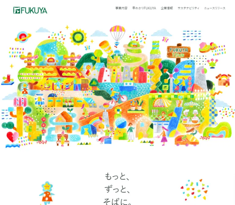
FUKUYA presents its real-estate group as an inhabited, imaginative town. Houses, trains, bicycles, playgrounds, plants, people, and fanciful structures form a dense illustration with grainy fills and irregular edges. The surrounding interface is restrained: a green wordmark, small dark navigation labels, Japanese sans-serif text, light English display headings, and thin arrows inside white circles.
The homepage is a corporate information hub with several destinations, rather than a single conversion funnel. Its distinctive rhythm moves between a full-viewport opening, spacious explanatory content, a lateral business sequence, corporate information links, news, and recruitment. A second panoramic illustration closes the page beneath a broad white curve.
閉じる
FUKUYA Holdings — Style Reference
A colorful crayon-like town framed by quiet corporate navigation and generous white space.
Website: fukuya-hd.co.jp Original URL: https://fukuya-hd.co.jp/ Final URL: https://fukuya-hd.co.jp/ Theme: light, with white space, cyan business scenery, and a vivid yellow recruitment area. Inspected: September 23, 2026, 06:39 JST; supplied retrieval timestamp September 22, 2026, 21:39:28.809 UTC. Viewports: desktop 1440 × 1000 CSS pixels; mobile 390 × 844 CSS pixels. Scope: the current corporate homepage. Visual evidence covers the opening illustration, a desktop business-section position, the desktop footer, and the mobile opening and recruitment/footer. Rendered DOM and computed styles additionally cover the introduction, five businesses, About, Company, Sustainability, and News. Linked pages, an expanded mobile menu, and video playback were not inspected.
FUKUYA presents its real-estate group as an inhabited, imaginative town. Houses, trains, bicycles, playgrounds, plants, people, and fanciful structures form a dense illustration with grainy fills and irregular edges. The surrounding interface is restrained: a green wordmark, small dark navigation labels, Japanese sans-serif text, light English display headings, and thin arrows inside white circles.
The homepage is a corporate information hub with several destinations, rather than a single conversion funnel. Its distinctive rhythm moves between a full-viewport opening, spacious explanatory content, a lateral business sequence, corporate information links, news, and recruitment. A second panoramic illustration closes the page beneath a broad white curve.
How to Read This Reference
- Measured means a value supplied by the rendered DOM or computed-style evidence. Tables round most measurements to two decimals.
- Visual estimate means an approximation from the supplied original-page screenshots. Estimated colors have not been sampled programmatically.
- Recommended means an implementation choice for reuse, including the CSS below. It is not a claim about the original stylesheet.
- Token names are descriptive aliases. The supplied custom-property inventory does not expose the site's complete visual token system.
- Capture coordinates are state-dependent. Several business and footer bounds overlap other sections or extend beyond the viewport. Use reliable dimensions and visible relationships; do not treat every recorded document coordinate as normal-flow layout.
- Only the supplied page evidence was used. No additional pages, assets, files, or interactions were accessed.
Tokens — Colors
Default Palette
| Name | Value | Suggested token | Evidence and role |
|---|---|---|---|
| Paper White | #ffffff |
--paper |
Measured body background and news-card fill; visually the opening canvas, organic business shapes, arrows' circular backgrounds, and footer |
| Botanical Ink | #34433c |
--ink |
Measured rgb(52, 67, 60); main text, navigation, and sampled Japanese headings |
| FUKUYA Green | approximately #00744d |
--brand |
Visual estimate; wordmark and mobile menu circle |
| Business Cyan | approximately #78dbe2 |
--business |
Visual estimate; large desktop business-section field |
| Recruitment Yellow | approximately #fff34b |
--sun |
Visual estimate; recruitment area and upper edge of the footer transition |
| Utility Gray | #999999 |
--muted-source |
Measured policy links, footer social links, and copyright |
The three estimated brand/section colors should be replaced with measured asset or stylesheet values if those become available. White, ink, and utility gray are directly supported by computed styles.
Color Roles
Most of the color complexity belongs to the artwork. Pink, orange, lime, blue, red, and turquoise appear as textured illustration colors, not as a large set of interface status colors. Keep functional text predominantly dark green-gray.
Cyan and yellow are architectural backgrounds. They occupy large areas and allow white circles or organic shapes to act as resting places. Brand green remains concentrated in identity and the mobile menu.
The header appears white over the opening, pale cyan over the business section, and pale yellow over the recruitment/footer area. The sampled HEADER element itself has a transparent background. A child, pseudo-element, or other compositing layer may produce the visible tint; its color and opacity were not provided. Do not report a specific blur or transparency formula as measured.
The supplied WordPress administrative purple and blue custom properties are not evidence of the public-facing palette. Likewise, generic preset font sizes do not replace the actual element measurements below.
Tokens — Typography
Japanese Interface — M PLUS 1p Stack
The computed family stack begins with M PLUS 1p:
'M PLUS 1p', 'Hiragino Sans', 'Hiragino Kaku Gothic ProN', 'ヒラギノ角ゴ ProN W3', 游ゴシック, YuGothic, 游ゴシック体, 'Noto Sans JP', 'BIZ UDPGothic', Meiryo, 'Helvetica Neue', Arial, sans-serif.
- Measured default weight:
500for body text, navigation, many headings, and general links. - Measured business-description weight:
400. - Character: clean Japanese sans-serif with an approachable, relatively open rhythm.
- Tracking: sampled text uses
normal, rather than exaggerated letter spacing. - Loading limitation: the computed family declaration is confirmed; the supplied evidence does not independently identify the font file used for every rendered glyph.
English Display — Poppins
Poppins, sans-serif, weight 400, is measured on the About, Company, and Sustainability headings. Their line height equals their font size. This gives the information sections a light geometric counterpoint to the Japanese copy.
The visible mobile recruitment word is large and white, but its text-bearing element was not included in the font sample. Using Poppins there is a reasonable adaptation, not a separately verified declaration.
Type Scale
Desktop and mobile columns describe the two inspected viewports, not a recovered responsive formula.
| Role | Desktop size / line height | Mobile size / line height | Weight | Evidence |
|---|---|---|---|---|
| Default body | 15.74 / 27.54px |
14.02 / 24.54px |
500 | Measured |
| Desktop primary navigation | 13.87 / 13.87px |
Hidden in the closed mobile header | 500 | Measured; desktop links also have 13.87px bottom padding |
| Introductory paragraph | 19.48 / 43.82px |
16.05 / 36.11px |
500 | Measured; approximately 2.25 line height |
| Business name | 23.22 / 40.63px |
18.07 / 31.63px |
500 | Measured |
| Business description | 17.48 / 34.96px |
14.05 / 28.10px |
400 | Measured; 2 line height |
| About paragraph | 17.48 / 34.96px |
14.05 / 28.10px |
500 | Measured |
| About / Company / Sustainability English heading | 60.43 / 60.43px |
30.43 / 30.43px |
400 | Measured Poppins |
| Business Japanese section label | 18.96 / 18.96px |
12.10 / 12.10px |
500 | Measured |
| News / recruitment Japanese section label | 19.22 / 19.22px |
14.07 / 14.07px |
500 | Measured |
| News item title | 19.48 / 34.09px |
16.05 / 28.09px |
500 | Measured |
| News category link | 13.87 / 13.87px |
13.01 / 13.01px |
500 | Measured |
| Footer primary link | 13.74 / 13.74px |
12.02 / 12.02px |
500 | Measured |
| Footer policy link | 13.61 / 13.61px |
12.02 / 12.02px |
500 | Measured |
| Mobile recruitment display word | Not visually measured | Approximately 54px |
Unverified | Visual estimate from the mobile capture |
Typography Boundaries
The FUKUYA wordmark is graphic identity. Its H1 wrapper inherits the body font, which does not identify the lettering in the logo. Use an authorized logo asset instead of recreating it with ordinary text.
The introduction's heading contains the source copy もっと、 / ずっと、 / そばに。. Its sampled H2 inherits the body font size, while its box is much taller than three body lines. The visible treatment may be controlled by descendants or graphics absent from the sample. The wrapper's 15.74px desktop and 14.02px mobile font sizes are therefore not reliable headline-glyph measurements.
Tokens — Spacing & Shapes
Density: compact navigation and utility text around large scenic areas and generous section spacing.
Measured geometry is role-specific. Desktop navigation spacing, the wider corporate-link panels, and the narrower news content area use different alignments. There is no evidence of one universal page gutter.
Layout Measurements
| Element or relationship | Desktop 1440 × 1000 | Mobile 390 × 844 | Status |
|---|---|---|---|
| Opening section | 1440 × 1000px |
390 × 844px |
Measured; one viewport high at both sizes |
| Header height | 98.56px |
85.39px |
Measured |
| Header top / bottom padding | 37.39 / 19.35px |
20.24 / 15.06px |
Measured |
| Logo wrapper | 168.67 × 41.84px |
120.67 × 31.38px |
Measured; not necessarily the painted asset bounds |
| Logo wrapper left edge | 80.84px |
20.84px |
Measured |
| Intro text column | 750px wide, centered |
349.53px wide |
Measured |
| Intro top padding after opening | 138.25px |
61.10px |
Measured |
| Standard mobile content gutter | — | 20.23px |
Measured across intro, business anchors, corporate panels, and news |
| About copy width | 463.66px |
327.09px |
Measured; mobile left inset 31.45px |
| Desktop business anchor width | 280.84px |
349.53px |
Measured; mobile visibility/flow caveat below |
| Desktop business pitch / clear gap | 380.84 / 100px |
— | Calculated from measured anchor bounds |
| Alternating desktop business offset | 93.47px |
— | Calculated from measured tops |
| Major circular-link box | 94.77 × 94.77px |
60.48 × 60.48px |
Measured on the recruitment link; matching heights on other major links |
| Circle-to-label gap | 18.69px |
10.12px |
Measured on major inline links |
| Company / Sustainability panel | Approximately 593.51 × 556.44px each |
349.53 × 303.78px each |
Measured |
| Corporate panel separation | 69.55px horizontally |
20.23px vertically |
Calculated from measured bounds |
| News item | 837.06 × 169.13px |
349.53 × 111.80px |
Measured in the captured state; not recommended fixed heights |
| News item gap | 18.69px |
10.11px |
Calculated from measured bounds |
| News item radius | 18.69px |
10.12px |
Measured |
| News item padding, top / horizontal / bottom | 51.73 / 62.82 / 41.73px |
30.31 / 15.67 / 20.31px |
Measured |
Shape Vocabulary
- Organic white islands: uneven, soft silhouettes behind business illustrations and text. The anchor itself reports zero border radius; the visible shape belongs to another layer whose geometry was not sampled.
- Circular navigation marks: white circles with thin dark arrows. Business-item circles appear about
60pxacross in the desktop screenshot, smaller than the measured94.77pxmajor links. - Mobile menu: an approximately
50pxgreen circle with three white horizontal strokes. - News cards: conventional rounded rectangles, with measured radii around
19pxdesktop and10pxmobile. - Footer transition: a large white arch rising into yellow. It is a panoramic section boundary, not a small scalloped divider.
Reusable Spacing Scale
For a new implementation, a practical rounded scale is 10, 15, 20, 30, 40, 60, 80, 100, 140px. This is a recommended working scale, not a recovered source variable system. Preserve the distinctive 100px desktop business gap and the roughly 20px phone gutters before normalizing incidental decimals.
Components
Persistent Corporate Header
Role: keep the group identity and major destinations available while the illustration and background change.
The desktop header places the green FUKUYA mark at the left, followed by a large open interval. Six navigation labels run across the right portion: 事業内容, 早わかりFUKUYA, 企業情報, サステナビリティ, ニュースリリース, and 採用情報. Three small social marks follow: X, Instagram, and YouTube.
At 1440px, the first navigation link starts at approximately x = 617.27px. Consecutive text-link boxes are separated by about 27.38px. Social-link boxes are about 17.59px wide, with a horizontal pitch of approximately 33.33px.
The same header remains at the top of the supplied scrolled screenshots. This supports persistent behavior, though the exact position rule was not supplied. Its lightly tinted appearance over colored areas should be preserved without assuming a glass-blur effect.
On mobile, the desktop navigation and header social icons are replaced visually by a circular menu control at the upper right. The green circle is approximately 50px, near x = 319px, y = 20px. Only the closed state is evidenced. Menu contents, opening animation, focus management, and dismissal behavior remain unverified.
A small outward-link-style glyph follows the recruitment label. Its supplied destination is still /recruit/ on the same domain. The glyph alone does not prove external navigation or a new tab.
Opening Town Illustration
Role: establish the group's human and residential world before presenting explanatory text.
The opening is a full-viewport section with no visible headline or button in either supplied opening capture. The illustration carries the entire first impression.
On desktop, the artwork's visible marks extend approximately from y = 124px to y = 875px, nearly across the full viewport width. Its perimeter is irregular and open, with isolated stars, clouds, confetti, and small motifs around the main town.
On mobile, the complete town is reduced to approximately the screen width and occupies roughly y = 78–300px. It is not cropped into a tall hero. The remainder of the 844px opening viewport is largely blank white space. That unusual amount of empty space is an observed feature of the captured state; do not fill it with an invented headline or stretch the artwork vertically.
Keep the complete scene recognizable: the globe at the left, balloon near the top, central buildings and transport, the FUKUYA TOWN sign toward the right, and the lower domestic and recreational scenes.
Introductory Statement
Role: connect the imaginative town to the group's real-estate services.
The DOM places the introduction after the viewport-height opening. It contains the three-line statement もっと、 / ずっと、 / そばに。, followed by a short paragraph about creating possibilities for living through future-oriented real-estate services.
The paragraph is unusually airy: approximately 19.48px / 43.82px on desktop and 16.05px / 36.11px on mobile. Its column is 750px on desktop and nearly the available width on mobile.
A video element is present in the supplied markup for this section. No playable media frame, source URL, poster, controls, audio state, or playback interaction was supplied. Treat media placement and behavior as incomplete evidence.
Business Section and Horizontal Sequence
Role: introduce five group businesses as distinct parts of the same illustrated world.
The desktop screenshot shows a large cyan field with white organic islands at staggered heights. A partial item exits the left edge, while ジェネシス, 福屋アセットマネジメント, and 福屋ライフサービス are visible across the center and right.
The DOM contains five business links. At the sampled position, they begin at x = 656.58, 1037.42, 1418.27, 1799.11, and 2179.95px. Each is about 280.84px wide. The last three appearing inside the later screenshot demonstrates a changed horizontal offset relative to those initial bounds.
This is consistent with a scrolling horizontal stage. The desktop section's measured height of 3221.63px also suggests a substantial scroll allocation. The supplied material does not establish the exact pinning implementation, translation formula, drag support, or autoplay behavior.
Do not mistake each item's arrow for a carousel control. The observed anchors lead to business-detail fragments; the arrow belongs to that destination link.
Business Island
Role: combine a small illustrated identity, a company name, a brief description, and a clear destination.
The anatomy is:
- A colorful illustration selected from the wider town vocabulary.
- An irregular white shape behind the upper content.
- A centered company name in dark ink.
- A left-aligned Japanese description with approximately double line spacing.
- A small white circular arrow centered below.
The white island is not always a container around every line. In the visible Genesis item, the description continues below the rounded white area and sits over cyan. In the asset-management item, the shape extends farther behind the copy. Preserve this loose composition instead of forcing all five businesses into identical filled rectangles.
Observed illustrations include an arched blue-and-green house for Genesis, a yellow geometric structure for asset management, and a heart with plants and a blue wave for life services.
The link wraps the business name and description in the DOM. In a new implementation, use one semantic anchor for the whole item and a decorative arrow inside it, avoiding nested interactive controls.
Major Circle-and-Label Link
Role: provide secondary navigation to a complete section or index.
Examples include 事業一覧, 早わかりFUKUYA, and お知らせ一覧. Their measured anchor height is 94.77px on desktop and 60.48px on mobile, with a gap of 18.69px or 10.12px between the circular mark and text.
Use a simple arrow with a thin stroke. The visual language is open and light; the circular mark is more important than a heavy icon. The recruitment link uses a square box matching these dimensions and appears as a white circle in the mobile screenshot.
About Feature
Role: introduce the group's identity through five themes.
The desktop text occupies the right portion of the section. The sampled English heading is two lines of Poppins at 60.43px, while the paragraph is 463.66px wide. On mobile, the measured heading is 30.43px, and the copy column is 327.09px wide with approximately 31.45px side placement.
The heading's recorded color is white on desktop and ink on mobile. Its transition includes color changes, so viewport and reveal state may both matter. The section's complete visual background was not included in the screenshots. Do not invent a photograph or diagnose white-on-white text from the transparent wrapper alone.
Company and Sustainability Portals
Role: provide two prominent corporate destinations.
On desktop, two equally sized anchor panels sit beside one another, each about 593.51 × 556.44px, separated by 69.55px. On mobile, they form a vertical sequence of 349.53 × 303.78px panels with a 20.23px gap.
Each panel contains an English display heading and a Japanese destination label. The English heading is white Poppins, 60.43px desktop and 30.43px mobile. Desktop left padding is 78.24px; mobile padding is 20px.
The panels' image or decorative backing is not shown in the supplied captures, and the sampled anchor backgrounds are transparent. Reuse the layout measurements without inventing their asset subject matter.
News Area
Role: make current announcements browsable by category and through individual article links.
Desktop uses an asymmetric two-column layout. The category area starts around x = 167.78px; article cards start at x = 435.14px and are 837.06px wide. Three news entries are present in the evidence, with dates, category labels, and titles.
On mobile, categories wrap into several rows above the news cards. Cards take the 349.53px content width. Their corner radius decreases from 18.69px to 10.12px, and horizontal padding decreases substantially.
An article card contains metadata followed by a larger title. Its computed transition is border-color 0.6s; the border's normal and interactive colors were not supplied. Do not replace that with an asserted shadow-lift effect.
The category elements are anchors to category URLs. There is no evidence that they filter results in place. Keep their navigation semantics unless implementing a separately specified filtering feature.
Recruitment Invitation
Role: close the corporate content with an inviting route to recruitment.
The mobile capture shows a saturated yellow field, a large centered white Recruit word, the smaller dark label 採用情報, and a white circular link with an upward-right arrow. Small illustrated characters and patterns surround the content.
The circular link measures 60.48px on mobile. Its desktop counterpart measures 94.77px. This is a destination link, not an inline form or application widget.
Keep the Japanese label dark and readable. The large white English word is a visual heading with low contrast against yellow; it should not be the only accessible identification of the destination.
Curved Illustrated Footer
Role: return to the town motif while presenting corporate and policy navigation.
A broad white arch rises into the yellow field. In the desktop screenshot, the center of the arch is near y = 263px, while its sides meet the viewport around y = 420px. These are visual estimates of the captured transition, not source curve coordinates.
Below the crest, a panoramic illustration shows trees, a bench, a small car, houses, a train, a playground, hills, clouds, and people. It reuses the opening world's visual vocabulary in a different, shallow arrangement.
The desktop footer keeps navigation and policy links on the left, social icons below, and the Japanese corporate wordmark and copyright toward the right. On mobile, all these groups are centered and stacked:
- Six primary links wrapping into two lines.
- Four policy links wrapping into two lines.
- X, Instagram, and YouTube icons.
- The corporate wordmark.
- Copyright.
Primary footer links remain dark; policy text, social marks, and copyright use measured #999999. The visible copyright reads © 2023 FUKUYA Holdings CO.,LTD.; this text is not evidence of the site's current design date.
Tokens — Motion & Interaction
The following declarations are present in the supplied computed styles. A declaration confirms configured timing, not that its trigger or complete animation was exercised.
| Element | Measured declaration or visual evidence | Interpretation and limitation |
|---|---|---|
| Header | opacity 1.8s 8s |
A delayed opacity transition exists; its opening-state conditions were not inspected |
| Header and footer text links | color 0.3s |
Short color feedback is configured; endpoint colors and trigger states were not supplied |
| Intro and About paragraphs | transform 1.05s cubic-bezier(0.215, 0.61, 0.355, 1), opacity 0.75s |
Supports a combined movement-and-fade reveal; direction and distance are unknown |
| Business Japanese section label | opacity 0.6s 0.3s, translate 0.9s 0.3s |
Delayed reveal timing is configured; exact translation is not provided |
| About English heading | opacity 0.6s, color 1.2s, left 0.6s |
Heading appearance, color, and horizontal placement can transition |
| News cards | border-color 0.6s |
Border feedback rather than a measured elevation animation |
| Desktop business sequence | Offscreen horizontal DOM bounds and a later view of subsequent items | Supports a changing lateral position; exact scroll coupling and input behavior remain unverified |
| Mobile menu | Closed green circle with three strokes | Opening behavior and menu geometry are unverified |
| Video | Video markup in the introduction | Playback, sound, controls, and loading behavior are unverified |
The sampled elements generally report animation: none. This does not establish that the entire page lacks animation: other descendants, pseudo-elements, JavaScript, and media were not fully represented.
For a reusable implementation, retain short color feedback and modest movement. Do not add continuous bouncing to every character based only on the playful illustration. A static, complete presentation should remain available before any scroll animation enhancement.
Surfaces
| Layer | Appearance | Evidence and implementation guidance |
|---|---|---|
| Opening canvas | White, unruled, spacious | Visible on both viewports |
| Persistent header | Light, apparently tinted by the section beneath | Visible; exact compositing layer unknown |
| Business field | Flat cyan | Visually confirmed; hex is estimated |
| Business islands | Irregular white silhouettes | Visually confirmed; source shape geometry unavailable |
| Major navigation circles | Flat white with a thin dark arrow | Visually confirmed; no visible shadow in the supplied examples |
| News cards | White rounded rectangles | Measured fill and radius; surrounding backdrop is not visually established |
| Corporate portal backing | Unverified | White heading text is measured, but the complete visual layer is not shown |
| Recruitment field | Flat vivid yellow with scattered artwork | Visually confirmed on mobile |
| Footer | White arch and white content surface | Visually confirmed on both viewports |
There is no visible general-purpose shadow system in the provided screenshots. Separation comes from color fields, silhouette, scale, and spacing. Do not extrapolate an absence of shadows to unseen pages or states.
Imagery
The artwork looks like layered crayon or oil-pastel drawing on white paper. That describes its appearance, not a verified production medium. Filled areas have grain, uneven coverage, and slightly irregular edges. Bright shapes overlap without heavy black outlines.
The scenes mix ordinary residential life with imaginative architecture. A bicycle, a train, kitchen activity, plants, benches, and small people make the real-estate subject feel inhabited. A globe, balloon, rainbow forms, unusual towers, and playful geometric trees keep the scene expressive.
Preserve these relationships:
- Keep texture inside the artwork while interface surfaces remain clean.
- Use a wide town panorama for the opening and a shallower, separately composed panorama for the footer.
- Use isolated motifs from the same visual world for businesses and recruitment.
- Let white space show between motifs and around the irregular perimeter.
- Scale raster artwork normally with sufficient source resolution. This is grainy illustration, not pixel art;
image-rendering: pixelatedwould change its character. - Avoid turning the town into a background image that crops differently behind text at every breakpoint.
Observed Asset References
No original image filenames, image URLs, video source URLs, or font-file URLs were supplied. The references below identify visible uses, not guessed asset paths.
| Asset or motif | Original-page evidence | Required treatment |
|---|---|---|
| FUKUYA header mark | Desktop and mobile opening captures | Preserve official proportions and green coloration |
| Opening town panorama | Desktop and mobile opening captures | Full composition, natural aspect ratio, clean white surroundings |
| Genesis motif | Desktop business capture | Blue-and-green arched structure with surrounding small marks |
| Asset-management motif | Desktop business capture | Yellow geometric structure with blue and multicolor accents |
| Life-services motif | Desktop business capture | Red/pink heart, plants, and blue wave |
| Recruitment ornaments | Mobile recruitment/footer capture | Small separated characters and patterns around the heading |
| Footer panorama | Desktop and mobile footer captures | Shallow horizontal scene with broad white margins |
| Corporate footer mark | Desktop and mobile footer captures | Separate Japanese wordmark asset; do not typeset an approximation |
| Social marks and arrows | Header, business, recruitment, and footer captures | Small, restrained symbols; icon-library identity not established |
Use authorized artwork or commission a coherent replacement set. CSS can reproduce the interface and composition, but simple geometric placeholders cannot reproduce the town's identity.
Layout & Responsive Behavior
Opening and Header
The opening section equals the inspected viewport height on both devices: 1000px desktop and 844px mobile. The illustration scales with width while the section keeps its vertical extent. This explains the large mobile white area below the scene.
The desktop navigation becomes a closed circular menu control by 390px. The breakpoint between the inspected widths is unknown. The logo wrapper decreases from approximately 169px to 121px wide, while the header decreases only from approximately 99px to 85px tall.
Business Sequence
Desktop geometry and the business screenshot support a lateral sequence with staggered items. The mobile sample gives all five anchors the same 20.23px left edge and 349.53px width, with increasing vertical positions. This suggests a single-column adaptation.
However, the mobile business section's own recorded height is only 481.25px, while its child bounds continue far beyond it and overlap the sampled About, corporate-link, and News sections. A mobile business screenshot was not supplied. Therefore, the actual visibility, containment, and scroll handoff cannot be reconstructed reliably from these coordinates alone.
For a new implementation, use a fully reachable vertical list on mobile. Treat that as a robust recommendation rather than a verified reconstruction of the original scroll system.
Information and News
The two desktop corporate portals become stacked panels. Their English heading size is approximately halved. The news sidebar becomes wrapped category navigation above full-width cards. Text padding and radii reduce, but the content does not need to become visually dense.
Footer
The desktop footer's left/right alignment becomes a centered sequence on mobile. The illustration remains panoramic instead of being replaced by a vertically cropped scene.
Footer and recruitment bounds overlap in both DOM snapshots. The screenshot clearly shows their final visual relationship, but the source positioning or reveal mechanism is not recoverable from the supplied bounds. Do not implement the recorded footer width or vertical overlap as a universal static rule.
Document-Length Limitation
The supplied document heights are approximately 8314px desktop and 4575px mobile. These are captured document extents, not recommended layout targets. The unusual child bounds and overlapping layers mean that summing measured section heights would not reproduce the visible scrolling experience.
Do’s and Don’ts
Do
- Make the complete illustrated town the opening's main visual event.
- Retain the large mobile white area when matching the supplied opening state.
- Keep Japanese UI text dark green-gray and moderately weighted.
- Use light Poppins headings where the evidence confirms them.
- Preserve generous Japanese paragraph leading, especially in business descriptions.
- Treat cyan and yellow as large section fields rather than tiny accent badges.
- Stagger desktop business items and allow their white silhouettes to differ.
- Keep the service arrow associated with its destination anchor.
- Use a second, shallow illustration to close the page.
- Preserve the footer's hierarchy between primary links, policy links, social icons, and identity.
- Keep measured values, visual estimates, and adaptations distinguishable in implementation notes.
Don’t
- Don't turn this corporate homepage into a product-sales layout with pricing cards and repeated conversion buttons.
- Don't crop the town into a tall phone image or enlarge it until important motifs disappear.
- Don't invent a visible opening headline based on text found later in the DOM.
- Don't place every business inside an identical rounded rectangle.
- Don't add glossy gradients, heavy shadows, or glass blur to the supplied visual language.
- Don't replace the grainy artwork with clean vector clip art or pixelated raster scaling.
- Don't assume arrow circles are slider controls.
- Don't assume news categories perform client-side filtering.
- Don't infer a menu overlay, video behavior, or hover endpoint that was not observed.
- Don't use transformed or overlapping DOM coordinates as fixed page-position instructions.
- Don't treat administrative CSS variables as public brand tokens.
Recommended Implementation Additions
These are recommendations for a new implementation, not verified original-site features:
- Give the menu button a descriptive accessible name,
aria-expanded, andaria-controls. Implement keyboard opening, closing, and appropriate focus behavior for the chosen menu pattern. - Give icon-only destination links and social links meaningful accessible names. Keep decorative arrow graphics hidden from assistive technology.
- Provide a useful text alternative for the opening town, while marking repeated decorative motifs as decorative.
- Keep all business destinations reachable without a pinned horizontal animation. Enhance a working list rather than making JavaScript transforms the only way to access content.
- Respect reduced-motion preferences. Show reveal content immediately and remove large scroll-driven translations when a simpler layout is needed.
- Use a darker utility-text color when normal-size policy text needs stronger contrast. The measured
#999999is a source reference, not an accessibility recommendation. - Preserve dark Japanese recruitment text and a descriptive link name so the white display word is not the sole way to identify the action.
- Let news titles wrap and cards grow. The measured card heights and single-line title bounds should not become clipping rules for future content.
- Reserve intrinsic space for illustration and video assets. Supply a meaningful media fallback without requiring playback for essential information.
Agent Prompt Guide
Quick Color Reference
- Canvas, islands, and circles: measured
#ffffff. - Main text: measured
#34433c. - Identity and mobile menu: approximately
#00744d. - Business section: approximately
#78dbe2. - Recruitment section: approximately
#fff34b. - Original footer utility text: measured
#999999. - Most additional colors belong to artwork, not interactive UI states.
Overall Prompt
“Create an illustration-led corporate homepage for a Japanese real-estate group, using the FUKUYA homepage as a structural and visual reference. Begin with a complete, richly colored crayon-like town on white inside a viewport-height opening. Keep a small green wordmark and compact dark navigation above it; on phones, use a green circular menu control and preserve the panorama at its natural ratio. Use M PLUS 1p for Japanese text and light Poppins for supported English headings. Introduce businesses across a cyan field using staggered white organic shapes, isolated textured illustrations, centered names, left-aligned descriptions, and small white arrow circles. Follow with corporate destinations and spacious news cards. End with a yellow recruitment invitation, a broad white arch, a shallow illustrated town panorama, and a restrained corporate footer. Keep the interface flat and calm so the artwork supplies the richness.”
Example Component Prompts
- Opening: “A white viewport-height opening with a complete panoramic crayon-like town. Keep colorful houses, people, plants, transport, clouds, and playful towers visible. Do not overlay a headline. At 390px, scale the entire panorama to the screen width near the top and leave substantial white space beneath it.”
- Business island: “Create one linked business introduction on cyan. Place an irregular white island behind a textured illustration and centered Japanese company name. Use a left-aligned description with double line spacing, allowing part of the copy to extend beyond the island. Finish with a small white circle containing a thin right arrow. No rectangular card border or shadow.”
- Corporate portals: “Build two equal desktop destination panels that stack on phones. Use light Poppins English headings at about 60px desktop and 30px mobile, with Japanese labels and arrow links. Accept supplied background artwork as an input; do not invent photographic subjects.”
- News area: “Use a narrow category column beside three wide white news cards. Each card contains date/category metadata and a Japanese title. Use roughly 19px corner radii and generous desktop padding. On phones, wrap category links above the cards, reduce radii to about 10px, and let titles wrap.”
- Recruitment and footer: “Center a large white recruitment word and smaller dark Japanese label on bright yellow, with a white arrow circle and sparse illustrated characters. Transition through a broad white arch into a shallow town illustration. Below it, stack centered primary links, policy links, social icons, corporate identity, and copyright on mobile.”
Quick Start
CSS Custom Properties
This is a recommended static adaptation using measured endpoint sizes and estimated section colors. It does not reproduce the original pinning, reveal logic, menu opening, video playback, or overlapping footer implementation.
Use these class relationships: .site-header contains .brand, .primary-nav, .header-social, and .menu-toggle; .opening contains .opening-art; .business-track contains linked .business-card elements; .news-layout contains categories and .news-list. Each business anchor contains an image, heading, paragraph, and decorative .circle-arrow span.
Load authorized font and illustration assets separately. The opening offsets assume artwork trimmed near its visible bounds; assets with built-in white margins require alignment adjustments. The 70rem breakpoint is a recommended implementation breakpoint, not a recovered source value. Organic shapes and the footer curve below are approximations.
:root {
  /* Measured public-facing colors */
  --paper: #ffffff;
  --ink: #34433c;
  --muted-source: #999999;

  /* Visual estimates: replace when exact values become available */
  --brand: #00744d;
  --business: #78dbe2;
  --sun: #fff34b;

  /* Recommended readable alternative for utility copy */
  --muted-readable: #66736c;

  /* Declared source families, with a shorter fallback stack */
  --font-ja: 'M PLUS 1p', 'Hiragino Sans',
    'Hiragino Kaku Gothic ProN', 'Yu Gothic',
    'Noto Sans JP', Meiryo, Arial, sans-serif;
  --font-en: 'Poppins', sans-serif;

  --body-size: 15.74px;
  --body-leading: 1.75;
  --detail-size: 17.48px;
  --business-title-size: 23.22px;
  --display-size: 60.43px;
  --page-inset: 20.23px;
  --header-height: 98.56px;
  --major-circle: 94.77px;
  --link-gap: 18.69px;
  --news-radius: 18.69px;
  --news-gap: 18.69px;
  --feedback-duration: 300ms;
}

* { box-sizing: border-box; }

html {
  scroll-padding-top: calc(var(--header-height) + 20px);
}

body {
  margin: 0;
  color: var(--ink);
  background: var(--paper);
  font: 500 var(--body-size) / var(--body-leading) var(--font-ja);
}

img { max-width: 100%; }
button, input { font: inherit; }
a { color: inherit; }

.content {
  width: min(1104.44px, calc(100% - 2 * var(--page-inset)));
  margin-inline: auto;
}

.site-header {
  position: fixed;
  inset: 0 0 auto;
  z-index: 50;
  display: flex;
  align-items: flex-start;
  gap: 32px;
  min-height: var(--header-height);
  padding: 37.39px 3.8vw 19.35px 5.614vw;
  /* Approximation of the pale header; no blur is asserted. */
  background: rgb(255 255 255 / 78%);
}

.brand {
  display: block;
  flex: 0 0 168.67px;
  width: 168.67px;
  margin: 0;
}

.brand img { display: block; width: 100%; height: auto; }

.primary-nav {
  display: flex;
  align-items: flex-start;
  gap: 27.38px;
  margin-inline-start: auto;
}

.primary-nav a {
  padding-bottom: 13.87px;
  font-size: 13.87px;
  line-height: 1;
  white-space: nowrap;
  text-decoration: none;
  transition: color var(--feedback-duration);
}

.header-social {
  display: flex;
  gap: 15.74px;
  font-size: 17.61px;
  line-height: 1;
}

.menu-toggle {
  display: none;
  width: 50px;
  height: 50px;
  flex: 0 0 50px;
  align-content: center;
  justify-items: center;
  gap: 7px;
  padding: 0;
  border: 0;
  border-radius: 50%;
  color: var(--paper);
  background: var(--brand);
  cursor: pointer;
}

.menu-toggle span {
  display: block;
  width: 25px;
  height: 2px;
  background: currentColor;
}

.opening {
  position: relative;
  min-height: 100vh;
  min-height: 100svh;
  background: var(--paper);
}

.opening-art {
  position: absolute;
  inset: 124px 0 auto;
  display: block;
  width: 100%;
  height: auto;
  object-fit: contain;
}

.intro { padding-block: 138.25px 100px; }

.intro-inner {
  width: min(750px, calc(100% - 2 * var(--page-inset)));
  margin-inline: auto;
}

.intro-title {
  /* Recommended fallback; original headline glyph size is unknown. */
  margin: 0 0 60px;
  font-size: clamp(30px, 3.2vw, 46px);
  font-weight: 500;
  line-height: 1.5;
}

.intro-copy {
  margin: 0;
  font-size: 19.48px;
  line-height: 2.25;
}

.display-title {
  margin: 0;
  font-family: var(--font-en);
  font-size: var(--display-size);
  font-weight: 400;
  line-height: 1;
}

.text-link {
  display: inline-flex;
  align-items: center;
  gap: var(--link-gap);
  text-decoration: none;
}

.circle-arrow {
  display: inline-grid;
  place-items: center;
  flex: 0 0 var(--major-circle);
  width: var(--major-circle);
  height: var(--major-circle);
  border-radius: 50%;
  color: var(--ink);
  background: var(--paper);
}

.circle-arrow svg {
  width: 20px;
  height: 20px;
  fill: none;
  stroke: currentColor;
  stroke-width: 1.25;
}

.business-section {
  padding-block: 100px 120px;
  background: var(--business);
}

.business-track {
  /* Accessible horizontal overflow, not reconstructed pinning. */
  display: flex;
  align-items: flex-start;
  gap: 100px;
  overflow-x: auto;
  overscroll-behavior-inline: contain;
  padding: 60px max(20.23px, calc((100vw - 1104.44px) / 2)) 40px;
}

.business-card {
  position: relative;
  isolation: isolate;
  display: flex;
  flex: 0 0 280.84px;
  flex-direction: column;
  width: 280.84px;
  color: var(--ink);
  text-decoration: none;
}

.business-card:nth-child(even) { margin-top: 93.47px; }

.business-card::before {
  /* Approximate organic backing; use supplied shapes when available. */
  content: '';
  position: absolute;
  z-index: -1;
  inset: 15px -10px auto;
  height: var(--island-height, 300px);
  border-radius: 46% 54% 44% 56% / 43% 48% 52% 57%;
  background: var(--paper);
}

.business-card:nth-child(even)::before {
  border-radius: 52% 48% 38% 62% / 42% 58% 42% 58%;
}

.business-card__art {
  display: block;
  width: 100%;
  height: var(--art-height, 170px);
  object-fit: contain;
}

.business-card h3 {
  margin: 0 0 23.69px;
  font-size: var(--business-title-size);
  font-weight: 500;
  line-height: 1.75;
  text-align: center;
}

.business-card p {
  margin: 0;
  font-size: var(--detail-size);
  font-weight: 400;
  line-height: 2;
}

.business-card .circle-arrow {
  --major-circle: 60px;
  margin: 22px auto 0;
}

.about-layout {
  display: grid;
  grid-template-columns: repeat(2, minmax(0, 1fr));
  align-items: center;
  gap: 64px;
  padding-block: 100px;
}

.about-copy p { font-size: var(--detail-size); line-height: 2; }

.portal-grid {
  display: grid;
  grid-template-columns: repeat(2, minmax(0, 1fr));
  gap: 69.55px;
  width: min(1256.56px, calc(100% - 2 * var(--page-inset)));
  margin-inline: auto;
  padding-block: 71.73px 130.86px;
}

.portal {
  display: flex;
  min-width: 0;
  min-height: 556.44px;
  flex-direction: column;
  justify-content: center;
  gap: 28px;
  padding: 40px 20px 40px 78.24px;
  text-decoration: none;
  /* Readable fallback, not an observed portal background. */
  background: var(--portal-surface, var(--brand));
  color: var(--paper);
}

.news-section { padding-block: 140px 150px; }

.news-layout {
  display: grid;
  grid-template-columns: 251.63px minmax(0, 1fr);
  align-items: start;
  gap: 15.73px;
}

.news-categories {
  display: flex;
  flex-direction: column;
  align-items: flex-start;
  gap: 23.59px;
  margin-top: 40px;
  font-size: 13.87px;
}

.news-categories a { text-decoration: none; }
.news-list { display: grid; gap: var(--news-gap); }

.news-card {
  display: block;
  padding: 51.73px 62.82px 41.73px;
  border: 2px solid transparent;
  border-radius: var(--news-radius);
  background: var(--paper);
  text-decoration: none;
  transition: border-color 600ms;
}

.news-meta { display: flex; flex-wrap: wrap; gap: 16px; }

.news-card h3 {
  margin: 14px 0 0;
  font-size: 19.48px;
  font-weight: 500;
  line-height: 1.75;
  overflow-wrap: anywhere;
}

.news-index { margin-top: 40px; text-align: right; }

.recruit {
  padding: 100px var(--page-inset) 80px;
  text-align: center;
  background: var(--sun);
}

.recruit-title {
  /* Display size is an adaptation; the mobile estimate is about 54px. */
  margin: 0;
  color: var(--paper);
  font: 400 72px / 1.1 var(--font-en);
}

.recruit-label { margin: 10px 0 20px; }

.footer-curve {
  height: clamp(32px, 11.11vw, 160px);
  overflow: hidden;
  background: var(--sun);
}

.footer-curve::before {
  content: '';
  display: block;
  width: 120%;
  height: 200%;
  margin-left: -10%;
  border-radius: 50% 50% 0 0;
  background: var(--paper);
}

.site-footer { padding-bottom: 77.39px; background: var(--paper); }
.footer-art { display: block; width: 100%; height: auto; }

.footer-layout {
  display: grid;
  grid-template-columns: minmax(0, 1fr) auto;
  gap: 40px;
  padding: 72px 3.8vw 0 5.614vw;
}

.footer-nav, .footer-policies, .footer-social {
  display: flex;
  flex-wrap: wrap;
  gap: 20px 27.38px;
}

.footer-nav { font-size: 13.74px; }
.footer-policies { margin-top: 20px; font-size: 13.61px; }
.footer-social { margin-top: 40px; font-size: 20px; }
.footer-layout a { text-decoration: none; }

.footer-policies, .footer-social, .copyright {
  /* Use --muted-source only when matching the original color exactly. */
  color: var(--muted-readable);
}

.footer-identity { align-self: end; text-align: right; }
.footer-logo { display: block; width: 284px; height: auto; }
.copyright { margin: 20px 0 0; font-size: 13.74px; }

:where(a, button):focus-visible {
  outline: 3px solid var(--brand);
  outline-offset: 5px;
}

@media (hover: hover) {
  /* Recommended endpoints; original endpoint colors were not supplied. */
  .primary-nav a:hover { color: var(--brand); }
  .news-card:hover { border-color: var(--brand); }
}

@media (max-width: 70rem) {
  :root {
    --body-size: 14.02px;
    --detail-size: 14.05px;
    --business-title-size: 18.07px;
    --display-size: 30.43px;
    --header-height: 85.39px;
    --major-circle: 60.48px;
    --link-gap: 10.12px;
    --news-radius: 10.12px;
    --news-gap: 10.12px;
  }

  .site-header {
    align-items: center;
    padding: 20.24px 20.84px 15.06px;
  }
  .brand { flex-basis: 120.67px; width: 120.67px; }
  .primary-nav, .header-social { display: none; }
  .menu-toggle { display: grid; margin-left: auto; }
  .opening-art { top: 78px; }
  .intro { padding-block: 61.10px 80px; }
  .intro-title { margin-bottom: 30px; }
  .intro-copy { font-size: 16.05px; }

  .business-section { padding-block: 82.45px 91.10px; }
  .business-track {
    display: grid;
    gap: 40.23px;
    overflow: visible;
    padding: 50px var(--page-inset) 0;
  }
  .business-card { width: 100%; max-width: 420px; margin-inline: auto; }
  .business-card:nth-child(even) { margin-top: 0; }
  .business-card::before { inset-inline: 0; }
  .business-card h3 { margin-bottom: 15.11px; }

  .about-layout { grid-template-columns: 1fr; gap: 30px; }
  .portal-grid { grid-template-columns: 1fr; gap: 20.23px; }
  .portal { min-height: 303.78px; padding: 30px 20px; }
  .news-layout { grid-template-columns: 1fr; gap: 30px; }
  .news-categories { flex-direction: row; flex-wrap: wrap; gap: 20px; }
  .news-card { padding: 30.31px 15.67px 20.31px; }
  .news-card h3 { font-size: 16.05px; }
  .recruit { padding-top: 60.61px; }
  .recruit-title { font-size: 54px; }

  .site-footer { padding-bottom: 60.24px; }
  .footer-layout { display: block; padding: 50px var(--page-inset) 0; }
  .footer-nav, .footer-policies, .footer-social { justify-content: center; }
  .footer-nav { gap: 15px; font-size: 12.02px; }
  .footer-policies { margin-top: 30px; gap: 20px; font-size: 12.02px; }
  .footer-social { gap: 20px; margin-top: 35px; }
  .footer-identity { margin-top: 40px; text-align: center; }
  .footer-logo { width: 201px; margin-inline: auto; }
  .copyright { font-size: 12.02px; }
}

@media (prefers-reduced-motion: reduce) {
  .primary-nav a, .news-card { transition: none; }
  .reveal { opacity: 1; transform: none; translate: none; }
}
The CSS provides the closed mobile header only. Implement the menu interaction separately before using it as the only route to primary navigation. For original-style lateral choreography, add progressive enhancement after the business links work as a normal list.
Tailwind v4 Token Mapping
Optional aliases for an existing Tailwind v4 project. Define the custom properties above first. This mapping does not imply that the original site uses Tailwind.
@theme inline {
  --color-paper: var(--paper);
  --color-ink: var(--ink);
  --color-brand: var(--brand);
  --color-business: var(--business);
  --color-sun: var(--sun);
  --color-utility: var(--muted-readable);
  --font-body: var(--font-ja);
  --font-display: var(--font-en);
  --text-body: var(--body-size);
  --text-detail: var(--detail-size);
  --text-business-title: var(--business-title-size);
  --text-display: var(--display-size);
  --radius-news: var(--news-radius);
  --spacing-page: var(--page-inset);
  --spacing-major-circle: var(--major-circle);
}
Sources & Evidence
- Inspected original and final website: FUKUYA Holdings. Both URLs are identical; the supplied response status is HTTP 200.
- Actual retrieval:
2026-09-22T21:39:28.809Z, equivalent to September 23, 2026, 06:39:28.809 JST. - Desktop evidence: three original-page captures at
1440 × 1000, showing the opening, a business-section position, and the footer. Rendered DOM, link destinations, element bounds, and selected computed styles were supplied for the homepage. - Mobile evidence: two original-page captures at
390 × 844, showing the opening and recruitment/footer. A corresponding rendered DOM and computed-style sample was supplied. - DOM-supported middle sections: introduction and video markup, all five businesses, About, Company, Sustainability, three news entries, category links, and recruitment. Their complete visual states were not all captured.
- Readiness procedure: the supplied capture process waited for document loading, visible image decoding, sampled layout/text stability, and applicable finite animations within stated time limits. Perpetual animations were temporarily paused during readiness checks and then resumed. Intermediate scrolling was performed. These measures do not guarantee that every delayed state or interaction was exercised.
- Interaction limits: no expanded menu, hover endpoint, keyboard flow, video playback, business-link navigation, news filtering, or destination-page behavior was supplied. Exact scrolling formulas, image paths, loaded font files, and complete pseudo-element styles remain unavailable.
- Geometry limits: mobile business children extend beyond their recorded section and overlap later bounds; recruitment/footer bounds also overlap. The reference distinguishes those state-dependent measurements from dependable visual relationships.
This document describes the current homepage supported by the supplied evidence. Its CSS is an explicitly labeled adaptation, not a claim to reproduce unobserved animation or hidden implementation details.
# FUKUYA Holdings — Style Reference

> A colorful crayon-like town framed by quiet corporate navigation and generous white space.

**Website:** [fukuya-hd.co.jp](https://fukuya-hd.co.jp/)
**Original URL:** https://fukuya-hd.co.jp/
**Final URL:** https://fukuya-hd.co.jp/
**Theme:** light, with white space, cyan business scenery, and a vivid yellow recruitment area.
**Inspected:** September 23, 2026, 06:39 JST; supplied retrieval timestamp September 22, 2026, 21:39:28.809 UTC.
**Viewports:** desktop 1440 × 1000 CSS pixels; mobile 390 × 844 CSS pixels.
**Scope:** the current corporate homepage. Visual evidence covers the opening illustration, a desktop business-section position, the desktop footer, and the mobile opening and recruitment/footer. Rendered DOM and computed styles additionally cover the introduction, five businesses, About, Company, Sustainability, and News. Linked pages, an expanded mobile menu, and video playback were not inspected.

FUKUYA presents its real-estate group as an inhabited, imaginative town. Houses, trains, bicycles, playgrounds, plants, people, and fanciful structures form a dense illustration with grainy fills and irregular edges. The surrounding interface is restrained: a green wordmark, small dark navigation labels, Japanese sans-serif text, light English display headings, and thin arrows inside white circles.

The homepage is a corporate information hub with several destinations, rather than a single conversion funnel. Its distinctive rhythm moves between a full-viewport opening, spacious explanatory content, a lateral business sequence, corporate information links, news, and recruitment. A second panoramic illustration closes the page beneath a broad white curve.
閉じる
# FUKUYA Holdings — Style Reference

> A colorful crayon-like town framed by quiet corporate navigation and generous white space.

**Website:** [fukuya-hd.co.jp](https://fukuya-hd.co.jp/)
**Original URL:** https://fukuya-hd.co.jp/
**Final URL:** https://fukuya-hd.co.jp/
**Theme:** light, with white space, cyan business scenery, and a vivid yellow recruitment area.
**Inspected:** September 23, 2026, 06:39 JST; supplied retrieval timestamp September 22, 2026, 21:39:28.809 UTC.
**Viewports:** desktop 1440 × 1000 CSS pixels; mobile 390 × 844 CSS pixels.
**Scope:** the current corporate homepage. Visual evidence covers the opening illustration, a desktop business-section position, the desktop footer, and the mobile opening and recruitment/footer. Rendered DOM and computed styles additionally cover the introduction, five businesses, About, Company, Sustainability, and News. Linked pages, an expanded mobile menu, and video playback were not inspected.

FUKUYA presents its real-estate group as an inhabited, imaginative town. Houses, trains, bicycles, playgrounds, plants, people, and fanciful structures form a dense illustration with grainy fills and irregular edges. The surrounding interface is restrained: a green wordmark, small dark navigation labels, Japanese sans-serif text, light English display headings, and thin arrows inside white circles.

The homepage is a corporate information hub with several destinations, rather than a single conversion funnel. Its distinctive rhythm moves between a full-viewport opening, spacious explanatory content, a lateral business sequence, corporate information links, news, and recruitment. A second panoramic illustration closes the page beneath a broad white curve.

## How to Read This Reference

- **Measured** means a value supplied by the rendered DOM or computed-style evidence. Tables round most measurements to two decimals.
- **Visual estimate** means an approximation from the supplied original-page screenshots. Estimated colors have not been sampled programmatically.
- **Recommended** means an implementation choice for reuse, including the CSS below. It is not a claim about the original stylesheet.
- **Token names** are descriptive aliases. The supplied custom-property inventory does not expose the site's complete visual token system.
- **Capture coordinates are state-dependent.** Several business and footer bounds overlap other sections or extend beyond the viewport. Use reliable dimensions and visible relationships; do not treat every recorded document coordinate as normal-flow layout.
- Only the supplied page evidence was used. No additional pages, assets, files, or interactions were accessed.

## Tokens — Colors

### Default Palette

| Name | Value | Suggested token | Evidence and role |
| --- | --- | --- | --- |
| Paper White | `#ffffff` | `--paper` | Measured body background and news-card fill; visually the opening canvas, organic business shapes, arrows' circular backgrounds, and footer |
| Botanical Ink | `#34433c` | `--ink` | Measured `rgb(52, 67, 60)`; main text, navigation, and sampled Japanese headings |
| FUKUYA Green | approximately `#00744d` | `--brand` | Visual estimate; wordmark and mobile menu circle |
| Business Cyan | approximately `#78dbe2` | `--business` | Visual estimate; large desktop business-section field |
| Recruitment Yellow | approximately `#fff34b` | `--sun` | Visual estimate; recruitment area and upper edge of the footer transition |
| Utility Gray | `#999999` | `--muted-source` | Measured policy links, footer social links, and copyright |

The three estimated brand/section colors should be replaced with measured asset or stylesheet values if those become available. White, ink, and utility gray are directly supported by computed styles.

### Color Roles

Most of the color complexity belongs to the artwork. Pink, orange, lime, blue, red, and turquoise appear as textured illustration colors, not as a large set of interface status colors. Keep functional text predominantly dark green-gray.

Cyan and yellow are architectural backgrounds. They occupy large areas and allow white circles or organic shapes to act as resting places. Brand green remains concentrated in identity and the mobile menu.

The header appears white over the opening, pale cyan over the business section, and pale yellow over the recruitment/footer area. The sampled `HEADER` element itself has a transparent background. A child, pseudo-element, or other compositing layer may produce the visible tint; its color and opacity were not provided. Do not report a specific blur or transparency formula as measured.

The supplied WordPress administrative purple and blue custom properties are not evidence of the public-facing palette. Likewise, generic preset font sizes do not replace the actual element measurements below.

## Tokens — Typography

### Japanese Interface — M PLUS 1p Stack

The computed family stack begins with **M PLUS 1p**:

`'M PLUS 1p', 'Hiragino Sans', 'Hiragino Kaku Gothic ProN', 'ヒラギノ角ゴ ProN W3', 游ゴシック, YuGothic, 游ゴシック体, 'Noto Sans JP', 'BIZ UDPGothic', Meiryo, 'Helvetica Neue', Arial, sans-serif`.

- **Measured default weight:** `500` for body text, navigation, many headings, and general links.
- **Measured business-description weight:** `400`.
- **Character:** clean Japanese sans-serif with an approachable, relatively open rhythm.
- **Tracking:** sampled text uses `normal`, rather than exaggerated letter spacing.
- **Loading limitation:** the computed family declaration is confirmed; the supplied evidence does not independently identify the font file used for every rendered glyph.

### English Display — Poppins

**Poppins, sans-serif**, weight `400`, is measured on the About, Company, and Sustainability headings. Their line height equals their font size. This gives the information sections a light geometric counterpoint to the Japanese copy.

The visible mobile recruitment word is large and white, but its text-bearing element was not included in the font sample. Using Poppins there is a reasonable adaptation, not a separately verified declaration.

### Type Scale

Desktop and mobile columns describe the two inspected viewports, not a recovered responsive formula.

| Role | Desktop size / line height | Mobile size / line height | Weight | Evidence |
| --- | --- | --- | --- | --- |
| Default body | `15.74 / 27.54px` | `14.02 / 24.54px` | 500 | Measured |
| Desktop primary navigation | `13.87 / 13.87px` | Hidden in the closed mobile header | 500 | Measured; desktop links also have `13.87px` bottom padding |
| Introductory paragraph | `19.48 / 43.82px` | `16.05 / 36.11px` | 500 | Measured; approximately `2.25` line height |
| Business name | `23.22 / 40.63px` | `18.07 / 31.63px` | 500 | Measured |
| Business description | `17.48 / 34.96px` | `14.05 / 28.10px` | 400 | Measured; `2` line height |
| About paragraph | `17.48 / 34.96px` | `14.05 / 28.10px` | 500 | Measured |
| About / Company / Sustainability English heading | `60.43 / 60.43px` | `30.43 / 30.43px` | 400 | Measured Poppins |
| Business Japanese section label | `18.96 / 18.96px` | `12.10 / 12.10px` | 500 | Measured |
| News / recruitment Japanese section label | `19.22 / 19.22px` | `14.07 / 14.07px` | 500 | Measured |
| News item title | `19.48 / 34.09px` | `16.05 / 28.09px` | 500 | Measured |
| News category link | `13.87 / 13.87px` | `13.01 / 13.01px` | 500 | Measured |
| Footer primary link | `13.74 / 13.74px` | `12.02 / 12.02px` | 500 | Measured |
| Footer policy link | `13.61 / 13.61px` | `12.02 / 12.02px` | 500 | Measured |
| Mobile recruitment display word | Not visually measured | Approximately `54px` | Unverified | Visual estimate from the mobile capture |

### Typography Boundaries

The FUKUYA wordmark is graphic identity. Its `H1` wrapper inherits the body font, which does not identify the lettering in the logo. Use an authorized logo asset instead of recreating it with ordinary text.

The introduction's heading contains the source copy `もっと、 / ずっと、 / そばに。`. Its sampled `H2` inherits the body font size, while its box is much taller than three body lines. The visible treatment may be controlled by descendants or graphics absent from the sample. The wrapper's `15.74px` desktop and `14.02px` mobile font sizes are therefore not reliable headline-glyph measurements.

## Tokens — Spacing & Shapes

**Density:** compact navigation and utility text around large scenic areas and generous section spacing.

**Measured geometry is role-specific.** Desktop navigation spacing, the wider corporate-link panels, and the narrower news content area use different alignments. There is no evidence of one universal page gutter.

### Layout Measurements

| Element or relationship | Desktop 1440 × 1000 | Mobile 390 × 844 | Status |
| --- | --- | --- | --- |
| Opening section | `1440 × 1000px` | `390 × 844px` | Measured; one viewport high at both sizes |
| Header height | `98.56px` | `85.39px` | Measured |
| Header top / bottom padding | `37.39 / 19.35px` | `20.24 / 15.06px` | Measured |
| Logo wrapper | `168.67 × 41.84px` | `120.67 × 31.38px` | Measured; not necessarily the painted asset bounds |
| Logo wrapper left edge | `80.84px` | `20.84px` | Measured |
| Intro text column | `750px` wide, centered | `349.53px` wide | Measured |
| Intro top padding after opening | `138.25px` | `61.10px` | Measured |
| Standard mobile content gutter | — | `20.23px` | Measured across intro, business anchors, corporate panels, and news |
| About copy width | `463.66px` | `327.09px` | Measured; mobile left inset `31.45px` |
| Desktop business anchor width | `280.84px` | `349.53px` | Measured; mobile visibility/flow caveat below |
| Desktop business pitch / clear gap | `380.84 / 100px` | — | Calculated from measured anchor bounds |
| Alternating desktop business offset | `93.47px` | — | Calculated from measured tops |
| Major circular-link box | `94.77 × 94.77px` | `60.48 × 60.48px` | Measured on the recruitment link; matching heights on other major links |
| Circle-to-label gap | `18.69px` | `10.12px` | Measured on major inline links |
| Company / Sustainability panel | Approximately `593.51 × 556.44px` each | `349.53 × 303.78px` each | Measured |
| Corporate panel separation | `69.55px` horizontally | `20.23px` vertically | Calculated from measured bounds |
| News item | `837.06 × 169.13px` | `349.53 × 111.80px` | Measured in the captured state; not recommended fixed heights |
| News item gap | `18.69px` | `10.11px` | Calculated from measured bounds |
| News item radius | `18.69px` | `10.12px` | Measured |
| News item padding, top / horizontal / bottom | `51.73 / 62.82 / 41.73px` | `30.31 / 15.67 / 20.31px` | Measured |

### Shape Vocabulary

- **Organic white islands:** uneven, soft silhouettes behind business illustrations and text. The anchor itself reports zero border radius; the visible shape belongs to another layer whose geometry was not sampled.
- **Circular navigation marks:** white circles with thin dark arrows. Business-item circles appear about `60px` across in the desktop screenshot, smaller than the measured `94.77px` major links.
- **Mobile menu:** an approximately `50px` green circle with three white horizontal strokes.
- **News cards:** conventional rounded rectangles, with measured radii around `19px` desktop and `10px` mobile.
- **Footer transition:** a large white arch rising into yellow. It is a panoramic section boundary, not a small scalloped divider.

### Reusable Spacing Scale

For a new implementation, a practical rounded scale is `10, 15, 20, 30, 40, 60, 80, 100, 140px`. This is a **recommended working scale**, not a recovered source variable system. Preserve the distinctive `100px` desktop business gap and the roughly `20px` phone gutters before normalizing incidental decimals.

## Components

### Persistent Corporate Header

**Role:** keep the group identity and major destinations available while the illustration and background change.

The desktop header places the green FUKUYA mark at the left, followed by a large open interval. Six navigation labels run across the right portion: `事業内容`, `早わかりFUKUYA`, `企業情報`, `サステナビリティ`, `ニュースリリース`, and `採用情報`. Three small social marks follow: X, Instagram, and YouTube.

At 1440px, the first navigation link starts at approximately `x = 617.27px`. Consecutive text-link boxes are separated by about `27.38px`. Social-link boxes are about `17.59px` wide, with a horizontal pitch of approximately `33.33px`.

The same header remains at the top of the supplied scrolled screenshots. This supports persistent behavior, though the exact `position` rule was not supplied. Its lightly tinted appearance over colored areas should be preserved without assuming a glass-blur effect.

On mobile, the desktop navigation and header social icons are replaced visually by a circular menu control at the upper right. The green circle is approximately `50px`, near `x = 319px, y = 20px`. Only the closed state is evidenced. Menu contents, opening animation, focus management, and dismissal behavior remain unverified.

A small outward-link-style glyph follows the recruitment label. Its supplied destination is still `/recruit/` on the same domain. The glyph alone does not prove external navigation or a new tab.

### Opening Town Illustration

**Role:** establish the group's human and residential world before presenting explanatory text.

The opening is a full-viewport section with no visible headline or button in either supplied opening capture. The illustration carries the entire first impression.

On desktop, the artwork's visible marks extend approximately from `y = 124px` to `y = 875px`, nearly across the full viewport width. Its perimeter is irregular and open, with isolated stars, clouds, confetti, and small motifs around the main town.

On mobile, the complete town is reduced to approximately the screen width and occupies roughly `y = 78–300px`. It is not cropped into a tall hero. The remainder of the 844px opening viewport is largely blank white space. That unusual amount of empty space is an observed feature of the captured state; do not fill it with an invented headline or stretch the artwork vertically.

Keep the complete scene recognizable: the globe at the left, balloon near the top, central buildings and transport, the FUKUYA TOWN sign toward the right, and the lower domestic and recreational scenes.

### Introductory Statement

**Role:** connect the imaginative town to the group's real-estate services.

The DOM places the introduction after the viewport-height opening. It contains the three-line statement `もっと、 / ずっと、 / そばに。`, followed by a short paragraph about creating possibilities for living through future-oriented real-estate services.

The paragraph is unusually airy: approximately `19.48px / 43.82px` on desktop and `16.05px / 36.11px` on mobile. Its column is `750px` on desktop and nearly the available width on mobile.

A video element is present in the supplied markup for this section. No playable media frame, source URL, poster, controls, audio state, or playback interaction was supplied. Treat media placement and behavior as incomplete evidence.

### Business Section and Horizontal Sequence

**Role:** introduce five group businesses as distinct parts of the same illustrated world.

The desktop screenshot shows a large cyan field with white organic islands at staggered heights. A partial item exits the left edge, while `ジェネシス`, `福屋アセットマネジメント`, and `福屋ライフサービス` are visible across the center and right.

The DOM contains five business links. At the sampled position, they begin at `x = 656.58`, `1037.42`, `1418.27`, `1799.11`, and `2179.95px`. Each is about `280.84px` wide. The last three appearing inside the later screenshot demonstrates a changed horizontal offset relative to those initial bounds.

This is consistent with a scrolling horizontal stage. The desktop section's measured height of `3221.63px` also suggests a substantial scroll allocation. The supplied material does not establish the exact pinning implementation, translation formula, drag support, or autoplay behavior.

Do not mistake each item's arrow for a carousel control. The observed anchors lead to business-detail fragments; the arrow belongs to that destination link.

### Business Island

**Role:** combine a small illustrated identity, a company name, a brief description, and a clear destination.

The anatomy is:

1. A colorful illustration selected from the wider town vocabulary.
2. An irregular white shape behind the upper content.
3. A centered company name in dark ink.
4. A left-aligned Japanese description with approximately double line spacing.
5. A small white circular arrow centered below.

The white island is not always a container around every line. In the visible Genesis item, the description continues below the rounded white area and sits over cyan. In the asset-management item, the shape extends farther behind the copy. Preserve this loose composition instead of forcing all five businesses into identical filled rectangles.

Observed illustrations include an arched blue-and-green house for Genesis, a yellow geometric structure for asset management, and a heart with plants and a blue wave for life services.

The link wraps the business name and description in the DOM. In a new implementation, use one semantic anchor for the whole item and a decorative arrow inside it, avoiding nested interactive controls.

### Major Circle-and-Label Link

**Role:** provide secondary navigation to a complete section or index.

Examples include `事業一覧`, `早わかりFUKUYA`, and `お知らせ一覧`. Their measured anchor height is `94.77px` on desktop and `60.48px` on mobile, with a gap of `18.69px` or `10.12px` between the circular mark and text.

Use a simple arrow with a thin stroke. The visual language is open and light; the circular mark is more important than a heavy icon. The recruitment link uses a square box matching these dimensions and appears as a white circle in the mobile screenshot.

### About Feature

**Role:** introduce the group's identity through five themes.

The desktop text occupies the right portion of the section. The sampled English heading is two lines of Poppins at `60.43px`, while the paragraph is `463.66px` wide. On mobile, the measured heading is `30.43px`, and the copy column is `327.09px` wide with approximately `31.45px` side placement.

The heading's recorded color is white on desktop and ink on mobile. Its transition includes color changes, so viewport and reveal state may both matter. The section's complete visual background was not included in the screenshots. Do not invent a photograph or diagnose white-on-white text from the transparent wrapper alone.

### Company and Sustainability Portals

**Role:** provide two prominent corporate destinations.

On desktop, two equally sized anchor panels sit beside one another, each about `593.51 × 556.44px`, separated by `69.55px`. On mobile, they form a vertical sequence of `349.53 × 303.78px` panels with a `20.23px` gap.

Each panel contains an English display heading and a Japanese destination label. The English heading is white Poppins, `60.43px` desktop and `30.43px` mobile. Desktop left padding is `78.24px`; mobile padding is `20px`.

The panels' image or decorative backing is not shown in the supplied captures, and the sampled anchor backgrounds are transparent. Reuse the layout measurements without inventing their asset subject matter.

### News Area

**Role:** make current announcements browsable by category and through individual article links.

Desktop uses an asymmetric two-column layout. The category area starts around `x = 167.78px`; article cards start at `x = 435.14px` and are `837.06px` wide. Three news entries are present in the evidence, with dates, category labels, and titles.

On mobile, categories wrap into several rows above the news cards. Cards take the `349.53px` content width. Their corner radius decreases from `18.69px` to `10.12px`, and horizontal padding decreases substantially.

An article card contains metadata followed by a larger title. Its computed transition is `border-color 0.6s`; the border's normal and interactive colors were not supplied. Do not replace that with an asserted shadow-lift effect.

The category elements are anchors to category URLs. There is no evidence that they filter results in place. Keep their navigation semantics unless implementing a separately specified filtering feature.

### Recruitment Invitation

**Role:** close the corporate content with an inviting route to recruitment.

The mobile capture shows a saturated yellow field, a large centered white `Recruit` word, the smaller dark label `採用情報`, and a white circular link with an upward-right arrow. Small illustrated characters and patterns surround the content.

The circular link measures `60.48px` on mobile. Its desktop counterpart measures `94.77px`. This is a destination link, not an inline form or application widget.

Keep the Japanese label dark and readable. The large white English word is a visual heading with low contrast against yellow; it should not be the only accessible identification of the destination.

### Curved Illustrated Footer

**Role:** return to the town motif while presenting corporate and policy navigation.

A broad white arch rises into the yellow field. In the desktop screenshot, the center of the arch is near `y = 263px`, while its sides meet the viewport around `y = 420px`. These are visual estimates of the captured transition, not source curve coordinates.

Below the crest, a panoramic illustration shows trees, a bench, a small car, houses, a train, a playground, hills, clouds, and people. It reuses the opening world's visual vocabulary in a different, shallow arrangement.

The desktop footer keeps navigation and policy links on the left, social icons below, and the Japanese corporate wordmark and copyright toward the right. On mobile, all these groups are centered and stacked:

1. Six primary links wrapping into two lines.
2. Four policy links wrapping into two lines.
3. X, Instagram, and YouTube icons.
4. The corporate wordmark.
5. Copyright.

Primary footer links remain dark; policy text, social marks, and copyright use measured `#999999`. The visible copyright reads `© 2023 FUKUYA Holdings CO.,LTD.`; this text is not evidence of the site's current design date.

## Tokens — Motion & Interaction

The following declarations are present in the supplied computed styles. A declaration confirms configured timing, not that its trigger or complete animation was exercised.

| Element | Measured declaration or visual evidence | Interpretation and limitation |
| --- | --- | --- |
| Header | `opacity 1.8s 8s` | A delayed opacity transition exists; its opening-state conditions were not inspected |
| Header and footer text links | `color 0.3s` | Short color feedback is configured; endpoint colors and trigger states were not supplied |
| Intro and About paragraphs | `transform 1.05s cubic-bezier(0.215, 0.61, 0.355, 1), opacity 0.75s` | Supports a combined movement-and-fade reveal; direction and distance are unknown |
| Business Japanese section label | `opacity 0.6s 0.3s, translate 0.9s 0.3s` | Delayed reveal timing is configured; exact translation is not provided |
| About English heading | `opacity 0.6s, color 1.2s, left 0.6s` | Heading appearance, color, and horizontal placement can transition |
| News cards | `border-color 0.6s` | Border feedback rather than a measured elevation animation |
| Desktop business sequence | Offscreen horizontal DOM bounds and a later view of subsequent items | Supports a changing lateral position; exact scroll coupling and input behavior remain unverified |
| Mobile menu | Closed green circle with three strokes | Opening behavior and menu geometry are unverified |
| Video | Video markup in the introduction | Playback, sound, controls, and loading behavior are unverified |

The sampled elements generally report `animation: none`. This does not establish that the entire page lacks animation: other descendants, pseudo-elements, JavaScript, and media were not fully represented.

For a reusable implementation, retain short color feedback and modest movement. Do not add continuous bouncing to every character based only on the playful illustration. A static, complete presentation should remain available before any scroll animation enhancement.

## Surfaces

| Layer | Appearance | Evidence and implementation guidance |
| --- | --- | --- |
| Opening canvas | White, unruled, spacious | Visible on both viewports |
| Persistent header | Light, apparently tinted by the section beneath | Visible; exact compositing layer unknown |
| Business field | Flat cyan | Visually confirmed; hex is estimated |
| Business islands | Irregular white silhouettes | Visually confirmed; source shape geometry unavailable |
| Major navigation circles | Flat white with a thin dark arrow | Visually confirmed; no visible shadow in the supplied examples |
| News cards | White rounded rectangles | Measured fill and radius; surrounding backdrop is not visually established |
| Corporate portal backing | Unverified | White heading text is measured, but the complete visual layer is not shown |
| Recruitment field | Flat vivid yellow with scattered artwork | Visually confirmed on mobile |
| Footer | White arch and white content surface | Visually confirmed on both viewports |

There is no visible general-purpose shadow system in the provided screenshots. Separation comes from color fields, silhouette, scale, and spacing. Do not extrapolate an absence of shadows to unseen pages or states.

## Imagery

The artwork looks like layered crayon or oil-pastel drawing on white paper. That describes its appearance, not a verified production medium. Filled areas have grain, uneven coverage, and slightly irregular edges. Bright shapes overlap without heavy black outlines.

The scenes mix ordinary residential life with imaginative architecture. A bicycle, a train, kitchen activity, plants, benches, and small people make the real-estate subject feel inhabited. A globe, balloon, rainbow forms, unusual towers, and playful geometric trees keep the scene expressive.

Preserve these relationships:

- Keep texture inside the artwork while interface surfaces remain clean.
- Use a wide town panorama for the opening and a shallower, separately composed panorama for the footer.
- Use isolated motifs from the same visual world for businesses and recruitment.
- Let white space show between motifs and around the irregular perimeter.
- Scale raster artwork normally with sufficient source resolution. This is grainy illustration, not pixel art; `image-rendering: pixelated` would change its character.
- Avoid turning the town into a background image that crops differently behind text at every breakpoint.

### Observed Asset References

No original image filenames, image URLs, video source URLs, or font-file URLs were supplied. The references below identify visible uses, not guessed asset paths.

| Asset or motif | Original-page evidence | Required treatment |
| --- | --- | --- |
| FUKUYA header mark | Desktop and mobile opening captures | Preserve official proportions and green coloration |
| Opening town panorama | Desktop and mobile opening captures | Full composition, natural aspect ratio, clean white surroundings |
| Genesis motif | Desktop business capture | Blue-and-green arched structure with surrounding small marks |
| Asset-management motif | Desktop business capture | Yellow geometric structure with blue and multicolor accents |
| Life-services motif | Desktop business capture | Red/pink heart, plants, and blue wave |
| Recruitment ornaments | Mobile recruitment/footer capture | Small separated characters and patterns around the heading |
| Footer panorama | Desktop and mobile footer captures | Shallow horizontal scene with broad white margins |
| Corporate footer mark | Desktop and mobile footer captures | Separate Japanese wordmark asset; do not typeset an approximation |
| Social marks and arrows | Header, business, recruitment, and footer captures | Small, restrained symbols; icon-library identity not established |

Use authorized artwork or commission a coherent replacement set. CSS can reproduce the interface and composition, but simple geometric placeholders cannot reproduce the town's identity.

## Layout & Responsive Behavior

### Opening and Header

The opening section equals the inspected viewport height on both devices: `1000px` desktop and `844px` mobile. The illustration scales with width while the section keeps its vertical extent. This explains the large mobile white area below the scene.

The desktop navigation becomes a closed circular menu control by 390px. The breakpoint between the inspected widths is unknown. The logo wrapper decreases from approximately `169px` to `121px` wide, while the header decreases only from approximately `99px` to `85px` tall.

### Business Sequence

Desktop geometry and the business screenshot support a lateral sequence with staggered items. The mobile sample gives all five anchors the same `20.23px` left edge and `349.53px` width, with increasing vertical positions. This suggests a single-column adaptation.

However, the mobile business section's own recorded height is only `481.25px`, while its child bounds continue far beyond it and overlap the sampled About, corporate-link, and News sections. A mobile business screenshot was not supplied. Therefore, the actual visibility, containment, and scroll handoff cannot be reconstructed reliably from these coordinates alone.

For a new implementation, use a fully reachable vertical list on mobile. Treat that as a robust recommendation rather than a verified reconstruction of the original scroll system.

### Information and News

The two desktop corporate portals become stacked panels. Their English heading size is approximately halved. The news sidebar becomes wrapped category navigation above full-width cards. Text padding and radii reduce, but the content does not need to become visually dense.

### Footer

The desktop footer's left/right alignment becomes a centered sequence on mobile. The illustration remains panoramic instead of being replaced by a vertically cropped scene.

Footer and recruitment bounds overlap in both DOM snapshots. The screenshot clearly shows their final visual relationship, but the source positioning or reveal mechanism is not recoverable from the supplied bounds. Do not implement the recorded footer width or vertical overlap as a universal static rule.

### Document-Length Limitation

The supplied document heights are approximately `8314px` desktop and `4575px` mobile. These are captured document extents, not recommended layout targets. The unusual child bounds and overlapping layers mean that summing measured section heights would not reproduce the visible scrolling experience.

## Do’s and Don’ts

### Do

- Make the complete illustrated town the opening's main visual event.
- Retain the large mobile white area when matching the supplied opening state.
- Keep Japanese UI text dark green-gray and moderately weighted.
- Use light Poppins headings where the evidence confirms them.
- Preserve generous Japanese paragraph leading, especially in business descriptions.
- Treat cyan and yellow as large section fields rather than tiny accent badges.
- Stagger desktop business items and allow their white silhouettes to differ.
- Keep the service arrow associated with its destination anchor.
- Use a second, shallow illustration to close the page.
- Preserve the footer's hierarchy between primary links, policy links, social icons, and identity.
- Keep measured values, visual estimates, and adaptations distinguishable in implementation notes.

### Don’t

- Don't turn this corporate homepage into a product-sales layout with pricing cards and repeated conversion buttons.
- Don't crop the town into a tall phone image or enlarge it until important motifs disappear.
- Don't invent a visible opening headline based on text found later in the DOM.
- Don't place every business inside an identical rounded rectangle.
- Don't add glossy gradients, heavy shadows, or glass blur to the supplied visual language.
- Don't replace the grainy artwork with clean vector clip art or pixelated raster scaling.
- Don't assume arrow circles are slider controls.
- Don't assume news categories perform client-side filtering.
- Don't infer a menu overlay, video behavior, or hover endpoint that was not observed.
- Don't use transformed or overlapping DOM coordinates as fixed page-position instructions.
- Don't treat administrative CSS variables as public brand tokens.

## Recommended Implementation Additions

These are recommendations for a new implementation, not verified original-site features:

- Give the menu button a descriptive accessible name, `aria-expanded`, and `aria-controls`. Implement keyboard opening, closing, and appropriate focus behavior for the chosen menu pattern.
- Give icon-only destination links and social links meaningful accessible names. Keep decorative arrow graphics hidden from assistive technology.
- Provide a useful text alternative for the opening town, while marking repeated decorative motifs as decorative.
- Keep all business destinations reachable without a pinned horizontal animation. Enhance a working list rather than making JavaScript transforms the only way to access content.
- Respect reduced-motion preferences. Show reveal content immediately and remove large scroll-driven translations when a simpler layout is needed.
- Use a darker utility-text color when normal-size policy text needs stronger contrast. The measured `#999999` is a source reference, not an accessibility recommendation.
- Preserve dark Japanese recruitment text and a descriptive link name so the white display word is not the sole way to identify the action.
- Let news titles wrap and cards grow. The measured card heights and single-line title bounds should not become clipping rules for future content.
- Reserve intrinsic space for illustration and video assets. Supply a meaningful media fallback without requiring playback for essential information.

## Agent Prompt Guide

### Quick Color Reference

- Canvas, islands, and circles: measured `#ffffff`.
- Main text: measured `#34433c`.
- Identity and mobile menu: approximately `#00744d`.
- Business section: approximately `#78dbe2`.
- Recruitment section: approximately `#fff34b`.
- Original footer utility text: measured `#999999`.
- Most additional colors belong to artwork, not interactive UI states.

### Overall Prompt

“Create an illustration-led corporate homepage for a Japanese real-estate group, using the FUKUYA homepage as a structural and visual reference. Begin with a complete, richly colored crayon-like town on white inside a viewport-height opening. Keep a small green wordmark and compact dark navigation above it; on phones, use a green circular menu control and preserve the panorama at its natural ratio. Use M PLUS 1p for Japanese text and light Poppins for supported English headings. Introduce businesses across a cyan field using staggered white organic shapes, isolated textured illustrations, centered names, left-aligned descriptions, and small white arrow circles. Follow with corporate destinations and spacious news cards. End with a yellow recruitment invitation, a broad white arch, a shallow illustrated town panorama, and a restrained corporate footer. Keep the interface flat and calm so the artwork supplies the richness.”

### Example Component Prompts

1. **Opening:** “A white viewport-height opening with a complete panoramic crayon-like town. Keep colorful houses, people, plants, transport, clouds, and playful towers visible. Do not overlay a headline. At 390px, scale the entire panorama to the screen width near the top and leave substantial white space beneath it.”
2. **Business island:** “Create one linked business introduction on cyan. Place an irregular white island behind a textured illustration and centered Japanese company name. Use a left-aligned description with double line spacing, allowing part of the copy to extend beyond the island. Finish with a small white circle containing a thin right arrow. No rectangular card border or shadow.”
3. **Corporate portals:** “Build two equal desktop destination panels that stack on phones. Use light Poppins English headings at about 60px desktop and 30px mobile, with Japanese labels and arrow links. Accept supplied background artwork as an input; do not invent photographic subjects.”
4. **News area:** “Use a narrow category column beside three wide white news cards. Each card contains date/category metadata and a Japanese title. Use roughly 19px corner radii and generous desktop padding. On phones, wrap category links above the cards, reduce radii to about 10px, and let titles wrap.”
5. **Recruitment and footer:** “Center a large white recruitment word and smaller dark Japanese label on bright yellow, with a white arrow circle and sparse illustrated characters. Transition through a broad white arch into a shallow town illustration. Below it, stack centered primary links, policy links, social icons, corporate identity, and copyright on mobile.”

## Quick Start

### CSS Custom Properties

This is a **recommended static adaptation** using measured endpoint sizes and estimated section colors. It does not reproduce the original pinning, reveal logic, menu opening, video playback, or overlapping footer implementation.

Use these class relationships: `.site-header` contains `.brand`, `.primary-nav`, `.header-social`, and `.menu-toggle`; `.opening` contains `.opening-art`; `.business-track` contains linked `.business-card` elements; `.news-layout` contains categories and `.news-list`. Each business anchor contains an image, heading, paragraph, and decorative `.circle-arrow` span.

Load authorized font and illustration assets separately. The opening offsets assume artwork trimmed near its visible bounds; assets with built-in white margins require alignment adjustments. The `70rem` breakpoint is a recommended implementation breakpoint, not a recovered source value. Organic shapes and the footer curve below are approximations.

```css
:root {
  /* Measured public-facing colors */
  --paper: #ffffff;
  --ink: #34433c;
  --muted-source: #999999;

  /* Visual estimates: replace when exact values become available */
  --brand: #00744d;
  --business: #78dbe2;
  --sun: #fff34b;

  /* Recommended readable alternative for utility copy */
  --muted-readable: #66736c;

  /* Declared source families, with a shorter fallback stack */
  --font-ja: 'M PLUS 1p', 'Hiragino Sans',
    'Hiragino Kaku Gothic ProN', 'Yu Gothic',
    'Noto Sans JP', Meiryo, Arial, sans-serif;
  --font-en: 'Poppins', sans-serif;

  --body-size: 15.74px;
  --body-leading: 1.75;
  --detail-size: 17.48px;
  --business-title-size: 23.22px;
  --display-size: 60.43px;
  --page-inset: 20.23px;
  --header-height: 98.56px;
  --major-circle: 94.77px;
  --link-gap: 18.69px;
  --news-radius: 18.69px;
  --news-gap: 18.69px;
  --feedback-duration: 300ms;
}

* { box-sizing: border-box; }

html {
  scroll-padding-top: calc(var(--header-height) + 20px);
}

body {
  margin: 0;
  color: var(--ink);
  background: var(--paper);
  font: 500 var(--body-size) / var(--body-leading) var(--font-ja);
}

img { max-width: 100%; }
button, input { font: inherit; }
a { color: inherit; }

.content {
  width: min(1104.44px, calc(100% - 2 * var(--page-inset)));
  margin-inline: auto;
}

.site-header {
  position: fixed;
  inset: 0 0 auto;
  z-index: 50;
  display: flex;
  align-items: flex-start;
  gap: 32px;
  min-height: var(--header-height);
  padding: 37.39px 3.8vw 19.35px 5.614vw;
  /* Approximation of the pale header; no blur is asserted. */
  background: rgb(255 255 255 / 78%);
}

.brand {
  display: block;
  flex: 0 0 168.67px;
  width: 168.67px;
  margin: 0;
}

.brand img { display: block; width: 100%; height: auto; }

.primary-nav {
  display: flex;
  align-items: flex-start;
  gap: 27.38px;
  margin-inline-start: auto;
}

.primary-nav a {
  padding-bottom: 13.87px;
  font-size: 13.87px;
  line-height: 1;
  white-space: nowrap;
  text-decoration: none;
  transition: color var(--feedback-duration);
}

.header-social {
  display: flex;
  gap: 15.74px;
  font-size: 17.61px;
  line-height: 1;
}

.menu-toggle {
  display: none;
  width: 50px;
  height: 50px;
  flex: 0 0 50px;
  align-content: center;
  justify-items: center;
  gap: 7px;
  padding: 0;
  border: 0;
  border-radius: 50%;
  color: var(--paper);
  background: var(--brand);
  cursor: pointer;
}

.menu-toggle span {
  display: block;
  width: 25px;
  height: 2px;
  background: currentColor;
}

.opening {
  position: relative;
  min-height: 100vh;
  min-height: 100svh;
  background: var(--paper);
}

.opening-art {
  position: absolute;
  inset: 124px 0 auto;
  display: block;
  width: 100%;
  height: auto;
  object-fit: contain;
}

.intro { padding-block: 138.25px 100px; }

.intro-inner {
  width: min(750px, calc(100% - 2 * var(--page-inset)));
  margin-inline: auto;
}

.intro-title {
  /* Recommended fallback; original headline glyph size is unknown. */
  margin: 0 0 60px;
  font-size: clamp(30px, 3.2vw, 46px);
  font-weight: 500;
  line-height: 1.5;
}

.intro-copy {
  margin: 0;
  font-size: 19.48px;
  line-height: 2.25;
}

.display-title {
  margin: 0;
  font-family: var(--font-en);
  font-size: var(--display-size);
  font-weight: 400;
  line-height: 1;
}

.text-link {
  display: inline-flex;
  align-items: center;
  gap: var(--link-gap);
  text-decoration: none;
}

.circle-arrow {
  display: inline-grid;
  place-items: center;
  flex: 0 0 var(--major-circle);
  width: var(--major-circle);
  height: var(--major-circle);
  border-radius: 50%;
  color: var(--ink);
  background: var(--paper);
}

.circle-arrow svg {
  width: 20px;
  height: 20px;
  fill: none;
  stroke: currentColor;
  stroke-width: 1.25;
}

.business-section {
  padding-block: 100px 120px;
  background: var(--business);
}

.business-track {
  /* Accessible horizontal overflow, not reconstructed pinning. */
  display: flex;
  align-items: flex-start;
  gap: 100px;
  overflow-x: auto;
  overscroll-behavior-inline: contain;
  padding: 60px max(20.23px, calc((100vw - 1104.44px) / 2)) 40px;
}

.business-card {
  position: relative;
  isolation: isolate;
  display: flex;
  flex: 0 0 280.84px;
  flex-direction: column;
  width: 280.84px;
  color: var(--ink);
  text-decoration: none;
}

.business-card:nth-child(even) { margin-top: 93.47px; }

.business-card::before {
  /* Approximate organic backing; use supplied shapes when available. */
  content: '';
  position: absolute;
  z-index: -1;
  inset: 15px -10px auto;
  height: var(--island-height, 300px);
  border-radius: 46% 54% 44% 56% / 43% 48% 52% 57%;
  background: var(--paper);
}

.business-card:nth-child(even)::before {
  border-radius: 52% 48% 38% 62% / 42% 58% 42% 58%;
}

.business-card__art {
  display: block;
  width: 100%;
  height: var(--art-height, 170px);
  object-fit: contain;
}

.business-card h3 {
  margin: 0 0 23.69px;
  font-size: var(--business-title-size);
  font-weight: 500;
  line-height: 1.75;
  text-align: center;
}

.business-card p {
  margin: 0;
  font-size: var(--detail-size);
  font-weight: 400;
  line-height: 2;
}

.business-card .circle-arrow {
  --major-circle: 60px;
  margin: 22px auto 0;
}

.about-layout {
  display: grid;
  grid-template-columns: repeat(2, minmax(0, 1fr));
  align-items: center;
  gap: 64px;
  padding-block: 100px;
}

.about-copy p { font-size: var(--detail-size); line-height: 2; }

.portal-grid {
  display: grid;
  grid-template-columns: repeat(2, minmax(0, 1fr));
  gap: 69.55px;
  width: min(1256.56px, calc(100% - 2 * var(--page-inset)));
  margin-inline: auto;
  padding-block: 71.73px 130.86px;
}

.portal {
  display: flex;
  min-width: 0;
  min-height: 556.44px;
  flex-direction: column;
  justify-content: center;
  gap: 28px;
  padding: 40px 20px 40px 78.24px;
  text-decoration: none;
  /* Readable fallback, not an observed portal background. */
  background: var(--portal-surface, var(--brand));
  color: var(--paper);
}

.news-section { padding-block: 140px 150px; }

.news-layout {
  display: grid;
  grid-template-columns: 251.63px minmax(0, 1fr);
  align-items: start;
  gap: 15.73px;
}

.news-categories {
  display: flex;
  flex-direction: column;
  align-items: flex-start;
  gap: 23.59px;
  margin-top: 40px;
  font-size: 13.87px;
}

.news-categories a { text-decoration: none; }
.news-list { display: grid; gap: var(--news-gap); }

.news-card {
  display: block;
  padding: 51.73px 62.82px 41.73px;
  border: 2px solid transparent;
  border-radius: var(--news-radius);
  background: var(--paper);
  text-decoration: none;
  transition: border-color 600ms;
}

.news-meta { display: flex; flex-wrap: wrap; gap: 16px; }

.news-card h3 {
  margin: 14px 0 0;
  font-size: 19.48px;
  font-weight: 500;
  line-height: 1.75;
  overflow-wrap: anywhere;
}

.news-index { margin-top: 40px; text-align: right; }

.recruit {
  padding: 100px var(--page-inset) 80px;
  text-align: center;
  background: var(--sun);
}

.recruit-title {
  /* Display size is an adaptation; the mobile estimate is about 54px. */
  margin: 0;
  color: var(--paper);
  font: 400 72px / 1.1 var(--font-en);
}

.recruit-label { margin: 10px 0 20px; }

.footer-curve {
  height: clamp(32px, 11.11vw, 160px);
  overflow: hidden;
  background: var(--sun);
}

.footer-curve::before {
  content: '';
  display: block;
  width: 120%;
  height: 200%;
  margin-left: -10%;
  border-radius: 50% 50% 0 0;
  background: var(--paper);
}

.site-footer { padding-bottom: 77.39px; background: var(--paper); }
.footer-art { display: block; width: 100%; height: auto; }

.footer-layout {
  display: grid;
  grid-template-columns: minmax(0, 1fr) auto;
  gap: 40px;
  padding: 72px 3.8vw 0 5.614vw;
}

.footer-nav, .footer-policies, .footer-social {
  display: flex;
  flex-wrap: wrap;
  gap: 20px 27.38px;
}

.footer-nav { font-size: 13.74px; }
.footer-policies { margin-top: 20px; font-size: 13.61px; }
.footer-social { margin-top: 40px; font-size: 20px; }
.footer-layout a { text-decoration: none; }

.footer-policies, .footer-social, .copyright {
  /* Use --muted-source only when matching the original color exactly. */
  color: var(--muted-readable);
}

.footer-identity { align-self: end; text-align: right; }
.footer-logo { display: block; width: 284px; height: auto; }
.copyright { margin: 20px 0 0; font-size: 13.74px; }

:where(a, button):focus-visible {
  outline: 3px solid var(--brand);
  outline-offset: 5px;
}

@media (hover: hover) {
  /* Recommended endpoints; original endpoint colors were not supplied. */
  .primary-nav a:hover { color: var(--brand); }
  .news-card:hover { border-color: var(--brand); }
}

@media (max-width: 70rem) {
  :root {
    --body-size: 14.02px;
    --detail-size: 14.05px;
    --business-title-size: 18.07px;
    --display-size: 30.43px;
    --header-height: 85.39px;
    --major-circle: 60.48px;
    --link-gap: 10.12px;
    --news-radius: 10.12px;
    --news-gap: 10.12px;
  }

  .site-header {
    align-items: center;
    padding: 20.24px 20.84px 15.06px;
  }
  .brand { flex-basis: 120.67px; width: 120.67px; }
  .primary-nav, .header-social { display: none; }
  .menu-toggle { display: grid; margin-left: auto; }
  .opening-art { top: 78px; }
  .intro { padding-block: 61.10px 80px; }
  .intro-title { margin-bottom: 30px; }
  .intro-copy { font-size: 16.05px; }

  .business-section { padding-block: 82.45px 91.10px; }
  .business-track {
    display: grid;
    gap: 40.23px;
    overflow: visible;
    padding: 50px var(--page-inset) 0;
  }
  .business-card { width: 100%; max-width: 420px; margin-inline: auto; }
  .business-card:nth-child(even) { margin-top: 0; }
  .business-card::before { inset-inline: 0; }
  .business-card h3 { margin-bottom: 15.11px; }

  .about-layout { grid-template-columns: 1fr; gap: 30px; }
  .portal-grid { grid-template-columns: 1fr; gap: 20.23px; }
  .portal { min-height: 303.78px; padding: 30px 20px; }
  .news-layout { grid-template-columns: 1fr; gap: 30px; }
  .news-categories { flex-direction: row; flex-wrap: wrap; gap: 20px; }
  .news-card { padding: 30.31px 15.67px 20.31px; }
  .news-card h3 { font-size: 16.05px; }
  .recruit { padding-top: 60.61px; }
  .recruit-title { font-size: 54px; }

  .site-footer { padding-bottom: 60.24px; }
  .footer-layout { display: block; padding: 50px var(--page-inset) 0; }
  .footer-nav, .footer-policies, .footer-social { justify-content: center; }
  .footer-nav { gap: 15px; font-size: 12.02px; }
  .footer-policies { margin-top: 30px; gap: 20px; font-size: 12.02px; }
  .footer-social { gap: 20px; margin-top: 35px; }
  .footer-identity { margin-top: 40px; text-align: center; }
  .footer-logo { width: 201px; margin-inline: auto; }
  .copyright { font-size: 12.02px; }
}

@media (prefers-reduced-motion: reduce) {
  .primary-nav a, .news-card { transition: none; }
  .reveal { opacity: 1; transform: none; translate: none; }
}
```

The CSS provides the closed mobile header only. Implement the menu interaction separately before using it as the only route to primary navigation. For original-style lateral choreography, add progressive enhancement after the business links work as a normal list.

### Tailwind v4 Token Mapping

Optional aliases for an existing Tailwind v4 project. Define the custom properties above first. This mapping does not imply that the original site uses Tailwind.

```css
@theme inline {
  --color-paper: var(--paper);
  --color-ink: var(--ink);
  --color-brand: var(--brand);
  --color-business: var(--business);
  --color-sun: var(--sun);
  --color-utility: var(--muted-readable);
  --font-body: var(--font-ja);
  --font-display: var(--font-en);
  --text-body: var(--body-size);
  --text-detail: var(--detail-size);
  --text-business-title: var(--business-title-size);
  --text-display: var(--display-size);
  --radius-news: var(--news-radius);
  --spacing-page: var(--page-inset);
  --spacing-major-circle: var(--major-circle);
}
```

## Sources & Evidence

- **Inspected original and final website:** [FUKUYA Holdings](https://fukuya-hd.co.jp/). Both URLs are identical; the supplied response status is HTTP 200.
- **Actual retrieval:** `2026-09-22T21:39:28.809Z`, equivalent to September 23, 2026, 06:39:28.809 JST.
- **Desktop evidence:** three original-page captures at `1440 × 1000`, showing the opening, a business-section position, and the footer. Rendered DOM, link destinations, element bounds, and selected computed styles were supplied for the homepage.
- **Mobile evidence:** two original-page captures at `390 × 844`, showing the opening and recruitment/footer. A corresponding rendered DOM and computed-style sample was supplied.
- **DOM-supported middle sections:** introduction and video markup, all five businesses, About, Company, Sustainability, three news entries, category links, and recruitment. Their complete visual states were not all captured.
- **Readiness procedure:** the supplied capture process waited for document loading, visible image decoding, sampled layout/text stability, and applicable finite animations within stated time limits. Perpetual animations were temporarily paused during readiness checks and then resumed. Intermediate scrolling was performed. These measures do not guarantee that every delayed state or interaction was exercised.
- **Interaction limits:** no expanded menu, hover endpoint, keyboard flow, video playback, business-link navigation, news filtering, or destination-page behavior was supplied. Exact scrolling formulas, image paths, loaded font files, and complete pseudo-element styles remain unavailable.
- **Geometry limits:** mobile business children extend beyond their recorded section and overlap later bounds; recruitment/footer bounds also overlap. The reference distinguishes those state-dependent measurements from dependable visual relationships.

This document describes the current homepage supported by the supplied evidence. Its CSS is an explicitly labeled adaptation, not a claim to reproduce unobserved animation or hidden implementation details.関連するデザイン
スタイルやページの種類、ジャンルが近いデザインを集めました。