プレビュー準備中デザインリファレンスを見る
DESIGN REFERENCE
GLOBAL WORK|つながる。つなげる。HOLIDAY GIFT!
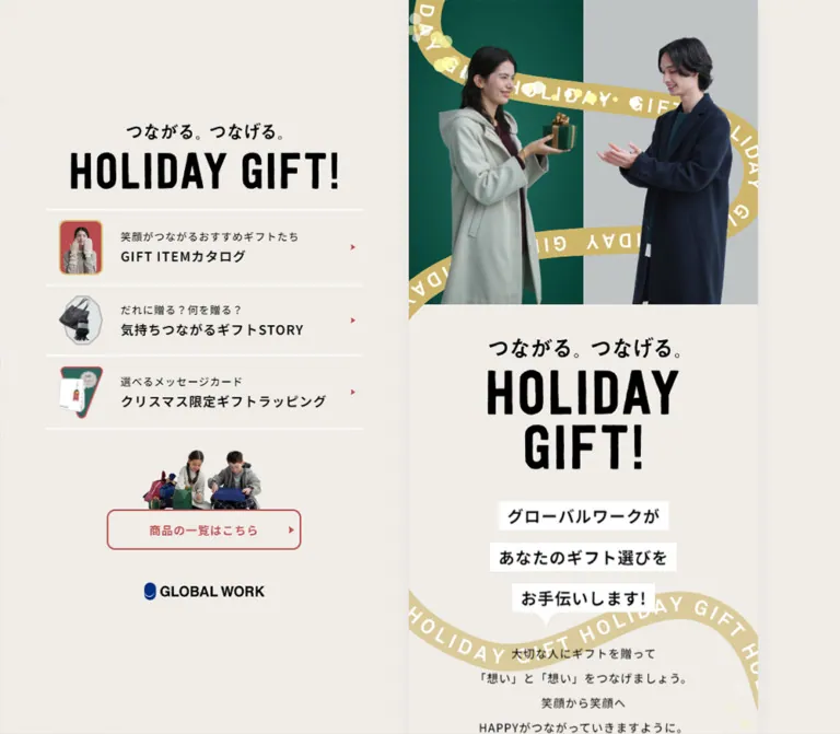
温かい生成り色を背景に、ギフトを渡す人物写真と金色のリボンを組み合わせた特集ページ。デスクトップでは固定的な左ナビゲーションと細い本文カラムを並べ、スマートフォンでは縦長のギフトガイドとして展開する。
GLOBAL WORK — HOLIDAY GIFT! Style Reference
A narrow holiday gift guide wrapped in gold ribbon, with quiet paper tones and expressive fashion photography.
Original URL: globalwork.jp/women/holidaygift2023 Final URL: globalwork.jp/women/holidaygift2023 — unchanged; reported HTTP 200. Theme: a single observed light palette with warm cream, black, muted red, gold, and deep green. Inspected: supplied capture dated September 23, 2026, 06:39 JST; retrieval timestamp September 22, 2026, 21:39:43.181 UTC. Viewports: 1440 × 1000 desktop and 390 × 844 mobile, in CSS pixels. Scope: the currently served campaign homepage: persistent desktop navigation, opening photo composition, introductory copy, three destination cards, repeated shopping link, credits, footer, mobile header states, language affordance, and floating survey banner. Linked catalog, story, wrapping, shop, and survey destinations were not inspected.
GLOBAL WORK presents this page as a seasonal gift-guide index. The opening image establishes the emotional premise: two people face each other across a small wrapped present. A gold ribbon repeatedly printed with HOLIDAY GIFT connects the photography, introduction, destination cards, and footer. Large condensed black lettering supplies the strongest graphic contrast; the remaining interface stays restrained and readable.
The defining desktop structure is deliberately asymmetric. A broad left region contains a persistent navigation composition, while the actual document runs through a narrow column farther right. On mobile, that document fills the screen. Three navigation choices reappear as staggered, colored cards inside the content, so the page supports both immediate navigation and a slower editorial introduction.
The captured runtime state displays English navigation and prose, while the campaign identity retains the Japanese tagline 「つながる。つなげる。」. This reference describes that supplied state. The year in the URL is part of the current address, not evidence that these captures reconstruct a historical version.
閉じる
GLOBAL WORK — HOLIDAY GIFT! Style Reference
A narrow holiday gift guide wrapped in gold ribbon, with quiet paper tones and expressive fashion photography.
Original URL: globalwork.jp/women/holidaygift2023 Final URL: globalwork.jp/women/holidaygift2023 — unchanged; reported HTTP 200. Theme: a single observed light palette with warm cream, black, muted red, gold, and deep green. Inspected: supplied capture dated September 23, 2026, 06:39 JST; retrieval timestamp September 22, 2026, 21:39:43.181 UTC. Viewports: 1440 × 1000 desktop and 390 × 844 mobile, in CSS pixels. Scope: the currently served campaign homepage: persistent desktop navigation, opening photo composition, introductory copy, three destination cards, repeated shopping link, credits, footer, mobile header states, language affordance, and floating survey banner. Linked catalog, story, wrapping, shop, and survey destinations were not inspected.
GLOBAL WORK presents this page as a seasonal gift-guide index. The opening image establishes the emotional premise: two people face each other across a small wrapped present. A gold ribbon repeatedly printed with HOLIDAY GIFT connects the photography, introduction, destination cards, and footer. Large condensed black lettering supplies the strongest graphic contrast; the remaining interface stays restrained and readable.
The defining desktop structure is deliberately asymmetric. A broad left region contains a persistent navigation composition, while the actual document runs through a narrow column farther right. On mobile, that document fills the screen. Three navigation choices reappear as staggered, colored cards inside the content, so the page supports both immediate navigation and a slower editorial introduction.
The captured runtime state displays English navigation and prose, while the campaign identity retains the Japanese tagline 「つながる。つなげる。」. This reference describes that supplied state. The year in the URL is part of the current address, not evidence that these captures reconstruct a historical version.
How to Read This Reference
- Measured values come from the supplied rendered DOM, computed styles, element rectangles, and custom properties. Numbers are rounded for readability unless extra precision explains a relationship.
- Visual observations come from the five supplied original-page captures: three desktop positions and mobile opening/footer positions.
- Estimates describe visible features without an exact computed measurement, such as rule thickness, icon contours, or the apparent size of lettering inside artwork.
- Derived relationships reproduce the measured samples mathematically. They are not claims that the original stylesheet uses those exact formulas.
- Recommendations are implementation choices for a new build. They are explicitly separate from verified source behavior.
- Named tokens are descriptive aliases unless a source custom property is identified.
The screenshots and DOM snapshots are separate samples. In particular, some desktop card coordinates differ between the initial DOM snapshot and their later visible screenshot positions. Use the measurements for size and the settled screenshots for composition; do not treat every sampled coordinate as a permanent layout constraint.
Tokens — Colors
Default Palette
| Name | Value | Source evidence / suggested alias | Role |
|---|---|---|---|
| Warm Paper | #f0ece7 |
Source --color-bg-fill; alias --gift-paper |
Document canvas, desktop margins, introductory and footer surfaces |
| Black Ink | #000000 |
Source --color-text; alias --gift-ink |
Campaign lettering, ordinary copy, navigation titles |
| Holiday Red | #b84b4d |
Source --color-primary; measured shopping-link text |
Outlined shopping links, navigation arrows, first card number |
| Ribbon Gold | #d5bb70 |
Source --color-secondary |
Gold ribbon family, small frames, decorative accents |
| Secondary Gold | #c6af6c |
Source --color-text-secondary |
Declared secondary text color; element-level use was not established |
| Deep Green | #2d675e |
Source --color-quaternary; measured second-card background |
Middle destination card with white text |
| Warm Taupe | #b7aca4 |
Measured third-card background: rgb(183, 172, 164) |
Wrapping destination card |
| Cool Gray | #bfc3c4 |
Source --color-bg-fill-secondary |
Declared supporting neutral; visually consistent with the gray half of the hero composition |
| Warm Brown | #89776a |
Source --color-text-tertiary; measured mobile home-link color |
Supporting text family; similar to the visible credit lettering |
| White | #ffffff |
Measured first-card background and second-card text | First destination card, introductory text strips, reversed text, divider rules |
The page uses muted holiday colors rather than a saturated red-and-green background. Keep most of the visible area paper-colored. Gold works as a connecting illustration, red as a small action accent, and green as one substantial navigation surface.
Color evidence limits: the credits look warm brown in the captures, but the sampled parent paragraph reports black. Its child styles were not included. Warm Brown is therefore a useful visual adaptation for credits, not a verified measurement of every credit line. The hero's photographic green is also not established as identical to the green card token.
The source declares --ribbon-opacity: 0.6. Its exact application to individual ribbon layers was not supplied. The lower-page ribbons visibly appear lighter than the hero ribbon, but a single opacity should not be assumed for all ribbon artwork.
The brand's blue symbol and the survey banner's pale green strip are separate identity/utility colors. Their exact values were not supplied, and they should not become additional campaign action colors.
Tokens — Typography
Main Interface and Body Copy
Computed source stack: "Noto Sans JP", "SF Pro JP", "SF Pro Text", "Hiragino Kaku Gothic Pro", sans-serif.
The body uses weight 500, line height 1.6, and tracking equivalent to 0.06em at body size. This creates clear, slightly spaced text against the dense campaign lettering. The English content remains within the Japanese-capable interface stack.
A computed font-family declaration identifies the requested stack, not proof that every named face loaded or rendered every character.
Condensed English Labels
Declared English stack: "Oswald", "SF Pro Text", "SF Pro Icons", "Helvetica Neue", "Helvetica", sans-serif.
Measured shopping-link stack: Oswald, "Noto Sans JP", "SF Pro JP", "SF Pro Text", "Hiragino Kaku Gothic Pro", sans-serif.
The product-list link explicitly uses this condensed mixed stack at weight 700. Its narrow lettering lets a long English label fit in a modest outlined button. Do not apply this display treatment to all body paragraphs.
Credits
The sampled credit paragraph declares Cabin, sans-serif, weight 500. It is centered and visually quieter than the campaign copy. The measured paragraph font and line height do not establish the size or color of every nested line.
Campaign Identity Artwork
HOLIDAY GIFT! uses very tall, compact black capitals with slightly irregular edges. The Japanese tagline sits above it. Desktop navigation uses a wide, single-line title composition; the main column uses a taller, two-line composition.
Treat these as authored identity artwork. The semantic H1 inherits ordinary text properties, but those properties do not explain the visible display-letter shapes or their large scale. The supplied evidence does not establish a font name or file format for the wordmark. Use authorized artwork when available; Oswald is only an approximation for newly authored supporting display text.
Type Scale
The root font size is measured at 17.472px on desktop and 15.6px on mobile. In this document, 1u means one source rem at the inspected viewport. The original formula connecting viewport size to root size was not supplied.
| Role | Measured / derived size | Desktop | Mobile | Weight and rhythm |
|---|---|---|---|---|
| Body and navigation-anchor inheritance | 1u |
17.472px | 15.6px | 500; line height 1.6 |
| Introductory supporting paragraph | 0.875u |
15.288px | 13.65px | 500; line height 1.6 |
| Product-list link | 0.875u |
15.288px | 13.65px | 700; line height 1.5 |
| White-strip introductory statement | 1.25u |
21.84px | 19.5px | 700; line height 1.6 |
| Credit paragraph container | 0.875u |
15.288px | 13.65px | Cabin 500; line height 1.6 |
| Closing footer statement | 0.875u |
15.288px | 13.65px | 500; line height 2 |
| Semantic H1 inheritance | 2u |
34.944px | 31.2px | 700; not the visible wordmark's letter size |
| Copyright paragraph container | 0.875u |
15.288px | 13.65px | Line height 1.25; nested lettering may differ |
Body tracking measures 1.04832px on desktop and 0.936px on mobile. Several smaller descendants retain that inherited absolute spacing. Applying 0.06em separately to each smaller child would produce a slightly different result.
Navigation and card captions are visibly smaller than their bold destination titles. Their individual child font sizes were not included in the element sample; a 0.875u caption with a 1u title is a recommended approximation, not an independently measured pair.
Tokens — Spacing & Shapes
Density: broad desktop whitespace around a compact navigation block and a narrow, vertically paced content strip.
Spacing Scale
| Unit | Desktop equivalent | Mobile equivalent | Evidence / use |
|---|---|---|---|
0.25u |
4.368px | 3.9px | Declared --spacer-xs |
0.5u |
8.736px | 7.8px | Declared small spacing; measured gap between intro copy rows |
0.75u |
13.104px | 11.7px | Measured navigation-row vertical padding |
0.9375u |
16.38px | 14.625px | Measured gap between white introductory strips |
1u |
17.472px | 15.6px | Navigation/card grid gap and card radius |
1.5u |
26.208px | 23.4px | Card padding on the shorter inset sides; vertical card separation |
2.5u |
43.68px | 39px | Intro and footer section padding |
4u |
69.888px | 62.4px | Larger card inset beside the overlapping number |
The source also declares larger spacing tokens at 6.5rem and 10.5rem. Their presence does not establish where they are used in this page.
Border Radius and Edges
| Element | Desktop | Mobile | Character |
|---|---|---|---|
| Destination card | 17.472px | 15.6px | Soft rectangle; measured |
| Product-list link | 11.466px | 10.2375px | Modestly rounded outline; measured |
| Desktop navigation rows | 0 | Not visible as a persistent rail | Square, transparent rows |
| White introductory strips | Visually square | Visually square | Paper-label treatment |
| Hero frame | Square | Square | Edge-to-edge rectangular composition |
| Survey close affordance | About 30px diameter | About 28–30px diameter | Visual estimate; circular |
The shopping-link border and navigation divider rules appear approximately 2px thick. Their widths were not included in the computed-property sample.
Layout Measurements
| Element | Desktop: 1440 × 1000 | Mobile: 390 × 844 |
|---|---|---|
| Main content column | x 808.70; width 469.55px | x 0; width 390px |
| Right outer margin | About 161.75px | None |
| Desktop navigation group | x 191.41; width 425.88px | Persistent group absent |
| Desktop campaign-logo link | 357.73 × 89.08px | Compact header logo: 169.64 × 42.23px in DOM |
| Hero composition | About 469.55 × 408.50px | About 390 × 339.30px |
| Main campaign-title block | 257.28 × 177.48px | 213.70 × 147.42px |
| Introductory copy width | 422.59px, or 90% of main | 351px, or 90% of main |
| Destination-card width | 410.84px | 341.25px |
| Product-list link | 295.84 × 54.59px | 264.69 × 48.75px |
| Footer brand-logo link | 162.09 × 23.25px | 144.73 × 20.77px |
| Document height | About 2482.08px | 2281px |
The measured hero height is approximately 0.87 × width at both viewports. Card width is approximately 87.5% of the main column at both viewports. The title-art block is approximately 54.8% of the main column.
Components
Persistent Desktop Navigation
Role: gives direct access to the three editorial destinations and shopping route throughout the scroll.
The left composition stays in the same visible location across the desktop captures. It occupies a 425.88px-wide group centered within the broad left region. Its campaign logo begins near y 151px; the brand mark finishes near y 834px. The exact positioning mechanism—fixed or sticky—was not supplied.
Its anatomy is:
- Wide campaign identity artwork with Japanese tagline.
- Three illustrated navigation rows separated by white horizontal rules.
- A small photographic cutout positioned directly above the outlined product-list link.
- A centered GLOBAL WORK brand mark.
The navigation remains compact despite the large surrounding canvas. Avoid stretching these rows to consume the whole left region.
Illustrated Navigation Row
Role: links to catalog, gift stories, or wrapping information.
Each row is a real anchor containing a distinctive visual thumbnail and a two-level text block. A small red arrow sits near the trailing edge.
Desktop computed anatomy:
- Width:
425.88px. - Grid tracks: approximately
65.52px 303.59px. - Gap:
17.472px. - Padding:
13.104px 21.84px 13.104px 17.472px. - Heights: about
100.02px,126.81px, and104.44px, driven by content and wrapping. - Background: transparent; corners square.
- Registered transition: background color and text color,
0.2s.
The thumbnail designs are deliberately different: a framed portrait, an irregular product cutout, and a tilted gift-card composition. Their contours carry more identity than a uniform icon set would.
The three observed destinations are /catalog/, /story/, and /wrapping/ beneath the campaign URL. These are separate page links, not verified in-page scroll anchors.
Opening Gift Photograph
Role: introduces the act of giving before presenting the navigation choices.
A pale-coated woman stands at left and a dark-coated man at right, facing a small green gift between them. The background splits vertically into deep green and cool gray. Gold ribbon curves behind and around the figures, with repeated white HOLIDAY GIFT lettering following its path.
Keep the composition tall enough to show coats and hands. The gift exchange sits near the center, while the models' faces occupy the upper half. On desktop, this image occupies only the narrow main column. On mobile, the same composition fills the viewport width with a closely matching aspect ratio.
The supplied evidence does not establish whether the final composition is one flattened asset or several independently rendered layers.
Campaign Introduction
Role: expands the campaign identity and explains the gift-selection premise.
The intro begins immediately beneath the hero and uses centered content on the paper background. Its measured section padding is 2.5u at the top and bottom.
The content sequence is:
- Japanese tagline and large two-line HOLIDAY GIFT! artwork.
- A substantial gap.
- Three separate white strips containing the bold introductory statement.
- A small speech-tail shape under the final strip.
- Four centered lines of supporting copy.
The white-strip container has 1.25u type and a 0.9375u row gap. Each strip follows its text width rather than filling the column. The final strip's tail makes the whole stack read as a friendly spoken recommendation.
The source includes a white SVG speech-tail data URI with a 43.08 × 25.16 viewBox. That supports the curved-tail motif, but its rendered size was not measured.
The supporting-copy container is 90% of the column width. It uses 0.875u text with 1.6 line height and a separate 0.5u gap between rows. Reproducing it with one ordinary paragraph and default line spacing would compress its vertical rhythm.
Alternating Destination Cards
Role: repeats the navigation as the central editorial content.
Three large rounded links form a staggered vertical sequence:
| Card | Surface / text | Composition | Number accent |
|---|---|---|---|
| Catalog | White / black | Portrait left, copy right | Red #01 near the outer right edge |
| Gift stories | Deep green / white | Copy left, product cutout right | Gold #02 near the outer left edge |
| Gift wrapping | Warm taupe / black | Gift-card artwork left, copy right | Green #03 near the outer right edge |
Each card measures 87.5% of the main width. The settled desktop capture aligns the first and third to the left edge of the main column and the middle card to the right. Mobile DOM measurements show the same stagger: x 0, 48.75, and 0 within a 390px column.
Desktop card padding is 26.208px on three sides, with a larger 69.888px inset on the number side. Mobile equivalents are 23.4px and 62.4px. Grid gaps are 1u and corner radii are 1u.
The first and third cards use an artwork-first grid; the second reverses it. Measured desktop tracks are approximately 81.83px 215.47px, reversed for the middle card. Mobile tracks are approximately 66.42px 173.45px.
Numbers sit at the card edge and read vertically, extending the composition beyond the rounded surface. They are decorative sequence markers, while the entire card is the link. Small directional arrows remain close to the destination title.
Do not force equal card heights. Desktop heights are approximately 154.89px, 157.16px, and 157.16px; mobile heights increase to approximately 162.19px, 165.28px, and 165.28px because the English text wraps more.
Sampling limitation: the initial desktop DOM places odd cards one source rem inward from the settled screenshot edge, with the middle card offset inward from the opposite edge. This could reflect a presentation state, but the mechanism was not identified. Preserve the settled stagger without inventing a specific entrance animation.
Product-List Link and Photographic Cutout
Role: sends visitors to the GLOBAL WORK shop at https://www.dot-st.com/globalwork/.
The same component appears in the desktop rail and near the end of the main document. It combines a small cutout scene of people handling gift bags with a red outlined link immediately below. The photo overlaps or meets the button's top edge, making them read as one composition.
Measured button properties:
- Text color:
#b84b4d. - Font: Oswald-first mixed stack, weight
700. - Font size:
0.875u; line height:1.5. - Padding: desktop
1.911px 30.576px; mobile1.706px 27.3px. - Radius: desktop
11.466px; mobile10.2375px. - Height: approximately
3.125u. - Registered transition: text and background colors,
0.2s.
Its observed English label is “Click here for a list of products.” A small red arrow occupies the right side. The button remains transparent in the supplied resting captures. The hover destination colors were not tested.
Repeated Lettering Strip
Role: creates a strong graphic transition into the footer.
A large, horizontally cropped sequence of HOLIDAY GIFT lettering spans the narrow main column. The text exceeds the column width and is visibly clipped at its edges. It resembles a marquee, but still captures alone do not establish continuous horizontal movement, speed, or direction.
Keep this decorative strip separate from semantic headings. An accessible implementation should not repeatedly announce the same phrase to assistive technology.
Credits and Closing Footer
Role: closes the editorial story and acknowledges its production.
Below the repeated lettering and shop component, the page presents a centered credit block, generous spacing, a short closing statement, the GLOBAL WORK logo, and copyright. A partial gold ribbon re-enters near the bottom edge.
The inspected footer directly credits CAMP4 for Web Design & Development, GRAPHITICA for Graphic Concept Design, and KNAX for Editing, alongside photography, styling, hair and makeup, illustration, and model credits. These are original-page observations.
The closing statement uses 0.875u type with a 2 line height. On mobile, its first sentence wraps across two lines, making the overall block taller. Preserve this natural reflow.
The visible copyright names Adastria Co., Ltd. The brand-logo link leads to https://www.globalwork.jp/.
Mobile Header
Role: restores compact navigation access after the opening composition.
The opening mobile capture starts directly with the hero. The lower-page capture shows a white header about 68.25px tall with a centered campaign logo and a red three-line menu symbol at the right.
The measured height matches the declared 70 / 16 rem header token at the mobile root size. The sampled logo link is about 169.64px wide. The menu-button rectangle is 39 × 39px.
In the initial DOM snapshot, the compact logo and menu button have negative y coordinates, consistent with a hidden/transformed header state. A header is visibly present in the later footer capture. Its exact reveal threshold and response to scroll direction were not tested.
Mobile navigation markup contains a home entry and the same destination links. Its DOM presence does not prove that an open menu was visible or usable. No open-menu screenshot or interaction result was supplied.
Language Affordance and Survey Banner
A small ENGLISH label with a downward caret appears at the upper right of the opening captures. Its options, implementation, persistence, and switching behavior were not exercised.
The survey banner is a separate floating utility near the bottom left. It shows the brand symbol, the Japanese label 「アンケート実施中」, a pale green strip, and a dark circular close affordance. The link target is https://questant.jp/q/F2FYIA8H.
Measured anchor boxes:
- Desktop: width
200px, height126.94px, left20px, bottom20px. - Mobile: width
150px, height95.94px, left15px, bottom20px.
The visible artwork occupies less than the full anchor rectangle. On mobile, it obscures parts of the introductory copy and lower footer. Its dismissal and persistence were not tested. Treat it as a peripheral utility, not as a core campaign card or required conversion pattern.
Tokens — Motion & Interaction
| Treatment | Evidence | What can safely be reproduced |
|---|---|---|
| Navigation-row feedback | Computed background-color 0.2s, color 0.2s |
Short color feedback; actual hover colors remain unverified |
| Product-list feedback | Computed color 0.2s, background-color 0.2s |
Short outlined-button feedback; resting state is verified |
| Destination-card feedback | Computed filter 0.2s |
A brief filter transition is registered; filter function and target value are unknown |
| Copyright presentation | transform 0.8s cubic-bezier(0.075, 0.82, 0.165, 1) 0.1s, opacity 0.6s 0.1s |
Evidence of transform/opacity transition timing; trigger and start values are unknown |
| Desktop navigation persistence | Same visual position in three scroll captures | Persistent left navigation; fixed versus sticky is not established |
| Mobile header presentation | Hidden above the viewport initially, visible in lower-page capture | A scroll-dependent header state; exact logic unverified |
| Product-link cutout imagery | People appear in different poses across captures | Suggests changing media; format, frame rate, and sequence are unknown |
| Gold ribbons and light dots | Present at multiple positions in the composition | Decorative layers are verified; animation paths and timing are not |
| Repeated lettering strip | Cropped repeating text visible near the footer | Marquee-like styling; continuous movement is unverified |
Many sampled elements report animation: none. That does not rule out animated images, descendants, pseudo-elements, scripts, or other unsampled layers.
The capture process observed the initial page for at least five seconds and waited for specified readiness conditions. Perpetual animations were paused during readiness checks and resumed afterward. These stills therefore cannot establish the normal cadence of all motion.
For a new implementation, keep optional motion quiet: short feedback on links and limited decoration around the gift scene. Any chosen ribbon animation, ticker speed, reveal offset, or menu timing must be treated as a recommendation rather than a recovered source value.
Surfaces
| Layer | Appearance | Purpose |
|---|---|---|
| Outer desktop canvas | Warm Paper | Creates generous breathing room around navigation and content |
| Main document | Mostly the same paper color | Connects the long editorial sequence without panel clutter |
| Introductory statement | Separate white, square text strips | Gives a friendly spoken-label emphasis |
| Catalog card | White rounded rectangle | First clear destination surface |
| Story card | Deep green rounded rectangle with white text | Alternating contrast and rhythm |
| Wrapping card | Warm taupe rounded rectangle | Soft third step in the navigation sequence |
| Product-list action | Transparent surface with red outline | Distinct shopping route without a heavy filled CTA |
| Mobile header | White strip in the lower-page capture | Compact persistent identity and navigation access |
| Survey utility | White rectangle with separate green accent | Peripheral feedback invitation |
There is no visible general-purpose card-shadow system. The main column has a subtle visual edge against its surroundings, but no box-shadow measurement was provided. Reproduce hierarchy through layout, flat fills, photographic boundaries, and typography before adding elevation effects.
Imagery
The imagery combines approachable fashion photography with the look of a printed seasonal gift guide. Winter coats, scarves, bags, message cards, and small presents carry the theme. The people interact with one another and with real products; they are not isolated fashion portraits without a narrative.
The gold ribbon is the primary connecting motif. Its curved path crosses the composition at different angles, while white uppercase lettering follows the ribbon. Some portions are clipped at the column boundary. Preserve that sense of a continuous object passing through a longer page rather than placing unrelated ribbon badges in each section.
Small pale dots provide a festive light effect. Their locations and opacity vary in the captures, but the evidence does not establish a particle system or a particular animation library.
Observed Asset References
No original image-file URLs, source dimensions, or media formats were supplied. The following are visual asset descriptions, not filenames or download paths.
| Asset | Observed use | Reproduction guidance |
|---|---|---|
| Wide campaign identity | Desktop navigation and compact mobile header | Preserve the Japanese tagline and single-line English title composition |
| Tall campaign identity | Main introduction | Preserve the stacked HOLIDAY / GIFT! arrangement |
| Gift-exchange composition | Opening main-column hero | Retain both faces, hands, the small gift, split background, and ribbon |
| Framed scarf portrait | Catalog links | Use its red field and rounded gold frame |
| Bag-and-scarf cutout | Story links | Preserve the irregular gray backing silhouette |
| Illustrated gift-card cutout | Wrapping links | Retain the tilted green shape and red perimeter |
| People with gift bags | Product-list component | Keep the cutout directly connected to the outlined link |
| GLOBAL WORK identity | Desktop rail and footer | Use the brand artwork without inventing a new blue value |
| Gold ribbon and pale dots | Hero, introduction, cards, footer | Keep decorative layers behind or clear of essential copy |
Use smooth photographic rendering. This page does not call for pixelated image scaling, uniform stock icons, or heavily filtered portrait photography. CSS can reproduce the layout and surfaces, but the campaign identity depends on the authored photographs, lettering, and cutout compositions.
Layout & Responsive Behavior
Desktop Composition
At 1440px wide, the main column starts at x 808.70px and measures 469.55px. The remaining space divides into approximately 808.70px at the left and 161.75px at the right—a 5:1 relationship.
A useful derived reconstruction is:
/* Geometry inferred from the inspected desktop sample. */
grid-template-columns: 5fr calc(26.875 * var(--u)) 1fr;
At --u: 17.472px, the center track is 469.56px, matching the measured column after rounding. This is a reconstruction from geometry. The supplied --view-columns custom-property string contains a leading colon, so it should not be copied literally as a valid grid declaration.
The left navigation is centered within the first track. The rightmost track stays largely empty. The layout does not center the entire experience as a conventional two-column block, nor does the main content grow into a wide desktop article.
Mobile Composition
At 390px wide, the main column becomes the full viewport width and the persistent desktop rail disappears from the visible page. The hero retains its approximate 100:87 width-to-height relationship.
The content sequence remains unchanged: photograph, introduction, three destination links, graphic footer transition, shopping link, credits, closing statement, brand, and copyright. The cards keep their left/right stagger rather than becoming centered full-width tiles.
The design uses at least two distinct scaling relationships:
- Artwork and card widths follow the main-column width. The column shrinks from 469.55px to 390px, approximately 83% of its desktop size.
- The measured root unit changes from 17.472px to 15.6px, approximately 89% of its desktop size.
This distinction explains why the mobile layout is not simply a uniformly scaled desktop column. Text consumes more lines, so the mobile destination section is slightly taller despite its smaller width and type.
Observed Section Sizes
| Region | Desktop | Mobile |
|---|---|---|
| Hero | About 408.50px high | About 339.30px high |
| Introduction | 640.41px high | 560.91px high |
| Destination section | 565.28px high | 578.53px high |
| Footer | 867.89px high | 802.27px high |
These are sampled document-region measurements. They should guide proportions, not become fixed heights that clip translated or enlarged text.
The breakpoint, tablet layout, landscape behavior, maximum desktop scaling, and short-screen navigation behavior were not supplied. The Quick Start uses a recommended breakpoint and explicit measured anchors rather than pretending to recover the full responsive stylesheet.
Do’s and Don’ts
Do
- Preserve the asymmetry: broad persistent navigation at left, narrow document toward the right.
- Use Warm Paper
#f0ece7as the dominant surface. - Keep red concentrated in small arrows, sequence accents, and the outlined shop link.
- Use green and taupe for the alternating destination cards, with the first card white.
- Preserve the distinction between authored campaign lettering and readable interface typography.
- Retain the three different thumbnail silhouettes and the gift-bag cutout above the CTA.
- Keep the cards at approximately 87.5% of the content width and alternate their alignment.
- Let translated text determine card height.
- Carry the ribbon motif through the page while protecting text legibility.
- Keep the desktop rail's information available through a compact mobile navigation mechanism.
- Separate decorative numbers and repeated lettering from meaningful link names.
Don’t
- Don’t stretch the main document across the desktop viewport.
- Don’t replace the left navigation with a generic horizontal corporate menu when reproducing this composition.
- Don’t turn the three destinations into an equal-column desktop card grid.
- Don’t use a large solid red purchase button in place of the observed restrained outline.
- Don’t assume the campaign wordmark is ordinary Oswald text because the CTA uses Oswald.
- Don’t crop away the hands and present that explain the hero's interaction.
- Don’t replace the distinct photographic thumbnails with matching gift-box icons.
- Don’t add glossy gradients, heavy drop shadows, or glass panels.
- Don’t infer a working menu, language selector, survey dismissal, or hover result from markup alone.
- Don’t assign invented durations to the ribbon, photo sequence, or marquee-like strip.
- Don’t copy the survey overlap as a desirable mobile content pattern.
- Don’t treat the 2023 URL segment as a reason to reconstruct an earlier page.
Recommended Implementation Additions
These are recommendations for a new implementation, not verified features of the original:
- Give the mobile menu button a clear accessible name,
aria-expanded, and a relationship to its controlled panel. Use at least a 44px hit area while retaining the smaller visible line artwork. - Remove hidden navigation from keyboard interaction with an appropriate hidden or inert state. Translating it outside the viewport is not sufficient by itself.
- Give full-card links concise accessible names. Mark their decorative numbers and duplicate arrows as hidden from assistive technology.
- Preserve an accessible H1 when using title artwork. Avoid announcing the same title twice through both image alt text and hidden text.
- Use a meaningful alternative for the gift-exchange photograph; decorative ribbons and dots should have empty alternatives or be hidden from accessibility APIs.
- Provide a visible focus outline that remains distinguishable on white, green, taupe, and paper surfaces.
- Check the small muted credit text and red button label for contrast at their final rendered sizes. Retain readable fallbacks if optional fonts fail to load.
- Respect reduced-motion preferences for any added ticker, decorative loop, reveal, or changing photograph.
- Ensure the survey utility can be dismissed with a keyboard and does not cover essential content on small screens. Its exact original persistence behavior is unknown.
- Reserve image dimensions to prevent layout shifts. Load the opening composition promptly and defer noncritical images below it where appropriate.
- Test intermediate widths, 200% text zoom, long Japanese/English labels, and short landscape viewports; those cases were not captured.
Agent Prompt Guide
Quick Color Reference
- Main canvas:
#f0ece7. - Text and campaign lettering:
#000000. - Shopping outline and small action accents:
#b84b4d. - Ribbon family:
#d5bb70. - Middle destination card:
#2d675ewith white text. - Third destination card:
#b7aca4with black text. - First destination card and introductory strips:
#ffffff. - Supporting warm neutral:
#89776a, subject to final text-contrast checks.
Overall Prompt
“Create a seasonal fashion gift-guide homepage with a warm cream canvas, black condensed campaign artwork, muted red outlined shopping links, gold ribbon decoration, and deep green accents. On desktop, center a compact persistent navigation composition in a broad left region and place the scrolling story in a narrow column toward the right. Begin that column with two people exchanging a small gift against a split green-and-gray background. Follow with a stacked campaign title, three white text strips, centered introductory copy, and three staggered destination cards in white, green, and taupe. End with cropped repeated lettering, a photographic gift-bag cutout above an outlined shop link, small centered credits, and a brand footer. On mobile, let the story fill the viewport and provide a compact header after the opening. Use supplied identity artwork rather than inventing its font.”
Example Component Prompts
- Desktop navigation: “A compact cream navigation group inside a broad empty desktop region: wide campaign logo, three illustrated rows with white separators, small red arrows, a gift-bag photo cutout above a red outlined shop link, and a centered brand mark. Keep row corners square and avoid card shadows.”
- Gift hero: “An approximately 100:87 fashion photograph composition with a pale-coated person at left, a dark-coated person at right, and a small wrapped gift between their hands. Divide the background into deep green and cool gray. Thread a gold ribbon with white repeated lettering behind the figures without covering faces.”
- Introduction: “Center a stacked black campaign-title artwork on warm paper. Below it, use three individually sized white text strips, bold readable sans-serif copy, generous gaps, and a small curved speech tail on the last strip. Follow with a short centered paragraph using loose row spacing.”
- Destination cards: “Build three links at 87.5% of a narrow content column. Alternate left, right, left alignment. Use white, deep green, and taupe surfaces; rounded corners of about one body-size unit; asymmetric padding; distinctive product artwork; and oversized vertical sequence numbers at the exposed card edges.”
- Shop component: “Place a small cutout photograph of people handling colorful gift bags directly above a transparent red outlined link. Use condensed bold lettering, a modest corner radius, and a small trailing arrow. Keep the link roughly 265px wide and 49px tall at a 390px viewport.”
- Responsive behavior: “Preserve the narrow desktop story column and full-width mobile story as distinct layouts. Keep alternating card alignment on phones, allow text to increase card height, and reveal a compact white header in the scrolled state. Treat the breakpoint and reveal threshold as implementation choices.”
Quick Start
CSS Custom Properties
This is a recommended implementation scaffold, not copied source CSS. It preserves the measured desktop and mobile anchors without changing the surrounding application's root font size.
The mobile 4vw unit and 64rem breakpoint are adaptation choices. Only the two supplied root sizes are verified. The scaffold uses a sticky desktop rail and a class-controlled mobile header; the original positioning and reveal logic were not recovered.
Apply gift-page to the page container or body. Within gift-shell, place gift-rail and gift-main as siblings. Place the mobile header and optional survey utility outside the clipped main column. Supply authorized photographs and campaign artwork separately; no image filenames are implied by these classes.
:root {
  /* Measured palette, exposed through implementation aliases. */
  --gift-paper: #f0ece7;
  --gift-ink: #000;
  --gift-red: #b84b4d;
  --gift-gold: #d5bb70;
  --gift-green: #2d675e;
  --gift-taupe: #b7aca4;
  --gift-gray: #bfc3c4;
  --gift-muted: #89776a;
  --gift-white: #fff;

  --gift-font-body: 'Noto Sans JP', 'SF Pro JP', 'SF Pro Text',
    'Hiragino Kaku Gothic Pro', sans-serif;
  --gift-font-condensed: 'Oswald', 'Noto Sans JP', 'SF Pro JP',
    'SF Pro Text', 'Hiragino Kaku Gothic Pro', sans-serif;
  --gift-font-credits: 'Cabin', sans-serif;

  /* Recommended scaling: matches 15.6px at a 390px viewport. */
  --u: clamp(14px, 4vw, 17.472px);
  --gift-track: calc(0.06 * var(--u));
  --gift-header-height: calc(4.375 * var(--u));
  --gift-card-art: calc(4.258 * var(--u));
  --gift-feedback: 200ms;
  --gift-safe-top: env(safe-area-inset-top, 0px);
}

* {
  box-sizing: border-box;
}

.gift-page {
  margin: 0;
  color: var(--gift-ink);
  background: var(--gift-paper);
  font-family: var(--gift-font-body);
  font-size: var(--u);
  font-weight: 500;
  line-height: 1.6;
  letter-spacing: var(--gift-track);
}

.gift-shell {
  min-height: 100svh;
}

.gift-main {
  position: relative;
  isolation: isolate;
  width: 100%;
  min-width: 0;
  overflow: clip;
}

.gift-rail {
  display: none;
}

.gift-hero {
  position: relative;
  aspect-ratio: 100 / 87;
  overflow: hidden;
}

.gift-hero > img {
  display: block;
  width: 100%;
  height: 100%;
  object-fit: contain;
}

/* Provide the authored ribbon composition as a separate asset. */
.gift-decoration {
  position: absolute;
  inset: 0;
  z-index: -1;
  pointer-events: none;
}

.gift-intro {
  padding-block: calc(2.5 * var(--u));
  text-align: center;
}

.gift-title-art {
  display: block;
  width: 54.8%;
  height: auto;
  margin: 0 auto calc(2.5 * var(--u));
}

.gift-statement {
  display: flex;
  flex-direction: column;
  align-items: center;
  gap: calc(0.9375 * var(--u));
  width: 90%;
  margin-inline: auto;
  font-size: calc(1.25 * var(--u));
  font-weight: 700;
  line-height: 1.6;
}

.gift-statement > span {
  position: relative;
  padding-inline: 0.5em;
  background: var(--gift-white);
}

/* Source-supported curved motif; rendered size is an adaptation. */
.gift-statement > span:last-child::after {
  content: '';
  position: absolute;
  top: 100%;
  left: 12%;
  width: calc(1.7 * var(--u));
  height: var(--u);
  background: url("data:image/svg+xml,%3Csvg xmlns='http://www.w3.org/2000/svg' viewBox='0 0 43.08 25.16'%3E%3Cpath fill='%23fff' d='M21.54 0H0s21.54 2.02 21.54 25.16C21.54 2.02 43.08 0 43.08 0H21.54Z'/%3E%3C/svg%3E") center / 100% 100% no-repeat;
}

.gift-intro-copy {
  display: grid;
  gap: calc(0.5 * var(--u));
  width: 90%;
  margin: calc(2.5 * var(--u)) auto 0;
  font-size: calc(0.875 * var(--u));
  line-height: 1.6;
}

.gift-destinations {
  display: grid;
  gap: calc(1.5 * var(--u));
  padding-bottom: calc(2.5 * var(--u));
}

.gift-tile {
  position: relative;
  display: grid;
  grid-template-columns: var(--gift-card-art) minmax(0, 1fr);
  align-items: center;
  gap: var(--u);
  width: 87.5%;
  padding: calc(1.5 * var(--u)) calc(4 * var(--u))
    calc(1.5 * var(--u)) calc(1.5 * var(--u));
  border-radius: var(--u);
  color: var(--gift-ink);
  background: var(--gift-white);
  text-decoration: none;
  transition: filter var(--gift-feedback);
}

.gift-tile--story {
  grid-template-columns: minmax(0, 1fr) var(--gift-card-art);
  margin-left: auto;
  padding-inline: calc(4 * var(--u)) calc(1.5 * var(--u));
  color: var(--gift-white);
  background: var(--gift-green);
}

.gift-tile--wrapping {
  background: var(--gift-taupe);
}

.gift-tile__art {
  display: block;
  width: 100%;
  height: auto;
}

/* Child type sizes approximate the observed hierarchy. */
.gift-tile__copy small {
  display: block;
  font-size: 0.875em;
  line-height: 1.6;
}

.gift-tile__copy strong {
  display: block;
  font-size: 1em;
  font-weight: 700;
  line-height: 1.6;
}

.gift-tile__number {
  position: absolute;
  top: calc(0.5 * var(--u));
  right: calc(-1.1 * var(--u));
  color: var(--gift-red);
  font-family: var(--gift-font-condensed);
  font-size: calc(2.5 * var(--u));
  font-weight: 700;
  line-height: 1;
  writing-mode: vertical-rl;
}

.gift-tile--story .gift-tile__number {
  inset: auto auto calc(0.75 * var(--u)) calc(-0.9 * var(--u));
  color: var(--gift-gold);
}

.gift-tile--wrapping .gift-tile__number {
  color: var(--gift-green);
}

.gift-shop {
  text-align: center;
}

.gift-shop__photo {
  display: block;
  width: calc(10 * var(--u));
  max-width: 60%;
  height: auto;
  margin: 0 auto -2px;
}

.gift-shop__link {
  position: relative;
  display: inline-flex;
  align-items: center;
  justify-content: center;
  min-height: calc(3.125 * var(--u));
  max-width: calc(100% - 2 * var(--u));
  padding: 0.125em 2em;
  border: 2px solid var(--gift-red);
  border-radius: 0.75em;
  color: var(--gift-red);
  background: transparent;
  font-family: var(--gift-font-condensed);
  font-size: calc(0.875 * var(--u));
  font-weight: 700;
  line-height: 1.5;
  text-decoration: none;
  transition: color var(--gift-feedback),
    background-color var(--gift-feedback);
}

.gift-footer {
  padding-block: calc(2.5 * var(--u));
  text-align: center;
}

/* Static approximation; no unverified marquee motion is added. */
.gift-lettering-strip {
  overflow: hidden;
  margin-bottom: calc(1.5 * var(--u));
  font-family: var(--gift-font-condensed);
  font-size: calc(3.25 * var(--u));
  font-weight: 700;
  line-height: 1;
  white-space: nowrap;
}

.gift-credits {
  width: 92%;
  margin: calc(2.5 * var(--u)) auto;
  color: var(--gift-muted);
  font-family: var(--gift-font-credits);
  font-size: calc(0.875 * var(--u));
  line-height: 1.6;
}

.gift-closing {
  width: 92%;
  margin: calc(2.5 * var(--u)) auto calc(1.5 * var(--u));
  font-size: calc(0.875 * var(--u));
  line-height: 2;
}

.gift-brand {
  display: block;
  width: calc(9.278 * var(--u));
  height: auto;
  margin-inline: auto;
}

.gift-copyright {
  width: 92%;
  margin: calc(5 * var(--u)) auto 0;
  font-size: calc(0.875 * var(--u));
  line-height: 1.25;
}

.gift-mobile-header {
  position: fixed;
  inset: 0 0 auto;
  z-index: 20;
  display: grid;
  grid-template-columns: 1fr auto 1fr;
  align-items: center;
  height: calc(var(--gift-header-height) + var(--gift-safe-top));
  padding-top: var(--gift-safe-top);
  background: var(--gift-white);
  visibility: hidden;
  pointer-events: none;
  transform: translateY(-110%);
}

/* Application logic must set the visible state. */
.gift-mobile-header.is-visible {
  visibility: visible;
  pointer-events: auto;
  transform: none;
}

.gift-mobile-header__logo {
  grid-column: 2;
  width: calc(10.875 * var(--u));
}

.gift-menu-button {
  grid-column: 3;
  justify-self: end;
  width: 44px;
  height: 44px;
  margin-right: calc(1.25 * var(--u));
  padding: 4px;
  border: 0;
  color: var(--gift-red);
  background: transparent;
  cursor: pointer;
}

/* Optional utility. Dismissal and obstruction handling are separate. */
.gift-survey {
  position: fixed;
  left: 15px;
  bottom: calc(20px + env(safe-area-inset-bottom, 0px));
  z-index: 30;
  width: 150px;
}

.gift-page :focus-visible {
  outline: 3px solid var(--gift-ink);
  outline-offset: 4px;
}

@media (min-width: 64rem) {
  :root {
    --u: 17.472px;
    --gift-card-art: calc(4.683 * var(--u));
  }

  .gift-shell {
    display: grid;
    grid-template-columns: 5fr calc(26.875 * var(--u)) 1fr;
    align-items: start;
  }

  .gift-rail {
    position: sticky;
    top: 0;
    grid-column: 1;
    grid-row: 1;
    display: grid;
    align-items: center;
    justify-items: center;
    height: 100svh;
    overflow-y: auto;
    padding: var(--u);
  }

  .gift-rail__inner {
    width: min(100%, calc(24.375 * var(--u)));
  }

  .gift-rail__title {
    display: block;
    width: 84%;
    height: auto;
    margin: 0 auto calc(1.5 * var(--u));
  }

  .gift-nav {
    border-top: 2px solid var(--gift-white);
  }

  .gift-nav__link {
    display: grid;
    grid-template-columns: calc(3.75 * var(--u)) minmax(0, 1fr);
    align-items: center;
    gap: var(--u);
    padding: calc(0.75 * var(--u)) calc(1.25 * var(--u))
      calc(0.75 * var(--u)) var(--u);
    border-bottom: 2px solid var(--gift-white);
    color: inherit;
    text-decoration: none;
    transition: color var(--gift-feedback),
      background-color var(--gift-feedback);
  }

  .gift-nav__art {
    display: block;
    width: 100%;
    height: auto;
  }

  .gift-rail .gift-shop {
    margin-top: calc(1.5 * var(--u));
  }

  .gift-rail .gift-brand {
    margin-top: calc(2.5 * var(--u));
  }

  .gift-main {
    grid-column: 2;
    grid-row: 1;
  }

  .gift-mobile-header {
    display: none;
  }

  .gift-survey {
    left: 20px;
    width: 200px;
  }
}

/* Recommended feedback values; original hover results were not tested. */
@media (hover: hover) {
  .gift-tile:hover {
    filter: brightness(0.97);
  }

  .gift-shop__link:hover {
    color: var(--gift-white);
    background: var(--gift-red);
  }

  .gift-nav__link:hover {
    background: rgba(255, 255, 255, 0.5);
  }
}

@media (prefers-reduced-motion: reduce) {
  .gift-page *,
  .gift-page *::before,
  .gift-page *::after {
    animation: none !important;
    transition: none !important;
    scroll-behavior: auto !important;
  }
}
The reduced-motion CSS does not pause animated image files. If those are used, provide static alternatives through the media component. The CSS also does not implement menu focus management, language switching, survey persistence, or external navigation behavior.
Tailwind v4 Token Mapping
Optional aliases for a project already using Tailwind v4. Define the custom properties above first. This does not imply that the inspected site uses Tailwind.
@theme inline {
  --color-paper: var(--gift-paper);
  --color-ink: var(--gift-ink);
  --color-holiday-red: var(--gift-red);
  --color-ribbon-gold: var(--gift-gold);
  --color-holiday-green: var(--gift-green);
  --color-wrapping-taupe: var(--gift-taupe);

  --font-body: var(--gift-font-body);
  --font-condensed: var(--gift-font-condensed);
  --font-credits: var(--gift-font-credits);

  --text-caption: calc(0.875 * var(--u));
  --text-body: var(--u);
  --text-statement: calc(1.25 * var(--u));

  --spacing-gift: var(--u);
  --spacing-gift-card: calc(1.5 * var(--u));
  --spacing-gift-section: calc(2.5 * var(--u));
  --radius-gift-card: var(--u);
}
Sources & Evidence
- Inspected website: GLOBAL WORK — HOLIDAY GIFT!. The supplied original and final URLs are identical, with a reported HTTP 200 response.
- Capture date: September 22, 2026, at 21:39:43.181 UTC, equivalent to September 23 at 06:39:43.181 JST.
- Desktop evidence: three original-page captures at 1440 × 1000, covering the opening, destination cards, and footer; rendered DOM reports approximately 2482.08px document height.
- Mobile evidence: opening and lower-page captures at 390 × 844; rendered DOM reports 2281px document height and provides destination-card measurements between those positions.
- Measured evidence: rendered text, link destinations, root custom properties, computed font stacks and colors, padding, gaps, radii, element rectangles, and registered transitions supplied with both viewport snapshots.
- Observed state changes: desktop navigation remains visually persistent across scroll positions; the compact mobile header appears in the lower-page capture; the small gift-bag photography shows different captured poses.
- Inspection limitations: no direct interaction results were supplied for hover, menu opening, language changes, survey dismissal, or destination navigation. Intermediate breakpoints, keyboard behavior, asset URLs, original media formats, animation loops, and font-loading success were not established.
This reference uses the supplied current-page evidence without additional browsing or file inspection. Its CSS and prompts are reusable adaptations; estimated geometry, proposed accessibility behavior, and unverified motion are not presented as recovered source implementation.
# GLOBAL WORK — HOLIDAY GIFT! Style Reference

> A narrow holiday gift guide wrapped in gold ribbon, with quiet paper tones and expressive fashion photography.

**Original URL:** [globalwork.jp/women/holidaygift2023](https://www.globalwork.jp/women/holidaygift2023/)
**Final URL:** [globalwork.jp/women/holidaygift2023](https://www.globalwork.jp/women/holidaygift2023/) — unchanged; reported HTTP 200.
**Theme:** a single observed light palette with warm cream, black, muted red, gold, and deep green.
**Inspected:** supplied capture dated September 23, 2026, 06:39 JST; retrieval timestamp September 22, 2026, 21:39:43.181 UTC.
**Viewports:** 1440 × 1000 desktop and 390 × 844 mobile, in CSS pixels.
**Scope:** the currently served campaign homepage: persistent desktop navigation, opening photo composition, introductory copy, three destination cards, repeated shopping link, credits, footer, mobile header states, language affordance, and floating survey banner. Linked catalog, story, wrapping, shop, and survey destinations were not inspected.

GLOBAL WORK presents this page as a seasonal gift-guide index. The opening image establishes the emotional premise: two people face each other across a small wrapped present. A gold ribbon repeatedly printed with HOLIDAY GIFT connects the photography, introduction, destination cards, and footer. Large condensed black lettering supplies the strongest graphic contrast; the remaining interface stays restrained and readable.

The defining desktop structure is deliberately asymmetric. A broad left region contains a persistent navigation composition, while the actual document runs through a narrow column farther right. On mobile, that document fills the screen. Three navigation choices reappear as staggered, colored cards inside the content, so the page supports both immediate navigation and a slower editorial introduction.

The captured runtime state displays English navigation and prose, while the campaign identity retains the Japanese tagline 「つながる。つなげる。」. This reference describes that supplied state. The year in the URL is part of the current address, not evidence that these captures reconstruct a historical version.
閉じる
# GLOBAL WORK — HOLIDAY GIFT! Style Reference

> A narrow holiday gift guide wrapped in gold ribbon, with quiet paper tones and expressive fashion photography.

**Original URL:** [globalwork.jp/women/holidaygift2023](https://www.globalwork.jp/women/holidaygift2023/)
**Final URL:** [globalwork.jp/women/holidaygift2023](https://www.globalwork.jp/women/holidaygift2023/) — unchanged; reported HTTP 200.
**Theme:** a single observed light palette with warm cream, black, muted red, gold, and deep green.
**Inspected:** supplied capture dated September 23, 2026, 06:39 JST; retrieval timestamp September 22, 2026, 21:39:43.181 UTC.
**Viewports:** 1440 × 1000 desktop and 390 × 844 mobile, in CSS pixels.
**Scope:** the currently served campaign homepage: persistent desktop navigation, opening photo composition, introductory copy, three destination cards, repeated shopping link, credits, footer, mobile header states, language affordance, and floating survey banner. Linked catalog, story, wrapping, shop, and survey destinations were not inspected.

GLOBAL WORK presents this page as a seasonal gift-guide index. The opening image establishes the emotional premise: two people face each other across a small wrapped present. A gold ribbon repeatedly printed with HOLIDAY GIFT connects the photography, introduction, destination cards, and footer. Large condensed black lettering supplies the strongest graphic contrast; the remaining interface stays restrained and readable.

The defining desktop structure is deliberately asymmetric. A broad left region contains a persistent navigation composition, while the actual document runs through a narrow column farther right. On mobile, that document fills the screen. Three navigation choices reappear as staggered, colored cards inside the content, so the page supports both immediate navigation and a slower editorial introduction.

The captured runtime state displays English navigation and prose, while the campaign identity retains the Japanese tagline 「つながる。つなげる。」. This reference describes that supplied state. The year in the URL is part of the current address, not evidence that these captures reconstruct a historical version.

## How to Read This Reference

- **Measured** values come from the supplied rendered DOM, computed styles, element rectangles, and custom properties. Numbers are rounded for readability unless extra precision explains a relationship.
- **Visual observations** come from the five supplied original-page captures: three desktop positions and mobile opening/footer positions.
- **Estimates** describe visible features without an exact computed measurement, such as rule thickness, icon contours, or the apparent size of lettering inside artwork.
- **Derived relationships** reproduce the measured samples mathematically. They are not claims that the original stylesheet uses those exact formulas.
- **Recommendations** are implementation choices for a new build. They are explicitly separate from verified source behavior.
- **Named tokens** are descriptive aliases unless a source custom property is identified.

The screenshots and DOM snapshots are separate samples. In particular, some desktop card coordinates differ between the initial DOM snapshot and their later visible screenshot positions. Use the measurements for size and the settled screenshots for composition; do not treat every sampled coordinate as a permanent layout constraint.

## Tokens — Colors

### Default Palette

| Name | Value | Source evidence / suggested alias | Role |
| --- | --- | --- | --- |
| Warm Paper | `#f0ece7` | Source `--color-bg-fill`; alias `--gift-paper` | Document canvas, desktop margins, introductory and footer surfaces |
| Black Ink | `#000000` | Source `--color-text`; alias `--gift-ink` | Campaign lettering, ordinary copy, navigation titles |
| Holiday Red | `#b84b4d` | Source `--color-primary`; measured shopping-link text | Outlined shopping links, navigation arrows, first card number |
| Ribbon Gold | `#d5bb70` | Source `--color-secondary` | Gold ribbon family, small frames, decorative accents |
| Secondary Gold | `#c6af6c` | Source `--color-text-secondary` | Declared secondary text color; element-level use was not established |
| Deep Green | `#2d675e` | Source `--color-quaternary`; measured second-card background | Middle destination card with white text |
| Warm Taupe | `#b7aca4` | Measured third-card background: `rgb(183, 172, 164)` | Wrapping destination card |
| Cool Gray | `#bfc3c4` | Source `--color-bg-fill-secondary` | Declared supporting neutral; visually consistent with the gray half of the hero composition |
| Warm Brown | `#89776a` | Source `--color-text-tertiary`; measured mobile home-link color | Supporting text family; similar to the visible credit lettering |
| White | `#ffffff` | Measured first-card background and second-card text | First destination card, introductory text strips, reversed text, divider rules |

The page uses muted holiday colors rather than a saturated red-and-green background. Keep most of the visible area paper-colored. Gold works as a connecting illustration, red as a small action accent, and green as one substantial navigation surface.

**Color evidence limits:** the credits look warm brown in the captures, but the sampled parent paragraph reports black. Its child styles were not included. Warm Brown is therefore a useful visual adaptation for credits, not a verified measurement of every credit line. The hero's photographic green is also not established as identical to the green card token.

The source declares `--ribbon-opacity: 0.6`. Its exact application to individual ribbon layers was not supplied. The lower-page ribbons visibly appear lighter than the hero ribbon, but a single opacity should not be assumed for all ribbon artwork.

The brand's blue symbol and the survey banner's pale green strip are separate identity/utility colors. Their exact values were not supplied, and they should not become additional campaign action colors.

## Tokens — Typography

### Main Interface and Body Copy

**Computed source stack:** `"Noto Sans JP", "SF Pro JP", "SF Pro Text", "Hiragino Kaku Gothic Pro", sans-serif`.

The body uses weight `500`, line height `1.6`, and tracking equivalent to `0.06em` at body size. This creates clear, slightly spaced text against the dense campaign lettering. The English content remains within the Japanese-capable interface stack.

A computed font-family declaration identifies the requested stack, not proof that every named face loaded or rendered every character.

### Condensed English Labels

**Declared English stack:** `"Oswald", "SF Pro Text", "SF Pro Icons", "Helvetica Neue", "Helvetica", sans-serif`.

**Measured shopping-link stack:** `Oswald, "Noto Sans JP", "SF Pro JP", "SF Pro Text", "Hiragino Kaku Gothic Pro", sans-serif`.

The product-list link explicitly uses this condensed mixed stack at weight `700`. Its narrow lettering lets a long English label fit in a modest outlined button. Do not apply this display treatment to all body paragraphs.

### Credits

The sampled credit paragraph declares `Cabin, sans-serif`, weight `500`. It is centered and visually quieter than the campaign copy. The measured paragraph font and line height do not establish the size or color of every nested line.

### Campaign Identity Artwork

HOLIDAY GIFT! uses very tall, compact black capitals with slightly irregular edges. The Japanese tagline sits above it. Desktop navigation uses a wide, single-line title composition; the main column uses a taller, two-line composition.

Treat these as authored identity artwork. The semantic H1 inherits ordinary text properties, but those properties do not explain the visible display-letter shapes or their large scale. The supplied evidence does not establish a font name or file format for the wordmark. Use authorized artwork when available; Oswald is only an approximation for newly authored supporting display text.

### Type Scale

The root font size is measured at **17.472px on desktop** and **15.6px on mobile**. In this document, **1u means one source rem at the inspected viewport**. The original formula connecting viewport size to root size was not supplied.

| Role | Measured / derived size | Desktop | Mobile | Weight and rhythm |
| --- | --- | --- | --- | --- |
| Body and navigation-anchor inheritance | `1u` | 17.472px | 15.6px | `500`; line height `1.6` |
| Introductory supporting paragraph | `0.875u` | 15.288px | 13.65px | `500`; line height `1.6` |
| Product-list link | `0.875u` | 15.288px | 13.65px | `700`; line height `1.5` |
| White-strip introductory statement | `1.25u` | 21.84px | 19.5px | `700`; line height `1.6` |
| Credit paragraph container | `0.875u` | 15.288px | 13.65px | Cabin `500`; line height `1.6` |
| Closing footer statement | `0.875u` | 15.288px | 13.65px | `500`; line height `2` |
| Semantic H1 inheritance | `2u` | 34.944px | 31.2px | `700`; not the visible wordmark's letter size |
| Copyright paragraph container | `0.875u` | 15.288px | 13.65px | Line height `1.25`; nested lettering may differ |

Body tracking measures `1.04832px` on desktop and `0.936px` on mobile. Several smaller descendants retain that inherited absolute spacing. Applying `0.06em` separately to each smaller child would produce a slightly different result.

Navigation and card captions are visibly smaller than their bold destination titles. Their individual child font sizes were not included in the element sample; a `0.875u` caption with a `1u` title is a recommended approximation, not an independently measured pair.

## Tokens — Spacing & Shapes

**Density:** broad desktop whitespace around a compact navigation block and a narrow, vertically paced content strip.

### Spacing Scale

| Unit | Desktop equivalent | Mobile equivalent | Evidence / use |
| --- | --- | --- | --- |
| `0.25u` | 4.368px | 3.9px | Declared `--spacer-xs` |
| `0.5u` | 8.736px | 7.8px | Declared small spacing; measured gap between intro copy rows |
| `0.75u` | 13.104px | 11.7px | Measured navigation-row vertical padding |
| `0.9375u` | 16.38px | 14.625px | Measured gap between white introductory strips |
| `1u` | 17.472px | 15.6px | Navigation/card grid gap and card radius |
| `1.5u` | 26.208px | 23.4px | Card padding on the shorter inset sides; vertical card separation |
| `2.5u` | 43.68px | 39px | Intro and footer section padding |
| `4u` | 69.888px | 62.4px | Larger card inset beside the overlapping number |

The source also declares larger spacing tokens at `6.5rem` and `10.5rem`. Their presence does not establish where they are used in this page.

### Border Radius and Edges

| Element | Desktop | Mobile | Character |
| --- | --- | --- | --- |
| Destination card | 17.472px | 15.6px | Soft rectangle; measured |
| Product-list link | 11.466px | 10.2375px | Modestly rounded outline; measured |
| Desktop navigation rows | 0 | Not visible as a persistent rail | Square, transparent rows |
| White introductory strips | Visually square | Visually square | Paper-label treatment |
| Hero frame | Square | Square | Edge-to-edge rectangular composition |
| Survey close affordance | About 30px diameter | About 28–30px diameter | Visual estimate; circular |

The shopping-link border and navigation divider rules appear approximately 2px thick. Their widths were not included in the computed-property sample.

### Layout Measurements

| Element | Desktop: 1440 × 1000 | Mobile: 390 × 844 |
| --- | --- | --- |
| Main content column | x 808.70; width 469.55px | x 0; width 390px |
| Right outer margin | About 161.75px | None |
| Desktop navigation group | x 191.41; width 425.88px | Persistent group absent |
| Desktop campaign-logo link | 357.73 × 89.08px | Compact header logo: 169.64 × 42.23px in DOM |
| Hero composition | About 469.55 × 408.50px | About 390 × 339.30px |
| Main campaign-title block | 257.28 × 177.48px | 213.70 × 147.42px |
| Introductory copy width | 422.59px, or 90% of main | 351px, or 90% of main |
| Destination-card width | 410.84px | 341.25px |
| Product-list link | 295.84 × 54.59px | 264.69 × 48.75px |
| Footer brand-logo link | 162.09 × 23.25px | 144.73 × 20.77px |
| Document height | About 2482.08px | 2281px |

The measured hero height is approximately `0.87 × width` at both viewports. Card width is approximately `87.5%` of the main column at both viewports. The title-art block is approximately `54.8%` of the main column.

## Components

### Persistent Desktop Navigation

**Role:** gives direct access to the three editorial destinations and shopping route throughout the scroll.

The left composition stays in the same visible location across the desktop captures. It occupies a 425.88px-wide group centered within the broad left region. Its campaign logo begins near y 151px; the brand mark finishes near y 834px. The exact positioning mechanism—fixed or sticky—was not supplied.

Its anatomy is:

1. Wide campaign identity artwork with Japanese tagline.
2. Three illustrated navigation rows separated by white horizontal rules.
3. A small photographic cutout positioned directly above the outlined product-list link.
4. A centered GLOBAL WORK brand mark.

The navigation remains compact despite the large surrounding canvas. Avoid stretching these rows to consume the whole left region.

### Illustrated Navigation Row

**Role:** links to catalog, gift stories, or wrapping information.

Each row is a real anchor containing a distinctive visual thumbnail and a two-level text block. A small red arrow sits near the trailing edge.

Desktop computed anatomy:

- Width: `425.88px`.
- Grid tracks: approximately `65.52px 303.59px`.
- Gap: `17.472px`.
- Padding: `13.104px 21.84px 13.104px 17.472px`.
- Heights: about `100.02px`, `126.81px`, and `104.44px`, driven by content and wrapping.
- Background: transparent; corners square.
- Registered transition: background color and text color, `0.2s`.

The thumbnail designs are deliberately different: a framed portrait, an irregular product cutout, and a tilted gift-card composition. Their contours carry more identity than a uniform icon set would.

The three observed destinations are `/catalog/`, `/story/`, and `/wrapping/` beneath the campaign URL. These are separate page links, not verified in-page scroll anchors.

### Opening Gift Photograph

**Role:** introduces the act of giving before presenting the navigation choices.

A pale-coated woman stands at left and a dark-coated man at right, facing a small green gift between them. The background splits vertically into deep green and cool gray. Gold ribbon curves behind and around the figures, with repeated white HOLIDAY GIFT lettering following its path.

Keep the composition tall enough to show coats and hands. The gift exchange sits near the center, while the models' faces occupy the upper half. On desktop, this image occupies only the narrow main column. On mobile, the same composition fills the viewport width with a closely matching aspect ratio.

The supplied evidence does not establish whether the final composition is one flattened asset or several independently rendered layers.

### Campaign Introduction

**Role:** expands the campaign identity and explains the gift-selection premise.

The intro begins immediately beneath the hero and uses centered content on the paper background. Its measured section padding is `2.5u` at the top and bottom.

The content sequence is:

1. Japanese tagline and large two-line HOLIDAY GIFT! artwork.
2. A substantial gap.
3. Three separate white strips containing the bold introductory statement.
4. A small speech-tail shape under the final strip.
5. Four centered lines of supporting copy.

The white-strip container has `1.25u` type and a `0.9375u` row gap. Each strip follows its text width rather than filling the column. The final strip's tail makes the whole stack read as a friendly spoken recommendation.

The source includes a white SVG speech-tail data URI with a `43.08 × 25.16` viewBox. That supports the curved-tail motif, but its rendered size was not measured.

The supporting-copy container is 90% of the column width. It uses `0.875u` text with `1.6` line height and a separate `0.5u` gap between rows. Reproducing it with one ordinary paragraph and default line spacing would compress its vertical rhythm.

### Alternating Destination Cards

**Role:** repeats the navigation as the central editorial content.

Three large rounded links form a staggered vertical sequence:

| Card | Surface / text | Composition | Number accent |
| --- | --- | --- | --- |
| Catalog | White / black | Portrait left, copy right | Red `#01` near the outer right edge |
| Gift stories | Deep green / white | Copy left, product cutout right | Gold `#02` near the outer left edge |
| Gift wrapping | Warm taupe / black | Gift-card artwork left, copy right | Green `#03` near the outer right edge |

Each card measures 87.5% of the main width. The settled desktop capture aligns the first and third to the left edge of the main column and the middle card to the right. Mobile DOM measurements show the same stagger: x `0`, `48.75`, and `0` within a 390px column.

Desktop card padding is `26.208px` on three sides, with a larger `69.888px` inset on the number side. Mobile equivalents are `23.4px` and `62.4px`. Grid gaps are `1u` and corner radii are `1u`.

The first and third cards use an artwork-first grid; the second reverses it. Measured desktop tracks are approximately `81.83px 215.47px`, reversed for the middle card. Mobile tracks are approximately `66.42px 173.45px`.

Numbers sit at the card edge and read vertically, extending the composition beyond the rounded surface. They are decorative sequence markers, while the entire card is the link. Small directional arrows remain close to the destination title.

Do not force equal card heights. Desktop heights are approximately 154.89px, 157.16px, and 157.16px; mobile heights increase to approximately 162.19px, 165.28px, and 165.28px because the English text wraps more.

**Sampling limitation:** the initial desktop DOM places odd cards one source rem inward from the settled screenshot edge, with the middle card offset inward from the opposite edge. This could reflect a presentation state, but the mechanism was not identified. Preserve the settled stagger without inventing a specific entrance animation.

### Product-List Link and Photographic Cutout

**Role:** sends visitors to the GLOBAL WORK shop at `https://www.dot-st.com/globalwork/`.

The same component appears in the desktop rail and near the end of the main document. It combines a small cutout scene of people handling gift bags with a red outlined link immediately below. The photo overlaps or meets the button's top edge, making them read as one composition.

Measured button properties:

- Text color: `#b84b4d`.
- Font: Oswald-first mixed stack, weight `700`.
- Font size: `0.875u`; line height: `1.5`.
- Padding: desktop `1.911px 30.576px`; mobile `1.706px 27.3px`.
- Radius: desktop `11.466px`; mobile `10.2375px`.
- Height: approximately `3.125u`.
- Registered transition: text and background colors, `0.2s`.

Its observed English label is “Click here for a list of products.” A small red arrow occupies the right side. The button remains transparent in the supplied resting captures. The hover destination colors were not tested.

### Repeated Lettering Strip

**Role:** creates a strong graphic transition into the footer.

A large, horizontally cropped sequence of HOLIDAY GIFT lettering spans the narrow main column. The text exceeds the column width and is visibly clipped at its edges. It resembles a marquee, but still captures alone do not establish continuous horizontal movement, speed, or direction.

Keep this decorative strip separate from semantic headings. An accessible implementation should not repeatedly announce the same phrase to assistive technology.

### Credits and Closing Footer

**Role:** closes the editorial story and acknowledges its production.

Below the repeated lettering and shop component, the page presents a centered credit block, generous spacing, a short closing statement, the GLOBAL WORK logo, and copyright. A partial gold ribbon re-enters near the bottom edge.

The inspected footer directly credits CAMP4 for Web Design & Development, GRAPHITICA for Graphic Concept Design, and KNAX for Editing, alongside photography, styling, hair and makeup, illustration, and model credits. These are original-page observations.

The closing statement uses `0.875u` type with a `2` line height. On mobile, its first sentence wraps across two lines, making the overall block taller. Preserve this natural reflow.

The visible copyright names Adastria Co., Ltd. The brand-logo link leads to `https://www.globalwork.jp/`.

### Mobile Header

**Role:** restores compact navigation access after the opening composition.

The opening mobile capture starts directly with the hero. The lower-page capture shows a white header about 68.25px tall with a centered campaign logo and a red three-line menu symbol at the right.

The measured height matches the declared `70 / 16 rem` header token at the mobile root size. The sampled logo link is about 169.64px wide. The menu-button rectangle is `39 × 39px`.

In the initial DOM snapshot, the compact logo and menu button have negative y coordinates, consistent with a hidden/transformed header state. A header is visibly present in the later footer capture. Its exact reveal threshold and response to scroll direction were not tested.

Mobile navigation markup contains a home entry and the same destination links. Its DOM presence does not prove that an open menu was visible or usable. No open-menu screenshot or interaction result was supplied.

### Language Affordance and Survey Banner

A small ENGLISH label with a downward caret appears at the upper right of the opening captures. Its options, implementation, persistence, and switching behavior were not exercised.

The survey banner is a separate floating utility near the bottom left. It shows the brand symbol, the Japanese label 「アンケート実施中」, a pale green strip, and a dark circular close affordance. The link target is `https://questant.jp/q/F2FYIA8H`.

Measured anchor boxes:

- Desktop: width `200px`, height `126.94px`, left `20px`, bottom `20px`.
- Mobile: width `150px`, height `95.94px`, left `15px`, bottom `20px`.

The visible artwork occupies less than the full anchor rectangle. On mobile, it obscures parts of the introductory copy and lower footer. Its dismissal and persistence were not tested. Treat it as a peripheral utility, not as a core campaign card or required conversion pattern.

## Tokens — Motion & Interaction

| Treatment | Evidence | What can safely be reproduced |
| --- | --- | --- |
| Navigation-row feedback | Computed `background-color 0.2s, color 0.2s` | Short color feedback; actual hover colors remain unverified |
| Product-list feedback | Computed `color 0.2s, background-color 0.2s` | Short outlined-button feedback; resting state is verified |
| Destination-card feedback | Computed `filter 0.2s` | A brief filter transition is registered; filter function and target value are unknown |
| Copyright presentation | `transform 0.8s cubic-bezier(0.075, 0.82, 0.165, 1) 0.1s`, `opacity 0.6s 0.1s` | Evidence of transform/opacity transition timing; trigger and start values are unknown |
| Desktop navigation persistence | Same visual position in three scroll captures | Persistent left navigation; fixed versus sticky is not established |
| Mobile header presentation | Hidden above the viewport initially, visible in lower-page capture | A scroll-dependent header state; exact logic unverified |
| Product-link cutout imagery | People appear in different poses across captures | Suggests changing media; format, frame rate, and sequence are unknown |
| Gold ribbons and light dots | Present at multiple positions in the composition | Decorative layers are verified; animation paths and timing are not |
| Repeated lettering strip | Cropped repeating text visible near the footer | Marquee-like styling; continuous movement is unverified |

Many sampled elements report `animation: none`. That does not rule out animated images, descendants, pseudo-elements, scripts, or other unsampled layers.

The capture process observed the initial page for at least five seconds and waited for specified readiness conditions. Perpetual animations were paused during readiness checks and resumed afterward. These stills therefore cannot establish the normal cadence of all motion.

For a new implementation, keep optional motion quiet: short feedback on links and limited decoration around the gift scene. Any chosen ribbon animation, ticker speed, reveal offset, or menu timing must be treated as a recommendation rather than a recovered source value.

## Surfaces

| Layer | Appearance | Purpose |
| --- | --- | --- |
| Outer desktop canvas | Warm Paper | Creates generous breathing room around navigation and content |
| Main document | Mostly the same paper color | Connects the long editorial sequence without panel clutter |
| Introductory statement | Separate white, square text strips | Gives a friendly spoken-label emphasis |
| Catalog card | White rounded rectangle | First clear destination surface |
| Story card | Deep green rounded rectangle with white text | Alternating contrast and rhythm |
| Wrapping card | Warm taupe rounded rectangle | Soft third step in the navigation sequence |
| Product-list action | Transparent surface with red outline | Distinct shopping route without a heavy filled CTA |
| Mobile header | White strip in the lower-page capture | Compact persistent identity and navigation access |
| Survey utility | White rectangle with separate green accent | Peripheral feedback invitation |

There is no visible general-purpose card-shadow system. The main column has a subtle visual edge against its surroundings, but no box-shadow measurement was provided. Reproduce hierarchy through layout, flat fills, photographic boundaries, and typography before adding elevation effects.

## Imagery

The imagery combines approachable fashion photography with the look of a printed seasonal gift guide. Winter coats, scarves, bags, message cards, and small presents carry the theme. The people interact with one another and with real products; they are not isolated fashion portraits without a narrative.

The gold ribbon is the primary connecting motif. Its curved path crosses the composition at different angles, while white uppercase lettering follows the ribbon. Some portions are clipped at the column boundary. Preserve that sense of a continuous object passing through a longer page rather than placing unrelated ribbon badges in each section.

Small pale dots provide a festive light effect. Their locations and opacity vary in the captures, but the evidence does not establish a particle system or a particular animation library.

### Observed Asset References

No original image-file URLs, source dimensions, or media formats were supplied. The following are visual asset descriptions, not filenames or download paths.

| Asset | Observed use | Reproduction guidance |
| --- | --- | --- |
| Wide campaign identity | Desktop navigation and compact mobile header | Preserve the Japanese tagline and single-line English title composition |
| Tall campaign identity | Main introduction | Preserve the stacked HOLIDAY / GIFT! arrangement |
| Gift-exchange composition | Opening main-column hero | Retain both faces, hands, the small gift, split background, and ribbon |
| Framed scarf portrait | Catalog links | Use its red field and rounded gold frame |
| Bag-and-scarf cutout | Story links | Preserve the irregular gray backing silhouette |
| Illustrated gift-card cutout | Wrapping links | Retain the tilted green shape and red perimeter |
| People with gift bags | Product-list component | Keep the cutout directly connected to the outlined link |
| GLOBAL WORK identity | Desktop rail and footer | Use the brand artwork without inventing a new blue value |
| Gold ribbon and pale dots | Hero, introduction, cards, footer | Keep decorative layers behind or clear of essential copy |

Use smooth photographic rendering. This page does not call for pixelated image scaling, uniform stock icons, or heavily filtered portrait photography. CSS can reproduce the layout and surfaces, but the campaign identity depends on the authored photographs, lettering, and cutout compositions.

## Layout & Responsive Behavior

### Desktop Composition

At 1440px wide, the main column starts at x 808.70px and measures 469.55px. The remaining space divides into approximately 808.70px at the left and 161.75px at the right—a 5:1 relationship.

A useful **derived reconstruction** is:

```css
/* Geometry inferred from the inspected desktop sample. */
grid-template-columns: 5fr calc(26.875 * var(--u)) 1fr;
```

At `--u: 17.472px`, the center track is 469.56px, matching the measured column after rounding. This is a reconstruction from geometry. The supplied `--view-columns` custom-property string contains a leading colon, so it should not be copied literally as a valid grid declaration.

The left navigation is centered within the first track. The rightmost track stays largely empty. The layout does not center the entire experience as a conventional two-column block, nor does the main content grow into a wide desktop article.

### Mobile Composition

At 390px wide, the main column becomes the full viewport width and the persistent desktop rail disappears from the visible page. The hero retains its approximate 100:87 width-to-height relationship.

The content sequence remains unchanged: photograph, introduction, three destination links, graphic footer transition, shopping link, credits, closing statement, brand, and copyright. The cards keep their left/right stagger rather than becoming centered full-width tiles.

The design uses at least two distinct scaling relationships:

- Artwork and card widths follow the main-column width. The column shrinks from 469.55px to 390px, approximately 83% of its desktop size.
- The measured root unit changes from 17.472px to 15.6px, approximately 89% of its desktop size.

This distinction explains why the mobile layout is not simply a uniformly scaled desktop column. Text consumes more lines, so the mobile destination section is slightly taller despite its smaller width and type.

### Observed Section Sizes

| Region | Desktop | Mobile |
| --- | --- | --- |
| Hero | About 408.50px high | About 339.30px high |
| Introduction | 640.41px high | 560.91px high |
| Destination section | 565.28px high | 578.53px high |
| Footer | 867.89px high | 802.27px high |

These are sampled document-region measurements. They should guide proportions, not become fixed heights that clip translated or enlarged text.

The breakpoint, tablet layout, landscape behavior, maximum desktop scaling, and short-screen navigation behavior were not supplied. The Quick Start uses a recommended breakpoint and explicit measured anchors rather than pretending to recover the full responsive stylesheet.

## Do’s and Don’ts

### Do

- Preserve the asymmetry: broad persistent navigation at left, narrow document toward the right.
- Use Warm Paper `#f0ece7` as the dominant surface.
- Keep red concentrated in small arrows, sequence accents, and the outlined shop link.
- Use green and taupe for the alternating destination cards, with the first card white.
- Preserve the distinction between authored campaign lettering and readable interface typography.
- Retain the three different thumbnail silhouettes and the gift-bag cutout above the CTA.
- Keep the cards at approximately 87.5% of the content width and alternate their alignment.
- Let translated text determine card height.
- Carry the ribbon motif through the page while protecting text legibility.
- Keep the desktop rail's information available through a compact mobile navigation mechanism.
- Separate decorative numbers and repeated lettering from meaningful link names.

### Don’t

- Don’t stretch the main document across the desktop viewport.
- Don’t replace the left navigation with a generic horizontal corporate menu when reproducing this composition.
- Don’t turn the three destinations into an equal-column desktop card grid.
- Don’t use a large solid red purchase button in place of the observed restrained outline.
- Don’t assume the campaign wordmark is ordinary Oswald text because the CTA uses Oswald.
- Don’t crop away the hands and present that explain the hero's interaction.
- Don’t replace the distinct photographic thumbnails with matching gift-box icons.
- Don’t add glossy gradients, heavy drop shadows, or glass panels.
- Don’t infer a working menu, language selector, survey dismissal, or hover result from markup alone.
- Don’t assign invented durations to the ribbon, photo sequence, or marquee-like strip.
- Don’t copy the survey overlap as a desirable mobile content pattern.
- Don’t treat the 2023 URL segment as a reason to reconstruct an earlier page.

## Recommended Implementation Additions

These are recommendations for a new implementation, not verified features of the original:

- Give the mobile menu button a clear accessible name, `aria-expanded`, and a relationship to its controlled panel. Use at least a 44px hit area while retaining the smaller visible line artwork.
- Remove hidden navigation from keyboard interaction with an appropriate hidden or inert state. Translating it outside the viewport is not sufficient by itself.
- Give full-card links concise accessible names. Mark their decorative numbers and duplicate arrows as hidden from assistive technology.
- Preserve an accessible H1 when using title artwork. Avoid announcing the same title twice through both image alt text and hidden text.
- Use a meaningful alternative for the gift-exchange photograph; decorative ribbons and dots should have empty alternatives or be hidden from accessibility APIs.
- Provide a visible focus outline that remains distinguishable on white, green, taupe, and paper surfaces.
- Check the small muted credit text and red button label for contrast at their final rendered sizes. Retain readable fallbacks if optional fonts fail to load.
- Respect reduced-motion preferences for any added ticker, decorative loop, reveal, or changing photograph.
- Ensure the survey utility can be dismissed with a keyboard and does not cover essential content on small screens. Its exact original persistence behavior is unknown.
- Reserve image dimensions to prevent layout shifts. Load the opening composition promptly and defer noncritical images below it where appropriate.
- Test intermediate widths, 200% text zoom, long Japanese/English labels, and short landscape viewports; those cases were not captured.

## Agent Prompt Guide

### Quick Color Reference

- Main canvas: `#f0ece7`.
- Text and campaign lettering: `#000000`.
- Shopping outline and small action accents: `#b84b4d`.
- Ribbon family: `#d5bb70`.
- Middle destination card: `#2d675e` with white text.
- Third destination card: `#b7aca4` with black text.
- First destination card and introductory strips: `#ffffff`.
- Supporting warm neutral: `#89776a`, subject to final text-contrast checks.

### Overall Prompt

“Create a seasonal fashion gift-guide homepage with a warm cream canvas, black condensed campaign artwork, muted red outlined shopping links, gold ribbon decoration, and deep green accents. On desktop, center a compact persistent navigation composition in a broad left region and place the scrolling story in a narrow column toward the right. Begin that column with two people exchanging a small gift against a split green-and-gray background. Follow with a stacked campaign title, three white text strips, centered introductory copy, and three staggered destination cards in white, green, and taupe. End with cropped repeated lettering, a photographic gift-bag cutout above an outlined shop link, small centered credits, and a brand footer. On mobile, let the story fill the viewport and provide a compact header after the opening. Use supplied identity artwork rather than inventing its font.”

### Example Component Prompts

1. **Desktop navigation:** “A compact cream navigation group inside a broad empty desktop region: wide campaign logo, three illustrated rows with white separators, small red arrows, a gift-bag photo cutout above a red outlined shop link, and a centered brand mark. Keep row corners square and avoid card shadows.”
2. **Gift hero:** “An approximately 100:87 fashion photograph composition with a pale-coated person at left, a dark-coated person at right, and a small wrapped gift between their hands. Divide the background into deep green and cool gray. Thread a gold ribbon with white repeated lettering behind the figures without covering faces.”
3. **Introduction:** “Center a stacked black campaign-title artwork on warm paper. Below it, use three individually sized white text strips, bold readable sans-serif copy, generous gaps, and a small curved speech tail on the last strip. Follow with a short centered paragraph using loose row spacing.”
4. **Destination cards:** “Build three links at 87.5% of a narrow content column. Alternate left, right, left alignment. Use white, deep green, and taupe surfaces; rounded corners of about one body-size unit; asymmetric padding; distinctive product artwork; and oversized vertical sequence numbers at the exposed card edges.”
5. **Shop component:** “Place a small cutout photograph of people handling colorful gift bags directly above a transparent red outlined link. Use condensed bold lettering, a modest corner radius, and a small trailing arrow. Keep the link roughly 265px wide and 49px tall at a 390px viewport.”
6. **Responsive behavior:** “Preserve the narrow desktop story column and full-width mobile story as distinct layouts. Keep alternating card alignment on phones, allow text to increase card height, and reveal a compact white header in the scrolled state. Treat the breakpoint and reveal threshold as implementation choices.”

## Quick Start

### CSS Custom Properties

This is a recommended implementation scaffold, not copied source CSS. It preserves the measured desktop and mobile anchors without changing the surrounding application's root font size.

The mobile `4vw` unit and `64rem` breakpoint are adaptation choices. Only the two supplied root sizes are verified. The scaffold uses a sticky desktop rail and a class-controlled mobile header; the original positioning and reveal logic were not recovered.

Apply `gift-page` to the page container or body. Within `gift-shell`, place `gift-rail` and `gift-main` as siblings. Place the mobile header and optional survey utility outside the clipped main column. Supply authorized photographs and campaign artwork separately; no image filenames are implied by these classes.

```css
:root {
  /* Measured palette, exposed through implementation aliases. */
  --gift-paper: #f0ece7;
  --gift-ink: #000;
  --gift-red: #b84b4d;
  --gift-gold: #d5bb70;
  --gift-green: #2d675e;
  --gift-taupe: #b7aca4;
  --gift-gray: #bfc3c4;
  --gift-muted: #89776a;
  --gift-white: #fff;

  --gift-font-body: 'Noto Sans JP', 'SF Pro JP', 'SF Pro Text',
    'Hiragino Kaku Gothic Pro', sans-serif;
  --gift-font-condensed: 'Oswald', 'Noto Sans JP', 'SF Pro JP',
    'SF Pro Text', 'Hiragino Kaku Gothic Pro', sans-serif;
  --gift-font-credits: 'Cabin', sans-serif;

  /* Recommended scaling: matches 15.6px at a 390px viewport. */
  --u: clamp(14px, 4vw, 17.472px);
  --gift-track: calc(0.06 * var(--u));
  --gift-header-height: calc(4.375 * var(--u));
  --gift-card-art: calc(4.258 * var(--u));
  --gift-feedback: 200ms;
  --gift-safe-top: env(safe-area-inset-top, 0px);
}

* {
  box-sizing: border-box;
}

.gift-page {
  margin: 0;
  color: var(--gift-ink);
  background: var(--gift-paper);
  font-family: var(--gift-font-body);
  font-size: var(--u);
  font-weight: 500;
  line-height: 1.6;
  letter-spacing: var(--gift-track);
}

.gift-shell {
  min-height: 100svh;
}

.gift-main {
  position: relative;
  isolation: isolate;
  width: 100%;
  min-width: 0;
  overflow: clip;
}

.gift-rail {
  display: none;
}

.gift-hero {
  position: relative;
  aspect-ratio: 100 / 87;
  overflow: hidden;
}

.gift-hero > img {
  display: block;
  width: 100%;
  height: 100%;
  object-fit: contain;
}

/* Provide the authored ribbon composition as a separate asset. */
.gift-decoration {
  position: absolute;
  inset: 0;
  z-index: -1;
  pointer-events: none;
}

.gift-intro {
  padding-block: calc(2.5 * var(--u));
  text-align: center;
}

.gift-title-art {
  display: block;
  width: 54.8%;
  height: auto;
  margin: 0 auto calc(2.5 * var(--u));
}

.gift-statement {
  display: flex;
  flex-direction: column;
  align-items: center;
  gap: calc(0.9375 * var(--u));
  width: 90%;
  margin-inline: auto;
  font-size: calc(1.25 * var(--u));
  font-weight: 700;
  line-height: 1.6;
}

.gift-statement > span {
  position: relative;
  padding-inline: 0.5em;
  background: var(--gift-white);
}

/* Source-supported curved motif; rendered size is an adaptation. */
.gift-statement > span:last-child::after {
  content: '';
  position: absolute;
  top: 100%;
  left: 12%;
  width: calc(1.7 * var(--u));
  height: var(--u);
  background: url("data:image/svg+xml,%3Csvg xmlns='http://www.w3.org/2000/svg' viewBox='0 0 43.08 25.16'%3E%3Cpath fill='%23fff' d='M21.54 0H0s21.54 2.02 21.54 25.16C21.54 2.02 43.08 0 43.08 0H21.54Z'/%3E%3C/svg%3E") center / 100% 100% no-repeat;
}

.gift-intro-copy {
  display: grid;
  gap: calc(0.5 * var(--u));
  width: 90%;
  margin: calc(2.5 * var(--u)) auto 0;
  font-size: calc(0.875 * var(--u));
  line-height: 1.6;
}

.gift-destinations {
  display: grid;
  gap: calc(1.5 * var(--u));
  padding-bottom: calc(2.5 * var(--u));
}

.gift-tile {
  position: relative;
  display: grid;
  grid-template-columns: var(--gift-card-art) minmax(0, 1fr);
  align-items: center;
  gap: var(--u);
  width: 87.5%;
  padding: calc(1.5 * var(--u)) calc(4 * var(--u))
    calc(1.5 * var(--u)) calc(1.5 * var(--u));
  border-radius: var(--u);
  color: var(--gift-ink);
  background: var(--gift-white);
  text-decoration: none;
  transition: filter var(--gift-feedback);
}

.gift-tile--story {
  grid-template-columns: minmax(0, 1fr) var(--gift-card-art);
  margin-left: auto;
  padding-inline: calc(4 * var(--u)) calc(1.5 * var(--u));
  color: var(--gift-white);
  background: var(--gift-green);
}

.gift-tile--wrapping {
  background: var(--gift-taupe);
}

.gift-tile__art {
  display: block;
  width: 100%;
  height: auto;
}

/* Child type sizes approximate the observed hierarchy. */
.gift-tile__copy small {
  display: block;
  font-size: 0.875em;
  line-height: 1.6;
}

.gift-tile__copy strong {
  display: block;
  font-size: 1em;
  font-weight: 700;
  line-height: 1.6;
}

.gift-tile__number {
  position: absolute;
  top: calc(0.5 * var(--u));
  right: calc(-1.1 * var(--u));
  color: var(--gift-red);
  font-family: var(--gift-font-condensed);
  font-size: calc(2.5 * var(--u));
  font-weight: 700;
  line-height: 1;
  writing-mode: vertical-rl;
}

.gift-tile--story .gift-tile__number {
  inset: auto auto calc(0.75 * var(--u)) calc(-0.9 * var(--u));
  color: var(--gift-gold);
}

.gift-tile--wrapping .gift-tile__number {
  color: var(--gift-green);
}

.gift-shop {
  text-align: center;
}

.gift-shop__photo {
  display: block;
  width: calc(10 * var(--u));
  max-width: 60%;
  height: auto;
  margin: 0 auto -2px;
}

.gift-shop__link {
  position: relative;
  display: inline-flex;
  align-items: center;
  justify-content: center;
  min-height: calc(3.125 * var(--u));
  max-width: calc(100% - 2 * var(--u));
  padding: 0.125em 2em;
  border: 2px solid var(--gift-red);
  border-radius: 0.75em;
  color: var(--gift-red);
  background: transparent;
  font-family: var(--gift-font-condensed);
  font-size: calc(0.875 * var(--u));
  font-weight: 700;
  line-height: 1.5;
  text-decoration: none;
  transition: color var(--gift-feedback),
    background-color var(--gift-feedback);
}

.gift-footer {
  padding-block: calc(2.5 * var(--u));
  text-align: center;
}

/* Static approximation; no unverified marquee motion is added. */
.gift-lettering-strip {
  overflow: hidden;
  margin-bottom: calc(1.5 * var(--u));
  font-family: var(--gift-font-condensed);
  font-size: calc(3.25 * var(--u));
  font-weight: 700;
  line-height: 1;
  white-space: nowrap;
}

.gift-credits {
  width: 92%;
  margin: calc(2.5 * var(--u)) auto;
  color: var(--gift-muted);
  font-family: var(--gift-font-credits);
  font-size: calc(0.875 * var(--u));
  line-height: 1.6;
}

.gift-closing {
  width: 92%;
  margin: calc(2.5 * var(--u)) auto calc(1.5 * var(--u));
  font-size: calc(0.875 * var(--u));
  line-height: 2;
}

.gift-brand {
  display: block;
  width: calc(9.278 * var(--u));
  height: auto;
  margin-inline: auto;
}

.gift-copyright {
  width: 92%;
  margin: calc(5 * var(--u)) auto 0;
  font-size: calc(0.875 * var(--u));
  line-height: 1.25;
}

.gift-mobile-header {
  position: fixed;
  inset: 0 0 auto;
  z-index: 20;
  display: grid;
  grid-template-columns: 1fr auto 1fr;
  align-items: center;
  height: calc(var(--gift-header-height) + var(--gift-safe-top));
  padding-top: var(--gift-safe-top);
  background: var(--gift-white);
  visibility: hidden;
  pointer-events: none;
  transform: translateY(-110%);
}

/* Application logic must set the visible state. */
.gift-mobile-header.is-visible {
  visibility: visible;
  pointer-events: auto;
  transform: none;
}

.gift-mobile-header__logo {
  grid-column: 2;
  width: calc(10.875 * var(--u));
}

.gift-menu-button {
  grid-column: 3;
  justify-self: end;
  width: 44px;
  height: 44px;
  margin-right: calc(1.25 * var(--u));
  padding: 4px;
  border: 0;
  color: var(--gift-red);
  background: transparent;
  cursor: pointer;
}

/* Optional utility. Dismissal and obstruction handling are separate. */
.gift-survey {
  position: fixed;
  left: 15px;
  bottom: calc(20px + env(safe-area-inset-bottom, 0px));
  z-index: 30;
  width: 150px;
}

.gift-page :focus-visible {
  outline: 3px solid var(--gift-ink);
  outline-offset: 4px;
}

@media (min-width: 64rem) {
  :root {
    --u: 17.472px;
    --gift-card-art: calc(4.683 * var(--u));
  }

  .gift-shell {
    display: grid;
    grid-template-columns: 5fr calc(26.875 * var(--u)) 1fr;
    align-items: start;
  }

  .gift-rail {
    position: sticky;
    top: 0;
    grid-column: 1;
    grid-row: 1;
    display: grid;
    align-items: center;
    justify-items: center;
    height: 100svh;
    overflow-y: auto;
    padding: var(--u);
  }

  .gift-rail__inner {
    width: min(100%, calc(24.375 * var(--u)));
  }

  .gift-rail__title {
    display: block;
    width: 84%;
    height: auto;
    margin: 0 auto calc(1.5 * var(--u));
  }

  .gift-nav {
    border-top: 2px solid var(--gift-white);
  }

  .gift-nav__link {
    display: grid;
    grid-template-columns: calc(3.75 * var(--u)) minmax(0, 1fr);
    align-items: center;
    gap: var(--u);
    padding: calc(0.75 * var(--u)) calc(1.25 * var(--u))
      calc(0.75 * var(--u)) var(--u);
    border-bottom: 2px solid var(--gift-white);
    color: inherit;
    text-decoration: none;
    transition: color var(--gift-feedback),
      background-color var(--gift-feedback);
  }

  .gift-nav__art {
    display: block;
    width: 100%;
    height: auto;
  }

  .gift-rail .gift-shop {
    margin-top: calc(1.5 * var(--u));
  }

  .gift-rail .gift-brand {
    margin-top: calc(2.5 * var(--u));
  }

  .gift-main {
    grid-column: 2;
    grid-row: 1;
  }

  .gift-mobile-header {
    display: none;
  }

  .gift-survey {
    left: 20px;
    width: 200px;
  }
}

/* Recommended feedback values; original hover results were not tested. */
@media (hover: hover) {
  .gift-tile:hover {
    filter: brightness(0.97);
  }

  .gift-shop__link:hover {
    color: var(--gift-white);
    background: var(--gift-red);
  }

  .gift-nav__link:hover {
    background: rgba(255, 255, 255, 0.5);
  }
}

@media (prefers-reduced-motion: reduce) {
  .gift-page *,
  .gift-page *::before,
  .gift-page *::after {
    animation: none !important;
    transition: none !important;
    scroll-behavior: auto !important;
  }
}
```

The reduced-motion CSS does not pause animated image files. If those are used, provide static alternatives through the media component. The CSS also does not implement menu focus management, language switching, survey persistence, or external navigation behavior.

### Tailwind v4 Token Mapping

Optional aliases for a project already using Tailwind v4. Define the custom properties above first. This does not imply that the inspected site uses Tailwind.

```css
@theme inline {
  --color-paper: var(--gift-paper);
  --color-ink: var(--gift-ink);
  --color-holiday-red: var(--gift-red);
  --color-ribbon-gold: var(--gift-gold);
  --color-holiday-green: var(--gift-green);
  --color-wrapping-taupe: var(--gift-taupe);

  --font-body: var(--gift-font-body);
  --font-condensed: var(--gift-font-condensed);
  --font-credits: var(--gift-font-credits);

  --text-caption: calc(0.875 * var(--u));
  --text-body: var(--u);
  --text-statement: calc(1.25 * var(--u));

  --spacing-gift: var(--u);
  --spacing-gift-card: calc(1.5 * var(--u));
  --spacing-gift-section: calc(2.5 * var(--u));
  --radius-gift-card: var(--u);
}
```

## Sources & Evidence

- **Inspected website:** [GLOBAL WORK — HOLIDAY GIFT!](https://www.globalwork.jp/women/holidaygift2023/). The supplied original and final URLs are identical, with a reported HTTP 200 response.
- **Capture date:** September 22, 2026, at 21:39:43.181 UTC, equivalent to September 23 at 06:39:43.181 JST.
- **Desktop evidence:** three original-page captures at 1440 × 1000, covering the opening, destination cards, and footer; rendered DOM reports approximately 2482.08px document height.
- **Mobile evidence:** opening and lower-page captures at 390 × 844; rendered DOM reports 2281px document height and provides destination-card measurements between those positions.
- **Measured evidence:** rendered text, link destinations, root custom properties, computed font stacks and colors, padding, gaps, radii, element rectangles, and registered transitions supplied with both viewport snapshots.
- **Observed state changes:** desktop navigation remains visually persistent across scroll positions; the compact mobile header appears in the lower-page capture; the small gift-bag photography shows different captured poses.
- **Inspection limitations:** no direct interaction results were supplied for hover, menu opening, language changes, survey dismissal, or destination navigation. Intermediate breakpoints, keyboard behavior, asset URLs, original media formats, animation loops, and font-loading success were not established.

This reference uses the supplied current-page evidence without additional browsing or file inspection. Its CSS and prompts are reusable adaptations; estimated geometry, proposed accessibility behavior, and unverified motion are not presented as recovered source implementation.関連するデザイン
スタイルやページの種類、ジャンルが近いデザインを集めました。