プレビュー準備中デザインリファレンスを見る
日本のWebデザインを、AIの制作リファレンスに。
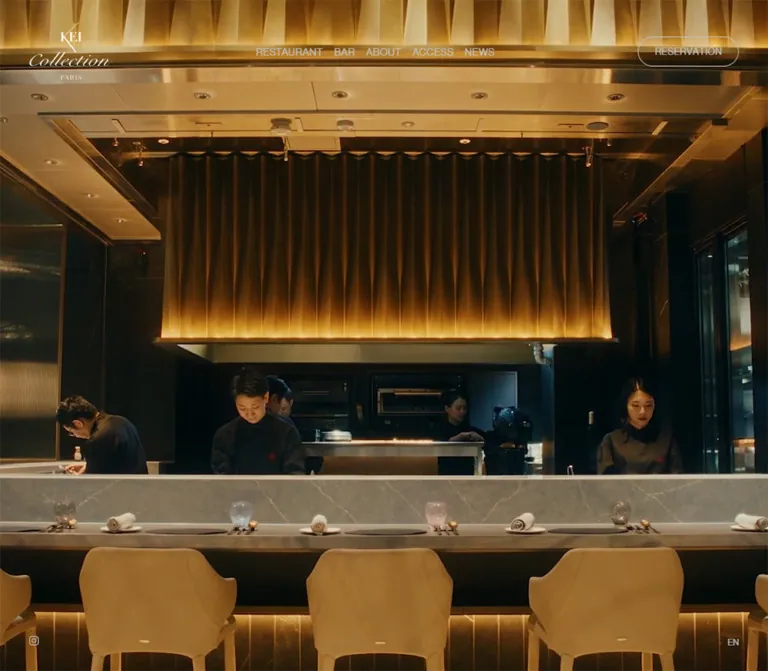
DESIGN REFERENCE
黒を基調に、大きなセリフ体の見出しと料理・空間の写真を組み合わせた公式サイト。控えめな予約導線、長いスクロール構成、季節のニュースモーダルが特徴。
オリジナルサイトを見るA dark restaurant and bar experience built from monumental serif titles, restrained navigation, and intimate photographic detail.
Website: KEI Collection PARIS
Original URL: https://www.kei-collection.com/
Final URL: https://www.kei-collection.com/
Theme: dark, with white display typography, silver utility text, and warmth supplied by imagery.
Inspected: September 22, 2026, from supplied browser evidence retrieved at 2026-09-22T14:11:04.662Z — 23:11 JST.
Viewports: desktop 1440 × 1000; mobile 390 × 844.
Scope: the current Japanese homepage, including its opening media area, restaurant and bar chapters, philosophy heading, lower photographic sequence, brand-link footer, persistent navigation, and open seasonal NEWS dialog. Linked destination pages were not inspected.
KEI Collection PARIS uses almost-black surfaces to make photography and typography carry the experience. The interface is sparse: a small signature-like brand mark, uppercase navigation, a narrow reservation capsule, and discreet social and language links. Large, regular-weight serif headings establish the editorial hierarchy. Japanese descriptions remain compact and quiet beneath them.
The homepage is a long presentation of a restaurant and bar, with links into a wider site. Its defining relationship is between immersive imagery, centered text compositions, and persistent access to reservations. Desktop restaurant and bar chapters occupy unusually long document spans; mobile condenses them into shorter sections with full-width text blocks.
A seasonal NEWS dialog is open in every supplied current-page capture. Its charcoal rectangle and white text are the clearest directly visible component. The surrounding page is heavily dimmed by its backdrop. Preserve this distinction: the darkened navigation in these screenshots is an overlay state, not the intended resting contrast of the website.
A dark restaurant and bar experience built from monumental serif titles, restrained navigation, and intimate photographic detail.
Website: KEI Collection PARIS
Original URL: https://www.kei-collection.com/
Final URL: https://www.kei-collection.com/
Theme: dark, with white display typography, silver utility text, and warmth supplied by imagery.
Inspected: September 22, 2026, from supplied browser evidence retrieved at 2026-09-22T14:11:04.662Z — 23:11 JST.
Viewports: desktop 1440 × 1000; mobile 390 × 844.
Scope: the current Japanese homepage, including its opening media area, restaurant and bar chapters, philosophy heading, lower photographic sequence, brand-link footer, persistent navigation, and open seasonal NEWS dialog. Linked destination pages were not inspected.
KEI Collection PARIS uses almost-black surfaces to make photography and typography carry the experience. The interface is sparse: a small signature-like brand mark, uppercase navigation, a narrow reservation capsule, and discreet social and language links. Large, regular-weight serif headings establish the editorial hierarchy. Japanese descriptions remain compact and quiet beneath them.
The homepage is a long presentation of a restaurant and bar, with links into a wider site. Its defining relationship is between immersive imagery, centered text compositions, and persistent access to reservations. Desktop restaurant and bar chapters occupy unusually long document spans; mobile condenses them into shorter sections with full-width text blocks.
A seasonal NEWS dialog is open in every supplied current-page capture. Its charcoal rectangle and white text are the clearest directly visible component. The surrounding page is heavily dimmed by its backdrop. Preserve this distinction: the darkened navigation in these screenshots is an overlay state, not the intended resting contrast of the website.
y coordinate as a normal-flow document offset.| Name | Value | Suggested token | Evidence and role |
|---|---|---|---|
| Near-black canvas | #040101 |
--color-canvas |
Measured body, lower media section, and footer background. A subtly warm black rather than neutral charcoal. |
| Chapter charcoal | #0e0e0e |
--color-section |
Measured restaurant and bar section background. |
| White | #ffffff |
--color-text |
Measured display headings, chapter detail links, philosophy copy, and NEWS text. |
| Silver gray | #c1c1c1 |
--color-muted |
Measured desktop navigation, Japanese chapter descriptions, footer text, and language link. |
| Black control ink | #000000 |
--color-control-ink |
Measured reservation anchor text in the supplied DOM state. The visible control also has state-dependent surrounding treatment. |
| Inherited dark ink | #292323 |
No primary visual token | Measured inherited body color. Visible dark-theme text generally overrides it; do not use it for normal copy on the dark canvas. |
| NEWS surface | Approximately #0e0e0e |
--color-news |
Visual estimate. The dialog wrapper's computed background was not supplied; its appearance closely matches chapter charcoal. |
| Modal veil | Black at approximately 70–80% opacity | --color-backdrop |
Visual estimate only. rgb(0 0 0 / 0.75) is a recommended starting point. |
Warmth comes from the imagery. Amber liquid, reflective glass, metallic highlights, skin, and warm interior lighting provide the warm end of the palette. There is no measured gold UI accent to reproduce as a button color or decorative border.
The NEWS backdrop darkens the logo, photography, reservation control, navigation, and footer together. Keep the dialog outside that dimming layer. Applying opacity to the entire page container, including the dialog, would destroy the observed hierarchy.
The exposed custom property --swiper-theme-color: #007aff is not evidence of a visible blue brand accent. No corresponding blue control appears in the supplied captures. Similarly, --swiper-navigation-size: 44px should not be treated as a measured size for the visible menu or close control.
Only a dark presentation is evidenced. No theme selector or light theme was observed. The difference between the opening outlined reservation treatment and the later light-filled treatment is a control-state variation, not evidence of multiple site themes.
baskerville-display-pt.400.RESTAURANT, BAR, and the French philosophy statement.Baskerville, Georgia, serif; these fallbacks were not declared in the supplied display-heading records.Use size and negative space to establish importance. These headings do not need bold weight, colored emphasis, or a decorative frame.
neue-haas-grotesk-display, sans-serif.400.VIEW MORE, ABOUT, NEWS, footer text, and EN.0.05em, measured as 0.7px at 14px, 0.65px at 13px, or 0.6px at 12px.The uppercase labels are compact and understated. Avoid stretching their tracking into widely spaced luxury-brand lettering; the measured spacing is modest.
"Noto Sans JP", sans-serif.1.8.#c1c1c1.游ゴシック体, YuGothic, 游ゴシック, "Yu Gothic", sans-serif.1.6.Do not apply the chapter-copy font indiscriminately to the dialog. The supplied evidence records different Japanese font stacks for these areas.
| Role | Desktop | Mobile | Line height | Tracking |
|---|---|---|---|---|
| Philosophy display | 90px / 400 | 48px / 400 | 90px / 48px | Normal |
| Chapter heading | 62px / 400 | 46px / 400 | 62px / 46px | Normal |
| Chapter description | 14px / 400 | 14px / 400 | 25.2px | Normal |
| Desktop navigation | 14px / 400 | Hidden in the captured mobile header | 14px | 0.7px |
| Reservation label | 13px / 400 | 12px / 400 | 13px / 12px | 0.65px / 0.6px |
| Chapter detail link | 14px / 400 | 14px / 400 | 19.6px | 0.7px |
| NEWS label | 14px / 400 | 14px / 400 | 14px | Normal |
| NEWS body | 14px / 400 | 14px / 400 | 22.4px | Normal |
| Philosophy subtitle | 14px / 400 | 14px / 400 | 14px / 25.2px | Normal |
| Privacy and copyright | 12px / 400 | 12px / 400 | 12px | 0.6px |
| EN link | 12px / 400 | 12px / 400 | 12px | Normal |
The source root is measured at 10px. The Quick Start uses explicit pixel values and a conventional root, so its dimensions do not depend on copying that root size.
The logo is artwork combining serif and script forms. Its lettering is not evidence of another ordinary text font, and it should not be recreated using a generic cursive font.
Density: very sparse across the page, with compact controls and compact dialog text. Geometry: rectangular imagery and panels, a pill-shaped reservation link, and thin line icons. Scale behavior: large display text and chapter extents change substantially between desktop and mobile; body text remains 14px.
| Use | Desktop | Mobile | Evidence |
|---|---|---|---|
| Header padding | 30px 40px |
16px 20px 30px 16px |
Measured |
| Gap between desktop navigation labels | 15px | Not applicable | Calculated from anchor bounds |
| Reservation padding | 13px 22px |
10px 14px |
Measured |
| Heading-to-description gap | 20px | 20px | Calculated from chapter bounds |
| Description-to-detail-link gap | 30px | 30px | Calculated from chapter bounds |
| Mobile chapter text side inset | — | 30px | Measured |
| Mobile chapter opening text offset | — | 100px below section start | Calculated |
| NEWS panel horizontal inset | Approximately 60px | Approximately 25px | Panel edge estimated; text bounds measured |
| NEWS label top inset | Approximately 90px | Approximately 80px | Panel edge estimated; text bounds measured |
| NEWS label-to-event-title gap | 52.4px after label line box | 52.4px | Calculated |
| NEWS paragraph separation | Approximately one 22.4px line | Approximately one 22.4px line | Visual and text-layout evidence |
| Lower media section vertical padding | 200px | 150px | Measured |
There is no evidence of a universal 8px spacing grid. Reuse the distinct 20px, 30px, 40px, 60px, 80px, and 100px relationships where they serve the same component roles.
| Element | Value or appearance | Evidence |
|---|---|---|
| Reservation link | 100px | Measured |
| NEWS panel | Square corners | Visual observation |
| Photography | Rectangular crops | Visual observation |
| Mobile unlabeled hero control | 50% radius on a 60 × 60px button | Measured; function unknown |
| Close and menu controls | Unboxed line symbols | Visual observation |
No general rounded-card or shadow system is visible.
| Element | Desktop: 1440 × 1000 | Mobile: 390 × 844 | Status |
|---|---|---|---|
| Document height | 12,855px | 5,753.81px, reported rounded as 5,754px | Measured |
| Opening section | 1440 × 1000px | 390 × 844px | Measured |
| Header box | 1440 × 140.22px | 390 × 100.5px | Measured |
| Logo link width | 114px | 77px | Measured inline-link width |
| Reservation link | 137.61 × 41px | 114.58 × 34px | Measured |
| Restaurant section | 3000px tall | 786.16px tall | Measured |
| Bar section | 3000px tall | 786.16px tall | Measured |
| Restaurant text block | 427.30px wide, centered around x = 1080 | 330px wide at x = 30 | Measured and calculated |
| Bar text block | 270.56px wide, centered around x = 360 | 330px wide at x = 30 | Measured and calculated |
| NEWS outer panel | Approximately 820 × 408px at x = 310, y = 296 | Approximately 330 × 473px at x = 30, y = 186 | Visual estimate |
| NEWS text region | 700px wide at x = 370 | 280px wide at x = 55 | Measured |
| Close button box | 15 × 18.5px | 15 × 18.5px | Measured |
| Mobile menu button box | Not present in desktop sample | 40 × 8px | Measured |
| Lower media section | 4290px tall | 1890px tall | Measured |
| Footer | 265px tall | 350.31px tall | Measured |
The 10px-high bounds reported for several logo links are inline text-box bounds, not the artwork's height. Do not turn those measurements into 10px-high logos.
Role: maintain identity, section navigation, and reservation access over imagery.
The desktop header places a compact logo at the upper left, five uppercase links in the center region, and a reservation capsule at the right. The header background is transparent in the measured state. Its horizontal padding is 40px and its top padding is 30px.
The observed navigation is RESTAURANT, BAR, ABOUT, ACCESS, and NEWS. These are links to separate paths, not evidence of on-page anchor scrolling. Their measured color is silver gray and their spacing is approximately 15px between labels.
On mobile, the logo shrinks from 114px to 77px wide. The reservation link remains visible, while the five text links disappear from the rendered mobile navigation. A thin two-line menu symbol occupies the right edge. Its measured 40 × 8px button box describes a very small visible control; menu contents and opening behavior were not inspected.
The header remains at the top in supplied captures of different page positions. This supports persistent positioning, but the exact source positioning rule was not included.
Role: provide a continuously available booking destination.
The link points to https://www.tablecheck.com/shops/keicollectionparis/reserve. Its label is RESERVATION, with a 100px radius and modest tracking.
Desktop dimensions are approximately 138 × 41px; mobile dimensions are approximately 115 × 34px. Their measured line heights and padding leave 2px of additional height, consistent with a thin border, although border widths were not included in the evidence.
The opening captures show an outlined treatment. Later captures show a light-filled capsule behind the modal veil. The trigger for that variation is unknown. Do not describe it as a verified hover, scroll, or active state.
The anchor's sampled background is transparent, so the filled appearance may involve another layer or a different captured state. A white-fill modifier is a useful implementation recommendation, not a recovered source declaration.
Role: establish atmosphere before the explanatory chapters.
The first section exactly matches the inspected viewport dimensions. The desktop capture shows dark architectural reflections and points of light; the mobile capture shows a close crop of a chef in a white jacket. Both are partly hidden and strongly dimmed by the NEWS overlay.
Keep this area immersive and image-led. The site chrome sits over it instead of occupying an opaque navigation strip above it.
A small vertical-bar symbol appears near the lower-right desktop utilities in the opening capture. The mobile DOM also contains an unlabeled circular 60px control near the bottom center. Their purposes are not established by the supplied evidence. Do not invent playback or sound semantics for them.
A video, image sequence, or other moving-media implementation is plausible, but its format, playback settings, and timing were not supplied.
Role: introduce the dining experience and link to its dedicated page.
At desktop, the text composition is centered in the right half of the viewport, around x = 1080. It contains a 62px serif title, a 14px Japanese description with 25.2px leading, and a small VIEW MORE link. The title-to-description gap is 20px; the description-to-link gap is 30px.
The content describes a theatrical open kitchen and an à la carte offering. Its structure is concise: one display heading, one short text block, and one detail link. Avoid expanding this chapter into a set of feature cards.
The measured section occupies 3000px of desktop document height. That extent may support a staged presentation, but the source positioning and scroll controller were not inspected. The photograph's full layout is obscured in the supplied captures.
On mobile, the heading begins 100px below the section start. The text region has 30px side margins and is 330px wide. The heading becomes 46px, while the description stays 14px. The description wraps into three lines, and the section's total height falls to approximately 786px.
Role: pair the rooftop-bar proposition with close photographic detail.
The desktop arrangement reverses the restaurant text placement. Its text block is centered in the left half around x = 360, while the visible right half contains an amber-toned close-up of a drinking vessel. The photograph reaches the right viewport edge in the supplied mid-page capture.
The 62px serif BAR heading sits above three lines of Japanese description and a VIEW MORE link. The description mentions the 49th-floor rooftop, Tokyo night views, an infinity pool, and food accompanying the bar experience. This is source copy, not confirmation that those subjects appear in the supplied photography.
At mobile, the text block expands to the same 330px width used for the restaurant chapter. Both chapters share a 46px heading, 14px description, and approximately 786px section height.
Role: introduce the brand's attitude toward ingredients and lead to the About page.
The DOM contains the French statement AMOUR DÉLICAT POUR LA MATIÈRE, the Japanese subtitle 素材への繊細な愛情, and an ABOUT link.
The French display text is 90px on desktop and 48px on mobile. Its reported bounding region changes from approximately 950 × 194px to 328 × 165px, supporting a narrower, more vertically stacked mobile composition. The Japanese subtitle remains 14px.
The extracted heading text repeats words and includes separated letters. This may reflect presentation markup, but no letter-animation sequence was verified. Render one coherent phrase in an accessible heading; do not reproduce the duplicated DOM text as two visible slogans.
Its measured viewport-relative placement should not be used to place it inside the opening hero. The heading occurs later in the DOM, and its actual positioning mechanism was not supplied.
Role: foreground a current event without changing the surrounding site's navigation structure.
This is the most consistently visible component. The panel remains centered over the opening area, the bar chapter, and the footer captures. It has a square charcoal surface, generous empty space, a small NEWS label, an emphasized event title, Japanese body copy, an underlined detail link, and a thin close cross in the upper-right corner.
The observed event title is 季節限定イベント「Beyond Magic Hour」. The detail link is 詳細はこちら, pointing to /news/2026.7.9.
Desktop anatomy:
Mobile anatomy:
The first body passage occupies roughly two lines on desktop and four on mobile; the following passage expands from roughly one line to three. Preserve that text-driven height instead of forcing both layouts to the same panel height.
The backdrop is uniform darkening without visible blur. The background remains recognizable, but its controls are intentionally subordinate. Modal dismissal, focus containment, Escape handling, background scroll locking, and repeat-visit behavior are unverified.
Role: continue the sensory presentation before the footer.
The lower section has a near-black canvas and substantial vertical padding: 200px desktop and 150px mobile. Its measured height is 4290px desktop and 1890px mobile.
The end-of-page captures show close food imagery, including a rounded amber vessel or dish and dark bead-like ingredients. Desktop uses a centrally framed photographic area surrounded by black space. Mobile imagery is inset approximately 30px from each side in the visible lower-page capture.
The modal prevents a complete reading of image count, sequence, spacing, and crops. No carousel controls, transition sequence, or source media URLs were supplied. Preserve the broad principle of large photographic compositions separated by black space; do not invent a verified gallery mechanism.
Role: connect related restaurant identities and provide legal and utility links.
The desktop footer presents six brand marks in a horizontal composition: Restaurant KEI, Maison KEI, Héritage by KEI, KEI Collection PARIS, Esprit C. KEI Ginza, and St Louis Bar by KEI. Preserve their individual artwork and proportions rather than rendering six matching text labels.
The mobile DOM indicates a wrapped arrangement: the first link occupies its own full-width row; the following three links share a row; the final two share another row. Much of this area remains behind the dialog, so the exact artwork dimensions are not established by the inline-link bounds.
At the bottom, Privacy Policy sits left and the copyright sits near the center. Small Instagram and EN links remain at the lower right. The legal and copyright typography is 12px silver gray with 0.6px tracking.
The privacy destination is an external policy page. Its existence does not independently establish a legal operating entity.
Role: provide low-emphasis access to Instagram and the English edition.
The Instagram link and EN occupy the lower-right region across the supplied positions. Desktop EN ends at x = 1400, 40px from the edge; mobile EN ends at x = 360, 30px from the edge.
The Instagram link's measured width is 13px, while EN is approximately 15px wide. Keep the visual symbols small, but use larger invisible hit areas in a new implementation. The original accessible names and effective touch targets were not captured.
| Treatment | Supplied evidence | What can be concluded |
|---|---|---|
| Desktop navigation color | color 0.3s |
A 300ms color transition is defined. The activated color and trigger were not captured. |
| Reservation background and text | background-color 0.2s ease-out, color 0.2s ease-out |
A short 200ms transition is defined for these properties. |
| Chapter paragraph reveal | opacity 0.6s 0.2s |
A 600ms opacity transition with a 200ms delay is defined. Its trigger and complete state sequence are unverified. |
| Other sampled elements | Frequently serialized as transition: all |
No usable nonzero duration can be inferred from that value alone. |
| Sampled CSS animations | animation: none |
No named CSS animation is reported on those sampled elements. This does not rule out descendants, scripts, transforms, or video. |
| Desktop chapter progression | Restaurant and bar each span three viewport heights | Long staging space is measured; pinning, scrubbing, and easing are unverified. |
| NEWS presentation | Open and centered in every current capture | Persistent overlay state is observed; opening and closing motion is unverified. |
| Header and lower-right utilities | Remain at viewport edges in different captures | Persistent positioning is visually supported; exact CSS mechanics are unavailable. |
| Reservation appearance | Outline and light-filled appearances occur in different captures | State variation is visible; the cause is unknown. |
The capture process waited for document readiness, visible finite motion, sampled layout stability, and image decoding within stated limits. Perpetual animations were temporarily paused during readiness checks and then resumed. This improves screenshot stability but does not establish a complete interaction timeline.
For an adaptation, preserve the measured short utility transitions. Introduce additional fades or media transitions only as recommendations. Avoid specifying an elaborate parallax or autoplay system as though it had been verified.
| Layer | Appearance | Purpose |
|---|---|---|
| Base page | Near-black #040101 |
Unifies the long document and footer. |
| Restaurant and bar chapters | Charcoal #0e0e0e |
Provides subtle differentiation within the dark page. |
| Photographic planes | Full-viewport, half-viewport, or centrally framed imagery | Supplies detail, warmth, and atmosphere. |
| Header | Transparent in the measured state | Places identity and navigation directly over the composition. |
| Reservation control | Fine capsule outline or light-filled state | Keeps the principal action recognizable without using a bright accent. |
| NEWS backdrop | Strong black veil | Reduces the entire surrounding page to context. |
| NEWS panel | Opaque charcoal, square corners | Creates a quiet foreground reading surface. |
| Text links | Small white or silver labels; NEWS detail visibly underlined | Supports navigation without introducing a card or button system everywhere. |
The interface relies on scale, negative space, image boundaries, and dark/light contrast. No visible elevation hierarchy requires soft drop shadows, glass blur, or ornamental gradients.
Current captures support a photographic language of reflections, close observation, and selective lighting. Architectural surfaces catch small highlights. Glass and amber liquid create layered transparency. Food is shown at a scale where texture becomes a major visual subject. The mobile opening crop brings a chef and white jacket into the foreground.
Use photographic assets that can withstand large crops. Desktop may expose a broad scene or half-screen detail; mobile needs an intentional focal point within a narrow vertical frame. A single center crop will not necessarily preserve a face, glass rim, or ingredient arrangement.
The warmth should remain inside the photography. Keep the interface monochrome so the images can change color and brightness without competing with colored buttons or decorative gradients.
No image, video, poster, or logo file paths were included in the supplied evidence. The following references identify visual roles rather than downloadable assets.
| Visual | Current-page evidence | Implementation guidance |
|---|---|---|
| KEI Collection PARIS wordmark | Upper-left header in desktop and mobile captures | Use authorized brand artwork; preserve its script and serif combination. |
| Reflective architectural scene | Desktop opening capture | Use a large photographic plane with detailed highlights and deep shadow. |
| Chef close-up | Mobile opening capture | Provide a mobile crop that retains the subject's face and working context. |
| Amber drinking-vessel detail | Desktop bar-position capture | Preserve the close crop and edge-to-edge right-hand image area. |
| Food and rounded vessel imagery | Desktop and mobile lower-page captures | Keep detail large and surround the sequence with black space. |
| Six related brand marks | Footer capture and original-page links | Preserve each mark's native proportions and artwork. |
| Menu, close, and social symbols | Current captures and button/link bounds | Simple line geometry is appropriate; accessible hit areas should be larger than the artwork. |
Do not invent original asset filenames or embed unverified media URLs. The CSS can reproduce layout and surfaces, but it cannot reproduce the photographic identity without suitable imagery.
The opening section occupies one full viewport. Restaurant and bar sections follow with measured 3000px extents, alternating their text centers between the right and left halves. The bar capture confirms a half-screen image on the opposite side of its text.
The restaurant and bar descriptions retain narrow reading widths rather than filling their entire 720px half. Their measured text centers, x = 1080 and x = 360, create a clear alternating rhythm.
Later DOM content includes the philosophy composition and a large media sequence before the footer. The interval between the end of the bar section and the lower media section is approximately 1300px. Its wrapper was not included in the sampled elements, so that interval should not be copied as a fully verified component height.
At 390px wide, the desktop navigation links are replaced by the menu symbol, while the reservation link remains exposed. Header spacing becomes asymmetric: 16px at the left and 20px at the right.
Restaurant and bar text blocks share a 330px width with 30px side margins. Chapter title size falls from 62px to 46px; body size stays 14px. Their section heights fall from 3000px to approximately 786px, a structural change rather than proportional scaling of the desktop page.
The philosophy display falls from 90px to 48px and occupies a taller relative text shape. The footer wraps its brand links into several rows and grows from 265px to approximately 350px tall.
The NEWS dialog keeps its body type size but changes from a 700px to a 280px text width. Horizontal padding contracts from approximately 60px to 25px. Text wrapping increases the panel height while vertical centering remains consistent.
Only two viewport widths were supplied. The breakpoint, tablet layout, landscape-phone layout, and intermediate fluid behavior are unknown. A breakpoint such as 767px in the Quick Start is a recommendation, not an observed source value.
The desktop's long chapter extents should be implemented only with a deliberate presentation system. A static fallback should use content-driven sections rather than reproduce thousands of pixels of empty space.
For shorter screens, cap the dialog height and allow internal scrolling. For narrow screens, allow the event title to wrap. The measured one-line title at 390px is not a reason to impose white-space: nowrap globally.
These are recommendations for a new implementation, not verified features of the original:
#040101.#0e0e0e.#ffffff.#c1c1c1.#0e0e0e.rgb(0 0 0 / 0.75).“Create an image-led Japanese restaurant and bar homepage inspired by KEI Collection PARIS. Use near-black #040101, charcoal #0e0e0e, white display text, and silver #c1c1c1 secondary text. Pair large regular-weight Baskerville-style headings with compact grotesk uppercase navigation and restrained Japanese descriptions. Keep a small authorized wordmark at the upper left, navigation in the desktop center region, and a rounded reservation capsule at the right. Alternate restaurant and bar text compositions across desktop halves, with large photographic planes showing reflections, culinary detail, and warm light. On mobile, keep the reservation link, replace text navigation with a thin menu symbol, and use 30px content margins. Include a separate seasonal NEWS dialog state with a square charcoal panel, generous padding, 14px white text, an underlined detail link, and a strong black backdrop. Treat media playback and scroll choreography as implementation choices requiring additional evidence.”
This is a reusable adaptation, not an extraction of the site's source. It preserves measured typography and major proportions, uses estimated dialog geometry, and adds accessible control sizing. It keeps a conventional root size and supplies a static chapter layout instead of inventing the original scroll controller. The 767px breakpoint, fallback fonts, 75% backdrop, focus treatment, and larger hit areas are recommendations.
Load authorized font files and brand assets separately. No original asset URL is implied by these class names.
:root {
  /* Measured colors */
  --color-canvas: #040101;
  --color-section: #0e0e0e;
  --color-text: #fff;
  --color-muted: #c1c1c1;
  --color-control-ink: #000;

  /* Visual approximations */
  --color-news: #0e0e0e;
  --color-backdrop: rgb(0 0 0 / 0.75);

  /* Observed families, with recommended display fallbacks */
  --font-display: 'baskerville-display-pt', Baskerville, Georgia, serif;
  --font-utility: 'neue-haas-grotesk-display', sans-serif;
  --font-japanese: 'Noto Sans JP', sans-serif;
  --font-news: '游ゴシック体', YuGothic, '游ゴシック', 'Yu Gothic', sans-serif;

  --text-chapter: 62px;
  --text-philosophy: 90px;
  --text-body: 14px;
  --text-utility: 14px;
  --text-small: 12px;
  --leading-body: 1.8;
  --leading-news: 1.6;
  --tracking-utility: 0.05em;

  --header-inline: 40px;
  --content-inset: 30px;
  --chapter-copy-max: 427.3px;
  --dialog-width: 820px;
  --dialog-inline: 60px;
  --dialog-block: 90px;
  --radius-reservation: 100px;

  /* Measured transition timings */
  --motion-nav: color 300ms;
  --motion-reservation: background-color 200ms ease-out, color 200ms ease-out;
  --motion-copy: opacity 600ms 200ms;
}

* { box-sizing: border-box; }

body {
  margin: 0;
  color: var(--color-text);
  background: var(--color-canvas);
  font-family: var(--font-japanese);
  font-size: var(--text-body);
  line-height: var(--leading-body);
}

img, video { display: block; max-inline-size: 100%; }
button, a { -webkit-tap-highlight-color: transparent; }
a { color: inherit; }
button { font: inherit; }

.site-header {
  position: fixed;
  z-index: 20;
  inset: 0 0 auto;
  display: grid;
  grid-template-columns: 1fr auto 1fr;
  align-items: center;
  padding: 30px var(--header-inline);
}

.site-logo { justify-self: start; }
.site-logo img { inline-size: 114px; block-size: auto; }

.site-nav {
  display: flex;
  align-items: center;
  gap: 15px;
}

.site-nav a, .detail-link {
  font-family: var(--font-utility);
  font-size: 14px;
  font-weight: 400;
  letter-spacing: var(--tracking-utility);
  text-decoration: none;
}

.site-nav a {
  padding-block-end: 4px;
  color: var(--color-muted);
  line-height: 1;
  transition: var(--motion-nav);
}

.header-actions {
  display: flex;
  align-items: center;
  justify-self: end;
  gap: 28px;
}

.reservation {
  display: inline-flex;
  align-items: center;
  justify-content: center;
  padding: 13px 22px;
  border: 1px solid currentColor;
  border-radius: var(--radius-reservation);
  color: var(--color-text);
  background: transparent;
  font-family: var(--font-utility);
  font-size: 13px;
  line-height: 1;
  letter-spacing: var(--tracking-utility);
  text-decoration: none;
  transition: var(--motion-reservation);
}

/* Recommended explicit modifier; original trigger is unknown. */
.reservation.is-filled {
  color: var(--color-control-ink);
  background: var(--color-text);
  border-color: var(--color-text);
}

.menu-toggle {
  display: none;
  position: relative;
  inline-size: 44px;
  block-size: 44px;
  padding: 0;
  border: 0;
  color: var(--color-muted);
  background: transparent;
}

.menu-toggle::before, .menu-toggle::after {
  content: '';
  position: absolute;
  inset-inline-end: 0;
  inline-size: 40px;
  block-size: 1px;
  background: currentColor;
}
.menu-toggle::before { inset-block-start: 18px; }
.menu-toggle::after { inset-block-start: 25px; }

.hero {
  position: relative;
  min-block-size: 100svh;
  overflow: hidden;
}

.hero-media {
  position: absolute;
  inset: 0;
  inline-size: 100%;
  block-size: 100%;
  object-fit: cover;
  object-position: var(--hero-focus, 50% 50%);
}

/* Static fallback: source desktop staging is not reconstructed. */
.chapter {
  display: grid;
  grid-template-columns: repeat(2, minmax(0, 1fr));
  min-block-size: 100svh;
  background: var(--color-section);
}

.chapter-media {
  margin: 0;
  min-inline-size: 0;
  min-block-size: 0;
}

.chapter-media img, .chapter-media video {
  inline-size: 100%;
  block-size: 100%;
  object-fit: cover;
  object-position: var(--media-focus, 50% 50%);
}

.chapter-copy {
  align-self: center;
  justify-self: center;
  inline-size: calc(100% - 60px);
  max-inline-size: var(--chapter-copy-max);
  padding-block: 100px;
  text-align: center;
}

.chapter--bar .chapter-copy {
  order: -1;
  max-inline-size: 270.6px;
}

.chapter-title {
  margin: 0 0 20px;
  font-family: var(--font-display);
  font-size: var(--text-chapter);
  font-weight: 400;
  line-height: 1;
}

.chapter-copy p {
  margin: 0;
  color: var(--color-muted);
  font-size: var(--text-body);
  line-height: var(--leading-body);
  transition: var(--motion-copy);
}

.detail-link {
  display: inline-block;
  margin-block-start: 30px;
  padding-block-end: 4px;
  line-height: 1.4;
}

.philosophy {
  display: grid;
  place-content: center;
  min-block-size: 100svh;
  padding: 100px 30px;
  text-align: center;
}

.philosophy h2 {
  max-inline-size: 950px;
  margin: 0 auto;
  font-family: var(--font-display);
  font-size: var(--text-philosophy);
  font-weight: 400;
  line-height: 1;
}

.philosophy p { margin: 40px 0 0; }

.media-sequence { padding-block: 200px; }
.media-sequence figure { margin-inline: auto; }

.site-footer {
  padding: 45px 45px 32px;
  background: var(--color-canvas);
  color: var(--color-muted);
}

.brand-strip {
  display: flex;
  align-items: center;
  justify-content: center;
  gap: 45px;
  margin-block-end: 90px;
}

.brand-strip img {
  inline-size: auto;
  max-block-size: 80px;
  margin-inline: auto;
}

.footer-meta {
  display: grid;
  grid-template-columns: 1fr auto 1fr;
  align-items: center;
  font-family: var(--font-utility);
  font-size: 12px;
  line-height: 1;
  letter-spacing: 0.05em;
}

.footer-meta p { margin: 0; }
.footer-meta a { justify-self: start; text-decoration: none; }

.site-utilities {
  position: fixed;
  z-index: 21;
  inset: auto 40px 24px auto;
  display: flex;
  align-items: center;
  gap: 12px;
  color: var(--color-muted);
  font-family: var(--font-utility);
  font-size: 12px;
}

.site-utilities a {
  display: grid;
  place-items: center;
  min-inline-size: 32px;
  min-block-size: 44px;
  text-decoration: none;
}

.news-dialog {
  position: fixed;
  inset: 0;
  inline-size: min(var(--dialog-width), calc(100% - 60px));
  max-inline-size: none;
  min-block-size: min(408px, calc(100dvh - 40px));
  max-block-size: calc(100dvh - 40px);
  margin: auto;
  padding: var(--dialog-block) var(--dialog-inline);
  overflow: auto;
  border: 0;
  border-radius: 0;
  color: var(--color-text);
  background: var(--color-news);
  font-family: var(--font-news);
  font-size: 14px;
  line-height: var(--leading-news);
}

.news-dialog::backdrop { background: var(--color-backdrop); }

.news-label {
  margin: 0 0 52.4px;
  font-family: var(--font-utility);
  font-size: 14px;
  font-weight: 400;
  line-height: 1;
}

.news-title {
  margin: 0;
  font: inherit;
  font-weight: 700; /* Recommended approximation of visible emphasis. */
}

.news-body p { margin: 0; }
.news-body p + p { margin-block-start: 22.4px; }

.news-detail {
  display: block;
  margin-block-start: 22.4px;
  text-decoration: underline;
  text-underline-offset: 2px;
}

.news-close {
  position: absolute;
  inset: 8px 8px auto auto;
  inline-size: 44px;
  block-size: 44px;
  padding: 0;
  border: 0;
  color: var(--color-text);
  background: transparent;
  cursor: pointer;
}

.news-close::before, .news-close::after {
  content: '';
  position: absolute;
  inset: 50% auto auto 50%;
  inline-size: 20px;
  block-size: 1px;
  background: currentColor;
}
.news-close::before { transform: translate(-50%, -50%) rotate(45deg); }
.news-close::after { transform: translate(-50%, -50%) rotate(-45deg); }

/* Recommended keyboard treatment. */
:where(a, button):focus-visible {
  outline: 2px solid var(--color-text);
  outline-offset: 5px;
}

@media (hover: hover) {
  .site-nav a:hover { color: var(--color-text); }
  .reservation:hover {
    color: var(--color-control-ink);
    background: var(--color-text);
    border-color: var(--color-text);
  }
}

/* Recommended breakpoint; only 1440px and 390px were inspected. */
@media (max-width: 767px) {
  :root {
    --text-chapter: 46px;
    --text-philosophy: 48px;
    --dialog-inline: 25px;
    --dialog-block: 80px;
  }

  .site-header {
    grid-template-columns: 1fr auto;
    padding: 16px 20px 30px 16px;
  }
  .site-logo img { inline-size: 77px; }
  .site-nav { display: none; }
  .menu-toggle { display: block; }
  .reservation { padding: 10px 14px; font-size: 12px; }

  .chapter { grid-template-columns: 1fr; min-block-size: 0; }
  .chapter-copy, .chapter--bar .chapter-copy {
    order: -1;
    inline-size: calc(100% - 60px);
    max-inline-size: none;
    padding-block: 100px 60px;
  }
  .chapter-media { min-block-size: 360px; }
  .chapter-media img, .chapter-media video { block-size: 360px; }

  .philosophy p { margin-block-start: 10px; }
  .media-sequence { padding-block: 150px; }
  .media-sequence figure { margin-inline: 30px; }

  .site-footer { padding: 30px 30px 20px; }
  .brand-strip {
    display: grid;
    grid-template-columns: repeat(6, minmax(0, 1fr));
    gap: 30px 35px;
  }
  .brand-strip > a { grid-column: span 2; min-inline-size: 0; }
  .brand-strip > a:first-child { grid-column: 1 / -1; }
  .brand-strip > a:nth-last-child(-n + 2) { grid-column: span 3; }
  .brand-strip img { max-block-size: 60px; }

  .footer-meta { grid-template-columns: auto 1fr; gap: 28px; }
  .site-utilities { inset: auto 24px 4px auto; gap: 0; }

  .news-dialog { min-block-size: 0; }
  .news-close { inset: 0 0 auto auto; }
}

@media (prefers-reduced-motion: reduce) {
  .site-nav a, .reservation, .chapter-copy p { transition: none; }
  html { scroll-behavior: auto; }
}
The mobile media height in this fallback is recommended, not measured. Replace it with the actual image aspect ratio or a deliberate art-directed crop. Likewise, footer artwork sizes must be tuned to the supplied logos rather than derived from inline anchor boxes.
This example uses actual observed event copy. Native showModal() supplies modal semantics and a backdrop; a plain open attribute would not create the same modal behavior. The form provides a keyboard-operable close action without assuming an original implementation.
<dialog class="news-dialog" aria-labelledby="news-label">
  <form method="dialog">
    <button class="news-close" type="submit" aria-label="Close news"></button>
  </form>

  <h2 class="news-label" id="news-label">NEWS</h2>
  <div class="news-body" lang="ja">
    <h3 class="news-title">季節限定イベント「Beyond Magic Hour」</h3>
    <p>7月15日(水)より、当店バーのルーフトップテラスにて、季節限定イベント「Beyond Magic Hour(ビヨンド・マジック・アワー)」を開催いたします。</p>
    <p>フリーフローで、名門シャンパーニュと小林圭シェフの世界を味わえるひとときをご提供いたします。</p>
    <a class="news-detail" href="https://www.kei-collection.com/news/2026.7.9">詳細はこちら</a>
  </div>
</dialog>

<script>
  // Demonstration only: choose an appropriate event-display policy.
  const newsDialog = document.querySelector('.news-dialog');
  if (newsDialog && !newsDialog.open) newsDialog.showModal();
</script>
This snippet does not implement event expiry, media playback, a mobile navigation drawer, or the site's unidentified scroll staging. Those behaviors require separate decisions and testing.
Optional aliases for a project already using Tailwind v4. This does not imply that the original site uses Tailwind. Define the properties above first.
@theme inline {
  --color-canvas: #040101;
  --color-section: #0e0e0e;
  --color-foreground: #fff;
  --color-secondary: #c1c1c1;

  --font-editorial: var(--font-display);
  --font-interface: var(--font-utility);
  --font-copy: var(--font-japanese);
  --font-announcement: var(--font-news);

  --text-chapter-title: var(--text-chapter);
  --text-philosophy-title: var(--text-philosophy);
  --text-copy: 14px;
  --text-caption: 12px;

  --spacing-page-inset: 30px;
  --spacing-dialog-inset: var(--dialog-inline);
  --radius-pill: 100px;
}
2026-09-22T14:11:04.662Z, equivalent to 23:11 JST.1440 × 1000, showing opening imagery, a bar-position composition, and the lower page/footer with the NEWS dialog open.390 × 844, showing opening imagery and the lower page/footer with the same dialog open.This document describes the current homepage evidenced by those captures. Measurements, visual approximations, and implementation recommendations are kept separate; the reusable code does not claim to reproduce unobserved media or scroll behavior.
# KEI Collection PARIS — Style Reference

> A dark restaurant and bar experience built from monumental serif titles, restrained navigation, and intimate photographic detail.

**Website:** [KEI Collection PARIS](https://www.kei-collection.com/)
**Original URL:** https://www.kei-collection.com/
**Final URL:** https://www.kei-collection.com/
**Theme:** dark, with white display typography, silver utility text, and warmth supplied by imagery.
**Inspected:** September 22, 2026, from supplied browser evidence retrieved at `2026-09-22T14:11:04.662Z` — 23:11 JST.
**Viewports:** desktop `1440 × 1000`; mobile `390 × 844`.
**Scope:** the current Japanese homepage, including its opening media area, restaurant and bar chapters, philosophy heading, lower photographic sequence, brand-link footer, persistent navigation, and open seasonal NEWS dialog. Linked destination pages were not inspected.

KEI Collection PARIS uses almost-black surfaces to make photography and typography carry the experience. The interface is sparse: a small signature-like brand mark, uppercase navigation, a narrow reservation capsule, and discreet social and language links. Large, regular-weight serif headings establish the editorial hierarchy. Japanese descriptions remain compact and quiet beneath them.

The homepage is a long presentation of a restaurant and bar, with links into a wider site. Its defining relationship is between immersive imagery, centered text compositions, and persistent access to reservations. Desktop restaurant and bar chapters occupy unusually long document spans; mobile condenses them into shorter sections with full-width text blocks.

A seasonal NEWS dialog is open in every supplied current-page capture. Its charcoal rectangle and white text are the clearest directly visible component. The surrounding page is heavily dimmed by its backdrop. Preserve this distinction: the darkened navigation in these screenshots is an overlay state, not the intended resting contrast of the website.
# KEI Collection PARIS — Style Reference

> A dark restaurant and bar experience built from monumental serif titles, restrained navigation, and intimate photographic detail.

**Website:** [KEI Collection PARIS](https://www.kei-collection.com/)
**Original URL:** https://www.kei-collection.com/
**Final URL:** https://www.kei-collection.com/
**Theme:** dark, with white display typography, silver utility text, and warmth supplied by imagery.
**Inspected:** September 22, 2026, from supplied browser evidence retrieved at `2026-09-22T14:11:04.662Z` — 23:11 JST.
**Viewports:** desktop `1440 × 1000`; mobile `390 × 844`.
**Scope:** the current Japanese homepage, including its opening media area, restaurant and bar chapters, philosophy heading, lower photographic sequence, brand-link footer, persistent navigation, and open seasonal NEWS dialog. Linked destination pages were not inspected.

KEI Collection PARIS uses almost-black surfaces to make photography and typography carry the experience. The interface is sparse: a small signature-like brand mark, uppercase navigation, a narrow reservation capsule, and discreet social and language links. Large, regular-weight serif headings establish the editorial hierarchy. Japanese descriptions remain compact and quiet beneath them.

The homepage is a long presentation of a restaurant and bar, with links into a wider site. Its defining relationship is between immersive imagery, centered text compositions, and persistent access to reservations. Desktop restaurant and bar chapters occupy unusually long document spans; mobile condenses them into shorter sections with full-width text blocks.

A seasonal NEWS dialog is open in every supplied current-page capture. Its charcoal rectangle and white text are the clearest directly visible component. The surrounding page is heavily dimmed by its backdrop. Preserve this distinction: the darkened navigation in these screenshots is an overlay state, not the intended resting contrast of the website.

## How to Read This Reference

- **Measured values** come from the supplied rendered DOM and computed-style records. They establish font declarations, text colors, element bounds, padding, transitions, and document dimensions.
- **Visual estimates** come from the five current-page captures: three desktop and two mobile. Dialog outer dimensions, backdrop strength, image crops, and some icon geometry fall into this category.
- **Calculated values** are simple derivations from measured bounds, such as the 15px desktop navigation gaps or the 20px gap between a chapter heading and its description.
- **Recommended values** belong to the reusable implementation. They are explicitly identified and do not claim to reproduce undisclosed source rules.
- Token names are descriptive aliases. The supplied evidence does not expose a complete original design-token system.
- Computed font-family declarations are available; font files and actual glyph fallback resolution were not independently inspected.
- The modal was not dismissed. Navigation, menu opening, reservation completion, keyboard behavior, sound controls, and media playback were not exercised.
- Some heading bounds are viewport-relative despite their later position in the DOM. Do not interpret every reported `y` coordinate as a normal-flow document offset.

## Tokens — Colors

### Default Palette

| Name | Value | Suggested token | Evidence and role |
| --- | --- | --- | --- |
| Near-black canvas | `#040101` | `--color-canvas` | Measured body, lower media section, and footer background. A subtly warm black rather than neutral charcoal. |
| Chapter charcoal | `#0e0e0e` | `--color-section` | Measured restaurant and bar section background. |
| White | `#ffffff` | `--color-text` | Measured display headings, chapter detail links, philosophy copy, and NEWS text. |
| Silver gray | `#c1c1c1` | `--color-muted` | Measured desktop navigation, Japanese chapter descriptions, footer text, and language link. |
| Black control ink | `#000000` | `--color-control-ink` | Measured reservation anchor text in the supplied DOM state. The visible control also has state-dependent surrounding treatment. |
| Inherited dark ink | `#292323` | No primary visual token | Measured inherited body color. Visible dark-theme text generally overrides it; do not use it for normal copy on the dark canvas. |
| NEWS surface | Approximately `#0e0e0e` | `--color-news` | Visual estimate. The dialog wrapper's computed background was not supplied; its appearance closely matches chapter charcoal. |
| Modal veil | Black at approximately 70–80% opacity | `--color-backdrop` | Visual estimate only. `rgb(0 0 0 / 0.75)` is a recommended starting point. |

**Warmth comes from the imagery.** Amber liquid, reflective glass, metallic highlights, skin, and warm interior lighting provide the warm end of the palette. There is no measured gold UI accent to reproduce as a button color or decorative border.

The NEWS backdrop darkens the logo, photography, reservation control, navigation, and footer together. Keep the dialog outside that dimming layer. Applying opacity to the entire page container, including the dialog, would destroy the observed hierarchy.

The exposed custom property `--swiper-theme-color: #007aff` is not evidence of a visible blue brand accent. No corresponding blue control appears in the supplied captures. Similarly, `--swiper-navigation-size: 44px` should not be treated as a measured size for the visible menu or close control.

### Theme Behavior

Only a dark presentation is evidenced. No theme selector or light theme was observed. The difference between the opening outlined reservation treatment and the later light-filled treatment is a control-state variation, not evidence of multiple site themes.

## Tokens — Typography

### Display Serif — Chapter and Philosophy Titles

- **Measured family:** `baskerville-display-pt`.
- **Measured weight:** `400`.
- **Roles:** `RESTAURANT`, `BAR`, and the French philosophy statement.
- **Character:** high contrast between thick and thin strokes, elegant proportions, and a distinctly editorial presence.
- **Desktop sizes:** 62px chapter titles and 90px philosophy text.
- **Mobile sizes:** 46px chapter titles and 48px philosophy text.
- **Fallback recommendation:** `Baskerville, Georgia, serif`; these fallbacks were not declared in the supplied display-heading records.

Use size and negative space to establish importance. These headings do not need bold weight, colored emphasis, or a decorative frame.

### Grotesk — Navigation and Utilities

- **Measured stack:** `neue-haas-grotesk-display, sans-serif`.
- **Measured weight:** `400`.
- **Roles:** navigation, reservation label, `VIEW MORE`, `ABOUT`, `NEWS`, footer text, and `EN`.
- **Tracking:** most navigation and action labels use `0.05em`, measured as 0.7px at 14px, 0.65px at 13px, or 0.6px at 12px.
- **Exceptions:** the NEWS label and EN link have normal measured tracking.

The uppercase labels are compact and understated. Avoid stretching their tracking into widely spaced luxury-brand lettering; the measured spacing is modest.

### Japanese Chapter Copy

- **Measured stack:** `"Noto Sans JP", sans-serif`.
- **Size and weight:** 14px, weight 400.
- **Line height:** 25.2px, equivalent to `1.8`.
- **Color:** `#c1c1c1`.
- **Role:** the short restaurant and rooftop-bar descriptions, plus the Japanese philosophy subtitle.

### Japanese NEWS Copy

- **Measured stack:** `游ゴシック体, YuGothic, 游ゴシック, "Yu Gothic", sans-serif`.
- **Size:** 14px at both inspected viewports.
- **Line height:** 22.4px, equivalent to `1.6`.
- **Color:** white.
- **Emphasis:** the event title appears heavier than the body in the captures. Its sampled parent paragraph reports weight 400; the weight of any nested emphasis element was not supplied.

Do not apply the chapter-copy font indiscriminately to the dialog. The supplied evidence records different Japanese font stacks for these areas.

### Type Scale

| Role | Desktop | Mobile | Line height | Tracking |
| --- | --- | --- | --- | --- |
| Philosophy display | 90px / 400 | 48px / 400 | 90px / 48px | Normal |
| Chapter heading | 62px / 400 | 46px / 400 | 62px / 46px | Normal |
| Chapter description | 14px / 400 | 14px / 400 | 25.2px | Normal |
| Desktop navigation | 14px / 400 | Hidden in the captured mobile header | 14px | 0.7px |
| Reservation label | 13px / 400 | 12px / 400 | 13px / 12px | 0.65px / 0.6px |
| Chapter detail link | 14px / 400 | 14px / 400 | 19.6px | 0.7px |
| NEWS label | 14px / 400 | 14px / 400 | 14px | Normal |
| NEWS body | 14px / 400 | 14px / 400 | 22.4px | Normal |
| Philosophy subtitle | 14px / 400 | 14px / 400 | 14px / 25.2px | Normal |
| Privacy and copyright | 12px / 400 | 12px / 400 | 12px | 0.6px |
| EN link | 12px / 400 | 12px / 400 | 12px | Normal |

The source root is measured at 10px. The Quick Start uses explicit pixel values and a conventional root, so its dimensions do not depend on copying that root size.

The logo is artwork combining serif and script forms. Its lettering is not evidence of another ordinary text font, and it should not be recreated using a generic cursive font.

## Tokens — Spacing & Shapes

**Density:** very sparse across the page, with compact controls and compact dialog text.
**Geometry:** rectangular imagery and panels, a pill-shaped reservation link, and thin line icons.
**Scale behavior:** large display text and chapter extents change substantially between desktop and mobile; body text remains 14px.

### Spacing Scale

| Use | Desktop | Mobile | Evidence |
| --- | --- | --- | --- |
| Header padding | `30px 40px` | `16px 20px 30px 16px` | Measured |
| Gap between desktop navigation labels | 15px | Not applicable | Calculated from anchor bounds |
| Reservation padding | `13px 22px` | `10px 14px` | Measured |
| Heading-to-description gap | 20px | 20px | Calculated from chapter bounds |
| Description-to-detail-link gap | 30px | 30px | Calculated from chapter bounds |
| Mobile chapter text side inset | — | 30px | Measured |
| Mobile chapter opening text offset | — | 100px below section start | Calculated |
| NEWS panel horizontal inset | Approximately 60px | Approximately 25px | Panel edge estimated; text bounds measured |
| NEWS label top inset | Approximately 90px | Approximately 80px | Panel edge estimated; text bounds measured |
| NEWS label-to-event-title gap | 52.4px after label line box | 52.4px | Calculated |
| NEWS paragraph separation | Approximately one 22.4px line | Approximately one 22.4px line | Visual and text-layout evidence |
| Lower media section vertical padding | 200px | 150px | Measured |

There is no evidence of a universal 8px spacing grid. Reuse the distinct 20px, 30px, 40px, 60px, 80px, and 100px relationships where they serve the same component roles.

### Border Radius

| Element | Value or appearance | Evidence |
| --- | --- | --- |
| Reservation link | 100px | Measured |
| NEWS panel | Square corners | Visual observation |
| Photography | Rectangular crops | Visual observation |
| Mobile unlabeled hero control | 50% radius on a 60 × 60px button | Measured; function unknown |
| Close and menu controls | Unboxed line symbols | Visual observation |

No general rounded-card or shadow system is visible.

### Layout Measurements

| Element | Desktop: 1440 × 1000 | Mobile: 390 × 844 | Status |
| --- | --- | --- | --- |
| Document height | 12,855px | 5,753.81px, reported rounded as 5,754px | Measured |
| Opening section | 1440 × 1000px | 390 × 844px | Measured |
| Header box | 1440 × 140.22px | 390 × 100.5px | Measured |
| Logo link width | 114px | 77px | Measured inline-link width |
| Reservation link | 137.61 × 41px | 114.58 × 34px | Measured |
| Restaurant section | 3000px tall | 786.16px tall | Measured |
| Bar section | 3000px tall | 786.16px tall | Measured |
| Restaurant text block | 427.30px wide, centered around x = 1080 | 330px wide at x = 30 | Measured and calculated |
| Bar text block | 270.56px wide, centered around x = 360 | 330px wide at x = 30 | Measured and calculated |
| NEWS outer panel | Approximately 820 × 408px at x = 310, y = 296 | Approximately 330 × 473px at x = 30, y = 186 | Visual estimate |
| NEWS text region | 700px wide at x = 370 | 280px wide at x = 55 | Measured |
| Close button box | 15 × 18.5px | 15 × 18.5px | Measured |
| Mobile menu button box | Not present in desktop sample | 40 × 8px | Measured |
| Lower media section | 4290px tall | 1890px tall | Measured |
| Footer | 265px tall | 350.31px tall | Measured |

The 10px-high bounds reported for several logo links are inline text-box bounds, not the artwork's height. Do not turn those measurements into 10px-high logos.

## Components

### Persistent Site Header

**Role:** maintain identity, section navigation, and reservation access over imagery.

The desktop header places a compact logo at the upper left, five uppercase links in the center region, and a reservation capsule at the right. The header background is transparent in the measured state. Its horizontal padding is 40px and its top padding is 30px.

The observed navigation is `RESTAURANT`, `BAR`, `ABOUT`, `ACCESS`, and `NEWS`. These are links to separate paths, not evidence of on-page anchor scrolling. Their measured color is silver gray and their spacing is approximately 15px between labels.

On mobile, the logo shrinks from 114px to 77px wide. The reservation link remains visible, while the five text links disappear from the rendered mobile navigation. A thin two-line menu symbol occupies the right edge. Its measured 40 × 8px button box describes a very small visible control; menu contents and opening behavior were not inspected.

The header remains at the top in supplied captures of different page positions. This supports persistent positioning, but the exact source positioning rule was not included.

### Reservation Capsule

**Role:** provide a continuously available booking destination.

The link points to `https://www.tablecheck.com/shops/keicollectionparis/reserve`. Its label is `RESERVATION`, with a 100px radius and modest tracking.

Desktop dimensions are approximately 138 × 41px; mobile dimensions are approximately 115 × 34px. Their measured line heights and padding leave 2px of additional height, consistent with a thin border, although border widths were not included in the evidence.

The opening captures show an outlined treatment. Later captures show a light-filled capsule behind the modal veil. The trigger for that variation is unknown. Do not describe it as a verified hover, scroll, or active state.

The anchor's sampled background is transparent, so the filled appearance may involve another layer or a different captured state. A white-fill modifier is a useful implementation recommendation, not a recovered source declaration.

### Opening Media Area

**Role:** establish atmosphere before the explanatory chapters.

The first section exactly matches the inspected viewport dimensions. The desktop capture shows dark architectural reflections and points of light; the mobile capture shows a close crop of a chef in a white jacket. Both are partly hidden and strongly dimmed by the NEWS overlay.

Keep this area immersive and image-led. The site chrome sits over it instead of occupying an opaque navigation strip above it.

A small vertical-bar symbol appears near the lower-right desktop utilities in the opening capture. The mobile DOM also contains an unlabeled circular 60px control near the bottom center. Their purposes are not established by the supplied evidence. Do not invent playback or sound semantics for them.

A video, image sequence, or other moving-media implementation is plausible, but its format, playback settings, and timing were not supplied.

### Restaurant Chapter

**Role:** introduce the dining experience and link to its dedicated page.

At desktop, the text composition is centered in the right half of the viewport, around x = 1080. It contains a 62px serif title, a 14px Japanese description with 25.2px leading, and a small `VIEW MORE` link. The title-to-description gap is 20px; the description-to-link gap is 30px.

The content describes a theatrical open kitchen and an à la carte offering. Its structure is concise: one display heading, one short text block, and one detail link. Avoid expanding this chapter into a set of feature cards.

The measured section occupies 3000px of desktop document height. That extent may support a staged presentation, but the source positioning and scroll controller were not inspected. The photograph's full layout is obscured in the supplied captures.

On mobile, the heading begins 100px below the section start. The text region has 30px side margins and is 330px wide. The heading becomes 46px, while the description stays 14px. The description wraps into three lines, and the section's total height falls to approximately 786px.

### Bar Chapter

**Role:** pair the rooftop-bar proposition with close photographic detail.

The desktop arrangement reverses the restaurant text placement. Its text block is centered in the left half around x = 360, while the visible right half contains an amber-toned close-up of a drinking vessel. The photograph reaches the right viewport edge in the supplied mid-page capture.

The 62px serif `BAR` heading sits above three lines of Japanese description and a `VIEW MORE` link. The description mentions the 49th-floor rooftop, Tokyo night views, an infinity pool, and food accompanying the bar experience. This is source copy, not confirmation that those subjects appear in the supplied photography.

At mobile, the text block expands to the same 330px width used for the restaurant chapter. Both chapters share a 46px heading, 14px description, and approximately 786px section height.

### Philosophy Composition

**Role:** introduce the brand's attitude toward ingredients and lead to the About page.

The DOM contains the French statement `AMOUR DÉLICAT POUR LA MATIÈRE`, the Japanese subtitle `素材への繊細な愛情`, and an `ABOUT` link.

The French display text is 90px on desktop and 48px on mobile. Its reported bounding region changes from approximately 950 × 194px to 328 × 165px, supporting a narrower, more vertically stacked mobile composition. The Japanese subtitle remains 14px.

The extracted heading text repeats words and includes separated letters. This may reflect presentation markup, but no letter-animation sequence was verified. Render one coherent phrase in an accessible heading; do not reproduce the duplicated DOM text as two visible slogans.

Its measured viewport-relative placement should not be used to place it inside the opening hero. The heading occurs later in the DOM, and its actual positioning mechanism was not supplied.

### Seasonal NEWS Dialog

**Role:** foreground a current event without changing the surrounding site's navigation structure.

This is the most consistently visible component. The panel remains centered over the opening area, the bar chapter, and the footer captures. It has a square charcoal surface, generous empty space, a small NEWS label, an emphasized event title, Japanese body copy, an underlined detail link, and a thin close cross in the upper-right corner.

The observed event title is `季節限定イベント「Beyond Magic Hour」`. The detail link is `詳細はこちら`, pointing to `/news/2026.7.9`.

**Desktop anatomy:**

1. Approximately 820px-wide panel centered in the viewport.
2. A 700px text column, giving approximately 60px horizontal panel padding.
3. NEWS label approximately 90px below the top edge.
4. Approximately 52.4px between the label's line-box bottom and the event title.
5. Event title and body at 14px with 22.4px leading.
6. Paragraph breaks and an underlined detail link, without a filled CTA.
7. A small 15px-wide close control near the top-right corner.

**Mobile anatomy:**

- Panel width approximately 330px, leaving 30px outside margins.
- Text width 280px, with 25px inner side padding.
- Approximately 80px above the NEWS label.
- The same 14px type and 22.4px leading as desktop.
- Increased panel height, approximately 473px, caused by text wrapping.
- Panel top near y = 186 at the 844px-tall viewport, preserving vertical centering.

The first body passage occupies roughly two lines on desktop and four on mobile; the following passage expands from roughly one line to three. Preserve that text-driven height instead of forcing both layouts to the same panel height.

The backdrop is uniform darkening without visible blur. The background remains recognizable, but its controls are intentionally subordinate. Modal dismissal, focus containment, Escape handling, background scroll locking, and repeat-visit behavior are unverified.

### Lower Photographic Sequence

**Role:** continue the sensory presentation before the footer.

The lower section has a near-black canvas and substantial vertical padding: 200px desktop and 150px mobile. Its measured height is 4290px desktop and 1890px mobile.

The end-of-page captures show close food imagery, including a rounded amber vessel or dish and dark bead-like ingredients. Desktop uses a centrally framed photographic area surrounded by black space. Mobile imagery is inset approximately 30px from each side in the visible lower-page capture.

The modal prevents a complete reading of image count, sequence, spacing, and crops. No carousel controls, transition sequence, or source media URLs were supplied. Preserve the broad principle of large photographic compositions separated by black space; do not invent a verified gallery mechanism.

### Brand-Link Footer

**Role:** connect related restaurant identities and provide legal and utility links.

The desktop footer presents six brand marks in a horizontal composition: Restaurant KEI, Maison KEI, Héritage by KEI, KEI Collection PARIS, Esprit C. KEI Ginza, and St Louis Bar by KEI. Preserve their individual artwork and proportions rather than rendering six matching text labels.

The mobile DOM indicates a wrapped arrangement: the first link occupies its own full-width row; the following three links share a row; the final two share another row. Much of this area remains behind the dialog, so the exact artwork dimensions are not established by the inline-link bounds.

At the bottom, `Privacy Policy` sits left and the copyright sits near the center. Small Instagram and EN links remain at the lower right. The legal and copyright typography is 12px silver gray with 0.6px tracking.

The privacy destination is an external policy page. Its existence does not independently establish a legal operating entity.

### Social and Language Utilities

**Role:** provide low-emphasis access to Instagram and the English edition.

The Instagram link and `EN` occupy the lower-right region across the supplied positions. Desktop EN ends at x = 1400, 40px from the edge; mobile EN ends at x = 360, 30px from the edge.

The Instagram link's measured width is 13px, while EN is approximately 15px wide. Keep the visual symbols small, but use larger invisible hit areas in a new implementation. The original accessible names and effective touch targets were not captured.

## Tokens — Motion & Interaction

| Treatment | Supplied evidence | What can be concluded |
| --- | --- | --- |
| Desktop navigation color | `color 0.3s` | A 300ms color transition is defined. The activated color and trigger were not captured. |
| Reservation background and text | `background-color 0.2s ease-out, color 0.2s ease-out` | A short 200ms transition is defined for these properties. |
| Chapter paragraph reveal | `opacity 0.6s 0.2s` | A 600ms opacity transition with a 200ms delay is defined. Its trigger and complete state sequence are unverified. |
| Other sampled elements | Frequently serialized as `transition: all` | No usable nonzero duration can be inferred from that value alone. |
| Sampled CSS animations | `animation: none` | No named CSS animation is reported on those sampled elements. This does not rule out descendants, scripts, transforms, or video. |
| Desktop chapter progression | Restaurant and bar each span three viewport heights | Long staging space is measured; pinning, scrubbing, and easing are unverified. |
| NEWS presentation | Open and centered in every current capture | Persistent overlay state is observed; opening and closing motion is unverified. |
| Header and lower-right utilities | Remain at viewport edges in different captures | Persistent positioning is visually supported; exact CSS mechanics are unavailable. |
| Reservation appearance | Outline and light-filled appearances occur in different captures | State variation is visible; the cause is unknown. |

The capture process waited for document readiness, visible finite motion, sampled layout stability, and image decoding within stated limits. Perpetual animations were temporarily paused during readiness checks and then resumed. This improves screenshot stability but does not establish a complete interaction timeline.

For an adaptation, preserve the measured short utility transitions. Introduce additional fades or media transitions only as recommendations. Avoid specifying an elaborate parallax or autoplay system as though it had been verified.

## Surfaces

| Layer | Appearance | Purpose |
| --- | --- | --- |
| Base page | Near-black `#040101` | Unifies the long document and footer. |
| Restaurant and bar chapters | Charcoal `#0e0e0e` | Provides subtle differentiation within the dark page. |
| Photographic planes | Full-viewport, half-viewport, or centrally framed imagery | Supplies detail, warmth, and atmosphere. |
| Header | Transparent in the measured state | Places identity and navigation directly over the composition. |
| Reservation control | Fine capsule outline or light-filled state | Keeps the principal action recognizable without using a bright accent. |
| NEWS backdrop | Strong black veil | Reduces the entire surrounding page to context. |
| NEWS panel | Opaque charcoal, square corners | Creates a quiet foreground reading surface. |
| Text links | Small white or silver labels; NEWS detail visibly underlined | Supports navigation without introducing a card or button system everywhere. |

The interface relies on scale, negative space, image boundaries, and dark/light contrast. No visible elevation hierarchy requires soft drop shadows, glass blur, or ornamental gradients.

## Imagery

Current captures support a photographic language of reflections, close observation, and selective lighting. Architectural surfaces catch small highlights. Glass and amber liquid create layered transparency. Food is shown at a scale where texture becomes a major visual subject. The mobile opening crop brings a chef and white jacket into the foreground.

Use photographic assets that can withstand large crops. Desktop may expose a broad scene or half-screen detail; mobile needs an intentional focal point within a narrow vertical frame. A single center crop will not necessarily preserve a face, glass rim, or ingredient arrangement.

The warmth should remain inside the photography. Keep the interface monochrome so the images can change color and brightness without competing with colored buttons or decorative gradients.

### Observed Asset References

No image, video, poster, or logo file paths were included in the supplied evidence. The following references identify visual roles rather than downloadable assets.

| Visual | Current-page evidence | Implementation guidance |
| --- | --- | --- |
| KEI Collection PARIS wordmark | Upper-left header in desktop and mobile captures | Use authorized brand artwork; preserve its script and serif combination. |
| Reflective architectural scene | Desktop opening capture | Use a large photographic plane with detailed highlights and deep shadow. |
| Chef close-up | Mobile opening capture | Provide a mobile crop that retains the subject's face and working context. |
| Amber drinking-vessel detail | Desktop bar-position capture | Preserve the close crop and edge-to-edge right-hand image area. |
| Food and rounded vessel imagery | Desktop and mobile lower-page captures | Keep detail large and surround the sequence with black space. |
| Six related brand marks | Footer capture and original-page links | Preserve each mark's native proportions and artwork. |
| Menu, close, and social symbols | Current captures and button/link bounds | Simple line geometry is appropriate; accessible hit areas should be larger than the artwork. |

Do not invent original asset filenames or embed unverified media URLs. The CSS can reproduce layout and surfaces, but it cannot reproduce the photographic identity without suitable imagery.

## Layout & Responsive Behavior

### Desktop Composition

The opening section occupies one full viewport. Restaurant and bar sections follow with measured 3000px extents, alternating their text centers between the right and left halves. The bar capture confirms a half-screen image on the opposite side of its text.

The restaurant and bar descriptions retain narrow reading widths rather than filling their entire 720px half. Their measured text centers, x = 1080 and x = 360, create a clear alternating rhythm.

Later DOM content includes the philosophy composition and a large media sequence before the footer. The interval between the end of the bar section and the lower media section is approximately 1300px. Its wrapper was not included in the sampled elements, so that interval should not be copied as a fully verified component height.

### Mobile Composition

At 390px wide, the desktop navigation links are replaced by the menu symbol, while the reservation link remains exposed. Header spacing becomes asymmetric: 16px at the left and 20px at the right.

Restaurant and bar text blocks share a 330px width with 30px side margins. Chapter title size falls from 62px to 46px; body size stays 14px. Their section heights fall from 3000px to approximately 786px, a structural change rather than proportional scaling of the desktop page.

The philosophy display falls from 90px to 48px and occupies a taller relative text shape. The footer wraps its brand links into several rows and grows from 265px to approximately 350px tall.

The NEWS dialog keeps its body type size but changes from a 700px to a 280px text width. Horizontal padding contracts from approximately 60px to 25px. Text wrapping increases the panel height while vertical centering remains consistent.

### Responsive Limits

Only two viewport widths were supplied. The breakpoint, tablet layout, landscape-phone layout, and intermediate fluid behavior are unknown. A breakpoint such as 767px in the Quick Start is a recommendation, not an observed source value.

The desktop's long chapter extents should be implemented only with a deliberate presentation system. A static fallback should use content-driven sections rather than reproduce thousands of pixels of empty space.

For shorter screens, cap the dialog height and allow internal scrolling. For narrow screens, allow the event title to wrap. The measured one-line title at 390px is not a reason to impose `white-space: nowrap` globally.

## Do’s and Don’ts

### Do

- Use the measured near-black canvas, charcoal chapters, white display text, and silver secondary text.
- Let photography provide amber and warm highlights.
- Pair regular-weight display serif headings with compact grotesk navigation.
- Preserve the distinction between the chapter-copy and NEWS-copy Japanese font stacks.
- Keep the reservation capsule visible in both desktop and mobile headers.
- Maintain the alternating desktop text centers and generous space around them.
- Keep chapter descriptions concise, with 14px type and 1.8 leading.
- Build the NEWS panel as a square, opaque rectangle over a separate dark backdrop.
- Preserve the dialog's 14px mobile text instead of shrinking it to retain desktop line breaks.
- Use real brand artwork and retain the different proportions of the footer marks.
- Treat long desktop section heights as evidence of staging space, with the exact motion still unresolved.

### Don’t

- Do not copy the backdrop-dimmed navigation as the normal resting text color.
- Do not introduce gold UI fills simply because the photographs contain amber tones.
- Do not replace the chapter compositions with a grid of rounded feature cards.
- Do not make every heading bold or every action a large filled button.
- Do not stretch the wordmark or replace it with generic script text.
- Do not infer autoplay, sound, parallax, menu contents, or modal persistence from static captures.
- Do not treat inline logo-link heights as artwork dimensions.
- Do not duplicate the philosophy phrase because the extracted DOM repeats its words.
- Do not force the mobile dialog to the desktop height or hide overflowing event copy.
- Do not reproduce 3000px static sections without the presentation behavior that makes their space useful.
- Do not infer unvisited page designs from their navigation labels.

## Recommended Implementation Additions

These are recommendations for a new implementation, not verified features of the original:

- Use a native modal dialog or an equivalent accessible implementation with a label, keyboard dismissal, focus containment, and focus restoration.
- Give the close icon, menu symbol, Instagram link, and any media controls explicit accessible names.
- Expand icon hit areas to at least 44 × 44px while preserving the small visible strokes.
- Keep focus indicators visible against both photography and black surfaces.
- Ensure the reservation link remains readable over bright imagery; select an outline or filled variant according to actual contrast.
- Provide a static, content-driven fallback when scroll staging or media cannot run.
- Respect reduced-motion preferences. If moving media is added, provide a usable pause control and handle playback through an explicit media policy.
- Offer a meaningful static poster and responsive crops for any video implementation.
- Prevent background interaction while the modal is open. Background scroll locking requires a deliberate implementation and was not verified in the original evidence.
- Use event dates and display rules that can expire gracefully; do not make a seasonal announcement permanently obstruct the homepage.
- Avoid oversized media downloads on mobile, and reserve image dimensions to reduce layout shifts.

## Agent Prompt Guide

### Quick Color Reference

- Canvas and footer: `#040101`.
- Restaurant and bar backgrounds: `#0e0e0e`.
- Display headings and active reading content: `#ffffff`.
- Chapter descriptions and quiet utilities: `#c1c1c1`.
- NEWS surface approximation: `#0e0e0e`.
- Recommended modal backdrop starting point: `rgb(0 0 0 / 0.75)`.
- Warm accents belong to photography, not a separate gold button palette.

### Overall Prompt

“Create an image-led Japanese restaurant and bar homepage inspired by KEI Collection PARIS. Use near-black `#040101`, charcoal `#0e0e0e`, white display text, and silver `#c1c1c1` secondary text. Pair large regular-weight Baskerville-style headings with compact grotesk uppercase navigation and restrained Japanese descriptions. Keep a small authorized wordmark at the upper left, navigation in the desktop center region, and a rounded reservation capsule at the right. Alternate restaurant and bar text compositions across desktop halves, with large photographic planes showing reflections, culinary detail, and warm light. On mobile, keep the reservation link, replace text navigation with a thin menu symbol, and use 30px content margins. Include a separate seasonal NEWS dialog state with a square charcoal panel, generous padding, 14px white text, an underlined detail link, and a strong black backdrop. Treat media playback and scroll choreography as implementation choices requiring additional evidence.”

### Example Component Prompts

1. **Header:** “Design a transparent header over dark photography. Use a 114px-wide logo, 14px silver uppercase navigation with approximately 15px gaps, and a 138 × 41px reservation capsule. On a 390px viewport, reduce the logo to 77px, retain a 115 × 34px reservation link, and show a thin 40px-wide two-line menu symbol. Add accessible hit areas without thickening the artwork.”
2. **Bar chapter:** “Create a desktop composition with centered text in the left half and a close crop of amber glass on the right. Use a 62px regular serif BAR heading, a narrow 14px Japanese description with 25.2px leading, and a small white VIEW MORE link. On mobile, use a 330px text region inside 30px margins and reduce the heading to 46px.”
3. **NEWS dialog:** “Create a square charcoal event dialog approximately 820px wide on desktop, with a 700px text column and generous top space. Use a 14px NEWS label, a short emphasized event title, 14px Japanese copy at 1.6 leading, an underlined detail link, and a fine close cross. At 390px wide, use a 330px panel with 25px inner side padding. Let wrapping determine height. Dim the surrounding page with a separate black veil.”
4. **Philosophy composition:** “Set AMOUR DÉLICAT POUR LA MATIÈRE as one coherent regular-weight serif heading, approximately 90px on desktop and 48px on mobile. Add a compact Japanese subtitle and an understated ABOUT link. Use large dark negative space; do not duplicate the phrase or invent a verified letter-animation sequence.”
5. **Footer:** “Arrange six supplied restaurant brand marks across a near-black desktop footer, preserving their individual proportions. Reflow them into one, three, and two links across successive mobile rows. Keep privacy and copyright text at 12px, and small social and language links at the lower right.”

## Quick Start

### CSS Custom Properties

This is a reusable adaptation, not an extraction of the site's source. It preserves measured typography and major proportions, uses estimated dialog geometry, and adds accessible control sizing. It keeps a conventional root size and supplies a static chapter layout instead of inventing the original scroll controller. The 767px breakpoint, fallback fonts, 75% backdrop, focus treatment, and larger hit areas are recommendations.

Load authorized font files and brand assets separately. No original asset URL is implied by these class names.

```css
:root {
  /* Measured colors */
  --color-canvas: #040101;
  --color-section: #0e0e0e;
  --color-text: #fff;
  --color-muted: #c1c1c1;
  --color-control-ink: #000;

  /* Visual approximations */
  --color-news: #0e0e0e;
  --color-backdrop: rgb(0 0 0 / 0.75);

  /* Observed families, with recommended display fallbacks */
  --font-display: 'baskerville-display-pt', Baskerville, Georgia, serif;
  --font-utility: 'neue-haas-grotesk-display', sans-serif;
  --font-japanese: 'Noto Sans JP', sans-serif;
  --font-news: '游ゴシック体', YuGothic, '游ゴシック', 'Yu Gothic', sans-serif;

  --text-chapter: 62px;
  --text-philosophy: 90px;
  --text-body: 14px;
  --text-utility: 14px;
  --text-small: 12px;
  --leading-body: 1.8;
  --leading-news: 1.6;
  --tracking-utility: 0.05em;

  --header-inline: 40px;
  --content-inset: 30px;
  --chapter-copy-max: 427.3px;
  --dialog-width: 820px;
  --dialog-inline: 60px;
  --dialog-block: 90px;
  --radius-reservation: 100px;

  /* Measured transition timings */
  --motion-nav: color 300ms;
  --motion-reservation: background-color 200ms ease-out, color 200ms ease-out;
  --motion-copy: opacity 600ms 200ms;
}

* { box-sizing: border-box; }

body {
  margin: 0;
  color: var(--color-text);
  background: var(--color-canvas);
  font-family: var(--font-japanese);
  font-size: var(--text-body);
  line-height: var(--leading-body);
}

img, video { display: block; max-inline-size: 100%; }
button, a { -webkit-tap-highlight-color: transparent; }
a { color: inherit; }
button { font: inherit; }

.site-header {
  position: fixed;
  z-index: 20;
  inset: 0 0 auto;
  display: grid;
  grid-template-columns: 1fr auto 1fr;
  align-items: center;
  padding: 30px var(--header-inline);
}

.site-logo { justify-self: start; }
.site-logo img { inline-size: 114px; block-size: auto; }

.site-nav {
  display: flex;
  align-items: center;
  gap: 15px;
}

.site-nav a, .detail-link {
  font-family: var(--font-utility);
  font-size: 14px;
  font-weight: 400;
  letter-spacing: var(--tracking-utility);
  text-decoration: none;
}

.site-nav a {
  padding-block-end: 4px;
  color: var(--color-muted);
  line-height: 1;
  transition: var(--motion-nav);
}

.header-actions {
  display: flex;
  align-items: center;
  justify-self: end;
  gap: 28px;
}

.reservation {
  display: inline-flex;
  align-items: center;
  justify-content: center;
  padding: 13px 22px;
  border: 1px solid currentColor;
  border-radius: var(--radius-reservation);
  color: var(--color-text);
  background: transparent;
  font-family: var(--font-utility);
  font-size: 13px;
  line-height: 1;
  letter-spacing: var(--tracking-utility);
  text-decoration: none;
  transition: var(--motion-reservation);
}

/* Recommended explicit modifier; original trigger is unknown. */
.reservation.is-filled {
  color: var(--color-control-ink);
  background: var(--color-text);
  border-color: var(--color-text);
}

.menu-toggle {
  display: none;
  position: relative;
  inline-size: 44px;
  block-size: 44px;
  padding: 0;
  border: 0;
  color: var(--color-muted);
  background: transparent;
}

.menu-toggle::before, .menu-toggle::after {
  content: '';
  position: absolute;
  inset-inline-end: 0;
  inline-size: 40px;
  block-size: 1px;
  background: currentColor;
}
.menu-toggle::before { inset-block-start: 18px; }
.menu-toggle::after { inset-block-start: 25px; }

.hero {
  position: relative;
  min-block-size: 100svh;
  overflow: hidden;
}

.hero-media {
  position: absolute;
  inset: 0;
  inline-size: 100%;
  block-size: 100%;
  object-fit: cover;
  object-position: var(--hero-focus, 50% 50%);
}

/* Static fallback: source desktop staging is not reconstructed. */
.chapter {
  display: grid;
  grid-template-columns: repeat(2, minmax(0, 1fr));
  min-block-size: 100svh;
  background: var(--color-section);
}

.chapter-media {
  margin: 0;
  min-inline-size: 0;
  min-block-size: 0;
}

.chapter-media img, .chapter-media video {
  inline-size: 100%;
  block-size: 100%;
  object-fit: cover;
  object-position: var(--media-focus, 50% 50%);
}

.chapter-copy {
  align-self: center;
  justify-self: center;
  inline-size: calc(100% - 60px);
  max-inline-size: var(--chapter-copy-max);
  padding-block: 100px;
  text-align: center;
}

.chapter--bar .chapter-copy {
  order: -1;
  max-inline-size: 270.6px;
}

.chapter-title {
  margin: 0 0 20px;
  font-family: var(--font-display);
  font-size: var(--text-chapter);
  font-weight: 400;
  line-height: 1;
}

.chapter-copy p {
  margin: 0;
  color: var(--color-muted);
  font-size: var(--text-body);
  line-height: var(--leading-body);
  transition: var(--motion-copy);
}

.detail-link {
  display: inline-block;
  margin-block-start: 30px;
  padding-block-end: 4px;
  line-height: 1.4;
}

.philosophy {
  display: grid;
  place-content: center;
  min-block-size: 100svh;
  padding: 100px 30px;
  text-align: center;
}

.philosophy h2 {
  max-inline-size: 950px;
  margin: 0 auto;
  font-family: var(--font-display);
  font-size: var(--text-philosophy);
  font-weight: 400;
  line-height: 1;
}

.philosophy p { margin: 40px 0 0; }

.media-sequence { padding-block: 200px; }
.media-sequence figure { margin-inline: auto; }

.site-footer {
  padding: 45px 45px 32px;
  background: var(--color-canvas);
  color: var(--color-muted);
}

.brand-strip {
  display: flex;
  align-items: center;
  justify-content: center;
  gap: 45px;
  margin-block-end: 90px;
}

.brand-strip img {
  inline-size: auto;
  max-block-size: 80px;
  margin-inline: auto;
}

.footer-meta {
  display: grid;
  grid-template-columns: 1fr auto 1fr;
  align-items: center;
  font-family: var(--font-utility);
  font-size: 12px;
  line-height: 1;
  letter-spacing: 0.05em;
}

.footer-meta p { margin: 0; }
.footer-meta a { justify-self: start; text-decoration: none; }

.site-utilities {
  position: fixed;
  z-index: 21;
  inset: auto 40px 24px auto;
  display: flex;
  align-items: center;
  gap: 12px;
  color: var(--color-muted);
  font-family: var(--font-utility);
  font-size: 12px;
}

.site-utilities a {
  display: grid;
  place-items: center;
  min-inline-size: 32px;
  min-block-size: 44px;
  text-decoration: none;
}

.news-dialog {
  position: fixed;
  inset: 0;
  inline-size: min(var(--dialog-width), calc(100% - 60px));
  max-inline-size: none;
  min-block-size: min(408px, calc(100dvh - 40px));
  max-block-size: calc(100dvh - 40px);
  margin: auto;
  padding: var(--dialog-block) var(--dialog-inline);
  overflow: auto;
  border: 0;
  border-radius: 0;
  color: var(--color-text);
  background: var(--color-news);
  font-family: var(--font-news);
  font-size: 14px;
  line-height: var(--leading-news);
}

.news-dialog::backdrop { background: var(--color-backdrop); }

.news-label {
  margin: 0 0 52.4px;
  font-family: var(--font-utility);
  font-size: 14px;
  font-weight: 400;
  line-height: 1;
}

.news-title {
  margin: 0;
  font: inherit;
  font-weight: 700; /* Recommended approximation of visible emphasis. */
}

.news-body p { margin: 0; }
.news-body p + p { margin-block-start: 22.4px; }

.news-detail {
  display: block;
  margin-block-start: 22.4px;
  text-decoration: underline;
  text-underline-offset: 2px;
}

.news-close {
  position: absolute;
  inset: 8px 8px auto auto;
  inline-size: 44px;
  block-size: 44px;
  padding: 0;
  border: 0;
  color: var(--color-text);
  background: transparent;
  cursor: pointer;
}

.news-close::before, .news-close::after {
  content: '';
  position: absolute;
  inset: 50% auto auto 50%;
  inline-size: 20px;
  block-size: 1px;
  background: currentColor;
}
.news-close::before { transform: translate(-50%, -50%) rotate(45deg); }
.news-close::after { transform: translate(-50%, -50%) rotate(-45deg); }

/* Recommended keyboard treatment. */
:where(a, button):focus-visible {
  outline: 2px solid var(--color-text);
  outline-offset: 5px;
}

@media (hover: hover) {
  .site-nav a:hover { color: var(--color-text); }
  .reservation:hover {
    color: var(--color-control-ink);
    background: var(--color-text);
    border-color: var(--color-text);
  }
}

/* Recommended breakpoint; only 1440px and 390px were inspected. */
@media (max-width: 767px) {
  :root {
    --text-chapter: 46px;
    --text-philosophy: 48px;
    --dialog-inline: 25px;
    --dialog-block: 80px;
  }

  .site-header {
    grid-template-columns: 1fr auto;
    padding: 16px 20px 30px 16px;
  }
  .site-logo img { inline-size: 77px; }
  .site-nav { display: none; }
  .menu-toggle { display: block; }
  .reservation { padding: 10px 14px; font-size: 12px; }

  .chapter { grid-template-columns: 1fr; min-block-size: 0; }
  .chapter-copy, .chapter--bar .chapter-copy {
    order: -1;
    inline-size: calc(100% - 60px);
    max-inline-size: none;
    padding-block: 100px 60px;
  }
  .chapter-media { min-block-size: 360px; }
  .chapter-media img, .chapter-media video { block-size: 360px; }

  .philosophy p { margin-block-start: 10px; }
  .media-sequence { padding-block: 150px; }
  .media-sequence figure { margin-inline: 30px; }

  .site-footer { padding: 30px 30px 20px; }
  .brand-strip {
    display: grid;
    grid-template-columns: repeat(6, minmax(0, 1fr));
    gap: 30px 35px;
  }
  .brand-strip > a { grid-column: span 2; min-inline-size: 0; }
  .brand-strip > a:first-child { grid-column: 1 / -1; }
  .brand-strip > a:nth-last-child(-n + 2) { grid-column: span 3; }
  .brand-strip img { max-block-size: 60px; }

  .footer-meta { grid-template-columns: auto 1fr; gap: 28px; }
  .site-utilities { inset: auto 24px 4px auto; gap: 0; }

  .news-dialog { min-block-size: 0; }
  .news-close { inset: 0 0 auto auto; }
}

@media (prefers-reduced-motion: reduce) {
  .site-nav a, .reservation, .chapter-copy p { transition: none; }
  html { scroll-behavior: auto; }
}
```

The mobile media height in this fallback is recommended, not measured. Replace it with the actual image aspect ratio or a deliberate art-directed crop. Likewise, footer artwork sizes must be tuned to the supplied logos rather than derived from inline anchor boxes.

### Minimal NEWS Dialog Markup

This example uses actual observed event copy. Native `showModal()` supplies modal semantics and a backdrop; a plain `open` attribute would not create the same modal behavior. The form provides a keyboard-operable close action without assuming an original implementation.

```html
<dialog class="news-dialog" aria-labelledby="news-label">
  <form method="dialog">
    <button class="news-close" type="submit" aria-label="Close news"></button>
  </form>

  <h2 class="news-label" id="news-label">NEWS</h2>
  <div class="news-body" lang="ja">
    <h3 class="news-title">季節限定イベント「Beyond Magic Hour」</h3>
    <p>7月15日(水)より、当店バーのルーフトップテラスにて、季節限定イベント「Beyond Magic Hour(ビヨンド・マジック・アワー)」を開催いたします。</p>
    <p>フリーフローで、名門シャンパーニュと小林圭シェフの世界を味わえるひとときをご提供いたします。</p>
    <a class="news-detail" href="https://www.kei-collection.com/news/2026.7.9">詳細はこちら</a>
  </div>
</dialog>

<script>
  // Demonstration only: choose an appropriate event-display policy.
  const newsDialog = document.querySelector('.news-dialog');
  if (newsDialog && !newsDialog.open) newsDialog.showModal();
</script>
```

This snippet does not implement event expiry, media playback, a mobile navigation drawer, or the site's unidentified scroll staging. Those behaviors require separate decisions and testing.

### Tailwind v4 Token Mapping

Optional aliases for a project already using Tailwind v4. This does not imply that the original site uses Tailwind. Define the properties above first.

```css
@theme inline {
  --color-canvas: #040101;
  --color-section: #0e0e0e;
  --color-foreground: #fff;
  --color-secondary: #c1c1c1;

  --font-editorial: var(--font-display);
  --font-interface: var(--font-utility);
  --font-copy: var(--font-japanese);
  --font-announcement: var(--font-news);

  --text-chapter-title: var(--text-chapter);
  --text-philosophy-title: var(--text-philosophy);
  --text-copy: 14px;
  --text-caption: 12px;

  --spacing-page-inset: 30px;
  --spacing-dialog-inset: var(--dialog-inline);
  --radius-pill: 100px;
}
```

## Sources & Evidence

- **Original and final website:** [https://www.kei-collection.com/](https://www.kei-collection.com/). The supplied observation reports HTTP 200 and no URL change.
- **Capture timestamp:** September 22, 2026, `2026-09-22T14:11:04.662Z`, equivalent to 23:11 JST.
- **Desktop evidence:** three current-page captures at `1440 × 1000`, showing opening imagery, a bar-position composition, and the lower page/footer with the NEWS dialog open.
- **Mobile evidence:** two current-page captures at `390 × 844`, showing opening imagery and the lower page/footer with the same dialog open.
- **Rendered DOM and computed styles:** both viewport records supplied text, link destinations, element rectangles, font declarations, colors, padding, radii, selected transition values, and document heights. These are the authority for measured values in this reference.
- **Observed original-page destinations:** restaurant, bar, about, access, news, the seasonal news article, external reservations, related brand websites, privacy policy, Instagram, and the English edition. Destinations were identified from rendered links; their pages were not inspected.
- **Inspection conditions:** the supplied browser process waited for readiness and sampled visual stability, traversed intermediate scroll positions, and temporarily paused perpetual animation during readiness checks. SharedWorkers and service workers were disabled.
- **Limitations:** no modal-closed capture, menu-open capture, verified hover sequence, clicked navigation outcome, playback sequence, accessibility tree, media asset URLs, or complete stylesheet was provided. The overlay obscures substantial parts of the underlying compositions. No additional browsing or command execution was performed for this reference.

This document describes the current homepage evidenced by those captures. Measurements, visual approximations, and implementation recommendations are kept separate; the reusable code does not claim to reproduce unobserved media or scroll behavior.スタイルやページの種類、ジャンルが近いデザインを集めました。