プレビュー準備中デザインリファレンスを見る
DESIGN REFERENCE
Kenta Toshikura|黒い舞台と円形ビジュアルのポートフォリオ
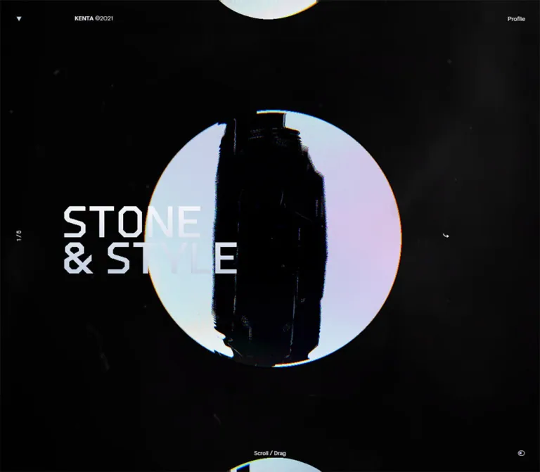
黒い全画面の背景に、淡い円形ビジュアルと角張った大きな文字を重ねたポートフォリオ。微細なノイズと色ずれ、余白の広い操作表示が特徴で、モバイルでは縦長の構図へ変化する。
Kenta Toshikura — Style Reference
A dark exhibition space where pale sculptural forms and angular project titles carry the entire composition.
Original URL: kentatoshikura.com Final URL: kentatoshikura.com Theme: near-black canvas, pale interface text, monochrome artwork with fine colored edge artifacts. Inspected: October 6, 2026, at 00:54 JST; supplied retrieval timestamp: October 5, 2026, at 15:54:08.421 UTC. Viewports: 1440 × 1000 desktop and 390 × 844 mobile, in CSS pixels. Scope: the current home portfolio index, its visible Stone and Style presentation, surrounding navigation, and supplied rendered DOM/computed styles. Three desktop captures and two mobile captures show this same project presentation. Profile and project destinations were identified from links but were not inspected.
The home page presents work as a single immersive stage. An irregular dark vertical form sits inside a large pale circular field. A two-line, angular title crosses the artwork from the left. The surrounding interface is sparse: a small identity treatment, Profile, a position counter, a navigation cue, and two small glyphs. Almost all remaining space stays black, with faint dust, scratches, and uneven texture.
The hierarchy depends on the contrast between very small interface labels and an exceptionally large project title. Circular fragments entering from the top and bottom make the composition feel larger than the viewport. On mobile, the central form becomes tall and narrow, shifts to the right, and sits behind a much smaller title. This is a distinct composition rather than a uniformly scaled desktop frame.
閉じる
Kenta Toshikura — Style Reference
A dark exhibition space where pale sculptural forms and angular project titles carry the entire composition.
Original URL: kentatoshikura.com Final URL: kentatoshikura.com Theme: near-black canvas, pale interface text, monochrome artwork with fine colored edge artifacts. Inspected: October 6, 2026, at 00:54 JST; supplied retrieval timestamp: October 5, 2026, at 15:54:08.421 UTC. Viewports: 1440 × 1000 desktop and 390 × 844 mobile, in CSS pixels. Scope: the current home portfolio index, its visible Stone and Style presentation, surrounding navigation, and supplied rendered DOM/computed styles. Three desktop captures and two mobile captures show this same project presentation. Profile and project destinations were identified from links but were not inspected.
The home page presents work as a single immersive stage. An irregular dark vertical form sits inside a large pale circular field. A two-line, angular title crosses the artwork from the left. The surrounding interface is sparse: a small identity treatment, Profile, a position counter, a navigation cue, and two small glyphs. Almost all remaining space stays black, with faint dust, scratches, and uneven texture.
The hierarchy depends on the contrast between very small interface labels and an exceptionally large project title. Circular fragments entering from the top and bottom make the composition feel larger than the viewport. On mobile, the central form becomes tall and narrow, shifts to the right, and sits behind a much smaller title. This is a distinct composition rather than a uniformly scaled desktop frame.
How to Read This Reference
- Measured means a value explicitly present in the supplied rendered DOM or computed-style evidence. Coordinates and element bounds refer to the stated capture viewport.
- Visual estimate means a measurement or description inferred from the original-page screenshots. These are approximate, not sampled CSS declarations.
- Recommended means guidance for a new implementation. Proposed breakpoints, component semantics, accessibility additions, and most Quick Start geometry fall into this category.
- Named tokens are descriptive aliases. The supplied custom-property extraction was empty; these are not claimed to be original variable names.
- Visible state and DOM presence are different. Several project anchors, loading strings, and duplicate labels exist in the extracted DOM without appearing together in the captures.
- Motion remains partially unverified. The evidence includes a few computed transitions and static captures, but no demonstrated project change, drag sequence, or Profile transition.
Tokens — Colors
Core Palette
| Name | Value | Evidence | Suggested token | Role |
|---|---|---|---|---|
| Near Black | #060506 |
Measured: rgb(6, 5, 6) on HTML and BODY at both viewports |
--color-canvas |
Continuous page background |
| Interface White | #f0f2f2 |
Measured: rgb(240, 242, 242) on BODY, navigation, and project anchors |
--color-ui |
Utility text and inherited interface foreground |
| Selection Dark | #1e1e1e |
Explicit selection rule in the supplied stylesheet text fragment; selection was not exercised | --color-selection |
Text-selection background |
| Pale Artwork Field | Approximately #e5e8e8 |
Visual estimate; the artwork varies across its surface | --color-art-fallback |
Optional placeholder behind prepared media |
| Chromatic Edge | Thin cyan/blue and red/yellow fringes | Visually observed; exact colors were not measured | No general UI token | Local artifacts along the artwork boundary and dark silhouette |
The stage is not visually flat despite its nearly black base. Faint marks create depth without establishing separate panels. The pale field belongs to the artwork, not to an interface card or light-mode section.
The oversized title looks close to white, but its own rendered color was not independently measured. The inherited anchor foreground is reliable for interface text; it does not establish the exact color of every rendered title pixel.
Color Application
- Keep navigation and status information within the black/off-white pair.
- Confine saturated color to fine image-edge artifacts. There is no evidence for colorful buttons or category badges.
- Preserve the dark silhouette inside the pale field. The strong internal light/dark division is central to the visible artwork.
- Recommended: place texture beneath legible interface text and tune it against the actual display. A texture that is obvious at a glance will overpower the observed restraint.
Tokens — Typography
Interface Family
Measured declared stack: Basis, followed by Hiragino Kaku Gothic ProN, localized equivalents, Meiryo, and sans-serif.
The computed family declaration establishes the intended stack. It does not independently verify the loaded font file or prove which fallback produced every glyph.
- Weight:
400throughout the sampled interface elements. - Tracking:
0.01em, measured as0.14pxon desktop and0.154pxon mobile. - Root font size:
10pxat both inspected viewports. - Interface character: restrained, compact, and neutral beside the angular project lettering.
- Visible utility labels include
PROFILE,SCROLL,Swipe, and1 / 5.
Project Display Lettering
The visible STONE & STYLE title uses wide, angular uppercase forms. Chamfered corners are particularly noticeable in the S, O, and ampersand. The two lines are tightly stacked and overlap the central media.
The display font is unverified. The extracted project anchors inherit the small interface font, while their large visible lettering was not separately measured. It may belong to a nested rendering layer or media representation; the evidence does not identify which. Do not assign the title to Basis solely because Basis appears on its parent anchor.
Type Scale
| Role | Desktop | Mobile | Evidence and interpretation |
|---|---|---|---|
| Root | 10px |
10px |
Measured |
| Body / sampled project anchors | 14px / 19.6px |
15.4px / 21.56px |
Measured; line height is 1.4 |
| Header container | 14px / 16.8px |
15.4px / 18.48px |
Measured; line height is 1.2 |
| Brand and Profile anchors | 14px / 16.8px |
15.4px / 16.17px |
Measured; mobile anchor line height is 1.05 |
| Visible project title | About 84px capital height per line; about 96px line pitch |
About 23–24px capital height; about 26px line pitch |
Visual estimate, not CSS font size |
| Desktop bottom cue | Approximately 12px |
— | Visual estimate |
| Mobile bottom cue | — | Approximately 15px |
Visual estimate, consistent with interface scale |
For a new implementation, nominal title sizes around 112px on the inspected desktop and 32px on the inspected phone provide a starting point. These are recommendations: the selected typeface will determine actual cap height and line width.
Hierarchy Rules
Keep the title visually dominant without increasing the surrounding navigation. Mobile reverses part of that relationship: the title becomes much smaller, while measured interface text grows from 14px to 15.4px. Preserve this distinction rather than shrinking all typography together.
The zero-height H1 contains the site identity in the DOM. It is not the large visible project title. Likewise, repeated Profile text in extraction should not become two visible navigation items.
Tokens — Spacing & Shapes
Measured Interface Geometry
| Element | 1440 × 1000 desktop | 390 × 844 mobile |
|---|---|---|
| Main stage | 1440 × 1000px |
390 × 844px |
| Header container | Full width, 0px layout height |
Full width, 0px layout height |
| Top-left home anchor | Approximately 100 × 100px, at (0, 0) |
Corresponding visible anchor was not included in the mobile element sample |
| Brand anchor | Approximately 133 × 100px, at (200, 0) |
Approximately 92.39 × 80px, at (30, 0) |
| Profile anchor | Approximately 138.14 × 100px, right aligned |
124 × 80px, right aligned |
| Profile horizontal padding | 40px |
30px |
| Unlabelled top-center home anchor | Approximately 100 × 100px, centered horizontally |
80 × 80px, at (155, 0) |
| Each project anchor | 1040 × 650px, at (200, 175) |
390 × 844px, at (0, 0) |
| Middle-right unlabelled anchor | Not separately identified in desktop sample | 80 × 80px, at (310, 382) |
| Bottom-right unlabelled anchor | Approximately 100 × 100px, at (1340, 900) |
80 × 80px, at (310, 764) |
The zero-height header does not mean the navigation is missing. Its children occupy substantial areas over the stage. Reproduce the overlaid composition rather than adding a conventional header band that pushes the artwork downward.
Artwork and Title Geometry
| Feature | Desktop visual estimate | Mobile visual estimate |
|---|---|---|
| Main pale form | Approximately 545 × 545px |
Visible envelope approximately 213 × 460px |
| Form bounds | Roughly x=454–999, y=232–778 |
Roughly x=142–355, y=204–664 |
| Form center | Near (727, 505) |
Near (249, 434) |
| Title bounds | Roughly x=220–720, y=417–598 |
Roughly x=50–178, y=410–461 |
| Top partial form | Extends about 40px into the viewport |
Extends about 40px into the viewport |
| Bottom partial form | Starts near y=968 |
Starts near y=827 |
| Small upper-left mark | About 12px diameter near (50, 50) |
About 4px diameter near (21, 24) |
These are visible bounds, not necessarily the full dimensions of the underlying artwork or its renderer.
Spacing Vocabulary
There is no evidenced universal spacing scale. The useful recurring relationships are:
- Desktop outer control module: approximately 100px.
- Mobile outer control module: 80px.
- Desktop Profile inset: 40px.
- Mobile identity and Profile inset: 30px.
- Desktop project region inset: 200px at the inspected width.
- Desktop title offset within that region: approximately 20px.
- Mobile title left edge: approximately 50px, deliberately different from the brand's 30px inset.
Shape Vocabulary
Sampled interface elements have 0px border radius and transparent backgrounds. The prominent curves come from the artwork and tiny symbols, not rounded content cards.
The desktop artwork reads as a circle. The mobile artwork has bowed top and bottom edges with long, nearly vertical sides. A CSS ellipse or a narrower circular crop alone will not accurately describe that mobile frame.
Components
Full-Viewport Project Stage
Role: the primary work-selection surface.
The main element matches the viewport at both inspected sizes. Five project anchors occupy the same bounds rather than forming five visible rows. In the screenshots, only the Stone and Style presentation is legible as the main project.
A practical layer model is:
- Near-black base.
- Faint atmospheric texture.
- Main artwork and partially clipped neighboring forms.
- Large project title and directional mark.
- Persistent-looking identity, Profile, progress, and corner utility.
This layer model is an implementation interpretation of the visible composition, not a verified source z-index map.
Do not render all extracted project names simultaneously. Their presence establishes available destinations, not a visible list layout.
Identity and Profile Navigation
Role: identify the portfolio and provide access to its profile.
On desktop, the visible identity reads KENTA ©2021 on one line, beginning around x=200. A small white mark occupies the upper-left area. PROFILE sits at the far right with a 40px text inset.
On mobile, KENTA and ©2021 stack near the left edge. Profile remains at the upper right and uses a 30px horizontal inset. The corresponding interaction boxes become 80px tall.
The Profile destination is the About route. Its page design and transition are unverified. The copyright year is visible content and should not be confused with the inspection date.
The DOM contains additional identity/loading text and an unlabelled home link centered along the top edge. Do not invent a visible wordmark or icon for that link when reproducing the captured state.
Active Project Entry
Role: associate the central visual with a project destination.
The visible project consists of three distinct visual parts:
- A pale, textured media field containing an irregular, vertically oriented black silhouette.
- An oversized two-line title,
STONEabove& STYLE, crossing the media from the left. - A small bent-arrow glyph to the right of the main composition.
On desktop, the sampled project anchor covers a 1040 × 650px region. On mobile, each sampled project anchor covers the entire 390 × 844px stage. The visible title itself is much smaller than those interaction areas.
The corresponding destination is Stone and Style. Opening that route was not demonstrated in the supplied evidence.
Recommended anatomy: use a semantic project link, a real text heading, and a separate decorative media layer. If the media renderer includes visible lettering, retain an accessible text equivalent without exposing duplicate titles to assistive technology.
Central Artwork
Role: provide the identity and atmosphere of the active project.
The desktop pale disc sits slightly right of the viewport midpoint. The dark shape within it extends almost the entire disc height. Its rough edges and uneven upper contour contrast with the disc's clean outer geometry. Fine cyan and warm-colored fringes trace selected edges.
The mobile frame is not merely smaller. The form is narrow and tall, its center shifts to about 64% of viewport width, and the dark silhouette occupies more of its left portion. The pale right side remains a strong vertical field behind the directional glyph.
The rendering mechanism is unknown. A curved silhouette and chromatic artifacts do not establish a particular graphics library, shader, or 3D technique.
Clipped Forms at the Viewport Edges
Role: imply continuity beyond the current frame.
Pale curved fragments enter from both the top and bottom. They repeat the material of the main artwork at a smaller visible scale. Their clipping is deliberate and helps the stage feel spatial rather than boxed.
The captures do not establish which projects these fragments represent, whether they are interactive, or whether their scale changes during navigation. Preserve the visual continuity without assigning unsupported project identities or behaviors.
Position Counter and Navigation Cue
Role: communicate position and suggest how to move through work.
Desktop shows 1 / 5 rotated along the left edge near mid-height. SCROLL sits near the bottom center. Mobile moves 1 / 5 to the lower-left corner, restores horizontal orientation, and changes the central cue to Swipe.
These labels support an intended gesture-driven presentation. They do not prove the accepted swipe direction, wheel sensitivity, snapping rules, looping behavior, or keyboard controls.
The DOM lists Stone and Style third among the extracted anchors, while the visible counter reads 1 / 5. Do not derive the visual sequence from DOM extraction order.
Directional Glyph and Corner Utility
Role: compact peripheral affordances; exact actions remain unverified.
The middle-right glyph looks like a small bent arrow. On mobile, an unlabelled # anchor with an 80 × 80px box occupies the same general area. A separate outlined oval with an inner dot appears at the lower right, also associated with an unlabelled # anchor.
The lower-right anchor is approximately 100 × 100px on desktop and 80 × 80px on mobile, despite its tiny visible symbol. Preserve the distinction between glyph size and target size.
Do not label the oval as sound, visibility, autoplay, or settings without establishing its actual effect. An href ending in # does not identify an action.
DOM-Only Loading and Support Content
The extracted text includes 100%, Loaded, repeated Profile text, VIEW WEBSITE, and a browser-support message. These do not appear as ordinary content in the supplied settled screenshots.
A loading-related state clearly exists in the DOM, but its visual layout, timing, and dismissal were not demonstrated. Do not add a permanent loading percentage, unsupported-browser panel, or duplicate navigation to the visible stage based on extraction alone.
Observed Project Destinations
| Link label | Destination | Inspection scope |
|---|---|---|
| Drift | project/drift | Link presence only |
| Garden Eight | project/garden-eight | Link presence only |
| Stone and Style | project/stone-and-style | Home-stage appearance and link presence |
| Aircord | project/aircord | Link presence only |
| Maxilla | project/maxilla | Link presence only |
Tokens — Motion & Interaction
Direct Evidence
| Element or behavior | Supplied evidence | Safe conclusion |
|---|---|---|
| Desktop top-left home anchor | opacity 1.2s cubic-bezier(0.4, 0.8, 0.74, 1) |
A long opacity transition is declared for this element |
| Mobile middle-right unlabelled anchor | Same 1.2s opacity transition and easing |
This peripheral control also has an opacity transition |
| Other sampled elements | Transition serialized as all, without a useful timing value |
No usable motion duration can be extracted from this alone |
| Sampled CSS animations | animation: none |
No CSS animation is reported on those sampled nodes; this does not rule out other rendering or script-driven motion |
| Desktop navigation cue | SCROLL |
Scrolling is presented as an intended input |
| Mobile navigation cue | Swipe |
Touch gesture navigation is presented as an intended input |
| Artwork fringes and distortion | Present in static captures | The appearance is observed; continuous rotation or animated distortion is not established |
The repeated captures retain the same project presentation. They do not supply a verified before/after navigation sequence. Duplicate labels might support a transition mechanism, but that mechanism cannot be reconstructed from text duplication alone.
Recommended Motion Rules
- Reuse the measured 1.2-second easing only where a slow peripheral opacity change is appropriate. It is not evidence for the duration of project transitions.
- Define project transitions separately after the navigation model is known. Keep heading, artwork, and counter synchronized.
- Preserve crisp, readable text during media distortion.
- Avoid adding perpetual whole-page wobble or rapid flashing color separation.
- Provide a static reduced-motion mode. A still image can retain the visual identity without reproducing unverified motion.
- If implementing wheel or swipe navigation, include explicit keyboard and button alternatives and prevent accidental multi-project skips.
Surfaces
| Layer | Appearance | Function |
|---|---|---|
| Page canvas | Near-black #060506 |
Continuous stage |
| Atmospheric texture | Very faint specks, scratches, and uneven dark patches | Material depth without a visible container |
| Main media | Pale field with a dark irregular silhouette | Primary visual focus |
| Display title | Large pale angular lettering | Project identification and compositional overlap |
| Navigation | Small off-white text and glyphs, transparent backgrounds | Peripheral orientation and access |
| Edge fragments | Partially clipped pale forms | Continuity outside the viewport |
No general panel, card, shadow, or elevated-surface system is visible. The page gains separation from scale, silhouette, overlap, and negative space.
Imagery
The imagery combines a high-contrast abstract object with imperfect digital reproduction. The main silhouette is nearly black, vertically elongated, and irregular at its edges. Its precise material and subject are not established by the captures.
The surrounding pale disc contains subtle surface variation. Small colored fringes appear around its boundary and selected internal edges, producing a restrained chromatic-aberration effect. The background carries scattered dust-like marks and faint scratches. These details remain subordinate to the circular field and title.
On mobile, preserve the observed redistribution of light and dark: the black form sits toward the left of the narrow media envelope, while a broad pale area remains on the right. Center-cropping an arbitrary desktop image may destroy this balance.
Asset Evidence and Production Guidance
| Visual asset | What is established | What is missing |
|---|---|---|
| Main desktop artwork | Appearance and approximate visible bounds | Original media URL, native dimensions, and rendering method |
| Mobile artwork | Distinct narrow composition | Whether produced by a separate asset, camera, transform, mask, or renderer |
| Background texture | Faint marks visible in original-page captures | Source file, opacity, tiling rules, and animation behavior |
| Large title lettering | Angular uppercase appearance | Font file, exact family, and rendering layer |
| Small symbols | Visible white dot, bent arrow, and outlined oval | Asset format and confirmed action semantics |
No original asset paths were supplied. Do not invent filenames and present them as source references.
For an adaptation, use authorized artwork or newly prepared visuals. CSS can reproduce the framing and interface spacing, but it cannot supply the irregular silhouette, material variation, or exact display lettering. Prefer separate prepared desktop and mobile frames when a static implementation cannot preserve both compositions from one asset.
Layout & Responsive Behavior
Observed Changes
| Relationship | Desktop | Mobile |
|---|---|---|
| Composition | Broad centered circle with title extending from its left | Narrow tall form shifted right, with a small title crossing its left side |
| Brand | Single-line KENTA ©2021 |
Two-line identity |
| Header interaction module | About 100px | 80px |
| Profile text inset | 40px | 30px |
| Utility typography | 14px | 15.4px |
| Project-title scale | Approximately 84px capital height | Approximately 23–24px capital height |
| Counter | Rotated, left-center | Horizontal, bottom-left |
| Bottom cue | SCROLL |
Swipe |
| Project-anchor area | Centered 1040 × 650px region | Entire 390 × 844px stage |
| Corner utility | Bottom-right 100px module | Bottom-right 80px module |
The mobile artwork's visible height is roughly 55% of the viewport, compared with roughly 55% on desktop. Its width changes much more strongly: approximately 38% of desktop width versus 55% of mobile width. These ratios describe the two screenshots; they are not verified source formulas.
The mobile title is positioned at about 13% of viewport width, while the artwork center is near 64%. This deliberate asymmetry creates space for text without returning to a stacked content layout.
Viewport and Document Height
Desktop document height is reported as 1000px, matching the viewport. Mobile document height is also reported as 1000px, while BODY and MAIN measure 844px high.
This discrepancy means the complete page cannot be assumed to be a perfectly non-scrolling 844px document. It also does not establish that the visible stage should be 1000px tall on mobile. Preserve the measured stage dimensions when reproducing this state, and independently verify overflow and gesture handling during implementation.
Unverified Responsive Rules
Only two viewport sizes were supplied. The source breakpoint, tablet layout, landscape behavior, safe-area treatment, and browser-toolbar resizing behavior remain unknown.
Recommended: use a content-driven breakpoint, stable viewport units for the stage, and safe-area-aware control positioning. Treat the Quick Start's 700px breakpoint as an adaptation choice, not an extracted rule. Test short landscape screens separately so the title, artwork, and bottom controls remain distinct.
Do’s and Don’ts
Do
- Start with the measured near-black canvas and off-white interface pair.
- Preserve large areas of dark negative space around the main composition.
- Let one project presentation dominate the viewport.
- Keep project lettering angular, uppercase, tightly stacked, and overlapping the artwork.
- Distinguish the display lettering from the small Basis-declared interface text.
- Preserve the pale field and irregular dark silhouette as a single visual relationship.
- Keep color separation thin and local to media edges.
- Retain the clipped forms at the top and bottom when reproducing the visible stage.
- Recompose the mobile artwork and reduce the title independently of utility text.
- Keep the controls' interaction boxes substantially larger than their visible glyphs.
Don’t
- Do not turn the five extracted project links into five simultaneously visible cards.
- Do not add prominent filled buttons, category chips, or unrelated accent colors.
- Do not assign an unverified font name to the project title.
- Do not replace the irregular silhouette with a generic gradient sphere and expect the same identity.
- Do not make background grain compete with the typography.
- Do not simply shrink the desktop circle and call it the mobile layout.
- Do not infer a specific graphics framework or continuous rotation from a still image.
- Do not assign sound, autoplay, or visibility behavior to the lower-right symbol without evidence.
- Do not show loading strings or repeated Profile labels as permanent content.
- Do not treat the copyright year or extracted anchor order as evidence of the capture date or visual project sequence.
Recommended Implementation Additions
These are recommendations for a new implementation, not verified features of the original:
- Expose only the active project panel to keyboard navigation. Make inactive overlapping panels inert so focus cannot land on invisible links.
- Use semantic links for Profile and project destinations, with a visible off-white focus outline.
- Give actionable icon-only controls accessible names after their effects are defined. Decorative glyphs should remain hidden from assistive technology.
- Provide explicit previous/next controls and keyboard operation alongside swipe or wheel input.
- Expose the current position as understandable text, such as
Project 1 of 5; avoid excessively frequent live announcements during gestures. - Keep navigation functional if the advanced artwork renderer fails. A prepared still image and working project links provide a useful fallback.
- Supply a reduced-motion presentation that retains the static composition and does not depend on perpetual distortion.
- Check title contrast over both the dark silhouette and the pale media field. Any contrast adjustment should be local and restrained.
- Verify mobile safe areas, browser-toolbar changes, and short landscape viewports without moving controls outside the usable screen.
Agent Prompt Guide
Quick Color Reference
- Canvas: measured
#060506. - Interface foreground: measured
#f0f2f2. - Selection background: source rule
#1e1e1e. - Pale media fallback: estimated
#e5e8e8, to be replaced by artwork. - Accent behavior: fine cyan/blue and red/yellow edge separation inside the imagery.
- Surface behavior: transparent navigation over a continuous dark stage; no card elevation system.
Overall Prompt
“Create a full-viewport creative portfolio index based on the supplied Kenta Toshikura home-page composition. Use a near-black #060506 canvas with very faint scratches and dust, small off-white #f0f2f2 utility text, and one dominant project visual. Place an irregular dark vertical silhouette inside a pale circular field near the desktop viewport center. Overlap its left half with a large, tightly stacked, angular uppercase project title. Keep identity at the upper left, Profile at the upper right, a rotated position counter on the left, and a subtle navigation cue at the bottom. Let pale curved fragments enter from the top and bottom edges. On a 390px phone, shift the artwork right and use a tall narrow composition, reduce the project title to about 32px nominal size, stack the identity, and move the counter to the bottom. Preserve real text and working project links. Treat unspecified motion and icon actions as implementation decisions, not established source behavior.”
Example Component Prompts
- Project stage: “At 1440 × 1000, build a dark viewport stage with a roughly 545px pale disc centered near x=727, y=505. Place prepared high-contrast artwork within it. Set a two-line angular title near x=220 and the vertical midpoint. Keep small utility labels widely separated from the visual center.”
- Mobile composition: “At 390 × 844, place a curved-ended artwork envelope around x=142–355 and y=204–664. Use a separately prepared mobile image if necessary. Position a compact two-line title near x=50 and y=410. Keep Profile at the top right, the position counter at the bottom left, and a Swipe cue at the bottom center.”
- Navigation chrome: “Use transparent navigation with regular-weight sans-serif labels, about 14px on desktop and 15.4px on mobile. Give desktop corner controls approximately 100px interaction boxes and mobile controls 80px boxes. Preserve visible focus states without adding filled pills.”
- Artwork treatment: “Prepare a pale, subtly textured field containing an irregular near-black vertical form. Add very thin chromatic edge artifacts and restrained grain. Keep the media high contrast, with most saturated color restricted to its contours. Do not bake essential interface text into the image.”
Quick Start
CSS Custom Properties
This is a static layout adaptation, not recovered source CSS. It preserves the two supplied compositions approximately while allowing the surrounding application to retain its normal root font size.
Use a .portfolio-shell containing an overlaid .site-header, a .project-stage, the active .project-link, .project-art, .project-counter, .gesture-cue, and .corner-utility. The project title uses two block spans. The cue can contain .cue-desktop and .cue-mobile spans.
Artwork elements expect prepared media. The mobile curved shape is a CSS approximation, not a reconstruction of the original renderer. --font-project intentionally falls back to the interface stack until an appropriate licensed display face is supplied. It is not a claim about the original title font.
:root {
  /* Measured interface colors */
  --color-canvas: #060506;
  --color-ui: #f0f2f2;
  --color-selection: #1e1e1e;

  /* Estimated media fallback; replace with prepared artwork */
  --color-art-fallback: #e5e8e8;

  /* Declared interface family, with equivalent fallback aliases */
  --font-ui: Basis, 'Hiragino Kaku Gothic ProN', Meiryo, sans-serif;
  --font-project: var(--font-ui);
  --text-ui: 14px;
  --leading-ui: 1.4;
  --tracking-ui: 0.01em;

  /* Recommended display scale; the source display face is unknown */
  --text-project: clamp(64px, 7.8vw, 116px);
  --leading-project: 0.86;

  /* Approximation of the inspected desktop coordinates */
  --chrome-size: 100px;
  --nav-inset: 40px;
  --stage-inset: 13.888889vw;
  --art-size: min(38vw, 55vh);
  --echo-size: 22vw;

  /* Optional authored texture; no original asset URL was supplied */
  --scene-texture: none;
  --texture-opacity: 0.1;

  /* Measured peripheral opacity timing */
  --motion-chrome: 1.2s cubic-bezier(0.4, 0.8, 0.74, 1);

  /* Recommended safe-area support */
  --safe-top: env(safe-area-inset-top, 0px);
  --safe-bottom: env(safe-area-inset-bottom, 0px);
  --safe-right: env(safe-area-inset-right, 0px);
}

.portfolio-shell,
.portfolio-shell * {
  box-sizing: border-box;
}

.portfolio-shell {
  position: relative;
  isolation: isolate;
  width: 100%;
  height: 100vh;
  height: 100svh;
  overflow: hidden;
  color: var(--color-ui);
  background: var(--color-canvas);
  font-family: var(--font-ui);
  font-size: var(--text-ui);
  font-weight: 400;
  line-height: var(--leading-ui);
  letter-spacing: var(--tracking-ui);
}

.portfolio-shell ::selection {
  color: var(--color-ui);
  background: var(--color-selection);
}

.project-stage {
  position: absolute;
  inset: 0;
}

.scene-texture {
  position: absolute;
  inset: 0;
  z-index: 2;
  pointer-events: none;
  background-image: var(--scene-texture);
  background-position: center;
  background-size: cover;
  opacity: var(--texture-opacity);
}

.site-header {
  position: absolute;
  inset: var(--safe-top) 0 auto;
  z-index: 10;
  height: 0;
  line-height: 1.2;
}

.site-header a {
  color: inherit;
  text-decoration: none;
}

.home-mark {
  position: absolute;
  top: 0;
  left: 0;
  display: grid;
  place-items: center;
  width: var(--chrome-size);
  height: var(--chrome-size);
  transition: opacity var(--motion-chrome);
}

.home-mark::before {
  content: '';
  width: 12px;
  height: 12px;
  border-radius: 50%;
  background: currentColor;
}

.brand {
  position: absolute;
  top: 0;
  left: var(--stage-inset);
  display: flex;
  align-items: center;
  gap: 0.25em;
  height: var(--chrome-size);
  white-space: nowrap;
}

.profile-link {
  position: absolute;
  top: 0;
  right: var(--safe-right);
  display: flex;
  align-items: center;
  justify-content: center;
  height: var(--chrome-size);
  padding-inline: var(--nav-inset);
  text-transform: uppercase;
}

.project-art {
  position: absolute;
  z-index: 1;
  top: 50.5%;
  left: 50.5%;
  width: var(--art-size);
  aspect-ratio: 1;
  margin: 0;
  overflow: hidden;
  border-radius: 50%;
  transform: translate(-50%, -50%);
  background: var(--color-art-fallback);
  pointer-events: none;
}

.project-art img,
.edge-form img {
  display: block;
  width: 100%;
  height: 100%;
  object-fit: cover;
}

.project-link {
  position: absolute;
  z-index: 3;
  inset: 17.5% var(--stage-inset);
  color: inherit;
  text-decoration: none;
}

.project-title {
  position: absolute;
  top: 51%;
  left: 20px;
  width: max-content;
  margin: 0;
  transform: translateY(-50%);
  font-family: var(--font-project);
  font-size: var(--text-project);
  font-weight: 400;
  line-height: var(--leading-project);
  letter-spacing: 0;
  text-transform: uppercase;
}

.project-title span {
  display: block;
}

/* Decorative until a specific action is implemented. */
.direction-mark {
  position: absolute;
  z-index: 4;
  top: 50%;
  left: 82.6%;
  transform: translate(-50%, -50%);
  pointer-events: none;
}

.project-counter {
  position: absolute;
  z-index: 5;
  top: 50%;
  left: 50px;
  margin: 0;
  white-space: nowrap;
  transform: translate(-50%, -50%) rotate(-90deg);
}

.gesture-cue {
  position: absolute;
  z-index: 5;
  bottom: calc(50px + var(--safe-bottom));
  left: 50%;
  margin: 0;
  transform: translate(-50%, 50%);
  font-size: 12px;
  white-space: nowrap;
}

.cue-mobile {
  display: none;
}

.corner-utility {
  position: absolute;
  z-index: 10;
  right: var(--safe-right);
  bottom: var(--safe-bottom);
  display: grid;
  place-items: center;
  width: var(--chrome-size);
  height: var(--chrome-size);
  padding: 0;
  border: 0;
  color: inherit;
  background: transparent;
}

/* Visual placeholder; semantics depend on the implemented action. */
.utility-symbol {
  position: relative;
  width: 18px;
  height: 14px;
  border: 2px solid currentColor;
  border-radius: 999px;
}

.utility-symbol::after {
  content: '';
  position: absolute;
  top: 50%;
  left: 50%;
  width: 4px;
  height: 4px;
  border-radius: 50%;
  background: currentColor;
  transform: translate(-50%, -50%);
}

/* Optional static echoes; their original identities are unverified. */
.edge-form {
  position: absolute;
  z-index: 1;
  left: 49%;
  width: var(--echo-size);
  aspect-ratio: 1;
  overflow: hidden;
  border-radius: 50%;
  transform: translateX(-50%);
  pointer-events: none;
}

.edge-form--top {
  top: calc(40px - var(--echo-size));
}

.edge-form--bottom {
  top: calc(100% - 32px);
  left: 51.2%;
}

/* Recommended keyboard treatment. */
.portfolio-shell :focus-visible {
  outline: 2px solid var(--color-ui);
  outline-offset: 4px;
}

.project-link:focus-visible {
  outline-offset: -4px;
}

/* Adaptation breakpoint; the original breakpoint is unknown. */
@media (max-width: 700px) {
  .portfolio-shell {
    --text-ui: 15.4px;
    --text-project: 32px;
    --leading-project: 0.82;
    --chrome-size: 80px;
    --nav-inset: 30px;
    --echo-size: 44vw;
  }

  .home-mark {
    left: 6px;
    width: 30px;
    height: 48px;
  }

  .home-mark::before {
    width: 4px;
    height: 4px;
  }

  .brand {
    left: 30px;
    flex-direction: column;
    align-items: flex-start;
    justify-content: center;
    gap: 0;
    line-height: 1.05;
  }

  .profile-link {
    line-height: 1.05;
  }

  .project-art {
    top: 51.4%;
    left: 63.7%;
    width: 54.6vw;
    height: 54.5vh;
    height: 54.5svh;
    aspect-ratio: auto;
    border-radius: 50% / 6%;
  }

  .project-link {
    inset: 0;
  }

  .project-title {
    top: 51.5%;
    left: 50px;
  }

  .direction-mark {
    left: calc(100% - 40px);
  }

  .project-counter {
    top: auto;
    bottom: calc(40px + var(--safe-bottom));
    left: 25px;
    transform: translateY(50%);
  }

  .gesture-cue {
    bottom: calc(40px + var(--safe-bottom));
    font-size: var(--text-ui);
  }

  .cue-desktop {
    display: none;
  }

  .cue-mobile {
    display: inline;
  }

  .edge-form--top {
    left: 65%;
  }

  .edge-form--bottom {
    top: calc(100% - 17px);
    left: 60%;
  }
}

@media (prefers-reduced-motion: reduce) {
  .portfolio-shell *,
  .portfolio-shell *::before,
  .portfolio-shell *::after {
    animation: none !important;
    transition: none !important;
    scroll-behavior: auto !important;
  }
}
The CSS does not implement project switching, gesture handling, a loading sequence, or the unknown utility action. Implement those behaviors before exposing gesture cues or interactive utility controls in a production interface. Use an actual project link for the active work and remove inactive links from the focus order.
Tailwind v4 Token Mapping
Optional aliases for a project already using Tailwind v4. This is not evidence that the original site uses Tailwind. Define the preceding custom properties first.
@theme inline {
  --color-canvas: #060506;
  --color-ui: #f0f2f2;
  --color-art-fallback: #e5e8e8;

  --font-interface: var(--font-ui);
  --font-project-title: var(--font-project);

  --text-interface: var(--text-ui);
  --text-project-title: var(--text-project);

  --spacing-chrome: var(--chrome-size);
  --spacing-nav-inset: var(--nav-inset);
  --spacing-stage-inset: var(--stage-inset);
}
Sources & Evidence
- Inspected original and final website: https://kentatoshikura.com/. Both URLs are identical; the supplied response status is HTTP 200.
- Actual retrieval:
2026-10-05T15:54:08.421Z, equivalent to October 6, 2026, at 00:54:08.421 JST. - Original-page visual evidence: three 1440 × 1000 desktop captures and two 390 × 844 mobile captures. All show the Stone and Style presentation with a visible
1 / 5counter. - Rendered evidence: page title, text extraction, destination links, element rectangles, computed foreground/background colors, font declarations, line heights, tracking, padding, and selected transition values at both viewports.
- Linked but uninspected destinations: the Profile/About route and five project routes. Their link presence does not establish their page layouts, credits, or transition behavior.
- Readiness limitations: the supplied inspection waited for document readiness, sampled layout/text stability, image decoding, and eligible finite animation settling within bounded time limits. Perpetual animations were temporarily paused during readiness checks and resumed. SharedWorkers and service workers were disabled.
- Interaction limitations: no supplied event trace establishes a project change, swipe direction, hover result, utility action, Profile transition, or continuous artwork animation. Delayed content and unexercised interactions remain unverified.
- Asset limitations: no original image URLs, font files, complete stylesheets, or renderer implementation were supplied. Artwork dimensions and title sizes identified as visual estimates are not source declarations.
This reference describes the supplied current home-page state. All proposed CSS formulas, responsive breakpoints, semantic enhancements, and missing interaction implementations are explicitly adaptations rather than recovered original behavior.
# Kenta Toshikura — Style Reference

> A dark exhibition space where pale sculptural forms and angular project titles carry the entire composition.

**Original URL:** [kentatoshikura.com](https://kentatoshikura.com/)
**Final URL:** [kentatoshikura.com](https://kentatoshikura.com/)
**Theme:** near-black canvas, pale interface text, monochrome artwork with fine colored edge artifacts.
**Inspected:** October 6, 2026, at 00:54 JST; supplied retrieval timestamp: October 5, 2026, at 15:54:08.421 UTC.
**Viewports:** 1440 × 1000 desktop and 390 × 844 mobile, in CSS pixels.
**Scope:** the current home portfolio index, its visible Stone and Style presentation, surrounding navigation, and supplied rendered DOM/computed styles. Three desktop captures and two mobile captures show this same project presentation. Profile and project destinations were identified from links but were not inspected.

The home page presents work as a single immersive stage. An irregular dark vertical form sits inside a large pale circular field. A two-line, angular title crosses the artwork from the left. The surrounding interface is sparse: a small identity treatment, Profile, a position counter, a navigation cue, and two small glyphs. Almost all remaining space stays black, with faint dust, scratches, and uneven texture.

The hierarchy depends on the contrast between very small interface labels and an exceptionally large project title. Circular fragments entering from the top and bottom make the composition feel larger than the viewport. On mobile, the central form becomes tall and narrow, shifts to the right, and sits behind a much smaller title. This is a distinct composition rather than a uniformly scaled desktop frame.
閉じる
# Kenta Toshikura — Style Reference

> A dark exhibition space where pale sculptural forms and angular project titles carry the entire composition.

**Original URL:** [kentatoshikura.com](https://kentatoshikura.com/)
**Final URL:** [kentatoshikura.com](https://kentatoshikura.com/)
**Theme:** near-black canvas, pale interface text, monochrome artwork with fine colored edge artifacts.
**Inspected:** October 6, 2026, at 00:54 JST; supplied retrieval timestamp: October 5, 2026, at 15:54:08.421 UTC.
**Viewports:** 1440 × 1000 desktop and 390 × 844 mobile, in CSS pixels.
**Scope:** the current home portfolio index, its visible Stone and Style presentation, surrounding navigation, and supplied rendered DOM/computed styles. Three desktop captures and two mobile captures show this same project presentation. Profile and project destinations were identified from links but were not inspected.

The home page presents work as a single immersive stage. An irregular dark vertical form sits inside a large pale circular field. A two-line, angular title crosses the artwork from the left. The surrounding interface is sparse: a small identity treatment, Profile, a position counter, a navigation cue, and two small glyphs. Almost all remaining space stays black, with faint dust, scratches, and uneven texture.

The hierarchy depends on the contrast between very small interface labels and an exceptionally large project title. Circular fragments entering from the top and bottom make the composition feel larger than the viewport. On mobile, the central form becomes tall and narrow, shifts to the right, and sits behind a much smaller title. This is a distinct composition rather than a uniformly scaled desktop frame.

## How to Read This Reference

- **Measured** means a value explicitly present in the supplied rendered DOM or computed-style evidence. Coordinates and element bounds refer to the stated capture viewport.
- **Visual estimate** means a measurement or description inferred from the original-page screenshots. These are approximate, not sampled CSS declarations.
- **Recommended** means guidance for a new implementation. Proposed breakpoints, component semantics, accessibility additions, and most Quick Start geometry fall into this category.
- **Named tokens** are descriptive aliases. The supplied custom-property extraction was empty; these are not claimed to be original variable names.
- **Visible state and DOM presence are different.** Several project anchors, loading strings, and duplicate labels exist in the extracted DOM without appearing together in the captures.
- **Motion remains partially unverified.** The evidence includes a few computed transitions and static captures, but no demonstrated project change, drag sequence, or Profile transition.

## Tokens — Colors

### Core Palette

| Name | Value | Evidence | Suggested token | Role |
| --- | --- | --- | --- | --- |
| Near Black | `#060506` | Measured: `rgb(6, 5, 6)` on HTML and BODY at both viewports | `--color-canvas` | Continuous page background |
| Interface White | `#f0f2f2` | Measured: `rgb(240, 242, 242)` on BODY, navigation, and project anchors | `--color-ui` | Utility text and inherited interface foreground |
| Selection Dark | `#1e1e1e` | Explicit selection rule in the supplied stylesheet text fragment; selection was not exercised | `--color-selection` | Text-selection background |
| Pale Artwork Field | Approximately `#e5e8e8` | Visual estimate; the artwork varies across its surface | `--color-art-fallback` | Optional placeholder behind prepared media |
| Chromatic Edge | Thin cyan/blue and red/yellow fringes | Visually observed; exact colors were not measured | No general UI token | Local artifacts along the artwork boundary and dark silhouette |

The stage is not visually flat despite its nearly black base. Faint marks create depth without establishing separate panels. The pale field belongs to the artwork, not to an interface card or light-mode section.

The oversized title looks close to white, but its own rendered color was not independently measured. The inherited anchor foreground is reliable for interface text; it does not establish the exact color of every rendered title pixel.

### Color Application

- Keep navigation and status information within the black/off-white pair.
- Confine saturated color to fine image-edge artifacts. There is no evidence for colorful buttons or category badges.
- Preserve the dark silhouette inside the pale field. The strong internal light/dark division is central to the visible artwork.
- **Recommended:** place texture beneath legible interface text and tune it against the actual display. A texture that is obvious at a glance will overpower the observed restraint.

## Tokens — Typography

### Interface Family

**Measured declared stack:** `Basis`, followed by Hiragino Kaku Gothic ProN, localized equivalents, Meiryo, and `sans-serif`.

The computed family declaration establishes the intended stack. It does not independently verify the loaded font file or prove which fallback produced every glyph.

- Weight: `400` throughout the sampled interface elements.
- Tracking: `0.01em`, measured as `0.14px` on desktop and `0.154px` on mobile.
- Root font size: `10px` at both inspected viewports.
- Interface character: restrained, compact, and neutral beside the angular project lettering.
- Visible utility labels include `PROFILE`, `SCROLL`, `Swipe`, and `1 / 5`.

### Project Display Lettering

The visible `STONE & STYLE` title uses wide, angular uppercase forms. Chamfered corners are particularly noticeable in the S, O, and ampersand. The two lines are tightly stacked and overlap the central media.

**The display font is unverified.** The extracted project anchors inherit the small interface font, while their large visible lettering was not separately measured. It may belong to a nested rendering layer or media representation; the evidence does not identify which. Do not assign the title to Basis solely because Basis appears on its parent anchor.

### Type Scale

| Role | Desktop | Mobile | Evidence and interpretation |
| --- | --- | --- | --- |
| Root | `10px` | `10px` | Measured |
| Body / sampled project anchors | `14px / 19.6px` | `15.4px / 21.56px` | Measured; line height is `1.4` |
| Header container | `14px / 16.8px` | `15.4px / 18.48px` | Measured; line height is `1.2` |
| Brand and Profile anchors | `14px / 16.8px` | `15.4px / 16.17px` | Measured; mobile anchor line height is `1.05` |
| Visible project title | About `84px` capital height per line; about `96px` line pitch | About `23–24px` capital height; about `26px` line pitch | Visual estimate, not CSS font size |
| Desktop bottom cue | Approximately `12px` | — | Visual estimate |
| Mobile bottom cue | — | Approximately `15px` | Visual estimate, consistent with interface scale |

For a new implementation, nominal title sizes around `112px` on the inspected desktop and `32px` on the inspected phone provide a starting point. These are recommendations: the selected typeface will determine actual cap height and line width.

### Hierarchy Rules

Keep the title visually dominant without increasing the surrounding navigation. Mobile reverses part of that relationship: the title becomes much smaller, while measured interface text grows from 14px to 15.4px. Preserve this distinction rather than shrinking all typography together.

The zero-height H1 contains the site identity in the DOM. It is not the large visible project title. Likewise, repeated `Profile` text in extraction should not become two visible navigation items.

## Tokens — Spacing & Shapes

### Measured Interface Geometry

| Element | 1440 × 1000 desktop | 390 × 844 mobile |
| --- | --- | --- |
| Main stage | `1440 × 1000px` | `390 × 844px` |
| Header container | Full width, `0px` layout height | Full width, `0px` layout height |
| Top-left home anchor | Approximately `100 × 100px`, at `(0, 0)` | Corresponding visible anchor was not included in the mobile element sample |
| Brand anchor | Approximately `133 × 100px`, at `(200, 0)` | Approximately `92.39 × 80px`, at `(30, 0)` |
| Profile anchor | Approximately `138.14 × 100px`, right aligned | `124 × 80px`, right aligned |
| Profile horizontal padding | `40px` | `30px` |
| Unlabelled top-center home anchor | Approximately `100 × 100px`, centered horizontally | `80 × 80px`, at `(155, 0)` |
| Each project anchor | `1040 × 650px`, at `(200, 175)` | `390 × 844px`, at `(0, 0)` |
| Middle-right unlabelled anchor | Not separately identified in desktop sample | `80 × 80px`, at `(310, 382)` |
| Bottom-right unlabelled anchor | Approximately `100 × 100px`, at `(1340, 900)` | `80 × 80px`, at `(310, 764)` |

The zero-height header does not mean the navigation is missing. Its children occupy substantial areas over the stage. Reproduce the overlaid composition rather than adding a conventional header band that pushes the artwork downward.

### Artwork and Title Geometry

| Feature | Desktop visual estimate | Mobile visual estimate |
| --- | --- | --- |
| Main pale form | Approximately `545 × 545px` | Visible envelope approximately `213 × 460px` |
| Form bounds | Roughly `x=454–999`, `y=232–778` | Roughly `x=142–355`, `y=204–664` |
| Form center | Near `(727, 505)` | Near `(249, 434)` |
| Title bounds | Roughly `x=220–720`, `y=417–598` | Roughly `x=50–178`, `y=410–461` |
| Top partial form | Extends about `40px` into the viewport | Extends about `40px` into the viewport |
| Bottom partial form | Starts near `y=968` | Starts near `y=827` |
| Small upper-left mark | About `12px` diameter near `(50, 50)` | About `4px` diameter near `(21, 24)` |

These are visible bounds, not necessarily the full dimensions of the underlying artwork or its renderer.

### Spacing Vocabulary

There is no evidenced universal spacing scale. The useful recurring relationships are:

- **Desktop outer control module:** approximately 100px.
- **Mobile outer control module:** 80px.
- **Desktop Profile inset:** 40px.
- **Mobile identity and Profile inset:** 30px.
- **Desktop project region inset:** 200px at the inspected width.
- **Desktop title offset within that region:** approximately 20px.
- **Mobile title left edge:** approximately 50px, deliberately different from the brand's 30px inset.

### Shape Vocabulary

Sampled interface elements have `0px` border radius and transparent backgrounds. The prominent curves come from the artwork and tiny symbols, not rounded content cards.

The desktop artwork reads as a circle. The mobile artwork has bowed top and bottom edges with long, nearly vertical sides. A CSS ellipse or a narrower circular crop alone will not accurately describe that mobile frame.

## Components

### Full-Viewport Project Stage

**Role:** the primary work-selection surface.

The main element matches the viewport at both inspected sizes. Five project anchors occupy the same bounds rather than forming five visible rows. In the screenshots, only the Stone and Style presentation is legible as the main project.

A practical layer model is:

1. Near-black base.
2. Faint atmospheric texture.
3. Main artwork and partially clipped neighboring forms.
4. Large project title and directional mark.
5. Persistent-looking identity, Profile, progress, and corner utility.

This layer model is an implementation interpretation of the visible composition, not a verified source z-index map.

Do not render all extracted project names simultaneously. Their presence establishes available destinations, not a visible list layout.

### Identity and Profile Navigation

**Role:** identify the portfolio and provide access to its profile.

On desktop, the visible identity reads `KENTA ©2021` on one line, beginning around x=200. A small white mark occupies the upper-left area. `PROFILE` sits at the far right with a 40px text inset.

On mobile, `KENTA` and `©2021` stack near the left edge. Profile remains at the upper right and uses a 30px horizontal inset. The corresponding interaction boxes become 80px tall.

The Profile destination is [the About route](https://kentatoshikura.com/about). Its page design and transition are unverified. The copyright year is visible content and should not be confused with the inspection date.

The DOM contains additional identity/loading text and an unlabelled home link centered along the top edge. Do not invent a visible wordmark or icon for that link when reproducing the captured state.

### Active Project Entry

**Role:** associate the central visual with a project destination.

The visible project consists of three distinct visual parts:

- A pale, textured media field containing an irregular, vertically oriented black silhouette.
- An oversized two-line title, `STONE` above `& STYLE`, crossing the media from the left.
- A small bent-arrow glyph to the right of the main composition.

On desktop, the sampled project anchor covers a 1040 × 650px region. On mobile, each sampled project anchor covers the entire 390 × 844px stage. The visible title itself is much smaller than those interaction areas.

The corresponding destination is [Stone and Style](https://kentatoshikura.com/project/stone-and-style). Opening that route was not demonstrated in the supplied evidence.

**Recommended anatomy:** use a semantic project link, a real text heading, and a separate decorative media layer. If the media renderer includes visible lettering, retain an accessible text equivalent without exposing duplicate titles to assistive technology.

### Central Artwork

**Role:** provide the identity and atmosphere of the active project.

The desktop pale disc sits slightly right of the viewport midpoint. The dark shape within it extends almost the entire disc height. Its rough edges and uneven upper contour contrast with the disc's clean outer geometry. Fine cyan and warm-colored fringes trace selected edges.

The mobile frame is not merely smaller. The form is narrow and tall, its center shifts to about 64% of viewport width, and the dark silhouette occupies more of its left portion. The pale right side remains a strong vertical field behind the directional glyph.

The rendering mechanism is unknown. A curved silhouette and chromatic artifacts do not establish a particular graphics library, shader, or 3D technique.

### Clipped Forms at the Viewport Edges

**Role:** imply continuity beyond the current frame.

Pale curved fragments enter from both the top and bottom. They repeat the material of the main artwork at a smaller visible scale. Their clipping is deliberate and helps the stage feel spatial rather than boxed.

The captures do not establish which projects these fragments represent, whether they are interactive, or whether their scale changes during navigation. Preserve the visual continuity without assigning unsupported project identities or behaviors.

### Position Counter and Navigation Cue

**Role:** communicate position and suggest how to move through work.

Desktop shows `1 / 5` rotated along the left edge near mid-height. `SCROLL` sits near the bottom center. Mobile moves `1 / 5` to the lower-left corner, restores horizontal orientation, and changes the central cue to `Swipe`.

These labels support an intended gesture-driven presentation. They do not prove the accepted swipe direction, wheel sensitivity, snapping rules, looping behavior, or keyboard controls.

The DOM lists Stone and Style third among the extracted anchors, while the visible counter reads `1 / 5`. Do not derive the visual sequence from DOM extraction order.

### Directional Glyph and Corner Utility

**Role:** compact peripheral affordances; exact actions remain unverified.

The middle-right glyph looks like a small bent arrow. On mobile, an unlabelled `#` anchor with an 80 × 80px box occupies the same general area. A separate outlined oval with an inner dot appears at the lower right, also associated with an unlabelled `#` anchor.

The lower-right anchor is approximately 100 × 100px on desktop and 80 × 80px on mobile, despite its tiny visible symbol. Preserve the distinction between glyph size and target size.

Do not label the oval as sound, visibility, autoplay, or settings without establishing its actual effect. An `href` ending in `#` does not identify an action.

### DOM-Only Loading and Support Content

The extracted text includes `100%`, `Loaded`, repeated Profile text, `VIEW WEBSITE`, and a browser-support message. These do not appear as ordinary content in the supplied settled screenshots.

A loading-related state clearly exists in the DOM, but its visual layout, timing, and dismissal were not demonstrated. Do not add a permanent loading percentage, unsupported-browser panel, or duplicate navigation to the visible stage based on extraction alone.

### Observed Project Destinations

| Link label | Destination | Inspection scope |
| --- | --- | --- |
| Drift | [project/drift](https://kentatoshikura.com/project/drift) | Link presence only |
| Garden Eight | [project/garden-eight](https://kentatoshikura.com/project/garden-eight) | Link presence only |
| Stone and Style | [project/stone-and-style](https://kentatoshikura.com/project/stone-and-style) | Home-stage appearance and link presence |
| Aircord | [project/aircord](https://kentatoshikura.com/project/aircord) | Link presence only |
| Maxilla | [project/maxilla](https://kentatoshikura.com/project/maxilla) | Link presence only |

## Tokens — Motion & Interaction

### Direct Evidence

| Element or behavior | Supplied evidence | Safe conclusion |
| --- | --- | --- |
| Desktop top-left home anchor | `opacity 1.2s cubic-bezier(0.4, 0.8, 0.74, 1)` | A long opacity transition is declared for this element |
| Mobile middle-right unlabelled anchor | Same `1.2s` opacity transition and easing | This peripheral control also has an opacity transition |
| Other sampled elements | Transition serialized as `all`, without a useful timing value | No usable motion duration can be extracted from this alone |
| Sampled CSS animations | `animation: none` | No CSS animation is reported on those sampled nodes; this does not rule out other rendering or script-driven motion |
| Desktop navigation cue | `SCROLL` | Scrolling is presented as an intended input |
| Mobile navigation cue | `Swipe` | Touch gesture navigation is presented as an intended input |
| Artwork fringes and distortion | Present in static captures | The appearance is observed; continuous rotation or animated distortion is not established |

The repeated captures retain the same project presentation. They do not supply a verified before/after navigation sequence. Duplicate labels might support a transition mechanism, but that mechanism cannot be reconstructed from text duplication alone.

### Recommended Motion Rules

- Reuse the measured 1.2-second easing only where a slow peripheral opacity change is appropriate. It is not evidence for the duration of project transitions.
- Define project transitions separately after the navigation model is known. Keep heading, artwork, and counter synchronized.
- Preserve crisp, readable text during media distortion.
- Avoid adding perpetual whole-page wobble or rapid flashing color separation.
- Provide a static reduced-motion mode. A still image can retain the visual identity without reproducing unverified motion.
- If implementing wheel or swipe navigation, include explicit keyboard and button alternatives and prevent accidental multi-project skips.

## Surfaces

| Layer | Appearance | Function |
| --- | --- | --- |
| Page canvas | Near-black `#060506` | Continuous stage |
| Atmospheric texture | Very faint specks, scratches, and uneven dark patches | Material depth without a visible container |
| Main media | Pale field with a dark irregular silhouette | Primary visual focus |
| Display title | Large pale angular lettering | Project identification and compositional overlap |
| Navigation | Small off-white text and glyphs, transparent backgrounds | Peripheral orientation and access |
| Edge fragments | Partially clipped pale forms | Continuity outside the viewport |

No general panel, card, shadow, or elevated-surface system is visible. The page gains separation from scale, silhouette, overlap, and negative space.

## Imagery

The imagery combines a high-contrast abstract object with imperfect digital reproduction. The main silhouette is nearly black, vertically elongated, and irregular at its edges. Its precise material and subject are not established by the captures.

The surrounding pale disc contains subtle surface variation. Small colored fringes appear around its boundary and selected internal edges, producing a restrained chromatic-aberration effect. The background carries scattered dust-like marks and faint scratches. These details remain subordinate to the circular field and title.

On mobile, preserve the observed redistribution of light and dark: the black form sits toward the left of the narrow media envelope, while a broad pale area remains on the right. Center-cropping an arbitrary desktop image may destroy this balance.

### Asset Evidence and Production Guidance

| Visual asset | What is established | What is missing |
| --- | --- | --- |
| Main desktop artwork | Appearance and approximate visible bounds | Original media URL, native dimensions, and rendering method |
| Mobile artwork | Distinct narrow composition | Whether produced by a separate asset, camera, transform, mask, or renderer |
| Background texture | Faint marks visible in original-page captures | Source file, opacity, tiling rules, and animation behavior |
| Large title lettering | Angular uppercase appearance | Font file, exact family, and rendering layer |
| Small symbols | Visible white dot, bent arrow, and outlined oval | Asset format and confirmed action semantics |

No original asset paths were supplied. Do not invent filenames and present them as source references.

For an adaptation, use authorized artwork or newly prepared visuals. CSS can reproduce the framing and interface spacing, but it cannot supply the irregular silhouette, material variation, or exact display lettering. Prefer separate prepared desktop and mobile frames when a static implementation cannot preserve both compositions from one asset.

## Layout & Responsive Behavior

### Observed Changes

| Relationship | Desktop | Mobile |
| --- | --- | --- |
| Composition | Broad centered circle with title extending from its left | Narrow tall form shifted right, with a small title crossing its left side |
| Brand | Single-line `KENTA ©2021` | Two-line identity |
| Header interaction module | About 100px | 80px |
| Profile text inset | 40px | 30px |
| Utility typography | 14px | 15.4px |
| Project-title scale | Approximately 84px capital height | Approximately 23–24px capital height |
| Counter | Rotated, left-center | Horizontal, bottom-left |
| Bottom cue | `SCROLL` | `Swipe` |
| Project-anchor area | Centered 1040 × 650px region | Entire 390 × 844px stage |
| Corner utility | Bottom-right 100px module | Bottom-right 80px module |

The mobile artwork's visible height is roughly 55% of the viewport, compared with roughly 55% on desktop. Its width changes much more strongly: approximately 38% of desktop width versus 55% of mobile width. These ratios describe the two screenshots; they are not verified source formulas.

The mobile title is positioned at about 13% of viewport width, while the artwork center is near 64%. This deliberate asymmetry creates space for text without returning to a stacked content layout.

### Viewport and Document Height

Desktop document height is reported as 1000px, matching the viewport. Mobile document height is also reported as 1000px, while BODY and MAIN measure 844px high.

This discrepancy means the complete page cannot be assumed to be a perfectly non-scrolling 844px document. It also does not establish that the visible stage should be 1000px tall on mobile. Preserve the measured stage dimensions when reproducing this state, and independently verify overflow and gesture handling during implementation.

### Unverified Responsive Rules

Only two viewport sizes were supplied. The source breakpoint, tablet layout, landscape behavior, safe-area treatment, and browser-toolbar resizing behavior remain unknown.

**Recommended:** use a content-driven breakpoint, stable viewport units for the stage, and safe-area-aware control positioning. Treat the Quick Start's 700px breakpoint as an adaptation choice, not an extracted rule. Test short landscape screens separately so the title, artwork, and bottom controls remain distinct.

## Do’s and Don’ts

### Do

- Start with the measured near-black canvas and off-white interface pair.
- Preserve large areas of dark negative space around the main composition.
- Let one project presentation dominate the viewport.
- Keep project lettering angular, uppercase, tightly stacked, and overlapping the artwork.
- Distinguish the display lettering from the small Basis-declared interface text.
- Preserve the pale field and irregular dark silhouette as a single visual relationship.
- Keep color separation thin and local to media edges.
- Retain the clipped forms at the top and bottom when reproducing the visible stage.
- Recompose the mobile artwork and reduce the title independently of utility text.
- Keep the controls' interaction boxes substantially larger than their visible glyphs.

### Don’t

- Do not turn the five extracted project links into five simultaneously visible cards.
- Do not add prominent filled buttons, category chips, or unrelated accent colors.
- Do not assign an unverified font name to the project title.
- Do not replace the irregular silhouette with a generic gradient sphere and expect the same identity.
- Do not make background grain compete with the typography.
- Do not simply shrink the desktop circle and call it the mobile layout.
- Do not infer a specific graphics framework or continuous rotation from a still image.
- Do not assign sound, autoplay, or visibility behavior to the lower-right symbol without evidence.
- Do not show loading strings or repeated Profile labels as permanent content.
- Do not treat the copyright year or extracted anchor order as evidence of the capture date or visual project sequence.

## Recommended Implementation Additions

These are recommendations for a new implementation, not verified features of the original:

- Expose only the active project panel to keyboard navigation. Make inactive overlapping panels inert so focus cannot land on invisible links.
- Use semantic links for Profile and project destinations, with a visible off-white focus outline.
- Give actionable icon-only controls accessible names after their effects are defined. Decorative glyphs should remain hidden from assistive technology.
- Provide explicit previous/next controls and keyboard operation alongside swipe or wheel input.
- Expose the current position as understandable text, such as `Project 1 of 5`; avoid excessively frequent live announcements during gestures.
- Keep navigation functional if the advanced artwork renderer fails. A prepared still image and working project links provide a useful fallback.
- Supply a reduced-motion presentation that retains the static composition and does not depend on perpetual distortion.
- Check title contrast over both the dark silhouette and the pale media field. Any contrast adjustment should be local and restrained.
- Verify mobile safe areas, browser-toolbar changes, and short landscape viewports without moving controls outside the usable screen.

## Agent Prompt Guide

### Quick Color Reference

- Canvas: measured `#060506`.
- Interface foreground: measured `#f0f2f2`.
- Selection background: source rule `#1e1e1e`.
- Pale media fallback: estimated `#e5e8e8`, to be replaced by artwork.
- Accent behavior: fine cyan/blue and red/yellow edge separation inside the imagery.
- Surface behavior: transparent navigation over a continuous dark stage; no card elevation system.

### Overall Prompt

“Create a full-viewport creative portfolio index based on the supplied Kenta Toshikura home-page composition. Use a near-black #060506 canvas with very faint scratches and dust, small off-white #f0f2f2 utility text, and one dominant project visual. Place an irregular dark vertical silhouette inside a pale circular field near the desktop viewport center. Overlap its left half with a large, tightly stacked, angular uppercase project title. Keep identity at the upper left, Profile at the upper right, a rotated position counter on the left, and a subtle navigation cue at the bottom. Let pale curved fragments enter from the top and bottom edges. On a 390px phone, shift the artwork right and use a tall narrow composition, reduce the project title to about 32px nominal size, stack the identity, and move the counter to the bottom. Preserve real text and working project links. Treat unspecified motion and icon actions as implementation decisions, not established source behavior.”

### Example Component Prompts

1. **Project stage:** “At 1440 × 1000, build a dark viewport stage with a roughly 545px pale disc centered near x=727, y=505. Place prepared high-contrast artwork within it. Set a two-line angular title near x=220 and the vertical midpoint. Keep small utility labels widely separated from the visual center.”
2. **Mobile composition:** “At 390 × 844, place a curved-ended artwork envelope around x=142–355 and y=204–664. Use a separately prepared mobile image if necessary. Position a compact two-line title near x=50 and y=410. Keep Profile at the top right, the position counter at the bottom left, and a Swipe cue at the bottom center.”
3. **Navigation chrome:** “Use transparent navigation with regular-weight sans-serif labels, about 14px on desktop and 15.4px on mobile. Give desktop corner controls approximately 100px interaction boxes and mobile controls 80px boxes. Preserve visible focus states without adding filled pills.”
4. **Artwork treatment:** “Prepare a pale, subtly textured field containing an irregular near-black vertical form. Add very thin chromatic edge artifacts and restrained grain. Keep the media high contrast, with most saturated color restricted to its contours. Do not bake essential interface text into the image.”

## Quick Start

### CSS Custom Properties

This is a **static layout adaptation**, not recovered source CSS. It preserves the two supplied compositions approximately while allowing the surrounding application to retain its normal root font size.

Use a `.portfolio-shell` containing an overlaid `.site-header`, a `.project-stage`, the active `.project-link`, `.project-art`, `.project-counter`, `.gesture-cue`, and `.corner-utility`. The project title uses two block spans. The cue can contain `.cue-desktop` and `.cue-mobile` spans.

Artwork elements expect prepared media. The mobile curved shape is a CSS approximation, not a reconstruction of the original renderer. `--font-project` intentionally falls back to the interface stack until an appropriate licensed display face is supplied. It is not a claim about the original title font.

```css
:root {
  /* Measured interface colors */
  --color-canvas: #060506;
  --color-ui: #f0f2f2;
  --color-selection: #1e1e1e;

  /* Estimated media fallback; replace with prepared artwork */
  --color-art-fallback: #e5e8e8;

  /* Declared interface family, with equivalent fallback aliases */
  --font-ui: Basis, 'Hiragino Kaku Gothic ProN', Meiryo, sans-serif;
  --font-project: var(--font-ui);
  --text-ui: 14px;
  --leading-ui: 1.4;
  --tracking-ui: 0.01em;

  /* Recommended display scale; the source display face is unknown */
  --text-project: clamp(64px, 7.8vw, 116px);
  --leading-project: 0.86;

  /* Approximation of the inspected desktop coordinates */
  --chrome-size: 100px;
  --nav-inset: 40px;
  --stage-inset: 13.888889vw;
  --art-size: min(38vw, 55vh);
  --echo-size: 22vw;

  /* Optional authored texture; no original asset URL was supplied */
  --scene-texture: none;
  --texture-opacity: 0.1;

  /* Measured peripheral opacity timing */
  --motion-chrome: 1.2s cubic-bezier(0.4, 0.8, 0.74, 1);

  /* Recommended safe-area support */
  --safe-top: env(safe-area-inset-top, 0px);
  --safe-bottom: env(safe-area-inset-bottom, 0px);
  --safe-right: env(safe-area-inset-right, 0px);
}

.portfolio-shell,
.portfolio-shell * {
  box-sizing: border-box;
}

.portfolio-shell {
  position: relative;
  isolation: isolate;
  width: 100%;
  height: 100vh;
  height: 100svh;
  overflow: hidden;
  color: var(--color-ui);
  background: var(--color-canvas);
  font-family: var(--font-ui);
  font-size: var(--text-ui);
  font-weight: 400;
  line-height: var(--leading-ui);
  letter-spacing: var(--tracking-ui);
}

.portfolio-shell ::selection {
  color: var(--color-ui);
  background: var(--color-selection);
}

.project-stage {
  position: absolute;
  inset: 0;
}

.scene-texture {
  position: absolute;
  inset: 0;
  z-index: 2;
  pointer-events: none;
  background-image: var(--scene-texture);
  background-position: center;
  background-size: cover;
  opacity: var(--texture-opacity);
}

.site-header {
  position: absolute;
  inset: var(--safe-top) 0 auto;
  z-index: 10;
  height: 0;
  line-height: 1.2;
}

.site-header a {
  color: inherit;
  text-decoration: none;
}

.home-mark {
  position: absolute;
  top: 0;
  left: 0;
  display: grid;
  place-items: center;
  width: var(--chrome-size);
  height: var(--chrome-size);
  transition: opacity var(--motion-chrome);
}

.home-mark::before {
  content: '';
  width: 12px;
  height: 12px;
  border-radius: 50%;
  background: currentColor;
}

.brand {
  position: absolute;
  top: 0;
  left: var(--stage-inset);
  display: flex;
  align-items: center;
  gap: 0.25em;
  height: var(--chrome-size);
  white-space: nowrap;
}

.profile-link {
  position: absolute;
  top: 0;
  right: var(--safe-right);
  display: flex;
  align-items: center;
  justify-content: center;
  height: var(--chrome-size);
  padding-inline: var(--nav-inset);
  text-transform: uppercase;
}

.project-art {
  position: absolute;
  z-index: 1;
  top: 50.5%;
  left: 50.5%;
  width: var(--art-size);
  aspect-ratio: 1;
  margin: 0;
  overflow: hidden;
  border-radius: 50%;
  transform: translate(-50%, -50%);
  background: var(--color-art-fallback);
  pointer-events: none;
}

.project-art img,
.edge-form img {
  display: block;
  width: 100%;
  height: 100%;
  object-fit: cover;
}

.project-link {
  position: absolute;
  z-index: 3;
  inset: 17.5% var(--stage-inset);
  color: inherit;
  text-decoration: none;
}

.project-title {
  position: absolute;
  top: 51%;
  left: 20px;
  width: max-content;
  margin: 0;
  transform: translateY(-50%);
  font-family: var(--font-project);
  font-size: var(--text-project);
  font-weight: 400;
  line-height: var(--leading-project);
  letter-spacing: 0;
  text-transform: uppercase;
}

.project-title span {
  display: block;
}

/* Decorative until a specific action is implemented. */
.direction-mark {
  position: absolute;
  z-index: 4;
  top: 50%;
  left: 82.6%;
  transform: translate(-50%, -50%);
  pointer-events: none;
}

.project-counter {
  position: absolute;
  z-index: 5;
  top: 50%;
  left: 50px;
  margin: 0;
  white-space: nowrap;
  transform: translate(-50%, -50%) rotate(-90deg);
}

.gesture-cue {
  position: absolute;
  z-index: 5;
  bottom: calc(50px + var(--safe-bottom));
  left: 50%;
  margin: 0;
  transform: translate(-50%, 50%);
  font-size: 12px;
  white-space: nowrap;
}

.cue-mobile {
  display: none;
}

.corner-utility {
  position: absolute;
  z-index: 10;
  right: var(--safe-right);
  bottom: var(--safe-bottom);
  display: grid;
  place-items: center;
  width: var(--chrome-size);
  height: var(--chrome-size);
  padding: 0;
  border: 0;
  color: inherit;
  background: transparent;
}

/* Visual placeholder; semantics depend on the implemented action. */
.utility-symbol {
  position: relative;
  width: 18px;
  height: 14px;
  border: 2px solid currentColor;
  border-radius: 999px;
}

.utility-symbol::after {
  content: '';
  position: absolute;
  top: 50%;
  left: 50%;
  width: 4px;
  height: 4px;
  border-radius: 50%;
  background: currentColor;
  transform: translate(-50%, -50%);
}

/* Optional static echoes; their original identities are unverified. */
.edge-form {
  position: absolute;
  z-index: 1;
  left: 49%;
  width: var(--echo-size);
  aspect-ratio: 1;
  overflow: hidden;
  border-radius: 50%;
  transform: translateX(-50%);
  pointer-events: none;
}

.edge-form--top {
  top: calc(40px - var(--echo-size));
}

.edge-form--bottom {
  top: calc(100% - 32px);
  left: 51.2%;
}

/* Recommended keyboard treatment. */
.portfolio-shell :focus-visible {
  outline: 2px solid var(--color-ui);
  outline-offset: 4px;
}

.project-link:focus-visible {
  outline-offset: -4px;
}

/* Adaptation breakpoint; the original breakpoint is unknown. */
@media (max-width: 700px) {
  .portfolio-shell {
    --text-ui: 15.4px;
    --text-project: 32px;
    --leading-project: 0.82;
    --chrome-size: 80px;
    --nav-inset: 30px;
    --echo-size: 44vw;
  }

  .home-mark {
    left: 6px;
    width: 30px;
    height: 48px;
  }

  .home-mark::before {
    width: 4px;
    height: 4px;
  }

  .brand {
    left: 30px;
    flex-direction: column;
    align-items: flex-start;
    justify-content: center;
    gap: 0;
    line-height: 1.05;
  }

  .profile-link {
    line-height: 1.05;
  }

  .project-art {
    top: 51.4%;
    left: 63.7%;
    width: 54.6vw;
    height: 54.5vh;
    height: 54.5svh;
    aspect-ratio: auto;
    border-radius: 50% / 6%;
  }

  .project-link {
    inset: 0;
  }

  .project-title {
    top: 51.5%;
    left: 50px;
  }

  .direction-mark {
    left: calc(100% - 40px);
  }

  .project-counter {
    top: auto;
    bottom: calc(40px + var(--safe-bottom));
    left: 25px;
    transform: translateY(50%);
  }

  .gesture-cue {
    bottom: calc(40px + var(--safe-bottom));
    font-size: var(--text-ui);
  }

  .cue-desktop {
    display: none;
  }

  .cue-mobile {
    display: inline;
  }

  .edge-form--top {
    left: 65%;
  }

  .edge-form--bottom {
    top: calc(100% - 17px);
    left: 60%;
  }
}

@media (prefers-reduced-motion: reduce) {
  .portfolio-shell *,
  .portfolio-shell *::before,
  .portfolio-shell *::after {
    animation: none !important;
    transition: none !important;
    scroll-behavior: auto !important;
  }
}
```

The CSS does not implement project switching, gesture handling, a loading sequence, or the unknown utility action. Implement those behaviors before exposing gesture cues or interactive utility controls in a production interface. Use an actual project link for the active work and remove inactive links from the focus order.

### Tailwind v4 Token Mapping

Optional aliases for a project already using Tailwind v4. This is not evidence that the original site uses Tailwind. Define the preceding custom properties first.

```css
@theme inline {
  --color-canvas: #060506;
  --color-ui: #f0f2f2;
  --color-art-fallback: #e5e8e8;

  --font-interface: var(--font-ui);
  --font-project-title: var(--font-project);

  --text-interface: var(--text-ui);
  --text-project-title: var(--text-project);

  --spacing-chrome: var(--chrome-size);
  --spacing-nav-inset: var(--nav-inset);
  --spacing-stage-inset: var(--stage-inset);
}
```

## Sources & Evidence

- **Inspected original and final website:** [https://kentatoshikura.com/](https://kentatoshikura.com/). Both URLs are identical; the supplied response status is HTTP 200.
- **Actual retrieval:** `2026-10-05T15:54:08.421Z`, equivalent to October 6, 2026, at 00:54:08.421 JST.
- **Original-page visual evidence:** three 1440 × 1000 desktop captures and two 390 × 844 mobile captures. All show the Stone and Style presentation with a visible `1 / 5` counter.
- **Rendered evidence:** page title, text extraction, destination links, element rectangles, computed foreground/background colors, font declarations, line heights, tracking, padding, and selected transition values at both viewports.
- **Linked but uninspected destinations:** the Profile/About route and five project routes. Their link presence does not establish their page layouts, credits, or transition behavior.
- **Readiness limitations:** the supplied inspection waited for document readiness, sampled layout/text stability, image decoding, and eligible finite animation settling within bounded time limits. Perpetual animations were temporarily paused during readiness checks and resumed. SharedWorkers and service workers were disabled.
- **Interaction limitations:** no supplied event trace establishes a project change, swipe direction, hover result, utility action, Profile transition, or continuous artwork animation. Delayed content and unexercised interactions remain unverified.
- **Asset limitations:** no original image URLs, font files, complete stylesheets, or renderer implementation were supplied. Artwork dimensions and title sizes identified as visual estimates are not source declarations.

This reference describes the supplied current home-page state. All proposed CSS formulas, responsive breakpoints, semantic enhancements, and missing interaction implementations are explicitly adaptations rather than recovered original behavior.関連するデザイン
スタイルやページの種類、ジャンルが近いデザインを集めました。