プレビュー準備中デザインリファレンスを見る
DESIGN REFERENCE
はらぺこロゴス 燒く、煮る編(Smart LOGOS vol.22)
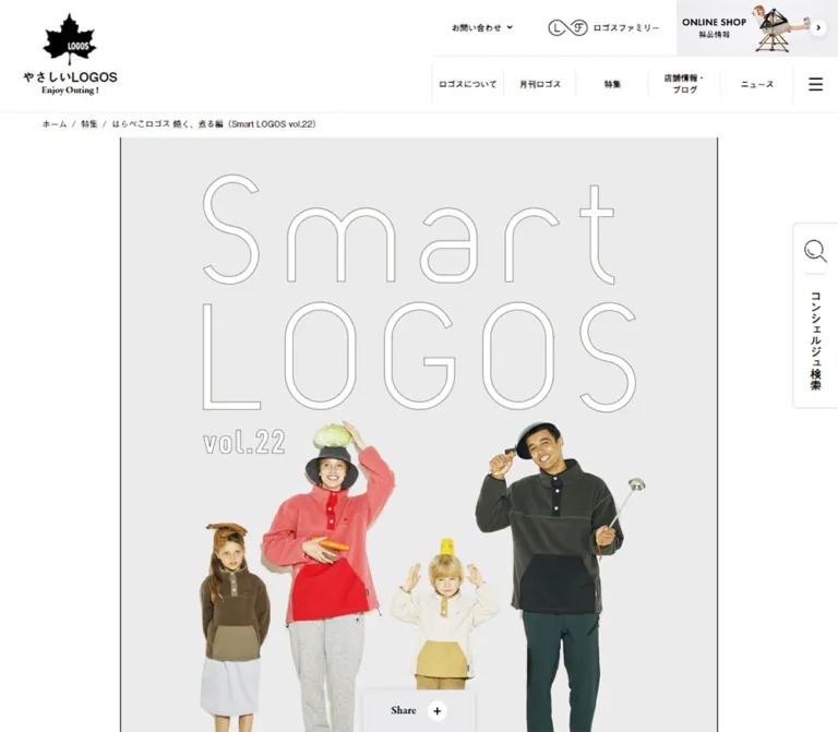
淡いグレーの誌面に、家族や調理器具の切り抜き写真、白いアウトライン文字、黄色の見出しを組み合わせたキャンプ料理特集。細い罫線と固定サイドナビが、遊び心のあるコラージュを整理しています。
Smart LOGOS vol.22 / Outdoor Cooking Feature — Style Reference
A pale-gray magazine spread with playful family photography, oversized outline lettering, and bright yellow cooking markers.
Website: LOGOS — Smart LOGOS vol.22
Original URL: https://www.logos.ne.jp/special/134
Final URL: https://www.logos.ne.jp/special/134 — HTTP 200; no redirect recorded.
Theme: light; white site shell, pale-gray editorial canvas, black typography, and yellow accents.
Inspected: September 23, 2026, at 06:00 JST, from supplied browser evidence captured at 2026-09-22T21:00:00.044Z.
Viewports: desktop 1440 × 1000 and mobile 390 × 844 CSS pixels.
Scope: the current long-form cooking feature within the LOGOS brand website, including its cover, chapter navigation, recipe and product sections, tableware track, grill comparison, closing links, membership promotion, shared header, and footer. Desktop screenshots show the opening, a middle product composition, and the footer; mobile screenshots show the opening and lower footer. Rendered DOM evidence supplies additional measurements throughout the article.
This page translates a small outdoor magazine into a long web article. Its identity comes from a narrow gray editorial strip, large photographic cutouts, almost-white display lettering with fine outlines, and small blocks of readable Japanese copy. People balance vegetables on their heads, hold cooking utensils, and appear beside oversized cookware. Puffy lettering and hand-drawn marks make the product story feel informal and friendly.
The surrounding website is more restrained. A white header, black maple-leaf brand mark, ruled navigation, compact utility controls, and a cool-gray footer frame the illustrated article. On desktop, persistent-looking side rails occupy the white margins while the story stays only 750px wide. Mobile removes these rails and recomposes the article without shrinking every element equally.
This is an editorial feature with product discovery links inside a broader brand website. Its structure includes reading, recipe access, comparison, related content, and site navigation rather than a single conversion sequence.
閉じる
Smart LOGOS vol.22 / Outdoor Cooking Feature — Style Reference
A pale-gray magazine spread with playful family photography, oversized outline lettering, and bright yellow cooking markers.
Website: LOGOS — Smart LOGOS vol.22
Original URL: https://www.logos.ne.jp/special/134
Final URL: https://www.logos.ne.jp/special/134 — HTTP 200; no redirect recorded.
Theme: light; white site shell, pale-gray editorial canvas, black typography, and yellow accents.
Inspected: September 23, 2026, at 06:00 JST, from supplied browser evidence captured at 2026-09-22T21:00:00.044Z.
Viewports: desktop 1440 × 1000 and mobile 390 × 844 CSS pixels.
Scope: the current long-form cooking feature within the LOGOS brand website, including its cover, chapter navigation, recipe and product sections, tableware track, grill comparison, closing links, membership promotion, shared header, and footer. Desktop screenshots show the opening, a middle product composition, and the footer; mobile screenshots show the opening and lower footer. Rendered DOM evidence supplies additional measurements throughout the article.
This page translates a small outdoor magazine into a long web article. Its identity comes from a narrow gray editorial strip, large photographic cutouts, almost-white display lettering with fine outlines, and small blocks of readable Japanese copy. People balance vegetables on their heads, hold cooking utensils, and appear beside oversized cookware. Puffy lettering and hand-drawn marks make the product story feel informal and friendly.
The surrounding website is more restrained. A white header, black maple-leaf brand mark, ruled navigation, compact utility controls, and a cool-gray footer frame the illustrated article. On desktop, persistent-looking side rails occupy the white margins while the story stays only 750px wide. Mobile removes these rails and recomposes the article without shrinking every element equally.
This is an editorial feature with product discovery links inside a broader brand website. Its structure includes reading, recipe access, comparison, related content, and site navigation rather than a single conversion sequence.
How to Read This Reference
- Measured means a value appears in the supplied rendered element rectangles, computed styles, or custom properties. Measurements are CSS pixels unless stated otherwise.
- Visual estimate means an approximate dimension, color, or arrangement inferred from the current screenshots. It is not a recovered stylesheet declaration.
- Recommendation means an implementation choice for a new project. Suggested breakpoints, fallback fonts, accessibility improvements, and CSS architecture are not claims about the original source.
- Source variables retain their supplied names. Other token names are descriptive aliases.
- Computed font-family declarations identify the requested stack, not independent proof that every named webfont successfully loaded.
- Some extracted navigation and social elements sit outside the viewport. Their styles describe those sampled elements; they do not establish that a menu was open or that the visible footer uses identical sizing.
- Only the supplied evidence was inspected. Recipe panels, menus, search, sharing, and product destinations were not operated or independently visited.
Tokens — Colors
Default Palette
| Name | Value | Token | Role and evidence |
|---|---|---|---|
| Site White | #ffffff |
--color-white |
Measured header background, CHECK buttons, chapter capsules, and comparison section |
| Black Ink | #000000 |
--color-ink; source --color-border: #000 |
Measured text and border token; visible logos, rules, and utility icons |
| Cooking Yellow | #ffd600 |
Source --color-yellow; alias --color-accent |
Measured chapter text, recipe circles, and closing ALL ITEMS button |
| Feature Gray | #ebebeb |
--color-feature |
Measured on the related-edition sidebar pill; the large editorial field visually matches this neutral gray, but its own background declaration was not included |
| Footer Gray | Approximately #e8ebec |
--color-footer |
Visual estimate for the broad, slightly cool footer surface |
| Utility Rule | Approximately #d6d9db |
--color-rule-soft |
Visual estimate for search-tab outlines, footer separators, and light header rules |
| Shop Pink | Approximately #ffcdca |
--color-shop-banner |
Visual estimate for the top-right shop promotion in the opening desktop capture; localized to that banner |
Yellow is a navigation and editorial emphasis color. It appears in chapter labels, the small selected-edition pill, circular recipe controls, and the larger closing product link. Ordinary product links remain white with black outlines.
The photographs contribute coral, olive, beige, brown, and dark teal. These belong to people, clothing, and products; they are not evidence of additional interface theme colors.
The source gives recipe-circle text a white fill over yellow. Fine dark edging is visible around some display text, but the supplied styles do not identify its stroke or shadow technique. For new implementations, use a contrast-tested text treatment rather than relying on this low-contrast pairing.
There is no evidence of a theme selector or alternate dark mode.
Tokens — Typography
Editorial Japanese
- Source family:
'dnp-shuei-mgothic-std', sans-serif, also supplied as--font-main. - Weights:
400for product descriptions;600for introductions, navigation, chapter labels, and callouts. - Character: rounded, approachable Japanese Gothic that supports the soft photographic collage.
- Measured body setting: desktop
14px / 26px; mobile product descriptions12px / 22px. - Important exception: introductory three-line copy remains
14px / 26pxon both inspected widths.
English Editorial Accents
- Source family:
'olivita', sans-serif, supplied as--font-en. - Observed roles: CHECK, ABOUT, ALL ITEMS, and the extracted CLOSE control.
- Measured CHECK setting: desktop
18px / 18px, weight400; mobile16px / 16px, weight400. - Visual character: compact, heavy-looking, irregular display lettering. Its appearance is stronger than the numeric weight alone suggests; do not replace it with an ordinary sans-serif at the same size and expect the same result.
Shared Brand Interface
- General site stack:
'a-otf-gothic-bbb-pr6n', sans-serif. - Brand wordmark stack:
'a-otf-midashi-go-mb31-pr6n', sans-serif. - Serif stack:
'garamond-premier-pro', serif, measured on the Enjoy Outing ! tagline, Share label, and offscreen social/app navigation samples. - The footer screenshots also show serif English headings, but exact visible-footer typography was not separately sampled.
Artwork Lettering
The huge Smart LOGOS title is graphic lettering. Its sampled heading has an empty text value and a large visual box; the inherited 21px font size does not describe the visible title. Preserve the white interior, hairline gray contour, tall proportions, and loose spacing as artwork.
The puffy Japanese feature lettering and white decorative English lettering likewise need custom artwork or carefully authored vector shapes. No font name or original asset format is established for them.
Type Scale
| Role | Desktop | Mobile | Weight / tracking | Evidence |
|---|---|---|---|---|
| Site base | 15px / 27px |
15px / 27px |
400, normal |
Measured |
| FUN FUN LOGOS | 19.5px / 35.1px |
16.5px / 23.1px |
700 |
Measured opening header |
| Enjoy Outing ! | 13.125px / 23.625px |
9.9px / 13.86px |
700 |
Measured opening header |
| Desktop primary navigation | 13.125px / 18.375px |
Not visible in opening mobile header | 700 |
Measured |
| Desktop breadcrumb | 11.25px / 20.25px |
Moved below the article | 400 |
Measured |
| Sidebar chapter links | 14px / 14px |
Sidebar absent | 600 |
Measured |
| Cover introduction | 14px / 26px |
14px / 26px |
600, 0.28px tracking |
Measured |
| Seasonal introduction | 14px / 34px |
14px / 34px |
600 |
Measured |
| Edition heading | 32px / 32px |
32px / 32px |
600 |
Measured |
| Cooking chapter label | 36px / 36px |
36px / 36px |
600 |
Measured text inside a larger graphic composition |
| Chapter capsule text | 28px / 32px |
28px / 32px |
600 |
Measured |
| Recipe-circle label | 20px / 28px |
16px / 22px |
600 |
Measured |
| Product callout | 12px / 18px |
10px / 16px |
600 |
Measured |
| Product description | 14px / 26px |
12px / 22px |
400 |
Measured |
| Collage product title | Approximately 16px, compact multiline setting |
Varies with composition | Visually semibold | Screenshot estimate; title styles not sampled |
| CHECK | 18px / 18px |
16px / 16px |
400, Olivita |
Measured |
| Grill comparison product title | 24px / 34px |
24px / 34px |
600, 0.48px tracking |
Measured |
| ALL ITEMS | Not supplied | 24px / 24px |
400, Olivita |
Measured mobile |
| Share | Not separately supplied | 15px / 27px |
600, Garamond stack |
Measured mobile |
The source root is a conventional measured 15px at both widths. There is no evidence of the unusual miniature-rem scaling system used in the structure example. Keep dimensions explicit instead of inventing a global fluid unit.
Tokens — Spacing & Shapes
Density: large graphic compositions with compact text islands.
Primary structure: a narrow editorial canvas surrounded by generous desktop margins.
Geometry: fine black rules, circles, long capsules, and occasional rounded image or panel corners.
Spacing Scale
These are recurring measurements, not proof of a unified source spacing scale.
| Use | Measured value | Notes |
|---|---|---|
| Sidebar link bottom padding | 3px |
Small underline clearance |
| Callout horizontal padding | 8px |
Text between short diagonal strokes |
| Related-edition pill horizontal padding | 10px |
Desktop sidebar |
| Description-to-CHECK gap | 12px |
Repeated product compositions |
| Chapter heading bottom padding | 14px |
Within a larger graphic heading box |
| Mobile product inset | 15px inside the 375px stage |
Produces a 345px full-width copy area |
| Mobile cover top padding | 20px |
Versus 46px on desktop |
| Chapter capsule gap | 30px |
Calculated from two 100px controls at the supplied positions |
| Simmering-section top padding | 63px |
Both inspected widths |
| Simmering-section bottom padding | Desktop 100px; mobile 46px |
Measured |
| Comparison-section vertical padding | Desktop 72px 67px; mobile 46px 13px |
Measured |
Border Radius
| Element | Value | Evidence |
|---|---|---|
| Main desktop article boundaries | Square | Screenshot observation |
| Related-edition sidebar pill | 50px |
Measured on a 166 × 29px element |
| CHECK link | 40px |
Measured |
| Chapter navigation capsule | 120px |
Measured on a 100 × 210px element |
| Recipe control | 100% |
Measured 120 × 120px circle |
| Mobile grill-comparison panel | 20px |
Measured |
| ALL ITEMS control | 200px |
Measured on a 335 × 80px mobile element |
| Search tab | Approximately 8px on exposed corners |
Screenshot estimate |
| Back-to-top control | Circle | Screenshot observation; approximately 70px diameter |
Layout Measurements
| Element | Desktop 1440 × 1000 |
Mobile 390 × 844 |
Status |
|---|---|---|---|
| Opening header | 1440 × 152px |
390 × 76px |
Measured |
| Header in later screenshots | Approximately 76px high |
Approximately 60px high |
Visual estimates; transition threshold unknown |
| Editorial inner stage | 750px, starting at x = 345px |
375px, starting at x = 7.5px |
Measured |
| Desktop article outside edges | Approximately x = 344–1096px |
Gray background spans viewport | Visual observation including fine borders |
| Cover start | y = 185.25px |
y = 75px |
Measured |
| Cover title graphic box | 545 × 355px |
279 × 183.1875px |
Measured heading bounds |
| Cover introduction | 750 × 78px |
375 × 78px |
Measured; three lines |
| Product copy column | Usually 180px |
Either 160px or 345px |
Measured; depends on composition |
| CHECK control | 180 × 42px |
160 × 36px |
Measured |
| Recipe control | 120 × 120px |
120 × 120px |
Measured; diameter does not shrink |
| Tableware item | 322px wide with 21px side padding |
375px wide with 15px side padding |
Measured track item bounds |
| Grill comparison surface | 750px wide |
345px wide at x = 22.5px |
Measured |
| Grill product grouping | Two columns of 324px |
One column of approximately 343px |
Measured |
| Reported document height | 14,117px |
14,700px |
Supplied document-height readings |
The feature occupies about 52.1% of desktop viewport width. On mobile, the 375px inner stage occupies about 96.2% of the viewport. These percentages are calculated from the measured rectangles, not source width formulas.
Components
Shared Site Header
Role: maintain brand identity and access to the wider website.
The opening desktop header has a large left brand block and two navigation rows on the right. The brand anchor starts at x = 75px and measures approximately 290 × 100px. A black maple leaf sits beside FUN FUN LOGOS and a small serif tagline.
The upper right row contains contact, membership, and a shop promotion. The shop link measures 240 × 75px; the captured promotion combines a pink field, compact black text, and cropped product imagery. The lower row begins at x = 615px, with five 150 × 75px navigation links followed by a hamburger control. Fine vertical separators organize the row.
Later desktop screenshots show a compact single-row header with a smaller leaf mark. The mobile opening shows the leaf at left, the wordmark centered in the viewport, and a hamburger at right. Full desktop navigation and the shop banner are not visible there.
The extracted navigation includes offscreen links. Do not render that whole list as visible page content merely because it appears in the text extraction. Menu opening, focus management, and the collapse threshold remain unverified.
Breadcrumb
Role: locate the article within the brand website.
On desktop, a small breadcrumb sits immediately below the expanded header, starting at x = 120px. It uses 11.25px site typography and an approximately 35px-high line area. The article begins below it.
On mobile, the opening screenshot has no breadcrumb above the cover. The DOM places the breadcrumb near the end of the article, after the article-return and keyword region. Preserve this responsive relocation if matching the inspected content order.
Desktop Editorial Rails
Role: keep chapter navigation and feature identity available beside the narrow article.
The left rail begins near x = 79px and contains a small Smart LOGOS vol.22 graphic, a yellow outlined edition pill, three chapter links, and a gray related-edition pill. The chapter links are 焼く, 煮る, and GRILL CHART, targeting #sec1, #sec2, and #sec3. Each has a small circled-arrow marker and compact spacing.
The related-edition link is measured at 166 × 29px, with 12px semibold text. It points to /special/135/.
The right rail shows the puffy feature lettering above a cutout photograph of two adults and a short black baseline. Both rails stay in approximately the same viewport positions between the supplied opening and middle screenshots, consistent with fixed or sticky behavior. Their exact positioning method and lower boundary are not supplied. They are absent from the footer capture and the mobile screenshots.
Magazine Cover
Role: establish the issue and its playful outdoor-cooking theme.
A tall pale-gray field begins with enormous two-line Smart LOGOS lettering and the small vol.22 marker. Four isolated people form a family-like group below: two adults and two children, holding utensils or balancing ingredients. Their clothing adds natural color without changing the gray background system.
The title graphic is 545px wide on desktop and 279px on mobile. The family composition also becomes smaller, while the introductory copy retains its original 14px / 26px size. On desktop, the first viewport ends before the introduction; on mobile, the people, three-line introduction, and yellow edition title all appear within the opening screen.
Avoid translating the cover into a conventional heading-and-button block. Its large lettering, full-body figures, and deliberate relationship between title and people are the component.
Edition Introduction and Chapter Capsules
Role: introduce the seasonal story and offer direct access to the two cooking chapters.
A centered yellow 32px heading is followed by decorative feature artwork and a six-line seasonal introduction at 14px / 34px. The introduction refers to seven recipes in the issue. The supplied content at this URL names four recipe features; do not infer that seven recipe modules are visible on this page.
Two white vertical capsules provide access to 焼く and 煮る. Each measures 100 × 210px, with yellow 28px lettering and a 120px radius. Their dimensions are unchanged between desktop and mobile, separated by a calculated 30px gap.
Cooking Chapter Header
Role: mark a major change in cooking method.
The chapter headings combine 36px yellow text with graphic decoration in boxes approximately 255 × 162px. Beneath them, three centered lines of semibold 14px / 26px copy introduce the chapter. Both chapter-heading width and text size remain constant on mobile.
The first chapter covers baking or grilling; the second covers simmering. The feature text names baked tacos, miso oden, meatball tomato stew, and boiled dumplings.
Recipe Photograph and Circular Trigger
Role: connect an illustrated food story to its ingredients and method.
Food photography sits within the gray composition, with a yellow circular control overlapping an image edge. The visible middle screenshot shows a rounded lower photograph corner and the badge extending beyond the photo.
The control is exactly 120 × 120px in both measured layouts. Its source label is 材料と作り方, split over two lines. Desktop text is 20px / 28px; mobile text is 16px / 22px.
On desktop, sampled recipe circles share an x coordinate of 795px. On mobile, their placement alternates by composition: tacos and tomato stew use the right side; oden and dumplings use the left. Do not apply one universal corner position to all recipes.
The links use a # destination. An extracted CLOSE control suggests an associated hidden interface, but no open recipe panel was supplied. Its layout, animation, dismissal behavior, and content cannot be specified as observed facts.
Product Collage
Role: explain the equipment used in each recipe while preserving the magazine composition.
The desktop middle screenshot shows a large pale ceramic pot on the left and a narrow title, description, and CHECK link on the right. Below it, the composition reverses: copy sits left, a person holding a stove occupies the middle, and a much larger olive stove cutout occupies the right. White puffy lettering, curved marks, and short diagonal strokes fill selected gaps.
A reusable anatomy is:
- A compact benefit callout, usually two lines, sometimes framed by diagonal strokes.
- A large isolated product image, optionally combined with a person.
- A centered multiline product name.
- A left-aligned description in a narrow text column.
- A white outlined CHECK link beneath the copy.
The usual desktop text column is 180px. Product bodies use 14px / 26px, while callouts use 12px / 18px. CHECK sits 12px below the description and measures 180 × 42px.
Mobile uses two distinct variants. The grill, skillet, wok, and ladle descriptions expand to 345px, with centered CHECK links below. The small pot, sake set, Dutch oven, and portable stove retain alternating 160px text columns beside their imagery. This mixed strategy is a defining responsive detail.
The eight CHECK links have real product destinations. For example, the Dutch oven points to /products/info/10749 and the portable stove to /products/info/10461. Their destination pages were not inspected.
Tableware Track
Role: introduce supporting tableware after the taco recipe.
The DOM contains eight distinct tableware products, with repeated entries at the edges of a horizontal track. Desktop items measure 322px wide, including 21px side padding; their descriptions occupy 280px. Mobile items measure 375px wide with 345px descriptions.
Neighboring entries have offscreen horizontal coordinates, and mobile samples include transform-related transitions. This supports describing the structure as a carousel-like track, but does not establish autoplay, drag gestures, arrow controls, loop timing, or keyboard behavior. Repeated entries should not be counted as additional products.
For an adaptation, preserve image, product title, and description as one linkable item. Do not add rounded card backgrounds unless required by a different design brief.
Grill Comparison
Role: compare four representative grill types by group size and style of use.
The gray editorial sequence changes to a white comparison surface. On desktop, the surface is 750px wide and contains two columns of 324px product groups. Group-size labels sit above and below the comparison; tall side labels identify leisurely autumn cooking and quick balcony use.
Measured desktop axis labels include 160 × 40px horizontal capsules and 40 × 240px vertical capsules. Product titles use 24px / 34px, weight 600, with 0.48px tracking.
On mobile, the comparison becomes a 345px-wide white panel with a 20px radius. The four products appear sequentially in one column, each approximately 343px wide. The desktop's surrounding axis arrangement is not present in the same extracted mobile form; per-product category text remains in the DOM.
The comparison links point to four filtered product categories. Its geometry is supported by DOM measurements, but its complete decorative artwork and background treatments are not shown in the supplied screenshots. Avoid inventing quadrant colors or chart animations.
Closing Issue Information
Role: connect the article to its companion edition, printed issue, and product collection.
The closing sequence includes a related-edition link, ABOUT, a Smart LOGOS explanation, a shop link, a limited-availability note, and ALL ITEMS. On mobile, the explanation uses 12px / 23px; the small note uses 10px type.
ALL ITEMS is a large yellow capsule, 335 × 80px, with 24px Olivita lettering. It points to a filtered collection. Below the editorial module, the shared site supplies a black article-return pill and a keyword region.
Keep the large yellow capsule as a closing action. Repeating this scale under every product would erase the distinction between reading links and the article's final collection link.
Floating Utility Controls
Role: maintain access to search, sharing, and page navigation.
The right-edge search tab is white with a thin gray outline, a magnifying-glass icon, a short divider, and the vertical label コンシェルジュ検索. It is approximately 61px wide and 250px high in the desktop and mobile opening screenshots. In the lower mobile screenshot it appears as a compact icon-only tab, approximately 61px square. The trigger for this state change is unknown.
Share appears in a pale-gray dock at the bottom center, with a small white circular plus symbol. The mobile text wrapper is measured at 57px high; the dock itself is visually about 150px wide. The same form appears in the desktop middle and footer captures.
A white circular up-arrow control with a soft shadow appears toward the desktop lower right. Its vertical position changes near the footer, so a specific fixed-offset implementation should not be assumed.
Search, Share, and back-to-top actions were not exercised. Their visible controls establish affordances, not verified outcomes.
Membership Promotion and Footer
Role: return from the special feature to the wider LOGOS ecosystem.
A white membership section precedes the footer. The desktop footer capture shows a large LOGOS Family graphic, explanatory copy, small gray pill links, a family line drawing, and app links. On mobile, its sampled section is 350px wide and approximately 1077px tall, showing a substantial vertical reflow.
The footer uses a broad cool-gray field. Desktop places three link groups on the left and social, app, and language links on the right, separated by a thin vertical rule. Link groups use serif English headings and smaller Japanese navigation. Social icons are black outlines with small labels beneath.
The mobile lower footer shows ACTIVITY LOGOS in a two-column link layout, followed by centered social icons, app links, English, and copyright. Horizontal rules and large vertical gaps replace the desktop column divider. The five social icons remain on one row.
Subtle shadows are limited to floating utilities. Footer navigation itself remains flat and ruled.
Tokens — Motion & Interaction
| Treatment | Supplied evidence | What can be concluded |
|---|---|---|
| Desktop editorial links | transition: opacity 0.6s |
A 600ms opacity transition is defined; hover/focus endpoint opacity was not supplied |
| Desktop shared-site links | transition: 0.3s |
A 300ms transition is defined; affected properties and visual endpoints are not established |
| Mobile editorial headings and introductions | transform 0.6s, opacity 0.6s |
Elements support a combined 600ms transform and fade treatment |
| Mobile comparison introduction | transform 0.6s 0.6s, opacity 0.6s 0.6s |
A 600ms delay precedes the 600ms transition on that sampled element |
| Mobile tableware items | Transform-related transition property | Track movement is supported by styling; duration and interaction mode are not established |
| Membership section | transition: 0.5s |
A 500ms transition is declared; no specific effect is verified |
| Header and search-tab states | Different sizes in top and lower captures | Responsive or scroll-related state changes exist; thresholds, easing, and implementation are unknown |
| Sampled keyframe animation | animation: none |
No named animation on those sampled elements; this does not prove that every asset and descendant is static |
| Chapter navigation | Links to #sec1, #sec2, and #sec3 |
In-page destinations are established; scrolling speed and smoothness were not tested |
The evidence supports restrained fades and transforms around a scrolling editorial page. It does not support claims of parallax, spring animation, animated typography, looping character motion, or a particular carousel autoplay interval.
The capture process waited for layout stability and visible image decoding, with bounded waits for finite motion. Perpetual animations were temporarily paused during readiness checks and then resumed. This procedure improves capture consistency but does not document a complete motion sequence.
For a new implementation, keep content visible without JavaScript and add reveal motion only as progressive enhancement. Use the observed 600ms duration as a reference, not as a reason to delay access to the article.
Surfaces
| Layer | Appearance | Purpose |
|---|---|---|
| Brand shell | White with black typography and pale separators | Navigation and site identity |
| Editorial canvas | Pale gray with thin black desktop side boundaries | Holds the continuous magazine composition |
| Product stories | Same gray field, isolated photographs, open text | Avoids a repetitive card-grid appearance |
| CHECK links | White capsule with fine black outline | Product discovery without overpowering the story |
| Recipe controls | Yellow circles | Distinct recipe-access affordance |
| Grill comparison | White; inset and rounded on mobile | Separates comparative information from narrative sections |
| Footer | Cool pale gray with subtle rules | Dense site navigation and social links |
| Search tab | White, gray outline, rounded exposed corners | Persistent utility access |
| Share and up-arrow controls | Pale or white surfaces with restrained shadows | Limited visual elevation for floating controls |
The visual hierarchy relies on scale, composition, white space, and occasional outlined shapes. There is no broad system of elevated content cards, gradients, or translucent glass panels.
Imagery
The feature combines three image types: isolated people, isolated cookware, and food or cooking photographs. People are photographed in relaxed, slightly absurd poses. Products remain recognizable and detailed, with visible metal, ceramic, enamel, and painted surfaces. Their relative size changes for storytelling: cookware can be as visually prominent as a person.
The cover includes complete standing figures. Preserve their silhouettes and the space around held utensils; cropping them into portrait cards would lose the physical humor. Within product sections, use transparent cutouts or assets with a precisely matched gray matte so there is no visible rectangular photo background.
Puffy lettering, little arrows, short diagonal marks, and rounded white doodles tie the photographs together. Their outlines are thin and irregular rather than uniformly heavy. Keep these marks subordinate to the product and copy.
Observed Asset References
The supplied DOM extract contains no image src URLs or native image dimensions. The following identifies visible assets by placement only; it does not invent file paths.
| Asset | Evidence location | Treatment |
|---|---|---|
| LOGOS maple-leaf mark | Desktop and mobile headers | Solid black silhouette with white internal lettering |
| Smart LOGOS vol.22 title | Cover and desktop left rail | Oversized pale lettering with fine outlines |
| Four-person cover composition | Desktop and mobile opening | Isolated full-body photographs with vegetables and utensils |
| Puffy feature lettering and two adults | Desktop right rail; feature introduction | Thin-outline white graphics combined with cutout photography |
| Ceramic Dutch oven | Desktop middle capture | Large isolated product on the gray canvas |
| Portable olive stove and person holding it | Desktop middle capture | Overlapping product and human cutouts at different scales |
| Cooking photograph | Top of desktop middle capture | Rectangular photo with a rounded visible lower corner and overlapping recipe circle |
| Family membership artwork | Desktop footer lead-in | Large wordmark and simple family line drawing |
| Social and utility icons | Header, search tab, footer | Black outline symbols with small text labels |
Use authorized artwork when available. If creating replacements, match pose, crop, silhouette, lighting, and composition rather than inserting generic camping landscape photography. CSS reproduces the layout and surfaces; it does not recreate the photographic identity.
Layout & Responsive Behavior
Desktop Reading Structure
At 1440px, the article's measured inner width is 750px and its center is the viewport center. The remaining space accommodates editorial rails and the global search tab. The feature does not expand to a full-width hero simply because the screen is wide.
The opening header is tall, but later screenshots show a compact header. The rails remain near their original screen positions through the middle article capture, then disappear in the footer view. The overall document is long, with a reported height of 14,117px.
Main chapters use centered introductions followed by asymmetric collages. Product copy alternates sides, while image scale and overlap create variety. The tableware track introduces horizontal structure; the white grill comparison introduces a distinct surface near the end.
Mobile Recomposition
At 390px, the feature background fills the viewport and its inner stage is 375px wide, with 7.5px side insets. The brand header is compact, the desktop rails disappear, and the cover starts at y = 75px.
The page is not a uniform 50% scale of desktop:
- Title artwork decreases from 545px to 279px wide.
- Introductory text stays at
14px / 26px. - Edition and chapter text stay at 32px and 36px respectively.
- Chapter capsules remain
100 × 210px. - Recipe circles remain 120px in diameter, with smaller labels.
- CHECK controls decrease from
180 × 42pxto160 × 36px. - Product descriptions change to
12px / 22pxand either 160px or 345px columns. - The comparison changes from two product columns to four vertically ordered groups inside a 345px rounded white panel.
- Footer navigation stacks, with selected link groups retaining two columns.
The mobile document is approximately 583px longer than the desktop document despite its much smaller cover. Comparison and site-footer reflow offset the reduction in graphic scale.
Responsive Limits
Only the two stated widths were supplied. Exact breakpoints, intermediate tablet behavior, landscape layouts, font-loading changes, and browser zoom behavior are unverified.
For an adaptation, choose breakpoints based on space: remove desktop rails before they collide with the article, switch to mobile product variants when their text columns no longer fit, and collapse the global navigation independently. The CSS starter uses explicitly recommended breakpoints rather than presenting them as recovered source values.
Do’s and Don’ts
Do
- Preserve the narrow gray editorial strip inside the wider white brand website.
- Use the measured yellow
#ffd600for chapter emphasis and recipe controls. - Keep full-body human cutouts, large product silhouettes, and playful ingredient poses central to the composition.
- Pair rounded Japanese editorial typography with the distinctive English display face and restrained serif utilities.
- Alternate product arrangements instead of repeating one symmetrical block.
- Preserve both mobile product variants: full-width copy and compact side-by-side copy.
- Keep recipe controls circular and CHECK links as smaller white outlined capsules.
- Retain the desktop chapter rail and provide equivalent in-flow access when it is hidden.
- Separate the grill comparison with a white surface and stack its products on mobile.
- Use fine rules and mostly flat surfaces, reserving shadows for floating controls.
- Distinguish artwork lettering from live text measurements.
Don’t
- Don’t stretch the article across the full desktop viewport.
- Don’t turn every product into an identical rounded card.
- Don’t scale all typography and controls by the cover's desktop-to-mobile ratio.
- Don’t replace the cutout photography with generic outdoor landscapes.
- Don’t treat clothing colors as additional interface accents.
- Don’t infer visible menu states from offscreen navigation in the DOM.
- Don’t claim that recipe links open a particular modal or that the tableware track autoplays without testing it.
- Don’t fabricate asset URLs, display-font identities, or hidden-panel designs.
- Don’t count repeated carousel entries as separate products.
- Don’t apply the header's changing height or search-tab state to a guessed scroll threshold without labeling it as an implementation choice.
- Don’t allow fixed utilities to cover essential copy or the final footer links in a new implementation.
Recommended Implementation Additions
These are improvements for a new implementation, not verified features of the original website:
- Use semantic headings and accessible text equivalents for graphic titles. The sampled empty heading text is not enough to establish an accessible name.
- Give every repeated CHECK link a product-specific accessible name, such as
View Dutch oven details. - Use buttons for controls that open recipe, menu, search, or share interfaces. Use anchors for actual destinations.
- If recipes open dialogs, implement focus placement, Escape dismissal, a labeled close button, and focus restoration. An inline expandable recipe is also valid when matching behavior is not required.
- Ensure touch targets are at least 44px high. The measured 36px mobile CHECK control can retain its visible proportions within a larger interaction area.
- Improve white-on-yellow recipe labels and yellow display text where needed for contrast. Fine decorative outlines alone should not be the only readability mechanism.
- Give a carousel explicit accessible navigation. Avoid autoplay by default, and remove duplicate track copies from keyboard and assistive-technology navigation.
- Keep decorative cutouts out of the accessibility tree when they add no information; give product and food photographs useful alternative text.
- Add scroll margins to chapter targets so the persistent header does not cover them.
- Respect reduced-motion preferences and leave content visible when enhancement scripts fail.
- Reserve clearance for the share dock and account for safe-area insets. Keep the search tab compact when its expanded form would cover reading content.
- Reserve image dimensions and lazy-load lower article imagery while prioritizing the cover assets.
Agent Prompt Guide
Quick Color Reference
- Shared site shell and product buttons: white
#ffffff. - Text, icons, and editorial outlines: black
#000000. - Editorial field:
#ebebeb, measured on the related-edition pill and visually matched to the large field. - Chapter accents, recipe circles, and final collection link: measured yellow
#ffd600. - Footer: approximately
#e8ebec; validate against available original assets or styles. - Photograph colors remain natural and do not become a second UI palette.
Overall Prompt
“Create a long outdoor-cooking editorial feature inside a restrained brand website. At a 1440px desktop viewport, center a 750px pale-gray magazine strip between white margins with a chapter rail on the left and a small feature illustration on the right. Use a giant white outline issue title, isolated full-body family photographs, oversized cookware cutouts, puffy white lettering, thin black rules, and yellow #ffd600 chapter accents. Use compact rounded Japanese typography, narrow product descriptions, white outlined CHECK capsules, and overlapping yellow recipe circles. On mobile, remove the rails, keep a 375px inner stage at a 390px viewport, and recompose each collage individually. Retain readable introductory text and full-size circular recipe controls. End with a white grill comparison, issue information, membership promotion, and a ruled gray brand footer. Label any unverified interactions as implementation decisions.”
Example Component Prompts
- Cover: “Design a pale-gray magazine cover with very large, thin-outline Smart LOGOS lettering above four full-body photographic cutouts. Include relaxed poses with vegetables and utensils, a small issue number, and centered three-line introductory copy. Keep the people uncropped and avoid placing them inside cards.”
- Product collage: “Place a large isolated ceramic pot on the left of a gray editorial field and a 180px text column on the right. Add a short two-line benefit caption with diagonal marks, a compact product title, a
14px / 26pxdescription, and a white180 × 42pxoutlined capsule link. Use a 160px text column for the compact mobile variant.” - Recipe control: “Overlap a 120px yellow circle with the edge of a food photograph. Use two lines of recipe-access text, with
20px / 28pxdesktop and16px / 22pxmobile sizing. Keep the circle diameter unchanged on mobile and allow its left/right position to vary by recipe. Choose accessible text contrast and do not assume an unverified modal design.” - Grill comparison: “Create a white comparison surface inside the gray article. Use two product columns on desktop and four sequential product groups inside a 345px rounded white panel on a 390px phone. Preserve product names, imagery, group-size information, and links to similar products. Do not invent unobserved quadrant colors.”
- Footer: “Build a cool-gray brand footer with thin rules, serif English group headings, small Japanese navigation, and five black outline social icons. Use a broad link column and a narrower social/app column on desktop. Stack the groups on mobile while keeping activity links in two columns and social icons on one row.”
Quick Start
CSS Custom Properties
This is an adaptation, not extracted production CSS. Font names and marked dimensions come from the supplied evidence; asset positions still require composition-specific tuning. The 767px and 1279px breakpoints are recommended starting points. The footer gray and soft rules are visual estimates.
Use .product-story--wide-mobile for the grill, skillet, wok, and ladle pattern. Leave it off for the compact side-by-side mobile pattern. Use .product-story--reverse to place copy on the opposite side. The complete cover artwork should include its own title; do not duplicate graphic lettering with a second heading image.
The starter deliberately uses black recipe-control text for contrast and 44px minimum CHECK targets. These are recommended changes from the measured white recipe labels and 36–42px CHECK heights. Header state changes and utility-panel behavior require separate application logic.
:root {
  /* Measured colors; the feature field is visually matched. */
  --color-white: #fff;
  --color-ink: #000;
  --color-accent: #ffd600;
  --color-feature: #ebebeb;

  /* Screenshot estimates. */
  --color-footer: #e8ebec;
  --color-rule-soft: #d6d9db;

  /* Source family names; font files are not included. */
  --font-site: 'a-otf-gothic-bbb-pr6n', sans-serif;
  --font-brand: 'a-otf-midashi-go-mb31-pr6n', sans-serif;
  --font-editorial: 'dnp-shuei-mgothic-std', sans-serif;
  --font-accent: 'olivita', sans-serif;
  --font-serif: 'garamond-premier-pro', serif;

  --article-inner: 750px;
  --article-outer: 752px;
  --copy-width: 180px;
  --recipe-size: 120px;
  --check-width: 180px;
  --check-source-height: 42px;
  --header-offset: 76px;

  --text-body: 14px;
  --leading-body: 26px;
  --text-callout: 12px;
  --leading-callout: 18px;
  --text-check: 18px;
  --text-recipe: 20px;
  --leading-recipe: 28px;

  --radius-pill: 40px;
  --radius-comparison: 20px;
  --motion-link: 600ms;
  --motion-reveal: 600ms;
  --safe-bottom: env(safe-area-inset-bottom, 0px);
}

* { box-sizing: border-box; }

body {
  margin: 0;
  color: var(--color-ink);
  background: var(--color-white);
  font: 400 15px/27px var(--font-site);
}

img { display: block; max-width: 100%; }
button, a { -webkit-tap-highlight-color: transparent; }
button { font: inherit; }

.site-header {
  position: sticky;
  top: 0;
  z-index: 40;
  min-height: 152px;
  background: var(--color-white);
  border-bottom: 1px solid var(--color-rule-soft);
}

/* State class is controlled by the host application. */
.site-header.is-compact { min-height: 76px; }
.site-brand { font-family: var(--font-brand); font-weight: 700; }
.site-tagline { font-family: var(--font-serif); font-weight: 700; }

.feature-frame {
  position: relative;
  width: min(100%, var(--article-outer));
  margin-inline: auto;
  border-inline: 1px solid var(--color-ink);
  background: var(--color-feature);
  font-family: var(--font-editorial);
}

.feature-stage {
  width: min(100%, var(--article-inner));
  margin-inline: auto;
}

.feature-stage [id] {
  scroll-margin-top: calc(var(--header-offset) + 20px);
}

/* Constrain sticky rails to the feature's containing block. */
.feature-rail {
  position: absolute;
  inset-block: 140px 0;
  width: 190px;
}
.feature-rail--left { right: calc(100% + 75px); }
.feature-rail--right { left: calc(100% + 65px); }
.feature-rail__inner { position: sticky; top: 140px; }
.feature-rail nav { display: grid; gap: 10px; }
.feature-rail a { color: inherit; font-size: 14px; line-height: 18px; }

.edition-pill {
  display: inline-flex;
  align-items: center;
  min-height: 29px;
  padding-inline: 16px;
  border: 1px solid var(--color-ink);
  border-radius: 50px;
  background: var(--color-accent);
  font-weight: 600;
}

.cover { padding-top: 46px; }
.cover-art { width: 100%; height: auto; object-fit: contain; }

.intro-copy {
  margin: 20px 0 0;
  text-align: center;
  font-size: 14px;
  line-height: 26px;
  font-weight: 600;
  letter-spacing: 0.28px;
}

.season-copy {
  text-align: center;
  font-size: 14px;
  line-height: 34px;
  font-weight: 600;
}

.edition-title {
  margin: 30px 0;
  color: var(--color-accent);
  text-align: center;
  font-size: 32px;
  line-height: 32px;
  font-weight: 600;
}

.chapter-links {
  display: flex;
  justify-content: center;
  gap: 30px;
  margin-block: 32px;
}

.chapter-link {
  display: flex;
  justify-content: center;
  width: 100px;
  height: 210px;
  padding-top: 20px;
  border: 1px solid var(--color-ink);
  border-radius: 120px;
  color: var(--color-ink);
  background: var(--color-white);
  font-size: 28px;
  line-height: 32px;
  font-weight: 600;
  text-decoration: none;
}

.chapter-heading {
  margin: 0 auto 14px;
  text-align: center;
  font-size: 36px;
  line-height: 36px;
  font-weight: 600;
}

.recipe-photo {
  position: relative;
  width: min(330px, calc(100% - 60px));
  margin: 44px auto 70px;
}
.recipe-photo > img { width: 100%; border-radius: 20px; }

.recipe-trigger {
  position: absolute;
  right: -30px;
  bottom: -30px;
  display: grid;
  place-items: center;
  width: var(--recipe-size);
  height: var(--recipe-size);
  padding: 12px;
  border: 1px solid var(--color-ink);
  border-radius: 50%;
  color: var(--color-ink);
  background: var(--color-accent);
  text-align: center;
  text-decoration: none;
  font: 600 var(--text-recipe)/var(--leading-recipe) var(--font-editorial);
  cursor: pointer;
}

.product-story {
  display: grid;
  grid-template-columns: minmax(0, 1fr) var(--copy-width);
  align-items: center;
  gap: 20px;
  padding: 24px 125px 24px 45px;
}

.product-story--reverse {
  grid-template-columns: var(--copy-width) minmax(0, 1fr);
  padding-inline: 125px 45px;
}
.product-story--reverse .product-media { grid-column: 2; grid-row: 1; }
.product-story--reverse .product-copy { grid-column: 1; grid-row: 1; }

.product-media { position: relative; min-width: 0; }
.product-cutout { width: 100%; height: auto; object-fit: contain; }

.product-callout {
  margin: 0 0 14px;
  padding-inline: 8px;
  text-align: center;
  font-size: var(--text-callout);
  line-height: var(--leading-callout);
  font-weight: 600;
}

.product-title {
  margin: 0 0 6px;
  text-align: center;
  font-size: 16px;
  line-height: 24px;
  font-weight: 600;
}

.product-copy p {
  margin: 0;
  font-size: var(--text-body);
  line-height: var(--leading-body);
}

.check-link {
  display: flex;
  align-items: center;
  justify-content: center;
  width: var(--check-width);
  min-height: max(44px, var(--check-source-height));
  margin-top: 12px;
  border: 1px solid var(--color-ink);
  border-radius: var(--radius-pill);
  color: var(--color-ink);
  background: var(--color-white);
  font: 400 var(--text-check)/1 var(--font-accent);
  text-decoration: none;
}

/* Native horizontal scrolling is an adaptation, not verified behavior. */
.tableware-track {
  display: flex;
  overflow-x: auto;
  scroll-snap-type: x proximity;
  overscroll-behavior-inline: contain;
}
.tableware-item {
  flex: 0 0 322px;
  padding-inline: 21px;
  scroll-snap-align: center;
  color: inherit;
  text-decoration: none;
}
.tableware-item p {
  font-size: var(--text-body);
  line-height: var(--leading-body);
}

.grill-comparison {
  padding: 72px 50px 67px;
  background: var(--color-white);
}
.grill-grid { display: grid; grid-template-columns: repeat(2, minmax(0, 1fr)); }
.grill-title {
  font-size: 24px;
  line-height: 34px;
  font-weight: 600;
  letter-spacing: 0.48px;
  text-align: center;
}

.all-items {
  display: grid;
  place-items: center;
  width: min(335px, calc(100% - 40px));
  min-height: 80px;
  margin: 64px auto 49px;
  border: 1px solid var(--color-ink);
  border-radius: 200px;
  color: var(--color-ink);
  background: var(--color-accent);
  font: 400 24px/1 var(--font-accent);
  text-decoration: none;
}

.site-footer {
  padding: 60px 20px calc(90px + var(--safe-bottom));
  background: var(--color-footer);
}
.footer-layout {
  display: grid;
  grid-template-columns: minmax(0, 800px) minmax(0, 1fr);
  gap: 40px;
  max-width: 1200px;
  margin-inline: auto;
}
.footer-heading { font-family: var(--font-serif); font-size: 18px; }
.footer-group { padding-block: 24px; border-bottom: 1px solid var(--color-rule-soft); }
.footer-social { border-left: 1px solid var(--color-rule-soft); padding-left: 35px; }
.social-links { display: grid; grid-template-columns: repeat(5, 1fr); gap: 12px; }
.activity-links { display: flex; flex-wrap: wrap; gap: 12px 20px; }

.share-dock {
  position: fixed;
  z-index: 50;
  left: 50%;
  bottom: 0;
  transform: translateX(-50%);
  display: flex;
  align-items: center;
  justify-content: center;
  gap: 15px;
  width: 150px;
  min-height: calc(57px + var(--safe-bottom));
  padding-bottom: var(--safe-bottom);
  border: 0;
  background: var(--color-footer);
  box-shadow: 0 0 8px rgb(0 0 0 / 10%);
  font: 600 15px/27px var(--font-serif);
}

.search-tab {
  position: fixed;
  z-index: 50;
  right: 0;
  top: 30vh;
  width: 61px;
  min-height: 250px;
  border: 1px solid var(--color-rule-soft);
  border-radius: 8px 0 0 8px;
  background: var(--color-white);
}
.search-tab__label { writing-mode: vertical-rl; margin: 20px auto; }
.search-tab.is-compact { min-height: 61px; }
.search-tab.is-compact .search-tab__label { display: none; }

/* Recommended focus and feedback; original endpoints were not supplied. */
a:focus-visible, button:focus-visible {
  outline: 2px solid var(--color-ink);
  outline-offset: 4px;
}

@media (hover: hover) {
  .check-link, .recipe-trigger { transition: opacity var(--motion-link); }
  .check-link:hover, .recipe-trigger:hover { opacity: 0.7; }
}

/* Recommended rail breakpoint; intermediate source behavior is unknown. */
@media (max-width: 1279px) {
  .feature-rail { display: none; }
}

/* Recommended mobile breakpoint. */
@media (max-width: 767px) {
  :root {
    --copy-width: 160px;
    --check-width: 160px;
    --check-source-height: 36px;
    --text-body: 12px;
    --leading-body: 22px;
    --text-callout: 10px;
    --leading-callout: 16px;
    --text-check: 16px;
    --text-recipe: 16px;
    --leading-recipe: 22px;
  }

  .site-header { min-height: 76px; }
  .site-header.is-compact { min-height: 60px; }
  .feature-frame { width: 100%; border-inline: 0; }
  .feature-stage { width: calc(100% - 15px); }
  .cover { padding-top: 20px; }

  .recipe-photo--left-mobile .recipe-trigger { left: -30px; right: auto; }

  .product-story,
  .product-story--reverse {
    gap: 10px;
    padding: 24px 15px;
  }
  .product-story--wide-mobile { display: block; }
  .product-story--wide-mobile .product-copy { margin-top: 20px; }
  .product-story--wide-mobile .check-link { margin-inline: auto; }

  .tableware-item { flex-basis: 100%; padding-inline: 15px; }
  .grill-comparison {
    width: calc(100% - 30px);
    margin-inline: auto;
    padding: 46px 1px 13px;
    border-radius: var(--radius-comparison);
  }
  .grill-grid { grid-template-columns: 1fr; gap: 48px; }

  .footer-layout { display: block; }
  .footer-social { border-left: 0; padding-left: 0; text-align: center; }
  .activity-links { display: grid; grid-template-columns: repeat(2, minmax(0, 1fr)); }
  .social-links { gap: 8px; }

  /* Recommended compact mobile utility to reduce content obstruction. */
  .search-tab { top: auto; bottom: calc(150px + var(--safe-bottom)); min-height: 61px; }
  .search-tab__label { display: none; }
}

/* Recommended narrow-phone fallback below the inspected width. */
@media (max-width: 359px) {
  .product-story { display: block; }
  .product-copy { margin-top: 20px; }
  .check-link { margin-inline: auto; }
}

@media (prefers-reduced-motion: reduce) {
  html { scroll-behavior: auto; }
  .feature-frame *,
  .feature-frame *::before,
  .feature-frame *::after {
    transition: none !important;
    animation: none !important;
  }
}
Tailwind v4 Token Mapping
Optional aliases for a project already using Tailwind v4. This does not imply that the original website uses Tailwind. Define the properties above first.
@theme inline {
  --color-feature: var(--color-feature);
  --color-cooking-yellow: var(--color-accent);
  --color-editorial-ink: var(--color-ink);
  --color-footer-surface: var(--color-footer);

  --font-editorial-body: var(--font-editorial);
  --font-editorial-accent: var(--font-accent);
  --font-site-serif: var(--font-serif);

  --text-product-body: var(--text-body);
  --text-product-callout: var(--text-callout);
  --text-product-check: var(--text-check);
  --text-recipe-label: var(--text-recipe);

  --spacing-editorial-column: 750px;
  --spacing-recipe-circle: 120px;
  --spacing-mobile-copy: 160px;

  --radius-editorial-pill: 40px;
  --radius-comparison-panel: 20px;
}
Use a distinct Tailwind token name if a build setup treats a same-name custom-property mapping as self-referential; for example, map --color-editorial-field to var(--color-feature) instead.
Sources & Evidence
- Inspected original and final page: LOGOS — Smart LOGOS vol.22. The supplied browser record reports HTTP 200 and the same original/final URL.
- Capture timestamp:
2026-09-22T21:00:00.044Z, equivalent to September 23, 2026, 06:00 JST. - Desktop evidence:
1440 × 1000viewport; opening, middle product composition, and footer screenshots; rendered text, link destinations, custom properties, element rectangles, and computed styles. Reported document height: 14,117px. - Mobile evidence:
390 × 844viewport; opening and lower-footer screenshots; rendered text, links, custom properties, element rectangles, and computed styles. Reported document height: 14,700px. - Source custom properties:
--font-main,--font-en,--color-yellow, and--color-border. Other tokens in this document are implementation aliases or explicitly marked visual estimates. - Observed state evidence: settled page positions and different header/search-tab appearances across captures. No supplied click sequence demonstrates recipe, menu, search, sharing, or carousel operation.
- Inspection limits: no original image paths, native image dimensions, complete stylesheet, complete animation timeline, intermediate viewport inspection, or destination-page verification. SharedWorkers and service workers were disabled by the supplied inspection process. Delayed content and unexercised interactions remain unverified.
This reference describes the current page represented by those captures and rendered measurements. Its reusable CSS, accessibility additions, and breakpoint choices are labeled adaptations, not a reconstruction of unobserved source code.
# Smart LOGOS vol.22 / Outdoor Cooking Feature — Style Reference

> A pale-gray magazine spread with playful family photography, oversized outline lettering, and bright yellow cooking markers.

**Website:** [LOGOS — Smart LOGOS vol.22](https://www.logos.ne.jp/special/134)
**Original URL:** https://www.logos.ne.jp/special/134
**Final URL:** https://www.logos.ne.jp/special/134 — HTTP 200; no redirect recorded.
**Theme:** light; white site shell, pale-gray editorial canvas, black typography, and yellow accents.
**Inspected:** September 23, 2026, at 06:00 JST, from supplied browser evidence captured at `2026-09-22T21:00:00.044Z`.
**Viewports:** desktop `1440 × 1000` and mobile `390 × 844` CSS pixels.
**Scope:** the current long-form cooking feature within the LOGOS brand website, including its cover, chapter navigation, recipe and product sections, tableware track, grill comparison, closing links, membership promotion, shared header, and footer. Desktop screenshots show the opening, a middle product composition, and the footer; mobile screenshots show the opening and lower footer. Rendered DOM evidence supplies additional measurements throughout the article.

This page translates a small outdoor magazine into a long web article. Its identity comes from a narrow gray editorial strip, large photographic cutouts, almost-white display lettering with fine outlines, and small blocks of readable Japanese copy. People balance vegetables on their heads, hold cooking utensils, and appear beside oversized cookware. Puffy lettering and hand-drawn marks make the product story feel informal and friendly.

The surrounding website is more restrained. A white header, black maple-leaf brand mark, ruled navigation, compact utility controls, and a cool-gray footer frame the illustrated article. On desktop, persistent-looking side rails occupy the white margins while the story stays only 750px wide. Mobile removes these rails and recomposes the article without shrinking every element equally.

This is an editorial feature with product discovery links inside a broader brand website. Its structure includes reading, recipe access, comparison, related content, and site navigation rather than a single conversion sequence.
閉じる
# Smart LOGOS vol.22 / Outdoor Cooking Feature — Style Reference

> A pale-gray magazine spread with playful family photography, oversized outline lettering, and bright yellow cooking markers.

**Website:** [LOGOS — Smart LOGOS vol.22](https://www.logos.ne.jp/special/134)
**Original URL:** https://www.logos.ne.jp/special/134
**Final URL:** https://www.logos.ne.jp/special/134 — HTTP 200; no redirect recorded.
**Theme:** light; white site shell, pale-gray editorial canvas, black typography, and yellow accents.
**Inspected:** September 23, 2026, at 06:00 JST, from supplied browser evidence captured at `2026-09-22T21:00:00.044Z`.
**Viewports:** desktop `1440 × 1000` and mobile `390 × 844` CSS pixels.
**Scope:** the current long-form cooking feature within the LOGOS brand website, including its cover, chapter navigation, recipe and product sections, tableware track, grill comparison, closing links, membership promotion, shared header, and footer. Desktop screenshots show the opening, a middle product composition, and the footer; mobile screenshots show the opening and lower footer. Rendered DOM evidence supplies additional measurements throughout the article.

This page translates a small outdoor magazine into a long web article. Its identity comes from a narrow gray editorial strip, large photographic cutouts, almost-white display lettering with fine outlines, and small blocks of readable Japanese copy. People balance vegetables on their heads, hold cooking utensils, and appear beside oversized cookware. Puffy lettering and hand-drawn marks make the product story feel informal and friendly.

The surrounding website is more restrained. A white header, black maple-leaf brand mark, ruled navigation, compact utility controls, and a cool-gray footer frame the illustrated article. On desktop, persistent-looking side rails occupy the white margins while the story stays only 750px wide. Mobile removes these rails and recomposes the article without shrinking every element equally.

This is an editorial feature with product discovery links inside a broader brand website. Its structure includes reading, recipe access, comparison, related content, and site navigation rather than a single conversion sequence.

## How to Read This Reference

- **Measured** means a value appears in the supplied rendered element rectangles, computed styles, or custom properties. Measurements are CSS pixels unless stated otherwise.
- **Visual estimate** means an approximate dimension, color, or arrangement inferred from the current screenshots. It is not a recovered stylesheet declaration.
- **Recommendation** means an implementation choice for a new project. Suggested breakpoints, fallback fonts, accessibility improvements, and CSS architecture are not claims about the original source.
- **Source variables** retain their supplied names. Other token names are descriptive aliases.
- Computed font-family declarations identify the requested stack, not independent proof that every named webfont successfully loaded.
- Some extracted navigation and social elements sit outside the viewport. Their styles describe those sampled elements; they do not establish that a menu was open or that the visible footer uses identical sizing.
- Only the supplied evidence was inspected. Recipe panels, menus, search, sharing, and product destinations were not operated or independently visited.

## Tokens — Colors

### Default Palette

| Name | Value | Token | Role and evidence |
| --- | --- | --- | --- |
| Site White | `#ffffff` | `--color-white` | Measured header background, CHECK buttons, chapter capsules, and comparison section |
| Black Ink | `#000000` | `--color-ink`; source `--color-border: #000` | Measured text and border token; visible logos, rules, and utility icons |
| Cooking Yellow | `#ffd600` | Source `--color-yellow`; alias `--color-accent` | Measured chapter text, recipe circles, and closing ALL ITEMS button |
| Feature Gray | `#ebebeb` | `--color-feature` | Measured on the related-edition sidebar pill; the large editorial field visually matches this neutral gray, but its own background declaration was not included |
| Footer Gray | Approximately `#e8ebec` | `--color-footer` | Visual estimate for the broad, slightly cool footer surface |
| Utility Rule | Approximately `#d6d9db` | `--color-rule-soft` | Visual estimate for search-tab outlines, footer separators, and light header rules |
| Shop Pink | Approximately `#ffcdca` | `--color-shop-banner` | Visual estimate for the top-right shop promotion in the opening desktop capture; localized to that banner |

Yellow is a navigation and editorial emphasis color. It appears in chapter labels, the small selected-edition pill, circular recipe controls, and the larger closing product link. Ordinary product links remain white with black outlines.

The photographs contribute coral, olive, beige, brown, and dark teal. These belong to people, clothing, and products; they are not evidence of additional interface theme colors.

The source gives recipe-circle text a white fill over yellow. Fine dark edging is visible around some display text, but the supplied styles do not identify its stroke or shadow technique. For new implementations, use a contrast-tested text treatment rather than relying on this low-contrast pairing.

There is no evidence of a theme selector or alternate dark mode.

## Tokens — Typography

### Editorial Japanese

- **Source family:** `'dnp-shuei-mgothic-std', sans-serif`, also supplied as `--font-main`.
- **Weights:** `400` for product descriptions; `600` for introductions, navigation, chapter labels, and callouts.
- **Character:** rounded, approachable Japanese Gothic that supports the soft photographic collage.
- **Measured body setting:** desktop `14px / 26px`; mobile product descriptions `12px / 22px`.
- **Important exception:** introductory three-line copy remains `14px / 26px` on both inspected widths.

### English Editorial Accents

- **Source family:** `'olivita', sans-serif`, supplied as `--font-en`.
- **Observed roles:** CHECK, ABOUT, ALL ITEMS, and the extracted CLOSE control.
- **Measured CHECK setting:** desktop `18px / 18px`, weight `400`; mobile `16px / 16px`, weight `400`.
- **Visual character:** compact, heavy-looking, irregular display lettering. Its appearance is stronger than the numeric weight alone suggests; do not replace it with an ordinary sans-serif at the same size and expect the same result.

### Shared Brand Interface

- **General site stack:** `'a-otf-gothic-bbb-pr6n', sans-serif`.
- **Brand wordmark stack:** `'a-otf-midashi-go-mb31-pr6n', sans-serif`.
- **Serif stack:** `'garamond-premier-pro', serif`, measured on the Enjoy Outing ! tagline, Share label, and offscreen social/app navigation samples.
- The footer screenshots also show serif English headings, but exact visible-footer typography was not separately sampled.

### Artwork Lettering

The huge Smart LOGOS title is graphic lettering. Its sampled heading has an empty text value and a large visual box; the inherited `21px` font size does not describe the visible title. Preserve the white interior, hairline gray contour, tall proportions, and loose spacing as artwork.

The puffy Japanese feature lettering and white decorative English lettering likewise need custom artwork or carefully authored vector shapes. No font name or original asset format is established for them.

### Type Scale

| Role | Desktop | Mobile | Weight / tracking | Evidence |
| --- | --- | --- | --- | --- |
| Site base | `15px / 27px` | `15px / 27px` | `400`, normal | Measured |
| FUN FUN LOGOS | `19.5px / 35.1px` | `16.5px / 23.1px` | `700` | Measured opening header |
| Enjoy Outing ! | `13.125px / 23.625px` | `9.9px / 13.86px` | `700` | Measured opening header |
| Desktop primary navigation | `13.125px / 18.375px` | Not visible in opening mobile header | `700` | Measured |
| Desktop breadcrumb | `11.25px / 20.25px` | Moved below the article | `400` | Measured |
| Sidebar chapter links | `14px / 14px` | Sidebar absent | `600` | Measured |
| Cover introduction | `14px / 26px` | `14px / 26px` | `600`, `0.28px` tracking | Measured |
| Seasonal introduction | `14px / 34px` | `14px / 34px` | `600` | Measured |
| Edition heading | `32px / 32px` | `32px / 32px` | `600` | Measured |
| Cooking chapter label | `36px / 36px` | `36px / 36px` | `600` | Measured text inside a larger graphic composition |
| Chapter capsule text | `28px / 32px` | `28px / 32px` | `600` | Measured |
| Recipe-circle label | `20px / 28px` | `16px / 22px` | `600` | Measured |
| Product callout | `12px / 18px` | `10px / 16px` | `600` | Measured |
| Product description | `14px / 26px` | `12px / 22px` | `400` | Measured |
| Collage product title | Approximately `16px`, compact multiline setting | Varies with composition | Visually semibold | Screenshot estimate; title styles not sampled |
| CHECK | `18px / 18px` | `16px / 16px` | `400`, Olivita | Measured |
| Grill comparison product title | `24px / 34px` | `24px / 34px` | `600`, `0.48px` tracking | Measured |
| ALL ITEMS | Not supplied | `24px / 24px` | `400`, Olivita | Measured mobile |
| Share | Not separately supplied | `15px / 27px` | `600`, Garamond stack | Measured mobile |

The source root is a conventional measured `15px` at both widths. There is no evidence of the unusual miniature-rem scaling system used in the structure example. Keep dimensions explicit instead of inventing a global fluid unit.

## Tokens — Spacing & Shapes

**Density:** large graphic compositions with compact text islands.
**Primary structure:** a narrow editorial canvas surrounded by generous desktop margins.
**Geometry:** fine black rules, circles, long capsules, and occasional rounded image or panel corners.

### Spacing Scale

These are recurring measurements, not proof of a unified source spacing scale.

| Use | Measured value | Notes |
| --- | --- | --- |
| Sidebar link bottom padding | `3px` | Small underline clearance |
| Callout horizontal padding | `8px` | Text between short diagonal strokes |
| Related-edition pill horizontal padding | `10px` | Desktop sidebar |
| Description-to-CHECK gap | `12px` | Repeated product compositions |
| Chapter heading bottom padding | `14px` | Within a larger graphic heading box |
| Mobile product inset | `15px` inside the 375px stage | Produces a 345px full-width copy area |
| Mobile cover top padding | `20px` | Versus `46px` on desktop |
| Chapter capsule gap | `30px` | Calculated from two 100px controls at the supplied positions |
| Simmering-section top padding | `63px` | Both inspected widths |
| Simmering-section bottom padding | Desktop `100px`; mobile `46px` | Measured |
| Comparison-section vertical padding | Desktop `72px 67px`; mobile `46px 13px` | Measured |

### Border Radius

| Element | Value | Evidence |
| --- | --- | --- |
| Main desktop article boundaries | Square | Screenshot observation |
| Related-edition sidebar pill | `50px` | Measured on a `166 × 29px` element |
| CHECK link | `40px` | Measured |
| Chapter navigation capsule | `120px` | Measured on a `100 × 210px` element |
| Recipe control | `100%` | Measured `120 × 120px` circle |
| Mobile grill-comparison panel | `20px` | Measured |
| ALL ITEMS control | `200px` | Measured on a `335 × 80px` mobile element |
| Search tab | Approximately `8px` on exposed corners | Screenshot estimate |
| Back-to-top control | Circle | Screenshot observation; approximately 70px diameter |

### Layout Measurements

| Element | Desktop `1440 × 1000` | Mobile `390 × 844` | Status |
| --- | --- | --- | --- |
| Opening header | `1440 × 152px` | `390 × 76px` | Measured |
| Header in later screenshots | Approximately `76px` high | Approximately `60px` high | Visual estimates; transition threshold unknown |
| Editorial inner stage | `750px`, starting at `x = 345px` | `375px`, starting at `x = 7.5px` | Measured |
| Desktop article outside edges | Approximately `x = 344–1096px` | Gray background spans viewport | Visual observation including fine borders |
| Cover start | `y = 185.25px` | `y = 75px` | Measured |
| Cover title graphic box | `545 × 355px` | `279 × 183.1875px` | Measured heading bounds |
| Cover introduction | `750 × 78px` | `375 × 78px` | Measured; three lines |
| Product copy column | Usually `180px` | Either `160px` or `345px` | Measured; depends on composition |
| CHECK control | `180 × 42px` | `160 × 36px` | Measured |
| Recipe control | `120 × 120px` | `120 × 120px` | Measured; diameter does not shrink |
| Tableware item | `322px` wide with `21px` side padding | `375px` wide with `15px` side padding | Measured track item bounds |
| Grill comparison surface | `750px` wide | `345px` wide at `x = 22.5px` | Measured |
| Grill product grouping | Two columns of `324px` | One column of approximately `343px` | Measured |
| Reported document height | `14,117px` | `14,700px` | Supplied document-height readings |

The feature occupies about 52.1% of desktop viewport width. On mobile, the 375px inner stage occupies about 96.2% of the viewport. These percentages are calculated from the measured rectangles, not source width formulas.

## Components

### Shared Site Header

**Role:** maintain brand identity and access to the wider website.

The opening desktop header has a large left brand block and two navigation rows on the right. The brand anchor starts at `x = 75px` and measures approximately `290 × 100px`. A black maple leaf sits beside FUN FUN LOGOS and a small serif tagline.

The upper right row contains contact, membership, and a shop promotion. The shop link measures `240 × 75px`; the captured promotion combines a pink field, compact black text, and cropped product imagery. The lower row begins at `x = 615px`, with five `150 × 75px` navigation links followed by a hamburger control. Fine vertical separators organize the row.

Later desktop screenshots show a compact single-row header with a smaller leaf mark. The mobile opening shows the leaf at left, the wordmark centered in the viewport, and a hamburger at right. Full desktop navigation and the shop banner are not visible there.

The extracted navigation includes offscreen links. Do not render that whole list as visible page content merely because it appears in the text extraction. Menu opening, focus management, and the collapse threshold remain unverified.

### Breadcrumb

**Role:** locate the article within the brand website.

On desktop, a small breadcrumb sits immediately below the expanded header, starting at `x = 120px`. It uses `11.25px` site typography and an approximately 35px-high line area. The article begins below it.

On mobile, the opening screenshot has no breadcrumb above the cover. The DOM places the breadcrumb near the end of the article, after the article-return and keyword region. Preserve this responsive relocation if matching the inspected content order.

### Desktop Editorial Rails

**Role:** keep chapter navigation and feature identity available beside the narrow article.

The left rail begins near `x = 79px` and contains a small Smart LOGOS vol.22 graphic, a yellow outlined edition pill, three chapter links, and a gray related-edition pill. The chapter links are `焼く`, `煮る`, and GRILL CHART, targeting `#sec1`, `#sec2`, and `#sec3`. Each has a small circled-arrow marker and compact spacing.

The related-edition link is measured at `166 × 29px`, with `12px` semibold text. It points to `/special/135/`.

The right rail shows the puffy feature lettering above a cutout photograph of two adults and a short black baseline. Both rails stay in approximately the same viewport positions between the supplied opening and middle screenshots, consistent with fixed or sticky behavior. Their exact positioning method and lower boundary are not supplied. They are absent from the footer capture and the mobile screenshots.

### Magazine Cover

**Role:** establish the issue and its playful outdoor-cooking theme.

A tall pale-gray field begins with enormous two-line Smart LOGOS lettering and the small vol.22 marker. Four isolated people form a family-like group below: two adults and two children, holding utensils or balancing ingredients. Their clothing adds natural color without changing the gray background system.

The title graphic is `545px` wide on desktop and `279px` on mobile. The family composition also becomes smaller, while the introductory copy retains its original `14px / 26px` size. On desktop, the first viewport ends before the introduction; on mobile, the people, three-line introduction, and yellow edition title all appear within the opening screen.

Avoid translating the cover into a conventional heading-and-button block. Its large lettering, full-body figures, and deliberate relationship between title and people are the component.

### Edition Introduction and Chapter Capsules

**Role:** introduce the seasonal story and offer direct access to the two cooking chapters.

A centered yellow `32px` heading is followed by decorative feature artwork and a six-line seasonal introduction at `14px / 34px`. The introduction refers to seven recipes in the issue. The supplied content at this URL names four recipe features; do not infer that seven recipe modules are visible on this page.

Two white vertical capsules provide access to `焼く` and `煮る`. Each measures `100 × 210px`, with yellow `28px` lettering and a `120px` radius. Their dimensions are unchanged between desktop and mobile, separated by a calculated 30px gap.

### Cooking Chapter Header

**Role:** mark a major change in cooking method.

The chapter headings combine `36px` yellow text with graphic decoration in boxes approximately `255 × 162px`. Beneath them, three centered lines of semibold `14px / 26px` copy introduce the chapter. Both chapter-heading width and text size remain constant on mobile.

The first chapter covers baking or grilling; the second covers simmering. The feature text names baked tacos, miso oden, meatball tomato stew, and boiled dumplings.

### Recipe Photograph and Circular Trigger

**Role:** connect an illustrated food story to its ingredients and method.

Food photography sits within the gray composition, with a yellow circular control overlapping an image edge. The visible middle screenshot shows a rounded lower photograph corner and the badge extending beyond the photo.

The control is exactly `120 × 120px` in both measured layouts. Its source label is `材料と作り方`, split over two lines. Desktop text is `20px / 28px`; mobile text is `16px / 22px`.

On desktop, sampled recipe circles share an `x` coordinate of `795px`. On mobile, their placement alternates by composition: tacos and tomato stew use the right side; oden and dumplings use the left. Do not apply one universal corner position to all recipes.

The links use a `#` destination. An extracted CLOSE control suggests an associated hidden interface, but no open recipe panel was supplied. Its layout, animation, dismissal behavior, and content cannot be specified as observed facts.

### Product Collage

**Role:** explain the equipment used in each recipe while preserving the magazine composition.

The desktop middle screenshot shows a large pale ceramic pot on the left and a narrow title, description, and CHECK link on the right. Below it, the composition reverses: copy sits left, a person holding a stove occupies the middle, and a much larger olive stove cutout occupies the right. White puffy lettering, curved marks, and short diagonal strokes fill selected gaps.

A reusable anatomy is:

1. A compact benefit callout, usually two lines, sometimes framed by diagonal strokes.
2. A large isolated product image, optionally combined with a person.
3. A centered multiline product name.
4. A left-aligned description in a narrow text column.
5. A white outlined CHECK link beneath the copy.

The usual desktop text column is 180px. Product bodies use `14px / 26px`, while callouts use `12px / 18px`. CHECK sits 12px below the description and measures `180 × 42px`.

Mobile uses two distinct variants. The grill, skillet, wok, and ladle descriptions expand to 345px, with centered CHECK links below. The small pot, sake set, Dutch oven, and portable stove retain alternating 160px text columns beside their imagery. This mixed strategy is a defining responsive detail.

The eight CHECK links have real product destinations. For example, the Dutch oven points to `/products/info/10749` and the portable stove to `/products/info/10461`. Their destination pages were not inspected.

### Tableware Track

**Role:** introduce supporting tableware after the taco recipe.

The DOM contains eight distinct tableware products, with repeated entries at the edges of a horizontal track. Desktop items measure 322px wide, including 21px side padding; their descriptions occupy 280px. Mobile items measure 375px wide with 345px descriptions.

Neighboring entries have offscreen horizontal coordinates, and mobile samples include transform-related transitions. This supports describing the structure as a carousel-like track, but does not establish autoplay, drag gestures, arrow controls, loop timing, or keyboard behavior. Repeated entries should not be counted as additional products.

For an adaptation, preserve image, product title, and description as one linkable item. Do not add rounded card backgrounds unless required by a different design brief.

### Grill Comparison

**Role:** compare four representative grill types by group size and style of use.

The gray editorial sequence changes to a white comparison surface. On desktop, the surface is 750px wide and contains two columns of 324px product groups. Group-size labels sit above and below the comparison; tall side labels identify leisurely autumn cooking and quick balcony use.

Measured desktop axis labels include `160 × 40px` horizontal capsules and `40 × 240px` vertical capsules. Product titles use `24px / 34px`, weight `600`, with `0.48px` tracking.

On mobile, the comparison becomes a 345px-wide white panel with a 20px radius. The four products appear sequentially in one column, each approximately 343px wide. The desktop's surrounding axis arrangement is not present in the same extracted mobile form; per-product category text remains in the DOM.

The comparison links point to four filtered product categories. Its geometry is supported by DOM measurements, but its complete decorative artwork and background treatments are not shown in the supplied screenshots. Avoid inventing quadrant colors or chart animations.

### Closing Issue Information

**Role:** connect the article to its companion edition, printed issue, and product collection.

The closing sequence includes a related-edition link, ABOUT, a Smart LOGOS explanation, a shop link, a limited-availability note, and ALL ITEMS. On mobile, the explanation uses `12px / 23px`; the small note uses `10px` type.

ALL ITEMS is a large yellow capsule, `335 × 80px`, with `24px` Olivita lettering. It points to a filtered collection. Below the editorial module, the shared site supplies a black article-return pill and a keyword region.

Keep the large yellow capsule as a closing action. Repeating this scale under every product would erase the distinction between reading links and the article's final collection link.

### Floating Utility Controls

**Role:** maintain access to search, sharing, and page navigation.

The right-edge search tab is white with a thin gray outline, a magnifying-glass icon, a short divider, and the vertical label `コンシェルジュ検索`. It is approximately 61px wide and 250px high in the desktop and mobile opening screenshots. In the lower mobile screenshot it appears as a compact icon-only tab, approximately 61px square. The trigger for this state change is unknown.

Share appears in a pale-gray dock at the bottom center, with a small white circular plus symbol. The mobile text wrapper is measured at 57px high; the dock itself is visually about 150px wide. The same form appears in the desktop middle and footer captures.

A white circular up-arrow control with a soft shadow appears toward the desktop lower right. Its vertical position changes near the footer, so a specific fixed-offset implementation should not be assumed.

Search, Share, and back-to-top actions were not exercised. Their visible controls establish affordances, not verified outcomes.

### Membership Promotion and Footer

**Role:** return from the special feature to the wider LOGOS ecosystem.

A white membership section precedes the footer. The desktop footer capture shows a large LOGOS Family graphic, explanatory copy, small gray pill links, a family line drawing, and app links. On mobile, its sampled section is 350px wide and approximately 1077px tall, showing a substantial vertical reflow.

The footer uses a broad cool-gray field. Desktop places three link groups on the left and social, app, and language links on the right, separated by a thin vertical rule. Link groups use serif English headings and smaller Japanese navigation. Social icons are black outlines with small labels beneath.

The mobile lower footer shows ACTIVITY LOGOS in a two-column link layout, followed by centered social icons, app links, English, and copyright. Horizontal rules and large vertical gaps replace the desktop column divider. The five social icons remain on one row.

Subtle shadows are limited to floating utilities. Footer navigation itself remains flat and ruled.

## Tokens — Motion & Interaction

| Treatment | Supplied evidence | What can be concluded |
| --- | --- | --- |
| Desktop editorial links | `transition: opacity 0.6s` | A 600ms opacity transition is defined; hover/focus endpoint opacity was not supplied |
| Desktop shared-site links | `transition: 0.3s` | A 300ms transition is defined; affected properties and visual endpoints are not established |
| Mobile editorial headings and introductions | `transform 0.6s, opacity 0.6s` | Elements support a combined 600ms transform and fade treatment |
| Mobile comparison introduction | `transform 0.6s 0.6s, opacity 0.6s 0.6s` | A 600ms delay precedes the 600ms transition on that sampled element |
| Mobile tableware items | Transform-related transition property | Track movement is supported by styling; duration and interaction mode are not established |
| Membership section | `transition: 0.5s` | A 500ms transition is declared; no specific effect is verified |
| Header and search-tab states | Different sizes in top and lower captures | Responsive or scroll-related state changes exist; thresholds, easing, and implementation are unknown |
| Sampled keyframe animation | `animation: none` | No named animation on those sampled elements; this does not prove that every asset and descendant is static |
| Chapter navigation | Links to `#sec1`, `#sec2`, and `#sec3` | In-page destinations are established; scrolling speed and smoothness were not tested |

The evidence supports restrained fades and transforms around a scrolling editorial page. It does not support claims of parallax, spring animation, animated typography, looping character motion, or a particular carousel autoplay interval.

The capture process waited for layout stability and visible image decoding, with bounded waits for finite motion. Perpetual animations were temporarily paused during readiness checks and then resumed. This procedure improves capture consistency but does not document a complete motion sequence.

For a new implementation, keep content visible without JavaScript and add reveal motion only as progressive enhancement. Use the observed 600ms duration as a reference, not as a reason to delay access to the article.

## Surfaces

| Layer | Appearance | Purpose |
| --- | --- | --- |
| Brand shell | White with black typography and pale separators | Navigation and site identity |
| Editorial canvas | Pale gray with thin black desktop side boundaries | Holds the continuous magazine composition |
| Product stories | Same gray field, isolated photographs, open text | Avoids a repetitive card-grid appearance |
| CHECK links | White capsule with fine black outline | Product discovery without overpowering the story |
| Recipe controls | Yellow circles | Distinct recipe-access affordance |
| Grill comparison | White; inset and rounded on mobile | Separates comparative information from narrative sections |
| Footer | Cool pale gray with subtle rules | Dense site navigation and social links |
| Search tab | White, gray outline, rounded exposed corners | Persistent utility access |
| Share and up-arrow controls | Pale or white surfaces with restrained shadows | Limited visual elevation for floating controls |

The visual hierarchy relies on scale, composition, white space, and occasional outlined shapes. There is no broad system of elevated content cards, gradients, or translucent glass panels.

## Imagery

The feature combines three image types: isolated people, isolated cookware, and food or cooking photographs. People are photographed in relaxed, slightly absurd poses. Products remain recognizable and detailed, with visible metal, ceramic, enamel, and painted surfaces. Their relative size changes for storytelling: cookware can be as visually prominent as a person.

The cover includes complete standing figures. Preserve their silhouettes and the space around held utensils; cropping them into portrait cards would lose the physical humor. Within product sections, use transparent cutouts or assets with a precisely matched gray matte so there is no visible rectangular photo background.

Puffy lettering, little arrows, short diagonal marks, and rounded white doodles tie the photographs together. Their outlines are thin and irregular rather than uniformly heavy. Keep these marks subordinate to the product and copy.

### Observed Asset References

The supplied DOM extract contains no image `src` URLs or native image dimensions. The following identifies visible assets by placement only; it does not invent file paths.

| Asset | Evidence location | Treatment |
| --- | --- | --- |
| LOGOS maple-leaf mark | Desktop and mobile headers | Solid black silhouette with white internal lettering |
| Smart LOGOS vol.22 title | Cover and desktop left rail | Oversized pale lettering with fine outlines |
| Four-person cover composition | Desktop and mobile opening | Isolated full-body photographs with vegetables and utensils |
| Puffy feature lettering and two adults | Desktop right rail; feature introduction | Thin-outline white graphics combined with cutout photography |
| Ceramic Dutch oven | Desktop middle capture | Large isolated product on the gray canvas |
| Portable olive stove and person holding it | Desktop middle capture | Overlapping product and human cutouts at different scales |
| Cooking photograph | Top of desktop middle capture | Rectangular photo with a rounded visible lower corner and overlapping recipe circle |
| Family membership artwork | Desktop footer lead-in | Large wordmark and simple family line drawing |
| Social and utility icons | Header, search tab, footer | Black outline symbols with small text labels |

Use authorized artwork when available. If creating replacements, match pose, crop, silhouette, lighting, and composition rather than inserting generic camping landscape photography. CSS reproduces the layout and surfaces; it does not recreate the photographic identity.

## Layout & Responsive Behavior

### Desktop Reading Structure

At 1440px, the article's measured inner width is 750px and its center is the viewport center. The remaining space accommodates editorial rails and the global search tab. The feature does not expand to a full-width hero simply because the screen is wide.

The opening header is tall, but later screenshots show a compact header. The rails remain near their original screen positions through the middle article capture, then disappear in the footer view. The overall document is long, with a reported height of 14,117px.

Main chapters use centered introductions followed by asymmetric collages. Product copy alternates sides, while image scale and overlap create variety. The tableware track introduces horizontal structure; the white grill comparison introduces a distinct surface near the end.

### Mobile Recomposition

At 390px, the feature background fills the viewport and its inner stage is 375px wide, with 7.5px side insets. The brand header is compact, the desktop rails disappear, and the cover starts at `y = 75px`.

The page is not a uniform 50% scale of desktop:

- Title artwork decreases from 545px to 279px wide.
- Introductory text stays at `14px / 26px`.
- Edition and chapter text stay at 32px and 36px respectively.
- Chapter capsules remain `100 × 210px`.
- Recipe circles remain 120px in diameter, with smaller labels.
- CHECK controls decrease from `180 × 42px` to `160 × 36px`.
- Product descriptions change to `12px / 22px` and either 160px or 345px columns.
- The comparison changes from two product columns to four vertically ordered groups inside a 345px rounded white panel.
- Footer navigation stacks, with selected link groups retaining two columns.

The mobile document is approximately 583px longer than the desktop document despite its much smaller cover. Comparison and site-footer reflow offset the reduction in graphic scale.

### Responsive Limits

Only the two stated widths were supplied. Exact breakpoints, intermediate tablet behavior, landscape layouts, font-loading changes, and browser zoom behavior are unverified.

For an adaptation, choose breakpoints based on space: remove desktop rails before they collide with the article, switch to mobile product variants when their text columns no longer fit, and collapse the global navigation independently. The CSS starter uses explicitly recommended breakpoints rather than presenting them as recovered source values.

## Do’s and Don’ts

### Do

- Preserve the narrow gray editorial strip inside the wider white brand website.
- Use the measured yellow `#ffd600` for chapter emphasis and recipe controls.
- Keep full-body human cutouts, large product silhouettes, and playful ingredient poses central to the composition.
- Pair rounded Japanese editorial typography with the distinctive English display face and restrained serif utilities.
- Alternate product arrangements instead of repeating one symmetrical block.
- Preserve both mobile product variants: full-width copy and compact side-by-side copy.
- Keep recipe controls circular and CHECK links as smaller white outlined capsules.
- Retain the desktop chapter rail and provide equivalent in-flow access when it is hidden.
- Separate the grill comparison with a white surface and stack its products on mobile.
- Use fine rules and mostly flat surfaces, reserving shadows for floating controls.
- Distinguish artwork lettering from live text measurements.

### Don’t

- Don’t stretch the article across the full desktop viewport.
- Don’t turn every product into an identical rounded card.
- Don’t scale all typography and controls by the cover's desktop-to-mobile ratio.
- Don’t replace the cutout photography with generic outdoor landscapes.
- Don’t treat clothing colors as additional interface accents.
- Don’t infer visible menu states from offscreen navigation in the DOM.
- Don’t claim that recipe links open a particular modal or that the tableware track autoplays without testing it.
- Don’t fabricate asset URLs, display-font identities, or hidden-panel designs.
- Don’t count repeated carousel entries as separate products.
- Don’t apply the header's changing height or search-tab state to a guessed scroll threshold without labeling it as an implementation choice.
- Don’t allow fixed utilities to cover essential copy or the final footer links in a new implementation.

## Recommended Implementation Additions

These are improvements for a new implementation, not verified features of the original website:

- Use semantic headings and accessible text equivalents for graphic titles. The sampled empty heading text is not enough to establish an accessible name.
- Give every repeated CHECK link a product-specific accessible name, such as `View Dutch oven details`.
- Use buttons for controls that open recipe, menu, search, or share interfaces. Use anchors for actual destinations.
- If recipes open dialogs, implement focus placement, Escape dismissal, a labeled close button, and focus restoration. An inline expandable recipe is also valid when matching behavior is not required.
- Ensure touch targets are at least 44px high. The measured 36px mobile CHECK control can retain its visible proportions within a larger interaction area.
- Improve white-on-yellow recipe labels and yellow display text where needed for contrast. Fine decorative outlines alone should not be the only readability mechanism.
- Give a carousel explicit accessible navigation. Avoid autoplay by default, and remove duplicate track copies from keyboard and assistive-technology navigation.
- Keep decorative cutouts out of the accessibility tree when they add no information; give product and food photographs useful alternative text.
- Add scroll margins to chapter targets so the persistent header does not cover them.
- Respect reduced-motion preferences and leave content visible when enhancement scripts fail.
- Reserve clearance for the share dock and account for safe-area insets. Keep the search tab compact when its expanded form would cover reading content.
- Reserve image dimensions and lazy-load lower article imagery while prioritizing the cover assets.

## Agent Prompt Guide

### Quick Color Reference

- Shared site shell and product buttons: white `#ffffff`.
- Text, icons, and editorial outlines: black `#000000`.
- Editorial field: `#ebebeb`, measured on the related-edition pill and visually matched to the large field.
- Chapter accents, recipe circles, and final collection link: measured yellow `#ffd600`.
- Footer: approximately `#e8ebec`; validate against available original assets or styles.
- Photograph colors remain natural and do not become a second UI palette.

### Overall Prompt

“Create a long outdoor-cooking editorial feature inside a restrained brand website. At a 1440px desktop viewport, center a 750px pale-gray magazine strip between white margins with a chapter rail on the left and a small feature illustration on the right. Use a giant white outline issue title, isolated full-body family photographs, oversized cookware cutouts, puffy white lettering, thin black rules, and yellow `#ffd600` chapter accents. Use compact rounded Japanese typography, narrow product descriptions, white outlined CHECK capsules, and overlapping yellow recipe circles. On mobile, remove the rails, keep a 375px inner stage at a 390px viewport, and recompose each collage individually. Retain readable introductory text and full-size circular recipe controls. End with a white grill comparison, issue information, membership promotion, and a ruled gray brand footer. Label any unverified interactions as implementation decisions.”

### Example Component Prompts

1. **Cover:** “Design a pale-gray magazine cover with very large, thin-outline Smart LOGOS lettering above four full-body photographic cutouts. Include relaxed poses with vegetables and utensils, a small issue number, and centered three-line introductory copy. Keep the people uncropped and avoid placing them inside cards.”
2. **Product collage:** “Place a large isolated ceramic pot on the left of a gray editorial field and a 180px text column on the right. Add a short two-line benefit caption with diagonal marks, a compact product title, a `14px / 26px` description, and a white `180 × 42px` outlined capsule link. Use a 160px text column for the compact mobile variant.”
3. **Recipe control:** “Overlap a 120px yellow circle with the edge of a food photograph. Use two lines of recipe-access text, with `20px / 28px` desktop and `16px / 22px` mobile sizing. Keep the circle diameter unchanged on mobile and allow its left/right position to vary by recipe. Choose accessible text contrast and do not assume an unverified modal design.”
4. **Grill comparison:** “Create a white comparison surface inside the gray article. Use two product columns on desktop and four sequential product groups inside a 345px rounded white panel on a 390px phone. Preserve product names, imagery, group-size information, and links to similar products. Do not invent unobserved quadrant colors.”
5. **Footer:** “Build a cool-gray brand footer with thin rules, serif English group headings, small Japanese navigation, and five black outline social icons. Use a broad link column and a narrower social/app column on desktop. Stack the groups on mobile while keeping activity links in two columns and social icons on one row.”

## Quick Start

### CSS Custom Properties

This is an adaptation, not extracted production CSS. Font names and marked dimensions come from the supplied evidence; asset positions still require composition-specific tuning. The 767px and 1279px breakpoints are recommended starting points. The footer gray and soft rules are visual estimates.

Use `.product-story--wide-mobile` for the grill, skillet, wok, and ladle pattern. Leave it off for the compact side-by-side mobile pattern. Use `.product-story--reverse` to place copy on the opposite side. The complete cover artwork should include its own title; do not duplicate graphic lettering with a second heading image.

The starter deliberately uses black recipe-control text for contrast and 44px minimum CHECK targets. These are recommended changes from the measured white recipe labels and 36–42px CHECK heights. Header state changes and utility-panel behavior require separate application logic.

```css
:root {
  /* Measured colors; the feature field is visually matched. */
  --color-white: #fff;
  --color-ink: #000;
  --color-accent: #ffd600;
  --color-feature: #ebebeb;

  /* Screenshot estimates. */
  --color-footer: #e8ebec;
  --color-rule-soft: #d6d9db;

  /* Source family names; font files are not included. */
  --font-site: 'a-otf-gothic-bbb-pr6n', sans-serif;
  --font-brand: 'a-otf-midashi-go-mb31-pr6n', sans-serif;
  --font-editorial: 'dnp-shuei-mgothic-std', sans-serif;
  --font-accent: 'olivita', sans-serif;
  --font-serif: 'garamond-premier-pro', serif;

  --article-inner: 750px;
  --article-outer: 752px;
  --copy-width: 180px;
  --recipe-size: 120px;
  --check-width: 180px;
  --check-source-height: 42px;
  --header-offset: 76px;

  --text-body: 14px;
  --leading-body: 26px;
  --text-callout: 12px;
  --leading-callout: 18px;
  --text-check: 18px;
  --text-recipe: 20px;
  --leading-recipe: 28px;

  --radius-pill: 40px;
  --radius-comparison: 20px;
  --motion-link: 600ms;
  --motion-reveal: 600ms;
  --safe-bottom: env(safe-area-inset-bottom, 0px);
}

* { box-sizing: border-box; }

body {
  margin: 0;
  color: var(--color-ink);
  background: var(--color-white);
  font: 400 15px/27px var(--font-site);
}

img { display: block; max-width: 100%; }
button, a { -webkit-tap-highlight-color: transparent; }
button { font: inherit; }

.site-header {
  position: sticky;
  top: 0;
  z-index: 40;
  min-height: 152px;
  background: var(--color-white);
  border-bottom: 1px solid var(--color-rule-soft);
}

/* State class is controlled by the host application. */
.site-header.is-compact { min-height: 76px; }
.site-brand { font-family: var(--font-brand); font-weight: 700; }
.site-tagline { font-family: var(--font-serif); font-weight: 700; }

.feature-frame {
  position: relative;
  width: min(100%, var(--article-outer));
  margin-inline: auto;
  border-inline: 1px solid var(--color-ink);
  background: var(--color-feature);
  font-family: var(--font-editorial);
}

.feature-stage {
  width: min(100%, var(--article-inner));
  margin-inline: auto;
}

.feature-stage [id] {
  scroll-margin-top: calc(var(--header-offset) + 20px);
}

/* Constrain sticky rails to the feature's containing block. */
.feature-rail {
  position: absolute;
  inset-block: 140px 0;
  width: 190px;
}
.feature-rail--left { right: calc(100% + 75px); }
.feature-rail--right { left: calc(100% + 65px); }
.feature-rail__inner { position: sticky; top: 140px; }
.feature-rail nav { display: grid; gap: 10px; }
.feature-rail a { color: inherit; font-size: 14px; line-height: 18px; }

.edition-pill {
  display: inline-flex;
  align-items: center;
  min-height: 29px;
  padding-inline: 16px;
  border: 1px solid var(--color-ink);
  border-radius: 50px;
  background: var(--color-accent);
  font-weight: 600;
}

.cover { padding-top: 46px; }
.cover-art { width: 100%; height: auto; object-fit: contain; }

.intro-copy {
  margin: 20px 0 0;
  text-align: center;
  font-size: 14px;
  line-height: 26px;
  font-weight: 600;
  letter-spacing: 0.28px;
}

.season-copy {
  text-align: center;
  font-size: 14px;
  line-height: 34px;
  font-weight: 600;
}

.edition-title {
  margin: 30px 0;
  color: var(--color-accent);
  text-align: center;
  font-size: 32px;
  line-height: 32px;
  font-weight: 600;
}

.chapter-links {
  display: flex;
  justify-content: center;
  gap: 30px;
  margin-block: 32px;
}

.chapter-link {
  display: flex;
  justify-content: center;
  width: 100px;
  height: 210px;
  padding-top: 20px;
  border: 1px solid var(--color-ink);
  border-radius: 120px;
  color: var(--color-ink);
  background: var(--color-white);
  font-size: 28px;
  line-height: 32px;
  font-weight: 600;
  text-decoration: none;
}

.chapter-heading {
  margin: 0 auto 14px;
  text-align: center;
  font-size: 36px;
  line-height: 36px;
  font-weight: 600;
}

.recipe-photo {
  position: relative;
  width: min(330px, calc(100% - 60px));
  margin: 44px auto 70px;
}
.recipe-photo > img { width: 100%; border-radius: 20px; }

.recipe-trigger {
  position: absolute;
  right: -30px;
  bottom: -30px;
  display: grid;
  place-items: center;
  width: var(--recipe-size);
  height: var(--recipe-size);
  padding: 12px;
  border: 1px solid var(--color-ink);
  border-radius: 50%;
  color: var(--color-ink);
  background: var(--color-accent);
  text-align: center;
  text-decoration: none;
  font: 600 var(--text-recipe)/var(--leading-recipe) var(--font-editorial);
  cursor: pointer;
}

.product-story {
  display: grid;
  grid-template-columns: minmax(0, 1fr) var(--copy-width);
  align-items: center;
  gap: 20px;
  padding: 24px 125px 24px 45px;
}

.product-story--reverse {
  grid-template-columns: var(--copy-width) minmax(0, 1fr);
  padding-inline: 125px 45px;
}
.product-story--reverse .product-media { grid-column: 2; grid-row: 1; }
.product-story--reverse .product-copy { grid-column: 1; grid-row: 1; }

.product-media { position: relative; min-width: 0; }
.product-cutout { width: 100%; height: auto; object-fit: contain; }

.product-callout {
  margin: 0 0 14px;
  padding-inline: 8px;
  text-align: center;
  font-size: var(--text-callout);
  line-height: var(--leading-callout);
  font-weight: 600;
}

.product-title {
  margin: 0 0 6px;
  text-align: center;
  font-size: 16px;
  line-height: 24px;
  font-weight: 600;
}

.product-copy p {
  margin: 0;
  font-size: var(--text-body);
  line-height: var(--leading-body);
}

.check-link {
  display: flex;
  align-items: center;
  justify-content: center;
  width: var(--check-width);
  min-height: max(44px, var(--check-source-height));
  margin-top: 12px;
  border: 1px solid var(--color-ink);
  border-radius: var(--radius-pill);
  color: var(--color-ink);
  background: var(--color-white);
  font: 400 var(--text-check)/1 var(--font-accent);
  text-decoration: none;
}

/* Native horizontal scrolling is an adaptation, not verified behavior. */
.tableware-track {
  display: flex;
  overflow-x: auto;
  scroll-snap-type: x proximity;
  overscroll-behavior-inline: contain;
}
.tableware-item {
  flex: 0 0 322px;
  padding-inline: 21px;
  scroll-snap-align: center;
  color: inherit;
  text-decoration: none;
}
.tableware-item p {
  font-size: var(--text-body);
  line-height: var(--leading-body);
}

.grill-comparison {
  padding: 72px 50px 67px;
  background: var(--color-white);
}
.grill-grid { display: grid; grid-template-columns: repeat(2, minmax(0, 1fr)); }
.grill-title {
  font-size: 24px;
  line-height: 34px;
  font-weight: 600;
  letter-spacing: 0.48px;
  text-align: center;
}

.all-items {
  display: grid;
  place-items: center;
  width: min(335px, calc(100% - 40px));
  min-height: 80px;
  margin: 64px auto 49px;
  border: 1px solid var(--color-ink);
  border-radius: 200px;
  color: var(--color-ink);
  background: var(--color-accent);
  font: 400 24px/1 var(--font-accent);
  text-decoration: none;
}

.site-footer {
  padding: 60px 20px calc(90px + var(--safe-bottom));
  background: var(--color-footer);
}
.footer-layout {
  display: grid;
  grid-template-columns: minmax(0, 800px) minmax(0, 1fr);
  gap: 40px;
  max-width: 1200px;
  margin-inline: auto;
}
.footer-heading { font-family: var(--font-serif); font-size: 18px; }
.footer-group { padding-block: 24px; border-bottom: 1px solid var(--color-rule-soft); }
.footer-social { border-left: 1px solid var(--color-rule-soft); padding-left: 35px; }
.social-links { display: grid; grid-template-columns: repeat(5, 1fr); gap: 12px; }
.activity-links { display: flex; flex-wrap: wrap; gap: 12px 20px; }

.share-dock {
  position: fixed;
  z-index: 50;
  left: 50%;
  bottom: 0;
  transform: translateX(-50%);
  display: flex;
  align-items: center;
  justify-content: center;
  gap: 15px;
  width: 150px;
  min-height: calc(57px + var(--safe-bottom));
  padding-bottom: var(--safe-bottom);
  border: 0;
  background: var(--color-footer);
  box-shadow: 0 0 8px rgb(0 0 0 / 10%);
  font: 600 15px/27px var(--font-serif);
}

.search-tab {
  position: fixed;
  z-index: 50;
  right: 0;
  top: 30vh;
  width: 61px;
  min-height: 250px;
  border: 1px solid var(--color-rule-soft);
  border-radius: 8px 0 0 8px;
  background: var(--color-white);
}
.search-tab__label { writing-mode: vertical-rl; margin: 20px auto; }
.search-tab.is-compact { min-height: 61px; }
.search-tab.is-compact .search-tab__label { display: none; }

/* Recommended focus and feedback; original endpoints were not supplied. */
a:focus-visible, button:focus-visible {
  outline: 2px solid var(--color-ink);
  outline-offset: 4px;
}

@media (hover: hover) {
  .check-link, .recipe-trigger { transition: opacity var(--motion-link); }
  .check-link:hover, .recipe-trigger:hover { opacity: 0.7; }
}

/* Recommended rail breakpoint; intermediate source behavior is unknown. */
@media (max-width: 1279px) {
  .feature-rail { display: none; }
}

/* Recommended mobile breakpoint. */
@media (max-width: 767px) {
  :root {
    --copy-width: 160px;
    --check-width: 160px;
    --check-source-height: 36px;
    --text-body: 12px;
    --leading-body: 22px;
    --text-callout: 10px;
    --leading-callout: 16px;
    --text-check: 16px;
    --text-recipe: 16px;
    --leading-recipe: 22px;
  }

  .site-header { min-height: 76px; }
  .site-header.is-compact { min-height: 60px; }
  .feature-frame { width: 100%; border-inline: 0; }
  .feature-stage { width: calc(100% - 15px); }
  .cover { padding-top: 20px; }

  .recipe-photo--left-mobile .recipe-trigger { left: -30px; right: auto; }

  .product-story,
  .product-story--reverse {
    gap: 10px;
    padding: 24px 15px;
  }
  .product-story--wide-mobile { display: block; }
  .product-story--wide-mobile .product-copy { margin-top: 20px; }
  .product-story--wide-mobile .check-link { margin-inline: auto; }

  .tableware-item { flex-basis: 100%; padding-inline: 15px; }
  .grill-comparison {
    width: calc(100% - 30px);
    margin-inline: auto;
    padding: 46px 1px 13px;
    border-radius: var(--radius-comparison);
  }
  .grill-grid { grid-template-columns: 1fr; gap: 48px; }

  .footer-layout { display: block; }
  .footer-social { border-left: 0; padding-left: 0; text-align: center; }
  .activity-links { display: grid; grid-template-columns: repeat(2, minmax(0, 1fr)); }
  .social-links { gap: 8px; }

  /* Recommended compact mobile utility to reduce content obstruction. */
  .search-tab { top: auto; bottom: calc(150px + var(--safe-bottom)); min-height: 61px; }
  .search-tab__label { display: none; }
}

/* Recommended narrow-phone fallback below the inspected width. */
@media (max-width: 359px) {
  .product-story { display: block; }
  .product-copy { margin-top: 20px; }
  .check-link { margin-inline: auto; }
}

@media (prefers-reduced-motion: reduce) {
  html { scroll-behavior: auto; }
  .feature-frame *,
  .feature-frame *::before,
  .feature-frame *::after {
    transition: none !important;
    animation: none !important;
  }
}
```

### Tailwind v4 Token Mapping

Optional aliases for a project already using Tailwind v4. This does not imply that the original website uses Tailwind. Define the properties above first.

```css
@theme inline {
  --color-feature: var(--color-feature);
  --color-cooking-yellow: var(--color-accent);
  --color-editorial-ink: var(--color-ink);
  --color-footer-surface: var(--color-footer);

  --font-editorial-body: var(--font-editorial);
  --font-editorial-accent: var(--font-accent);
  --font-site-serif: var(--font-serif);

  --text-product-body: var(--text-body);
  --text-product-callout: var(--text-callout);
  --text-product-check: var(--text-check);
  --text-recipe-label: var(--text-recipe);

  --spacing-editorial-column: 750px;
  --spacing-recipe-circle: 120px;
  --spacing-mobile-copy: 160px;

  --radius-editorial-pill: 40px;
  --radius-comparison-panel: 20px;
}
```

Use a distinct Tailwind token name if a build setup treats a same-name custom-property mapping as self-referential; for example, map `--color-editorial-field` to `var(--color-feature)` instead.

## Sources & Evidence

- **Inspected original and final page:** [LOGOS — Smart LOGOS vol.22](https://www.logos.ne.jp/special/134). The supplied browser record reports HTTP 200 and the same original/final URL.
- **Capture timestamp:** `2026-09-22T21:00:00.044Z`, equivalent to September 23, 2026, 06:00 JST.
- **Desktop evidence:** `1440 × 1000` viewport; opening, middle product composition, and footer screenshots; rendered text, link destinations, custom properties, element rectangles, and computed styles. Reported document height: 14,117px.
- **Mobile evidence:** `390 × 844` viewport; opening and lower-footer screenshots; rendered text, links, custom properties, element rectangles, and computed styles. Reported document height: 14,700px.
- **Source custom properties:** `--font-main`, `--font-en`, `--color-yellow`, and `--color-border`. Other tokens in this document are implementation aliases or explicitly marked visual estimates.
- **Observed state evidence:** settled page positions and different header/search-tab appearances across captures. No supplied click sequence demonstrates recipe, menu, search, sharing, or carousel operation.
- **Inspection limits:** no original image paths, native image dimensions, complete stylesheet, complete animation timeline, intermediate viewport inspection, or destination-page verification. SharedWorkers and service workers were disabled by the supplied inspection process. Delayed content and unexercised interactions remain unverified.

This reference describes the current page represented by those captures and rendered measurements. Its reusable CSS, accessibility additions, and breakpoint choices are labeled adaptations, not a reconstruction of unobserved source code.関連するデザイン
スタイルやページの種類、ジャンルが近いデザインを集めました。