プレビュー準備中デザインリファレンスを見る
DESIGN REFERENCE
株式会社メルン|余白と混植タイポグラフィのデザインスタジオサイト
温かみのあるグレージュに、セリフ体とサンセリフ体の大きな見出しを組み合わせた企業サイト。大胆な余白、横並びの制作実績・プロセスカード、控えめなお知らせカードが特徴。
meln Inc. — Style Reference
Warm gray paper, expressive typography, and carefully spaced windows into a design studio’s work.
Website: meln.design Original URL: https://meln.design/ Final URL: https://meln.design/ Theme: light, with a warm neutral canvas and charcoal text Inspected: September 23, 2026, 06:00 JST; supplied retrieval timestamp: September 22, 2026, 21:00:22.794 UTC Viewports: 1440 × 1000 desktop and 390 × 844 mobile, in CSS pixels Scope: the current studio homepage, including its closed header navigation, introductory typography, stationery image, service introduction, work gallery, approach cards, template directory, information cards, and footer. Destination pages and open-menu states were not inspected.
meln presents its studio, work, process, and downloadable resources through a long editorial homepage. The visual identity comes from the relationship between an oversized mixed-type opening, small bilingual explanations, generous empty space, and physical-looking graphic-design imagery. The interface stays quiet while the work supplies color and texture.
The page uses several distinct alignment systems. The header sits close to the viewport edges; the opening copy moves inward; later sections use a narrower central frame with their main content offset to the right. Horizontal galleries interrupt this measured vertical rhythm. At the bottom, a broad rounded panel turns three destination links into the principal closing gesture.
閉じる
meln Inc. — Style Reference
Warm gray paper, expressive typography, and carefully spaced windows into a design studio’s work.
Website: meln.design Original URL: https://meln.design/ Final URL: https://meln.design/ Theme: light, with a warm neutral canvas and charcoal text Inspected: September 23, 2026, 06:00 JST; supplied retrieval timestamp: September 22, 2026, 21:00:22.794 UTC Viewports: 1440 × 1000 desktop and 390 × 844 mobile, in CSS pixels Scope: the current studio homepage, including its closed header navigation, introductory typography, stationery image, service introduction, work gallery, approach cards, template directory, information cards, and footer. Destination pages and open-menu states were not inspected.
meln presents its studio, work, process, and downloadable resources through a long editorial homepage. The visual identity comes from the relationship between an oversized mixed-type opening, small bilingual explanations, generous empty space, and physical-looking graphic-design imagery. The interface stays quiet while the work supplies color and texture.
The page uses several distinct alignment systems. The header sits close to the viewport edges; the opening copy moves inward; later sections use a narrower central frame with their main content offset to the right. Horizontal galleries interrupt this measured vertical rhythm. At the bottom, a broad rounded panel turns three destination links into the principal closing gesture.
How to Read This Reference
- Measured values come from the supplied rendered DOM, computed styles, and element rectangles. Values are rounded where additional precision would not help implementation.
- Derived values are arithmetic relationships between those measurements, such as gaps between adjacent cards.
- Estimated values come from visual inspection of the supplied current-page screenshots. They are not stylesheet measurements or pixel samples.
- Recommended values and behaviors are adaptations for a new implementation. The CSS below is a practical starting point, not recovered source code.
- All named implementation tokens are aliases created for this reference unless a source custom property is explicitly identified.
- Some sampled text parents have transparent computed colors while the screenshots show dark, readable lettering. Descendant or other paint styles were not included. Use the visible result and confirmed ink tokens; do not reproduce those parent values as invisible text.
- Both viewport sizes were inspected. Intermediate breakpoints, menu operation, hover states, carousel activation, and complete animation sequences remain unverified.
Tokens — Colors
Default Palette
| Name | Value | Implementation token | Evidence and role |
|---|---|---|---|
| Warm Canvas | #f0eee9 |
--meln-canvas |
Declared source --s-color-d0a7e942; visually corresponds to the principal page and inner footer panel |
| Charcoal Ink | #252525 |
--meln-ink |
Source --s-color-13b9d86c; measured on navigation, large section text, numbers, badges, and footer links |
| Soft White | #fbfbfb |
--meln-surface |
Measured information-card and outer-footer background |
| Warm Stone | #d8d4c5 |
--meln-badge |
Measured Info badge background: rgb(216, 212, 197) |
| Secondary Gray | #808080 |
--meln-muted |
Measured information-card descriptions |
| Utility Gray | #333333 |
— | Computed on several structural and control elements; individual icon paint was not separately supplied |
| Section Dark | #222222 |
— | Measured on mobile section-label headings |
| Underlying White | #ffffff |
— | Computed body background; this is not the dominant visible page canvas |
| Quiet Divider | Suggested #d8d4c5 |
--meln-rule |
Footer rules appear pale and warm; their exact color was not supplied. Reusing Warm Stone is a recommendation |
The difference between the canvas and card surface is deliberately small. Cards become legible through spacing and geometry rather than a strong outline or a saturated fill.
Orange, amber, cyan, and muted green appear within the stationery artwork. They are image colors, not verified interface tokens. Preserve this distribution: neutral navigation and content surfaces, with concentrated color in the work and occasional decorative artwork.
The supplied custom properties also contain loading colors and numerous transparent gradient entries. These do not establish a visible loading screen, selectable themes, or a global animated-gradient background.
Tokens — Typography
Poppins and Noto Sans JP — Interface and Content
Measured family: Poppins, 'Noto Sans JP'.
This stack is confirmed on navigation, Japanese introductory copy, service and approach paragraphs, process numbers and captions, directory titles, information cards, and footer text. Poppins supplies the rounded geometric Latin character visible in the interface; Noto Sans JP is the declared Japanese companion.
Most sampled content uses weight 400. Header navigation and the Japanese introductory H1 use 500. Hierarchy comes mainly from size, placement, and whitespace rather than heavy bold weights.
Lato — English Supporting Copy
Measured family: Lato.
The small English paragraph beside the opening arrow uses weight 500, with 12px / 19.2px on desktop and 11px / 17.6px on mobile. It is visibly subordinate to both the display phrase and the Japanese introduction.
Display Serif — Opening Phrase
The screenshots show three typographic treatments:
Designingin an italic, high-contrast serif.forin an upright serif.opportunity.in a large geometric sans-serif on a separate line.
The supplied source declares both 'Instrument Serif' through --s-font-42b5a333 and 'Bodoni Moda' through --s-font-089f2958. The individual display-letter elements were not included in the computed-style sample, so their exact family assignments cannot be confirmed.
The Quick Start uses Instrument Serif for the serif line as an explicit implementation choice. Validate the result against the current capture before treating it as a precise reproduction. The sans-serif display line uses the documented Poppins stack as an adaptation.
Wordmark
The black meln Inc. wordmark has a compact, substantial serif character. Its home-link box measures approximately 120 × 23.2px on desktop and 100 × 19.4px on mobile. Its underlying font or artwork format is not established by the supplied sample. Preserve an authorized wordmark asset where available rather than deriving it from the body-font stack.
Type Scale
Values below are measured unless marked estimated.
| Role | Desktop | Mobile | Weight and tracking |
|---|---|---|---|
| Opening serif line | Approximately 120px, estimated |
Approximately 48px, estimated |
Italic first word, upright second word; exact metrics unverified |
| Opening sans-serif line | Approximately 100px, estimated |
Approximately 52px, estimated |
Visually regular; exact computed style absent |
Service display words Spotlight, the |
56px / 56px |
36px / 36px |
400, normal tracking |
Footer Stay tuned |
56px / 56px |
36px / 36px |
400, normal tracking |
| Directory destination title | 32px / 32px |
20px / 20px |
400 |
| Footer destination title | 32px / 32px |
24px / 24px |
400 |
| Header controls | 16px / 22.4px |
12px / 16.8px |
500 |
| Information-card title | 16px / 25.6px |
Same | 400 |
| Japanese introductory H1 | 14px / 22.4px |
Same | 500, 0.7px tracking |
| Service and approach body | 14px / 22.4px |
13px / 20.8px |
400 |
| Directory description | 14px / 22.4px |
Same | 400 |
| Section label | 14px / 19.6px |
12px / 16.8px |
400 |
| Short Japanese subtitle | 14px / 19.6px |
Same | 400, 0.7px tracking |
| Process number | 14px / 16.8px |
Same | 400 |
| Process caption | 13px / 20.8px |
Same | 400 |
| Information date and badge | 13px / 20.8px |
Same | 400, 0.65px tracking |
| Information description | 12px / 19.2px |
Same | 400 |
| English opening note | 12px / 19.2px |
11px / 17.6px |
Lato, 500 |
| Footer legal text | 12px / 16.8px |
Same | 400 |
| Directory index | 12px / 12px |
Same | 400 |
The large English phrase is the visual headline, but the sampled semantic H1 is the Japanese introduction: デザインが好機になる、良いきっかけになる。melnは東京のデザインスタジオです。 Visual prominence and heading semantics should therefore be documented separately.
Tokens — Spacing & Shapes
Spacing character: generous distances between sections, compact internal text spacing, and recurring 24px relationships.
The following is a reusable scale extracted from repeated measurements, not a claim that the original declares a formal spacing system.
Spacing Scale
| Value | Observed or derived use |
|---|---|
6px |
Gap between an information title and its description, derived from text rectangles |
12px |
Header control padding, badge horizontal padding, and date-row-to-title spacing |
24px |
Gallery gaps, desktop information-grid gaps, information-card padding, and mobile content gutters |
32px |
Directory-row vertical padding and distance from work-gallery controls to the image track |
48px |
Desktop header side padding; mobile gaps between several section elements |
72px |
Mobile distance from the bottom of the Japanese introductory box to the top of the English note box |
96px |
Desktop hero side inset; derived approach-copy-to-card gap; estimated footer panel side padding confirmed by child positions |
Approximately 120px |
Mobile work-gallery-to-approach-rule separation, derived with the rule position estimated |
Approximately 240px |
Corresponding desktop separation |
Border Radius
| Element | Value | Evidence |
|---|---|---|
| Information cards | 8px |
Computed |
| Work-image cards | 12px |
Computed |
| Approach cards | Approximately 12px |
Screenshot estimate |
Info badge |
48px |
Computed; visually a capsule |
| Forward carousel control | 48px |
Computed on a 64 × 32px box |
| Back carousel control | 50% |
Computed on a 32 × 32px box |
| Opening down-arrow control | 50% |
Computed on a 64 × 64px box |
| Footer panel | Approximately 24–28px |
Screenshot estimate |
| Header navigation backing | Capsule | Visible in scrolled captures; wrapper radius not supplied |
Layout Measurements
| Element | Desktop, 1440px wide | Mobile, 390px wide |
|---|---|---|
| Document height | Approximately 5192.4px |
Approximately 4958.4px |
| Header height | 70.4px |
64.8px |
| Header side padding | 48px |
12px |
| Japanese opening-copy left edge | 96px |
24px |
| Japanese opening-copy box | 777.6 × 22.4px |
342 × 44.8px |
| English opening-copy box | 298.4 × 57.6px |
254 × 52.8px |
| Down-arrow box | 64 × 64px |
64 × 64px |
| Opening image start | Approximately y = 578px, screenshot |
Approximately y = 462px, screenshot |
| Service text columns | Two 505.6px columns |
One 342px column |
| Work-image card | 780 × 480px |
307.2 × 320px |
| Work-image gap | 24px, derived |
24px, derived |
| Approach paragraph | Two 342.4px columns, 48px gap |
Stacked 342px paragraphs, 24px gap |
| Approach-card width | Approximately 320px, derived and visually supported |
Approximately 240px, derived |
| Approach-card stride | 344px, derived |
264px, derived |
| Directory content width | 851.2px |
342px |
| Information-card width | 413.6px |
342px |
| Information-grid gap | 24px in both directions |
32px vertically |
| Footer outer frame | 24px |
12px |
| Footer destination column | 552px |
318px |
| Footer row height | 96–97px |
72–73px |
DOM positions and screenshot positions are separate observations. Text wrappers may also participate in transitions. Use the dimensions to establish proportion rather than assuming every recorded Y coordinate is an invariant final position.
Components
Persistent Header
Role: keep identity, the template store, and general navigation within reach.
The header places the wordmark at the far left and Store · Menu at the far right. Store is an anchor to /website-templates; Menu is a button. The small dot is a separator, not a third action.
On desktop, the header has 48px horizontal padding. Each text control has 12px padding and a 22.4px line box. On mobile, the header inset becomes 12px and the controls use 12px type with vertical padding only.
The header remains at the top of multiple scrolled captures. This supports persistent positioning, but the supplied computed fields do not distinguish fixed from sticky implementation. A pale capsule behind the right-hand group becomes visually apparent over content. Its opacity, blur, and activation threshold were not measured.
No open-menu capture was provided. Its panel geometry, contents, animation, and dismissal behavior must remain unspecified.
Opening Typography and Introduction
Role: state the studio’s position with typographic confidence before showing work.
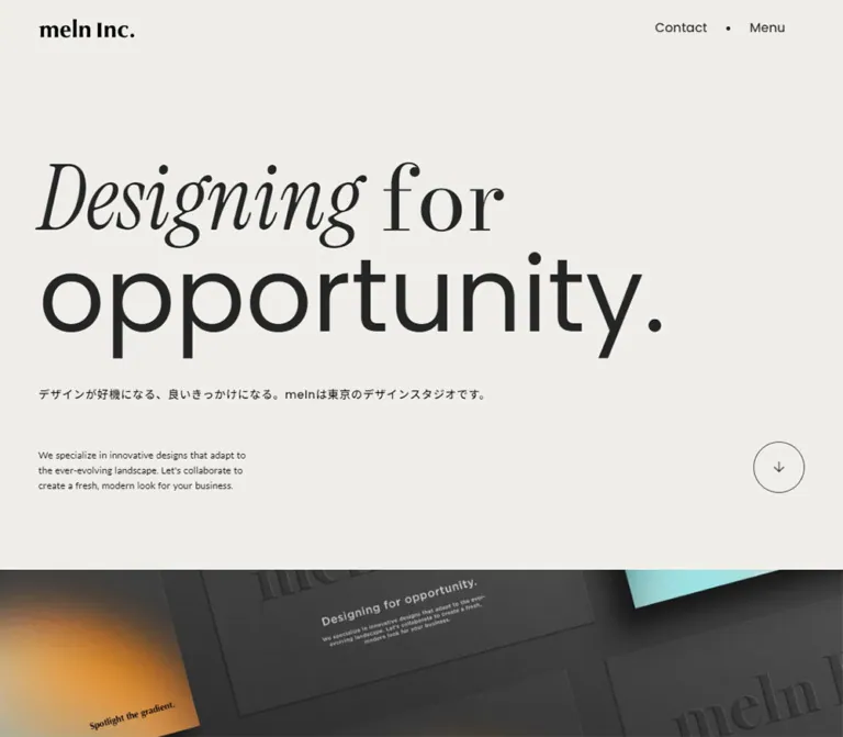
Keep the phrase on two visual lines: Designing for above opportunity. The first line combines italic and upright serif forms; the second uses broad sans-serif forms. Align the two lines to a common left edge and retain substantial empty space to their right on desktop.
The desktop Japanese introduction sits at x = 96px below the display phrase. At the right, a narrow English paragraph and an outlined circular down arrow form a compact group. Their bottom edges align near y = 482px in the measured boxes. The copy and arrow are separated by approximately 12px.
On mobile, the composition becomes sequential: display phrase, two-line Japanese introduction, a large breathing interval, then English copy and arrow in one row. That last row is 342px wide: 254px of text, a 24px gap, and a 64px circle.
The arrow links to /#main. This establishes the destination, but smooth scrolling and its duration were not exercised. Keep the arrow as an actual anchor with an accessible name in a new implementation.
Full-Width Stationery Image
Role: turn the abstract brand statement into a tangible design object.
The image begins immediately after the warm opening section and extends to both viewport edges. It shows dark charcoal printed pieces arranged diagonally, embossed-looking branding, and soft orange/cyan color fields with visible grain.
The desktop capture reveals a broad arrangement of multiple pieces. The mobile capture shows a much tighter portion of the composition, including a dark branded card above a colorful gradient card. This is a change in visible crop; the evidence does not establish whether it uses separate assets or a shared image with responsive positioning.
Its lower boundary, source file, and complete rendered height were not supplied. Do not infer video, parallax, or an animated texture from the still captures.
Section Label and Rule
Role: introduce a new content area without competing with its main material.
The desktop approach section has a fine dark rule spanning approximately 1088px, from x = 176px to x = 1264px. A small starburst mark sits below the rule beside Approach. The section label itself is only 14px on desktop and 12px on mobile.
Use a lightweight label, a small decorative marker, and a long rule. The label identifies the section; the typography, work, or cards below it supply the emphasis. The complete marker treatment is visually confirmed for Approach; other section headings are confirmed in the DOM.
Service Introduction
Role: explain the studio’s work and the thinking behind it.
The service section contains Our service, the phrase Spotlight the Gradient, a short Japanese subtitle, and a longer studio description. The measured words Spotlight and the use Poppins at 56px on desktop and 36px on mobile. The exact style of the individually wrapped Gradient letters was not supplied.
Desktop places the display statement on the left and a 505.6px-wide paragraph on the right, within a wider frame than the later approach section. The paragraph describes support spanning research, planning, improvement, corporate identities, products, and brands.
Mobile stacks the statement, subtitle, and paragraph within 24px side gutters. Paragraph size decreases from 14px to 13px; the short subtitle retains 14px type. Preserve this difference instead of shrinking every text role together.
Work Gallery
Role: provide a visual route to the studio’s work.
A large central image card is flanked by cropped neighbors. At the desktop measurement, the central card starts at x = 330px, measures 780 × 480px, and has a 12px radius. Neighboring cards are 24px away. On mobile, the central card starts near x = 41.4px and measures 307.2 × 320px, leaving a small visible sliver of each neighboring card.
Every sampled gallery anchor points to /works; distinct project-detail destinations were not present in the supplied link evidence. Images are implemented as backgrounds in the recorded markup, with a charcoal base color.
A compact control pair precedes the gallery: a 32px circular back button and a 64 × 32px forward capsule. Their gap is 12px. Duplicate offscreen entries suggest a carousel structure, but looping, autoplay, dragging, and button outcomes were not tested.
Approach Introduction
Role: articulate the process behind the visual work.
Desktop intentionally leaves the left portion of the central frame empty. Two Japanese paragraphs begin near x = 531.2px and x = 921.6px, each 342.4px wide, with 48px between them. Their text is 14px with 22.4px leading.
On mobile, both paragraphs align to x = 24px, become 342px wide, and stack with a 24px gap. Their type changes to 13px with 20.8px leading. This is a genuine layout reflow, not a uniformly scaled desktop composition.
Numbered Approach Cards
Role: summarize six stages while introducing a slower horizontal reading rhythm.
The six source captions are:
ヒアリングとリサーチ情報を選び、整理する本質を捉え、旗を立てるアイディアを発散するかたちづくり、整える浸透させる
Each card has a small number near its upper-left corner, a large open middle region, and a 13px caption near the bottom. The desktop cards appear approximately 320px wide with 48px insets. Mobile text measurements imply 240px cards with 24px insets. The track retains a 24px gap at both sizes.
The corresponding card heights are approximately 350px and 302px when derived from the number, caption, and inferred symmetric padding. Card-wrapper rectangles were not included, so these heights are implementation estimates.
The third visible desktop card contains a small four-point star with grainy pink, orange, and yellow coloring. Other visible centers appear empty in this capture. Their full asset or animation states are unverified; do not invent a complete six-icon system from one visible illustration.
The DOM repeats stage 01 after stage 06, consistent with a carousel duplicate. A new implementation should retain six logical stages and prevent any visual clones from becoming duplicate accessible content.
Template Directory
Role: present three resource destinations as spacious linked rows.
The Our contents section links to Template Store, Studio Store, and Notion Templates. Each row contains a small parenthesized index, an English title, a Japanese description, and a right arrow.
Desktop rows occupy the rightmost 851.2px of the central frame. Titles use 32px type; descriptions sit beside them. Rows have 32px vertical padding and measure approximately 96–97px tall.
Mobile rows use the full 342px content width. The index and 20px title share the upper line, while the 14px description moves beneath them with roughly 12px separation. Text occupies a 298px-wide region, reserving room for the arrow. Row height grows with wrapping to approximately 119–142px.
This component works as a quiet directory. Keep the full row as the link target and let type, rules, and arrows carry the hierarchy.
Information Card
Role: communicate dated announcements with minimal visual weight.
The desktop section contains four cards arranged in two columns; mobile presents the same four entries in one column. The cards use #fbfbfb, an 8px radius, and 24px declared padding. Text starts approximately 25px inside the measured box, indicating an additional edge allowance whose exact border styling was not supplied.
The anatomy is consistent:
| Part | Treatment |
|---|---|
| Top row | Date at left, Info or info capsule at right |
| Date | 13px / 20.8px, 0.65px tracking |
| Badge | Same text metrics, Warm Stone fill, 12px horizontal padding, 48px radius |
| Title | 12px below the top row; 16px / 25.6px, regular weight |
| Description | 6px below title; 12px / 19.2px, Secondary Gray |
| Destination glyph | Small external-link-style icon aligned at the lower right |
Desktop card heights vary between approximately 147.6px and 166.8px with description length. Mobile titles wrap to two lines, producing approximately 173.2px and 192.4px cards. Preserve content-driven heights rather than truncating titles to force a uniform rectangle.
The external-link-style glyph is also used on an internal template-detail link. Its appearance alone does not prove a new-tab target or an external destination.
Stay Tuned Footer
Role: close the page with three clear onward routes.
A soft-white outer frame encloses a large warm-canvas panel with rounded corners. Desktop uses a 24px frame and approximately 96px inner side padding. The left column contains Stay tuned and まずはこちらをご覧ください; the right contains three large links: Templates Store, note, and Our works.
The two desktop content columns measure 552px each with a 96px interval. Link rows use 32px type, 32px vertical padding, a small right arrow, and pale separators between rows. The copyright, privacy link, and contact link sit beneath the right-hand content.
Mobile changes to one column inside a 12px outer frame. The panel has approximately 24px horizontal and 48px vertical padding. The heading is 36px, followed by a 14px subtitle. A 48px gap separates the introductory block from the link list. Links use 24px type and 24px vertical padding.
The legal row remains 12px and fits on one line at 390px. Allow wrapping at narrower widths or increased text size in a new implementation. The displayed copyright year is source copy, not evidence of the inspection date or a redesign date.
Tokens — Motion & Interaction
Recorded Transition Values
These are computed declarations, not verified recordings of complete effects. Repeated gradient-property entries belong to the same declarations and should not be counted as separate animations.
| Element or group | Recorded timing | Evidence limit |
|---|---|---|
| Common anchors and structural elements | 300ms cubic-bezier(0.4, 0.4, 0, 1) |
Changed properties and hover endpoints were not captured |
| Header | 800ms cubic-bezier(0.4, 0.4, 0, 1), 500ms delay |
Entrance or state-change geometry is not established |
| Japanese opening H1 and English note | 1000ms cubic-bezier(0.445, 0.05, 0.55, 0.95), 500ms delay |
Transparent parent samples do not identify the full reveal mechanism |
| Section labels | 800ms cubic-bezier(0.445, 0.05, 0.55, 0.95) |
Scroll trigger and initial state unverified |
| Main explanatory paragraphs | 600ms cubic-bezier(0.445, 0.05, 0.55, 0.95), commonly 200ms delay |
End-to-end behavior unverified |
| Short Japanese subtitles | Same 600ms curve, commonly 100ms delay |
Individual paint behavior not supplied |
| Service display words | 800ms cubic-bezier(0.4, 0.4, 0, 1); 200ms and 300ms delays on sampled words |
Supports staggered declarations, not an exact whole-phrase sequence |
| Carousel buttons | 400ms cubic-bezier(0.4, 0.4, 0, 1) |
Does not establish slide duration |
| Information cards and their text | 600ms cubic-bezier(0.4, 0.4, 0, 1) |
Hover appearance not supplied |
| Work-card transform | transform cubic-bezier(0.58, 0.21, 0.41, 0.96) |
No nonzero duration appears in the supplied string; do not invent one |
| Body background | 500ms cubic-bezier(0.4, 0.4, 0, 1) |
No theme-switch interaction was observed |
Confirmed Structure and Unverified Behavior
The captures confirm vertical page traversal and a header that remains visible over different sections. The DOM confirms an in-page anchor, navigation links, a menu button, and back/forward gallery controls.
The split-letter opening text and staggered word declarations indicate motion-related structure. They do not establish a particular rotation, blur, per-letter delay, or scroll-scrubbing effect. Likewise, a static grainy star does not prove a looping animation.
The capture process waited for finite motion and layout stability within time limits, and temporarily paused perpetual animations during readiness checks. Sampled parents report animation: none, but descendant, pseudo-element, or scripted motion may still exist. Menu opening, horizontal navigation, hover feedback, keyboard behavior, autoplay, reduced-motion support, and new-tab behavior were not exercised.
For an adaptation, use the recorded easing curves for restrained transitions. Keep content readable before JavaScript runs and treat any specific reveal displacement or hover-arrow movement as a new design decision.
Surfaces
| Layer | Appearance | Purpose |
|---|---|---|
| Main canvas | Warm neutral #f0eee9 |
Unifies the long page and supports extensive whitespace |
| Header | Transparent overall, with a pale navigation capsule visible over content | Maintains readable utilities without a full-width solid bar |
| Opening work image | Dark, textured, full width | Provides the strongest contrast and color concentration |
| Work cards | Image-filled, 12px corners, charcoal base | Frames project imagery within a horizontal sequence |
| Approach cards | Near-white, approximately 12px corners | Separates numbered stages while retaining open interiors |
| Information cards | #fbfbfb, 8px corners |
Creates subtle panels for dense small text |
| Category badges | #d8d4c5 capsules |
Identifies announcement type without a strong accent color |
| Footer | Warm panel within a soft-white frame | Gives the closing navigation a distinct enclosure |
There is no evidence of a general heavy-shadow elevation system. Separation comes primarily from surface changes, rounded boundaries, thin rules, and spacing. Shadows visible inside the stationery image belong to the depicted objects and should not automatically become UI card shadows.
Imagery
The opening image has a tactile print-design character: dark paper, embossed-looking lettering, angled arrangements, soft color diffusion, and fine grain. The warmer gradient areas contrast with a turquoise/cyan region while remaining embedded in a mostly charcoal scene.
The work-gallery crop shows a framed typographic poster, neighboring printed material, and graphic compositions. Preserve their proportions and photographic context. The nearly square mobile gallery card exposes a different portion of the work than the wide desktop card.
The small process star introduces related color and texture at a much smaller scale. It acts as a localized detail within an otherwise quiet card. It does not justify covering every surface in noise or gradients.
Arrows and destination glyphs are compact and monochrome. The DOM exposes names such as arrow_downward, arrow_forward, and open_in_new, but the icon family itself was not included in the style sample. Simple SVG equivalents are a suitable implementation recommendation.
Observed Asset References
| Asset family | Supplied evidence | Reuse guidance |
|---|---|---|
| Wordmark | Visible in current captures; home-link dimensions supplied | Use authorized artwork; exact file URL and format unavailable |
| Opening stationery composition | Current desktop and mobile captures | Preserve the dark print texture and responsive crop; source URL unavailable |
| Studio-hosted gallery images | Background URLs under storage.googleapis.com/studio-design-asset-files/projects/rROn4KpaAL/ |
Recorded filename prefixes include s-900x1133_v-fs_webp_ and s-2400x1602_v-frms_webp_; full filenames were truncated |
| Additional gallery background | Unsplash asset identifier photo-1615799998603-7c6270a45196 appears in original-page markup |
Exact correspondence to a visible settled card was not established |
| Process star | Visible within stage 03 in the desktop capture | Full asset reference and animation state unavailable |
Do not construct complete download URLs from truncated filenames. The supplied captures are sufficient to describe composition, but the original authorized assets are needed for faithful imagery.
Layout & Responsive Behavior
Desktop Alignment System
At 1440px, the page uses several nested widths rather than one universal container:
- Header wordmark: 48px from the left edge.
- Opening text: 96px from the left edge.
- Service content: approximately 128px from each side, yielding a 1184px frame.
- Approach rule: approximately 176px from each side, yielding a 1088px frame.
- Directory and information bodies: begin near x = 412.8px and end at x = 1264px.
- Footer panel: 24px from each edge, with content starting at x = 120px.
The directory and information bodies therefore occupy approximately 78.2% of their 1088px frame. The approach paragraphs begin farther inward and occupy its rightmost 732.8px. These deliberate offsets are central to the desktop composition.
Large galleries escape the narrow text frame. The work gallery centers its active image in the viewport; the approach track begins at the section’s left alignment and continues past the right edge.
Mobile Reflow
At 390px, most content uses 24px side gutters, giving a 342px reading width. The header uses 12px gutters, while the footer combines a 12px outer frame with 24px inner padding.
The introductory note moves beneath the Japanese copy, but the arrow remains alongside the note. Service text becomes a single column. Approach paragraphs stack. Resource descriptions move below their titles. Information cards become a single vertical list with 32px gaps. The footer becomes one column while retaining large destination links.
Both work and process sequences remain horizontal. They do not become a long vertical stack of all cards. The mobile work card becomes taller relative to its width, and the process card becomes narrower while retaining the number/open-center/caption hierarchy.
Breakpoints and Height
A source fragment exposes a max-width: 1140px rule for responsive line breaks. It does not reveal the complete layout breakpoint system. No tablet capture was supplied, so the Quick Start’s 900px layout breakpoint is a recommendation.
The measured mobile document is slightly shorter than desktop despite stacked text and news cards. Smaller display type, reduced large gaps, and retained horizontal tracks help explain this. Do not reproduce the total height as a fixed CSS value; preserve the content relationships and let the document grow naturally.
Do’s and Don’ts
Do
- Preserve the measured warm canvas
#f0eee9and charcoal ink#252525. - Keep the first-line serif contrast and the broad sans-serif
opportunity.line. - Treat the wordmark as its own brand element.
- Use small section labels, long rules, and substantial breathing space.
- Preserve the different desktop alignment frames and right-offset content areas.
- Keep saturated color concentrated in imagery and small decorative artwork.
- Maintain visible neighboring cards in horizontal galleries.
- Retain the six-stage process and its large open card centers.
- Let information-card titles wrap naturally on mobile.
- Preserve the footer’s large rounded enclosure and three spacious destination rows.
- Separate measured transition declarations from untested animation behavior.
Don’t
- Don’t center every section or force all content into one identical container.
- Don’t replace the mixed opening typography with one bold sans-serif heading.
- Don’t make the whole page white because the body’s computed background is white.
- Don’t copy transparent text-parent colors into the finished interface.
- Don’t convert the gallery and process tracks into a generic desktop card grid.
- Don’t apply the stationery image’s physical shadows to every UI card.
- Don’t turn Warm Stone badges into brightly colored action buttons.
- Don’t invent six decorative process illustrations from the single visible star.
- Don’t assume carousel clones prove autoplay or infinite interaction.
- Don’t infer new-tab behavior from an external-link-style icon.
- Don’t fabricate a menu overlay, display-font assignment, or asset URL.
Recommended Implementation Additions
These are recommendations for a new implementation, not verified features of the original:
- Give the down arrow, gallery controls, and home wordmark meaningful accessible names. Hide purely decorative icon glyphs from assistive technology.
- If display text is split into letters for motion, preserve a coherent accessible phrase and avoid exposing letter-by-letter reading order.
- Keep a logical heading hierarchy while retaining the observed small Japanese H1 treatment if reproducing this page closely.
- Provide visible keyboard focus and keyboard-operable horizontal tracks. Keep cloned carousel items out of the accessibility tree.
- Increase the effective target area of 32px gallery controls to at least 44px while preserving their smaller visible shape.
- Support reduced motion and leave all essential copy visible when scripts fail or motion is disabled.
- Review the muted information text:
#808080on#fbfbfbis approximately 3.8:1 by sRGB contrast calculation. A darker gray such as#6b6b6bimproves normal-text contrast. - Allow legal links, translated titles, and longer announcements to wrap without clipping.
- Reserve image dimensions to reduce layout shift, and supply responsive image crops after testing the actual artwork.
- Offset anchor targets for the persistent header so section labels remain visible after navigation.
Agent Prompt Guide
Quick Color Reference
- Main canvas and inner footer panel:
#f0eee9. - Principal text:
#252525. - Information cards and outer footer:
#fbfbfb. - Information badge:
#d8d4c5. - Observed secondary text:
#808080; consider a darker accessible adaptation. - Fine warm rules: suggested reuse of
#d8d4c5, exact source rule color unverified. - Orange/cyan gradients: confined to artwork, without claiming exact color stops.
Overall Prompt
“Create a Japanese design-studio homepage inspired by the documented meln composition. Use a warm #f0eee9 canvas, charcoal #252525 text, a compact serif wordmark at upper left, and Store/Menu utilities at upper right. Build an oversized two-line opening with italic serif ‘Designing’, upright serif ‘for’, and geometric sans-serif ‘opportunity.’ Keep Japanese supporting copy small, with a tiny Lato English note beside a 64px outlined down arrow. Follow with a full-width image of dark printed stationery containing grainy orange and cyan gradients. Use generous vertical spacing, small section labels with fine rules, right-offset desktop text columns, horizontal work and process tracks, quiet information cards, and a large rounded footer containing three destination rows. Reflow text and news into one mobile column with 24px gutters while retaining horizontal galleries. Treat exact display-font mapping and untested interactions as implementation choices.”
Example Component Prompts
- Opening: “A warm-gray studio introduction with a two-line mixed-serif/sans phrase, wide empty space on the right, a small Japanese introduction below, and a narrow English note beside a 64px outlined circle. On a 390px screen, place the note beneath the Japanese text and keep the arrow at its right.”
- Work gallery: “Center a 780 × 480px image card with 12px corners between cropped neighboring cards and 24px gaps. Use a roughly 307 × 320px card on a 390px phone. Preserve the artwork crop and make every card a route to the works index. Do not assume autoplay.”
- Approach: “Start with a fine 1088px rule and a small starburst section label. Offset two 342px Japanese paragraphs to the right, then introduce a horizontal sequence of pale 320px numbered cards with 48px insets. Use a sparse number/open-middle/caption structure, with a small grainy four-point star only where supported by the reference.”
- Information card: “Use a soft-white panel with an 8px radius and 24px padding. Put a tracked 13px date opposite a warm-stone Info capsule, followed by a regular 16px title, a gray 12px description, and a tiny destination glyph at lower right. Let wrapping determine height.”
- Footer: “Place a warm rounded panel inside a soft-white frame. On desktop, show a 56px Stay tuned heading at left and three 32px destination rows at right. On mobile, stack the content, use a 36px heading and 24px links, preserve pale dividing rules, and place compact legal links beneath.”
Quick Start
CSS Custom Properties
This CSS combines measured colors and small-text metrics with recommended layout formulas. The opening display sizes are screenshot estimates; Instrument Serif is a proposed display-family mapping. The 900px breakpoint, scroll-snap implementation, footer radius, and divider color are adaptations.
Load the required licensed font files separately, including a true italic serif face. Font-family declarations alone do not load fonts. Authorized wordmark and imagery assets are also required.
The class structure assumes a .meln-site wrapper; a header with a brand image and navigation group; two display-line spans inside .hero-title; a Japanese .hero-intro and .hero-note inside .hero-meta; and semantic links, lists, headings, and paragraphs within the remaining components. Add gallery buttons only when their behavior is implemented.
:root {
  /* Measured colors and a recommended divider alias */
  --meln-canvas: #f0eee9;
  --meln-ink: #252525;
  --meln-surface: #fbfbfb;
  --meln-badge: #d8d4c5;
  --meln-muted: #808080;
  --meln-rule: #d8d4c5;

  /* Confirmed content families; display mapping is recommended */
  --meln-ui: 'Poppins', 'Noto Sans JP', sans-serif;
  --meln-english: 'Lato', sans-serif;
  --meln-display: 'Instrument Serif', Georgia, serif;

  --meln-space-12: 12px;
  --meln-space-24: 24px;
  --meln-space-32: 32px;
  --meln-space-48: 48px;
  --meln-space-96: 96px;
  --meln-content-max: 1088px;
  --meln-service-max: 1184px;
  --meln-radius-card: 8px;
  --meln-radius-work: 12px;
  --meln-radius-footer: 24px;

  /* Recorded easing, reused for optional interface feedback */
  --meln-ease: cubic-bezier(0.4, 0.4, 0, 1);
  --meln-ease-reveal: cubic-bezier(0.445, 0.05, 0.55, 0.95);
  --meln-motion-ui: 300ms var(--meln-ease);
}

* { box-sizing: border-box; }
body { margin: 0; }

.meln-site {
  color: var(--meln-ink);
  background: var(--meln-canvas);
  font-family: var(--meln-ui);
  font-size: 14px;
  line-height: 1.6;
}

.meln-site a { color: inherit; text-decoration: none; }
.meln-site button { color: inherit; font: inherit; }
.meln-site img { display: block; max-inline-size: 100%; }
.meln-site :focus-visible {
  outline: 2px solid var(--meln-ink);
  outline-offset: 5px;
}
.meln-site [id] { scroll-margin-top: 90px; }

.site-header {
  position: fixed;
  inset: 0 0 auto;
  z-index: 20;
  display: flex;
  align-items: center;
  justify-content: space-between;
  padding: 12px 48px;
}
.site-brand img { inline-size: 120px; block-size: auto; }
.header-nav {
  display: flex;
  align-items: center;
  gap: 12px;
  padding-inline: 12px;
  border-radius: 999px;
  background: var(--meln-canvas);
}
.header-nav a,
.header-nav button {
  display: block;
  padding: 12px;
  border: 0;
  background: transparent;
  font: 500 16px/1.4 var(--meln-ui);
  cursor: pointer;
}
.nav-dot {
  inline-size: 5px;
  block-size: 5px;
  border-radius: 50%;
  background: currentColor;
}

/* Opening geometry approximates the supplied settled captures. */
.hero { padding: 192px clamp(24px, 6.6667vw, 96px) 96px; }
.hero-title { margin: 0; font-weight: 400; }
.hero-line { display: block; }
.hero-line--serif {
  font-family: var(--meln-display);
  font-size: clamp(72px, 8.3333vw, 120px);
  line-height: 1;
}
.hero-line--serif em { font-weight: inherit; }
.hero-line--sans {
  font-family: var(--meln-ui);
  font-size: clamp(64px, 6.9444vw, 100px);
  line-height: 1;
}
.hero-meta {
  display: grid;
  grid-template-columns: minmax(0, 1fr) 374.4px;
  align-items: end;
  gap: clamp(32px, 6.6667vw, 96px);
  margin-top: 6px;
}
.hero-intro {
  margin: 0;
  font-size: 14px;
  font-weight: 500;
  line-height: 1.6;
  letter-spacing: 0.05em;
}
.hero-note {
  display: grid;
  grid-template-columns: minmax(0, 1fr) 64px;
  align-items: end;
  gap: 12px;
}
.hero-note p {
  margin: 0;
  font: 500 12px/1.6 var(--meln-english);
}
.down-link {
  display: grid;
  place-items: center;
  inline-size: 64px;
  block-size: 64px;
  border: 1px solid currentColor;
  border-radius: 50%;
}
.down-link svg { inline-size: 24px; block-size: 24px; }

/* Set media height and crop after testing the actual authorized asset. */
.brand-media { margin: 0; }
.brand-media img {
  inline-size: 100%;
  block-size: var(--brand-media-height, auto);
  object-fit: cover;
  object-position: var(--brand-media-position, center);
}

.content-frame,
.service-frame {
  inline-size: calc(100% - 48px);
  margin-inline: auto;
}
.content-frame { max-inline-size: var(--meln-content-max); }
.service-frame { max-inline-size: var(--meln-service-max); }
.section-head { border-top: 1px solid var(--meln-ink); }
.section-label {
  display: flex;
  align-items: center;
  gap: 8px;
  margin: 0;
  padding-top: 12px;
  font-size: 14px;
  font-weight: 400;
  line-height: 1.4;
}
.section-mark { inline-size: 16px; block-size: 16px; }
.section-body { margin-top: 48px; }
.offset-body { margin-inline-start: 21.766%; }
.service-grid {
  display: grid;
  grid-template-columns: repeat(2, minmax(0, 1fr));
  gap: clamp(48px, 12vw, 172.8px);
}
.section-display {
  margin: 0;
  font-size: 56px;
  font-weight: 400;
  line-height: 1;
}
.service-copy,
.approach-copy p { margin: 0; font-size: 14px; line-height: 1.6; }
.approach-copy {
  display: grid;
  grid-template-columns: repeat(2, minmax(0, 1fr));
  gap: 48px;
  margin-inline-start: 32.647%;
}

/* Native scrolling is an adaptation, not a recovered carousel engine. */
.work-track,
.process-track {
  display: flex;
  gap: 24px;
  overflow-x: auto;
  overscroll-behavior-inline: contain;
  scroll-snap-type: x proximity;
  list-style: none;
}
.work-track {
  margin: 32px 0 0;
  padding: 0 max(24px, calc((100% - 780px) / 2));
}
.work-card {
  flex: 0 0 min(780px, 80vw);
  block-size: 480px;
  overflow: hidden;
  border-radius: var(--meln-radius-work);
  background: var(--meln-ink);
  scroll-snap-align: center;
}
.work-card img {
  inline-size: 100%;
  block-size: 100%;
  object-fit: cover;
}
.process-track {
  margin: 96px 0 0;
  padding: 0 max(24px, calc((100% - 1088px) / 2));
}
.process-card {
  flex: 0 0 320px;
  display: grid;
  grid-template-rows: auto 1fr auto;
  min-block-size: 350px;
  padding: 48px;
  border-radius: 12px;
  background: var(--meln-surface);
  scroll-snap-align: start;
}
.process-number { margin: 0; font-size: 14px; line-height: 1.2; }
.process-art {
  align-self: center;
  justify-self: center;
  max-inline-size: 112px;
  max-block-size: 120px;
}
.process-caption { margin: 0; font-size: 13px; line-height: 1.6; }

.directory-row {
  display: grid;
  grid-template-columns: auto auto minmax(0, 1fr) 20px;
  align-items: center;
  column-gap: 12px;
  padding-block: 32px;
}
.directory-row + .directory-row { border-top: 1px solid var(--meln-rule); }
.directory-index { font-size: 12px; line-height: 1; }
.directory-title { margin: 0; font-size: 32px; font-weight: 400; line-height: 1; }
.directory-description { margin: 0 12px 0 36px; font-size: 14px; line-height: 1.6; }
.directory-arrow { justify-self: end; }

.news-grid {
  display: grid;
  grid-template-columns: repeat(2, minmax(0, 1fr));
  gap: 24px;
}
.news-card {
  display: block;
  padding: 24px;
  border: 1px solid transparent;
  border-radius: var(--meln-radius-card);
  background: var(--meln-surface);
}
.news-meta {
  display: flex;
  align-items: center;
  justify-content: space-between;
  font-size: 13px;
  line-height: 1.6;
  letter-spacing: 0.05em;
}
.news-badge {
  padding-inline: 12px;
  border-radius: 48px;
  background: var(--meln-badge);
}
.news-title {
  margin: 12px 0 6px;
  font-size: 16px;
  font-weight: 400;
  line-height: 1.6;
}
.news-description {
  margin: 0;
  color: var(--meln-muted);
  font-size: 12px;
  line-height: 1.6;
}
.news-icon {
  display: block;
  inline-size: 14px;
  block-size: 14px;
  margin-inline-start: auto;
  color: var(--meln-muted);
}

.site-footer { padding: 24px; background: var(--meln-surface); }
.footer-panel {
  display: grid;
  grid-template-columns: repeat(2, minmax(0, 1fr));
  gap: 24px 96px;
  padding: 96px 96px 48px;
  border-radius: var(--meln-radius-footer);
  background: var(--meln-canvas);
}
.footer-heading { margin: 0; font-size: 56px; font-weight: 400; line-height: 1; }
.footer-subtitle { margin: 24px 0 0; font-size: 14px; line-height: 1.4; letter-spacing: 0.05em; }
.footer-links a {
  display: flex;
  align-items: center;
  justify-content: space-between;
  gap: 24px;
  padding-block: 32px;
  font-size: 32px;
  line-height: 1;
}
.footer-links a + a { border-top: 1px solid var(--meln-rule); }
.footer-arrow { flex: 0 0 20px; inline-size: 20px; block-size: 20px; }
.footer-legal {
  grid-column: 1 / -1;
  display: flex;
  align-items: center;
  justify-content: flex-end;
  flex-wrap: wrap;
  gap: 12px;
  font-size: 12px;
  line-height: 1.4;
}
.footer-legal p { margin: 0; }
.footer-dot { inline-size: 4px; block-size: 4px; border-radius: 50%; background: currentColor; }

/* Recommended feedback; original hover endpoints were not supplied. */
@media (hover: hover) {
  .directory-row:hover .directory-title,
  .footer-links a:hover,
  .news-card:hover .news-title {
    text-decoration: underline;
    text-underline-offset: 0.15em;
  }
}

/* Recommended breakpoint; only endpoint layouts were inspected. */
@media (max-width: 900px) {
  .site-header { padding: 12px; }
  .site-brand img { inline-size: 100px; }
  .header-nav { padding-inline: 24px; }
  .header-nav a,
  .header-nav button { padding: 12px 0; font-size: 12px; }

  .hero { padding: 120px 24px 48px; }
  .hero-line--serif { font-size: clamp(40px, 12.3077vw, 72px); }
  .hero-line--sans { font-size: clamp(36px, 13.3333vw, 72px); }
  .hero-meta { display: block; margin-top: 24px; }
  .hero-note { gap: 24px; margin-top: 60.8px; }
  .hero-note p { font-size: 11px; }

  .section-label { font-size: 12px; }
  .section-mark { inline-size: 14px; block-size: 14px; }
  .section-display { font-size: 36px; }
  .offset-body,
  .approach-copy { margin-inline-start: 0; }
  .service-grid { grid-template-columns: 1fr; gap: 48px; }
  .approach-copy { grid-template-columns: 1fr; gap: 24px; }
  .service-copy,
  .approach-copy p { font-size: 13px; }

  .work-track { padding-inline: 10.615vw; }
  .work-card { flex-basis: 78.77vw; block-size: 320px; }
  .process-track { margin-top: 48px; padding-inline: 24px; }
  .process-card { flex-basis: 240px; min-block-size: 302px; padding: 24px; }

  .directory-row { grid-template-columns: auto minmax(0, 1fr) 20px; row-gap: 12px; }
  .directory-title { font-size: 20px; }
  .directory-description { grid-column: 1 / 3; grid-row: 2; margin: 0 12px 0 0; }
  .directory-arrow { grid-column: 3; grid-row: 1 / 3; }
  .news-grid { grid-template-columns: 1fr; gap: 32px; }

  .site-footer { padding: 12px; }
  .footer-panel { grid-template-columns: 1fr; gap: 0; padding: 48px 24px; border-radius: 28px; }
  .footer-heading { font-size: 36px; }
  .footer-links { margin-top: 48px; }
  .footer-links a { padding-block: 24px; font-size: 24px; }
  .footer-legal { margin-top: 24px; }
}

@media (prefers-reduced-motion: reduce) {
  .meln-site *,
  .meln-site *::before,
  .meln-site *::after {
    animation: none !important;
    transition: none !important;
    scroll-behavior: auto !important;
  }
  .work-track,
  .process-track { scroll-snap-type: none; }
}
The CSS leaves content visible and does not attempt to recreate unverified reveals. Macro section spacing should be applied per section, using the observed large desktop intervals and smaller mobile intervals as guides. The full-width image height remains asset-dependent rather than being invented from an incomplete crop.
Tailwind v4 Token Mapping
Optional aliases for a project already using Tailwind v4. This is not evidence that the original site uses Tailwind. Define the custom properties above first.
@theme inline {
  --color-canvas: var(--meln-canvas);
  --color-ink: var(--meln-ink);
  --color-surface: var(--meln-surface);
  --color-stone: var(--meln-badge);
  --color-muted: var(--meln-muted);
  --color-rule: var(--meln-rule);

  --font-sans: var(--meln-ui);
  --font-editorial: var(--meln-display);
  --font-supporting: var(--meln-english);

  --text-caption: 12px;
  --text-small: 13px;
  --text-body: 14px;
  --text-card-title: 16px;
  --text-directory: 32px;
  --text-section-display: 56px;

  --spacing-card-gap: 24px;
  --spacing-card-inset: 24px;
  --spacing-section-inset: 48px;
  --radius-card: 8px;
  --radius-work: 12px;
  --radius-footer: 24px;
}
Sources & Evidence
- Inspected original and final page: https://meln.design/, reported HTTP 200 with no URL change.
- Capture timestamp:
2026-09-22T21:00:22.794Z, equivalent to September 23, 2026, 06:00:22.794 JST. This is the supplied inspection timestamp, not a separate live visit performed for this document. - Desktop evidence: 1440 × 1000 CSS-pixel viewport; supplied opening, middle, and bottom captures, plus rendered DOM and computed-style measurements across the homepage.
- Mobile evidence: 390 × 844 CSS-pixel viewport; supplied opening and bottom captures, plus rendered DOM and computed-style measurements across the homepage.
- Measured source material: color and font custom properties; element dimensions, padding, radii, text metrics, transition declarations, semantic tags, and link destinations. Linked pages were not opened or analyzed.
- Observed interaction scope: vertical traversal and persistent header appearance. Menu activation, gallery-control outcomes, hover states, keyboard interaction, autoplay, and complete motion sequences were not supplied.
- Capture limitations: the browser process waited for document readiness, finite motion, sampled layout stability, and visible image decoding within bounded time limits. Perpetual motion was temporarily paused for readiness checks; SharedWorkers and service workers were disabled. These checks do not prove delayed-content completeness.
- Identity evidence: the original-page title identifies meln Inc. and 株式会社メルン; the Japanese introduction describes a Tokyo design studio; the footer repeats the meln name.
This reference describes the supplied current homepage. Display-font assignments, missing asset paths, intermediate responsive behavior, and untested interaction outcomes remain explicitly unresolved.
# meln Inc. — Style Reference

> Warm gray paper, expressive typography, and carefully spaced windows into a design studio’s work.

**Website:** [meln.design](https://meln.design/)
**Original URL:** https://meln.design/
**Final URL:** https://meln.design/
**Theme:** light, with a warm neutral canvas and charcoal text
**Inspected:** September 23, 2026, 06:00 JST; supplied retrieval timestamp: September 22, 2026, 21:00:22.794 UTC
**Viewports:** 1440 × 1000 desktop and 390 × 844 mobile, in CSS pixels
**Scope:** the current studio homepage, including its closed header navigation, introductory typography, stationery image, service introduction, work gallery, approach cards, template directory, information cards, and footer. Destination pages and open-menu states were not inspected.

meln presents its studio, work, process, and downloadable resources through a long editorial homepage. The visual identity comes from the relationship between an oversized mixed-type opening, small bilingual explanations, generous empty space, and physical-looking graphic-design imagery. The interface stays quiet while the work supplies color and texture.

The page uses several distinct alignment systems. The header sits close to the viewport edges; the opening copy moves inward; later sections use a narrower central frame with their main content offset to the right. Horizontal galleries interrupt this measured vertical rhythm. At the bottom, a broad rounded panel turns three destination links into the principal closing gesture.
閉じる
# meln Inc. — Style Reference

> Warm gray paper, expressive typography, and carefully spaced windows into a design studio’s work.

**Website:** [meln.design](https://meln.design/)
**Original URL:** https://meln.design/
**Final URL:** https://meln.design/
**Theme:** light, with a warm neutral canvas and charcoal text
**Inspected:** September 23, 2026, 06:00 JST; supplied retrieval timestamp: September 22, 2026, 21:00:22.794 UTC
**Viewports:** 1440 × 1000 desktop and 390 × 844 mobile, in CSS pixels
**Scope:** the current studio homepage, including its closed header navigation, introductory typography, stationery image, service introduction, work gallery, approach cards, template directory, information cards, and footer. Destination pages and open-menu states were not inspected.

meln presents its studio, work, process, and downloadable resources through a long editorial homepage. The visual identity comes from the relationship between an oversized mixed-type opening, small bilingual explanations, generous empty space, and physical-looking graphic-design imagery. The interface stays quiet while the work supplies color and texture.

The page uses several distinct alignment systems. The header sits close to the viewport edges; the opening copy moves inward; later sections use a narrower central frame with their main content offset to the right. Horizontal galleries interrupt this measured vertical rhythm. At the bottom, a broad rounded panel turns three destination links into the principal closing gesture.

## How to Read This Reference

- **Measured** values come from the supplied rendered DOM, computed styles, and element rectangles. Values are rounded where additional precision would not help implementation.
- **Derived** values are arithmetic relationships between those measurements, such as gaps between adjacent cards.
- **Estimated** values come from visual inspection of the supplied current-page screenshots. They are not stylesheet measurements or pixel samples.
- **Recommended** values and behaviors are adaptations for a new implementation. The CSS below is a practical starting point, not recovered source code.
- All named implementation tokens are aliases created for this reference unless a source custom property is explicitly identified.
- Some sampled text parents have transparent computed colors while the screenshots show dark, readable lettering. Descendant or other paint styles were not included. Use the visible result and confirmed ink tokens; do not reproduce those parent values as invisible text.
- Both viewport sizes were inspected. Intermediate breakpoints, menu operation, hover states, carousel activation, and complete animation sequences remain unverified.

## Tokens — Colors

### Default Palette

| Name | Value | Implementation token | Evidence and role |
| --- | --- | --- | --- |
| Warm Canvas | `#f0eee9` | `--meln-canvas` | Declared source `--s-color-d0a7e942`; visually corresponds to the principal page and inner footer panel |
| Charcoal Ink | `#252525` | `--meln-ink` | Source `--s-color-13b9d86c`; measured on navigation, large section text, numbers, badges, and footer links |
| Soft White | `#fbfbfb` | `--meln-surface` | Measured information-card and outer-footer background |
| Warm Stone | `#d8d4c5` | `--meln-badge` | Measured `Info` badge background: `rgb(216, 212, 197)` |
| Secondary Gray | `#808080` | `--meln-muted` | Measured information-card descriptions |
| Utility Gray | `#333333` | — | Computed on several structural and control elements; individual icon paint was not separately supplied |
| Section Dark | `#222222` | — | Measured on mobile section-label headings |
| Underlying White | `#ffffff` | — | Computed body background; this is not the dominant visible page canvas |
| Quiet Divider | Suggested `#d8d4c5` | `--meln-rule` | Footer rules appear pale and warm; their exact color was not supplied. Reusing Warm Stone is a recommendation |

The difference between the canvas and card surface is deliberately small. Cards become legible through spacing and geometry rather than a strong outline or a saturated fill.

Orange, amber, cyan, and muted green appear within the stationery artwork. They are image colors, not verified interface tokens. Preserve this distribution: neutral navigation and content surfaces, with concentrated color in the work and occasional decorative artwork.

The supplied custom properties also contain loading colors and numerous transparent gradient entries. These do not establish a visible loading screen, selectable themes, or a global animated-gradient background.

## Tokens — Typography

### Poppins and Noto Sans JP — Interface and Content

**Measured family:** `Poppins, 'Noto Sans JP'`.

This stack is confirmed on navigation, Japanese introductory copy, service and approach paragraphs, process numbers and captions, directory titles, information cards, and footer text. Poppins supplies the rounded geometric Latin character visible in the interface; Noto Sans JP is the declared Japanese companion.

Most sampled content uses weight `400`. Header navigation and the Japanese introductory H1 use `500`. Hierarchy comes mainly from size, placement, and whitespace rather than heavy bold weights.

### Lato — English Supporting Copy

**Measured family:** `Lato`.

The small English paragraph beside the opening arrow uses weight `500`, with `12px / 19.2px` on desktop and `11px / 17.6px` on mobile. It is visibly subordinate to both the display phrase and the Japanese introduction.

### Display Serif — Opening Phrase

The screenshots show three typographic treatments:

- `Designing` in an italic, high-contrast serif.
- `for` in an upright serif.
- `opportunity.` in a large geometric sans-serif on a separate line.

The supplied source declares both `'Instrument Serif'` through `--s-font-42b5a333` and `'Bodoni Moda'` through `--s-font-089f2958`. The individual display-letter elements were not included in the computed-style sample, so their exact family assignments cannot be confirmed.

The Quick Start uses Instrument Serif for the serif line as an explicit implementation choice. Validate the result against the current capture before treating it as a precise reproduction. The sans-serif display line uses the documented Poppins stack as an adaptation.

### Wordmark

The black `meln Inc.` wordmark has a compact, substantial serif character. Its home-link box measures approximately `120 × 23.2px` on desktop and `100 × 19.4px` on mobile. Its underlying font or artwork format is not established by the supplied sample. Preserve an authorized wordmark asset where available rather than deriving it from the body-font stack.

### Type Scale

Values below are measured unless marked estimated.

| Role | Desktop | Mobile | Weight and tracking |
| --- | --- | --- | --- |
| Opening serif line | Approximately `120px`, estimated | Approximately `48px`, estimated | Italic first word, upright second word; exact metrics unverified |
| Opening sans-serif line | Approximately `100px`, estimated | Approximately `52px`, estimated | Visually regular; exact computed style absent |
| Service display words `Spotlight`, `the` | `56px / 56px` | `36px / 36px` | `400`, normal tracking |
| Footer `Stay tuned` | `56px / 56px` | `36px / 36px` | `400`, normal tracking |
| Directory destination title | `32px / 32px` | `20px / 20px` | `400` |
| Footer destination title | `32px / 32px` | `24px / 24px` | `400` |
| Header controls | `16px / 22.4px` | `12px / 16.8px` | `500` |
| Information-card title | `16px / 25.6px` | Same | `400` |
| Japanese introductory H1 | `14px / 22.4px` | Same | `500`, `0.7px` tracking |
| Service and approach body | `14px / 22.4px` | `13px / 20.8px` | `400` |
| Directory description | `14px / 22.4px` | Same | `400` |
| Section label | `14px / 19.6px` | `12px / 16.8px` | `400` |
| Short Japanese subtitle | `14px / 19.6px` | Same | `400`, `0.7px` tracking |
| Process number | `14px / 16.8px` | Same | `400` |
| Process caption | `13px / 20.8px` | Same | `400` |
| Information date and badge | `13px / 20.8px` | Same | `400`, `0.65px` tracking |
| Information description | `12px / 19.2px` | Same | `400` |
| English opening note | `12px / 19.2px` | `11px / 17.6px` | Lato, `500` |
| Footer legal text | `12px / 16.8px` | Same | `400` |
| Directory index | `12px / 12px` | Same | `400` |

The large English phrase is the visual headline, but the sampled semantic H1 is the Japanese introduction: `デザインが好機になる、良いきっかけになる。melnは東京のデザインスタジオです。` Visual prominence and heading semantics should therefore be documented separately.

## Tokens — Spacing & Shapes

**Spacing character:** generous distances between sections, compact internal text spacing, and recurring 24px relationships.

The following is a reusable scale extracted from repeated measurements, not a claim that the original declares a formal spacing system.

### Spacing Scale

| Value | Observed or derived use |
| --- | --- |
| `6px` | Gap between an information title and its description, derived from text rectangles |
| `12px` | Header control padding, badge horizontal padding, and date-row-to-title spacing |
| `24px` | Gallery gaps, desktop information-grid gaps, information-card padding, and mobile content gutters |
| `32px` | Directory-row vertical padding and distance from work-gallery controls to the image track |
| `48px` | Desktop header side padding; mobile gaps between several section elements |
| `72px` | Mobile distance from the bottom of the Japanese introductory box to the top of the English note box |
| `96px` | Desktop hero side inset; derived approach-copy-to-card gap; estimated footer panel side padding confirmed by child positions |
| Approximately `120px` | Mobile work-gallery-to-approach-rule separation, derived with the rule position estimated |
| Approximately `240px` | Corresponding desktop separation |

### Border Radius

| Element | Value | Evidence |
| --- | --- | --- |
| Information cards | `8px` | Computed |
| Work-image cards | `12px` | Computed |
| Approach cards | Approximately `12px` | Screenshot estimate |
| `Info` badge | `48px` | Computed; visually a capsule |
| Forward carousel control | `48px` | Computed on a `64 × 32px` box |
| Back carousel control | `50%` | Computed on a `32 × 32px` box |
| Opening down-arrow control | `50%` | Computed on a `64 × 64px` box |
| Footer panel | Approximately `24–28px` | Screenshot estimate |
| Header navigation backing | Capsule | Visible in scrolled captures; wrapper radius not supplied |

### Layout Measurements

| Element | Desktop, 1440px wide | Mobile, 390px wide |
| --- | --- | --- |
| Document height | Approximately `5192.4px` | Approximately `4958.4px` |
| Header height | `70.4px` | `64.8px` |
| Header side padding | `48px` | `12px` |
| Japanese opening-copy left edge | `96px` | `24px` |
| Japanese opening-copy box | `777.6 × 22.4px` | `342 × 44.8px` |
| English opening-copy box | `298.4 × 57.6px` | `254 × 52.8px` |
| Down-arrow box | `64 × 64px` | `64 × 64px` |
| Opening image start | Approximately `y = 578px`, screenshot | Approximately `y = 462px`, screenshot |
| Service text columns | Two `505.6px` columns | One `342px` column |
| Work-image card | `780 × 480px` | `307.2 × 320px` |
| Work-image gap | `24px`, derived | `24px`, derived |
| Approach paragraph | Two `342.4px` columns, `48px` gap | Stacked `342px` paragraphs, `24px` gap |
| Approach-card width | Approximately `320px`, derived and visually supported | Approximately `240px`, derived |
| Approach-card stride | `344px`, derived | `264px`, derived |
| Directory content width | `851.2px` | `342px` |
| Information-card width | `413.6px` | `342px` |
| Information-grid gap | `24px` in both directions | `32px` vertically |
| Footer outer frame | `24px` | `12px` |
| Footer destination column | `552px` | `318px` |
| Footer row height | `96–97px` | `72–73px` |

DOM positions and screenshot positions are separate observations. Text wrappers may also participate in transitions. Use the dimensions to establish proportion rather than assuming every recorded Y coordinate is an invariant final position.

## Components

### Persistent Header

**Role:** keep identity, the template store, and general navigation within reach.

The header places the wordmark at the far left and `Store · Menu` at the far right. `Store` is an anchor to `/website-templates`; `Menu` is a button. The small dot is a separator, not a third action.

On desktop, the header has 48px horizontal padding. Each text control has 12px padding and a 22.4px line box. On mobile, the header inset becomes 12px and the controls use 12px type with vertical padding only.

The header remains at the top of multiple scrolled captures. This supports persistent positioning, but the supplied computed fields do not distinguish fixed from sticky implementation. A pale capsule behind the right-hand group becomes visually apparent over content. Its opacity, blur, and activation threshold were not measured.

No open-menu capture was provided. Its panel geometry, contents, animation, and dismissal behavior must remain unspecified.

### Opening Typography and Introduction

**Role:** state the studio’s position with typographic confidence before showing work.

Keep the phrase on two visual lines: `Designing for` above `opportunity.` The first line combines italic and upright serif forms; the second uses broad sans-serif forms. Align the two lines to a common left edge and retain substantial empty space to their right on desktop.

The desktop Japanese introduction sits at x = 96px below the display phrase. At the right, a narrow English paragraph and an outlined circular down arrow form a compact group. Their bottom edges align near y = 482px in the measured boxes. The copy and arrow are separated by approximately 12px.

On mobile, the composition becomes sequential: display phrase, two-line Japanese introduction, a large breathing interval, then English copy and arrow in one row. That last row is 342px wide: 254px of text, a 24px gap, and a 64px circle.

The arrow links to `/#main`. This establishes the destination, but smooth scrolling and its duration were not exercised. Keep the arrow as an actual anchor with an accessible name in a new implementation.

### Full-Width Stationery Image

**Role:** turn the abstract brand statement into a tangible design object.

The image begins immediately after the warm opening section and extends to both viewport edges. It shows dark charcoal printed pieces arranged diagonally, embossed-looking branding, and soft orange/cyan color fields with visible grain.

The desktop capture reveals a broad arrangement of multiple pieces. The mobile capture shows a much tighter portion of the composition, including a dark branded card above a colorful gradient card. This is a change in visible crop; the evidence does not establish whether it uses separate assets or a shared image with responsive positioning.

Its lower boundary, source file, and complete rendered height were not supplied. Do not infer video, parallax, or an animated texture from the still captures.

### Section Label and Rule

**Role:** introduce a new content area without competing with its main material.

The desktop approach section has a fine dark rule spanning approximately 1088px, from x = 176px to x = 1264px. A small starburst mark sits below the rule beside `Approach`. The section label itself is only 14px on desktop and 12px on mobile.

Use a lightweight label, a small decorative marker, and a long rule. The label identifies the section; the typography, work, or cards below it supply the emphasis. The complete marker treatment is visually confirmed for Approach; other section headings are confirmed in the DOM.

### Service Introduction

**Role:** explain the studio’s work and the thinking behind it.

The service section contains `Our service`, the phrase `Spotlight the Gradient`, a short Japanese subtitle, and a longer studio description. The measured words `Spotlight` and `the` use Poppins at 56px on desktop and 36px on mobile. The exact style of the individually wrapped `Gradient` letters was not supplied.

Desktop places the display statement on the left and a 505.6px-wide paragraph on the right, within a wider frame than the later approach section. The paragraph describes support spanning research, planning, improvement, corporate identities, products, and brands.

Mobile stacks the statement, subtitle, and paragraph within 24px side gutters. Paragraph size decreases from 14px to 13px; the short subtitle retains 14px type. Preserve this difference instead of shrinking every text role together.

### Work Gallery

**Role:** provide a visual route to the studio’s work.

A large central image card is flanked by cropped neighbors. At the desktop measurement, the central card starts at x = 330px, measures 780 × 480px, and has a 12px radius. Neighboring cards are 24px away. On mobile, the central card starts near x = 41.4px and measures 307.2 × 320px, leaving a small visible sliver of each neighboring card.

Every sampled gallery anchor points to `/works`; distinct project-detail destinations were not present in the supplied link evidence. Images are implemented as backgrounds in the recorded markup, with a charcoal base color.

A compact control pair precedes the gallery: a 32px circular back button and a 64 × 32px forward capsule. Their gap is 12px. Duplicate offscreen entries suggest a carousel structure, but looping, autoplay, dragging, and button outcomes were not tested.

### Approach Introduction

**Role:** articulate the process behind the visual work.

Desktop intentionally leaves the left portion of the central frame empty. Two Japanese paragraphs begin near x = 531.2px and x = 921.6px, each 342.4px wide, with 48px between them. Their text is 14px with 22.4px leading.

On mobile, both paragraphs align to x = 24px, become 342px wide, and stack with a 24px gap. Their type changes to 13px with 20.8px leading. This is a genuine layout reflow, not a uniformly scaled desktop composition.

### Numbered Approach Cards

**Role:** summarize six stages while introducing a slower horizontal reading rhythm.

The six source captions are:

1. `ヒアリングとリサーチ`
2. `情報を選び、整理する`
3. `本質を捉え、旗を立てる`
4. `アイディアを発散する`
5. `かたちづくり、整える`
6. `浸透させる`

Each card has a small number near its upper-left corner, a large open middle region, and a 13px caption near the bottom. The desktop cards appear approximately 320px wide with 48px insets. Mobile text measurements imply 240px cards with 24px insets. The track retains a 24px gap at both sizes.

The corresponding card heights are approximately 350px and 302px when derived from the number, caption, and inferred symmetric padding. Card-wrapper rectangles were not included, so these heights are implementation estimates.

The third visible desktop card contains a small four-point star with grainy pink, orange, and yellow coloring. Other visible centers appear empty in this capture. Their full asset or animation states are unverified; do not invent a complete six-icon system from one visible illustration.

The DOM repeats stage 01 after stage 06, consistent with a carousel duplicate. A new implementation should retain six logical stages and prevent any visual clones from becoming duplicate accessible content.

### Template Directory

**Role:** present three resource destinations as spacious linked rows.

The `Our contents` section links to `Template Store`, `Studio Store`, and `Notion Templates`. Each row contains a small parenthesized index, an English title, a Japanese description, and a right arrow.

Desktop rows occupy the rightmost 851.2px of the central frame. Titles use 32px type; descriptions sit beside them. Rows have 32px vertical padding and measure approximately 96–97px tall.

Mobile rows use the full 342px content width. The index and 20px title share the upper line, while the 14px description moves beneath them with roughly 12px separation. Text occupies a 298px-wide region, reserving room for the arrow. Row height grows with wrapping to approximately 119–142px.

This component works as a quiet directory. Keep the full row as the link target and let type, rules, and arrows carry the hierarchy.

### Information Card

**Role:** communicate dated announcements with minimal visual weight.

The desktop section contains four cards arranged in two columns; mobile presents the same four entries in one column. The cards use `#fbfbfb`, an 8px radius, and 24px declared padding. Text starts approximately 25px inside the measured box, indicating an additional edge allowance whose exact border styling was not supplied.

The anatomy is consistent:

| Part | Treatment |
| --- | --- |
| Top row | Date at left, `Info` or `info` capsule at right |
| Date | `13px / 20.8px`, `0.65px` tracking |
| Badge | Same text metrics, Warm Stone fill, 12px horizontal padding, 48px radius |
| Title | 12px below the top row; `16px / 25.6px`, regular weight |
| Description | 6px below title; `12px / 19.2px`, Secondary Gray |
| Destination glyph | Small external-link-style icon aligned at the lower right |

Desktop card heights vary between approximately 147.6px and 166.8px with description length. Mobile titles wrap to two lines, producing approximately 173.2px and 192.4px cards. Preserve content-driven heights rather than truncating titles to force a uniform rectangle.

The external-link-style glyph is also used on an internal template-detail link. Its appearance alone does not prove a new-tab target or an external destination.

### Stay Tuned Footer

**Role:** close the page with three clear onward routes.

A soft-white outer frame encloses a large warm-canvas panel with rounded corners. Desktop uses a 24px frame and approximately 96px inner side padding. The left column contains `Stay tuned` and `まずはこちらをご覧ください`; the right contains three large links: `Templates Store`, `note`, and `Our works`.

The two desktop content columns measure 552px each with a 96px interval. Link rows use 32px type, 32px vertical padding, a small right arrow, and pale separators between rows. The copyright, privacy link, and contact link sit beneath the right-hand content.

Mobile changes to one column inside a 12px outer frame. The panel has approximately 24px horizontal and 48px vertical padding. The heading is 36px, followed by a 14px subtitle. A 48px gap separates the introductory block from the link list. Links use 24px type and 24px vertical padding.

The legal row remains 12px and fits on one line at 390px. Allow wrapping at narrower widths or increased text size in a new implementation. The displayed copyright year is source copy, not evidence of the inspection date or a redesign date.

## Tokens — Motion & Interaction

### Recorded Transition Values

These are computed declarations, not verified recordings of complete effects. Repeated gradient-property entries belong to the same declarations and should not be counted as separate animations.

| Element or group | Recorded timing | Evidence limit |
| --- | --- | --- |
| Common anchors and structural elements | `300ms cubic-bezier(0.4, 0.4, 0, 1)` | Changed properties and hover endpoints were not captured |
| Header | `800ms cubic-bezier(0.4, 0.4, 0, 1)`, `500ms` delay | Entrance or state-change geometry is not established |
| Japanese opening H1 and English note | `1000ms cubic-bezier(0.445, 0.05, 0.55, 0.95)`, `500ms` delay | Transparent parent samples do not identify the full reveal mechanism |
| Section labels | `800ms cubic-bezier(0.445, 0.05, 0.55, 0.95)` | Scroll trigger and initial state unverified |
| Main explanatory paragraphs | `600ms cubic-bezier(0.445, 0.05, 0.55, 0.95)`, commonly `200ms` delay | End-to-end behavior unverified |
| Short Japanese subtitles | Same `600ms` curve, commonly `100ms` delay | Individual paint behavior not supplied |
| Service display words | `800ms cubic-bezier(0.4, 0.4, 0, 1)`; `200ms` and `300ms` delays on sampled words | Supports staggered declarations, not an exact whole-phrase sequence |
| Carousel buttons | `400ms cubic-bezier(0.4, 0.4, 0, 1)` | Does not establish slide duration |
| Information cards and their text | `600ms cubic-bezier(0.4, 0.4, 0, 1)` | Hover appearance not supplied |
| Work-card transform | `transform cubic-bezier(0.58, 0.21, 0.41, 0.96)` | No nonzero duration appears in the supplied string; do not invent one |
| Body background | `500ms cubic-bezier(0.4, 0.4, 0, 1)` | No theme-switch interaction was observed |

### Confirmed Structure and Unverified Behavior

The captures confirm vertical page traversal and a header that remains visible over different sections. The DOM confirms an in-page anchor, navigation links, a menu button, and back/forward gallery controls.

The split-letter opening text and staggered word declarations indicate motion-related structure. They do not establish a particular rotation, blur, per-letter delay, or scroll-scrubbing effect. Likewise, a static grainy star does not prove a looping animation.

The capture process waited for finite motion and layout stability within time limits, and temporarily paused perpetual animations during readiness checks. Sampled parents report `animation: none`, but descendant, pseudo-element, or scripted motion may still exist. Menu opening, horizontal navigation, hover feedback, keyboard behavior, autoplay, reduced-motion support, and new-tab behavior were not exercised.

For an adaptation, use the recorded easing curves for restrained transitions. Keep content readable before JavaScript runs and treat any specific reveal displacement or hover-arrow movement as a new design decision.

## Surfaces

| Layer | Appearance | Purpose |
| --- | --- | --- |
| Main canvas | Warm neutral `#f0eee9` | Unifies the long page and supports extensive whitespace |
| Header | Transparent overall, with a pale navigation capsule visible over content | Maintains readable utilities without a full-width solid bar |
| Opening work image | Dark, textured, full width | Provides the strongest contrast and color concentration |
| Work cards | Image-filled, 12px corners, charcoal base | Frames project imagery within a horizontal sequence |
| Approach cards | Near-white, approximately 12px corners | Separates numbered stages while retaining open interiors |
| Information cards | `#fbfbfb`, 8px corners | Creates subtle panels for dense small text |
| Category badges | `#d8d4c5` capsules | Identifies announcement type without a strong accent color |
| Footer | Warm panel within a soft-white frame | Gives the closing navigation a distinct enclosure |

There is no evidence of a general heavy-shadow elevation system. Separation comes primarily from surface changes, rounded boundaries, thin rules, and spacing. Shadows visible inside the stationery image belong to the depicted objects and should not automatically become UI card shadows.

## Imagery

The opening image has a tactile print-design character: dark paper, embossed-looking lettering, angled arrangements, soft color diffusion, and fine grain. The warmer gradient areas contrast with a turquoise/cyan region while remaining embedded in a mostly charcoal scene.

The work-gallery crop shows a framed typographic poster, neighboring printed material, and graphic compositions. Preserve their proportions and photographic context. The nearly square mobile gallery card exposes a different portion of the work than the wide desktop card.

The small process star introduces related color and texture at a much smaller scale. It acts as a localized detail within an otherwise quiet card. It does not justify covering every surface in noise or gradients.

Arrows and destination glyphs are compact and monochrome. The DOM exposes names such as `arrow_downward`, `arrow_forward`, and `open_in_new`, but the icon family itself was not included in the style sample. Simple SVG equivalents are a suitable implementation recommendation.

### Observed Asset References

| Asset family | Supplied evidence | Reuse guidance |
| --- | --- | --- |
| Wordmark | Visible in current captures; home-link dimensions supplied | Use authorized artwork; exact file URL and format unavailable |
| Opening stationery composition | Current desktop and mobile captures | Preserve the dark print texture and responsive crop; source URL unavailable |
| Studio-hosted gallery images | Background URLs under `storage.googleapis.com/studio-design-asset-files/projects/rROn4KpaAL/` | Recorded filename prefixes include `s-900x1133_v-fs_webp_` and `s-2400x1602_v-frms_webp_`; full filenames were truncated |
| Additional gallery background | Unsplash asset identifier `photo-1615799998603-7c6270a45196` appears in original-page markup | Exact correspondence to a visible settled card was not established |
| Process star | Visible within stage 03 in the desktop capture | Full asset reference and animation state unavailable |

Do not construct complete download URLs from truncated filenames. The supplied captures are sufficient to describe composition, but the original authorized assets are needed for faithful imagery.

## Layout & Responsive Behavior

### Desktop Alignment System

At 1440px, the page uses several nested widths rather than one universal container:

- Header wordmark: 48px from the left edge.
- Opening text: 96px from the left edge.
- Service content: approximately 128px from each side, yielding a 1184px frame.
- Approach rule: approximately 176px from each side, yielding a 1088px frame.
- Directory and information bodies: begin near x = 412.8px and end at x = 1264px.
- Footer panel: 24px from each edge, with content starting at x = 120px.

The directory and information bodies therefore occupy approximately 78.2% of their 1088px frame. The approach paragraphs begin farther inward and occupy its rightmost 732.8px. These deliberate offsets are central to the desktop composition.

Large galleries escape the narrow text frame. The work gallery centers its active image in the viewport; the approach track begins at the section’s left alignment and continues past the right edge.

### Mobile Reflow

At 390px, most content uses 24px side gutters, giving a 342px reading width. The header uses 12px gutters, while the footer combines a 12px outer frame with 24px inner padding.

The introductory note moves beneath the Japanese copy, but the arrow remains alongside the note. Service text becomes a single column. Approach paragraphs stack. Resource descriptions move below their titles. Information cards become a single vertical list with 32px gaps. The footer becomes one column while retaining large destination links.

Both work and process sequences remain horizontal. They do not become a long vertical stack of all cards. The mobile work card becomes taller relative to its width, and the process card becomes narrower while retaining the number/open-center/caption hierarchy.

### Breakpoints and Height

A source fragment exposes a `max-width: 1140px` rule for responsive line breaks. It does not reveal the complete layout breakpoint system. No tablet capture was supplied, so the Quick Start’s 900px layout breakpoint is a recommendation.

The measured mobile document is slightly shorter than desktop despite stacked text and news cards. Smaller display type, reduced large gaps, and retained horizontal tracks help explain this. Do not reproduce the total height as a fixed CSS value; preserve the content relationships and let the document grow naturally.

## Do’s and Don’ts

### Do

- Preserve the measured warm canvas `#f0eee9` and charcoal ink `#252525`.
- Keep the first-line serif contrast and the broad sans-serif `opportunity.` line.
- Treat the wordmark as its own brand element.
- Use small section labels, long rules, and substantial breathing space.
- Preserve the different desktop alignment frames and right-offset content areas.
- Keep saturated color concentrated in imagery and small decorative artwork.
- Maintain visible neighboring cards in horizontal galleries.
- Retain the six-stage process and its large open card centers.
- Let information-card titles wrap naturally on mobile.
- Preserve the footer’s large rounded enclosure and three spacious destination rows.
- Separate measured transition declarations from untested animation behavior.

### Don’t

- Don’t center every section or force all content into one identical container.
- Don’t replace the mixed opening typography with one bold sans-serif heading.
- Don’t make the whole page white because the body’s computed background is white.
- Don’t copy transparent text-parent colors into the finished interface.
- Don’t convert the gallery and process tracks into a generic desktop card grid.
- Don’t apply the stationery image’s physical shadows to every UI card.
- Don’t turn Warm Stone badges into brightly colored action buttons.
- Don’t invent six decorative process illustrations from the single visible star.
- Don’t assume carousel clones prove autoplay or infinite interaction.
- Don’t infer new-tab behavior from an external-link-style icon.
- Don’t fabricate a menu overlay, display-font assignment, or asset URL.

## Recommended Implementation Additions

These are recommendations for a new implementation, not verified features of the original:

- Give the down arrow, gallery controls, and home wordmark meaningful accessible names. Hide purely decorative icon glyphs from assistive technology.
- If display text is split into letters for motion, preserve a coherent accessible phrase and avoid exposing letter-by-letter reading order.
- Keep a logical heading hierarchy while retaining the observed small Japanese H1 treatment if reproducing this page closely.
- Provide visible keyboard focus and keyboard-operable horizontal tracks. Keep cloned carousel items out of the accessibility tree.
- Increase the effective target area of 32px gallery controls to at least 44px while preserving their smaller visible shape.
- Support reduced motion and leave all essential copy visible when scripts fail or motion is disabled.
- Review the muted information text: `#808080` on `#fbfbfb` is approximately 3.8:1 by sRGB contrast calculation. A darker gray such as `#6b6b6b` improves normal-text contrast.
- Allow legal links, translated titles, and longer announcements to wrap without clipping.
- Reserve image dimensions to reduce layout shift, and supply responsive image crops after testing the actual artwork.
- Offset anchor targets for the persistent header so section labels remain visible after navigation.

## Agent Prompt Guide

### Quick Color Reference

- Main canvas and inner footer panel: `#f0eee9`.
- Principal text: `#252525`.
- Information cards and outer footer: `#fbfbfb`.
- Information badge: `#d8d4c5`.
- Observed secondary text: `#808080`; consider a darker accessible adaptation.
- Fine warm rules: suggested reuse of `#d8d4c5`, exact source rule color unverified.
- Orange/cyan gradients: confined to artwork, without claiming exact color stops.

### Overall Prompt

“Create a Japanese design-studio homepage inspired by the documented meln composition. Use a warm `#f0eee9` canvas, charcoal `#252525` text, a compact serif wordmark at upper left, and Store/Menu utilities at upper right. Build an oversized two-line opening with italic serif ‘Designing’, upright serif ‘for’, and geometric sans-serif ‘opportunity.’ Keep Japanese supporting copy small, with a tiny Lato English note beside a 64px outlined down arrow. Follow with a full-width image of dark printed stationery containing grainy orange and cyan gradients. Use generous vertical spacing, small section labels with fine rules, right-offset desktop text columns, horizontal work and process tracks, quiet information cards, and a large rounded footer containing three destination rows. Reflow text and news into one mobile column with 24px gutters while retaining horizontal galleries. Treat exact display-font mapping and untested interactions as implementation choices.”

### Example Component Prompts

1. **Opening:** “A warm-gray studio introduction with a two-line mixed-serif/sans phrase, wide empty space on the right, a small Japanese introduction below, and a narrow English note beside a 64px outlined circle. On a 390px screen, place the note beneath the Japanese text and keep the arrow at its right.”
2. **Work gallery:** “Center a 780 × 480px image card with 12px corners between cropped neighboring cards and 24px gaps. Use a roughly 307 × 320px card on a 390px phone. Preserve the artwork crop and make every card a route to the works index. Do not assume autoplay.”
3. **Approach:** “Start with a fine 1088px rule and a small starburst section label. Offset two 342px Japanese paragraphs to the right, then introduce a horizontal sequence of pale 320px numbered cards with 48px insets. Use a sparse number/open-middle/caption structure, with a small grainy four-point star only where supported by the reference.”
4. **Information card:** “Use a soft-white panel with an 8px radius and 24px padding. Put a tracked 13px date opposite a warm-stone Info capsule, followed by a regular 16px title, a gray 12px description, and a tiny destination glyph at lower right. Let wrapping determine height.”
5. **Footer:** “Place a warm rounded panel inside a soft-white frame. On desktop, show a 56px Stay tuned heading at left and three 32px destination rows at right. On mobile, stack the content, use a 36px heading and 24px links, preserve pale dividing rules, and place compact legal links beneath.”

## Quick Start

### CSS Custom Properties

This CSS combines measured colors and small-text metrics with recommended layout formulas. The opening display sizes are screenshot estimates; Instrument Serif is a proposed display-family mapping. The 900px breakpoint, scroll-snap implementation, footer radius, and divider color are adaptations.

Load the required licensed font files separately, including a true italic serif face. Font-family declarations alone do not load fonts. Authorized wordmark and imagery assets are also required.

The class structure assumes a `.meln-site` wrapper; a header with a brand image and navigation group; two display-line spans inside `.hero-title`; a Japanese `.hero-intro` and `.hero-note` inside `.hero-meta`; and semantic links, lists, headings, and paragraphs within the remaining components. Add gallery buttons only when their behavior is implemented.

```css
:root {
  /* Measured colors and a recommended divider alias */
  --meln-canvas: #f0eee9;
  --meln-ink: #252525;
  --meln-surface: #fbfbfb;
  --meln-badge: #d8d4c5;
  --meln-muted: #808080;
  --meln-rule: #d8d4c5;

  /* Confirmed content families; display mapping is recommended */
  --meln-ui: 'Poppins', 'Noto Sans JP', sans-serif;
  --meln-english: 'Lato', sans-serif;
  --meln-display: 'Instrument Serif', Georgia, serif;

  --meln-space-12: 12px;
  --meln-space-24: 24px;
  --meln-space-32: 32px;
  --meln-space-48: 48px;
  --meln-space-96: 96px;
  --meln-content-max: 1088px;
  --meln-service-max: 1184px;
  --meln-radius-card: 8px;
  --meln-radius-work: 12px;
  --meln-radius-footer: 24px;

  /* Recorded easing, reused for optional interface feedback */
  --meln-ease: cubic-bezier(0.4, 0.4, 0, 1);
  --meln-ease-reveal: cubic-bezier(0.445, 0.05, 0.55, 0.95);
  --meln-motion-ui: 300ms var(--meln-ease);
}

* { box-sizing: border-box; }
body { margin: 0; }

.meln-site {
  color: var(--meln-ink);
  background: var(--meln-canvas);
  font-family: var(--meln-ui);
  font-size: 14px;
  line-height: 1.6;
}

.meln-site a { color: inherit; text-decoration: none; }
.meln-site button { color: inherit; font: inherit; }
.meln-site img { display: block; max-inline-size: 100%; }
.meln-site :focus-visible {
  outline: 2px solid var(--meln-ink);
  outline-offset: 5px;
}
.meln-site [id] { scroll-margin-top: 90px; }

.site-header {
  position: fixed;
  inset: 0 0 auto;
  z-index: 20;
  display: flex;
  align-items: center;
  justify-content: space-between;
  padding: 12px 48px;
}
.site-brand img { inline-size: 120px; block-size: auto; }
.header-nav {
  display: flex;
  align-items: center;
  gap: 12px;
  padding-inline: 12px;
  border-radius: 999px;
  background: var(--meln-canvas);
}
.header-nav a,
.header-nav button {
  display: block;
  padding: 12px;
  border: 0;
  background: transparent;
  font: 500 16px/1.4 var(--meln-ui);
  cursor: pointer;
}
.nav-dot {
  inline-size: 5px;
  block-size: 5px;
  border-radius: 50%;
  background: currentColor;
}

/* Opening geometry approximates the supplied settled captures. */
.hero { padding: 192px clamp(24px, 6.6667vw, 96px) 96px; }
.hero-title { margin: 0; font-weight: 400; }
.hero-line { display: block; }
.hero-line--serif {
  font-family: var(--meln-display);
  font-size: clamp(72px, 8.3333vw, 120px);
  line-height: 1;
}
.hero-line--serif em { font-weight: inherit; }
.hero-line--sans {
  font-family: var(--meln-ui);
  font-size: clamp(64px, 6.9444vw, 100px);
  line-height: 1;
}
.hero-meta {
  display: grid;
  grid-template-columns: minmax(0, 1fr) 374.4px;
  align-items: end;
  gap: clamp(32px, 6.6667vw, 96px);
  margin-top: 6px;
}
.hero-intro {
  margin: 0;
  font-size: 14px;
  font-weight: 500;
  line-height: 1.6;
  letter-spacing: 0.05em;
}
.hero-note {
  display: grid;
  grid-template-columns: minmax(0, 1fr) 64px;
  align-items: end;
  gap: 12px;
}
.hero-note p {
  margin: 0;
  font: 500 12px/1.6 var(--meln-english);
}
.down-link {
  display: grid;
  place-items: center;
  inline-size: 64px;
  block-size: 64px;
  border: 1px solid currentColor;
  border-radius: 50%;
}
.down-link svg { inline-size: 24px; block-size: 24px; }

/* Set media height and crop after testing the actual authorized asset. */
.brand-media { margin: 0; }
.brand-media img {
  inline-size: 100%;
  block-size: var(--brand-media-height, auto);
  object-fit: cover;
  object-position: var(--brand-media-position, center);
}

.content-frame,
.service-frame {
  inline-size: calc(100% - 48px);
  margin-inline: auto;
}
.content-frame { max-inline-size: var(--meln-content-max); }
.service-frame { max-inline-size: var(--meln-service-max); }
.section-head { border-top: 1px solid var(--meln-ink); }
.section-label {
  display: flex;
  align-items: center;
  gap: 8px;
  margin: 0;
  padding-top: 12px;
  font-size: 14px;
  font-weight: 400;
  line-height: 1.4;
}
.section-mark { inline-size: 16px; block-size: 16px; }
.section-body { margin-top: 48px; }
.offset-body { margin-inline-start: 21.766%; }
.service-grid {
  display: grid;
  grid-template-columns: repeat(2, minmax(0, 1fr));
  gap: clamp(48px, 12vw, 172.8px);
}
.section-display {
  margin: 0;
  font-size: 56px;
  font-weight: 400;
  line-height: 1;
}
.service-copy,
.approach-copy p { margin: 0; font-size: 14px; line-height: 1.6; }
.approach-copy {
  display: grid;
  grid-template-columns: repeat(2, minmax(0, 1fr));
  gap: 48px;
  margin-inline-start: 32.647%;
}

/* Native scrolling is an adaptation, not a recovered carousel engine. */
.work-track,
.process-track {
  display: flex;
  gap: 24px;
  overflow-x: auto;
  overscroll-behavior-inline: contain;
  scroll-snap-type: x proximity;
  list-style: none;
}
.work-track {
  margin: 32px 0 0;
  padding: 0 max(24px, calc((100% - 780px) / 2));
}
.work-card {
  flex: 0 0 min(780px, 80vw);
  block-size: 480px;
  overflow: hidden;
  border-radius: var(--meln-radius-work);
  background: var(--meln-ink);
  scroll-snap-align: center;
}
.work-card img {
  inline-size: 100%;
  block-size: 100%;
  object-fit: cover;
}
.process-track {
  margin: 96px 0 0;
  padding: 0 max(24px, calc((100% - 1088px) / 2));
}
.process-card {
  flex: 0 0 320px;
  display: grid;
  grid-template-rows: auto 1fr auto;
  min-block-size: 350px;
  padding: 48px;
  border-radius: 12px;
  background: var(--meln-surface);
  scroll-snap-align: start;
}
.process-number { margin: 0; font-size: 14px; line-height: 1.2; }
.process-art {
  align-self: center;
  justify-self: center;
  max-inline-size: 112px;
  max-block-size: 120px;
}
.process-caption { margin: 0; font-size: 13px; line-height: 1.6; }

.directory-row {
  display: grid;
  grid-template-columns: auto auto minmax(0, 1fr) 20px;
  align-items: center;
  column-gap: 12px;
  padding-block: 32px;
}
.directory-row + .directory-row { border-top: 1px solid var(--meln-rule); }
.directory-index { font-size: 12px; line-height: 1; }
.directory-title { margin: 0; font-size: 32px; font-weight: 400; line-height: 1; }
.directory-description { margin: 0 12px 0 36px; font-size: 14px; line-height: 1.6; }
.directory-arrow { justify-self: end; }

.news-grid {
  display: grid;
  grid-template-columns: repeat(2, minmax(0, 1fr));
  gap: 24px;
}
.news-card {
  display: block;
  padding: 24px;
  border: 1px solid transparent;
  border-radius: var(--meln-radius-card);
  background: var(--meln-surface);
}
.news-meta {
  display: flex;
  align-items: center;
  justify-content: space-between;
  font-size: 13px;
  line-height: 1.6;
  letter-spacing: 0.05em;
}
.news-badge {
  padding-inline: 12px;
  border-radius: 48px;
  background: var(--meln-badge);
}
.news-title {
  margin: 12px 0 6px;
  font-size: 16px;
  font-weight: 400;
  line-height: 1.6;
}
.news-description {
  margin: 0;
  color: var(--meln-muted);
  font-size: 12px;
  line-height: 1.6;
}
.news-icon {
  display: block;
  inline-size: 14px;
  block-size: 14px;
  margin-inline-start: auto;
  color: var(--meln-muted);
}

.site-footer { padding: 24px; background: var(--meln-surface); }
.footer-panel {
  display: grid;
  grid-template-columns: repeat(2, minmax(0, 1fr));
  gap: 24px 96px;
  padding: 96px 96px 48px;
  border-radius: var(--meln-radius-footer);
  background: var(--meln-canvas);
}
.footer-heading { margin: 0; font-size: 56px; font-weight: 400; line-height: 1; }
.footer-subtitle { margin: 24px 0 0; font-size: 14px; line-height: 1.4; letter-spacing: 0.05em; }
.footer-links a {
  display: flex;
  align-items: center;
  justify-content: space-between;
  gap: 24px;
  padding-block: 32px;
  font-size: 32px;
  line-height: 1;
}
.footer-links a + a { border-top: 1px solid var(--meln-rule); }
.footer-arrow { flex: 0 0 20px; inline-size: 20px; block-size: 20px; }
.footer-legal {
  grid-column: 1 / -1;
  display: flex;
  align-items: center;
  justify-content: flex-end;
  flex-wrap: wrap;
  gap: 12px;
  font-size: 12px;
  line-height: 1.4;
}
.footer-legal p { margin: 0; }
.footer-dot { inline-size: 4px; block-size: 4px; border-radius: 50%; background: currentColor; }

/* Recommended feedback; original hover endpoints were not supplied. */
@media (hover: hover) {
  .directory-row:hover .directory-title,
  .footer-links a:hover,
  .news-card:hover .news-title {
    text-decoration: underline;
    text-underline-offset: 0.15em;
  }
}

/* Recommended breakpoint; only endpoint layouts were inspected. */
@media (max-width: 900px) {
  .site-header { padding: 12px; }
  .site-brand img { inline-size: 100px; }
  .header-nav { padding-inline: 24px; }
  .header-nav a,
  .header-nav button { padding: 12px 0; font-size: 12px; }

  .hero { padding: 120px 24px 48px; }
  .hero-line--serif { font-size: clamp(40px, 12.3077vw, 72px); }
  .hero-line--sans { font-size: clamp(36px, 13.3333vw, 72px); }
  .hero-meta { display: block; margin-top: 24px; }
  .hero-note { gap: 24px; margin-top: 60.8px; }
  .hero-note p { font-size: 11px; }

  .section-label { font-size: 12px; }
  .section-mark { inline-size: 14px; block-size: 14px; }
  .section-display { font-size: 36px; }
  .offset-body,
  .approach-copy { margin-inline-start: 0; }
  .service-grid { grid-template-columns: 1fr; gap: 48px; }
  .approach-copy { grid-template-columns: 1fr; gap: 24px; }
  .service-copy,
  .approach-copy p { font-size: 13px; }

  .work-track { padding-inline: 10.615vw; }
  .work-card { flex-basis: 78.77vw; block-size: 320px; }
  .process-track { margin-top: 48px; padding-inline: 24px; }
  .process-card { flex-basis: 240px; min-block-size: 302px; padding: 24px; }

  .directory-row { grid-template-columns: auto minmax(0, 1fr) 20px; row-gap: 12px; }
  .directory-title { font-size: 20px; }
  .directory-description { grid-column: 1 / 3; grid-row: 2; margin: 0 12px 0 0; }
  .directory-arrow { grid-column: 3; grid-row: 1 / 3; }
  .news-grid { grid-template-columns: 1fr; gap: 32px; }

  .site-footer { padding: 12px; }
  .footer-panel { grid-template-columns: 1fr; gap: 0; padding: 48px 24px; border-radius: 28px; }
  .footer-heading { font-size: 36px; }
  .footer-links { margin-top: 48px; }
  .footer-links a { padding-block: 24px; font-size: 24px; }
  .footer-legal { margin-top: 24px; }
}

@media (prefers-reduced-motion: reduce) {
  .meln-site *,
  .meln-site *::before,
  .meln-site *::after {
    animation: none !important;
    transition: none !important;
    scroll-behavior: auto !important;
  }
  .work-track,
  .process-track { scroll-snap-type: none; }
}
```

The CSS leaves content visible and does not attempt to recreate unverified reveals. Macro section spacing should be applied per section, using the observed large desktop intervals and smaller mobile intervals as guides. The full-width image height remains asset-dependent rather than being invented from an incomplete crop.

### Tailwind v4 Token Mapping

Optional aliases for a project already using Tailwind v4. This is not evidence that the original site uses Tailwind. Define the custom properties above first.

```css
@theme inline {
  --color-canvas: var(--meln-canvas);
  --color-ink: var(--meln-ink);
  --color-surface: var(--meln-surface);
  --color-stone: var(--meln-badge);
  --color-muted: var(--meln-muted);
  --color-rule: var(--meln-rule);

  --font-sans: var(--meln-ui);
  --font-editorial: var(--meln-display);
  --font-supporting: var(--meln-english);

  --text-caption: 12px;
  --text-small: 13px;
  --text-body: 14px;
  --text-card-title: 16px;
  --text-directory: 32px;
  --text-section-display: 56px;

  --spacing-card-gap: 24px;
  --spacing-card-inset: 24px;
  --spacing-section-inset: 48px;
  --radius-card: 8px;
  --radius-work: 12px;
  --radius-footer: 24px;
}
```

## Sources & Evidence

- **Inspected original and final page:** [https://meln.design/](https://meln.design/), reported HTTP 200 with no URL change.
- **Capture timestamp:** `2026-09-22T21:00:22.794Z`, equivalent to September 23, 2026, 06:00:22.794 JST. This is the supplied inspection timestamp, not a separate live visit performed for this document.
- **Desktop evidence:** 1440 × 1000 CSS-pixel viewport; supplied opening, middle, and bottom captures, plus rendered DOM and computed-style measurements across the homepage.
- **Mobile evidence:** 390 × 844 CSS-pixel viewport; supplied opening and bottom captures, plus rendered DOM and computed-style measurements across the homepage.
- **Measured source material:** color and font custom properties; element dimensions, padding, radii, text metrics, transition declarations, semantic tags, and link destinations. Linked pages were not opened or analyzed.
- **Observed interaction scope:** vertical traversal and persistent header appearance. Menu activation, gallery-control outcomes, hover states, keyboard interaction, autoplay, and complete motion sequences were not supplied.
- **Capture limitations:** the browser process waited for document readiness, finite motion, sampled layout stability, and visible image decoding within bounded time limits. Perpetual motion was temporarily paused for readiness checks; SharedWorkers and service workers were disabled. These checks do not prove delayed-content completeness.
- **Identity evidence:** the original-page title identifies meln Inc. and 株式会社メルン; the Japanese introduction describes a Tokyo design studio; the footer repeats the meln name.

This reference describes the supplied current homepage. Display-font assignments, missing asset paths, intermediate responsive behavior, and untested interaction outcomes remain explicitly unresolved.関連するデザイン
スタイルやページの種類、ジャンルが近いデザインを集めました。