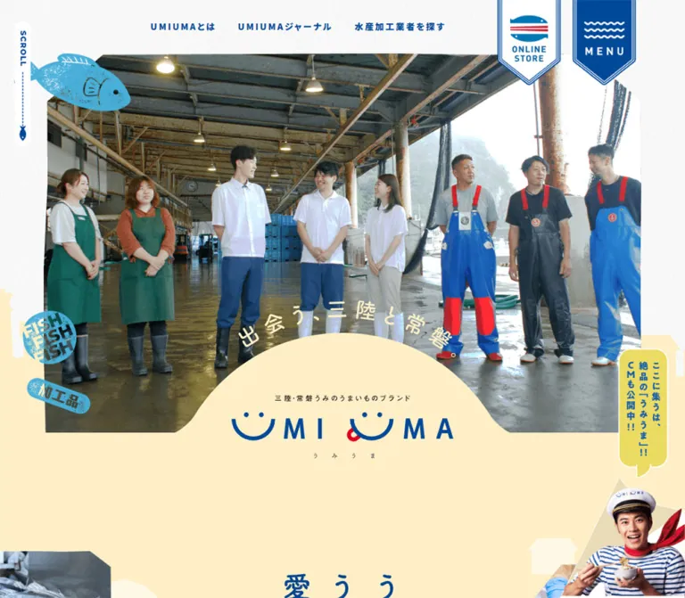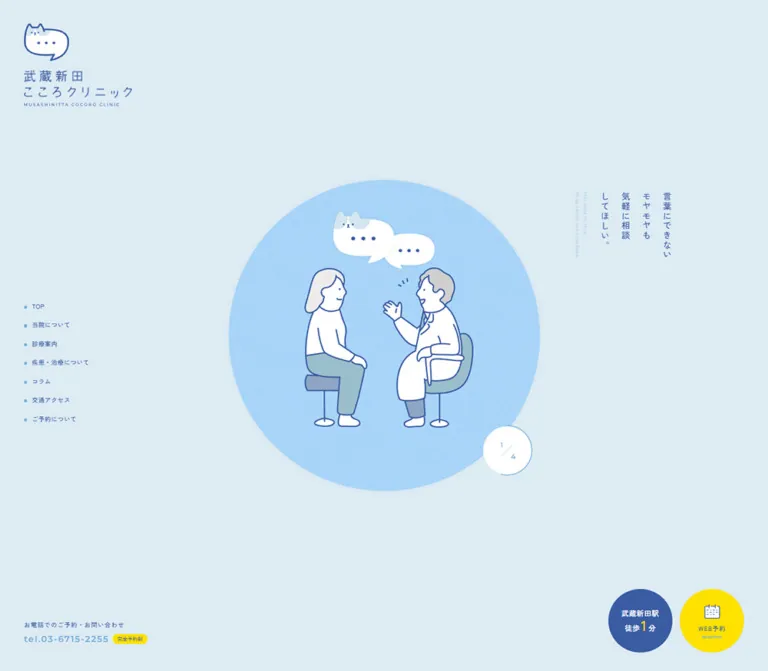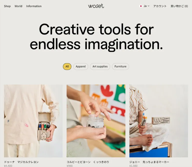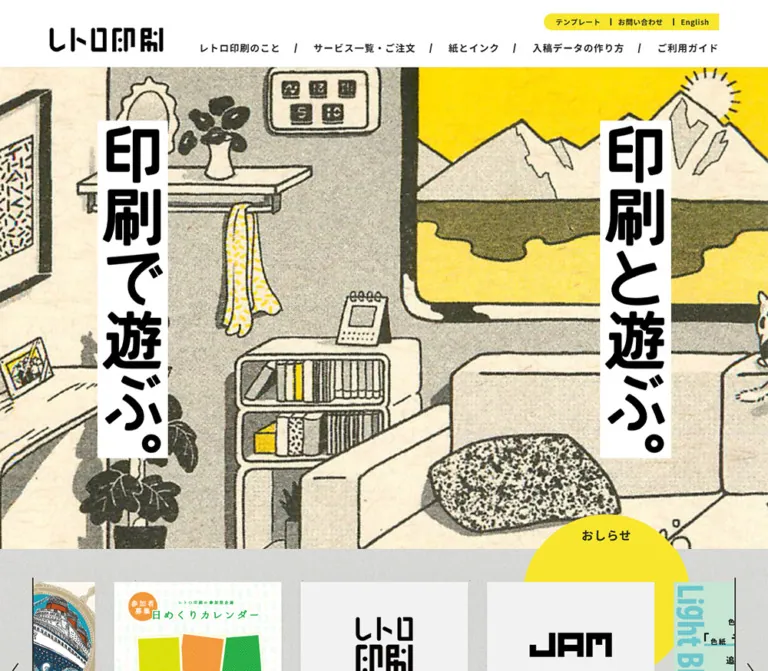
プレビュー準備中デザインリファレンスを見る
Morinaga COCOIKU PROJECT — Style Reference
A bright yellow playground where a cocoa mug becomes a companion for learning, cooking, and play.
Original URL: morinaga.co.jp/cocoa/milk/cocoiku/ Final URL: morinaga.co.jp/cocoa/milk/cocoiku/ — unchanged; supplied HTTP status: 200. Theme: a light presentation dominated by yellow, cocoa brown, and white. No theme selector was evidenced. Inspected: September 23, 2026, 06:42 JST / September 22, 2026, 21:42 UTC, through the supplied browser observations. Viewports: 1440 × 1000 and 390 × 844 CSS pixels. Scope: the current main page, including the captured opening, character profile, and closing product composition; rendered DOM and computed-style evidence additionally cover preparation steps, music controls, downloads, learning links, quizzes, recipes, products, sharing, the corporate footer, and cookie notice. Linked pages and files were not opened.
This is a substantial brand and educational content hub. It introduces cocoa preparation as something parents and children can do together, then expands into music, activities, learning, recipes, and product discovery. Its visual identity comes from a white mug character, generous yellow space, rounded Japanese typography, cocoa-colored controls, and occasional oversized decorative lettering.
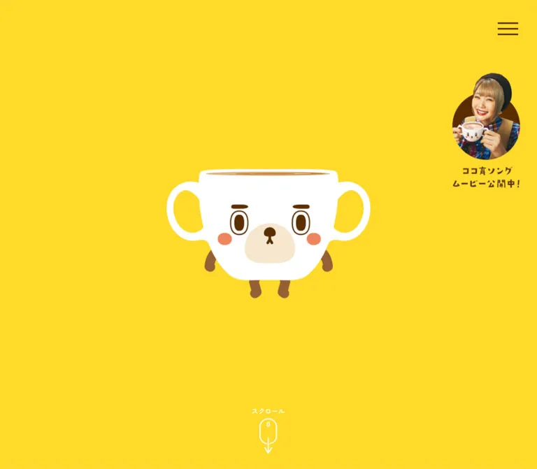
The opening is unusually sparse: a small character occupies the center of a full-height yellow field, with a menu in the upper-right corner. Later content becomes denser while retaining narrow centered desktop columns. The closing composition combines realistic cocoa photography with the illustrated character, bringing the playful world back to the physical drink.
閉じる
Morinaga COCOIKU PROJECT — Style Reference
A bright yellow playground where a cocoa mug becomes a companion for learning, cooking, and play.
Original URL: morinaga.co.jp/cocoa/milk/cocoiku/ Final URL: morinaga.co.jp/cocoa/milk/cocoiku/ — unchanged; supplied HTTP status: 200. Theme: a light presentation dominated by yellow, cocoa brown, and white. No theme selector was evidenced. Inspected: September 23, 2026, 06:42 JST / September 22, 2026, 21:42 UTC, through the supplied browser observations. Viewports: 1440 × 1000 and 390 × 844 CSS pixels. Scope: the current main page, including the captured opening, character profile, and closing product composition; rendered DOM and computed-style evidence additionally cover preparation steps, music controls, downloads, learning links, quizzes, recipes, products, sharing, the corporate footer, and cookie notice. Linked pages and files were not opened.
This is a substantial brand and educational content hub. It introduces cocoa preparation as something parents and children can do together, then expands into music, activities, learning, recipes, and product discovery. Its visual identity comes from a white mug character, generous yellow space, rounded Japanese typography, cocoa-colored controls, and occasional oversized decorative lettering.
The opening is unusually sparse: a small character occupies the center of a full-height yellow field, with a menu in the upper-right corner. Later content becomes denser while retaining narrow centered desktop columns. The closing composition combines realistic cocoa photography with the illustrated character, bringing the playful world back to the physical drink.
How to Read This Reference
- Measured values come from the supplied rendered DOM and computed styles. These include exact colors, declared font families, element rectangles, type sizes, and transition declarations.
- Visual estimates come from current-page captures 1–5. They describe visible artwork, borders, and compositions that were not individually measured in the DOM extract. They are not pixel-sampled values.
- Calculated values are arithmetic derived from measured rectangles, such as column gaps or proportions of the viewport.
- Recommended values and code are implementation guidance. They are not recovered source CSS.
- All custom-property names below are descriptive aliases. The supplied custom-property extraction was empty; that does not establish that the original has no CSS variables.
- The evidence includes five current-page screenshots, not a complete screenshot of every section. Components outside those captures are described from DOM evidence with corresponding limitations.
- The initial state was observed for at least five seconds. This does not establish the complete opening sequence, every animation state, or the results of clicking controls.
Tokens — Colors
Default Palette
| Name | Value | Suggested token | Role and evidence |
|---|---|---|---|
| Cocoa Yellow | #ffda2a |
--color-canvas |
Measured background of the body, opening header, introductory section, product section, and menu button |
| Cocoa Brown | #5a2e00 |
--color-cocoa |
Measured character captions, product text, filled links, sound controls, and quiz-card backgrounds |
| White | #ffffff |
--color-white |
Measured reversed labels, inactive carousel dots, white activity controls, and footer; also the visible mug and speech-bubble color |
| Activity Orange | #ff6e43 |
--color-activity |
Measured active carousel dot and cold-cocoa heading fill |
| Neutral Text | #222222 |
--color-neutral |
Measured base body and formal-notice text; not the principal brand-copy color |
Yellow is the continuous environment, rather than an occasional highlight. Brown supplies readable text, strong silhouettes, and compact navigation. White separates the character and selected controls from the saturated canvas. Orange is a secondary activity accent.
Use the computed colors as numerical anchors. Nearby colors in artwork or capture rendering should not be treated as additional exact CSS tokens without sampling or asset inspection.
Utility Palette
| Name | Value | Role |
|---|---|---|
| Consent Red | #b6002a |
Measured cookie acceptance fill and settings text |
| Corporate Link Red | #b50029 |
Measured inherited color on several corporate and image links; not necessarily visible through their artwork |
| Policy Blue | #3860be |
Measured underlined cookie-policy link |
| Correction Red | #ff0000 |
Measured heading color for the published correction notice |
| Close Gray | #555555 |
Measured cookie-notice close-button color |
Keep these utility roles separate from the yellow-and-brown brand system. The red cookie button is not evidence that general campaign actions should be red.
Artwork Colors
The character adds a pale cream muzzle, coral cheeks, caramel cocoa, and medium-brown limbs. The profile backdrop adds orange and muted ochre versions of oversized COMUG lettering. These are observed artwork colors, but exact asset values were not supplied. Preserve them through authorized artwork rather than inventing a second interface palette.
Tokens — Typography
Rounded Brand Typography
Measured leading family: Zen Maru Gothic.
The computed brand stack names Zen Maru Gothic first, followed by Hiragino Kaku Gothic variants, Meiryo, Osaka, and sans-serif. This is direct evidence of the intended family. The extract does not separately verify font-file loading or which face rendered each glyph.
Brand headings, explanatory copy, buttons, captions, and product information share this rounded Japanese character. Most emphasized text uses weight 700; descriptions and smaller resource links use 400. The usual brand line height is 1.8, with tracking of 0.02em.
Corporate and Formal Text
The base page, cookie notice, and footer use a conventional Japanese sans-serif stack led by Hiragino Kaku Gothic and Meiryo. The correction notice also uses this more conventional stack instead of Zen Maru Gothic.
This separation is useful: playful content feels friendly, while legal and corrective information remains straightforward. Do not apply the rounded campaign face indiscriminately to every corporate utility.
Graphic Headings and Ruby
Several h1, h2, and h3 elements have empty extracted text and substantial rendered boxes. Their default computed 13px font size is not a measurement of visible graphic lettering. The specific image or background assets used for these headings were not exposed.
Small phonetic readings appear above Japanese words in the profile and other child-oriented copy. Preserve ruby structure when rebuilding live text. The extracted text sometimes concatenates a word with its reading; do not reproduce that concatenation as ordinary copy.
Type Scale
Values below are measured. Sizes and line heights are in CSS pixels.
| Role | Desktop size / line height | Mobile size / line height | Weight | Tracking |
|---|---|---|---|---|
| Base body | 13 / 23.4 |
13 / 23.4 |
400 | Normal |
| Profile heading | 26 / 46.8 |
16.64 / 29.952 |
700 | 0.02em |
| Character caption | 20 / 36 |
14.56 / 26.208 |
700 | 0.02em |
| Preparation step label | 28 / 25.2 |
14.56 / 13.104 |
700 | 0.02em |
| Cold-cocoa heading | 24 / 43.2 |
16.64 / 29.952 |
700 | 0.05em |
| Sound label | 51 / 91.8 |
33.28 / 59.904 |
700 | 0.02em |
| Sound ON/OFF | 64 / 115.2 |
37.44 / 67.392 |
700 | 0.02em |
| Song download link | 24 / 43.2 |
16.64 / 29.952 |
700 | 0.02em |
| Wallpaper size link | 14 / 25.2 |
12.48 / 22.464 |
400 | 0.02em |
| Learning link | 15 / 27.273 |
14.56 / 26.473 |
400 | 0.02em |
| Adult-reading banner | 28 / 50.4 |
16.64 / 29.952 |
700 | 0.02em |
| Product title | 15 / 27 |
14.56 / 26.208 |
700 | 0.02em |
| Product description | 14 / 25.2 |
12.48 / 22.464 |
400 | 0.02em |
| Product link | 13 / 23.4 |
12.48 / 22.464 |
700 | 0.02em |
| Share heading | 24 / 24 |
18.72 / 18.72 |
700 | 0.02em |
| Share sublabel | 12 / 12 |
10.4 / 10.4 |
700 | 0.02em |
| Correction heading | 18 / 32.4 |
16.64 / 29.952 |
700 | 0.1em |
| Cookie buttons | 13.008 / 15.610 |
Same | 600 | 0.01em |
The large sound controls are a specific feature, not a general display-heading scale. The opening capture has no oversized live-text sales headline.
Tokens — Spacing & Shapes
Responsive Unit
The root is measured at 16px on both viewports, while the body remains 13px. Mobile dimensions often use multiples of 1.04px, but the actual source formulas and breakpoint were not provided.
At 390px wide, the following viewport expressions reproduce measured values:
| Measurement | Measured value | Equivalent expression at this viewport |
|---|---|---|
| Main side inset | About 20.8px |
5.3333vw |
| Main content width | About 348.4px |
89.3333vw |
| Menu-button side | About 41.6px |
10.6667vw |
| Common medium heading | 16.64px |
4.2667vw |
| Character caption | 14.56px |
3.7333vw |
| Small product copy | 12.48px |
3.2vw |
| Carousel arrow side | About 31.2px |
8vw |
These are equivalent calculations, not recovered declarations. Components scale differently: product titles barely shrink, whereas sound controls shrink substantially. Avoid applying one global scale factor to the desktop page.
Spacing Scale
| Use | Desktop | Mobile | Evidence |
|---|---|---|---|
| Main column side margins | 370px |
About 20.8px |
Measured at inspected widths |
| Menu edge inset | 30px |
About 15.6px |
Measured button position |
| Product title-to-copy separation | 8px |
About 5.19px |
Calculated from rectangles |
| Recipe-grid gap | 20px |
About 10.39px |
Calculated horizontally and vertically |
| Product-column gap | 65px |
About 25.98px |
Calculated |
| Song-download vertical gap | 20px |
About 10.39px |
Calculated |
| Wallpaper-link vertical gap | 10px |
About 8.31px |
Calculated |
| Share-icon gap | 10px |
About 10.39px |
Calculated |
| Product-section top padding | 64px |
About 41.59px |
Measured |
The overall rhythm alternates large theatrical spaces with compact groups of useful controls. Do not distribute every item with the same generous card-grid spacing.
Border Radius
| Element | Desktop | Mobile | Status |
|---|---|---|---|
| Menu button | 6px |
3.12px |
Measured; its yellow surface blends into the canvas |
| Recipe tile | 20px |
10.4px |
Measured |
| Quiz button | 20px |
15.6px |
Measured |
| Product link | 20px |
15.6px |
Measured |
| Song-download link | 40px |
40px |
Measured |
| Wallpaper size link | 7px |
5.2px |
Measured |
| Cold-cocoa heading | 36px |
20.8px |
Measured |
| Carousel dot | 50% |
50% |
Measured |
| Cookie buttons | 2px |
2px |
Measured |
| Profile outer frame | Approximately 40px |
Not visually inspected | Desktop visual estimate |
Layout Measurements
| Element | Desktop: 1440 × 1000 | Mobile: 390 × 844 |
|---|---|---|
| Opening header | 1440 × 1000px |
390 × 844px |
| Opening H1 box | 850 × 618.80px |
390 × 283.91px |
| Visible opening mascot | Approximately 400 × 254px |
Approximately 240 × 152px |
| Common content column | 700px |
About 348.4px |
| Menu button | 54 × 54px |
About 41.59 × 41.59px |
| Preparation arrows | 40 × 40px |
About 31.19 × 31.19px |
| Preparation dot | 16 × 16px |
About 10.39 × 10.39px |
| Song download | 480 × 74px |
About 348.39 × 41.59px |
| Promotional banner link | 700 × 322.81px |
312 × 144.14px |
| Recipe tile | 220 × 220px |
About 109.19 × 109.19px |
| Product text/link width | 190px |
About 161.19px |
| Product link height | 32px |
About 31.19px |
| Share link | 40 × 40px |
About 31.19 × 31.19px |
| Corporate footer | About 89.78px high |
About 116.17px high |
| Document height | About 22,661px |
About 18,279px |
Only the visible mascot dimensions are screenshot estimates. The much larger H1 rectangle includes layout space and must not be used as the character's visible silhouette size.
Components
Opening Character Stage
Role: establish the character and atmosphere before the denser content.
The captured opening contains a white mug character near the exact viewport center. The desktop silhouette spans approximately x=520–920 and y=371–625. The mobile silhouette spans approximately x=75–315 and y=345–497. Both retain abundant uninterrupted yellow space.
The face combines a cream muzzle, dark oval eyes and brows, coral cheeks, and small brown limbs. Two large mug handles double as ear-like shapes. The illustration uses clean, smooth edges and flat fills, with a restrained cocoa swirl at the rim.
A small white スクロール cue is visible near the bottom of the desktop capture, partly covered by the cookie notice. Its complete motion and mobile visibility are unverified.
The opening remains viewport-sized behind the cookie overlay. Do not vertically center the mascot within only the unobscured area above the notice.
Persistent Menu Control
Role: access navigation without occupying a conventional header bar.
Three thin brown horizontal strokes sit in the upper-right corner. The desktop button is 54px square, 30px from the top and right edges. The mobile button is about 41.6px square with 15.6px edge offsets. The visible strokes are smaller than these button boxes: approximately 40px wide on desktop and 27px on mobile.
The menu remains in the same visual location across the supplied scroll positions. The opened menu, its link inventory, focus behavior, and dismissal mechanism were not captured.
Parent-and-Child Introduction
Role: explain the project's educational premise.
The rendered copy describes measuring, pouring, kneading, stirring, and warming cocoa as meaningful challenges for children. It is centered in a narrower text region: 595px on desktop and approximately 348.4px on mobile. Computed copy uses brown Zen Maru Gothic at 13px with 23.4px line height.
A graphic heading box precedes or overlaps this region in the reported geometry. Its artwork was not separately supplied, so do not infer the visible heading's typography from its inherited font size.
Character Profile Panel
Role: turn the mascot into a recognizable personality.
The desktop capture shows a yellow panel about 700px wide, outlined with an approximately 6px brown stroke and large rounded corners. A brown capsule overlaps the top border. Its white heading reads コマグちゃんはこんな子, with a small phonetic reading above the final character.
The panel contains, in order:
- A large character illustration.
- A centered bold character caption.
- A compact two-column profile table.
The visible caption is あたたかくて、ついついウトウト。, paired with a sleepy expression. Other captions are present in the DOM at nearly identical coordinates. This supports a multi-state presentation, but not a specific autoplay or scroll-transition mechanism.
The table is approximately 544px wide in the screenshot. Brown cells carry white rounded text, separated by thin yellow rules. The label column is approximately 37% of the table width. Labels start with a white circular bullet and include small readings where needed. Five rows describe personality, charm point, special skill, favorite thing, and distinguishing trait.
Behind the panel, enormous cropped COMUG lettering repeats in brown, ochre, and orange, with small character instances between letters. Visible glyph heights are roughly 100–110px, with a row pitch around 164px. Treat this as a decorative backdrop; its font or asset construction was not established.
Cocoa Preparation Carousel
Role: present a short preparation sequence as individual illustrated steps.
The DOM contains a start state plus steps 1–5, repeated three times. Repeated text and offscreen coordinates are consistent with carousel clones; they should not become eighteen separate instructions in a reconstruction.
Measured structure includes paired arrows, a horizontal sequence, a step-label box, and six pagination dots. Desktop slide positions advance by 800px; mobile positions advance by approximately 343.19px. These are measured strides, not confirmed slide-image widths.
The step-label box is 152px square on desktop and about 83.19px square on mobile. Its short label uses an unusually tight line height of 0.9. Inactive dots are white; the selected dot is orange. The desktop and mobile snapshots show different selected indices, which does not establish autoplay.
Cold-Cocoa Instructions
Role: supplement the warm preparation sequence.
The heading 冷たいココアの作りかた appears in an orange capsule with white bold text. Its measured box is 432 × 57px on desktop and approximately 291.19 × 41.59px on mobile. Three numbered instructions follow in the rendered text.
The heading has color and border transition declarations, but it is reported as an H3. Expansion, accordion behavior, and click results were not verified. Do not turn this into an accordion solely because its shape resembles a button.
Song Controls and Downloads
Role: combine an audiovisual activity with printable resources.
This section gives sound a conspicuous interface: a large brown サウンド label and oversized ON and OFF controls. On desktop, the label is 51px and the controls are 64px; on mobile, they become 33.28px and 37.44px respectively.
Below them are two stacked brown pill links with white bold labels for the song score and lyric sheet. Each measures 480 × 74px on desktop, shrinking to the mobile content width and about 41.6px high. Desktop separation is 20px; mobile separation is about 10.4px.
The controls' presence is confirmed. Audio playback, initial sound state, synchronization, and persistence are not.
Promotional Banner Carousel
Role: connect the project to related cocoa destinations.
The extract contains two distinct linked destinations repeated across a carousel: the Senobi section and the cocoa overview. A central desktop link measures 700 × 322.81px; its mobile equivalent measures 312 × 144.14px and starts at x=39px.
Paired navigation arrows and two pagination dots are measured. The actual banner artwork is not shown in the supplied current-page screenshots, so its photography, lettering, and imagery should not be inferred from destination names.
Play and Wallpaper Downloads
Role: provide activities and character artwork to keep.
The まちがいさがし control uses brown text on a white pill: 312 × 48px on desktop and about 228.78 × 36.39px on mobile.
Three wallpaper groups each offer four size links: 320×568px, 375×667px, 720×1280px, and 1920×1080px. The three groups remain side by side at 390px wide. Individual links change from 140 × 28px to approximately 83.19 × 26px, with shallow rounded corners rather than full capsule ends.
Desktop and smartphone setup instructions follow. The button and link anatomy is measured, but the spot-the-difference activity's opened state and wallpaper image contents were not inspected.
Learning Links and Correction Notice
Role: organize experiments and background knowledge while retaining formal editorial information.
Two learning groups sit beside each other on desktop and stack vertically on mobile. The measured heading boxes are about 282.5px wide on desktop and 268.97px on mobile. Link copy is 15px desktop and 14.56px mobile, with generous line height.
The link text is measured as white. Its complete surrounding surface was not captured, so a specific section background should not be asserted from the links alone.
A published correction follows, headed お詫びと訂正 in red. It switches to a conventional Japanese sans-serif, dark body text, and distinct original/corrected information. The inner text width is 634px desktop and approximately 302.8px mobile. Preserve the formal treatment and readable hierarchy rather than styling this notice as another playful activity.
Cocoa Knowledge Cards
Role: invite exploration of six cocoa and chocolate questions.
A brown banner with white text introduces the activity. Six brown rounded buttons follow. Desktop placement uses three column origins at x=370, 610, and 850px, across two rows. The sampled button widths vary from about 139.8 to 211.1px; do not describe these as six measured 220px-wide cards.
On mobile, the layout becomes two columns and three rows. Buttons are consistently about 166.39 × 226.36px, with approximately 15.6px horizontal separation, 15.6px padding, and 15.6px corners.
The desktop buttons declare a transform transition. Answer displays, card flips, dialogs, or reveal behavior were not captured. The inherited button text color also does not establish the final color of nested artwork or labels.
Recipe Tiles
Role: provide compact entry points into six recipes.
Six linked square tiles form a three-by-two grid on both inspected viewports. Desktop tiles are 220px square with 20px gaps and corners. Mobile tiles are approximately 109.19px square with 10.39px gaps and 10.4px corners.
The destinations and recipe names are confirmed by the rendered links. The individual tile imagery and title overlays were not visually captured, so their detailed composition remains unverified.
Product Directory
Role: connect educational engagement with the cocoa product family.
Five unboxed product groups contain a package image, title, short description, and compact brown destination link. The yellow canvas continues behind the whole group; the visible products are not placed inside white cards.
Desktop uses three items followed by a centered row of two. Text columns are 190px wide with 65px horizontal gaps. Mobile uses two items, then two, then a centered final item. Mobile columns are approximately 161.19px wide with 25.98px gaps.
Product names are bold brown; descriptions are regular brown with relaxed line spacing. Destination links have white bold labels and a small right-facing chevron. Desktop links are 190 × 32px; mobile links are approximately 161.19 × 31.19px. Links align within each product row despite different description lengths.
The mobile screenshot shows the final セノビー group centered above the closing illustration. Preserve this deliberate final-row centering.
Closing Cocoa Composition and Sharing
Role: end with an appetizing image and a small sharing invitation.
A large photographic white mug filled with foamy cocoa rises from the bottom. The illustrated character sits over its rim, accompanied by a white speech bubble reading ココアはやっぱり モリナガ♪.
In the desktop capture, the visible cocoa rim spans approximately 700px, while the handle extends the composition farther right. The character is approximately 315px wide. On mobile, the rim approaches the full content width and the character is approximately 155px wide. These are visual estimates; the full photographic asset boundary is not exposed.
The desktop share group overlays the pale cup body: Let’s share, a small Japanese sublabel, and circular Facebook and X marks. Link boxes measure 40px square on desktop and about 31.19px on mobile. The visible X mark still points to a twitter.com/share URL in the evidence.
Cookie Notice and Corporate Footer
Role: provide corporate consent and legal utilities alongside the campaign.
The cookie notice is a persistent white bottom overlay with a thin dark border and visible separation from the yellow page. On desktop it occupies approximately the bottom 88px. On mobile it begins near y=576px and occupies about 268px, nearly 32% of the viewport.
Desktop anatomy is horizontal: explanatory text, an underlined policy link, settings, a red OK button, and a close mark at the far right. Mobile rearranges this into a paragraph, centered settings control, and a nearly full-width acceptance button. The close button remains at the upper-right of the notice.
The acceptance button is measured at 125 × 41.61px desktop and 350 × 41.61px mobile. The close-button box is 44px square on both. The notice was not dismissed in the supplied captures; preference-dialog contents and consent results are unverified.
The separate footer is white and uses conventional sans-serif text. It contains privacy and terms links, a corporate home link, and Copyright © MORINAGA & CO., LTD. All rights reserved. This independently supports the site's Morinaga identity. No production credit is established by the inspected page evidence.
Tokens — Motion & Interaction
| Treatment | Measured declaration or observation | Limit |
|---|---|---|
| Preparation and banner dots | transform 0.2s linear |
Target scale and trigger were not supplied |
| Desktop song and product links | color 0.2s, background-color 0.2s |
Hover/focus end colors were not captured |
| Cold-cocoa heading | Background, border, and text-color transitions of 0.2s |
Does not establish an accordion |
| Desktop promotional image links | opacity 0.3s |
Final opacity and trigger unverified |
| Desktop knowledge buttons | transform 0.2s |
Does not establish flipping or answer presentation |
| Character profile | Several captions share nearly identical positions; captured illustration has a sleepy expression | Sequence, triggers, and duration unverified |
| Opening geometry | Main content begins at y=6000 desktop and y=5064 mobile | Suggests a staged opening, but does not establish its animation implementation |
| Persistent utilities | Menu and cookie notice retain their viewport locations across supplied captures | Opened states were not exercised |
The main-content offsets equal six inspected viewport heights: 6 × 1000 and 6 × 844. This is strong geometric evidence of an extended opening region. It is not permission to recreate six blank screens or invent a scroll-scrubbed animation timeline.
Many sampled nodes report animation: none. This does not rule out JavaScript transforms, animated images, descendant motion, or other unmeasured effects. Likewise, a reported transition: all without a duration is not evidence of a visible timed transition.
For a new implementation, use the confirmed short 200–300ms control transitions where appropriate. Add any character motion only as an explicitly designed addition, with a static alternative. Do not claim a particular bounce, blink, parallax effect, or audio synchronization as observed.
Surfaces
| Layer | Appearance | Function |
|---|---|---|
| Main canvas | Solid yellow | Continuous setting across opening, profile, products, and closing composition |
| Profile frame | Yellow interior, thick brown outline | Groups the character without introducing a white card |
| Profile table | Brown cells, white text, yellow dividers | Compact character information |
| Primary brand links | Brown capsules with white labels | Downloads and product destinations |
| Secondary activity controls | White with brown text | Play control and wallpaper links |
| Activity accent | Orange pill or dot | Cold-cocoa heading and selected carousel state |
| Character and speech bubble | White artwork | High-contrast focal points within the yellow scene |
| Corporate utilities | White surfaces, conventional text, red or blue utility accents | Consent and legal information |
The captured brand sections do not use a general shadow-elevation system. Separation comes from color, outlines, silhouettes, and overlap. The cookie notice has its own utility-layer treatment and should not establish a shadow style for every component.
Imagery
The character illustration is the primary identity asset. Preserve its distinctive double handles, cream muzzle, coral cheeks, narrow brows, cocoa rim, and short limbs. It should remain visually smooth rather than pixelated, textured, or converted into a generic outline icon.
The profile stage uses character scale and repetition: a large central figure is surrounded by tiny figures and enormous cropped lettering. The closing scene uses a different contrast—flat illustration against realistic product photography. Package images retain their printed colors and stand independently on yellow.
Use transparent or carefully isolated images for the mascot and packaging. Preserve the full character silhouette and package shape. The closing mug may deliberately extend beyond its section's visible frame, but text and interactive controls should not be clipped with it.
Observed Asset References
Paths below are relative to the inspected original page. Their links were present in the rendered evidence; file contents were not opened.
| Asset or resource | Observed path | Evidence scope |
|---|---|---|
| Wallpaper A, small phone | assets/images/wallpaper_comug_a_320_568.jpg |
Direct image link |
| Wallpaper A, phone | assets/images/wallpaper_comug_a_375_667.jpg |
Direct image link |
| Wallpaper A, large phone | assets/images/wallpaper_comug_a_720_1280.jpg |
Direct image link |
| Wallpaper A, desktop | assets/images/wallpaper_comug_a_1920_1080.jpg |
Direct image link |
| Wallpaper B, phone | assets/images/wallpaper_comug_b_375_667.jpg |
Direct image link; other three sizes also present |
| Wallpaper C, phone | assets/images/wallpaper_comug_c_375_667.jpg |
Direct image link; other three sizes also present |
| Song score | assets/pdf/cocoiku_song_score.pdf |
Download destination only |
| Lyric sheet | assets/pdf/cocoiku_song_lyric_sheet.pdf |
Download destination only |
| Opening/profile mascot | Filename not exposed | Visible in current captures |
| Closing mug photograph | Filename not exposed | Visible in current captures |
| Product packages | Filenames not exposed | Visible in current captures |
Do not substitute the wallpaper files for the opening artwork without inspecting them. CSS can reproduce the layout, but the mascot and photographic assets carry much of the page's identity.
Layout & Responsive Behavior
A Narrow Desktop Content Spine
Much of the desktop content occupies a centered 700px column, leaving 370px on either side at 1440px wide. Decorative backgrounds and the closing photograph extend beyond that spine. The opening uses the full viewport rather than the content column.
The mobile content spine is approximately 348.4px wide, leaving 20.8px side margins. Smaller components choose their own widths inside it; the promotional banner, for example, is only 312px wide.
Different Sections Reflow Differently
| Section | Desktop | Mobile |
|---|---|---|
| Opening | Centered character with extensive empty space | Same centered composition; character becomes proportionally larger relative to width |
| Learning groups | Two side-by-side groups | Two vertically stacked groups |
| Knowledge cards | Three positions per row, two rows | Two equal columns, three rows |
| Recipes | Three columns, two rows | Still three columns, two rows |
| Wallpaper groups | Three columns | Still three columns |
| Products | Three items, then centered two | Two items, two items, then centered one |
| Cookie notice | Horizontal utility strip | Tall stacked panel |
| Footer | Compact horizontal organization | Taller stacked organization |
The recipe grid is a particularly important exception to generic responsive defaults. Collapsing every section to one column would substantially change the actual mobile composition.
Long-Page Geometry
The supplied document heights are about 22,661px desktop and 18,279px mobile. Main content begins after an opening region equivalent to six viewport heights. The character section itself reports approximately 4540px desktop and 3678px mobile, much taller than the single visible profile panel.
These measurements suggest staged presentation and reserved scroll distance, but the supplied data does not expose the complete relationship between scrolling and character states. Preserve content order and visual hierarchy in a new implementation; reconstruct long scroll ranges only when the actual interactive sequence is available.
Occlusion and Small Screens
The mobile cookie notice hides much of the lower page in both supplied mobile captures, including the lower closing photograph and sharing area. That occlusion must not be interpreted as missing mobile content: the mobile DOM still includes the share controls and footer.
No tablet, intermediate breakpoint, landscape, browser-chrome resize, or orientation-change capture was supplied. The breakpoint and interpolation used in the Quick Start are recommendations, not original source facts.
Do’s and Don’ts
Do
- Make yellow the environment and brown the principal readable ink.
- Preserve the opening's small centered character and substantial empty space.
- Use Zen Maru Gothic as the intended brand family, with robust Japanese fallbacks.
- Keep ruby readings attached to the relevant Japanese words.
- Distinguish graphic heading artwork from live text measurements.
- Preserve the framed profile, brown information table, and oversized decorative lettering.
- Keep product groups unboxed and center incomplete final rows.
- Retain three mobile columns for the observed recipe and wallpaper groups.
- Use full package silhouettes and smooth character artwork.
- Separate corporate consent styling from the playful campaign controls.
- Label unverified motion and interaction behavior explicitly.
Don't
- Don't replace the captured opening with an invented headline, signup form, or oversized CTA.
- Don't stretch the mascot to fill the desktop column or mistake its H1 box for its visible size.
- Don't turn every section into a white rounded card with a drop shadow.
- Don't use the cookie notice's red as the general campaign action color.
- Don't assume carousel clones are additional content steps.
- Don't infer autoplay from different selected slides in different snapshots.
- Don't invent answer dialogs, menu transitions, or sound behavior from control labels alone.
- Don't shrink every desktop measurement by one uniform mobile factor.
- Don't hardcode thousands of pixels of empty scroll space without the corresponding experience.
- Don't fabricate filenames for the mascot, headings, or closing photograph.
Recommended Implementation Additions
These are recommendations for a new implementation, not verified original features:
- Give the menu, carousel arrows, dot controls, sound buttons, close button, and share links explicit accessible names and states.
- Increase small control hit areas to at least 44px without enlarging every visible dot or icon. The measured mobile arrows, product links, wallpaper links, and dots are smaller than that target.
- Preserve visible focus indicators in cocoa brown or another sufficiently contrasting color.
- Make recipe and learning names available as live or accessible text when their visual presentation uses images.
- Keep carousel clones out of the accessibility reading order and expose the current step clearly.
- If an opening scroll sequence is implemented, provide a direct route to the content and a reduced-motion version without prolonged empty travel.
- Use explicit user control for sound and retain a usable muted experience.
- Ensure the consent panel remains operable with enlarged text and short viewports. Its contents may need their own height limit and scrolling.
- Reserve intrinsic image dimensions to prevent the character and large closing photograph from shifting surrounding content during decoding.
- Preserve formal notices in readable live text and maintain their heading structure.
Agent Prompt Guide
Quick Color Reference
- Main canvas: measured
#ffda2a. - Brand text, filled links, and strong outlines: measured
#5a2e00. - Character, reversed text, inactive dots, and secondary controls: white.
- Selected carousel state and cold-cocoa heading: measured
#ff6e43. - Cookie acceptance: measured
#b6002a, confined to the utility interface. - Decorative lettering and character facial colors: use artwork; exact color values are unverified.
Overall Prompt
“Build a Japanese parent-and-child cocoa content hub inspired by the current Morinaga COCOIKU PROJECT page. Use a continuous yellow #ffda2a canvas, cocoa-brown #5a2e00 text and controls, Zen Maru Gothic, and a smooth white mug mascot. Begin with a full-height, mostly empty stage containing a centered character and an upper-right three-line menu. Organize later content around a 700px desktop column: a rounded brown-outlined character profile, preparation steps, music resources, activities, learning links, compact recipes, and unboxed product groups. Use brown capsules with white labels, restrained orange active states, and ruby readings where appropriate. End with an oversized realistic cocoa mug, the illustrated character on its rim, a white speech bubble, and compact sharing links. Match each section's observed mobile layout rather than collapsing everything to one column. Treat animation timing and unobserved opened states as separate design decisions.”
Example Component Prompts
- Opening stage: “A viewport-height yellow scene with a white double-handled cocoa mug character centered horizontally and vertically. The visible mascot is approximately 400px wide on desktop and 240px at a 390px phone width. Keep the upper-right menu small, preserve broad empty space, and do not add a visible promotional headline.”
- Character profile: “A centered 700px yellow panel with a thick cocoa-brown outline and rounded corners. Overlap the top border with a brown capsule carrying a white Japanese heading. Place a large character, a centered bold caption, and a brown two-column profile table with white text and yellow dividers. Behind it, crop oversized repeating COMUG lettering and tiny character instances.”
- Product directory: “Five product groups directly on yellow, each with an isolated package, small bold brown title, relaxed brown description, and compact brown capsule link with a white chevron. Use three plus two centered items on desktop, and two plus two plus one centered item on mobile.”
- Recipe grid: “Six rounded square linked tiles in three columns at both desktop and phone widths. Use 220px tiles and 20px gaps within a 700px desktop column; at 390px viewport width, use approximately 109px tiles and 10.4px gaps. Do not invent unseen tile artwork.”
- Closing composition: “Place a large realistic white mug of foamy cocoa beneath the product directory. Sit the illustrated mug character over the rim and put a white speech bubble to its upper-right. On desktop, center a small brown sharing group over the pale cup body. Preserve the contrast between flat illustration and photographic texture.”
Quick Start
CSS Custom Properties
This is an implementation adaptation, not the original stylesheet. It reproduces measured colors, major desktop dimensions, and the observed mobile arrangements. The 767px breakpoint, image-slot heights, profile spacing, and decorative frame values are recommendations or visual approximations. It deliberately does not invent the opening animation or unseen interactive states.
Load an authorized Zen Maru Gothic font separately if required. Supply actual character, package, recipe, and closing-photo assets through image elements. The CSS does not fabricate their URLs.
The product list expects five direct children. The profile information uses a semantic table; the menu button contains three decorative spans; pagination uses buttons with aria-current on the selected item.
:root {
  /* Measured palette */
  --color-canvas: #ffda2a;
  --color-cocoa: #5a2e00;
  --color-white: #ffffff;
  --color-activity: #ff6e43;
  --color-neutral: #222222;
  --color-consent: #b6002a;
  --color-policy: #3860be;

  /* Latin-name equivalents of the observed fallback families */
  --font-playful: 'Zen Maru Gothic', 'Hiragino Kaku Gothic Pro',
    Meiryo, Osaka, sans-serif;
  --font-utility: 'Hiragino Kaku Gothic ProN',
    'Hiragino Kaku Gothic Pro', Meiryo, sans-serif;

  --content-max: 700px;
  --page-gutter: 24px;
  --brand-leading: 1.8;
  --brand-tracking: 0.02em;
  --profile-heading-size: 26px;
  --caption-size: 20px;
  --product-title-size: 15px;
  --product-copy-size: 14px;
  --product-link-size: 13px;
  --product-width: 190px;
  --product-gap: 65px;
  --tile-gap: 20px;
  --tile-radius: 20px;
  --dot-size: 16px;
  --control-time: 200ms;
}

.cocoiku,
.cocoiku *,
.consent,
.consent * {
  box-sizing: border-box;
}

.cocoiku {
  margin: 0;
  color: var(--color-cocoa);
  background: var(--color-canvas);
  font-family: var(--font-playful);
  font-size: 13px;
  line-height: var(--brand-leading);
  letter-spacing: var(--brand-tracking);
}

.cocoiku img {
  display: block;
  max-inline-size: 100%;
  block-size: auto;
}

.cocoiku button,
.cocoiku a {
  font: inherit;
  letter-spacing: inherit;
}

.content-column {
  inline-size: min(
    var(--content-max),
    calc(100% - var(--page-gutter) - var(--page-gutter))
  );
  margin-inline: auto;
}

/* Static opening adaptation; no invented scroll timeline */
.opening-stage {
  position: relative;
  display: grid;
  place-items: center;
  min-block-size: 100vh;
  min-block-size: 100svh;
}

.opening-mascot {
  inline-size: min(400px, 61.5385vw);
}

.menu-toggle {
  position: fixed;
  z-index: 30;
  inset-block-start: 30px;
  inset-inline-end: 30px;
  display: grid;
  place-content: center;
  gap: 8px;
  inline-size: 54px;
  block-size: 54px;
  padding: 0;
  border: 0;
  border-radius: 6px;
  color: var(--color-cocoa);
  background: var(--color-canvas);
  cursor: pointer;
}

.menu-toggle span {
  inline-size: 40px;
  block-size: 3px;
  background: currentColor;
}

/* Frame geometry and spacing are visual approximations */
.profile-scene {
  position: relative;
  padding-block: 48px;
  background-color: var(--color-canvas);
  background-image: var(--comug-pattern, none);
}

.profile-card {
  position: relative;
  padding: 88px 72px 56px;
  border: 6px solid var(--color-cocoa);
  border-radius: 40px;
  background: var(--color-canvas);
}

.profile-card__title {
  position: absolute;
  inset-block-start: 0;
  inset-inline-start: 50%;
  transform: translate(-50%, -50%);
  display: grid;
  place-items: center;
  inline-size: min(432px, 90%);
  min-block-size: 56px;
  margin: 0;
  padding: 4px 16px;
  border-radius: 999px;
  color: var(--color-white);
  background: var(--color-cocoa);
  font-size: var(--profile-heading-size);
  font-weight: 700;
  text-align: center;
}

.profile-card__mascot {
  inline-size: min(400px, 100%);
  margin-inline: auto;
}

.profile-card__caption {
  margin-block: 48px 80px;
  font-size: var(--caption-size);
  font-weight: 700;
  text-align: center;
}

.profile-table {
  inline-size: 100%;
  border-collapse: collapse;
  color: var(--color-white);
  background: var(--color-cocoa);
  font-size: 18px;
  font-weight: 700;
  text-align: start;
}

.profile-table th,
.profile-table td {
  padding: 14px 16px;
  border: 2px solid var(--color-canvas);
  vertical-align: middle;
}

.profile-table th {
  inline-size: 37%;
}

.brand-pill {
  display: flex;
  align-items: center;
  justify-content: center;
  border: 0;
  border-radius: 999px;
  color: var(--color-white);
  background: var(--color-cocoa);
  font-weight: 700;
  text-align: center;
  text-decoration: none;
  transition: color var(--control-time),
    background-color var(--control-time);
}

.download-list {
  display: grid;
  gap: 20px;
  justify-items: center;
}

.download-link {
  inline-size: min(480px, 100%);
  min-block-size: 74px;
  padding: 8px 16px;
  font-size: 24px;
}

.carousel-dots {
  display: flex;
  justify-content: center;
  gap: 18px;
}

.carousel-dot {
  flex: 0 0 var(--dot-size);
  inline-size: var(--dot-size);
  block-size: var(--dot-size);
  padding: 0;
  border: 0;
  border-radius: 50%;
  background: var(--color-white);
  transition: transform 200ms linear;
}

.carousel-dot[aria-current='true'] {
  background: var(--color-activity);
}

.recipe-grid {
  display: grid;
  grid-template-columns: repeat(3, minmax(0, 1fr));
  gap: var(--tile-gap);
}

.recipe-tile {
  display: block;
  aspect-ratio: 1;
  overflow: hidden;
  border-radius: var(--tile-radius);
}

.recipe-tile img {
  inline-size: 100%;
  block-size: 100%;
  object-fit: cover;
}

.product-list {
  display: flex;
  flex-wrap: wrap;
  justify-content: center;
  gap: 48px var(--product-gap);
}

.product {
  display: flex;
  flex: 0 0 var(--product-width);
  flex-direction: column;
  min-inline-size: 0;
}

/* Recommended image slot; original image box was not measured */
.product__image {
  inline-size: 100%;
  block-size: 190px !important;
  margin-block-end: 16px;
  object-fit: contain;
}

.product__title {
  margin: 0;
  font-size: var(--product-title-size);
  font-weight: 700;
}

.product__description {
  margin-block: 8px;
  font-size: var(--product-copy-size);
}

.product__link {
  position: relative;
  min-block-size: 32px;
  margin-block-start: auto;
  padding: 4px 26px 4px 12px;
  font-size: var(--product-link-size);
}

.product__link::after {
  position: absolute;
  inset-inline-end: 16px;
  inline-size: 7px;
  block-size: 7px;
  border-block-start: 2px solid currentColor;
  border-inline-end: 2px solid currentColor;
  transform: rotate(45deg);
  content: '';
}

.share {
  display: grid;
  justify-items: center;
  gap: 10px;
  text-align: center;
}

.share__title {
  margin: 0;
  font-size: 24px;
  font-weight: 700;
  line-height: 1;
}

.share__links {
  display: flex;
  gap: 10px;
}

.share__link {
  display: grid;
  place-items: center;
  inline-size: 40px;
  block-size: 40px;
  border-radius: 50%;
  color: var(--color-white);
  background: var(--color-cocoa);
}

/* Recommended consent layout; widths match measured controls */
.consent {
  position: fixed;
  z-index: 100;
  inset-inline: 0;
  inset-block-end: 0;
  display: grid;
  grid-template-columns: minmax(0, 1fr) 125px 125px 44px;
  align-items: center;
  gap: 18px;
  padding: 20px 16px 20px 32px;
  border: 1px solid #000;
  color: var(--color-neutral);
  background: var(--color-white);
  font-family: var(--font-utility);
  font-size: 13.008px;
  line-height: 1.5;
  max-block-size: 100dvh;
  overflow-y: auto;
}

.consent__copy {
  max-inline-size: 760px;
  margin: 0;
}

.consent__copy a {
  color: var(--color-policy);
  font-weight: 700;
  text-decoration: underline;
}

.consent__settings,
.consent__accept {
  min-block-size: 42px;
  padding: 12px 10px;
  border: 0;
  border-radius: 2px;
  font: inherit;
  font-weight: 600;
  line-height: 1.2;
  cursor: pointer;
}

.consent__settings {
  color: var(--color-consent);
  background: var(--color-white);
  text-decoration: underline;
}

.consent__accept {
  color: var(--color-white);
  background: var(--color-consent);
}

.consent__close {
  inline-size: 44px;
  block-size: 44px;
  padding: 0;
  border: 0;
  color: #555;
  background: transparent;
  font-size: 24px;
  cursor: pointer;
}

/* Recommended focus treatment */
.cocoiku :focus-visible,
.consent :focus-visible {
  outline: 3px solid var(--color-cocoa);
  outline-offset: 4px;
}

/* Recommended breakpoint, calibrated to the 390px observation */
@media (max-width: 767px) {
  :root {
    --page-gutter: 5.333333vw;
    --profile-heading-size: 4.266667vw;
    --caption-size: 3.733333vw;
    --product-title-size: 3.733333vw;
    --product-copy-size: 3.2vw;
    --product-link-size: 3.2vw;
    --product-width: 41.333333vw;
    --product-gap: 6.666667vw;
    --tile-gap: 2.666667vw;
    --tile-radius: 2.666667vw;
    --dot-size: 2.666667vw;
  }

  .menu-toggle {
    inset-block-start: 4vw;
    inset-inline-end: 4vw;
    inline-size: 10.666667vw;
    block-size: 10.666667vw;
    gap: 5.5px;
    border-radius: 0.8vw;
  }

  .menu-toggle span {
    inline-size: 27px;
    block-size: 2px;
  }

  .profile-card {
    padding: 56px 16px 32px;
    border-width: 3px;
    border-radius: 24px;
  }

  .profile-card__title {
    min-block-size: 40px;
  }

  .profile-card__caption {
    margin-block: 28px 40px;
  }

  .profile-table {
    font-size: 14px;
  }

  .profile-table th,
  .profile-table td {
    padding: 10px 8px;
  }

  .download-list {
    gap: 2.666667vw;
  }

  .download-link {
    inline-size: 100%;
    min-block-size: 10.666667vw;
    padding: 4px 12px;
    font-size: 4.266667vw;
  }

  .carousel-dots {
    gap: 2.866667vw;
  }

  .product__image {
    block-size: 150px !important;
    margin-block-end: 12px;
  }

  .product__description {
    margin-block: 1.333333vw 2.666667vw;
  }

  .product__link {
    min-block-size: 8vw;
  }

  .share__title {
    font-size: 4.8vw;
  }

  .share__link {
    inline-size: 8vw;
    block-size: 8vw;
  }

  .consent {
    grid-template-columns: minmax(0, 1fr);
    gap: 16px;
    padding: 44px 19px 15px;
  }

  .consent__close {
    position: absolute;
    inset-block-start: 4px;
    inset-inline-end: 0;
  }
}

/* Recommended static alternative; JS timelines need equivalent handling */
@media (prefers-reduced-motion: reduce) {
  .cocoiku *,
  .cocoiku *::before,
  .cocoiku *::after {
    animation: none !important;
    transition: none !important;
    scroll-behavior: auto !important;
  }
}
This starter retains several compact measured controls for visual correspondence. Expand their interactive hit areas for production use. It provides no menu-opening logic, audio implementation, carousel engine, consent storage, or quiz-answer behavior.
Tailwind v4 Token Mapping
Optional aliases for a project already using Tailwind v4. This does not imply that the original site uses Tailwind. Define the custom properties above first.
@theme inline {
  --color-cocoa-yellow: #ffda2a;
  --color-cocoa-brown: #5a2e00;
  --color-cocoa-activity: #ff6e43;
  --color-consent-red: #b6002a;
  --font-cocoiku: var(--font-playful);
  --font-corporate: var(--font-utility);
  --spacing-content: var(--content-max);
  --spacing-page: var(--page-gutter);
  --spacing-product: var(--product-width);
  --radius-recipe: var(--tile-radius);
  --text-product-title: var(--product-title-size);
  --text-product-copy: var(--product-copy-size);
  --text-character-caption: var(--caption-size);
}
Sources & Evidence
- Inspected original and final page: COCOIKU PROJECT. Both supplied URLs are identical, with HTTP 200 and the rendered title
ココ育PROJECT | 森永製菓. - Capture timestamp:
2026-09-22T21:42:00.098Z, equivalent to September 23, 2026, 06:42:00.098 JST. - Desktop evidence: 1440 × 1000 CSS-pixel viewport; current captures of the opening, character profile, and closing products/photograph; rendered DOM and computed-style samples across the main document.
- Mobile evidence: 390 × 844 CSS-pixel viewport; current captures of the opening and final product/closing composition; corresponding rendered DOM and computed-style samples.
- Measured evidence: element rectangles, declared font stacks, font sizes, line heights, tracking, colors, selected padding and radii, link destinations, and transition strings supplied in the observation.
- Observed navigation scope: scroll traversal represented by the captures. No supplied click results establish menu behavior, carousel controls, quiz answers, sound playback, sharing completion, or consent changes.
- Readiness limitations: the supplied process waited for document load, visible image decoding, sampled layout/text stability, and relevant finite animations, subject to time limits. Perpetual animations were paused during readiness checks and resumed afterward. These procedures do not prove complete delayed content or every motion state.
- Inspection limits: shared workers and service workers were disabled. Full stylesheets, animation scripts, asset inventories, child-page rendering, tablet layouts, and keyboard interaction results were not supplied. Linked downloads and destination pages were not opened.
This reference describes the current supplied page state. Numerical source facts, screenshot estimates, calculated relationships, and implementation recommendations are identified separately throughout.
# Morinaga COCOIKU PROJECT — Style Reference

> A bright yellow playground where a cocoa mug becomes a companion for learning, cooking, and play.

**Original URL:** [morinaga.co.jp/cocoa/milk/cocoiku/](https://www.morinaga.co.jp/cocoa/milk/cocoiku/)
**Final URL:** [morinaga.co.jp/cocoa/milk/cocoiku/](https://www.morinaga.co.jp/cocoa/milk/cocoiku/) — unchanged; supplied HTTP status: 200.
**Theme:** a light presentation dominated by yellow, cocoa brown, and white. No theme selector was evidenced.
**Inspected:** September 23, 2026, 06:42 JST / September 22, 2026, 21:42 UTC, through the supplied browser observations.
**Viewports:** 1440 × 1000 and 390 × 844 CSS pixels.
**Scope:** the current main page, including the captured opening, character profile, and closing product composition; rendered DOM and computed-style evidence additionally cover preparation steps, music controls, downloads, learning links, quizzes, recipes, products, sharing, the corporate footer, and cookie notice. Linked pages and files were not opened.

This is a substantial brand and educational content hub. It introduces cocoa preparation as something parents and children can do together, then expands into music, activities, learning, recipes, and product discovery. Its visual identity comes from a white mug character, generous yellow space, rounded Japanese typography, cocoa-colored controls, and occasional oversized decorative lettering.

The opening is unusually sparse: a small character occupies the center of a full-height yellow field, with a menu in the upper-right corner. Later content becomes denser while retaining narrow centered desktop columns. The closing composition combines realistic cocoa photography with the illustrated character, bringing the playful world back to the physical drink.
閉じる
# Morinaga COCOIKU PROJECT — Style Reference

> A bright yellow playground where a cocoa mug becomes a companion for learning, cooking, and play.

**Original URL:** [morinaga.co.jp/cocoa/milk/cocoiku/](https://www.morinaga.co.jp/cocoa/milk/cocoiku/)
**Final URL:** [morinaga.co.jp/cocoa/milk/cocoiku/](https://www.morinaga.co.jp/cocoa/milk/cocoiku/) — unchanged; supplied HTTP status: 200.
**Theme:** a light presentation dominated by yellow, cocoa brown, and white. No theme selector was evidenced.
**Inspected:** September 23, 2026, 06:42 JST / September 22, 2026, 21:42 UTC, through the supplied browser observations.
**Viewports:** 1440 × 1000 and 390 × 844 CSS pixels.
**Scope:** the current main page, including the captured opening, character profile, and closing product composition; rendered DOM and computed-style evidence additionally cover preparation steps, music controls, downloads, learning links, quizzes, recipes, products, sharing, the corporate footer, and cookie notice. Linked pages and files were not opened.

This is a substantial brand and educational content hub. It introduces cocoa preparation as something parents and children can do together, then expands into music, activities, learning, recipes, and product discovery. Its visual identity comes from a white mug character, generous yellow space, rounded Japanese typography, cocoa-colored controls, and occasional oversized decorative lettering.

The opening is unusually sparse: a small character occupies the center of a full-height yellow field, with a menu in the upper-right corner. Later content becomes denser while retaining narrow centered desktop columns. The closing composition combines realistic cocoa photography with the illustrated character, bringing the playful world back to the physical drink.

## How to Read This Reference

- **Measured** values come from the supplied rendered DOM and computed styles. These include exact colors, declared font families, element rectangles, type sizes, and transition declarations.
- **Visual estimates** come from current-page captures 1–5. They describe visible artwork, borders, and compositions that were not individually measured in the DOM extract. They are not pixel-sampled values.
- **Calculated** values are arithmetic derived from measured rectangles, such as column gaps or proportions of the viewport.
- **Recommended** values and code are implementation guidance. They are not recovered source CSS.
- All custom-property names below are descriptive aliases. The supplied custom-property extraction was empty; that does not establish that the original has no CSS variables.
- The evidence includes five current-page screenshots, not a complete screenshot of every section. Components outside those captures are described from DOM evidence with corresponding limitations.
- The initial state was observed for at least five seconds. This does not establish the complete opening sequence, every animation state, or the results of clicking controls.

## Tokens — Colors

### Default Palette

| Name | Value | Suggested token | Role and evidence |
| --- | --- | --- | --- |
| Cocoa Yellow | `#ffda2a` | `--color-canvas` | Measured background of the body, opening header, introductory section, product section, and menu button |
| Cocoa Brown | `#5a2e00` | `--color-cocoa` | Measured character captions, product text, filled links, sound controls, and quiz-card backgrounds |
| White | `#ffffff` | `--color-white` | Measured reversed labels, inactive carousel dots, white activity controls, and footer; also the visible mug and speech-bubble color |
| Activity Orange | `#ff6e43` | `--color-activity` | Measured active carousel dot and cold-cocoa heading fill |
| Neutral Text | `#222222` | `--color-neutral` | Measured base body and formal-notice text; not the principal brand-copy color |

Yellow is the continuous environment, rather than an occasional highlight. Brown supplies readable text, strong silhouettes, and compact navigation. White separates the character and selected controls from the saturated canvas. Orange is a secondary activity accent.

Use the computed colors as numerical anchors. Nearby colors in artwork or capture rendering should not be treated as additional exact CSS tokens without sampling or asset inspection.

### Utility Palette

| Name | Value | Role |
| --- | --- | --- |
| Consent Red | `#b6002a` | Measured cookie acceptance fill and settings text |
| Corporate Link Red | `#b50029` | Measured inherited color on several corporate and image links; not necessarily visible through their artwork |
| Policy Blue | `#3860be` | Measured underlined cookie-policy link |
| Correction Red | `#ff0000` | Measured heading color for the published correction notice |
| Close Gray | `#555555` | Measured cookie-notice close-button color |

Keep these utility roles separate from the yellow-and-brown brand system. The red cookie button is not evidence that general campaign actions should be red.

### Artwork Colors

The character adds a pale cream muzzle, coral cheeks, caramel cocoa, and medium-brown limbs. The profile backdrop adds orange and muted ochre versions of oversized `COMUG` lettering. These are observed artwork colors, but exact asset values were not supplied. Preserve them through authorized artwork rather than inventing a second interface palette.

## Tokens — Typography

### Rounded Brand Typography

**Measured leading family:** `Zen Maru Gothic`.

The computed brand stack names Zen Maru Gothic first, followed by Hiragino Kaku Gothic variants, Meiryo, Osaka, and sans-serif. This is direct evidence of the intended family. The extract does not separately verify font-file loading or which face rendered each glyph.

Brand headings, explanatory copy, buttons, captions, and product information share this rounded Japanese character. Most emphasized text uses weight `700`; descriptions and smaller resource links use `400`. The usual brand line height is `1.8`, with tracking of `0.02em`.

### Corporate and Formal Text

The base page, cookie notice, and footer use a conventional Japanese sans-serif stack led by Hiragino Kaku Gothic and Meiryo. The correction notice also uses this more conventional stack instead of Zen Maru Gothic.

This separation is useful: playful content feels friendly, while legal and corrective information remains straightforward. Do not apply the rounded campaign face indiscriminately to every corporate utility.

### Graphic Headings and Ruby

Several `h1`, `h2`, and `h3` elements have empty extracted text and substantial rendered boxes. Their default computed `13px` font size is not a measurement of visible graphic lettering. The specific image or background assets used for these headings were not exposed.

Small phonetic readings appear above Japanese words in the profile and other child-oriented copy. Preserve ruby structure when rebuilding live text. The extracted text sometimes concatenates a word with its reading; do not reproduce that concatenation as ordinary copy.

### Type Scale

Values below are measured. Sizes and line heights are in CSS pixels.

| Role | Desktop size / line height | Mobile size / line height | Weight | Tracking |
| --- | --- | --- | --- | --- |
| Base body | `13 / 23.4` | `13 / 23.4` | 400 | Normal |
| Profile heading | `26 / 46.8` | `16.64 / 29.952` | 700 | `0.02em` |
| Character caption | `20 / 36` | `14.56 / 26.208` | 700 | `0.02em` |
| Preparation step label | `28 / 25.2` | `14.56 / 13.104` | 700 | `0.02em` |
| Cold-cocoa heading | `24 / 43.2` | `16.64 / 29.952` | 700 | `0.05em` |
| Sound label | `51 / 91.8` | `33.28 / 59.904` | 700 | `0.02em` |
| Sound ON/OFF | `64 / 115.2` | `37.44 / 67.392` | 700 | `0.02em` |
| Song download link | `24 / 43.2` | `16.64 / 29.952` | 700 | `0.02em` |
| Wallpaper size link | `14 / 25.2` | `12.48 / 22.464` | 400 | `0.02em` |
| Learning link | `15 / 27.273` | `14.56 / 26.473` | 400 | `0.02em` |
| Adult-reading banner | `28 / 50.4` | `16.64 / 29.952` | 700 | `0.02em` |
| Product title | `15 / 27` | `14.56 / 26.208` | 700 | `0.02em` |
| Product description | `14 / 25.2` | `12.48 / 22.464` | 400 | `0.02em` |
| Product link | `13 / 23.4` | `12.48 / 22.464` | 700 | `0.02em` |
| Share heading | `24 / 24` | `18.72 / 18.72` | 700 | `0.02em` |
| Share sublabel | `12 / 12` | `10.4 / 10.4` | 700 | `0.02em` |
| Correction heading | `18 / 32.4` | `16.64 / 29.952` | 700 | `0.1em` |
| Cookie buttons | `13.008 / 15.610` | Same | 600 | `0.01em` |

The large sound controls are a specific feature, not a general display-heading scale. The opening capture has no oversized live-text sales headline.

## Tokens — Spacing & Shapes

### Responsive Unit

The root is measured at `16px` on both viewports, while the body remains `13px`. Mobile dimensions often use multiples of `1.04px`, but the actual source formulas and breakpoint were not provided.

At 390px wide, the following viewport expressions reproduce measured values:

| Measurement | Measured value | Equivalent expression at this viewport |
| --- | --- | --- |
| Main side inset | About `20.8px` | `5.3333vw` |
| Main content width | About `348.4px` | `89.3333vw` |
| Menu-button side | About `41.6px` | `10.6667vw` |
| Common medium heading | `16.64px` | `4.2667vw` |
| Character caption | `14.56px` | `3.7333vw` |
| Small product copy | `12.48px` | `3.2vw` |
| Carousel arrow side | About `31.2px` | `8vw` |

These are equivalent calculations, not recovered declarations. Components scale differently: product titles barely shrink, whereas sound controls shrink substantially. Avoid applying one global scale factor to the desktop page.

### Spacing Scale

| Use | Desktop | Mobile | Evidence |
| --- | --- | --- | --- |
| Main column side margins | `370px` | About `20.8px` | Measured at inspected widths |
| Menu edge inset | `30px` | About `15.6px` | Measured button position |
| Product title-to-copy separation | `8px` | About `5.19px` | Calculated from rectangles |
| Recipe-grid gap | `20px` | About `10.39px` | Calculated horizontally and vertically |
| Product-column gap | `65px` | About `25.98px` | Calculated |
| Song-download vertical gap | `20px` | About `10.39px` | Calculated |
| Wallpaper-link vertical gap | `10px` | About `8.31px` | Calculated |
| Share-icon gap | `10px` | About `10.39px` | Calculated |
| Product-section top padding | `64px` | About `41.59px` | Measured |

The overall rhythm alternates large theatrical spaces with compact groups of useful controls. Do not distribute every item with the same generous card-grid spacing.

### Border Radius

| Element | Desktop | Mobile | Status |
| --- | --- | --- | --- |
| Menu button | `6px` | `3.12px` | Measured; its yellow surface blends into the canvas |
| Recipe tile | `20px` | `10.4px` | Measured |
| Quiz button | `20px` | `15.6px` | Measured |
| Product link | `20px` | `15.6px` | Measured |
| Song-download link | `40px` | `40px` | Measured |
| Wallpaper size link | `7px` | `5.2px` | Measured |
| Cold-cocoa heading | `36px` | `20.8px` | Measured |
| Carousel dot | `50%` | `50%` | Measured |
| Cookie buttons | `2px` | `2px` | Measured |
| Profile outer frame | Approximately `40px` | Not visually inspected | Desktop visual estimate |

### Layout Measurements

| Element | Desktop: 1440 × 1000 | Mobile: 390 × 844 |
| --- | --- | --- |
| Opening header | `1440 × 1000px` | `390 × 844px` |
| Opening H1 box | `850 × 618.80px` | `390 × 283.91px` |
| Visible opening mascot | Approximately `400 × 254px` | Approximately `240 × 152px` |
| Common content column | `700px` | About `348.4px` |
| Menu button | `54 × 54px` | About `41.59 × 41.59px` |
| Preparation arrows | `40 × 40px` | About `31.19 × 31.19px` |
| Preparation dot | `16 × 16px` | About `10.39 × 10.39px` |
| Song download | `480 × 74px` | About `348.39 × 41.59px` |
| Promotional banner link | `700 × 322.81px` | `312 × 144.14px` |
| Recipe tile | `220 × 220px` | About `109.19 × 109.19px` |
| Product text/link width | `190px` | About `161.19px` |
| Product link height | `32px` | About `31.19px` |
| Share link | `40 × 40px` | About `31.19 × 31.19px` |
| Corporate footer | About `89.78px` high | About `116.17px` high |
| Document height | About `22,661px` | About `18,279px` |

Only the visible mascot dimensions are screenshot estimates. The much larger H1 rectangle includes layout space and must not be used as the character's visible silhouette size.

## Components

### Opening Character Stage

**Role:** establish the character and atmosphere before the denser content.

The captured opening contains a white mug character near the exact viewport center. The desktop silhouette spans approximately x=520–920 and y=371–625. The mobile silhouette spans approximately x=75–315 and y=345–497. Both retain abundant uninterrupted yellow space.

The face combines a cream muzzle, dark oval eyes and brows, coral cheeks, and small brown limbs. Two large mug handles double as ear-like shapes. The illustration uses clean, smooth edges and flat fills, with a restrained cocoa swirl at the rim.

A small white `スクロール` cue is visible near the bottom of the desktop capture, partly covered by the cookie notice. Its complete motion and mobile visibility are unverified.

The opening remains viewport-sized behind the cookie overlay. Do not vertically center the mascot within only the unobscured area above the notice.

### Persistent Menu Control

**Role:** access navigation without occupying a conventional header bar.

Three thin brown horizontal strokes sit in the upper-right corner. The desktop button is 54px square, 30px from the top and right edges. The mobile button is about 41.6px square with 15.6px edge offsets. The visible strokes are smaller than these button boxes: approximately 40px wide on desktop and 27px on mobile.

The menu remains in the same visual location across the supplied scroll positions. The opened menu, its link inventory, focus behavior, and dismissal mechanism were not captured.

### Parent-and-Child Introduction

**Role:** explain the project's educational premise.

The rendered copy describes measuring, pouring, kneading, stirring, and warming cocoa as meaningful challenges for children. It is centered in a narrower text region: 595px on desktop and approximately 348.4px on mobile. Computed copy uses brown Zen Maru Gothic at 13px with 23.4px line height.

A graphic heading box precedes or overlaps this region in the reported geometry. Its artwork was not separately supplied, so do not infer the visible heading's typography from its inherited font size.

### Character Profile Panel

**Role:** turn the mascot into a recognizable personality.

The desktop capture shows a yellow panel about 700px wide, outlined with an approximately 6px brown stroke and large rounded corners. A brown capsule overlaps the top border. Its white heading reads `コマグちゃんはこんな子`, with a small phonetic reading above the final character.

The panel contains, in order:

1. A large character illustration.
2. A centered bold character caption.
3. A compact two-column profile table.

The visible caption is `あたたかくて、ついついウトウト。`, paired with a sleepy expression. Other captions are present in the DOM at nearly identical coordinates. This supports a multi-state presentation, but not a specific autoplay or scroll-transition mechanism.

The table is approximately 544px wide in the screenshot. Brown cells carry white rounded text, separated by thin yellow rules. The label column is approximately 37% of the table width. Labels start with a white circular bullet and include small readings where needed. Five rows describe personality, charm point, special skill, favorite thing, and distinguishing trait.

Behind the panel, enormous cropped `COMUG` lettering repeats in brown, ochre, and orange, with small character instances between letters. Visible glyph heights are roughly 100–110px, with a row pitch around 164px. Treat this as a decorative backdrop; its font or asset construction was not established.

### Cocoa Preparation Carousel

**Role:** present a short preparation sequence as individual illustrated steps.

The DOM contains a start state plus steps 1–5, repeated three times. Repeated text and offscreen coordinates are consistent with carousel clones; they should not become eighteen separate instructions in a reconstruction.

Measured structure includes paired arrows, a horizontal sequence, a step-label box, and six pagination dots. Desktop slide positions advance by 800px; mobile positions advance by approximately 343.19px. These are measured strides, not confirmed slide-image widths.

The step-label box is 152px square on desktop and about 83.19px square on mobile. Its short label uses an unusually tight line height of `0.9`. Inactive dots are white; the selected dot is orange. The desktop and mobile snapshots show different selected indices, which does not establish autoplay.

### Cold-Cocoa Instructions

**Role:** supplement the warm preparation sequence.

The heading `冷たいココアの作りかた` appears in an orange capsule with white bold text. Its measured box is 432 × 57px on desktop and approximately 291.19 × 41.59px on mobile. Three numbered instructions follow in the rendered text.

The heading has color and border transition declarations, but it is reported as an H3. Expansion, accordion behavior, and click results were not verified. Do not turn this into an accordion solely because its shape resembles a button.

### Song Controls and Downloads

**Role:** combine an audiovisual activity with printable resources.

This section gives sound a conspicuous interface: a large brown `サウンド` label and oversized `ON` and `OFF` controls. On desktop, the label is 51px and the controls are 64px; on mobile, they become 33.28px and 37.44px respectively.

Below them are two stacked brown pill links with white bold labels for the song score and lyric sheet. Each measures 480 × 74px on desktop, shrinking to the mobile content width and about 41.6px high. Desktop separation is 20px; mobile separation is about 10.4px.

The controls' presence is confirmed. Audio playback, initial sound state, synchronization, and persistence are not.

### Promotional Banner Carousel

**Role:** connect the project to related cocoa destinations.

The extract contains two distinct linked destinations repeated across a carousel: the Senobi section and the cocoa overview. A central desktop link measures 700 × 322.81px; its mobile equivalent measures 312 × 144.14px and starts at x=39px.

Paired navigation arrows and two pagination dots are measured. The actual banner artwork is not shown in the supplied current-page screenshots, so its photography, lettering, and imagery should not be inferred from destination names.

### Play and Wallpaper Downloads

**Role:** provide activities and character artwork to keep.

The `まちがいさがし` control uses brown text on a white pill: 312 × 48px on desktop and about 228.78 × 36.39px on mobile.

Three wallpaper groups each offer four size links: `320×568px`, `375×667px`, `720×1280px`, and `1920×1080px`. The three groups remain side by side at 390px wide. Individual links change from 140 × 28px to approximately 83.19 × 26px, with shallow rounded corners rather than full capsule ends.

Desktop and smartphone setup instructions follow. The button and link anatomy is measured, but the spot-the-difference activity's opened state and wallpaper image contents were not inspected.

### Learning Links and Correction Notice

**Role:** organize experiments and background knowledge while retaining formal editorial information.

Two learning groups sit beside each other on desktop and stack vertically on mobile. The measured heading boxes are about 282.5px wide on desktop and 268.97px on mobile. Link copy is 15px desktop and 14.56px mobile, with generous line height.

The link text is measured as white. Its complete surrounding surface was not captured, so a specific section background should not be asserted from the links alone.

A published correction follows, headed `お詫びと訂正` in red. It switches to a conventional Japanese sans-serif, dark body text, and distinct original/corrected information. The inner text width is 634px desktop and approximately 302.8px mobile. Preserve the formal treatment and readable hierarchy rather than styling this notice as another playful activity.

### Cocoa Knowledge Cards

**Role:** invite exploration of six cocoa and chocolate questions.

A brown banner with white text introduces the activity. Six brown rounded buttons follow. Desktop placement uses three column origins at x=370, 610, and 850px, across two rows. The sampled button widths vary from about 139.8 to 211.1px; do not describe these as six measured 220px-wide cards.

On mobile, the layout becomes two columns and three rows. Buttons are consistently about 166.39 × 226.36px, with approximately 15.6px horizontal separation, 15.6px padding, and 15.6px corners.

The desktop buttons declare a transform transition. Answer displays, card flips, dialogs, or reveal behavior were not captured. The inherited button text color also does not establish the final color of nested artwork or labels.

### Recipe Tiles

**Role:** provide compact entry points into six recipes.

Six linked square tiles form a three-by-two grid on both inspected viewports. Desktop tiles are 220px square with 20px gaps and corners. Mobile tiles are approximately 109.19px square with 10.39px gaps and 10.4px corners.

The destinations and recipe names are confirmed by the rendered links. The individual tile imagery and title overlays were not visually captured, so their detailed composition remains unverified.

### Product Directory

**Role:** connect educational engagement with the cocoa product family.

Five unboxed product groups contain a package image, title, short description, and compact brown destination link. The yellow canvas continues behind the whole group; the visible products are not placed inside white cards.

Desktop uses three items followed by a centered row of two. Text columns are 190px wide with 65px horizontal gaps. Mobile uses two items, then two, then a centered final item. Mobile columns are approximately 161.19px wide with 25.98px gaps.

Product names are bold brown; descriptions are regular brown with relaxed line spacing. Destination links have white bold labels and a small right-facing chevron. Desktop links are 190 × 32px; mobile links are approximately 161.19 × 31.19px. Links align within each product row despite different description lengths.

The mobile screenshot shows the final `セノビー` group centered above the closing illustration. Preserve this deliberate final-row centering.

### Closing Cocoa Composition and Sharing

**Role:** end with an appetizing image and a small sharing invitation.

A large photographic white mug filled with foamy cocoa rises from the bottom. The illustrated character sits over its rim, accompanied by a white speech bubble reading `ココアはやっぱり モリナガ♪`.

In the desktop capture, the visible cocoa rim spans approximately 700px, while the handle extends the composition farther right. The character is approximately 315px wide. On mobile, the rim approaches the full content width and the character is approximately 155px wide. These are visual estimates; the full photographic asset boundary is not exposed.

The desktop share group overlays the pale cup body: `Let’s share`, a small Japanese sublabel, and circular Facebook and X marks. Link boxes measure 40px square on desktop and about 31.19px on mobile. The visible X mark still points to a `twitter.com/share` URL in the evidence.

### Cookie Notice and Corporate Footer

**Role:** provide corporate consent and legal utilities alongside the campaign.

The cookie notice is a persistent white bottom overlay with a thin dark border and visible separation from the yellow page. On desktop it occupies approximately the bottom 88px. On mobile it begins near y=576px and occupies about 268px, nearly 32% of the viewport.

Desktop anatomy is horizontal: explanatory text, an underlined policy link, settings, a red `OK` button, and a close mark at the far right. Mobile rearranges this into a paragraph, centered settings control, and a nearly full-width acceptance button. The close button remains at the upper-right of the notice.

The acceptance button is measured at 125 × 41.61px desktop and 350 × 41.61px mobile. The close-button box is 44px square on both. The notice was not dismissed in the supplied captures; preference-dialog contents and consent results are unverified.

The separate footer is white and uses conventional sans-serif text. It contains privacy and terms links, a corporate home link, and `Copyright © MORINAGA & CO., LTD. All rights reserved.` This independently supports the site's Morinaga identity. No production credit is established by the inspected page evidence.

## Tokens — Motion & Interaction

| Treatment | Measured declaration or observation | Limit |
| --- | --- | --- |
| Preparation and banner dots | `transform 0.2s linear` | Target scale and trigger were not supplied |
| Desktop song and product links | `color 0.2s, background-color 0.2s` | Hover/focus end colors were not captured |
| Cold-cocoa heading | Background, border, and text-color transitions of `0.2s` | Does not establish an accordion |
| Desktop promotional image links | `opacity 0.3s` | Final opacity and trigger unverified |
| Desktop knowledge buttons | `transform 0.2s` | Does not establish flipping or answer presentation |
| Character profile | Several captions share nearly identical positions; captured illustration has a sleepy expression | Sequence, triggers, and duration unverified |
| Opening geometry | Main content begins at y=6000 desktop and y=5064 mobile | Suggests a staged opening, but does not establish its animation implementation |
| Persistent utilities | Menu and cookie notice retain their viewport locations across supplied captures | Opened states were not exercised |

The main-content offsets equal six inspected viewport heights: `6 × 1000` and `6 × 844`. This is strong geometric evidence of an extended opening region. It is not permission to recreate six blank screens or invent a scroll-scrubbed animation timeline.

Many sampled nodes report `animation: none`. This does not rule out JavaScript transforms, animated images, descendant motion, or other unmeasured effects. Likewise, a reported `transition: all` without a duration is not evidence of a visible timed transition.

For a new implementation, use the confirmed short 200–300ms control transitions where appropriate. Add any character motion only as an explicitly designed addition, with a static alternative. Do not claim a particular bounce, blink, parallax effect, or audio synchronization as observed.

## Surfaces

| Layer | Appearance | Function |
| --- | --- | --- |
| Main canvas | Solid yellow | Continuous setting across opening, profile, products, and closing composition |
| Profile frame | Yellow interior, thick brown outline | Groups the character without introducing a white card |
| Profile table | Brown cells, white text, yellow dividers | Compact character information |
| Primary brand links | Brown capsules with white labels | Downloads and product destinations |
| Secondary activity controls | White with brown text | Play control and wallpaper links |
| Activity accent | Orange pill or dot | Cold-cocoa heading and selected carousel state |
| Character and speech bubble | White artwork | High-contrast focal points within the yellow scene |
| Corporate utilities | White surfaces, conventional text, red or blue utility accents | Consent and legal information |

The captured brand sections do not use a general shadow-elevation system. Separation comes from color, outlines, silhouettes, and overlap. The cookie notice has its own utility-layer treatment and should not establish a shadow style for every component.

## Imagery

The character illustration is the primary identity asset. Preserve its distinctive double handles, cream muzzle, coral cheeks, narrow brows, cocoa rim, and short limbs. It should remain visually smooth rather than pixelated, textured, or converted into a generic outline icon.

The profile stage uses character scale and repetition: a large central figure is surrounded by tiny figures and enormous cropped lettering. The closing scene uses a different contrast—flat illustration against realistic product photography. Package images retain their printed colors and stand independently on yellow.

Use transparent or carefully isolated images for the mascot and packaging. Preserve the full character silhouette and package shape. The closing mug may deliberately extend beyond its section's visible frame, but text and interactive controls should not be clipped with it.

### Observed Asset References

Paths below are relative to the inspected original page. Their links were present in the rendered evidence; file contents were not opened.

| Asset or resource | Observed path | Evidence scope |
| --- | --- | --- |
| Wallpaper A, small phone | `assets/images/wallpaper_comug_a_320_568.jpg` | Direct image link |
| Wallpaper A, phone | `assets/images/wallpaper_comug_a_375_667.jpg` | Direct image link |
| Wallpaper A, large phone | `assets/images/wallpaper_comug_a_720_1280.jpg` | Direct image link |
| Wallpaper A, desktop | `assets/images/wallpaper_comug_a_1920_1080.jpg` | Direct image link |
| Wallpaper B, phone | `assets/images/wallpaper_comug_b_375_667.jpg` | Direct image link; other three sizes also present |
| Wallpaper C, phone | `assets/images/wallpaper_comug_c_375_667.jpg` | Direct image link; other three sizes also present |
| Song score | `assets/pdf/cocoiku_song_score.pdf` | Download destination only |
| Lyric sheet | `assets/pdf/cocoiku_song_lyric_sheet.pdf` | Download destination only |
| Opening/profile mascot | Filename not exposed | Visible in current captures |
| Closing mug photograph | Filename not exposed | Visible in current captures |
| Product packages | Filenames not exposed | Visible in current captures |

Do not substitute the wallpaper files for the opening artwork without inspecting them. CSS can reproduce the layout, but the mascot and photographic assets carry much of the page's identity.

## Layout & Responsive Behavior

### A Narrow Desktop Content Spine

Much of the desktop content occupies a centered 700px column, leaving 370px on either side at 1440px wide. Decorative backgrounds and the closing photograph extend beyond that spine. The opening uses the full viewport rather than the content column.

The mobile content spine is approximately 348.4px wide, leaving 20.8px side margins. Smaller components choose their own widths inside it; the promotional banner, for example, is only 312px wide.

### Different Sections Reflow Differently

| Section | Desktop | Mobile |
| --- | --- | --- |
| Opening | Centered character with extensive empty space | Same centered composition; character becomes proportionally larger relative to width |
| Learning groups | Two side-by-side groups | Two vertically stacked groups |
| Knowledge cards | Three positions per row, two rows | Two equal columns, three rows |
| Recipes | Three columns, two rows | Still three columns, two rows |
| Wallpaper groups | Three columns | Still three columns |
| Products | Three items, then centered two | Two items, two items, then centered one |
| Cookie notice | Horizontal utility strip | Tall stacked panel |
| Footer | Compact horizontal organization | Taller stacked organization |

The recipe grid is a particularly important exception to generic responsive defaults. Collapsing every section to one column would substantially change the actual mobile composition.

### Long-Page Geometry

The supplied document heights are about 22,661px desktop and 18,279px mobile. Main content begins after an opening region equivalent to six viewport heights. The character section itself reports approximately 4540px desktop and 3678px mobile, much taller than the single visible profile panel.

These measurements suggest staged presentation and reserved scroll distance, but the supplied data does not expose the complete relationship between scrolling and character states. Preserve content order and visual hierarchy in a new implementation; reconstruct long scroll ranges only when the actual interactive sequence is available.

### Occlusion and Small Screens

The mobile cookie notice hides much of the lower page in both supplied mobile captures, including the lower closing photograph and sharing area. That occlusion must not be interpreted as missing mobile content: the mobile DOM still includes the share controls and footer.

No tablet, intermediate breakpoint, landscape, browser-chrome resize, or orientation-change capture was supplied. The breakpoint and interpolation used in the Quick Start are recommendations, not original source facts.

## Do’s and Don’ts

### Do

- Make yellow the environment and brown the principal readable ink.
- Preserve the opening's small centered character and substantial empty space.
- Use Zen Maru Gothic as the intended brand family, with robust Japanese fallbacks.
- Keep ruby readings attached to the relevant Japanese words.
- Distinguish graphic heading artwork from live text measurements.
- Preserve the framed profile, brown information table, and oversized decorative lettering.
- Keep product groups unboxed and center incomplete final rows.
- Retain three mobile columns for the observed recipe and wallpaper groups.
- Use full package silhouettes and smooth character artwork.
- Separate corporate consent styling from the playful campaign controls.
- Label unverified motion and interaction behavior explicitly.

### Don't

- Don't replace the captured opening with an invented headline, signup form, or oversized CTA.
- Don't stretch the mascot to fill the desktop column or mistake its H1 box for its visible size.
- Don't turn every section into a white rounded card with a drop shadow.
- Don't use the cookie notice's red as the general campaign action color.
- Don't assume carousel clones are additional content steps.
- Don't infer autoplay from different selected slides in different snapshots.
- Don't invent answer dialogs, menu transitions, or sound behavior from control labels alone.
- Don't shrink every desktop measurement by one uniform mobile factor.
- Don't hardcode thousands of pixels of empty scroll space without the corresponding experience.
- Don't fabricate filenames for the mascot, headings, or closing photograph.

## Recommended Implementation Additions

These are recommendations for a new implementation, not verified original features:

- Give the menu, carousel arrows, dot controls, sound buttons, close button, and share links explicit accessible names and states.
- Increase small control hit areas to at least 44px without enlarging every visible dot or icon. The measured mobile arrows, product links, wallpaper links, and dots are smaller than that target.
- Preserve visible focus indicators in cocoa brown or another sufficiently contrasting color.
- Make recipe and learning names available as live or accessible text when their visual presentation uses images.
- Keep carousel clones out of the accessibility reading order and expose the current step clearly.
- If an opening scroll sequence is implemented, provide a direct route to the content and a reduced-motion version without prolonged empty travel.
- Use explicit user control for sound and retain a usable muted experience.
- Ensure the consent panel remains operable with enlarged text and short viewports. Its contents may need their own height limit and scrolling.
- Reserve intrinsic image dimensions to prevent the character and large closing photograph from shifting surrounding content during decoding.
- Preserve formal notices in readable live text and maintain their heading structure.

## Agent Prompt Guide

### Quick Color Reference

- Main canvas: measured `#ffda2a`.
- Brand text, filled links, and strong outlines: measured `#5a2e00`.
- Character, reversed text, inactive dots, and secondary controls: white.
- Selected carousel state and cold-cocoa heading: measured `#ff6e43`.
- Cookie acceptance: measured `#b6002a`, confined to the utility interface.
- Decorative lettering and character facial colors: use artwork; exact color values are unverified.

### Overall Prompt

“Build a Japanese parent-and-child cocoa content hub inspired by the current Morinaga COCOIKU PROJECT page. Use a continuous yellow `#ffda2a` canvas, cocoa-brown `#5a2e00` text and controls, Zen Maru Gothic, and a smooth white mug mascot. Begin with a full-height, mostly empty stage containing a centered character and an upper-right three-line menu. Organize later content around a 700px desktop column: a rounded brown-outlined character profile, preparation steps, music resources, activities, learning links, compact recipes, and unboxed product groups. Use brown capsules with white labels, restrained orange active states, and ruby readings where appropriate. End with an oversized realistic cocoa mug, the illustrated character on its rim, a white speech bubble, and compact sharing links. Match each section's observed mobile layout rather than collapsing everything to one column. Treat animation timing and unobserved opened states as separate design decisions.”

### Example Component Prompts

1. **Opening stage:** “A viewport-height yellow scene with a white double-handled cocoa mug character centered horizontally and vertically. The visible mascot is approximately 400px wide on desktop and 240px at a 390px phone width. Keep the upper-right menu small, preserve broad empty space, and do not add a visible promotional headline.”
2. **Character profile:** “A centered 700px yellow panel with a thick cocoa-brown outline and rounded corners. Overlap the top border with a brown capsule carrying a white Japanese heading. Place a large character, a centered bold caption, and a brown two-column profile table with white text and yellow dividers. Behind it, crop oversized repeating COMUG lettering and tiny character instances.”
3. **Product directory:** “Five product groups directly on yellow, each with an isolated package, small bold brown title, relaxed brown description, and compact brown capsule link with a white chevron. Use three plus two centered items on desktop, and two plus two plus one centered item on mobile.”
4. **Recipe grid:** “Six rounded square linked tiles in three columns at both desktop and phone widths. Use 220px tiles and 20px gaps within a 700px desktop column; at 390px viewport width, use approximately 109px tiles and 10.4px gaps. Do not invent unseen tile artwork.”
5. **Closing composition:** “Place a large realistic white mug of foamy cocoa beneath the product directory. Sit the illustrated mug character over the rim and put a white speech bubble to its upper-right. On desktop, center a small brown sharing group over the pale cup body. Preserve the contrast between flat illustration and photographic texture.”

## Quick Start

### CSS Custom Properties

This is an implementation adaptation, not the original stylesheet. It reproduces measured colors, major desktop dimensions, and the observed mobile arrangements. The 767px breakpoint, image-slot heights, profile spacing, and decorative frame values are recommendations or visual approximations. It deliberately does not invent the opening animation or unseen interactive states.

Load an authorized Zen Maru Gothic font separately if required. Supply actual character, package, recipe, and closing-photo assets through image elements. The CSS does not fabricate their URLs.

The product list expects five direct children. The profile information uses a semantic table; the menu button contains three decorative spans; pagination uses buttons with `aria-current` on the selected item.

```css
:root {
  /* Measured palette */
  --color-canvas: #ffda2a;
  --color-cocoa: #5a2e00;
  --color-white: #ffffff;
  --color-activity: #ff6e43;
  --color-neutral: #222222;
  --color-consent: #b6002a;
  --color-policy: #3860be;

  /* Latin-name equivalents of the observed fallback families */
  --font-playful: 'Zen Maru Gothic', 'Hiragino Kaku Gothic Pro',
    Meiryo, Osaka, sans-serif;
  --font-utility: 'Hiragino Kaku Gothic ProN',
    'Hiragino Kaku Gothic Pro', Meiryo, sans-serif;

  --content-max: 700px;
  --page-gutter: 24px;
  --brand-leading: 1.8;
  --brand-tracking: 0.02em;
  --profile-heading-size: 26px;
  --caption-size: 20px;
  --product-title-size: 15px;
  --product-copy-size: 14px;
  --product-link-size: 13px;
  --product-width: 190px;
  --product-gap: 65px;
  --tile-gap: 20px;
  --tile-radius: 20px;
  --dot-size: 16px;
  --control-time: 200ms;
}

.cocoiku,
.cocoiku *,
.consent,
.consent * {
  box-sizing: border-box;
}

.cocoiku {
  margin: 0;
  color: var(--color-cocoa);
  background: var(--color-canvas);
  font-family: var(--font-playful);
  font-size: 13px;
  line-height: var(--brand-leading);
  letter-spacing: var(--brand-tracking);
}

.cocoiku img {
  display: block;
  max-inline-size: 100%;
  block-size: auto;
}

.cocoiku button,
.cocoiku a {
  font: inherit;
  letter-spacing: inherit;
}

.content-column {
  inline-size: min(
    var(--content-max),
    calc(100% - var(--page-gutter) - var(--page-gutter))
  );
  margin-inline: auto;
}

/* Static opening adaptation; no invented scroll timeline */
.opening-stage {
  position: relative;
  display: grid;
  place-items: center;
  min-block-size: 100vh;
  min-block-size: 100svh;
}

.opening-mascot {
  inline-size: min(400px, 61.5385vw);
}

.menu-toggle {
  position: fixed;
  z-index: 30;
  inset-block-start: 30px;
  inset-inline-end: 30px;
  display: grid;
  place-content: center;
  gap: 8px;
  inline-size: 54px;
  block-size: 54px;
  padding: 0;
  border: 0;
  border-radius: 6px;
  color: var(--color-cocoa);
  background: var(--color-canvas);
  cursor: pointer;
}

.menu-toggle span {
  inline-size: 40px;
  block-size: 3px;
  background: currentColor;
}

/* Frame geometry and spacing are visual approximations */
.profile-scene {
  position: relative;
  padding-block: 48px;
  background-color: var(--color-canvas);
  background-image: var(--comug-pattern, none);
}

.profile-card {
  position: relative;
  padding: 88px 72px 56px;
  border: 6px solid var(--color-cocoa);
  border-radius: 40px;
  background: var(--color-canvas);
}

.profile-card__title {
  position: absolute;
  inset-block-start: 0;
  inset-inline-start: 50%;
  transform: translate(-50%, -50%);
  display: grid;
  place-items: center;
  inline-size: min(432px, 90%);
  min-block-size: 56px;
  margin: 0;
  padding: 4px 16px;
  border-radius: 999px;
  color: var(--color-white);
  background: var(--color-cocoa);
  font-size: var(--profile-heading-size);
  font-weight: 700;
  text-align: center;
}

.profile-card__mascot {
  inline-size: min(400px, 100%);
  margin-inline: auto;
}

.profile-card__caption {
  margin-block: 48px 80px;
  font-size: var(--caption-size);
  font-weight: 700;
  text-align: center;
}

.profile-table {
  inline-size: 100%;
  border-collapse: collapse;
  color: var(--color-white);
  background: var(--color-cocoa);
  font-size: 18px;
  font-weight: 700;
  text-align: start;
}

.profile-table th,
.profile-table td {
  padding: 14px 16px;
  border: 2px solid var(--color-canvas);
  vertical-align: middle;
}

.profile-table th {
  inline-size: 37%;
}

.brand-pill {
  display: flex;
  align-items: center;
  justify-content: center;
  border: 0;
  border-radius: 999px;
  color: var(--color-white);
  background: var(--color-cocoa);
  font-weight: 700;
  text-align: center;
  text-decoration: none;
  transition: color var(--control-time),
    background-color var(--control-time);
}

.download-list {
  display: grid;
  gap: 20px;
  justify-items: center;
}

.download-link {
  inline-size: min(480px, 100%);
  min-block-size: 74px;
  padding: 8px 16px;
  font-size: 24px;
}

.carousel-dots {
  display: flex;
  justify-content: center;
  gap: 18px;
}

.carousel-dot {
  flex: 0 0 var(--dot-size);
  inline-size: var(--dot-size);
  block-size: var(--dot-size);
  padding: 0;
  border: 0;
  border-radius: 50%;
  background: var(--color-white);
  transition: transform 200ms linear;
}

.carousel-dot[aria-current='true'] {
  background: var(--color-activity);
}

.recipe-grid {
  display: grid;
  grid-template-columns: repeat(3, minmax(0, 1fr));
  gap: var(--tile-gap);
}

.recipe-tile {
  display: block;
  aspect-ratio: 1;
  overflow: hidden;
  border-radius: var(--tile-radius);
}

.recipe-tile img {
  inline-size: 100%;
  block-size: 100%;
  object-fit: cover;
}

.product-list {
  display: flex;
  flex-wrap: wrap;
  justify-content: center;
  gap: 48px var(--product-gap);
}

.product {
  display: flex;
  flex: 0 0 var(--product-width);
  flex-direction: column;
  min-inline-size: 0;
}

/* Recommended image slot; original image box was not measured */
.product__image {
  inline-size: 100%;
  block-size: 190px !important;
  margin-block-end: 16px;
  object-fit: contain;
}

.product__title {
  margin: 0;
  font-size: var(--product-title-size);
  font-weight: 700;
}

.product__description {
  margin-block: 8px;
  font-size: var(--product-copy-size);
}

.product__link {
  position: relative;
  min-block-size: 32px;
  margin-block-start: auto;
  padding: 4px 26px 4px 12px;
  font-size: var(--product-link-size);
}

.product__link::after {
  position: absolute;
  inset-inline-end: 16px;
  inline-size: 7px;
  block-size: 7px;
  border-block-start: 2px solid currentColor;
  border-inline-end: 2px solid currentColor;
  transform: rotate(45deg);
  content: '';
}

.share {
  display: grid;
  justify-items: center;
  gap: 10px;
  text-align: center;
}

.share__title {
  margin: 0;
  font-size: 24px;
  font-weight: 700;
  line-height: 1;
}

.share__links {
  display: flex;
  gap: 10px;
}

.share__link {
  display: grid;
  place-items: center;
  inline-size: 40px;
  block-size: 40px;
  border-radius: 50%;
  color: var(--color-white);
  background: var(--color-cocoa);
}

/* Recommended consent layout; widths match measured controls */
.consent {
  position: fixed;
  z-index: 100;
  inset-inline: 0;
  inset-block-end: 0;
  display: grid;
  grid-template-columns: minmax(0, 1fr) 125px 125px 44px;
  align-items: center;
  gap: 18px;
  padding: 20px 16px 20px 32px;
  border: 1px solid #000;
  color: var(--color-neutral);
  background: var(--color-white);
  font-family: var(--font-utility);
  font-size: 13.008px;
  line-height: 1.5;
  max-block-size: 100dvh;
  overflow-y: auto;
}

.consent__copy {
  max-inline-size: 760px;
  margin: 0;
}

.consent__copy a {
  color: var(--color-policy);
  font-weight: 700;
  text-decoration: underline;
}

.consent__settings,
.consent__accept {
  min-block-size: 42px;
  padding: 12px 10px;
  border: 0;
  border-radius: 2px;
  font: inherit;
  font-weight: 600;
  line-height: 1.2;
  cursor: pointer;
}

.consent__settings {
  color: var(--color-consent);
  background: var(--color-white);
  text-decoration: underline;
}

.consent__accept {
  color: var(--color-white);
  background: var(--color-consent);
}

.consent__close {
  inline-size: 44px;
  block-size: 44px;
  padding: 0;
  border: 0;
  color: #555;
  background: transparent;
  font-size: 24px;
  cursor: pointer;
}

/* Recommended focus treatment */
.cocoiku :focus-visible,
.consent :focus-visible {
  outline: 3px solid var(--color-cocoa);
  outline-offset: 4px;
}

/* Recommended breakpoint, calibrated to the 390px observation */
@media (max-width: 767px) {
  :root {
    --page-gutter: 5.333333vw;
    --profile-heading-size: 4.266667vw;
    --caption-size: 3.733333vw;
    --product-title-size: 3.733333vw;
    --product-copy-size: 3.2vw;
    --product-link-size: 3.2vw;
    --product-width: 41.333333vw;
    --product-gap: 6.666667vw;
    --tile-gap: 2.666667vw;
    --tile-radius: 2.666667vw;
    --dot-size: 2.666667vw;
  }

  .menu-toggle {
    inset-block-start: 4vw;
    inset-inline-end: 4vw;
    inline-size: 10.666667vw;
    block-size: 10.666667vw;
    gap: 5.5px;
    border-radius: 0.8vw;
  }

  .menu-toggle span {
    inline-size: 27px;
    block-size: 2px;
  }

  .profile-card {
    padding: 56px 16px 32px;
    border-width: 3px;
    border-radius: 24px;
  }

  .profile-card__title {
    min-block-size: 40px;
  }

  .profile-card__caption {
    margin-block: 28px 40px;
  }

  .profile-table {
    font-size: 14px;
  }

  .profile-table th,
  .profile-table td {
    padding: 10px 8px;
  }

  .download-list {
    gap: 2.666667vw;
  }

  .download-link {
    inline-size: 100%;
    min-block-size: 10.666667vw;
    padding: 4px 12px;
    font-size: 4.266667vw;
  }

  .carousel-dots {
    gap: 2.866667vw;
  }

  .product__image {
    block-size: 150px !important;
    margin-block-end: 12px;
  }

  .product__description {
    margin-block: 1.333333vw 2.666667vw;
  }

  .product__link {
    min-block-size: 8vw;
  }

  .share__title {
    font-size: 4.8vw;
  }

  .share__link {
    inline-size: 8vw;
    block-size: 8vw;
  }

  .consent {
    grid-template-columns: minmax(0, 1fr);
    gap: 16px;
    padding: 44px 19px 15px;
  }

  .consent__close {
    position: absolute;
    inset-block-start: 4px;
    inset-inline-end: 0;
  }
}

/* Recommended static alternative; JS timelines need equivalent handling */
@media (prefers-reduced-motion: reduce) {
  .cocoiku *,
  .cocoiku *::before,
  .cocoiku *::after {
    animation: none !important;
    transition: none !important;
    scroll-behavior: auto !important;
  }
}
```

This starter retains several compact measured controls for visual correspondence. Expand their interactive hit areas for production use. It provides no menu-opening logic, audio implementation, carousel engine, consent storage, or quiz-answer behavior.

### Tailwind v4 Token Mapping

Optional aliases for a project already using Tailwind v4. This does not imply that the original site uses Tailwind. Define the custom properties above first.

```css
@theme inline {
  --color-cocoa-yellow: #ffda2a;
  --color-cocoa-brown: #5a2e00;
  --color-cocoa-activity: #ff6e43;
  --color-consent-red: #b6002a;
  --font-cocoiku: var(--font-playful);
  --font-corporate: var(--font-utility);
  --spacing-content: var(--content-max);
  --spacing-page: var(--page-gutter);
  --spacing-product: var(--product-width);
  --radius-recipe: var(--tile-radius);
  --text-product-title: var(--product-title-size);
  --text-product-copy: var(--product-copy-size);
  --text-character-caption: var(--caption-size);
}
```

## Sources & Evidence

- **Inspected original and final page:** [COCOIKU PROJECT](https://www.morinaga.co.jp/cocoa/milk/cocoiku/). Both supplied URLs are identical, with HTTP 200 and the rendered title `ココ育PROJECT | 森永製菓`.
- **Capture timestamp:** `2026-09-22T21:42:00.098Z`, equivalent to September 23, 2026, 06:42:00.098 JST.
- **Desktop evidence:** 1440 × 1000 CSS-pixel viewport; current captures of the opening, character profile, and closing products/photograph; rendered DOM and computed-style samples across the main document.
- **Mobile evidence:** 390 × 844 CSS-pixel viewport; current captures of the opening and final product/closing composition; corresponding rendered DOM and computed-style samples.
- **Measured evidence:** element rectangles, declared font stacks, font sizes, line heights, tracking, colors, selected padding and radii, link destinations, and transition strings supplied in the observation.
- **Observed navigation scope:** scroll traversal represented by the captures. No supplied click results establish menu behavior, carousel controls, quiz answers, sound playback, sharing completion, or consent changes.
- **Readiness limitations:** the supplied process waited for document load, visible image decoding, sampled layout/text stability, and relevant finite animations, subject to time limits. Perpetual animations were paused during readiness checks and resumed afterward. These procedures do not prove complete delayed content or every motion state.
- **Inspection limits:** shared workers and service workers were disabled. Full stylesheets, animation scripts, asset inventories, child-page rendering, tablet layouts, and keyboard interaction results were not supplied. Linked downloads and destination pages were not opened.

This reference describes the current supplied page state. Numerical source facts, screenshot estimates, calculated relationships, and implementation recommendations are identified separately throughout.関連するデザイン
スタイルやページの種類、ジャンルが近いデザインを集めました。