プレビュー準備中デザインリファレンスを見る
DESIGN REFERENCE
ノレルGO公式サイト
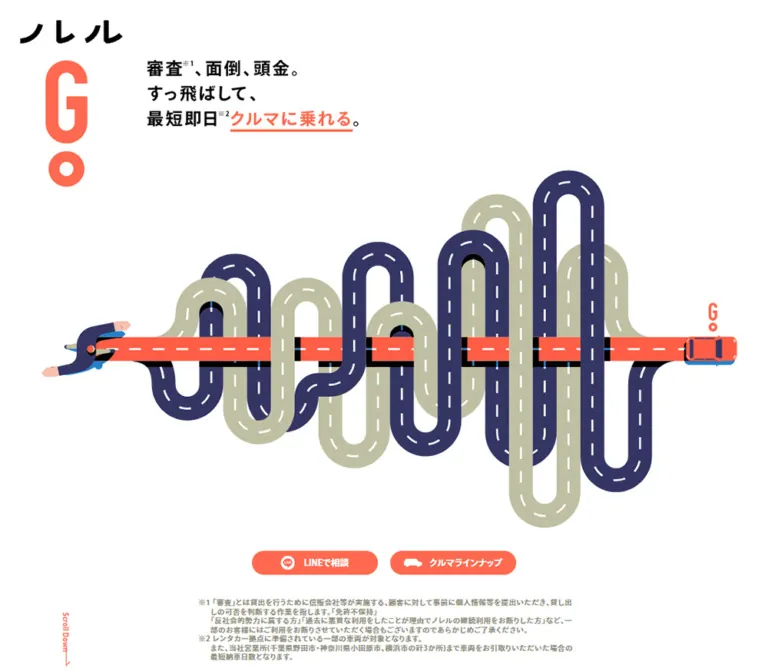
絡み合う道路を一直線に抜けるイラストが印象的な、自動車月額利用サービスのサイト。コーラルとブルー、太い文字、カプセル型の導線でサービスと利用例を伝える。
NOREL GO — Style Reference
A straight coral shortcut through a tangle of roads, extended into a bold Japanese car-service story.
Original URL: norel.jp/go
Final URL: norel.jp/go — HTTP 200; no redirect recorded.
Theme: light opening canvas, coral chapter fields, blue supporting components, and a charcoal footer. No theme selector was evidenced.
Inspected: September 24, 2026, at 05:59 JST; supplied retrieval timestamp September 23, 2026, at 20:59:09.747 UTC.
Viewports: desktop 1440 × 1000 CSS pixels; mobile 390 × 844 CSS pixels.
Scope: the supplied current-page desktop hero, use-case timeline, FAQ/footer, mobile hero, and a sparse mobile scrolled state; supplemented by rendered text, links, element rectangles, and computed styles across the page. No independent browsing or interaction testing was performed for this reference.
NOREL GO is a long, single-page service website containing a statement, movie section, service explanation, vehicle plans, illustrated usage scenarios, a system explanation, and a beginner guide. Its identity comes from a repeated road metaphor. In the opening illustration, a straight coral road cuts across looping navy and pale olive routes. The same visual vocabulary continues through vertical connectors, cars, oversized rounded containers, and route markings farther down the page.
The typography is consistently heavy. Compact English navigation contrasts with widely tracked Japanese explanations, large price figures, and dense qualification text. White space makes the opening illustration feel expansive; later coral fields support much denser storytelling. Vehicle photographs supply practical detail inside an otherwise flat illustrated world. Preserve that relationship between graphic metaphor, actual cars, and direct service information.
閉じる
NOREL GO — Style Reference
A straight coral shortcut through a tangle of roads, extended into a bold Japanese car-service story.
Original URL: norel.jp/go
Final URL: norel.jp/go — HTTP 200; no redirect recorded.
Theme: light opening canvas, coral chapter fields, blue supporting components, and a charcoal footer. No theme selector was evidenced.
Inspected: September 24, 2026, at 05:59 JST; supplied retrieval timestamp September 23, 2026, at 20:59:09.747 UTC.
Viewports: desktop 1440 × 1000 CSS pixels; mobile 390 × 844 CSS pixels.
Scope: the supplied current-page desktop hero, use-case timeline, FAQ/footer, mobile hero, and a sparse mobile scrolled state; supplemented by rendered text, links, element rectangles, and computed styles across the page. No independent browsing or interaction testing was performed for this reference.
NOREL GO is a long, single-page service website containing a statement, movie section, service explanation, vehicle plans, illustrated usage scenarios, a system explanation, and a beginner guide. Its identity comes from a repeated road metaphor. In the opening illustration, a straight coral road cuts across looping navy and pale olive routes. The same visual vocabulary continues through vertical connectors, cars, oversized rounded containers, and route markings farther down the page.
The typography is consistently heavy. Compact English navigation contrasts with widely tracked Japanese explanations, large price figures, and dense qualification text. White space makes the opening illustration feel expansive; later coral fields support much denser storytelling. Vehicle photographs supply practical detail inside an otherwise flat illustrated world. Preserve that relationship between graphic metaphor, actual cars, and direct service information.
How to Read This Reference
- Measured means recorded in the supplied rendered DOM or computed styles. Measurements are CSS pixels unless stated otherwise.
- Estimated means visually assessed from the original-page captures. Estimated hex colors are reproduction starting points, not sampled or source-confirmed values.
- Recommended means proposed implementation guidance. Breakpoints, accessible controls, fallback behavior, and CSS reconstruction choices are not claims about the original implementation.
- Named tokens are aliases introduced here. The supplied custom-property inventories were empty; no original design-token names were established.
- Computed font declarations establish the requested family and weight, not independent confirmation of which font file rendered every glyph.
- Evidence varies by section. The desktop hero, timeline, and FAQ/footer have visual evidence. Several other sections have detailed DOM measurements without a corresponding supplied screenshot.
- Mobile measurements require caution. Its document-height report and sampled element geometry disagree, and the later mobile capture contains almost no section text. These limitations are documented below rather than interpreted as intentional blank-page design.
Tokens — Colors
Default Palette
| Name | Value | Suggested token | Evidence | Role |
|---|---|---|---|---|
| Action Coral | #ff694f |
--color-coral |
Measured | Hero buttons, navigation text, social discs, logo paths, and initial journey text |
| Service Blue | #288cd2 |
--color-blue |
Measured | Vehicle-name capsules, large contact panels, later-plan text, and supporting labels |
| White | #ffffff |
--color-white |
Measured | Hero canvas, reversed text, icons, and white component surfaces |
| Header Gray | #f4f4f4 |
--color-header |
Measured | Desktop and mobile navigation strip |
| Footer Charcoal | #2c2c2c |
--color-footer |
Measured on mobile; visually corroborated on desktop | Footer field |
| Desktop Note Gray | #939283 |
--color-note |
Measured | Hero qualifications at desktop size |
| Mobile Note Olive | #c4c4ab |
--color-note-mobile |
Measured | Hero qualifications at mobile size |
| Road Navy | Approximately #383568 |
--color-road-navy |
Estimated | Dark looping roads in the opening illustration |
| Road Olive | Approximately #c1c2a5 |
--color-road-olive |
Estimated | Pale looping roads in the opening illustration |
| Chapter Coral | Approximately #ff775f |
--color-chapter |
Estimated | Broad visible field behind the captured journey and FAQ sections |
| Capsule Border | Approximately #e2e2e2 |
--color-capsule-border |
Estimated | Thick perimeter and internal divider of journey capsules |
| Graphic Black | Approximately #000000 |
--color-ink |
Estimated from visible artwork | Hero lettering, selected road underpasses, and the hard offset below the floating consultation button |
Coral and blue have different jobs. Coral establishes the GO identity and the principal consultation/lineup actions. Blue organizes pricing, contact information, and a later NOREL plan in the first usage story. The other captured story text remains coral; blue does not automatically mean every future timeline event.
The LINE actions use the site's coral or blue surfaces with white branding. They do not introduce a separate green action system. Likewise, the captured social icon is the Twitter bird; replacing it with another mark would change the observed reference.
Rendered Color Versus Container Color
Some sampled sections report white backgrounds and white foreground text even though the corresponding desktop capture shows a coral chapter field. The evidence does not include every background graphic, positioned layer, SVG, or pseudo-element involved in that composition.
Treat the captures as the authority for the visible composite and the computed styles as the authority for the sampled element. Do not infer a blending algorithm or rebuild the page as invisible white text on white panels. The Quick Start uses explicit surface colors as a practical adaptation.
Tokens — Typography
Main Interface Family
- Computed family:
ryo-gothic-plusn, sans-serif. - Computed weight:
700throughout the sampled body copy, navigation, labels, prices, and qualifications. - Character: dense, bold Japanese Gothic lettering paired with compact Latin forms.
- Recommended fallback: retain
sans-serifif the original family is unavailable. A licensed and tested font setup is required to reproduce the original metrics closely. - Important distinction: the root HTML element reports
Times, but the body and sampled interface elements override it. A serif interface is not supported by the evidence.
Graphic Lettering and Logos
The tall GO mark, the Japanese wordmark, and the hero headline behave as graphic content. The hero's sampled H2 has no extracted text and inherits a 16px font declaration, while the visible lettering is considerably larger. Its container measurement is useful; the inherited font size is not a measurement of the artwork's glyphs.
Preserve the logo's unusual proportions: a compact Japanese wordmark above a very tall coral G and a separate round lower mark in the hero and footer. The navigation uses a horizontal lockup. Do not approximate these with ordinary typed letters if matching the original identity matters.
Type Scale
All values below are measured unless explicitly identified as visual estimates.
| Role | Desktop size / line height | Mobile size / line height | Tracking and notes |
|---|---|---|---|
| English chapter marker | 80 / 68px |
24 / 20.4px |
2px desktop; 0.6px mobile, equivalent to 0.025em |
| Major Japanese section heading | 60 / 60px |
20 / 20px in sampled headings |
Tracking varies by heading; System uses a mobile 25px line height |
| Plan price | 70 / 70px |
40 / 44px |
0.065em tracking |
| Plan switching statement | 40 / 40px |
20 / 20px |
0.195em tracking |
| Header navigation | 24 / 24px |
Not present in the closed mobile header | Weight 700 |
| Hero action | 16.5 / 16.5px |
18 / 18px |
Mobile text becomes slightly larger |
| Statement paragraph | 25 / 50px |
12 / 21px |
Long desktop line spacing |
| Service introduction step | 25 / 36.25px |
10 / 15px |
Three narrow columns remain in the mobile sample |
| Benefit label | 30 / 30px |
15 / 15px |
Rounded label geometry |
| Benefit description | 20 / 30px |
12 / 18px |
Consistent 1.5 line-height ratio |
| Story lead-in | 30 / 30px |
15 / 15px |
0.12em tracking |
| Journey event heading | 30 / 40.2px |
10 / 13.4px |
0.12em tracking |
| Journey timing label | 20 / 20px |
10 / 10px |
0.115em tracking |
| Journey vehicle caption | 16 / 16px |
10 / 10px |
0.115em tracking |
| Contact-panel heading | 40 / 40px |
20 / 20px |
Tracking changes from 6.8px to 2.4px |
| FAQ question | 40 / 40px |
12 / 12px |
0.12em tracking |
| Hero qualification | 12 / 18.72px |
10 / 15.6px |
0.085em tracking |
| Vertical scroll label | 10.5 / 10.5px |
10.4 / 10.4px |
Small utility lettering |
The visible hero lettering is approximately 30–32px on desktop and 15–16px on mobile, but these are visual estimates of graphic lettering. They are not verified CSS text sizes.
Do not apply one global scale factor. Chapter markers shrink sharply on mobile, prices shrink less, and the main action buttons keep their dimensions while increasing their text size.
Tokens — Spacing & Shapes
The design combines broad empty areas with tightly packed information. Its recurring shapes are road bends, full capsules, circles, and thick outlines. Ordinary paragraphs retain square text boxes; not every piece of information becomes a card.
Layout Measurements
| Element | Desktop | Mobile | Evidence |
|---|---|---|---|
| Opening section | 1440 × 1000px |
390 × 886.31px |
Measured |
| Navigation height | 70px |
35px |
Measured |
| Navigation horizontal padding | 80px |
25px |
Measured |
| Header logo link width | 166px |
73px |
Measured; link height does not reliably describe the graphic |
| Common content width | 1240px, beginning at x = 100 |
340px, beginning at x = 25 |
Measured |
| Statement text width | 984px, beginning at x = 228 |
340px, beginning at x = 25 |
Measured |
| Main story text width | 990px, beginning at x = 225 |
340px, beginning at x = 25 |
Measured |
| Hero headline container | 390 × 132.98px |
364 × 67.38px |
Measured; graphic occupancy differs from container width |
| Hero action | 232.5 × 45px |
233 × 45px |
Measured |
| Hero action gap | 22.5px horizontally |
15px vertically |
Calculated from measured rectangles |
| Hero qualification paragraph width | 916px |
236px |
Measured; excludes the separate marker area |
| Large contact panel | 1000 × 410px |
335 × 210.13px |
Measured |
| Journey capsule | Approximately 820 × 200px |
Complete outer box not supplied | Desktop visual estimate |
| Journey transition circle | Approximately 200 × 200px |
Complete outer box not supplied | Desktop visual estimate |
| Desktop FAQ content | 1240px wide |
340px wrapper inferred from surrounding measurements |
Measured desktop; mobile wrapper inference |
| FAQ row pitch | Approximately 109px |
44px |
Desktop estimate; mobile text-position difference |
Spacing Scale
| Use | Recorded value | Interpretation |
|---|---|---|
| Mobile content inset | 25px |
Repeated across statement, service, story, and guide sections |
| Desktop content inset | 100px |
Common full-width content alignment at 1440px |
| Desktop header inset | 80px |
Slightly wider navigation span than the content below |
| Header link separation | About 45px |
Calculated between successive navigation labels |
| Desktop service columns | About 400px each, with 20px gaps |
Three columns across the 1240px content region |
| Mobile benefit columns | 162.5px each, with 15px gap |
Two columns inside 340px |
| Hero notes after mobile buttons | 20px to paragraph box |
Calculated from measured rectangles |
| Contact padding, desktop | 60px 52px 60px 56px |
Measured; intentionally asymmetric |
| Contact padding, mobile | 50px 20px 25px 22px |
Measured; reserves space for the heading above the inner columns |
| Standard journey-to-journey gap | Approximately 30px |
Visual estimate from the desktop capture |
Border Radius and Stroke
| Element | Value | Evidence |
|---|---|---|
| Desktop hero action | 22.5px radius |
Measured |
| Mobile hero action | 27px declared radius on a 45px-high box |
Measured; visually a full capsule |
| Header social control | 40 × 40px, 20px radius |
Measured |
| Mobile footer social control | 30 × 30px, 15px radius |
Measured for the sampled Twitter control |
| Desktop contact panel | 40px radius |
Measured |
| Mobile contact panel | 20px radius |
Measured |
| Desktop vehicle-name strip | 46px high, 23px radius |
Measured |
| Mobile vehicle-name strip | 23px high, 12px radius |
Measured |
| Desktop journey capsule | About 100px radius and 10px perimeter |
Estimated |
| Desktop FAQ rule | About 5px |
Estimated |
There is no evidence of a universal source spacing unit or a single radius token. Preserve the observed family resemblance without pretending every measurement comes from one mathematical scale.
Components
Opening Road Composition
Role: express the service proposition through a immediately recognizable visual shortcut.
The desktop hero places the vertical logo near the upper-left corner and a compact three-line Japanese message to its right. Most of the viewport belongs to the road illustration. A straight horizontal coral route passes across many alternating navy and pale olive bends. White dashed lane markings keep all routes within one visual language. Small black underpass segments clarify overlaps.
An illustrated figure occupies the left end of the straight route; a top-view car and small GO mark occupy the right. These are integral parts of the artwork, not interchangeable dashboard icons. The road is roughly 44px thick along its straight desktop section, based on the capture.
On mobile, the composition is art-directed vertically: the straight route runs down the center, loops spread to either side, the figure is near the top, and the car finishes near the headline. The headline moves below most of the illustration. This is a separate arrangement, not a simple scale reduction or rotation of the entire desktop hero.
Implementation guidance: use responsive artwork with explicit aspect ratios. Keep explanatory copy and controls as separate elements. Preserve the route junctions, lane dashes, and crossing order when recreating the illustration.
Hero Actions and Qualifications
Role: provide immediate consultation and access to the vehicle section.
Two equal coral capsules contain a white icon followed by bold text: LINEで相談 and クルマラインナップ. Desktop dimensions are 232.5 × 45px with a 22.5px gap. Mobile dimensions remain approximately 233 × 45px, stacked with a 15px gap.
The consultation link points to an external LINE-related preview URL. The lineup link points to #plan. These destinations are present in the rendered evidence; successful external navigation and account behavior were not tested.
A dense qualification block follows the buttons. Desktop paragraphs are 12px gray text with 18.72px line height. Mobile paragraphs are 10px pale olive text with 15.6px line height and wrap into a narrow 236px column. Keep the superscript markers and corresponding qualifications associated with the claims they qualify.
The mobile hero is about 42px taller than the inspected viewport, so the lower note text continues below the initial capture. That alone is not evidence of missing content.
Floating Commercial Tile
Role: provide a separate route into campaign video content.
A framed photographic still, topped by a coral CMで話題! ribbon, overlaps the hero. The image shows a person driving with white/coral graphic lettering over the photograph. A light frame and soft shadow separate it from the white canvas.
The desktop anchor measures 288 × 194.19px. On mobile, the visible tile is approximately 176 × 119px at the upper-right corner. Its sampled anchor reports an anomalous 865.52px height, much taller than the visible image. Do not use that height as the artwork's intrinsic size or assume it describes a verified hit area.
The destination is the observed commercial page. The tile has a measured 2s infinite fuwafuwa animation declaration. Keyframes and movement amplitude were not supplied. There is no evidence here that clicking it opens an inline player or modal.
Navigation Strip
Role: maintain section access after the opening composition.
The navigation occurs after the hero in document flow: its sampled top is y = 1000px on desktop and y = 886.31px on mobile. In the supplied scrolled captures it sits at the top of the viewport. This supports visible pinning after the hero, but the exact sticky/fixed implementation and activation threshold were not supplied.
Desktop anatomy:
- A 70px-high light-gray strip with 80px side padding.
- A horizontal logo at the left, about 166px wide.
- Five coral text links:
Service,Plan,How to use,System, andGuide. - Two 40px coral social discs at the right, with white marks.
- 24px bold navigation text and approximately 45px spacing between labels.
Mobile anatomy:
- A 35px-high strip with 25px side padding.
- A 73px-wide logo at the left.
- A coral three-line menu symbol at the right, approximately 50px wide.
- The desktop link row is absent from the closed-header presentation.
The mobile menu's open state, animation, keyboard behavior, and contents were not exercised.
Chapter Markers and Road Continuity
Role: turn a long service explanation into a sequence of recognizable chapters.
English markers use 80px bold text with a compressed 68px line height on desktop. State-ment is split across two lines, while How, to, and use are arranged as separate stacked words. Mobile markers reduce to 24px with a 20.4px line height.
The captured later desktop sections use a coral field with tonal road patterns and a central vertical route behind the content. In the FAQ capture, a top-view car sits on that central route. These motifs connect the chapters visually without placing every block inside a separate rectangle.
The sparse mobile scrolled capture shows a coral dashed centerline and a small blue vehicle on white. It confirms that a vertical route layer exists in that captured state. It does not establish why the accompanying section content is absent or prove a particular scroll-animation mechanism.
Service Explanation and Benefit Grid
Role: explain the entry process, then summarize six service attributes.
The rendered structure first presents three explanatory steps. At desktop width, each text region is about 400px wide with 25px text. The mobile sample still contains three adjacent step regions, each about 121.67px wide, using 10px text. The third sampled region reaches the viewport's right edge rather than the usual 25px inset.
Below this, six benefits form three columns on desktop and two columns on mobile. Examples include 審査なし, 頭金0円, 最短1日, and LINEで相談, with qualification markers where supplied.
Each benefit combines a rounded label box and an explanatory paragraph. Desktop label text is 30px; descriptions are 20/30px. Mobile label text is 15px; descriptions are 12/18px. The measured label boxes have rounded geometry, but their complete border treatment was not supplied in the visual captures.
Recommended adaptation: keep the desktop three-column rhythm, but review whether the mobile introductory steps need a vertical layout or larger text. That would be an accessibility improvement, not a reconstruction of the measured mobile arrangement.
Price Groups and Vehicle Lineup
Role: connect large monthly-price information with concrete vehicle examples.
The rendered page contains two prominent price groups, including the source copy 税込29,800円/月~ and 税込49,280円/月. These are recorded page labels, not independently verified current offers.
Prices use 70px bold desktop text with 4.55px tracking. They reduce to 40px with 44px line height on mobile. Smaller qualification paragraphs and a switching statement follow each price.
Desktop vehicle groups contain three columns. Their blue name strips measure approximately 380 × 46px with white 30px lettering. Mobile name strips are recorded at 190 × 23px with 15px lettering. Their reported x positions extend beyond the viewport and overlap neighboring horizontal ranges. A carousel, swipe interaction, or clipping mechanism cannot be established from these measurements alone.
Do not infer product-card shadows, purchase controls, or a checkout flow. The observed structure presents vehicles and directs users toward consultation.
Large LINE Contact Panel
Role: repeat the consultation route after substantial service information.
This is a large blue rounded anchor, not a small green messaging button. On desktop it measures 1000 × 410px with a 40px radius. A branding area occupies the left; the right contains a 40px heading, 25/36px explanatory copy, and a smaller operating-hours line. A white capsule labeled 追加 sits in the branding area.
The mobile panel is 335 × 210.13px with a 20px radius. Its 20px heading spans near the top of the panel, above a compact two-column interior. Body copy becomes 12/17.28px and the hours become 10/15px. The small white 追加 capsule reduces from 185 × 40px to 60 × 25px.
Two such panels appear in the desktop rendered content. Only the earlier one appears in the supplied mobile rendered text. The evidence does not establish whether that difference is permanent across all mobile states.
Use-Case Journey Capsule
Role: show how a car arrangement can change over time.
The captured desktop capsule is approximately 820px wide and 200px high, with a thick pale-gray border and semicircular ends. It has three parts:
- A left brand compartment, separated by a vertical pale-gray rule.
- A middle vehicle photograph with a centered caption below.
- A right text compartment containing a small timing label and a larger two- or three-line outcome.
The first event uses coral text and a GO identity. In the first story, later events use blue text and a blue left compartment with a white NOREL wordmark. A blue circular transition badge connects the initial and later plan events. A narrow vertical connector continues behind the capsules.
The first story includes source timing labels 4ヶ月後 and 16ヶ月後. Other rendered stories use different vehicles and timings, with coral event text. Preserve these distinctions if reproducing the actual content; do not make the number of events or their colors universal.
The vehicle-caption box is 168px wide on desktop and typically 80px wide on mobile. Event text begins around x = 730px on desktop and x = 209px in the first mobile story. This supports a compact side-by-side arrangement on mobile rather than a fully stacked card.
The source identifies these narratives as fictional stories assembled with reference to customer experiences. Their illustrated timeline presentation should not be recast as independently verified individual testimonials.
System Explanation
Role: explain the service model through comparison and numbered reasons.
The DOM records paired rows beginning with white rounded labels such as これまで and これから, followed by descriptive text. The labels have blue text and measure about 92px high on desktop, with 40px lettering. Mobile labels are 40px high with 20px lettering.
A subsequent explanation uses three numbered headings and indented body copy. Desktop body paragraphs are 20/30px; mobile paragraphs are 12/18px. Preserve the progression from comparison to reasons rather than replacing it with unrelated icon cards.
The complete rendered surface behind this section was not included in the supplied screenshots. Its text hierarchy and box geometry are measured; its full visual layering remains unverified.
Guide and FAQ Rows
Role: provide a compact final clarification area.
The rendered guide contains seven questions. The captured desktop rows use large white Japanese text on coral, thick white horizontal rules, and a simple downward chevron aligned at the right. Questions are inset about 40px from the content edge. The 40px text uses 4.8px tracking.
Desktop rows are approximately 109px apart. On mobile, question text is 12px with 1.44px tracking, and successive text positions are 44px apart. The supplied capture shows the collapsed appearance; answer content and expansion behavior were not inspected.
A centered upward chevron and PAGE TOP label finish the guide. The recorded link targets the page's empty fragment. Smooth scrolling is not established by the href alone.
Footer
Role: close the long page with repeated navigation, social routes, and legal links.
The desktop footer is a charcoal field about 301px tall in the supplied page geometry. A vertical white/coral logo sits toward the left. Five large white navigation links occupy a loose three-column arrangement, with coral social discs to the right. Smaller muted purple-gray text forms the legal and copyright row.
Mobile footer geometry is measured at 354.19px high. The logo is centered above a compact three-column navigation layout. Navigation text is 20px; a sampled social disc is 30px in diameter.
The original page visibly contains the footer line Copylight ©2016 IDOM Caas Technology Inc.. This supports reporting that footer wording, but its year is not evidence of the current design's publication date. No production-credit claim is established by the inspected page.
Tokens — Motion & Interaction
| Treatment | Evidence | What can safely be carried forward |
|---|---|---|
| Commercial tile animation | Computed 2s infinite fuwafuwa |
A perpetual decorative animation is declared; amplitude and keyframes are unknown |
| Hero action transitions | Computed 0.4s |
Preserve a moderate transition duration if adding feedback; original changed properties and end states were not supplied |
| Navigation and social transitions | Computed 0.4s |
Duration is measured; hover appearance is unverified |
| Large contact-panel transitions | Computed 0.4s |
Same duration family as the smaller links |
| FAQ question transitions | Computed 0.4s |
Does not by itself prove an answer-panel height animation |
| Header at viewport top after scrolling | Visible in supplied scrolled captures | Reproduce the pinned visual result; implementation mechanism is not established |
| Section navigation | Recorded fragment hrefs | Targets are established; scrolling speed, easing, and focus transfer are not |
| Central route and car | Visible in later desktop and mobile states | Preserve the motif; continuous movement and scroll synchronization remain unverified |
| FAQ chevrons | Visible collapsed rows | Expansion result, timing, and accessibility semantics remain unverified |
| Mobile menu | Closed icon visible | Opening behavior remains unverified |
| Vehicle lineup | DOM contains horizontally extending label boxes | No swipe or carousel behavior should be claimed |
The capture procedure waited for document loading, visible image decoding, and finite motion within bounded time limits. Perpetual animation was paused during readiness checks and then resumed. Consequently, the captures establish particular rendered states, not a complete motion sequence.
Recommended motion policy: use subtle feedback for controls, keep the commercial tile's decorative movement optional, and ensure all sections remain readable without route animation. A reduced-motion mode should preserve content and navigation rather than displaying an empty transit scene.
Surfaces
| Layer | Appearance | Purpose |
|---|---|---|
| Opening canvas | White, with extensive negative space | Makes the road composition and coral action pair dominant |
| Navigation | Flat light gray | Separates persistent navigation from the illustrated page |
| Chapter field | Coral with tonal road shapes in the captured sections | Connects long-form explanations into one visual journey |
| Journey capsule | White, thick pale-gray perimeter, rounded ends | Groups brand, vehicle, timing, and outcome |
| Contact panel | Blue, white text, broad rounded corners | Creates a distinct consultation destination |
| FAQ area | White text and rules directly on coral | Supports scanning without individual cards |
| Footer | Charcoal with white navigation and coral social controls | Produces a strong final visual stop |
| Commercial tile | Photograph, light frame, soft shadow | Separates promotional media from flat illustration |
Shadows are selective. The commercial tile has a soft shadow, while the captured floating consultation button has a hard black offset beneath a white outline. These do not establish a general elevation system for every component.
Imagery
The identity depends on clean, flat illustrations with strongly controlled silhouettes. Roads use broad constant-width strokes, rounded U-turns, white lane dashes, and clear crossing order. Human and vehicle details remain small relative to the road network. Avoid adding texture, gradients, or realistic asphalt to the primary illustration.
Vehicle photographs have a different purpose: they identify actual models inside the service narrative. The captured journey shows orange and blue cars isolated against white. Preserve their complete silhouettes and proportions. Transparency of the underlying files was not established.
The commercial tile uses ordinary photographic footage or a still, framed like a small screen. Its photographic character should remain distinct from the simplified road and character illustration.
Observed Asset References
No original image-file inventory or verified image asset paths were supplied. The following references identify observed artwork without inventing filenames.
| Asset | Evidence | Reuse guidance |
|---|---|---|
| Vertical and horizontal NOREL GO logos | Original captures and inline SVG path-style text | Use approved vector artwork; preserve the separate lockups |
| Desktop road composition | Desktop hero capture | Preserve the straight horizontal shortcut and layered loops |
| Mobile road composition | Mobile hero capture | Use a vertical art-directed arrangement |
| Top-view cars and illustrated figure | Hero and later route captures | Maintain the small scale and flat drawing language |
| Vehicle photographs | Desktop journey capture and rendered captions | Use uncropped product silhouettes with readable captions |
| Commercial image | Hero captures and its recorded page link | Do not infer a media-file URL or player implementation |
| LINE and Twitter symbols | Header/footer captures and inline SVG styles | Use the actual observed marks when reproducing this reference |
| FAQ and page-top chevrons | Desktop guide capture | Simple strokes are sufficient; no general icon library was established |
CSS can reproduce the containers, alignment, and palette. It cannot reproduce the distinctive road geometry, logos, and photographic assets without separately authored or authorized artwork.
Layout & Responsive Behavior
Desktop Structure
The opening hero occupies the full inspected 1000px viewport height. The main navigation follows it in the document and remains visible at the viewport top in later captures. Beneath it, the page alternates large illustrated transitions with content regions between about 984px and 1240px wide.
The DOM reports a desktop document height of approximately 21,948px. This is a long narrative page with repeated consultation opportunities, not a compact application shell. The center route and chapter labels help maintain continuity across that length.
The captured timeline keeps its capsules centered at approximately 820px wide even though the surrounding chapter is much wider. The FAQ expands to the common 1240px content width. Different content types deliberately use different measures.
Mobile Changes
| Feature | Observed mobile behavior |
|---|---|
| Hero road | Reorganized vertically rather than uniformly scaled |
| Hero message | Moves below most of the road artwork |
| Hero actions | Stack vertically while retaining approximately 233 × 45px dimensions |
| Commercial tile | Moves to the upper-right portion of the hero |
| Scroll cue | Moves from the lower-left desktop area to the right side of the mobile hero |
| Header | Reduces from 70px to 35px and presents a menu icon instead of the desktop link row |
| Common content | Usually 340px wide with 25px side insets |
| Chapter labels | Reduce from 80px to 24px |
| Benefit grid | Changes from three columns to two |
| Initial service steps | Remain three adjacent columns in the sampled DOM |
| Contact panel | Uses a top-spanning heading over compact inner columns |
| Journey content | Retains tightly compressed brand/photo/text relationships |
| FAQ | Reduces to 12px questions and a 44px row pitch |
| Footer | Centers the logo above compact navigation and social controls |
No tablet viewport or intermediate breakpoint was supplied. The breakpoint in the Quick Start is a recommendation, not a recovered source value.
Mobile Evidence Limitations
The mobile snapshot reports documentHeight: 18209, while its sampled HTML and body rectangles are approximately 8976.78px high. The main element is sampled at approximately 8622.59px. These values cannot be reconciled into one reliable page-height model from the supplied evidence.
The later mobile screenshot shows the pinned header, a dashed coral centerline, and a small vehicle against white, with no substantive section text visible. Possible causes are not established. Do not describe this as a verified loading screen, an intentional full-page interlude, or proof that every lower section failed.
The mobile rendered text also omits the desktop closing manifesto and second large contact panel. Report that as a difference in the supplied state, not an unconditional mobile content rule.
For implementation, validate actual section visibility, route-layer stacking, anchor hit areas, and document height on a real mobile browser. Do not encode the inconsistent height reports as fixed dimensions.
Do’s and Don’ts
Do
- Keep coral
#ff694fand blue#288cd2as the measured interface anchors. - Preserve the road metaphor across hero artwork, connectors, and later section decoration.
- Give the desktop illustration substantial white space.
- Art-direct the mobile road vertically while keeping the controls independently laid out.
- Retain the nearly unchanged desktop/mobile hero button size.
- Use the observed bold Gothic family declaration and role-specific tracking.
- Separate graphic logos and headlines from ordinary text sizing.
- Build journey capsules from brand, vehicle, timing, and outcome compartments.
- Keep car photographs fully visible and captions attached to their corresponding vehicles.
- Preserve qualification markers, fictional-story context, and associated notes.
- Distinguish measured styling from recommended accessibility and interaction improvements.
Don’t
- Don’t replace the road composition with a generic car photograph spanning the hero.
- Don’t shrink the entire desktop page by one scale factor for mobile.
- Don’t put every paragraph inside a rounded shadow card.
- Don’t introduce green as the default consultation-button color merely because the destination is LINE.
- Don’t infer a carousel from overflowing mobile vehicle labels.
- Don’t claim the FAQ, menu, video player, or route animation was fully tested.
- Don’t treat the empty hero heading's inherited 16px font size as its graphic lettering size.
- Don’t reproduce white-on-white section samples without accounting for the visible background composition.
- Don’t hardcode the mobile document-height discrepancy or oversized commercial-anchor rectangle.
- Don’t use the footer copyright year to date the design.
- Don’t make animation a prerequisite for reading the service information.
Recommended Implementation Additions
These are improvements for a new implementation, not verified original-page features.
- Improve small-text readability. The measured mobile experience contains substantial 10–12px text. Consider 14–16px explanatory copy and larger qualification text, allowing panels to grow vertically.
- Review text contrast. Calculated from the recorded sRGB colors, white on coral is approximately 2.8:1 and white on blue approximately 3.6:1. Use darker text or a darker control fill where normal-size text needs stronger contrast, while retaining the original colors in illustration and large graphic areas.
- Make the menu a real button. Supply an accessible name,
aria-expanded, keyboard operation, and a touch target larger than the 35px visual header height where necessary. - Use proper section headings. Several visible chapter labels are sampled as paragraphs. A new implementation should provide a coherent heading structure without changing their appearance.
- Expose graphic copy accessibly. Give meaningful headline artwork a text equivalent; mark purely decorative roads and lane markings as decorative.
- Implement FAQ semantics explicitly. Native
details/summaryor accessible button-controlled panels can preserve the visual rows without relying on click handlers attached to plain text. - Protect content from animation failures. Render the service text in normal document flow and layer route artwork behind it. Provide a static reduced-motion state.
- Validate mobile vehicle groups. If they scroll horizontally, implement and label that behavior deliberately. Otherwise reflow them to avoid unexplained overlap and clipping.
- Verify the commercial hit area. Match the clickable region to the visible tile and prevent it from intercepting nearby hero actions.
- Account for the pinned header. Use anchor offsets and visible focus indicators so keyboard and fragment navigation reach readable headings.
Agent Prompt Guide
Quick Color Reference
- Measured primary coral:
#ff694f. - Measured secondary blue:
#288cd2. - Hero and capsule white:
#ffffff. - Navigation gray:
#f4f4f4. - Footer charcoal:
#2c2c2c. - Estimated illustration navy:
#383568. - Estimated illustration olive:
#c1c2a5. - Estimated broad chapter coral:
#ff775f. - Desktop qualification text:
#939283; mobile source value:#c4c4ab.
Overall Prompt
“Create a Japanese car-service presentation inspired by the inspected NOREL GO page. Open on a white canvas with a tall vertical brand mark, a compact three-line message, and a large flat illustration in which a straight coral road cuts across tangled navy and pale olive routes. Use white dashed lane markings, a small illustrated person, and a top-view car. Place two equal coral pill actions below the artwork. Put a light-gray navigation strip after the hero and keep it available while reading later chapters. Continue into coral narrative fields, bold Gothic typography, large monthly-price figures, blue consultation panels, and centered white journey capsules containing a brand compartment, vehicle photograph, timing label, and outcome. Finish with white-rule FAQ rows and a charcoal footer. Art-direct the mobile road vertically; retain approximately 233 × 45px primary actions. Implement content visibility independently of decorative animation.”
Example Component Prompts
- Hero: “Create a white desktop hero dominated by a flat road illustration. Use a straight coral route through looping navy and pale olive roads, with white lane dashes and clear overpasses. Keep the Japanese headline compact in the upper-left region and place two 232.5 × 45px coral capsules beneath the illustration. Provide a separate vertical mobile composition.”
- Journey capsule: “Create an approximately 820 × 200px white capsule with a thick pale-gray border and semicircular ends. Divide it into a brand compartment, a centered vehicle photograph with caption, and bold Japanese event text. Use coral for the initial GO event and blue for the later-plan variant. Connect events with a narrow centered route behind them.”
- Contact panel: “Create a 1000px-wide blue contact panel with a 40px radius, white branding at left, a bold 40px heading, explanatory copy, and a smaller hours line at right. On mobile, use a 335px panel with a 20px radius and move the heading above the two inner columns. Allow readable text to increase the panel height.”
- FAQ: “Create full-width Japanese FAQ rows directly on coral. Use white horizontal rules, bold widely tracked questions, and simple right-aligned downward chevrons. Match the approximately 109px desktop row rhythm. Implement accessible expansion separately; the reference establishes only the collapsed appearance.”
- Navigation: “Create a 70px light-gray desktop navigation strip with a 166px brand lockup, five coral English section links, and two circular social controls. Place it after the hero. On mobile use a compact 35px visual strip with a 73px logo and a three-line coral menu button, while providing an adequate accessible hit area.”
Quick Start
CSS Custom Properties
This is a practical adaptation, not recovered source code. Exact interface colors and selected component dimensions come from the supplied measurements. Illustration colors, capsule strokes, and the broad chapter fill are estimates. The 767px breakpoint, sticky-header mechanism, FAQ implementation, focus treatment, and responsive interpolation are recommendations.
The hero classes assume separately supplied desktop/mobile artwork. No original asset filenames are implied. The code intentionally leaves out unverified scroll choreography and commercial-tile keyframes. A .comfortable-reading modifier demonstrates an optional mobile readability improvement.
:root {
  /* Measured interface colors */
  --color-coral: #ff694f;
  --color-blue: #288cd2;
  --color-white: #ffffff;
  --color-header: #f4f4f4;
  --color-footer: #2c2c2c;
  --color-note: #939283;
  --color-note-mobile: #c4c4ab;

  /* Visual estimates for illustration and composite surfaces */
  --color-road-navy: #383568;
  --color-road-olive: #c1c2a5;
  --color-chapter: #ff775f;
  --color-capsule-border: #e2e2e2;
  --color-ink: #000000;

  /* Observed family declaration and selected type roles */
  --font-site: ryo-gothic-plusn, sans-serif;
  --weight-bold: 700;
  --text-section: 80px;
  --text-price: 70px;
  --text-body: 20px;
  --text-journey: 30px;
  --text-faq: 40px;

  /* Measured target dimensions; interpolation is recommended */
  --content-width: 1240px;
  --page-gutter: clamp(25px, 6.945vw, 100px);
  --header-height: 70px;
  --button-width: 232.5px;
  --button-height: 45px;
  --radius-panel: 40px;
  --radius-pill: 999px;
  --duration-ui: 400ms;
}

* { box-sizing: border-box; }

body {
  margin: 0;
  color: var(--color-ink);
  background: var(--color-white);
  font-family: var(--font-site);
  font-weight: var(--weight-bold);
  line-height: 1.5;
}

img, svg { max-width: 100%; }
img { display: block; height: auto; }
button, input { font: inherit; }

.container {
  width: min(
    var(--content-width),
    calc(100% - 2 * var(--page-gutter))
  );
  margin-inline: auto;
}

section[id] {
  scroll-margin-top: calc(var(--header-height) + 20px);
}

/* Desktop hero positions approximate the inspected composition. */
.hero {
  position: relative;
  min-height: max(900px, 100svh);
  isolation: isolate;
  background: var(--color-white);
}

.hero-brand {
  position: absolute;
  z-index: 2;
  top: 38px;
  left: 38px;
  width: 188px;
}

.hero-copy {
  position: absolute;
  z-index: 2;
  top: 110px;
  left: max(25px, calc(50% - 448.5px));
  width: 390px;
  margin: 0;
}

.hero-art {
  position: absolute;
  top: 19%;
  left: 50%;
  display: block;
  width: min(1280px, calc(100% - 128px));
  transform: translateX(-50%);
}

.hero-art img { width: 100%; object-fit: contain; }

.hero-actions {
  position: absolute;
  z-index: 3;
  bottom: 149.6px;
  left: 50%;
  display: flex;
  gap: 22.5px;
  transform: translateX(-50%);
}

.pill-cta {
  display: inline-flex;
  flex: none;
  align-items: center;
  justify-content: center;
  gap: 16px;
  width: var(--button-width);
  min-height: var(--button-height);
  padding: 8px 18px;
  border-radius: var(--radius-pill);
  color: var(--color-white);
  background: var(--color-coral);
  font-size: 16.5px;
  line-height: 1;
  text-decoration: none;
  transition: filter var(--duration-ui) ease;
}

.pill-cta svg { width: 26px; height: 26px; flex: none; }

.hero-notes {
  position: absolute;
  bottom: 24px;
  left: 50%;
  width: min(940px, calc(100% - 50px));
  margin: 0;
  padding-left: 24px;
  color: var(--color-note);
  font-size: 12px;
  line-height: 1.56;
  letter-spacing: 0.085em;
  transform: translateX(-50%);
}

.hero-commercial {
  position: absolute;
  z-index: 4;
  right: 2.6%;
  bottom: 15.8%;
  display: block;
  width: 288px;
}

/* Place this element immediately after the hero in the document. */
.site-header {
  position: sticky;
  z-index: 20;
  top: 0;
  display: flex;
  align-items: center;
  justify-content: space-between;
  height: var(--header-height);
  padding-inline: 80px;
  background: var(--color-header);
}

.header-brand { display: block; width: 166px; }
.desktop-nav { display: flex; align-items: center; gap: 45px; }
.desktop-nav a {
  color: var(--color-coral);
  font-size: 24px;
  line-height: 1;
  text-decoration: none;
}

.social-links { display: flex; gap: 20px; }
.social-link {
  display: grid;
  place-items: center;
  width: 40px;
  height: 40px;
  border-radius: 50%;
  color: var(--color-white);
  background: var(--color-coral);
}

.menu-toggle { display: none; }

/* Explicit composite color; original layering was not supplied. */
.chapter {
  position: relative;
  isolation: isolate;
  padding-block: 90px;
  color: var(--color-white);
  background: var(--color-chapter);
}

.section-label {
  margin: 0 0 60px;
  font-size: var(--text-section);
  line-height: 0.85;
  letter-spacing: 0.025em;
}

.feature-grid {
  display: grid;
  grid-template-columns: repeat(3, minmax(0, 1fr));
  gap: 40px 20px;
}

.feature-copy {
  font-size: var(--text-body);
  line-height: 1.5;
}

.plan-price {
  font-size: var(--text-price);
  line-height: 1;
  letter-spacing: 0.065em;
}

.route-timeline {
  position: relative;
  isolation: isolate;
  display: grid;
  gap: 30px;
  width: min(820px, 100%);
  margin-inline: auto;
}

.route-timeline::before {
  position: absolute;
  z-index: -1;
  inset-block: 0;
  left: 50%;
  width: 8px;
  background: var(--color-road-navy);
  content: '';
  transform: translateX(-50%);
}

.journey-step {
  display: grid;
  grid-template-columns: 188px 200px minmax(0, 1fr);
  align-items: stretch;
  min-height: 200px;
  overflow: hidden;
  border: 10px solid var(--color-capsule-border);
  border-radius: 100px;
  color: var(--color-coral);
  background: var(--color-white);
}

.journey-brand {
  display: grid;
  place-items: center;
  padding: 20px;
  border-right: 4px solid var(--color-capsule-border);
}

.journey-car {
  align-self: center;
  margin: 0;
  text-align: center;
}

.journey-car img { width: 168px; margin-inline: auto; }
.journey-car figcaption {
  margin-top: 10px;
  font-size: 16px;
  line-height: 1;
  letter-spacing: 0.115em;
}

.journey-info { align-self: center; padding: 20px 22px; }
.journey-kicker {
  margin: 0 0 15px;
  font-size: 20px;
  line-height: 1;
  letter-spacing: 0.115em;
}

.journey-heading {
  margin: 0;
  font-size: var(--text-journey);
  line-height: 1.34;
  letter-spacing: 0.12em;
}

.journey-step--blue { color: var(--color-blue); }
.journey-step--blue .journey-brand {
  color: var(--color-white);
  background: var(--color-blue);
}

.journey-switch {
  display: grid;
  place-items: center;
  width: 200px;
  aspect-ratio: 1;
  margin-inline: auto;
  padding: 16px;
  border: 10px solid var(--color-white);
  border-radius: 50%;
  color: var(--color-white);
  background: var(--color-blue);
  text-align: center;
}

.contact-panel {
  position: relative;
  display: grid;
  grid-template-columns: 210px minmax(0, 1fr);
  align-items: center;
  gap: 54px;
  width: min(1000px, 100%);
  min-height: 410px;
  margin-inline: auto;
  padding: 60px 52px 60px 56px;
  border-radius: var(--radius-panel);
  color: var(--color-white);
  background: var(--color-blue);
  text-decoration: none;
}

.contact-title {
  margin: 0 0 10px;
  font-size: 40px;
  line-height: 1;
  letter-spacing: 0.17em;
}

.contact-copy { margin: 0; font-size: 25px; line-height: 1.44; }
.contact-hours { font-size: 16px; letter-spacing: 0.105em; }

/* Native disclosure is a recommended implementation. */
.faq-row { border-top: 5px solid currentColor; }
.faq-row:last-child { border-bottom: 5px solid currentColor; }
.faq-row summary {
  display: flex;
  align-items: center;
  justify-content: space-between;
  gap: 24px;
  min-height: 104px;
  padding: 24px 40px;
  font-size: var(--text-faq);
  line-height: 1.2;
  letter-spacing: 0.12em;
  list-style: none;
  cursor: pointer;
}

.faq-row summary::-webkit-details-marker { display: none; }
.faq-row summary::after {
  flex: none;
  width: 28px;
  height: 28px;
  border-right: 4px solid currentColor;
  border-bottom: 4px solid currentColor;
  content: '';
  transform: rotate(45deg);
  transition: transform var(--duration-ui) ease;
}

.faq-row[open] summary::after { transform: rotate(225deg); }
.faq-answer { padding: 0 40px 32px; font-size: var(--text-body); }

.site-footer {
  padding: 40px var(--page-gutter);
  color: var(--color-white);
  background: var(--color-footer);
}

/* Recommended focus feedback, not a measured original state. */
a:focus-visible, button:focus-visible, summary:focus-visible {
  outline: 3px solid var(--color-road-navy);
  outline-offset: 4px;
  box-shadow: 0 0 0 7px var(--color-white);
}

@media (max-width: 767px) {
  :root {
    --page-gutter: 25px;
    --header-height: 35px;
    --button-width: 233px;
    --text-section: 24px;
    --text-price: 40px;
    --text-body: 12px;
    --text-journey: 10px;
    --text-faq: 12px;
    --radius-panel: 20px;
  }

  .hero { min-height: 0; padding: 20px 25px; }
  .hero-brand { top: 20px; left: 20px; width: 98px; }
  .hero-art {
    position: static;
    width: 240px;
    margin: 3px auto 0;
    transform: none;
  }
  .hero-copy {
    position: relative;
    inset: auto;
    width: 100%;
    margin: -29px 0 18px;
  }
  .hero-copy img { width: 200px; }
  .hero-actions {
    position: static;
    flex-direction: column;
    align-items: center;
    gap: 15px;
    transform: none;
  }
  .pill-cta { font-size: 18px; }
  .hero-notes {
    position: static;
    width: 260px;
    max-width: 100%;
    margin: 20px auto 0;
    color: var(--color-note-mobile);
    font-size: 10px;
    transform: none;
  }
  .hero-commercial {
    top: 20px;
    right: 5px;
    bottom: auto;
    width: 175.5px;
  }
  .site-header { padding-inline: 25px; }
  .header-brand { width: 73px; }
  .desktop-nav { display: none; }
  .menu-toggle {
    position: relative;
    display: flex;
    flex-direction: column;
    justify-content: space-between;
    width: 50px;
    height: 35px;
    padding: 7px 0;
    border: 0;
    background: transparent;
  }
  .menu-toggle span { height: 2px; background: var(--color-coral); }
  .chapter { padding-block: 45px; }
  .section-label { margin-bottom: 30px; }
  .feature-grid { grid-template-columns: repeat(2, minmax(0, 1fr)); gap: 15px; }
  .plan-price { line-height: 1.1; }
  .route-timeline { gap: 20px; }
  .journey-step {
    grid-template-columns: 80px 90px minmax(0, 1fr);
    min-height: 98px;
    border-width: 4px;
    border-radius: 50px;
  }
  .journey-brand { padding: 8px; border-right-width: 2px; }
  .journey-car img { width: 80px; }
  .journey-car figcaption { margin-top: 5px; font-size: 10px; }
  .journey-info { padding: 10px; }
  .journey-kicker { margin-bottom: 8px; font-size: 10px; }
  .journey-switch { width: 100px; border-width: 5px; padding: 8px; }
  .contact-panel {
    grid-template-columns: 85px minmax(0, 1fr);
    gap: 5px;
    width: min(335px, 100%);
    min-height: 210px;
    padding: 50px 20px 25px 22px;
  }
  .contact-title {
    position: absolute;
    top: 17px;
    inset-inline: 5px;
    font-size: 20px;
    letter-spacing: 0.12em;
    text-align: center;
  }
  .contact-copy { font-size: 12px; }
  .contact-hours { font-size: 10px; line-height: 1.5; }
  .faq-row, .faq-row:last-child { border-width: 2px; }
  .faq-row summary { min-height: 42px; padding: 12px 16px; gap: 12px; }
  .faq-row summary::after { width: 12px; height: 12px; border-width: 2px; }
  .faq-answer { padding: 0 16px 20px; }
  .site-footer { padding-block: 20px 14px; }

  /* Optional readability improvements; these change source proportions. */
  .comfortable-reading .hero-notes {
    width: 100%;
    color: #59594f;
    font-size: 14px;
  }
  .comfortable-reading .feature-copy,
  .comfortable-reading .faq-answer { font-size: 16px; }
  .comfortable-reading .journey-heading,
  .comfortable-reading .faq-row summary { font-size: 14px; line-height: 1.5; }
  .comfortable-reading .journey-step {
    grid-template-columns: 70px minmax(0, 1fr);
    border-radius: 28px;
  }
  .comfortable-reading .journey-info { grid-column: 1 / -1; }
}

@media (prefers-reduced-motion: reduce) {
  .hero-commercial,
  .pill-cta,
  .faq-row summary::after {
    animation: none !important;
    transition: none !important;
  }
}
Use real anchors for navigation and consultation. The menu requires its own accessible state management. The following FAQ markup demonstrates the recommended native disclosure structure; its answer is an editorial placeholder because original expanded answers were not supplied.
<section class='chapter' id='guide' aria-labelledby='guide-title'>
  <div class='container'>
    <h2 class='section-label' id='guide-title'>Guide</h2>
    <div class='faq-list'>
      <details class='faq-row'>
        <summary>手続きはどれくらい簡単なの?</summary>
        <div class='faq-answer'>
          <!-- Replace with verified service information before publishing. -->
        </div>
      </details>
    </div>
  </div>
</section>
Tailwind v4 Token Mapping
Optional mapping for a project already using Tailwind v4. This does not imply that the original site uses Tailwind. Define the custom properties above first.
@theme inline {
  --color-go-coral: var(--color-coral);
  --color-go-blue: var(--color-blue);
  --color-go-header: var(--color-header);
  --color-go-footer: var(--color-footer);
  --color-go-road-navy: var(--color-road-navy);
  --color-go-road-olive: var(--color-road-olive);
  --font-go: var(--font-site);
  --text-go-section: var(--text-section);
  --text-go-price: var(--text-price);
  --text-go-body: var(--text-body);
  --text-go-journey: var(--text-journey);
  --spacing-go-gutter: var(--page-gutter);
  --spacing-go-header: var(--header-height);
  --radius-go-panel: var(--radius-panel);
  --radius-go-pill: 999px;
}
Sources & Evidence
- Original and final page: NOREL GO official website. The supplied inspection records HTTP 200 and identical original/final URLs.
- Capture time: September 23, 2026, 20:59:09.747 UTC, corresponding to September 24, 2026, 05:59:09.747 JST.
- Desktop evidence: 1440 × 1000 CSS-pixel hero, journey, and FAQ/footer captures; rendered page text, destination links, sampled element rectangles, and computed styles. Reported document height approximately 21,948px.
- Mobile evidence: 390 × 844 CSS-pixel hero and sparse scrolled captures, plus rendered text and sampled styles. The document-height report of 18,209px conflicts with the approximately 8976.78px sampled root/body rectangles; no single authoritative mobile height is asserted.
- Recorded original-site navigation:
#service,#plan,#howtouse,#system, and#guideon the inspected page. Their existence is established by rendered hrefs, not by separate activation tests. - Recorded commercial destination: norel.jp/landing/go/cm3/?no=12. Only the link and visible promotional tile were inspected here; the destination experience was not opened.
- Readiness scope: the supplied process observed the initial page for at least five seconds and used bounded waits for finite animation, layout/text stability, and image decoding. It temporarily paused perpetual animations during readiness checks and traversed intermediate scroll positions. SharedWorkers and service workers were disabled during inspection.
- Unverified behavior: opened mobile navigation, expanded FAQ answers, hover end states, external consultation completion, video playback, exact road-motion choreography, intermediate responsive breakpoints, and delayed content beyond the capture procedure's limits.
This reference describes the currently supplied original-page evidence. It does not reconstruct an earlier version. All estimated colors, inferred geometry, accessible enhancements, and implementation choices are identified separately from measured observations.
# NOREL GO — Style Reference

> A straight coral shortcut through a tangle of roads, extended into a bold Japanese car-service story.

**Original URL:** [norel.jp/go](https://norel.jp/go)
**Final URL:** [norel.jp/go](https://norel.jp/go) — HTTP 200; no redirect recorded.
**Theme:** light opening canvas, coral chapter fields, blue supporting components, and a charcoal footer. No theme selector was evidenced.
**Inspected:** September 24, 2026, at 05:59 JST; supplied retrieval timestamp September 23, 2026, at 20:59:09.747 UTC.
**Viewports:** desktop 1440 × 1000 CSS pixels; mobile 390 × 844 CSS pixels.
**Scope:** the supplied current-page desktop hero, use-case timeline, FAQ/footer, mobile hero, and a sparse mobile scrolled state; supplemented by rendered text, links, element rectangles, and computed styles across the page. No independent browsing or interaction testing was performed for this reference.

NOREL GO is a long, single-page service website containing a statement, movie section, service explanation, vehicle plans, illustrated usage scenarios, a system explanation, and a beginner guide. Its identity comes from a repeated road metaphor. In the opening illustration, a straight coral road cuts across looping navy and pale olive routes. The same visual vocabulary continues through vertical connectors, cars, oversized rounded containers, and route markings farther down the page.

The typography is consistently heavy. Compact English navigation contrasts with widely tracked Japanese explanations, large price figures, and dense qualification text. White space makes the opening illustration feel expansive; later coral fields support much denser storytelling. Vehicle photographs supply practical detail inside an otherwise flat illustrated world. Preserve that relationship between graphic metaphor, actual cars, and direct service information.
閉じる
# NOREL GO — Style Reference

> A straight coral shortcut through a tangle of roads, extended into a bold Japanese car-service story.

**Original URL:** [norel.jp/go](https://norel.jp/go)
**Final URL:** [norel.jp/go](https://norel.jp/go) — HTTP 200; no redirect recorded.
**Theme:** light opening canvas, coral chapter fields, blue supporting components, and a charcoal footer. No theme selector was evidenced.
**Inspected:** September 24, 2026, at 05:59 JST; supplied retrieval timestamp September 23, 2026, at 20:59:09.747 UTC.
**Viewports:** desktop 1440 × 1000 CSS pixels; mobile 390 × 844 CSS pixels.
**Scope:** the supplied current-page desktop hero, use-case timeline, FAQ/footer, mobile hero, and a sparse mobile scrolled state; supplemented by rendered text, links, element rectangles, and computed styles across the page. No independent browsing or interaction testing was performed for this reference.

NOREL GO is a long, single-page service website containing a statement, movie section, service explanation, vehicle plans, illustrated usage scenarios, a system explanation, and a beginner guide. Its identity comes from a repeated road metaphor. In the opening illustration, a straight coral road cuts across looping navy and pale olive routes. The same visual vocabulary continues through vertical connectors, cars, oversized rounded containers, and route markings farther down the page.

The typography is consistently heavy. Compact English navigation contrasts with widely tracked Japanese explanations, large price figures, and dense qualification text. White space makes the opening illustration feel expansive; later coral fields support much denser storytelling. Vehicle photographs supply practical detail inside an otherwise flat illustrated world. Preserve that relationship between graphic metaphor, actual cars, and direct service information.

## How to Read This Reference

- **Measured** means recorded in the supplied rendered DOM or computed styles. Measurements are CSS pixels unless stated otherwise.
- **Estimated** means visually assessed from the original-page captures. Estimated hex colors are reproduction starting points, not sampled or source-confirmed values.
- **Recommended** means proposed implementation guidance. Breakpoints, accessible controls, fallback behavior, and CSS reconstruction choices are not claims about the original implementation.
- **Named tokens** are aliases introduced here. The supplied custom-property inventories were empty; no original design-token names were established.
- **Computed font declarations** establish the requested family and weight, not independent confirmation of which font file rendered every glyph.
- **Evidence varies by section.** The desktop hero, timeline, and FAQ/footer have visual evidence. Several other sections have detailed DOM measurements without a corresponding supplied screenshot.
- **Mobile measurements require caution.** Its document-height report and sampled element geometry disagree, and the later mobile capture contains almost no section text. These limitations are documented below rather than interpreted as intentional blank-page design.

## Tokens — Colors

### Default Palette

| Name | Value | Suggested token | Evidence | Role |
| --- | --- | --- | --- | --- |
| Action Coral | `#ff694f` | `--color-coral` | Measured | Hero buttons, navigation text, social discs, logo paths, and initial journey text |
| Service Blue | `#288cd2` | `--color-blue` | Measured | Vehicle-name capsules, large contact panels, later-plan text, and supporting labels |
| White | `#ffffff` | `--color-white` | Measured | Hero canvas, reversed text, icons, and white component surfaces |
| Header Gray | `#f4f4f4` | `--color-header` | Measured | Desktop and mobile navigation strip |
| Footer Charcoal | `#2c2c2c` | `--color-footer` | Measured on mobile; visually corroborated on desktop | Footer field |
| Desktop Note Gray | `#939283` | `--color-note` | Measured | Hero qualifications at desktop size |
| Mobile Note Olive | `#c4c4ab` | `--color-note-mobile` | Measured | Hero qualifications at mobile size |
| Road Navy | Approximately `#383568` | `--color-road-navy` | Estimated | Dark looping roads in the opening illustration |
| Road Olive | Approximately `#c1c2a5` | `--color-road-olive` | Estimated | Pale looping roads in the opening illustration |
| Chapter Coral | Approximately `#ff775f` | `--color-chapter` | Estimated | Broad visible field behind the captured journey and FAQ sections |
| Capsule Border | Approximately `#e2e2e2` | `--color-capsule-border` | Estimated | Thick perimeter and internal divider of journey capsules |
| Graphic Black | Approximately `#000000` | `--color-ink` | Estimated from visible artwork | Hero lettering, selected road underpasses, and the hard offset below the floating consultation button |

**Coral and blue have different jobs.** Coral establishes the GO identity and the principal consultation/lineup actions. Blue organizes pricing, contact information, and a later NOREL plan in the first usage story. The other captured story text remains coral; blue does not automatically mean every future timeline event.

The LINE actions use the site's coral or blue surfaces with white branding. They do not introduce a separate green action system. Likewise, the captured social icon is the Twitter bird; replacing it with another mark would change the observed reference.

### Rendered Color Versus Container Color

Some sampled sections report white backgrounds and white foreground text even though the corresponding desktop capture shows a coral chapter field. The evidence does not include every background graphic, positioned layer, SVG, or pseudo-element involved in that composition.

Treat the captures as the authority for the visible composite and the computed styles as the authority for the sampled element. Do not infer a blending algorithm or rebuild the page as invisible white text on white panels. The Quick Start uses explicit surface colors as a practical adaptation.

## Tokens — Typography

### Main Interface Family

- **Computed family:** `ryo-gothic-plusn, sans-serif`.
- **Computed weight:** `700` throughout the sampled body copy, navigation, labels, prices, and qualifications.
- **Character:** dense, bold Japanese Gothic lettering paired with compact Latin forms.
- **Recommended fallback:** retain `sans-serif` if the original family is unavailable. A licensed and tested font setup is required to reproduce the original metrics closely.
- **Important distinction:** the root HTML element reports `Times`, but the body and sampled interface elements override it. A serif interface is not supported by the evidence.

### Graphic Lettering and Logos

The tall GO mark, the Japanese wordmark, and the hero headline behave as graphic content. The hero's sampled `H2` has no extracted text and inherits a 16px font declaration, while the visible lettering is considerably larger. Its container measurement is useful; the inherited font size is not a measurement of the artwork's glyphs.

Preserve the logo's unusual proportions: a compact Japanese wordmark above a very tall coral G and a separate round lower mark in the hero and footer. The navigation uses a horizontal lockup. Do not approximate these with ordinary typed letters if matching the original identity matters.

### Type Scale

All values below are measured unless explicitly identified as visual estimates.

| Role | Desktop size / line height | Mobile size / line height | Tracking and notes |
| --- | --- | --- | --- |
| English chapter marker | `80 / 68px` | `24 / 20.4px` | `2px` desktop; `0.6px` mobile, equivalent to `0.025em` |
| Major Japanese section heading | `60 / 60px` | `20 / 20px` in sampled headings | Tracking varies by heading; System uses a mobile 25px line height |
| Plan price | `70 / 70px` | `40 / 44px` | `0.065em` tracking |
| Plan switching statement | `40 / 40px` | `20 / 20px` | `0.195em` tracking |
| Header navigation | `24 / 24px` | Not present in the closed mobile header | Weight 700 |
| Hero action | `16.5 / 16.5px` | `18 / 18px` | Mobile text becomes slightly larger |
| Statement paragraph | `25 / 50px` | `12 / 21px` | Long desktop line spacing |
| Service introduction step | `25 / 36.25px` | `10 / 15px` | Three narrow columns remain in the mobile sample |
| Benefit label | `30 / 30px` | `15 / 15px` | Rounded label geometry |
| Benefit description | `20 / 30px` | `12 / 18px` | Consistent 1.5 line-height ratio |
| Story lead-in | `30 / 30px` | `15 / 15px` | `0.12em` tracking |
| Journey event heading | `30 / 40.2px` | `10 / 13.4px` | `0.12em` tracking |
| Journey timing label | `20 / 20px` | `10 / 10px` | `0.115em` tracking |
| Journey vehicle caption | `16 / 16px` | `10 / 10px` | `0.115em` tracking |
| Contact-panel heading | `40 / 40px` | `20 / 20px` | Tracking changes from `6.8px` to `2.4px` |
| FAQ question | `40 / 40px` | `12 / 12px` | `0.12em` tracking |
| Hero qualification | `12 / 18.72px` | `10 / 15.6px` | `0.085em` tracking |
| Vertical scroll label | `10.5 / 10.5px` | `10.4 / 10.4px` | Small utility lettering |

The visible hero lettering is approximately 30–32px on desktop and 15–16px on mobile, but these are visual estimates of graphic lettering. They are not verified CSS text sizes.

**Do not apply one global scale factor.** Chapter markers shrink sharply on mobile, prices shrink less, and the main action buttons keep their dimensions while increasing their text size.

## Tokens — Spacing & Shapes

The design combines broad empty areas with tightly packed information. Its recurring shapes are road bends, full capsules, circles, and thick outlines. Ordinary paragraphs retain square text boxes; not every piece of information becomes a card.

### Layout Measurements

| Element | Desktop | Mobile | Evidence |
| --- | --- | --- | --- |
| Opening section | `1440 × 1000px` | `390 × 886.31px` | Measured |
| Navigation height | `70px` | `35px` | Measured |
| Navigation horizontal padding | `80px` | `25px` | Measured |
| Header logo link width | `166px` | `73px` | Measured; link height does not reliably describe the graphic |
| Common content width | `1240px`, beginning at x = 100 | `340px`, beginning at x = 25 | Measured |
| Statement text width | `984px`, beginning at x = 228 | `340px`, beginning at x = 25 | Measured |
| Main story text width | `990px`, beginning at x = 225 | `340px`, beginning at x = 25 | Measured |
| Hero headline container | `390 × 132.98px` | `364 × 67.38px` | Measured; graphic occupancy differs from container width |
| Hero action | `232.5 × 45px` | `233 × 45px` | Measured |
| Hero action gap | `22.5px` horizontally | `15px` vertically | Calculated from measured rectangles |
| Hero qualification paragraph width | `916px` | `236px` | Measured; excludes the separate marker area |
| Large contact panel | `1000 × 410px` | `335 × 210.13px` | Measured |
| Journey capsule | Approximately `820 × 200px` | Complete outer box not supplied | Desktop visual estimate |
| Journey transition circle | Approximately `200 × 200px` | Complete outer box not supplied | Desktop visual estimate |
| Desktop FAQ content | `1240px` wide | `340px` wrapper inferred from surrounding measurements | Measured desktop; mobile wrapper inference |
| FAQ row pitch | Approximately `109px` | `44px` | Desktop estimate; mobile text-position difference |

### Spacing Scale

| Use | Recorded value | Interpretation |
| --- | --- | --- |
| Mobile content inset | `25px` | Repeated across statement, service, story, and guide sections |
| Desktop content inset | `100px` | Common full-width content alignment at 1440px |
| Desktop header inset | `80px` | Slightly wider navigation span than the content below |
| Header link separation | About `45px` | Calculated between successive navigation labels |
| Desktop service columns | About `400px` each, with `20px` gaps | Three columns across the 1240px content region |
| Mobile benefit columns | `162.5px` each, with `15px` gap | Two columns inside 340px |
| Hero notes after mobile buttons | `20px` to paragraph box | Calculated from measured rectangles |
| Contact padding, desktop | `60px 52px 60px 56px` | Measured; intentionally asymmetric |
| Contact padding, mobile | `50px 20px 25px 22px` | Measured; reserves space for the heading above the inner columns |
| Standard journey-to-journey gap | Approximately `30px` | Visual estimate from the desktop capture |

### Border Radius and Stroke

| Element | Value | Evidence |
| --- | --- | --- |
| Desktop hero action | `22.5px` radius | Measured |
| Mobile hero action | `27px` declared radius on a 45px-high box | Measured; visually a full capsule |
| Header social control | `40 × 40px`, `20px` radius | Measured |
| Mobile footer social control | `30 × 30px`, `15px` radius | Measured for the sampled Twitter control |
| Desktop contact panel | `40px` radius | Measured |
| Mobile contact panel | `20px` radius | Measured |
| Desktop vehicle-name strip | `46px` high, `23px` radius | Measured |
| Mobile vehicle-name strip | `23px` high, `12px` radius | Measured |
| Desktop journey capsule | About `100px` radius and `10px` perimeter | Estimated |
| Desktop FAQ rule | About `5px` | Estimated |

There is no evidence of a universal source spacing unit or a single radius token. Preserve the observed family resemblance without pretending every measurement comes from one mathematical scale.

## Components

### Opening Road Composition

**Role:** express the service proposition through a immediately recognizable visual shortcut.

The desktop hero places the vertical logo near the upper-left corner and a compact three-line Japanese message to its right. Most of the viewport belongs to the road illustration. A straight horizontal coral route passes across many alternating navy and pale olive bends. White dashed lane markings keep all routes within one visual language. Small black underpass segments clarify overlaps.

An illustrated figure occupies the left end of the straight route; a top-view car and small GO mark occupy the right. These are integral parts of the artwork, not interchangeable dashboard icons. The road is roughly 44px thick along its straight desktop section, based on the capture.

On mobile, the composition is art-directed vertically: the straight route runs down the center, loops spread to either side, the figure is near the top, and the car finishes near the headline. The headline moves below most of the illustration. This is a separate arrangement, not a simple scale reduction or rotation of the entire desktop hero.

**Implementation guidance:** use responsive artwork with explicit aspect ratios. Keep explanatory copy and controls as separate elements. Preserve the route junctions, lane dashes, and crossing order when recreating the illustration.

### Hero Actions and Qualifications

**Role:** provide immediate consultation and access to the vehicle section.

Two equal coral capsules contain a white icon followed by bold text: `LINEで相談` and `クルマラインナップ`. Desktop dimensions are 232.5 × 45px with a 22.5px gap. Mobile dimensions remain approximately 233 × 45px, stacked with a 15px gap.

The consultation link points to an external LINE-related preview URL. The lineup link points to `#plan`. These destinations are present in the rendered evidence; successful external navigation and account behavior were not tested.

A dense qualification block follows the buttons. Desktop paragraphs are 12px gray text with 18.72px line height. Mobile paragraphs are 10px pale olive text with 15.6px line height and wrap into a narrow 236px column. Keep the superscript markers and corresponding qualifications associated with the claims they qualify.

The mobile hero is about 42px taller than the inspected viewport, so the lower note text continues below the initial capture. That alone is not evidence of missing content.

### Floating Commercial Tile

**Role:** provide a separate route into campaign video content.

A framed photographic still, topped by a coral `CMで話題!` ribbon, overlaps the hero. The image shows a person driving with white/coral graphic lettering over the photograph. A light frame and soft shadow separate it from the white canvas.

The desktop anchor measures 288 × 194.19px. On mobile, the visible tile is approximately 176 × 119px at the upper-right corner. Its sampled anchor reports an anomalous 865.52px height, much taller than the visible image. Do not use that height as the artwork's intrinsic size or assume it describes a verified hit area.

The destination is [the observed commercial page](https://norel.jp/landing/go/cm3/?no=12). The tile has a measured `2s infinite fuwafuwa` animation declaration. Keyframes and movement amplitude were not supplied. There is no evidence here that clicking it opens an inline player or modal.

### Navigation Strip

**Role:** maintain section access after the opening composition.

The navigation occurs after the hero in document flow: its sampled top is y = 1000px on desktop and y = 886.31px on mobile. In the supplied scrolled captures it sits at the top of the viewport. This supports visible pinning after the hero, but the exact sticky/fixed implementation and activation threshold were not supplied.

Desktop anatomy:

- A 70px-high light-gray strip with 80px side padding.
- A horizontal logo at the left, about 166px wide.
- Five coral text links: `Service`, `Plan`, `How to use`, `System`, and `Guide`.
- Two 40px coral social discs at the right, with white marks.
- 24px bold navigation text and approximately 45px spacing between labels.

Mobile anatomy:

- A 35px-high strip with 25px side padding.
- A 73px-wide logo at the left.
- A coral three-line menu symbol at the right, approximately 50px wide.
- The desktop link row is absent from the closed-header presentation.

The mobile menu's open state, animation, keyboard behavior, and contents were not exercised.

### Chapter Markers and Road Continuity

**Role:** turn a long service explanation into a sequence of recognizable chapters.

English markers use 80px bold text with a compressed 68px line height on desktop. `State-ment` is split across two lines, while `How`, `to`, and `use` are arranged as separate stacked words. Mobile markers reduce to 24px with a 20.4px line height.

The captured later desktop sections use a coral field with tonal road patterns and a central vertical route behind the content. In the FAQ capture, a top-view car sits on that central route. These motifs connect the chapters visually without placing every block inside a separate rectangle.

The sparse mobile scrolled capture shows a coral dashed centerline and a small blue vehicle on white. It confirms that a vertical route layer exists in that captured state. It does not establish why the accompanying section content is absent or prove a particular scroll-animation mechanism.

### Service Explanation and Benefit Grid

**Role:** explain the entry process, then summarize six service attributes.

The rendered structure first presents three explanatory steps. At desktop width, each text region is about 400px wide with 25px text. The mobile sample still contains three adjacent step regions, each about 121.67px wide, using 10px text. The third sampled region reaches the viewport's right edge rather than the usual 25px inset.

Below this, six benefits form three columns on desktop and two columns on mobile. Examples include `審査なし`, `頭金0円`, `最短1日`, and `LINEで相談`, with qualification markers where supplied.

Each benefit combines a rounded label box and an explanatory paragraph. Desktop label text is 30px; descriptions are 20/30px. Mobile label text is 15px; descriptions are 12/18px. The measured label boxes have rounded geometry, but their complete border treatment was not supplied in the visual captures.

**Recommended adaptation:** keep the desktop three-column rhythm, but review whether the mobile introductory steps need a vertical layout or larger text. That would be an accessibility improvement, not a reconstruction of the measured mobile arrangement.

### Price Groups and Vehicle Lineup

**Role:** connect large monthly-price information with concrete vehicle examples.

The rendered page contains two prominent price groups, including the source copy `税込29,800円/月~` and `税込49,280円/月`. These are recorded page labels, not independently verified current offers.

Prices use 70px bold desktop text with 4.55px tracking. They reduce to 40px with 44px line height on mobile. Smaller qualification paragraphs and a switching statement follow each price.

Desktop vehicle groups contain three columns. Their blue name strips measure approximately 380 × 46px with white 30px lettering. Mobile name strips are recorded at 190 × 23px with 15px lettering. Their reported x positions extend beyond the viewport and overlap neighboring horizontal ranges. A carousel, swipe interaction, or clipping mechanism cannot be established from these measurements alone.

Do not infer product-card shadows, purchase controls, or a checkout flow. The observed structure presents vehicles and directs users toward consultation.

### Large LINE Contact Panel

**Role:** repeat the consultation route after substantial service information.

This is a large blue rounded anchor, not a small green messaging button. On desktop it measures 1000 × 410px with a 40px radius. A branding area occupies the left; the right contains a 40px heading, 25/36px explanatory copy, and a smaller operating-hours line. A white capsule labeled `追加` sits in the branding area.

The mobile panel is 335 × 210.13px with a 20px radius. Its 20px heading spans near the top of the panel, above a compact two-column interior. Body copy becomes 12/17.28px and the hours become 10/15px. The small white `追加` capsule reduces from 185 × 40px to 60 × 25px.

Two such panels appear in the desktop rendered content. Only the earlier one appears in the supplied mobile rendered text. The evidence does not establish whether that difference is permanent across all mobile states.

### Use-Case Journey Capsule

**Role:** show how a car arrangement can change over time.

The captured desktop capsule is approximately 820px wide and 200px high, with a thick pale-gray border and semicircular ends. It has three parts:

1. A left brand compartment, separated by a vertical pale-gray rule.
2. A middle vehicle photograph with a centered caption below.
3. A right text compartment containing a small timing label and a larger two- or three-line outcome.

The first event uses coral text and a GO identity. In the first story, later events use blue text and a blue left compartment with a white NOREL wordmark. A blue circular transition badge connects the initial and later plan events. A narrow vertical connector continues behind the capsules.

The first story includes source timing labels `4ヶ月後` and `16ヶ月後`. Other rendered stories use different vehicles and timings, with coral event text. Preserve these distinctions if reproducing the actual content; do not make the number of events or their colors universal.

The vehicle-caption box is 168px wide on desktop and typically 80px wide on mobile. Event text begins around x = 730px on desktop and x = 209px in the first mobile story. This supports a compact side-by-side arrangement on mobile rather than a fully stacked card.

The source identifies these narratives as fictional stories assembled with reference to customer experiences. Their illustrated timeline presentation should not be recast as independently verified individual testimonials.

### System Explanation

**Role:** explain the service model through comparison and numbered reasons.

The DOM records paired rows beginning with white rounded labels such as `これまで` and `これから`, followed by descriptive text. The labels have blue text and measure about 92px high on desktop, with 40px lettering. Mobile labels are 40px high with 20px lettering.

A subsequent explanation uses three numbered headings and indented body copy. Desktop body paragraphs are 20/30px; mobile paragraphs are 12/18px. Preserve the progression from comparison to reasons rather than replacing it with unrelated icon cards.

The complete rendered surface behind this section was not included in the supplied screenshots. Its text hierarchy and box geometry are measured; its full visual layering remains unverified.

### Guide and FAQ Rows

**Role:** provide a compact final clarification area.

The rendered guide contains seven questions. The captured desktop rows use large white Japanese text on coral, thick white horizontal rules, and a simple downward chevron aligned at the right. Questions are inset about 40px from the content edge. The 40px text uses 4.8px tracking.

Desktop rows are approximately 109px apart. On mobile, question text is 12px with 1.44px tracking, and successive text positions are 44px apart. The supplied capture shows the collapsed appearance; answer content and expansion behavior were not inspected.

A centered upward chevron and `PAGE TOP` label finish the guide. The recorded link targets the page's empty fragment. Smooth scrolling is not established by the href alone.

### Footer

**Role:** close the long page with repeated navigation, social routes, and legal links.

The desktop footer is a charcoal field about 301px tall in the supplied page geometry. A vertical white/coral logo sits toward the left. Five large white navigation links occupy a loose three-column arrangement, with coral social discs to the right. Smaller muted purple-gray text forms the legal and copyright row.

Mobile footer geometry is measured at 354.19px high. The logo is centered above a compact three-column navigation layout. Navigation text is 20px; a sampled social disc is 30px in diameter.

The original page visibly contains the footer line `Copylight ©2016 IDOM Caas Technology Inc.`. This supports reporting that footer wording, but its year is not evidence of the current design's publication date. No production-credit claim is established by the inspected page.

## Tokens — Motion & Interaction

| Treatment | Evidence | What can safely be carried forward |
| --- | --- | --- |
| Commercial tile animation | Computed `2s infinite fuwafuwa` | A perpetual decorative animation is declared; amplitude and keyframes are unknown |
| Hero action transitions | Computed `0.4s` | Preserve a moderate transition duration if adding feedback; original changed properties and end states were not supplied |
| Navigation and social transitions | Computed `0.4s` | Duration is measured; hover appearance is unverified |
| Large contact-panel transitions | Computed `0.4s` | Same duration family as the smaller links |
| FAQ question transitions | Computed `0.4s` | Does not by itself prove an answer-panel height animation |
| Header at viewport top after scrolling | Visible in supplied scrolled captures | Reproduce the pinned visual result; implementation mechanism is not established |
| Section navigation | Recorded fragment hrefs | Targets are established; scrolling speed, easing, and focus transfer are not |
| Central route and car | Visible in later desktop and mobile states | Preserve the motif; continuous movement and scroll synchronization remain unverified |
| FAQ chevrons | Visible collapsed rows | Expansion result, timing, and accessibility semantics remain unverified |
| Mobile menu | Closed icon visible | Opening behavior remains unverified |
| Vehicle lineup | DOM contains horizontally extending label boxes | No swipe or carousel behavior should be claimed |

The capture procedure waited for document loading, visible image decoding, and finite motion within bounded time limits. Perpetual animation was paused during readiness checks and then resumed. Consequently, the captures establish particular rendered states, not a complete motion sequence.

**Recommended motion policy:** use subtle feedback for controls, keep the commercial tile's decorative movement optional, and ensure all sections remain readable without route animation. A reduced-motion mode should preserve content and navigation rather than displaying an empty transit scene.

## Surfaces

| Layer | Appearance | Purpose |
| --- | --- | --- |
| Opening canvas | White, with extensive negative space | Makes the road composition and coral action pair dominant |
| Navigation | Flat light gray | Separates persistent navigation from the illustrated page |
| Chapter field | Coral with tonal road shapes in the captured sections | Connects long-form explanations into one visual journey |
| Journey capsule | White, thick pale-gray perimeter, rounded ends | Groups brand, vehicle, timing, and outcome |
| Contact panel | Blue, white text, broad rounded corners | Creates a distinct consultation destination |
| FAQ area | White text and rules directly on coral | Supports scanning without individual cards |
| Footer | Charcoal with white navigation and coral social controls | Produces a strong final visual stop |
| Commercial tile | Photograph, light frame, soft shadow | Separates promotional media from flat illustration |

Shadows are selective. The commercial tile has a soft shadow, while the captured floating consultation button has a hard black offset beneath a white outline. These do not establish a general elevation system for every component.

## Imagery

The identity depends on clean, flat illustrations with strongly controlled silhouettes. Roads use broad constant-width strokes, rounded U-turns, white lane dashes, and clear crossing order. Human and vehicle details remain small relative to the road network. Avoid adding texture, gradients, or realistic asphalt to the primary illustration.

Vehicle photographs have a different purpose: they identify actual models inside the service narrative. The captured journey shows orange and blue cars isolated against white. Preserve their complete silhouettes and proportions. Transparency of the underlying files was not established.

The commercial tile uses ordinary photographic footage or a still, framed like a small screen. Its photographic character should remain distinct from the simplified road and character illustration.

### Observed Asset References

No original image-file inventory or verified image asset paths were supplied. The following references identify observed artwork without inventing filenames.

| Asset | Evidence | Reuse guidance |
| --- | --- | --- |
| Vertical and horizontal NOREL GO logos | Original captures and inline SVG path-style text | Use approved vector artwork; preserve the separate lockups |
| Desktop road composition | Desktop hero capture | Preserve the straight horizontal shortcut and layered loops |
| Mobile road composition | Mobile hero capture | Use a vertical art-directed arrangement |
| Top-view cars and illustrated figure | Hero and later route captures | Maintain the small scale and flat drawing language |
| Vehicle photographs | Desktop journey capture and rendered captions | Use uncropped product silhouettes with readable captions |
| Commercial image | Hero captures and its recorded page link | Do not infer a media-file URL or player implementation |
| LINE and Twitter symbols | Header/footer captures and inline SVG styles | Use the actual observed marks when reproducing this reference |
| FAQ and page-top chevrons | Desktop guide capture | Simple strokes are sufficient; no general icon library was established |

CSS can reproduce the containers, alignment, and palette. It cannot reproduce the distinctive road geometry, logos, and photographic assets without separately authored or authorized artwork.

## Layout & Responsive Behavior

### Desktop Structure

The opening hero occupies the full inspected 1000px viewport height. The main navigation follows it in the document and remains visible at the viewport top in later captures. Beneath it, the page alternates large illustrated transitions with content regions between about 984px and 1240px wide.

The DOM reports a desktop document height of approximately 21,948px. This is a long narrative page with repeated consultation opportunities, not a compact application shell. The center route and chapter labels help maintain continuity across that length.

The captured timeline keeps its capsules centered at approximately 820px wide even though the surrounding chapter is much wider. The FAQ expands to the common 1240px content width. Different content types deliberately use different measures.

### Mobile Changes

| Feature | Observed mobile behavior |
| --- | --- |
| Hero road | Reorganized vertically rather than uniformly scaled |
| Hero message | Moves below most of the road artwork |
| Hero actions | Stack vertically while retaining approximately 233 × 45px dimensions |
| Commercial tile | Moves to the upper-right portion of the hero |
| Scroll cue | Moves from the lower-left desktop area to the right side of the mobile hero |
| Header | Reduces from 70px to 35px and presents a menu icon instead of the desktop link row |
| Common content | Usually 340px wide with 25px side insets |
| Chapter labels | Reduce from 80px to 24px |
| Benefit grid | Changes from three columns to two |
| Initial service steps | Remain three adjacent columns in the sampled DOM |
| Contact panel | Uses a top-spanning heading over compact inner columns |
| Journey content | Retains tightly compressed brand/photo/text relationships |
| FAQ | Reduces to 12px questions and a 44px row pitch |
| Footer | Centers the logo above compact navigation and social controls |

No tablet viewport or intermediate breakpoint was supplied. The breakpoint in the Quick Start is a recommendation, not a recovered source value.

### Mobile Evidence Limitations

The mobile snapshot reports `documentHeight: 18209`, while its sampled HTML and body rectangles are approximately 8976.78px high. The main element is sampled at approximately 8622.59px. These values cannot be reconciled into one reliable page-height model from the supplied evidence.

The later mobile screenshot shows the pinned header, a dashed coral centerline, and a small vehicle against white, with no substantive section text visible. Possible causes are not established. Do not describe this as a verified loading screen, an intentional full-page interlude, or proof that every lower section failed.

The mobile rendered text also omits the desktop closing manifesto and second large contact panel. Report that as a difference in the supplied state, not an unconditional mobile content rule.

For implementation, validate actual section visibility, route-layer stacking, anchor hit areas, and document height on a real mobile browser. Do not encode the inconsistent height reports as fixed dimensions.

## Do’s and Don’ts

### Do

- Keep coral `#ff694f` and blue `#288cd2` as the measured interface anchors.
- Preserve the road metaphor across hero artwork, connectors, and later section decoration.
- Give the desktop illustration substantial white space.
- Art-direct the mobile road vertically while keeping the controls independently laid out.
- Retain the nearly unchanged desktop/mobile hero button size.
- Use the observed bold Gothic family declaration and role-specific tracking.
- Separate graphic logos and headlines from ordinary text sizing.
- Build journey capsules from brand, vehicle, timing, and outcome compartments.
- Keep car photographs fully visible and captions attached to their corresponding vehicles.
- Preserve qualification markers, fictional-story context, and associated notes.
- Distinguish measured styling from recommended accessibility and interaction improvements.

### Don’t

- Don’t replace the road composition with a generic car photograph spanning the hero.
- Don’t shrink the entire desktop page by one scale factor for mobile.
- Don’t put every paragraph inside a rounded shadow card.
- Don’t introduce green as the default consultation-button color merely because the destination is LINE.
- Don’t infer a carousel from overflowing mobile vehicle labels.
- Don’t claim the FAQ, menu, video player, or route animation was fully tested.
- Don’t treat the empty hero heading's inherited 16px font size as its graphic lettering size.
- Don’t reproduce white-on-white section samples without accounting for the visible background composition.
- Don’t hardcode the mobile document-height discrepancy or oversized commercial-anchor rectangle.
- Don’t use the footer copyright year to date the design.
- Don’t make animation a prerequisite for reading the service information.

## Recommended Implementation Additions

These are improvements for a new implementation, not verified original-page features.

- **Improve small-text readability.** The measured mobile experience contains substantial 10–12px text. Consider 14–16px explanatory copy and larger qualification text, allowing panels to grow vertically.
- **Review text contrast.** Calculated from the recorded sRGB colors, white on coral is approximately 2.8:1 and white on blue approximately 3.6:1. Use darker text or a darker control fill where normal-size text needs stronger contrast, while retaining the original colors in illustration and large graphic areas.
- **Make the menu a real button.** Supply an accessible name, `aria-expanded`, keyboard operation, and a touch target larger than the 35px visual header height where necessary.
- **Use proper section headings.** Several visible chapter labels are sampled as paragraphs. A new implementation should provide a coherent heading structure without changing their appearance.
- **Expose graphic copy accessibly.** Give meaningful headline artwork a text equivalent; mark purely decorative roads and lane markings as decorative.
- **Implement FAQ semantics explicitly.** Native `details`/`summary` or accessible button-controlled panels can preserve the visual rows without relying on click handlers attached to plain text.
- **Protect content from animation failures.** Render the service text in normal document flow and layer route artwork behind it. Provide a static reduced-motion state.
- **Validate mobile vehicle groups.** If they scroll horizontally, implement and label that behavior deliberately. Otherwise reflow them to avoid unexplained overlap and clipping.
- **Verify the commercial hit area.** Match the clickable region to the visible tile and prevent it from intercepting nearby hero actions.
- **Account for the pinned header.** Use anchor offsets and visible focus indicators so keyboard and fragment navigation reach readable headings.

## Agent Prompt Guide

### Quick Color Reference

- Measured primary coral: `#ff694f`.
- Measured secondary blue: `#288cd2`.
- Hero and capsule white: `#ffffff`.
- Navigation gray: `#f4f4f4`.
- Footer charcoal: `#2c2c2c`.
- Estimated illustration navy: `#383568`.
- Estimated illustration olive: `#c1c2a5`.
- Estimated broad chapter coral: `#ff775f`.
- Desktop qualification text: `#939283`; mobile source value: `#c4c4ab`.

### Overall Prompt

“Create a Japanese car-service presentation inspired by the inspected NOREL GO page. Open on a white canvas with a tall vertical brand mark, a compact three-line message, and a large flat illustration in which a straight coral road cuts across tangled navy and pale olive routes. Use white dashed lane markings, a small illustrated person, and a top-view car. Place two equal coral pill actions below the artwork. Put a light-gray navigation strip after the hero and keep it available while reading later chapters. Continue into coral narrative fields, bold Gothic typography, large monthly-price figures, blue consultation panels, and centered white journey capsules containing a brand compartment, vehicle photograph, timing label, and outcome. Finish with white-rule FAQ rows and a charcoal footer. Art-direct the mobile road vertically; retain approximately 233 × 45px primary actions. Implement content visibility independently of decorative animation.”

### Example Component Prompts

1. **Hero:** “Create a white desktop hero dominated by a flat road illustration. Use a straight coral route through looping navy and pale olive roads, with white lane dashes and clear overpasses. Keep the Japanese headline compact in the upper-left region and place two 232.5 × 45px coral capsules beneath the illustration. Provide a separate vertical mobile composition.”
2. **Journey capsule:** “Create an approximately 820 × 200px white capsule with a thick pale-gray border and semicircular ends. Divide it into a brand compartment, a centered vehicle photograph with caption, and bold Japanese event text. Use coral for the initial GO event and blue for the later-plan variant. Connect events with a narrow centered route behind them.”
3. **Contact panel:** “Create a 1000px-wide blue contact panel with a 40px radius, white branding at left, a bold 40px heading, explanatory copy, and a smaller hours line at right. On mobile, use a 335px panel with a 20px radius and move the heading above the two inner columns. Allow readable text to increase the panel height.”
4. **FAQ:** “Create full-width Japanese FAQ rows directly on coral. Use white horizontal rules, bold widely tracked questions, and simple right-aligned downward chevrons. Match the approximately 109px desktop row rhythm. Implement accessible expansion separately; the reference establishes only the collapsed appearance.”
5. **Navigation:** “Create a 70px light-gray desktop navigation strip with a 166px brand lockup, five coral English section links, and two circular social controls. Place it after the hero. On mobile use a compact 35px visual strip with a 73px logo and a three-line coral menu button, while providing an adequate accessible hit area.”

## Quick Start

### CSS Custom Properties

This is a practical adaptation, not recovered source code. Exact interface colors and selected component dimensions come from the supplied measurements. Illustration colors, capsule strokes, and the broad chapter fill are estimates. The 767px breakpoint, sticky-header mechanism, FAQ implementation, focus treatment, and responsive interpolation are recommendations.

The hero classes assume separately supplied desktop/mobile artwork. No original asset filenames are implied. The code intentionally leaves out unverified scroll choreography and commercial-tile keyframes. A `.comfortable-reading` modifier demonstrates an optional mobile readability improvement.

```css
:root {
  /* Measured interface colors */
  --color-coral: #ff694f;
  --color-blue: #288cd2;
  --color-white: #ffffff;
  --color-header: #f4f4f4;
  --color-footer: #2c2c2c;
  --color-note: #939283;
  --color-note-mobile: #c4c4ab;

  /* Visual estimates for illustration and composite surfaces */
  --color-road-navy: #383568;
  --color-road-olive: #c1c2a5;
  --color-chapter: #ff775f;
  --color-capsule-border: #e2e2e2;
  --color-ink: #000000;

  /* Observed family declaration and selected type roles */
  --font-site: ryo-gothic-plusn, sans-serif;
  --weight-bold: 700;
  --text-section: 80px;
  --text-price: 70px;
  --text-body: 20px;
  --text-journey: 30px;
  --text-faq: 40px;

  /* Measured target dimensions; interpolation is recommended */
  --content-width: 1240px;
  --page-gutter: clamp(25px, 6.945vw, 100px);
  --header-height: 70px;
  --button-width: 232.5px;
  --button-height: 45px;
  --radius-panel: 40px;
  --radius-pill: 999px;
  --duration-ui: 400ms;
}

* { box-sizing: border-box; }

body {
  margin: 0;
  color: var(--color-ink);
  background: var(--color-white);
  font-family: var(--font-site);
  font-weight: var(--weight-bold);
  line-height: 1.5;
}

img, svg { max-width: 100%; }
img { display: block; height: auto; }
button, input { font: inherit; }

.container {
  width: min(
    var(--content-width),
    calc(100% - 2 * var(--page-gutter))
  );
  margin-inline: auto;
}

section[id] {
  scroll-margin-top: calc(var(--header-height) + 20px);
}

/* Desktop hero positions approximate the inspected composition. */
.hero {
  position: relative;
  min-height: max(900px, 100svh);
  isolation: isolate;
  background: var(--color-white);
}

.hero-brand {
  position: absolute;
  z-index: 2;
  top: 38px;
  left: 38px;
  width: 188px;
}

.hero-copy {
  position: absolute;
  z-index: 2;
  top: 110px;
  left: max(25px, calc(50% - 448.5px));
  width: 390px;
  margin: 0;
}

.hero-art {
  position: absolute;
  top: 19%;
  left: 50%;
  display: block;
  width: min(1280px, calc(100% - 128px));
  transform: translateX(-50%);
}

.hero-art img { width: 100%; object-fit: contain; }

.hero-actions {
  position: absolute;
  z-index: 3;
  bottom: 149.6px;
  left: 50%;
  display: flex;
  gap: 22.5px;
  transform: translateX(-50%);
}

.pill-cta {
  display: inline-flex;
  flex: none;
  align-items: center;
  justify-content: center;
  gap: 16px;
  width: var(--button-width);
  min-height: var(--button-height);
  padding: 8px 18px;
  border-radius: var(--radius-pill);
  color: var(--color-white);
  background: var(--color-coral);
  font-size: 16.5px;
  line-height: 1;
  text-decoration: none;
  transition: filter var(--duration-ui) ease;
}

.pill-cta svg { width: 26px; height: 26px; flex: none; }

.hero-notes {
  position: absolute;
  bottom: 24px;
  left: 50%;
  width: min(940px, calc(100% - 50px));
  margin: 0;
  padding-left: 24px;
  color: var(--color-note);
  font-size: 12px;
  line-height: 1.56;
  letter-spacing: 0.085em;
  transform: translateX(-50%);
}

.hero-commercial {
  position: absolute;
  z-index: 4;
  right: 2.6%;
  bottom: 15.8%;
  display: block;
  width: 288px;
}

/* Place this element immediately after the hero in the document. */
.site-header {
  position: sticky;
  z-index: 20;
  top: 0;
  display: flex;
  align-items: center;
  justify-content: space-between;
  height: var(--header-height);
  padding-inline: 80px;
  background: var(--color-header);
}

.header-brand { display: block; width: 166px; }
.desktop-nav { display: flex; align-items: center; gap: 45px; }
.desktop-nav a {
  color: var(--color-coral);
  font-size: 24px;
  line-height: 1;
  text-decoration: none;
}

.social-links { display: flex; gap: 20px; }
.social-link {
  display: grid;
  place-items: center;
  width: 40px;
  height: 40px;
  border-radius: 50%;
  color: var(--color-white);
  background: var(--color-coral);
}

.menu-toggle { display: none; }

/* Explicit composite color; original layering was not supplied. */
.chapter {
  position: relative;
  isolation: isolate;
  padding-block: 90px;
  color: var(--color-white);
  background: var(--color-chapter);
}

.section-label {
  margin: 0 0 60px;
  font-size: var(--text-section);
  line-height: 0.85;
  letter-spacing: 0.025em;
}

.feature-grid {
  display: grid;
  grid-template-columns: repeat(3, minmax(0, 1fr));
  gap: 40px 20px;
}

.feature-copy {
  font-size: var(--text-body);
  line-height: 1.5;
}

.plan-price {
  font-size: var(--text-price);
  line-height: 1;
  letter-spacing: 0.065em;
}

.route-timeline {
  position: relative;
  isolation: isolate;
  display: grid;
  gap: 30px;
  width: min(820px, 100%);
  margin-inline: auto;
}

.route-timeline::before {
  position: absolute;
  z-index: -1;
  inset-block: 0;
  left: 50%;
  width: 8px;
  background: var(--color-road-navy);
  content: '';
  transform: translateX(-50%);
}

.journey-step {
  display: grid;
  grid-template-columns: 188px 200px minmax(0, 1fr);
  align-items: stretch;
  min-height: 200px;
  overflow: hidden;
  border: 10px solid var(--color-capsule-border);
  border-radius: 100px;
  color: var(--color-coral);
  background: var(--color-white);
}

.journey-brand {
  display: grid;
  place-items: center;
  padding: 20px;
  border-right: 4px solid var(--color-capsule-border);
}

.journey-car {
  align-self: center;
  margin: 0;
  text-align: center;
}

.journey-car img { width: 168px; margin-inline: auto; }
.journey-car figcaption {
  margin-top: 10px;
  font-size: 16px;
  line-height: 1;
  letter-spacing: 0.115em;
}

.journey-info { align-self: center; padding: 20px 22px; }
.journey-kicker {
  margin: 0 0 15px;
  font-size: 20px;
  line-height: 1;
  letter-spacing: 0.115em;
}

.journey-heading {
  margin: 0;
  font-size: var(--text-journey);
  line-height: 1.34;
  letter-spacing: 0.12em;
}

.journey-step--blue { color: var(--color-blue); }
.journey-step--blue .journey-brand {
  color: var(--color-white);
  background: var(--color-blue);
}

.journey-switch {
  display: grid;
  place-items: center;
  width: 200px;
  aspect-ratio: 1;
  margin-inline: auto;
  padding: 16px;
  border: 10px solid var(--color-white);
  border-radius: 50%;
  color: var(--color-white);
  background: var(--color-blue);
  text-align: center;
}

.contact-panel {
  position: relative;
  display: grid;
  grid-template-columns: 210px minmax(0, 1fr);
  align-items: center;
  gap: 54px;
  width: min(1000px, 100%);
  min-height: 410px;
  margin-inline: auto;
  padding: 60px 52px 60px 56px;
  border-radius: var(--radius-panel);
  color: var(--color-white);
  background: var(--color-blue);
  text-decoration: none;
}

.contact-title {
  margin: 0 0 10px;
  font-size: 40px;
  line-height: 1;
  letter-spacing: 0.17em;
}

.contact-copy { margin: 0; font-size: 25px; line-height: 1.44; }
.contact-hours { font-size: 16px; letter-spacing: 0.105em; }

/* Native disclosure is a recommended implementation. */
.faq-row { border-top: 5px solid currentColor; }
.faq-row:last-child { border-bottom: 5px solid currentColor; }
.faq-row summary {
  display: flex;
  align-items: center;
  justify-content: space-between;
  gap: 24px;
  min-height: 104px;
  padding: 24px 40px;
  font-size: var(--text-faq);
  line-height: 1.2;
  letter-spacing: 0.12em;
  list-style: none;
  cursor: pointer;
}

.faq-row summary::-webkit-details-marker { display: none; }
.faq-row summary::after {
  flex: none;
  width: 28px;
  height: 28px;
  border-right: 4px solid currentColor;
  border-bottom: 4px solid currentColor;
  content: '';
  transform: rotate(45deg);
  transition: transform var(--duration-ui) ease;
}

.faq-row[open] summary::after { transform: rotate(225deg); }
.faq-answer { padding: 0 40px 32px; font-size: var(--text-body); }

.site-footer {
  padding: 40px var(--page-gutter);
  color: var(--color-white);
  background: var(--color-footer);
}

/* Recommended focus feedback, not a measured original state. */
a:focus-visible, button:focus-visible, summary:focus-visible {
  outline: 3px solid var(--color-road-navy);
  outline-offset: 4px;
  box-shadow: 0 0 0 7px var(--color-white);
}

@media (max-width: 767px) {
  :root {
    --page-gutter: 25px;
    --header-height: 35px;
    --button-width: 233px;
    --text-section: 24px;
    --text-price: 40px;
    --text-body: 12px;
    --text-journey: 10px;
    --text-faq: 12px;
    --radius-panel: 20px;
  }

  .hero { min-height: 0; padding: 20px 25px; }
  .hero-brand { top: 20px; left: 20px; width: 98px; }
  .hero-art {
    position: static;
    width: 240px;
    margin: 3px auto 0;
    transform: none;
  }
  .hero-copy {
    position: relative;
    inset: auto;
    width: 100%;
    margin: -29px 0 18px;
  }
  .hero-copy img { width: 200px; }
  .hero-actions {
    position: static;
    flex-direction: column;
    align-items: center;
    gap: 15px;
    transform: none;
  }
  .pill-cta { font-size: 18px; }
  .hero-notes {
    position: static;
    width: 260px;
    max-width: 100%;
    margin: 20px auto 0;
    color: var(--color-note-mobile);
    font-size: 10px;
    transform: none;
  }
  .hero-commercial {
    top: 20px;
    right: 5px;
    bottom: auto;
    width: 175.5px;
  }
  .site-header { padding-inline: 25px; }
  .header-brand { width: 73px; }
  .desktop-nav { display: none; }
  .menu-toggle {
    position: relative;
    display: flex;
    flex-direction: column;
    justify-content: space-between;
    width: 50px;
    height: 35px;
    padding: 7px 0;
    border: 0;
    background: transparent;
  }
  .menu-toggle span { height: 2px; background: var(--color-coral); }
  .chapter { padding-block: 45px; }
  .section-label { margin-bottom: 30px; }
  .feature-grid { grid-template-columns: repeat(2, minmax(0, 1fr)); gap: 15px; }
  .plan-price { line-height: 1.1; }
  .route-timeline { gap: 20px; }
  .journey-step {
    grid-template-columns: 80px 90px minmax(0, 1fr);
    min-height: 98px;
    border-width: 4px;
    border-radius: 50px;
  }
  .journey-brand { padding: 8px; border-right-width: 2px; }
  .journey-car img { width: 80px; }
  .journey-car figcaption { margin-top: 5px; font-size: 10px; }
  .journey-info { padding: 10px; }
  .journey-kicker { margin-bottom: 8px; font-size: 10px; }
  .journey-switch { width: 100px; border-width: 5px; padding: 8px; }
  .contact-panel {
    grid-template-columns: 85px minmax(0, 1fr);
    gap: 5px;
    width: min(335px, 100%);
    min-height: 210px;
    padding: 50px 20px 25px 22px;
  }
  .contact-title {
    position: absolute;
    top: 17px;
    inset-inline: 5px;
    font-size: 20px;
    letter-spacing: 0.12em;
    text-align: center;
  }
  .contact-copy { font-size: 12px; }
  .contact-hours { font-size: 10px; line-height: 1.5; }
  .faq-row, .faq-row:last-child { border-width: 2px; }
  .faq-row summary { min-height: 42px; padding: 12px 16px; gap: 12px; }
  .faq-row summary::after { width: 12px; height: 12px; border-width: 2px; }
  .faq-answer { padding: 0 16px 20px; }
  .site-footer { padding-block: 20px 14px; }

  /* Optional readability improvements; these change source proportions. */
  .comfortable-reading .hero-notes {
    width: 100%;
    color: #59594f;
    font-size: 14px;
  }
  .comfortable-reading .feature-copy,
  .comfortable-reading .faq-answer { font-size: 16px; }
  .comfortable-reading .journey-heading,
  .comfortable-reading .faq-row summary { font-size: 14px; line-height: 1.5; }
  .comfortable-reading .journey-step {
    grid-template-columns: 70px minmax(0, 1fr);
    border-radius: 28px;
  }
  .comfortable-reading .journey-info { grid-column: 1 / -1; }
}

@media (prefers-reduced-motion: reduce) {
  .hero-commercial,
  .pill-cta,
  .faq-row summary::after {
    animation: none !important;
    transition: none !important;
  }
}
```

Use real anchors for navigation and consultation. The menu requires its own accessible state management. The following FAQ markup demonstrates the recommended native disclosure structure; its answer is an editorial placeholder because original expanded answers were not supplied.

```html
<section class='chapter' id='guide' aria-labelledby='guide-title'>
  <div class='container'>
    <h2 class='section-label' id='guide-title'>Guide</h2>
    <div class='faq-list'>
      <details class='faq-row'>
        <summary>手続きはどれくらい簡単なの?</summary>
        <div class='faq-answer'>
          <!-- Replace with verified service information before publishing. -->
        </div>
      </details>
    </div>
  </div>
</section>
```

### Tailwind v4 Token Mapping

Optional mapping for a project already using Tailwind v4. This does not imply that the original site uses Tailwind. Define the custom properties above first.

```css
@theme inline {
  --color-go-coral: var(--color-coral);
  --color-go-blue: var(--color-blue);
  --color-go-header: var(--color-header);
  --color-go-footer: var(--color-footer);
  --color-go-road-navy: var(--color-road-navy);
  --color-go-road-olive: var(--color-road-olive);
  --font-go: var(--font-site);
  --text-go-section: var(--text-section);
  --text-go-price: var(--text-price);
  --text-go-body: var(--text-body);
  --text-go-journey: var(--text-journey);
  --spacing-go-gutter: var(--page-gutter);
  --spacing-go-header: var(--header-height);
  --radius-go-panel: var(--radius-panel);
  --radius-go-pill: 999px;
}
```

## Sources & Evidence

- **Original and final page:** [NOREL GO official website](https://norel.jp/go). The supplied inspection records HTTP 200 and identical original/final URLs.
- **Capture time:** September 23, 2026, 20:59:09.747 UTC, corresponding to September 24, 2026, 05:59:09.747 JST.
- **Desktop evidence:** 1440 × 1000 CSS-pixel hero, journey, and FAQ/footer captures; rendered page text, destination links, sampled element rectangles, and computed styles. Reported document height approximately 21,948px.
- **Mobile evidence:** 390 × 844 CSS-pixel hero and sparse scrolled captures, plus rendered text and sampled styles. The document-height report of 18,209px conflicts with the approximately 8976.78px sampled root/body rectangles; no single authoritative mobile height is asserted.
- **Recorded original-site navigation:** `#service`, `#plan`, `#howtouse`, `#system`, and `#guide` on the inspected page. Their existence is established by rendered hrefs, not by separate activation tests.
- **Recorded commercial destination:** [norel.jp/landing/go/cm3/?no=12](https://norel.jp/landing/go/cm3/?no=12). Only the link and visible promotional tile were inspected here; the destination experience was not opened.
- **Readiness scope:** the supplied process observed the initial page for at least five seconds and used bounded waits for finite animation, layout/text stability, and image decoding. It temporarily paused perpetual animations during readiness checks and traversed intermediate scroll positions. SharedWorkers and service workers were disabled during inspection.
- **Unverified behavior:** opened mobile navigation, expanded FAQ answers, hover end states, external consultation completion, video playback, exact road-motion choreography, intermediate responsive breakpoints, and delayed content beyond the capture procedure's limits.

This reference describes the currently supplied original-page evidence. It does not reconstruct an earlier version. All estimated colors, inferred geometry, accessible enhancements, and implementation choices are identified separately from measured observations.関連するデザイン
スタイルやページの種類、ジャンルが近いデザインを集めました。