プレビュー準備中デザインリファレンスを見る
日本のWebデザインを、AIの制作リファレンスに。
DESIGN REFERENCE
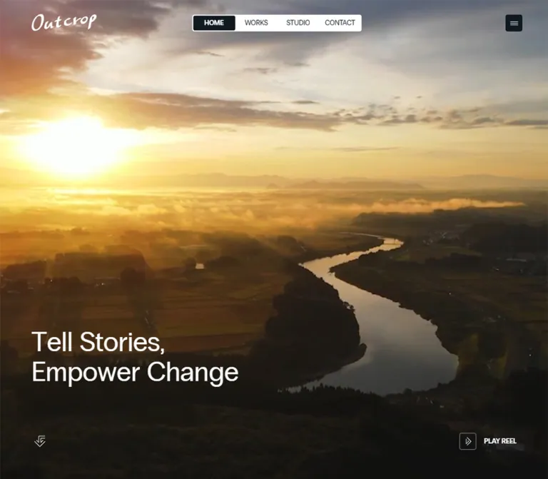
全画面の映像と白いコピーで始まる、秋田の映像制作会社の公式サイト。白地と濃紺のタイポグラフィ、大きな制作実績、余白のあるグリッドが特徴。
オリジナルサイトを見るCinematic footage framed by a handwritten signature, compact navigation, and precise editorial typography.
Original URL: https://outcrop.jp/ Final URL: https://outcrop.jp/ Theme: white document canvas and deep navy typography, with white interface elements over the opening footage. Inspected: September 13, 2026, at 08:25:40 UTC / 17:25:40 JST, using the supplied browser evidence. Viewports: 1440 × 1000 and 390 × 844 CSS pixels. Scope: the current corporate and portfolio homepage. Three desktop captures and two mobile captures visually document the opening hero. Rendered DOM and computed styles describe the introduction, selected projects, services, news, careers, footer, and additional interface elements. Lower sections and opened interactive states lack confirming screenshots.
Outcrop presents itself as an Akita film and creative company. Its homepage gives moving imagery the entire opening viewport, then introduces a substantial company and portfolio structure: mission, selected work, related services, updates, recruitment, and company information. The visual identity comes from the relationship between cinematic scale and small, carefully placed controls.
The opening composition is unusually economical. A white handwritten wordmark sits at the upper left, a compact segmented navigation bar sits at the desktop viewport center, and a small dark menu button occupies the upper right. The regular-weight statement “Tell Stories, Empower Change” sits low on the left. A fine angular scroll symbol and an outlined reel control anchor the lower corners.
The document beneath this opening uses a white body background and navy text in the supplied computed styles. Its measured structure combines an inset mission column, a two-column project grid, very large service names, and smaller information groups. Preserve this change of scale: immersive imagery first, then generous editorial space and clear access to the work.
Cinematic footage framed by a handwritten signature, compact navigation, and precise editorial typography.
Original URL: https://outcrop.jp/ Final URL: https://outcrop.jp/ Theme: white document canvas and deep navy typography, with white interface elements over the opening footage. Inspected: September 13, 2026, at 08:25:40 UTC / 17:25:40 JST, using the supplied browser evidence. Viewports: 1440 × 1000 and 390 × 844 CSS pixels. Scope: the current corporate and portfolio homepage. Three desktop captures and two mobile captures visually document the opening hero. Rendered DOM and computed styles describe the introduction, selected projects, services, news, careers, footer, and additional interface elements. Lower sections and opened interactive states lack confirming screenshots.
Outcrop presents itself as an Akita film and creative company. Its homepage gives moving imagery the entire opening viewport, then introduces a substantial company and portfolio structure: mission, selected work, related services, updates, recruitment, and company information. The visual identity comes from the relationship between cinematic scale and small, carefully placed controls.
The opening composition is unusually economical. A white handwritten wordmark sits at the upper left, a compact segmented navigation bar sits at the desktop viewport center, and a small dark menu button occupies the upper right. The regular-weight statement “Tell Stories, Empower Change” sits low on the left. A fine angular scroll symbol and an outlined reel control anchor the lower corners.
The document beneath this opening uses a white body background and navy text in the supplied computed styles. Its measured structure combines an inset mission column, a two-column project grid, very large service names, and smaller information groups. Preserve this change of scale: immersive imagery first, then generous editorial space and clear access to the work.
--oc- are reusable aliases introduced here. Original variables use the --app- prefix.The supplied screenshots establish the hero’s appearance strongly. Lower-page layout is supported by DOM geometry, but its final visual presentation after scrolling is less certain. Menu, reel, and service-detail elements occur in the DOM without a recorded opening interaction. Their presence must not be interpreted as proof that they were visible simultaneously.
No additional pages, asset files, or external destinations were opened for this reference.
| Name | Value | Source / reusable alias | Evidence and role |
|---|---|---|---|
| Deep Navy | #101820 |
--app-g-color-primary, --app-g-color-black, --app-g-color-link / --oc-ink |
Declared and computed. Body text and the visible menu-button background. |
| White | #ffffff |
--app-g-color-white / --oc-paper |
Declared and computed. Body background, hero heading, and wordmark link color. Visually used by the desktop navigation surface. |
| Preload Gray | #f3f3f3 |
--app-g-color-preload / --oc-preload |
Declared. No visible loading-state capture establishes its actual presentation. |
| Placeholder Green-Black | #212721 |
--app-g-color-placeholder / --oc-placeholder |
Declared. Suitable as a source-derived media fallback; its visible use was not confirmed. |
| Muted Navy | rgba(16,24,32,.75) |
Computed on the footer Home link | Measured in the DOM. A subdued link state, not a separate brand hue. |
The interface’s stable palette is navy and white. Amber architecture, dark red backgrounds, skin tones, and other colors belong to the captured footage. They should not become permanent interface accents.
| Family | Declared alpha values | Interpretation |
|---|---|---|
| Navy | 0, .05, .10, .15, .25, .50 |
Available dark overlays and subtle surface treatments. Individual assignments were not supplied. |
| White | .05, .25, .50, .75 |
Available light overlays, strokes, and secondary details. Individual assignments were not supplied. |
The reel icon’s border appears approximately 1px and translucent white. Using rgba(255,255,255,.5) is a reasonable reconstruction, but that specific binding is an estimate.
The footage is dark enough to support white text in the supplied frames. The evidence does not establish whether this comes from grading, an overlay, or both. Any scrim introduced in a new implementation must be labeled as a contrast treatment, not copied as a measured original value.
The custom-property dump also contains generic publishing-system gradients, vivid colors, and shadow presets. Their availability does not make them part of the observed design. Do not add purple gradients, bright green buttons, or deep card shadows merely because those variables exist.
Some outer anchors report browser blue, rgb(0,0,238), while their visible nested content is white or navy. Use the rendered appearance and relevant child styles when reconstructing navigation; browser-blue anchor values are not evidence for a blue accent system.
Declared family:
"Radio Grotesk", YakuHanJPs, "Hiragino Kaku Gothic ProN",
"Hiragino Sans", "BIZ UDPGothic", Meiryo,
-apple-system, BlinkMacSystemFont, sans-serif
Radio Grotesk is explicitly named in the source variables and computed styles. The evidence does not include its font-file URL or a loaded-font report, so this reference does not assert which file or cut supplied every glyph.
The main display voice is regular-weight grotesk typography: large but controlled, with normal tracking and tight leading. Bold weight distinguishes project titles and selected section labels. Avoid making every large heading bold; the regular-weight hero and service names are central to the hierarchy.
The separate Japanese source variable omits Radio Grotesk:
YakuHanJPs, "Hiragino Kaku Gothic ProN", "Hiragino Sans",
"BIZ UDPGothic", Meiryo,
-apple-system, BlinkMacSystemFont, sans-serif
The sampled Japanese paragraphs still report the broader English-first computed stack. That is compatible with glyph fallback; it does not establish that every paragraph explicitly uses the Japanese variable.
YakuHanJPs appears in an embedded font-face declaration. It should be treated as part of the source’s Japanese typesetting stack, not as the display typeface for the Latin headings.
The handwritten Outcrop signature is a graphic identity element. Its anchor is measured, but no wordmark asset URL or script-font declaration was supplied. Use an authorized brand asset rather than attempting to identify or substitute a cursive font.
Several native button elements report Arial at 13.3333px, including Play reel and Close. Links report the Radio Grotesk stack. Inner label styles were not exhaustively sampled, so do not infer an undocumented button font weight from the screenshot alone.
Values below are computed font size and parent line height, rounded to two decimals.
| Role | Desktop size / line height | Mobile size / line height | Weight | Evidence |
|---|---|---|---|---|
| Base body | 14.29 / 14.29px |
14 / 14px |
400 |
Computed body styles; paragraphs override leading. |
| Small labels and section kickers | 13.33 / 13.33px |
13 / 13px |
400–700 |
Utility links are regular; sampled section kickers are bold. |
| Hero statement | 60.95 / 60.95px |
40 / 40px |
400 |
Visible H1. |
| Mission statement | 60.95 / 60.95px |
32 / 32px |
400 |
DOM-measured H2. |
| Mission paragraph | 19.05 / 28.57px |
14 / 21px |
400 |
DOM-measured Japanese paragraph. |
| Selected works heading | 45.71 / 45.71px |
32 / 32px |
700 |
DOM-measured section heading. |
| Selected works introduction | 13.33 / 16.67px |
13 / 16.25px |
400 |
Compact Japanese description. |
| Project title | 19.05 / 23.81px |
18 / 22.5px |
700 |
Measured project headings. |
| Service name | 121.91 / 121.91px |
36 / 36px |
400 |
Measured linked service names. |
| Service-detail heading | 34.29 / 34.29px |
32 / 32px |
400 |
DOM-only detail elements; visibility unverified. |
| News and careers headline | 45.71 / 45.71px |
32 / 32px |
400 |
DOM-measured headings. |
| Additional menu primary link | 45.71 / 45.71px |
40 / 40px |
400 |
DOM-only menu elements; open appearance unverified. |
Headline box versus line height: the desktop hero H1 occupies 134.09px vertically, and the mobile H1 occupies 88px. Both are approximately 2.2em, although the sampled parent line height is 1. Split text wrappers affect the complete box. A two-line reconstruction with line-height: 1.1 approximates the measured result; it is not a claim about the original child CSS.
The root font size is measured at 10px in both viewports. Consequently, source 4rem means 40px, not 64px.
Relevant desktop declarations include:
--app-g-font-size-xs: clamp(1.3rem, 1/1512*100*14vw, 1.5rem);
--app-g-font-size-m: clamp(1.8rem, 1/1512*100*20vw, 2.4rem);
--app-g-font-size-xl: clamp(4rem, 1/1512*100*48vw, 5rem);
--app-g-font-size-2xl: clamp(5.2rem, 1/1512*100*64vw, 6.8rem);
--app-c-font-size-services: clamp(3.6rem, 1/1512*100*128vw, 17.6rem);
At 1440px wide, the 64vw expression produces 60.95px, and the service expression produces 121.90px. At 390px, the service formula reaches its 36px minimum.
Mobile typography also changes by role. The hero becomes 40px, while the mission and ordinary section headings become 32px. Applying the desktop display token uniformly on phones would miss this distinction.
The declared marquee token calculates to approximately 182.86px on desktop and 96px on mobile. Its actual applied element style and visible motion were not supplied.
| Source token | Desktop | Mobile | Interpretation |
|---|---|---|---|
--app-g-spacing-xs |
20px |
20px |
Small structural space. |
--app-g-spacing-s |
30px |
30px |
Label-to-headline rhythm in information groups. |
--app-g-spacing-m |
40px |
40px |
Common content separation. |
--app-g-spacing-l |
60px |
60px |
Larger internal spacing. |
--app-g-spacing-xl |
120px |
100px |
Major section rhythm. |
--app-g-spacing-2xl |
180px |
160px |
Large editorial spacing. |
--app-g-spacing-3xl |
240px |
220px |
Largest declared spacing. |
| Grid horizontal and vertical padding | 60px |
20px |
Declared outer grid insets. |
| Grid column and row gap | 20px |
20px |
Declared grid spacing. |
| Element | Value | Status |
|---|---|---|
| Standard UI size | 32px |
Declared and measured on the menu button. |
| Small radius | 4px |
Declared; computed on the menu button. |
| Medium radius | 6px |
Declared; no confirmed component assignment. |
| Desktop navigation item | 80 × 28px |
Measured. |
| Desktop navigation shell | Approximately 324 × 32px |
Visual estimate around four measured items. |
| Navigation shell padding | Approximately 2px |
Calculated reconstruction. |
| Reel icon frame | Approximately 32 × 32px |
Visual estimate consistent with the shared UI size. |
| Reel icon-to-label gap | Approximately 14px |
Visual estimate. |
| Project media ratio | 16 / 9 |
Calculated exactly from measured link boxes. |
The visible UI uses small-radius squares and a compact rectangular navigation bar. It does not use large pill-shaped calls to action. Project media links report zero border radius; their child image styling was not included.
A twelve-column grid is strongly supported by the measured widths and positions, although the grid container’s own column declaration was not supplied.
At 1440px:
60px each.1320px.11 × 20px = 220px.(1320 − 220) / 12 = 91.67px.| Span | Calculated width | Corresponding measured use |
|---|---|---|
| 2 columns | 203.33px |
Desktop footer information groups. |
| 4 columns | 426.67px |
Works introduction and project-title region. |
| 5 columns | 538.33px |
News and careers text region. |
| 6 columns | 650px |
Project media slots. |
| 8 columns | 873.33px |
Centered mission text column. |
On mobile, the usable width is 350px: 390 − 20 − 20. The project grid becomes one column. Footer groups retain a two-column arrangement of 165px each with a 20px gap.
Role: identity and primary navigation over the opening footage.
The header background is transparent in the sampled styles. Its measured height is 120px on desktop and 72px on mobile. The desktop source height is clamp(70px, calc(100vw / 12), 120px); mobile declares 72px directly.
The white wordmark anchor measures:
| Viewport | Position | Size |
|---|---|---|
| Desktop | x: 60px, y: 42.36px |
124.63 × 32px |
| Mobile | x: 20px, y: 22.5px |
93.47 × 24px |
The mobile mark is exactly three quarters of the desktop anchor size. The surrounding empty heading element is wider than the artwork; use the anchor dimensions when sizing the visible mark.
Only its opening position is confirmed. Fixed or sticky behavior after scrolling was not demonstrated.
Role: immediate access to Home, Works, Studio, and Contact.
Four equal 80px-wide links form a small white rectangle centered on the viewport. The measured link group runs from approximately x: 560px to x: 880px. A narrow surrounding white edge gives the overall shell an estimated width of 324px.
The active Home segment is dark navy with white text. Inactive labels appear navy on white. Labels are uppercase in the screenshots, compact, and tightly centered within 28px-high link boxes.
The navigation is centered independently of the wordmark and menu button. Reproduce it with absolute centering or a genuinely centered grid column; distributing all header children with space-between would produce a different alignment.
The segmented navigation is absent from the visible mobile header.
Role: access to a broader navigation set.
The visible button is 32 × 32px, navy, and rounded by 4px. Short white horizontal strokes form the icon. It sits at 1348,44 on desktop and 338,20 on mobile, preserving the respective 60px and 20px right insets.
Additional DOM elements include Close, four large primary links, News, Careers, Privacy Policy, social links, and another Play reel button. Desktop primary links begin around x: 1060px; mobile equivalents begin around x: 60px.
These measurements establish a separate navigation structure. They do not establish the open panel’s width, backdrop, entrance direction, or focus behavior. No open-menu screenshot or click result was supplied.
Role: communicate the company’s film practice before introducing explanatory content.
The section is measured at exactly 1440 × 1000px and 390 × 844px. Current screenshots show imagery reaching every edge, with no surrounding frame or letterboxing.
Its anatomy is:
The statement preserves the break after “Tell Stories,” in both inspected viewports. It is regular-weight, left aligned, and has normal tracking.
| Measurement | Desktop | Mobile |
|---|---|---|
| Heading position | 60, 683.91px |
20, 614px |
| Heading box | 1320 × 134.09px |
350 × 88px |
| Heading bottom | 818px |
702px |
| Heading-bottom clearance from viewport | 182px |
142px |
| Reel button position | 1269.55, 907.81px |
261.11, 791.81px |
| Reel button box | 110.45 × 32.38px |
108.89 × 32.38px |
A useful calculated relationship is that the heading bottom sits 122px above the outer bottom inset in both captures: 182 − 60 and 142 − 20. The gap from the heading box to the reel-button top is approximately 90px in both.
The Quick Start preserves this relationship as an adaptation. It does not assert that the original uses a 122px custom property.
Role: provide small media and progression controls without covering the footage.
Play reel consists of a fine square outline, an angular play-like symbol, and a short uppercase label. Its container remains transparent. The button is compact enough to read as a media utility rather than a large conversion CTA.
The lower-left symbol uses thin, bent, overlapping downward strokes. Its appearance suggests scrolling, but its exact target and scroll behavior were not supplied.
The DOM contains Play reel and Close controls in additional structures. A dedicated reel experience is therefore suggested, but its opening presentation, video controls, sound policy, and closing behavior remain unverified.
Role: translate the cinematic opening into the company’s mission.
The section follows the hero in the DOM. An English statement is paired with Japanese explanatory text and a Studio link.
On desktop, the principal text column begins at x: 283.33px and is 873.33px wide, matching an eight-column span with two columns of offset. On mobile, both text blocks use the full 350px inner width at x: 20px.
The English heading changes from 60.95px to 32px. The Japanese paragraph changes from 19.05px / 1.5 to 14px / 1.5. Its top is measured 40px below the English heading box at both widths.
The Studio link sits toward the right at the bottom of the desktop section and is centered on mobile. Preserve this as an editorial introduction with substantial space around the statement. The screenshots do not confirm any additional imagery or reveal treatment in this section.
Role: show actual projects and provide routes into the portfolio.
The desktop section header places the bold Selected works heading on the left and a compact Japanese introduction in the rightmost four columns. On mobile, the introduction follows the heading with a measured 20px gap.
The project grid contains four entries:
| Project title in the source | Client in the source |
|---|---|
| JAPAN'S TRUE WINTER | JR東日本秋田支社 |
| TORCH T01(YAMAHA) | ヤマハ株式会社 |
| トヨタおじさん「迷子」篇 | 秋田トヨタ自動車株式会社 |
| AKITA CITY PROMOTION「久しぶりに、帰ることにした。」 | 秋田市 |
All four expose a Commercial category link.
Each project has a separate media link, title link, client label, and category link. On desktop, media boxes measure 650 × 365.625px, arranged in two columns at x: 60px and x: 730px. On mobile, they measure 350 × 196.875px and stack vertically. Both ratios are exactly 16:9.
Project titles begin 20px below their media boxes. Desktop categories sit to the right of the title region; mobile categories move below the title and client information. The mobile gap from a category’s bottom to the following media slot is approximately 40px.
The longer fourth title wraps to two lines at both widths. Preserve natural wrapping rather than imposing equal single-line labels or truncation.
All works is centered beneath the grid. Actual project imagery, hover zooms, preview playback, and image loading treatments are not visible in the supplied screenshots.
Role: present the company’s connected activities as a typographic index.
The DOM names Outcrop Studios, Outcrop Cinema, Atle DELTA, and Non-profits. Three service names have measured anchors; the Non-profits entry is present in text, but an equivalent destination link was not supplied.
The linked names are exceptionally large on desktop: 121.91px regular type with approximately 128px-high boxes. On mobile, they use 36px type with approximately 37.8px-high boxes. The service list starts at the normal outer inset rather than inside the centered mission column.
Additional detail elements contain a heading, Japanese description, a View Details link for three entries, and an icon-only button. Their headings are white in the computed styles. Multiple detail groups occupy identical coordinates, so they cannot safely be interpreted as four simultaneously visible cards.
The declared transitions on service links include color, translation, and text-stroke changes. This supports an interactive treatment, but it does not establish whether details appear on hover, click, pointer movement, or another trigger. A new implementation should keep service destinations usable independently of any optional preview behavior.
Role: provide external routes to company updates and recruitment.
These are two vertically stacked editorial groups. On desktop, both occupy a five-column region beginning at approximately x: 730px, leaving the left part of the section outside the sampled text layout. On mobile, they use the full inner width at x: 20px.
Each group contains:
The measured kicker-to-headline gap is 30px. Another approximately 30px separates the headline and action. Desktop headlines are 45.71px; mobile headlines are 32px.
The note and Medium destinations are evidenced by anchors. Their external pages were not inspected. No supplied screenshot establishes what, if anything, fills the desktop section’s left region.
Role: conclude with identity, navigation, social links, and company location.
The footer measures one viewport high in both supplied DOM snapshots: 1000px on desktop and 844px on mobile.
Desktop Sitemap, Follow us, and Address groups occupy three two-column spans in the right half of the page. Their measured widths are approximately 203.33px, beginning at x: 730px, 953.33px, and 1176.66px.
On mobile, Sitemap and Follow us occupy two 165px columns. Address moves below them and spans the full 350px inner width. The source also contains a Google Maps link, Privacy Policy, and © 2026.
Six repetitions of “Outcrop, inc.” occur in the DOM, alongside a named marquee size token. This suggests a repeated identity treatment, but neither its visible arrangement nor its movement was recorded. Do not render six stacked wordmarks merely because the extracted text repeats six times.
| Treatment | Evidence | Value or limitation |
|---|---|---|
| Hero imagery changes | Current desktop and mobile captures show changing frames | Temporal imagery is supported. File type, duration, frame rate, playback policy, and loop boundaries are unknown. |
| Mobile menu-button visibility | Computed transition | opacity and visibility, 0.35s cubic-bezier(0.104, 0.204, 0.492, 1) |
| Additional navigation Close control | Computed transition | opacity 0.25s cubic-bezier(0.306, 0.968, 0.632, 1) |
| Service-link color | Computed transition | 0.25s cubic-bezier(0.306, 0.968, 0.632, 1) |
| Service-link translation | Computed transition | 1s cubic-bezier(0.642, 0, 0.328, 1) |
| Service-link text stroke | Computed transition | Stroke color and width use the same 0.25s easing as color. End states are unknown. |
| Split heading text | Character-level text appears in extraction | Compatible with animated typography, but entrance order, staggering, and duration are unverified. |
| Repeated link labels | Many links contain duplicate text | Compatible with layered label effects; no hover direction or timing was recorded. |
| Repeated footer identity | Six copies and a marquee-related token | Continuous movement is not established. |
| Reel and service-detail controls | Present in DOM | Opening, closing, keyboard handling, and playback outcomes were not exercised. |
Many sampled parent elements report animation: none. That does not establish that the experience is static: video, nested elements, transforms, and JavaScript-driven motion can operate independently of a parent’s CSS animation value.
For reuse, preserve the distinction between quick interface feedback and slower spatial movement. The measured service transitions use 250ms for color or stroke and 1000ms for translation. Avoid inventing a page-wide animation system from these isolated declarations.
| Layer | Appearance | Evidence boundary |
|---|---|---|
| Document canvas | White | Computed body background. |
| Opening media | Full-bleed cinematic imagery | Visually confirmed in both viewports. |
| Hero typography | White, directly over imagery | Visually and computationally confirmed. |
| Desktop navigation | White compact rectangle with navy active segment | Visually confirmed; outer dimensions estimated. |
| Menu control | Solid navy, 4px radius | Visually and computationally confirmed. |
| Reel control | Transparent with a fine outlined icon frame | Visually confirmed; exact border alpha estimated. |
| Lower content sections | Transparent sampled containers with navy text over the white body | DOM evidence; complete rendered surfaces were not visually captured. |
| Service details | White text on an unspecified underlying surface | Text styles measured; surface and open presentation unknown. |
No shadow-based elevation system is visible in the opening captures. The generic shadow presets in the variable dump are insufficient evidence for adding elevated cards elsewhere.
The current desktop captures show an amber-lit built environment with tiled roofs, narrow streets, and a person moving through the scene. Subsequent desktop frames use a closer view of the person and surrounding architecture. The phone captures show a tightly framed expressive face with visible injury or makeup detail, against darker red and teal surroundings.
These frames make the film work feel immediate and physical. Architecture, faces, light, and movement carry the emotional content, while the interface remains restrained.
The mobile composition fills the tall viewport and crops the subject substantially. This supports using cover-like media behavior as a reconstruction. It does not prove the original object-fit declaration or a separate mobile video source. Different desktop and mobile frames alone cannot establish different source files.
No direct hero-video, poster, wordmark, or project-image URL was included in the supplied evidence.
| Asset role | What is established | What remains unknown |
|---|---|---|
| Wordmark | White handwritten signature and measured anchor dimensions | File URL and exact asset format. |
| Hero media | Changing full-viewport cinematic imagery | Source URL, encoding, duration, audio, poster, and breakpoint-specific sourcing. |
| Project media | Four linked 16:9 slots with measured dimensions | Actual image contents, URLs, and hover behavior. |
| Interface symbols | Fine angular linework visible in the hero | Individual symbol paths and asset files. |
| Service-detail media | Additional detail content exists | Whether a panel contains photography, video, a flat fill, or another treatment. |
Project titles must not be used to invent the unseen thumbnails. Likewise, the captured hero scenes should not be assigned to a particular project without direct evidence.
For a new implementation, use authorized footage and wordmark artwork. Keep natural photographic detail, deliberate focal points, and crisp interface symbols. CSS can reproduce the shell, but the footage supplies much of its identity.
| Feature | 1440 × 1000 | 390 × 844 |
|---|---|---|
| Outer inset | 60px |
20px |
| Header height | 120px |
72px |
| Wordmark height | 32px |
24px |
| Segmented navigation | Visible | Not visible |
| Menu-button face | 32 × 32px |
32 × 32px |
| Hero heading | 60.95px, two lines |
40px, two lines |
| Mission heading | 60.95px |
32px |
| Mission column | Centered, 873.33px |
Full inner width, 350px |
| Project arrangement | Two columns | One column |
| Project media | 650 × 365.625px |
350 × 196.875px |
| Service names | 121.91px |
36px |
| Updates text region | Right-side five-column span | Full inner width |
| Footer information | Three groups in the right half | Two groups across, address below |
These are role-specific layout changes, not uniform scaling of the desktop page. Utility controls remain small, while major text and content widths change more substantially.
The following values are measured DOM bounds, rounded to two decimals. They describe the captured layout state, not prescribed fixed heights.
| Section | Desktop start / height | Mobile start / height |
|---|---|---|
| Hero | 0 / 1000px |
0 / 844px |
| Who we are | 1000 / 904.73px |
844 / 875.38px |
| Selected works | 1904.73 / 1404.58px |
1719.38 / 1707.94px |
| Studio & Services | 3309.31 / 805.33px |
3427.31 / 340.36px |
| News and careers | 4114.64 / 808.88px |
3767.67 / 833.50px |
| Footer | 4923.52 / 1000px |
4601.17 / 844px |
The mobile works section becomes taller because four projects stack. The service section becomes much shorter as its oversized desktop text contracts. Large spaces elsewhere remain substantial rather than collapsing into a dense phone layout.
The reported document height equals the viewport height, while the main element spans approximately 5923.52px on desktop and 5445.17px on mobile. Root scroll metrics therefore do not describe the complete content extent. A scrolling wrapper or transform-based arrangement is possible, but the exact mechanism was not provided.
Do not reproduce a viewport-only document with inaccessible overflow on the basis of that single metric. The Quick Start uses normal document flow as a recommended baseline.
The source includes a 1024px minimum-width reference variable, but no actual media-query boundary was supplied. The Quick Start chooses a 1024px layout switch as an implementation assumption. Tablet, landscape-phone, browser-toolbar resizing, and intermediate breakpoints were not separately inspected.
#101820 and white.These are recommendations for a new implementation, not verified original features.
aria-current for the current navigation link.#ffffff.#101820.#f3f3f3 and #212721; visible use unverified.“Create a corporate and film-production portfolio homepage inspired by the current Outcrop composition. Begin with full-viewport cinematic footage, a white handwritten brand asset at the upper left, a compact white four-segment navigation centered on desktop, and a 32px navy menu face at the upper right. Place a regular-weight white two-line statement low on the left, a fine angular scroll cue below it, and a small outlined reel action at the lower right. Use a white document canvas, deep navy #101820, and Radio Grotesk when licensed and available, with Japanese sans-serif fallbacks. Continue with a centered mission column, four 16:9 project entries in a two-column desktop grid, oversized regular service names, news and careers groups, and a structured footer. Use 60px desktop insets, 20px mobile insets, and 20px grid gaps. On mobile, hide the segmented navigation, use a 40px hero heading, and stack project entries. Specify interactive states separately rather than inventing behavior from static captures.”
This is a reusable adaptation, not the original stylesheet. Source rem values are converted to pixels so the surrounding application can retain its normal root font size. The code reproduces key hero relationships, type roles, media ratios, and grid alignments. Lower-section heights remain content-driven instead of being locked to captured coordinates.
The 1024px layout switch, 25% hero scrim, 1.1 display leading, and expanded menu hit area are implementation choices. No font or media URLs are invented here: provide licensed fonts, a wordmark asset, footage, poster, and project images separately.
:root {
  /* Source-supported colors */
  --oc-ink: #101820;
  --oc-paper: #ffffff;
  --oc-preload: #f3f3f3;
  --oc-placeholder: #212721;
  --oc-white-a50: rgba(255, 255, 255, .5);

  /* Recommended scrim; original opacity is unverified */
  --oc-hero-scrim: rgba(16, 24, 32, .25);

  /* Source-declared families; supply licensed font files separately */
  --oc-font-en: 'Radio Grotesk', YakuHanJPs,
    'Hiragino Kaku Gothic ProN', 'Hiragino Sans',
    'BIZ UDPGothic', Meiryo, -apple-system,
    BlinkMacSystemFont, sans-serif;
  --oc-font-ja: YakuHanJPs, 'Hiragino Kaku Gothic ProN',
    'Hiragino Sans', 'BIZ UDPGothic', Meiryo,
    -apple-system, BlinkMacSystemFont, sans-serif;

  /* Source-derived fluid scales and captured role sizes */
  --oc-text-body: 14.2857px;
  --oc-text-utility: clamp(13px, .925926vw, 15px);
  --oc-text-project: clamp(18px, 1.322751vw, 24px);
  --oc-text-section: clamp(40px, 3.174603vw, 50px);
  --oc-text-hero: clamp(52px, 4.232804vw, 68px);
  --oc-text-mission: var(--oc-text-hero);
  --oc-text-mission-body: var(--oc-text-project);
  --oc-text-service: clamp(36px, 8.465608vw, 176px);
  --oc-text-marquee: clamp(96px, 12.698413vw, 240px);

  --oc-space-xs: 20px;
  --oc-space-s: 30px;
  --oc-space-m: 40px;
  --oc-space-l: 60px;
  --oc-space-xl: 120px;
  --oc-space-2xl: 180px;
  --oc-space-3xl: 240px;
  --oc-inset: 60px;
  --oc-grid-gap: 20px;

  --oc-header-height: clamp(70px, calc(100vw / 12), 120px);
  --oc-ui-size: 32px;
  --oc-radius-ui: 4px;
  --oc-logo-width: 124.625px;
  --oc-logo-height: 32px;

  /* Calculated from the two captured hero heading boxes */
  --oc-hero-title-clearance: 122px;

  --oc-ease-fast: cubic-bezier(.306, .968, .632, 1);
  --oc-ease-move: cubic-bezier(.642, 0, .328, 1);
  --oc-motion-fast: 250ms var(--oc-ease-fast);
  --oc-motion-move: 1000ms var(--oc-ease-move);
}

.oc-page,
.oc-page * {
  box-sizing: border-box;
}

.oc-page {
  position: relative;
  color: var(--oc-ink);
  background: var(--oc-paper);
  font-family: var(--oc-font-en);
  font-size: var(--oc-text-body);
  font-weight: 400;
  line-height: 1.5;
}

.oc-page :where(h1, h2, h3, p) {
  margin: 0;
}

.oc-page a {
  color: inherit;
}

.oc-page button {
  font: inherit;
}

/* Opening position only; sticky behavior was not established */
.oc-header {
  position: absolute;
  z-index: 10;
  inset: 0 0 auto;
  display: flex;
  align-items: center;
  justify-content: space-between;
  height: var(--oc-header-height);
  padding-inline: var(--oc-inset);
}

.oc-brand {
  display: block;
  width: var(--oc-logo-width);
  height: var(--oc-logo-height);
  color: var(--oc-paper);
  transform: translateY(-1.5px);
}

.oc-brand > :is(img, svg) {
  display: block;
  width: 100%;
  height: 100%;
  object-fit: contain;
}

.oc-nav {
  position: absolute;
  top: 50%;
  left: 50%;
  display: flex;
  padding: 2px;
  border-radius: var(--oc-radius-ui);
  background: var(--oc-paper);
  transform: translate(-50%, -50%);
}

.oc-nav a {
  display: grid;
  place-items: center;
  width: 80px;
  height: 28px;
  color: var(--oc-ink);
  font-size: var(--oc-text-utility);
  line-height: 1;
  text-transform: uppercase;
  text-decoration: none;
}

.oc-nav a[aria-current='page'] {
  border-radius: 2px;
  color: var(--oc-paper);
  background: var(--oc-ink);
}

/* Recommended 44px hit area around the observed 32px face */
.oc-menu-toggle {
  display: grid;
  place-items: center;
  width: 44px;
  height: 44px;
  margin-inline-end: -6px;
  padding: 6px;
  border: 0;
  color: var(--oc-paper);
  background: transparent;
  cursor: pointer;
}

.oc-menu-toggle__face {
  display: grid;
  place-items: center;
  width: var(--oc-ui-size);
  height: var(--oc-ui-size);
  border-radius: var(--oc-radius-ui);
  background: var(--oc-ink);
}

.oc-hero {
  position: relative;
  isolation: isolate;
  min-height: 100vh;
  min-height: 100svh;
  color: var(--oc-paper);
  background: var(--oc-ink);
}

.oc-hero__media {
  position: absolute;
  z-index: -2;
  inset: 0;
  display: block;
  width: 100%;
  height: 100%;
  object-fit: cover;
  object-position: center;
}

.oc-hero::before {
  position: absolute;
  z-index: -1;
  inset: 0;
  content: '';
  background: var(--oc-hero-scrim);
  pointer-events: none;
}

.oc-hero__title {
  position: absolute;
  inset-inline: var(--oc-inset);
  bottom: calc(var(--oc-inset) + var(--oc-hero-title-clearance));
  font-size: var(--oc-text-hero);
  font-weight: 400;
  line-height: 1.1;
  letter-spacing: normal;
}

.oc-hero__title > span {
  display: block;
}

.oc-hero__actions {
  position: absolute;
  inset-inline: var(--oc-inset);
  bottom: calc(var(--oc-inset) - 6px);
  display: flex;
  align-items: center;
  justify-content: space-between;
}

.oc-icon-action {
  display: inline-flex;
  align-items: center;
  gap: 14px;
  min-height: 44px;
  padding: 0;
  border: 0;
  color: inherit;
  background: transparent;
  font-family: var(--oc-font-en);
  font-size: var(--oc-text-utility);
  line-height: 1;
  text-transform: uppercase;
  text-decoration: none;
  cursor: pointer;
}

.oc-icon-action__frame {
  display: grid;
  place-items: center;
  flex: 0 0 var(--oc-ui-size);
  width: var(--oc-ui-size);
  height: var(--oc-ui-size);
  border: 1px solid var(--oc-white-a50);
  border-radius: var(--oc-radius-ui);
}

.oc-icon-action--scroll {
  min-width: 44px;
  margin-inline-start: -6px;
  justify-content: center;
}

.oc-section {
  padding: var(--oc-space-xl) var(--oc-inset);
}

.oc-grid {
  display: grid;
  grid-template-columns: repeat(12, minmax(0, 1fr));
  column-gap: var(--oc-grid-gap);
}

.oc-kicker {
  font-size: var(--oc-text-utility);
  font-weight: 700;
  line-height: 1;
  text-transform: uppercase;
}

.oc-mission__content {
  grid-column: 3 / span 8;
}

.oc-mission__title {
  font-size: var(--oc-text-mission);
  font-weight: 400;
  line-height: 1.1;
}

.oc-mission__copy {
  margin-top: var(--oc-space-m);
  font-family: var(--oc-font-ja);
  font-size: var(--oc-text-mission-body);
  line-height: 1.5;
}

.oc-mission__link {
  grid-column: 11 / -1;
  justify-self: start;
  margin-top: var(--oc-space-xl);
}

.oc-works__header {
  margin-bottom: var(--oc-space-m);
}

.oc-works__heading {
  grid-column: 1 / span 6;
  font-size: var(--oc-text-section);
  font-weight: 700;
  line-height: 1.1;
}

.oc-works__intro {
  grid-column: 9 / span 4;
  font-family: var(--oc-font-ja);
  font-size: var(--oc-text-utility);
  line-height: 1.25;
}

.oc-works__grid {
  display: grid;
  grid-template-columns: repeat(2, minmax(0, 1fr));
  gap: var(--oc-space-m) var(--oc-grid-gap);
}

.oc-work__media {
  display: block;
  aspect-ratio: 16 / 9;
  overflow: hidden;
  border-radius: 0;
  background: var(--oc-placeholder);
}

.oc-work__media > :is(img, video) {
  display: block;
  width: 100%;
  height: 100%;
  object-fit: cover;
}

.oc-work__meta {
  display: grid;
  grid-template-columns: repeat(6, minmax(0, 1fr));
  gap: var(--oc-grid-gap);
  margin-top: var(--oc-space-xs);
}

.oc-work__info {
  grid-column: 1 / span 4;
}

.oc-work__title {
  font-size: var(--oc-text-project);
  font-weight: 700;
  line-height: 1.25;
}

.oc-work__title a {
  text-decoration: none;
}

/* Client spacing is an adaptation; its original style was not sampled */
.oc-work__client {
  margin-top: 6px;
  font-size: var(--oc-text-body);
  line-height: 1.5;
}

.oc-work__category {
  grid-column: 5 / span 2;
  align-self: start;
  justify-self: end;
  margin-inline-end: 20px;
  font-size: var(--oc-text-utility);
  line-height: 1;
  text-transform: uppercase;
  text-decoration: none;
}

.oc-works__more {
  display: flex;
  justify-content: center;
  margin-top: var(--oc-space-xl);
}

.oc-services__list {
  margin: var(--oc-space-xl) 0 0;
  padding: 0;
  list-style: none;
}

.oc-service-link {
  display: inline-block;
  padding-bottom: .05em;
  font-size: var(--oc-text-service);
  font-weight: 400;
  line-height: 1;
  text-decoration: none;
  transition:
    color var(--oc-motion-fast),
    translate var(--oc-motion-move);
}

/* Hover and detail-panel end states require separate specification */
.oc-updates__content {
  grid-column: 7 / span 5;
}

.oc-update + .oc-update {
  margin-top: 80px;
}

.oc-update__title {
  margin-top: var(--oc-space-s);
  font-size: var(--oc-text-section);
  font-weight: 400;
  line-height: 1;
}

.oc-update__action {
  display: inline-flex;
  margin-top: var(--oc-space-s);
}

.oc-update__copy {
  margin-top: var(--oc-space-xs);
  font-family: var(--oc-font-ja);
}

.oc-footer {
  min-height: 100vh;
  min-height: 100svh;
  padding: var(--oc-space-xl) var(--oc-inset) var(--oc-space-l);
}

/* A static brand treatment; continuous motion is not assumed */
.oc-footer__brand {
  overflow: hidden;
  font-size: var(--oc-text-marquee);
  line-height: 1;
  white-space: nowrap;
}

.oc-footer__groups {
  margin-top: var(--oc-space-l);
}

.oc-footer__sitemap {
  grid-column: 7 / span 2;
}

.oc-footer__social {
  grid-column: 9 / span 2;
}

.oc-footer__address {
  grid-column: 11 / span 2;
}

.oc-footer__links {
  display: grid;
  gap: 6px;
  margin-top: var(--oc-space-s);
}

.oc-footer__links a {
  text-decoration: none;
}

/* Recommended keyboard focus treatment */
.oc-page :focus-visible {
  outline: 2px solid currentColor;
  outline-offset: 4px;
}

/* Chosen adaptation breakpoint; original media queries were not supplied */
@media (max-width: 1023px) {
  :root {
    --oc-inset: 20px;
    --oc-header-height: 72px;
    --oc-logo-width: 93.46875px;
    --oc-logo-height: 24px;
    --oc-text-body: 14px;
    --oc-text-utility: 13px;
    --oc-text-project: clamp(18px, 1.455026vw, 24px);
    --oc-text-section: 32px;
    --oc-text-hero: 40px;
    --oc-text-mission: 32px;
    --oc-text-mission-body: 14px;
    --oc-space-xl: 100px;
    --oc-space-2xl: 160px;
    --oc-space-3xl: 220px;
  }

  .oc-nav {
    display: none;
  }

  .oc-grid {
    grid-template-columns: repeat(2, minmax(0, 1fr));
  }

  .oc-mission__content,
  .oc-mission__link,
  .oc-works__heading,
  .oc-works__intro,
  .oc-updates__content {
    grid-column: 1 / -1;
  }

  .oc-mission__link {
    justify-self: center;
  }

  .oc-works__intro {
    margin-top: var(--oc-space-xs);
  }

  .oc-works__grid {
    grid-template-columns: minmax(0, 1fr);
  }

  .oc-work__meta {
    grid-template-columns: minmax(0, 1fr);
  }

  .oc-work__info,
  .oc-work__category {
    grid-column: 1;
  }

  .oc-work__category {
    justify-self: start;
    margin-inline-end: 0;
  }

  .oc-works__more {
    margin-top: var(--oc-space-l);
  }

  .oc-services,
  .oc-updates {
    padding-block: var(--oc-space-l);
  }

  .oc-services__list {
    margin-top: 78px;
  }

  .oc-services__list > li + li {
    margin-top: 5px;
  }

  .oc-footer__sitemap {
    grid-column: 1;
  }

  .oc-footer__social {
    grid-column: 2;
  }

  .oc-footer__address {
    grid-column: 1 / -1;
    margin-top: 90px;
  }
}

@media (prefers-reduced-motion: reduce) {
  .oc-page *,
  .oc-page *::before,
  .oc-page *::after {
    animation: none !important;
    transition: none !important;
    scroll-behavior: auto !important;
  }

  /* Also pause background video in JavaScript and display its poster. */
}
Use .oc-header and the main content inside .oc-page. The hero contains its media, heading, and lower action row. Give .oc-hero__title two spans for the observed line break. Use .oc-menu-toggle__face inside the larger menu button and provide an accessible label on the button itself.
Use .oc-grid together with .oc-works__header, .oc-footer__groups, and the mission or updates containers. Each work entry contains .oc-work__media followed by .oc-work__meta, with .oc-work__info and .oc-work__category as siblings.
The CSS deliberately leaves menu opening, reel playback, service previews, and video preference handling to application logic. It has not been executed against the original assets. Validate font metrics and media focal points before treating it as a pixel-level reproduction.
Optional aliases for projects already using Tailwind v4. This is not evidence that the original site uses Tailwind. Define the --oc- variables above first.
@theme inline {
  --color-outcrop-ink: var(--oc-ink);
  --color-outcrop-paper: var(--oc-paper);
  --color-outcrop-placeholder: var(--oc-placeholder);

  --font-outcrop: var(--oc-font-en);
  --font-outcrop-ja: var(--oc-font-ja);

  --text-outcrop-utility: var(--oc-text-utility);
  --text-outcrop-project: var(--oc-text-project);
  --text-outcrop-section: var(--oc-text-section);
  --text-outcrop-hero: var(--oc-text-hero);
  --text-outcrop-service: var(--oc-text-service);

  --spacing-outcrop-inset: var(--oc-inset);
  --spacing-outcrop-gap: var(--oc-grid-gap);
  --spacing-outcrop-ui: var(--oc-ui-size);
  --radius-outcrop-ui: var(--oc-radius-ui);
}
2026-09-13T08:25:40.183Z, equivalent to September 13, 2026, 17:25:40.183 JST.This reference describes the current homepage using the supplied capture set. Measurements, source declarations, visual estimates, and implementation recommendations are distinguished throughout.
# Outcrop — Style Reference

> Cinematic footage framed by a handwritten signature, compact navigation, and precise editorial typography.

**Original URL:** [https://outcrop.jp/](https://outcrop.jp/)
**Final URL:** [https://outcrop.jp/](https://outcrop.jp/)
**Theme:** white document canvas and deep navy typography, with white interface elements over the opening footage.
**Inspected:** September 13, 2026, at 08:25:40 UTC / 17:25:40 JST, using the supplied browser evidence.
**Viewports:** 1440 × 1000 and 390 × 844 CSS pixels.
**Scope:** the current corporate and portfolio homepage. Three desktop captures and two mobile captures visually document the opening hero. Rendered DOM and computed styles describe the introduction, selected projects, services, news, careers, footer, and additional interface elements. Lower sections and opened interactive states lack confirming screenshots.

Outcrop presents itself as an Akita film and creative company. Its homepage gives moving imagery the entire opening viewport, then introduces a substantial company and portfolio structure: mission, selected work, related services, updates, recruitment, and company information. The visual identity comes from the relationship between cinematic scale and small, carefully placed controls.

The opening composition is unusually economical. A white handwritten wordmark sits at the upper left, a compact segmented navigation bar sits at the desktop viewport center, and a small dark menu button occupies the upper right. The regular-weight statement “Tell Stories, Empower Change” sits low on the left. A fine angular scroll symbol and an outlined reel control anchor the lower corners.

The document beneath this opening uses a white body background and navy text in the supplied computed styles. Its measured structure combines an inset mission column, a two-column project grid, very large service names, and smaller information groups. Preserve this change of scale: immersive imagery first, then generous editorial space and clear access to the work.
# Outcrop — Style Reference

> Cinematic footage framed by a handwritten signature, compact navigation, and precise editorial typography.

**Original URL:** [https://outcrop.jp/](https://outcrop.jp/)
**Final URL:** [https://outcrop.jp/](https://outcrop.jp/)
**Theme:** white document canvas and deep navy typography, with white interface elements over the opening footage.
**Inspected:** September 13, 2026, at 08:25:40 UTC / 17:25:40 JST, using the supplied browser evidence.
**Viewports:** 1440 × 1000 and 390 × 844 CSS pixels.
**Scope:** the current corporate and portfolio homepage. Three desktop captures and two mobile captures visually document the opening hero. Rendered DOM and computed styles describe the introduction, selected projects, services, news, careers, footer, and additional interface elements. Lower sections and opened interactive states lack confirming screenshots.

Outcrop presents itself as an Akita film and creative company. Its homepage gives moving imagery the entire opening viewport, then introduces a substantial company and portfolio structure: mission, selected work, related services, updates, recruitment, and company information. The visual identity comes from the relationship between cinematic scale and small, carefully placed controls.

The opening composition is unusually economical. A white handwritten wordmark sits at the upper left, a compact segmented navigation bar sits at the desktop viewport center, and a small dark menu button occupies the upper right. The regular-weight statement “Tell Stories, Empower Change” sits low on the left. A fine angular scroll symbol and an outlined reel control anchor the lower corners.

The document beneath this opening uses a white body background and navy text in the supplied computed styles. Its measured structure combines an inset mission column, a two-column project grid, very large service names, and smaller information groups. Preserve this change of scale: immersive imagery first, then generous editorial space and clear access to the work.

## How to Read This Reference

- **Measured** means supplied element bounds or computed styles. Measurements belong to the captured state, including elements outside the visible viewport.
- **Declared** means a supplied CSS custom property. A declaration alone does not prove that its color, shadow, or animation appeared on screen.
- **Visual estimate** means an approximation from the current desktop or mobile screenshots.
- **Calculated** means arithmetic based on measured bounds or declared formulas.
- **Recommended** means implementation guidance for a new project. It does not describe a verified feature of the original.
- Tokens beginning with `--oc-` are reusable aliases introduced here. Original variables use the `--app-` prefix.

The supplied screenshots establish the hero’s appearance strongly. Lower-page layout is supported by DOM geometry, but its final visual presentation after scrolling is less certain. Menu, reel, and service-detail elements occur in the DOM without a recorded opening interaction. Their presence must not be interpreted as proof that they were visible simultaneously.

No additional pages, asset files, or external destinations were opened for this reference.

## Tokens — Colors

### Core Palette

| Name | Value | Source / reusable alias | Evidence and role |
| --- | --- | --- | --- |
| Deep Navy | `#101820` | `--app-g-color-primary`, `--app-g-color-black`, `--app-g-color-link` / `--oc-ink` | Declared and computed. Body text and the visible menu-button background. |
| White | `#ffffff` | `--app-g-color-white` / `--oc-paper` | Declared and computed. Body background, hero heading, and wordmark link color. Visually used by the desktop navigation surface. |
| Preload Gray | `#f3f3f3` | `--app-g-color-preload` / `--oc-preload` | Declared. No visible loading-state capture establishes its actual presentation. |
| Placeholder Green-Black | `#212721` | `--app-g-color-placeholder` / `--oc-placeholder` | Declared. Suitable as a source-derived media fallback; its visible use was not confirmed. |
| Muted Navy | `rgba(16,24,32,.75)` | Computed on the footer Home link | Measured in the DOM. A subdued link state, not a separate brand hue. |

The interface’s stable palette is navy and white. Amber architecture, dark red backgrounds, skin tones, and other colors belong to the captured footage. They should not become permanent interface accents.

### Transparency Tokens

| Family | Declared alpha values | Interpretation |
| --- | --- | --- |
| Navy | `0`, `.05`, `.10`, `.15`, `.25`, `.50` | Available dark overlays and subtle surface treatments. Individual assignments were not supplied. |
| White | `.05`, `.25`, `.50`, `.75` | Available light overlays, strokes, and secondary details. Individual assignments were not supplied. |

The reel icon’s border appears approximately 1px and translucent white. Using `rgba(255,255,255,.5)` is a reasonable reconstruction, but that specific binding is an estimate.

The footage is dark enough to support white text in the supplied frames. The evidence does not establish whether this comes from grading, an overlay, or both. Any scrim introduced in a new implementation must be labeled as a contrast treatment, not copied as a measured original value.

### Palette Boundaries

The custom-property dump also contains generic publishing-system gradients, vivid colors, and shadow presets. Their availability does not make them part of the observed design. Do not add purple gradients, bright green buttons, or deep card shadows merely because those variables exist.

Some outer anchors report browser blue, `rgb(0,0,238)`, while their visible nested content is white or navy. Use the rendered appearance and relevant child styles when reconstructing navigation; browser-blue anchor values are not evidence for a blue accent system.

## Tokens — Typography

### English Display and Interface Stack

**Declared family:**

```css
"Radio Grotesk", YakuHanJPs, "Hiragino Kaku Gothic ProN",
"Hiragino Sans", "BIZ UDPGothic", Meiryo,
-apple-system, BlinkMacSystemFont, sans-serif
```

Radio Grotesk is explicitly named in the source variables and computed styles. The evidence does not include its font-file URL or a loaded-font report, so this reference does not assert which file or cut supplied every glyph.

The main display voice is regular-weight grotesk typography: large but controlled, with normal tracking and tight leading. Bold weight distinguishes project titles and selected section labels. Avoid making every large heading bold; the regular-weight hero and service names are central to the hierarchy.

### Japanese Text Stack

The separate Japanese source variable omits Radio Grotesk:

```css
YakuHanJPs, "Hiragino Kaku Gothic ProN", "Hiragino Sans",
"BIZ UDPGothic", Meiryo,
-apple-system, BlinkMacSystemFont, sans-serif
```

The sampled Japanese paragraphs still report the broader English-first computed stack. That is compatible with glyph fallback; it does not establish that every paragraph explicitly uses the Japanese variable.

YakuHanJPs appears in an embedded font-face declaration. It should be treated as part of the source’s Japanese typesetting stack, not as the display typeface for the Latin headings.

### Wordmark and Button Typography

The handwritten Outcrop signature is a graphic identity element. Its anchor is measured, but no wordmark asset URL or script-font declaration was supplied. Use an authorized brand asset rather than attempting to identify or substitute a cursive font.

Several native button elements report Arial at `13.3333px`, including Play reel and Close. Links report the Radio Grotesk stack. Inner label styles were not exhaustively sampled, so do not infer an undocumented button font weight from the screenshot alone.

### Type Scale

Values below are computed font size and parent line height, rounded to two decimals.

| Role | Desktop size / line height | Mobile size / line height | Weight | Evidence |
| --- | --- | --- | --- | --- |
| Base body | `14.29 / 14.29px` | `14 / 14px` | `400` | Computed body styles; paragraphs override leading. |
| Small labels and section kickers | `13.33 / 13.33px` | `13 / 13px` | `400–700` | Utility links are regular; sampled section kickers are bold. |
| Hero statement | `60.95 / 60.95px` | `40 / 40px` | `400` | Visible H1. |
| Mission statement | `60.95 / 60.95px` | `32 / 32px` | `400` | DOM-measured H2. |
| Mission paragraph | `19.05 / 28.57px` | `14 / 21px` | `400` | DOM-measured Japanese paragraph. |
| Selected works heading | `45.71 / 45.71px` | `32 / 32px` | `700` | DOM-measured section heading. |
| Selected works introduction | `13.33 / 16.67px` | `13 / 16.25px` | `400` | Compact Japanese description. |
| Project title | `19.05 / 23.81px` | `18 / 22.5px` | `700` | Measured project headings. |
| Service name | `121.91 / 121.91px` | `36 / 36px` | `400` | Measured linked service names. |
| Service-detail heading | `34.29 / 34.29px` | `32 / 32px` | `400` | DOM-only detail elements; visibility unverified. |
| News and careers headline | `45.71 / 45.71px` | `32 / 32px` | `400` | DOM-measured headings. |
| Additional menu primary link | `45.71 / 45.71px` | `40 / 40px` | `400` | DOM-only menu elements; open appearance unverified. |

**Headline box versus line height:** the desktop hero H1 occupies `134.09px` vertically, and the mobile H1 occupies `88px`. Both are approximately `2.2em`, although the sampled parent line height is `1`. Split text wrappers affect the complete box. A two-line reconstruction with `line-height: 1.1` approximates the measured result; it is not a claim about the original child CSS.

### Source Scaling

The root font size is measured at `10px` in both viewports. Consequently, source `4rem` means `40px`, not `64px`.

Relevant desktop declarations include:

```css
--app-g-font-size-xs: clamp(1.3rem, 1/1512*100*14vw, 1.5rem);
--app-g-font-size-m: clamp(1.8rem, 1/1512*100*20vw, 2.4rem);
--app-g-font-size-xl: clamp(4rem, 1/1512*100*48vw, 5rem);
--app-g-font-size-2xl: clamp(5.2rem, 1/1512*100*64vw, 6.8rem);
--app-c-font-size-services: clamp(3.6rem, 1/1512*100*128vw, 17.6rem);
```

At 1440px wide, the `64vw` expression produces `60.95px`, and the service expression produces `121.90px`. At 390px, the service formula reaches its `36px` minimum.

Mobile typography also changes by role. The hero becomes 40px, while the mission and ordinary section headings become 32px. Applying the desktop display token uniformly on phones would miss this distinction.

The declared marquee token calculates to approximately `182.86px` on desktop and `96px` on mobile. Its actual applied element style and visible motion were not supplied.

## Tokens — Spacing & Shapes

### Spacing Scale

| Source token | Desktop | Mobile | Interpretation |
| --- | --- | --- | --- |
| `--app-g-spacing-xs` | `20px` | `20px` | Small structural space. |
| `--app-g-spacing-s` | `30px` | `30px` | Label-to-headline rhythm in information groups. |
| `--app-g-spacing-m` | `40px` | `40px` | Common content separation. |
| `--app-g-spacing-l` | `60px` | `60px` | Larger internal spacing. |
| `--app-g-spacing-xl` | `120px` | `100px` | Major section rhythm. |
| `--app-g-spacing-2xl` | `180px` | `160px` | Large editorial spacing. |
| `--app-g-spacing-3xl` | `240px` | `220px` | Largest declared spacing. |
| Grid horizontal and vertical padding | `60px` | `20px` | Declared outer grid insets. |
| Grid column and row gap | `20px` | `20px` | Declared grid spacing. |

### Geometry

| Element | Value | Status |
| --- | --- | --- |
| Standard UI size | `32px` | Declared and measured on the menu button. |
| Small radius | `4px` | Declared; computed on the menu button. |
| Medium radius | `6px` | Declared; no confirmed component assignment. |
| Desktop navigation item | `80 × 28px` | Measured. |
| Desktop navigation shell | Approximately `324 × 32px` | Visual estimate around four measured items. |
| Navigation shell padding | Approximately `2px` | Calculated reconstruction. |
| Reel icon frame | Approximately `32 × 32px` | Visual estimate consistent with the shared UI size. |
| Reel icon-to-label gap | Approximately `14px` | Visual estimate. |
| Project media ratio | `16 / 9` | Calculated exactly from measured link boxes. |

The visible UI uses small-radius squares and a compact rectangular navigation bar. It does not use large pill-shaped calls to action. Project media links report zero border radius; their child image styling was not included.

### Desktop Grid Reconstruction

A twelve-column grid is strongly supported by the measured widths and positions, although the grid container’s own column declaration was not supplied.

At 1440px:

- Outer insets: `60px` each.
- Available width: `1320px`.
- Eleven gaps: `11 × 20px = 220px`.
- Calculated column width: `(1320 − 220) / 12 = 91.67px`.

| Span | Calculated width | Corresponding measured use |
| --- | --- | --- |
| 2 columns | `203.33px` | Desktop footer information groups. |
| 4 columns | `426.67px` | Works introduction and project-title region. |
| 5 columns | `538.33px` | News and careers text region. |
| 6 columns | `650px` | Project media slots. |
| 8 columns | `873.33px` | Centered mission text column. |

On mobile, the usable width is `350px`: `390 − 20 − 20`. The project grid becomes one column. Footer groups retain a two-column arrangement of `165px` each with a `20px` gap.

## Components

### Header and Wordmark

**Role:** identity and primary navigation over the opening footage.

The header background is transparent in the sampled styles. Its measured height is `120px` on desktop and `72px` on mobile. The desktop source height is `clamp(70px, calc(100vw / 12), 120px)`; mobile declares 72px directly.

The white wordmark anchor measures:

| Viewport | Position | Size |
| --- | --- | --- |
| Desktop | `x: 60px`, `y: 42.36px` | `124.63 × 32px` |
| Mobile | `x: 20px`, `y: 22.5px` | `93.47 × 24px` |

The mobile mark is exactly three quarters of the desktop anchor size. The surrounding empty heading element is wider than the artwork; use the anchor dimensions when sizing the visible mark.

Only its opening position is confirmed. Fixed or sticky behavior after scrolling was not demonstrated.

### Desktop Segmented Navigation

**Role:** immediate access to Home, Works, Studio, and Contact.

Four equal 80px-wide links form a small white rectangle centered on the viewport. The measured link group runs from approximately `x: 560px` to `x: 880px`. A narrow surrounding white edge gives the overall shell an estimated width of 324px.

The active Home segment is dark navy with white text. Inactive labels appear navy on white. Labels are uppercase in the screenshots, compact, and tightly centered within 28px-high link boxes.

The navigation is centered independently of the wordmark and menu button. Reproduce it with absolute centering or a genuinely centered grid column; distributing all header children with space-between would produce a different alignment.

The segmented navigation is absent from the visible mobile header.

### Menu Button and Additional Navigation

**Role:** access to a broader navigation set.

The visible button is `32 × 32px`, navy, and rounded by 4px. Short white horizontal strokes form the icon. It sits at `1348,44` on desktop and `338,20` on mobile, preserving the respective 60px and 20px right insets.

Additional DOM elements include Close, four large primary links, News, Careers, Privacy Policy, social links, and another Play reel button. Desktop primary links begin around `x: 1060px`; mobile equivalents begin around `x: 60px`.

These measurements establish a separate navigation structure. They do not establish the open panel’s width, backdrop, entrance direction, or focus behavior. No open-menu screenshot or click result was supplied.

### Full-Viewport Hero

**Role:** communicate the company’s film practice before introducing explanatory content.

The section is measured at exactly `1440 × 1000px` and `390 × 844px`. Current screenshots show imagery reaching every edge, with no surrounding frame or letterboxing.

Its anatomy is:

1. Full-bleed footage layer.
2. Transparent overlaid header.
3. White two-line statement toward the lower left.
4. Small angular scroll affordance at the lower left edge.
5. Outlined Play reel control at the lower right edge.

The statement preserves the break after “Tell Stories,” in both inspected viewports. It is regular-weight, left aligned, and has normal tracking.

| Measurement | Desktop | Mobile |
| --- | --- | --- |
| Heading position | `60, 683.91px` | `20, 614px` |
| Heading box | `1320 × 134.09px` | `350 × 88px` |
| Heading bottom | `818px` | `702px` |
| Heading-bottom clearance from viewport | `182px` | `142px` |
| Reel button position | `1269.55, 907.81px` | `261.11, 791.81px` |
| Reel button box | `110.45 × 32.38px` | `108.89 × 32.38px` |

A useful calculated relationship is that the heading bottom sits `122px` above the outer bottom inset in both captures: `182 − 60` and `142 − 20`. The gap from the heading box to the reel-button top is approximately 90px in both.

The Quick Start preserves this relationship as an adaptation. It does not assert that the original uses a 122px custom property.

### Reel Action and Scroll Affordance

**Role:** provide small media and progression controls without covering the footage.

Play reel consists of a fine square outline, an angular play-like symbol, and a short uppercase label. Its container remains transparent. The button is compact enough to read as a media utility rather than a large conversion CTA.

The lower-left symbol uses thin, bent, overlapping downward strokes. Its appearance suggests scrolling, but its exact target and scroll behavior were not supplied.

The DOM contains Play reel and Close controls in additional structures. A dedicated reel experience is therefore suggested, but its opening presentation, video controls, sound policy, and closing behavior remain unverified.

### Who We Are

**Role:** translate the cinematic opening into the company’s mission.

The section follows the hero in the DOM. An English statement is paired with Japanese explanatory text and a Studio link.

On desktop, the principal text column begins at `x: 283.33px` and is `873.33px` wide, matching an eight-column span with two columns of offset. On mobile, both text blocks use the full 350px inner width at `x: 20px`.

The English heading changes from 60.95px to 32px. The Japanese paragraph changes from `19.05px / 1.5` to `14px / 1.5`. Its top is measured 40px below the English heading box at both widths.

The Studio link sits toward the right at the bottom of the desktop section and is centered on mobile. Preserve this as an editorial introduction with substantial space around the statement. The screenshots do not confirm any additional imagery or reveal treatment in this section.

### Selected Works

**Role:** show actual projects and provide routes into the portfolio.

The desktop section header places the bold Selected works heading on the left and a compact Japanese introduction in the rightmost four columns. On mobile, the introduction follows the heading with a measured 20px gap.

The project grid contains four entries:

| Project title in the source | Client in the source |
| --- | --- |
| JAPAN'S TRUE WINTER | JR東日本秋田支社 |
| TORCH T01(YAMAHA) | ヤマハ株式会社 |
| トヨタおじさん「迷子」篇 | 秋田トヨタ自動車株式会社 |
| AKITA CITY PROMOTION「久しぶりに、帰ることにした。」 | 秋田市 |

All four expose a Commercial category link.

Each project has a separate media link, title link, client label, and category link. On desktop, media boxes measure `650 × 365.625px`, arranged in two columns at `x: 60px` and `x: 730px`. On mobile, they measure `350 × 196.875px` and stack vertically. Both ratios are exactly 16:9.

Project titles begin 20px below their media boxes. Desktop categories sit to the right of the title region; mobile categories move below the title and client information. The mobile gap from a category’s bottom to the following media slot is approximately 40px.

The longer fourth title wraps to two lines at both widths. Preserve natural wrapping rather than imposing equal single-line labels or truncation.

All works is centered beneath the grid. Actual project imagery, hover zooms, preview playback, and image loading treatments are not visible in the supplied screenshots.

### Studio & Services

**Role:** present the company’s connected activities as a typographic index.

The DOM names Outcrop Studios, Outcrop Cinema, Atle DELTA, and Non-profits. Three service names have measured anchors; the Non-profits entry is present in text, but an equivalent destination link was not supplied.

The linked names are exceptionally large on desktop: 121.91px regular type with approximately 128px-high boxes. On mobile, they use 36px type with approximately 37.8px-high boxes. The service list starts at the normal outer inset rather than inside the centered mission column.

Additional detail elements contain a heading, Japanese description, a View Details link for three entries, and an icon-only button. Their headings are white in the computed styles. Multiple detail groups occupy identical coordinates, so they cannot safely be interpreted as four simultaneously visible cards.

The declared transitions on service links include color, translation, and text-stroke changes. This supports an interactive treatment, but it does not establish whether details appear on hover, click, pointer movement, or another trigger. A new implementation should keep service destinations usable independently of any optional preview behavior.

### News and Careers

**Role:** provide external routes to company updates and recruitment.

These are two vertically stacked editorial groups. On desktop, both occupy a five-column region beginning at approximately `x: 730px`, leaving the left part of the section outside the sampled text layout. On mobile, they use the full inner width at `x: 20px`.

Each group contains:

- A small bold kicker: News or Careers.
- A regular-weight headline: Stay up to date or Join our team.
- A compact external-platform action: note or Medium.
- Supporting Japanese copy.

The measured kicker-to-headline gap is 30px. Another approximately 30px separates the headline and action. Desktop headlines are 45.71px; mobile headlines are 32px.

The note and Medium destinations are evidenced by anchors. Their external pages were not inspected. No supplied screenshot establishes what, if anything, fills the desktop section’s left region.

### Footer

**Role:** conclude with identity, navigation, social links, and company location.

The footer measures one viewport high in both supplied DOM snapshots: 1000px on desktop and 844px on mobile.

Desktop Sitemap, Follow us, and Address groups occupy three two-column spans in the right half of the page. Their measured widths are approximately 203.33px, beginning at `x: 730px`, `953.33px`, and `1176.66px`.

On mobile, Sitemap and Follow us occupy two 165px columns. Address moves below them and spans the full 350px inner width. The source also contains a Google Maps link, Privacy Policy, and © 2026.

Six repetitions of “Outcrop, inc.” occur in the DOM, alongside a named marquee size token. This suggests a repeated identity treatment, but neither its visible arrangement nor its movement was recorded. Do not render six stacked wordmarks merely because the extracted text repeats six times.

## Tokens — Motion & Interaction

| Treatment | Evidence | Value or limitation |
| --- | --- | --- |
| Hero imagery changes | Current desktop and mobile captures show changing frames | Temporal imagery is supported. File type, duration, frame rate, playback policy, and loop boundaries are unknown. |
| Mobile menu-button visibility | Computed transition | `opacity` and `visibility`, `0.35s cubic-bezier(0.104, 0.204, 0.492, 1)` |
| Additional navigation Close control | Computed transition | `opacity 0.25s cubic-bezier(0.306, 0.968, 0.632, 1)` |
| Service-link color | Computed transition | `0.25s cubic-bezier(0.306, 0.968, 0.632, 1)` |
| Service-link translation | Computed transition | `1s cubic-bezier(0.642, 0, 0.328, 1)` |
| Service-link text stroke | Computed transition | Stroke color and width use the same 0.25s easing as color. End states are unknown. |
| Split heading text | Character-level text appears in extraction | Compatible with animated typography, but entrance order, staggering, and duration are unverified. |
| Repeated link labels | Many links contain duplicate text | Compatible with layered label effects; no hover direction or timing was recorded. |
| Repeated footer identity | Six copies and a marquee-related token | Continuous movement is not established. |
| Reel and service-detail controls | Present in DOM | Opening, closing, keyboard handling, and playback outcomes were not exercised. |

Many sampled parent elements report `animation: none`. That does not establish that the experience is static: video, nested elements, transforms, and JavaScript-driven motion can operate independently of a parent’s CSS animation value.

For reuse, preserve the distinction between quick interface feedback and slower spatial movement. The measured service transitions use 250ms for color or stroke and 1000ms for translation. Avoid inventing a page-wide animation system from these isolated declarations.

## Surfaces

| Layer | Appearance | Evidence boundary |
| --- | --- | --- |
| Document canvas | White | Computed body background. |
| Opening media | Full-bleed cinematic imagery | Visually confirmed in both viewports. |
| Hero typography | White, directly over imagery | Visually and computationally confirmed. |
| Desktop navigation | White compact rectangle with navy active segment | Visually confirmed; outer dimensions estimated. |
| Menu control | Solid navy, 4px radius | Visually and computationally confirmed. |
| Reel control | Transparent with a fine outlined icon frame | Visually confirmed; exact border alpha estimated. |
| Lower content sections | Transparent sampled containers with navy text over the white body | DOM evidence; complete rendered surfaces were not visually captured. |
| Service details | White text on an unspecified underlying surface | Text styles measured; surface and open presentation unknown. |

No shadow-based elevation system is visible in the opening captures. The generic shadow presets in the variable dump are insufficient evidence for adding elevated cards elsewhere.

## Imagery

The current desktop captures show an amber-lit built environment with tiled roofs, narrow streets, and a person moving through the scene. Subsequent desktop frames use a closer view of the person and surrounding architecture. The phone captures show a tightly framed expressive face with visible injury or makeup detail, against darker red and teal surroundings.

These frames make the film work feel immediate and physical. Architecture, faces, light, and movement carry the emotional content, while the interface remains restrained.

The mobile composition fills the tall viewport and crops the subject substantially. This supports using cover-like media behavior as a reconstruction. It does not prove the original `object-fit` declaration or a separate mobile video source. Different desktop and mobile frames alone cannot establish different source files.

### Observed Asset References

No direct hero-video, poster, wordmark, or project-image URL was included in the supplied evidence.

| Asset role | What is established | What remains unknown |
| --- | --- | --- |
| Wordmark | White handwritten signature and measured anchor dimensions | File URL and exact asset format. |
| Hero media | Changing full-viewport cinematic imagery | Source URL, encoding, duration, audio, poster, and breakpoint-specific sourcing. |
| Project media | Four linked 16:9 slots with measured dimensions | Actual image contents, URLs, and hover behavior. |
| Interface symbols | Fine angular linework visible in the hero | Individual symbol paths and asset files. |
| Service-detail media | Additional detail content exists | Whether a panel contains photography, video, a flat fill, or another treatment. |

Project titles must not be used to invent the unseen thumbnails. Likewise, the captured hero scenes should not be assigned to a particular project without direct evidence.

For a new implementation, use authorized footage and wordmark artwork. Keep natural photographic detail, deliberate focal points, and crisp interface symbols. CSS can reproduce the shell, but the footage supplies much of its identity.

## Layout & Responsive Behavior

### Confirmed Changes Between Viewports

| Feature | 1440 × 1000 | 390 × 844 |
| --- | --- | --- |
| Outer inset | `60px` | `20px` |
| Header height | `120px` | `72px` |
| Wordmark height | `32px` | `24px` |
| Segmented navigation | Visible | Not visible |
| Menu-button face | `32 × 32px` | `32 × 32px` |
| Hero heading | `60.95px`, two lines | `40px`, two lines |
| Mission heading | `60.95px` | `32px` |
| Mission column | Centered, `873.33px` | Full inner width, `350px` |
| Project arrangement | Two columns | One column |
| Project media | `650 × 365.625px` | `350 × 196.875px` |
| Service names | `121.91px` | `36px` |
| Updates text region | Right-side five-column span | Full inner width |
| Footer information | Three groups in the right half | Two groups across, address below |

These are role-specific layout changes, not uniform scaling of the desktop page. Utility controls remain small, while major text and content widths change more substantially.

### Captured Section Bounds

The following values are measured DOM bounds, rounded to two decimals. They describe the captured layout state, not prescribed fixed heights.

| Section | Desktop start / height | Mobile start / height |
| --- | --- | --- |
| Hero | `0 / 1000px` | `0 / 844px` |
| Who we are | `1000 / 904.73px` | `844 / 875.38px` |
| Selected works | `1904.73 / 1404.58px` | `1719.38 / 1707.94px` |
| Studio & Services | `3309.31 / 805.33px` | `3427.31 / 340.36px` |
| News and careers | `4114.64 / 808.88px` | `3767.67 / 833.50px` |
| Footer | `4923.52 / 1000px` | `4601.17 / 844px` |

The mobile works section becomes taller because four projects stack. The service section becomes much shorter as its oversized desktop text contracts. Large spaces elsewhere remain substantial rather than collapsing into a dense phone layout.

### Scrolling and Breakpoint Limits

The reported document height equals the viewport height, while the main element spans approximately `5923.52px` on desktop and `5445.17px` on mobile. Root scroll metrics therefore do not describe the complete content extent. A scrolling wrapper or transform-based arrangement is possible, but the exact mechanism was not provided.

Do not reproduce a viewport-only document with inaccessible overflow on the basis of that single metric. The Quick Start uses normal document flow as a recommended baseline.

The source includes a 1024px minimum-width reference variable, but no actual media-query boundary was supplied. The Quick Start chooses a 1024px layout switch as an implementation assumption. Tablet, landscape-phone, browser-toolbar resizing, and intermediate breakpoints were not separately inspected.

## Do’s and Don’ts

### Do

- Let footage occupy the complete opening viewport.
- Keep the stable UI palette centered on `#101820` and white.
- Preserve the handwritten wordmark as a brand asset.
- Center desktop navigation independently of the side controls.
- Keep the hero statement regular-weight and low on the left.
- Preserve the measured 60px desktop and 20px mobile insets at the reference sizes.
- Use the 20px grid gap to connect mission, projects, and footer geometry.
- Keep project media at 16:9 and move from two columns to one on mobile.
- Distinguish large regular service names from smaller bold project titles.
- Treat unobserved menu, reel, and service-detail states as implementation work requiring explicit design decisions.

### Don’t

- Don’t reduce the whole site to a single promotional hero; the homepage has a substantial company and portfolio structure.
- Don’t add a bright CTA color sampled from a footage frame.
- Don’t replace the small reel action with a large filled pill.
- Don’t substitute a guessed cursive font for the wordmark.
- Don’t assume the mobile view uses a different video merely because it shows another scene.
- Don’t invent project thumbnails from their titles.
- Don’t copy the extracted duplicate labels into visible or accessible text.
- Don’t treat overlapping DOM detail groups as simultaneously visible cards.
- Don’t copy source rem values into a conventional 16px-root project without conversion.
- Don’t claim smooth scrolling, parallax, hover previews, or reel playback behavior that the supplied evidence did not demonstrate.

## Recommended Implementation Additions

These are recommendations for a new implementation, not verified original features.

- Provide a visible way to pause background motion. Respect reduced-motion preferences with a static poster and explicitly pause the video in JavaScript.
- Keep sound behind a deliberate user action. The observed Play reel label does not establish an existing audio policy.
- Test heading and control contrast across the entire footage sequence. Adjust grading or a restrained scrim according to the brightest frames.
- Expand small controls to approximately 44px hit areas while keeping their visible faces at 32px. The Quick Start demonstrates this for the menu.
- Give the wordmark link, menu, reel, and scroll controls clear accessible names. Use `aria-current` for the current navigation link.
- Keep one accessible copy of each label and heading. Hide decorative animation duplicates from assistive technology.
- Give any implemented modal an accessible title, keyboard dismissal, focus management, and focus restoration.
- Ensure service destinations remain available to touch and keyboard users without requiring hover.
- Use a lightweight hero poster and defer nonessential lower-page media. Reserve the measured media ratios to avoid layout shifts.
- Use a coherent heading hierarchy in a new implementation; visual scale does not require copying the sampled H1/H2/H3 ordering exactly.
- Allow additional heading wrapping on narrower screens instead of clipping text or forcing horizontal overflow.

## Agent Prompt Guide

### Quick Color Reference

- Document background: `#ffffff`.
- Main text, menu face, active desktop navigation segment: `#101820`.
- Hero heading, wordmark, and media controls: white.
- Reel outline: approximately half-opacity white; reconstruction estimate.
- Photographic colors: supplied by footage, not permanent UI tokens.
- Loading and placeholder colors: declared `#f3f3f3` and `#212721`; visible use unverified.

### Overall Prompt

“Create a corporate and film-production portfolio homepage inspired by the current Outcrop composition. Begin with full-viewport cinematic footage, a white handwritten brand asset at the upper left, a compact white four-segment navigation centered on desktop, and a 32px navy menu face at the upper right. Place a regular-weight white two-line statement low on the left, a fine angular scroll cue below it, and a small outlined reel action at the lower right. Use a white document canvas, deep navy `#101820`, and Radio Grotesk when licensed and available, with Japanese sans-serif fallbacks. Continue with a centered mission column, four 16:9 project entries in a two-column desktop grid, oversized regular service names, news and careers groups, and a structured footer. Use 60px desktop insets, 20px mobile insets, and 20px grid gaps. On mobile, hide the segmented navigation, use a 40px hero heading, and stack project entries. Specify interactive states separately rather than inventing behavior from static captures.”

### Example Component Prompts

1. **Hero:** “Build a full-height film hero with edge-to-edge cover media. At 1440 × 1000, use a 60px side inset and a regular heading near 61px; at 390 × 844, use a 20px inset and 40px heading. Preserve the line break after ‘Tell Stories,’. Keep the statement about 90px above the top of the lower reel control. Use a licensed wordmark asset and fine angular white symbols.”
2. **Project entry:** “Create an unboxed portfolio entry with a 16:9 media slot, a bold 19px desktop or 18px mobile title, client information, and a small Commercial category link. Leave 20px below the image before the title. Put the category to the right on desktop and below the metadata on mobile. Let longer titles wrap.”
3. **Mission:** “Place a large regular English mission statement and smaller Japanese explanation in an eight-column region centered within a twelve-column desktop grid. Use 20px gutters and a 40px gap between heading and paragraph. On mobile, use the full inner width with 32px display text and 14px body text at 1.5 leading.”
4. **Services:** “Create a typographic service index with regular-weight names around 122px on the reference desktop width and 36px on the reference phone width. Keep entries on the white canvas with navy text. Make destinations keyboard and touch accessible; treat optional previews and stroke transitions as separately specified states.”
5. **Footer:** “Build a spacious company footer with sitemap, social links, and address information. At desktop, align three equal information groups in the right half of a twelve-column grid. On mobile, place sitemap and social groups in two columns and address below. Keep any repeated brand treatment separate from accessible navigation, and do not assume a marquee animation.”

## Quick Start

### CSS Custom Properties

This is a reusable adaptation, not the original stylesheet. Source rem values are converted to pixels so the surrounding application can retain its normal root font size. The code reproduces key hero relationships, type roles, media ratios, and grid alignments. Lower-section heights remain content-driven instead of being locked to captured coordinates.

The 1024px layout switch, 25% hero scrim, 1.1 display leading, and expanded menu hit area are implementation choices. No font or media URLs are invented here: provide licensed fonts, a wordmark asset, footage, poster, and project images separately.

```css
:root {
  /* Source-supported colors */
  --oc-ink: #101820;
  --oc-paper: #ffffff;
  --oc-preload: #f3f3f3;
  --oc-placeholder: #212721;
  --oc-white-a50: rgba(255, 255, 255, .5);

  /* Recommended scrim; original opacity is unverified */
  --oc-hero-scrim: rgba(16, 24, 32, .25);

  /* Source-declared families; supply licensed font files separately */
  --oc-font-en: 'Radio Grotesk', YakuHanJPs,
    'Hiragino Kaku Gothic ProN', 'Hiragino Sans',
    'BIZ UDPGothic', Meiryo, -apple-system,
    BlinkMacSystemFont, sans-serif;
  --oc-font-ja: YakuHanJPs, 'Hiragino Kaku Gothic ProN',
    'Hiragino Sans', 'BIZ UDPGothic', Meiryo,
    -apple-system, BlinkMacSystemFont, sans-serif;

  /* Source-derived fluid scales and captured role sizes */
  --oc-text-body: 14.2857px;
  --oc-text-utility: clamp(13px, .925926vw, 15px);
  --oc-text-project: clamp(18px, 1.322751vw, 24px);
  --oc-text-section: clamp(40px, 3.174603vw, 50px);
  --oc-text-hero: clamp(52px, 4.232804vw, 68px);
  --oc-text-mission: var(--oc-text-hero);
  --oc-text-mission-body: var(--oc-text-project);
  --oc-text-service: clamp(36px, 8.465608vw, 176px);
  --oc-text-marquee: clamp(96px, 12.698413vw, 240px);

  --oc-space-xs: 20px;
  --oc-space-s: 30px;
  --oc-space-m: 40px;
  --oc-space-l: 60px;
  --oc-space-xl: 120px;
  --oc-space-2xl: 180px;
  --oc-space-3xl: 240px;
  --oc-inset: 60px;
  --oc-grid-gap: 20px;

  --oc-header-height: clamp(70px, calc(100vw / 12), 120px);
  --oc-ui-size: 32px;
  --oc-radius-ui: 4px;
  --oc-logo-width: 124.625px;
  --oc-logo-height: 32px;

  /* Calculated from the two captured hero heading boxes */
  --oc-hero-title-clearance: 122px;

  --oc-ease-fast: cubic-bezier(.306, .968, .632, 1);
  --oc-ease-move: cubic-bezier(.642, 0, .328, 1);
  --oc-motion-fast: 250ms var(--oc-ease-fast);
  --oc-motion-move: 1000ms var(--oc-ease-move);
}

.oc-page,
.oc-page * {
  box-sizing: border-box;
}

.oc-page {
  position: relative;
  color: var(--oc-ink);
  background: var(--oc-paper);
  font-family: var(--oc-font-en);
  font-size: var(--oc-text-body);
  font-weight: 400;
  line-height: 1.5;
}

.oc-page :where(h1, h2, h3, p) {
  margin: 0;
}

.oc-page a {
  color: inherit;
}

.oc-page button {
  font: inherit;
}

/* Opening position only; sticky behavior was not established */
.oc-header {
  position: absolute;
  z-index: 10;
  inset: 0 0 auto;
  display: flex;
  align-items: center;
  justify-content: space-between;
  height: var(--oc-header-height);
  padding-inline: var(--oc-inset);
}

.oc-brand {
  display: block;
  width: var(--oc-logo-width);
  height: var(--oc-logo-height);
  color: var(--oc-paper);
  transform: translateY(-1.5px);
}

.oc-brand > :is(img, svg) {
  display: block;
  width: 100%;
  height: 100%;
  object-fit: contain;
}

.oc-nav {
  position: absolute;
  top: 50%;
  left: 50%;
  display: flex;
  padding: 2px;
  border-radius: var(--oc-radius-ui);
  background: var(--oc-paper);
  transform: translate(-50%, -50%);
}

.oc-nav a {
  display: grid;
  place-items: center;
  width: 80px;
  height: 28px;
  color: var(--oc-ink);
  font-size: var(--oc-text-utility);
  line-height: 1;
  text-transform: uppercase;
  text-decoration: none;
}

.oc-nav a[aria-current='page'] {
  border-radius: 2px;
  color: var(--oc-paper);
  background: var(--oc-ink);
}

/* Recommended 44px hit area around the observed 32px face */
.oc-menu-toggle {
  display: grid;
  place-items: center;
  width: 44px;
  height: 44px;
  margin-inline-end: -6px;
  padding: 6px;
  border: 0;
  color: var(--oc-paper);
  background: transparent;
  cursor: pointer;
}

.oc-menu-toggle__face {
  display: grid;
  place-items: center;
  width: var(--oc-ui-size);
  height: var(--oc-ui-size);
  border-radius: var(--oc-radius-ui);
  background: var(--oc-ink);
}

.oc-hero {
  position: relative;
  isolation: isolate;
  min-height: 100vh;
  min-height: 100svh;
  color: var(--oc-paper);
  background: var(--oc-ink);
}

.oc-hero__media {
  position: absolute;
  z-index: -2;
  inset: 0;
  display: block;
  width: 100%;
  height: 100%;
  object-fit: cover;
  object-position: center;
}

.oc-hero::before {
  position: absolute;
  z-index: -1;
  inset: 0;
  content: '';
  background: var(--oc-hero-scrim);
  pointer-events: none;
}

.oc-hero__title {
  position: absolute;
  inset-inline: var(--oc-inset);
  bottom: calc(var(--oc-inset) + var(--oc-hero-title-clearance));
  font-size: var(--oc-text-hero);
  font-weight: 400;
  line-height: 1.1;
  letter-spacing: normal;
}

.oc-hero__title > span {
  display: block;
}

.oc-hero__actions {
  position: absolute;
  inset-inline: var(--oc-inset);
  bottom: calc(var(--oc-inset) - 6px);
  display: flex;
  align-items: center;
  justify-content: space-between;
}

.oc-icon-action {
  display: inline-flex;
  align-items: center;
  gap: 14px;
  min-height: 44px;
  padding: 0;
  border: 0;
  color: inherit;
  background: transparent;
  font-family: var(--oc-font-en);
  font-size: var(--oc-text-utility);
  line-height: 1;
  text-transform: uppercase;
  text-decoration: none;
  cursor: pointer;
}

.oc-icon-action__frame {
  display: grid;
  place-items: center;
  flex: 0 0 var(--oc-ui-size);
  width: var(--oc-ui-size);
  height: var(--oc-ui-size);
  border: 1px solid var(--oc-white-a50);
  border-radius: var(--oc-radius-ui);
}

.oc-icon-action--scroll {
  min-width: 44px;
  margin-inline-start: -6px;
  justify-content: center;
}

.oc-section {
  padding: var(--oc-space-xl) var(--oc-inset);
}

.oc-grid {
  display: grid;
  grid-template-columns: repeat(12, minmax(0, 1fr));
  column-gap: var(--oc-grid-gap);
}

.oc-kicker {
  font-size: var(--oc-text-utility);
  font-weight: 700;
  line-height: 1;
  text-transform: uppercase;
}

.oc-mission__content {
  grid-column: 3 / span 8;
}

.oc-mission__title {
  font-size: var(--oc-text-mission);
  font-weight: 400;
  line-height: 1.1;
}

.oc-mission__copy {
  margin-top: var(--oc-space-m);
  font-family: var(--oc-font-ja);
  font-size: var(--oc-text-mission-body);
  line-height: 1.5;
}

.oc-mission__link {
  grid-column: 11 / -1;
  justify-self: start;
  margin-top: var(--oc-space-xl);
}

.oc-works__header {
  margin-bottom: var(--oc-space-m);
}

.oc-works__heading {
  grid-column: 1 / span 6;
  font-size: var(--oc-text-section);
  font-weight: 700;
  line-height: 1.1;
}

.oc-works__intro {
  grid-column: 9 / span 4;
  font-family: var(--oc-font-ja);
  font-size: var(--oc-text-utility);
  line-height: 1.25;
}

.oc-works__grid {
  display: grid;
  grid-template-columns: repeat(2, minmax(0, 1fr));
  gap: var(--oc-space-m) var(--oc-grid-gap);
}

.oc-work__media {
  display: block;
  aspect-ratio: 16 / 9;
  overflow: hidden;
  border-radius: 0;
  background: var(--oc-placeholder);
}

.oc-work__media > :is(img, video) {
  display: block;
  width: 100%;
  height: 100%;
  object-fit: cover;
}

.oc-work__meta {
  display: grid;
  grid-template-columns: repeat(6, minmax(0, 1fr));
  gap: var(--oc-grid-gap);
  margin-top: var(--oc-space-xs);
}

.oc-work__info {
  grid-column: 1 / span 4;
}

.oc-work__title {
  font-size: var(--oc-text-project);
  font-weight: 700;
  line-height: 1.25;
}

.oc-work__title a {
  text-decoration: none;
}

/* Client spacing is an adaptation; its original style was not sampled */
.oc-work__client {
  margin-top: 6px;
  font-size: var(--oc-text-body);
  line-height: 1.5;
}

.oc-work__category {
  grid-column: 5 / span 2;
  align-self: start;
  justify-self: end;
  margin-inline-end: 20px;
  font-size: var(--oc-text-utility);
  line-height: 1;
  text-transform: uppercase;
  text-decoration: none;
}

.oc-works__more {
  display: flex;
  justify-content: center;
  margin-top: var(--oc-space-xl);
}

.oc-services__list {
  margin: var(--oc-space-xl) 0 0;
  padding: 0;
  list-style: none;
}

.oc-service-link {
  display: inline-block;
  padding-bottom: .05em;
  font-size: var(--oc-text-service);
  font-weight: 400;
  line-height: 1;
  text-decoration: none;
  transition:
    color var(--oc-motion-fast),
    translate var(--oc-motion-move);
}

/* Hover and detail-panel end states require separate specification */
.oc-updates__content {
  grid-column: 7 / span 5;
}

.oc-update + .oc-update {
  margin-top: 80px;
}

.oc-update__title {
  margin-top: var(--oc-space-s);
  font-size: var(--oc-text-section);
  font-weight: 400;
  line-height: 1;
}

.oc-update__action {
  display: inline-flex;
  margin-top: var(--oc-space-s);
}

.oc-update__copy {
  margin-top: var(--oc-space-xs);
  font-family: var(--oc-font-ja);
}

.oc-footer {
  min-height: 100vh;
  min-height: 100svh;
  padding: var(--oc-space-xl) var(--oc-inset) var(--oc-space-l);
}

/* A static brand treatment; continuous motion is not assumed */
.oc-footer__brand {
  overflow: hidden;
  font-size: var(--oc-text-marquee);
  line-height: 1;
  white-space: nowrap;
}

.oc-footer__groups {
  margin-top: var(--oc-space-l);
}

.oc-footer__sitemap {
  grid-column: 7 / span 2;
}

.oc-footer__social {
  grid-column: 9 / span 2;
}

.oc-footer__address {
  grid-column: 11 / span 2;
}

.oc-footer__links {
  display: grid;
  gap: 6px;
  margin-top: var(--oc-space-s);
}

.oc-footer__links a {
  text-decoration: none;
}

/* Recommended keyboard focus treatment */
.oc-page :focus-visible {
  outline: 2px solid currentColor;
  outline-offset: 4px;
}

/* Chosen adaptation breakpoint; original media queries were not supplied */
@media (max-width: 1023px) {
  :root {
    --oc-inset: 20px;
    --oc-header-height: 72px;
    --oc-logo-width: 93.46875px;
    --oc-logo-height: 24px;
    --oc-text-body: 14px;
    --oc-text-utility: 13px;
    --oc-text-project: clamp(18px, 1.455026vw, 24px);
    --oc-text-section: 32px;
    --oc-text-hero: 40px;
    --oc-text-mission: 32px;
    --oc-text-mission-body: 14px;
    --oc-space-xl: 100px;
    --oc-space-2xl: 160px;
    --oc-space-3xl: 220px;
  }

  .oc-nav {
    display: none;
  }

  .oc-grid {
    grid-template-columns: repeat(2, minmax(0, 1fr));
  }

  .oc-mission__content,
  .oc-mission__link,
  .oc-works__heading,
  .oc-works__intro,
  .oc-updates__content {
    grid-column: 1 / -1;
  }

  .oc-mission__link {
    justify-self: center;
  }

  .oc-works__intro {
    margin-top: var(--oc-space-xs);
  }

  .oc-works__grid {
    grid-template-columns: minmax(0, 1fr);
  }

  .oc-work__meta {
    grid-template-columns: minmax(0, 1fr);
  }

  .oc-work__info,
  .oc-work__category {
    grid-column: 1;
  }

  .oc-work__category {
    justify-self: start;
    margin-inline-end: 0;
  }

  .oc-works__more {
    margin-top: var(--oc-space-l);
  }

  .oc-services,
  .oc-updates {
    padding-block: var(--oc-space-l);
  }

  .oc-services__list {
    margin-top: 78px;
  }

  .oc-services__list > li + li {
    margin-top: 5px;
  }

  .oc-footer__sitemap {
    grid-column: 1;
  }

  .oc-footer__social {
    grid-column: 2;
  }

  .oc-footer__address {
    grid-column: 1 / -1;
    margin-top: 90px;
  }
}

@media (prefers-reduced-motion: reduce) {
  .oc-page *,
  .oc-page *::before,
  .oc-page *::after {
    animation: none !important;
    transition: none !important;
    scroll-behavior: auto !important;
  }

  /* Also pause background video in JavaScript and display its poster. */
}
```

### Component Wiring

Use `.oc-header` and the main content inside `.oc-page`. The hero contains its media, heading, and lower action row. Give `.oc-hero__title` two spans for the observed line break. Use `.oc-menu-toggle__face` inside the larger menu button and provide an accessible label on the button itself.

Use `.oc-grid` together with `.oc-works__header`, `.oc-footer__groups`, and the mission or updates containers. Each work entry contains `.oc-work__media` followed by `.oc-work__meta`, with `.oc-work__info` and `.oc-work__category` as siblings.

The CSS deliberately leaves menu opening, reel playback, service previews, and video preference handling to application logic. It has not been executed against the original assets. Validate font metrics and media focal points before treating it as a pixel-level reproduction.

### Tailwind v4 Token Mapping

Optional aliases for projects already using Tailwind v4. This is not evidence that the original site uses Tailwind. Define the `--oc-` variables above first.

```css
@theme inline {
  --color-outcrop-ink: var(--oc-ink);
  --color-outcrop-paper: var(--oc-paper);
  --color-outcrop-placeholder: var(--oc-placeholder);

  --font-outcrop: var(--oc-font-en);
  --font-outcrop-ja: var(--oc-font-ja);

  --text-outcrop-utility: var(--oc-text-utility);
  --text-outcrop-project: var(--oc-text-project);
  --text-outcrop-section: var(--oc-text-section);
  --text-outcrop-hero: var(--oc-text-hero);
  --text-outcrop-service: var(--oc-text-service);

  --spacing-outcrop-inset: var(--oc-inset);
  --spacing-outcrop-gap: var(--oc-grid-gap);
  --spacing-outcrop-ui: var(--oc-ui-size);
  --radius-outcrop-ui: var(--oc-radius-ui);
}
```

## Sources & Evidence

- **Inspected original and final website:** [https://outcrop.jp/](https://outcrop.jp/). The supplied browser report records HTTP 200 with no URL change and the title “秋田の映像会社 | Outcrop inc.”
- **Capture timestamp:** `2026-09-13T08:25:40.183Z`, equivalent to September 13, 2026, 17:25:40.183 JST.
- **Visual evidence:** three current desktop opening captures at 1440 × 1000 and two current mobile opening captures at 390 × 844. These establish hero composition, visible controls, responsive header differences, and changing imagery.
- **Rendered evidence:** text, anchors, element rectangles, computed typography and colors, transition declarations, and CSS custom properties for both viewports. Lower-section and additional-state observations are attributed to this DOM evidence rather than unseen screenshots.
- **Inspection conditions:** the supplied process observed the initial page for at least five seconds and applied bounded readiness checks for document load, finite animation, layout stability, and visible image decoding. These checks do not establish completion of delayed or interaction-triggered content. SharedWorkers and service workers were disabled.
- **Interaction limits:** no explicit menu-open, reel-play, service-preview, hover, keyboard, or lower-section screenshot result was supplied. Destinations were identified from homepage anchors without inspecting their pages.
- **Asset limits:** no direct footage, poster, project-image, or wordmark file references were supplied. Font-family declarations are available, but a complete loaded-font verification is not.

This reference describes the current homepage using the supplied capture set. Measurements, source declarations, visual estimates, and implementation recommendations are distinguished throughout.スタイルやページの種類、ジャンルが近いデザインを集めました。