プレビュー準備中デザインリファレンスを見る
DESIGN REFERENCE
アールイコール採用サイト|赤と大胆な文字で伝える野心
鮮烈な赤、画面からはみ出す日本語の大型文字、縦書きと社員写真が印象的な採用サイト。事業紹介、社員インタビュー、動画、応募導線を大きな画面構成でつなぐ。
REqual Recruitment — Style Reference
A recruitment site that turns ambition into oversized lettering, red space, and employee portraits.
Website: r-equal.com/recruit Original URL: https://r-equal.com/recruit/ Final URL: https://r-equal.com/recruit/ Theme: a dominant red field with pale gray typography, white logo tiles, and full-color photography; no selectable theme was evidenced. Inspected: October 2, 2026, Japan Standard Time. The supplied browser retrieval timestamp is October 1, 2026, at 15:18:46.156 UTC. Viewports: 1440 × 1000 and 390 × 844 CSS pixels. Scope: the current recruitment homepage: opening composition, company introduction, three interview links, movie section, application banner, footer, and the closed navigation structure. Linked detail pages, the application form, video playback, and an opened menu were not inspected.
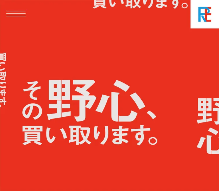
REqual’s recruitment homepage uses the visual force of a poster across a long editorial page. A saturated red canvas carries the slogan “その野心、買い取ります。” in pale, exceptionally large lettering. Cuts through the title’s letterforms, repeated fragments beyond the viewport, and deliberately uneven composition give the opening its identity. The message occupies space as artwork rather than behaving like a conventional typeset heading.
The rest of the page translates that scale into recruitment content. Employee photographs fill the width, vertical Japanese labels sit directly against the left edge, and interview headlines occupy substantial areas of the images. Large English navigation labels pair with much smaller Japanese explanations. A pale application banner reverses the main palette before the red footer returns.
This is the homepage of a recruitment microsite, with routes to business information, employee stories, benefits, and applications. Preserve that information structure alongside the graphic impact.
閉じる
REqual Recruitment — Style Reference
A recruitment site that turns ambition into oversized lettering, red space, and employee portraits.
Website: r-equal.com/recruit Original URL: https://r-equal.com/recruit/ Final URL: https://r-equal.com/recruit/ Theme: a dominant red field with pale gray typography, white logo tiles, and full-color photography; no selectable theme was evidenced. Inspected: October 2, 2026, Japan Standard Time. The supplied browser retrieval timestamp is October 1, 2026, at 15:18:46.156 UTC. Viewports: 1440 × 1000 and 390 × 844 CSS pixels. Scope: the current recruitment homepage: opening composition, company introduction, three interview links, movie section, application banner, footer, and the closed navigation structure. Linked detail pages, the application form, video playback, and an opened menu were not inspected.
REqual’s recruitment homepage uses the visual force of a poster across a long editorial page. A saturated red canvas carries the slogan “その野心、買い取ります。” in pale, exceptionally large lettering. Cuts through the title’s letterforms, repeated fragments beyond the viewport, and deliberately uneven composition give the opening its identity. The message occupies space as artwork rather than behaving like a conventional typeset heading.
The rest of the page translates that scale into recruitment content. Employee photographs fill the width, vertical Japanese labels sit directly against the left edge, and interview headlines occupy substantial areas of the images. Large English navigation labels pair with much smaller Japanese explanations. A pale application banner reverses the main palette before the red footer returns.
This is the homepage of a recruitment microsite, with routes to business information, employee stories, benefits, and applications. Preserve that information structure alongside the graphic impact.
How to Read This Reference
- Measured values come from the supplied rendered DOM and computed styles. Unless identified otherwise, measurements are CSS pixels.
- Observed descriptions come from the supplied current-page captures: desktop opening, interview area, and footer; mobile opening and footer tail.
- Calculated values are arithmetic derived from those measurements. They are not recovered stylesheet formulas.
- Estimated values describe visual appearance where the relevant child styles or asset data were unavailable.
- Recommended values and implementation choices belong to the reusable adaptation, not necessarily to the original website.
- Named tokens below are implementation aliases. The only supplied source custom property was
--vw: 1vw; a complete original token system was not exposed. - Element rectangles can reflect transforms and inline rendering. Do not treat every measured rectangle as an untransformed CSS width, height, or line box.
Two interpretation details matter. First, the mobile image containing navigation and copyright is the footer at the bottom of the document, not evidence of an opened menu. Its contents and positions agree with the footer DOM. Second, the hero’s H1 has no extracted text and a computed font size of 16px, while its visible lettering is enormous. The H1 rectangle describes the graphic’s footprint; its inherited font size does not describe the artwork.
Tokens — Colors
Default Palette
| Name | Value | Suggested token | Evidence and role |
|---|---|---|---|
| Recruitment Red | #e8301e |
--color-red |
Measured footer background, rgb(232, 48, 30). A visually similar red dominates the opening and other captured areas; its exact background declaration was not supplied for those layers. |
| Pale Lettering | #e8e4e4 |
--color-chalk |
Measured navigation, introduction text, vertical interview labels, copyright, and application-section background. |
| Clean White | #ffffff |
--color-white |
Measured home-logo tile background and movie-caption text. Visibly distinct from the warmer pale lettering. |
| Logo Blue | Not numerically established | Preserve in the logo asset | Bright cyan-blue in the company monogram. It is an identity detail, not an evidenced general interface accent. |
| Photographic colors | Image-dependent | No interface token | Deep green foliage, navy tailoring, concrete gray, and incidental street colors in the visible employee photograph. |
The application banner reverses the dominant relationship: pale background, red lettering, and red directional graphics. The footer returns to red with pale text. This reversal supplies separation without introducing a new surface style.
Some link wrappers report browser blue, rgb(0, 0, 238), and several containers report black text or a white background. The screenshots and measured descendants show different visible treatments. Do not turn these inherited wrapper values into blue links, black display titles, or a white page design.
Contrast Consideration
Calculated: pale lettering #e8e4e4 against the measured footer red #e8301e has approximately 3.42:1 contrast. This supports the visual strength of large lettering but requires attention for the smaller navigation translations and copyright in a new implementation. White alone provides approximately 4.31:1 against that red, so it is not a complete solution for normal-size text.
Recommendation: retain the large red-and-pale composition while giving small essential information a verified higher-contrast treatment, such as a darker local background. Recheck contrast over each photograph separately.
Tokens — Typography
Japanese Text
Measured family declaration:
source-han-sans-japanese, 'Hiragino Kaku Gothic ProN',
'メイリオ', Meiryo, Arial, Verdana, 'MS Pゴシック', sans-serif
Large Japanese section headings, explanatory paragraphs, vertical interview labels, and navigation translations use weight 700. The introduction paragraph remains unusually substantial: 26px on desktop and 20px on mobile, both with a line-height ratio of 1.8.
The computed family establishes the declared stack, not which font file successfully rendered every glyph. Font files and licensing were not supplied.
English Navigation and Utility Titles
Measured family: neue-haas-grotesk-display, sans-serif.
Measured weight: 600.
The English labels are compact, bold-looking grotesk forms with mostly normal tracking. Their uppercase appearance comes from the actual labels: TOP, BUSINESS, INTERVIEW, VARIOUS SYSTEMS, GUIDELINE, and MOVIE.
Use the contrast between large English labels and small Japanese explanations as a recurring component pattern. The Japanese label aligns near the lower part of the English line rather than forming a centered two-line button.
Hero Lettering
The slogan is visually an authored graphic with customized cuts and tightly arranged Japanese forms. The extracted H1 is empty, and the underlying image, SVG, or other graphic implementation was not included in the evidence.
Preserve the authored title artwork when it is available and authorized. A normal bold font can provide a fallback, but it will not reproduce the cuts, character proportions, and internal arrangement. Do not apply the hero’s letter cuts to body text or all navigation labels.
Type Scale
| Role | Desktop measurement | Mobile measurement | Weight / spacing |
|---|---|---|---|
| Main English navigation label | 40px / 48px |
32px / 38.4px |
600; normal tracking |
INTERVIEW group label |
20px / 24px |
20px / 24px |
600; normal tracking |
| Header-navigation Japanese label | 15px / normal |
15px / normal |
700 |
| Footer-navigation Japanese label | 17px / normal |
15px / normal |
700 |
| Introduction heading | 111.6px / 122.76px |
49.92px / 54.912px |
700; line-height 1.1 |
| Introduction paragraph | 26px / 46.8px |
20px / 36px |
700; tracking -0.03em |
| Vertical interview labels | 99px / 99px |
52px / 52px |
700; normal declared tracking |
MOVIE label |
42.432px / normal |
32.142px / normal |
600; tracking -0.03em |
| Movie-section Japanese heading | 110.595px / 121.655px |
48.8762px / 53.7638px |
700; line-height approximately 1.1 |
| Movie captions | 21.216px / normal |
16.071px / normal |
700; white |
| Copyright | 16px / normal |
16px / normal |
400; measured text rectangle 24px high |
The mobile footer anchor wrappers retain a computed 40px size in places, but their visible English paragraph children are 32px. Use the child values when reproducing visible navigation.
Unmeasured display text: interview headline and employee-name child styles were not supplied. The desktop photograph shows a very large Japanese headline, a smaller tenure label, and an English name with a diagonal arrow. Do not use the parent H2’s inherited 16px value as the headline size. The starter CSS uses explicitly recommended approximations for these elements.
Tokens — Spacing & Shapes
There is no evidenced universal 8px spacing grid. The page combines viewport-related display proportions with fixed utility sizes, generous vertical intervals, and narrow mobile gutters.
Spacing Scale
| Use | Desktop | Mobile | Status |
|---|---|---|---|
| Hamburger left position | 40.5px |
16px |
Measured |
| Hamburger top position | 54px |
40px |
Measured visual button rectangle |
| Home-logo tile padding | 20px |
20px |
Measured |
| Introduction side inset | 90px |
15.59375px |
Measured; approximately 6.25vw and 4vw respectively |
| Footer content left inset | 45px |
17.15625px |
Measured |
| Footer top/bottom padding | 70px |
70px |
Measured computed padding |
| Footer bilingual-label gap | 16px |
16px |
Calculated from child positions |
| Major footer row gap | 30px |
25px |
Calculated between adjacent top-level rows |
| Numbered footer interview-row gap | 12px |
12px |
Calculated |
| Application-section padding | 40.5px on every side |
30px 16px 20px |
Measured |
| Introduction bottom padding | 136px |
100px |
Measured |
| Movie-section bottom padding | 160px |
110px |
Measured |
Border Radius and Edges
All sampled elements have border-radius: 0. The observed interface uses rectangular image fields, square brand tiles, unboxed text links, and straight arrow strokes. No decorative shadow system is apparent in the supplied captures.
The hamburger has three fine horizontal strokes, approximately 2px thick visually. Its overall measured rectangle is only 24px high on desktop and 15px high on mobile. These bounds do not establish whether an additional invisible hit area exists.
Layout Measurements
| Element | Desktop: 1440 × 1000 | Mobile: 390 × 844 |
|---|---|---|
| Document height | 10894px, rounded reported value |
8682px, rounded reported value |
| Opening section | 1440 × 1000px |
390 × 844px |
| Hero H1 rectangle | 887.39 × 433.41px, at approximately (146.70, 373.30) |
416 × 203.17px, at approximately (-13, 320.41) |
| Home-logo tile | 138 × 137.98px |
96 × 95.98px |
| Hamburger rectangle | 94 × 24px |
60 × 15px |
| Introduction paragraph width | 1260px |
358.80px |
| Interview section height | 4500px |
3798px |
| Movie-content column | Approximately 895.70px, beginning at x = 500.30px |
Heading width 358px; video-link width 390px |
| Application section | 636.75px high |
396.28px high |
| Application link rectangle | 1359 × 555.75px |
358 × 346.28px |
| Footer | 818.11px high |
1003.84px high |
| Footer logo group | 222 × 90.11px |
222 × 90.11px |
Calculated: the hero artwork rectangle has an approximately 2.0475:1 aspect ratio at both viewports. On mobile, it is 26px wider than the viewport and centered, producing about 13px of clipping on either side. This is a compositional crop, not a text block that simply wraps to fit.
Calculated: the interview section is exactly 4.5 viewport heights in both supplied measurements. This establishes its long scroll allocation, but not the individual panels’ sticky rules, animation triggers, or background behavior.
Components
Corner Navigation and Brand Tile
Role: expose navigation while keeping the opening dominated by the slogan.
The opening has no conventional full-width navigation bar. A three-line menu control sits near the upper-left corner. A white square containing the blue-and-red monogram touches the upper-right corner.
On desktop, the white tile is 138px square with 20px padding. On mobile, it becomes 96px square while retaining that padding. The resulting inner content boxes are approximately 98px and 56px wide; the actual mark has its own internal whitespace.
The hamburger remains at the same viewport location in the supplied top and lower-page captures, supporting persistent placement. The brand tile is visible in the opening captures but not in the supplied lower-page captures. Its exact scroll-dependent visibility behavior is unverified.
Recommended anatomy: a real menu button containing a decorative three-line icon; a separate home link containing the authorized brand asset. Give the button an accessible name and a larger interactive area without enlarging the visible strokes.
Closed Navigation Structure
Role: route visitors through the recruitment microsite.
The rendered DOM includes the following navigation hierarchy:
TOPwith “トップ”.BUSINESSwith “事業紹介”.INTERVIEW, followed by01,02, and03, each with “先輩社員の野心”.VARIOUS SYSTEMSwith “各種制度”.GUIDELINEwith “募集要項”.CORPORATE SITE, plus an application link in the header structure.
In the sampled closed state, navigation links sit outside the left edge: approximately x = -999.5px on desktop and x = -374px on mobile. This supports an off-canvas structure. It does not establish the opened panel’s exact appearance, direction of travel, focus behavior, or dismissal rules.
Do not substitute the mobile footer screenshot for an open-menu specification. The footer includes copyright and has independently measured document positions.
Opening Slogan Composition
Role: establish the recruitment message before explanatory content begins.
Use a viewport-height red field with a clipped graphic layer. The principal slogan sits below and left of the desktop viewport’s center, leaving extensive open red space above it. Fragments of additional slogans enter from the top, left, and right edges at different orientations and scales.
The main graphic is approximately 887px wide on desktop. Its center is near 41% of the viewport width and 59% of the viewport height. On mobile, the 416px-wide graphic is centered in the 390px viewport, vertically centered near y = 422px, and deliberately cropped horizontally.
The largest word, “野心”, has geometric interruptions through its strokes. The smaller “その” is arranged vertically beside it, while “買い取ります。” forms the lower horizontal line. Preserve these relationships as an authored composition rather than independently resizing each text fragment.
The supplied frames establish repeated edge fragments, but not whether they move continuously. A static implementation is an evidence-safe starting point.
Company Introduction
Role: explain the employer proposition and lead into business information.
The measured structure is a large Japanese H2, a long bold paragraph, and a READ MORE link to /recruit/business/.
On desktop, the heading begins around 90px from the left edge and uses 111.6px type. The paragraph spans a 1260px-wide area, using 26px bold text with 46.8px line height. On mobile, the inset reduces to approximately 15.6px, the heading becomes 49.92px, and the paragraph becomes 20px with 36px line height.
There is substantial separation between the heading and paragraph in the measured rectangles. Preserve a spacious editorial rhythm, but do not infer a missing illustration or recover exact source margins from that gap alone: intervening asset information and transform details were not supplied.
The call to action is an unboxed text link. Its measured wrapper is approximately 259.42 × 42px on desktop and 214.05 × 38px on mobile; its visible child type size was not included.
Employee Interview Panel
Role: make individual employees the main evidence behind the recruitment message.
The page links to three employee stories:
| Employee | Visible tenure label | Headline |
|---|---|---|
| Yoshiki Kadono | “入社1年目” | “買取りの常識を塗り変える” |
| Ryo Tsukada | “入社1年目” | “30歳で営業の最前線へ” |
| Asami Nakamura | “入社5年目” | “自分の好奇心を満たし続ける” |
The supplied desktop interview capture shows Ryo Tsukada standing outdoors in a navy suit, with foliage and street details behind him. The portrait occupies the full width. Typography sits directly over the photograph, with no card, rounded container, or opaque text panel.
Two vertical labels occupy the far-left edge: “野心を持った” on the right and “先輩社員” on the left. Their desktop columns begin at x = 117px and x = 0px; both use 99px type. On mobile, those positions become approximately 57.19px and 0px, with 52px type.
The Ryo headline occupies the upper-right portion of the photograph in a strongly vertical arrangement. The tenure, English name, and diagonal arrow sit below it. The next panel begins with a large horizontal headline for Asami Nakamura, showing that story compositions vary rather than repeating one identical text box.
Verified interaction boundary: the headline/name groups are links to individual interview pages. The supplied DOM does not establish that the entire photograph is clickable.
Responsive observation: desktop story links occupy different positions on the right, while all three mobile link rectangles begin at x = 16px and sit farther down their respective sections. Mobile layouts therefore reposition the content and change line breaks; they are not just scaled desktop overlays.
Movie Section
Role: provide workplace videos after the employee stories.
The section contains a small English MOVIE label, the much larger Japanese heading “仕事風景を知るリアルムービー”, and three external video links.
On desktop, the principal content column is approximately 895.70px wide and starts at x = 500.30px, leaving an unusually broad area to its left. The measured section uses flex layout with a 7% gap. The supplied evidence does not identify all content, if any, occupying that left area.
Desktop video-link rectangles are approximately 895.70 × 504.27px, very close to a 16:9 preview. Caption rectangles lie inside their lower portion, inset approximately 28px from the left and 24px from the bottom.
On mobile, the heading retains 16px side gutters while the video links span the full 390px width. The first two link rectangles are approximately 279.56px high, and their captions occupy the final 48px. This geometry is consistent with a 16:9 preview followed by a two-line caption; it is a layout inference, since a movie-section screenshot was not supplied.
The destinations are YouTube URLs. Playback, autoplay, modal presentation, and opening in a new tab were not tested. Do not add an embedded player or autoplay behavior as an observed feature.
Application Banner
Role: create a prominent route to /recruit/entry/ before the footer.
The banner switches to a pale background and red graphics. In the visible desktop portion, ENTRY repeats at several scales and orientations alongside the monogram. The Japanese label “エントリーする” and a large northeast arrow reinforce the destination.
This is an expansive linked graphic, not a small pill button. Its desktop section is approximately 637px high. The mobile section remains approximately 396px high despite the much narrower width, so the artwork needs a deliberate mobile arrangement rather than a proportional desktop reduction.
The application link’s extracted text is empty, and its nested H2 reports a 0px font size. That does not establish the accessibility tree, but it does mean text extraction alone cannot describe the visual label. In a new implementation, give the link an explicit accessible name and hide decorative repetitions from assistive technology.
Footer
Role: provide a complete second navigation route and corporate identity.
The footer is a large red section with a white-backed company wordmark and the company name “株式会社アールイコール” below it. The inspected page also displays Copyright © 2022 R= Inc. All Rights Reserved. The year is visible content, not the inspection date or proof of when the current design was produced.
On desktop, the brand group sits at the upper left, CORPORATE SITE sits at the upper right, the navigation runs down the left, and copyright aligns near the bottom right. The footer’s wide empty center is part of its composition.
On mobile, these elements form a single left-aligned sequence. The English labels shrink from 40px to 32px. Most Japanese explanations remain beside their English labels, but “各種制度” wraps beneath VARIOUS SYSTEMS. The corporate link follows the navigation after a large vertical gap, with copyright below.
The mobile footer is approximately 1004px high, exceeding the 844px viewport. In the supplied bottom capture, the brand group has already scrolled above the frame. Its absence from that image is not evidence that mobile removes the logo.
Text Links and Directional Arrows
Large navigation and content links are typographic elements rather than filled controls. Northeast arrows appear with interview names, the application banner, and CORPORATE SITE. They have straight strokes, open interiors, and visual weight appropriate to the nearby text.
Preserve the arrow’s directional character without using it to imply unverified behavior. An arrow does not prove that a destination opens in a separate tab.
Tokens — Motion & Interaction
| Treatment | Supplied evidence | What can safely be concluded |
|---|---|---|
| Header transition | Computed transition includes 0.4s |
A 400ms transition is declared; changed properties, easing, and trigger were not supplied. |
| Home-logo link | Computed transition includes 0.4s |
A transition exists; its hover or scroll effect was not exercised. |
| Main application link | Computed transition includes 0.4s at both viewports |
Duration is evidenced, but the visual change is not. |
| Footer brand link | Computed transition includes 0.4s |
Same limitation: no observed before/after state. |
| Closed menu | Navigation rectangles lie offscreen to the left | Closed-state placement is established; opening behavior is unverified. |
| Repeated hero fragments | Visible in static desktop and mobile captures | Repetition and clipping are established; marquee speed, rotation, and direction are unknown. |
| Long interview sequence | Section height equals 4.5 viewport heights in both samples |
Long scroll allocation is measured; sticky pinning, parallax, and reveal timelines are not established. |
| Employee and navigation links | Destination URLs are present | Link semantics and routes are established; destinations were not visited. |
| Movie previews | External YouTube links are present | Video destinations are established; playback behavior is not. |
Sampled elements report animation: none, but this does not rule out animation on unlisted children, pseudo-elements, or JavaScript-controlled properties. The capture process waited for finite motion and temporarily paused perpetual animations during readiness checks; that process is not a motion recording.
Recommended adaptation: begin with static, complete content. If a menu transition is added, a 400ms duration can echo the measured interface timing, but its easing and transform remain implementation choices. Give decorative movement a reduced-motion alternative and avoid making scrolling or animation necessary to read the recruitment information.
Surfaces
| Layer | Appearance | Function |
|---|---|---|
| Opening canvas | Uninterrupted red with pale title artwork | Establishes the campaign message and scale |
| Editorial content | Pale, bold text associated with the dominant red treatment | Explains the company and organizes recruitment content |
| Interview field | Full-width photography with pale overlaid lettering | Centers employee identity and story |
| Brand tile | White square containing the original monogram | Keeps the small multicolor identity legible |
| Application banner | Pale background with red repeated lettering | Creates a major palette reversal and application destination |
| Footer | Solid measured red with pale navigation | Provides a spacious, comprehensive closing directory |
Avoid translating this into an elevation system. Separation comes from photographic boundaries, large typography, empty space, and a change of background color. No rounded-card grid, decorative gradient, or soft-shadow hierarchy is evidenced.
Imagery
The opening is typographic artwork. Its identity comes from composition and letterform treatment rather than a background photograph. Keep the red field clean and the pale lettering crisp.
The visible employee photograph has a documentary setting: a person in business clothing, natural daylight, foliage, pavement, concrete, and street furniture. The person remains central while the surrounding environment provides room for overlay text. Preserve natural image detail and photographic depth instead of treating the entire scene as a flat brand-color duotone.
The supplied interview capture fully establishes Ryo Tsukada’s scene and shows only the upper portion of the following Asami Nakamura panel. It does not justify inventing photographic details for every employee. Some background areas appear soft; the evidence does not establish whether every such area results from lens depth, an image treatment, or a transition state.
The blue-and-red monogram and the footer wordmark are distinct assets. The small gray lettering in the footer wordmark is part of that identity, not a new general text-color token.
Observed Asset References
Actual image URLs, SVG paths, and filenames were not supplied. The following identifies assets by their visible role without inventing paths.
| Asset | Evidence | Reuse guidance |
|---|---|---|
| Main slogan artwork | Desktop and mobile opening captures; H1 rectangles | Preserve its approximately 2.0475:1 footprint and authored character arrangement. |
| Peripheral slogan fragments | Opening captures | Use separately positioned decorative artwork in a clipped layer; motion is unverified. |
| Company monogram | Upper-right opening tile and application artwork | Use the original mark with its white support surface. |
| Footer wordmark and company-name lockup | Desktop footer; mobile DOM dimensions | Preserve the 222px-wide group at both inspected sizes. |
| Ryo Tsukada portrait scene | Desktop interview capture | Use a full-width, carefully cropped image with text outside the face area. |
| Other employee imagery | Interview content structure; partial following panel | Obtain the actual authorized assets before choosing crops or photographic treatments. |
| Movie preview assets | Three measured external video-link regions | Preserve preview proportions; exact artwork was not visible in the supplied screenshots. |
| Application lettering and arrow | Visible desktop application-banner portion | Preserve multiscale repetition and the pale/red palette reversal. |
Layout & Responsive Behavior
Page Sequence
The supplied DOM establishes this order:
- Viewport-height opening slogan.
- Company introduction and business link.
- Three employee interview entries.
- Movie section with three links.
- Application banner.
- Footer navigation and corporate link.
| Section | Desktop height | Mobile height |
|---|---|---|
| Opening | 1000px |
844px |
| Introduction | 1645.31px |
1391.33px |
| Interview sequence | 4500px |
3798px |
| Movie section | 2294.08px |
1248.61px |
| Application banner | 636.75px |
396.28px |
| Footer | 818.11px |
1003.84px |
These are measured allocations at two viewports, not fixed heights to paste into every screen size.
Opening Composition
Desktop uses an off-center principal slogan with abundant red space. Mobile recenters the main graphic, intentionally allows it to exceed the viewport width, and retains partial peripheral fragments. Contain this overflow within the artwork layer so decorative cropping does not cause horizontal page scrolling.
The logo does not scale at the same ratio as the slogan: its tile changes from 138px to 96px, whereas the title changes from approximately 887px to 416px. Treat branding, utility controls, and display artwork as separate responsive systems.
Reading Content
The introduction changes from 90px desktop gutters to approximately 16px mobile gutters. Body text reduces modestly, from 26px to 20px, rather than following the much stronger reduction in headline size. This preserves a forceful, readable paragraph treatment.
The movie section changes from a right-weighted desktop column to full-width mobile preview regions. Keep heading gutters separate from media width.
Interview Composition
Mobile moves the interview title groups toward the lower part of each story and aligns them at a 16px left inset. The extracted text also shows changed line breaks in the first and third headlines. Preserve the employee’s face and let the text arrangement adapt to the photograph instead of uniformly shrinking the desktop layout.
The vertical left-edge labels remain large at 52px on mobile. They are not converted into tiny horizontal badges.
Footer Reflow
Desktop distributes branding, navigation, corporate link, and copyright across the width. Mobile uses one column and substantial gaps. The Japanese subtitle for the longest English navigation item wraps beneath it, while shorter pairs stay inline.
Only two viewport sizes were supplied. The precise breakpoint, intermediate tablet behavior, landscape behavior, zoom behavior, and safe-area handling are unknown. The Quick Start uses a recommended 767px breakpoint, not a recovered source value.
Do’s and Don’ts
Do
- Make the red field and pale oversized lettering the primary visual relationship.
- Preserve the custom slogan artwork, including its letter cuts and internal hierarchy.
- Let decorative fragments cross the viewport edges while keeping actionable content reachable.
- Pair large English navigation with small, bold Japanese explanations.
- Use full-width employee photography and deliberately varied headline compositions.
- Retain the vertical Japanese rails against the left edge.
- Recompose the mobile hero and employee stories instead of scaling the desktop page uniformly.
- Give the application banner its pale background and red typographic repetition.
- Preserve the footer’s large empty desktop center and spacious mobile sequence.
- Keep measured source behavior separate from optional motion and accessibility improvements.
Don’t
- Don’t turn the recruitment homepage into a generic feature-card or product-pricing layout.
- Don’t interpret the H1’s inherited 16px font size as the size of the visible slogan.
- Don’t replace the authored slogan with an arbitrary bold font and claim an exact match.
- Don’t convert employee photographs into small rounded profile cards.
- Don’t treat inherited blue anchor colors as the visible link palette.
- Don’t infer an opened menu from the mobile footer capture.
- Don’t make the whole portrait clickable unless that is an intentional new implementation choice.
- Don’t invent marquee speeds, parallax, hover effects, or video autoplay from static frames.
- Don’t remove the mobile footer logo merely because it is above the bottom screenshot’s crop.
- Don’t let decorative hero overflow create horizontal scrolling across the whole document.
Recommended Implementation Additions
These are recommendations for a new implementation, not verified features of the inspected page:
- Give the menu control a minimum 44px interactive height while preserving the slim three-line icon.
- Provide an accessible text equivalent for the main slogan and a clear name for the graphic application link. Keep repeated decorative slogans out of the accessibility tree.
- Implement the menu with an expanded state, keyboard support, focus restoration, and appropriate focus containment if it behaves as a modal panel.
- Keep a visible focus indicator on pale, red, and photographic backgrounds.
- Improve contrast for small navigation translations and copyright without weakening the large display treatment.
- Supply meaningful alternative text for employee portraits and descriptive names for external video links.
- Place mobile movie captions below the image when needed for legibility; the measured geometry supports this arrangement.
- Use responsive image sources and intentional focal positions. Avoid moving text across a face as the viewport changes.
- Reserve image dimensions to prevent layout shifts, and prioritize the opening artwork and first visible photograph appropriately.
- Ensure the complete page remains readable without decorative animation, with reduced motion, and when custom fonts are unavailable.
Agent Prompt Guide
Quick Color Reference
- Main red reference:
#e8301e, measured on the footer. - Main pale typography and application surface:
#e8e4e4. - Logo tile and video-caption white:
#ffffff. - Blue belongs to the original monogram; do not promote it into a new button system.
- Interview colors come from full-color employee photography.
- No evidenced rounded-card or shadow-based surface system.
Overall Prompt
“Create a recruitment microsite homepage inspired by the current REqual recruitment page. Use a dominant red field based on #e8301e, pale lettering #e8e4e4, and square white logo tiles. Begin with a viewport-height composition containing an authorized, oversized Japanese slogan graphic with cut letterforms and cropped repeated fragments at the edges. Pair bold Japanese section text with large uppercase grotesk navigation. Follow the introduction with full-width employee photographs, left-edge vertical Japanese labels, and individually arranged interview headlines. Add a right-weighted desktop movie column, a pale application banner with repeated red ENTRY artwork, and a spacious red footer. Recompose the artwork and story text for mobile. Keep decorative movement optional because the supplied evidence does not establish its timing.”
Example Component Prompts
- Opening: “A full-height red composition with pale Japanese slogan artwork. At 1440px width, place an approximately 887px-wide main graphic below and left of center. At 390px width, center a 416px-wide graphic and clip its edges. Keep a fine three-line menu at upper left and a white monogram tile at upper right. Peripheral slogan fragments are decorative.”
- Interview panel: “A full-width outdoor employee portrait with large pale Japanese typography directly over the photograph. Place two vertical label columns against the left edge. Arrange the story headline separately from the tenure and English-name link with a northeast arrow. On mobile, move the story text lower and preserve the face.”
- Application banner: “An expansive pale-gray application link with repeated red
ENTRYlettering at different scales and orientations, the authorized monogram, a Japanese application label, and a large northeast arrow. Square edges, no filled pill button, and a separately composed mobile layout.” - Footer: “A red recruitment footer with a 222px-wide company lockup, large uppercase English links, small Japanese explanations, three numbered interview links, and a corporate-site arrow. Use a left navigation column and right-side corporate link and copyright on desktop. Stack them with generous gaps on mobile.”
Quick Start
CSS Custom Properties
This is a recommended static adaptation, not the original stylesheet. It reproduces measured colors, key type sizes, opening proportions, and navigation relationships. The 767px breakpoint, interview headline scale, focus treatment, and simplified story-panel heights are recommendations.
Use the classes with semantic sections, headings, and links. Apply .hero__title to the H1 containing authorized title artwork; its image or SVG fills that box. Place decorative repetitions inside .hero__decoration and mark that layer aria-hidden="true". The menu icon expects three decorative spans inside .menu-button__lines. The menu’s JavaScript and original graphic assets are not included.
The story styles below provide a static viewport-height alternative. They do not reconstruct the original interview section’s measured 4.5-viewport scroll allocation or any unverified scroll timeline.
:root {
  /* Measured palette; red is directly measured on the footer. */
  --color-red: #e8301e;
  --color-chalk: #e8e4e4;
  --color-white: #ffffff;

  /* Declared source families; load authorized fonts separately. */
  --font-ja: source-han-sans-japanese,
    'Hiragino Kaku Gothic ProN', Meiryo, Arial, sans-serif;
  --font-latin: neue-haas-grotesk-display, Arial, sans-serif;
  --weight-ja: 700;
  --weight-latin: 600;

  /* Sample-matched desktop values and calculated proportions. */
  --text-nav: 40px;
  --text-nav-ja: 17px;
  --text-group: 20px;
  --text-heading: 7.75vw;
  --text-body: 26px;
  --text-rail: 99px;
  --text-movie: 42.432px;
  --text-movie-heading: 110.595px;
  --text-caption: 21.216px;
  --leading-heading: 1.1;
  --leading-body: 1.8;

  --copy-inset: 6.25vw;
  --footer-inset: 3.125vw;
  --chrome-inset: 2.8125vw;
  --menu-top: 54px;
  --menu-width: 94px;
  --menu-line-box: 24px;
  --brand-size: 138px;
  --nav-gap: 30px;
  --rail-gap: 18px;

  /* Duration is evidenced; easing is an adaptation choice. */
  --duration-interface: 400ms;
  --ease-interface: ease;
}

* {
  box-sizing: border-box;
}

body {
  margin: 0;
}

.recruit-page {
  color: var(--color-chalk);
  background: var(--color-red);
  font-family: var(--font-ja);
}

.recruit-page a {
  color: inherit;
}

.recruit-page img {
  display: block;
  max-width: 100%;
}

/* Recommended focus treatment, not a source decoration. */
.recruit-page :focus-visible {
  outline: 3px solid #171717;
  outline-offset: 5px;
  box-shadow: 0 0 0 3px var(--color-white);
}

.hero {
  position: relative;
  min-height: 100vh;
  min-height: 100svh;
  overflow: clip;
  isolation: isolate;
}

.hero__title {
  position: absolute;
  top: 59%;
  left: 41%;
  width: 61.625vw;
  aspect-ratio: 2.0475;
  margin: 0;
  transform: translate(-50%, -50%);
}

.hero__title img,
.hero__title svg {
  display: block;
  width: 100%;
  height: 100%;
  object-fit: contain;
}

.hero__decoration {
  position: absolute;
  inset: 0;
  z-index: -1;
  overflow: clip;
  pointer-events: none;
}

/* Position individual decorative assets within this layer. */
.hero__decoration > * {
  position: absolute;
}

.menu-button {
  position: fixed;
  z-index: 20;
  top: calc(var(--menu-top) - (44px - var(--menu-line-box)) / 2);
  left: var(--chrome-inset);
  display: grid;
  align-items: center;
  width: var(--menu-width);
  min-height: 44px;
  padding: 0;
  border: 0;
  border-radius: 0;
  color: var(--color-chalk);
  background: transparent;
  cursor: pointer;
}

.menu-button__lines {
  display: flex;
  flex-direction: column;
  justify-content: space-between;
  height: var(--menu-line-box);
}

.menu-button__lines span {
  display: block;
  height: 2px;
  background: currentColor;
}

/* Opening placement only; scroll visibility was not established. */
.brand-tile {
  position: absolute;
  z-index: 10;
  top: 0;
  right: 0;
  display: grid;
  place-items: center;
  width: var(--brand-size);
  aspect-ratio: 1;
  padding: 20px;
  background: var(--color-white);
}

.brand-tile img,
.brand-tile svg {
  width: 100%;
  height: 100%;
  object-fit: contain;
}

.intro {
  padding: 60px var(--copy-inset) 136px;
}

.intro__heading {
  margin: 0;
  font-size: var(--text-heading);
  font-weight: var(--weight-ja);
  line-height: var(--leading-heading);
}

.intro__body {
  margin: clamp(146px, 25vw, 360px) 0 0;
  font-size: var(--text-body);
  font-weight: var(--weight-ja);
  line-height: var(--leading-body);
  letter-spacing: -0.03em;
}

.text-link {
  display: inline-flex;
  align-items: center;
  gap: 20px;
  font-family: var(--font-latin);
  font-size: var(--text-nav);
  font-weight: var(--weight-latin);
  line-height: 1.2;
  text-decoration: none;
}

.intro__more {
  margin-top: clamp(64px, 6.25vw, 90px);
}

/* Static story adaptation; original scroll mechanics are unknown. */
.story {
  position: relative;
  min-height: 100vh;
  min-height: 100svh;
  isolation: isolate;
}

.story__photo {
  position: absolute;
  inset: 0;
  z-index: -1;
  width: 100%;
  height: 100%;
  object-fit: cover;
  object-position: var(--portrait-position, 50% 50%);
}

.story__rail {
  position: absolute;
  top: 0;
  left: 0;
  display: flex;
  flex-direction: row-reverse;
  gap: var(--rail-gap);
  pointer-events: none;
}

.story__rail p {
  margin: 0;
  writing-mode: vertical-rl;
  text-orientation: upright;
  font-size: var(--text-rail);
  font-weight: var(--weight-ja);
  line-height: 1;
}

.story__link {
  position: relative;
  display: block;
  width: min(65vw, 940px);
  margin-left: auto;
  padding: 16px 4.8vw 40px 0;
  text-decoration: none;
}

/* Recommended sizes: headline child metrics were not supplied. */
.story__headline {
  margin: 0 0 28px;
  font-size: clamp(60px, 8vw, 128px);
  font-weight: var(--weight-ja);
  line-height: 1.05;
}

.story__tenure {
  display: block;
  font-size: 20px;
  font-weight: var(--weight-ja);
}

.story__name {
  display: flex;
  align-items: baseline;
  gap: 16px;
  font-family: var(--font-latin);
  font-size: 40px;
  font-weight: var(--weight-latin);
}

.movie-section {
  padding: 129.55px 44px 160px;
}

.movie-section__content {
  width: 66.25%;
  margin-left: auto;
}

.movie-section__eyebrow {
  margin: 0 0 15px;
  font-family: var(--font-latin);
  font-size: var(--text-movie);
  font-weight: var(--weight-latin);
  letter-spacing: -0.03em;
}

.movie-section__heading {
  margin: 0 0 100px;
  font-size: var(--text-movie-heading);
  font-weight: var(--weight-ja);
  line-height: 1.1;
}

.movie-list {
  display: grid;
  gap: 46px;
}

.movie-link {
  position: relative;
  display: block;
  text-decoration: none;
}

.movie-link__image {
  width: 100%;
  aspect-ratio: 16 / 9;
  object-fit: cover;
}

.movie-link__caption {
  position: absolute;
  right: 28px;
  bottom: 24px;
  left: 28px;
  margin: 0;
  color: var(--color-white);
  font-size: var(--text-caption);
  font-weight: var(--weight-ja);
}

.entry {
  padding: var(--chrome-inset);
  color: var(--color-red);
  background: var(--color-chalk);
}

.entry__link {
  position: relative;
  display: grid;
  align-items: end;
  justify-items: end;
  min-height: 38.594vw;
  text-decoration: none;
}

.entry__pattern {
  position: absolute;
  inset: 0;
  overflow: clip;
  pointer-events: none;
}

.entry__label {
  position: relative;
  z-index: 1;
  font-weight: var(--weight-ja);
}

.footer {
  display: grid;
  grid-template-columns: minmax(0, 1fr) auto;
  grid-template-areas:
    'brand corporate'
    'nav copyright';
  column-gap: 24px;
  row-gap: 60px;
  padding: 70px var(--footer-inset);
  background: var(--color-red);
}

.footer__brand {
  grid-area: brand;
  width: 222px;
}

.footer__nav {
  grid-area: nav;
  display: grid;
  gap: var(--nav-gap);
  justify-self: start;
}

.nav-row {
  display: flex;
  flex-wrap: wrap;
  align-items: baseline;
  gap: 0 16px;
  text-decoration: none;
}

.nav-row__en {
  font-family: var(--font-latin);
  font-size: var(--text-nav);
  font-weight: var(--weight-latin);
  line-height: 1.2;
}

.nav-row__ja {
  font-size: var(--text-nav-ja);
  font-weight: var(--weight-ja);
}

.interview-group__title {
  margin: 0 0 24px;
  font-family: var(--font-latin);
  font-size: var(--text-group);
  font-weight: var(--weight-latin);
  line-height: 1.2;
}

.interview-group__links {
  display: grid;
  gap: 12px;
}

.footer__corporate {
  grid-area: corporate;
  align-self: start;
}

.footer__copyright {
  grid-area: copyright;
  align-self: end;
  margin: 0;
  font-size: 16px;
  font-weight: 400;
  line-height: 1.5;
}

/* Recommended feedback; original hover visuals were not observed. */
@media (hover: hover) {
  .nav-row:hover,
  .text-link:hover,
  .story__link:hover .story__name {
    text-decoration: underline;
    text-underline-offset: 0.12em;
  }
}

/* Recommended breakpoint, not a recovered source breakpoint. */
@media (max-width: 767px) {
  :root {
    --text-nav: 32px;
    --text-nav-ja: 15px;
    --text-heading: 12.8vw;
    --text-body: 20px;
    --text-rail: 52px;
    --text-movie: 32.142px;
    --text-movie-heading: 48.8762px;
    --text-caption: 16.071px;
    --copy-inset: 4vw;
    --footer-inset: 4.4vw;
    --chrome-inset: 16px;
    --menu-top: 40px;
    --menu-width: 60px;
    --menu-line-box: 15px;
    --brand-size: 96px;
    --nav-gap: 25px;
    --rail-gap: 5.2px;
  }

  .hero__title {
    top: 50%;
    left: 50%;
    width: 106.667vw;
  }

  .intro {
    padding-top: 56px;
    padding-bottom: 100px;
  }

  .story {
    display: flex;
    align-items: end;
  }

  .story__link {
    width: 100%;
    margin: 0;
    padding: 52vh 16px 32px;
  }

  .story__headline {
    font-size: clamp(48px, 14vw, 68px);
  }

  .story__name {
    font-size: 32px;
  }

  .movie-section {
    padding: 61px 0 110px;
  }

  .movie-section__content {
    width: 100%;
  }

  .movie-section__eyebrow,
  .movie-section__heading {
    margin-inline: 16px;
  }

  .movie-section__heading {
    margin-bottom: 52px;
  }

  .movie-list {
    gap: 32px;
  }

  .movie-link__caption {
    position: static;
    margin: 12px 16px 0;
    line-height: 1.5;
  }

  .entry {
    padding: 30px 16px 20px;
  }

  .entry__link {
    min-height: 346.28px;
  }

  .footer {
    grid-template-columns: minmax(0, 1fr);
    grid-template-areas:
      'brand'
      'nav'
      'corporate'
      'copyright';
    row-gap: 0;
  }

  .footer__brand {
    margin-bottom: 60px;
  }

  .footer__nav {
    width: 100%;
  }

  .nav-row--wide .nav-row__ja {
    flex-basis: 100%;
  }

  .footer__corporate {
    margin-top: 115px;
  }

  .footer__copyright {
    margin-top: 55px;
    margin-bottom: 20px;
  }
}

/* Keep future decorative motion optional. */
@media (prefers-reduced-motion: reduce) {
  .hero__decoration *,
  .entry__pattern *,
  .menu-panel {
    animation: none !important;
    transition-duration: 0.01ms !important;
  }
}
For close visual reproduction, supply the actual slogan, repeated graphic fragments, logos, arrows, and photographs. The CSS provides their layout context; it does not recreate their artwork. Small-text contrast, individual photo crops, and the unimplemented menu behavior still require deliberate implementation and testing.
Tailwind v4 Token Mapping
Optional aliases for a project already using Tailwind v4. These do not imply that the inspected website uses Tailwind. Define the custom properties above first.
@theme inline {
  --color-recruit-red: var(--color-red);
  --color-recruit-chalk: var(--color-chalk);
  --color-recruit-white: var(--color-white);

  --font-japanese: var(--font-ja);
  --font-display: var(--font-latin);

  --text-navigation: var(--text-nav);
  --text-navigation-caption: var(--text-nav-ja);
  --text-section-heading: var(--text-heading);
  --text-editorial-body: var(--text-body);
  --text-interview-rail: var(--text-rail);

  --spacing-copy-inset: var(--copy-inset);
  --spacing-footer-inset: var(--footer-inset);
  --spacing-brand-tile: var(--brand-size);

  --radius-flat: 0px;
}
Sources & Evidence
- Inspected original and final page: REqual recruitment homepage. Both supplied URLs are identical; the browser reported HTTP 200 and the title “アールイコール採用サイト|総合リユース企業”.
- Capture timestamp: October 1, 2026, 15:18:46.156 UTC, equivalent to October 2, 2026, 00:18:46.156 JST.
- Desktop evidence: 1440 × 1000 CSS-pixel rendered DOM and computed styles, plus opening, interview-area, and footer captures. Reported document height: 10894px.
- Mobile evidence: 390 × 844 CSS-pixel rendered DOM and computed styles, plus opening and bottom-of-footer captures. Reported document height: 8682px.
- Link evidence: the original page exposes routes to business, three interviews, benefits, application, application guidelines, the corporate website, and three YouTube videos. Link destinations were extracted but not independently inspected.
- Original-page identity evidence: the footer’s company lockup and company-name label, corporate link to r-equal.com, and displayed copyright. No production-credit claim is established here from the inspected page.
- Capture procedure: initial observation lasted at least five seconds. Readiness checks waited for document load, relevant finite motion, sampled layout/text stability, and visible image decoding within stated limits. Scrolling traversed intermediate positions. SharedWorkers and service workers were disabled during inspection.
- Limitations: no interaction recording, complete stylesheet, image-source inventory, font-loading confirmation, opened-menu capture, hover comparison, video playback test, or linked-page inspection was supplied. Delayed content and unexercised motion remain unverified.
This reference describes the current page represented by the supplied inspection. It uses screenshots for visible composition, rendered DOM for measured values and link structure, and explicitly labeled recommendations for the reusable implementation.
# REqual Recruitment — Style Reference

> A recruitment site that turns ambition into oversized lettering, red space, and employee portraits.

**Website:** [r-equal.com/recruit](https://r-equal.com/recruit/)
**Original URL:** https://r-equal.com/recruit/
**Final URL:** https://r-equal.com/recruit/
**Theme:** a dominant red field with pale gray typography, white logo tiles, and full-color photography; no selectable theme was evidenced.
**Inspected:** October 2, 2026, Japan Standard Time. The supplied browser retrieval timestamp is October 1, 2026, at 15:18:46.156 UTC.
**Viewports:** 1440 × 1000 and 390 × 844 CSS pixels.
**Scope:** the current recruitment homepage: opening composition, company introduction, three interview links, movie section, application banner, footer, and the closed navigation structure. Linked detail pages, the application form, video playback, and an opened menu were not inspected.

REqual’s recruitment homepage uses the visual force of a poster across a long editorial page. A saturated red canvas carries the slogan “その野心、買い取ります。” in pale, exceptionally large lettering. Cuts through the title’s letterforms, repeated fragments beyond the viewport, and deliberately uneven composition give the opening its identity. The message occupies space as artwork rather than behaving like a conventional typeset heading.

The rest of the page translates that scale into recruitment content. Employee photographs fill the width, vertical Japanese labels sit directly against the left edge, and interview headlines occupy substantial areas of the images. Large English navigation labels pair with much smaller Japanese explanations. A pale application banner reverses the main palette before the red footer returns.

This is the homepage of a recruitment microsite, with routes to business information, employee stories, benefits, and applications. Preserve that information structure alongside the graphic impact.
閉じる
# REqual Recruitment — Style Reference

> A recruitment site that turns ambition into oversized lettering, red space, and employee portraits.

**Website:** [r-equal.com/recruit](https://r-equal.com/recruit/)
**Original URL:** https://r-equal.com/recruit/
**Final URL:** https://r-equal.com/recruit/
**Theme:** a dominant red field with pale gray typography, white logo tiles, and full-color photography; no selectable theme was evidenced.
**Inspected:** October 2, 2026, Japan Standard Time. The supplied browser retrieval timestamp is October 1, 2026, at 15:18:46.156 UTC.
**Viewports:** 1440 × 1000 and 390 × 844 CSS pixels.
**Scope:** the current recruitment homepage: opening composition, company introduction, three interview links, movie section, application banner, footer, and the closed navigation structure. Linked detail pages, the application form, video playback, and an opened menu were not inspected.

REqual’s recruitment homepage uses the visual force of a poster across a long editorial page. A saturated red canvas carries the slogan “その野心、買い取ります。” in pale, exceptionally large lettering. Cuts through the title’s letterforms, repeated fragments beyond the viewport, and deliberately uneven composition give the opening its identity. The message occupies space as artwork rather than behaving like a conventional typeset heading.

The rest of the page translates that scale into recruitment content. Employee photographs fill the width, vertical Japanese labels sit directly against the left edge, and interview headlines occupy substantial areas of the images. Large English navigation labels pair with much smaller Japanese explanations. A pale application banner reverses the main palette before the red footer returns.

This is the homepage of a recruitment microsite, with routes to business information, employee stories, benefits, and applications. Preserve that information structure alongside the graphic impact.

## How to Read This Reference

- **Measured** values come from the supplied rendered DOM and computed styles. Unless identified otherwise, measurements are CSS pixels.
- **Observed** descriptions come from the supplied current-page captures: desktop opening, interview area, and footer; mobile opening and footer tail.
- **Calculated** values are arithmetic derived from those measurements. They are not recovered stylesheet formulas.
- **Estimated** values describe visual appearance where the relevant child styles or asset data were unavailable.
- **Recommended** values and implementation choices belong to the reusable adaptation, not necessarily to the original website.
- Named tokens below are implementation aliases. The only supplied source custom property was `--vw: 1vw`; a complete original token system was not exposed.
- Element rectangles can reflect transforms and inline rendering. Do not treat every measured rectangle as an untransformed CSS width, height, or line box.

Two interpretation details matter. First, the mobile image containing navigation and copyright is the **footer at the bottom of the document**, not evidence of an opened menu. Its contents and positions agree with the footer DOM. Second, the hero’s H1 has no extracted text and a computed font size of 16px, while its visible lettering is enormous. The H1 rectangle describes the graphic’s footprint; its inherited font size does not describe the artwork.

## Tokens — Colors

### Default Palette

| Name | Value | Suggested token | Evidence and role |
| --- | --- | --- | --- |
| Recruitment Red | `#e8301e` | `--color-red` | Measured footer background, `rgb(232, 48, 30)`. A visually similar red dominates the opening and other captured areas; its exact background declaration was not supplied for those layers. |
| Pale Lettering | `#e8e4e4` | `--color-chalk` | Measured navigation, introduction text, vertical interview labels, copyright, and application-section background. |
| Clean White | `#ffffff` | `--color-white` | Measured home-logo tile background and movie-caption text. Visibly distinct from the warmer pale lettering. |
| Logo Blue | Not numerically established | Preserve in the logo asset | Bright cyan-blue in the company monogram. It is an identity detail, not an evidenced general interface accent. |
| Photographic colors | Image-dependent | No interface token | Deep green foliage, navy tailoring, concrete gray, and incidental street colors in the visible employee photograph. |

The application banner reverses the dominant relationship: pale background, red lettering, and red directional graphics. The footer returns to red with pale text. This reversal supplies separation without introducing a new surface style.

Some link wrappers report browser blue, `rgb(0, 0, 238)`, and several containers report black text or a white background. The screenshots and measured descendants show different visible treatments. Do not turn these inherited wrapper values into blue links, black display titles, or a white page design.

### Contrast Consideration

**Calculated:** pale lettering `#e8e4e4` against the measured footer red `#e8301e` has approximately **3.42:1** contrast. This supports the visual strength of large lettering but requires attention for the smaller navigation translations and copyright in a new implementation. White alone provides approximately **4.31:1** against that red, so it is not a complete solution for normal-size text.

**Recommendation:** retain the large red-and-pale composition while giving small essential information a verified higher-contrast treatment, such as a darker local background. Recheck contrast over each photograph separately.

## Tokens — Typography

### Japanese Text

**Measured family declaration:**

```css
source-han-sans-japanese, 'Hiragino Kaku Gothic ProN',
'メイリオ', Meiryo, Arial, Verdana, 'MS Pゴシック', sans-serif
```

Large Japanese section headings, explanatory paragraphs, vertical interview labels, and navigation translations use weight `700`. The introduction paragraph remains unusually substantial: 26px on desktop and 20px on mobile, both with a line-height ratio of `1.8`.

The computed family establishes the declared stack, not which font file successfully rendered every glyph. Font files and licensing were not supplied.

### English Navigation and Utility Titles

**Measured family:** `neue-haas-grotesk-display, sans-serif`.
**Measured weight:** `600`.

The English labels are compact, bold-looking grotesk forms with mostly normal tracking. Their uppercase appearance comes from the actual labels: `TOP`, `BUSINESS`, `INTERVIEW`, `VARIOUS SYSTEMS`, `GUIDELINE`, and `MOVIE`.

Use the contrast between large English labels and small Japanese explanations as a recurring component pattern. The Japanese label aligns near the lower part of the English line rather than forming a centered two-line button.

### Hero Lettering

The slogan is visually an authored graphic with customized cuts and tightly arranged Japanese forms. The extracted H1 is empty, and the underlying image, SVG, or other graphic implementation was not included in the evidence.

Preserve the authored title artwork when it is available and authorized. A normal bold font can provide a fallback, but it will not reproduce the cuts, character proportions, and internal arrangement. Do not apply the hero’s letter cuts to body text or all navigation labels.

### Type Scale

| Role | Desktop measurement | Mobile measurement | Weight / spacing |
| --- | --- | --- | --- |
| Main English navigation label | `40px / 48px` | `32px / 38.4px` | `600`; normal tracking |
| `INTERVIEW` group label | `20px / 24px` | `20px / 24px` | `600`; normal tracking |
| Header-navigation Japanese label | `15px / normal` | `15px / normal` | `700` |
| Footer-navigation Japanese label | `17px / normal` | `15px / normal` | `700` |
| Introduction heading | `111.6px / 122.76px` | `49.92px / 54.912px` | `700`; line-height `1.1` |
| Introduction paragraph | `26px / 46.8px` | `20px / 36px` | `700`; tracking `-0.03em` |
| Vertical interview labels | `99px / 99px` | `52px / 52px` | `700`; normal declared tracking |
| `MOVIE` label | `42.432px / normal` | `32.142px / normal` | `600`; tracking `-0.03em` |
| Movie-section Japanese heading | `110.595px / 121.655px` | `48.8762px / 53.7638px` | `700`; line-height approximately `1.1` |
| Movie captions | `21.216px / normal` | `16.071px / normal` | `700`; white |
| Copyright | `16px / normal` | `16px / normal` | `400`; measured text rectangle 24px high |

The mobile footer anchor wrappers retain a computed 40px size in places, but their visible English paragraph children are 32px. Use the child values when reproducing visible navigation.

**Unmeasured display text:** interview headline and employee-name child styles were not supplied. The desktop photograph shows a very large Japanese headline, a smaller tenure label, and an English name with a diagonal arrow. Do not use the parent H2’s inherited 16px value as the headline size. The starter CSS uses explicitly recommended approximations for these elements.

## Tokens — Spacing & Shapes

There is no evidenced universal 8px spacing grid. The page combines viewport-related display proportions with fixed utility sizes, generous vertical intervals, and narrow mobile gutters.

### Spacing Scale

| Use | Desktop | Mobile | Status |
| --- | --- | --- | --- |
| Hamburger left position | `40.5px` | `16px` | Measured |
| Hamburger top position | `54px` | `40px` | Measured visual button rectangle |
| Home-logo tile padding | `20px` | `20px` | Measured |
| Introduction side inset | `90px` | `15.59375px` | Measured; approximately `6.25vw` and `4vw` respectively |
| Footer content left inset | `45px` | `17.15625px` | Measured |
| Footer top/bottom padding | `70px` | `70px` | Measured computed padding |
| Footer bilingual-label gap | `16px` | `16px` | Calculated from child positions |
| Major footer row gap | `30px` | `25px` | Calculated between adjacent top-level rows |
| Numbered footer interview-row gap | `12px` | `12px` | Calculated |
| Application-section padding | `40.5px` on every side | `30px 16px 20px` | Measured |
| Introduction bottom padding | `136px` | `100px` | Measured |
| Movie-section bottom padding | `160px` | `110px` | Measured |

### Border Radius and Edges

All sampled elements have `border-radius: 0`. The observed interface uses rectangular image fields, square brand tiles, unboxed text links, and straight arrow strokes. No decorative shadow system is apparent in the supplied captures.

The hamburger has three fine horizontal strokes, approximately 2px thick visually. Its overall measured rectangle is only 24px high on desktop and 15px high on mobile. These bounds do not establish whether an additional invisible hit area exists.

### Layout Measurements

| Element | Desktop: 1440 × 1000 | Mobile: 390 × 844 |
| --- | --- | --- |
| Document height | `10894px`, rounded reported value | `8682px`, rounded reported value |
| Opening section | `1440 × 1000px` | `390 × 844px` |
| Hero H1 rectangle | `887.39 × 433.41px`, at approximately `(146.70, 373.30)` | `416 × 203.17px`, at approximately `(-13, 320.41)` |
| Home-logo tile | `138 × 137.98px` | `96 × 95.98px` |
| Hamburger rectangle | `94 × 24px` | `60 × 15px` |
| Introduction paragraph width | `1260px` | `358.80px` |
| Interview section height | `4500px` | `3798px` |
| Movie-content column | Approximately `895.70px`, beginning at `x = 500.30px` | Heading width `358px`; video-link width `390px` |
| Application section | `636.75px` high | `396.28px` high |
| Application link rectangle | `1359 × 555.75px` | `358 × 346.28px` |
| Footer | `818.11px` high | `1003.84px` high |
| Footer logo group | `222 × 90.11px` | `222 × 90.11px` |

**Calculated:** the hero artwork rectangle has an approximately `2.0475:1` aspect ratio at both viewports. On mobile, it is 26px wider than the viewport and centered, producing about 13px of clipping on either side. This is a compositional crop, not a text block that simply wraps to fit.

**Calculated:** the interview section is exactly `4.5` viewport heights in both supplied measurements. This establishes its long scroll allocation, but not the individual panels’ sticky rules, animation triggers, or background behavior.

## Components

### Corner Navigation and Brand Tile

**Role:** expose navigation while keeping the opening dominated by the slogan.

The opening has no conventional full-width navigation bar. A three-line menu control sits near the upper-left corner. A white square containing the blue-and-red monogram touches the upper-right corner.

On desktop, the white tile is 138px square with 20px padding. On mobile, it becomes 96px square while retaining that padding. The resulting inner content boxes are approximately 98px and 56px wide; the actual mark has its own internal whitespace.

The hamburger remains at the same viewport location in the supplied top and lower-page captures, supporting persistent placement. The brand tile is visible in the opening captures but not in the supplied lower-page captures. Its exact scroll-dependent visibility behavior is unverified.

**Recommended anatomy:** a real menu button containing a decorative three-line icon; a separate home link containing the authorized brand asset. Give the button an accessible name and a larger interactive area without enlarging the visible strokes.

### Closed Navigation Structure

**Role:** route visitors through the recruitment microsite.

The rendered DOM includes the following navigation hierarchy:

1. `TOP` with “トップ”.
2. `BUSINESS` with “事業紹介”.
3. `INTERVIEW`, followed by `01`, `02`, and `03`, each with “先輩社員の野心”.
4. `VARIOUS SYSTEMS` with “各種制度”.
5. `GUIDELINE` with “募集要項”.
6. `CORPORATE SITE`, plus an application link in the header structure.

In the sampled closed state, navigation links sit outside the left edge: approximately `x = -999.5px` on desktop and `x = -374px` on mobile. This supports an off-canvas structure. It does not establish the opened panel’s exact appearance, direction of travel, focus behavior, or dismissal rules.

Do not substitute the mobile footer screenshot for an open-menu specification. The footer includes copyright and has independently measured document positions.

### Opening Slogan Composition

**Role:** establish the recruitment message before explanatory content begins.

Use a viewport-height red field with a clipped graphic layer. The principal slogan sits below and left of the desktop viewport’s center, leaving extensive open red space above it. Fragments of additional slogans enter from the top, left, and right edges at different orientations and scales.

The main graphic is approximately 887px wide on desktop. Its center is near 41% of the viewport width and 59% of the viewport height. On mobile, the 416px-wide graphic is centered in the 390px viewport, vertically centered near `y = 422px`, and deliberately cropped horizontally.

The largest word, “野心”, has geometric interruptions through its strokes. The smaller “その” is arranged vertically beside it, while “買い取ります。” forms the lower horizontal line. Preserve these relationships as an authored composition rather than independently resizing each text fragment.

The supplied frames establish repeated edge fragments, but not whether they move continuously. A static implementation is an evidence-safe starting point.

### Company Introduction

**Role:** explain the employer proposition and lead into business information.

The measured structure is a large Japanese H2, a long bold paragraph, and a `READ MORE` link to `/recruit/business/`.

On desktop, the heading begins around 90px from the left edge and uses 111.6px type. The paragraph spans a 1260px-wide area, using 26px bold text with 46.8px line height. On mobile, the inset reduces to approximately 15.6px, the heading becomes 49.92px, and the paragraph becomes 20px with 36px line height.

There is substantial separation between the heading and paragraph in the measured rectangles. Preserve a spacious editorial rhythm, but do not infer a missing illustration or recover exact source margins from that gap alone: intervening asset information and transform details were not supplied.

The call to action is an unboxed text link. Its measured wrapper is approximately `259.42 × 42px` on desktop and `214.05 × 38px` on mobile; its visible child type size was not included.

### Employee Interview Panel

**Role:** make individual employees the main evidence behind the recruitment message.

The page links to three employee stories:

| Employee | Visible tenure label | Headline |
| --- | --- | --- |
| Yoshiki Kadono | “入社1年目” | “買取りの常識を塗り変える” |
| Ryo Tsukada | “入社1年目” | “30歳で営業の最前線へ” |
| Asami Nakamura | “入社5年目” | “自分の好奇心を満たし続ける” |

The supplied desktop interview capture shows Ryo Tsukada standing outdoors in a navy suit, with foliage and street details behind him. The portrait occupies the full width. Typography sits directly over the photograph, with no card, rounded container, or opaque text panel.

Two vertical labels occupy the far-left edge: “野心を持った” on the right and “先輩社員” on the left. Their desktop columns begin at `x = 117px` and `x = 0px`; both use 99px type. On mobile, those positions become approximately `57.19px` and `0px`, with 52px type.

The Ryo headline occupies the upper-right portion of the photograph in a strongly vertical arrangement. The tenure, English name, and diagonal arrow sit below it. The next panel begins with a large horizontal headline for Asami Nakamura, showing that story compositions vary rather than repeating one identical text box.

**Verified interaction boundary:** the headline/name groups are links to individual interview pages. The supplied DOM does not establish that the entire photograph is clickable.

**Responsive observation:** desktop story links occupy different positions on the right, while all three mobile link rectangles begin at `x = 16px` and sit farther down their respective sections. Mobile layouts therefore reposition the content and change line breaks; they are not just scaled desktop overlays.

### Movie Section

**Role:** provide workplace videos after the employee stories.

The section contains a small English `MOVIE` label, the much larger Japanese heading “仕事風景を知るリアルムービー”, and three external video links.

On desktop, the principal content column is approximately 895.70px wide and starts at `x = 500.30px`, leaving an unusually broad area to its left. The measured section uses flex layout with a `7%` gap. The supplied evidence does not identify all content, if any, occupying that left area.

Desktop video-link rectangles are approximately `895.70 × 504.27px`, very close to a 16:9 preview. Caption rectangles lie inside their lower portion, inset approximately 28px from the left and 24px from the bottom.

On mobile, the heading retains 16px side gutters while the video links span the full 390px width. The first two link rectangles are approximately 279.56px high, and their captions occupy the final 48px. This geometry is consistent with a 16:9 preview followed by a two-line caption; it is a layout inference, since a movie-section screenshot was not supplied.

The destinations are YouTube URLs. Playback, autoplay, modal presentation, and opening in a new tab were not tested. Do not add an embedded player or autoplay behavior as an observed feature.

### Application Banner

**Role:** create a prominent route to `/recruit/entry/` before the footer.

The banner switches to a pale background and red graphics. In the visible desktop portion, `ENTRY` repeats at several scales and orientations alongside the monogram. The Japanese label “エントリーする” and a large northeast arrow reinforce the destination.

This is an expansive linked graphic, not a small pill button. Its desktop section is approximately 637px high. The mobile section remains approximately 396px high despite the much narrower width, so the artwork needs a deliberate mobile arrangement rather than a proportional desktop reduction.

The application link’s extracted text is empty, and its nested H2 reports a 0px font size. That does not establish the accessibility tree, but it does mean text extraction alone cannot describe the visual label. In a new implementation, give the link an explicit accessible name and hide decorative repetitions from assistive technology.

### Footer

**Role:** provide a complete second navigation route and corporate identity.

The footer is a large red section with a white-backed company wordmark and the company name “株式会社アールイコール” below it. The inspected page also displays `Copyright © 2022 R= Inc. All Rights Reserved.` The year is visible content, not the inspection date or proof of when the current design was produced.

On desktop, the brand group sits at the upper left, `CORPORATE SITE` sits at the upper right, the navigation runs down the left, and copyright aligns near the bottom right. The footer’s wide empty center is part of its composition.

On mobile, these elements form a single left-aligned sequence. The English labels shrink from 40px to 32px. Most Japanese explanations remain beside their English labels, but “各種制度” wraps beneath `VARIOUS SYSTEMS`. The corporate link follows the navigation after a large vertical gap, with copyright below.

The mobile footer is approximately 1004px high, exceeding the 844px viewport. In the supplied bottom capture, the brand group has already scrolled above the frame. Its absence from that image is not evidence that mobile removes the logo.

### Text Links and Directional Arrows

Large navigation and content links are typographic elements rather than filled controls. Northeast arrows appear with interview names, the application banner, and `CORPORATE SITE`. They have straight strokes, open interiors, and visual weight appropriate to the nearby text.

Preserve the arrow’s directional character without using it to imply unverified behavior. An arrow does not prove that a destination opens in a separate tab.

## Tokens — Motion & Interaction

| Treatment | Supplied evidence | What can safely be concluded |
| --- | --- | --- |
| Header transition | Computed transition includes `0.4s` | A 400ms transition is declared; changed properties, easing, and trigger were not supplied. |
| Home-logo link | Computed transition includes `0.4s` | A transition exists; its hover or scroll effect was not exercised. |
| Main application link | Computed transition includes `0.4s` at both viewports | Duration is evidenced, but the visual change is not. |
| Footer brand link | Computed transition includes `0.4s` | Same limitation: no observed before/after state. |
| Closed menu | Navigation rectangles lie offscreen to the left | Closed-state placement is established; opening behavior is unverified. |
| Repeated hero fragments | Visible in static desktop and mobile captures | Repetition and clipping are established; marquee speed, rotation, and direction are unknown. |
| Long interview sequence | Section height equals `4.5` viewport heights in both samples | Long scroll allocation is measured; sticky pinning, parallax, and reveal timelines are not established. |
| Employee and navigation links | Destination URLs are present | Link semantics and routes are established; destinations were not visited. |
| Movie previews | External YouTube links are present | Video destinations are established; playback behavior is not. |

Sampled elements report `animation: none`, but this does not rule out animation on unlisted children, pseudo-elements, or JavaScript-controlled properties. The capture process waited for finite motion and temporarily paused perpetual animations during readiness checks; that process is not a motion recording.

**Recommended adaptation:** begin with static, complete content. If a menu transition is added, a 400ms duration can echo the measured interface timing, but its easing and transform remain implementation choices. Give decorative movement a reduced-motion alternative and avoid making scrolling or animation necessary to read the recruitment information.

## Surfaces

| Layer | Appearance | Function |
| --- | --- | --- |
| Opening canvas | Uninterrupted red with pale title artwork | Establishes the campaign message and scale |
| Editorial content | Pale, bold text associated with the dominant red treatment | Explains the company and organizes recruitment content |
| Interview field | Full-width photography with pale overlaid lettering | Centers employee identity and story |
| Brand tile | White square containing the original monogram | Keeps the small multicolor identity legible |
| Application banner | Pale background with red repeated lettering | Creates a major palette reversal and application destination |
| Footer | Solid measured red with pale navigation | Provides a spacious, comprehensive closing directory |

Avoid translating this into an elevation system. Separation comes from photographic boundaries, large typography, empty space, and a change of background color. No rounded-card grid, decorative gradient, or soft-shadow hierarchy is evidenced.

## Imagery

The opening is typographic artwork. Its identity comes from composition and letterform treatment rather than a background photograph. Keep the red field clean and the pale lettering crisp.

The visible employee photograph has a documentary setting: a person in business clothing, natural daylight, foliage, pavement, concrete, and street furniture. The person remains central while the surrounding environment provides room for overlay text. Preserve natural image detail and photographic depth instead of treating the entire scene as a flat brand-color duotone.

The supplied interview capture fully establishes Ryo Tsukada’s scene and shows only the upper portion of the following Asami Nakamura panel. It does not justify inventing photographic details for every employee. Some background areas appear soft; the evidence does not establish whether every such area results from lens depth, an image treatment, or a transition state.

The blue-and-red monogram and the footer wordmark are distinct assets. The small gray lettering in the footer wordmark is part of that identity, not a new general text-color token.

### Observed Asset References

Actual image URLs, SVG paths, and filenames were not supplied. The following identifies assets by their visible role without inventing paths.

| Asset | Evidence | Reuse guidance |
| --- | --- | --- |
| Main slogan artwork | Desktop and mobile opening captures; H1 rectangles | Preserve its approximately `2.0475:1` footprint and authored character arrangement. |
| Peripheral slogan fragments | Opening captures | Use separately positioned decorative artwork in a clipped layer; motion is unverified. |
| Company monogram | Upper-right opening tile and application artwork | Use the original mark with its white support surface. |
| Footer wordmark and company-name lockup | Desktop footer; mobile DOM dimensions | Preserve the 222px-wide group at both inspected sizes. |
| Ryo Tsukada portrait scene | Desktop interview capture | Use a full-width, carefully cropped image with text outside the face area. |
| Other employee imagery | Interview content structure; partial following panel | Obtain the actual authorized assets before choosing crops or photographic treatments. |
| Movie preview assets | Three measured external video-link regions | Preserve preview proportions; exact artwork was not visible in the supplied screenshots. |
| Application lettering and arrow | Visible desktop application-banner portion | Preserve multiscale repetition and the pale/red palette reversal. |

## Layout & Responsive Behavior

### Page Sequence

The supplied DOM establishes this order:

1. Viewport-height opening slogan.
2. Company introduction and business link.
3. Three employee interview entries.
4. Movie section with three links.
5. Application banner.
6. Footer navigation and corporate link.

| Section | Desktop height | Mobile height |
| --- | --- | --- |
| Opening | `1000px` | `844px` |
| Introduction | `1645.31px` | `1391.33px` |
| Interview sequence | `4500px` | `3798px` |
| Movie section | `2294.08px` | `1248.61px` |
| Application banner | `636.75px` | `396.28px` |
| Footer | `818.11px` | `1003.84px` |

These are measured allocations at two viewports, not fixed heights to paste into every screen size.

### Opening Composition

Desktop uses an off-center principal slogan with abundant red space. Mobile recenters the main graphic, intentionally allows it to exceed the viewport width, and retains partial peripheral fragments. Contain this overflow within the artwork layer so decorative cropping does not cause horizontal page scrolling.

The logo does not scale at the same ratio as the slogan: its tile changes from 138px to 96px, whereas the title changes from approximately 887px to 416px. Treat branding, utility controls, and display artwork as separate responsive systems.

### Reading Content

The introduction changes from 90px desktop gutters to approximately 16px mobile gutters. Body text reduces modestly, from 26px to 20px, rather than following the much stronger reduction in headline size. This preserves a forceful, readable paragraph treatment.

The movie section changes from a right-weighted desktop column to full-width mobile preview regions. Keep heading gutters separate from media width.

### Interview Composition

Mobile moves the interview title groups toward the lower part of each story and aligns them at a 16px left inset. The extracted text also shows changed line breaks in the first and third headlines. Preserve the employee’s face and let the text arrangement adapt to the photograph instead of uniformly shrinking the desktop layout.

The vertical left-edge labels remain large at 52px on mobile. They are not converted into tiny horizontal badges.

### Footer Reflow

Desktop distributes branding, navigation, corporate link, and copyright across the width. Mobile uses one column and substantial gaps. The Japanese subtitle for the longest English navigation item wraps beneath it, while shorter pairs stay inline.

Only two viewport sizes were supplied. The precise breakpoint, intermediate tablet behavior, landscape behavior, zoom behavior, and safe-area handling are unknown. The Quick Start uses a **recommended 767px breakpoint**, not a recovered source value.

## Do’s and Don’ts

### Do

- Make the red field and pale oversized lettering the primary visual relationship.
- Preserve the custom slogan artwork, including its letter cuts and internal hierarchy.
- Let decorative fragments cross the viewport edges while keeping actionable content reachable.
- Pair large English navigation with small, bold Japanese explanations.
- Use full-width employee photography and deliberately varied headline compositions.
- Retain the vertical Japanese rails against the left edge.
- Recompose the mobile hero and employee stories instead of scaling the desktop page uniformly.
- Give the application banner its pale background and red typographic repetition.
- Preserve the footer’s large empty desktop center and spacious mobile sequence.
- Keep measured source behavior separate from optional motion and accessibility improvements.

### Don’t

- Don’t turn the recruitment homepage into a generic feature-card or product-pricing layout.
- Don’t interpret the H1’s inherited 16px font size as the size of the visible slogan.
- Don’t replace the authored slogan with an arbitrary bold font and claim an exact match.
- Don’t convert employee photographs into small rounded profile cards.
- Don’t treat inherited blue anchor colors as the visible link palette.
- Don’t infer an opened menu from the mobile footer capture.
- Don’t make the whole portrait clickable unless that is an intentional new implementation choice.
- Don’t invent marquee speeds, parallax, hover effects, or video autoplay from static frames.
- Don’t remove the mobile footer logo merely because it is above the bottom screenshot’s crop.
- Don’t let decorative hero overflow create horizontal scrolling across the whole document.

## Recommended Implementation Additions

These are recommendations for a new implementation, not verified features of the inspected page:

- Give the menu control a minimum 44px interactive height while preserving the slim three-line icon.
- Provide an accessible text equivalent for the main slogan and a clear name for the graphic application link. Keep repeated decorative slogans out of the accessibility tree.
- Implement the menu with an expanded state, keyboard support, focus restoration, and appropriate focus containment if it behaves as a modal panel.
- Keep a visible focus indicator on pale, red, and photographic backgrounds.
- Improve contrast for small navigation translations and copyright without weakening the large display treatment.
- Supply meaningful alternative text for employee portraits and descriptive names for external video links.
- Place mobile movie captions below the image when needed for legibility; the measured geometry supports this arrangement.
- Use responsive image sources and intentional focal positions. Avoid moving text across a face as the viewport changes.
- Reserve image dimensions to prevent layout shifts, and prioritize the opening artwork and first visible photograph appropriately.
- Ensure the complete page remains readable without decorative animation, with reduced motion, and when custom fonts are unavailable.

## Agent Prompt Guide

### Quick Color Reference

- Main red reference: `#e8301e`, measured on the footer.
- Main pale typography and application surface: `#e8e4e4`.
- Logo tile and video-caption white: `#ffffff`.
- Blue belongs to the original monogram; do not promote it into a new button system.
- Interview colors come from full-color employee photography.
- No evidenced rounded-card or shadow-based surface system.

### Overall Prompt

“Create a recruitment microsite homepage inspired by the current REqual recruitment page. Use a dominant red field based on `#e8301e`, pale lettering `#e8e4e4`, and square white logo tiles. Begin with a viewport-height composition containing an authorized, oversized Japanese slogan graphic with cut letterforms and cropped repeated fragments at the edges. Pair bold Japanese section text with large uppercase grotesk navigation. Follow the introduction with full-width employee photographs, left-edge vertical Japanese labels, and individually arranged interview headlines. Add a right-weighted desktop movie column, a pale application banner with repeated red `ENTRY` artwork, and a spacious red footer. Recompose the artwork and story text for mobile. Keep decorative movement optional because the supplied evidence does not establish its timing.”

### Example Component Prompts

1. **Opening:** “A full-height red composition with pale Japanese slogan artwork. At 1440px width, place an approximately 887px-wide main graphic below and left of center. At 390px width, center a 416px-wide graphic and clip its edges. Keep a fine three-line menu at upper left and a white monogram tile at upper right. Peripheral slogan fragments are decorative.”
2. **Interview panel:** “A full-width outdoor employee portrait with large pale Japanese typography directly over the photograph. Place two vertical label columns against the left edge. Arrange the story headline separately from the tenure and English-name link with a northeast arrow. On mobile, move the story text lower and preserve the face.”
3. **Application banner:** “An expansive pale-gray application link with repeated red `ENTRY` lettering at different scales and orientations, the authorized monogram, a Japanese application label, and a large northeast arrow. Square edges, no filled pill button, and a separately composed mobile layout.”
4. **Footer:** “A red recruitment footer with a 222px-wide company lockup, large uppercase English links, small Japanese explanations, three numbered interview links, and a corporate-site arrow. Use a left navigation column and right-side corporate link and copyright on desktop. Stack them with generous gaps on mobile.”

## Quick Start

### CSS Custom Properties

This is a **recommended static adaptation**, not the original stylesheet. It reproduces measured colors, key type sizes, opening proportions, and navigation relationships. The 767px breakpoint, interview headline scale, focus treatment, and simplified story-panel heights are recommendations.

Use the classes with semantic sections, headings, and links. Apply `.hero__title` to the H1 containing authorized title artwork; its image or SVG fills that box. Place decorative repetitions inside `.hero__decoration` and mark that layer `aria-hidden="true"`. The menu icon expects three decorative spans inside `.menu-button__lines`. The menu’s JavaScript and original graphic assets are not included.

The story styles below provide a static viewport-height alternative. They do not reconstruct the original interview section’s measured 4.5-viewport scroll allocation or any unverified scroll timeline.

```css
:root {
  /* Measured palette; red is directly measured on the footer. */
  --color-red: #e8301e;
  --color-chalk: #e8e4e4;
  --color-white: #ffffff;

  /* Declared source families; load authorized fonts separately. */
  --font-ja: source-han-sans-japanese,
    'Hiragino Kaku Gothic ProN', Meiryo, Arial, sans-serif;
  --font-latin: neue-haas-grotesk-display, Arial, sans-serif;
  --weight-ja: 700;
  --weight-latin: 600;

  /* Sample-matched desktop values and calculated proportions. */
  --text-nav: 40px;
  --text-nav-ja: 17px;
  --text-group: 20px;
  --text-heading: 7.75vw;
  --text-body: 26px;
  --text-rail: 99px;
  --text-movie: 42.432px;
  --text-movie-heading: 110.595px;
  --text-caption: 21.216px;
  --leading-heading: 1.1;
  --leading-body: 1.8;

  --copy-inset: 6.25vw;
  --footer-inset: 3.125vw;
  --chrome-inset: 2.8125vw;
  --menu-top: 54px;
  --menu-width: 94px;
  --menu-line-box: 24px;
  --brand-size: 138px;
  --nav-gap: 30px;
  --rail-gap: 18px;

  /* Duration is evidenced; easing is an adaptation choice. */
  --duration-interface: 400ms;
  --ease-interface: ease;
}

* {
  box-sizing: border-box;
}

body {
  margin: 0;
}

.recruit-page {
  color: var(--color-chalk);
  background: var(--color-red);
  font-family: var(--font-ja);
}

.recruit-page a {
  color: inherit;
}

.recruit-page img {
  display: block;
  max-width: 100%;
}

/* Recommended focus treatment, not a source decoration. */
.recruit-page :focus-visible {
  outline: 3px solid #171717;
  outline-offset: 5px;
  box-shadow: 0 0 0 3px var(--color-white);
}

.hero {
  position: relative;
  min-height: 100vh;
  min-height: 100svh;
  overflow: clip;
  isolation: isolate;
}

.hero__title {
  position: absolute;
  top: 59%;
  left: 41%;
  width: 61.625vw;
  aspect-ratio: 2.0475;
  margin: 0;
  transform: translate(-50%, -50%);
}

.hero__title img,
.hero__title svg {
  display: block;
  width: 100%;
  height: 100%;
  object-fit: contain;
}

.hero__decoration {
  position: absolute;
  inset: 0;
  z-index: -1;
  overflow: clip;
  pointer-events: none;
}

/* Position individual decorative assets within this layer. */
.hero__decoration > * {
  position: absolute;
}

.menu-button {
  position: fixed;
  z-index: 20;
  top: calc(var(--menu-top) - (44px - var(--menu-line-box)) / 2);
  left: var(--chrome-inset);
  display: grid;
  align-items: center;
  width: var(--menu-width);
  min-height: 44px;
  padding: 0;
  border: 0;
  border-radius: 0;
  color: var(--color-chalk);
  background: transparent;
  cursor: pointer;
}

.menu-button__lines {
  display: flex;
  flex-direction: column;
  justify-content: space-between;
  height: var(--menu-line-box);
}

.menu-button__lines span {
  display: block;
  height: 2px;
  background: currentColor;
}

/* Opening placement only; scroll visibility was not established. */
.brand-tile {
  position: absolute;
  z-index: 10;
  top: 0;
  right: 0;
  display: grid;
  place-items: center;
  width: var(--brand-size);
  aspect-ratio: 1;
  padding: 20px;
  background: var(--color-white);
}

.brand-tile img,
.brand-tile svg {
  width: 100%;
  height: 100%;
  object-fit: contain;
}

.intro {
  padding: 60px var(--copy-inset) 136px;
}

.intro__heading {
  margin: 0;
  font-size: var(--text-heading);
  font-weight: var(--weight-ja);
  line-height: var(--leading-heading);
}

.intro__body {
  margin: clamp(146px, 25vw, 360px) 0 0;
  font-size: var(--text-body);
  font-weight: var(--weight-ja);
  line-height: var(--leading-body);
  letter-spacing: -0.03em;
}

.text-link {
  display: inline-flex;
  align-items: center;
  gap: 20px;
  font-family: var(--font-latin);
  font-size: var(--text-nav);
  font-weight: var(--weight-latin);
  line-height: 1.2;
  text-decoration: none;
}

.intro__more {
  margin-top: clamp(64px, 6.25vw, 90px);
}

/* Static story adaptation; original scroll mechanics are unknown. */
.story {
  position: relative;
  min-height: 100vh;
  min-height: 100svh;
  isolation: isolate;
}

.story__photo {
  position: absolute;
  inset: 0;
  z-index: -1;
  width: 100%;
  height: 100%;
  object-fit: cover;
  object-position: var(--portrait-position, 50% 50%);
}

.story__rail {
  position: absolute;
  top: 0;
  left: 0;
  display: flex;
  flex-direction: row-reverse;
  gap: var(--rail-gap);
  pointer-events: none;
}

.story__rail p {
  margin: 0;
  writing-mode: vertical-rl;
  text-orientation: upright;
  font-size: var(--text-rail);
  font-weight: var(--weight-ja);
  line-height: 1;
}

.story__link {
  position: relative;
  display: block;
  width: min(65vw, 940px);
  margin-left: auto;
  padding: 16px 4.8vw 40px 0;
  text-decoration: none;
}

/* Recommended sizes: headline child metrics were not supplied. */
.story__headline {
  margin: 0 0 28px;
  font-size: clamp(60px, 8vw, 128px);
  font-weight: var(--weight-ja);
  line-height: 1.05;
}

.story__tenure {
  display: block;
  font-size: 20px;
  font-weight: var(--weight-ja);
}

.story__name {
  display: flex;
  align-items: baseline;
  gap: 16px;
  font-family: var(--font-latin);
  font-size: 40px;
  font-weight: var(--weight-latin);
}

.movie-section {
  padding: 129.55px 44px 160px;
}

.movie-section__content {
  width: 66.25%;
  margin-left: auto;
}

.movie-section__eyebrow {
  margin: 0 0 15px;
  font-family: var(--font-latin);
  font-size: var(--text-movie);
  font-weight: var(--weight-latin);
  letter-spacing: -0.03em;
}

.movie-section__heading {
  margin: 0 0 100px;
  font-size: var(--text-movie-heading);
  font-weight: var(--weight-ja);
  line-height: 1.1;
}

.movie-list {
  display: grid;
  gap: 46px;
}

.movie-link {
  position: relative;
  display: block;
  text-decoration: none;
}

.movie-link__image {
  width: 100%;
  aspect-ratio: 16 / 9;
  object-fit: cover;
}

.movie-link__caption {
  position: absolute;
  right: 28px;
  bottom: 24px;
  left: 28px;
  margin: 0;
  color: var(--color-white);
  font-size: var(--text-caption);
  font-weight: var(--weight-ja);
}

.entry {
  padding: var(--chrome-inset);
  color: var(--color-red);
  background: var(--color-chalk);
}

.entry__link {
  position: relative;
  display: grid;
  align-items: end;
  justify-items: end;
  min-height: 38.594vw;
  text-decoration: none;
}

.entry__pattern {
  position: absolute;
  inset: 0;
  overflow: clip;
  pointer-events: none;
}

.entry__label {
  position: relative;
  z-index: 1;
  font-weight: var(--weight-ja);
}

.footer {
  display: grid;
  grid-template-columns: minmax(0, 1fr) auto;
  grid-template-areas:
    'brand corporate'
    'nav copyright';
  column-gap: 24px;
  row-gap: 60px;
  padding: 70px var(--footer-inset);
  background: var(--color-red);
}

.footer__brand {
  grid-area: brand;
  width: 222px;
}

.footer__nav {
  grid-area: nav;
  display: grid;
  gap: var(--nav-gap);
  justify-self: start;
}

.nav-row {
  display: flex;
  flex-wrap: wrap;
  align-items: baseline;
  gap: 0 16px;
  text-decoration: none;
}

.nav-row__en {
  font-family: var(--font-latin);
  font-size: var(--text-nav);
  font-weight: var(--weight-latin);
  line-height: 1.2;
}

.nav-row__ja {
  font-size: var(--text-nav-ja);
  font-weight: var(--weight-ja);
}

.interview-group__title {
  margin: 0 0 24px;
  font-family: var(--font-latin);
  font-size: var(--text-group);
  font-weight: var(--weight-latin);
  line-height: 1.2;
}

.interview-group__links {
  display: grid;
  gap: 12px;
}

.footer__corporate {
  grid-area: corporate;
  align-self: start;
}

.footer__copyright {
  grid-area: copyright;
  align-self: end;
  margin: 0;
  font-size: 16px;
  font-weight: 400;
  line-height: 1.5;
}

/* Recommended feedback; original hover visuals were not observed. */
@media (hover: hover) {
  .nav-row:hover,
  .text-link:hover,
  .story__link:hover .story__name {
    text-decoration: underline;
    text-underline-offset: 0.12em;
  }
}

/* Recommended breakpoint, not a recovered source breakpoint. */
@media (max-width: 767px) {
  :root {
    --text-nav: 32px;
    --text-nav-ja: 15px;
    --text-heading: 12.8vw;
    --text-body: 20px;
    --text-rail: 52px;
    --text-movie: 32.142px;
    --text-movie-heading: 48.8762px;
    --text-caption: 16.071px;
    --copy-inset: 4vw;
    --footer-inset: 4.4vw;
    --chrome-inset: 16px;
    --menu-top: 40px;
    --menu-width: 60px;
    --menu-line-box: 15px;
    --brand-size: 96px;
    --nav-gap: 25px;
    --rail-gap: 5.2px;
  }

  .hero__title {
    top: 50%;
    left: 50%;
    width: 106.667vw;
  }

  .intro {
    padding-top: 56px;
    padding-bottom: 100px;
  }

  .story {
    display: flex;
    align-items: end;
  }

  .story__link {
    width: 100%;
    margin: 0;
    padding: 52vh 16px 32px;
  }

  .story__headline {
    font-size: clamp(48px, 14vw, 68px);
  }

  .story__name {
    font-size: 32px;
  }

  .movie-section {
    padding: 61px 0 110px;
  }

  .movie-section__content {
    width: 100%;
  }

  .movie-section__eyebrow,
  .movie-section__heading {
    margin-inline: 16px;
  }

  .movie-section__heading {
    margin-bottom: 52px;
  }

  .movie-list {
    gap: 32px;
  }

  .movie-link__caption {
    position: static;
    margin: 12px 16px 0;
    line-height: 1.5;
  }

  .entry {
    padding: 30px 16px 20px;
  }

  .entry__link {
    min-height: 346.28px;
  }

  .footer {
    grid-template-columns: minmax(0, 1fr);
    grid-template-areas:
      'brand'
      'nav'
      'corporate'
      'copyright';
    row-gap: 0;
  }

  .footer__brand {
    margin-bottom: 60px;
  }

  .footer__nav {
    width: 100%;
  }

  .nav-row--wide .nav-row__ja {
    flex-basis: 100%;
  }

  .footer__corporate {
    margin-top: 115px;
  }

  .footer__copyright {
    margin-top: 55px;
    margin-bottom: 20px;
  }
}

/* Keep future decorative motion optional. */
@media (prefers-reduced-motion: reduce) {
  .hero__decoration *,
  .entry__pattern *,
  .menu-panel {
    animation: none !important;
    transition-duration: 0.01ms !important;
  }
}
```

For close visual reproduction, supply the actual slogan, repeated graphic fragments, logos, arrows, and photographs. The CSS provides their layout context; it does not recreate their artwork. Small-text contrast, individual photo crops, and the unimplemented menu behavior still require deliberate implementation and testing.

### Tailwind v4 Token Mapping

Optional aliases for a project already using Tailwind v4. These do not imply that the inspected website uses Tailwind. Define the custom properties above first.

```css
@theme inline {
  --color-recruit-red: var(--color-red);
  --color-recruit-chalk: var(--color-chalk);
  --color-recruit-white: var(--color-white);

  --font-japanese: var(--font-ja);
  --font-display: var(--font-latin);

  --text-navigation: var(--text-nav);
  --text-navigation-caption: var(--text-nav-ja);
  --text-section-heading: var(--text-heading);
  --text-editorial-body: var(--text-body);
  --text-interview-rail: var(--text-rail);

  --spacing-copy-inset: var(--copy-inset);
  --spacing-footer-inset: var(--footer-inset);
  --spacing-brand-tile: var(--brand-size);

  --radius-flat: 0px;
}
```

## Sources & Evidence

- **Inspected original and final page:** [REqual recruitment homepage](https://r-equal.com/recruit/). Both supplied URLs are identical; the browser reported HTTP 200 and the title “アールイコール採用サイト|総合リユース企業”.
- **Capture timestamp:** October 1, 2026, 15:18:46.156 UTC, equivalent to October 2, 2026, 00:18:46.156 JST.
- **Desktop evidence:** 1440 × 1000 CSS-pixel rendered DOM and computed styles, plus opening, interview-area, and footer captures. Reported document height: 10894px.
- **Mobile evidence:** 390 × 844 CSS-pixel rendered DOM and computed styles, plus opening and bottom-of-footer captures. Reported document height: 8682px.
- **Link evidence:** the original page exposes routes to business, three interviews, benefits, application, application guidelines, the corporate website, and three YouTube videos. Link destinations were extracted but not independently inspected.
- **Original-page identity evidence:** the footer’s company lockup and company-name label, corporate link to [r-equal.com](https://r-equal.com/), and displayed copyright. No production-credit claim is established here from the inspected page.
- **Capture procedure:** initial observation lasted at least five seconds. Readiness checks waited for document load, relevant finite motion, sampled layout/text stability, and visible image decoding within stated limits. Scrolling traversed intermediate positions. SharedWorkers and service workers were disabled during inspection.
- **Limitations:** no interaction recording, complete stylesheet, image-source inventory, font-loading confirmation, opened-menu capture, hover comparison, video playback test, or linked-page inspection was supplied. Delayed content and unexercised motion remain unverified.

This reference describes the current page represented by the supplied inspection. It uses screenshots for visible composition, rendered DOM for measured values and link structure, and explicitly labeled recommendations for the reusable implementation.関連するデザイン
スタイルやページの種類、ジャンルが近いデザインを集めました。