プレビュー準備中デザインリファレンスを見る
DESIGN REFERENCE
SHIFT LINK|体験をつなぐインタラクティブシステム
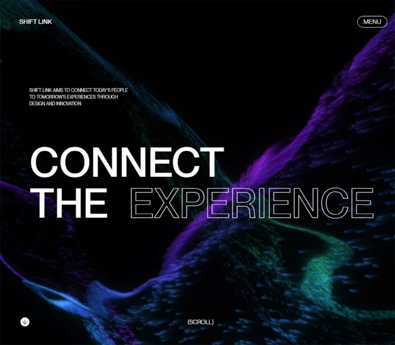
黒い空間に青・紫・青緑の粒子が波打つサービスサイト。大きな欧文見出しとアウトライン文字、非対称の余白設計を軸に、リアルとバーチャルをつなぐ技術や事例を紹介しています。
SHIFT LINK — Style Reference
Oversized words suspended inside a dark landscape of flowing digital particles.
Original URL: shiftlink.tech
Final URL: shiftlink.tech — unchanged; supplied HTTP status 200.
Theme: black canvas, white typography, and dark blue, violet, and teal imagery.
Inspected: supplied browser evidence retrieved October 1, 2026 at 20:07:25.162 UTC; October 2, 2026 at 05:07:25.162 JST.
Viewports: desktop 1440 × 1000 and mobile 390 × 844 CSS pixels.
Scope: three desktop opening-state captures, two mobile hero captures, and rendered DOM/computed-style evidence extending through services, system information, case studies, vision, teams, and contact. Lower sections are documented from DOM measurements, not from supplied lower-page screenshots. Menu opening, language switching, hover states, and navigation outcomes were not exercised in the supplied evidence.
SHIFT LINK presents a service and its underlying technical capabilities through a long editorial sequence. It connects real and virtual environments, introduces three service areas, explains a system, presents three case studies, identifies the participating teams, and ends with an invitation to collaborate. Its structure extends well beyond the introductory hero.
The opening visual combines a nearly black, spatial particle field with a very large English statement: CONNECT THE EXPERIENCE. The first two words are filled; the final word is outlined. Small navigation labels and a compact mission statement make the display type feel even larger. Desktop placement is deliberately asymmetric. Mobile rearranges the composition into an introduction followed by a three-line headline, while retaining a full-height background scene.
The reusable identity comes from five relationships: black negative space against dim colored geometry; filled words against hollow lettering; small utility text against monumental headings; offset desktop columns against a clear mobile gutter; and an atmospheric opening against substantial bilingual project information.
閉じる
SHIFT LINK — Style Reference
Oversized words suspended inside a dark landscape of flowing digital particles.
Original URL: shiftlink.tech
Final URL: shiftlink.tech — unchanged; supplied HTTP status 200.
Theme: black canvas, white typography, and dark blue, violet, and teal imagery.
Inspected: supplied browser evidence retrieved October 1, 2026 at 20:07:25.162 UTC; October 2, 2026 at 05:07:25.162 JST.
Viewports: desktop 1440 × 1000 and mobile 390 × 844 CSS pixels.
Scope: three desktop opening-state captures, two mobile hero captures, and rendered DOM/computed-style evidence extending through services, system information, case studies, vision, teams, and contact. Lower sections are documented from DOM measurements, not from supplied lower-page screenshots. Menu opening, language switching, hover states, and navigation outcomes were not exercised in the supplied evidence.
SHIFT LINK presents a service and its underlying technical capabilities through a long editorial sequence. It connects real and virtual environments, introduces three service areas, explains a system, presents three case studies, identifies the participating teams, and ends with an invitation to collaborate. Its structure extends well beyond the introductory hero.
The opening visual combines a nearly black, spatial particle field with a very large English statement: CONNECT THE EXPERIENCE. The first two words are filled; the final word is outlined. Small navigation labels and a compact mission statement make the display type feel even larger. Desktop placement is deliberately asymmetric. Mobile rearranges the composition into an introduction followed by a three-line headline, while retaining a full-height background scene.
The reusable identity comes from five relationships: black negative space against dim colored geometry; filled words against hollow lettering; small utility text against monumental headings; offset desktop columns against a clear mobile gutter; and an atmospheric opening against substantial bilingual project information.
How to Read This Reference
- Measured means a value appears in the supplied computed styles, element rectangles, or custom properties. All dimensions are CSS pixels unless otherwise stated.
- Visually estimated means a value or treatment is inferred from the original-page captures. Approximate particle colors, visible pill dimensions, and outline thickness belong to this category.
- Calculated means arithmetic applied to an observed formula, such as
13vwat a 390px viewport. - Recommended means an implementation choice for a new build. It is not a claim about the original site's behavior.
- DOM-only sections have reliable text and typography evidence, but their final composited imagery, reveal states, and visible surfaces are not fully established.
- Custom-property names beginning with
--top-,--services-, and similar prefixes are source names. The--sl-*names in Quick Start are adaptation aliases.
The snapshots contain duplicate header elements and some offscreen or overlapping element bounds. A DOM rectangle establishes geometry at the sampled moment; it does not prove that the element was visible or that it belongs in normal document flow.
Tokens — Colors
Interface Palette
| Name | Value | Evidence | Role |
|---|---|---|---|
| Canvas Black | #000000 |
Measured body background | Opening canvas and underlying page background |
| Interface White | #FFFFFF |
Measured body, navigation, hero, and most content text | Filled headings, body copy, controls, and outlines |
| Contact Ink | #000000 |
Measured contact copy and outgoing footer links | Contact-region text; the composited background beneath it is unverified |
| Transparent Layer | rgba(0, 0, 0, 0) |
Measured on section and text wrappers | Allows underlying page or scene layers to remain visible |
The desktop headline appears softer than pure white in the revealed capture, while its computed color is white. Preserve the distinction between the authored color and its appearance during compositing or entrance motion. The evidence does not establish a separate gray headline token.
Particle-Field Approximation
These are visual reference estimates, not measured shader uniforms or sampled source colors. They describe the dark original-page captures.
| Name | Approximate value | Role |
|---|---|---|
| Deep Blue | #081C25 |
Cool facets emerging from black |
| Indigo | #171B42 |
Intermediate wave surfaces and depth |
| Violet | #29103D |
Purple ridges, especially toward the right and lower scene |
| Deep Teal | #062B2B |
Green-blue ribbons and upper-left geometry |
The scene contains many intermediate shades, including extensive near-black regions. These four colors are anchors for a new art direction, not a complete reconstruction palette. Keep them in the imagery rather than distributing them among navigation items, badges, or unrelated button fills.
No selectable color theme was demonstrated. The contact section's black text does not, by itself, establish a white surface or a theme switch.
Tokens — Typography
Declared Latin and General Interface Stack
Measured family declaration: 'Pangram Pangram', 'Hiragino Sans', Meiryo, sans-serif.
The Latin lettering has a restrained sans-serif character with large, relatively even strokes and tight line stacking. The declared family name is available in the evidence; a more specific commercial face, font file, or font-loading configuration is not. Do not substitute an assumed font name from the same foundry and call it verified.
Most display headings use weight 500. Supporting descriptions frequently use 300. The desktop corner wordmark uses 400. Letter spacing is reported as normal for the sampled elements; conspicuous tracking is not a defining ingredient.
Japanese Text
Several Japanese descriptions explicitly use 'Hiragino Sans', Meiryo, sans-serif. Introductory and vision statements use the unusual numeric weight 501, as do the larger Japanese service leads. This is an observed computed value, not evidence of a separately named 501-weight font file.
Japanese text participates in the same scale contrast as the English typography: very large statements, medium service propositions, and lighter supporting paragraphs. Avoid reducing it to tiny supplementary captions.
Type Scale
Sizes and line heights below are measured unless identified as source tokens.
| Role | Desktop size / line height | Mobile size / line height | Weight / notes |
|---|---|---|---|
| Desktop corner wordmark | 15 / 15px |
Mobile DOM also contains 14 / 14px branding |
Desktop 400; mobile node 500; mobile visibility unresolved |
| Navigation labels | Source token 14px |
Menu source token 14px |
Exact label line boxes were not supplied |
| Hero statement | 100 / 100px |
50.7 / 50.7px |
500; mobile size is 13vw |
| Hero introduction | 12 / 18px |
12 / 18px |
300; uppercase appearance |
| Introductory Japanese statement | 60 / 81px |
29.25 / 39.4875px |
501; mobile 7.5vw |
| Service English heading | 80 / 90px |
39 / 43.875px |
500; mobile 10vw |
| Service Japanese lead | 40 / 50px |
22.62 / 28.275px |
501; mobile 5.8vw |
| Service supporting copy | 20 / 24px |
17 / 20.4px |
300 |
| System section title | 100 / 112.5px |
46.8 / 52.65px |
500; mobile 12vw |
| System item title | 40 / 45px |
17.55 / 19.7437px |
300; mobile 4.5vw |
| System item copy | 20 / 26px |
17 / 22.1px |
300 |
| Showcase and Teams titles | 120 / 135px |
46.8 / 52.65px |
500; mobile 12vw |
| Case-study heading | 80 / 90px |
31.2 / 35.1px |
500; mobile 8vw |
| Case-study copy | 20 / 26px |
17 / 22.1px |
300 |
| Japanese vision statement | 80 / 108px |
31.98 / 43.173px |
501; mobile 8.2vw |
| THE SHIFT team name | 40 / 45px |
30 / 33.75px |
500; excludes bottom padding |
| Team description | 19.7 / 23.64px |
17 / 20.4px |
300 |
| Contact introduction | 14 / 19.6px |
14 / 19.6px |
300 |
| Footer social links | 14 / 21px |
14 / 21px |
300 |
Contact display caveat: desktop source properties include --contact-title-upper: 140px and --contact-title-lower: 125px. Mobile defines --contact-title: 14.5vw, equivalent to 56.55px at 390px. The sampled contact h2 is a transparent-text wrapper with a computed font size of 16px; its child styling was not supplied. Use the display properties as sizing evidence, not as proof of the final glyph fill, stroke, or transform.
Filled and Outlined Display Words
In the visible hero, CONNECT and THE are solid white, while EXPERIENCE has a dark interior and a thin light outline. The outline appears approximately 1px thick. Its exact implementation was not captured.
A practical recreation can use transparent text with -webkit-text-stroke, but that is an implementation recommendation. Retain a filled fallback where text stroke is unavailable.
Tokens — Spacing & Shapes
The source uses a mixture of fixed desktop dimensions, viewport-relative mobile typography, and large section intervals. A universal 8px spacing grid is not demonstrated.
Layout Measurements
| Element | Desktop 1440 × 1000 |
Mobile 390 × 844 |
Evidence |
|---|---|---|---|
| Main section shell | 1280px, starting at x=80 |
390px, starting at x=0 |
Measured |
| Standard section horizontal padding | 145px per side |
25px per side |
Measured |
| Standard inner content width | 990px, starting at x=225 |
340px, starting at x=25 |
Calculated from measured shell/padding |
| Header inset token | 44px |
25px |
Source --menu-padding |
| Hero section height | 1000px |
844px |
Measured |
| Hero heading origin | x=326, y=400 |
x=25, y=372.9375 |
Measured |
| Hero heading box | 892.21875 × 200px |
304.109375 × 152.109375px |
Measured; visual transforms may affect appearance |
| Hero copy box origin | x=932, y=600 |
x=25, y=234.546875 |
Measured |
| Hero copy padding | 30px above its text |
0 |
Measured |
| Major section top padding | 420px |
320px |
Measured on System and Showcase |
| Teams bottom padding | 800px |
400px |
Measured |
| Contact section height | 1000px |
844px |
Measured |
The desktop hero's source offsets are relative to its centered shell: 80 + 246 = 326px for the headline, and 80 + 852 = 932px for the introduction. Copying 246px directly as a viewport offset would misalign the composition.
Spacing and Media Properties
| Use | Desktop | Mobile | Interpretation |
|---|---|---|---|
| Service copy offset: Multiple Environments | 404px |
0 |
Source property; measured copy begins at 225 + 404 = 629px on desktop |
| Service copy offset: Simulation Design System | 202px |
0 |
Measured desktop copy begins at 427px |
| Service copy offset: Remote Control | 303px |
0 |
Measured desktop copy begins at 528px |
| Space above supporting service copy | 25px |
25px |
Measured paragraph padding |
| Space above case-study copy | 20px |
20px |
Measured paragraph padding |
| Service media size properties | 788 × 598px |
Width 100%; height about 251.47px |
Mobile height calculated from supplied formula; actual media bounds not supplied |
| System media size properties | 944 × 648px |
Width 100%; height about 254.33px |
Same limitation |
| Service image top-margin property | -65px |
-35px |
Suggests overlap; lower-page appearance is not visually verified |
| System information title-height property | 196px |
130px |
Source property, not proof of an accordion interaction |
| Desktop case-study text width | 485px |
Measured 340px |
Short text measure below much larger headings |
Observed mobile media formulas:
/* Source custom-property values; their containing blocks are not documented. */
--services-image-height: calc(100vw * 0.758582524271845 * 0.85);
--system-image-height: calc(100vw * 0.686440677966102 * 0.95);
Do not automatically replace 100% media width with 100vw: the containing block is part of the layout and was not recorded for these media elements.
Shapes
| Element | Treatment | Confidence |
|---|---|---|
| Header language control | Small transparent capsule with a fine white outline | Visible desktop estimate; roughly 42 × 26px |
| Mobile Menu control | Transparent capsule with a fine white outline | Visible estimate; roughly 67 × 28px |
| Scroll icon | White circle containing a thin black down arrow | Visible estimate; roughly 24px diameter |
| Hero lettering outline | Fine light stroke, unfilled interior | Visually verified; thickness estimated |
| Content surfaces | No enclosing cards established by the evidence | DOM-only below the hero |
Rounded geometry is concentrated in compact controls. It is not a general rounded-card design system.
Components
Opening Identity State
Anatomy: a black viewport, a white linked-loop symbol, and the SHIFT LINK wordmark centered as one compact group.
The first desktop capture places the group around the viewport center, approximately (720, 500). Its total visible width is roughly 230px. There is no visible progress percentage or loading bar.
The next desktop capture retains the central mark while the background scene and navigation become faintly visible. The later capture shows the hero without the central identity overlay. This supports an opening reveal sequence, but does not establish whether its timing depends on asset loading, a fixed delay, or another condition.
For a new implementation, keep this state brief and nonblocking. The reference does not justify leaving the main content inaccessible until an animation finishes.
Desktop Header
Anatomy: small brand at the far left; SERVICES, OUR VISION, TEAMS, and CONTACT distributed across the right half; outlined EN capsule near the right edge.
The visible brand is measured at x=44, y=60, using 15px type with a 15px line height. Navigation sits directly over the scene without a visible header panel, divider, or shadow.
The header is visible in the opening captures. Persistence during scrolling was not demonstrated, so fixed or sticky behavior should not be treated as established.
Mobile Header
The mobile captures visibly show the outlined MENU control near the upper-right corner, approximately x=306, y=43. The desktop navigation row is absent from those captures.
The DOM contains a mobile brand node at x=25, y=50, an EN label, and menu content. These are not all visibly discernible in the supplied mobile images. Their presence does not prove that the menu was open or that the brand remained visible throughout the opening sequence.
No open-menu layout, backdrop, transition, focus behavior, or language-selection result was observed.
Full-Viewport Particle Scene
Anatomy: an edge-to-edge black field containing dense, tiny, faceted elements arranged into broad folds and ribbons.
The original desktop hero shows teal structures toward the upper left, indigo and violet structures across the lower region and right side, and substantial black space through the center. Individual elements resemble tiny triangular or pyramidal facets rather than soft circular bokeh.
The scene frames the text without becoming a uniform bright texture. Depth comes from changing density, scale, darkness, and directional flow. Keep black gaps between the ribbons.
The two mobile captures show different particle arrangements while the text remains in essentially the same place. This supports a changing background scene. The evidence does not identify its renderer, shader, animation library, input sources, or frame rate.
Hero Statement and Introduction
Desktop anatomy: a two-line display statement around the vertical center, with CONNECT above THE EXPERIENCE; a small three-line introduction below and to the right.
The desktop heading's measured origin is x=326, y=400, with 100px type and a 100px line height. In the visible reveal frame, the text appears tilted in depth. That frame should not be treated as proof of a permanent slanted resting state.
The mission text reads:
SHIFT LINK AIMS TO CONNECT TODAY’S PEOPLE
TO TOMORROW'S EXPERIENCES THROUGH
DESIGN AND INNOVATION
Its desktop box begins at x=932, y=600; 30px of top padding places the text lower within that box. It uses 12px / 18px light type.
Mobile anatomy: the same introduction first, followed by a three-line statement: CONNECT, THE, EXPERIENCE. Both share the 25px left gutter. The copy starts at about 27.8% of viewport height; the heading starts at about 44.2%. The measured gap from the copy box's bottom to the heading box's top is approximately 84.4px.
This is a composition change, not simply a proportional reduction of the desktop layout.
Scroll Cue
Anatomy: a small filled circle with a down arrow near the lower-left corner, paired with (SCROLL) centered near the bottom of the viewport.
The visible circle is approximately 24px across. It sits about 48–50px above the bottom edge in the supplied captures. The label remains small and plain, without a large button enclosure.
The captures establish an invitation to continue down the page. They do not establish whether clicking the icon performs a scroll, whether it animates, or whether the cue is fixed beyond the hero.
Introductory Japanese Statement
DOM-only anatomy: one large Japanese paragraph, presented as an expansive statement between the hero and services.
Desktop uses 60px / 81px typography at weight 501. The paragraph is offset to x=528, substantially farther right than the standard content start at x=225. Mobile reduces it to 29.25px / 39.4875px, beginning at x=19.5, equivalent to the source 5vw offset.
The mobile section occupies a full 844px viewport-height region. This gives the statement a chapter-like role rather than treating it as a small hero subtitle.
Some recorded desktop bounds extend outside the viewport. This may relate to reveal geometry or positioning; it is not a recommendation to introduce horizontal page overflow.
Service Feature Sequence
DOM-only anatomy: three large feature presentations, each combining an English heading, a media-sized region implied by source properties, a larger Japanese proposition, and a lighter supporting paragraph.
The three headings are:
Multiple EnvironmentsSimulation Design SystemRemote Control
Each English heading spans two lines at 80px / 90px on desktop. The Japanese lead uses 40px / 50px, followed by 20px / 24px supporting text with 25px top padding.
The distinctive desktop rhythm is the changing copy alignment. The first description begins at x=629, the second at x=427, and the third at x=528, while the headings share x=225. These are deliberate offsets, not three equal cards.
At 390px, headings and descriptions all align to x=25. The Japanese lead becomes 22.62px; supporting text remains a readable 17px. The layout simplifies its offsets while retaining generous vertical separation.
The media properties suggest large illustrations or visual panels, but the supplied screenshots do not show those assets. Their actual subjects and cropping must remain unassigned.
System Overview
DOM-only anatomy: a system media region, a SYSTEM title, a short overview paragraph, and three labeled information entries:
SHIFT LINK CONTROLLERDEVELOPMENT ENVIRONMENTDEVICES
The overview explains flexible operation across equipment and platforms. The descriptions mention networked external inputs, web-standard technologies and game engines, and displays, sensors, and AR/MR/VR devices.
Desktop title size is 100px; information headings are lighter 40px / 45px text. On mobile, the section title becomes 46.8px, while information headings become 17.55px, close to their 17px supporting copy.
Several entry rectangles overlap vertically in the sampled DOM. Do not infer that all descriptions appear together in a conventional vertical list, or that the entries form an accordion. Active-state visibility and interaction were not captured. A new static implementation should keep each heading and paragraph readable without overlap.
Showcase
DOM-only anatomy: a Showcase section heading followed by three numbered case studies, each with a project heading and explanatory Japanese copy.
| Case | Heading | Supported subject |
|---|---|---|
| 1 | Museum Experience |
System use in a Japan Airlines museum and remote browser-based updates |
| 2 | AR GLASS Experience |
An experience demo using AR glasses and remotely adjustable digital content |
| 3 | Media Facade Simulator |
A web-based simulation of signage content in a virtual Shibuya environment |
The section title is 120px / 135px on desktop. Case headings are 80px / 90px, with descriptions constrained to 485px. Mobile sizes become 46.8px and 31.2px, respectively, with 340px descriptions.
The third case includes the observed link label Link to the Media Facade Simulator, pointing to https://media-facade.shiftlink.tech/. The destination was not inspected.
The large measured intervals between case headings suggest substantial media or reveal space. They do not establish a slider, autoplaying video, or a particular image arrangement.
Future Vision Statement
DOM-only anatomy: the label Our Future Vision and a large Japanese statement about connecting people through technology and design in real and virtual environments.
The statement uses 80px / 108px on desktop and 31.98px / 43.173px on mobile, both at weight 501. A measured 70px top padding separates the statement from the label region.
This is another large typographic chapter. Keep the text dominant instead of converting the message into a small supporting card.
Teams
DOM-only anatomy: large TEAMS heading, a short English introduction, and two partner entries combining identity, role, description, and an outbound website link.
The desktop rows measure 990px wide. The identity region begins at x=225; Japanese descriptions begin at x=571.5, a 346.5px separation. That corresponds to 35% of the inner content width. Descriptions are measured at 485px wide.
Mobile stacks the identity, role, explicit Website link, and description within the 340px content width. This is also a link-presentation change: desktop exposes broad linked entries, while the supplied mobile link list exposes separate Website labels.
The inspected page states that THE SHIFT handles SHIFT LINK's planning, production, operation, art direction, and design. It identifies aircord with technical direction and development. These are project responsibilities stated on the original page; they should not be expanded into unsupported claims about individual website implementation tasks.
Contact and Footer
DOM-only anatomy: a short collaboration invitation, a two-line CONNECT WITH US email link, copyright text, and INSTAGRAM / TWITTER links.
The email destination is mailto:info@theshift.tokyo. The section occupies one viewport height at both observed sizes. Desktop contact copy begins at x=427; mobile begins at approximately x=75.69, retaining a more pronounced inset than the standard 25px content gutter.
Contact copy and social links have computed black text, while the section wrapper is transparent. Its actual backdrop is not visible in the supplied captures. The headline wrapper also has transparent text, implying additional child or rendering treatment that is absent from the element sample. Do not invent a confirmed white finale or a specific outline animation.
The copyright reads © 2022 The Shift, Inc. All rights reserved. This is page content, not the date of the supplied inspection.
Tokens — Motion & Interaction
| Treatment | What the evidence supports | What remains unknown |
|---|---|---|
| Opening identity reveal | Centered logo on black, then a dim scene beneath it, then the hero without the central logo | Trigger, duration, easing, and loading dependency |
| Hero display motion | Different apparent projection/visibility of the heading across desktop opening frames | Exact transform, resting state, timeline, and scroll linkage |
| Particle-field movement | Different scene geometry across mobile captures with stable text placement | Renderer, loop length, speed, frame rate, and pointer response |
| Scroll invitation | Bottom arrow and (SCROLL) label |
Click action, cue animation, and persistence |
| Section navigation | Desktop section labels and mobile menu content are present | Scroll offsets, smooth-scroll implementation, active state, and menu transition |
| Language control | EN is present in the interface evidence |
Destination, translated state, and switching mechanism |
| Case, partner, contact, and social links | Href values are supplied | Hover treatment and destination-page behavior |
Sampled elements report animation: none and a generic transition value of all. These values do not establish a static page: visual changes are present in the captures, and motion may occur on unsampled descendants or other rendering layers. No reliable duration or easing token can be extracted from those fields.
Recommended motion direction: let the scene change slowly enough to preserve reading clarity; keep textual navigation stable; use one restrained opening reveal. Any chosen timing is a new implementation decision. Provide a static scene and immediate text visibility for reduced-motion users.
Surfaces
| Layer | Observed treatment | Implementation implication |
|---|---|---|
| Base page | Measured black body background | Start with a true black canvas |
| Hero scene | Dark faceted ribbons with large empty regions | Avoid a uniformly bright full-screen texture |
| Header | White elements over the scene | No visible opaque navigation bar is required for the opening state |
| Main statement | Filled and outlined white lettering | Typography is the primary foreground object |
| Compact controls | Thin outlined capsules and a filled circular arrow | Keep enclosure shapes small and purposeful |
| Lower-section wrappers | Transparent computed backgrounds | Final composited appearance needs separate visual confirmation |
| Contact region | Black text on an unverified composited backdrop | Resolve contrast before reproducing this region |
No general shadow or elevation system is established. The visible hero obtains depth from its scene, not from elevated interface cards.
Imagery
The opening imagery is abstract and spatial. Dense fields of tiny faceted elements form sweeping ribbons, ridges, and valleys. Blue, purple, and teal emerge from black at low brightness. The field remains detailed at close inspection without reading as a flat noise overlay.
On desktop, the scene surrounds and partly crosses the broad heading region. Mobile shows a narrower crop or recomposed view with ribbons running through the lower half and along the upper-left edge. The exact camera or responsive scene logic is unknown.
For an adaptation, retain small geometric primitives, directional organization, depth variation, and black negative space. A generic smooth gradient or bright neon smoke texture would lose the defining structure.
Observed Asset References
No image, model, shader, video, or font-file URLs were supplied. Do not invent asset paths.
| Visual resource | Available evidence | Reuse guidance |
|---|---|---|
| Opening linked-loop symbol and wordmark | Visible in desktop opening captures | Use an authorized brand asset; preserve compact proportions |
| Hero particle field | Visible at desktop and mobile sizes in different states | Recreate with authorized media or a separately built scene; rendering technology is unverified |
Outlined EXPERIENCE lettering |
Visible in original hero captures | Reproduce with text styling where possible, retaining accessible text |
| Service and system media | Size-related custom properties only | Treat visual subjects and asset formats as unknown |
| Case-study media | Content context and large DOM intervals | Do not fabricate specific photographs, diagrams, or video controls |
| aircord identity treatment | Partner entry and a heading with no extracted text | Asset type and appearance are not established |
Layout & Responsive Behavior
Desktop Composition
A 1280px shell is centered within the 1440px viewport, leaving 80px outer margins. Most lower sections then add 145px of internal padding, producing a 990px working width.
The hero uses separate offsets within the wider shell. Its headline begins at x=326, while its small introduction is pushed to x=932. This places the statement left of the introduction and leaves the upper portion of the scene comparatively open.
Below the hero, common heading alignment at x=225 creates continuity. Service descriptions vary their offsets by 202px, 303px, or 404px. This produces an editorial rhythm without requiring different card styles.
Mobile Recomposition
At 390 × 844:
- The section shell spans the viewport, with a standard
25pxgutter and340pxinner width. - Desktop navigation gives way to a visible Menu capsule.
- Hero copy moves above the heading.
- The heading changes from two lines to three and scales to
13vw. - Service descriptions lose their desktop offsets and align to the main gutter.
- Large English section titles use viewport-relative sizes, while body copy remains
17px. - Team information becomes stacked and exposes explicit
Websitelinks. - Large section pauses remain:
320pxtop padding and400pxbeneath Teams are still present.
The source exposes breakpoint-like properties --sm: 640px, --lg: 1024px, --xl: 1280px, and --xl2: 1536px. Their exact media-query usage was not supplied. Only the two recorded viewport states are verified; tablet behavior should not be invented from these names.
Scroll and Geometry Limitations
The supplied document-height field equals the viewport height at both sizes, but the measured main height is approximately 16184.5px on desktop and 10486.23px on mobile. The html and body rectangles also report zero height.
This combination is consistent with a separately managed layout or scrolling layer, but does not identify its mechanism. It is not evidence that the site contains only one screen. Do not infer a specific smooth-scroll library, scroll-snap system, or pinned timeline.
Some text rectangles extend beyond their containing viewport, and system entries overlap in the sample. A reusable implementation should preserve the visual relationships while independently ensuring readable flow, reachable content, and no unintended horizontal scrolling.
Do’s and Don’ts
Do
- Use true black and white as the interface foundation.
- Keep blue, violet, and teal concentrated in the scene.
- Preserve the combination of solid
CONNECT THEand outlinedEXPERIENCE. - Match the hero's measured
100pxdesktop and50.7pxmobile headline sizes at the recorded viewports. - Recompose the mobile hero with its introduction above the three-line heading.
- Keep small navigation and description text in tension with very large headings.
- Use a common lower-page heading alignment with staggered desktop description offsets.
- Retain substantial Japanese propositions and vision statements.
- Treat services, system details, cases, teams, and contact as distinct chapters in a long presentation.
- Separate visible evidence from DOM-only structure when extending the reference.
Don’t
- Don’t flatten the particle field into a generic bright gradient.
- Don’t make every heading hollow; the filled/outlined contrast is selective.
- Don’t introduce colorful CTA buttons, badges, or rounded feature cards without a new design reason.
- Don’t center all desktop content and remove the measured offsets.
- Don’t shrink the entire desktop composition onto a phone.
- Don’t label the tilted desktop opening frame as a permanent text transform.
- Don’t infer menu animation, pointer parallax, or scroll-linked motion from labels alone.
- Don’t assume a white contact background from black computed text.
- Don’t reproduce overlapping DOM rectangles as a static content layout.
- Don’t invent media filenames, a specific font face, or technology credits.
Recommended Implementation Additions
These are recommendations for a new implementation, not verified original-site features.
- Provide a static poster or paused state for the decorative scene, and respect
prefers-reduced-motionin both CSS and the scene renderer. - Render headings, descriptions, and navigation as accessible HTML above decorative media. Mark purely decorative scene layers
aria-hidden. - Preserve visible text if the font or scene fails to load. The opening identity state should never become a permanent gate.
- Expand the small Menu, language, and scroll-control hit areas to at least
44 × 44pxwithout enlarging their visible capsules or circles. - Give the menu an accessible name, expanded state, keyboard behavior, and reliable close/focus handling.
- Use one semantic page
h1; avoid exposing duplicated responsive header content to assistive technology. - Keep body copy bounded within mobile gutters even where the sampled original rectangles extend beyond the viewport.
- Provide native, keyboard-reachable navigation as a fallback for any enhanced scrolling.
- Confirm the contact backdrop and headline treatment before implementing its measured black foreground.
- Pause expensive background rendering when offscreen and cap render resolution on constrained devices. These are performance recommendations, not observations about the source.
Agent Prompt Guide
Quick Color Reference
- Canvas: measured
#000000. - Main text and control outlines: measured
#FFFFFF. - Scene anchors: estimated deep blue
#081C25, indigo#171B42, violet#29103D, and teal#062B2B. - Avoid treating scene colors as a button or badge palette.
- Contact foreground is measured black; its final backdrop remains unverified.
Overall Prompt
“Create a service and project presentation inspired by the current SHIFT LINK page. Use a true black canvas, white sans-serif typography, and an abstract field of tiny faceted particles forming dark blue, violet, and teal ribbons. Keep substantial black negative space. At 1440 × 1000, use a centered 1280px shell, a 100px two-line CONNECT THE EXPERIENCE statement starting around x=326, and a 12px introduction offset to the lower right. Fill CONNECT and THE; outline EXPERIENCE. Place small navigation directly over the scene. Continue with oversized service headings, large Japanese propositions, staggered desktop copy columns, system information, three case studies, a vision statement, team entries, and contact. At 390 × 844, use 25px gutters, move the introduction above the headline, split the headline into three 50.7px lines, and stack lower content. Keep body copy around 17px. Use accessible static fallbacks; do not invent unverified menu or scroll behavior.”
Example Component Prompts
- Opening hero: “Build a full-height black hero with a decorative field of tiny triangular facets arranged into flowing ribbons. Use dim teal in the upper-left area and violet/indigo toward the lower and right areas. Overlay a very large white statement with only EXPERIENCE outlined. Keep the interface crisp and the scene dark.”
- Mobile hero: “At 390 × 844, place a small 12px/18px three-line introduction at x=25 and y≈235. Place CONNECT / THE / EXPERIENCE below it at x=25 and y≈373, using 50.7px type with equal line height. Add a small outlined Menu capsule near the top right and a bottom-centered scroll label.”
- Service presentation: “Use an 80px two-line English heading aligned to a common desktop column. Pair it with a 40px Japanese lead and a lighter 20px paragraph. Offset descriptions by 202px, 303px, or 404px across successive sections. Remove these offsets on mobile and use 39px headings, 22.62px leads, and 17px body text.”
- Case study: “Create a spacious case-study block with a small case number, a large two-line project heading, room for separately supplied media, and a 485px desktop description measure. Keep the content on an unboxed surface. Stack at 340px content width on a 390px phone.”
- Team entry: “Create a plain editorial partner row with identity and role on the left and a compact Japanese description on the right. Use a 35% identity column within a 990px inner region. On mobile, stack the identity, role, Website link, and 17px description. Avoid card backgrounds and shadows.”
Quick Start
CSS Custom Properties
This is a static, accessible adaptation, not extracted source code. It reproduces the measured typography and principal layout relationships at the two inspected sizes. The mobile switch at 1024px, bounded fluid sizes, native section links, visible mobile brand, and larger hit areas are recommendations.
Supply authorized scene media inside .hero__scene. The CSS does not generate the original particle field, implement a menu, reproduce an entrance timeline, or assume the contact backdrop. The font family declaration is preserved, but no font file is fabricated.
:root {
  /* Measured interface colors */
  --sl-canvas: #000000;
  --sl-ink: #ffffff;

  /* Approximate artwork anchors, not measured renderer colors */
  --sl-blue: #081c25;
  --sl-indigo: #171b42;
  --sl-violet: #29103d;
  --sl-teal: #062b2b;

  /* Observed family declarations */
  --sl-font: 'Pangram Pangram', 'Hiragino Sans', Meiryo, sans-serif;
  --sl-font-ja: 'Hiragino Sans', Meiryo, sans-serif;

  /* Desktop dimensions */
  --sl-shell: 1280px;
  --sl-inset: 145px;
  --sl-header-inset: 44px;
  --sl-section-space: 420px;
  --sl-hero-title-left: 246px;
  --sl-hero-copy-left: 852px;
  --sl-hero-size: 100px;
  --sl-service-size: 80px;
  --sl-section-size: 120px;
  --sl-system-size: 100px;
  --sl-case-size: 80px;
  --sl-lead-size: 40px;
  --sl-body-size: 20px;
  --sl-about-size: 60px;
  --sl-vision-size: 80px;
  --sl-team-logo: 40px;
  --sl-team-copy: 19.7px;
  --sl-teams-tail: 800px;
  --sl-media-overlap: -65px;

  /* Visual estimates and accessible adaptation values */
  --sl-outline: 1px;
  --sl-pill-radius: 999px;
  --sl-hit-size: 44px;
}

* {
  box-sizing: border-box;
}

body {
  margin: 0;
  color: var(--sl-ink);
  background: var(--sl-canvas);
  font-family: var(--sl-font);
  font-weight: 500;
}

a {
  color: inherit;
}

button {
  color: inherit;
  font: inherit;
}

:where(a, button):focus-visible {
  outline: 2px solid currentColor;
  outline-offset: 5px;
}

.site-header {
  position: absolute;
  z-index: 5;
  inset-block-start: 46px;
  inset-inline: var(--sl-header-inset);
  display: flex;
  align-items: center;
  justify-content: space-between;
  min-block-size: var(--sl-hit-size);
}

.site-brand {
  font-size: 15px;
  font-weight: 400;
  line-height: 1;
  text-decoration: none;
}

.site-nav {
  display: flex;
  align-items: center;
  gap: clamp(24px, 7vw, 100px);
  font-size: 14px;
  font-weight: 400;
}

.site-nav a {
  text-decoration: none;
}

.pill-control {
  position: relative;
  display: inline-flex;
  align-items: center;
  justify-content: center;
  min-block-size: var(--sl-hit-size);
  padding-inline: 14px;
  border: 0;
  background: transparent;
  font-size: 14px;
  line-height: 1;
  cursor: pointer;
}

.pill-control::before {
  position: absolute;
  inset-inline: 0;
  inset-block-start: 50%;
  block-size: 28px;
  border: var(--sl-outline) solid currentColor;
  border-radius: var(--sl-pill-radius);
  transform: translateY(-50%);
  content: '';
  pointer-events: none;
}

.site-menu {
  display: none;
}

.hero {
  position: relative;
  isolation: isolate;
  min-block-size: 100vh;
  min-block-size: 100svh;
  background: var(--sl-canvas);
}

.hero__scene {
  position: absolute;
  z-index: -1;
  inset: 0;
  overflow: hidden;
  pointer-events: none;
}

.hero__scene :is(img, video, canvas) {
  display: block;
  inline-size: 100%;
  block-size: 100%;
  object-fit: cover;
}

.hero__layout {
  position: relative;
  inline-size: min(100%, var(--sl-shell));
  block-size: 100vh;
  block-size: 100svh;
  margin-inline: auto;
}

.hero__title {
  position: absolute;
  inset-inline-start: var(--sl-hero-title-left);
  inset-block-start: 50%;
  margin: 0;
  transform: translateY(-50%);
  font-size: var(--sl-hero-size);
  font-weight: 500;
  line-height: 1;
  letter-spacing: normal;
}

.hero__connect {
  display: block;
}

.hero__line {
  display: flex;
  align-items: baseline;
  gap: 1em;
  white-space: nowrap;
}

/* Filled text remains the fallback when text stroke is unavailable. */
@supports (-webkit-text-stroke: 1px white) {
  .display-outline {
    color: transparent;
    -webkit-text-stroke: var(--sl-outline) var(--sl-ink);
  }
}

.hero__copy {
  position: absolute;
  inset-inline-start: var(--sl-hero-copy-left);
  inset-block-start: 60%;
  inline-size: 270px;
  margin: 0;
  padding-block-start: 30px;
  font-size: 12px;
  font-weight: 300;
  line-height: 18px;
  text-transform: uppercase;
}

.scroll-cue {
  position: absolute;
  inset-inline: 37px;
  inset-block-end: calc(38px + env(safe-area-inset-bottom, 0px));
  display: flex;
  align-items: center;
  min-block-size: var(--sl-hit-size);
  text-decoration: none;
}

.scroll-cue__icon {
  display: grid;
  place-items: center;
  inline-size: 24px;
  block-size: 24px;
  margin-inline-start: 10px;
  border-radius: 50%;
  color: var(--sl-canvas);
  background: var(--sl-ink);
  font-size: 20px;
  font-weight: 300;
  line-height: 1;
}

.scroll-cue__label {
  position: absolute;
  inset-inline-start: 50%;
  transform: translateX(-50%);
  font-size: 16px;
  font-weight: 400;
  line-height: 1;
}

.section {
  inline-size: min(100%, var(--sl-shell));
  margin-inline: auto;
  padding-inline: var(--sl-inset);
  padding-block-start: var(--sl-section-space);
  scroll-margin-block-start: 32px;
}

.section-title,
.service-title,
.case-title,
.system-title {
  margin: 0;
  font-weight: 500;
  line-height: 1.125;
}

.section-title {
  font-size: var(--sl-section-size);
}

.service-title {
  font-size: var(--sl-service-size);
}

.system-title {
  font-size: var(--sl-system-size);
}

.case-title {
  font-size: var(--sl-case-size);
}

.service--environments {
  --copy-offset: 404px;
}

.service--simulation {
  --copy-offset: 202px;
}

.service--remote {
  --copy-offset: 303px;
}

.service__copy {
  max-inline-size: 640px;
  margin-inline-start: var(--copy-offset, 0px);
}

.service__lead {
  margin: 0;
  font-family: var(--sl-font-ja);
  font-size: var(--sl-lead-size);
  font-weight: 501;
  line-height: 1.25;
}

.service__body {
  margin: 25px 0 0;
  font-family: var(--sl-font-ja);
  font-size: var(--sl-body-size);
  font-weight: 300;
  line-height: 1.2;
}

/* Media ratio adaptation; original lower-page imagery is unverified. */
.service__media {
  display: block;
  inline-size: min(100%, 788px);
  aspect-ratio: 788 / 598;
  margin-block-start: var(--sl-media-overlap);
  object-fit: contain;
}

.case__body {
  max-inline-size: 485px;
  margin: 20px 0 0;
  font-size: var(--sl-body-size);
  font-weight: 300;
  line-height: 1.3;
}

.about-statement,
.vision-statement {
  margin: 0;
  font-family: var(--sl-font-ja);
  font-weight: 501;
  line-height: 1.35;
}

.about-statement {
  font-size: var(--sl-about-size);
}

.vision-statement {
  padding-block-start: 70px;
  font-size: var(--sl-vision-size);
}

.teams {
  padding-block-end: var(--sl-teams-tail);
}

.team-row {
  display: grid;
  grid-template-columns: 35% minmax(0, 1fr);
  align-items: center;
  min-block-size: 225px;
}

.team-row__name {
  margin: 0;
  padding-block-end: 30px;
  font-size: var(--sl-team-logo);
  font-weight: 500;
  line-height: 1.125;
}

.team-row__description {
  max-inline-size: 485px;
  margin: 0;
  font-family: var(--sl-font-ja);
  font-size: var(--sl-team-copy);
  font-weight: 300;
  line-height: 1.2;
}

@media (max-width: 1023px) {
  :root {
    /* Recommended interpolation; exact values match the 390px sample. */
    --sl-inset: 25px;
    --sl-header-inset: 25px;
    --sl-section-space: 320px;
    --sl-hero-size: clamp(32px, 13vw, 100px);
    --sl-service-size: clamp(28px, 10vw, 80px);
    --sl-section-size: clamp(32px, 12vw, 120px);
    --sl-system-size: clamp(32px, 12vw, 100px);
    --sl-case-size: clamp(24px, 8vw, 80px);
    --sl-lead-size: clamp(20px, 5.8vw, 40px);
    --sl-body-size: 17px;
    --sl-about-size: clamp(24px, 7.5vw, 60px);
    --sl-vision-size: clamp(26px, 8.2vw, 80px);
    --sl-team-logo: 30px;
    --sl-team-copy: 17px;
    --sl-teams-tail: 400px;
    --sl-media-overlap: -35px;
  }

  .site-header {
    inset-block-start: 35px;
  }

  .site-nav {
    display: none;
  }

  .site-menu {
    display: inline-flex;
  }

  .hero__copy {
    inset-inline-start: 25px;
    inset-block-start: 27.79%;
    inline-size: calc(100% - 50px);
    padding: 0;
  }

  .hero__title {
    inset-inline-start: 25px;
    inset-block-start: 44.19%;
    transform: none;
  }

  .hero__line,
  .hero__line > span {
    display: block;
  }

  .scroll-cue {
    inset-inline: 18px;
    inset-block-end: calc(40px + env(safe-area-inset-bottom, 0px));
  }

  .service__copy {
    margin-inline-start: 0;
  }

  .team-row {
    grid-template-columns: minmax(0, 1fr);
    min-block-size: 0;
    padding-block-end: 96px;
  }

  .team-row__description {
    margin-block-start: 30px;
  }
}

/* Pair this with an explicit pause/static mode in the scene renderer. */
@media (prefers-reduced-motion: reduce) {
  html {
    scroll-behavior: auto;
  }

  .hero__scene,
  .hero__scene * {
    animation: none !important;
    transition: none !important;
  }
}
Minimal Hero Markup
This example intentionally uses ordinary readable content and a native section link. The scene container remains black until authorized media is added. A menu controller and the rest of the content must be implemented separately.
<section class='hero' aria-labelledby='hero-title'>
  <div class='hero__scene' aria-hidden='true'>
    <!-- Add an authorized static image, video, or rendered scene here. -->
  </div>

  <div class='hero__layout'>
    <p class='hero__copy'>
      SHIFT LINK AIMS TO CONNECT TODAY’S PEOPLE<br>
      TO TOMORROW'S EXPERIENCES THROUGH<br>
      DESIGN AND INNOVATION
    </p>

    <h1 class='hero__title' id='hero-title'>
      <span class='hero__connect'>CONNECT</span>
      <span class='hero__line'>
        <span>THE</span>
        <span class='display-outline'>EXPERIENCE</span>
      </span>
    </h1>
  </div>

  <a class='scroll-cue' href='#services' aria-label='Scroll to services'>
    <span class='scroll-cue__icon' aria-hidden='true'>↓</span>
    <span class='scroll-cue__label'>(SCROLL)</span>
  </a>
</section>

<section class='section' id='services' aria-labelledby='services-title'>
  <h2 class='service-title' id='services-title'>
    Multiple<br>Environments
  </h2>
</section>
Tailwind v4 Token Mapping
Optional aliases for a project already using Tailwind v4. This does not identify the original site's framework. Define the custom properties above first.
@theme inline {
  --color-canvas: var(--sl-canvas);
  --color-ink: var(--sl-ink);
  --color-scene-blue: var(--sl-blue);
  --color-scene-indigo: var(--sl-indigo);
  --color-scene-violet: var(--sl-violet);
  --color-scene-teal: var(--sl-teal);

  --font-display: var(--sl-font);
  --font-japanese: var(--sl-font-ja);

  --text-hero: var(--sl-hero-size);
  --text-section: var(--sl-section-size);
  --text-service: var(--sl-service-size);
  --text-case: var(--sl-case-size);
  --text-lead: var(--sl-lead-size);
  --text-body: var(--sl-body-size);

  --spacing-page-inset: var(--sl-inset);
  --spacing-section-gap: var(--sl-section-space);
  --radius-capsule: var(--sl-pill-radius);
}
Sources & Evidence
- Inspected original and final page: https://shiftlink.tech/. The supplied browser record reports HTTP
200, the titleSHIFT LINK, and an unchanged final URL. - Capture timestamp: October 1, 2026 at
20:07:25.162 UTC, equivalent to October 2 at05:07:25.162 JST. - Original-page visual evidence: three
1440 × 1000desktop captures covering the centered identity state, a dim reveal, and the revealed hero; two390 × 844mobile captures showing the hero with different background arrangements. - Rendered evidence: element rectangles, computed colors, font declarations, weights, sizes, line heights, padding, source custom properties, content text, and outbound link destinations at both viewport sizes.
- Capture methodology supplied with the evidence: readiness checks included document loading, visible image decoding, layout/text stability, and finite-animation checks. Perpetual animations were temporarily paused during readiness checks and then resumed. These checks do not guarantee a final resting state or complete semantic visibility.
- Interaction limits: no direct menu-opening, language-switching, hover, pointer-response, or link-destination results were supplied. No timing measurements, renderer details, or asset URLs were available.
- Lower-page limits: services through contact are represented by DOM and computed-style evidence rather than matching viewport screenshots. Their text and typography are documented; unobserved media, compositing, and interactions remain unspecified.
This reference describes the current page represented by the supplied inspection. No additional pages or files were accessed. The CSS, accessibility provisions, breakpoint choice, and static fallback behavior are explicitly recommended adaptations.
# SHIFT LINK — Style Reference

> Oversized words suspended inside a dark landscape of flowing digital particles.

**Original URL:** [shiftlink.tech](https://shiftlink.tech/)
**Final URL:** [shiftlink.tech](https://shiftlink.tech/) — unchanged; supplied HTTP status `200`.
**Theme:** black canvas, white typography, and dark blue, violet, and teal imagery.
**Inspected:** supplied browser evidence retrieved October 1, 2026 at 20:07:25.162 UTC; October 2, 2026 at 05:07:25.162 JST.
**Viewports:** desktop `1440 × 1000` and mobile `390 × 844` CSS pixels.
**Scope:** three desktop opening-state captures, two mobile hero captures, and rendered DOM/computed-style evidence extending through services, system information, case studies, vision, teams, and contact. Lower sections are documented from DOM measurements, not from supplied lower-page screenshots. Menu opening, language switching, hover states, and navigation outcomes were not exercised in the supplied evidence.

SHIFT LINK presents a service and its underlying technical capabilities through a long editorial sequence. It connects real and virtual environments, introduces three service areas, explains a system, presents three case studies, identifies the participating teams, and ends with an invitation to collaborate. Its structure extends well beyond the introductory hero.

The opening visual combines a nearly black, spatial particle field with a very large English statement: `CONNECT THE EXPERIENCE`. The first two words are filled; the final word is outlined. Small navigation labels and a compact mission statement make the display type feel even larger. Desktop placement is deliberately asymmetric. Mobile rearranges the composition into an introduction followed by a three-line headline, while retaining a full-height background scene.

The reusable identity comes from five relationships: black negative space against dim colored geometry; filled words against hollow lettering; small utility text against monumental headings; offset desktop columns against a clear mobile gutter; and an atmospheric opening against substantial bilingual project information.
閉じる
# SHIFT LINK — Style Reference

> Oversized words suspended inside a dark landscape of flowing digital particles.

**Original URL:** [shiftlink.tech](https://shiftlink.tech/)
**Final URL:** [shiftlink.tech](https://shiftlink.tech/) — unchanged; supplied HTTP status `200`.
**Theme:** black canvas, white typography, and dark blue, violet, and teal imagery.
**Inspected:** supplied browser evidence retrieved October 1, 2026 at 20:07:25.162 UTC; October 2, 2026 at 05:07:25.162 JST.
**Viewports:** desktop `1440 × 1000` and mobile `390 × 844` CSS pixels.
**Scope:** three desktop opening-state captures, two mobile hero captures, and rendered DOM/computed-style evidence extending through services, system information, case studies, vision, teams, and contact. Lower sections are documented from DOM measurements, not from supplied lower-page screenshots. Menu opening, language switching, hover states, and navigation outcomes were not exercised in the supplied evidence.

SHIFT LINK presents a service and its underlying technical capabilities through a long editorial sequence. It connects real and virtual environments, introduces three service areas, explains a system, presents three case studies, identifies the participating teams, and ends with an invitation to collaborate. Its structure extends well beyond the introductory hero.

The opening visual combines a nearly black, spatial particle field with a very large English statement: `CONNECT THE EXPERIENCE`. The first two words are filled; the final word is outlined. Small navigation labels and a compact mission statement make the display type feel even larger. Desktop placement is deliberately asymmetric. Mobile rearranges the composition into an introduction followed by a three-line headline, while retaining a full-height background scene.

The reusable identity comes from five relationships: black negative space against dim colored geometry; filled words against hollow lettering; small utility text against monumental headings; offset desktop columns against a clear mobile gutter; and an atmospheric opening against substantial bilingual project information.

## How to Read This Reference

- **Measured** means a value appears in the supplied computed styles, element rectangles, or custom properties. All dimensions are CSS pixels unless otherwise stated.
- **Visually estimated** means a value or treatment is inferred from the original-page captures. Approximate particle colors, visible pill dimensions, and outline thickness belong to this category.
- **Calculated** means arithmetic applied to an observed formula, such as `13vw` at a 390px viewport.
- **Recommended** means an implementation choice for a new build. It is not a claim about the original site's behavior.
- **DOM-only** sections have reliable text and typography evidence, but their final composited imagery, reveal states, and visible surfaces are not fully established.
- Custom-property names beginning with `--top-`, `--services-`, and similar prefixes are source names. The `--sl-*` names in Quick Start are adaptation aliases.

The snapshots contain duplicate header elements and some offscreen or overlapping element bounds. A DOM rectangle establishes geometry at the sampled moment; it does not prove that the element was visible or that it belongs in normal document flow.

## Tokens — Colors

### Interface Palette

| Name | Value | Evidence | Role |
| --- | --- | --- | --- |
| Canvas Black | `#000000` | Measured body background | Opening canvas and underlying page background |
| Interface White | `#FFFFFF` | Measured body, navigation, hero, and most content text | Filled headings, body copy, controls, and outlines |
| Contact Ink | `#000000` | Measured contact copy and outgoing footer links | Contact-region text; the composited background beneath it is unverified |
| Transparent Layer | `rgba(0, 0, 0, 0)` | Measured on section and text wrappers | Allows underlying page or scene layers to remain visible |

The desktop headline appears softer than pure white in the revealed capture, while its computed color is white. Preserve the distinction between the authored color and its appearance during compositing or entrance motion. The evidence does not establish a separate gray headline token.

### Particle-Field Approximation

These are **visual reference estimates**, not measured shader uniforms or sampled source colors. They describe the dark original-page captures.

| Name | Approximate value | Role |
| --- | --- | --- |
| Deep Blue | `#081C25` | Cool facets emerging from black |
| Indigo | `#171B42` | Intermediate wave surfaces and depth |
| Violet | `#29103D` | Purple ridges, especially toward the right and lower scene |
| Deep Teal | `#062B2B` | Green-blue ribbons and upper-left geometry |

The scene contains many intermediate shades, including extensive near-black regions. These four colors are anchors for a new art direction, not a complete reconstruction palette. Keep them in the imagery rather than distributing them among navigation items, badges, or unrelated button fills.

No selectable color theme was demonstrated. The contact section's black text does not, by itself, establish a white surface or a theme switch.

## Tokens — Typography

### Declared Latin and General Interface Stack

**Measured family declaration:** `'Pangram Pangram', 'Hiragino Sans', Meiryo, sans-serif`.

The Latin lettering has a restrained sans-serif character with large, relatively even strokes and tight line stacking. The declared family name is available in the evidence; a more specific commercial face, font file, or font-loading configuration is not. Do not substitute an assumed font name from the same foundry and call it verified.

Most display headings use weight `500`. Supporting descriptions frequently use `300`. The desktop corner wordmark uses `400`. Letter spacing is reported as `normal` for the sampled elements; conspicuous tracking is not a defining ingredient.

### Japanese Text

Several Japanese descriptions explicitly use `'Hiragino Sans', Meiryo, sans-serif`. Introductory and vision statements use the unusual numeric weight `501`, as do the larger Japanese service leads. This is an observed computed value, not evidence of a separately named 501-weight font file.

Japanese text participates in the same scale contrast as the English typography: very large statements, medium service propositions, and lighter supporting paragraphs. Avoid reducing it to tiny supplementary captions.

### Type Scale

Sizes and line heights below are measured unless identified as source tokens.

| Role | Desktop size / line height | Mobile size / line height | Weight / notes |
| --- | --- | --- | --- |
| Desktop corner wordmark | `15 / 15px` | Mobile DOM also contains `14 / 14px` branding | Desktop `400`; mobile node `500`; mobile visibility unresolved |
| Navigation labels | Source token `14px` | Menu source token `14px` | Exact label line boxes were not supplied |
| Hero statement | `100 / 100px` | `50.7 / 50.7px` | `500`; mobile size is `13vw` |
| Hero introduction | `12 / 18px` | `12 / 18px` | `300`; uppercase appearance |
| Introductory Japanese statement | `60 / 81px` | `29.25 / 39.4875px` | `501`; mobile `7.5vw` |
| Service English heading | `80 / 90px` | `39 / 43.875px` | `500`; mobile `10vw` |
| Service Japanese lead | `40 / 50px` | `22.62 / 28.275px` | `501`; mobile `5.8vw` |
| Service supporting copy | `20 / 24px` | `17 / 20.4px` | `300` |
| System section title | `100 / 112.5px` | `46.8 / 52.65px` | `500`; mobile `12vw` |
| System item title | `40 / 45px` | `17.55 / 19.7437px` | `300`; mobile `4.5vw` |
| System item copy | `20 / 26px` | `17 / 22.1px` | `300` |
| Showcase and Teams titles | `120 / 135px` | `46.8 / 52.65px` | `500`; mobile `12vw` |
| Case-study heading | `80 / 90px` | `31.2 / 35.1px` | `500`; mobile `8vw` |
| Case-study copy | `20 / 26px` | `17 / 22.1px` | `300` |
| Japanese vision statement | `80 / 108px` | `31.98 / 43.173px` | `501`; mobile `8.2vw` |
| THE SHIFT team name | `40 / 45px` | `30 / 33.75px` | `500`; excludes bottom padding |
| Team description | `19.7 / 23.64px` | `17 / 20.4px` | `300` |
| Contact introduction | `14 / 19.6px` | `14 / 19.6px` | `300` |
| Footer social links | `14 / 21px` | `14 / 21px` | `300` |

**Contact display caveat:** desktop source properties include `--contact-title-upper: 140px` and `--contact-title-lower: 125px`. Mobile defines `--contact-title: 14.5vw`, equivalent to `56.55px` at 390px. The sampled contact `h2` is a transparent-text wrapper with a computed font size of `16px`; its child styling was not supplied. Use the display properties as sizing evidence, not as proof of the final glyph fill, stroke, or transform.

### Filled and Outlined Display Words

In the visible hero, `CONNECT` and `THE` are solid white, while `EXPERIENCE` has a dark interior and a thin light outline. The outline appears approximately `1px` thick. Its exact implementation was not captured.

A practical recreation can use transparent text with `-webkit-text-stroke`, but that is an implementation recommendation. Retain a filled fallback where text stroke is unavailable.

## Tokens — Spacing & Shapes

The source uses a mixture of fixed desktop dimensions, viewport-relative mobile typography, and large section intervals. A universal 8px spacing grid is not demonstrated.

### Layout Measurements

| Element | Desktop `1440 × 1000` | Mobile `390 × 844` | Evidence |
| --- | --- | --- | --- |
| Main section shell | `1280px`, starting at `x=80` | `390px`, starting at `x=0` | Measured |
| Standard section horizontal padding | `145px` per side | `25px` per side | Measured |
| Standard inner content width | `990px`, starting at `x=225` | `340px`, starting at `x=25` | Calculated from measured shell/padding |
| Header inset token | `44px` | `25px` | Source `--menu-padding` |
| Hero section height | `1000px` | `844px` | Measured |
| Hero heading origin | `x=326, y=400` | `x=25, y=372.9375` | Measured |
| Hero heading box | `892.21875 × 200px` | `304.109375 × 152.109375px` | Measured; visual transforms may affect appearance |
| Hero copy box origin | `x=932, y=600` | `x=25, y=234.546875` | Measured |
| Hero copy padding | `30px` above its text | `0` | Measured |
| Major section top padding | `420px` | `320px` | Measured on System and Showcase |
| Teams bottom padding | `800px` | `400px` | Measured |
| Contact section height | `1000px` | `844px` | Measured |

The desktop hero's source offsets are relative to its centered shell: `80 + 246 = 326px` for the headline, and `80 + 852 = 932px` for the introduction. Copying `246px` directly as a viewport offset would misalign the composition.

### Spacing and Media Properties

| Use | Desktop | Mobile | Interpretation |
| --- | --- | --- | --- |
| Service copy offset: Multiple Environments | `404px` | `0` | Source property; measured copy begins at `225 + 404 = 629px` on desktop |
| Service copy offset: Simulation Design System | `202px` | `0` | Measured desktop copy begins at `427px` |
| Service copy offset: Remote Control | `303px` | `0` | Measured desktop copy begins at `528px` |
| Space above supporting service copy | `25px` | `25px` | Measured paragraph padding |
| Space above case-study copy | `20px` | `20px` | Measured paragraph padding |
| Service media size properties | `788 × 598px` | Width `100%`; height about `251.47px` | Mobile height calculated from supplied formula; actual media bounds not supplied |
| System media size properties | `944 × 648px` | Width `100%`; height about `254.33px` | Same limitation |
| Service image top-margin property | `-65px` | `-35px` | Suggests overlap; lower-page appearance is not visually verified |
| System information title-height property | `196px` | `130px` | Source property, not proof of an accordion interaction |
| Desktop case-study text width | `485px` | Measured `340px` | Short text measure below much larger headings |

Observed mobile media formulas:

```css
/* Source custom-property values; their containing blocks are not documented. */
--services-image-height: calc(100vw * 0.758582524271845 * 0.85);
--system-image-height: calc(100vw * 0.686440677966102 * 0.95);
```

Do not automatically replace `100%` media width with `100vw`: the containing block is part of the layout and was not recorded for these media elements.

### Shapes

| Element | Treatment | Confidence |
| --- | --- | --- |
| Header language control | Small transparent capsule with a fine white outline | Visible desktop estimate; roughly `42 × 26px` |
| Mobile Menu control | Transparent capsule with a fine white outline | Visible estimate; roughly `67 × 28px` |
| Scroll icon | White circle containing a thin black down arrow | Visible estimate; roughly `24px` diameter |
| Hero lettering outline | Fine light stroke, unfilled interior | Visually verified; thickness estimated |
| Content surfaces | No enclosing cards established by the evidence | DOM-only below the hero |

Rounded geometry is concentrated in compact controls. It is not a general rounded-card design system.

## Components

### Opening Identity State

**Anatomy:** a black viewport, a white linked-loop symbol, and the `SHIFT LINK` wordmark centered as one compact group.

The first desktop capture places the group around the viewport center, approximately `(720, 500)`. Its total visible width is roughly `230px`. There is no visible progress percentage or loading bar.

The next desktop capture retains the central mark while the background scene and navigation become faintly visible. The later capture shows the hero without the central identity overlay. This supports an opening reveal sequence, but does not establish whether its timing depends on asset loading, a fixed delay, or another condition.

For a new implementation, keep this state brief and nonblocking. The reference does not justify leaving the main content inaccessible until an animation finishes.

### Desktop Header

**Anatomy:** small brand at the far left; `SERVICES`, `OUR VISION`, `TEAMS`, and `CONTACT` distributed across the right half; outlined `EN` capsule near the right edge.

The visible brand is measured at `x=44, y=60`, using `15px` type with a `15px` line height. Navigation sits directly over the scene without a visible header panel, divider, or shadow.

The header is visible in the opening captures. Persistence during scrolling was not demonstrated, so fixed or sticky behavior should not be treated as established.

### Mobile Header

The mobile captures visibly show the outlined `MENU` control near the upper-right corner, approximately `x=306, y=43`. The desktop navigation row is absent from those captures.

The DOM contains a mobile brand node at `x=25, y=50`, an `EN` label, and menu content. These are not all visibly discernible in the supplied mobile images. Their presence does not prove that the menu was open or that the brand remained visible throughout the opening sequence.

No open-menu layout, backdrop, transition, focus behavior, or language-selection result was observed.

### Full-Viewport Particle Scene

**Anatomy:** an edge-to-edge black field containing dense, tiny, faceted elements arranged into broad folds and ribbons.

The original desktop hero shows teal structures toward the upper left, indigo and violet structures across the lower region and right side, and substantial black space through the center. Individual elements resemble tiny triangular or pyramidal facets rather than soft circular bokeh.

The scene frames the text without becoming a uniform bright texture. Depth comes from changing density, scale, darkness, and directional flow. Keep black gaps between the ribbons.

The two mobile captures show different particle arrangements while the text remains in essentially the same place. This supports a changing background scene. The evidence does not identify its renderer, shader, animation library, input sources, or frame rate.

### Hero Statement and Introduction

**Desktop anatomy:** a two-line display statement around the vertical center, with `CONNECT` above `THE EXPERIENCE`; a small three-line introduction below and to the right.

The desktop heading's measured origin is `x=326, y=400`, with `100px` type and a `100px` line height. In the visible reveal frame, the text appears tilted in depth. That frame should not be treated as proof of a permanent slanted resting state.

The mission text reads:

> SHIFT LINK AIMS TO CONNECT TODAY’S PEOPLE
> TO TOMORROW'S EXPERIENCES THROUGH
> DESIGN AND INNOVATION

Its desktop box begins at `x=932, y=600`; `30px` of top padding places the text lower within that box. It uses `12px / 18px` light type.

**Mobile anatomy:** the same introduction first, followed by a three-line statement: `CONNECT`, `THE`, `EXPERIENCE`. Both share the `25px` left gutter. The copy starts at about `27.8%` of viewport height; the heading starts at about `44.2%`. The measured gap from the copy box's bottom to the heading box's top is approximately `84.4px`.

This is a composition change, not simply a proportional reduction of the desktop layout.

### Scroll Cue

**Anatomy:** a small filled circle with a down arrow near the lower-left corner, paired with `(SCROLL)` centered near the bottom of the viewport.

The visible circle is approximately `24px` across. It sits about `48–50px` above the bottom edge in the supplied captures. The label remains small and plain, without a large button enclosure.

The captures establish an invitation to continue down the page. They do not establish whether clicking the icon performs a scroll, whether it animates, or whether the cue is fixed beyond the hero.

### Introductory Japanese Statement

**DOM-only anatomy:** one large Japanese paragraph, presented as an expansive statement between the hero and services.

Desktop uses `60px / 81px` typography at weight `501`. The paragraph is offset to `x=528`, substantially farther right than the standard content start at `x=225`. Mobile reduces it to `29.25px / 39.4875px`, beginning at `x=19.5`, equivalent to the source `5vw` offset.

The mobile section occupies a full `844px` viewport-height region. This gives the statement a chapter-like role rather than treating it as a small hero subtitle.

Some recorded desktop bounds extend outside the viewport. This may relate to reveal geometry or positioning; it is not a recommendation to introduce horizontal page overflow.

### Service Feature Sequence

**DOM-only anatomy:** three large feature presentations, each combining an English heading, a media-sized region implied by source properties, a larger Japanese proposition, and a lighter supporting paragraph.

The three headings are:

1. `Multiple Environments`
2. `Simulation Design System`
3. `Remote Control`

Each English heading spans two lines at `80px / 90px` on desktop. The Japanese lead uses `40px / 50px`, followed by `20px / 24px` supporting text with `25px` top padding.

The distinctive desktop rhythm is the changing copy alignment. The first description begins at `x=629`, the second at `x=427`, and the third at `x=528`, while the headings share `x=225`. These are deliberate offsets, not three equal cards.

At 390px, headings and descriptions all align to `x=25`. The Japanese lead becomes `22.62px`; supporting text remains a readable `17px`. The layout simplifies its offsets while retaining generous vertical separation.

The media properties suggest large illustrations or visual panels, but the supplied screenshots do not show those assets. Their actual subjects and cropping must remain unassigned.

### System Overview

**DOM-only anatomy:** a system media region, a `SYSTEM` title, a short overview paragraph, and three labeled information entries:

- `SHIFT LINK CONTROLLER`
- `DEVELOPMENT ENVIRONMENT`
- `DEVICES`

The overview explains flexible operation across equipment and platforms. The descriptions mention networked external inputs, web-standard technologies and game engines, and displays, sensors, and AR/MR/VR devices.

Desktop title size is `100px`; information headings are lighter `40px / 45px` text. On mobile, the section title becomes `46.8px`, while information headings become `17.55px`, close to their `17px` supporting copy.

Several entry rectangles overlap vertically in the sampled DOM. Do not infer that all descriptions appear together in a conventional vertical list, or that the entries form an accordion. Active-state visibility and interaction were not captured. A new static implementation should keep each heading and paragraph readable without overlap.

### Showcase

**DOM-only anatomy:** a `Showcase` section heading followed by three numbered case studies, each with a project heading and explanatory Japanese copy.

| Case | Heading | Supported subject |
| --- | --- | --- |
| 1 | `Museum Experience` | System use in a Japan Airlines museum and remote browser-based updates |
| 2 | `AR GLASS Experience` | An experience demo using AR glasses and remotely adjustable digital content |
| 3 | `Media Facade Simulator` | A web-based simulation of signage content in a virtual Shibuya environment |

The section title is `120px / 135px` on desktop. Case headings are `80px / 90px`, with descriptions constrained to `485px`. Mobile sizes become `46.8px` and `31.2px`, respectively, with `340px` descriptions.

The third case includes the observed link label `Link to the Media Facade Simulator`, pointing to `https://media-facade.shiftlink.tech/`. The destination was not inspected.

The large measured intervals between case headings suggest substantial media or reveal space. They do not establish a slider, autoplaying video, or a particular image arrangement.

### Future Vision Statement

**DOM-only anatomy:** the label `Our Future Vision` and a large Japanese statement about connecting people through technology and design in real and virtual environments.

The statement uses `80px / 108px` on desktop and `31.98px / 43.173px` on mobile, both at weight `501`. A measured `70px` top padding separates the statement from the label region.

This is another large typographic chapter. Keep the text dominant instead of converting the message into a small supporting card.

### Teams

**DOM-only anatomy:** large `TEAMS` heading, a short English introduction, and two partner entries combining identity, role, description, and an outbound website link.

The desktop rows measure `990px` wide. The identity region begins at `x=225`; Japanese descriptions begin at `x=571.5`, a `346.5px` separation. That corresponds to 35% of the inner content width. Descriptions are measured at `485px` wide.

Mobile stacks the identity, role, explicit `Website` link, and description within the `340px` content width. This is also a link-presentation change: desktop exposes broad linked entries, while the supplied mobile link list exposes separate `Website` labels.

The inspected page states that THE SHIFT handles SHIFT LINK's planning, production, operation, art direction, and design. It identifies aircord with technical direction and development. These are project responsibilities stated on the original page; they should not be expanded into unsupported claims about individual website implementation tasks.

### Contact and Footer

**DOM-only anatomy:** a short collaboration invitation, a two-line `CONNECT WITH US` email link, copyright text, and `INSTAGRAM` / `TWITTER` links.

The email destination is `mailto:info@theshift.tokyo`. The section occupies one viewport height at both observed sizes. Desktop contact copy begins at `x=427`; mobile begins at approximately `x=75.69`, retaining a more pronounced inset than the standard `25px` content gutter.

Contact copy and social links have computed black text, while the section wrapper is transparent. Its actual backdrop is not visible in the supplied captures. The headline wrapper also has transparent text, implying additional child or rendering treatment that is absent from the element sample. Do not invent a confirmed white finale or a specific outline animation.

The copyright reads `© 2022 The Shift, Inc. All rights reserved.` This is page content, not the date of the supplied inspection.

## Tokens — Motion & Interaction

| Treatment | What the evidence supports | What remains unknown |
| --- | --- | --- |
| Opening identity reveal | Centered logo on black, then a dim scene beneath it, then the hero without the central logo | Trigger, duration, easing, and loading dependency |
| Hero display motion | Different apparent projection/visibility of the heading across desktop opening frames | Exact transform, resting state, timeline, and scroll linkage |
| Particle-field movement | Different scene geometry across mobile captures with stable text placement | Renderer, loop length, speed, frame rate, and pointer response |
| Scroll invitation | Bottom arrow and `(SCROLL)` label | Click action, cue animation, and persistence |
| Section navigation | Desktop section labels and mobile menu content are present | Scroll offsets, smooth-scroll implementation, active state, and menu transition |
| Language control | `EN` is present in the interface evidence | Destination, translated state, and switching mechanism |
| Case, partner, contact, and social links | Href values are supplied | Hover treatment and destination-page behavior |

Sampled elements report `animation: none` and a generic transition value of `all`. These values do not establish a static page: visual changes are present in the captures, and motion may occur on unsampled descendants or other rendering layers. No reliable duration or easing token can be extracted from those fields.

**Recommended motion direction:** let the scene change slowly enough to preserve reading clarity; keep textual navigation stable; use one restrained opening reveal. Any chosen timing is a new implementation decision. Provide a static scene and immediate text visibility for reduced-motion users.

## Surfaces

| Layer | Observed treatment | Implementation implication |
| --- | --- | --- |
| Base page | Measured black body background | Start with a true black canvas |
| Hero scene | Dark faceted ribbons with large empty regions | Avoid a uniformly bright full-screen texture |
| Header | White elements over the scene | No visible opaque navigation bar is required for the opening state |
| Main statement | Filled and outlined white lettering | Typography is the primary foreground object |
| Compact controls | Thin outlined capsules and a filled circular arrow | Keep enclosure shapes small and purposeful |
| Lower-section wrappers | Transparent computed backgrounds | Final composited appearance needs separate visual confirmation |
| Contact region | Black text on an unverified composited backdrop | Resolve contrast before reproducing this region |

No general shadow or elevation system is established. The visible hero obtains depth from its scene, not from elevated interface cards.

## Imagery

The opening imagery is abstract and spatial. Dense fields of tiny faceted elements form sweeping ribbons, ridges, and valleys. Blue, purple, and teal emerge from black at low brightness. The field remains detailed at close inspection without reading as a flat noise overlay.

On desktop, the scene surrounds and partly crosses the broad heading region. Mobile shows a narrower crop or recomposed view with ribbons running through the lower half and along the upper-left edge. The exact camera or responsive scene logic is unknown.

For an adaptation, retain small geometric primitives, directional organization, depth variation, and black negative space. A generic smooth gradient or bright neon smoke texture would lose the defining structure.

### Observed Asset References

No image, model, shader, video, or font-file URLs were supplied. Do not invent asset paths.

| Visual resource | Available evidence | Reuse guidance |
| --- | --- | --- |
| Opening linked-loop symbol and wordmark | Visible in desktop opening captures | Use an authorized brand asset; preserve compact proportions |
| Hero particle field | Visible at desktop and mobile sizes in different states | Recreate with authorized media or a separately built scene; rendering technology is unverified |
| Outlined `EXPERIENCE` lettering | Visible in original hero captures | Reproduce with text styling where possible, retaining accessible text |
| Service and system media | Size-related custom properties only | Treat visual subjects and asset formats as unknown |
| Case-study media | Content context and large DOM intervals | Do not fabricate specific photographs, diagrams, or video controls |
| aircord identity treatment | Partner entry and a heading with no extracted text | Asset type and appearance are not established |

## Layout & Responsive Behavior

### Desktop Composition

A `1280px` shell is centered within the `1440px` viewport, leaving `80px` outer margins. Most lower sections then add `145px` of internal padding, producing a `990px` working width.

The hero uses separate offsets within the wider shell. Its headline begins at `x=326`, while its small introduction is pushed to `x=932`. This places the statement left of the introduction and leaves the upper portion of the scene comparatively open.

Below the hero, common heading alignment at `x=225` creates continuity. Service descriptions vary their offsets by `202px`, `303px`, or `404px`. This produces an editorial rhythm without requiring different card styles.

### Mobile Recomposition

At `390 × 844`:

- The section shell spans the viewport, with a standard `25px` gutter and `340px` inner width.
- Desktop navigation gives way to a visible Menu capsule.
- Hero copy moves above the heading.
- The heading changes from two lines to three and scales to `13vw`.
- Service descriptions lose their desktop offsets and align to the main gutter.
- Large English section titles use viewport-relative sizes, while body copy remains `17px`.
- Team information becomes stacked and exposes explicit `Website` links.
- Large section pauses remain: `320px` top padding and `400px` beneath Teams are still present.

The source exposes breakpoint-like properties `--sm: 640px`, `--lg: 1024px`, `--xl: 1280px`, and `--xl2: 1536px`. Their exact media-query usage was not supplied. Only the two recorded viewport states are verified; tablet behavior should not be invented from these names.

### Scroll and Geometry Limitations

The supplied document-height field equals the viewport height at both sizes, but the measured `main` height is approximately `16184.5px` on desktop and `10486.23px` on mobile. The `html` and `body` rectangles also report zero height.

This combination is consistent with a separately managed layout or scrolling layer, but does not identify its mechanism. It is not evidence that the site contains only one screen. Do not infer a specific smooth-scroll library, scroll-snap system, or pinned timeline.

Some text rectangles extend beyond their containing viewport, and system entries overlap in the sample. A reusable implementation should preserve the visual relationships while independently ensuring readable flow, reachable content, and no unintended horizontal scrolling.

## Do’s and Don’ts

### Do

- Use true black and white as the interface foundation.
- Keep blue, violet, and teal concentrated in the scene.
- Preserve the combination of solid `CONNECT THE` and outlined `EXPERIENCE`.
- Match the hero's measured `100px` desktop and `50.7px` mobile headline sizes at the recorded viewports.
- Recompose the mobile hero with its introduction above the three-line heading.
- Keep small navigation and description text in tension with very large headings.
- Use a common lower-page heading alignment with staggered desktop description offsets.
- Retain substantial Japanese propositions and vision statements.
- Treat services, system details, cases, teams, and contact as distinct chapters in a long presentation.
- Separate visible evidence from DOM-only structure when extending the reference.

### Don’t

- Don’t flatten the particle field into a generic bright gradient.
- Don’t make every heading hollow; the filled/outlined contrast is selective.
- Don’t introduce colorful CTA buttons, badges, or rounded feature cards without a new design reason.
- Don’t center all desktop content and remove the measured offsets.
- Don’t shrink the entire desktop composition onto a phone.
- Don’t label the tilted desktop opening frame as a permanent text transform.
- Don’t infer menu animation, pointer parallax, or scroll-linked motion from labels alone.
- Don’t assume a white contact background from black computed text.
- Don’t reproduce overlapping DOM rectangles as a static content layout.
- Don’t invent media filenames, a specific font face, or technology credits.

## Recommended Implementation Additions

These are recommendations for a new implementation, not verified original-site features.

- Provide a static poster or paused state for the decorative scene, and respect `prefers-reduced-motion` in both CSS and the scene renderer.
- Render headings, descriptions, and navigation as accessible HTML above decorative media. Mark purely decorative scene layers `aria-hidden`.
- Preserve visible text if the font or scene fails to load. The opening identity state should never become a permanent gate.
- Expand the small Menu, language, and scroll-control hit areas to at least `44 × 44px` without enlarging their visible capsules or circles.
- Give the menu an accessible name, expanded state, keyboard behavior, and reliable close/focus handling.
- Use one semantic page `h1`; avoid exposing duplicated responsive header content to assistive technology.
- Keep body copy bounded within mobile gutters even where the sampled original rectangles extend beyond the viewport.
- Provide native, keyboard-reachable navigation as a fallback for any enhanced scrolling.
- Confirm the contact backdrop and headline treatment before implementing its measured black foreground.
- Pause expensive background rendering when offscreen and cap render resolution on constrained devices. These are performance recommendations, not observations about the source.

## Agent Prompt Guide

### Quick Color Reference

- Canvas: measured `#000000`.
- Main text and control outlines: measured `#FFFFFF`.
- Scene anchors: estimated deep blue `#081C25`, indigo `#171B42`, violet `#29103D`, and teal `#062B2B`.
- Avoid treating scene colors as a button or badge palette.
- Contact foreground is measured black; its final backdrop remains unverified.

### Overall Prompt

“Create a service and project presentation inspired by the current SHIFT LINK page. Use a true black canvas, white sans-serif typography, and an abstract field of tiny faceted particles forming dark blue, violet, and teal ribbons. Keep substantial black negative space. At 1440 × 1000, use a centered 1280px shell, a 100px two-line CONNECT THE EXPERIENCE statement starting around x=326, and a 12px introduction offset to the lower right. Fill CONNECT and THE; outline EXPERIENCE. Place small navigation directly over the scene. Continue with oversized service headings, large Japanese propositions, staggered desktop copy columns, system information, three case studies, a vision statement, team entries, and contact. At 390 × 844, use 25px gutters, move the introduction above the headline, split the headline into three 50.7px lines, and stack lower content. Keep body copy around 17px. Use accessible static fallbacks; do not invent unverified menu or scroll behavior.”

### Example Component Prompts

1. **Opening hero:** “Build a full-height black hero with a decorative field of tiny triangular facets arranged into flowing ribbons. Use dim teal in the upper-left area and violet/indigo toward the lower and right areas. Overlay a very large white statement with only EXPERIENCE outlined. Keep the interface crisp and the scene dark.”
2. **Mobile hero:** “At 390 × 844, place a small 12px/18px three-line introduction at x=25 and y≈235. Place CONNECT / THE / EXPERIENCE below it at x=25 and y≈373, using 50.7px type with equal line height. Add a small outlined Menu capsule near the top right and a bottom-centered scroll label.”
3. **Service presentation:** “Use an 80px two-line English heading aligned to a common desktop column. Pair it with a 40px Japanese lead and a lighter 20px paragraph. Offset descriptions by 202px, 303px, or 404px across successive sections. Remove these offsets on mobile and use 39px headings, 22.62px leads, and 17px body text.”
4. **Case study:** “Create a spacious case-study block with a small case number, a large two-line project heading, room for separately supplied media, and a 485px desktop description measure. Keep the content on an unboxed surface. Stack at 340px content width on a 390px phone.”
5. **Team entry:** “Create a plain editorial partner row with identity and role on the left and a compact Japanese description on the right. Use a 35% identity column within a 990px inner region. On mobile, stack the identity, role, Website link, and 17px description. Avoid card backgrounds and shadows.”

## Quick Start

### CSS Custom Properties

This is a **static, accessible adaptation**, not extracted source code. It reproduces the measured typography and principal layout relationships at the two inspected sizes. The mobile switch at `1024px`, bounded fluid sizes, native section links, visible mobile brand, and larger hit areas are recommendations.

Supply authorized scene media inside `.hero__scene`. The CSS does not generate the original particle field, implement a menu, reproduce an entrance timeline, or assume the contact backdrop. The font family declaration is preserved, but no font file is fabricated.

```css
:root {
  /* Measured interface colors */
  --sl-canvas: #000000;
  --sl-ink: #ffffff;

  /* Approximate artwork anchors, not measured renderer colors */
  --sl-blue: #081c25;
  --sl-indigo: #171b42;
  --sl-violet: #29103d;
  --sl-teal: #062b2b;

  /* Observed family declarations */
  --sl-font: 'Pangram Pangram', 'Hiragino Sans', Meiryo, sans-serif;
  --sl-font-ja: 'Hiragino Sans', Meiryo, sans-serif;

  /* Desktop dimensions */
  --sl-shell: 1280px;
  --sl-inset: 145px;
  --sl-header-inset: 44px;
  --sl-section-space: 420px;
  --sl-hero-title-left: 246px;
  --sl-hero-copy-left: 852px;
  --sl-hero-size: 100px;
  --sl-service-size: 80px;
  --sl-section-size: 120px;
  --sl-system-size: 100px;
  --sl-case-size: 80px;
  --sl-lead-size: 40px;
  --sl-body-size: 20px;
  --sl-about-size: 60px;
  --sl-vision-size: 80px;
  --sl-team-logo: 40px;
  --sl-team-copy: 19.7px;
  --sl-teams-tail: 800px;
  --sl-media-overlap: -65px;

  /* Visual estimates and accessible adaptation values */
  --sl-outline: 1px;
  --sl-pill-radius: 999px;
  --sl-hit-size: 44px;
}

* {
  box-sizing: border-box;
}

body {
  margin: 0;
  color: var(--sl-ink);
  background: var(--sl-canvas);
  font-family: var(--sl-font);
  font-weight: 500;
}

a {
  color: inherit;
}

button {
  color: inherit;
  font: inherit;
}

:where(a, button):focus-visible {
  outline: 2px solid currentColor;
  outline-offset: 5px;
}

.site-header {
  position: absolute;
  z-index: 5;
  inset-block-start: 46px;
  inset-inline: var(--sl-header-inset);
  display: flex;
  align-items: center;
  justify-content: space-between;
  min-block-size: var(--sl-hit-size);
}

.site-brand {
  font-size: 15px;
  font-weight: 400;
  line-height: 1;
  text-decoration: none;
}

.site-nav {
  display: flex;
  align-items: center;
  gap: clamp(24px, 7vw, 100px);
  font-size: 14px;
  font-weight: 400;
}

.site-nav a {
  text-decoration: none;
}

.pill-control {
  position: relative;
  display: inline-flex;
  align-items: center;
  justify-content: center;
  min-block-size: var(--sl-hit-size);
  padding-inline: 14px;
  border: 0;
  background: transparent;
  font-size: 14px;
  line-height: 1;
  cursor: pointer;
}

.pill-control::before {
  position: absolute;
  inset-inline: 0;
  inset-block-start: 50%;
  block-size: 28px;
  border: var(--sl-outline) solid currentColor;
  border-radius: var(--sl-pill-radius);
  transform: translateY(-50%);
  content: '';
  pointer-events: none;
}

.site-menu {
  display: none;
}

.hero {
  position: relative;
  isolation: isolate;
  min-block-size: 100vh;
  min-block-size: 100svh;
  background: var(--sl-canvas);
}

.hero__scene {
  position: absolute;
  z-index: -1;
  inset: 0;
  overflow: hidden;
  pointer-events: none;
}

.hero__scene :is(img, video, canvas) {
  display: block;
  inline-size: 100%;
  block-size: 100%;
  object-fit: cover;
}

.hero__layout {
  position: relative;
  inline-size: min(100%, var(--sl-shell));
  block-size: 100vh;
  block-size: 100svh;
  margin-inline: auto;
}

.hero__title {
  position: absolute;
  inset-inline-start: var(--sl-hero-title-left);
  inset-block-start: 50%;
  margin: 0;
  transform: translateY(-50%);
  font-size: var(--sl-hero-size);
  font-weight: 500;
  line-height: 1;
  letter-spacing: normal;
}

.hero__connect {
  display: block;
}

.hero__line {
  display: flex;
  align-items: baseline;
  gap: 1em;
  white-space: nowrap;
}

/* Filled text remains the fallback when text stroke is unavailable. */
@supports (-webkit-text-stroke: 1px white) {
  .display-outline {
    color: transparent;
    -webkit-text-stroke: var(--sl-outline) var(--sl-ink);
  }
}

.hero__copy {
  position: absolute;
  inset-inline-start: var(--sl-hero-copy-left);
  inset-block-start: 60%;
  inline-size: 270px;
  margin: 0;
  padding-block-start: 30px;
  font-size: 12px;
  font-weight: 300;
  line-height: 18px;
  text-transform: uppercase;
}

.scroll-cue {
  position: absolute;
  inset-inline: 37px;
  inset-block-end: calc(38px + env(safe-area-inset-bottom, 0px));
  display: flex;
  align-items: center;
  min-block-size: var(--sl-hit-size);
  text-decoration: none;
}

.scroll-cue__icon {
  display: grid;
  place-items: center;
  inline-size: 24px;
  block-size: 24px;
  margin-inline-start: 10px;
  border-radius: 50%;
  color: var(--sl-canvas);
  background: var(--sl-ink);
  font-size: 20px;
  font-weight: 300;
  line-height: 1;
}

.scroll-cue__label {
  position: absolute;
  inset-inline-start: 50%;
  transform: translateX(-50%);
  font-size: 16px;
  font-weight: 400;
  line-height: 1;
}

.section {
  inline-size: min(100%, var(--sl-shell));
  margin-inline: auto;
  padding-inline: var(--sl-inset);
  padding-block-start: var(--sl-section-space);
  scroll-margin-block-start: 32px;
}

.section-title,
.service-title,
.case-title,
.system-title {
  margin: 0;
  font-weight: 500;
  line-height: 1.125;
}

.section-title {
  font-size: var(--sl-section-size);
}

.service-title {
  font-size: var(--sl-service-size);
}

.system-title {
  font-size: var(--sl-system-size);
}

.case-title {
  font-size: var(--sl-case-size);
}

.service--environments {
  --copy-offset: 404px;
}

.service--simulation {
  --copy-offset: 202px;
}

.service--remote {
  --copy-offset: 303px;
}

.service__copy {
  max-inline-size: 640px;
  margin-inline-start: var(--copy-offset, 0px);
}

.service__lead {
  margin: 0;
  font-family: var(--sl-font-ja);
  font-size: var(--sl-lead-size);
  font-weight: 501;
  line-height: 1.25;
}

.service__body {
  margin: 25px 0 0;
  font-family: var(--sl-font-ja);
  font-size: var(--sl-body-size);
  font-weight: 300;
  line-height: 1.2;
}

/* Media ratio adaptation; original lower-page imagery is unverified. */
.service__media {
  display: block;
  inline-size: min(100%, 788px);
  aspect-ratio: 788 / 598;
  margin-block-start: var(--sl-media-overlap);
  object-fit: contain;
}

.case__body {
  max-inline-size: 485px;
  margin: 20px 0 0;
  font-size: var(--sl-body-size);
  font-weight: 300;
  line-height: 1.3;
}

.about-statement,
.vision-statement {
  margin: 0;
  font-family: var(--sl-font-ja);
  font-weight: 501;
  line-height: 1.35;
}

.about-statement {
  font-size: var(--sl-about-size);
}

.vision-statement {
  padding-block-start: 70px;
  font-size: var(--sl-vision-size);
}

.teams {
  padding-block-end: var(--sl-teams-tail);
}

.team-row {
  display: grid;
  grid-template-columns: 35% minmax(0, 1fr);
  align-items: center;
  min-block-size: 225px;
}

.team-row__name {
  margin: 0;
  padding-block-end: 30px;
  font-size: var(--sl-team-logo);
  font-weight: 500;
  line-height: 1.125;
}

.team-row__description {
  max-inline-size: 485px;
  margin: 0;
  font-family: var(--sl-font-ja);
  font-size: var(--sl-team-copy);
  font-weight: 300;
  line-height: 1.2;
}

@media (max-width: 1023px) {
  :root {
    /* Recommended interpolation; exact values match the 390px sample. */
    --sl-inset: 25px;
    --sl-header-inset: 25px;
    --sl-section-space: 320px;
    --sl-hero-size: clamp(32px, 13vw, 100px);
    --sl-service-size: clamp(28px, 10vw, 80px);
    --sl-section-size: clamp(32px, 12vw, 120px);
    --sl-system-size: clamp(32px, 12vw, 100px);
    --sl-case-size: clamp(24px, 8vw, 80px);
    --sl-lead-size: clamp(20px, 5.8vw, 40px);
    --sl-body-size: 17px;
    --sl-about-size: clamp(24px, 7.5vw, 60px);
    --sl-vision-size: clamp(26px, 8.2vw, 80px);
    --sl-team-logo: 30px;
    --sl-team-copy: 17px;
    --sl-teams-tail: 400px;
    --sl-media-overlap: -35px;
  }

  .site-header {
    inset-block-start: 35px;
  }

  .site-nav {
    display: none;
  }

  .site-menu {
    display: inline-flex;
  }

  .hero__copy {
    inset-inline-start: 25px;
    inset-block-start: 27.79%;
    inline-size: calc(100% - 50px);
    padding: 0;
  }

  .hero__title {
    inset-inline-start: 25px;
    inset-block-start: 44.19%;
    transform: none;
  }

  .hero__line,
  .hero__line > span {
    display: block;
  }

  .scroll-cue {
    inset-inline: 18px;
    inset-block-end: calc(40px + env(safe-area-inset-bottom, 0px));
  }

  .service__copy {
    margin-inline-start: 0;
  }

  .team-row {
    grid-template-columns: minmax(0, 1fr);
    min-block-size: 0;
    padding-block-end: 96px;
  }

  .team-row__description {
    margin-block-start: 30px;
  }
}

/* Pair this with an explicit pause/static mode in the scene renderer. */
@media (prefers-reduced-motion: reduce) {
  html {
    scroll-behavior: auto;
  }

  .hero__scene,
  .hero__scene * {
    animation: none !important;
    transition: none !important;
  }
}
```

### Minimal Hero Markup

This example intentionally uses ordinary readable content and a native section link. The scene container remains black until authorized media is added. A menu controller and the rest of the content must be implemented separately.

```html
<section class='hero' aria-labelledby='hero-title'>
  <div class='hero__scene' aria-hidden='true'>
    <!-- Add an authorized static image, video, or rendered scene here. -->
  </div>

  <div class='hero__layout'>
    <p class='hero__copy'>
      SHIFT LINK AIMS TO CONNECT TODAY’S PEOPLE<br>
      TO TOMORROW'S EXPERIENCES THROUGH<br>
      DESIGN AND INNOVATION
    </p>

    <h1 class='hero__title' id='hero-title'>
      <span class='hero__connect'>CONNECT</span>
      <span class='hero__line'>
        <span>THE</span>
        <span class='display-outline'>EXPERIENCE</span>
      </span>
    </h1>
  </div>

  <a class='scroll-cue' href='#services' aria-label='Scroll to services'>
    <span class='scroll-cue__icon' aria-hidden='true'>↓</span>
    <span class='scroll-cue__label'>(SCROLL)</span>
  </a>
</section>

<section class='section' id='services' aria-labelledby='services-title'>
  <h2 class='service-title' id='services-title'>
    Multiple<br>Environments
  </h2>
</section>
```

### Tailwind v4 Token Mapping

Optional aliases for a project already using Tailwind v4. This does not identify the original site's framework. Define the custom properties above first.

```css
@theme inline {
  --color-canvas: var(--sl-canvas);
  --color-ink: var(--sl-ink);
  --color-scene-blue: var(--sl-blue);
  --color-scene-indigo: var(--sl-indigo);
  --color-scene-violet: var(--sl-violet);
  --color-scene-teal: var(--sl-teal);

  --font-display: var(--sl-font);
  --font-japanese: var(--sl-font-ja);

  --text-hero: var(--sl-hero-size);
  --text-section: var(--sl-section-size);
  --text-service: var(--sl-service-size);
  --text-case: var(--sl-case-size);
  --text-lead: var(--sl-lead-size);
  --text-body: var(--sl-body-size);

  --spacing-page-inset: var(--sl-inset);
  --spacing-section-gap: var(--sl-section-space);
  --radius-capsule: var(--sl-pill-radius);
}
```

## Sources & Evidence

- **Inspected original and final page:** [https://shiftlink.tech/](https://shiftlink.tech/). The supplied browser record reports HTTP `200`, the title `SHIFT LINK`, and an unchanged final URL.
- **Capture timestamp:** October 1, 2026 at `20:07:25.162 UTC`, equivalent to October 2 at `05:07:25.162 JST`.
- **Original-page visual evidence:** three `1440 × 1000` desktop captures covering the centered identity state, a dim reveal, and the revealed hero; two `390 × 844` mobile captures showing the hero with different background arrangements.
- **Rendered evidence:** element rectangles, computed colors, font declarations, weights, sizes, line heights, padding, source custom properties, content text, and outbound link destinations at both viewport sizes.
- **Capture methodology supplied with the evidence:** readiness checks included document loading, visible image decoding, layout/text stability, and finite-animation checks. Perpetual animations were temporarily paused during readiness checks and then resumed. These checks do not guarantee a final resting state or complete semantic visibility.
- **Interaction limits:** no direct menu-opening, language-switching, hover, pointer-response, or link-destination results were supplied. No timing measurements, renderer details, or asset URLs were available.
- **Lower-page limits:** services through contact are represented by DOM and computed-style evidence rather than matching viewport screenshots. Their text and typography are documented; unobserved media, compositing, and interactions remain unspecified.

This reference describes the current page represented by the supplied inspection. No additional pages or files were accessed. The CSS, accessibility provisions, breakpoint choice, and static fallback behavior are explicitly recommended adaptations.関連するデザイン
スタイルやページの種類、ジャンルが近いデザインを集めました。