プレビュー準備中デザインリファレンスを見る
DESIGN REFERENCE
SLOTH JINNAN|コワーキングサロン・レンタルスペース
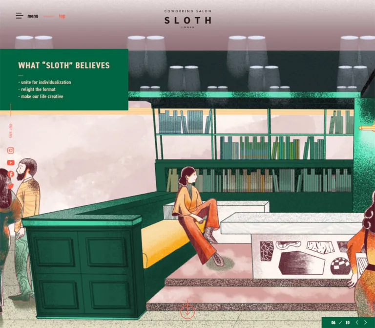
粒状の室内イラスト、深緑とコーラル、淡いピーチを組み合わせた施設サイト。縦長の欧文書体、余白の広い構成、画面端の予約タブが特徴。
SLOTH JINNAN — Style Reference
An illustrated creative salon framed by forest green, coral wayfinding, and narrow editorial lettering.
Original URL: https://sloth.salon/ Final URL: https://sloth.salon/ Theme: light gray content canvas, peach desktop navigation, and deep green panels. Inspected: October 5, 2026, at 05:26 JST; supplied retrieval timestamp: October 4, 2026, 20:26:18.723 UTC. Viewports: desktop 1440 × 1000 CSS pixels; mobile 390 × 844 CSS pixels. Scope: the current venue homepage, including its illustrated opening, news, coworking introduction, rental-space directory, About content, floor-map section, access information, and footer. Visual captures cover the desktop opening, rental/About boundary, access/footer, and mobile opening/footer. Rendered DOM measurements additionally cover the intervening sections. Linked detail pages, booking forms, expanded menus, and floor-map actions were not inspected.
SLOTH presents a working venue with a cultural identity. A richly textured illustration establishes the atmosphere before the page shifts into news, interior photography, space listings, and practical visitor information. Deep green provides the main text and structural surfaces. Coral marks rental categories, selected headings, small arrows, and reservation access. Peach warms the navigation and reversed lettering, while the main content sits on a slightly warm gray.
The defining contrast is between expressive artwork and precise typography. Tall, narrow English headings have generous tracking; Japanese paragraphs are quieter and more open. Photographs remain square-cornered, divisions use thin rules, and broad spaces separate the major sections. Persistent controls sit at the edges of the viewport rather than occupying a large central conversion panel.
閉じる
SLOTH JINNAN — Style Reference
An illustrated creative salon framed by forest green, coral wayfinding, and narrow editorial lettering.
Original URL: https://sloth.salon/ Final URL: https://sloth.salon/ Theme: light gray content canvas, peach desktop navigation, and deep green panels. Inspected: October 5, 2026, at 05:26 JST; supplied retrieval timestamp: October 4, 2026, 20:26:18.723 UTC. Viewports: desktop 1440 × 1000 CSS pixels; mobile 390 × 844 CSS pixels. Scope: the current venue homepage, including its illustrated opening, news, coworking introduction, rental-space directory, About content, floor-map section, access information, and footer. Visual captures cover the desktop opening, rental/About boundary, access/footer, and mobile opening/footer. Rendered DOM measurements additionally cover the intervening sections. Linked detail pages, booking forms, expanded menus, and floor-map actions were not inspected.
SLOTH presents a working venue with a cultural identity. A richly textured illustration establishes the atmosphere before the page shifts into news, interior photography, space listings, and practical visitor information. Deep green provides the main text and structural surfaces. Coral marks rental categories, selected headings, small arrows, and reservation access. Peach warms the navigation and reversed lettering, while the main content sits on a slightly warm gray.
The defining contrast is between expressive artwork and precise typography. Tall, narrow English headings have generous tracking; Japanese paragraphs are quieter and more open. Photographs remain square-cornered, divisions use thin rules, and broad spaces separate the major sections. Persistent controls sit at the edges of the viewport rather than occupying a large central conversion panel.
How to Read This Reference
- Measured values come from the supplied rendered DOM and computed styles. Dimensions are CSS pixels unless stated otherwise.
- Calculated values are arithmetic derived from those measurements, such as column gaps and the vertical centering of the contact tabs.
- Visual estimates describe the supplied original-page captures. They are not independently sampled stylesheet values.
- Recommendations and the Quick Start are reusable implementation guidance. They are not a reconstruction of unprovided source code.
- Font-family names below are reported computed stacks. The evidence does not identify the font file used for every rendered glyph.
- Desktop and mobile captures represent different carousel states. Their differences do not establish a transition sequence or autoplay interval.
Tokens — Colors
Default Palette
| Name | Value | Suggested token | Evidence and role |
|---|---|---|---|
| Salon Green | #006441 |
--color-green |
Measured body and section-heading color; measured map-button background. The hero panel and footer visually use the same green family. |
| Signal Coral | #ff5f4a |
--color-coral |
Measured coworking/rental headings and page links; present in arrow and social SVG fills. Visually used by the reservation tab. |
| Warm Gray | #dfdfdd |
--color-canvas |
Measured body background and mobile About disclosure-control background. |
| Soft Peach | #ffd2bf |
--color-peach |
Measured hero-title and footer-link text. The desktop navigation has a closely matching peach fill; its background was not separately exported. |
| Root Blush | #ffdacf |
--color-root |
Measured HTML background beneath the body. Keep separate from the peach lettering token. |
| Navigation Black | #000000 |
--color-nav-ink |
Measured desktop navigation text; the graphical main logo appears nearly black. |
| White Detail | #ffffff |
--color-white |
SVG fill evidence for arrows and other graphical details; visually used on the contact tabs. |
| Asset Green | #006e41 |
--color-asset-green |
Embedded fill in the access logo and some disclosure graphics. A local artwork variation, not a second global text color. |
Color Behavior
Green is the default reading color on gray. Coral identifies the coworking and rental portions and supplies small directional details. Peach becomes the text color on major green surfaces, especially the opening title panel and footer. This division gives the long page a consistent rhythm without making every section a separate colored card.
The illustrated scenes contain orange timber, muted clothing, plants, blue accents, and burgundy linework. These belong to the artwork rather than the interface token system. Footer social icons also retain platform colors, whereas the desktop social rail appears coral.
The exported root properties include many WordPress preset colors, gradients, shadows, and icon-font declarations. Their presence does not establish visible use. Likewise, blue computed anchor colors on SVG-bearing links do not mean the page uses blue text links: the visible graphic has its own fill.
Tokens — Typography
Condensed English — Headings and Navigation
- Reported stack:
din-2014-narrow, dnp-shuei-gothic-gin-std, sans-serif. - Observed weights:
600for navigation, links, rental captions, and smaller headings;700for major section titles. - Character: tall, narrow letters with explicit tracking. English titles frequently use uppercase.
- Role: creates a recognizable system across the navigation, service headings, small labels, and footer.
- Implementation alias:
--font-condensed.
The source uses a named narrow family. A generic wide geometric sans-serif will change both line lengths and the visual density of the navigation. Load the named family only when available and appropriately licensed; otherwise choose a narrow fallback and recheck wrapping.
Japanese — Body and Practical Information
- Reported stack:
dnp-shuei-gothic-gin-std, 游ゴシック体, "Yu Gothic", YuGothic, "Hiragino Kaku Gothic ProN", Osaka, "MS Pゴシック", sans-serif. - Desktop body:
15px, weight400, line height25.5px, tracking0.1px. - Mobile body:
14px, weight400, line height26.6px, tracking0.1px. - Role: explanatory prose, addresses, operator names, and visitor information.
The mobile body becomes slightly smaller while its line height increases from 1.7 to 1.9. Preserve this breathing room rather than compressing Japanese paragraphs to match the narrow English lettering.
Logo and Graphic Labels
The logo is graphical. Its empty extracted heading text and surrounding font declarations do not identify a logo typeface. Use an authorized logo asset rather than rebuilding the wordmark with tracked body text.
Several small controls also contain SVG lettering or symbols. Their visual size cannot always be inferred from the parent anchor's font size.
Type Scale
All values in this table are measured computed styles.
| Role | Desktop size / line height | Mobile size / line height | Weight | Tracking |
|---|---|---|---|---|
| Japanese body | 15 / 25.5px |
14 / 26.6px |
400 | 0.1px |
| Desktop primary navigation | 15 / 15px |
Replaced by menu control | 600 | 1.2px |
| Opening title | 24 / 28.8px |
24 / 28.8px |
700 | 2.8px desktop; 2.2px mobile |
| NEWS heading | 40 / 68px |
38 / 64.6px |
700 | 6px desktop; 1px mobile |
| News title | 24 / 31.2px |
21 / 25.2px |
600 | 0.6px |
| COWORKING SALON heading | 56 / 67.2px |
47 / 56.4px |
700 | 10px desktop; 1px mobile |
| RENTAL SPACE heading | 40 / 56px |
38 / 41.8px |
700 | 7px desktop; 1px mobile |
| Rental caption | 17 / 28.9px |
17 / 32.3px |
600 | 0.1px |
| ABOUT US / FLOOR MAP | 40 / 68px |
38 / 64.6px |
700 | 7px desktop; 1px mobile |
| About subheading | 22 / 37.4px |
20 / 38px |
600 | 1px |
| ACCESS heading | 40 / 40px |
40 / 40px |
700 | 6px |
| Page-detail link | 15 / 25.5px |
14 / 26.6px |
600 | 0.1px |
| Footer primary link | 15 / 15px |
14 / 26.6px |
600 | 0.1px |
| Legal link | 13 / 22.1px |
13 / 24.7px |
600 | 0.1px |
Geometry caveat: the desktop opening heading reports a bounding height of approximately 108px, despite a nominal three-line total of 86.4px. The supplied element sample does not explain that difference. Preserve the computed type values and use the screenshot to judge the surrounding panel; do not invent a scaling transform.
Tokens — Spacing & Shapes
There is no verified global spacing scale. The page combines several independent content widths with full-width image and rental sections.
Layout Measurements
| Element | Desktop | Mobile | Evidence |
|---|---|---|---|
| Document height | 7725px |
7219px |
Measured snapshot heights; content/state dependent |
| Opening header region | y:86px, 1440 × 914px |
y:0, 390 × 844px |
Measured |
| Desktop navigation strip | Approximately 90px high |
Not visible | Visual estimate; overlaps the measured opening start slightly |
| Main content width | 1300px, left inset 70px |
300px, left inset 45px |
Measured news and About regions |
| Floor-map heading region | 1200px, left inset 120px |
300px, left inset 45px |
Measured |
| News entry | About 383.28px wide |
300px wide |
Measured |
| Desktop news gap | About 75.08px |
Entries stack | Calculated from entry positions |
| Rental cell | About 480 × 387.06px |
195 × 266.94px |
Measured |
| Rental cell padding | 20px 20px 25px |
10px |
Measured |
| About left/right regions | 560px / 650px |
Both 300px wide |
Measured heading regions |
| About column gap | 90px |
Stacked | Calculated |
| Contact rail | 34 × 192px |
34 × 192px |
Measured combined links |
| Map button | About 136.61 × 27.77px |
Same | Measured |
| Floor-map marker bounds | 15 × 15px |
6.75 × 6.75px |
Measured; surrounding hit regions unknown |
Spacing Relationships
- The NEWS heading begins
77pxbelow the opening region at both inspected sizes. - The desktop About heading starts approximately
176pxafter the final rental-cell bottom; mobile reduces that interval to approximately82px. - Desktop rental images have
20pxside insets within full-width cells. Mobile reduces those insets to10px. - Mobile content uses several distinct gutters:
45pxfor news/About, approximately30pxfor access details, and40pxfor the footer menu. - The desktop opening panel is approximately
408 × 194px, flush left, with text beginning around65pxfrom the viewport edge. These panel dimensions are visual estimates. - The mobile opening panel is approximately
270 × 146px, also flush left, with a measured30pxtext inset.
Border Radius and Rules
| Element | Treatment | Evidence |
|---|---|---|
| Photographs, news regions, rental cells | Square corners | Captures and measured zero-radius links |
| Opening title panel | Square rectangle | Visual |
| Rental dividers | Thin coral rules, approximately 1px |
Visual; row coordinates also show roughly 1px separation |
| Footer separators | Thin peach rules | Visual |
| Google Map button | 14px radius |
Measured |
| Operating-company / social / telephone labels | Small outlined pills | Visual; exact radius not exported |
| Directional arrows | Fine circular outlines | Visual |
| Contact tabs | Narrow rectangles with small clipped left corners | Visual; clipping geometry not exported |
Use roundness for small labels and directional controls. The primary architecture remains rectangular and flat.
Components
Desktop Navigation and Mobile Menu Control
Role: persistent orientation across a long venue homepage.
The desktop strip places a small graphical logo at the left and a seven-item English navigation row at the right: TOP, NEWS, COWORKING SALON, RENTAL SPACE, ABOUT US, FLOOR MAP, and ACCESS. The logo heading bounds are approximately 125 × 49.92px, starting at x:28px, y:23.53px. Black condensed lettering sits on a peach field.
The strip remains visible in the supplied scrolled desktop captures. A fixed implementation is a suitable adaptation, although the exported sample does not include its positioning declaration.
On mobile, the peach strip disappears. A compact hamburger with the word “menu” sits near the upper-left corner. The opening logo is centered around y:70px over the illustration. In the scrolled footer capture, the menu control remains visible while the opening logo does not. The menu overlaps address text in that capture; treat this as an observed collision to improve, not a spacing pattern to reproduce.
The expanded menu was not captured. Do not infer its panel color, animation, contents, or focus behavior.
Illustrated Opening and Title Panel
Role: establishes the venue's creative atmosphere and identifies its two principal services.
Desktop artwork fills the available opening region beneath the navigation. The current illustrated gallery scene contains people talking, reading, arranging artwork, and occupying stepped seating. Orange ceiling beams create strong perspective; plants, art, clothing, and stippled shadows supply detail.
A green panel overlays the upper-left portion of the scene. Its peach headline is deliberately broken into three lines:
COWORKING SALON&RENTAL SPACE
The heading remains modest relative to the artwork. Avoid enlarging it into a dominant full-width slogan.
At 390 × 844, the visible artwork ends around y:591px, approximately 70% of the viewport height. The title panel begins around y:605px on the gray area below it. This is a measured-image proportion from one mobile capture, not a verified viewport formula. The composition changes from an overlay to an image followed by an offset label.
A green counter/control strip occupies the opening's lower-right corner. It shows a two-digit current index, a slash, a total of ten, and small previous/next arrows. A coral circular down-arrow sits near the desktop bottom center; mobile moves it toward the lower right. The lower-right third-party badge partly obscures these details in the supplied captures.
Persistent Contact Tabs
Role: keeps reservation and general contact available while visitors explore the venue.
Two vertically oriented tabs sit flush with the right edge. The coral “reservation” link measures 34 × 109px; the green “contact” link measures 34 × 83px. Lettering is white and reads along the vertical axis.
The combined height is 192px. Their positions exactly support vertical centering:
- Desktop:
1000 / 2 − 192 / 2 = 404px. - Mobile:
844 / 2 − 192 / 2 = 326px.
The rendered links point to the site's contact route, with ?id=reservation distinguishing reservation access. The destination forms were not inspected.
Desktop Social Rail
Role: provides persistent community links without expanding the header.
A narrow coral rail sits near x:20–40px. It combines fine vertical rules, a rotated “our sns” label, and Instagram, YouTube, Facebook, X, and LINE icons. Individual visible icons are roughly 16–21px across, although the exported anchor rectangles do not always equal SVG bounds.
The rail stays in the same viewport region across the desktop captures. It is absent from the mobile opening. Social access returns as a horizontal row in the lower information area.
News Entries
Role: connects the venue's spatial identity to its current events and community activity.
Three linked entries form a desktop row within the 1300px content region. Each entry is about 383.28px wide, with approximately 75.08px gaps. The entries combine a preview region, a date/category line, and a condensed title. A small coral NEWS PAGE link aligns to the lower right of the section.
On mobile, entries become stacked flex rows rather than large full-width vertical cards. Each measures 300px wide and approximately 184.59px high in the snapshot, with about 20px between entries. The text region begins at x:210px within a row starting at x:45px, leaving a 165px offset for preview content and spacing. Titles occupy 135px and wrap aggressively.
The supplied visual crops do not show the news artwork. Exact preview aspect ratios and subjects are therefore unverified. The Quick Start proposes a preview/text arrangement that matches the measured text offset, without asserting the original image dimensions.
Coworking Introduction
Role: explains the salon concept and provides a route to membership information.
The large coral COWORKING SALON heading breaks over two lines. Supporting content includes the definition CO(一緒に) + WORKING(働く) + SALON(談話室), a Japanese explanatory paragraph, a monthly price, and the coral COWORKING SALON PAGE link.
The desktop heading occupies a 641.86px-wide region starting near x:78px; mobile uses the standard 300px region at x:45px. Its type changes from 56px with 10px tracking to 47px with 1px tracking. This substantial tracking reduction preserves the heading's scale on a narrow screen.
The section's adjacent media arrangement is not visible in the supplied crops. Do not infer a particular photograph or decorative overlay from the heading geometry alone.
Rental-Space Directory
Role: offers direct access to six distinct venue spaces.
The directory spans the full viewport width. Desktop uses three columns and two rows; mobile uses two columns and three rows. The sequence remains GALLERY, SLOTH TERRACE, ROOF TOP, MEETING SPACE, POP UP SPACE, and BAR SPACE.
Each cell is a single linked region containing a rectangular interior photograph, a centered coral caption, and a small circular arrow beneath it. Thin coral rules divide cells. The gray page background continues through the grid, so the entries feel like a printed directory rather than floating cards.
Desktop cells measure approximately 480 × 387px, with 20px side/top padding and 25px bottom padding. Mobile cells measure 195 × 267px, with 10px padding. Keep the category labels at the observed 17px scale rather than shrinking them proportionally with the images.
The visible photographs show real spaces with different furnishings and light: a pale meeting area, an entrance/stair area, and a warm wooden bar table. Preserve those differences instead of applying one heavy color filter to every photograph.
About Section
Role: communicates the venue's beliefs and the meaning behind its name.
Desktop uses an asymmetric two-column composition. A 560px left region contains ABOUT US and a photograph of a pale interior with a square lattice wall. The visible photograph is approximately 560 × 315px, a visual 16:9 estimate. A 650px right region holds two text groups, separated from the left by 90px.
The first group, WHAT “SLOTH” BELIEVES, uses three compact English statements paired with Japanese explanations. Short horizontal rules connect the columns. Small outlined squares precede the subsection headings. The second group, WHAT's SLOTH, is a paragraph explaining the name's ecological metaphor.
On mobile, these regions stack within 300px. The DOM exposes READ MORE/CLOSE graphic controls measuring approximately 99.58 × 34.69px. Only the first belief pair appears in the extracted mobile text. This is consistent with a collapsed presentation, but expansion behavior and the exact hidden region were not exercised.
Floor-Map Section
Role: explains the venue's distribution across multiple building levels.
The rendered content identifies 1st FLOOR / ENTRANCE; 2nd FLOOR / SALON, LIBRARY, GALLERY, BAR; 6th FLOOR / TERRACE; and ROOF TOP. Numerous small linked markers are positioned through this section.
Their measured bounds change from 15px square on desktop to 6.75px square on mobile, a ratio of 0.45. This establishes the marker-size relationship, not the complete scaling rule for every map layer.
The marker elements declare 1.6s ease-in-out infinite blinkAnimation. Their keyframes and activated states were not supplied. The floor-plan artwork itself is outside the attached visual crops, so its colors, detail level, and popup contents remain unverified.
Access Map and Venue Information
Role: converts the page's atmosphere into practical visiting information.
The desktop map spans approximately 1300px between 70px side margins. It is an illustrated neighborhood map rather than a plain embedded map screenshot: green park areas contain tree silhouettes, buildings are pale peach, and dark outlines and uppercase labels identify landmarks. The supplied crop shows only part of its height.
Below it, a green SLOTH wordmark accompanies English and Japanese addresses. A compact green Google Map pill sits at the far right on desktop and below the address at the left on mobile. Its measured dimensions are approximately 136.61 × 27.77px, with a 14px radius and 7px 15px 6px padding.
Supporting information is organized by small outlined labels: “operating company,” “our sns,” and “telephone.” The inspected footer labels ワイズ 株式会社 and 株式会社 しんか as operating companies and links their names to their respective websites. These labels do not establish website production credits.
On mobile, operator names stack beside their label; social icons remain in a horizontal row; and telephone information occupies its own block. The practical information uses approximately 30px left clearance.
Footer Navigation
Role: closes the page with a concise sitemap and legal information.
A full-width green surface reverses the interface to peach. A small “menu” label sits above a thin horizontal rule. Desktop presents seven evenly distributed links across the 1300px interior, with fine vertical separators. Each link region is approximately 185.63px wide.
Mobile changes the hierarchy: six primary links occupy the left column, while RENTAL SPACE and its six individual destinations occupy the right column. A vertical rule divides them. The interior starts at x:40px; the second column's text begins around x:229px.
Copyright remains small at the lower left. The legal links, including 利用規約/キャンセルポリシー and プライバシーポリシー, sit to the right and stack on mobile. Their document contents were not inspected.
Tokens — Motion & Interaction
| Treatment | Evidence | Implementation implication |
|---|---|---|
| Opening carousel | Desktop index 05/10; mobile DOM 06/10 and visual capture 07/10; previous/next affordances present | Multiple captured slide states are established. Autoplay interval, transition type, and manual-control response are unverified. |
| Floor-map markers | Computed 1.6s ease-in-out infinite blinkAnimation |
Timing and repetition are known; opacity/transform keyframes are not. |
| Persistent desktop navigation | Same upper strip in opening and scrolled captures | Preserve persistent orientation. Exact fixed-versus-sticky source rule was not exported. |
| Contact tabs | Identical dimensions and centered position across sizes and scroll captures | A fixed right-edge rail with top:50% and translateY(-50%) reproduces the measured relationship. |
| Mobile menu | Hamburger/menu control visible | Open state, dismissal, and transition are unverified. |
| Mobile About disclosure | READ MORE/CLOSE SVG identifiers and truncated extracted belief content | Use an explicit disclosure model in a new implementation; do not invent the original animation. |
| Section and down-arrow links | Several links target # |
Script-assisted navigation is possible; exact scroll targets and easing were not tested. |
| Hover/focus appearance | No exercised states provided | Any hover or focus treatment in the Quick Start is a recommendation. |
The exported properties also contain --spider--transition-duration: 1s and --_global--transition-duration: .2s. Neither is directly connected to the visible opening carousel by the supplied evidence. Do not describe either as its verified transition duration.
Most sampled elements report animation: none and a transition property of all, without a verified effective duration. This does not rule out JavaScript animation, descendant effects, or unexercised states.
Surfaces
| Layer | Appearance | Purpose |
|---|---|---|
| Root | Light blush | Underlying document background |
| Main canvas | Warm gray | Continuous reading and directory surface |
| Desktop navigation | Peach, visually estimated | Separates persistent navigation from imagery |
| Opening label | Solid green with peach text | Anchors service identity over or below artwork |
| Directory | Gray with coral rules | Organizes photography without raised cards |
| Small information label | Transparent, green outline | Identifies contact-information groups |
| Footer | Solid green with peach rules and lettering | Provides a strong visual endpoint |
| Reservation tab | Coral with white lettering | Persistent reservation access |
There is no visible general elevation system. The lower-right reCAPTCHA badge has its own third-party white surface and shadow; it is not a brand component. Its presence does not indicate a page-blocking challenge in these captures.
Imagery
The opening illustration combines architectural perspective with lively, imperfect human detail. Fine grain and stippling appear across walls, shadows, clothing, plants, and timber. The people look engaged in ordinary creative activity rather than posed for a corporate stock photograph. Preserve that relationship between the room and its occupants.
The illustrated artwork should retain natural raster texture. Unlike pixel art, it does not call for image-rendering: pixelated. Use adequate-resolution assets, normal interpolation, and deliberate focal points for narrow crops.
Interior photography introduces a calmer register below the opening. Pale walls, lattice structures, wood, textiles, and varied furnishings communicate the spaces themselves. Keep image corners square and allow architectural lines to remain legible.
The neighborhood map extends the handmade character through watercolor-like fills and illustrated trees, while its labels remain practical. Essential address information also exists as HTML text, which is important when the map is scaled down.
Observed Asset References
No hero or photograph source URLs were included in the supplied evidence. The following are observed roles and embedded identifiers, not downloadable filenames.
| Asset | Observed reference | Status |
|---|---|---|
| Opening interior illustration | Original desktop and mobile opening captures | Image URL and complete slide inventory unavailable |
| Main logo | Graphical mark within desktop/mobile heading regions | Typeface and file URL unavailable |
| About photograph | Pale lattice-wall interior in desktop capture | File URL unavailable |
| Rental photographs | Meeting, entrance/pop-up, and bar imagery in desktop capture | File URLs unavailable |
| Access map | Illustrated neighborhood map in desktop access capture | File URL unavailable |
| Social symbols | icon_sns_instagram, icon_sns_youtube, icon_sns_facebook, icon_sns_x |
Embedded SVG identifiers |
| Carousel arrows | slide_nav_arrow |
Embedded SVG identifier |
| Down arrow | slide_down_arrow |
Embedded SVG identifier |
| Rental arrow | circle_link_right_arrow |
Embedded SVG identifier |
| Access logo / map control | logo_access_sloth, google_map |
Embedded SVG identifiers |
| Disclosure graphics | text_read_more, text_close |
Mobile DOM identifiers |
| Return-to-top symbol | gotop |
Embedded SVG identifier; action untested |
Use authorized original assets when available. For a new brand, commission artwork with similarly tangible materials and inhabited architecture without copying the specific people or compositions.
Layout & Responsive Behavior
The page follows a continuous sequence: illustrated opening → news → coworking introduction → rental directory → About → floor maps → access → footer. The measured desktop document is approximately 7.7 viewports tall. It supports both exploration of the venue and practical navigation to service pages.
Desktop
The opening is almost a full screen, beginning just below the persistent peach navigation. Later content alternates between broad centered regions and a full-width rental grid. The news and About sections use 70px outer margins; the floor-map heading is inset farther, at 120px. The social rail occupies the left edge and contact tabs occupy the right.
Mobile
The navigation becomes a persistent menu control, while the logo moves into the opening image. The illustration occupies the upper portion of the first screen, with the green title block below. The opening still measures one complete 844px viewport in the supplied DOM.
News entries stack but retain a preview/text split. Rental cells remain two across. About content stacks and exposes disclosure controls. Floor markers become much smaller. Access information becomes vertical, and the footer changes to a two-column sitemap that explicitly lists the rental destinations.
The original breakpoint thresholds were not supplied. The Quick Start uses 1024px as a recommended starting breakpoint for these structural changes, not as an observed source value. Test intermediate widths because the full desktop navigation needs substantial horizontal room.
Content and Overlay Clearances
The mobile screenshots show collisions between the persistent menu and address text, and between the lower-right badge and opening/footer controls. Preserve the persistent-navigation idea while providing reserved space, visible focus states, and safe-area clearance in a new implementation. Do not reproduce clipped legal links or obscured arrows as intentional art direction.
Do’s and Don’ts
Do
- Use green
#006441as the main reading and structural color on gray#dfdfdd. - Pair coral
#ff5f4awith service headings, directory rules, arrows, and reservation access. - Use peach lettering on green surfaces and a warm peach desktop navigation field.
- Keep English display type narrow, bold, and intentionally tracked.
- Reduce heading tracking substantially on mobile while retaining a strong type scale.
- Let detailed illustration establish the atmosphere and real photography explain the spaces.
- Preserve the full-width rental directory and its three-to-two-column responsive change.
- Keep practical address and contact information readable outside imagery.
- Treat the fixed contact tabs as part of the page's navigation architecture.
- Retain square media edges, thin dividers, and small pill labels.
Don’t
- Do not replace the homepage's news, directory, floor maps, and access information with a generic promotional funnel.
- Do not convert the directory into floating rounded cards with large shadows.
- Do not apply generic WordPress gradient or shadow presets merely because they appear in exported properties.
- Do not rebuild the logo using an assumed font.
- Do not flatten the textured artwork into smooth corporate vector figures.
- Do not force desktop-level letter spacing onto narrow mobile headings.
- Do not treat unvisited links, menu states, or floor-map popups as verified interactions.
- Do not prescribe a carousel easing or autoplay interval from unrelated root variables.
- Do not copy the small mobile marker bounds as sufficient touch targets.
- Do not reproduce overlay collisions as part of the desired layout.
Recommended Implementation Additions
These are improvements for a new implementation, not verified original-site features:
- Give SVG-only controls accessible names, including carousel navigation, map markers, social links, and return-to-top actions.
- Implement the mobile menu with a real button,
aria-expanded, an associated navigation region, and appropriate keyboard behavior. - Implement About disclosures with buttons or native disclosure elements. Keep all content available without relying on hover.
- Expand small control hit areas toward a
44pxtarget while preserving the compact visible artwork. Provide a text list of rooms alongside dense map markers. - Add a pause control if the opening advances automatically. Honor reduced-motion preferences for both carousel movement and marker blinking.
- Use green or another tested high-contrast treatment for essential small text where coral against gray does not provide sufficient contrast.
- Reserve room for persistent controls and any required third-party badge, especially around mobile footer links.
- Define explicit image dimensions, prioritize the first visible illustration, and defer below-the-fold media without allowing layout jumps.
- Test Japanese wrapping with the actual fonts. Font fallback can change the narrow news-title columns considerably.
Agent Prompt Guide
Quick Color Reference
- Main canvas:
#dfdfdd. - Main text and structural panels:
#006441. - Service headings, directory dividers, and reservation accent:
#ff5f4a. - Reversed major lettering:
#ffd2bf. - Desktop navigation: peach visually approximated with
#ffd2bf. - Root background: measured
#ffdacf. - Shapes: square media and panels, fine rules, occasional small outlined pills.
Overall Prompt
“Design a Japanese creative-venue homepage inspired by SLOTH JINNAN. Use a warm gray canvas, deep green text and panels, coral service headings, and peach reversed lettering. Pair narrow uppercase English typography with spacious Japanese body text. Open with a detailed, grainy illustration of people inhabiting a creative interior, framed by a small logo and a left-aligned green service label. Continue with event news, a coworking introduction, a full-width rental-space directory, an asymmetric About section, floor information, an illustrated neighborhood map, and practical visitor details. Keep photos square-cornered and divisions thin. Use persistent right-edge reservation/contact tabs. On mobile, replace the desktop navigation with a menu control, place the opening label below the artwork, use two rental columns, stack About content, and split the footer into primary and rental navigation.”
Example Component Prompts
- Opening: “Build an illustrated venue opening with strong architectural perspective, orange timber, plants, and people engaged in creative activity. Overlay a square green panel with three lines of peach condensed lettering on desktop. At 390px, place a 270px-wide label below the image. Keep the logo graphical and the carousel counter compact.”
- Rental directory: “Create six linked venue entries in a full-width gray grid: three columns on desktop, two on mobile. Each entry contains a rectangular interior photograph, centered coral condensed caption, and a small outlined circular arrow. Divide cells with fine coral rules; avoid raised surfaces.”
- About: “Use a 1300px desktop content area with a 560px photo/title region, a 90px gap, and a 650px text region. Pair English belief statements with Japanese explanations using short rule connectors. Stack the composition on mobile and provide accessible disclosure controls where needed.”
- Contact rail: “Place a 34px-wide pair of vertical tabs at the right viewport edge, centered as a 192px group. Use coral for reservation and green for contact, with white lettering. Preserve the compact appearance while ensuring usable hit areas and clearances.”
- Footer: “Create a green footer with peach lettering, a thin top menu rule, and a seven-link desktop row. On mobile, use one column for primary pages and another for six rental destinations, separated by a fine vertical rule. Keep copyright and legal links small but unobscured.”
Quick Start
CSS Custom Properties
This is an implementation starting point, not extracted site CSS. Colors and type sizes use the measured values above. Header fill, responsive breakpoint, image fitting, intermediate-width behavior, and hover/focus treatments are recommendations. Provide real logo and image assets separately; the named fonts are not bundled by this CSS.
The mobile opening uses the observed approximately 70% image proportion as an adaptation. Rental images retain their supplied aspect ratios because their complete image bounds were not exported. The proposed mobile news grid leaves the measured 165px offset before its text region at a 300px row width.
:root {
  /* Measured palette; peach header fill is a visual approximation. */
  --color-green: #006441;
  --color-coral: #ff5f4a;
  --color-canvas: #dfdfdd;
  --color-peach: #ffd2bf;
  --color-root: #ffdacf;
  --color-nav-ink: #000;
  --color-white: #fff;

  --font-condensed: 'din-2014-narrow',
    'dnp-shuei-gothic-gin-std', sans-serif;
  --font-japanese: 'dnp-shuei-gothic-gin-std',
    '游ゴシック体', 'Yu Gothic', YuGothic,
    'Hiragino Kaku Gothic ProN', Osaka,
    'MS Pゴシック', sans-serif;

  --body-size: 15px;
  --body-leading: 1.7;
  --section-size: 40px;
  --section-tracking: 7px;
  --page-gutter: 70px;
  --content-max: 1300px;
  --nav-height: 90px;
  --hero-offset: 86px;
  --rail-width: 34px;
  --rule: 1px;
  --safe-bottom: env(safe-area-inset-bottom, 0px);
}

* { box-sizing: border-box; }
html { background: var(--color-root); }
body {
  margin: 0;
  color: var(--color-green);
  background: var(--color-canvas);
  font-family: var(--font-japanese);
  font-size: var(--body-size);
  line-height: var(--body-leading);
  letter-spacing: .1px;
}

img { display: block; max-width: 100%; height: auto; }
button { font: inherit; }
a { color: inherit; }
.container {
  width: calc(100% - 2 * var(--page-gutter));
  max-width: var(--content-max);
  margin-inline: auto;
}
.section { padding-block: 80px; }
.section-title {
  margin: 0 0 30px;
  font: 700 var(--section-size)/1.7 var(--font-condensed);
  letter-spacing: var(--section-tracking);
}
section[id] { scroll-margin-top: 110px; }

.site-nav {
  position: fixed;
  z-index: 30;
  inset: 0 0 auto;
  height: var(--nav-height);
  display: flex;
  align-items: center;
  justify-content: space-between;
  padding-inline: 28px;
  background: var(--color-peach);
  color: var(--color-nav-ink);
}
.site-logo { width: 125px; flex: none; }
.desktop-links {
  display: flex;
  align-items: center;
  gap: 12px;
}
.desktop-links a {
  padding: 12px;
  font: 600 15px/1 var(--font-condensed);
  letter-spacing: 1.2px;
  text-decoration: none;
}
.mobile-menu, .hero-logo { display: none; }

.site-hero {
  position: relative;
  margin-top: var(--hero-offset);
  height: calc(100svh - var(--hero-offset));
}
.hero-art {
  position: absolute;
  inset: 0;
  width: 100%;
  height: 100%;
  object-fit: cover;
  object-position: var(--hero-position, center);
}
.hero-label {
  position: absolute;
  top: 70px;
  left: 0;
  display: flex;
  align-items: center;
  width: 408px;
  min-height: 194px;
  padding: 40px 65px;
  color: var(--color-peach);
  background: var(--color-green);
}
.hero-label h2 {
  margin: 0;
  font: 700 24px/1.2 var(--font-condensed);
  letter-spacing: 2.8px;
}
.hero-controls {
  position: absolute;
  right: 0;
  bottom: 0;
  display: flex;
  align-items: center;
  gap: 10px;
  padding-inline: 12px;
  color: var(--color-white);
  background: var(--color-green);
  font: 600 12px/1 var(--font-condensed);
}
.hero-controls button {
  /* Recommended larger hit area than the captured arrows. */
  min-width: 44px;
  min-height: 44px;
  border: 0;
  color: inherit;
  background: transparent;
  cursor: pointer;
}

.contact-rail {
  position: fixed;
  z-index: 40;
  top: 50%;
  right: 0;
  transform: translateY(-50%);
  width: var(--rail-width);
}
.contact-rail a {
  display: grid;
  place-items: center;
  width: var(--rail-width);
  color: var(--color-white);
  text-decoration: none;
}
.contact-rail span {
  writing-mode: vertical-rl;
  text-orientation: mixed;
}
.contact-rail .reservation {
  height: 109px;
  background: var(--color-coral);
}
.contact-rail .contact {
  height: 83px;
  background: var(--color-green);
}
.social-rail {
  position: fixed;
  z-index: 20;
  left: 20px;
  top: 50%;
  transform: translateY(-50%);
  display: grid;
  justify-items: center;
  gap: 12px;
  color: var(--color-coral);
}

.news-grid {
  display: grid;
  grid-template-columns: repeat(3, minmax(0, 1fr));
  gap: 75px;
}
.news-entry { text-decoration: none; }
.news-title {
  margin: 10px 0 0;
  font: 600 24px/1.3 var(--font-condensed);
  letter-spacing: .6px;
  overflow-wrap: anywhere;
}
.page-link {
  display: inline-block;
  padding-bottom: 5px;
  color: var(--color-coral);
  font-family: var(--font-condensed);
  font-weight: 600;
  text-underline-offset: 5px;
}
.coworking-title {
  color: var(--color-coral);
  font: 700 56px/1.2 var(--font-condensed);
  letter-spacing: 10px;
}

.rental-heading {
  color: var(--color-coral);
  text-align: center;
  line-height: 1.4;
}
.rental-grid {
  display: grid;
  grid-template-columns: repeat(3, minmax(0, 1fr));
  border-top: var(--rule) solid var(--color-coral);
}
.rental-card {
  min-width: 0;
  min-height: 387px;
  padding: 20px 20px 25px;
  border-right: var(--rule) solid var(--color-coral);
  border-bottom: var(--rule) solid var(--color-coral);
  color: var(--color-coral);
  text-align: center;
  text-decoration: none;
}
.rental-card:nth-child(3n) { border-right: 0; }
.rental-card img { width: 100%; }
.rental-caption {
  margin: 26px 0 4px;
  font: 600 17px/1.7 var(--font-condensed);
}
.circle-arrow {
  display: inline-grid;
  place-items: center;
  width: 19px;
  height: 19px;
  border: 1px solid currentColor;
  border-radius: 50%;
  font-size: 12px;
  line-height: 1;
}

.about { padding-block: 176px; }
.about-grid {
  display: grid;
  grid-template-columns: 43.077% 50%;
  justify-content: space-between;
}
.about-photo {
  width: 100%;
  aspect-ratio: 16 / 9;
  object-fit: cover;
}
.about-subtitle {
  margin: 0 0 12px;
  font: 600 22px/1.7 var(--font-condensed);
  letter-spacing: 1px;
}
.about-subtitle::before {
  content: '';
  display: inline-block;
  width: 11px;
  height: 11px;
  margin-right: 6px;
  border: 1px solid currentColor;
}
.about-block + .about-block { margin-top: 60px; }
.info-label {
  display: inline-block;
  padding: 1px 8px;
  border: 1px solid currentColor;
  border-radius: 999px;
  font: 600 14px/1.2 var(--font-condensed);
}
.map-link {
  display: inline-flex;
  align-items: center;
  gap: 8px;
  padding: 7px 15px 6px;
  border-radius: 14px;
  color: var(--color-white);
  background: var(--color-green);
  font: 600 15px/1 var(--font-condensed);
  text-decoration: none;
}
.access-title {
  font-size: 40px;
  line-height: 1;
  letter-spacing: 6px;
}
.access-map { width: 100%; }

.site-footer {
  padding: 34px var(--page-gutter)
    calc(30px + var(--safe-bottom));
  color: var(--color-peach);
  background: var(--color-green);
  font-family: var(--font-condensed);
}
.footer-menu-label {
  margin-bottom: 18px;
  padding-bottom: 5px;
  border-bottom: 1px solid currentColor;
}
.footer-primary {
  display: grid;
  grid-template-columns: repeat(7, minmax(0, 1fr));
}
.footer-primary a {
  padding: 8px 10px;
  border-right: 1px solid currentColor;
  font-weight: 600;
  text-align: center;
  text-decoration: none;
}
.footer-primary a:last-child { border-right: 0; }
.footer-rentals { display: none; }

/* Recommended focus and hover treatments. */
a:focus-visible, button:focus-visible, summary:focus-visible {
  outline: 2px solid currentColor;
  outline-offset: 4px;
}
@media (hover: hover) {
  .desktop-links a:hover, .footer-primary a:hover {
    text-decoration: underline;
    text-underline-offset: 4px;
  }
}

/* Recommended breakpoint; original threshold was not provided. */
@media (max-width: 1024px) {
  :root {
    --body-size: 14px;
    --body-leading: 1.9;
    --section-size: 38px;
    --section-tracking: 1px;
    --page-gutter: 45px;
  }
  .site-nav, .social-rail { display: none; }
  .mobile-menu {
    position: fixed;
    z-index: 50;
    top: 18px;
    left: 20px;
    display: inline-flex;
    align-items: center;
    gap: 12px;
    min-height: 44px;
    border: 0;
    color: var(--color-nav-ink);
    background: transparent;
    font-family: var(--font-condensed);
  }
  .site-hero { margin-top: 0; height: 100svh; }
  .hero-art { height: 70%; }
  .hero-logo {
    position: absolute;
    display: block;
    top: 70px;
    left: 50%;
    width: 134px;
    transform: translateX(-50%);
  }
  .hero-label {
    top: calc(70% + 14px);
    width: 270px;
    min-height: 146px;
    padding: 30px 10px 30px 30px;
  }
  .hero-label h2 { letter-spacing: 2.2px; }
  .news-grid { grid-template-columns: 1fr; gap: 20px; }
  .news-entry {
    display: grid;
    grid-template-columns: minmax(0, 1fr) minmax(0, .9fr);
    align-items: start;
    gap: 15px;
  }
  .news-title { font-size: 21px; line-height: 1.2; }
  .coworking-title { font-size: 47px; letter-spacing: 1px; }
  .rental-heading { padding-inline: 40px; line-height: 1.1; }
  .rental-grid { grid-template-columns: repeat(2, minmax(0, 1fr)); }
  .rental-card { min-height: 267px; padding: 10px; }
  .rental-card:nth-child(3n) { border-right: 1px solid currentColor; }
  .rental-card:nth-child(2n) { border-right: 0; }
  .rental-caption { line-height: 1.9; }
  .about { padding-block: 82px; }
  .about-grid { grid-template-columns: 1fr; gap: 30px; }
  .about-subtitle { font-size: 20px; line-height: 1.9; }
  .access-details { padding-inline: 30px; }
  .site-footer { padding-inline: 40px; }
  .footer-columns { display: grid; grid-template-columns: 1fr 1fr; }
  .footer-primary { display: block; }
  .footer-primary a {
    display: block;
    padding: 0;
    border: 0;
    line-height: 32px;
    text-align: left;
  }
  .footer-primary .desktop-rental-link { display: none; }
  .footer-rentals {
    display: block;
    padding-left: 34px;
    border-left: 1px solid currentColor;
  }
  .footer-rentals a { display: block; text-decoration: none; }
  section[id] { scroll-margin-top: 80px; }
}

/* Pair this with reduced-motion handling in carousel JavaScript. */
@media (prefers-reduced-motion: reduce) {
  .site-hero *, .floor-map-marker {
    animation: none !important;
    transition: none !important;
  }
}
Use .news-entry with two children: a preview and a text wrapper. Use .footer-columns around .footer-primary and .footer-rentals; the latter holds the mobile rental list. Supply actual carousel logic, disclosure state, menu behavior, and navigation targets separately. This CSS intentionally does not invent those uninspected behaviors.
Tailwind v4 Token Mapping
Optional aliases for a project already using Tailwind v4. Define the custom properties above first. This does not imply that the original website uses Tailwind.
@theme inline {
  --color-salon: #006441;
  --color-coral: #ff5f4a;
  --color-canvas: #dfdfdd;
  --color-peach: #ffd2bf;
  --color-root-blush: #ffdacf;

  --font-display: var(--font-condensed);
  --font-body: var(--font-japanese);

  --text-body: var(--body-size);
  --text-section: var(--section-size);
  --text-rental: 17px;
  --text-hero: 24px;

  --spacing-page: var(--page-gutter);
  --spacing-contact-rail: 34px;
  --radius-map: 14px;
}
Sources & Evidence
- SLOTH JINNAN homepage: original and final URL; supplied HTTP status
200. This is the source of the current-page observations. - Capture timestamp: October 4, 2026, 20:26:18.723 UTC, equivalent to October 5, 2026, 05:26:18.723 JST.
- Desktop evidence: 1440 × 1000 viewport; three original-page captures covering the opening, rental/About boundary, and access/footer; rendered text, links, computed styles, and element bounds across the homepage; measured document height
7725px. - Mobile evidence: 390 × 844 viewport; two original-page captures covering the opening and lower information/footer; rendered text, links, computed styles, and element bounds across the homepage; measured document height
7219px. - Interaction evidence: persistent controls across scroll positions, distinct captured carousel indices, mobile disclosure affordances, and the computed floor-marker animation declaration. No menu opening, carousel button activation, disclosure expansion, floor-marker activation, reservation submission, or hover/focus sequence was provided.
- Inspection limits: the supplied browser process waited for document/image readiness and sampled layout stability, with finite waiting limits. Perpetual animations were paused for readiness checks and resumed. These checks do not establish complete delayed content or every interaction state. Service workers and SharedWorkers were disabled during inspection.
- Asset and style limits: no complete stylesheet, font-file inventory, image-source inventory, or floor-map visual capture was supplied. Generic exported root properties are not treated as proof of visible component styling.
This reference describes the current homepage represented by the supplied evidence. Estimated geometry and recommended implementation choices are explicitly identified; unvisited destinations and unexercised interaction states remain outside its verified scope.
# SLOTH JINNAN — Style Reference

> An illustrated creative salon framed by forest green, coral wayfinding, and narrow editorial lettering.

**Original URL:** [https://sloth.salon/](https://sloth.salon/)
**Final URL:** [https://sloth.salon/](https://sloth.salon/)
**Theme:** light gray content canvas, peach desktop navigation, and deep green panels.
**Inspected:** October 5, 2026, at 05:26 JST; supplied retrieval timestamp: October 4, 2026, 20:26:18.723 UTC.
**Viewports:** desktop 1440 × 1000 CSS pixels; mobile 390 × 844 CSS pixels.
**Scope:** the current venue homepage, including its illustrated opening, news, coworking introduction, rental-space directory, About content, floor-map section, access information, and footer. Visual captures cover the desktop opening, rental/About boundary, access/footer, and mobile opening/footer. Rendered DOM measurements additionally cover the intervening sections. Linked detail pages, booking forms, expanded menus, and floor-map actions were not inspected.

SLOTH presents a working venue with a cultural identity. A richly textured illustration establishes the atmosphere before the page shifts into news, interior photography, space listings, and practical visitor information. Deep green provides the main text and structural surfaces. Coral marks rental categories, selected headings, small arrows, and reservation access. Peach warms the navigation and reversed lettering, while the main content sits on a slightly warm gray.

The defining contrast is between expressive artwork and precise typography. Tall, narrow English headings have generous tracking; Japanese paragraphs are quieter and more open. Photographs remain square-cornered, divisions use thin rules, and broad spaces separate the major sections. Persistent controls sit at the edges of the viewport rather than occupying a large central conversion panel.
閉じる
# SLOTH JINNAN — Style Reference

> An illustrated creative salon framed by forest green, coral wayfinding, and narrow editorial lettering.

**Original URL:** [https://sloth.salon/](https://sloth.salon/)
**Final URL:** [https://sloth.salon/](https://sloth.salon/)
**Theme:** light gray content canvas, peach desktop navigation, and deep green panels.
**Inspected:** October 5, 2026, at 05:26 JST; supplied retrieval timestamp: October 4, 2026, 20:26:18.723 UTC.
**Viewports:** desktop 1440 × 1000 CSS pixels; mobile 390 × 844 CSS pixels.
**Scope:** the current venue homepage, including its illustrated opening, news, coworking introduction, rental-space directory, About content, floor-map section, access information, and footer. Visual captures cover the desktop opening, rental/About boundary, access/footer, and mobile opening/footer. Rendered DOM measurements additionally cover the intervening sections. Linked detail pages, booking forms, expanded menus, and floor-map actions were not inspected.

SLOTH presents a working venue with a cultural identity. A richly textured illustration establishes the atmosphere before the page shifts into news, interior photography, space listings, and practical visitor information. Deep green provides the main text and structural surfaces. Coral marks rental categories, selected headings, small arrows, and reservation access. Peach warms the navigation and reversed lettering, while the main content sits on a slightly warm gray.

The defining contrast is between expressive artwork and precise typography. Tall, narrow English headings have generous tracking; Japanese paragraphs are quieter and more open. Photographs remain square-cornered, divisions use thin rules, and broad spaces separate the major sections. Persistent controls sit at the edges of the viewport rather than occupying a large central conversion panel.

## How to Read This Reference

- **Measured** values come from the supplied rendered DOM and computed styles. Dimensions are CSS pixels unless stated otherwise.
- **Calculated** values are arithmetic derived from those measurements, such as column gaps and the vertical centering of the contact tabs.
- **Visual estimates** describe the supplied original-page captures. They are not independently sampled stylesheet values.
- **Recommendations** and the Quick Start are reusable implementation guidance. They are not a reconstruction of unprovided source code.
- Font-family names below are reported computed stacks. The evidence does not identify the font file used for every rendered glyph.
- Desktop and mobile captures represent different carousel states. Their differences do not establish a transition sequence or autoplay interval.

## Tokens — Colors

### Default Palette

| Name | Value | Suggested token | Evidence and role |
| --- | --- | --- | --- |
| Salon Green | `#006441` | `--color-green` | Measured body and section-heading color; measured map-button background. The hero panel and footer visually use the same green family. |
| Signal Coral | `#ff5f4a` | `--color-coral` | Measured coworking/rental headings and page links; present in arrow and social SVG fills. Visually used by the reservation tab. |
| Warm Gray | `#dfdfdd` | `--color-canvas` | Measured body background and mobile About disclosure-control background. |
| Soft Peach | `#ffd2bf` | `--color-peach` | Measured hero-title and footer-link text. The desktop navigation has a closely matching peach fill; its background was not separately exported. |
| Root Blush | `#ffdacf` | `--color-root` | Measured HTML background beneath the body. Keep separate from the peach lettering token. |
| Navigation Black | `#000000` | `--color-nav-ink` | Measured desktop navigation text; the graphical main logo appears nearly black. |
| White Detail | `#ffffff` | `--color-white` | SVG fill evidence for arrows and other graphical details; visually used on the contact tabs. |
| Asset Green | `#006e41` | `--color-asset-green` | Embedded fill in the access logo and some disclosure graphics. A local artwork variation, not a second global text color. |

### Color Behavior

Green is the default reading color on gray. Coral identifies the coworking and rental portions and supplies small directional details. Peach becomes the text color on major green surfaces, especially the opening title panel and footer. This division gives the long page a consistent rhythm without making every section a separate colored card.

The illustrated scenes contain orange timber, muted clothing, plants, blue accents, and burgundy linework. These belong to the artwork rather than the interface token system. Footer social icons also retain platform colors, whereas the desktop social rail appears coral.

The exported root properties include many WordPress preset colors, gradients, shadows, and icon-font declarations. Their presence does not establish visible use. Likewise, blue computed anchor colors on SVG-bearing links do not mean the page uses blue text links: the visible graphic has its own fill.

## Tokens — Typography

### Condensed English — Headings and Navigation

- **Reported stack:** `din-2014-narrow, dnp-shuei-gothic-gin-std, sans-serif`.
- **Observed weights:** `600` for navigation, links, rental captions, and smaller headings; `700` for major section titles.
- **Character:** tall, narrow letters with explicit tracking. English titles frequently use uppercase.
- **Role:** creates a recognizable system across the navigation, service headings, small labels, and footer.
- **Implementation alias:** `--font-condensed`.

The source uses a named narrow family. A generic wide geometric sans-serif will change both line lengths and the visual density of the navigation. Load the named family only when available and appropriately licensed; otherwise choose a narrow fallback and recheck wrapping.

### Japanese — Body and Practical Information

- **Reported stack:** `dnp-shuei-gothic-gin-std, 游ゴシック体, "Yu Gothic", YuGothic, "Hiragino Kaku Gothic ProN", Osaka, "MS Pゴシック", sans-serif`.
- **Desktop body:** `15px`, weight `400`, line height `25.5px`, tracking `0.1px`.
- **Mobile body:** `14px`, weight `400`, line height `26.6px`, tracking `0.1px`.
- **Role:** explanatory prose, addresses, operator names, and visitor information.

The mobile body becomes slightly smaller while its line height increases from `1.7` to `1.9`. Preserve this breathing room rather than compressing Japanese paragraphs to match the narrow English lettering.

### Logo and Graphic Labels

The logo is graphical. Its empty extracted heading text and surrounding font declarations do not identify a logo typeface. Use an authorized logo asset rather than rebuilding the wordmark with tracked body text.

Several small controls also contain SVG lettering or symbols. Their visual size cannot always be inferred from the parent anchor's font size.

### Type Scale

All values in this table are measured computed styles.

| Role | Desktop size / line height | Mobile size / line height | Weight | Tracking |
| --- | --- | --- | --- | --- |
| Japanese body | `15 / 25.5px` | `14 / 26.6px` | 400 | `0.1px` |
| Desktop primary navigation | `15 / 15px` | Replaced by menu control | 600 | `1.2px` |
| Opening title | `24 / 28.8px` | `24 / 28.8px` | 700 | `2.8px` desktop; `2.2px` mobile |
| NEWS heading | `40 / 68px` | `38 / 64.6px` | 700 | `6px` desktop; `1px` mobile |
| News title | `24 / 31.2px` | `21 / 25.2px` | 600 | `0.6px` |
| COWORKING SALON heading | `56 / 67.2px` | `47 / 56.4px` | 700 | `10px` desktop; `1px` mobile |
| RENTAL SPACE heading | `40 / 56px` | `38 / 41.8px` | 700 | `7px` desktop; `1px` mobile |
| Rental caption | `17 / 28.9px` | `17 / 32.3px` | 600 | `0.1px` |
| ABOUT US / FLOOR MAP | `40 / 68px` | `38 / 64.6px` | 700 | `7px` desktop; `1px` mobile |
| About subheading | `22 / 37.4px` | `20 / 38px` | 600 | `1px` |
| ACCESS heading | `40 / 40px` | `40 / 40px` | 700 | `6px` |
| Page-detail link | `15 / 25.5px` | `14 / 26.6px` | 600 | `0.1px` |
| Footer primary link | `15 / 15px` | `14 / 26.6px` | 600 | `0.1px` |
| Legal link | `13 / 22.1px` | `13 / 24.7px` | 600 | `0.1px` |

**Geometry caveat:** the desktop opening heading reports a bounding height of approximately `108px`, despite a nominal three-line total of `86.4px`. The supplied element sample does not explain that difference. Preserve the computed type values and use the screenshot to judge the surrounding panel; do not invent a scaling transform.

## Tokens — Spacing & Shapes

There is no verified global spacing scale. The page combines several independent content widths with full-width image and rental sections.

### Layout Measurements

| Element | Desktop | Mobile | Evidence |
| --- | --- | --- | --- |
| Document height | `7725px` | `7219px` | Measured snapshot heights; content/state dependent |
| Opening header region | `y:86px`, `1440 × 914px` | `y:0`, `390 × 844px` | Measured |
| Desktop navigation strip | Approximately `90px` high | Not visible | Visual estimate; overlaps the measured opening start slightly |
| Main content width | `1300px`, left inset `70px` | `300px`, left inset `45px` | Measured news and About regions |
| Floor-map heading region | `1200px`, left inset `120px` | `300px`, left inset `45px` | Measured |
| News entry | About `383.28px` wide | `300px` wide | Measured |
| Desktop news gap | About `75.08px` | Entries stack | Calculated from entry positions |
| Rental cell | About `480 × 387.06px` | `195 × 266.94px` | Measured |
| Rental cell padding | `20px 20px 25px` | `10px` | Measured |
| About left/right regions | `560px / 650px` | Both `300px` wide | Measured heading regions |
| About column gap | `90px` | Stacked | Calculated |
| Contact rail | `34 × 192px` | `34 × 192px` | Measured combined links |
| Map button | About `136.61 × 27.77px` | Same | Measured |
| Floor-map marker bounds | `15 × 15px` | `6.75 × 6.75px` | Measured; surrounding hit regions unknown |

### Spacing Relationships

- The NEWS heading begins `77px` below the opening region at both inspected sizes.
- The desktop About heading starts approximately `176px` after the final rental-cell bottom; mobile reduces that interval to approximately `82px`.
- Desktop rental images have `20px` side insets within full-width cells. Mobile reduces those insets to `10px`.
- Mobile content uses several distinct gutters: `45px` for news/About, approximately `30px` for access details, and `40px` for the footer menu.
- The desktop opening panel is approximately `408 × 194px`, flush left, with text beginning around `65px` from the viewport edge. These panel dimensions are visual estimates.
- The mobile opening panel is approximately `270 × 146px`, also flush left, with a measured `30px` text inset.

### Border Radius and Rules

| Element | Treatment | Evidence |
| --- | --- | --- |
| Photographs, news regions, rental cells | Square corners | Captures and measured zero-radius links |
| Opening title panel | Square rectangle | Visual |
| Rental dividers | Thin coral rules, approximately `1px` | Visual; row coordinates also show roughly `1px` separation |
| Footer separators | Thin peach rules | Visual |
| Google Map button | `14px` radius | Measured |
| Operating-company / social / telephone labels | Small outlined pills | Visual; exact radius not exported |
| Directional arrows | Fine circular outlines | Visual |
| Contact tabs | Narrow rectangles with small clipped left corners | Visual; clipping geometry not exported |

Use roundness for small labels and directional controls. The primary architecture remains rectangular and flat.

## Components

### Desktop Navigation and Mobile Menu Control

**Role:** persistent orientation across a long venue homepage.

The desktop strip places a small graphical logo at the left and a seven-item English navigation row at the right: TOP, NEWS, COWORKING SALON, RENTAL SPACE, ABOUT US, FLOOR MAP, and ACCESS. The logo heading bounds are approximately `125 × 49.92px`, starting at `x:28px`, `y:23.53px`. Black condensed lettering sits on a peach field.

The strip remains visible in the supplied scrolled desktop captures. A fixed implementation is a suitable adaptation, although the exported sample does not include its positioning declaration.

On mobile, the peach strip disappears. A compact hamburger with the word “menu” sits near the upper-left corner. The opening logo is centered around `y:70px` over the illustration. In the scrolled footer capture, the menu control remains visible while the opening logo does not. The menu overlaps address text in that capture; treat this as an observed collision to improve, not a spacing pattern to reproduce.

The expanded menu was not captured. Do not infer its panel color, animation, contents, or focus behavior.

### Illustrated Opening and Title Panel

**Role:** establishes the venue's creative atmosphere and identifies its two principal services.

Desktop artwork fills the available opening region beneath the navigation. The current illustrated gallery scene contains people talking, reading, arranging artwork, and occupying stepped seating. Orange ceiling beams create strong perspective; plants, art, clothing, and stippled shadows supply detail.

A green panel overlays the upper-left portion of the scene. Its peach headline is deliberately broken into three lines:

`COWORKING SALON`
`&`
`RENTAL SPACE`

The heading remains modest relative to the artwork. Avoid enlarging it into a dominant full-width slogan.

At 390 × 844, the visible artwork ends around `y:591px`, approximately 70% of the viewport height. The title panel begins around `y:605px` on the gray area below it. This is a measured-image proportion from one mobile capture, not a verified viewport formula. The composition changes from an overlay to an image followed by an offset label.

A green counter/control strip occupies the opening's lower-right corner. It shows a two-digit current index, a slash, a total of ten, and small previous/next arrows. A coral circular down-arrow sits near the desktop bottom center; mobile moves it toward the lower right. The lower-right third-party badge partly obscures these details in the supplied captures.

### Persistent Contact Tabs

**Role:** keeps reservation and general contact available while visitors explore the venue.

Two vertically oriented tabs sit flush with the right edge. The coral “reservation” link measures `34 × 109px`; the green “contact” link measures `34 × 83px`. Lettering is white and reads along the vertical axis.

The combined height is `192px`. Their positions exactly support vertical centering:

- Desktop: `1000 / 2 − 192 / 2 = 404px`.
- Mobile: `844 / 2 − 192 / 2 = 326px`.

The rendered links point to the site's contact route, with `?id=reservation` distinguishing reservation access. The destination forms were not inspected.

### Desktop Social Rail

**Role:** provides persistent community links without expanding the header.

A narrow coral rail sits near `x:20–40px`. It combines fine vertical rules, a rotated “our sns” label, and Instagram, YouTube, Facebook, X, and LINE icons. Individual visible icons are roughly `16–21px` across, although the exported anchor rectangles do not always equal SVG bounds.

The rail stays in the same viewport region across the desktop captures. It is absent from the mobile opening. Social access returns as a horizontal row in the lower information area.

### News Entries

**Role:** connects the venue's spatial identity to its current events and community activity.

Three linked entries form a desktop row within the `1300px` content region. Each entry is about `383.28px` wide, with approximately `75.08px` gaps. The entries combine a preview region, a date/category line, and a condensed title. A small coral NEWS PAGE link aligns to the lower right of the section.

On mobile, entries become stacked flex rows rather than large full-width vertical cards. Each measures `300px` wide and approximately `184.59px` high in the snapshot, with about `20px` between entries. The text region begins at `x:210px` within a row starting at `x:45px`, leaving a `165px` offset for preview content and spacing. Titles occupy `135px` and wrap aggressively.

The supplied visual crops do not show the news artwork. Exact preview aspect ratios and subjects are therefore unverified. The Quick Start proposes a preview/text arrangement that matches the measured text offset, without asserting the original image dimensions.

### Coworking Introduction

**Role:** explains the salon concept and provides a route to membership information.

The large coral COWORKING SALON heading breaks over two lines. Supporting content includes the definition `CO(一緒に) + WORKING(働く) + SALON(談話室)`, a Japanese explanatory paragraph, a monthly price, and the coral COWORKING SALON PAGE link.

The desktop heading occupies a `641.86px`-wide region starting near `x:78px`; mobile uses the standard `300px` region at `x:45px`. Its type changes from `56px` with `10px` tracking to `47px` with `1px` tracking. This substantial tracking reduction preserves the heading's scale on a narrow screen.

The section's adjacent media arrangement is not visible in the supplied crops. Do not infer a particular photograph or decorative overlay from the heading geometry alone.

### Rental-Space Directory

**Role:** offers direct access to six distinct venue spaces.

The directory spans the full viewport width. Desktop uses three columns and two rows; mobile uses two columns and three rows. The sequence remains GALLERY, SLOTH TERRACE, ROOF TOP, MEETING SPACE, POP UP SPACE, and BAR SPACE.

Each cell is a single linked region containing a rectangular interior photograph, a centered coral caption, and a small circular arrow beneath it. Thin coral rules divide cells. The gray page background continues through the grid, so the entries feel like a printed directory rather than floating cards.

Desktop cells measure approximately `480 × 387px`, with `20px` side/top padding and `25px` bottom padding. Mobile cells measure `195 × 267px`, with `10px` padding. Keep the category labels at the observed `17px` scale rather than shrinking them proportionally with the images.

The visible photographs show real spaces with different furnishings and light: a pale meeting area, an entrance/stair area, and a warm wooden bar table. Preserve those differences instead of applying one heavy color filter to every photograph.

### About Section

**Role:** communicates the venue's beliefs and the meaning behind its name.

Desktop uses an asymmetric two-column composition. A `560px` left region contains ABOUT US and a photograph of a pale interior with a square lattice wall. The visible photograph is approximately `560 × 315px`, a visual 16:9 estimate. A `650px` right region holds two text groups, separated from the left by `90px`.

The first group, WHAT “SLOTH” BELIEVES, uses three compact English statements paired with Japanese explanations. Short horizontal rules connect the columns. Small outlined squares precede the subsection headings. The second group, WHAT's SLOTH, is a paragraph explaining the name's ecological metaphor.

On mobile, these regions stack within `300px`. The DOM exposes READ MORE/CLOSE graphic controls measuring approximately `99.58 × 34.69px`. Only the first belief pair appears in the extracted mobile text. This is consistent with a collapsed presentation, but expansion behavior and the exact hidden region were not exercised.

### Floor-Map Section

**Role:** explains the venue's distribution across multiple building levels.

The rendered content identifies 1st FLOOR / ENTRANCE; 2nd FLOOR / SALON, LIBRARY, GALLERY, BAR; 6th FLOOR / TERRACE; and ROOF TOP. Numerous small linked markers are positioned through this section.

Their measured bounds change from `15px` square on desktop to `6.75px` square on mobile, a ratio of `0.45`. This establishes the marker-size relationship, not the complete scaling rule for every map layer.

The marker elements declare `1.6s ease-in-out infinite blinkAnimation`. Their keyframes and activated states were not supplied. The floor-plan artwork itself is outside the attached visual crops, so its colors, detail level, and popup contents remain unverified.

### Access Map and Venue Information

**Role:** converts the page's atmosphere into practical visiting information.

The desktop map spans approximately `1300px` between `70px` side margins. It is an illustrated neighborhood map rather than a plain embedded map screenshot: green park areas contain tree silhouettes, buildings are pale peach, and dark outlines and uppercase labels identify landmarks. The supplied crop shows only part of its height.

Below it, a green SLOTH wordmark accompanies English and Japanese addresses. A compact green Google Map pill sits at the far right on desktop and below the address at the left on mobile. Its measured dimensions are approximately `136.61 × 27.77px`, with a `14px` radius and `7px 15px 6px` padding.

Supporting information is organized by small outlined labels: “operating company,” “our sns,” and “telephone.” The inspected footer labels ワイズ 株式会社 and 株式会社 しんか as operating companies and links their names to their respective websites. These labels do not establish website production credits.

On mobile, operator names stack beside their label; social icons remain in a horizontal row; and telephone information occupies its own block. The practical information uses approximately `30px` left clearance.

### Footer Navigation

**Role:** closes the page with a concise sitemap and legal information.

A full-width green surface reverses the interface to peach. A small “menu” label sits above a thin horizontal rule. Desktop presents seven evenly distributed links across the `1300px` interior, with fine vertical separators. Each link region is approximately `185.63px` wide.

Mobile changes the hierarchy: six primary links occupy the left column, while RENTAL SPACE and its six individual destinations occupy the right column. A vertical rule divides them. The interior starts at `x:40px`; the second column's text begins around `x:229px`.

Copyright remains small at the lower left. The legal links, including `利用規約/キャンセルポリシー` and `プライバシーポリシー`, sit to the right and stack on mobile. Their document contents were not inspected.

## Tokens — Motion & Interaction

| Treatment | Evidence | Implementation implication |
| --- | --- | --- |
| Opening carousel | Desktop index 05/10; mobile DOM 06/10 and visual capture 07/10; previous/next affordances present | Multiple captured slide states are established. Autoplay interval, transition type, and manual-control response are unverified. |
| Floor-map markers | Computed `1.6s ease-in-out infinite blinkAnimation` | Timing and repetition are known; opacity/transform keyframes are not. |
| Persistent desktop navigation | Same upper strip in opening and scrolled captures | Preserve persistent orientation. Exact fixed-versus-sticky source rule was not exported. |
| Contact tabs | Identical dimensions and centered position across sizes and scroll captures | A fixed right-edge rail with `top:50%` and `translateY(-50%)` reproduces the measured relationship. |
| Mobile menu | Hamburger/menu control visible | Open state, dismissal, and transition are unverified. |
| Mobile About disclosure | READ MORE/CLOSE SVG identifiers and truncated extracted belief content | Use an explicit disclosure model in a new implementation; do not invent the original animation. |
| Section and down-arrow links | Several links target `#` | Script-assisted navigation is possible; exact scroll targets and easing were not tested. |
| Hover/focus appearance | No exercised states provided | Any hover or focus treatment in the Quick Start is a recommendation. |

The exported properties also contain `--spider--transition-duration: 1s` and `--_global--transition-duration: .2s`. Neither is directly connected to the visible opening carousel by the supplied evidence. Do not describe either as its verified transition duration.

Most sampled elements report `animation: none` and a transition property of `all`, without a verified effective duration. This does not rule out JavaScript animation, descendant effects, or unexercised states.

## Surfaces

| Layer | Appearance | Purpose |
| --- | --- | --- |
| Root | Light blush | Underlying document background |
| Main canvas | Warm gray | Continuous reading and directory surface |
| Desktop navigation | Peach, visually estimated | Separates persistent navigation from imagery |
| Opening label | Solid green with peach text | Anchors service identity over or below artwork |
| Directory | Gray with coral rules | Organizes photography without raised cards |
| Small information label | Transparent, green outline | Identifies contact-information groups |
| Footer | Solid green with peach rules and lettering | Provides a strong visual endpoint |
| Reservation tab | Coral with white lettering | Persistent reservation access |

There is no visible general elevation system. The lower-right reCAPTCHA badge has its own third-party white surface and shadow; it is not a brand component. Its presence does not indicate a page-blocking challenge in these captures.

## Imagery

The opening illustration combines architectural perspective with lively, imperfect human detail. Fine grain and stippling appear across walls, shadows, clothing, plants, and timber. The people look engaged in ordinary creative activity rather than posed for a corporate stock photograph. Preserve that relationship between the room and its occupants.

The illustrated artwork should retain natural raster texture. Unlike pixel art, it does not call for `image-rendering: pixelated`. Use adequate-resolution assets, normal interpolation, and deliberate focal points for narrow crops.

Interior photography introduces a calmer register below the opening. Pale walls, lattice structures, wood, textiles, and varied furnishings communicate the spaces themselves. Keep image corners square and allow architectural lines to remain legible.

The neighborhood map extends the handmade character through watercolor-like fills and illustrated trees, while its labels remain practical. Essential address information also exists as HTML text, which is important when the map is scaled down.

### Observed Asset References

No hero or photograph source URLs were included in the supplied evidence. The following are observed roles and embedded identifiers, not downloadable filenames.

| Asset | Observed reference | Status |
| --- | --- | --- |
| Opening interior illustration | Original desktop and mobile opening captures | Image URL and complete slide inventory unavailable |
| Main logo | Graphical mark within desktop/mobile heading regions | Typeface and file URL unavailable |
| About photograph | Pale lattice-wall interior in desktop capture | File URL unavailable |
| Rental photographs | Meeting, entrance/pop-up, and bar imagery in desktop capture | File URLs unavailable |
| Access map | Illustrated neighborhood map in desktop access capture | File URL unavailable |
| Social symbols | `icon_sns_instagram`, `icon_sns_youtube`, `icon_sns_facebook`, `icon_sns_x` | Embedded SVG identifiers |
| Carousel arrows | `slide_nav_arrow` | Embedded SVG identifier |
| Down arrow | `slide_down_arrow` | Embedded SVG identifier |
| Rental arrow | `circle_link_right_arrow` | Embedded SVG identifier |
| Access logo / map control | `logo_access_sloth`, `google_map` | Embedded SVG identifiers |
| Disclosure graphics | `text_read_more`, `text_close` | Mobile DOM identifiers |
| Return-to-top symbol | `gotop` | Embedded SVG identifier; action untested |

Use authorized original assets when available. For a new brand, commission artwork with similarly tangible materials and inhabited architecture without copying the specific people or compositions.

## Layout & Responsive Behavior

The page follows a continuous sequence: illustrated opening → news → coworking introduction → rental directory → About → floor maps → access → footer. The measured desktop document is approximately 7.7 viewports tall. It supports both exploration of the venue and practical navigation to service pages.

### Desktop

The opening is almost a full screen, beginning just below the persistent peach navigation. Later content alternates between broad centered regions and a full-width rental grid. The news and About sections use `70px` outer margins; the floor-map heading is inset farther, at `120px`. The social rail occupies the left edge and contact tabs occupy the right.

### Mobile

The navigation becomes a persistent menu control, while the logo moves into the opening image. The illustration occupies the upper portion of the first screen, with the green title block below. The opening still measures one complete `844px` viewport in the supplied DOM.

News entries stack but retain a preview/text split. Rental cells remain two across. About content stacks and exposes disclosure controls. Floor markers become much smaller. Access information becomes vertical, and the footer changes to a two-column sitemap that explicitly lists the rental destinations.

The original breakpoint thresholds were not supplied. The Quick Start uses `1024px` as a recommended starting breakpoint for these structural changes, not as an observed source value. Test intermediate widths because the full desktop navigation needs substantial horizontal room.

### Content and Overlay Clearances

The mobile screenshots show collisions between the persistent menu and address text, and between the lower-right badge and opening/footer controls. Preserve the persistent-navigation idea while providing reserved space, visible focus states, and safe-area clearance in a new implementation. Do not reproduce clipped legal links or obscured arrows as intentional art direction.

## Do’s and Don’ts

### Do

- Use green `#006441` as the main reading and structural color on gray `#dfdfdd`.
- Pair coral `#ff5f4a` with service headings, directory rules, arrows, and reservation access.
- Use peach lettering on green surfaces and a warm peach desktop navigation field.
- Keep English display type narrow, bold, and intentionally tracked.
- Reduce heading tracking substantially on mobile while retaining a strong type scale.
- Let detailed illustration establish the atmosphere and real photography explain the spaces.
- Preserve the full-width rental directory and its three-to-two-column responsive change.
- Keep practical address and contact information readable outside imagery.
- Treat the fixed contact tabs as part of the page's navigation architecture.
- Retain square media edges, thin dividers, and small pill labels.

### Don’t

- Do not replace the homepage's news, directory, floor maps, and access information with a generic promotional funnel.
- Do not convert the directory into floating rounded cards with large shadows.
- Do not apply generic WordPress gradient or shadow presets merely because they appear in exported properties.
- Do not rebuild the logo using an assumed font.
- Do not flatten the textured artwork into smooth corporate vector figures.
- Do not force desktop-level letter spacing onto narrow mobile headings.
- Do not treat unvisited links, menu states, or floor-map popups as verified interactions.
- Do not prescribe a carousel easing or autoplay interval from unrelated root variables.
- Do not copy the small mobile marker bounds as sufficient touch targets.
- Do not reproduce overlay collisions as part of the desired layout.

## Recommended Implementation Additions

These are improvements for a new implementation, not verified original-site features:

- Give SVG-only controls accessible names, including carousel navigation, map markers, social links, and return-to-top actions.
- Implement the mobile menu with a real button, `aria-expanded`, an associated navigation region, and appropriate keyboard behavior.
- Implement About disclosures with buttons or native disclosure elements. Keep all content available without relying on hover.
- Expand small control hit areas toward a `44px` target while preserving the compact visible artwork. Provide a text list of rooms alongside dense map markers.
- Add a pause control if the opening advances automatically. Honor reduced-motion preferences for both carousel movement and marker blinking.
- Use green or another tested high-contrast treatment for essential small text where coral against gray does not provide sufficient contrast.
- Reserve room for persistent controls and any required third-party badge, especially around mobile footer links.
- Define explicit image dimensions, prioritize the first visible illustration, and defer below-the-fold media without allowing layout jumps.
- Test Japanese wrapping with the actual fonts. Font fallback can change the narrow news-title columns considerably.

## Agent Prompt Guide

### Quick Color Reference

- Main canvas: `#dfdfdd`.
- Main text and structural panels: `#006441`.
- Service headings, directory dividers, and reservation accent: `#ff5f4a`.
- Reversed major lettering: `#ffd2bf`.
- Desktop navigation: peach visually approximated with `#ffd2bf`.
- Root background: measured `#ffdacf`.
- Shapes: square media and panels, fine rules, occasional small outlined pills.

### Overall Prompt

“Design a Japanese creative-venue homepage inspired by SLOTH JINNAN. Use a warm gray canvas, deep green text and panels, coral service headings, and peach reversed lettering. Pair narrow uppercase English typography with spacious Japanese body text. Open with a detailed, grainy illustration of people inhabiting a creative interior, framed by a small logo and a left-aligned green service label. Continue with event news, a coworking introduction, a full-width rental-space directory, an asymmetric About section, floor information, an illustrated neighborhood map, and practical visitor details. Keep photos square-cornered and divisions thin. Use persistent right-edge reservation/contact tabs. On mobile, replace the desktop navigation with a menu control, place the opening label below the artwork, use two rental columns, stack About content, and split the footer into primary and rental navigation.”

### Example Component Prompts

1. **Opening:** “Build an illustrated venue opening with strong architectural perspective, orange timber, plants, and people engaged in creative activity. Overlay a square green panel with three lines of peach condensed lettering on desktop. At 390px, place a 270px-wide label below the image. Keep the logo graphical and the carousel counter compact.”
2. **Rental directory:** “Create six linked venue entries in a full-width gray grid: three columns on desktop, two on mobile. Each entry contains a rectangular interior photograph, centered coral condensed caption, and a small outlined circular arrow. Divide cells with fine coral rules; avoid raised surfaces.”
3. **About:** “Use a 1300px desktop content area with a 560px photo/title region, a 90px gap, and a 650px text region. Pair English belief statements with Japanese explanations using short rule connectors. Stack the composition on mobile and provide accessible disclosure controls where needed.”
4. **Contact rail:** “Place a 34px-wide pair of vertical tabs at the right viewport edge, centered as a 192px group. Use coral for reservation and green for contact, with white lettering. Preserve the compact appearance while ensuring usable hit areas and clearances.”
5. **Footer:** “Create a green footer with peach lettering, a thin top menu rule, and a seven-link desktop row. On mobile, use one column for primary pages and another for six rental destinations, separated by a fine vertical rule. Keep copyright and legal links small but unobscured.”

## Quick Start

### CSS Custom Properties

This is an implementation starting point, not extracted site CSS. Colors and type sizes use the measured values above. Header fill, responsive breakpoint, image fitting, intermediate-width behavior, and hover/focus treatments are recommendations. Provide real logo and image assets separately; the named fonts are not bundled by this CSS.

The mobile opening uses the observed approximately 70% image proportion as an adaptation. Rental images retain their supplied aspect ratios because their complete image bounds were not exported. The proposed mobile news grid leaves the measured `165px` offset before its text region at a `300px` row width.

```css
:root {
  /* Measured palette; peach header fill is a visual approximation. */
  --color-green: #006441;
  --color-coral: #ff5f4a;
  --color-canvas: #dfdfdd;
  --color-peach: #ffd2bf;
  --color-root: #ffdacf;
  --color-nav-ink: #000;
  --color-white: #fff;

  --font-condensed: 'din-2014-narrow',
    'dnp-shuei-gothic-gin-std', sans-serif;
  --font-japanese: 'dnp-shuei-gothic-gin-std',
    '游ゴシック体', 'Yu Gothic', YuGothic,
    'Hiragino Kaku Gothic ProN', Osaka,
    'MS Pゴシック', sans-serif;

  --body-size: 15px;
  --body-leading: 1.7;
  --section-size: 40px;
  --section-tracking: 7px;
  --page-gutter: 70px;
  --content-max: 1300px;
  --nav-height: 90px;
  --hero-offset: 86px;
  --rail-width: 34px;
  --rule: 1px;
  --safe-bottom: env(safe-area-inset-bottom, 0px);
}

* { box-sizing: border-box; }
html { background: var(--color-root); }
body {
  margin: 0;
  color: var(--color-green);
  background: var(--color-canvas);
  font-family: var(--font-japanese);
  font-size: var(--body-size);
  line-height: var(--body-leading);
  letter-spacing: .1px;
}

img { display: block; max-width: 100%; height: auto; }
button { font: inherit; }
a { color: inherit; }
.container {
  width: calc(100% - 2 * var(--page-gutter));
  max-width: var(--content-max);
  margin-inline: auto;
}
.section { padding-block: 80px; }
.section-title {
  margin: 0 0 30px;
  font: 700 var(--section-size)/1.7 var(--font-condensed);
  letter-spacing: var(--section-tracking);
}
section[id] { scroll-margin-top: 110px; }

.site-nav {
  position: fixed;
  z-index: 30;
  inset: 0 0 auto;
  height: var(--nav-height);
  display: flex;
  align-items: center;
  justify-content: space-between;
  padding-inline: 28px;
  background: var(--color-peach);
  color: var(--color-nav-ink);
}
.site-logo { width: 125px; flex: none; }
.desktop-links {
  display: flex;
  align-items: center;
  gap: 12px;
}
.desktop-links a {
  padding: 12px;
  font: 600 15px/1 var(--font-condensed);
  letter-spacing: 1.2px;
  text-decoration: none;
}
.mobile-menu, .hero-logo { display: none; }

.site-hero {
  position: relative;
  margin-top: var(--hero-offset);
  height: calc(100svh - var(--hero-offset));
}
.hero-art {
  position: absolute;
  inset: 0;
  width: 100%;
  height: 100%;
  object-fit: cover;
  object-position: var(--hero-position, center);
}
.hero-label {
  position: absolute;
  top: 70px;
  left: 0;
  display: flex;
  align-items: center;
  width: 408px;
  min-height: 194px;
  padding: 40px 65px;
  color: var(--color-peach);
  background: var(--color-green);
}
.hero-label h2 {
  margin: 0;
  font: 700 24px/1.2 var(--font-condensed);
  letter-spacing: 2.8px;
}
.hero-controls {
  position: absolute;
  right: 0;
  bottom: 0;
  display: flex;
  align-items: center;
  gap: 10px;
  padding-inline: 12px;
  color: var(--color-white);
  background: var(--color-green);
  font: 600 12px/1 var(--font-condensed);
}
.hero-controls button {
  /* Recommended larger hit area than the captured arrows. */
  min-width: 44px;
  min-height: 44px;
  border: 0;
  color: inherit;
  background: transparent;
  cursor: pointer;
}

.contact-rail {
  position: fixed;
  z-index: 40;
  top: 50%;
  right: 0;
  transform: translateY(-50%);
  width: var(--rail-width);
}
.contact-rail a {
  display: grid;
  place-items: center;
  width: var(--rail-width);
  color: var(--color-white);
  text-decoration: none;
}
.contact-rail span {
  writing-mode: vertical-rl;
  text-orientation: mixed;
}
.contact-rail .reservation {
  height: 109px;
  background: var(--color-coral);
}
.contact-rail .contact {
  height: 83px;
  background: var(--color-green);
}
.social-rail {
  position: fixed;
  z-index: 20;
  left: 20px;
  top: 50%;
  transform: translateY(-50%);
  display: grid;
  justify-items: center;
  gap: 12px;
  color: var(--color-coral);
}

.news-grid {
  display: grid;
  grid-template-columns: repeat(3, minmax(0, 1fr));
  gap: 75px;
}
.news-entry { text-decoration: none; }
.news-title {
  margin: 10px 0 0;
  font: 600 24px/1.3 var(--font-condensed);
  letter-spacing: .6px;
  overflow-wrap: anywhere;
}
.page-link {
  display: inline-block;
  padding-bottom: 5px;
  color: var(--color-coral);
  font-family: var(--font-condensed);
  font-weight: 600;
  text-underline-offset: 5px;
}
.coworking-title {
  color: var(--color-coral);
  font: 700 56px/1.2 var(--font-condensed);
  letter-spacing: 10px;
}

.rental-heading {
  color: var(--color-coral);
  text-align: center;
  line-height: 1.4;
}
.rental-grid {
  display: grid;
  grid-template-columns: repeat(3, minmax(0, 1fr));
  border-top: var(--rule) solid var(--color-coral);
}
.rental-card {
  min-width: 0;
  min-height: 387px;
  padding: 20px 20px 25px;
  border-right: var(--rule) solid var(--color-coral);
  border-bottom: var(--rule) solid var(--color-coral);
  color: var(--color-coral);
  text-align: center;
  text-decoration: none;
}
.rental-card:nth-child(3n) { border-right: 0; }
.rental-card img { width: 100%; }
.rental-caption {
  margin: 26px 0 4px;
  font: 600 17px/1.7 var(--font-condensed);
}
.circle-arrow {
  display: inline-grid;
  place-items: center;
  width: 19px;
  height: 19px;
  border: 1px solid currentColor;
  border-radius: 50%;
  font-size: 12px;
  line-height: 1;
}

.about { padding-block: 176px; }
.about-grid {
  display: grid;
  grid-template-columns: 43.077% 50%;
  justify-content: space-between;
}
.about-photo {
  width: 100%;
  aspect-ratio: 16 / 9;
  object-fit: cover;
}
.about-subtitle {
  margin: 0 0 12px;
  font: 600 22px/1.7 var(--font-condensed);
  letter-spacing: 1px;
}
.about-subtitle::before {
  content: '';
  display: inline-block;
  width: 11px;
  height: 11px;
  margin-right: 6px;
  border: 1px solid currentColor;
}
.about-block + .about-block { margin-top: 60px; }
.info-label {
  display: inline-block;
  padding: 1px 8px;
  border: 1px solid currentColor;
  border-radius: 999px;
  font: 600 14px/1.2 var(--font-condensed);
}
.map-link {
  display: inline-flex;
  align-items: center;
  gap: 8px;
  padding: 7px 15px 6px;
  border-radius: 14px;
  color: var(--color-white);
  background: var(--color-green);
  font: 600 15px/1 var(--font-condensed);
  text-decoration: none;
}
.access-title {
  font-size: 40px;
  line-height: 1;
  letter-spacing: 6px;
}
.access-map { width: 100%; }

.site-footer {
  padding: 34px var(--page-gutter)
    calc(30px + var(--safe-bottom));
  color: var(--color-peach);
  background: var(--color-green);
  font-family: var(--font-condensed);
}
.footer-menu-label {
  margin-bottom: 18px;
  padding-bottom: 5px;
  border-bottom: 1px solid currentColor;
}
.footer-primary {
  display: grid;
  grid-template-columns: repeat(7, minmax(0, 1fr));
}
.footer-primary a {
  padding: 8px 10px;
  border-right: 1px solid currentColor;
  font-weight: 600;
  text-align: center;
  text-decoration: none;
}
.footer-primary a:last-child { border-right: 0; }
.footer-rentals { display: none; }

/* Recommended focus and hover treatments. */
a:focus-visible, button:focus-visible, summary:focus-visible {
  outline: 2px solid currentColor;
  outline-offset: 4px;
}
@media (hover: hover) {
  .desktop-links a:hover, .footer-primary a:hover {
    text-decoration: underline;
    text-underline-offset: 4px;
  }
}

/* Recommended breakpoint; original threshold was not provided. */
@media (max-width: 1024px) {
  :root {
    --body-size: 14px;
    --body-leading: 1.9;
    --section-size: 38px;
    --section-tracking: 1px;
    --page-gutter: 45px;
  }
  .site-nav, .social-rail { display: none; }
  .mobile-menu {
    position: fixed;
    z-index: 50;
    top: 18px;
    left: 20px;
    display: inline-flex;
    align-items: center;
    gap: 12px;
    min-height: 44px;
    border: 0;
    color: var(--color-nav-ink);
    background: transparent;
    font-family: var(--font-condensed);
  }
  .site-hero { margin-top: 0; height: 100svh; }
  .hero-art { height: 70%; }
  .hero-logo {
    position: absolute;
    display: block;
    top: 70px;
    left: 50%;
    width: 134px;
    transform: translateX(-50%);
  }
  .hero-label {
    top: calc(70% + 14px);
    width: 270px;
    min-height: 146px;
    padding: 30px 10px 30px 30px;
  }
  .hero-label h2 { letter-spacing: 2.2px; }
  .news-grid { grid-template-columns: 1fr; gap: 20px; }
  .news-entry {
    display: grid;
    grid-template-columns: minmax(0, 1fr) minmax(0, .9fr);
    align-items: start;
    gap: 15px;
  }
  .news-title { font-size: 21px; line-height: 1.2; }
  .coworking-title { font-size: 47px; letter-spacing: 1px; }
  .rental-heading { padding-inline: 40px; line-height: 1.1; }
  .rental-grid { grid-template-columns: repeat(2, minmax(0, 1fr)); }
  .rental-card { min-height: 267px; padding: 10px; }
  .rental-card:nth-child(3n) { border-right: 1px solid currentColor; }
  .rental-card:nth-child(2n) { border-right: 0; }
  .rental-caption { line-height: 1.9; }
  .about { padding-block: 82px; }
  .about-grid { grid-template-columns: 1fr; gap: 30px; }
  .about-subtitle { font-size: 20px; line-height: 1.9; }
  .access-details { padding-inline: 30px; }
  .site-footer { padding-inline: 40px; }
  .footer-columns { display: grid; grid-template-columns: 1fr 1fr; }
  .footer-primary { display: block; }
  .footer-primary a {
    display: block;
    padding: 0;
    border: 0;
    line-height: 32px;
    text-align: left;
  }
  .footer-primary .desktop-rental-link { display: none; }
  .footer-rentals {
    display: block;
    padding-left: 34px;
    border-left: 1px solid currentColor;
  }
  .footer-rentals a { display: block; text-decoration: none; }
  section[id] { scroll-margin-top: 80px; }
}

/* Pair this with reduced-motion handling in carousel JavaScript. */
@media (prefers-reduced-motion: reduce) {
  .site-hero *, .floor-map-marker {
    animation: none !important;
    transition: none !important;
  }
}
```

Use `.news-entry` with two children: a preview and a text wrapper. Use `.footer-columns` around `.footer-primary` and `.footer-rentals`; the latter holds the mobile rental list. Supply actual carousel logic, disclosure state, menu behavior, and navigation targets separately. This CSS intentionally does not invent those uninspected behaviors.

### Tailwind v4 Token Mapping

Optional aliases for a project already using Tailwind v4. Define the custom properties above first. This does not imply that the original website uses Tailwind.

```css
@theme inline {
  --color-salon: #006441;
  --color-coral: #ff5f4a;
  --color-canvas: #dfdfdd;
  --color-peach: #ffd2bf;
  --color-root-blush: #ffdacf;

  --font-display: var(--font-condensed);
  --font-body: var(--font-japanese);

  --text-body: var(--body-size);
  --text-section: var(--section-size);
  --text-rental: 17px;
  --text-hero: 24px;

  --spacing-page: var(--page-gutter);
  --spacing-contact-rail: 34px;
  --radius-map: 14px;
}
```

## Sources & Evidence

- [SLOTH JINNAN homepage](https://sloth.salon/): original and final URL; supplied HTTP status `200`. This is the source of the current-page observations.
- **Capture timestamp:** October 4, 2026, 20:26:18.723 UTC, equivalent to October 5, 2026, 05:26:18.723 JST.
- **Desktop evidence:** 1440 × 1000 viewport; three original-page captures covering the opening, rental/About boundary, and access/footer; rendered text, links, computed styles, and element bounds across the homepage; measured document height `7725px`.
- **Mobile evidence:** 390 × 844 viewport; two original-page captures covering the opening and lower information/footer; rendered text, links, computed styles, and element bounds across the homepage; measured document height `7219px`.
- **Interaction evidence:** persistent controls across scroll positions, distinct captured carousel indices, mobile disclosure affordances, and the computed floor-marker animation declaration. No menu opening, carousel button activation, disclosure expansion, floor-marker activation, reservation submission, or hover/focus sequence was provided.
- **Inspection limits:** the supplied browser process waited for document/image readiness and sampled layout stability, with finite waiting limits. Perpetual animations were paused for readiness checks and resumed. These checks do not establish complete delayed content or every interaction state. Service workers and SharedWorkers were disabled during inspection.
- **Asset and style limits:** no complete stylesheet, font-file inventory, image-source inventory, or floor-map visual capture was supplied. Generic exported root properties are not treated as proof of visible component styling.

This reference describes the current homepage represented by the supplied evidence. Estimated geometry and recommended implementation choices are explicitly identified; unvisited destinations and unexercised interaction states remain outside its verified scope.関連するデザイン
スタイルやページの種類、ジャンルが近いデザインを集めました。