プレビュー準備中デザインリファレンスを見る
DESIGN REFERENCE
THE FIRST TAKE|音楽メディア公式サイト
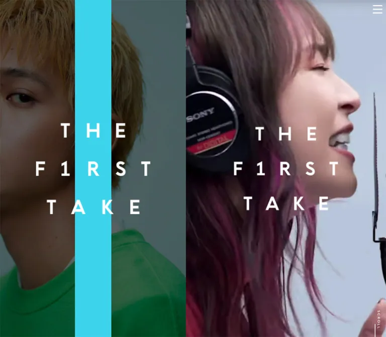
アーティスト写真と縦のカラーバーを左側に据え、右側に歌唱映像・ニュース・ギャラリー・グッズを展開。白黒の余白と文字間隔の広いロゴが特徴の音楽メディアサイト。
THE FIRST TAKE — Style Reference
A performance film beside a persistent artist portrait, punctuated by a single vertical band of color.
Website / original URL: thefirsttake.jp Final URL: https://www.thefirsttake.jp/ Theme: black and white editorial surfaces, darkened photography, and changing portrait accents; no user-selectable theme was verified. Inspected: supplied evidence retrieved October 5, 2026 at 05:24:17.180 JST / October 4, 2026 at 20:24:17.180 UTC. Viewports: 1440 × 1000 CSS pixels on desktop and 390 × 844 CSS pixels on mobile. Scope: the current homepage, including the desktop opening composition, news-to-gallery region, merchandise-to-footer region, two mobile hero captures, and supplied rendered DOM/computed-style samples. Linked pages and external destinations were not inspected.
THE FIRST TAKE presents a music and content hub through a strong two-part composition. At the inspected desktop width, an 890px artist portrait occupies the left side while a 550px stream holds the performance film and subsequent content. The portrait remains in the same viewport position in the supplied scrolled captures. A narrow, saturated vertical stripe cuts through it, with the white three-line wordmark centered across both photograph and stripe.
The right side moves from immersive performance footage into restrained editorial sections: ruled news entries, a loose arrangement of artist photographs, music collections, merchandise, and a black social footer. Wide tracking and centered graphic labels maintain the identity even when the background becomes plain white. The design derives its impact from image scale, asymmetry, and color placement rather than large promotional copy or decorated cards.
On the supplied phone captures, the left portrait composition disappears and the performance film occupies the available width. The logo remains prominent over a tightly cropped face. The mobile DOM contains the lower homepage content, but the captures do not establish how that content becomes reachable.
閉じる
THE FIRST TAKE — Style Reference
A performance film beside a persistent artist portrait, punctuated by a single vertical band of color.
Website / original URL: thefirsttake.jp Final URL: https://www.thefirsttake.jp/ Theme: black and white editorial surfaces, darkened photography, and changing portrait accents; no user-selectable theme was verified. Inspected: supplied evidence retrieved October 5, 2026 at 05:24:17.180 JST / October 4, 2026 at 20:24:17.180 UTC. Viewports: 1440 × 1000 CSS pixels on desktop and 390 × 844 CSS pixels on mobile. Scope: the current homepage, including the desktop opening composition, news-to-gallery region, merchandise-to-footer region, two mobile hero captures, and supplied rendered DOM/computed-style samples. Linked pages and external destinations were not inspected.
THE FIRST TAKE presents a music and content hub through a strong two-part composition. At the inspected desktop width, an 890px artist portrait occupies the left side while a 550px stream holds the performance film and subsequent content. The portrait remains in the same viewport position in the supplied scrolled captures. A narrow, saturated vertical stripe cuts through it, with the white three-line wordmark centered across both photograph and stripe.
The right side moves from immersive performance footage into restrained editorial sections: ruled news entries, a loose arrangement of artist photographs, music collections, merchandise, and a black social footer. Wide tracking and centered graphic labels maintain the identity even when the background becomes plain white. The design derives its impact from image scale, asymmetry, and color placement rather than large promotional copy or decorated cards.
On the supplied phone captures, the left portrait composition disappears and the performance film occupies the available width. The logo remains prominent over a tightly cropped face. The mobile DOM contains the lower homepage content, but the captures do not establish how that content becomes reachable.
How to Read This Reference
- Measured means a value explicitly supplied in rendered DOM/computed-style evidence. Measurements apply to the recorded state and viewport.
- Visual estimate means a dimension or color inferred from the supplied current-page screenshots. These values were not obtained by programmatic pixel sampling.
- Calculated means arithmetic based on a supplied measurement, such as the desktop column percentages.
- Recommended means implementation guidance for a new build, including the CSS adaptation below. It is not a claim about source behavior.
- All custom-property names in this document are implementation aliases. The supplied custom-property inventory was empty.
- Blank text on an element does not mean the visible interface lacks a label. Several visible headings, links, and wordmarks have no extracted text; their displayed lettering cannot be identified from the wrapper font alone.
- Screenshot states and DOM samples are complementary rather than guaranteed to represent the same animation frame. State-specific offsets are called out instead of being converted into permanent spacing rules.
Tokens — Colors
Default Palette
| Name | Value | Suggested token | Evidence and role |
|---|---|---|---|
| Black | #000000 |
--color-ink |
Measured body background and content text; visually confirmed in the footer and rules |
| White | #ffffff |
--color-paper |
Measured copyright text; visually consistent with the gallery, shop, logos, and reversed controls |
| News Gray | Approximately #f2f2f2 |
--color-news |
Visual estimate of the pale news-section surface |
| Portrait Shade | Black darkening; opacity unknown | --portrait-shade |
Photograph appears substantially darkened behind the white logo; overlay versus asset treatment is unverified |
| Film Shade | Darkening over performance footage; opacity unknown | --film-shade |
Visual treatment preserves readable white lettering over skin and studio backgrounds |
The visible interface is predominantly monochrome. Color is concentrated in photography and the vertical portrait band. Several image-bearing anchors compute to browser blue, rgb(0, 0, 238), but no corresponding blue text treatment is visible in the supplied captures. Do not promote that inherited wrapper color into the palette.
Observed Accent States
These are three captured portrait states, not verified theme presets or user controls.
| State | Approximate band color | Suggested token | Current-page evidence |
|---|---|---|---|
| Sand | #d1b082 |
--accent-sand |
Desktop opening capture with a group portrait |
| Vivid Red | #ff4136 |
--accent-red |
Desktop news/gallery capture with a close portrait |
| Acid Yellow | #e9ff55 |
--accent-lime |
Desktop merchandise/footer capture with a dark portrait |
The exact accent RGB values were not supplied. Treat these hexadecimal values as practical visual approximations. Keep the band opaque and visually separate from the photograph's darkening treatment. The evidence does not establish whether portrait and accent changes follow time, scrolling, or another condition.
Tokens — Typography
Source Text Stack
The measured regular body stack is:
font-family: 'ヒラギノ角ゴ Pro W3', 'Hiragino Kaku Gothic Pro', メイリオ, Meiryo, sans-serif;
font-size: 14px;
font-weight: 400;
line-height: 14px;
News links, dates, product captions, collection names, and copyright use the corresponding bold stack:
font-family: 'ヒラギノ角ゴ Pro W6', 'Hiragino Kaku Gothic Pro', メイリオ, Meiryo, sans-serif;
font-weight: 700;
These are measured font-family declarations, not proof of which installed font supplied every glyph. The root element's Times declaration is overridden by the body for the sampled content; it does not establish a serif visual direction.
Brand and Graphic Labels
The large mark is arranged as three separately centered rows: THE, F1RST, and TAKE. Its identity depends on generous spaces between letters, consistent row alignment, and the numeral 1 in the middle row. Preserve the authentic artwork when available and authorized. No font name for the logo was established.
Visible labels such as GALLERY, ALL NEWS, and ONLINE SHOP use black uppercase lettering with generous tracking. Their wrappers often report 14px text despite much larger visible lettering. Consequently, wrapper text styles must not be treated as measurements of the rendered graphic.
Type Scale
| Role | Size / line height | Weight | Tracking | Evidence |
|---|---|---|---|---|
| Base text | 14px / 14px |
400 |
Normal | Measured on both viewports |
| News date | 10px / 10px |
700 |
1px, equivalent to 0.1em |
Measured |
| News title | 18px / 30.06px |
700 |
2.52px, equivalent to 0.14em |
Measured |
News MORE |
10px / 10px |
700 |
1px |
Measured |
| Music collection title | 14px / 20.02px |
700 |
1.96px, equivalent to 0.14em |
Measured |
| Product name | 14px / 21px |
700 |
2.8px, equivalent to 0.2em |
Measured |
| Product price | 14px / 14px |
700 |
2.8px |
Measured |
| Copyright | 10px / 10px |
700 |
2px, equivalent to 0.2em |
Measured |
GALLERY lettering |
Approximately 28–30px |
Visually medium/bold | Approximately 5–6px |
Visual estimate; graphic font unknown |
| Large underlined section links | Approximately 18–20px |
Visually medium/bold | Approximately 3–4px |
Visual estimate; graphic font unknown |
| Vertical scroll caption | Approximately 8–10px |
Visually bold | Approximately 2px |
Visual estimate |
There is no observed oversized headline hierarchy competing with the photographs. Main textual emphasis comes from weight, tracking, and white space. For additional paragraphs in a new implementation, a line height around 1.5–1.7 is recommended; the measured body reset of 14px / 14px should not become a general long-form reading style.
Tokens — Spacing & Shapes
Overall rhythm: large image fields and generous section intervals, with compact metadata inside them. Shape language: square image edges, fine horizontal rules, unboxed text links, and a few circular media controls.
Spacing Scale
| Use | Value | Evidence |
|---|---|---|
| News and main merchandise inset | 25px per side |
Measured from section and product geometry on both viewports |
| Music collection inset | 36px per side |
Measured: 478px inside 550px; 318px inside 390px |
| News row top / bottom padding | 28px / 32px |
Measured |
| Date-to-title interval | 18px |
Calculated from measured text rectangles |
Title-to-MORE interval |
Approximately 18px |
Calculated from measured text rectangles |
| Underlined graphic-link bottom padding | 9px |
Measured |
| Product name-to-price interval | 11px |
Calculated from measured rectangles |
| Price-to-shop-link interval | 101px |
Calculated on both viewports |
| Collection title-to-link interval | 16px desktop; 24px mobile |
Calculated from measured rectangles |
| Navigation link padding | 22px 0 22px 30px |
Measured DOM; open-menu appearance unverified |
| Adjacent merchandise item interval | 10px |
Calculated from consecutive horizontal rectangles |
| Broad section breathing room | Approximately 80–100px |
Visual estimate; not a universal recovered source token |
Border Radius
| Element | Treatment | Evidence |
|---|---|---|
| Portrait, gallery, product imagery | Square corners | Visible in desktop captures |
| News rows and section links | Unboxed; no pill shape | Visible captures and sampled zero-radius wrappers |
| Desktop pause affordance | Circular, approximately 56px across | Visual estimate |
| Merchandise next affordance | White circle, approximately 46–48px across | Visual estimate |
Layout Measurements
| Element | At 1440 × 1000 | At 390 × 844 | Status |
|---|---|---|---|
| Portrait region | 890 × 1000px |
Not visible | Desktop boundary is visually clear and corroborated by content starting at x=890 |
| Main content stream | 550px wide |
390px wide |
Measured section widths |
| Desktop proportions | 61.81% / 38.19% |
Single visible column | Calculated; original responsive formula unknown |
| Portrait stripe | Approximately 100px wide, x≈395–495 |
Not visible | Visual estimate |
| Portrait logo | Approximately 315 × 250px, centered near (445, 500) |
Not visible | Visual estimate |
| Film logo | Approximately 295 × 230px, centered near (1165, 500) |
Approximately 210 × 165px, centered near (195, 500) |
Visual estimates |
| News section inner width | 500px |
340px |
Measured |
| Music collection width | 478px |
318px |
Measured |
| Active product caption width | 500px |
340px |
Measured |
| Subsequent product caption width | 228px |
228px |
Measured offscreen rectangles |
| Menu glyph | Approximately 26 × 23px |
Approximately 26 × 23px |
Visual estimate; about 10px from the right edge |
| Reported document height | 6829px |
844px |
Measured; mobile interpretation is limited |
The desktop news-section heading begins at x=915, while sampled news-row anchors begin at x=931. The visible scrolled capture aligns the row near x=915. This 16px discrepancy is state-specific evidence, not a reliable extra gutter; its cause was not recorded.
Components
Persistent Artist Panel
Role: maintains the site's identity while the content stream changes.
The panel fills the left 890px of the inspected desktop viewport from top to bottom. Its anatomy is a full-bleed artist image, a darkened image treatment, a straight vertical color band, and the three-line white logo above both. The band is centered within the panel, approximately 100px wide, and has no gradient, border, rounded corner, or visible texture.
The logo's center sits near the center of the panel. Its full width crosses beyond the stripe so that the photograph remains integral to the composition. In all three desktop captures, the panel retains its screen position while the right column shows different portions of the page. A fixed panel is a suitable reconstruction; the supplied styles do not establish whether the source uses fixed, sticky, or another mechanism.
Different artist photographs and band colors appear between captures. Preserve the capacity for multiple art-directed states without claiming a specific slideshow or scroll synchronization rule.
Performance-Film Hero
Role: makes the musical performance the opening experience.
On desktop, tightly cropped footage fills the right stream. The large white logo is centered within that stream rather than the full browser window. A circular pause symbol is visible below the middle logo row in the opening desktop capture. Its click behavior and ownership were not established by the DOM extract.
On mobile, the film replaces the two-panel composition. The face extends beyond the viewport edges, and the logo is reduced to roughly 210px wide. Its center is near y=500 in the 844px-high viewport, visibly below the viewport midpoint of y=422. Do not silently describe this captured state as vertically centered in the phone screen.
The two mobile captures show different performance frames. Audio state, playback startup, looping, media source, and clip selection remain unverified.
Menu Toggle and Navigation Inventory
Role: provides compact access to the wider content ecosystem.
Three straight horizontal strokes sit near the upper-right corner, approximately 26px wide with a combined height of 23px. They appear white over the film and black over the light content states. No enclosing button surface is visible.
The rendered link inventory includes the homepage, news, official store, the homepage playlist anchor, festival content, INSIDE THE FIRST TAKE, reports, stage content, and four social destinations. Sampled navigation links have approximately 58.69px-high rectangles and 22px vertical padding.
These rectangles do not prove that the menu was open. No open-menu screenshot, overlay surface, dismissal action, focus behavior, or transition was supplied. Build the toggle as a real button; a minimum 44px invisible hit area is a recommended addition, not an observed measurement.
News Row
Role: presents current announcements without introducing card chrome.
A pale-gray section contains three dated links in the supplied DOM. Each whole row is an anchor holding a small date, a bold Japanese headline, and an underlined MORE label. Fine black horizontal rules separate entries. The row has no thumbnail, colored badge, rounded container, or shadow.
Use the measured 28px top and 32px bottom padding. Dates and MORE are 10px / 10px with 1px tracking. Titles are 18px / 30.06px with 2.52px tracking. Both type sizes remain unchanged in the phone DOM; the narrower width creates additional lines.
For example, the first supplied announcement occupies two title lines on desktop and three on mobile. Its complete row grows from approximately 176.09px to 206.14px. The longer second item grows from approximately 206.14px to 236.19px. This is content wrapping, not a smaller mobile type scale.
Underlined Section Link
Role: moves from a homepage preview to a deeper destination.
ALL NEWS and ONLINE SHOP are centered, widely tracked uppercase labels with thin black underlines. They retain substantial empty space around them rather than becoming filled CTA buttons.
The supplied anchor widths are approximately 121.33px for the news link and 164.03px for the shop link, with around 24px total height and 9px bottom padding. These dimensions describe the rendered link wrappers. The exact graphic lettering cannot be recovered from their inherited 14px text declarations.
Artist Gallery
Role: creates an editorial interval between text-heavy and commerce sections.
A centered GALLERY heading introduces white space populated by offset artist portraits. The visible arrangement includes a small square near the left, a larger square higher and farther right, another small image overlapping its lower-right region, and a partial image at the far-right edge.
Approximate visible sizes are 150px for the smaller squares and 250px for the larger square. Images are upright, square-cornered, and untreated by decorative borders. Some artwork extends beyond the visible stream boundary. This is an asymmetrical composition, not an evenly spaced masonry or card grid.
The DOM includes Instagram, TikTok, and Twitter destinations after the gallery area. Their presence is verified; gallery-item linking, dragging, automatic motion, and hover behavior are not.
Music Collection Blocks
Role: connects the homepage to recorded-music destinations.
The DOM supplies two collections: FROM THE FIRST TAKE and THE FIRST TAKE ORIGINALS, each with a large linked region, a centered title, and a smaller destination link. Their inner region is 478px wide on desktop and 318px on mobile, maintaining 36px side insets.
Collection titles use the measured bold stack at 14px / 20.02px and 1.96px tracking. The title-to-link gap increases from approximately 16px to 24px in the mobile sample.
These sections were not shown in the attached desktop crops. Do not invent cover artwork, exact image proportions, or a particular playback interaction from the anchor rectangles alone. An earlier image-led region and a YouTube playlist destination are also present in the DOM, but their full appearance is outside the visual evidence.
Merchandise Preview
Role: previews physical goods and hands off to the official store.
The visible active item uses a large product photograph on a light studio background. It spans approximately 500px within the desktop stream's 25px side margins. Beneath it, a centered two-line name is followed by a separate price. The captured item reads White Studio / Big T-shirt [BLACK], followed by ¥3,500(税込).
Use 14px / 21px bold type with 2.8px tracking for names, then an 11px gap before a 14px / 14px price. A large interval of 101px separates the price rectangle from the ONLINE SHOP link rectangle.
A white circular chevron sits at the right edge of the product image, with part of a neighboring slide visible. The DOM contains eight product entries positioned horizontally: the active caption spans 500px on desktop or 340px on mobile, while subsequent captions measure 228px, separated by 10px. This supports a horizontal product sequence, but its click, swipe, resizing, autoplay, and wraparound behavior were not exercised.
Social Footer
Role: closes the homepage with the brand and external channels.
The footer is a solid black rectangle confined to the right content stream on desktop. A centered horizontal white wordmark appears above four white social symbols: YouTube, Instagram, TikTok, and the bird-shaped Twitter mark visible in the capture. A small ©THE F1RST TAKE line sits below.
The measured social-link widths are 34.5px, 29px, 25.5px, and 31.5px, with approximately 40px between their recorded boxes. These are inline-link rectangles, not complete icon-height or touch-target measurements. Copyright uses white 10px / 10px bold text with 2px tracking.
The supplied desktop crop suggests a footer around 275px tall. Keep its generous vertical spacing and centered grouping; avoid turning it into a dense multi-column sitemap.
Tokens — Motion & Interaction
| Treatment | Evidence | What can be concluded |
|---|---|---|
| Performance footage | Different frames in two mobile captures | The media changes over time; duration, audio, looping, and startup rules are unknown |
| Portrait and band changes | Three different desktop states | Multiple combinations exist; trigger and transition are unknown |
| News-link opacity | Mobile computed transition: 0.125s cubic-bezier(0.215, 0.61, 0.355, 1) |
A transition is defined; the initiating state was not recorded |
| News-link transform | Mobile computed transition: 0.5s cubic-bezier(0, 0.7, 0.3, 1) |
Transform transition exists; distance and trigger are unknown |
| Collection-title opacity | Mobile computed transition: 0.25s cubic-bezier(0.215, 0.61, 0.355, 1) |
Defined on both collection-title samples |
| Collection-title transform | Mobile computed transition: 0.5s cubic-bezier(0, 0.7, 0.3, 1) |
Defined; entrance direction is unverified |
| Pause affordance | Circular pause glyph in desktop hero | A visible affordance exists; activation was not supplied |
| Product navigation | Right-chevron circle and horizontal offscreen items | A sequence and navigation affordance are visible; behavior is unverified |
| Menu contrast | White over film; black over light content | Different visible contrast states exist; implementation mechanism is unknown |
Most other sampled text wrappers report animation: none and a bare transition: all. That does not establish an animation duration, nor does it rule out motion on media, descendants, pseudo-elements, or unsampled containers.
The capture process temporarily paused perpetual animations during readiness checks and resumed them afterward. Consequently, screenshots establish appearance and differing frames, not reliable transition timing. No parallax speed, gallery choreography, reveal distance, or menu easing should be presented as measured.
Surfaces
| Layer | Appearance | Purpose |
|---|---|---|
| Artist panel | Darkened full-bleed photography | Persistent visual identity |
| Accent band | Flat opaque color | Strong vertical rhythm and state variation |
| Hero film | Cropped performance footage with white graphics | Immersion and immediate subject recognition |
| News | Pale gray, black text, fine rules | Clear reading hierarchy |
| Gallery and merchandise | White with unboxed imagery | Space around photography and products |
| Footer | Pure black with white artwork | Visual closure and social destinations |
| Media controls | Small circular surfaces where visible | Local interaction without a broad button system |
No card-shadow elevation system is visible in the supplied states. Structure comes from surface changes, image boundaries, rules, scale, and placement. The photography may contain tonal gradients, but decorative interface gradients are not part of the observed treatment.
Imagery
Photography is the main design material. Artist portraits are closely cropped, often cutting off hair, shoulders, or parts of a group to fill the left field. Clothing, hair, and expression provide visual complexity. The darkening treatment reduces competition with the bright stripe and white mark.
The film uses even tighter performance crops: faces, microphones, and headphones become large graphic shapes. This should feel like a camera close-up, not a generic background-video montage. Cropping needs per-asset focal-point control, especially when moving from a 550px desktop stream to a 390px phone.
Gallery photography retains light studio backgrounds and natural color. Merchandise is photographed plainly against a pale background so the object reads clearly. Preserve that distinction: portrait imagery supports atmosphere, while product imagery supports inspection.
Observed Asset References
No image src, SVG asset path, or video file URL was supplied. The inventory below identifies visible roles without inventing filenames.
| Asset role | Evidence | Reuse guidance |
|---|---|---|
| Artist-panel portraits | Three current desktop captures | Use authorized high-resolution photographs and individual crop settings |
| Performance film | Desktop opening and both phone captures | Supply a poster, playback controls, and intentional portrait cropping |
| Three-line wordmark | Current desktop and mobile captures | Preserve original artwork proportions and the F1RST lettering |
| Section-link and heading graphics | Visible labels plus text-empty DOM wrappers | Use available brand artwork or clearly label a text approximation |
| Gallery portraits | Desktop gallery capture | Preserve square edges, mixed sizes, overlap, and white space |
| Product photography | Desktop shop capture | Keep the item legible; avoid aggressive cover cropping |
| Social symbols | Desktop footer | Match the shown silhouettes when reproducing this captured state |
CSS can reproduce the composition and text rhythm, but the artist imagery, performance footage, and wordmark carry much of the identity.
Layout & Responsive Behavior
Desktop: Stable Portrait, Narrow Content Stream
At 1440px wide, the split occurs at x=890. The right stream is 550px wide and continues through the hero, news, gallery, music collections, shop, and footer. The left panel does not gain a matching stack of content; it remains a full-height portrait composition in the supplied scrolled views.
The opening uses two simultaneous branded fields: a portrait logo on the left and a film logo on the right. Lower down, only the persistent portrait remains while the right side becomes a conventional vertical content sequence. This imbalance is central to the design.
Only one desktop width was supplied. A fixed 550px stream, a proportional split, and a capped responsive formula could all produce that observation. The original breakpoint and general width formula are unknown. The Quick Start chooses a 550px stream as an explicit reconstruction decision.
Mobile: Film First, Lower Content Unconfirmed Visually
At 390px wide, the portrait panel and its band are absent from the visible opening. The film fills the screen width; the upper-right menu keeps approximately the same glyph dimensions and edge inset. The logo shrinks and remains horizontally centered.
The mobile logo center is near y=500. Also, early downstream DOM regions retain y-values of 1120 and 1302, matching the desktop sample. Together these observations suggest a logical opening stage taller than the 844px viewport, but they do not prove the original height rule.
The DOM confirms responsive content widths: 340px for news and active product captions, and 318px for collection blocks. Text sizes remain stable while headlines wrap. After the news section, mobile coordinates are about 90px lower than desktop coordinates until later image-region differences change the relationship.
The reported mobile document height is only 844px even though the copyright rectangle is around y=6371. This may involve a separate scroll owner, an overflow state, or capture timing; the extract does not identify the cause. Do not conclude that the page contains only one screen, and do not claim that all lower mobile sections were successfully scrolled into view.
Recommended Responsive Construction
Use a persistent desktop portrait plus a separate main stream. Hide the portrait at a tested breakpoint and let the main stream occupy the phone width. Preserve 25px content insets and the measured text scale rather than shrinking every component proportionally.
Keep gallery and merchandise overflow local to their own components. Ensure a single understandable vertical scrolling route reaches the footer. Test the 390 × 844 case explicitly, including browser chrome changes, orientation changes, menu dismissal, and media loading.
Do’s and Don’ts
Do
- Preserve the large portrait field beside the narrow desktop content stream.
- Center the vertical band within the portrait and keep it approximately 100px wide at the inspected desktop size.
- Place the white three-line wordmark above the photograph and band as a separate layer.
- Use the actual wordmark artwork when available; retain the numeral
1inF1RST. - Give photography and performance footage most of the visual weight.
- Keep news titles bold, tracked, and generously led at the measured 18px scale.
- Use thin rules and underlined text or graphic links instead of a large button system.
- Maintain the offset gallery composition with mixed image sizes and clean square edges.
- Keep product names and prices centered beneath clear product photography.
- Preserve the black footer as a simple centered brand-and-social composition.
- Treat mobile reachability and unknown transition triggers as items requiring implementation verification.
Don’t
- Don’t replace the asymmetrical desktop composition with a centered full-width content grid.
- Don’t turn every section into a rounded card with a shadow.
- Don’t use the accent stripe color for every link, heading, and button.
- Don’t place promotional headlines over the film when none are evidenced.
- Don’t infer the logo font from the body stack or the 14px graphic wrappers.
- Don’t treat inherited browser-blue anchor text as a visible brand color.
- Don’t make the left portrait scroll away in a capture-matching desktop reconstruction.
- Don’t assert that portrait changes are scroll-driven or timed without further evidence.
- Don’t infer carousel swipe, autoplay, or wrapping behavior from offscreen slides alone.
- Don’t shrink the mobile news text merely to avoid wrapping.
- Don’t reproduce the ambiguous mobile document-height state as an intentional scrolling restriction.
Recommended Implementation Additions
These are recommendations for a new implementation, not verified features of the original page:
- Give the menu, pause control, carousel arrows, and social links explicit accessible names. Text-empty extracts do not establish whether the originals already have suitable names.
- Give the menu an accurate expanded state, keyboard navigation, predictable dismissal, and focus restoration.
- Keep controls at least 44px in their interactive dimension while retaining the compact visible glyphs.
- Provide meaningful alternatives for artist and product imagery. Mark purely decorative portraits appropriately if the same identity is already conveyed nearby.
- Provide a poster and a usable static state for performance media. Respect reduced-motion preferences and require a deliberate user action before audible playback.
- Keep the film's pause control available wherever automatic playback is used, including mobile.
- Preserve logo contrast across every photograph and frame rather than relying on one favorable still.
- Use semantic headings and accessible link text when visual labels are supplied as images.
- Ensure hidden navigation and inactive carousel content do not create unexpected keyboard stops.
- Make below-the-fold mobile content reachable through a clearly defined scroll container and test it on actual phone-sized viewports.
Agent Prompt Guide
Quick Color Reference
- Text, rules, and footer: measured black
#000000. - Light content surfaces and reversed graphics: white
#ffffff. - News surface: approximate
#f2f2f2. - Portrait bands: approximate sand
#d1b082, red#ff4136, and acid yellow#e9ff55. - Photograph darkening: match the reference visually; source opacity is unknown.
- Keep accent color confined primarily to the portrait stripe rather than distributing it throughout the interface.
Overall Prompt
“Create a music-content homepage inspired by the current THE FIRST TAKE composition. At 1440 × 1000, use an 890px persistent artist portrait on the left and a 550px content stream on the right. Darken the portrait, place a flat 100px vertical color stripe through its center, and overlay an authorized white three-line wordmark. Open the right stream with tightly cropped performance footage and another white wordmark. Continue with pale-gray ruled news rows, a white offset artist gallery, music collection links, a horizontal merchandise preview, and a black social footer. Use the measured Japanese sans-serif text scale, bold 18px news titles, small tracked metadata, and centered underlined section links. On phones, remove the portrait panel and make the film and content stream full width. Keep unverified media, menu, and carousel behaviors explicit implementation decisions.”
Example Component Prompts
- Portrait panel: “A full-height artist portrait occupying the left 890px of a 1440px composition. Darken the photograph, add a straight opaque 100px red stripe at its horizontal center, and place a white three-line brand asset across the stripe and photograph. Square edges, no decorative border or shadow.”
- News row: “A 500px-wide linked news entry on pale gray, with 28px top and 32px bottom padding. Stack a 10px bold date, an 18px bold Japanese title at 30.06px line height and 2.52px tracking, then a small underlined MORE. Use 18px internal vertical intervals and a fine separator.”
- Artist gallery: “A white 550px editorial column with a centered tracked GALLERY heading. Arrange upright square portraits asymmetrically: one small image at the left, a larger image higher on the right, and another small image overlapping below it. Let a further image be partially clipped at the right edge.”
- Merchandise preview: “A large, plain studio product photograph within 25px side margins. Beneath it, center a two-line 14px bold product name with 2.8px tracking, then a separate price after an 11px gap. Add a small white circular next-arrow affordance at the image edge and a widely spaced underlined ONLINE SHOP link well below.”
- Mobile hero: “At 390 × 844, show only tightly cropped performance footage with a roughly 210px-wide white brand asset centered horizontally. Match the captured lower logo position near y=500, keep a compact white menu glyph at the upper right, and place a vertical scroll cue near the lower-right edge. Provide reachable content below and accessible media controls.”
Quick Start
CSS Custom Properties
This is a reconstruction scaffold, not recovered source CSS. Exact text metrics and content insets come from the supplied DOM. Accent colors, image shading, graphic-label typography, gallery positions, and the 900px breakpoint are estimates or recommendations.
The starter deliberately uses a 1000px hero stage to reproduce the observed logo center near y=500 in both supplied viewport sizes. This is a capture-calibrated choice, not a verified source height formula. Change --hero-stage to 100svh for a viewport-centered adaptation; that changes the observed phone composition.
Expected structure: a .tft-page containing .tft-identity, a .tft-main content stream, and a .tft-menu-toggle. Both identity and hero contain media, a .tft-shade, and a .tft-brand image; the identity additionally contains .tft-band. Supply authorized media and logo assets. CSS alone does not implement the menu, playback, or carousel controls.
:root {
  /* Measured palette plus explicitly approximate surface/accent colors. */
  --color-ink: #000000;
  --color-paper: #ffffff;
  --color-news: #f2f2f2;
  --accent-sand: #d1b082;
  --accent-red: #ff4136;
  --accent-lime: #e9ff55;
  --portrait-accent: var(--accent-red);

  /* Measured source text stacks. */
  --font-regular: 'ヒラギノ角ゴ Pro W3', 'Hiragino Kaku Gothic Pro',
    メイリオ, Meiryo, sans-serif;
  --font-bold: 'ヒラギノ角ゴ Pro W6', 'Hiragino Kaku Gothic Pro',
    メイリオ, Meiryo, sans-serif;
  --text-meta: 10px;
  --text-caption: 14px;
  --text-news: 18px;
  --leading-news: 30.06px;
  --tracking-meta: 1px;
  --tracking-news: 2.52px;
  --tracking-product: 2.8px;

  /* Desktop reconstruction choices calibrated to the supplied capture. */
  --stream-width: 550px;
  --hero-stage: 1000px;
  --band-width: 100px;
  --content-inset: 25px;
  --collection-inset: 36px;
  --section-space: 80px;

  /* Recommended starting opacities; original values are unknown. */
  --portrait-shade: 0.48;
  --film-shade: 0.18;

  /* Computed transition values observed on mobile text components. */
  --ease-opacity: cubic-bezier(0.215, 0.61, 0.355, 1);
  --ease-transform: cubic-bezier(0, 0.7, 0.3, 1);
  --motion-news: 125ms;
  --motion-collection: 250ms;
  --motion-transform: 500ms;
}

* { box-sizing: border-box; }
body { margin: 0; }
button, a { -webkit-tap-highlight-color: transparent; }

.tft-page {
  color: var(--color-ink);
  background: var(--color-ink);
  font: 400 14px/1.5 var(--font-regular);
}

.tft-identity {
  position: fixed;
  inset: 0 auto 0 0;
  inline-size: calc(100% - var(--stream-width));
  block-size: 100svh;
  overflow: hidden;
  background: var(--color-ink);
}

.tft-main {
  position: relative;
  inline-size: var(--stream-width);
  margin-inline-start: calc(100% - var(--stream-width));
  background: var(--color-paper);
}

.tft-hero {
  position: relative;
  block-size: var(--hero-stage);
  overflow: hidden;
  color: var(--color-paper);
  background: var(--color-ink);
}

.tft-media {
  position: absolute;
  inset: 0;
  display: block;
  inline-size: 100%;
  block-size: 100%;
  object-fit: cover;
  object-position: var(--media-focus, 50% 50%);
}

.tft-shade {
  position: absolute;
  inset: 0;
  z-index: 1;
  background: #000;
  opacity: var(--film-shade);
  pointer-events: none;
}

.tft-identity .tft-shade { opacity: var(--portrait-shade); }
.tft-identity[data-accent='sand'] { --portrait-accent: var(--accent-sand); }
.tft-identity[data-accent='lime'] { --portrait-accent: var(--accent-lime); }

.tft-band {
  position: absolute;
  inset-block: 0;
  inset-inline-start: 50%;
  z-index: 2;
  inline-size: var(--band-width);
  transform: translateX(-50%);
  background: var(--portrait-accent);
  pointer-events: none;
}

.tft-brand {
  position: absolute;
  inset-block-start: 50%;
  inset-inline-start: 50%;
  z-index: 3;
  display: block;
  inline-size: 295px;
  max-inline-size: 80%;
  block-size: auto;
  transform: translate(-50%, -50%);
}

.tft-identity .tft-brand { inline-size: 315px; }

/* A 44px target preserves the approximately 26px visible menu glyph. */
.tft-menu-toggle {
  position: fixed;
  inset-block-start: max(1px, env(safe-area-inset-top, 0px));
  inset-inline-end: max(1px, env(safe-area-inset-right, 0px));
  z-index: 20;
  display: grid;
  align-content: center;
  justify-items: center;
  gap: 7px;
  inline-size: 44px;
  block-size: 48px;
  padding: 0;
  border: 0;
  color: #fff;
  background: transparent;
  cursor: pointer;
}

.tft-menu-toggle span {
  inline-size: 26px;
  block-size: 3px;
  background: currentColor;
}

/* Set this state according to the actual surface behind the control. */
.tft-menu-toggle[data-tone='dark'] { color: #000; }

.tft-scroll-cue {
  position: absolute;
  inset-block-start: calc(min(100svh, var(--hero-stage)) - 74px);
  inset-inline-end: 12px;
  z-index: 4;
  min-block-size: 60px;
  padding-inline-start: 6px;
  border-inline-start: 1px solid currentColor;
  font: 700 8px/1 var(--font-bold);
  letter-spacing: 2px;
  writing-mode: vertical-rl;
}

.tft-section { padding-block: var(--section-space); }

/* Text approximation for graphic headings, not an identified logo font. */
.tft-section-title {
  margin: 0 0 60px;
  text-align: center;
  font: 700 28px/1.2 var(--font-bold);
  letter-spacing: 6px;
}

.tft-news {
  padding-inline: var(--content-inset);
  background: var(--color-news);
}

.tft-news-link {
  display: block;
  padding-block: 28px 32px;
  border-block-start: 1px solid currentColor;
  color: inherit;
  text-decoration: none;
  font-family: var(--font-bold);
  font-weight: 700;
  transition:
    opacity var(--motion-news) var(--ease-opacity),
    transform var(--motion-transform) var(--ease-transform);
}

.tft-news-date,
.tft-news-more {
  margin: 0;
  font-size: var(--text-meta);
  line-height: 10px;
  letter-spacing: var(--tracking-meta);
}

.tft-news-title {
  margin: 18px 0;
  font-size: var(--text-news);
  line-height: var(--leading-news);
  letter-spacing: var(--tracking-news);
  overflow-wrap: anywhere;
}

.tft-news-more { text-decoration: underline; }
.tft-link-row { margin: 32px 0 0; text-align: center; }

.tft-section-link {
  display: inline-block;
  padding-block-end: 9px;
  border-block-end: 1px solid currentColor;
  color: inherit;
  text-decoration: none;
  font: 700 18px/1 var(--font-bold);
  letter-spacing: 4px;
}

/* Estimated collage geometry; crop and placement require asset review. */
.tft-gallery { overflow: hidden; }
.tft-collage { position: relative; block-size: 420px; overflow: hidden; }
.tft-collage img {
  position: absolute;
  display: block;
  aspect-ratio: 1;
  object-fit: cover;
}
.tft-collage .portrait-small { left: 7.45%; top: 164px; width: 150px; }
.tft-collage .portrait-large { left: 44.36%; top: 10px; width: 250px; }
.tft-collage .portrait-lower { left: 60.91%; top: 236px; width: 150px; }
.tft-collage .portrait-edge { left: 88.73%; top: 0; width: 170px; }

.tft-collection { padding-inline: var(--collection-inset); }
.tft-collection-media { display: block; inline-size: 100%; block-size: auto; }
.tft-collection-title {
  margin: 24px 0 16px;
  text-align: center;
  font: 700 14px/20.02px var(--font-bold);
  letter-spacing: 1.96px;
}

/* Native horizontal scrolling is a recommended baseline, not source behavior. */
.tft-product-track {
  display: flex;
  gap: 10px;
  overflow-x: auto;
  overscroll-behavior-x: contain;
  scroll-snap-type: x proximity;
  scroll-padding-inline: var(--content-inset);
  padding-inline: var(--content-inset);
}

.tft-product {
  flex: 0 0 228px;
  min-inline-size: 0;
  margin: 0;
  text-align: center;
  scroll-snap-align: start;
}

.tft-product.is-active { flex-basis: 100%; }
.tft-product img { display: block; inline-size: 100%; block-size: auto; }
.tft-product-name {
  margin: 18px 0 0;
  font: 700 14px/21px var(--font-bold);
  letter-spacing: var(--tracking-product);
}
.tft-product-price {
  margin: 11px 0 0;
  font: 700 14px/14px var(--font-bold);
  letter-spacing: var(--tracking-product);
}
.tft-shop .tft-link-row { margin-block-start: 101px; }

.tft-footer {
  padding: 64px 25px 56px;
  color: var(--color-paper);
  background: var(--color-ink);
  text-align: center;
}
.tft-footer-brand { display: block; width: 250px; max-width: 100%; margin: auto; }
.tft-socials {
  display: flex;
  justify-content: center;
  align-items: center;
  gap: 26px;
  margin-block: 44px 48px;
}
.tft-socials a {
  display: grid;
  place-items: center;
  min-inline-size: 44px;
  min-block-size: 44px;
  color: inherit;
}
.tft-copyright {
  margin: 0;
  font: 700 10px/10px var(--font-bold);
  letter-spacing: 2px;
}

/* Recommended focus treatment and hover feedback. */
.tft-page :focus-visible {
  outline: 2px solid currentColor;
  outline-offset: 5px;
}
@media (hover: hover) {
  .tft-news-link:hover { opacity: 0.65; }
}

/* Chosen breakpoint; the original breakpoint was not supplied. */
@media (max-width: 899px) {
  .tft-identity { display: none; }
  .tft-main { inline-size: 100%; margin-inline-start: 0; }
  .tft-hero .tft-brand { inline-size: 210px; }
  .tft-collection-title { margin-block-end: 24px; }
}

@media (prefers-reduced-motion: reduce) {
  .tft-news-link { transition: none; }
  .tft-product-track { scroll-behavior: auto; }
  /* Pause or replace moving media in application logic as well. */
}
The product starter uses native horizontal scrolling to keep all items reachable. A scripted active-slide resize, next-arrow behavior, and pause/menu actions require separate implementation and testing. Do not infer those behaviors from this CSS or mistake them for verified source interactions.
Tailwind v4 Token Mapping
Optional aliases for a project already using Tailwind v4. Define the preceding custom properties first. This mapping does not imply that the inspected site uses Tailwind.
@theme inline {
  --color-ink: #000000;
  --color-paper: #ffffff;
  --color-news: #f2f2f2;
  --color-band-sand: #d1b082;
  --color-band-red: #ff4136;
  --color-band-lime: #e9ff55;

  --font-site: var(--font-regular);
  --font-site-bold: var(--font-bold);

  --text-meta: 10px;
  --text-caption: 14px;
  --text-news: 18px;
  --text-news--line-height: 30.06px;
  --text-news--letter-spacing: 2.52px;

  --spacing-content-inset: 25px;
  --spacing-collection-inset: 36px;
  --spacing-band: 100px;
  --spacing-stream: 550px;
}
Sources & Evidence
- Original and final website: https://www.thefirsttake.jp/. The supplied response status was HTTP 200, the final URL was unchanged, and the rendered title was
THE FIRST TAKE. - Evidence timestamp:
2026-10-04T20:24:17.180Z, equivalent to October 5, 2026 at 05:24:17.180 JST. Individual screenshot timestamps were not supplied. - Desktop visual evidence: three 1440 × 1000 captures showing the opening portrait/film composition, the news/gallery region, and the merchandise/footer region. Exact scroll offsets were not supplied.
- Mobile visual evidence: two 390 × 844 captures showing different performance frames in the opening composition. No lower-content mobile screenshot was supplied.
- Rendered DOM/computed styles: both viewport samples supplied text, link destinations, element rectangles, font declarations, colors, padding, and selected transition values. These establish the precise text metrics and inner content widths documented above.
- Observed progression: desktop captures establish different vertical content regions while the portrait panel remains in place. The phone captures establish changing footage. No menu opening, carousel activation, pause activation, keyboard traversal, or audio test was supplied.
- Inspection limitations: readiness checks waited for load, visible image decoding, and sampled layout/text stability within finite time limits, with an initial observation of at least five seconds. Perpetual animations were temporarily paused for readiness and resumed. SharedWorkers and service workers were disabled. Delayed content, alternate scroll owners, and unexercised interactions may therefore remain unresolved.
- Asset and stylesheet limitations: no complete stylesheet, asset URL inventory, image-source dimensions, video metadata, responsive breakpoint declaration, or source custom-property set was available. Estimates and implementation choices are labeled throughout.
This reference analyzes the supplied current homepage evidence. No additional browsing or file inspection was performed. The CSS is a practical adaptation of the observed composition, with mobile scrolling, accessibility, and interaction behavior requiring explicit implementation verification.
# THE FIRST TAKE — Style Reference

> A performance film beside a persistent artist portrait, punctuated by a single vertical band of color.

**Website / original URL:** [thefirsttake.jp](https://www.thefirsttake.jp/)
**Final URL:** [https://www.thefirsttake.jp/](https://www.thefirsttake.jp/)
**Theme:** black and white editorial surfaces, darkened photography, and changing portrait accents; no user-selectable theme was verified.
**Inspected:** supplied evidence retrieved October 5, 2026 at 05:24:17.180 JST / October 4, 2026 at 20:24:17.180 UTC.
**Viewports:** 1440 × 1000 CSS pixels on desktop and 390 × 844 CSS pixels on mobile.
**Scope:** the current homepage, including the desktop opening composition, news-to-gallery region, merchandise-to-footer region, two mobile hero captures, and supplied rendered DOM/computed-style samples. Linked pages and external destinations were not inspected.

THE FIRST TAKE presents a music and content hub through a strong two-part composition. At the inspected desktop width, an 890px artist portrait occupies the left side while a 550px stream holds the performance film and subsequent content. The portrait remains in the same viewport position in the supplied scrolled captures. A narrow, saturated vertical stripe cuts through it, with the white three-line wordmark centered across both photograph and stripe.

The right side moves from immersive performance footage into restrained editorial sections: ruled news entries, a loose arrangement of artist photographs, music collections, merchandise, and a black social footer. Wide tracking and centered graphic labels maintain the identity even when the background becomes plain white. The design derives its impact from image scale, asymmetry, and color placement rather than large promotional copy or decorated cards.

On the supplied phone captures, the left portrait composition disappears and the performance film occupies the available width. The logo remains prominent over a tightly cropped face. The mobile DOM contains the lower homepage content, but the captures do not establish how that content becomes reachable.
閉じる
# THE FIRST TAKE — Style Reference

> A performance film beside a persistent artist portrait, punctuated by a single vertical band of color.

**Website / original URL:** [thefirsttake.jp](https://www.thefirsttake.jp/)
**Final URL:** [https://www.thefirsttake.jp/](https://www.thefirsttake.jp/)
**Theme:** black and white editorial surfaces, darkened photography, and changing portrait accents; no user-selectable theme was verified.
**Inspected:** supplied evidence retrieved October 5, 2026 at 05:24:17.180 JST / October 4, 2026 at 20:24:17.180 UTC.
**Viewports:** 1440 × 1000 CSS pixels on desktop and 390 × 844 CSS pixels on mobile.
**Scope:** the current homepage, including the desktop opening composition, news-to-gallery region, merchandise-to-footer region, two mobile hero captures, and supplied rendered DOM/computed-style samples. Linked pages and external destinations were not inspected.

THE FIRST TAKE presents a music and content hub through a strong two-part composition. At the inspected desktop width, an 890px artist portrait occupies the left side while a 550px stream holds the performance film and subsequent content. The portrait remains in the same viewport position in the supplied scrolled captures. A narrow, saturated vertical stripe cuts through it, with the white three-line wordmark centered across both photograph and stripe.

The right side moves from immersive performance footage into restrained editorial sections: ruled news entries, a loose arrangement of artist photographs, music collections, merchandise, and a black social footer. Wide tracking and centered graphic labels maintain the identity even when the background becomes plain white. The design derives its impact from image scale, asymmetry, and color placement rather than large promotional copy or decorated cards.

On the supplied phone captures, the left portrait composition disappears and the performance film occupies the available width. The logo remains prominent over a tightly cropped face. The mobile DOM contains the lower homepage content, but the captures do not establish how that content becomes reachable.

## How to Read This Reference

- **Measured** means a value explicitly supplied in rendered DOM/computed-style evidence. Measurements apply to the recorded state and viewport.
- **Visual estimate** means a dimension or color inferred from the supplied current-page screenshots. These values were not obtained by programmatic pixel sampling.
- **Calculated** means arithmetic based on a supplied measurement, such as the desktop column percentages.
- **Recommended** means implementation guidance for a new build, including the CSS adaptation below. It is not a claim about source behavior.
- All custom-property names in this document are implementation aliases. The supplied custom-property inventory was empty.
- Blank text on an element does not mean the visible interface lacks a label. Several visible headings, links, and wordmarks have no extracted text; their displayed lettering cannot be identified from the wrapper font alone.
- Screenshot states and DOM samples are complementary rather than guaranteed to represent the same animation frame. State-specific offsets are called out instead of being converted into permanent spacing rules.

## Tokens — Colors

### Default Palette

| Name | Value | Suggested token | Evidence and role |
| --- | --- | --- | --- |
| Black | `#000000` | `--color-ink` | Measured body background and content text; visually confirmed in the footer and rules |
| White | `#ffffff` | `--color-paper` | Measured copyright text; visually consistent with the gallery, shop, logos, and reversed controls |
| News Gray | Approximately `#f2f2f2` | `--color-news` | Visual estimate of the pale news-section surface |
| Portrait Shade | Black darkening; opacity unknown | `--portrait-shade` | Photograph appears substantially darkened behind the white logo; overlay versus asset treatment is unverified |
| Film Shade | Darkening over performance footage; opacity unknown | `--film-shade` | Visual treatment preserves readable white lettering over skin and studio backgrounds |

The visible interface is predominantly monochrome. Color is concentrated in photography and the vertical portrait band. Several image-bearing anchors compute to browser blue, `rgb(0, 0, 238)`, but no corresponding blue text treatment is visible in the supplied captures. Do not promote that inherited wrapper color into the palette.

### Observed Accent States

These are three captured portrait states, not verified theme presets or user controls.

| State | Approximate band color | Suggested token | Current-page evidence |
| --- | --- | --- | --- |
| Sand | `#d1b082` | `--accent-sand` | Desktop opening capture with a group portrait |
| Vivid Red | `#ff4136` | `--accent-red` | Desktop news/gallery capture with a close portrait |
| Acid Yellow | `#e9ff55` | `--accent-lime` | Desktop merchandise/footer capture with a dark portrait |

The exact accent RGB values were not supplied. Treat these hexadecimal values as practical visual approximations. Keep the band opaque and visually separate from the photograph's darkening treatment. The evidence does not establish whether portrait and accent changes follow time, scrolling, or another condition.

## Tokens — Typography

### Source Text Stack

The measured regular body stack is:

```css
font-family: 'ヒラギノ角ゴ Pro W3', 'Hiragino Kaku Gothic Pro', メイリオ, Meiryo, sans-serif;
font-size: 14px;
font-weight: 400;
line-height: 14px;
```

News links, dates, product captions, collection names, and copyright use the corresponding bold stack:

```css
font-family: 'ヒラギノ角ゴ Pro W6', 'Hiragino Kaku Gothic Pro', メイリオ, Meiryo, sans-serif;
font-weight: 700;
```

These are measured font-family declarations, not proof of which installed font supplied every glyph. The root element's `Times` declaration is overridden by the body for the sampled content; it does not establish a serif visual direction.

### Brand and Graphic Labels

The large mark is arranged as three separately centered rows: `THE`, `F1RST`, and `TAKE`. Its identity depends on generous spaces between letters, consistent row alignment, and the numeral `1` in the middle row. Preserve the authentic artwork when available and authorized. No font name for the logo was established.

Visible labels such as `GALLERY`, `ALL NEWS`, and `ONLINE SHOP` use black uppercase lettering with generous tracking. Their wrappers often report 14px text despite much larger visible lettering. Consequently, wrapper text styles must not be treated as measurements of the rendered graphic.

### Type Scale

| Role | Size / line height | Weight | Tracking | Evidence |
| --- | --- | --- | --- | --- |
| Base text | `14px / 14px` | `400` | Normal | Measured on both viewports |
| News date | `10px / 10px` | `700` | `1px`, equivalent to `0.1em` | Measured |
| News title | `18px / 30.06px` | `700` | `2.52px`, equivalent to `0.14em` | Measured |
| News `MORE` | `10px / 10px` | `700` | `1px` | Measured |
| Music collection title | `14px / 20.02px` | `700` | `1.96px`, equivalent to `0.14em` | Measured |
| Product name | `14px / 21px` | `700` | `2.8px`, equivalent to `0.2em` | Measured |
| Product price | `14px / 14px` | `700` | `2.8px` | Measured |
| Copyright | `10px / 10px` | `700` | `2px`, equivalent to `0.2em` | Measured |
| `GALLERY` lettering | Approximately `28–30px` | Visually medium/bold | Approximately `5–6px` | Visual estimate; graphic font unknown |
| Large underlined section links | Approximately `18–20px` | Visually medium/bold | Approximately `3–4px` | Visual estimate; graphic font unknown |
| Vertical scroll caption | Approximately `8–10px` | Visually bold | Approximately `2px` | Visual estimate |

There is no observed oversized headline hierarchy competing with the photographs. Main textual emphasis comes from weight, tracking, and white space. For additional paragraphs in a new implementation, a line height around `1.5–1.7` is recommended; the measured body reset of `14px / 14px` should not become a general long-form reading style.

## Tokens — Spacing & Shapes

**Overall rhythm:** large image fields and generous section intervals, with compact metadata inside them.
**Shape language:** square image edges, fine horizontal rules, unboxed text links, and a few circular media controls.

### Spacing Scale

| Use | Value | Evidence |
| --- | --- | --- |
| News and main merchandise inset | `25px` per side | Measured from section and product geometry on both viewports |
| Music collection inset | `36px` per side | Measured: 478px inside 550px; 318px inside 390px |
| News row top / bottom padding | `28px / 32px` | Measured |
| Date-to-title interval | `18px` | Calculated from measured text rectangles |
| Title-to-`MORE` interval | Approximately `18px` | Calculated from measured text rectangles |
| Underlined graphic-link bottom padding | `9px` | Measured |
| Product name-to-price interval | `11px` | Calculated from measured rectangles |
| Price-to-shop-link interval | `101px` | Calculated on both viewports |
| Collection title-to-link interval | `16px` desktop; `24px` mobile | Calculated from measured rectangles |
| Navigation link padding | `22px 0 22px 30px` | Measured DOM; open-menu appearance unverified |
| Adjacent merchandise item interval | `10px` | Calculated from consecutive horizontal rectangles |
| Broad section breathing room | Approximately `80–100px` | Visual estimate; not a universal recovered source token |

### Border Radius

| Element | Treatment | Evidence |
| --- | --- | --- |
| Portrait, gallery, product imagery | Square corners | Visible in desktop captures |
| News rows and section links | Unboxed; no pill shape | Visible captures and sampled zero-radius wrappers |
| Desktop pause affordance | Circular, approximately 56px across | Visual estimate |
| Merchandise next affordance | White circle, approximately 46–48px across | Visual estimate |

### Layout Measurements

| Element | At 1440 × 1000 | At 390 × 844 | Status |
| --- | --- | --- | --- |
| Portrait region | `890 × 1000px` | Not visible | Desktop boundary is visually clear and corroborated by content starting at x=890 |
| Main content stream | `550px` wide | `390px` wide | Measured section widths |
| Desktop proportions | `61.81% / 38.19%` | Single visible column | Calculated; original responsive formula unknown |
| Portrait stripe | Approximately `100px` wide, x≈395–495 | Not visible | Visual estimate |
| Portrait logo | Approximately `315 × 250px`, centered near `(445, 500)` | Not visible | Visual estimate |
| Film logo | Approximately `295 × 230px`, centered near `(1165, 500)` | Approximately `210 × 165px`, centered near `(195, 500)` | Visual estimates |
| News section inner width | `500px` | `340px` | Measured |
| Music collection width | `478px` | `318px` | Measured |
| Active product caption width | `500px` | `340px` | Measured |
| Subsequent product caption width | `228px` | `228px` | Measured offscreen rectangles |
| Menu glyph | Approximately `26 × 23px` | Approximately `26 × 23px` | Visual estimate; about 10px from the right edge |
| Reported document height | `6829px` | `844px` | Measured; mobile interpretation is limited |

The desktop news-section heading begins at x=915, while sampled news-row anchors begin at x=931. The visible scrolled capture aligns the row near x=915. This 16px discrepancy is state-specific evidence, not a reliable extra gutter; its cause was not recorded.

## Components

### Persistent Artist Panel

**Role:** maintains the site's identity while the content stream changes.

The panel fills the left 890px of the inspected desktop viewport from top to bottom. Its anatomy is a full-bleed artist image, a darkened image treatment, a straight vertical color band, and the three-line white logo above both. The band is centered within the panel, approximately 100px wide, and has no gradient, border, rounded corner, or visible texture.

The logo's center sits near the center of the panel. Its full width crosses beyond the stripe so that the photograph remains integral to the composition. In all three desktop captures, the panel retains its screen position while the right column shows different portions of the page. A fixed panel is a suitable reconstruction; the supplied styles do not establish whether the source uses `fixed`, `sticky`, or another mechanism.

Different artist photographs and band colors appear between captures. Preserve the capacity for multiple art-directed states without claiming a specific slideshow or scroll synchronization rule.

### Performance-Film Hero

**Role:** makes the musical performance the opening experience.

On desktop, tightly cropped footage fills the right stream. The large white logo is centered within that stream rather than the full browser window. A circular pause symbol is visible below the middle logo row in the opening desktop capture. Its click behavior and ownership were not established by the DOM extract.

On mobile, the film replaces the two-panel composition. The face extends beyond the viewport edges, and the logo is reduced to roughly 210px wide. Its center is near y=500 in the 844px-high viewport, visibly below the viewport midpoint of y=422. Do not silently describe this captured state as vertically centered in the phone screen.

The two mobile captures show different performance frames. Audio state, playback startup, looping, media source, and clip selection remain unverified.

### Menu Toggle and Navigation Inventory

**Role:** provides compact access to the wider content ecosystem.

Three straight horizontal strokes sit near the upper-right corner, approximately 26px wide with a combined height of 23px. They appear white over the film and black over the light content states. No enclosing button surface is visible.

The rendered link inventory includes the homepage, news, official store, the homepage playlist anchor, festival content, INSIDE THE FIRST TAKE, reports, stage content, and four social destinations. Sampled navigation links have approximately 58.69px-high rectangles and 22px vertical padding.

These rectangles do not prove that the menu was open. No open-menu screenshot, overlay surface, dismissal action, focus behavior, or transition was supplied. Build the toggle as a real button; a minimum 44px invisible hit area is a recommended addition, not an observed measurement.

### News Row

**Role:** presents current announcements without introducing card chrome.

A pale-gray section contains three dated links in the supplied DOM. Each whole row is an anchor holding a small date, a bold Japanese headline, and an underlined `MORE` label. Fine black horizontal rules separate entries. The row has no thumbnail, colored badge, rounded container, or shadow.

Use the measured `28px` top and `32px` bottom padding. Dates and `MORE` are `10px / 10px` with `1px` tracking. Titles are `18px / 30.06px` with `2.52px` tracking. Both type sizes remain unchanged in the phone DOM; the narrower width creates additional lines.

For example, the first supplied announcement occupies two title lines on desktop and three on mobile. Its complete row grows from approximately 176.09px to 206.14px. The longer second item grows from approximately 206.14px to 236.19px. This is content wrapping, not a smaller mobile type scale.

### Underlined Section Link

**Role:** moves from a homepage preview to a deeper destination.

`ALL NEWS` and `ONLINE SHOP` are centered, widely tracked uppercase labels with thin black underlines. They retain substantial empty space around them rather than becoming filled CTA buttons.

The supplied anchor widths are approximately 121.33px for the news link and 164.03px for the shop link, with around 24px total height and 9px bottom padding. These dimensions describe the rendered link wrappers. The exact graphic lettering cannot be recovered from their inherited 14px text declarations.

### Artist Gallery

**Role:** creates an editorial interval between text-heavy and commerce sections.

A centered `GALLERY` heading introduces white space populated by offset artist portraits. The visible arrangement includes a small square near the left, a larger square higher and farther right, another small image overlapping its lower-right region, and a partial image at the far-right edge.

Approximate visible sizes are 150px for the smaller squares and 250px for the larger square. Images are upright, square-cornered, and untreated by decorative borders. Some artwork extends beyond the visible stream boundary. This is an asymmetrical composition, not an evenly spaced masonry or card grid.

The DOM includes Instagram, TikTok, and Twitter destinations after the gallery area. Their presence is verified; gallery-item linking, dragging, automatic motion, and hover behavior are not.

### Music Collection Blocks

**Role:** connects the homepage to recorded-music destinations.

The DOM supplies two collections: `FROM THE FIRST TAKE` and `THE FIRST TAKE ORIGINALS`, each with a large linked region, a centered title, and a smaller destination link. Their inner region is 478px wide on desktop and 318px on mobile, maintaining 36px side insets.

Collection titles use the measured bold stack at `14px / 20.02px` and `1.96px` tracking. The title-to-link gap increases from approximately 16px to 24px in the mobile sample.

These sections were not shown in the attached desktop crops. Do not invent cover artwork, exact image proportions, or a particular playback interaction from the anchor rectangles alone. An earlier image-led region and a YouTube playlist destination are also present in the DOM, but their full appearance is outside the visual evidence.

### Merchandise Preview

**Role:** previews physical goods and hands off to the official store.

The visible active item uses a large product photograph on a light studio background. It spans approximately 500px within the desktop stream's 25px side margins. Beneath it, a centered two-line name is followed by a separate price. The captured item reads `White Studio / Big T-shirt [BLACK]`, followed by `¥3,500(税込)`.

Use `14px / 21px` bold type with `2.8px` tracking for names, then an 11px gap before a `14px / 14px` price. A large interval of 101px separates the price rectangle from the `ONLINE SHOP` link rectangle.

A white circular chevron sits at the right edge of the product image, with part of a neighboring slide visible. The DOM contains eight product entries positioned horizontally: the active caption spans 500px on desktop or 340px on mobile, while subsequent captions measure 228px, separated by 10px. This supports a horizontal product sequence, but its click, swipe, resizing, autoplay, and wraparound behavior were not exercised.

### Social Footer

**Role:** closes the homepage with the brand and external channels.

The footer is a solid black rectangle confined to the right content stream on desktop. A centered horizontal white wordmark appears above four white social symbols: YouTube, Instagram, TikTok, and the bird-shaped Twitter mark visible in the capture. A small `©THE F1RST TAKE` line sits below.

The measured social-link widths are 34.5px, 29px, 25.5px, and 31.5px, with approximately 40px between their recorded boxes. These are inline-link rectangles, not complete icon-height or touch-target measurements. Copyright uses white `10px / 10px` bold text with `2px` tracking.

The supplied desktop crop suggests a footer around 275px tall. Keep its generous vertical spacing and centered grouping; avoid turning it into a dense multi-column sitemap.

## Tokens — Motion & Interaction

| Treatment | Evidence | What can be concluded |
| --- | --- | --- |
| Performance footage | Different frames in two mobile captures | The media changes over time; duration, audio, looping, and startup rules are unknown |
| Portrait and band changes | Three different desktop states | Multiple combinations exist; trigger and transition are unknown |
| News-link opacity | Mobile computed transition: `0.125s cubic-bezier(0.215, 0.61, 0.355, 1)` | A transition is defined; the initiating state was not recorded |
| News-link transform | Mobile computed transition: `0.5s cubic-bezier(0, 0.7, 0.3, 1)` | Transform transition exists; distance and trigger are unknown |
| Collection-title opacity | Mobile computed transition: `0.25s cubic-bezier(0.215, 0.61, 0.355, 1)` | Defined on both collection-title samples |
| Collection-title transform | Mobile computed transition: `0.5s cubic-bezier(0, 0.7, 0.3, 1)` | Defined; entrance direction is unverified |
| Pause affordance | Circular pause glyph in desktop hero | A visible affordance exists; activation was not supplied |
| Product navigation | Right-chevron circle and horizontal offscreen items | A sequence and navigation affordance are visible; behavior is unverified |
| Menu contrast | White over film; black over light content | Different visible contrast states exist; implementation mechanism is unknown |

Most other sampled text wrappers report `animation: none` and a bare `transition: all`. That does not establish an animation duration, nor does it rule out motion on media, descendants, pseudo-elements, or unsampled containers.

The capture process temporarily paused perpetual animations during readiness checks and resumed them afterward. Consequently, screenshots establish appearance and differing frames, not reliable transition timing. No parallax speed, gallery choreography, reveal distance, or menu easing should be presented as measured.

## Surfaces

| Layer | Appearance | Purpose |
| --- | --- | --- |
| Artist panel | Darkened full-bleed photography | Persistent visual identity |
| Accent band | Flat opaque color | Strong vertical rhythm and state variation |
| Hero film | Cropped performance footage with white graphics | Immersion and immediate subject recognition |
| News | Pale gray, black text, fine rules | Clear reading hierarchy |
| Gallery and merchandise | White with unboxed imagery | Space around photography and products |
| Footer | Pure black with white artwork | Visual closure and social destinations |
| Media controls | Small circular surfaces where visible | Local interaction without a broad button system |

No card-shadow elevation system is visible in the supplied states. Structure comes from surface changes, image boundaries, rules, scale, and placement. The photography may contain tonal gradients, but decorative interface gradients are not part of the observed treatment.

## Imagery

Photography is the main design material. Artist portraits are closely cropped, often cutting off hair, shoulders, or parts of a group to fill the left field. Clothing, hair, and expression provide visual complexity. The darkening treatment reduces competition with the bright stripe and white mark.

The film uses even tighter performance crops: faces, microphones, and headphones become large graphic shapes. This should feel like a camera close-up, not a generic background-video montage. Cropping needs per-asset focal-point control, especially when moving from a 550px desktop stream to a 390px phone.

Gallery photography retains light studio backgrounds and natural color. Merchandise is photographed plainly against a pale background so the object reads clearly. Preserve that distinction: portrait imagery supports atmosphere, while product imagery supports inspection.

### Observed Asset References

No image `src`, SVG asset path, or video file URL was supplied. The inventory below identifies visible roles without inventing filenames.

| Asset role | Evidence | Reuse guidance |
| --- | --- | --- |
| Artist-panel portraits | Three current desktop captures | Use authorized high-resolution photographs and individual crop settings |
| Performance film | Desktop opening and both phone captures | Supply a poster, playback controls, and intentional portrait cropping |
| Three-line wordmark | Current desktop and mobile captures | Preserve original artwork proportions and the `F1RST` lettering |
| Section-link and heading graphics | Visible labels plus text-empty DOM wrappers | Use available brand artwork or clearly label a text approximation |
| Gallery portraits | Desktop gallery capture | Preserve square edges, mixed sizes, overlap, and white space |
| Product photography | Desktop shop capture | Keep the item legible; avoid aggressive cover cropping |
| Social symbols | Desktop footer | Match the shown silhouettes when reproducing this captured state |

CSS can reproduce the composition and text rhythm, but the artist imagery, performance footage, and wordmark carry much of the identity.

## Layout & Responsive Behavior

### Desktop: Stable Portrait, Narrow Content Stream

At 1440px wide, the split occurs at x=890. The right stream is 550px wide and continues through the hero, news, gallery, music collections, shop, and footer. The left panel does not gain a matching stack of content; it remains a full-height portrait composition in the supplied scrolled views.

The opening uses two simultaneous branded fields: a portrait logo on the left and a film logo on the right. Lower down, only the persistent portrait remains while the right side becomes a conventional vertical content sequence. This imbalance is central to the design.

Only one desktop width was supplied. A fixed 550px stream, a proportional split, and a capped responsive formula could all produce that observation. The original breakpoint and general width formula are unknown. The Quick Start chooses a 550px stream as an explicit reconstruction decision.

### Mobile: Film First, Lower Content Unconfirmed Visually

At 390px wide, the portrait panel and its band are absent from the visible opening. The film fills the screen width; the upper-right menu keeps approximately the same glyph dimensions and edge inset. The logo shrinks and remains horizontally centered.

The mobile logo center is near y=500. Also, early downstream DOM regions retain y-values of 1120 and 1302, matching the desktop sample. Together these observations suggest a logical opening stage taller than the 844px viewport, but they do not prove the original height rule.

The DOM confirms responsive content widths: 340px for news and active product captions, and 318px for collection blocks. Text sizes remain stable while headlines wrap. After the news section, mobile coordinates are about 90px lower than desktop coordinates until later image-region differences change the relationship.

The reported mobile document height is only 844px even though the copyright rectangle is around y=6371. This may involve a separate scroll owner, an overflow state, or capture timing; the extract does not identify the cause. Do not conclude that the page contains only one screen, and do not claim that all lower mobile sections were successfully scrolled into view.

### Recommended Responsive Construction

Use a persistent desktop portrait plus a separate main stream. Hide the portrait at a tested breakpoint and let the main stream occupy the phone width. Preserve 25px content insets and the measured text scale rather than shrinking every component proportionally.

Keep gallery and merchandise overflow local to their own components. Ensure a single understandable vertical scrolling route reaches the footer. Test the 390 × 844 case explicitly, including browser chrome changes, orientation changes, menu dismissal, and media loading.

## Do’s and Don’ts

### Do

- Preserve the large portrait field beside the narrow desktop content stream.
- Center the vertical band within the portrait and keep it approximately 100px wide at the inspected desktop size.
- Place the white three-line wordmark above the photograph and band as a separate layer.
- Use the actual wordmark artwork when available; retain the numeral `1` in `F1RST`.
- Give photography and performance footage most of the visual weight.
- Keep news titles bold, tracked, and generously led at the measured 18px scale.
- Use thin rules and underlined text or graphic links instead of a large button system.
- Maintain the offset gallery composition with mixed image sizes and clean square edges.
- Keep product names and prices centered beneath clear product photography.
- Preserve the black footer as a simple centered brand-and-social composition.
- Treat mobile reachability and unknown transition triggers as items requiring implementation verification.

### Don’t

- Don’t replace the asymmetrical desktop composition with a centered full-width content grid.
- Don’t turn every section into a rounded card with a shadow.
- Don’t use the accent stripe color for every link, heading, and button.
- Don’t place promotional headlines over the film when none are evidenced.
- Don’t infer the logo font from the body stack or the 14px graphic wrappers.
- Don’t treat inherited browser-blue anchor text as a visible brand color.
- Don’t make the left portrait scroll away in a capture-matching desktop reconstruction.
- Don’t assert that portrait changes are scroll-driven or timed without further evidence.
- Don’t infer carousel swipe, autoplay, or wrapping behavior from offscreen slides alone.
- Don’t shrink the mobile news text merely to avoid wrapping.
- Don’t reproduce the ambiguous mobile document-height state as an intentional scrolling restriction.

## Recommended Implementation Additions

These are recommendations for a new implementation, not verified features of the original page:

- Give the menu, pause control, carousel arrows, and social links explicit accessible names. Text-empty extracts do not establish whether the originals already have suitable names.
- Give the menu an accurate expanded state, keyboard navigation, predictable dismissal, and focus restoration.
- Keep controls at least 44px in their interactive dimension while retaining the compact visible glyphs.
- Provide meaningful alternatives for artist and product imagery. Mark purely decorative portraits appropriately if the same identity is already conveyed nearby.
- Provide a poster and a usable static state for performance media. Respect reduced-motion preferences and require a deliberate user action before audible playback.
- Keep the film's pause control available wherever automatic playback is used, including mobile.
- Preserve logo contrast across every photograph and frame rather than relying on one favorable still.
- Use semantic headings and accessible link text when visual labels are supplied as images.
- Ensure hidden navigation and inactive carousel content do not create unexpected keyboard stops.
- Make below-the-fold mobile content reachable through a clearly defined scroll container and test it on actual phone-sized viewports.

## Agent Prompt Guide

### Quick Color Reference

- Text, rules, and footer: measured black `#000000`.
- Light content surfaces and reversed graphics: white `#ffffff`.
- News surface: approximate `#f2f2f2`.
- Portrait bands: approximate sand `#d1b082`, red `#ff4136`, and acid yellow `#e9ff55`.
- Photograph darkening: match the reference visually; source opacity is unknown.
- Keep accent color confined primarily to the portrait stripe rather than distributing it throughout the interface.

### Overall Prompt

“Create a music-content homepage inspired by the current THE FIRST TAKE composition. At 1440 × 1000, use an 890px persistent artist portrait on the left and a 550px content stream on the right. Darken the portrait, place a flat 100px vertical color stripe through its center, and overlay an authorized white three-line wordmark. Open the right stream with tightly cropped performance footage and another white wordmark. Continue with pale-gray ruled news rows, a white offset artist gallery, music collection links, a horizontal merchandise preview, and a black social footer. Use the measured Japanese sans-serif text scale, bold 18px news titles, small tracked metadata, and centered underlined section links. On phones, remove the portrait panel and make the film and content stream full width. Keep unverified media, menu, and carousel behaviors explicit implementation decisions.”

### Example Component Prompts

1. **Portrait panel:** “A full-height artist portrait occupying the left 890px of a 1440px composition. Darken the photograph, add a straight opaque 100px red stripe at its horizontal center, and place a white three-line brand asset across the stripe and photograph. Square edges, no decorative border or shadow.”
2. **News row:** “A 500px-wide linked news entry on pale gray, with 28px top and 32px bottom padding. Stack a 10px bold date, an 18px bold Japanese title at 30.06px line height and 2.52px tracking, then a small underlined MORE. Use 18px internal vertical intervals and a fine separator.”
3. **Artist gallery:** “A white 550px editorial column with a centered tracked GALLERY heading. Arrange upright square portraits asymmetrically: one small image at the left, a larger image higher on the right, and another small image overlapping below it. Let a further image be partially clipped at the right edge.”
4. **Merchandise preview:** “A large, plain studio product photograph within 25px side margins. Beneath it, center a two-line 14px bold product name with 2.8px tracking, then a separate price after an 11px gap. Add a small white circular next-arrow affordance at the image edge and a widely spaced underlined ONLINE SHOP link well below.”
5. **Mobile hero:** “At 390 × 844, show only tightly cropped performance footage with a roughly 210px-wide white brand asset centered horizontally. Match the captured lower logo position near y=500, keep a compact white menu glyph at the upper right, and place a vertical scroll cue near the lower-right edge. Provide reachable content below and accessible media controls.”

## Quick Start

### CSS Custom Properties

This is a reconstruction scaffold, not recovered source CSS. Exact text metrics and content insets come from the supplied DOM. Accent colors, image shading, graphic-label typography, gallery positions, and the 900px breakpoint are estimates or recommendations.

The starter deliberately uses a **1000px hero stage** to reproduce the observed logo center near y=500 in both supplied viewport sizes. This is a capture-calibrated choice, not a verified source height formula. Change `--hero-stage` to `100svh` for a viewport-centered adaptation; that changes the observed phone composition.

Expected structure: a `.tft-page` containing `.tft-identity`, a `.tft-main` content stream, and a `.tft-menu-toggle`. Both identity and hero contain media, a `.tft-shade`, and a `.tft-brand` image; the identity additionally contains `.tft-band`. Supply authorized media and logo assets. CSS alone does not implement the menu, playback, or carousel controls.

```css
:root {
  /* Measured palette plus explicitly approximate surface/accent colors. */
  --color-ink: #000000;
  --color-paper: #ffffff;
  --color-news: #f2f2f2;
  --accent-sand: #d1b082;
  --accent-red: #ff4136;
  --accent-lime: #e9ff55;
  --portrait-accent: var(--accent-red);

  /* Measured source text stacks. */
  --font-regular: 'ヒラギノ角ゴ Pro W3', 'Hiragino Kaku Gothic Pro',
    メイリオ, Meiryo, sans-serif;
  --font-bold: 'ヒラギノ角ゴ Pro W6', 'Hiragino Kaku Gothic Pro',
    メイリオ, Meiryo, sans-serif;
  --text-meta: 10px;
  --text-caption: 14px;
  --text-news: 18px;
  --leading-news: 30.06px;
  --tracking-meta: 1px;
  --tracking-news: 2.52px;
  --tracking-product: 2.8px;

  /* Desktop reconstruction choices calibrated to the supplied capture. */
  --stream-width: 550px;
  --hero-stage: 1000px;
  --band-width: 100px;
  --content-inset: 25px;
  --collection-inset: 36px;
  --section-space: 80px;

  /* Recommended starting opacities; original values are unknown. */
  --portrait-shade: 0.48;
  --film-shade: 0.18;

  /* Computed transition values observed on mobile text components. */
  --ease-opacity: cubic-bezier(0.215, 0.61, 0.355, 1);
  --ease-transform: cubic-bezier(0, 0.7, 0.3, 1);
  --motion-news: 125ms;
  --motion-collection: 250ms;
  --motion-transform: 500ms;
}

* { box-sizing: border-box; }
body { margin: 0; }
button, a { -webkit-tap-highlight-color: transparent; }

.tft-page {
  color: var(--color-ink);
  background: var(--color-ink);
  font: 400 14px/1.5 var(--font-regular);
}

.tft-identity {
  position: fixed;
  inset: 0 auto 0 0;
  inline-size: calc(100% - var(--stream-width));
  block-size: 100svh;
  overflow: hidden;
  background: var(--color-ink);
}

.tft-main {
  position: relative;
  inline-size: var(--stream-width);
  margin-inline-start: calc(100% - var(--stream-width));
  background: var(--color-paper);
}

.tft-hero {
  position: relative;
  block-size: var(--hero-stage);
  overflow: hidden;
  color: var(--color-paper);
  background: var(--color-ink);
}

.tft-media {
  position: absolute;
  inset: 0;
  display: block;
  inline-size: 100%;
  block-size: 100%;
  object-fit: cover;
  object-position: var(--media-focus, 50% 50%);
}

.tft-shade {
  position: absolute;
  inset: 0;
  z-index: 1;
  background: #000;
  opacity: var(--film-shade);
  pointer-events: none;
}

.tft-identity .tft-shade { opacity: var(--portrait-shade); }
.tft-identity[data-accent='sand'] { --portrait-accent: var(--accent-sand); }
.tft-identity[data-accent='lime'] { --portrait-accent: var(--accent-lime); }

.tft-band {
  position: absolute;
  inset-block: 0;
  inset-inline-start: 50%;
  z-index: 2;
  inline-size: var(--band-width);
  transform: translateX(-50%);
  background: var(--portrait-accent);
  pointer-events: none;
}

.tft-brand {
  position: absolute;
  inset-block-start: 50%;
  inset-inline-start: 50%;
  z-index: 3;
  display: block;
  inline-size: 295px;
  max-inline-size: 80%;
  block-size: auto;
  transform: translate(-50%, -50%);
}

.tft-identity .tft-brand { inline-size: 315px; }

/* A 44px target preserves the approximately 26px visible menu glyph. */
.tft-menu-toggle {
  position: fixed;
  inset-block-start: max(1px, env(safe-area-inset-top, 0px));
  inset-inline-end: max(1px, env(safe-area-inset-right, 0px));
  z-index: 20;
  display: grid;
  align-content: center;
  justify-items: center;
  gap: 7px;
  inline-size: 44px;
  block-size: 48px;
  padding: 0;
  border: 0;
  color: #fff;
  background: transparent;
  cursor: pointer;
}

.tft-menu-toggle span {
  inline-size: 26px;
  block-size: 3px;
  background: currentColor;
}

/* Set this state according to the actual surface behind the control. */
.tft-menu-toggle[data-tone='dark'] { color: #000; }

.tft-scroll-cue {
  position: absolute;
  inset-block-start: calc(min(100svh, var(--hero-stage)) - 74px);
  inset-inline-end: 12px;
  z-index: 4;
  min-block-size: 60px;
  padding-inline-start: 6px;
  border-inline-start: 1px solid currentColor;
  font: 700 8px/1 var(--font-bold);
  letter-spacing: 2px;
  writing-mode: vertical-rl;
}

.tft-section { padding-block: var(--section-space); }

/* Text approximation for graphic headings, not an identified logo font. */
.tft-section-title {
  margin: 0 0 60px;
  text-align: center;
  font: 700 28px/1.2 var(--font-bold);
  letter-spacing: 6px;
}

.tft-news {
  padding-inline: var(--content-inset);
  background: var(--color-news);
}

.tft-news-link {
  display: block;
  padding-block: 28px 32px;
  border-block-start: 1px solid currentColor;
  color: inherit;
  text-decoration: none;
  font-family: var(--font-bold);
  font-weight: 700;
  transition:
    opacity var(--motion-news) var(--ease-opacity),
    transform var(--motion-transform) var(--ease-transform);
}

.tft-news-date,
.tft-news-more {
  margin: 0;
  font-size: var(--text-meta);
  line-height: 10px;
  letter-spacing: var(--tracking-meta);
}

.tft-news-title {
  margin: 18px 0;
  font-size: var(--text-news);
  line-height: var(--leading-news);
  letter-spacing: var(--tracking-news);
  overflow-wrap: anywhere;
}

.tft-news-more { text-decoration: underline; }
.tft-link-row { margin: 32px 0 0; text-align: center; }

.tft-section-link {
  display: inline-block;
  padding-block-end: 9px;
  border-block-end: 1px solid currentColor;
  color: inherit;
  text-decoration: none;
  font: 700 18px/1 var(--font-bold);
  letter-spacing: 4px;
}

/* Estimated collage geometry; crop and placement require asset review. */
.tft-gallery { overflow: hidden; }
.tft-collage { position: relative; block-size: 420px; overflow: hidden; }
.tft-collage img {
  position: absolute;
  display: block;
  aspect-ratio: 1;
  object-fit: cover;
}
.tft-collage .portrait-small { left: 7.45%; top: 164px; width: 150px; }
.tft-collage .portrait-large { left: 44.36%; top: 10px; width: 250px; }
.tft-collage .portrait-lower { left: 60.91%; top: 236px; width: 150px; }
.tft-collage .portrait-edge { left: 88.73%; top: 0; width: 170px; }

.tft-collection { padding-inline: var(--collection-inset); }
.tft-collection-media { display: block; inline-size: 100%; block-size: auto; }
.tft-collection-title {
  margin: 24px 0 16px;
  text-align: center;
  font: 700 14px/20.02px var(--font-bold);
  letter-spacing: 1.96px;
}

/* Native horizontal scrolling is a recommended baseline, not source behavior. */
.tft-product-track {
  display: flex;
  gap: 10px;
  overflow-x: auto;
  overscroll-behavior-x: contain;
  scroll-snap-type: x proximity;
  scroll-padding-inline: var(--content-inset);
  padding-inline: var(--content-inset);
}

.tft-product {
  flex: 0 0 228px;
  min-inline-size: 0;
  margin: 0;
  text-align: center;
  scroll-snap-align: start;
}

.tft-product.is-active { flex-basis: 100%; }
.tft-product img { display: block; inline-size: 100%; block-size: auto; }
.tft-product-name {
  margin: 18px 0 0;
  font: 700 14px/21px var(--font-bold);
  letter-spacing: var(--tracking-product);
}
.tft-product-price {
  margin: 11px 0 0;
  font: 700 14px/14px var(--font-bold);
  letter-spacing: var(--tracking-product);
}
.tft-shop .tft-link-row { margin-block-start: 101px; }

.tft-footer {
  padding: 64px 25px 56px;
  color: var(--color-paper);
  background: var(--color-ink);
  text-align: center;
}
.tft-footer-brand { display: block; width: 250px; max-width: 100%; margin: auto; }
.tft-socials {
  display: flex;
  justify-content: center;
  align-items: center;
  gap: 26px;
  margin-block: 44px 48px;
}
.tft-socials a {
  display: grid;
  place-items: center;
  min-inline-size: 44px;
  min-block-size: 44px;
  color: inherit;
}
.tft-copyright {
  margin: 0;
  font: 700 10px/10px var(--font-bold);
  letter-spacing: 2px;
}

/* Recommended focus treatment and hover feedback. */
.tft-page :focus-visible {
  outline: 2px solid currentColor;
  outline-offset: 5px;
}
@media (hover: hover) {
  .tft-news-link:hover { opacity: 0.65; }
}

/* Chosen breakpoint; the original breakpoint was not supplied. */
@media (max-width: 899px) {
  .tft-identity { display: none; }
  .tft-main { inline-size: 100%; margin-inline-start: 0; }
  .tft-hero .tft-brand { inline-size: 210px; }
  .tft-collection-title { margin-block-end: 24px; }
}

@media (prefers-reduced-motion: reduce) {
  .tft-news-link { transition: none; }
  .tft-product-track { scroll-behavior: auto; }
  /* Pause or replace moving media in application logic as well. */
}
```

The product starter uses native horizontal scrolling to keep all items reachable. A scripted active-slide resize, next-arrow behavior, and pause/menu actions require separate implementation and testing. Do not infer those behaviors from this CSS or mistake them for verified source interactions.

### Tailwind v4 Token Mapping

Optional aliases for a project already using Tailwind v4. Define the preceding custom properties first. This mapping does not imply that the inspected site uses Tailwind.

```css
@theme inline {
  --color-ink: #000000;
  --color-paper: #ffffff;
  --color-news: #f2f2f2;
  --color-band-sand: #d1b082;
  --color-band-red: #ff4136;
  --color-band-lime: #e9ff55;

  --font-site: var(--font-regular);
  --font-site-bold: var(--font-bold);

  --text-meta: 10px;
  --text-caption: 14px;
  --text-news: 18px;
  --text-news--line-height: 30.06px;
  --text-news--letter-spacing: 2.52px;

  --spacing-content-inset: 25px;
  --spacing-collection-inset: 36px;
  --spacing-band: 100px;
  --spacing-stream: 550px;
}
```

## Sources & Evidence

- **Original and final website:** [https://www.thefirsttake.jp/](https://www.thefirsttake.jp/). The supplied response status was HTTP 200, the final URL was unchanged, and the rendered title was `THE FIRST TAKE`.
- **Evidence timestamp:** `2026-10-04T20:24:17.180Z`, equivalent to October 5, 2026 at 05:24:17.180 JST. Individual screenshot timestamps were not supplied.
- **Desktop visual evidence:** three 1440 × 1000 captures showing the opening portrait/film composition, the news/gallery region, and the merchandise/footer region. Exact scroll offsets were not supplied.
- **Mobile visual evidence:** two 390 × 844 captures showing different performance frames in the opening composition. No lower-content mobile screenshot was supplied.
- **Rendered DOM/computed styles:** both viewport samples supplied text, link destinations, element rectangles, font declarations, colors, padding, and selected transition values. These establish the precise text metrics and inner content widths documented above.
- **Observed progression:** desktop captures establish different vertical content regions while the portrait panel remains in place. The phone captures establish changing footage. No menu opening, carousel activation, pause activation, keyboard traversal, or audio test was supplied.
- **Inspection limitations:** readiness checks waited for load, visible image decoding, and sampled layout/text stability within finite time limits, with an initial observation of at least five seconds. Perpetual animations were temporarily paused for readiness and resumed. SharedWorkers and service workers were disabled. Delayed content, alternate scroll owners, and unexercised interactions may therefore remain unresolved.
- **Asset and stylesheet limitations:** no complete stylesheet, asset URL inventory, image-source dimensions, video metadata, responsive breakpoint declaration, or source custom-property set was available. Estimates and implementation choices are labeled throughout.

This reference analyzes the supplied current homepage evidence. No additional browsing or file inspection was performed. The CSS is a practical adaptation of the observed composition, with mobile scrolling, accessibility, and interaction behavior requiring explicit implementation verification.関連するデザイン
スタイルやページの種類、ジャンルが近いデザインを集めました。