プレビュー準備中デザインリファレンスを見る
DESIGN REFERENCE
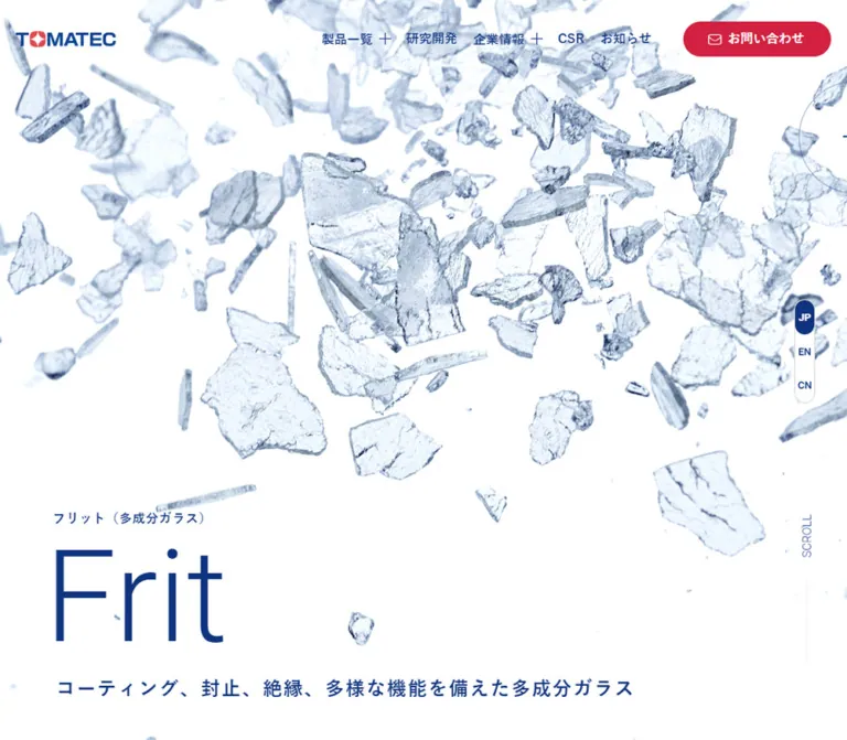
TOMATEC|素材の造形と青のタイポグラフィが映える企業サイト
大きな英文製品名、素材のビジュアル、非対称の曲線、濃紺のフッターで構成された材料メーカーの企業サイト。デスクトップとモバイルの実測値を含むデザイン資料。
TOMATEC — Style Reference
Sculptural materials, expansive blue typography, and sweeping corners give an industrial company a clear visual identity.
Original URL: https://tomatec.co.jp/ Final URL: https://tomatec.co.jp/ Theme: light product and information areas, alternating with slate and deep navy sections; no theme selector was observed. Inspected: October 2, 2026 JST. Supplied evidence retrieval timestamp: October 1, 2026, 16:33:39.726 UTC. Viewports: desktop 1440 × 1000 and mobile 390 × 844 CSS pixels. Scope: the current Japanese corporate homepage, including the captured brand screen, product hero, product rail, global statistics, research section, information rail, company/CSR/recruitment pathways, footer, and cookie notice. The supplied evidence includes three desktop captures, two mobile captures, and rendered DOM/computed styles covering the homepage. Linked destinations and expanded controls were not inspected.
TOMATEC uses large, light English product names alongside compact, bold Japanese labels. Blue supplies the identity and most interface emphasis; red appears selectively in the desktop contact action and small accents. White material imagery creates an unusually open product presentation, while a seedling photograph introduces environmental themes. Large curves belong to section boundaries and prominent destination panels rather than every content block.
This is a corporate navigation hub with several parallel purposes: finding materials, understanding research and overseas operations, reading announcements, exploring the company, and making contact. Its hierarchy alternates between spacious editorial sections and horizontally arranged content. Preserve that breadth when adapting the design.
閉じる
TOMATEC — Style Reference
Sculptural materials, expansive blue typography, and sweeping corners give an industrial company a clear visual identity.
Original URL: https://tomatec.co.jp/ Final URL: https://tomatec.co.jp/ Theme: light product and information areas, alternating with slate and deep navy sections; no theme selector was observed. Inspected: October 2, 2026 JST. Supplied evidence retrieval timestamp: October 1, 2026, 16:33:39.726 UTC. Viewports: desktop 1440 × 1000 and mobile 390 × 844 CSS pixels. Scope: the current Japanese corporate homepage, including the captured brand screen, product hero, product rail, global statistics, research section, information rail, company/CSR/recruitment pathways, footer, and cookie notice. The supplied evidence includes three desktop captures, two mobile captures, and rendered DOM/computed styles covering the homepage. Linked destinations and expanded controls were not inspected.
TOMATEC uses large, light English product names alongside compact, bold Japanese labels. Blue supplies the identity and most interface emphasis; red appears selectively in the desktop contact action and small accents. White material imagery creates an unusually open product presentation, while a seedling photograph introduces environmental themes. Large curves belong to section boundaries and prominent destination panels rather than every content block.
This is a corporate navigation hub with several parallel purposes: finding materials, understanding research and overseas operations, reading announcements, exploring the company, and making contact. Its hierarchy alternates between spacious editorial sections and horizontally arranged content. Preserve that breadth when adapting the design.
How to Read This Reference
- Measured means supplied computed styles or element rectangles. Measurements describe the captured state, not a verified source stylesheet formula.
- Derived means arithmetic using measured rectangles, such as the distance between adjacent cards.
- Estimated means visual judgment from the original-page screenshots. Estimated values are not pixel samples.
- Recommended means implementation guidance for a new project. The CSS and prompts below are adaptations, not recovered source code.
- Token names beginning with
--tm-are reference aliases. They were not exposed by the original website. - The desktop opening image and mobile product hero show different states. Their timing and transition relationship were not established.
- Repeated hero labels and offscreen elements exist in the DOM. They must not be interpreted as simultaneously visible paragraphs or evidence of page-wide horizontal overflow.
- Cookie notices obscure substantial portions of the captured page. Content underneath those notices is described only where supported by other supplied evidence.
Tokens — Colors
Default Palette
| Name | Value | Reference token | Evidence and role |
|---|---|---|---|
| Corporate Blue | #0f347f |
--tm-blue |
Measured navigation, product titles, research copy, active information category, and consent button |
| Contact Red | #d22141 |
--tm-red |
Measured desktop contact-link background |
| Footer Navy | #061e4e |
--tm-navy |
Measured footer background |
| Global Slate | #384153 |
--tm-slate |
Measured overseas-operations section background |
| Blue Mist | #dde2ed |
--tm-mist |
Measured research background and text on dark sections |
| Card Ice | #f1f4f8 |
--tm-card |
Measured information-card background |
| Body Charcoal | #1d1d1f |
--tm-text |
Measured ordinary product descriptions and cookie copy |
| White | #ffffff |
--tm-white |
Measured reversed control text and group-logo surface; the product canvas also appears white |
| Secondary Footer Text | rgba(221,226,237,.8) |
--tm-footer-muted |
Measured subordinate desktop footer links |
| Inactive Category Text | rgba(15,52,127,.2) |
--tm-category-muted |
Measured unselected information-category links |
The cookie panel appears close to the pale information-card surface, but its own background declaration was not included. Reusing #f1f4f8 for that panel is a recommended approximation.
The contact field visible on the right of the desktop footer appears blue against the darker footer. Its containing element's fill was not supplied; use Corporate Blue as a visual approximation rather than reporting it as an independently measured color.
Natural greens, brown soil, silver-white material highlights, and photographic shadows come from imagery. They are not additional interface theme colors.
Color Behavior
The hierarchy uses three distinct dark tones: blue for identity and actions, slate for global reach, and navy for the footer. Keeping these separate matters more than introducing additional accents.
Two source custom properties were exposed: --swiper-theme-color: #007aff and --swiper-navigation-size: 44px. These are library-named values. They do not establish the site's brand blue, actual control dimensions, slider configuration, or animation timing.
Tokens — Typography
Japanese Interface and Body Copy
Measured source stack: 游ゴシック, YuGothic, "ヒラギノ角ゴ Pro", "Hiragino Kaku Gothic Pro", メイリオ, Meiryo, sans-serif.
Navigation, product labels, research copy, and key statements commonly use weight 700. Product descriptions use 400. Cookie copy uses a computed weight of 300; the exact rendered weight depends on the available system font.
The combination is intentionally uneven in scale: short Japanese labels are compact and strong, while English product names are much larger and lighter. Do not make every heading bold.
English Display and Language Controls
Measured source family: Roboto, sans-serif on English hero names and language links.
Hero product names use weight 300. Language controls use 700. The wide, light English section titles are visually consistent with this display approach, but their child-span computed styles were not included. Roboto 300 is therefore a recommended match for those section titles, not an independently measured declaration.
Root and Wrapper Sizes
The measured root size is 10px at both viewports. Main content wrappers use 14px, but most readable text overrides that value. The 14px computed size of an H2 wrapper does not describe the large English word inside it.
The Quick Start retains the browser's normal root size and uses explicit component sizes. Do not copy source rem assumptions into a project with a different root size.
Type Scale
Values below are font size / line height. Both columns are measured unless marked otherwise.
| Role | Desktop | Mobile | Weight and character |
|---|---|---|---|
| English hero product name | 160 / 160px |
64 / 64px |
Roboto 300 |
| Japanese hero category | 16 / 16px |
15 / 15px |
700, tracking 0.04em |
| Hero supporting statement | 24 / 37.68px |
14 / 21.98px |
700, tracking 0.08em |
| English major section title | Approximately 80px |
Approximately 40px |
Estimated; light sans serif |
| Desktop primary navigation | 16 / 16px |
Hidden in the captured compact header | 700 |
| Product-section introduction | 24 / 48px |
18 / 32.04px |
700, tracking 0.01em |
| Product-card title | 20 / 30px |
18 / 28.8px |
700, tracking 0.01em |
| Product-card description | 16 / 27.04px |
16 / 27.04px |
400, tracking 0.01em |
| Global lead statement | 32 / 56.96px |
18 / 32.04px |
700 |
| Global and research paragraphs | 16 / 32px |
16 / 32px |
700 |
| News-card title | 16 / 27.008px |
16 / 27.008px |
700 |
| Information-category link | 16 / 16px |
14 / 14px |
700 |
| Main footer link | 14 / 14px |
16 / 16px for ordinary link rows |
700 |
| Subordinate desktop footer link | 13 / 15.6px |
Not visible in the collapsed capture | 400 |
| Cookie paragraph | 14 / 25.2px |
12 / 21.6px |
300 |
| Language link | 13 / 13px |
12 / 18px |
Roboto 700 |
The consent button is separately measured on mobile as Arial, 13px, weight 300. This is a control-specific fallback, not the site's display family.
The global figures appear approximately 120–128px on desktop, with much smaller labels and stacked unit qualifiers. Their individual text styles were not supplied.
Tokens — Spacing & Shapes
Density: broad section spacing, restrained navigation, tall product media, and compact news cards. Structural rhythm: large English heading, smaller Japanese label, a substantial gap, then copy or linked content.
Spacing Scale
| Use | Value | Evidence |
|---|---|---|
| Mobile page gutter | 20px |
Measured across main sections and footer rows |
| Header left inset | 20px at both widths |
Measured logo position |
| News-card inset | 17px |
Measured |
| Desktop product/news rail gap | 40px |
Derived from consecutive card rectangles |
| Mobile product gap | 25px |
Derived from 277 − 20 − 232 |
| Mobile news gap | 15px |
Derived from 255 − 20 − 220 |
| Heading top allowance | 40px |
Measured H2 padding |
| Cookie copy-to-actions gap | 27px |
Derived at both viewports |
| Cookie left/right inset | 56px / 48px |
Derived from screenshot panel edges and measured text boxes |
| Research content top inset | 120px desktop; 70px mobile |
Derived from section and heading rectangles |
| Major desktop section spacing | Commonly 150–190px |
Measured section padding; varies by section |
There is no evidence of a single universal spacing unit. Retain the meaningful component values instead of forcing every measurement onto an eight-pixel scale.
Border Radius
| Element | Value | Status |
|---|---|---|
| News card | 10px |
Measured |
| Desktop header contact link | 50px |
Measured; produces a pill on a 44px control |
| Mobile consent button | 17.5px |
Measured on a 35px control |
| News previous/next button | 35px |
Measured on a 76 × 35px box |
| Active news category | Bottom-right 32px desktop, 24px mobile |
Measured; remaining corners are square |
| Global section | Top-right 262.8px desktop, 71.175px mobile |
Measured |
| Cookie notice | Approximately 50px at top-left |
Screenshot estimate |
| Footer contact field | Very large top-left curve, approximately 250–270px on desktop |
Screenshot estimate |
| Circular destination arrows | Approximately 100px diameter on photo panels; 70px in desktop Contact |
Screenshot estimates |
The Global corner measurements equal 18.25vw at both supplied widths. This is a compatible derived formula, not a recovered source declaration.
Use a small number of purposeful curves: a major section corner, a destination field, a notice corner, and circular arrows. Product imagery and normal layout boundaries do not need rounded-card styling.
Layout Measurements
| Element | Desktop | Mobile |
|---|---|---|
| Header | 1440 × 100px |
390 × 75px |
| Logo heading box | Approximately 171.63 × 28.77px |
124 × 20.78px |
| Main research/news content width | 1240px, beginning at x=100 |
350px, beginning at x=20 |
| Product introduction width | 1030px, beginning at x=205 |
350px, beginning at x=20 |
| Global heading container | 1200px, beginning at x=120 |
350px, beginning at x=20 |
| Product-card width | 350px |
232px |
| News-card box | 258 × 245px |
220 × 245px |
| Company/CSR/Recruit panel | Each 480 × 688.06px, side by side |
Each 390 × 240px, stacked |
| Cookie notice outer box | Approximately 540 × 272px |
Approximately 390 × 272px |
| Cookie paragraph width | 436px |
286px |
The different desktop container widths are intentional evidence. A single max-width applied to every section would lose the inward product introduction and wider research/information alignment.
Components
Corporate Header
Role: identity, major site destinations, contact access, and language selection.
The desktop header is 100px tall. The logo begins at x=20; six blue navigation links occupy the right side, followed by a red contact pill. The links use bold 16px Japanese type, with several adjacent navigation gaps measuring 40px.
The contact link measures 185 × 44px, with white text, a 50px radius, and measured padding of 13px 13px 13px 35px. Its source transition covers background and text color over 0.3s; the resulting hover colors were not captured.
At 390px, the header becomes 75px tall. The logo is 124px wide, the visible JP capsule is 50 × 18px at x=250, and a two-line menu graphic occupies a measured 48 × 10px button box at x=322, y=32.
The desktop language links form a vertical group near the right edge, each 24px wide and approximately 42.67px tall. Mobile DOM evidence contains JP, EN, and CN, but only the current JP capsule is visible in the screenshot. The reveal mechanism was not exercised.
Header stickiness, menu contents, keyboard behavior, and language-selector expansion are unverified. The header is absent from the lower-page screenshots; do not assume it remains fixed while scrolling.
Captured Brand Screen
Role: an identity-focused state shown in the first desktop capture.
A seedling rises from sharply detailed soil into a dark green, defocused background. The plant is centered near the bottom. A white TOMATEC logo sits above it, followed by the italic line “always for you and with you” and the Japanese statement “社会とつながる、世界に広がる、暮らしを彩る”.
The photograph fills the 1440 × 1000 capture. Logo and copy are centered, with ample dark space supporting legibility. There are no visible header or cookie controls in this frame.
This state must not be assigned an invented duration or loading mechanism. The evidence does not establish whether it is an opening overlay, a hero state, or another timed presentation. A new implementation should keep core navigation reachable independently of any introductory sequence.
Product Hero
Role: introduces material families through a dominant visual and a bilingual product identity.
The mobile capture shows Gelcoat: a glossy white, ribbon-like liquid form against white space. The material extends beyond the crop. Its visual region ends near y=400, followed by the bold Japanese category, a large light-blue English product name, and a thin outlined circular arrow toward the right.
The visible Gelcoat name uses the measured 64px / 64px, weight 300, Roboto treatment. Desktop hero names are measured at 160px / 160px. The mobile category begins near x=19; the English name begins at x=16.
Hero content in the rendered DOM includes Advanced material, Frit, Pigment, Gelcoat, and Fertilizer, with repeated entries. Supporting Japanese descriptions are also present. The duplicates are consistent with a changing or looped presentation, but its movement, autoplay interval, clipping implementation, and input controls were not tested.
The cookie panel starts at approximately y=572 on mobile, concealing the supporting description and lower hero content. The supplied DOM places the supporting copy around y=586; its absence from the screenshot is not evidence that it was removed.
Bilingual Section Heading
Role: creates a consistent hierarchy across Products, Global, Research & Development, Information, and the lower company pathways.
The anatomy is a small accent mark, generous vertical separation, a large light English heading, and a smaller bold Japanese label. A short blue/red mark is visible above the research heading. The measured heading wrappers reserve 40px of top padding.
The desktop research heading spans a broad single line. Its English size is visually about 80px. On mobile, the research heading wrapper is 139px high compared with 99px for shorter section names, consistent with an additional display line. The exact child-span styles were not supplied; approximately 40px is a practical mobile starting point.
Do not compress the long research title into a tiny single line. Allow it to wrap while maintaining the English/Japanese scale difference.
Product Rail
Role: exposes six material categories without turning the homepage into a dense catalog grid.
The product introduction is narrower than the general desktop content area. Below it, a horizontal series of linked product entries starts at x=205. Cards measure 350px wide with 40px gaps. On mobile they measure 232px with 25px gaps, starting at x=20; part of the next card remains beyond the visible width.
Each entry contains a large media region, a bold blue Japanese title, and a smaller charcoal description. The measured distance from entry top to title top is 570px on desktop and 380px on mobile. These distances include media and spacing; they are not verified image heights.
Titles change from 20px / 30px to 18px / 28.8px, while descriptions remain 16px / 27.04px. Long category names wrap naturally. Desktop content exposes PREV and NEXT; mobile does not show those labels in the rendered text summary. Swipe and button behavior remain unverified.
The final product-list link is right aligned on desktop, around x=1155, but begins at x=20 on mobile. Preserve this responsive change rather than shrinking the entire desktop rail layout.
Global Section and Statistics
Role: connects the material business to international reach.
A slate section introduces a strong change in tone. Its top-right corner is dramatically rounded. Blue Mist text sits above a dark world-map graphic visible in the desktop capture.
The desktop introduction uses multiple adjacent text regions: a bilingual heading, a bold statement, and a 16px / 32px paragraph. On mobile the statement and paragraph stack in the 350px content width.
Three desktop metrics appear over the map:
- “輸出国”: 70 countries or more.
- “海外生産比率”: 67% or more.
- “海外販売比率”: 60% or more.
Each metric has a small bold label, a much larger light number, and a compact stacked qualifier. Fine dotted vertical dividers separate the groups. Exact number styles and divider declarations were not provided.
The mobile DOM retains all three metrics, but their internal mobile arrangement is not documented by a screenshot or individual rectangles. A stacked metric arrangement is a recommendation for narrow screens, not an observed fact. No count-up animation was verified.
Research & Development Section
Role: presents a research statement and a distinct route into technical content.
The section uses the measured pale #dde2ed background and blue text. On desktop, the heading begins 120px below the section start; the body occupies approximately 583px on the left. The paragraph uses bold 16px / 32px, giving it a strong but unhurried reading rhythm.
A blue destination panel sits to the right. Its internal research link measures approximately 369 × 106px and uses bold 18px text. The outer panel is partially hidden by the cookie notice, so that link rectangle must not be substituted for the background panel's full dimensions.
The screenshot shows a broad curved boundary toward the lower left, revealing image content beneath. The sampled outer SECTION has a zero border radius; the visible curve therefore cannot be confidently assigned to that element. Reproduce it with a separate decorative layer when adapting the design.
On mobile, the paragraph spans the full 350px content width. The research link moves below it and measures 320 × 105px at x=50. The section retains substantial lower visual space: measured bottom padding changes from 460px to 235px.
Information Categories
Role: provides routes to announcement categories.
The category row sits between the bilingual heading and the news rail. The selected “全て” link has blue fill, pale text, and only its bottom-right corner rounded. It measures 102 × 52px on desktop and 83 × 40px on mobile.
Unselected categories are measured as blue at 20% opacity. Their contrast is weak; this is a source observation, not a recommendation. They are links to category URLs, so do not assume they are disabled controls or in-place AJAX filters.
The mobile category positions continue beyond the right edge. Keep the row horizontally reachable in an adaptation. Its exact original overflow and gesture behavior was not tested.
News Card and Rail Controls
Role: exposes dated company notices, environmental updates, exhibition information, and press releases.
News cards use #f1f4f8, 10px corners, and blue content. The anatomy is a date/category area, a bold title, and an action label such as “PDFを開く” or “詳しく見る”. Each card is an anchor whose destination may be a PDF or an article.
Desktop cards measure 258 × 245px, separated by 40px. Mobile cards measure 220 × 245px, separated by 15px. Text padding is 17px at the top and sides. The supplied bottom padding changes from 95px to 30px; preserve room for the action without assuming the title consumes the entire card.
Titles stay 16px / 27.008px across viewports. The first title grows from two measured lines on desktop to three on mobile. Equal captured card heights coexist with variable text length.
Previous/next buttons measure 76 × 35px, with a 9px gap. They appear above the rail at the desktop right, then below the rail at the mobile left. The next button has a measured blue fill. The all-articles link sits separately to the right.
Desktop cards declare a box-shadow 0.3s transition. The actual hover shadow was not captured, so this does not establish a general elevation system.
Company, CSR, and Recruit Pathways
Role: connects the product-led homepage to the rest of the organization.
Three photographic destinations occupy equal desktop thirds. The current captures show a building facade, the seedling, and a group of people. Dark blue-toned overlays unify the images and support pale text and thin circular arrows.
Each desktop panel measures 480 × 688.06px. Company content includes a paragraph and subsidiary links; CSR includes explanatory copy. On mobile the panels become three 390 × 240px blocks, and the rendered text summary retains the main bilingual headings while omitting the desktop explanatory content.
The transition is structural: tall, detailed columns become shallow, stacked destinations. Do not preserve the entire desktop text density inside a 240px mobile panel.
The sampled panels declare 0.3s transitions, but their hover end states and clickable-region behavior were not exercised. Avoid nesting links inside another full-panel anchor when implementing the Company panel's subsidiary destinations.
Footer and Contact Field
Role: complete navigation, contact/catalog routes, and corporate identification.
The footer uses the measured #061e4e background. Desktop navigation is arranged in three groups toward the left: products, company information, and general destinations/policies. Main links use 14px bold text; subordinate links use 13px regular text at reduced opacity.
The right side contains a much larger blue field with a sweeping top-left curve. Contact is visually prominent, with a light English title, a small Japanese label, a fine rule, and a circular arrow. The DOM also records a Catalog destination linking to an external catalog service; that lower area is substantially obscured in the desktop screenshot.
The footer identifies TOMATEC株式会社, gives its Osaka address and telephone number, and includes a linked Toyo Seikan Group logo on a white pill-shaped surface. This identity is supported by the inspected homepage itself.
At 390px, Contact and Catalog precede a vertical footer navigation list. Products and company information are measured as buttons, and the company row shows a plus sign. Ordinary navigation rows show right-pointing chevrons and fine dividers. The buttons are 350 × 64px; ordinary link rows are 350 × 62px, with an approximately one-pixel separator between rows.
The collapsed presentation is observed. Opening, closing, animation, focus management, and persistence of those groups were not tested.
Cookie Notice
Role: persistent information and consent controls over the page.
The desktop notice occupies the lower-right corner at approximately x=900, y=728, with a 540 × 272px outer box. On mobile it spans the viewport from approximately y=572 to 844. Both captures show one strongly rounded top-left corner and square remaining edges.
The copy begins 56px from the left and approximately 45px from the top. Its measured width is 436px on desktop and 286px on mobile. Below it, an underlined “詳細はこちら” link sits left and a blue “同意する” pill sits right, separated from the paragraph by 27px.
The mobile consent control is exactly 134 × 35px with a 17.5px radius. The desktop control appears similar. Its dismissal and persistence were not exercised.
The notice remains in the same viewport location across different scroll captures, supporting a viewport-anchored implementation. Its exact positioning CSS and any backdrop were not supplied. It should not automatically be treated as a modal dialog.
At 390 × 844, its approximately 272px height covers 32.2% of the viewport. This significantly affects what is visible in the hero and footer. Keep that obstruction explicit when assessing the screenshots.
Tokens — Motion & Interaction
| Element | Supplied evidence | What remains unverified |
|---|---|---|
| Desktop ordinary links | opacity 0.3s |
Trigger, final opacity, and keyboard equivalent |
| Desktop contact link | background-color 0.3s, color 0.3s |
Hover/focus endpoint colors |
| Desktop news cards | box-shadow 0.3s |
Shadow size, color, and elevation |
| Company/CSR/Recruit panels | 0.3s transition |
Which visible properties change |
| Mobile language links | 0.3s transition |
Expansion trigger and transition geometry |
| Hero product presentation | Repeated product labels and different captured states | Autoplay, sequence, timing, motion path, and pause controls |
| Product/news rails | Horizontal geometry and previous/next controls | Dragging, swipe support, wrapping, and easing |
| Global figures | Final numeric values are visible | Any count-up behavior |
| Cookie notice | Present across scroll positions | Dismissal animation and saved state |
| Mobile footer groups | Button semantics and plus indicator | Expansion behavior and animation |
Many sampled elements report animation: none, while some report only transition: all without a nonzero duration. Neither establishes that the whole page is static. JavaScript, unsampled descendants, imagery, and other layers can behave independently.
The collection process waited for finite visible motion and layout stability, with bounded readiness checks. Perpetual animations were paused during checks and then resumed. These conditions support stable captures but do not reveal interaction timing or prove that every delayed state was reached.
Recommended motion language: restrained 200–300ms control feedback, short opacity changes, and simple panel transitions. Do not invent continuous 3D movement, scroll parallax, numerical counting, or a mandatory splash delay from these screenshots.
Surfaces
| Layer | Appearance | Purpose |
|---|---|---|
| Product canvas | White with blue typography | Makes material imagery and large names dominant |
| Product entry | Open media/text composition | Category discovery without a heavy card container |
| Global section | Slate with pale text and a darker map | International scale and statistical emphasis |
| Research section | Blue Mist with blue copy | A quieter technical narrative |
| News card | Card Ice, 10px corners |
Compact repeated editorial content |
| Photo pathway | Darkened photography with pale details | Company, environmental, and recruitment routes |
| Footer | Deep navy | Dense navigation and corporate information |
| Contact field | Blue, large asymmetrical curve | A prominent destination within the footer |
| Cookie notice | Pale panel, one rounded corner | Persistent utility content above the page |
Separation comes primarily from large color fields, section geometry, and image contrast. The supplied desktop news-card transition allows localized shadow feedback; it does not justify applying shadows throughout the design.
Imagery
Two visual modes define the available current-page captures.
The first is material as an object: the mobile Gelcoat image is glossy, pale, fluid, and sculptural. Highlights carry the shape while the background stays white. Its crop extends beyond the viewport, making the material feel larger than a conventional product packshot.
The second is corporate and environmental photography: a seedling in detailed soil, a building facade, and people. The brand screen uses dark natural bokeh for centered white copy. The lower pathways use blue-toned darkening to bring unrelated photographs into the site's palette.
The world map is a low-contrast graphic behind the global metrics. It supports the numbers without competing with them. Use crisp outlines for arrows, chevrons, plus signs, and rules; there is no evidence of a decorative illustration-based icon system.
Observed Asset References
No image source URLs or filenames were included in the supplied original-page evidence. The following inventory describes visible assets without inventing paths.
| Asset | Evidence | Reuse guidance |
|---|---|---|
| TOMATEC logo, blue/red version | Mobile header capture | Preserve the supplied mark and proportions; do not recreate it with ordinary text |
| White TOMATEC logo | Desktop brand capture | Use only on a sufficiently dark image region |
| Seedling and soil photograph | Desktop brand screen and CSR pathway | Keep the plant focal point and material detail in the soil |
| White liquid/material form | Mobile Gelcoat hero | Preserve specular detail and intentional edge cropping |
| World-map graphic | Desktop global statistics capture | Keep contrast lower than the metrics |
| Building facade photograph | Desktop Company pathway | Crop as architectural texture behind navigation |
| Group photograph | Desktop Recruit pathway | Maintain meaningful subjects when changing aspect ratio |
| Toyo Seikan Group mark | Desktop footer capture and homepage link | Keep it as a separate corporate mark on its white surface |
Individual product-rail images and the full research image treatment were not documented sufficiently to prescribe exact crops. Use approved assets when available. The CSS shell alone cannot reproduce the material photography or brand marks.
Layout & Responsive Behavior
Measured Section Rhythm
| Region | Desktop | Mobile |
|---|---|---|
| Products | Height 1517.03px; padding 190px 0 170px |
Height 985.75px; padding 85px 0 70px |
| Global | Height 795px; padding 150px 0 180px |
Height 862.03px; padding 75px 0 |
| Research | Height 1089px; bottom padding 460px |
Height 763px; bottom padding 235px |
| Information | Height 1034px; padding 185px 0 190px |
Height 785px; padding 100px 0 150px |
| Lower pathways | Three adjacent 480px columns |
Three stacked 240px-high sections |
| Footer | Height 696px; padding 120px 0 35px |
Height 1307.5px; padding 45px 0 85px |
These heights belong to the captured content. They should guide proportions, not become rigid production heights that clip translations or expanded content.
The desktop document is approximately 6833.09px tall. The mobile document is approximately 6106.28px tall. The shorter mobile document does not mean everything simply shrinks: the footer becomes taller, the Global paragraph becomes longer, and the detailed lower photo columns become much shallower destinations.
Structural Changes
- The header switches from a full navigation row to a logo, compact language capsule, and menu control.
- Hero display type reduces from
160pxto64px; the Japanese category changes only from16pxto15px. - Main content usually moves to
20pxside gutters. Desktop product, global, and general content use different widths. - Product and information collections remain horizontal rails, with narrower cards and smaller gaps.
- Global introductory text stacks. The research paragraph and destination link also stack.
- News navigation moves from the desktop upper-right area to the mobile lower-left area.
- Company, CSR, and Recruit become vertically stacked blocks with less visible supporting text.
- Footer link groups become full-width rows, with collapsed product/company groups.
- The cookie notice changes from a right-side panel to a full-width bottom panel while keeping unusually large inner insets.
Only two viewport widths were supplied. The original breakpoint values and intermediate tablet behavior are unknown. The 64rem breakpoint in the Quick Start is a recommendation, not a source measurement.
Some hero text rectangles extend far beyond the mobile viewport, including a measured 1373px category track. These describe internal presentation layers. Keep overflow contained at the relevant hero or rail boundary rather than imposing that width on the whole page.
Do’s and Don’ts
Do
- Preserve the measured blue, red, slate, navy, and pale-surface distinctions.
- Pair very large, light English product names with small, bold Japanese labels.
- Keep different desktop content widths for the product introduction and wider editorial sections.
- Use asymmetrical curves on major surfaces and simple circular arrows for destinations.
- Let product imagery occupy a large, uncluttered region.
- Retain horizontal product and news rails on narrow screens.
- Keep body text readable while reducing display type and vertical spacing.
- Treat company, research, news, recruitment, and contact as separate navigation goals.
- Preserve the compact date/category/title/action anatomy of news cards.
- Account for the cookie notice when reviewing visible content and implementing bottom-page access.
Don't
- Don't turn the corporate homepage into a single-offer conversion page.
- Don't replace all open product entries with identical rounded cards.
- Don't use green photography as evidence for a green interface palette.
- Don't flatten slate, corporate blue, and footer navy into one dark color.
- Don't make every English title bold or uppercase.
- Don't interpret duplicate hero DOM labels as simultaneous visible content.
- Don't claim verified autoplay, count-up animation, parallax, or menu transitions.
- Don't use the wrapper
H2size as the actual English display size. - Don't apply card shadows to every section based on one news-card transition.
- Don't force the desktop hero scale or footer columns onto the phone layout.
- Don't invent image paths, font families, asset formats, or production credits.
Recommended Implementation Additions
These are improvements for an adaptation, not verified features of the inspected site:
- Enlarge the effective touch targets of the language capsule, menu button, rail controls, and consent button to at least
44 × 44pxwhile preserving their visual proportions where possible. - Give icon-only arrows and menu controls explicit accessible names and visible keyboard focus.
- Implement footer expansion buttons with
aria-expandedandaria-controls, or use a carefully styled native disclosure pattern. - Keep inactive category links readable. The measured
20%blue treatment should not be copied as a readability target. - Keep rails keyboard accessible and provide a clear way to reach content outside the viewport. Ensure offscreen items do not create page-wide overflow.
- If the hero changes automatically, provide pause behavior, synchronize labels with imagery, and remove inactive duplicates from the accessibility tree.
- Provide reduced-motion and static-image alternatives without delaying access to navigation.
- Ensure the cookie notice can be dismissed as designed and that underlying footer content remains reachable. Do not add modal focus trapping unless the component actually requires modal behavior.
- Allow notice copy and controls to reflow under text zoom and on screens narrower than the inspected phone.
- Preserve PDF/external-destination labels on news and catalog links; their destination type is meaningful to the user.
- Provide suitable alternative text for meaningful material and recruitment imagery, while keeping decorative maps and overlays out of the reading order.
Agent Prompt Guide
Quick Color Reference
- Primary identity and text emphasis:
#0f347f. - Desktop header contact action:
#d22141with white text. - Global section:
#384153with#dde2edtext. - Research surface:
#dde2edwith blue text. - News cards:
#f1f4f8with blue titles. - Footer:
#061e4e, pale navigation, white corporate details. - Cookie notice: pale panel; blue consent pill; underline the details link.
- Fine rules and photo overlays: derive from the relevant blue/pale pair; exact opacity requires project-specific tuning.
Overall Prompt
“Create a Japanese materials-company homepage inspired by the observed TOMATEC design. Use white product areas, corporate blue #0f347f, a restrained red #d22141 contact action, slate global content, a pale blue research section, and a deep navy footer. Pair light Roboto English display names with bold Japanese system-sans labels. Present material imagery at large scale with generous white space. Build horizontal product and news rails, a world-map statistics section, a research statement with a prominent destination panel, and company/CSR/recruitment photo pathways. Use a few oversized asymmetrical corners and thin circular arrows. At 390px, use 20px gutters, a compact header, 64px hero product names, narrow horizontal cards, and stacked footer navigation. Treat motion and expanded states as separate implementation requirements; do not infer them from static captures.”
Example Component Prompts
- Product hero: “Use a white background and a large glossy white material form cropped beyond the image edges. Below it, place a bold Japanese material category and a light blue English product name. Use Roboto 300 at 160px on a wide desktop and 64px on a 390px phone. Add a thin circular destination arrow. Keep supporting copy legible and allow long names to adapt.”
- Product rail: “Create open product entries with dominant media, blue Japanese titles, and charcoal descriptions. Use 350px cards with 40px gaps on desktop; 232px cards with 25px gaps on mobile. Keep the rail horizontal and leave the next item discoverable.”
- Global panel: “Create a slate #384153 section with a large rounded top-right corner and pale #dde2ed text. Place a subdued world-map graphic behind three oversized statistics. Each metric has a bold label, light number, and compact unit qualifier. Use dotted dividers between desktop metrics; do not add an unrequested counter animation.”
- News card: “Create a 258px-wide pale #f1f4f8 news card with 10px corners, 17px inner padding, a date/category line, a blue 16px bold title, and a bottom destination label. On mobile use 220px width and a 15px rail gap. Allow the card to grow if text requires it.”
- Footer: “Use a deep navy footer with grouped pale navigation and a large blue Contact field with a sweeping top-left curve. Include a thin outlined arrow and smaller Japanese subtitle. On mobile stack the contact routes above full-width divider rows and accessible expandable product/company groups.”
- Cookie notice: “Create a pale bottom-right panel about 540px wide with only its top-left corner rounded by about 50px. Use generous inner insets, a paragraph, an underlined details link, and a blue consent pill. At 390px make it full-width, permit text reflow, and keep both actions reachable.”
Quick Start
CSS Custom Properties
This is a usable visual foundation with descriptive class names. It uses the measured palette, card widths, gaps, and text sizes. Section-heading sizes, media proportions, photo tint, cookie fill, and breakpoint are explicitly recommended approximations. Native horizontal scrolling substitutes for the unverified original carousel implementation.
Load Roboto separately if available and authorized; no font URL was supplied. The CSS does not implement a timed brand screen, hero switching, cookie persistence, menu expansion, or rail-button logic.
Expected anatomy: .tm-section-heading contains .tm-heading-en and .tm-heading-ja; each .tm-product-card is a link containing media, a heading, and a paragraph; .tm-news-card is a link containing metadata, a heading, and .tm-card-action. The cookie notice contains a paragraph and .tm-cookie-actions with a details link and native button.
:root {
  /* Measured colors; descriptive aliases */
  --tm-blue: #0f347f;
  --tm-red: #d22141;
  --tm-navy: #061e4e;
  --tm-slate: #384153;
  --tm-mist: #dde2ed;
  --tm-card: #f1f4f8;
  --tm-text: #1d1d1f;
  --tm-white: #ffffff;
  --tm-footer-muted: rgba(221, 226, 237, 0.8);

  /* Measured source families */
  --tm-font-jp: '游ゴシック', YuGothic, 'ヒラギノ角ゴ Pro',
    'Hiragino Kaku Gothic Pro', 'メイリオ', Meiryo, sans-serif;
  --tm-font-en: Roboto, sans-serif;

  /* Mobile measurements */
  --tm-gutter: 20px;
  --tm-header-height: 75px;
  --tm-logo-width: 124px;
  --tm-hero-size: 64px;
  --tm-product-width: 232px;
  --tm-product-gap: 25px;
  --tm-news-width: 220px;
  --tm-news-gap: 15px;
  --tm-card-radius: 10px;

  /* Derived or recommended adaptations */
  --tm-section-size: 40px;
  --tm-global-curve: 18.25vw;
  --tm-cookie-radius: 50px;
  --tm-cookie-fill: var(--tm-card);
  --tm-feedback: 300ms;
}

* { box-sizing: border-box; }

.tm-page {
  margin: 0;
  color: var(--tm-text);
  background: var(--tm-white);
  font-family: var(--tm-font-jp);
  font-size: 16px;
  line-height: 1.69;
}

.tm-page a { color: inherit; }
.tm-page img { display: block; max-width: 100%; }
.tm-page button { font: inherit; }

.tm-container {
  width: min(1240px, calc(100% - 2 * var(--tm-gutter)));
  margin-inline: auto;
}

.tm-container--intro { max-width: 1030px; }
.tm-container--global { max-width: 1200px; }

.tm-header {
  min-height: var(--tm-header-height);
  padding-inline: 20px;
  display: flex;
  align-items: center;
  justify-content: space-between;
  gap: 24px;
}

.tm-logo { width: var(--tm-logo-width); flex: none; }
.tm-desktop-nav { display: none; }
.tm-mobile-tools { display: flex; align-items: center; gap: 22px; }

.tm-contact-pill {
  display: inline-flex;
  align-items: center;
  justify-content: center;
  width: 185px;
  min-height: 44px;
  padding: 13px 13px 13px 35px;
  border-radius: 50px;
  color: var(--tm-white) !important;
  background: var(--tm-red);
  font-size: 16px;
  font-weight: 700;
  line-height: 1;
  text-decoration: none;
  transition: background-color var(--tm-feedback),
    color var(--tm-feedback);
}

.tm-hero { overflow: clip; color: var(--tm-blue); }

.tm-hero-media {
  /* Recommended image region, not a recovered source height */
  height: clamp(325px, 45vw, 650px);
  overflow: hidden;
}

.tm-hero-media img {
  width: 100%;
  height: 100%;
  object-fit: cover;
}

.tm-hero-copy { padding: 30px 20px 48px; }
.tm-hero-kicker { font-size: 15px; font-weight: 700; letter-spacing: .04em; }

.tm-hero-name {
  margin: 28px 0;
  font-family: var(--tm-font-en);
  font-size: var(--tm-hero-size);
  font-weight: 300;
  line-height: 1;
  overflow-wrap: anywhere;
}

.tm-hero-description {
  font-size: 14px;
  font-weight: 700;
  line-height: 1.57;
  letter-spacing: .08em;
}

.tm-section-heading {
  position: relative;
  margin: 0;
  padding-top: 40px;
  color: var(--tm-blue);
}

.tm-section-heading::before {
  /* Visual approximation of the small two-color accent */
  content: '';
  position: absolute;
  top: 0;
  left: 5px;
  width: 18px;
  height: 5px;
  border-radius: 2px;
  background: linear-gradient(90deg, var(--tm-blue) 55%, var(--tm-red) 55%);
}

.tm-heading-en {
  display: block;
  font-family: var(--tm-font-en);
  font-size: var(--tm-section-size);
  font-weight: 300;
  line-height: 1;
  overflow-wrap: break-word;
}

.tm-heading-ja {
  display: block;
  margin-top: 10px;
  font-size: 14px;
  font-weight: 700;
  line-height: 1.2;
}

.tm-products { padding-block: 85px 70px; }
.tm-product-intro {
  margin-block: 35px 60px;
  color: var(--tm-blue);
  font-size: 18px;
  font-weight: 700;
  line-height: 1.78;
}

.tm-rail {
  display: grid;
  grid-auto-flow: column;
  grid-auto-columns: var(--rail-width);
  gap: var(--rail-gap);
  overflow-x: auto;
  overscroll-behavior-inline: contain;
  scroll-snap-type: x proximity;
  scroll-padding-inline: var(--tm-gutter);
}

.tm-rail > * { min-width: 0; scroll-snap-align: start; }

.tm-product-rail {
  --rail-width: var(--tm-product-width);
  --rail-gap: var(--tm-product-gap);
  padding-inline-start: max(var(--tm-gutter), calc((100% - 1030px) / 2));
  padding-inline-end: var(--tm-gutter);
}

.tm-product-card { text-decoration: none; }

.tm-product-media {
  /* Recommended starting ratio; exact source crops are unknown */
  width: 100%;
  aspect-ratio: 2 / 3;
  object-fit: cover;
}

.tm-product-card h3 {
  margin: 32px 0 5px;
  color: var(--tm-blue);
  font-size: 18px;
  font-weight: 700;
  line-height: 1.6;
  letter-spacing: .01em;
}

.tm-product-card p { margin: 0; font-size: 16px; line-height: 1.69; }

.tm-global {
  padding-block: 75px;
  border-top-right-radius: var(--tm-global-curve);
  color: var(--tm-mist);
  background: var(--tm-slate);
  overflow: clip;
}

.tm-global .tm-section-heading { color: inherit; }
.tm-global p { font-weight: 700; line-height: 2; }

.tm-stats {
  /* Recommended mobile stacking; original metric layout is unverified */
  display: grid;
  gap: 32px;
  margin-top: 48px;
}

.tm-stat-number {
  font-family: var(--tm-font-en);
  font-size: 64px;
  font-weight: 300;
  line-height: 1;
}

.tm-research {
  padding-block: 70px 235px;
  color: var(--tm-blue);
  background: var(--tm-mist);
}

.tm-research-grid { display: grid; gap: 40px; margin-top: 40px; }
.tm-research-copy { margin: 0; font-size: 16px; font-weight: 700; line-height: 2; }

.tm-research-destination {
  display: flex;
  align-items: center;
  justify-content: space-between;
  gap: 24px;
  min-height: 150px;
  padding: 35px 30px;
  border-radius: 18px;
  color: var(--tm-mist) !important;
  background: var(--tm-blue);
  font-size: 18px;
  font-weight: 700;
  text-decoration: none;
}

.tm-information { padding-block: 100px 150px; }

.tm-category-row {
  display: flex;
  align-items: center;
  gap: 30px;
  margin-block: 40px 55px;
  overflow-x: auto;
}

.tm-category-row a {
  flex: none;
  color: var(--tm-blue);
  font-size: 14px;
  font-weight: 700;
  text-decoration: none;
}

.tm-category-row [aria-current='page'] {
  padding: 10px 30px 10px 25px;
  border-bottom-right-radius: 24px;
  color: var(--tm-mist);
  background: var(--tm-blue);
}

.tm-news-rail { --rail-width: var(--tm-news-width); --rail-gap: var(--tm-news-gap); }

.tm-news-card {
  display: flex;
  flex-direction: column;
  min-height: 245px;
  padding: 17px;
  border-radius: var(--tm-card-radius);
  color: var(--tm-blue) !important;
  background: var(--tm-card);
  text-decoration: none;
}

.tm-news-card h3 { margin: 20px 0; font-size: 16px; font-weight: 700; line-height: 1.688; }
.tm-card-action { margin-top: auto; font-size: 14px; }

.tm-circle-arrow {
  display: inline-grid;
  place-items: center;
  flex: none;
  width: 60px;
  height: 60px;
  border: 1px solid currentColor;
  border-radius: 50%;
  font-size: 24px;
  line-height: 1;
}

.tm-pathways { display: grid; }

.tm-pathway {
  position: relative;
  isolation: isolate;
  min-height: 240px;
  padding: 70px 20px 30px;
  color: var(--tm-mist);
}

.tm-pathway > img {
  position: absolute;
  inset: 0;
  z-index: -2;
  width: 100%;
  height: 100%;
  object-fit: cover;
}

.tm-pathway::before {
  /* Recommended tint; the original overlay opacity was not measured */
  content: '';
  position: absolute;
  inset: 0;
  z-index: -1;
  background: rgb(6 30 78 / .56);
}

.tm-pathway .tm-section-heading { color: inherit; }
.tm-footer { padding-block: 45px 85px; color: var(--tm-mist); background: var(--tm-navy); }
.tm-footer-layout { display: grid; gap: 35px; }

.tm-footer-row {
  display: flex;
  align-items: center;
  justify-content: space-between;
  gap: 20px;
  width: 100%;
  min-height: 63px;
  padding-block: 20px;
  border: 0;
  border-bottom: 1px solid rgb(221 226 237 / .2);
  color: inherit;
  background: transparent;
  font-size: 16px;
  font-weight: 700;
  text-align: left;
  text-decoration: none;
}

.tm-footer-contact {
  padding: 60px 50px 45px;
  border-top-left-radius: 100px;
  background: var(--tm-blue);
}

.tm-cookie {
  position: fixed;
  right: 0;
  bottom: 0;
  z-index: 100;
  width: min(540px, 100%);
  min-height: 272px;
  max-height: calc(100dvh - 16px);
  overflow-y: auto;
  padding: 45px 48px calc(35px + env(safe-area-inset-bottom, 0px)) 56px;
  border-top-left-radius: var(--tm-cookie-radius);
  color: var(--tm-text);
  background: var(--tm-cookie-fill);
}

.tm-cookie p { margin: 0; font-size: 12px; font-weight: 300; line-height: 1.8; }
.tm-cookie-actions { display: flex; align-items: center; justify-content: space-between; gap: 20px; margin-top: 27px; }
.tm-cookie-actions a { color: var(--tm-blue); font-size: 14px; text-decoration: underline; }

.tm-cookie-consent {
  flex: none;
  width: 134px;
  min-height: 35px;
  border: 0;
  border-radius: 17.5px;
  color: var(--tm-white);
  background: var(--tm-blue);
  font-family: Arial, sans-serif;
  font-size: 13px;
  font-weight: 300;
  cursor: pointer;
}

/* Recommended focus treatment */
.tm-page :focus-visible { outline: 3px solid currentColor; outline-offset: 4px; }

/* Recommended breakpoint; original breakpoint was not supplied */
@media (min-width: 64rem) {
  :root {
    --tm-gutter: 100px;
    --tm-header-height: 100px;
    --tm-logo-width: 171.625px;
    --tm-hero-size: 160px;
    --tm-section-size: 80px;
    --tm-product-width: 350px;
    --tm-product-gap: 40px;
    --tm-news-width: 258px;
    --tm-news-gap: 40px;
  }

  .tm-desktop-nav { display: flex; align-items: center; justify-content: flex-end; flex-wrap: wrap; gap: 24px 40px; }
  .tm-desktop-nav a { color: var(--tm-blue); font-size: 16px; font-weight: 700; text-decoration: none; }
  .tm-mobile-tools { display: none; }
  .tm-hero-copy { padding-inline: 56px; }
  .tm-hero-kicker { font-size: 16px; }
  .tm-hero-description { font-size: 24px; }
  .tm-heading-ja { font-size: 16px; }
  .tm-products { padding-block: 190px 170px; }
  .tm-product-intro { margin-block: 50px 100px; font-size: 24px; line-height: 2; }
  .tm-product-card h3 { margin-top: 45px; font-size: 20px; line-height: 1.5; }
  .tm-global { padding-block: 150px 180px; }
  .tm-stats { grid-template-columns: repeat(3, minmax(0, 1fr)); }
  .tm-stat + .tm-stat { padding-left: 40px; border-left: 1px dotted currentColor; }
  .tm-stat-number { font-size: 120px; }
  .tm-research { padding-block: 120px 460px; }
  .tm-research-grid { grid-template-columns: repeat(2, minmax(0, 1fr)); gap: 80px; margin-top: 95px; }
  .tm-information { padding-block: 185px 190px; }
  .tm-category-row a { font-size: 16px; }
  .tm-category-row [aria-current='page'] { padding: 18px 40px 18px 30px; border-bottom-right-radius: 32px; }
  .tm-pathways { grid-template-columns: repeat(3, minmax(0, 1fr)); }
  .tm-pathway { min-height: 688px; padding: 65px 40px 150px; }
  .tm-pathway .tm-heading-en { font-size: 56px; }
  .tm-footer { padding-block: 120px 35px; }
  .tm-footer-layout { grid-template-columns: minmax(0, 1fr) 38%; }
  .tm-footer-contact { border-top-left-radius: 260px; padding: 150px 60px 65px 100px; }
  .tm-cookie p { font-size: 14px; }
}

/* Recommended accommodation below the inspected phone width */
@media (max-width: 359px) {
  .tm-cookie { padding-inline: 24px; }
  .tm-cookie-actions { flex-wrap: wrap; }
  .tm-hero-name { font-size: 56px; }
}

@media (prefers-reduced-motion: reduce) {
  .tm-page *, .tm-page *::before, .tm-page *::after {
    animation: none !important;
    transition: none !important;
    scroll-behavior: auto !important;
  }
}
The pathway overlay opacity, 2:3 product media ratio, desktop pathway title size, and footer contact padding are starting points for asset-specific tuning. Test intermediate widths, longer Japanese labels, larger text settings, and notice dismissal before treating this foundation as production-ready. JavaScript-driven motion also needs its own reduced-motion handling.
Tailwind v4 Token Mapping
Optional aliases for a project already using Tailwind v4. Define the custom properties above first. This does not imply that the inspected website uses Tailwind.
@theme inline {
  --color-corporate-blue: var(--tm-blue);
  --color-contact-red: var(--tm-red);
  --color-footer-navy: var(--tm-navy);
  --color-global-slate: var(--tm-slate);
  --color-blue-mist: var(--tm-mist);
  --color-card-ice: var(--tm-card);
  --color-body-charcoal: var(--tm-text);

  --font-japanese: var(--tm-font-jp);
  --font-display: var(--tm-font-en);
  --text-hero: var(--tm-hero-size);
  --text-section: var(--tm-section-size);

  --spacing-page-gutter: var(--tm-gutter);
  --spacing-product-card: var(--tm-product-width);
  --spacing-news-card: var(--tm-news-width);
  --radius-news: var(--tm-card-radius);
  --radius-notice: var(--tm-cookie-radius);
}
Sources & Evidence
- Inspected original and final homepage: https://tomatec.co.jp/. The supplied collection reports HTTP
200and no URL change. - Capture date: supplied retrieval timestamp
2026-10-01T16:33:39.726Z, corresponding to October 2, 2026, 01:33:39.726 JST. Individual screenshot timestamps were not supplied separately. - Desktop evidence:
1440 × 1000screenshots of the full-screen brand state, Global/Research boundary, and lower pathways/footer; rendered DOM and computed styles across an approximately6833.09pxdocument. - Mobile evidence:
390 × 844screenshots of the Gelcoat hero/header and footer; rendered DOM and computed styles across an approximately6106.28pxdocument. - Measured evidence: element rectangles, fonts, colors, spacing, corner radii, transition declarations, and link destinations supplied with the observations.
- Interaction scope: automated initial observation and scrolling through intermediate positions. No verified clicks, hover endpoints, menu expansions, footer expansions, cookie dismissal, carousel navigation, or language changes were supplied.
- Collection limitations: bounded readiness checks can miss delayed content. SharedWorkers and service workers were disabled. The captured brand and product states do not establish a complete temporal sequence. Asset URLs, most heading child-span styles, slider configuration, and original breakpoint rules were not included.
- Analysis method: this reference uses the supplied original-page captures and rendered evidence only. No additional browsing, commands, or file access were performed.
This document describes the current homepage represented by those observations. Estimates and implementation additions are labeled so they can be reused without being mistaken for measured source behavior.
# TOMATEC — Style Reference

> Sculptural materials, expansive blue typography, and sweeping corners give an industrial company a clear visual identity.

**Original URL:** [https://tomatec.co.jp/](https://tomatec.co.jp/)
**Final URL:** [https://tomatec.co.jp/](https://tomatec.co.jp/)
**Theme:** light product and information areas, alternating with slate and deep navy sections; no theme selector was observed.
**Inspected:** October 2, 2026 JST. Supplied evidence retrieval timestamp: October 1, 2026, 16:33:39.726 UTC.
**Viewports:** desktop **1440 × 1000** and mobile **390 × 844** CSS pixels.
**Scope:** the current Japanese corporate homepage, including the captured brand screen, product hero, product rail, global statistics, research section, information rail, company/CSR/recruitment pathways, footer, and cookie notice. The supplied evidence includes three desktop captures, two mobile captures, and rendered DOM/computed styles covering the homepage. Linked destinations and expanded controls were not inspected.

TOMATEC uses large, light English product names alongside compact, bold Japanese labels. Blue supplies the identity and most interface emphasis; red appears selectively in the desktop contact action and small accents. White material imagery creates an unusually open product presentation, while a seedling photograph introduces environmental themes. Large curves belong to section boundaries and prominent destination panels rather than every content block.

This is a corporate navigation hub with several parallel purposes: finding materials, understanding research and overseas operations, reading announcements, exploring the company, and making contact. Its hierarchy alternates between spacious editorial sections and horizontally arranged content. Preserve that breadth when adapting the design.
閉じる
# TOMATEC — Style Reference

> Sculptural materials, expansive blue typography, and sweeping corners give an industrial company a clear visual identity.

**Original URL:** [https://tomatec.co.jp/](https://tomatec.co.jp/)
**Final URL:** [https://tomatec.co.jp/](https://tomatec.co.jp/)
**Theme:** light product and information areas, alternating with slate and deep navy sections; no theme selector was observed.
**Inspected:** October 2, 2026 JST. Supplied evidence retrieval timestamp: October 1, 2026, 16:33:39.726 UTC.
**Viewports:** desktop **1440 × 1000** and mobile **390 × 844** CSS pixels.
**Scope:** the current Japanese corporate homepage, including the captured brand screen, product hero, product rail, global statistics, research section, information rail, company/CSR/recruitment pathways, footer, and cookie notice. The supplied evidence includes three desktop captures, two mobile captures, and rendered DOM/computed styles covering the homepage. Linked destinations and expanded controls were not inspected.

TOMATEC uses large, light English product names alongside compact, bold Japanese labels. Blue supplies the identity and most interface emphasis; red appears selectively in the desktop contact action and small accents. White material imagery creates an unusually open product presentation, while a seedling photograph introduces environmental themes. Large curves belong to section boundaries and prominent destination panels rather than every content block.

This is a corporate navigation hub with several parallel purposes: finding materials, understanding research and overseas operations, reading announcements, exploring the company, and making contact. Its hierarchy alternates between spacious editorial sections and horizontally arranged content. Preserve that breadth when adapting the design.

## How to Read This Reference

- **Measured** means supplied computed styles or element rectangles. Measurements describe the captured state, not a verified source stylesheet formula.
- **Derived** means arithmetic using measured rectangles, such as the distance between adjacent cards.
- **Estimated** means visual judgment from the original-page screenshots. Estimated values are not pixel samples.
- **Recommended** means implementation guidance for a new project. The CSS and prompts below are adaptations, not recovered source code.
- Token names beginning with `--tm-` are reference aliases. They were not exposed by the original website.
- The desktop opening image and mobile product hero show different states. Their timing and transition relationship were not established.
- Repeated hero labels and offscreen elements exist in the DOM. They must not be interpreted as simultaneously visible paragraphs or evidence of page-wide horizontal overflow.
- Cookie notices obscure substantial portions of the captured page. Content underneath those notices is described only where supported by other supplied evidence.

## Tokens — Colors

### Default Palette

| Name | Value | Reference token | Evidence and role |
| --- | --- | --- | --- |
| Corporate Blue | `#0f347f` | `--tm-blue` | Measured navigation, product titles, research copy, active information category, and consent button |
| Contact Red | `#d22141` | `--tm-red` | Measured desktop contact-link background |
| Footer Navy | `#061e4e` | `--tm-navy` | Measured footer background |
| Global Slate | `#384153` | `--tm-slate` | Measured overseas-operations section background |
| Blue Mist | `#dde2ed` | `--tm-mist` | Measured research background and text on dark sections |
| Card Ice | `#f1f4f8` | `--tm-card` | Measured information-card background |
| Body Charcoal | `#1d1d1f` | `--tm-text` | Measured ordinary product descriptions and cookie copy |
| White | `#ffffff` | `--tm-white` | Measured reversed control text and group-logo surface; the product canvas also appears white |
| Secondary Footer Text | `rgba(221,226,237,.8)` | `--tm-footer-muted` | Measured subordinate desktop footer links |
| Inactive Category Text | `rgba(15,52,127,.2)` | `--tm-category-muted` | Measured unselected information-category links |

The cookie panel appears close to the pale information-card surface, but its own background declaration was not included. Reusing `#f1f4f8` for that panel is a **recommended approximation**.

The contact field visible on the right of the desktop footer appears blue against the darker footer. Its containing element's fill was not supplied; use Corporate Blue as a visual approximation rather than reporting it as an independently measured color.

Natural greens, brown soil, silver-white material highlights, and photographic shadows come from imagery. They are not additional interface theme colors.

### Color Behavior

The hierarchy uses three distinct dark tones: blue for identity and actions, slate for global reach, and navy for the footer. Keeping these separate matters more than introducing additional accents.

Two source custom properties were exposed: `--swiper-theme-color: #007aff` and `--swiper-navigation-size: 44px`. These are library-named values. They do not establish the site's brand blue, actual control dimensions, slider configuration, or animation timing.

## Tokens — Typography

### Japanese Interface and Body Copy

**Measured source stack:** `游ゴシック, YuGothic, "ヒラギノ角ゴ Pro", "Hiragino Kaku Gothic Pro", メイリオ, Meiryo, sans-serif`.

Navigation, product labels, research copy, and key statements commonly use weight `700`. Product descriptions use `400`. Cookie copy uses a computed weight of `300`; the exact rendered weight depends on the available system font.

The combination is intentionally uneven in scale: short Japanese labels are compact and strong, while English product names are much larger and lighter. Do not make every heading bold.

### English Display and Language Controls

**Measured source family:** `Roboto, sans-serif` on English hero names and language links.

Hero product names use weight `300`. Language controls use `700`. The wide, light English section titles are visually consistent with this display approach, but their child-span computed styles were not included. Roboto `300` is therefore a recommended match for those section titles, not an independently measured declaration.

### Root and Wrapper Sizes

The measured root size is `10px` at both viewports. Main content wrappers use `14px`, but most readable text overrides that value. The `14px` computed size of an `H2` wrapper does **not** describe the large English word inside it.

The Quick Start retains the browser's normal root size and uses explicit component sizes. Do not copy source `rem` assumptions into a project with a different root size.

### Type Scale

Values below are font size / line height. Both columns are measured unless marked otherwise.

| Role | Desktop | Mobile | Weight and character |
| --- | --- | --- | --- |
| English hero product name | `160 / 160px` | `64 / 64px` | Roboto `300` |
| Japanese hero category | `16 / 16px` | `15 / 15px` | `700`, tracking `0.04em` |
| Hero supporting statement | `24 / 37.68px` | `14 / 21.98px` | `700`, tracking `0.08em` |
| English major section title | Approximately `80px` | Approximately `40px` | Estimated; light sans serif |
| Desktop primary navigation | `16 / 16px` | Hidden in the captured compact header | `700` |
| Product-section introduction | `24 / 48px` | `18 / 32.04px` | `700`, tracking `0.01em` |
| Product-card title | `20 / 30px` | `18 / 28.8px` | `700`, tracking `0.01em` |
| Product-card description | `16 / 27.04px` | `16 / 27.04px` | `400`, tracking `0.01em` |
| Global lead statement | `32 / 56.96px` | `18 / 32.04px` | `700` |
| Global and research paragraphs | `16 / 32px` | `16 / 32px` | `700` |
| News-card title | `16 / 27.008px` | `16 / 27.008px` | `700` |
| Information-category link | `16 / 16px` | `14 / 14px` | `700` |
| Main footer link | `14 / 14px` | `16 / 16px` for ordinary link rows | `700` |
| Subordinate desktop footer link | `13 / 15.6px` | Not visible in the collapsed capture | `400` |
| Cookie paragraph | `14 / 25.2px` | `12 / 21.6px` | `300` |
| Language link | `13 / 13px` | `12 / 18px` | Roboto `700` |

The consent button is separately measured on mobile as Arial, `13px`, weight `300`. This is a control-specific fallback, not the site's display family.

The global figures appear approximately `120–128px` on desktop, with much smaller labels and stacked unit qualifiers. Their individual text styles were not supplied.

## Tokens — Spacing & Shapes

**Density:** broad section spacing, restrained navigation, tall product media, and compact news cards.
**Structural rhythm:** large English heading, smaller Japanese label, a substantial gap, then copy or linked content.

### Spacing Scale

| Use | Value | Evidence |
| --- | --- | --- |
| Mobile page gutter | `20px` | Measured across main sections and footer rows |
| Header left inset | `20px` at both widths | Measured logo position |
| News-card inset | `17px` | Measured |
| Desktop product/news rail gap | `40px` | Derived from consecutive card rectangles |
| Mobile product gap | `25px` | Derived from `277 − 20 − 232` |
| Mobile news gap | `15px` | Derived from `255 − 20 − 220` |
| Heading top allowance | `40px` | Measured `H2` padding |
| Cookie copy-to-actions gap | `27px` | Derived at both viewports |
| Cookie left/right inset | `56px / 48px` | Derived from screenshot panel edges and measured text boxes |
| Research content top inset | `120px` desktop; `70px` mobile | Derived from section and heading rectangles |
| Major desktop section spacing | Commonly `150–190px` | Measured section padding; varies by section |

There is no evidence of a single universal spacing unit. Retain the meaningful component values instead of forcing every measurement onto an eight-pixel scale.

### Border Radius

| Element | Value | Status |
| --- | --- | --- |
| News card | `10px` | Measured |
| Desktop header contact link | `50px` | Measured; produces a pill on a `44px` control |
| Mobile consent button | `17.5px` | Measured on a `35px` control |
| News previous/next button | `35px` | Measured on a `76 × 35px` box |
| Active news category | Bottom-right `32px` desktop, `24px` mobile | Measured; remaining corners are square |
| Global section | Top-right `262.8px` desktop, `71.175px` mobile | Measured |
| Cookie notice | Approximately `50px` at top-left | Screenshot estimate |
| Footer contact field | Very large top-left curve, approximately `250–270px` on desktop | Screenshot estimate |
| Circular destination arrows | Approximately `100px` diameter on photo panels; `70px` in desktop Contact | Screenshot estimates |

The Global corner measurements equal **18.25vw** at both supplied widths. This is a compatible derived formula, not a recovered source declaration.

Use a small number of purposeful curves: a major section corner, a destination field, a notice corner, and circular arrows. Product imagery and normal layout boundaries do not need rounded-card styling.

### Layout Measurements

| Element | Desktop | Mobile |
| --- | --- | --- |
| Header | `1440 × 100px` | `390 × 75px` |
| Logo heading box | Approximately `171.63 × 28.77px` | `124 × 20.78px` |
| Main research/news content width | `1240px`, beginning at `x=100` | `350px`, beginning at `x=20` |
| Product introduction width | `1030px`, beginning at `x=205` | `350px`, beginning at `x=20` |
| Global heading container | `1200px`, beginning at `x=120` | `350px`, beginning at `x=20` |
| Product-card width | `350px` | `232px` |
| News-card box | `258 × 245px` | `220 × 245px` |
| Company/CSR/Recruit panel | Each `480 × 688.06px`, side by side | Each `390 × 240px`, stacked |
| Cookie notice outer box | Approximately `540 × 272px` | Approximately `390 × 272px` |
| Cookie paragraph width | `436px` | `286px` |

The different desktop container widths are intentional evidence. A single `max-width` applied to every section would lose the inward product introduction and wider research/information alignment.

## Components

### Corporate Header

**Role:** identity, major site destinations, contact access, and language selection.

The desktop header is `100px` tall. The logo begins at `x=20`; six blue navigation links occupy the right side, followed by a red contact pill. The links use bold `16px` Japanese type, with several adjacent navigation gaps measuring `40px`.

The contact link measures `185 × 44px`, with white text, a `50px` radius, and measured padding of `13px 13px 13px 35px`. Its source transition covers background and text color over `0.3s`; the resulting hover colors were not captured.

At `390px`, the header becomes `75px` tall. The logo is `124px` wide, the visible `JP` capsule is `50 × 18px` at `x=250`, and a two-line menu graphic occupies a measured `48 × 10px` button box at `x=322`, `y=32`.

The desktop language links form a vertical group near the right edge, each `24px` wide and approximately `42.67px` tall. Mobile DOM evidence contains `JP`, `EN`, and `CN`, but only the current `JP` capsule is visible in the screenshot. The reveal mechanism was not exercised.

Header stickiness, menu contents, keyboard behavior, and language-selector expansion are unverified. The header is absent from the lower-page screenshots; do not assume it remains fixed while scrolling.

### Captured Brand Screen

**Role:** an identity-focused state shown in the first desktop capture.

A seedling rises from sharply detailed soil into a dark green, defocused background. The plant is centered near the bottom. A white TOMATEC logo sits above it, followed by the italic line “always for you and with you” and the Japanese statement “社会とつながる、世界に広がる、暮らしを彩る”.

The photograph fills the `1440 × 1000` capture. Logo and copy are centered, with ample dark space supporting legibility. There are no visible header or cookie controls in this frame.

This state must not be assigned an invented duration or loading mechanism. The evidence does not establish whether it is an opening overlay, a hero state, or another timed presentation. A new implementation should keep core navigation reachable independently of any introductory sequence.

### Product Hero

**Role:** introduces material families through a dominant visual and a bilingual product identity.

The mobile capture shows Gelcoat: a glossy white, ribbon-like liquid form against white space. The material extends beyond the crop. Its visual region ends near `y=400`, followed by the bold Japanese category, a large light-blue English product name, and a thin outlined circular arrow toward the right.

The visible `Gelcoat` name uses the measured `64px / 64px`, weight `300`, Roboto treatment. Desktop hero names are measured at `160px / 160px`. The mobile category begins near `x=19`; the English name begins at `x=16`.

Hero content in the rendered DOM includes Advanced material, Frit, Pigment, Gelcoat, and Fertilizer, with repeated entries. Supporting Japanese descriptions are also present. The duplicates are consistent with a changing or looped presentation, but its movement, autoplay interval, clipping implementation, and input controls were not tested.

The cookie panel starts at approximately `y=572` on mobile, concealing the supporting description and lower hero content. The supplied DOM places the supporting copy around `y=586`; its absence from the screenshot is not evidence that it was removed.

### Bilingual Section Heading

**Role:** creates a consistent hierarchy across Products, Global, Research & Development, Information, and the lower company pathways.

The anatomy is a small accent mark, generous vertical separation, a large light English heading, and a smaller bold Japanese label. A short blue/red mark is visible above the research heading. The measured heading wrappers reserve `40px` of top padding.

The desktop research heading spans a broad single line. Its English size is visually about `80px`. On mobile, the research heading wrapper is `139px` high compared with `99px` for shorter section names, consistent with an additional display line. The exact child-span styles were not supplied; approximately `40px` is a practical mobile starting point.

Do not compress the long research title into a tiny single line. Allow it to wrap while maintaining the English/Japanese scale difference.

### Product Rail

**Role:** exposes six material categories without turning the homepage into a dense catalog grid.

The product introduction is narrower than the general desktop content area. Below it, a horizontal series of linked product entries starts at `x=205`. Cards measure `350px` wide with `40px` gaps. On mobile they measure `232px` with `25px` gaps, starting at `x=20`; part of the next card remains beyond the visible width.

Each entry contains a large media region, a bold blue Japanese title, and a smaller charcoal description. The measured distance from entry top to title top is `570px` on desktop and `380px` on mobile. These distances include media and spacing; they are not verified image heights.

Titles change from `20px / 30px` to `18px / 28.8px`, while descriptions remain `16px / 27.04px`. Long category names wrap naturally. Desktop content exposes `PREV` and `NEXT`; mobile does not show those labels in the rendered text summary. Swipe and button behavior remain unverified.

The final product-list link is right aligned on desktop, around `x=1155`, but begins at `x=20` on mobile. Preserve this responsive change rather than shrinking the entire desktop rail layout.

### Global Section and Statistics

**Role:** connects the material business to international reach.

A slate section introduces a strong change in tone. Its top-right corner is dramatically rounded. Blue Mist text sits above a dark world-map graphic visible in the desktop capture.

The desktop introduction uses multiple adjacent text regions: a bilingual heading, a bold statement, and a `16px / 32px` paragraph. On mobile the statement and paragraph stack in the `350px` content width.

Three desktop metrics appear over the map:

- “輸出国”: **70** countries or more.
- “海外生産比率”: **67%** or more.
- “海外販売比率”: **60%** or more.

Each metric has a small bold label, a much larger light number, and a compact stacked qualifier. Fine dotted vertical dividers separate the groups. Exact number styles and divider declarations were not provided.

The mobile DOM retains all three metrics, but their internal mobile arrangement is not documented by a screenshot or individual rectangles. A stacked metric arrangement is a recommendation for narrow screens, not an observed fact. No count-up animation was verified.

### Research & Development Section

**Role:** presents a research statement and a distinct route into technical content.

The section uses the measured pale `#dde2ed` background and blue text. On desktop, the heading begins `120px` below the section start; the body occupies approximately `583px` on the left. The paragraph uses bold `16px / 32px`, giving it a strong but unhurried reading rhythm.

A blue destination panel sits to the right. Its internal research link measures approximately `369 × 106px` and uses bold `18px` text. The outer panel is partially hidden by the cookie notice, so that link rectangle must not be substituted for the background panel's full dimensions.

The screenshot shows a broad curved boundary toward the lower left, revealing image content beneath. The sampled outer `SECTION` has a zero border radius; the visible curve therefore cannot be confidently assigned to that element. Reproduce it with a separate decorative layer when adapting the design.

On mobile, the paragraph spans the full `350px` content width. The research link moves below it and measures `320 × 105px` at `x=50`. The section retains substantial lower visual space: measured bottom padding changes from `460px` to `235px`.

### Information Categories

**Role:** provides routes to announcement categories.

The category row sits between the bilingual heading and the news rail. The selected “全て” link has blue fill, pale text, and only its bottom-right corner rounded. It measures `102 × 52px` on desktop and `83 × 40px` on mobile.

Unselected categories are measured as blue at `20%` opacity. Their contrast is weak; this is a source observation, not a recommendation. They are links to category URLs, so do not assume they are disabled controls or in-place AJAX filters.

The mobile category positions continue beyond the right edge. Keep the row horizontally reachable in an adaptation. Its exact original overflow and gesture behavior was not tested.

### News Card and Rail Controls

**Role:** exposes dated company notices, environmental updates, exhibition information, and press releases.

News cards use `#f1f4f8`, `10px` corners, and blue content. The anatomy is a date/category area, a bold title, and an action label such as “PDFを開く” or “詳しく見る”. Each card is an anchor whose destination may be a PDF or an article.

Desktop cards measure `258 × 245px`, separated by `40px`. Mobile cards measure `220 × 245px`, separated by `15px`. Text padding is `17px` at the top and sides. The supplied bottom padding changes from `95px` to `30px`; preserve room for the action without assuming the title consumes the entire card.

Titles stay `16px / 27.008px` across viewports. The first title grows from two measured lines on desktop to three on mobile. Equal captured card heights coexist with variable text length.

Previous/next buttons measure `76 × 35px`, with a `9px` gap. They appear above the rail at the desktop right, then below the rail at the mobile left. The next button has a measured blue fill. The all-articles link sits separately to the right.

Desktop cards declare a `box-shadow 0.3s` transition. The actual hover shadow was not captured, so this does not establish a general elevation system.

### Company, CSR, and Recruit Pathways

**Role:** connects the product-led homepage to the rest of the organization.

Three photographic destinations occupy equal desktop thirds. The current captures show a building facade, the seedling, and a group of people. Dark blue-toned overlays unify the images and support pale text and thin circular arrows.

Each desktop panel measures `480 × 688.06px`. Company content includes a paragraph and subsidiary links; CSR includes explanatory copy. On mobile the panels become three `390 × 240px` blocks, and the rendered text summary retains the main bilingual headings while omitting the desktop explanatory content.

The transition is structural: tall, detailed columns become shallow, stacked destinations. Do not preserve the entire desktop text density inside a `240px` mobile panel.

The sampled panels declare `0.3s` transitions, but their hover end states and clickable-region behavior were not exercised. Avoid nesting links inside another full-panel anchor when implementing the Company panel's subsidiary destinations.

### Footer and Contact Field

**Role:** complete navigation, contact/catalog routes, and corporate identification.

The footer uses the measured `#061e4e` background. Desktop navigation is arranged in three groups toward the left: products, company information, and general destinations/policies. Main links use `14px` bold text; subordinate links use `13px` regular text at reduced opacity.

The right side contains a much larger blue field with a sweeping top-left curve. Contact is visually prominent, with a light English title, a small Japanese label, a fine rule, and a circular arrow. The DOM also records a Catalog destination linking to an external catalog service; that lower area is substantially obscured in the desktop screenshot.

The footer identifies **TOMATEC株式会社**, gives its Osaka address and telephone number, and includes a linked Toyo Seikan Group logo on a white pill-shaped surface. This identity is supported by the inspected homepage itself.

At `390px`, Contact and Catalog precede a vertical footer navigation list. Products and company information are measured as buttons, and the company row shows a plus sign. Ordinary navigation rows show right-pointing chevrons and fine dividers. The buttons are `350 × 64px`; ordinary link rows are `350 × 62px`, with an approximately one-pixel separator between rows.

The collapsed presentation is observed. Opening, closing, animation, focus management, and persistence of those groups were not tested.

### Cookie Notice

**Role:** persistent information and consent controls over the page.

The desktop notice occupies the lower-right corner at approximately `x=900`, `y=728`, with a `540 × 272px` outer box. On mobile it spans the viewport from approximately `y=572` to `844`. Both captures show one strongly rounded top-left corner and square remaining edges.

The copy begins `56px` from the left and approximately `45px` from the top. Its measured width is `436px` on desktop and `286px` on mobile. Below it, an underlined “詳細はこちら” link sits left and a blue “同意する” pill sits right, separated from the paragraph by `27px`.

The mobile consent control is exactly `134 × 35px` with a `17.5px` radius. The desktop control appears similar. Its dismissal and persistence were not exercised.

The notice remains in the same viewport location across different scroll captures, supporting a viewport-anchored implementation. Its exact positioning CSS and any backdrop were not supplied. It should not automatically be treated as a modal dialog.

At `390 × 844`, its approximately `272px` height covers **32.2%** of the viewport. This significantly affects what is visible in the hero and footer. Keep that obstruction explicit when assessing the screenshots.

## Tokens — Motion & Interaction

| Element | Supplied evidence | What remains unverified |
| --- | --- | --- |
| Desktop ordinary links | `opacity 0.3s` | Trigger, final opacity, and keyboard equivalent |
| Desktop contact link | `background-color 0.3s, color 0.3s` | Hover/focus endpoint colors |
| Desktop news cards | `box-shadow 0.3s` | Shadow size, color, and elevation |
| Company/CSR/Recruit panels | `0.3s` transition | Which visible properties change |
| Mobile language links | `0.3s` transition | Expansion trigger and transition geometry |
| Hero product presentation | Repeated product labels and different captured states | Autoplay, sequence, timing, motion path, and pause controls |
| Product/news rails | Horizontal geometry and previous/next controls | Dragging, swipe support, wrapping, and easing |
| Global figures | Final numeric values are visible | Any count-up behavior |
| Cookie notice | Present across scroll positions | Dismissal animation and saved state |
| Mobile footer groups | Button semantics and plus indicator | Expansion behavior and animation |

Many sampled elements report `animation: none`, while some report only `transition: all` without a nonzero duration. Neither establishes that the whole page is static. JavaScript, unsampled descendants, imagery, and other layers can behave independently.

The collection process waited for finite visible motion and layout stability, with bounded readiness checks. Perpetual animations were paused during checks and then resumed. These conditions support stable captures but do not reveal interaction timing or prove that every delayed state was reached.

**Recommended motion language:** restrained `200–300ms` control feedback, short opacity changes, and simple panel transitions. Do not invent continuous 3D movement, scroll parallax, numerical counting, or a mandatory splash delay from these screenshots.

## Surfaces

| Layer | Appearance | Purpose |
| --- | --- | --- |
| Product canvas | White with blue typography | Makes material imagery and large names dominant |
| Product entry | Open media/text composition | Category discovery without a heavy card container |
| Global section | Slate with pale text and a darker map | International scale and statistical emphasis |
| Research section | Blue Mist with blue copy | A quieter technical narrative |
| News card | Card Ice, `10px` corners | Compact repeated editorial content |
| Photo pathway | Darkened photography with pale details | Company, environmental, and recruitment routes |
| Footer | Deep navy | Dense navigation and corporate information |
| Contact field | Blue, large asymmetrical curve | A prominent destination within the footer |
| Cookie notice | Pale panel, one rounded corner | Persistent utility content above the page |

Separation comes primarily from large color fields, section geometry, and image contrast. The supplied desktop news-card transition allows localized shadow feedback; it does not justify applying shadows throughout the design.

## Imagery

Two visual modes define the available current-page captures.

The first is **material as an object**: the mobile Gelcoat image is glossy, pale, fluid, and sculptural. Highlights carry the shape while the background stays white. Its crop extends beyond the viewport, making the material feel larger than a conventional product packshot.

The second is **corporate and environmental photography**: a seedling in detailed soil, a building facade, and people. The brand screen uses dark natural bokeh for centered white copy. The lower pathways use blue-toned darkening to bring unrelated photographs into the site's palette.

The world map is a low-contrast graphic behind the global metrics. It supports the numbers without competing with them. Use crisp outlines for arrows, chevrons, plus signs, and rules; there is no evidence of a decorative illustration-based icon system.

### Observed Asset References

No image source URLs or filenames were included in the supplied original-page evidence. The following inventory describes visible assets without inventing paths.

| Asset | Evidence | Reuse guidance |
| --- | --- | --- |
| TOMATEC logo, blue/red version | Mobile header capture | Preserve the supplied mark and proportions; do not recreate it with ordinary text |
| White TOMATEC logo | Desktop brand capture | Use only on a sufficiently dark image region |
| Seedling and soil photograph | Desktop brand screen and CSR pathway | Keep the plant focal point and material detail in the soil |
| White liquid/material form | Mobile Gelcoat hero | Preserve specular detail and intentional edge cropping |
| World-map graphic | Desktop global statistics capture | Keep contrast lower than the metrics |
| Building facade photograph | Desktop Company pathway | Crop as architectural texture behind navigation |
| Group photograph | Desktop Recruit pathway | Maintain meaningful subjects when changing aspect ratio |
| Toyo Seikan Group mark | Desktop footer capture and homepage link | Keep it as a separate corporate mark on its white surface |

Individual product-rail images and the full research image treatment were not documented sufficiently to prescribe exact crops. Use approved assets when available. The CSS shell alone cannot reproduce the material photography or brand marks.

## Layout & Responsive Behavior

### Measured Section Rhythm

| Region | Desktop | Mobile |
| --- | --- | --- |
| Products | Height `1517.03px`; padding `190px 0 170px` | Height `985.75px`; padding `85px 0 70px` |
| Global | Height `795px`; padding `150px 0 180px` | Height `862.03px`; padding `75px 0` |
| Research | Height `1089px`; bottom padding `460px` | Height `763px`; bottom padding `235px` |
| Information | Height `1034px`; padding `185px 0 190px` | Height `785px`; padding `100px 0 150px` |
| Lower pathways | Three adjacent `480px` columns | Three stacked `240px`-high sections |
| Footer | Height `696px`; padding `120px 0 35px` | Height `1307.5px`; padding `45px 0 85px` |

These heights belong to the captured content. They should guide proportions, not become rigid production heights that clip translations or expanded content.

The desktop document is approximately **6833.09px** tall. The mobile document is approximately **6106.28px** tall. The shorter mobile document does not mean everything simply shrinks: the footer becomes taller, the Global paragraph becomes longer, and the detailed lower photo columns become much shallower destinations.

### Structural Changes

- The header switches from a full navigation row to a logo, compact language capsule, and menu control.
- Hero display type reduces from `160px` to `64px`; the Japanese category changes only from `16px` to `15px`.
- Main content usually moves to `20px` side gutters. Desktop product, global, and general content use different widths.
- Product and information collections remain horizontal rails, with narrower cards and smaller gaps.
- Global introductory text stacks. The research paragraph and destination link also stack.
- News navigation moves from the desktop upper-right area to the mobile lower-left area.
- Company, CSR, and Recruit become vertically stacked blocks with less visible supporting text.
- Footer link groups become full-width rows, with collapsed product/company groups.
- The cookie notice changes from a right-side panel to a full-width bottom panel while keeping unusually large inner insets.

Only two viewport widths were supplied. The original breakpoint values and intermediate tablet behavior are unknown. The `64rem` breakpoint in the Quick Start is a recommendation, not a source measurement.

Some hero text rectangles extend far beyond the mobile viewport, including a measured `1373px` category track. These describe internal presentation layers. Keep overflow contained at the relevant hero or rail boundary rather than imposing that width on the whole page.

## Do’s and Don’ts

### Do

- Preserve the measured blue, red, slate, navy, and pale-surface distinctions.
- Pair very large, light English product names with small, bold Japanese labels.
- Keep different desktop content widths for the product introduction and wider editorial sections.
- Use asymmetrical curves on major surfaces and simple circular arrows for destinations.
- Let product imagery occupy a large, uncluttered region.
- Retain horizontal product and news rails on narrow screens.
- Keep body text readable while reducing display type and vertical spacing.
- Treat company, research, news, recruitment, and contact as separate navigation goals.
- Preserve the compact date/category/title/action anatomy of news cards.
- Account for the cookie notice when reviewing visible content and implementing bottom-page access.

### Don't

- Don't turn the corporate homepage into a single-offer conversion page.
- Don't replace all open product entries with identical rounded cards.
- Don't use green photography as evidence for a green interface palette.
- Don't flatten slate, corporate blue, and footer navy into one dark color.
- Don't make every English title bold or uppercase.
- Don't interpret duplicate hero DOM labels as simultaneous visible content.
- Don't claim verified autoplay, count-up animation, parallax, or menu transitions.
- Don't use the wrapper `H2` size as the actual English display size.
- Don't apply card shadows to every section based on one news-card transition.
- Don't force the desktop hero scale or footer columns onto the phone layout.
- Don't invent image paths, font families, asset formats, or production credits.

## Recommended Implementation Additions

These are improvements for an adaptation, not verified features of the inspected site:

- Enlarge the effective touch targets of the language capsule, menu button, rail controls, and consent button to at least `44 × 44px` while preserving their visual proportions where possible.
- Give icon-only arrows and menu controls explicit accessible names and visible keyboard focus.
- Implement footer expansion buttons with `aria-expanded` and `aria-controls`, or use a carefully styled native disclosure pattern.
- Keep inactive category links readable. The measured `20%` blue treatment should not be copied as a readability target.
- Keep rails keyboard accessible and provide a clear way to reach content outside the viewport. Ensure offscreen items do not create page-wide overflow.
- If the hero changes automatically, provide pause behavior, synchronize labels with imagery, and remove inactive duplicates from the accessibility tree.
- Provide reduced-motion and static-image alternatives without delaying access to navigation.
- Ensure the cookie notice can be dismissed as designed and that underlying footer content remains reachable. Do not add modal focus trapping unless the component actually requires modal behavior.
- Allow notice copy and controls to reflow under text zoom and on screens narrower than the inspected phone.
- Preserve PDF/external-destination labels on news and catalog links; their destination type is meaningful to the user.
- Provide suitable alternative text for meaningful material and recruitment imagery, while keeping decorative maps and overlays out of the reading order.

## Agent Prompt Guide

### Quick Color Reference

- Primary identity and text emphasis: `#0f347f`.
- Desktop header contact action: `#d22141` with white text.
- Global section: `#384153` with `#dde2ed` text.
- Research surface: `#dde2ed` with blue text.
- News cards: `#f1f4f8` with blue titles.
- Footer: `#061e4e`, pale navigation, white corporate details.
- Cookie notice: pale panel; blue consent pill; underline the details link.
- Fine rules and photo overlays: derive from the relevant blue/pale pair; exact opacity requires project-specific tuning.

### Overall Prompt

“Create a Japanese materials-company homepage inspired by the observed TOMATEC design. Use white product areas, corporate blue #0f347f, a restrained red #d22141 contact action, slate global content, a pale blue research section, and a deep navy footer. Pair light Roboto English display names with bold Japanese system-sans labels. Present material imagery at large scale with generous white space. Build horizontal product and news rails, a world-map statistics section, a research statement with a prominent destination panel, and company/CSR/recruitment photo pathways. Use a few oversized asymmetrical corners and thin circular arrows. At 390px, use 20px gutters, a compact header, 64px hero product names, narrow horizontal cards, and stacked footer navigation. Treat motion and expanded states as separate implementation requirements; do not infer them from static captures.”

### Example Component Prompts

1. **Product hero:** “Use a white background and a large glossy white material form cropped beyond the image edges. Below it, place a bold Japanese material category and a light blue English product name. Use Roboto 300 at 160px on a wide desktop and 64px on a 390px phone. Add a thin circular destination arrow. Keep supporting copy legible and allow long names to adapt.”
2. **Product rail:** “Create open product entries with dominant media, blue Japanese titles, and charcoal descriptions. Use 350px cards with 40px gaps on desktop; 232px cards with 25px gaps on mobile. Keep the rail horizontal and leave the next item discoverable.”
3. **Global panel:** “Create a slate #384153 section with a large rounded top-right corner and pale #dde2ed text. Place a subdued world-map graphic behind three oversized statistics. Each metric has a bold label, light number, and compact unit qualifier. Use dotted dividers between desktop metrics; do not add an unrequested counter animation.”
4. **News card:** “Create a 258px-wide pale #f1f4f8 news card with 10px corners, 17px inner padding, a date/category line, a blue 16px bold title, and a bottom destination label. On mobile use 220px width and a 15px rail gap. Allow the card to grow if text requires it.”
5. **Footer:** “Use a deep navy footer with grouped pale navigation and a large blue Contact field with a sweeping top-left curve. Include a thin outlined arrow and smaller Japanese subtitle. On mobile stack the contact routes above full-width divider rows and accessible expandable product/company groups.”
6. **Cookie notice:** “Create a pale bottom-right panel about 540px wide with only its top-left corner rounded by about 50px. Use generous inner insets, a paragraph, an underlined details link, and a blue consent pill. At 390px make it full-width, permit text reflow, and keep both actions reachable.”

## Quick Start

### CSS Custom Properties

This is a usable visual foundation with descriptive class names. It uses the measured palette, card widths, gaps, and text sizes. Section-heading sizes, media proportions, photo tint, cookie fill, and breakpoint are explicitly **recommended approximations**. Native horizontal scrolling substitutes for the unverified original carousel implementation.

Load Roboto separately if available and authorized; no font URL was supplied. The CSS does not implement a timed brand screen, hero switching, cookie persistence, menu expansion, or rail-button logic.

Expected anatomy: `.tm-section-heading` contains `.tm-heading-en` and `.tm-heading-ja`; each `.tm-product-card` is a link containing media, a heading, and a paragraph; `.tm-news-card` is a link containing metadata, a heading, and `.tm-card-action`. The cookie notice contains a paragraph and `.tm-cookie-actions` with a details link and native button.

```css
:root {
  /* Measured colors; descriptive aliases */
  --tm-blue: #0f347f;
  --tm-red: #d22141;
  --tm-navy: #061e4e;
  --tm-slate: #384153;
  --tm-mist: #dde2ed;
  --tm-card: #f1f4f8;
  --tm-text: #1d1d1f;
  --tm-white: #ffffff;
  --tm-footer-muted: rgba(221, 226, 237, 0.8);

  /* Measured source families */
  --tm-font-jp: '游ゴシック', YuGothic, 'ヒラギノ角ゴ Pro',
    'Hiragino Kaku Gothic Pro', 'メイリオ', Meiryo, sans-serif;
  --tm-font-en: Roboto, sans-serif;

  /* Mobile measurements */
  --tm-gutter: 20px;
  --tm-header-height: 75px;
  --tm-logo-width: 124px;
  --tm-hero-size: 64px;
  --tm-product-width: 232px;
  --tm-product-gap: 25px;
  --tm-news-width: 220px;
  --tm-news-gap: 15px;
  --tm-card-radius: 10px;

  /* Derived or recommended adaptations */
  --tm-section-size: 40px;
  --tm-global-curve: 18.25vw;
  --tm-cookie-radius: 50px;
  --tm-cookie-fill: var(--tm-card);
  --tm-feedback: 300ms;
}

* { box-sizing: border-box; }

.tm-page {
  margin: 0;
  color: var(--tm-text);
  background: var(--tm-white);
  font-family: var(--tm-font-jp);
  font-size: 16px;
  line-height: 1.69;
}

.tm-page a { color: inherit; }
.tm-page img { display: block; max-width: 100%; }
.tm-page button { font: inherit; }

.tm-container {
  width: min(1240px, calc(100% - 2 * var(--tm-gutter)));
  margin-inline: auto;
}

.tm-container--intro { max-width: 1030px; }
.tm-container--global { max-width: 1200px; }

.tm-header {
  min-height: var(--tm-header-height);
  padding-inline: 20px;
  display: flex;
  align-items: center;
  justify-content: space-between;
  gap: 24px;
}

.tm-logo { width: var(--tm-logo-width); flex: none; }
.tm-desktop-nav { display: none; }
.tm-mobile-tools { display: flex; align-items: center; gap: 22px; }

.tm-contact-pill {
  display: inline-flex;
  align-items: center;
  justify-content: center;
  width: 185px;
  min-height: 44px;
  padding: 13px 13px 13px 35px;
  border-radius: 50px;
  color: var(--tm-white) !important;
  background: var(--tm-red);
  font-size: 16px;
  font-weight: 700;
  line-height: 1;
  text-decoration: none;
  transition: background-color var(--tm-feedback),
    color var(--tm-feedback);
}

.tm-hero { overflow: clip; color: var(--tm-blue); }

.tm-hero-media {
  /* Recommended image region, not a recovered source height */
  height: clamp(325px, 45vw, 650px);
  overflow: hidden;
}

.tm-hero-media img {
  width: 100%;
  height: 100%;
  object-fit: cover;
}

.tm-hero-copy { padding: 30px 20px 48px; }
.tm-hero-kicker { font-size: 15px; font-weight: 700; letter-spacing: .04em; }

.tm-hero-name {
  margin: 28px 0;
  font-family: var(--tm-font-en);
  font-size: var(--tm-hero-size);
  font-weight: 300;
  line-height: 1;
  overflow-wrap: anywhere;
}

.tm-hero-description {
  font-size: 14px;
  font-weight: 700;
  line-height: 1.57;
  letter-spacing: .08em;
}

.tm-section-heading {
  position: relative;
  margin: 0;
  padding-top: 40px;
  color: var(--tm-blue);
}

.tm-section-heading::before {
  /* Visual approximation of the small two-color accent */
  content: '';
  position: absolute;
  top: 0;
  left: 5px;
  width: 18px;
  height: 5px;
  border-radius: 2px;
  background: linear-gradient(90deg, var(--tm-blue) 55%, var(--tm-red) 55%);
}

.tm-heading-en {
  display: block;
  font-family: var(--tm-font-en);
  font-size: var(--tm-section-size);
  font-weight: 300;
  line-height: 1;
  overflow-wrap: break-word;
}

.tm-heading-ja {
  display: block;
  margin-top: 10px;
  font-size: 14px;
  font-weight: 700;
  line-height: 1.2;
}

.tm-products { padding-block: 85px 70px; }
.tm-product-intro {
  margin-block: 35px 60px;
  color: var(--tm-blue);
  font-size: 18px;
  font-weight: 700;
  line-height: 1.78;
}

.tm-rail {
  display: grid;
  grid-auto-flow: column;
  grid-auto-columns: var(--rail-width);
  gap: var(--rail-gap);
  overflow-x: auto;
  overscroll-behavior-inline: contain;
  scroll-snap-type: x proximity;
  scroll-padding-inline: var(--tm-gutter);
}

.tm-rail > * { min-width: 0; scroll-snap-align: start; }

.tm-product-rail {
  --rail-width: var(--tm-product-width);
  --rail-gap: var(--tm-product-gap);
  padding-inline-start: max(var(--tm-gutter), calc((100% - 1030px) / 2));
  padding-inline-end: var(--tm-gutter);
}

.tm-product-card { text-decoration: none; }

.tm-product-media {
  /* Recommended starting ratio; exact source crops are unknown */
  width: 100%;
  aspect-ratio: 2 / 3;
  object-fit: cover;
}

.tm-product-card h3 {
  margin: 32px 0 5px;
  color: var(--tm-blue);
  font-size: 18px;
  font-weight: 700;
  line-height: 1.6;
  letter-spacing: .01em;
}

.tm-product-card p { margin: 0; font-size: 16px; line-height: 1.69; }

.tm-global {
  padding-block: 75px;
  border-top-right-radius: var(--tm-global-curve);
  color: var(--tm-mist);
  background: var(--tm-slate);
  overflow: clip;
}

.tm-global .tm-section-heading { color: inherit; }
.tm-global p { font-weight: 700; line-height: 2; }

.tm-stats {
  /* Recommended mobile stacking; original metric layout is unverified */
  display: grid;
  gap: 32px;
  margin-top: 48px;
}

.tm-stat-number {
  font-family: var(--tm-font-en);
  font-size: 64px;
  font-weight: 300;
  line-height: 1;
}

.tm-research {
  padding-block: 70px 235px;
  color: var(--tm-blue);
  background: var(--tm-mist);
}

.tm-research-grid { display: grid; gap: 40px; margin-top: 40px; }
.tm-research-copy { margin: 0; font-size: 16px; font-weight: 700; line-height: 2; }

.tm-research-destination {
  display: flex;
  align-items: center;
  justify-content: space-between;
  gap: 24px;
  min-height: 150px;
  padding: 35px 30px;
  border-radius: 18px;
  color: var(--tm-mist) !important;
  background: var(--tm-blue);
  font-size: 18px;
  font-weight: 700;
  text-decoration: none;
}

.tm-information { padding-block: 100px 150px; }

.tm-category-row {
  display: flex;
  align-items: center;
  gap: 30px;
  margin-block: 40px 55px;
  overflow-x: auto;
}

.tm-category-row a {
  flex: none;
  color: var(--tm-blue);
  font-size: 14px;
  font-weight: 700;
  text-decoration: none;
}

.tm-category-row [aria-current='page'] {
  padding: 10px 30px 10px 25px;
  border-bottom-right-radius: 24px;
  color: var(--tm-mist);
  background: var(--tm-blue);
}

.tm-news-rail { --rail-width: var(--tm-news-width); --rail-gap: var(--tm-news-gap); }

.tm-news-card {
  display: flex;
  flex-direction: column;
  min-height: 245px;
  padding: 17px;
  border-radius: var(--tm-card-radius);
  color: var(--tm-blue) !important;
  background: var(--tm-card);
  text-decoration: none;
}

.tm-news-card h3 { margin: 20px 0; font-size: 16px; font-weight: 700; line-height: 1.688; }
.tm-card-action { margin-top: auto; font-size: 14px; }

.tm-circle-arrow {
  display: inline-grid;
  place-items: center;
  flex: none;
  width: 60px;
  height: 60px;
  border: 1px solid currentColor;
  border-radius: 50%;
  font-size: 24px;
  line-height: 1;
}

.tm-pathways { display: grid; }

.tm-pathway {
  position: relative;
  isolation: isolate;
  min-height: 240px;
  padding: 70px 20px 30px;
  color: var(--tm-mist);
}

.tm-pathway > img {
  position: absolute;
  inset: 0;
  z-index: -2;
  width: 100%;
  height: 100%;
  object-fit: cover;
}

.tm-pathway::before {
  /* Recommended tint; the original overlay opacity was not measured */
  content: '';
  position: absolute;
  inset: 0;
  z-index: -1;
  background: rgb(6 30 78 / .56);
}

.tm-pathway .tm-section-heading { color: inherit; }
.tm-footer { padding-block: 45px 85px; color: var(--tm-mist); background: var(--tm-navy); }
.tm-footer-layout { display: grid; gap: 35px; }

.tm-footer-row {
  display: flex;
  align-items: center;
  justify-content: space-between;
  gap: 20px;
  width: 100%;
  min-height: 63px;
  padding-block: 20px;
  border: 0;
  border-bottom: 1px solid rgb(221 226 237 / .2);
  color: inherit;
  background: transparent;
  font-size: 16px;
  font-weight: 700;
  text-align: left;
  text-decoration: none;
}

.tm-footer-contact {
  padding: 60px 50px 45px;
  border-top-left-radius: 100px;
  background: var(--tm-blue);
}

.tm-cookie {
  position: fixed;
  right: 0;
  bottom: 0;
  z-index: 100;
  width: min(540px, 100%);
  min-height: 272px;
  max-height: calc(100dvh - 16px);
  overflow-y: auto;
  padding: 45px 48px calc(35px + env(safe-area-inset-bottom, 0px)) 56px;
  border-top-left-radius: var(--tm-cookie-radius);
  color: var(--tm-text);
  background: var(--tm-cookie-fill);
}

.tm-cookie p { margin: 0; font-size: 12px; font-weight: 300; line-height: 1.8; }
.tm-cookie-actions { display: flex; align-items: center; justify-content: space-between; gap: 20px; margin-top: 27px; }
.tm-cookie-actions a { color: var(--tm-blue); font-size: 14px; text-decoration: underline; }

.tm-cookie-consent {
  flex: none;
  width: 134px;
  min-height: 35px;
  border: 0;
  border-radius: 17.5px;
  color: var(--tm-white);
  background: var(--tm-blue);
  font-family: Arial, sans-serif;
  font-size: 13px;
  font-weight: 300;
  cursor: pointer;
}

/* Recommended focus treatment */
.tm-page :focus-visible { outline: 3px solid currentColor; outline-offset: 4px; }

/* Recommended breakpoint; original breakpoint was not supplied */
@media (min-width: 64rem) {
  :root {
    --tm-gutter: 100px;
    --tm-header-height: 100px;
    --tm-logo-width: 171.625px;
    --tm-hero-size: 160px;
    --tm-section-size: 80px;
    --tm-product-width: 350px;
    --tm-product-gap: 40px;
    --tm-news-width: 258px;
    --tm-news-gap: 40px;
  }

  .tm-desktop-nav { display: flex; align-items: center; justify-content: flex-end; flex-wrap: wrap; gap: 24px 40px; }
  .tm-desktop-nav a { color: var(--tm-blue); font-size: 16px; font-weight: 700; text-decoration: none; }
  .tm-mobile-tools { display: none; }
  .tm-hero-copy { padding-inline: 56px; }
  .tm-hero-kicker { font-size: 16px; }
  .tm-hero-description { font-size: 24px; }
  .tm-heading-ja { font-size: 16px; }
  .tm-products { padding-block: 190px 170px; }
  .tm-product-intro { margin-block: 50px 100px; font-size: 24px; line-height: 2; }
  .tm-product-card h3 { margin-top: 45px; font-size: 20px; line-height: 1.5; }
  .tm-global { padding-block: 150px 180px; }
  .tm-stats { grid-template-columns: repeat(3, minmax(0, 1fr)); }
  .tm-stat + .tm-stat { padding-left: 40px; border-left: 1px dotted currentColor; }
  .tm-stat-number { font-size: 120px; }
  .tm-research { padding-block: 120px 460px; }
  .tm-research-grid { grid-template-columns: repeat(2, minmax(0, 1fr)); gap: 80px; margin-top: 95px; }
  .tm-information { padding-block: 185px 190px; }
  .tm-category-row a { font-size: 16px; }
  .tm-category-row [aria-current='page'] { padding: 18px 40px 18px 30px; border-bottom-right-radius: 32px; }
  .tm-pathways { grid-template-columns: repeat(3, minmax(0, 1fr)); }
  .tm-pathway { min-height: 688px; padding: 65px 40px 150px; }
  .tm-pathway .tm-heading-en { font-size: 56px; }
  .tm-footer { padding-block: 120px 35px; }
  .tm-footer-layout { grid-template-columns: minmax(0, 1fr) 38%; }
  .tm-footer-contact { border-top-left-radius: 260px; padding: 150px 60px 65px 100px; }
  .tm-cookie p { font-size: 14px; }
}

/* Recommended accommodation below the inspected phone width */
@media (max-width: 359px) {
  .tm-cookie { padding-inline: 24px; }
  .tm-cookie-actions { flex-wrap: wrap; }
  .tm-hero-name { font-size: 56px; }
}

@media (prefers-reduced-motion: reduce) {
  .tm-page *, .tm-page *::before, .tm-page *::after {
    animation: none !important;
    transition: none !important;
    scroll-behavior: auto !important;
  }
}
```

The pathway overlay opacity, `2:3` product media ratio, desktop pathway title size, and footer contact padding are starting points for asset-specific tuning. Test intermediate widths, longer Japanese labels, larger text settings, and notice dismissal before treating this foundation as production-ready. JavaScript-driven motion also needs its own reduced-motion handling.

### Tailwind v4 Token Mapping

Optional aliases for a project already using Tailwind v4. Define the custom properties above first. This does not imply that the inspected website uses Tailwind.

```css
@theme inline {
  --color-corporate-blue: var(--tm-blue);
  --color-contact-red: var(--tm-red);
  --color-footer-navy: var(--tm-navy);
  --color-global-slate: var(--tm-slate);
  --color-blue-mist: var(--tm-mist);
  --color-card-ice: var(--tm-card);
  --color-body-charcoal: var(--tm-text);

  --font-japanese: var(--tm-font-jp);
  --font-display: var(--tm-font-en);
  --text-hero: var(--tm-hero-size);
  --text-section: var(--tm-section-size);

  --spacing-page-gutter: var(--tm-gutter);
  --spacing-product-card: var(--tm-product-width);
  --spacing-news-card: var(--tm-news-width);
  --radius-news: var(--tm-card-radius);
  --radius-notice: var(--tm-cookie-radius);
}
```

## Sources & Evidence

- **Inspected original and final homepage:** [https://tomatec.co.jp/](https://tomatec.co.jp/). The supplied collection reports HTTP `200` and no URL change.
- **Capture date:** supplied retrieval timestamp `2026-10-01T16:33:39.726Z`, corresponding to October 2, 2026, 01:33:39.726 JST. Individual screenshot timestamps were not supplied separately.
- **Desktop evidence:** `1440 × 1000` screenshots of the full-screen brand state, Global/Research boundary, and lower pathways/footer; rendered DOM and computed styles across an approximately `6833.09px` document.
- **Mobile evidence:** `390 × 844` screenshots of the Gelcoat hero/header and footer; rendered DOM and computed styles across an approximately `6106.28px` document.
- **Measured evidence:** element rectangles, fonts, colors, spacing, corner radii, transition declarations, and link destinations supplied with the observations.
- **Interaction scope:** automated initial observation and scrolling through intermediate positions. No verified clicks, hover endpoints, menu expansions, footer expansions, cookie dismissal, carousel navigation, or language changes were supplied.
- **Collection limitations:** bounded readiness checks can miss delayed content. SharedWorkers and service workers were disabled. The captured brand and product states do not establish a complete temporal sequence. Asset URLs, most heading child-span styles, slider configuration, and original breakpoint rules were not included.
- **Analysis method:** this reference uses the supplied original-page captures and rendered evidence only. No additional browsing, commands, or file access were performed.

This document describes the current homepage represented by those observations. Estimates and implementation additions are labeled so they can be reused without being mistaken for measured source behavior.関連するデザイン
スタイルやページの種類、ジャンルが近いデザインを集めました。