プレビュー準備中デザインリファレンスを見る
DESIGN REFERENCE
インディゴ白書 | 45R
藍色の巻物を入口に、オリジナルインディゴの物語をたどる45Rの特設コンテンツ。縦書きの明朝体、和紙や布の質感、大胆な衣服のイラスト、右端の細いナビゲーションが特徴。
45R / Indigo Hakusho — Style Reference
An indigo-covered handscroll opens into a textured story of color, cloth, and time.
Original URL: 45r.jp/ja/indigo-hakusho/ Final URL: 45r.jp/ja/indigo-hakusho/ — unchanged; supplied HTTP status: 200. Theme: warm tan surroundings, aged cream paper, and deep blue ink, with brighter colors inside the illustrations. No theme selector was evidenced. Inspected: September 23, 2026, at 06:14:43 JST; the supplied retrieval timestamp is September 22, 2026, at 21:14:43.771 UTC. Viewports: 1440 × 1000 desktop and 390 × 844 mobile, in CSS pixels. Scope: three original desktop captures, two original mobile captures, and rendered text, element rectangles, computed styles, and outgoing links at both viewports. The visible states cover the closed handscroll, partially opened handscroll, and a desktop editorial spread about the first original indigo color. Later chapters are documented through the rendered DOM, without equivalent screenshots of every chapter.
This is an illustrated brand editorial experience about 45R’s indigo development, dyeing methods, and the aging of clothing. Its organizing object is a handscroll: a narrow cylinder wrapped in patterned indigo fabric becomes the edge of a much wider paper world. Japanese vertical writing, painted garments, seal-like marks, and visible paper grain make the reading experience feel closely related to the material being described.
A slim navigation rail remains at the right edge while the narrative changes around it. The opening is unusually restrained: almost the entire viewport is tan, with one tall textile object in the center. Interior spreads become much richer, pairing cream paper and blue text with oversized garments or a turquoise landscape. Product links exist within the story, but the main composition is editorial rather than a product grid.
閉じる
45R / Indigo Hakusho — Style Reference
An indigo-covered handscroll opens into a textured story of color, cloth, and time.
Original URL: 45r.jp/ja/indigo-hakusho/ Final URL: 45r.jp/ja/indigo-hakusho/ — unchanged; supplied HTTP status: 200. Theme: warm tan surroundings, aged cream paper, and deep blue ink, with brighter colors inside the illustrations. No theme selector was evidenced. Inspected: September 23, 2026, at 06:14:43 JST; the supplied retrieval timestamp is September 22, 2026, at 21:14:43.771 UTC. Viewports: 1440 × 1000 desktop and 390 × 844 mobile, in CSS pixels. Scope: three original desktop captures, two original mobile captures, and rendered text, element rectangles, computed styles, and outgoing links at both viewports. The visible states cover the closed handscroll, partially opened handscroll, and a desktop editorial spread about the first original indigo color. Later chapters are documented through the rendered DOM, without equivalent screenshots of every chapter.
This is an illustrated brand editorial experience about 45R’s indigo development, dyeing methods, and the aging of clothing. Its organizing object is a handscroll: a narrow cylinder wrapped in patterned indigo fabric becomes the edge of a much wider paper world. Japanese vertical writing, painted garments, seal-like marks, and visible paper grain make the reading experience feel closely related to the material being described.
A slim navigation rail remains at the right edge while the narrative changes around it. The opening is unusually restrained: almost the entire viewport is tan, with one tall textile object in the center. Interior spreads become much richer, pairing cream paper and blue text with oversized garments or a turquoise landscape. Product links exist within the story, but the main composition is editorial rather than a product grid.
How to Read This Reference
- Measured values come from the supplied rendered DOM and computed styles. They describe the recorded state, including elements located outside the viewport.
- Visual estimates come from the five original-page captures. Approximate dimensions and artwork colors are identified explicitly; they were not programmatically sampled.
- Calculated values are arithmetic derived from measured or estimated dimensions. They are not recovered source formulas.
- Recommendations describe a reusable implementation. Proposed breakpoints, accessibility treatments, and fallback behavior are not claims about the original.
- Token names are descriptive implementation aliases unless explicitly identified as a source custom property.
- Rendered bounds and CSS sizes are different kinds of evidence. Scene transforms can enlarge an element’s rectangle without changing its computed font size or padding. Do not combine those values as though every element were untransformed.
- DOM presence does not establish visibility. Many chapter elements have large negative horizontal coordinates in the supplied snapshots. Their styles establish typography and component structure, but not their exact appearance in an unseen scene.
Tokens — Colors
Core Interface Palette
| Name | Value | Suggested token | Evidence | Role |
|---|---|---|---|---|
| Tan Ground | #a48e69 |
--color-ground |
Measured: body rgb(164, 142, 105) at both viewports |
Opening background and exposed surroundings of the scroll |
| Indigo Ink | #1b526c |
--color-ink |
Measured: text and product-link background rgb(27, 82, 108) |
Reading text, navigation lettering, copyright, and filled product links |
| Link White | #ffffff |
--color-on-ink |
Measured on product-link text | Reversed lettering inside the indigo capsule |
| Aged Paper | approximately #f4e5b7 |
--color-paper |
Visual estimate | Base approximation for the textured interior paper |
| Pale Cloud | approximately #fff8cc |
--color-cloud |
Visual estimate | Light cloud ribbons and bright paper highlights |
The body’s measured background is tan, not cream. The cream reading surface belongs to the illustrated scroll and its interior spreads. Preserve this distinction: it creates the contrast between a physical object resting in space and the world revealed inside it.
Artwork Palette
These are approximate art-direction colors, not verified CSS declarations or a complete inventory of the illustrations.
| Name | Approximate value | Suggested token | Visible use |
|---|---|---|---|
| Deep Cloth | #102c40 |
--color-cloth |
Dark portions of the roll and garment silhouettes |
| Worn Indigo | #2486a0 |
--color-worn-indigo |
Lighter dyed areas of the roll |
| Sea Turquoise | #30c1c6 |
--color-sea |
Open-scroll sea and sky illustration |
| Seal Red | #d66e67 |
--color-seal |
Small irregular printed emblems |
| Muted Jade | #77a69d |
--color-trim |
Roll rims and cool edging |
| Spindle Red | #4b1111 |
--color-spindle |
Dark red exposed ends of the scroll spindle |
Do not flatten the cloth into a single blue fill. Its identity comes from uneven dye, fine grain, dark stamped motifs, and variation along the cylinder. Likewise, paper is a field of warm variations rather than a uniform yellow rectangle.
The generic black text inherited by structural DOM elements is not the main visible editorial ink. Default utility custom properties such as --tw-ring-color also do not establish additional visible palette colors.
Tokens — Typography
Editorial Japanese Text
Measured family: ten-mincho-text, serif.
The main story uses regular-weight Mincho text in vertical columns. Its fine strokes, generous column pitch, and unhurried text blocks support the literary tone. Standard story paragraphs remain 18px at both inspected viewport sizes. Mobile therefore retains a substantial reading size while showing a smaller portion of the wider narrative.
Color Names and Utilities
Measured families: A1 Gothic B for the bold Japanese color names and A1 Gothic R for product-link text and copyright.
The Gothic color names act as compact identifiers within the editorial sequence. Their weight distinguishes the named color from the surrounding reflective prose without introducing an oversized marketing headline.
Romanized Names and Collection Indices
Measured family: ivypresto-headline, serif.
Romanizations such as Yonju-go and identifiers such as No.01 (1999) use very small serif text with pronounced tracking. They occupy narrow companion columns beside the Japanese name. They are supporting catalog information, not headings of equal weight.
Artwork Lettering and Logo
The brush lettering on the front label, including the page title “インディゴ白書,” belongs to the visible artwork. No font declaration for that lettering was supplied. The fine 45R logo is also an identity asset; the anchor’s inherited system font does not identify the logo’s lettering.
Font-family declarations were recorded, but font binaries and delivery configuration were not inspected. A new implementation must supply appropriately licensed fonts or accept fallback differences.
Type Scale
| Role | Family | Desktop size / line height | Mobile size / line height | Weight | Tracking |
|---|---|---|---|---|---|
| Main story paragraph | ten-mincho-text, serif |
18px / 30.6px |
18px / 30.6px |
400 | Normal |
| Supporting editorial paragraph | ten-mincho-text, serif |
14px / 23.8px |
14px / 23.8px |
400 | Normal |
| Narrow chapter statement | ten-mincho-text, serif |
21px / 22.26px |
21px / 22.26px |
400 | -0.21px |
| Japanese color name | A1 Gothic B |
32px / 35.2px |
32px / 35.2px |
700 | -0.32px |
| Romanization and index | ivypresto-headline, serif |
10px / 10px |
10px / 10px |
400 | 1px |
| Contents label | ten-mincho-text, serif |
16px / 23.2px |
14px / 20.3px |
400 | -0.16px / -0.14px |
| Product-link label | A1 Gothic R |
14px / 21px |
14px / 21px |
400 | -0.14px |
| Copyright | A1 Gothic R |
10px / 19px |
10px / 19px |
400 | 0.4px |
| Introductory statement lines | ten-mincho-text, serif |
18px / 18.18px |
15px / 15.15px |
400 | Normal |
For vertical text, line height primarily controls spacing between columns. A body value of 30.6px should not be interpreted as an unusually tall gap between characters within a column.
The introductory statement uses a special arrangement of individual lines. Its near-1.01 line height is not the body-copy setting and should not replace the 1.7 leading used throughout the story.
Tokens — Spacing & Shapes
There is no evidenced universal spacing scale. The page combines tightly controlled utility dimensions, regular editorial column spacing, and large compositions organized around viewport height.
Measured Spacing and Geometry
| Element or relationship | Desktop | Mobile | Evidence note |
|---|---|---|---|
| Right rail width | 60px |
40px |
Header rectangle |
| Right rail edge clearance | 40px |
20px |
Calculated from viewport and header bounds |
| Rail top padding | 37px |
25px |
Computed padding |
| Rail bottom padding | 47px |
20px |
Computed padding |
| Logo-link rectangle | 60 × 22px |
40 × 22px |
Rendered bounds |
| Contents-button top | 179px |
77px |
Rendered bounds |
| Contents-button rectangle | about 15.84 × 96.41px |
14 × 87.59px |
Original narrow control bounds |
| Main paragraph column pitch | 30.6px |
30.6px |
Computed line height |
| Gap between sampled story paragraphs | 30px |
30px |
Calculated from neighboring rectangles |
| Space between color-name companion columns | approximately 10px |
approximately 7–8px |
Calculated from rectangles |
| Product-link padding | 22px 14px |
Same | Computed, before ancestor transforms |
| Product-link internal gap | 11px |
Same | Computed flex gap |
| Product-link rendered rectangle | about 73.5 × 244.55px |
Same | Post-transform bounds |
| Circular scene controls | 80 × 80px |
Same | Rendered button rectangles |
Shape Language
| Shape | Value or appearance | Status |
|---|---|---|
| Product-link capsule | border-radius: 9999px |
Measured |
| Circular scene controls | border-radius: 50% |
Measured |
| Most sampled text containers | border-radius: 0 |
Measured |
| Interior editorial wash | Approximately 20px corner radius in the visible desktop spread |
Visual estimate; rendering method unknown |
| Chapter-title enclosure | Fine, slightly irregular nested rectangular outline | Visual observation |
| Front title label | Tall pale textile patch with a stitched-looking perimeter | Artwork, not an evidenced CSS component |
| Cloud ribbons | Long cream bands with rounded ends and uneven overlaps | Artwork |
The capsule is a specific product-link shape, not a default radius for every content section. The large editorial surface should retain the feeling of a wash on paper rather than becoming a raised application card.
Opening Composition
| Measurement | Desktop capture | Mobile capture | Interpretation |
|---|---|---|---|
| Complete closed roll, including spindle ends | Approximately 213 × 896px |
Approximately 180 × 759px |
Visual estimate |
| Roll top | Approximately 52px |
Approximately 43px |
Visual estimate |
| Roll height / viewport height | Approximately 89.6% |
Approximately 89.9% |
Calculated from estimates |
| Roll width / viewport width | Approximately 14.8% |
Approximately 46.2% |
Calculated from estimates |
A height-led rule around 90vh is a useful reconstruction starting point, but it is not a recovered source formula. The artwork occupies nearly the same proportion of viewport height on both devices while becoming much more dominant horizontally on the phone.
Components
Persistent Right Rail
Role: stable identity and access to the contents while the illustrated scenes change.
The rail has three parts: a 45R logo near the top, the contents control below it, and a narrow copyright line near the bottom. It has a transparent background and no separating rule. In the supplied images it overlays tan, paper, garments, and turquoise illustration without changing its basic position.
On desktop, the rail occupies x = 1340–1400 in a 1440px viewport. On mobile, it occupies x = 330–370 in a 390px viewport. Its visual center therefore remains close to the right edge, with 40px and 20px outside clearance respectively.
The logo link points back to the same Indigo Hakusho URL. Do not assume it leads to the corporate homepage.
The contents control combines three thin vertical blue strokes with the two stacked characters “目” and “次.” The strokes appear about 32px tall. This orientation is distinctive: a conventional horizontal hamburger changes the rail’s character. The visible icon-to-label space is approximately 18px on desktop and 15px on mobile.
The copyright reads “©45rpm studio co., ltd.” and runs down the lower rail. Its measured rectangle is 19 × 112.67px at both viewports. The original control has a very narrow measured width; enlarging its invisible hit area is a recommended accessibility adaptation.
The menu-open state, menu contents, dismissal behavior, and focus handling were not supplied.
Closed Handscroll
Role: establishes the physical metaphor and gives the opening a single visual focus.
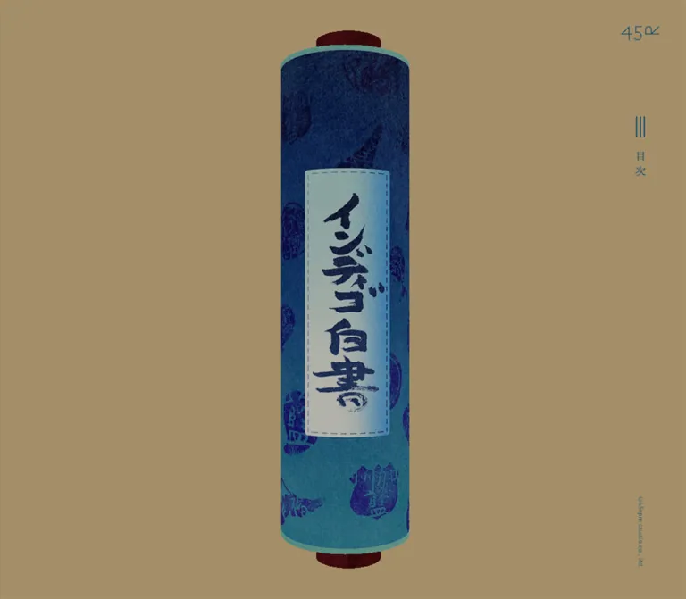
The cylinder is built visually from a dark red spindle, a patterned indigo cover, muted green rims, and a pale title patch. The cover moves from very dark navy near the top toward a brighter worn blue below. Irregular stamped emblems interrupt the fabric grain. The title patch carries large brush lettering and a stitched-looking dashed outline.
The roll is nearly centered, with only a small apparent horizontal offset. Large unbroken areas of tan surround it. There is no visible headline block, introductory paragraph, or product button beside the object in the closed state.
Treat the cylinder’s volume, fabric pattern, and lettering as a coordinated asset. A rounded rectangle with a blue gradient will reproduce neither the textile detail nor the perspective. The screenshots establish a dimensional appearance, but they do not establish whether it was produced with a model, canvas, layered images, or another renderer.
The closed roll remains visible in a capture taken after the initial readiness wait. It should not be labeled a loading screen solely because it appears first.
Open Scroll Edge and Paper Reveal
Role: connects the opening object with the wider narrative surface.
The desktop open-state capture places the roll around x = 222–431. The exposed paper begins at its right edge, and the brighter illustrated area begins around x = 909. The paper spans approximately y = 83–917, leaving tan bands above and below. A small ochre 45R mark sits within the quiet paper area.
The cover shows different patterned motifs from the frontal opening state, while the title patch is no longer facing the viewer. This is consistent with a turning cylinder during an unrolling sequence; its angle, timing, and control mechanism were not recorded.
The mobile open-state capture shows a different framing: the cylinder is around x = 126–292, with only a narrow paper area visible to its right. The exposed paper spans roughly y = 108–736. Do not force these two captures into a single inferred translation value; they may represent different progress positions as well as different responsive framing.
Illustrated Editorial Spread
Role: combines an explanation of a color with the clothing that embodies it.
The visible desktop spread about “45番色” has three principal layers:
- A warm textured paper field with a broad, slightly darker translucent-looking wash.
- Vertical blue prose and a narrow framed chapter statement toward the center-left.
- An oversized indigo shirt on the right, with jeans entering from the bottom edge.
The wash begins near x = 115, y = 90, and extends to about y = 910. Its right edge continues beyond the visible composition. The prose occupies roughly y = 195–795; the garment illustrations extend outside the wash and are deliberately cropped by the viewport.
The chapter statement, “ファーストにしてベストの色「45番色」,” sits in a slim outlined strip around x = 773, above and to the right of the prose columns. The body proceeds through vertical columns toward the left. A small red stamp near the upper-left adds a printed accent without competing with the reading text.
This is an editorial composition, not a pair of equal-width columns. The clothing is allowed to dominate the right side, cross surface boundaries, and disappear beyond the viewport.
Vertical Prose Group
Role: carries the detailed narrative without losing the scroll’s reading rhythm.
Main paragraphs use 18px Mincho text with 30.6px column pitch. Neighboring paragraph blocks have approximately 30px of additional separation. Different chapter families use different vertical reading lengths rather than one universal text-box height.
History passages have a measured height of 486px at both viewports. Color-story passages use 600px on desktop and 573px on mobile. Some process passages become taller on mobile, reaching 672px. The amount of text in each column therefore changes while the font size stays stable.
For implementation, use actual vertical writing with an appropriate Japanese language attribute. Do not simulate the prose by rotating a horizontal paragraph: punctuation, wrapping, and reading order would differ. Treat short numerals and embedded brand marks deliberately; the supplied text extraction omits some inline content visible in the screenshots.
Color Identity Group
Role: identifies a named indigo within the longer story.
The DOM establishes a consistent grouping of a bold Japanese color name, a narrow romanized name, and a narrow numbered/year identifier. Examples include “45番色,” “墨納戸,” “水浅葱,” “夏ブルー,” “ダッシュインディゴ,” and “影色納戸.”
The main name uses 32px A1 Gothic B; the two companion columns use 10px ivypresto-headline with 1px tracking. The compact companions preserve the authority of the Japanese name while giving the section a catalog-like specificity.
This structure is DOM-confirmed beyond the photographed spread. The exact illustration, spacing, and visible backdrop of every later color entry were not independently captured.
Product-Link Capsule
Role: offers a contextual route from a color story to related merchandise.
Two anchors labeled “アイテムを見る” were recorded:
- The first-color entry links to
https://shop.45r.jp/shop/e/eindigo45/. - The later signature-color entry links to
https://shop.45r.jp/shop/e/ekageiro/.
The anchor has indigo fill, white lettering, an extremely rounded outline, 22px vertical and 14px horizontal computed padding, and an 11px flex gap. Its recorded screen rectangle is approximately 73.5 × 244.55px, forming a tall capsule associated with the vertical reading system.
The rectangle is larger than a simple calculation from its computed 14px type and padding would suggest. Preserve the distinction between the component’s raw styles and scene-level scaling. The Quick Start uses the raw styles and does not reproduce unknown ancestor transforms.
A 300ms color/background transition is declared. The actual hover colors and destination-page behavior were not observed.
Circular Scene Controls
Role: unresolved interactive controls within several later scenes.
The DOM includes 80px square buttons with 50% radius beside several color sections and near the concluding content. The supplied extraction contains no button text, and the original captures do not establish their icons or activated results.
Their geometry can be documented, but do not label them as zoom, play, next, or replay controls without further evidence. Empty extracted text also does not establish that an accessible name is absent; it may exist outside the supplied fields.
Introductory and Closing Statements
Role: provides short, poetic pauses around the longer narrative.
Three statement lines are present in the rendered DOM, including “わたしたちにしか、つくれない。” Each occupies a narrow vertical column. The typography reduces from 18px on desktop to 15px on mobile, unlike the main body copy.
Some copies of these lines have clipping and transform transitions. Their rectangles indicate transformed states, but the supplied opening screenshots show the roll rather than a clearly readable standalone statement composition. Document the text and declared transitions without inventing its exact sequence or duration on screen.
Tokens — Motion & Interaction
The evidence combines static states with computed transition declarations. It supports the existence of scene changes and several reveal treatments, but it does not provide a complete interaction recording.
| Treatment | Recorded value or evidence | What can be concluded |
|---|---|---|
| Statement clipping | clip-path 0.4s cubic-bezier(0.47, 0.16, 0.24, 1) |
A 400ms clipping transition is declared on sampled statement lines |
| Statement transform | transform 1s cubic-bezier(0.47, 0.16, 0.24, 1) |
A one-second transform transition is declared; start/end transforms were not supplied |
| Other mobile statement reveal | Transform 1s, opacity 0.7s, both using cubic-bezier(0.26, 0.06, 0, 1) |
A second reveal treatment exists in the mobile DOM |
| Selected mobile prose | opacity 1.5s cubic-bezier(0.26, 0.06, 0, 1) |
Some paragraphs have a slower opacity reveal declaration |
| Sampled mobile chapter heading | Clip 0.7s, transform 1s, opacity 2s, using cubic-bezier(0.47, 0.16, 0.24, 1) |
Layered reveal timing is declared; artwork and triggering conditions are unverified |
| Product-link colors | Background and color 0.3s cubic-bezier(0.26, 0.06, 0, 1) |
Color transitions are defined; target colors are unknown |
| Handscroll opening | Closed and open states appear in original captures | Structural change is visible; no exact roll duration, easing, or rotation is established |
| Narrative travel | Long document, very wide sections, large horizontal offsets | Consistent with a horizontally staged narrative within a long scrolling document; exact input mapping is not supplied |
The desktop document height is 65,387px and the mobile document height is 56,222px. One sampled flex section measures about 28,615px wide at both viewports. These values help explain the scale of the narrative staging; they are not recommended constants for a reconstruction.
Most sampled elements report animation: none. This only describes their CSS animation field. It does not rule out JavaScript-driven animation, canvas rendering, or transformed ancestors. Similarly, a default scroll-snap custom property does not prove that snapping is active.
Recommended motion approach: preserve a deliberate unfolding pace, with restrained clipping, translation, and opacity changes. Keep reading text still once it is presented. Make scene travel reversible and provide a static reading alternative. Do not introduce a specific animation library or renderer as though it had been identified in the source.
Surfaces
| Layer | Appearance | Function |
|---|---|---|
| Outside world | Flat measured tan #a48e69 |
Makes the closed scroll feel isolated and tangible |
| Exposed paper | Mottled warm cream with darker edge shading | Connects the roll to its revealed content |
| Editorial wash | Large pale golden area with soft-looking texture and modest rounding | Groups a prose passage without a conventional card frame |
| Cloth | Dense grain, irregular indigo variation, dark printed motifs | Carries the material identity of the brand story |
| Landscape | Turquoise water and sky, pale clouds, grassy foreground | Opens the narrative into a brighter illustrated world |
| Utility layer | Fine blue logo, narrow label, small copyright | Keeps orientation available with minimal visual weight |
| Printed accents | Small red seals and occasional ochre marks | Adds rhythm and a handmade print association |
There is no evidenced general-purpose elevation system. Depth comes from cylindrical shading, layered illustrations, paper edges, and overlaps. Artwork may contain shading or soft halos; that is different from adding drop shadows to every interface element.
Imagery
The artwork blends the texture of dyed fabric with the language of a painted picture scroll. The opening cover has fine cloth grain, irregular emblems, and a pale sewn label. The interior garment image has visible seams, brass-colored buttons, pocket details, and variations in indigo density. The jeans are cropped into the lower edge as part of a larger composition rather than presented in an isolated product tile.
The open-scroll landscape supplies a contrasting register: a turquoise sea and sky, thin pale cloud ribbons, green ground, and a small human figure near the shore. Its grain and softened edges keep it visually related to the paper and clothing.
Preserve the distinction between crisp interface lettering and textured illustration. Use adequate image resolution and normal image interpolation. Deliberate pixelation is not evidenced here.
Observed Asset Roles
No asset manifest, image URLs, intrinsic image dimensions, model files, or renderer information were supplied. The entries below identify visible roles, not recovered filenames.
| Asset role | Visible evidence | Reuse guidance |
|---|---|---|
| Complete closed roll | Desktop and mobile opening captures | Preserve the title patch, spindle ends, rims, and full silhouette |
| Patterned cover in an open state | Desktop and mobile partial-opening captures | Keep motif scale and shading consistent with the closed version |
| Paper field | Open states and desktop editorial spread | Use real texture with quiet areas beneath prose |
| Shirt and jeans | Desktop first-color spread | Preserve the cutout silhouette, garment details, overlap, and intentional cropping |
| Coastal illustration | Desktop open-scroll state | Keep its panorama and small figure in relation to the large empty sky and sea |
| Red printed emblems | Desktop interior states | Use sparingly; retain irregular printed edges |
| 45R identity mark | Right rail and illustrated paper | Use an authorized identity asset rather than reconstructing it with ordinary text |
For a new project, commission or supply artwork with the same material logic rather than copying brand-specific illustrations. CSS can establish the proportions and typography, but it cannot supply the visual identity of the textile and paper assets.
Layout & Responsive Behavior
The experience preserves vertical writing and a continuous illustrated world at both supplied viewport sizes. The phone view is not simply a desktop spread reduced until all of it fits.
Observed Comparison
| Property | 1440 × 1000 | 390 × 844 | Responsive implication |
|---|---|---|---|
| Right rail | 60px wide, 40px from right | 40px wide, 20px from right | Utility shell becomes narrower and moves closer to the edge |
| Logo top | 37px | 25px | Reduced top clearance |
| Contents top | 179px | 77px | Position changes substantially rather than following uniform scaling |
| Main prose | 18px / 30.6px | Same | Reading size is preserved |
| Color names | 32px / 35.2px | Same | Section identity remains strong |
| Introductory lines | 18px | 15px | Selected display copy becomes smaller |
| History text length | 486px | 486px | Same vertical reading measure |
| Color-story text length | 600px | 573px | Slightly shorter columns |
| Sampled process text length | 600px | 672px | Some mobile passages use more vertical space |
| Product-link rendered size | About 73.5 × 244.55px | Same | Contextual action retains its physical presence |
| Closed-roll height | About 90% of viewport | About 90% of viewport | Height-led artwork sizing is a plausible adaptation |
The 486px history blocks are vertically centered in both measured layouts: their top is 257px on desktop and 179px on mobile. Other chapters use their own alignment and reading lengths, so a single centered text-box rule would be insufficient.
The source custom property --vh is 10px on desktop and 8.44px on mobile, matching one hundredth of the recorded viewport height. This establishes a viewport-height unit at capture time; it does not establish how browser-toolbar resizing is handled.
Horizontal coordinates in the supplied DOM can be tens of thousands of pixels outside the viewport. Treat those as scene-state measurements, not margins to copy into a static page. A reusable implementation should calculate travel from its actual content dimensions.
No tablet, landscape-phone, zoomed-text, or intermediate-width captures were supplied. The precise breakpoint is unknown. The Quick Start’s 600px breakpoint is a recommendation chosen to separate the two demonstrated configurations.
Do’s and Don’ts
Do
- Keep the measured tan ground
#a48e69distinct from the illustrated cream paper. - Use
#1b526cas the principal interface ink and contextual action fill. - Preserve the opening’s large empty field around one tall roll.
- Keep the right rail slim, persistent, and visually independent of the changing scenes.
- Use three vertical strokes for the contents icon and stack “目” above “次.”
- Preserve real vertical Japanese typesetting, regular Mincho prose, and generous column pitch.
- Retain the stronger Gothic color names and delicate serif companion metadata.
- Let garments overlap paper boundaries and extend beyond the viewport where the composition calls for it.
- Keep tactile grain in cloth, paper, seals, and landscapes.
- Separate measured CSS styles from transformed on-screen rectangles.
- Preserve readable body type on mobile while adapting the visible portion of the scene.
Don’t
- Don’t replace the story with a generic hero, feature-card grid, and repeated conversion buttons.
- Don’t turn every paragraph into a rounded cream card.
- Don’t treat the front brush lettering as an ordinary font heading.
- Don’t substitute a smooth blue gradient for the patterned textile cover.
- Don’t make every mobile dimension a fixed percentage of the desktop layout.
- Don’t rotate horizontal paragraphs to imitate Japanese vertical composition.
- Don’t infer menu contents or circular-button functions from their shapes alone.
- Don’t hardcode the captured document heights or negative scene coordinates.
- Don’t claim a specific 3D technology, animation library, or gesture mapping without evidence.
- Don’t use the long color-transition declaration as proof of an observed hover state.
- Don’t crop meaningful prose or garment details merely to fit a reusable card ratio.
Recommended Implementation Additions
These are recommendations for a new implementation, not verified features of the original:
- Enlarge the contents button’s interactive width to at least 44px while retaining the narrow visual icon and label.
- Give the contents control an accessible name, expanded state, and relationship to the actual menu. Provide predictable keyboard opening, closing, and focus return.
- Preserve semantic reading order independently of scene transforms. Prevent offscreen interactive elements from becoming confusing keyboard stops.
- Provide a linear reading mode with the complete story available without the handscroll animation. Use ordinary document flow as a fallback if the scene controller fails.
- Offer reduced-motion behavior that bypasses large scene travel and reveals prose without prolonged clipping or opacity delays.
- Test the small rail text against tan, garments, and bright illustration. Where necessary, add a restrained local backing or a higher-contrast utility treatment.
- Keep decorative textures out of the accessibility tree. Give meaningful garment and narrative illustrations useful alternatives, and provide accessible text for artwork-based headings.
- Recalculate scene travel after fonts, images, viewport dimensions, or text size change. Avoid deriving the entire experience from a single initial desktop width.
- Use responsive image delivery and defer distant chapter assets while keeping the opening artwork and first reading state stable.
Agent Prompt Guide
Quick Color Reference
- Outside canvas: measured
#a48e69. - Interface ink and filled product links: measured
#1b526c. - Product-link text: measured
#ffffff. - Textured paper approximation:
#f4e5b7. - Deep cloth approximation:
#102c40, with worn blue variation around#2486a0. - Landscape approximation: turquoise
#30c1c6and pale clouds#fff8cc. - Small printed accent approximation:
#d66e67.
Overall Prompt
“Create an illustrated editorial experience about the history of a textile color. Begin with a tall patterned indigo handscroll on a flat tan canvas, approximately 90% of the viewport height. Keep a narrow blue navigation rail at the right edge, containing an identity mark, three vertical strokes above a stacked contents label, and tiny vertical copyright text. Reveal a warm textured paper world with Japanese vertical prose, fine framed chapter statements, oversized garment illustrations, and sparse red seal marks. Use 18px Mincho body text with 1.7 column leading, 32px bold Gothic color names, and 10px tracked serif companion metadata. Preserve generous empty space and material grain. Keep contextual merchandise links inside the story. Build an accessible linear reading fallback alongside any animated scene presentation.”
Example Component Prompts
- Opening object: “Compose one indigo-covered handscroll against
#a48e69. Give it dark red spindle ends, muted green rims, irregular stamped textile motifs, and a pale stitched title patch with supplied brush lettering. Keep the complete object near 90% of viewport height and leave broad empty surroundings.” - Right rail: “Create a transparent 60px desktop navigation rail 40px from the right edge. Put the identity mark near the top, three thin vertical strokes above the stacked label ‘目次,’ and a tiny vertical copyright near the bottom. On a narrow phone use a 40px rail with 20px edge clearance. Enlarge the invisible button target without widening the drawing.”
- Color-story spread: “Set blue vertical Mincho paragraphs on mottled cream paper. Place a slender framed statement at the right of the text and an oversized illustrated indigo shirt beyond it. Let jeans enter from below, cropping at the viewport edge. Add one small red printed mark. Use no card shadow.”
- Color identifier: “Pair a 32px bold Japanese Gothic color name with two narrow 10px serif companion columns for romanization and an index/year. Use
#1b526c, 1px tracking on the companion text, and compact spacing. Preserve the distinction between the name and its metadata.” - Accessible narrative behavior: “Keep the illustrated handscroll as progressive enhancement. Ensure all chapters remain readable in semantic order without animation, provide a working contents menu, and replace long scene travel with immediate navigation when reduced motion is requested. Do not assign unverified behavior to decorative controls.”
Quick Start
CSS Custom Properties
This is a practical adaptation of the evidenced shell, typography, and component styles. It uses normal page scrolling and locally scrollable vertical prose as a usable baseline. It does not reproduce the original handscroll renderer or its scene choreography.
The paper color and roll-sizing formula are approximations. The 600px breakpoint, focus style, larger hit area, and static reading flow are recommendations. Supply authorized imagery and licensed font files separately; the family names below do not load those resources.
:root {
  /* Measured interface colors */
  --color-ground: #a48e69;
  --color-ink: #1b526c;
  --color-on-ink: #ffffff;

  /* Visual approximations for artwork-adjacent surfaces */
  --color-paper: #f4e5b7;
  --color-cloud: #fff8cc;
  --color-seal: #d66e67;
  --paper-texture: none;

  /* Recorded families; font delivery is project-specific */
  --font-story: 'ten-mincho-text', serif;
  --font-utility: 'A1 Gothic R', sans-serif;
  --font-color-name: 'A1 Gothic B', sans-serif;
  --font-index: 'ivypresto-headline', serif;

  --text-body: 18px;
  --text-small: 14px;
  --text-statement: 21px;
  --text-color-name: 32px;
  --text-index: 10px;
  --text-menu: 16px;
  --text-intro: 18px;

  --leading-body: 1.7;
  --paragraph-gap: 30px;
  --reading-length: 600px;
  --history-length: 486px;

  /* Recorded desktop rail geometry */
  --rail-width: 60px;
  --rail-edge: 40px;
  --brand-top: 37px;
  --contents-top: 179px;
  --copyright-bottom: 47px;
  --contents-gap: 18px;

  /* Recommended approximation from the opening captures */
  --roll-height: 90vh;
  --roll-offset-x: -5px;

  /* Measured transition timing functions */
  --ease-reveal: cubic-bezier(0.47, 0.16, 0.24, 1);
  --ease-color: cubic-bezier(0.26, 0.06, 0, 1);
  --duration-color: 300ms;
  --duration-clip: 400ms;
  --duration-travel: 1000ms;
}

* {
  box-sizing: border-box;
}

body {
  margin: 0;
  color: var(--color-ink);
  background: var(--color-ground);
  font-family: var(--font-story);
}

img {
  display: block;
  max-width: 100%;
  image-rendering: auto;
}

.opening {
  position: relative;
  display: grid;
  place-items: center;
  min-height: 100vh;
  background: var(--color-ground);
}

.roll-art {
  width: auto;
  height: var(--roll-height);
  max-width: calc(100vw - 110px);
  object-fit: contain;
  transform: translateX(var(--roll-offset-x));
}

.site-rail {
  position: fixed;
  z-index: 20;
  top: 0;
  right: max(var(--rail-edge), env(safe-area-inset-right, 0px));
  width: var(--rail-width);
  height: 100vh;
  color: var(--color-ink);
  pointer-events: none;
}

.site-rail a,
.site-rail button {
  pointer-events: auto;
}

.brand-link {
  position: absolute;
  top: var(--brand-top);
  left: 0;
  display: grid;
  place-items: center;
  width: 100%;
  height: 22px;
  color: inherit;
}

.brand-mark {
  width: 100%;
  height: auto;
  max-height: 22px;
  object-fit: contain;
}

.contents-button {
  position: absolute;
  top: var(--contents-top);
  left: 50%;
  display: flex;
  flex-direction: column;
  align-items: center;
  gap: var(--contents-gap);
  width: 44px;
  min-height: 44px;
  padding: 0;
  border: 0;
  color: inherit;
  background: transparent;
  cursor: pointer;
  transform: translateX(-50%);
}

/* Recommended drawing based on the visible vertical-stroke icon */
.contents-icon {
  display: block;
  width: 14px;
  height: 32px;
  background: linear-gradient(
    to right,
    currentColor 0 1px,
    transparent 1px 6px,
    currentColor 6px 7px,
    transparent 7px 12px,
    currentColor 12px 14px
  );
}

.contents-label {
  font-family: var(--font-story);
  font-size: var(--text-menu);
  font-weight: 400;
  line-height: 1.45;
  letter-spacing: -0.01em;
}

.contents-label > span {
  display: block;
}

.rail-copyright {
  position: absolute;
  right: calc((var(--rail-width) - 19px) / 2);
  bottom: max(var(--copyright-bottom), env(safe-area-inset-bottom, 0px));
  margin: 0;
  writing-mode: vertical-rl;
  text-orientation: mixed;
  font-family: var(--font-utility);
  font-size: 10px;
  font-weight: 400;
  line-height: 19px;
  letter-spacing: 0.4px;
}

/* Recommended readable baseline, independent of scene animation */
.story-section {
  padding: 90px 120px 90px 8vw;
  background-color: var(--color-paper);
  background-image: var(--paper-texture);
}

.story-paper {
  padding: 60px 40px;
  border-radius: 20px;
  background: rgb(226 188 92 / 10%);
}

.reading-window {
  max-width: 100%;
  overflow-x: auto;
  overscroll-behavior-x: contain;
  scrollbar-gutter: stable;
}

/* In vertical writing, inline-size controls the physical height. */
.vertical-copy {
  display: flow-root;
  width: max-content;
  inline-size: var(--reading-length);
  writing-mode: vertical-rl;
  text-orientation: mixed;
  font-family: var(--font-story);
  font-size: var(--text-body);
  font-weight: 400;
  line-height: var(--leading-body);
}

.vertical-copy > p {
  margin-inline: 0;
  margin-block: 0 var(--paragraph-gap);
}

.vertical-copy > p:last-child {
  margin-block-end: 0;
}

.vertical-copy--history {
  inline-size: var(--history-length);
}

.vertical-copy--small {
  font-size: var(--text-small);
}

.chapter-statement {
  width: max-content;
  max-height: 100%;
  margin: 0;
  padding: 8px;
  border: 1px solid currentColor;
  outline: 1px solid currentColor;
  outline-offset: 3px;
  writing-mode: vertical-rl;
  font-size: var(--text-statement);
  font-weight: 400;
  line-height: 1.06;
  letter-spacing: -0.01em;
}

.color-identity {
  display: flex;
  flex-direction: row-reverse;
  align-items: flex-start;
  gap: 10px;
  width: max-content;
}

.color-name {
  margin: 0;
  writing-mode: vertical-rl;
  font-family: var(--font-color-name);
  font-size: var(--text-color-name);
  font-weight: 700;
  line-height: 1.1;
  letter-spacing: -0.01em;
}

.color-index {
  margin: 0;
  writing-mode: vertical-rl;
  font-family: var(--font-index);
  font-size: var(--text-index);
  font-weight: 400;
  line-height: 1;
  letter-spacing: 1px;
}

/* Source component styles without unknown ancestor scaling */
.item-link {
  display: inline-flex;
  flex-direction: column;
  align-items: center;
  justify-content: center;
  gap: 11px;
  padding: 22px 14px;
  border-radius: 9999px;
  color: var(--color-on-ink);
  background: var(--color-ink);
  font-family: var(--font-utility);
  font-size: 14px;
  font-weight: 400;
  line-height: 1.5;
  letter-spacing: -0.01em;
  text-decoration: none;
  transition:
    background-color var(--duration-color) var(--ease-color),
    color var(--duration-color) var(--ease-color);
}

.item-link__label {
  writing-mode: vertical-rl;
  text-orientation: mixed;
}

.garment-art {
  width: min(100%, 720px);
  height: auto;
  object-fit: contain;
}

/* Recommended focus treatment; hover endpoints were not observed. */
a:focus-visible,
button:focus-visible,
.reading-window:focus-visible {
  outline: 2px solid var(--color-ink);
  outline-offset: 5px;
}

/* Recommended breakpoint, not a recovered source media query */
@media (max-width: 600px) {
  :root {
    --rail-width: 40px;
    --rail-edge: 20px;
    --brand-top: 25px;
    --contents-top: 77px;
    --copyright-bottom: 20px;
    --contents-gap: 15px;
    --text-menu: 14px;
    --text-intro: 15px;
    --reading-length: 573px;
  }

  .story-section {
    padding: 100px 72px 70px 20px;
  }

  .story-paper {
    padding: 30px 20px;
  }

  .color-identity {
    gap: 8px;
  }
}

@supports (height: 100svh) {
  :root {
    --roll-height: 90svh;
  }

  .opening {
    min-height: 100svh;
  }
}

@supports (height: 100dvh) {
  .site-rail {
    height: 100dvh;
  }
}

/* Recommended linear alternative for an explicit reading-mode toggle */
.linear-reading .reading-window {
  overflow: visible;
}

.linear-reading .vertical-copy {
  width: auto;
  inline-size: auto;
  writing-mode: horizontal-tb;
}

.linear-reading .vertical-copy > p {
  margin: 0 0 1.5em;
}

@media (prefers-reduced-motion: reduce) {
  .item-link {
    transition: none;
  }

  .scene-reveal {
    opacity: 1;
    clip-path: none;
    transform: none;
    transition: none;
    animation: none;
  }
}
Component Assembly Notes
Use .site-rail for the persistent header, with a real anchor for .brand-link and a real button for .contents-button. Put decorative strokes in an aria-hidden .contents-icon; put the two contents characters in separate spans inside .contents-label. The button still needs actual menu behavior and expanded-state management.
Use an authorized complete-roll image for .roll-art. Its transparent bounds should include the spindle ends so the height approximation remains meaningful. Supply .brand-mark as an image or accessible inline vector rather than ordinary text.
For reading content, place .vertical-copy inside a labeled, keyboard-focusable .reading-window. Set lang="ja" on Japanese text. The local horizontal scrolling in this starter is an accessible baseline, not a claim about the original’s input handling. A scene controller can later enhance presentation while retaining the same semantic content.
The CSS intentionally leaves the observed hover endpoint, unknown circular-control functions, asset URLs, and cinematic scene offsets unspecified. Those require actual product decisions or additional evidence.
Tailwind v4 Token Mapping
Optional aliases for a project already using Tailwind v4. This mapping is implementation guidance; it does not identify the original site’s framework or version.
@theme inline {
  --color-ground: #a48e69;
  --color-ink: #1b526c;
  --color-paper: #f4e5b7;
  --color-seal: #d66e67;

  --font-story: 'ten-mincho-text', serif;
  --font-utility: 'A1 Gothic R', sans-serif;
  --font-color-name: 'A1 Gothic B', sans-serif;
  --font-index: 'ivypresto-headline', serif;

  --text-story: 18px;
  --text-statement: 21px;
  --text-color-name: 32px;
  --text-index: 10px;

  --spacing-paragraph: 30px;
  --radius-capsule: 9999px;
  --ease-reveal: cubic-bezier(0.47, 0.16, 0.24, 1);
}
Sources & Evidence
- Original and final page: 45R — Indigo Hakusho. The supplied observation reports HTTP 200 and no URL change.
- Capture timestamp:
2026-09-22T21:14:43.771Z, equivalent to September 23, 2026, at 06:14:43.771 JST. - Original visual evidence: three 1440 × 1000 desktop captures showing the closed roll, first-color editorial spread, and partially opened scroll; two 390 × 844 mobile captures showing closed and partially opened states.
- Rendered evidence: page title and text, outgoing anchor destinations, computed font families and metrics, foreground/background colors, padding, gaps, border radii, transition declarations, element rectangles, document heights, and viewport custom properties at both sizes.
- Readiness conditions: the supplied inspection waited at least five seconds initially and used bounded checks for document loading, relevant finite motion, layout/text stability, and visible image decoding. Perpetual animations were temporarily paused during readiness checks and then resumed. SharedWorkers and service workers were disabled.
- Interaction limits: captures establish different scroll compositions but do not provide a complete gesture or animation recording. Menu activation, circular-button actions, hover endpoints, product destinations, sound, keyboard behavior, and reduced-motion behavior were not demonstrated.
- Inspection limits: no additional browsing, command execution, asset retrieval, source-code inspection, or font-file inspection was performed for this reference. Exact asset paths, scene-controller logic, renderer technology, intermediate breakpoints, and every later chapter’s visual layout remain unverified.
This reference describes the current page evidenced by the supplied captures and rendered observations. Measured values, visual estimates, and implementation recommendations are kept separate throughout.
# 45R / Indigo Hakusho — Style Reference

> An indigo-covered handscroll opens into a textured story of color, cloth, and time.

**Original URL:** [45r.jp/ja/indigo-hakusho/](https://45r.jp/ja/indigo-hakusho/)
**Final URL:** [45r.jp/ja/indigo-hakusho/](https://45r.jp/ja/indigo-hakusho/) — unchanged; supplied HTTP status: 200.
**Theme:** warm tan surroundings, aged cream paper, and deep blue ink, with brighter colors inside the illustrations. No theme selector was evidenced.
**Inspected:** September 23, 2026, at 06:14:43 JST; the supplied retrieval timestamp is September 22, 2026, at 21:14:43.771 UTC.
**Viewports:** 1440 × 1000 desktop and 390 × 844 mobile, in CSS pixels.
**Scope:** three original desktop captures, two original mobile captures, and rendered text, element rectangles, computed styles, and outgoing links at both viewports. The visible states cover the closed handscroll, partially opened handscroll, and a desktop editorial spread about the first original indigo color. Later chapters are documented through the rendered DOM, without equivalent screenshots of every chapter.

This is an illustrated brand editorial experience about 45R’s indigo development, dyeing methods, and the aging of clothing. Its organizing object is a handscroll: a narrow cylinder wrapped in patterned indigo fabric becomes the edge of a much wider paper world. Japanese vertical writing, painted garments, seal-like marks, and visible paper grain make the reading experience feel closely related to the material being described.

A slim navigation rail remains at the right edge while the narrative changes around it. The opening is unusually restrained: almost the entire viewport is tan, with one tall textile object in the center. Interior spreads become much richer, pairing cream paper and blue text with oversized garments or a turquoise landscape. Product links exist within the story, but the main composition is editorial rather than a product grid.
閉じる
# 45R / Indigo Hakusho — Style Reference

> An indigo-covered handscroll opens into a textured story of color, cloth, and time.

**Original URL:** [45r.jp/ja/indigo-hakusho/](https://45r.jp/ja/indigo-hakusho/)
**Final URL:** [45r.jp/ja/indigo-hakusho/](https://45r.jp/ja/indigo-hakusho/) — unchanged; supplied HTTP status: 200.
**Theme:** warm tan surroundings, aged cream paper, and deep blue ink, with brighter colors inside the illustrations. No theme selector was evidenced.
**Inspected:** September 23, 2026, at 06:14:43 JST; the supplied retrieval timestamp is September 22, 2026, at 21:14:43.771 UTC.
**Viewports:** 1440 × 1000 desktop and 390 × 844 mobile, in CSS pixels.
**Scope:** three original desktop captures, two original mobile captures, and rendered text, element rectangles, computed styles, and outgoing links at both viewports. The visible states cover the closed handscroll, partially opened handscroll, and a desktop editorial spread about the first original indigo color. Later chapters are documented through the rendered DOM, without equivalent screenshots of every chapter.

This is an illustrated brand editorial experience about 45R’s indigo development, dyeing methods, and the aging of clothing. Its organizing object is a handscroll: a narrow cylinder wrapped in patterned indigo fabric becomes the edge of a much wider paper world. Japanese vertical writing, painted garments, seal-like marks, and visible paper grain make the reading experience feel closely related to the material being described.

A slim navigation rail remains at the right edge while the narrative changes around it. The opening is unusually restrained: almost the entire viewport is tan, with one tall textile object in the center. Interior spreads become much richer, pairing cream paper and blue text with oversized garments or a turquoise landscape. Product links exist within the story, but the main composition is editorial rather than a product grid.

## How to Read This Reference

- **Measured** values come from the supplied rendered DOM and computed styles. They describe the recorded state, including elements located outside the viewport.
- **Visual estimates** come from the five original-page captures. Approximate dimensions and artwork colors are identified explicitly; they were not programmatically sampled.
- **Calculated** values are arithmetic derived from measured or estimated dimensions. They are not recovered source formulas.
- **Recommendations** describe a reusable implementation. Proposed breakpoints, accessibility treatments, and fallback behavior are not claims about the original.
- **Token names** are descriptive implementation aliases unless explicitly identified as a source custom property.
- **Rendered bounds and CSS sizes are different kinds of evidence.** Scene transforms can enlarge an element’s rectangle without changing its computed font size or padding. Do not combine those values as though every element were untransformed.
- **DOM presence does not establish visibility.** Many chapter elements have large negative horizontal coordinates in the supplied snapshots. Their styles establish typography and component structure, but not their exact appearance in an unseen scene.

## Tokens — Colors

### Core Interface Palette

| Name | Value | Suggested token | Evidence | Role |
| --- | --- | --- | --- | --- |
| Tan Ground | `#a48e69` | `--color-ground` | Measured: body `rgb(164, 142, 105)` at both viewports | Opening background and exposed surroundings of the scroll |
| Indigo Ink | `#1b526c` | `--color-ink` | Measured: text and product-link background `rgb(27, 82, 108)` | Reading text, navigation lettering, copyright, and filled product links |
| Link White | `#ffffff` | `--color-on-ink` | Measured on product-link text | Reversed lettering inside the indigo capsule |
| Aged Paper | approximately `#f4e5b7` | `--color-paper` | Visual estimate | Base approximation for the textured interior paper |
| Pale Cloud | approximately `#fff8cc` | `--color-cloud` | Visual estimate | Light cloud ribbons and bright paper highlights |

The body’s measured background is tan, not cream. The cream reading surface belongs to the illustrated scroll and its interior spreads. Preserve this distinction: it creates the contrast between a physical object resting in space and the world revealed inside it.

### Artwork Palette

These are approximate art-direction colors, not verified CSS declarations or a complete inventory of the illustrations.

| Name | Approximate value | Suggested token | Visible use |
| --- | --- | --- | --- |
| Deep Cloth | `#102c40` | `--color-cloth` | Dark portions of the roll and garment silhouettes |
| Worn Indigo | `#2486a0` | `--color-worn-indigo` | Lighter dyed areas of the roll |
| Sea Turquoise | `#30c1c6` | `--color-sea` | Open-scroll sea and sky illustration |
| Seal Red | `#d66e67` | `--color-seal` | Small irregular printed emblems |
| Muted Jade | `#77a69d` | `--color-trim` | Roll rims and cool edging |
| Spindle Red | `#4b1111` | `--color-spindle` | Dark red exposed ends of the scroll spindle |

Do not flatten the cloth into a single blue fill. Its identity comes from uneven dye, fine grain, dark stamped motifs, and variation along the cylinder. Likewise, paper is a field of warm variations rather than a uniform yellow rectangle.

The generic black text inherited by structural DOM elements is not the main visible editorial ink. Default utility custom properties such as `--tw-ring-color` also do not establish additional visible palette colors.

## Tokens — Typography

### Editorial Japanese Text

**Measured family:** `ten-mincho-text, serif`.

The main story uses regular-weight Mincho text in vertical columns. Its fine strokes, generous column pitch, and unhurried text blocks support the literary tone. Standard story paragraphs remain 18px at both inspected viewport sizes. Mobile therefore retains a substantial reading size while showing a smaller portion of the wider narrative.

### Color Names and Utilities

**Measured families:** `A1 Gothic B` for the bold Japanese color names and `A1 Gothic R` for product-link text and copyright.

The Gothic color names act as compact identifiers within the editorial sequence. Their weight distinguishes the named color from the surrounding reflective prose without introducing an oversized marketing headline.

### Romanized Names and Collection Indices

**Measured family:** `ivypresto-headline, serif`.

Romanizations such as `Yonju-go` and identifiers such as `No.01 (1999)` use very small serif text with pronounced tracking. They occupy narrow companion columns beside the Japanese name. They are supporting catalog information, not headings of equal weight.

### Artwork Lettering and Logo

The brush lettering on the front label, including the page title “インディゴ白書,” belongs to the visible artwork. No font declaration for that lettering was supplied. The fine 45R logo is also an identity asset; the anchor’s inherited system font does not identify the logo’s lettering.

Font-family declarations were recorded, but font binaries and delivery configuration were not inspected. A new implementation must supply appropriately licensed fonts or accept fallback differences.

### Type Scale

| Role | Family | Desktop size / line height | Mobile size / line height | Weight | Tracking |
| --- | --- | --- | --- | --- | --- |
| Main story paragraph | `ten-mincho-text, serif` | `18px / 30.6px` | `18px / 30.6px` | 400 | Normal |
| Supporting editorial paragraph | `ten-mincho-text, serif` | `14px / 23.8px` | `14px / 23.8px` | 400 | Normal |
| Narrow chapter statement | `ten-mincho-text, serif` | `21px / 22.26px` | `21px / 22.26px` | 400 | `-0.21px` |
| Japanese color name | `A1 Gothic B` | `32px / 35.2px` | `32px / 35.2px` | 700 | `-0.32px` |
| Romanization and index | `ivypresto-headline, serif` | `10px / 10px` | `10px / 10px` | 400 | `1px` |
| Contents label | `ten-mincho-text, serif` | `16px / 23.2px` | `14px / 20.3px` | 400 | `-0.16px` / `-0.14px` |
| Product-link label | `A1 Gothic R` | `14px / 21px` | `14px / 21px` | 400 | `-0.14px` |
| Copyright | `A1 Gothic R` | `10px / 19px` | `10px / 19px` | 400 | `0.4px` |
| Introductory statement lines | `ten-mincho-text, serif` | `18px / 18.18px` | `15px / 15.15px` | 400 | Normal |

For vertical text, line height primarily controls spacing between columns. A body value of `30.6px` should not be interpreted as an unusually tall gap between characters within a column.

The introductory statement uses a special arrangement of individual lines. Its near-1.01 line height is not the body-copy setting and should not replace the 1.7 leading used throughout the story.

## Tokens — Spacing & Shapes

There is no evidenced universal spacing scale. The page combines tightly controlled utility dimensions, regular editorial column spacing, and large compositions organized around viewport height.

### Measured Spacing and Geometry

| Element or relationship | Desktop | Mobile | Evidence note |
| --- | --- | --- | --- |
| Right rail width | `60px` | `40px` | Header rectangle |
| Right rail edge clearance | `40px` | `20px` | Calculated from viewport and header bounds |
| Rail top padding | `37px` | `25px` | Computed padding |
| Rail bottom padding | `47px` | `20px` | Computed padding |
| Logo-link rectangle | `60 × 22px` | `40 × 22px` | Rendered bounds |
| Contents-button top | `179px` | `77px` | Rendered bounds |
| Contents-button rectangle | about `15.84 × 96.41px` | `14 × 87.59px` | Original narrow control bounds |
| Main paragraph column pitch | `30.6px` | `30.6px` | Computed line height |
| Gap between sampled story paragraphs | `30px` | `30px` | Calculated from neighboring rectangles |
| Space between color-name companion columns | approximately `10px` | approximately `7–8px` | Calculated from rectangles |
| Product-link padding | `22px 14px` | Same | Computed, before ancestor transforms |
| Product-link internal gap | `11px` | Same | Computed flex gap |
| Product-link rendered rectangle | about `73.5 × 244.55px` | Same | Post-transform bounds |
| Circular scene controls | `80 × 80px` | Same | Rendered button rectangles |

### Shape Language

| Shape | Value or appearance | Status |
| --- | --- | --- |
| Product-link capsule | `border-radius: 9999px` | Measured |
| Circular scene controls | `border-radius: 50%` | Measured |
| Most sampled text containers | `border-radius: 0` | Measured |
| Interior editorial wash | Approximately `20px` corner radius in the visible desktop spread | Visual estimate; rendering method unknown |
| Chapter-title enclosure | Fine, slightly irregular nested rectangular outline | Visual observation |
| Front title label | Tall pale textile patch with a stitched-looking perimeter | Artwork, not an evidenced CSS component |
| Cloud ribbons | Long cream bands with rounded ends and uneven overlaps | Artwork |

The capsule is a specific product-link shape, not a default radius for every content section. The large editorial surface should retain the feeling of a wash on paper rather than becoming a raised application card.

### Opening Composition

| Measurement | Desktop capture | Mobile capture | Interpretation |
| --- | --- | --- | --- |
| Complete closed roll, including spindle ends | Approximately `213 × 896px` | Approximately `180 × 759px` | Visual estimate |
| Roll top | Approximately `52px` | Approximately `43px` | Visual estimate |
| Roll height / viewport height | Approximately `89.6%` | Approximately `89.9%` | Calculated from estimates |
| Roll width / viewport width | Approximately `14.8%` | Approximately `46.2%` | Calculated from estimates |

A height-led rule around `90vh` is a useful reconstruction starting point, but it is not a recovered source formula. The artwork occupies nearly the same proportion of viewport height on both devices while becoming much more dominant horizontally on the phone.

## Components

### Persistent Right Rail

**Role:** stable identity and access to the contents while the illustrated scenes change.

The rail has three parts: a 45R logo near the top, the contents control below it, and a narrow copyright line near the bottom. It has a transparent background and no separating rule. In the supplied images it overlays tan, paper, garments, and turquoise illustration without changing its basic position.

On desktop, the rail occupies `x = 1340–1400` in a 1440px viewport. On mobile, it occupies `x = 330–370` in a 390px viewport. Its visual center therefore remains close to the right edge, with 40px and 20px outside clearance respectively.

The logo link points back to the same Indigo Hakusho URL. Do not assume it leads to the corporate homepage.

The contents control combines three thin **vertical** blue strokes with the two stacked characters “目” and “次.” The strokes appear about 32px tall. This orientation is distinctive: a conventional horizontal hamburger changes the rail’s character. The visible icon-to-label space is approximately 18px on desktop and 15px on mobile.

The copyright reads “©45rpm studio co., ltd.” and runs down the lower rail. Its measured rectangle is `19 × 112.67px` at both viewports. The original control has a very narrow measured width; enlarging its invisible hit area is a recommended accessibility adaptation.

The menu-open state, menu contents, dismissal behavior, and focus handling were not supplied.

### Closed Handscroll

**Role:** establishes the physical metaphor and gives the opening a single visual focus.

The cylinder is built visually from a dark red spindle, a patterned indigo cover, muted green rims, and a pale title patch. The cover moves from very dark navy near the top toward a brighter worn blue below. Irregular stamped emblems interrupt the fabric grain. The title patch carries large brush lettering and a stitched-looking dashed outline.

The roll is nearly centered, with only a small apparent horizontal offset. Large unbroken areas of tan surround it. There is no visible headline block, introductory paragraph, or product button beside the object in the closed state.

Treat the cylinder’s volume, fabric pattern, and lettering as a coordinated asset. A rounded rectangle with a blue gradient will reproduce neither the textile detail nor the perspective. The screenshots establish a dimensional appearance, but they do not establish whether it was produced with a model, canvas, layered images, or another renderer.

The closed roll remains visible in a capture taken after the initial readiness wait. It should not be labeled a loading screen solely because it appears first.

### Open Scroll Edge and Paper Reveal

**Role:** connects the opening object with the wider narrative surface.

The desktop open-state capture places the roll around `x = 222–431`. The exposed paper begins at its right edge, and the brighter illustrated area begins around `x = 909`. The paper spans approximately `y = 83–917`, leaving tan bands above and below. A small ochre 45R mark sits within the quiet paper area.

The cover shows different patterned motifs from the frontal opening state, while the title patch is no longer facing the viewer. This is consistent with a turning cylinder during an unrolling sequence; its angle, timing, and control mechanism were not recorded.

The mobile open-state capture shows a different framing: the cylinder is around `x = 126–292`, with only a narrow paper area visible to its right. The exposed paper spans roughly `y = 108–736`. Do not force these two captures into a single inferred translation value; they may represent different progress positions as well as different responsive framing.

### Illustrated Editorial Spread

**Role:** combines an explanation of a color with the clothing that embodies it.

The visible desktop spread about “45番色” has three principal layers:

1. A warm textured paper field with a broad, slightly darker translucent-looking wash.
2. Vertical blue prose and a narrow framed chapter statement toward the center-left.
3. An oversized indigo shirt on the right, with jeans entering from the bottom edge.

The wash begins near `x = 115`, `y = 90`, and extends to about `y = 910`. Its right edge continues beyond the visible composition. The prose occupies roughly `y = 195–795`; the garment illustrations extend outside the wash and are deliberately cropped by the viewport.

The chapter statement, “ファーストにしてベストの色「45番色」,” sits in a slim outlined strip around `x = 773`, above and to the right of the prose columns. The body proceeds through vertical columns toward the left. A small red stamp near the upper-left adds a printed accent without competing with the reading text.

This is an editorial composition, not a pair of equal-width columns. The clothing is allowed to dominate the right side, cross surface boundaries, and disappear beyond the viewport.

### Vertical Prose Group

**Role:** carries the detailed narrative without losing the scroll’s reading rhythm.

Main paragraphs use 18px Mincho text with 30.6px column pitch. Neighboring paragraph blocks have approximately 30px of additional separation. Different chapter families use different vertical reading lengths rather than one universal text-box height.

History passages have a measured height of 486px at both viewports. Color-story passages use 600px on desktop and 573px on mobile. Some process passages become taller on mobile, reaching 672px. The amount of text in each column therefore changes while the font size stays stable.

For implementation, use actual vertical writing with an appropriate Japanese language attribute. Do not simulate the prose by rotating a horizontal paragraph: punctuation, wrapping, and reading order would differ. Treat short numerals and embedded brand marks deliberately; the supplied text extraction omits some inline content visible in the screenshots.

### Color Identity Group

**Role:** identifies a named indigo within the longer story.

The DOM establishes a consistent grouping of a bold Japanese color name, a narrow romanized name, and a narrow numbered/year identifier. Examples include “45番色,” “墨納戸,” “水浅葱,” “夏ブルー,” “ダッシュインディゴ,” and “影色納戸.”

The main name uses 32px `A1 Gothic B`; the two companion columns use 10px `ivypresto-headline` with 1px tracking. The compact companions preserve the authority of the Japanese name while giving the section a catalog-like specificity.

This structure is DOM-confirmed beyond the photographed spread. The exact illustration, spacing, and visible backdrop of every later color entry were not independently captured.

### Product-Link Capsule

**Role:** offers a contextual route from a color story to related merchandise.

Two anchors labeled “アイテムを見る” were recorded:

- The first-color entry links to `https://shop.45r.jp/shop/e/eindigo45/`.
- The later signature-color entry links to `https://shop.45r.jp/shop/e/ekageiro/`.

The anchor has indigo fill, white lettering, an extremely rounded outline, 22px vertical and 14px horizontal computed padding, and an 11px flex gap. Its recorded screen rectangle is approximately `73.5 × 244.55px`, forming a tall capsule associated with the vertical reading system.

The rectangle is larger than a simple calculation from its computed 14px type and padding would suggest. Preserve the distinction between the component’s raw styles and scene-level scaling. The Quick Start uses the raw styles and does not reproduce unknown ancestor transforms.

A 300ms color/background transition is declared. The actual hover colors and destination-page behavior were not observed.

### Circular Scene Controls

**Role:** unresolved interactive controls within several later scenes.

The DOM includes 80px square buttons with 50% radius beside several color sections and near the concluding content. The supplied extraction contains no button text, and the original captures do not establish their icons or activated results.

Their geometry can be documented, but do not label them as zoom, play, next, or replay controls without further evidence. Empty extracted text also does not establish that an accessible name is absent; it may exist outside the supplied fields.

### Introductory and Closing Statements

**Role:** provides short, poetic pauses around the longer narrative.

Three statement lines are present in the rendered DOM, including “わたしたちにしか、つくれない。” Each occupies a narrow vertical column. The typography reduces from 18px on desktop to 15px on mobile, unlike the main body copy.

Some copies of these lines have clipping and transform transitions. Their rectangles indicate transformed states, but the supplied opening screenshots show the roll rather than a clearly readable standalone statement composition. Document the text and declared transitions without inventing its exact sequence or duration on screen.

## Tokens — Motion & Interaction

The evidence combines static states with computed transition declarations. It supports the existence of scene changes and several reveal treatments, but it does not provide a complete interaction recording.

| Treatment | Recorded value or evidence | What can be concluded |
| --- | --- | --- |
| Statement clipping | `clip-path 0.4s cubic-bezier(0.47, 0.16, 0.24, 1)` | A 400ms clipping transition is declared on sampled statement lines |
| Statement transform | `transform 1s cubic-bezier(0.47, 0.16, 0.24, 1)` | A one-second transform transition is declared; start/end transforms were not supplied |
| Other mobile statement reveal | Transform `1s`, opacity `0.7s`, both using `cubic-bezier(0.26, 0.06, 0, 1)` | A second reveal treatment exists in the mobile DOM |
| Selected mobile prose | `opacity 1.5s cubic-bezier(0.26, 0.06, 0, 1)` | Some paragraphs have a slower opacity reveal declaration |
| Sampled mobile chapter heading | Clip `0.7s`, transform `1s`, opacity `2s`, using `cubic-bezier(0.47, 0.16, 0.24, 1)` | Layered reveal timing is declared; artwork and triggering conditions are unverified |
| Product-link colors | Background and color `0.3s cubic-bezier(0.26, 0.06, 0, 1)` | Color transitions are defined; target colors are unknown |
| Handscroll opening | Closed and open states appear in original captures | Structural change is visible; no exact roll duration, easing, or rotation is established |
| Narrative travel | Long document, very wide sections, large horizontal offsets | Consistent with a horizontally staged narrative within a long scrolling document; exact input mapping is not supplied |

The desktop document height is 65,387px and the mobile document height is 56,222px. One sampled flex section measures about 28,615px wide at both viewports. These values help explain the scale of the narrative staging; they are not recommended constants for a reconstruction.

Most sampled elements report `animation: none`. This only describes their CSS animation field. It does not rule out JavaScript-driven animation, canvas rendering, or transformed ancestors. Similarly, a default scroll-snap custom property does not prove that snapping is active.

**Recommended motion approach:** preserve a deliberate unfolding pace, with restrained clipping, translation, and opacity changes. Keep reading text still once it is presented. Make scene travel reversible and provide a static reading alternative. Do not introduce a specific animation library or renderer as though it had been identified in the source.

## Surfaces

| Layer | Appearance | Function |
| --- | --- | --- |
| Outside world | Flat measured tan `#a48e69` | Makes the closed scroll feel isolated and tangible |
| Exposed paper | Mottled warm cream with darker edge shading | Connects the roll to its revealed content |
| Editorial wash | Large pale golden area with soft-looking texture and modest rounding | Groups a prose passage without a conventional card frame |
| Cloth | Dense grain, irregular indigo variation, dark printed motifs | Carries the material identity of the brand story |
| Landscape | Turquoise water and sky, pale clouds, grassy foreground | Opens the narrative into a brighter illustrated world |
| Utility layer | Fine blue logo, narrow label, small copyright | Keeps orientation available with minimal visual weight |
| Printed accents | Small red seals and occasional ochre marks | Adds rhythm and a handmade print association |

There is no evidenced general-purpose elevation system. Depth comes from cylindrical shading, layered illustrations, paper edges, and overlaps. Artwork may contain shading or soft halos; that is different from adding drop shadows to every interface element.

## Imagery

The artwork blends the texture of dyed fabric with the language of a painted picture scroll. The opening cover has fine cloth grain, irregular emblems, and a pale sewn label. The interior garment image has visible seams, brass-colored buttons, pocket details, and variations in indigo density. The jeans are cropped into the lower edge as part of a larger composition rather than presented in an isolated product tile.

The open-scroll landscape supplies a contrasting register: a turquoise sea and sky, thin pale cloud ribbons, green ground, and a small human figure near the shore. Its grain and softened edges keep it visually related to the paper and clothing.

Preserve the distinction between crisp interface lettering and textured illustration. Use adequate image resolution and normal image interpolation. Deliberate pixelation is not evidenced here.

### Observed Asset Roles

No asset manifest, image URLs, intrinsic image dimensions, model files, or renderer information were supplied. The entries below identify visible roles, not recovered filenames.

| Asset role | Visible evidence | Reuse guidance |
| --- | --- | --- |
| Complete closed roll | Desktop and mobile opening captures | Preserve the title patch, spindle ends, rims, and full silhouette |
| Patterned cover in an open state | Desktop and mobile partial-opening captures | Keep motif scale and shading consistent with the closed version |
| Paper field | Open states and desktop editorial spread | Use real texture with quiet areas beneath prose |
| Shirt and jeans | Desktop first-color spread | Preserve the cutout silhouette, garment details, overlap, and intentional cropping |
| Coastal illustration | Desktop open-scroll state | Keep its panorama and small figure in relation to the large empty sky and sea |
| Red printed emblems | Desktop interior states | Use sparingly; retain irregular printed edges |
| 45R identity mark | Right rail and illustrated paper | Use an authorized identity asset rather than reconstructing it with ordinary text |

For a new project, commission or supply artwork with the same material logic rather than copying brand-specific illustrations. CSS can establish the proportions and typography, but it cannot supply the visual identity of the textile and paper assets.

## Layout & Responsive Behavior

The experience preserves vertical writing and a continuous illustrated world at both supplied viewport sizes. The phone view is not simply a desktop spread reduced until all of it fits.

### Observed Comparison

| Property | 1440 × 1000 | 390 × 844 | Responsive implication |
| --- | --- | --- | --- |
| Right rail | 60px wide, 40px from right | 40px wide, 20px from right | Utility shell becomes narrower and moves closer to the edge |
| Logo top | 37px | 25px | Reduced top clearance |
| Contents top | 179px | 77px | Position changes substantially rather than following uniform scaling |
| Main prose | 18px / 30.6px | Same | Reading size is preserved |
| Color names | 32px / 35.2px | Same | Section identity remains strong |
| Introductory lines | 18px | 15px | Selected display copy becomes smaller |
| History text length | 486px | 486px | Same vertical reading measure |
| Color-story text length | 600px | 573px | Slightly shorter columns |
| Sampled process text length | 600px | 672px | Some mobile passages use more vertical space |
| Product-link rendered size | About 73.5 × 244.55px | Same | Contextual action retains its physical presence |
| Closed-roll height | About 90% of viewport | About 90% of viewport | Height-led artwork sizing is a plausible adaptation |

The 486px history blocks are vertically centered in both measured layouts: their top is 257px on desktop and 179px on mobile. Other chapters use their own alignment and reading lengths, so a single centered text-box rule would be insufficient.

The source custom property `--vh` is `10px` on desktop and `8.44px` on mobile, matching one hundredth of the recorded viewport height. This establishes a viewport-height unit at capture time; it does not establish how browser-toolbar resizing is handled.

Horizontal coordinates in the supplied DOM can be tens of thousands of pixels outside the viewport. Treat those as scene-state measurements, not margins to copy into a static page. A reusable implementation should calculate travel from its actual content dimensions.

No tablet, landscape-phone, zoomed-text, or intermediate-width captures were supplied. The precise breakpoint is unknown. The Quick Start’s 600px breakpoint is a recommendation chosen to separate the two demonstrated configurations.

## Do’s and Don’ts

### Do

- Keep the measured tan ground `#a48e69` distinct from the illustrated cream paper.
- Use `#1b526c` as the principal interface ink and contextual action fill.
- Preserve the opening’s large empty field around one tall roll.
- Keep the right rail slim, persistent, and visually independent of the changing scenes.
- Use three vertical strokes for the contents icon and stack “目” above “次.”
- Preserve real vertical Japanese typesetting, regular Mincho prose, and generous column pitch.
- Retain the stronger Gothic color names and delicate serif companion metadata.
- Let garments overlap paper boundaries and extend beyond the viewport where the composition calls for it.
- Keep tactile grain in cloth, paper, seals, and landscapes.
- Separate measured CSS styles from transformed on-screen rectangles.
- Preserve readable body type on mobile while adapting the visible portion of the scene.

### Don’t

- Don’t replace the story with a generic hero, feature-card grid, and repeated conversion buttons.
- Don’t turn every paragraph into a rounded cream card.
- Don’t treat the front brush lettering as an ordinary font heading.
- Don’t substitute a smooth blue gradient for the patterned textile cover.
- Don’t make every mobile dimension a fixed percentage of the desktop layout.
- Don’t rotate horizontal paragraphs to imitate Japanese vertical composition.
- Don’t infer menu contents or circular-button functions from their shapes alone.
- Don’t hardcode the captured document heights or negative scene coordinates.
- Don’t claim a specific 3D technology, animation library, or gesture mapping without evidence.
- Don’t use the long color-transition declaration as proof of an observed hover state.
- Don’t crop meaningful prose or garment details merely to fit a reusable card ratio.

## Recommended Implementation Additions

These are recommendations for a new implementation, not verified features of the original:

- Enlarge the contents button’s interactive width to at least 44px while retaining the narrow visual icon and label.
- Give the contents control an accessible name, expanded state, and relationship to the actual menu. Provide predictable keyboard opening, closing, and focus return.
- Preserve semantic reading order independently of scene transforms. Prevent offscreen interactive elements from becoming confusing keyboard stops.
- Provide a linear reading mode with the complete story available without the handscroll animation. Use ordinary document flow as a fallback if the scene controller fails.
- Offer reduced-motion behavior that bypasses large scene travel and reveals prose without prolonged clipping or opacity delays.
- Test the small rail text against tan, garments, and bright illustration. Where necessary, add a restrained local backing or a higher-contrast utility treatment.
- Keep decorative textures out of the accessibility tree. Give meaningful garment and narrative illustrations useful alternatives, and provide accessible text for artwork-based headings.
- Recalculate scene travel after fonts, images, viewport dimensions, or text size change. Avoid deriving the entire experience from a single initial desktop width.
- Use responsive image delivery and defer distant chapter assets while keeping the opening artwork and first reading state stable.

## Agent Prompt Guide

### Quick Color Reference

- Outside canvas: measured `#a48e69`.
- Interface ink and filled product links: measured `#1b526c`.
- Product-link text: measured `#ffffff`.
- Textured paper approximation: `#f4e5b7`.
- Deep cloth approximation: `#102c40`, with worn blue variation around `#2486a0`.
- Landscape approximation: turquoise `#30c1c6` and pale clouds `#fff8cc`.
- Small printed accent approximation: `#d66e67`.

### Overall Prompt

“Create an illustrated editorial experience about the history of a textile color. Begin with a tall patterned indigo handscroll on a flat tan canvas, approximately 90% of the viewport height. Keep a narrow blue navigation rail at the right edge, containing an identity mark, three vertical strokes above a stacked contents label, and tiny vertical copyright text. Reveal a warm textured paper world with Japanese vertical prose, fine framed chapter statements, oversized garment illustrations, and sparse red seal marks. Use 18px Mincho body text with 1.7 column leading, 32px bold Gothic color names, and 10px tracked serif companion metadata. Preserve generous empty space and material grain. Keep contextual merchandise links inside the story. Build an accessible linear reading fallback alongside any animated scene presentation.”

### Example Component Prompts

1. **Opening object:** “Compose one indigo-covered handscroll against `#a48e69`. Give it dark red spindle ends, muted green rims, irregular stamped textile motifs, and a pale stitched title patch with supplied brush lettering. Keep the complete object near 90% of viewport height and leave broad empty surroundings.”
2. **Right rail:** “Create a transparent 60px desktop navigation rail 40px from the right edge. Put the identity mark near the top, three thin vertical strokes above the stacked label ‘目次,’ and a tiny vertical copyright near the bottom. On a narrow phone use a 40px rail with 20px edge clearance. Enlarge the invisible button target without widening the drawing.”
3. **Color-story spread:** “Set blue vertical Mincho paragraphs on mottled cream paper. Place a slender framed statement at the right of the text and an oversized illustrated indigo shirt beyond it. Let jeans enter from below, cropping at the viewport edge. Add one small red printed mark. Use no card shadow.”
4. **Color identifier:** “Pair a 32px bold Japanese Gothic color name with two narrow 10px serif companion columns for romanization and an index/year. Use `#1b526c`, 1px tracking on the companion text, and compact spacing. Preserve the distinction between the name and its metadata.”
5. **Accessible narrative behavior:** “Keep the illustrated handscroll as progressive enhancement. Ensure all chapters remain readable in semantic order without animation, provide a working contents menu, and replace long scene travel with immediate navigation when reduced motion is requested. Do not assign unverified behavior to decorative controls.”

## Quick Start

### CSS Custom Properties

This is a practical adaptation of the evidenced shell, typography, and component styles. It uses normal page scrolling and locally scrollable vertical prose as a usable baseline. It does not reproduce the original handscroll renderer or its scene choreography.

The paper color and roll-sizing formula are approximations. The 600px breakpoint, focus style, larger hit area, and static reading flow are recommendations. Supply authorized imagery and licensed font files separately; the family names below do not load those resources.

```css
:root {
  /* Measured interface colors */
  --color-ground: #a48e69;
  --color-ink: #1b526c;
  --color-on-ink: #ffffff;

  /* Visual approximations for artwork-adjacent surfaces */
  --color-paper: #f4e5b7;
  --color-cloud: #fff8cc;
  --color-seal: #d66e67;
  --paper-texture: none;

  /* Recorded families; font delivery is project-specific */
  --font-story: 'ten-mincho-text', serif;
  --font-utility: 'A1 Gothic R', sans-serif;
  --font-color-name: 'A1 Gothic B', sans-serif;
  --font-index: 'ivypresto-headline', serif;

  --text-body: 18px;
  --text-small: 14px;
  --text-statement: 21px;
  --text-color-name: 32px;
  --text-index: 10px;
  --text-menu: 16px;
  --text-intro: 18px;

  --leading-body: 1.7;
  --paragraph-gap: 30px;
  --reading-length: 600px;
  --history-length: 486px;

  /* Recorded desktop rail geometry */
  --rail-width: 60px;
  --rail-edge: 40px;
  --brand-top: 37px;
  --contents-top: 179px;
  --copyright-bottom: 47px;
  --contents-gap: 18px;

  /* Recommended approximation from the opening captures */
  --roll-height: 90vh;
  --roll-offset-x: -5px;

  /* Measured transition timing functions */
  --ease-reveal: cubic-bezier(0.47, 0.16, 0.24, 1);
  --ease-color: cubic-bezier(0.26, 0.06, 0, 1);
  --duration-color: 300ms;
  --duration-clip: 400ms;
  --duration-travel: 1000ms;
}

* {
  box-sizing: border-box;
}

body {
  margin: 0;
  color: var(--color-ink);
  background: var(--color-ground);
  font-family: var(--font-story);
}

img {
  display: block;
  max-width: 100%;
  image-rendering: auto;
}

.opening {
  position: relative;
  display: grid;
  place-items: center;
  min-height: 100vh;
  background: var(--color-ground);
}

.roll-art {
  width: auto;
  height: var(--roll-height);
  max-width: calc(100vw - 110px);
  object-fit: contain;
  transform: translateX(var(--roll-offset-x));
}

.site-rail {
  position: fixed;
  z-index: 20;
  top: 0;
  right: max(var(--rail-edge), env(safe-area-inset-right, 0px));
  width: var(--rail-width);
  height: 100vh;
  color: var(--color-ink);
  pointer-events: none;
}

.site-rail a,
.site-rail button {
  pointer-events: auto;
}

.brand-link {
  position: absolute;
  top: var(--brand-top);
  left: 0;
  display: grid;
  place-items: center;
  width: 100%;
  height: 22px;
  color: inherit;
}

.brand-mark {
  width: 100%;
  height: auto;
  max-height: 22px;
  object-fit: contain;
}

.contents-button {
  position: absolute;
  top: var(--contents-top);
  left: 50%;
  display: flex;
  flex-direction: column;
  align-items: center;
  gap: var(--contents-gap);
  width: 44px;
  min-height: 44px;
  padding: 0;
  border: 0;
  color: inherit;
  background: transparent;
  cursor: pointer;
  transform: translateX(-50%);
}

/* Recommended drawing based on the visible vertical-stroke icon */
.contents-icon {
  display: block;
  width: 14px;
  height: 32px;
  background: linear-gradient(
    to right,
    currentColor 0 1px,
    transparent 1px 6px,
    currentColor 6px 7px,
    transparent 7px 12px,
    currentColor 12px 14px
  );
}

.contents-label {
  font-family: var(--font-story);
  font-size: var(--text-menu);
  font-weight: 400;
  line-height: 1.45;
  letter-spacing: -0.01em;
}

.contents-label > span {
  display: block;
}

.rail-copyright {
  position: absolute;
  right: calc((var(--rail-width) - 19px) / 2);
  bottom: max(var(--copyright-bottom), env(safe-area-inset-bottom, 0px));
  margin: 0;
  writing-mode: vertical-rl;
  text-orientation: mixed;
  font-family: var(--font-utility);
  font-size: 10px;
  font-weight: 400;
  line-height: 19px;
  letter-spacing: 0.4px;
}

/* Recommended readable baseline, independent of scene animation */
.story-section {
  padding: 90px 120px 90px 8vw;
  background-color: var(--color-paper);
  background-image: var(--paper-texture);
}

.story-paper {
  padding: 60px 40px;
  border-radius: 20px;
  background: rgb(226 188 92 / 10%);
}

.reading-window {
  max-width: 100%;
  overflow-x: auto;
  overscroll-behavior-x: contain;
  scrollbar-gutter: stable;
}

/* In vertical writing, inline-size controls the physical height. */
.vertical-copy {
  display: flow-root;
  width: max-content;
  inline-size: var(--reading-length);
  writing-mode: vertical-rl;
  text-orientation: mixed;
  font-family: var(--font-story);
  font-size: var(--text-body);
  font-weight: 400;
  line-height: var(--leading-body);
}

.vertical-copy > p {
  margin-inline: 0;
  margin-block: 0 var(--paragraph-gap);
}

.vertical-copy > p:last-child {
  margin-block-end: 0;
}

.vertical-copy--history {
  inline-size: var(--history-length);
}

.vertical-copy--small {
  font-size: var(--text-small);
}

.chapter-statement {
  width: max-content;
  max-height: 100%;
  margin: 0;
  padding: 8px;
  border: 1px solid currentColor;
  outline: 1px solid currentColor;
  outline-offset: 3px;
  writing-mode: vertical-rl;
  font-size: var(--text-statement);
  font-weight: 400;
  line-height: 1.06;
  letter-spacing: -0.01em;
}

.color-identity {
  display: flex;
  flex-direction: row-reverse;
  align-items: flex-start;
  gap: 10px;
  width: max-content;
}

.color-name {
  margin: 0;
  writing-mode: vertical-rl;
  font-family: var(--font-color-name);
  font-size: var(--text-color-name);
  font-weight: 700;
  line-height: 1.1;
  letter-spacing: -0.01em;
}

.color-index {
  margin: 0;
  writing-mode: vertical-rl;
  font-family: var(--font-index);
  font-size: var(--text-index);
  font-weight: 400;
  line-height: 1;
  letter-spacing: 1px;
}

/* Source component styles without unknown ancestor scaling */
.item-link {
  display: inline-flex;
  flex-direction: column;
  align-items: center;
  justify-content: center;
  gap: 11px;
  padding: 22px 14px;
  border-radius: 9999px;
  color: var(--color-on-ink);
  background: var(--color-ink);
  font-family: var(--font-utility);
  font-size: 14px;
  font-weight: 400;
  line-height: 1.5;
  letter-spacing: -0.01em;
  text-decoration: none;
  transition:
    background-color var(--duration-color) var(--ease-color),
    color var(--duration-color) var(--ease-color);
}

.item-link__label {
  writing-mode: vertical-rl;
  text-orientation: mixed;
}

.garment-art {
  width: min(100%, 720px);
  height: auto;
  object-fit: contain;
}

/* Recommended focus treatment; hover endpoints were not observed. */
a:focus-visible,
button:focus-visible,
.reading-window:focus-visible {
  outline: 2px solid var(--color-ink);
  outline-offset: 5px;
}

/* Recommended breakpoint, not a recovered source media query */
@media (max-width: 600px) {
  :root {
    --rail-width: 40px;
    --rail-edge: 20px;
    --brand-top: 25px;
    --contents-top: 77px;
    --copyright-bottom: 20px;
    --contents-gap: 15px;
    --text-menu: 14px;
    --text-intro: 15px;
    --reading-length: 573px;
  }

  .story-section {
    padding: 100px 72px 70px 20px;
  }

  .story-paper {
    padding: 30px 20px;
  }

  .color-identity {
    gap: 8px;
  }
}

@supports (height: 100svh) {
  :root {
    --roll-height: 90svh;
  }

  .opening {
    min-height: 100svh;
  }
}

@supports (height: 100dvh) {
  .site-rail {
    height: 100dvh;
  }
}

/* Recommended linear alternative for an explicit reading-mode toggle */
.linear-reading .reading-window {
  overflow: visible;
}

.linear-reading .vertical-copy {
  width: auto;
  inline-size: auto;
  writing-mode: horizontal-tb;
}

.linear-reading .vertical-copy > p {
  margin: 0 0 1.5em;
}

@media (prefers-reduced-motion: reduce) {
  .item-link {
    transition: none;
  }

  .scene-reveal {
    opacity: 1;
    clip-path: none;
    transform: none;
    transition: none;
    animation: none;
  }
}
```

### Component Assembly Notes

Use `.site-rail` for the persistent header, with a real anchor for `.brand-link` and a real button for `.contents-button`. Put decorative strokes in an `aria-hidden` `.contents-icon`; put the two contents characters in separate spans inside `.contents-label`. The button still needs actual menu behavior and expanded-state management.

Use an authorized complete-roll image for `.roll-art`. Its transparent bounds should include the spindle ends so the height approximation remains meaningful. Supply `.brand-mark` as an image or accessible inline vector rather than ordinary text.

For reading content, place `.vertical-copy` inside a labeled, keyboard-focusable `.reading-window`. Set `lang="ja"` on Japanese text. The local horizontal scrolling in this starter is an accessible baseline, not a claim about the original’s input handling. A scene controller can later enhance presentation while retaining the same semantic content.

The CSS intentionally leaves the observed hover endpoint, unknown circular-control functions, asset URLs, and cinematic scene offsets unspecified. Those require actual product decisions or additional evidence.

### Tailwind v4 Token Mapping

Optional aliases for a project already using Tailwind v4. This mapping is implementation guidance; it does not identify the original site’s framework or version.

```css
@theme inline {
  --color-ground: #a48e69;
  --color-ink: #1b526c;
  --color-paper: #f4e5b7;
  --color-seal: #d66e67;

  --font-story: 'ten-mincho-text', serif;
  --font-utility: 'A1 Gothic R', sans-serif;
  --font-color-name: 'A1 Gothic B', sans-serif;
  --font-index: 'ivypresto-headline', serif;

  --text-story: 18px;
  --text-statement: 21px;
  --text-color-name: 32px;
  --text-index: 10px;

  --spacing-paragraph: 30px;
  --radius-capsule: 9999px;
  --ease-reveal: cubic-bezier(0.47, 0.16, 0.24, 1);
}
```

## Sources & Evidence

- **Original and final page:** [45R — Indigo Hakusho](https://45r.jp/ja/indigo-hakusho/). The supplied observation reports HTTP 200 and no URL change.
- **Capture timestamp:** `2026-09-22T21:14:43.771Z`, equivalent to September 23, 2026, at 06:14:43.771 JST.
- **Original visual evidence:** three 1440 × 1000 desktop captures showing the closed roll, first-color editorial spread, and partially opened scroll; two 390 × 844 mobile captures showing closed and partially opened states.
- **Rendered evidence:** page title and text, outgoing anchor destinations, computed font families and metrics, foreground/background colors, padding, gaps, border radii, transition declarations, element rectangles, document heights, and viewport custom properties at both sizes.
- **Readiness conditions:** the supplied inspection waited at least five seconds initially and used bounded checks for document loading, relevant finite motion, layout/text stability, and visible image decoding. Perpetual animations were temporarily paused during readiness checks and then resumed. SharedWorkers and service workers were disabled.
- **Interaction limits:** captures establish different scroll compositions but do not provide a complete gesture or animation recording. Menu activation, circular-button actions, hover endpoints, product destinations, sound, keyboard behavior, and reduced-motion behavior were not demonstrated.
- **Inspection limits:** no additional browsing, command execution, asset retrieval, source-code inspection, or font-file inspection was performed for this reference. Exact asset paths, scene-controller logic, renderer technology, intermediate breakpoints, and every later chapter’s visual layout remain unverified.

This reference describes the current page evidenced by the supplied captures and rendered observations. Measured values, visual estimates, and implementation recommendations are kept separate throughout.関連するデザイン
スタイルやページの種類、ジャンルが近いデザインを集めました。