プレビュー準備中デザインリファレンスを見る
DESIGN REFERENCE
ホテルインディゴと、日本の“ネイバーフッド”を旅する。|BRUTUS
ホテルの外観を描いた導入から、ネイビーの誌面へと展開する旅行特集。写真に重なる大きな英字、縦組みの日本語、端正な余白が、渋谷と犬山のカルチャーを紹介する。
BRUTUS × Hotel Indigo — Style Reference
An illustrated hotel façade opens into an indigo travel magazine.
Website: BRUTUS × Hotel Indigo Original URL: https://brutus.jp/special/2023/hotel-indigo/ Final URL: https://brutus.jp/special/2023/hotel-indigo/ Inspected: September 22, 2026, at 20:27:52 UTC; September 23, 2026, at 05:27:52 JST, according to the supplied capture record. Viewports: 1440 × 1000 desktop and 390 × 844 mobile, in CSS pixels. Theme: alternating white editorial space and deep navy story sections, ending in a light-gray publisher footer. No user-selectable theme was evidenced. Scope: the current special-feature index, including its architectural opening, introduction, sharing controls, Shibuya and Inuyama article entrances, persistent brand mark, and footer. Linked articles and sharing destinations were not inspected.
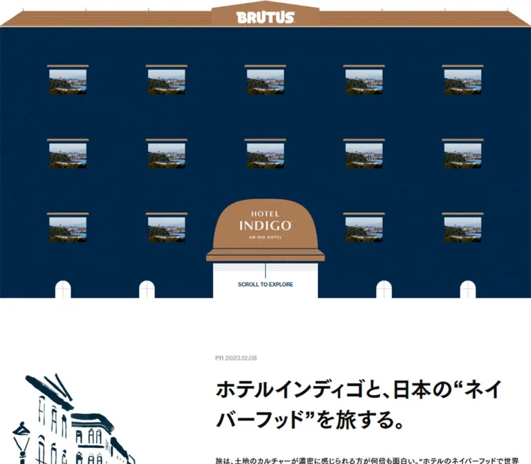
This is a branded travel editorial hub. Its opening presents a hotel as a graphic object: a copper-colored roof, a navy façade, regularly repeated photographic windows, and a central Hotel Indigo entrance. Scrolling leads into a white introduction and then two large photographic compositions about local culture. The main onward actions lead to stories about Shibuya and Inuyama.
The strongest visual relationship is between small architectural repetition and large editorial scale. Tiny window photographs establish rhythm at the top; later, large photographs carry thin white English lettering that extends beyond their edges. Heavy Japanese prose and muted teal vertical labels balance that lettering. Generous navy space holds the composition together without cards, shadows, or boxed section headings.
閉じる
BRUTUS × Hotel Indigo — Style Reference
An illustrated hotel façade opens into an indigo travel magazine.
Website: BRUTUS × Hotel Indigo Original URL: https://brutus.jp/special/2023/hotel-indigo/ Final URL: https://brutus.jp/special/2023/hotel-indigo/ Inspected: September 22, 2026, at 20:27:52 UTC; September 23, 2026, at 05:27:52 JST, according to the supplied capture record. Viewports: 1440 × 1000 desktop and 390 × 844 mobile, in CSS pixels. Theme: alternating white editorial space and deep navy story sections, ending in a light-gray publisher footer. No user-selectable theme was evidenced. Scope: the current special-feature index, including its architectural opening, introduction, sharing controls, Shibuya and Inuyama article entrances, persistent brand mark, and footer. Linked articles and sharing destinations were not inspected.
This is a branded travel editorial hub. Its opening presents a hotel as a graphic object: a copper-colored roof, a navy façade, regularly repeated photographic windows, and a central Hotel Indigo entrance. Scrolling leads into a white introduction and then two large photographic compositions about local culture. The main onward actions lead to stories about Shibuya and Inuyama.
The strongest visual relationship is between small architectural repetition and large editorial scale. Tiny window photographs establish rhythm at the top; later, large photographs carry thin white English lettering that extends beyond their edges. Heavy Japanese prose and muted teal vertical labels balance that lettering. Generous navy space holds the composition together without cards, shadows, or boxed section headings.
How to Read This Reference
- Measured values come from the supplied rendered DOM, computed-style records, or arithmetic on those records. Measurements describe the two inspected viewports, not an inferred universal stylesheet.
- Visual estimates come from the original-page screenshots. Estimated colors were not programmatically sampled, and architectural dimensions are approximate.
- Recommended values and code are adaptations for a new implementation. They are not claims about the original site's framework, breakpoints, or animation logic.
- Named tokens are implementation aliases unless explicitly identified as source custom properties.
- Some desktop elements have recorded positions approximately 50px below the layout suggested by their section padding and settled screenshots. A reveal offset is plausible, but its mechanism was not captured. Preserve measured sizes without automatically turning that offset into permanent spacing.
- The original captures include desktop opening, story, and footer views, plus mobile opening and footer views. Mobile story geometry is available through the DOM, but its complete photographic composition was not visually captured.
Tokens — Colors
Default Palette
| Name | Value | Evidence | Suggested token | Role |
|---|---|---|---|---|
| Paper White | #ffffff |
Measured body background and feature text | --color-paper |
Introduction, doorway, reversed lettering |
| Editorial Ink | #0d0d0d |
Measured body and introduction text | --color-ink |
Japanese introduction and ordinary text |
| Brand Indigo | #002e52 |
Measured share-control foreground | --color-indigo |
Brand-colored controls and a reliable navy reference |
| Story Navy | Approximately #062f4f |
Visual estimate | --color-story |
Broad photographic editorial sections |
| Façade Navy | Approximately #022641 |
Visual estimate | --color-facade |
Darker architectural opening with subtle tonal texture |
| Roof Copper | Approximately #b38159 |
Visual estimate | --color-copper |
Roof, window awnings, architectural accents |
| Muted Teal | Approximately #3b7284 |
Visual estimate | --color-teal |
Large vertical Japanese topic and place labels |
| Canopy White | Approximately #f4f4f2 |
Visual estimate | --color-canopy |
Rounded entrance canopy in the current opening captures |
| Footer Gray | #ebebeb |
Measured footer background | --color-footer |
Publisher navigation and legal area |
| Footer Ink | #101010 |
Measured footer text | --color-footer-ink |
Small footer links and notices |
The measured navy belongs to the share controls. The records do not expose the painted background declaration for the large navy story field: sampled section backgrounds are transparent. Keep the screenshot-derived field colors explicitly approximate instead of presenting the share color as a measured background value.
Color Behavior
The small BRUTUS wordmark appears white over the opening and a lower navy section, and navy over the white area in the desktop middle capture. Its appearance therefore responds to context, but the supplied evidence does not establish how that change is triggered.
The source includes a global --swiper-theme-color: #007aff. No visible component in the supplied captures establishes that bright blue as part of this page's palette. Likewise, the presence of Swiper variables does not prove that a visible carousel exists.
Use copper for architecture and teal for secondary editorial lettering. The main article entrances rely on photographs, white lettering, and the READ label rather than a separate saturated button color.
Tokens — Typography
Japanese Editorial Text
- Measured body stack:
'FOT-筑紫ゴシック Pro B', sans-serif. - Measured display and feature-copy stack:
'FOT-筑紫ゴシック Pro E', sans-serif. - Body default:
17px, weight400; individual components override this. - Introduction heading: Pro E, weight
700. - Feature descriptions: Pro E, computed weight
400, despite their visually substantial strokes. - Tracking: normal for the sampled introduction and feature paragraphs.
The face names are directly present in computed styles. The supplied evidence does not independently verify font-file delivery or licensing. A new implementation should use authorized font files or accept that a fallback will change line breaks and visual density.
Do not replace every heavy-looking Japanese paragraph with font-weight: 700. The distinction between the B and E faces contributes to the observed hierarchy.
English Display Lettering
The story compositions visibly use MUSIC, SHIBUYA, TREASURE, and INUYAMA. The lettering is thin, uppercase, and considerably larger than the Japanese body copy. Topic and place names occupy separate horizontal positions, extending outside the photo rectangle.
The sampled story H2 elements contain no extracted text and inherit 25.5px typography. That value does not describe the visible English letterforms. Their actual font family and construction are unverified; they may be artwork or separately styled descendants. Use supplied title artwork when available, or describe a light sans-serif replacement as an adaptation.
Brand Marks
BRUTUS and Hotel Indigo are visual wordmarks. The H1's computed 34px font size does not explain the BRUTUS logo geometry. Preserve the artwork and its proportions rather than approximating either identity with ordinary text.
Type Scale
| Role | Desktop | Mobile | Evidence and use |
|---|---|---|---|
| Introduction title | 42px / 60.0012px, weight 700 |
30px / 47.001px, weight 700 |
Measured Pro E; recorded boxes are 600 × 120px and 342 × 94px |
| Introduction paragraph | 15px / 30px, weight 400 |
13px / 26px, weight 400 |
Measured Pro B; line-height ratio remains 2 |
| Feature description | 20px / 40px, weight 400 |
20px / 40px, weight 400 |
Measured Pro E; mobile preserves the large reading scale |
| Footer network links | 10px / 19px |
10px / 19px |
Measured Pro B with 0.68px tracking |
| Footer pricing notices | 10px / 20px |
10px / 20px |
Measured Pro B with 0.68px tracking |
| Main English place lettering | Roughly 130px optical scale | Not visually measured | Desktop screenshot estimate, not a confirmed CSS font size |
| Vertical Japanese display labels | Roughly 60px optical scale | Not visually measured | Desktop screenshot estimate |
| Scroll cue | Roughly 10px | Roughly 8px | Screenshot estimate; uppercase utility treatment |
| Publication marker | Small, muted gray | Small, muted gray | PR 2023.12.08 is present; exact typography was not sampled |
The copyright wrapper computes to 17px / 34px, but its visible nested text is smaller. Do not use the wrapper's size as a verified leaf-text measurement.
Tokens — Spacing & Shapes
Density: sparse architecture and expansive editorial compositions, followed by a compact footer. Geometry: rectangular photographs, unboxed typography, circular share controls, and a few rounded architectural forms.
Spacing Scale
| Use | Desktop | Mobile | Status |
|---|---|---|---|
| Introduction section padding | 111px 0 124px |
79px 0 41px |
Measured |
| Introduction title-to-paragraph gap | 40px |
32px |
Derived from recorded boxes |
| Feature-one section padding | 160px 0 85px |
85px 0 55px |
Measured |
| Feature-two section padding | 85px 0 150px |
55px 0 90px |
Measured |
| Desktop photo-to-description gap | 30px |
Not applied in the same way | Derived from boxes |
| Mobile article-link bottom padding | 0 on desktop |
70px |
Measured |
| Main mobile content gutter | — | 24px |
Measured |
| Footer horizontal inset | 40px |
28px |
Derived from child positions |
| Footer vertical padding | 66px 0 50px |
66px 0 50px |
Measured |
| Share-control gap | 14px |
13px |
Derived from adjacent 37px boxes |
Source Fluid Variables
The page exposes --fluid-min-width: 375, --fluid-max-width: 1440, --f-0-min: 14, and --f-0-max: 18. Its recorded --space-l expression interpolates between twice those font values.
With the measured 16px root, the expression evaluates to 28px at 375px viewport width, approximately 28.11px at 390px, and 36px at 1440px. These are calculations from a global variable, not evidence that every section gap uses it. The explicit component values above take precedence for reproducing the inspected layouts.
Border Radius
| Element | Observed treatment |
|---|---|
| Main story photographs | Square corners |
| Façade photo windows | Square image rectangles beneath shallow awnings |
| Share anchors and button | Measured 50% radius on 37 × 37px boxes |
| Hotel entrance canopy | Broad rounded architectural dome; not a general UI radius |
| Ground-level decorative windows | Narrow arches |
| Footer and editorial sections | Full-width rectangular surfaces |
Layout Measurements
| Element | 1440 × 1000 | 390 × 844 |
|---|---|---|
| Document height | 3889.30px |
4098.14px |
| Opening height, derived from introduction start | 808.55px |
695.53px |
| Introduction section height | 758px |
915.64px |
| Shibuya section height | 1020.38px |
1026px |
| Inuyama section height | 970.38px |
951px |
| Footer height | 332px |
509.97px |
| Introduction copy width and left position | 600px, x = 638px |
342px, x = 24px |
| Feature image-link box | 816.56 × 545.38px, x = 311.72px |
342 × 526px, x = 24px, including bottom padding |
| Feature paragraph width and left position | 600px, x = 420px |
342px, x = 24px |
| English-title H2 envelope | 1240px wide, x = 100px |
374px wide, x = 8px |
| Top wordmark link box | 158.13 × 35.73px |
122.72 × 35.73px |
| Footer wordmark link box | 480 × 116.36px |
334 × 80.97px |
Subtracting the mobile link's 70px bottom padding leaves a 342 × 456px content region, exactly 3:4. This supports a portrait-stage adaptation, but an image-specific bounding box was not supplied. The desktop link is approximately 3:2.
Components
Persistent BRUTUS Wordmark
Role: keeps the publisher identity present while the page changes visual environments.
The opening wordmark is centered near the roof peak. Its measured desktop link begins at x = 640.94px, y = 21.08px; on mobile, x = 133.64px, y = 19.55px. The header itself has a measured zero-height flow box.
Scrolled screenshots continue to show the small mark near the top center, including over article content. This supports a persistent overlay interpretation. The exact use of fixed positioning, sticky positioning, or script-controlled placement was not recorded.
The header link points to this special-feature index. The large footer logo instead points to the main BRUTUS site. Keep these destinations distinct.
Architectural Opening
Role: establishes the hotel theme before introducing the editorial content.
Build the visual in layers:
- A full-width navy façade with very subtle tonal texture.
- A shallow copper roof with horizontal linework and a raised central crest.
- The centered BRUTUS wordmark above the façade.
- Repeated photographic windows, each topped by a small copper awning.
- A larger central entrance with an off-white rounded canopy, Hotel Indigo artwork, outlined cornice, and white doorway.
- Small ground-level arched windows and the
SCROLL TO EXPLOREcue.
The desktop screenshot shows five window columns across three rows, with the bottom middle position reserved for the entrance: fourteen visible photo windows. Mobile recomposes this into three columns across four rows, again reserving the bottom middle position: eleven visible windows.
Desktop photo windows are approximately 100 × 67px beneath 114px-wide awnings. Mobile photographs are approximately 66px wide beneath 76px-wide awnings. Desktop row spacing is about 200px; mobile spacing is about 132px. These are screenshot estimates.
The current desktop opening shows a warmly lit interior repeated across its windows. The current mobile opening shows a blue cocktail photograph. This establishes different captured content states, not a verified rotation interval or responsive image-selection rule.
Hotel Entrance and Scroll Cue
Role: gives the architectural composition a focal point and suggests onward reading.
The entrance is approximately 322px wide on desktop and 204px wide on mobile, including the projecting cornice. The main canopy is off-white with dark indigo Hotel Indigo lettering. Thin navy outlines and several fine horizontal doorway lines provide detail without heavy shadows.
The small uppercase scroll cue sits inside the white doorway. Desktop also shows a thin vertical line above it. The cue's text is evidenced, but its clickable behavior is not. In a new implementation, making it an accessible in-page link is a recommendation.
The opening occupies roughly 809px of the 1000px desktop viewport and 696px of the 844px mobile viewport. Do not automatically convert it into a mandatory full-screen 100vh hero.
White Editorial Introduction
Role: explains the feature and establishes its sponsored editorial framing.
The section contains the publication marker PR 2023.12.08, the title ホテルインディゴと、日本の“ネイバーフッド”を旅する。, introductory prose, photography and text credits, and sharing controls.
On desktop, the 600px text column is offset to the right: its left edge is 638px rather than the 420px used by the centered feature paragraphs below. On mobile, it becomes a 342px column with 24px side gutters.
The heading uses the heavier Japanese face at 42px on desktop and 30px on mobile. The introduction paragraph is much smaller than the later feature descriptions: 15px on desktop and 13px on mobile, both at double line height.
The complete white section is not visible in the supplied original screenshots. Its text and principal measurements are supported by the DOM; the composition of any unsampled decorative elements is not established. Do not fill the unused desktop area with invented illustration details.
Sharing Row
Role: provides distribution controls beneath the introduction.
The extracted mobile text includes SHARE. Four measured anchors lead to Twitter, Facebook, LINE, and Pinterest share endpoints. A fifth 37 × 37px element is a button with no extracted label. All five sampled controls have circular geometry and indigo foreground color.
The gaps between controls are 14px on desktop and 13px on mobile. Their visible action boxes remain 37px at both sizes.
The fifth button's action, icon, feedback, and accessible name were not supplied. Do not identify it as a copy-link control without additional evidence. Share destinations were recorded as links but were not activated.
Shibuya Editorial Entrance
Role: opens the music-focused Shibuya story.
A large rectangular photograph shows a person seated in a lounge lined with books and records. Its warm shelving, dark frames, upholstered seating, and cultural objects give the otherwise restrained navy composition visual density.
The photograph is centered at approximately 816.56px wide. Thin white MUSIC lettering extends toward the left outer margin; SHIBUYA extends toward the right. Muted teal Japanese labels, 渋谷 and 音楽, sit vertically around opposing image corners and are partially occluded by the photographic rectangle.
The linked image region points to /special/2023/hotel-indigo/shibuya/. The DOM includes READ inside that link, but the supplied screenshots do not establish its normal placement or reveal behavior.
Below the image is a separate 600px-wide paragraph using Pro E at 20px/40px. Its text introduces Shibuya's music culture and the visit by STUTS. The paragraph is not a small card caption; it has the weight and space of an editorial standfirst.
Inuyama Editorial Entrance
Role: opens the heritage-focused Inuyama story.
This composition repeats the same structural system with a landscape photograph of the hotel, greenery, river, town, and castle. TREASURE and INUYAMA provide the English display hierarchy, with vertical Japanese labels including 犬山 and 国宝 in the DOM.
The image-link and paragraph widths match the Shibuya section. The destination is /special/2023/hotel-indigo/inuyama/.
The desktop paragraph occupies four 40px lines; the mobile record occupies seven. The Shibuya paragraph occupies five desktop lines and nine mobile lines. These line counts explain much of the mobile section height without requiring a smaller body size.
Publisher Footer
Role: closes the feature with publication-network navigation, notices, and a strong publisher identity.
The footer changes to measured #ebebeb with dark text. Compact links to related publications wrap across several rows and are visually separated by vertical bars. A second group includes マガジンワールド, 広告掲載, and プライバシーポリシー.
Two small paragraphs explain the date-dependent treatment of listed prices. The footer also displays the Hearst trademark line and the Magazine house copyright line. These are footer notices, not website production credits.
On desktop, the text occupies the left region and a 480px-wide black BRUTUS mark sits at the lower right. On mobile, the links, notices, and copyright stack above a 334px-wide mark. The mobile footer uses 28px side gutters, slightly wider than the 24px content gutters above.
Tokens — Motion & Interaction
| Treatment | Evidence | What remains unverified |
|---|---|---|
| Document scrolling | Supplied captures show opening, middle, and footer positions | Smooth scrolling, scroll snapping, or custom scrolling behavior |
| Persistent brand mark | Small BRUTUS mark remains near the top in scrolled screenshots | Positioning implementation and color-switch thresholds |
| Possible content reveals | Desktop boxes have an approximately 50px position discrepancy; initial text extraction omits some content present in element records | Transform, opacity, trigger, duration, easing, and replay behavior |
| Repeated window photographs | Desktop and mobile opening captures show different photos | Whether images rotate, respond to viewport, or depend on capture timing |
| Article navigation | Two original-page article hrefs are present | Destination-page behavior and transition effects |
READ affordance |
Text is present inside article links | Hover-only visibility, pointer following, or custom cursor behavior |
| Share controls | Four hrefs and one button are recorded | Activation results, popups, clipboard behavior, and feedback |
| Sampled CSS animation | Sampled elements report animation: none |
Descendant, pseudo-element, or script-driven animation |
The recorded transition string is all, without usable timing or easing data. It is not a motion specification. No source duration can be responsibly assigned from these records.
The inspection allowed loading and finite animation to settle, and temporarily paused perpetual animations during readiness checks. That process does not provide a motion timeline or prove that delayed content was fully revealed.
Recommended adaptation: keep content visible by default, use ordinary document scrolling, and limit any added feedback to short opacity or underline changes. If implementing reveals or photographic cycling, define them as new behavior and provide a static reduced-motion state.
Surfaces
| Layer | Appearance | Purpose |
|---|---|---|
| Opening façade | Deep navy with faint texture | Architectural stage for repeated windows |
| Roof and awnings | Warm copper with restrained linework | Adds material character and repetitive detail |
| Entrance canopy | Off-white with navy artwork and rules | Central focal point and brand partnership |
| Introduction | Plain white with near-black text | Editorial explanation and sharing |
| Story field | Continuous navy with white prose | Connects the two destinations into one visual sequence |
| Photo plane | Full-color, square-cornered rectangles | Supplies atmosphere, place, and cultural detail |
| Topic labels | Muted teal lettering around image edges | Secondary editorial structure |
| Footer | Flat light gray with dark typography | Dense navigation and publication information |
There is no evidenced general-purpose elevation system. Separation comes from full-width color changes, image edges, typography, and spacing. Rounded forms belong chiefly to the depicted architecture and circular share controls.
Imagery
Use two complementary image languages: stylized architectural illustration for the opening and natural editorial photography for the stories.
The façade is frontal and almost diagrammatic. Its repeated windows, shallow awnings, horizontal roof lines, and centered entrance make the whole page feel like a place to enter. The photographs inside the windows are small crops whose repetition matters more than individually legible detail.
The larger story photographs should retain their environmental information. In Shibuya, shelving, records, books, furniture, and a seated subject communicate local culture. In Inuyama, the hotel remains connected to its surrounding landscape and historic town. Avoid replacing these compositions with isolated room details that remove the neighborhood context.
Keep photographs in natural color. Warm interiors and green-blue landscapes provide contrast against the navy field. Do not apply a universal duotone treatment or soften the images into background haze.
Observed Asset References
No original image, SVG, or font-file URLs were included in the supplied evidence. This inventory identifies visible assets without inventing source paths.
| Asset | Evidence | Reuse guidance |
|---|---|---|
| Small BRUTUS mark | Opening and scrolled original captures | Preserve artwork proportions and appropriate light/dark variants |
| Large black BRUTUS mark | Desktop and mobile footer captures | Keep its wide silhouette and substantial footer presence |
| Hotel Indigo entrance artwork | Original opening captures | Preserve the logo, rounded canopy, cornice, and doorway relationships |
| Roof and façade details | Original opening captures | Retain subtle material texture and architectural linework |
| Repeated interior/cocktail photographs | Desktop/mobile opening captures | Treat differing frames as observed states, not a known slideshow specification |
| Shibuya lounge photograph | Desktop middle capture | Preserve the person and surrounding shelves when choosing crops |
| Inuyama landscape photograph | Desktop lower capture | Retain the relationship between hotel, river, greenery, and castle |
| English story lettering | Original desktop story captures | Use authorized artwork or a clearly identified typographic adaptation |
The rendered mobile page credits photo / Kazuharu Igarashi and text / BRUTUS. These establish photography and text credits; they do not identify a web designer or developer.
Layout & Responsive Behavior
Desktop Composition
The page is a vertical editorial sequence, not a grid of destination cards. The opening spans the viewport. The white introduction uses a right-offset copy column. The two story sections switch to centered imagery and centered, narrower prose.
At 1440px, each story link is approximately 56.71% of viewport width, while its English-title envelope spans 1240px, or 86.11%. The 600px prose column is only 41.67%. This creates three distinct widths: broad lettering, medium photography, and narrow reading text.
The navy field remains continuous between the two stories. Section spacing changes from 160px at the start of the first feature to 85px at the start of the second, then opens to a 150px final bottom padding.
Mobile Recomposition
The façade changes from five columns to three, adds a window row, and gives the entrance a much larger share of the page width. The small publisher mark shrinks from a 158.13px link box to 122.72px, far less than a proportional scaling of the whole desktop scene would produce.
Editorial content uses 24px gutters. The introduction title and paragraph become smaller, but the feature descriptions remain 20px/40px. This deliberate distinction keeps destination copy prominent and substantially increases its line count.
The article-link box becomes taller and includes 70px of bottom padding. Its remaining content region suggests a portrait composition. The heading envelope is 374px wide, extending 16px farther on each side than the 342px main content region. Preserve room for this overhang without introducing horizontal page scrolling.
The footer stacks its content and moves the large BRUTUS mark below the legal text. Its typography remains small rather than scaling down further.
Responsive Limits
Only 1440px and 390px widths were inspected. No original media-query threshold, tablet layout, landscape-phone layout, or ultra-wide behavior was supplied. The breakpoint used in the Quick Start is a recommendation.
Use intrinsic heights for editorial text. The measured section heights are reference results, not fixed heights to impose on translated copy, different fonts, or enlarged text.
Do’s and Don’ts
Do
- Preserve the architectural opening with its roof, repeated window rhythm, central entrance, and visible scroll cue.
- Recompose the façade for mobile instead of shrinking the desktop scene uniformly.
- Maintain distinct widths for display lettering, photographs, and prose.
- Keep the introduction right-offset on desktop and the feature descriptions centered.
- Use the measured Japanese type hierarchy, including 20px/40px feature copy on mobile.
- Let thin English lettering extend outside the photographic rectangle.
- Keep muted teal vertical labels visually secondary and partially integrated with image edges.
- Use square photographic edges and continuous navy section backgrounds.
- Preserve the large black footer wordmark and compact publication-network links.
- Separate measured values from estimated colors, inferred geometry, and new interaction choices.
Don’t
- Don't turn the two editorial entrances into rounded booking cards with prices and reservation buttons.
- Don't use the sampled 25.5px H2 style as the size of the visible English artwork.
- Don't treat a 50px capture-position discrepancy as permanent section padding.
- Don't infer a carousel from global Swiper variables or different window photographs.
- Don't invent a hover cursor,
READanimation, or share-button action. - Don't reduce every mobile text style proportionally; the feature paragraphs retain their desktop size.
- Don't add glossy gradients, glass panels, or floating shadows to the editorial surfaces.
- Don't stretch the story photograph to the full desktop text envelope.
- Don't fabricate image paths, font assets, or web-production credits.
- Don't hardcode the measured document or section heights around variable text.
Recommended Implementation Additions
These are recommendations for a new implementation, not verified features of the original:
- Provide meaningful accessible names for the publisher logo, both article links, and every share control. Include live or visually hidden story titles if display lettering is artwork.
- Mark repeated decorative window images as decorative so a screen reader does not announce the same photograph fourteen times.
- Give story photographs useful alternative text that conveys the location and editorial subject.
- Make the scroll cue an ordinary anchor to the introduction, with no required animation.
- Keep the visible 37px share circles if desired, but enlarge their interaction areas to at least 44px without overlapping adjacent targets.
- Keep essential content visible before JavaScript enhancement. Avoid leaving the introduction blank if a reveal script fails.
- Provide focus indicators that remain visible on both white and navy surfaces.
- Keep vertical teal labels decorative or duplicate their information in a readable title. Their low-emphasis color should not be the only way to identify an article.
- Test the persistent logo against enlarged text and narrow screens; its overlap should not obscure essential reading content.
- Use responsive image sources for the suggested portrait mobile stage, checking that important subjects survive the crop.
- Respect reduced-motion preferences for any newly added photographic cycling or scroll reveal.
Agent Prompt Guide
Quick Color Reference
- White editorial canvas: measured
#ffffff. - Introduction text: measured
#0d0d0d. - Brand-colored controls: measured
#002e52. - Story background: approximately
#062f4f. - Opening façade: approximately
#022641. - Roof and awnings: approximately
#b38159. - Secondary vertical lettering: approximately
#3b7284. - Footer: measured
#ebebebwith#101010text.
Overall Prompt
“Create a Japanese travel editorial hub inspired by the current BRUTUS × Hotel Indigo feature. Open with a frontal illustrated hotel: deep navy façade, copper roof and tiny awnings, repeated photographic windows, a central off-white hotel entrance, and a small centered publisher mark. Follow with a generous white introduction whose desktop copy sits to the right. Present two destinations on a continuous navy background using large square-cornered photographs, oversized thin white English topic/place lettering that overhangs the images, and muted teal vertical Japanese labels. Keep destination prose centered at 600px maximum width and 20px/40px, including on mobile. Recompose the opening into three window columns on phones. Finish with a light-gray publication footer and a large black wordmark. Treat animation and unverified controls as separate implementation decisions.”
Example Component Prompts
- Architectural opening: “Build a navy hotel façade with five photo-window columns on desktop and three on mobile. Place shallow copper awnings above each window and leave the bottom center clear for a rounded off-white entrance canopy. Use a small uppercase scroll cue in the doorway. Keep the architectural artwork flat and subtly textured.”
- Story entrance: “Center an approximately 817px-wide landscape photograph within a 1440px navy page. Extend a two-part thin white English title across a 1240px envelope, placing one word toward the upper left and the other toward the lower right. Add muted teal vertical Japanese labels near opposing image corners. Follow with a 600px-wide Japanese paragraph at 20px/40px.”
- Mobile story: “Use 24px side gutters at 390px width. Adapt the photo stage toward a portrait format, allow the display-title layer to extend to 8px from the viewport edges, and keep the Japanese standfirst at 20px with 40px line height. Prevent the decorative overhang from causing horizontal scrolling.”
- Publisher footer: “Create a flat light-gray footer with tiny dark publication links separated by vertical bars, two compact legal paragraphs, and copyright information. Place a wide black publisher mark at the lower right on desktop and below the text on mobile. Use 40px desktop and 28px mobile side insets.”
Quick Start
CSS Custom Properties
This is an implementation scaffold, not recovered source CSS. It uses measured text sizes and widths, estimated illustration colors, and a recommended 48rem breakpoint. It intentionally adds no automatic reveal or slideshow.
The façade expects authorized roof and entrance artwork plus fourteen .facade-window children. Each window contains an image; CSS supplies its simple awning. On mobile, eleven windows remain visible. Fine architectural texture, ground-level arches, and exact wordmarks should come from artwork rather than this scaffold.
For a story, place .feature-photo, .feature-title, and optional .feature-keyword elements inside .feature-visual, itself inside .feature-link. Put .feature-summary after that link. The English title approximation uses live sans-serif text; substitute authorized display artwork if available.
:root {
  /* Measured colors */
  --color-paper: #ffffff;
  --color-ink: #0d0d0d;
  --color-indigo: #002e52;
  --color-footer: #ebebeb;
  --color-footer-ink: #101010;

  /* Screenshot estimates */
  --color-story: #062f4f;
  --color-facade: #022641;
  --color-copper: #b38159;
  --color-teal: #3b7284;
  --color-canopy: #f4f4f2;

  /* Declared source stacks; supply authorized font files */
  --font-body: 'FOT-筑紫ゴシック Pro B', sans-serif;
  --font-heavy: 'FOT-筑紫ゴシック Pro E', sans-serif;
  --font-display-adaptation: sans-serif;

  --copy-width: 600px;
  --photo-width: 816.5625px;
  --display-width: 1240px;
  --mobile-gutter: 24px;
  --share-size: 37px;
  --share-gap: 14px;
  --masthead-color: #ffffff;
}

* {
  box-sizing: border-box;
}

html {
  font-size: 16px;
}

body {
  margin: 0;
  color: var(--color-ink);
  background: var(--color-paper);
  font-family: var(--font-body);
  font-size: 17px;
}

img {
  max-width: 100%;
}

/* Persistent positioning is a visual adaptation. */
.brand-mark {
  position: fixed;
  z-index: 30;
  top: 21px;
  left: 50%;
  width: 158.125px;
  transform: translateX(-50%);
  color: var(--masthead-color);
}

.brand-mark img,
.brand-mark svg {
  display: block;
  width: 100%;
  height: auto;
}

/* Use matching light/dark assets, or compatible currentColor artwork. */
.brand-mark[data-tone='ink'] {
  --masthead-color: var(--color-indigo);
}

.hotel-facade {
  position: relative;
  aspect-ratio: 1440 / 808.546875;
  overflow: hidden;
  background: var(--color-facade);
}

.facade-roof {
  position: absolute;
  inset: 0 0 auto;
  width: 100%;
  height: 9.1%;
  object-fit: fill;
}

.facade-windows {
  position: absolute;
  top: 21.8%;
  right: 8.8%;
  left: 8.8%;
  display: grid;
  grid-template-columns: repeat(5, auto);
  justify-content: space-between;
  row-gap: 8.4vw;
}

.facade-window {
  width: 7.9167vw;
}

.facade-window::before {
  display: block;
  height: 0.4167vw;
  margin-bottom: 0.4861vw;
  background: var(--color-copper);
  clip-path: polygon(2% 0, 98% 0, 100% 100%, 0 100%);
  content: '';
}

.facade-window img {
  display: block;
  width: 87.72%;
  aspect-ratio: 3 / 2;
  margin-inline: auto;
  object-fit: cover;
}

.facade-window:nth-child(13) {
  grid-column: 4;
}

.facade-entry {
  position: absolute;
  bottom: 0;
  left: 50%;
  width: 22.36%;
  height: 33.3%;
  transform: translateX(-50%);
  object-fit: contain;
  object-position: bottom;
}

.scroll-cue {
  position: absolute;
  bottom: 4%;
  left: 50%;
  transform: translateX(-50%);
  color: var(--color-indigo);
  font-family: sans-serif;
  font-size: 10px;
  line-height: 1.2;
  white-space: nowrap;
  text-decoration: none;
}

.scroll-cue::before {
  position: absolute;
  bottom: calc(100% + 10px);
  left: 50%;
  width: 1px;
  height: 42px;
  background: currentColor;
  content: '';
}

.intro {
  padding-block: 111px 124px;
  background: var(--color-paper);
}

/* This wrapper reproduces the measured desktop copy position. */
.intro-inner {
  width: min(calc(100% - 48px), 1036px);
  margin-inline: auto;
}

.intro-copy {
  width: min(100%, var(--copy-width));
  margin-left: auto;
}

.intro-kicker {
  margin: 0 0 20px;
  color: #777;
  font-size: 12px;
  line-height: 15px;
}

.intro-title {
  margin: 0;
  font-family: var(--font-heavy);
  font-size: 42px;
  font-weight: 700;
  line-height: 60px;
}

.intro-body {
  margin: 40px 0 0;
  font-size: 15px;
  line-height: 30px;
}

/* Credit typography is an adaptation; leaf sizes were not sampled. */
.intro-credits {
  margin-top: 24px;
  font-size: 12px;
  line-height: 1.7;
}

.share-row,
.share-list {
  display: flex;
  align-items: center;
}

.share-row {
  flex-wrap: wrap;
  gap: 16px 24px;
  margin-top: 24px;
  color: var(--color-indigo);
}

.share-list {
  gap: var(--share-gap);
  margin: 0;
  padding: 0;
  list-style: none;
}

.share-control {
  display: grid;
  width: var(--share-size);
  height: var(--share-size);
  padding: 0;
  place-items: center;
  border: 0;
  border-radius: 50%;
  color: inherit;
  background: transparent;
  font: inherit;
  cursor: pointer;
}

.feature {
  padding-block: 160px 85px;
  overflow: clip;
  color: var(--color-paper);
  background: var(--color-story);
}

.feature--second {
  padding-block: 85px 150px;
}

.feature-link {
  display: block;
  width: min(56.7057vw, var(--photo-width));
  margin-inline: auto;
  color: inherit;
  text-decoration: none;
}

.feature-visual {
  position: relative;
  isolation: isolate;
}

.feature-photo {
  position: relative;
  z-index: 1;
  display: block;
  width: 100%;
  aspect-ratio: 816.5625 / 545.375;
  object-fit: cover;
}

/* Approximation of unverified display artwork, not its source font. */
.feature-title {
  position: absolute;
  z-index: 2;
  top: 17%;
  left: 50%;
  width: min(calc(100vw - 200px), var(--display-width));
  margin: 0;
  transform: translateX(-50%);
  font-family: var(--font-display-adaptation);
  font-size: clamp(64px, 9.3vw, 134px);
  font-weight: 300;
  line-height: 1;
  pointer-events: none;
}

.feature-title span {
  display: block;
}

.feature-title span + span {
  text-align: right;
}

.feature-title .smaller-topic {
  font-size: 0.62em;
}

.feature-keyword {
  position: absolute;
  z-index: 0;
  color: var(--color-teal);
  font-family: var(--font-heavy);
  font-size: 60px;
  line-height: 1;
  writing-mode: vertical-rl;
  pointer-events: none;
}

.feature-keyword--top {
  top: -55px;
  right: -40px;
}

.feature-keyword--bottom {
  bottom: -74px;
  left: -44px;
}

.feature-summary {
  width: min(calc(100% - 48px), var(--copy-width));
  margin: 30px auto 0;
  font-family: var(--font-heavy);
  font-size: 20px;
  font-weight: 400;
  line-height: 40px;
}

.site-footer {
  padding: 66px 40px 50px;
  color: var(--color-footer-ink);
  background: var(--color-footer);
  letter-spacing: 0.68px;
}

.footer-inner {
  display: grid;
  grid-template-columns: minmax(0, 1fr) minmax(0, 480px);
  align-items: end;
  gap: 66px;
}

.footer-network {
  display: flex;
  flex-wrap: wrap;
  font-size: 10px;
  line-height: 19px;
}

.footer-network a {
  color: inherit;
  text-decoration: none;
}

.footer-network a:not(:last-child)::after {
  margin-inline: 9px;
  content: '|';
}

.footer-legal {
  margin-block: 25px;
  font-size: 10px;
  line-height: 20px;
}

.footer-legal p {
  margin: 0;
}

/* Adapted leaf size; the original wrapper size is not a leaf measurement. */
.footer-copyright {
  margin: 0;
  font-size: 12px;
  line-height: 34px;
}

.footer-brand,
.footer-brand img,
.footer-brand svg {
  display: block;
  width: 100%;
  height: auto;
}

:where(a, button):focus-visible {
  outline: 2px solid currentColor;
  outline-offset: 5px;
}

@media (hover: hover) {
  /* Recommended feedback, not an observed source hover treatment. */
  .footer-network a:hover {
    text-decoration: underline;
    text-underline-offset: 3px;
  }
}

/* Recommended breakpoint; only 390px and 1440px were inspected. */
@media (max-width: 48rem) {
  :root {
    --share-gap: 13px;
  }

  .brand-mark {
    top: 19.55px;
    width: 122.72px;
  }

  .hotel-facade {
    aspect-ratio: 390 / 695.53125;
  }

  .facade-roof {
    height: 8.9%;
  }

  .facade-windows {
    top: 19.3%;
    right: 4.615%;
    left: 4.615%;
    grid-template-columns: repeat(3, auto);
    row-gap: 19.9vw;
  }

  .facade-window {
    width: 19.487vw;
  }

  .facade-window::before {
    height: 1.026vw;
    margin-bottom: 1.538vw;
  }

  .facade-window:nth-child(11) {
    grid-column: 3;
  }

  .facade-window:nth-child(n + 12) {
    display: none;
  }

  .facade-entry {
    width: 52.31%;
    height: 25.63%;
  }

  .scroll-cue {
    bottom: 2.6%;
    font-size: 8px;
  }

  .scroll-cue::before {
    display: none;
  }

  .intro {
    padding-block: 79px 41px;
  }

  .intro-title {
    font-size: 30px;
    line-height: 47px;
  }

  .intro-body {
    margin-top: 32px;
    font-size: 13px;
    line-height: 26px;
  }

  .feature {
    padding-block: 85px 55px;
  }

  .feature--second {
    padding-block: 55px 90px;
  }

  .feature-link {
    width: calc(100% - 48px);
    padding-bottom: 70px;
  }

  .feature-photo {
    /* Derived content-region ratio; confirm the intended image crop. */
    aspect-ratio: 3 / 4;
  }

  .feature-title {
    top: 35.37%;
    width: calc(100vw - 16px);
    font-size: clamp(40px, 17.1vw, 68px);
  }

  .feature-keyword {
    font-size: 36px;
  }

  .feature-keyword--top {
    top: -36px;
    right: -12px;
  }

  .feature-keyword--bottom {
    bottom: -52px;
    left: -12px;
  }

  .feature-summary {
    margin-top: 0;
  }

  .site-footer {
    padding-inline: 28px;
  }

  .footer-inner {
    grid-template-columns: minmax(0, 1fr);
    gap: 38px;
  }
}
The scaffold leaves introduction height content-driven because the supplied records do not fully explain that section's decorative or reveal-related space. It also caps desktop photo width for practical reuse; behavior beyond the inspected width is a recommendation.
Tailwind v4 Token Mapping
Optional aliases for a project already using Tailwind v4. There is no evidence that the original page uses Tailwind. Define the custom properties above first.
@theme inline {
  --color-paper: #ffffff;
  --color-ink: #0d0d0d;
  --color-indigo: #002e52;
  --color-story: #062f4f;
  --color-facade: #022641;
  --color-copper: #b38159;
  --color-teal: #3b7284;
  --color-footer: #ebebeb;

  --font-editorial: var(--font-body);
  --font-editorial-heavy: var(--font-heavy);
  --font-display: var(--font-display-adaptation);

  --text-intro: 15px;
  --text-intro--line-height: 30px;
  --text-feature: 20px;
  --text-feature--line-height: 40px;
  --text-footer: 10px;
  --text-footer--line-height: 19px;

  --spacing-content-gutter: 24px;
  --spacing-copy: 600px;
  --spacing-share: 37px;
}
Sources & Evidence
- Original and final inspected page: supplied HTTP 200 record, page title, rendered text, links, element bounds, computed typography, colors, spacing, and source custom properties. The original and final URLs are identical.
- Capture timestamp:
2026-09-22T20:27:52.662Z, corresponding to September 23, 2026, at 05:27:52.662 JST. - Desktop evidence: 1440 × 1000 viewport; original opening, Shibuya composition, and lower Inuyama/footer screenshots; recorded document height approximately 3889.30px.
- Mobile evidence: 390 × 844 viewport; original opening and lower-content/footer screenshots; recorded document height approximately 4098.14px. The mobile DOM also supplies introduction, credit, sharing, and story measurements.
- Observed onward links: Shibuya and Inuyama. Their hrefs were recorded on the index; the destination pages were not inspected.
- Interaction scope: scrolling across supplied capture positions and inspection of rendered link/button records. No supplied click, hover, keyboard, clipboard, share-result, or reduced-motion test establishes additional behavior.
- Inspection limits: captures waited for document readiness, finite visible motion, layout/text stability, and visible image decoding within bounded waits. Perpetual animations were temporarily paused during checks. Delayed content, exact motion timing, asset URLs, title-art construction, and unexercised interactions remain unverified.
This reference describes the page currently served during the supplied capture session. The visible PR 2023.12.08 marker and 2023 footer copyright are page content, not the inspection date. No historical reconstruction or additional browsing was used.
# BRUTUS × Hotel Indigo — Style Reference

> An illustrated hotel façade opens into an indigo travel magazine.

**Website:** [BRUTUS × Hotel Indigo](https://brutus.jp/special/2023/hotel-indigo/)
**Original URL:** https://brutus.jp/special/2023/hotel-indigo/
**Final URL:** https://brutus.jp/special/2023/hotel-indigo/
**Inspected:** September 22, 2026, at 20:27:52 UTC; September 23, 2026, at 05:27:52 JST, according to the supplied capture record.
**Viewports:** 1440 × 1000 desktop and 390 × 844 mobile, in CSS pixels.
**Theme:** alternating white editorial space and deep navy story sections, ending in a light-gray publisher footer. No user-selectable theme was evidenced.
**Scope:** the current special-feature index, including its architectural opening, introduction, sharing controls, Shibuya and Inuyama article entrances, persistent brand mark, and footer. Linked articles and sharing destinations were not inspected.

This is a branded travel editorial hub. Its opening presents a hotel as a graphic object: a copper-colored roof, a navy façade, regularly repeated photographic windows, and a central Hotel Indigo entrance. Scrolling leads into a white introduction and then two large photographic compositions about local culture. The main onward actions lead to stories about Shibuya and Inuyama.

The strongest visual relationship is between small architectural repetition and large editorial scale. Tiny window photographs establish rhythm at the top; later, large photographs carry thin white English lettering that extends beyond their edges. Heavy Japanese prose and muted teal vertical labels balance that lettering. Generous navy space holds the composition together without cards, shadows, or boxed section headings.
閉じる
# BRUTUS × Hotel Indigo — Style Reference

> An illustrated hotel façade opens into an indigo travel magazine.

**Website:** [BRUTUS × Hotel Indigo](https://brutus.jp/special/2023/hotel-indigo/)
**Original URL:** https://brutus.jp/special/2023/hotel-indigo/
**Final URL:** https://brutus.jp/special/2023/hotel-indigo/
**Inspected:** September 22, 2026, at 20:27:52 UTC; September 23, 2026, at 05:27:52 JST, according to the supplied capture record.
**Viewports:** 1440 × 1000 desktop and 390 × 844 mobile, in CSS pixels.
**Theme:** alternating white editorial space and deep navy story sections, ending in a light-gray publisher footer. No user-selectable theme was evidenced.
**Scope:** the current special-feature index, including its architectural opening, introduction, sharing controls, Shibuya and Inuyama article entrances, persistent brand mark, and footer. Linked articles and sharing destinations were not inspected.

This is a branded travel editorial hub. Its opening presents a hotel as a graphic object: a copper-colored roof, a navy façade, regularly repeated photographic windows, and a central Hotel Indigo entrance. Scrolling leads into a white introduction and then two large photographic compositions about local culture. The main onward actions lead to stories about Shibuya and Inuyama.

The strongest visual relationship is between small architectural repetition and large editorial scale. Tiny window photographs establish rhythm at the top; later, large photographs carry thin white English lettering that extends beyond their edges. Heavy Japanese prose and muted teal vertical labels balance that lettering. Generous navy space holds the composition together without cards, shadows, or boxed section headings.

## How to Read This Reference

- **Measured** values come from the supplied rendered DOM, computed-style records, or arithmetic on those records. Measurements describe the two inspected viewports, not an inferred universal stylesheet.
- **Visual estimates** come from the original-page screenshots. Estimated colors were not programmatically sampled, and architectural dimensions are approximate.
- **Recommended** values and code are adaptations for a new implementation. They are not claims about the original site's framework, breakpoints, or animation logic.
- **Named tokens** are implementation aliases unless explicitly identified as source custom properties.
- Some desktop elements have recorded positions approximately 50px below the layout suggested by their section padding and settled screenshots. A reveal offset is plausible, but its mechanism was not captured. Preserve measured sizes without automatically turning that offset into permanent spacing.
- The original captures include desktop opening, story, and footer views, plus mobile opening and footer views. Mobile story geometry is available through the DOM, but its complete photographic composition was not visually captured.

## Tokens — Colors

### Default Palette

| Name | Value | Evidence | Suggested token | Role |
| --- | --- | --- | --- | --- |
| Paper White | `#ffffff` | Measured body background and feature text | `--color-paper` | Introduction, doorway, reversed lettering |
| Editorial Ink | `#0d0d0d` | Measured body and introduction text | `--color-ink` | Japanese introduction and ordinary text |
| Brand Indigo | `#002e52` | Measured share-control foreground | `--color-indigo` | Brand-colored controls and a reliable navy reference |
| Story Navy | Approximately `#062f4f` | Visual estimate | `--color-story` | Broad photographic editorial sections |
| Façade Navy | Approximately `#022641` | Visual estimate | `--color-facade` | Darker architectural opening with subtle tonal texture |
| Roof Copper | Approximately `#b38159` | Visual estimate | `--color-copper` | Roof, window awnings, architectural accents |
| Muted Teal | Approximately `#3b7284` | Visual estimate | `--color-teal` | Large vertical Japanese topic and place labels |
| Canopy White | Approximately `#f4f4f2` | Visual estimate | `--color-canopy` | Rounded entrance canopy in the current opening captures |
| Footer Gray | `#ebebeb` | Measured footer background | `--color-footer` | Publisher navigation and legal area |
| Footer Ink | `#101010` | Measured footer text | `--color-footer-ink` | Small footer links and notices |

The measured navy belongs to the share controls. The records do not expose the painted background declaration for the large navy story field: sampled section backgrounds are transparent. Keep the screenshot-derived field colors explicitly approximate instead of presenting the share color as a measured background value.

### Color Behavior

The small BRUTUS wordmark appears white over the opening and a lower navy section, and navy over the white area in the desktop middle capture. Its appearance therefore responds to context, but the supplied evidence does not establish how that change is triggered.

The source includes a global `--swiper-theme-color: #007aff`. No visible component in the supplied captures establishes that bright blue as part of this page's palette. Likewise, the presence of Swiper variables does not prove that a visible carousel exists.

Use copper for architecture and teal for secondary editorial lettering. The main article entrances rely on photographs, white lettering, and the `READ` label rather than a separate saturated button color.

## Tokens — Typography

### Japanese Editorial Text

- **Measured body stack:** `'FOT-筑紫ゴシック Pro B', sans-serif`.
- **Measured display and feature-copy stack:** `'FOT-筑紫ゴシック Pro E', sans-serif`.
- **Body default:** `17px`, weight `400`; individual components override this.
- **Introduction heading:** Pro E, weight `700`.
- **Feature descriptions:** Pro E, computed weight `400`, despite their visually substantial strokes.
- **Tracking:** normal for the sampled introduction and feature paragraphs.

The face names are directly present in computed styles. The supplied evidence does not independently verify font-file delivery or licensing. A new implementation should use authorized font files or accept that a fallback will change line breaks and visual density.

Do not replace every heavy-looking Japanese paragraph with `font-weight: 700`. The distinction between the B and E faces contributes to the observed hierarchy.

### English Display Lettering

The story compositions visibly use `MUSIC`, `SHIBUYA`, `TREASURE`, and `INUYAMA`. The lettering is thin, uppercase, and considerably larger than the Japanese body copy. Topic and place names occupy separate horizontal positions, extending outside the photo rectangle.

The sampled story H2 elements contain no extracted text and inherit `25.5px` typography. That value does **not** describe the visible English letterforms. Their actual font family and construction are unverified; they may be artwork or separately styled descendants. Use supplied title artwork when available, or describe a light sans-serif replacement as an adaptation.

### Brand Marks

BRUTUS and Hotel Indigo are visual wordmarks. The H1's computed `34px` font size does not explain the BRUTUS logo geometry. Preserve the artwork and its proportions rather than approximating either identity with ordinary text.

### Type Scale

| Role | Desktop | Mobile | Evidence and use |
| --- | --- | --- | --- |
| Introduction title | `42px / 60.0012px`, weight `700` | `30px / 47.001px`, weight `700` | Measured Pro E; recorded boxes are 600 × 120px and 342 × 94px |
| Introduction paragraph | `15px / 30px`, weight `400` | `13px / 26px`, weight `400` | Measured Pro B; line-height ratio remains 2 |
| Feature description | `20px / 40px`, weight `400` | `20px / 40px`, weight `400` | Measured Pro E; mobile preserves the large reading scale |
| Footer network links | `10px / 19px` | `10px / 19px` | Measured Pro B with `0.68px` tracking |
| Footer pricing notices | `10px / 20px` | `10px / 20px` | Measured Pro B with `0.68px` tracking |
| Main English place lettering | Roughly 130px optical scale | Not visually measured | Desktop screenshot estimate, not a confirmed CSS font size |
| Vertical Japanese display labels | Roughly 60px optical scale | Not visually measured | Desktop screenshot estimate |
| Scroll cue | Roughly 10px | Roughly 8px | Screenshot estimate; uppercase utility treatment |
| Publication marker | Small, muted gray | Small, muted gray | `PR 2023.12.08` is present; exact typography was not sampled |

The copyright wrapper computes to `17px / 34px`, but its visible nested text is smaller. Do not use the wrapper's size as a verified leaf-text measurement.

## Tokens — Spacing & Shapes

**Density:** sparse architecture and expansive editorial compositions, followed by a compact footer.
**Geometry:** rectangular photographs, unboxed typography, circular share controls, and a few rounded architectural forms.

### Spacing Scale

| Use | Desktop | Mobile | Status |
| --- | --- | --- | --- |
| Introduction section padding | `111px 0 124px` | `79px 0 41px` | Measured |
| Introduction title-to-paragraph gap | `40px` | `32px` | Derived from recorded boxes |
| Feature-one section padding | `160px 0 85px` | `85px 0 55px` | Measured |
| Feature-two section padding | `85px 0 150px` | `55px 0 90px` | Measured |
| Desktop photo-to-description gap | `30px` | Not applied in the same way | Derived from boxes |
| Mobile article-link bottom padding | `0` on desktop | `70px` | Measured |
| Main mobile content gutter | — | `24px` | Measured |
| Footer horizontal inset | `40px` | `28px` | Derived from child positions |
| Footer vertical padding | `66px 0 50px` | `66px 0 50px` | Measured |
| Share-control gap | `14px` | `13px` | Derived from adjacent 37px boxes |

### Source Fluid Variables

The page exposes `--fluid-min-width: 375`, `--fluid-max-width: 1440`, `--f-0-min: 14`, and `--f-0-max: 18`. Its recorded `--space-l` expression interpolates between twice those font values.

With the measured 16px root, the expression evaluates to 28px at 375px viewport width, approximately 28.11px at 390px, and 36px at 1440px. These are calculations from a global variable, not evidence that every section gap uses it. The explicit component values above take precedence for reproducing the inspected layouts.

### Border Radius

| Element | Observed treatment |
| --- | --- |
| Main story photographs | Square corners |
| Façade photo windows | Square image rectangles beneath shallow awnings |
| Share anchors and button | Measured `50%` radius on 37 × 37px boxes |
| Hotel entrance canopy | Broad rounded architectural dome; not a general UI radius |
| Ground-level decorative windows | Narrow arches |
| Footer and editorial sections | Full-width rectangular surfaces |

### Layout Measurements

| Element | 1440 × 1000 | 390 × 844 |
| --- | --- | --- |
| Document height | `3889.30px` | `4098.14px` |
| Opening height, derived from introduction start | `808.55px` | `695.53px` |
| Introduction section height | `758px` | `915.64px` |
| Shibuya section height | `1020.38px` | `1026px` |
| Inuyama section height | `970.38px` | `951px` |
| Footer height | `332px` | `509.97px` |
| Introduction copy width and left position | `600px`, x = `638px` | `342px`, x = `24px` |
| Feature image-link box | `816.56 × 545.38px`, x = `311.72px` | `342 × 526px`, x = `24px`, including bottom padding |
| Feature paragraph width and left position | `600px`, x = `420px` | `342px`, x = `24px` |
| English-title H2 envelope | `1240px` wide, x = `100px` | `374px` wide, x = `8px` |
| Top wordmark link box | `158.13 × 35.73px` | `122.72 × 35.73px` |
| Footer wordmark link box | `480 × 116.36px` | `334 × 80.97px` |

Subtracting the mobile link's 70px bottom padding leaves a 342 × 456px content region, exactly 3:4. This supports a portrait-stage adaptation, but an image-specific bounding box was not supplied. The desktop link is approximately 3:2.

## Components

### Persistent BRUTUS Wordmark

**Role:** keeps the publisher identity present while the page changes visual environments.

The opening wordmark is centered near the roof peak. Its measured desktop link begins at x = 640.94px, y = 21.08px; on mobile, x = 133.64px, y = 19.55px. The header itself has a measured zero-height flow box.

Scrolled screenshots continue to show the small mark near the top center, including over article content. This supports a persistent overlay interpretation. The exact use of fixed positioning, sticky positioning, or script-controlled placement was not recorded.

The header link points to this special-feature index. The large footer logo instead points to the main BRUTUS site. Keep these destinations distinct.

### Architectural Opening

**Role:** establishes the hotel theme before introducing the editorial content.

Build the visual in layers:

1. A full-width navy façade with very subtle tonal texture.
2. A shallow copper roof with horizontal linework and a raised central crest.
3. The centered BRUTUS wordmark above the façade.
4. Repeated photographic windows, each topped by a small copper awning.
5. A larger central entrance with an off-white rounded canopy, Hotel Indigo artwork, outlined cornice, and white doorway.
6. Small ground-level arched windows and the `SCROLL TO EXPLORE` cue.

The desktop screenshot shows five window columns across three rows, with the bottom middle position reserved for the entrance: fourteen visible photo windows. Mobile recomposes this into three columns across four rows, again reserving the bottom middle position: eleven visible windows.

Desktop photo windows are approximately 100 × 67px beneath 114px-wide awnings. Mobile photographs are approximately 66px wide beneath 76px-wide awnings. Desktop row spacing is about 200px; mobile spacing is about 132px. These are screenshot estimates.

The current desktop opening shows a warmly lit interior repeated across its windows. The current mobile opening shows a blue cocktail photograph. This establishes different captured content states, not a verified rotation interval or responsive image-selection rule.

### Hotel Entrance and Scroll Cue

**Role:** gives the architectural composition a focal point and suggests onward reading.

The entrance is approximately 322px wide on desktop and 204px wide on mobile, including the projecting cornice. The main canopy is off-white with dark indigo Hotel Indigo lettering. Thin navy outlines and several fine horizontal doorway lines provide detail without heavy shadows.

The small uppercase scroll cue sits inside the white doorway. Desktop also shows a thin vertical line above it. The cue's text is evidenced, but its clickable behavior is not. In a new implementation, making it an accessible in-page link is a recommendation.

The opening occupies roughly 809px of the 1000px desktop viewport and 696px of the 844px mobile viewport. Do not automatically convert it into a mandatory full-screen `100vh` hero.

### White Editorial Introduction

**Role:** explains the feature and establishes its sponsored editorial framing.

The section contains the publication marker `PR 2023.12.08`, the title `ホテルインディゴと、日本の“ネイバーフッド”を旅する。`, introductory prose, photography and text credits, and sharing controls.

On desktop, the 600px text column is offset to the right: its left edge is 638px rather than the 420px used by the centered feature paragraphs below. On mobile, it becomes a 342px column with 24px side gutters.

The heading uses the heavier Japanese face at 42px on desktop and 30px on mobile. The introduction paragraph is much smaller than the later feature descriptions: 15px on desktop and 13px on mobile, both at double line height.

The complete white section is not visible in the supplied original screenshots. Its text and principal measurements are supported by the DOM; the composition of any unsampled decorative elements is not established. Do not fill the unused desktop area with invented illustration details.

### Sharing Row

**Role:** provides distribution controls beneath the introduction.

The extracted mobile text includes `SHARE`. Four measured anchors lead to Twitter, Facebook, LINE, and Pinterest share endpoints. A fifth 37 × 37px element is a button with no extracted label. All five sampled controls have circular geometry and indigo foreground color.

The gaps between controls are 14px on desktop and 13px on mobile. Their visible action boxes remain 37px at both sizes.

The fifth button's action, icon, feedback, and accessible name were not supplied. Do not identify it as a copy-link control without additional evidence. Share destinations were recorded as links but were not activated.

### Shibuya Editorial Entrance

**Role:** opens the music-focused Shibuya story.

A large rectangular photograph shows a person seated in a lounge lined with books and records. Its warm shelving, dark frames, upholstered seating, and cultural objects give the otherwise restrained navy composition visual density.

The photograph is centered at approximately 816.56px wide. Thin white `MUSIC` lettering extends toward the left outer margin; `SHIBUYA` extends toward the right. Muted teal Japanese labels, `渋谷` and `音楽`, sit vertically around opposing image corners and are partially occluded by the photographic rectangle.

The linked image region points to `/special/2023/hotel-indigo/shibuya/`. The DOM includes `READ` inside that link, but the supplied screenshots do not establish its normal placement or reveal behavior.

Below the image is a separate 600px-wide paragraph using Pro E at 20px/40px. Its text introduces Shibuya's music culture and the visit by STUTS. The paragraph is not a small card caption; it has the weight and space of an editorial standfirst.

### Inuyama Editorial Entrance

**Role:** opens the heritage-focused Inuyama story.

This composition repeats the same structural system with a landscape photograph of the hotel, greenery, river, town, and castle. `TREASURE` and `INUYAMA` provide the English display hierarchy, with vertical Japanese labels including `犬山` and `国宝` in the DOM.

The image-link and paragraph widths match the Shibuya section. The destination is `/special/2023/hotel-indigo/inuyama/`.

The desktop paragraph occupies four 40px lines; the mobile record occupies seven. The Shibuya paragraph occupies five desktop lines and nine mobile lines. These line counts explain much of the mobile section height without requiring a smaller body size.

### Publisher Footer

**Role:** closes the feature with publication-network navigation, notices, and a strong publisher identity.

The footer changes to measured `#ebebeb` with dark text. Compact links to related publications wrap across several rows and are visually separated by vertical bars. A second group includes `マガジンワールド`, `広告掲載`, and `プライバシーポリシー`.

Two small paragraphs explain the date-dependent treatment of listed prices. The footer also displays the Hearst trademark line and the Magazine house copyright line. These are footer notices, not website production credits.

On desktop, the text occupies the left region and a 480px-wide black BRUTUS mark sits at the lower right. On mobile, the links, notices, and copyright stack above a 334px-wide mark. The mobile footer uses 28px side gutters, slightly wider than the 24px content gutters above.

## Tokens — Motion & Interaction

| Treatment | Evidence | What remains unverified |
| --- | --- | --- |
| Document scrolling | Supplied captures show opening, middle, and footer positions | Smooth scrolling, scroll snapping, or custom scrolling behavior |
| Persistent brand mark | Small BRUTUS mark remains near the top in scrolled screenshots | Positioning implementation and color-switch thresholds |
| Possible content reveals | Desktop boxes have an approximately 50px position discrepancy; initial text extraction omits some content present in element records | Transform, opacity, trigger, duration, easing, and replay behavior |
| Repeated window photographs | Desktop and mobile opening captures show different photos | Whether images rotate, respond to viewport, or depend on capture timing |
| Article navigation | Two original-page article hrefs are present | Destination-page behavior and transition effects |
| `READ` affordance | Text is present inside article links | Hover-only visibility, pointer following, or custom cursor behavior |
| Share controls | Four hrefs and one button are recorded | Activation results, popups, clipboard behavior, and feedback |
| Sampled CSS animation | Sampled elements report `animation: none` | Descendant, pseudo-element, or script-driven animation |

The recorded transition string is `all`, without usable timing or easing data. It is not a motion specification. No source duration can be responsibly assigned from these records.

The inspection allowed loading and finite animation to settle, and temporarily paused perpetual animations during readiness checks. That process does not provide a motion timeline or prove that delayed content was fully revealed.

**Recommended adaptation:** keep content visible by default, use ordinary document scrolling, and limit any added feedback to short opacity or underline changes. If implementing reveals or photographic cycling, define them as new behavior and provide a static reduced-motion state.

## Surfaces

| Layer | Appearance | Purpose |
| --- | --- | --- |
| Opening façade | Deep navy with faint texture | Architectural stage for repeated windows |
| Roof and awnings | Warm copper with restrained linework | Adds material character and repetitive detail |
| Entrance canopy | Off-white with navy artwork and rules | Central focal point and brand partnership |
| Introduction | Plain white with near-black text | Editorial explanation and sharing |
| Story field | Continuous navy with white prose | Connects the two destinations into one visual sequence |
| Photo plane | Full-color, square-cornered rectangles | Supplies atmosphere, place, and cultural detail |
| Topic labels | Muted teal lettering around image edges | Secondary editorial structure |
| Footer | Flat light gray with dark typography | Dense navigation and publication information |

There is no evidenced general-purpose elevation system. Separation comes from full-width color changes, image edges, typography, and spacing. Rounded forms belong chiefly to the depicted architecture and circular share controls.

## Imagery

Use two complementary image languages: stylized architectural illustration for the opening and natural editorial photography for the stories.

The façade is frontal and almost diagrammatic. Its repeated windows, shallow awnings, horizontal roof lines, and centered entrance make the whole page feel like a place to enter. The photographs inside the windows are small crops whose repetition matters more than individually legible detail.

The larger story photographs should retain their environmental information. In Shibuya, shelving, records, books, furniture, and a seated subject communicate local culture. In Inuyama, the hotel remains connected to its surrounding landscape and historic town. Avoid replacing these compositions with isolated room details that remove the neighborhood context.

Keep photographs in natural color. Warm interiors and green-blue landscapes provide contrast against the navy field. Do not apply a universal duotone treatment or soften the images into background haze.

### Observed Asset References

No original image, SVG, or font-file URLs were included in the supplied evidence. This inventory identifies visible assets without inventing source paths.

| Asset | Evidence | Reuse guidance |
| --- | --- | --- |
| Small BRUTUS mark | Opening and scrolled original captures | Preserve artwork proportions and appropriate light/dark variants |
| Large black BRUTUS mark | Desktop and mobile footer captures | Keep its wide silhouette and substantial footer presence |
| Hotel Indigo entrance artwork | Original opening captures | Preserve the logo, rounded canopy, cornice, and doorway relationships |
| Roof and façade details | Original opening captures | Retain subtle material texture and architectural linework |
| Repeated interior/cocktail photographs | Desktop/mobile opening captures | Treat differing frames as observed states, not a known slideshow specification |
| Shibuya lounge photograph | Desktop middle capture | Preserve the person and surrounding shelves when choosing crops |
| Inuyama landscape photograph | Desktop lower capture | Retain the relationship between hotel, river, greenery, and castle |
| English story lettering | Original desktop story captures | Use authorized artwork or a clearly identified typographic adaptation |

The rendered mobile page credits `photo / Kazuharu Igarashi` and `text / BRUTUS`. These establish photography and text credits; they do not identify a web designer or developer.

## Layout & Responsive Behavior

### Desktop Composition

The page is a vertical editorial sequence, not a grid of destination cards. The opening spans the viewport. The white introduction uses a right-offset copy column. The two story sections switch to centered imagery and centered, narrower prose.

At 1440px, each story link is approximately 56.71% of viewport width, while its English-title envelope spans 1240px, or 86.11%. The 600px prose column is only 41.67%. This creates three distinct widths: broad lettering, medium photography, and narrow reading text.

The navy field remains continuous between the two stories. Section spacing changes from 160px at the start of the first feature to 85px at the start of the second, then opens to a 150px final bottom padding.

### Mobile Recomposition

The façade changes from five columns to three, adds a window row, and gives the entrance a much larger share of the page width. The small publisher mark shrinks from a 158.13px link box to 122.72px, far less than a proportional scaling of the whole desktop scene would produce.

Editorial content uses 24px gutters. The introduction title and paragraph become smaller, but the feature descriptions remain 20px/40px. This deliberate distinction keeps destination copy prominent and substantially increases its line count.

The article-link box becomes taller and includes 70px of bottom padding. Its remaining content region suggests a portrait composition. The heading envelope is 374px wide, extending 16px farther on each side than the 342px main content region. Preserve room for this overhang without introducing horizontal page scrolling.

The footer stacks its content and moves the large BRUTUS mark below the legal text. Its typography remains small rather than scaling down further.

### Responsive Limits

Only 1440px and 390px widths were inspected. No original media-query threshold, tablet layout, landscape-phone layout, or ultra-wide behavior was supplied. The breakpoint used in the Quick Start is a recommendation.

Use intrinsic heights for editorial text. The measured section heights are reference results, not fixed heights to impose on translated copy, different fonts, or enlarged text.

## Do’s and Don’ts

### Do

- Preserve the architectural opening with its roof, repeated window rhythm, central entrance, and visible scroll cue.
- Recompose the façade for mobile instead of shrinking the desktop scene uniformly.
- Maintain distinct widths for display lettering, photographs, and prose.
- Keep the introduction right-offset on desktop and the feature descriptions centered.
- Use the measured Japanese type hierarchy, including 20px/40px feature copy on mobile.
- Let thin English lettering extend outside the photographic rectangle.
- Keep muted teal vertical labels visually secondary and partially integrated with image edges.
- Use square photographic edges and continuous navy section backgrounds.
- Preserve the large black footer wordmark and compact publication-network links.
- Separate measured values from estimated colors, inferred geometry, and new interaction choices.

### Don’t

- Don't turn the two editorial entrances into rounded booking cards with prices and reservation buttons.
- Don't use the sampled 25.5px H2 style as the size of the visible English artwork.
- Don't treat a 50px capture-position discrepancy as permanent section padding.
- Don't infer a carousel from global Swiper variables or different window photographs.
- Don't invent a hover cursor, `READ` animation, or share-button action.
- Don't reduce every mobile text style proportionally; the feature paragraphs retain their desktop size.
- Don't add glossy gradients, glass panels, or floating shadows to the editorial surfaces.
- Don't stretch the story photograph to the full desktop text envelope.
- Don't fabricate image paths, font assets, or web-production credits.
- Don't hardcode the measured document or section heights around variable text.

## Recommended Implementation Additions

These are recommendations for a new implementation, not verified features of the original:

- Provide meaningful accessible names for the publisher logo, both article links, and every share control. Include live or visually hidden story titles if display lettering is artwork.
- Mark repeated decorative window images as decorative so a screen reader does not announce the same photograph fourteen times.
- Give story photographs useful alternative text that conveys the location and editorial subject.
- Make the scroll cue an ordinary anchor to the introduction, with no required animation.
- Keep the visible 37px share circles if desired, but enlarge their interaction areas to at least 44px without overlapping adjacent targets.
- Keep essential content visible before JavaScript enhancement. Avoid leaving the introduction blank if a reveal script fails.
- Provide focus indicators that remain visible on both white and navy surfaces.
- Keep vertical teal labels decorative or duplicate their information in a readable title. Their low-emphasis color should not be the only way to identify an article.
- Test the persistent logo against enlarged text and narrow screens; its overlap should not obscure essential reading content.
- Use responsive image sources for the suggested portrait mobile stage, checking that important subjects survive the crop.
- Respect reduced-motion preferences for any newly added photographic cycling or scroll reveal.

## Agent Prompt Guide

### Quick Color Reference

- White editorial canvas: measured `#ffffff`.
- Introduction text: measured `#0d0d0d`.
- Brand-colored controls: measured `#002e52`.
- Story background: approximately `#062f4f`.
- Opening façade: approximately `#022641`.
- Roof and awnings: approximately `#b38159`.
- Secondary vertical lettering: approximately `#3b7284`.
- Footer: measured `#ebebeb` with `#101010` text.

### Overall Prompt

“Create a Japanese travel editorial hub inspired by the current BRUTUS × Hotel Indigo feature. Open with a frontal illustrated hotel: deep navy façade, copper roof and tiny awnings, repeated photographic windows, a central off-white hotel entrance, and a small centered publisher mark. Follow with a generous white introduction whose desktop copy sits to the right. Present two destinations on a continuous navy background using large square-cornered photographs, oversized thin white English topic/place lettering that overhangs the images, and muted teal vertical Japanese labels. Keep destination prose centered at 600px maximum width and 20px/40px, including on mobile. Recompose the opening into three window columns on phones. Finish with a light-gray publication footer and a large black wordmark. Treat animation and unverified controls as separate implementation decisions.”

### Example Component Prompts

1. **Architectural opening:** “Build a navy hotel façade with five photo-window columns on desktop and three on mobile. Place shallow copper awnings above each window and leave the bottom center clear for a rounded off-white entrance canopy. Use a small uppercase scroll cue in the doorway. Keep the architectural artwork flat and subtly textured.”
2. **Story entrance:** “Center an approximately 817px-wide landscape photograph within a 1440px navy page. Extend a two-part thin white English title across a 1240px envelope, placing one word toward the upper left and the other toward the lower right. Add muted teal vertical Japanese labels near opposing image corners. Follow with a 600px-wide Japanese paragraph at 20px/40px.”
3. **Mobile story:** “Use 24px side gutters at 390px width. Adapt the photo stage toward a portrait format, allow the display-title layer to extend to 8px from the viewport edges, and keep the Japanese standfirst at 20px with 40px line height. Prevent the decorative overhang from causing horizontal scrolling.”
4. **Publisher footer:** “Create a flat light-gray footer with tiny dark publication links separated by vertical bars, two compact legal paragraphs, and copyright information. Place a wide black publisher mark at the lower right on desktop and below the text on mobile. Use 40px desktop and 28px mobile side insets.”

## Quick Start

### CSS Custom Properties

This is an implementation scaffold, not recovered source CSS. It uses measured text sizes and widths, estimated illustration colors, and a recommended 48rem breakpoint. It intentionally adds no automatic reveal or slideshow.

The façade expects authorized roof and entrance artwork plus fourteen `.facade-window` children. Each window contains an image; CSS supplies its simple awning. On mobile, eleven windows remain visible. Fine architectural texture, ground-level arches, and exact wordmarks should come from artwork rather than this scaffold.

For a story, place `.feature-photo`, `.feature-title`, and optional `.feature-keyword` elements inside `.feature-visual`, itself inside `.feature-link`. Put `.feature-summary` after that link. The English title approximation uses live sans-serif text; substitute authorized display artwork if available.

```css
:root {
  /* Measured colors */
  --color-paper: #ffffff;
  --color-ink: #0d0d0d;
  --color-indigo: #002e52;
  --color-footer: #ebebeb;
  --color-footer-ink: #101010;

  /* Screenshot estimates */
  --color-story: #062f4f;
  --color-facade: #022641;
  --color-copper: #b38159;
  --color-teal: #3b7284;
  --color-canopy: #f4f4f2;

  /* Declared source stacks; supply authorized font files */
  --font-body: 'FOT-筑紫ゴシック Pro B', sans-serif;
  --font-heavy: 'FOT-筑紫ゴシック Pro E', sans-serif;
  --font-display-adaptation: sans-serif;

  --copy-width: 600px;
  --photo-width: 816.5625px;
  --display-width: 1240px;
  --mobile-gutter: 24px;
  --share-size: 37px;
  --share-gap: 14px;
  --masthead-color: #ffffff;
}

* {
  box-sizing: border-box;
}

html {
  font-size: 16px;
}

body {
  margin: 0;
  color: var(--color-ink);
  background: var(--color-paper);
  font-family: var(--font-body);
  font-size: 17px;
}

img {
  max-width: 100%;
}

/* Persistent positioning is a visual adaptation. */
.brand-mark {
  position: fixed;
  z-index: 30;
  top: 21px;
  left: 50%;
  width: 158.125px;
  transform: translateX(-50%);
  color: var(--masthead-color);
}

.brand-mark img,
.brand-mark svg {
  display: block;
  width: 100%;
  height: auto;
}

/* Use matching light/dark assets, or compatible currentColor artwork. */
.brand-mark[data-tone='ink'] {
  --masthead-color: var(--color-indigo);
}

.hotel-facade {
  position: relative;
  aspect-ratio: 1440 / 808.546875;
  overflow: hidden;
  background: var(--color-facade);
}

.facade-roof {
  position: absolute;
  inset: 0 0 auto;
  width: 100%;
  height: 9.1%;
  object-fit: fill;
}

.facade-windows {
  position: absolute;
  top: 21.8%;
  right: 8.8%;
  left: 8.8%;
  display: grid;
  grid-template-columns: repeat(5, auto);
  justify-content: space-between;
  row-gap: 8.4vw;
}

.facade-window {
  width: 7.9167vw;
}

.facade-window::before {
  display: block;
  height: 0.4167vw;
  margin-bottom: 0.4861vw;
  background: var(--color-copper);
  clip-path: polygon(2% 0, 98% 0, 100% 100%, 0 100%);
  content: '';
}

.facade-window img {
  display: block;
  width: 87.72%;
  aspect-ratio: 3 / 2;
  margin-inline: auto;
  object-fit: cover;
}

.facade-window:nth-child(13) {
  grid-column: 4;
}

.facade-entry {
  position: absolute;
  bottom: 0;
  left: 50%;
  width: 22.36%;
  height: 33.3%;
  transform: translateX(-50%);
  object-fit: contain;
  object-position: bottom;
}

.scroll-cue {
  position: absolute;
  bottom: 4%;
  left: 50%;
  transform: translateX(-50%);
  color: var(--color-indigo);
  font-family: sans-serif;
  font-size: 10px;
  line-height: 1.2;
  white-space: nowrap;
  text-decoration: none;
}

.scroll-cue::before {
  position: absolute;
  bottom: calc(100% + 10px);
  left: 50%;
  width: 1px;
  height: 42px;
  background: currentColor;
  content: '';
}

.intro {
  padding-block: 111px 124px;
  background: var(--color-paper);
}

/* This wrapper reproduces the measured desktop copy position. */
.intro-inner {
  width: min(calc(100% - 48px), 1036px);
  margin-inline: auto;
}

.intro-copy {
  width: min(100%, var(--copy-width));
  margin-left: auto;
}

.intro-kicker {
  margin: 0 0 20px;
  color: #777;
  font-size: 12px;
  line-height: 15px;
}

.intro-title {
  margin: 0;
  font-family: var(--font-heavy);
  font-size: 42px;
  font-weight: 700;
  line-height: 60px;
}

.intro-body {
  margin: 40px 0 0;
  font-size: 15px;
  line-height: 30px;
}

/* Credit typography is an adaptation; leaf sizes were not sampled. */
.intro-credits {
  margin-top: 24px;
  font-size: 12px;
  line-height: 1.7;
}

.share-row,
.share-list {
  display: flex;
  align-items: center;
}

.share-row {
  flex-wrap: wrap;
  gap: 16px 24px;
  margin-top: 24px;
  color: var(--color-indigo);
}

.share-list {
  gap: var(--share-gap);
  margin: 0;
  padding: 0;
  list-style: none;
}

.share-control {
  display: grid;
  width: var(--share-size);
  height: var(--share-size);
  padding: 0;
  place-items: center;
  border: 0;
  border-radius: 50%;
  color: inherit;
  background: transparent;
  font: inherit;
  cursor: pointer;
}

.feature {
  padding-block: 160px 85px;
  overflow: clip;
  color: var(--color-paper);
  background: var(--color-story);
}

.feature--second {
  padding-block: 85px 150px;
}

.feature-link {
  display: block;
  width: min(56.7057vw, var(--photo-width));
  margin-inline: auto;
  color: inherit;
  text-decoration: none;
}

.feature-visual {
  position: relative;
  isolation: isolate;
}

.feature-photo {
  position: relative;
  z-index: 1;
  display: block;
  width: 100%;
  aspect-ratio: 816.5625 / 545.375;
  object-fit: cover;
}

/* Approximation of unverified display artwork, not its source font. */
.feature-title {
  position: absolute;
  z-index: 2;
  top: 17%;
  left: 50%;
  width: min(calc(100vw - 200px), var(--display-width));
  margin: 0;
  transform: translateX(-50%);
  font-family: var(--font-display-adaptation);
  font-size: clamp(64px, 9.3vw, 134px);
  font-weight: 300;
  line-height: 1;
  pointer-events: none;
}

.feature-title span {
  display: block;
}

.feature-title span + span {
  text-align: right;
}

.feature-title .smaller-topic {
  font-size: 0.62em;
}

.feature-keyword {
  position: absolute;
  z-index: 0;
  color: var(--color-teal);
  font-family: var(--font-heavy);
  font-size: 60px;
  line-height: 1;
  writing-mode: vertical-rl;
  pointer-events: none;
}

.feature-keyword--top {
  top: -55px;
  right: -40px;
}

.feature-keyword--bottom {
  bottom: -74px;
  left: -44px;
}

.feature-summary {
  width: min(calc(100% - 48px), var(--copy-width));
  margin: 30px auto 0;
  font-family: var(--font-heavy);
  font-size: 20px;
  font-weight: 400;
  line-height: 40px;
}

.site-footer {
  padding: 66px 40px 50px;
  color: var(--color-footer-ink);
  background: var(--color-footer);
  letter-spacing: 0.68px;
}

.footer-inner {
  display: grid;
  grid-template-columns: minmax(0, 1fr) minmax(0, 480px);
  align-items: end;
  gap: 66px;
}

.footer-network {
  display: flex;
  flex-wrap: wrap;
  font-size: 10px;
  line-height: 19px;
}

.footer-network a {
  color: inherit;
  text-decoration: none;
}

.footer-network a:not(:last-child)::after {
  margin-inline: 9px;
  content: '|';
}

.footer-legal {
  margin-block: 25px;
  font-size: 10px;
  line-height: 20px;
}

.footer-legal p {
  margin: 0;
}

/* Adapted leaf size; the original wrapper size is not a leaf measurement. */
.footer-copyright {
  margin: 0;
  font-size: 12px;
  line-height: 34px;
}

.footer-brand,
.footer-brand img,
.footer-brand svg {
  display: block;
  width: 100%;
  height: auto;
}

:where(a, button):focus-visible {
  outline: 2px solid currentColor;
  outline-offset: 5px;
}

@media (hover: hover) {
  /* Recommended feedback, not an observed source hover treatment. */
  .footer-network a:hover {
    text-decoration: underline;
    text-underline-offset: 3px;
  }
}

/* Recommended breakpoint; only 390px and 1440px were inspected. */
@media (max-width: 48rem) {
  :root {
    --share-gap: 13px;
  }

  .brand-mark {
    top: 19.55px;
    width: 122.72px;
  }

  .hotel-facade {
    aspect-ratio: 390 / 695.53125;
  }

  .facade-roof {
    height: 8.9%;
  }

  .facade-windows {
    top: 19.3%;
    right: 4.615%;
    left: 4.615%;
    grid-template-columns: repeat(3, auto);
    row-gap: 19.9vw;
  }

  .facade-window {
    width: 19.487vw;
  }

  .facade-window::before {
    height: 1.026vw;
    margin-bottom: 1.538vw;
  }

  .facade-window:nth-child(11) {
    grid-column: 3;
  }

  .facade-window:nth-child(n + 12) {
    display: none;
  }

  .facade-entry {
    width: 52.31%;
    height: 25.63%;
  }

  .scroll-cue {
    bottom: 2.6%;
    font-size: 8px;
  }

  .scroll-cue::before {
    display: none;
  }

  .intro {
    padding-block: 79px 41px;
  }

  .intro-title {
    font-size: 30px;
    line-height: 47px;
  }

  .intro-body {
    margin-top: 32px;
    font-size: 13px;
    line-height: 26px;
  }

  .feature {
    padding-block: 85px 55px;
  }

  .feature--second {
    padding-block: 55px 90px;
  }

  .feature-link {
    width: calc(100% - 48px);
    padding-bottom: 70px;
  }

  .feature-photo {
    /* Derived content-region ratio; confirm the intended image crop. */
    aspect-ratio: 3 / 4;
  }

  .feature-title {
    top: 35.37%;
    width: calc(100vw - 16px);
    font-size: clamp(40px, 17.1vw, 68px);
  }

  .feature-keyword {
    font-size: 36px;
  }

  .feature-keyword--top {
    top: -36px;
    right: -12px;
  }

  .feature-keyword--bottom {
    bottom: -52px;
    left: -12px;
  }

  .feature-summary {
    margin-top: 0;
  }

  .site-footer {
    padding-inline: 28px;
  }

  .footer-inner {
    grid-template-columns: minmax(0, 1fr);
    gap: 38px;
  }
}
```

The scaffold leaves introduction height content-driven because the supplied records do not fully explain that section's decorative or reveal-related space. It also caps desktop photo width for practical reuse; behavior beyond the inspected width is a recommendation.

### Tailwind v4 Token Mapping

Optional aliases for a project already using Tailwind v4. There is no evidence that the original page uses Tailwind. Define the custom properties above first.

```css
@theme inline {
  --color-paper: #ffffff;
  --color-ink: #0d0d0d;
  --color-indigo: #002e52;
  --color-story: #062f4f;
  --color-facade: #022641;
  --color-copper: #b38159;
  --color-teal: #3b7284;
  --color-footer: #ebebeb;

  --font-editorial: var(--font-body);
  --font-editorial-heavy: var(--font-heavy);
  --font-display: var(--font-display-adaptation);

  --text-intro: 15px;
  --text-intro--line-height: 30px;
  --text-feature: 20px;
  --text-feature--line-height: 40px;
  --text-footer: 10px;
  --text-footer--line-height: 19px;

  --spacing-content-gutter: 24px;
  --spacing-copy: 600px;
  --spacing-share: 37px;
}
```

## Sources & Evidence

- [Original and final inspected page](https://brutus.jp/special/2023/hotel-indigo/): supplied HTTP 200 record, page title, rendered text, links, element bounds, computed typography, colors, spacing, and source custom properties. The original and final URLs are identical.
- **Capture timestamp:** `2026-09-22T20:27:52.662Z`, corresponding to September 23, 2026, at 05:27:52.662 JST.
- **Desktop evidence:** 1440 × 1000 viewport; original opening, Shibuya composition, and lower Inuyama/footer screenshots; recorded document height approximately 3889.30px.
- **Mobile evidence:** 390 × 844 viewport; original opening and lower-content/footer screenshots; recorded document height approximately 4098.14px. The mobile DOM also supplies introduction, credit, sharing, and story measurements.
- **Observed onward links:** [Shibuya](https://brutus.jp/special/2023/hotel-indigo/shibuya/) and [Inuyama](https://brutus.jp/special/2023/hotel-indigo/inuyama/). Their hrefs were recorded on the index; the destination pages were not inspected.
- **Interaction scope:** scrolling across supplied capture positions and inspection of rendered link/button records. No supplied click, hover, keyboard, clipboard, share-result, or reduced-motion test establishes additional behavior.
- **Inspection limits:** captures waited for document readiness, finite visible motion, layout/text stability, and visible image decoding within bounded waits. Perpetual animations were temporarily paused during checks. Delayed content, exact motion timing, asset URLs, title-art construction, and unexercised interactions remain unverified.

This reference describes the page currently served during the supplied capture session. The visible `PR 2023.12.08` marker and 2023 footer copyright are page content, not the inspection date. No historical reconstruction or additional browsing was used.関連するデザイン
スタイルやページの種類、ジャンルが近いデザインを集めました。