プレビュー準備中デザインリファレンスを見る
DESIGN REFERENCE
AQM²|AI・金融分野のコーポレートサイト
青と赤橙のローポリゴン造形、灰色の全画面背景、白いタイポグラフィが特徴の企業サイト。現行モバイルのサービス紹介画面を中心に、構成と実測スタイルを記録。
AQM² — Style Reference
A quiet gray stage for two vivid, faceted forms and restrained white typography.
Original URL: aqm2.ai/ja/
Final URL: aqm2.ai
Theme: light gray scene, saturated blue and red-orange artwork, white navigation and service text.
Inspected: October 2, 2026, using the supplied browser capture run recorded at 2026-10-02T09:57:46.100Z — 18:57:46.100 JST.
Viewports: desktop 1440 × 1000 and mobile 390 × 844 CSS pixels.
Scope: the current corporate homepage’s opening Capital Market scene, mobile identity/navigation controls, cookie notice, measured DOM styles, and the incomplete desktop presentation. Menu contents, destination pages, consent dismissal, and later scenes were not visually inspected.
The requested Japanese URL resolved to the root homepage with HTTP 200. Its document title identifies AQM², Ltd. and the phrase “Co-creation of values by Human-Machine Intelligence.” The visible mobile interface is English. The retained identity supports treating this as the current corporate website at the resolved URL.
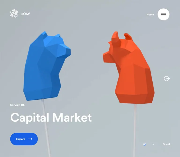
The mobile opening scene uses a full-screen gray field with two opposing low-poly animal forms: a blue bear-like head entering from the left and a red-orange bull-like head entering from the right. Their cropped silhouettes and sharply shaded facets carry most of the visual weight. A small white brand mark occupies the upper-left corner; a Home label and circular navigation affordance occupy the upper-right. The service label and large white title sit near the bottom-left.
A floating white cookie capsule overlays the lower scene and covers the measured Explore link area. This overlap is part of the captured state, not a recommended layout behavior. The three desktop frames show an almost entirely white canvas with a pale incomplete circle near the upper-right. They do not establish the finished desktop design.
閉じる
AQM² — Style Reference
A quiet gray stage for two vivid, faceted forms and restrained white typography.
Original URL: aqm2.ai/ja/
Final URL: aqm2.ai
Theme: light gray scene, saturated blue and red-orange artwork, white navigation and service text.
Inspected: October 2, 2026, using the supplied browser capture run recorded at 2026-10-02T09:57:46.100Z — 18:57:46.100 JST.
Viewports: desktop 1440 × 1000 and mobile 390 × 844 CSS pixels.
Scope: the current corporate homepage’s opening Capital Market scene, mobile identity/navigation controls, cookie notice, measured DOM styles, and the incomplete desktop presentation. Menu contents, destination pages, consent dismissal, and later scenes were not visually inspected.
The requested Japanese URL resolved to the root homepage with HTTP 200. Its document title identifies AQM², Ltd. and the phrase “Co-creation of values by Human-Machine Intelligence.” The visible mobile interface is English. The retained identity supports treating this as the current corporate website at the resolved URL.
The mobile opening scene uses a full-screen gray field with two opposing low-poly animal forms: a blue bear-like head entering from the left and a red-orange bull-like head entering from the right. Their cropped silhouettes and sharply shaded facets carry most of the visual weight. A small white brand mark occupies the upper-left corner; a Home label and circular navigation affordance occupy the upper-right. The service label and large white title sit near the bottom-left.
A floating white cookie capsule overlays the lower scene and covers the measured Explore link area. This overlap is part of the captured state, not a recommended layout behavior. The three desktop frames show an almost entirely white canvas with a pale incomplete circle near the upper-right. They do not establish the finished desktop design.
How to Read This Reference
- Measured values come directly from the supplied rendered DOM and computed styles. Measurements describe the captured state, including elements whose visible paint was obscured or unresolved.
- Visual estimates come from the current-page screenshots. The scene palette, artwork bounds, and cookie-container geometry were not programmatically sampled.
- Derived values are simple calculations from measured rectangles, such as the 28px gap above the Explore anchor.
- Recommendations describe a reusable implementation. They are not claims about existing accessibility, responsive breakpoints, or interaction behavior.
- Token names are descriptive implementation aliases. The supplied custom-property collections were empty; no original CSS variable names were established.
- Evidence is strongest on mobile. Desktop header rectangles are measurable, but the completed desktop scene is unverified.
Tokens — Colors
Exact Computed UI Colors
| Name | Value | Suggested token | Evidence and role |
|---|---|---|---|
| Interface White | #FFFFFF |
--color-white |
Measured foreground on the mobile section, Service label, Capital Market title, Explore anchor, and OK label |
| Near Black | #1C1D1D |
--color-ink |
Measured OK-button background and MAIN foreground; the visible service section overrides its inherited foreground with white |
| Utility Black | #000000 |
--color-utility |
Measured cookie-policy link and navigation-button foreground; also the BODY foreground |
| Transparent | rgba(0, 0, 0, 0) |
— | Reported on BODY, MAIN, the mobile section, and several outer control elements |
The transparent computed backgrounds do not mean the visible scene is white or colorless. The gray field and artwork come from visual layers not described by the sampled element backgrounds. Likewise, the navigation button’s outer box is transparent even though the screenshot contains a white circular surface inside it.
Estimated Scene Palette
These are practical approximations from the current mobile screenshots, not recovered material colors or sampled source declarations.
| Name | Approximate value | Suggested token | Role |
|---|---|---|---|
| Cool Gray Stage | #B7C1C5 |
--color-stage |
Dominant background; its appearance varies subtly across the frame |
| Faceted Blue | #2485D0 |
--color-scene-blue |
Main blue animal surfaces |
| Blue Shadow | #1B5F9F |
--color-scene-blue-dark |
Darker side and lower facets |
| Blue Highlight | #319DE8 |
--color-scene-blue-light |
Upward-facing and brighter facets |
| Red Orange | #F45129 |
--color-scene-orange |
Main orange animal surfaces |
| Orange Shadow | #C63D20 |
--color-scene-orange-dark |
Darker side and underside facets |
| Orange Highlight | #FF6135 |
--color-scene-orange-light |
Brighter upper facets |
The logo, navigation disc, and consent capsule appear white. Their individual fill declarations were not included in the evidence. Use white as a reconstruction choice consistent with the screenshots.
Blue and orange belong primarily to the artwork. The current captures do not establish either as the default button color, link color, or semantic status color. In particular, the Explore anchor’s painted treatment is hidden behind the consent notice.
Tokens — Typography
Primary Interface Family
- Computed family:
CircularStd. - Measured weight:
500throughout the sampled text and controls. - Default BODY size:
16pxwith24pxline height and-0.24pxletter spacing. - Character: clean sans-serif typography with rounded forms and compact tracking. Scale and placement create hierarchy without a visible change to bold weight.
- Limit: computed family names do not establish the font-file URL, exact face file, or successful font download. None were supplied.
- Recommended fallback:
Arial, sans-serif. This is an implementation choice and can change text widths.
Type Scale
| Role | Size | Line height | Weight | Tracking | Status |
|---|---|---|---|---|---|
| BODY / general UI | 16px |
24px |
500 |
-0.24px |
Measured |
| Service label | 13.92px |
20.88px |
500 |
-0.2088px |
Measured mobile |
| Capital Market title | 40px |
48px |
500 |
-0.6px |
Measured mobile H2 |
| Explore anchor | 16px |
24px |
500 |
-0.24px |
Measured; painted control obscured |
| Learn More link | 9.92px |
14.88px |
500 |
-0.24px |
Measured mobile |
| OK label | 9.92px |
14.88px |
500 |
-0.24px |
Measured mobile |
| Home caption | About 10–11px |
Unverified | Unverified | Unverified | Visual estimate; nested caption styles absent |
The BODY, Service label, and title tracking correspond to -0.015em at their respective sizes. The cookie utilities retain a measured -0.24px; applying -0.015em to their smaller type would produce a different result.
The DOM text extraction separates many heading letters onto individual lines, while both mobile screenshots show a normal horizontal heading. This is not evidence of a vertical typography layout or a particular letter-animation sequence.
Tokens — Spacing & Shapes
Spacing and Alignment
| Measurement | Value | Status and interpretation |
|---|---|---|
| Mobile section padding | 0px 20.96px 48px |
Measured computed style |
| Mobile content left edge | 20.953px |
Measured rectangle, including browser rounding |
| Mobile content width | 348.094px |
Measured label, heading, and Explore boxes |
| Header brand left/top | 21px / 24px |
Measured mobile |
| Navigation-button top/right | 21px / 21px |
Measured mobile |
| Heading-to-Explore gap | 28px |
Derived: 734.094 − 706.094 |
| Explore bottom clearance | 48px |
Derived from anchor bottom 796px and viewport height 844px |
| Cookie capsule side clearance | About 21px |
Visual estimate |
| Cookie capsule bottom clearance | About 45px |
Visual estimate |
| Cookie text left inset | About 29px |
Visual estimate relative to the capsule |
| OK-button padding | 12.48px |
Measured computed style |
A universal spacing grid cannot be recovered from these samples. Preserve the measured relationships instead of claiming an underlying 4px or 8px system.
Border Radius and Control Geometry
| Element | Geometry | Evidence |
|---|---|---|
| Navigation outer button | 48 × 48px, 50% radius |
Measured mobile box |
| Visible navigation disc | Approximately 44px diameter |
Screenshot estimate; smaller than the outer box |
| Consent OK button | 39.25 × 39.813px, 50% radius |
Measured; slightly unequal dimensions |
| Consent close button | 24.953 × 24.953px, 0px radius |
Measured outer box; the visible X is smaller |
| Consent capsule | Approximately 348 × 68px, fully rounded ends |
Screenshot estimate; approximately 34px end radius |
| Service text region | Unboxed | Visible mobile composition |
Layout Measurements
| Element | Mobile 390 × 844 |
Desktop 1440 × 1000 |
|---|---|---|
| Document height | 844px |
1000px |
| MAIN rectangle | Full viewport | Full viewport |
| Brand link | x21, y24, 116 × 45px |
x60, y54, 117 × 53.703px |
| Navigation button | x321, y21, 48 × 48px |
x1306.094, y48, 73.906 × 73.906px |
| Service label | x20.953, y637.219, 348.094 × 20.875px |
No usable rendered measurement supplied |
| Capital Market H2 | x20.953, y658.094, 348.094 × 48px |
No usable rendered measurement supplied |
| Explore anchor | x20.953, y734.094, 348.094 × 61.906px |
No usable rendered measurement supplied |
Desktop rectangles describe DOM geometry during the unresolved presentation. They should not be presented as proof that the corresponding finished controls were visible.
Components
Brand and Header Chrome
Role: persistent identity and access to navigation within the opening scene.
The visible mobile brand consists of a white faceted emblem followed by the AQM² wordmark. Its home link occupies a 116 × 45px box at 21px from the left and 24px from the top. It points to https://aqm2.ai/.
The visible header composition spans the upper corners, but the measured HEADER element itself is only the compact logo region: 137 × 69px on mobile. Do not interpret that element’s bounds as a full-width navigation bar.
There is no visible solid header strip. Brand and navigation appear directly over the scene, keeping the canvas visually continuous.
Circular Navigation Affordance
Role: a compact navigation entry point, with its actual click behavior unverified.
A small white Home caption sits immediately to the left of a white disc containing black horizontal bars. The disc is approximately 44px across within a measured 48px circular button box. On the phone, the button ends at x369, leaving a 21px right inset.
The sampled button contains the DOM text home, while the screenshot includes menu-like bars. The supplied evidence does not establish whether clicking opens a menu, changes a scene, or performs another action. Its accessible name was not inspected.
Use a real button and an explicit accessible name in a new implementation, chosen to match the behavior actually implemented.
Full-Viewport Service Scene
Role: introduces the Capital Market service through a single strong visual composition.
The measured mobile SECTION fills 390 × 844px and uses display: flex. Its visible hierarchy is:
- Full-bleed gray scene and oversized faceted artwork.
- White brand and navigation controls at the top.
- A lower-left Service label.
- A larger Capital Market H2.
- An Explore link area below the heading, currently covered by consent UI.
The section has 20.96px horizontal padding and 48px bottom padding. The text stack aligns to one shared left edge. Its Service line starts at approximately 75.5% of the viewport height.
Do not turn this opening view into a content-card grid. Its character comes from a large uninterrupted stage, edge cropping, and a small amount of anchored text.
Service Label and Heading
Role: identify the current service without competing with the artwork.
Service uses 13.92px / 20.88px white text. Capital Market follows immediately in a 40px / 48px line box, also white, with weight 500. The measured title is an H2 and fits on one line at the inspected width.
No paragraph, badge, divider, or boxed panel is visible around this text. The label-to-title relationship is compact; the larger gap occurs after the title, before the Explore anchor.
Explore Anchor
Role: links to the service detail page.
The rendered link target is https://aqm2.ai/capital-market/. Its measured box is 348.094 × 61.906px, beginning at y734.094. The source reports white 16px / 24px text and a transparent background on the anchor itself.
The estimated consent-capsule footprint spans approximately y731–799, covering the anchor’s entire vertical range and nearly the same horizontal range. The capture therefore does not establish the link’s visible fill, icon, inner shape, or child-level button styling.
The Quick Start uses a neutral text-link treatment for this unresolved component. That is a recommendation, not a reconstruction of its hidden painted state.
Cookie Consent Capsule
Role: requests consent and provides a policy link.
A white, fully rounded capsule floats across the lower phone viewport. Its estimated bounds are x21, y731, width348, height68px. The screenshot does not establish whether the source uses fixed positioning, absolute positioning, or another layout method.
Its anatomy is a horizontal row:
- A compact two-line message: “Please consent to the acquisition and use of cookies.”
- An underlined Learn More link flowing with the message and targeting
https://aqm2.ai/privacy/#cookie-policy. - A dark near-circular OK button with white text.
- A small black X inside a transparent close-button box.
The OK button begins at approximately x276.016, y745.328; the close button begins at x325.172, y752.75. Both align around the capsule’s vertical center. There is no visible full-screen scrim or strong elevation shadow.
The supplied states do not show what OK or close does, whether dismissal persists, or how consent affects loading. The banner remains visible in both mobile frames.
Desktop White State
Role: unresolved; visually consistent with a loading or transition state.
All three desktop captures show a near-white viewport and a faint incomplete circular mark near the measured upper-right control position. The desktop visible-text extraction contains only Home, although the BODY text includes the service and navigation content.
Describe this as incomplete desktop rendering. Do not reproduce it as an intentional blank homepage or invent a completed desktop composition. The cause and eventual outcome were not established.
Additional DOM Content
The BODY includes the tagline “Co-creation of values by Human-Machine Intelligence,” navigation-like text including service, capital market, about, contact, EN / JA, and Privacy&Cookie Policy, plus a copyright identifying AQM2, Ltd.
These strings support site identity and the presence of additional content. Their visual placement is unverified. They do not establish an open-menu layout, a visible footer, a second scene, or functioning language switching.
Tokens — Motion & Interaction
Computed Transition Evidence
| Target | Supplied transition | What can be concluded |
|---|---|---|
| BODY background and text color | 0.6s cubic-bezier(0.26, 0.06, 0, 1) |
A 600ms color-transition capability is declared; its trigger was not observed |
| Mobile MAIN opacity | 0.5s cubic-bezier(0.26, 0.06, 0, 1) |
A 500ms opacity transition is declared |
| Explore opacity | 0.5s cubic-bezier(0.18, 0.06, 0.23, 1) |
Link opacity can transition; no hover or activation result was captured |
| OK transform | 0.4s cubic-bezier(0.43, 0.05, 0.17, 1) |
Transform easing and duration are available; scale or displacement is unknown |
| OK opacity | 0.4s cubic-bezier(0.26, 0.06, 0, 1) |
A 400ms opacity transition is declared |
| Brand-link opacity | opacity cubic-bezier(0.18, 0.06, 0.23, 1) |
Easing is supplied, but no positive duration is established by this value |
| Other sampled elements | Frequently transition: all and animation: none |
These values do not establish a timed animation or its trigger |
Scene Motion Evidence
The two mobile frames show different outlines and positions for the faceted heads while the header, title, and consent banner remain stable. This establishes changing scene imagery between captures. It does not establish the motion’s duration, direction, loop, user input, or rendering technology.
The supplied collection process temporarily paused perpetual animations during readiness checks and then resumed them. These still images cannot recover playback timing. A reported animation: none on sampled HTML elements also does not rule out changes elsewhere in the rendering system.
Do not claim verified scroll-driven camera movement, pointer parallax, drag rotation, autoplay sequencing, or staggered heading animation. No corresponding interaction results were supplied.
Recommended adaptation: use restrained continuous artwork motion only if it can be paused. Keep the interface anchored and provide a static scene when reduced motion is requested. Any renderer needs its own pause logic; CSS transition overrides alone are insufficient.
Surfaces
| Layer | Visible appearance | Function |
|---|---|---|
| Scene field | Cool light gray with subtle variation | Gives the saturated artwork a quiet background |
| Animal artwork | Hard-edged blue and orange facets | Supplies depth, contrast, and service identity |
| Brand and service typography | White, directly over the scene | Keeps interface framing light |
| Navigation disc | White circular surface with black bars | Separates a small control from the artwork |
| Consent capsule | White pill with dark compact content | Introduces a temporary utility layer |
| Consent acceptance | Near-black circular fill | Creates a strong local action within the capsule |
| Desktop unresolved state | Near-white field with pale circular mark | Captured incomplete presentation |
Within the inspected mobile opening scene, there is no visible general-purpose card system, bordered content grid, blurred glass panel, or pronounced drop-shadow hierarchy. Depth comes primarily from the artwork’s shaded facets.
Imagery
The current mobile artwork is deliberately faceted. Large polygon planes produce abrupt changes in shade, with blue and orange remaining cleanly separated. The silhouettes suggest opposing market animals, but that interpretation does not establish official model names.
Both forms extend beyond the phone’s side edges. The blue head faces inward from the left; the orange horned head faces inward from the right. Their central separation leaves a clear gray corridor. The artwork occupies roughly the upper-middle band of the screen, beginning around y150–175 and extending to approximately y550–565, depending on the frame.
The crop is part of the composition. Fitting both complete objects inside a narrow screen would reduce their scale and weaken the captured visual relationship. Preserve the interior-facing silhouettes, the broad central opening, and separation from the lower text zone.
Keep flat shading and large readable facets. Highly polished metal, dense surface textures, soft sculpted fur, or generic financial photography would produce a different visual language. The screenshot does not establish a WebGL implementation, a specific 3D library, or whether a rendered image sequence is involved.
Observed Asset References
No image, model, texture, video, or font-file URLs were supplied. The observed assets are identifiable only by their rendered roles: the white emblem and wordmark, the blue faceted form, and the orange faceted form.
Do not invent original filenames or model paths. The CSS below recreates the interface shell; an appropriate scene asset or renderer must be supplied separately.
Layout & Responsive Behavior
Observed Mobile Layout
At 390 × 844, the page presents one viewport-height scene. The measured document height is also 844px. A roughly 21px horizontal inset aligns the brand, lower text, and consent capsule. The navigation control uses a similar right inset.
The lower text region is compact and bottom anchored in appearance. Its geometry is consistent with a stack containing a 20.88px label line, a 48px title line, a 28px gap, and a 61.906px link box, followed by 48px of bottom padding. These values account for the measured label position around y637.219.
The artwork is cropped at both sides rather than shown as a contained illustration. The two screenshots preserve the text positions while their scene imagery changes.
Observed Desktop Differences
At 1440 × 1000, the document and MAIN still match the viewport. The brand link is inset 60px from the left and 54px from the top. The navigation button is inset 60px from the right and 48px from the top, with an approximately 73.91px box.
The brand’s width stays almost unchanged between the measured mobile and desktop states: 116px versus 117px. The button box grows substantially. No source breakpoint or scaling formula was supplied, and the finished desktop artwork and title positions remain unknown.
Responsive Limits and Recommendations
- The evidence does not prove that the page always prevents scrolling or that all site content fits in one screen.
- Intermediate widths, landscape phones, safe-area devices, and browser-toolbar changes were not captured.
- For a new implementation, use a viewport-height scene that can grow when text or controls need more room.
- Preserve edge-cropped artwork on mobile through a deliberate camera or image composition; no original crop formula is known.
- Reserve space for consent UI while it is present. The captured overlap hides the service-entry link.
- Choose desktop artwork proportions and breakpoints through new validation rather than treating the incomplete desktop frames as a finished reference.
Do’s and Don’ts
Do
- Build the opening scene around gray negative space and two strongly colored, inward-facing forms.
- Keep the artwork large enough to crop at the mobile edges.
- Preserve the mobile title’s measured
40px / 48px, weight500, and-0.6pxtracking. - Align the label, title, and service link to the same approximately
21pxmobile inset. - Use white for brand and service framing, with dark details concentrated inside white utility controls.
- Retain the contrast between angular artwork and circular or pill-shaped controls.
- Keep scene motion independent from stable interface placement.
- Label unresolved desktop and interaction details explicitly.
Don’t
- Don’t interpret the white desktop captures as the completed visual design.
- Don’t infer the Explore control’s fill, radius, or icon from an obscured anchor.
- Don’t reduce the large scene to a small illustration above a conventional feature-card grid.
- Don’t turn artwork colors into semantic UI colors without a separate design decision.
- Don’t smooth away the defining polygon facets or introduce glossy materials.
- Don’t claim menu layouts, language-switching behavior, or consent persistence without testing them.
- Don’t infer a rendering library from the appearance of 3D imagery.
- Don’t preserve the consent banner’s obstruction of the service link in a new implementation.
Recommended Implementation Additions
These are recommendations, not verified features of the original page:
- Keep the service link reachable. Reserve the measured consent-banner height and its bottom offset, updating the reservation if its copy wraps.
- Enlarge touch targets. The measured OK control is approximately
39 × 40px, and the close box is approximately25px. Provide at least44 × 44pxinteraction targets while retaining a smaller visible disc or X if desired. - Name icon controls. Supply meaningful accessible names for navigation and consent dismissal, and implement focus handling appropriate to any menu that opens.
- Check text contrast. Small white text on the light gray stage needs verification against the actual moving background. A slightly darker quiet region behind text can preserve the visual direction.
- Provide a static scene fallback. Keep identity, service text, and navigation available if the artwork renderer or assets fail to initialize.
- Support reduced motion. Pause the scene renderer as well as CSS transitions.
- Retain semantic text. Ensure split-letter markup is announced as complete words. Establish a meaningful page-level heading hierarchy; the inspected service title is an H2.
- Handle longer translations. Allow headings and consent copy to wrap, let the scene grow, and remeasure overlay clearance instead of relying on a single fixed phone height.
Agent Prompt Guide
Quick Color Reference
- Stage: approximately
#B7C1C5. - Blue artwork: approximately
#2485D0, with darker and lighter flat-shaded facets. - Orange artwork: approximately
#F45129, with red-orange shadow facets. - Service and brand foreground: white.
- Consent acceptance fill: measured
#1C1D1D. - Cookie utility text: measured black.
- A general primary-action fill has not been established.
Overall Prompt
“Create a mobile-first corporate service homepage inspired by the current AQM² opening scene. Use a full-viewport cool gray stage with oversized, flat-shaded polygonal animal heads facing inward: blue from the left and red-orange from the right. Crop both at the screen edges and retain a broad gray opening between them. Place a white emblem and wordmark in the upper-left, with a small Home caption and circular white navigation control in the upper-right. Anchor a small Service label above a white Capital Market heading near the lower-left. At 390px width, use approximately 21px side insets and a 40px/48px medium-weight heading. Keep the composition sparse and the interface stable. Add a white pill-shaped consent notice with dark text and a dark circular acceptance control, reserving enough space to keep the service link accessible. Treat artwork colors and unverified desktop proportions as design adaptations rather than recovered source values.”
Example Component Prompts
- Service text: “A lower-left text stack aligned 21px from the phone edge. Service is 13.92px with 20.88px line height; Capital Market is 40px with 48px line height. Both are white, medium weight, and tightly tracked. No panel, border, or shadow.”
- Navigation control: “A compact white circular navigation surface with three dark horizontal bars, next to a small white Home caption. Use a 48px mobile button box. Keep the control separate from the logo and provide an accessible name matching its implemented action.”
- Scene artwork: “Two large opposing low-poly animal busts, one blue and bear-like, one red-orange and bull-like. Use hard polygon facets and simple shading against a quiet cool gray background. Crop the outside edges while keeping a clear corridor between their inward-facing profiles.”
- Consent capsule: “A white capsule near the bottom of a 390px viewport, approximately 348px wide. Place compact black consent copy and an underlined policy link at left, then a dark circular OK control and a small close X. Expand interaction targets and reserve space so the capsule does not cover navigation.”
- Motion adaptation: “Keep the header and service text fixed within the composition while the artwork changes subtly. Use the documented 400–600ms transition timings for UI state changes where appropriate. Do not invent a source camera loop or scroll choreography; provide a static reduced-motion state.”
Quick Start
CSS Custom Properties
This is a mobile-focused reconstruction scaffold. Exact computed typography and geometry are mixed with explicitly estimated scene colors and capsule dimensions. The artwork and logo require separately supplied assets. The Explore link uses a recommended neutral treatment because its original paint is obscured.
Suggested structure: .aqm-shell contains .aqm-scene with an artwork layer and .aqm-copy, a separate .aqm-header containing the brand and navigation, and .aqm-cookie containing copy, acceptance, and close controls. The navigation button contains .aqm-menu-glyph.
:root {
  /* Exact computed UI colors */
  --color-white: #ffffff;
  --color-ink: #1c1d1d;
  --color-utility: #000000;

  /* Visual estimates for the rendered scene */
  --color-stage: #b7c1c5;
  --color-scene-blue: #2485d0;
  --color-scene-orange: #f45129;

  /* Source family; fallbacks are recommendations */
  --font-ui: 'CircularStd', Arial, sans-serif;
  --weight-ui: 500;
  --text-body: 16px;
  --text-label: 13.92px;
  --text-title: 40px;
  --text-cookie: 9.92px;
  --tracking-ui: -0.015em;

  /* Measured mobile geometry */
  --page-inset: 20.96px;
  --header-inset: 21px;
  --scene-bottom: 48px;
  --title-link-gap: 28px;
  --explore-height: 61.90625px;
  --nav-size: 48px;

  /* Estimated consent-container geometry */
  --consent-height: 68px;
  --consent-bottom: 45px;
  --radius-pill: 999px;

  /* Measured transition timings and curves */
  --ease-scene: cubic-bezier(0.26, 0.06, 0, 1);
  --ease-link: cubic-bezier(0.18, 0.06, 0.23, 1);
  --ease-control: cubic-bezier(0.43, 0.05, 0.17, 1);
}

.aqm-shell,
.aqm-shell *,
.aqm-shell *::before,
.aqm-shell *::after {
  box-sizing: border-box;
}

.aqm-shell {
  position: relative;
  isolation: isolate;
  min-height: 100vh;
  min-height: 100svh;
  color: var(--color-white);
  background: var(--color-stage);
  font-family: var(--font-ui);
  font-size: var(--text-body);
  font-weight: var(--weight-ui);
  line-height: 24px;
  letter-spacing: var(--tracking-ui);
  transition:
    background-color 600ms var(--ease-scene),
    color 600ms var(--ease-scene);
}

.aqm-shell button,
.aqm-shell a {
  -webkit-tap-highlight-color: transparent;
}

.aqm-shell button {
  font: inherit;
  letter-spacing: inherit;
  cursor: pointer;
}

.aqm-scene {
  position: relative;
  isolation: isolate;
  display: flex;
  flex-direction: column;
  justify-content: flex-end;
  min-height: 100vh;
  min-height: 100svh;
  padding: 0 var(--page-inset) var(--scene-bottom);
  overflow: hidden;
  transition: opacity 500ms var(--ease-scene);
}

/* Supply an image or renderer with intentional mobile framing. */
.aqm-scene-art {
  position: absolute;
  z-index: -1;
  inset: 0;
  width: 100%;
  height: 100%;
  object-fit: cover;
  pointer-events: none;
}

.aqm-copy {
  width: 100%;
}

.aqm-service-label {
  margin: 0;
  font-size: var(--text-label);
  line-height: 20.88px;
  letter-spacing: -0.2088px;
}

.aqm-service-title {
  margin: 0;
  font-size: var(--text-title);
  font-weight: var(--weight-ui);
  line-height: 48px;
  letter-spacing: -0.6px;
}

/* Recommended neutral treatment; original painted CTA is unknown. */
.aqm-explore {
  display: flex;
  align-items: center;
  width: 100%;
  min-height: var(--explore-height);
  margin-top: var(--title-link-gap);
  color: inherit;
  font-size: 16px;
  line-height: 24px;
  text-underline-offset: 0.2em;
  transition: opacity 500ms var(--ease-link);
}

.aqm-header {
  position: absolute;
  z-index: 2;
  inset: 0 0 auto;
  display: flex;
  align-items: flex-start;
  justify-content: space-between;
  padding: var(--header-inset);
}

.aqm-brand {
  display: block;
  width: 116px;
  height: 45px;
  margin-top: 3px;
}

.aqm-brand img {
  display: block;
  width: 100%;
  height: 100%;
  object-fit: contain;
}

.aqm-nav {
  display: flex;
  align-items: center;
  gap: 12px; /* Visual approximation */
}

.aqm-home-caption {
  font-size: 10.5px; /* Visual approximation */
  line-height: 1.2;
}

.aqm-menu {
  position: relative;
  display: grid;
  place-items: center;
  width: var(--nav-size);
  height: var(--nav-size);
  padding: 0;
  border: 0;
  border-radius: 50%;
  background: transparent;
  color: var(--color-utility);
}

.aqm-menu::before {
  content: '';
  position: absolute;
  inset: 2px; /* Estimated visible disc inset */
  border-radius: inherit;
  background: var(--color-white);
}

.aqm-menu-glyph {
  position: relative;
  width: 18px;
  height: 2px;
  background: currentColor;
  box-shadow: 0 -4px currentColor, 0 4px currentColor;
}

/* Fixed positioning and the width cap are adaptation choices. */
.aqm-cookie {
  position: fixed;
  z-index: 3;
  left: var(--page-inset);
  bottom: calc(var(--consent-bottom) + env(safe-area-inset-bottom, 0px));
  display: grid;
  grid-template-columns: minmax(0, 1fr) 39.25px 24.953px;
  align-items: center;
  gap: 9.9px;
  width: calc(100% - 2 * var(--page-inset));
  max-width: 520px;
  min-height: var(--consent-height);
  padding: 14px 19px 14px 29px;
  border-radius: var(--radius-pill);
  color: var(--color-utility);
  background: var(--color-white);
  font-size: var(--text-cookie);
  line-height: 14.88px;
  letter-spacing: -0.24px;
}

.aqm-cookie-copy {
  margin: 0;
}

.aqm-cookie a {
  color: inherit;
  text-decoration: underline;
}

/* These boxes reproduce measured sizes; enlarge production hit targets. */
.aqm-cookie-ok {
  display: grid;
  place-items: center;
  width: 39.25px;
  height: 39.8125px;
  padding: 12.48px;
  border: 0;
  border-radius: 50%;
  color: var(--color-white);
  background: var(--color-ink);
  transition:
    transform 400ms var(--ease-control),
    opacity 400ms var(--ease-scene);
}

.aqm-cookie-close {
  position: relative;
  width: 24.953px;
  height: 24.953px;
  padding: 0;
  border: 0;
  color: var(--color-utility);
  background: transparent;
}

.aqm-cookie-close::before,
.aqm-cookie-close::after {
  content: '';
  position: absolute;
  top: 12px;
  left: 7px;
  width: 11px;
  height: 1px;
  background: currentColor;
  transform: rotate(45deg);
}

.aqm-cookie-close::after {
  transform: rotate(-45deg);
}

/* Recommended collision prevention; intentionally changes the capture. */
.aqm-shell[data-consent-visible='true'] .aqm-scene {
  padding-bottom: calc(
    var(--consent-height) + var(--consent-bottom) + 16px
    + env(safe-area-inset-bottom, 0px)
  );
}

/* Recommended breakpoint; only these desktop header boxes were measured. */
@media (min-width: 60rem) {
  .aqm-header {
    padding: 48px 60px;
  }

  .aqm-brand {
    width: 117px;
    height: 53.703125px;
    margin-top: 6px;
  }

  .aqm-menu {
    --nav-size: 73.90625px;
  }
}

/* Recommended focus treatment, not a recovered source state. */
.aqm-shell :focus-visible {
  outline: 2px solid var(--color-ink);
  outline-offset: 4px;
}

@media (prefers-reduced-motion: reduce) {
  .aqm-shell,
  .aqm-shell *,
  .aqm-shell *::before,
  .aqm-shell *::after {
    animation: none !important;
    transition: none !important;
  }
}
Set data-consent-visible='true' while the notice is shown and update --consent-height from its actual rendered height when text wraps. Implement consent actions, menu behavior, and renderer pausing separately. The media query does not establish a source breakpoint or a verified desktop scene layout.
Tailwind v4 Token Mapping
Optional aliases for projects already using Tailwind v4. These do not imply that the original site uses Tailwind. Define the custom properties above first.
@theme inline {
  --color-stage: #b7c1c5;
  --color-scene-blue: #2485d0;
  --color-scene-orange: #f45129;
  --color-ink: #1c1d1d;
  --color-interface-white: #ffffff;

  --font-ui: 'CircularStd', Arial, sans-serif;

  --text-service-label: 13.92px;
  --text-service-label--line-height: 20.88px;
  --text-service-title: 40px;
  --text-service-title--line-height: 48px;
  --text-cookie: 9.92px;
  --text-cookie--line-height: 14.88px;

  --spacing-page-inset: 20.96px;
  --spacing-scene-bottom: 48px;
  --spacing-title-link: 28px;
  --spacing-nav-control: 48px;

  --radius-capsule: 999px;
}
Sources & Evidence
- Requested original page: https://aqm2.ai/ja/.
- Resolved current page: https://aqm2.ai/, reported HTTP 200, with the title “AQM², Ltd. - Co-creation of values by Human-Machine Intelligence.”
- Capture run: October 2, 2026,
09:57:46.100 UTC/18:57:46.100 JST. Individual frame timestamps and device-pixel ratio were not supplied. - Visual evidence: three desktop frames at
1440 × 1000showing the unresolved white state, and two mobile frames at390 × 844showing the service scene and consent notice. - Measurement evidence: supplied rendered DOM text, element rectangles, computed colors, typography, padding, radii, transitions, and document dimensions. No external stylesheet, asset file, or font file was independently inspected.
- Observed link destinations: Capital Market, home, and cookie policy. These destinations were extracted from the page; their contents were not inspected.
- Motion evidence: different artwork frames with stable mobile interface placement, plus declared CSS transitions. No click, hover, drag, consent-dismissal, or menu-open result was supplied.
- Collection limitations: readiness checks included document loading, image decoding, finite-animation checks, and sampled layout/text stability. These checks do not prove semantic completeness. Perpetual animations were paused during readiness checks and resumed afterward. SharedWorkers and service workers were disabled in the supplied inspection environment; the cause of the incomplete desktop state remains unknown.
This reference describes the supplied current-page evidence, with a completed mobile scene and unresolved desktop presentation. Estimated colors, adaptation code, and recommended accessibility behavior are distinguished from measured source values.
# AQM² — Style Reference

> A quiet gray stage for two vivid, faceted forms and restrained white typography.

**Original URL:** [aqm2.ai/ja/](https://aqm2.ai/ja/)
**Final URL:** [aqm2.ai](https://aqm2.ai/)
**Theme:** light gray scene, saturated blue and red-orange artwork, white navigation and service text.
**Inspected:** October 2, 2026, using the supplied browser capture run recorded at `2026-10-02T09:57:46.100Z` — 18:57:46.100 JST.
**Viewports:** desktop `1440 × 1000` and mobile `390 × 844` CSS pixels.
**Scope:** the current corporate homepage’s opening Capital Market scene, mobile identity/navigation controls, cookie notice, measured DOM styles, and the incomplete desktop presentation. Menu contents, destination pages, consent dismissal, and later scenes were not visually inspected.

The requested Japanese URL resolved to the root homepage with HTTP 200. Its document title identifies AQM², Ltd. and the phrase “Co-creation of values by Human-Machine Intelligence.” The visible mobile interface is English. The retained identity supports treating this as the current corporate website at the resolved URL.

The mobile opening scene uses a full-screen gray field with two opposing low-poly animal forms: a blue bear-like head entering from the left and a red-orange bull-like head entering from the right. Their cropped silhouettes and sharply shaded facets carry most of the visual weight. A small white brand mark occupies the upper-left corner; a Home label and circular navigation affordance occupy the upper-right. The service label and large white title sit near the bottom-left.

A floating white cookie capsule overlays the lower scene and covers the measured Explore link area. This overlap is part of the captured state, not a recommended layout behavior. The three desktop frames show an almost entirely white canvas with a pale incomplete circle near the upper-right. They do not establish the finished desktop design.
閉じる
# AQM² — Style Reference

> A quiet gray stage for two vivid, faceted forms and restrained white typography.

**Original URL:** [aqm2.ai/ja/](https://aqm2.ai/ja/)
**Final URL:** [aqm2.ai](https://aqm2.ai/)
**Theme:** light gray scene, saturated blue and red-orange artwork, white navigation and service text.
**Inspected:** October 2, 2026, using the supplied browser capture run recorded at `2026-10-02T09:57:46.100Z` — 18:57:46.100 JST.
**Viewports:** desktop `1440 × 1000` and mobile `390 × 844` CSS pixels.
**Scope:** the current corporate homepage’s opening Capital Market scene, mobile identity/navigation controls, cookie notice, measured DOM styles, and the incomplete desktop presentation. Menu contents, destination pages, consent dismissal, and later scenes were not visually inspected.

The requested Japanese URL resolved to the root homepage with HTTP 200. Its document title identifies AQM², Ltd. and the phrase “Co-creation of values by Human-Machine Intelligence.” The visible mobile interface is English. The retained identity supports treating this as the current corporate website at the resolved URL.

The mobile opening scene uses a full-screen gray field with two opposing low-poly animal forms: a blue bear-like head entering from the left and a red-orange bull-like head entering from the right. Their cropped silhouettes and sharply shaded facets carry most of the visual weight. A small white brand mark occupies the upper-left corner; a Home label and circular navigation affordance occupy the upper-right. The service label and large white title sit near the bottom-left.

A floating white cookie capsule overlays the lower scene and covers the measured Explore link area. This overlap is part of the captured state, not a recommended layout behavior. The three desktop frames show an almost entirely white canvas with a pale incomplete circle near the upper-right. They do not establish the finished desktop design.

## How to Read This Reference

- **Measured values** come directly from the supplied rendered DOM and computed styles. Measurements describe the captured state, including elements whose visible paint was obscured or unresolved.
- **Visual estimates** come from the current-page screenshots. The scene palette, artwork bounds, and cookie-container geometry were not programmatically sampled.
- **Derived values** are simple calculations from measured rectangles, such as the 28px gap above the Explore anchor.
- **Recommendations** describe a reusable implementation. They are not claims about existing accessibility, responsive breakpoints, or interaction behavior.
- **Token names** are descriptive implementation aliases. The supplied custom-property collections were empty; no original CSS variable names were established.
- **Evidence is strongest on mobile.** Desktop header rectangles are measurable, but the completed desktop scene is unverified.

## Tokens — Colors

### Exact Computed UI Colors

| Name | Value | Suggested token | Evidence and role |
| --- | --- | --- | --- |
| Interface White | `#FFFFFF` | `--color-white` | Measured foreground on the mobile section, Service label, Capital Market title, Explore anchor, and OK label |
| Near Black | `#1C1D1D` | `--color-ink` | Measured OK-button background and MAIN foreground; the visible service section overrides its inherited foreground with white |
| Utility Black | `#000000` | `--color-utility` | Measured cookie-policy link and navigation-button foreground; also the BODY foreground |
| Transparent | `rgba(0, 0, 0, 0)` | — | Reported on BODY, MAIN, the mobile section, and several outer control elements |

The transparent computed backgrounds do not mean the visible scene is white or colorless. The gray field and artwork come from visual layers not described by the sampled element backgrounds. Likewise, the navigation button’s outer box is transparent even though the screenshot contains a white circular surface inside it.

### Estimated Scene Palette

These are practical approximations from the current mobile screenshots, not recovered material colors or sampled source declarations.

| Name | Approximate value | Suggested token | Role |
| --- | --- | --- | --- |
| Cool Gray Stage | `#B7C1C5` | `--color-stage` | Dominant background; its appearance varies subtly across the frame |
| Faceted Blue | `#2485D0` | `--color-scene-blue` | Main blue animal surfaces |
| Blue Shadow | `#1B5F9F` | `--color-scene-blue-dark` | Darker side and lower facets |
| Blue Highlight | `#319DE8` | `--color-scene-blue-light` | Upward-facing and brighter facets |
| Red Orange | `#F45129` | `--color-scene-orange` | Main orange animal surfaces |
| Orange Shadow | `#C63D20` | `--color-scene-orange-dark` | Darker side and underside facets |
| Orange Highlight | `#FF6135` | `--color-scene-orange-light` | Brighter upper facets |

The logo, navigation disc, and consent capsule appear white. Their individual fill declarations were not included in the evidence. Use white as a reconstruction choice consistent with the screenshots.

Blue and orange belong primarily to the artwork. The current captures do not establish either as the default button color, link color, or semantic status color. In particular, the Explore anchor’s painted treatment is hidden behind the consent notice.

## Tokens — Typography

### Primary Interface Family

- **Computed family:** `CircularStd`.
- **Measured weight:** `500` throughout the sampled text and controls.
- **Default BODY size:** `16px` with `24px` line height and `-0.24px` letter spacing.
- **Character:** clean sans-serif typography with rounded forms and compact tracking. Scale and placement create hierarchy without a visible change to bold weight.
- **Limit:** computed family names do not establish the font-file URL, exact face file, or successful font download. None were supplied.
- **Recommended fallback:** `Arial, sans-serif`. This is an implementation choice and can change text widths.

### Type Scale

| Role | Size | Line height | Weight | Tracking | Status |
| --- | --- | --- | --- | --- | --- |
| BODY / general UI | `16px` | `24px` | `500` | `-0.24px` | Measured |
| Service label | `13.92px` | `20.88px` | `500` | `-0.2088px` | Measured mobile |
| Capital Market title | `40px` | `48px` | `500` | `-0.6px` | Measured mobile H2 |
| Explore anchor | `16px` | `24px` | `500` | `-0.24px` | Measured; painted control obscured |
| Learn More link | `9.92px` | `14.88px` | `500` | `-0.24px` | Measured mobile |
| OK label | `9.92px` | `14.88px` | `500` | `-0.24px` | Measured mobile |
| Home caption | About `10–11px` | Unverified | Unverified | Unverified | Visual estimate; nested caption styles absent |

The BODY, Service label, and title tracking correspond to `-0.015em` at their respective sizes. The cookie utilities retain a measured `-0.24px`; applying `-0.015em` to their smaller type would produce a different result.

The DOM text extraction separates many heading letters onto individual lines, while both mobile screenshots show a normal horizontal heading. This is not evidence of a vertical typography layout or a particular letter-animation sequence.

## Tokens — Spacing & Shapes

### Spacing and Alignment

| Measurement | Value | Status and interpretation |
| --- | --- | --- |
| Mobile section padding | `0px 20.96px 48px` | Measured computed style |
| Mobile content left edge | `20.953px` | Measured rectangle, including browser rounding |
| Mobile content width | `348.094px` | Measured label, heading, and Explore boxes |
| Header brand left/top | `21px / 24px` | Measured mobile |
| Navigation-button top/right | `21px / 21px` | Measured mobile |
| Heading-to-Explore gap | `28px` | Derived: `734.094 − 706.094` |
| Explore bottom clearance | `48px` | Derived from anchor bottom `796px` and viewport height `844px` |
| Cookie capsule side clearance | About `21px` | Visual estimate |
| Cookie capsule bottom clearance | About `45px` | Visual estimate |
| Cookie text left inset | About `29px` | Visual estimate relative to the capsule |
| OK-button padding | `12.48px` | Measured computed style |

A universal spacing grid cannot be recovered from these samples. Preserve the measured relationships instead of claiming an underlying 4px or 8px system.

### Border Radius and Control Geometry

| Element | Geometry | Evidence |
| --- | --- | --- |
| Navigation outer button | `48 × 48px`, `50%` radius | Measured mobile box |
| Visible navigation disc | Approximately `44px` diameter | Screenshot estimate; smaller than the outer box |
| Consent OK button | `39.25 × 39.813px`, `50%` radius | Measured; slightly unequal dimensions |
| Consent close button | `24.953 × 24.953px`, `0px` radius | Measured outer box; the visible X is smaller |
| Consent capsule | Approximately `348 × 68px`, fully rounded ends | Screenshot estimate; approximately `34px` end radius |
| Service text region | Unboxed | Visible mobile composition |

### Layout Measurements

| Element | Mobile `390 × 844` | Desktop `1440 × 1000` |
| --- | --- | --- |
| Document height | `844px` | `1000px` |
| MAIN rectangle | Full viewport | Full viewport |
| Brand link | `x21, y24, 116 × 45px` | `x60, y54, 117 × 53.703px` |
| Navigation button | `x321, y21, 48 × 48px` | `x1306.094, y48, 73.906 × 73.906px` |
| Service label | `x20.953, y637.219, 348.094 × 20.875px` | No usable rendered measurement supplied |
| Capital Market H2 | `x20.953, y658.094, 348.094 × 48px` | No usable rendered measurement supplied |
| Explore anchor | `x20.953, y734.094, 348.094 × 61.906px` | No usable rendered measurement supplied |

Desktop rectangles describe DOM geometry during the unresolved presentation. They should not be presented as proof that the corresponding finished controls were visible.

## Components

### Brand and Header Chrome

**Role:** persistent identity and access to navigation within the opening scene.

The visible mobile brand consists of a white faceted emblem followed by the AQM² wordmark. Its home link occupies a `116 × 45px` box at `21px` from the left and `24px` from the top. It points to `https://aqm2.ai/`.

The visible header composition spans the upper corners, but the measured HEADER element itself is only the compact logo region: `137 × 69px` on mobile. Do not interpret that element’s bounds as a full-width navigation bar.

There is no visible solid header strip. Brand and navigation appear directly over the scene, keeping the canvas visually continuous.

### Circular Navigation Affordance

**Role:** a compact navigation entry point, with its actual click behavior unverified.

A small white Home caption sits immediately to the left of a white disc containing black horizontal bars. The disc is approximately `44px` across within a measured `48px` circular button box. On the phone, the button ends at `x369`, leaving a `21px` right inset.

The sampled button contains the DOM text `home`, while the screenshot includes menu-like bars. The supplied evidence does not establish whether clicking opens a menu, changes a scene, or performs another action. Its accessible name was not inspected.

Use a real button and an explicit accessible name in a new implementation, chosen to match the behavior actually implemented.

### Full-Viewport Service Scene

**Role:** introduces the Capital Market service through a single strong visual composition.

The measured mobile SECTION fills `390 × 844px` and uses `display: flex`. Its visible hierarchy is:

1. Full-bleed gray scene and oversized faceted artwork.
2. White brand and navigation controls at the top.
3. A lower-left Service label.
4. A larger Capital Market H2.
5. An Explore link area below the heading, currently covered by consent UI.

The section has `20.96px` horizontal padding and `48px` bottom padding. The text stack aligns to one shared left edge. Its Service line starts at approximately 75.5% of the viewport height.

Do not turn this opening view into a content-card grid. Its character comes from a large uninterrupted stage, edge cropping, and a small amount of anchored text.

### Service Label and Heading

**Role:** identify the current service without competing with the artwork.

Service uses `13.92px / 20.88px` white text. Capital Market follows immediately in a `40px / 48px` line box, also white, with weight `500`. The measured title is an H2 and fits on one line at the inspected width.

No paragraph, badge, divider, or boxed panel is visible around this text. The label-to-title relationship is compact; the larger gap occurs after the title, before the Explore anchor.

### Explore Anchor

**Role:** links to the service detail page.

The rendered link target is `https://aqm2.ai/capital-market/`. Its measured box is `348.094 × 61.906px`, beginning at `y734.094`. The source reports white `16px / 24px` text and a transparent background on the anchor itself.

The estimated consent-capsule footprint spans approximately `y731–799`, covering the anchor’s entire vertical range and nearly the same horizontal range. The capture therefore does not establish the link’s visible fill, icon, inner shape, or child-level button styling.

The Quick Start uses a neutral text-link treatment for this unresolved component. That is a recommendation, not a reconstruction of its hidden painted state.

### Cookie Consent Capsule

**Role:** requests consent and provides a policy link.

A white, fully rounded capsule floats across the lower phone viewport. Its estimated bounds are `x21, y731, width348, height68px`. The screenshot does not establish whether the source uses fixed positioning, absolute positioning, or another layout method.

Its anatomy is a horizontal row:

- A compact two-line message: “Please consent to the acquisition and use of cookies.”
- An underlined Learn More link flowing with the message and targeting `https://aqm2.ai/privacy/#cookie-policy`.
- A dark near-circular OK button with white text.
- A small black X inside a transparent close-button box.

The OK button begins at approximately `x276.016, y745.328`; the close button begins at `x325.172, y752.75`. Both align around the capsule’s vertical center. There is no visible full-screen scrim or strong elevation shadow.

The supplied states do not show what OK or close does, whether dismissal persists, or how consent affects loading. The banner remains visible in both mobile frames.

### Desktop White State

**Role:** unresolved; visually consistent with a loading or transition state.

All three desktop captures show a near-white viewport and a faint incomplete circular mark near the measured upper-right control position. The desktop visible-text extraction contains only Home, although the BODY text includes the service and navigation content.

Describe this as incomplete desktop rendering. Do not reproduce it as an intentional blank homepage or invent a completed desktop composition. The cause and eventual outcome were not established.

### Additional DOM Content

The BODY includes the tagline “Co-creation of values by Human-Machine Intelligence,” navigation-like text including service, capital market, about, contact, EN / JA, and Privacy&Cookie Policy, plus a copyright identifying AQM2, Ltd.

These strings support site identity and the presence of additional content. Their visual placement is unverified. They do not establish an open-menu layout, a visible footer, a second scene, or functioning language switching.

## Tokens — Motion & Interaction

### Computed Transition Evidence

| Target | Supplied transition | What can be concluded |
| --- | --- | --- |
| BODY background and text color | `0.6s cubic-bezier(0.26, 0.06, 0, 1)` | A 600ms color-transition capability is declared; its trigger was not observed |
| Mobile MAIN opacity | `0.5s cubic-bezier(0.26, 0.06, 0, 1)` | A 500ms opacity transition is declared |
| Explore opacity | `0.5s cubic-bezier(0.18, 0.06, 0.23, 1)` | Link opacity can transition; no hover or activation result was captured |
| OK transform | `0.4s cubic-bezier(0.43, 0.05, 0.17, 1)` | Transform easing and duration are available; scale or displacement is unknown |
| OK opacity | `0.4s cubic-bezier(0.26, 0.06, 0, 1)` | A 400ms opacity transition is declared |
| Brand-link opacity | `opacity cubic-bezier(0.18, 0.06, 0.23, 1)` | Easing is supplied, but no positive duration is established by this value |
| Other sampled elements | Frequently `transition: all` and `animation: none` | These values do not establish a timed animation or its trigger |

### Scene Motion Evidence

The two mobile frames show different outlines and positions for the faceted heads while the header, title, and consent banner remain stable. This establishes changing scene imagery between captures. It does not establish the motion’s duration, direction, loop, user input, or rendering technology.

The supplied collection process temporarily paused perpetual animations during readiness checks and then resumed them. These still images cannot recover playback timing. A reported `animation: none` on sampled HTML elements also does not rule out changes elsewhere in the rendering system.

Do not claim verified scroll-driven camera movement, pointer parallax, drag rotation, autoplay sequencing, or staggered heading animation. No corresponding interaction results were supplied.

**Recommended adaptation:** use restrained continuous artwork motion only if it can be paused. Keep the interface anchored and provide a static scene when reduced motion is requested. Any renderer needs its own pause logic; CSS transition overrides alone are insufficient.

## Surfaces

| Layer | Visible appearance | Function |
| --- | --- | --- |
| Scene field | Cool light gray with subtle variation | Gives the saturated artwork a quiet background |
| Animal artwork | Hard-edged blue and orange facets | Supplies depth, contrast, and service identity |
| Brand and service typography | White, directly over the scene | Keeps interface framing light |
| Navigation disc | White circular surface with black bars | Separates a small control from the artwork |
| Consent capsule | White pill with dark compact content | Introduces a temporary utility layer |
| Consent acceptance | Near-black circular fill | Creates a strong local action within the capsule |
| Desktop unresolved state | Near-white field with pale circular mark | Captured incomplete presentation |

Within the inspected mobile opening scene, there is no visible general-purpose card system, bordered content grid, blurred glass panel, or pronounced drop-shadow hierarchy. Depth comes primarily from the artwork’s shaded facets.

## Imagery

The current mobile artwork is deliberately faceted. Large polygon planes produce abrupt changes in shade, with blue and orange remaining cleanly separated. The silhouettes suggest opposing market animals, but that interpretation does not establish official model names.

Both forms extend beyond the phone’s side edges. The blue head faces inward from the left; the orange horned head faces inward from the right. Their central separation leaves a clear gray corridor. The artwork occupies roughly the upper-middle band of the screen, beginning around `y150–175` and extending to approximately `y550–565`, depending on the frame.

The crop is part of the composition. Fitting both complete objects inside a narrow screen would reduce their scale and weaken the captured visual relationship. Preserve the interior-facing silhouettes, the broad central opening, and separation from the lower text zone.

Keep flat shading and large readable facets. Highly polished metal, dense surface textures, soft sculpted fur, or generic financial photography would produce a different visual language. The screenshot does not establish a WebGL implementation, a specific 3D library, or whether a rendered image sequence is involved.

### Observed Asset References

No image, model, texture, video, or font-file URLs were supplied. The observed assets are identifiable only by their rendered roles: the white emblem and wordmark, the blue faceted form, and the orange faceted form.

Do not invent original filenames or model paths. The CSS below recreates the interface shell; an appropriate scene asset or renderer must be supplied separately.

## Layout & Responsive Behavior

### Observed Mobile Layout

At `390 × 844`, the page presents one viewport-height scene. The measured document height is also `844px`. A roughly `21px` horizontal inset aligns the brand, lower text, and consent capsule. The navigation control uses a similar right inset.

The lower text region is compact and bottom anchored in appearance. Its geometry is consistent with a stack containing a `20.88px` label line, a `48px` title line, a `28px` gap, and a `61.906px` link box, followed by `48px` of bottom padding. These values account for the measured label position around `y637.219`.

The artwork is cropped at both sides rather than shown as a contained illustration. The two screenshots preserve the text positions while their scene imagery changes.

### Observed Desktop Differences

At `1440 × 1000`, the document and MAIN still match the viewport. The brand link is inset `60px` from the left and `54px` from the top. The navigation button is inset `60px` from the right and `48px` from the top, with an approximately `73.91px` box.

The brand’s width stays almost unchanged between the measured mobile and desktop states: `116px` versus `117px`. The button box grows substantially. No source breakpoint or scaling formula was supplied, and the finished desktop artwork and title positions remain unknown.

### Responsive Limits and Recommendations

- The evidence does not prove that the page always prevents scrolling or that all site content fits in one screen.
- Intermediate widths, landscape phones, safe-area devices, and browser-toolbar changes were not captured.
- For a new implementation, use a viewport-height scene that can grow when text or controls need more room.
- Preserve edge-cropped artwork on mobile through a deliberate camera or image composition; no original crop formula is known.
- Reserve space for consent UI while it is present. The captured overlap hides the service-entry link.
- Choose desktop artwork proportions and breakpoints through new validation rather than treating the incomplete desktop frames as a finished reference.

## Do’s and Don’ts

### Do

- Build the opening scene around gray negative space and two strongly colored, inward-facing forms.
- Keep the artwork large enough to crop at the mobile edges.
- Preserve the mobile title’s measured `40px / 48px`, weight `500`, and `-0.6px` tracking.
- Align the label, title, and service link to the same approximately `21px` mobile inset.
- Use white for brand and service framing, with dark details concentrated inside white utility controls.
- Retain the contrast between angular artwork and circular or pill-shaped controls.
- Keep scene motion independent from stable interface placement.
- Label unresolved desktop and interaction details explicitly.

### Don’t

- Don’t interpret the white desktop captures as the completed visual design.
- Don’t infer the Explore control’s fill, radius, or icon from an obscured anchor.
- Don’t reduce the large scene to a small illustration above a conventional feature-card grid.
- Don’t turn artwork colors into semantic UI colors without a separate design decision.
- Don’t smooth away the defining polygon facets or introduce glossy materials.
- Don’t claim menu layouts, language-switching behavior, or consent persistence without testing them.
- Don’t infer a rendering library from the appearance of 3D imagery.
- Don’t preserve the consent banner’s obstruction of the service link in a new implementation.

## Recommended Implementation Additions

These are recommendations, not verified features of the original page:

- **Keep the service link reachable.** Reserve the measured consent-banner height and its bottom offset, updating the reservation if its copy wraps.
- **Enlarge touch targets.** The measured OK control is approximately `39 × 40px`, and the close box is approximately `25px`. Provide at least `44 × 44px` interaction targets while retaining a smaller visible disc or X if desired.
- **Name icon controls.** Supply meaningful accessible names for navigation and consent dismissal, and implement focus handling appropriate to any menu that opens.
- **Check text contrast.** Small white text on the light gray stage needs verification against the actual moving background. A slightly darker quiet region behind text can preserve the visual direction.
- **Provide a static scene fallback.** Keep identity, service text, and navigation available if the artwork renderer or assets fail to initialize.
- **Support reduced motion.** Pause the scene renderer as well as CSS transitions.
- **Retain semantic text.** Ensure split-letter markup is announced as complete words. Establish a meaningful page-level heading hierarchy; the inspected service title is an H2.
- **Handle longer translations.** Allow headings and consent copy to wrap, let the scene grow, and remeasure overlay clearance instead of relying on a single fixed phone height.

## Agent Prompt Guide

### Quick Color Reference

- Stage: approximately `#B7C1C5`.
- Blue artwork: approximately `#2485D0`, with darker and lighter flat-shaded facets.
- Orange artwork: approximately `#F45129`, with red-orange shadow facets.
- Service and brand foreground: white.
- Consent acceptance fill: measured `#1C1D1D`.
- Cookie utility text: measured black.
- A general primary-action fill has not been established.

### Overall Prompt

“Create a mobile-first corporate service homepage inspired by the current AQM² opening scene. Use a full-viewport cool gray stage with oversized, flat-shaded polygonal animal heads facing inward: blue from the left and red-orange from the right. Crop both at the screen edges and retain a broad gray opening between them. Place a white emblem and wordmark in the upper-left, with a small Home caption and circular white navigation control in the upper-right. Anchor a small Service label above a white Capital Market heading near the lower-left. At 390px width, use approximately 21px side insets and a 40px/48px medium-weight heading. Keep the composition sparse and the interface stable. Add a white pill-shaped consent notice with dark text and a dark circular acceptance control, reserving enough space to keep the service link accessible. Treat artwork colors and unverified desktop proportions as design adaptations rather than recovered source values.”

### Example Component Prompts

1. **Service text:** “A lower-left text stack aligned 21px from the phone edge. Service is 13.92px with 20.88px line height; Capital Market is 40px with 48px line height. Both are white, medium weight, and tightly tracked. No panel, border, or shadow.”
2. **Navigation control:** “A compact white circular navigation surface with three dark horizontal bars, next to a small white Home caption. Use a 48px mobile button box. Keep the control separate from the logo and provide an accessible name matching its implemented action.”
3. **Scene artwork:** “Two large opposing low-poly animal busts, one blue and bear-like, one red-orange and bull-like. Use hard polygon facets and simple shading against a quiet cool gray background. Crop the outside edges while keeping a clear corridor between their inward-facing profiles.”
4. **Consent capsule:** “A white capsule near the bottom of a 390px viewport, approximately 348px wide. Place compact black consent copy and an underlined policy link at left, then a dark circular OK control and a small close X. Expand interaction targets and reserve space so the capsule does not cover navigation.”
5. **Motion adaptation:** “Keep the header and service text fixed within the composition while the artwork changes subtly. Use the documented 400–600ms transition timings for UI state changes where appropriate. Do not invent a source camera loop or scroll choreography; provide a static reduced-motion state.”

## Quick Start

### CSS Custom Properties

This is a mobile-focused reconstruction scaffold. Exact computed typography and geometry are mixed with explicitly estimated scene colors and capsule dimensions. The artwork and logo require separately supplied assets. The Explore link uses a recommended neutral treatment because its original paint is obscured.

Suggested structure: `.aqm-shell` contains `.aqm-scene` with an artwork layer and `.aqm-copy`, a separate `.aqm-header` containing the brand and navigation, and `.aqm-cookie` containing copy, acceptance, and close controls. The navigation button contains `.aqm-menu-glyph`.

```css
:root {
  /* Exact computed UI colors */
  --color-white: #ffffff;
  --color-ink: #1c1d1d;
  --color-utility: #000000;

  /* Visual estimates for the rendered scene */
  --color-stage: #b7c1c5;
  --color-scene-blue: #2485d0;
  --color-scene-orange: #f45129;

  /* Source family; fallbacks are recommendations */
  --font-ui: 'CircularStd', Arial, sans-serif;
  --weight-ui: 500;
  --text-body: 16px;
  --text-label: 13.92px;
  --text-title: 40px;
  --text-cookie: 9.92px;
  --tracking-ui: -0.015em;

  /* Measured mobile geometry */
  --page-inset: 20.96px;
  --header-inset: 21px;
  --scene-bottom: 48px;
  --title-link-gap: 28px;
  --explore-height: 61.90625px;
  --nav-size: 48px;

  /* Estimated consent-container geometry */
  --consent-height: 68px;
  --consent-bottom: 45px;
  --radius-pill: 999px;

  /* Measured transition timings and curves */
  --ease-scene: cubic-bezier(0.26, 0.06, 0, 1);
  --ease-link: cubic-bezier(0.18, 0.06, 0.23, 1);
  --ease-control: cubic-bezier(0.43, 0.05, 0.17, 1);
}

.aqm-shell,
.aqm-shell *,
.aqm-shell *::before,
.aqm-shell *::after {
  box-sizing: border-box;
}

.aqm-shell {
  position: relative;
  isolation: isolate;
  min-height: 100vh;
  min-height: 100svh;
  color: var(--color-white);
  background: var(--color-stage);
  font-family: var(--font-ui);
  font-size: var(--text-body);
  font-weight: var(--weight-ui);
  line-height: 24px;
  letter-spacing: var(--tracking-ui);
  transition:
    background-color 600ms var(--ease-scene),
    color 600ms var(--ease-scene);
}

.aqm-shell button,
.aqm-shell a {
  -webkit-tap-highlight-color: transparent;
}

.aqm-shell button {
  font: inherit;
  letter-spacing: inherit;
  cursor: pointer;
}

.aqm-scene {
  position: relative;
  isolation: isolate;
  display: flex;
  flex-direction: column;
  justify-content: flex-end;
  min-height: 100vh;
  min-height: 100svh;
  padding: 0 var(--page-inset) var(--scene-bottom);
  overflow: hidden;
  transition: opacity 500ms var(--ease-scene);
}

/* Supply an image or renderer with intentional mobile framing. */
.aqm-scene-art {
  position: absolute;
  z-index: -1;
  inset: 0;
  width: 100%;
  height: 100%;
  object-fit: cover;
  pointer-events: none;
}

.aqm-copy {
  width: 100%;
}

.aqm-service-label {
  margin: 0;
  font-size: var(--text-label);
  line-height: 20.88px;
  letter-spacing: -0.2088px;
}

.aqm-service-title {
  margin: 0;
  font-size: var(--text-title);
  font-weight: var(--weight-ui);
  line-height: 48px;
  letter-spacing: -0.6px;
}

/* Recommended neutral treatment; original painted CTA is unknown. */
.aqm-explore {
  display: flex;
  align-items: center;
  width: 100%;
  min-height: var(--explore-height);
  margin-top: var(--title-link-gap);
  color: inherit;
  font-size: 16px;
  line-height: 24px;
  text-underline-offset: 0.2em;
  transition: opacity 500ms var(--ease-link);
}

.aqm-header {
  position: absolute;
  z-index: 2;
  inset: 0 0 auto;
  display: flex;
  align-items: flex-start;
  justify-content: space-between;
  padding: var(--header-inset);
}

.aqm-brand {
  display: block;
  width: 116px;
  height: 45px;
  margin-top: 3px;
}

.aqm-brand img {
  display: block;
  width: 100%;
  height: 100%;
  object-fit: contain;
}

.aqm-nav {
  display: flex;
  align-items: center;
  gap: 12px; /* Visual approximation */
}

.aqm-home-caption {
  font-size: 10.5px; /* Visual approximation */
  line-height: 1.2;
}

.aqm-menu {
  position: relative;
  display: grid;
  place-items: center;
  width: var(--nav-size);
  height: var(--nav-size);
  padding: 0;
  border: 0;
  border-radius: 50%;
  background: transparent;
  color: var(--color-utility);
}

.aqm-menu::before {
  content: '';
  position: absolute;
  inset: 2px; /* Estimated visible disc inset */
  border-radius: inherit;
  background: var(--color-white);
}

.aqm-menu-glyph {
  position: relative;
  width: 18px;
  height: 2px;
  background: currentColor;
  box-shadow: 0 -4px currentColor, 0 4px currentColor;
}

/* Fixed positioning and the width cap are adaptation choices. */
.aqm-cookie {
  position: fixed;
  z-index: 3;
  left: var(--page-inset);
  bottom: calc(var(--consent-bottom) + env(safe-area-inset-bottom, 0px));
  display: grid;
  grid-template-columns: minmax(0, 1fr) 39.25px 24.953px;
  align-items: center;
  gap: 9.9px;
  width: calc(100% - 2 * var(--page-inset));
  max-width: 520px;
  min-height: var(--consent-height);
  padding: 14px 19px 14px 29px;
  border-radius: var(--radius-pill);
  color: var(--color-utility);
  background: var(--color-white);
  font-size: var(--text-cookie);
  line-height: 14.88px;
  letter-spacing: -0.24px;
}

.aqm-cookie-copy {
  margin: 0;
}

.aqm-cookie a {
  color: inherit;
  text-decoration: underline;
}

/* These boxes reproduce measured sizes; enlarge production hit targets. */
.aqm-cookie-ok {
  display: grid;
  place-items: center;
  width: 39.25px;
  height: 39.8125px;
  padding: 12.48px;
  border: 0;
  border-radius: 50%;
  color: var(--color-white);
  background: var(--color-ink);
  transition:
    transform 400ms var(--ease-control),
    opacity 400ms var(--ease-scene);
}

.aqm-cookie-close {
  position: relative;
  width: 24.953px;
  height: 24.953px;
  padding: 0;
  border: 0;
  color: var(--color-utility);
  background: transparent;
}

.aqm-cookie-close::before,
.aqm-cookie-close::after {
  content: '';
  position: absolute;
  top: 12px;
  left: 7px;
  width: 11px;
  height: 1px;
  background: currentColor;
  transform: rotate(45deg);
}

.aqm-cookie-close::after {
  transform: rotate(-45deg);
}

/* Recommended collision prevention; intentionally changes the capture. */
.aqm-shell[data-consent-visible='true'] .aqm-scene {
  padding-bottom: calc(
    var(--consent-height) + var(--consent-bottom) + 16px
    + env(safe-area-inset-bottom, 0px)
  );
}

/* Recommended breakpoint; only these desktop header boxes were measured. */
@media (min-width: 60rem) {
  .aqm-header {
    padding: 48px 60px;
  }

  .aqm-brand {
    width: 117px;
    height: 53.703125px;
    margin-top: 6px;
  }

  .aqm-menu {
    --nav-size: 73.90625px;
  }
}

/* Recommended focus treatment, not a recovered source state. */
.aqm-shell :focus-visible {
  outline: 2px solid var(--color-ink);
  outline-offset: 4px;
}

@media (prefers-reduced-motion: reduce) {
  .aqm-shell,
  .aqm-shell *,
  .aqm-shell *::before,
  .aqm-shell *::after {
    animation: none !important;
    transition: none !important;
  }
}
```

Set `data-consent-visible='true'` while the notice is shown and update `--consent-height` from its actual rendered height when text wraps. Implement consent actions, menu behavior, and renderer pausing separately. The media query does not establish a source breakpoint or a verified desktop scene layout.

### Tailwind v4 Token Mapping

Optional aliases for projects already using Tailwind v4. These do not imply that the original site uses Tailwind. Define the custom properties above first.

```css
@theme inline {
  --color-stage: #b7c1c5;
  --color-scene-blue: #2485d0;
  --color-scene-orange: #f45129;
  --color-ink: #1c1d1d;
  --color-interface-white: #ffffff;

  --font-ui: 'CircularStd', Arial, sans-serif;

  --text-service-label: 13.92px;
  --text-service-label--line-height: 20.88px;
  --text-service-title: 40px;
  --text-service-title--line-height: 48px;
  --text-cookie: 9.92px;
  --text-cookie--line-height: 14.88px;

  --spacing-page-inset: 20.96px;
  --spacing-scene-bottom: 48px;
  --spacing-title-link: 28px;
  --spacing-nav-control: 48px;

  --radius-capsule: 999px;
}
```

## Sources & Evidence

- **Requested original page:** [https://aqm2.ai/ja/](https://aqm2.ai/ja/).
- **Resolved current page:** [https://aqm2.ai/](https://aqm2.ai/), reported HTTP 200, with the title “AQM², Ltd. - Co-creation of values by Human-Machine Intelligence.”
- **Capture run:** October 2, 2026, `09:57:46.100 UTC` / `18:57:46.100 JST`. Individual frame timestamps and device-pixel ratio were not supplied.
- **Visual evidence:** three desktop frames at `1440 × 1000` showing the unresolved white state, and two mobile frames at `390 × 844` showing the service scene and consent notice.
- **Measurement evidence:** supplied rendered DOM text, element rectangles, computed colors, typography, padding, radii, transitions, and document dimensions. No external stylesheet, asset file, or font file was independently inspected.
- **Observed link destinations:** [Capital Market](https://aqm2.ai/capital-market/), [home](https://aqm2.ai/), and [cookie policy](https://aqm2.ai/privacy/#cookie-policy). These destinations were extracted from the page; their contents were not inspected.
- **Motion evidence:** different artwork frames with stable mobile interface placement, plus declared CSS transitions. No click, hover, drag, consent-dismissal, or menu-open result was supplied.
- **Collection limitations:** readiness checks included document loading, image decoding, finite-animation checks, and sampled layout/text stability. These checks do not prove semantic completeness. Perpetual animations were paused during readiness checks and resumed afterward. SharedWorkers and service workers were disabled in the supplied inspection environment; the cause of the incomplete desktop state remains unknown.

This reference describes the supplied current-page evidence, with a completed mobile scene and unresolved desktop presentation. Estimated colors, adaptation code, and recommended accessibility behavior are distinguished from measured source values.関連するデザイン
スタイルやページの種類、ジャンルが近いデザインを集めました。