プレビュー準備中デザインリファレンスを見る
DESIGN REFERENCE
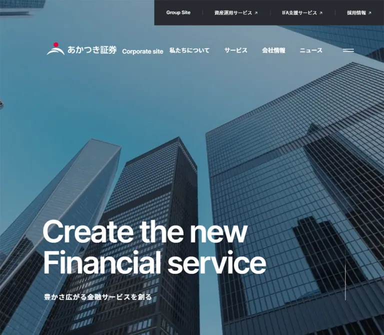
あかつき証券|大型タイポグラフィと余白が際立つ企業サイト
青みを帯びた高層ビルの写真に大きな白文字を重ね、企業姿勢と金融サービスを紹介。非対称の本文配置、円形の矢印リンク、濃色フッターで構成されたコーポレートサイト。
Akatsuki Securities / Corporate Site — Style Reference
A blue skyline, expansive white space, and precise typography give a financial institution a contemporary editorial presence.
Website: corp.akatsuki-sc.com
Original URL: https://corp.akatsuki-sc.com/
Final URL: https://corp.akatsuki-sc.com/
Theme: white content canvas, a photograph-led opening, and a charcoal footer
Inspected: October 2, 2026; supplied retrieval timestamp 2026-10-02T10:28:53.452Z, equivalent to 19:28:53 JST
Viewports: desktop 1440 × 1000 and mobile 390 × 844 CSS pixels
Scope: the current corporate homepage: opening hero, header states, section navigation, Mission, three service introductions, News, Media, utility destinations, and footer. Additional menu structure is available in the rendered DOM; an opened-menu capture and interaction results are not supplied.
The homepage combines institutional scale with a restrained interface. An upward-looking city photograph fills the desktop opening, carrying the two-line statement “Create the new / Financial service” in very large white Inter. A compact Japanese statement sits underneath. The logo and navigation occupy the upper edge without enclosing the photograph in a separate header surface.
Below the opening, the visual system becomes predominantly black and white. Large English section titles establish the rhythm, while Japanese headings and paragraphs explain the company and its services. Desktop content is deliberately shifted to the right, leaving a narrow navigation lane on the left. Service photography supplies human context, and a substantial charcoal footer consolidates corporate, policy, and operational links.
This is a corporate information homepage with several destinations and content types. Its identity depends on the relationship between the photographic opening, generous reading space, editorial service introductions, compact information lists, and comprehensive footer.
閉じる
Akatsuki Securities / Corporate Site — Style Reference
A blue skyline, expansive white space, and precise typography give a financial institution a contemporary editorial presence.
Website: corp.akatsuki-sc.com
Original URL: https://corp.akatsuki-sc.com/
Final URL: https://corp.akatsuki-sc.com/
Theme: white content canvas, a photograph-led opening, and a charcoal footer
Inspected: October 2, 2026; supplied retrieval timestamp 2026-10-02T10:28:53.452Z, equivalent to 19:28:53 JST
Viewports: desktop 1440 × 1000 and mobile 390 × 844 CSS pixels
Scope: the current corporate homepage: opening hero, header states, section navigation, Mission, three service introductions, News, Media, utility destinations, and footer. Additional menu structure is available in the rendered DOM; an opened-menu capture and interaction results are not supplied.
The homepage combines institutional scale with a restrained interface. An upward-looking city photograph fills the desktop opening, carrying the two-line statement “Create the new / Financial service” in very large white Inter. A compact Japanese statement sits underneath. The logo and navigation occupy the upper edge without enclosing the photograph in a separate header surface.
Below the opening, the visual system becomes predominantly black and white. Large English section titles establish the rhythm, while Japanese headings and paragraphs explain the company and its services. Desktop content is deliberately shifted to the right, leaving a narrow navigation lane on the left. Service photography supplies human context, and a substantial charcoal footer consolidates corporate, policy, and operational links.
This is a corporate information homepage with several destinations and content types. Its identity depends on the relationship between the photographic opening, generous reading space, editorial service introductions, compact information lists, and comprehensive footer.
How to Read This Reference
- Measured values come from the supplied rendered DOM, computed styles, and element rectangles at the two inspected viewports.
- Calculated values are arithmetic derived from those measurements. They do not establish the original CSS formula.
- Estimated values describe visible screenshot geometry or color where an exact style was not supplied.
- Recommended values and behaviors belong to the reusable implementation. They are not claims about the original site.
- Token names in this document are implementation aliases. The supplied custom-property inventory mainly contains general WordPress presets; their presence does not make those colors, gradients, or shadows part of the visible design.
- Font-family names are supported by computed styles. Font files, loading behavior, and every descendant text style were not independently inspected.
- Screenshots establish settled visual states. They do not establish animation timing, hover behavior, menu transitions, or successful filtering.
Tokens — Colors
Default Palette
| Name | Value | Suggested token | Role and evidence |
|---|---|---|---|
| Page White | #ffffff |
--color-page |
Measured body background; also measured hero lettering and primary footer links |
| Body Charcoal | #272a2f |
--color-body |
Measured Japanese body text and desktop group-site strip |
| Deep Charcoal | #1f2022 |
--color-strong |
Measured English section titles, many links, and footer background |
| Active Rail | #212326 |
--color-rail-active |
Measured active section-navigation text |
| Quiet Rail | #8e9195 |
--color-rail-muted |
Measured inactive section-navigation text |
| Inactive Filter | #a2a5ac |
--color-filter-muted |
Measured inactive News categories |
| Secondary Menu Text | #636569 |
--color-menu-muted |
Measured subordinate links in additional navigation markup |
| Action Text | #333333 |
--color-action |
Measured service links, More detail, and View all |
| Footer Links | #bdbebf |
--color-footer-link |
Measured policy and utility links on charcoal |
| Footer Fine Print | #939496 |
--color-footer-muted |
Measured registration information and copyright |
| Dark Divider | approximately #38393b |
--color-rule-dark |
Screenshot estimate for subtle footer rules; exact border color was not supplied |
Photographic and Brand Accents
| Accent | Reference value | Status | Application |
|---|---|---|---|
| Skyline Blue Gray | approximately #4f8295 |
Visual estimate, not a sampled CSS color | Describes part of the hero photograph's overall atmosphere; not a flat page background |
| Brand Red | approximately #e60046 |
Visual estimate | Small circular accent in the logo |
| Brand Blue | approximately #0089cc |
Visual estimate | Colored logo treatment visible against white in the scrolled desktop capture |
The blue impression comes primarily from the hero image. Glass facades, the sky, and a darkened photographic treatment produce several blue and gray values. The supplied evidence does not identify the original image's unprocessed colors, overlay color, opacity, or blend mode.
Keep the interface neutral. The brand's small red mark does not establish a red button system, and the presence of blue in photography does not imply blue navigation surfaces. Use the authorized logo artwork instead of reconstructing its colors or curves from these estimates.
Tokens — Typography
Inter — English Display Type
Measured family: Inter, sans-serif.
Inter is used for the opening statement and the large English section titles. Both use weight 600. Negative tracking gives the large letters a compact, continuous silhouette, especially in the two-line hero statement.
The homepage's visible section labels are Mission, Service, News, and Media. Their scale gives structure to long stretches of white space without introducing colored panels or decorative section backgrounds.
Noto Sans JP — Japanese Content
Measured family: "Noto Sans JP", sans-serif.
The body uses weight 500; prominent Japanese headings use 700; secondary navigation and policy links often use 400. Japanese paragraphs retain generous line height even when their font size decreases on mobile.
The desktop body default is 16px / 28.32px, but the main Mission and service paragraphs override it. Do not use the body default as the size of every paragraph.
Mixed Action Labels
Measured stack: Inter, "Noto Sans JP", sans-serif.
Service destination links and English actions share this stack. Their weight is 700. The small bold label and a separate arrow treatment create emphasis without a large colored button surface.
Type Scale
| Role | Desktop measurement | Mobile measurement | Weight / tracking |
|---|---|---|---|
| Hero English statement | 112.896px / 115.154px |
38px / 42.56px |
600; desktop -0.05em, mobile -0.035em |
| Hero Japanese statement | 19px / 19.38px |
12px / 12.24px |
700; 0.05em |
| English section title | 82px / 82px |
40px / 40px |
600; -0.03em |
| Mission Japanese heading | 58px / 78.3px |
28px / 35.7px |
700; -0.03em |
| Mission paragraph | 22px / 41.8px |
16px / 28px |
500; normal tracking |
| Service heading container | 42px / 74.34px |
26px / 32.24px |
700; normal tracking |
| Service paragraph | 18px / 31.86px |
16px / 28px |
500 |
| Service destination label | 14px / 24.78px |
14px / 24.78px |
700 |
| Hero primary navigation | 16px / 24px |
Not visible in the opening | 700 |
| Hero group-site links | 13px / 19.5px |
Not visible in the opening | 400 |
| Desktop section rail | 13px / 19.5px |
Not present in the supplied mobile state | 400 inactive, 700 active; 0.02em |
| News categories | 16px / 24px |
13px / 19.5px |
700 selected, 400 inactive |
| News and Media link wrapper | 16px / 28.32px |
14px / 24.78px |
500; descendants may override |
| Utility destination label | 16px / 28.32px |
13px / 23.01px |
500 |
| Footer primary links | 14px / 24.78px |
14px / 24.78px |
500 |
| Footer policy links | 14px / 22.12px |
14px / 22.12px |
400 |
| Registration information | 12px / 24px |
12px / 18px |
400 |
| Copyright | 13px / 23.01px |
12px / 21.24px |
400 |
The service heading measurement belongs to an h3 that includes both a service name and supporting text. The screenshot visibly differentiates those runs. Descendant styles were not supplied, so the parent size should not be applied indiscriminately to the entire combined string. An approximately 18px bold supporting line on desktop is a visual estimate.
Element height and line height also differ in places. For example, a desktop English section heading has an 86px measured rectangle despite its 82px computed line height; the mobile rectangle is 54px with 40px line height. Preserve the typographic settings and tune surrounding spacing rather than forcing all headings into those rectangle heights.
Tokens — Spacing & Shapes
Overall density: sparse main content, compact navigation, and an information-rich footer.
The spacing is not a uniform card grid. Large gaps separate editorial sections, while smaller gaps organize labels, links, and rules. The desktop Mission block adds a second indentation inside the already offset main column.
Spacing Measurements
| Relationship | Desktop | Mobile | Evidence |
|---|---|---|---|
| Hero end to Mission start | 160px |
90px |
Calculated from section and header rectangles |
| Mission content top padding | 160px |
48px |
Measured padding |
| Mission content left padding | 130px |
0 |
Measured padding |
| Mission heading to paragraph | 60px |
33px |
Calculated rectangle separation |
| Mission end to Service start | 160px |
80px |
Calculated |
| Service heading container to paragraph | 70px |
30px |
Calculated for sampled introductions |
| Service paragraph to destination action | 50px |
20px |
Calculated |
| Service end to News start | 200px |
80px |
Calculated |
| News end to Media start | 110px |
160px |
Calculated; mobile rhythm is not uniformly compressed |
| Media end to utility group outer edge | approximately 110px |
approximately 80px |
Calculated with inferred 1px borders |
| Utility group end to footer | approximately 200px |
approximately 100px |
Calculated with inferred outer bounds |
| Footer policy-link vertical pitch | approximately 32.11px |
approximately 32.11px |
Calculated from consecutive link positions |
Geometry
| Element | Treatment | Status |
|---|---|---|
| Main content surfaces | Square, unboxed white regions | Visible |
| Service photograph | Rectangular with square corners | Visible in desktop IFA capture |
| Utility destination panels | Thin rectangular outlines, no visible rounding | Visible on desktop |
| Service arrow disk | Approximately 60 × 60px, fully circular |
Screenshot estimate consistent with measured link height |
| Mobile service action | 30px measured link height; 40px right padding |
Measured; the icon itself was not separately captured |
| Menu symbol | Two short horizontal strokes | Visible; no enclosing filled button |
| Footer rules | Thin, low-contrast horizontal lines | Visible |
There is no visible general-purpose shadow or rounded-card system in the supplied captures. Separation comes from scale, whitespace, image boundaries, and rules.
Layout Measurements
| Element | Desktop 1440 × 1000 |
Mobile 390 × 844 |
|---|---|---|
| Document height | 7283.125px |
5718.5px |
| Hero rectangle | 1440 × 1000px |
390 × 450px |
| Hero statement position | x=116, y=611.34 |
x=22, y=267.67 |
| Hero statement rectangle | 851.03 × 230.28px |
295.97 × 85.09px |
| Japanese hero statement position | x=122, y=882.63 |
x=24, y=365.77 |
| Main column | x=187.19, width 1152.02px |
x=24, width 342px |
| Service text column | Width 581.20px |
Width 342px |
| IFA photograph | Approximately 461 × 576px in the supplied scrolled capture |
Image bounds not supplied |
| Utility link interior | Approximately 275.5 × 80px each |
162 × 70px each |
| Footer content width | 1152px, beginning at x=144 |
342px, beginning at x=24 |
| Footer height | 633.42px |
921.17px |
At the sampled desktop width, the main column corresponds to approximately 80% width with a 13% left offset and a 7% right margin. The footer also uses approximately 80% width, but is centered with 10% margins. These are calculated relationships at one viewport, not recovered stylesheet formulas.
Components
Photographic Hero
Role: establish identity and the company's central statement.
The desktop hero occupies the entire inspected 1000px viewport height. Buildings enter from several edges and converge toward the open sky, creating strong upward diagonals. The main statement is anchored low and left, leaving the upper center relatively open.
The exact displayed copy is:
- “Create the new”
- “Financial service”
- “豊かさ広がる金融サービスを創る”
The English statement has two deliberate lines. On desktop, its approximately 113px size, tight tracking, and near-solid line spacing create a large white mass against the dark glass. The Japanese line is much smaller and separated from the English text box by approximately 41px.
On mobile, the hero is 450px high. The English statement remains on two lines at 38px, with approximately 13px before the Japanese line. Its left edge is 22px; the Japanese text aligns at the normal 24px content inset. The photograph receives a narrower crop that retains the upward architectural perspective.
A thin vertical mark is visible near the lower-right desktop edge. Its exact purpose and behavior were not verified; do not automatically implement it as a working scroll control.
Opening Header and Group-Site Strip
Role: distinguish corporate navigation from related service destinations.
The desktop header has two levels:
- A charcoal strip attached to the top-right edge, approximately
70pxhigh. It contains Group Site and three outbound destinations: asset management, IFA support, and recruitment. Small diagonal arrows and thin vertical separators distinguish these links. - A transparent navigation row over the photograph. A horizontal white logo lockup begins near
x=130,y=117. Four Japanese corporate links sit to its right, followed by a two-stroke menu symbol.
The corporate links are “私たちについて”, “サービス”, “会社情報”, and “ニュース”. They use white 16px bold text. The logo lockup includes the small red mark and the English descriptor Corporate site.
At 390px, the visible opening header contains a stacked logo treatment at x=24, y=15, and a menu link at x=340, y=21 with a measured 30 × 30px box. The desktop group strip and horizontal corporate links are absent from the opening capture. Related destinations remain represented in the additional mobile navigation DOM.
An outbound arrow communicates a destination relationship; the evidence does not establish whether links open a new tab.
Scrolled Identity and Section Rail
Role: maintain orientation alongside long-form content.
The desktop IFA capture shows a compact colored logo with black lettering at the upper left, a gray Corporate site descriptor, and a dark two-stroke menu symbol at the upper right. This is visually distinct from the opening's white horizontal lockup.
The left rail contains Mission, Service, News, and Media. Inactive labels are light gray; the visible Service state is dark and bold with a small dot to its left. Labels begin around x=44, with an approximately 48.5px vertical pitch. The supplied anchor destinations are #SEC01, #SEC02, #SEC03, and #SEC04.
The rail and corner controls remain visible in supplied scrolled desktop states. Their underlying fixed or sticky positioning, activation threshold, and lower boundary were not provided. The footer capture still shows Service emphasized, so reliable scroll-synchronized active-state updates cannot be claimed from these images alone.
The mobile evidence contains no equivalent visible section rail. Preserve the mobile content width instead of allocating a narrow sidebar.
Additional Menu Structure
Role: expose the broader corporate hierarchy.
The rendered desktop DOM includes grouped navigation for company background, services, company information, and news. Sampled group headings use 20px / 35.4px, weight 700; subordinate links use 14px / 24.78px, weight 400, in #636569.
Desktop group-heading rectangles occupy four horizontal positions, consistent with a multi-column menu layout. Mobile category links have full-width 390 × 65px rectangles and 24px left padding. Several mobile categories use # destinations, while the related service links have explicit URLs.
This confirms markup and responsive measurements, not a tested menu experience. Opening, closing, expansion, focus handling, overlay appearance, and menu animation remain unverified. Reproduce the information hierarchy only after deciding and implementing accessible behavior.
Mission Section
Role: present the corporate purpose as an editorial statement.
A large Inter Mission heading starts at the main column's left edge. On desktop, the Japanese content begins another 130px to the right and 160px below the heading region. The two-line Japanese heading uses 58px bold type, followed by 22px medium-weight prose with 41.8px leading.
The content includes “豊かさ広がる / 金融サービスを創る”. A More detail link leads to the company-background page. Its desktop link rectangle is 87.69 × 94px, positioned well to the right of the copy. The supplied screenshots do not show this desktop action closely enough to establish its full icon arrangement.
On mobile, the inset disappears. Mission, the Japanese heading, and the paragraph share the 24px left edge. The heading becomes 28px; the paragraph remains a comfortable 16px / 28px. The paragraph starts approximately 33px after the heading, and More detail appears below it.
Service Introduction
Role: explain three service areas with text and photography.
The Service section contains asset management, IFA support, and services for financial institutions. These are substantial introductions in a long vertical sequence. The supplied desktop IFA capture shows the anatomy clearly:
- A large Japanese service name at the left.
- A smaller bold supporting line directly below it.
- A short paragraph in a
581pxtext column. - A right-aligned destination label and dark circular outbound arrow.
- A portrait photograph at the right, approximately
461 × 576px.
The text and image occupy approximately 50.45% and 40% of the main width, leaving about 9.55% between them. These percentages combine measured text geometry with estimated image bounds.
In the IFA capture, the photograph begins below the heading region and extends far below the paragraph. It depicts a financial adviser presenting a tablet to a seated client in a bright interior. This offset is part of the composition; aligning all text and image edges into a compact card would materially change it.
Desktop service-heading starts occur near document positions 2205.78, 3187.55, and 4183.48, approximately one viewport apart. There is no evidence that this spacing represents scroll snapping or pinned panels.
Mobile heading and paragraph widths become 342px. The supplied positions indicate significant space before each service heading, consistent with a vertically reorganized visual region. The mobile service photographs themselves are not shown in the attached captures, so their precise crop, aspect ratio, and order remain unverified. An image-above-copy arrangement is a practical implementation recommendation, not a measured fact.
Circular Service Destination Link
Role: provide a focused exit to a related service site.
The visible IFA action combines “IFA支援サービスサイト” with a dark circle containing a small white northeast arrow. The circle is approximately 60px in diameter. The whole anchor measures 222.33 × 60px, with 75px right padding reserved by the source layout for the action treatment.
The label is 14px, bold, in #333333. Its baseline sits around the vertical center of the circle. The asset-management action uses the same measured height and padding pattern.
On mobile, the source link height decreases to 30px and the reserved right padding to 40px. A new implementation should retain the compact visual circle while providing a larger interactive target.
The financial-institution introduction has no separate destination action in the supplied homepage link inventory. Do not add an equivalent button merely to make all three introductions identical.
News Categories and Rows
Role: provide a concise current-information index.
News begins with the same oversized English section title, followed by four categories: “すべて”, “サービス”, “お知らせ”, and “業績・組織”. The selected category is dark and bold; the others are pale gray and regular weight.
Desktop category labels use 16px; mobile labels use 13px. The desktop first label reserves 16px at the left, while mobile labels have 10px bottom padding. Duplicated text appears in the DOM extraction, but the evidence does not establish the mechanism behind it. Render each visible label once.
The desktop list contains three full-width linked rows, each with a measured height of 89px and 90px start-to-start spacing. Each record includes a date, category, Japanese title, and NEW text where present. On mobile, the row heights vary from approximately 96px to 120px as content wraps. A compact metadata line above the title is consistent with the extracted mobile reading order; descendant rectangles are unavailable.
A View all link sits at the lower right. Its desktop anchor measures approximately 141 × 60px, compared with 101 × 30px on mobile.
The category anchors use javascript:void(0). That establishes a scripted control rather than a navigable destination; no successful filter operation was recorded. Row divider styling is not directly visible in the supplied screenshots, so use the measured row rhythm as stronger evidence than any assumed border color.
Media Rows
Role: collect external coverage and published materials.
Media reuses the English section-title scale and the full-width linked-list structure. Three records are present, followed by View all. One record includes a PDF label and points directly to a document; the others point to site articles.
Longer titles increase desktop row height from 89px to approximately 115px. Mobile rows range from approximately 120px to 143px. The content therefore uses flexible row heights. Do not truncate every title to a fixed single line to reproduce the shorter desktop row.
The evidence confirms a document link, not a preview, download dialog, or special PDF viewer.
Utility Destination Grid
Role: provide operational routes after the editorial content.
Four outlined destinations appear before the footer: recruitment, asset-navigation login, account opening, and the IFA portal login. The desktop grid has four equal columns with square corners, centered labels, and a small northeast arrow near each right edge.
Measured desktop link interiors are approximately 275.5 × 80px. The screenshot suggests an enclosing 1px border, producing approximately 277.5 × 82px outer panels and 14px gaps.
On mobile, the DOM establishes a two-column, two-row arrangement. Link interiors are 162 × 70px; an equivalent border gives approximately 164 × 72px outer panels. Calculated horizontal and vertical gaps are approximately 14px and 20px. Labels reduce to 13px, and the two login destinations keep two-line wording.
These are links to separate services. The homepage does not contain an inline account-opening form or login form.
Corporate Footer
Role: close the page with identity, policy access, and registration details.
The footer is a full-width #1f2022 field. Desktop content is centered in a 1152px column, unlike the offset main content. A white horizontal brand lockup occupies the upper left, with four primary links across the upper right.
Below that row, two policy groups sit side by side. Thin gray rules define their upper edges; short white strokes mark the beginning of the rules in the screenshot. Six policy links appear in the left group, and two guide/policy links in the right. Policy text is 14px, regular weight, in #bdbebf.
A separate ruled row contains contact, electronic notices, disclosures, and recruitment. The bottom area places company registration information at left and copyright at right. The original footer identifies the company as あかつき証券株式会社 and includes “© Akatsuki Securities,Inc.”.
Mobile changes the hierarchy substantially. The four primary links become stacked rows approximately 60.77px high with rules between them. Policy groups become a single column. The four short utility links still fit across one row at 390px. Registration information wraps into a 342px block with 18px leading, and copyright follows below.
The attached mobile footer image begins below the brand area. The DOM confirms that the brand link remains earlier in the footer; its absence from that crop is not evidence that it is removed on mobile.
Tokens — Motion & Interaction
| Treatment | Evidence | What can be concluded |
|---|---|---|
| News category color transition | color 0.4s cubic-bezier(0.23, 1, 0.32, 1) |
A defined 400ms color transition exists on category anchors |
| Section anchor destinations | #SEC01 through #SEC04 |
The rail points to page sections; scroll easing and offset handling are unverified |
| Selected section styling | Dark bold label and dot visible in desktop captures | A selected visual state exists; accurate live synchronization was not demonstrated |
| Header appearance below the hero | Different logo and menu treatment in scrolled captures | Multiple header appearances exist; transition timing and trigger are unknown |
| Menu control | Two-stroke symbol and # anchor |
An affordance exists; opening behavior and animation were not exercised |
| News filtering | Scripted category anchors | Intended scripted behavior is indicated; resulting content changes are unverified |
| Hero photography | Settled architectural image in both captures | No verified pan, zoom, video, slideshow, or parallax behavior |
| Other sampled elements | Many report animation: none and transition: all |
These records do not establish a nonzero animation duration or describe all descendants and pseudo-elements |
The collection process waited for settled layout and visible image decoding, with finite-motion readiness checks. That improves confidence in the final composition but does not expose a complete motion specification. Perpetual animation was handled by the collector; its actual presence on a particular component is not established by that procedure alone.
For an adaptation, keep any additional motion quiet and subordinate to reading. A short opacity or color change is sufficient for most links. Preserve the measured category transition where useful, support reduced motion, and avoid introducing continuous image movement without a separate design requirement.
Surfaces
| Layer | Appearance | Purpose |
|---|---|---|
| Opening | Full-bleed, darkened blue architectural photograph | Scale and corporate identity |
| Opening navigation | Transparent with white content | Keep the image visually continuous |
| Group-site strip | Flat #272a2f rectangle |
Separate related service destinations |
| Main page | Flat white canvas | Let typography, spacing, and photographs carry hierarchy |
| Service action | Small dark circle with white arrow | Local emphasis beside a bold text label |
| Utility destination | White rectangle with a fine dark outline | Distinct operational route |
| Footer | Flat #1f2022 field with muted rules |
Consolidate dense corporate information |
There is no evidenced glass layer, floating shadow system, decorative gradient panel, or repeated rounded content card. General WordPress gradient and shadow presets in the custom-property inventory should not be copied into this design.
Imagery
The opening photograph uses a low camera angle, several converging facades, and a broad area of blue sky. Its composition supports the low-left headline while keeping institutional scale visible. Preserve the relationship between open sky and dense glass geometry when selecting a replacement image.
The visible service photograph introduces people at a much more intimate scale. A seated adviser and client, a tablet, daylight, and a softly blurred foreground communicate consultation through an actual scene. The tall crop gives the service block visual weight despite the short paragraph beside it.
The two image roles should remain distinct: architecture establishes the institution; service photography makes the work concrete. Avoid replacing both with generic decorative finance icons.
Observed Asset References
| Visual | Original-page evidence | Asset-path status |
|---|---|---|
| Architectural hero | Desktop and mobile opening captures | No image or video URL supplied |
| IFA consultation photograph | Desktop service capture, approximately 4:5 crop | No image URL supplied |
| White horizontal brand lockup | Desktop opening and footer captures | No asset URL supplied |
| Compact white brand treatment | Mobile opening capture | No asset URL supplied |
| Colored logo on white | Scrolled desktop service capture | No asset URL supplied |
No asset filenames can be recovered from the provided evidence. Use authorized source assets if available, or clearly separate replacement photography from original-brand artwork. Do not invent paths and present them as observed originals.
Layout & Responsive Behavior
Desktop Composition
The opening, main content, and footer use three related alignments. The opening statement begins around 8.1% from the left; the main column begins around 13%; the footer begins at 10%. This variation creates a deliberate hierarchy while keeping the page broadly aligned.
The main column leaves room for the compact rail. Its width is approximately 1152px, and the Mission text adds a further 130px inset. Service sections use a broad text column and a tall image with substantial separation. News and Media expand back across the full main width.
The page's measured desktop height is approximately 7283px. This is an observation of current content, not a target height to hardcode.
Mobile Composition
At 390px, the page uses consistent 24px side margins and 342px content width. The opening is 450px high, approximately 53.3% of the inspected viewport. Its visible logo and menu remain small, and the first viewport already reveals the beginning of Mission.
English section headings reduce from 82px to 40px. Mission's Japanese heading reduces from 58px to 28px, while important paragraphs remain 16px. The design therefore preserves reading size while reducing display scale and indentation.
The utility grid changes from four columns to two. The footer changes from horizontal groups into stacked rows and policy lists, increasing its height from approximately 633px to 921px. Mobile is a structural reflow, not a uniformly scaled desktop composition.
Responsive Limits
Only two viewport sizes were supplied. The exact breakpoint, tablet layout, landscape treatment, safe-area handling, and behavior at narrower phone widths are unknown. A 64rem breakpoint in the Quick Start is a recommendation. Its interpolated sizes and mobile photograph ratio also require testing against the chosen assets and real copy.
Do not derive a universal 450px mobile hero rule or an exact desktop 100vh rule solely from the two measured rectangles. Those values are useful implementation targets for the inspected conditions.
Do’s and Don’ts
Do
- Preserve the two-line English hero statement and its strong white silhouette.
- Use Inter at weight
600for large English display text and Noto Sans JP for Japanese reading content. - Keep the main desktop column offset and the footer centered.
- Retain the larger desktop Mission indentation and remove it on mobile.
- Give service photography enough height and surrounding space to remain a major element.
- Keep the interface mostly white and charcoal, with brand color concentrated in the logo.
- Pair small bold service labels with circular outbound-arrow treatments.
- Allow News and Media row heights to grow with Japanese titles.
- Preserve the four-column to two-column utility-grid change.
- Treat the mobile footer as a carefully spaced information hierarchy.
- Keep visible labels singular even when extracted DOM text contains repeated spans.
Don’t
- Don’t convert the three service introductions into a compact grid of rounded cards.
- Don’t promote every destination into a bright filled button.
- Don’t apply the desktop hero height to the phone layout without checking the first-screen composition.
- Don’t carry the desktop left rail into the narrow mobile content area.
- Don’t replace generous section spacing with identical small gaps everywhere.
- Don’t use every WordPress preset color, shadow, or gradient found in the DOM inventory.
- Don’t assume the hero is video or add parallax based on a still image.
- Don’t claim menu expansion or News filtering has been verified.
- Don’t infer actual image URLs, logo asset construction, or font-loading details.
- Don’t remove corporate and policy links to simplify the footer into a promotional closing block.
Recommended Implementation Additions
These recommendations are not verified original-site features:
- Give the two-stroke menu button an accessible name,
aria-expanded, andaria-controls. If it opens an overlay, manage focus and Escape behavior explicitly. - Keep a visible focus indicator on all links. Enlarge compact mobile icon targets to at least
44 × 44pxwithout enlarging the visible arrow disk. - Implement News categories as semantic buttons with a selected state and an understandable update to the results. Avoid copying
javascript:void(0)as the complete behavior. - Give the main page a clear heading hierarchy. The sampled hero statement is a paragraph, and an
h1appears in menu markup; a new implementation can improve document semantics while preserving the visual design. - Hide decorative duplicate label spans from assistive technology if text-layer effects are used.
- Use a reliable section-observation mechanism if the desktop rail is intended to track reading position. Test its state near the footer and on direct anchor navigation.
- Keep muted text contrast and focus visibility under review. Pale inactive labels should not be the only indication of availability or state.
- Use meaningful alternative text for informative service images and empty alternatives for purely decorative hero photography.
- Respect reduced-motion preferences for any added reveals or smooth scrolling.
- Keep all content visible when enhancement scripts fail. Reserve image dimensions to avoid layout movement.
Agent Prompt Guide
Quick Color Reference
- Main page:
#ffffff. - Japanese body text:
#272a2f. - English section titles and footer surface:
#1f2022. - Action-label text:
#333333. - Inactive section labels:
#8e9195. - Inactive News categories:
#a2a5ac. - Footer policy links:
#bdbebf. - Footer fine print:
#939496. - Hero blue belongs to photography; logo red and blue belong to authorized artwork.
Overall Prompt
“Create a Japanese financial corporate homepage using a full-width architectural opening, a white editorial content area, and a substantial charcoal footer. Place a large white two-line English statement low on the hero, set in Inter 600 with tight tracking, and add a compact Japanese supporting line. On desktop, use an offset main column with a small section rail on the left, oversized English section headings, bold Japanese headings, and generous vertical space. Present three service introductions as spacious text-and-photo compositions, with small bold destination labels beside dark circular arrows. Follow with News and Media lists, four outlined utility links, and a detailed corporate footer. At phone width, use 24px side margins, a compact 450px reference hero, 40px section headings, readable 16px main paragraphs, a two-column utility grid, and stacked footer groups. Treat unspecified interactions and image crops as implementation decisions.”
Example Component Prompts
- Opening: “Build a desktop corporate hero around an upward-looking photograph of glass towers and blue sky. Position the white two-line statement ‘Create the new / Financial service’ low and left. Use Inter 600, approximately 113px at 1440px width, 1.02 line height, and -0.05em tracking. Place a small bold Japanese line underneath. Add transparent corporate navigation and a charcoal group-site strip at the upper right.”
- Service introduction: “Create a spacious white service section with a Japanese heading and smaller bold subtitle at left, an 18px paragraph with approximately 1.77 leading, and a tall consultation photograph at right. At the reference desktop width, allocate roughly 581px to text and 461px to the image. Place a right-aligned service label beside a 60px dark circular northeast arrow. Keep square image corners and broad whitespace.”
- Utility grid: “Create four equal outlined corporate destination links with centered Japanese labels, small northeast arrows, no shadow, and square corners. Use approximately 82px outer height on desktop. Reflow into two columns on mobile with approximately 72px outer height, 14px column gaps, and 20px row gaps.”
- Footer: “Create a #1f2022 corporate footer with a white brand lockup, white primary navigation, #bdbebf policy links, and #939496 registration text. Use subtle horizontal rules and two policy columns on desktop. At 390px, stack the primary links into roughly 61px rows, use 24px side padding, stack policy groups, and place copyright below the legal information.”
- Responsive Mission: “Use an 82px Inter Mission heading on desktop and a separately indented Japanese statement at 58px, followed by 22px text with 1.9 leading. At phone width, remove the indentation, reduce the English heading to 40px and the Japanese heading to 28px, and keep body text at 16px with 28px leading.”
Quick Start
CSS Custom Properties
This is an implementation scaffold, not recovered production CSS. It uses the measured colors and typography, recreates the sampled desktop alignments, and supplies a recommended responsive layout. The breakpoint, hero overlay, mobile image crop, focus treatment, and minimum target sizes are recommendations.
Load Inter and Noto Sans JP through your own font setup. Provide authorized image and logo assets. The hero expects an image with class .hero-media, a .hero-copy wrapper, a .hero-title containing two block spans, and a .hero-tagline. Service blocks expect .service-copy and .service-photo children; the supporting line inside a service title uses .service-subtitle.
:root {
  /* Measured interface colors */
  --color-page: #ffffff;
  --color-body: #272a2f;
  --color-strong: #1f2022;
  --color-action: #333333;
  --color-rail-active: #212326;
  --color-rail-muted: #8e9195;
  --color-filter-muted: #a2a5ac;
  --color-footer-link: #bdbebf;
  --color-footer-muted: #939496;

  /* Estimated or recommended supporting treatments */
  --color-rule-dark: #38393b;
  --color-rule-light: #dedfe1;
  --hero-overlay: rgb(13 31 43 / 28%);

  --font-display: Inter, sans-serif;
  --font-body: 'Noto Sans JP', sans-serif;
  --font-action: Inter, 'Noto Sans JP', sans-serif;

  --text-hero: clamp(38px, 7.84vw, 112.896px);
  --text-section: 82px;
  --text-mission: 58px;
  --text-service: 42px;
  --text-prose: 18px;
  --space-section: 160px;
  --action-diameter: 60px;
  --mobile-gutter: 24px;
  --motion-category: 400ms cubic-bezier(0.23, 1, 0.32, 1);
}

* { box-sizing: border-box; }

body {
  margin: 0;
  color: var(--color-body);
  background: var(--color-page);
  font: 500 16px/1.77 var(--font-body);
}

img { display: block; max-width: 100%; }
a { color: inherit; text-decoration: none; }
button { font: inherit; }

:where(a, button):focus-visible {
  outline: 2px solid currentColor;
  outline-offset: 5px;
}

.hero {
  position: relative;
  isolation: isolate;
  min-height: 100vh;
  min-height: 100svh;
  overflow: hidden;
  color: #fff;
  background: var(--color-strong);
}

.hero-media,
.hero::after {
  position: absolute;
  inset: 0;
  width: 100%;
  height: 100%;
}

.hero-media {
  z-index: -2;
  object-fit: cover;
  object-position: center;
}

.hero::after {
  content: '';
  z-index: -1;
  background: var(--hero-overlay);
  pointer-events: none;
}

.hero-copy {
  position: absolute;
  left: 8.0556%;
  right: 7%;
  bottom: 9.8%;
}

.hero-title {
  margin: 0;
  font: 600 var(--text-hero)/1.02 var(--font-display);
  letter-spacing: -0.05em;
}

.hero-title > span { display: block; }

.hero-tagline {
  margin: 41px 0 0 6px;
  font-size: 19px;
  font-weight: 700;
  line-height: 1.02;
  letter-spacing: 0.05em;
}

.site-header {
  position: absolute;
  top: 117px;
  left: 9.03%;
  right: 7.55%;
  display: flex;
  align-items: center;
  justify-content: space-between;
  gap: 24px;
}

.brand {
  display: flex;
  align-items: center;
  gap: 16px;
  flex-shrink: 0;
}

.brand-mark { width: 194px; }
.brand-caption { font-size: 18px; white-space: nowrap; }

.primary-nav {
  display: flex;
  align-items: center;
  gap: clamp(20px, 2.78vw, 40px);
  font-size: 16px;
  font-weight: 700;
}

.group-strip {
  position: absolute;
  inset: 0 0 auto auto;
  display: flex;
  align-items: center;
  min-height: 70px;
  background: var(--color-body);
  font-size: 13px;
  font-weight: 400;
}

.group-strip > * { padding-inline: 32px; }
.group-strip > * + * { border-left: 1px solid rgb(255 255 255 / 18%); }

/* Larger target with a compact two-stroke visual. */
.menu-toggle {
  position: relative;
  width: 44px;
  height: 44px;
  flex: 0 0 44px;
  padding: 0;
  border: 0;
  background: transparent;
  color: inherit;
  cursor: pointer;
}

.menu-toggle::before,
.menu-toggle::after {
  content: '';
  position: absolute;
  left: 7px;
  width: 30px;
  height: 2px;
  background: currentColor;
}

.menu-toggle::before { top: 17px; }
.menu-toggle::after { top: 23px; }

.main-column {
  width: 80%;
  margin-left: 13%;
  padding-top: 160px;
}

.section-title {
  margin: 0;
  color: var(--color-strong);
  font: 600 var(--text-section)/1 var(--font-display);
  letter-spacing: -0.03em;
}

section[id] { scroll-margin-top: 100px; }

.mission-content {
  display: flex;
  align-items: center;
  justify-content: space-between;
  gap: 60px;
  padding: 160px 0 0 130px;
}

.mission-copy { max-width: 656.5px; }

.mission-title {
  margin: 0;
  font-size: var(--text-mission);
  font-weight: 700;
  line-height: 1.35;
  letter-spacing: -0.03em;
}

.mission-copy p {
  margin: 60px 0 0;
  font-size: 22px;
  line-height: 1.9;
}

.service-section { margin-top: var(--space-section); }

.service-list {
  display: grid;
  gap: 200px;
  margin-top: 170px;
}

.service-block {
  display: grid;
  grid-template-columns: minmax(0, 50.45fr) minmax(0, 40fr);
  column-gap: 9.55%;
  align-items: start;
}

.service-title {
  margin: 0;
  font-size: var(--text-service);
  font-weight: 700;
  line-height: 1.77;
}

/* Subtitle size is a visual approximation. */
.service-subtitle {
  display: block;
  font-size: 18px;
  line-height: 1.77;
}

.service-description {
  margin: 70px 0 0;
  font-size: var(--text-prose);
  line-height: 1.77;
}

.service-photo {
  width: 100%;
  margin-top: 150px;
  aspect-ratio: 4 / 5;
  object-fit: cover;
}

.service-action-row { margin-top: 50px; text-align: right; }

.outbound-action {
  display: inline-flex;
  align-items: center;
  justify-content: flex-end;
  gap: 15px;
  min-height: 44px;
  color: var(--color-action);
  font: 700 14px/1.77 var(--font-action);
}

.action-disc {
  display: grid;
  place-items: center;
  width: var(--action-diameter);
  height: var(--action-diameter);
  flex: 0 0 var(--action-diameter);
  border-radius: 50%;
  color: #fff;
  background: var(--color-strong);
}

.news-section { margin-top: 200px; }
.media-section { margin-top: 110px; }

.news-filters {
  display: flex;
  flex-wrap: wrap;
  gap: 30px;
  margin-top: 72px;
}

.news-tab {
  padding: 0 0 0 16px;
  border: 0;
  color: var(--color-filter-muted);
  background: transparent;
  font-size: 16px;
  line-height: 1.5;
  cursor: pointer;
  transition: color var(--motion-category);
}

.news-tab[aria-pressed='true'] {
  color: var(--color-body);
  font-weight: 700;
}

/* Row grid and divider color are recommended reconstructions. */
.news-list { margin-top: 52px; }
.media-list { margin-top: 72px; }

.information-row {
  display: grid;
  grid-template-columns: 130px 130px minmax(0, 1fr);
  align-items: center;
  gap: 24px;
  min-height: 90px;
  padding-block: 24px;
  border-top: 1px solid var(--color-rule-light);
  color: var(--color-strong);
}

.information-row:last-child { border-bottom: 1px solid var(--color-rule-light); }

.utility-grid {
  display: grid;
  grid-template-columns: repeat(4, minmax(0, 1fr));
  gap: 14px;
  margin: 110px 0 200px;
}

.utility-link {
  position: relative;
  display: flex;
  align-items: center;
  justify-content: center;
  min-height: 82px;
  padding: 12px 38px 12px 20px;
  border: 1px solid var(--color-strong);
  color: var(--color-strong);
  text-align: center;
}

.utility-arrow { position: absolute; right: 20px; }

.site-footer {
  padding: 72px 0 54px;
  color: var(--color-footer-link);
  background: var(--color-strong);
}

.footer-inner { width: 80%; margin-inline: auto; }

.footer-top,
.footer-primary,
.footer-utility,
.footer-meta {
  display: flex;
  align-items: center;
}

.footer-top,
.footer-meta { justify-content: space-between; gap: 30px; }
.footer-primary { gap: 64px; color: #fff; font-size: 14px; }

.footer-policy-groups {
  display: grid;
  grid-template-columns: repeat(2, minmax(0, 1fr));
  gap: 62px;
  margin-top: 68px;
}

.footer-policy-group {
  position: relative;
  padding-top: 28px;
  border-top: 1px solid var(--color-rule-dark);
}

.footer-policy-group::before {
  content: '';
  position: absolute;
  top: -1px;
  left: 0;
  width: 12px;
  height: 2px;
  background: #fff;
}

.footer-policy-group a {
  display: block;
  width: fit-content;
  margin-bottom: 10px;
  font-size: 14px;
  font-weight: 400;
  line-height: 1.58;
}

.footer-utility {
  flex-wrap: wrap;
  gap: 20px 60px;
  margin-top: 30px;
  padding-block: 30px;
  border-block: 1px solid var(--color-rule-dark);
  font-size: 14px;
  font-weight: 400;
}

.footer-meta {
  align-items: flex-end;
  margin-top: 30px;
  color: var(--color-footer-muted);
  font-weight: 400;
}

.footer-legal { margin: 0; font-size: 12px; line-height: 2; }
.footer-copyright { margin: 0; font-size: 13px; }

/* Recommended breakpoint; only 1440px and 390px were inspected. */
@media (max-width: 64rem) {
  :root {
    --text-section: 40px;
    --text-mission: 28px;
    --text-service: 26px;
    --text-prose: 16px;
    --space-section: 80px;
    --action-diameter: 30px;
  }

  body { font-size: 14px; }
  .hero { min-height: 450px; }
  .hero-copy { left: 22px; right: 24px; bottom: 72px; }

  .hero-title {
    font-size: clamp(32px, 9.744vw, 38px);
    line-height: 1.12;
    letter-spacing: -0.035em;
  }

  .hero-tagline {
    margin: 13px 0 0 2px;
    font-size: 12px;
  }

  .site-header { top: 15px; left: 24px; right: 13px; align-items: flex-start; }
  .group-strip, .primary-nav-links { display: none; }
  .brand { flex-direction: column; gap: 4px; align-items: center; }
  .brand-mark { width: 76px; }
  .brand-caption { font-size: 11px; }

  .main-column {
    width: calc(100% - 48px);
    margin-inline: 24px;
    padding-top: 90px;
  }

  .mission-content { display: block; padding: 48px 0 0; }
  .mission-title { line-height: 1.275; }
  .mission-copy p { margin-top: 33px; font-size: 16px; line-height: 1.75; }

  .service-list { gap: 80px; margin-top: 40px; }
  .service-block { grid-template-columns: minmax(0, 1fr); gap: 32px; }
  .service-title { line-height: 1.24; }
  .service-subtitle { margin-top: 8px; font-size: 15px; line-height: 1.6; }
  .service-description { margin-top: 30px; line-height: 1.75; }

  /* Recommended mobile crop and order; not visually verified. */
  .service-photo { order: -1; margin-top: 0; aspect-ratio: 8 / 5; }
  .service-action-row { margin-top: 20px; }
  .outbound-action { gap: 10px; }

  .news-section { margin-top: 80px; }
  .media-section { margin-top: 160px; }
  .news-filters { gap: 32px; margin-top: 40px; }
  .news-tab { padding: 0 0 10px; font-size: 13px; }
  .news-list { margin-top: 28px; }
  .media-list { margin-top: 40px; }

  .information-row {
    grid-template-columns: auto minmax(0, 1fr);
    gap: 10px 16px;
    min-height: 96px;
    padding-block: 20px;
  }

  .information-title { grid-column: 1 / -1; }

  .utility-grid {
    grid-template-columns: repeat(2, minmax(0, 1fr));
    gap: 20px 14px;
    margin: 80px 0 100px;
  }

  .utility-link { min-height: 72px; padding: 10px 25px 10px 14px; font-size: 13px; }
  .utility-arrow { right: 12px; }

  .site-footer { padding: 24px 0 40px; }
  .footer-inner { width: calc(100% - 48px); }
  .footer-top { display: block; }
  .footer-primary { display: block; margin-top: 28px; }

  .footer-primary a {
    display: block;
    padding: 18px 10px;
    border-bottom: 1px solid var(--color-rule-dark);
  }

  .footer-policy-groups { grid-template-columns: 1fr; gap: 30px; margin-top: 30px; }
  .footer-policy-group { padding-top: 30px; }
  .footer-policy-group:first-child { border-top: 0; padding-top: 0; }
  .footer-policy-group::before { display: none; }
  .footer-utility { justify-content: space-between; gap: 16px; }
  .footer-meta { display: grid; gap: 18px; }
  .footer-legal { line-height: 1.5; }
  .footer-copyright { font-size: 12px; }
}

@media (prefers-reduced-motion: reduce) {
  .news-tab { transition: none; }
}
The overlay should be reduced or removed if the chosen photograph is already graded. Use a compact authorized logo variant on mobile rather than assuming the desktop logo asset will scale into the observed stacked lockup. Menu state, News filtering, and rail synchronization require separate semantic markup and JavaScript; this scaffold does not imply that those behaviors have been reproduced.
Tailwind v4 Token Mapping
Optional aliases for a project already using Tailwind v4. This is not evidence that the original website uses Tailwind. Define the custom properties above first.
@theme inline {
  --color-page: #ffffff;
  --color-body: #272a2f;
  --color-strong: #1f2022;
  --color-action: #333333;
  --color-rail-muted: #8e9195;
  --color-filter-muted: #a2a5ac;
  --color-footer-link: #bdbebf;
  --color-footer-muted: #939496;

  --font-sans: 'Noto Sans JP', sans-serif;
  --font-display: Inter, sans-serif;

  --text-display-hero: var(--text-hero);
  --text-display-section: var(--text-section);
  --text-display-mission: var(--text-mission);
  --text-display-service: var(--text-service);
  --text-reading: var(--text-prose);

  --spacing-page-gutter: 24px;
  --spacing-section-gap: var(--space-section);
  --spacing-action-disc: var(--action-diameter);
}
Sources & Evidence
- Inspected original and final page: https://corp.akatsuki-sc.com/. The supplied browser record reports HTTP
200and the same original and final URL. - Capture date: October 2, 2026. Supplied retrieval timestamp:
2026-10-02T10:28:53.452Z. Individual screenshot timestamps were not separately supplied. - Desktop visual evidence:
1440 × 1000opening, IFA service, and lower-page/footer captures. These establish the hero treatment, scrolled identity, service-photo composition, outlined utility panels, and footer appearance. - Mobile visual evidence:
390 × 844opening/Mission and footer captures. These establish the compact hero, mobile type scale, consistent side margins, and stacked footer hierarchy. - Rendered original-page evidence: text, link destinations, computed font and color values, element rectangles, document heights, and the measured category transition at both viewports. This supports sections not shown closely in the attached captures, including News, Media, and the mobile utility grid.
- Inspection limitations: no additional browsing was performed for this reference. No opened-menu screenshot, hover recording, filter result, keyboard test, image-source inventory, font-file inventory, or complete animation timeline was supplied. Mobile service-image geometry and intermediate responsive widths remain unverified.
This reference describes the current homepage represented by the supplied original-page captures and rendered evidence. Measurements apply to the inspected conditions; estimates and implementation recommendations are identified separately.
# Akatsuki Securities / Corporate Site — Style Reference

> A blue skyline, expansive white space, and precise typography give a financial institution a contemporary editorial presence.

**Website:** [corp.akatsuki-sc.com](https://corp.akatsuki-sc.com/)
**Original URL:** https://corp.akatsuki-sc.com/
**Final URL:** https://corp.akatsuki-sc.com/
**Theme:** white content canvas, a photograph-led opening, and a charcoal footer
**Inspected:** October 2, 2026; supplied retrieval timestamp `2026-10-02T10:28:53.452Z`, equivalent to 19:28:53 JST
**Viewports:** desktop `1440 × 1000` and mobile `390 × 844` CSS pixels
**Scope:** the current corporate homepage: opening hero, header states, section navigation, Mission, three service introductions, News, Media, utility destinations, and footer. Additional menu structure is available in the rendered DOM; an opened-menu capture and interaction results are not supplied.

The homepage combines institutional scale with a restrained interface. An upward-looking city photograph fills the desktop opening, carrying the two-line statement “Create the new / Financial service” in very large white Inter. A compact Japanese statement sits underneath. The logo and navigation occupy the upper edge without enclosing the photograph in a separate header surface.

Below the opening, the visual system becomes predominantly black and white. Large English section titles establish the rhythm, while Japanese headings and paragraphs explain the company and its services. Desktop content is deliberately shifted to the right, leaving a narrow navigation lane on the left. Service photography supplies human context, and a substantial charcoal footer consolidates corporate, policy, and operational links.

This is a corporate information homepage with several destinations and content types. Its identity depends on the relationship between the photographic opening, generous reading space, editorial service introductions, compact information lists, and comprehensive footer.
閉じる
# Akatsuki Securities / Corporate Site — Style Reference

> A blue skyline, expansive white space, and precise typography give a financial institution a contemporary editorial presence.

**Website:** [corp.akatsuki-sc.com](https://corp.akatsuki-sc.com/)
**Original URL:** https://corp.akatsuki-sc.com/
**Final URL:** https://corp.akatsuki-sc.com/
**Theme:** white content canvas, a photograph-led opening, and a charcoal footer
**Inspected:** October 2, 2026; supplied retrieval timestamp `2026-10-02T10:28:53.452Z`, equivalent to 19:28:53 JST
**Viewports:** desktop `1440 × 1000` and mobile `390 × 844` CSS pixels
**Scope:** the current corporate homepage: opening hero, header states, section navigation, Mission, three service introductions, News, Media, utility destinations, and footer. Additional menu structure is available in the rendered DOM; an opened-menu capture and interaction results are not supplied.

The homepage combines institutional scale with a restrained interface. An upward-looking city photograph fills the desktop opening, carrying the two-line statement “Create the new / Financial service” in very large white Inter. A compact Japanese statement sits underneath. The logo and navigation occupy the upper edge without enclosing the photograph in a separate header surface.

Below the opening, the visual system becomes predominantly black and white. Large English section titles establish the rhythm, while Japanese headings and paragraphs explain the company and its services. Desktop content is deliberately shifted to the right, leaving a narrow navigation lane on the left. Service photography supplies human context, and a substantial charcoal footer consolidates corporate, policy, and operational links.

This is a corporate information homepage with several destinations and content types. Its identity depends on the relationship between the photographic opening, generous reading space, editorial service introductions, compact information lists, and comprehensive footer.

## How to Read This Reference

- **Measured** values come from the supplied rendered DOM, computed styles, and element rectangles at the two inspected viewports.
- **Calculated** values are arithmetic derived from those measurements. They do not establish the original CSS formula.
- **Estimated** values describe visible screenshot geometry or color where an exact style was not supplied.
- **Recommended** values and behaviors belong to the reusable implementation. They are not claims about the original site.
- Token names in this document are implementation aliases. The supplied custom-property inventory mainly contains general WordPress presets; their presence does not make those colors, gradients, or shadows part of the visible design.
- Font-family names are supported by computed styles. Font files, loading behavior, and every descendant text style were not independently inspected.
- Screenshots establish settled visual states. They do not establish animation timing, hover behavior, menu transitions, or successful filtering.

## Tokens — Colors

### Default Palette

| Name | Value | Suggested token | Role and evidence |
| --- | --- | --- | --- |
| Page White | `#ffffff` | `--color-page` | Measured body background; also measured hero lettering and primary footer links |
| Body Charcoal | `#272a2f` | `--color-body` | Measured Japanese body text and desktop group-site strip |
| Deep Charcoal | `#1f2022` | `--color-strong` | Measured English section titles, many links, and footer background |
| Active Rail | `#212326` | `--color-rail-active` | Measured active section-navigation text |
| Quiet Rail | `#8e9195` | `--color-rail-muted` | Measured inactive section-navigation text |
| Inactive Filter | `#a2a5ac` | `--color-filter-muted` | Measured inactive News categories |
| Secondary Menu Text | `#636569` | `--color-menu-muted` | Measured subordinate links in additional navigation markup |
| Action Text | `#333333` | `--color-action` | Measured service links, More detail, and View all |
| Footer Links | `#bdbebf` | `--color-footer-link` | Measured policy and utility links on charcoal |
| Footer Fine Print | `#939496` | `--color-footer-muted` | Measured registration information and copyright |
| Dark Divider | approximately `#38393b` | `--color-rule-dark` | Screenshot estimate for subtle footer rules; exact border color was not supplied |

### Photographic and Brand Accents

| Accent | Reference value | Status | Application |
| --- | --- | --- | --- |
| Skyline Blue Gray | approximately `#4f8295` | Visual estimate, not a sampled CSS color | Describes part of the hero photograph's overall atmosphere; not a flat page background |
| Brand Red | approximately `#e60046` | Visual estimate | Small circular accent in the logo |
| Brand Blue | approximately `#0089cc` | Visual estimate | Colored logo treatment visible against white in the scrolled desktop capture |

The blue impression comes primarily from the hero image. Glass facades, the sky, and a darkened photographic treatment produce several blue and gray values. The supplied evidence does not identify the original image's unprocessed colors, overlay color, opacity, or blend mode.

Keep the interface neutral. The brand's small red mark does not establish a red button system, and the presence of blue in photography does not imply blue navigation surfaces. Use the authorized logo artwork instead of reconstructing its colors or curves from these estimates.

## Tokens — Typography

### Inter — English Display Type

**Measured family:** `Inter, sans-serif`.

Inter is used for the opening statement and the large English section titles. Both use weight `600`. Negative tracking gives the large letters a compact, continuous silhouette, especially in the two-line hero statement.

The homepage's visible section labels are Mission, Service, News, and Media. Their scale gives structure to long stretches of white space without introducing colored panels or decorative section backgrounds.

### Noto Sans JP — Japanese Content

**Measured family:** `"Noto Sans JP", sans-serif`.

The body uses weight `500`; prominent Japanese headings use `700`; secondary navigation and policy links often use `400`. Japanese paragraphs retain generous line height even when their font size decreases on mobile.

The desktop body default is `16px / 28.32px`, but the main Mission and service paragraphs override it. Do not use the body default as the size of every paragraph.

### Mixed Action Labels

**Measured stack:** `Inter, "Noto Sans JP", sans-serif`.

Service destination links and English actions share this stack. Their weight is `700`. The small bold label and a separate arrow treatment create emphasis without a large colored button surface.

### Type Scale

| Role | Desktop measurement | Mobile measurement | Weight / tracking |
| --- | --- | --- | --- |
| Hero English statement | `112.896px / 115.154px` | `38px / 42.56px` | `600`; desktop `-0.05em`, mobile `-0.035em` |
| Hero Japanese statement | `19px / 19.38px` | `12px / 12.24px` | `700`; `0.05em` |
| English section title | `82px / 82px` | `40px / 40px` | `600`; `-0.03em` |
| Mission Japanese heading | `58px / 78.3px` | `28px / 35.7px` | `700`; `-0.03em` |
| Mission paragraph | `22px / 41.8px` | `16px / 28px` | `500`; normal tracking |
| Service heading container | `42px / 74.34px` | `26px / 32.24px` | `700`; normal tracking |
| Service paragraph | `18px / 31.86px` | `16px / 28px` | `500` |
| Service destination label | `14px / 24.78px` | `14px / 24.78px` | `700` |
| Hero primary navigation | `16px / 24px` | Not visible in the opening | `700` |
| Hero group-site links | `13px / 19.5px` | Not visible in the opening | `400` |
| Desktop section rail | `13px / 19.5px` | Not present in the supplied mobile state | `400` inactive, `700` active; `0.02em` |
| News categories | `16px / 24px` | `13px / 19.5px` | `700` selected, `400` inactive |
| News and Media link wrapper | `16px / 28.32px` | `14px / 24.78px` | `500`; descendants may override |
| Utility destination label | `16px / 28.32px` | `13px / 23.01px` | `500` |
| Footer primary links | `14px / 24.78px` | `14px / 24.78px` | `500` |
| Footer policy links | `14px / 22.12px` | `14px / 22.12px` | `400` |
| Registration information | `12px / 24px` | `12px / 18px` | `400` |
| Copyright | `13px / 23.01px` | `12px / 21.24px` | `400` |

The service heading measurement belongs to an `h3` that includes both a service name and supporting text. The screenshot visibly differentiates those runs. Descendant styles were not supplied, so the parent size should not be applied indiscriminately to the entire combined string. An approximately `18px` bold supporting line on desktop is a visual estimate.

Element height and line height also differ in places. For example, a desktop English section heading has an `86px` measured rectangle despite its `82px` computed line height; the mobile rectangle is `54px` with `40px` line height. Preserve the typographic settings and tune surrounding spacing rather than forcing all headings into those rectangle heights.

## Tokens — Spacing & Shapes

**Overall density:** sparse main content, compact navigation, and an information-rich footer.

The spacing is not a uniform card grid. Large gaps separate editorial sections, while smaller gaps organize labels, links, and rules. The desktop Mission block adds a second indentation inside the already offset main column.

### Spacing Measurements

| Relationship | Desktop | Mobile | Evidence |
| --- | --- | --- | --- |
| Hero end to Mission start | `160px` | `90px` | Calculated from section and header rectangles |
| Mission content top padding | `160px` | `48px` | Measured padding |
| Mission content left padding | `130px` | `0` | Measured padding |
| Mission heading to paragraph | `60px` | `33px` | Calculated rectangle separation |
| Mission end to Service start | `160px` | `80px` | Calculated |
| Service heading container to paragraph | `70px` | `30px` | Calculated for sampled introductions |
| Service paragraph to destination action | `50px` | `20px` | Calculated |
| Service end to News start | `200px` | `80px` | Calculated |
| News end to Media start | `110px` | `160px` | Calculated; mobile rhythm is not uniformly compressed |
| Media end to utility group outer edge | approximately `110px` | approximately `80px` | Calculated with inferred 1px borders |
| Utility group end to footer | approximately `200px` | approximately `100px` | Calculated with inferred outer bounds |
| Footer policy-link vertical pitch | approximately `32.11px` | approximately `32.11px` | Calculated from consecutive link positions |

### Geometry

| Element | Treatment | Status |
| --- | --- | --- |
| Main content surfaces | Square, unboxed white regions | Visible |
| Service photograph | Rectangular with square corners | Visible in desktop IFA capture |
| Utility destination panels | Thin rectangular outlines, no visible rounding | Visible on desktop |
| Service arrow disk | Approximately `60 × 60px`, fully circular | Screenshot estimate consistent with measured link height |
| Mobile service action | `30px` measured link height; `40px` right padding | Measured; the icon itself was not separately captured |
| Menu symbol | Two short horizontal strokes | Visible; no enclosing filled button |
| Footer rules | Thin, low-contrast horizontal lines | Visible |

There is no visible general-purpose shadow or rounded-card system in the supplied captures. Separation comes from scale, whitespace, image boundaries, and rules.

### Layout Measurements

| Element | Desktop `1440 × 1000` | Mobile `390 × 844` |
| --- | --- | --- |
| Document height | `7283.125px` | `5718.5px` |
| Hero rectangle | `1440 × 1000px` | `390 × 450px` |
| Hero statement position | `x=116`, `y=611.34` | `x=22`, `y=267.67` |
| Hero statement rectangle | `851.03 × 230.28px` | `295.97 × 85.09px` |
| Japanese hero statement position | `x=122`, `y=882.63` | `x=24`, `y=365.77` |
| Main column | `x=187.19`, width `1152.02px` | `x=24`, width `342px` |
| Service text column | Width `581.20px` | Width `342px` |
| IFA photograph | Approximately `461 × 576px` in the supplied scrolled capture | Image bounds not supplied |
| Utility link interior | Approximately `275.5 × 80px` each | `162 × 70px` each |
| Footer content width | `1152px`, beginning at `x=144` | `342px`, beginning at `x=24` |
| Footer height | `633.42px` | `921.17px` |

At the sampled desktop width, the main column corresponds to approximately **80% width with a 13% left offset and a 7% right margin**. The footer also uses approximately 80% width, but is centered with 10% margins. These are calculated relationships at one viewport, not recovered stylesheet formulas.

## Components

### Photographic Hero

**Role:** establish identity and the company's central statement.

The desktop hero occupies the entire inspected `1000px` viewport height. Buildings enter from several edges and converge toward the open sky, creating strong upward diagonals. The main statement is anchored low and left, leaving the upper center relatively open.

The exact displayed copy is:

- “Create the new”
- “Financial service”
- “豊かさ広がる金融サービスを創る”

The English statement has two deliberate lines. On desktop, its approximately `113px` size, tight tracking, and near-solid line spacing create a large white mass against the dark glass. The Japanese line is much smaller and separated from the English text box by approximately `41px`.

On mobile, the hero is `450px` high. The English statement remains on two lines at `38px`, with approximately `13px` before the Japanese line. Its left edge is `22px`; the Japanese text aligns at the normal `24px` content inset. The photograph receives a narrower crop that retains the upward architectural perspective.

A thin vertical mark is visible near the lower-right desktop edge. Its exact purpose and behavior were not verified; do not automatically implement it as a working scroll control.

### Opening Header and Group-Site Strip

**Role:** distinguish corporate navigation from related service destinations.

The desktop header has two levels:

1. A charcoal strip attached to the top-right edge, approximately `70px` high. It contains Group Site and three outbound destinations: asset management, IFA support, and recruitment. Small diagonal arrows and thin vertical separators distinguish these links.
2. A transparent navigation row over the photograph. A horizontal white logo lockup begins near `x=130`, `y=117`. Four Japanese corporate links sit to its right, followed by a two-stroke menu symbol.

The corporate links are “私たちについて”, “サービス”, “会社情報”, and “ニュース”. They use white `16px` bold text. The logo lockup includes the small red mark and the English descriptor Corporate site.

At `390px`, the visible opening header contains a stacked logo treatment at `x=24`, `y=15`, and a menu link at `x=340`, `y=21` with a measured `30 × 30px` box. The desktop group strip and horizontal corporate links are absent from the opening capture. Related destinations remain represented in the additional mobile navigation DOM.

An outbound arrow communicates a destination relationship; the evidence does not establish whether links open a new tab.

### Scrolled Identity and Section Rail

**Role:** maintain orientation alongside long-form content.

The desktop IFA capture shows a compact colored logo with black lettering at the upper left, a gray Corporate site descriptor, and a dark two-stroke menu symbol at the upper right. This is visually distinct from the opening's white horizontal lockup.

The left rail contains Mission, Service, News, and Media. Inactive labels are light gray; the visible Service state is dark and bold with a small dot to its left. Labels begin around `x=44`, with an approximately `48.5px` vertical pitch. The supplied anchor destinations are `#SEC01`, `#SEC02`, `#SEC03`, and `#SEC04`.

The rail and corner controls remain visible in supplied scrolled desktop states. Their underlying fixed or sticky positioning, activation threshold, and lower boundary were not provided. The footer capture still shows Service emphasized, so reliable scroll-synchronized active-state updates cannot be claimed from these images alone.

The mobile evidence contains no equivalent visible section rail. Preserve the mobile content width instead of allocating a narrow sidebar.

### Additional Menu Structure

**Role:** expose the broader corporate hierarchy.

The rendered desktop DOM includes grouped navigation for company background, services, company information, and news. Sampled group headings use `20px / 35.4px`, weight `700`; subordinate links use `14px / 24.78px`, weight `400`, in `#636569`.

Desktop group-heading rectangles occupy four horizontal positions, consistent with a multi-column menu layout. Mobile category links have full-width `390 × 65px` rectangles and `24px` left padding. Several mobile categories use `#` destinations, while the related service links have explicit URLs.

This confirms markup and responsive measurements, not a tested menu experience. Opening, closing, expansion, focus handling, overlay appearance, and menu animation remain unverified. Reproduce the information hierarchy only after deciding and implementing accessible behavior.

### Mission Section

**Role:** present the corporate purpose as an editorial statement.

A large Inter Mission heading starts at the main column's left edge. On desktop, the Japanese content begins another `130px` to the right and `160px` below the heading region. The two-line Japanese heading uses `58px` bold type, followed by `22px` medium-weight prose with `41.8px` leading.

The content includes “豊かさ広がる / 金融サービスを創る”. A More detail link leads to the company-background page. Its desktop link rectangle is `87.69 × 94px`, positioned well to the right of the copy. The supplied screenshots do not show this desktop action closely enough to establish its full icon arrangement.

On mobile, the inset disappears. Mission, the Japanese heading, and the paragraph share the `24px` left edge. The heading becomes `28px`; the paragraph remains a comfortable `16px / 28px`. The paragraph starts approximately `33px` after the heading, and More detail appears below it.

### Service Introduction

**Role:** explain three service areas with text and photography.

The Service section contains asset management, IFA support, and services for financial institutions. These are substantial introductions in a long vertical sequence. The supplied desktop IFA capture shows the anatomy clearly:

- A large Japanese service name at the left.
- A smaller bold supporting line directly below it.
- A short paragraph in a `581px` text column.
- A right-aligned destination label and dark circular outbound arrow.
- A portrait photograph at the right, approximately `461 × 576px`.

The text and image occupy approximately 50.45% and 40% of the main width, leaving about 9.55% between them. These percentages combine measured text geometry with estimated image bounds.

In the IFA capture, the photograph begins below the heading region and extends far below the paragraph. It depicts a financial adviser presenting a tablet to a seated client in a bright interior. This offset is part of the composition; aligning all text and image edges into a compact card would materially change it.

Desktop service-heading starts occur near document positions `2205.78`, `3187.55`, and `4183.48`, approximately one viewport apart. There is no evidence that this spacing represents scroll snapping or pinned panels.

Mobile heading and paragraph widths become `342px`. The supplied positions indicate significant space before each service heading, consistent with a vertically reorganized visual region. The mobile service photographs themselves are not shown in the attached captures, so their precise crop, aspect ratio, and order remain unverified. An image-above-copy arrangement is a practical implementation recommendation, not a measured fact.

### Circular Service Destination Link

**Role:** provide a focused exit to a related service site.

The visible IFA action combines “IFA支援サービスサイト” with a dark circle containing a small white northeast arrow. The circle is approximately `60px` in diameter. The whole anchor measures `222.33 × 60px`, with `75px` right padding reserved by the source layout for the action treatment.

The label is `14px`, bold, in `#333333`. Its baseline sits around the vertical center of the circle. The asset-management action uses the same measured height and padding pattern.

On mobile, the source link height decreases to `30px` and the reserved right padding to `40px`. A new implementation should retain the compact visual circle while providing a larger interactive target.

The financial-institution introduction has no separate destination action in the supplied homepage link inventory. Do not add an equivalent button merely to make all three introductions identical.

### News Categories and Rows

**Role:** provide a concise current-information index.

News begins with the same oversized English section title, followed by four categories: “すべて”, “サービス”, “お知らせ”, and “業績・組織”. The selected category is dark and bold; the others are pale gray and regular weight.

Desktop category labels use `16px`; mobile labels use `13px`. The desktop first label reserves `16px` at the left, while mobile labels have `10px` bottom padding. Duplicated text appears in the DOM extraction, but the evidence does not establish the mechanism behind it. Render each visible label once.

The desktop list contains three full-width linked rows, each with a measured height of `89px` and `90px` start-to-start spacing. Each record includes a date, category, Japanese title, and NEW text where present. On mobile, the row heights vary from approximately `96px` to `120px` as content wraps. A compact metadata line above the title is consistent with the extracted mobile reading order; descendant rectangles are unavailable.

A View all link sits at the lower right. Its desktop anchor measures approximately `141 × 60px`, compared with `101 × 30px` on mobile.

The category anchors use `javascript:void(0)`. That establishes a scripted control rather than a navigable destination; no successful filter operation was recorded. Row divider styling is not directly visible in the supplied screenshots, so use the measured row rhythm as stronger evidence than any assumed border color.

### Media Rows

**Role:** collect external coverage and published materials.

Media reuses the English section-title scale and the full-width linked-list structure. Three records are present, followed by View all. One record includes a PDF label and points directly to a document; the others point to site articles.

Longer titles increase desktop row height from `89px` to approximately `115px`. Mobile rows range from approximately `120px` to `143px`. The content therefore uses flexible row heights. Do not truncate every title to a fixed single line to reproduce the shorter desktop row.

The evidence confirms a document link, not a preview, download dialog, or special PDF viewer.

### Utility Destination Grid

**Role:** provide operational routes after the editorial content.

Four outlined destinations appear before the footer: recruitment, asset-navigation login, account opening, and the IFA portal login. The desktop grid has four equal columns with square corners, centered labels, and a small northeast arrow near each right edge.

Measured desktop link interiors are approximately `275.5 × 80px`. The screenshot suggests an enclosing `1px` border, producing approximately `277.5 × 82px` outer panels and `14px` gaps.

On mobile, the DOM establishes a two-column, two-row arrangement. Link interiors are `162 × 70px`; an equivalent border gives approximately `164 × 72px` outer panels. Calculated horizontal and vertical gaps are approximately `14px` and `20px`. Labels reduce to `13px`, and the two login destinations keep two-line wording.

These are links to separate services. The homepage does not contain an inline account-opening form or login form.

### Corporate Footer

**Role:** close the page with identity, policy access, and registration details.

The footer is a full-width `#1f2022` field. Desktop content is centered in a `1152px` column, unlike the offset main content. A white horizontal brand lockup occupies the upper left, with four primary links across the upper right.

Below that row, two policy groups sit side by side. Thin gray rules define their upper edges; short white strokes mark the beginning of the rules in the screenshot. Six policy links appear in the left group, and two guide/policy links in the right. Policy text is `14px`, regular weight, in `#bdbebf`.

A separate ruled row contains contact, electronic notices, disclosures, and recruitment. The bottom area places company registration information at left and copyright at right. The original footer identifies the company as あかつき証券株式会社 and includes “© Akatsuki Securities,Inc.”.

Mobile changes the hierarchy substantially. The four primary links become stacked rows approximately `60.77px` high with rules between them. Policy groups become a single column. The four short utility links still fit across one row at `390px`. Registration information wraps into a `342px` block with `18px` leading, and copyright follows below.

The attached mobile footer image begins below the brand area. The DOM confirms that the brand link remains earlier in the footer; its absence from that crop is not evidence that it is removed on mobile.

## Tokens — Motion & Interaction

| Treatment | Evidence | What can be concluded |
| --- | --- | --- |
| News category color transition | `color 0.4s cubic-bezier(0.23, 1, 0.32, 1)` | A defined 400ms color transition exists on category anchors |
| Section anchor destinations | `#SEC01` through `#SEC04` | The rail points to page sections; scroll easing and offset handling are unverified |
| Selected section styling | Dark bold label and dot visible in desktop captures | A selected visual state exists; accurate live synchronization was not demonstrated |
| Header appearance below the hero | Different logo and menu treatment in scrolled captures | Multiple header appearances exist; transition timing and trigger are unknown |
| Menu control | Two-stroke symbol and `#` anchor | An affordance exists; opening behavior and animation were not exercised |
| News filtering | Scripted category anchors | Intended scripted behavior is indicated; resulting content changes are unverified |
| Hero photography | Settled architectural image in both captures | No verified pan, zoom, video, slideshow, or parallax behavior |
| Other sampled elements | Many report `animation: none` and `transition: all` | These records do not establish a nonzero animation duration or describe all descendants and pseudo-elements |

The collection process waited for settled layout and visible image decoding, with finite-motion readiness checks. That improves confidence in the final composition but does not expose a complete motion specification. Perpetual animation was handled by the collector; its actual presence on a particular component is not established by that procedure alone.

For an adaptation, keep any additional motion quiet and subordinate to reading. A short opacity or color change is sufficient for most links. Preserve the measured category transition where useful, support reduced motion, and avoid introducing continuous image movement without a separate design requirement.

## Surfaces

| Layer | Appearance | Purpose |
| --- | --- | --- |
| Opening | Full-bleed, darkened blue architectural photograph | Scale and corporate identity |
| Opening navigation | Transparent with white content | Keep the image visually continuous |
| Group-site strip | Flat `#272a2f` rectangle | Separate related service destinations |
| Main page | Flat white canvas | Let typography, spacing, and photographs carry hierarchy |
| Service action | Small dark circle with white arrow | Local emphasis beside a bold text label |
| Utility destination | White rectangle with a fine dark outline | Distinct operational route |
| Footer | Flat `#1f2022` field with muted rules | Consolidate dense corporate information |

There is no evidenced glass layer, floating shadow system, decorative gradient panel, or repeated rounded content card. General WordPress gradient and shadow presets in the custom-property inventory should not be copied into this design.

## Imagery

The opening photograph uses a low camera angle, several converging facades, and a broad area of blue sky. Its composition supports the low-left headline while keeping institutional scale visible. Preserve the relationship between open sky and dense glass geometry when selecting a replacement image.

The visible service photograph introduces people at a much more intimate scale. A seated adviser and client, a tablet, daylight, and a softly blurred foreground communicate consultation through an actual scene. The tall crop gives the service block visual weight despite the short paragraph beside it.

The two image roles should remain distinct: architecture establishes the institution; service photography makes the work concrete. Avoid replacing both with generic decorative finance icons.

### Observed Asset References

| Visual | Original-page evidence | Asset-path status |
| --- | --- | --- |
| Architectural hero | Desktop and mobile opening captures | No image or video URL supplied |
| IFA consultation photograph | Desktop service capture, approximately 4:5 crop | No image URL supplied |
| White horizontal brand lockup | Desktop opening and footer captures | No asset URL supplied |
| Compact white brand treatment | Mobile opening capture | No asset URL supplied |
| Colored logo on white | Scrolled desktop service capture | No asset URL supplied |

No asset filenames can be recovered from the provided evidence. Use authorized source assets if available, or clearly separate replacement photography from original-brand artwork. Do not invent paths and present them as observed originals.

## Layout & Responsive Behavior

### Desktop Composition

The opening, main content, and footer use three related alignments. The opening statement begins around `8.1%` from the left; the main column begins around `13%`; the footer begins at `10%`. This variation creates a deliberate hierarchy while keeping the page broadly aligned.

The main column leaves room for the compact rail. Its width is approximately `1152px`, and the Mission text adds a further `130px` inset. Service sections use a broad text column and a tall image with substantial separation. News and Media expand back across the full main width.

The page's measured desktop height is approximately `7283px`. This is an observation of current content, not a target height to hardcode.

### Mobile Composition

At `390px`, the page uses consistent `24px` side margins and `342px` content width. The opening is `450px` high, approximately 53.3% of the inspected viewport. Its visible logo and menu remain small, and the first viewport already reveals the beginning of Mission.

English section headings reduce from `82px` to `40px`. Mission's Japanese heading reduces from `58px` to `28px`, while important paragraphs remain `16px`. The design therefore preserves reading size while reducing display scale and indentation.

The utility grid changes from four columns to two. The footer changes from horizontal groups into stacked rows and policy lists, increasing its height from approximately `633px` to `921px`. Mobile is a structural reflow, not a uniformly scaled desktop composition.

### Responsive Limits

Only two viewport sizes were supplied. The exact breakpoint, tablet layout, landscape treatment, safe-area handling, and behavior at narrower phone widths are unknown. A `64rem` breakpoint in the Quick Start is a recommendation. Its interpolated sizes and mobile photograph ratio also require testing against the chosen assets and real copy.

Do not derive a universal `450px` mobile hero rule or an exact desktop `100vh` rule solely from the two measured rectangles. Those values are useful implementation targets for the inspected conditions.

## Do’s and Don’ts

### Do

- Preserve the two-line English hero statement and its strong white silhouette.
- Use Inter at weight `600` for large English display text and Noto Sans JP for Japanese reading content.
- Keep the main desktop column offset and the footer centered.
- Retain the larger desktop Mission indentation and remove it on mobile.
- Give service photography enough height and surrounding space to remain a major element.
- Keep the interface mostly white and charcoal, with brand color concentrated in the logo.
- Pair small bold service labels with circular outbound-arrow treatments.
- Allow News and Media row heights to grow with Japanese titles.
- Preserve the four-column to two-column utility-grid change.
- Treat the mobile footer as a carefully spaced information hierarchy.
- Keep visible labels singular even when extracted DOM text contains repeated spans.

### Don’t

- Don’t convert the three service introductions into a compact grid of rounded cards.
- Don’t promote every destination into a bright filled button.
- Don’t apply the desktop hero height to the phone layout without checking the first-screen composition.
- Don’t carry the desktop left rail into the narrow mobile content area.
- Don’t replace generous section spacing with identical small gaps everywhere.
- Don’t use every WordPress preset color, shadow, or gradient found in the DOM inventory.
- Don’t assume the hero is video or add parallax based on a still image.
- Don’t claim menu expansion or News filtering has been verified.
- Don’t infer actual image URLs, logo asset construction, or font-loading details.
- Don’t remove corporate and policy links to simplify the footer into a promotional closing block.

## Recommended Implementation Additions

These recommendations are not verified original-site features:

- Give the two-stroke menu button an accessible name, `aria-expanded`, and `aria-controls`. If it opens an overlay, manage focus and Escape behavior explicitly.
- Keep a visible focus indicator on all links. Enlarge compact mobile icon targets to at least `44 × 44px` without enlarging the visible arrow disk.
- Implement News categories as semantic buttons with a selected state and an understandable update to the results. Avoid copying `javascript:void(0)` as the complete behavior.
- Give the main page a clear heading hierarchy. The sampled hero statement is a paragraph, and an `h1` appears in menu markup; a new implementation can improve document semantics while preserving the visual design.
- Hide decorative duplicate label spans from assistive technology if text-layer effects are used.
- Use a reliable section-observation mechanism if the desktop rail is intended to track reading position. Test its state near the footer and on direct anchor navigation.
- Keep muted text contrast and focus visibility under review. Pale inactive labels should not be the only indication of availability or state.
- Use meaningful alternative text for informative service images and empty alternatives for purely decorative hero photography.
- Respect reduced-motion preferences for any added reveals or smooth scrolling.
- Keep all content visible when enhancement scripts fail. Reserve image dimensions to avoid layout movement.

## Agent Prompt Guide

### Quick Color Reference

- Main page: `#ffffff`.
- Japanese body text: `#272a2f`.
- English section titles and footer surface: `#1f2022`.
- Action-label text: `#333333`.
- Inactive section labels: `#8e9195`.
- Inactive News categories: `#a2a5ac`.
- Footer policy links: `#bdbebf`.
- Footer fine print: `#939496`.
- Hero blue belongs to photography; logo red and blue belong to authorized artwork.

### Overall Prompt

“Create a Japanese financial corporate homepage using a full-width architectural opening, a white editorial content area, and a substantial charcoal footer. Place a large white two-line English statement low on the hero, set in Inter 600 with tight tracking, and add a compact Japanese supporting line. On desktop, use an offset main column with a small section rail on the left, oversized English section headings, bold Japanese headings, and generous vertical space. Present three service introductions as spacious text-and-photo compositions, with small bold destination labels beside dark circular arrows. Follow with News and Media lists, four outlined utility links, and a detailed corporate footer. At phone width, use 24px side margins, a compact 450px reference hero, 40px section headings, readable 16px main paragraphs, a two-column utility grid, and stacked footer groups. Treat unspecified interactions and image crops as implementation decisions.”

### Example Component Prompts

1. **Opening:** “Build a desktop corporate hero around an upward-looking photograph of glass towers and blue sky. Position the white two-line statement ‘Create the new / Financial service’ low and left. Use Inter 600, approximately 113px at 1440px width, 1.02 line height, and -0.05em tracking. Place a small bold Japanese line underneath. Add transparent corporate navigation and a charcoal group-site strip at the upper right.”
2. **Service introduction:** “Create a spacious white service section with a Japanese heading and smaller bold subtitle at left, an 18px paragraph with approximately 1.77 leading, and a tall consultation photograph at right. At the reference desktop width, allocate roughly 581px to text and 461px to the image. Place a right-aligned service label beside a 60px dark circular northeast arrow. Keep square image corners and broad whitespace.”
3. **Utility grid:** “Create four equal outlined corporate destination links with centered Japanese labels, small northeast arrows, no shadow, and square corners. Use approximately 82px outer height on desktop. Reflow into two columns on mobile with approximately 72px outer height, 14px column gaps, and 20px row gaps.”
4. **Footer:** “Create a #1f2022 corporate footer with a white brand lockup, white primary navigation, #bdbebf policy links, and #939496 registration text. Use subtle horizontal rules and two policy columns on desktop. At 390px, stack the primary links into roughly 61px rows, use 24px side padding, stack policy groups, and place copyright below the legal information.”
5. **Responsive Mission:** “Use an 82px Inter Mission heading on desktop and a separately indented Japanese statement at 58px, followed by 22px text with 1.9 leading. At phone width, remove the indentation, reduce the English heading to 40px and the Japanese heading to 28px, and keep body text at 16px with 28px leading.”

## Quick Start

### CSS Custom Properties

This is an implementation scaffold, not recovered production CSS. It uses the measured colors and typography, recreates the sampled desktop alignments, and supplies a recommended responsive layout. The breakpoint, hero overlay, mobile image crop, focus treatment, and minimum target sizes are recommendations.

Load Inter and Noto Sans JP through your own font setup. Provide authorized image and logo assets. The hero expects an image with class `.hero-media`, a `.hero-copy` wrapper, a `.hero-title` containing two block spans, and a `.hero-tagline`. Service blocks expect `.service-copy` and `.service-photo` children; the supporting line inside a service title uses `.service-subtitle`.

```css
:root {
  /* Measured interface colors */
  --color-page: #ffffff;
  --color-body: #272a2f;
  --color-strong: #1f2022;
  --color-action: #333333;
  --color-rail-active: #212326;
  --color-rail-muted: #8e9195;
  --color-filter-muted: #a2a5ac;
  --color-footer-link: #bdbebf;
  --color-footer-muted: #939496;

  /* Estimated or recommended supporting treatments */
  --color-rule-dark: #38393b;
  --color-rule-light: #dedfe1;
  --hero-overlay: rgb(13 31 43 / 28%);

  --font-display: Inter, sans-serif;
  --font-body: 'Noto Sans JP', sans-serif;
  --font-action: Inter, 'Noto Sans JP', sans-serif;

  --text-hero: clamp(38px, 7.84vw, 112.896px);
  --text-section: 82px;
  --text-mission: 58px;
  --text-service: 42px;
  --text-prose: 18px;
  --space-section: 160px;
  --action-diameter: 60px;
  --mobile-gutter: 24px;
  --motion-category: 400ms cubic-bezier(0.23, 1, 0.32, 1);
}

* { box-sizing: border-box; }

body {
  margin: 0;
  color: var(--color-body);
  background: var(--color-page);
  font: 500 16px/1.77 var(--font-body);
}

img { display: block; max-width: 100%; }
a { color: inherit; text-decoration: none; }
button { font: inherit; }

:where(a, button):focus-visible {
  outline: 2px solid currentColor;
  outline-offset: 5px;
}

.hero {
  position: relative;
  isolation: isolate;
  min-height: 100vh;
  min-height: 100svh;
  overflow: hidden;
  color: #fff;
  background: var(--color-strong);
}

.hero-media,
.hero::after {
  position: absolute;
  inset: 0;
  width: 100%;
  height: 100%;
}

.hero-media {
  z-index: -2;
  object-fit: cover;
  object-position: center;
}

.hero::after {
  content: '';
  z-index: -1;
  background: var(--hero-overlay);
  pointer-events: none;
}

.hero-copy {
  position: absolute;
  left: 8.0556%;
  right: 7%;
  bottom: 9.8%;
}

.hero-title {
  margin: 0;
  font: 600 var(--text-hero)/1.02 var(--font-display);
  letter-spacing: -0.05em;
}

.hero-title > span { display: block; }

.hero-tagline {
  margin: 41px 0 0 6px;
  font-size: 19px;
  font-weight: 700;
  line-height: 1.02;
  letter-spacing: 0.05em;
}

.site-header {
  position: absolute;
  top: 117px;
  left: 9.03%;
  right: 7.55%;
  display: flex;
  align-items: center;
  justify-content: space-between;
  gap: 24px;
}

.brand {
  display: flex;
  align-items: center;
  gap: 16px;
  flex-shrink: 0;
}

.brand-mark { width: 194px; }
.brand-caption { font-size: 18px; white-space: nowrap; }

.primary-nav {
  display: flex;
  align-items: center;
  gap: clamp(20px, 2.78vw, 40px);
  font-size: 16px;
  font-weight: 700;
}

.group-strip {
  position: absolute;
  inset: 0 0 auto auto;
  display: flex;
  align-items: center;
  min-height: 70px;
  background: var(--color-body);
  font-size: 13px;
  font-weight: 400;
}

.group-strip > * { padding-inline: 32px; }
.group-strip > * + * { border-left: 1px solid rgb(255 255 255 / 18%); }

/* Larger target with a compact two-stroke visual. */
.menu-toggle {
  position: relative;
  width: 44px;
  height: 44px;
  flex: 0 0 44px;
  padding: 0;
  border: 0;
  background: transparent;
  color: inherit;
  cursor: pointer;
}

.menu-toggle::before,
.menu-toggle::after {
  content: '';
  position: absolute;
  left: 7px;
  width: 30px;
  height: 2px;
  background: currentColor;
}

.menu-toggle::before { top: 17px; }
.menu-toggle::after { top: 23px; }

.main-column {
  width: 80%;
  margin-left: 13%;
  padding-top: 160px;
}

.section-title {
  margin: 0;
  color: var(--color-strong);
  font: 600 var(--text-section)/1 var(--font-display);
  letter-spacing: -0.03em;
}

section[id] { scroll-margin-top: 100px; }

.mission-content {
  display: flex;
  align-items: center;
  justify-content: space-between;
  gap: 60px;
  padding: 160px 0 0 130px;
}

.mission-copy { max-width: 656.5px; }

.mission-title {
  margin: 0;
  font-size: var(--text-mission);
  font-weight: 700;
  line-height: 1.35;
  letter-spacing: -0.03em;
}

.mission-copy p {
  margin: 60px 0 0;
  font-size: 22px;
  line-height: 1.9;
}

.service-section { margin-top: var(--space-section); }

.service-list {
  display: grid;
  gap: 200px;
  margin-top: 170px;
}

.service-block {
  display: grid;
  grid-template-columns: minmax(0, 50.45fr) minmax(0, 40fr);
  column-gap: 9.55%;
  align-items: start;
}

.service-title {
  margin: 0;
  font-size: var(--text-service);
  font-weight: 700;
  line-height: 1.77;
}

/* Subtitle size is a visual approximation. */
.service-subtitle {
  display: block;
  font-size: 18px;
  line-height: 1.77;
}

.service-description {
  margin: 70px 0 0;
  font-size: var(--text-prose);
  line-height: 1.77;
}

.service-photo {
  width: 100%;
  margin-top: 150px;
  aspect-ratio: 4 / 5;
  object-fit: cover;
}

.service-action-row { margin-top: 50px; text-align: right; }

.outbound-action {
  display: inline-flex;
  align-items: center;
  justify-content: flex-end;
  gap: 15px;
  min-height: 44px;
  color: var(--color-action);
  font: 700 14px/1.77 var(--font-action);
}

.action-disc {
  display: grid;
  place-items: center;
  width: var(--action-diameter);
  height: var(--action-diameter);
  flex: 0 0 var(--action-diameter);
  border-radius: 50%;
  color: #fff;
  background: var(--color-strong);
}

.news-section { margin-top: 200px; }
.media-section { margin-top: 110px; }

.news-filters {
  display: flex;
  flex-wrap: wrap;
  gap: 30px;
  margin-top: 72px;
}

.news-tab {
  padding: 0 0 0 16px;
  border: 0;
  color: var(--color-filter-muted);
  background: transparent;
  font-size: 16px;
  line-height: 1.5;
  cursor: pointer;
  transition: color var(--motion-category);
}

.news-tab[aria-pressed='true'] {
  color: var(--color-body);
  font-weight: 700;
}

/* Row grid and divider color are recommended reconstructions. */
.news-list { margin-top: 52px; }
.media-list { margin-top: 72px; }

.information-row {
  display: grid;
  grid-template-columns: 130px 130px minmax(0, 1fr);
  align-items: center;
  gap: 24px;
  min-height: 90px;
  padding-block: 24px;
  border-top: 1px solid var(--color-rule-light);
  color: var(--color-strong);
}

.information-row:last-child { border-bottom: 1px solid var(--color-rule-light); }

.utility-grid {
  display: grid;
  grid-template-columns: repeat(4, minmax(0, 1fr));
  gap: 14px;
  margin: 110px 0 200px;
}

.utility-link {
  position: relative;
  display: flex;
  align-items: center;
  justify-content: center;
  min-height: 82px;
  padding: 12px 38px 12px 20px;
  border: 1px solid var(--color-strong);
  color: var(--color-strong);
  text-align: center;
}

.utility-arrow { position: absolute; right: 20px; }

.site-footer {
  padding: 72px 0 54px;
  color: var(--color-footer-link);
  background: var(--color-strong);
}

.footer-inner { width: 80%; margin-inline: auto; }

.footer-top,
.footer-primary,
.footer-utility,
.footer-meta {
  display: flex;
  align-items: center;
}

.footer-top,
.footer-meta { justify-content: space-between; gap: 30px; }
.footer-primary { gap: 64px; color: #fff; font-size: 14px; }

.footer-policy-groups {
  display: grid;
  grid-template-columns: repeat(2, minmax(0, 1fr));
  gap: 62px;
  margin-top: 68px;
}

.footer-policy-group {
  position: relative;
  padding-top: 28px;
  border-top: 1px solid var(--color-rule-dark);
}

.footer-policy-group::before {
  content: '';
  position: absolute;
  top: -1px;
  left: 0;
  width: 12px;
  height: 2px;
  background: #fff;
}

.footer-policy-group a {
  display: block;
  width: fit-content;
  margin-bottom: 10px;
  font-size: 14px;
  font-weight: 400;
  line-height: 1.58;
}

.footer-utility {
  flex-wrap: wrap;
  gap: 20px 60px;
  margin-top: 30px;
  padding-block: 30px;
  border-block: 1px solid var(--color-rule-dark);
  font-size: 14px;
  font-weight: 400;
}

.footer-meta {
  align-items: flex-end;
  margin-top: 30px;
  color: var(--color-footer-muted);
  font-weight: 400;
}

.footer-legal { margin: 0; font-size: 12px; line-height: 2; }
.footer-copyright { margin: 0; font-size: 13px; }

/* Recommended breakpoint; only 1440px and 390px were inspected. */
@media (max-width: 64rem) {
  :root {
    --text-section: 40px;
    --text-mission: 28px;
    --text-service: 26px;
    --text-prose: 16px;
    --space-section: 80px;
    --action-diameter: 30px;
  }

  body { font-size: 14px; }
  .hero { min-height: 450px; }
  .hero-copy { left: 22px; right: 24px; bottom: 72px; }

  .hero-title {
    font-size: clamp(32px, 9.744vw, 38px);
    line-height: 1.12;
    letter-spacing: -0.035em;
  }

  .hero-tagline {
    margin: 13px 0 0 2px;
    font-size: 12px;
  }

  .site-header { top: 15px; left: 24px; right: 13px; align-items: flex-start; }
  .group-strip, .primary-nav-links { display: none; }
  .brand { flex-direction: column; gap: 4px; align-items: center; }
  .brand-mark { width: 76px; }
  .brand-caption { font-size: 11px; }

  .main-column {
    width: calc(100% - 48px);
    margin-inline: 24px;
    padding-top: 90px;
  }

  .mission-content { display: block; padding: 48px 0 0; }
  .mission-title { line-height: 1.275; }
  .mission-copy p { margin-top: 33px; font-size: 16px; line-height: 1.75; }

  .service-list { gap: 80px; margin-top: 40px; }
  .service-block { grid-template-columns: minmax(0, 1fr); gap: 32px; }
  .service-title { line-height: 1.24; }
  .service-subtitle { margin-top: 8px; font-size: 15px; line-height: 1.6; }
  .service-description { margin-top: 30px; line-height: 1.75; }

  /* Recommended mobile crop and order; not visually verified. */
  .service-photo { order: -1; margin-top: 0; aspect-ratio: 8 / 5; }
  .service-action-row { margin-top: 20px; }
  .outbound-action { gap: 10px; }

  .news-section { margin-top: 80px; }
  .media-section { margin-top: 160px; }
  .news-filters { gap: 32px; margin-top: 40px; }
  .news-tab { padding: 0 0 10px; font-size: 13px; }
  .news-list { margin-top: 28px; }
  .media-list { margin-top: 40px; }

  .information-row {
    grid-template-columns: auto minmax(0, 1fr);
    gap: 10px 16px;
    min-height: 96px;
    padding-block: 20px;
  }

  .information-title { grid-column: 1 / -1; }

  .utility-grid {
    grid-template-columns: repeat(2, minmax(0, 1fr));
    gap: 20px 14px;
    margin: 80px 0 100px;
  }

  .utility-link { min-height: 72px; padding: 10px 25px 10px 14px; font-size: 13px; }
  .utility-arrow { right: 12px; }

  .site-footer { padding: 24px 0 40px; }
  .footer-inner { width: calc(100% - 48px); }
  .footer-top { display: block; }
  .footer-primary { display: block; margin-top: 28px; }

  .footer-primary a {
    display: block;
    padding: 18px 10px;
    border-bottom: 1px solid var(--color-rule-dark);
  }

  .footer-policy-groups { grid-template-columns: 1fr; gap: 30px; margin-top: 30px; }
  .footer-policy-group { padding-top: 30px; }
  .footer-policy-group:first-child { border-top: 0; padding-top: 0; }
  .footer-policy-group::before { display: none; }
  .footer-utility { justify-content: space-between; gap: 16px; }
  .footer-meta { display: grid; gap: 18px; }
  .footer-legal { line-height: 1.5; }
  .footer-copyright { font-size: 12px; }
}

@media (prefers-reduced-motion: reduce) {
  .news-tab { transition: none; }
}
```

The overlay should be reduced or removed if the chosen photograph is already graded. Use a compact authorized logo variant on mobile rather than assuming the desktop logo asset will scale into the observed stacked lockup. Menu state, News filtering, and rail synchronization require separate semantic markup and JavaScript; this scaffold does not imply that those behaviors have been reproduced.

### Tailwind v4 Token Mapping

Optional aliases for a project already using Tailwind v4. This is not evidence that the original website uses Tailwind. Define the custom properties above first.

```css
@theme inline {
  --color-page: #ffffff;
  --color-body: #272a2f;
  --color-strong: #1f2022;
  --color-action: #333333;
  --color-rail-muted: #8e9195;
  --color-filter-muted: #a2a5ac;
  --color-footer-link: #bdbebf;
  --color-footer-muted: #939496;

  --font-sans: 'Noto Sans JP', sans-serif;
  --font-display: Inter, sans-serif;

  --text-display-hero: var(--text-hero);
  --text-display-section: var(--text-section);
  --text-display-mission: var(--text-mission);
  --text-display-service: var(--text-service);
  --text-reading: var(--text-prose);

  --spacing-page-gutter: 24px;
  --spacing-section-gap: var(--space-section);
  --spacing-action-disc: var(--action-diameter);
}
```

## Sources & Evidence

- **Inspected original and final page:** [https://corp.akatsuki-sc.com/](https://corp.akatsuki-sc.com/). The supplied browser record reports HTTP `200` and the same original and final URL.
- **Capture date:** October 2, 2026. Supplied retrieval timestamp: `2026-10-02T10:28:53.452Z`. Individual screenshot timestamps were not separately supplied.
- **Desktop visual evidence:** `1440 × 1000` opening, IFA service, and lower-page/footer captures. These establish the hero treatment, scrolled identity, service-photo composition, outlined utility panels, and footer appearance.
- **Mobile visual evidence:** `390 × 844` opening/Mission and footer captures. These establish the compact hero, mobile type scale, consistent side margins, and stacked footer hierarchy.
- **Rendered original-page evidence:** text, link destinations, computed font and color values, element rectangles, document heights, and the measured category transition at both viewports. This supports sections not shown closely in the attached captures, including News, Media, and the mobile utility grid.
- **Inspection limitations:** no additional browsing was performed for this reference. No opened-menu screenshot, hover recording, filter result, keyboard test, image-source inventory, font-file inventory, or complete animation timeline was supplied. Mobile service-image geometry and intermediate responsive widths remain unverified.

This reference describes the current homepage represented by the supplied original-page captures and rendered evidence. Measurements apply to the inspected conditions; estimates and implementation recommendations are identified separately.関連するデザイン
スタイルやページの種類、ジャンルが近いデザインを集めました。