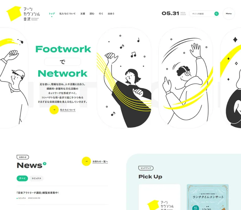
プレビュー準備中デザインリファレンスを見る
Arts Council Kanazawa — Style Reference
An open cultural noticeboard connected by green typography, yellow ribbons, and people in motion.
Website: artscouncil-kanazawa.jp Original URL: https://artscouncil-kanazawa.jp/ Final URL: https://artscouncil-kanazawa.jp/ Theme: white canvas with green and yellow accents; one observed color scheme Inspected: September 24, 2026, 06:30:50 JST — browser retrieval timestamp September 23, 2026, 21:30:50.066 UTC Viewports: desktop 1440 × 1000 CSS pixels; mobile 390 × 844 CSS pixels Scope: the current homepage, using supplied browser screenshots, rendered text, links, element rectangles, and computed styles. Detailed visual coverage includes the opening composition, the transition into Artists, and the footer on desktop, plus the opening and footer on mobile. Other homepage sections are documented primarily through DOM evidence. Linked destination pages and open menu/search states were not inspected.
Arts Council Kanazawa is a cultural information and support portal. Its homepage connects news, editorial reporting, events, artist profiles, support programs, and organizational information. The design combines a generous white canvas with broad, heavy Latin headings and compact Japanese explanations. Bright yellow circles and ribbons introduce movement, while green connects navigation, headings, counts, social links, and the closing footer.
The most distinctive geometry is selective rounding: tall illustrated panels, circular action markers, photographs with one oversized rounded corner, and large section backgrounds rounded at a single edge. The opening is spacious and expressive; the content below becomes an orderly directory. Preserve both parts of that relationship when adapting the design.
閉じる
Arts Council Kanazawa — Style Reference
An open cultural noticeboard connected by green typography, yellow ribbons, and people in motion.
Website: artscouncil-kanazawa.jp Original URL: https://artscouncil-kanazawa.jp/ Final URL: https://artscouncil-kanazawa.jp/ Theme: white canvas with green and yellow accents; one observed color scheme Inspected: September 24, 2026, 06:30:50 JST — browser retrieval timestamp September 23, 2026, 21:30:50.066 UTC Viewports: desktop 1440 × 1000 CSS pixels; mobile 390 × 844 CSS pixels Scope: the current homepage, using supplied browser screenshots, rendered text, links, element rectangles, and computed styles. Detailed visual coverage includes the opening composition, the transition into Artists, and the footer on desktop, plus the opening and footer on mobile. Other homepage sections are documented primarily through DOM evidence. Linked destination pages and open menu/search states were not inspected.
Arts Council Kanazawa is a cultural information and support portal. Its homepage connects news, editorial reporting, events, artist profiles, support programs, and organizational information. The design combines a generous white canvas with broad, heavy Latin headings and compact Japanese explanations. Bright yellow circles and ribbons introduce movement, while green connects navigation, headings, counts, social links, and the closing footer.
The most distinctive geometry is selective rounding: tall illustrated panels, circular action markers, photographs with one oversized rounded corner, and large section backgrounds rounded at a single edge. The opening is spacious and expressive; the content below becomes an orderly directory. Preserve both parts of that relationship when adapting the design.
How to Read This Reference
- Measured means a value appears directly in the supplied computed styles or element rectangles.
- Calculated means a value is derived from those measurements, such as the gap between adjacent cards.
- Estimated means a value is judged from an original-page screenshot. Estimated colors are working approximations, not sampled source declarations.
- Recommended means a proposed implementation choice or improvement. The Quick Start is an adaptation, not recovered source code.
- Named custom properties in this document are implementation aliases. They are not claimed to be the website's original tokens.
- The source root computes to
14px. The Quick Start keeps a conventional browser root and explicitly declares component sizes, so itsrembreakpoints do not reproduce an undocumented source scaling system. - Some extracted navigation nodes belong to states not visible in the screenshots. Their presence and dimensions do not establish the appearance of an opened menu.
- A collected anchor rectangle may exclude decorative circles, descendants, or pseudo-elements. Screenshot geometry and anchor geometry are therefore identified separately.
Tokens — Colors
Default Palette
| Name | Value | Suggested token | Evidence and role |
|---|---|---|---|
| White Canvas | #FFFFFF |
--color-canvas |
Measured on HTML/body; visible across the main page and card backgrounds |
| Charcoal | #333333 |
--color-ink |
Measured base text and newsletter registration fill; also the visual family of illustration linework |
| Council Green | #1CC18E |
--color-brand |
Measured on search controls, the selected news category, and Instagram text; visually consistent with the larger green branding areas |
| Signal Yellow | approximately #FFF000 |
--color-yellow |
Estimated from action circles, illustration ribbons, and the event participation panel; the logo appears slightly brighter |
| Soft Gray | #F5F5F5 |
--color-soft |
Measured inactive news-category fill; a similar pale gray appears in decorative background lettering |
| Secondary Gray | #999999 |
--color-muted |
Measured on secondary menu links and unsubscribe text; use cautiously for essential small text |
| Pale Aqua | approximately #E8F6F6 |
--color-aqua |
Estimated from the visible upper edge of the Pick Up background |
| Warm Off-white | approximately #FBF4EF |
--color-warm |
Estimated from the Events section surrounding its paired participation panels |
| Fine Rule | approximately #E5E5E5 |
--color-rule |
Estimated from the search outline, menu circle, illustration frames, and separators |
The exact green is established by small interface elements. Applying that same value to the hero heading and footer is a practical reconstruction choice; their individual computed fills were not supplied. The yellow and pale background values, including their appearances in the metadata palette, remain estimates.
Green and yellow have different jobs. Green identifies the organization and organizes content. Yellow marks movement and invitations: arrow disks, ribbons, the logo, and one large participation surface. Most ordinary reading text remains charcoal.
The recorded WordPress- and Swiper-prefixed custom properties include blues and purples. Those values are not evidence of visible brand colors and should not enter the working palette.
Theme Presets
Only the white, green, and yellow presentation is evidenced. No theme selector, dark appearance, or alternate palette was inspected.
Tokens — Typography
Japanese Body and Navigation
Measured source stack: dnp-shuei-gothic-gin-std, sans-serif.
The base is 14px, weight 500, line height 25.2px, and letter spacing 0.56px. This gives a calculated line-height ratio of 1.8 and tracking of 0.04em at the base size. Desktop top navigation increases to 15px with a 19.5px line height, while retaining 0.56px tracking.
This typography gives the Japanese information a calm, compact rhythm. Preserve the generous line spacing and moderately weighted strokes instead of making every content label heavy.
Latin Display and Utility Text
Measured source stack on selected utility links: termina, sans-serif.
Termina is directly recorded on Instagram labels and Google Map links, at weight 700 with normal letter spacing. The broad Latin section headings, date, and hero words visually fit the same family, but their individual computed styles are absent. Using Termina for those larger roles is an evidence-informed recommendation, not a measured assignment.
The logo lettering is part of the brand artwork. Do not attempt to recreate it by typesetting the organization name in a general Japanese font.
Type Scale
| Role | Desktop | Mobile | Evidence |
|---|---|---|---|
| Base Japanese text | 14px / 25.2px, weight 500 |
Same base values | Measured |
| Top navigation | 15px / 19.5px, weight 500 |
Not visible in the opening header | Measured desktop; screenshot observation mobile |
| Extracted menu primary links | 24px / 43.2px |
20px / 36px |
Measured nodes; open menu appearance unverified |
| Hero Latin words | Approximately 60px, heavy |
Approximately 40px, heavy |
Estimated |
| Hero Japanese lead | Approximately 16px / 29px |
Approximately 12px / 22px |
Estimated; not the measured root style |
| Main Latin section heading | Approximately 48px |
Approximately 32px for News |
Estimated |
| Artist Japanese name | Approximately 24px |
Not directly visible in a supplied mobile detail capture | Estimated desktop |
| Artist role and Romanized name | Approximately 12px |
Not visually verified | Estimated desktop |
| Instagram link | 14px / 25.2px, weight 700 |
Same | Measured Termina stack |
| Registration link | 14px / 80px |
12px / 60px |
Measured; line height supplies vertical centering |
| Footer primary navigation | 14px / 14px |
Same | Measured |
| Footer subordinate navigation | 12px / 12px |
Same | Measured |
| Footer privacy link | 12px / 12px |
10px / 10px |
Measured |
| Footer Google Map link | 10px / 10px, weight 700 |
9px / 9px, weight 700 |
Measured Termina stack |
Do not copy a parent anchor's 14px style onto all descendants. The artist names and Latin headings visibly create hierarchy beyond the base text size.
Tokens — Spacing & Shapes
Density: generous between sections, compact within metadata. Geometry: circles, tall rounded illustration frames, selected oversized corners, and fine outlines.
Spacing Scale
| Use | Value | Evidence |
|---|---|---|
| Desktop news-filter gap | 8px |
Calculated from adjacent anchor rectangles |
| Mobile Pick Up item gap | 15px |
Calculated |
| Mobile directory column gap | 19px |
Calculated from 165.5px cards at x = 20 and 204.5 |
| Mobile general side inset | 20px |
Measured across header, news, grids, and footer links |
| Desktop navigation gap | 30px |
Calculated between successive top-navigation links |
| Desktop Pick Up item gap | 30px |
Calculated |
| Mobile Magazine/Artists row gap | 38px after the tallest card |
Calculated |
| Desktop header side inset | 40px |
Measured logo position; visually consistent with right utilities |
| Desktop Events column gap | 40px |
Calculated |
| Desktop Magazine/Artists column gap | 60px |
Calculated |
| Desktop support-link padding | 80px |
Measured on all sides |
| Desktop event-promotion padding | 40px 80px |
Measured |
| Mobile event-promotion padding | 30px 20px |
Measured |
| Desktop footer top padding | 120px on the footer element |
Measured; distinct from the inner green panel's content inset |
Border Radius
| Element | Value or treatment | Evidence |
|---|---|---|
| News filters | 20px radius on 38px-high links |
Measured |
| Search button | Circular; 28px desktop, 32px mobile |
Measured dimensions; recorded radius 28px |
| Registration link | 40px radius |
Measured |
| Facebook outline link | 40px radius |
Measured |
| Footer social circles | 40px desktop diameter, 30px mobile |
Measured |
| Main arrow disk | Approximately 60px desktop, 40px mobile |
Estimated from screenshots |
| Menu disk | Approximately 80px diameter at both viewports |
Estimated from screenshots |
| Section label | Fine outlined tab with an almost square upper-left corner and rounded remaining corners | Visual observation |
| Artist image | One approximately 80px corner, other corners around 10px at a 280px image width |
Estimated |
| Desktop footer upper-right corner | Approximately 160px |
Estimated |
| Mobile footer upper-right corner | Approximately 80px |
Estimated |
The corner variation is systematic, not random noise: the first visible artist image emphasizes its upper-left corner, the second its lower-left, the third its upper-right, and the fourth its lower-right.
Layout Measurements
| Element | Desktop 1440 × 1000 | Mobile 390 × 844 | Evidence |
|---|---|---|---|
| Header | 180px high |
100px high |
Measured |
| Header brand link | 220 × 100px, x = 40, y = 40 |
132 × 60px, x = 20, y = 20 |
Measured |
| Search button | 28 × 28px, x = 1266, y = 76 |
32 × 32px, x = 338, y ≈ 24.91 |
Measured |
| Menu placement | About 40px from right, 50px from top | About 20px from right and bottom | Estimated, repeated across scroll captures |
| Hero illustration panel | About 316 × 585px |
About 166 × 309px |
Estimated |
| News article width | 560px |
350px |
Measured |
| Magazine/Artists cards | Four columns of 280px |
Two columns of 165.5px |
Measured |
| Magazine/Artists grid span | 1300px, x = 70 to 1370 |
350px, x = 20 to 370 |
Calculated |
| Events cards | Five columns of 216px |
Two columns of 165.5px |
Measured |
| Events grid span | 1240px, x = 100 to 1340 |
350px, x = 20 to 370 |
Calculated |
| Pick Up items | Approximately 246.14px wide |
105.875px wide |
Measured |
| Paired event promotions | Two adjacent 640px links |
Stacked 350px links |
Measured |
| Registration link | Approximately 394.39 × 81px |
290 × 60px |
Measured |
| Footer parent | Approximately 746.38px high |
Approximately 751.75px high |
Measured |
| Visible green footer field | About 1296px wide |
About 370px wide |
Estimated; parent remains viewport-wide |
| Document height | 9732px |
11890px |
Reported browser measurements |
Components
Site Header
Role: identity, primary destinations, date display, and search.
The desktop header places the large yellow-and-charcoal logo at the left, six Japanese navigation links beside it, and date/search utilities at the right. The navigation labels are トップ, 私たちについて, 支援, 読む, 行く, and 出会う. The screenshot marks the current home destination with green text and a small dot underneath.
The date uses large, wide numerals with much smaller weekday and year text. The captured display reads 09.23, WED, and 2026; it is page content, not the authority for the inspection date. Automatic date updates were not tested.
On mobile, the logo becomes 60% of its desktop dimensions. The navigation row and visible search input disappear from the opening composition, leaving the logo, compact date, and green search disk. The main header is absent from the supplied scrolled captures.
Persistent Menu Control
Role: a consistently available navigation entry point.
A white circular control with a fine gray border and a small bold Menu label stays at the desktop upper-right and mobile lower-right across the supplied scroll positions. This supports viewport-pinned behavior, although its computed positioning rule was not provided.
The mobile disk overlaps part of the News archive link in the opening capture and part of the copyright line at the bottom. Preserve the recognizable circle in an adaptation, but reserve enough content clearance to avoid those collisions.
No open menu state or activation sequence was captured. Extracted menu links establish destination inventory, not panel animation, backdrop treatment, or focus behavior.
Footwork / Network Hero
Role: expresses the organization's connection between direct engagement and cultural networks.
On desktop, the message occupies an approximately 432px-wide area centered near x = 400, while tall illustrated panels continue on either side. The panels extend beyond the viewport edges, making the composition feel larger than the screen. Black-and-white figures, music notes, and yellow ribbon strokes provide most of the visual activity.
The headline is constructed from three parts: Footwork, a Japanese particle in a thin outlined capsule, and Network. The desktop screenshot shows が; the mobile screenshot shows は. The DOM contains で, が, は, と, and の. These are alternatives, not a five-character subtitle to display all at once.
The desktop message is centered, with a short Japanese introduction below and a yellow-circle link to 私たちについて. On mobile, the illustrations become a shallow band beneath the header. The heading overlaps their lower edge: Footwork forms the first line, followed by the particle capsule and Network on the second. The introduction and action become left aligned at approximately x = 30.
Very pale oversized Latin lettering sits behind the text area. Keep it decorative and low contrast; it must not compete with the Japanese introduction.
Section Heading and Archive Link
Role: a repeated orientation pattern across the portal.
The heading group consists of a small outlined Japanese label, a large bold Latin heading, and, where applicable, a small green count capsule attached near the heading's upper-right edge. The captured counts are News 26, Magazine 81, Events 7, and Artists 224. Treat them as content values, not permanent design constants.
On desktop, a short explanation occupies the middle of the heading row and the archive link sits at the right. The archive link combines a yellow arrow disk with an underlined Japanese label. The disk and text form one destination, rather than two separate controls.
For Magazine, Events, and Artists, the mobile DOM places the archive link after the card collection. News retains its archive link beside the heading.
News List and Category Links
Role: timely organizational announcements.
The desktop list occupies a measured 560px-wide column beginning at x = 40. Its four category links are すべて, お知らせ, リリース, and トピックス. They have a 38px line box, 16px horizontal padding, a 20px radius, and an 8px gap. The selected category uses green with white text; inactive categories use soft gray with charcoal text.
The links point to archive and taxonomy URLs. No in-place filtering was demonstrated, so an adaptation should not assume these are JavaScript tabs.
Article links stack a title above category/date metadata. Desktop row starts are approximately 121.39px apart for the sampled entries. On mobile, the list expands to 350px within 20px side margins; shorter rows start approximately 89.19px apart, while a longer title makes its row taller. The category links are absent from the supplied mobile text and link inventory.
Pick Up Rail
Role: a compact group of featured programs and announcements.
This region sits alongside News on desktop and follows it on mobile. The opening desktop screenshot reveals a pale aqua field with a large rounded upper-left edge. The item rectangles establish a horizontal sequence: approximately 246.14px-wide items with 30px gaps on desktop, and 105.875px-wide items with 15px gaps on mobile.
Some items extend beyond the viewport at both widths. This supports a rail layout, but it does not establish whether users drag it, use arrows, or see automatic movement. The supplied original-page screenshots do not show the full cards, so their detailed image treatment should not be reconstructed from unrelated imagery.
Magazine Grid
Role: reporting, interviews, columns, and conversations about local cultural activity.
Eight article links form four columns on desktop and two on mobile. Desktop cards are 280px wide with 60px horizontal gaps. Mobile cards are 165.5px wide with 19px gaps and approximately 38px between rows.
Each link contains an article title, category information, and date. The measured heights vary with title length; the next row starts after the tallest card. Preserve that ordinary row alignment rather than forcing the content into masonry.
The detailed Magazine images are not visible in the supplied original-page screenshots. Card widths, content hierarchy, and responsive placement are established; image masks and aspect ratios remain unverified.
Events Grid and Participation Panels
Role: discover local events and explain participation through Instagram.
Events uses five measured 216px columns on desktop with 40px gaps, then two 165.5px columns on mobile. Each linked record includes an event title, date or date range, and venue. The sampled event destinations are Instagram posts; they are not all internal detail pages.
Below the grid, two equal desktop panels pair small black-and-white illustrations with explanatory text. The left panel is white and links to the event hashtag collection. The right panel is bright yellow and explains how to publish event information using the organization's hashtag. A white circular arrow appears near the yellow panel's lower-right corner in the supplied capture.
These panels sit inside a warm off-white section with a large rounded lower-left boundary. Their measured padding changes from 40px 80px on desktop to 30px 20px on mobile, where they stack vertically.
Artist Directory Card
Role: introduce people and their disciplines.
The desktop capture shows four approximately 280px-square photographs across a row. Each image has one conspicuously rounded corner and three much smaller corners. The first card also has a yellow NEW badge inset near the upper-left edge.
Below the image, stack the professional role, larger Japanese name, smaller gray Romanized name, and compact discipline metadata marked by a green dot. The entire record is a link to an internal artist page. Visible examples include 岸本恵, 望月太満衛, 小林敏江, and 山田ゆかり.
Photography remains natural and varied: a performance setting, an artist with an instrument, a formal portrait, and a pianist beside a piano. Do not impose one color grade or one studio background on every portrait. The repeated size and changing corner geometry provide cohesion.
The mobile DOM confirms two columns, but a mobile portrait-detail screenshot was not supplied. Retaining square image boxes there is a recommended adaptation, not a separately measured crop rule.
Support Entries
Role: direct practitioners toward consultation and funding.
Two substantial links are numbered 01 and 02, followed by a Japanese service title and an explanatory paragraph. The recorded destinations lead to cultural consultation and support-program information.
On desktop, each link begins near x = 438.41 and spans approximately 921.59px, leaving a separate area to its left. Its display is flex and its padding is 80px. On mobile, each becomes a 350px-wide block with 20px padding; the two entries have a 10px gap.
These measurements establish the change from a wide service layout to stacked mobile entries. Their full decorative surfaces and any illustrations were not visible in the supplied detail captures.
Mail News Registration
Role: a secondary subscription path within the broader information site.
The section includes an explanation, registration statement, dark pill-shaped link labeled 登録フォーム, privacy information, and an unsubscribe link. The dark link is approximately 394.39px wide on desktop and 290px on mobile, with a measured 40px border radius.
The registration and unsubscribe links lead to /entry and /cancel. No form entry, validation, consent interaction, or completion state was exercised. The homepage presents a route to registration, not a verified inline subscription form.
About Us
Role: explain the program and its institutional context.
The homepage includes a substantive Japanese explanation rather than only a slogan. It identifies ACK as a program operated by 公益財団法人金沢芸術創造財団, followed by a link to more information.
Keep this section readable and subordinate to the main discovery areas. Its exact visual composition is not established by the supplied screenshots, although its text and destination are present in both viewport records.
Social Media and Lower Search
Role: connect the portal to ongoing social activity and topic discovery.
The social area contains three linked square images. Their measured desktop widths are approximately 184.66px; on mobile they become 168px and wrap into two columns with 12px gaps. An Instagram text link follows, along with a large outlined Facebook pill measuring 600 × 63px on desktop and 350 × 63px on mobile.
The desktop footer capture also shows a thin vertical divider separating the social area from the adjacent region. Search headings, keyword text, and submit controls are present in the DOM, but the supplied captures do not establish a complete search interaction or results state.
Green Footer
Role: a substantial closing directory and organizational signature.
The footer's visible green field begins at the left edge and stops short of the right edge. On desktop it spans about 90% of the viewport and has a very large rounded upper-right corner. On mobile it leaves a 20px white strip at the right and reduces that corner to approximately 80px.
Desktop navigation begins at x = 144. Two link columns distinguish organization details from the main content destinations; separate white social circles sit beside them. The brand and contact block occupies the right half, with a yellow symbol, white wordmark, address, phone/fax, map link, and copyright. Faint circular Latin lettering crosses behind this information.
On mobile, the two navigation columns remain side by side. Social circles move into a horizontal pair, while the logo and contact details stack below the navigation. The brand link becomes 132 × 60px. Preserve the deep vertical spacing and the large green silhouette while allowing contact information and copyright to wrap clear of the Menu control.
Tokens — Motion & Interaction
| Treatment | Evidence | What can safely be concluded |
|---|---|---|
| General desktop links | Computed 0.3s ease-in-out transition |
Short eased transitions are declared; the animated property and endpoint styling are not established for every link |
| Map and selected privacy links | background-size 0.4s cubic-bezier(0.23, 1, 0.32, 1) |
A background-size transition is declared; its direction and exact underline states were not captured |
| Mobile links | Many records serialize transition as all |
No nonzero duration should be inferred from that value alone |
| Hero particle alternatives | Multiple particles in the DOM; different visible particles across captures | A changing-word presentation is plausible; timing, trigger, sequencing, and repeat behavior are unverified |
| Illustration and Pick Up rails | Repeated panels or items, with offscreen content | Horizontal composition is evidenced; autoplay, dragging, and navigation controls are unverified |
| Menu control | Same screen corner across opening and scrolled captures | Persistent viewport placement is supported; opening behavior was not exercised |
| Sampled element animations | Recorded as none |
Does not rule out animation on descendants, pseudo-elements, scripts, or unsampled elements |
The browser preparation process waited for loading and finite motion and temporarily paused perpetual animation during readiness checks. That process is not an interaction recording and cannot establish animation durations or complete reveal behavior.
For an adaptation, use restrained 300ms feedback for links and controls. Keep any moving hero treatment decorative and provide a static reduced-motion presentation. Do not invent an exact carousel interval or elaborate page transition and present it as source behavior.
Surfaces
| Layer | Appearance | Purpose |
|---|---|---|
| Main canvas | White, without visible global texture | Keeps a long information page light |
| Content cards | Images and text directly on the canvas | Lets editorial and artist content supply visual density |
| Featured region | Pale aqua with a large rounded boundary | Separates Pick Up from the News column |
| Events region | Warm off-white with a broad corner | Groups event discovery and participation guidance |
| Participation emphasis | Flat bright yellow | Draws attention to the contribution workflow |
| Selected category | Green pill with white text | Marks the current archive category |
| Registration action | Charcoal pill with white text | Distinguishes subscription from ordinary archive links |
| Footer | Large green field with white details | Consolidates navigation and institutional identity |
No general shadow-based elevation system is visible. Separation comes from white space, background fields, thin rules, image edges, and selective rounding. The Instagram icon retains its recognizable multicolor mark; that does not imply a gradient system for the rest of the interface.
Imagery
The opening illustrations use clean charcoal outlines, large white areas, and occasional solid charcoal clothing or hair. Figures raise their arms, listen, or perform, surrounded by small musical and graphic marks. Yellow arcs pass through the compositions as a connecting motif. Their energy comes from posture and curved strokes rather than detailed shading.
The logo adds an angular yellow silhouette beside custom Japanese lettering. Keep it as supplied artwork when authorized. The line illustrations also carry specific identity; generic icon libraries will not reproduce their character.
Directory photography is full color and documentary in character. Preserve faces, instruments, and meaningful context when choosing focal points. The artist masks should shape the photograph boundary without distorting the subject. Do not apply pixelated rendering: the current visual language uses smooth lines and normal photographic detail.
Observed Asset References
No image src URLs, native image dimensions, or asset formats were supplied. The following references identify visible content and page records, not downloadable artwork files.
| Asset group | Observed location or record | Verified use |
|---|---|---|
| Yellow symbol and custom wordmark | Homepage header and footer | Dark lettering on white; white lettering on green |
| Illustrated people and yellow ribbons | Homepage opening composition | Tall rounded frames, partly cropped at viewport edges |
| Participation illustrations | Paired panels immediately before Artists | Small monochrome figures beside explanatory text |
| First visible artist photograph | /artists/6990/ |
Performance image for 岸本恵 |
| Second visible artist photograph | /artists/2391/ |
Instrument-related portrait for 望月太満衛 |
| Third visible artist photograph | /artists/284/ |
Portrait with flute for 小林敏江 |
| Fourth visible artist photograph | /artists/280/ |
Pianist portrait for 山田ゆかり |
| Social previews | Three linked posts in the lower homepage | Square media tiles; three across desktop, two columns on mobile |
Layout & Responsive Behavior
The homepage follows a long editorial sequence: opening statement, News and Pick Up, Magazine, Events, Artists, Support, Mail News, About Us, social/search utilities, and footer. It is an ordinary scrolling website with several discovery paths, not a single-purpose conversion page.
Desktop
The 180px header gives the logo and navigation substantial breathing room. Below it, illustration panels extend horizontally across the screen while the main message occupies an opening between panels. News and Pick Up introduce a split layout. Magazine and Artists use a shared four-column rhythm, while Events fits five smaller items across its own container.
Section headings combine a left title, middle explanation, and right archive action. The artist detail capture demonstrates how open this remains: an approximately 120px gap separates the end of the warm Events background from the Artists label, followed by a generous heading-to-image interval.
Mobile
The 100px header keeps only essential identity and utilities visible. The hero artwork moves above the message, and the headline overlaps its lower edge. Body copy becomes left aligned. The Menu circle moves to the lower-right and remains there while scrolling.
Magazine and Artists change from four columns to two; Events changes from five to two. This is a compact browsing layout rather than a one-card-per-row feed. Archive links move below those collections. The participation panels stack, support entries become blocks, and social tiles wrap.
The footer retains two navigation columns before stacking its identity and contact block. The mobile document is approximately 22% taller than the desktop document, calculated from the reported heights; this is a snapshot of the current content, not a universal ratio.
Responsive Limits
Only 1440px and 390px widths are evidenced. The original breakpoint values, tablet layouts, landscape-phone behavior, zoom handling, and safe-area rules were not supplied. The breakpoints in the Quick Start are recommendations chosen to keep the broad header and multi-column layouts usable.
Do not set fixed section heights from document coordinates. Content changes, font loading, and title wrapping must be allowed to increase the page length. Confine deliberate horizontal clipping to decorative illustration bands; keep content rails navigable.
Do’s and Don’ts
Do
- Preserve the white canvas, measured green, charcoal text, and restrained use of yellow.
- Pair compact Japanese explanations with broad, heavy Latin headings.
- Keep the illustrated opening visually larger than the viewport through controlled edge cropping.
- Recompose the hero on mobile instead of shrinking the desktop arrangement uniformly.
- Use one oversized corner on artist photographs and vary that corner across the row.
- Maintain the measured four-to-two and five-to-two directory changes.
- Treat yellow arrow disks and their text labels as one accessible link.
- Retain the distinction between internal artist/article destinations and external event posts.
- Keep counts, dates, badges, and featured content data-driven.
- Give the green footer enough space to function as a useful directory.
Don't
- Don't flatten the homepage into a generic hero followed by interchangeable feature cards.
- Don't replace every selective corner with a uniformly rounded rectangle.
- Don't add shadows, glass blur, or gradients as the main separation system.
- Don't make every action a large yellow filled button; the usual pattern is a disk beside text.
- Don't infer visible brand colors from unused administrative or slider defaults.
- Don't declare hero animation timing or menu behavior from static captures.
- Don't describe the News taxonomy links as verified in-place filters.
- Don't force long artist disciplines or article titles into identical fixed-height text boxes.
- Don't make essential mobile content disappear under the persistent Menu circle.
- Don't fabricate image paths, illustration credits, or additional font families.
Recommended Implementation Additions
These are improvements for a new implementation, not verified features of the inspected site:
- Give search and social icon controls explicit accessible names. Hide decorative ribbons, background lettering, and repeated illustration panels from assistive technology.
- Implement Menu as a real button with
aria-expandedand a controlled navigation region. If it opens a modal panel, add Escape handling, focus management, and an accessible close action. - Keep a generous invisible hit area around the measured 28–32px search disks and 30px mobile social circles.
- Reserve space around the pinned Menu control and let footer copyright wrap. Add bottom scroll clearance for focused content near the viewport edge.
- Check text contrast for white-on-green counts and footer text, green links, and gray secondary labels. Use a darker green text token where essential small text needs more contrast.
- Keep one stable accessible hero phrase if visual particles rotate; repeated decorative word changes should not continually interrupt screen-reader users.
- Offer keyboard and touch access to any interactive content rail, and avoid autoplay as the only way to reveal offscreen items.
- Use meaningful portrait alternatives when the image adds information, while avoiding redundant repetition of an adjacent linked name.
- Load licensed font resources deliberately and verify Japanese/Latin fallback metrics. The computed family name alone does not establish complete font-loading behavior.
Agent Prompt Guide
Quick Color Reference
- Main canvas:
#FFFFFF, measured. - Main text and dark registration action:
#333333, measured. - Brand controls and selected category:
#1CC18E, measured. - Arrow circles and ribbon accents: approximately
#FFF000, estimated. - Inactive filters:
#F5F5F5, measured. - Pick Up field: approximately
#E8F6F6, estimated. - Events field: approximately
#FBF4EF, estimated. - Borders: thin pale gray; no general shadow elevation.
Overall Prompt
“Create a responsive cultural information portal inspired by Arts Council Kanazawa. Use a white canvas, charcoal Japanese text, green branding, and vivid yellow circles and ribbon accents. Pair a restrained Japanese Gothic body with wide, heavy Latin section headings. Build an opening composition of tall rounded panels containing expressive black-and-white people, with yellow arcs crossing their gestures. Place a Footwork/Network message between panels on desktop and overlapping the artwork's lower edge on mobile. Continue into news, featured programs, editorial stories, events, artist profiles, support, newsletter information, and an extensive green footer. Use four desktop columns for editorial and artist cards, five for events, and two mobile columns. Give artist photographs one oversized rounded corner each. Avoid shadows and preserve generous gaps between sections.”
Example Component Prompts
- Header: “At 1440px, create a 180px-high white header with a 220 × 100px brand area inset 40px, six compact Japanese navigation links, a bold date, a pale search pill, and a separate white circular Menu control. At 390px, use a 100px header with a 132 × 60px logo, compact date, and green search disk.”
- Artist card: “Create a borderless cultural-directory link with a square color portrait, one oversized rounded corner, a small profession line, larger Japanese name, smaller gray Romanized name, and green-dot discipline metadata. Use a 280px width in a four-column desktop grid and 165.5px at the reference phone width.”
- Section heading: “Place a small outlined Japanese tab above a broad charcoal Latin heading. Attach a small green count capsule near the heading's upper-right. Add a short explanation and an archive link made from a yellow arrow disk plus underlined text. Move the archive link below the content grid on mobile.”
- Event participation pair: “Create adjacent white and bright-yellow information panels inside a warm off-white section. Pair monochrome human illustrations with Japanese participation guidance. Use 40px vertical and 80px horizontal desktop padding; stack the panels with 30px by 20px padding on mobile.”
- Footer: “Create a large green footer that touches the left edge and stops short of the right edge, with a dramatically rounded upper-right corner. Arrange two navigation columns, white social circles, a yellow-and-white logo, and contact information. Stack the identity block below the navigation on mobile and keep all text clear of the pinned Menu circle.”
Quick Start
CSS Custom Properties
This is a static structural adaptation. Exact colors and measured dimensions are reused where available; estimated radii, display sizes, and breakpoint choices are explicitly reconstruction values. Licensed font files, original artwork, search behavior, menu behavior, and any animated rail require separate implementation.
For the hero, place a .hero-rail and .hero-copy inside .hero. The rail contains one .hero-panel, a .hero-gap, then additional .hero-panel elements. The title contains two .hero-word elements with .hero-connector between them. Supply authorized illustration assets; no source asset paths are invented here.
:root {
  /* Measured colors */
  --color-canvas: #fff;
  --color-ink: #333;
  --color-brand: #1cc18e;
  --color-soft: #f5f5f5;
  --color-muted: #999;

  /* Visual estimates for this adaptation */
  --color-yellow: #fff000;
  --color-aqua: #e8f6f6;
  --color-warm: #fbf4ef;
  --color-rule: #e5e5e5;

  /* Source family names; font resources are not bundled */
  --font-body: dnp-shuei-gothic-gin-std, sans-serif;
  --font-latin: termina, sans-serif;
  --text-body: 14px;
  --leading-body: 1.8;
  --tracking-body: 0.04em;

  /* Measured directory geometry */
  --directory-inset: 70px;
  --directory-gap: 60px;
  --directory-row-gap: 60px;
  --event-inset: 100px;
  --event-gap: 40px;

  /* Estimated display geometry */
  --text-hero: 60px;
  --text-section: 48px;
  --action-size: 60px;
  --radius-photo: 80px;
  --radius-footer: 160px;
  --motion-link: 300ms ease-in-out;
}

* { box-sizing: border-box; }

body {
  margin: 0;
  color: var(--color-ink);
  background: var(--color-canvas);
  font-family: var(--font-body);
  font-size: var(--text-body);
  font-weight: 500;
  line-height: var(--leading-body);
  letter-spacing: var(--tracking-body);
}

img { display: block; max-width: 100%; }
a { color: inherit; }
button, input { font: inherit; }
button { cursor: pointer; }

/* Slots: brand, navigation, date, search, reserved menu space. */
.site-header {
  height: 180px;
  padding-inline: 40px;
  display: grid;
  grid-template-columns: 220px minmax(0, 1fr) 166px 200px 80px;
  align-items: center;
  gap: 20px;
}
.site-header::after { content: ''; }
.brand { display: block; width: 220px; }
.brand img { width: 100%; height: auto; }
.top-nav {
  display: flex;
  gap: 30px;
  margin-inline-start: 40px;
  white-space: nowrap;
  font-size: 15px;
  line-height: 1.3;
}
.top-nav a { position: relative; text-decoration: none; }
.top-nav [aria-current='page'] { color: var(--color-brand); }
.top-nav [aria-current='page']::after {
  content: '';
  position: absolute;
  left: 50%;
  bottom: -14px;
  width: 6px;
  height: 6px;
  border-radius: 50%;
  background: currentColor;
  transform: translateX(-50%);
}
.site-date {
  display: flex;
  align-items: center;
  gap: 8px;
  font-family: var(--font-latin);
  font-weight: 700;
  letter-spacing: normal;
}
.date-value { font-size: 32px; line-height: 1; }
.date-meta { font-size: 10px; line-height: 1.1; }

.search-field {
  display: flex;
  align-items: center;
  width: 200px;
  height: 40px;
  border-radius: 999px;
  background: var(--color-soft);
}
.search-field input {
  min-width: 0;
  width: 0;
  flex: 1;
  padding: 0 0 0 20px;
  border: 0;
  background: transparent;
}
.search-field button {
  flex: 0 0 28px;
  height: 28px;
  margin: 6px;
  padding: 0;
  border: 0;
  border-radius: 50%;
  color: white;
  background: var(--color-brand);
}
.menu-trigger {
  position: fixed;
  z-index: 30;
  top: 50px;
  right: 40px;
  width: 80px;
  height: 80px;
  padding: 0;
  border: 1px solid var(--color-rule);
  border-radius: 50%;
  color: var(--color-ink);
  background: white;
  font: 700 11px var(--font-latin);
}

/* Static composition; no unverified autoplay is reproduced. */
.hero {
  position: relative;
  isolation: isolate;
  min-height: 705px;
  overflow: clip;
}
.hero-rail {
  position: absolute;
  z-index: -1;
  top: 0;
  left: calc(50% - 878px);
  display: flex;
  gap: 24px;
  width: max-content;
  pointer-events: none;
}
.hero-panel {
  flex: 0 0 316px;
  width: 316px;
  height: 585px;
  overflow: hidden;
  border: 1px solid var(--color-rule);
  border-radius: 140px;
}
.hero-panel img {
  width: 100%;
  height: 100%;
  object-fit: contain;
}
.hero-gap { flex: 0 0 436px; }
.hero-copy {
  width: 432px;
  margin-left: max(20px, calc(50% - 536px));
  padding-top: 48px;
  text-align: center;
}
.hero-title {
  display: grid;
  justify-items: center;
  gap: 16px;
  margin: 0;
  color: var(--color-brand);
  font: 700 var(--text-hero) / 1.1 var(--font-latin);
  letter-spacing: normal;
}
.hero-connector {
  display: grid;
  place-items: center;
  width: 240px;
  height: 52px;
  border: 1px solid var(--color-rule);
  border-radius: 999px;
  color: var(--color-ink);
  background: white;
  font: 600 36px / 1 var(--font-body);
}
.hero-lead {
  max-width: 360px;
  margin: 32px auto 24px;
  font-size: 16px;
  line-height: 1.8;
}

.section-head {
  display: grid;
  grid-template-columns: 305px minmax(0, 1fr) auto;
  align-items: end;
  gap: 60px;
  margin-bottom: 70px;
}
.section-tab {
  display: table;
  margin-bottom: 14px;
  padding: 3px 14px;
  border: 2px solid currentColor;
  border-radius: 0 16px 16px 16px;
  font-size: 12px;
  line-height: 1.5;
}
.section-title {
  display: flex;
  align-items: flex-start;
  margin: 0;
  font: 700 var(--text-section) / 1.1 var(--font-latin);
  letter-spacing: normal;
}
.section-count {
  padding: 3px 6px;
  border-radius: 999px;
  color: white;
  background: var(--color-brand);
  font: 700 11px / 1.2 var(--font-latin);
}
.action-link {
  display: inline-flex;
  align-items: center;
  gap: 10px;
  text-decoration: none;
}
.action-disk {
  display: grid;
  place-items: center;
  flex: 0 0 var(--action-size);
  width: var(--action-size);
  height: var(--action-size);
  border-radius: 50%;
  background: var(--color-yellow);
}
.action-label { border-bottom: 1px solid currentColor; }
.action-arrow { transition: transform var(--motion-link); }

.directory {
  width: calc(100% - 2 * var(--directory-inset));
  max-width: 1300px;
  margin-inline: auto;
}
.directory-grid {
  display: grid;
  grid-template-columns: repeat(4, minmax(0, 1fr));
  gap: var(--directory-row-gap) var(--directory-gap);
}
.artist-card { min-width: 0; text-decoration: none; }
.artist-photo {
  width: 100%;
  aspect-ratio: 1;
  object-fit: cover;
  border-radius: var(--radius-photo) 10px 10px 10px;
}
.artist-card:nth-child(4n + 2) .artist-photo {
  border-radius: 10px 10px 10px var(--radius-photo);
}
.artist-card:nth-child(4n + 3) .artist-photo {
  border-radius: 10px var(--radius-photo) 10px 10px;
}
.artist-card:nth-child(4n + 4) .artist-photo {
  border-radius: 10px 10px var(--radius-photo) 10px;
}
.artist-role { margin: 16px 0 4px; font-size: 12px; }
.artist-name { margin: 0; font-size: 24px; line-height: 1.4; }
.artist-roman {
  margin: 3px 0 8px;
  color: var(--color-muted);
  font: 700 11px / 1.5 var(--font-latin);
  letter-spacing: normal;
}
.artist-tags { margin: 0; font-size: 12px; }
.artist-tags::before { content: '• '; color: var(--color-brand); }

.events-grid {
  display: grid;
  grid-template-columns: repeat(5, minmax(0, 1fr));
  gap: 40px var(--event-gap);
  width: calc(100% - 2 * var(--event-inset));
  max-width: 1240px;
  margin-inline: auto;
}
.news-filters { display: flex; flex-wrap: wrap; gap: 8px; }
.news-filters a {
  padding-inline: 16px;
  border-radius: 20px;
  background: var(--color-soft);
  font-weight: 600;
  line-height: 38px;
  text-decoration: none;
}
.news-filters [aria-current='page'] {
  color: white;
  background: var(--color-brand);
}
.pickup-rail {
  display: flex;
  gap: 30px;
  overflow-x: auto;
  padding-bottom: 12px;
}
.pickup-item { flex: 0 0 246.14px; }
.event-promotions {
  display: grid;
  grid-template-columns: repeat(2, minmax(0, 1fr));
}
.event-promotion { padding: 40px 80px; background: white; }
.event-promotion.is-highlight { background: var(--color-yellow); }
.registration-link {
  display: block;
  width: min(100%, 394.4px);
  padding-inline: 40px;
  border-radius: 40px;
  color: white;
  background: var(--color-ink);
  line-height: 80px;
  text-decoration: none;
}

.site-footer {
  width: 90%;
  margin-top: 120px;
  padding: 120px 10vw 80px;
  border-top-right-radius: var(--radius-footer);
  color: white;
  background: var(--color-brand);
}
.footer-layout {
  display: grid;
  grid-template-columns: minmax(0, 1fr) minmax(0, 410px);
  align-items: end;
  gap: 90px;
}
.footer-nav {
  display: grid;
  grid-template-columns: repeat(2, max-content);
  gap: 60px;
}
.footer-nav a { display: block; margin-bottom: 24px; }
.footer-contact { overflow-wrap: anywhere; }
.footer-copyright { white-space: normal; }

/* Recommended feedback and focus behavior. */
@media (hover: hover) {
  .action-link:hover .action-arrow { transform: translateX(3px); }
}
:where(a, button, input):focus-visible {
  outline: 3px solid var(--color-ink);
  outline-offset: 4px;
}

/* Proposed header breakpoint, not a recovered source value. */
@media (max-width: 84rem) {
  .site-header {
    height: 100px;
    padding-inline: 20px;
    grid-template-columns: 132px minmax(0, 1fr) 32px;
  }
  .site-header::after, .top-nav { display: none; }
  .site-header .brand { width: 132px; }
  .site-date { display: grid; justify-self: end; gap: 2px; text-align: center; }
  .date-value { font-size: 20px; }
  .date-meta { font-size: 9px; }
  .search-field { width: 32px; height: 32px; background: transparent; }
  .search-field input { display: none; }
  .search-field button { flex-basis: 32px; height: 32px; margin: 0; }
  .menu-trigger {
    top: auto;
    right: 20px;
    bottom: calc(20px + env(safe-area-inset-bottom, 0px));
  }
}

/* Proposed content breakpoint; only endpoint layouts were observed. */
@media (max-width: 64rem) {
  :root {
    --directory-inset: 20px;
    --directory-gap: 19px;
    --directory-row-gap: 38px;
    --event-inset: 20px;
    --event-gap: 19px;
    --text-hero: 40px;
    --text-section: 32px;
    --action-size: 40px;
    --radius-photo: 48px;
    --radius-footer: 80px;
  }
  html { scroll-padding-bottom: 120px; }
  .hero { min-height: 616px; }
  .hero-rail { left: calc(50% - 281px); gap: 20px; }
  .hero-panel { flex-basis: 166px; width: 166px; height: 309px; border-radius: 80px; }
  .hero-gap { display: none; }
  .hero-copy {
    width: calc(100% - 60px);
    margin-left: 30px;
    padding-top: 270px;
    text-align: left;
  }
  .hero-title {
    grid-template-columns: 80px minmax(0, 1fr);
    justify-items: start;
    align-items: center;
    gap: 6px 10px;
  }
  .hero-word:first-child { grid-column: 1 / -1; }
  .hero-connector { width: 80px; height: 34px; font-size: 24px; }
  .hero-lead { margin: 22px 0 20px; font-size: 12px; line-height: 1.8; }
  .section-head { grid-template-columns: 1fr; gap: 24px; margin-bottom: 40px; }
  .directory-grid, .events-grid { grid-template-columns: repeat(2, minmax(0, 1fr)); }
  .events-grid { row-gap: 30px; }
  .artist-name { font-size: 18px; }
  .artist-roman { font-size: 10px; }
  .news-filters { display: none; }
  .pickup-rail { gap: 15px; }
  .pickup-item { flex-basis: 105.875px; }
  .event-promotions { grid-template-columns: 1fr; }
  .event-promotion { padding: 30px 20px; }
  .registration-link { width: min(100%, 290px); padding-inline: 30px; font-size: 12px; line-height: 60px; }
  .site-footer {
    width: calc(100% - 20px);
    margin-top: 80px;
    padding: 60px 20px 120px;
  }
  .footer-layout { grid-template-columns: 1fr; gap: 64px; }
  .site-footer .brand { width: 132px; }
  .footer-copyright { max-width: 100%; }
}

@media (prefers-reduced-motion: reduce) {
  .action-arrow { transition: none; }
}
The mobile footer's extra bottom padding is an intentional clearance improvement. Mobile artist-name sizes and image radii in this snippet are recommendations because those details were not directly captured. Use actual markup order to place mobile archive links after their collections; visual CSS reordering alone should not create a confusing keyboard sequence.
Tailwind v4 Token Mapping
Optional aliases for projects already using Tailwind v4. This does not imply that the original site uses Tailwind. Keep the CSS variables above and apply the measured grid geometry through components or arbitrary values.
@theme inline {
  --color-canvas: var(--color-canvas);
  --color-council: var(--color-brand);
  --color-charcoal: var(--color-ink);
  --color-signal: var(--color-yellow);
  --color-aqua-panel: var(--color-aqua);
  --color-warm-panel: var(--color-warm);

  --font-japanese: var(--font-body);
  --font-display: var(--font-latin);

  --text-hero: var(--text-hero);
  --text-section: var(--text-section);
  --spacing-directory-gap: var(--directory-gap);
  --spacing-action: var(--action-size);
  --radius-portrait: var(--radius-photo);
  --radius-footer-panel: var(--radius-footer);
}
Sources & Evidence
- Inspected original and final page: Arts Council Kanazawa. The supplied browser record reports HTTP
200and the same original/final URL. - Retrieval:
2026-09-23T21:30:50.066Z, equivalent to September 24, 2026, 06:30:50.066 JST. The date displayed in the site header is separate page content. - Desktop evidence: 1440 × 1000 CSS-pixel viewport, document height 9732px; original-page captures of the opening, event-promotion/artist transition, and lower social/footer region.
- Mobile evidence: 390 × 844 CSS-pixel viewport, document height 11890px; original-page captures of the opening and footer, plus rendered DOM measurements throughout the homepage.
- Computed evidence: base typography, selected utility typography, colors on sampled elements, link transitions, control sizes, padding, radii, card rectangles, and link destinations. Most heading styles, image URLs, pseudo-element styles, and source media queries were not included.
- Interaction scope: loading and scrolling were part of capture preparation. Menu opening, search submission, category activation, carousel operation, subscription, hover endpoints, and keyboard navigation were not demonstrated. Linked pages were not independently inspected.
- Capture limitations: readiness checks included at least five seconds of initial observation and bounded waiting for loading, layout stability, finite animation, and image decoding. Perpetual animation was paused during checks and resumed afterward. These checks do not guarantee all delayed content or motion states were captured; service workers and SharedWorkers were disabled.
This reference describes the current homepage represented by that evidence. Exact values, visual estimates, and proposed implementation choices are labeled separately so the design can be reused without treating unverified behavior as fact.
# Arts Council Kanazawa — Style Reference

> An open cultural noticeboard connected by green typography, yellow ribbons, and people in motion.

**Website:** [artscouncil-kanazawa.jp](https://artscouncil-kanazawa.jp/)
**Original URL:** https://artscouncil-kanazawa.jp/
**Final URL:** https://artscouncil-kanazawa.jp/
**Theme:** white canvas with green and yellow accents; one observed color scheme
**Inspected:** September 24, 2026, 06:30:50 JST — browser retrieval timestamp September 23, 2026, 21:30:50.066 UTC
**Viewports:** desktop 1440 × 1000 CSS pixels; mobile 390 × 844 CSS pixels
**Scope:** the current homepage, using supplied browser screenshots, rendered text, links, element rectangles, and computed styles. Detailed visual coverage includes the opening composition, the transition into Artists, and the footer on desktop, plus the opening and footer on mobile. Other homepage sections are documented primarily through DOM evidence. Linked destination pages and open menu/search states were not inspected.

Arts Council Kanazawa is a cultural information and support portal. Its homepage connects news, editorial reporting, events, artist profiles, support programs, and organizational information. The design combines a generous white canvas with broad, heavy Latin headings and compact Japanese explanations. Bright yellow circles and ribbons introduce movement, while green connects navigation, headings, counts, social links, and the closing footer.

The most distinctive geometry is selective rounding: tall illustrated panels, circular action markers, photographs with one oversized rounded corner, and large section backgrounds rounded at a single edge. The opening is spacious and expressive; the content below becomes an orderly directory. Preserve both parts of that relationship when adapting the design.
閉じる
# Arts Council Kanazawa — Style Reference

> An open cultural noticeboard connected by green typography, yellow ribbons, and people in motion.

**Website:** [artscouncil-kanazawa.jp](https://artscouncil-kanazawa.jp/)
**Original URL:** https://artscouncil-kanazawa.jp/
**Final URL:** https://artscouncil-kanazawa.jp/
**Theme:** white canvas with green and yellow accents; one observed color scheme
**Inspected:** September 24, 2026, 06:30:50 JST — browser retrieval timestamp September 23, 2026, 21:30:50.066 UTC
**Viewports:** desktop 1440 × 1000 CSS pixels; mobile 390 × 844 CSS pixels
**Scope:** the current homepage, using supplied browser screenshots, rendered text, links, element rectangles, and computed styles. Detailed visual coverage includes the opening composition, the transition into Artists, and the footer on desktop, plus the opening and footer on mobile. Other homepage sections are documented primarily through DOM evidence. Linked destination pages and open menu/search states were not inspected.

Arts Council Kanazawa is a cultural information and support portal. Its homepage connects news, editorial reporting, events, artist profiles, support programs, and organizational information. The design combines a generous white canvas with broad, heavy Latin headings and compact Japanese explanations. Bright yellow circles and ribbons introduce movement, while green connects navigation, headings, counts, social links, and the closing footer.

The most distinctive geometry is selective rounding: tall illustrated panels, circular action markers, photographs with one oversized rounded corner, and large section backgrounds rounded at a single edge. The opening is spacious and expressive; the content below becomes an orderly directory. Preserve both parts of that relationship when adapting the design.

## How to Read This Reference

- **Measured** means a value appears directly in the supplied computed styles or element rectangles.
- **Calculated** means a value is derived from those measurements, such as the gap between adjacent cards.
- **Estimated** means a value is judged from an original-page screenshot. Estimated colors are working approximations, not sampled source declarations.
- **Recommended** means a proposed implementation choice or improvement. The Quick Start is an adaptation, not recovered source code.
- Named custom properties in this document are implementation aliases. They are not claimed to be the website's original tokens.
- The source root computes to `14px`. The Quick Start keeps a conventional browser root and explicitly declares component sizes, so its `rem` breakpoints do not reproduce an undocumented source scaling system.
- Some extracted navigation nodes belong to states not visible in the screenshots. Their presence and dimensions do not establish the appearance of an opened menu.
- A collected anchor rectangle may exclude decorative circles, descendants, or pseudo-elements. Screenshot geometry and anchor geometry are therefore identified separately.

## Tokens — Colors

### Default Palette

| Name | Value | Suggested token | Evidence and role |
| --- | --- | --- | --- |
| White Canvas | `#FFFFFF` | `--color-canvas` | Measured on HTML/body; visible across the main page and card backgrounds |
| Charcoal | `#333333` | `--color-ink` | Measured base text and newsletter registration fill; also the visual family of illustration linework |
| Council Green | `#1CC18E` | `--color-brand` | Measured on search controls, the selected news category, and Instagram text; visually consistent with the larger green branding areas |
| Signal Yellow | approximately `#FFF000` | `--color-yellow` | Estimated from action circles, illustration ribbons, and the event participation panel; the logo appears slightly brighter |
| Soft Gray | `#F5F5F5` | `--color-soft` | Measured inactive news-category fill; a similar pale gray appears in decorative background lettering |
| Secondary Gray | `#999999` | `--color-muted` | Measured on secondary menu links and unsubscribe text; use cautiously for essential small text |
| Pale Aqua | approximately `#E8F6F6` | `--color-aqua` | Estimated from the visible upper edge of the Pick Up background |
| Warm Off-white | approximately `#FBF4EF` | `--color-warm` | Estimated from the Events section surrounding its paired participation panels |
| Fine Rule | approximately `#E5E5E5` | `--color-rule` | Estimated from the search outline, menu circle, illustration frames, and separators |

The exact green is established by small interface elements. Applying that same value to the hero heading and footer is a practical reconstruction choice; their individual computed fills were not supplied. The yellow and pale background values, including their appearances in the metadata palette, remain estimates.

Green and yellow have different jobs. Green identifies the organization and organizes content. Yellow marks movement and invitations: arrow disks, ribbons, the logo, and one large participation surface. Most ordinary reading text remains charcoal.

The recorded WordPress- and Swiper-prefixed custom properties include blues and purples. Those values are not evidence of visible brand colors and should not enter the working palette.

### Theme Presets

Only the white, green, and yellow presentation is evidenced. No theme selector, dark appearance, or alternate palette was inspected.

## Tokens — Typography

### Japanese Body and Navigation

**Measured source stack:** `dnp-shuei-gothic-gin-std, sans-serif`.

The base is `14px`, weight `500`, line height `25.2px`, and letter spacing `0.56px`. This gives a calculated line-height ratio of `1.8` and tracking of `0.04em` at the base size. Desktop top navigation increases to `15px` with a `19.5px` line height, while retaining `0.56px` tracking.

This typography gives the Japanese information a calm, compact rhythm. Preserve the generous line spacing and moderately weighted strokes instead of making every content label heavy.

### Latin Display and Utility Text

**Measured source stack on selected utility links:** `termina, sans-serif`.

Termina is directly recorded on Instagram labels and Google Map links, at weight `700` with normal letter spacing. The broad Latin section headings, date, and hero words visually fit the same family, but their individual computed styles are absent. Using Termina for those larger roles is an evidence-informed recommendation, not a measured assignment.

The logo lettering is part of the brand artwork. Do not attempt to recreate it by typesetting the organization name in a general Japanese font.

### Type Scale

| Role | Desktop | Mobile | Evidence |
| --- | --- | --- | --- |
| Base Japanese text | `14px / 25.2px`, weight `500` | Same base values | Measured |
| Top navigation | `15px / 19.5px`, weight `500` | Not visible in the opening header | Measured desktop; screenshot observation mobile |
| Extracted menu primary links | `24px / 43.2px` | `20px / 36px` | Measured nodes; open menu appearance unverified |
| Hero Latin words | Approximately `60px`, heavy | Approximately `40px`, heavy | Estimated |
| Hero Japanese lead | Approximately `16px / 29px` | Approximately `12px / 22px` | Estimated; not the measured root style |
| Main Latin section heading | Approximately `48px` | Approximately `32px` for News | Estimated |
| Artist Japanese name | Approximately `24px` | Not directly visible in a supplied mobile detail capture | Estimated desktop |
| Artist role and Romanized name | Approximately `12px` | Not visually verified | Estimated desktop |
| Instagram link | `14px / 25.2px`, weight `700` | Same | Measured Termina stack |
| Registration link | `14px / 80px` | `12px / 60px` | Measured; line height supplies vertical centering |
| Footer primary navigation | `14px / 14px` | Same | Measured |
| Footer subordinate navigation | `12px / 12px` | Same | Measured |
| Footer privacy link | `12px / 12px` | `10px / 10px` | Measured |
| Footer Google Map link | `10px / 10px`, weight `700` | `9px / 9px`, weight `700` | Measured Termina stack |

Do not copy a parent anchor's `14px` style onto all descendants. The artist names and Latin headings visibly create hierarchy beyond the base text size.

## Tokens — Spacing & Shapes

**Density:** generous between sections, compact within metadata.
**Geometry:** circles, tall rounded illustration frames, selected oversized corners, and fine outlines.

### Spacing Scale

| Use | Value | Evidence |
| --- | --- | --- |
| Desktop news-filter gap | `8px` | Calculated from adjacent anchor rectangles |
| Mobile Pick Up item gap | `15px` | Calculated |
| Mobile directory column gap | `19px` | Calculated from `165.5px` cards at x = 20 and 204.5 |
| Mobile general side inset | `20px` | Measured across header, news, grids, and footer links |
| Desktop navigation gap | `30px` | Calculated between successive top-navigation links |
| Desktop Pick Up item gap | `30px` | Calculated |
| Mobile Magazine/Artists row gap | `38px` after the tallest card | Calculated |
| Desktop header side inset | `40px` | Measured logo position; visually consistent with right utilities |
| Desktop Events column gap | `40px` | Calculated |
| Desktop Magazine/Artists column gap | `60px` | Calculated |
| Desktop support-link padding | `80px` | Measured on all sides |
| Desktop event-promotion padding | `40px 80px` | Measured |
| Mobile event-promotion padding | `30px 20px` | Measured |
| Desktop footer top padding | `120px` on the footer element | Measured; distinct from the inner green panel's content inset |

### Border Radius

| Element | Value or treatment | Evidence |
| --- | --- | --- |
| News filters | `20px` radius on `38px`-high links | Measured |
| Search button | Circular; `28px` desktop, `32px` mobile | Measured dimensions; recorded radius `28px` |
| Registration link | `40px` radius | Measured |
| Facebook outline link | `40px` radius | Measured |
| Footer social circles | `40px` desktop diameter, `30px` mobile | Measured |
| Main arrow disk | Approximately `60px` desktop, `40px` mobile | Estimated from screenshots |
| Menu disk | Approximately `80px` diameter at both viewports | Estimated from screenshots |
| Section label | Fine outlined tab with an almost square upper-left corner and rounded remaining corners | Visual observation |
| Artist image | One approximately `80px` corner, other corners around `10px` at a `280px` image width | Estimated |
| Desktop footer upper-right corner | Approximately `160px` | Estimated |
| Mobile footer upper-right corner | Approximately `80px` | Estimated |

The corner variation is systematic, not random noise: the first visible artist image emphasizes its upper-left corner, the second its lower-left, the third its upper-right, and the fourth its lower-right.

### Layout Measurements

| Element | Desktop 1440 × 1000 | Mobile 390 × 844 | Evidence |
| --- | --- | --- | --- |
| Header | `180px` high | `100px` high | Measured |
| Header brand link | `220 × 100px`, x = 40, y = 40 | `132 × 60px`, x = 20, y = 20 | Measured |
| Search button | `28 × 28px`, x = 1266, y = 76 | `32 × 32px`, x = 338, y ≈ 24.91 | Measured |
| Menu placement | About 40px from right, 50px from top | About 20px from right and bottom | Estimated, repeated across scroll captures |
| Hero illustration panel | About `316 × 585px` | About `166 × 309px` | Estimated |
| News article width | `560px` | `350px` | Measured |
| Magazine/Artists cards | Four columns of `280px` | Two columns of `165.5px` | Measured |
| Magazine/Artists grid span | `1300px`, x = 70 to 1370 | `350px`, x = 20 to 370 | Calculated |
| Events cards | Five columns of `216px` | Two columns of `165.5px` | Measured |
| Events grid span | `1240px`, x = 100 to 1340 | `350px`, x = 20 to 370 | Calculated |
| Pick Up items | Approximately `246.14px` wide | `105.875px` wide | Measured |
| Paired event promotions | Two adjacent `640px` links | Stacked `350px` links | Measured |
| Registration link | Approximately `394.39 × 81px` | `290 × 60px` | Measured |
| Footer parent | Approximately `746.38px` high | Approximately `751.75px` high | Measured |
| Visible green footer field | About `1296px` wide | About `370px` wide | Estimated; parent remains viewport-wide |
| Document height | `9732px` | `11890px` | Reported browser measurements |

## Components

### Site Header

**Role:** identity, primary destinations, date display, and search.

The desktop header places the large yellow-and-charcoal logo at the left, six Japanese navigation links beside it, and date/search utilities at the right. The navigation labels are `トップ`, `私たちについて`, `支援`, `読む`, `行く`, and `出会う`. The screenshot marks the current home destination with green text and a small dot underneath.

The date uses large, wide numerals with much smaller weekday and year text. The captured display reads `09.23`, `WED`, and `2026`; it is page content, not the authority for the inspection date. Automatic date updates were not tested.

On mobile, the logo becomes 60% of its desktop dimensions. The navigation row and visible search input disappear from the opening composition, leaving the logo, compact date, and green search disk. The main header is absent from the supplied scrolled captures.

### Persistent Menu Control

**Role:** a consistently available navigation entry point.

A white circular control with a fine gray border and a small bold `Menu` label stays at the desktop upper-right and mobile lower-right across the supplied scroll positions. This supports viewport-pinned behavior, although its computed positioning rule was not provided.

The mobile disk overlaps part of the News archive link in the opening capture and part of the copyright line at the bottom. Preserve the recognizable circle in an adaptation, but reserve enough content clearance to avoid those collisions.

No open menu state or activation sequence was captured. Extracted menu links establish destination inventory, not panel animation, backdrop treatment, or focus behavior.

### Footwork / Network Hero

**Role:** expresses the organization's connection between direct engagement and cultural networks.

On desktop, the message occupies an approximately 432px-wide area centered near x = 400, while tall illustrated panels continue on either side. The panels extend beyond the viewport edges, making the composition feel larger than the screen. Black-and-white figures, music notes, and yellow ribbon strokes provide most of the visual activity.

The headline is constructed from three parts: `Footwork`, a Japanese particle in a thin outlined capsule, and `Network`. The desktop screenshot shows `が`; the mobile screenshot shows `は`. The DOM contains `で`, `が`, `は`, `と`, and `の`. These are alternatives, not a five-character subtitle to display all at once.

The desktop message is centered, with a short Japanese introduction below and a yellow-circle link to `私たちについて`. On mobile, the illustrations become a shallow band beneath the header. The heading overlaps their lower edge: `Footwork` forms the first line, followed by the particle capsule and `Network` on the second. The introduction and action become left aligned at approximately x = 30.

Very pale oversized Latin lettering sits behind the text area. Keep it decorative and low contrast; it must not compete with the Japanese introduction.

### Section Heading and Archive Link

**Role:** a repeated orientation pattern across the portal.

The heading group consists of a small outlined Japanese label, a large bold Latin heading, and, where applicable, a small green count capsule attached near the heading's upper-right edge. The captured counts are News `26`, Magazine `81`, Events `7`, and Artists `224`. Treat them as content values, not permanent design constants.

On desktop, a short explanation occupies the middle of the heading row and the archive link sits at the right. The archive link combines a yellow arrow disk with an underlined Japanese label. The disk and text form one destination, rather than two separate controls.

For Magazine, Events, and Artists, the mobile DOM places the archive link after the card collection. News retains its archive link beside the heading.

### News List and Category Links

**Role:** timely organizational announcements.

The desktop list occupies a measured 560px-wide column beginning at x = 40. Its four category links are `すべて`, `お知らせ`, `リリース`, and `トピックス`. They have a 38px line box, 16px horizontal padding, a 20px radius, and an 8px gap. The selected category uses green with white text; inactive categories use soft gray with charcoal text.

The links point to archive and taxonomy URLs. No in-place filtering was demonstrated, so an adaptation should not assume these are JavaScript tabs.

Article links stack a title above category/date metadata. Desktop row starts are approximately 121.39px apart for the sampled entries. On mobile, the list expands to 350px within 20px side margins; shorter rows start approximately 89.19px apart, while a longer title makes its row taller. The category links are absent from the supplied mobile text and link inventory.

### Pick Up Rail

**Role:** a compact group of featured programs and announcements.

This region sits alongside News on desktop and follows it on mobile. The opening desktop screenshot reveals a pale aqua field with a large rounded upper-left edge. The item rectangles establish a horizontal sequence: approximately 246.14px-wide items with 30px gaps on desktop, and 105.875px-wide items with 15px gaps on mobile.

Some items extend beyond the viewport at both widths. This supports a rail layout, but it does not establish whether users drag it, use arrows, or see automatic movement. The supplied original-page screenshots do not show the full cards, so their detailed image treatment should not be reconstructed from unrelated imagery.

### Magazine Grid

**Role:** reporting, interviews, columns, and conversations about local cultural activity.

Eight article links form four columns on desktop and two on mobile. Desktop cards are 280px wide with 60px horizontal gaps. Mobile cards are 165.5px wide with 19px gaps and approximately 38px between rows.

Each link contains an article title, category information, and date. The measured heights vary with title length; the next row starts after the tallest card. Preserve that ordinary row alignment rather than forcing the content into masonry.

The detailed Magazine images are not visible in the supplied original-page screenshots. Card widths, content hierarchy, and responsive placement are established; image masks and aspect ratios remain unverified.

### Events Grid and Participation Panels

**Role:** discover local events and explain participation through Instagram.

Events uses five measured 216px columns on desktop with 40px gaps, then two 165.5px columns on mobile. Each linked record includes an event title, date or date range, and venue. The sampled event destinations are Instagram posts; they are not all internal detail pages.

Below the grid, two equal desktop panels pair small black-and-white illustrations with explanatory text. The left panel is white and links to the event hashtag collection. The right panel is bright yellow and explains how to publish event information using the organization's hashtag. A white circular arrow appears near the yellow panel's lower-right corner in the supplied capture.

These panels sit inside a warm off-white section with a large rounded lower-left boundary. Their measured padding changes from `40px 80px` on desktop to `30px 20px` on mobile, where they stack vertically.

### Artist Directory Card

**Role:** introduce people and their disciplines.

The desktop capture shows four approximately 280px-square photographs across a row. Each image has one conspicuously rounded corner and three much smaller corners. The first card also has a yellow `NEW` badge inset near the upper-left edge.

Below the image, stack the professional role, larger Japanese name, smaller gray Romanized name, and compact discipline metadata marked by a green dot. The entire record is a link to an internal artist page. Visible examples include `岸本恵`, `望月太満衛`, `小林敏江`, and `山田ゆかり`.

Photography remains natural and varied: a performance setting, an artist with an instrument, a formal portrait, and a pianist beside a piano. Do not impose one color grade or one studio background on every portrait. The repeated size and changing corner geometry provide cohesion.

The mobile DOM confirms two columns, but a mobile portrait-detail screenshot was not supplied. Retaining square image boxes there is a recommended adaptation, not a separately measured crop rule.

### Support Entries

**Role:** direct practitioners toward consultation and funding.

Two substantial links are numbered `01` and `02`, followed by a Japanese service title and an explanatory paragraph. The recorded destinations lead to cultural consultation and support-program information.

On desktop, each link begins near x = 438.41 and spans approximately 921.59px, leaving a separate area to its left. Its display is flex and its padding is 80px. On mobile, each becomes a 350px-wide block with 20px padding; the two entries have a 10px gap.

These measurements establish the change from a wide service layout to stacked mobile entries. Their full decorative surfaces and any illustrations were not visible in the supplied detail captures.

### Mail News Registration

**Role:** a secondary subscription path within the broader information site.

The section includes an explanation, registration statement, dark pill-shaped link labeled `登録フォーム`, privacy information, and an unsubscribe link. The dark link is approximately 394.39px wide on desktop and 290px on mobile, with a measured 40px border radius.

The registration and unsubscribe links lead to `/entry` and `/cancel`. No form entry, validation, consent interaction, or completion state was exercised. The homepage presents a route to registration, not a verified inline subscription form.

### About Us

**Role:** explain the program and its institutional context.

The homepage includes a substantive Japanese explanation rather than only a slogan. It identifies ACK as a program operated by `公益財団法人金沢芸術創造財団`, followed by a link to more information.

Keep this section readable and subordinate to the main discovery areas. Its exact visual composition is not established by the supplied screenshots, although its text and destination are present in both viewport records.

### Social Media and Lower Search

**Role:** connect the portal to ongoing social activity and topic discovery.

The social area contains three linked square images. Their measured desktop widths are approximately 184.66px; on mobile they become 168px and wrap into two columns with 12px gaps. An Instagram text link follows, along with a large outlined Facebook pill measuring 600 × 63px on desktop and 350 × 63px on mobile.

The desktop footer capture also shows a thin vertical divider separating the social area from the adjacent region. Search headings, keyword text, and submit controls are present in the DOM, but the supplied captures do not establish a complete search interaction or results state.

### Green Footer

**Role:** a substantial closing directory and organizational signature.

The footer's visible green field begins at the left edge and stops short of the right edge. On desktop it spans about 90% of the viewport and has a very large rounded upper-right corner. On mobile it leaves a 20px white strip at the right and reduces that corner to approximately 80px.

Desktop navigation begins at x = 144. Two link columns distinguish organization details from the main content destinations; separate white social circles sit beside them. The brand and contact block occupies the right half, with a yellow symbol, white wordmark, address, phone/fax, map link, and copyright. Faint circular Latin lettering crosses behind this information.

On mobile, the two navigation columns remain side by side. Social circles move into a horizontal pair, while the logo and contact details stack below the navigation. The brand link becomes 132 × 60px. Preserve the deep vertical spacing and the large green silhouette while allowing contact information and copyright to wrap clear of the Menu control.

## Tokens — Motion & Interaction

| Treatment | Evidence | What can safely be concluded |
| --- | --- | --- |
| General desktop links | Computed `0.3s ease-in-out` transition | Short eased transitions are declared; the animated property and endpoint styling are not established for every link |
| Map and selected privacy links | `background-size 0.4s cubic-bezier(0.23, 1, 0.32, 1)` | A background-size transition is declared; its direction and exact underline states were not captured |
| Mobile links | Many records serialize transition as `all` | No nonzero duration should be inferred from that value alone |
| Hero particle alternatives | Multiple particles in the DOM; different visible particles across captures | A changing-word presentation is plausible; timing, trigger, sequencing, and repeat behavior are unverified |
| Illustration and Pick Up rails | Repeated panels or items, with offscreen content | Horizontal composition is evidenced; autoplay, dragging, and navigation controls are unverified |
| Menu control | Same screen corner across opening and scrolled captures | Persistent viewport placement is supported; opening behavior was not exercised |
| Sampled element animations | Recorded as `none` | Does not rule out animation on descendants, pseudo-elements, scripts, or unsampled elements |

The browser preparation process waited for loading and finite motion and temporarily paused perpetual animation during readiness checks. That process is not an interaction recording and cannot establish animation durations or complete reveal behavior.

For an adaptation, use restrained 300ms feedback for links and controls. Keep any moving hero treatment decorative and provide a static reduced-motion presentation. Do not invent an exact carousel interval or elaborate page transition and present it as source behavior.

## Surfaces

| Layer | Appearance | Purpose |
| --- | --- | --- |
| Main canvas | White, without visible global texture | Keeps a long information page light |
| Content cards | Images and text directly on the canvas | Lets editorial and artist content supply visual density |
| Featured region | Pale aqua with a large rounded boundary | Separates Pick Up from the News column |
| Events region | Warm off-white with a broad corner | Groups event discovery and participation guidance |
| Participation emphasis | Flat bright yellow | Draws attention to the contribution workflow |
| Selected category | Green pill with white text | Marks the current archive category |
| Registration action | Charcoal pill with white text | Distinguishes subscription from ordinary archive links |
| Footer | Large green field with white details | Consolidates navigation and institutional identity |

No general shadow-based elevation system is visible. Separation comes from white space, background fields, thin rules, image edges, and selective rounding. The Instagram icon retains its recognizable multicolor mark; that does not imply a gradient system for the rest of the interface.

## Imagery

The opening illustrations use clean charcoal outlines, large white areas, and occasional solid charcoal clothing or hair. Figures raise their arms, listen, or perform, surrounded by small musical and graphic marks. Yellow arcs pass through the compositions as a connecting motif. Their energy comes from posture and curved strokes rather than detailed shading.

The logo adds an angular yellow silhouette beside custom Japanese lettering. Keep it as supplied artwork when authorized. The line illustrations also carry specific identity; generic icon libraries will not reproduce their character.

Directory photography is full color and documentary in character. Preserve faces, instruments, and meaningful context when choosing focal points. The artist masks should shape the photograph boundary without distorting the subject. Do not apply pixelated rendering: the current visual language uses smooth lines and normal photographic detail.

### Observed Asset References

No image `src` URLs, native image dimensions, or asset formats were supplied. The following references identify visible content and page records, not downloadable artwork files.

| Asset group | Observed location or record | Verified use |
| --- | --- | --- |
| Yellow symbol and custom wordmark | Homepage header and footer | Dark lettering on white; white lettering on green |
| Illustrated people and yellow ribbons | Homepage opening composition | Tall rounded frames, partly cropped at viewport edges |
| Participation illustrations | Paired panels immediately before Artists | Small monochrome figures beside explanatory text |
| First visible artist photograph | `/artists/6990/` | Performance image for `岸本恵` |
| Second visible artist photograph | `/artists/2391/` | Instrument-related portrait for `望月太満衛` |
| Third visible artist photograph | `/artists/284/` | Portrait with flute for `小林敏江` |
| Fourth visible artist photograph | `/artists/280/` | Pianist portrait for `山田ゆかり` |
| Social previews | Three linked posts in the lower homepage | Square media tiles; three across desktop, two columns on mobile |

## Layout & Responsive Behavior

The homepage follows a long editorial sequence: opening statement, News and Pick Up, Magazine, Events, Artists, Support, Mail News, About Us, social/search utilities, and footer. It is an ordinary scrolling website with several discovery paths, not a single-purpose conversion page.

### Desktop

The 180px header gives the logo and navigation substantial breathing room. Below it, illustration panels extend horizontally across the screen while the main message occupies an opening between panels. News and Pick Up introduce a split layout. Magazine and Artists use a shared four-column rhythm, while Events fits five smaller items across its own container.

Section headings combine a left title, middle explanation, and right archive action. The artist detail capture demonstrates how open this remains: an approximately 120px gap separates the end of the warm Events background from the Artists label, followed by a generous heading-to-image interval.

### Mobile

The 100px header keeps only essential identity and utilities visible. The hero artwork moves above the message, and the headline overlaps its lower edge. Body copy becomes left aligned. The Menu circle moves to the lower-right and remains there while scrolling.

Magazine and Artists change from four columns to two; Events changes from five to two. This is a compact browsing layout rather than a one-card-per-row feed. Archive links move below those collections. The participation panels stack, support entries become blocks, and social tiles wrap.

The footer retains two navigation columns before stacking its identity and contact block. The mobile document is approximately 22% taller than the desktop document, calculated from the reported heights; this is a snapshot of the current content, not a universal ratio.

### Responsive Limits

Only 1440px and 390px widths are evidenced. The original breakpoint values, tablet layouts, landscape-phone behavior, zoom handling, and safe-area rules were not supplied. The breakpoints in the Quick Start are recommendations chosen to keep the broad header and multi-column layouts usable.

Do not set fixed section heights from document coordinates. Content changes, font loading, and title wrapping must be allowed to increase the page length. Confine deliberate horizontal clipping to decorative illustration bands; keep content rails navigable.

## Do’s and Don’ts

### Do

- Preserve the white canvas, measured green, charcoal text, and restrained use of yellow.
- Pair compact Japanese explanations with broad, heavy Latin headings.
- Keep the illustrated opening visually larger than the viewport through controlled edge cropping.
- Recompose the hero on mobile instead of shrinking the desktop arrangement uniformly.
- Use one oversized corner on artist photographs and vary that corner across the row.
- Maintain the measured four-to-two and five-to-two directory changes.
- Treat yellow arrow disks and their text labels as one accessible link.
- Retain the distinction between internal artist/article destinations and external event posts.
- Keep counts, dates, badges, and featured content data-driven.
- Give the green footer enough space to function as a useful directory.

### Don't

- Don't flatten the homepage into a generic hero followed by interchangeable feature cards.
- Don't replace every selective corner with a uniformly rounded rectangle.
- Don't add shadows, glass blur, or gradients as the main separation system.
- Don't make every action a large yellow filled button; the usual pattern is a disk beside text.
- Don't infer visible brand colors from unused administrative or slider defaults.
- Don't declare hero animation timing or menu behavior from static captures.
- Don't describe the News taxonomy links as verified in-place filters.
- Don't force long artist disciplines or article titles into identical fixed-height text boxes.
- Don't make essential mobile content disappear under the persistent Menu circle.
- Don't fabricate image paths, illustration credits, or additional font families.

## Recommended Implementation Additions

These are improvements for a new implementation, not verified features of the inspected site:

- Give search and social icon controls explicit accessible names. Hide decorative ribbons, background lettering, and repeated illustration panels from assistive technology.
- Implement Menu as a real button with `aria-expanded` and a controlled navigation region. If it opens a modal panel, add Escape handling, focus management, and an accessible close action.
- Keep a generous invisible hit area around the measured 28–32px search disks and 30px mobile social circles.
- Reserve space around the pinned Menu control and let footer copyright wrap. Add bottom scroll clearance for focused content near the viewport edge.
- Check text contrast for white-on-green counts and footer text, green links, and gray secondary labels. Use a darker green text token where essential small text needs more contrast.
- Keep one stable accessible hero phrase if visual particles rotate; repeated decorative word changes should not continually interrupt screen-reader users.
- Offer keyboard and touch access to any interactive content rail, and avoid autoplay as the only way to reveal offscreen items.
- Use meaningful portrait alternatives when the image adds information, while avoiding redundant repetition of an adjacent linked name.
- Load licensed font resources deliberately and verify Japanese/Latin fallback metrics. The computed family name alone does not establish complete font-loading behavior.

## Agent Prompt Guide

### Quick Color Reference

- Main canvas: `#FFFFFF`, measured.
- Main text and dark registration action: `#333333`, measured.
- Brand controls and selected category: `#1CC18E`, measured.
- Arrow circles and ribbon accents: approximately `#FFF000`, estimated.
- Inactive filters: `#F5F5F5`, measured.
- Pick Up field: approximately `#E8F6F6`, estimated.
- Events field: approximately `#FBF4EF`, estimated.
- Borders: thin pale gray; no general shadow elevation.

### Overall Prompt

“Create a responsive cultural information portal inspired by Arts Council Kanazawa. Use a white canvas, charcoal Japanese text, green branding, and vivid yellow circles and ribbon accents. Pair a restrained Japanese Gothic body with wide, heavy Latin section headings. Build an opening composition of tall rounded panels containing expressive black-and-white people, with yellow arcs crossing their gestures. Place a Footwork/Network message between panels on desktop and overlapping the artwork's lower edge on mobile. Continue into news, featured programs, editorial stories, events, artist profiles, support, newsletter information, and an extensive green footer. Use four desktop columns for editorial and artist cards, five for events, and two mobile columns. Give artist photographs one oversized rounded corner each. Avoid shadows and preserve generous gaps between sections.”

### Example Component Prompts

1. **Header:** “At 1440px, create a 180px-high white header with a 220 × 100px brand area inset 40px, six compact Japanese navigation links, a bold date, a pale search pill, and a separate white circular Menu control. At 390px, use a 100px header with a 132 × 60px logo, compact date, and green search disk.”
2. **Artist card:** “Create a borderless cultural-directory link with a square color portrait, one oversized rounded corner, a small profession line, larger Japanese name, smaller gray Romanized name, and green-dot discipline metadata. Use a 280px width in a four-column desktop grid and 165.5px at the reference phone width.”
3. **Section heading:** “Place a small outlined Japanese tab above a broad charcoal Latin heading. Attach a small green count capsule near the heading's upper-right. Add a short explanation and an archive link made from a yellow arrow disk plus underlined text. Move the archive link below the content grid on mobile.”
4. **Event participation pair:** “Create adjacent white and bright-yellow information panels inside a warm off-white section. Pair monochrome human illustrations with Japanese participation guidance. Use 40px vertical and 80px horizontal desktop padding; stack the panels with 30px by 20px padding on mobile.”
5. **Footer:** “Create a large green footer that touches the left edge and stops short of the right edge, with a dramatically rounded upper-right corner. Arrange two navigation columns, white social circles, a yellow-and-white logo, and contact information. Stack the identity block below the navigation on mobile and keep all text clear of the pinned Menu circle.”

## Quick Start

### CSS Custom Properties

This is a static structural adaptation. Exact colors and measured dimensions are reused where available; estimated radii, display sizes, and breakpoint choices are explicitly reconstruction values. Licensed font files, original artwork, search behavior, menu behavior, and any animated rail require separate implementation.

For the hero, place a `.hero-rail` and `.hero-copy` inside `.hero`. The rail contains one `.hero-panel`, a `.hero-gap`, then additional `.hero-panel` elements. The title contains two `.hero-word` elements with `.hero-connector` between them. Supply authorized illustration assets; no source asset paths are invented here.

```css
:root {
  /* Measured colors */
  --color-canvas: #fff;
  --color-ink: #333;
  --color-brand: #1cc18e;
  --color-soft: #f5f5f5;
  --color-muted: #999;

  /* Visual estimates for this adaptation */
  --color-yellow: #fff000;
  --color-aqua: #e8f6f6;
  --color-warm: #fbf4ef;
  --color-rule: #e5e5e5;

  /* Source family names; font resources are not bundled */
  --font-body: dnp-shuei-gothic-gin-std, sans-serif;
  --font-latin: termina, sans-serif;
  --text-body: 14px;
  --leading-body: 1.8;
  --tracking-body: 0.04em;

  /* Measured directory geometry */
  --directory-inset: 70px;
  --directory-gap: 60px;
  --directory-row-gap: 60px;
  --event-inset: 100px;
  --event-gap: 40px;

  /* Estimated display geometry */
  --text-hero: 60px;
  --text-section: 48px;
  --action-size: 60px;
  --radius-photo: 80px;
  --radius-footer: 160px;
  --motion-link: 300ms ease-in-out;
}

* { box-sizing: border-box; }

body {
  margin: 0;
  color: var(--color-ink);
  background: var(--color-canvas);
  font-family: var(--font-body);
  font-size: var(--text-body);
  font-weight: 500;
  line-height: var(--leading-body);
  letter-spacing: var(--tracking-body);
}

img { display: block; max-width: 100%; }
a { color: inherit; }
button, input { font: inherit; }
button { cursor: pointer; }

/* Slots: brand, navigation, date, search, reserved menu space. */
.site-header {
  height: 180px;
  padding-inline: 40px;
  display: grid;
  grid-template-columns: 220px minmax(0, 1fr) 166px 200px 80px;
  align-items: center;
  gap: 20px;
}
.site-header::after { content: ''; }
.brand { display: block; width: 220px; }
.brand img { width: 100%; height: auto; }
.top-nav {
  display: flex;
  gap: 30px;
  margin-inline-start: 40px;
  white-space: nowrap;
  font-size: 15px;
  line-height: 1.3;
}
.top-nav a { position: relative; text-decoration: none; }
.top-nav [aria-current='page'] { color: var(--color-brand); }
.top-nav [aria-current='page']::after {
  content: '';
  position: absolute;
  left: 50%;
  bottom: -14px;
  width: 6px;
  height: 6px;
  border-radius: 50%;
  background: currentColor;
  transform: translateX(-50%);
}
.site-date {
  display: flex;
  align-items: center;
  gap: 8px;
  font-family: var(--font-latin);
  font-weight: 700;
  letter-spacing: normal;
}
.date-value { font-size: 32px; line-height: 1; }
.date-meta { font-size: 10px; line-height: 1.1; }

.search-field {
  display: flex;
  align-items: center;
  width: 200px;
  height: 40px;
  border-radius: 999px;
  background: var(--color-soft);
}
.search-field input {
  min-width: 0;
  width: 0;
  flex: 1;
  padding: 0 0 0 20px;
  border: 0;
  background: transparent;
}
.search-field button {
  flex: 0 0 28px;
  height: 28px;
  margin: 6px;
  padding: 0;
  border: 0;
  border-radius: 50%;
  color: white;
  background: var(--color-brand);
}
.menu-trigger {
  position: fixed;
  z-index: 30;
  top: 50px;
  right: 40px;
  width: 80px;
  height: 80px;
  padding: 0;
  border: 1px solid var(--color-rule);
  border-radius: 50%;
  color: var(--color-ink);
  background: white;
  font: 700 11px var(--font-latin);
}

/* Static composition; no unverified autoplay is reproduced. */
.hero {
  position: relative;
  isolation: isolate;
  min-height: 705px;
  overflow: clip;
}
.hero-rail {
  position: absolute;
  z-index: -1;
  top: 0;
  left: calc(50% - 878px);
  display: flex;
  gap: 24px;
  width: max-content;
  pointer-events: none;
}
.hero-panel {
  flex: 0 0 316px;
  width: 316px;
  height: 585px;
  overflow: hidden;
  border: 1px solid var(--color-rule);
  border-radius: 140px;
}
.hero-panel img {
  width: 100%;
  height: 100%;
  object-fit: contain;
}
.hero-gap { flex: 0 0 436px; }
.hero-copy {
  width: 432px;
  margin-left: max(20px, calc(50% - 536px));
  padding-top: 48px;
  text-align: center;
}
.hero-title {
  display: grid;
  justify-items: center;
  gap: 16px;
  margin: 0;
  color: var(--color-brand);
  font: 700 var(--text-hero) / 1.1 var(--font-latin);
  letter-spacing: normal;
}
.hero-connector {
  display: grid;
  place-items: center;
  width: 240px;
  height: 52px;
  border: 1px solid var(--color-rule);
  border-radius: 999px;
  color: var(--color-ink);
  background: white;
  font: 600 36px / 1 var(--font-body);
}
.hero-lead {
  max-width: 360px;
  margin: 32px auto 24px;
  font-size: 16px;
  line-height: 1.8;
}

.section-head {
  display: grid;
  grid-template-columns: 305px minmax(0, 1fr) auto;
  align-items: end;
  gap: 60px;
  margin-bottom: 70px;
}
.section-tab {
  display: table;
  margin-bottom: 14px;
  padding: 3px 14px;
  border: 2px solid currentColor;
  border-radius: 0 16px 16px 16px;
  font-size: 12px;
  line-height: 1.5;
}
.section-title {
  display: flex;
  align-items: flex-start;
  margin: 0;
  font: 700 var(--text-section) / 1.1 var(--font-latin);
  letter-spacing: normal;
}
.section-count {
  padding: 3px 6px;
  border-radius: 999px;
  color: white;
  background: var(--color-brand);
  font: 700 11px / 1.2 var(--font-latin);
}
.action-link {
  display: inline-flex;
  align-items: center;
  gap: 10px;
  text-decoration: none;
}
.action-disk {
  display: grid;
  place-items: center;
  flex: 0 0 var(--action-size);
  width: var(--action-size);
  height: var(--action-size);
  border-radius: 50%;
  background: var(--color-yellow);
}
.action-label { border-bottom: 1px solid currentColor; }
.action-arrow { transition: transform var(--motion-link); }

.directory {
  width: calc(100% - 2 * var(--directory-inset));
  max-width: 1300px;
  margin-inline: auto;
}
.directory-grid {
  display: grid;
  grid-template-columns: repeat(4, minmax(0, 1fr));
  gap: var(--directory-row-gap) var(--directory-gap);
}
.artist-card { min-width: 0; text-decoration: none; }
.artist-photo {
  width: 100%;
  aspect-ratio: 1;
  object-fit: cover;
  border-radius: var(--radius-photo) 10px 10px 10px;
}
.artist-card:nth-child(4n + 2) .artist-photo {
  border-radius: 10px 10px 10px var(--radius-photo);
}
.artist-card:nth-child(4n + 3) .artist-photo {
  border-radius: 10px var(--radius-photo) 10px 10px;
}
.artist-card:nth-child(4n + 4) .artist-photo {
  border-radius: 10px 10px var(--radius-photo) 10px;
}
.artist-role { margin: 16px 0 4px; font-size: 12px; }
.artist-name { margin: 0; font-size: 24px; line-height: 1.4; }
.artist-roman {
  margin: 3px 0 8px;
  color: var(--color-muted);
  font: 700 11px / 1.5 var(--font-latin);
  letter-spacing: normal;
}
.artist-tags { margin: 0; font-size: 12px; }
.artist-tags::before { content: '• '; color: var(--color-brand); }

.events-grid {
  display: grid;
  grid-template-columns: repeat(5, minmax(0, 1fr));
  gap: 40px var(--event-gap);
  width: calc(100% - 2 * var(--event-inset));
  max-width: 1240px;
  margin-inline: auto;
}
.news-filters { display: flex; flex-wrap: wrap; gap: 8px; }
.news-filters a {
  padding-inline: 16px;
  border-radius: 20px;
  background: var(--color-soft);
  font-weight: 600;
  line-height: 38px;
  text-decoration: none;
}
.news-filters [aria-current='page'] {
  color: white;
  background: var(--color-brand);
}
.pickup-rail {
  display: flex;
  gap: 30px;
  overflow-x: auto;
  padding-bottom: 12px;
}
.pickup-item { flex: 0 0 246.14px; }
.event-promotions {
  display: grid;
  grid-template-columns: repeat(2, minmax(0, 1fr));
}
.event-promotion { padding: 40px 80px; background: white; }
.event-promotion.is-highlight { background: var(--color-yellow); }
.registration-link {
  display: block;
  width: min(100%, 394.4px);
  padding-inline: 40px;
  border-radius: 40px;
  color: white;
  background: var(--color-ink);
  line-height: 80px;
  text-decoration: none;
}

.site-footer {
  width: 90%;
  margin-top: 120px;
  padding: 120px 10vw 80px;
  border-top-right-radius: var(--radius-footer);
  color: white;
  background: var(--color-brand);
}
.footer-layout {
  display: grid;
  grid-template-columns: minmax(0, 1fr) minmax(0, 410px);
  align-items: end;
  gap: 90px;
}
.footer-nav {
  display: grid;
  grid-template-columns: repeat(2, max-content);
  gap: 60px;
}
.footer-nav a { display: block; margin-bottom: 24px; }
.footer-contact { overflow-wrap: anywhere; }
.footer-copyright { white-space: normal; }

/* Recommended feedback and focus behavior. */
@media (hover: hover) {
  .action-link:hover .action-arrow { transform: translateX(3px); }
}
:where(a, button, input):focus-visible {
  outline: 3px solid var(--color-ink);
  outline-offset: 4px;
}

/* Proposed header breakpoint, not a recovered source value. */
@media (max-width: 84rem) {
  .site-header {
    height: 100px;
    padding-inline: 20px;
    grid-template-columns: 132px minmax(0, 1fr) 32px;
  }
  .site-header::after, .top-nav { display: none; }
  .site-header .brand { width: 132px; }
  .site-date { display: grid; justify-self: end; gap: 2px; text-align: center; }
  .date-value { font-size: 20px; }
  .date-meta { font-size: 9px; }
  .search-field { width: 32px; height: 32px; background: transparent; }
  .search-field input { display: none; }
  .search-field button { flex-basis: 32px; height: 32px; margin: 0; }
  .menu-trigger {
    top: auto;
    right: 20px;
    bottom: calc(20px + env(safe-area-inset-bottom, 0px));
  }
}

/* Proposed content breakpoint; only endpoint layouts were observed. */
@media (max-width: 64rem) {
  :root {
    --directory-inset: 20px;
    --directory-gap: 19px;
    --directory-row-gap: 38px;
    --event-inset: 20px;
    --event-gap: 19px;
    --text-hero: 40px;
    --text-section: 32px;
    --action-size: 40px;
    --radius-photo: 48px;
    --radius-footer: 80px;
  }
  html { scroll-padding-bottom: 120px; }
  .hero { min-height: 616px; }
  .hero-rail { left: calc(50% - 281px); gap: 20px; }
  .hero-panel { flex-basis: 166px; width: 166px; height: 309px; border-radius: 80px; }
  .hero-gap { display: none; }
  .hero-copy {
    width: calc(100% - 60px);
    margin-left: 30px;
    padding-top: 270px;
    text-align: left;
  }
  .hero-title {
    grid-template-columns: 80px minmax(0, 1fr);
    justify-items: start;
    align-items: center;
    gap: 6px 10px;
  }
  .hero-word:first-child { grid-column: 1 / -1; }
  .hero-connector { width: 80px; height: 34px; font-size: 24px; }
  .hero-lead { margin: 22px 0 20px; font-size: 12px; line-height: 1.8; }
  .section-head { grid-template-columns: 1fr; gap: 24px; margin-bottom: 40px; }
  .directory-grid, .events-grid { grid-template-columns: repeat(2, minmax(0, 1fr)); }
  .events-grid { row-gap: 30px; }
  .artist-name { font-size: 18px; }
  .artist-roman { font-size: 10px; }
  .news-filters { display: none; }
  .pickup-rail { gap: 15px; }
  .pickup-item { flex-basis: 105.875px; }
  .event-promotions { grid-template-columns: 1fr; }
  .event-promotion { padding: 30px 20px; }
  .registration-link { width: min(100%, 290px); padding-inline: 30px; font-size: 12px; line-height: 60px; }
  .site-footer {
    width: calc(100% - 20px);
    margin-top: 80px;
    padding: 60px 20px 120px;
  }
  .footer-layout { grid-template-columns: 1fr; gap: 64px; }
  .site-footer .brand { width: 132px; }
  .footer-copyright { max-width: 100%; }
}

@media (prefers-reduced-motion: reduce) {
  .action-arrow { transition: none; }
}
```

The mobile footer's extra bottom padding is an intentional clearance improvement. Mobile artist-name sizes and image radii in this snippet are recommendations because those details were not directly captured. Use actual markup order to place mobile archive links after their collections; visual CSS reordering alone should not create a confusing keyboard sequence.

### Tailwind v4 Token Mapping

Optional aliases for projects already using Tailwind v4. This does not imply that the original site uses Tailwind. Keep the CSS variables above and apply the measured grid geometry through components or arbitrary values.

```css
@theme inline {
  --color-canvas: var(--color-canvas);
  --color-council: var(--color-brand);
  --color-charcoal: var(--color-ink);
  --color-signal: var(--color-yellow);
  --color-aqua-panel: var(--color-aqua);
  --color-warm-panel: var(--color-warm);

  --font-japanese: var(--font-body);
  --font-display: var(--font-latin);

  --text-hero: var(--text-hero);
  --text-section: var(--text-section);
  --spacing-directory-gap: var(--directory-gap);
  --spacing-action: var(--action-size);
  --radius-portrait: var(--radius-photo);
  --radius-footer-panel: var(--radius-footer);
}
```

## Sources & Evidence

- **Inspected original and final page:** [Arts Council Kanazawa](https://artscouncil-kanazawa.jp/). The supplied browser record reports HTTP `200` and the same original/final URL.
- **Retrieval:** `2026-09-23T21:30:50.066Z`, equivalent to September 24, 2026, 06:30:50.066 JST. The date displayed in the site header is separate page content.
- **Desktop evidence:** 1440 × 1000 CSS-pixel viewport, document height 9732px; original-page captures of the opening, event-promotion/artist transition, and lower social/footer region.
- **Mobile evidence:** 390 × 844 CSS-pixel viewport, document height 11890px; original-page captures of the opening and footer, plus rendered DOM measurements throughout the homepage.
- **Computed evidence:** base typography, selected utility typography, colors on sampled elements, link transitions, control sizes, padding, radii, card rectangles, and link destinations. Most heading styles, image URLs, pseudo-element styles, and source media queries were not included.
- **Interaction scope:** loading and scrolling were part of capture preparation. Menu opening, search submission, category activation, carousel operation, subscription, hover endpoints, and keyboard navigation were not demonstrated. Linked pages were not independently inspected.
- **Capture limitations:** readiness checks included at least five seconds of initial observation and bounded waiting for loading, layout stability, finite animation, and image decoding. Perpetual animation was paused during checks and resumed afterward. These checks do not guarantee all delayed content or motion states were captured; service workers and SharedWorkers were disabled.

This reference describes the current homepage represented by that evidence. Exact values, visual estimates, and proposed implementation choices are labeled separately so the design can be reused without treating unverified behavior as fact.関連するデザイン
スタイルやページの種類、ジャンルが近いデザインを集めました。