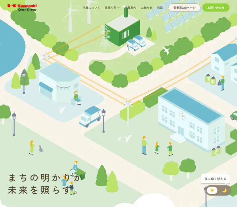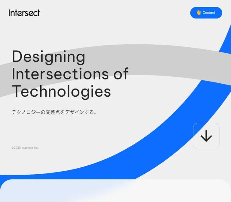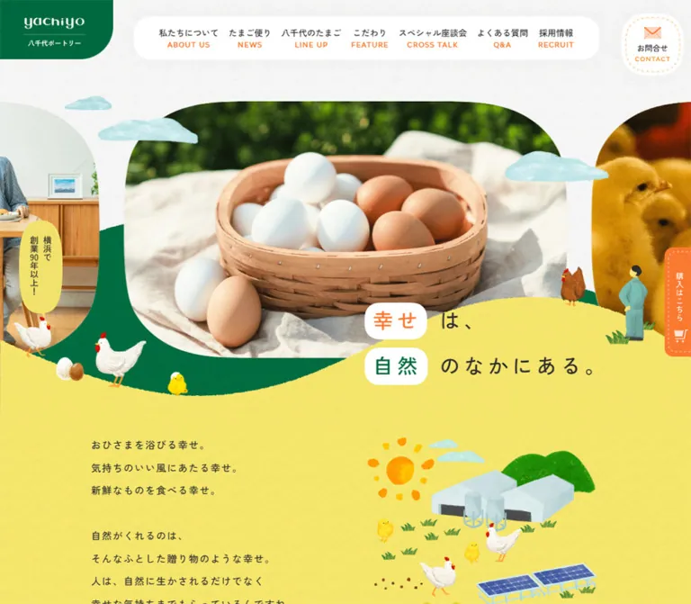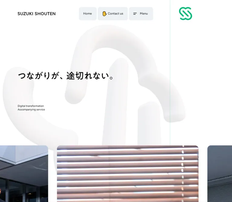
プレビュー準備中デザインリファレンスを見る
日本のWebデザインを、AIの制作リファレンスに。
DESIGN REFERENCE
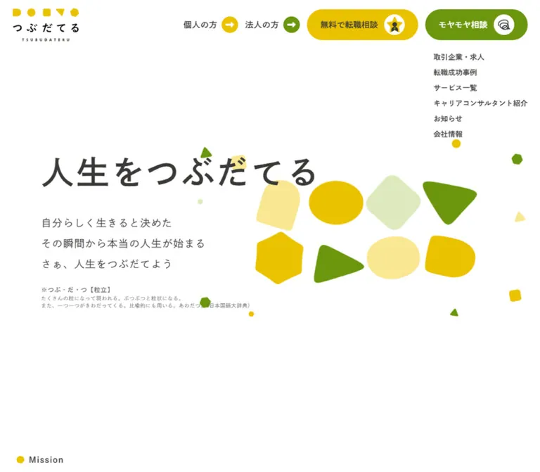
白い余白、表情のある幾何学図形、ゆったりした和文書体が特徴の転職支援サイト。相談導線、横並びの事例・人物紹介、大きく丸めたフッターを備える。
オリジナルサイトを見るA spacious career-support website where individual shapes give a human voice to a structured service.
Website: tsubudateru.com
Original URL: https://www.tsubudateru.com/
Final URL: https://www.tsubudateru.com/
Response: HTTP 200; no redirect recorded.
Theme: light, with white space, gold, olive green, and pale supporting colors.
Inspected: September 22, 2026, through the supplied browser evidence. Retrieval timestamp: 2026-09-22T13:38:55.506Z, or 22:38:55 JST.
Viewports: desktop 1440 × 1000 and mobile 390 × 844 CSS pixels.
Scope: the current corporate and career-support homepage: its opening composition, mission, service principles, employer links, career stories, recommendation statistics, consultant profiles, FAQ, consultation routes, news, column introduction, and footer. Linked destination pages were not inspected.
Tsubudateru combines warm Japanese typography with a small family of geometric marks. Circles, softened triangles, rounded quadrilaterals, and irregular polygons appear in the logo and desktop hero, then return as section accents and large background silhouettes. The main canvas remains white. Gold and olive supply the brand character; a brighter, separate green identifies the LINE consultation route.
The page is a substantial site homepage with editorial and corporate navigation. Its visual rhythm moves from a sparse introduction into employer and story collections, human portraits, practical questions, and several consultation paths. Broad spacing and generous line heights keep this content approachable. The oversized yellow footer is a particularly useful reference: its silhouette changes substantially between desktop and mobile while retaining the same identity.
A spacious career-support website where individual shapes give a human voice to a structured service.
Website: tsubudateru.com
Original URL: https://www.tsubudateru.com/
Final URL: https://www.tsubudateru.com/
Response: HTTP 200; no redirect recorded.
Theme: light, with white space, gold, olive green, and pale supporting colors.
Inspected: September 22, 2026, through the supplied browser evidence. Retrieval timestamp: 2026-09-22T13:38:55.506Z, or 22:38:55 JST.
Viewports: desktop 1440 × 1000 and mobile 390 × 844 CSS pixels.
Scope: the current corporate and career-support homepage: its opening composition, mission, service principles, employer links, career stories, recommendation statistics, consultant profiles, FAQ, consultation routes, news, column introduction, and footer. Linked destination pages were not inspected.
Tsubudateru combines warm Japanese typography with a small family of geometric marks. Circles, softened triangles, rounded quadrilaterals, and irregular polygons appear in the logo and desktop hero, then return as section accents and large background silhouettes. The main canvas remains white. Gold and olive supply the brand character; a brighter, separate green identifies the LINE consultation route.
The page is a substantial site homepage with editorial and corporate navigation. Its visual rhythm moves from a sparse introduction into employer and story collections, human portraits, practical questions, and several consultation paths. Broad spacing and generous line heights keep this content approachable. The oversized yellow footer is a particularly useful reference: its silhouette changes substantially between desktop and mobile while retaining the same identity.
| Name | Value | Alias | Evidence and role |
|---|---|---|---|
| White | #ffffff |
--color-page |
Measured on content sections and story cards; visually the dominant page canvas. |
| Warm charcoal | #3b3938 |
--color-ink |
Measured on the hero heading, body copy, navigation labels, and profile names. |
| Secondary gray | #6a6968 |
--color-muted |
Measured on the small dictionary explanation below the hero copy. |
| Gold | #eac200 |
--color-gold |
Measured on employer-list and consultant-list buttons. Hero, logo, and footer gold appear closely related, but their exact fills were not supplied. |
| Olive | #6b960e |
--color-olive |
Measured on story-category badges, carousel controls, and selected link text. Visually echoed in decorative shapes and footer actions. |
| LINE green | #00b900 |
--color-line |
Measured background of the current header consultation button. |
| Pale cream | #fff5d6 |
--color-cream |
Measured on large Latin profile-name text. A similar cream is visible behind consultant portraits; the portrait fill itself is not measured. |
| FAQ tint | #f5f5e6 |
--color-faq |
Measured background of the first mobile FAQ question button. |
| White veil | rgba(255,255,255,.65) |
--surface-veil |
Measured consultant-section background. The screenshot shows faint, softened decorations behind this area. |
| Pale yellow | approximately #fae991 |
--color-grain-light |
Visual estimate for the lighter desktop hero shapes. |
| Pale green | approximately #dce9bb |
--color-grain-green |
Visual estimate for the pale rounded square and small decorative dot. |
| Footer ivory | approximately #fffdf6 |
--color-ivory |
Visual estimate for the footer canvas and the pale statistics surround. |
Gold is the main identity color and a large-area structural accent. Olive supports navigation, content categorization, and the exploratory consultation route. LINE green belongs to the named external communication channel; keep it distinct from the quieter olive.
Use charcoal text on gold and pale surfaces. The original uses white labels on LINE green and olive controls. Those combinations should be checked at their actual text sizes when adapting the design; their presence is not evidence of an accessibility pass.
The supplied custom-property list contains many transparent gradient stops. That does not establish a visible gradient treatment. The inspected design reads as flat color fields, with localized softened decorations around the consultant section.
The computed typography identifies specific Japanese families:
| Role | Computed family | Source variable | Important distinction |
|---|---|---|---|
| Main headings and controls | 秀英角ゴシック銀 B JIS2004 |
--s-font-aea78c7f |
Major headings often use this B face with CSS weight 400. |
| Paragraphs and supporting copy | 秀英角ゴシック銀 L JIS2004 |
--s-font-889c65b6 |
Hero and explanatory paragraphs use CSS weight 400. |
| Additional declared face | 秀英角ゴシック銀 M JIS2004 |
--s-font-289022e5 |
Declared, but its application is not established by the sampled elements. |
The B/L distinction is carried by separate family names, not simply by switching one family between weights 700 and 300. Feature headings additionally request 700, while story titles and some profile metadata request 900.
Noto Sans JP, Lato, Montserrat, and 見出ゴMB1 also appear in declared variables. Their declaration alone does not establish use in the visible components. The root element's Times declaration is likewise not the page's primary content typography.
Font-file delivery and actual glyph fallback were not independently inspected. The Quick Start preserves the observed family strings and provides a recommended fallback stack; it does not bundle fonts.
Values below are measured. The notation is font size / line height.
| Role | Desktop | Mobile | Tracking | Face / CSS weight |
|---|---|---|---|---|
| Hero H1 | 64 / 112px |
36 / 63px |
0.07em |
B / 400 |
| Hero supporting copy | 20 / 40px |
16 / 32px |
0.07em |
L / 400 |
| Dictionary label | 12 / 12px |
10 / 10px |
0.07em |
B / 400 |
| Dictionary explanation | 10 / 14px |
10 / 14px |
0.07em |
L / 400 |
| Mission eyebrow | 16 / 28px |
16 / 28px |
0.07em |
B / 400 |
| Mission statement | 40 / 62px |
24 / 37.2px |
0.07em |
B / 400 |
| Mission paragraphs | 18 / 36px |
16 / 32px |
0.07em |
L / 400 |
| Service-principle heading | 24 / 42px |
20 / 35px |
0.05em |
B / 700 |
| General explanatory copy | 16 / 28px |
14 / 24.5px |
0.07em |
L / 400 |
| Employer-section heading | 48 / 84px |
24 / 42px |
0.07em |
B / 400 |
| Career-story section heading | 48 / 48px |
24 / 24px |
0.07em |
B / 400 |
| Consultant-section heading | 48 / 84px |
20 / 35px |
Desktop 0.07em; mobile 0.05em |
B / 400 |
| Story title | 16 / 22.4px |
14 / 19.6px |
0.07em |
B / 900 |
| Story category badge | 14 / 14px |
12 / 12px |
0.03em |
B / 900 |
| Consultant role | 14 / 19.6px |
12 / 16.8px |
0.07em |
L / 900 |
| Consultant Japanese name | 16 / 28px |
16 / 28px |
0.07em |
B / 900 |
| Consultant Latin name | 32 / 38.4px |
20 / 24px |
0.07em |
B / 900 |
| Standard list-button label | 16 / 16px |
14 / 14px |
Usually normal | B / 400 |
| LINE button label | 16 / 16px |
12 / 12px |
Normal | B / 400 |
| Expanded desktop navigation | 14 / 14px |
Hidden in captured header | 0.01em |
B / 400 |
| Header audience links | 16 / 16px |
Hidden in captured header | 0.03em |
B / 400 |
| FAQ question | Not sampled | 14 / 24.5px |
0.07em |
B / 400 |
| FAQ Q/A marker | Not sampled | 24 / 24px |
0.07em |
B / 400 |
The recurring 0.07em tracking and line heights of 1.75–2 are central to the site's relaxed reading texture. Small button labels tighten to a line height of 1.
Two computed-style cautions matter. The mission statement's sampled parent has transparent text color although the statement is visible in the desktop capture; its full painting mechanism was not supplied. Also, the statistics use mixed-size text: the desktop 5.0 parent reports 20px type but a 36px-high box and visibly larger digits. Do not copy either parent declaration as a complete rendering specification. The mobile 5.0 element explicitly measures 40 / 40px.
Density: generous at section level, compact inside navigation and metadata. Spacing model: repeated pixel values, without evidence of one universal fluid unit.
| Value | Measured or calculated use |
|---|---|
4px |
Dictionary label-to-explanation separation; mobile LINE content gap. |
8px |
Desktop audience-link icon gap; desktop LINE content gap; mobile FAQ internal gap. |
12px |
Mobile LINE horizontal padding. |
16px |
Header vertical padding; mobile header horizontal padding; mobile hero text-group gaps; expanded navigation gap. |
20px |
Mobile main-section side inset; standard list-button vertical padding. |
24px |
Desktop header side inset; desktop hero text-group gaps; mobile story-content inset and inter-card gap. |
32px |
Mobile hero side inset; desktop story-content inset. |
40px |
Desktop story-card gap; desktop consultant-card padding and image-to-text gap. |
48px |
Calculated gap between successive mobile service-principle groups. |
60px |
Desktop wide-section side inset. |
72px |
Calculated gap between the approximately 352px service-principle columns. |
80px |
Common section padding; desktop mission top inset. |
120px |
Desktop hero and mission left alignment; consultant-section top padding. |
140px |
Declared desktop bottom padding on the service-principles section. |
| Element | Value | Evidence |
|---|---|---|
| Header LINE button | 40px |
Measured at both viewports. |
| List buttons | 40px |
Measured at both viewports. |
| Story cards | Desktop 24px; mobile 16px |
Measured. |
| Story badges | 4px |
Measured. |
| Carousel controls | 50%, within 40 × 40px |
Measured. |
| First mobile FAQ question | 60px 60px 60px 0 |
Measured; a speech-bubble-like silhouette. |
| Statistics panels | Approximately 40px lower corners |
Visual estimate from the desktop capture. |
| Desktop yellow footer panel | Approximately 196px left corners, 16px right corners |
Visual estimate; the left edge forms a broad capsule end. |
| Mobile yellow footer panel | Approximately 80px top-left, 8px other corners |
Visual estimate. |
The geometry has two scales: small functional pills and much larger architectural curves. Do not apply one uniform radius to every surface.
| Element | Desktop 1440 × 1000 |
Mobile 390 × 844 |
Status |
|---|---|---|---|
| Document height | 9542.31px |
9200.27px |
Measured snapshot extent. |
| Compact header | 96px high |
76px high |
Measured. |
| Expanded opening header | 306px high, including link list |
76px; link list not shown |
Measured. |
| Header logo link | 130 × 64px |
80px wide; wrappers approximately 39.38–44px high |
Measured across header variants. |
| LINE button | 216.25 × 60px |
143.19 × 44px |
Measured. |
| Hero section | 800px high |
844px high |
Measured; mobile equals the inspected viewport height. |
| H1 box origin | x:120, y:278 |
x:32, y:110 |
Measured. |
| H1 box | 545.92 × 112px |
307.17 × 63px |
Measured. |
| Hero lead box | 321 × 120px |
256.81 × 96px |
Measured. |
| Mission text width | Approximately 480px |
350px |
Measured. |
| Principle paragraph width | 351.95px |
300px, centered |
Measured. |
| Employer-logo link box | 176 × 80px |
126 × 60px |
Measured. |
| Story card | 400 × 453.84px |
246 × 323.75px |
Measured captured content. |
| Story-card gap | 40px |
24px |
Calculated from successive card positions. |
| Consultant link | 440 × 612.38px |
240 × 421.59px |
Measured. |
| Consultant image area | Approximately 360 × 360px |
Approximately 208 × 208px |
Calculated from padding and following text positions. |
| Yellow footer panel | Approximately 864 × 392px |
Approximately 390 × 541px |
Visual estimate. |
| Footer consultation pills | Approximately 208 × 60px |
Approximately 326 × 60px |
Visual estimate. |
Document coordinates belong to the DOM snapshots. Scrolled screenshots may represent a different settled moment; no exact scroll offsets were supplied.
Role: maintain identity, audience routing, and a continuously available consultation action.
The opening desktop composition places the logo at (24,16) and three navigation groups at the upper right: 個人の方, 法人の方, and the green LINE pill. The audience links pair text with 32px circular arrow badges. A seven-link vertical list begins below the action area at approximately x:1233, y:96, with 14px labels on a 30px vertical pitch.
A second, compact header is present in the DOM and visible in the scrolled screenshots. It adds a hamburger button at the far right, moving the action group 64px left. The desktop button box measures 40 × 60px. The logo and action row remain at the viewport top in lower-page captures, supporting persistent-header behavior. The exact visibility trigger and positioning implementation were not supplied.
On mobile, the header shows only the 80px logo, LINE action, and hamburger. The two audience links and the expanded desktop list are not visible. The hamburger's sampled variants measure 24 × 21px and 24 × 44px; do not assume a 44px-wide touch target.
The header is visually transparent over scrolled content. The column heading and mobile footer logo can pass behind it. No opaque header bar, shadow, or blur is established by these captures. The menu's opened state was not inspected.
Role: direct access to the external consultation channel.
An actual anchor points to https://lin.ee/lKbeDAf. Its anatomy is a green rounded container, a white LINEで転職相談 label, and a white circular icon enclosure. The enclosure is approximately 40px on desktop and 24px on mobile, judged visually.
Desktop padding is 8px 24px, with an 8px gap; mobile padding is 8px 12px, with a 4px gap. The outer radius remains 40px while the control height changes from 60px to 44px. Keep the channel icon visually separate from the word label.
Role: establish the brand proposition before presenting service details.
The desktop hero is an 800px-high composition with text on the left and shapes on the right. The H1 人生をつぶだてる occupies one line. Its large line box is followed by 24px of separation, three lines of light-weight supporting copy, another 24px gap, and a compact dictionary-style explanation.
The supporting copy is deliberately short and poetic. Preserve its three-line rhythm and the relationship between the strong headline and lighter, widely spaced text. The dictionary label and explanation create a quiet editorial detail rather than another conversion panel.
At 390px, the H1 starts at x:32, y:110, retains one line, and changes to 36px. Text-group gaps shrink to 16px. The dictionary explanation uses a 300px width and wraps across three lines. No large consultation button is inserted into the hero body; the visible conversion action remains in the header.
Role: translate the brand's idea of distinct individuals into a recognizable visual vocabulary.
The current desktop screenshot shows eight prominent shapes in two loose rows of four. They include a pale horizontal rounded shape, a gold circle, a pale-green rounded square, green triangles with softened vertices, a gold polygon, and rounded oval or capsule forms. Their rotations and proportions differ slightly. Smaller particles surround the cluster, generally about 14–44px across by visual estimate.
The large cluster occupies approximately 610 × 280px, around x:674–1282, y:310–585. The surrounding particles spread farther out. Shapes have solid fills and no visible outlines, texture, or dimensional lighting.
The mobile capture instead shows a centered four-by-two arrangement of gray squares, approximately 67px each, within a 300px-wide area around y:503–647. This is a captured rendering state. The evidence does not identify a loading sequence, failed asset, or intended permanent mobile treatment.
For a new implementation, a static SVG composition based on the observed desktop shape family is a reasonable fallback recommendation. Rounded polygon vertices should be authored deliberately; a sharp CSS triangle is only an approximation.
Role: explain the service's values and reassure visitors who have not committed to changing jobs.
The mission begins after the hero. A small gold polygon sits beside the 16px Mission eyebrow. The two-line statement follows after 16px. Desktop content aligns at approximately 120px from the left; the mobile mission uses a separate, narrower 20px inset.
The supporting mission paragraph has a 40px separation from the statement on desktop and 24px on mobile. Its source line height remains spacious: 36px and 32px respectively.
The following principles form three desktop columns with approximately 352px paragraph widths and 72px gaps. Each has a centered multiline heading, a substantial intervening visual region, and supporting copy. The precise imagery in that region is not established by the supplied screenshots or complete asset references.
Mobile places these groups vertically, using centered 300px-wide descriptions and approximately 48px between groups. The section height grows from 618px to 1126px. Preserve this structural stacking rather than shrinking three columns into the phone width.
Role: demonstrate the range of available employers through linked brand marks.
A 48px desktop heading and explanatory paragraph introduce two labeled collections: 成長企業 and グローバル企業. Their logo links occupy horizontal tracks with items positioned both inside and outside the viewport. Desktop link boxes measure 176 × 80px; mobile boxes measure 126 × 60px.
The measured horizontal pitch is 288px on desktop and 180px on mobile, giving calculated spaces of 112px and 54px between the sampled link boxes. This should not be confused with the 64px internal gap reported on individual anchors.
The DOM contains pause text within these sections. This supports the presence of a motion-control affordance, but its operation, track speed, and direction were not tested. A centered gold list button links to /companylist.
Role: provide evidence through individual career narratives.
Each story is an entire linked card. The first desktop card starts at x:204, followed by cards at x:644 and x:1084; the third extends past the viewport. On mobile, the first card begins at x:20, and the next at x:290, leaving a substantial preview of the following card.
The measured card shell is white, with a 24px desktop radius and a 16px mobile radius. Its content consists of an upper media region, a green category badge, an adjacent green hashtag/job category, a charcoal story title, and a compact name/age line. Title and metadata insets are 32px on desktop and 24px on mobile.
Desktop badges use 8px 16px padding and a 4px radius. The first title occupies approximately three measured lines on desktop and four on mobile; the exact truncation rule was not supplied. Two 40px circular controls sit below the track toward the right.
The mobile category row for some long labels extends beyond the measured card bounds. Treat that as an observed layout limitation. For reuse, allow categories to wrap while keeping the card width and typography hierarchy.
The source contains duplicate story links, consistent with a looping track. Autoplay, drag behavior, arrow behavior, and loop timing remain unverified.
Role: present a large recommendation statistic and a compact review summary.
The content displays a 92%! recommendation figure and a 5.0 review average. These are the site's displayed claims; no survey method or review source was inspected.
In the desktop capture, a white rounded inner panel sits within a very pale outer surface. The review prompt is centered and flanked by short diagonal gold strokes. The small review label shares a baseline area with a larger number. Large open space around these details gives them prominence without additional card borders.
The DOM shows the recommendation caption beside its number on desktop and above the number on mobile. Its caption changes from 24 / 42px to 20 / 35px. Do not infer count-up animation from the numerical content or the mixed-size text boxes.
Role: connect the service to identifiable people.
A centered heading sits above a horizontally overflowing row of profile links. In the desktop screenshot, portraits appear against pale cream shapes, including a circle and asymmetric rounded silhouettes. Three large portrait areas are visible across the viewport, with neighboring content peeking at the edges.
The outer link is 440px wide with 40px padding, yielding a calculated 360px portrait area. A 40px gap leads to the role and name block. On mobile, the link becomes 240px wide with 24px 16px padding and a calculated 208px portrait area; the image-to-text gap becomes 24px.
Below the portrait, stack a small professional role, a 16px Japanese name, and a larger Latin name. The Latin name uses measured pale cream text and functions visually as a secondary graphic layer; the darker Japanese name remains the primary readable identifier.
Repeated profiles and pause text appear in the DOM. Exact movement and pause behavior were not exercised. A gold button below the collection links to /member.
Role: reduce uncertainty about cost, consultation scope, remote meetings, negotiation, and availability.
The supplied mobile measurements establish a 350px-wide question button at a 20px page inset. The first question is 97px high, with 24px padding and an 8px internal gap. Its pale #f5f5e6 background has three heavily rounded corners and a square lower-left corner.
A green 24px Q. marker precedes the 14px question text. Answer text and an A. marker are present in the extracted DOM. A button element establishes an interactive affordance, but the captured evidence does not verify the default expanded state, toggle behavior, indicator graphic, or answer transition.
A reuse implementation should retain the bubble silhouette and implement disclosure semantics explicitly. Do not label an invented accordion animation as an observed feature.
Role: offer different levels of commitment and keep the homepage connected to ongoing content.
Two distinct linked offers are recorded: career-change consultation at /contact/careerchange and exploratory consultation at /contact/moyamoya. Their text differentiates people seeking suitable roles from people still clarifying their direction. The supplied frames do not establish the full visual layout of these offer blocks.
News entries combine a date, category, and headline within a link. Three entries are present in the supplied text, followed by a news-index link. Exact row styling is outside the visual and computed-style coverage.
The lower desktop screenshot does establish the column introduction: a broad, left-aligned text region, a prominent Japanese heading, two paragraph groups, and a centered olive pill labeled コラム一覧. The pill is approximately 264 × 60px by visual estimate. A large white interval separates it from the footer.
Role: close the page with identity, consultation choices, and a complete site directory.
On desktop, the footer uses an ivory canvas. The logo and four circular social links occupy roughly the left 40% of the width. The yellow navigation panel fills the remaining 60%, touching the right edge. Its left side has a large capsule-like curve, while the right corners remain modestly rounded.
Inside the panel, seven directory links form a vertical list. A second column holds two 60px-high consultation pills, followed by the individual and corporate audience links. The first consultation pill is ivory with charcoal text and a small illustrated badge. The second is olive with white text and a circular line illustration.
The social links lead to YouTube, Instagram, note, and X. Their visible enclosures are approximately 40px circles with thin gold borders. Copyright sits at the lower left, while the privacy-policy link sits at the lower right.
Mobile changes the composition rather than scaling it down. The larger footer logo and social row are centered above a full-width yellow panel. Inside the panel, the consultation pills stack first, followed by a two-column audience row and then a two-column directory. The panel has an approximately 80px top-left curve and small remaining corners. Content begins about 32px from each side; consultation pills are approximately 326px wide.
The privacy link and copyright move below the panel and become centered. The persistent header remains visible over this footer capture, partially covering the larger footer logo near the top of the frame.
| Treatment | Supplied evidence | What can be concluded |
|---|---|---|
| General element transitions | 0.3s cubic-bezier(0.4, 0.4, 0, 1) |
A common transition duration and easing are declared. Specific hover endpoints are not supplied. |
| Body background transition | background 0.5s cubic-bezier(0.4, 0.4, 0, 1) |
A background transition exists; no particular background-changing interaction is established. |
| Story controls | 0.4s cubic-bezier(0.4, 0.4, 0, 1) |
Measured declaration on circular buttons. |
| FAQ question | 0.4s cubic-bezier(0.4, 0.4, 0, 1) |
Measured declaration on the mobile question button; answer motion remains unknown. |
| Consultant links | 0.3s linear |
Measured transition declaration; not a measurement of a full track cycle. |
| Story cards | transform linear |
No positive duration is present in the supplied shorthand; do not derive a slide duration from it. |
| Employer and consultant tracks | Offscreen items, repeated content, pause text | Horizontal track structure and motion affordances are supported; operation and timing are unverified. |
| Header persistence | Header remains at viewport top in scrolled captures | Persistent navigation is visually supported. Its activation threshold is unknown. |
| Hero shapes | One desktop arrangement and a gray-block mobile state | Rotation, morphing, parallax, and entrance timing cannot be established. |
The sampled elements generally report animation: none. This does not rule out animation on unsampled descendants, pseudo-elements, or JavaScript-controlled transforms.
The collection process waited for load, bounded animation readiness, image decoding, and layout/text stability. It temporarily paused perpetual animations during readiness checks and resumed them afterward. These procedures do not provide a motion recording or prove that all delayed content was complete.
Recommended motion vocabulary: short color or opacity feedback using the observed 300ms easing; restrained decorative movement only when it adds value; a static reduced-motion presentation. Do not invent a complex choreography from still images.
| Surface | Appearance | Structural purpose |
|---|---|---|
| Main canvas | White, largely unboxed | Preserves the spacious editorial rhythm. |
| Story card | White, rounded corners | Groups media and career metadata within a horizontal collection. |
| Statistics surround | Visually ivory, with a white rounded interior | Separates social proof with a broad soft boundary. |
| Consultant area | Measured translucent white section, pale portrait backdrops | Keeps people prominent while allowing faint decoration. |
| FAQ question | Pale greenish cream, asymmetric rounded corners | Gives practical questions a conversational character. |
| Footer | Ivory canvas plus a large yellow silhouette | Provides a strong closing landmark and directory. |
| Actions | Gold, olive, ivory, or channel green pills | Distinguishes destinations through color and icon treatment. |
No general shadow-based elevation system is established by the visible captures. Separation comes primarily from color, spacing, rounded silhouettes, and image boundaries. Softened decorative dots should not be generalized into blurred interface panels.
The brand artwork is flat and geometric. Its personality comes from slightly irregular proportions, rounded vertices, uneven rotations, and the contrast between large shapes and tiny scattered particles. The same vocabulary works at logo scale, hero scale, and architectural footer scale.
Consultant imagery introduces natural-color people against clean pale shapes. In the supplied desktop frame, only the upper portions of the portraits are visible, so exact full-body crops and native transparency are not established. Preserve natural skin color and the simple backdrop relationship when choosing replacement photography.
The wordmark includes a row of five small gold marks above the Japanese name and a tiny tracked Latin line below it. Treat it as a supplied brand asset rather than approximating the lettering with an unrelated display font.
| Asset or family | Evidence | Reuse direction |
|---|---|---|
| Header and footer wordmark | Current desktop/mobile screenshots; homepage logo anchors | Use an authorized logo asset with its original proportions. |
| Eight-shape hero cluster | Current desktop opening screenshot | Author clean SVG shapes if recreating the motif; retain soft vertices. |
| Small decorative particles | Desktop hero and consultant transition | Keep sparse and subordinate to text. |
| Consultant portraits | Desktop consultant screenshot and linked profile structure | Pair natural-color portraits with varied cream silhouettes. |
| Employer marks | Measured linked logo boxes | Preserve each logo's aspect ratio; use contained placement. |
| LINE, consultation, and social icons | Current header/footer screenshots and recorded links | Retain their distinct purposes; decorative badges are not interchangeable. |
No complete image-file URLs were supplied for these assets. Truncated background-image references are insufficient to publish a usable asset path. This reference therefore does not invent filenames or downloads.
The desktop uses several alignment systems rather than one universal container. Hero and mission text begin near 120px. Wider employer and column content begins around 60px. The career-story track begins around 204px in the measured desktop state, then extends beyond the right edge. Consultant cards occupy a full-width horizontal sequence.
Mobile uses 16px header insets, 32px hero insets, and mostly 20px main-section insets. Principle descriptions narrow further to 300px and are centered. Preserve these deliberate differences; replacing them with one global 16px gutter would change the composition.
| Area | Observed desktop behavior | Observed mobile behavior |
|---|---|---|
| Header | Audience links, LINE pill, expanded opening directory; compact scrolled variant | Logo, LINE pill, hamburger only. |
| Hero | Text left, colored shapes right; 800px section | Text above a gray four-by-two block state; 844px section. |
| Mission | Narrow text group within a broad layout | 350px text width, smaller statement, 20px inset. |
| Principles | Three columns | Three vertically stacked groups. |
| Employer collections | Large logo boxes in horizontal tracks | Smaller logo boxes; tracks remain horizontal. |
| Stories | 400px cards with 40px gaps | 246px cards with 24px gaps and a following-card preview. |
| Consultants | 440px links with 360px image areas | 240px links with 208px image areas and neighboring content. |
| Footer | Brand area left, yellow directory panel right | Centered brand area, full-width panel, reordered actions and directory. |
A source excerpt contains a max-width: 1140px media rule for responsive line breaks. This is evidence of that breakpoint's existence, not a complete map of the site's layout breakpoints. Intermediate widths, landscape orientation, browser zoom, and safe-area handling were not inspected.
The mobile document is slightly shorter overall despite stacking the principles. Other sections become smaller or more compact. Do not derive a uniform desktop-to-mobile scale factor from the total page heights.
0.07em tracking for primary Japanese content.These are recommendations for a new implementation, not verified original-site behavior:
aria-expanded and aria-controls, or use native disclosure elements.#ffffff.#3b3938.#6a6968.#eac200; exact artwork/footer fills unverified.#6b960e.#00b900 with white text.#f5f5e6.#fff5d6 on Latin name text.“Create a Japanese corporate and career-support homepage inspired by the current Tsubudateru reference. Use a white canvas, warm charcoal text, gold and olive accents, spacious Japanese typography, and a family of flat geometric shapes with rounded vertices. On desktop, place a one-line brand statement and three-line introduction to the left of an eight-shape composition. Keep a compact logo and a green LINE consultation pill in persistent navigation. Follow with mission content, three service principles, employer-logo tracks, rounded career-story cards, recommendation statistics, consultant portraits, practical questions, consultation routes, news, and a column introduction. Finish with an ivory footer and a large yellow panel with a capsule-like left edge. On mobile, simplify navigation, stack text-led sections, retain horizontal content tracks, and move consultation actions above the footer directory. Treat any supplied static artwork fallback and intermediate breakpoints as implementation choices.”
人生をつぶだてる in a strong Japanese Gothic face at 64px with 112px line height and 0.07em tracking. Place three short lines of lighter 20px copy below, then a tiny dictionary explanation. Use flat gold, olive, pale-yellow, and pale-green shapes to the right. At 390px, use a 36px headline and 32px side insets. A colored mobile fallback is a proposed enhancement, not the observed gray-block capture.”This is an adaptation, not extracted production CSS. It uses a conventional 16px root and preserves measured endpoint proportions where practical. The 1140px layout switch is a recommended implementation choice; only a line-break rule at that width was directly observed.
Use .hero-inner with .hero-copy and .hero-art; place eight .grain elements inside .hero-cluster. The footer panel expects .footer-links, .footer-actions, and .footer-audiences. A single header can use data-top='true' for its opening variant. Menu logic, FAQ state management, and track controls require separate implementation.
The mobile artwork below is a recommended static colored fallback. It does not claim to reproduce the gray-block state in the supplied mobile capture. Polygon clipping is an approximation; authored SVG paths are preferable for the original's softened vertices. The suggested 16:9 story-media slot is not a directly measured image crop.
:root {
  /* Measured colors */
  --color-page: #ffffff;
  --color-ink: #3b3938;
  --color-muted: #6a6968;
  --color-gold: #eac200;
  --color-olive: #6b960e;
  --color-line: #00b900;
  --color-cream: #fff5d6;
  --color-faq: #f5f5e6;
  --surface-veil: rgb(255 255 255 / 65%);

  /* Visual approximations for unmeasured decorative fills */
  --color-grain-light: #fae991;
  --color-grain-green: #dce9bb;
  --color-ivory: #fffdf6;

  /* Observed family names; fallback is recommended */
  --font-display: '秀英角ゴシック銀 B JIS2004', 'Noto Sans JP', sans-serif;
  --font-body: '秀英角ゴシック銀 L JIS2004', 'Noto Sans JP', sans-serif;
  --text-hero: 4rem;
  --text-section: 3rem;
  --text-lead: 1.25rem;
  --text-body: 1rem;
  --tracking-main: .07em;

  --space-1: 4px;
  --space-2: 8px;
  --space-4: 16px;
  --space-6: 24px;
  --space-8: 32px;
  --space-10: 40px;
  --space-section: 80px;
  --radius-card: 24px;
  --radius-pill: 40px;
  --header-height: 96px;
  --ease-site: cubic-bezier(.4, .4, 0, 1);
  --motion-ui: 300ms;
}

*,
*::before,
*::after {
  box-sizing: border-box;
}

body { margin: 0; }

.tsubu {
  color: var(--color-ink);
  background: var(--color-page);
  font-family: var(--font-body);
  font-size: var(--text-body);
  font-weight: 400;
  line-height: 1.75;
  letter-spacing: var(--tracking-main);
}

.tsubu :where(h1, h2, h3, p) { margin: 0; }
.tsubu :where(a) { color: inherit; }
.tsubu :where(button) { font: inherit; }
.tsubu :where(h1, h2, h3, .pill, .audience-link) {
  font-family: var(--font-display);
  font-weight: 400;
}

.container {
  width: min(1320px, calc(100% - 120px));
  margin-inline: auto;
}

.container--reading { max-width: 1200px; }
.section { padding-block: var(--space-section); }
.section-title { font-size: var(--text-section); line-height: 1.75; }

.site-header {
  position: fixed;
  z-index: 50;
  inset: 0 0 auto;
  height: var(--header-height);
  display: flex;
  align-items: center;
  justify-content: space-between;
  gap: 24px;
  padding: 16px 24px;
  background: transparent;
}

.brand { display: block; flex: 0 0 130px; }
.brand img { display: block; width: 100%; height: auto; }
.header-actions,
.header-audiences { display: flex; align-items: center; gap: 24px; }

.audience-link {
  display: inline-flex;
  align-items: center;
  gap: 8px;
  text-decoration: none;
  font-size: 16px;
  line-height: 1;
  letter-spacing: .03em;
}

.arrow-badge {
  display: grid;
  place-items: center;
  flex: 0 0 32px;
  width: 32px;
  height: 32px;
  border-radius: 50%;
  color: white;
  background: var(--color-gold);
}

.arrow-badge--olive { background: var(--color-olive); }

.pill {
  display: inline-flex;
  align-items: center;
  justify-content: center;
  gap: 24px;
  min-height: 60px;
  padding: 20px 24px;
  border: 0;
  border-radius: var(--radius-pill);
  background: var(--color-gold);
  color: var(--color-ink);
  text-decoration: none;
  font-size: 16px;
  line-height: 1;
  letter-spacing: 0;
  transition: opacity var(--motion-ui) var(--ease-site);
}

.pill--olive { background: var(--color-olive); color: white; }
.pill--ivory { background: var(--color-ivory); }
.pill--line {
  width: 216.25px;
  padding: 8px 24px;
  gap: 8px;
  background: var(--color-line);
  color: white;
}

.pill-icon {
  display: grid;
  place-items: center;
  flex: 0 0 32px;
  width: 32px;
  height: 32px;
  border-radius: 50%;
  background: white;
}

.pill--line .pill-icon { flex-basis: 40px; width: 40px; height: 40px; }

.menu-button {
  display: grid;
  place-content: center;
  gap: 8px;
  width: 44px;
  min-height: 60px;
  padding: 0;
  border: 0;
  color: var(--color-ink);
  background: transparent;
  cursor: pointer;
}

.menu-button span {
  width: 40px;
  height: 6px;
  border-radius: 3px;
  background: currentColor;
}

.hero-nav {
  display: none;
  position: absolute;
  top: 96px;
  right: 24px;
  gap: 16px;
  font-family: var(--font-display);
  font-size: 14px;
  line-height: 1;
  letter-spacing: .01em;
}

.hero-nav a { text-decoration: none; }
.site-header[data-top='true'] .hero-nav { display: grid; }
.site-header[data-top='true'] .menu-button { display: none; }

.hero {
  display: grid;
  align-items: center;
  min-height: 800px;
  padding-top: 80px;
}

.hero-inner {
  display: grid;
  grid-template-columns: 546px minmax(0, 1fr);
  align-items: center;
  gap: 12px;
}

.hero-title { font-size: var(--text-hero); line-height: 1.75; }
.hero-lead { margin-top: 24px !important; font-size: var(--text-lead); line-height: 2; }
.hero-note { max-width: 413px; margin-top: 24px; color: var(--color-muted); }
.hero-note-label { font-family: var(--font-display); font-size: 12px; line-height: 1; }
.hero-note-body { margin-top: 4px !important; font-size: 10px; line-height: 1.4; }

/* Static decorative approximation; replace polygons with rounded SVGs */
.hero-art { position: relative; width: min(100%, 610px); aspect-ratio: 1.55; }
.hero-cluster {
  position: absolute;
  inset: 18% 0 12%;
  display: grid;
  grid-template-columns: repeat(4, minmax(0, 1fr));
  grid-template-rows: repeat(2, minmax(0, 1fr));
  gap: 18px;
}

.grain { background: var(--color-gold); border-radius: 24%; }
.grain:nth-child(1) { background: var(--color-grain-light); border-radius: 10% 50% 50% 10%; transform: rotate(-4deg); }
.grain:nth-child(2) { border-radius: 50%; }
.grain:nth-child(3) { background: var(--color-grain-green); transform: rotate(8deg); }
.grain:nth-child(4),
.grain:nth-child(6) { background: var(--color-olive); clip-path: polygon(0 0, 100% 12%, 24% 100%); }
.grain:nth-child(5) { clip-path: polygon(25% 0, 75% 0, 100% 50%, 75% 100%, 25% 100%, 0 50%); }
.grain:nth-child(6) { transform: rotate(-14deg); }
.grain:nth-child(7) { background: var(--color-grain-light); border-radius: 50%; transform: rotate(20deg); }
.grain:nth-child(8) { border-radius: 50% 12% 12% 50%; }

.eyebrow {
  display: flex;
  align-items: center;
  gap: 10px;
  font-family: var(--font-display);
  font-size: 16px;
  line-height: 28px;
}

.eyebrow::before {
  content: '';
  width: 14px;
  height: 14px;
  border-radius: 35%;
  background: var(--color-gold);
  transform: rotate(18deg);
}

.mission-statement { margin-top: 16px !important; font-size: 40px; line-height: 1.55; }
.mission-copy { max-width: 480px; margin-top: 40px !important; font-size: 18px; line-height: 2; }
.principles { display: grid; grid-template-columns: repeat(3, minmax(0, 1fr)); gap: 72px; }
.principle h3 { text-align: center; font-size: 24px; line-height: 1.75; font-weight: 700; }

/* Native horizontal scrolling is a recommended accessible baseline */
.case-rail {
  display: flex;
  gap: 40px;
  overflow-x: auto;
  padding: 0 max(20px, calc((100vw - 1032px) / 2)) 40px;
  scroll-snap-type: x proximity;
}

.case-card {
  flex: 0 0 400px;
  min-width: 0;
  overflow: hidden;
  border-radius: var(--radius-card);
  background: white;
  text-decoration: none;
  scroll-snap-align: start;
}

.case-media { display: block; width: 100%; aspect-ratio: 16 / 9; object-fit: cover; }
.case-body { display: grid; gap: 24px; padding: 24px 32px 40px; }
.case-tags { display: flex; align-items: center; flex-wrap: wrap; gap: 8px 16px; }
.case-badge { padding: 8px 16px; border-radius: 4px; background: var(--color-olive); color: white; font-size: 14px; line-height: 1; letter-spacing: .03em; }
.case-category { color: var(--color-olive); font-size: 14px; }
.case-title { font-size: 16px; line-height: 1.4; font-weight: 900 !important; }
.case-meta { font-size: 14px; line-height: 1.4; }

.member-rail { display: flex; overflow-x: auto; }
.member-card { flex: 0 0 440px; min-width: 0; padding: 40px; text-decoration: none; }
.member-portrait { aspect-ratio: 1; overflow: hidden; border-radius: 50%; background: var(--color-cream); }
.member-portrait--asymmetric { border-radius: 24px 50% 24px 24px; }
.member-portrait img { display: block; width: 100%; height: 100%; object-fit: cover; }
.member-info { margin-top: 40px; }
.member-role { font-size: 14px; line-height: 1.4; }
.member-name { margin-top: 8px !important; font-size: 16px; line-height: 1.75; }
.member-latin { font-family: var(--font-display); font-size: 32px; line-height: 1.2; color: var(--color-cream); }

.faq-question {
  display: flex;
  align-items: center;
  gap: 8px;
  width: 100%;
  padding: 24px;
  border: 0;
  border-radius: 60px 60px 60px 0;
  color: var(--color-ink);
  background: var(--color-faq);
  text-align: left;
  cursor: pointer;
}

.faq-letter { flex: none; color: var(--color-olive); font-family: var(--font-display); font-size: 24px; line-height: 1; }
.faq-question-text { font-family: var(--font-display); font-size: 14px; line-height: 1.75; }
.faq-answer { padding: 24px; }
.faq-answer[hidden] { display: none; }

.site-footer { background: var(--color-ivory); }
.footer-main { display: grid; grid-template-columns: 40% 60%; }
.footer-brand { padding: 80px 32px; text-align: center; }
.footer-logo { display: block; width: 160px; height: auto; margin-inline: auto; }
.social-links { display: flex; justify-content: center; gap: 16px; margin-top: 24px; }
.social-link { display: grid; place-items: center; width: 40px; height: 40px; border: 1px solid var(--color-gold); border-radius: 50%; }

/* Footer geometry and padding are screenshot-based approximations */
.footer-panel {
  display: grid;
  grid-template-columns: minmax(0, 1fr) 208px;
  grid-template-areas: 'links actions' 'links audiences';
  gap: 16px 80px;
  min-height: 392px;
  padding: 80px clamp(32px, 11.875vw, 171px) 80px clamp(48px, 13.542vw, 195px);
  border-radius: 196px 16px 16px 196px;
  background: var(--color-gold);
}

.footer-links { grid-area: links; display: grid; align-content: start; gap: 20px; }
.footer-links a { text-decoration: none; font-size: 16px; line-height: 1; }
.footer-actions { grid-area: actions; display: grid; gap: 16px; }
.footer-audiences { grid-area: audiences; display: grid; justify-items: end; gap: 16px; }
.footer-legal { display: flex; justify-content: space-between; gap: 24px; padding: 24px 60px; color: var(--color-muted); font-size: 12px; }

/* Recommended keyboard feedback and anchor clearance */
.tsubu :focus-visible { outline: 3px solid var(--color-ink); outline-offset: 4px; }
.tsubu [id] { scroll-margin-top: calc(var(--header-height) + 24px); }

@media (hover: hover) {
  .pill:hover { opacity: .86; }
  .footer-links a:hover,
  .hero-nav a:hover { text-decoration: underline; text-underline-offset: 4px; }
}

/* Recommended layout cutover; intermediate widths were not inspected */
@media (max-width: 1140px) {
  :root {
    --header-height: 76px;
    --text-hero: 2.25rem;
    --text-section: 1.5rem;
    --text-lead: 1rem;
    --text-body: .875rem;
    --radius-card: 16px;
  }

  .container { width: calc(100% - 40px); }
  .site-header { padding: 16px; gap: 16px; }
  .brand { flex-basis: 80px; }
  .header-actions { gap: 8px; }
  .header-audiences,
  .site-header[data-top='true'] .hero-nav { display: none; }
  .site-header[data-top='true'] .menu-button { display: grid; }
  .menu-button { width: 44px; min-height: 44px; gap: 6px; }
  .menu-button span { width: 24px; height: 3px; }
  .pill { min-height: 58px; font-size: 14px; }
  .pill--line { width: 143.19px; min-height: 44px; padding: 8px 12px; gap: 4px; font-size: 12px; }
  .pill--line .pill-icon { flex-basis: 24px; width: 24px; height: 24px; }

  .hero { min-height: 100svh; align-content: start; padding: 110px 0 80px; }
  .hero-inner { display: block; width: calc(100% - 64px); }
  .hero-title { font-size: clamp(28px, 9.23vw, 36px); }
  .hero-lead { margin-top: 16px !important; }
  .hero-note { max-width: 300px; margin-top: 16px; }
  .hero-note-label { font-size: 10px; }
  .hero-art { width: min(300px, 100%); aspect-ratio: 300 / 144; margin: 146px auto 0; }
  .hero-cluster { inset: 0; gap: 8px 10px; }

  .mission-statement { font-size: 24px; }
  .mission-copy { margin-top: 24px !important; font-size: 16px; }
  .principles { grid-template-columns: 1fr; justify-items: center; gap: 48px; }
  .principle { width: min(300px, 100%); }
  .principle h3 { font-size: 20px; }

  .case-rail { gap: 24px; padding-inline: 20px; }
  .case-card { flex-basis: 246px; }
  .case-body { gap: 8px; padding: 14px 24px 24px; }
  .case-badge,
  .case-category,
  .case-meta { font-size: 12px; }
  .case-title { font-size: 14px; }
  .case-meta { margin-top: 8px !important; }

  .member-card { flex-basis: 240px; padding: 24px 16px; }
  .member-info { margin-top: 24px; }
  .member-role { font-size: 12px; }
  .member-latin { font-size: 20px; }

  .footer-main { grid-template-columns: 1fr; }
  .footer-brand { padding: 64px 32px 40px; }
  .footer-panel {
    grid-template-columns: minmax(0, 1fr);
    grid-template-areas: 'actions' 'audiences' 'links';
    gap: 32px;
    min-height: 0;
    padding: 64px 32px;
    border-radius: 80px 8px 8px 8px;
  }
  .footer-actions .pill { width: 100%; min-height: 60px; }
  .footer-audiences { grid-template-columns: repeat(2, minmax(0, 1fr)); justify-items: start; gap: 16px; }
  .footer-links { grid-template-columns: repeat(2, minmax(0, 1fr)); gap: 24px 8px; }
  .footer-links a { font-size: 14px; line-height: 1.4; }
  .footer-legal { flex-direction: column; align-items: center; padding: 24px 20px; text-align: center; }
}

/* Recommended reduced-motion behavior */
@media (prefers-reduced-motion: reduce) {
  .tsubu .pill,
  .tsubu .faq-question,
  .tsubu .member-card { transition: none; }
  .tsubu .case-rail,
  .tsubu .member-rail { scroll-behavior: auto; }
  .tsubu .grain { animation: none; }
}
The CSS intentionally permits wrapping and content growth. Exact screenshot matching also depends on licensed fonts, original artwork, image crops, and the site's unsupplied state logic. This snippet was not executed or browser-tested as part of the evidence-only analysis.
Optional aliases for a project already using Tailwind v4. This does not imply that the original site uses Tailwind. Define the custom properties above first.
@theme inline {
  --color-page: #ffffff;
  --color-ink: #3b3938;
  --color-muted: #6a6968;
  --color-gold: #eac200;
  --color-olive: #6b960e;
  --color-line: #00b900;
  --color-cream: #fff5d6;
  --color-faq: #f5f5e6;

  --font-heading: var(--font-display);
  --font-copy: var(--font-body);
  --text-display: var(--text-hero);
  --text-section-heading: var(--text-section);
  --text-introduction: var(--text-lead);

  --radius-story: var(--radius-card);
  --radius-action: var(--radius-pill);
  --spacing-section: var(--space-section);
  --spacing-card-inset: 32px;
  --spacing-mobile-inset: 20px;
}
2026-09-22T13:38:55.506Z.1440 × 1000, covering the opening, statistics/consultant transition, and lower column/footer area; accompanying rendered text, links, element rectangles, computed styles, and custom properties.390 × 844, covering the opening and footer; accompanying rendered text, links, element rectangles, computed styles, and custom properties.This reference describes the current homepage represented by the supplied evidence. It does not establish the appearance or behavior of uninspected destination pages.
# Tsubudateru — Style Reference

> A spacious career-support website where individual shapes give a human voice to a structured service.

**Website:** [tsubudateru.com](https://www.tsubudateru.com/)
**Original URL:** https://www.tsubudateru.com/
**Final URL:** https://www.tsubudateru.com/
**Response:** HTTP 200; no redirect recorded.
**Theme:** light, with white space, gold, olive green, and pale supporting colors.
**Inspected:** September 22, 2026, through the supplied browser evidence. Retrieval timestamp: `2026-09-22T13:38:55.506Z`, or 22:38:55 JST.
**Viewports:** desktop `1440 × 1000` and mobile `390 × 844` CSS pixels.
**Scope:** the current corporate and career-support homepage: its opening composition, mission, service principles, employer links, career stories, recommendation statistics, consultant profiles, FAQ, consultation routes, news, column introduction, and footer. Linked destination pages were not inspected.

Tsubudateru combines warm Japanese typography with a small family of geometric marks. Circles, softened triangles, rounded quadrilaterals, and irregular polygons appear in the logo and desktop hero, then return as section accents and large background silhouettes. The main canvas remains white. Gold and olive supply the brand character; a brighter, separate green identifies the LINE consultation route.

The page is a substantial site homepage with editorial and corporate navigation. Its visual rhythm moves from a sparse introduction into employer and story collections, human portraits, practical questions, and several consultation paths. Broad spacing and generous line heights keep this content approachable. The oversized yellow footer is a particularly useful reference: its silhouette changes substantially between desktop and mobile while retaining the same identity.
# Tsubudateru — Style Reference

> A spacious career-support website where individual shapes give a human voice to a structured service.

**Website:** [tsubudateru.com](https://www.tsubudateru.com/)
**Original URL:** https://www.tsubudateru.com/
**Final URL:** https://www.tsubudateru.com/
**Response:** HTTP 200; no redirect recorded.
**Theme:** light, with white space, gold, olive green, and pale supporting colors.
**Inspected:** September 22, 2026, through the supplied browser evidence. Retrieval timestamp: `2026-09-22T13:38:55.506Z`, or 22:38:55 JST.
**Viewports:** desktop `1440 × 1000` and mobile `390 × 844` CSS pixels.
**Scope:** the current corporate and career-support homepage: its opening composition, mission, service principles, employer links, career stories, recommendation statistics, consultant profiles, FAQ, consultation routes, news, column introduction, and footer. Linked destination pages were not inspected.

Tsubudateru combines warm Japanese typography with a small family of geometric marks. Circles, softened triangles, rounded quadrilaterals, and irregular polygons appear in the logo and desktop hero, then return as section accents and large background silhouettes. The main canvas remains white. Gold and olive supply the brand character; a brighter, separate green identifies the LINE consultation route.

The page is a substantial site homepage with editorial and corporate navigation. Its visual rhythm moves from a sparse introduction into employer and story collections, human portraits, practical questions, and several consultation paths. Broad spacing and generous line heights keep this content approachable. The oversized yellow footer is a particularly useful reference: its silhouette changes substantially between desktop and mobile while retaining the same identity.

## How to Read This Reference

- **Measured** means a value appears in the supplied rendered DOM or computed styles. Measurements are CSS pixels unless stated otherwise.
- **Calculated** means a value follows from measured coordinates or dimensions, such as the space between adjacent cards.
- **Visual estimate** means a proportion, color approximation, or shape was judged from the current-page screenshots without a corresponding computed value.
- **Recommended** identifies an implementation choice for reuse. It is not a verified feature of the original.
- All descriptive token names are aliases created for this reference. Original font-variable identifiers are identified separately.
- Visual coverage includes the desktop opening, a statistics-to-consultants transition, and the lower column/footer area; mobile coverage includes the opening and footer. The supplied DOM extends the structural evidence beyond those frames.
- The mobile hero contains eight gray blocks in the supplied capture. Their cause and eventual appearance are unverified. They must not be silently treated as a completed colored illustration.

## Tokens — Colors

### Default Palette

| Name | Value | Alias | Evidence and role |
| --- | --- | --- | --- |
| White | `#ffffff` | `--color-page` | Measured on content sections and story cards; visually the dominant page canvas. |
| Warm charcoal | `#3b3938` | `--color-ink` | Measured on the hero heading, body copy, navigation labels, and profile names. |
| Secondary gray | `#6a6968` | `--color-muted` | Measured on the small dictionary explanation below the hero copy. |
| Gold | `#eac200` | `--color-gold` | Measured on employer-list and consultant-list buttons. Hero, logo, and footer gold appear closely related, but their exact fills were not supplied. |
| Olive | `#6b960e` | `--color-olive` | Measured on story-category badges, carousel controls, and selected link text. Visually echoed in decorative shapes and footer actions. |
| LINE green | `#00b900` | `--color-line` | Measured background of the current header consultation button. |
| Pale cream | `#fff5d6` | `--color-cream` | Measured on large Latin profile-name text. A similar cream is visible behind consultant portraits; the portrait fill itself is not measured. |
| FAQ tint | `#f5f5e6` | `--color-faq` | Measured background of the first mobile FAQ question button. |
| White veil | `rgba(255,255,255,.65)` | `--surface-veil` | Measured consultant-section background. The screenshot shows faint, softened decorations behind this area. |
| Pale yellow | approximately `#fae991` | `--color-grain-light` | Visual estimate for the lighter desktop hero shapes. |
| Pale green | approximately `#dce9bb` | `--color-grain-green` | Visual estimate for the pale rounded square and small decorative dot. |
| Footer ivory | approximately `#fffdf6` | `--color-ivory` | Visual estimate for the footer canvas and the pale statistics surround. |

### Color Roles

Gold is the main identity color and a large-area structural accent. Olive supports navigation, content categorization, and the exploratory consultation route. LINE green belongs to the named external communication channel; keep it distinct from the quieter olive.

Use charcoal text on gold and pale surfaces. The original uses white labels on LINE green and olive controls. Those combinations should be checked at their actual text sizes when adapting the design; their presence is not evidence of an accessibility pass.

The supplied custom-property list contains many transparent gradient stops. That does not establish a visible gradient treatment. The inspected design reads as flat color fields, with localized softened decorations around the consultant section.

## Tokens — Typography

### Source Families

The computed typography identifies specific Japanese families:

| Role | Computed family | Source variable | Important distinction |
| --- | --- | --- | --- |
| Main headings and controls | `秀英角ゴシック銀 B JIS2004` | `--s-font-aea78c7f` | Major headings often use this B face with CSS weight `400`. |
| Paragraphs and supporting copy | `秀英角ゴシック銀 L JIS2004` | `--s-font-889c65b6` | Hero and explanatory paragraphs use CSS weight `400`. |
| Additional declared face | `秀英角ゴシック銀 M JIS2004` | `--s-font-289022e5` | Declared, but its application is not established by the sampled elements. |

The B/L distinction is carried by separate family names, not simply by switching one family between weights 700 and 300. Feature headings additionally request `700`, while story titles and some profile metadata request `900`.

`Noto Sans JP`, Lato, Montserrat, and `見出ゴMB1` also appear in declared variables. Their declaration alone does not establish use in the visible components. The root element's Times declaration is likewise not the page's primary content typography.

Font-file delivery and actual glyph fallback were not independently inspected. The Quick Start preserves the observed family strings and provides a recommended fallback stack; it does not bundle fonts.

### Type Scale

Values below are measured. The notation is **font size / line height**.

| Role | Desktop | Mobile | Tracking | Face / CSS weight |
| --- | --- | --- | --- | --- |
| Hero H1 | `64 / 112px` | `36 / 63px` | `0.07em` | B / `400` |
| Hero supporting copy | `20 / 40px` | `16 / 32px` | `0.07em` | L / `400` |
| Dictionary label | `12 / 12px` | `10 / 10px` | `0.07em` | B / `400` |
| Dictionary explanation | `10 / 14px` | `10 / 14px` | `0.07em` | L / `400` |
| Mission eyebrow | `16 / 28px` | `16 / 28px` | `0.07em` | B / `400` |
| Mission statement | `40 / 62px` | `24 / 37.2px` | `0.07em` | B / `400` |
| Mission paragraphs | `18 / 36px` | `16 / 32px` | `0.07em` | L / `400` |
| Service-principle heading | `24 / 42px` | `20 / 35px` | `0.05em` | B / `700` |
| General explanatory copy | `16 / 28px` | `14 / 24.5px` | `0.07em` | L / `400` |
| Employer-section heading | `48 / 84px` | `24 / 42px` | `0.07em` | B / `400` |
| Career-story section heading | `48 / 48px` | `24 / 24px` | `0.07em` | B / `400` |
| Consultant-section heading | `48 / 84px` | `20 / 35px` | Desktop `0.07em`; mobile `0.05em` | B / `400` |
| Story title | `16 / 22.4px` | `14 / 19.6px` | `0.07em` | B / `900` |
| Story category badge | `14 / 14px` | `12 / 12px` | `0.03em` | B / `900` |
| Consultant role | `14 / 19.6px` | `12 / 16.8px` | `0.07em` | L / `900` |
| Consultant Japanese name | `16 / 28px` | `16 / 28px` | `0.07em` | B / `900` |
| Consultant Latin name | `32 / 38.4px` | `20 / 24px` | `0.07em` | B / `900` |
| Standard list-button label | `16 / 16px` | `14 / 14px` | Usually normal | B / `400` |
| LINE button label | `16 / 16px` | `12 / 12px` | Normal | B / `400` |
| Expanded desktop navigation | `14 / 14px` | Hidden in captured header | `0.01em` | B / `400` |
| Header audience links | `16 / 16px` | Hidden in captured header | `0.03em` | B / `400` |
| FAQ question | Not sampled | `14 / 24.5px` | `0.07em` | B / `400` |
| FAQ Q/A marker | Not sampled | `24 / 24px` | `0.07em` | B / `400` |

The recurring `0.07em` tracking and line heights of `1.75–2` are central to the site's relaxed reading texture. Small button labels tighten to a line height of `1`.

Two computed-style cautions matter. The mission statement's sampled parent has transparent text color although the statement is visible in the desktop capture; its full painting mechanism was not supplied. Also, the statistics use mixed-size text: the desktop `5.0` parent reports 20px type but a 36px-high box and visibly larger digits. Do not copy either parent declaration as a complete rendering specification. The mobile `5.0` element explicitly measures `40 / 40px`.

## Tokens — Spacing & Shapes

**Density:** generous at section level, compact inside navigation and metadata.
**Spacing model:** repeated pixel values, without evidence of one universal fluid unit.

### Spacing Scale

| Value | Measured or calculated use |
| --- | --- |
| `4px` | Dictionary label-to-explanation separation; mobile LINE content gap. |
| `8px` | Desktop audience-link icon gap; desktop LINE content gap; mobile FAQ internal gap. |
| `12px` | Mobile LINE horizontal padding. |
| `16px` | Header vertical padding; mobile header horizontal padding; mobile hero text-group gaps; expanded navigation gap. |
| `20px` | Mobile main-section side inset; standard list-button vertical padding. |
| `24px` | Desktop header side inset; desktop hero text-group gaps; mobile story-content inset and inter-card gap. |
| `32px` | Mobile hero side inset; desktop story-content inset. |
| `40px` | Desktop story-card gap; desktop consultant-card padding and image-to-text gap. |
| `48px` | Calculated gap between successive mobile service-principle groups. |
| `60px` | Desktop wide-section side inset. |
| `72px` | Calculated gap between the approximately 352px service-principle columns. |
| `80px` | Common section padding; desktop mission top inset. |
| `120px` | Desktop hero and mission left alignment; consultant-section top padding. |
| `140px` | Declared desktop bottom padding on the service-principles section. |

### Border Radius

| Element | Value | Evidence |
| --- | --- | --- |
| Header LINE button | `40px` | Measured at both viewports. |
| List buttons | `40px` | Measured at both viewports. |
| Story cards | Desktop `24px`; mobile `16px` | Measured. |
| Story badges | `4px` | Measured. |
| Carousel controls | `50%`, within `40 × 40px` | Measured. |
| First mobile FAQ question | `60px 60px 60px 0` | Measured; a speech-bubble-like silhouette. |
| Statistics panels | Approximately `40px` lower corners | Visual estimate from the desktop capture. |
| Desktop yellow footer panel | Approximately `196px` left corners, `16px` right corners | Visual estimate; the left edge forms a broad capsule end. |
| Mobile yellow footer panel | Approximately `80px` top-left, `8px` other corners | Visual estimate. |

The geometry has two scales: small functional pills and much larger architectural curves. Do not apply one uniform radius to every surface.

### Layout Measurements

| Element | Desktop `1440 × 1000` | Mobile `390 × 844` | Status |
| --- | --- | --- | --- |
| Document height | `9542.31px` | `9200.27px` | Measured snapshot extent. |
| Compact header | `96px` high | `76px` high | Measured. |
| Expanded opening header | `306px` high, including link list | `76px`; link list not shown | Measured. |
| Header logo link | `130 × 64px` | `80px` wide; wrappers approximately `39.38–44px` high | Measured across header variants. |
| LINE button | `216.25 × 60px` | `143.19 × 44px` | Measured. |
| Hero section | `800px` high | `844px` high | Measured; mobile equals the inspected viewport height. |
| H1 box origin | `x:120, y:278` | `x:32, y:110` | Measured. |
| H1 box | `545.92 × 112px` | `307.17 × 63px` | Measured. |
| Hero lead box | `321 × 120px` | `256.81 × 96px` | Measured. |
| Mission text width | Approximately `480px` | `350px` | Measured. |
| Principle paragraph width | `351.95px` | `300px`, centered | Measured. |
| Employer-logo link box | `176 × 80px` | `126 × 60px` | Measured. |
| Story card | `400 × 453.84px` | `246 × 323.75px` | Measured captured content. |
| Story-card gap | `40px` | `24px` | Calculated from successive card positions. |
| Consultant link | `440 × 612.38px` | `240 × 421.59px` | Measured. |
| Consultant image area | Approximately `360 × 360px` | Approximately `208 × 208px` | Calculated from padding and following text positions. |
| Yellow footer panel | Approximately `864 × 392px` | Approximately `390 × 541px` | Visual estimate. |
| Footer consultation pills | Approximately `208 × 60px` | Approximately `326 × 60px` | Visual estimate. |

Document coordinates belong to the DOM snapshots. Scrolled screenshots may represent a different settled moment; no exact scroll offsets were supplied.

## Components

### Opening and Persistent Header

**Role:** maintain identity, audience routing, and a continuously available consultation action.

The opening desktop composition places the logo at `(24,16)` and three navigation groups at the upper right: `個人の方`, `法人の方`, and the green LINE pill. The audience links pair text with 32px circular arrow badges. A seven-link vertical list begins below the action area at approximately `x:1233, y:96`, with 14px labels on a 30px vertical pitch.

A second, compact header is present in the DOM and visible in the scrolled screenshots. It adds a hamburger button at the far right, moving the action group 64px left. The desktop button box measures `40 × 60px`. The logo and action row remain at the viewport top in lower-page captures, supporting persistent-header behavior. The exact visibility trigger and positioning implementation were not supplied.

On mobile, the header shows only the 80px logo, LINE action, and hamburger. The two audience links and the expanded desktop list are not visible. The hamburger's sampled variants measure `24 × 21px` and `24 × 44px`; do not assume a 44px-wide touch target.

The header is visually transparent over scrolled content. The column heading and mobile footer logo can pass behind it. No opaque header bar, shadow, or blur is established by these captures. The menu's opened state was not inspected.

### LINE Consultation Pill

**Role:** direct access to the external consultation channel.

An actual anchor points to `https://lin.ee/lKbeDAf`. Its anatomy is a green rounded container, a white `LINEで転職相談` label, and a white circular icon enclosure. The enclosure is approximately 40px on desktop and 24px on mobile, judged visually.

Desktop padding is `8px 24px`, with an 8px gap; mobile padding is `8px 12px`, with a 4px gap. The outer radius remains 40px while the control height changes from 60px to 44px. Keep the channel icon visually separate from the word label.

### Hero Statement and Dictionary Note

**Role:** establish the brand proposition before presenting service details.

The desktop hero is an 800px-high composition with text on the left and shapes on the right. The H1 `人生をつぶだてる` occupies one line. Its large line box is followed by 24px of separation, three lines of light-weight supporting copy, another 24px gap, and a compact dictionary-style explanation.

The supporting copy is deliberately short and poetic. Preserve its three-line rhythm and the relationship between the strong headline and lighter, widely spaced text. The dictionary label and explanation create a quiet editorial detail rather than another conversion panel.

At 390px, the H1 starts at `x:32, y:110`, retains one line, and changes to 36px. Text-group gaps shrink to 16px. The dictionary explanation uses a 300px width and wraps across three lines. No large consultation button is inserted into the hero body; the visible conversion action remains in the header.

### Geometric Hero Artwork

**Role:** translate the brand's idea of distinct individuals into a recognizable visual vocabulary.

The current desktop screenshot shows eight prominent shapes in two loose rows of four. They include a pale horizontal rounded shape, a gold circle, a pale-green rounded square, green triangles with softened vertices, a gold polygon, and rounded oval or capsule forms. Their rotations and proportions differ slightly. Smaller particles surround the cluster, generally about 14–44px across by visual estimate.

The large cluster occupies approximately `610 × 280px`, around `x:674–1282, y:310–585`. The surrounding particles spread farther out. Shapes have solid fills and no visible outlines, texture, or dimensional lighting.

The mobile capture instead shows a centered four-by-two arrangement of gray squares, approximately 67px each, within a 300px-wide area around `y:503–647`. This is a captured rendering state. The evidence does not identify a loading sequence, failed asset, or intended permanent mobile treatment.

For a new implementation, a static SVG composition based on the observed desktop shape family is a reasonable fallback recommendation. Rounded polygon vertices should be authored deliberately; a sharp CSS triangle is only an approximation.

### Mission and Service Principles

**Role:** explain the service's values and reassure visitors who have not committed to changing jobs.

The mission begins after the hero. A small gold polygon sits beside the 16px `Mission` eyebrow. The two-line statement follows after 16px. Desktop content aligns at approximately 120px from the left; the mobile mission uses a separate, narrower 20px inset.

The supporting mission paragraph has a 40px separation from the statement on desktop and 24px on mobile. Its source line height remains spacious: 36px and 32px respectively.

The following principles form three desktop columns with approximately 352px paragraph widths and 72px gaps. Each has a centered multiline heading, a substantial intervening visual region, and supporting copy. The precise imagery in that region is not established by the supplied screenshots or complete asset references.

Mobile places these groups vertically, using centered 300px-wide descriptions and approximately 48px between groups. The section height grows from 618px to 1126px. Preserve this structural stacking rather than shrinking three columns into the phone width.

### Employer Collections

**Role:** demonstrate the range of available employers through linked brand marks.

A 48px desktop heading and explanatory paragraph introduce two labeled collections: `成長企業` and `グローバル企業`. Their logo links occupy horizontal tracks with items positioned both inside and outside the viewport. Desktop link boxes measure `176 × 80px`; mobile boxes measure `126 × 60px`.

The measured horizontal pitch is 288px on desktop and 180px on mobile, giving calculated spaces of 112px and 54px between the sampled link boxes. This should not be confused with the 64px internal gap reported on individual anchors.

The DOM contains pause text within these sections. This supports the presence of a motion-control affordance, but its operation, track speed, and direction were not tested. A centered gold list button links to `/companylist`.

### Career-Story Cards

**Role:** provide evidence through individual career narratives.

Each story is an entire linked card. The first desktop card starts at `x:204`, followed by cards at `x:644` and `x:1084`; the third extends past the viewport. On mobile, the first card begins at `x:20`, and the next at `x:290`, leaving a substantial preview of the following card.

The measured card shell is white, with a 24px desktop radius and a 16px mobile radius. Its content consists of an upper media region, a green category badge, an adjacent green hashtag/job category, a charcoal story title, and a compact name/age line. Title and metadata insets are 32px on desktop and 24px on mobile.

Desktop badges use `8px 16px` padding and a 4px radius. The first title occupies approximately three measured lines on desktop and four on mobile; the exact truncation rule was not supplied. Two 40px circular controls sit below the track toward the right.

The mobile category row for some long labels extends beyond the measured card bounds. Treat that as an observed layout limitation. For reuse, allow categories to wrap while keeping the card width and typography hierarchy.

The source contains duplicate story links, consistent with a looping track. Autoplay, drag behavior, arrow behavior, and loop timing remain unverified.

### Recommendation and Review Panel

**Role:** present a large recommendation statistic and a compact review summary.

The content displays a `92%!` recommendation figure and a `5.0` review average. These are the site's displayed claims; no survey method or review source was inspected.

In the desktop capture, a white rounded inner panel sits within a very pale outer surface. The review prompt is centered and flanked by short diagonal gold strokes. The small review label shares a baseline area with a larger number. Large open space around these details gives them prominence without additional card borders.

The DOM shows the recommendation caption beside its number on desktop and above the number on mobile. Its caption changes from `24 / 42px` to `20 / 35px`. Do not infer count-up animation from the numerical content or the mixed-size text boxes.

### Consultant Profile Track

**Role:** connect the service to identifiable people.

A centered heading sits above a horizontally overflowing row of profile links. In the desktop screenshot, portraits appear against pale cream shapes, including a circle and asymmetric rounded silhouettes. Three large portrait areas are visible across the viewport, with neighboring content peeking at the edges.

The outer link is 440px wide with 40px padding, yielding a calculated 360px portrait area. A 40px gap leads to the role and name block. On mobile, the link becomes 240px wide with `24px 16px` padding and a calculated 208px portrait area; the image-to-text gap becomes 24px.

Below the portrait, stack a small professional role, a 16px Japanese name, and a larger Latin name. The Latin name uses measured pale cream text and functions visually as a secondary graphic layer; the darker Japanese name remains the primary readable identifier.

Repeated profiles and pause text appear in the DOM. Exact movement and pause behavior were not exercised. A gold button below the collection links to `/member`.

### FAQ Question Bubble

**Role:** reduce uncertainty about cost, consultation scope, remote meetings, negotiation, and availability.

The supplied mobile measurements establish a 350px-wide question button at a 20px page inset. The first question is 97px high, with 24px padding and an 8px internal gap. Its pale `#f5f5e6` background has three heavily rounded corners and a square lower-left corner.

A green 24px `Q.` marker precedes the 14px question text. Answer text and an `A.` marker are present in the extracted DOM. A button element establishes an interactive affordance, but the captured evidence does not verify the default expanded state, toggle behavior, indicator graphic, or answer transition.

A reuse implementation should retain the bubble silhouette and implement disclosure semantics explicitly. Do not label an invented accordion animation as an observed feature.

### Consultation Routes, News, and Column Introduction

**Role:** offer different levels of commitment and keep the homepage connected to ongoing content.

Two distinct linked offers are recorded: career-change consultation at `/contact/careerchange` and exploratory consultation at `/contact/moyamoya`. Their text differentiates people seeking suitable roles from people still clarifying their direction. The supplied frames do not establish the full visual layout of these offer blocks.

News entries combine a date, category, and headline within a link. Three entries are present in the supplied text, followed by a news-index link. Exact row styling is outside the visual and computed-style coverage.

The lower desktop screenshot does establish the column introduction: a broad, left-aligned text region, a prominent Japanese heading, two paragraph groups, and a centered olive pill labeled `コラム一覧`. The pill is approximately `264 × 60px` by visual estimate. A large white interval separates it from the footer.

### Footer Brand and Navigation Panel

**Role:** close the page with identity, consultation choices, and a complete site directory.

On desktop, the footer uses an ivory canvas. The logo and four circular social links occupy roughly the left 40% of the width. The yellow navigation panel fills the remaining 60%, touching the right edge. Its left side has a large capsule-like curve, while the right corners remain modestly rounded.

Inside the panel, seven directory links form a vertical list. A second column holds two 60px-high consultation pills, followed by the individual and corporate audience links. The first consultation pill is ivory with charcoal text and a small illustrated badge. The second is olive with white text and a circular line illustration.

The social links lead to YouTube, Instagram, note, and X. Their visible enclosures are approximately 40px circles with thin gold borders. Copyright sits at the lower left, while the privacy-policy link sits at the lower right.

Mobile changes the composition rather than scaling it down. The larger footer logo and social row are centered above a full-width yellow panel. Inside the panel, the consultation pills stack first, followed by a two-column audience row and then a two-column directory. The panel has an approximately 80px top-left curve and small remaining corners. Content begins about 32px from each side; consultation pills are approximately 326px wide.

The privacy link and copyright move below the panel and become centered. The persistent header remains visible over this footer capture, partially covering the larger footer logo near the top of the frame.

## Tokens — Motion & Interaction

| Treatment | Supplied evidence | What can be concluded |
| --- | --- | --- |
| General element transitions | `0.3s cubic-bezier(0.4, 0.4, 0, 1)` | A common transition duration and easing are declared. Specific hover endpoints are not supplied. |
| Body background transition | `background 0.5s cubic-bezier(0.4, 0.4, 0, 1)` | A background transition exists; no particular background-changing interaction is established. |
| Story controls | `0.4s cubic-bezier(0.4, 0.4, 0, 1)` | Measured declaration on circular buttons. |
| FAQ question | `0.4s cubic-bezier(0.4, 0.4, 0, 1)` | Measured declaration on the mobile question button; answer motion remains unknown. |
| Consultant links | `0.3s linear` | Measured transition declaration; not a measurement of a full track cycle. |
| Story cards | `transform linear` | No positive duration is present in the supplied shorthand; do not derive a slide duration from it. |
| Employer and consultant tracks | Offscreen items, repeated content, pause text | Horizontal track structure and motion affordances are supported; operation and timing are unverified. |
| Header persistence | Header remains at viewport top in scrolled captures | Persistent navigation is visually supported. Its activation threshold is unknown. |
| Hero shapes | One desktop arrangement and a gray-block mobile state | Rotation, morphing, parallax, and entrance timing cannot be established. |

The sampled elements generally report `animation: none`. This does not rule out animation on unsampled descendants, pseudo-elements, or JavaScript-controlled transforms.

The collection process waited for load, bounded animation readiness, image decoding, and layout/text stability. It temporarily paused perpetual animations during readiness checks and resumed them afterward. These procedures do not provide a motion recording or prove that all delayed content was complete.

**Recommended motion vocabulary:** short color or opacity feedback using the observed 300ms easing; restrained decorative movement only when it adds value; a static reduced-motion presentation. Do not invent a complex choreography from still images.

## Surfaces

| Surface | Appearance | Structural purpose |
| --- | --- | --- |
| Main canvas | White, largely unboxed | Preserves the spacious editorial rhythm. |
| Story card | White, rounded corners | Groups media and career metadata within a horizontal collection. |
| Statistics surround | Visually ivory, with a white rounded interior | Separates social proof with a broad soft boundary. |
| Consultant area | Measured translucent white section, pale portrait backdrops | Keeps people prominent while allowing faint decoration. |
| FAQ question | Pale greenish cream, asymmetric rounded corners | Gives practical questions a conversational character. |
| Footer | Ivory canvas plus a large yellow silhouette | Provides a strong closing landmark and directory. |
| Actions | Gold, olive, ivory, or channel green pills | Distinguishes destinations through color and icon treatment. |

No general shadow-based elevation system is established by the visible captures. Separation comes primarily from color, spacing, rounded silhouettes, and image boundaries. Softened decorative dots should not be generalized into blurred interface panels.

## Imagery

The brand artwork is flat and geometric. Its personality comes from slightly irregular proportions, rounded vertices, uneven rotations, and the contrast between large shapes and tiny scattered particles. The same vocabulary works at logo scale, hero scale, and architectural footer scale.

Consultant imagery introduces natural-color people against clean pale shapes. In the supplied desktop frame, only the upper portions of the portraits are visible, so exact full-body crops and native transparency are not established. Preserve natural skin color and the simple backdrop relationship when choosing replacement photography.

The wordmark includes a row of five small gold marks above the Japanese name and a tiny tracked Latin line below it. Treat it as a supplied brand asset rather than approximating the lettering with an unrelated display font.

### Observed Asset References

| Asset or family | Evidence | Reuse direction |
| --- | --- | --- |
| Header and footer wordmark | Current desktop/mobile screenshots; homepage logo anchors | Use an authorized logo asset with its original proportions. |
| Eight-shape hero cluster | Current desktop opening screenshot | Author clean SVG shapes if recreating the motif; retain soft vertices. |
| Small decorative particles | Desktop hero and consultant transition | Keep sparse and subordinate to text. |
| Consultant portraits | Desktop consultant screenshot and linked profile structure | Pair natural-color portraits with varied cream silhouettes. |
| Employer marks | Measured linked logo boxes | Preserve each logo's aspect ratio; use contained placement. |
| LINE, consultation, and social icons | Current header/footer screenshots and recorded links | Retain their distinct purposes; decorative badges are not interchangeable. |

No complete image-file URLs were supplied for these assets. Truncated background-image references are insufficient to publish a usable asset path. This reference therefore does not invent filenames or downloads.

## Layout & Responsive Behavior

The desktop uses several alignment systems rather than one universal container. Hero and mission text begin near 120px. Wider employer and column content begins around 60px. The career-story track begins around 204px in the measured desktop state, then extends beyond the right edge. Consultant cards occupy a full-width horizontal sequence.

Mobile uses 16px header insets, 32px hero insets, and mostly 20px main-section insets. Principle descriptions narrow further to 300px and are centered. Preserve these deliberate differences; replacing them with one global 16px gutter would change the composition.

| Area | Observed desktop behavior | Observed mobile behavior |
| --- | --- | --- |
| Header | Audience links, LINE pill, expanded opening directory; compact scrolled variant | Logo, LINE pill, hamburger only. |
| Hero | Text left, colored shapes right; 800px section | Text above a gray four-by-two block state; 844px section. |
| Mission | Narrow text group within a broad layout | 350px text width, smaller statement, 20px inset. |
| Principles | Three columns | Three vertically stacked groups. |
| Employer collections | Large logo boxes in horizontal tracks | Smaller logo boxes; tracks remain horizontal. |
| Stories | 400px cards with 40px gaps | 246px cards with 24px gaps and a following-card preview. |
| Consultants | 440px links with 360px image areas | 240px links with 208px image areas and neighboring content. |
| Footer | Brand area left, yellow directory panel right | Centered brand area, full-width panel, reordered actions and directory. |

A source excerpt contains a `max-width: 1140px` media rule for responsive line breaks. This is evidence of that breakpoint's existence, not a complete map of the site's layout breakpoints. Intermediate widths, landscape orientation, browser zoom, and safe-area handling were not inspected.

The mobile document is slightly shorter overall despite stacking the principles. Other sections become smaller or more compact. Do not derive a uniform desktop-to-mobile scale factor from the total page heights.

## Do’s and Don’ts

### Do

- Preserve the relationship between white space, warm charcoal type, gold, and olive.
- Keep LINE green assigned to the named consultation channel.
- Retain the separate B and L Japanese font roles when licensed assets are available.
- Use generous line heights and the recurring `0.07em` tracking for primary Japanese content.
- Carry the geometric vocabulary from small markers into large silhouettes.
- Keep the opening statement sparse and the dictionary note visually quiet.
- Preserve horizontal story and consultant collections with visible neighboring content.
- Recompose the footer on mobile, placing the consultation choices before its directory.
- Distinguish measured controls from visually estimated decorative geometry.
- Document the mobile gray-block state without inventing its cause.

### Don’t

- Do not reduce the homepage to a single campaign funnel; retain its corporate and editorial destinations.
- Do not replace the current header's LINE action with a different consultation arrangement.
- Do not use bright channel green for every brand accent.
- Do not turn every section into an identical rounded card.
- Do not apply glossy gradients, heavy shadows, or dimensional lighting to the geometric artwork.
- Do not force all content onto one gutter or one responsive scaling formula.
- Do not infer autoplay speed, hover behavior, parallax, or menu animation from still frames.
- Do not treat duplicated DOM headers or track items as instructions to duplicate accessible content.
- Do not copy transparent parent text colors without understanding their rendering mechanism.
- Do not reproduce overflowing mobile category rows as a required design feature.

## Recommended Implementation Additions

These are recommendations for a new implementation, not verified original-site behavior:

- Give the hamburger and carousel controls accessible names and at least 44px target areas, while retaining their smaller visible artwork where useful.
- Use one accessible navigation system with explicit open/closed states. Remove inactive variants and carousel clones from keyboard navigation.
- Connect FAQ buttons to answer regions with `aria-expanded` and `aria-controls`, or use native disclosure elements.
- Make horizontal collections usable by touch and keyboard. If they move automatically, provide an effective pause control and stop movement during interaction.
- Mark decorative shapes as hidden from assistive technology. Keep meaningful employer logos and profile images appropriately described.
- Provide a static hero fallback so essential content does not depend on decoration finishing its initialization.
- Wrap long mobile category rows and let card heights grow when needed.
- Check contrast for small white labels on green surfaces and for the pale Latin profile names. Preserve a readable primary name independently.
- Consider increasing the 10px explanatory note and very small footer legal copy for readability.
- Add visible focus states and account for the persistent header when navigating to section anchors.

## Agent Prompt Guide

### Quick Color Reference

- Main canvas: measured `#ffffff`.
- Primary text: measured `#3b3938`.
- Secondary note: measured `#6a6968`.
- Brand gold: measured button fill `#eac200`; exact artwork/footer fills unverified.
- Olive: measured `#6b960e`.
- LINE action: measured `#00b900` with white text.
- FAQ bubble: measured `#f5f5e6`.
- Pale profile accent: measured `#fff5d6` on Latin name text.
- Decorative pale yellow, pale green, and footer ivory: visual approximations only.

### Overall Prompt

“Create a Japanese corporate and career-support homepage inspired by the current Tsubudateru reference. Use a white canvas, warm charcoal text, gold and olive accents, spacious Japanese typography, and a family of flat geometric shapes with rounded vertices. On desktop, place a one-line brand statement and three-line introduction to the left of an eight-shape composition. Keep a compact logo and a green LINE consultation pill in persistent navigation. Follow with mission content, three service principles, employer-logo tracks, rounded career-story cards, recommendation statistics, consultant portraits, practical questions, consultation routes, news, and a column introduction. Finish with an ivory footer and a large yellow panel with a capsule-like left edge. On mobile, simplify navigation, stack text-led sections, retain horizontal content tracks, and move consultation actions above the footer directory. Treat any supplied static artwork fallback and intermediate breakpoints as implementation choices.”

### Example Component Prompts

1. **Header:** “Build a 96px desktop header with a 130px logo, two audience links paired with circular arrow badges, and a 216px-wide green LINE consultation pill. Provide an opening directory and a compact scrolled variant. At 390px, use a 76px header, 80px logo, 143px-wide LINE action, and an accessible hamburger target. Menu-open behavior must be implemented explicitly.”
2. **Hero:** “Set `人生をつぶだてる` in a strong Japanese Gothic face at 64px with 112px line height and 0.07em tracking. Place three short lines of lighter 20px copy below, then a tiny dictionary explanation. Use flat gold, olive, pale-yellow, and pale-green shapes to the right. At 390px, use a 36px headline and 32px side insets. A colored mobile fallback is a proposed enhancement, not the observed gray-block capture.”
3. **Story collection:** “Create horizontally arranged white story cards, 400px wide with 24px corners on desktop and 246px wide with 16px corners on mobile. Include media, a green category badge, a wrapping job-category label, a compact bold title, and a name/age line. Use 40px desktop gaps and 24px mobile gaps. Keep navigation accessible and avoid heavy shadows.”
4. **Consultant profile:** “Place a natural-color portrait against a cream circle or asymmetric rounded silhouette. Use a 440px desktop link with 40px padding, a 360px image area, and role/name typography below. On mobile, use a 240px link with 16px horizontal padding and a 208px image area. Keep the Japanese name dark and readable.”
5. **FAQ:** “Design a pale greenish-cream question bubble with a 60px radius on three corners and a square lower-left corner. At 390px, the question spans 350px with 24px padding, a green 24px Q marker, and 14px Japanese text at 1.75 line height. Add proper disclosure semantics without assuming an original animation.”
6. **Footer:** “Use an ivory footer with centered brand/social content in the left desktop area and a yellow navigation panel occupying the right 60%. Give the yellow panel a broad capsule-like left end. On mobile, place the brand above a full-width yellow panel with an 80px top-left curve, two stacked consultation pills, a two-column audience row, and a two-column directory.”

## Quick Start

### CSS Custom Properties

This is an adaptation, not extracted production CSS. It uses a conventional 16px root and preserves measured endpoint proportions where practical. The 1140px layout switch is a recommended implementation choice; only a line-break rule at that width was directly observed.

Use `.hero-inner` with `.hero-copy` and `.hero-art`; place eight `.grain` elements inside `.hero-cluster`. The footer panel expects `.footer-links`, `.footer-actions`, and `.footer-audiences`. A single header can use `data-top='true'` for its opening variant. Menu logic, FAQ state management, and track controls require separate implementation.

The mobile artwork below is a recommended static colored fallback. It does not claim to reproduce the gray-block state in the supplied mobile capture. Polygon clipping is an approximation; authored SVG paths are preferable for the original's softened vertices. The suggested 16:9 story-media slot is not a directly measured image crop.

```css
:root {
  /* Measured colors */
  --color-page: #ffffff;
  --color-ink: #3b3938;
  --color-muted: #6a6968;
  --color-gold: #eac200;
  --color-olive: #6b960e;
  --color-line: #00b900;
  --color-cream: #fff5d6;
  --color-faq: #f5f5e6;
  --surface-veil: rgb(255 255 255 / 65%);

  /* Visual approximations for unmeasured decorative fills */
  --color-grain-light: #fae991;
  --color-grain-green: #dce9bb;
  --color-ivory: #fffdf6;

  /* Observed family names; fallback is recommended */
  --font-display: '秀英角ゴシック銀 B JIS2004', 'Noto Sans JP', sans-serif;
  --font-body: '秀英角ゴシック銀 L JIS2004', 'Noto Sans JP', sans-serif;
  --text-hero: 4rem;
  --text-section: 3rem;
  --text-lead: 1.25rem;
  --text-body: 1rem;
  --tracking-main: .07em;

  --space-1: 4px;
  --space-2: 8px;
  --space-4: 16px;
  --space-6: 24px;
  --space-8: 32px;
  --space-10: 40px;
  --space-section: 80px;
  --radius-card: 24px;
  --radius-pill: 40px;
  --header-height: 96px;
  --ease-site: cubic-bezier(.4, .4, 0, 1);
  --motion-ui: 300ms;
}

*,
*::before,
*::after {
  box-sizing: border-box;
}

body { margin: 0; }

.tsubu {
  color: var(--color-ink);
  background: var(--color-page);
  font-family: var(--font-body);
  font-size: var(--text-body);
  font-weight: 400;
  line-height: 1.75;
  letter-spacing: var(--tracking-main);
}

.tsubu :where(h1, h2, h3, p) { margin: 0; }
.tsubu :where(a) { color: inherit; }
.tsubu :where(button) { font: inherit; }
.tsubu :where(h1, h2, h3, .pill, .audience-link) {
  font-family: var(--font-display);
  font-weight: 400;
}

.container {
  width: min(1320px, calc(100% - 120px));
  margin-inline: auto;
}

.container--reading { max-width: 1200px; }
.section { padding-block: var(--space-section); }
.section-title { font-size: var(--text-section); line-height: 1.75; }

.site-header {
  position: fixed;
  z-index: 50;
  inset: 0 0 auto;
  height: var(--header-height);
  display: flex;
  align-items: center;
  justify-content: space-between;
  gap: 24px;
  padding: 16px 24px;
  background: transparent;
}

.brand { display: block; flex: 0 0 130px; }
.brand img { display: block; width: 100%; height: auto; }
.header-actions,
.header-audiences { display: flex; align-items: center; gap: 24px; }

.audience-link {
  display: inline-flex;
  align-items: center;
  gap: 8px;
  text-decoration: none;
  font-size: 16px;
  line-height: 1;
  letter-spacing: .03em;
}

.arrow-badge {
  display: grid;
  place-items: center;
  flex: 0 0 32px;
  width: 32px;
  height: 32px;
  border-radius: 50%;
  color: white;
  background: var(--color-gold);
}

.arrow-badge--olive { background: var(--color-olive); }

.pill {
  display: inline-flex;
  align-items: center;
  justify-content: center;
  gap: 24px;
  min-height: 60px;
  padding: 20px 24px;
  border: 0;
  border-radius: var(--radius-pill);
  background: var(--color-gold);
  color: var(--color-ink);
  text-decoration: none;
  font-size: 16px;
  line-height: 1;
  letter-spacing: 0;
  transition: opacity var(--motion-ui) var(--ease-site);
}

.pill--olive { background: var(--color-olive); color: white; }
.pill--ivory { background: var(--color-ivory); }
.pill--line {
  width: 216.25px;
  padding: 8px 24px;
  gap: 8px;
  background: var(--color-line);
  color: white;
}

.pill-icon {
  display: grid;
  place-items: center;
  flex: 0 0 32px;
  width: 32px;
  height: 32px;
  border-radius: 50%;
  background: white;
}

.pill--line .pill-icon { flex-basis: 40px; width: 40px; height: 40px; }

.menu-button {
  display: grid;
  place-content: center;
  gap: 8px;
  width: 44px;
  min-height: 60px;
  padding: 0;
  border: 0;
  color: var(--color-ink);
  background: transparent;
  cursor: pointer;
}

.menu-button span {
  width: 40px;
  height: 6px;
  border-radius: 3px;
  background: currentColor;
}

.hero-nav {
  display: none;
  position: absolute;
  top: 96px;
  right: 24px;
  gap: 16px;
  font-family: var(--font-display);
  font-size: 14px;
  line-height: 1;
  letter-spacing: .01em;
}

.hero-nav a { text-decoration: none; }
.site-header[data-top='true'] .hero-nav { display: grid; }
.site-header[data-top='true'] .menu-button { display: none; }

.hero {
  display: grid;
  align-items: center;
  min-height: 800px;
  padding-top: 80px;
}

.hero-inner {
  display: grid;
  grid-template-columns: 546px minmax(0, 1fr);
  align-items: center;
  gap: 12px;
}

.hero-title { font-size: var(--text-hero); line-height: 1.75; }
.hero-lead { margin-top: 24px !important; font-size: var(--text-lead); line-height: 2; }
.hero-note { max-width: 413px; margin-top: 24px; color: var(--color-muted); }
.hero-note-label { font-family: var(--font-display); font-size: 12px; line-height: 1; }
.hero-note-body { margin-top: 4px !important; font-size: 10px; line-height: 1.4; }

/* Static decorative approximation; replace polygons with rounded SVGs */
.hero-art { position: relative; width: min(100%, 610px); aspect-ratio: 1.55; }
.hero-cluster {
  position: absolute;
  inset: 18% 0 12%;
  display: grid;
  grid-template-columns: repeat(4, minmax(0, 1fr));
  grid-template-rows: repeat(2, minmax(0, 1fr));
  gap: 18px;
}

.grain { background: var(--color-gold); border-radius: 24%; }
.grain:nth-child(1) { background: var(--color-grain-light); border-radius: 10% 50% 50% 10%; transform: rotate(-4deg); }
.grain:nth-child(2) { border-radius: 50%; }
.grain:nth-child(3) { background: var(--color-grain-green); transform: rotate(8deg); }
.grain:nth-child(4),
.grain:nth-child(6) { background: var(--color-olive); clip-path: polygon(0 0, 100% 12%, 24% 100%); }
.grain:nth-child(5) { clip-path: polygon(25% 0, 75% 0, 100% 50%, 75% 100%, 25% 100%, 0 50%); }
.grain:nth-child(6) { transform: rotate(-14deg); }
.grain:nth-child(7) { background: var(--color-grain-light); border-radius: 50%; transform: rotate(20deg); }
.grain:nth-child(8) { border-radius: 50% 12% 12% 50%; }

.eyebrow {
  display: flex;
  align-items: center;
  gap: 10px;
  font-family: var(--font-display);
  font-size: 16px;
  line-height: 28px;
}

.eyebrow::before {
  content: '';
  width: 14px;
  height: 14px;
  border-radius: 35%;
  background: var(--color-gold);
  transform: rotate(18deg);
}

.mission-statement { margin-top: 16px !important; font-size: 40px; line-height: 1.55; }
.mission-copy { max-width: 480px; margin-top: 40px !important; font-size: 18px; line-height: 2; }
.principles { display: grid; grid-template-columns: repeat(3, minmax(0, 1fr)); gap: 72px; }
.principle h3 { text-align: center; font-size: 24px; line-height: 1.75; font-weight: 700; }

/* Native horizontal scrolling is a recommended accessible baseline */
.case-rail {
  display: flex;
  gap: 40px;
  overflow-x: auto;
  padding: 0 max(20px, calc((100vw - 1032px) / 2)) 40px;
  scroll-snap-type: x proximity;
}

.case-card {
  flex: 0 0 400px;
  min-width: 0;
  overflow: hidden;
  border-radius: var(--radius-card);
  background: white;
  text-decoration: none;
  scroll-snap-align: start;
}

.case-media { display: block; width: 100%; aspect-ratio: 16 / 9; object-fit: cover; }
.case-body { display: grid; gap: 24px; padding: 24px 32px 40px; }
.case-tags { display: flex; align-items: center; flex-wrap: wrap; gap: 8px 16px; }
.case-badge { padding: 8px 16px; border-radius: 4px; background: var(--color-olive); color: white; font-size: 14px; line-height: 1; letter-spacing: .03em; }
.case-category { color: var(--color-olive); font-size: 14px; }
.case-title { font-size: 16px; line-height: 1.4; font-weight: 900 !important; }
.case-meta { font-size: 14px; line-height: 1.4; }

.member-rail { display: flex; overflow-x: auto; }
.member-card { flex: 0 0 440px; min-width: 0; padding: 40px; text-decoration: none; }
.member-portrait { aspect-ratio: 1; overflow: hidden; border-radius: 50%; background: var(--color-cream); }
.member-portrait--asymmetric { border-radius: 24px 50% 24px 24px; }
.member-portrait img { display: block; width: 100%; height: 100%; object-fit: cover; }
.member-info { margin-top: 40px; }
.member-role { font-size: 14px; line-height: 1.4; }
.member-name { margin-top: 8px !important; font-size: 16px; line-height: 1.75; }
.member-latin { font-family: var(--font-display); font-size: 32px; line-height: 1.2; color: var(--color-cream); }

.faq-question {
  display: flex;
  align-items: center;
  gap: 8px;
  width: 100%;
  padding: 24px;
  border: 0;
  border-radius: 60px 60px 60px 0;
  color: var(--color-ink);
  background: var(--color-faq);
  text-align: left;
  cursor: pointer;
}

.faq-letter { flex: none; color: var(--color-olive); font-family: var(--font-display); font-size: 24px; line-height: 1; }
.faq-question-text { font-family: var(--font-display); font-size: 14px; line-height: 1.75; }
.faq-answer { padding: 24px; }
.faq-answer[hidden] { display: none; }

.site-footer { background: var(--color-ivory); }
.footer-main { display: grid; grid-template-columns: 40% 60%; }
.footer-brand { padding: 80px 32px; text-align: center; }
.footer-logo { display: block; width: 160px; height: auto; margin-inline: auto; }
.social-links { display: flex; justify-content: center; gap: 16px; margin-top: 24px; }
.social-link { display: grid; place-items: center; width: 40px; height: 40px; border: 1px solid var(--color-gold); border-radius: 50%; }

/* Footer geometry and padding are screenshot-based approximations */
.footer-panel {
  display: grid;
  grid-template-columns: minmax(0, 1fr) 208px;
  grid-template-areas: 'links actions' 'links audiences';
  gap: 16px 80px;
  min-height: 392px;
  padding: 80px clamp(32px, 11.875vw, 171px) 80px clamp(48px, 13.542vw, 195px);
  border-radius: 196px 16px 16px 196px;
  background: var(--color-gold);
}

.footer-links { grid-area: links; display: grid; align-content: start; gap: 20px; }
.footer-links a { text-decoration: none; font-size: 16px; line-height: 1; }
.footer-actions { grid-area: actions; display: grid; gap: 16px; }
.footer-audiences { grid-area: audiences; display: grid; justify-items: end; gap: 16px; }
.footer-legal { display: flex; justify-content: space-between; gap: 24px; padding: 24px 60px; color: var(--color-muted); font-size: 12px; }

/* Recommended keyboard feedback and anchor clearance */
.tsubu :focus-visible { outline: 3px solid var(--color-ink); outline-offset: 4px; }
.tsubu [id] { scroll-margin-top: calc(var(--header-height) + 24px); }

@media (hover: hover) {
  .pill:hover { opacity: .86; }
  .footer-links a:hover,
  .hero-nav a:hover { text-decoration: underline; text-underline-offset: 4px; }
}

/* Recommended layout cutover; intermediate widths were not inspected */
@media (max-width: 1140px) {
  :root {
    --header-height: 76px;
    --text-hero: 2.25rem;
    --text-section: 1.5rem;
    --text-lead: 1rem;
    --text-body: .875rem;
    --radius-card: 16px;
  }

  .container { width: calc(100% - 40px); }
  .site-header { padding: 16px; gap: 16px; }
  .brand { flex-basis: 80px; }
  .header-actions { gap: 8px; }
  .header-audiences,
  .site-header[data-top='true'] .hero-nav { display: none; }
  .site-header[data-top='true'] .menu-button { display: grid; }
  .menu-button { width: 44px; min-height: 44px; gap: 6px; }
  .menu-button span { width: 24px; height: 3px; }
  .pill { min-height: 58px; font-size: 14px; }
  .pill--line { width: 143.19px; min-height: 44px; padding: 8px 12px; gap: 4px; font-size: 12px; }
  .pill--line .pill-icon { flex-basis: 24px; width: 24px; height: 24px; }

  .hero { min-height: 100svh; align-content: start; padding: 110px 0 80px; }
  .hero-inner { display: block; width: calc(100% - 64px); }
  .hero-title { font-size: clamp(28px, 9.23vw, 36px); }
  .hero-lead { margin-top: 16px !important; }
  .hero-note { max-width: 300px; margin-top: 16px; }
  .hero-note-label { font-size: 10px; }
  .hero-art { width: min(300px, 100%); aspect-ratio: 300 / 144; margin: 146px auto 0; }
  .hero-cluster { inset: 0; gap: 8px 10px; }

  .mission-statement { font-size: 24px; }
  .mission-copy { margin-top: 24px !important; font-size: 16px; }
  .principles { grid-template-columns: 1fr; justify-items: center; gap: 48px; }
  .principle { width: min(300px, 100%); }
  .principle h3 { font-size: 20px; }

  .case-rail { gap: 24px; padding-inline: 20px; }
  .case-card { flex-basis: 246px; }
  .case-body { gap: 8px; padding: 14px 24px 24px; }
  .case-badge,
  .case-category,
  .case-meta { font-size: 12px; }
  .case-title { font-size: 14px; }
  .case-meta { margin-top: 8px !important; }

  .member-card { flex-basis: 240px; padding: 24px 16px; }
  .member-info { margin-top: 24px; }
  .member-role { font-size: 12px; }
  .member-latin { font-size: 20px; }

  .footer-main { grid-template-columns: 1fr; }
  .footer-brand { padding: 64px 32px 40px; }
  .footer-panel {
    grid-template-columns: minmax(0, 1fr);
    grid-template-areas: 'actions' 'audiences' 'links';
    gap: 32px;
    min-height: 0;
    padding: 64px 32px;
    border-radius: 80px 8px 8px 8px;
  }
  .footer-actions .pill { width: 100%; min-height: 60px; }
  .footer-audiences { grid-template-columns: repeat(2, minmax(0, 1fr)); justify-items: start; gap: 16px; }
  .footer-links { grid-template-columns: repeat(2, minmax(0, 1fr)); gap: 24px 8px; }
  .footer-links a { font-size: 14px; line-height: 1.4; }
  .footer-legal { flex-direction: column; align-items: center; padding: 24px 20px; text-align: center; }
}

/* Recommended reduced-motion behavior */
@media (prefers-reduced-motion: reduce) {
  .tsubu .pill,
  .tsubu .faq-question,
  .tsubu .member-card { transition: none; }
  .tsubu .case-rail,
  .tsubu .member-rail { scroll-behavior: auto; }
  .tsubu .grain { animation: none; }
}
```

The CSS intentionally permits wrapping and content growth. Exact screenshot matching also depends on licensed fonts, original artwork, image crops, and the site's unsupplied state logic. This snippet was not executed or browser-tested as part of the evidence-only analysis.

### Tailwind v4 Token Mapping

Optional aliases for a project already using Tailwind v4. This does not imply that the original site uses Tailwind. Define the custom properties above first.

```css
@theme inline {
  --color-page: #ffffff;
  --color-ink: #3b3938;
  --color-muted: #6a6968;
  --color-gold: #eac200;
  --color-olive: #6b960e;
  --color-line: #00b900;
  --color-cream: #fff5d6;
  --color-faq: #f5f5e6;

  --font-heading: var(--font-display);
  --font-copy: var(--font-body);
  --text-display: var(--text-hero);
  --text-section-heading: var(--text-section);
  --text-introduction: var(--text-lead);

  --radius-story: var(--radius-card);
  --radius-action: var(--radius-pill);
  --spacing-section: var(--space-section);
  --spacing-card-inset: 32px;
  --spacing-mobile-inset: 20px;
}
```

## Sources & Evidence

- **Inspected original and final page:** [https://www.tsubudateru.com/](https://www.tsubudateru.com/), returned HTTP 200 with no recorded URL change.
- **Capture date:** September 22, 2026; supplied retrieval timestamp `2026-09-22T13:38:55.506Z`.
- **Desktop evidence:** three current-page captures at `1440 × 1000`, covering the opening, statistics/consultant transition, and lower column/footer area; accompanying rendered text, links, element rectangles, computed styles, and custom properties.
- **Mobile evidence:** two current-page captures at `390 × 844`, covering the opening and footer; accompanying rendered text, links, element rectangles, computed styles, and custom properties.
- **Inspection process:** the supplied browser collection observed the initial page for at least five seconds, used bounded readiness checks for layout and images, and traversed intermediate scroll positions. Shared workers and service workers were disabled.
- **Interaction coverage:** scrolled page states and persistent-header appearance are evidenced. No explicit menu opening, FAQ toggle, carousel navigation, pause activation, hover sequence, form submission, or linked-page inspection was supplied.
- **Limitations:** complete asset URLs, full descendant styles, exact breakpoint rules, motion recordings, and the cause of the mobile gray-block state are unavailable. Visual estimates and implementation recommendations are marked throughout.

This reference describes the current homepage represented by the supplied evidence. It does not establish the appearance or behavior of uninspected destination pages.スタイルやページの種類、ジャンルが近いデザインを集めました。