プレビュー準備中デザインリファレンスを見る
日本のWebデザインを、AIの制作リファレンスに。
DESIGN REFERENCE
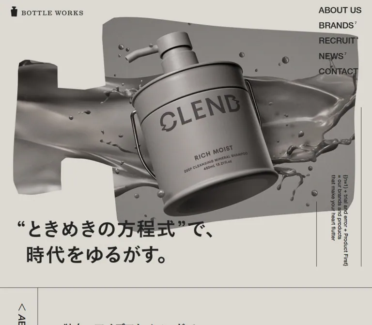
グレージュの背景に、ボトル形の大胆な商品ビジュアルと縦向きの見出しを組み合わせた化粧品企業サイト。左右にずらしたブランド紹介と大きな日本語コピーが特徴です。
オリジナルサイトを見るGlossy cosmetics imagery inside irregular bottle shapes, framed by warm gray space and assertive typography.
Website: bottleworks.jp Original URL: https://bottleworks.jp/ Final URL: https://bottleworks.jp/ Theme: light; warm gray canvas with charcoal typography and colorful product artwork. Inspected: September 13, 2026, at 08:21:50.907 UTC / 17:21:50.907 JST, through the supplied browser evidence. Viewports: desktop 1440 × 1000 CSS pixels; mobile 390 × 844 CSS pixels. Scope: the current corporate homepage, including its opening composition, company introduction, brand collection, news, recruitment, contact invitation, and footer. Screenshots show the desktop opening, part of the brand collection, desktop contact/footer, mobile opening/About transition, and mobile footer. Other homepage sections are supported by rendered DOM measurements rather than dedicated screenshots. Linked pages and the expanded mobile menu were not inspected.
BOTTLE WORKS presents its cosmetics business through a restrained editorial shell and highly expressive product imagery. The surrounding page is almost entirely warm gray and charcoal. Honey-colored liquid, metallic gray shampoo packaging, turquoise bubbles, and yellow serum imagery provide localized bursts of color. Large Japanese statements, compact English labels, thin rules, and asymmetric positioning organize the page without conventional card surfaces.
The defining device is the bottle silhouette. The opening artwork sits inside a broad, irregular bottle shape lying horizontally across the page. Brand images repeat the irregular perimeter at smaller sizes. A narrow vertical section rail creates a second recurring structure, while parenthesized numbers and links reinforce the page's equation-themed language. This is a long corporate homepage with several destinations and purposes; its design should retain that breadth.
Glossy cosmetics imagery inside irregular bottle shapes, framed by warm gray space and assertive typography.
Website: bottleworks.jp Original URL: https://bottleworks.jp/ Final URL: https://bottleworks.jp/ Theme: light; warm gray canvas with charcoal typography and colorful product artwork. Inspected: September 13, 2026, at 08:21:50.907 UTC / 17:21:50.907 JST, through the supplied browser evidence. Viewports: desktop 1440 × 1000 CSS pixels; mobile 390 × 844 CSS pixels. Scope: the current corporate homepage, including its opening composition, company introduction, brand collection, news, recruitment, contact invitation, and footer. Screenshots show the desktop opening, part of the brand collection, desktop contact/footer, mobile opening/About transition, and mobile footer. Other homepage sections are supported by rendered DOM measurements rather than dedicated screenshots. Linked pages and the expanded mobile menu were not inspected.
BOTTLE WORKS presents its cosmetics business through a restrained editorial shell and highly expressive product imagery. The surrounding page is almost entirely warm gray and charcoal. Honey-colored liquid, metallic gray shampoo packaging, turquoise bubbles, and yellow serum imagery provide localized bursts of color. Large Japanese statements, compact English labels, thin rules, and asymmetric positioning organize the page without conventional card surfaces.
The defining device is the bottle silhouette. The opening artwork sits inside a broad, irregular bottle shape lying horizontally across the page. Brand images repeat the irregular perimeter at smaller sizes. A narrow vertical section rail creates a second recurring structure, while parenthesized numbers and links reinforce the page's equation-themed language. This is a long corporate homepage with several destinations and purposes; its design should retain that breadth.
rem token.--color-canvas are implementation aliases unless a source variable is explicitly identified.10px on the inspected desktop and 10.4px on the inspected phone. Do not copy its numeric rem values into a conventional 16px-root project without conversion.animation: none does not rule out animation on children, pseudo-elements, images, or JavaScript-controlled layers.| Name | Value | Token / evidence | Role |
|---|---|---|---|
| Warm Gray Canvas | #DCD9D2 |
Alias --color-canvas; measured body background rgb(220, 217, 210) |
Page background, visible image cutouts, section interiors, contact region, footer |
| Charcoal Ink | #222222 |
Source --colors-black: #222; measured body and link color |
Text, header identity, navigation, rules, arrows, social icons |
| Pale Blue Mark | Approximately #ABC1CB |
Alias --color-mark; visual estimate |
Bottle symbol in the footer identity |
The pale blue is confined to the footer mark in the supplied captures. It is not evidence of a blue button system or a general link accent. The warm gray remains visible between every major component and through the negative space around the clipped artwork.
| Source token | Value | Evidence boundary |
|---|---|---|
--colors-gray |
#545454 |
Declared; no specific visible component using it was established |
--colors-red |
#A94F4F |
Declared; no visible red action or status treatment was established |
--colors-error |
#A94F4F |
Declared; no form error state was inspected |
Do not promote these utility declarations into the homepage's main visual palette. Similarly, the gold, aqua, yellow, blush, and gray inside product artwork belong to those compositions rather than to interchangeable interface themes.
Observed bold-cut stack: "游ゴシック体 Pr6N B", "Yu Gothic Pr6N B", sans-serif.
The sampled Japanese statements use this family with a computed font-weight: 400. The family name identifies the bold cut; adding font-weight: 700 indiscriminately could change rendering or synthesize extra weight. This distinction matters for the dense, confident Japanese typography.
Observed medium-cut stack: "游ゴシック体 Pr6N M", "Yu Gothic Pr6N M", sans-serif.
The smaller brand-introduction paragraph uses the medium cut. Large Japanese statements often have negative tracking, while generous line spacing keeps them readable.
Observed stack: "HelveticaNeueLTPro-Md", sans-serif, also computed at weight 400.
This family appears in the uppercase navigation, vertical section labels, equation copy, link treatments, brand indices, category labels, dates, and footer navigation. Its compact shapes contrast with the broader Japanese display text.
The source also declares "HelveticaNeueLTPro-MdIt", sans-serif and a mixed English/Japanese stack. Their declarations alone do not establish which visible elements use them.
The header identity combines a bottle icon with a serif-looking uppercase wordmark. Treat it as supplied identity artwork: the available evidence does not establish a text font for recreating it.
The hero headline also requires care. Its sampled H1 reports the inherited body size, yet the screenshot shows much larger lettering. The measured H1 bounds are 741 × 166.22px on desktop and 348.39 × 78.14px on mobile. The visible lettering is approximately 64–68px and 31–33px, respectively. The sampled H1 style does not explain the rendering mechanism, so neither the inherited size nor a guessed font size should be presented as the exact headline typography.
Values below are measured unless explicitly marked as estimates. Sizes and line heights are in CSS pixels.
| Role | Desktop size / line height | Mobile size / line height | Tracking and notes |
|---|---|---|---|
| Default Japanese body | 16 / 24 |
16.64 / 24.96 |
Bold-cut family, computed weight 400 |
| Opening desktop navigation | 32 / 38.4 |
Hidden in the closed mobile view | Normal tracking |
| Navigation in scrolled desktop captures | Approximately 20px |
— | Visual estimate; change mechanism unverified |
| Visible hero lettering | Approximately 64–68px |
Approximately 31–33px |
Visual estimate; use H1 bounds for asset sizing |
| Hero equation annotation | 20 / 24 |
9.36 / 11.232 |
English copy arranged vertically at the right |
| Section rail | 36 / 36 |
18.72 / 18.72 |
Mobile tracking 0.02em |
| About statement | 42 / 75.6 |
20.8 / 41.6 |
-0.07em tracking at both sizes |
| Brands display heading | 64 / 96 |
35.36 / 53.04 |
-0.07em |
| Brands supporting paragraph | 20 / 32 |
16.64 / 26.624 |
Desktop -0.05em; mobile normal |
| Brand index | 52 / 52 |
37.44 / 37.44 |
Parenthesized, three-digit number |
| Brand category | 14 / 21 |
10.4 / 15.6 |
Uppercase English |
| Standard large text link | 30 / 30 |
18.72 / 18.72 |
0.03em; overall ornamented box is taller |
| News utility link | 16 / 16 |
14.56 / 14.56 |
Desktop 0.03em; mobile normal |
| News headline | 20 / 36 |
16.64 / 29.952 |
Mobile -0.05em |
| News date | 16 / 16 |
14.56 / 14.56 |
English family |
| Recruit statement | 64 / 96 |
35.36 / 53.04 |
Desktop -0.04em; mobile -0.07em |
| Contact statement | 47 / 70.5 |
35.36 / 53.04 |
Desktop normal; mobile -0.07em |
| Footer primary navigation | 20 / 30 |
16.64 / 24.96 |
Uppercase English |
| Footer brand links | 14 / 21 |
12.48 / 18.72 |
Long mobile names wrap |
| Privacy link | 12 / 18 |
10.4 / 15.6 |
Small utility text |
The copyright appears smaller than its sampled parent font size. Its rendered box is approximately 186.06 × 15px on desktop and 154.80 × 12.47px on mobile. Descendant styling or rendering details were not supplied; do not treat the parent's 16px or 16.64px as its visible text size.
Density: sparse at section scale, compact inside navigation and metadata.
Geometry: thin rules, unboxed links, and irregular image perimeters. There is no visible general-purpose rounded-card or drop-shadow system.
| Use | Desktop | Mobile | Evidence |
|---|---|---|---|
| Header horizontal inset | 40px |
16.64px |
Computed padding |
| Header top inset | 24px |
Vertically centered within header | Desktop padding; mobile logo bounds |
| Header height | 88px |
56.16px |
Source 8.8rem / 5.4rem and measured bounds |
| Standard section rail width | 144px |
45.75px |
Source 14.4rem / 4.4rem, with rounding |
| Rail-to-body inset | 96px |
24.96px |
Calculated from rail edge and text start |
| Standard left text origin | 240px |
70.70px |
Measured About, Brands, News, Contact positions |
| Brand collection outer inset | 96px |
Approximately 16.61px |
Measured card positions |
| Desktop brand column gap | 48px |
Single column | Calculated from two 600px columns |
| Mobile gap between brand links | — | Approximately 33.27px |
Calculated from consecutive card bounds |
| Desktop navigation item gap | 20px |
— | Calculated between 38.39px line boxes |
| About statement to text link | 44px |
Approximately 24.95px |
Calculated from element bounds |
| News row vertical padding | 36px |
49.92px |
Computed padding |
| Social icon size | 27px |
28.08px |
Measured link boxes |
These values form several related scales rather than a universal eight-pixel system. In particular, the mobile layout combines a narrow structural rail with nearly full-width product imagery.
| Element | Treatment | Status |
|---|---|---|
| Section boundaries | Approximately 1px charcoal rules |
Visually observed; exact border declaration absent |
| Text links | No enclosing filled surface | Visually observed |
| Brand links | Transparent, sampled radius 0px |
Measured |
| Brand artwork | Uneven polygonal perimeter with softened or curved segments | Visually observed; mask implementation unknown |
| Hero artwork | Wide bottle silhouette with an inset neck at the left | Visually observed |
| Footer bottle | Slightly irregular bottle mark | Visually observed |
A zero border radius on a link does not explain the image silhouette inside it. Reproduce those outlines through appropriate artwork or masks rather than assuming a border-radius recipe.
| Element | Desktop 1440 × 1000 | Mobile 390 × 844 |
|---|---|---|
| Document height | Approximately 8200.75px |
Approximately 7430.55px |
| Header home link | 277 × 40px, at (40, 24) |
187.19 × 27.02px, at (16.63, 14.56) |
| Mobile plus control | — | 24.95 × 24.95px, at (348.42, 15.59) |
| Hero headline origin | (68, 837.78) |
(15.59, 384.66) |
| About section start | y = 1096px |
y = 530.39px |
| Standard rail heading box | 144 × 456px |
45.75 × 208px |
| Brand link width | 600px |
356.75px |
| Brand link height range | 468–503px |
287.27–311.17px |
| News row | 1056 × 279px |
344.25 × 391.33px |
| Contact section height | 456px |
Approximately 379.53px |
| Footer height | 470px |
Approximately 670.16px |
The standard rail heading box is not the height of its entire section. The About rail ends before all of its surrounding section content. The News rail is substantially taller: 1135px on desktop and approximately 1278.89px on mobile.
Anatomy: home-linked bottle/wordmark at the upper left; five uppercase destination links at the upper right on desktop; a plus-icon button on mobile.
Desktop header padding is 24px 40px 0. The opening navigation begins around x = 1237px, with 32px text and 20px gaps between line boxes. Its links extend to approximately y = 296px, beyond the header's own 88px rectangle. This is an overlaid vertical navigation stack, not a conventional single-row bar.
BRANDS, RECRUIT, and NEWS carry small raised counts: 8, 4, and 31 in the current evidence. Keep these as secondary metadata beside their labels rather than full badges. Exact count typography was not separately measured.
The logo and navigation remain at the screen's upper edges in the supplied scrolled captures. Those captures show a smaller desktop navigation, approximately 20px. Persistence and size variation are visually supported; the exact positioning implementation, threshold, and transition are not.
On mobile, the five-link stack disappears from the visible closed header. The plus glyph is approximately 25px square. The control is a button in the DOM, but its accessible name, expanded layout, and open/close behavior were not supplied.
The transparent header can overlap content: the desktop brand capture shows navigation near artwork labels, and the mobile footer capture shows the header over the preceding contact content. Preserve the airy appearance while addressing such collisions in a new implementation.
Anatomy: oversized product composition; irregular horizontal bottle perimeter; Japanese headline below its lower-left area; narrow equation annotation at the right.
The desktop capture features a white HONEYQUE shampoo bottle tilted diagonally, surrounded by translucent amber liquid. The composition occupies most of the width, with the image's bottle-shaped outline exposing the warm gray canvas around it. The headline begins near the artwork's lower edge rather than sitting in a separate centered marketing column.
The mobile capture features MOROCCAN BEAUTY GOLDEN MOIST EX artwork in the same bottle-shaped device. Visually, the artwork runs approximately from y = 125px to 343px; the headline starts around 385px. The opening section ends at 530.39px, allowing the About section to enter the first phone viewport.
The actual source headline is “ときめきの方程式”で、時代をゆるがす。. Preserve its strong two-line composition when using authorized artwork, or use a deliberately typeset live-text alternative. Its sampled parent font size does not reproduce its visible appearance.
The right-side equation reads {(n=1) + trial and error + Product First}, followed by two explanatory lines. It is turned into a narrow vertical annotation bounded by fine rules. Its font falls from 20px on desktop to 9.36px on mobile, making it more like a marginal note than body copy.
Different product creatives are visible across the two viewports. This supports multiple hero variants, but does not establish automatic rotation, a slideshow interval, crossfading, or user controls.
Anatomy: thin section-top rule; narrow side column; vertical divider; rotated English section label with a chevron-like lead-in.
The standard desktop rail is 144px wide, with 36px English labels. On mobile it becomes approximately 45.75px wide with 18.72px labels. Main text starts another 96px or 24.96px beyond the rail.
Most rails sit on the left. Recruitment reverses the arrangement: its rail occupies the rightmost 144px on desktop or 45.75px on mobile. This reversal creates variation while retaining the same vocabulary.
The mobile DOM includes duplicate or fragmented heading strings such as ABUT US alongside ABOUT US. These fragments do not prove that duplicate headings are intended visible copy. Use one complete semantic heading, with any decorative letter treatment kept separate from its accessible text.
Anatomy: vertical About rail; large Japanese paragraph; ornamented VIEW MORE link; equation-themed text elsewhere in the section.
Desktop text starts at (240, 1216) and uses 42px type, 75.6px line height, and -0.07em tracking. On mobile it begins at (70.70, 613.58) with 20.8px type and a generous 41.6px line height.
The phone layout inserts additional line breaks, including a separate line for “つくりだす。”. Its line rhythm is a major part of the composition; do not compress it to ordinary body leading simply to reduce page length.
The link follows the statement with approximately 44px desktop clearance and 25px mobile clearance. The section is substantially taller than its rail, leaving space for additional composition and formula text.
Anatomy: opening parenthesis, underlined uppercase label, right arrow, closing parenthesis; all on the page canvas.
The contact screenshot clearly exposes this structure. The large desktop CONTACT US link has a total measured width of approximately 335.06px and a height of 36px, with 30px label typography. Mobile uses 18.72px type inside an approximately 234.34 × 24.94px total box.
The opening and closing parentheses are spaced well away from the label. The arrow is a visible part of the composition, not a tiny trailing icon. Keep the underline on the label rather than drawing a solid rule under the complete ornamented group.
Other homepage links use the same family of treatment. News has a smaller version. Recruitment's actual extracted label is VIRE MORE; that spelling is observed source copy, not a recommended reusable label.
Anatomy: left section rail; large Japanese statement; smaller explanatory paragraph; broad product collection below.
Desktop uses a 64 / 96px heading at x = 240px. Mobile changes it to 35.36 / 53.04px and three lines. The supporting paragraph falls from 20px to 16.64px and wraps to two lines on the phone.
The sampled mobile heading box reaches approximately x = 400.41px, beyond the 390px viewport. This is a geometry finding, not proof of user-visible horizontal scrolling. A new implementation should verify long Japanese headings at narrow widths rather than copying that overflow blindly.
Anatomy: individual brand logo above the composition; vivid product artwork inside an irregular perimeter; a large parenthesized index overlapping the lower-right edge; a small category below.
Desktop links occupy two 600px columns at x = 96px and 744px. Their top edges are staggered. The first right-column entry begins 73px above the first left-column entry; other paired offsets are approximately 60–73px. This produces an editorial rhythm without a uniform row of boxed cards.
The screenshot shows CLEND's gray mineral-splash composition opposite AMPULE SHOT's saturated yellow serum imagery. Brand logos sit above the artwork and vary in alignment and shape. They are identity assets, not a common text style applied to every company name.
The 52px desktop indices overlap the image edge near the bottom right, followed by 14px category labels. On mobile, each link becomes approximately 356.75px wide, with a 37.44px index and 10.4px category. All seven links occupy one column in numeric order.
| Index | Brand in the supplied links | Category |
|---|---|---|
(001) |
SECOND IMPACT | HAIR CARE |
(002) |
HONEYQUE | HAIR CARE |
(003) |
MOROCCAN BEAUTY | HAIR CARE |
(004) |
MOROCCAN BEAUTY GOLDEN MOIST EX | HAIR CARE |
(005) |
CLEND | HAIR CARE |
(006) |
AMPULE SHOT | SKIN CARE |
(007) |
M/ MONO BOTTLE | OTHERS |
These links point to separate brand domains. The current header count and footer include eight brands, while the homepage collection contains seven numbered links. KIMESHIRO appears in the footer; do not invent an eighth homepage image card to reconcile the count.
The rendered text includes (UNIQUE IDEAS)+(UNIQUE METHODS), (NEEDS OF N=1)×(TRIAL+ERROR)×PRODUCT FIRST, and JOIN BOTTLE WORKS between major content groups.
These phrases extend the equation language established in the hero. Their exact geometry and motion were not captured in the supplied element samples. They can inform a new implementation's editorial transitions, but should not be described as verified marquees, scroll-linked animations, or rotating ribbons.
Measured anatomy: a tall left rail; a small VIEW MORE link toward the upper right; three large linked rows containing a Japanese headline and an English-family date.
Desktop row bounds are 1056 × 279px, beginning at x = 144px. Each row has 36px vertical padding and 96px left padding, aligning text at x = 240px. Headlines use 20 / 36px type in a 528px-wide box.
Mobile rows begin at x = 45.75px and occupy the remaining width. They are approximately 391.33px tall, with 49.92px vertical padding and 24.96px left padding. Headline boxes are approximately 273.52px wide and 89.86px high, with 16.64 / 29.952px type.
The equal mobile headline heights despite differing text lengths suggest a constrained presentation, but the exact truncation or line-clamp implementation was not supplied. Likewise, unused row space and vertical offsets do not establish the appearance or position of any unsampled image. Reuse the measured text hierarchy without inventing a thumbnail layout.
Measured anatomy: right-side rail; left-aligned large Japanese headline; large text link; recruitment phrase later in the section.
The desktop heading begins at x = 96px and uses 64 / 96px type. Mobile places it at x = 45.75px, with 35.36 / 53.04px type. The source copy is “時代の代表作を、つくりだそう。”.
This component changes the directional balance of the page through its right rail. Its complete visual composition was not shown in a dedicated screenshot, so additional images, decorative shapes, or motion cannot be specified as observed.
Anatomy: left rail; a large Japanese sentence; centered parenthesized contact link; a full-width lower rule leading into the footer.
On desktop, the section is 456px tall. The sentence uses 47 / 70.5px type and runs on one line. The contact link sits beneath it, centered relative to the sentence's content grouping rather than necessarily the entire viewport.
On mobile, the sentence becomes three lines: “商品についての”, “お問い合わせは”, and “こちらから。”. Its type is 35.36 / 53.04px, with -0.07em tracking. The content begins at x = 70.70px, and the complete section is approximately 379.53px tall.
There is no filled conversion panel. Scale, whitespace, underline, parentheses, and arrow establish the invitation.
Anatomy: large two-line identity with pale blue bottle; primary company links; brand directory; Instagram and X icons; privacy link; copyright.
Desktop places the identity on the left, primary links around x = 687.58px, and a two-column brand directory beginning around x = 845.47px. Primary link rows advance approximately 40px. Brand links use 14px type with approximately 34px row intervals. Social icons sit below the primary links.
Mobile moves the large identity above the directories. Company links begin at x = 46.80px; the brand column begins at 152.36px. The eight brands become one vertical list, while company links remain in their own left column. The long GOLDEN MOIST EX name wraps naturally. Social icons stay under the company column, alongside the lower portion of the brand list.
The privacy link and copyright sit on a separate bottom line. The footer grows from 470px to approximately 670.16px tall. This extra height results from actual content reflow, not simply larger bottom padding.
The page title identifies ボトルワークス株式会社, and the footer reads © Bottle Works Inc, All Rights Reserved.. No production credits are present in the supplied original-page evidence.
| Treatment | Available evidence | What can be stated |
|---|---|---|
| Home logo transition | Computed opacity 0.3s |
A 300ms opacity transition is declared; trigger and endpoint were not exercised |
| Social link transition | Computed opacity 0.3s |
Same declared transition; hover appearance unverified |
| Back easing token | cubic-bezier(.34, 1.56, .64, 1) |
Source token exists; assignment to a visible component is unknown |
| Sine easing token | cubic-bezier(.37, 0, .63, 1) |
Source token exists; assignment is unknown |
| Desktop header variation | Larger opening navigation, smaller navigation in scrolled captures | Size variation is visible; threshold and animation are unverified |
| Hero imagery | Different products in desktop and mobile captures | Multiple creatives are evidenced; timing and selection logic are unknown |
| Mobile menu | Plus-icon button in the closed state | An apparent menu affordance is present; expanded state unverified |
| Brand and utility links | Rendered anchor destinations | Navigation targets exist; destination experiences were not inspected |
| Formula text bands | Text in rendered DOM | Text is evidenced; movement is not |
| Generic sampled transitions | Many elements report transition: all |
This alone does not establish a nonzero animated transition |
The capture procedure waited for visible finite motion and layout stability, temporarily paused perpetual animations during readiness checks, and then resumed them. It is not a motion recording and does not establish animation timing or completeness.
Recommended adaptation: start with static, well-composed imagery and restrained link feedback. A short opacity change around 300ms is consistent with the declared logo/social transition. Introduce a hero sequence or moving formula band only as an explicitly new behavior, with pause and reduced-motion handling where appropriate.
| Layer | Appearance | Function |
|---|---|---|
| Page canvas | Solid warm gray #DCD9D2 |
Continuous visual foundation |
| Header | Transparent in supplied captures | Identity and navigation over page content |
| Section frames | Same canvas, thin charcoal rules | Structural separation without background changes |
| Product compositions | Saturated or metallic imagery inside irregular silhouettes | Primary visual emphasis |
| Text actions | Underline, parentheses, arrow | Navigation without filled buttons |
| Footer | Same canvas with a pale blue identity accent | Quiet directory and legal closure |
Gloss, liquid gradients, and dimensional shadows occur inside product imagery. They are not evidence of glossy interface panels or a general elevation system.
The artwork combines sharply presented cosmetic packaging with expressive ingredient or material environments. HONEYQUE uses translucent amber liquid around a white bottle. MOROCCAN BEAUTY imagery uses aqua or gold, suspended droplets, and ingredient cues. CLEND uses a nearly monochrome gray bottle and a sculptural gray splash. AMPULE SHOT uses bright yellow bottles and magnified liquid bubbles. The partially visible M/ MONO BOTTLE composition uses subdued blush tones.
The effect is photographic and composited, with dimensional lighting and carefully arranged product angles. The evidence does not establish whether any individual scene originated as photography, 3D rendering, or a hybrid, so keep production-method claims open.
Preserve three relationships:
Hero and collection artwork require different crops. The hero's left neck creates a large notch, whereas collection images use broad, irregular quadrilateral shapes. A generic rounded rectangle would remove much of the site's character.
No direct media paths were included in the supplied evidence. The following identifies visible assets without inventing filenames or download URLs.
| Asset | Observed use | Evidence boundary |
|---|---|---|
| Black horizontal bottle/wordmark | Persistent header | Visible on desktop and mobile; link bounds measured |
| HONEYQUE amber composition | Desktop hero | Current opening screenshot |
| GOLDEN MOIST EX gold composition | Mobile hero | Current mobile opening screenshot |
| CLEND gray composition and logo | Brand collection | Current desktop brand screenshot |
| AMPULE SHOT yellow composition and logo | Brand collection | Current desktop brand screenshot |
| Aqua and gold brand compositions | Upper edge of brand screenshot | Only partial compositions visible |
| M/ MONO BOTTLE blush composition | Lower edge of brand screenshot | Only partial composition visible |
| Pale blue bottle with stacked wordmark | Footer | Current desktop and mobile footer screenshots |
| Instagram and X symbols | Footer social links | Visible icons and destination links supplied |
Use authorized original assets when available. For a new brand, create comparable product art and an original silhouette system; CSS alone cannot reproduce the packaging, liquid detail, and identity marks.
The homepage follows the same major content order at both inspected widths. Its responsiveness changes column structure, rail width, typography, image size, and line breaks rather than replacing the corporate content with a reduced mobile page.
| Region | Desktop behavior | Mobile behavior |
|---|---|---|
| Header | Large stacked navigation at upper right | Plus-icon button; full stack not visible |
| Hero | Artwork fills most of the width; headline near its lower edge | Smaller bottle composition above a two-line headline |
| Section rail | 144px wide | Approximately 45.75px wide |
| About | Five-line large statement | More line breaks and 2.0 line-height ratio |
| Brand collection | Two staggered columns | One numeric sequence, nearly full viewport width |
| Recruitment | Rail at right | Right rail retained |
| Contact | One-line sentence | Three-line sentence |
| Footer | Identity plus company links plus two brand columns | Identity above company links and one brand column |
The source declares breakpoints at 769px and 1920px. The supplied evidence covers one width on each side of 769px; it does not show intermediate tablet sizes or an extra-wide desktop.
The mobile root is 10.4px, which is consistent with scaling a 375px-wide design by 390 / 375 = 1.04. This is a calculated consistency check, not proof of the complete root-size formula. The desktop root is 10px at 1440px.
The source header and rail tokens change structurally between modes:
/* Observed source token values; source rem is not a standard 16px rem. */
/* Desktop */
--sizes-header-height: 8.8rem;
--sizes-section-heading-width: 14.4rem;

/* Mobile */
--sizes-header-height: 5.4rem;
--sizes-section-heading-width: 4.4rem;
These are document-relative starts, not screenshot-relative positions or recommended fixed heights.
| Section | Desktop Y | Mobile Y |
|---|---|---|
| About | 1096px |
530.39px |
| Our Brands | 2174.56px |
1372.63px |
| News | 5224.16px |
4405.78px |
| Recruit | 6359.16px |
5684.67px |
| Contact | 7274.75px |
6380.86px |
| Footer | 7730.75px |
6760.39px |
Keep normal document scrolling and allow content-driven section heights. The visual capture of a persistent header does not justify turning this long homepage into a fixed-height application shell.
#DCD9D2 and charcoal text #222222 consistent across the page.These are improvements for a new implementation, not verified features of the original page:
aria-expanded, and aria-controls. Provide keyboard focus management and Escape-to-close behavior for the eventual menu.#DCD9D2.#222222.#ABC1CB; visual estimate.“Create a responsive cosmetics corporate homepage inspired by the current BOTTLE WORKS composition. Use warm gray #DCD9D2, charcoal #222222, bold Japanese statements, compact uppercase English navigation, thin rules, and narrow vertical section rails. Place vivid product imagery inside a large irregular horizontal bottle silhouette, with a two-line Japanese headline below its lower-left edge and a narrow vertical equation annotation at the right. Build a staggered two-column brand collection with individual logos, irregular image perimeters, large parenthesized numbers, and tiny categories. Include company information, news, recruitment with a right-side rail, a restrained contact invitation, and a comprehensive footer. On mobile, use a plus-icon navigation control, narrow rails, one column of brands, and reflowed Japanese copy. Treat animation as a separate design decision.”
(005) at the lower-right image edge and a small uppercase category underneath. Use a 600px desktop width within staggered columns; use a nearly full-width single-column entry on mobile.”CONTACT US label between widely spaced parentheses and a right arrow. Reflow the sentence to three lines on mobile. Use rules and typography instead of a filled CTA panel.”The following is a reusable adaptation, not the original stylesheet. It keeps a conventional root font size and uses --u for nominal design pixels. At 1440px, --u is 1px; at 390px, the recommended mobile formula produces 1.04px. Its caps and behavior at other widths are recommendations.
The polygons are approximate placeholders. Replace them with authorized artwork or carefully authored SVG masks for closer silhouette correspondence. No asset URLs or font-file locations are implied. The source family names work only when their fonts are available.
Suggested structure: .site-header contains the identity, .desktop-nav, and .menu-toggle; .hero contains .hero-media, .hero-title, and .hero-equation; .section-frame contains a .section-rail and its normal-flow content. Each .brand-card contains a logo, a clipped media wrapper, and metadata outside that wrapper. A .text-link contains decorative parentheses, an underlined label, and an arrow; hide decorative characters from assistive technology.
:root {
  /* Measured primary colors; blue is a visual estimate. */
  --color-canvas: #dcd9d2;
  --color-ink: #222;
  --color-mark: #abc1cb;

  /* Observed family names; provide licensed files separately. */
  --font-jp: '游ゴシック体 Pr6N B', 'Yu Gothic Pr6N B', sans-serif;
  --font-jp-medium: '游ゴシック体 Pr6N M', 'Yu Gothic Pr6N M', sans-serif;
  --font-en: 'HelveticaNeueLTPro-Md', sans-serif;

  /* Adaptation units, without changing the root font size. */
  --u: 1px;
  --header-height: 88px;
  --header-inset: 40px;
  --rail-width: 144px;
  --rail-height: 456px;
  --section-inset: clamp(32px, 6.6667vw, 96px);
  --gallery-inset: clamp(24px, 6.6667vw, 96px);
  --rule-width: 1px;

  --text-body: 16px;
  --text-nav: 32px;
  --text-rail: 36px;
  --text-about: 42px;
  --text-display: 64px;
  --text-index: 52px;
  --text-category: 14px;
  --text-action: 30px;
  --text-contact: 47px;
  --leading-about: 1.8;

  /* The logo/social duration is observed; easing is an adaptation. */
  --motion-opacity: 300ms ease;

  /* Approximate shapes, not recovered source masks. */
  --shape-bottle: polygon(
    32% 0%, 100% 8%, 98% 93%, 32% 100%,
    30% 73%, 18% 70%, 15% 73%, 15% 84%,
    6% 88%, 1% 87%, 0% 81%, 2% 24%,
    5% 21%, 13% 23%, 13% 35%, 22% 36%,
    27% 34%, 26% 4%
  );
  --shape-brand: polygon(
    11% 0%, 84% 4%, 94% 11%, 98% 21%,
    100% 72%, 94% 88%, 80% 98%, 14% 100%,
    4% 91%, 0% 82%, 3% 29%, 6% 8%
  );
}

* { box-sizing: border-box; }

body {
  margin: 0;
  color: var(--color-ink);
  background: var(--color-canvas);
  font: 400 var(--text-body)/1.5 var(--font-jp);
}

img { display: block; max-width: 100%; }
a { color: inherit; }
button { color: inherit; font: inherit; }

:where(a, button):focus-visible {
  outline: 2px solid currentColor;
  outline-offset: 5px;
}

section { scroll-margin-top: calc(var(--header-height) + 24px); }

.site-header {
  position: fixed;
  inset: 0 0 auto;
  z-index: 20;
  display: flex;
  align-items: flex-start;
  justify-content: space-between;
  height: var(--header-height);
  padding: 24px var(--header-inset) 0;
  pointer-events: none;
}

.site-header > * { pointer-events: auto; }

.site-logo {
  display: block;
  width: 277px;
  transition: opacity var(--motion-opacity);
}

.desktop-nav {
  display: flex;
  flex-direction: column;
  align-items: flex-start;
  gap: 20px;
  font: 400 var(--text-nav)/1.2 var(--font-en);
}

.desktop-nav a { text-decoration: none; }
.desktop-nav sup { font-size: 0.38em; vertical-align: super; }
.menu-toggle { display: none; }

/* Optional state; its activation threshold is not source-verified. */
.site-header.is-compact .desktop-nav {
  gap: 20px;
  font-size: 20px;
}

.hero {
  position: relative;
  min-height: 1096px;
}

.hero-media {
  position: absolute;
  inset: 65px 60px auto;
  aspect-ratio: 1.68;
  clip-path: var(--shape-bottle);
}

.hero-media img {
  width: 100%;
  height: 100%;
  object-fit: cover;
  object-position: var(--hero-position, center);
}

.hero-title {
  position: absolute;
  top: 838px;
  left: 68px;
  width: min(741px, calc(100% - 136px));
  margin: 0;
  font: 400 64px/1.3 var(--font-jp);
}

/* Prefer native proportions when the heading is supplied artwork. */
.hero-title img { width: 100%; height: auto; }
.hero-title > span { display: block; }

.hero-equation {
  position: absolute;
  top: 664px;
  right: 40px;
  margin: 0;
  padding: 2px 50px;
  border-inline: var(--rule-width) solid;
  font: 400 20px/1.2 var(--font-en);
}

.hero-equation > span {
  display: block;
  writing-mode: vertical-rl;
}

.section-frame {
  position: relative;
  border-top: var(--rule-width) solid;
  padding: 120px var(--section-inset);
  padding-left: calc(var(--rail-width) + var(--section-inset));
}

.section-rail {
  position: absolute;
  top: 0;
  left: 0;
  width: var(--rail-width);
  height: var(--rail-height);
  margin: 0;
  padding-top: 56px;
  border-right: var(--rule-width) solid;
  display: flex;
  justify-content: center;
  font: 400 var(--text-rail)/1 var(--font-en);
}

.section-rail > span {
  writing-mode: vertical-rl;
  text-orientation: sideways;
}

.section-frame.is-reversed {
  padding-left: var(--section-inset);
  padding-right: calc(var(--rail-width) + var(--section-inset));
}

.is-reversed .section-rail {
  left: auto;
  right: 0;
  border-right: 0;
  border-left: var(--rule-width) solid;
}

.about-copy {
  margin: 0 0 44px;
  font-size: var(--text-about);
  line-height: var(--leading-about);
  letter-spacing: -0.07em;
}

.display-copy {
  margin: 0;
  font-size: var(--text-display);
  line-height: 1.5;
  letter-spacing: -0.07em;
}

.supporting-copy {
  font: 400 20px/1.6 var(--font-jp-medium);
  letter-spacing: -0.05em;
}

.text-link {
  display: inline-flex;
  align-items: center;
  gap: 24px;
  max-width: 100%;
  text-decoration: none;
  font: 400 var(--text-action)/1 var(--font-en);
  letter-spacing: 0.03em;
}

.text-link__label {
  text-decoration: underline;
  text-underline-offset: 0.16em;
  text-decoration-thickness: 1px;
}

.brand-grid {
  display: grid;
  grid-template-columns: repeat(2, minmax(0, 1fr));
  gap: 72px 48px;
  margin: 0 var(--gallery-inset);
  padding: 0 0 73px;
  list-style: none;
}

/* Approximate stagger; individual source offsets vary. */
.brand-grid > :nth-child(odd) { transform: translateY(73px); }

.brand-card {
  display: block;
  min-width: 0;
  text-decoration: none;
}

.brand-logo {
  width: var(--brand-logo-width, 36%);
  margin: 0 0 12px 12%;
}

.brand-grid > :nth-child(even) .brand-logo { margin-left: auto; }

.brand-media {
  aspect-ratio: var(--brand-ratio, 1.4);
  clip-path: var(--brand-shape, var(--shape-brand));
}

.brand-media img {
  width: 100%;
  height: 100%;
  object-fit: cover;
  object-position: var(--brand-position, center);
}

.brand-meta {
  position: relative;
  z-index: 1;
  width: max-content;
  margin: -50px 0 0 auto;
  text-align: center;
  font-family: var(--font-en);
}

.brand-index { margin: 0; font-size: var(--text-index); line-height: 1; }
.brand-category { margin: 0; font-size: var(--text-category); line-height: 1.5; }

.contact-copy {
  margin: 0 0 36px;
  font-size: var(--text-contact);
  line-height: 1.5;
}

.contact-group { width: fit-content; max-width: 100%; }
.contact-group .text-link { display: flex; width: fit-content; margin-inline: auto; }

.site-footer {
  border-top: var(--rule-width) solid;
  padding: 100px 0 50px;
}

.footer-main {
  width: min(1150px, 80%);
  margin-inline: auto;
  display: grid;
  grid-template-columns: minmax(0, 1fr) 102px 450px;
  gap: 56px;
}

.footer-logo { width: 254px; }
.footer-links { font: 400 20px/1.5 var(--font-en); }
.footer-links a { text-decoration: none; }
.footer-company { display: grid; align-content: start; gap: 10px; }

.footer-brand-list {
  display: grid;
  grid-template-columns: max-content minmax(0, 1fr);
  gap: 13px 32px;
  margin-top: 10px;
  font: 400 14px/1.5 var(--font-en);
}

.footer-social {
  display: flex;
  gap: 22px;
  margin-top: 38px;
}

.footer-social a { width: 27px; transition: opacity var(--motion-opacity); }

.footer-legal {
  width: min(1150px, 80%);
  margin: 80px auto 0;
  display: flex;
  justify-content: space-between;
  gap: 16px;
  font: 400 12px/1.5 var(--font-en);
}

@media (hover: hover) {
  .site-logo:hover,
  .footer-social a:hover { opacity: 0.65; }
  .desktop-nav a:hover { text-decoration: underline; }
}

/* Recommended intermediate layout; no tablet capture was supplied. */
@media (min-width: 769px) and (max-width: 1100px) {
  .footer-main { grid-template-columns: 1fr 1fr; gap: 40px; }
  .footer-logo { grid-column: 1 / -1; }
  .footer-brand-list { grid-template-columns: 1fr; }
}

@media (max-width: 768px) {
  :root {
    /* Recommended interpolation and caps; matches the 390px sample. */
    --u: clamp(0.9px, calc(100vw / 375), 1.15px);
    --header-height: calc(54 * var(--u));
    --header-inset: calc(16 * var(--u));
    --rail-width: calc(44 * var(--u));
    --rail-height: calc(200 * var(--u));
    --section-inset: calc(24 * var(--u));
    --gallery-inset: calc(16 * var(--u));
    --text-body: calc(16 * var(--u));
    --text-rail: calc(18 * var(--u));
    --text-about: calc(20 * var(--u));
    --text-display: calc(34 * var(--u));
    --text-index: calc(36 * var(--u));
    --text-action: calc(18 * var(--u));
    --text-contact: calc(34 * var(--u));
    --leading-about: 2;
    /* Recommended readability floor; source sample is 10.4px. */
    --text-category: max(12px, calc(10 * var(--u)));
  }

  .site-header { align-items: center; padding: 0 var(--header-inset); }
  .site-logo { width: calc(180 * var(--u)); }
  .desktop-nav { display: none; }

  .menu-toggle {
    display: grid;
    place-items: center;
    width: 44px;
    height: 44px;
    margin-right: -9px;
    padding: 0;
    border: 0;
    background: transparent;
  }

  .menu-toggle svg { width: calc(24 * var(--u)); height: auto; }
  .hero { min-height: calc(510 * var(--u)); }

  .hero-media {
    inset: calc(120 * var(--u)) calc(20 * var(--u)) auto;
    aspect-ratio: 1.6;
  }

  .hero-title {
    top: calc(370 * var(--u));
    left: calc(15 * var(--u));
    width: calc(335 * var(--u));
    max-width: calc(100% - 30 * var(--u));
    font-size: calc(31 * var(--u));
    line-height: 1.3;
  }

  .hero-equation {
    top: calc(75 * var(--u));
    right: var(--header-inset);
    padding: 2px calc(10 * var(--u));
    font-size: calc(9 * var(--u));
  }

  .section-frame { padding-block: calc(80 * var(--u)); }
  .section-rail { padding-top: calc(50 * var(--u)); letter-spacing: 0.02em; }
  .about-copy { margin-bottom: calc(24 * var(--u)); }
  .supporting-copy { font-size: var(--text-body); letter-spacing: normal; }
  .text-link { gap: calc(20 * var(--u)); }

  .brand-grid {
    grid-template-columns: minmax(0, 1fr);
    gap: calc(32 * var(--u));
    padding-bottom: 0;
  }

  .brand-grid > :nth-child(odd) { transform: none; }
  .brand-meta { margin-top: calc(-36 * var(--u)); }
  .contact-copy { margin-bottom: calc(24 * var(--u)); letter-spacing: -0.07em; }

  .site-footer { padding-top: calc(72 * var(--u)); }

  .footer-main {
    width: calc(100% - 90 * var(--u));
    grid-template-columns: calc(81.5 * var(--u)) minmax(0, 1fr);
    gap: calc(72 * var(--u)) calc(20 * var(--u));
  }

  .footer-logo { grid-column: 1 / -1; width: calc(230 * var(--u)); }
  .footer-links { font-size: var(--text-body); }
  .footer-company { gap: calc(14 * var(--u)); }

  .footer-brand-list {
    grid-template-columns: minmax(0, 1fr);
    gap: calc(14 * var(--u));
    margin-top: calc(20 * var(--u));
    font-size: calc(12 * var(--u));
    overflow-wrap: anywhere;
  }

  .footer-social { gap: calc(25 * var(--u)); margin-top: calc(130 * var(--u)); }
  .footer-social a { width: calc(27 * var(--u)); flex-shrink: 0; }

  .footer-legal {
    width: auto;
    margin: calc(56 * var(--u)) var(--header-inset) 0 calc(25 * var(--u));
    flex-wrap: wrap;
    font-size: 12px;
  }
}

@media (prefers-reduced-motion: reduce) {
  .site-logo,
  .footer-social a { transition: none; }
}
This CSS establishes the shell, rail, gallery, contact, and footer relationships. It does not implement a menu dialog, hero sequencing, formula-band motion, exact artwork masks, or any unverified reveal behavior. The live-text hero fallback and footer geometry remain approximations; validate them with the actual assets and content.
Optional mapping for a project already using Tailwind v4. This is an implementation convenience, not a claim about the original site's framework. Define the custom properties above first.
@theme inline {
  --color-canvas: #dcd9d2;
  --color-ink: #222;
  --color-mark: #abc1cb;

  --font-display-jp: var(--font-jp);
  --font-body-jp: var(--font-jp-medium);
  --font-utility: var(--font-en);

  --text-body: var(--text-body);
  --text-section: var(--text-display);
  --text-number: var(--text-index);
  --text-link: var(--text-action);

  --spacing-rail: var(--rail-width);
  --spacing-section: var(--section-inset);
  --spacing-gallery: var(--gallery-inset);
}
When integrating the mapping, give any existing project tokens distinct names if they would otherwise reference themselves. For example, map a project utility named --text-copy to var(--text-body) instead of redeclaring --text-body in that project's theme.
08:21:50.907 UTC / 17:21:50.907 JST.1440 × 1000 CSS-pixel viewport, approximately 8200.75px document height; screenshots of the opening composition, part of the brand collection, and contact/footer.390 × 844 CSS-pixel viewport, approximately 7430.55px document height; screenshots of the opening/About transition and footer.This reference describes the current homepage evidenced by those captures. Measured styles, screenshot estimates, calculated relationships, and recommended implementation behavior are distinguished throughout.
# BOTTLE WORKS — Style Reference

> Glossy cosmetics imagery inside irregular bottle shapes, framed by warm gray space and assertive typography.

**Website:** [bottleworks.jp](https://bottleworks.jp/)
**Original URL:** https://bottleworks.jp/
**Final URL:** https://bottleworks.jp/
**Theme:** light; warm gray canvas with charcoal typography and colorful product artwork.
**Inspected:** September 13, 2026, at 08:21:50.907 UTC / 17:21:50.907 JST, through the supplied browser evidence.
**Viewports:** desktop 1440 × 1000 CSS pixels; mobile 390 × 844 CSS pixels.
**Scope:** the current corporate homepage, including its opening composition, company introduction, brand collection, news, recruitment, contact invitation, and footer. Screenshots show the desktop opening, part of the brand collection, desktop contact/footer, mobile opening/About transition, and mobile footer. Other homepage sections are supported by rendered DOM measurements rather than dedicated screenshots. Linked pages and the expanded mobile menu were not inspected.

BOTTLE WORKS presents its cosmetics business through a restrained editorial shell and highly expressive product imagery. The surrounding page is almost entirely warm gray and charcoal. Honey-colored liquid, metallic gray shampoo packaging, turquoise bubbles, and yellow serum imagery provide localized bursts of color. Large Japanese statements, compact English labels, thin rules, and asymmetric positioning organize the page without conventional card surfaces.

The defining device is the bottle silhouette. The opening artwork sits inside a broad, irregular bottle shape lying horizontally across the page. Brand images repeat the irregular perimeter at smaller sizes. A narrow vertical section rail creates a second recurring structure, while parenthesized numbers and links reinforce the page's equation-themed language. This is a long corporate homepage with several destinations and purposes; its design should retain that breadth.
# BOTTLE WORKS — Style Reference

> Glossy cosmetics imagery inside irregular bottle shapes, framed by warm gray space and assertive typography.

**Website:** [bottleworks.jp](https://bottleworks.jp/)
**Original URL:** https://bottleworks.jp/
**Final URL:** https://bottleworks.jp/
**Theme:** light; warm gray canvas with charcoal typography and colorful product artwork.
**Inspected:** September 13, 2026, at 08:21:50.907 UTC / 17:21:50.907 JST, through the supplied browser evidence.
**Viewports:** desktop 1440 × 1000 CSS pixels; mobile 390 × 844 CSS pixels.
**Scope:** the current corporate homepage, including its opening composition, company introduction, brand collection, news, recruitment, contact invitation, and footer. Screenshots show the desktop opening, part of the brand collection, desktop contact/footer, mobile opening/About transition, and mobile footer. Other homepage sections are supported by rendered DOM measurements rather than dedicated screenshots. Linked pages and the expanded mobile menu were not inspected.

BOTTLE WORKS presents its cosmetics business through a restrained editorial shell and highly expressive product imagery. The surrounding page is almost entirely warm gray and charcoal. Honey-colored liquid, metallic gray shampoo packaging, turquoise bubbles, and yellow serum imagery provide localized bursts of color. Large Japanese statements, compact English labels, thin rules, and asymmetric positioning organize the page without conventional card surfaces.

The defining device is the bottle silhouette. The opening artwork sits inside a broad, irregular bottle shape lying horizontally across the page. Brand images repeat the irregular perimeter at smaller sizes. A narrow vertical section rail creates a second recurring structure, while parenthesized numbers and links reinforce the page's equation-themed language. This is a long corporate homepage with several destinations and purposes; its design should retain that breadth.

## How to Read This Reference

- **Measured** means a value is present in the supplied rendered DOM, computed styles, or source custom properties. Tables round geometry to two decimal places where useful.
- **Visually estimated** means a value or relationship was judged from the supplied current-page screenshots. Estimated colors are not verified source declarations.
- **Calculated** means arithmetic derived from supplied measurements, such as a column gap or the pixel equivalent of a source `rem` token.
- **Recommended** means guidance for a new implementation. It does not establish existing behavior.
- Token names such as `--color-canvas` are implementation aliases unless a source variable is explicitly identified.
- The source root is `10px` on the inspected desktop and `10.4px` on the inspected phone. Do not copy its numeric `rem` values into a conventional 16px-root project without conversion.
- Computed styles identify declared font families, not individual downloaded font files. Asset URLs and font-file URLs were not supplied.
- A sampled `animation: none` does not rule out animation on children, pseudo-elements, images, or JavaScript-controlled layers.

## Tokens — Colors

### Default Palette

| Name | Value | Token / evidence | Role |
| --- | --- | --- | --- |
| Warm Gray Canvas | `#DCD9D2` | Alias `--color-canvas`; measured body background `rgb(220, 217, 210)` | Page background, visible image cutouts, section interiors, contact region, footer |
| Charcoal Ink | `#222222` | Source `--colors-black: #222`; measured body and link color | Text, header identity, navigation, rules, arrows, social icons |
| Pale Blue Mark | Approximately `#ABC1CB` | Alias `--color-mark`; visual estimate | Bottle symbol in the footer identity |

The pale blue is confined to the footer mark in the supplied captures. It is not evidence of a blue button system or a general link accent. The warm gray remains visible between every major component and through the negative space around the clipped artwork.

### Declared Utility Colors

| Source token | Value | Evidence boundary |
| --- | --- | --- |
| `--colors-gray` | `#545454` | Declared; no specific visible component using it was established |
| `--colors-red` | `#A94F4F` | Declared; no visible red action or status treatment was established |
| `--colors-error` | `#A94F4F` | Declared; no form error state was inspected |

Do not promote these utility declarations into the homepage's main visual palette. Similarly, the gold, aqua, yellow, blush, and gray inside product artwork belong to those compositions rather than to interchangeable interface themes.

## Tokens — Typography

### Japanese Display and Body

**Observed bold-cut stack:** `"游ゴシック体 Pr6N B", "Yu Gothic Pr6N B", sans-serif`.

The sampled Japanese statements use this family with a computed `font-weight: 400`. The family name identifies the bold cut; adding `font-weight: 700` indiscriminately could change rendering or synthesize extra weight. This distinction matters for the dense, confident Japanese typography.

**Observed medium-cut stack:** `"游ゴシック体 Pr6N M", "Yu Gothic Pr6N M", sans-serif`.

The smaller brand-introduction paragraph uses the medium cut. Large Japanese statements often have negative tracking, while generous line spacing keeps them readable.

### English Navigation and Numbers

**Observed stack:** `"HelveticaNeueLTPro-Md", sans-serif`, also computed at weight `400`.

This family appears in the uppercase navigation, vertical section labels, equation copy, link treatments, brand indices, category labels, dates, and footer navigation. Its compact shapes contrast with the broader Japanese display text.

The source also declares `"HelveticaNeueLTPro-MdIt", sans-serif` and a mixed English/Japanese stack. Their declarations alone do not establish which visible elements use them.

### Identity and Hero Headline

The header identity combines a bottle icon with a serif-looking uppercase wordmark. Treat it as supplied identity artwork: the available evidence does not establish a text font for recreating it.

The hero headline also requires care. Its sampled H1 reports the inherited body size, yet the screenshot shows much larger lettering. The measured H1 bounds are `741 × 166.22px` on desktop and `348.39 × 78.14px` on mobile. The visible lettering is approximately `64–68px` and `31–33px`, respectively. The sampled H1 style does not explain the rendering mechanism, so neither the inherited size nor a guessed font size should be presented as the exact headline typography.

### Type Scale

Values below are measured unless explicitly marked as estimates. Sizes and line heights are in CSS pixels.

| Role | Desktop size / line height | Mobile size / line height | Tracking and notes |
| --- | --- | --- | --- |
| Default Japanese body | `16 / 24` | `16.64 / 24.96` | Bold-cut family, computed weight 400 |
| Opening desktop navigation | `32 / 38.4` | Hidden in the closed mobile view | Normal tracking |
| Navigation in scrolled desktop captures | Approximately `20px` | — | Visual estimate; change mechanism unverified |
| Visible hero lettering | Approximately `64–68px` | Approximately `31–33px` | Visual estimate; use H1 bounds for asset sizing |
| Hero equation annotation | `20 / 24` | `9.36 / 11.232` | English copy arranged vertically at the right |
| Section rail | `36 / 36` | `18.72 / 18.72` | Mobile tracking `0.02em` |
| About statement | `42 / 75.6` | `20.8 / 41.6` | `-0.07em` tracking at both sizes |
| Brands display heading | `64 / 96` | `35.36 / 53.04` | `-0.07em` |
| Brands supporting paragraph | `20 / 32` | `16.64 / 26.624` | Desktop `-0.05em`; mobile normal |
| Brand index | `52 / 52` | `37.44 / 37.44` | Parenthesized, three-digit number |
| Brand category | `14 / 21` | `10.4 / 15.6` | Uppercase English |
| Standard large text link | `30 / 30` | `18.72 / 18.72` | `0.03em`; overall ornamented box is taller |
| News utility link | `16 / 16` | `14.56 / 14.56` | Desktop `0.03em`; mobile normal |
| News headline | `20 / 36` | `16.64 / 29.952` | Mobile `-0.05em` |
| News date | `16 / 16` | `14.56 / 14.56` | English family |
| Recruit statement | `64 / 96` | `35.36 / 53.04` | Desktop `-0.04em`; mobile `-0.07em` |
| Contact statement | `47 / 70.5` | `35.36 / 53.04` | Desktop normal; mobile `-0.07em` |
| Footer primary navigation | `20 / 30` | `16.64 / 24.96` | Uppercase English |
| Footer brand links | `14 / 21` | `12.48 / 18.72` | Long mobile names wrap |
| Privacy link | `12 / 18` | `10.4 / 15.6` | Small utility text |

The copyright appears smaller than its sampled parent font size. Its rendered box is approximately `186.06 × 15px` on desktop and `154.80 × 12.47px` on mobile. Descendant styling or rendering details were not supplied; do not treat the parent's `16px` or `16.64px` as its visible text size.

## Tokens — Spacing & Shapes

**Density:** sparse at section scale, compact inside navigation and metadata.

**Geometry:** thin rules, unboxed links, and irregular image perimeters. There is no visible general-purpose rounded-card or drop-shadow system.

### Spacing Scale

| Use | Desktop | Mobile | Evidence |
| --- | --- | --- | --- |
| Header horizontal inset | `40px` | `16.64px` | Computed padding |
| Header top inset | `24px` | Vertically centered within header | Desktop padding; mobile logo bounds |
| Header height | `88px` | `56.16px` | Source `8.8rem` / `5.4rem` and measured bounds |
| Standard section rail width | `144px` | `45.75px` | Source `14.4rem` / `4.4rem`, with rounding |
| Rail-to-body inset | `96px` | `24.96px` | Calculated from rail edge and text start |
| Standard left text origin | `240px` | `70.70px` | Measured About, Brands, News, Contact positions |
| Brand collection outer inset | `96px` | Approximately `16.61px` | Measured card positions |
| Desktop brand column gap | `48px` | Single column | Calculated from two 600px columns |
| Mobile gap between brand links | — | Approximately `33.27px` | Calculated from consecutive card bounds |
| Desktop navigation item gap | `20px` | — | Calculated between 38.39px line boxes |
| About statement to text link | `44px` | Approximately `24.95px` | Calculated from element bounds |
| News row vertical padding | `36px` | `49.92px` | Computed padding |
| Social icon size | `27px` | `28.08px` | Measured link boxes |

These values form several related scales rather than a universal eight-pixel system. In particular, the mobile layout combines a narrow structural rail with nearly full-width product imagery.

### Border Radius and Silhouettes

| Element | Treatment | Status |
| --- | --- | --- |
| Section boundaries | Approximately `1px` charcoal rules | Visually observed; exact border declaration absent |
| Text links | No enclosing filled surface | Visually observed |
| Brand links | Transparent, sampled radius `0px` | Measured |
| Brand artwork | Uneven polygonal perimeter with softened or curved segments | Visually observed; mask implementation unknown |
| Hero artwork | Wide bottle silhouette with an inset neck at the left | Visually observed |
| Footer bottle | Slightly irregular bottle mark | Visually observed |

A zero border radius on a link does not explain the image silhouette inside it. Reproduce those outlines through appropriate artwork or masks rather than assuming a border-radius recipe.

### Layout Measurements

| Element | Desktop 1440 × 1000 | Mobile 390 × 844 |
| --- | --- | --- |
| Document height | Approximately `8200.75px` | Approximately `7430.55px` |
| Header home link | `277 × 40px`, at `(40, 24)` | `187.19 × 27.02px`, at `(16.63, 14.56)` |
| Mobile plus control | — | `24.95 × 24.95px`, at `(348.42, 15.59)` |
| Hero headline origin | `(68, 837.78)` | `(15.59, 384.66)` |
| About section start | `y = 1096px` | `y = 530.39px` |
| Standard rail heading box | `144 × 456px` | `45.75 × 208px` |
| Brand link width | `600px` | `356.75px` |
| Brand link height range | `468–503px` | `287.27–311.17px` |
| News row | `1056 × 279px` | `344.25 × 391.33px` |
| Contact section height | `456px` | Approximately `379.53px` |
| Footer height | `470px` | Approximately `670.16px` |

The standard rail heading box is not the height of its entire section. The About rail ends before all of its surrounding section content. The News rail is substantially taller: `1135px` on desktop and approximately `1278.89px` on mobile.

## Components

### Persistent Identity and Navigation

**Anatomy:** home-linked bottle/wordmark at the upper left; five uppercase destination links at the upper right on desktop; a plus-icon button on mobile.

Desktop header padding is `24px 40px 0`. The opening navigation begins around `x = 1237px`, with `32px` text and `20px` gaps between line boxes. Its links extend to approximately `y = 296px`, beyond the header's own `88px` rectangle. This is an overlaid vertical navigation stack, not a conventional single-row bar.

`BRANDS`, `RECRUIT`, and `NEWS` carry small raised counts: 8, 4, and 31 in the current evidence. Keep these as secondary metadata beside their labels rather than full badges. Exact count typography was not separately measured.

The logo and navigation remain at the screen's upper edges in the supplied scrolled captures. Those captures show a smaller desktop navigation, approximately `20px`. Persistence and size variation are visually supported; the exact positioning implementation, threshold, and transition are not.

On mobile, the five-link stack disappears from the visible closed header. The plus glyph is approximately `25px` square. The control is a button in the DOM, but its accessible name, expanded layout, and open/close behavior were not supplied.

The transparent header can overlap content: the desktop brand capture shows navigation near artwork labels, and the mobile footer capture shows the header over the preceding contact content. Preserve the airy appearance while addressing such collisions in a new implementation.

### Bottle-Shaped Hero

**Anatomy:** oversized product composition; irregular horizontal bottle perimeter; Japanese headline below its lower-left area; narrow equation annotation at the right.

The desktop capture features a white HONEYQUE shampoo bottle tilted diagonally, surrounded by translucent amber liquid. The composition occupies most of the width, with the image's bottle-shaped outline exposing the warm gray canvas around it. The headline begins near the artwork's lower edge rather than sitting in a separate centered marketing column.

The mobile capture features MOROCCAN BEAUTY GOLDEN MOIST EX artwork in the same bottle-shaped device. Visually, the artwork runs approximately from `y = 125px` to `343px`; the headline starts around `385px`. The opening section ends at `530.39px`, allowing the About section to enter the first phone viewport.

The actual source headline is “ときめきの方程式”で、時代をゆるがす。. Preserve its strong two-line composition when using authorized artwork, or use a deliberately typeset live-text alternative. Its sampled parent font size does not reproduce its visible appearance.

The right-side equation reads `{(n=1) + trial and error + Product First}`, followed by two explanatory lines. It is turned into a narrow vertical annotation bounded by fine rules. Its font falls from `20px` on desktop to `9.36px` on mobile, making it more like a marginal note than body copy.

Different product creatives are visible across the two viewports. This supports multiple hero variants, but does not establish automatic rotation, a slideshow interval, crossfading, or user controls.

### Vertical Section Rail

**Anatomy:** thin section-top rule; narrow side column; vertical divider; rotated English section label with a chevron-like lead-in.

The standard desktop rail is `144px` wide, with `36px` English labels. On mobile it becomes approximately `45.75px` wide with `18.72px` labels. Main text starts another `96px` or `24.96px` beyond the rail.

Most rails sit on the left. Recruitment reverses the arrangement: its rail occupies the rightmost `144px` on desktop or `45.75px` on mobile. This reversal creates variation while retaining the same vocabulary.

The mobile DOM includes duplicate or fragmented heading strings such as `ABUT US` alongside `ABOUT US`. These fragments do not prove that duplicate headings are intended visible copy. Use one complete semantic heading, with any decorative letter treatment kept separate from its accessible text.

### About Statement

**Anatomy:** vertical About rail; large Japanese paragraph; ornamented `VIEW MORE` link; equation-themed text elsewhere in the section.

Desktop text starts at `(240, 1216)` and uses `42px` type, `75.6px` line height, and `-0.07em` tracking. On mobile it begins at `(70.70, 613.58)` with `20.8px` type and a generous `41.6px` line height.

The phone layout inserts additional line breaks, including a separate line for “つくりだす。”. Its line rhythm is a major part of the composition; do not compress it to ordinary body leading simply to reduce page length.

The link follows the statement with approximately `44px` desktop clearance and `25px` mobile clearance. The section is substantially taller than its rail, leaving space for additional composition and formula text.

### Parenthesized Text Link

**Anatomy:** opening parenthesis, underlined uppercase label, right arrow, closing parenthesis; all on the page canvas.

The contact screenshot clearly exposes this structure. The large desktop `CONTACT US` link has a total measured width of approximately `335.06px` and a height of `36px`, with `30px` label typography. Mobile uses `18.72px` type inside an approximately `234.34 × 24.94px` total box.

The opening and closing parentheses are spaced well away from the label. The arrow is a visible part of the composition, not a tiny trailing icon. Keep the underline on the label rather than drawing a solid rule under the complete ornamented group.

Other homepage links use the same family of treatment. News has a smaller version. Recruitment's actual extracted label is `VIRE MORE`; that spelling is observed source copy, not a recommended reusable label.

### Brand Introduction

**Anatomy:** left section rail; large Japanese statement; smaller explanatory paragraph; broad product collection below.

Desktop uses a `64 / 96px` heading at `x = 240px`. Mobile changes it to `35.36 / 53.04px` and three lines. The supporting paragraph falls from `20px` to `16.64px` and wraps to two lines on the phone.

The sampled mobile heading box reaches approximately `x = 400.41px`, beyond the 390px viewport. This is a geometry finding, not proof of user-visible horizontal scrolling. A new implementation should verify long Japanese headings at narrow widths rather than copying that overflow blindly.

### Brand Collection Link

**Anatomy:** individual brand logo above the composition; vivid product artwork inside an irregular perimeter; a large parenthesized index overlapping the lower-right edge; a small category below.

Desktop links occupy two `600px` columns at `x = 96px` and `744px`. Their top edges are staggered. The first right-column entry begins `73px` above the first left-column entry; other paired offsets are approximately `60–73px`. This produces an editorial rhythm without a uniform row of boxed cards.

The screenshot shows CLEND's gray mineral-splash composition opposite AMPULE SHOT's saturated yellow serum imagery. Brand logos sit above the artwork and vary in alignment and shape. They are identity assets, not a common text style applied to every company name.

The `52px` desktop indices overlap the image edge near the bottom right, followed by `14px` category labels. On mobile, each link becomes approximately `356.75px` wide, with a `37.44px` index and `10.4px` category. All seven links occupy one column in numeric order.

| Index | Brand in the supplied links | Category |
| --- | --- | --- |
| `(001)` | SECOND IMPACT | HAIR CARE |
| `(002)` | HONEYQUE | HAIR CARE |
| `(003)` | MOROCCAN BEAUTY | HAIR CARE |
| `(004)` | MOROCCAN BEAUTY GOLDEN MOIST EX | HAIR CARE |
| `(005)` | CLEND | HAIR CARE |
| `(006)` | AMPULE SHOT | SKIN CARE |
| `(007)` | M/ MONO BOTTLE | OTHERS |

These links point to separate brand domains. The current header count and footer include eight brands, while the homepage collection contains seven numbered links. KIMESHIRO appears in the footer; do not invent an eighth homepage image card to reconcile the count.

### Equation Text Bands

The rendered text includes `(UNIQUE IDEAS)+(UNIQUE METHODS)`, `(NEEDS OF N=1)×(TRIAL+ERROR)×PRODUCT FIRST`, and `JOIN BOTTLE WORKS` between major content groups.

These phrases extend the equation language established in the hero. Their exact geometry and motion were not captured in the supplied element samples. They can inform a new implementation's editorial transitions, but should not be described as verified marquees, scroll-linked animations, or rotating ribbons.

### News List

**Measured anatomy:** a tall left rail; a small `VIEW MORE` link toward the upper right; three large linked rows containing a Japanese headline and an English-family date.

Desktop row bounds are `1056 × 279px`, beginning at `x = 144px`. Each row has `36px` vertical padding and `96px` left padding, aligning text at `x = 240px`. Headlines use `20 / 36px` type in a `528px`-wide box.

Mobile rows begin at `x = 45.75px` and occupy the remaining width. They are approximately `391.33px` tall, with `49.92px` vertical padding and `24.96px` left padding. Headline boxes are approximately `273.52px` wide and `89.86px` high, with `16.64 / 29.952px` type.

The equal mobile headline heights despite differing text lengths suggest a constrained presentation, but the exact truncation or line-clamp implementation was not supplied. Likewise, unused row space and vertical offsets do not establish the appearance or position of any unsampled image. Reuse the measured text hierarchy without inventing a thumbnail layout.

### Recruitment Statement

**Measured anatomy:** right-side rail; left-aligned large Japanese headline; large text link; recruitment phrase later in the section.

The desktop heading begins at `x = 96px` and uses `64 / 96px` type. Mobile places it at `x = 45.75px`, with `35.36 / 53.04px` type. The source copy is “時代の代表作を、つくりだそう。”.

This component changes the directional balance of the page through its right rail. Its complete visual composition was not shown in a dedicated screenshot, so additional images, decorative shapes, or motion cannot be specified as observed.

### Contact Invitation

**Anatomy:** left rail; a large Japanese sentence; centered parenthesized contact link; a full-width lower rule leading into the footer.

On desktop, the section is `456px` tall. The sentence uses `47 / 70.5px` type and runs on one line. The contact link sits beneath it, centered relative to the sentence's content grouping rather than necessarily the entire viewport.

On mobile, the sentence becomes three lines: “商品についての”, “お問い合わせは”, and “こちらから。”. Its type is `35.36 / 53.04px`, with `-0.07em` tracking. The content begins at `x = 70.70px`, and the complete section is approximately `379.53px` tall.

There is no filled conversion panel. Scale, whitespace, underline, parentheses, and arrow establish the invitation.

### Footer Directory

**Anatomy:** large two-line identity with pale blue bottle; primary company links; brand directory; Instagram and X icons; privacy link; copyright.

Desktop places the identity on the left, primary links around `x = 687.58px`, and a two-column brand directory beginning around `x = 845.47px`. Primary link rows advance approximately `40px`. Brand links use `14px` type with approximately `34px` row intervals. Social icons sit below the primary links.

Mobile moves the large identity above the directories. Company links begin at `x = 46.80px`; the brand column begins at `152.36px`. The eight brands become one vertical list, while company links remain in their own left column. The long GOLDEN MOIST EX name wraps naturally. Social icons stay under the company column, alongside the lower portion of the brand list.

The privacy link and copyright sit on a separate bottom line. The footer grows from `470px` to approximately `670.16px` tall. This extra height results from actual content reflow, not simply larger bottom padding.

The page title identifies ボトルワークス株式会社, and the footer reads `© Bottle Works Inc, All Rights Reserved.`. No production credits are present in the supplied original-page evidence.

## Tokens — Motion & Interaction

| Treatment | Available evidence | What can be stated |
| --- | --- | --- |
| Home logo transition | Computed `opacity 0.3s` | A 300ms opacity transition is declared; trigger and endpoint were not exercised |
| Social link transition | Computed `opacity 0.3s` | Same declared transition; hover appearance unverified |
| Back easing token | `cubic-bezier(.34, 1.56, .64, 1)` | Source token exists; assignment to a visible component is unknown |
| Sine easing token | `cubic-bezier(.37, 0, .63, 1)` | Source token exists; assignment is unknown |
| Desktop header variation | Larger opening navigation, smaller navigation in scrolled captures | Size variation is visible; threshold and animation are unverified |
| Hero imagery | Different products in desktop and mobile captures | Multiple creatives are evidenced; timing and selection logic are unknown |
| Mobile menu | Plus-icon button in the closed state | An apparent menu affordance is present; expanded state unverified |
| Brand and utility links | Rendered anchor destinations | Navigation targets exist; destination experiences were not inspected |
| Formula text bands | Text in rendered DOM | Text is evidenced; movement is not |
| Generic sampled transitions | Many elements report `transition: all` | This alone does not establish a nonzero animated transition |

The capture procedure waited for visible finite motion and layout stability, temporarily paused perpetual animations during readiness checks, and then resumed them. It is not a motion recording and does not establish animation timing or completeness.

**Recommended adaptation:** start with static, well-composed imagery and restrained link feedback. A short opacity change around 300ms is consistent with the declared logo/social transition. Introduce a hero sequence or moving formula band only as an explicitly new behavior, with pause and reduced-motion handling where appropriate.

## Surfaces

| Layer | Appearance | Function |
| --- | --- | --- |
| Page canvas | Solid warm gray `#DCD9D2` | Continuous visual foundation |
| Header | Transparent in supplied captures | Identity and navigation over page content |
| Section frames | Same canvas, thin charcoal rules | Structural separation without background changes |
| Product compositions | Saturated or metallic imagery inside irregular silhouettes | Primary visual emphasis |
| Text actions | Underline, parentheses, arrow | Navigation without filled buttons |
| Footer | Same canvas with a pale blue identity accent | Quiet directory and legal closure |

Gloss, liquid gradients, and dimensional shadows occur inside product imagery. They are not evidence of glossy interface panels or a general elevation system.

## Imagery

The artwork combines sharply presented cosmetic packaging with expressive ingredient or material environments. HONEYQUE uses translucent amber liquid around a white bottle. MOROCCAN BEAUTY imagery uses aqua or gold, suspended droplets, and ingredient cues. CLEND uses a nearly monochrome gray bottle and a sculptural gray splash. AMPULE SHOT uses bright yellow bottles and magnified liquid bubbles. The partially visible M/ MONO BOTTLE composition uses subdued blush tones.

The effect is photographic and composited, with dimensional lighting and carefully arranged product angles. The evidence does not establish whether any individual scene originated as photography, 3D rendering, or a hybrid, so keep production-method claims open.

Preserve three relationships:

- Packaging remains recognizable and its label is a focal point.
- Liquid, bubbles, and ingredients support the product rather than becoming unrelated background texture.
- The irregular outer silhouette exposes the neutral page canvas and connects the image to the bottle identity.

Hero and collection artwork require different crops. The hero's left neck creates a large notch, whereas collection images use broad, irregular quadrilateral shapes. A generic rounded rectangle would remove much of the site's character.

### Observed Asset References

No direct media paths were included in the supplied evidence. The following identifies visible assets without inventing filenames or download URLs.

| Asset | Observed use | Evidence boundary |
| --- | --- | --- |
| Black horizontal bottle/wordmark | Persistent header | Visible on desktop and mobile; link bounds measured |
| HONEYQUE amber composition | Desktop hero | Current opening screenshot |
| GOLDEN MOIST EX gold composition | Mobile hero | Current mobile opening screenshot |
| CLEND gray composition and logo | Brand collection | Current desktop brand screenshot |
| AMPULE SHOT yellow composition and logo | Brand collection | Current desktop brand screenshot |
| Aqua and gold brand compositions | Upper edge of brand screenshot | Only partial compositions visible |
| M/ MONO BOTTLE blush composition | Lower edge of brand screenshot | Only partial composition visible |
| Pale blue bottle with stacked wordmark | Footer | Current desktop and mobile footer screenshots |
| Instagram and X symbols | Footer social links | Visible icons and destination links supplied |

Use authorized original assets when available. For a new brand, create comparable product art and an original silhouette system; CSS alone cannot reproduce the packaging, liquid detail, and identity marks.

## Layout & Responsive Behavior

The homepage follows the same major content order at both inspected widths. Its responsiveness changes column structure, rail width, typography, image size, and line breaks rather than replacing the corporate content with a reduced mobile page.

| Region | Desktop behavior | Mobile behavior |
| --- | --- | --- |
| Header | Large stacked navigation at upper right | Plus-icon button; full stack not visible |
| Hero | Artwork fills most of the width; headline near its lower edge | Smaller bottle composition above a two-line headline |
| Section rail | 144px wide | Approximately 45.75px wide |
| About | Five-line large statement | More line breaks and 2.0 line-height ratio |
| Brand collection | Two staggered columns | One numeric sequence, nearly full viewport width |
| Recruitment | Rail at right | Right rail retained |
| Contact | One-line sentence | Three-line sentence |
| Footer | Identity plus company links plus two brand columns | Identity above company links and one brand column |

### Source Scaling and Breakpoints

The source declares breakpoints at `769px` and `1920px`. The supplied evidence covers one width on each side of 769px; it does not show intermediate tablet sizes or an extra-wide desktop.

The mobile root is `10.4px`, which is consistent with scaling a 375px-wide design by `390 / 375 = 1.04`. This is a calculated consistency check, not proof of the complete root-size formula. The desktop root is `10px` at 1440px.

The source header and rail tokens change structurally between modes:

```css
/* Observed source token values; source rem is not a standard 16px rem. */
/* Desktop */
--sizes-header-height: 8.8rem;
--sizes-section-heading-width: 14.4rem;

/* Mobile */
--sizes-header-height: 5.4rem;
--sizes-section-heading-width: 4.4rem;
```

### Measured Section Positions

These are document-relative starts, not screenshot-relative positions or recommended fixed heights.

| Section | Desktop Y | Mobile Y |
| --- | --- | --- |
| About | `1096px` | `530.39px` |
| Our Brands | `2174.56px` | `1372.63px` |
| News | `5224.16px` | `4405.78px` |
| Recruit | `6359.16px` | `5684.67px` |
| Contact | `7274.75px` | `6380.86px` |
| Footer | `7730.75px` | `6760.39px` |

Keep normal document scrolling and allow content-driven section heights. The visual capture of a persistent header does not justify turning this long homepage into a fixed-height application shell.

## Do’s and Don’ts

### Do

- Keep the measured warm gray canvas `#DCD9D2` and charcoal text `#222222` consistent across the page.
- Let product artwork carry the strongest color and dimensionality.
- Preserve the broad bottle-shaped hero and irregular collection perimeters.
- Pair bold-cut Japanese statements with compact medium-cut English navigation and indices.
- Maintain generous Japanese line spacing and deliberate responsive line breaks.
- Use thin rules and narrow vertical rails to organize major sections.
- Reverse the recruitment rail to retain the page's directional variation.
- Keep brand logos, large parenthesized indices, and small category labels outside a conventional card shell.
- Collapse the brand collection into a single ordered mobile column.
- Retain the footer's separate company and brand navigation groups.

### Don’t

- Don’t replace the brand collection with uniform rounded cards, pill tags, or a shopping-product grid.
- Don’t distribute gold, aqua, and yellow across unrelated interface controls.
- Don’t add interface shadows merely because the product images contain dimensional lighting.
- Don’t recreate the identity using an invented serif font and ordinary text.
- Don’t use the H1 parent's inherited font size as the size of its visible headline.
- Don’t add synthetic bold weight to the named bold-cut Japanese family without checking the result.
- Don’t interpret different hero screenshots as proof of a timed carousel.
- Don’t assume the formula phrases are animated marquees.
- Don’t invent an eighth numbered homepage card from the navigation count.
- Don’t reproduce header collisions, heading overflow, or duplicated extracted heading fragments as essential design features.

## Recommended Implementation Additions

These are improvements for a new implementation, not verified features of the original page:

- Give the mobile menu button an accessible name, `aria-expanded`, and `aria-controls`. Provide keyboard focus management and Escape-to-close behavior for the eventual menu.
- Keep the visible plus near 25px while expanding its interactive target to at least 44 × 44px.
- Give every brand link an accessible name containing its brand, not only its number and category. Supply appropriate alternatives for logo and product artwork without redundant announcements.
- Keep a single complete semantic heading beneath any decorative letter splitting or rotation.
- Use a visible charcoal focus outline, and ensure persistent navigation does not obscure focused content or anchor destinations.
- Test long Japanese statements and long brand names at narrow widths and enlarged text settings. Avoid using global horizontal clipping to conceal content overflow.
- Consider a minimum 12px size for category and legal text. The source's measured mobile category and privacy labels are only 10.4px.
- Use the exact licensed font files only when available and authorized. Otherwise, select fallback faces with comparable Japanese weight and English width, then retest wrapping.
- If animated artwork is added, provide reduced-motion behavior and a stable initial composition. Do not defer essential content indefinitely behind reveal effects.
- Reserve image aspect ratios, prioritize the opening image, and defer below-fold media appropriately. Exact file formats and loading strategy were not supplied.

## Agent Prompt Guide

### Quick Color Reference

- Canvas and section surfaces: `#DCD9D2`.
- Main text, rules, icons, arrows: `#222222`.
- Footer bottle mark: approximately `#ABC1CB`; visual estimate.
- Gold, amber, aqua, yellow, gray, and blush: product-art directions, not general interface tokens.
- Action treatment: underlined English label with generous parentheses and an arrow.
- Separation: thin rules and open space; no general shadow system.

### Overall Prompt

“Create a responsive cosmetics corporate homepage inspired by the current BOTTLE WORKS composition. Use warm gray `#DCD9D2`, charcoal `#222222`, bold Japanese statements, compact uppercase English navigation, thin rules, and narrow vertical section rails. Place vivid product imagery inside a large irregular horizontal bottle silhouette, with a two-line Japanese headline below its lower-left edge and a narrow vertical equation annotation at the right. Build a staggered two-column brand collection with individual logos, irregular image perimeters, large parenthesized numbers, and tiny categories. Include company information, news, recruitment with a right-side rail, a restrained contact invitation, and a comprehensive footer. On mobile, use a plus-icon navigation control, narrow rails, one column of brands, and reflowed Japanese copy. Treat animation as a separate design decision.”

### Example Component Prompts

1. **Hero:** “A warm gray full-width opening composition with a glossy cosmetic bottle and expressive liquid imagery inside an irregular bottle-shaped perimeter. Keep the left neck notch clearly visible. Add a bold two-line Japanese headline near the lower left and a fine vertical English annotation at the right. Preserve readable packaging and broad neutral negative space.”
2. **Brand link:** “An unboxed brand entry with its original logo above an uneven polygonal product image. Place a large charcoal `(005)` at the lower-right image edge and a small uppercase category underneath. Use a 600px desktop width within staggered columns; use a nearly full-width single-column entry on mobile.”
3. **Section rail:** “A 144px desktop side rail with a fine charcoal divider and a rotated English heading on a warm gray surface. Start main text 96px beyond the rail. At the phone reference width, reduce the rail to about 46px and the inner text inset to about 25px. Reverse the rail for recruitment.”
4. **Contact:** “A spacious contact section on the same warm gray canvas, with one large Japanese sentence and an underlined `CONTACT US` label between widely spaced parentheses and a right arrow. Reflow the sentence to three lines on mobile. Use rules and typography instead of a filled CTA panel.”
5. **Footer:** “A calm corporate directory with a pale blue bottle symbol and stacked wordmark, separate company links, eight brand links, Instagram and X icons, and small legal text. Use two brand columns on desktop and one brand column beside company links on mobile.”

## Quick Start

### CSS Custom Properties

The following is a reusable adaptation, not the original stylesheet. It keeps a conventional root font size and uses `--u` for nominal design pixels. At 1440px, `--u` is 1px; at 390px, the recommended mobile formula produces 1.04px. Its caps and behavior at other widths are recommendations.

The polygons are approximate placeholders. Replace them with authorized artwork or carefully authored SVG masks for closer silhouette correspondence. No asset URLs or font-file locations are implied. The source family names work only when their fonts are available.

Suggested structure: `.site-header` contains the identity, `.desktop-nav`, and `.menu-toggle`; `.hero` contains `.hero-media`, `.hero-title`, and `.hero-equation`; `.section-frame` contains a `.section-rail` and its normal-flow content. Each `.brand-card` contains a logo, a clipped media wrapper, and metadata outside that wrapper. A `.text-link` contains decorative parentheses, an underlined label, and an arrow; hide decorative characters from assistive technology.

```css
:root {
  /* Measured primary colors; blue is a visual estimate. */
  --color-canvas: #dcd9d2;
  --color-ink: #222;
  --color-mark: #abc1cb;

  /* Observed family names; provide licensed files separately. */
  --font-jp: '游ゴシック体 Pr6N B', 'Yu Gothic Pr6N B', sans-serif;
  --font-jp-medium: '游ゴシック体 Pr6N M', 'Yu Gothic Pr6N M', sans-serif;
  --font-en: 'HelveticaNeueLTPro-Md', sans-serif;

  /* Adaptation units, without changing the root font size. */
  --u: 1px;
  --header-height: 88px;
  --header-inset: 40px;
  --rail-width: 144px;
  --rail-height: 456px;
  --section-inset: clamp(32px, 6.6667vw, 96px);
  --gallery-inset: clamp(24px, 6.6667vw, 96px);
  --rule-width: 1px;

  --text-body: 16px;
  --text-nav: 32px;
  --text-rail: 36px;
  --text-about: 42px;
  --text-display: 64px;
  --text-index: 52px;
  --text-category: 14px;
  --text-action: 30px;
  --text-contact: 47px;
  --leading-about: 1.8;

  /* The logo/social duration is observed; easing is an adaptation. */
  --motion-opacity: 300ms ease;

  /* Approximate shapes, not recovered source masks. */
  --shape-bottle: polygon(
    32% 0%, 100% 8%, 98% 93%, 32% 100%,
    30% 73%, 18% 70%, 15% 73%, 15% 84%,
    6% 88%, 1% 87%, 0% 81%, 2% 24%,
    5% 21%, 13% 23%, 13% 35%, 22% 36%,
    27% 34%, 26% 4%
  );
  --shape-brand: polygon(
    11% 0%, 84% 4%, 94% 11%, 98% 21%,
    100% 72%, 94% 88%, 80% 98%, 14% 100%,
    4% 91%, 0% 82%, 3% 29%, 6% 8%
  );
}

* { box-sizing: border-box; }

body {
  margin: 0;
  color: var(--color-ink);
  background: var(--color-canvas);
  font: 400 var(--text-body)/1.5 var(--font-jp);
}

img { display: block; max-width: 100%; }
a { color: inherit; }
button { color: inherit; font: inherit; }

:where(a, button):focus-visible {
  outline: 2px solid currentColor;
  outline-offset: 5px;
}

section { scroll-margin-top: calc(var(--header-height) + 24px); }

.site-header {
  position: fixed;
  inset: 0 0 auto;
  z-index: 20;
  display: flex;
  align-items: flex-start;
  justify-content: space-between;
  height: var(--header-height);
  padding: 24px var(--header-inset) 0;
  pointer-events: none;
}

.site-header > * { pointer-events: auto; }

.site-logo {
  display: block;
  width: 277px;
  transition: opacity var(--motion-opacity);
}

.desktop-nav {
  display: flex;
  flex-direction: column;
  align-items: flex-start;
  gap: 20px;
  font: 400 var(--text-nav)/1.2 var(--font-en);
}

.desktop-nav a { text-decoration: none; }
.desktop-nav sup { font-size: 0.38em; vertical-align: super; }
.menu-toggle { display: none; }

/* Optional state; its activation threshold is not source-verified. */
.site-header.is-compact .desktop-nav {
  gap: 20px;
  font-size: 20px;
}

.hero {
  position: relative;
  min-height: 1096px;
}

.hero-media {
  position: absolute;
  inset: 65px 60px auto;
  aspect-ratio: 1.68;
  clip-path: var(--shape-bottle);
}

.hero-media img {
  width: 100%;
  height: 100%;
  object-fit: cover;
  object-position: var(--hero-position, center);
}

.hero-title {
  position: absolute;
  top: 838px;
  left: 68px;
  width: min(741px, calc(100% - 136px));
  margin: 0;
  font: 400 64px/1.3 var(--font-jp);
}

/* Prefer native proportions when the heading is supplied artwork. */
.hero-title img { width: 100%; height: auto; }
.hero-title > span { display: block; }

.hero-equation {
  position: absolute;
  top: 664px;
  right: 40px;
  margin: 0;
  padding: 2px 50px;
  border-inline: var(--rule-width) solid;
  font: 400 20px/1.2 var(--font-en);
}

.hero-equation > span {
  display: block;
  writing-mode: vertical-rl;
}

.section-frame {
  position: relative;
  border-top: var(--rule-width) solid;
  padding: 120px var(--section-inset);
  padding-left: calc(var(--rail-width) + var(--section-inset));
}

.section-rail {
  position: absolute;
  top: 0;
  left: 0;
  width: var(--rail-width);
  height: var(--rail-height);
  margin: 0;
  padding-top: 56px;
  border-right: var(--rule-width) solid;
  display: flex;
  justify-content: center;
  font: 400 var(--text-rail)/1 var(--font-en);
}

.section-rail > span {
  writing-mode: vertical-rl;
  text-orientation: sideways;
}

.section-frame.is-reversed {
  padding-left: var(--section-inset);
  padding-right: calc(var(--rail-width) + var(--section-inset));
}

.is-reversed .section-rail {
  left: auto;
  right: 0;
  border-right: 0;
  border-left: var(--rule-width) solid;
}

.about-copy {
  margin: 0 0 44px;
  font-size: var(--text-about);
  line-height: var(--leading-about);
  letter-spacing: -0.07em;
}

.display-copy {
  margin: 0;
  font-size: var(--text-display);
  line-height: 1.5;
  letter-spacing: -0.07em;
}

.supporting-copy {
  font: 400 20px/1.6 var(--font-jp-medium);
  letter-spacing: -0.05em;
}

.text-link {
  display: inline-flex;
  align-items: center;
  gap: 24px;
  max-width: 100%;
  text-decoration: none;
  font: 400 var(--text-action)/1 var(--font-en);
  letter-spacing: 0.03em;
}

.text-link__label {
  text-decoration: underline;
  text-underline-offset: 0.16em;
  text-decoration-thickness: 1px;
}

.brand-grid {
  display: grid;
  grid-template-columns: repeat(2, minmax(0, 1fr));
  gap: 72px 48px;
  margin: 0 var(--gallery-inset);
  padding: 0 0 73px;
  list-style: none;
}

/* Approximate stagger; individual source offsets vary. */
.brand-grid > :nth-child(odd) { transform: translateY(73px); }

.brand-card {
  display: block;
  min-width: 0;
  text-decoration: none;
}

.brand-logo {
  width: var(--brand-logo-width, 36%);
  margin: 0 0 12px 12%;
}

.brand-grid > :nth-child(even) .brand-logo { margin-left: auto; }

.brand-media {
  aspect-ratio: var(--brand-ratio, 1.4);
  clip-path: var(--brand-shape, var(--shape-brand));
}

.brand-media img {
  width: 100%;
  height: 100%;
  object-fit: cover;
  object-position: var(--brand-position, center);
}

.brand-meta {
  position: relative;
  z-index: 1;
  width: max-content;
  margin: -50px 0 0 auto;
  text-align: center;
  font-family: var(--font-en);
}

.brand-index { margin: 0; font-size: var(--text-index); line-height: 1; }
.brand-category { margin: 0; font-size: var(--text-category); line-height: 1.5; }

.contact-copy {
  margin: 0 0 36px;
  font-size: var(--text-contact);
  line-height: 1.5;
}

.contact-group { width: fit-content; max-width: 100%; }
.contact-group .text-link { display: flex; width: fit-content; margin-inline: auto; }

.site-footer {
  border-top: var(--rule-width) solid;
  padding: 100px 0 50px;
}

.footer-main {
  width: min(1150px, 80%);
  margin-inline: auto;
  display: grid;
  grid-template-columns: minmax(0, 1fr) 102px 450px;
  gap: 56px;
}

.footer-logo { width: 254px; }
.footer-links { font: 400 20px/1.5 var(--font-en); }
.footer-links a { text-decoration: none; }
.footer-company { display: grid; align-content: start; gap: 10px; }

.footer-brand-list {
  display: grid;
  grid-template-columns: max-content minmax(0, 1fr);
  gap: 13px 32px;
  margin-top: 10px;
  font: 400 14px/1.5 var(--font-en);
}

.footer-social {
  display: flex;
  gap: 22px;
  margin-top: 38px;
}

.footer-social a { width: 27px; transition: opacity var(--motion-opacity); }

.footer-legal {
  width: min(1150px, 80%);
  margin: 80px auto 0;
  display: flex;
  justify-content: space-between;
  gap: 16px;
  font: 400 12px/1.5 var(--font-en);
}

@media (hover: hover) {
  .site-logo:hover,
  .footer-social a:hover { opacity: 0.65; }
  .desktop-nav a:hover { text-decoration: underline; }
}

/* Recommended intermediate layout; no tablet capture was supplied. */
@media (min-width: 769px) and (max-width: 1100px) {
  .footer-main { grid-template-columns: 1fr 1fr; gap: 40px; }
  .footer-logo { grid-column: 1 / -1; }
  .footer-brand-list { grid-template-columns: 1fr; }
}

@media (max-width: 768px) {
  :root {
    /* Recommended interpolation and caps; matches the 390px sample. */
    --u: clamp(0.9px, calc(100vw / 375), 1.15px);
    --header-height: calc(54 * var(--u));
    --header-inset: calc(16 * var(--u));
    --rail-width: calc(44 * var(--u));
    --rail-height: calc(200 * var(--u));
    --section-inset: calc(24 * var(--u));
    --gallery-inset: calc(16 * var(--u));
    --text-body: calc(16 * var(--u));
    --text-rail: calc(18 * var(--u));
    --text-about: calc(20 * var(--u));
    --text-display: calc(34 * var(--u));
    --text-index: calc(36 * var(--u));
    --text-action: calc(18 * var(--u));
    --text-contact: calc(34 * var(--u));
    --leading-about: 2;
    /* Recommended readability floor; source sample is 10.4px. */
    --text-category: max(12px, calc(10 * var(--u)));
  }

  .site-header { align-items: center; padding: 0 var(--header-inset); }
  .site-logo { width: calc(180 * var(--u)); }
  .desktop-nav { display: none; }

  .menu-toggle {
    display: grid;
    place-items: center;
    width: 44px;
    height: 44px;
    margin-right: -9px;
    padding: 0;
    border: 0;
    background: transparent;
  }

  .menu-toggle svg { width: calc(24 * var(--u)); height: auto; }
  .hero { min-height: calc(510 * var(--u)); }

  .hero-media {
    inset: calc(120 * var(--u)) calc(20 * var(--u)) auto;
    aspect-ratio: 1.6;
  }

  .hero-title {
    top: calc(370 * var(--u));
    left: calc(15 * var(--u));
    width: calc(335 * var(--u));
    max-width: calc(100% - 30 * var(--u));
    font-size: calc(31 * var(--u));
    line-height: 1.3;
  }

  .hero-equation {
    top: calc(75 * var(--u));
    right: var(--header-inset);
    padding: 2px calc(10 * var(--u));
    font-size: calc(9 * var(--u));
  }

  .section-frame { padding-block: calc(80 * var(--u)); }
  .section-rail { padding-top: calc(50 * var(--u)); letter-spacing: 0.02em; }
  .about-copy { margin-bottom: calc(24 * var(--u)); }
  .supporting-copy { font-size: var(--text-body); letter-spacing: normal; }
  .text-link { gap: calc(20 * var(--u)); }

  .brand-grid {
    grid-template-columns: minmax(0, 1fr);
    gap: calc(32 * var(--u));
    padding-bottom: 0;
  }

  .brand-grid > :nth-child(odd) { transform: none; }
  .brand-meta { margin-top: calc(-36 * var(--u)); }
  .contact-copy { margin-bottom: calc(24 * var(--u)); letter-spacing: -0.07em; }

  .site-footer { padding-top: calc(72 * var(--u)); }

  .footer-main {
    width: calc(100% - 90 * var(--u));
    grid-template-columns: calc(81.5 * var(--u)) minmax(0, 1fr);
    gap: calc(72 * var(--u)) calc(20 * var(--u));
  }

  .footer-logo { grid-column: 1 / -1; width: calc(230 * var(--u)); }
  .footer-links { font-size: var(--text-body); }
  .footer-company { gap: calc(14 * var(--u)); }

  .footer-brand-list {
    grid-template-columns: minmax(0, 1fr);
    gap: calc(14 * var(--u));
    margin-top: calc(20 * var(--u));
    font-size: calc(12 * var(--u));
    overflow-wrap: anywhere;
  }

  .footer-social { gap: calc(25 * var(--u)); margin-top: calc(130 * var(--u)); }
  .footer-social a { width: calc(27 * var(--u)); flex-shrink: 0; }

  .footer-legal {
    width: auto;
    margin: calc(56 * var(--u)) var(--header-inset) 0 calc(25 * var(--u));
    flex-wrap: wrap;
    font-size: 12px;
  }
}

@media (prefers-reduced-motion: reduce) {
  .site-logo,
  .footer-social a { transition: none; }
}
```

This CSS establishes the shell, rail, gallery, contact, and footer relationships. It does not implement a menu dialog, hero sequencing, formula-band motion, exact artwork masks, or any unverified reveal behavior. The live-text hero fallback and footer geometry remain approximations; validate them with the actual assets and content.

### Tailwind v4 Token Mapping

Optional mapping for a project already using Tailwind v4. This is an implementation convenience, not a claim about the original site's framework. Define the custom properties above first.

```css
@theme inline {
  --color-canvas: #dcd9d2;
  --color-ink: #222;
  --color-mark: #abc1cb;

  --font-display-jp: var(--font-jp);
  --font-body-jp: var(--font-jp-medium);
  --font-utility: var(--font-en);

  --text-body: var(--text-body);
  --text-section: var(--text-display);
  --text-number: var(--text-index);
  --text-link: var(--text-action);

  --spacing-rail: var(--rail-width);
  --spacing-section: var(--section-inset);
  --spacing-gallery: var(--gallery-inset);
}
```

When integrating the mapping, give any existing project tokens distinct names if they would otherwise reference themselves. For example, map a project utility named `--text-copy` to `var(--text-body)` instead of redeclaring `--text-body` in that project's theme.

## Sources & Evidence

- [BOTTLE WORKS — current homepage](https://bottleworks.jp/): original and final URL, HTTP 200, page title, visible company identity, rendered text, links, element rectangles, computed styles, and custom properties supplied by the browser observation.
- Capture timestamp: September 13, 2026, `08:21:50.907 UTC` / `17:21:50.907 JST`.
- Desktop evidence: `1440 × 1000` CSS-pixel viewport, approximately `8200.75px` document height; screenshots of the opening composition, part of the brand collection, and contact/footer.
- Mobile evidence: `390 × 844` CSS-pixel viewport, approximately `7430.55px` document height; screenshots of the opening/About transition and footer.
- Observation procedure: document and image readiness checks, an initial observation of at least five seconds, finite-motion and layout-stability checks, and scrolling through intermediate positions. Perpetual animations were temporarily paused during readiness checks and resumed afterward.
- Inspection limitations: no expanded mobile menu, exercised hover/focus states, motion recording, destination-page inspection, complete media inventory, font-file inspection, or intermediate-width screenshots. SharedWorkers and service workers were disabled during capture.

This reference describes the current homepage evidenced by those captures. Measured styles, screenshot estimates, calculated relationships, and recommended implementation behavior are distinguished throughout.スタイルやページの種類、ジャンルが近いデザインを集めました。