プレビュー準備中デザインリファレンスを見る
DESIGN REFERENCE
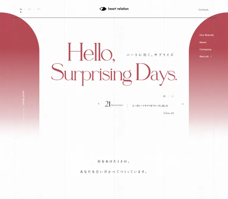
株式会社heart relation|ローズ色の大判セリフ体と余白が印象的な企業サイト
白い微細なテクスチャ、大きなセリフ体、左右のアーチ状グラデーションが特徴。企業情報とブランド紹介をつなぐ構成を、実測値とモバイルでの組み替えを交えて解説します。
heart relation — Style Reference
An airy corporate introduction framed by rose-colored arches and expressive editorial typography.
Original URL: https://heartrelation.co.jp/ Final URL: https://heartrelation.co.jp/ Theme: light, with a white textured canvas, muted rose display type, and black utility text. Inspected: October 2, 2026, at 01:16:31 JST; supplied retrieval timestamp: October 1, 2026, at 16:16:31 UTC. Viewports: 1440 × 1000 desktop and 390 × 844 mobile, in CSS pixels. Scope: supplied opening-view captures at both sizes, plus a homepage-wide rendered DOM and computed-style inventory. Linked pages, an opened navigation menu, carousel operation, and lower-page imagery were not visually inspected.
The current page is the corporate homepage of heart relation. Its information architecture connects brands, a personal message, company news, corporate information, recruitment, and contact details. The opening composition gives these conventional corporate functions an editorial character: enormous fine-stroked serif lettering floats between two rose-colored shapes, while practical navigation stays small and quiet.
The most distinctive relationship is between scale and restraint. “Hello, Surprising Days.” occupies much of the central view, but the logo, language choices, news item, and navigation remain compact. Thin construction lines and a faint granular surface organize the white space. The side shapes begin with rounded shoulders and dissolve downward, suggesting an architectural opening without enclosing the content in a card.
Mobile receives a deliberately different composition. The headline becomes three staggered lines, the logo moves to the upper left, navigation becomes a two-line menu symbol, and the news teaser disappears from the opening. Preserve this rearrangement rather than reducing the desktop layout uniformly.
閉じる
heart relation — Style Reference
An airy corporate introduction framed by rose-colored arches and expressive editorial typography.
Original URL: https://heartrelation.co.jp/ Final URL: https://heartrelation.co.jp/ Theme: light, with a white textured canvas, muted rose display type, and black utility text. Inspected: October 2, 2026, at 01:16:31 JST; supplied retrieval timestamp: October 1, 2026, at 16:16:31 UTC. Viewports: 1440 × 1000 desktop and 390 × 844 mobile, in CSS pixels. Scope: supplied opening-view captures at both sizes, plus a homepage-wide rendered DOM and computed-style inventory. Linked pages, an opened navigation menu, carousel operation, and lower-page imagery were not visually inspected.
The current page is the corporate homepage of heart relation. Its information architecture connects brands, a personal message, company news, corporate information, recruitment, and contact details. The opening composition gives these conventional corporate functions an editorial character: enormous fine-stroked serif lettering floats between two rose-colored shapes, while practical navigation stays small and quiet.
The most distinctive relationship is between scale and restraint. “Hello, Surprising Days.” occupies much of the central view, but the logo, language choices, news item, and navigation remain compact. Thin construction lines and a faint granular surface organize the white space. The side shapes begin with rounded shoulders and dissolve downward, suggesting an architectural opening without enclosing the content in a card.
Mobile receives a deliberately different composition. The headline becomes three staggered lines, the logo moves to the upper left, navigation becomes a two-line menu symbol, and the news teaser disappears from the opening. Preserve this rearrangement rather than reducing the desktop layout uniformly.
How to Read This Reference
- Measured means a value appears in the supplied computed styles or element rectangles. Decimal values are rounded where that improves readability.
- Visual estimate means a proportion or treatment was read from the supplied original-page captures. These estimates are not stylesheet declarations or sampled color measurements.
- Calculated means simple arithmetic applied to measured values, such as converting tracking to
emor finding the space between two elements. - Recommended means guidance for a new implementation. The CSS starter, its breakpoint, and its interpolation formulas are recommendations, not recovered source code.
- Font names below are the declared computed stacks. The evidence does not independently establish which font file supplied every glyph.
- The opening is visually documented. Lower-page descriptions distinguish DOM-supported structure from appearance that was not captured.
- Element rectangles alone do not prove visibility. The inventory includes secondary navigation and repeated text that are absent from the screenshots.
Tokens — Colors
Default Palette
The token names are implementation aliases, not original custom-property names.
| Name | Value | Suggested token | Evidence and role |
|---|---|---|---|
| Brand Rose | #b54c55 |
--hr-rose |
Measured rgb(181, 76, 85) on the hero and the Our Brands, Company, and Recruit headings |
| White Canvas | approximately #ffffff |
--hr-paper |
Visually white opening surface; sampled HTML and body backgrounds are transparent, so this is a direct-color implementation choice |
| Black Ink | #000000 |
--hr-ink |
Measured on navigation, many links, and black section headings; visually used by the logo |
| Reading Ink | #333333 |
--hr-copy |
Measured on message paragraphs, desktop hero-news copy, and mobile news titles |
| Secondary Gray | #666666 |
--hr-secondary |
Measured on desktop news-column labels and footer contact captions |
| Quiet Gray | #999999 |
--hr-muted |
Measured on the mobile scroll prompt, copyright, and some secondary links |
| Reversed White | #ffffff |
--hr-on-rose |
Measured on the desktop side navigation and vertical scroll prompt |
| Guide Line | suggested rgba(0, 0, 0, 0.06) |
--hr-guide |
Approximation for the faint construction lines; their exact source color was not supplied |
The exact rose is supported by text styles. The side decoration appears related in hue, but its gradient stops and compositing method were not provided. Reusing #b54c55 as its starting color is a practical approximation.
Gradient and Texture Treatment
The side fields fade from a substantial rose area near the top into pale pink and then the white canvas. The fade is vertical and broad. It is not a small glossy highlight or a multicolor background.
A subtle grain is visible across the opening, including the pale areas. Its asset, blend mode, opacity, and rendering method are unknown. For a new implementation, use an optional neutral texture at low opacity and inspect it at actual display size. The texture should remain subordinate to the thin letterforms.
The supplied custom-property inventory contains many platform color, gradient, and shadow presets. Their presence does not demonstrate that they are used by this design. Bright blue, purple, orange, and preset drop shadows are therefore excluded from the observed palette.
Tokens — Typography
Display Serif — Brand Voice
Declared stack: LeGrandRegular-Regular, "Cormorant Garamond", "Times New Roman", YuMincho, "Hiragino Mincho ProN", "Yu Mincho", "MS PMincho", serif.
Measured weight: 400.
This stack appears on the hero, major section titles, Message, News, footer email address, and secondary navigation links. The opening lettering has strong thick–thin contrast, delicate hairlines, and expressive curves. Its impact comes from size and spacing rather than bold weight.
The hero uses negative tracking. Most section titles use normal tracking, while Message has a small positive adjustment. Do not apply the hero’s tight spacing to every serif element.
Utility Sans — Navigation and Information
Declared stack: Montserrat, "Noto Sans JP", "Helvetica Neue", Arial, "Hiragino Kaku Gothic ProN", "Hiragino Sans", Meiryo, sans-serif.
Use this for language choices, navigation, news descriptions, dates where applicable, captions, and recruitment links. Much of the English utility text uses 0.04em tracking. Its measured sizes stay around 13.5–16.6px rather than shrinking in proportion to the viewport width.
Weights are generally 400, with some 500 status text and 300 desktop news titles or copyright text.
Japanese Serif — Introductory and Message Copy
Declared stack: "游明朝体36ポかな M", "Yu Mincho 36p Kana M", "Shippori Mincho", "Times New Roman", YuMincho, "Hiragino Mincho ProN", "Yu Mincho", "MS PMincho", serif.
The short introductory statement uses unusually generous tracking and line height. The longer Message section uses a more readable rhythm, especially on mobile, where its tracking returns to normal.
The hero tagline, “ハートに効く、サプライズ,” visually uses small Japanese serif lettering. Its own computed-style record was not supplied. Do not assign it the parent H1’s large font size or assume that its precise family has been verified.
Type Scale
All sizes in this table are measured unless explicitly marked as estimates.
| Role | Desktop size / line height | Mobile size / line height | Tracking and notes |
|---|---|---|---|
| Hero H1 | 140.625 / 140.625px |
87.360 / 87.360px |
Desktop -0.03em; mobile -0.02em; weight 400 |
| Our Brands, Company, Recruit | 112.5 / 112.5px |
76.960 / 76.960px |
Rose, normal tracking |
| News heading | 67.5 / 67.5px |
58.240 / 58.240px |
Black, normal tracking |
| Message heading | 45 / 45px |
29.12 / 29.12px |
Black, 0.02em tracking |
| Introductory Japanese statement | 19.125 / 65.981px |
14.56 / 41.496px |
Desktop 0.39em; mobile 0.25em |
| Message paragraphs | 16.875 / 35.1px |
14.56 / 29.12px |
Desktop 0.15em; mobile normal |
| Desktop side navigation | 14.625 / 17.989px |
Not shown in opening | 0.04em |
| Language choices | 13.5 / 13.5px |
13.52 / 13.52px in secondary navigation markup |
0.04em |
| Hero news title | 13.5 / 24.3px |
Not shown in opening | 0.04em, #333333 |
| Hero news counter | 13.5 / 13.5px |
Not shown in opening | Weight 500, 0.04em |
| Hero View all | 15.75 / 15.75px |
Not shown in opening | 0.04em |
| Brand-site caption | 13.5 / 13.5px |
13.52 / 13.52px |
0.04em |
| News-list title | 15.75 / 31.5px |
14.56 / 29.12px |
Desktop weight 300 and 0.06em; mobile weight 400 and 0.08em |
| Scroll prompt | 14.625 / 17.989px |
14.56 / 17.618px |
0.04em; direction and color change |
| Footer navigation | 15.75 / 19.058px |
16.64 / 20.8px |
Mobile text is slightly larger |
| Footer email | 39.375 / 52.369px |
36.4 / 50.960px |
Display serif |
| Secondary navigation links | 72 / 86.4px |
47.840 / 57.408px |
Computed markup; opened state not captured |
| Hero day numeral | approximately 48–50px |
Not shown | Visual estimate; numeral style record unavailable |
| Hero Japanese tagline | approximately 20–22px |
approximately 14–15px |
Visual estimate; widely spaced |
The hierarchy is intentionally uneven. News is smaller and black; Company and Recruit are larger and rose; Message is smaller again. Preserve these distinctions rather than normalizing all section headings to one style.
Tokens — Spacing & Shapes
Root Units and Measurement Discipline
The computed root font size is 11.25px on desktop and 10.4px on mobile. These are not conventional 16px roots.
Many measurements are convenient multiples of those values. For example, 112.5px equals ten desktop root units and 76.96px equals 7.4 mobile root units. These are calculated relationships; the evidence does not reveal the original authoring formula or breakpoint.
The starter below uses a separate --hr-u variable so a new application can retain its normal root font size.
Spacing Reference
| Use | Desktop | Mobile | Evidence |
|---|---|---|---|
| Common link padding | 11.25px |
10.4px |
Measured on several links |
| Side-navigation vertical padding | 5.625px |
Not applicable | Measured |
| Side-navigation row advance | 45.313px |
Not applicable | Calculated from consecutive link positions |
| Main desktop guide inset | approximately 90px |
— | Visual estimate, also aligned with the brand-heading rectangle |
| Outer mobile rule inset | — | approximately 16.6px |
Visual estimate, consistent with news-container measurements |
| Message content inset | 247.5px from left |
33.266px from left |
Measured |
| Intro section top padding | 252px |
91.520px |
Measured |
| Intro section bottom padding | 157.5px |
130px |
Measured |
| Space between brand-link boxes | 106.5px |
approximately 34.313px |
Calculated from initial slide rectangles |
| Hero news title left padding | 27px |
Not applicable | Measured |
Shape Language
- Observed opening: square, unboxed links; fine rules; tiny arrows; a small active-language dot; and very large curved side decorations.
- Sampled link and button boxes:
border-radius: 0and transparent backgrounds. - Visual estimate: the main header rule is about 1px thick.
- Unknown: exact side-shape paths, gradient stops, lower-page image masks, and detailed CTA decoration.
- Recommended: reserve prominent curvature for the architectural side fields. Avoid adding a general rounded-card system.
Layout Measurements
| Element | Desktop at 1440 × 1000 | Mobile at 390 × 844 | Evidence |
|---|---|---|---|
| Opening section | 1440 × 735.75px |
390 × 709.984px |
Measured section rectangle |
| H1 box | x 320.516, y 243, width 798.953, height 326.25px |
x 0, y 211, width 390, height 335.938px |
Measured; includes descendant content, not just visible glyph bounds |
| Opening logo link | x 627.75, y 33.75, 184.5 × 45px |
x 23.906, y 17.672, 118.547 × 35.328px |
Measured; includes vertical padding |
| Header rule | approximately x 69–1371, y 111px |
approximately x 16–374, y 66px |
Visual estimate |
| Left side field | approximately 248px wide, starting near y 79px |
approximately 47px wide, starting near y 42px |
Visual estimate |
| Right side field | starts near x 1192px |
starts near x 343px |
Visual estimate |
| Hero news item link | 477 × 49.5px |
Absent from opening | Measured |
| Hero previous/next button | 31.5 × 35.438px |
Absent from opening | Measured |
| Brand-link box | 315 × 453.625px |
249.594 × 358.766px |
Measured; includes more than the image alone |
| News list | x 193.5, width 1053px |
x 16.625, width 356.75px |
Measured |
| Message copy column | 524.25px wide |
323.469px wide |
Measured |
| Sampled body rectangle | 6568.219px high |
5861.5px high |
Measured body bounds; not a verified native scroll range |
The capture summary reports a document height equal to the viewport, despite the much taller body and section rectangles. The underlying scrolling architecture is therefore unresolved. Do not interpret the page as a viewport-locked application or use the summary height to discard the lower sections.
Components
Opening Header
Role: brand identity, language selection, and contact access.
The desktop header has three visual zones: Ja / En / Ch at the left, the black heart relation emblem and wordmark in the center, and Contact at the right. A long fine rule runs below them. The header sits over the opening composition rather than inside a filled panel.
The centered logo link is 184.5px wide. Its 45px height includes 11.25px of padding above and below. The language links use 13.5px sans-serif type, and the selected Japanese option has a small black dot beneath it in the screenshot. Fine vertical separators distinguish the language choices.
Contact links to mailto:info@herlipto.jp. The language destinations are /, /en/, and /zh/ on the original domain. These destinations are evidenced by anchors, not by visits to the destination pages.
On mobile, the logo link moves to x 23.906px and becomes 118.547px wide. A two-line menu symbol appears near the upper right. Its sampled button box is approximately 24.953px square. Language choices and Contact are not visible in the opening header.
The header element itself has a measured height of zero, so its children’s rectangles and the screenshot are more useful than the parent box for reconstructing the opening geometry. Fixed or sticky behavior during scrolling was not verified.
Side Arches and Construction Lines
Role: create a distinctive frame without enclosing the main content.
The left field meets the outer viewport edge and curves inward to a vertical edge. The right field mirrors it. Both fade into the canvas before the lower part of the screenshot. Their large upper curves matter more than a particular CSS technique: they could be implemented with shaped elements, masks, or artwork, but the original method is unknown.
At desktop size, the inner edges sit near x 248px and x 1192px. On mobile, they sit near x 47px and x 343px. This leaves a broad central white opening while allowing the mobile word “Surprising” to extend slightly over the colored sides.
Faint vertical guides are visible near x 90, 405, 720, 1035, and 1350px on desktop. The outer and central guides have a dotted appearance. Mobile retains a much simpler narrow frame, with faint guides near the outer insets and center.
Do not turn these fields into ordinary rounded rectangles with four equal corners. Their curvature belongs at the upper shoulders, and their lower edges disappear through the fade.
Hero Headline and Japanese Tagline
Role: communicate the brand’s emotional tone before detailed corporate information.
Desktop composition:
- “Hello,” occupies the upper line, inset from the left edge of the full heading block.
- “Surprising Days.” forms one long second line.
- “ハートに効く、サプライズ” sits to the right of “Hello,” in the open space above the second line.
The H1 is rose, regular weight, and 140.625px with an equal line height. Its -4.21875px tracking equals -0.03em. The measured block is centered horizontally, but the individual lines create an asymmetric arrangement within it.
Mobile composition:
- “Hello,” starts near x 90px.
- “Surprising” begins near x 30px and nearly spans the viewport.
- “Days.” shifts to the right, beginning near x 165px.
- The Japanese tagline becomes a separate centered line below the English composition.
The mobile H1 uses 87.360px type and -0.02em tracking. This is a designed three-line treatment, not an accidental wrap. Keep the full accessible heading text as “Hello, Surprising Days.” even if visual spans control the line breaks.
Desktop News Teaser
Role: add a compact current-information entry point beneath the brand statement.
The visible teaser occupies the lower-right portion of the central opening. Its anatomy is:
- A small right-aligned
01 / 03counter above the row. - A tiny previous arrow.
- An oversized serif day numeral with a small English month beside it.
- A short vertical separator.
- A Japanese article title in compact sans-serif text.
- A tiny next arrow.
- A right-aligned View all link underneath.
The captured item reads “15 August” and “株式会社yutoriと資本業務提携の締結に合意.” The corresponding article anchor points to /news/192/.
The current article-link rectangle is 477 × 49.5px at x 650.25, y 632.25px. The counter sits at y 603px. The visible article title uses 13.5px / 24.3px, 0.04em tracking, and #333333.
The DOM contains repeated article nodes extending horizontally, while the screenshot exposes one item. This supports a carousel-like structure, but does not verify autoplay, looping, slide duration, swipe support, or arrow behavior. There are three distinct news entries; repeated nodes should not be counted as additional articles.
The teaser and its View all link are not visible in the mobile opening.
Scroll Cue
Role: indicate that the composition continues below the opening.
On desktop, “scroll down” is white, oriented vertically, and placed within the left rose field near x 139.5, y 574.875px. A fine vertical line extends below it.
On mobile, the cue becomes horizontal, gray, and centered at approximately y 610px. Its measured size remains almost unchanged: 14.56px compared with 14.625px on desktop.
A small pale rose mark appears beneath the mobile cue in one supplied frame. The evidence does not establish its movement, timing, or rendering mechanism. Do not invent a bounce or pulse animation from this difference alone.
Introductory Statement
Role: bridge the opening identity and the brand portfolio.
The desktop DOM presents two centered Japanese lines:
“箱をあけたときの、”
“あなたを思い浮かべてつくっています。”
Mobile divides the second sentence into two lines, producing a three-line statement. Desktop type is 19.125px with a 65.981px line height and 7.459px tracking. Mobile uses 14.56px, a 41.496px line height, and 3.64px tracking.
The section begins immediately after the hero but contains substantial internal space: 252px top padding on desktop, 91.52px on mobile. Its paragraphs are represented in the DOM near or beyond the lower edge of the supplied opening captures. Their complete reveal state is not visually established.
Our Brands Showcase
Role: provide access to the company’s brand destinations.
The desktop DOM places a large rose Our Brands heading at the left and horizontally arranged brand links to its right. The heading uses 112.5px display type. The first two brand-link boxes begin at x 613.875 and x 1035.375px; each is 315px wide.
Two button elements sit above the track toward the right. Their measured boxes are 49.5 × 57.375px. Each brand link includes the caption Official brand site, measured at 13.5px with 0.04em tracking.
The original-page anchors include https://www.herlipto.jp/, several brand destinations under https://herlipto.jp/, and one Douyin destination. The links establish destination structure; they do not establish the appearance or subject matter of each tile image.
On mobile, the heading precedes the controls and track. The first brand-link box starts at x 34.313px and is 249.594px wide; the next begins at x 318.219px. These bounds are consistent with a horizontally overflowing strip that can expose part of the next item. Actual clipping and movement were not visually tested.
The View all link moves from the desktop heading area to below the mobile track. Its sampled box changes from 315 × 69px to approximately 186.141 × 63.938px.
Do not interpret a brand-link box’s full height as the image’s aspect ratio: it includes caption content and potentially other elements.
Message Section
Role: give the company a personal editorial voice.
Message is a relatively small black serif heading: 45px on desktop and 29.12px on mobile. The Japanese copy is set in a Mincho stack rather than the navigation sans-serif.
The desktop copy column begins at x 247.5px and is 524.25px wide. Paragraphs use 16.875px / 35.1px, 0.15em tracking, and #333333. On mobile, the column becomes 323.469px wide at x 33.266px, with 14.56px / 29.12px type and normal tracking.
The copy references 小嶋陽菜 and ends with a heart relation executive-role line. These are content observations, not production credits.
The mobile DOM places the first paragraph roughly 576px below the bottom of the Message heading. The inventory does not identify all intervening visual content. Do not reproduce this gap as an arbitrary empty spacer or assume a particular portrait without additional imagery evidence.
Repeated “Hello, Surprising Days.” text occurs between Message and News: six occurrences in desktop extracted text and two on mobile. A repeating typographic band is plausible, but its appearance and motion are unverified.
News Index Preview
Role: present dated corporate announcements in a structured list.
The desktop section has a black 67.5px serif heading and a 1053px-wide list. Date and Title labels appear above the rows in 13.5px gray sans-serif type. The title column begins at x 509.625px, about 316.125px into the list.
Three distinct entries are present: August 15, 2024; November 21, 2022; and February 22, 2022. Each row is an article link. The supplied rectangles show 60.75px link heights and approximately 106.75px between row starts.
On mobile, Date and Title labels are absent from the extracted visible text. Dates and titles are stacked within narrower rows. The first long title occupies two 29.12px lines, producing a taller row than the other entries. Preserve content-driven row heights.
The View more link is positioned toward the right below the list. Its box is 315 × 69px on desktop and approximately 210.969 × 63.938px on mobile. Duplicate View more text exists inside the link markup; its purpose and visual transition are not verified.
Company and Recruit Gateways
Role: direct visitors to corporate details and employment information.
Company uses the large rose display style. On desktop its heading begins at x 838.125px; on mobile it moves to x 33.266px. A View more link appears later in the section. The intervening image content is not represented in the supplied visual evidence.
Recruit forms a more compact gateway. Desktop places its 112.5px rose heading in the left half and a recruitment link in the right half. The link box is 526.5 × 76.5px and carries “採用情報を見る.”
Mobile stacks the 76.96px heading above a centered link approximately 239.188 × 69.609px. The section remains spacious even though it contains little text.
The exact outlines, arrows, image crops, and decorative treatments of these lower-page links cannot be recovered from the text and rectangle inventory alone.
Footer
Role: repeat essential navigation and provide direct contact channels.
Desktop footer navigation and contact content occupy the right side of the page. Four navigation links form two columns. The email hello@heartrelation.co.jp uses the display serif at 39.375px, beneath a small sans-serif Get in touch with us caption.
Mobile relocates the logo and content toward the left inset. Navigation becomes a vertical list, and its type increases to 16.64px. The email remains prominent at 36.4px and nearly spans the available content width.
The original-page anchors also include Note and Wantedly destinations, plus a Page top anchor targeting /#. Their icon artwork and click behavior were not inspected. Copyright text reads “© 2022 heart relation”; that year does not establish the current retrieval date or a discontinued site.
The footer email differs from the header contact destination. Preserve each observed context rather than silently treating them as interchangeable.
Secondary Navigation Markup
Role: provide an additional route list, likely associated with the menu control.
The DOM contains Home, Our Brands, News, Company, and Recruit with numeric labels 01–05, plus language choices and info@herlipto.jp. The route labels use large serif type: 72px on desktop and 47.84px on mobile.
This content has measurable rectangles but is not visible in the supplied opening screenshots. No open-menu capture or activation log is supplied. Its backdrop, entrance animation, focus behavior, close control, and exact presentation remain unverified.
Tokens — Motion & Interaction
Measured Transition Declarations
These are computed transition declarations, not recordings of completed interactions.
| Element | Supplied declaration | What it establishes |
|---|---|---|
| Header container | opacity 0.6s cubic-bezier(0, 0, 0.5, 1) |
An opacity transition is configured |
| Opening logo link | opacity 1s cubic-bezier(0, 0, 0.5, 1) 0.6s |
A delayed opacity transition is configured |
| Hero H1 | opacity 0.8s cubic-bezier(0, 0, 0.5, 1) 0.6s |
The heading shares a delayed fade treatment |
| Desktop Contact | opacity 0.8s cubic-bezier(0, 0, 0.5, 1) 1.6s |
A later opacity transition is configured |
| Hero section | opacity 1s cubic-bezier(0, 0, 0.5, 1) |
Section-level opacity transition |
| Language links | opacity 0.4s cubic-bezier(0, 0, 0.5, 1) |
Shorter utility-link fade |
| Many ordinary links | opacity 1.5s cubic-bezier(0, 0, 0.5, 1) |
Long opacity transition; trigger and target opacity unknown |
| Brand-track buttons | opacity 0.4s cubic-bezier(0, 0, 0.5, 1) |
Short control fade |
| Message paragraphs | opacity 1.2s ... , transform 1.2s ... with the same curve |
Both opacity and transform transitions are configured |
| Main container | 1.2s desktop; 0.7s mobile |
Different transition durations; no meaningful state change established |
The supported motion vocabulary is gradual opacity change and, for message paragraphs, transform-assisted transitions. The captured declarations do not establish transform distance, direction, trigger thresholds, or hover values.
Interaction Evidence and Limits
- Navigation and article destinations are supported by actual anchors.
- The opening news area has arrow controls, a counter, and horizontally repeated article nodes. Operation and autoplay are unverified.
- The brand area has two buttons and horizontal item positions. Swipe, drag, looping, and advancement are unverified.
- The mobile menu symbol is visible; opening and closing were not tested.
- Page top is an anchor; smooth scrolling is not established.
- Most sampled elements report
animation: none. This does not rule out JavaScript animation, pseudo-element animation, or motion outside the sampled elements. - Duplicate CTA text and repeated slogans do not prove a rolling hover effect or marquee animation.
Recommended adaptation: keep interactions calm and readable. Use the measured easing curve for optional fades, provide content without requiring animation, and offer reduced-motion behavior. Avoid introducing springs, continuous parallax, or automatic carousels without a separate product requirement.
Surfaces
| Layer | Supported appearance | Implementation guidance |
|---|---|---|
| Opening canvas | Visually white with faint grain | Use white as the base; treat texture as an optional decorative layer |
| Side frame | Muted rose fading through pale pink into white | Keep the fade broad and the upper curves large |
| Header | Visually transparent over the composition, with a fine rule | Avoid a heavy filled navigation bar in the initial state |
| Guide system | Very faint vertical lines, including dotted lines | Keep contrast below that of text and the main header rule |
| Hero information | Unboxed text, small separators, tiny arrows | Organize with alignment and spacing rather than cards |
| Sampled lower links | Transparent backgrounds and zero-radius boxes | Do not infer unseen image masks or border decoration |
| Secondary navigation | Markup exists; surface not captured | Specify its visual treatment only as a new implementation decision |
No general shadow-based elevation system is visible in the opening. The side gradient is a decorative field, not an elevation shadow.
Imagery
The opening is primarily typographic. Its visible identity comes from the black logo artwork, rose side shapes, tiny directional marks, faint grain, and fine guide lines. A photographic hero is not part of the supplied opening captures.
The logo combines an organic black-and-white emblem with a lowercase wordmark. Use authorized original artwork when available; a typed wordmark is only a placeholder. The asset format and source filename were not supplied.
Lower-page brand links and large section areas may include imagery, but the supplied evidence does not show their photographs, subjects, crops, or color grading. Do not invent a portrait, fashion shoot, office scene, or product still life as an observed asset.
Observed Asset References
| Visual element | Evidence | Asset availability |
|---|---|---|
| Heart relation emblem and wordmark | Visible in desktop and mobile header captures | No original asset URL supplied |
| Rose side fields | Visible at both viewports | Original shape and gradient implementation unknown |
| Fine grain | Visible in the opening canvas and color fields | No texture filename or blend specification supplied |
| Two-line mobile menu symbol | Visible in mobile captures | Original SVG or CSS definition unknown |
| Small news arrows | Visible in desktop opening | Original asset definition unknown |
| Pale mobile scroll decoration | Visible in one supplied frame | Asset and motion unknown |
| Brand, Message, and Company imagery | Not visually supplied | Subject matter and crops unverified |
For a new site using this design language, restrained editorial imagery could complement the typography. That is a recommendation, not a description of the uncaptured original images.
Layout & Responsive Behavior
Opening Composition
Desktop uses an approximately 799px-wide central heading block, separate side navigation on the right frame, a vertical scroll cue on the left frame, and a news teaser beneath the heading toward the right. The Japanese tagline occupies the space beside the first English line.
Mobile keeps the English typography exceptionally large relative to the viewport. Its three lines are offset individually, while the tagline and scroll cue become centered. The side fields narrow dramatically, from approximately 17.2% of viewport width each to approximately 12.1% each.
The opening section itself does not shrink in proportion to viewport width: its measured height changes from 735.75px to approximately 709.98px. Do not equate the blank lower area of a screenshot with a 100vh hero requirement.
Measured Recomposition
| Element | Desktop | Mobile |
|---|---|---|
| Logo | Centered | Upper left |
| Header utilities | Language choices and Contact visible | Menu symbol visible; language and Contact absent from opening |
| Main title | Two lines | Three staggered lines |
| Japanese tagline | Beside Hello | Below the English title |
| Main side navigation | On right rose field | Absent from opening |
| Hero news teaser | Present | Absent from opening |
| Scroll cue | Vertical, white, left | Horizontal, gray, centered |
| Introductory statement | Two lines | Three lines |
| Brand showcase | Heading beside track | Heading above track |
| News metadata | Date and Title columns | Date above title; no visible column labels |
| Company heading | Toward the right | Left content inset |
| Recruit | Heading and link side by side | Heading above centered link |
| Footer routes | Two columns on the right | Vertical list on the left |
Content Widths and Unknown Breakpoints
The desktop news region is 1053px wide, or 73.125% of the viewport. Mobile news uses a broader 356.75px outer region with titles inset further. Mobile message copy uses approximately 33.27px side margins.
The brand-track geometry changes from 315px items with 106.5px gaps to approximately 249.59px items with 34.31px gaps. This is another reason to avoid uniform scaling.
Only two viewport sizes were supplied. The exact media-query breakpoint, intermediate tablet behavior, maximum widths, landscape behavior, and text-zoom response are unknown. A breakpoint near 48rem is used below as a recommended starting point, not an observed source value.
Do’s and Don’ts
Do
- Preserve the measured rose
#b54c55for the expressive display headings. - Pair regular-weight display serif lettering with small, lightly tracked utility sans-serif text.
- Keep the opening primarily typographic, with the side fields supplying its large decorative shapes.
- Preserve the desktop two-line and mobile three-line headline compositions.
- Use broad white space, fine rules, and faint guides to organize the page.
- Retain the distinct sizes and colors of Message, News, and the larger rose section headings.
- Keep Japanese message copy comfortably spaced, with less tracking on mobile.
- Treat the homepage as a corporate information system with brand, news, company, recruitment, and contact routes.
- Keep lower-page recommendations separate from observed imagery and measured geometry.
Don’t
- Don’t replace the headline composition with a generic centered heading and oversized filled CTA.
- Don’t make every heading bold or give every section the same heading scale.
- Don’t turn the side fields into small rounded cards or opaque panels that enclose the text.
- Don’t import the unused platform preset colors into the brand palette.
- Don’t use heavy grain, strong grid lines, or shadows that compete with the fine typography.
- Don’t scale all utility text down according to viewport width.
- Don’t copy the H1’s tracking into long Japanese paragraphs.
- Don’t treat repeated DOM text as proof of autoplay, marquee motion, or a particular hover effect.
- Don’t invent lower-page photography, menu surfaces, production credits, or asset paths.
- Don’t infer closure from old news dates or the copyright year.
Recommended Implementation Additions
These are improvements for a new implementation, not verified original-site features.
- Increase the mobile menu’s effective hit area from its measured approximately 25px box to at least 44 × 44px while retaining the small visible symbol.
- Give arrow controls explicit accessible names. Expose carousel position without repeatedly announcing decorative or cloned content.
- Use one accessible H1 sentence, even when its visual treatment requires multiple spans or alternate layouts.
- Hide decorative duplicate labels, texture, guide lines, and repeated slogans from assistive technology.
- Keep actionable text sufficiently contrasted. The observed
#999999is better reserved for secondary decoration than essential small controls on white. - Keep reversed navigation within the stronger part of the rose field; verify contrast wherever the gradient becomes pale.
- Provide keyboard focus states and meaningful logo-link names. If the menu opens as a modal, implement focus handling, Escape dismissal, and a clear close control.
- If automatic carousel movement is added, provide pause controls and reduced-motion behavior. A static first item should remain useful without JavaScript.
- Allow native vertical reading and test zoom, long Japanese titles, intermediate widths, and landscape phones before fixing any section height.
- Load licensed display fonts with a suitable fallback strategy. Recheck line widths after the real font loads; fallback metrics can alter the headline dramatically.
Agent Prompt Guide
Quick Color Reference
- Hero and major brand headings: measured
#b54c55. - Canvas: visually white; use
#ffffffas the implementation base. - Logo and primary utility text:
#000000. - Reading copy:
#333333. - Secondary labels:
#666666. - Quiet cues:
#999999. - Desktop text over the rose field:
#ffffff. - Guides: very faint neutral lines; exact source color unknown.
- Side fade: rose to transparent over white; exact stops unknown.
Overall Prompt
“Create an editorial corporate homepage for a fashion and beauty company using a white canvas, faint neutral grain, rose #b54c55, and black utility text. Use a regular high-contrast display serif for an oversized ‘Hello, Surprising Days.’ introduction and major brand headings. Frame the opening with two large rounded rose shoulders at the viewport edges that fade downward into white. Center the desktop logo, place small language choices left and Contact right, and add a fine horizontal rule. Keep desktop navigation on the right rose field and a compact dated news teaser below the headline. On mobile, move the logo left, show a small menu symbol, arrange the headline in three staggered lines, center the Japanese tagline and scroll cue, and remove the opening news teaser. Continue with brand links, an editorial message, dated news, Company, Recruit, and contact navigation. Use the supplied measurements for proportions; do not invent unseen imagery or unverified motion.”
Example Component Prompts
- Opening header: “A transparent corporate header on white grain, with a centered black logo, compact Ja / En / Ch controls at left, Contact at right, and a single fine rule beneath. At phone width, use a smaller left-aligned logo and a two-line menu symbol with an accessible 44px target.”
- Hero lettering: “Use regular rose display-serif type at approximately 141px on a 1440px desktop. Offset ‘Hello,’ within the central heading block and keep ‘Surprising Days.’ on one second line. At 390px, use approximately 87px type across three individually aligned lines. Put the Japanese tagline below on mobile.”
- News teaser: “An unboxed desktop news strip with a small right-aligned counter, tiny previous and next arrows, a large serif day numeral, a small English month, a thin vertical separator, a compact Japanese title, and a View all text link beneath.”
- Brand showcase: “Place a large two-line rose Our Brands heading beside a horizontal row of brand links on desktop. Use 315px link widths and approximately 106px gaps at 1440px. At 390px, move the heading above the row and use approximately 250px link widths with 34px gaps. Use supplied imagery only; image subjects and crop ratios are not established by the reference.”
- Message copy: “Use a small black serif Message heading and a Japanese Mincho text column. At desktop, use approximately 17px text, 35px leading, and gentle tracking. On mobile, use approximately 14.6px text, 29px leading, normal tracking, and 33px side insets.”
- News list: “Create a restrained linked announcement list with a black serif News heading, small Date and Title labels on desktop, and stacked date/title rows on mobile. Let long Japanese titles increase row height. Keep the surface transparent and avoid raised cards.”
Quick Start
CSS Custom Properties
This is a proposed implementation of the opening composition and reusable typography. It is not extracted site CSS. The unit formulas match the two supplied viewport samples but are unverified between them. The breakpoint, gradient stops, guide colors, and shape radii are approximations.
Keep a conventional document root size. Supply authorized logo artwork separately. --hr-grain defaults to no image; assign a licensed subtle texture if available. Menu and carousel behavior require separate implementation.
:root {
  /* Measured colors, with a direct white canvas adaptation. */
  --hr-paper: #ffffff;
  --hr-rose: #b54c55;
  --hr-ink: #000000;
  --hr-copy: #333333;
  --hr-secondary: #666666;
  --hr-muted: #999999;
  --hr-guide: rgb(0 0 0 / 0.06);
  --hr-grain: none;

  /* Computed font stacks; font files are not bundled. */
  --hr-display: LeGrandRegular-Regular, 'Cormorant Garamond',
    'Times New Roman', YuMincho, 'Hiragino Mincho ProN',
    'Yu Mincho', 'MS PMincho', serif;
  --hr-utility: Montserrat, 'Noto Sans JP', 'Helvetica Neue',
    Arial, 'Hiragino Kaku Gothic ProN', 'Hiragino Sans',
    Meiryo, sans-serif;
  --hr-editorial: 'Yu Mincho 36p Kana M', 'Shippori Mincho',
    'Times New Roman', YuMincho, 'Hiragino Mincho ProN',
    'Yu Mincho', 'MS PMincho', serif;

  /* Recommended interpolation: 11.25px at 1440px. */
  --hr-u: clamp(8px, 0.78125vw, 11.25px);
  --hr-hero-size: calc(12.5 * var(--hr-u));
  --hr-section-size: calc(10 * var(--hr-u));
  --hr-news-size: calc(6 * var(--hr-u));
  --hr-message-size: calc(4 * var(--hr-u));
  --hr-utility-size: calc(1.3 * var(--hr-u));
  --hr-caption-size: calc(1.2 * var(--hr-u));
  --hr-copy-size: calc(1.5 * var(--hr-u));
  --hr-tracking-utility: 0.04em;
  --hr-tracking-hero: -0.03em;
  --hr-ease: cubic-bezier(0, 0, 0.5, 1);
  --hr-link-duration: 400ms;
}

* { box-sizing: border-box; }
body { margin: 0; }

.hr-page {
  position: relative;
  isolation: isolate;
  min-height: 100svh;
  overflow-x: clip;
  color: var(--hr-ink);
  background: var(--hr-paper);
  font-family: var(--hr-utility);
}

/* Optional texture approximation; never intercepts input. */
.hr-page::after {
  content: '';
  position: absolute;
  inset: 0;
  z-index: 4;
  pointer-events: none;
  background-image: var(--hr-grain);
  opacity: 0.04;
}

.hr-page a { color: inherit; }
.hr-page button { font: inherit; }
.hr-page :focus-visible {
  outline: 2px solid var(--hr-rose);
  outline-offset: 5px;
}

/* Decorative guide approximation. */
.hr-guides {
  position: absolute;
  inset: 0 6.25%;
  z-index: 2;
  pointer-events: none;
  border-inline: 1px dotted var(--hr-guide);
  background-image: linear-gradient(
    to right,
    transparent calc(100% - 1px),
    var(--hr-guide) 0
  );
  background-size: 25% 100%;
}

.hr-header {
  position: absolute;
  inset: calc(3 * var(--hr-u)) calc(6 * var(--hr-u)) auto;
  z-index: 3;
  display: grid;
  grid-template-columns: 1fr auto 1fr;
  align-items: start;
  min-height: calc(7 * var(--hr-u));
  padding: var(--hr-u) calc(4 * var(--hr-u));
  border-bottom: 1px solid rgb(0 0 0 / 0.6);
}

.hr-logo { width: calc(16.4 * var(--hr-u)); }
.hr-logo img { display: block; width: 100%; height: auto; }
.hr-languages { display: flex; gap: calc(2 * var(--hr-u)); }
.hr-contact { justify-self: end; }
.hr-menu-toggle { display: none; }

.hr-languages a,
.hr-contact,
.hr-side-nav a {
  font-size: var(--hr-utility-size);
  font-weight: 400;
  line-height: 1.23;
  letter-spacing: var(--hr-tracking-utility);
  text-decoration: none;
}

.hr-languages a { font-size: var(--hr-caption-size); }
.hr-languages [aria-current] { position: relative; }
.hr-languages [aria-current]::after {
  content: '';
  position: absolute;
  top: calc(100% + 8px);
  left: 50%;
  width: 5px;
  height: 5px;
  border-radius: 50%;
  background: currentColor;
  transform: translateX(-50%);
}

.hr-hero {
  position: relative;
  isolation: isolate;
  min-height: calc(65.4 * var(--hr-u));
}

/* Approximate shoulders and fade, not original geometry. */
.hr-hero::before,
.hr-hero::after {
  content: '';
  position: absolute;
  z-index: -1;
  top: calc(7 * var(--hr-u));
  width: calc(22 * var(--hr-u));
  height: calc(72 * var(--hr-u));
  pointer-events: none;
  background: linear-gradient(
    to bottom,
    var(--hr-rose) 0%,
    rgb(181 76 85 / 0.8) 35%,
    rgb(181 76 85 / 0.22) 75%,
    rgb(181 76 85 / 0) 100%
  );
}
.hr-hero::before {
  left: 0;
  border-top-right-radius: 100% calc(22 * var(--hr-u));
}
.hr-hero::after {
  right: 0;
  border-top-left-radius: 100% calc(22 * var(--hr-u));
}

.hr-title {
  width: calc(71.018 * var(--hr-u));
  margin: 0 auto;
  padding-top: calc(21.6 * var(--hr-u));
  color: var(--hr-rose);
  font-family: var(--hr-display);
  font-size: var(--hr-hero-size);
  font-weight: 400;
  line-height: 1;
  letter-spacing: var(--hr-tracking-hero);
}
.hr-hello {
  display: block;
  margin-left: calc(9 * var(--hr-u));
}
.hr-phrase { display: block; white-space: nowrap; }

/* Tagline values are visual approximations. */
.hr-tagline {
  position: absolute;
  top: calc(29.5 * var(--hr-u));
  left: calc(50% + 2.4 * var(--hr-u));
  margin: 0;
  font-family: var(--hr-editorial);
  font-size: calc(1.9 * var(--hr-u));
  font-weight: 400;
  line-height: 1.5;
  letter-spacing: 0.3em;
  white-space: nowrap;
}

.hr-side-nav {
  position: absolute;
  top: calc(18.5 * var(--hr-u));
  right: calc(8 * var(--hr-u));
  display: grid;
  gap: calc(1.43 * var(--hr-u));
  color: white;
}
.hr-side-nav a { padding-block: calc(0.5 * var(--hr-u)); }

.hr-hero-news {
  position: absolute;
  top: calc(53.6 * var(--hr-u));
  left: calc(54 * var(--hr-u));
  width: calc(50 * var(--hr-u));
  font-size: var(--hr-caption-size);
  letter-spacing: 0.04em;
}
.hr-news-counter {
  margin: 0 calc(6.4 * var(--hr-u)) calc(1.4 * var(--hr-u)) 0;
  text-align: right;
  line-height: 1;
}
.hr-teaser-row {
  display: grid;
  grid-template-columns: 44px minmax(0, 1fr) 44px;
  align-items: center;
}
.hr-arrow {
  min-width: 44px;
  min-height: 44px;
  padding: 0;
  border: 0;
  color: var(--hr-secondary);
  background: transparent;
  cursor: pointer;
}
.hr-teaser-link {
  display: flex;
  align-items: baseline;
  min-width: 0;
  text-decoration: none;
}
.hr-teaser-date {
  display: flex;
  align-items: baseline;
  gap: calc(0.7 * var(--hr-u));
  flex: 0 0 auto;
}
.hr-teaser-day {
  font-family: var(--hr-display);
  font-size: calc(4.4 * var(--hr-u));
  line-height: 1;
}
.hr-teaser-title {
  min-width: 0;
  margin: 0 0 0 calc(2.4 * var(--hr-u));
  padding-left: calc(2.4 * var(--hr-u));
  border-left: 1px solid rgb(0 0 0 / 0.2);
  color: var(--hr-copy);
  line-height: 1.8;
}
.hr-news-all {
  display: block;
  margin: calc(1.4 * var(--hr-u)) calc(6.4 * var(--hr-u)) 0 0;
  text-align: right;
  font-size: calc(1.4 * var(--hr-u));
  text-decoration: none;
}

.hr-scroll {
  position: absolute;
  top: calc(51.1 * var(--hr-u));
  left: calc(12.4 * var(--hr-u));
  display: flex;
  flex-direction: column;
  align-items: center;
  margin: 0;
  color: white;
  font-size: var(--hr-utility-size);
  line-height: 1.23;
  letter-spacing: 0.04em;
}
.hr-scroll span { writing-mode: vertical-rl; }
.hr-scroll::after {
  content: '';
  width: 1px;
  height: calc(9.4 * var(--hr-u));
  margin-top: calc(1.8 * var(--hr-u));
  background: rgb(255 255 255 / 0.5);
}

.hr-intro {
  padding: calc(22.4 * var(--hr-u)) 0 calc(14 * var(--hr-u));
  text-align: center;
  font-family: var(--hr-editorial);
  font-size: calc(1.7 * var(--hr-u));
  line-height: 3.45;
  letter-spacing: 0.39em;
}
.hr-intro p { margin: 0; }
.hr-content { width: 73.125%; margin-inline: auto; }
.hr-section-title {
  margin: 0;
  color: var(--hr-rose);
  font: 400 var(--hr-section-size) / 1 var(--hr-display);
}
.hr-news-heading {
  color: var(--hr-ink);
  font-size: var(--hr-news-size);
}
.hr-message-heading {
  color: var(--hr-ink);
  font-size: var(--hr-message-size);
  letter-spacing: 0.02em;
}
.hr-message-copy {
  max-width: calc(46.6 * var(--hr-u));
  color: var(--hr-copy);
  font-family: var(--hr-editorial);
  font-size: var(--hr-copy-size);
  line-height: 2.08;
  letter-spacing: 0.15em;
}

/* Recommended breakpoint; not recovered from the original. */
@media (max-width: 47.99rem) {
  :root {
    /* 10.4px at 390px. */
    --hr-u: clamp(8px, 2.666667vw, 12px);
    --hr-hero-size: calc(8.4 * var(--hr-u));
    --hr-section-size: calc(7.4 * var(--hr-u));
    --hr-news-size: calc(5.6 * var(--hr-u));
    --hr-message-size: calc(2.8 * var(--hr-u));
    --hr-utility-size: calc(1.4 * var(--hr-u));
    --hr-caption-size: calc(1.3 * var(--hr-u));
    --hr-copy-size: calc(1.4 * var(--hr-u));
    --hr-tracking-hero: -0.02em;
  }

  .hr-guides {
    inset-inline: calc(1.6 * var(--hr-u));
    background-size: 50% 100%;
  }
  .hr-header {
    inset: calc(1.7 * var(--hr-u)) calc(1.6 * var(--hr-u)) auto;
    grid-template-columns: 1fr auto;
    min-height: calc(4.7 * var(--hr-u));
    padding: var(--hr-u) calc(0.7 * var(--hr-u));
  }
  .hr-logo { width: calc(11.4 * var(--hr-u)); }
  .hr-languages,
  .hr-contact,
  .hr-side-nav,
  .hr-hero-news { display: none; }
  .hr-menu-toggle {
    display: grid;
    place-items: center;
    width: 44px;
    height: 44px;
    margin-top: -12px;
    border: 0;
    padding: 0;
    background: transparent;
  }
  .hr-menu-symbol {
    width: 25px;
    height: 6px;
    border-block: 1px solid var(--hr-secondary);
  }
  .hr-hero { min-height: calc(68.268 * var(--hr-u)); }
  .hr-hero::before,
  .hr-hero::after {
    top: calc(4 * var(--hr-u));
    width: calc(4.5 * var(--hr-u));
    height: calc(67 * var(--hr-u));
  }
  .hr-hero::before {
    border-top-right-radius: 100% calc(8 * var(--hr-u));
  }
  .hr-hero::after {
    border-top-left-radius: 100% calc(8 * var(--hr-u));
  }
  .hr-title {
    width: 100%;
    padding-top: calc(20.2885 * var(--hr-u));
  }
  .hr-hello { margin-left: calc(8.5 * var(--hr-u)); }
  .hr-surprising {
    display: block;
    margin-left: calc(3 * var(--hr-u));
  }
  .hr-days {
    display: block;
    padding-right: calc(5.5 * var(--hr-u));
    text-align: right;
  }
  .hr-tagline {
    top: calc(50.5 * var(--hr-u));
    left: 0;
    right: 0;
    font-size: calc(1.4 * var(--hr-u));
    text-align: center;
  }
  .hr-scroll {
    top: calc(58.68 * var(--hr-u));
    left: 50%;
    color: var(--hr-muted);
    transform: translateX(-50%);
    white-space: nowrap;
  }
  .hr-scroll span { writing-mode: horizontal-tb; }
  .hr-scroll::after { display: none; }
  .hr-intro {
    padding-block: calc(8.8 * var(--hr-u)) calc(12.5 * var(--hr-u));
    font-size: calc(1.4 * var(--hr-u));
    line-height: 2.85;
    letter-spacing: 0.25em;
  }
  .hr-content {
    width: calc(100% - 6.4 * var(--hr-u));
  }
  .hr-message-copy {
    max-width: none;
    line-height: 2;
    letter-spacing: normal;
  }
}

/* Recommended interaction feedback; not an observed hover value. */
@media (hover: hover) {
  .hr-text-link {
    transition: opacity var(--hr-link-duration) var(--hr-ease);
  }
  .hr-text-link:hover { opacity: 0.65; }
}

/* Scope motion reduction to this implementation. */
@media (prefers-reduced-motion: reduce) {
  .hr-page *,
  .hr-page *::before,
  .hr-page *::after {
    animation: none !important;
    transition: none !important;
    scroll-behavior: auto !important;
  }
}
Minimal Hero Markup
This fragment demonstrates the line-break anatomy. The surrounding .hr-page, header, news teaser, and content sections can use the styles above. Use a real menu implementation for the menu button and actual article data for the teaser.
<section class="hr-hero" aria-labelledby="home-title">
  <h1 class="hr-title" id="home-title">
    <span class="hr-hello">Hello,</span>
    <span class="hr-phrase"><span class="hr-surprising">Surprising</span> <span class="hr-days">Days.</span></span>
  </h1>

  <p class="hr-tagline" lang="ja">ハートに効く、サプライズ</p>

  <nav class="hr-side-nav" aria-label="Primary navigation">
    <a href="/brands/">Our Brands</a>
    <a href="/news/">News</a>
    <a href="/company/">Company</a>
    <a href="/recruit/">Recruit</a>
  </nav>

  <p class="hr-scroll"><span>scroll down</span></p>
</section>
The headline’s final width depends on the available display font. Check the two supplied viewport sizes with the actual licensed font before refining line offsets. Do not compensate for a missing display font by distorting the text horizontally.
Tailwind v4 Token Mapping
Optional aliases for an implementation already using Tailwind v4. Define the custom properties above first. This does not imply that the original site uses Tailwind.
@theme inline {
  --color-brand-rose: var(--hr-rose);
  --color-paper: var(--hr-paper);
  --color-ink: var(--hr-ink);
  --color-reading: var(--hr-copy);
  --color-secondary: var(--hr-secondary);
  --font-display: var(--hr-display);
  --font-utility: var(--hr-utility);
  --font-editorial: var(--hr-editorial);
  --text-hero: var(--hr-hero-size);
  --text-section: var(--hr-section-size);
  --text-caption: var(--hr-caption-size);
  --spacing-design-unit: var(--hr-u);
}
Sources & Evidence
- Inspected original and final page: https://heartrelation.co.jp/. The supplied observation reports HTTP 200 and the page title “株式会社heart relation.” No redirect is reported.
- Capture date:
2026-10-01T16:16:31.024Z, equivalent to October 2, 2026, at 01:16:31.024 JST. - Visual evidence: three supplied desktop opening captures at 1440 × 1000 and two mobile opening captures at 390 × 844. These establish the visible headline arrangement, navigation, framing shapes, fine rules, grain, and responsive opening states.
- Measurement evidence: supplied rendered DOM text, anchor destinations, element rectangles, computed font stacks, type sizes, line heights, tracking, colors, padding, transitions, and custom-property inventory at both viewports.
- Lower-page evidence: homepage DOM and computed styles support the sequence and geometry of Intro, Our Brands, Message, News, Company, Recruit, footer, and secondary navigation markup. Lower-page photographs and complete rendered surfaces were not supplied.
- Capture limitations: the supplied process waits for load, image decoding, finite animation readiness, and sampled layout stability within bounded timeouts. Perpetual animations are paused during readiness checks and resumed afterward. These checks do not establish semantic completeness or prove any specific interaction.
- Unverified behavior: menu activation, carousel controls, autoplay, swipe support, hover outcomes, scroll-trigger timing, sticky-header behavior, and Page top scrolling. No before-and-after interaction record was supplied.
- Unresolved geometry: summary document heights equal the viewports, while body rectangles are substantially taller. The native scrolling mechanism and effective scroll ranges cannot be established from that discrepancy.
- Analysis method: this reference uses only the supplied original-page evidence. No additional browsing, commands, file inspection, font retrieval, or asset retrieval was performed.
This document describes the current captured corporate homepage. Exact computed values, visual estimates, and proposed implementation choices are identified separately throughout.
# heart relation — Style Reference

> An airy corporate introduction framed by rose-colored arches and expressive editorial typography.

**Original URL:** [https://heartrelation.co.jp/](https://heartrelation.co.jp/)
**Final URL:** [https://heartrelation.co.jp/](https://heartrelation.co.jp/)
**Theme:** light, with a white textured canvas, muted rose display type, and black utility text.
**Inspected:** October 2, 2026, at 01:16:31 JST; supplied retrieval timestamp: October 1, 2026, at 16:16:31 UTC.
**Viewports:** 1440 × 1000 desktop and 390 × 844 mobile, in CSS pixels.
**Scope:** supplied opening-view captures at both sizes, plus a homepage-wide rendered DOM and computed-style inventory. Linked pages, an opened navigation menu, carousel operation, and lower-page imagery were not visually inspected.

The current page is the corporate homepage of heart relation. Its information architecture connects brands, a personal message, company news, corporate information, recruitment, and contact details. The opening composition gives these conventional corporate functions an editorial character: enormous fine-stroked serif lettering floats between two rose-colored shapes, while practical navigation stays small and quiet.

The most distinctive relationship is between scale and restraint. “Hello, Surprising Days.” occupies much of the central view, but the logo, language choices, news item, and navigation remain compact. Thin construction lines and a faint granular surface organize the white space. The side shapes begin with rounded shoulders and dissolve downward, suggesting an architectural opening without enclosing the content in a card.

Mobile receives a deliberately different composition. The headline becomes three staggered lines, the logo moves to the upper left, navigation becomes a two-line menu symbol, and the news teaser disappears from the opening. Preserve this rearrangement rather than reducing the desktop layout uniformly.
閉じる
# heart relation — Style Reference

> An airy corporate introduction framed by rose-colored arches and expressive editorial typography.

**Original URL:** [https://heartrelation.co.jp/](https://heartrelation.co.jp/)
**Final URL:** [https://heartrelation.co.jp/](https://heartrelation.co.jp/)
**Theme:** light, with a white textured canvas, muted rose display type, and black utility text.
**Inspected:** October 2, 2026, at 01:16:31 JST; supplied retrieval timestamp: October 1, 2026, at 16:16:31 UTC.
**Viewports:** 1440 × 1000 desktop and 390 × 844 mobile, in CSS pixels.
**Scope:** supplied opening-view captures at both sizes, plus a homepage-wide rendered DOM and computed-style inventory. Linked pages, an opened navigation menu, carousel operation, and lower-page imagery were not visually inspected.

The current page is the corporate homepage of heart relation. Its information architecture connects brands, a personal message, company news, corporate information, recruitment, and contact details. The opening composition gives these conventional corporate functions an editorial character: enormous fine-stroked serif lettering floats between two rose-colored shapes, while practical navigation stays small and quiet.

The most distinctive relationship is between scale and restraint. “Hello, Surprising Days.” occupies much of the central view, but the logo, language choices, news item, and navigation remain compact. Thin construction lines and a faint granular surface organize the white space. The side shapes begin with rounded shoulders and dissolve downward, suggesting an architectural opening without enclosing the content in a card.

Mobile receives a deliberately different composition. The headline becomes three staggered lines, the logo moves to the upper left, navigation becomes a two-line menu symbol, and the news teaser disappears from the opening. Preserve this rearrangement rather than reducing the desktop layout uniformly.

## How to Read This Reference

- **Measured** means a value appears in the supplied computed styles or element rectangles. Decimal values are rounded where that improves readability.
- **Visual estimate** means a proportion or treatment was read from the supplied original-page captures. These estimates are not stylesheet declarations or sampled color measurements.
- **Calculated** means simple arithmetic applied to measured values, such as converting tracking to `em` or finding the space between two elements.
- **Recommended** means guidance for a new implementation. The CSS starter, its breakpoint, and its interpolation formulas are recommendations, not recovered source code.
- Font names below are the **declared computed stacks**. The evidence does not independently establish which font file supplied every glyph.
- The opening is visually documented. Lower-page descriptions distinguish DOM-supported structure from appearance that was not captured.
- Element rectangles alone do not prove visibility. The inventory includes secondary navigation and repeated text that are absent from the screenshots.

## Tokens — Colors

### Default Palette

The token names are implementation aliases, not original custom-property names.

| Name | Value | Suggested token | Evidence and role |
| --- | --- | --- | --- |
| Brand Rose | `#b54c55` | `--hr-rose` | Measured `rgb(181, 76, 85)` on the hero and the Our Brands, Company, and Recruit headings |
| White Canvas | approximately `#ffffff` | `--hr-paper` | Visually white opening surface; sampled HTML and body backgrounds are transparent, so this is a direct-color implementation choice |
| Black Ink | `#000000` | `--hr-ink` | Measured on navigation, many links, and black section headings; visually used by the logo |
| Reading Ink | `#333333` | `--hr-copy` | Measured on message paragraphs, desktop hero-news copy, and mobile news titles |
| Secondary Gray | `#666666` | `--hr-secondary` | Measured on desktop news-column labels and footer contact captions |
| Quiet Gray | `#999999` | `--hr-muted` | Measured on the mobile scroll prompt, copyright, and some secondary links |
| Reversed White | `#ffffff` | `--hr-on-rose` | Measured on the desktop side navigation and vertical scroll prompt |
| Guide Line | suggested `rgba(0, 0, 0, 0.06)` | `--hr-guide` | Approximation for the faint construction lines; their exact source color was not supplied |

The exact rose is supported by text styles. The side decoration appears related in hue, but its gradient stops and compositing method were not provided. Reusing `#b54c55` as its starting color is a practical approximation.

### Gradient and Texture Treatment

The side fields fade from a substantial rose area near the top into pale pink and then the white canvas. The fade is vertical and broad. It is not a small glossy highlight or a multicolor background.

A subtle grain is visible across the opening, including the pale areas. Its asset, blend mode, opacity, and rendering method are unknown. For a new implementation, use an optional neutral texture at low opacity and inspect it at actual display size. The texture should remain subordinate to the thin letterforms.

The supplied custom-property inventory contains many platform color, gradient, and shadow presets. Their presence does not demonstrate that they are used by this design. Bright blue, purple, orange, and preset drop shadows are therefore excluded from the observed palette.

## Tokens — Typography

### Display Serif — Brand Voice

**Declared stack:** `LeGrandRegular-Regular, "Cormorant Garamond", "Times New Roman", YuMincho, "Hiragino Mincho ProN", "Yu Mincho", "MS PMincho", serif`.

**Measured weight:** `400`.

This stack appears on the hero, major section titles, Message, News, footer email address, and secondary navigation links. The opening lettering has strong thick–thin contrast, delicate hairlines, and expressive curves. Its impact comes from size and spacing rather than bold weight.

The hero uses negative tracking. Most section titles use normal tracking, while Message has a small positive adjustment. Do not apply the hero’s tight spacing to every serif element.

### Utility Sans — Navigation and Information

**Declared stack:** `Montserrat, "Noto Sans JP", "Helvetica Neue", Arial, "Hiragino Kaku Gothic ProN", "Hiragino Sans", Meiryo, sans-serif`.

Use this for language choices, navigation, news descriptions, dates where applicable, captions, and recruitment links. Much of the English utility text uses `0.04em` tracking. Its measured sizes stay around 13.5–16.6px rather than shrinking in proportion to the viewport width.

Weights are generally `400`, with some `500` status text and `300` desktop news titles or copyright text.

### Japanese Serif — Introductory and Message Copy

**Declared stack:** `"游明朝体36ポかな M", "Yu Mincho 36p Kana M", "Shippori Mincho", "Times New Roman", YuMincho, "Hiragino Mincho ProN", "Yu Mincho", "MS PMincho", serif`.

The short introductory statement uses unusually generous tracking and line height. The longer Message section uses a more readable rhythm, especially on mobile, where its tracking returns to normal.

The hero tagline, “ハートに効く、サプライズ,” visually uses small Japanese serif lettering. Its own computed-style record was not supplied. Do not assign it the parent H1’s large font size or assume that its precise family has been verified.

### Type Scale

All sizes in this table are measured unless explicitly marked as estimates.

| Role | Desktop size / line height | Mobile size / line height | Tracking and notes |
| --- | --- | --- | --- |
| Hero H1 | `140.625 / 140.625px` | `87.360 / 87.360px` | Desktop `-0.03em`; mobile `-0.02em`; weight 400 |
| Our Brands, Company, Recruit | `112.5 / 112.5px` | `76.960 / 76.960px` | Rose, normal tracking |
| News heading | `67.5 / 67.5px` | `58.240 / 58.240px` | Black, normal tracking |
| Message heading | `45 / 45px` | `29.12 / 29.12px` | Black, `0.02em` tracking |
| Introductory Japanese statement | `19.125 / 65.981px` | `14.56 / 41.496px` | Desktop `0.39em`; mobile `0.25em` |
| Message paragraphs | `16.875 / 35.1px` | `14.56 / 29.12px` | Desktop `0.15em`; mobile normal |
| Desktop side navigation | `14.625 / 17.989px` | Not shown in opening | `0.04em` |
| Language choices | `13.5 / 13.5px` | `13.52 / 13.52px` in secondary navigation markup | `0.04em` |
| Hero news title | `13.5 / 24.3px` | Not shown in opening | `0.04em`, `#333333` |
| Hero news counter | `13.5 / 13.5px` | Not shown in opening | Weight 500, `0.04em` |
| Hero View all | `15.75 / 15.75px` | Not shown in opening | `0.04em` |
| Brand-site caption | `13.5 / 13.5px` | `13.52 / 13.52px` | `0.04em` |
| News-list title | `15.75 / 31.5px` | `14.56 / 29.12px` | Desktop weight 300 and `0.06em`; mobile weight 400 and `0.08em` |
| Scroll prompt | `14.625 / 17.989px` | `14.56 / 17.618px` | `0.04em`; direction and color change |
| Footer navigation | `15.75 / 19.058px` | `16.64 / 20.8px` | Mobile text is slightly larger |
| Footer email | `39.375 / 52.369px` | `36.4 / 50.960px` | Display serif |
| Secondary navigation links | `72 / 86.4px` | `47.840 / 57.408px` | Computed markup; opened state not captured |
| Hero day numeral | approximately `48–50px` | Not shown | Visual estimate; numeral style record unavailable |
| Hero Japanese tagline | approximately `20–22px` | approximately `14–15px` | Visual estimate; widely spaced |

The hierarchy is intentionally uneven. News is smaller and black; Company and Recruit are larger and rose; Message is smaller again. Preserve these distinctions rather than normalizing all section headings to one style.

## Tokens — Spacing & Shapes

### Root Units and Measurement Discipline

The computed root font size is **11.25px on desktop** and **10.4px on mobile**. These are not conventional 16px roots.

Many measurements are convenient multiples of those values. For example, 112.5px equals ten desktop root units and 76.96px equals 7.4 mobile root units. These are calculated relationships; the evidence does not reveal the original authoring formula or breakpoint.

The starter below uses a separate `--hr-u` variable so a new application can retain its normal root font size.

### Spacing Reference

| Use | Desktop | Mobile | Evidence |
| --- | --- | --- | --- |
| Common link padding | `11.25px` | `10.4px` | Measured on several links |
| Side-navigation vertical padding | `5.625px` | Not applicable | Measured |
| Side-navigation row advance | `45.313px` | Not applicable | Calculated from consecutive link positions |
| Main desktop guide inset | approximately `90px` | — | Visual estimate, also aligned with the brand-heading rectangle |
| Outer mobile rule inset | — | approximately `16.6px` | Visual estimate, consistent with news-container measurements |
| Message content inset | `247.5px` from left | `33.266px` from left | Measured |
| Intro section top padding | `252px` | `91.520px` | Measured |
| Intro section bottom padding | `157.5px` | `130px` | Measured |
| Space between brand-link boxes | `106.5px` | approximately `34.313px` | Calculated from initial slide rectangles |
| Hero news title left padding | `27px` | Not applicable | Measured |

### Shape Language

- **Observed opening:** square, unboxed links; fine rules; tiny arrows; a small active-language dot; and very large curved side decorations.
- **Sampled link and button boxes:** `border-radius: 0` and transparent backgrounds.
- **Visual estimate:** the main header rule is about 1px thick.
- **Unknown:** exact side-shape paths, gradient stops, lower-page image masks, and detailed CTA decoration.
- **Recommended:** reserve prominent curvature for the architectural side fields. Avoid adding a general rounded-card system.

### Layout Measurements

| Element | Desktop at 1440 × 1000 | Mobile at 390 × 844 | Evidence |
| --- | --- | --- | --- |
| Opening section | `1440 × 735.75px` | `390 × 709.984px` | Measured section rectangle |
| H1 box | x `320.516`, y `243`, width `798.953`, height `326.25px` | x `0`, y `211`, width `390`, height `335.938px` | Measured; includes descendant content, not just visible glyph bounds |
| Opening logo link | x `627.75`, y `33.75`, `184.5 × 45px` | x `23.906`, y `17.672`, `118.547 × 35.328px` | Measured; includes vertical padding |
| Header rule | approximately x `69–1371`, y `111px` | approximately x `16–374`, y `66px` | Visual estimate |
| Left side field | approximately `248px` wide, starting near y `79px` | approximately `47px` wide, starting near y `42px` | Visual estimate |
| Right side field | starts near x `1192px` | starts near x `343px` | Visual estimate |
| Hero news item link | `477 × 49.5px` | Absent from opening | Measured |
| Hero previous/next button | `31.5 × 35.438px` | Absent from opening | Measured |
| Brand-link box | `315 × 453.625px` | `249.594 × 358.766px` | Measured; includes more than the image alone |
| News list | x `193.5`, width `1053px` | x `16.625`, width `356.75px` | Measured |
| Message copy column | `524.25px` wide | `323.469px` wide | Measured |
| Sampled body rectangle | `6568.219px` high | `5861.5px` high | Measured body bounds; not a verified native scroll range |

The capture summary reports a document height equal to the viewport, despite the much taller body and section rectangles. The underlying scrolling architecture is therefore unresolved. Do not interpret the page as a viewport-locked application or use the summary height to discard the lower sections.

## Components

### Opening Header

**Role:** brand identity, language selection, and contact access.

The desktop header has three visual zones: Ja / En / Ch at the left, the black heart relation emblem and wordmark in the center, and Contact at the right. A long fine rule runs below them. The header sits over the opening composition rather than inside a filled panel.

The centered logo link is 184.5px wide. Its 45px height includes 11.25px of padding above and below. The language links use 13.5px sans-serif type, and the selected Japanese option has a small black dot beneath it in the screenshot. Fine vertical separators distinguish the language choices.

Contact links to `mailto:info@herlipto.jp`. The language destinations are `/`, `/en/`, and `/zh/` on the original domain. These destinations are evidenced by anchors, not by visits to the destination pages.

On mobile, the logo link moves to x 23.906px and becomes 118.547px wide. A two-line menu symbol appears near the upper right. Its sampled button box is approximately 24.953px square. Language choices and Contact are not visible in the opening header.

The header element itself has a measured height of zero, so its children’s rectangles and the screenshot are more useful than the parent box for reconstructing the opening geometry. Fixed or sticky behavior during scrolling was not verified.

### Side Arches and Construction Lines

**Role:** create a distinctive frame without enclosing the main content.

The left field meets the outer viewport edge and curves inward to a vertical edge. The right field mirrors it. Both fade into the canvas before the lower part of the screenshot. Their large upper curves matter more than a particular CSS technique: they could be implemented with shaped elements, masks, or artwork, but the original method is unknown.

At desktop size, the inner edges sit near x 248px and x 1192px. On mobile, they sit near x 47px and x 343px. This leaves a broad central white opening while allowing the mobile word “Surprising” to extend slightly over the colored sides.

Faint vertical guides are visible near x 90, 405, 720, 1035, and 1350px on desktop. The outer and central guides have a dotted appearance. Mobile retains a much simpler narrow frame, with faint guides near the outer insets and center.

Do not turn these fields into ordinary rounded rectangles with four equal corners. Their curvature belongs at the upper shoulders, and their lower edges disappear through the fade.

### Hero Headline and Japanese Tagline

**Role:** communicate the brand’s emotional tone before detailed corporate information.

Desktop composition:

- “Hello,” occupies the upper line, inset from the left edge of the full heading block.
- “Surprising Days.” forms one long second line.
- “ハートに効く、サプライズ” sits to the right of “Hello,” in the open space above the second line.

The H1 is rose, regular weight, and 140.625px with an equal line height. Its `-4.21875px` tracking equals `-0.03em`. The measured block is centered horizontally, but the individual lines create an asymmetric arrangement within it.

Mobile composition:

- “Hello,” starts near x 90px.
- “Surprising” begins near x 30px and nearly spans the viewport.
- “Days.” shifts to the right, beginning near x 165px.
- The Japanese tagline becomes a separate centered line below the English composition.

The mobile H1 uses 87.360px type and `-0.02em` tracking. This is a designed three-line treatment, not an accidental wrap. Keep the full accessible heading text as “Hello, Surprising Days.” even if visual spans control the line breaks.

### Desktop News Teaser

**Role:** add a compact current-information entry point beneath the brand statement.

The visible teaser occupies the lower-right portion of the central opening. Its anatomy is:

1. A small right-aligned `01 / 03` counter above the row.
2. A tiny previous arrow.
3. An oversized serif day numeral with a small English month beside it.
4. A short vertical separator.
5. A Japanese article title in compact sans-serif text.
6. A tiny next arrow.
7. A right-aligned View all link underneath.

The captured item reads “15 August” and “株式会社yutoriと資本業務提携の締結に合意.” The corresponding article anchor points to `/news/192/`.

The current article-link rectangle is 477 × 49.5px at x 650.25, y 632.25px. The counter sits at y 603px. The visible article title uses `13.5px / 24.3px`, `0.04em` tracking, and `#333333`.

The DOM contains repeated article nodes extending horizontally, while the screenshot exposes one item. This supports a carousel-like structure, but does not verify autoplay, looping, slide duration, swipe support, or arrow behavior. There are three distinct news entries; repeated nodes should not be counted as additional articles.

The teaser and its View all link are not visible in the mobile opening.

### Scroll Cue

**Role:** indicate that the composition continues below the opening.

On desktop, “scroll down” is white, oriented vertically, and placed within the left rose field near x 139.5, y 574.875px. A fine vertical line extends below it.

On mobile, the cue becomes horizontal, gray, and centered at approximately y 610px. Its measured size remains almost unchanged: 14.56px compared with 14.625px on desktop.

A small pale rose mark appears beneath the mobile cue in one supplied frame. The evidence does not establish its movement, timing, or rendering mechanism. Do not invent a bounce or pulse animation from this difference alone.

### Introductory Statement

**Role:** bridge the opening identity and the brand portfolio.

The desktop DOM presents two centered Japanese lines:

“箱をあけたときの、”

“あなたを思い浮かべてつくっています。”

Mobile divides the second sentence into two lines, producing a three-line statement. Desktop type is 19.125px with a 65.981px line height and 7.459px tracking. Mobile uses 14.56px, a 41.496px line height, and 3.64px tracking.

The section begins immediately after the hero but contains substantial internal space: 252px top padding on desktop, 91.52px on mobile. Its paragraphs are represented in the DOM near or beyond the lower edge of the supplied opening captures. Their complete reveal state is not visually established.

### Our Brands Showcase

**Role:** provide access to the company’s brand destinations.

The desktop DOM places a large rose Our Brands heading at the left and horizontally arranged brand links to its right. The heading uses 112.5px display type. The first two brand-link boxes begin at x 613.875 and x 1035.375px; each is 315px wide.

Two button elements sit above the track toward the right. Their measured boxes are 49.5 × 57.375px. Each brand link includes the caption Official brand site, measured at 13.5px with `0.04em` tracking.

The original-page anchors include `https://www.herlipto.jp/`, several brand destinations under `https://herlipto.jp/`, and one Douyin destination. The links establish destination structure; they do not establish the appearance or subject matter of each tile image.

On mobile, the heading precedes the controls and track. The first brand-link box starts at x 34.313px and is 249.594px wide; the next begins at x 318.219px. These bounds are consistent with a horizontally overflowing strip that can expose part of the next item. Actual clipping and movement were not visually tested.

The View all link moves from the desktop heading area to below the mobile track. Its sampled box changes from 315 × 69px to approximately 186.141 × 63.938px.

Do not interpret a brand-link box’s full height as the image’s aspect ratio: it includes caption content and potentially other elements.

### Message Section

**Role:** give the company a personal editorial voice.

Message is a relatively small black serif heading: 45px on desktop and 29.12px on mobile. The Japanese copy is set in a Mincho stack rather than the navigation sans-serif.

The desktop copy column begins at x 247.5px and is 524.25px wide. Paragraphs use `16.875px / 35.1px`, `0.15em` tracking, and `#333333`. On mobile, the column becomes 323.469px wide at x 33.266px, with `14.56px / 29.12px` type and normal tracking.

The copy references 小嶋陽菜 and ends with a heart relation executive-role line. These are content observations, not production credits.

The mobile DOM places the first paragraph roughly 576px below the bottom of the Message heading. The inventory does not identify all intervening visual content. Do not reproduce this gap as an arbitrary empty spacer or assume a particular portrait without additional imagery evidence.

Repeated “Hello, Surprising Days.” text occurs between Message and News: six occurrences in desktop extracted text and two on mobile. A repeating typographic band is plausible, but its appearance and motion are unverified.

### News Index Preview

**Role:** present dated corporate announcements in a structured list.

The desktop section has a black 67.5px serif heading and a 1053px-wide list. Date and Title labels appear above the rows in 13.5px gray sans-serif type. The title column begins at x 509.625px, about 316.125px into the list.

Three distinct entries are present: August 15, 2024; November 21, 2022; and February 22, 2022. Each row is an article link. The supplied rectangles show 60.75px link heights and approximately 106.75px between row starts.

On mobile, Date and Title labels are absent from the extracted visible text. Dates and titles are stacked within narrower rows. The first long title occupies two 29.12px lines, producing a taller row than the other entries. Preserve content-driven row heights.

The View more link is positioned toward the right below the list. Its box is 315 × 69px on desktop and approximately 210.969 × 63.938px on mobile. Duplicate View more text exists inside the link markup; its purpose and visual transition are not verified.

### Company and Recruit Gateways

**Role:** direct visitors to corporate details and employment information.

Company uses the large rose display style. On desktop its heading begins at x 838.125px; on mobile it moves to x 33.266px. A View more link appears later in the section. The intervening image content is not represented in the supplied visual evidence.

Recruit forms a more compact gateway. Desktop places its 112.5px rose heading in the left half and a recruitment link in the right half. The link box is 526.5 × 76.5px and carries “採用情報を見る.”

Mobile stacks the 76.96px heading above a centered link approximately 239.188 × 69.609px. The section remains spacious even though it contains little text.

The exact outlines, arrows, image crops, and decorative treatments of these lower-page links cannot be recovered from the text and rectangle inventory alone.

### Footer

**Role:** repeat essential navigation and provide direct contact channels.

Desktop footer navigation and contact content occupy the right side of the page. Four navigation links form two columns. The email `hello@heartrelation.co.jp` uses the display serif at 39.375px, beneath a small sans-serif Get in touch with us caption.

Mobile relocates the logo and content toward the left inset. Navigation becomes a vertical list, and its type increases to 16.64px. The email remains prominent at 36.4px and nearly spans the available content width.

The original-page anchors also include Note and Wantedly destinations, plus a Page top anchor targeting `/#`. Their icon artwork and click behavior were not inspected. Copyright text reads “© 2022 heart relation”; that year does not establish the current retrieval date or a discontinued site.

The footer email differs from the header contact destination. Preserve each observed context rather than silently treating them as interchangeable.

### Secondary Navigation Markup

**Role:** provide an additional route list, likely associated with the menu control.

The DOM contains Home, Our Brands, News, Company, and Recruit with numeric labels 01–05, plus language choices and `info@herlipto.jp`. The route labels use large serif type: 72px on desktop and 47.84px on mobile.

This content has measurable rectangles but is not visible in the supplied opening screenshots. No open-menu capture or activation log is supplied. Its backdrop, entrance animation, focus behavior, close control, and exact presentation remain unverified.

## Tokens — Motion & Interaction

### Measured Transition Declarations

These are computed transition declarations, not recordings of completed interactions.

| Element | Supplied declaration | What it establishes |
| --- | --- | --- |
| Header container | `opacity 0.6s cubic-bezier(0, 0, 0.5, 1)` | An opacity transition is configured |
| Opening logo link | `opacity 1s cubic-bezier(0, 0, 0.5, 1) 0.6s` | A delayed opacity transition is configured |
| Hero H1 | `opacity 0.8s cubic-bezier(0, 0, 0.5, 1) 0.6s` | The heading shares a delayed fade treatment |
| Desktop Contact | `opacity 0.8s cubic-bezier(0, 0, 0.5, 1) 1.6s` | A later opacity transition is configured |
| Hero section | `opacity 1s cubic-bezier(0, 0, 0.5, 1)` | Section-level opacity transition |
| Language links | `opacity 0.4s cubic-bezier(0, 0, 0.5, 1)` | Shorter utility-link fade |
| Many ordinary links | `opacity 1.5s cubic-bezier(0, 0, 0.5, 1)` | Long opacity transition; trigger and target opacity unknown |
| Brand-track buttons | `opacity 0.4s cubic-bezier(0, 0, 0.5, 1)` | Short control fade |
| Message paragraphs | `opacity 1.2s ... , transform 1.2s ...` with the same curve | Both opacity and transform transitions are configured |
| Main container | `1.2s` desktop; `0.7s` mobile | Different transition durations; no meaningful state change established |

The supported motion vocabulary is gradual opacity change and, for message paragraphs, transform-assisted transitions. The captured declarations do not establish transform distance, direction, trigger thresholds, or hover values.

### Interaction Evidence and Limits

- Navigation and article destinations are supported by actual anchors.
- The opening news area has arrow controls, a counter, and horizontally repeated article nodes. Operation and autoplay are unverified.
- The brand area has two buttons and horizontal item positions. Swipe, drag, looping, and advancement are unverified.
- The mobile menu symbol is visible; opening and closing were not tested.
- Page top is an anchor; smooth scrolling is not established.
- Most sampled elements report `animation: none`. This does not rule out JavaScript animation, pseudo-element animation, or motion outside the sampled elements.
- Duplicate CTA text and repeated slogans do not prove a rolling hover effect or marquee animation.

**Recommended adaptation:** keep interactions calm and readable. Use the measured easing curve for optional fades, provide content without requiring animation, and offer reduced-motion behavior. Avoid introducing springs, continuous parallax, or automatic carousels without a separate product requirement.

## Surfaces

| Layer | Supported appearance | Implementation guidance |
| --- | --- | --- |
| Opening canvas | Visually white with faint grain | Use white as the base; treat texture as an optional decorative layer |
| Side frame | Muted rose fading through pale pink into white | Keep the fade broad and the upper curves large |
| Header | Visually transparent over the composition, with a fine rule | Avoid a heavy filled navigation bar in the initial state |
| Guide system | Very faint vertical lines, including dotted lines | Keep contrast below that of text and the main header rule |
| Hero information | Unboxed text, small separators, tiny arrows | Organize with alignment and spacing rather than cards |
| Sampled lower links | Transparent backgrounds and zero-radius boxes | Do not infer unseen image masks or border decoration |
| Secondary navigation | Markup exists; surface not captured | Specify its visual treatment only as a new implementation decision |

No general shadow-based elevation system is visible in the opening. The side gradient is a decorative field, not an elevation shadow.

## Imagery

The opening is primarily typographic. Its visible identity comes from the black logo artwork, rose side shapes, tiny directional marks, faint grain, and fine guide lines. A photographic hero is not part of the supplied opening captures.

The logo combines an organic black-and-white emblem with a lowercase wordmark. Use authorized original artwork when available; a typed wordmark is only a placeholder. The asset format and source filename were not supplied.

Lower-page brand links and large section areas may include imagery, but the supplied evidence does not show their photographs, subjects, crops, or color grading. Do not invent a portrait, fashion shoot, office scene, or product still life as an observed asset.

### Observed Asset References

| Visual element | Evidence | Asset availability |
| --- | --- | --- |
| Heart relation emblem and wordmark | Visible in desktop and mobile header captures | No original asset URL supplied |
| Rose side fields | Visible at both viewports | Original shape and gradient implementation unknown |
| Fine grain | Visible in the opening canvas and color fields | No texture filename or blend specification supplied |
| Two-line mobile menu symbol | Visible in mobile captures | Original SVG or CSS definition unknown |
| Small news arrows | Visible in desktop opening | Original asset definition unknown |
| Pale mobile scroll decoration | Visible in one supplied frame | Asset and motion unknown |
| Brand, Message, and Company imagery | Not visually supplied | Subject matter and crops unverified |

For a new site using this design language, restrained editorial imagery could complement the typography. That is a recommendation, not a description of the uncaptured original images.

## Layout & Responsive Behavior

### Opening Composition

Desktop uses an approximately 799px-wide central heading block, separate side navigation on the right frame, a vertical scroll cue on the left frame, and a news teaser beneath the heading toward the right. The Japanese tagline occupies the space beside the first English line.

Mobile keeps the English typography exceptionally large relative to the viewport. Its three lines are offset individually, while the tagline and scroll cue become centered. The side fields narrow dramatically, from approximately 17.2% of viewport width each to approximately 12.1% each.

The opening section itself does not shrink in proportion to viewport width: its measured height changes from 735.75px to approximately 709.98px. Do not equate the blank lower area of a screenshot with a `100vh` hero requirement.

### Measured Recomposition

| Element | Desktop | Mobile |
| --- | --- | --- |
| Logo | Centered | Upper left |
| Header utilities | Language choices and Contact visible | Menu symbol visible; language and Contact absent from opening |
| Main title | Two lines | Three staggered lines |
| Japanese tagline | Beside Hello | Below the English title |
| Main side navigation | On right rose field | Absent from opening |
| Hero news teaser | Present | Absent from opening |
| Scroll cue | Vertical, white, left | Horizontal, gray, centered |
| Introductory statement | Two lines | Three lines |
| Brand showcase | Heading beside track | Heading above track |
| News metadata | Date and Title columns | Date above title; no visible column labels |
| Company heading | Toward the right | Left content inset |
| Recruit | Heading and link side by side | Heading above centered link |
| Footer routes | Two columns on the right | Vertical list on the left |

### Content Widths and Unknown Breakpoints

The desktop news region is 1053px wide, or 73.125% of the viewport. Mobile news uses a broader 356.75px outer region with titles inset further. Mobile message copy uses approximately 33.27px side margins.

The brand-track geometry changes from 315px items with 106.5px gaps to approximately 249.59px items with 34.31px gaps. This is another reason to avoid uniform scaling.

Only two viewport sizes were supplied. The exact media-query breakpoint, intermediate tablet behavior, maximum widths, landscape behavior, and text-zoom response are unknown. A breakpoint near 48rem is used below as a recommended starting point, not an observed source value.

## Do’s and Don’ts

### Do

- Preserve the measured rose `#b54c55` for the expressive display headings.
- Pair regular-weight display serif lettering with small, lightly tracked utility sans-serif text.
- Keep the opening primarily typographic, with the side fields supplying its large decorative shapes.
- Preserve the desktop two-line and mobile three-line headline compositions.
- Use broad white space, fine rules, and faint guides to organize the page.
- Retain the distinct sizes and colors of Message, News, and the larger rose section headings.
- Keep Japanese message copy comfortably spaced, with less tracking on mobile.
- Treat the homepage as a corporate information system with brand, news, company, recruitment, and contact routes.
- Keep lower-page recommendations separate from observed imagery and measured geometry.

### Don’t

- Don’t replace the headline composition with a generic centered heading and oversized filled CTA.
- Don’t make every heading bold or give every section the same heading scale.
- Don’t turn the side fields into small rounded cards or opaque panels that enclose the text.
- Don’t import the unused platform preset colors into the brand palette.
- Don’t use heavy grain, strong grid lines, or shadows that compete with the fine typography.
- Don’t scale all utility text down according to viewport width.
- Don’t copy the H1’s tracking into long Japanese paragraphs.
- Don’t treat repeated DOM text as proof of autoplay, marquee motion, or a particular hover effect.
- Don’t invent lower-page photography, menu surfaces, production credits, or asset paths.
- Don’t infer closure from old news dates or the copyright year.

## Recommended Implementation Additions

These are improvements for a new implementation, not verified original-site features.

- Increase the mobile menu’s effective hit area from its measured approximately 25px box to at least 44 × 44px while retaining the small visible symbol.
- Give arrow controls explicit accessible names. Expose carousel position without repeatedly announcing decorative or cloned content.
- Use one accessible H1 sentence, even when its visual treatment requires multiple spans or alternate layouts.
- Hide decorative duplicate labels, texture, guide lines, and repeated slogans from assistive technology.
- Keep actionable text sufficiently contrasted. The observed `#999999` is better reserved for secondary decoration than essential small controls on white.
- Keep reversed navigation within the stronger part of the rose field; verify contrast wherever the gradient becomes pale.
- Provide keyboard focus states and meaningful logo-link names. If the menu opens as a modal, implement focus handling, Escape dismissal, and a clear close control.
- If automatic carousel movement is added, provide pause controls and reduced-motion behavior. A static first item should remain useful without JavaScript.
- Allow native vertical reading and test zoom, long Japanese titles, intermediate widths, and landscape phones before fixing any section height.
- Load licensed display fonts with a suitable fallback strategy. Recheck line widths after the real font loads; fallback metrics can alter the headline dramatically.

## Agent Prompt Guide

### Quick Color Reference

- Hero and major brand headings: measured `#b54c55`.
- Canvas: visually white; use `#ffffff` as the implementation base.
- Logo and primary utility text: `#000000`.
- Reading copy: `#333333`.
- Secondary labels: `#666666`.
- Quiet cues: `#999999`.
- Desktop text over the rose field: `#ffffff`.
- Guides: very faint neutral lines; exact source color unknown.
- Side fade: rose to transparent over white; exact stops unknown.

### Overall Prompt

“Create an editorial corporate homepage for a fashion and beauty company using a white canvas, faint neutral grain, rose `#b54c55`, and black utility text. Use a regular high-contrast display serif for an oversized ‘Hello, Surprising Days.’ introduction and major brand headings. Frame the opening with two large rounded rose shoulders at the viewport edges that fade downward into white. Center the desktop logo, place small language choices left and Contact right, and add a fine horizontal rule. Keep desktop navigation on the right rose field and a compact dated news teaser below the headline. On mobile, move the logo left, show a small menu symbol, arrange the headline in three staggered lines, center the Japanese tagline and scroll cue, and remove the opening news teaser. Continue with brand links, an editorial message, dated news, Company, Recruit, and contact navigation. Use the supplied measurements for proportions; do not invent unseen imagery or unverified motion.”

### Example Component Prompts

1. **Opening header:** “A transparent corporate header on white grain, with a centered black logo, compact Ja / En / Ch controls at left, Contact at right, and a single fine rule beneath. At phone width, use a smaller left-aligned logo and a two-line menu symbol with an accessible 44px target.”
2. **Hero lettering:** “Use regular rose display-serif type at approximately 141px on a 1440px desktop. Offset ‘Hello,’ within the central heading block and keep ‘Surprising Days.’ on one second line. At 390px, use approximately 87px type across three individually aligned lines. Put the Japanese tagline below on mobile.”
3. **News teaser:** “An unboxed desktop news strip with a small right-aligned counter, tiny previous and next arrows, a large serif day numeral, a small English month, a thin vertical separator, a compact Japanese title, and a View all text link beneath.”
4. **Brand showcase:** “Place a large two-line rose Our Brands heading beside a horizontal row of brand links on desktop. Use 315px link widths and approximately 106px gaps at 1440px. At 390px, move the heading above the row and use approximately 250px link widths with 34px gaps. Use supplied imagery only; image subjects and crop ratios are not established by the reference.”
5. **Message copy:** “Use a small black serif Message heading and a Japanese Mincho text column. At desktop, use approximately 17px text, 35px leading, and gentle tracking. On mobile, use approximately 14.6px text, 29px leading, normal tracking, and 33px side insets.”
6. **News list:** “Create a restrained linked announcement list with a black serif News heading, small Date and Title labels on desktop, and stacked date/title rows on mobile. Let long Japanese titles increase row height. Keep the surface transparent and avoid raised cards.”

## Quick Start

### CSS Custom Properties

This is a proposed implementation of the opening composition and reusable typography. It is not extracted site CSS. The unit formulas match the two supplied viewport samples but are unverified between them. The breakpoint, gradient stops, guide colors, and shape radii are approximations.

Keep a conventional document root size. Supply authorized logo artwork separately. `--hr-grain` defaults to no image; assign a licensed subtle texture if available. Menu and carousel behavior require separate implementation.

```css
:root {
  /* Measured colors, with a direct white canvas adaptation. */
  --hr-paper: #ffffff;
  --hr-rose: #b54c55;
  --hr-ink: #000000;
  --hr-copy: #333333;
  --hr-secondary: #666666;
  --hr-muted: #999999;
  --hr-guide: rgb(0 0 0 / 0.06);
  --hr-grain: none;

  /* Computed font stacks; font files are not bundled. */
  --hr-display: LeGrandRegular-Regular, 'Cormorant Garamond',
    'Times New Roman', YuMincho, 'Hiragino Mincho ProN',
    'Yu Mincho', 'MS PMincho', serif;
  --hr-utility: Montserrat, 'Noto Sans JP', 'Helvetica Neue',
    Arial, 'Hiragino Kaku Gothic ProN', 'Hiragino Sans',
    Meiryo, sans-serif;
  --hr-editorial: 'Yu Mincho 36p Kana M', 'Shippori Mincho',
    'Times New Roman', YuMincho, 'Hiragino Mincho ProN',
    'Yu Mincho', 'MS PMincho', serif;

  /* Recommended interpolation: 11.25px at 1440px. */
  --hr-u: clamp(8px, 0.78125vw, 11.25px);
  --hr-hero-size: calc(12.5 * var(--hr-u));
  --hr-section-size: calc(10 * var(--hr-u));
  --hr-news-size: calc(6 * var(--hr-u));
  --hr-message-size: calc(4 * var(--hr-u));
  --hr-utility-size: calc(1.3 * var(--hr-u));
  --hr-caption-size: calc(1.2 * var(--hr-u));
  --hr-copy-size: calc(1.5 * var(--hr-u));
  --hr-tracking-utility: 0.04em;
  --hr-tracking-hero: -0.03em;
  --hr-ease: cubic-bezier(0, 0, 0.5, 1);
  --hr-link-duration: 400ms;
}

* { box-sizing: border-box; }
body { margin: 0; }

.hr-page {
  position: relative;
  isolation: isolate;
  min-height: 100svh;
  overflow-x: clip;
  color: var(--hr-ink);
  background: var(--hr-paper);
  font-family: var(--hr-utility);
}

/* Optional texture approximation; never intercepts input. */
.hr-page::after {
  content: '';
  position: absolute;
  inset: 0;
  z-index: 4;
  pointer-events: none;
  background-image: var(--hr-grain);
  opacity: 0.04;
}

.hr-page a { color: inherit; }
.hr-page button { font: inherit; }
.hr-page :focus-visible {
  outline: 2px solid var(--hr-rose);
  outline-offset: 5px;
}

/* Decorative guide approximation. */
.hr-guides {
  position: absolute;
  inset: 0 6.25%;
  z-index: 2;
  pointer-events: none;
  border-inline: 1px dotted var(--hr-guide);
  background-image: linear-gradient(
    to right,
    transparent calc(100% - 1px),
    var(--hr-guide) 0
  );
  background-size: 25% 100%;
}

.hr-header {
  position: absolute;
  inset: calc(3 * var(--hr-u)) calc(6 * var(--hr-u)) auto;
  z-index: 3;
  display: grid;
  grid-template-columns: 1fr auto 1fr;
  align-items: start;
  min-height: calc(7 * var(--hr-u));
  padding: var(--hr-u) calc(4 * var(--hr-u));
  border-bottom: 1px solid rgb(0 0 0 / 0.6);
}

.hr-logo { width: calc(16.4 * var(--hr-u)); }
.hr-logo img { display: block; width: 100%; height: auto; }
.hr-languages { display: flex; gap: calc(2 * var(--hr-u)); }
.hr-contact { justify-self: end; }
.hr-menu-toggle { display: none; }

.hr-languages a,
.hr-contact,
.hr-side-nav a {
  font-size: var(--hr-utility-size);
  font-weight: 400;
  line-height: 1.23;
  letter-spacing: var(--hr-tracking-utility);
  text-decoration: none;
}

.hr-languages a { font-size: var(--hr-caption-size); }
.hr-languages [aria-current] { position: relative; }
.hr-languages [aria-current]::after {
  content: '';
  position: absolute;
  top: calc(100% + 8px);
  left: 50%;
  width: 5px;
  height: 5px;
  border-radius: 50%;
  background: currentColor;
  transform: translateX(-50%);
}

.hr-hero {
  position: relative;
  isolation: isolate;
  min-height: calc(65.4 * var(--hr-u));
}

/* Approximate shoulders and fade, not original geometry. */
.hr-hero::before,
.hr-hero::after {
  content: '';
  position: absolute;
  z-index: -1;
  top: calc(7 * var(--hr-u));
  width: calc(22 * var(--hr-u));
  height: calc(72 * var(--hr-u));
  pointer-events: none;
  background: linear-gradient(
    to bottom,
    var(--hr-rose) 0%,
    rgb(181 76 85 / 0.8) 35%,
    rgb(181 76 85 / 0.22) 75%,
    rgb(181 76 85 / 0) 100%
  );
}
.hr-hero::before {
  left: 0;
  border-top-right-radius: 100% calc(22 * var(--hr-u));
}
.hr-hero::after {
  right: 0;
  border-top-left-radius: 100% calc(22 * var(--hr-u));
}

.hr-title {
  width: calc(71.018 * var(--hr-u));
  margin: 0 auto;
  padding-top: calc(21.6 * var(--hr-u));
  color: var(--hr-rose);
  font-family: var(--hr-display);
  font-size: var(--hr-hero-size);
  font-weight: 400;
  line-height: 1;
  letter-spacing: var(--hr-tracking-hero);
}
.hr-hello {
  display: block;
  margin-left: calc(9 * var(--hr-u));
}
.hr-phrase { display: block; white-space: nowrap; }

/* Tagline values are visual approximations. */
.hr-tagline {
  position: absolute;
  top: calc(29.5 * var(--hr-u));
  left: calc(50% + 2.4 * var(--hr-u));
  margin: 0;
  font-family: var(--hr-editorial);
  font-size: calc(1.9 * var(--hr-u));
  font-weight: 400;
  line-height: 1.5;
  letter-spacing: 0.3em;
  white-space: nowrap;
}

.hr-side-nav {
  position: absolute;
  top: calc(18.5 * var(--hr-u));
  right: calc(8 * var(--hr-u));
  display: grid;
  gap: calc(1.43 * var(--hr-u));
  color: white;
}
.hr-side-nav a { padding-block: calc(0.5 * var(--hr-u)); }

.hr-hero-news {
  position: absolute;
  top: calc(53.6 * var(--hr-u));
  left: calc(54 * var(--hr-u));
  width: calc(50 * var(--hr-u));
  font-size: var(--hr-caption-size);
  letter-spacing: 0.04em;
}
.hr-news-counter {
  margin: 0 calc(6.4 * var(--hr-u)) calc(1.4 * var(--hr-u)) 0;
  text-align: right;
  line-height: 1;
}
.hr-teaser-row {
  display: grid;
  grid-template-columns: 44px minmax(0, 1fr) 44px;
  align-items: center;
}
.hr-arrow {
  min-width: 44px;
  min-height: 44px;
  padding: 0;
  border: 0;
  color: var(--hr-secondary);
  background: transparent;
  cursor: pointer;
}
.hr-teaser-link {
  display: flex;
  align-items: baseline;
  min-width: 0;
  text-decoration: none;
}
.hr-teaser-date {
  display: flex;
  align-items: baseline;
  gap: calc(0.7 * var(--hr-u));
  flex: 0 0 auto;
}
.hr-teaser-day {
  font-family: var(--hr-display);
  font-size: calc(4.4 * var(--hr-u));
  line-height: 1;
}
.hr-teaser-title {
  min-width: 0;
  margin: 0 0 0 calc(2.4 * var(--hr-u));
  padding-left: calc(2.4 * var(--hr-u));
  border-left: 1px solid rgb(0 0 0 / 0.2);
  color: var(--hr-copy);
  line-height: 1.8;
}
.hr-news-all {
  display: block;
  margin: calc(1.4 * var(--hr-u)) calc(6.4 * var(--hr-u)) 0 0;
  text-align: right;
  font-size: calc(1.4 * var(--hr-u));
  text-decoration: none;
}

.hr-scroll {
  position: absolute;
  top: calc(51.1 * var(--hr-u));
  left: calc(12.4 * var(--hr-u));
  display: flex;
  flex-direction: column;
  align-items: center;
  margin: 0;
  color: white;
  font-size: var(--hr-utility-size);
  line-height: 1.23;
  letter-spacing: 0.04em;
}
.hr-scroll span { writing-mode: vertical-rl; }
.hr-scroll::after {
  content: '';
  width: 1px;
  height: calc(9.4 * var(--hr-u));
  margin-top: calc(1.8 * var(--hr-u));
  background: rgb(255 255 255 / 0.5);
}

.hr-intro {
  padding: calc(22.4 * var(--hr-u)) 0 calc(14 * var(--hr-u));
  text-align: center;
  font-family: var(--hr-editorial);
  font-size: calc(1.7 * var(--hr-u));
  line-height: 3.45;
  letter-spacing: 0.39em;
}
.hr-intro p { margin: 0; }
.hr-content { width: 73.125%; margin-inline: auto; }
.hr-section-title {
  margin: 0;
  color: var(--hr-rose);
  font: 400 var(--hr-section-size) / 1 var(--hr-display);
}
.hr-news-heading {
  color: var(--hr-ink);
  font-size: var(--hr-news-size);
}
.hr-message-heading {
  color: var(--hr-ink);
  font-size: var(--hr-message-size);
  letter-spacing: 0.02em;
}
.hr-message-copy {
  max-width: calc(46.6 * var(--hr-u));
  color: var(--hr-copy);
  font-family: var(--hr-editorial);
  font-size: var(--hr-copy-size);
  line-height: 2.08;
  letter-spacing: 0.15em;
}

/* Recommended breakpoint; not recovered from the original. */
@media (max-width: 47.99rem) {
  :root {
    /* 10.4px at 390px. */
    --hr-u: clamp(8px, 2.666667vw, 12px);
    --hr-hero-size: calc(8.4 * var(--hr-u));
    --hr-section-size: calc(7.4 * var(--hr-u));
    --hr-news-size: calc(5.6 * var(--hr-u));
    --hr-message-size: calc(2.8 * var(--hr-u));
    --hr-utility-size: calc(1.4 * var(--hr-u));
    --hr-caption-size: calc(1.3 * var(--hr-u));
    --hr-copy-size: calc(1.4 * var(--hr-u));
    --hr-tracking-hero: -0.02em;
  }

  .hr-guides {
    inset-inline: calc(1.6 * var(--hr-u));
    background-size: 50% 100%;
  }
  .hr-header {
    inset: calc(1.7 * var(--hr-u)) calc(1.6 * var(--hr-u)) auto;
    grid-template-columns: 1fr auto;
    min-height: calc(4.7 * var(--hr-u));
    padding: var(--hr-u) calc(0.7 * var(--hr-u));
  }
  .hr-logo { width: calc(11.4 * var(--hr-u)); }
  .hr-languages,
  .hr-contact,
  .hr-side-nav,
  .hr-hero-news { display: none; }
  .hr-menu-toggle {
    display: grid;
    place-items: center;
    width: 44px;
    height: 44px;
    margin-top: -12px;
    border: 0;
    padding: 0;
    background: transparent;
  }
  .hr-menu-symbol {
    width: 25px;
    height: 6px;
    border-block: 1px solid var(--hr-secondary);
  }
  .hr-hero { min-height: calc(68.268 * var(--hr-u)); }
  .hr-hero::before,
  .hr-hero::after {
    top: calc(4 * var(--hr-u));
    width: calc(4.5 * var(--hr-u));
    height: calc(67 * var(--hr-u));
  }
  .hr-hero::before {
    border-top-right-radius: 100% calc(8 * var(--hr-u));
  }
  .hr-hero::after {
    border-top-left-radius: 100% calc(8 * var(--hr-u));
  }
  .hr-title {
    width: 100%;
    padding-top: calc(20.2885 * var(--hr-u));
  }
  .hr-hello { margin-left: calc(8.5 * var(--hr-u)); }
  .hr-surprising {
    display: block;
    margin-left: calc(3 * var(--hr-u));
  }
  .hr-days {
    display: block;
    padding-right: calc(5.5 * var(--hr-u));
    text-align: right;
  }
  .hr-tagline {
    top: calc(50.5 * var(--hr-u));
    left: 0;
    right: 0;
    font-size: calc(1.4 * var(--hr-u));
    text-align: center;
  }
  .hr-scroll {
    top: calc(58.68 * var(--hr-u));
    left: 50%;
    color: var(--hr-muted);
    transform: translateX(-50%);
    white-space: nowrap;
  }
  .hr-scroll span { writing-mode: horizontal-tb; }
  .hr-scroll::after { display: none; }
  .hr-intro {
    padding-block: calc(8.8 * var(--hr-u)) calc(12.5 * var(--hr-u));
    font-size: calc(1.4 * var(--hr-u));
    line-height: 2.85;
    letter-spacing: 0.25em;
  }
  .hr-content {
    width: calc(100% - 6.4 * var(--hr-u));
  }
  .hr-message-copy {
    max-width: none;
    line-height: 2;
    letter-spacing: normal;
  }
}

/* Recommended interaction feedback; not an observed hover value. */
@media (hover: hover) {
  .hr-text-link {
    transition: opacity var(--hr-link-duration) var(--hr-ease);
  }
  .hr-text-link:hover { opacity: 0.65; }
}

/* Scope motion reduction to this implementation. */
@media (prefers-reduced-motion: reduce) {
  .hr-page *,
  .hr-page *::before,
  .hr-page *::after {
    animation: none !important;
    transition: none !important;
    scroll-behavior: auto !important;
  }
}
```

### Minimal Hero Markup

This fragment demonstrates the line-break anatomy. The surrounding `.hr-page`, header, news teaser, and content sections can use the styles above. Use a real menu implementation for the menu button and actual article data for the teaser.

```html
<section class="hr-hero" aria-labelledby="home-title">
  <h1 class="hr-title" id="home-title">
    <span class="hr-hello">Hello,</span>
    <span class="hr-phrase"><span class="hr-surprising">Surprising</span> <span class="hr-days">Days.</span></span>
  </h1>

  <p class="hr-tagline" lang="ja">ハートに効く、サプライズ</p>

  <nav class="hr-side-nav" aria-label="Primary navigation">
    <a href="/brands/">Our Brands</a>
    <a href="/news/">News</a>
    <a href="/company/">Company</a>
    <a href="/recruit/">Recruit</a>
  </nav>

  <p class="hr-scroll"><span>scroll down</span></p>
</section>
```

The headline’s final width depends on the available display font. Check the two supplied viewport sizes with the actual licensed font before refining line offsets. Do not compensate for a missing display font by distorting the text horizontally.

### Tailwind v4 Token Mapping

Optional aliases for an implementation already using Tailwind v4. Define the custom properties above first. This does not imply that the original site uses Tailwind.

```css
@theme inline {
  --color-brand-rose: var(--hr-rose);
  --color-paper: var(--hr-paper);
  --color-ink: var(--hr-ink);
  --color-reading: var(--hr-copy);
  --color-secondary: var(--hr-secondary);
  --font-display: var(--hr-display);
  --font-utility: var(--hr-utility);
  --font-editorial: var(--hr-editorial);
  --text-hero: var(--hr-hero-size);
  --text-section: var(--hr-section-size);
  --text-caption: var(--hr-caption-size);
  --spacing-design-unit: var(--hr-u);
}
```

## Sources & Evidence

- **Inspected original and final page:** [https://heartrelation.co.jp/](https://heartrelation.co.jp/). The supplied observation reports HTTP 200 and the page title “株式会社heart relation.” No redirect is reported.
- **Capture date:** `2026-10-01T16:16:31.024Z`, equivalent to October 2, 2026, at 01:16:31.024 JST.
- **Visual evidence:** three supplied desktop opening captures at 1440 × 1000 and two mobile opening captures at 390 × 844. These establish the visible headline arrangement, navigation, framing shapes, fine rules, grain, and responsive opening states.
- **Measurement evidence:** supplied rendered DOM text, anchor destinations, element rectangles, computed font stacks, type sizes, line heights, tracking, colors, padding, transitions, and custom-property inventory at both viewports.
- **Lower-page evidence:** homepage DOM and computed styles support the sequence and geometry of Intro, Our Brands, Message, News, Company, Recruit, footer, and secondary navigation markup. Lower-page photographs and complete rendered surfaces were not supplied.
- **Capture limitations:** the supplied process waits for load, image decoding, finite animation readiness, and sampled layout stability within bounded timeouts. Perpetual animations are paused during readiness checks and resumed afterward. These checks do not establish semantic completeness or prove any specific interaction.
- **Unverified behavior:** menu activation, carousel controls, autoplay, swipe support, hover outcomes, scroll-trigger timing, sticky-header behavior, and Page top scrolling. No before-and-after interaction record was supplied.
- **Unresolved geometry:** summary document heights equal the viewports, while body rectangles are substantially taller. The native scrolling mechanism and effective scroll ranges cannot be established from that discrepancy.
- **Analysis method:** this reference uses only the supplied original-page evidence. No additional browsing, commands, file inspection, font retrieval, or asset retrieval was performed.

This document describes the current captured corporate homepage. Exact computed values, visual estimates, and proposed implementation choices are identified separately throughout.関連するデザイン
スタイルやページの種類、ジャンルが近いデザインを集めました。