プレビュー準備中デザインリファレンスを見る
日本のWebデザインを、AIの制作リファレンスに。
DESIGN REFERENCE
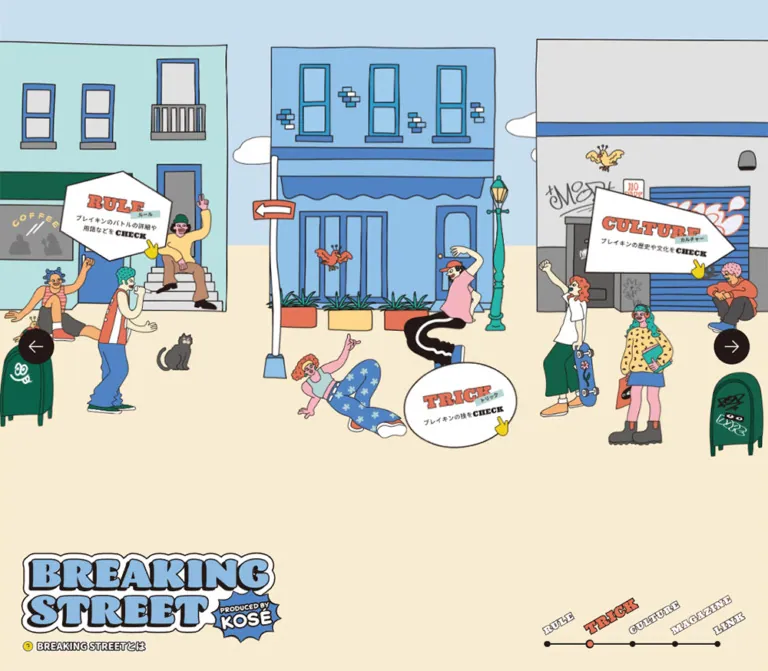
手描き風の街並みと太い縁取りのロゴが特徴のブレイキン情報サイト。ブルーとクリームを基調に、紙がめくれるような導入ビジュアルとイラスト付きのカテゴリーリンクで世界観を構成しています。
オリジナルサイトを見るA pastel breaking-culture neighborhood introduced by an illustrated welcome poster that appears to curl like paper.
Website: breakingstreet.kose.co.jp Original URL: https://breakingstreet.kose.co.jp/ Final URL: https://breakingstreet.kose.co.jp/ Theme: light, with pastel illustration, warm cream surfaces, and dark brown outlines. Inspected: supplied browser evidence retrieved September 16, 2026 at 19:57:13.529 UTC — September 17, 2026 at 04:57:13.529 JST. Viewports: desktop 1440 × 1000 CSS pixels; mobile 390 × 844 CSS pixels. Scope: the current homepage introduction overlay, visible portions of its softened background, and rendered DOM/computed-style evidence for the underlying brand header, category links, news, sharing, and related links. Destination pages and the unobscured homepage were not inspected.
BREAKING STREET presents breaking as a culture to explore through different destinations: LAB, RULE, TRICK, CULTURE, and MAGAZINE. Its homepage uses a spatial street composition, with links distributed beyond the viewport. The directly visible introduction establishes the visual identity: chunky outlined lettering, blue and yellow paper-like fields, centered Japanese copy, small birds, and dancers in expressive poses.
The desktop captures show a strongly curved and distorted poster above a blurred street background. The mobile captures show a much flatter, slightly tilted version whose text is readable. These are observed rendering states; the supplied evidence does not establish the intended desktop endpoint or the motion connecting them. The practical design reference is therefore strongest for the welcome poster, palette, lettering, utility controls, and measured responsive positioning.
A pastel breaking-culture neighborhood introduced by an illustrated welcome poster that appears to curl like paper.
Website: breakingstreet.kose.co.jp Original URL: https://breakingstreet.kose.co.jp/ Final URL: https://breakingstreet.kose.co.jp/ Theme: light, with pastel illustration, warm cream surfaces, and dark brown outlines. Inspected: supplied browser evidence retrieved September 16, 2026 at 19:57:13.529 UTC — September 17, 2026 at 04:57:13.529 JST. Viewports: desktop 1440 × 1000 CSS pixels; mobile 390 × 844 CSS pixels. Scope: the current homepage introduction overlay, visible portions of its softened background, and rendered DOM/computed-style evidence for the underlying brand header, category links, news, sharing, and related links. Destination pages and the unobscured homepage were not inspected.
BREAKING STREET presents breaking as a culture to explore through different destinations: LAB, RULE, TRICK, CULTURE, and MAGAZINE. Its homepage uses a spatial street composition, with links distributed beyond the viewport. The directly visible introduction establishes the visual identity: chunky outlined lettering, blue and yellow paper-like fields, centered Japanese copy, small birds, and dancers in expressive poses.
The desktop captures show a strongly curved and distorted poster above a blurred street background. The mobile captures show a much flatter, slightly tilted version whose text is readable. These are observed rendering states; the supplied evidence does not establish the intended desktop endpoint or the motion connecting them. The practical design reference is therefore strongest for the welcome poster, palette, lettering, utility controls, and measured responsive positioning.
--num-topNews: 2; no original palette or spacing token system was exposed.| Name | Value | Suggested token | Evidence and role |
|---|---|---|---|
| Sky Blue | #c9deef |
--bs-sky |
Measured: body background at both viewports. It is an underlying page color, not the final color of every visible surface. |
| Outline Ink | #231815 |
--bs-ink |
Measured: body text and multiple inline SVG fills. Visually consistent with the dark close control and illustration outlines. |
| White | #ffffff |
--bs-white |
Measured: close-caption color, close-icon stroke, and SVG fills. Used for reversed controls and outlined lettering. |
| Sign Coral | #e57357 |
--bs-coral |
Measured: category-link SVG fills. Keep its role tied to illustrated sign details. |
| Sign Mint | #b6d5d5 |
--bs-mint |
Measured: category-link SVG fills. A supporting color within the navigation artwork. |
| Poster Blue | approximately #7ea8dc |
--bs-poster-blue |
Visual estimate: dominant lower poster field and portions of the folded desktop artwork. |
| Poster Light Blue | approximately #9ebbdc |
--bs-poster-light |
Visual estimate: lighter blue areas in the welcome composition. |
| Butter Yellow | approximately #f1d694 |
--bs-yellow |
Visual estimate: upper poster field and small illustration accents. |
| Poster Cream | approximately #f8edcf |
--bs-cream |
Visual estimate: pale warm region behind the upper introduction copy. |
| Veiled Paper | approximately #fcf9f2 |
--bs-paper |
Visual estimate: large, nearly white warm field visible around and below the introduction. It may be a composited result. |
| Service Green | #00b900 |
--bs-line-green |
Measured: fill in the LINE sharing SVG. This is service branding, not a general action color. |
The identity depends on blue, cream, yellow, and dark outlines working together. Warm and cool colors occupy broad, flat regions. White provides separation around lettering and within the close control. Coral and mint belong to smaller illustrated details.
The pale appearance of the captured street is affected by the introduction overlay. Do not extract a washed-out background palette from that state and assume it represents the unobscured illustration. The measured body color and SVG fills are stronger evidence for their specific roles.
No alternate color theme, dark mode, or theme switch was verified.
The body reports 'Noto Sans JP', sans-serif, with a default weight of 500. Category anchors report weight 400; small paragraph nodes within them report weight 500. News copy uses weight 900.
This supports a Japanese sans-serif interface with strong news emphasis. It does not establish the font used inside every illustration. The introduction's Japanese text is visible in the screenshots but absent from the supplied extracted text, so its rendering method and exact font cannot be confirmed.
CLOSE and SHARE report Ultra, serif, weight 400. Ultra supplies the heavy display character without requiring a bold weight. Use this measured family for utility lettering when available; do not infer that the illustrated logo uses the same font.
The close caption uses 0.07em tracking and a 1.1 line-height ratio. SHARE uses 0.05em tracking.
The HTML element reports zen-old-mincho, sans-serif. The body overrides it with Noto Sans JP. This root declaration is not evidence that the visible page is predominantly set in a Mincho face.
Computed family strings also do not independently prove successful font-file loading. No font-file URLs or loading records were supplied.
The welcome wordmark uses irregular, inflated blue letters, dark contours, and broad white outlines. The small PRODUCED BY KOSÉ badge is integrated into the artwork. The bottom welcome message uses white lettering with a dark outline.
Preserve this lettering as authorized artwork where possible. A plain text heading with a heavy font does not capture the individual letter shapes and contours.
| Role | Desktop | Mobile | Weight / rhythm | Evidence |
|---|---|---|---|---|
| Root and inherited body size | 11.25px |
10.4px |
Body weight 500; normal line height |
Measured |
| Paragraph nodes within category links | 11.25px |
10.4px |
500; line height 16.875px / 15.6px; tracking 0.05em |
Measured; extracted paragraph text is empty |
| CLOSE | 11.25px |
7.385px |
Ultra 400; line height 12.375px / 8.1235px; tracking 0.07em |
Measured |
| SHARE | 18px |
16.64px |
Ultra 400; normal line height; tracking 0.05em |
Measured; offscreen in both snapshots |
| News message | 14px |
11.44px |
Noto Sans JP 900; tracking 0.05em |
Measured |
| Introduction paragraphs | Not reliably measurable through distortion | Approximately 15–17px |
Visually heavy, centered; approximately 25–28px between lines |
Visual estimate; font and weight unverified |
| Outlined welcome message | Distorted | Approximately 24–28px letter height |
Two prominent lines near the poster bottom | Visual estimate; artwork lettering |
News line-height exception: desktop news reports 21px; mobile reports 3.432px, despite a paragraph rectangle about 21.42px high and extracted line breaks. Preserve this as an observation, not as a reusable body-text specification. The supplied nodes do not explain the complete mobile line layout. A new implementation should use a readable line height such as 1.5.
The two observed root sizes do not reveal the source scaling formula or breakpoint. Keep a conventional root size in a new implementation unless the original scaling rules become available.
There is no verified global spacing scale. The interface combines a large illustrated composition with small utility text and generous desktop surroundings.
| Element | Desktop 1440 × 1000 | Mobile 390 × 844 | Interpretation |
|---|---|---|---|
| Body and document height | 1000px |
844px |
Both captured documents match the viewport height. |
| MAIN rectangle | 1440 × 0px |
390 × 0px |
Consistent with descendants outside normal flow; exact positioning rules were not supplied. |
| Brand HEADER | x 35, y 780.125; 489.344 × 187.875px |
x 13.516, y 15.594; 202.359 × 84px |
Strong responsive relocation from lower left to upper left in the measured layout. |
| CLOSE caption | x 962.393, y 118.969; 47.875 × 12.375px |
x 352.591, y 80.005; 31.406 × 8.125px |
Caption bounds, not the full hit target. |
| News anchor wrapper | x 380, y -42.75; 680 × 144px |
x 218.422, y -58.234; 151.828 × 164.172px |
Wrapper extends above the viewport; these are not recommended static banner dimensions. |
The desktop header's bottom clearance is approximately 32px, calculated from its measured rectangle. The mobile header begins approximately 13.5px from the left and 15.6px from the top. Both are behind the introduction in the supplied captures.
| Feature | Estimate | Practical meaning |
|---|---|---|
| Desktop poster envelope | Approximately x 457–1058, y 106–802 |
Roughly 600 × 700px of visible deformed artwork; not the dimensions of the original flat asset. |
| Mobile poster envelope | Approximately y 70–774, reaching or exceeding both side edges |
Almost full-width composition with edge cropping. |
| Mobile poster tilt | Approximately -3deg |
Top and bottom edges rise gently toward the right. |
| Desktop close circle | Approximately 76px diameter |
Large dark circular utility control. |
| Mobile close circle | Approximately 52px diameter |
Upper-right control, with slight clipping at the viewport edge. |
| Poster corners | Visually close to square | No prominent rounded-card treatment. |
| Background blur | Clearly visible; radius unknown | Separates the introduction from the illustrated environment. |
For an adaptation, use 4, 8, 12, 16, 24, and 32px as an implementation scale. These are recommendations, not recovered source tokens. Use the larger steps for poster clearances and the smaller steps for icon-caption spacing.
Keep the close circle optically attached to the poster's upper-right area. On narrow screens, provide enough clearance to retain its entire hit target even if the original capture shows clipping.
Role: introduce breaking and the site's cultural scope before exploration.
The visible layer stack is:
The poster carries almost all foreground content. There is no visible conventional modal title bar, footer button row, or general card-shadow system. Separation comes from background softening and the contrast between the sharp poster and its surroundings.
The desktop version occupies the central area with broad margins. Its surface bends dramatically, compressing and rotating both text and illustration. The mobile version is much flatter and readable. Repeated desktop captures retain the distorted state; this cannot be assumed to be a successfully completed entrance animation.
For a new implementation, keep content usable if the deformation effect is unavailable or fails to settle. A flat poster is a suitable fallback.
Role: combine the explanation, identity, and emotional tone in one composition.
The readable mobile anatomy is particularly useful:
ようこそ、ブレイキンストリートへ。.The copy moves through a definition of breaking, its relationship to music and fashion, the site's gathering-place idea, an invitation to explore, and an inclusive welcome for newcomers and experienced dancers. These text groups are part of the poster's visual rhythm.
Maintain the relationship between text and figures. The dancers frame the final invitation; they are not interchangeable stock decorations. Avoid cropping them into separate generic cards.
The welcome text's absence from the supplied text extraction does not prove that it lacks accessible alternatives. Its accessibility representation was not inspected. For a new implementation, provide equivalent selectable or assistive text.
Role: provide an unmistakable exit from the introduction.
The control combines a dark circle, a thin white X above, and a small white CLOSE caption below. The source SVG fragment declares a white stroke at 2px; the final rendered stroke can be affected by scaling.
The caption is a measured paragraph node. The enclosing control's semantic element, keyboard handling, and hit-target bounds were not supplied. No close action was exercised in the evidence.
Recommended anatomy: a native button, centered icon and caption, a complete circular hit area, an accessible name, and a visible focus outline. Preserve approximately 76px and 52px circle sizes as desktop/mobile starting points. Increase the mobile caption above the observed 7.385px if it needs to function as readable text.
Role: organize the site's content as destinations in an illustrated environment.
The original desktop background visibly contains pale blue building forms and a large white looping shape at the left, softened by the overlay. Fine illustration details and the full composition cannot be evaluated reliably through this state.
The DOM provides stronger evidence for the spatial arrangement: several category links are far outside the viewport. On mobile, the category links have similar vertical positions and are distributed horizontally. This supports a wide stage containing multiple destinations.
The mechanism for traversing the stage was not verified. There is no supplied result demonstrating drag, swipe, wheel navigation, arrow activation, wrapping, or snapping.
For an adaptation, keep scene artwork and its interactive hotspots in the same coordinate system. Changing the scale of one without the other can detach the clickable region from its illustrated sign.
Role: navigate to the site's editorial categories.
The five destinations are directly present as anchors. Several contain inline SVG styling with ink, white, coral, and mint fills. Their visual identities are therefore partly artwork-based.
| Destination | Observed URL path | Desktop rectangle: x, y; width × height | Mobile rectangle: x, y; width × height |
|---|---|---|---|
| LAB | /lab/ |
177.0, 533.4; 242.7 × 155.0px |
-307.6, 470.0; 224.3 × 143.5px |
| RULE | /rule/ |
621.3, 190.2; 213.5 × 175.4px |
97.9, 470.3; 197.4 × 162.4px |
| TRICK | /trick/ |
1265.9, 549.3; 213.5 × 165.5px |
485.9, 471.6; 197.3 × 153.2px |
| CULTURE | /culture/ |
1605.6, 219.9; 286.6 × 168.0px |
847.8, 471.8; 265.0 × 155.6px |
| MAGAZINE | /magazine/ |
-893.7, 527.2; 268.7 × 177.2px |
1247.1, 465.8; 248.4 × 164.0px |
These are transformed bounding rectangles, not source width declarations or a complete map. Negative coordinates and coordinates beyond the viewport are intentional evidence of the captured arrangement; they do not establish how the user reaches those destinations.
On mobile, RULE lies within the viewport while the other category anchors are outside it. Category artwork retains substantial size: RULE is approximately 197px wide on a 390px screen. The layout does not simply shrink every destination to fit simultaneously.
SVG style strings appearing in extracted link text are not meaningful user-facing labels. Inspect actual accessible names before concluding that those anchors are correctly named.
Role: persistent site identity in the underlying street interface.
The measured HEADER contains SVG-related markup. Its desktop box sits near the lower-left corner; its mobile box moves to the upper-left corner and becomes substantially smaller.
Its measured transition is:
opacity 0.8s cubic-bezier(0.455, 0.03, 0.515, 0.955)
The transition declaration is verified. Its trigger, start opacity, and final visible state were not supplied. Because the introduction masks the underlying interface, the measured box should not be treated as an unobscured screenshot of the header.
Role: announce updates to editorial sections.
The DOM includes the date 2025.09 and messages such as LABページを更新しました and MAGAZINEページを更新しました. The first message appears again in the extracted sequence. The custom property --num-topNews: 2 is consistent with two distinct news items, but no ticker timing or animation was verified.
Desktop news text is 14px, weight 900, with 21px line height. Mobile text is smaller and its extraction includes a line break before 更新しました.
The enclosing anchor's destination differs between snapshots: /magazine/ on desktop and /lab/ on mobile. Treat these as captured states. An implementation should keep the currently presented message and its destination synchronized.
The wrapper extends above the viewport at both sizes. Its negative y-coordinate and repeated content should not be copied into an ordinary static notice without understanding the missing layout or animation rules.
Role: distribute the site and connect to related resources.
The DOM exposes Facebook, LINE, and X sharing URLs and an Ultra SHARE label. These elements are outside the viewport in both measured snapshots. Their presence is verified; their revealed appearance and interaction are not.
Three additional external destinations appear in the DOM: sports.kose.co.jp, a team page under home.dleague.co.jp, and breaking.jdsf.jp. They are also outside the viewport. Do not invent a visible footer or sidebar layout from these links alone.
| Feature | Evidence | Supported conclusion | Unverified details |
|---|---|---|---|
| Brand visibility transition | Computed opacity 0.8s cubic-bezier(0.455, 0.03, 0.515, 0.955) |
An 800ms opacity transition is declared for HEADER. | Trigger, endpoints, and whether it ran during capture. |
| Desktop paper deformation | Strongly curled poster in all supplied desktop images | The captured poster has nonplanar-looking visual distortion. | Renderer, duration, easing, intended final shape, and whether it is currently moving. |
| Mobile poster tilt | Slight rotation and readable flat composition | The observed mobile state is nearly flat and tilted. | Whether this is a responsive effect change or a different animation phase. |
| Background softening | Blurred, pale street behind the introduction | The foreground is separated by visual softening. | CSS filter, blur radius, opacity, and transition. |
| Wide street arrangement | Category anchors extend beyond both viewport edges | A spatial arrangement exceeds the visible width. | Navigation gestures, controls, looping, and snapping. |
| News repetition | Two distinct notices and a repeated first entry | Multiple update states exist in the DOM. | Autoplay, interval, transition direction, and pause behavior. |
| Close affordance | Visible X and CLOSE caption | The interface presents a dismissal control. | Actual dismissal result, focus restoration, and persistence between visits. |
Most sampled elements report animation: none. This applies only to those sampled elements and does not rule out animation on descendants, pseudo-elements, SVG content, or JavaScript-rendered graphics. Similarly, a serialized transition value of all does not establish a nonzero animation duration.
These are implementation recommendations. No entrance duration, hover animation, or navigation gesture is established by the supplied evidence.
| Layer | Appearance | Evidence and purpose |
|---|---|---|
| Underlying body | Sky blue #c9deef |
Measured background beneath the composition. |
| Street illustration | Pastel building forms and outlined artwork | Partially visible through the introduction; unobscured details are outside scope. |
| Introduction veil | Pale warm surface with substantial blur | Visually observed; compositing values unknown. |
| Poster | Flat-color blue, cream, and yellow artwork | Clearly visible on mobile; dramatically deformed on desktop. |
| Close control | Dark circular fill with white icon and lettering | Visually observed; caption color measured. |
| Destination artwork | Ink, white, coral, and mint SVG fills | Source fills measured; full sign appearance obscured. |
There is no verified general-purpose elevation system. The inspected identity relies on illustration, outlines, flat color, and a strong foreground/background separation.
The introduction uses friendly hand-drawn character illustration with thin, irregular dark outlines and broad pastel fills. Clothing gives the dancers their character: oversized trousers, star patterns, a pink top, yellow pants, and a dark shirt. Their poses communicate movement even in a still image.
Small birds provide visual punctuation between text groups. The blue and yellow regions act as compositional fields rather than realistic lighting. The logo's broad white edging helps it remain distinct from those fields.
Preserve the artwork's aspect ratio, expressive anatomy, and uneven line quality. The supplied current captures do not support a pixel-art treatment, photographic hero, glossy 3D material, or a texture-heavy print aesthetic.
No artwork file paths, image src URLs, or font-file URLs were provided. Do not invent an asset directory from the visible appearance.
| Asset or graphic | Available reference | Implementation implication |
|---|---|---|
| Welcome composition | Original mobile and desktop captures | Rendering method and source dimensions are unknown; obtain authorized artwork for close reproduction. |
| Wordmark and small brand badge | Clearly visible in the mobile introduction | Preserve custom lettering and outline relationships. |
| Dancers and birds | Clearly visible in the mobile introduction | Keep their placement connected to the welcome text. |
| Underlying brand graphic | SVG-related markup within HEADER | An SVG-based graphic is evidenced, but no standalone file URL was supplied. |
| Category graphics | Inline SVG styles inside category anchors | Known fills can seed tokens; source contours require the actual artwork. |
| Close icon | Inline SVG fragment with white 2px stroke |
A simple X can be implemented without guessing an icon library. |
| Sharing graphics | Inline SVG fragments within sharing anchors | Service destinations and some colors are known; visible presentation was not inspected. |
CSS can reproduce layout, basic color relationships, blur, and circular controls. It cannot reconstruct the exact character illustrations or the desktop paper deformation from the supplied measurements alone.
The captured composition is dominated by a curled welcome poster around the center of the viewport. Its visible envelope is approximately 600 × 700px, leaving broad pale margins and substantial space below. The CLOSE circle sits above its upper-right region.
The underlying HEADER is measured near the lower-left corner. Category anchors occupy varied vertical positions and extend beyond both sides of the viewport. The news wrapper spans 680px near the upper center, with part of its measured rectangle above the screen.
The document height equals the viewport height. This captured state does not demonstrate a vertically scrolling sequence of homepage sections.
The introduction becomes a readable, nearly full-width poster. Its slight tilt causes edge cropping; the lower artwork ends near y 774, leaving roughly 70px of pale space below. The close control remains near the upper-right corner and is partly clipped at the right edge.
Behind it, the measured brand header moves to the upper-left corner. The news wrapper occupies a narrow upper-right area. Category links sit at approximately y 466–472, spread horizontally across a much wider coordinate space.
RULE is about 92.4% of its desktop bounding-box width, even though the viewport is only about 27.1% as wide. These calculated ratios show that the scene preserves large destination graphics instead of proportionally reducing the entire desktop view to phone width. They do not reveal the source responsive formula.
The source breakpoint, intermediate-width layouts, landscape behavior, safe-area rules, browser zoom behavior, and stage traversal method were not supplied. Neither screenshot size establishes whether opening the introduction is a one-time event or a repeatable interaction.
For an adaptation, validate readable text and complete close-button access at narrow widths and short heights. Provide internal scrolling for the introduction when necessary. A recommended flat fallback should retain all text and illustrations without requiring the paper effect to finish.
These are recommendations for a new implementation, not verified features of the original:
44 × 44px; preserve the larger illustrated circle where possible.#c9deef.#231815.#ffffff.#e57357 and #b6d5d5.#7ea8dc, light blue #9ebbdc, cream #f8edcf, and yellow #f1d694.#fcf9f2; actual opacity and blur are unknown.“Create an illustrated breaking-culture content hub inspired by the supplied BREAKING STREET reference. Use a pastel street environment with artwork-based destinations for LAB, RULE, TRICK, CULTURE, and MAGAZINE. Introduce the experience with a nearly square-cornered portrait poster using blue, cream, and yellow fields, chunky outlined lettering, centered Japanese copy, small birds, and expressive dancers near the bottom corners. Place a dark brown circular CLOSE control near its upper-right corner, with a white X above a small Ultra caption. Soften the street behind the introduction. Use Noto Sans JP for ordinary Japanese interface text. Preserve large scene destinations on mobile and provide accessible ways to reach offscreen content. Treat paper deformation as an optional enhancement with a flat readable fallback; no specific animation timing or gesture is established by the reference.”
This is a recommended implementation scaffold, not recovered site CSS. It keeps a conventional root font size, uses the measured color and font declarations where available, and labels visual approximations. The 640px breakpoint, native horizontal overflow, backdrop settings, and dialog sizing are adaptation choices.
Apply .intro-dialog to a native dialog opened with showModal(). Place the close button in a method='dialog' form. Put the authorized poster artwork in .intro-art inside .intro-poster; alternatively, use semantic content styled with .intro-copy. Asset loading, navigation coordinates, and any paper deformation require separate implementation.
:root {
  /* Measured colors */
  --bs-sky: #c9deef;
  --bs-ink: #231815;
  --bs-white: #ffffff;
  --bs-coral: #e57357;
  --bs-mint: #b6d5d5;
  --bs-line-green: #00b900;

  /* Visual approximations, not sampled source colors */
  --bs-poster-blue: #7ea8dc;
  --bs-poster-light: #9ebbdc;
  --bs-yellow: #f1d694;
  --bs-cream: #f8edcf;
  --bs-paper: #fcf9f2;

  /* Observed family declarations; font files are not loaded here */
  --bs-font-body: 'Noto Sans JP', sans-serif;
  --bs-font-display: Ultra, serif;
  --bs-weight-body: 500;
  --bs-weight-news: 900;

  /* Recommended spacing aliases */
  --bs-space-1: 4px;
  --bs-space-2: 8px;
  --bs-space-3: 12px;
  --bs-space-4: 16px;
  --bs-space-6: 24px;
  --bs-space-8: 32px;

  /* Recommended stable geometry */
  --bs-poster-width: 580px;
  --bs-close-size: 76px;
  --bs-poster-tilt: -3deg;
  --bs-radius-poster: 2px;

  /* Example authoring width; replace with the actual scene width */
  --bs-scene-width: 2400px;

  /* Measured HEADER transition */
  --bs-header-transition:
    opacity 800ms cubic-bezier(0.455, 0.03, 0.515, 0.955);
}

* {
  box-sizing: border-box;
}

body {
  margin: 0;
  color: var(--bs-ink);
  background: var(--bs-sky);
  font-family: var(--bs-font-body);
  font-weight: var(--bs-weight-body);
}

.breaking-shell {
  position: relative;
  height: 100vh;
  height: 100dvh;
  overflow: hidden;
  background: var(--bs-sky);
}

/* Recommended native-scroll fallback, not verified source behavior */
.street-viewport {
  position: absolute;
  inset: 0;
  overflow-x: auto;
  overflow-y: hidden;
  overscroll-behavior-inline: contain;
}

.street-world {
  position: relative;
  width: var(--bs-scene-width);
  min-width: 100%;
  height: 100%;
}

/* Set coordinates against the actual artwork, not screenshot bounds */
.street-hotspot {
  position: absolute;
  left: var(--hotspot-x, 0%);
  top: var(--hotspot-y, 0%);
  width: var(--hotspot-width, 214px);
  display: block;
  color: var(--bs-ink);
  text-decoration: none;
}

.street-hotspot > img,
.street-hotspot > svg {
  display: block;
  width: 100%;
  height: auto;
}

/* Source-informed placement; intermediate behavior is recommended */
.brand-header {
  position: absolute;
  z-index: 2;
  left: 35px;
  bottom: 32px;
  width: min(489.344px, 34vw);
  transition: var(--bs-header-transition);
}

.brand-header img,
.brand-header svg {
  display: block;
  width: 100%;
  height: auto;
}

/* Positive inset is an adaptation, not the measured ticker offset */
.top-news {
  position: absolute;
  z-index: 2;
  top: 16px;
  left: 50%;
  width: min(680px, calc(100% - 48px));
  transform: translateX(-50%);
  text-align: center;
}

.news-message {
  margin: 0;
  font-size: 14px;
  font-weight: var(--bs-weight-news);
  line-height: 1.5;
  letter-spacing: 0.05em;
}

.share-label {
  font-family: var(--bs-font-display);
  font-size: 18px;
  font-weight: 400;
  letter-spacing: 0.05em;
}

.intro-dialog {
  width: min(
    calc(100vw - 32px),
    calc(var(--bs-poster-width) + 48px)
  );
  max-width: none;
  max-height: calc(100vh - 32px);
  max-height: calc(100dvh - 32px);
  margin: auto;
  padding: 0;
  overflow: visible;
  border: 0;
  color: var(--bs-ink);
  background: transparent;
}

/* Blur and opacity are recommended approximations */
.intro-dialog::backdrop {
  background: rgb(252 249 242 / 78%);
  backdrop-filter: blur(8px);
  -webkit-backdrop-filter: blur(8px);
}

.intro-scroll {
  max-height: calc(100vh - 32px);
  max-height: calc(100dvh - 32px);
  overflow: auto;
  overscroll-behavior: contain;
  padding: 28px 12px 18px;
}

.intro-poster {
  position: relative;
  width: 100%;
  border-radius: var(--bs-radius-poster);
  background: var(--bs-poster-blue);
  transform: rotate(var(--bs-poster-tilt));
  transform-origin: center;
}

/* Authorized composite artwork retains its intrinsic proportions */
.intro-art {
  display: block;
  width: 100%;
  height: auto;
  border-radius: inherit;
}

/* Optional semantic-copy treatment, not verified poster typography */
.intro-copy {
  padding: var(--bs-space-6);
  text-align: center;
  font-size: clamp(16px, 1.4vw, 21px);
  font-weight: 900;
  line-height: 1.7;
}

.intro-copy p {
  margin: 0;
}

.intro-copy p + p {
  margin-top: var(--bs-space-4);
}

.intro-close {
  position: absolute;
  z-index: 3;
  top: 0;
  right: 0;
  display: flex;
  flex-direction: column;
  align-items: center;
  justify-content: center;
  gap: 6px;
  width: var(--bs-close-size);
  height: var(--bs-close-size);
  padding: 0;
  border: 0;
  border-radius: 50%;
  color: var(--bs-white);
  background: var(--bs-ink);
  cursor: pointer;
}

.intro-close svg {
  width: 24px;
  height: 24px;
  fill: none;
  stroke: currentColor;
  stroke-width: 2;
}

.intro-close-label {
  margin: 0;
  font-family: var(--bs-font-display);
  /* Readability improvement over the observed tiny mobile caption */
  font-size: 12px;
  font-weight: 400;
  line-height: 1.1;
  letter-spacing: 0.07em;
}

.breaking-shell :focus-visible,
.intro-dialog :focus-visible {
  outline: 3px solid var(--bs-ink);
  outline-offset: 4px;
  box-shadow: 0 0 0 2px var(--bs-white);
}

/* Recommended breakpoint; the source breakpoint was not supplied */
@media (max-width: 640px) {
  :root {
    --bs-close-size: 52px;
  }

  .brand-header {
    top: 15.6px;
    right: auto;
    bottom: auto;
    left: 13.5px;
    width: min(202.36px, 52vw);
  }

  .top-news {
    top: 16px;
    right: 20px;
    left: auto;
    width: min(151.83px, 40vw);
    transform: none;
  }

  .news-message {
    font-size: 12px;
    line-height: 1.5;
  }

  .share-label {
    font-size: 16.64px;
  }

  .intro-close {
    gap: 3px;
  }

  .intro-close svg {
    width: 18px;
    height: 18px;
  }

  .intro-copy {
    padding: 20px 16px;
  }
}

@media (prefers-reduced-motion: reduce) {
  .brand-header {
    transition: none;
  }

  .intro-poster {
    transform: none;
  }
}
This scaffold deliberately provides a stable poster and reachable close control. It does not reproduce the desktop curl, automatically cycle news, or implement a scene-navigation engine. Those behaviors require separate decisions and validation. Any JavaScript animation must also respect reduced motion.
Optional aliases for projects already using Tailwind v4. This is not evidence that the original website uses Tailwind. Define the custom properties above first.
@theme inline {
  --color-street-sky: var(--bs-sky);
  --color-street-ink: var(--bs-ink);
  --color-street-paper: var(--bs-paper);
  --color-street-blue: var(--bs-poster-blue);
  --color-street-cream: var(--bs-cream);
  --color-street-yellow: var(--bs-yellow);
  --color-street-coral: var(--bs-coral);
  --color-street-mint: var(--bs-mint);

  --font-street-body: var(--bs-font-body);
  --font-street-display: var(--bs-font-display);

  --spacing-street-inset: var(--bs-space-6);
  --spacing-street-close: var(--bs-close-size);
  --radius-street-poster: var(--bs-radius-poster);
}
200.19:57:13.529 UTC, equivalent to September 17, 2026 at 04:57:13.529 JST. This is the supplied retrieval timestamp; individual screenshot timestamps were not provided.1440 × 1000 and two mobile images at 390 × 844. They show the introduction overlay. No unobscured current homepage capture was supplied.--num-topNews: 2.This reference describes the current captured introduction and the underlying homepage structure supported by its rendered evidence. All reusable CSS, additional accessibility behavior, and unresolved interaction choices are explicitly presented as adaptations.
# BREAKING STREET — Style Reference

> A pastel breaking-culture neighborhood introduced by an illustrated welcome poster that appears to curl like paper.

**Website:** [breakingstreet.kose.co.jp](https://breakingstreet.kose.co.jp/)
**Original URL:** https://breakingstreet.kose.co.jp/
**Final URL:** https://breakingstreet.kose.co.jp/
**Theme:** light, with pastel illustration, warm cream surfaces, and dark brown outlines.
**Inspected:** supplied browser evidence retrieved September 16, 2026 at 19:57:13.529 UTC — September 17, 2026 at 04:57:13.529 JST.
**Viewports:** desktop 1440 × 1000 CSS pixels; mobile 390 × 844 CSS pixels.
**Scope:** the current homepage introduction overlay, visible portions of its softened background, and rendered DOM/computed-style evidence for the underlying brand header, category links, news, sharing, and related links. Destination pages and the unobscured homepage were not inspected.

BREAKING STREET presents breaking as a culture to explore through different destinations: LAB, RULE, TRICK, CULTURE, and MAGAZINE. Its homepage uses a spatial street composition, with links distributed beyond the viewport. The directly visible introduction establishes the visual identity: chunky outlined lettering, blue and yellow paper-like fields, centered Japanese copy, small birds, and dancers in expressive poses.

The desktop captures show a strongly curved and distorted poster above a blurred street background. The mobile captures show a much flatter, slightly tilted version whose text is readable. These are observed rendering states; the supplied evidence does not establish the intended desktop endpoint or the motion connecting them. The practical design reference is therefore strongest for the welcome poster, palette, lettering, utility controls, and measured responsive positioning.
# BREAKING STREET — Style Reference

> A pastel breaking-culture neighborhood introduced by an illustrated welcome poster that appears to curl like paper.

**Website:** [breakingstreet.kose.co.jp](https://breakingstreet.kose.co.jp/)
**Original URL:** https://breakingstreet.kose.co.jp/
**Final URL:** https://breakingstreet.kose.co.jp/
**Theme:** light, with pastel illustration, warm cream surfaces, and dark brown outlines.
**Inspected:** supplied browser evidence retrieved September 16, 2026 at 19:57:13.529 UTC — September 17, 2026 at 04:57:13.529 JST.
**Viewports:** desktop 1440 × 1000 CSS pixels; mobile 390 × 844 CSS pixels.
**Scope:** the current homepage introduction overlay, visible portions of its softened background, and rendered DOM/computed-style evidence for the underlying brand header, category links, news, sharing, and related links. Destination pages and the unobscured homepage were not inspected.

BREAKING STREET presents breaking as a culture to explore through different destinations: LAB, RULE, TRICK, CULTURE, and MAGAZINE. Its homepage uses a spatial street composition, with links distributed beyond the viewport. The directly visible introduction establishes the visual identity: chunky outlined lettering, blue and yellow paper-like fields, centered Japanese copy, small birds, and dancers in expressive poses.

The desktop captures show a strongly curved and distorted poster above a blurred street background. The mobile captures show a much flatter, slightly tilted version whose text is readable. These are observed rendering states; the supplied evidence does not establish the intended desktop endpoint or the motion connecting them. The practical design reference is therefore strongest for the welcome poster, palette, lettering, utility controls, and measured responsive positioning.

## How to Read This Reference

- **Measured** values come from the supplied rendered DOM and computed styles. Bounding boxes are viewport-relative and may include transforms.
- **Visual estimates** describe the original-page screenshots. Approximate colors were judged visually; no pixel sampling was performed.
- **Recommendations** are proposed implementation choices, including the CSS scaffold, accessible behavior, and fallback navigation.
- **Named tokens** are descriptive aliases. The only supplied source custom property was `--num-topNews: 2`; no original palette or spacing token system was exposed.
- **Visibility matters:** an element can have a measured rectangle while sitting outside the viewport or behind the introduction. Its presence does not prove that it was visible or operable in the captured state.
- Three desktop captures and two mobile captures were supplied. Repeated frames do not establish an animation sequence.

## Tokens — Colors

### Default Palette

| Name | Value | Suggested token | Evidence and role |
| --- | --- | --- | --- |
| Sky Blue | `#c9deef` | `--bs-sky` | **Measured:** body background at both viewports. It is an underlying page color, not the final color of every visible surface. |
| Outline Ink | `#231815` | `--bs-ink` | **Measured:** body text and multiple inline SVG fills. Visually consistent with the dark close control and illustration outlines. |
| White | `#ffffff` | `--bs-white` | **Measured:** close-caption color, close-icon stroke, and SVG fills. Used for reversed controls and outlined lettering. |
| Sign Coral | `#e57357` | `--bs-coral` | **Measured:** category-link SVG fills. Keep its role tied to illustrated sign details. |
| Sign Mint | `#b6d5d5` | `--bs-mint` | **Measured:** category-link SVG fills. A supporting color within the navigation artwork. |
| Poster Blue | approximately `#7ea8dc` | `--bs-poster-blue` | **Visual estimate:** dominant lower poster field and portions of the folded desktop artwork. |
| Poster Light Blue | approximately `#9ebbdc` | `--bs-poster-light` | **Visual estimate:** lighter blue areas in the welcome composition. |
| Butter Yellow | approximately `#f1d694` | `--bs-yellow` | **Visual estimate:** upper poster field and small illustration accents. |
| Poster Cream | approximately `#f8edcf` | `--bs-cream` | **Visual estimate:** pale warm region behind the upper introduction copy. |
| Veiled Paper | approximately `#fcf9f2` | `--bs-paper` | **Visual estimate:** large, nearly white warm field visible around and below the introduction. It may be a composited result. |
| Service Green | `#00b900` | `--bs-line-green` | **Measured:** fill in the LINE sharing SVG. This is service branding, not a general action color. |

### Palette Use

The identity depends on blue, cream, yellow, and dark outlines working together. Warm and cool colors occupy broad, flat regions. White provides separation around lettering and within the close control. Coral and mint belong to smaller illustrated details.

The pale appearance of the captured street is affected by the introduction overlay. Do not extract a washed-out background palette from that state and assume it represents the unobscured illustration. The measured body color and SVG fills are stronger evidence for their specific roles.

No alternate color theme, dark mode, or theme switch was verified.

## Tokens — Typography

### Japanese Interface Copy

The body reports `'Noto Sans JP', sans-serif`, with a default weight of `500`. Category anchors report weight `400`; small paragraph nodes within them report weight `500`. News copy uses weight `900`.

This supports a Japanese sans-serif interface with strong news emphasis. It does not establish the font used inside every illustration. The introduction's Japanese text is visible in the screenshots but absent from the supplied extracted text, so its rendering method and exact font cannot be confirmed.

### Display Utility Labels

`CLOSE` and `SHARE` report `Ultra, serif`, weight `400`. Ultra supplies the heavy display character without requiring a bold weight. Use this measured family for utility lettering when available; do not infer that the illustrated logo uses the same font.

The close caption uses `0.07em` tracking and a `1.1` line-height ratio. SHARE uses `0.05em` tracking.

### Root Declaration

The HTML element reports `zen-old-mincho, sans-serif`. The body overrides it with Noto Sans JP. This root declaration is not evidence that the visible page is predominantly set in a Mincho face.

Computed family strings also do not independently prove successful font-file loading. No font-file URLs or loading records were supplied.

### Artwork Lettering

The welcome wordmark uses irregular, inflated blue letters, dark contours, and broad white outlines. The small `PRODUCED BY KOSÉ` badge is integrated into the artwork. The bottom welcome message uses white lettering with a dark outline.

Preserve this lettering as authorized artwork where possible. A plain text heading with a heavy font does not capture the individual letter shapes and contours.

### Type Scale

| Role | Desktop | Mobile | Weight / rhythm | Evidence |
| --- | --- | --- | --- | --- |
| Root and inherited body size | `11.25px` | `10.4px` | Body weight `500`; normal line height | Measured |
| Paragraph nodes within category links | `11.25px` | `10.4px` | `500`; line height `16.875px` / `15.6px`; tracking `0.05em` | Measured; extracted paragraph text is empty |
| CLOSE | `11.25px` | `7.385px` | Ultra `400`; line height `12.375px` / `8.1235px`; tracking `0.07em` | Measured |
| SHARE | `18px` | `16.64px` | Ultra `400`; normal line height; tracking `0.05em` | Measured; offscreen in both snapshots |
| News message | `14px` | `11.44px` | Noto Sans JP `900`; tracking `0.05em` | Measured |
| Introduction paragraphs | Not reliably measurable through distortion | Approximately `15–17px` | Visually heavy, centered; approximately `25–28px` between lines | Visual estimate; font and weight unverified |
| Outlined welcome message | Distorted | Approximately `24–28px` letter height | Two prominent lines near the poster bottom | Visual estimate; artwork lettering |

**News line-height exception:** desktop news reports `21px`; mobile reports `3.432px`, despite a paragraph rectangle about `21.42px` high and extracted line breaks. Preserve this as an observation, not as a reusable body-text specification. The supplied nodes do not explain the complete mobile line layout. A new implementation should use a readable line height such as `1.5`.

The two observed root sizes do not reveal the source scaling formula or breakpoint. Keep a conventional root size in a new implementation unless the original scaling rules become available.

## Tokens — Spacing & Shapes

There is no verified global spacing scale. The interface combines a large illustrated composition with small utility text and generous desktop surroundings.

### Measured Layout Anchors

| Element | Desktop 1440 × 1000 | Mobile 390 × 844 | Interpretation |
| --- | --- | --- | --- |
| Body and document height | `1000px` | `844px` | Both captured documents match the viewport height. |
| MAIN rectangle | `1440 × 0px` | `390 × 0px` | Consistent with descendants outside normal flow; exact positioning rules were not supplied. |
| Brand HEADER | x `35`, y `780.125`; `489.344 × 187.875px` | x `13.516`, y `15.594`; `202.359 × 84px` | Strong responsive relocation from lower left to upper left in the measured layout. |
| CLOSE caption | x `962.393`, y `118.969`; `47.875 × 12.375px` | x `352.591`, y `80.005`; `31.406 × 8.125px` | Caption bounds, not the full hit target. |
| News anchor wrapper | x `380`, y `-42.75`; `680 × 144px` | x `218.422`, y `-58.234`; `151.828 × 164.172px` | Wrapper extends above the viewport; these are not recommended static banner dimensions. |

The desktop header's bottom clearance is approximately `32px`, calculated from its measured rectangle. The mobile header begins approximately `13.5px` from the left and `15.6px` from the top. Both are behind the introduction in the supplied captures.

### Visual Geometry

| Feature | Estimate | Practical meaning |
| --- | --- | --- |
| Desktop poster envelope | Approximately x `457–1058`, y `106–802` | Roughly `600 × 700px` of visible deformed artwork; not the dimensions of the original flat asset. |
| Mobile poster envelope | Approximately y `70–774`, reaching or exceeding both side edges | Almost full-width composition with edge cropping. |
| Mobile poster tilt | Approximately `-3deg` | Top and bottom edges rise gently toward the right. |
| Desktop close circle | Approximately `76px` diameter | Large dark circular utility control. |
| Mobile close circle | Approximately `52px` diameter | Upper-right control, with slight clipping at the viewport edge. |
| Poster corners | Visually close to square | No prominent rounded-card treatment. |
| Background blur | Clearly visible; radius unknown | Separates the introduction from the illustrated environment. |

### Recommended Spacing Aliases

For an adaptation, use `4`, `8`, `12`, `16`, `24`, and `32px` as an implementation scale. These are recommendations, not recovered source tokens. Use the larger steps for poster clearances and the smaller steps for icon-caption spacing.

Keep the close circle optically attached to the poster's upper-right area. On narrow screens, provide enough clearance to retain its entire hit target even if the original capture shows clipping.

## Components

### Introduction Overlay

**Role:** introduce breaking and the site's cultural scope before exploration.

The visible layer stack is:

1. An illustrated street background.
2. Strong visual softening and a pale veil.
3. A colorful welcome poster.
4. A dark circular CLOSE control near the poster's upper-right corner.

The poster carries almost all foreground content. There is no visible conventional modal title bar, footer button row, or general card-shadow system. Separation comes from background softening and the contrast between the sharp poster and its surroundings.

The desktop version occupies the central area with broad margins. Its surface bends dramatically, compressing and rotating both text and illustration. The mobile version is much flatter and readable. Repeated desktop captures retain the distorted state; this cannot be assumed to be a successfully completed entrance animation.

For a new implementation, keep content usable if the deformation effect is unavailable or fails to settle. A flat poster is a suitable fallback.

### Welcome Poster

**Role:** combine the explanation, identity, and emotional tone in one composition.

The readable mobile anatomy is particularly useful:

- **Top wordmark:** two large lines of blue outlined lettering, with a small burst-shaped brand badge to the right.
- **Warm upper field:** yellow and pale cream regions with gently irregular boundaries.
- **Centered explanation:** several compact groups of dark Japanese text.
- **Blue lower field:** broad blue shapes carry the middle and lower content.
- **Small birds:** yellow and coral birds punctuate the text area.
- **Bottom invitation:** large white, dark-outlined lettering reading `ようこそ、ブレイキンストリートへ。`.
- **Dancers:** a pink-top figure in loose blue star-patterned trousers at lower left, and a figure in a dark top and yellow trousers at lower right.

The copy moves through a definition of breaking, its relationship to music and fashion, the site's gathering-place idea, an invitation to explore, and an inclusive welcome for newcomers and experienced dancers. These text groups are part of the poster's visual rhythm.

Maintain the relationship between text and figures. The dancers frame the final invitation; they are not interchangeable stock decorations. Avoid cropping them into separate generic cards.

The welcome text's absence from the supplied text extraction does not prove that it lacks accessible alternatives. Its accessibility representation was not inspected. For a new implementation, provide equivalent selectable or assistive text.

### Circular Close Control

**Role:** provide an unmistakable exit from the introduction.

The control combines a dark circle, a thin white X above, and a small white `CLOSE` caption below. The source SVG fragment declares a white stroke at `2px`; the final rendered stroke can be affected by scaling.

The caption is a measured paragraph node. The enclosing control's semantic element, keyboard handling, and hit-target bounds were not supplied. No close action was exercised in the evidence.

**Recommended anatomy:** a native button, centered icon and caption, a complete circular hit area, an accessible name, and a visible focus outline. Preserve approximately `76px` and `52px` circle sizes as desktop/mobile starting points. Increase the mobile caption above the observed `7.385px` if it needs to function as readable text.

### Illustrated Street Stage

**Role:** organize the site's content as destinations in an illustrated environment.

The original desktop background visibly contains pale blue building forms and a large white looping shape at the left, softened by the overlay. Fine illustration details and the full composition cannot be evaluated reliably through this state.

The DOM provides stronger evidence for the spatial arrangement: several category links are far outside the viewport. On mobile, the category links have similar vertical positions and are distributed horizontally. This supports a wide stage containing multiple destinations.

The mechanism for traversing the stage was not verified. There is no supplied result demonstrating drag, swipe, wheel navigation, arrow activation, wrapping, or snapping.

For an adaptation, keep scene artwork and its interactive hotspots in the same coordinate system. Changing the scale of one without the other can detach the clickable region from its illustrated sign.

### Category Destination Links

**Role:** navigate to the site's editorial categories.

The five destinations are directly present as anchors. Several contain inline SVG styling with ink, white, coral, and mint fills. Their visual identities are therefore partly artwork-based.

| Destination | Observed URL path | Desktop rectangle: x, y; width × height | Mobile rectangle: x, y; width × height |
| --- | --- | --- | --- |
| LAB | `/lab/` | `177.0, 533.4; 242.7 × 155.0px` | `-307.6, 470.0; 224.3 × 143.5px` |
| RULE | `/rule/` | `621.3, 190.2; 213.5 × 175.4px` | `97.9, 470.3; 197.4 × 162.4px` |
| TRICK | `/trick/` | `1265.9, 549.3; 213.5 × 165.5px` | `485.9, 471.6; 197.3 × 153.2px` |
| CULTURE | `/culture/` | `1605.6, 219.9; 286.6 × 168.0px` | `847.8, 471.8; 265.0 × 155.6px` |
| MAGAZINE | `/magazine/` | `-893.7, 527.2; 268.7 × 177.2px` | `1247.1, 465.8; 248.4 × 164.0px` |

These are transformed bounding rectangles, not source width declarations or a complete map. Negative coordinates and coordinates beyond the viewport are intentional evidence of the captured arrangement; they do not establish how the user reaches those destinations.

On mobile, RULE lies within the viewport while the other category anchors are outside it. Category artwork retains substantial size: RULE is approximately `197px` wide on a `390px` screen. The layout does not simply shrink every destination to fit simultaneously.

SVG style strings appearing in extracted link text are not meaningful user-facing labels. Inspect actual accessible names before concluding that those anchors are correctly named.

### Brand Header

**Role:** persistent site identity in the underlying street interface.

The measured HEADER contains SVG-related markup. Its desktop box sits near the lower-left corner; its mobile box moves to the upper-left corner and becomes substantially smaller.

Its measured transition is:

```css
opacity 0.8s cubic-bezier(0.455, 0.03, 0.515, 0.955)
```

The transition declaration is verified. Its trigger, start opacity, and final visible state were not supplied. Because the introduction masks the underlying interface, the measured box should not be treated as an unobscured screenshot of the header.

### News Notice

**Role:** announce updates to editorial sections.

The DOM includes the date `2025.09` and messages such as `LABページを更新しました` and `MAGAZINEページを更新しました`. The first message appears again in the extracted sequence. The custom property `--num-topNews: 2` is consistent with two distinct news items, but no ticker timing or animation was verified.

Desktop news text is `14px`, weight `900`, with `21px` line height. Mobile text is smaller and its extraction includes a line break before `更新しました`.

The enclosing anchor's destination differs between snapshots: `/magazine/` on desktop and `/lab/` on mobile. Treat these as captured states. An implementation should keep the currently presented message and its destination synchronized.

The wrapper extends above the viewport at both sizes. Its negative y-coordinate and repeated content should not be copied into an ordinary static notice without understanding the missing layout or animation rules.

### Sharing and Related Links

**Role:** distribute the site and connect to related resources.

The DOM exposes Facebook, LINE, and X sharing URLs and an Ultra `SHARE` label. These elements are outside the viewport in both measured snapshots. Their presence is verified; their revealed appearance and interaction are not.

Three additional external destinations appear in the DOM: `sports.kose.co.jp`, a team page under `home.dleague.co.jp`, and `breaking.jdsf.jp`. They are also outside the viewport. Do not invent a visible footer or sidebar layout from these links alone.

## Tokens — Motion & Interaction

| Feature | Evidence | Supported conclusion | Unverified details |
| --- | --- | --- | --- |
| Brand visibility transition | Computed `opacity 0.8s cubic-bezier(0.455, 0.03, 0.515, 0.955)` | An 800ms opacity transition is declared for HEADER. | Trigger, endpoints, and whether it ran during capture. |
| Desktop paper deformation | Strongly curled poster in all supplied desktop images | The captured poster has nonplanar-looking visual distortion. | Renderer, duration, easing, intended final shape, and whether it is currently moving. |
| Mobile poster tilt | Slight rotation and readable flat composition | The observed mobile state is nearly flat and tilted. | Whether this is a responsive effect change or a different animation phase. |
| Background softening | Blurred, pale street behind the introduction | The foreground is separated by visual softening. | CSS filter, blur radius, opacity, and transition. |
| Wide street arrangement | Category anchors extend beyond both viewport edges | A spatial arrangement exceeds the visible width. | Navigation gestures, controls, looping, and snapping. |
| News repetition | Two distinct notices and a repeated first entry | Multiple update states exist in the DOM. | Autoplay, interval, transition direction, and pause behavior. |
| Close affordance | Visible X and CLOSE caption | The interface presents a dismissal control. | Actual dismissal result, focus restoration, and persistence between visits. |

Most sampled elements report `animation: none`. This applies only to those sampled elements and does not rule out animation on descendants, pseudo-elements, SVG content, or JavaScript-rendered graphics. Similarly, a serialized transition value of `all` does not establish a nonzero animation duration.

### Recommended Motion Policy

- Use the measured 800ms easing only where reproducing the observed header transition is appropriate.
- Treat a true paper curl as a separate effect requiring authored geometry or artwork. A simple CSS rotation reproduces the mobile tilt more closely than the desktop deformation.
- Keep the close control independent of any distorted surface so its target remains stable.
- Offer a flat, readable introduction under reduced motion and as an effect-failure fallback.
- Keep news readable long enough to follow its link, and avoid announcing duplicated carousel content repeatedly.

These are implementation recommendations. No entrance duration, hover animation, or navigation gesture is established by the supplied evidence.

## Surfaces

| Layer | Appearance | Evidence and purpose |
| --- | --- | --- |
| Underlying body | Sky blue `#c9deef` | Measured background beneath the composition. |
| Street illustration | Pastel building forms and outlined artwork | Partially visible through the introduction; unobscured details are outside scope. |
| Introduction veil | Pale warm surface with substantial blur | Visually observed; compositing values unknown. |
| Poster | Flat-color blue, cream, and yellow artwork | Clearly visible on mobile; dramatically deformed on desktop. |
| Close control | Dark circular fill with white icon and lettering | Visually observed; caption color measured. |
| Destination artwork | Ink, white, coral, and mint SVG fills | Source fills measured; full sign appearance obscured. |

There is no verified general-purpose elevation system. The inspected identity relies on illustration, outlines, flat color, and a strong foreground/background separation.

## Imagery

The introduction uses friendly hand-drawn character illustration with thin, irregular dark outlines and broad pastel fills. Clothing gives the dancers their character: oversized trousers, star patterns, a pink top, yellow pants, and a dark shirt. Their poses communicate movement even in a still image.

Small birds provide visual punctuation between text groups. The blue and yellow regions act as compositional fields rather than realistic lighting. The logo's broad white edging helps it remain distinct from those fields.

Preserve the artwork's aspect ratio, expressive anatomy, and uneven line quality. The supplied current captures do not support a pixel-art treatment, photographic hero, glossy 3D material, or a texture-heavy print aesthetic.

### Observed Asset References

No artwork file paths, image `src` URLs, or font-file URLs were provided. Do not invent an asset directory from the visible appearance.

| Asset or graphic | Available reference | Implementation implication |
| --- | --- | --- |
| Welcome composition | Original mobile and desktop captures | Rendering method and source dimensions are unknown; obtain authorized artwork for close reproduction. |
| Wordmark and small brand badge | Clearly visible in the mobile introduction | Preserve custom lettering and outline relationships. |
| Dancers and birds | Clearly visible in the mobile introduction | Keep their placement connected to the welcome text. |
| Underlying brand graphic | SVG-related markup within HEADER | An SVG-based graphic is evidenced, but no standalone file URL was supplied. |
| Category graphics | Inline SVG styles inside category anchors | Known fills can seed tokens; source contours require the actual artwork. |
| Close icon | Inline SVG fragment with white `2px` stroke | A simple X can be implemented without guessing an icon library. |
| Sharing graphics | Inline SVG fragments within sharing anchors | Service destinations and some colors are known; visible presentation was not inspected. |

CSS can reproduce layout, basic color relationships, blur, and circular controls. It cannot reconstruct the exact character illustrations or the desktop paper deformation from the supplied measurements alone.

## Layout & Responsive Behavior

### Desktop: 1440 × 1000

The captured composition is dominated by a curled welcome poster around the center of the viewport. Its visible envelope is approximately `600 × 700px`, leaving broad pale margins and substantial space below. The CLOSE circle sits above its upper-right region.

The underlying HEADER is measured near the lower-left corner. Category anchors occupy varied vertical positions and extend beyond both sides of the viewport. The news wrapper spans `680px` near the upper center, with part of its measured rectangle above the screen.

The document height equals the viewport height. This captured state does not demonstrate a vertically scrolling sequence of homepage sections.

### Mobile: 390 × 844

The introduction becomes a readable, nearly full-width poster. Its slight tilt causes edge cropping; the lower artwork ends near y `774`, leaving roughly `70px` of pale space below. The close control remains near the upper-right corner and is partly clipped at the right edge.

Behind it, the measured brand header moves to the upper-left corner. The news wrapper occupies a narrow upper-right area. Category links sit at approximately y `466–472`, spread horizontally across a much wider coordinate space.

RULE is about `92.4%` of its desktop bounding-box width, even though the viewport is only about `27.1%` as wide. These calculated ratios show that the scene preserves large destination graphics instead of proportionally reducing the entire desktop view to phone width. They do not reveal the source responsive formula.

### What Remains Unknown

The source breakpoint, intermediate-width layouts, landscape behavior, safe-area rules, browser zoom behavior, and stage traversal method were not supplied. Neither screenshot size establishes whether opening the introduction is a one-time event or a repeatable interaction.

For an adaptation, validate readable text and complete close-button access at narrow widths and short heights. Provide internal scrolling for the introduction when necessary. A recommended flat fallback should retain all text and illustrations without requiring the paper effect to finish.

## Do’s and Don’ts

### Do

- Build around a pastel blue, cream, and yellow composition with dark brown outlines.
- Keep measured SVG colors distinct from visually estimated poster colors.
- Preserve the outlined wordmark as artwork when authorized assets are available.
- Use Ultra for the measured English utility-label role and Noto Sans JP for the measured interface-copy role.
- Keep the introduction's text groups, birds, and dancers in a single coherent composition.
- Maintain a sharp foreground poster against a softened street background.
- Anchor interactive hotspots to the same coordinate system as their scene artwork.
- Preserve the large relative size of mobile category graphics.
- Keep close-button geometry independent of paper deformation.
- Provide readable text and a stable fallback when motion is reduced or unavailable.

### Don’t

- Don't describe the curled desktop capture as a verified completed animation.
- Don't infer swipe, drag, arrow, or wheel behavior from offscreen element coordinates.
- Don't treat hidden category links as visible homepage screenshots.
- Don't apply the root Mincho declaration to all visible Japanese text.
- Don't rebuild the custom wordmark using Ultra alone.
- Don't use the LINE service green as a general call-to-action color.
- Don't copy the unusual mobile news line height into ordinary paragraphs.
- Don't preserve clipped controls or extremely small captions merely for visual similarity.
- Don't introduce a generic rounded-card grid, glossy shadows, or photographic hero that displaces the illustrated street concept.
- Don't invent asset filenames, font URLs, rendering libraries, or production credits.

## Recommended Implementation Additions

These are recommendations for a new implementation, not verified features of the original:

- Implement the introduction with native dialog behavior or equivalent focus management, background inertness, Escape dismissal, and focus restoration.
- Give the close control a complete hit target of at least `44 × 44px`; preserve the larger illustrated circle where possible.
- Provide equivalent accessible text for the welcome explanation and meaningful accessible names for artwork-based links.
- Verify accessible names directly. Empty extracted text and embedded SVG style strings are insufficient accessibility evidence.
- Supply keyboard and touch access to every offscreen destination, plus an ordinary text navigation alternative.
- Make focused destinations scroll into view in any native overflow-based adaptation.
- Keep each news message associated with its correct destination and suppress duplicate announcements from cloned items.
- Increase tiny utility text when necessary and allow zoom without losing the close control.
- Provide a static poster state for reduced motion; separately stop any JavaScript or canvas motion.
- Reserve artwork dimensions before loading and keep useful navigation available if graphics fail.

## Agent Prompt Guide

### Quick Color Reference

- Underlying page: measured `#c9deef`.
- Text and SVG linework: measured `#231815`.
- Reversed icon and caption: measured `#ffffff`.
- Category illustration accents: measured `#e57357` and `#b6d5d5`.
- Welcome poster: approximate blue `#7ea8dc`, light blue `#9ebbdc`, cream `#f8edcf`, and yellow `#f1d694`.
- Pale overlay appearance: approximately `#fcf9f2`; actual opacity and blur are unknown.

### Overall Prompt

“Create an illustrated breaking-culture content hub inspired by the supplied BREAKING STREET reference. Use a pastel street environment with artwork-based destinations for LAB, RULE, TRICK, CULTURE, and MAGAZINE. Introduce the experience with a nearly square-cornered portrait poster using blue, cream, and yellow fields, chunky outlined lettering, centered Japanese copy, small birds, and expressive dancers near the bottom corners. Place a dark brown circular CLOSE control near its upper-right corner, with a white X above a small Ultra caption. Soften the street behind the introduction. Use Noto Sans JP for ordinary Japanese interface text. Preserve large scene destinations on mobile and provide accessible ways to reach offscreen content. Treat paper deformation as an optional enhancement with a flat readable fallback; no specific animation timing or gesture is established by the reference.”

### Example Component Prompts

1. **Welcome poster:** “Design a slightly tilted portrait welcome composition with a blue lower field, irregular cream and butter-yellow upper regions, a large outlined wordmark, five compact centered text groups, small birds, and two dancers framing an outlined welcome message. Keep the figures integrated into the composition. Exact artwork must come from authorized assets.”
2. **Close control:** “Create a dark brown circular button approximately 76px on desktop and 52px on mobile. Stack a thin white X over an Ultra CLOSE caption. Keep the entire hit target visible and keyboard accessible. Use a readable caption size in the adaptation.”
3. **Street navigation:** “Place illustrated category links on a wide scene using a shared artwork coordinate system. Use ink, white, coral, and mint details. Preserve substantial link-art size on phones and provide a text navigation fallback. Choose and document the traversal method as a new implementation decision.”
4. **News notice:** “Create a compact update notice with a date and heavy Noto Sans JP message. Use 14px text with 1.5 line height as the desktop starting point. Allow a two-line mobile message and keep the visible message's link destination synchronized.”
5. **Reduced-motion introduction:** “Present the same welcome poster in a flat, fully readable state. Keep the circular close control stable, allow internal scrolling on short screens, and retain all introduction content without a curl animation.”

## Quick Start

### CSS Custom Properties

This is a recommended implementation scaffold, not recovered site CSS. It keeps a conventional root font size, uses the measured color and font declarations where available, and labels visual approximations. The `640px` breakpoint, native horizontal overflow, backdrop settings, and dialog sizing are adaptation choices.

Apply `.intro-dialog` to a native dialog opened with `showModal()`. Place the close button in a `method='dialog'` form. Put the authorized poster artwork in `.intro-art` inside `.intro-poster`; alternatively, use semantic content styled with `.intro-copy`. Asset loading, navigation coordinates, and any paper deformation require separate implementation.

```css
:root {
  /* Measured colors */
  --bs-sky: #c9deef;
  --bs-ink: #231815;
  --bs-white: #ffffff;
  --bs-coral: #e57357;
  --bs-mint: #b6d5d5;
  --bs-line-green: #00b900;

  /* Visual approximations, not sampled source colors */
  --bs-poster-blue: #7ea8dc;
  --bs-poster-light: #9ebbdc;
  --bs-yellow: #f1d694;
  --bs-cream: #f8edcf;
  --bs-paper: #fcf9f2;

  /* Observed family declarations; font files are not loaded here */
  --bs-font-body: 'Noto Sans JP', sans-serif;
  --bs-font-display: Ultra, serif;
  --bs-weight-body: 500;
  --bs-weight-news: 900;

  /* Recommended spacing aliases */
  --bs-space-1: 4px;
  --bs-space-2: 8px;
  --bs-space-3: 12px;
  --bs-space-4: 16px;
  --bs-space-6: 24px;
  --bs-space-8: 32px;

  /* Recommended stable geometry */
  --bs-poster-width: 580px;
  --bs-close-size: 76px;
  --bs-poster-tilt: -3deg;
  --bs-radius-poster: 2px;

  /* Example authoring width; replace with the actual scene width */
  --bs-scene-width: 2400px;

  /* Measured HEADER transition */
  --bs-header-transition:
    opacity 800ms cubic-bezier(0.455, 0.03, 0.515, 0.955);
}

* {
  box-sizing: border-box;
}

body {
  margin: 0;
  color: var(--bs-ink);
  background: var(--bs-sky);
  font-family: var(--bs-font-body);
  font-weight: var(--bs-weight-body);
}

.breaking-shell {
  position: relative;
  height: 100vh;
  height: 100dvh;
  overflow: hidden;
  background: var(--bs-sky);
}

/* Recommended native-scroll fallback, not verified source behavior */
.street-viewport {
  position: absolute;
  inset: 0;
  overflow-x: auto;
  overflow-y: hidden;
  overscroll-behavior-inline: contain;
}

.street-world {
  position: relative;
  width: var(--bs-scene-width);
  min-width: 100%;
  height: 100%;
}

/* Set coordinates against the actual artwork, not screenshot bounds */
.street-hotspot {
  position: absolute;
  left: var(--hotspot-x, 0%);
  top: var(--hotspot-y, 0%);
  width: var(--hotspot-width, 214px);
  display: block;
  color: var(--bs-ink);
  text-decoration: none;
}

.street-hotspot > img,
.street-hotspot > svg {
  display: block;
  width: 100%;
  height: auto;
}

/* Source-informed placement; intermediate behavior is recommended */
.brand-header {
  position: absolute;
  z-index: 2;
  left: 35px;
  bottom: 32px;
  width: min(489.344px, 34vw);
  transition: var(--bs-header-transition);
}

.brand-header img,
.brand-header svg {
  display: block;
  width: 100%;
  height: auto;
}

/* Positive inset is an adaptation, not the measured ticker offset */
.top-news {
  position: absolute;
  z-index: 2;
  top: 16px;
  left: 50%;
  width: min(680px, calc(100% - 48px));
  transform: translateX(-50%);
  text-align: center;
}

.news-message {
  margin: 0;
  font-size: 14px;
  font-weight: var(--bs-weight-news);
  line-height: 1.5;
  letter-spacing: 0.05em;
}

.share-label {
  font-family: var(--bs-font-display);
  font-size: 18px;
  font-weight: 400;
  letter-spacing: 0.05em;
}

.intro-dialog {
  width: min(
    calc(100vw - 32px),
    calc(var(--bs-poster-width) + 48px)
  );
  max-width: none;
  max-height: calc(100vh - 32px);
  max-height: calc(100dvh - 32px);
  margin: auto;
  padding: 0;
  overflow: visible;
  border: 0;
  color: var(--bs-ink);
  background: transparent;
}

/* Blur and opacity are recommended approximations */
.intro-dialog::backdrop {
  background: rgb(252 249 242 / 78%);
  backdrop-filter: blur(8px);
  -webkit-backdrop-filter: blur(8px);
}

.intro-scroll {
  max-height: calc(100vh - 32px);
  max-height: calc(100dvh - 32px);
  overflow: auto;
  overscroll-behavior: contain;
  padding: 28px 12px 18px;
}

.intro-poster {
  position: relative;
  width: 100%;
  border-radius: var(--bs-radius-poster);
  background: var(--bs-poster-blue);
  transform: rotate(var(--bs-poster-tilt));
  transform-origin: center;
}

/* Authorized composite artwork retains its intrinsic proportions */
.intro-art {
  display: block;
  width: 100%;
  height: auto;
  border-radius: inherit;
}

/* Optional semantic-copy treatment, not verified poster typography */
.intro-copy {
  padding: var(--bs-space-6);
  text-align: center;
  font-size: clamp(16px, 1.4vw, 21px);
  font-weight: 900;
  line-height: 1.7;
}

.intro-copy p {
  margin: 0;
}

.intro-copy p + p {
  margin-top: var(--bs-space-4);
}

.intro-close {
  position: absolute;
  z-index: 3;
  top: 0;
  right: 0;
  display: flex;
  flex-direction: column;
  align-items: center;
  justify-content: center;
  gap: 6px;
  width: var(--bs-close-size);
  height: var(--bs-close-size);
  padding: 0;
  border: 0;
  border-radius: 50%;
  color: var(--bs-white);
  background: var(--bs-ink);
  cursor: pointer;
}

.intro-close svg {
  width: 24px;
  height: 24px;
  fill: none;
  stroke: currentColor;
  stroke-width: 2;
}

.intro-close-label {
  margin: 0;
  font-family: var(--bs-font-display);
  /* Readability improvement over the observed tiny mobile caption */
  font-size: 12px;
  font-weight: 400;
  line-height: 1.1;
  letter-spacing: 0.07em;
}

.breaking-shell :focus-visible,
.intro-dialog :focus-visible {
  outline: 3px solid var(--bs-ink);
  outline-offset: 4px;
  box-shadow: 0 0 0 2px var(--bs-white);
}

/* Recommended breakpoint; the source breakpoint was not supplied */
@media (max-width: 640px) {
  :root {
    --bs-close-size: 52px;
  }

  .brand-header {
    top: 15.6px;
    right: auto;
    bottom: auto;
    left: 13.5px;
    width: min(202.36px, 52vw);
  }

  .top-news {
    top: 16px;
    right: 20px;
    left: auto;
    width: min(151.83px, 40vw);
    transform: none;
  }

  .news-message {
    font-size: 12px;
    line-height: 1.5;
  }

  .share-label {
    font-size: 16.64px;
  }

  .intro-close {
    gap: 3px;
  }

  .intro-close svg {
    width: 18px;
    height: 18px;
  }

  .intro-copy {
    padding: 20px 16px;
  }
}

@media (prefers-reduced-motion: reduce) {
  .brand-header {
    transition: none;
  }

  .intro-poster {
    transform: none;
  }
}
```

This scaffold deliberately provides a stable poster and reachable close control. It does not reproduce the desktop curl, automatically cycle news, or implement a scene-navigation engine. Those behaviors require separate decisions and validation. Any JavaScript animation must also respect reduced motion.

### Tailwind v4 Token Mapping

Optional aliases for projects already using Tailwind v4. This is not evidence that the original website uses Tailwind. Define the custom properties above first.

```css
@theme inline {
  --color-street-sky: var(--bs-sky);
  --color-street-ink: var(--bs-ink);
  --color-street-paper: var(--bs-paper);
  --color-street-blue: var(--bs-poster-blue);
  --color-street-cream: var(--bs-cream);
  --color-street-yellow: var(--bs-yellow);
  --color-street-coral: var(--bs-coral);
  --color-street-mint: var(--bs-mint);

  --font-street-body: var(--bs-font-body);
  --font-street-display: var(--bs-font-display);

  --spacing-street-inset: var(--bs-space-6);
  --spacing-street-close: var(--bs-close-size);
  --radius-street-poster: var(--bs-radius-poster);
}
```

## Sources & Evidence

- **Original and final page:** [BREAKING STREET](https://breakingstreet.kose.co.jp/). Both supplied URLs are identical; reported HTTP status is `200`.
- **Evidence timestamp:** September 16, 2026 at `19:57:13.529 UTC`, equivalent to September 17, 2026 at `04:57:13.529 JST`. This is the supplied retrieval timestamp; individual screenshot timestamps were not provided.
- **Original-page captures:** three desktop images at `1440 × 1000` and two mobile images at `390 × 844`. They show the introduction overlay. No unobscured current homepage capture was supplied.
- **Rendered DOM and computed styles:** both viewport snapshots include body colors, font-family declarations, text metrics, element rectangles, anchor destinations, SVG fill/stroke fragments, the HEADER opacity transition, and `--num-topNews: 2`.
- **Capture procedure:** the supplied browser process observed the initial page for at least five seconds and attempted load, image, layout, and finite-animation stabilization within bounded waits. Perpetual animations were paused during readiness checks and resumed. These checks do not prove that the curled poster is an intended final state.
- **Inspection limitations:** no close, navigation, sharing, hover, keyboard, or category-page interaction result was supplied. Full stylesheets, artwork paths, font files, animation code, and accessibility-tree data were unavailable. SharedWorkers and service workers were disabled during inspection.

This reference describes the current captured introduction and the underlying homepage structure supported by its rendered evidence. All reusable CSS, additional accessibility behavior, and unresolved interaction choices are explicitly presented as adaptations.スタイルやページの種類、ジャンルが近いデザインを集めました。