プレビュー準備中デザインリファレンスを見る
日本のWebデザインを、AIの制作リファレンスに。
DESIGN REFERENCE
海鳥の親子を描いた質感豊かなコラージュと、青・ミント色、波形の区切りが特徴の啓発サイト。交互配置のストーリーと、参加・購入・寄付を促す追従導線で環境問題への理解と行動をつなぐ。
オリジナルサイトを見るA textured coastal picture book that connects environmental learning with everyday action.
Website: Protect Seabirds from Plastic Pollution
Original URL: https://lp.wbsj.org/plastic-problem/
Final URL: https://lp.wbsj.org/plastic-problem/
Theme: light, with ocean blues, pale mint, pale green, white, and warm cream.
Inspected: September 17, 2026, Japan Standard Time. The supplied browser evidence was retrieved at 2026-09-16T19:55:46.781Z, equivalent to September 17 at 04:55:46.781 JST.
Viewports: desktop 1440 × 1000 CSS pixels; mobile 390 × 844 CSS pixels.
Scope: the current campaign homepage, including the opening illustration, introduction, news, topic navigation, five educational stories, resources, support options, activity feed, sharing area, footer, and persistent action controls. Visual captures cover the desktop opening, a desktop story transition, desktop footer, mobile opening, and mobile footer. Other sections have rendered DOM and computed-style evidence. Linked pages and menu-open states were not inspected.
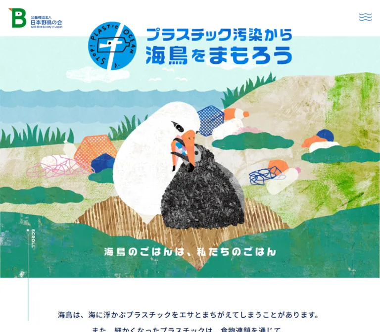
The page combines the warmth of a handmade picture book with the clarity of a public-interest information site. A white parent seabird bends toward a charcoal-colored chick in a landscape assembled from textured paper, painted grasses, layered sea bands, and discarded plastic. The bright blue campaign identity establishes the subject before the explanatory copy begins.
The longer page develops this scene into a reading sequence. Pale mint surrounds alternating illustration-and-text stories; white panels have broad curved edges; pale green introduces practical support options. Wave silhouettes, small wave ornaments, dotted rules, circular illustrations, and rounded buttons repeat the coastal theme at different scales. A blue action dock keeps three participation routes available in the scrolled captures.
The organization is identified by the original page's logo, footer copyright, and link to the Wild Bird Society of Japan website. The design should be understood as an educational campaign homepage with related resources and ongoing activity updates, rather than reduced to a single conversion screen.
A textured coastal picture book that connects environmental learning with everyday action.
Website: Protect Seabirds from Plastic Pollution
Original URL: https://lp.wbsj.org/plastic-problem/
Final URL: https://lp.wbsj.org/plastic-problem/
Theme: light, with ocean blues, pale mint, pale green, white, and warm cream.
Inspected: September 17, 2026, Japan Standard Time. The supplied browser evidence was retrieved at 2026-09-16T19:55:46.781Z, equivalent to September 17 at 04:55:46.781 JST.
Viewports: desktop 1440 × 1000 CSS pixels; mobile 390 × 844 CSS pixels.
Scope: the current campaign homepage, including the opening illustration, introduction, news, topic navigation, five educational stories, resources, support options, activity feed, sharing area, footer, and persistent action controls. Visual captures cover the desktop opening, a desktop story transition, desktop footer, mobile opening, and mobile footer. Other sections have rendered DOM and computed-style evidence. Linked pages and menu-open states were not inspected.
The page combines the warmth of a handmade picture book with the clarity of a public-interest information site. A white parent seabird bends toward a charcoal-colored chick in a landscape assembled from textured paper, painted grasses, layered sea bands, and discarded plastic. The bright blue campaign identity establishes the subject before the explanatory copy begins.
The longer page develops this scene into a reading sequence. Pale mint surrounds alternating illustration-and-text stories; white panels have broad curved edges; pale green introduces practical support options. Wave silhouettes, small wave ornaments, dotted rules, circular illustrations, and rounded buttons repeat the coastal theme at different scales. A blue action dock keeps three participation routes available in the scrolled captures.
The organization is identified by the original page's logo, footer copyright, and link to the Wild Bird Society of Japan website. The design should be understood as an educational campaign homepage with related resources and ongoing activity updates, rather than reduced to a single conversion screen.
--sea are descriptive names introduced here. Original custom-property names are shown separately where available.The document heights were approximately 11,473px on desktop and 14,569px on mobile. These are capture-time content measurements, not heights to hardcode.
| Name | Value | Evidence and suggested token | Role |
|---|---|---|---|
| Deep Navy | #071d4d |
Measured body color; source --color-text; alias --ink |
Long-form copy, utility text, and information hierarchy |
| Ocean Blue | #0f93d6 |
Source --color-primary; alias --primary |
Primary campaign UI color and a suitable basis for blue controls |
| Deeper Ocean Blue | #0d88c4 |
Source --color-secondary; alias --secondary |
Secondary blue in the interface palette |
| Heading Blue | #004092 |
Measured section H2 color; alias --heading |
Major editorial section headings |
| Sea Mint | #dbfcf8 |
Measured story-section background; alias --sea |
Continuous field behind the five educational stories |
| Pale Leaf | #edfcdb |
Measured support-section background; alias --leaf |
Participation and support area |
| Warm Cream | #fcf8ed |
Source --color-4th; alias --paper |
Corresponds visually to the warm footer surface; that surface's own computed fill was not supplied |
| Sea Green | #32917e |
Measured support-card heading color; alias --teal |
Action-option headings; visually related to the mobile hero caption |
| White | #ffffff |
Source --color-white and --color-back; measured body and dock-button fills |
Open canvas, story panels, reversed labels, and button surfaces |
| Counter Blue | #2071d0 |
Measured challenge-counter label color; alias --counter |
Participation counter label |
| Dock Sky | Approximately #7ecbed |
Visual estimate only; alias --dock |
Broad blue field of the persistent action dock |
The blue campaign lettering and logo are graphical artwork. Their exact fill values were not extracted. Do not assume that every blue visible in the artwork equals the primary CSS token.
| Source token | Value | Interpretation |
|---|---|---|
--color-3rd |
#fa9058 |
Declared orange accent; its exact application was not established by the sampled elements |
--color-5th |
#8b055b |
Declared accent; no visible role confirmed in the inspected states |
--color-error |
#8b055b |
Declared error color; no error state was exercised |
--color-black |
#000000 |
Available source constant, not the default body text color |
The illustrations introduce coral, orange, pink, grass green, beige, charcoal, and several blues. These belong mainly to the picture-book artwork. Avoid turning every illustration color into a competing interface accent.
Only the light presentation is evidenced. No theme selector or dark mode was observed. The alternating section colors organize the reading journey; they are not selectable themes.
Source stack: Noto Sans JP, 游ゴシック体, YuGothic, 游ゴシック, Yu Gothic, sans-serif.
The source declares Noto Sans JP first, followed by Japanese system fallbacks. The supplied computed styles establish the declared stack, not which font file ultimately rendered every glyph.
Use regular weight for explanations, medium weight for introductions and navigation captions, and bold weight for section headings. Long paragraphs are deliberately spacious: the main story copy uses a 32px line height on both inspected viewports.
Source stack: Montserrat, sans-serif.
Montserrat is directly evidenced on the NEWS heading. It brings a compact geometric character to the Latin label. Its use on other numbers or utility captions was not independently confirmed; do not assign it to the challenge counter solely from appearance.
The visible campaign lockup has heavy, rounded, irregular Japanese lettering and a circular bottle-and-bird emblem. Treat this as identity artwork. The actual H1 is visually hidden in a 1 × 1px box at x: -1px; its computed 16px size does not describe the large visible campaign lettering.
The story H3 containers similarly report inherited 16px / 24px typography, while the desktop capture shows larger blue display lettering within the heading area. The sample does not reveal the complete descendant or graphic construction. Preserve the heading's visual composition instead of copying the container's font size as the visible title size.
All values in this table are measured from text elements, except where explicitly qualified.
| Role | Desktop size / line height | Mobile size / line height | Weight | Desktop → mobile tracking |
|---|---|---|---|---|
| Default body | 16 / 24px |
16 / 24px |
400 | Normal |
| Opening explanation | 20 / 44px |
17 / 35px |
500 | 0.05em → 0.03em |
| Major section H2 | 36 / 50px |
23 / 40px |
700 | 0.07em → 0.05em |
| Section introduction | 18 / 35px |
16 / 31px |
500 | 0.05em → 0.03em |
| Story paragraph | 17 / 32px |
16 / 32px |
400 | 0.03em on both |
| Topic-navigation caption | 18 / 32px |
15 / 25px |
500 | 0.05em → 0.03em |
NEWS |
20 / 20px |
22 / 22px |
700 | 0.15em on both |
| News subtitle | 12 / 12px |
13 / 13px |
500 | 0.15em on both |
| News paragraph | 17 / 31px |
16 / 32px |
400 | 0.05em → 0.03em |
| Resource-tile heading | 28 / 48px |
22 / 40px |
700 | 0.10em → 0.05em |
| Resource-tile description | 18 / 33px |
17 / 33px |
500 | 0.03em on both |
| Support-option heading | 21 / 35px |
20 / 36px |
700 | 0.10em → 0.05em |
| Activity headline | 23 / 35px |
18 / 30px |
500 | 0.10em → 0.03em |
| Activity excerpt | 16 / 30px |
16 / 30px |
400 | Normal |
| Sharing invitation | 15 / 30px |
15 / 30px |
700 | 0.10em on both |
| Counter label | 13 / 17px |
11 / 17px |
500 | Normal → -0.05em |
The hero caption appears approximately 36px on desktop and 24px on mobile, with bold, widely spaced lettering. These are visual estimates; its own computed text styles were not included.
For text buttons, the sampled anchor often inherits navy 16px / 24px regular text, while the visible nested label is white or blue and heavier. The ancestor styles are not reliable measurements of the final label treatment. The Quick Start uses a recommended bold 16px button label.
Density: generous editorial spacing around compact controls.
Structural rhythm: large illustrations and curved section surfaces, with smaller repeated gaps around captions and buttons.
Root size: measured 16px; there is no evidence of a miniature or viewport-scaled root unit.
| Source property | Value | Interpretation |
|---|---|---|
--width-inner |
1200 |
Unitless source design constant; the desktop topic group spans 1200px |
--width-inner-lg |
1260 |
Wider source content constant |
--width-subInner |
900 |
Additional source content constant; do not assume every narrow block uses it |
--width-design |
1600 |
Source design reference width, not the inspected viewport |
--height-design |
900 |
Source design reference height, not proof of a viewport-height hero |
--gutter |
max(20px, 5.333%) |
General gutter formula; observed full-width section padding is about 76.78px desktop and 20.80px mobile |
--gutter-inner |
max(23px, 6.133%) |
Additional inset formula; percentage resolution depends on the containing block |
--scroll-paddingTop |
40 |
Unitless source constant; actual anchor-scroll behavior was not tested |
When adapting the unitless width constants, explicitly provide units. width: var(--width-inner) would not be a usable width if the variable contains only 1200.
| Relationship | Desktop | Mobile | Evidence |
|---|---|---|---|
| Header horizontal inset | About 30.84px |
About 20.80px |
Computed padding |
| Story title to paragraph | 25px |
14px |
Calculated from adjacent bounds |
| Story paragraph to detail button | 45px |
35px |
Calculated from adjacent bounds |
| Section H2 to introduction | 30px |
16px |
Calculated from adjacent bounds |
| Activity-row separation | 50px |
50px |
Calculated between link rectangles |
| Topic-grid horizontal gap | About 37.33px |
18px |
Calculated |
| Mobile topic-grid row gap | — | 35px |
Calculated |
| Support-option horizontal gap | About 26.66px |
— | Calculated |
| Mobile support-option separation | — | 30px |
Calculated |
| Share-control gap | 16px |
10px |
Calculated |
| Footer account-control gap | 20px |
20px |
Calculated |
The 70px vertical displacement of the middle desktop topic links and middle support option is especially distinctive. It produces a gently uneven rhythm without rotating the entire layout.
| Element | Treatment | Evidence |
|---|---|---|
| Story detail button | 25px radius on a 50px-high control |
Computed |
| Desktop dock button | 40px declared radius on a 50px-high control |
Computed; visually a pill |
| Mobile dock button | 10px radius on a 50px-high control |
Computed |
| Share and account symbols | Circular visible surfaces | Screenshot; the anchor itself reports zero radius |
| Story illustrations | Large circular or rounded compositions | Desktop screenshot |
| Story text surface | Broad asymmetric white curve connected visually to the section edge | Desktop screenshot; exact radius not supplied |
| Footer and dock boundaries | Shallow waves across the viewport | Screenshots; exact path not supplied |
Do not mistake the zero radius of a link wrapper for the shape of its image or SVG child.
| Element | Desktop | Mobile |
|---|---|---|
| Header | 1440 × 100px |
390 × 70px |
| Main top padding | 100px |
105px |
| Opening organization logo link | About 149.5 × 54.97px |
82 × 30.16px |
| Wave-menu button bounds | 36 × 21px |
36 × 21px |
| Opening explanatory paragraph | 768px wide |
About 348.41px wide |
| Topic-navigation item | 272 × 351px |
About 165.20 × 223.20px |
| Story text column | 455px |
About 302.41–308.41px |
| Story detail button | 310 × 50px |
About 302.41–308.41 × 50px |
| Resource tile | 720 × 599px |
390 × 438px |
| Support-option link | 400px wide |
About 348.41px wide |
| Activity link | 970 × 180px |
About 348.41 × 459.84px |
| Sharing link box | 64 × 64px |
About 49.73 × 49.73px |
| Footer campaign lockup | 300 × 72px |
300 × 72px |
| Footer account link | 60 × 60px |
60 × 60px |
| Footer organization logo link | About 200.20 × 29.48px |
Same measured size |
| Dock action link | About 264.34 × 50px |
About 111.33 × 50px |
Role: maintain identity and access to site navigation without competing with the illustration.
The opening header places the organization's green emblem and name at the far left, with a small blue three-wave menu symbol at the far right. Its measured height changes from 100px to 70px. The mobile main content nevertheless begins with 105px top padding, leaving additional space for the campaign lockup to overlap the opening illustration.
In the scrolled screenshots, the upper-left identity is the compact blue campaign lockup rather than the initial organization mark. Its visible width is approximately 200px on desktop and 160px on mobile. These are visual estimates. The precise scroll threshold and transition between identities were not supplied.
The closed-state DOM contains links for the homepage, organizational initiatives, learning opportunities, and the plastic-reduction challenge. Their measured positions are above the viewport. Desktop links are arranged horizontally in that offscreen state; mobile links form a vertical sequence with a calculated 51px pitch. This does not establish the appearance or mechanics of an opened menu.
The wave mark is a distinctive navigation symbol. Preserve its three flowing strokes rather than replacing it with an unrelated filled icon. For a new implementation, place the 36 × 21px graphic inside a larger accessible button target.
Role: make the environmental issue emotionally understandable before presenting detailed explanations.
The hero has three visual layers: a full-width coastal illustration, an overlapping campaign lockup near the top, and a short caption near the bottom. On desktop, the circular emblem and two-line blue wordmark form an approximately 740px-wide composition near the upper center. The illustration begins beneath the 100px header area and fills the remainder of the opening capture.
The parent bird and chick occupy the center foreground. The adult's white body and orange beak contrast with the chick's dark rubbed texture. Nets, bottles, and other discarded materials appear around them. Layered turquoise hills and a brown, striped nest area make the scene feel assembled from physical materials.
On mobile, the scene is tightly framed around the birds. Its visible illustrated field extends approximately from y: 105px to y: 635px, or about 530px high. The campaign lockup is approximately 334–338px wide and overlaps the upper edge. The side landscape is cropped; the subject remains large.
The caption 海鳥のごはんは、私たちのごはん changes placement and color. It is white over the desktop landscape, but appears as centered green text in a white area below the mobile illustration. This is a structural responsive change, not uniform scaling of the desktop hero.
A small vertical SCROLL label, dot, and fine line sit toward the left. The mobile line continues into the white caption area. Its presence is visually established; whether it is clickable or animated was not verified.
Role: connect the illustrated scene to the visitor's own life.
A centered 768px desktop text block follows the hero. Its 20px / 44px medium-weight typography gives the introduction an unusually open rhythm. At the measured desktop position, the paragraph begins around document y: 1096px.
On mobile, the paragraph uses the general 20.80px side gutters and 17px / 35px type. It begins around y: 765px, below the separate caption. Let this text wrap naturally at the mobile measure; do not retain desktop line breaks indiscriminately.
Role: show that the campaign is maintained and point readers toward recent activity.
The DOM identifies a compact NEWS label, a Japanese subtitle, a date, and two announcement paragraphs. Desktop label and body positions indicate a side-by-side arrangement. Mobile moves the label grouping above the narrower text content, with additional internal horizontal padding.
The Latin heading uses Montserrat and wide tracking. It increases from 20px to 22px on mobile, demonstrating that the responsive type system is not a universal reduction. The label text is computed white; the enclosing graphic or fill is not included in the sampled elements, so its exact background geometry should not be invented.
The observed announcement date is 2026.1.14. Treat dates and announcement text as content, not permanent decorative elements.
Role: provide shortcuts to the main reading and action areas.
The four links target #foods, #introduction, #support, and #activity. Each combines an upper visual area with a centered, usually two-line Japanese caption.
Desktop uses four 272px-wide items across a 1200px span. The two middle items begin 70px lower than the outer pair. Bounds are consistent with a square leading visual area and a 15px gap before the caption, although the image elements themselves were not sampled.
Mobile uses two equal columns of about 165.20px, an 18px horizontal gap, and a 35px row gap. The desktop displacement is removed. Bounds are consistent with a square visual area and an 8px caption gap. Keep these as lightweight illustrated navigation links, not boxed dashboard cards.
Role: establish the next part of the campaign story.
Major sections use centered blue H2 text followed by a centered introduction. Desktop headings are 36px / 50px with 0.07em tracking; mobile headings are 23px / 40px with 0.05em tracking.
The measured clusters reserve substantial space above the H2, consistent with decorative or illustrative content in the composition. Across several sections, the H2 begins 165px after the section's initial padded position on desktop and 115px after it on mobile. The sampled element list does not identify every asset occupying that space.
The heading-to-introduction gap reduces from 30px to 16px. Retain the calm centered hierarchy, while allowing longer mobile headings to occupy two lines.
Role: explain the chain from plastic waste to wildlife and human consequences, then introduce practical action.
The five topics cover wildlife effects, microplastics and chemicals, effects on people, waste sources and recycling, and everyday changes. The entire sequence sits on the measured mint background #dbfcf8.
Desktop alternates the copy column: right for stories 1, 3, and 5; left for stories 2 and 4. Each copy column is 455px wide. The associated illustration occupies the opposite side. The supplied middle capture shows a circular recycling scene at the right of one story and part of a person illustration below on the left of the next.
White text surfaces have very large curved ends rather than a consistent small card radius. Broad mint intervals remain visible between them. A pale vertical STORY label sits near the outer edge. A short blue wave ornament separates the visible title from the paragraph.
The desktop title positions have an approximately 775–777px pitch. This describes the captured composition, not a required fixed row height. Copy length varies, and mobile must grow with its content.
On mobile, text columns narrow to approximately 302–308px, while story paragraphs retain 32px leading. The sequence becomes vertical rather than alternating left and right. The measurements establish the stacked content flow; the supplied mobile screenshots do not show the interior story artwork, so its exact mobile crop is unverified.
Role: offer deeper information without interrupting the narrative.
The repeated 詳しくはこちら link is centered below each story paragraph. Desktop dimensions are 310 × 50px with a 25px radius. On mobile, it fills the narrower story text measure while retaining its 50px height.
The visible desktop button uses a blue fill, white bold label, an angled division between blue tones, and a small white circular icon holder near the right edge. The sampled anchor declares background-position 0.7s; the precise background construction and hover endpoint were not supplied.
The story links lead to corresponding sections of the organization's explanatory article. Stories 2 and 3 share the same linked anchor. Preserve real destination semantics rather than treating the buttons as decorative pills.
Role: connect the overview to organizational work and educational opportunities.
Two large linked tiles follow the educational stories. Their labels are 日本野鳥の会の取り組み and 学ぼう! 体験しよう!.
Desktop places two 720 × 599px tiles edge to edge across the viewport. Titles and descriptions appear toward the lower portion, with white text. The mobile arrangement stacks two 390 × 438px tiles with a calculated 10px gap.
The original captures supplied here do not show these tiles. Their dimensions, lower text placement, typography, and link destinations are measured, but their exact background images are not established. Do not choose stock photographs and present them as observed assets.
Role: translate understanding into participation, product choices, or donations.
The support section has the measured pale-green background #edfcdb. It introduces three numbered options, 01, 02, and 03, followed by headings, descriptions, and action labels.
Desktop uses three approximately 400px-wide linked groups. The middle option begins 70px lower. Headings use #32917e, 21px / 35px, bold weight, and wide tracking. Descriptions are 300px wide inside their larger group.
Mobile stacks the groups at about 348.41px wide with 30px gaps. The first two are approximately 612.80px tall; the shorter third is approximately 576.80px. These heights arise from content and media allocation. They should not become rigid component constraints.
Each sampled group is a single anchor wrapping its contents. If adapting this structure, avoid nesting an additional interactive button inside that anchor; the visual button can be a non-interactive child.
Role: provide ongoing evidence of the organization's work.
Three linked entries lead to the campaign's note articles. Each combines a date, title, excerpt, and a leading media region.
Desktop link geometry is 970 × 180px, centered at x: 235px. Its measured grid is 250px 680px with a 40px gap. The title and excerpt occupy a 600px text measure inside the second track. Entries are separated by 50px.
Mobile changes to one 348.41px column with a measured 13px row gap. Headlines reduce to 18px / 30px and occupy taller boxes; excerpts remain 16px / 30px. The original image content is not visible in the supplied screenshots.
A centered 310 × 50px link labeled noteでもっと見る ends the list. The observed article dates range from October 2025 to January 2026; these are content timestamps, not evidence of a particular design launch date.
Role: encourage visitors to spread the issue after reading.
A centered invitation, 身近な人へこの問題を広めよう!, appears above six monochrome sharing symbols: X, Facebook, Hatena Bookmark, Pocket, LINE, and Pinterest. Their destinations are present in the rendered links, but sharing flows were not exercised.
Desktop uses six 64px link boxes with 16px gaps, making a 464px row. The visible circles sit within those boxes. Mobile retains all six in one row, using approximately 49.73px link boxes and 10px gaps.
The invitation is framed by a delicate dotted wave motif. This is a quiet transition into the footer, not another large call-to-action block.
Role: close the reading experience with campaign and organizational identity.
A white sharing area meets a warm cream footer along a broad shallow wave. A textured turtle illustration crosses the boundary near the right side, providing a small final narrative detail.
The centered vertical stack contains a 300 × 72px campaign lockup, three 60px circular account links, a dotted wave divider, an approximately 200 × 29.5px organization logo, and a small copyright line. Facebook, X, and YouTube account symbols retain their recognizable brand colors or black treatment.
The campaign lockup and account controls remain the same measured size on mobile. The footer changes its surrounding spacing instead of shrinking every object. The copyright text displayed in the capture is © 2007-2024 Wild Bird Society of Japan; it does not override the actual inspection date.
Role: keep a short set of practical next steps available during the long read.
The scrolled desktop and footer captures show a full-width sky-blue dock with a wave-shaped top. The same controls remain anchored near the bottom of the viewport across those captures, consistent with persistent overlay behavior. The opening captures do not show it. The exact visibility trigger and positioning implementation were not supplied.
Desktop anatomy consists of a centered invitation, three white pill links, two smaller underlined resource links, a challenge counter toward the right, and a blue TOP control protruding at the left. The three main links are approximately 264.34 × 50px, with calculated 18px gaps.
The challenge counter is visually enclosed by a dotted, roughly circular outline on desktop. The observed value is 16969; this is a capture-time value. No counting animation, update frequency, or challenge-completion behavior was verified.
Mobile places the invitation at the upper left and the smaller counter at the upper right, separated visually by a dotted vertical rule. Three white buttons remain in one row at approximately 111.33 × 50px, with 8px gaps and 10px radii. Labels wrap or shorten, including the shorter プラを減らすチャレンジ. The two small resource links remain below them. The desktop TOP control is not visible in the supplied mobile footer capture.
The dock occupies approximately the bottom 180–205px, including its changing wave crest, in the scrolled screenshots. This is a visual estimate, not a measured container height. Reserve enough document space for it in a new implementation and account for device safe areas.
| Treatment | Supplied evidence | What can be concluded |
|---|---|---|
| Header entrance | 1.2s 0.7s forwards top-fade in computed animation |
A 1.2-second named animation with a 0.7-second delay is declared; its keyframes were not supplied |
| Ordinary text and identity links | opacity 0.3s |
Opacity changes are supported; endpoint opacity and exact trigger were not captured |
| Story and final activity buttons | background-position 0.7s |
A moving background treatment is declared; full hover behavior remains unverified |
| Dock links | background-color 0.3s |
Background-color feedback is declared; final hover colors were not supplied |
| Compact scrolled identity | Different identity visible in opening and scrolled screenshots | A state change is evidenced; timing and threshold are unknown |
| Bottom action dock | Absent in opening captures, present in scrolled captures | Visibility changes with page state; no exact scroll rule is established |
| Topic links | Actual hash destinations in rendered DOM | In-page navigation is available; smooth-scroll timing was not tested |
TOP button |
Desktop button and visible upward mark | Its intended navigation role is apparent; click behavior was not exercised |
| Menu | Closed-state wave control and offscreen navigation links | Menu availability is evidenced; opening, dismissal, focus handling, and animation are unverified |
Computed transition: all entries without an accompanying nonzero duration do not prove an animated effect. Likewise, wave-shaped artwork does not prove that waves are animated.
The supplied capture process waited for initial loading and settling, conservatively awaited finite visible or potentially revealing animation, and temporarily paused perpetual animation during readiness checks before resuming it. Static captures and these checks cannot establish a complete motion sequence. Do not invent parallax, bird movement, turtle swimming, counter animation, or continuous wave motion.
| Surface | Appearance | Function |
|---|---|---|
| Opening canvas | White with a full-width textured illustration | Establishes subject and atmosphere |
| Reading introduction | White, unboxed, navy text | Gives the opening explanation room to breathe |
| Story field | Flat mint #dbfcf8 |
Connects five chapters into one continuous sequence |
| Story copy | White with very broad curved boundaries | Separates readable text from surrounding illustrations |
| Support field | Flat pale green #edfcdb |
Signals the move from explanation to participation |
| Activity area | Light canvas with structured linked rows | Keeps current information readable |
| Footer | Warm cream corresponding visually to #fcf8ed |
Softens the closing identity area |
| Action dock | Sky blue with a shallow wave crest | Persistent access to action links |
| Primary link surfaces | Blue pills or white dock buttons | Clear, repeated navigation affordances |
No general shadow-based elevation system is visible in the supplied captures. Separation comes from colored fields, curved silhouettes, spacing, and illustration boundaries. Keep paper texture mainly inside artwork; body text rests on clean flat surfaces.
The illustration language is tactile collage: rubbed pigment, fibrous paper, cut edges, stippled patches, crosshatched nets, and uneven painted contours. The parent bird is broad and softly rounded, while its beak and the plastic fragments add sharp accents. Dark chick feathers use a dense rough texture that remains visible at large scale.
The palette is cheerful enough to invite attention while the subject communicates harm. Preserve that relationship. Generic recycling icons or immaculate vector animals would lose the emotional and material qualities of the original composition.
Secondary imagery stays in the same world. The visible story illustration shows waste and recycling containers inside a circular scene. A person illustration emerges at the next chapter. Small seabirds and a turtle accompany the footer area. These smaller illustrations help connect otherwise functional sections to the main narrative.
Use normal high-quality raster scaling or supplied vectors with embedded texture. There is no evidence for pixelated rendering. Avoid image-rendering: pixelated, which would change the intended paper grain into blocky digital pixels.
The supplied evidence does not include a complete image-source inventory. The following are visual asset requirements, not filenames to fetch.
| Asset | Observed use | File or implementation evidence |
|---|---|---|
| Parent bird and chick coastal composition | Opening hero | Visible in desktop and mobile captures; source path and layering unknown |
| Blue campaign lockup | Hero, scrolled header, footer | Visible at multiple scales; source path and format unknown |
| Organization identity | Opening header and footer | Visible; footer link points to the official organization website |
| Three-wave menu symbol | Upper-right navigation control | Visible; source SVG or image path not supplied |
| Recycling composition | Desktop story illustration | Visible circular crop; source path not supplied |
| Person illustration | Beginning of the next desktop story | Partially visible; full composition not supplied |
| Turtle and small seabirds | Footer transition | Visible decorative artwork; source paths not supplied |
| Sharing and account symbols | Sharing strip and footer | Visible controls and destinations; asset implementation unknown |
Use authorized artwork when available. If creating a new campaign, commission a consistent set of illustrations rather than assembling unrelated stock styles. Keep logos and primary titles separate from the background composition when responsive repositioning requires it.
At 1440 × 1000, the page balances full-width scenes with several narrower reading measures. The opening explanation is 768px wide, topic navigation spans 1200px, individual story text columns are 455px, and activity rows are 970px. This variation creates pacing; one universal content width would flatten the hierarchy.
The desktop topic links and support options use selective 70px vertical offsets. Educational stories alternate sides, while resource tiles split the viewport evenly. The footer returns to a centered vertical stack.
The story section alone measures approximately 4369px high. Its large illustrations, generous gaps, and readable paragraphs establish a slow educational cadence. Avoid compressing this into a dense feature grid.
At 390 × 844, the general content width is about 348.41px, with 20.80px side gutters. The page is approximately 3096px taller than its desktop counterpart, a calculated difference caused by stacked groups and additional wrapping.
| Component | Observed mobile change |
|---|---|
| Header | Height reduces to 70px; initial organization mark reduces to 82px wide |
| Hero | Scene is tightly cropped around the birds; caption moves below the image onto white |
| Introductory copy | Becomes 17px text with 35px leading and full available reading width |
| Topic navigation | Four desktop items become a 2 × 2 grid; stagger is removed |
| Educational stories | Alternate desktop columns become a vertical reading sequence |
| Story copy | Narrows to approximately 302–308px but retains 32px line height |
| Resource tiles | Two equal desktop columns become two full-width stacked tiles |
| Support options | Three columns become one vertical sequence |
| Activity list | Horizontal media/text grids become single-column entries |
| Sharing strip | Six controls remain in one row at smaller sizes |
| Footer identity | Campaign lockup remains 300px wide; account buttons remain 60px |
| Action dock | Three actions remain side by side; labels wrap and corners reduce to 10px |
The mobile footer capture shows the compact header lockup overlapping part of the sharing invitation at that scroll position. This is an observed occlusion, not a decorative treatment to reproduce. A new implementation should give anchor targets sufficient top clearance and keep important text clear of persistent identity controls.
The bottom dock also overlays the reading area in the desktop middle capture. Preserve access to its actions while reserving end-of-document clearance and checking keyboard-focused elements near the viewport bottom.
Only the two stated viewport sizes were supplied. Tablet behavior, landscape layouts, zoom behavior, and the original media-query breakpoints remain unverified. The 48rem breakpoint in the Quick Start is a recommendation, not recovered source CSS.
These are recommendations for a new implementation, not verified features of the original page:
#071d4d.#0f93d6; secondary blue: #0d88c4.#004092.#dbfcf8.#edfcdb.#fcf8ed, visually consistent with the capture.#32917e.#7ecbed; visual estimate requiring confirmation.#ffffff.“Create an educational wildlife-conservation campaign homepage with a tactile coastal picture-book identity. Use textured paper collage for a parent seabird and chick surrounded by marine plastic, a bright blue graphic campaign lockup, navy Japanese reading text, mint educational sections, a pale-green participation section, and a warm cream footer. Build a long reading sequence with four illustrated topic links, five alternating illustration-and-copy stories, two resource tiles, three numbered support options, and a latest-activity list. Use broad wave boundaries, small wave ornaments, dotted dividers, and blue pill links. On mobile, crop the hero around the birds, move its caption below the illustration, stack story and resource content, and retain a compact three-action bottom dock. Use the supplied measurements where available and mark missing artwork or behavior as implementation decisions.”
This is a reusable adaptation, not extracted source CSS. Exact measured colors, reading sizes, button dimensions, and several layout relationships are retained. The dock color, curve construction, hero sizing formula, breakpoint, and hover endpoints are recommendations. Supply authorized artwork as separate image elements; no asset filenames are assumed.
The CSS expects a .campaign-page wrapper containing .site-header, .page-main, and the footer. Inside .hero, place .campaign-lockup, .hero-scene containing the illustration image, and .hero-caption. Each .story contains .story-visual and .story-panel, with .story-copy inside the panel. The dock uses .dock-intro, .dock-count, .dock-actions, and .dock-links inside .dock-inner.
:root {
  /* Measured colors or declared source palette values */
  --ink: #071d4d;
  --primary: #0f93d6;
  --secondary: #0d88c4;
  --heading: #004092;
  --sea: #dbfcf8;
  --leaf: #edfcdb;
  --paper: #fcf8ed;
  --teal: #32917e;
  --counter: #2071d0;
  --white: #fff;

  /* Visual approximation; confirm against an authorized asset */
  --dock: #7ecbed;

  --font-ja: 'Noto Sans JP', '游ゴシック体', YuGothic,
    '游ゴシック', 'Yu Gothic', sans-serif;
  --font-latin: 'Montserrat', sans-serif;

  --inner: 1200px;
  --inner-wide: 1260px;
  --page-gutter: max(20px, 5.333vw);
  --header-height: 100px;
  --main-offset: 100px;
  --body-size: 17px;
  --body-leading: 32px;
  --title-size: 36px;
  --title-leading: 50px;
  --pill-radius: 25px;
  --link-time: 300ms;
  --fill-time: 700ms;

  /* Recommended clearance, not a measured source dock height */
  --dock-clearance: 225px;

  /* Recommended static wave silhouette */
  --wave-mask: url('data:image/svg+xml,%3Csvg xmlns=%22http://www.w3.org/2000/svg%22 viewBox=%220 0 1440 40%22 preserveAspectRatio=%22none%22%3E%3Cpath d=%22M0 20C180 20 180 0 360 0S540 40 720 40S900 0 1080 0S1260 40 1440 40V40H0Z%22/%3E%3C/svg%3E');
}

* { box-sizing: border-box; }

body {
  margin: 0;
  color: var(--ink);
  background: var(--white);
  font-family: var(--font-ja);
  font-size: 16px;
  line-height: 1.5;
}

img, svg { max-inline-size: 100%; }
img { display: block; block-size: auto; }
button, input { font: inherit; }
a { color: inherit; }

.campaign-page.has-action-dock {
  padding-block-end:
    calc(var(--dock-clearance) + env(safe-area-inset-bottom, 0px));
}

.page-inner {
  inline-size: min(
    var(--inner),
    calc(100% - var(--page-gutter) - var(--page-gutter))
  );
  margin-inline: auto;
}

.site-header {
  position: fixed;
  inset: 0 0 auto;
  z-index: 40;
  display: flex;
  align-items: center;
  justify-content: space-between;
  block-size: var(--header-height);
  padding-inline: clamp(20px, 2.142vw, 34px);
}

.brand-organization { inline-size: 149.5px; }
.brand-campaign { inline-size: 200px; }

/* Recommended hit area around the observed 36 x 21 graphic */
.menu-toggle {
  display: grid;
  place-items: center;
  inline-size: 44px;
  block-size: 44px;
  padding: 0;
  border: 0;
  color: var(--primary);
  background: transparent;
  cursor: pointer;
}

.menu-mark { inline-size: 36px; block-size: 21px; }
.page-main { padding-block-start: var(--main-offset); }

.hero { position: relative; }

.hero-scene {
  margin: 0;
  block-size: clamp(640px, 62.5vw, 1000px);
  overflow: hidden;
}

.hero-scene img {
  inline-size: 100%;
  block-size: 100%;
  object-fit: cover;
  object-position: center;
}

.campaign-lockup {
  position: absolute;
  z-index: 1;
  inset-block-start: -53px;
  inset-inline-start: 50%;
  inline-size: min(51.4vw, 820px);
  transform: translateX(-50%);
}

.hero-caption {
  position: absolute;
  inset-inline: 24px;
  inset-block-end: 32px;
  margin: 0;
  color: var(--white);
  text-align: center;
  font-size: 36px;
  font-weight: 700;
  line-height: 1.4;
  letter-spacing: 0.12em;
}

.opening-copy {
  max-inline-size: 768px;
  margin: 96px auto 40px;
  font-size: 20px;
  font-weight: 500;
  line-height: 44px;
  letter-spacing: 0.05em;
}

.section-heading {
  margin: 0;
  color: var(--heading);
  font-size: var(--title-size);
  font-weight: 700;
  line-height: var(--title-leading);
  letter-spacing: 0.07em;
  text-align: center;
  text-wrap: balance;
}

.section-intro {
  margin: 30px auto 0;
  font-size: 18px;
  font-weight: 500;
  line-height: 35px;
  letter-spacing: 0.05em;
  text-align: center;
}

.topic-nav {
  display: grid;
  grid-template-columns: repeat(4, minmax(0, 1fr));
  align-items: start;
  gap: 37.33px;
}

.topic-link { display: block; text-decoration: none; }
.topic-link:nth-child(2),
.topic-link:nth-child(3) { margin-block-start: 70px; }
.topic-image { aspect-ratio: 1; object-fit: contain; }

.topic-caption {
  margin: 15px 0 0;
  font-size: 18px;
  font-weight: 500;
  line-height: 32px;
  letter-spacing: 0.05em;
  text-align: center;
}

.story-section { background: var(--sea); }
.story-list { max-inline-size: var(--inner-wide); margin-inline: auto; }

.story {
  display: grid;
  grid-template-columns: repeat(2, minmax(0, 1fr));
  align-items: center;
  gap: 40px;
  padding-block: 80px;
}

.story-visual {
  inline-size: 100%;
  margin: 0;
  overflow: hidden;
  border-radius: 50%;
}

.story-visual img { inline-size: 100%; }

/* Approximate the broad panel curve without claiming source radii */
.story-panel {
  padding: 64px 32px;
  background: var(--white);
  border-radius: 240px 0 0 240px;
}

.story-copy { max-inline-size: 455px; margin-inline: auto; }
.story-copy p {
  margin: 25px 0 0;
  font-size: var(--body-size);
  line-height: var(--body-leading);
  letter-spacing: 0.03em;
}

.story:nth-child(even) .story-visual { grid-column: 2; grid-row: 1; }
.story:nth-child(even) .story-panel {
  grid-column: 1;
  grid-row: 1;
  border-radius: 0 240px 240px 0;
}

.detail-link {
  position: relative;
  display: grid;
  place-items: center;
  inline-size: min(310px, 100%);
  min-block-size: 50px;
  margin: 45px auto 0;
  padding: 10px 46px;
  border-radius: var(--pill-radius);
  color: var(--white);
  background: linear-gradient(
    120deg, var(--primary) 48%, var(--secondary) 48%
  );
  background-size: 180% 100%;
  font-size: 16px;
  font-weight: 700;
  text-align: center;
  text-decoration: none;
  transition: background-position var(--fill-time);
}

.detail-link-icon {
  position: absolute;
  inset-inline-end: 15px;
  display: grid;
  place-items: center;
  inline-size: 26px;
  block-size: 26px;
  border-radius: 50%;
  color: var(--primary);
  background: var(--white);
}

.resource-grid { display: grid; grid-template-columns: 1fr 1fr; }
.support-section { background: var(--leaf); }

.support-grid {
  display: grid;
  grid-template-columns: repeat(3, minmax(0, 1fr));
  align-items: start;
  gap: 26.67px;
  max-inline-size: 1253.34px;
  margin-inline: auto;
  padding-block-end: 70px;
}

.support-option:nth-child(2) { margin-block-start: 70px; }
.support-option-title {
  color: var(--teal);
  font-size: 21px;
  line-height: 35px;
  letter-spacing: 0.1em;
}

.activity-list { max-inline-size: 970px; margin-inline: auto; }
.activity-row {
  display: grid;
  grid-template-columns: 250px minmax(0, 1fr);
  gap: 40px;
  margin-block-end: 50px;
  text-decoration: none;
}

.share-links {
  display: grid;
  grid-template-columns: repeat(6, minmax(0, 1fr));
  gap: 16px;
  inline-size: min(464px, 100%);
  margin-inline: auto;
}

.share-links a { display: block; aspect-ratio: 1; }

.wave-surface { position: relative; background: var(--surface-color); }
.wave-surface::before {
  content: '';
  position: absolute;
  inset: -32px 0 auto;
  block-size: 33px;
  background: var(--surface-color);
  -webkit-mask: var(--wave-mask) center / 100% 100% no-repeat;
  mask: var(--wave-mask) center / 100% 100% no-repeat;
  pointer-events: none;
}

.identity-footer {
  --surface-color: var(--paper);
  padding: 64px 20px 80px;
  text-align: center;
}

.footer-lockup { inline-size: min(300px, 100%); margin-inline: auto; }
.account-links {
  display: flex;
  justify-content: center;
  gap: 20px;
  margin-block: 50px;
}

.account-links a {
  display: grid;
  place-items: center;
  inline-size: 60px;
  block-size: 60px;
  border-radius: 50%;
  background: var(--white);
}

.action-dock {
  --surface-color: var(--dock);
  position: fixed;
  inset: auto 0 0;
  z-index: 30;
  padding: 26px 20px calc(20px + env(safe-area-inset-bottom, 0px));
  visibility: hidden;
  transform: translateY(calc(100% + 40px));
  pointer-events: none;
}

/* Toggle from application state; the original threshold is unknown */
.action-dock.is-visible {
  visibility: visible;
  transform: none;
  pointer-events: auto;
}

.dock-inner { position: relative; max-inline-size: 1380px; margin: auto; }
.dock-intro {
  margin: 0 0 16px;
  color: var(--white);
  font-size: 20px;
  font-weight: 700;
  text-align: center;
}

.dock-actions {
  display: grid;
  grid-template-columns: repeat(3, minmax(0, 1fr));
  gap: 18px;
  max-inline-size: 829px;
  margin-inline: auto;
}

.dock-actions a {
  display: grid;
  place-items: center;
  min-block-size: 50px;
  padding: 8px 16px;
  border-radius: 40px;
  color: var(--primary);
  background: var(--white);
  font-size: 16px;
  font-weight: 500;
  line-height: 1.35;
  text-align: center;
  text-decoration: none;
  transition: background-color var(--link-time);
}

.dock-count {
  position: absolute;
  inset: 0 0 auto auto;
  padding: 18px;
  border: 2px dotted currentColor;
  border-radius: 50%;
  color: var(--counter);
  text-align: center;
}

.dock-links {
  display: flex;
  justify-content: center;
  flex-wrap: wrap;
  gap: 8px 20px;
  margin-block-start: 14px;
  color: var(--white);
  font-size: 13px;
  font-weight: 700;
}

.campaign-page [id] {
  scroll-margin-block-start: calc(var(--header-height) + 24px);
}

.campaign-page :focus-visible {
  outline: 3px solid var(--ink);
  outline-offset: 4px;
}

@media (hover: hover) {
  /* Recommended endpoints; only source durations were supplied */
  .detail-link:hover { background-position: 100% 0; }
  .dock-actions a:hover { background-color: var(--sea); }
}

@media (max-width: 80rem) and (min-width: 48.01rem) {
  /* Recommended intermediate-width safeguard */
  .dock-inner {
    display: grid;
    grid-template-columns: 1fr auto;
    gap: 12px 20px;
  }
  .dock-intro { text-align: start; }
  .dock-count { position: static; border: 0; padding: 0; }
  .dock-actions, .dock-links { grid-column: 1 / -1; inline-size: 100%; }
}

@media (max-width: 48rem) {
  :root {
    --header-height: 70px;
    --main-offset: 105px;
    --body-size: 16px;
    --title-size: 23px;
    --title-leading: 40px;
    --dock-clearance: 205px;
  }

  .site-header { padding-inline: var(--page-gutter); }
  .brand-organization { inline-size: 82px; }
  .brand-campaign { inline-size: 160px; }

  .hero-scene { block-size: clamp(460px, 136vw, 620px); }
  .campaign-lockup {
    inset-block-start: -24px;
    inline-size: calc(100% - 56px);
  }
  .hero-caption {
    position: static;
    margin: 16px 40px 0;
    color: var(--teal);
    font-size: 24px;
    line-height: 34px;
    text-wrap: balance;
  }
  .opening-copy {
    margin: 48px var(--page-gutter) 20px;
    font-size: 17px;
    line-height: 35px;
    letter-spacing: 0.03em;
  }
  .section-heading { letter-spacing: 0.05em; }
  .section-intro {
    margin-block-start: 16px;
    font-size: 16px;
    line-height: 31px;
    letter-spacing: 0.03em;
  }

  .topic-nav { grid-template-columns: 1fr 1fr; gap: 35px 18px; }
  .topic-link:nth-child(n) { margin-block-start: 0; }
  .topic-caption {
    margin-block-start: 8px;
    font-size: 15px;
    line-height: 25px;
    letter-spacing: 0.03em;
  }

  .story-list { padding-inline: var(--page-gutter); }
  .story { grid-template-columns: 1fr; gap: 24px; padding-block: 40px; }
  .story:nth-child(n) .story-visual,
  .story:nth-child(n) .story-panel {
    grid-column: auto;
    grid-row: auto;
  }
  .story:nth-child(n) .story-panel {
    padding: 40px 23px;
    border-radius: 100px 100px 0 0;
  }
  .story-copy p { margin-block-start: 14px; }
  .detail-link { margin-block-start: 35px; }

  .resource-grid { grid-template-columns: 1fr; gap: 10px; }
  .support-grid { grid-template-columns: 1fr; gap: 30px; padding-bottom: 0; }
  .support-option:nth-child(n) { margin-block-start: 0; }
  .support-option-title {
    font-size: 20px;
    line-height: 36px;
    letter-spacing: 0.05em;
  }
  .activity-row { grid-template-columns: 1fr; gap: 13px; }
  .share-links { gap: 10px; }

  .action-dock { padding: 18px 20px calc(14px + env(safe-area-inset-bottom, 0px)); }
  .dock-inner {
    display: grid;
    grid-template-columns: minmax(0, 1fr) auto;
    gap: 12px 16px;
  }
  .dock-intro {
    margin: 0;
    font-size: 15px;
    line-height: 21px;
    text-align: start;
  }
  .dock-count {
    position: static;
    padding: 0 0 0 10px;
    border: 0;
    border-inline-start: 2px dotted currentColor;
    border-radius: 0;
    font-size: 11px;
  }
  .dock-actions {
    grid-column: 1 / -1;
    inline-size: 100%;
    gap: 8px;
  }
  .dock-actions a {
    padding-inline: 5px;
    border-radius: 10px;
    font-size: 14px;
  }
  .dock-links {
    grid-column: 1 / -1;
    margin: 0;
    font-size: 12px;
  }
}

@media (prefers-reduced-motion: reduce) {
  .campaign-page *,
  .campaign-page *::before,
  .campaign-page *::after {
    animation: none !important;
    transition: none !important;
    scroll-behavior: auto !important;
  }
}
The CSS does not implement menu logic, counter updates, sharing services, or the original entry animation. A reasonable new implementation can use an intersection observer to change the header identity and reveal the dock after the hero leaves view, but that threshold is a recommendation. Verify the dock's actual rendered height and update the reserved space if labels, fonts, or localization make it taller.
The mobile story-panel radius in this adaptation is also a recommendation: interior mobile story shapes were not visually captured. Use the supplied mobile measurements to preserve the reading measure without claiming an exact reconstruction of unseen artwork.
Optional aliases for a project already using Tailwind v4. This is not evidence that the original site uses Tailwind. Define the custom properties above first.
@theme inline {
  --color-campaign-ink: var(--ink);
  --color-ocean: var(--primary);
  --color-ocean-deep: var(--secondary);
  --color-campaign-heading: var(--heading);
  --color-sea-mint: var(--sea);
  --color-pale-leaf: var(--leaf);
  --color-warm-paper: var(--paper);
  --color-sea-green: var(--teal);
  --color-dock-sky: var(--dock);

  --font-campaign: var(--font-ja);
  --font-campaign-latin: var(--font-latin);

  --text-story: var(--body-size);
  --text-section: var(--title-size);
  --spacing-campaign-gutter: var(--page-gutter);
  --spacing-campaign-inner: var(--inner);
  --spacing-story-copy: 455px;
  --spacing-detail-button: 310px;

  --radius-detail: 25px;
  --radius-dock-mobile: 10px;
}
200 and no URL change.2026-09-16T19:55:46.781Z, or September 17, 2026 at 04:55:46.781 JST. This document analyzes that supplied current-page evidence; no additional browser inspection was performed.1440 × 1000 CSS-pixel viewport, approximately 11,473px document height, opening capture, story-transition capture, footer capture, rendered text, links, computed custom properties, and sampled element bounds/styles.390 × 844 CSS-pixel viewport, approximately 14,569px document height, opening and footer captures, rendered text, links, computed custom properties, and sampled element bounds/styles.Measured values in this reference describe the captured page. Visual estimates and reusable implementation choices are explicitly identified so they can be refined without being mistaken for recovered source code.
# Wild Bird Society of Japan — Plastic Pollution Campaign Style Reference

> A textured coastal picture book that connects environmental learning with everyday action.

**Website:** [Protect Seabirds from Plastic Pollution](https://lp.wbsj.org/plastic-problem/)
**Original URL:** https://lp.wbsj.org/plastic-problem/
**Final URL:** https://lp.wbsj.org/plastic-problem/
**Theme:** light, with ocean blues, pale mint, pale green, white, and warm cream.
**Inspected:** September 17, 2026, Japan Standard Time. The supplied browser evidence was retrieved at `2026-09-16T19:55:46.781Z`, equivalent to September 17 at 04:55:46.781 JST.
**Viewports:** desktop `1440 × 1000` CSS pixels; mobile `390 × 844` CSS pixels.
**Scope:** the current campaign homepage, including the opening illustration, introduction, news, topic navigation, five educational stories, resources, support options, activity feed, sharing area, footer, and persistent action controls. Visual captures cover the desktop opening, a desktop story transition, desktop footer, mobile opening, and mobile footer. Other sections have rendered DOM and computed-style evidence. Linked pages and menu-open states were not inspected.

The page combines the warmth of a handmade picture book with the clarity of a public-interest information site. A white parent seabird bends toward a charcoal-colored chick in a landscape assembled from textured paper, painted grasses, layered sea bands, and discarded plastic. The bright blue campaign identity establishes the subject before the explanatory copy begins.

The longer page develops this scene into a reading sequence. Pale mint surrounds alternating illustration-and-text stories; white panels have broad curved edges; pale green introduces practical support options. Wave silhouettes, small wave ornaments, dotted rules, circular illustrations, and rounded buttons repeat the coastal theme at different scales. A blue action dock keeps three participation routes available in the scrolled captures.

The organization is identified by the original page's logo, footer copyright, and link to the Wild Bird Society of Japan website. The design should be understood as an educational campaign homepage with related resources and ongoing activity updates, rather than reduced to a single conversion screen.
# Wild Bird Society of Japan — Plastic Pollution Campaign Style Reference

> A textured coastal picture book that connects environmental learning with everyday action.

**Website:** [Protect Seabirds from Plastic Pollution](https://lp.wbsj.org/plastic-problem/)
**Original URL:** https://lp.wbsj.org/plastic-problem/
**Final URL:** https://lp.wbsj.org/plastic-problem/
**Theme:** light, with ocean blues, pale mint, pale green, white, and warm cream.
**Inspected:** September 17, 2026, Japan Standard Time. The supplied browser evidence was retrieved at `2026-09-16T19:55:46.781Z`, equivalent to September 17 at 04:55:46.781 JST.
**Viewports:** desktop `1440 × 1000` CSS pixels; mobile `390 × 844` CSS pixels.
**Scope:** the current campaign homepage, including the opening illustration, introduction, news, topic navigation, five educational stories, resources, support options, activity feed, sharing area, footer, and persistent action controls. Visual captures cover the desktop opening, a desktop story transition, desktop footer, mobile opening, and mobile footer. Other sections have rendered DOM and computed-style evidence. Linked pages and menu-open states were not inspected.

The page combines the warmth of a handmade picture book with the clarity of a public-interest information site. A white parent seabird bends toward a charcoal-colored chick in a landscape assembled from textured paper, painted grasses, layered sea bands, and discarded plastic. The bright blue campaign identity establishes the subject before the explanatory copy begins.

The longer page develops this scene into a reading sequence. Pale mint surrounds alternating illustration-and-text stories; white panels have broad curved edges; pale green introduces practical support options. Wave silhouettes, small wave ornaments, dotted rules, circular illustrations, and rounded buttons repeat the coastal theme at different scales. A blue action dock keeps three participation routes available in the scrolled captures.

The organization is identified by the original page's logo, footer copyright, and link to the Wild Bird Society of Japan website. The design should be understood as an educational campaign homepage with related resources and ongoing activity updates, rather than reduced to a single conversion screen.

## How to Read This Reference

- **Measured** means a value comes from the supplied rendered DOM, element bounds, computed styles, or source custom properties. Measurements are CSS pixels unless stated otherwise.
- **Calculated** means a relationship is derived from those measurements, such as a gap between two element rectangles.
- **Visual estimate** means an appearance or approximate dimension is judged from the supplied original-page captures. Estimated colors are not pixel samples.
- **Recommendation** means an implementation choice for a new site. It does not establish how the original was built.
- **Token aliases** such as `--sea` are descriptive names introduced here. Original custom-property names are shown separately where available.
- **Evidence limits matter:** the element sample does not include every image, SVG child, pseudo-element, accessible name, or nested text span. A parent element's computed text color or font size may not describe its visible graphical children.

The document heights were approximately `11,473px` on desktop and `14,569px` on mobile. These are capture-time content measurements, not heights to hardcode.

## Tokens — Colors

### Default Palette

| Name | Value | Evidence and suggested token | Role |
| --- | --- | --- | --- |
| Deep Navy | `#071d4d` | Measured body color; source `--color-text`; alias `--ink` | Long-form copy, utility text, and information hierarchy |
| Ocean Blue | `#0f93d6` | Source `--color-primary`; alias `--primary` | Primary campaign UI color and a suitable basis for blue controls |
| Deeper Ocean Blue | `#0d88c4` | Source `--color-secondary`; alias `--secondary` | Secondary blue in the interface palette |
| Heading Blue | `#004092` | Measured section H2 color; alias `--heading` | Major editorial section headings |
| Sea Mint | `#dbfcf8` | Measured story-section background; alias `--sea` | Continuous field behind the five educational stories |
| Pale Leaf | `#edfcdb` | Measured support-section background; alias `--leaf` | Participation and support area |
| Warm Cream | `#fcf8ed` | Source `--color-4th`; alias `--paper` | Corresponds visually to the warm footer surface; that surface's own computed fill was not supplied |
| Sea Green | `#32917e` | Measured support-card heading color; alias `--teal` | Action-option headings; visually related to the mobile hero caption |
| White | `#ffffff` | Source `--color-white` and `--color-back`; measured body and dock-button fills | Open canvas, story panels, reversed labels, and button surfaces |
| Counter Blue | `#2071d0` | Measured challenge-counter label color; alias `--counter` | Participation counter label |
| Dock Sky | Approximately `#7ecbed` | Visual estimate only; alias `--dock` | Broad blue field of the persistent action dock |

The blue campaign lettering and logo are graphical artwork. Their exact fill values were not extracted. Do not assume that every blue visible in the artwork equals the primary CSS token.

### Additional Source Tokens

| Source token | Value | Interpretation |
| --- | --- | --- |
| `--color-3rd` | `#fa9058` | Declared orange accent; its exact application was not established by the sampled elements |
| `--color-5th` | `#8b055b` | Declared accent; no visible role confirmed in the inspected states |
| `--color-error` | `#8b055b` | Declared error color; no error state was exercised |
| `--color-black` | `#000000` | Available source constant, not the default body text color |

The illustrations introduce coral, orange, pink, grass green, beige, charcoal, and several blues. These belong mainly to the picture-book artwork. Avoid turning every illustration color into a competing interface accent.

### Theme Behavior

Only the light presentation is evidenced. No theme selector or dark mode was observed. The alternating section colors organize the reading journey; they are not selectable themes.

## Tokens — Typography

### Japanese Reading Text

**Source stack:** `Noto Sans JP, 游ゴシック体, YuGothic, 游ゴシック, Yu Gothic, sans-serif`.

The source declares Noto Sans JP first, followed by Japanese system fallbacks. The supplied computed styles establish the declared stack, not which font file ultimately rendered every glyph.

Use regular weight for explanations, medium weight for introductions and navigation captions, and bold weight for section headings. Long paragraphs are deliberately spacious: the main story copy uses a `32px` line height on both inspected viewports.

### Latin Utility Text

**Source stack:** `Montserrat, sans-serif`.

Montserrat is directly evidenced on the `NEWS` heading. It brings a compact geometric character to the Latin label. Its use on other numbers or utility captions was not independently confirmed; do not assign it to the challenge counter solely from appearance.

### Campaign Lettering and Story Titles

The visible campaign lockup has heavy, rounded, irregular Japanese lettering and a circular bottle-and-bird emblem. Treat this as identity artwork. The actual H1 is visually hidden in a `1 × 1px` box at `x: -1px`; its computed `16px` size does not describe the large visible campaign lettering.

The story H3 containers similarly report inherited `16px / 24px` typography, while the desktop capture shows larger blue display lettering within the heading area. The sample does not reveal the complete descendant or graphic construction. Preserve the heading's visual composition instead of copying the container's font size as the visible title size.

### Type Scale

All values in this table are measured from text elements, except where explicitly qualified.

| Role | Desktop size / line height | Mobile size / line height | Weight | Desktop → mobile tracking |
| --- | --- | --- | --- | --- |
| Default body | `16 / 24px` | `16 / 24px` | 400 | Normal |
| Opening explanation | `20 / 44px` | `17 / 35px` | 500 | `0.05em → 0.03em` |
| Major section H2 | `36 / 50px` | `23 / 40px` | 700 | `0.07em → 0.05em` |
| Section introduction | `18 / 35px` | `16 / 31px` | 500 | `0.05em → 0.03em` |
| Story paragraph | `17 / 32px` | `16 / 32px` | 400 | `0.03em` on both |
| Topic-navigation caption | `18 / 32px` | `15 / 25px` | 500 | `0.05em → 0.03em` |
| `NEWS` | `20 / 20px` | `22 / 22px` | 700 | `0.15em` on both |
| News subtitle | `12 / 12px` | `13 / 13px` | 500 | `0.15em` on both |
| News paragraph | `17 / 31px` | `16 / 32px` | 400 | `0.05em → 0.03em` |
| Resource-tile heading | `28 / 48px` | `22 / 40px` | 700 | `0.10em → 0.05em` |
| Resource-tile description | `18 / 33px` | `17 / 33px` | 500 | `0.03em` on both |
| Support-option heading | `21 / 35px` | `20 / 36px` | 700 | `0.10em → 0.05em` |
| Activity headline | `23 / 35px` | `18 / 30px` | 500 | `0.10em → 0.03em` |
| Activity excerpt | `16 / 30px` | `16 / 30px` | 400 | Normal |
| Sharing invitation | `15 / 30px` | `15 / 30px` | 700 | `0.10em` on both |
| Counter label | `13 / 17px` | `11 / 17px` | 500 | Normal → `-0.05em` |

The hero caption appears approximately `36px` on desktop and `24px` on mobile, with bold, widely spaced lettering. These are visual estimates; its own computed text styles were not included.

For text buttons, the sampled anchor often inherits navy `16px / 24px` regular text, while the visible nested label is white or blue and heavier. The ancestor styles are not reliable measurements of the final label treatment. The Quick Start uses a recommended bold `16px` button label.

## Tokens — Spacing & Shapes

**Density:** generous editorial spacing around compact controls.
**Structural rhythm:** large illustrations and curved section surfaces, with smaller repeated gaps around captions and buttons.
**Root size:** measured `16px`; there is no evidence of a miniature or viewport-scaled root unit.

### Source Layout Constants

| Source property | Value | Interpretation |
| --- | --- | --- |
| `--width-inner` | `1200` | Unitless source design constant; the desktop topic group spans 1200px |
| `--width-inner-lg` | `1260` | Wider source content constant |
| `--width-subInner` | `900` | Additional source content constant; do not assume every narrow block uses it |
| `--width-design` | `1600` | Source design reference width, not the inspected viewport |
| `--height-design` | `900` | Source design reference height, not proof of a viewport-height hero |
| `--gutter` | `max(20px, 5.333%)` | General gutter formula; observed full-width section padding is about 76.78px desktop and 20.80px mobile |
| `--gutter-inner` | `max(23px, 6.133%)` | Additional inset formula; percentage resolution depends on the containing block |
| `--scroll-paddingTop` | `40` | Unitless source constant; actual anchor-scroll behavior was not tested |

When adapting the unitless width constants, explicitly provide units. `width: var(--width-inner)` would not be a usable width if the variable contains only `1200`.

### Spacing Scale

| Relationship | Desktop | Mobile | Evidence |
| --- | --- | --- | --- |
| Header horizontal inset | About `30.84px` | About `20.80px` | Computed padding |
| Story title to paragraph | `25px` | `14px` | Calculated from adjacent bounds |
| Story paragraph to detail button | `45px` | `35px` | Calculated from adjacent bounds |
| Section H2 to introduction | `30px` | `16px` | Calculated from adjacent bounds |
| Activity-row separation | `50px` | `50px` | Calculated between link rectangles |
| Topic-grid horizontal gap | About `37.33px` | `18px` | Calculated |
| Mobile topic-grid row gap | — | `35px` | Calculated |
| Support-option horizontal gap | About `26.66px` | — | Calculated |
| Mobile support-option separation | — | `30px` | Calculated |
| Share-control gap | `16px` | `10px` | Calculated |
| Footer account-control gap | `20px` | `20px` | Calculated |

The `70px` vertical displacement of the middle desktop topic links and middle support option is especially distinctive. It produces a gently uneven rhythm without rotating the entire layout.

### Border Radius and Silhouettes

| Element | Treatment | Evidence |
| --- | --- | --- |
| Story detail button | `25px` radius on a `50px`-high control | Computed |
| Desktop dock button | `40px` declared radius on a `50px`-high control | Computed; visually a pill |
| Mobile dock button | `10px` radius on a `50px`-high control | Computed |
| Share and account symbols | Circular visible surfaces | Screenshot; the anchor itself reports zero radius |
| Story illustrations | Large circular or rounded compositions | Desktop screenshot |
| Story text surface | Broad asymmetric white curve connected visually to the section edge | Desktop screenshot; exact radius not supplied |
| Footer and dock boundaries | Shallow waves across the viewport | Screenshots; exact path not supplied |

Do not mistake the zero radius of a link wrapper for the shape of its image or SVG child.

### Layout Measurements

| Element | Desktop | Mobile |
| --- | --- | --- |
| Header | `1440 × 100px` | `390 × 70px` |
| Main top padding | `100px` | `105px` |
| Opening organization logo link | About `149.5 × 54.97px` | `82 × 30.16px` |
| Wave-menu button bounds | `36 × 21px` | `36 × 21px` |
| Opening explanatory paragraph | `768px` wide | About `348.41px` wide |
| Topic-navigation item | `272 × 351px` | About `165.20 × 223.20px` |
| Story text column | `455px` | About `302.41–308.41px` |
| Story detail button | `310 × 50px` | About `302.41–308.41 × 50px` |
| Resource tile | `720 × 599px` | `390 × 438px` |
| Support-option link | `400px` wide | About `348.41px` wide |
| Activity link | `970 × 180px` | About `348.41 × 459.84px` |
| Sharing link box | `64 × 64px` | About `49.73 × 49.73px` |
| Footer campaign lockup | `300 × 72px` | `300 × 72px` |
| Footer account link | `60 × 60px` | `60 × 60px` |
| Footer organization logo link | About `200.20 × 29.48px` | Same measured size |
| Dock action link | About `264.34 × 50px` | About `111.33 × 50px` |

## Components

### Persistent Header and Wave Menu

**Role:** maintain identity and access to site navigation without competing with the illustration.

The opening header places the organization's green emblem and name at the far left, with a small blue three-wave menu symbol at the far right. Its measured height changes from `100px` to `70px`. The mobile main content nevertheless begins with `105px` top padding, leaving additional space for the campaign lockup to overlap the opening illustration.

In the scrolled screenshots, the upper-left identity is the compact blue campaign lockup rather than the initial organization mark. Its visible width is approximately `200px` on desktop and `160px` on mobile. These are visual estimates. The precise scroll threshold and transition between identities were not supplied.

The closed-state DOM contains links for the homepage, organizational initiatives, learning opportunities, and the plastic-reduction challenge. Their measured positions are above the viewport. Desktop links are arranged horizontally in that offscreen state; mobile links form a vertical sequence with a calculated `51px` pitch. This does not establish the appearance or mechanics of an opened menu.

The wave mark is a distinctive navigation symbol. Preserve its three flowing strokes rather than replacing it with an unrelated filled icon. For a new implementation, place the `36 × 21px` graphic inside a larger accessible button target.

### Illustrated Hero

**Role:** make the environmental issue emotionally understandable before presenting detailed explanations.

The hero has three visual layers: a full-width coastal illustration, an overlapping campaign lockup near the top, and a short caption near the bottom. On desktop, the circular emblem and two-line blue wordmark form an approximately `740px`-wide composition near the upper center. The illustration begins beneath the `100px` header area and fills the remainder of the opening capture.

The parent bird and chick occupy the center foreground. The adult's white body and orange beak contrast with the chick's dark rubbed texture. Nets, bottles, and other discarded materials appear around them. Layered turquoise hills and a brown, striped nest area make the scene feel assembled from physical materials.

On mobile, the scene is tightly framed around the birds. Its visible illustrated field extends approximately from `y: 105px` to `y: 635px`, or about `530px` high. The campaign lockup is approximately `334–338px` wide and overlaps the upper edge. The side landscape is cropped; the subject remains large.

The caption `海鳥のごはんは、私たちのごはん` changes placement and color. It is white over the desktop landscape, but appears as centered green text in a white area below the mobile illustration. This is a structural responsive change, not uniform scaling of the desktop hero.

A small vertical `SCROLL` label, dot, and fine line sit toward the left. The mobile line continues into the white caption area. Its presence is visually established; whether it is clickable or animated was not verified.

### Opening Explanation

**Role:** connect the illustrated scene to the visitor's own life.

A centered `768px` desktop text block follows the hero. Its `20px / 44px` medium-weight typography gives the introduction an unusually open rhythm. At the measured desktop position, the paragraph begins around document `y: 1096px`.

On mobile, the paragraph uses the general `20.80px` side gutters and `17px / 35px` type. It begins around `y: 765px`, below the separate caption. Let this text wrap naturally at the mobile measure; do not retain desktop line breaks indiscriminately.

### News Announcement

**Role:** show that the campaign is maintained and point readers toward recent activity.

The DOM identifies a compact `NEWS` label, a Japanese subtitle, a date, and two announcement paragraphs. Desktop label and body positions indicate a side-by-side arrangement. Mobile moves the label grouping above the narrower text content, with additional internal horizontal padding.

The Latin heading uses Montserrat and wide tracking. It increases from `20px` to `22px` on mobile, demonstrating that the responsive type system is not a universal reduction. The label text is computed white; the enclosing graphic or fill is not included in the sampled elements, so its exact background geometry should not be invented.

The observed announcement date is `2026.1.14`. Treat dates and announcement text as content, not permanent decorative elements.

### Four-Topic Navigation

**Role:** provide shortcuts to the main reading and action areas.

The four links target `#foods`, `#introduction`, `#support`, and `#activity`. Each combines an upper visual area with a centered, usually two-line Japanese caption.

Desktop uses four `272px`-wide items across a `1200px` span. The two middle items begin `70px` lower than the outer pair. Bounds are consistent with a square leading visual area and a `15px` gap before the caption, although the image elements themselves were not sampled.

Mobile uses two equal columns of about `165.20px`, an `18px` horizontal gap, and a `35px` row gap. The desktop displacement is removed. Bounds are consistent with a square visual area and an `8px` caption gap. Keep these as lightweight illustrated navigation links, not boxed dashboard cards.

### Section Heading Cluster

**Role:** establish the next part of the campaign story.

Major sections use centered blue H2 text followed by a centered introduction. Desktop headings are `36px / 50px` with `0.07em` tracking; mobile headings are `23px / 40px` with `0.05em` tracking.

The measured clusters reserve substantial space above the H2, consistent with decorative or illustrative content in the composition. Across several sections, the H2 begins `165px` after the section's initial padded position on desktop and `115px` after it on mobile. The sampled element list does not identify every asset occupying that space.

The heading-to-introduction gap reduces from `30px` to `16px`. Retain the calm centered hierarchy, while allowing longer mobile headings to occupy two lines.

### Five Educational Stories

**Role:** explain the chain from plastic waste to wildlife and human consequences, then introduce practical action.

The five topics cover wildlife effects, microplastics and chemicals, effects on people, waste sources and recycling, and everyday changes. The entire sequence sits on the measured mint background `#dbfcf8`.

Desktop alternates the copy column: right for stories 1, 3, and 5; left for stories 2 and 4. Each copy column is `455px` wide. The associated illustration occupies the opposite side. The supplied middle capture shows a circular recycling scene at the right of one story and part of a person illustration below on the left of the next.

White text surfaces have very large curved ends rather than a consistent small card radius. Broad mint intervals remain visible between them. A pale vertical `STORY` label sits near the outer edge. A short blue wave ornament separates the visible title from the paragraph.

The desktop title positions have an approximately `775–777px` pitch. This describes the captured composition, not a required fixed row height. Copy length varies, and mobile must grow with its content.

On mobile, text columns narrow to approximately `302–308px`, while story paragraphs retain `32px` leading. The sequence becomes vertical rather than alternating left and right. The measurements establish the stacked content flow; the supplied mobile screenshots do not show the interior story artwork, so its exact mobile crop is unverified.

### Story Detail Button

**Role:** offer deeper information without interrupting the narrative.

The repeated `詳しくはこちら` link is centered below each story paragraph. Desktop dimensions are `310 × 50px` with a `25px` radius. On mobile, it fills the narrower story text measure while retaining its `50px` height.

The visible desktop button uses a blue fill, white bold label, an angled division between blue tones, and a small white circular icon holder near the right edge. The sampled anchor declares `background-position 0.7s`; the precise background construction and hover endpoint were not supplied.

The story links lead to corresponding sections of the organization's explanatory article. Stories 2 and 3 share the same linked anchor. Preserve real destination semantics rather than treating the buttons as decorative pills.

### Resource Tiles

**Role:** connect the overview to organizational work and educational opportunities.

Two large linked tiles follow the educational stories. Their labels are `日本野鳥の会の取り組み` and `学ぼう! 体験しよう!`.

Desktop places two `720 × 599px` tiles edge to edge across the viewport. Titles and descriptions appear toward the lower portion, with white text. The mobile arrangement stacks two `390 × 438px` tiles with a calculated `10px` gap.

The original captures supplied here do not show these tiles. Their dimensions, lower text placement, typography, and link destinations are measured, but their exact background images are not established. Do not choose stock photographs and present them as observed assets.

### Three Support Options

**Role:** translate understanding into participation, product choices, or donations.

The support section has the measured pale-green background `#edfcdb`. It introduces three numbered options, `01`, `02`, and `03`, followed by headings, descriptions, and action labels.

Desktop uses three approximately `400px`-wide linked groups. The middle option begins `70px` lower. Headings use `#32917e`, `21px / 35px`, bold weight, and wide tracking. Descriptions are `300px` wide inside their larger group.

Mobile stacks the groups at about `348.41px` wide with `30px` gaps. The first two are approximately `612.80px` tall; the shorter third is approximately `576.80px`. These heights arise from content and media allocation. They should not become rigid component constraints.

Each sampled group is a single anchor wrapping its contents. If adapting this structure, avoid nesting an additional interactive button inside that anchor; the visual button can be a non-interactive child.

### Latest Activity List

**Role:** provide ongoing evidence of the organization's work.

Three linked entries lead to the campaign's note articles. Each combines a date, title, excerpt, and a leading media region.

Desktop link geometry is `970 × 180px`, centered at `x: 235px`. Its measured grid is `250px 680px` with a `40px` gap. The title and excerpt occupy a `600px` text measure inside the second track. Entries are separated by `50px`.

Mobile changes to one `348.41px` column with a measured `13px` row gap. Headlines reduce to `18px / 30px` and occupy taller boxes; excerpts remain `16px / 30px`. The original image content is not visible in the supplied screenshots.

A centered `310 × 50px` link labeled `noteでもっと見る` ends the list. The observed article dates range from October 2025 to January 2026; these are content timestamps, not evidence of a particular design launch date.

### Sharing Strip

**Role:** encourage visitors to spread the issue after reading.

A centered invitation, `身近な人へこの問題を広めよう!`, appears above six monochrome sharing symbols: X, Facebook, Hatena Bookmark, Pocket, LINE, and Pinterest. Their destinations are present in the rendered links, but sharing flows were not exercised.

Desktop uses six `64px` link boxes with `16px` gaps, making a `464px` row. The visible circles sit within those boxes. Mobile retains all six in one row, using approximately `49.73px` link boxes and `10px` gaps.

The invitation is framed by a delicate dotted wave motif. This is a quiet transition into the footer, not another large call-to-action block.

### Identity Footer

**Role:** close the reading experience with campaign and organizational identity.

A white sharing area meets a warm cream footer along a broad shallow wave. A textured turtle illustration crosses the boundary near the right side, providing a small final narrative detail.

The centered vertical stack contains a `300 × 72px` campaign lockup, three `60px` circular account links, a dotted wave divider, an approximately `200 × 29.5px` organization logo, and a small copyright line. Facebook, X, and YouTube account symbols retain their recognizable brand colors or black treatment.

The campaign lockup and account controls remain the same measured size on mobile. The footer changes its surrounding spacing instead of shrinking every object. The copyright text displayed in the capture is `© 2007-2024 Wild Bird Society of Japan`; it does not override the actual inspection date.

### Persistent Action Dock

**Role:** keep a short set of practical next steps available during the long read.

The scrolled desktop and footer captures show a full-width sky-blue dock with a wave-shaped top. The same controls remain anchored near the bottom of the viewport across those captures, consistent with persistent overlay behavior. The opening captures do not show it. The exact visibility trigger and positioning implementation were not supplied.

Desktop anatomy consists of a centered invitation, three white pill links, two smaller underlined resource links, a challenge counter toward the right, and a blue `TOP` control protruding at the left. The three main links are approximately `264.34 × 50px`, with calculated `18px` gaps.

The challenge counter is visually enclosed by a dotted, roughly circular outline on desktop. The observed value is `16969`; this is a capture-time value. No counting animation, update frequency, or challenge-completion behavior was verified.

Mobile places the invitation at the upper left and the smaller counter at the upper right, separated visually by a dotted vertical rule. Three white buttons remain in one row at approximately `111.33 × 50px`, with `8px` gaps and `10px` radii. Labels wrap or shorten, including the shorter `プラを減らすチャレンジ`. The two small resource links remain below them. The desktop `TOP` control is not visible in the supplied mobile footer capture.

The dock occupies approximately the bottom `180–205px`, including its changing wave crest, in the scrolled screenshots. This is a visual estimate, not a measured container height. Reserve enough document space for it in a new implementation and account for device safe areas.

## Tokens — Motion & Interaction

| Treatment | Supplied evidence | What can be concluded |
| --- | --- | --- |
| Header entrance | `1.2s 0.7s forwards top-fade` in computed animation | A 1.2-second named animation with a 0.7-second delay is declared; its keyframes were not supplied |
| Ordinary text and identity links | `opacity 0.3s` | Opacity changes are supported; endpoint opacity and exact trigger were not captured |
| Story and final activity buttons | `background-position 0.7s` | A moving background treatment is declared; full hover behavior remains unverified |
| Dock links | `background-color 0.3s` | Background-color feedback is declared; final hover colors were not supplied |
| Compact scrolled identity | Different identity visible in opening and scrolled screenshots | A state change is evidenced; timing and threshold are unknown |
| Bottom action dock | Absent in opening captures, present in scrolled captures | Visibility changes with page state; no exact scroll rule is established |
| Topic links | Actual hash destinations in rendered DOM | In-page navigation is available; smooth-scroll timing was not tested |
| `TOP` button | Desktop button and visible upward mark | Its intended navigation role is apparent; click behavior was not exercised |
| Menu | Closed-state wave control and offscreen navigation links | Menu availability is evidenced; opening, dismissal, focus handling, and animation are unverified |

Computed `transition: all` entries without an accompanying nonzero duration do not prove an animated effect. Likewise, wave-shaped artwork does not prove that waves are animated.

The supplied capture process waited for initial loading and settling, conservatively awaited finite visible or potentially revealing animation, and temporarily paused perpetual animation during readiness checks before resuming it. Static captures and these checks cannot establish a complete motion sequence. Do not invent parallax, bird movement, turtle swimming, counter animation, or continuous wave motion.

## Surfaces

| Surface | Appearance | Function |
| --- | --- | --- |
| Opening canvas | White with a full-width textured illustration | Establishes subject and atmosphere |
| Reading introduction | White, unboxed, navy text | Gives the opening explanation room to breathe |
| Story field | Flat mint `#dbfcf8` | Connects five chapters into one continuous sequence |
| Story copy | White with very broad curved boundaries | Separates readable text from surrounding illustrations |
| Support field | Flat pale green `#edfcdb` | Signals the move from explanation to participation |
| Activity area | Light canvas with structured linked rows | Keeps current information readable |
| Footer | Warm cream corresponding visually to `#fcf8ed` | Softens the closing identity area |
| Action dock | Sky blue with a shallow wave crest | Persistent access to action links |
| Primary link surfaces | Blue pills or white dock buttons | Clear, repeated navigation affordances |

No general shadow-based elevation system is visible in the supplied captures. Separation comes from colored fields, curved silhouettes, spacing, and illustration boundaries. Keep paper texture mainly inside artwork; body text rests on clean flat surfaces.

## Imagery

The illustration language is tactile collage: rubbed pigment, fibrous paper, cut edges, stippled patches, crosshatched nets, and uneven painted contours. The parent bird is broad and softly rounded, while its beak and the plastic fragments add sharp accents. Dark chick feathers use a dense rough texture that remains visible at large scale.

The palette is cheerful enough to invite attention while the subject communicates harm. Preserve that relationship. Generic recycling icons or immaculate vector animals would lose the emotional and material qualities of the original composition.

Secondary imagery stays in the same world. The visible story illustration shows waste and recycling containers inside a circular scene. A person illustration emerges at the next chapter. Small seabirds and a turtle accompany the footer area. These smaller illustrations help connect otherwise functional sections to the main narrative.

Use normal high-quality raster scaling or supplied vectors with embedded texture. There is no evidence for pixelated rendering. Avoid `image-rendering: pixelated`, which would change the intended paper grain into blocky digital pixels.

### Observed Asset References

The supplied evidence does not include a complete image-source inventory. The following are visual asset requirements, not filenames to fetch.

| Asset | Observed use | File or implementation evidence |
| --- | --- | --- |
| Parent bird and chick coastal composition | Opening hero | Visible in desktop and mobile captures; source path and layering unknown |
| Blue campaign lockup | Hero, scrolled header, footer | Visible at multiple scales; source path and format unknown |
| Organization identity | Opening header and footer | Visible; footer link points to the official organization website |
| Three-wave menu symbol | Upper-right navigation control | Visible; source SVG or image path not supplied |
| Recycling composition | Desktop story illustration | Visible circular crop; source path not supplied |
| Person illustration | Beginning of the next desktop story | Partially visible; full composition not supplied |
| Turtle and small seabirds | Footer transition | Visible decorative artwork; source paths not supplied |
| Sharing and account symbols | Sharing strip and footer | Visible controls and destinations; asset implementation unknown |

Use authorized artwork when available. If creating a new campaign, commission a consistent set of illustrations rather than assembling unrelated stock styles. Keep logos and primary titles separate from the background composition when responsive repositioning requires it.

## Layout & Responsive Behavior

### Desktop Composition

At `1440 × 1000`, the page balances full-width scenes with several narrower reading measures. The opening explanation is `768px` wide, topic navigation spans `1200px`, individual story text columns are `455px`, and activity rows are `970px`. This variation creates pacing; one universal content width would flatten the hierarchy.

The desktop topic links and support options use selective `70px` vertical offsets. Educational stories alternate sides, while resource tiles split the viewport evenly. The footer returns to a centered vertical stack.

The story section alone measures approximately `4369px` high. Its large illustrations, generous gaps, and readable paragraphs establish a slow educational cadence. Avoid compressing this into a dense feature grid.

### Mobile Composition

At `390 × 844`, the general content width is about `348.41px`, with `20.80px` side gutters. The page is approximately `3096px` taller than its desktop counterpart, a calculated difference caused by stacked groups and additional wrapping.

| Component | Observed mobile change |
| --- | --- |
| Header | Height reduces to 70px; initial organization mark reduces to 82px wide |
| Hero | Scene is tightly cropped around the birds; caption moves below the image onto white |
| Introductory copy | Becomes 17px text with 35px leading and full available reading width |
| Topic navigation | Four desktop items become a 2 × 2 grid; stagger is removed |
| Educational stories | Alternate desktop columns become a vertical reading sequence |
| Story copy | Narrows to approximately 302–308px but retains 32px line height |
| Resource tiles | Two equal desktop columns become two full-width stacked tiles |
| Support options | Three columns become one vertical sequence |
| Activity list | Horizontal media/text grids become single-column entries |
| Sharing strip | Six controls remain in one row at smaller sizes |
| Footer identity | Campaign lockup remains 300px wide; account buttons remain 60px |
| Action dock | Three actions remain side by side; labels wrap and corners reduce to 10px |

### Persistent-UI Constraints

The mobile footer capture shows the compact header lockup overlapping part of the sharing invitation at that scroll position. This is an observed occlusion, not a decorative treatment to reproduce. A new implementation should give anchor targets sufficient top clearance and keep important text clear of persistent identity controls.

The bottom dock also overlays the reading area in the desktop middle capture. Preserve access to its actions while reserving end-of-document clearance and checking keyboard-focused elements near the viewport bottom.

Only the two stated viewport sizes were supplied. Tablet behavior, landscape layouts, zoom behavior, and the original media-query breakpoints remain unverified. The `48rem` breakpoint in the Quick Start is a recommendation, not recovered source CSS.

## Do’s and Don’ts

### Do

- Preserve the relationship between tactile wildlife illustration and clean, readable information surfaces.
- Use the measured navy, mint, pale green, heading blue, and green action-heading colors consistently.
- Treat the campaign lockup as artwork with an accessible text equivalent.
- Keep paragraph leading generous, especially the measured 32px story rhythm.
- Alternate desktop story compositions and stack them coherently on mobile.
- Retain the selective desktop stagger in topic navigation and support options.
- Repeat the wave motif at several scales: menu strokes, small separators, and broad section edges.
- Keep the mobile hero's separate green caption below the image.
- Distinguish sharing controls from links to official social accounts.
- Preserve the dock's three action choices and its different desktop and mobile button shapes.
- Treat the counter, dates, news, and activity entries as replaceable content.

### Don’t

- Don't infer the visible hero lettering from the hidden H1's 16px computed size.
- Don't turn the entire page into a uniform grid of rounded cards.
- Don't replace paper texture with glossy gradients, glass effects, or generic vector cleanup.
- Don't add texture behind long paragraphs merely because the illustrations are textured.
- Don't scale the desktop hero down intact and lose the birds' prominence on mobile.
- Don't shrink all mobile typography proportionally; the source uses role-specific changes.
- Don't reproduce captured header overlap as intentional layout.
- Don't apply the mobile dock's 10px radius to every control; story buttons remain pills.
- Don't invent missing tile images, artwork paths, animation sequences, or interaction outcomes.
- Don't assume every declared accent token is visibly used in the inspected states.
- Don't infer a redesign date from the footer's copyright range.

## Recommended Implementation Additions

These are recommendations for a new implementation, not verified features of the original page:

- Give the wave-menu control an accessible name, an expanded state, and at least a 44px target. Keep closed navigation out of keyboard traversal.
- Preserve a real H1 even when the visible title is an image or SVG. Avoid duplicate announcements from equivalent logo text and alternative text.
- Supply meaningful alternative text for explanatory illustrations; hide purely decorative waves and animals from assistive technology where appropriate.
- Use semantic anchors for navigation and buttons for state changes. Do not nest interactive controls inside the support-option anchors.
- Provide visible keyboard focus and enough top and bottom clearance for persistent UI.
- Check the contrast of small white text on blue surfaces and blue text on the dock. Keep long-form text in the measured dark navy.
- Respect reduced-motion preferences. Since original keyframes are unavailable, favor minimal feedback over invented continuous animation.
- Keep the challenge count data-driven. If it updates, announce changes selectively rather than interrupting reading repeatedly.
- Reserve image dimensions and art-directed mobile crops to reduce layout shifts and protect the parent-and-chick focal point.
- Validate long labels, text enlargement, and narrow screens before retaining a three-column mobile action dock unchanged.

## Agent Prompt Guide

### Quick Color Reference

- Main reading text: `#071d4d`.
- Primary interface blue: `#0f93d6`; secondary blue: `#0d88c4`.
- Major section headings: `#004092`.
- Educational-story background: `#dbfcf8`.
- Support background: `#edfcdb`.
- Footer cream: source token `#fcf8ed`, visually consistent with the capture.
- Support headings: `#32917e`.
- Action dock: approximately `#7ecbed`; visual estimate requiring confirmation.
- White surfaces: `#ffffff`.

### Overall Prompt

“Create an educational wildlife-conservation campaign homepage with a tactile coastal picture-book identity. Use textured paper collage for a parent seabird and chick surrounded by marine plastic, a bright blue graphic campaign lockup, navy Japanese reading text, mint educational sections, a pale-green participation section, and a warm cream footer. Build a long reading sequence with four illustrated topic links, five alternating illustration-and-copy stories, two resource tiles, three numbered support options, and a latest-activity list. Use broad wave boundaries, small wave ornaments, dotted dividers, and blue pill links. On mobile, crop the hero around the birds, move its caption below the illustration, stack story and resource content, and retain a compact three-action bottom dock. Use the supplied measurements where available and mark missing artwork or behavior as implementation decisions.”

### Example Component Prompts

1. **Hero:** “Design a full-width coastal collage with a large white adult seabird bending toward a dark chick. Preserve rough paper grain, layered sea bands, orange beaks, and visible plastic debris. Float a separate blue campaign lockup near the top. At 390px wide, keep the birds large and move the short caption onto white space below the scene. Do not bake interface text into the background image.”
2. **Story chapter:** “Create a mint section containing a large circular illustration opposite a white text surface with a broad curved edge. Use a 455px desktop copy measure, navy 17px text on 32px leading, a blue title treatment, a small wave separator, and a centered 310 × 50px detail link. Alternate sides on desktop; stack coherently on mobile with 16px text and unchanged 32px leading.”
3. **Topic navigation:** “Arrange four illustrated links across a 1200px desktop span, each 272px wide, with the two middle items 70px lower. Place centered two-line captions below their images. At 390px, use a 2 × 2 grid with approximately 165px items, an 18px column gap, and no vertical stagger.”
4. **Support options:** “Place three numbered participation links on pale green #edfcdb. Use large leading imagery, green bold headings, navy descriptions, and clear action labels. Offset the middle desktop group by 70px. Stack the groups on mobile with 30px separation and keep each group a single semantic link.”
5. **Action dock:** “Build a sky-blue bottom dock with a shallow wave crest. Include an invitation, three white action links, two small underlined resource links, and a challenge counter. Desktop actions are about 264 × 50px pills; mobile actions are about 111 × 50px with 10px radii. Reflow the invitation and counter above the mobile buttons. Treat the count as data and reserve space so the dock does not hide the final content.”
6. **Footer:** “Create a warm cream closing section beneath a white sharing strip. Use a shallow wave boundary with a small textured turtle crossing it, a centered 300 × 72px campaign lockup, three 60px account buttons, a dotted wave divider, an organization logo, and a small copyright line. Keep the identity artwork generously spaced on mobile.”

## Quick Start

### CSS Custom Properties

This is a reusable adaptation, not extracted source CSS. Exact measured colors, reading sizes, button dimensions, and several layout relationships are retained. The dock color, curve construction, hero sizing formula, breakpoint, and hover endpoints are recommendations. Supply authorized artwork as separate image elements; no asset filenames are assumed.

The CSS expects a `.campaign-page` wrapper containing `.site-header`, `.page-main`, and the footer. Inside `.hero`, place `.campaign-lockup`, `.hero-scene` containing the illustration image, and `.hero-caption`. Each `.story` contains `.story-visual` and `.story-panel`, with `.story-copy` inside the panel. The dock uses `.dock-intro`, `.dock-count`, `.dock-actions`, and `.dock-links` inside `.dock-inner`.

```css
:root {
  /* Measured colors or declared source palette values */
  --ink: #071d4d;
  --primary: #0f93d6;
  --secondary: #0d88c4;
  --heading: #004092;
  --sea: #dbfcf8;
  --leaf: #edfcdb;
  --paper: #fcf8ed;
  --teal: #32917e;
  --counter: #2071d0;
  --white: #fff;

  /* Visual approximation; confirm against an authorized asset */
  --dock: #7ecbed;

  --font-ja: 'Noto Sans JP', '游ゴシック体', YuGothic,
    '游ゴシック', 'Yu Gothic', sans-serif;
  --font-latin: 'Montserrat', sans-serif;

  --inner: 1200px;
  --inner-wide: 1260px;
  --page-gutter: max(20px, 5.333vw);
  --header-height: 100px;
  --main-offset: 100px;
  --body-size: 17px;
  --body-leading: 32px;
  --title-size: 36px;
  --title-leading: 50px;
  --pill-radius: 25px;
  --link-time: 300ms;
  --fill-time: 700ms;

  /* Recommended clearance, not a measured source dock height */
  --dock-clearance: 225px;

  /* Recommended static wave silhouette */
  --wave-mask: url('data:image/svg+xml,%3Csvg xmlns=%22http://www.w3.org/2000/svg%22 viewBox=%220 0 1440 40%22 preserveAspectRatio=%22none%22%3E%3Cpath d=%22M0 20C180 20 180 0 360 0S540 40 720 40S900 0 1080 0S1260 40 1440 40V40H0Z%22/%3E%3C/svg%3E');
}

* { box-sizing: border-box; }

body {
  margin: 0;
  color: var(--ink);
  background: var(--white);
  font-family: var(--font-ja);
  font-size: 16px;
  line-height: 1.5;
}

img, svg { max-inline-size: 100%; }
img { display: block; block-size: auto; }
button, input { font: inherit; }
a { color: inherit; }

.campaign-page.has-action-dock {
  padding-block-end:
    calc(var(--dock-clearance) + env(safe-area-inset-bottom, 0px));
}

.page-inner {
  inline-size: min(
    var(--inner),
    calc(100% - var(--page-gutter) - var(--page-gutter))
  );
  margin-inline: auto;
}

.site-header {
  position: fixed;
  inset: 0 0 auto;
  z-index: 40;
  display: flex;
  align-items: center;
  justify-content: space-between;
  block-size: var(--header-height);
  padding-inline: clamp(20px, 2.142vw, 34px);
}

.brand-organization { inline-size: 149.5px; }
.brand-campaign { inline-size: 200px; }

/* Recommended hit area around the observed 36 x 21 graphic */
.menu-toggle {
  display: grid;
  place-items: center;
  inline-size: 44px;
  block-size: 44px;
  padding: 0;
  border: 0;
  color: var(--primary);
  background: transparent;
  cursor: pointer;
}

.menu-mark { inline-size: 36px; block-size: 21px; }
.page-main { padding-block-start: var(--main-offset); }

.hero { position: relative; }

.hero-scene {
  margin: 0;
  block-size: clamp(640px, 62.5vw, 1000px);
  overflow: hidden;
}

.hero-scene img {
  inline-size: 100%;
  block-size: 100%;
  object-fit: cover;
  object-position: center;
}

.campaign-lockup {
  position: absolute;
  z-index: 1;
  inset-block-start: -53px;
  inset-inline-start: 50%;
  inline-size: min(51.4vw, 820px);
  transform: translateX(-50%);
}

.hero-caption {
  position: absolute;
  inset-inline: 24px;
  inset-block-end: 32px;
  margin: 0;
  color: var(--white);
  text-align: center;
  font-size: 36px;
  font-weight: 700;
  line-height: 1.4;
  letter-spacing: 0.12em;
}

.opening-copy {
  max-inline-size: 768px;
  margin: 96px auto 40px;
  font-size: 20px;
  font-weight: 500;
  line-height: 44px;
  letter-spacing: 0.05em;
}

.section-heading {
  margin: 0;
  color: var(--heading);
  font-size: var(--title-size);
  font-weight: 700;
  line-height: var(--title-leading);
  letter-spacing: 0.07em;
  text-align: center;
  text-wrap: balance;
}

.section-intro {
  margin: 30px auto 0;
  font-size: 18px;
  font-weight: 500;
  line-height: 35px;
  letter-spacing: 0.05em;
  text-align: center;
}

.topic-nav {
  display: grid;
  grid-template-columns: repeat(4, minmax(0, 1fr));
  align-items: start;
  gap: 37.33px;
}

.topic-link { display: block; text-decoration: none; }
.topic-link:nth-child(2),
.topic-link:nth-child(3) { margin-block-start: 70px; }
.topic-image { aspect-ratio: 1; object-fit: contain; }

.topic-caption {
  margin: 15px 0 0;
  font-size: 18px;
  font-weight: 500;
  line-height: 32px;
  letter-spacing: 0.05em;
  text-align: center;
}

.story-section { background: var(--sea); }
.story-list { max-inline-size: var(--inner-wide); margin-inline: auto; }

.story {
  display: grid;
  grid-template-columns: repeat(2, minmax(0, 1fr));
  align-items: center;
  gap: 40px;
  padding-block: 80px;
}

.story-visual {
  inline-size: 100%;
  margin: 0;
  overflow: hidden;
  border-radius: 50%;
}

.story-visual img { inline-size: 100%; }

/* Approximate the broad panel curve without claiming source radii */
.story-panel {
  padding: 64px 32px;
  background: var(--white);
  border-radius: 240px 0 0 240px;
}

.story-copy { max-inline-size: 455px; margin-inline: auto; }
.story-copy p {
  margin: 25px 0 0;
  font-size: var(--body-size);
  line-height: var(--body-leading);
  letter-spacing: 0.03em;
}

.story:nth-child(even) .story-visual { grid-column: 2; grid-row: 1; }
.story:nth-child(even) .story-panel {
  grid-column: 1;
  grid-row: 1;
  border-radius: 0 240px 240px 0;
}

.detail-link {
  position: relative;
  display: grid;
  place-items: center;
  inline-size: min(310px, 100%);
  min-block-size: 50px;
  margin: 45px auto 0;
  padding: 10px 46px;
  border-radius: var(--pill-radius);
  color: var(--white);
  background: linear-gradient(
    120deg, var(--primary) 48%, var(--secondary) 48%
  );
  background-size: 180% 100%;
  font-size: 16px;
  font-weight: 700;
  text-align: center;
  text-decoration: none;
  transition: background-position var(--fill-time);
}

.detail-link-icon {
  position: absolute;
  inset-inline-end: 15px;
  display: grid;
  place-items: center;
  inline-size: 26px;
  block-size: 26px;
  border-radius: 50%;
  color: var(--primary);
  background: var(--white);
}

.resource-grid { display: grid; grid-template-columns: 1fr 1fr; }
.support-section { background: var(--leaf); }

.support-grid {
  display: grid;
  grid-template-columns: repeat(3, minmax(0, 1fr));
  align-items: start;
  gap: 26.67px;
  max-inline-size: 1253.34px;
  margin-inline: auto;
  padding-block-end: 70px;
}

.support-option:nth-child(2) { margin-block-start: 70px; }
.support-option-title {
  color: var(--teal);
  font-size: 21px;
  line-height: 35px;
  letter-spacing: 0.1em;
}

.activity-list { max-inline-size: 970px; margin-inline: auto; }
.activity-row {
  display: grid;
  grid-template-columns: 250px minmax(0, 1fr);
  gap: 40px;
  margin-block-end: 50px;
  text-decoration: none;
}

.share-links {
  display: grid;
  grid-template-columns: repeat(6, minmax(0, 1fr));
  gap: 16px;
  inline-size: min(464px, 100%);
  margin-inline: auto;
}

.share-links a { display: block; aspect-ratio: 1; }

.wave-surface { position: relative; background: var(--surface-color); }
.wave-surface::before {
  content: '';
  position: absolute;
  inset: -32px 0 auto;
  block-size: 33px;
  background: var(--surface-color);
  -webkit-mask: var(--wave-mask) center / 100% 100% no-repeat;
  mask: var(--wave-mask) center / 100% 100% no-repeat;
  pointer-events: none;
}

.identity-footer {
  --surface-color: var(--paper);
  padding: 64px 20px 80px;
  text-align: center;
}

.footer-lockup { inline-size: min(300px, 100%); margin-inline: auto; }
.account-links {
  display: flex;
  justify-content: center;
  gap: 20px;
  margin-block: 50px;
}

.account-links a {
  display: grid;
  place-items: center;
  inline-size: 60px;
  block-size: 60px;
  border-radius: 50%;
  background: var(--white);
}

.action-dock {
  --surface-color: var(--dock);
  position: fixed;
  inset: auto 0 0;
  z-index: 30;
  padding: 26px 20px calc(20px + env(safe-area-inset-bottom, 0px));
  visibility: hidden;
  transform: translateY(calc(100% + 40px));
  pointer-events: none;
}

/* Toggle from application state; the original threshold is unknown */
.action-dock.is-visible {
  visibility: visible;
  transform: none;
  pointer-events: auto;
}

.dock-inner { position: relative; max-inline-size: 1380px; margin: auto; }
.dock-intro {
  margin: 0 0 16px;
  color: var(--white);
  font-size: 20px;
  font-weight: 700;
  text-align: center;
}

.dock-actions {
  display: grid;
  grid-template-columns: repeat(3, minmax(0, 1fr));
  gap: 18px;
  max-inline-size: 829px;
  margin-inline: auto;
}

.dock-actions a {
  display: grid;
  place-items: center;
  min-block-size: 50px;
  padding: 8px 16px;
  border-radius: 40px;
  color: var(--primary);
  background: var(--white);
  font-size: 16px;
  font-weight: 500;
  line-height: 1.35;
  text-align: center;
  text-decoration: none;
  transition: background-color var(--link-time);
}

.dock-count {
  position: absolute;
  inset: 0 0 auto auto;
  padding: 18px;
  border: 2px dotted currentColor;
  border-radius: 50%;
  color: var(--counter);
  text-align: center;
}

.dock-links {
  display: flex;
  justify-content: center;
  flex-wrap: wrap;
  gap: 8px 20px;
  margin-block-start: 14px;
  color: var(--white);
  font-size: 13px;
  font-weight: 700;
}

.campaign-page [id] {
  scroll-margin-block-start: calc(var(--header-height) + 24px);
}

.campaign-page :focus-visible {
  outline: 3px solid var(--ink);
  outline-offset: 4px;
}

@media (hover: hover) {
  /* Recommended endpoints; only source durations were supplied */
  .detail-link:hover { background-position: 100% 0; }
  .dock-actions a:hover { background-color: var(--sea); }
}

@media (max-width: 80rem) and (min-width: 48.01rem) {
  /* Recommended intermediate-width safeguard */
  .dock-inner {
    display: grid;
    grid-template-columns: 1fr auto;
    gap: 12px 20px;
  }
  .dock-intro { text-align: start; }
  .dock-count { position: static; border: 0; padding: 0; }
  .dock-actions, .dock-links { grid-column: 1 / -1; inline-size: 100%; }
}

@media (max-width: 48rem) {
  :root {
    --header-height: 70px;
    --main-offset: 105px;
    --body-size: 16px;
    --title-size: 23px;
    --title-leading: 40px;
    --dock-clearance: 205px;
  }

  .site-header { padding-inline: var(--page-gutter); }
  .brand-organization { inline-size: 82px; }
  .brand-campaign { inline-size: 160px; }

  .hero-scene { block-size: clamp(460px, 136vw, 620px); }
  .campaign-lockup {
    inset-block-start: -24px;
    inline-size: calc(100% - 56px);
  }
  .hero-caption {
    position: static;
    margin: 16px 40px 0;
    color: var(--teal);
    font-size: 24px;
    line-height: 34px;
    text-wrap: balance;
  }
  .opening-copy {
    margin: 48px var(--page-gutter) 20px;
    font-size: 17px;
    line-height: 35px;
    letter-spacing: 0.03em;
  }
  .section-heading { letter-spacing: 0.05em; }
  .section-intro {
    margin-block-start: 16px;
    font-size: 16px;
    line-height: 31px;
    letter-spacing: 0.03em;
  }

  .topic-nav { grid-template-columns: 1fr 1fr; gap: 35px 18px; }
  .topic-link:nth-child(n) { margin-block-start: 0; }
  .topic-caption {
    margin-block-start: 8px;
    font-size: 15px;
    line-height: 25px;
    letter-spacing: 0.03em;
  }

  .story-list { padding-inline: var(--page-gutter); }
  .story { grid-template-columns: 1fr; gap: 24px; padding-block: 40px; }
  .story:nth-child(n) .story-visual,
  .story:nth-child(n) .story-panel {
    grid-column: auto;
    grid-row: auto;
  }
  .story:nth-child(n) .story-panel {
    padding: 40px 23px;
    border-radius: 100px 100px 0 0;
  }
  .story-copy p { margin-block-start: 14px; }
  .detail-link { margin-block-start: 35px; }

  .resource-grid { grid-template-columns: 1fr; gap: 10px; }
  .support-grid { grid-template-columns: 1fr; gap: 30px; padding-bottom: 0; }
  .support-option:nth-child(n) { margin-block-start: 0; }
  .support-option-title {
    font-size: 20px;
    line-height: 36px;
    letter-spacing: 0.05em;
  }
  .activity-row { grid-template-columns: 1fr; gap: 13px; }
  .share-links { gap: 10px; }

  .action-dock { padding: 18px 20px calc(14px + env(safe-area-inset-bottom, 0px)); }
  .dock-inner {
    display: grid;
    grid-template-columns: minmax(0, 1fr) auto;
    gap: 12px 16px;
  }
  .dock-intro {
    margin: 0;
    font-size: 15px;
    line-height: 21px;
    text-align: start;
  }
  .dock-count {
    position: static;
    padding: 0 0 0 10px;
    border: 0;
    border-inline-start: 2px dotted currentColor;
    border-radius: 0;
    font-size: 11px;
  }
  .dock-actions {
    grid-column: 1 / -1;
    inline-size: 100%;
    gap: 8px;
  }
  .dock-actions a {
    padding-inline: 5px;
    border-radius: 10px;
    font-size: 14px;
  }
  .dock-links {
    grid-column: 1 / -1;
    margin: 0;
    font-size: 12px;
  }
}

@media (prefers-reduced-motion: reduce) {
  .campaign-page *,
  .campaign-page *::before,
  .campaign-page *::after {
    animation: none !important;
    transition: none !important;
    scroll-behavior: auto !important;
  }
}
```

The CSS does not implement menu logic, counter updates, sharing services, or the original entry animation. A reasonable new implementation can use an intersection observer to change the header identity and reveal the dock after the hero leaves view, but that threshold is a recommendation. Verify the dock's actual rendered height and update the reserved space if labels, fonts, or localization make it taller.

The mobile story-panel radius in this adaptation is also a recommendation: interior mobile story shapes were not visually captured. Use the supplied mobile measurements to preserve the reading measure without claiming an exact reconstruction of unseen artwork.

### Tailwind v4 Token Mapping

Optional aliases for a project already using Tailwind v4. This is not evidence that the original site uses Tailwind. Define the custom properties above first.

```css
@theme inline {
  --color-campaign-ink: var(--ink);
  --color-ocean: var(--primary);
  --color-ocean-deep: var(--secondary);
  --color-campaign-heading: var(--heading);
  --color-sea-mint: var(--sea);
  --color-pale-leaf: var(--leaf);
  --color-warm-paper: var(--paper);
  --color-sea-green: var(--teal);
  --color-dock-sky: var(--dock);

  --font-campaign: var(--font-ja);
  --font-campaign-latin: var(--font-latin);

  --text-story: var(--body-size);
  --text-section: var(--title-size);
  --spacing-campaign-gutter: var(--page-gutter);
  --spacing-campaign-inner: var(--inner);
  --spacing-story-copy: 455px;
  --spacing-detail-button: 310px;

  --radius-detail: 25px;
  --radius-dock-mobile: 10px;
}
```

## Sources & Evidence

- **Original and final page:** [https://lp.wbsj.org/plastic-problem/](https://lp.wbsj.org/plastic-problem/). The supplied browser record reports HTTP `200` and no URL change.
- **Capture date:** evidence retrieved at `2026-09-16T19:55:46.781Z`, or September 17, 2026 at 04:55:46.781 JST. This document analyzes that supplied current-page evidence; no additional browser inspection was performed.
- **Desktop evidence:** `1440 × 1000` CSS-pixel viewport, approximately `11,473px` document height, opening capture, story-transition capture, footer capture, rendered text, links, computed custom properties, and sampled element bounds/styles.
- **Mobile evidence:** `390 × 844` CSS-pixel viewport, approximately `14,569px` document height, opening and footer captures, rendered text, links, computed custom properties, and sampled element bounds/styles.
- **Observed state changes:** scrolling exposes the compact campaign identity and bottom action dock. The sharing area, footer, and mobile hero reconfiguration are visible. No menu opening, hover sequence, share completion, donation flow, challenge completion, or button activation was supplied.
- **Inspection limitations:** the provided screenshots do not visually cover every DOM-measured section. Image URLs, complete stylesheets, animation keyframes, accessible-name computations, intermediate breakpoints, and linked-page content were not supplied. The capture process included load and stability checks, but those checks do not establish delayed-content completeness or unexercised behavior. SharedWorkers and service workers were disabled during the supplied inspection.

Measured values in this reference describe the captured page. Visual estimates and reusable implementation choices are explicitly identified so they can be refined without being mistaken for recovered source code.スタイルやページの種類、ジャンルが近いデザインを集めました。