プレビュー準備中デザインリファレンスを見る
日本のWebデザインを、AIの制作リファレンスに。
DESIGN REFERENCE
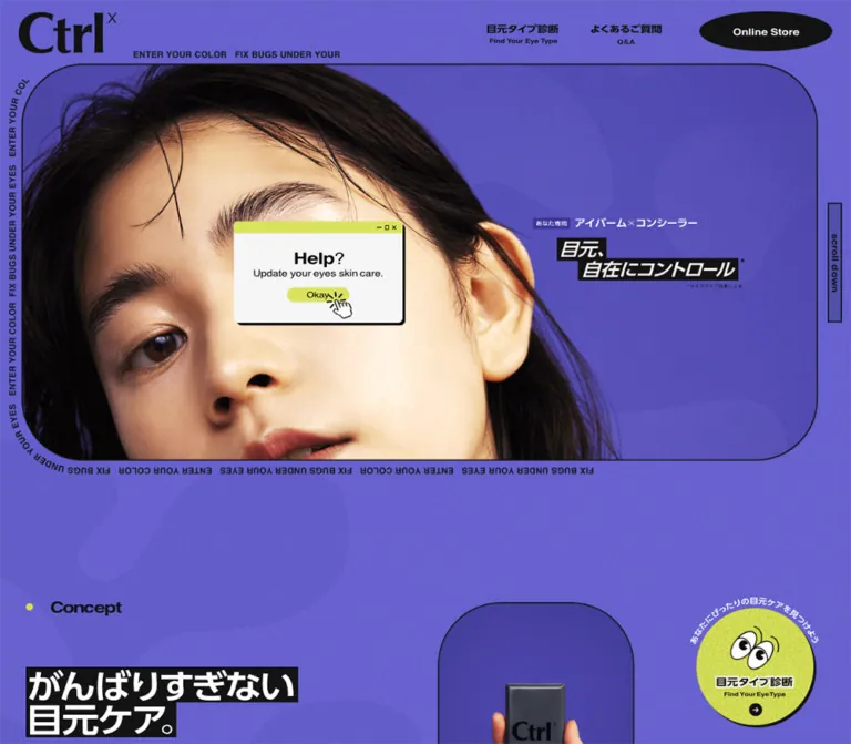
紫の粒状テクスチャ、大胆に切り取った顔写真、黒い輪郭線、キーキャップ風の商品表現が特徴。スマートフォンでは縦長の写真と縦書きコピーへ構図を切り替える公式ブランドサイト。
オリジナルサイトを見るA close-up beauty portrait framed by keyboard language, black outlines, and grainy violet.
Website: ctrlx.jp Original URL: https://ctrlx.jp/ Final URL: https://ctrlx.jp/ Theme: one observed violet color scheme Inspected: September 22, 2026, at 14:35 UTC / 23:35 JST, using the supplied browser evidence Viewports: desktop 1440 × 1000 CSS px; mobile 390 × 844 CSS px Scope: the current official brand and product homepage, including its opening composition, product information in the rendered DOM, news, FAQ preview, and footer. Visual captures cover the desktop opening, a mostly background-only intermediate state, the desktop ending, and the mobile opening and ending. Linked pages and commerce flows were not inspected.
Ctrlx combines an editorial beauty photograph with the language of computer shortcuts. A warm, tightly cropped face sits inside an oversized rounded rectangle. Repeating English utility text follows its perimeter, a narrow vertical scroll tab projects from the right edge, and white Japanese lettering appears on black strips. The surrounding violet field contains fine grain and large, faint, rounded abstract forms.
The page is a long brand presentation with product information and utility navigation. It is not a verified shopping application. Desktop sections distribute headings, copy, and product groups across an expansive canvas; mobile changes both the composition and the content arrangement. The most important relationships are violet against near-black, warm skin against cool surroundings, graphic lettering against readable Japanese body text, and large photographic shapes against compact controls.
A close-up beauty portrait framed by keyboard language, black outlines, and grainy violet.
Website: ctrlx.jp Original URL: https://ctrlx.jp/ Final URL: https://ctrlx.jp/ Theme: one observed violet color scheme Inspected: September 22, 2026, at 14:35 UTC / 23:35 JST, using the supplied browser evidence Viewports: desktop 1440 × 1000 CSS px; mobile 390 × 844 CSS px Scope: the current official brand and product homepage, including its opening composition, product information in the rendered DOM, news, FAQ preview, and footer. Visual captures cover the desktop opening, a mostly background-only intermediate state, the desktop ending, and the mobile opening and ending. Linked pages and commerce flows were not inspected.
Ctrlx combines an editorial beauty photograph with the language of computer shortcuts. A warm, tightly cropped face sits inside an oversized rounded rectangle. Repeating English utility text follows its perimeter, a narrow vertical scroll tab projects from the right edge, and white Japanese lettering appears on black strips. The surrounding violet field contains fine grain and large, faint, rounded abstract forms.
The page is a long brand presentation with product information and utility navigation. It is not a verified shopping application. Desktop sections distribute headings, copy, and product groups across an expansive canvas; mobile changes both the composition and the content arrangement. The most important relationships are violet against near-black, warm skin against cool surroundings, graphic lettering against readable Japanese body text, and large photographic shapes against compact controls.
line-height: 0. Their computed font sizes do not reliably describe their painted lettering. Treat these as graphic-content slots; their exact SVG or raster implementation was not supplied.| Name | Value | Suggested token | Evidence and role |
|---|---|---|---|
| Violet Canvas | #6762d3 |
--ctrl-violet |
Measured body background at both viewports; the continuous page foundation |
| Near-black Ink | #131313 |
--ctrl-ink |
Measured body text, filled buttons, and social-control backgrounds; outlines appear consistent with this ink |
| Acid Yellow | #d6e04e |
--ctrl-acid |
Measured application and product-result captions in the DOM; an accent rather than the main action color |
| Reversed White | approximately #ffffff |
--ctrl-white |
Estimated from hero lettering, button labels, and social glyphs; the exact graphic fill was not supplied |
| Muted Contour Violet | approximately #5751b8 |
--ctrl-contour |
Estimated darker violet for the faint abstract background forms; their original color and opacity are unknown |
The computed violet is the underlying canvas color. Grain and translucent forms make individual screenshot pixels vary. Do not replace the measured base color with a single sampled pixel from a textured region.
Black is the dominant control color. The header store control, FAQ expansion circles, View More button, and social tiles use dark fills. Acid yellow should remain a localized accent rather than becoming a universal primary-button treatment.
The mobile opening includes six small square product graphics. These provide a second, localized palette.
| Graphic | Observed appearance | Approximation for a prototype |
|---|---|---|
| Del / blue | Bright violet | #8b62e9 |
| Del / brown | Warm orange | #f28a32 |
| Del / black | Pale blue-gray | #d0dce1 |
| Y / plus | Yellow-green | #d6e04e |
| B / plus | Cyan | #47bfd2 |
| Ctrlx case | Medium gray | #95969c |
These six hexadecimal values are visual approximations, not measured package colors. In particular, the measured acid caption color does not prove that the Y graphic uses the identical fill. Preserve approved product artwork when available.
No alternate theme or theme-switching control was established by the evidence.
"Noto Sans JP", sans-serif at both viewports.500 for most explanatory text, 700 for the concept statement and FAQ questions, and 400 for notes and selected supporting text.0.1456px letter spacing, equivalent to 0.01em at its measured size.The Ctrlx wordmark is a distinctive black graphic with heavy serif forms and a small raised x. Its measured image-like box is more useful than the inherited H1 font size. Do not recreate it by choosing an arbitrary serif font.
The hero message uses bold, slanted white Japanese lettering on tightly fitted black strips. Desktop presents it horizontally; mobile presents a narrow vertical composition. Preserve that art direction with approved artwork or a deliberately typeset adaptation. The exact display typeface is not established.
The navigation, perimeter text, View More label, Page Top label, and Follow Me! stamp contain bold Latin lettering. Their appearance can be approximated with a bold sans-serif, but their precise font families are unverified.
Sizes below describe actual text-bearing elements unless explicitly marked otherwise.
| Role | Desktop size / line height | Mobile size / line height | Weight | Status |
|---|---|---|---|---|
| Body default | 18.97 / 41.51px |
16.64 / 34.47px |
500 | Measured inherited baseline |
| Concept statement | 18.97 / 60.48px |
16.64 / 43.68px |
700 | Measured |
| Product introduction | 15.81 / 34.59px |
14.56 / 30.16px |
500 | Measured |
| Feature explanation | 16.87 / 36.90px |
14.56 / 30.16px |
500 | Measured |
| FAQ question | 16.87 / 36.90px |
14.56 / 30.16px |
700 | Measured |
| Ingredient and claim notes | 10.54 / approximately 14.74px |
8.32 / approximately 12.95px |
400 | Measured; some notes use a different line height |
| Application caption | 11.59 / 21.08px |
10.92 / 18.72px |
500 | Measured acid-colored text |
| News date | 13.75 / 28.90px |
10.92 / 18.72px |
400 | Measured |
| Footer legal links | 11.59 / 25.00px |
9.36 / 14.56px |
500 | Measured |
| Painted action label | approximately 16px |
approximately 16px |
Visually bold | Estimated from screenshots |
| Perimeter lettering | approximately 14–15px |
approximately 10–11px |
Visually bold | Estimated from screenshots |
The root font size is measured at 10px on desktop and 10.4px on mobile. The underlying formulas and breakpoints are not supplied. Do not copy assumed source rem values into a conventional 16px-root application.
The computed H2 sizes of 28.46px desktop and 24.96px mobile, and H3 sizes of 22.20px and 19.47px, mostly belong to empty, zero-line-height graphic wrappers. They are not a dependable live-text heading scale.
Density: compact navigation and controls around large imagery, broad section spacing, and long-form product information.
Two measured endpoints show responsive sizing, but they do not reveal a single universal scaling formula. Some elements shrink substantially, some barely change, and others change arrangement entirely.
For example, the logo width changes from 162.33px to 92.30px, while product buttons remain approximately 232px and 229px wide. Model the responsive system with separate layout and typography tokens rather than scaling the whole page uniformly.
| Use | Desktop | Mobile | Evidence |
|---|---|---|---|
| Header horizontal padding | 31.68px |
15.08px |
Measured |
| Main content left inset | Usually 42.17px |
Usually 20.27px |
Measured; concept differs slightly |
| Common large section top padding | Approximately 211px |
Approximately 83–125px |
Measured examples; not universal |
| Concealer section top padding | 210.83px |
62.40px |
Measured exception |
| FAQ section top padding | 211.46px |
88.71px |
Measured |
| Product CTA horizontal padding | Approximately 31px |
Approximately 37.39px |
Measured |
| Social-tile gap | 17.94px |
10.41px |
Calculated from measured rectangles |
| Mobile FAQ reserved icon space | — | 47.32px |
Measured right padding on questions |
| Footer bottom padding | Not separately established | 120.90px |
Measured mobile footer padding |
| Element | Desktop | Mobile | Evidence |
|---|---|---|---|
| Hero frame | Approximately 105px |
Approximately 64px |
Estimated from screenshots |
| Product / View More button | 21.08px |
20.80px |
Measured |
| Social tile | 31.62px |
26.00px |
Measured |
| FAQ plus disc | Circular, approximately 43px diameter |
Circular, approximately 31px diameter |
Estimated |
| Online Store silhouette | Wide ellipse | Not visible in the closed mobile header | Estimated painted shape |
| Hero message strips | Essentially square corners | Essentially square corners | Visual observation |
The three rounding families serve different purposes: a very large photographic frame, moderately rounded rectangular controls, and circles or ellipses for compact utilities. Avoid applying the hero radius to every component.
| Element | Desktop 1440 × 1000 | Mobile 390 × 844 |
|---|---|---|
| Header | Measured height 109.31px |
Measured height 67.06px |
| Wordmark box | 162.33 × 69.16px, at 31.67, 20.44 |
92.30 × 39.31px, at 15.08, 13.88 |
| Hero frame | Estimated 1347 × 671px, at approximately 37, 107 |
Estimated 344 × 488px, at approximately 20, 67 |
| Scroll-tab anchor | 24.47 × 200.25px, at 1400.16, 343.02 |
16.63 × 136.05px, at 368.19, 243.01 |
| Product CTA | 231.92 × 63.94px |
228.80 × 66.41px |
| FAQ content column | 906.58px wide, starting at x = 491.23px |
349.47px wide, starting at x = 20.27px |
| FAQ View More | 253.02 × 63.64px |
228.80 × 66.44px |
| Social tile | 88.55 × 88.55px |
72.80 × 72.80px |
| Document height | Approximately 14,005px |
Approximately 16,280px |
Role: brand identity, eye-type diagnosis, FAQ access, and a store entry point.
Desktop places the large wordmark at the far left. The right side contains two stacked Japanese/English navigation graphics: “目元タイプ診断” / “Find Your Eye Type” and “よくあるご質問” / “Q&A”. Their measured boxes are approximately 126 × 35px each. A black elliptical Online Store graphic sits farther right and appears approximately 221 × 66px.
On mobile, the wordmark becomes smaller and the desktop navigation is replaced by a two-line hamburger at the upper right. The visible lines are approximately 52px wide. The menu was not opened, so its panel, navigation order, and transition are unknown.
The header remains at the viewport top in the lower-page captures. Its surface is transparent, and FAQ text visibly passes underneath it. Persistence is supported by the captures, but the original position rule was not included. For a new implementation, a sticky or fixed header is appropriate; prevent focused or anchor-targeted content from being obscured.
The Online Store anchor has an empty extracted destination and a zero-height measured rectangle despite its visible graphic. Its final destination, hit area, and scripted behavior are unverified.
Role: establish the beauty focus and the brand’s shortcut metaphor immediately.
The desktop frame is nearly twice as wide as it is tall. Its thin dark outline and large corner radii enclose a close-up face across the left portion and a violet area for copy on the right. The face is intentionally oversized: black hair reaches the upper frame, the eyes dominate the composition, and the mouth is partly cut by the lower edge.
The desktop copy combines a small “あなた専用” badge, “アイバーム×コンシーラー”, and the black-backed message “目元、自在にコントロール”. The message is staggered across two horizontal strips rather than centered as a conventional headline block.
Mobile changes the frame to a tall portrait shape. The face sits lower, leaving violet space above the hair; the main message becomes narrow vertical lettering near the upper-right corner. This is an art-direction change, not merely the desktop banner scaled down. Exact image files and crop rules were not supplied.
Use a clipped inner photograph and a separate outer decoration layer. Clipping the whole hero wrapper would cut off the perimeter lettering and scroll tab.
Role: make the hero feel like an outlined interface object while providing a route into the page.
The perimeter repeats “ENTER YOUR COLOR” and “FIX BUGS UNDER YOUR EYES”. Text follows straight edges and curved corners, with different orientations around the frame. Its positioning and clipping produce the feeling of a continuous loop.
An SVG text path is a practical reconstruction technique, but the original mechanism is not established. Create desktop and mobile paths that fit their different frame proportions; do not distort one text-path canvas to fit both.
The right-side Scroll down tab is a narrow outlined rectangle with vertical lettering. Its verified link target is https://ctrlx.jp/#concept. The target is known; smooth scrolling, animation timing, and hover feedback were not exercised.
Role: connect the keyboard metaphor to the product range before the long narrative begins.
Beneath the mobile portrait, six roughly 48 × 48px square graphics form a single row with approximately 7px gaps. The row begins around x = 30px, y = 609px and occupies roughly 331px in width. Large Del, Y, B, and Ctrlx forms sit low within the squares; small modifiers sit near their upper edges.
The descriptor “あなた専用 アイバーム×コンシーラー” appears below this row in white. The row is visible in the current mobile opening; an equivalent desktop row is not visible in the supplied opening capture. Click behavior for these squares was not established.
Role: explain the brand’s attitude and lead into the range.
The DOM establishes unusually spacious editorial sections. The concept section spans approximately 2283px on desktop and 2037px on mobile. Its desktop statement sits in a right-side column at x = 959.30px, with a 405.84px width and approximately 60.48px line spacing. On mobile it moves to the main 349.16px column with approximately 43.68px line spacing.
A later introductory paragraph sits at x = 741.44px on desktop, with a width of 457.84px. It becomes a 349.47px column at the mobile left inset. The content explains three eye balms and two concealers selected for different concerns or personal colors.
These measurements establish the editorial spacing and column changes. The intermediate screenshot does not establish the final artwork, image placement, or reveal state of these sections. Preserve space for approved graphics without inventing a collage from the empty capture.
Role: present the range and its individual options.
The rendered content contains three eye balms: Del Blue, Del Brown, and Del Black; two concealers: Plus Y and Plus B; and a compact case. Each is listed at “¥ 990(税込)” in the current evidence.
Desktop balm CTAs share the same vertical position, with centers approximately 460px apart. This supports a three-column offer arrangement. The two concealers and case also have aligned desktop CTAs. On mobile, the balm and concealer offers appear sequentially down the document; the compact case appears later, after the concealer feature content.
The practical anatomy is an offer graphic area, product name and variant, price, associated notes, and a dark rounded action. The available DOM establishes this content and its alignment; it does not establish every unseen product surface or packshot crop. The purchase-like anchors have empty extracted destinations, so their transaction behavior remains unknown.
Role: explain formulation, texture, application, and finish.
Desktop feature explanations use several horizontal zones. Narrow graphic slots begin near x = 42.17px; graphic headings begin around x = 139.80px; paragraph copy begins around x = 258.67px and spans 676.78px. Selected application captions occupy a right-side area and use acid yellow.
On mobile, the main copy moves to the standard 349.47px column. The tall, narrow desktop graphic slots become short horizontal boxes, and application captions appear later in the vertical sequence. This is further evidence that the page rearranges its graphics rather than scaling a desktop canvas uniformly.
The concealer section includes upper/lower result labels for Plus Y and Plus B. Those labels do not establish a before-and-after comparison. Keep product qualifications and numbered notes attached to the relevant statements.
Role: maintain a small brand-update area within the long page.
Two entries are present, dated 2024.05.01 and 2024.05.21. Desktop date text starts near x = 492.31px, aligning with the right-side content system. Mobile dates start at the standard 20.27px inset.
The DOM provides headlines, dates, and additional entry content. The supplied current screenshots do not establish whether opening an entry expands it, opens a dialog, or navigates elsewhere. Do not infer those behaviors from hidden or unpainted text.
Role: answer common product questions and lead to the dedicated FAQ page.
Desktop places the question list in a wide right column, leaving a separate heading area to the left. Mobile uses nearly the full content width. Questions sit directly on the violet canvas, separated by thin black rules. A black circular plus sits at the right of each row.
The three source questions concern choosing an eye balm, the free-from formulation, and use outside the eye area. The visible state is collapsed. Answer text exists in the DOM, but expansion behavior and animation were not tested.
Desktop question paragraphs measure 73.75px high, while their repeated top positions are approximately 122.38px apart. These are different measurements: the paragraph box is not the entire row. On mobile, the long first question wraps and has a taller row; the following question positions are approximately 80.17px apart.
The black View More button sits below the list, with its label left of a right arrow. Its verified destination is https://ctrlx.jp/qa/. Use a real link for that navigation. Native details and summary are a reasonable recommended implementation for the local accordion, not a claim about the source markup.
Role: return navigation, social links, and legal identity.
Page Top is aligned to the right above a full-width thin rule. Below it, Follow Me! appears as white lettering in a tight black rectangular stamp. Instagram and X sit in large black rounded-square tiles with white glyphs.
Desktop places the social block around x = 505.47px, continuing the page’s offset content alignment. Legal links sit beneath it, while “© msh Inc.” appears toward the far right. Mobile centers the social block, keeps the two legal links together, and places the copyright on its own centered line. A generous bottom reserve remains.
The homepage independently provides the copyright label and the “運営会社” link to https://www.msh-labo.com/company. The privacy link targets https://www.msh-labo.com/privacy. These destination pages were not inspected.
The supplied evidence includes computed transition declarations, but it does not record completed hover, menu, FAQ, or purchase interactions.
| Element | Recorded transition | What can be concluded |
|---|---|---|
| Wordmark link | 0.5s at both viewports |
A transition duration is declared; the changed property and resulting state are unknown |
| Scroll-down link | 0.3s |
A link transition is declared; this does not establish scroll duration |
| Selected concept / introduction graphics | 0.6s |
Transition-capable elements exist; reveal trigger and movement are unverified |
| Product and View More buttons | 0.4s on desktop |
A transition duration is declared; exact feedback is unknown |
| Social tiles | 0.4s on desktop |
Same limitation as the action buttons |
| Footer legal links | 0.3s |
Transition declaration only |
| Many mobile controls | Serialized as all without a duration |
Do not assign a nonzero duration from this field |
| Sampled elements | animation: none |
No named animation was recorded on those elements at that instant; child or pseudo-element motion is not ruled out |
The capture process waited for finite motion and temporarily paused perpetual motion during readiness checks. This is inspection methodology, not evidence that a particular animation exists.
Some diagnostic and unlabeled anchors have nonzero rectangles without corresponding visible artwork in the supplied current frames. Their appearance and activation timing remain unresolved. Do not fabricate a visible overlay from those rectangles.
Recommended motion: keep feedback short and restrained, using opacity or small color changes for controls. Make content visible by default, then progressively enhance optional reveals. Support reduced motion and avoid making access to product information depend on an animation completing.
| Layer | Appearance | Purpose |
|---|---|---|
| Page canvas | Measured violet with visible fine grain | Continuous identity across the opening and ending |
| Background decoration | Large, faint, rounded abstract forms | Add depth without dividing the page into cards |
| Hero | Photograph and violet field within a thin black rounded outline | Main editorial focal point |
| Hero message | White graphic lettering on tight black strips | Strong contrast within the portrait composition |
| Filled controls | Near-black with white labels or icons | Navigation and utility actions |
| FAQ structure | Violet surface with black rules | Separate questions without introducing panels |
| Product keys | Small colored squares with dark lettering | Local product differentiation and keyboard metaphor |
The visible shell and footer do not use a general soft-shadow elevation system. Their hierarchy comes from cropping, scale, outlines, and solid dark shapes. This does not establish the styling of every unseen middle-page product graphic.
The current opening uses a close-up portrait with black hair, warm skin, visible highlights, and eyes as the compositional center. The crop is assertive rather than a conventional centered headshot. On desktop the face presses against the frame edges; on mobile its lower placement creates room for the vertical message.
Fine grain softens the otherwise crisp violet and black system. Broad abstract forms remain low contrast so they do not compete with the portrait or text. The evidence does not identify whether all grain is baked into images, applied as an overlay, or split across both techniques.
Use high-resolution photographic assets with enough surrounding space for responsive cropping. Do not apply image-rendering: pixelated; the roughness comes from texture, not deliberately enlarged pixels. Product-key lettering should retain its graphic identity instead of being replaced with a generic icon set.
No original image URLs, filenames, SVG paths, or font-file URLs were supplied. The following are rendered asset roles, not downloadable asset paths.
| Asset role | Current evidence | Implementation guidance |
|---|---|---|
| Ctrlx wordmark | Visible at both viewport sizes; measured wrapper dimensions | Preserve the approved graphic and aspect ratio |
| Hero portrait | Visible in desktop and mobile opening captures | Prepare deliberate desktop and mobile crops |
| Hero message | Horizontal desktop and vertical mobile artwork | Use separate responsive compositions when needed |
| Perimeter lettering | Visible around both frame shapes | Fit a path to each frame; mark repetition decorative |
| Six product-key graphics | Visible in the mobile opening | Keep the six-item order and small modifier lettering |
| Grain and abstract forms | Visible in the canvas and background-only capture | Use restrained texture; exact assets are unknown |
| Instagram and X marks | Visible in footer tiles | Use appropriate, recognizable brand marks |
For a new brand, commission or license imagery with equivalent compositional flexibility. The CSS shell cannot reproduce the identity carried by the original portrait and lettering.
The page remains a vertically scrolling document at both inspected widths. Its measured height increases from approximately 14,005px to 16,280px on mobile, even though individual margins and graphic sizes often decrease. Stacking product offers and relocating the case account for part of this change.
| Relationship | Desktop observation | Mobile observation |
|---|---|---|
| Header navigation | Two bilingual links plus store ellipse | Two-line menu control |
| Hero proportions | Approximately 2.01:1 |
Approximately 0.70:1 |
| Hero message | Horizontal strips on the right | Vertical strips near the upper right |
| Product keys | Not visible in the supplied desktop opening | Six graphics below the portrait |
| Concept statement | Narrow right-side column | Main content-width column |
| Product offers | Three aligned balm actions; aligned concealer/case actions | Offers stacked; case appears later |
| Feature layout | Graphic, copy, and right-caption zones | Sequential vertical content |
| FAQ | Offset right column | Full content-width list |
| Footer | Offset social block; copyright to the right | Centered social block and stacked copyright |
The breakpoint cannot be recovered from two samples. The Quick Start uses 48rem as a recommended switching point, not a measured source breakpoint. Test intermediate widths, especially where the desktop header links stop fitting.
Retain approximately 20px content gutters at the inspected phone width. Allow long Japanese FAQ questions to wrap while preserving the right-side expansion control. The scroll tab needs its own narrow strip outside the hero, so the hero’s right gutter differs from the ordinary text gutter.
The transparent persistent header visibly overlaps scrolled text in the ending captures. Preserve its light visual footprint while improving anchor offsets, keyboard-focus visibility, and any necessary scrolled-header backing in a new implementation.
#6762d3 and near-black #131313.These are recommendations, not verified features of the original site:
8.32–9.36px sizes; approximately 12px is a practical starting point, subject to layout and readability testing.#6762d3.#131313.#d6e04e.“Create an official beauty-brand homepage inspired by the observed Ctrlx design. Use a continuous grainy violet canvas, near-black typography and outlines, a large close-up portrait inside a thin rounded frame, repeated utility text around its perimeter, and a narrow vertical scroll tab. Place a graphic wordmark at the upper left and compact bilingual navigation with a black elliptical store action at the upper right. Use generous Japanese line spacing and offset editorial columns for product information. On mobile, switch to a tall portrait crop, vertical black-backed lettering, a two-line menu control, and six small product-key graphics below the hero. Finish with ruled FAQ rows and black social tiles. Keep unverified interactions simple and accessible.”
This is a recommended reconstruction scaffold, not recovered site CSS. It retains a conventional root font size and uses measured endpoint values where practical. The 48rem breakpoint, native FAQ behavior, hover opacity, and procedural grain are implementation choices. The grain is a substitute, and the original abstract background artwork is not reproduced.
Expected anatomy: a .site-header, followed by .hero. Inside the hero, .hero-stage contains the clipped .hero-frame, portrait, title artwork, perimeter SVG, and scroll tab. The optional .keycaps row and .hero-description follow the stage. Editorial sections can use .editorial-grid; FAQ rows use details.faq-item with a summary and an .faq-toggle span. Asset files and the perimeter SVG path must be supplied by the implementation.
:root {
  /* Measured colors, with an approximate reverse white. */
  --ctrl-violet: #6762d3;
  --ctrl-ink: #131313;
  --ctrl-acid: #d6e04e;
  --ctrl-white: #fff;
  --font-body: 'Noto Sans JP', sans-serif;

  /* Desktop endpoint values; these are implementation aliases. */
  --text-body: 18.9749px;
  --text-copy: 16.8667px;
  --leading-body: 2.1875;
  --leading-copy: 2.1875;
  --content-gutter: 2.928vw;
  --section-space: 210.83px;
  --header-height: 109.31px;
  --logo-width: 162.33px;
  --hero-left: 2.57vw;
  --hero-right: 3.89vw;
  --hero-ratio: 1347 / 671;
  --hero-radius: 105px;
  --scroll-width: 24.47px;
  --scroll-height: 200.25px;
  --scroll-gap: 16px;
  --button-radius: 21.08px;
  --social-size: 88.55px;
  --social-radius: 31.62px;
  --social-gap: 17.94px;
  --rule: 2px;

  /* Recommended static texture substitute, not an original asset. */
  --grain: url('data:image/svg+xml,%3Csvg xmlns=%22http://www.w3.org/2000/svg%22 width=%22180%22 height=%22180%22%3E%3Cfilter id=%22n%22%3E%3CfeTurbulence type=%22fractalNoise%22 baseFrequency=%22.82%22 numOctaves=%223%22 stitchTiles=%22stitch%22/%3E%3C/filter%3E%3Crect width=%22100%25%22 height=%22100%25%22 opacity=%22.14%22 filter=%22url(%23n)%22/%3E%3C/svg%3E');
}

* { box-sizing: border-box; }
html { font-size: 100%; }
body {
  margin: 0;
  color: var(--ctrl-ink);
  background-color: var(--ctrl-violet);
  background-image: var(--grain);
  font-family: var(--font-body);
  font-size: var(--text-body);
  font-weight: 500;
  line-height: var(--leading-body);
}
a { color: inherit; }
button { font: inherit; }
img { max-width: 100%; }
[id] { scroll-margin-top: calc(var(--header-height) + 20px); }

/* Sticky positioning is a recommended persistent-header implementation. */
.site-header {
  position: sticky;
  top: 0;
  z-index: 20;
  display: flex;
  align-items: center;
  justify-content: space-between;
  min-height: var(--header-height);
  padding: 20.44px 2.2vw 19.73px;
}
.wordmark { display: block; line-height: 0; }
.wordmark img { display: block; width: var(--logo-width); height: auto; }
.desktop-nav { display: flex; align-items: center; gap: 40px; }
.nav-link { text-align: center; font-weight: 700; line-height: 1.2; }
.nav-link small { display: block; margin-top: 4px; font-size: 12px; }
.store-link {
  display: grid;
  place-items: center;
  width: 221.38px;
  min-height: 66px;
  border-radius: 50%;
  color: var(--ctrl-white);
  background: var(--ctrl-ink);
  font-size: 18px;
  font-weight: 700;
  text-decoration: none;
}
.menu-toggle { display: none; }

.hero {
  position: relative;
  margin: -2px var(--hero-right) 0 var(--hero-left);
}
.hero-stage { position: relative; }
.hero-frame {
  position: relative;
  overflow: hidden;
  aspect-ratio: var(--hero-ratio);
  border: var(--rule) solid var(--ctrl-ink);
  border-radius: var(--hero-radius);
  background: var(--ctrl-violet);
}
.hero-frame > picture { display: block; width: 100%; height: 100%; }
.hero-image {
  display: block;
  width: 100%;
  height: 100%;
  object-fit: cover;
  object-position: var(--portrait-position, 50% 50%);
}
.hero-title-art {
  position: absolute;
  top: 44%;
  left: 67%;
  width: 23%;
  height: auto;
}
.hero-description {
  position: absolute;
  top: 38.5%;
  left: 64.2%;
  margin: 0;
  color: var(--ctrl-white);
  font-size: 18px;
  font-weight: 700;
  line-height: 1.3;
}
.perimeter {
  position: absolute;
  inset: -18px;
  width: calc(100% + 36px);
  height: calc(100% + 36px);
  overflow: visible;
  pointer-events: none;
  fill: var(--ctrl-ink);
  font: 700 15px var(--font-body);
}
.scroll-tab {
  position: absolute;
  top: 50%;
  left: calc(100% + var(--scroll-gap));
  display: grid;
  place-items: center;
  width: var(--scroll-width);
  height: var(--scroll-height);
  transform: translateY(-50%);
  border: var(--rule) solid var(--ctrl-ink);
  writing-mode: vertical-rl;
  font-size: 15px;
  font-weight: 700;
  line-height: 1;
  text-decoration: none;
}
.keycaps { display: none; }

.section {
  padding: var(--section-space) var(--content-gutter);
}
.editorial-grid {
  display: grid;
  grid-template-columns: minmax(0, .438fr) minmax(0, 1fr);
  column-gap: 52px;
}
.copy {
  font-size: var(--text-copy);
  line-height: var(--leading-copy);
}
.concept-statement { font-weight: 700; line-height: 3.187; }
.product-grid {
  display: grid;
  grid-template-columns: repeat(3, minmax(0, 1fr));
  gap: 28px;
}
.product-offer { min-width: 0; }
.qualification {
  /* Recommended readability floor; larger than the observed mobile notes. */
  font-size: 12px;
  font-weight: 400;
  line-height: 1.65;
}
.application-caption { color: var(--ctrl-acid); }
.action {
  display: inline-flex;
  align-items: center;
  justify-content: space-between;
  gap: 24px;
  width: 231.92px;
  max-width: 100%;
  min-height: 63.94px;
  padding: 12px 31px;
  border: 0;
  border-radius: var(--button-radius);
  color: var(--ctrl-white);
  background: var(--ctrl-ink);
  font-size: 16px;
  font-weight: 700;
  line-height: 1.3;
  text-decoration: none;
}

/* Native details behavior is recommended, not verified source behavior. */
.faq-item { border-bottom: var(--rule) solid var(--ctrl-ink); }
.faq-item summary {
  display: grid;
  grid-template-columns: minmax(0, 1fr) 43px;
  align-items: center;
  gap: 16px;
  min-height: 120.38px;
  padding: 18.45px 0;
  list-style: none;
  cursor: pointer;
  font-size: var(--text-copy);
  font-weight: 700;
  line-height: var(--leading-copy);
}
.faq-item summary::-webkit-details-marker { display: none; }
.faq-toggle {
  display: grid;
  place-items: center;
  width: 43px;
  height: 43px;
  border-radius: 50%;
  color: var(--ctrl-white);
  background: var(--ctrl-ink);
  font-size: 24px;
  line-height: 1;
}
.faq-toggle::after { content: '+'; }
.faq-item[open] .faq-toggle::after { content: '−'; }
.faq-answer { padding: 0 59px 28px 0; }
.faq-more { width: 253.02px; margin-top: 42px; }

.footer-top {
  margin-inline: var(--content-gutter);
  padding-bottom: 44px;
  text-align: right;
  font-weight: 700;
  line-height: 1.2;
}
.footer-top a { text-decoration: none; }
.footer-body {
  border-top: var(--rule) solid var(--ctrl-ink);
  padding: 64px var(--content-gutter) 16px 35.1%;
}
.follow-label {
  display: inline-block;
  margin: 0 0 14px;
  padding: 0 8px;
  color: var(--ctrl-white);
  background: var(--ctrl-ink);
  font-size: 20px;
  font-weight: 700;
  line-height: 1.25;
}
.social-row { display: flex; gap: var(--social-gap); }
.social-link {
  display: grid;
  place-items: center;
  width: var(--social-size);
  height: var(--social-size);
  border-radius: var(--social-radius);
  color: var(--ctrl-white);
  background: var(--ctrl-ink);
}
.social-link svg { width: 28px; height: 28px; }
.footer-meta {
  display: flex;
  align-items: center;
  gap: 22.5px;
  margin-top: 64.6px;
  font-size: 12px;
  line-height: 2;
}
.footer-meta a { text-decoration: none; }
.copyright { margin: 0 0 0 auto; }

:where(a, button, summary):focus-visible {
  outline: 3px solid var(--ctrl-ink);
  outline-offset: 4px;
}
@media (hover: hover) {
  /* Durations echo recorded values; opacity feedback is recommended. */
  .action, .social-link { transition: opacity 400ms ease; }
  .wordmark { transition: opacity 500ms ease; }
  .action:hover, .social-link:hover, .wordmark:hover { opacity: .78; }
}

/* Recommended breakpoint; the source breakpoint was not supplied. */
@media (max-width: 48rem) {
  :root {
    --text-body: 16.6397px;
    --text-copy: 14.56px;
    --leading-body: 2.0714;
    --leading-copy: 2.0714;
    --content-gutter: 5.2vw;
    --section-space: 83.2px;
    --header-height: 67.06px;
    --logo-width: 92.30px;
    --hero-left: 5.2vw;
    --hero-right: 6.667vw;
    --hero-ratio: 344 / 488;
    --hero-radius: 64px;
    --scroll-width: 16.63px;
    --scroll-height: 136.05px;
    --scroll-gap: 4.75px;
    --button-radius: 20.80px;
    --social-size: 72.80px;
    --social-radius: 26px;
    --social-gap: 10.41px;
  }
  .site-header { padding: 13.88px 15.08px; }
  .desktop-nav { display: none; }
  .menu-toggle {
    position: relative;
    display: block;
    width: 52px;
    height: 44px;
    margin-right: 5px;
    padding: 0;
    border: 0;
    background: transparent;
  }
  .menu-toggle::before, .menu-toggle::after {
    content: '';
    position: absolute;
    right: 0;
    left: 0;
    height: 3px;
    background: var(--ctrl-ink);
  }
  .menu-toggle::before { top: 15px; }
  .menu-toggle::after { top: 26px; }
  .hero { margin-top: 0; }
  .hero-title-art { top: 9%; right: 9.5%; left: auto; width: 12%; }
  .perimeter {
    inset: -12px;
    width: calc(100% + 24px);
    height: calc(100% + 24px);
    font-size: 10.5px;
  }
  .scroll-tab { font-size: 11px; }
  .keycaps {
    display: grid;
    grid-template-columns: repeat(6, minmax(0, 1fr));
    gap: 7px;
    width: calc(100% - 12px);
    margin: 54px auto 0;
  }
  .keycaps img { display: block; width: 100%; aspect-ratio: 1; }
  .hero-description {
    position: static;
    margin-top: 10px;
    text-align: center;
    font-size: 14px;
  }
  .editorial-grid, .product-grid { grid-template-columns: 1fr; gap: 40px; }
  .concept-statement { line-height: 2.625; }
  .action { width: 228.80px; min-height: 66.41px; padding-inline: 37.39px; }
  .faq-item summary {
    grid-template-columns: minmax(0, 1fr) 31.2px;
    min-height: 78.17px;
    padding: 24px 0;
  }
  .faq-toggle { width: 31.2px; height: 31.2px; font-size: 20px; }
  .faq-answer { padding-right: 0; }
  .faq-more { margin-top: 32px; }
  .footer-top { padding-bottom: 33px; }
  .footer-body { padding: 41px var(--content-gutter) 120.9px; text-align: center; }
  .follow-label { margin-bottom: 16px; font-size: 18px; }
  .social-row { justify-content: center; }
  .footer-meta {
    justify-content: center;
    flex-wrap: wrap;
    column-gap: 19.5px;
    row-gap: 22px;
    margin-top: 49.2px;
    line-height: 1.55;
  }
  .copyright { flex-basis: 100%; margin: 0; }
}

@media (prefers-reduced-motion: reduce) {
  *, *::before, *::after {
    animation: none !important;
    transition: none !important;
    scroll-behavior: auto !important;
  }
}
Use a responsive picture for the portrait and title artwork when separate compositions are available. The CSS does not supply a mobile menu, external store behavior, the original reveal logic, or a finished perimeter path. Keep those integrations explicit rather than presenting decorative controls as working features.
Optional aliases for a project already using Tailwind v4. Define the properties above first. This does not imply that the original site uses Tailwind.
@theme inline {
  --color-canvas: var(--ctrl-violet);
  --color-ink: var(--ctrl-ink);
  --color-acid: var(--ctrl-acid);
  --color-reverse: var(--ctrl-white);
  --font-sans: var(--font-body);
  --text-body: var(--text-copy);
  --spacing-gutter: var(--content-gutter);
  --spacing-section: var(--section-space);
  --spacing-social: var(--social-size);
  --radius-action: var(--button-radius);
  --radius-social: var(--social-radius);
  --radius-portrait: var(--hero-radius);
}
200.2026-09-22T14:35:00.714Z, corresponding to September 22, 2026, 23:35 JST.14,005px.16,280px.This reference describes the current supplied homepage evidence. Measured geometry, visual estimates, and implementation recommendations remain distinct throughout; unseen artwork and unresolved interaction states are not reconstructed.
# Ctrlx — Style Reference

> A close-up beauty portrait framed by keyboard language, black outlines, and grainy violet.

**Website:** [ctrlx.jp](https://ctrlx.jp/)
**Original URL:** https://ctrlx.jp/
**Final URL:** https://ctrlx.jp/
**Theme:** one observed violet color scheme
**Inspected:** September 22, 2026, at 14:35 UTC / 23:35 JST, using the supplied browser evidence
**Viewports:** desktop 1440 × 1000 CSS px; mobile 390 × 844 CSS px
**Scope:** the current official brand and product homepage, including its opening composition, product information in the rendered DOM, news, FAQ preview, and footer. Visual captures cover the desktop opening, a mostly background-only intermediate state, the desktop ending, and the mobile opening and ending. Linked pages and commerce flows were not inspected.

Ctrlx combines an editorial beauty photograph with the language of computer shortcuts. A warm, tightly cropped face sits inside an oversized rounded rectangle. Repeating English utility text follows its perimeter, a narrow vertical scroll tab projects from the right edge, and white Japanese lettering appears on black strips. The surrounding violet field contains fine grain and large, faint, rounded abstract forms.

The page is a long brand presentation with product information and utility navigation. It is not a verified shopping application. Desktop sections distribute headings, copy, and product groups across an expansive canvas; mobile changes both the composition and the content arrangement. The most important relationships are violet against near-black, warm skin against cool surroundings, graphic lettering against readable Japanese body text, and large photographic shapes against compact controls.
# Ctrlx — Style Reference

> A close-up beauty portrait framed by keyboard language, black outlines, and grainy violet.

**Website:** [ctrlx.jp](https://ctrlx.jp/)
**Original URL:** https://ctrlx.jp/
**Final URL:** https://ctrlx.jp/
**Theme:** one observed violet color scheme
**Inspected:** September 22, 2026, at 14:35 UTC / 23:35 JST, using the supplied browser evidence
**Viewports:** desktop 1440 × 1000 CSS px; mobile 390 × 844 CSS px
**Scope:** the current official brand and product homepage, including its opening composition, product information in the rendered DOM, news, FAQ preview, and footer. Visual captures cover the desktop opening, a mostly background-only intermediate state, the desktop ending, and the mobile opening and ending. Linked pages and commerce flows were not inspected.

Ctrlx combines an editorial beauty photograph with the language of computer shortcuts. A warm, tightly cropped face sits inside an oversized rounded rectangle. Repeating English utility text follows its perimeter, a narrow vertical scroll tab projects from the right edge, and white Japanese lettering appears on black strips. The surrounding violet field contains fine grain and large, faint, rounded abstract forms.

The page is a long brand presentation with product information and utility navigation. It is not a verified shopping application. Desktop sections distribute headings, copy, and product groups across an expansive canvas; mobile changes both the composition and the content arrangement. The most important relationships are violet against near-black, warm skin against cool surroundings, graphic lettering against readable Japanese body text, and large photographic shapes against compact controls.

## How to Read This Reference

- **Measured** means a value supplied by the rendered DOM or computed-style evidence. Tables round measurements to two decimal places where useful.
- **Estimated** means a visual approximation from the current-page screenshots. Hero geometry, grain strength, and lettering inside artwork fall into this category unless noted otherwise.
- **Recommended** means an implementation choice for a new build. The CSS breakpoint, accessible behaviors, and example CSS are recommendations, not recovered source code.
- Coordinates from the DOM describe the document at the recorded state. Screenshot coordinates describe the visible viewport; these are not interchangeable after scrolling.
- The supplied custom-property maps were empty. Every named token in this document is an implementation alias, not a verified source variable.
- Several headings and links have empty extracted text, nonzero rectangles, and `line-height: 0`. Their computed font sizes do not reliably describe their painted lettering. Treat these as graphic-content slots; their exact SVG or raster implementation was not supplied.
- The intermediate desktop capture shows the persistent header and background with little visible content. The DOM contains extensive content in that region, but its final painted appearance is not established. Do not turn that capture into an intentionally empty section or invent an animation sequence to explain it.

## Tokens — Colors

### Default Palette

| Name | Value | Suggested token | Evidence and role |
| --- | --- | --- | --- |
| Violet Canvas | `#6762d3` | `--ctrl-violet` | Measured body background at both viewports; the continuous page foundation |
| Near-black Ink | `#131313` | `--ctrl-ink` | Measured body text, filled buttons, and social-control backgrounds; outlines appear consistent with this ink |
| Acid Yellow | `#d6e04e` | `--ctrl-acid` | Measured application and product-result captions in the DOM; an accent rather than the main action color |
| Reversed White | approximately `#ffffff` | `--ctrl-white` | Estimated from hero lettering, button labels, and social glyphs; the exact graphic fill was not supplied |
| Muted Contour Violet | approximately `#5751b8` | `--ctrl-contour` | Estimated darker violet for the faint abstract background forms; their original color and opacity are unknown |

The computed violet is the underlying canvas color. Grain and translucent forms make individual screenshot pixels vary. Do not replace the measured base color with a single sampled pixel from a textured region.

Black is the dominant control color. The header store control, FAQ expansion circles, View More button, and social tiles use dark fills. Acid yellow should remain a localized accent rather than becoming a universal primary-button treatment.

### Product Accents

The mobile opening includes six small square product graphics. These provide a second, localized palette.

| Graphic | Observed appearance | Approximation for a prototype |
| --- | --- | --- |
| Del / blue | Bright violet | `#8b62e9` |
| Del / brown | Warm orange | `#f28a32` |
| Del / black | Pale blue-gray | `#d0dce1` |
| Y / plus | Yellow-green | `#d6e04e` |
| B / plus | Cyan | `#47bfd2` |
| Ctrlx case | Medium gray | `#95969c` |

These six hexadecimal values are visual approximations, not measured package colors. In particular, the measured acid caption color does not prove that the Y graphic uses the identical fill. Preserve approved product artwork when available.

No alternate theme or theme-switching control was established by the evidence.

## Tokens — Typography

### Japanese Body Text

- **Computed stack:** `"Noto Sans JP", sans-serif` at both viewports.
- **Weights:** `500` for most explanatory text, `700` for the concept statement and FAQ questions, and `400` for notes and selected supporting text.
- **Character:** sturdy Japanese sans-serif text with unusually generous line spacing.
- **Tracking:** generally normal. The mobile concealer introduction has a measured `0.1456px` letter spacing, equivalent to `0.01em` at its measured size.
- **Loading limitation:** the computed family is known; font-file URLs and loading configuration were not supplied.

### Brand and Graphic Lettering

The Ctrlx wordmark is a distinctive black graphic with heavy serif forms and a small raised x. Its measured image-like box is more useful than the inherited H1 font size. Do not recreate it by choosing an arbitrary serif font.

The hero message uses bold, slanted white Japanese lettering on tightly fitted black strips. Desktop presents it horizontally; mobile presents a narrow vertical composition. Preserve that art direction with approved artwork or a deliberately typeset adaptation. The exact display typeface is not established.

The navigation, perimeter text, View More label, Page Top label, and Follow Me! stamp contain bold Latin lettering. Their appearance can be approximated with a bold sans-serif, but their precise font families are unverified.

### Type Scale

Sizes below describe actual text-bearing elements unless explicitly marked otherwise.

| Role | Desktop size / line height | Mobile size / line height | Weight | Status |
| --- | --- | --- | --- | --- |
| Body default | `18.97 / 41.51px` | `16.64 / 34.47px` | 500 | Measured inherited baseline |
| Concept statement | `18.97 / 60.48px` | `16.64 / 43.68px` | 700 | Measured |
| Product introduction | `15.81 / 34.59px` | `14.56 / 30.16px` | 500 | Measured |
| Feature explanation | `16.87 / 36.90px` | `14.56 / 30.16px` | 500 | Measured |
| FAQ question | `16.87 / 36.90px` | `14.56 / 30.16px` | 700 | Measured |
| Ingredient and claim notes | `10.54 / approximately 14.74px` | `8.32 / approximately 12.95px` | 400 | Measured; some notes use a different line height |
| Application caption | `11.59 / 21.08px` | `10.92 / 18.72px` | 500 | Measured acid-colored text |
| News date | `13.75 / 28.90px` | `10.92 / 18.72px` | 400 | Measured |
| Footer legal links | `11.59 / 25.00px` | `9.36 / 14.56px` | 500 | Measured |
| Painted action label | approximately `16px` | approximately `16px` | Visually bold | Estimated from screenshots |
| Perimeter lettering | approximately `14–15px` | approximately `10–11px` | Visually bold | Estimated from screenshots |

The root font size is measured at `10px` on desktop and `10.4px` on mobile. The underlying formulas and breakpoints are not supplied. Do not copy assumed source rem values into a conventional 16px-root application.

The computed H2 sizes of `28.46px` desktop and `24.96px` mobile, and H3 sizes of `22.20px` and `19.47px`, mostly belong to empty, zero-line-height graphic wrappers. They are not a dependable live-text heading scale.

## Tokens — Spacing & Shapes

**Density:** compact navigation and controls around large imagery, broad section spacing, and long-form product information.

### Responsive Unit

Two measured endpoints show responsive sizing, but they do not reveal a single universal scaling formula. Some elements shrink substantially, some barely change, and others change arrangement entirely.

For example, the logo width changes from `162.33px` to `92.30px`, while product buttons remain approximately `232px` and `229px` wide. Model the responsive system with separate layout and typography tokens rather than scaling the whole page uniformly.

### Spacing Scale

| Use | Desktop | Mobile | Evidence |
| --- | --- | --- | --- |
| Header horizontal padding | `31.68px` | `15.08px` | Measured |
| Main content left inset | Usually `42.17px` | Usually `20.27px` | Measured; concept differs slightly |
| Common large section top padding | Approximately `211px` | Approximately `83–125px` | Measured examples; not universal |
| Concealer section top padding | `210.83px` | `62.40px` | Measured exception |
| FAQ section top padding | `211.46px` | `88.71px` | Measured |
| Product CTA horizontal padding | Approximately `31px` | Approximately `37.39px` | Measured |
| Social-tile gap | `17.94px` | `10.41px` | Calculated from measured rectangles |
| Mobile FAQ reserved icon space | — | `47.32px` | Measured right padding on questions |
| Footer bottom padding | Not separately established | `120.90px` | Measured mobile footer padding |

### Border Radius

| Element | Desktop | Mobile | Evidence |
| --- | --- | --- | --- |
| Hero frame | Approximately `105px` | Approximately `64px` | Estimated from screenshots |
| Product / View More button | `21.08px` | `20.80px` | Measured |
| Social tile | `31.62px` | `26.00px` | Measured |
| FAQ plus disc | Circular, approximately `43px` diameter | Circular, approximately `31px` diameter | Estimated |
| Online Store silhouette | Wide ellipse | Not visible in the closed mobile header | Estimated painted shape |
| Hero message strips | Essentially square corners | Essentially square corners | Visual observation |

The three rounding families serve different purposes: a very large photographic frame, moderately rounded rectangular controls, and circles or ellipses for compact utilities. Avoid applying the hero radius to every component.

### Layout Measurements

| Element | Desktop 1440 × 1000 | Mobile 390 × 844 |
| --- | --- | --- |
| Header | Measured height `109.31px` | Measured height `67.06px` |
| Wordmark box | `162.33 × 69.16px`, at `31.67, 20.44` | `92.30 × 39.31px`, at `15.08, 13.88` |
| Hero frame | Estimated `1347 × 671px`, at approximately `37, 107` | Estimated `344 × 488px`, at approximately `20, 67` |
| Scroll-tab anchor | `24.47 × 200.25px`, at `1400.16, 343.02` | `16.63 × 136.05px`, at `368.19, 243.01` |
| Product CTA | `231.92 × 63.94px` | `228.80 × 66.41px` |
| FAQ content column | `906.58px` wide, starting at `x = 491.23px` | `349.47px` wide, starting at `x = 20.27px` |
| FAQ View More | `253.02 × 63.64px` | `228.80 × 66.44px` |
| Social tile | `88.55 × 88.55px` | `72.80 × 72.80px` |
| Document height | Approximately `14,005px` | Approximately `16,280px` |

## Components

### Persistent Header

**Role:** brand identity, eye-type diagnosis, FAQ access, and a store entry point.

Desktop places the large wordmark at the far left. The right side contains two stacked Japanese/English navigation graphics: “目元タイプ診断” / “Find Your Eye Type” and “よくあるご質問” / “Q&A”. Their measured boxes are approximately `126 × 35px` each. A black elliptical Online Store graphic sits farther right and appears approximately `221 × 66px`.

On mobile, the wordmark becomes smaller and the desktop navigation is replaced by a two-line hamburger at the upper right. The visible lines are approximately `52px` wide. The menu was not opened, so its panel, navigation order, and transition are unknown.

The header remains at the viewport top in the lower-page captures. Its surface is transparent, and FAQ text visibly passes underneath it. Persistence is supported by the captures, but the original `position` rule was not included. For a new implementation, a sticky or fixed header is appropriate; prevent focused or anchor-targeted content from being obscured.

The Online Store anchor has an empty extracted destination and a zero-height measured rectangle despite its visible graphic. Its final destination, hit area, and scripted behavior are unverified.

### Framed Portrait Hero

**Role:** establish the beauty focus and the brand’s shortcut metaphor immediately.

The desktop frame is nearly twice as wide as it is tall. Its thin dark outline and large corner radii enclose a close-up face across the left portion and a violet area for copy on the right. The face is intentionally oversized: black hair reaches the upper frame, the eyes dominate the composition, and the mouth is partly cut by the lower edge.

The desktop copy combines a small “あなた専用” badge, “アイバーム×コンシーラー”, and the black-backed message “目元、自在にコントロール”. The message is staggered across two horizontal strips rather than centered as a conventional headline block.

Mobile changes the frame to a tall portrait shape. The face sits lower, leaving violet space above the hair; the main message becomes narrow vertical lettering near the upper-right corner. This is an art-direction change, not merely the desktop banner scaled down. Exact image files and crop rules were not supplied.

Use a clipped inner photograph and a separate outer decoration layer. Clipping the whole hero wrapper would cut off the perimeter lettering and scroll tab.

### Perimeter Typography and Scroll Tab

**Role:** make the hero feel like an outlined interface object while providing a route into the page.

The perimeter repeats “ENTER YOUR COLOR” and “FIX BUGS UNDER YOUR EYES”. Text follows straight edges and curved corners, with different orientations around the frame. Its positioning and clipping produce the feeling of a continuous loop.

An SVG text path is a practical reconstruction technique, but the original mechanism is not established. Create desktop and mobile paths that fit their different frame proportions; do not distort one text-path canvas to fit both.

The right-side Scroll down tab is a narrow outlined rectangle with vertical lettering. Its verified link target is `https://ctrlx.jp/#concept`. The target is known; smooth scrolling, animation timing, and hover feedback were not exercised.

### Mobile Product-Key Row

**Role:** connect the keyboard metaphor to the product range before the long narrative begins.

Beneath the mobile portrait, six roughly `48 × 48px` square graphics form a single row with approximately `7px` gaps. The row begins around `x = 30px`, `y = 609px` and occupies roughly `331px` in width. Large Del, Y, B, and Ctrlx forms sit low within the squares; small modifiers sit near their upper edges.

The descriptor “あなた専用 アイバーム×コンシーラー” appears below this row in white. The row is visible in the current mobile opening; an equivalent desktop row is not visible in the supplied opening capture. Click behavior for these squares was not established.

### Concept and Product Introduction

**Role:** explain the brand’s attitude and lead into the range.

The DOM establishes unusually spacious editorial sections. The concept section spans approximately `2283px` on desktop and `2037px` on mobile. Its desktop statement sits in a right-side column at `x = 959.30px`, with a `405.84px` width and approximately `60.48px` line spacing. On mobile it moves to the main `349.16px` column with approximately `43.68px` line spacing.

A later introductory paragraph sits at `x = 741.44px` on desktop, with a width of `457.84px`. It becomes a `349.47px` column at the mobile left inset. The content explains three eye balms and two concealers selected for different concerns or personal colors.

These measurements establish the editorial spacing and column changes. The intermediate screenshot does not establish the final artwork, image placement, or reveal state of these sections. Preserve space for approved graphics without inventing a collage from the empty capture.

### Product Offer Groups

**Role:** present the range and its individual options.

The rendered content contains three eye balms: Del Blue, Del Brown, and Del Black; two concealers: Plus Y and Plus B; and a compact case. Each is listed at “¥ 990(税込)” in the current evidence.

Desktop balm CTAs share the same vertical position, with centers approximately `460px` apart. This supports a three-column offer arrangement. The two concealers and case also have aligned desktop CTAs. On mobile, the balm and concealer offers appear sequentially down the document; the compact case appears later, after the concealer feature content.

The practical anatomy is an offer graphic area, product name and variant, price, associated notes, and a dark rounded action. The available DOM establishes this content and its alignment; it does not establish every unseen product surface or packshot crop. The purchase-like anchors have empty extracted destinations, so their transaction behavior remains unknown.

### Product Feature Rows

**Role:** explain formulation, texture, application, and finish.

Desktop feature explanations use several horizontal zones. Narrow graphic slots begin near `x = 42.17px`; graphic headings begin around `x = 139.80px`; paragraph copy begins around `x = 258.67px` and spans `676.78px`. Selected application captions occupy a right-side area and use acid yellow.

On mobile, the main copy moves to the standard `349.47px` column. The tall, narrow desktop graphic slots become short horizontal boxes, and application captions appear later in the vertical sequence. This is further evidence that the page rearranges its graphics rather than scaling a desktop canvas uniformly.

The concealer section includes upper/lower result labels for Plus Y and Plus B. Those labels do not establish a before-and-after comparison. Keep product qualifications and numbered notes attached to the relevant statements.

### News Entries

**Role:** maintain a small brand-update area within the long page.

Two entries are present, dated `2024.05.01` and `2024.05.21`. Desktop date text starts near `x = 492.31px`, aligning with the right-side content system. Mobile dates start at the standard `20.27px` inset.

The DOM provides headlines, dates, and additional entry content. The supplied current screenshots do not establish whether opening an entry expands it, opens a dialog, or navigates elsewhere. Do not infer those behaviors from hidden or unpainted text.

### FAQ Preview

**Role:** answer common product questions and lead to the dedicated FAQ page.

Desktop places the question list in a wide right column, leaving a separate heading area to the left. Mobile uses nearly the full content width. Questions sit directly on the violet canvas, separated by thin black rules. A black circular plus sits at the right of each row.

The three source questions concern choosing an eye balm, the free-from formulation, and use outside the eye area. The visible state is collapsed. Answer text exists in the DOM, but expansion behavior and animation were not tested.

Desktop question paragraphs measure `73.75px` high, while their repeated top positions are approximately `122.38px` apart. These are different measurements: the paragraph box is not the entire row. On mobile, the long first question wraps and has a taller row; the following question positions are approximately `80.17px` apart.

The black View More button sits below the list, with its label left of a right arrow. Its verified destination is `https://ctrlx.jp/qa/`. Use a real link for that navigation. Native `details` and `summary` are a reasonable recommended implementation for the local accordion, not a claim about the source markup.

### Footer

**Role:** return navigation, social links, and legal identity.

Page Top is aligned to the right above a full-width thin rule. Below it, Follow Me! appears as white lettering in a tight black rectangular stamp. Instagram and X sit in large black rounded-square tiles with white glyphs.

Desktop places the social block around `x = 505.47px`, continuing the page’s offset content alignment. Legal links sit beneath it, while “© msh Inc.” appears toward the far right. Mobile centers the social block, keeps the two legal links together, and places the copyright on its own centered line. A generous bottom reserve remains.

The homepage independently provides the copyright label and the “運営会社” link to `https://www.msh-labo.com/company`. The privacy link targets `https://www.msh-labo.com/privacy`. These destination pages were not inspected.

## Tokens — Motion & Interaction

The supplied evidence includes computed transition declarations, but it does not record completed hover, menu, FAQ, or purchase interactions.

| Element | Recorded transition | What can be concluded |
| --- | --- | --- |
| Wordmark link | `0.5s` at both viewports | A transition duration is declared; the changed property and resulting state are unknown |
| Scroll-down link | `0.3s` | A link transition is declared; this does not establish scroll duration |
| Selected concept / introduction graphics | `0.6s` | Transition-capable elements exist; reveal trigger and movement are unverified |
| Product and View More buttons | `0.4s` on desktop | A transition duration is declared; exact feedback is unknown |
| Social tiles | `0.4s` on desktop | Same limitation as the action buttons |
| Footer legal links | `0.3s` | Transition declaration only |
| Many mobile controls | Serialized as `all` without a duration | Do not assign a nonzero duration from this field |
| Sampled elements | `animation: none` | No named animation was recorded on those elements at that instant; child or pseudo-element motion is not ruled out |

The capture process waited for finite motion and temporarily paused perpetual motion during readiness checks. This is inspection methodology, not evidence that a particular animation exists.

Some diagnostic and unlabeled anchors have nonzero rectangles without corresponding visible artwork in the supplied current frames. Their appearance and activation timing remain unresolved. Do not fabricate a visible overlay from those rectangles.

**Recommended motion:** keep feedback short and restrained, using opacity or small color changes for controls. Make content visible by default, then progressively enhance optional reveals. Support reduced motion and avoid making access to product information depend on an animation completing.

## Surfaces

| Layer | Appearance | Purpose |
| --- | --- | --- |
| Page canvas | Measured violet with visible fine grain | Continuous identity across the opening and ending |
| Background decoration | Large, faint, rounded abstract forms | Add depth without dividing the page into cards |
| Hero | Photograph and violet field within a thin black rounded outline | Main editorial focal point |
| Hero message | White graphic lettering on tight black strips | Strong contrast within the portrait composition |
| Filled controls | Near-black with white labels or icons | Navigation and utility actions |
| FAQ structure | Violet surface with black rules | Separate questions without introducing panels |
| Product keys | Small colored squares with dark lettering | Local product differentiation and keyboard metaphor |

The visible shell and footer do not use a general soft-shadow elevation system. Their hierarchy comes from cropping, scale, outlines, and solid dark shapes. This does not establish the styling of every unseen middle-page product graphic.

## Imagery

The current opening uses a close-up portrait with black hair, warm skin, visible highlights, and eyes as the compositional center. The crop is assertive rather than a conventional centered headshot. On desktop the face presses against the frame edges; on mobile its lower placement creates room for the vertical message.

Fine grain softens the otherwise crisp violet and black system. Broad abstract forms remain low contrast so they do not compete with the portrait or text. The evidence does not identify whether all grain is baked into images, applied as an overlay, or split across both techniques.

Use high-resolution photographic assets with enough surrounding space for responsive cropping. Do not apply `image-rendering: pixelated`; the roughness comes from texture, not deliberately enlarged pixels. Product-key lettering should retain its graphic identity instead of being replaced with a generic icon set.

### Observed Asset References

No original image URLs, filenames, SVG paths, or font-file URLs were supplied. The following are rendered asset roles, not downloadable asset paths.

| Asset role | Current evidence | Implementation guidance |
| --- | --- | --- |
| Ctrlx wordmark | Visible at both viewport sizes; measured wrapper dimensions | Preserve the approved graphic and aspect ratio |
| Hero portrait | Visible in desktop and mobile opening captures | Prepare deliberate desktop and mobile crops |
| Hero message | Horizontal desktop and vertical mobile artwork | Use separate responsive compositions when needed |
| Perimeter lettering | Visible around both frame shapes | Fit a path to each frame; mark repetition decorative |
| Six product-key graphics | Visible in the mobile opening | Keep the six-item order and small modifier lettering |
| Grain and abstract forms | Visible in the canvas and background-only capture | Use restrained texture; exact assets are unknown |
| Instagram and X marks | Visible in footer tiles | Use appropriate, recognizable brand marks |

For a new brand, commission or license imagery with equivalent compositional flexibility. The CSS shell cannot reproduce the identity carried by the original portrait and lettering.

## Layout & Responsive Behavior

The page remains a vertically scrolling document at both inspected widths. Its measured height increases from approximately `14,005px` to `16,280px` on mobile, even though individual margins and graphic sizes often decrease. Stacking product offers and relocating the case account for part of this change.

| Relationship | Desktop observation | Mobile observation |
| --- | --- | --- |
| Header navigation | Two bilingual links plus store ellipse | Two-line menu control |
| Hero proportions | Approximately `2.01:1` | Approximately `0.70:1` |
| Hero message | Horizontal strips on the right | Vertical strips near the upper right |
| Product keys | Not visible in the supplied desktop opening | Six graphics below the portrait |
| Concept statement | Narrow right-side column | Main content-width column |
| Product offers | Three aligned balm actions; aligned concealer/case actions | Offers stacked; case appears later |
| Feature layout | Graphic, copy, and right-caption zones | Sequential vertical content |
| FAQ | Offset right column | Full content-width list |
| Footer | Offset social block; copyright to the right | Centered social block and stacked copyright |

The breakpoint cannot be recovered from two samples. The Quick Start uses `48rem` as a recommended switching point, not a measured source breakpoint. Test intermediate widths, especially where the desktop header links stop fitting.

Retain approximately `20px` content gutters at the inspected phone width. Allow long Japanese FAQ questions to wrap while preserving the right-side expansion control. The scroll tab needs its own narrow strip outside the hero, so the hero’s right gutter differs from the ordinary text gutter.

The transparent persistent header visibly overlaps scrolled text in the ending captures. Preserve its light visual footprint while improving anchor offsets, keyboard-focus visibility, and any necessary scrolled-header backing in a new implementation.

## Do’s and Don’ts

### Do

- Start with the measured violet `#6762d3` and near-black `#131313`.
- Preserve the close-up portrait, generous frame radius, and thin dark outline as a single composition.
- Treat mobile as a new crop and lettering arrangement.
- Keep perimeter text, the clipped photograph, and the projecting scroll tab on separate layers.
- Use the actual wordmark and approved graphic lettering when available.
- Keep bright product colors localized to product graphics and selected accents.
- Preserve spacious Japanese line spacing and the offset desktop columns.
- Keep FAQ rows on the violet canvas with simple rules and dark plus discs.
- Distinguish a painted graphic’s size from its wrapper’s inherited font size.
- Keep essential content visible even if optional reveal code fails.

### Don’t

- Don’t convert the whole page into white cards on a purple background.
- Don’t replace the elliptical store control with the same rounded rectangle used for View More.
- Don’t make every button acid yellow.
- Don’t reduce the mobile hero to a scaled desktop banner.
- Don’t assign an unverified display font to the wordmark or graphic headings.
- Don’t interpret blank intermediate captures as intentional empty sections.
- Don’t invent purchase destinations, menu contents, overlays, or FAQ animation.
- Don’t treat upper/lower concealer labels as verified before-and-after photography.
- Don’t add a generic shadow system to the visible outline-based interface.
- Don’t copy zero line height onto real text headings.

## Recommended Implementation Additions

These are recommendations, not verified features of the original site:

- Give graphic navigation, the wordmark link, the hamburger, social controls, and the scroll tab explicit accessible names.
- Provide a semantic H1 and readable equivalents for important text embedded in artwork. Mark repeated perimeter lettering as decorative.
- Use keyboard-operable FAQ controls with exposed expanded states. Keep the full row clickable even when the visible plus disc is small.
- Raise mobile legal and qualification text above the observed `8.32–9.36px` sizes; approximately `12px` is a practical starting point, subject to layout and readability testing.
- Check text contrast against the final textured background, especially for small captions.
- Add scroll offsets for the persistent header and keep focused content unobscured.
- Resolve store and product destinations before presenting actions as functional purchase links.
- Supply responsive image sizes, explicit image dimensions, and intentional crops. Prioritize the hero image; defer lower-page imagery appropriately.
- Make reveal effects progressive enhancements, with reduced-motion behavior and a visible fallback.

## Agent Prompt Guide

### Quick Color Reference

- Main canvas: measured `#6762d3`.
- Text, outlines, and dark controls: measured `#131313`.
- Selected product/application captions: measured `#d6e04e`.
- Reversed graphic lettering: approximately white.
- Grain: fine and restrained; exact original texture unavailable.
- Additional orange, cyan, pale gray, and violet: localized product-key colors, not a global rainbow palette.

### Overall Prompt

“Create an official beauty-brand homepage inspired by the observed Ctrlx design. Use a continuous grainy violet canvas, near-black typography and outlines, a large close-up portrait inside a thin rounded frame, repeated utility text around its perimeter, and a narrow vertical scroll tab. Place a graphic wordmark at the upper left and compact bilingual navigation with a black elliptical store action at the upper right. Use generous Japanese line spacing and offset editorial columns for product information. On mobile, switch to a tall portrait crop, vertical black-backed lettering, a two-line menu control, and six small product-key graphics below the hero. Finish with ruled FAQ rows and black social tiles. Keep unverified interactions simple and accessible.”

### Example Component Prompts

1. **Desktop hero:** “At 1440px wide, create an approximately 1347 × 671px portrait frame with a 2px dark outline and roughly 105px corners. Let the face dominate the left side and place white Japanese graphic lettering on black strips at the right. Keep perimeter text and the vertical scroll link outside the clipping layer.”
2. **Mobile hero:** “At 390px wide, use an approximately 344 × 488px frame near the left 20px gutter. Position the face low enough to leave violet space above the hair, place a narrow vertical message near the upper right, and follow the image with six approximately 48px product-key squares.”
3. **Product content:** “Use three aligned product offers on desktop and a vertical sequence on mobile. Keep readable Japanese names, variants, prices, qualifications, and near-black rounded actions. Use approved product images; the supplied evidence does not establish the unseen packshot compositions.”
4. **FAQ:** “Place a 907px ruled question list in the right desktop column, then make it approximately 349px wide on mobile. Use bold Japanese questions, black circular plus indicators, and a separate black View More link with a right arrow. Implement keyboard-accessible expansion without inventing elaborate motion.”
5. **Footer:** “Continue the violet texture, place Page Top at the right above a thin rule, and use a tight black Follow Me! stamp above two rounded black social tiles. Offset the desktop social group to roughly 35% of the viewport width; center it on mobile.”

## Quick Start

### CSS Custom Properties

This is a recommended reconstruction scaffold, not recovered site CSS. It retains a conventional root font size and uses measured endpoint values where practical. The `48rem` breakpoint, native FAQ behavior, hover opacity, and procedural grain are implementation choices. The grain is a substitute, and the original abstract background artwork is not reproduced.

Expected anatomy: a `.site-header`, followed by `.hero`. Inside the hero, `.hero-stage` contains the clipped `.hero-frame`, portrait, title artwork, perimeter SVG, and scroll tab. The optional `.keycaps` row and `.hero-description` follow the stage. Editorial sections can use `.editorial-grid`; FAQ rows use `details.faq-item` with a `summary` and an `.faq-toggle` span. Asset files and the perimeter SVG path must be supplied by the implementation.

```css
:root {
  /* Measured colors, with an approximate reverse white. */
  --ctrl-violet: #6762d3;
  --ctrl-ink: #131313;
  --ctrl-acid: #d6e04e;
  --ctrl-white: #fff;
  --font-body: 'Noto Sans JP', sans-serif;

  /* Desktop endpoint values; these are implementation aliases. */
  --text-body: 18.9749px;
  --text-copy: 16.8667px;
  --leading-body: 2.1875;
  --leading-copy: 2.1875;
  --content-gutter: 2.928vw;
  --section-space: 210.83px;
  --header-height: 109.31px;
  --logo-width: 162.33px;
  --hero-left: 2.57vw;
  --hero-right: 3.89vw;
  --hero-ratio: 1347 / 671;
  --hero-radius: 105px;
  --scroll-width: 24.47px;
  --scroll-height: 200.25px;
  --scroll-gap: 16px;
  --button-radius: 21.08px;
  --social-size: 88.55px;
  --social-radius: 31.62px;
  --social-gap: 17.94px;
  --rule: 2px;

  /* Recommended static texture substitute, not an original asset. */
  --grain: url('data:image/svg+xml,%3Csvg xmlns=%22http://www.w3.org/2000/svg%22 width=%22180%22 height=%22180%22%3E%3Cfilter id=%22n%22%3E%3CfeTurbulence type=%22fractalNoise%22 baseFrequency=%22.82%22 numOctaves=%223%22 stitchTiles=%22stitch%22/%3E%3C/filter%3E%3Crect width=%22100%25%22 height=%22100%25%22 opacity=%22.14%22 filter=%22url(%23n)%22/%3E%3C/svg%3E');
}

* { box-sizing: border-box; }
html { font-size: 100%; }
body {
  margin: 0;
  color: var(--ctrl-ink);
  background-color: var(--ctrl-violet);
  background-image: var(--grain);
  font-family: var(--font-body);
  font-size: var(--text-body);
  font-weight: 500;
  line-height: var(--leading-body);
}
a { color: inherit; }
button { font: inherit; }
img { max-width: 100%; }
[id] { scroll-margin-top: calc(var(--header-height) + 20px); }

/* Sticky positioning is a recommended persistent-header implementation. */
.site-header {
  position: sticky;
  top: 0;
  z-index: 20;
  display: flex;
  align-items: center;
  justify-content: space-between;
  min-height: var(--header-height);
  padding: 20.44px 2.2vw 19.73px;
}
.wordmark { display: block; line-height: 0; }
.wordmark img { display: block; width: var(--logo-width); height: auto; }
.desktop-nav { display: flex; align-items: center; gap: 40px; }
.nav-link { text-align: center; font-weight: 700; line-height: 1.2; }
.nav-link small { display: block; margin-top: 4px; font-size: 12px; }
.store-link {
  display: grid;
  place-items: center;
  width: 221.38px;
  min-height: 66px;
  border-radius: 50%;
  color: var(--ctrl-white);
  background: var(--ctrl-ink);
  font-size: 18px;
  font-weight: 700;
  text-decoration: none;
}
.menu-toggle { display: none; }

.hero {
  position: relative;
  margin: -2px var(--hero-right) 0 var(--hero-left);
}
.hero-stage { position: relative; }
.hero-frame {
  position: relative;
  overflow: hidden;
  aspect-ratio: var(--hero-ratio);
  border: var(--rule) solid var(--ctrl-ink);
  border-radius: var(--hero-radius);
  background: var(--ctrl-violet);
}
.hero-frame > picture { display: block; width: 100%; height: 100%; }
.hero-image {
  display: block;
  width: 100%;
  height: 100%;
  object-fit: cover;
  object-position: var(--portrait-position, 50% 50%);
}
.hero-title-art {
  position: absolute;
  top: 44%;
  left: 67%;
  width: 23%;
  height: auto;
}
.hero-description {
  position: absolute;
  top: 38.5%;
  left: 64.2%;
  margin: 0;
  color: var(--ctrl-white);
  font-size: 18px;
  font-weight: 700;
  line-height: 1.3;
}
.perimeter {
  position: absolute;
  inset: -18px;
  width: calc(100% + 36px);
  height: calc(100% + 36px);
  overflow: visible;
  pointer-events: none;
  fill: var(--ctrl-ink);
  font: 700 15px var(--font-body);
}
.scroll-tab {
  position: absolute;
  top: 50%;
  left: calc(100% + var(--scroll-gap));
  display: grid;
  place-items: center;
  width: var(--scroll-width);
  height: var(--scroll-height);
  transform: translateY(-50%);
  border: var(--rule) solid var(--ctrl-ink);
  writing-mode: vertical-rl;
  font-size: 15px;
  font-weight: 700;
  line-height: 1;
  text-decoration: none;
}
.keycaps { display: none; }

.section {
  padding: var(--section-space) var(--content-gutter);
}
.editorial-grid {
  display: grid;
  grid-template-columns: minmax(0, .438fr) minmax(0, 1fr);
  column-gap: 52px;
}
.copy {
  font-size: var(--text-copy);
  line-height: var(--leading-copy);
}
.concept-statement { font-weight: 700; line-height: 3.187; }
.product-grid {
  display: grid;
  grid-template-columns: repeat(3, minmax(0, 1fr));
  gap: 28px;
}
.product-offer { min-width: 0; }
.qualification {
  /* Recommended readability floor; larger than the observed mobile notes. */
  font-size: 12px;
  font-weight: 400;
  line-height: 1.65;
}
.application-caption { color: var(--ctrl-acid); }
.action {
  display: inline-flex;
  align-items: center;
  justify-content: space-between;
  gap: 24px;
  width: 231.92px;
  max-width: 100%;
  min-height: 63.94px;
  padding: 12px 31px;
  border: 0;
  border-radius: var(--button-radius);
  color: var(--ctrl-white);
  background: var(--ctrl-ink);
  font-size: 16px;
  font-weight: 700;
  line-height: 1.3;
  text-decoration: none;
}

/* Native details behavior is recommended, not verified source behavior. */
.faq-item { border-bottom: var(--rule) solid var(--ctrl-ink); }
.faq-item summary {
  display: grid;
  grid-template-columns: minmax(0, 1fr) 43px;
  align-items: center;
  gap: 16px;
  min-height: 120.38px;
  padding: 18.45px 0;
  list-style: none;
  cursor: pointer;
  font-size: var(--text-copy);
  font-weight: 700;
  line-height: var(--leading-copy);
}
.faq-item summary::-webkit-details-marker { display: none; }
.faq-toggle {
  display: grid;
  place-items: center;
  width: 43px;
  height: 43px;
  border-radius: 50%;
  color: var(--ctrl-white);
  background: var(--ctrl-ink);
  font-size: 24px;
  line-height: 1;
}
.faq-toggle::after { content: '+'; }
.faq-item[open] .faq-toggle::after { content: '−'; }
.faq-answer { padding: 0 59px 28px 0; }
.faq-more { width: 253.02px; margin-top: 42px; }

.footer-top {
  margin-inline: var(--content-gutter);
  padding-bottom: 44px;
  text-align: right;
  font-weight: 700;
  line-height: 1.2;
}
.footer-top a { text-decoration: none; }
.footer-body {
  border-top: var(--rule) solid var(--ctrl-ink);
  padding: 64px var(--content-gutter) 16px 35.1%;
}
.follow-label {
  display: inline-block;
  margin: 0 0 14px;
  padding: 0 8px;
  color: var(--ctrl-white);
  background: var(--ctrl-ink);
  font-size: 20px;
  font-weight: 700;
  line-height: 1.25;
}
.social-row { display: flex; gap: var(--social-gap); }
.social-link {
  display: grid;
  place-items: center;
  width: var(--social-size);
  height: var(--social-size);
  border-radius: var(--social-radius);
  color: var(--ctrl-white);
  background: var(--ctrl-ink);
}
.social-link svg { width: 28px; height: 28px; }
.footer-meta {
  display: flex;
  align-items: center;
  gap: 22.5px;
  margin-top: 64.6px;
  font-size: 12px;
  line-height: 2;
}
.footer-meta a { text-decoration: none; }
.copyright { margin: 0 0 0 auto; }

:where(a, button, summary):focus-visible {
  outline: 3px solid var(--ctrl-ink);
  outline-offset: 4px;
}
@media (hover: hover) {
  /* Durations echo recorded values; opacity feedback is recommended. */
  .action, .social-link { transition: opacity 400ms ease; }
  .wordmark { transition: opacity 500ms ease; }
  .action:hover, .social-link:hover, .wordmark:hover { opacity: .78; }
}

/* Recommended breakpoint; the source breakpoint was not supplied. */
@media (max-width: 48rem) {
  :root {
    --text-body: 16.6397px;
    --text-copy: 14.56px;
    --leading-body: 2.0714;
    --leading-copy: 2.0714;
    --content-gutter: 5.2vw;
    --section-space: 83.2px;
    --header-height: 67.06px;
    --logo-width: 92.30px;
    --hero-left: 5.2vw;
    --hero-right: 6.667vw;
    --hero-ratio: 344 / 488;
    --hero-radius: 64px;
    --scroll-width: 16.63px;
    --scroll-height: 136.05px;
    --scroll-gap: 4.75px;
    --button-radius: 20.80px;
    --social-size: 72.80px;
    --social-radius: 26px;
    --social-gap: 10.41px;
  }
  .site-header { padding: 13.88px 15.08px; }
  .desktop-nav { display: none; }
  .menu-toggle {
    position: relative;
    display: block;
    width: 52px;
    height: 44px;
    margin-right: 5px;
    padding: 0;
    border: 0;
    background: transparent;
  }
  .menu-toggle::before, .menu-toggle::after {
    content: '';
    position: absolute;
    right: 0;
    left: 0;
    height: 3px;
    background: var(--ctrl-ink);
  }
  .menu-toggle::before { top: 15px; }
  .menu-toggle::after { top: 26px; }
  .hero { margin-top: 0; }
  .hero-title-art { top: 9%; right: 9.5%; left: auto; width: 12%; }
  .perimeter {
    inset: -12px;
    width: calc(100% + 24px);
    height: calc(100% + 24px);
    font-size: 10.5px;
  }
  .scroll-tab { font-size: 11px; }
  .keycaps {
    display: grid;
    grid-template-columns: repeat(6, minmax(0, 1fr));
    gap: 7px;
    width: calc(100% - 12px);
    margin: 54px auto 0;
  }
  .keycaps img { display: block; width: 100%; aspect-ratio: 1; }
  .hero-description {
    position: static;
    margin-top: 10px;
    text-align: center;
    font-size: 14px;
  }
  .editorial-grid, .product-grid { grid-template-columns: 1fr; gap: 40px; }
  .concept-statement { line-height: 2.625; }
  .action { width: 228.80px; min-height: 66.41px; padding-inline: 37.39px; }
  .faq-item summary {
    grid-template-columns: minmax(0, 1fr) 31.2px;
    min-height: 78.17px;
    padding: 24px 0;
  }
  .faq-toggle { width: 31.2px; height: 31.2px; font-size: 20px; }
  .faq-answer { padding-right: 0; }
  .faq-more { margin-top: 32px; }
  .footer-top { padding-bottom: 33px; }
  .footer-body { padding: 41px var(--content-gutter) 120.9px; text-align: center; }
  .follow-label { margin-bottom: 16px; font-size: 18px; }
  .social-row { justify-content: center; }
  .footer-meta {
    justify-content: center;
    flex-wrap: wrap;
    column-gap: 19.5px;
    row-gap: 22px;
    margin-top: 49.2px;
    line-height: 1.55;
  }
  .copyright { flex-basis: 100%; margin: 0; }
}

@media (prefers-reduced-motion: reduce) {
  *, *::before, *::after {
    animation: none !important;
    transition: none !important;
    scroll-behavior: auto !important;
  }
}
```

Use a responsive `picture` for the portrait and title artwork when separate compositions are available. The CSS does not supply a mobile menu, external store behavior, the original reveal logic, or a finished perimeter path. Keep those integrations explicit rather than presenting decorative controls as working features.

### Tailwind v4 Token Mapping

Optional aliases for a project already using Tailwind v4. Define the properties above first. This does not imply that the original site uses Tailwind.

```css
@theme inline {
  --color-canvas: var(--ctrl-violet);
  --color-ink: var(--ctrl-ink);
  --color-acid: var(--ctrl-acid);
  --color-reverse: var(--ctrl-white);
  --font-sans: var(--font-body);
  --text-body: var(--text-copy);
  --spacing-gutter: var(--content-gutter);
  --spacing-section: var(--section-space);
  --spacing-social: var(--social-size);
  --radius-action: var(--button-radius);
  --radius-social: var(--social-radius);
  --radius-portrait: var(--hero-radius);
}
```

## Sources & Evidence

- **Inspected original and final page:** [Ctrlx official homepage](https://ctrlx.jp/). Both supplied URLs are identical; the recorded HTTP status is `200`.
- **Capture timestamp:** `2026-09-22T14:35:00.714Z`, corresponding to September 22, 2026, 23:35 JST.
- **Desktop evidence:** 1440 × 1000 viewport; current-page opening, background-only intermediate capture, and lower FAQ/footer capture. Supplied document height is approximately `14,005px`.
- **Mobile evidence:** 390 × 844 viewport; current-page opening and lower FAQ/footer capture. Supplied document height is approximately `16,280px`.
- **Rendered DOM and computed styles:** supplied for both viewports, including text, link destinations, rectangles, colors, font stacks, sizes, line heights, padding, radii, and serialized transitions. Original selectors, full stylesheets, image URLs, and media-query rules were not supplied.
- **Observed navigation evidence:** homepage links to the concept anchor, eye-type diagnosis page, FAQ page, page top, social accounts, company page, and privacy page. Link presence is verified; destination-page behavior is outside the inspection scope.
- **Capture limitations:** initial observation lasted at least five seconds, with readiness checks for document loading, finite motion, sampled layout/text stability, and image decoding. These checks do not establish semantic completeness or explain unpainted content. Menu opening, FAQ expansion, hover states, product actions, and diagnosis interactions were not exercised.

This reference describes the current supplied homepage evidence. Measured geometry, visual estimates, and implementation recommendations remain distinct throughout; unseen artwork and unresolved interaction states are not reconstructed.スタイルやページの種類、ジャンルが近いデザインを集めました。