プレビュー準備中デザインリファレンスを見る
DESIGN REFERENCE
養老うまいもん広場BBQ場|和紙・縦書き・食材イラストの施設サイト
和紙調の背景に明朝体の縦書き、肉とビールの大胆なイラストを組み合わせたBBQ施設サイト。朱色の予約導線と大きな余白を軸に、スマートフォンでは構図と情報配置を組み替えています。
Yoro Umaimon Hiroba BBQ — Style Reference
A barbecue destination presented as a Japanese travel poster: warm paper, vertical lettering, painted mountains, and oversized food.
Website: umaimon.yoro-meat.co.jp
Original URL: https://umaimon.yoro-meat.co.jp/
Final URL: https://umaimon.yoro-meat.co.jp/
Theme: a single observed light presentation with parchment tones and vermilion accents.
Inspected: October 5, 2026 at 06:13:29 JST, from supplied browser evidence captured at 2026-10-04T21:13:29.146Z.
Viewports: desktop 1440 × 1000 and mobile 390 × 844 CSS pixels.
Scope: the current facility homepage, including its opening composition, persistent navigation, an intermediate photographic composition, news, and footer. Rendered DOM measurements additionally cover the introduction, three features, menu, and facility information. Separate guide pages, external destinations, booking behavior, and the opened mobile menu were not inspected.
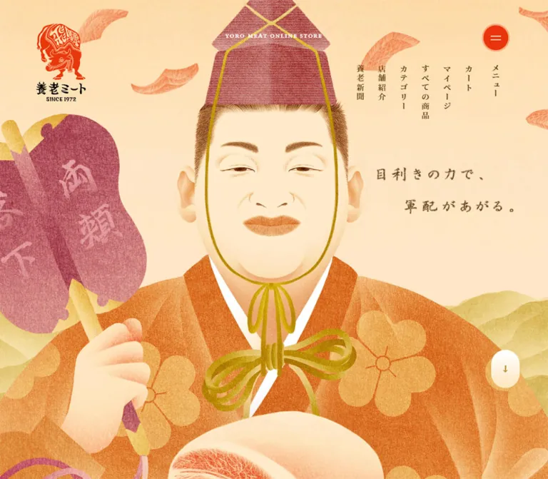
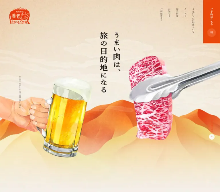
The website introduces 養老うまいもん広場BBQ場, a barbecue facility whose page identifies it as directly operated by 養老ミート. Its design connects food with a countryside excursion. The opening slogan, “うまい肉は、旅の目的地になる”, stands vertically between a beer held from the left edge and marbled beef gripped by tongs entering from the right. Layered ochre mountains and pale clouds make the composition feel like an illustrated destination poster.
The page continues as a long facility website with practical menu, access, and news information. Small navigation columns and a strong reservation block remain present while generous image intervals separate the content. Japanese Mincho typography gives even operational details an editorial tone. On mobile, the scene is recomposed around a narrow vertical headline, and desktop navigation becomes two square controls at the top right.
閉じる
Yoro Umaimon Hiroba BBQ — Style Reference
A barbecue destination presented as a Japanese travel poster: warm paper, vertical lettering, painted mountains, and oversized food.
Website: umaimon.yoro-meat.co.jp
Original URL: https://umaimon.yoro-meat.co.jp/
Final URL: https://umaimon.yoro-meat.co.jp/
Theme: a single observed light presentation with parchment tones and vermilion accents.
Inspected: October 5, 2026 at 06:13:29 JST, from supplied browser evidence captured at 2026-10-04T21:13:29.146Z.
Viewports: desktop 1440 × 1000 and mobile 390 × 844 CSS pixels.
Scope: the current facility homepage, including its opening composition, persistent navigation, an intermediate photographic composition, news, and footer. Rendered DOM measurements additionally cover the introduction, three features, menu, and facility information. Separate guide pages, external destinations, booking behavior, and the opened mobile menu were not inspected.
The website introduces 養老うまいもん広場BBQ場, a barbecue facility whose page identifies it as directly operated by 養老ミート. Its design connects food with a countryside excursion. The opening slogan, “うまい肉は、旅の目的地になる”, stands vertically between a beer held from the left edge and marbled beef gripped by tongs entering from the right. Layered ochre mountains and pale clouds make the composition feel like an illustrated destination poster.
The page continues as a long facility website with practical menu, access, and news information. Small navigation columns and a strong reservation block remain present while generous image intervals separate the content. Japanese Mincho typography gives even operational details an editorial tone. On mobile, the scene is recomposed around a narrow vertical headline, and desktop navigation becomes two square controls at the top right.
How to Read This Reference
- Measured means a value was supplied in rendered element bounds or computed styles. Values are CSS pixels unless stated otherwise; tables round long decimals for readability.
- Visually observed means a feature is visible in the supplied current-page captures. Sizes described as approximate were estimated from those captures, without pixel sampling.
- Calculated means a relationship was derived from supplied measurements, such as a column gap or relative width.
- Recommended means an implementation choice for reuse. It is not a claim about the original source code.
- Token names are descriptive aliases. The evidence contains no named source custom properties.
- A wrapper's computed font or background does not necessarily describe its children or artwork. This matters especially for the logo, hero slogan, reservation control, and English section headings.
- Only two viewport sizes are documented. The original breakpoints, intermediate scaling formulas, and landscape behavior are unknown.
Tokens — Colors
Default Palette
| Name | Value | Suggested token | Evidence and role |
|---|---|---|---|
| Vermilion | #e94709 |
--color-accent |
Measured footer background, reservation notice text, and map-link text. The visible reservation tab and logo use a closely corresponding orange-red. |
| Brown Ink | #241f1d |
--color-ink |
Measured Japanese body text, navigation, menu titles, and facility information. |
| Reversed Cream | #f2ede1 |
--color-on-accent |
Measured footer links and mobile navigation links present in the DOM. Do not treat this as a measured page-background color. |
| Milk | #fbfaf7 |
--color-control |
Measured background of the mobile menu square. |
| Date Gray | #a0988d |
--color-muted |
Measured news-date text. |
| Paper Base | approximately #f3eee4 |
--color-paper |
Visual estimate for the pale central and lower canvas. The actual surface contains texture and tonal variation. |
| Parchment Wash | approximately #efd9b6 |
--color-parchment |
Visual estimate for the warmer upper background. |
| Fine Rule | approximately #d1c9bb |
--color-rule |
Visual estimate for news separators. Border color was not included in the computed-style evidence. |
The first five colors are direct RGB-to-hex conversions from the supplied computed styles. The final three are practical approximations, not sampled source values.
The HTML and body records report white backgrounds, but the screenshots visibly show a textured cream composition. Use the rendered appearance as the visual authority; the white root background does not explain the intervening artwork or decorative layers.
Palette Behavior
Vermilion serves three different scales: a compact logo, a highly visible reservation control, and the full-width footer. Most intervening content stays on pale paper with dark brown text. Orange outline controls and occasional orange notices connect those larger accents without filling every section with color.
Food and scenery introduce additional colors through imagery: golden beer, pink-red marbling, silver tongs, warm orange ridges, and pale yellow foothills. These are image colors, not evidence of a larger interface-status palette. No alternate theme or color-selection control was observed.
Tokens — Typography
Japanese Mincho — Main Content
Measured family stack:
游明朝体, 'Yu Mincho', YuMincho,
'ヒラギノ明朝 Pro', 'Hiragino Mincho Pro',
'MS P明朝', 'MS PMincho', serif
This stack appears on Japanese paragraphs, navigation links, facility labels, and menu titles. Measured weights include 400 for ordinary information, 500 for introductory and feature prose, and 600 for navigation and emphasized titles.
The generous line spacing is essential. Desktop introductory prose uses 16.2px / 34.2px, approximately 2.11 line height. Mobile introductory prose uses 15.0724px / 29.2029px, approximately 1.94. News text keeps a looser mobile line height of 31.8196px.
CarrigDC — Selected Latin Utilities
CarrigDC is explicitly reported for news dates, the Google Map link, and the Page Top wrapper. Dates use regular weight; map and Page Top wrappers use 700.
The evidence does not identify the font-file URL or establish that every English heading uses CarrigDC. The sampled section-heading wrappers report Times, and their individual children were not measured. Retain that distinction when reproducing mixed English/Japanese headings.
For a new implementation, use CarrigDC only when an appropriate font asset is available. A fallback such as Georgia is a recommendation, not the measured source fallback.
Hero Slogan and Logo
The hero slogan looks like bold Japanese Mincho lettering, approximately 48–52px on desktop and 28–32px on mobile. These are visual estimates. Its text is absent from the supplied rendered-text extraction, so whether it is live text, an image, or another graphic implementation is unverified.
The H1 bounds correspond to the illustrated logo. Its computed Times 32px value does not identify the logo's lettering. Preserve the logo as an identity asset rather than rebuilding it with that wrapper font.
Type Scale
| Role | Desktop measured value | Mobile measured value | Weight and detail |
|---|---|---|---|
| Introductory prose | 16.2 / 34.2px |
15.07 / 29.20px |
500 |
| Feature paragraphs | 16.2 / 34.2px |
15.07 / 29.20px |
500; -0.06em tracking |
| Main menu titles | 23.4 / 40px |
18.84 / 32.21px |
600; 0.08em tracking |
| Smaller desktop menu titles | 19.8 / 33.85px |
18.84 / 32.21px |
600; 0.08em tracking |
| Side-menu heading | 19.8 / 36px |
18.84 / 34.26px |
600; 0.08em tracking |
| News dates | 21.6px |
18.84px |
CarrigDC 400; 0.025em tracking |
| News descriptions | 16.2 / 34.2px |
15.07 / 31.82px |
Mincho 400 |
| Facility field labels | 12.6px |
12.25px |
Mincho 600 |
| Facility values | 16.2 / 34.2px |
15.07 / 29.20px |
Mincho 400 |
| Desktop navigation | 14.4px |
Replaced by menu control | Mincho 600 |
| Primary footer links | 16.2px |
15.07px |
Mincho 600 |
| Corporate/store footer links | 14.4px |
12.25px |
600; 0.15em tracking |
| Google Map | 14.4 / 30.4px |
11.30 / 21.90px |
CarrigDC 700; 0.05em tracking |
The Japanese heading wrappers report 24px at both viewports, but their bounds change and their internal lettering was not separately measured. Do not use the wrapper value to override visible headline proportions.
Tokens — Spacing & Shapes
Density: sparse compositions around compact navigation and readable information blocks. Geometry: square utility tabs, a pill-shaped guide link, circular arrow controls, and a circular photograph. Source spacing system: unknown. Repeated decimal values are measurements, not proof of a particular rem or viewport-unit formula.
Spacing Scale
| Use | Desktop | Mobile | Status |
|---|---|---|---|
| Main content side inset | 225px for a 990px region |
18.84px for a 352.31px region |
Measured on menu notice/footer or corresponding content |
| Introductory prose width | 452.69px |
343.83px |
Measured |
| Menu introduction width | 468px |
343.83px |
Measured |
| Feature paragraph width | 270px |
254.34px |
Measured |
| Guide-link horizontal padding | left 31.5px, right 27px |
left 26.38px, right 21.20px |
Measured |
| Menu-title horizontal padding | 25.2px |
23.55px |
Measured |
| Reservation-notice padding | 22.5px |
approximately 17px |
Measured |
| Desktop navigation gap | 22.5px |
Not applicable | Calculated from adjacent 28.80px link boxes |
| Facility section to news section | 180px |
94.19px |
Calculated from section bounds |
| News end to footer start | 252px |
131.88px |
Calculated from section bounds |
Border Radius
| Element | Desktop | Mobile | Evidence |
|---|---|---|---|
| Guide link | 36px |
35.33px |
Computed radius |
| Reservation block | Square | Square | Visible captures |
| Mobile menu control | Not applicable | 0px |
Computed radius |
| Scroll arrow | Circle, approximately 36px diameter |
Circle, approximately 38px diameter |
Visible shape and enclosing link bounds |
| Footer arrow | Approximately 54px diameter |
Approximately 45–47px diameter |
Visual estimate supported by control bounds |
| Beef photograph | Circle, approximately 395px diameter |
Not visually documented | Desktop intermediate capture |
Layout Measurements
| Element | Desktop at 1440 × 1000 | Mobile at 390 × 844 |
|---|---|---|
| Logo wrapper | 135 × 106.19px, at 59.39, 46.80 |
89.02 × 69.70px, at 17.89, 18.36 |
| Reservation control | 108 × 279px, flush top right |
80.06 × 80.06px, flush top right |
| Menu control | Five exposed navigation columns | 80.06 × 80.06px, immediately left of reservation |
| Guide link | 279 × 72px, centered |
352.31 × 70.64px, nearly full content width |
| News region | Approximately 765px wide |
352.31px wide |
| News date column | 153px |
Date appears above description |
| News column gap | 58.5px |
Vertical spacing replaces horizontal gap |
| Footer | 396px high |
461.59px high |
| Footer top padding | 83.7px |
65.47px |
| Recorded document height | 11145.03px |
12022.72px |
Components
Persistent Identity and Desktop Navigation
Anatomy: illustrated logo at upper left; five independent vertical navigation links near the upper right; a reservation block attached to the right edge; a small vertical Latin brand caption near the left edge.
The desktop navigation links each occupy approximately 28.8px of width and begin at y = 52.19px. From left to right, the visible labels are “ご利用ガイド”, “お知らせ”, “施設情報”, “メニュー”, and “うまいもん広場について”. Their differing text lengths produce different column heights.
There is no opaque full-width header bar in the captures. The logo and navigation sit over the paper and remain at the same screen positions in the opening, intermediate, and footer views. This supports persistent positioning, although the supplied styles do not establish whether it is implemented with fixed elements or another mechanism.
Keep the logo visually separate from navigation. A conventional horizontal masthead would remove the poster-like framing.
Reservation Control
Desktop anatomy: a 108 × 279px vermilion rectangle, a cream vertical label reading “ご予約はこちら”, and a lighter circular area containing a cutlery symbol.
Mobile anatomy: an approximately 80px square at the top right, with the cutlery symbol above a short horizontal “ご予約” caption. It directly adjoins the pale menu square.
The reservation control remains visible in all supplied page positions. Its destination is not established: the corresponding anchor has an empty href in the evidence. That does not establish whether a script opens a booking interface, starts a call, or performs another action. Implement the actual reservation behavior explicitly in a new site.
Mobile Menu Control
A square milk-colored surface, approximately 80 × 80px, containing three dark horizontal strokes and the caption “メニュー”. It sits at x = 229.88px in the 390px capture.
The DOM also includes five larger cream navigation links at approximately 18.84px, but no supplied screenshot shows the open menu. Those records do not verify the panel background, opening transition, close control, or focus behavior. Only the closed control can be reproduced directly from visible evidence.
Opening Food Composition
Anatomy: pale textured canvas; a two-column vertical slogan; painted cloud ribbons; layered mountains; a hand and beer entering from the left; beef and tongs entering from the right; a separate scroll cue.
At desktop width, the slogan occupies the central upper area, approximately x = 650–790px and y = 205–600px. The beer becomes a large lower-left mass; the tong-held beef fills the lower-right area. The illustrations extend beyond the viewport edges. Their cropping is part of the composition.
On mobile, the slogan sits around x = 155–235px, beginning near y = 130px. The beef is placed above and to the right of the beer, while the mountain band sits around the lower third of the scene. The paper continues below the artwork to the bottom of the capture.
Use separate artwork layers or responsive compositions. Shrinking a complete desktop screenshot would make the headline, logo, and controls unusably small.
Scroll Cue
Anatomy: a narrow vertical “Scroll Down” caption and a pale circular button containing an orange downward arrow.
The enclosing desktop control is 36 × 121.70px, near the right edge at y = 644px. On mobile, it moves to the left at approximately x = 18.83px, y = 282.59px, with an enclosing size of 37.67 × 125.45px.
The relocation keeps it away from the mobile beef illustration and top-right controls. A 250ms opacity transition is declared on its anchor, but its activation and scrolling behavior were not tested.
Introductory Statement
The introduction combines a centered, vertically arranged heading with a narrow horizontal paragraph. Source heading copy includes “養老ミート隣接”, “買ってすぐ楽しめる”, and “BBQ広場”.
The measured heading wrapper is 204 × 441.14px on desktop and 147 × 323.16px on mobile. The paragraph below is approximately 453px wide on desktop and 344px on mobile. Its left-aligned prose contrasts with the upright heading, allowing the design to move from atmosphere into explanation without changing type family.
Preserve a restricted reading measure. Expanding the introductory paragraph to the entire desktop content width would weaken this transition.
Three Feature Columns
The feature section covers effortless barbecue preparation, local ingredients, and take-home goods. Each item contains a vertical heading, an explanatory paragraph, and an ordinal label in the form “特長 壱”, “特長 弐”, or “特長 参”. The exact visual placement of those ordinal labels is not documented in the captures.
Desktop paragraphs occupy three 270px columns beginning near x = 216.91, 585, and 953.09px. Their calculated inter-column gap is about 98.09px. The heading wrappers are narrower and centered above them.
On mobile, the items stack. Their paragraphs remain only 254.34px wide, centered within the 390px viewport. This is deliberately narrower than the general mobile content region. Keep this distinction instead of assigning every section the same width.
Guide Link
A thin orange pill outline with the label “ご利用ガイドを見る” and a small right arrow. The desktop link is centered and measures 279 × 72px; mobile expands it to 352.31 × 70.64px.
The visible label and outline are orange, even though the sampled anchor itself reports black text. This indicates that the wrapper style alone is insufficient to describe its descendants.
The href is directly evidenced as https://umaimon.yoro-meat.co.jp/guide/. The destination page was not inspected.
Circular Beef Composition
The intermediate desktop capture shows a large circular photograph of marbled beef centered over a pale scenic background. Its diameter is approximately 395px. Oversized cream Japanese characters sit around the circle, with spaced Latin lettering arranged above and below it.
The photograph introduces literal food texture after the illustrated opening. The surrounding characters and hills remain low in contrast, leaving the meat as the focal point. There is no visible elevated card or rectangular frame.
The still image does not establish rotation, a carousel, or any scroll-linked transformation. Mobile treatment of this composition is not visually documented.
Menu Section
Evidence level: structure, content, typography, and text-block geometry are measured; complete visual styling and menu imagery are not shown in the supplied screenshots.
The section begins with “Menu” and “メニュー”, followed by a narrow explanatory paragraph and a wider orange reservation notice. It contains five set offerings, then side-menu categories and practical notes.
The first two desktop offering text regions are 459px wide and share a row. The remaining three are 288px wide and share a subsequent row. Each offering groups a title, price and serving quantity, and an ingredient list. Main titles use 23.4px; the smaller desktop group uses 19.8px.
At mobile width, all five text regions become 352.31px wide and stack. Titles use 18.84px; long names wrap across multiple lines. One comparison-set title occupies three lines in the mobile evidence.
The side-menu area groups food, drinks, and desserts in label/value pairs. Its heading sits beside the groups on desktop and above them on mobile. Do not infer product-photo crops, card borders, or hover effects from the text geometry alone.
Facility Information
The “Store Info” section contains address, opening hours, phone number, road access, and railway access.
Desktop information uses small semibold field labels at the left and larger values to their right. The map link sits toward the right side of the address row. On mobile, the label/value relationship remains: labels begin near x = 18.84px, and values begin near x = 115.38px. The map link moves beneath the address within the value region.
Transport instructions change more substantially. Their category labels sit beside the details on desktop, then above the corresponding lists on mobile.
The phone anchor explicitly uses tel:0584-34-3939; the map anchor has a supplied Google Maps URL. These destinations are known, but neither was activated during the documented inspection.
News Rows
Two news entries appear in a restrained ruled list. The date is larger, muted, and set in CarrigDC; the description is smaller dark Mincho text. Thin horizontal separators provide structure without filled cards.
Desktop rows pair a 153px date region with a description region beginning 211.5px farther right. The widest description measures 553.5px. On mobile, dates sit above their descriptions, and the whole row spans approximately 352px.
The displayed 2021.07.09 dates are content dates. They do not change the inspection date or establish that the current visual design is unchanged from that year.
Footer
A full-width vermilion field closes the page. On desktop it is 396px high, with content beginning 83.7px below its top and 225px from the left.
The first link group contains the guide, reservation, and Instagram. A second group contains the corporate website and online store, with small outward arrows. The Page Top control sits to the right, combining its caption with a lighter circular upward-arrow button. Copyright appears lower and toward the right.
On mobile, the footer grows to approximately 462px. Link groups stack along the left edge with roughly 19px inset. The Page Top caption turns vertically and sits above its circle near the lower right. Copyright remains a small horizontal line toward the left.
The persistent logo and top-right controls remain visible over the page at this scroll position. Avoid adding another full logo inside the footer merely to follow a generic footer template.
Tokens — Motion & Interaction
| Treatment | Direct evidence | What remains unknown |
|---|---|---|
| Map-link transition | Computed opacity 0.25s |
Trigger, target opacity, and actual hover appearance |
| Instagram and corporate/store links | Computed opacity 0.25s |
Hover and focus results |
| Scroll cue | Computed opacity 0.25s |
Click result and scroll timing |
| Persistent navigation | Same screen placement across supplied scroll captures | Exact positioning and scroll-handling implementation |
| Mobile menu | Closed control plus navigation entries in DOM | Open appearance, animation, dismissal, and keyboard behavior |
| Reservation | Visible action in header and footer | Booking destination or script-driven interaction |
| Page Top | Caption and upward-arrow control | Actual scroll implementation and duration |
| Scenic and circular artwork | Still compositions at captured positions | Parallax, rotation, entrance sequences, and ongoing animation |
Most sampled elements report animation: none. Several report only transition: all, without a nonzero duration. Neither observation proves that the full experience is static: scripts, descendants, pseudo-elements, and unrecorded graphics may behave differently.
The capture procedure waited for document readiness, visible-image decoding, and sampled layout stability. It included at least five seconds of initial observation, used bounded animation waits, and temporarily paused perpetual animations during readiness checks. No supplied interaction trace establishes a specific scene animation.
Recommended motion for reuse: retain restrained 250ms opacity feedback for appropriate links. Any new scene movement should be optional and should preserve readable resting states. Do not invent continuous spinning, bouncing arrows, or parallax as documented original behavior.
Surfaces
| Layer | Appearance | Design function |
|---|---|---|
| Main canvas | Pale paper with fine mottling and a warmer upper wash | Gives the page a physical, printed character |
| Scenic decoration | Broad translucent cloud shapes and overlapping painted hills | Connects separated compositions without boxed sections |
| Food artwork | Detailed cutouts and a circular photograph | Supplies saturation, texture, and focal weight |
| Body content | Dark serif text directly over pale surfaces | Maintains an editorial flow |
| Guide action | Transparent pill with a fine orange outline | Offers a quiet secondary destination |
| Reservation | Solid orange rectangle with reversed details | Creates a persistent primary action |
| Mobile menu | Pale square | Keeps navigation distinct from reservation |
| Footer | Solid orange with cream text | Provides a decisive visual ending |
The visible areas use little conventional elevation. No broad card-shadow system appears in the supplied captures. Menu-container surfaces are not sufficiently documented to extend that statement to every component.
Imagery
The opening mixes watercolor-like illustration with detailed food rendering. Beer foam, glass reflections, marbling, and metal highlights are recognizable, while the cutout edges and scenery retain a painted quality. Food is presented at a deliberately exaggerated scale; the landscape is a setting rather than a realistic background photograph.
Clouds are broad, pale ribbons. Mountains overlap as angular orange, ochre, and yellow masses with softened texture. At lower positions, the scenery becomes much paler, allowing informational text and photography to dominate.
The intermediate meat photograph has a crisp circular crop. Cream decorative lettering surrounds it without a containing card. The logo is a compact vermilion illustration combining Japanese lettering, mountain forms, and cattle imagery.
Observed Asset References
No original image filenames, asset URLs, intrinsic dimensions, or format metadata were supplied. The following inventory identifies visible assets without inventing paths.
| Asset | Evidence | Implementation guidance |
|---|---|---|
| Illustrated logo | Desktop and mobile captures | Preserve as an identity asset with meaningful alternative text |
| Hand holding beer | Opening captures | Retain transparent or carefully masked edges and viewport cropping |
| Beef held by tongs | Opening captures | Preserve the diagonal entry of the tongs and prominent marbling |
| Mountain scenery | Opening and desktop lower captures | Treat as decorative artwork; provide responsive placement |
| Cloud ribbons | Opening and intermediate captures | Keep pale and subordinate to text |
| Paper texture | All current-page captures | Use a subtle repeating or sufficiently large background asset |
| Circular beef photograph | Desktop intermediate capture | Use a circular crop and preserve the meat as the central subject |
| Hero slogan | Opening captures | Original rendering method unknown; accessible live text is a recommended adaptation |
| Cutlery, arrows, menu lines, Instagram mark | Visible controls | Use compact, consistent icons; the source icon technology is unknown |
Use appropriately authorized assets when reproducing the original identity. A paper-colored rectangle and generic steak photograph will not reproduce the composition by themselves.
Layout & Responsive Behavior
Long-Page Structure
The observed sequence is opening artwork, introduction, visual intervals, three features, guide link, a circular photographic composition, menu, facility information, news, and footer. Some visual intervals are represented more clearly in screenshots than in extracted text.
| Section | Desktop document y-position | Mobile document y-position |
|---|---|---|
| Introduction begins | 2000px |
1688px |
| Features begin | 4731.66px |
4209.34px |
| Guide link begins | 5226.66px |
5446.34px |
| Menu begins | 6258.05px |
6019.06px |
| Facility information begins | 8860.84px |
9995.91px |
| News begins | 10017.30px |
10972.94px |
| Footer begins | 10749.03px |
11561.13px |
The introduction begins at twice the viewport height in both supplied layouts. This is a measured staging relationship, not proof of a pinned animation. These coordinates describe the captured document; they should not be copied as absolute positions or unexplained blank margins. Decorative layers and script-controlled layout are not fully represented in the element inventory.
Desktop to Mobile Changes
- The logo decreases from
135pxto approximately89pxwide and moves closer to the upper-left edge. - Five exposed navigation columns are replaced visually by a square menu control. Reservation changes from a tall tab to an adjacent square.
- The hero is recomposed: the headline stays readable, the beef sits above the beer, and the scroll cue moves from the right to the left.
- Feature columns stack, but their paragraph measure stays narrower than the general content width.
- The guide link expands from a compact centered pill to almost the entire mobile content width.
- Two-plus-three desktop menu text groups become one vertical sequence of five offerings.
- Facility label/value rows remain two-column, while transport categories move above their lists.
- News dates move above descriptions.
- Footer groups stack; Page Top becomes a vertical caption above a circular arrow.
The menu section grows from approximately 1784px to 3553px high. This is the largest measured section expansion and helps explain why the mobile document is taller despite smaller typography and shorter decorative intervals.
Recommended breakpoint: the Quick Start uses 960px as an implementation starting point, not an observed source breakpoint. Validate the header between tablet and desktop widths, where five vertical navigation links and a reservation tab must coexist with the logo.
Do’s and Don’ts
Do
- Build the visual hierarchy around pale textured paper, dark brown Mincho text, and vermilion actions.
- Preserve vertical Japanese lettering as a structural feature of the opening and navigation.
- Let the food artwork extend beyond the viewport edges.
- Keep the desktop reservation tab visually stronger than the guide link.
- Recompose the mobile hero instead of uniformly scaling the desktop scene.
- Preserve narrow reading measures and unusually generous paragraph leading.
- Keep feature paragraphs narrower than general mobile content.
- Use horizontal rules, typography, and spacing to organize news.
- Retain the desktop-to-mobile changes in menu, access information, and footer layout.
- Separate visible evidence from inferred artwork implementation or untested behavior.
Don’t
- Don’t turn the facility homepage into a generic sales landing-page template.
- Don’t replace the illustrated opening with a dark full-bleed grill photograph.
- Don’t set every heading and utility in a modern sans-serif.
- Don’t box every content group into rounded cards with shadows.
- Don’t use the same content width for the intro, features, menu, and news.
- Don’t treat the logo wrapper's font as the logo's typeface.
- Don’t infer an orange mobile overlay solely from cream navigation text in the DOM.
- Don’t invent booking destinations or assume empty href values prove broken interactions.
- Don’t copy large document offsets as fixed blank spacers without understanding the scenic layout.
- Don’t describe unobserved spinning, parallax, or entrance animation as an original feature.
Recommended Implementation Additions
These are recommendations for a new implementation, not verified features of the inspected website.
- Use semantic links for actual destinations and buttons for menu or booking dialogs. Give each a visible keyboard focus state.
- Add
aria-expandedandaria-controlsto the menu trigger. If the menu is a modal overlay, implement focus management, Escape dismissal, and a clear close control. - Provide an accessible text equivalent for the hero slogan if it is rendered as artwork. Mark mountains, clouds, and decorative lettering as decorative.
- Keep transparent fixed navigation from permanently hiding anchor destinations. Use suitable scroll offsets and test focused controls near the top edge.
- Verify contrast for small cream text on orange and muted dates on textured paper. The palette measurements are not an accessibility pass.
- Preserve sufficiently large interactive hit areas around small arrows and utility labels.
- Respect reduced-motion preferences for any added scene movement or smooth scrolling.
- Test longer menu names, zoom, missing fonts, and narrow phones. Permit content growth rather than relying on fixed-height text boxes.
- Reserve image dimensions and use responsive image sources so large food illustrations do not shift the layout during loading.
Agent Prompt Guide
Quick Color Reference
- Main ink: measured
#241f1d. - Strong accent and footer: measured
#e94709. - Reversed footer text: measured
#f2ede1. - Mobile menu square: measured
#fbfaf7. - News dates: measured
#a0988d. - Pale paper approximation:
#f3eee4, with subtle warm texture. - Fine rule approximation:
#d1c9bb. - Additional food and landscape colors should come primarily from artwork.
Overall Prompt
“Create a Japanese barbecue facility homepage inspired by Yoro Umaimon Hiroba BBQ. Use pale textured paper, dark brown Mincho typography, vertical Japanese headings, and a vermilion reservation control. Compose the opening like an illustrated travel poster: a hand holding golden beer enters from the left, marbled beef held by silver tongs enters from the right, and painted orange mountains sit behind them. Keep a compact illustrated logo at upper left and five narrow vertical navigation columns at upper right. Continue through a narrow introduction, three features, an outlined guide pill, a circular beef photograph, practical menu and access information, ruled news rows, and a full-width orange footer. Recompose the phone layout with two 80px utility squares and vertically stacked content. Use artwork and spacing rather than shadows for visual depth.”
Example Component Prompts
- Opening scene: “Place the two-column vertical copy ‘うまい肉は、旅の目的地になる’ near the center of a warm paper composition. Balance large beer artwork at lower left with tong-held marbled beef at right. Use pale cloud ribbons and layered orange hills. Keep the headline unobstructed and the artwork cropped by the viewport.”
- Persistent navigation: “Create five dark Mincho navigation columns floating over the page, plus a 108 × 279px vermilion reservation tab attached to the upper-right edge. On mobile, replace the visible navigation columns with a pale menu square next to an orange reservation square, each about 80px.”
- Feature group: “Arrange three unboxed editorial features across desktop, each with a narrow vertical Japanese heading, an ordinal label, and a 270px paragraph with generous leading. On mobile, stack the features and center their approximately 254px paragraphs.”
- Guide link: “Create a fine orange outlined pill with ‘ご利用ガイドを見る’ and a small right arrow. Use a 279 × 72px desktop shape, expanding to the mobile content width without adding a shadow.”
- News list: “Use muted serif dates and dark Mincho descriptions on textured cream paper. Desktop rows have a date column and a wider description column separated by generous space. Stack the date above the description on mobile. Divide entries with fine warm-gray rules.”
- Footer: “Create a flat vermilion footer with cream text, two link groups, small external arrows, and a circular Page Top control. Stack the groups on mobile and put a vertical Page Top caption above its circle near the lower-right corner.”
Quick Start
CSS Custom Properties
This is a usable adaptation, not recovered source CSS. Measured desktop values anchor the tokens; the mobile rules use measured mobile endpoints. The 960px breakpoint, focus treatment, fallback fonts, and artwork positioning are recommendations.
The CSS expects separate image elements for the logo and scenic artwork. Set --paper-texture to an authorized image when available; it defaults to no image. No asset filenames or booking endpoints are assumed. The hero uses ordinary document flow rather than attempting to reproduce unverified scroll staging.
:root {
  /* Measured interface colors */
  --color-accent: #e94709;
  --color-ink: #241f1d;
  --color-on-accent: #f2ede1;
  --color-control: #fbfaf7;
  --color-muted: #a0988d;

  /* Visual approximations */
  --color-paper: #f3eee4;
  --color-rule: #d1c9bb;
  --paper-texture: none;

  /* Measured Japanese stack; recommended Latin fallback */
  --font-japanese: '游明朝体', 'Yu Mincho', YuMincho,
    'ヒラギノ明朝 Pro', 'Hiragino Mincho Pro',
    'MS P明朝', 'MS PMincho', serif;
  --font-latin: 'CarrigDC', Georgia, serif;

  --text-body: 16.2px;
  --leading-body: 34.2px;
  --text-menu: 23.4px;
  --text-menu-small: 19.8px;
  --text-date: 21.6px;
  --text-label: 12.6px;

  --content-wide: 990px;
  --content-news: 765px;
  --content-prose: 468px;
  --page-gutter: 32px;
  --guide-height: 72px;
  --guide-radius: 36px;
  --motion-link: 250ms;
}

* { box-sizing: border-box; }

html { scroll-padding-top: 110px; }

body {
  margin: 0;
  color: var(--color-ink);
  background-color: var(--color-paper);
  background-image: var(--paper-texture);
  font-family: var(--font-japanese);
  font-size: var(--text-body);
  line-height: var(--leading-body);
}

img { display: block; max-width: 100%; }
button { font: inherit; }
a { color: inherit; }

.content-wide,
.news-list {
  width: min(calc(100% - 2 * var(--page-gutter)), var(--content-wide));
  margin-inline: auto;
}

.prose {
  width: min(calc(100% - 2 * var(--page-gutter)), var(--content-prose));
  margin-inline: auto;
  font-weight: 500;
}

/* Transparent persistent chrome */
.site-header {
  position: fixed;
  inset: 0 0 auto;
  z-index: 30;
  pointer-events: none;
}

.site-header > * { pointer-events: auto; }

.brand {
  position: absolute;
  top: 46.8px;
  left: 59.4px;
  width: 135px;
}

.desktop-nav {
  position: absolute;
  top: 52.2px;
  right: 162px;
  display: flex;
  align-items: flex-start;
  gap: 22.5px;
}

.desktop-nav a {
  width: 28.8px;
  writing-mode: vertical-rl;
  text-orientation: upright;
  font-size: 14.4px;
  font-weight: 600;
  line-height: 2;
  text-decoration: none;
}

.reservation {
  position: absolute;
  top: 0;
  right: 0;
  display: flex;
  flex-direction: column;
  align-items: center;
  gap: 20px;
  width: 108px;
  height: 279px;
  padding: 50px 0 0;
  border: 0;
  color: var(--color-on-accent);
  background: var(--color-accent);
  text-decoration: none;
  cursor: pointer;
}

.reservation-label {
  writing-mode: vertical-rl;
  text-orientation: upright;
  line-height: 1.3;
}

.action-icon,
.arrow-circle {
  display: grid;
  place-items: center;
  flex: none;
  width: 54px;
  height: 54px;
  border-radius: 50%;
  background: rgb(255 255 255 / 12%);
}

.action-icon svg,
.arrow-circle svg {
  width: 20px;
  height: 20px;
}

.menu-toggle { display: none; }

/* Recommended static composition using separate artwork layers */
.hero {
  position: relative;
  isolation: isolate;
  min-height: max(720px, 100svh);
  overflow: clip;
}

.hero-title {
  position: absolute;
  z-index: 3;
  top: 20.5%;
  left: 50%;
  display: flex;
  flex-direction: row-reverse;
  gap: 28px;
  margin: 0;
  transform: translateX(-50%);
  font-size: 50px;
  font-weight: 600;
  line-height: 1.15;
}

.hero-title > span {
  writing-mode: vertical-rl;
  text-orientation: upright;
}

.hero-art {
  position: absolute;
  pointer-events: none;
}

.hero-clouds { top: 23%; left: 0; width: 100%; }
.hero-mountains { top: 64%; left: 0; width: 100%; }
.hero-beer { z-index: 2; top: 50%; left: -1%; width: 43%; }
.hero-beef { z-index: 2; top: 35.5%; right: -1%; width: 42%; }

.scroll-cue {
  position: absolute;
  z-index: 4;
  top: 64.4%;
  right: 34.2px;
  display: flex;
  flex-direction: column;
  align-items: center;
  gap: 14px;
  color: var(--color-accent);
  font-family: var(--font-latin);
  font-size: 12px;
  line-height: 1;
  text-decoration: none;
}

.scroll-cue > span:first-child { writing-mode: vertical-rl; }
.scroll-cue .arrow-circle {
  width: 36px;
  height: 36px;
  background: var(--color-control);
}

/* Editorial sections */
.features {
  display: grid;
  grid-template-columns: repeat(3, 270px);
  justify-content: space-between;
  gap: 40px;
  width: min(calc(100% - 2 * var(--page-gutter)), 1006.2px);
  margin-inline: auto;
}

.feature-heading {
  width: fit-content;
  margin-inline: auto;
  writing-mode: vertical-rl;
  text-orientation: upright;
  font-weight: 600;
}

.feature-copy {
  font-weight: 500;
  letter-spacing: -0.06em;
}

.guide-link {
  display: flex;
  align-items: center;
  justify-content: space-between;
  width: 279px;
  min-height: var(--guide-height);
  margin: 48px auto 0;
  padding-inline: 31.5px 27px;
  border: 1px solid var(--color-accent);
  border-radius: var(--guide-radius);
  color: var(--color-accent);
  font-weight: 600;
  text-decoration: none;
}

.beef-medallion {
  width: min(395px, 76vw);
  aspect-ratio: 1;
  margin-inline: auto;
  border-radius: 50%;
  object-fit: cover;
}

.reservation-notice {
  padding: 22.5px;
  color: var(--color-accent);
  font-weight: 600;
}

.menu-featured,
.menu-other {
  display: grid;
  grid-template-columns: repeat(2, minmax(0, 1fr));
  gap: 72px;
}

.menu-other {
  grid-template-columns: repeat(3, minmax(0, 1fr));
  gap: 61.2px;
  margin-top: 80px;
}

.menu-item { min-width: 0; }
.menu-item > :is(h3, p) { padding-inline: 25.2px; }

.menu-item h3 {
  font-size: var(--text-menu);
  font-weight: 600;
  line-height: 40px;
  letter-spacing: 0.08em;
}

.menu-other h3 {
  font-size: var(--text-menu-small);
  line-height: 33.85px;
}

.news-list { max-width: var(--content-news); }

.news-row {
  display: grid;
  grid-template-columns: 153px minmax(0, 1fr);
  align-items: center;
  gap: 58.5px;
  padding-block: 36px;
  border-top: 1px solid var(--color-rule);
}

.news-row:last-child { border-bottom: 1px solid var(--color-rule); }
.news-row p { margin: 0; }

.news-date {
  color: var(--color-muted);
  font-family: var(--font-latin);
  font-size: var(--text-date);
  line-height: 1.2;
  letter-spacing: 0.025em;
}

/* Footer geometry follows the measured desktop proportions */
.site-footer {
  min-height: 396px;
  padding: 83.7px var(--page-gutter) 40px;
  color: var(--color-on-accent);
  background: var(--color-accent);
}

.footer-inner {
  position: relative;
  display: grid;
  grid-template-columns: max-content max-content 1fr;
  align-items: start;
  gap: 0 108px;
  max-width: 990px;
  margin-inline: auto;
}

.footer-links { display: grid; gap: 12px; }
.footer-links a { font-weight: 600; text-decoration: none; }
.footer-secondary { font-size: 14.4px; letter-spacing: 0.15em; }

.page-top {
  display: flex;
  align-items: center;
  justify-self: end;
  gap: 18px;
  font-family: var(--font-latin);
  font-size: 12.6px;
  line-height: 1.2;
  text-decoration: none;
}

.copyright {
  grid-column: 1 / -1;
  justify-self: end;
  margin: 80px 0 0;
  font-size: 10px;
  line-height: 1.6;
  letter-spacing: 0.05em;
}

/* The source declares opacity transitions; this hover target is recommended. */
.utility-link,
.scroll-cue { transition: opacity var(--motion-link); }

@media (hover: hover) {
  .utility-link:hover,
  .scroll-cue:hover { opacity: 0.72; }
}

:where(a, button):focus-visible {
  outline: 2px solid currentColor;
  outline-offset: 5px;
}

/* Recommended breakpoint; mobile values use the captured 390px endpoint. */
@media (max-width: 960px) {
  :root {
    --text-body: 15.0724px;
    --leading-body: 29.2029px;
    --text-menu: 18.8406px;
    --text-menu-small: 18.8406px;
    --text-date: 18.8406px;
    --text-label: 12.2464px;
    --page-gutter: 18.84px;
    --guide-height: 70.64px;
    --guide-radius: 35.33px;
  }

  .brand { top: 18.36px; left: 17.89px; width: 89.02px; }
  .desktop-nav { display: none; }

  .menu-toggle,
  .reservation {
    position: absolute;
    top: 0;
    display: flex;
    flex-direction: column;
    align-items: center;
    justify-content: center;
    gap: 8px;
    width: 80px;
    height: 80px;
    padding: 0;
    border: 0;
    font-size: 12px;
    line-height: 1.2;
  }

  .menu-toggle {
    right: 80px;
    color: var(--color-ink);
    background: var(--color-control);
    cursor: pointer;
  }

  .reservation-label { writing-mode: horizontal-tb; }
  .reservation .action-icon { order: -1; width: 24px; height: 24px; background: none; }

  .hero { min-height: 100svh; }
  .hero-title { top: 15.4%; gap: 18px; font-size: 30px; }
  .hero-clouds { top: 17%; }
  .hero-mountains { top: 62%; }
  .hero-beer { top: 50%; left: -3%; width: 53%; }
  .hero-beef { top: 35.5%; right: -5%; width: 48%; }
  .scroll-cue { top: 33.5%; right: auto; left: 18.84px; }
  .scroll-cue .arrow-circle { width: 37.67px; height: 37.67px; }

  .prose { width: min(calc(100% - 46.16px), 468px); }
  .features { grid-template-columns: minmax(0, 1fr); gap: 84.8px; }
  .feature { width: min(100%, 254.34px); margin-inline: auto; }

  .guide-link {
    width: calc(100% - 2 * var(--page-gutter));
    padding-inline: 26.38px 21.2px;
  }

  .reservation-notice { padding: 17px; }
  .menu-featured,
  .menu-other { grid-template-columns: minmax(0, 1fr); gap: 64px; }
  .menu-item > :is(h3, p) { padding-inline: 23.55px; }
  .menu-item h3 { line-height: 32.21px; }

  .news-row { grid-template-columns: minmax(0, 1fr); gap: 7px; padding-block: 25px; }
  .news-row p { line-height: 31.8196px; }

  .site-footer { min-height: 461.59px; padding-top: 65.47px; }
  .footer-inner { display: block; min-height: 356px; }
  .footer-secondary { margin-top: 40px; font-size: 12.2464px; }
  .page-top { position: absolute; right: 0; bottom: 15px; flex-direction: column; }
  .page-top > span:first-child { writing-mode: vertical-rl; }
  .page-top .arrow-circle { width: 45px; height: 45px; }
  .copyright { margin-top: 64px; }
}

@media (prefers-reduced-motion: reduce) {
  .utility-link,
  .scroll-cue { transition: none; }
}
For the hero headline, place the two quoted lines in separate spans, with “うまい肉は、” first and “旅の目的地になる” second. The row-reverse arrangement places the first column on the right. Artwork positions assume tightly cropped transparent assets and require adjustment to their actual bounds.
The CSS supplies appearance, not menu or booking logic. Connect controls to real destinations or implemented dialogs; do not use empty href values as functional placeholders.
Tailwind v4 Token Mapping
Optional aliases for projects already using Tailwind v4. This does not imply that the original site uses Tailwind. Define the custom properties above first.
@theme inline {
  --color-paper: #f3eee4;
  --color-ink: #241f1d;
  --color-vermilion: #e94709;
  --color-cream: #f2ede1;
  --color-milk: #fbfaf7;
  --color-date: #a0988d;
  --color-rule: #d1c9bb;

  --font-mincho: var(--font-japanese);
  --font-editorial: var(--font-latin);

  --text-copy: var(--text-body);
  --text-offering: var(--text-menu);
  --text-news-date: var(--text-date);
  --text-field-label: var(--text-label);

  --spacing-page: var(--page-gutter);
  --radius-guide: var(--guide-radius);
}
Sources & Evidence
- Inspected original and final page: Yoro Umaimon Hiroba BBQ. The supplied browser record reports HTTP
200and no change between original and final URLs. - Capture timestamp:
2026-10-04T21:13:29.146Z, equivalent to October 5, 2026 at 06:13:29 JST. - Desktop evidence: three supplied
1440 × 1000captures showing the opening, an intermediate guide/photograph area, and the news/footer boundary; rendered DOM and computed-style records across the homepage. - Mobile evidence: two supplied
390 × 844captures showing the opening and news/footer area; rendered DOM and computed-style records across the homepage. - Measured material: element bounds, text, selected href values, font families, font sizes and weights, line heights, letter spacing, padding, backgrounds, radii, and transition declarations. No original stylesheet files or image-asset inventory were provided.
- Observed state changes: the page was captured at multiple scroll positions. Persistent chrome and responsive rearrangement can be compared directly. Menu opening, booking, hover results, and Page Top activation are not documented.
- Operator evidence: the original page describes the facility as directly operated by 養老ミート, links to its corporate site, and includes its name in the footer copyright. No production-credit claim is made from the inspected homepage evidence.
- Limitations: full menu imagery, hidden navigation appearance, font loading success, exact decorative asset composition, breakpoints, and ongoing or script-driven motion remain unverified. SharedWorkers and service workers were disabled during the supplied inspection.
This reference documents the current supplied page state. Estimated colors, recommended responsive rules, and reusable CSS are explicitly distinguished from measured source evidence.
# Yoro Umaimon Hiroba BBQ — Style Reference

> A barbecue destination presented as a Japanese travel poster: warm paper, vertical lettering, painted mountains, and oversized food.

**Website:** [umaimon.yoro-meat.co.jp](https://umaimon.yoro-meat.co.jp/)
**Original URL:** https://umaimon.yoro-meat.co.jp/
**Final URL:** https://umaimon.yoro-meat.co.jp/
**Theme:** a single observed light presentation with parchment tones and vermilion accents.
**Inspected:** October 5, 2026 at 06:13:29 JST, from supplied browser evidence captured at `2026-10-04T21:13:29.146Z`.
**Viewports:** desktop `1440 × 1000` and mobile `390 × 844` CSS pixels.
**Scope:** the current facility homepage, including its opening composition, persistent navigation, an intermediate photographic composition, news, and footer. Rendered DOM measurements additionally cover the introduction, three features, menu, and facility information. Separate guide pages, external destinations, booking behavior, and the opened mobile menu were not inspected.

The website introduces 養老うまいもん広場BBQ場, a barbecue facility whose page identifies it as directly operated by 養老ミート. Its design connects food with a countryside excursion. The opening slogan, “うまい肉は、旅の目的地になる”, stands vertically between a beer held from the left edge and marbled beef gripped by tongs entering from the right. Layered ochre mountains and pale clouds make the composition feel like an illustrated destination poster.

The page continues as a long facility website with practical menu, access, and news information. Small navigation columns and a strong reservation block remain present while generous image intervals separate the content. Japanese Mincho typography gives even operational details an editorial tone. On mobile, the scene is recomposed around a narrow vertical headline, and desktop navigation becomes two square controls at the top right.
閉じる
# Yoro Umaimon Hiroba BBQ — Style Reference

> A barbecue destination presented as a Japanese travel poster: warm paper, vertical lettering, painted mountains, and oversized food.

**Website:** [umaimon.yoro-meat.co.jp](https://umaimon.yoro-meat.co.jp/)
**Original URL:** https://umaimon.yoro-meat.co.jp/
**Final URL:** https://umaimon.yoro-meat.co.jp/
**Theme:** a single observed light presentation with parchment tones and vermilion accents.
**Inspected:** October 5, 2026 at 06:13:29 JST, from supplied browser evidence captured at `2026-10-04T21:13:29.146Z`.
**Viewports:** desktop `1440 × 1000` and mobile `390 × 844` CSS pixels.
**Scope:** the current facility homepage, including its opening composition, persistent navigation, an intermediate photographic composition, news, and footer. Rendered DOM measurements additionally cover the introduction, three features, menu, and facility information. Separate guide pages, external destinations, booking behavior, and the opened mobile menu were not inspected.

The website introduces 養老うまいもん広場BBQ場, a barbecue facility whose page identifies it as directly operated by 養老ミート. Its design connects food with a countryside excursion. The opening slogan, “うまい肉は、旅の目的地になる”, stands vertically between a beer held from the left edge and marbled beef gripped by tongs entering from the right. Layered ochre mountains and pale clouds make the composition feel like an illustrated destination poster.

The page continues as a long facility website with practical menu, access, and news information. Small navigation columns and a strong reservation block remain present while generous image intervals separate the content. Japanese Mincho typography gives even operational details an editorial tone. On mobile, the scene is recomposed around a narrow vertical headline, and desktop navigation becomes two square controls at the top right.

## How to Read This Reference

- **Measured** means a value was supplied in rendered element bounds or computed styles. Values are CSS pixels unless stated otherwise; tables round long decimals for readability.
- **Visually observed** means a feature is visible in the supplied current-page captures. Sizes described as approximate were estimated from those captures, without pixel sampling.
- **Calculated** means a relationship was derived from supplied measurements, such as a column gap or relative width.
- **Recommended** means an implementation choice for reuse. It is not a claim about the original source code.
- Token names are descriptive aliases. The evidence contains no named source custom properties.
- A wrapper's computed font or background does not necessarily describe its children or artwork. This matters especially for the logo, hero slogan, reservation control, and English section headings.
- Only two viewport sizes are documented. The original breakpoints, intermediate scaling formulas, and landscape behavior are unknown.

## Tokens — Colors

### Default Palette

| Name | Value | Suggested token | Evidence and role |
| --- | --- | --- | --- |
| Vermilion | `#e94709` | `--color-accent` | Measured footer background, reservation notice text, and map-link text. The visible reservation tab and logo use a closely corresponding orange-red. |
| Brown Ink | `#241f1d` | `--color-ink` | Measured Japanese body text, navigation, menu titles, and facility information. |
| Reversed Cream | `#f2ede1` | `--color-on-accent` | Measured footer links and mobile navigation links present in the DOM. Do not treat this as a measured page-background color. |
| Milk | `#fbfaf7` | `--color-control` | Measured background of the mobile menu square. |
| Date Gray | `#a0988d` | `--color-muted` | Measured news-date text. |
| Paper Base | approximately `#f3eee4` | `--color-paper` | Visual estimate for the pale central and lower canvas. The actual surface contains texture and tonal variation. |
| Parchment Wash | approximately `#efd9b6` | `--color-parchment` | Visual estimate for the warmer upper background. |
| Fine Rule | approximately `#d1c9bb` | `--color-rule` | Visual estimate for news separators. Border color was not included in the computed-style evidence. |

The first five colors are direct RGB-to-hex conversions from the supplied computed styles. The final three are practical approximations, not sampled source values.

The HTML and body records report white backgrounds, but the screenshots visibly show a textured cream composition. Use the rendered appearance as the visual authority; the white root background does not explain the intervening artwork or decorative layers.

### Palette Behavior

Vermilion serves three different scales: a compact logo, a highly visible reservation control, and the full-width footer. Most intervening content stays on pale paper with dark brown text. Orange outline controls and occasional orange notices connect those larger accents without filling every section with color.

Food and scenery introduce additional colors through imagery: golden beer, pink-red marbling, silver tongs, warm orange ridges, and pale yellow foothills. These are image colors, not evidence of a larger interface-status palette. No alternate theme or color-selection control was observed.

## Tokens — Typography

### Japanese Mincho — Main Content

**Measured family stack:**

```css
游明朝体, 'Yu Mincho', YuMincho,
'ヒラギノ明朝 Pro', 'Hiragino Mincho Pro',
'MS P明朝', 'MS PMincho', serif
```

This stack appears on Japanese paragraphs, navigation links, facility labels, and menu titles. Measured weights include `400` for ordinary information, `500` for introductory and feature prose, and `600` for navigation and emphasized titles.

The generous line spacing is essential. Desktop introductory prose uses `16.2px / 34.2px`, approximately `2.11` line height. Mobile introductory prose uses `15.0724px / 29.2029px`, approximately `1.94`. News text keeps a looser mobile line height of `31.8196px`.

### CarrigDC — Selected Latin Utilities

`CarrigDC` is explicitly reported for news dates, the Google Map link, and the Page Top wrapper. Dates use regular weight; map and Page Top wrappers use `700`.

The evidence does not identify the font-file URL or establish that every English heading uses CarrigDC. The sampled section-heading wrappers report `Times`, and their individual children were not measured. Retain that distinction when reproducing mixed English/Japanese headings.

For a new implementation, use CarrigDC only when an appropriate font asset is available. A fallback such as Georgia is a recommendation, not the measured source fallback.

### Hero Slogan and Logo

The hero slogan looks like bold Japanese Mincho lettering, approximately `48–52px` on desktop and `28–32px` on mobile. These are visual estimates. Its text is absent from the supplied rendered-text extraction, so whether it is live text, an image, or another graphic implementation is unverified.

The H1 bounds correspond to the illustrated logo. Its computed `Times 32px` value does not identify the logo's lettering. Preserve the logo as an identity asset rather than rebuilding it with that wrapper font.

### Type Scale

| Role | Desktop measured value | Mobile measured value | Weight and detail |
| --- | --- | --- | --- |
| Introductory prose | `16.2 / 34.2px` | `15.07 / 29.20px` | `500` |
| Feature paragraphs | `16.2 / 34.2px` | `15.07 / 29.20px` | `500`; `-0.06em` tracking |
| Main menu titles | `23.4 / 40px` | `18.84 / 32.21px` | `600`; `0.08em` tracking |
| Smaller desktop menu titles | `19.8 / 33.85px` | `18.84 / 32.21px` | `600`; `0.08em` tracking |
| Side-menu heading | `19.8 / 36px` | `18.84 / 34.26px` | `600`; `0.08em` tracking |
| News dates | `21.6px` | `18.84px` | CarrigDC `400`; `0.025em` tracking |
| News descriptions | `16.2 / 34.2px` | `15.07 / 31.82px` | Mincho `400` |
| Facility field labels | `12.6px` | `12.25px` | Mincho `600` |
| Facility values | `16.2 / 34.2px` | `15.07 / 29.20px` | Mincho `400` |
| Desktop navigation | `14.4px` | Replaced by menu control | Mincho `600` |
| Primary footer links | `16.2px` | `15.07px` | Mincho `600` |
| Corporate/store footer links | `14.4px` | `12.25px` | `600`; `0.15em` tracking |
| Google Map | `14.4 / 30.4px` | `11.30 / 21.90px` | CarrigDC `700`; `0.05em` tracking |

The Japanese heading wrappers report `24px` at both viewports, but their bounds change and their internal lettering was not separately measured. Do not use the wrapper value to override visible headline proportions.

## Tokens — Spacing & Shapes

**Density:** sparse compositions around compact navigation and readable information blocks.
**Geometry:** square utility tabs, a pill-shaped guide link, circular arrow controls, and a circular photograph.
**Source spacing system:** unknown. Repeated decimal values are measurements, not proof of a particular rem or viewport-unit formula.

### Spacing Scale

| Use | Desktop | Mobile | Status |
| --- | --- | --- | --- |
| Main content side inset | `225px` for a `990px` region | `18.84px` for a `352.31px` region | Measured on menu notice/footer or corresponding content |
| Introductory prose width | `452.69px` | `343.83px` | Measured |
| Menu introduction width | `468px` | `343.83px` | Measured |
| Feature paragraph width | `270px` | `254.34px` | Measured |
| Guide-link horizontal padding | left `31.5px`, right `27px` | left `26.38px`, right `21.20px` | Measured |
| Menu-title horizontal padding | `25.2px` | `23.55px` | Measured |
| Reservation-notice padding | `22.5px` | approximately `17px` | Measured |
| Desktop navigation gap | `22.5px` | Not applicable | Calculated from adjacent `28.80px` link boxes |
| Facility section to news section | `180px` | `94.19px` | Calculated from section bounds |
| News end to footer start | `252px` | `131.88px` | Calculated from section bounds |

### Border Radius

| Element | Desktop | Mobile | Evidence |
| --- | --- | --- | --- |
| Guide link | `36px` | `35.33px` | Computed radius |
| Reservation block | Square | Square | Visible captures |
| Mobile menu control | Not applicable | `0px` | Computed radius |
| Scroll arrow | Circle, approximately `36px` diameter | Circle, approximately `38px` diameter | Visible shape and enclosing link bounds |
| Footer arrow | Approximately `54px` diameter | Approximately `45–47px` diameter | Visual estimate supported by control bounds |
| Beef photograph | Circle, approximately `395px` diameter | Not visually documented | Desktop intermediate capture |

### Layout Measurements

| Element | Desktop at 1440 × 1000 | Mobile at 390 × 844 |
| --- | --- | --- |
| Logo wrapper | `135 × 106.19px`, at `59.39, 46.80` | `89.02 × 69.70px`, at `17.89, 18.36` |
| Reservation control | `108 × 279px`, flush top right | `80.06 × 80.06px`, flush top right |
| Menu control | Five exposed navigation columns | `80.06 × 80.06px`, immediately left of reservation |
| Guide link | `279 × 72px`, centered | `352.31 × 70.64px`, nearly full content width |
| News region | Approximately `765px` wide | `352.31px` wide |
| News date column | `153px` | Date appears above description |
| News column gap | `58.5px` | Vertical spacing replaces horizontal gap |
| Footer | `396px` high | `461.59px` high |
| Footer top padding | `83.7px` | `65.47px` |
| Recorded document height | `11145.03px` | `12022.72px` |

## Components

### Persistent Identity and Desktop Navigation

**Anatomy:** illustrated logo at upper left; five independent vertical navigation links near the upper right; a reservation block attached to the right edge; a small vertical Latin brand caption near the left edge.

The desktop navigation links each occupy approximately `28.8px` of width and begin at `y = 52.19px`. From left to right, the visible labels are “ご利用ガイド”, “お知らせ”, “施設情報”, “メニュー”, and “うまいもん広場について”. Their differing text lengths produce different column heights.

There is no opaque full-width header bar in the captures. The logo and navigation sit over the paper and remain at the same screen positions in the opening, intermediate, and footer views. This supports persistent positioning, although the supplied styles do not establish whether it is implemented with fixed elements or another mechanism.

Keep the logo visually separate from navigation. A conventional horizontal masthead would remove the poster-like framing.

### Reservation Control

**Desktop anatomy:** a `108 × 279px` vermilion rectangle, a cream vertical label reading “ご予約はこちら”, and a lighter circular area containing a cutlery symbol.

**Mobile anatomy:** an approximately `80px` square at the top right, with the cutlery symbol above a short horizontal “ご予約” caption. It directly adjoins the pale menu square.

The reservation control remains visible in all supplied page positions. Its destination is not established: the corresponding anchor has an empty href in the evidence. That does not establish whether a script opens a booking interface, starts a call, or performs another action. Implement the actual reservation behavior explicitly in a new site.

### Mobile Menu Control

A square milk-colored surface, approximately `80 × 80px`, containing three dark horizontal strokes and the caption “メニュー”. It sits at `x = 229.88px` in the `390px` capture.

The DOM also includes five larger cream navigation links at approximately `18.84px`, but no supplied screenshot shows the open menu. Those records do not verify the panel background, opening transition, close control, or focus behavior. Only the closed control can be reproduced directly from visible evidence.

### Opening Food Composition

**Anatomy:** pale textured canvas; a two-column vertical slogan; painted cloud ribbons; layered mountains; a hand and beer entering from the left; beef and tongs entering from the right; a separate scroll cue.

At desktop width, the slogan occupies the central upper area, approximately `x = 650–790px` and `y = 205–600px`. The beer becomes a large lower-left mass; the tong-held beef fills the lower-right area. The illustrations extend beyond the viewport edges. Their cropping is part of the composition.

On mobile, the slogan sits around `x = 155–235px`, beginning near `y = 130px`. The beef is placed above and to the right of the beer, while the mountain band sits around the lower third of the scene. The paper continues below the artwork to the bottom of the capture.

Use separate artwork layers or responsive compositions. Shrinking a complete desktop screenshot would make the headline, logo, and controls unusably small.

### Scroll Cue

**Anatomy:** a narrow vertical “Scroll Down” caption and a pale circular button containing an orange downward arrow.

The enclosing desktop control is `36 × 121.70px`, near the right edge at `y = 644px`. On mobile, it moves to the left at approximately `x = 18.83px`, `y = 282.59px`, with an enclosing size of `37.67 × 125.45px`.

The relocation keeps it away from the mobile beef illustration and top-right controls. A `250ms` opacity transition is declared on its anchor, but its activation and scrolling behavior were not tested.

### Introductory Statement

The introduction combines a centered, vertically arranged heading with a narrow horizontal paragraph. Source heading copy includes “養老ミート隣接”, “買ってすぐ楽しめる”, and “BBQ広場”.

The measured heading wrapper is `204 × 441.14px` on desktop and `147 × 323.16px` on mobile. The paragraph below is approximately `453px` wide on desktop and `344px` on mobile. Its left-aligned prose contrasts with the upright heading, allowing the design to move from atmosphere into explanation without changing type family.

Preserve a restricted reading measure. Expanding the introductory paragraph to the entire desktop content width would weaken this transition.

### Three Feature Columns

The feature section covers effortless barbecue preparation, local ingredients, and take-home goods. Each item contains a vertical heading, an explanatory paragraph, and an ordinal label in the form “特長 壱”, “特長 弐”, or “特長 参”. The exact visual placement of those ordinal labels is not documented in the captures.

Desktop paragraphs occupy three `270px` columns beginning near `x = 216.91`, `585`, and `953.09px`. Their calculated inter-column gap is about `98.09px`. The heading wrappers are narrower and centered above them.

On mobile, the items stack. Their paragraphs remain only `254.34px` wide, centered within the `390px` viewport. This is deliberately narrower than the general mobile content region. Keep this distinction instead of assigning every section the same width.

### Guide Link

A thin orange pill outline with the label “ご利用ガイドを見る” and a small right arrow. The desktop link is centered and measures `279 × 72px`; mobile expands it to `352.31 × 70.64px`.

The visible label and outline are orange, even though the sampled anchor itself reports black text. This indicates that the wrapper style alone is insufficient to describe its descendants.

The href is directly evidenced as `https://umaimon.yoro-meat.co.jp/guide/`. The destination page was not inspected.

### Circular Beef Composition

The intermediate desktop capture shows a large circular photograph of marbled beef centered over a pale scenic background. Its diameter is approximately `395px`. Oversized cream Japanese characters sit around the circle, with spaced Latin lettering arranged above and below it.

The photograph introduces literal food texture after the illustrated opening. The surrounding characters and hills remain low in contrast, leaving the meat as the focal point. There is no visible elevated card or rectangular frame.

The still image does not establish rotation, a carousel, or any scroll-linked transformation. Mobile treatment of this composition is not visually documented.

### Menu Section

**Evidence level:** structure, content, typography, and text-block geometry are measured; complete visual styling and menu imagery are not shown in the supplied screenshots.

The section begins with “Menu” and “メニュー”, followed by a narrow explanatory paragraph and a wider orange reservation notice. It contains five set offerings, then side-menu categories and practical notes.

The first two desktop offering text regions are `459px` wide and share a row. The remaining three are `288px` wide and share a subsequent row. Each offering groups a title, price and serving quantity, and an ingredient list. Main titles use `23.4px`; the smaller desktop group uses `19.8px`.

At mobile width, all five text regions become `352.31px` wide and stack. Titles use `18.84px`; long names wrap across multiple lines. One comparison-set title occupies three lines in the mobile evidence.

The side-menu area groups food, drinks, and desserts in label/value pairs. Its heading sits beside the groups on desktop and above them on mobile. Do not infer product-photo crops, card borders, or hover effects from the text geometry alone.

### Facility Information

The “Store Info” section contains address, opening hours, phone number, road access, and railway access.

Desktop information uses small semibold field labels at the left and larger values to their right. The map link sits toward the right side of the address row. On mobile, the label/value relationship remains: labels begin near `x = 18.84px`, and values begin near `x = 115.38px`. The map link moves beneath the address within the value region.

Transport instructions change more substantially. Their category labels sit beside the details on desktop, then above the corresponding lists on mobile.

The phone anchor explicitly uses `tel:0584-34-3939`; the map anchor has a supplied Google Maps URL. These destinations are known, but neither was activated during the documented inspection.

### News Rows

Two news entries appear in a restrained ruled list. The date is larger, muted, and set in CarrigDC; the description is smaller dark Mincho text. Thin horizontal separators provide structure without filled cards.

Desktop rows pair a `153px` date region with a description region beginning `211.5px` farther right. The widest description measures `553.5px`. On mobile, dates sit above their descriptions, and the whole row spans approximately `352px`.

The displayed `2021.07.09` dates are content dates. They do not change the inspection date or establish that the current visual design is unchanged from that year.

### Footer

A full-width vermilion field closes the page. On desktop it is `396px` high, with content beginning `83.7px` below its top and `225px` from the left.

The first link group contains the guide, reservation, and Instagram. A second group contains the corporate website and online store, with small outward arrows. The Page Top control sits to the right, combining its caption with a lighter circular upward-arrow button. Copyright appears lower and toward the right.

On mobile, the footer grows to approximately `462px`. Link groups stack along the left edge with roughly `19px` inset. The Page Top caption turns vertically and sits above its circle near the lower right. Copyright remains a small horizontal line toward the left.

The persistent logo and top-right controls remain visible over the page at this scroll position. Avoid adding another full logo inside the footer merely to follow a generic footer template.

## Tokens — Motion & Interaction

| Treatment | Direct evidence | What remains unknown |
| --- | --- | --- |
| Map-link transition | Computed `opacity 0.25s` | Trigger, target opacity, and actual hover appearance |
| Instagram and corporate/store links | Computed `opacity 0.25s` | Hover and focus results |
| Scroll cue | Computed `opacity 0.25s` | Click result and scroll timing |
| Persistent navigation | Same screen placement across supplied scroll captures | Exact positioning and scroll-handling implementation |
| Mobile menu | Closed control plus navigation entries in DOM | Open appearance, animation, dismissal, and keyboard behavior |
| Reservation | Visible action in header and footer | Booking destination or script-driven interaction |
| Page Top | Caption and upward-arrow control | Actual scroll implementation and duration |
| Scenic and circular artwork | Still compositions at captured positions | Parallax, rotation, entrance sequences, and ongoing animation |

Most sampled elements report `animation: none`. Several report only `transition: all`, without a nonzero duration. Neither observation proves that the full experience is static: scripts, descendants, pseudo-elements, and unrecorded graphics may behave differently.

The capture procedure waited for document readiness, visible-image decoding, and sampled layout stability. It included at least five seconds of initial observation, used bounded animation waits, and temporarily paused perpetual animations during readiness checks. No supplied interaction trace establishes a specific scene animation.

**Recommended motion for reuse:** retain restrained `250ms` opacity feedback for appropriate links. Any new scene movement should be optional and should preserve readable resting states. Do not invent continuous spinning, bouncing arrows, or parallax as documented original behavior.

## Surfaces

| Layer | Appearance | Design function |
| --- | --- | --- |
| Main canvas | Pale paper with fine mottling and a warmer upper wash | Gives the page a physical, printed character |
| Scenic decoration | Broad translucent cloud shapes and overlapping painted hills | Connects separated compositions without boxed sections |
| Food artwork | Detailed cutouts and a circular photograph | Supplies saturation, texture, and focal weight |
| Body content | Dark serif text directly over pale surfaces | Maintains an editorial flow |
| Guide action | Transparent pill with a fine orange outline | Offers a quiet secondary destination |
| Reservation | Solid orange rectangle with reversed details | Creates a persistent primary action |
| Mobile menu | Pale square | Keeps navigation distinct from reservation |
| Footer | Solid orange with cream text | Provides a decisive visual ending |

The visible areas use little conventional elevation. No broad card-shadow system appears in the supplied captures. Menu-container surfaces are not sufficiently documented to extend that statement to every component.

## Imagery

The opening mixes watercolor-like illustration with detailed food rendering. Beer foam, glass reflections, marbling, and metal highlights are recognizable, while the cutout edges and scenery retain a painted quality. Food is presented at a deliberately exaggerated scale; the landscape is a setting rather than a realistic background photograph.

Clouds are broad, pale ribbons. Mountains overlap as angular orange, ochre, and yellow masses with softened texture. At lower positions, the scenery becomes much paler, allowing informational text and photography to dominate.

The intermediate meat photograph has a crisp circular crop. Cream decorative lettering surrounds it without a containing card. The logo is a compact vermilion illustration combining Japanese lettering, mountain forms, and cattle imagery.

### Observed Asset References

No original image filenames, asset URLs, intrinsic dimensions, or format metadata were supplied. The following inventory identifies visible assets without inventing paths.

| Asset | Evidence | Implementation guidance |
| --- | --- | --- |
| Illustrated logo | Desktop and mobile captures | Preserve as an identity asset with meaningful alternative text |
| Hand holding beer | Opening captures | Retain transparent or carefully masked edges and viewport cropping |
| Beef held by tongs | Opening captures | Preserve the diagonal entry of the tongs and prominent marbling |
| Mountain scenery | Opening and desktop lower captures | Treat as decorative artwork; provide responsive placement |
| Cloud ribbons | Opening and intermediate captures | Keep pale and subordinate to text |
| Paper texture | All current-page captures | Use a subtle repeating or sufficiently large background asset |
| Circular beef photograph | Desktop intermediate capture | Use a circular crop and preserve the meat as the central subject |
| Hero slogan | Opening captures | Original rendering method unknown; accessible live text is a recommended adaptation |
| Cutlery, arrows, menu lines, Instagram mark | Visible controls | Use compact, consistent icons; the source icon technology is unknown |

Use appropriately authorized assets when reproducing the original identity. A paper-colored rectangle and generic steak photograph will not reproduce the composition by themselves.

## Layout & Responsive Behavior

### Long-Page Structure

The observed sequence is opening artwork, introduction, visual intervals, three features, guide link, a circular photographic composition, menu, facility information, news, and footer. Some visual intervals are represented more clearly in screenshots than in extracted text.

| Section | Desktop document y-position | Mobile document y-position |
| --- | --- | --- |
| Introduction begins | `2000px` | `1688px` |
| Features begin | `4731.66px` | `4209.34px` |
| Guide link begins | `5226.66px` | `5446.34px` |
| Menu begins | `6258.05px` | `6019.06px` |
| Facility information begins | `8860.84px` | `9995.91px` |
| News begins | `10017.30px` | `10972.94px` |
| Footer begins | `10749.03px` | `11561.13px` |

The introduction begins at twice the viewport height in both supplied layouts. This is a measured staging relationship, not proof of a pinned animation. These coordinates describe the captured document; they should not be copied as absolute positions or unexplained blank margins. Decorative layers and script-controlled layout are not fully represented in the element inventory.

### Desktop to Mobile Changes

- The logo decreases from `135px` to approximately `89px` wide and moves closer to the upper-left edge.
- Five exposed navigation columns are replaced visually by a square menu control. Reservation changes from a tall tab to an adjacent square.
- The hero is recomposed: the headline stays readable, the beef sits above the beer, and the scroll cue moves from the right to the left.
- Feature columns stack, but their paragraph measure stays narrower than the general content width.
- The guide link expands from a compact centered pill to almost the entire mobile content width.
- Two-plus-three desktop menu text groups become one vertical sequence of five offerings.
- Facility label/value rows remain two-column, while transport categories move above their lists.
- News dates move above descriptions.
- Footer groups stack; Page Top becomes a vertical caption above a circular arrow.

The menu section grows from approximately `1784px` to `3553px` high. This is the largest measured section expansion and helps explain why the mobile document is taller despite smaller typography and shorter decorative intervals.

**Recommended breakpoint:** the Quick Start uses `960px` as an implementation starting point, not an observed source breakpoint. Validate the header between tablet and desktop widths, where five vertical navigation links and a reservation tab must coexist with the logo.

## Do’s and Don’ts

### Do

- Build the visual hierarchy around pale textured paper, dark brown Mincho text, and vermilion actions.
- Preserve vertical Japanese lettering as a structural feature of the opening and navigation.
- Let the food artwork extend beyond the viewport edges.
- Keep the desktop reservation tab visually stronger than the guide link.
- Recompose the mobile hero instead of uniformly scaling the desktop scene.
- Preserve narrow reading measures and unusually generous paragraph leading.
- Keep feature paragraphs narrower than general mobile content.
- Use horizontal rules, typography, and spacing to organize news.
- Retain the desktop-to-mobile changes in menu, access information, and footer layout.
- Separate visible evidence from inferred artwork implementation or untested behavior.

### Don’t

- Don’t turn the facility homepage into a generic sales landing-page template.
- Don’t replace the illustrated opening with a dark full-bleed grill photograph.
- Don’t set every heading and utility in a modern sans-serif.
- Don’t box every content group into rounded cards with shadows.
- Don’t use the same content width for the intro, features, menu, and news.
- Don’t treat the logo wrapper's font as the logo's typeface.
- Don’t infer an orange mobile overlay solely from cream navigation text in the DOM.
- Don’t invent booking destinations or assume empty href values prove broken interactions.
- Don’t copy large document offsets as fixed blank spacers without understanding the scenic layout.
- Don’t describe unobserved spinning, parallax, or entrance animation as an original feature.

## Recommended Implementation Additions

These are recommendations for a new implementation, not verified features of the inspected website.

- Use semantic links for actual destinations and buttons for menu or booking dialogs. Give each a visible keyboard focus state.
- Add `aria-expanded` and `aria-controls` to the menu trigger. If the menu is a modal overlay, implement focus management, Escape dismissal, and a clear close control.
- Provide an accessible text equivalent for the hero slogan if it is rendered as artwork. Mark mountains, clouds, and decorative lettering as decorative.
- Keep transparent fixed navigation from permanently hiding anchor destinations. Use suitable scroll offsets and test focused controls near the top edge.
- Verify contrast for small cream text on orange and muted dates on textured paper. The palette measurements are not an accessibility pass.
- Preserve sufficiently large interactive hit areas around small arrows and utility labels.
- Respect reduced-motion preferences for any added scene movement or smooth scrolling.
- Test longer menu names, zoom, missing fonts, and narrow phones. Permit content growth rather than relying on fixed-height text boxes.
- Reserve image dimensions and use responsive image sources so large food illustrations do not shift the layout during loading.

## Agent Prompt Guide

### Quick Color Reference

- Main ink: measured `#241f1d`.
- Strong accent and footer: measured `#e94709`.
- Reversed footer text: measured `#f2ede1`.
- Mobile menu square: measured `#fbfaf7`.
- News dates: measured `#a0988d`.
- Pale paper approximation: `#f3eee4`, with subtle warm texture.
- Fine rule approximation: `#d1c9bb`.
- Additional food and landscape colors should come primarily from artwork.

### Overall Prompt

“Create a Japanese barbecue facility homepage inspired by Yoro Umaimon Hiroba BBQ. Use pale textured paper, dark brown Mincho typography, vertical Japanese headings, and a vermilion reservation control. Compose the opening like an illustrated travel poster: a hand holding golden beer enters from the left, marbled beef held by silver tongs enters from the right, and painted orange mountains sit behind them. Keep a compact illustrated logo at upper left and five narrow vertical navigation columns at upper right. Continue through a narrow introduction, three features, an outlined guide pill, a circular beef photograph, practical menu and access information, ruled news rows, and a full-width orange footer. Recompose the phone layout with two 80px utility squares and vertically stacked content. Use artwork and spacing rather than shadows for visual depth.”

### Example Component Prompts

1. **Opening scene:** “Place the two-column vertical copy ‘うまい肉は、旅の目的地になる’ near the center of a warm paper composition. Balance large beer artwork at lower left with tong-held marbled beef at right. Use pale cloud ribbons and layered orange hills. Keep the headline unobstructed and the artwork cropped by the viewport.”
2. **Persistent navigation:** “Create five dark Mincho navigation columns floating over the page, plus a 108 × 279px vermilion reservation tab attached to the upper-right edge. On mobile, replace the visible navigation columns with a pale menu square next to an orange reservation square, each about 80px.”
3. **Feature group:** “Arrange three unboxed editorial features across desktop, each with a narrow vertical Japanese heading, an ordinal label, and a 270px paragraph with generous leading. On mobile, stack the features and center their approximately 254px paragraphs.”
4. **Guide link:** “Create a fine orange outlined pill with ‘ご利用ガイドを見る’ and a small right arrow. Use a 279 × 72px desktop shape, expanding to the mobile content width without adding a shadow.”
5. **News list:** “Use muted serif dates and dark Mincho descriptions on textured cream paper. Desktop rows have a date column and a wider description column separated by generous space. Stack the date above the description on mobile. Divide entries with fine warm-gray rules.”
6. **Footer:** “Create a flat vermilion footer with cream text, two link groups, small external arrows, and a circular Page Top control. Stack the groups on mobile and put a vertical Page Top caption above its circle near the lower-right corner.”

## Quick Start

### CSS Custom Properties

This is a usable adaptation, not recovered source CSS. Measured desktop values anchor the tokens; the mobile rules use measured mobile endpoints. The `960px` breakpoint, focus treatment, fallback fonts, and artwork positioning are recommendations.

The CSS expects separate image elements for the logo and scenic artwork. Set `--paper-texture` to an authorized image when available; it defaults to no image. No asset filenames or booking endpoints are assumed. The hero uses ordinary document flow rather than attempting to reproduce unverified scroll staging.

```css
:root {
  /* Measured interface colors */
  --color-accent: #e94709;
  --color-ink: #241f1d;
  --color-on-accent: #f2ede1;
  --color-control: #fbfaf7;
  --color-muted: #a0988d;

  /* Visual approximations */
  --color-paper: #f3eee4;
  --color-rule: #d1c9bb;
  --paper-texture: none;

  /* Measured Japanese stack; recommended Latin fallback */
  --font-japanese: '游明朝体', 'Yu Mincho', YuMincho,
    'ヒラギノ明朝 Pro', 'Hiragino Mincho Pro',
    'MS P明朝', 'MS PMincho', serif;
  --font-latin: 'CarrigDC', Georgia, serif;

  --text-body: 16.2px;
  --leading-body: 34.2px;
  --text-menu: 23.4px;
  --text-menu-small: 19.8px;
  --text-date: 21.6px;
  --text-label: 12.6px;

  --content-wide: 990px;
  --content-news: 765px;
  --content-prose: 468px;
  --page-gutter: 32px;
  --guide-height: 72px;
  --guide-radius: 36px;
  --motion-link: 250ms;
}

* { box-sizing: border-box; }

html { scroll-padding-top: 110px; }

body {
  margin: 0;
  color: var(--color-ink);
  background-color: var(--color-paper);
  background-image: var(--paper-texture);
  font-family: var(--font-japanese);
  font-size: var(--text-body);
  line-height: var(--leading-body);
}

img { display: block; max-width: 100%; }
button { font: inherit; }
a { color: inherit; }

.content-wide,
.news-list {
  width: min(calc(100% - 2 * var(--page-gutter)), var(--content-wide));
  margin-inline: auto;
}

.prose {
  width: min(calc(100% - 2 * var(--page-gutter)), var(--content-prose));
  margin-inline: auto;
  font-weight: 500;
}

/* Transparent persistent chrome */
.site-header {
  position: fixed;
  inset: 0 0 auto;
  z-index: 30;
  pointer-events: none;
}

.site-header > * { pointer-events: auto; }

.brand {
  position: absolute;
  top: 46.8px;
  left: 59.4px;
  width: 135px;
}

.desktop-nav {
  position: absolute;
  top: 52.2px;
  right: 162px;
  display: flex;
  align-items: flex-start;
  gap: 22.5px;
}

.desktop-nav a {
  width: 28.8px;
  writing-mode: vertical-rl;
  text-orientation: upright;
  font-size: 14.4px;
  font-weight: 600;
  line-height: 2;
  text-decoration: none;
}

.reservation {
  position: absolute;
  top: 0;
  right: 0;
  display: flex;
  flex-direction: column;
  align-items: center;
  gap: 20px;
  width: 108px;
  height: 279px;
  padding: 50px 0 0;
  border: 0;
  color: var(--color-on-accent);
  background: var(--color-accent);
  text-decoration: none;
  cursor: pointer;
}

.reservation-label {
  writing-mode: vertical-rl;
  text-orientation: upright;
  line-height: 1.3;
}

.action-icon,
.arrow-circle {
  display: grid;
  place-items: center;
  flex: none;
  width: 54px;
  height: 54px;
  border-radius: 50%;
  background: rgb(255 255 255 / 12%);
}

.action-icon svg,
.arrow-circle svg {
  width: 20px;
  height: 20px;
}

.menu-toggle { display: none; }

/* Recommended static composition using separate artwork layers */
.hero {
  position: relative;
  isolation: isolate;
  min-height: max(720px, 100svh);
  overflow: clip;
}

.hero-title {
  position: absolute;
  z-index: 3;
  top: 20.5%;
  left: 50%;
  display: flex;
  flex-direction: row-reverse;
  gap: 28px;
  margin: 0;
  transform: translateX(-50%);
  font-size: 50px;
  font-weight: 600;
  line-height: 1.15;
}

.hero-title > span {
  writing-mode: vertical-rl;
  text-orientation: upright;
}

.hero-art {
  position: absolute;
  pointer-events: none;
}

.hero-clouds { top: 23%; left: 0; width: 100%; }
.hero-mountains { top: 64%; left: 0; width: 100%; }
.hero-beer { z-index: 2; top: 50%; left: -1%; width: 43%; }
.hero-beef { z-index: 2; top: 35.5%; right: -1%; width: 42%; }

.scroll-cue {
  position: absolute;
  z-index: 4;
  top: 64.4%;
  right: 34.2px;
  display: flex;
  flex-direction: column;
  align-items: center;
  gap: 14px;
  color: var(--color-accent);
  font-family: var(--font-latin);
  font-size: 12px;
  line-height: 1;
  text-decoration: none;
}

.scroll-cue > span:first-child { writing-mode: vertical-rl; }
.scroll-cue .arrow-circle {
  width: 36px;
  height: 36px;
  background: var(--color-control);
}

/* Editorial sections */
.features {
  display: grid;
  grid-template-columns: repeat(3, 270px);
  justify-content: space-between;
  gap: 40px;
  width: min(calc(100% - 2 * var(--page-gutter)), 1006.2px);
  margin-inline: auto;
}

.feature-heading {
  width: fit-content;
  margin-inline: auto;
  writing-mode: vertical-rl;
  text-orientation: upright;
  font-weight: 600;
}

.feature-copy {
  font-weight: 500;
  letter-spacing: -0.06em;
}

.guide-link {
  display: flex;
  align-items: center;
  justify-content: space-between;
  width: 279px;
  min-height: var(--guide-height);
  margin: 48px auto 0;
  padding-inline: 31.5px 27px;
  border: 1px solid var(--color-accent);
  border-radius: var(--guide-radius);
  color: var(--color-accent);
  font-weight: 600;
  text-decoration: none;
}

.beef-medallion {
  width: min(395px, 76vw);
  aspect-ratio: 1;
  margin-inline: auto;
  border-radius: 50%;
  object-fit: cover;
}

.reservation-notice {
  padding: 22.5px;
  color: var(--color-accent);
  font-weight: 600;
}

.menu-featured,
.menu-other {
  display: grid;
  grid-template-columns: repeat(2, minmax(0, 1fr));
  gap: 72px;
}

.menu-other {
  grid-template-columns: repeat(3, minmax(0, 1fr));
  gap: 61.2px;
  margin-top: 80px;
}

.menu-item { min-width: 0; }
.menu-item > :is(h3, p) { padding-inline: 25.2px; }

.menu-item h3 {
  font-size: var(--text-menu);
  font-weight: 600;
  line-height: 40px;
  letter-spacing: 0.08em;
}

.menu-other h3 {
  font-size: var(--text-menu-small);
  line-height: 33.85px;
}

.news-list { max-width: var(--content-news); }

.news-row {
  display: grid;
  grid-template-columns: 153px minmax(0, 1fr);
  align-items: center;
  gap: 58.5px;
  padding-block: 36px;
  border-top: 1px solid var(--color-rule);
}

.news-row:last-child { border-bottom: 1px solid var(--color-rule); }
.news-row p { margin: 0; }

.news-date {
  color: var(--color-muted);
  font-family: var(--font-latin);
  font-size: var(--text-date);
  line-height: 1.2;
  letter-spacing: 0.025em;
}

/* Footer geometry follows the measured desktop proportions */
.site-footer {
  min-height: 396px;
  padding: 83.7px var(--page-gutter) 40px;
  color: var(--color-on-accent);
  background: var(--color-accent);
}

.footer-inner {
  position: relative;
  display: grid;
  grid-template-columns: max-content max-content 1fr;
  align-items: start;
  gap: 0 108px;
  max-width: 990px;
  margin-inline: auto;
}

.footer-links { display: grid; gap: 12px; }
.footer-links a { font-weight: 600; text-decoration: none; }
.footer-secondary { font-size: 14.4px; letter-spacing: 0.15em; }

.page-top {
  display: flex;
  align-items: center;
  justify-self: end;
  gap: 18px;
  font-family: var(--font-latin);
  font-size: 12.6px;
  line-height: 1.2;
  text-decoration: none;
}

.copyright {
  grid-column: 1 / -1;
  justify-self: end;
  margin: 80px 0 0;
  font-size: 10px;
  line-height: 1.6;
  letter-spacing: 0.05em;
}

/* The source declares opacity transitions; this hover target is recommended. */
.utility-link,
.scroll-cue { transition: opacity var(--motion-link); }

@media (hover: hover) {
  .utility-link:hover,
  .scroll-cue:hover { opacity: 0.72; }
}

:where(a, button):focus-visible {
  outline: 2px solid currentColor;
  outline-offset: 5px;
}

/* Recommended breakpoint; mobile values use the captured 390px endpoint. */
@media (max-width: 960px) {
  :root {
    --text-body: 15.0724px;
    --leading-body: 29.2029px;
    --text-menu: 18.8406px;
    --text-menu-small: 18.8406px;
    --text-date: 18.8406px;
    --text-label: 12.2464px;
    --page-gutter: 18.84px;
    --guide-height: 70.64px;
    --guide-radius: 35.33px;
  }

  .brand { top: 18.36px; left: 17.89px; width: 89.02px; }
  .desktop-nav { display: none; }

  .menu-toggle,
  .reservation {
    position: absolute;
    top: 0;
    display: flex;
    flex-direction: column;
    align-items: center;
    justify-content: center;
    gap: 8px;
    width: 80px;
    height: 80px;
    padding: 0;
    border: 0;
    font-size: 12px;
    line-height: 1.2;
  }

  .menu-toggle {
    right: 80px;
    color: var(--color-ink);
    background: var(--color-control);
    cursor: pointer;
  }

  .reservation-label { writing-mode: horizontal-tb; }
  .reservation .action-icon { order: -1; width: 24px; height: 24px; background: none; }

  .hero { min-height: 100svh; }
  .hero-title { top: 15.4%; gap: 18px; font-size: 30px; }
  .hero-clouds { top: 17%; }
  .hero-mountains { top: 62%; }
  .hero-beer { top: 50%; left: -3%; width: 53%; }
  .hero-beef { top: 35.5%; right: -5%; width: 48%; }
  .scroll-cue { top: 33.5%; right: auto; left: 18.84px; }
  .scroll-cue .arrow-circle { width: 37.67px; height: 37.67px; }

  .prose { width: min(calc(100% - 46.16px), 468px); }
  .features { grid-template-columns: minmax(0, 1fr); gap: 84.8px; }
  .feature { width: min(100%, 254.34px); margin-inline: auto; }

  .guide-link {
    width: calc(100% - 2 * var(--page-gutter));
    padding-inline: 26.38px 21.2px;
  }

  .reservation-notice { padding: 17px; }
  .menu-featured,
  .menu-other { grid-template-columns: minmax(0, 1fr); gap: 64px; }
  .menu-item > :is(h3, p) { padding-inline: 23.55px; }
  .menu-item h3 { line-height: 32.21px; }

  .news-row { grid-template-columns: minmax(0, 1fr); gap: 7px; padding-block: 25px; }
  .news-row p { line-height: 31.8196px; }

  .site-footer { min-height: 461.59px; padding-top: 65.47px; }
  .footer-inner { display: block; min-height: 356px; }
  .footer-secondary { margin-top: 40px; font-size: 12.2464px; }
  .page-top { position: absolute; right: 0; bottom: 15px; flex-direction: column; }
  .page-top > span:first-child { writing-mode: vertical-rl; }
  .page-top .arrow-circle { width: 45px; height: 45px; }
  .copyright { margin-top: 64px; }
}

@media (prefers-reduced-motion: reduce) {
  .utility-link,
  .scroll-cue { transition: none; }
}
```

For the hero headline, place the two quoted lines in separate spans, with “うまい肉は、” first and “旅の目的地になる” second. The `row-reverse` arrangement places the first column on the right. Artwork positions assume tightly cropped transparent assets and require adjustment to their actual bounds.

The CSS supplies appearance, not menu or booking logic. Connect controls to real destinations or implemented dialogs; do not use empty href values as functional placeholders.

### Tailwind v4 Token Mapping

Optional aliases for projects already using Tailwind v4. This does not imply that the original site uses Tailwind. Define the custom properties above first.

```css
@theme inline {
  --color-paper: #f3eee4;
  --color-ink: #241f1d;
  --color-vermilion: #e94709;
  --color-cream: #f2ede1;
  --color-milk: #fbfaf7;
  --color-date: #a0988d;
  --color-rule: #d1c9bb;

  --font-mincho: var(--font-japanese);
  --font-editorial: var(--font-latin);

  --text-copy: var(--text-body);
  --text-offering: var(--text-menu);
  --text-news-date: var(--text-date);
  --text-field-label: var(--text-label);

  --spacing-page: var(--page-gutter);
  --radius-guide: var(--guide-radius);
}
```

## Sources & Evidence

- **Inspected original and final page:** [Yoro Umaimon Hiroba BBQ](https://umaimon.yoro-meat.co.jp/). The supplied browser record reports HTTP `200` and no change between original and final URLs.
- **Capture timestamp:** `2026-10-04T21:13:29.146Z`, equivalent to October 5, 2026 at 06:13:29 JST.
- **Desktop evidence:** three supplied `1440 × 1000` captures showing the opening, an intermediate guide/photograph area, and the news/footer boundary; rendered DOM and computed-style records across the homepage.
- **Mobile evidence:** two supplied `390 × 844` captures showing the opening and news/footer area; rendered DOM and computed-style records across the homepage.
- **Measured material:** element bounds, text, selected href values, font families, font sizes and weights, line heights, letter spacing, padding, backgrounds, radii, and transition declarations. No original stylesheet files or image-asset inventory were provided.
- **Observed state changes:** the page was captured at multiple scroll positions. Persistent chrome and responsive rearrangement can be compared directly. Menu opening, booking, hover results, and Page Top activation are not documented.
- **Operator evidence:** the original page describes the facility as directly operated by 養老ミート, links to its corporate site, and includes its name in the footer copyright. No production-credit claim is made from the inspected homepage evidence.
- **Limitations:** full menu imagery, hidden navigation appearance, font loading success, exact decorative asset composition, breakpoints, and ongoing or script-driven motion remain unverified. SharedWorkers and service workers were disabled during the supplied inspection.

This reference documents the current supplied page state. Estimated colors, recommended responsive rules, and reusable CSS are explicitly distinguished from measured source evidence.関連するデザイン
スタイルやページの種類、ジャンルが近いデザインを集めました。