プレビュー準備中デザインリファレンスを見る
日本のWebデザインを、AIの制作リファレンスに。
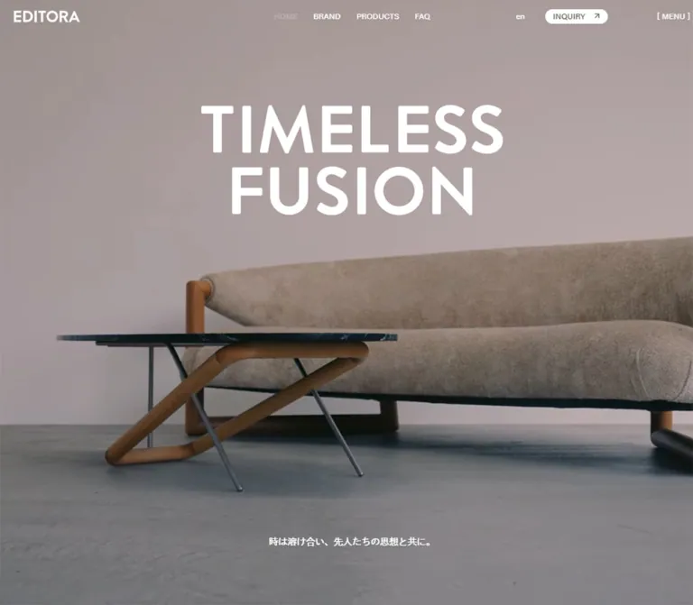
DESIGN REFERENCE
職人の作業風景、大きな欧文見出し、ハーフトーン画像、繊細な罫線を組み合わせた家具ブランドサイト。PCの全面映像とスマートフォンの余白を生かした構成の違いまで整理。
オリジナルサイトを見るMonumental lettering and intimate craftsmanship, framed by softly grained paper.
Original URL: https://editora.jp/
Final URL: https://editora.jp/
Theme: warm paper and black, with a reversed desktop opening over dark craft imagery.
Inspected: September 17, 2026, 05:39 JST; supplied capture record 2026-09-16T20:39:10.803Z.
Viewports: desktop 1440 × 1000 and mobile 390 × 844 CSS pixels.
Scope: the current Japanese homepage, using three desktop captures, two mobile captures, and rendered DOM/computed-style evidence from both viewports. Visually documented areas include the opening, desktop product introduction, showroom details, and footer. The DOM additionally documents the brand narrative, mobile product layout, media section dimensions, and menu content. Linked pages and opened interaction states were not inspected.
EDITORA presents furniture through the relationship between making, historical design thinking, and contemporary objects. The homepage leads with an oversized two-line English statement and a small Japanese sentence: 「時は溶け合い、先人たちの思想と共に。」. Large images and unusually generous empty space carry the atmosphere; compact navigation and pill-shaped links keep the interface quiet.
The desktop opening fills the viewport with dark craft imagery and white lettering. Mobile changes the composition substantially: black lettering sits on paper, a landscape craft image occupies a separate inset rectangle, and the Japanese sentence rests near the bottom of the screen. Lower sections return to paper, bold black headings, thin rules, a halftone furniture detail, and restrained showroom information. This is a furniture brand homepage with catalog and contact entry points, not a standalone campaign layout.
Monumental lettering and intimate craftsmanship, framed by softly grained paper.
Original URL: https://editora.jp/
Final URL: https://editora.jp/
Theme: warm paper and black, with a reversed desktop opening over dark craft imagery.
Inspected: September 17, 2026, 05:39 JST; supplied capture record 2026-09-16T20:39:10.803Z.
Viewports: desktop 1440 × 1000 and mobile 390 × 844 CSS pixels.
Scope: the current Japanese homepage, using three desktop captures, two mobile captures, and rendered DOM/computed-style evidence from both viewports. Visually documented areas include the opening, desktop product introduction, showroom details, and footer. The DOM additionally documents the brand narrative, mobile product layout, media section dimensions, and menu content. Linked pages and opened interaction states were not inspected.
EDITORA presents furniture through the relationship between making, historical design thinking, and contemporary objects. The homepage leads with an oversized two-line English statement and a small Japanese sentence: 「時は溶け合い、先人たちの思想と共に。」. Large images and unusually generous empty space carry the atmosphere; compact navigation and pill-shaped links keep the interface quiet.
The desktop opening fills the viewport with dark craft imagery and white lettering. Mobile changes the composition substantially: black lettering sits on paper, a landscape craft image occupies a separate inset rectangle, and the Japanese sentence rests near the bottom of the screen. Lower sections return to paper, bold black headings, thin rules, a halftone furniture detail, and restrained showroom information. This is a furniture brand homepage with catalog and contact entry points, not a standalone campaign layout.
| Name | Value | Source token | Evidence and role |
|---|---|---|---|
| Warm Paper | #f4efe3 |
--color-bg |
Measured body and products-section background at both viewports. The main light canvas. |
| Grained Paper Variant | #ebe7da |
--color-bg-grained |
Declared. Fine grain is visible on paper surfaces, but the exact compositing relationship to this token is not supplied. |
| Black Ink | #000000 |
--color-black |
Measured text on light sections; visible button fills and strong graphic details. |
| Reversed White | #ffffff |
--color-white |
Measured desktop opening header and tagline text; visible hero lettering and reversed control labels. |
| Moss | #535543 |
--color-moss |
Measured desktop opening inquiry-link text, inside the visually white pill. |
| Dark Moss | #31322c |
--color-darkMoss |
Measured background on menu-associated showroom/social elements. The opened menu was not visually inspected. |
The visible homepage is principally paper, black, and white. Brown wood, skin tones, and deep green-black shadows belong to the craft imagery; they are not evidence of additional UI accent colors.
| Source token | Value | Interpretation |
|---|---|---|
--color-gray |
#aca8a7 |
Available muted neutral; exact visible assignment is unverified. |
--color-caption |
#8a8a8a |
Available caption neutral; exact visible assignment is unverified. |
--color-thumb |
#f6f1e7 |
Available pale image-backing color; application is unverified. |
--color-hr-black |
rgba(0,0,0,.2) |
Declared translucent dark rule. Not proof that every visible border uses this opacity. |
--color-hr-white |
hsla(0,0%,100%,.2) |
Declared translucent white rule. |
--color-green |
#006f3f |
Declared, not established as a visible homepage accent. |
--color-blue |
#5ca0af |
Declared, not established as a visible homepage accent. |
--color-orange |
#c3571b |
Declared, not established as a visible homepage accent. |
Do not distribute these secondary colors across categories merely because they exist in the stylesheet. The captured category list is black on paper.
The computed family stack begins with acumin-pro, dnp-shuei-gothic-kin-std, and noto-sans-cjk-jp, followed by Japanese system-font fallbacks including Hiragino Kaku Gothic Pro and Yu Gothic, then sans-serif.
500.700.1.8 at both inspected widths.A .tk-brandon-grotesque registration also appears in the supplied page evidence. Its assignment to the visible hero lettering was not provided. Do not claim that the hero uses Brandon Grotesque solely from the registration or its appearance. Computed family stacks also do not establish the resolved font for every individual glyph.
The header logo occupies a measured 100 × 18px linked box at both widths. Its wrapper reports 24px desktop and 22px mobile text, but the link has no extracted text. Those wrapper values do not identify the lettering artwork's font or its actual glyph size.
The visible TIMELESS FUSION statement is likewise absent from the sampled text-heading records. Its two-line composition is clear in the images, while its source font size and rendering method remain unverified. Treat it as a distinct display treatment, not a measured 90px section heading.
| Role | Desktop | Mobile | Weight / leading | Status |
|---|---|---|---|---|
| General body copy | 14px |
13px |
500; 25.2px / 23.4px |
Measured |
| Header utilities | 12px |
11px |
500; context-dependent leading |
Measured |
| Desktop primary navigation | 12px |
Hidden from the captured mobile header | 500 / 16.8px |
Measured |
| Hero Japanese sentence | 14px |
13px |
500; 19.6px / 18.2px |
Measured |
| Products heading | 90px |
46.8px |
700 / 1 |
Measured |
| Showroom heading | 48px |
32px |
700 / 1 |
Measured |
| Category display label | Approximately 38px |
Approximately 20px |
Bold; roughly 1.1 |
Desktop visual estimate; mobile inference from row geometry |
| Category count / anchor base | 14px |
13px |
500; base leading 1.1 |
Measured anchor styles; child-label styles absent |
| Standard pill label | 14px |
13px |
500 / 1.2 |
Measured |
| Footer primary links | 12px |
11px |
700 / 1.4 |
Measured |
| Footer category links | 12px |
11px |
500 / 1.4 |
Measured |
| Hero display lettering | Approximately 140–144px |
Approximately 60px |
Heavy, tightly stacked | Visual estimate, not computed type |
The desktop category anchors report a 14px base size even though their visible names are much larger. Preserve the distinction between the outer link, large inner label, and small right-aligned count.
Menu-associated primary links report 90px / 99px on desktop and 46.8px / 51.48px on mobile, both weight 700 with 0.01em tracking. Company and Legals report 12px desktop and 20px mobile. These values document prepared menu elements, not a verified open-menu screenshot.
| Use | Desktop | Mobile | Evidence |
|---|---|---|---|
| Outer page inset | 2vw = 28.8px |
16px |
Source --margin-outer |
| Grid / common control gap | 10px |
10px |
Source --gap; also measured on category links |
| Medium spacing token | 30px |
30px |
Source --margin-m |
| Header height | 52px |
52px |
Source --space-header and measured header |
| Standard pill padding | 7px 14px 9.1px |
6.5px 13px 8.45px |
Measured; equivalent to .5em 1em .65em |
| Header inquiry horizontal padding | 9px |
8.25px |
Measured; .75em of its utility type |
| Product-link bottom padding | 4.2px |
3.9px |
Measured; .3em of anchor base type |
| Footer padding | 28.8px |
16px |
Measured |
| Showroom action gap | 10px horizontally |
10px vertically |
Calculated from measured link rectangles |
The declared desktop unit is:
--grid: calc(8.33333vw - 2vw * 2 / 12 - 10px * 11 / 12);
The mobile declaration substitutes 16px for the outer inset. An equivalent conceptual formula is:
/* Equivalent grid calculation, expressed with descriptive aliases. */
--column: calc((100vw - 2 * var(--page-inset) - 11 * var(--gap)) / 12);
At 1440px, the calculated column is approximately 106.03px. Six columns plus five gaps produce 686.2px, matching each measured showroom grid column. At 390px, the calculated column is approximately 20.67px. This is an underlying alignment unit, not evidence that all sections display twelve visible columns.
| Element | Value | Status |
|---|---|---|
| Standard filled pills | 200px |
Measured and declared as --r-btn |
| Small-radius token | 11px |
Declared as --r-btn-s; assignment not established here |
| Menu-associated information blocks | 4px |
Measured; also --r-label |
| Circular token | 50% |
Declared as --r-circle; not a general card treatment |
| Photos and major panels | Square corners | Visible in supplied captures |
| Header and product-panel rules | Approximately 1px |
Visual estimate; border widths were not included in the sampled styles |
| Element | Desktop | Mobile |
|---|---|---|
| Main document height | 4563.59px, rounded capture height 4564px |
3873.97px, rounded capture height 3874px |
| Header logo box | 100 × 18px, x 28.8px |
100 × 18px, x 16px |
| Header inquiry box | 95.52 × 22px |
87.56 × 22px |
| Product section | 1440 × 948px |
390 × 872.17px |
| Product heading content width | 632.11px |
358px |
| Category link row | 689.70 × 45.97px, including side padding |
358 × 25.89px |
| Media interlude box | 1440 × 810px, calculated 16:9 |
390 × 292.5px, calculated 4:3 |
| Showroom section | 1440 × 448px |
390 × 408.94px |
| Footer | 1440 × 500px |
390 × 481.36px |
| Footer linked wordmark box | 722.83 × 131.42px |
204.66 × 37.20px |
These are capture-state measurements. The desktop introductory section reports a 2800px height while the products section begins at y = 1800px in the supplied record. That overlap means these rectangles cannot be summed as ordinary consecutive block heights. The exact positioning or scroll-control implementation is not supplied.
Role: continuous access to brand identity, navigation, inquiry, and menu.
The desktop header is 52px high. A 100px-wide logo aligns to the 2vw left inset. HOME, BRAND, PRODUCTS, and FAQ form a compact group centered around the page midpoint. The right side contains en, a small INQUIRY pill with an outward arrow, and a bracketed [ MENU ] control.
At the desktop opening, the header is visually transparent with white details; the inquiry pill is white with moss-colored text. In the lower desktop captures, it becomes paper-colored with black details and a thin bottom rule. The header remains at the viewport top in the scrolled captures. Its precise fixed/sticky implementation and changeover threshold are unverified.
Mobile retains the logo, inquiry pill, and bracketed menu. The primary navigation and header language link are absent from the visible bar. Its 16px side inset, 52px height, paper background, and black bottom rule are already present at the opening. The inquiry pill is black with white text.
The current Home item is visually subdued. Although its computed text color matches other links, an additional rendering treatment changes its appearance; the exact opacity or layer responsible was not supplied.
Role: establish the relationship between the brand statement and furniture-making.
Desktop uses an edge-to-edge craft image or film frame. Close-up hands and a tool dominate the lower/right area, with dark negative space supporting large white TIMELESS FUSION lettering near the upper center. The statement is split into exactly two lines. Its visible letter block is approximately 640px wide and 230px tall; those are screenshot estimates, not an element measurement.
The Japanese sentence is horizontally centered. Its measured text box begins at y = 894.41px and ends at 914px, leaving 86px beneath it in the 1000px viewport.
Mobile separates the three elements:
16:9.773.81–792px, leaving 52px beneath it.The long intervals of empty paper are part of this composition. Do not enlarge the mobile image to fill the viewport or place the title over it.
The DOM includes Play Video, but the available evidence does not establish autoplay, looping, audio state, player controls, or the response to activation.
Role: explain the design philosophy before the catalog entry points.
The rendered text describes furniture as an expression connected to preceding designers, respect for their thinking, and the fusion of tradition with innovation. An EXPLORE MORE ABOUT EDITORA pill links to /brand/.
The CTA measures approximately 280.70 × 32.89px on desktop and 260.66 × 30.53px on mobile. The mobile record places it at x = 30px, within a narrative area using more inset than the 16px outer shell.
The narrative is documented in the DOM but is not shown in a complete supplied screenshot. Preserve its content role and compact CTA without inventing a specific reveal sequence, text alignment at every scroll position, or background transition.
Role: introduce the collection and route visitors to its categories.
Desktop is a nearly viewport-height, ruled two-column panel. Fine vertical lines mark the outer boundaries and center division. The left half contains an oversized black-and-paper halftone furniture detail. The right half contains:
PRODUCTS heading at 90px / 1, weight 700.FAQ and COMPANY pills positioned toward the bottom right, separated by 10px.The right heading begins at approximately x = 749.3px. Its inset is repeated by the paragraph and category labels. The panel preserves a large empty region below the category list; do not fill it with extra cards or promotional badges.
On mobile, the heading begins 334.22px below the product section's start, consistent with an image region preceding the text. The heading and links occupy the full 358px inner width. The precise mobile image crop is not visible in the supplied captures.
Role: direct navigation to the collection and category indexes.
| Label | Captured count | Observed destination |
|---|---|---|
ALL PRODUCTS |
(19) |
/products/ |
SEATING |
(11) |
/filter/seating/ |
TABLE |
(6) |
/filter/table/ |
STORAGE |
(2) |
/filter/storage/ |
Each entry is a full-width link with a large uppercase name at the left and a much smaller count at the right. There are no filled count badges, image thumbnails, individual card backgrounds, or per-row divider lines in the visible desktop list.
The measured desktop row height is 45.97px. The mobile row height is 25.89px. A useful reconstruction is a 38px desktop label and 20px mobile label at 1.1 leading, with bottom padding inherited from the smaller anchor size. Those label sizes are estimates derived from appearance and geometry, not supplied child styles.
Treat the counts as captured catalog data, not permanent decorative numbers. These links point to category URLs; no in-place filtering behavior was demonstrated.
Role: a compact action or secondary navigation destination.
Standard pills use a fully rounded 200px radius, body-sized text, 1.2 leading, and asymmetric vertical padding: .5em above and .65em below. This produces approximately 32.89px desktop and 30.53px mobile heights. The visual adjustment centers the letterforms rather than relying on equal padding.
Black fill with white text is the main light-surface treatment. The desktop opening inquiry reverses to white. Outward arrows accompany inquiry, maps, and reservation links; FAQ and Company are text-only.
Several sampled anchors report a transparent background even though their screenshots show filled pills. The visible fill therefore cannot be reconstructed by reading the anchor background alone; a nested or pseudo-element layer may supply it. Its exact implementation was not included.
Repeated captions such as INQUIRYINQUIRY occur in the DOM, while the captures show one label. A new implementation should expose one accessible caption and hide any decorative duplicate from assistive technology.
Role: a large visual interval between the product introduction and showroom information.
The measured section is 1440 × 810px on desktop and 390 × 292.5px on mobile, corresponding to 16:9 and 4:3 boxes. Its sampled background is black. A narrow strip of imagery is visible below the product panel in the desktop capture, but the complete interlude is not shown.
Use the dimensions as evidence for responsive media framing. Do not infer a solid black visual section, a particular film sequence, or interactive gallery controls from the background declaration or generic extracted labels.
Role: connect the brand to a physical visit and an appointment request.
Desktop uses two measured 686.2px grid columns with a 10px gap and 28.8px outer padding. A small monochrome showroom photograph sits at the far left, while the information starts at x = 753.8px in the right column. The large gap between the photograph and copy is intentional.
The information group contains a 48px SHOWROOM heading, a Japanese paragraph explaining the reservation requirement, an email link, a small square marker before EDITORA SHOWROOM, an address, and two black pills. GOOGLE MAPS leads to a map URL; MAKE A RESERVATION uses mailto:info@editora.jp?subject=.
The captured address is 「〒103-0025 東京都中央区日本橋茅場町 2-1-7」. Reservation links initiate email; an embedded booking flow was not observed.
On mobile, the heading becomes 32px. The measured introduction header is about 214.69px wide, narrower than the 358px page interior. This produces a deliberately narrow reading block. Maps and reservation actions stack vertically at x = 16px with a 10px gap. Their measured widths are about 150.47px and 194.89px. The provided mobile footer capture begins partway through this section, so its upper image arrangement is unverified.
Role: repeat site navigation, provide contact routes, and close with a large brand signature.
Desktop has a 500px-high footer with a horizontal navigation group near the upper left and a small black upward triangle at the upper right. Products contains three subordinate category links. Below a broad field of empty paper, the large EDITORA wordmark occupies a measured 722.83 × 131.42px box. Language, Social, and Showroom information sit to its right. A small ©2024 label rests near the bottom left; this is the displayed copyright text, not the inspection date.
Mobile changes the grouping:
204.66 × 37.20px; the en link aligns toward the right.The upward triangle's observed link destination is the homepage URL. Its appearance suggests upward navigation, but smooth scrolling or a special back-to-top handler was not exercised.
The header contains a real button with MENU and CLOSE text layers. The DOM includes language choices, large Brand/Products/FAQ links, Company/Legals links, and showroom/social information blocks. Menu-associated information blocks have white text, dark moss fills, and 4px radii.
These nodes have measured rectangles even while the supplied screenshots show the closed state. Do not treat their coordinates as proof of an open-menu layout, opening animation, tilt, or interaction sequence. The generic extracted labels DETAIL, CLOSE, and DRAG also do not establish a working draggable gallery or custom cursor.
| Target | Supplied declaration | What it supports |
|---|---|---|
| Main navigation and primary footer links | background-size 0.4s cubic-bezier(.16,.5,.25,1) |
A background-based link treatment can animate. Its start/end appearance was not captured. |
| Standard action links | transform 0.4s cubic-bezier(.16,.5,.25,1) |
Transform transitions are defined; exact translation or scale is unknown. |
| Category anchors | 0.2s cubic-bezier(.16,.5,.25,1) |
Short interaction transition; changed properties and endpoint styles are unverified. |
| Logo, language, and inquiry anchors | 0.2s ease-in-out |
General short transitions are declared. |
| Menu primary links | 0.4s cubic-bezier(.16,.5,.25,1) |
Prepared menu-link transition; opened state not inspected. |
| Menu-associated information blocks | border 0.1s ease-in-out |
A quick border transition is declared. |
The source custom easing used repeatedly is:
--ease-custom-out: cubic-bezier(.16, .5, .25, 1);
Numerous power, sine, expo, and back easing variables are also declared. Their presence does not establish which sections use them. Do not turn the whole page into a spring animation system based on unused declarations.
The captures establish different header color treatments, an inset mobile opening, and settled scroll positions. They do not establish menu opening, hover endpoints, video playback behavior, custom cursor operation, page-transition direction, or scroll-scrub timing.
The capture process waited for document load, visible image decoding, and sampled layout/text stability, with finite-motion checks. Perpetual animations were paused during readiness checks and resumed afterward. These checks reduce transient capture errors but do not verify every delayed feature. Sampled elements reporting animation: none do not rule out animation on descendants, pseudo-elements, JavaScript-controlled layers, or media.
Recommended adaptation: use the measured 200ms and 400ms timings for restrained link feedback. Keep any newly designed media or menu motion explicitly separate from claims about the original behavior.
| Layer | Visible treatment | Function |
|---|---|---|
| Main light canvas | Warm paper with subtle fine grain | Connects the editorial sections and footer |
| Desktop opening | Dark craft imagery with white typography | Establishes material and human presence |
| Mobile opening | Paper, black lettering, inset landscape media | Gives title, craft image, and sentence separate space |
| Product panel | Shared paper surface, thin vertical rules, halftone image | Organizes a large editorial split without cards |
| Standard action | Small black or white capsule | Provides a clear link without a large conversion block |
| Mobile footer utility | Thin outlined capsule | Keeps small contact links legible and distinct |
| Prepared menu information | Dark moss block with 4px radius | DOM-supported styling; open appearance unverified |
There is no visible general-purpose shadow or raised-card system. Separation comes from scale, empty space, thin rules, and image boundaries. Grain should remain quiet enough that it never becomes a competing illustration behind the text.
Three visible image treatments create the identity:
Keep ordinary photography naturally rendered. The halftone dots belong to that specific processed image; do not apply global pixelation or a dot filter to every asset. Preserve square corners and deliberate cropping.
No original photo, film, logo, or grain asset URLs were included in the supplied evidence. Do not invent filenames or reuse unrelated media as if it were an observed asset.
| Asset | Available evidence | Implementation guidance |
|---|---|---|
| Craft media | Visible desktop and mobile frames; Play Video DOM label |
Supply licensed craft media and a stable poster; playback policy needs separate implementation. |
| Product halftone | Visible in the desktop product panel | Preserve the existing dot texture and crop deliberately. |
| Showroom photograph | Visible in the desktop closing capture | Use a monochrome interior image; native dimensions are unknown. |
| EDITORA wordmarks | Measured linked boxes and visible lettering | Use authorized artwork rather than identifying the font from wrapper styles. |
| External arrow | --i-exarrow-r contains an inline SVG with a 20 × 20 native canvas |
Keep a compact northeast arrow; native canvas size is not a measured rendered size. |
| Paper grain | Visible on light surfaces; related color token declared | Texture file, opacity, and blending method are unverified. |
| Feature | 1440 × 1000 desktop | 390 × 844 mobile |
|---|---|---|
| Header | White over opening; paper/black lower down; centered primary navigation | Paper/black from the start; logo, inquiry, and menu only |
| Outer inset | 28.8px |
16px |
| Opening media | Full-viewport visual field | Approximately 358 × 201px inset landscape box |
| Opening title | Large white two-line statement over media | Smaller black two-line statement above media |
| Product structure | Equal visual halves with a central rule | Image region precedes full-width heading and category links |
| Products title | 90px |
46.8px |
| Category row height | About 45.97px |
About 25.89px |
| Media interlude | Measured 16:9 box |
Measured 4:3 box |
| Showroom | Small image at far left; copy in right half | Narrow text block; vertically stacked actions |
| Footer | Single navigation row; huge logo beside utility groups | Navigation wraps; contacts precede smaller logo |
The responsive design changes composition rather than simply shrinking desktop dimensions. The clearest example is the mobile opening's return to paper around the media. The footer also reorders visual groups, and the showroom keeps a narrower copy measure instead of automatically filling the phone width.
Only the two supplied viewport sizes are verified. The exact breakpoint and interpolation rules between them are unknown. The Quick Start uses a recommended 960px breakpoint to avoid crowding the desktop navigation; this is not a recovered source breakpoint.
Do not fix the entire page to one viewport because the body rectangle measures the viewport height. The measured main content is a long document at both sizes. Likewise, do not copy overlapping desktop section coordinates directly into normal-flow CSS.
#f4efe3, black ink, and white reverse treatment.These are recommendations for a new implementation, not verified features of the inspected site:
:focus-visible outline and retain semantic anchors for navigation destinations.aria-expanded, and aria-controls. If the menu is modal, manage focus, Escape, background inertness, and focus restoration.#f4efe3.#ebe7da; exact source compositing is unknown.#000000.#ffffff.#535543.“Create an editorial furniture-brand homepage inspired by the observed EDITORA composition. Use warm paper #f4efe3, subtle stationary grain, black sans-serif typography, fine rules, square imagery, and small fully rounded link pills. At 1440px, place a large two-line brand statement over dark edge-to-edge craft media and keep a 52px navigation bar at the top. Follow with a ruled two-column product introduction: oversized halftone furniture imagery on the left, a 90px title, Japanese body copy, and four category links with small right-aligned counts on the right. Preserve substantial empty space. At 390px, change the opening to black lettering on paper with a separate 358px-wide landscape media rectangle. Use 16px side insets, compact navigation, stacked showroom actions, and a reorganized footer. Use supplied authorized assets; treat unspecified animation as a new implementation decision.”
This adaptation reproduces the evidenced palette, primary sizes, margins, pills, and major responsive relationships. Display-letter sizing, the 960px breakpoint, and hover underlines are recommendations. It keeps a conventional browser root size while assigning the observed pixel sizes to component tokens.
Load authorized fonts and artwork separately. Naming a font family does not load it. No original texture or media path is assumed. The header's data-surface state must be set by application logic; no source scroll threshold is known.
:root {
  /* Measured or declared source colors. */
  --color-paper: #f4efe3;
  --color-paper-grained: #ebe7da;
  --color-ink: #000;
  --color-white: #fff;
  --color-moss: #535543;
  --color-dark-moss: #31322c;
  --color-rule-soft: rgb(0 0 0 / 20%);

  /* Source family names with a shortened system fallback list. */
  --font-ui: 'acumin-pro', 'dnp-shuei-gothic-kin-std',
    'noto-sans-cjk-jp', 'Hiragino Kaku Gothic Pro',
    'Yu Gothic', sans-serif;
  /* Approximation: the hero's actual font assignment is unverified. */
  --font-display: var(--font-ui);
  --size-body: 14px;
  --size-utility: 12px;
  --size-products: clamp(46.8px, 6.25vw, 90px);
  --size-showroom: clamp(32px, 3.3333vw, 48px);
  --size-category: 38px;

  --page-inset: 2vw;
  --gap: 10px;
  --space-medium: 30px;
  --header-height: 52px;
  --radius-pill: 200px;
  --column: calc((100vw - 2 * var(--page-inset) - 11 * var(--gap)) / 12);
  --ease-out: cubic-bezier(.16, .5, .25, 1);

  /* Optional licensed grain tile; no original asset path was supplied. */
  --paper-grain: none;
}

* { box-sizing: border-box; }
html { scroll-padding-top: var(--header-height); }
body {
  margin: 0;
  color: var(--color-ink);
  background: var(--color-paper);
  background-image: var(--paper-grain);
  font-family: var(--font-ui);
  font-size: var(--size-body);
  font-weight: 500;
  line-height: 1.8;
}
a { color: inherit; }
button { font: inherit; }
img, video { display: block; max-width: 100%; }
h1, h2, p, figure { margin: 0; }

.site-header {
  position: fixed;
  z-index: 100;
  inset: 0 0 auto;
  height: var(--header-height);
  padding-inline: var(--page-inset);
  display: grid;
  grid-template-columns: 1fr auto 1fr;
  align-items: center;
  color: var(--color-white);
  border-bottom: 1px solid transparent;
  font-size: var(--size-utility);
  line-height: 1.4;
}
.brand-mark {
  display: block;
  width: 100px;
  height: 18px;
}
.brand-mark > :is(img, svg) { width: 100%; height: 100%; }
.primary-nav { display: flex; gap: 24px; }
.primary-nav a, .footer-nav a { text-decoration: none; }
.header-tools {
  justify-self: end;
  display: flex;
  align-items: center;
  gap: 40px;
}
.menu-toggle {
  margin-inline-start: 64px;
  padding: 0;
  border: 0;
  background: none;
  color: inherit;
  cursor: pointer;
}
.pill {
  display: inline-flex;
  align-items: center;
  justify-content: center;
  gap: 10px;
  width: fit-content;
  padding: .5em 1em .65em;
  border: 0;
  border-radius: var(--radius-pill);
  color: var(--color-white);
  background: var(--color-ink);
  font-size: var(--size-body);
  font-weight: 500;
  line-height: 1.2;
  text-decoration: none;
  white-space: nowrap;
}
.header-inquiry {
  height: 22px;
  padding: 0 .75em .125em;
  font-size: var(--size-utility);
  color: var(--color-moss);
  background: var(--color-white);
}
.site-header[data-surface='paper'] {
  color: var(--color-ink);
  background: var(--color-paper);
  background-image: var(--paper-grain);
  border-bottom-color: currentColor;
}
.site-header[data-surface='paper'] .header-inquiry {
  color: var(--color-white);
  background: var(--color-ink);
}

.hero {
  position: relative;
  min-height: 100svh;
  color: var(--color-white);
  background: var(--color-ink);
}
.hero-media { position: absolute; inset: 0; }
.hero-media > :is(img, video) {
  width: 100%;
  height: 100%;
  object-fit: cover;
}
.hero-title {
  position: absolute;
  z-index: 1;
  top: 14svh;
  left: 50%;
  transform: translateX(-50%);
  width: max-content;
  max-width: calc(100% - 2 * var(--page-inset));
  font-family: var(--font-display);
  font-size: clamp(80px, 10vw, 144px);
  font-weight: 700;
  line-height: .9;
  letter-spacing: .02em;
  text-align: center;
}
.hero-title span { display: block; }
.hero-caption {
  position: absolute;
  z-index: 1;
  inset: auto 30px 86px;
  text-align: center;
  line-height: 1.4;
}

.products-panel {
  display: grid;
  grid-template-columns: repeat(2, minmax(0, 1fr));
  min-height: calc(100svh - var(--header-height));
  margin-inline: var(--page-inset);
  border-inline: 1px solid var(--color-ink);
}
.products-visual { position: relative; min-width: 0; padding: 10px; }
.products-visual img {
  width: 100%;
  height: 100%;
  object-fit: cover;
}
.products-content {
  display: flex;
  flex-direction: column;
  min-width: 0;
  padding: var(--page-inset);
  border-left: 1px solid var(--color-ink);
}
.products-title {
  font-size: var(--size-products);
  font-weight: 700;
  line-height: 1;
}
.products-copy { margin-block: 30px 56px; }
.category-row {
  display: flex;
  align-items: center;
  justify-content: space-between;
  gap: var(--gap);
  padding-bottom: .3em;
  font-size: var(--size-body);
  line-height: 1.1;
  text-decoration: none;
}
.category-name {
  font-size: var(--size-category);
  font-weight: 700;
  line-height: 1.1;
  text-transform: uppercase;
}
.category-count { flex-shrink: 0; font-size: var(--size-body); }
.products-actions {
  display: flex;
  justify-content: flex-end;
  gap: var(--gap);
  margin-top: auto;
  padding-top: 60px;
}
.media-interlude { aspect-ratio: 16 / 9; background: var(--color-ink); }
.media-interlude > :is(img, video) {
  width: 100%; height: 100%; object-fit: cover;
}

.showroom {
  display: grid;
  grid-template-columns: repeat(2, minmax(0, 1fr));
  gap: var(--gap);
  padding: var(--page-inset);
}
.showroom-photo { width: 32.4%; height: auto; align-self: start; }
.showroom-info { padding-inline: var(--page-inset); }
.showroom-title { font-size: var(--size-showroom); font-weight: 700; line-height: 1; }
.showroom-description { margin-top: 16px; }
.showroom-address { margin-top: 60px; }
.showroom-actions { display: flex; flex-wrap: wrap; gap: 10px; margin-top: 24px; }

.site-footer {
  display: grid;
  grid-template-rows: auto 1fr auto;
  gap: 30px;
  min-height: 500px;
  margin-top: 4vw;
  padding: var(--page-inset);
  font-size: var(--size-utility);
  line-height: 1.4;
}
.footer-nav { display: flex; align-items: start; gap: 36px; }
.footer-nav > div > a { font-weight: 700; }
.footer-subnav { display: grid; gap: 3px; margin-top: 12px; }
.to-top { margin-left: auto; }
.footer-bottom {
  align-self: end;
  display: grid;
  grid-template-areas: 'brand language social showroom';
  grid-template-columns: minmax(0, 1fr) auto auto 206px;
  gap: 6vw;
  align-items: start;
}
.footer-brand { grid-area: brand; }
.footer-wordmark { width: 50.2vw; max-width: 100%; height: auto; }
.footer-language { grid-area: language; }
.footer-social { grid-area: social; }
.footer-showroom { grid-area: showroom; }
.footer-label { display: block; margin-bottom: 12px; font-weight: 700; }

/* Recommended feedback; original hover endpoints were not supplied. */
@media (hover: hover) {
  .primary-nav a:hover, .category-row:hover .category-name {
    text-decoration: underline;
    text-underline-offset: .12em;
    text-decoration-thickness: 1px;
  }
}
:where(a, button):focus-visible { outline: 2px solid currentColor; outline-offset: 4px; }

/* Recommended breakpoint, not a recovered source media query. */
@media (max-width: 960px) {
  :root {
    --page-inset: 16px;
    --size-body: 13px;
    --size-utility: 11px;
    --size-products: clamp(36px, 12vw, 60px);
    --size-showroom: 32px;
    --size-category: 20px;
  }
  .site-header {
    grid-template-columns: 1fr auto;
    color: var(--color-ink);
    background: var(--color-paper);
    background-image: var(--paper-grain);
    border-bottom-color: currentColor;
  }
  .primary-nav, .header-language { display: none; }
  .header-tools { gap: 20px; }
  .menu-toggle { margin-inline-start: 0; }
  .header-inquiry { color: var(--color-white); background: var(--color-ink); }
  .hero { color: var(--color-ink); background: transparent; }
  .hero-title { top: 100px; font-size: clamp(44px, 15.4vw, 64px); }
  .hero-media {
    inset: auto var(--page-inset);
    top: 55.8%;
    transform: translateY(-50%);
    aspect-ratio: 16 / 9;
  }
  .hero-caption { bottom: 52px; }
  .products-panel { grid-template-columns: 1fr; min-height: 0; border: 0; }
  /* Recommended mobile crop: the original image box was not measured. */
  .products-visual { aspect-ratio: 6 / 5; padding: 0; }
  .products-content { padding: 30px 0 68px; border: 0; }
  .products-copy { margin-block: 24px 48px; }
  .products-actions { padding-top: 78px; }
  .media-interlude { aspect-ratio: 4 / 3; }
  /* Recommended normal-flow showroom; mobile image placement is unverified. */
  .showroom { grid-template-columns: 1fr; gap: 30px; }
  .showroom-photo { width: min(45%, 180px); }
  .showroom-info { padding: 0; }
  .showroom-description { max-width: 215px; }
  .showroom-actions { flex-direction: column; align-items: flex-start; }
  .site-footer { min-height: 481px; margin-top: 130px; }
  .footer-nav {
    display: grid;
    grid-template-columns: repeat(4, minmax(0, 1fr)) 16px;
    gap: 36px 10px;
  }
  .to-top { grid-column: 5; grid-row: 1; margin: 0; }
  .footer-bottom {
    grid-template-areas: 'showroom social' 'brand language';
    grid-template-columns: minmax(0, 1.5fr) minmax(0, 1fr);
    gap: 40px 16px;
  }
  .footer-wordmark { width: 204.66px; }
  .footer-language { justify-self: end; }
  .footer-utility-link {
    display: inline-flex;
    gap: 6px;
    padding: 0 9px;
    border: 1px solid currentColor;
    border-radius: var(--radius-pill);
    text-decoration: none;
  }
}

/* Also update any JavaScript animation and media playback separately. */
@media (prefers-reduced-motion: reduce) {
  .site-header *, .pill, .category-row { transition: none; animation: none; }
}
The CSS intentionally uses normal document flow instead of attempting to recreate the unverified overlapping introductory timeline. It also supplies a conservative mobile showroom arrangement rather than claiming to reproduce an unseen image position. Font fallback metrics and chosen media crops will affect the final result.
Use actual anchors for the observed navigation model. Keep the label and count separate, and expose only one copy of each caption.
<a class='category-row' href='/filter/seating/'>
  <span class='category-name'>Seating</span>
  <span class='category-count'>(11)</span>
</a>

<a class='pill' href='mailto:info@editora.jp?subject='>
  <span>MAKE A RESERVATION</span>
  <span aria-hidden='true'>↗</span>
</a>
For the hero, place two block spans inside .hero-title, one for TIMELESS and one for FUSION. Place the licensed poster or media element inside .hero-media. Use an accessible linked image or SVG for the wordmarks rather than trying to match them with the approximate display font.
Optional aliases for an existing Tailwind v4 project. This is not evidence that the original site uses Tailwind. Define the custom properties above first.
@theme inline {
  --color-canvas: var(--color-paper);
  --color-ink: #000;
  --color-reversed: #fff;
  --color-moss: #535543;
  --font-interface: var(--font-ui);
  --text-copy: var(--size-body);
  --text-utility: var(--size-utility);
  --text-section: var(--size-products);
  --text-category: var(--size-category);
  --spacing-page: var(--page-inset);
  --spacing-header: var(--header-height);
  --radius-pill: 200px;
}
200 and the same original and final URL.2026-09-16T20:39:10.803Z, equivalent to September 17, 2026, 05:39 JST. Viewports were 1440 × 1000 and 390 × 844 CSS pixels.This reference describes the current homepage evidence. Measurements, visual estimates, and recommended implementation choices are labeled separately throughout.
# EDITORA / TIMELESS FUSION — Style Reference

> Monumental lettering and intimate craftsmanship, framed by softly grained paper.

**Original URL:** [https://editora.jp/](https://editora.jp/)
**Final URL:** [https://editora.jp/](https://editora.jp/)
**Theme:** warm paper and black, with a reversed desktop opening over dark craft imagery.
**Inspected:** September 17, 2026, 05:39 JST; supplied capture record `2026-09-16T20:39:10.803Z`.
**Viewports:** desktop **1440 × 1000** and mobile **390 × 844** CSS pixels.
**Scope:** the current Japanese homepage, using three desktop captures, two mobile captures, and rendered DOM/computed-style evidence from both viewports. Visually documented areas include the opening, desktop product introduction, showroom details, and footer. The DOM additionally documents the brand narrative, mobile product layout, media section dimensions, and menu content. Linked pages and opened interaction states were not inspected.

EDITORA presents furniture through the relationship between making, historical design thinking, and contemporary objects. The homepage leads with an oversized two-line English statement and a small Japanese sentence: 「時は溶け合い、先人たちの思想と共に。」. Large images and unusually generous empty space carry the atmosphere; compact navigation and pill-shaped links keep the interface quiet.

The desktop opening fills the viewport with dark craft imagery and white lettering. Mobile changes the composition substantially: black lettering sits on paper, a landscape craft image occupies a separate inset rectangle, and the Japanese sentence rests near the bottom of the screen. Lower sections return to paper, bold black headings, thin rules, a halftone furniture detail, and restrained showroom information. This is a furniture brand homepage with catalog and contact entry points, not a standalone campaign layout.
# EDITORA / TIMELESS FUSION — Style Reference

> Monumental lettering and intimate craftsmanship, framed by softly grained paper.

**Original URL:** [https://editora.jp/](https://editora.jp/)
**Final URL:** [https://editora.jp/](https://editora.jp/)
**Theme:** warm paper and black, with a reversed desktop opening over dark craft imagery.
**Inspected:** September 17, 2026, 05:39 JST; supplied capture record `2026-09-16T20:39:10.803Z`.
**Viewports:** desktop **1440 × 1000** and mobile **390 × 844** CSS pixels.
**Scope:** the current Japanese homepage, using three desktop captures, two mobile captures, and rendered DOM/computed-style evidence from both viewports. Visually documented areas include the opening, desktop product introduction, showroom details, and footer. The DOM additionally documents the brand narrative, mobile product layout, media section dimensions, and menu content. Linked pages and opened interaction states were not inspected.

EDITORA presents furniture through the relationship between making, historical design thinking, and contemporary objects. The homepage leads with an oversized two-line English statement and a small Japanese sentence: 「時は溶け合い、先人たちの思想と共に。」. Large images and unusually generous empty space carry the atmosphere; compact navigation and pill-shaped links keep the interface quiet.

The desktop opening fills the viewport with dark craft imagery and white lettering. Mobile changes the composition substantially: black lettering sits on paper, a landscape craft image occupies a separate inset rectangle, and the Japanese sentence rests near the bottom of the screen. Lower sections return to paper, bold black headings, thin rules, a halftone furniture detail, and restrained showroom information. This is a furniture brand homepage with catalog and contact entry points, not a standalone campaign layout.

## How to Read This Reference

- **Measured** means a value appears in the supplied rendered DOM or computed-style record. Measurements describe the captured state, not every possible scroll or interaction state.
- **Declared** means a source custom property or font registration was supplied, but its use in a visible component is not necessarily established.
- **Calculated** means arithmetic from measured values, such as grid-column widths or media-box aspect ratios.
- **Estimated** means a visual approximation from the current-page captures. Hero lettering and unreported child text styles require this treatment.
- **Recommended** means implementation guidance for a new build. The CSS below is an adaptation, not recovered source code.
- Duplicated link captions and menu content occur in the DOM even when only one caption, or no menu panel, is visible. Do not interpret every extracted string as simultaneously visible UI.

## Tokens — Colors

### Default Palette

| Name | Value | Source token | Evidence and role |
| --- | --- | --- | --- |
| Warm Paper | `#f4efe3` | `--color-bg` | Measured body and products-section background at both viewports. The main light canvas. |
| Grained Paper Variant | `#ebe7da` | `--color-bg-grained` | Declared. Fine grain is visible on paper surfaces, but the exact compositing relationship to this token is not supplied. |
| Black Ink | `#000000` | `--color-black` | Measured text on light sections; visible button fills and strong graphic details. |
| Reversed White | `#ffffff` | `--color-white` | Measured desktop opening header and tagline text; visible hero lettering and reversed control labels. |
| Moss | `#535543` | `--color-moss` | Measured desktop opening inquiry-link text, inside the visually white pill. |
| Dark Moss | `#31322c` | `--color-darkMoss` | Measured background on menu-associated showroom/social elements. The opened menu was not visually inspected. |

The visible homepage is principally paper, black, and white. Brown wood, skin tones, and deep green-black shadows belong to the craft imagery; they are not evidence of additional UI accent colors.

### Supporting Declarations

| Source token | Value | Interpretation |
| --- | --- | --- |
| `--color-gray` | `#aca8a7` | Available muted neutral; exact visible assignment is unverified. |
| `--color-caption` | `#8a8a8a` | Available caption neutral; exact visible assignment is unverified. |
| `--color-thumb` | `#f6f1e7` | Available pale image-backing color; application is unverified. |
| `--color-hr-black` | `rgba(0,0,0,.2)` | Declared translucent dark rule. Not proof that every visible border uses this opacity. |
| `--color-hr-white` | `hsla(0,0%,100%,.2)` | Declared translucent white rule. |
| `--color-green` | `#006f3f` | Declared, not established as a visible homepage accent. |
| `--color-blue` | `#5ca0af` | Declared, not established as a visible homepage accent. |
| `--color-orange` | `#c3571b` | Declared, not established as a visible homepage accent. |

Do not distribute these secondary colors across categories merely because they exist in the stylesheet. The captured category list is black on paper.

## Tokens — Typography

### Main Interface and Japanese Copy

The computed family stack begins with `acumin-pro`, `dnp-shuei-gothic-kin-std`, and `noto-sans-cjk-jp`, followed by Japanese system-font fallbacks including Hiragino Kaku Gothic Pro and Yu Gothic, then `sans-serif`.

- **Measured body weight:** `500`.
- **Measured heading and primary footer-link weight:** `700`.
- **Body leading:** `1.8` at both inspected widths.
- **General tracking:** normal; the interface does not depend on widely tracked labels.
- **Character:** direct, compact sans-serif typography, with substantial scale differences between utility text and section titles.

A `.tk-brandon-grotesque` registration also appears in the supplied page evidence. Its assignment to the visible hero lettering was not provided. Do not claim that the hero uses Brandon Grotesque solely from the registration or its appearance. Computed family stacks also do not establish the resolved font for every individual glyph.

### Wordmarks and Hero Lettering

The header logo occupies a measured **100 × 18px** linked box at both widths. Its wrapper reports `24px` desktop and `22px` mobile text, but the link has no extracted text. Those wrapper values do not identify the lettering artwork's font or its actual glyph size.

The visible `TIMELESS FUSION` statement is likewise absent from the sampled text-heading records. Its two-line composition is clear in the images, while its source font size and rendering method remain unverified. Treat it as a distinct display treatment, not a measured 90px section heading.

### Type Scale

| Role | Desktop | Mobile | Weight / leading | Status |
| --- | --- | --- | --- | --- |
| General body copy | `14px` | `13px` | `500`; `25.2px` / `23.4px` | Measured |
| Header utilities | `12px` | `11px` | `500`; context-dependent leading | Measured |
| Desktop primary navigation | `12px` | Hidden from the captured mobile header | `500 / 16.8px` | Measured |
| Hero Japanese sentence | `14px` | `13px` | `500`; `19.6px` / `18.2px` | Measured |
| Products heading | `90px` | `46.8px` | `700 / 1` | Measured |
| Showroom heading | `48px` | `32px` | `700 / 1` | Measured |
| Category display label | Approximately `38px` | Approximately `20px` | Bold; roughly `1.1` | Desktop visual estimate; mobile inference from row geometry |
| Category count / anchor base | `14px` | `13px` | `500`; base leading `1.1` | Measured anchor styles; child-label styles absent |
| Standard pill label | `14px` | `13px` | `500 / 1.2` | Measured |
| Footer primary links | `12px` | `11px` | `700 / 1.4` | Measured |
| Footer category links | `12px` | `11px` | `500 / 1.4` | Measured |
| Hero display lettering | Approximately `140–144px` | Approximately `60px` | Heavy, tightly stacked | Visual estimate, not computed type |

The desktop category anchors report a 14px base size even though their visible names are much larger. Preserve the distinction between the outer link, large inner label, and small right-aligned count.

### Menu Typography — DOM Evidence Only

Menu-associated primary links report `90px / 99px` on desktop and `46.8px / 51.48px` on mobile, both weight `700` with `0.01em` tracking. Company and Legals report `12px` desktop and `20px` mobile. These values document prepared menu elements, not a verified open-menu screenshot.

## Tokens — Spacing & Shapes

### Spacing Scale

| Use | Desktop | Mobile | Evidence |
| --- | --- | --- | --- |
| Outer page inset | `2vw` = `28.8px` | `16px` | Source `--margin-outer` |
| Grid / common control gap | `10px` | `10px` | Source `--gap`; also measured on category links |
| Medium spacing token | `30px` | `30px` | Source `--margin-m` |
| Header height | `52px` | `52px` | Source `--space-header` and measured header |
| Standard pill padding | `7px 14px 9.1px` | `6.5px 13px 8.45px` | Measured; equivalent to `.5em 1em .65em` |
| Header inquiry horizontal padding | `9px` | `8.25px` | Measured; `.75em` of its utility type |
| Product-link bottom padding | `4.2px` | `3.9px` | Measured; `.3em` of anchor base type |
| Footer padding | `28.8px` | `16px` | Measured |
| Showroom action gap | `10px` horizontally | `10px` vertically | Calculated from measured link rectangles |

### Grid

The declared desktop unit is:

```css
--grid: calc(8.33333vw - 2vw * 2 / 12 - 10px * 11 / 12);
```

The mobile declaration substitutes `16px` for the outer inset. An equivalent conceptual formula is:

```css
/* Equivalent grid calculation, expressed with descriptive aliases. */
--column: calc((100vw - 2 * var(--page-inset) - 11 * var(--gap)) / 12);
```

At 1440px, the calculated column is approximately **106.03px**. Six columns plus five gaps produce **686.2px**, matching each measured showroom grid column. At 390px, the calculated column is approximately **20.67px**. This is an underlying alignment unit, not evidence that all sections display twelve visible columns.

### Border Radius and Rules

| Element | Value | Status |
| --- | --- | --- |
| Standard filled pills | `200px` | Measured and declared as `--r-btn` |
| Small-radius token | `11px` | Declared as `--r-btn-s`; assignment not established here |
| Menu-associated information blocks | `4px` | Measured; also `--r-label` |
| Circular token | `50%` | Declared as `--r-circle`; not a general card treatment |
| Photos and major panels | Square corners | Visible in supplied captures |
| Header and product-panel rules | Approximately `1px` | Visual estimate; border widths were not included in the sampled styles |

### Layout Measurements

| Element | Desktop | Mobile |
| --- | --- | --- |
| Main document height | `4563.59px`, rounded capture height `4564px` | `3873.97px`, rounded capture height `3874px` |
| Header logo box | `100 × 18px`, x `28.8px` | `100 × 18px`, x `16px` |
| Header inquiry box | `95.52 × 22px` | `87.56 × 22px` |
| Product section | `1440 × 948px` | `390 × 872.17px` |
| Product heading content width | `632.11px` | `358px` |
| Category link row | `689.70 × 45.97px`, including side padding | `358 × 25.89px` |
| Media interlude box | `1440 × 810px`, calculated `16:9` | `390 × 292.5px`, calculated `4:3` |
| Showroom section | `1440 × 448px` | `390 × 408.94px` |
| Footer | `1440 × 500px` | `390 × 481.36px` |
| Footer linked wordmark box | `722.83 × 131.42px` | `204.66 × 37.20px` |

These are capture-state measurements. The desktop introductory section reports a 2800px height while the products section begins at y = 1800px in the supplied record. That overlap means these rectangles cannot be summed as ordinary consecutive block heights. The exact positioning or scroll-control implementation is not supplied.

## Components

### Persistent Header

**Role:** continuous access to brand identity, navigation, inquiry, and menu.

The desktop header is 52px high. A 100px-wide logo aligns to the 2vw left inset. `HOME`, `BRAND`, `PRODUCTS`, and `FAQ` form a compact group centered around the page midpoint. The right side contains `en`, a small `INQUIRY` pill with an outward arrow, and a bracketed `[ MENU ]` control.

At the desktop opening, the header is visually transparent with white details; the inquiry pill is white with moss-colored text. In the lower desktop captures, it becomes paper-colored with black details and a thin bottom rule. The header remains at the viewport top in the scrolled captures. Its precise fixed/sticky implementation and changeover threshold are unverified.

Mobile retains the logo, inquiry pill, and bracketed menu. The primary navigation and header language link are absent from the visible bar. Its 16px side inset, 52px height, paper background, and black bottom rule are already present at the opening. The inquiry pill is black with white text.

The current Home item is visually subdued. Although its computed text color matches other links, an additional rendering treatment changes its appearance; the exact opacity or layer responsible was not supplied.

### Opening Composition

**Role:** establish the relationship between the brand statement and furniture-making.

Desktop uses an edge-to-edge craft image or film frame. Close-up hands and a tool dominate the lower/right area, with dark negative space supporting large white `TIMELESS FUSION` lettering near the upper center. The statement is split into exactly two lines. Its visible letter block is approximately 640px wide and 230px tall; those are screenshot estimates, not an element measurement.

The Japanese sentence is horizontally centered. Its measured text box begins at y = `894.41px` and ends at `914px`, leaving 86px beneath it in the 1000px viewport.

Mobile separates the three elements:

1. Black two-line lettering appears around y = 106–201px.
2. A landscape craft image sits at approximately x = 16px, y = 370px, width = 358px, height = 201px. Its visible box is approximately `16:9`.
3. The Japanese sentence occupies a measured y = `773.81–792px`, leaving 52px beneath it.

The long intervals of empty paper are part of this composition. Do not enlarge the mobile image to fill the viewport or place the title over it.

The DOM includes `Play Video`, but the available evidence does not establish autoplay, looping, audio state, player controls, or the response to activation.

### Brand Narrative

**Role:** explain the design philosophy before the catalog entry points.

The rendered text describes furniture as an expression connected to preceding designers, respect for their thinking, and the fusion of tradition with innovation. An `EXPLORE MORE ABOUT EDITORA` pill links to `/brand/`.

The CTA measures approximately `280.70 × 32.89px` on desktop and `260.66 × 30.53px` on mobile. The mobile record places it at x = 30px, within a narrative area using more inset than the 16px outer shell.

The narrative is documented in the DOM but is not shown in a complete supplied screenshot. Preserve its content role and compact CTA without inventing a specific reveal sequence, text alignment at every scroll position, or background transition.

### Product Introduction Panel

**Role:** introduce the collection and route visitors to its categories.

Desktop is a nearly viewport-height, ruled two-column panel. Fine vertical lines mark the outer boundaries and center division. The left half contains an oversized black-and-paper halftone furniture detail. The right half contains:

1. A `PRODUCTS` heading at `90px / 1`, weight `700`.
2. A Japanese introduction set at the body scale, wrapping across a measured 632px-wide text region.
3. Four large category links with small counts aligned to the far right.
4. `FAQ` and `COMPANY` pills positioned toward the bottom right, separated by 10px.

The right heading begins at approximately x = 749.3px. Its inset is repeated by the paragraph and category labels. The panel preserves a large empty region below the category list; do not fill it with extra cards or promotional badges.

On mobile, the heading begins 334.22px below the product section's start, consistent with an image region preceding the text. The heading and links occupy the full 358px inner width. The precise mobile image crop is not visible in the supplied captures.

### Category Link Row

**Role:** direct navigation to the collection and category indexes.

| Label | Captured count | Observed destination |
| --- | --- | --- |
| `ALL PRODUCTS` | `(19)` | `/products/` |
| `SEATING` | `(11)` | `/filter/seating/` |
| `TABLE` | `(6)` | `/filter/table/` |
| `STORAGE` | `(2)` | `/filter/storage/` |

Each entry is a full-width link with a large uppercase name at the left and a much smaller count at the right. There are no filled count badges, image thumbnails, individual card backgrounds, or per-row divider lines in the visible desktop list.

The measured desktop row height is 45.97px. The mobile row height is 25.89px. A useful reconstruction is a 38px desktop label and 20px mobile label at `1.1` leading, with bottom padding inherited from the smaller anchor size. Those label sizes are estimates derived from appearance and geometry, not supplied child styles.

Treat the counts as captured catalog data, not permanent decorative numbers. These links point to category URLs; no in-place filtering behavior was demonstrated.

### Pill Link

**Role:** a compact action or secondary navigation destination.

Standard pills use a fully rounded 200px radius, body-sized text, `1.2` leading, and asymmetric vertical padding: `.5em` above and `.65em` below. This produces approximately 32.89px desktop and 30.53px mobile heights. The visual adjustment centers the letterforms rather than relying on equal padding.

Black fill with white text is the main light-surface treatment. The desktop opening inquiry reverses to white. Outward arrows accompany inquiry, maps, and reservation links; FAQ and Company are text-only.

Several sampled anchors report a transparent background even though their screenshots show filled pills. The visible fill therefore cannot be reconstructed by reading the anchor background alone; a nested or pseudo-element layer may supply it. Its exact implementation was not included.

Repeated captions such as `INQUIRYINQUIRY` occur in the DOM, while the captures show one label. A new implementation should expose one accessible caption and hide any decorative duplicate from assistive technology.

### Media Interlude

**Role:** a large visual interval between the product introduction and showroom information.

The measured section is `1440 × 810px` on desktop and `390 × 292.5px` on mobile, corresponding to `16:9` and `4:3` boxes. Its sampled background is black. A narrow strip of imagery is visible below the product panel in the desktop capture, but the complete interlude is not shown.

Use the dimensions as evidence for responsive media framing. Do not infer a solid black visual section, a particular film sequence, or interactive gallery controls from the background declaration or generic extracted labels.

### Showroom Information

**Role:** connect the brand to a physical visit and an appointment request.

Desktop uses two measured 686.2px grid columns with a 10px gap and 28.8px outer padding. A small monochrome showroom photograph sits at the far left, while the information starts at x = 753.8px in the right column. The large gap between the photograph and copy is intentional.

The information group contains a 48px `SHOWROOM` heading, a Japanese paragraph explaining the reservation requirement, an email link, a small square marker before `EDITORA SHOWROOM`, an address, and two black pills. `GOOGLE MAPS` leads to a map URL; `MAKE A RESERVATION` uses `mailto:info@editora.jp?subject=`.

The captured address is 「〒103-0025 東京都中央区日本橋茅場町 2-1-7」. Reservation links initiate email; an embedded booking flow was not observed.

On mobile, the heading becomes 32px. The measured introduction header is about 214.69px wide, narrower than the 358px page interior. This produces a deliberately narrow reading block. Maps and reservation actions stack vertically at x = 16px with a 10px gap. Their measured widths are about 150.47px and 194.89px. The provided mobile footer capture begins partway through this section, so its upper image arrangement is unverified.

### Footer

**Role:** repeat site navigation, provide contact routes, and close with a large brand signature.

Desktop has a 500px-high footer with a horizontal navigation group near the upper left and a small black upward triangle at the upper right. Products contains three subordinate category links. Below a broad field of empty paper, the large EDITORA wordmark occupies a measured `722.83 × 131.42px` box. Language, Social, and Showroom information sit to its right. A small `©2024` label rests near the bottom left; this is the displayed copyright text, not the inspection date.

Mobile changes the grouping:

- Home, Brand, Products, and FAQ occupy the first navigation row, with the triangle at the right edge.
- Company, Legals, and Inquiry occupy a second row. Product sublinks remain under Products.
- Showroom and Social share a lower two-column information area.
- Reservation and Instagram links gain small outlined pill treatments in the visible mobile footer.
- The wordmark moves below these information blocks and reduces to `204.66 × 37.20px`; the `en` link aligns toward the right.

The upward triangle's observed link destination is the homepage URL. Its appearance suggests upward navigation, but smooth scrolling or a special back-to-top handler was not exercised.

### Menu Content — Prepared but Not Visually Verified

The header contains a real button with `MENU` and `CLOSE` text layers. The DOM includes language choices, large Brand/Products/FAQ links, Company/Legals links, and showroom/social information blocks. Menu-associated information blocks have white text, dark moss fills, and 4px radii.

These nodes have measured rectangles even while the supplied screenshots show the closed state. Do not treat their coordinates as proof of an open-menu layout, opening animation, tilt, or interaction sequence. The generic extracted labels `DETAIL`, `CLOSE`, and `DRAG` also do not establish a working draggable gallery or custom cursor.

## Tokens — Motion & Interaction

### Measured Transition Declarations

| Target | Supplied declaration | What it supports |
| --- | --- | --- |
| Main navigation and primary footer links | `background-size 0.4s cubic-bezier(.16,.5,.25,1)` | A background-based link treatment can animate. Its start/end appearance was not captured. |
| Standard action links | `transform 0.4s cubic-bezier(.16,.5,.25,1)` | Transform transitions are defined; exact translation or scale is unknown. |
| Category anchors | `0.2s cubic-bezier(.16,.5,.25,1)` | Short interaction transition; changed properties and endpoint styles are unverified. |
| Logo, language, and inquiry anchors | `0.2s ease-in-out` | General short transitions are declared. |
| Menu primary links | `0.4s cubic-bezier(.16,.5,.25,1)` | Prepared menu-link transition; opened state not inspected. |
| Menu-associated information blocks | `border 0.1s ease-in-out` | A quick border transition is declared. |

The source custom easing used repeatedly is:

```css
--ease-custom-out: cubic-bezier(.16, .5, .25, 1);
```

Numerous power, sine, expo, and back easing variables are also declared. Their presence does not establish which sections use them. Do not turn the whole page into a spring animation system based on unused declarations.

### Observed States and Limits

The captures establish different header color treatments, an inset mobile opening, and settled scroll positions. They do not establish menu opening, hover endpoints, video playback behavior, custom cursor operation, page-transition direction, or scroll-scrub timing.

The capture process waited for document load, visible image decoding, and sampled layout/text stability, with finite-motion checks. Perpetual animations were paused during readiness checks and resumed afterward. These checks reduce transient capture errors but do not verify every delayed feature. Sampled elements reporting `animation: none` do not rule out animation on descendants, pseudo-elements, JavaScript-controlled layers, or media.

**Recommended adaptation:** use the measured 200ms and 400ms timings for restrained link feedback. Keep any newly designed media or menu motion explicitly separate from claims about the original behavior.

## Surfaces

| Layer | Visible treatment | Function |
| --- | --- | --- |
| Main light canvas | Warm paper with subtle fine grain | Connects the editorial sections and footer |
| Desktop opening | Dark craft imagery with white typography | Establishes material and human presence |
| Mobile opening | Paper, black lettering, inset landscape media | Gives title, craft image, and sentence separate space |
| Product panel | Shared paper surface, thin vertical rules, halftone image | Organizes a large editorial split without cards |
| Standard action | Small black or white capsule | Provides a clear link without a large conversion block |
| Mobile footer utility | Thin outlined capsule | Keeps small contact links legible and distinct |
| Prepared menu information | Dark moss block with 4px radius | DOM-supported styling; open appearance unverified |

There is no visible general-purpose shadow or raised-card system. Separation comes from scale, empty space, thin rules, and image boundaries. Grain should remain quiet enough that it never becomes a competing illustration behind the text.

## Imagery

Three visible image treatments create the identity:

1. **Craft close-ups:** hands, tools, wood, and workshop shadows. The desktop frame is immersive and tightly cropped; the mobile frame includes a tool and orange hose within a landscape rectangle. Keep the human action and material contact legible.
2. **Printed furniture detail:** a large monochrome halftone crop in the product section. Its visible dot pattern and high-contrast forms supply texture distinct from ordinary photography.
3. **Monochrome showroom photograph:** a smaller image showing furniture and interior fittings. It anchors the contact section without dominating the copy.

Keep ordinary photography naturally rendered. The halftone dots belong to that specific processed image; do not apply global pixelation or a dot filter to every asset. Preserve square corners and deliberate cropping.

### Observed Asset References

No original photo, film, logo, or grain asset URLs were included in the supplied evidence. Do not invent filenames or reuse unrelated media as if it were an observed asset.

| Asset | Available evidence | Implementation guidance |
| --- | --- | --- |
| Craft media | Visible desktop and mobile frames; `Play Video` DOM label | Supply licensed craft media and a stable poster; playback policy needs separate implementation. |
| Product halftone | Visible in the desktop product panel | Preserve the existing dot texture and crop deliberately. |
| Showroom photograph | Visible in the desktop closing capture | Use a monochrome interior image; native dimensions are unknown. |
| EDITORA wordmarks | Measured linked boxes and visible lettering | Use authorized artwork rather than identifying the font from wrapper styles. |
| External arrow | `--i-exarrow-r` contains an inline SVG with a `20 × 20` native canvas | Keep a compact northeast arrow; native canvas size is not a measured rendered size. |
| Paper grain | Visible on light surfaces; related color token declared | Texture file, opacity, and blending method are unverified. |

## Layout & Responsive Behavior

| Feature | 1440 × 1000 desktop | 390 × 844 mobile |
| --- | --- | --- |
| Header | White over opening; paper/black lower down; centered primary navigation | Paper/black from the start; logo, inquiry, and menu only |
| Outer inset | `28.8px` | `16px` |
| Opening media | Full-viewport visual field | Approximately `358 × 201px` inset landscape box |
| Opening title | Large white two-line statement over media | Smaller black two-line statement above media |
| Product structure | Equal visual halves with a central rule | Image region precedes full-width heading and category links |
| Products title | `90px` | `46.8px` |
| Category row height | About `45.97px` | About `25.89px` |
| Media interlude | Measured `16:9` box | Measured `4:3` box |
| Showroom | Small image at far left; copy in right half | Narrow text block; vertically stacked actions |
| Footer | Single navigation row; huge logo beside utility groups | Navigation wraps; contacts precede smaller logo |

The responsive design changes composition rather than simply shrinking desktop dimensions. The clearest example is the mobile opening's return to paper around the media. The footer also reorders visual groups, and the showroom keeps a narrower copy measure instead of automatically filling the phone width.

Only the two supplied viewport sizes are verified. The exact breakpoint and interpolation rules between them are unknown. The Quick Start uses a **recommended 960px breakpoint** to avoid crowding the desktop navigation; this is not a recovered source breakpoint.

Do not fix the entire page to one viewport because the body rectangle measures the viewport height. The measured main content is a long document at both sizes. Likewise, do not copy overlapping desktop section coordinates directly into normal-flow CSS.

## Do’s and Don’ts

### Do

- Start from the measured paper `#f4efe3`, black ink, and white reverse treatment.
- Preserve the contrast between very large English headings and compact Japanese body copy.
- Keep the opening statement on two lines and give the mobile image its own space.
- Align major sections to 2vw desktop and 16px mobile outer insets.
- Use a large halftone image beside the desktop product introduction.
- Keep category names large and counts small, plain, and right aligned.
- Use compact pills with the observed asymmetric vertical padding.
- Preserve the wide empty areas beneath the product list and within the footer.
- Treat logos as artwork with measured boxes, not as ordinary text headings.
- Distinguish declared transitions from verified interaction behavior.

### Don’t

- Don’t replace the mobile opening with a reduced full-bleed desktop hero.
- Don’t turn category navigation into colorful cards or count badges.
- Don’t fill quiet areas with invented feature grids, testimonials, or purchase widgets.
- Don’t introduce rounded photo containers, broad shadows, or glossy gradient surfaces.
- Don’t apply the halftone treatment to all photography.
- Don’t assign Brandon Grotesque to the hero without element-level evidence.
- Don’t reproduce duplicated DOM captions as visible or accessible duplicate text.
- Don’t assume the reservation link opens a booking application; its observed target is email.
- Don’t claim a menu animation, drag interaction, or video policy that was not exercised.
- Don’t present source secondary colors as a visible theme system.

## Recommended Implementation Additions

These are recommendations for a new implementation, not verified features of the inspected site:

- Preserve compact visual pills while providing comfortable pointer targets. Where enlarging targets would overlap adjacent category rows, increase the row spacing instead of layering invisible hit areas over one another.
- Add a clear `:focus-visible` outline and retain semantic anchors for navigation destinations.
- Give the menu button an accessible name, `aria-expanded`, and `aria-controls`. If the menu is modal, manage focus, Escape, background inertness, and focus restoration.
- Provide meaningful names for linked logo artwork and the upward triangle. Hide decorative arrows and duplicate animation labels from the accessibility tree.
- Supply a descriptive poster and a pause option for moving craft media. Do not require media playback to access the brand statement or navigation.
- Respect reduced-motion preferences in both CSS and any JavaScript/media controller; CSS alone cannot pause a video.
- Make body text and small utilities resilient to browser text enlargement. Source sizes of 11–14px are observations, not a reason to prevent zoom.
- Keep category counts synchronized with catalog data.
- Keep the paper texture optional and lightweight. Avoid adding noise with a full-screen animated canvas.
- Test intermediate widths and short landscape screens, especially the fixed header, narrow showroom text, and large footer wordmark.

## Agent Prompt Guide

### Quick Color Reference

- Main canvas: `#f4efe3`.
- Grained-paper token: `#ebe7da`; exact source compositing is unknown.
- Main text, category names, and filled light-surface buttons: `#000000`.
- Reversed hero and button text: `#ffffff`.
- Desktop opening inquiry text: `#535543`.
- Keep colored material tones inside photography rather than inventing UI accents.

### Overall Prompt

“Create an editorial furniture-brand homepage inspired by the observed EDITORA composition. Use warm paper `#f4efe3`, subtle stationary grain, black sans-serif typography, fine rules, square imagery, and small fully rounded link pills. At 1440px, place a large two-line brand statement over dark edge-to-edge craft media and keep a 52px navigation bar at the top. Follow with a ruled two-column product introduction: oversized halftone furniture imagery on the left, a 90px title, Japanese body copy, and four category links with small right-aligned counts on the right. Preserve substantial empty space. At 390px, change the opening to black lettering on paper with a separate 358px-wide landscape media rectangle. Use 16px side insets, compact navigation, stacked showroom actions, and a reorganized footer. Use supplied authorized assets; treat unspecified animation as a new implementation decision.”

### Example Component Prompts

1. **Header:** “Build a 52px header with a 100 × 18px wordmark, centered 12px desktop navigation, a compact inquiry capsule, and a bracketed menu control. Support white details over dark opening media and black details on paper. On mobile show only identity, inquiry, and menu with 16px side insets.”
2. **Mobile opening:** “Compose a 390 × 844 reference frame using paper, a black two-line display heading near the top, a square-cornered 358 × 201px craft image around the middle, and one small centered Japanese sentence near the bottom. Preserve the large empty intervals.”
3. **Product panel:** “Create a nearly viewport-height desktop panel with thin outer and center rules, a tall halftone furniture crop on the left, and a 90px PRODUCTS heading on the right. Place approximately 38px category names opposite 14px counts. Keep FAQ and Company pills near the lower right.”
4. **Showroom:** “Pair a small monochrome interior photograph with a right-column showroom heading, compact reservation explanation, square location marker, address, and black Maps/Reservation pills. Stack the actions on mobile and keep the introduction narrower than the page.”
5. **Footer:** “Create a spacious paper footer with grouped navigation, subordinate product categories, a small upward triangle, and an oversized linked wordmark. On mobile wrap navigation into two rows, place showroom and social information above the reduced wordmark, and use fine outlined utility pills.”

## Quick Start

### CSS Custom Properties

This adaptation reproduces the evidenced palette, primary sizes, margins, pills, and major responsive relationships. Display-letter sizing, the 960px breakpoint, and hover underlines are recommendations. It keeps a conventional browser root size while assigning the observed pixel sizes to component tokens.

Load authorized fonts and artwork separately. Naming a font family does not load it. No original texture or media path is assumed. The header's `data-surface` state must be set by application logic; no source scroll threshold is known.

```css
:root {
  /* Measured or declared source colors. */
  --color-paper: #f4efe3;
  --color-paper-grained: #ebe7da;
  --color-ink: #000;
  --color-white: #fff;
  --color-moss: #535543;
  --color-dark-moss: #31322c;
  --color-rule-soft: rgb(0 0 0 / 20%);

  /* Source family names with a shortened system fallback list. */
  --font-ui: 'acumin-pro', 'dnp-shuei-gothic-kin-std',
    'noto-sans-cjk-jp', 'Hiragino Kaku Gothic Pro',
    'Yu Gothic', sans-serif;
  /* Approximation: the hero's actual font assignment is unverified. */
  --font-display: var(--font-ui);
  --size-body: 14px;
  --size-utility: 12px;
  --size-products: clamp(46.8px, 6.25vw, 90px);
  --size-showroom: clamp(32px, 3.3333vw, 48px);
  --size-category: 38px;

  --page-inset: 2vw;
  --gap: 10px;
  --space-medium: 30px;
  --header-height: 52px;
  --radius-pill: 200px;
  --column: calc((100vw - 2 * var(--page-inset) - 11 * var(--gap)) / 12);
  --ease-out: cubic-bezier(.16, .5, .25, 1);

  /* Optional licensed grain tile; no original asset path was supplied. */
  --paper-grain: none;
}

* { box-sizing: border-box; }
html { scroll-padding-top: var(--header-height); }
body {
  margin: 0;
  color: var(--color-ink);
  background: var(--color-paper);
  background-image: var(--paper-grain);
  font-family: var(--font-ui);
  font-size: var(--size-body);
  font-weight: 500;
  line-height: 1.8;
}
a { color: inherit; }
button { font: inherit; }
img, video { display: block; max-width: 100%; }
h1, h2, p, figure { margin: 0; }

.site-header {
  position: fixed;
  z-index: 100;
  inset: 0 0 auto;
  height: var(--header-height);
  padding-inline: var(--page-inset);
  display: grid;
  grid-template-columns: 1fr auto 1fr;
  align-items: center;
  color: var(--color-white);
  border-bottom: 1px solid transparent;
  font-size: var(--size-utility);
  line-height: 1.4;
}
.brand-mark {
  display: block;
  width: 100px;
  height: 18px;
}
.brand-mark > :is(img, svg) { width: 100%; height: 100%; }
.primary-nav { display: flex; gap: 24px; }
.primary-nav a, .footer-nav a { text-decoration: none; }
.header-tools {
  justify-self: end;
  display: flex;
  align-items: center;
  gap: 40px;
}
.menu-toggle {
  margin-inline-start: 64px;
  padding: 0;
  border: 0;
  background: none;
  color: inherit;
  cursor: pointer;
}
.pill {
  display: inline-flex;
  align-items: center;
  justify-content: center;
  gap: 10px;
  width: fit-content;
  padding: .5em 1em .65em;
  border: 0;
  border-radius: var(--radius-pill);
  color: var(--color-white);
  background: var(--color-ink);
  font-size: var(--size-body);
  font-weight: 500;
  line-height: 1.2;
  text-decoration: none;
  white-space: nowrap;
}
.header-inquiry {
  height: 22px;
  padding: 0 .75em .125em;
  font-size: var(--size-utility);
  color: var(--color-moss);
  background: var(--color-white);
}
.site-header[data-surface='paper'] {
  color: var(--color-ink);
  background: var(--color-paper);
  background-image: var(--paper-grain);
  border-bottom-color: currentColor;
}
.site-header[data-surface='paper'] .header-inquiry {
  color: var(--color-white);
  background: var(--color-ink);
}

.hero {
  position: relative;
  min-height: 100svh;
  color: var(--color-white);
  background: var(--color-ink);
}
.hero-media { position: absolute; inset: 0; }
.hero-media > :is(img, video) {
  width: 100%;
  height: 100%;
  object-fit: cover;
}
.hero-title {
  position: absolute;
  z-index: 1;
  top: 14svh;
  left: 50%;
  transform: translateX(-50%);
  width: max-content;
  max-width: calc(100% - 2 * var(--page-inset));
  font-family: var(--font-display);
  font-size: clamp(80px, 10vw, 144px);
  font-weight: 700;
  line-height: .9;
  letter-spacing: .02em;
  text-align: center;
}
.hero-title span { display: block; }
.hero-caption {
  position: absolute;
  z-index: 1;
  inset: auto 30px 86px;
  text-align: center;
  line-height: 1.4;
}

.products-panel {
  display: grid;
  grid-template-columns: repeat(2, minmax(0, 1fr));
  min-height: calc(100svh - var(--header-height));
  margin-inline: var(--page-inset);
  border-inline: 1px solid var(--color-ink);
}
.products-visual { position: relative; min-width: 0; padding: 10px; }
.products-visual img {
  width: 100%;
  height: 100%;
  object-fit: cover;
}
.products-content {
  display: flex;
  flex-direction: column;
  min-width: 0;
  padding: var(--page-inset);
  border-left: 1px solid var(--color-ink);
}
.products-title {
  font-size: var(--size-products);
  font-weight: 700;
  line-height: 1;
}
.products-copy { margin-block: 30px 56px; }
.category-row {
  display: flex;
  align-items: center;
  justify-content: space-between;
  gap: var(--gap);
  padding-bottom: .3em;
  font-size: var(--size-body);
  line-height: 1.1;
  text-decoration: none;
}
.category-name {
  font-size: var(--size-category);
  font-weight: 700;
  line-height: 1.1;
  text-transform: uppercase;
}
.category-count { flex-shrink: 0; font-size: var(--size-body); }
.products-actions {
  display: flex;
  justify-content: flex-end;
  gap: var(--gap);
  margin-top: auto;
  padding-top: 60px;
}
.media-interlude { aspect-ratio: 16 / 9; background: var(--color-ink); }
.media-interlude > :is(img, video) {
  width: 100%; height: 100%; object-fit: cover;
}

.showroom {
  display: grid;
  grid-template-columns: repeat(2, minmax(0, 1fr));
  gap: var(--gap);
  padding: var(--page-inset);
}
.showroom-photo { width: 32.4%; height: auto; align-self: start; }
.showroom-info { padding-inline: var(--page-inset); }
.showroom-title { font-size: var(--size-showroom); font-weight: 700; line-height: 1; }
.showroom-description { margin-top: 16px; }
.showroom-address { margin-top: 60px; }
.showroom-actions { display: flex; flex-wrap: wrap; gap: 10px; margin-top: 24px; }

.site-footer {
  display: grid;
  grid-template-rows: auto 1fr auto;
  gap: 30px;
  min-height: 500px;
  margin-top: 4vw;
  padding: var(--page-inset);
  font-size: var(--size-utility);
  line-height: 1.4;
}
.footer-nav { display: flex; align-items: start; gap: 36px; }
.footer-nav > div > a { font-weight: 700; }
.footer-subnav { display: grid; gap: 3px; margin-top: 12px; }
.to-top { margin-left: auto; }
.footer-bottom {
  align-self: end;
  display: grid;
  grid-template-areas: 'brand language social showroom';
  grid-template-columns: minmax(0, 1fr) auto auto 206px;
  gap: 6vw;
  align-items: start;
}
.footer-brand { grid-area: brand; }
.footer-wordmark { width: 50.2vw; max-width: 100%; height: auto; }
.footer-language { grid-area: language; }
.footer-social { grid-area: social; }
.footer-showroom { grid-area: showroom; }
.footer-label { display: block; margin-bottom: 12px; font-weight: 700; }

/* Recommended feedback; original hover endpoints were not supplied. */
@media (hover: hover) {
  .primary-nav a:hover, .category-row:hover .category-name {
    text-decoration: underline;
    text-underline-offset: .12em;
    text-decoration-thickness: 1px;
  }
}
:where(a, button):focus-visible { outline: 2px solid currentColor; outline-offset: 4px; }

/* Recommended breakpoint, not a recovered source media query. */
@media (max-width: 960px) {
  :root {
    --page-inset: 16px;
    --size-body: 13px;
    --size-utility: 11px;
    --size-products: clamp(36px, 12vw, 60px);
    --size-showroom: 32px;
    --size-category: 20px;
  }
  .site-header {
    grid-template-columns: 1fr auto;
    color: var(--color-ink);
    background: var(--color-paper);
    background-image: var(--paper-grain);
    border-bottom-color: currentColor;
  }
  .primary-nav, .header-language { display: none; }
  .header-tools { gap: 20px; }
  .menu-toggle { margin-inline-start: 0; }
  .header-inquiry { color: var(--color-white); background: var(--color-ink); }
  .hero { color: var(--color-ink); background: transparent; }
  .hero-title { top: 100px; font-size: clamp(44px, 15.4vw, 64px); }
  .hero-media {
    inset: auto var(--page-inset);
    top: 55.8%;
    transform: translateY(-50%);
    aspect-ratio: 16 / 9;
  }
  .hero-caption { bottom: 52px; }
  .products-panel { grid-template-columns: 1fr; min-height: 0; border: 0; }
  /* Recommended mobile crop: the original image box was not measured. */
  .products-visual { aspect-ratio: 6 / 5; padding: 0; }
  .products-content { padding: 30px 0 68px; border: 0; }
  .products-copy { margin-block: 24px 48px; }
  .products-actions { padding-top: 78px; }
  .media-interlude { aspect-ratio: 4 / 3; }
  /* Recommended normal-flow showroom; mobile image placement is unverified. */
  .showroom { grid-template-columns: 1fr; gap: 30px; }
  .showroom-photo { width: min(45%, 180px); }
  .showroom-info { padding: 0; }
  .showroom-description { max-width: 215px; }
  .showroom-actions { flex-direction: column; align-items: flex-start; }
  .site-footer { min-height: 481px; margin-top: 130px; }
  .footer-nav {
    display: grid;
    grid-template-columns: repeat(4, minmax(0, 1fr)) 16px;
    gap: 36px 10px;
  }
  .to-top { grid-column: 5; grid-row: 1; margin: 0; }
  .footer-bottom {
    grid-template-areas: 'showroom social' 'brand language';
    grid-template-columns: minmax(0, 1.5fr) minmax(0, 1fr);
    gap: 40px 16px;
  }
  .footer-wordmark { width: 204.66px; }
  .footer-language { justify-self: end; }
  .footer-utility-link {
    display: inline-flex;
    gap: 6px;
    padding: 0 9px;
    border: 1px solid currentColor;
    border-radius: var(--radius-pill);
    text-decoration: none;
  }
}

/* Also update any JavaScript animation and media playback separately. */
@media (prefers-reduced-motion: reduce) {
  .site-header *, .pill, .category-row { transition: none; animation: none; }
}
```

The CSS intentionally uses normal document flow instead of attempting to recreate the unverified overlapping introductory timeline. It also supplies a conservative mobile showroom arrangement rather than claiming to reproduce an unseen image position. Font fallback metrics and chosen media crops will affect the final result.

### Example Component Markup

Use actual anchors for the observed navigation model. Keep the label and count separate, and expose only one copy of each caption.

```html
<a class='category-row' href='/filter/seating/'>
  <span class='category-name'>Seating</span>
  <span class='category-count'>(11)</span>
</a>

<a class='pill' href='mailto:info@editora.jp?subject='>
  <span>MAKE A RESERVATION</span>
  <span aria-hidden='true'>↗</span>
</a>
```

For the hero, place two block spans inside `.hero-title`, one for `TIMELESS` and one for `FUSION`. Place the licensed poster or media element inside `.hero-media`. Use an accessible linked image or SVG for the wordmarks rather than trying to match them with the approximate display font.

### Tailwind v4 Token Mapping

Optional aliases for an existing Tailwind v4 project. This is not evidence that the original site uses Tailwind. Define the custom properties above first.

```css
@theme inline {
  --color-canvas: var(--color-paper);
  --color-ink: #000;
  --color-reversed: #fff;
  --color-moss: #535543;
  --font-interface: var(--font-ui);
  --text-copy: var(--size-body);
  --text-utility: var(--size-utility);
  --text-section: var(--size-products);
  --text-category: var(--size-category);
  --spacing-page: var(--page-inset);
  --spacing-header: var(--header-height);
  --radius-pill: 200px;
}
```

## Sources & Evidence

- **Inspected original/final page:** [EDITORA — TIMELESS FUSION](https://editora.jp/). The supplied record reports HTTP `200` and the same original and final URL.
- **Capture record:** `2026-09-16T20:39:10.803Z`, equivalent to September 17, 2026, 05:39 JST. Viewports were `1440 × 1000` and `390 × 844` CSS pixels.
- **Visual evidence:** current-page desktop opening, product panel, and showroom/footer captures; mobile opening and showroom/footer captures. These establish visible composition, imagery, grain, color reversal, and responsive regrouping.
- **Rendered evidence:** page text, link destinations, custom properties, computed font stacks and sizes, element rectangles, padding, radii, transitions, document heights, and selected grid declarations at both viewports.
- **Interaction scope:** settled initial and scrolled states were supplied. Menu activation, hover endpoints, media controls, drag behavior, language switching, form use, and linked-page rendering were not demonstrated.
- **Inspection limits:** no independent browsing or commands were performed for this reference. Source asset URLs, complete child/pseudo-element styles, resolved glyph fonts, exact breakpoints, and animation timelines were not supplied. SharedWorkers and service workers were disabled during the supplied inspection, which may limit conclusions about worker-dependent behavior.

This reference describes the current homepage evidence. Measurements, visual estimates, and recommended implementation choices are labeled separately throughout.スタイルやページの種類、ジャンルが近いデザインを集めました。