プレビュー準備中デザインリファレンスを見る
DESIGN REFERENCE
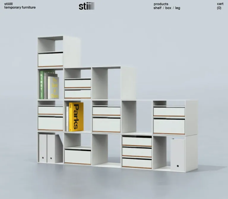
stiiilll(スティール)|仮設家具のブランド・通販サイト
白い余白と黒いコンデンス書体、大きな家具写真で構成されたECサイト。デスクトップの3列グリッドと非対称な写真配置を、モバイルでは縦方向のカタログへ展開しています。
stiiilll — Style Reference
A modular furniture catalog organized through white space, condensed black lettering, and quiet photographs of steel structures.
Original URL: https://stiiilll.com/ Final URL: https://stiiilll.com/ Theme: light; white interface surfaces with black typography and photographic color. Inspected: September 23, 2026, 06:00 JST. The supplied inspection timestamp is September 22, 2026, 21:00:40.072 UTC. Viewports: desktop 1440 × 1000 CSS pixels; mobile 390 × 844 CSS pixels. Scope: the current home page of the furniture brand and shop: opening media, persistent navigation, three product-category entries, brand introduction, shelf/box/leg editorial sections, specifications, collection links, and footer. Menu and cart structures are present in the supplied DOM, but their open states were not exercised. Collection, account, checkout, policy, and external destinations were not inspected.
stiiilll presents furniture through the visual logic of its products: repeated modules, slender edges, practical labels, and space between structures. A white canvas and black text provide a stable framework for pale steel furniture, concrete floors, white interiors, and occasional natural materials. Large lowercase category names establish rhythm without adding promotional banners or decorative containers.
The desktop page uses a recurring three-column alignment. The product index occupies all three columns evenly; later sections place photographs across the first two columns and technical information in the third. Some photographs occupy only the middle column, leaving an entire empty column at the left. On mobile, the same material becomes a single vertical sequence with 20px side margins, large headings, square category photographs, and a compact persistent header. This is a brand storefront with an editorial product catalog, rather than a page organized around one conversion action.
閉じる
stiiilll — Style Reference
A modular furniture catalog organized through white space, condensed black lettering, and quiet photographs of steel structures.
Original URL: https://stiiilll.com/ Final URL: https://stiiilll.com/ Theme: light; white interface surfaces with black typography and photographic color. Inspected: September 23, 2026, 06:00 JST. The supplied inspection timestamp is September 22, 2026, 21:00:40.072 UTC. Viewports: desktop 1440 × 1000 CSS pixels; mobile 390 × 844 CSS pixels. Scope: the current home page of the furniture brand and shop: opening media, persistent navigation, three product-category entries, brand introduction, shelf/box/leg editorial sections, specifications, collection links, and footer. Menu and cart structures are present in the supplied DOM, but their open states were not exercised. Collection, account, checkout, policy, and external destinations were not inspected.
stiiilll presents furniture through the visual logic of its products: repeated modules, slender edges, practical labels, and space between structures. A white canvas and black text provide a stable framework for pale steel furniture, concrete floors, white interiors, and occasional natural materials. Large lowercase category names establish rhythm without adding promotional banners or decorative containers.
The desktop page uses a recurring three-column alignment. The product index occupies all three columns evenly; later sections place photographs across the first two columns and technical information in the third. Some photographs occupy only the middle column, leaving an entire empty column at the left. On mobile, the same material becomes a single vertical sequence with 20px side margins, large headings, square category photographs, and a compact persistent header. This is a brand storefront with an editorial product catalog, rather than a page organized around one conversion action.
How to Read This Reference
- Measured values come from the supplied rendered DOM, computed styles, element rectangles, or exposed CSS custom properties.
- Calculated values are arithmetic derived from those measurements, such as column widths and spacing between element rectangles.
- Visual estimates describe the supplied screenshots where an element was not included in the measured sample. They are identified explicitly.
- Recommendations provide an implementation approach. They are not claims about the original source code or verified behavior.
- Token names introduced here are implementation aliases unless identified as source custom properties.
- Desktop and mobile were both captured. Intermediate widths, open overlays, hover results, keyboard behavior, and continuous media playback remain unverified.
- Offscreen elements are kept separate from the visible page. Their styles do not establish the appearance of an opened menu or cart.
Tokens — Colors
Default Palette
| Name | Value | Evidence | Role |
|---|---|---|---|
| Canvas White | #ffffff |
Measured body background; also present in source --payment-terms-background-color |
Page, product information, footer, and uninterrupted space around photographs |
| Interface Black | #000000 |
Measured text color throughout the visible page | Navigation, category names, body copy, links, and wordmark appearance |
| Menu Gray | #676869 |
Measured on offscreen mobile navigation links | Hidden-state source color; the visible open-menu result was not verified |
| Overlay Black | rgba(0, 0, 0, 0.3) |
Measured on zero-height overlay elements | Defined overlay tint; not visible in the supplied page captures |
The current visible interface is essentially a white/black system. Thin rules in the specification tables and footer appear black in the screenshots; their exact border declarations were not supplied.
Cool gray, muted blue, green, terracotta, and wood tones belong to the photography. They are not demonstrated as reusable interface accent colors. Avoid turning a blue shirt or a green plant into a button token.
Color Application
Use white as one continuous surface instead of alternating colored section backgrounds. Keep navigation and product names black. The hero header sits directly over its media without a visible filled strip, blur, or gradient in the supplied frames. Photography must therefore provide enough local contrast around these controls.
No theme switch, alternative color theme, colored purchase button, or sale-badge system is evidenced on this home page.
Tokens — Typography
Source Families
The supplied styles name the following families. These are exact CSS family identifiers, not expanded commercial font names or evidence of a particular font-file version.
| Role | Source family or property | Observed use |
|---|---|---|
| General text | --text-font-family, beginning with Suisse R |
Body text, Japanese paragraphs, footer |
| English utility text | --text-en-font-family, beginning with Suisse M, then Suisse R |
Navigation, cart, section label, and view more links |
| Large condensed text | --ttl-font-family, beginning with Suisse R cond, then Suisse R |
Product-category names and editorial product titles |
| Light text family | --text-thin-font-family, beginning with Suisse L |
Declared, but no defining visible application established by the sampled elements |
The source stacks include Japanese fallbacks such as Yu Gothic Medium, Yu Gothic Bold, YuGothic, Hiragino Kaku Gothic ProN, and Yu Gothic. Preserve a suitable Japanese sans-serif fallback chain when adapting the design.
The utility family is often computed at font-weight: 400 even though it appears firm and substantial. The Japanese descriptive paragraphs and footer are explicitly 700. Do not make every element bold to approximate the screenshots.
The logo is a graphic wordmark. Its enclosing H1 has a small computed font size, but that is not the visible logo's lettering size. Use the actual authorized brand asset rather than reproducing its tapering vertical strokes with ordinary text.
Type Scale
| Role | Desktop | Mobile | Weight | Tracking / notes |
|---|---|---|---|---|
| Base body | 14px / 22.4px |
14px / 22.4px |
400 |
Normal |
| Header navigation | 16px / 24px |
Replaced by menu trigger | 400, utility family |
Normal |
| Cart label | 16px / 20.8px |
14px / 18.2px |
400, utility family |
Two lines: cart and (0) |
products label |
16px / 16px |
14px / 14px |
400, utility family |
Lowercase |
| Product-index title | 150px / 180px |
100px / 120px |
400, condensed family |
-3px / -2px, equivalent to -0.02em |
| Editorial product title | 150px / 150px |
100px / 100px |
400, condensed family |
-3px / -2px |
| Brand introduction | 18px / 28.8px |
16px / 25.6px |
700 |
Normal |
| Product description | 16px / 25.6px |
14px / 22.4px |
700 |
Normal |
Index view more |
14px / 14px |
12px / 12px |
400, utility family |
Compact text link |
Editorial view more |
14px / 22.4px |
12px / 19.2px |
400, utility family |
Separate line below description |
| Footer navigation | 16px / 25.6px |
14px / 22.4px |
700 |
Additional spacing between rows |
| Footer company text | 16px / 26.4px |
14px / 22.4px |
700 |
Four visible lines |
| Copyright | 12px / 19.8px |
12px / 19.2px |
700 |
Smallest persistent footer text |
| Offscreen mobile category links | Not applicable | 90px / 90px |
400, condensed family |
-1.8px; open state unverified |
| Offscreen mobile secondary links | Not applicable | 18px / 18px |
400, utility family |
Open state unverified |
Specification text appears approximately 14px on desktop. This is a screenshot estimate: table-cell computed typography was not included in the supplied sample. A 12–14px specification scale is a reasonable adaptation, subject to legibility testing.
Typographic Character
Preserve the contrast between extremely large, narrow English nouns and small, dense practical text. The category labels are simply shelf, box, and leg. They do not need uppercase styling, decorative subtitles, outlines, or accent colors.
The large headings have small optical outdents. In the index, the desktop shelf title starts 4px left of its photograph; box and leg start 9px left. Mobile offsets are 4px and 6px respectively. These are measured placement differences, not evidence that all body text should use negative margins.
Tokens — Spacing & Shapes
Primary layout rhythm: 20px horizontal margins and gaps, with much larger vertical intervals around photographs. Shape language: rectangular photographs, unboxed text, thin horizontal rules, and minimal outline icons.
Spacing Scale
| Use | Value | Status |
|---|---|---|
| Standard page side inset | 20px at both inspected widths |
Measured |
| Product-index desktop gap | 20px |
Calculated from adjacent image rectangles |
Index image to view more |
14px |
Calculated at both widths |
Desktop products label bottom to title box |
56px |
Calculated |
Mobile products label bottom to title box |
7px |
Calculated |
| Mobile category link bottom to next title box | 58px |
Calculated for the first two transitions |
| Description bottom to editorial link | 20px desktop; 17px mobile |
Calculated |
| Gap between the two visible shelf photographs | About 50px |
Screenshot estimate |
Mobile hero bottom to products label |
About 60px |
Screenshot boundary plus measured label position |
| Last visible photograph to footer rule | About 100px desktop; 60px mobile |
Screenshot estimates |
| Footer rule to first text row | About 40px |
Screenshot estimate |
Do not force these values into a universal 8px scale. The small optical corrections and compact text spacing coexist with broad photographic intervals.
Border Radius and Edges
| Element | Treatment | Evidence |
|---|---|---|
| Category photographs | Square corners | Visible in desktop/mobile evidence |
| Editorial photographs | Square corners | Visible in the supplied section captures |
| Product information | No card container | Visible |
| Specification separators | Approximately 1px black horizontal rules | Screenshot estimate |
| Footer separator | Approximately 1px black horizontal rule | Screenshot estimate |
| Some index text links | Computed 3px radius |
No filled surface makes this visually significant |
| Offscreen empty-cart action | Computed 30px radius |
Hidden DOM detail; not the home page's primary action style |
There is no visible card-shadow or rounded-panel system in the captured home page. The exposed 100px swatch-radius variable does not establish visible circular product swatches here.
Layout Measurements
| Element | Desktop 1440 × 1000 | Mobile 390 × 844 |
|---|---|---|
| Main content width | 1400px between 20px insets |
350px between 20px insets |
| Category image | About 453.33 × 453.33px |
350 × 350px |
| Category image starts | x = 20, 493.33, 966.67px |
All at x = 20px |
| Header height variables | 55px |
52px |
| Wordmark bounds | 70 × 34.52px, at approximately (491.91, 10) |
60 × 29.59px, at approximately (164, 15.20) |
| Brand introduction | x = 494px, width 926px |
x = 20px, width 350px |
| Editorial description | x = 971.25px, width 436.75px |
x = 20px, width 350px |
| Footer policy-column start | x = 493.33px |
x = 182.5px |
| Footer company-column start | About x = 965.66px |
x = 20px, on a later row |
| Document height | About 10969px |
About 8791px |
The desktop column calculation is (1440 - 40 - 40) / 3 = 453.33px: two page insets and two internal gaps. A two-column image spans approximately 926.67px. This matches the visible large shelf photograph and the width of the brand-introduction region.
Document heights are capture measurements, not dimensions to hardcode. Mobile stacking is offset by the much smaller rendered imagery and different spacing.
Components
Persistent Header
Role: identity, category navigation, and shopping utilities.
The desktop header distributes content across the page's recurring grid:
- A two-line brand descriptor at the upper left:
stiiilllandtemporary furniture. - The graphic wordmark near the left edge of the second column, rather than centered in the viewport.
- A two-line navigation group at the start of the third column. The first line reads
shelf / box / leg; the second readscases / sustainability. - An outline account icon and a two-line
cart (0)link near the right edge.
There is no visible bottom border or opaque header background in the supplied frames. The header remains near the top edge in the scrolled captures, supporting persistent positioning. The precise choice of CSS fixed versus sticky was not provided.
The desktop account link measures approximately 32 × 25.7px; the mobile account and cart link boxes measure 44 × 44px. These measurements describe different responsive targets rather than one shared icon size.
The measured HEADER element containing the shopping-cart title is offscreen. It is not the visible site header and should not be used to derive the main header's width or padding.
Mobile Header and Menu Trigger
Role: preserve brand recognition while reducing navigation density.
At 390px, the left brand descriptor and visible desktop navigation disappear. A narrow three-stroke vertical menu symbol appears at the left. The wordmark moves to the center and reduces from 70px to 60px wide. Account and cart utilities remain at the right.
The icon is composed visually of vertical strokes, not the usual three horizontal hamburger lines. Keep that distinction when rebuilding the control. Its visible strokes are much narrower than the measured button area.
The DOM contains a mobile menu with large category names and smaller links for cases, sustainability, contact, Instagram, and top. Their sampled coordinates are outside the left edge of the viewport. No screenshot shows this menu open; its final surface, coverage, focus handling, and open-state colors remain unverified.
Opening Media
Role: introduce the furniture through scale and material rather than headline copy.
The desktop opening capture is filled by a close view of pale steel shelving, accessories, and a light interior. The photo continues beneath the transparent header. The mobile opening capture shows a table with slender wood supports and a dark top on a pale background; this media region ends at approximately y = 281px.
No marketing headline, explanatory paragraph, large action button, or visible pagination dots overlay these captured opening frames. The only typography over the image belongs to the header.
The different desktop and mobile subjects do not establish whether the page uses a timed sequence, alternate responsive assets, or another media state. The DOM excerpt contains a video-container styling reference, but it does not include a verified playback trace, video URL, or effective hero bounds. Media type, timing, looping, controls, and image-change behavior remain unverified.
For an adaptation, use a responsive image or a video with a reliable poster. Treat a viewport-height desktop hero and a roughly 25:18 mobile media box as screenshot-based approximations, not recovered source formulas.
Product-Category Index
Role: direct entry into the three collections.
A small products label introduces three entries in the order shelf, box, leg. Each entry has the same anatomy:
- Oversized condensed category name.
- Square product photograph linked to its collection.
- Small
view moretext link below the photograph.
The desktop entries occupy equal columns with 20px gaps. Mobile uses the full 350px content width and stacks all three entries. There is no visible card fill, rounded image treatment, price, badge, rating, or add-to-cart button in this component.
The title's line box slightly overlaps the photograph's vertical region: approximately 5px on desktop and 3px on mobile. The visible glyphs remain clear of the image. This is a typographic spacing detail, not an instruction to place the letters on top of the furniture.
The image and text links both point to the matching collection. The supplied DOM does not establish that the entire outer entry is one clickable surface.
Brand Introduction
Role: explain the concept of temporary, adaptable furniture.
The source copy describes furniture that can accommodate moves, changing offices, and evolving layouts, with modular adjustment and reduced damage to interiors. The styling is a dense, bold Japanese paragraph rather than a set of benefit cards.
On desktop, the paragraph begins around the second column and spans the remaining two columns. The measured box is 926px wide, with 14px right padding, at 18px / 28.8px. On mobile it becomes a full-width 350px paragraph at 16px / 25.6px.
Keep the large surrounding intervals when reproducing the editorial rhythm. Do not replace the prose with arbitrary icon bullets simply to reduce page length.
Editorial Product Section
Role: show the furniture in use and provide practical specifications.
Each product section combines photographs with a recurring information stack:
- Large condensed lowercase product name.
- Compact specification table.
- Bold Japanese descriptive paragraph.
- Plain
view morelink to the corresponding collection.
The desktop information occupies the rightmost column. Photographs occupy the first two columns, sometimes spanning both and sometimes using only one. In the shelf capture, a smaller image occupies the left column above a much wider interior photograph. In the leg capture, a portrait image sits in the middle column while the left column remains empty.
The leg portrait is approximately 453px wide and 605px tall in the visible frame, close to a 3:4 ratio. Do not impose that ratio on every editorial image: the shelf section also uses a wide interior photograph.
The supplied frames show a stable-looking right information column beside a longer image sequence. This is consistent with pinned copy, but its positioning declaration and scroll lifecycle were not supplied. Treat desktop product-copy pinning as an optional implementation choice requiring further verification.
On mobile, the measured titles, descriptions, and links all return to the 20px left inset and full 350px content width. Exact ordering of every intervening photograph is not documented by the two mobile screenshots.
Specification Table
Role: communicate dimensions, materials, and finishes without visual clutter.
Use left-aligned labels, compact values, and thin horizontal dividers between categories of information. There is no surrounding table box or alternating row shading in the supplied desktop captures. Dimensions can contain multiple variants within one logical row.
| Product | Dimensions shown in source | Material label and value | Colors |
|---|---|---|---|
| shelf | shelf 2400 — W636 D274 H2385mm; shelf 2700 — W636 D274 H2685mm |
material / steel |
white / gray |
| box | W350 D350 H350mm |
material / steel |
white / gray |
| leg | S — W400 D400 H400mm; M — W400 D400 H700mm; L — W600 D600 H700mm |
materials / steel / wood |
white / gray / wood |
Preserve the source's singular/plural distinction if reproducing its actual labels. In a new implementation, use semantic table headers or a definition list and keep each variant associated with its dimensions. Avoid spacing columns with full-width spaces in HTML; use table cells or a small grid.
Text Collection Link
Role: move from editorial context to collection browsing.
view more appears in small black utility type with no visible filled button, arrow, or surrounding capsule. Index links use a tight line height; editorial links use the body-like 1.6 line height. Their understated appearance should remain subordinate to the product title and photograph.
The collection destinations are /collections/shelf, /collections/box, and /collections/leg, with trailing-slash variants in the editorial links. Navigation results were not tested.
Footer
Role: practical navigation, policies, operator information, and social access.
A thin black rule separates the footer from the last photograph. The desktop footer follows three main alignments:
- Left: top, combined category links, cases, sustainability, contact.
- Middle: four Japanese policy links.
- Right: company name, address, telephone and fax, Instagram, and copyright.
The original footer names 株式会社 新和 and links that name to its company page. This is directly supported by the inspected home page. The copyright reads © 2023 stiiilll temporary furniture; the displayed year is not the inspection year.
At 390px, navigation and policy links remain side by side. Their text starts at x = 20px and x = 182.5px. Company information moves below them and spans the content width. Instagram and copyright follow with substantial separation.
The mobile rule is inset about 10px from the viewport edges, while the text is inset 20px. In the desktop screenshot, the rule extends to approximately 5px from each edge. These are visual estimates, not measured border declarations.
Cart and Account Entry Points
Role: retain shopping access without competing with the catalog.
The account icon links to the site's customer-authentication redirect, and the cart text links to /cart. The inspected count is (0).
Offscreen DOM contains an empty-cart title, close controls, and a 買い物を始める action. Its header measures 540px wide on desktop and 351px on mobile. These are offscreen header measurements, not a verified complete drawer specification. Opening the cart, changing its count, authentication, and checkout behavior were not observed.
Tokens — Motion & Interaction
The evidence contains computed transition declarations, but no recorded interaction sequence demonstrating their final visual results.
| Treatment | Measured declaration | Evidence boundary |
|---|---|---|
| Desktop category navigation | color 0.1s |
Target hover color not supplied |
| General links | color 0.1s, border-color 0.1s, opacity 0.1s, text-decoration-color 0.1s |
Defines possible transitions, not an observed hover effect |
Index view more links |
background-color 0.1s, color 0.1s, border-color 0.1s, opacity 0.1s |
No filled hover state was captured |
| Mobile menu trigger | color 0.1s |
Trigger activation not tested |
| Offscreen mobile menu links | opacity 0.24s 0.19s, transform 0.24s 0.19s |
240ms duration and 190ms delay; direction and open result unknown |
| Offscreen menu-related control | opacity 0.35s cubic-bezier(0.55, 0.03, 0.37, 0.96), visibility 0.35s cubic-bezier(0.55, 0.03, 0.37, 0.96) |
Do not generalize this to the entire menu panel |
| Zero-height overlay elements | opacity 0.34s |
Overlay was not visibly open |
| Sampled visible text elements | animation: none |
Does not rule out video, JavaScript behavior, or motion on unsampled elements |
Several elements report only transition: all, without a demonstrated nonzero timing or state change. That is insufficient evidence for a page-wide animation system.
The supplied capture process waited for load, visible images, and sampled layout stability, with an initial observation of at least five seconds. Perpetual animations were temporarily paused during readiness checks and then resumed. This procedure does not establish hero playback timing or delayed interaction behavior.
For a new implementation, keep small link feedback brief. An underline appearing over 100ms is a reasonable recommendation, but its exact appearance is not a finding about the original. Avoid adding parallax, scroll-driven zoom, elastic card motion, or elaborate image reveals without further evidence.
Surfaces
| Layer | Appearance | Purpose |
|---|---|---|
| Page canvas | Solid white | Continuous catalog and editorial space |
| Header | Visually transparent in supplied frames | Brand and navigation over both photographs and white areas |
| Category entry | No separate surface | Typography and photograph define the module |
| Product information | White page with thin table rules | Technical clarity without a card container |
| Photography | Natural shadows and material texture inside the image | Depth and color belong to the furniture scene |
| Footer | White, separated by a thin black rule | Quiet continuation of the page grid |
| Overlay | Black at 30% opacity in hidden DOM | Defined but not visually verified |
Distinguish photographic shadows from interface elevation. A shelf casting a soft shadow on a wall does not justify adding CSS shadows around product images.
Imagery
Photography carries most of the site's atmosphere. Pale steel structures are shown against white walls, concrete floors, and cool neutral backgrounds. Styling is practical and sparse: storage boxes, books, office objects, shirts, folded clothing, plants, and small vessels demonstrate use without overwhelming the furniture.
The opening desktop scene is a close crop. Category photographs isolate a product within a square frame. Editorial photographs widen the context to office, retail, and wardrobe arrangements. The leg section shows tabletops and supports at different heights, with clothing and accessories demonstrating display use.
Preserve slender furniture profiles and the empty space around them. Use high-resolution images with natural tonal detail. Do not apply pixelation, hard duotone processing, heavy saturation, artificial vignettes, or cutout-style drop shadows.
Cropping and Placement
- Category images: square, with the full primary object readable. The measured displayed sizes are approximately 453px on desktop and 350px on mobile.
- Editorial images: use their intended portrait or landscape framing. Let some images span two desktop columns while others occupy one.
- Opening media: edge to edge, beneath the header. Cropping must preserve the furniture and suitable contrast near navigation.
- Mobile photographs: retain 20px side insets for the visible category and final editorial images. The opening media is full width.
Observed Asset References
These URLs were supplied in the rendered original-page evidence. They were not separately downloaded or inspected during this analysis.
| Asset | Observed URL | Use |
|---|---|---|
| Shelf category photograph | https://stiiilll.com/cdn/shop/files/products_shelf_1024x1024.jpg?v=1697193964 |
Square collection entry |
| Box category photograph | https://stiiilll.com/cdn/shop/files/products_box_1024x1024.jpg?v=1697193979 |
Square collection entry |
| Leg category photograph | https://stiiilll.com/cdn/shop/files/products_leg_1024x1024.jpg?v=1697193994 |
Square collection entry |
Hero, editorial-photo, logo, and font-file URLs were not included in the supplied asset evidence. Do not invent filenames for them. Use original assets only when authorized and available.
Layout & Responsive Behavior
Desktop: Shared Three-Column Alignment
At 1440px, the page uses a 1400px content region with 20px side margins. The product index demonstrates three equal columns separated by 20px gaps. That alignment reappears in the header, brand introduction, editorial photography, information panels, and footer.
The graphic logo sits near the second-column start rather than the screen center. The brand introduction begins in the second column and spans two columns. Product details sit in the third. A single middle-column photograph can leave the first column empty, producing a deliberate asymmetry.
Use this common alignment system instead of independent centered containers for each section. An arbitrary maximum width or a conventional centered logo would change the composition at the inspected desktop width.
Mobile: One Product Column, Two Footer Columns
At 390px, the content width is 350px. Category names reduce from 150px to 100px while retaining their condensed family and -0.02em tracking. Category images remain square. Descriptive text reduces by 2px, while the base body size stays 14px.
The opening media is much shorter than the 844px viewport, allowing products, the first category title, and nearly the entire first image to appear in the initial capture. A full-height mobile hero would lose this observed balance.
The footer does not collapse into a single undifferentiated list: navigation and policy links keep two columns, followed by a full-width company block. Account and cart remain visible in the header while category navigation moves behind the menu trigger.
Verified Endpoints and Unknown Intermediate Behavior
The two inspected widths establish distinct desktop and mobile arrangements. They do not reveal the exact breakpoint, whether intermediate columns exist, or the source's continuous sizing formulas.
The Quick Start uses a recommended 900px breakpoint to switch these arrangements. It also uses a viewport-height desktop hero and a 25:18 mobile media ratio as approximations. These decisions should be checked at tablet widths, in landscape orientation, and with real assets.
Do not derive the whole page from absolute screenshot coordinates. Use the measured grid, typography, and component spacing, then let content determine total height.
Do’s and Don’ts
Do
- Keep the white canvas and black interface typography consistent across sections.
- Use the observed condensed family for the very large lowercase product names when licensed and available.
- Preserve the difference between 150px desktop headings and 100px mobile headings.
- Align desktop modules to the recurring three-column grid with 20px gaps.
- Keep the desktop wordmark at the second-column start and center it on mobile.
- Treat empty columns as part of the composition.
- Use square category photographs and varied editorial image proportions.
- Keep specifications compact, left aligned, and separated by fine horizontal rules.
- Preserve bold Japanese descriptions alongside regular-weight utility text.
- Retain the mobile footer's two upper columns and lower company-information block.
- Keep collection actions as quiet text links.
- Distinguish hidden source styles from verified visible states.
Don’t
- Don't turn the catalog into a grid of rounded ecommerce cards with prices, badges, and prominent purchase buttons.
- Don't add a large promotional headline over the opening image without a new content requirement.
- Don't center every desktop section or remove the intentionally empty left column.
- Don't use a generic wide bold font for the category names.
- Don't recreate the graphic wordmark as an ordinary text heading.
- Don't color the interface from incidental props in the photographs.
- Don't crop slender furniture so aggressively that its complete structure becomes unclear.
- Don't add interface shadows or glass effects based on shadows inside photographs.
- Don't replace the mobile menu's vertical-stroke symbol with an unrelated icon treatment.
- Don't infer a carousel, autoplay duration, pinned product panel, or drawer behavior from static frames alone.
- Don't copy offscreen cart-button styling into the visible
view morelinks. - Don't hardcode the captured document heights.
Recommended Implementation Additions
These are recommendations for an adaptation, not verified features of the inspected site:
- Give the home wordmark, menu trigger, and account icon explicit accessible names. Provide an expanded state and controlled-region association for the menu.
- Use meaningful heading elements for product sections. The sampled editorial product names are paragraphs styled as titles; semantic headings can preserve the appearance while improving navigation.
- Give repeated
view morelinks distinct accessible names, such asView shelf collection. - Supply meaningful image alternatives where photographs convey product structure or use. The supplied category-image markup has empty alt attributes; an image-only link needs a reliable accessible name.
- Preserve at least 44px touch targets around compact utilities and text actions without adding large visible button surfaces.
- If implementing a modal menu or cart, add focus management, Escape handling, scroll containment, and a clear close control.
- Verify header contrast over every hero frame and editorial photograph. If necessary, add a restrained contrast treatment for difficult images rather than relying on a single favorable frame.
- Load authorized font files with an appropriate fallback strategy. The supplied family names do not provide font files or licensing rights.
- Reserve image space to reduce layout movement, and load below-the-fold editorial photography efficiently. Do not defer the initial hero asset as if it were a distant gallery image.
- If the hero moves continuously, provide appropriate pause behavior and honor reduced-motion preferences. Keep a useful static poster.
- Test the large condensed headings, footer policy links, and specification values at narrow widths and increased text size.
Agent Prompt Guide
Quick Color Reference
- Page and visible content surfaces:
#ffffff. - Text, icons, and visible linework:
#000000. - Photography: cool pale neutrals with restrained natural color; not a UI accent palette.
- Hidden mobile-menu text source:
#676869, with open appearance unverified. - Hidden overlay source: black at 30% opacity.
- Actions: plain black text, without a prominent colored fill.
Overall Prompt
“Create a Japanese modular-furniture brand storefront inspired by the supplied stiiilll reference. Use a white canvas, black utility text, large lowercase condensed category names, and quiet photographs of pale steel furniture. At desktop width, establish three equal columns with 20px outside margins and 20px gaps. Place the graphic wordmark at the start of the second column, category navigation at the third, and account/cart utilities at the far right. Present shelf, box, and leg as three square-image category entries, then use asymmetric editorial photographs across the first two columns with specifications and bold Japanese descriptions in the third. Keep photographs square-cornered, tables lightly ruled, and collection links small. On mobile, center the wordmark, use a vertical-stroke menu symbol, stack products within 20px margins, reduce category headings to 100px, and retain two upper footer columns.”
Example Component Prompts
- Header: “Build a transparent persistent furniture-store header aligned to a three-column page grid. Use a two-line descriptor at left, a small graphic wordmark at the second-column start, two compact navigation rows at the third-column start, and account/cart utilities at the right. On mobile, show a centered 60px wordmark and a menu symbol made from three vertical strokes. Keep menu-open behavior separate from the verified closed layout.”
- Category entry: “Create a borderless product-category module with a 150px condensed lowercase title, slightly negative tracking, a square product photograph, and a 14px
view morelink. Use 100px titles and 12px links on mobile. Avoid card backgrounds, prices, badges, and shadows.” - Editorial section: “Arrange a furniture story on a three-column white grid. Let photographs occupy one or two columns on the left, preserving intentional empty areas. Put a large condensed product name, a small ruled specification table, bold Japanese description, and plain collection link in the right column. Use the photographs' intended aspect ratios.”
- Specification table: “Use compact black text on white with labels for dimensions, material, and colors. Align variant names and millimeter dimensions in stable columns. Add only thin horizontal separators between information groups; no outer box or alternating fills.”
- Footer: “Create a white footer under a thin black rule. Align navigation, Japanese policy links, and company information to three desktop columns. On mobile, keep navigation and policies side by side, then place company information, Instagram, and small copyright text below with generous vertical spacing.”
Quick Start
CSS Custom Properties
The following is an adaptation scaffold, not extracted source CSS. It preserves measured typography and the main grid relationships. The 900px breakpoint, hero sizing, some gallery intervals, and semantic class structure are recommendations. It does not implement menu/cart state, hero playback, or unverified product-copy pinning.
The font stacks use observed Latin-script family names and omit duplicate localized aliases for readability. Supply licensed font files separately; no font URLs were available in the evidence.
:root {
  /* Measured visible palette */
  --color-canvas: #fff;
  --color-ink: #000;

  /* Source values from hidden elements; not active page accents */
  --color-menu-source: #676869;
  --color-overlay-source: rgb(0 0 0 / 30%);

  /* Observed family identifiers with practical fallbacks */
  --font-body: 'Suisse R', 'Yu Gothic Medium', YuGothic,
    'Hiragino Kaku Gothic ProN', 'Yu Gothic', sans-serif;
  --font-utility: 'Suisse M', 'Suisse R', 'Yu Gothic Bold',
    YuGothic, 'Hiragino Kaku Gothic ProN', 'Yu Gothic', sans-serif;
  --font-display: 'Suisse R cond', 'Suisse R', 'Yu Gothic Bold',
    YuGothic, 'Hiragino Kaku Gothic ProN', 'Yu Gothic', sans-serif;

  --size-display: 150px;
  --size-utility: 16px;
  --size-description: 16px;
  --size-introduction: 18px;
  --size-link: 14px;
  --leading-body: 1.6;
  --tracking-display: -0.02em;

  --page-inset: 20px;
  --grid-gap: 20px;
  --header-height: 55px;
  --logo-width: 70px;
  --rule-width: 1px;
  --radius-content: 0;
  --motion-link: 100ms;
}

* { box-sizing: border-box; }

body {
  margin: 0;
  color: var(--color-ink);
  background: var(--color-canvas);
  font: 400 14px / var(--leading-body) var(--font-body);
}

img, video { display: block; max-width: 100%; }
button, input { font: inherit; }
a { color: inherit; text-decoration: none; }

.site-header {
  position: fixed;
  z-index: 20;
  inset: 0 0 auto;
  display: grid;
  grid-template-columns: repeat(3, minmax(0, 1fr));
  column-gap: var(--grid-gap);
  height: var(--header-height);
  padding: 10px var(--page-inset) 0;
  background: transparent;
  font: 400 var(--size-utility) / 1.2 var(--font-utility);
}

.brand-descriptor { grid-column: 1; line-height: 1; }
.brand-logo { grid-column: 2; width: var(--logo-width); }
.brand-logo img { width: 100%; height: auto; }
.desktop-nav { grid-column: 3; align-self: start; }
.desktop-nav .nav-row { display: flex; align-items: baseline; gap: 6px; }

.header-tools {
  position: absolute;
  top: 8px;
  right: 20px;
  display: flex;
  align-items: flex-start;
  gap: 21px;
}

.account-link { display: grid; place-items: center; width: 32px; }
.cart-link { line-height: 1.3; }
.cart-link span { display: block; }
.menu-trigger { display: none; }

/* Recommended hero approximation from the supplied captures. */
.hero { position: relative; height: 100svh; overflow: hidden; }
.hero-media {
  position: absolute;
  inset: 0;
  width: 100%;
  height: 100%;
  object-fit: cover;
}

.products { padding: 84px var(--page-inset) 0; }
.section-label {
  margin: 0;
  font: 400 var(--size-utility) / 1 var(--font-utility);
}

.product-grid {
  display: grid;
  grid-template-columns: repeat(3, minmax(0, 1fr));
  gap: var(--grid-gap);
  margin-top: 56px;
}

.product-card { min-width: 0; }
.category-title {
  margin: 0 0 -5px -4px;
  font: 400 var(--size-display) / 1.2 var(--font-display);
  letter-spacing: var(--tracking-display);
}

.product-card[data-category='box'] .category-title,
.product-card[data-category='leg'] .category-title {
  margin-left: -9px;
}

.category-photo { display: block; aspect-ratio: 1; }
.category-photo img {
  width: 100%;
  height: 100%;
  object-fit: cover;
  border-radius: var(--radius-content);
}

.more {
  display: block;
  margin-top: 20px;
  font: 400 var(--size-link) / 1.6 var(--font-utility);
}
.product-card .more { margin-top: 14px; line-height: 1; }

/* Section margins are recommended scaffolding, not recovered values. */
.brand-section,
.feature {
  display: grid;
  grid-template-columns: repeat(3, minmax(0, 1fr));
  gap: var(--grid-gap);
  margin: 120px var(--page-inset) 0;
  align-items: start;
}

.brand-copy {
  grid-column: 2 / -1;
  margin: 0;
  padding-right: 14px;
  font-size: var(--size-introduction);
  font-weight: 700;
  line-height: 1.6;
}

.feature-gallery {
  grid-column: 1 / span 2;
  display: grid;
  grid-template-columns: repeat(2, minmax(0, 1fr));
  gap: 50px var(--grid-gap);
}

.feature-gallery figure { min-width: 0; margin: 0; }
.feature-gallery img { width: 100%; height: auto; }
.media-half { grid-column: span 1; }
.media-half.at-second { grid-column: 2; }
.media-wide { grid-column: 1 / -1; }

.feature-copy {
  grid-column: 3;
  grid-row: 1;
  min-width: 0;
  padding: 0 12px 0 5px;
}

.feature-title {
  margin: 0 0 40px -6px;
  font: 400 var(--size-display) / 1 var(--font-display);
  letter-spacing: var(--tracking-display);
}

/* Specification type and cell spacing are visual approximations. */
.specs {
  width: 100%;
  margin: 0 0 32px;
  border-collapse: collapse;
  font: 400 14px / 1.3 var(--font-utility);
}
.specs th, .specs td {
  padding: 7px 0;
  text-align: left;
  vertical-align: top;
  font-weight: 400;
}
.specs th { width: 25%; padding-right: 12px; }
.specs tr + tr { border-top: var(--rule-width) solid currentColor; }
.spec-variant {
  display: grid;
  grid-template-columns: minmax(0, 1fr) minmax(0, 2fr);
  gap: 12px;
}

.feature-description {
  margin: 0;
  font-size: var(--size-description);
  font-weight: 700;
  line-height: 1.6;
}

.site-footer {
  margin: 100px 5px 0;
  padding: 36px 15px 20px;
  border-top: var(--rule-width) solid currentColor;
  font-size: 16px;
  font-weight: 700;
}
.footer-grid {
  display: grid;
  grid-template-columns: repeat(3, minmax(0, 1fr));
  gap: var(--grid-gap);
}
.footer-nav { padding-left: 10px; }
.footer-list { margin: 0; padding: 0; list-style: none; }
.footer-list li + li { margin-top: 1px; }
.footer-contact p { margin: 0; line-height: 1.65; }
.footer-contact .footer-social { margin-top: 32px; }
.footer-contact .copyright { margin-top: 56px; font-size: 12px; }

/* Recommended interaction feedback; hover results were not captured. */
a { transition: text-decoration-color var(--motion-link); }
@media (hover: hover) {
  .more:hover,
  .desktop-nav a:hover,
  .footer-list a:hover {
    text-decoration: underline;
    text-underline-offset: 3px;
  }
}
:focus-visible { outline: 2px solid currentColor; outline-offset: 4px; }
[id] { scroll-margin-top: calc(var(--header-height) + 20px); }

/* Recommended breakpoint; only 1440px and 390px were inspected. */
@media (max-width: 900px) {
  :root {
    --size-display: 100px;
    --size-utility: 14px;
    --size-description: 14px;
    --size-introduction: 16px;
    --size-link: 12px;
    --header-height: 52px;
    --logo-width: 60px;
  }

  .site-header { display: block; padding: 0; }
  .brand-descriptor, .desktop-nav { display: none; }
  .brand-logo {
    position: absolute;
    top: 15px;
    left: 50%;
    transform: translateX(-50%);
  }
  .header-tools { top: 4px; right: 2px; gap: 0; }
  .account-link, .cart-link { width: 44px; min-height: 44px; }
  .cart-link { padding-top: 9px; }

  .menu-trigger {
    position: absolute;
    top: 8px;
    left: 5px;
    display: flex;
    align-items: center;
    justify-content: center;
    gap: 5px;
    width: 44px;
    height: 44px;
    padding: 0;
    border: 0;
    background: none;
    color: inherit;
  }
  .menu-trigger span { width: 1px; height: 28px; background: currentColor; }

  .hero { height: auto; aspect-ratio: 25 / 18; }
  .products { padding-top: 60px; }
  .product-grid { grid-template-columns: 1fr; row-gap: 58px; margin-top: 7px; }
  .category-title { margin-bottom: -3px; }
  .product-card[data-category='box'] .category-title,
  .product-card[data-category='leg'] .category-title { margin-left: -6px; }

  .brand-section, .feature { grid-template-columns: 1fr; margin-top: 80px; }
  .brand-copy { grid-column: 1; padding: 0; }
  .feature-gallery { grid-column: 1; grid-template-columns: 1fr; gap: 40px; }
  .media-half, .media-half.at-second, .media-wide { grid-column: 1; }
  .feature-copy { grid-column: 1; grid-row: auto; padding: 0; }
  .feature-title { margin-left: -4px; margin-bottom: 32px; }
  .specs { font-size: 12px; }
  .more { margin-top: 17px; }

  .site-footer { margin: 60px 10px 0; padding: 36px 10px 55px; font-size: 14px; }
  .footer-grid {
    /* This ratio reproduces the measured policy start at 390px. */
    grid-template-columns: minmax(0, 13fr) minmax(0, 15fr);
    column-gap: 0;
    row-gap: 54px;
  }
  .footer-nav { padding-left: 0; }
  .footer-list li + li { margin-top: 3px; }
  .footer-contact { grid-column: 1 / -1; }
  .footer-contact p { line-height: 1.6; }
  .footer-contact .copyright { margin-top: 64px; }
}

@media (prefers-reduced-motion: reduce) {
  a, button { transition: none; }
  html { scroll-behavior: auto; }
}
Component Markup Example
This example uses an observed category-image URL and collection destination. Its semantic labels are recommended additions. Use the image only with appropriate authorization.
<article class='product-card' data-category='shelf'>
  <h3 class='category-title'>shelf</h3>
  <a class='category-photo'
     href='https://stiiilll.com/collections/shelf'
     aria-label='Browse the shelf collection'>
    <img
      src='https://stiiilll.com/cdn/shop/files/products_shelf_1024x1024.jpg?v=1697193964'
      alt='A tall white steel shelf with slender supports'
      loading='lazy'
      decoding='async'>
  </a>
  <a class='more'
     href='https://stiiilll.com/collections/shelf'
     aria-label='View the shelf collection'>view more</a>
</article>
Place three category articles inside .product-grid. For each editorial section, put .feature-gallery before .feature-copy inside .feature; the desktop grid positions the copy on the right while the mobile scaffold follows that document order. Assign .media-wide to photographs spanning both gallery columns and .media-half.at-second to a photograph occupying only the second gallery column.
The footer expects navigation, policy navigation, and .footer-contact as the three children of .footer-grid. The mobile menu trigger requires three decorative spans and an accessible button label; its actual state management must be implemented separately.
Tailwind v4 Token Mapping
Optional aliases for a project already using Tailwind v4. This is not evidence that the original site uses Tailwind. Define the custom properties above first.
@theme inline {
  --color-canvas: #ffffff;
  --color-ink: #000000;
  --font-sans: var(--font-body);
  --font-catalog: var(--font-display);
  --font-label: var(--font-utility);
  --text-catalog: var(--size-display);
  --text-description: var(--size-description);
  --text-introduction: var(--size-introduction);
  --text-utility: var(--size-utility);
  --text-more: var(--size-link);
  --spacing-page: var(--page-inset);
  --spacing-grid: var(--grid-gap);
  --radius-catalog: 0px;
}
Sources & Evidence
- Original and final page: https://stiiilll.com/. The supplied response reports HTTP 200 and no URL change. The document title is
stiiilll 仮設家具ブランド. - Capture timestamp:
2026-09-22T21:00:40.072Z, equivalent to September 23, 2026, 06:00:40.072 JST. - Desktop evidence: three supplied 1440 × 1000 captures covering opening media, shelf editorial content, and the final leg section/footer, together with rendered text, link destinations, computed styles, and element rectangles.
- Mobile evidence: two supplied 390 × 844 captures covering the opening/product-index region and final photograph/footer, together with the mobile rendered DOM and computed styles.
- Measurements: source font-family variables, 55px/52px header-height variables, body and text styles, product-image rectangles, title sizes and tracking, column starts, footer positions, transition declarations, and document heights.
- Interaction scope: the supplied inspection traversed scroll positions and checked settled rendering. No menu, cart, account, collection, hover, or keyboard interaction trace was provided. Persistent header appearance is supported by the scrolled screenshots; product-copy pinning and continuous hero behavior remain unverified.
- Capture limitations: readiness checks used finite time limits and do not prove semantic completeness. SharedWorkers and service workers were disabled during inspection. Asset URLs were documented only when present in the supplied rendered evidence. No additional browsing or file inspection was performed for this reference.
This document describes the current home page represented by the supplied original-site evidence. Measurements, visual estimates, hidden-state declarations, and implementation recommendations are kept distinct throughout.
# stiiilll — Style Reference

> A modular furniture catalog organized through white space, condensed black lettering, and quiet photographs of steel structures.

**Original URL:** [https://stiiilll.com/](https://stiiilll.com/)
**Final URL:** [https://stiiilll.com/](https://stiiilll.com/)
**Theme:** light; white interface surfaces with black typography and photographic color.
**Inspected:** September 23, 2026, 06:00 JST. The supplied inspection timestamp is September 22, 2026, 21:00:40.072 UTC.
**Viewports:** desktop 1440 × 1000 CSS pixels; mobile 390 × 844 CSS pixels.
**Scope:** the current home page of the furniture brand and shop: opening media, persistent navigation, three product-category entries, brand introduction, shelf/box/leg editorial sections, specifications, collection links, and footer. Menu and cart structures are present in the supplied DOM, but their open states were not exercised. Collection, account, checkout, policy, and external destinations were not inspected.

stiiilll presents furniture through the visual logic of its products: repeated modules, slender edges, practical labels, and space between structures. A white canvas and black text provide a stable framework for pale steel furniture, concrete floors, white interiors, and occasional natural materials. Large lowercase category names establish rhythm without adding promotional banners or decorative containers.

The desktop page uses a recurring three-column alignment. The product index occupies all three columns evenly; later sections place photographs across the first two columns and technical information in the third. Some photographs occupy only the middle column, leaving an entire empty column at the left. On mobile, the same material becomes a single vertical sequence with 20px side margins, large headings, square category photographs, and a compact persistent header. This is a brand storefront with an editorial product catalog, rather than a page organized around one conversion action.
閉じる
# stiiilll — Style Reference

> A modular furniture catalog organized through white space, condensed black lettering, and quiet photographs of steel structures.

**Original URL:** [https://stiiilll.com/](https://stiiilll.com/)
**Final URL:** [https://stiiilll.com/](https://stiiilll.com/)
**Theme:** light; white interface surfaces with black typography and photographic color.
**Inspected:** September 23, 2026, 06:00 JST. The supplied inspection timestamp is September 22, 2026, 21:00:40.072 UTC.
**Viewports:** desktop 1440 × 1000 CSS pixels; mobile 390 × 844 CSS pixels.
**Scope:** the current home page of the furniture brand and shop: opening media, persistent navigation, three product-category entries, brand introduction, shelf/box/leg editorial sections, specifications, collection links, and footer. Menu and cart structures are present in the supplied DOM, but their open states were not exercised. Collection, account, checkout, policy, and external destinations were not inspected.

stiiilll presents furniture through the visual logic of its products: repeated modules, slender edges, practical labels, and space between structures. A white canvas and black text provide a stable framework for pale steel furniture, concrete floors, white interiors, and occasional natural materials. Large lowercase category names establish rhythm without adding promotional banners or decorative containers.

The desktop page uses a recurring three-column alignment. The product index occupies all three columns evenly; later sections place photographs across the first two columns and technical information in the third. Some photographs occupy only the middle column, leaving an entire empty column at the left. On mobile, the same material becomes a single vertical sequence with 20px side margins, large headings, square category photographs, and a compact persistent header. This is a brand storefront with an editorial product catalog, rather than a page organized around one conversion action.

## How to Read This Reference

- **Measured** values come from the supplied rendered DOM, computed styles, element rectangles, or exposed CSS custom properties.
- **Calculated** values are arithmetic derived from those measurements, such as column widths and spacing between element rectangles.
- **Visual estimates** describe the supplied screenshots where an element was not included in the measured sample. They are identified explicitly.
- **Recommendations** provide an implementation approach. They are not claims about the original source code or verified behavior.
- Token names introduced here are implementation aliases unless identified as source custom properties.
- Desktop and mobile were both captured. Intermediate widths, open overlays, hover results, keyboard behavior, and continuous media playback remain unverified.
- Offscreen elements are kept separate from the visible page. Their styles do not establish the appearance of an opened menu or cart.

## Tokens — Colors

### Default Palette

| Name | Value | Evidence | Role |
| --- | --- | --- | --- |
| Canvas White | `#ffffff` | Measured body background; also present in source `--payment-terms-background-color` | Page, product information, footer, and uninterrupted space around photographs |
| Interface Black | `#000000` | Measured text color throughout the visible page | Navigation, category names, body copy, links, and wordmark appearance |
| Menu Gray | `#676869` | Measured on offscreen mobile navigation links | Hidden-state source color; the visible open-menu result was not verified |
| Overlay Black | `rgba(0, 0, 0, 0.3)` | Measured on zero-height overlay elements | Defined overlay tint; not visible in the supplied page captures |

The current visible interface is essentially a white/black system. Thin rules in the specification tables and footer appear black in the screenshots; their exact border declarations were not supplied.

Cool gray, muted blue, green, terracotta, and wood tones belong to the photography. They are not demonstrated as reusable interface accent colors. Avoid turning a blue shirt or a green plant into a button token.

### Color Application

Use white as one continuous surface instead of alternating colored section backgrounds. Keep navigation and product names black. The hero header sits directly over its media without a visible filled strip, blur, or gradient in the supplied frames. Photography must therefore provide enough local contrast around these controls.

No theme switch, alternative color theme, colored purchase button, or sale-badge system is evidenced on this home page.

## Tokens — Typography

### Source Families

The supplied styles name the following families. These are exact CSS family identifiers, not expanded commercial font names or evidence of a particular font-file version.

| Role | Source family or property | Observed use |
| --- | --- | --- |
| General text | `--text-font-family`, beginning with `Suisse R` | Body text, Japanese paragraphs, footer |
| English utility text | `--text-en-font-family`, beginning with `Suisse M`, then `Suisse R` | Navigation, cart, section label, and `view more` links |
| Large condensed text | `--ttl-font-family`, beginning with `Suisse R cond`, then `Suisse R` | Product-category names and editorial product titles |
| Light text family | `--text-thin-font-family`, beginning with `Suisse L` | Declared, but no defining visible application established by the sampled elements |

The source stacks include Japanese fallbacks such as Yu Gothic Medium, Yu Gothic Bold, YuGothic, Hiragino Kaku Gothic ProN, and Yu Gothic. Preserve a suitable Japanese sans-serif fallback chain when adapting the design.

The utility family is often computed at `font-weight: 400` even though it appears firm and substantial. The Japanese descriptive paragraphs and footer are explicitly `700`. Do not make every element bold to approximate the screenshots.

The logo is a graphic wordmark. Its enclosing H1 has a small computed font size, but that is not the visible logo's lettering size. Use the actual authorized brand asset rather than reproducing its tapering vertical strokes with ordinary text.

### Type Scale

| Role | Desktop | Mobile | Weight | Tracking / notes |
| --- | --- | --- | --- | --- |
| Base body | `14px / 22.4px` | `14px / 22.4px` | `400` | Normal |
| Header navigation | `16px / 24px` | Replaced by menu trigger | `400`, utility family | Normal |
| Cart label | `16px / 20.8px` | `14px / 18.2px` | `400`, utility family | Two lines: `cart` and `(0)` |
| `products` label | `16px / 16px` | `14px / 14px` | `400`, utility family | Lowercase |
| Product-index title | `150px / 180px` | `100px / 120px` | `400`, condensed family | `-3px` / `-2px`, equivalent to `-0.02em` |
| Editorial product title | `150px / 150px` | `100px / 100px` | `400`, condensed family | `-3px` / `-2px` |
| Brand introduction | `18px / 28.8px` | `16px / 25.6px` | `700` | Normal |
| Product description | `16px / 25.6px` | `14px / 22.4px` | `700` | Normal |
| Index `view more` | `14px / 14px` | `12px / 12px` | `400`, utility family | Compact text link |
| Editorial `view more` | `14px / 22.4px` | `12px / 19.2px` | `400`, utility family | Separate line below description |
| Footer navigation | `16px / 25.6px` | `14px / 22.4px` | `700` | Additional spacing between rows |
| Footer company text | `16px / 26.4px` | `14px / 22.4px` | `700` | Four visible lines |
| Copyright | `12px / 19.8px` | `12px / 19.2px` | `700` | Smallest persistent footer text |
| Offscreen mobile category links | Not applicable | `90px / 90px` | `400`, condensed family | `-1.8px`; open state unverified |
| Offscreen mobile secondary links | Not applicable | `18px / 18px` | `400`, utility family | Open state unverified |

Specification text appears approximately 14px on desktop. This is a screenshot estimate: table-cell computed typography was not included in the supplied sample. A 12–14px specification scale is a reasonable adaptation, subject to legibility testing.

### Typographic Character

Preserve the contrast between extremely large, narrow English nouns and small, dense practical text. The category labels are simply `shelf`, `box`, and `leg`. They do not need uppercase styling, decorative subtitles, outlines, or accent colors.

The large headings have small optical outdents. In the index, the desktop `shelf` title starts 4px left of its photograph; `box` and `leg` start 9px left. Mobile offsets are 4px and 6px respectively. These are measured placement differences, not evidence that all body text should use negative margins.

## Tokens — Spacing & Shapes

**Primary layout rhythm:** 20px horizontal margins and gaps, with much larger vertical intervals around photographs.
**Shape language:** rectangular photographs, unboxed text, thin horizontal rules, and minimal outline icons.

### Spacing Scale

| Use | Value | Status |
| --- | --- | --- |
| Standard page side inset | `20px` at both inspected widths | Measured |
| Product-index desktop gap | `20px` | Calculated from adjacent image rectangles |
| Index image to `view more` | `14px` | Calculated at both widths |
| Desktop `products` label bottom to title box | `56px` | Calculated |
| Mobile `products` label bottom to title box | `7px` | Calculated |
| Mobile category link bottom to next title box | `58px` | Calculated for the first two transitions |
| Description bottom to editorial link | `20px` desktop; `17px` mobile | Calculated |
| Gap between the two visible shelf photographs | About `50px` | Screenshot estimate |
| Mobile hero bottom to `products` label | About `60px` | Screenshot boundary plus measured label position |
| Last visible photograph to footer rule | About `100px` desktop; `60px` mobile | Screenshot estimates |
| Footer rule to first text row | About `40px` | Screenshot estimate |

Do not force these values into a universal 8px scale. The small optical corrections and compact text spacing coexist with broad photographic intervals.

### Border Radius and Edges

| Element | Treatment | Evidence |
| --- | --- | --- |
| Category photographs | Square corners | Visible in desktop/mobile evidence |
| Editorial photographs | Square corners | Visible in the supplied section captures |
| Product information | No card container | Visible |
| Specification separators | Approximately 1px black horizontal rules | Screenshot estimate |
| Footer separator | Approximately 1px black horizontal rule | Screenshot estimate |
| Some index text links | Computed `3px` radius | No filled surface makes this visually significant |
| Offscreen empty-cart action | Computed `30px` radius | Hidden DOM detail; not the home page's primary action style |

There is no visible card-shadow or rounded-panel system in the captured home page. The exposed `100px` swatch-radius variable does not establish visible circular product swatches here.

### Layout Measurements

| Element | Desktop 1440 × 1000 | Mobile 390 × 844 |
| --- | --- | --- |
| Main content width | `1400px` between 20px insets | `350px` between 20px insets |
| Category image | About `453.33 × 453.33px` | `350 × 350px` |
| Category image starts | `x = 20`, `493.33`, `966.67px` | All at `x = 20px` |
| Header height variables | `55px` | `52px` |
| Wordmark bounds | `70 × 34.52px`, at approximately `(491.91, 10)` | `60 × 29.59px`, at approximately `(164, 15.20)` |
| Brand introduction | `x = 494px`, width `926px` | `x = 20px`, width `350px` |
| Editorial description | `x = 971.25px`, width `436.75px` | `x = 20px`, width `350px` |
| Footer policy-column start | `x = 493.33px` | `x = 182.5px` |
| Footer company-column start | About `x = 965.66px` | `x = 20px`, on a later row |
| Document height | About `10969px` | About `8791px` |

The desktop column calculation is `(1440 - 40 - 40) / 3 = 453.33px`: two page insets and two internal gaps. A two-column image spans approximately `926.67px`. This matches the visible large shelf photograph and the width of the brand-introduction region.

Document heights are capture measurements, not dimensions to hardcode. Mobile stacking is offset by the much smaller rendered imagery and different spacing.

## Components

### Persistent Header

**Role:** identity, category navigation, and shopping utilities.

The desktop header distributes content across the page's recurring grid:

1. A two-line brand descriptor at the upper left: `stiiilll` and `temporary furniture`.
2. The graphic wordmark near the left edge of the second column, rather than centered in the viewport.
3. A two-line navigation group at the start of the third column. The first line reads `shelf / box / leg`; the second reads `cases / sustainability`.
4. An outline account icon and a two-line `cart (0)` link near the right edge.

There is no visible bottom border or opaque header background in the supplied frames. The header remains near the top edge in the scrolled captures, supporting persistent positioning. The precise choice of CSS `fixed` versus `sticky` was not provided.

The desktop account link measures approximately `32 × 25.7px`; the mobile account and cart link boxes measure `44 × 44px`. These measurements describe different responsive targets rather than one shared icon size.

The measured `HEADER` element containing the shopping-cart title is offscreen. It is not the visible site header and should not be used to derive the main header's width or padding.

### Mobile Header and Menu Trigger

**Role:** preserve brand recognition while reducing navigation density.

At 390px, the left brand descriptor and visible desktop navigation disappear. A narrow three-stroke vertical menu symbol appears at the left. The wordmark moves to the center and reduces from 70px to 60px wide. Account and cart utilities remain at the right.

The icon is composed visually of vertical strokes, not the usual three horizontal hamburger lines. Keep that distinction when rebuilding the control. Its visible strokes are much narrower than the measured button area.

The DOM contains a mobile menu with large category names and smaller links for cases, sustainability, contact, Instagram, and top. Their sampled coordinates are outside the left edge of the viewport. No screenshot shows this menu open; its final surface, coverage, focus handling, and open-state colors remain unverified.

### Opening Media

**Role:** introduce the furniture through scale and material rather than headline copy.

The desktop opening capture is filled by a close view of pale steel shelving, accessories, and a light interior. The photo continues beneath the transparent header. The mobile opening capture shows a table with slender wood supports and a dark top on a pale background; this media region ends at approximately `y = 281px`.

No marketing headline, explanatory paragraph, large action button, or visible pagination dots overlay these captured opening frames. The only typography over the image belongs to the header.

The different desktop and mobile subjects do not establish whether the page uses a timed sequence, alternate responsive assets, or another media state. The DOM excerpt contains a video-container styling reference, but it does not include a verified playback trace, video URL, or effective hero bounds. Media type, timing, looping, controls, and image-change behavior remain unverified.

For an adaptation, use a responsive image or a video with a reliable poster. Treat a viewport-height desktop hero and a roughly `25:18` mobile media box as screenshot-based approximations, not recovered source formulas.

### Product-Category Index

**Role:** direct entry into the three collections.

A small `products` label introduces three entries in the order `shelf`, `box`, `leg`. Each entry has the same anatomy:

- Oversized condensed category name.
- Square product photograph linked to its collection.
- Small `view more` text link below the photograph.

The desktop entries occupy equal columns with 20px gaps. Mobile uses the full 350px content width and stacks all three entries. There is no visible card fill, rounded image treatment, price, badge, rating, or add-to-cart button in this component.

The title's line box slightly overlaps the photograph's vertical region: approximately 5px on desktop and 3px on mobile. The visible glyphs remain clear of the image. This is a typographic spacing detail, not an instruction to place the letters on top of the furniture.

The image and text links both point to the matching collection. The supplied DOM does not establish that the entire outer entry is one clickable surface.

### Brand Introduction

**Role:** explain the concept of temporary, adaptable furniture.

The source copy describes furniture that can accommodate moves, changing offices, and evolving layouts, with modular adjustment and reduced damage to interiors. The styling is a dense, bold Japanese paragraph rather than a set of benefit cards.

On desktop, the paragraph begins around the second column and spans the remaining two columns. The measured box is 926px wide, with 14px right padding, at `18px / 28.8px`. On mobile it becomes a full-width 350px paragraph at `16px / 25.6px`.

Keep the large surrounding intervals when reproducing the editorial rhythm. Do not replace the prose with arbitrary icon bullets simply to reduce page length.

### Editorial Product Section

**Role:** show the furniture in use and provide practical specifications.

Each product section combines photographs with a recurring information stack:

1. Large condensed lowercase product name.
2. Compact specification table.
3. Bold Japanese descriptive paragraph.
4. Plain `view more` link to the corresponding collection.

The desktop information occupies the rightmost column. Photographs occupy the first two columns, sometimes spanning both and sometimes using only one. In the shelf capture, a smaller image occupies the left column above a much wider interior photograph. In the leg capture, a portrait image sits in the middle column while the left column remains empty.

The leg portrait is approximately 453px wide and 605px tall in the visible frame, close to a `3:4` ratio. Do not impose that ratio on every editorial image: the shelf section also uses a wide interior photograph.

The supplied frames show a stable-looking right information column beside a longer image sequence. This is consistent with pinned copy, but its positioning declaration and scroll lifecycle were not supplied. Treat desktop product-copy pinning as an optional implementation choice requiring further verification.

On mobile, the measured titles, descriptions, and links all return to the 20px left inset and full 350px content width. Exact ordering of every intervening photograph is not documented by the two mobile screenshots.

### Specification Table

**Role:** communicate dimensions, materials, and finishes without visual clutter.

Use left-aligned labels, compact values, and thin horizontal dividers between categories of information. There is no surrounding table box or alternating row shading in the supplied desktop captures. Dimensions can contain multiple variants within one logical row.

| Product | Dimensions shown in source | Material label and value | Colors |
| --- | --- | --- | --- |
| shelf | `shelf 2400 — W636 D274 H2385mm`; `shelf 2700 — W636 D274 H2685mm` | `material` / `steel` | `white / gray` |
| box | `W350 D350 H350mm` | `material` / `steel` | `white / gray` |
| leg | `S — W400 D400 H400mm`; `M — W400 D400 H700mm`; `L — W600 D600 H700mm` | `materials` / `steel / wood` | `white / gray / wood` |

Preserve the source's singular/plural distinction if reproducing its actual labels. In a new implementation, use semantic table headers or a definition list and keep each variant associated with its dimensions. Avoid spacing columns with full-width spaces in HTML; use table cells or a small grid.

### Text Collection Link

**Role:** move from editorial context to collection browsing.

`view more` appears in small black utility type with no visible filled button, arrow, or surrounding capsule. Index links use a tight line height; editorial links use the body-like 1.6 line height. Their understated appearance should remain subordinate to the product title and photograph.

The collection destinations are `/collections/shelf`, `/collections/box`, and `/collections/leg`, with trailing-slash variants in the editorial links. Navigation results were not tested.

### Footer

**Role:** practical navigation, policies, operator information, and social access.

A thin black rule separates the footer from the last photograph. The desktop footer follows three main alignments:

- Left: top, combined category links, cases, sustainability, contact.
- Middle: four Japanese policy links.
- Right: company name, address, telephone and fax, Instagram, and copyright.

The original footer names **株式会社 新和** and links that name to its company page. This is directly supported by the inspected home page. The copyright reads `© 2023 stiiilll temporary furniture`; the displayed year is not the inspection year.

At 390px, navigation and policy links remain side by side. Their text starts at `x = 20px` and `x = 182.5px`. Company information moves below them and spans the content width. Instagram and copyright follow with substantial separation.

The mobile rule is inset about 10px from the viewport edges, while the text is inset 20px. In the desktop screenshot, the rule extends to approximately 5px from each edge. These are visual estimates, not measured border declarations.

### Cart and Account Entry Points

**Role:** retain shopping access without competing with the catalog.

The account icon links to the site's customer-authentication redirect, and the cart text links to `/cart`. The inspected count is `(0)`.

Offscreen DOM contains an empty-cart title, close controls, and a `買い物を始める` action. Its header measures 540px wide on desktop and 351px on mobile. These are offscreen header measurements, not a verified complete drawer specification. Opening the cart, changing its count, authentication, and checkout behavior were not observed.

## Tokens — Motion & Interaction

The evidence contains computed transition declarations, but no recorded interaction sequence demonstrating their final visual results.

| Treatment | Measured declaration | Evidence boundary |
| --- | --- | --- |
| Desktop category navigation | `color 0.1s` | Target hover color not supplied |
| General links | `color 0.1s, border-color 0.1s, opacity 0.1s, text-decoration-color 0.1s` | Defines possible transitions, not an observed hover effect |
| Index `view more` links | `background-color 0.1s, color 0.1s, border-color 0.1s, opacity 0.1s` | No filled hover state was captured |
| Mobile menu trigger | `color 0.1s` | Trigger activation not tested |
| Offscreen mobile menu links | `opacity 0.24s 0.19s, transform 0.24s 0.19s` | 240ms duration and 190ms delay; direction and open result unknown |
| Offscreen menu-related control | `opacity 0.35s cubic-bezier(0.55, 0.03, 0.37, 0.96), visibility 0.35s cubic-bezier(0.55, 0.03, 0.37, 0.96)` | Do not generalize this to the entire menu panel |
| Zero-height overlay elements | `opacity 0.34s` | Overlay was not visibly open |
| Sampled visible text elements | `animation: none` | Does not rule out video, JavaScript behavior, or motion on unsampled elements |

Several elements report only `transition: all`, without a demonstrated nonzero timing or state change. That is insufficient evidence for a page-wide animation system.

The supplied capture process waited for load, visible images, and sampled layout stability, with an initial observation of at least five seconds. Perpetual animations were temporarily paused during readiness checks and then resumed. This procedure does not establish hero playback timing or delayed interaction behavior.

For a new implementation, keep small link feedback brief. An underline appearing over 100ms is a reasonable recommendation, but its exact appearance is not a finding about the original. Avoid adding parallax, scroll-driven zoom, elastic card motion, or elaborate image reveals without further evidence.

## Surfaces

| Layer | Appearance | Purpose |
| --- | --- | --- |
| Page canvas | Solid white | Continuous catalog and editorial space |
| Header | Visually transparent in supplied frames | Brand and navigation over both photographs and white areas |
| Category entry | No separate surface | Typography and photograph define the module |
| Product information | White page with thin table rules | Technical clarity without a card container |
| Photography | Natural shadows and material texture inside the image | Depth and color belong to the furniture scene |
| Footer | White, separated by a thin black rule | Quiet continuation of the page grid |
| Overlay | Black at 30% opacity in hidden DOM | Defined but not visually verified |

Distinguish photographic shadows from interface elevation. A shelf casting a soft shadow on a wall does not justify adding CSS shadows around product images.

## Imagery

Photography carries most of the site's atmosphere. Pale steel structures are shown against white walls, concrete floors, and cool neutral backgrounds. Styling is practical and sparse: storage boxes, books, office objects, shirts, folded clothing, plants, and small vessels demonstrate use without overwhelming the furniture.

The opening desktop scene is a close crop. Category photographs isolate a product within a square frame. Editorial photographs widen the context to office, retail, and wardrobe arrangements. The leg section shows tabletops and supports at different heights, with clothing and accessories demonstrating display use.

Preserve slender furniture profiles and the empty space around them. Use high-resolution images with natural tonal detail. Do not apply pixelation, hard duotone processing, heavy saturation, artificial vignettes, or cutout-style drop shadows.

### Cropping and Placement

- **Category images:** square, with the full primary object readable. The measured displayed sizes are approximately 453px on desktop and 350px on mobile.
- **Editorial images:** use their intended portrait or landscape framing. Let some images span two desktop columns while others occupy one.
- **Opening media:** edge to edge, beneath the header. Cropping must preserve the furniture and suitable contrast near navigation.
- **Mobile photographs:** retain 20px side insets for the visible category and final editorial images. The opening media is full width.

### Observed Asset References

These URLs were supplied in the rendered original-page evidence. They were not separately downloaded or inspected during this analysis.

| Asset | Observed URL | Use |
| --- | --- | --- |
| Shelf category photograph | `https://stiiilll.com/cdn/shop/files/products_shelf_1024x1024.jpg?v=1697193964` | Square collection entry |
| Box category photograph | `https://stiiilll.com/cdn/shop/files/products_box_1024x1024.jpg?v=1697193979` | Square collection entry |
| Leg category photograph | `https://stiiilll.com/cdn/shop/files/products_leg_1024x1024.jpg?v=1697193994` | Square collection entry |

Hero, editorial-photo, logo, and font-file URLs were not included in the supplied asset evidence. Do not invent filenames for them. Use original assets only when authorized and available.

## Layout & Responsive Behavior

### Desktop: Shared Three-Column Alignment

At 1440px, the page uses a 1400px content region with 20px side margins. The product index demonstrates three equal columns separated by 20px gaps. That alignment reappears in the header, brand introduction, editorial photography, information panels, and footer.

The graphic logo sits near the second-column start rather than the screen center. The brand introduction begins in the second column and spans two columns. Product details sit in the third. A single middle-column photograph can leave the first column empty, producing a deliberate asymmetry.

Use this common alignment system instead of independent centered containers for each section. An arbitrary maximum width or a conventional centered logo would change the composition at the inspected desktop width.

### Mobile: One Product Column, Two Footer Columns

At 390px, the content width is 350px. Category names reduce from 150px to 100px while retaining their condensed family and `-0.02em` tracking. Category images remain square. Descriptive text reduces by 2px, while the base body size stays 14px.

The opening media is much shorter than the 844px viewport, allowing `products`, the first category title, and nearly the entire first image to appear in the initial capture. A full-height mobile hero would lose this observed balance.

The footer does not collapse into a single undifferentiated list: navigation and policy links keep two columns, followed by a full-width company block. Account and cart remain visible in the header while category navigation moves behind the menu trigger.

### Verified Endpoints and Unknown Intermediate Behavior

The two inspected widths establish distinct desktop and mobile arrangements. They do not reveal the exact breakpoint, whether intermediate columns exist, or the source's continuous sizing formulas.

The Quick Start uses a **recommended 900px breakpoint** to switch these arrangements. It also uses a viewport-height desktop hero and a `25:18` mobile media ratio as approximations. These decisions should be checked at tablet widths, in landscape orientation, and with real assets.

Do not derive the whole page from absolute screenshot coordinates. Use the measured grid, typography, and component spacing, then let content determine total height.

## Do’s and Don’ts

### Do

- Keep the white canvas and black interface typography consistent across sections.
- Use the observed condensed family for the very large lowercase product names when licensed and available.
- Preserve the difference between 150px desktop headings and 100px mobile headings.
- Align desktop modules to the recurring three-column grid with 20px gaps.
- Keep the desktop wordmark at the second-column start and center it on mobile.
- Treat empty columns as part of the composition.
- Use square category photographs and varied editorial image proportions.
- Keep specifications compact, left aligned, and separated by fine horizontal rules.
- Preserve bold Japanese descriptions alongside regular-weight utility text.
- Retain the mobile footer's two upper columns and lower company-information block.
- Keep collection actions as quiet text links.
- Distinguish hidden source styles from verified visible states.

### Don’t

- Don't turn the catalog into a grid of rounded ecommerce cards with prices, badges, and prominent purchase buttons.
- Don't add a large promotional headline over the opening image without a new content requirement.
- Don't center every desktop section or remove the intentionally empty left column.
- Don't use a generic wide bold font for the category names.
- Don't recreate the graphic wordmark as an ordinary text heading.
- Don't color the interface from incidental props in the photographs.
- Don't crop slender furniture so aggressively that its complete structure becomes unclear.
- Don't add interface shadows or glass effects based on shadows inside photographs.
- Don't replace the mobile menu's vertical-stroke symbol with an unrelated icon treatment.
- Don't infer a carousel, autoplay duration, pinned product panel, or drawer behavior from static frames alone.
- Don't copy offscreen cart-button styling into the visible `view more` links.
- Don't hardcode the captured document heights.

## Recommended Implementation Additions

These are recommendations for an adaptation, not verified features of the inspected site:

- Give the home wordmark, menu trigger, and account icon explicit accessible names. Provide an expanded state and controlled-region association for the menu.
- Use meaningful heading elements for product sections. The sampled editorial product names are paragraphs styled as titles; semantic headings can preserve the appearance while improving navigation.
- Give repeated `view more` links distinct accessible names, such as `View shelf collection`.
- Supply meaningful image alternatives where photographs convey product structure or use. The supplied category-image markup has empty alt attributes; an image-only link needs a reliable accessible name.
- Preserve at least 44px touch targets around compact utilities and text actions without adding large visible button surfaces.
- If implementing a modal menu or cart, add focus management, Escape handling, scroll containment, and a clear close control.
- Verify header contrast over every hero frame and editorial photograph. If necessary, add a restrained contrast treatment for difficult images rather than relying on a single favorable frame.
- Load authorized font files with an appropriate fallback strategy. The supplied family names do not provide font files or licensing rights.
- Reserve image space to reduce layout movement, and load below-the-fold editorial photography efficiently. Do not defer the initial hero asset as if it were a distant gallery image.
- If the hero moves continuously, provide appropriate pause behavior and honor reduced-motion preferences. Keep a useful static poster.
- Test the large condensed headings, footer policy links, and specification values at narrow widths and increased text size.

## Agent Prompt Guide

### Quick Color Reference

- Page and visible content surfaces: `#ffffff`.
- Text, icons, and visible linework: `#000000`.
- Photography: cool pale neutrals with restrained natural color; not a UI accent palette.
- Hidden mobile-menu text source: `#676869`, with open appearance unverified.
- Hidden overlay source: black at 30% opacity.
- Actions: plain black text, without a prominent colored fill.

### Overall Prompt

“Create a Japanese modular-furniture brand storefront inspired by the supplied stiiilll reference. Use a white canvas, black utility text, large lowercase condensed category names, and quiet photographs of pale steel furniture. At desktop width, establish three equal columns with 20px outside margins and 20px gaps. Place the graphic wordmark at the start of the second column, category navigation at the third, and account/cart utilities at the far right. Present shelf, box, and leg as three square-image category entries, then use asymmetric editorial photographs across the first two columns with specifications and bold Japanese descriptions in the third. Keep photographs square-cornered, tables lightly ruled, and collection links small. On mobile, center the wordmark, use a vertical-stroke menu symbol, stack products within 20px margins, reduce category headings to 100px, and retain two upper footer columns.”

### Example Component Prompts

1. **Header:** “Build a transparent persistent furniture-store header aligned to a three-column page grid. Use a two-line descriptor at left, a small graphic wordmark at the second-column start, two compact navigation rows at the third-column start, and account/cart utilities at the right. On mobile, show a centered 60px wordmark and a menu symbol made from three vertical strokes. Keep menu-open behavior separate from the verified closed layout.”
2. **Category entry:** “Create a borderless product-category module with a 150px condensed lowercase title, slightly negative tracking, a square product photograph, and a 14px `view more` link. Use 100px titles and 12px links on mobile. Avoid card backgrounds, prices, badges, and shadows.”
3. **Editorial section:** “Arrange a furniture story on a three-column white grid. Let photographs occupy one or two columns on the left, preserving intentional empty areas. Put a large condensed product name, a small ruled specification table, bold Japanese description, and plain collection link in the right column. Use the photographs' intended aspect ratios.”
4. **Specification table:** “Use compact black text on white with labels for dimensions, material, and colors. Align variant names and millimeter dimensions in stable columns. Add only thin horizontal separators between information groups; no outer box or alternating fills.”
5. **Footer:** “Create a white footer under a thin black rule. Align navigation, Japanese policy links, and company information to three desktop columns. On mobile, keep navigation and policies side by side, then place company information, Instagram, and small copyright text below with generous vertical spacing.”

## Quick Start

### CSS Custom Properties

The following is an adaptation scaffold, not extracted source CSS. It preserves measured typography and the main grid relationships. The 900px breakpoint, hero sizing, some gallery intervals, and semantic class structure are recommendations. It does not implement menu/cart state, hero playback, or unverified product-copy pinning.

The font stacks use observed Latin-script family names and omit duplicate localized aliases for readability. Supply licensed font files separately; no font URLs were available in the evidence.

```css
:root {
  /* Measured visible palette */
  --color-canvas: #fff;
  --color-ink: #000;

  /* Source values from hidden elements; not active page accents */
  --color-menu-source: #676869;
  --color-overlay-source: rgb(0 0 0 / 30%);

  /* Observed family identifiers with practical fallbacks */
  --font-body: 'Suisse R', 'Yu Gothic Medium', YuGothic,
    'Hiragino Kaku Gothic ProN', 'Yu Gothic', sans-serif;
  --font-utility: 'Suisse M', 'Suisse R', 'Yu Gothic Bold',
    YuGothic, 'Hiragino Kaku Gothic ProN', 'Yu Gothic', sans-serif;
  --font-display: 'Suisse R cond', 'Suisse R', 'Yu Gothic Bold',
    YuGothic, 'Hiragino Kaku Gothic ProN', 'Yu Gothic', sans-serif;

  --size-display: 150px;
  --size-utility: 16px;
  --size-description: 16px;
  --size-introduction: 18px;
  --size-link: 14px;
  --leading-body: 1.6;
  --tracking-display: -0.02em;

  --page-inset: 20px;
  --grid-gap: 20px;
  --header-height: 55px;
  --logo-width: 70px;
  --rule-width: 1px;
  --radius-content: 0;
  --motion-link: 100ms;
}

* { box-sizing: border-box; }

body {
  margin: 0;
  color: var(--color-ink);
  background: var(--color-canvas);
  font: 400 14px / var(--leading-body) var(--font-body);
}

img, video { display: block; max-width: 100%; }
button, input { font: inherit; }
a { color: inherit; text-decoration: none; }

.site-header {
  position: fixed;
  z-index: 20;
  inset: 0 0 auto;
  display: grid;
  grid-template-columns: repeat(3, minmax(0, 1fr));
  column-gap: var(--grid-gap);
  height: var(--header-height);
  padding: 10px var(--page-inset) 0;
  background: transparent;
  font: 400 var(--size-utility) / 1.2 var(--font-utility);
}

.brand-descriptor { grid-column: 1; line-height: 1; }
.brand-logo { grid-column: 2; width: var(--logo-width); }
.brand-logo img { width: 100%; height: auto; }
.desktop-nav { grid-column: 3; align-self: start; }
.desktop-nav .nav-row { display: flex; align-items: baseline; gap: 6px; }

.header-tools {
  position: absolute;
  top: 8px;
  right: 20px;
  display: flex;
  align-items: flex-start;
  gap: 21px;
}

.account-link { display: grid; place-items: center; width: 32px; }
.cart-link { line-height: 1.3; }
.cart-link span { display: block; }
.menu-trigger { display: none; }

/* Recommended hero approximation from the supplied captures. */
.hero { position: relative; height: 100svh; overflow: hidden; }
.hero-media {
  position: absolute;
  inset: 0;
  width: 100%;
  height: 100%;
  object-fit: cover;
}

.products { padding: 84px var(--page-inset) 0; }
.section-label {
  margin: 0;
  font: 400 var(--size-utility) / 1 var(--font-utility);
}

.product-grid {
  display: grid;
  grid-template-columns: repeat(3, minmax(0, 1fr));
  gap: var(--grid-gap);
  margin-top: 56px;
}

.product-card { min-width: 0; }
.category-title {
  margin: 0 0 -5px -4px;
  font: 400 var(--size-display) / 1.2 var(--font-display);
  letter-spacing: var(--tracking-display);
}

.product-card[data-category='box'] .category-title,
.product-card[data-category='leg'] .category-title {
  margin-left: -9px;
}

.category-photo { display: block; aspect-ratio: 1; }
.category-photo img {
  width: 100%;
  height: 100%;
  object-fit: cover;
  border-radius: var(--radius-content);
}

.more {
  display: block;
  margin-top: 20px;
  font: 400 var(--size-link) / 1.6 var(--font-utility);
}
.product-card .more { margin-top: 14px; line-height: 1; }

/* Section margins are recommended scaffolding, not recovered values. */
.brand-section,
.feature {
  display: grid;
  grid-template-columns: repeat(3, minmax(0, 1fr));
  gap: var(--grid-gap);
  margin: 120px var(--page-inset) 0;
  align-items: start;
}

.brand-copy {
  grid-column: 2 / -1;
  margin: 0;
  padding-right: 14px;
  font-size: var(--size-introduction);
  font-weight: 700;
  line-height: 1.6;
}

.feature-gallery {
  grid-column: 1 / span 2;
  display: grid;
  grid-template-columns: repeat(2, minmax(0, 1fr));
  gap: 50px var(--grid-gap);
}

.feature-gallery figure { min-width: 0; margin: 0; }
.feature-gallery img { width: 100%; height: auto; }
.media-half { grid-column: span 1; }
.media-half.at-second { grid-column: 2; }
.media-wide { grid-column: 1 / -1; }

.feature-copy {
  grid-column: 3;
  grid-row: 1;
  min-width: 0;
  padding: 0 12px 0 5px;
}

.feature-title {
  margin: 0 0 40px -6px;
  font: 400 var(--size-display) / 1 var(--font-display);
  letter-spacing: var(--tracking-display);
}

/* Specification type and cell spacing are visual approximations. */
.specs {
  width: 100%;
  margin: 0 0 32px;
  border-collapse: collapse;
  font: 400 14px / 1.3 var(--font-utility);
}
.specs th, .specs td {
  padding: 7px 0;
  text-align: left;
  vertical-align: top;
  font-weight: 400;
}
.specs th { width: 25%; padding-right: 12px; }
.specs tr + tr { border-top: var(--rule-width) solid currentColor; }
.spec-variant {
  display: grid;
  grid-template-columns: minmax(0, 1fr) minmax(0, 2fr);
  gap: 12px;
}

.feature-description {
  margin: 0;
  font-size: var(--size-description);
  font-weight: 700;
  line-height: 1.6;
}

.site-footer {
  margin: 100px 5px 0;
  padding: 36px 15px 20px;
  border-top: var(--rule-width) solid currentColor;
  font-size: 16px;
  font-weight: 700;
}
.footer-grid {
  display: grid;
  grid-template-columns: repeat(3, minmax(0, 1fr));
  gap: var(--grid-gap);
}
.footer-nav { padding-left: 10px; }
.footer-list { margin: 0; padding: 0; list-style: none; }
.footer-list li + li { margin-top: 1px; }
.footer-contact p { margin: 0; line-height: 1.65; }
.footer-contact .footer-social { margin-top: 32px; }
.footer-contact .copyright { margin-top: 56px; font-size: 12px; }

/* Recommended interaction feedback; hover results were not captured. */
a { transition: text-decoration-color var(--motion-link); }
@media (hover: hover) {
  .more:hover,
  .desktop-nav a:hover,
  .footer-list a:hover {
    text-decoration: underline;
    text-underline-offset: 3px;
  }
}
:focus-visible { outline: 2px solid currentColor; outline-offset: 4px; }
[id] { scroll-margin-top: calc(var(--header-height) + 20px); }

/* Recommended breakpoint; only 1440px and 390px were inspected. */
@media (max-width: 900px) {
  :root {
    --size-display: 100px;
    --size-utility: 14px;
    --size-description: 14px;
    --size-introduction: 16px;
    --size-link: 12px;
    --header-height: 52px;
    --logo-width: 60px;
  }

  .site-header { display: block; padding: 0; }
  .brand-descriptor, .desktop-nav { display: none; }
  .brand-logo {
    position: absolute;
    top: 15px;
    left: 50%;
    transform: translateX(-50%);
  }
  .header-tools { top: 4px; right: 2px; gap: 0; }
  .account-link, .cart-link { width: 44px; min-height: 44px; }
  .cart-link { padding-top: 9px; }

  .menu-trigger {
    position: absolute;
    top: 8px;
    left: 5px;
    display: flex;
    align-items: center;
    justify-content: center;
    gap: 5px;
    width: 44px;
    height: 44px;
    padding: 0;
    border: 0;
    background: none;
    color: inherit;
  }
  .menu-trigger span { width: 1px; height: 28px; background: currentColor; }

  .hero { height: auto; aspect-ratio: 25 / 18; }
  .products { padding-top: 60px; }
  .product-grid { grid-template-columns: 1fr; row-gap: 58px; margin-top: 7px; }
  .category-title { margin-bottom: -3px; }
  .product-card[data-category='box'] .category-title,
  .product-card[data-category='leg'] .category-title { margin-left: -6px; }

  .brand-section, .feature { grid-template-columns: 1fr; margin-top: 80px; }
  .brand-copy { grid-column: 1; padding: 0; }
  .feature-gallery { grid-column: 1; grid-template-columns: 1fr; gap: 40px; }
  .media-half, .media-half.at-second, .media-wide { grid-column: 1; }
  .feature-copy { grid-column: 1; grid-row: auto; padding: 0; }
  .feature-title { margin-left: -4px; margin-bottom: 32px; }
  .specs { font-size: 12px; }
  .more { margin-top: 17px; }

  .site-footer { margin: 60px 10px 0; padding: 36px 10px 55px; font-size: 14px; }
  .footer-grid {
    /* This ratio reproduces the measured policy start at 390px. */
    grid-template-columns: minmax(0, 13fr) minmax(0, 15fr);
    column-gap: 0;
    row-gap: 54px;
  }
  .footer-nav { padding-left: 0; }
  .footer-list li + li { margin-top: 3px; }
  .footer-contact { grid-column: 1 / -1; }
  .footer-contact p { line-height: 1.6; }
  .footer-contact .copyright { margin-top: 64px; }
}

@media (prefers-reduced-motion: reduce) {
  a, button { transition: none; }
  html { scroll-behavior: auto; }
}
```

### Component Markup Example

This example uses an observed category-image URL and collection destination. Its semantic labels are recommended additions. Use the image only with appropriate authorization.

```html
<article class='product-card' data-category='shelf'>
  <h3 class='category-title'>shelf</h3>
  <a class='category-photo'
     href='https://stiiilll.com/collections/shelf'
     aria-label='Browse the shelf collection'>
    <img
      src='https://stiiilll.com/cdn/shop/files/products_shelf_1024x1024.jpg?v=1697193964'
      alt='A tall white steel shelf with slender supports'
      loading='lazy'
      decoding='async'>
  </a>
  <a class='more'
     href='https://stiiilll.com/collections/shelf'
     aria-label='View the shelf collection'>view more</a>
</article>
```

Place three category articles inside `.product-grid`. For each editorial section, put `.feature-gallery` before `.feature-copy` inside `.feature`; the desktop grid positions the copy on the right while the mobile scaffold follows that document order. Assign `.media-wide` to photographs spanning both gallery columns and `.media-half.at-second` to a photograph occupying only the second gallery column.

The footer expects navigation, policy navigation, and `.footer-contact` as the three children of `.footer-grid`. The mobile menu trigger requires three decorative spans and an accessible button label; its actual state management must be implemented separately.

### Tailwind v4 Token Mapping

Optional aliases for a project already using Tailwind v4. This is not evidence that the original site uses Tailwind. Define the custom properties above first.

```css
@theme inline {
  --color-canvas: #ffffff;
  --color-ink: #000000;
  --font-sans: var(--font-body);
  --font-catalog: var(--font-display);
  --font-label: var(--font-utility);
  --text-catalog: var(--size-display);
  --text-description: var(--size-description);
  --text-introduction: var(--size-introduction);
  --text-utility: var(--size-utility);
  --text-more: var(--size-link);
  --spacing-page: var(--page-inset);
  --spacing-grid: var(--grid-gap);
  --radius-catalog: 0px;
}
```

## Sources & Evidence

- **Original and final page:** [https://stiiilll.com/](https://stiiilll.com/). The supplied response reports HTTP 200 and no URL change. The document title is `stiiilll 仮設家具ブランド`.
- **Capture timestamp:** `2026-09-22T21:00:40.072Z`, equivalent to September 23, 2026, 06:00:40.072 JST.
- **Desktop evidence:** three supplied 1440 × 1000 captures covering opening media, shelf editorial content, and the final leg section/footer, together with rendered text, link destinations, computed styles, and element rectangles.
- **Mobile evidence:** two supplied 390 × 844 captures covering the opening/product-index region and final photograph/footer, together with the mobile rendered DOM and computed styles.
- **Measurements:** source font-family variables, 55px/52px header-height variables, body and text styles, product-image rectangles, title sizes and tracking, column starts, footer positions, transition declarations, and document heights.
- **Interaction scope:** the supplied inspection traversed scroll positions and checked settled rendering. No menu, cart, account, collection, hover, or keyboard interaction trace was provided. Persistent header appearance is supported by the scrolled screenshots; product-copy pinning and continuous hero behavior remain unverified.
- **Capture limitations:** readiness checks used finite time limits and do not prove semantic completeness. SharedWorkers and service workers were disabled during inspection. Asset URLs were documented only when present in the supplied rendered evidence. No additional browsing or file inspection was performed for this reference.

This document describes the current home page represented by the supplied original-site evidence. Measurements, visual estimates, hidden-state declarations, and implementation recommendations are kept distinct throughout.関連するデザイン
スタイルやページの種類、ジャンルが近いデザインを集めました。