プレビュー準備中デザインリファレンスを見る
DESIGN REFERENCE
メルカリ10周年「ARIGATO! 10」|立体キャラクターと祝祭的なデザイン
鮮やかな黄色、赤い「10」のバルーン、浮遊する3Dキャラクターが印象的な周年特設サイト。白い見出しタブ付きカード、PCの千鳥配置、スマートフォンでの再構成を詳しく整理。
Mercari — ARIGATO! 10 — Style Reference
A bright anniversary playground built from glossy balloons, collectible characters, and floating objects.
Website: ARIGATO! 10 — Mercari 10th Anniversary Original URL: https://events.mercari.com/10th-anniversary/ Final URL: https://events.mercari.com/10th-anniversary/ Theme: saturated yellow and orange, a coral content field, white caption surfaces, and dark Japanese lettering. Inspected: September 24, 2026, 05:59:38 JST; supplied retrieval timestamp September 23, 2026, 20:59:38.956 UTC. Viewports: 1440 × 1000 desktop and 390 × 844 mobile, in CSS pixels. Scope: the currently served anniversary hub: opening artwork, introduction and linked content modules, lower preview area, app-opening link, closing character composition, and persistent utilities. Visual evidence covers the desktop opening, middle, and footer, plus the mobile opening and footer. The introduction and some lower modules are documented primarily through rendered DOM evidence. Linked destinations and activated utility states were not inspected.
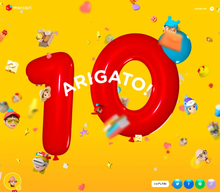
Mercari’s anniversary page makes celebration tangible. A huge red balloon numeral, white curved “ARIGATO!” lettering, and a blue balloon establish the opening. Toy-like heads, parcels, boots, books, coins, hearts, and pixel-shaped symbols occupy different apparent depths around them. Bright color, glossy highlights, selective blur, and deliberately varied object sizes create the impression of a crowded three-dimensional celebration.
The same world continues through the content. Large illustrated and photographic cards sit in a staggered arrangement over coral, with heavy black headings and short descriptions printed on white tabs. Cyan circular arrows overlap their corners. At the end, character heads frame the Mercari symbol, a large Japanese closing message, and glossy sharing buttons. Mobile preserves this identity through a narrower hero composition, offset single-column cards, a compact sharing trigger, and horizontal character bands.
閉じる
Mercari — ARIGATO! 10 — Style Reference
A bright anniversary playground built from glossy balloons, collectible characters, and floating objects.
Website: ARIGATO! 10 — Mercari 10th Anniversary Original URL: https://events.mercari.com/10th-anniversary/ Final URL: https://events.mercari.com/10th-anniversary/ Theme: saturated yellow and orange, a coral content field, white caption surfaces, and dark Japanese lettering. Inspected: September 24, 2026, 05:59:38 JST; supplied retrieval timestamp September 23, 2026, 20:59:38.956 UTC. Viewports: 1440 × 1000 desktop and 390 × 844 mobile, in CSS pixels. Scope: the currently served anniversary hub: opening artwork, introduction and linked content modules, lower preview area, app-opening link, closing character composition, and persistent utilities. Visual evidence covers the desktop opening, middle, and footer, plus the mobile opening and footer. The introduction and some lower modules are documented primarily through rendered DOM evidence. Linked destinations and activated utility states were not inspected.
Mercari’s anniversary page makes celebration tangible. A huge red balloon numeral, white curved “ARIGATO!” lettering, and a blue balloon establish the opening. Toy-like heads, parcels, boots, books, coins, hearts, and pixel-shaped symbols occupy different apparent depths around them. Bright color, glossy highlights, selective blur, and deliberately varied object sizes create the impression of a crowded three-dimensional celebration.
The same world continues through the content. Large illustrated and photographic cards sit in a staggered arrangement over coral, with heavy black headings and short descriptions printed on white tabs. Cyan circular arrows overlap their corners. At the end, character heads frame the Mercari symbol, a large Japanese closing message, and glossy sharing buttons. Mobile preserves this identity through a narrower hero composition, offset single-column cards, a compact sharing trigger, and horizontal character bands.
This is an anniversary content hub containing stories, a diagnosis activity, promotional links, merchandise, and an app-opening action. The current page includes a campaign-ended notice. That notice describes an individual campaign’s status; the supplied page itself remains available with HTTP 200.
How to Read This Reference
- Measured values come from supplied computed styles, custom properties, and rendered element rectangles. They describe the sampled state at the stated viewport.
- Visual observations come from the five original-page screenshots. Approximate image measurements are explicitly called estimates.
- Source tokens retain their supplied custom-property names. Additional names used in the Quick Start are implementation aliases.
- Recommendations describe a reusable implementation, including accessibility improvements and approximate layout recipes. They are not assertions about the original code.
- State differences matter: desktop card rectangles are 570px square in the DOM readback, while cards in the middle screenshot appear approximately 600px square. These are different recorded presentation states. The responsible transform or trigger was not supplied.
- Graphic lettering is not a font measurement. Several headings have empty extracted text and contain visible graphic treatments. Their inherited CSS font sizes do not measure the letters in those graphics.
- No additional browsing, file inspection, or interaction testing was performed for this reference.
Tokens — Colors
Default Palette
| Name | Source value | Source token | Role and evidence |
|---|---|---|---|
| Celebration Yellow | #ffce00 |
--color-bg, --color-yellow |
Principal scene color; consistent with the opening and closing screenshots |
| Warm Orange | #feb417 |
--color-orange |
Supporting warm color; the screenshots show orange toward the lower scene, but the exact gradient declaration was not supplied |
| Mercari Red | #ff0211 |
--color-primary |
Measured campaign-ended badge fill; also the semantic red reference for the brand world |
| Coral Pink | #ff5a5a |
--color-pink |
Source color consistent with the large coral field behind the middle content cards; its exact compositing was not measured |
| Reading Ink | #222222 |
--color-base |
Measured body and card-description text color |
| White | #ffffff |
--color-white |
Measured caption surfaces and introduction text; visible frames, speech bubbles, and reversed graphic lettering |
| Sky Blue | #4dc9ff |
--color-blue |
Source accent consistent with the cyan arrow disks and brand accent; glossy artwork includes additional shades |
| Twitter Blue | #1da1f2 |
--color-twitter |
Declared platform color associated with the bird sharing control |
| Facebook Blue | #0668e1 |
--color-facebook |
Declared platform color associated with the Facebook sharing control |
| LINE Green | #06c755 |
--color-line |
Declared platform color associated with the LINE sharing control |
| Copy Lavender | #c098de |
--color-copy |
Declared color associated with the chain-link sharing control |
The red numeral is shaded artwork: its highlights, dark edges, reflections, and balloon seams cannot be represented by one flat red token. The same distinction applies to the cyan arrow disks and sharing buttons, which have glossy highlights over their base colors.
The body’s measured background is white, while the visible scene is predominantly yellow or coral. This demonstrates that the body background alone does not describe the page’s rendered color system. Preserve the colored scene layers and section surfaces when implementing the design.
Supporting Source Colors
The supplied custom properties also declare #ffe366 for --color-yellow-blur, #f6cf45 for --color-yellow-guide, #fcf0be for --color-cream, #eeeeee for --color-gray, #00c1aa for --color-green, #e0e9ff for --color-sky, and #000091 for --color-present-base. Their precise component assignments were not established by the supplied samples.
--color-purple: #c098dd and --color-copy: #c098de are separate source values. Keep that distinction when documenting the source, even though their visual difference is very small.
Recommended gradient approximation: use yellow through most of the stage and introduce orange near the bottom. Treat stop positions as art direction choices; no original gradient stops were provided.
Tokens — Typography
Noto Sans JP — Live Text
- Measured family:
"Noto Sans JP", sans-serifon body text, descriptions, notices, and sampled controls. - Default weight:
700. - Emphasis weight:
900on the introduction and desktop sharing speech bubble. - Default line height:
1.6. - Default tracking:
0.06emon body and card descriptions. - Character: dense, friendly, emphatic Japanese sans-serif text that remains visually substantial beside large illustrations.
- Loading limitation: the computed family is supplied; font file URLs and the actual downloaded font resources were not supplied.
The source declares weights from 100 through 900, but that does not prove all of them are used. The principal measured hierarchy is bold body copy and black-weight emphasis.
Graphic Lettering
The hero’s white “ARIGATO!” follows the red numeral’s celebratory composition. Card headings use large, compact black lettering, and the footer message is an expressive, heavy graphic block. Preserve their silhouettes and line breaks when authorized assets are available.
Several corresponding H1, H2, and paragraph samples have no extracted text. Consequently, their computed 18px desktop or 14.56px mobile font sizes should not be used to recreate the visible graphic letters. The evidence does not establish a separate display-font name.
For a new implementation without these graphics, use live Noto Sans JP at weight 900 as an explicitly approximate replacement, then tune line breaks and spacing visually.
Type Scale
| Role | Desktop measurement | Mobile measurement | Weight | Tracking |
|---|---|---|---|---|
| Root font size | 10px |
5.2px |
400 on the root | Normal |
| Body default | 18px / 28.8px |
14.56px / 23.296px |
700 | 1.08px / 0.8736px |
| Introduction paragraph | 20px / 40px |
14.56px / 29.12px |
900 | 1.08px / 0.8736px |
| Card description | 16px / 25.6px |
11.44px / 18.304px |
700 | 0.96px / 0.6864px |
| Campaign-ended notice | 20px / 20px |
12.48px / 12.48px |
700 | 1.2px / 0.7488px |
| Desktop sharing callout | 14px / 19.6px |
No equivalent text measurement supplied | 900 | Normal |
| Card display headings | Graphic lettering; CSS inheritance does not measure it | Graphic lettering; CSS inheritance does not measure it | Not established | Not established |
| Footer message | Graphic box approximately 334 × 183px |
Graphic box approximately 260 × 147.16px |
Not established | Not established |
The introduction’s desktop tracking is inherited at 1.08px even though its font size is 20px. Do not automatically recalculate it as 1.2px when documenting the measured result.
Recommended readability adjustment: raise mobile card descriptions from the observed 11.44px to at least 14px in a new implementation, allowing the white caption area to grow. This changes the exact source proportions but improves practical reading.
Tokens — Spacing & Shapes
Responsive Unit
The source uses a scaled root rather than a conventional 16px rem:
| Source property | Desktop | Mobile |
|---|---|---|
--base-size |
1440px |
750px |
--design-view-width-pc |
1440px |
1440px |
--design-view-width-sp |
750px |
750px |
--font-size-base |
1.8rem |
2.8rem |
--min-text-scale |
.75 |
1 |
| Computed root | 10px |
5.2px |
--first-view-height |
1000px |
1000px |
The mobile root is consistent with 10 × 390 / 750 = 5.2px. The desktop root is consistent with 10 × 1440 / 1440 = 10px. These calculations explain the supplied samples; the complete root-sizing rule and its limits were not provided.
A source 2rem radius therefore becomes 20px at the desktop sample and 10.4px at the mobile sample. Copying those rem values into a standard-root project would produce substantially different dimensions.
Spacing Scale
| Use | Desktop evidence | Mobile evidence | Interpretation |
|---|---|---|---|
| Card title padding | 13px 16px 6px |
8.32px 8.32px 1.56px |
Computed padding; title and description are separate white surfaces |
| Card description padding | 14px 16px |
6.24px 8.32px |
Computed padding |
| Caption start inside card | Approximately 12.35px in the DOM rectangle sample |
6px |
Rendered inset; may include presentation scaling |
| Visible card frame | Approximately 14px in the middle screenshot |
No mobile card screenshot supplied | Desktop visual estimate |
| Mobile card-to-card gap | — | Approximately 31.19px |
Measured difference between successive square-card rectangles |
| Intro left edge | 78px |
28.59px |
Measured content alignment |
| Footer top padding | 100px |
106.6px |
Computed padding |
| Desktop footer share padding | 5px |
0px |
Makes a 100px visible disk inside a 110px desktop button box |
| Desktop fixed share padding | 4px |
Different mobile composition | Makes a 60px visible disk inside a 68px button box |
Border Radius
| Element | Desktop | Mobile |
|---|---|---|
| Content-card anchor | 20px |
10.4px |
| Caption corner | Usually 5px on the exposed upper-right corner |
Usually 2.6px |
| Campaign-ended notice | 5px |
2.6px |
| App-opening link | 999px |
999px |
| Sharing and assistant controls | 50% |
50% where measured as circular |
| Desktop share speech bubble | 10px |
Equivalent measurement unavailable |
Caption tabs do not use a uniform rounded rectangle. The samples show square shared edges and selective small-radius exposed corners. Adjacent title and description rectangles overlap by approximately one rendered pixel in several measurements, preventing a visible seam.
Layout Measurements
| Element | Desktop, 1440 × 1000 | Mobile, 390 × 844 |
|---|---|---|
| Document height | Approximately 6498.73px |
Approximately 5522.83px |
| Main content height | Approximately 5668.23px |
Approximately 4450.14px |
| Introduction heading graphic | 420 × 232.55px |
282.88 × 156.61px |
| Introduction paragraph box | 1284 × 400px |
332.81 × 291.25px |
| First story card | 1216 × 612.08px |
327.59 × 461.98px |
| Subsequent square-card links | 570 × 570px in DOM sample |
327.59 × 327.59px |
| Lower preview button | 980 × 551.25px |
327.63 × 184.28px |
| App-opening link | 200 × 80px |
187.19 × 67.59px |
| Footer | Approximately 830.5px high |
Approximately 1072.69px high |
| Central footer brand button | 104 × 104px |
71.75 × 71.75px |
| Footer sharing buttons | 110 × 110px, arranged 2 × 2 |
72.80 × 72.80px, arranged in one row |
| Assistant button | 106 × 106px |
72.80 × 72.80px |
| Sound button hit box | 134 × 60px |
112.81 × 39.5px |
The lower preview’s measured ratio is 16:9 at both viewports. The first story card changes from approximately 2:1 to a tall mobile composition; it should not be implemented as one fixed-ratio landscape image at all widths.
Components
Opening Scene
Role: establish the anniversary identity before the content modules.
The visual anchor is an oversized glossy red “10,” with balloon-like extrusion, deep red shading, white highlights, and small tied ends. White “ARIGATO!” lettering crosses the numeral at an angle. A cyan-blue balloon sits nearby. Character heads and everyday objects interrupt the silhouette and circulate through the surrounding yellow field.
The desktop opening screenshot leaves substantial space around the main balloon cluster. Its red numeral occupies roughly 540px of horizontal space in that captured pose, a visual estimate. On mobile, the numeral occupies roughly 340px of a 390px viewport and becomes the dominant central mass. These are capture-specific artwork bounds, not a verified scaling formula.
Separate the composition into background color, distant ornaments, focal artwork, foreground ornaments, and utility controls. Foreground blur should affect selected decorations, while the anniversary mark and controls remain legible. The evidence does not identify the rendering engine or prove whether the scene uses raster layers, canvas, or a three-dimensional runtime.
Brand and Sound Utilities
Role: preserve identity and provide an audio affordance without a conventional navigation bar.
The mobile opening shows the white Mercari wordmark with its red and cyan symbol near the upper-left corner. The measured wrapper begins at approximately 20.8px, 15.6px and is 124.8 × 31.72px. The desktop wrapper measures 160 × 40.66px, with its sampled top at -10px; opacity and transform transitions are declared. The desktop opening still does not establish a stable logo visibility rule.
The upper-right utility displays the small white label “SOUND ON” and a white circular play symbol. Its button occupies a larger hit box than the visible lettering. It remains visible in the supplied opening and closing views.
The label alone does not establish whether audio was already playing or whether clicking would enable it. Audio playback, persistence, and toggle feedback were not tested.
Introduction Block
Role: explain the anniversary’s community-focused message before presenting destinations.
The DOM contains a graphic heading followed by a heavy white paragraph beginning “みんなの数だけ、メルカリの使い方がある。” The paragraph uses deliberately generous leading: 40px on desktop and 29.12px on mobile, both twice their corresponding font size.
The introduction is left aligned at approximately 78px on desktop and 28.59px on mobile. Its graphic heading is narrower than the paragraph container. Preserve the authored line breaks and the contrast between the headline graphic and the evenly paced text block.
This section was not shown in a dedicated supplied still. Its exact backdrop, decorative arrangement, and reveal choreography remain unverified.
Linked Content Card
Role: make each story, activity, or campaign a large visual destination.
The repeated anatomy is:
- A whole-card anchor with a rounded outer silhouette.
- An image or illustrated poster held inside a thick white frame.
- A large graphic title on an opaque white tab near the lower-left edge.
- A separate white description tab immediately beneath it, often with a different width.
- A glossy cyan circular arrow overlapping the upper-right corner where visible.
- Optional speech-bubble artwork or a status label outside the standard caption stack.
The middle screenshot shows approximately 600px square cards with an approximately 14px white frame and 20px outer corner treatment. The DOM sample records 570px square link rectangles. Use these as distinct state observations instead of combining them into a single exact box model.
Description text is live Noto Sans JP at 16px, weight 700, 25.6px line height on desktop. Its mobile measurement is 11.44px with 18.304px line height. Caption widths are content-dependent: the two-line campaign heading and its description do not create a full-width white footer.
The visible arrow disks are approximately 70px in diameter on desktop, an image estimate. Keep the outer anchor’s overflow available for this overlapping affordance, while clipping the inner artwork to its rounded frame. A click result or hover enlargement was not tested.
Story Feature Card
Role: lead into the collection of customer episodes.
The first card links to 100 Mercari. Its supplied copy describes purchases, life changes, and a hundred different ways of enjoying everyday life.
It is a broad feature on desktop, measured at 1216 × 612.08px, and a portrait-oriented block on mobile, measured at 327.59 × 461.98px. A separate callout reads “100人のエピソード 読んでみてね!”
The mobile feature is centered at an approximately 31.2px left inset. Recompose the artwork and captions for the taller layout; the supplied measurements do not support simply shrinking the desktop landscape format. The full feature image itself was not present in the supplied stills.
Character Diagnosis Card
Role: invite entry into a four-question character activity.
The visible artwork uses tilted collectible-style character cards with red borders, portrait heads, and dense Japanese labels against the yellow anniversary background. The white caption presents “あなたの「心の隠れキャラ」がバレる診断,” with a short description beneath it. An additional callout in the DOM says “アイコン画像がもらえる!”
Its anchor points to the supplied diagnosis questions URL. The question flow and icon-download behavior were not inspected.
On desktop this card starts in the right column before the neighboring campaign card on the left. On mobile it is the first square card following the story feature, offset toward the right.
Campaign and Merchandise Cards
Role: collect promotional destinations without leaving the celebratory visual system.
The campaign overview uses a poster dominated by another large red “10,” bright yellow, character heads, confetti, and diagonal promotional lettering. Its caption reads “おトクな キャンペーン情報.”
The bath-merchandise card introduces photography: pale bathroom surfaces, a white towel, a yellow towel with red lettering, and a yellow bag. The photographic treatment is bright and light, and remains enclosed in the same white frame and caption system as the illustrated cards.
The DOM also identifies a Mercari-points lottery and a prefectural-towel or points campaign. Their destination links were recorded, but their linked pages were not opened. The shared card structure is better supported than any assumptions about those external campaign experiences.
Campaign-Ended Notice
Role: communicate the current status of the final campaign card.
The actual label is “キャンペーンは終了しました.” It uses white bold text on #ff0211, with a 5px desktop radius and 2.6px mobile radius. Desktop type is 20px with a 20px line height; mobile type is 12.48px with the same numeric line height.
The label sits near the card’s upper-left region rather than replacing the entire card. The anchor remains present in the supplied DOM. Preserve the status prominently when describing or adapting this content; do not imply the campaign remains open.
Lower Preview Button and App Link
Role: provide a final large content preview followed by an app-opening destination.
A substantial button near the end of the main content measures 980 × 551.25px on desktop and 327.63 × 184.28px on mobile. Both are 16:9. It has a 20px desktop radius and 10.4px mobile radius. The supplied evidence does not establish its accessible name, full artwork, or activated behavior, so it should not be documented as a verified video player.
Below it, “メルカリを開く” appears as a centered dark pill. The link measures 200 × 80px on desktop and approximately 187.19 × 67.59px on mobile. The footer screenshot shows white lettering on a dark shaded surface. The wrapper’s inherited dark text color does not describe every rendered layer of this button.
The recorded destination is https://app.adjust.com/11w61a7a. Navigation through that link was not tested.
Closing Character Composition
Role: turn the footer into a final anniversary statement.
The desktop center stacks a red-and-cyan Mercari symbol, the message “みんなが もっと楽しメル 次の10年へ。”, a 2 × 2 sharing group, “Privacy Policy,” and “©2023 Mercari,Inc.” A subdued giant “10” remains behind the foreground content. Character heads form loose vertical groups on both sides of the center.
The mobile arrangement changes substantially. A cropped band of heads appears above the central symbol and message, four sharing buttons occupy one row, and more character rows continue beneath the legal text. The footer is taller in the mobile DOM sample than on desktop despite the narrower viewport.
The character bands’ cropping is observed. Horizontal scrolling or marquee animation is not established by the still images. The central logo and at least one character-related element are represented as buttons in the DOM, but their actions were not tested.
Sharing Controls
Role: offer sharing at both the page edge and the closing statement.
Four platform treatments are visible: the Twitter bird, Facebook, LINE, and a chain-link symbol. Preserve the bird icon when describing the inspected page; it is the actual captured graphic.
Desktop uses two presentations:
- A fixed lower-right row with 68px button boxes and 4px padding, producing approximately 60px visible disks. A white speech bubble reads “シェアしてね!”
- A larger footer group using 110px button boxes and 5px padding, producing approximately 100px visible disks arranged in two rows.
Mobile uses a glossy yellow-to-red “シェア” trigger at the lower-right edge, approximately 72.8px square. The DOM also contains four smaller 41.59px button rectangles positioned around that area, consistent with a possible expanded arrangement. Their reveal sequence and active visibility were not tested.
The mobile footer’s four large sharing buttons are all visible in a single row. Their boxes measure approximately 72.8px, with about 11.44px between them.
Assistant and Speech Bubbles
Role: provide a recurring character guide and short contextual prompts.
The lower-left assistant is a character head inside a yellow circular field with a white outline, plus a small overlapping question-mark badge. The main button is 106px square in the desktop readback and approximately 72.8px square on mobile.
The screenshots show different speech-bubble messages, including a welcome-and-scroll prompt, a thank-you near the footer, and a mobile suggestion to turn sound on. This establishes multiple captured messages, but not their exact trigger rules or timing.
A “閉じる” button and additional heading geometry exist in the DOM evidence. No corresponding open panel was visually inspected, so its anatomy, opening behavior, and focus handling remain unknown.
Tokens — Motion & Interaction
| Treatment | Supplied declaration or observation | What is established |
|---|---|---|
| Brand wrapper | opacity 0.2s, transform 0.46s cubic-bezier(.16, .05, 0, 1) |
Transition values are defined; exact entry trigger was not tested |
| Mobile content sections | opacity 0.36s, transform 0.72s cubic-bezier(.16, .05, 0, 1) |
Reveal-capable transitions are defined; displacement and trigger thresholds were not supplied |
| Assistant button | transform 0.36s cubic-bezier(.215, .61, .355, 1) |
Transform transition is defined |
| Mobile sharing trigger | transform 0.36s cubic-bezier(.215, .61, .355, 1) |
Transform transition is defined; expanded interaction was not tested |
| Sound button | opacity 0.16s linear |
Short opacity feedback is defined |
| Floating scene | Depth, overlap, rotation, and selective blur are visible | Movement paths, loop lengths, pointer response, and renderer are unverified |
| Desktop card scale | DOM bounds differ from the middle screenshot | Multiple presentation states are recorded; the cause is unverified |
| Guide messages | Different text appears in different captures | Message variation is visible; sequencing rules are unknown |
The source declares additional easing families, including --ease-pop: cubic-bezier(.19, .04, .28, 1.39), --ease-out-pop: cubic-bezier(.23, 1, .46, 1.4), and several back easings. Their presence alone does not establish that a particular balloon or button uses them.
Sampled nodes frequently report animation: none. This does not rule out motion on other nodes, script-driven transforms, canvas rendering, or animated assets. Conversely, floating-looking artwork in a still image does not prove a specific animation.
Recommended adaptation: use the measured short control transitions and longer reveal timing, keep decorative motion subtle, and offer a static reduced-motion scene. Any new drift duration, rotation amplitude, or parallax behavior should be documented as a design choice.
Surfaces
| Layer | Appearance | Purpose |
|---|---|---|
| Opening and closing field | Saturated yellow with warmer orange lower in the scene | Establishes the anniversary world |
| Middle content field | Broad coral color behind the cards | Separates the content sequence while preserving high saturation |
| Hero objects | Glossy red and blue, dimensional shading, selective blur | Carries the strongest depth and material cues |
| Card frame | Thick opaque white perimeter | Separates busy artwork from the colored scene |
| Caption tabs | White, mostly square edges with small exposed corner radii | Gives black headings and descriptions a clear reading surface |
| Speech bubbles | White with dark or red text and a small tail | Connects short prompts to assistant or sharing controls |
| Arrow and share disks | Colored circles with bright highlights | Makes controls feel like objects from the same visual world |
| App-opening action | Dark pill with light lettering | Creates a compact, strong final action |
| Ended status | Red rectangle with white text | Makes campaign status explicit |
The page’s depth comes primarily from artwork, glossy disks, overlap, and selective blur. The supplied card samples do not establish a general soft-shadow elevation system.
Imagery
The illustration language is deliberately eclectic within a consistent material world. Rounded heads wear hats, helmets, goggles, costumes, and unusual hair. Ordinary goods such as boots, parcels, books, and drinks share space with coins, hearts, stars, question blocks, and pixel-like creatures. Shapes feel collectible, buoyant, and playful.
Several objects are sharp and central; others are enlarged, cropped at the edge, or blurred. This depth hierarchy is essential. Uniform size, uniform sharpness, and evenly distributed icons would flatten the composition.
The central numeral uses inflated volume and specular highlights. Character faces use softer, clay-like shading. Pixel-shaped objects introduce a harder geometry without changing the bright palette. The merchandise photograph adds a real-world texture while keeping a light exposure and vivid yellow accents.
Footer heads are more orderly than hero ornaments. They frame the central message as a community of characters, with reduced competition from the faded background numeral. On mobile they become cropped horizontal groupings around the central content.
Observed Asset References
Exact image URLs, file formats, native dimensions, and model resources were not included in the supplied evidence. The following are descriptive asset identifiers, not file paths.
| Asset group | Evidence | Implementation guidance |
|---|---|---|
| Mercari logo and symbol | Mobile opening and both closing views | Use authorized brand artwork and preserve its red, cyan, and white variants |
| Red balloon “10” and white lettering | Desktop and mobile opening views | Preserve the complete rendered silhouette and highlights |
| Character heads | Opening, cards, assistant, and footer | Prepare consistent transparent assets or equivalent scene objects |
| Everyday-object ornaments | Opening and middle views | Vary scale, depth, rotation, and cropping deliberately |
| Campaign poster | Desktop middle view | Preserve its designed typography rather than rebuilding it from inherited heading styles |
| Diagnosis cards | Desktop middle view | Keep the tilted red-framed collectible-card composition |
| Bath merchandise photograph | Desktop middle view | Maintain bright exposure and the yellow/white product palette |
| Footer slogan | Desktop and mobile closing views | Preserve layout-specific graphic proportions and provide an accessible text equivalent |
| Social and utility symbols | Opening, middle, and closing controls | Match the captured symbol set; verify accessible names separately |
CSS can reproduce the shell, frames, spacing, and button materials. The site’s distinctive imagery requires dedicated artwork; generic emoji or flat stock icons would substantially change the result.
Layout & Responsive Behavior
Desktop
The page is a long document rather than an internally scrolling application shell. The 1440 × 1000 sample has approximately 6499px of total content height. The header itself has zero measured layout height, consistent with utility elements being positioned outside a normal navigation strip.
The content sequence begins with an expansive story feature, then alternates square destinations across two columns. In the middle screenshot, the left card begins near x = 80px and the right near x = 760px, with approximately 600px card widths. In the DOM readback, their bounds are x = 95px and x = 775px with 570px widths. The column centers remain consistent while their visible extents differ.
The diagnosis card precedes the campaign card vertically by approximately 310px in the readback. Repeated cards in a column are separated by about 680px from top to top. This produces a staggered editorial rhythm rather than level rows.
The closing composition reserves a narrow center for the message and sharing controls, while larger groups of character heads occupy the flanks. The fixed sharing row and assistant remain at the viewport edges in the middle and closing screenshots.
Mobile
The square cards become a single ordered sequence but retain deliberate lateral offsets. At 390px wide, their measured width is approximately 327.6px, exactly consistent with 84% of the viewport.
| Card | Measured left edge | Approximate viewport proportion |
|---|---|---|
| Story feature | 31.2px |
8vw |
| Diagnosis | 46.81px |
12vw |
| Campaign overview | 15.59px |
4vw |
| Bath merchandise | 46.81px |
12vw |
| Points lottery | 15.59px |
4vw |
| Final campaign | 31.2px |
8vw |
Successive square cards have approximately 31.2px between their measured rectangles, matching 8vw at this viewport. This is a specific compositional pattern: preserve the slight zigzag instead of centering every card automatically.
The mobile story feature is taller than the square cards. The lower preview retains its 16:9 ratio. The app-opening action remains a substantial pill rather than shrinking in direct proportion to the desktop page.
Footer sharing changes from 2 × 2 to one row. Character groups move above and below the central content. The fixed sharing controls collapse visually to one circular trigger, while the assistant stays at the lower-left. Their measured mobile edge clearances are approximately 10px.
Breakpoints and Viewport Limits
Declared source breakpoints are 320, 768, 1024, 1440, and 1680px, with an additional 9999px sentinel. The supplied evidence does not include the media-query rules connecting every layout change to those values. A 768px breakpoint is used in the Quick Start as a recommendation, not a recovered rule.
--first-view-height is 1000px in both snapshots, including the 844px-tall mobile viewport. The introduction heading begins around document y = 1075.9px on mobile. Therefore, the evidence does not support replacing the opening’s entire document allocation with exactly one mobile viewport height.
The source also declares --max-content-width: 168rem and different --footer-height values, but their final use cannot be determined from the custom properties alone. Prefer measured rendered boxes when documenting these two viewports.
Intermediate widths, landscape phones, browser zoom, safe-area behavior, and keyboard navigation were not tested.
Do’s and Don’ts
Do
- Keep yellow
#ffce00as the dominant identity color and reserve a large red balloon numeral for the opening’s focal point. - Build depth through object scale, overlap, selective blur, and bright material highlights.
- Preserve the coral content field and opaque white card frames.
- Use separate, content-sized white title and description tabs with shared square edges.
- Retain the staggered desktop columns and the 4vw/12vw mobile card offsets.
- Treat the first story feature as a separately composed responsive asset.
- Keep live Japanese descriptions bold and allow generous line height.
- Recompose the footer: flanking character groups on desktop, cropped character bands on mobile.
- Preserve the visible campaign-ended notice.
- Distinguish control hit boxes from the smaller visible artwork inside them.
- Keep animation measurements separate from assumptions about the floating scene.
Don’t
- Don’t replace the hero with flat text, a generic gradient, and evenly spaced emoji.
- Don’t make every card caption a full-width white footer.
- Don’t force the desktop cards into perfectly aligned rows.
- Don’t scale the whole desktop layout down uniformly for mobile.
- Don’t derive graphic headline sizes from their containers’ inherited font sizes.
- Don’t copy source rem values into a 16px-root project without conversion.
- Don’t blur the main anniversary lettering or essential controls.
- Don’t add soft shadows, glass panels, or a neutral dashboard shell as the primary surface system.
- Don’t describe the diagnosis flow, audio, sharing expansion, or lower preview playback as tested interactions.
- Don’t treat the retained 2023 copyright or an ended campaign as proof that the current page is unavailable.
Recommended Implementation Additions
These are recommendations for a new implementation, not verified features of the original:
- Provide accessible text equivalents for graphic headings and the footer slogan. Empty extracted text does not prove an absent accessible name, so inspect actual accessibility attributes before reporting defects.
- Give sound, assistant, sharing, copy-link, and character controls explicit accessible names and visible focus indicators.
- Use real links for destinations and buttons for local actions. Avoid nesting an arrow button inside a whole-card anchor; the arrow can be decorative.
- Increase mobile description text to at least 14px and let captions expand naturally.
- Increase the mobile sound hit area to at least 44px high; its supplied box is approximately 39.5px high.
- Preserve visible status information in live text, including the ended-campaign notice.
- Start audible playback only after a clear user action and provide a persistent, understandable sound state.
- Respect reduced-motion preferences in CSS and any scene runtime. A CSS media query alone will not stop script-driven rendering.
- Keep decorative objects out of the accessibility tree and prevent them from intercepting pointer input.
- Add safe-area padding to fixed controls, and reserve enough document clearance to avoid covering links or legal text.
- If sharing opens a panel, manage expanded state and keyboard access. If copying a link succeeds, announce a short confirmation.
- Preserve useful content and working links before any decorative scene or reveal code finishes loading.
Agent Prompt Guide
Quick Color Reference
- Main scene: yellow
#ffce00, warming toward orange#feb417. - Anniversary red and status badge:
#ff0211. - Middle content field: coral source token
#ff5a5a. - Caption surfaces and frames:
#ffffff. - Reading text:
#222222. - Arrow accent: cyan
#4dc9ff, with an added glossy highlight. - Sharing bases:
#1da1f2,#0668e1,#06c755, and#c098de. - Primary structural contrast: busy dimensional artwork against clean white text tabs.
Overall Prompt
“Create a responsive anniversary content hub inspired by Mercari’s ARIGATO! 10 visual system. Use a saturated yellow scene with a glossy red balloon numeral, angled white celebration lettering, a cyan balloon, and floating toy-like heads and everyday objects at varied depths. Continue into a coral content field with large white-framed image cards. Place bold black graphic-style titles and short Japanese descriptions on separate white tabs near each card’s lower-left corner. Overlap a glossy cyan arrow disk at the upper-right. Use staggered two-column placement on desktop and an offset single-column sequence on mobile. Finish with a central brand symbol and bold closing message framed by a community of characters. Keep the assistant at lower-left and sound utility at upper-right; use a compact mobile sharing trigger. Use authorized bespoke imagery, and identify any newly invented animation as an adaptation.”
Example Component Prompts
- Opening artwork: “A bright yellow anniversary stage with an inflated red 10, white ARIGATO! lettering, a cyan balloon, and scattered character heads, parcels, stars, and hearts. Keep the numeral crisp; use blur only on selected near and far decorations. Prepare a separate narrow-screen composition.”
- Content card: “A large square promotional image in a thick white frame with rounded outer corners. Add a content-sized white title tab and a separate white description tab at the lower-left. Use heavy black Japanese lettering and a glossy cyan arrow circle overlapping the upper-right. Preserve exposed square edges between the caption tabs.”
- Mobile content sequence: “At 390px width, use approximately 328px cards with alternating 16px and 47px left offsets, approximately 31px vertical gaps, and a centered first feature. Keep captions readable and allow their height to grow.”
- Closing section: “Center the brand symbol and a three-line black Japanese message over a yellow-orange celebration field with a subdued giant numeral. Place character heads on both sides for desktop. On mobile, use cropped character bands above and below, with four glossy sharing circles in one horizontal row.”
- Assistant control: “A small character head in a yellow circular field with a white outline and an overlapping question-mark badge. Pair it with a compact white speech bubble. Keep the entire control keyboard accessible and clear of the page’s primary content.”
Quick Start
CSS Custom Properties
This is an implementation recipe, not recovered source CSS. It uses a conventional root font size and a separate --u unit that matches the two inspected root measurements. Desktop card geometry follows the approximately 600px screenshot state; mobile card geometry follows the DOM measurements. Gradient stops, live-text display headings, focus styling, and reveal displacement are recommendations.
The recipe intentionally raises mobile descriptions to 14px. It supplies layout and material treatments; artwork, sound, sharing handlers, and scene rendering require separate assets and application code.
:root {
  /* Source-derived palette */
  --color-yellow: #ffce00;
  --color-orange: #feb417;
  --color-red: #ff0211;
  --color-coral: #ff5a5a;
  --color-ink: #222222;
  --color-white: #ffffff;
  --color-cyan: #4dc9ff;
  --color-twitter: #1da1f2;
  --color-facebook: #0668e1;
  --color-line: #06c755;
  --color-copy: #c098de;

  /* Adaptation unit: 10px at the inspected desktop width */
  --u: min(10px, 0.694444vw);
  --font-body: 'Noto Sans JP', sans-serif;
  --weight-bold: 700;
  --weight-black: 900;
  --leading-body: 1.6;
  --tracking-body: 0.06em;

  /* Screenshot-based desktop layout */
  --content-width: 1280px;
  --page-gutter: clamp(32px, 5.555556vw, 80px);
  --card-gap: clamp(40px, 5.555556vw, 80px);
  --card-stagger: 310px;
  --card-radius: calc(2 * var(--u));
  --card-frame: 14px;
  --caption-radius: calc(0.5 * var(--u));
  --first-view-height: 1000px;

  /* Measured transition values */
  --ease-unleash: cubic-bezier(.16, .05, 0, 1);
  --ease-out-cubic: cubic-bezier(.215, .61, .355, 1);
  --motion-reveal: 720ms var(--ease-unleash);
  --motion-control: 360ms var(--ease-out-cubic);
  --safe-bottom: env(safe-area-inset-bottom, 0px);
  --safe-top: env(safe-area-inset-top, 0px);
}

* { box-sizing: border-box; }

body {
  margin: 0;
  color: var(--color-ink);
  background: var(--color-yellow);
  font-family: var(--font-body);
  font-size: clamp(14px, calc(1.8 * var(--u)), 18px);
  font-weight: var(--weight-bold);
  line-height: var(--leading-body);
  letter-spacing: var(--tracking-body);
}

button, a { -webkit-tap-highlight-color: transparent; }
button { font: inherit; }
img { display: block; max-width: 100%; }

.anniversary-page {
  position: relative;
  isolation: isolate;
  overflow-x: clip;
}

/* Recommended color approximation; original stops are unknown. */
.scene-surface {
  background: linear-gradient(
    180deg,
    var(--color-yellow) 0%,
    var(--color-yellow) 68%,
    var(--color-orange) 100%
  );
}

.hero {
  position: relative;
  min-height: max(100svh, var(--first-view-height));
}

.hero-stage {
  position: absolute;
  inset: 0 0 auto;
  height: min(100svh, var(--first-view-height));
  overflow: clip;
}

.hero-mark {
  position: absolute;
  left: 50%;
  top: 61%;
  width: min(40vw, 580px);
  transform: translate(-50%, -50%);
}

/* Supply per-object positions through custom properties. */
.scene-object {
  position: absolute;
  left: var(--object-x, 50%);
  top: var(--object-y, 50%);
  width: var(--object-size, 80px);
  transform: translate(-50%, -50%) rotate(var(--object-angle, 0deg));
  filter: blur(var(--object-blur, 0px));
  pointer-events: none;
  user-select: none;
}

.site-brand {
  position: absolute;
  top: 24px;
  left: 40px;
  width: 160px;
  z-index: 20;
}

.sound-control {
  position: fixed;
  top: calc(24px + var(--safe-top));
  right: 20px;
  z-index: 100;
  display: flex;
  align-items: center;
  justify-content: center;
  gap: 14px;
  min-width: 134px;
  min-height: 60px;
  padding: 20px;
  border: 0;
  color: var(--color-white);
  background: transparent;
  cursor: pointer;
  transition: opacity 160ms linear;
}

.content-field { background: var(--color-coral); }

.content-container {
  width: min(
    var(--content-width),
    calc(100% - 2 * var(--page-gutter))
  );
  margin-inline: auto;
}

.introduction {
  padding: 100px var(--page-gutter) 140px;
  color: var(--color-white);
}

.introduction p {
  margin: 48px 0 0;
  font-size: 20px;
  font-weight: var(--weight-black);
  line-height: 2;
  letter-spacing: 1.08px;
}

.story-feature {
  display: block;
  width: 100%;
  aspect-ratio: 2 / 1;
  margin-bottom: 160px;
}

/* Five slots follow the observed semantic order. */
.campaign-grid {
  display: grid;
  grid-template-columns: repeat(2, minmax(0, 1fr));
  gap: var(--card-gap);
  align-items: start;
}

.card-slot:nth-child(1) { grid-area: 1 / 2; }
.card-slot:nth-child(2) { grid-area: 1 / 1; }
.card-slot:nth-child(3) { grid-area: 2 / 2; }
.card-slot:nth-child(4) { grid-area: 2 / 1; }
.card-slot:nth-child(5) { grid-area: 3 / 2; }

.card-slot:nth-child(2),
.card-slot:nth-child(4) {
  position: relative;
  top: var(--card-stagger);
}

.campaign-card {
  position: relative;
  display: block;
  aspect-ratio: 1;
  color: var(--color-ink);
  text-decoration: none;
  border-radius: var(--card-radius);
}

.card-frame {
  position: absolute;
  inset: 0;
  overflow: hidden;
  border: var(--card-frame) solid var(--color-white);
  border-radius: inherit;
  background: var(--color-white);
}

.card-art {
  width: 100%;
  height: 100%;
  object-fit: cover;
}

.card-caption {
  position: absolute;
  left: var(--card-frame);
  bottom: var(--card-frame);
  max-width: calc(100% - 2 * var(--card-frame));
}

/* Live-text substitute for the original graphic titles. */
.card-title {
  width: fit-content;
  max-width: 100%;
  margin: 0;
  padding: 13px 16px 6px;
  border-radius: 0 var(--caption-radius) 0 0;
  background: var(--color-white);
  font-size: clamp(24px, 2.222222vw, 32px);
  font-weight: var(--weight-black);
  line-height: 1.2;
  letter-spacing: 0;
}

.card-description {
  width: fit-content;
  max-width: 100%;
  margin: -1px 0 0;
  padding: 14px 16px;
  border-radius: 0 var(--caption-radius) 0 0;
  background: var(--color-white);
  font-size: 16px;
  line-height: 1.6;
}

.card-arrow {
  position: absolute;
  top: -21px;
  right: -21px;
  display: grid;
  place-items: center;
  width: 70px;
  aspect-ratio: 1;
  border-radius: 50%;
  color: var(--color-white);
  background:
    radial-gradient(ellipse at 35% 0%, #ffffffb3, transparent 55%),
    var(--color-cyan);
}

.campaign-status {
  position: absolute;
  top: 30px;
  left: 30px;
  margin: 0;
  padding: 17px 20px;
  border-radius: 5px;
  color: var(--color-white);
  background: var(--color-red);
  font-size: 20px;
  line-height: 1;
}

.lower-preview {
  display: block;
  width: min(980px, 84%);
  aspect-ratio: 16 / 9;
  margin: 80px auto 60px;
  overflow: hidden;
  padding: 0;
  border: 0;
  border-radius: var(--card-radius);
}

.app-link {
  display: grid;
  place-items: center;
  width: 200px;
  min-height: 80px;
  margin-inline: auto;
  border-radius: 999px;
  color: var(--color-white);
  background: linear-gradient(#484848, #222222);
  text-decoration: none;
}

.anniversary-footer {
  position: relative;
  padding: 100px 24px 50px;
  text-align: center;
}

.footer-core {
  position: relative;
  z-index: 1;
  width: 334px;
  max-width: 100%;
  margin-inline: auto;
}

.footer-symbol { width: 104px; margin-inline: auto; }
.footer-message { width: 334px; margin: 20px auto 32px; }

.footer-share {
  display: grid;
  grid-template-columns: repeat(2, 110px);
  justify-content: center;
}

.share-button {
  display: block;
  width: 110px;
  aspect-ratio: 1;
  padding: 5px;
  border: 0;
  border-radius: 50%;
  background: transparent;
  cursor: pointer;
}

.share-face {
  display: grid;
  place-items: center;
  width: 100%;
  height: 100%;
  border-radius: inherit;
  color: var(--color-white);
  background:
    radial-gradient(ellipse at 38% 0%, #ffffffb3, transparent 55%),
    var(--platform-color, var(--color-cyan));
}

.share-twitter { --platform-color: var(--color-twitter); }
.share-facebook { --platform-color: var(--color-facebook); }
.share-line { --platform-color: var(--color-line); }
.share-copy { --platform-color: var(--color-copy); }

.footer-legal {
  margin-top: 26px;
  color: var(--color-white);
  font-size: 12px;
}

.assistant,
.mobile-share-trigger {
  position: fixed;
  bottom: calc(12px + var(--safe-bottom));
  z-index: 100;
  width: 106px;
  aspect-ratio: 1;
  border-radius: 50%;
  transition: transform var(--motion-control);
}

.assistant { left: 24px; }
.mobile-share-trigger { display: none; }

.desktop-share {
  position: fixed;
  right: 20px;
  bottom: calc(16px + var(--safe-bottom));
  z-index: 100;
  display: flex;
  align-items: center;
}

.desktop-share .share-button { width: 68px; padding: 4px; }

/* Content remains visible until reveal behavior is initialized. */
[data-reveal-ready] .reveal {
  transition: opacity 360ms, transform var(--motion-reveal);
}

[data-reveal-ready] .reveal:not(.is-visible) {
  opacity: 0;
  transform: translateY(24px);
}

:where(a, button):focus-visible {
  outline: 3px solid var(--color-ink);
  outline-offset: 5px;
  box-shadow: 0 0 0 2px var(--color-white);
}

@media (max-width: 767px) {
  :root {
    /* 5.2px at the inspected 390px viewport */
    --u: 1.333333vw;
    --card-frame: 6px;
  }

  body { font-size: clamp(14px, calc(2.8 * var(--u)), 16px); }
  .hero-mark { top: 50%; width: 92vw; }
  .site-brand { top: 15.6px; left: 20.8px; width: 124.8px; }

  .sound-control {
    top: calc(10px + var(--safe-top));
    right: 9px;
    min-width: 113px;
    min-height: 44px;
    padding: 10px;
  }

  .content-container { width: 100%; }
  .introduction { padding: 76px 7.333333vw 42px; }
  .introduction p {
    margin-top: 24px;
    font-size: clamp(14px, calc(2.8 * var(--u)), 16px);
    letter-spacing: 0.06em;
  }

  .story-feature {
    width: 84%;
    aspect-ratio: 327.6 / 462;
    margin: 0 auto 8vw;
  }

  .campaign-grid {
    display: flex;
    flex-direction: column;
    gap: 8vw;
  }

  .campaign-grid > .card-slot {
    position: static;
    width: 84%;
    margin-left: 12%;
  }

  .campaign-grid > .card-slot:nth-child(even) { margin-left: 4%; }
  .campaign-grid > .card-slot:last-child { margin-left: 8%; }

  .card-title {
    padding: 8.32px 8.32px 1.56px;
    font-size: 20px;
  }

  .card-description {
    padding: 6.24px 8.32px;
    font-size: 14px;
  }

  .card-arrow { width: 44px; top: -12px; right: -10px; }
  .campaign-status {
    top: 15px;
    left: 15px;
    padding: 9px 10px;
    border-radius: 2.6px;
    font-size: 12.48px;
  }

  .lower-preview { margin-block: 60px 31px; }
  .app-link { width: 48vw; min-height: 67.6px; }
  .anniversary-footer { padding-top: 106.6px; padding-bottom: 110px; }
  .footer-core { width: 100%; }
  .footer-symbol { width: 71.75px; }
  .footer-message { width: 260px; }

  .footer-share {
    grid-template-columns: repeat(4, calc(14 * var(--u)));
    gap: calc(2.2 * var(--u));
  }

  .footer-share .share-button { width: 100%; padding: 0; }
  .desktop-share { display: none; }

  .assistant,
  .mobile-share-trigger {
    width: calc(14 * var(--u));
    bottom: calc(10px + var(--safe-bottom));
  }

  .assistant { left: 10px; }
  .mobile-share-trigger { display: grid; right: 10px; }
}

@media (prefers-reduced-motion: reduce) {
  html { scroll-behavior: auto; }

  .anniversary-page *,
  .anniversary-page *::before,
  .anniversary-page *::after {
    animation: none !important;
    transition: none !important;
  }

  [data-reveal-ready] .reveal:not(.is-visible) {
    opacity: 1;
    transform: none;
  }
}
Use .card-slot wrappers in the order diagnosis, campaign overview, merchandise, points lottery, and final campaign. Keep the story feature before that group. The explicit desktop placement applies to those five modules; revise it when the content count changes.
Supply separate character compositions for the desktop footer flanks and mobile character bands. Their asset arrangement is intentionally left to the artwork layer. Decorative objects should use empty alternatives and an appropriate hidden accessibility state; interactive character elements require their own names and actions.
Tailwind v4 Token Mapping
Optional aliases for a project already using Tailwind v4. This does not imply that the inspected site uses Tailwind. Define the custom properties above first.
@theme inline {
  --color-celebration: var(--color-yellow);
  --color-celebration-warm: var(--color-orange);
  --color-anniversary-red: var(--color-red);
  --color-content-field: var(--color-coral);
  --color-reading-ink: var(--color-ink);
  --color-caption-paper: var(--color-white);
  --color-action-cyan: var(--color-cyan);
  --color-share-twitter: var(--color-twitter);
  --color-share-facebook: var(--color-facebook);
  --color-share-line: var(--color-line);
  --color-share-copy: var(--color-copy);

  --font-celebration: var(--font-body);
  --radius-campaign: var(--card-radius);
  --radius-caption: var(--caption-radius);
  --spacing-design-unit: var(--u);
  --spacing-card-frame: var(--card-frame);
  --spacing-campaign-gap: var(--card-gap);
  --ease-celebration-reveal: var(--ease-unleash);
  --ease-celebration-control: var(--ease-out-cubic);
}
Sources & Evidence
- Original and final website: https://events.mercari.com/10th-anniversary/. The supplied response status is 200 and the final URL is unchanged.
- Capture timestamp: September 23, 2026, 20:59:38.956 UTC, equivalent to September 24, 2026, 05:59:38.956 JST.
- Desktop evidence: 1440 × 1000 viewport; opening, middle-card, and closing screenshots; rendered text, link destinations, custom properties, computed styles, and element rectangles. Document height approximately 6498.73px.
- Mobile evidence: 390 × 844 viewport; opening and closing screenshots; rendered text, link destinations, custom properties, computed styles, and element rectangles. Document height approximately 5522.83px. Mobile card descriptions and offsets are DOM-derived because no mobile middle-card still was supplied.
- Capture procedure: the supplied process observed the initial page for at least five seconds and waited for document load, sampled layout/text stability, visible image decoding, and finite motion within stated limits. Perpetual animation was paused during readiness checks and then resumed. Scrolling traversed intermediate positions. SharedWorkers and service workers were disabled.
- Interaction limits: destination URLs were recorded but not visited. Sound activation, sharing expansion, clipboard feedback, assistant-panel opening, diagnosis completion, character-button actions, and the lower preview’s activated state were not tested.
- Measurement limits: screenshot presentation and DOM rectangles are not identical for some desktop elements. No complete stylesheet, image resource inventory, scene implementation, accessibility tree, or animation timeline was provided. Declared tokens establish available values, not every component assignment.
This reference describes the page currently served at the supplied capture time. Retained anniversary dates and campaign copy are part of that observed page. The CSS recipes and accessibility additions are explicitly proposed adaptations.
# Mercari — ARIGATO! 10 — Style Reference

> A bright anniversary playground built from glossy balloons, collectible characters, and floating objects.

**Website:** [ARIGATO! 10 — Mercari 10th Anniversary](https://events.mercari.com/10th-anniversary/)
**Original URL:** https://events.mercari.com/10th-anniversary/
**Final URL:** https://events.mercari.com/10th-anniversary/
**Theme:** saturated yellow and orange, a coral content field, white caption surfaces, and dark Japanese lettering.
**Inspected:** September 24, 2026, 05:59:38 JST; supplied retrieval timestamp September 23, 2026, 20:59:38.956 UTC.
**Viewports:** 1440 × 1000 desktop and 390 × 844 mobile, in CSS pixels.
**Scope:** the currently served anniversary hub: opening artwork, introduction and linked content modules, lower preview area, app-opening link, closing character composition, and persistent utilities. Visual evidence covers the desktop opening, middle, and footer, plus the mobile opening and footer. The introduction and some lower modules are documented primarily through rendered DOM evidence. Linked destinations and activated utility states were not inspected.

Mercari’s anniversary page makes celebration tangible. A huge red balloon numeral, white curved “ARIGATO!” lettering, and a blue balloon establish the opening. Toy-like heads, parcels, boots, books, coins, hearts, and pixel-shaped symbols occupy different apparent depths around them. Bright color, glossy highlights, selective blur, and deliberately varied object sizes create the impression of a crowded three-dimensional celebration.

The same world continues through the content. Large illustrated and photographic cards sit in a staggered arrangement over coral, with heavy black headings and short descriptions printed on white tabs. Cyan circular arrows overlap their corners. At the end, character heads frame the Mercari symbol, a large Japanese closing message, and glossy sharing buttons. Mobile preserves this identity through a narrower hero composition, offset single-column cards, a compact sharing trigger, and horizontal character bands.
閉じる
# Mercari — ARIGATO! 10 — Style Reference

> A bright anniversary playground built from glossy balloons, collectible characters, and floating objects.

**Website:** [ARIGATO! 10 — Mercari 10th Anniversary](https://events.mercari.com/10th-anniversary/)
**Original URL:** https://events.mercari.com/10th-anniversary/
**Final URL:** https://events.mercari.com/10th-anniversary/
**Theme:** saturated yellow and orange, a coral content field, white caption surfaces, and dark Japanese lettering.
**Inspected:** September 24, 2026, 05:59:38 JST; supplied retrieval timestamp September 23, 2026, 20:59:38.956 UTC.
**Viewports:** 1440 × 1000 desktop and 390 × 844 mobile, in CSS pixels.
**Scope:** the currently served anniversary hub: opening artwork, introduction and linked content modules, lower preview area, app-opening link, closing character composition, and persistent utilities. Visual evidence covers the desktop opening, middle, and footer, plus the mobile opening and footer. The introduction and some lower modules are documented primarily through rendered DOM evidence. Linked destinations and activated utility states were not inspected.

Mercari’s anniversary page makes celebration tangible. A huge red balloon numeral, white curved “ARIGATO!” lettering, and a blue balloon establish the opening. Toy-like heads, parcels, boots, books, coins, hearts, and pixel-shaped symbols occupy different apparent depths around them. Bright color, glossy highlights, selective blur, and deliberately varied object sizes create the impression of a crowded three-dimensional celebration.

The same world continues through the content. Large illustrated and photographic cards sit in a staggered arrangement over coral, with heavy black headings and short descriptions printed on white tabs. Cyan circular arrows overlap their corners. At the end, character heads frame the Mercari symbol, a large Japanese closing message, and glossy sharing buttons. Mobile preserves this identity through a narrower hero composition, offset single-column cards, a compact sharing trigger, and horizontal character bands.

This is an anniversary content hub containing stories, a diagnosis activity, promotional links, merchandise, and an app-opening action. The current page includes a campaign-ended notice. That notice describes an individual campaign’s status; the supplied page itself remains available with HTTP 200.

## How to Read This Reference

- **Measured values** come from supplied computed styles, custom properties, and rendered element rectangles. They describe the sampled state at the stated viewport.
- **Visual observations** come from the five original-page screenshots. Approximate image measurements are explicitly called estimates.
- **Source tokens** retain their supplied custom-property names. Additional names used in the Quick Start are implementation aliases.
- **Recommendations** describe a reusable implementation, including accessibility improvements and approximate layout recipes. They are not assertions about the original code.
- **State differences matter:** desktop card rectangles are 570px square in the DOM readback, while cards in the middle screenshot appear approximately 600px square. These are different recorded presentation states. The responsible transform or trigger was not supplied.
- **Graphic lettering is not a font measurement.** Several headings have empty extracted text and contain visible graphic treatments. Their inherited CSS font sizes do not measure the letters in those graphics.
- No additional browsing, file inspection, or interaction testing was performed for this reference.

## Tokens — Colors

### Default Palette

| Name | Source value | Source token | Role and evidence |
| --- | --- | --- | --- |
| Celebration Yellow | `#ffce00` | `--color-bg`, `--color-yellow` | Principal scene color; consistent with the opening and closing screenshots |
| Warm Orange | `#feb417` | `--color-orange` | Supporting warm color; the screenshots show orange toward the lower scene, but the exact gradient declaration was not supplied |
| Mercari Red | `#ff0211` | `--color-primary` | Measured campaign-ended badge fill; also the semantic red reference for the brand world |
| Coral Pink | `#ff5a5a` | `--color-pink` | Source color consistent with the large coral field behind the middle content cards; its exact compositing was not measured |
| Reading Ink | `#222222` | `--color-base` | Measured body and card-description text color |
| White | `#ffffff` | `--color-white` | Measured caption surfaces and introduction text; visible frames, speech bubbles, and reversed graphic lettering |
| Sky Blue | `#4dc9ff` | `--color-blue` | Source accent consistent with the cyan arrow disks and brand accent; glossy artwork includes additional shades |
| Twitter Blue | `#1da1f2` | `--color-twitter` | Declared platform color associated with the bird sharing control |
| Facebook Blue | `#0668e1` | `--color-facebook` | Declared platform color associated with the Facebook sharing control |
| LINE Green | `#06c755` | `--color-line` | Declared platform color associated with the LINE sharing control |
| Copy Lavender | `#c098de` | `--color-copy` | Declared color associated with the chain-link sharing control |

The red numeral is shaded artwork: its highlights, dark edges, reflections, and balloon seams cannot be represented by one flat red token. The same distinction applies to the cyan arrow disks and sharing buttons, which have glossy highlights over their base colors.

The body’s measured background is white, while the visible scene is predominantly yellow or coral. This demonstrates that the body background alone does not describe the page’s rendered color system. Preserve the colored scene layers and section surfaces when implementing the design.

### Supporting Source Colors

The supplied custom properties also declare `#ffe366` for `--color-yellow-blur`, `#f6cf45` for `--color-yellow-guide`, `#fcf0be` for `--color-cream`, `#eeeeee` for `--color-gray`, `#00c1aa` for `--color-green`, `#e0e9ff` for `--color-sky`, and `#000091` for `--color-present-base`. Their precise component assignments were not established by the supplied samples.

`--color-purple: #c098dd` and `--color-copy: #c098de` are separate source values. Keep that distinction when documenting the source, even though their visual difference is very small.

**Recommended gradient approximation:** use yellow through most of the stage and introduce orange near the bottom. Treat stop positions as art direction choices; no original gradient stops were provided.

## Tokens — Typography

### Noto Sans JP — Live Text

- **Measured family:** `"Noto Sans JP", sans-serif` on body text, descriptions, notices, and sampled controls.
- **Default weight:** `700`.
- **Emphasis weight:** `900` on the introduction and desktop sharing speech bubble.
- **Default line height:** `1.6`.
- **Default tracking:** `0.06em` on body and card descriptions.
- **Character:** dense, friendly, emphatic Japanese sans-serif text that remains visually substantial beside large illustrations.
- **Loading limitation:** the computed family is supplied; font file URLs and the actual downloaded font resources were not supplied.

The source declares weights from 100 through 900, but that does not prove all of them are used. The principal measured hierarchy is bold body copy and black-weight emphasis.

### Graphic Lettering

The hero’s white “ARIGATO!” follows the red numeral’s celebratory composition. Card headings use large, compact black lettering, and the footer message is an expressive, heavy graphic block. Preserve their silhouettes and line breaks when authorized assets are available.

Several corresponding `H1`, `H2`, and paragraph samples have no extracted text. Consequently, their computed 18px desktop or 14.56px mobile font sizes should not be used to recreate the visible graphic letters. The evidence does not establish a separate display-font name.

For a new implementation without these graphics, use live Noto Sans JP at weight 900 as an explicitly approximate replacement, then tune line breaks and spacing visually.

### Type Scale

| Role | Desktop measurement | Mobile measurement | Weight | Tracking |
| --- | --- | --- | --- | --- |
| Root font size | `10px` | `5.2px` | 400 on the root | Normal |
| Body default | `18px / 28.8px` | `14.56px / 23.296px` | 700 | `1.08px` / `0.8736px` |
| Introduction paragraph | `20px / 40px` | `14.56px / 29.12px` | 900 | `1.08px` / `0.8736px` |
| Card description | `16px / 25.6px` | `11.44px / 18.304px` | 700 | `0.96px` / `0.6864px` |
| Campaign-ended notice | `20px / 20px` | `12.48px / 12.48px` | 700 | `1.2px` / `0.7488px` |
| Desktop sharing callout | `14px / 19.6px` | No equivalent text measurement supplied | 900 | Normal |
| Card display headings | Graphic lettering; CSS inheritance does not measure it | Graphic lettering; CSS inheritance does not measure it | Not established | Not established |
| Footer message | Graphic box approximately `334 × 183px` | Graphic box approximately `260 × 147.16px` | Not established | Not established |

The introduction’s desktop tracking is inherited at 1.08px even though its font size is 20px. Do not automatically recalculate it as 1.2px when documenting the measured result.

**Recommended readability adjustment:** raise mobile card descriptions from the observed 11.44px to at least 14px in a new implementation, allowing the white caption area to grow. This changes the exact source proportions but improves practical reading.

## Tokens — Spacing & Shapes

### Responsive Unit

The source uses a scaled root rather than a conventional 16px rem:

| Source property | Desktop | Mobile |
| --- | --- | --- |
| `--base-size` | `1440px` | `750px` |
| `--design-view-width-pc` | `1440px` | `1440px` |
| `--design-view-width-sp` | `750px` | `750px` |
| `--font-size-base` | `1.8rem` | `2.8rem` |
| `--min-text-scale` | `.75` | `1` |
| Computed root | `10px` | `5.2px` |
| `--first-view-height` | `1000px` | `1000px` |

The mobile root is consistent with `10 × 390 / 750 = 5.2px`. The desktop root is consistent with `10 × 1440 / 1440 = 10px`. These calculations explain the supplied samples; the complete root-sizing rule and its limits were not provided.

A source `2rem` radius therefore becomes 20px at the desktop sample and 10.4px at the mobile sample. Copying those rem values into a standard-root project would produce substantially different dimensions.

### Spacing Scale

| Use | Desktop evidence | Mobile evidence | Interpretation |
| --- | --- | --- | --- |
| Card title padding | `13px 16px 6px` | `8.32px 8.32px 1.56px` | Computed padding; title and description are separate white surfaces |
| Card description padding | `14px 16px` | `6.24px 8.32px` | Computed padding |
| Caption start inside card | Approximately `12.35px` in the DOM rectangle sample | `6px` | Rendered inset; may include presentation scaling |
| Visible card frame | Approximately `14px` in the middle screenshot | No mobile card screenshot supplied | Desktop visual estimate |
| Mobile card-to-card gap | — | Approximately `31.19px` | Measured difference between successive square-card rectangles |
| Intro left edge | `78px` | `28.59px` | Measured content alignment |
| Footer top padding | `100px` | `106.6px` | Computed padding |
| Desktop footer share padding | `5px` | `0px` | Makes a 100px visible disk inside a 110px desktop button box |
| Desktop fixed share padding | `4px` | Different mobile composition | Makes a 60px visible disk inside a 68px button box |

### Border Radius

| Element | Desktop | Mobile |
| --- | --- | --- |
| Content-card anchor | `20px` | `10.4px` |
| Caption corner | Usually `5px` on the exposed upper-right corner | Usually `2.6px` |
| Campaign-ended notice | `5px` | `2.6px` |
| App-opening link | `999px` | `999px` |
| Sharing and assistant controls | `50%` | `50%` where measured as circular |
| Desktop share speech bubble | `10px` | Equivalent measurement unavailable |

Caption tabs do not use a uniform rounded rectangle. The samples show square shared edges and selective small-radius exposed corners. Adjacent title and description rectangles overlap by approximately one rendered pixel in several measurements, preventing a visible seam.

### Layout Measurements

| Element | Desktop, 1440 × 1000 | Mobile, 390 × 844 |
| --- | --- | --- |
| Document height | Approximately `6498.73px` | Approximately `5522.83px` |
| Main content height | Approximately `5668.23px` | Approximately `4450.14px` |
| Introduction heading graphic | `420 × 232.55px` | `282.88 × 156.61px` |
| Introduction paragraph box | `1284 × 400px` | `332.81 × 291.25px` |
| First story card | `1216 × 612.08px` | `327.59 × 461.98px` |
| Subsequent square-card links | `570 × 570px` in DOM sample | `327.59 × 327.59px` |
| Lower preview button | `980 × 551.25px` | `327.63 × 184.28px` |
| App-opening link | `200 × 80px` | `187.19 × 67.59px` |
| Footer | Approximately `830.5px` high | Approximately `1072.69px` high |
| Central footer brand button | `104 × 104px` | `71.75 × 71.75px` |
| Footer sharing buttons | `110 × 110px`, arranged 2 × 2 | `72.80 × 72.80px`, arranged in one row |
| Assistant button | `106 × 106px` | `72.80 × 72.80px` |
| Sound button hit box | `134 × 60px` | `112.81 × 39.5px` |

The lower preview’s measured ratio is 16:9 at both viewports. The first story card changes from approximately 2:1 to a tall mobile composition; it should not be implemented as one fixed-ratio landscape image at all widths.

## Components

### Opening Scene

**Role:** establish the anniversary identity before the content modules.

The visual anchor is an oversized glossy red “10,” with balloon-like extrusion, deep red shading, white highlights, and small tied ends. White “ARIGATO!” lettering crosses the numeral at an angle. A cyan-blue balloon sits nearby. Character heads and everyday objects interrupt the silhouette and circulate through the surrounding yellow field.

The desktop opening screenshot leaves substantial space around the main balloon cluster. Its red numeral occupies roughly 540px of horizontal space in that captured pose, a visual estimate. On mobile, the numeral occupies roughly 340px of a 390px viewport and becomes the dominant central mass. These are capture-specific artwork bounds, not a verified scaling formula.

Separate the composition into background color, distant ornaments, focal artwork, foreground ornaments, and utility controls. Foreground blur should affect selected decorations, while the anniversary mark and controls remain legible. The evidence does not identify the rendering engine or prove whether the scene uses raster layers, canvas, or a three-dimensional runtime.

### Brand and Sound Utilities

**Role:** preserve identity and provide an audio affordance without a conventional navigation bar.

The mobile opening shows the white Mercari wordmark with its red and cyan symbol near the upper-left corner. The measured wrapper begins at approximately `20.8px, 15.6px` and is `124.8 × 31.72px`. The desktop wrapper measures `160 × 40.66px`, with its sampled top at `-10px`; opacity and transform transitions are declared. The desktop opening still does not establish a stable logo visibility rule.

The upper-right utility displays the small white label “SOUND ON” and a white circular play symbol. Its button occupies a larger hit box than the visible lettering. It remains visible in the supplied opening and closing views.

The label alone does not establish whether audio was already playing or whether clicking would enable it. Audio playback, persistence, and toggle feedback were not tested.

### Introduction Block

**Role:** explain the anniversary’s community-focused message before presenting destinations.

The DOM contains a graphic heading followed by a heavy white paragraph beginning “みんなの数だけ、メルカリの使い方がある。” The paragraph uses deliberately generous leading: 40px on desktop and 29.12px on mobile, both twice their corresponding font size.

The introduction is left aligned at approximately 78px on desktop and 28.59px on mobile. Its graphic heading is narrower than the paragraph container. Preserve the authored line breaks and the contrast between the headline graphic and the evenly paced text block.

This section was not shown in a dedicated supplied still. Its exact backdrop, decorative arrangement, and reveal choreography remain unverified.

### Linked Content Card

**Role:** make each story, activity, or campaign a large visual destination.

The repeated anatomy is:

1. A whole-card anchor with a rounded outer silhouette.
2. An image or illustrated poster held inside a thick white frame.
3. A large graphic title on an opaque white tab near the lower-left edge.
4. A separate white description tab immediately beneath it, often with a different width.
5. A glossy cyan circular arrow overlapping the upper-right corner where visible.
6. Optional speech-bubble artwork or a status label outside the standard caption stack.

The middle screenshot shows approximately 600px square cards with an approximately 14px white frame and 20px outer corner treatment. The DOM sample records 570px square link rectangles. Use these as distinct state observations instead of combining them into a single exact box model.

Description text is live Noto Sans JP at 16px, weight 700, 25.6px line height on desktop. Its mobile measurement is 11.44px with 18.304px line height. Caption widths are content-dependent: the two-line campaign heading and its description do not create a full-width white footer.

The visible arrow disks are approximately 70px in diameter on desktop, an image estimate. Keep the outer anchor’s overflow available for this overlapping affordance, while clipping the inner artwork to its rounded frame. A click result or hover enlargement was not tested.

### Story Feature Card

**Role:** lead into the collection of customer episodes.

The first card links to [100 Mercari](https://events.mercari.com/100mercari/). Its supplied copy describes purchases, life changes, and a hundred different ways of enjoying everyday life.

It is a broad feature on desktop, measured at `1216 × 612.08px`, and a portrait-oriented block on mobile, measured at `327.59 × 461.98px`. A separate callout reads “100人のエピソード 読んでみてね!”

The mobile feature is centered at an approximately 31.2px left inset. Recompose the artwork and captions for the taller layout; the supplied measurements do not support simply shrinking the desktop landscape format. The full feature image itself was not present in the supplied stills.

### Character Diagnosis Card

**Role:** invite entry into a four-question character activity.

The visible artwork uses tilted collectible-style character cards with red borders, portrait heads, and dense Japanese labels against the yellow anniversary background. The white caption presents “あなたの「心の隠れキャラ」がバレる診断,” with a short description beneath it. An additional callout in the DOM says “アイコン画像がもらえる!”

Its anchor points to the supplied [diagnosis questions URL](https://events.mercari.com/10th-anniversary/shindan/questions.html). The question flow and icon-download behavior were not inspected.

On desktop this card starts in the right column before the neighboring campaign card on the left. On mobile it is the first square card following the story feature, offset toward the right.

### Campaign and Merchandise Cards

**Role:** collect promotional destinations without leaving the celebratory visual system.

The campaign overview uses a poster dominated by another large red “10,” bright yellow, character heads, confetti, and diagonal promotional lettering. Its caption reads “おトクな キャンペーン情報.”

The bath-merchandise card introduces photography: pale bathroom surfaces, a white towel, a yellow towel with red lettering, and a yellow bag. The photographic treatment is bright and light, and remains enclosed in the same white frame and caption system as the illustrated cards.

The DOM also identifies a Mercari-points lottery and a prefectural-towel or points campaign. Their destination links were recorded, but their linked pages were not opened. The shared card structure is better supported than any assumptions about those external campaign experiences.

### Campaign-Ended Notice

**Role:** communicate the current status of the final campaign card.

The actual label is “キャンペーンは終了しました.” It uses white bold text on `#ff0211`, with a 5px desktop radius and 2.6px mobile radius. Desktop type is 20px with a 20px line height; mobile type is 12.48px with the same numeric line height.

The label sits near the card’s upper-left region rather than replacing the entire card. The anchor remains present in the supplied DOM. Preserve the status prominently when describing or adapting this content; do not imply the campaign remains open.

### Lower Preview Button and App Link

**Role:** provide a final large content preview followed by an app-opening destination.

A substantial button near the end of the main content measures `980 × 551.25px` on desktop and `327.63 × 184.28px` on mobile. Both are 16:9. It has a 20px desktop radius and 10.4px mobile radius. The supplied evidence does not establish its accessible name, full artwork, or activated behavior, so it should not be documented as a verified video player.

Below it, “メルカリを開く” appears as a centered dark pill. The link measures `200 × 80px` on desktop and approximately `187.19 × 67.59px` on mobile. The footer screenshot shows white lettering on a dark shaded surface. The wrapper’s inherited dark text color does not describe every rendered layer of this button.

The recorded destination is `https://app.adjust.com/11w61a7a`. Navigation through that link was not tested.

### Closing Character Composition

**Role:** turn the footer into a final anniversary statement.

The desktop center stacks a red-and-cyan Mercari symbol, the message “みんなが もっと楽しメル 次の10年へ。”, a 2 × 2 sharing group, “Privacy Policy,” and “©2023 Mercari,Inc.” A subdued giant “10” remains behind the foreground content. Character heads form loose vertical groups on both sides of the center.

The mobile arrangement changes substantially. A cropped band of heads appears above the central symbol and message, four sharing buttons occupy one row, and more character rows continue beneath the legal text. The footer is taller in the mobile DOM sample than on desktop despite the narrower viewport.

The character bands’ cropping is observed. Horizontal scrolling or marquee animation is not established by the still images. The central logo and at least one character-related element are represented as buttons in the DOM, but their actions were not tested.

### Sharing Controls

**Role:** offer sharing at both the page edge and the closing statement.

Four platform treatments are visible: the Twitter bird, Facebook, LINE, and a chain-link symbol. Preserve the bird icon when describing the inspected page; it is the actual captured graphic.

Desktop uses two presentations:

- A fixed lower-right row with 68px button boxes and 4px padding, producing approximately 60px visible disks. A white speech bubble reads “シェアしてね!”
- A larger footer group using 110px button boxes and 5px padding, producing approximately 100px visible disks arranged in two rows.

Mobile uses a glossy yellow-to-red “シェア” trigger at the lower-right edge, approximately 72.8px square. The DOM also contains four smaller 41.59px button rectangles positioned around that area, consistent with a possible expanded arrangement. Their reveal sequence and active visibility were not tested.

The mobile footer’s four large sharing buttons are all visible in a single row. Their boxes measure approximately 72.8px, with about 11.44px between them.

### Assistant and Speech Bubbles

**Role:** provide a recurring character guide and short contextual prompts.

The lower-left assistant is a character head inside a yellow circular field with a white outline, plus a small overlapping question-mark badge. The main button is 106px square in the desktop readback and approximately 72.8px square on mobile.

The screenshots show different speech-bubble messages, including a welcome-and-scroll prompt, a thank-you near the footer, and a mobile suggestion to turn sound on. This establishes multiple captured messages, but not their exact trigger rules or timing.

A “閉じる” button and additional heading geometry exist in the DOM evidence. No corresponding open panel was visually inspected, so its anatomy, opening behavior, and focus handling remain unknown.

## Tokens — Motion & Interaction

| Treatment | Supplied declaration or observation | What is established |
| --- | --- | --- |
| Brand wrapper | `opacity 0.2s`, `transform 0.46s cubic-bezier(.16, .05, 0, 1)` | Transition values are defined; exact entry trigger was not tested |
| Mobile content sections | `opacity 0.36s`, `transform 0.72s cubic-bezier(.16, .05, 0, 1)` | Reveal-capable transitions are defined; displacement and trigger thresholds were not supplied |
| Assistant button | `transform 0.36s cubic-bezier(.215, .61, .355, 1)` | Transform transition is defined |
| Mobile sharing trigger | `transform 0.36s cubic-bezier(.215, .61, .355, 1)` | Transform transition is defined; expanded interaction was not tested |
| Sound button | `opacity 0.16s linear` | Short opacity feedback is defined |
| Floating scene | Depth, overlap, rotation, and selective blur are visible | Movement paths, loop lengths, pointer response, and renderer are unverified |
| Desktop card scale | DOM bounds differ from the middle screenshot | Multiple presentation states are recorded; the cause is unverified |
| Guide messages | Different text appears in different captures | Message variation is visible; sequencing rules are unknown |

The source declares additional easing families, including `--ease-pop: cubic-bezier(.19, .04, .28, 1.39)`, `--ease-out-pop: cubic-bezier(.23, 1, .46, 1.4)`, and several back easings. Their presence alone does not establish that a particular balloon or button uses them.

Sampled nodes frequently report `animation: none`. This does not rule out motion on other nodes, script-driven transforms, canvas rendering, or animated assets. Conversely, floating-looking artwork in a still image does not prove a specific animation.

**Recommended adaptation:** use the measured short control transitions and longer reveal timing, keep decorative motion subtle, and offer a static reduced-motion scene. Any new drift duration, rotation amplitude, or parallax behavior should be documented as a design choice.

## Surfaces

| Layer | Appearance | Purpose |
| --- | --- | --- |
| Opening and closing field | Saturated yellow with warmer orange lower in the scene | Establishes the anniversary world |
| Middle content field | Broad coral color behind the cards | Separates the content sequence while preserving high saturation |
| Hero objects | Glossy red and blue, dimensional shading, selective blur | Carries the strongest depth and material cues |
| Card frame | Thick opaque white perimeter | Separates busy artwork from the colored scene |
| Caption tabs | White, mostly square edges with small exposed corner radii | Gives black headings and descriptions a clear reading surface |
| Speech bubbles | White with dark or red text and a small tail | Connects short prompts to assistant or sharing controls |
| Arrow and share disks | Colored circles with bright highlights | Makes controls feel like objects from the same visual world |
| App-opening action | Dark pill with light lettering | Creates a compact, strong final action |
| Ended status | Red rectangle with white text | Makes campaign status explicit |

The page’s depth comes primarily from artwork, glossy disks, overlap, and selective blur. The supplied card samples do not establish a general soft-shadow elevation system.

## Imagery

The illustration language is deliberately eclectic within a consistent material world. Rounded heads wear hats, helmets, goggles, costumes, and unusual hair. Ordinary goods such as boots, parcels, books, and drinks share space with coins, hearts, stars, question blocks, and pixel-like creatures. Shapes feel collectible, buoyant, and playful.

Several objects are sharp and central; others are enlarged, cropped at the edge, or blurred. This depth hierarchy is essential. Uniform size, uniform sharpness, and evenly distributed icons would flatten the composition.

The central numeral uses inflated volume and specular highlights. Character faces use softer, clay-like shading. Pixel-shaped objects introduce a harder geometry without changing the bright palette. The merchandise photograph adds a real-world texture while keeping a light exposure and vivid yellow accents.

Footer heads are more orderly than hero ornaments. They frame the central message as a community of characters, with reduced competition from the faded background numeral. On mobile they become cropped horizontal groupings around the central content.

### Observed Asset References

Exact image URLs, file formats, native dimensions, and model resources were not included in the supplied evidence. The following are descriptive asset identifiers, not file paths.

| Asset group | Evidence | Implementation guidance |
| --- | --- | --- |
| Mercari logo and symbol | Mobile opening and both closing views | Use authorized brand artwork and preserve its red, cyan, and white variants |
| Red balloon “10” and white lettering | Desktop and mobile opening views | Preserve the complete rendered silhouette and highlights |
| Character heads | Opening, cards, assistant, and footer | Prepare consistent transparent assets or equivalent scene objects |
| Everyday-object ornaments | Opening and middle views | Vary scale, depth, rotation, and cropping deliberately |
| Campaign poster | Desktop middle view | Preserve its designed typography rather than rebuilding it from inherited heading styles |
| Diagnosis cards | Desktop middle view | Keep the tilted red-framed collectible-card composition |
| Bath merchandise photograph | Desktop middle view | Maintain bright exposure and the yellow/white product palette |
| Footer slogan | Desktop and mobile closing views | Preserve layout-specific graphic proportions and provide an accessible text equivalent |
| Social and utility symbols | Opening, middle, and closing controls | Match the captured symbol set; verify accessible names separately |

CSS can reproduce the shell, frames, spacing, and button materials. The site’s distinctive imagery requires dedicated artwork; generic emoji or flat stock icons would substantially change the result.

## Layout & Responsive Behavior

### Desktop

The page is a long document rather than an internally scrolling application shell. The 1440 × 1000 sample has approximately 6499px of total content height. The header itself has zero measured layout height, consistent with utility elements being positioned outside a normal navigation strip.

The content sequence begins with an expansive story feature, then alternates square destinations across two columns. In the middle screenshot, the left card begins near x = 80px and the right near x = 760px, with approximately 600px card widths. In the DOM readback, their bounds are x = 95px and x = 775px with 570px widths. The column centers remain consistent while their visible extents differ.

The diagnosis card precedes the campaign card vertically by approximately 310px in the readback. Repeated cards in a column are separated by about 680px from top to top. This produces a staggered editorial rhythm rather than level rows.

The closing composition reserves a narrow center for the message and sharing controls, while larger groups of character heads occupy the flanks. The fixed sharing row and assistant remain at the viewport edges in the middle and closing screenshots.

### Mobile

The square cards become a single ordered sequence but retain deliberate lateral offsets. At 390px wide, their measured width is approximately 327.6px, exactly consistent with 84% of the viewport.

| Card | Measured left edge | Approximate viewport proportion |
| --- | --- | --- |
| Story feature | `31.2px` | `8vw` |
| Diagnosis | `46.81px` | `12vw` |
| Campaign overview | `15.59px` | `4vw` |
| Bath merchandise | `46.81px` | `12vw` |
| Points lottery | `15.59px` | `4vw` |
| Final campaign | `31.2px` | `8vw` |

Successive square cards have approximately 31.2px between their measured rectangles, matching 8vw at this viewport. This is a specific compositional pattern: preserve the slight zigzag instead of centering every card automatically.

The mobile story feature is taller than the square cards. The lower preview retains its 16:9 ratio. The app-opening action remains a substantial pill rather than shrinking in direct proportion to the desktop page.

Footer sharing changes from 2 × 2 to one row. Character groups move above and below the central content. The fixed sharing controls collapse visually to one circular trigger, while the assistant stays at the lower-left. Their measured mobile edge clearances are approximately 10px.

### Breakpoints and Viewport Limits

Declared source breakpoints are 320, 768, 1024, 1440, and 1680px, with an additional 9999px sentinel. The supplied evidence does not include the media-query rules connecting every layout change to those values. A 768px breakpoint is used in the Quick Start as a recommendation, not a recovered rule.

`--first-view-height` is 1000px in both snapshots, including the 844px-tall mobile viewport. The introduction heading begins around document y = 1075.9px on mobile. Therefore, the evidence does not support replacing the opening’s entire document allocation with exactly one mobile viewport height.

The source also declares `--max-content-width: 168rem` and different `--footer-height` values, but their final use cannot be determined from the custom properties alone. Prefer measured rendered boxes when documenting these two viewports.

Intermediate widths, landscape phones, browser zoom, safe-area behavior, and keyboard navigation were not tested.

## Do’s and Don’ts

### Do

- Keep yellow `#ffce00` as the dominant identity color and reserve a large red balloon numeral for the opening’s focal point.
- Build depth through object scale, overlap, selective blur, and bright material highlights.
- Preserve the coral content field and opaque white card frames.
- Use separate, content-sized white title and description tabs with shared square edges.
- Retain the staggered desktop columns and the 4vw/12vw mobile card offsets.
- Treat the first story feature as a separately composed responsive asset.
- Keep live Japanese descriptions bold and allow generous line height.
- Recompose the footer: flanking character groups on desktop, cropped character bands on mobile.
- Preserve the visible campaign-ended notice.
- Distinguish control hit boxes from the smaller visible artwork inside them.
- Keep animation measurements separate from assumptions about the floating scene.

### Don’t

- Don’t replace the hero with flat text, a generic gradient, and evenly spaced emoji.
- Don’t make every card caption a full-width white footer.
- Don’t force the desktop cards into perfectly aligned rows.
- Don’t scale the whole desktop layout down uniformly for mobile.
- Don’t derive graphic headline sizes from their containers’ inherited font sizes.
- Don’t copy source rem values into a 16px-root project without conversion.
- Don’t blur the main anniversary lettering or essential controls.
- Don’t add soft shadows, glass panels, or a neutral dashboard shell as the primary surface system.
- Don’t describe the diagnosis flow, audio, sharing expansion, or lower preview playback as tested interactions.
- Don’t treat the retained 2023 copyright or an ended campaign as proof that the current page is unavailable.

## Recommended Implementation Additions

These are recommendations for a new implementation, not verified features of the original:

- Provide accessible text equivalents for graphic headings and the footer slogan. Empty extracted text does not prove an absent accessible name, so inspect actual accessibility attributes before reporting defects.
- Give sound, assistant, sharing, copy-link, and character controls explicit accessible names and visible focus indicators.
- Use real links for destinations and buttons for local actions. Avoid nesting an arrow button inside a whole-card anchor; the arrow can be decorative.
- Increase mobile description text to at least 14px and let captions expand naturally.
- Increase the mobile sound hit area to at least 44px high; its supplied box is approximately 39.5px high.
- Preserve visible status information in live text, including the ended-campaign notice.
- Start audible playback only after a clear user action and provide a persistent, understandable sound state.
- Respect reduced-motion preferences in CSS and any scene runtime. A CSS media query alone will not stop script-driven rendering.
- Keep decorative objects out of the accessibility tree and prevent them from intercepting pointer input.
- Add safe-area padding to fixed controls, and reserve enough document clearance to avoid covering links or legal text.
- If sharing opens a panel, manage expanded state and keyboard access. If copying a link succeeds, announce a short confirmation.
- Preserve useful content and working links before any decorative scene or reveal code finishes loading.

## Agent Prompt Guide

### Quick Color Reference

- Main scene: yellow `#ffce00`, warming toward orange `#feb417`.
- Anniversary red and status badge: `#ff0211`.
- Middle content field: coral source token `#ff5a5a`.
- Caption surfaces and frames: `#ffffff`.
- Reading text: `#222222`.
- Arrow accent: cyan `#4dc9ff`, with an added glossy highlight.
- Sharing bases: `#1da1f2`, `#0668e1`, `#06c755`, and `#c098de`.
- Primary structural contrast: busy dimensional artwork against clean white text tabs.

### Overall Prompt

“Create a responsive anniversary content hub inspired by Mercari’s ARIGATO! 10 visual system. Use a saturated yellow scene with a glossy red balloon numeral, angled white celebration lettering, a cyan balloon, and floating toy-like heads and everyday objects at varied depths. Continue into a coral content field with large white-framed image cards. Place bold black graphic-style titles and short Japanese descriptions on separate white tabs near each card’s lower-left corner. Overlap a glossy cyan arrow disk at the upper-right. Use staggered two-column placement on desktop and an offset single-column sequence on mobile. Finish with a central brand symbol and bold closing message framed by a community of characters. Keep the assistant at lower-left and sound utility at upper-right; use a compact mobile sharing trigger. Use authorized bespoke imagery, and identify any newly invented animation as an adaptation.”

### Example Component Prompts

1. **Opening artwork:** “A bright yellow anniversary stage with an inflated red 10, white ARIGATO! lettering, a cyan balloon, and scattered character heads, parcels, stars, and hearts. Keep the numeral crisp; use blur only on selected near and far decorations. Prepare a separate narrow-screen composition.”
2. **Content card:** “A large square promotional image in a thick white frame with rounded outer corners. Add a content-sized white title tab and a separate white description tab at the lower-left. Use heavy black Japanese lettering and a glossy cyan arrow circle overlapping the upper-right. Preserve exposed square edges between the caption tabs.”
3. **Mobile content sequence:** “At 390px width, use approximately 328px cards with alternating 16px and 47px left offsets, approximately 31px vertical gaps, and a centered first feature. Keep captions readable and allow their height to grow.”
4. **Closing section:** “Center the brand symbol and a three-line black Japanese message over a yellow-orange celebration field with a subdued giant numeral. Place character heads on both sides for desktop. On mobile, use cropped character bands above and below, with four glossy sharing circles in one horizontal row.”
5. **Assistant control:** “A small character head in a yellow circular field with a white outline and an overlapping question-mark badge. Pair it with a compact white speech bubble. Keep the entire control keyboard accessible and clear of the page’s primary content.”

## Quick Start

### CSS Custom Properties

This is an implementation recipe, not recovered source CSS. It uses a conventional root font size and a separate `--u` unit that matches the two inspected root measurements. Desktop card geometry follows the approximately 600px screenshot state; mobile card geometry follows the DOM measurements. Gradient stops, live-text display headings, focus styling, and reveal displacement are recommendations.

The recipe intentionally raises mobile descriptions to 14px. It supplies layout and material treatments; artwork, sound, sharing handlers, and scene rendering require separate assets and application code.

```css
:root {
  /* Source-derived palette */
  --color-yellow: #ffce00;
  --color-orange: #feb417;
  --color-red: #ff0211;
  --color-coral: #ff5a5a;
  --color-ink: #222222;
  --color-white: #ffffff;
  --color-cyan: #4dc9ff;
  --color-twitter: #1da1f2;
  --color-facebook: #0668e1;
  --color-line: #06c755;
  --color-copy: #c098de;

  /* Adaptation unit: 10px at the inspected desktop width */
  --u: min(10px, 0.694444vw);
  --font-body: 'Noto Sans JP', sans-serif;
  --weight-bold: 700;
  --weight-black: 900;
  --leading-body: 1.6;
  --tracking-body: 0.06em;

  /* Screenshot-based desktop layout */
  --content-width: 1280px;
  --page-gutter: clamp(32px, 5.555556vw, 80px);
  --card-gap: clamp(40px, 5.555556vw, 80px);
  --card-stagger: 310px;
  --card-radius: calc(2 * var(--u));
  --card-frame: 14px;
  --caption-radius: calc(0.5 * var(--u));
  --first-view-height: 1000px;

  /* Measured transition values */
  --ease-unleash: cubic-bezier(.16, .05, 0, 1);
  --ease-out-cubic: cubic-bezier(.215, .61, .355, 1);
  --motion-reveal: 720ms var(--ease-unleash);
  --motion-control: 360ms var(--ease-out-cubic);
  --safe-bottom: env(safe-area-inset-bottom, 0px);
  --safe-top: env(safe-area-inset-top, 0px);
}

* { box-sizing: border-box; }

body {
  margin: 0;
  color: var(--color-ink);
  background: var(--color-yellow);
  font-family: var(--font-body);
  font-size: clamp(14px, calc(1.8 * var(--u)), 18px);
  font-weight: var(--weight-bold);
  line-height: var(--leading-body);
  letter-spacing: var(--tracking-body);
}

button, a { -webkit-tap-highlight-color: transparent; }
button { font: inherit; }
img { display: block; max-width: 100%; }

.anniversary-page {
  position: relative;
  isolation: isolate;
  overflow-x: clip;
}

/* Recommended color approximation; original stops are unknown. */
.scene-surface {
  background: linear-gradient(
    180deg,
    var(--color-yellow) 0%,
    var(--color-yellow) 68%,
    var(--color-orange) 100%
  );
}

.hero {
  position: relative;
  min-height: max(100svh, var(--first-view-height));
}

.hero-stage {
  position: absolute;
  inset: 0 0 auto;
  height: min(100svh, var(--first-view-height));
  overflow: clip;
}

.hero-mark {
  position: absolute;
  left: 50%;
  top: 61%;
  width: min(40vw, 580px);
  transform: translate(-50%, -50%);
}

/* Supply per-object positions through custom properties. */
.scene-object {
  position: absolute;
  left: var(--object-x, 50%);
  top: var(--object-y, 50%);
  width: var(--object-size, 80px);
  transform: translate(-50%, -50%) rotate(var(--object-angle, 0deg));
  filter: blur(var(--object-blur, 0px));
  pointer-events: none;
  user-select: none;
}

.site-brand {
  position: absolute;
  top: 24px;
  left: 40px;
  width: 160px;
  z-index: 20;
}

.sound-control {
  position: fixed;
  top: calc(24px + var(--safe-top));
  right: 20px;
  z-index: 100;
  display: flex;
  align-items: center;
  justify-content: center;
  gap: 14px;
  min-width: 134px;
  min-height: 60px;
  padding: 20px;
  border: 0;
  color: var(--color-white);
  background: transparent;
  cursor: pointer;
  transition: opacity 160ms linear;
}

.content-field { background: var(--color-coral); }

.content-container {
  width: min(
    var(--content-width),
    calc(100% - 2 * var(--page-gutter))
  );
  margin-inline: auto;
}

.introduction {
  padding: 100px var(--page-gutter) 140px;
  color: var(--color-white);
}

.introduction p {
  margin: 48px 0 0;
  font-size: 20px;
  font-weight: var(--weight-black);
  line-height: 2;
  letter-spacing: 1.08px;
}

.story-feature {
  display: block;
  width: 100%;
  aspect-ratio: 2 / 1;
  margin-bottom: 160px;
}

/* Five slots follow the observed semantic order. */
.campaign-grid {
  display: grid;
  grid-template-columns: repeat(2, minmax(0, 1fr));
  gap: var(--card-gap);
  align-items: start;
}

.card-slot:nth-child(1) { grid-area: 1 / 2; }
.card-slot:nth-child(2) { grid-area: 1 / 1; }
.card-slot:nth-child(3) { grid-area: 2 / 2; }
.card-slot:nth-child(4) { grid-area: 2 / 1; }
.card-slot:nth-child(5) { grid-area: 3 / 2; }

.card-slot:nth-child(2),
.card-slot:nth-child(4) {
  position: relative;
  top: var(--card-stagger);
}

.campaign-card {
  position: relative;
  display: block;
  aspect-ratio: 1;
  color: var(--color-ink);
  text-decoration: none;
  border-radius: var(--card-radius);
}

.card-frame {
  position: absolute;
  inset: 0;
  overflow: hidden;
  border: var(--card-frame) solid var(--color-white);
  border-radius: inherit;
  background: var(--color-white);
}

.card-art {
  width: 100%;
  height: 100%;
  object-fit: cover;
}

.card-caption {
  position: absolute;
  left: var(--card-frame);
  bottom: var(--card-frame);
  max-width: calc(100% - 2 * var(--card-frame));
}

/* Live-text substitute for the original graphic titles. */
.card-title {
  width: fit-content;
  max-width: 100%;
  margin: 0;
  padding: 13px 16px 6px;
  border-radius: 0 var(--caption-radius) 0 0;
  background: var(--color-white);
  font-size: clamp(24px, 2.222222vw, 32px);
  font-weight: var(--weight-black);
  line-height: 1.2;
  letter-spacing: 0;
}

.card-description {
  width: fit-content;
  max-width: 100%;
  margin: -1px 0 0;
  padding: 14px 16px;
  border-radius: 0 var(--caption-radius) 0 0;
  background: var(--color-white);
  font-size: 16px;
  line-height: 1.6;
}

.card-arrow {
  position: absolute;
  top: -21px;
  right: -21px;
  display: grid;
  place-items: center;
  width: 70px;
  aspect-ratio: 1;
  border-radius: 50%;
  color: var(--color-white);
  background:
    radial-gradient(ellipse at 35% 0%, #ffffffb3, transparent 55%),
    var(--color-cyan);
}

.campaign-status {
  position: absolute;
  top: 30px;
  left: 30px;
  margin: 0;
  padding: 17px 20px;
  border-radius: 5px;
  color: var(--color-white);
  background: var(--color-red);
  font-size: 20px;
  line-height: 1;
}

.lower-preview {
  display: block;
  width: min(980px, 84%);
  aspect-ratio: 16 / 9;
  margin: 80px auto 60px;
  overflow: hidden;
  padding: 0;
  border: 0;
  border-radius: var(--card-radius);
}

.app-link {
  display: grid;
  place-items: center;
  width: 200px;
  min-height: 80px;
  margin-inline: auto;
  border-radius: 999px;
  color: var(--color-white);
  background: linear-gradient(#484848, #222222);
  text-decoration: none;
}

.anniversary-footer {
  position: relative;
  padding: 100px 24px 50px;
  text-align: center;
}

.footer-core {
  position: relative;
  z-index: 1;
  width: 334px;
  max-width: 100%;
  margin-inline: auto;
}

.footer-symbol { width: 104px; margin-inline: auto; }
.footer-message { width: 334px; margin: 20px auto 32px; }

.footer-share {
  display: grid;
  grid-template-columns: repeat(2, 110px);
  justify-content: center;
}

.share-button {
  display: block;
  width: 110px;
  aspect-ratio: 1;
  padding: 5px;
  border: 0;
  border-radius: 50%;
  background: transparent;
  cursor: pointer;
}

.share-face {
  display: grid;
  place-items: center;
  width: 100%;
  height: 100%;
  border-radius: inherit;
  color: var(--color-white);
  background:
    radial-gradient(ellipse at 38% 0%, #ffffffb3, transparent 55%),
    var(--platform-color, var(--color-cyan));
}

.share-twitter { --platform-color: var(--color-twitter); }
.share-facebook { --platform-color: var(--color-facebook); }
.share-line { --platform-color: var(--color-line); }
.share-copy { --platform-color: var(--color-copy); }

.footer-legal {
  margin-top: 26px;
  color: var(--color-white);
  font-size: 12px;
}

.assistant,
.mobile-share-trigger {
  position: fixed;
  bottom: calc(12px + var(--safe-bottom));
  z-index: 100;
  width: 106px;
  aspect-ratio: 1;
  border-radius: 50%;
  transition: transform var(--motion-control);
}

.assistant { left: 24px; }
.mobile-share-trigger { display: none; }

.desktop-share {
  position: fixed;
  right: 20px;
  bottom: calc(16px + var(--safe-bottom));
  z-index: 100;
  display: flex;
  align-items: center;
}

.desktop-share .share-button { width: 68px; padding: 4px; }

/* Content remains visible until reveal behavior is initialized. */
[data-reveal-ready] .reveal {
  transition: opacity 360ms, transform var(--motion-reveal);
}

[data-reveal-ready] .reveal:not(.is-visible) {
  opacity: 0;
  transform: translateY(24px);
}

:where(a, button):focus-visible {
  outline: 3px solid var(--color-ink);
  outline-offset: 5px;
  box-shadow: 0 0 0 2px var(--color-white);
}

@media (max-width: 767px) {
  :root {
    /* 5.2px at the inspected 390px viewport */
    --u: 1.333333vw;
    --card-frame: 6px;
  }

  body { font-size: clamp(14px, calc(2.8 * var(--u)), 16px); }
  .hero-mark { top: 50%; width: 92vw; }
  .site-brand { top: 15.6px; left: 20.8px; width: 124.8px; }

  .sound-control {
    top: calc(10px + var(--safe-top));
    right: 9px;
    min-width: 113px;
    min-height: 44px;
    padding: 10px;
  }

  .content-container { width: 100%; }
  .introduction { padding: 76px 7.333333vw 42px; }
  .introduction p {
    margin-top: 24px;
    font-size: clamp(14px, calc(2.8 * var(--u)), 16px);
    letter-spacing: 0.06em;
  }

  .story-feature {
    width: 84%;
    aspect-ratio: 327.6 / 462;
    margin: 0 auto 8vw;
  }

  .campaign-grid {
    display: flex;
    flex-direction: column;
    gap: 8vw;
  }

  .campaign-grid > .card-slot {
    position: static;
    width: 84%;
    margin-left: 12%;
  }

  .campaign-grid > .card-slot:nth-child(even) { margin-left: 4%; }
  .campaign-grid > .card-slot:last-child { margin-left: 8%; }

  .card-title {
    padding: 8.32px 8.32px 1.56px;
    font-size: 20px;
  }

  .card-description {
    padding: 6.24px 8.32px;
    font-size: 14px;
  }

  .card-arrow { width: 44px; top: -12px; right: -10px; }
  .campaign-status {
    top: 15px;
    left: 15px;
    padding: 9px 10px;
    border-radius: 2.6px;
    font-size: 12.48px;
  }

  .lower-preview { margin-block: 60px 31px; }
  .app-link { width: 48vw; min-height: 67.6px; }
  .anniversary-footer { padding-top: 106.6px; padding-bottom: 110px; }
  .footer-core { width: 100%; }
  .footer-symbol { width: 71.75px; }
  .footer-message { width: 260px; }

  .footer-share {
    grid-template-columns: repeat(4, calc(14 * var(--u)));
    gap: calc(2.2 * var(--u));
  }

  .footer-share .share-button { width: 100%; padding: 0; }
  .desktop-share { display: none; }

  .assistant,
  .mobile-share-trigger {
    width: calc(14 * var(--u));
    bottom: calc(10px + var(--safe-bottom));
  }

  .assistant { left: 10px; }
  .mobile-share-trigger { display: grid; right: 10px; }
}

@media (prefers-reduced-motion: reduce) {
  html { scroll-behavior: auto; }

  .anniversary-page *,
  .anniversary-page *::before,
  .anniversary-page *::after {
    animation: none !important;
    transition: none !important;
  }

  [data-reveal-ready] .reveal:not(.is-visible) {
    opacity: 1;
    transform: none;
  }
}
```

Use `.card-slot` wrappers in the order diagnosis, campaign overview, merchandise, points lottery, and final campaign. Keep the story feature before that group. The explicit desktop placement applies to those five modules; revise it when the content count changes.

Supply separate character compositions for the desktop footer flanks and mobile character bands. Their asset arrangement is intentionally left to the artwork layer. Decorative objects should use empty alternatives and an appropriate hidden accessibility state; interactive character elements require their own names and actions.

### Tailwind v4 Token Mapping

Optional aliases for a project already using Tailwind v4. This does not imply that the inspected site uses Tailwind. Define the custom properties above first.

```css
@theme inline {
  --color-celebration: var(--color-yellow);
  --color-celebration-warm: var(--color-orange);
  --color-anniversary-red: var(--color-red);
  --color-content-field: var(--color-coral);
  --color-reading-ink: var(--color-ink);
  --color-caption-paper: var(--color-white);
  --color-action-cyan: var(--color-cyan);
  --color-share-twitter: var(--color-twitter);
  --color-share-facebook: var(--color-facebook);
  --color-share-line: var(--color-line);
  --color-share-copy: var(--color-copy);

  --font-celebration: var(--font-body);
  --radius-campaign: var(--card-radius);
  --radius-caption: var(--caption-radius);
  --spacing-design-unit: var(--u);
  --spacing-card-frame: var(--card-frame);
  --spacing-campaign-gap: var(--card-gap);
  --ease-celebration-reveal: var(--ease-unleash);
  --ease-celebration-control: var(--ease-out-cubic);
}
```

## Sources & Evidence

- **Original and final website:** [https://events.mercari.com/10th-anniversary/](https://events.mercari.com/10th-anniversary/). The supplied response status is 200 and the final URL is unchanged.
- **Capture timestamp:** September 23, 2026, 20:59:38.956 UTC, equivalent to September 24, 2026, 05:59:38.956 JST.
- **Desktop evidence:** 1440 × 1000 viewport; opening, middle-card, and closing screenshots; rendered text, link destinations, custom properties, computed styles, and element rectangles. Document height approximately 6498.73px.
- **Mobile evidence:** 390 × 844 viewport; opening and closing screenshots; rendered text, link destinations, custom properties, computed styles, and element rectangles. Document height approximately 5522.83px. Mobile card descriptions and offsets are DOM-derived because no mobile middle-card still was supplied.
- **Capture procedure:** the supplied process observed the initial page for at least five seconds and waited for document load, sampled layout/text stability, visible image decoding, and finite motion within stated limits. Perpetual animation was paused during readiness checks and then resumed. Scrolling traversed intermediate positions. SharedWorkers and service workers were disabled.
- **Interaction limits:** destination URLs were recorded but not visited. Sound activation, sharing expansion, clipboard feedback, assistant-panel opening, diagnosis completion, character-button actions, and the lower preview’s activated state were not tested.
- **Measurement limits:** screenshot presentation and DOM rectangles are not identical for some desktop elements. No complete stylesheet, image resource inventory, scene implementation, accessibility tree, or animation timeline was provided. Declared tokens establish available values, not every component assignment.

This reference describes the page currently served at the supplied capture time. Retained anniversary dates and campaign copy are part of that observed page. The CSS recipes and accessibility additions are explicitly proposed adaptations.関連するデザイン
スタイルやページの種類、ジャンルが近いデザインを集めました。