プレビュー準備中デザインリファレンスを見る
日本のWebデザインを、AIの制作リファレンスに。
DESIGN REFERENCE
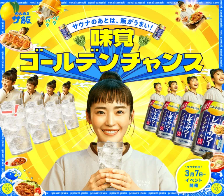
鮮烈な黄色と青、立体文字、人物や料理の切り抜きを組み合わせた特設ページ。サウナ飯とノンアルコール飲料の魅力を、記事・施設情報・投稿企画とともに紹介しています。
オリジナルサイトを見るA fizzy yellow-and-blue festival poster, built from oversized lettering, food photography, and exuberant repetition.
Original URL: sauna-ikitai.com/special/mikaku/ Final URL: sauna-ikitai.com/special/mikaku/ — unchanged; supplied HTTP status: 200. Theme: a single bright palette of fluorescent yellow, electric blue, and white. No theme selector is evidenced. Inspected: supplied browser observation dated September 23, 2026, 01:01:56 JST / September 22, 2026, 16:01:56 UTC. Viewports: desktop 1440 × 1000 CSS pixels; mobile 390 × 844 CSS pixels. Scope: the current campaign page, including its opening composition, Topics links, explanatory content, product benefits, expert quotation, brand links, journal cards, venue information, participation panel, and footer. Five original-page screenshots provide visual coverage of the hero, lower benefits area, participation panel, and footer. Rendered DOM evidence supplies additional measurements for intervening sections. Linked destinations were not inspected.
This is a campaign experience with editorial and venue content. Its strongest visual idea is the combination of an intensely graphic advertising composition with recognizable, full-color photography. A smiling person holding a sparkling drink anchors the hero. Repeated figures, cans, glasses, and plates radiate around that center. Yellow display lettering projects forward on long blue extrusions, while a curved white banner introduces the central message.
Below the opening image, the page alternates yellow, white, and blue fields. White provides room for explanations; blue becomes both a full-section background and the surface of product-benefit blocks; yellow returns inside editorial cards. Large photographs and lettering carry the excitement, while ordinary text uses the measured M PLUS 1p stack. The final participation panel and quiet white footer give the long page a clear landing point.
A fizzy yellow-and-blue festival poster, built from oversized lettering, food photography, and exuberant repetition.
Original URL: sauna-ikitai.com/special/mikaku/ Final URL: sauna-ikitai.com/special/mikaku/ — unchanged; supplied HTTP status: 200. Theme: a single bright palette of fluorescent yellow, electric blue, and white. No theme selector is evidenced. Inspected: supplied browser observation dated September 23, 2026, 01:01:56 JST / September 22, 2026, 16:01:56 UTC. Viewports: desktop 1440 × 1000 CSS pixels; mobile 390 × 844 CSS pixels. Scope: the current campaign page, including its opening composition, Topics links, explanatory content, product benefits, expert quotation, brand links, journal cards, venue information, participation panel, and footer. Five original-page screenshots provide visual coverage of the hero, lower benefits area, participation panel, and footer. Rendered DOM evidence supplies additional measurements for intervening sections. Linked destinations were not inspected.
This is a campaign experience with editorial and venue content. Its strongest visual idea is the combination of an intensely graphic advertising composition with recognizable, full-color photography. A smiling person holding a sparkling drink anchors the hero. Repeated figures, cans, glasses, and plates radiate around that center. Yellow display lettering projects forward on long blue extrusions, while a curved white banner introduces the central message.
Below the opening image, the page alternates yellow, white, and blue fields. White provides room for explanations; blue becomes both a full-section background and the surface of product-benefit blocks; yellow returns inside editorial cards. Large photographs and lettering carry the excitement, while ordinary text uses the measured M PLUS 1p stack. The final participation panel and quiet white footer give the long page a clear landing point.
| Name | Value | Source / reuse token | Role and evidence |
|---|---|---|---|
| Electric Blue | #006cff |
Source --color-blue-1; alias --color-blue |
Measured body text, major blue sections, benefit blocks, brand-link pills, and blue interface details |
| Fluorescent Yellow | #fcff00 |
Source --color-yellow-1; alias --color-yellow |
Measured body background, journal-card fills, and editorial header surfaces |
| White | #ffffff |
Source --color-white |
Measured Topics and footer backgrounds; white type on blue; visually present in banners and content panels |
| Reserved Charcoal | #282828 |
Source --color-black |
Defined source token; a major visible role is not established by the supplied captures |
Keep blue as the main interface ink. Black is not the observed default reading color, despite the presence of a black token.
The hero contains amber and orange bands, lighter blue extrusion faces, dark outlines, silvery cans, warm skin tones, and the natural colors of food. These are artwork colors, not evidence of additional global UI tokens. Their exact values were not supplied.
The yellow page token is flat. The hero's spiral, rays, luminous highlights, and warm shading are part of a richer visual background and should not be reduced to a single yellow rectangle when matching the composition.
White content areas use very faint bubbles or repeated lettering. These textures provide atmosphere without competing with blue text. No exact texture opacity was measured.
"M PLUS 1p", sans-serif.400, 500, 800, and 900, depending on the component.0.45px.0.266667px.The supplied evidence identifies the computed family stack, but does not include font-file URLs or a font-loading audit.
The hero title, curved banner, campaign logos, and several section headings use artwork. The hero's thick outlines, exaggerated perspective, and irregular Japanese letter shapes cannot be reproduced by assigning font-weight: 900 to ordinary text.
Use approved artwork for those marks. Retain semantic heading text or a meaningful image alternative, but do not treat the H1 wrapper's measured 18px desktop font size as the visible headline scale. The footer logo is also an image-based mark, not a typesetting recipe.
All values below are measured. Font sizes and line heights are shown in CSS pixels.
| Role | Desktop size / line height | Mobile size / line height | Weight | Notes |
|---|---|---|---|---|
| Body inheritance | 18 / 32.4 |
10.6667 / 17.0667 |
400 | Many components override this |
TOPICS heading |
34 / 40.8 |
22.6667 / 27.2 |
800 | Live text, unlike the main graphic title |
| Topics article title | 20 / 30 |
13.3333 / 20 |
800 | Horizontal card copy |
| Introductory statement | 22 / 39.996 |
Visibility unresolved | 800 | Mobile paragraph boxes have zero height in the supplied DOM |
| Benefit explanation | 16 / 25.008 |
10.6667 / 16.672 |
500 | White text on blue |
| Expert heading | 18 / 18 |
13.3333 / 13.3333 |
800 | Tracking changes to 2.79px / 2.06667px |
| Expert quotation | 16 / 25.008 |
12 / 18.756 |
500 | Blue text on a white textured surface |
| Journal excerpt | 16 / 22 |
10.6667 / 14.6667 |
800 | Denser than explanatory copy |
| Participation link statement | 30 / 45 |
20 / 30 |
800 | Main call to share an experience |
| Participation campaign notice | 30 / 50.7692 |
20 / 28 |
800 | Centered between blue rules |
| Participation project description | 20 / 36 |
13.3333 / 24 |
800 | Three desktop lines; more mobile wrapping |
The brand-link anchor inherits the body size, but its visible main line is larger. The child text size was not included in the measurements. Its desktop appearance is approximately in the low-to-mid 30px range; this is a visual estimate, not a source token.
Several mobile sizes are two thirds of their desktop counterparts. This is a pattern in the evidence, not proof of one global scale rule. The body size, component widths, and section layouts do not all follow the same ratio.
Density: a crowded opening composition followed by generously separated content sections.
Shape language: broad rounded panels, capsule links, circular arrows, graphic ribbons, and hard-edged display artwork.
Root size: the sampled HTML element remains 16px at both viewports. Do not infer a special root-unit system from the fractional mobile measurements.
| Use | Desktop | Mobile | Evidence |
|---|---|---|---|
| Common section side padding | 30px |
13.3333px |
Measured on Topics and several later sections |
| Benefits section side padding | 70px |
13.3333px |
Measured outer section padding |
| Topics heading top inset | 35px |
23.3333px |
Measured header padding |
| Topics heading-to-card gap | 40px |
About 26.66px |
Calculated from element bounds |
| Gap between desktop Topics cards | 40px |
Not applicable | Calculated from two 560px cards at x = 140 and 740 |
| Mobile Topics slide gap | Not applicable | About 15.66px |
Calculated from slide pitch and width |
| Gap between desktop journal cards | 14px |
Not applicable | Calculated from 376px pitch minus 362px width |
| Gap between mobile journal cards | Not applicable | About 18.66px |
Calculated vertical gap |
| Intro paragraph separation | 32px |
Unverified | Calculated between desktop text boxes |
| Footer top-to-logo spacing | 80px |
About 53.33px |
Calculated from footer and logo bounds |
| Element | Desktop | Mobile | Status |
|---|---|---|---|
| Topics link | 15px |
10px |
Measured |
| Journal card | 25px |
16.6667px |
Measured |
| Journal section header | Bottom corners 15px |
Bottom corners 10px |
Measured |
| Brand link | 60px |
40px |
Measured; exactly half the captured link height |
| Carousel arrow button | 50% |
50% |
Measured |
| Active venue card | 15px |
10px |
Measured |
| Inactive venue card | 10px |
10px |
Measured |
| White benefits panel | Approximately 30px |
Not visually verified | Screenshot estimate |
| White participation panel | Approximately 15px |
Approximately 10px |
Screenshot estimates |
| Element | Desktop at 1440 × 1000 | Mobile at 390 × 844 |
|---|---|---|
| Hero extent | Topics begins at y = 1000 |
Topics begins at y = 844 |
| Hero logo link | x = 70, y = 70; 116 × 72.22px |
x = 26.66, y = 33.33; 76.66 × 47.72px |
| Main title wrapper | x = 248.89, y = 144.42; 942.22 × 286.52px |
x = 0, y = 241.67; 390 × 102.38px, with 26.67px side padding |
| Topics card | 560 × 184px |
About 319.34 × 126.92px |
| Brand link | 720 × 120px, x = 360 |
About 336.66 × 80px, x = 26.67 |
| Journal card | 362 × 449px |
About 296.69 × 312.66px |
| Active venue card | 454 × 510px |
About 302.66 × 340px |
| Inactive venue card | 370 × 242px |
About 302.66 × 160px |
| Main carousel arrow | 80 × 80px |
About 53.33 × 53.33px |
| Participation copy width | 840px |
About 310.03px |
| Footer logo | 182 × 141.56px |
About 121.33 × 94.36px |
| Footer height | About 462.58px |
About 324.31px |
The desktop title wrapper occupies approximately 65.43% of viewport width. The mobile title's available inner width is approximately 336.67px, calculated after its side padding. These are useful composition anchors; they do not reveal the original responsive formula.
Role: makes the page feel like a complete illustrated poster rather than a series of disconnected sections.
A blue perimeter carries repeated white nonal-sameshi lettering. The text rotates with the edges, including an inverted lower strip. Blue-and-white wave illustrations rise from the lower corners, with fish-like figures and yellow circular emblems bearing サ.
The desktop band is approximately 30px thick, estimated from the screenshots. It occupies the same viewport edges in the hero, middle, and footer captures, which is consistent with viewport-pinned decoration. The actual positioning declaration was not supplied.
The phone hero has a narrower border, approximately 20px, and compact corner waves. The phone footer capture has no perimeter or corner overlay. Preserve this observed difference when adapting the page; do not assume that a fixed border continues through every mobile section.
Treat the perimeter as decoration. In a new implementation, it should not intercept pointer events or reduce the accessible reading area without corresponding content clearance.
Role: introduces the campaign through a single emphatic visual composition.
Its visible anatomy is:
サウナのあとは、飯がうまい!.味覚ゴールデンチャンス, with yellow faces, dark outlines, and blue perspective extrusion.This is visual anatomy, not a verified inventory of separate DOM image layers. The supplied evidence does not establish which details are combined into individual assets.
Desktop distributes the collage widely around the central face. Mobile moves the main title down, keeps the face near the visual center, and reveals more torso and hands. The food and repeated product groups crop at the sides. This is intentional portrait art direction, not a uniformly scaled desktop poster.
The hero occupies exactly the captured viewport height in both states. No conventional navigation bar or primary conversion button is visible in the supplied hero captures. The upper-left logo is a link to the food-sharing project.
Role: offers two early entry points into the journal content.
The DOM measures a white section directly after the hero, with a bold TOPICS heading. On desktop, two horizontal links sit in a centered 1160px span: 560px each with a 40px gap. Each link includes the category label ジャーナル and a bold article title. The title region begins 254px inside the first card, leaving a substantial leading visual area; the corresponding image subject is not shown in the supplied screenshot crops.
On mobile, this section changes into a carousel structure. The active card is about 319px wide, with neighboring cards outside the viewport, circular Previous/Next buttons, and two small pagination buttons. Repeated DOM links are consistent with carousel clones, not six different articles.
The source defines a transition on margin-top and border-bottom-width. This suggests an interaction involving position and a lower edge, but the resting border thickness and hover endpoint were not supplied. Do not invent a shadow system from that transition alone.
Role: explains the campaign concept before introducing the drink benefits.
The desktop DOM records three centered statements in 22px, weight 800, with approximately 40px line height and 32px gaps between their text boxes. A large graphic heading precedes them. A later nested section contains the numerals 1, 2, and 3 and another graphic heading.
These sections are not pictured in the supplied screenshot crops, so their detailed illustration subjects and numbered-item anatomy remain unverified.
The mobile introductory paragraph nodes remain in the DOM but have zero-height rectangles and are absent from the supplied rendered-text summary. A graphic or alternate presentation may exist, but the evidence does not establish it. Do not claim that the desktop text is visibly reproduced unchanged on mobile, and do not deliberately hide essential copy in a new build merely to reproduce these measurements.
Role: groups three product messages, expert support, and a brand destination into one visual unit.
The desktop screenshot shows a broad white surface with a pale bubble texture and rounded lower corners. Three blue benefit blocks occupy its upper portion. Their lower edges step upward from left to right by approximately 60px per block. The DOM supports the same stagger: paragraph positions shift upward by 60px, while their horizontal anchors advance by 380px.
Each block combines a centered bold white heading with a narrower paragraph beneath. Desktop paragraph widths are 268px, using 16px / 25.008px, weight 500. Rounded lower corners soften the strong rectangular blue fields.
On mobile, the three paragraphs share x ≈ 33.33px and are separated vertically by approximately 210.73px. This establishes a vertical sequence rather than the desktop three-column staircase. Their computed copy size becomes 10.6667px; increasing this in a new implementation is an explicitly recommended readability improvement.
The benefit statements are source campaign copy. This reference records their visual treatment without independently validating their physiological claims.
Role: provides a human endorsement within the benefit panel.
A circular portrait with a blue outline sits alongside blue nameplates containing the organization and speaker name. To the right, a short blue heading has a yellow marker-like highlight underneath it, followed by a blue quotation on white.
The visible speaker is identified in the page as 一般社団法人日本味覚協会 and 水野考貴氏. These are content attributions, not production credits.
Desktop quotation text starts at x ≈ 508.52px and occupies approximately 691.48px. The heading uses unusually wide tracking: 2.79px at an 18px font size. The portrait is approximately 100px across in the screenshot; that diameter is an estimate.
On mobile, the heading begins farther to the right at x ≈ 119.98px, while the quotation returns to x ≈ 33.33px and spans 323.34px. The text therefore reorganizes around the identification area instead of retaining a narrow desktop quotation column.
Role: a repeated outbound product link.
The large blue capsule contains a narrow white product-name strip, a much larger white action label, and a circular white icon area at the right. In the visible desktop instance, an angled product can protrudes beyond the capsule's left edge and above and below its main body.
The measured link is 720 × 120px with a 60px radius. Mobile changes to approximately 336.66 × 80px with a 40px radius. Two instances appear in the DOM, both linking to the same product page.
Preserve the hierarchy between the product name and ブランドサイトはこちらから. The can is a separate visual accent; it should not force the interactive target to shrink to the text alone. The icon communicates an external destination, but new-tab behavior was not verified.
Role: gives the campaign editorial depth through two feature stories.
The DOM records a full blue section with a large yellow header panel and yellow article cards. Each card is an anchor containing a title/author grouping, an excerpt, and a date. The observed authors are 清水みさと and ヨッピー, and the visible article dates are 2024.03.05.
Desktop cards measure 362 × 449px, have 25px radii, and repeat along a horizontal track with 14px gaps. Previous/Next buttons are 80px circles. Some title bounds extend beyond the card width, indicating a graphic or transformed title treatment whose exact internal construction is not available.
Mobile shows two vertically stacked cards, each about 296.69 × 312.66px, separated by approximately 18.66px. No journal Previous/Next controls occur in the supplied mobile evidence. This is a section-specific carousel-to-stack change; it should not be confused with the Topics section, which gains a carousel on mobile.
The intervening journal visuals are not included in the supplied screenshot crops. Use the measured surface, spacing, and content hierarchy confidently, but do not infer the exact photographs or title-art assets.
Role: presents participating venues with an expanded current item.
The section is introduced by EVENT INFO, an event heading, and supporting copy. The selected venue exposes location, opening hours, event period, and a facility-detail link. Other venue entries remain in the horizontal sequence.
Desktop uses unequal card states: the current card is 454 × 510px, while neighboring cards are 370 × 242px. In the captured state, the current card sits 308px above the smaller cards and lies to the right of the page center. On mobile, the card widths become equal at approximately 302.66px, but heights remain unequal: 340px selected and 160px inactive. The selected mobile card is centered and sits 180px higher.
Circular Previous/Next controls and four small indicator buttons are present. The indicator rectangles measure 32 × 9px on desktop and approximately 25.59 × 7.19px on mobile; these are visual bounds, not recommended minimum touch targets.
The page still serves dated event material. Its presence in the current capture is not evidence that the event or promotional offer remains active in September 2026.
Role: closes the campaign content with an invitation to share a food experience.
A white panel sits inside a blue section, with very pale repeated Japanese lettering behind its content and floating food cutouts outside its edges. The desktop panel is approximately 920px wide, estimated from the screenshot, with a measured 840px inner text region.
Its three-part anatomy is:
サウナ飯 receives white-on-blue emphasis inside the line.Desktop places the logo and invitation side by side. Mobile centers the logo above left-aligned invitation text, keeps the arrow toward the upper-right, and wraps the campaign notice into three centered lines. The lower explanatory paragraph stays left aligned on mobile.
Food plates overlap the panel's exterior at several edges. Preserve those overlaps, but keep the readable text region clear. The panel's texture should remain much lighter than its content.
Role: ends the campaign with the host site's identity and social links.
The footer is a spacious white field containing the blue サウナイキタイ logo, the label 公式SNS, three blue social symbols, and © SAUNA IKITAI. The logo links to the site root. The captured social artwork includes the Twitter bird, Instagram, and Facebook symbols; do not automatically substitute a different symbol when reproducing the captured appearance.
The logo is 182px wide on desktop and approximately 121.33px on mobile. It begins 80px and 53.33px below the footer top, respectively. The footer is approximately 462.58px tall on desktop and 324.31px on mobile.
Desktop perimeter decoration remains visible around this quiet white area. The supplied mobile footer has clean, undecorated outer edges. The original page evidence establishes the footer branding and copyright, but does not identify a production team.
The supplied computed styles establish transition timing. They do not establish every trigger, start state, endpoint, or complete animation sequence.
| Element | Measured transition | What can be concluded |
|---|---|---|
| Hero H1 wrapper | Opacity 0.2s after 0.1s; transform 0.4s after 0.1s |
A reveal-capable wrapper exists; initial transform and triggering logic are not supplied |
| Hero transform easing | cubic-bezier(0.18, 0.89, 0.32, 1.28) |
An overshooting, lively timing curve is declared |
| Logo links and carousel arrows | Transform 0.26s with the same overshoot curve |
Suitable for compact tactile feedback; actual hover scale is unknown |
| Topics cards | margin-top and border-bottom-width, 0.15s cubic-bezier(0.22, 0.61, 0.36, 1) |
Source declares position/edge feedback; endpoint values are unknown |
| Intro paragraphs | Opacity 0.5s; transform 0.6s cubic-bezier(0.22, 0.61, 0.36, 1) |
Three staggered declarations use delays of 0, 0.25s, and 0.5s |
| Selected venue card | Supplied shorthand 0.4s |
A 400ms transition is declared; changed properties are not identified |
| Venue indicators | Opacity 0.25s ease-in-out |
Indicator opacity can transition |
animation: none appears on the sampled elements. This does not prove that the entire page is motionless: descendants, decorative layers, pseudo-elements, and script-driven behavior were not comprehensively enumerated.
Verified affordances include anchors, Previous/Next buttons, and pagination buttons. No click results, swipe behavior, keyboard behavior, autoplay cadence, or continuous movement of the perimeter and collage were supplied. Do not describe the border as an animated marquee or the food as continuously floating on the strength of a still image.
For a new implementation, use the measured short overshoot timing for small controls and reserve longer staggered reveals for optional decoration. Keep all substantive content available when motion is disabled or scripts fail.
| Surface | Appearance | Function |
|---|---|---|
| Main page | Flat fluorescent yellow | Connects the large campaign sections |
| Hero | Yellow and amber radiating artwork | Establishes energy and focuses attention on the portrait |
| Topics strip | White | Separates the dense hero from editorial entry points |
| Benefits panel | White with faint bubbles | Supports explanatory copy and product messaging |
| Benefit blocks | Solid blue with white text | Gives the three messages a strong common identity |
| Journal and venue region | Solid blue | Creates a sustained contrasting chapter |
| Journal cards | Yellow with blue content | Brings the main palette into discrete editorial objects |
| Participation panel | White with faint repeated lettering | Frames the closing invitation |
| Footer | White with blue identity | Provides a calmer ending |
There is no evidenced global system of soft card shadows, glass blur, or neutral-gray elevations. Depth comes mainly from graphic extrusion, image overlap, staggered blocks, and the contrast between large color fields.
The visual language combines Japanese promotional graphics with appetizing, sharply cut photography. Food remains recognizably photographic: browned dumplings, fried chicken, curry, noodles, and other plated dishes retain their color and texture. Clear drinks show ice and bubbles. Product cans keep their silvery material and detailed labels.
The central portrait is friendly and direct. Smaller copies of the same person appear in rhythmic sequences, often paired with a glass or can. Size progression and diagonal arrangement create depth without a realistic shared environment. The peripheral upside-down bucket scene adds a deliberately playful disruption.
Blue-and-white clouds, waves, sparkles, and outlines connect the photographs to the graphic world. The title's extrusion is crisp and geometric, while the photographs retain natural shading. This contrast is essential: flattening all imagery into a single illustration style would change the page substantially.
Use clean alpha edges and adequate source resolution. Do not apply image-rendering: pixelated; the supplied photographs and lettering are intended to remain smooth. Avoid adding an identical synthetic drop shadow to every cutout when the source composition achieves separation through placement and color.
The supplied DOM extract does not include image src values or background-image URLs. No original asset filenames can therefore be cited responsibly.
| Asset family | Observed placement | What is verified |
|---|---|---|
| Main title and curved banner | Desktop and mobile hero | Visible shape, color treatment, and title-wrapper geometry |
| Central portrait | Desktop and mobile hero | Different responsive crop and scale relationships |
| Repeated figures, glasses, and cans | Hero side groups | Perspective-like size repetition and edge cropping |
| Food and lemon cutouts | Hero and participation exterior | Full-color photographic treatment |
| Wave corners and repeated text strips | Desktop perimeter; mobile hero | Visible decoration and viewport-specific presence |
| Bubble texture | White benefits panel | Low-contrast photographic or rendered bubbles; file type unknown |
| Expert portrait and labels | Benefits panel | Circular portrait, blue outline, and blue nameplates |
| Faint lettering texture | Participation panel | Repeated pale text behind content |
| Host logo and social symbols | Footer | Blue artwork on white, with measured link bounds |
A faithful implementation needs approved artwork or purpose-made replacements. The CSS shell alone cannot recreate the portrait, product photography, or campaign lettering.
The page uses normal document scrolling, with section-specific layouts rather than one repeated responsive grid.
| Area | Desktop observation | Mobile observation |
|---|---|---|
| Hero | Wide collage around a centered face; title begins near 14.4% of viewport height | Portrait composition; title begins near 28.6%; more torso is visible |
| Perimeter | Visible at the same viewport edges in multiple scroll captures | Present in hero; absent in the supplied footer capture |
| Topics | Two side-by-side horizontal links | Carousel with one principal card, neighbors, arrows, and dots |
| Introduction | Three measurable text statements | Corresponding paragraph boxes have zero height; visible replacement is unverified |
| Benefits | Three columns with a 60px staircase | Vertical sequence of three messages |
| Expert quotation | Identity at left, quotation column at right | Heading and identification area above a wider quotation |
| Journal | Repeated horizontal track with arrow controls | Two vertically stacked articles |
| Venues | Larger active card plus smaller, lower neighbors | Same-width cards with a taller active state |
| Participation | Logo and invitation in a horizontal row | Logo above invitation; notice wraps into three lines |
| Footer | Larger identity and persistent surrounding decoration | Smaller identity, clear white edges |
The visual rhythm is created by changes of scale and surface, not by equally spaced, interchangeable cards. Desktop benefits have room to stagger; mobile preserves their sequence while reducing horizontal complexity. The hero receives its own responsive art direction, independent of the content sections.
Only two viewport sizes were supplied. Breakpoint locations, tablet behavior, landscape-phone behavior, and interpolation formulas remain unknown. Although the source custom property --vh is reported as 10px in both snapshots, this is not enough to explain the mobile hero height. Use the measured viewport-height result as evidence, not that isolated variable as a complete formula.
#fcff00, #006cff, and white as the dominant interface palette.M PLUS 1p text.These are recommendations for a new implementation, not verified features of the original page.
14–16px where possible. The observed 10.67–12px benefit and quotation sizes are useful matching evidence, but are small reading targets.pointer-events: none.4.6:1, while blue against yellow is approximately 4.2:1; the latter is more suitable for sufficiently large bold text than small normal-weight copy.#fcff00.#006cff.#ffffff.“Create a Japanese campaign page inspired by the supplied SAUNA IKITAI reference. Use fluorescent yellow #fcff00, electric blue #006cff, and white. Open with a viewport-height photographic collage: a central person holding a sparkling drink, oversized yellow lettering with blue perspective extrusion, a curved white message banner, repeated drink-and-person groups, peripheral food cutouts, rays, sparkles, and illustrated wave corners. Use M PLUS 1p for live text and supplied artwork for campaign lettering. Continue with a white Topics strip, a textured white benefit panel containing staggered blue blocks, an expert quotation, a large blue product-link capsule, yellow journal cards on blue, a venue carousel, a white participation panel, and a spacious white footer. Recompose the hero for mobile; make Topics a carousel, stack journal cards vertically, and preserve the section-specific responsive hierarchy.”
This is an implementation scaffold, not extracted source CSS. It uses the measured palette, typography, radii, and selected dimensions. The 767px breakpoint, hero layer positioning between the measured states, fallback carousel scrolling, and hover movement are recommendations. The simple CSS rays are a placeholder for the actual hero artwork.
Supply approved images inside the named hero and logo elements. Original asset paths were not provided. Load M PLUS 1p through the project's own approved font setup; the following code does not fetch fonts or images.
:root {
  /* Observed source colors */
  --color-yellow-1: #fcff00;
  --color-blue-1: #006cff;
  --color-white: #ffffff;
  --color-black: #282828;

  /* Reusable aliases */
  --color-yellow: var(--color-yellow-1);
  --color-blue: var(--color-blue-1);
  --font-body: 'M PLUS 1p', sans-serif;
  --weight-body: 400;
  --weight-copy: 500;
  --weight-bold: 800;

  --text-body: 18px;
  --leading-body: 1.8;
  --tracking-body: 0.45px;
  --text-section: 34px;
  --text-topic: 20px;
  --text-small: 16px;
  --text-community: 30px;
  --text-community-body: 20px;

  --gutter: 30px;
  --benefit-gutter: 70px;
  --radius-topic: 15px;
  --radius-card: 25px;
  --radius-panel: 15px;
  --radius-pill: 60px;
  --arrow-size: 80px;

  --ease-bounce: cubic-bezier(0.18, 0.89, 0.32, 1.28);
  --ease-reveal: cubic-bezier(0.22, 0.61, 0.36, 1);
  --motion-control: 260ms var(--ease-bounce);
  --motion-hero: 400ms var(--ease-bounce);
}

* { box-sizing: border-box; }
body { margin: 0; }

.mikaku-page {
  position: relative;
  overflow-x: clip;
  color: var(--color-blue);
  background: var(--color-yellow);
  font-family: var(--font-body);
  font-size: var(--text-body);
  font-weight: var(--weight-body);
  line-height: var(--leading-body);
  letter-spacing: var(--tracking-body);
}

.mikaku-page img {
  display: block;
  max-width: 100%;
  height: auto;
}

.mikaku-page a { color: inherit; }

/* Recommended positioning model for the observed desktop frame. */
.edge-frame {
  position: fixed;
  z-index: 30;
  inset: 0;
  border: 30px solid var(--color-blue);
  pointer-events: none;
}

/* Add approved text-strip and corner-wave artwork to this frame. */
.mikaku-hero {
  position: relative;
  isolation: isolate;
  height: 100svh;
  overflow: hidden;
  background:
    radial-gradient(circle at 50% 55%, #ffffff80, transparent 60%),
    repeating-conic-gradient(
      from -8deg at 50% 55%,
      transparent 0deg 15deg,
      #ffffff30 15deg 30deg
    ),
    var(--color-yellow);
}

.hero-logo {
  position: absolute;
  z-index: 5;
  top: 70px;
  left: 70px;
  width: 116px;
  transition: transform var(--motion-control);
}

.hero-title {
  position: absolute;
  z-index: 2;
  top: 14.44%;
  left: 50%;
  width: 65.43%;
  margin: 0;
  transform: translateX(-50%);
}

.hero-title img { width: 100%; }

/* Portrait dimensions are a starting estimate, not source CSS. */
.hero-portrait {
  position: absolute;
  z-index: 3;
  bottom: 30px;
  left: 50%;
  width: min(58vw, 840px);
  transform: translateX(-50%);
}

.topics {
  padding: 35px var(--gutter) 68px;
  background: var(--color-white);
}

.section-title {
  margin: 0 0 40px;
  font-size: var(--text-section);
  font-weight: var(--weight-bold);
  line-height: 1.2;
  text-align: center;
}

.topics-grid {
  display: grid;
  grid-template-columns: repeat(2, minmax(0, 1fr));
  gap: 40px;
  max-width: 1160px;
  margin-inline: auto;
}

.topic-card {
  display: grid;
  grid-template-columns: 220px minmax(0, 1fr);
  align-items: center;
  gap: 34px;
  min-height: 184px;
  padding-right: 34px;
  border-radius: var(--radius-topic);
  text-decoration: none;
}

.topic-card__title {
  margin: 0;
  font-size: var(--text-topic);
  font-weight: var(--weight-bold);
  line-height: 1.5;
}

.benefit-panel {
  width: calc(100% - 2 * var(--benefit-gutter));
  margin-inline: auto;
  padding: 160px 80px 65px;
  border-radius: 30px;
  background: var(--color-white);
}

.benefit-grid {
  display: grid;
  grid-template-columns: repeat(3, minmax(0, 1fr));
  gap: 2px;
}

.benefit-card {
  padding: 48px 55px 80px;
  border-radius: 12px;
  color: var(--color-white);
  background: var(--color-blue);
}

.benefit-card:nth-child(2) { transform: translateY(-60px); }
.benefit-card:nth-child(3) { transform: translateY(-120px); }

.benefit-card h3 {
  margin: 0 0 32px;
  font-size: 24px;
  font-weight: var(--weight-bold);
  line-height: 1.45;
  text-align: center;
}

.benefit-card p,
.expert-copy {
  margin: 0;
  font-size: var(--text-small);
  font-weight: var(--weight-copy);
  line-height: 1.563;
}

.expert {
  display: grid;
  grid-template-columns: 268.5px minmax(0, 1fr);
  gap: 20px;
  max-width: 1000px;
  margin: 70px auto 0;
}

.expert-heading {
  display: inline;
  font-size: 18px;
  font-weight: var(--weight-bold);
  line-height: 1;
  letter-spacing: 2.79px;
  background: linear-gradient(
    transparent 60%, var(--color-yellow) 60%
  );
}

.brand-link {
  position: relative;
  display: grid;
  align-content: center;
  justify-items: center;
  gap: 10px;
  width: min(720px, calc(100% - 2 * var(--gutter)));
  min-height: 120px;
  margin: 80px auto 0;
  padding: 20px 100px;
  border-radius: var(--radius-pill);
  color: var(--color-white) !important;
  background: var(--color-blue);
  text-align: center;
  text-decoration: none;
}

.brand-link__eyebrow {
  padding: 2px 16px;
  border-radius: 999px;
  color: var(--color-blue);
  background: var(--color-white);
  font-size: 16px;
  font-weight: var(--weight-bold);
  line-height: 1.4;
}

/* Main label size is a recommended approximation. */
.brand-link__label {
  font-size: 32px;
  font-weight: var(--weight-bold);
  line-height: 1.3;
}

.brand-link__arrow {
  position: absolute;
  top: 50%;
  right: 30px;
  display: grid;
  place-items: center;
  width: 60px;
  height: 60px;
  border: 5px solid #ffffff55;
  border-radius: 50%;
  color: var(--color-blue);
  background: var(--color-white);
  background-clip: padding-box;
  transform: translateY(-50%);
}

.journal-section {
  padding: 60px var(--gutter) 100px;
  background: var(--color-blue);
}

/* Native scrolling is a usable fallback, not the verified source engine. */
.journal-track {
  display: grid;
  grid-auto-flow: column;
  grid-auto-columns: 362px;
  gap: 14px;
  overflow-x: auto;
  scroll-snap-type: x proximity;
}

.journal-card {
  min-height: 449px;
  padding: 30px 38px;
  border-radius: var(--radius-card);
  background: var(--color-yellow);
  text-decoration: none;
  scroll-snap-align: center;
}

.journal-card__excerpt {
  font-size: var(--text-small);
  font-weight: var(--weight-bold);
  line-height: 1.375;
}

.carousel-button {
  display: grid;
  place-items: center;
  width: var(--arrow-size);
  height: var(--arrow-size);
  padding: 0;
  border: 2px solid var(--color-white);
  border-radius: 50%;
  color: var(--color-white);
  background: var(--color-blue);
  cursor: pointer;
  transition: transform var(--motion-control);
}

.participation {
  padding: 70px var(--gutter) 60px;
  background: var(--color-blue);
}

.participation-panel {
  max-width: 920px;
  margin-inline: auto;
  padding: 0 40px 26px;
  border-radius: var(--radius-panel);
  background: var(--color-white);
}

.participation-link {
  position: relative;
  display: flex;
  align-items: center;
  gap: 70px;
  padding-block: 35px;
  text-decoration: none;
}

.participation-logo { flex: 0 0 116px; }

.participation-copy {
  margin: 0;
  font-size: var(--text-community);
  font-weight: var(--weight-bold);
  line-height: 1.5;
}

.participation-notice {
  margin: 0;
  padding-block: 16px;
  border-block: 4px solid var(--color-blue);
  font-size: var(--text-community);
  font-weight: var(--weight-bold);
  line-height: 1.6923;
  text-align: center;
}

.participation-description {
  margin: 26px 0 0;
  font-size: var(--text-community-body);
  font-weight: var(--weight-bold);
  line-height: 1.8;
  text-align: center;
}

.inline-emphasis {
  padding-inline: 0.12em;
  border-radius: 4px;
  color: var(--color-white);
  background: var(--color-blue);
}

.mikaku-footer {
  min-height: 462.58px;
  padding: 80px var(--gutter) 70px;
  background: var(--color-white);
  text-align: center;
}

.footer-logo {
  display: block;
  width: 182px;
  margin-inline: auto;
  transition: transform var(--motion-control);
}

.social-links {
  display: flex;
  align-items: center;
  justify-content: center;
  gap: 20px;
  padding: 0;
  list-style: none;
}

/* Recommended hit areas; larger than several measured source links. */
.social-links a {
  display: grid;
  place-items: center;
  min-width: 44px;
  min-height: 44px;
}

/* Recommended hover endpoint; source timing is measured. */
@media (hover: hover) {
  .hero-logo:hover,
  .footer-logo:hover,
  .carousel-button:hover {
    transform: translateY(-2px);
  }
}

/* Recommended two-color focus treatment. */
.mikaku-page :is(a, button):focus-visible {
  outline: 3px solid var(--color-blue);
  outline-offset: 4px;
  box-shadow: 0 0 0 7px var(--color-white);
}

@media (max-width: 767px) {
  :root {
    --text-body: 10.6667px;
    --leading-body: 1.6;
    --tracking-body: 0.266667px;
    --text-section: 22.6667px;
    --text-topic: 13.3333px;
    --text-small: 10.6667px;
    --text-community: 20px;
    --text-community-body: 13.3333px;
    --gutter: 13.3333px;
    --benefit-gutter: 13.3333px;
    --radius-topic: 10px;
    --radius-card: 16.6667px;
    --radius-panel: 10px;
    --radius-pill: 40px;
    --arrow-size: 53.3333px;
  }

  /* Hero-only mobile frame is an adaptation of the supplied captures. */
  .edge-frame {
    position: absolute;
    bottom: auto;
    height: 100svh;
    border-width: 20px;
  }

  .hero-logo {
    top: 33.3333px;
    left: 26.6667px;
    width: 76.6667px;
  }

  .hero-title {
    top: 28.63%;
    width: calc(100% - 53.3333px);
  }

  .hero-portrait {
    bottom: 20px;
    width: calc(100% - 40px);
  }

  .topics { padding-block: 23.3333px 46px; }
  .section-title { margin-bottom: 26.6667px; }

  .topics-grid {
    display: flex;
    gap: 15.6667px;
    overflow-x: auto;
    padding-inline: 20px;
    scroll-snap-type: x mandatory;
  }

  .topic-card {
    flex: 0 0 min(319.34px, 100%);
    grid-template-columns: minmax(0, 130px) minmax(0, 1fr);
    gap: 18.6667px;
    min-height: 126.92px;
    padding-right: 18.6667px;
    scroll-snap-align: center;
  }

  .benefit-panel {
    padding: 40px 20px;
    border-radius: 20px;
  }

  .benefit-grid {
    grid-template-columns: minmax(0, 1fr);
    gap: 20px;
  }

  .benefit-card { padding: 28px 20px; }
  .benefit-card:nth-child(n) { transform: none; }
  .benefit-card h3 { font-size: 20px; }

  .expert {
    grid-template-columns: minmax(0, 1fr);
    margin-top: 40px;
  }

  .expert-heading {
    font-size: 13.3333px;
    letter-spacing: 2.06667px;
  }

  .expert-copy { font-size: 12px; }

  .brand-link {
    width: calc(100% - 53.3333px);
    min-height: 80px;
    margin-top: 40px;
    padding: 14.6667px 48px 14.6667px 20px;
    gap: 6px;
  }

  .brand-link__eyebrow {
    font-size: 10px;
    padding-inline: 8px;
  }

  .brand-link__label { font-size: 18px; }

  .brand-link__arrow {
    right: 10px;
    width: 34px;
    height: 34px;
    border-width: 3px;
  }

  .journal-track {
    grid-auto-flow: row;
    grid-auto-columns: auto;
    grid-template-columns: minmax(0, 1fr);
    gap: 18.6667px;
    max-width: 296.69px;
    margin-inline: auto;
    overflow: visible;
  }

  .journal-card {
    min-height: 312.66px;
    padding: 20px 25px;
  }

  .participation { padding-block: 40px 60px; }

  .participation-panel {
    padding: 38.6667px 26.6667px 14.6667px;
  }

  .participation-link {
    flex-direction: column;
    gap: 16px;
    padding: 0 0 20px;
  }

  .participation-logo {
    flex-basis: auto;
    width: 100px;
  }

  .participation-notice {
    border-width: 2px;
    padding-block: 12px;
    line-height: 1.4;
  }

  .participation-description {
    margin-top: 20px;
    text-align: left;
  }

  .mikaku-footer {
    min-height: 324.31px;
    padding-top: 53.3333px;
  }

  .footer-logo { width: 121.3333px; }

  /* Optional readability mode for a new production implementation. */
  .readable-copy :is(.benefit-card p, .expert-copy, .journal-card__excerpt) {
    font-size: 14px;
    line-height: 1.65;
  }
}

@media (prefers-reduced-motion: reduce) {
  .mikaku-page *,
  .mikaku-page *::before,
  .mikaku-page *::after {
    animation: none !important;
    transition: none !important;
    scroll-behavior: auto !important;
  }
}
The scaffold intentionally leaves detailed cutout placement, bubble and lettering textures, venue-state logic, carousel buttons, and asset-based headings to the implementation. Its native overflow tracks are functional fallbacks, not evidence of the original carousel library. Product-can overlap should be added after the actual asset dimensions are known.
Optional aliases for a project already using Tailwind v4. These do not imply that the original page uses Tailwind. Define the preceding custom properties first.
@theme inline {
  --color-mikaku-blue: var(--color-blue);
  --color-mikaku-yellow: var(--color-yellow);
  --color-mikaku-white: var(--color-white);

  --font-mikaku: var(--font-body);
  --text-mikaku-body: var(--text-body);
  --text-mikaku-section: var(--text-section);
  --text-mikaku-topic: var(--text-topic);
  --text-mikaku-small: var(--text-small);
  --text-mikaku-community: var(--text-community);

  --spacing-mikaku-gutter: var(--gutter);
  --spacing-mikaku-arrow: var(--arrow-size);

  --radius-mikaku-topic: var(--radius-topic);
  --radius-mikaku-card: var(--radius-card);
  --radius-mikaku-panel: var(--radius-panel);
  --radius-mikaku-pill: var(--radius-pill);
}
2026-09-22T16:01:56.144Z, equivalent to September 23, 2026, 01:01:56.144 JST.This document describes the currently supplied page state. Historical dates within its content do not change that scope. Values labeled as estimates or recommendations should not be treated as recovered source declarations.
# SAUNA IKITAI / 味覚ゴールデンチャンス — Style Reference

> A fizzy yellow-and-blue festival poster, built from oversized lettering, food photography, and exuberant repetition.

**Original URL:** [sauna-ikitai.com/special/mikaku/](https://sauna-ikitai.com/special/mikaku/)
**Final URL:** [sauna-ikitai.com/special/mikaku/](https://sauna-ikitai.com/special/mikaku/) — unchanged; supplied HTTP status: 200.
**Theme:** a single bright palette of fluorescent yellow, electric blue, and white. No theme selector is evidenced.
**Inspected:** supplied browser observation dated September 23, 2026, 01:01:56 JST / September 22, 2026, 16:01:56 UTC.
**Viewports:** desktop 1440 × 1000 CSS pixels; mobile 390 × 844 CSS pixels.
**Scope:** the current campaign page, including its opening composition, Topics links, explanatory content, product benefits, expert quotation, brand links, journal cards, venue information, participation panel, and footer. Five original-page screenshots provide visual coverage of the hero, lower benefits area, participation panel, and footer. Rendered DOM evidence supplies additional measurements for intervening sections. Linked destinations were not inspected.

This is a campaign experience with editorial and venue content. Its strongest visual idea is the combination of an intensely graphic advertising composition with recognizable, full-color photography. A smiling person holding a sparkling drink anchors the hero. Repeated figures, cans, glasses, and plates radiate around that center. Yellow display lettering projects forward on long blue extrusions, while a curved white banner introduces the central message.

Below the opening image, the page alternates yellow, white, and blue fields. White provides room for explanations; blue becomes both a full-section background and the surface of product-benefit blocks; yellow returns inside editorial cards. Large photographs and lettering carry the excitement, while ordinary text uses the measured `M PLUS 1p` stack. The final participation panel and quiet white footer give the long page a clear landing point.
# SAUNA IKITAI / 味覚ゴールデンチャンス — Style Reference

> A fizzy yellow-and-blue festival poster, built from oversized lettering, food photography, and exuberant repetition.

**Original URL:** [sauna-ikitai.com/special/mikaku/](https://sauna-ikitai.com/special/mikaku/)
**Final URL:** [sauna-ikitai.com/special/mikaku/](https://sauna-ikitai.com/special/mikaku/) — unchanged; supplied HTTP status: 200.
**Theme:** a single bright palette of fluorescent yellow, electric blue, and white. No theme selector is evidenced.
**Inspected:** supplied browser observation dated September 23, 2026, 01:01:56 JST / September 22, 2026, 16:01:56 UTC.
**Viewports:** desktop 1440 × 1000 CSS pixels; mobile 390 × 844 CSS pixels.
**Scope:** the current campaign page, including its opening composition, Topics links, explanatory content, product benefits, expert quotation, brand links, journal cards, venue information, participation panel, and footer. Five original-page screenshots provide visual coverage of the hero, lower benefits area, participation panel, and footer. Rendered DOM evidence supplies additional measurements for intervening sections. Linked destinations were not inspected.

This is a campaign experience with editorial and venue content. Its strongest visual idea is the combination of an intensely graphic advertising composition with recognizable, full-color photography. A smiling person holding a sparkling drink anchors the hero. Repeated figures, cans, glasses, and plates radiate around that center. Yellow display lettering projects forward on long blue extrusions, while a curved white banner introduces the central message.

Below the opening image, the page alternates yellow, white, and blue fields. White provides room for explanations; blue becomes both a full-section background and the surface of product-benefit blocks; yellow returns inside editorial cards. Large photographs and lettering carry the excitement, while ordinary text uses the measured `M PLUS 1p` stack. The final participation panel and quiet white footer give the long page a clear landing point.

## How to Read This Reference

- **Measured** means a value appears in the supplied rendered DOM, computed styles, or custom properties. Measurements describe the two captured states, not an inferred universal stylesheet.
- **Calculated** means arithmetic derived from those measurements, such as the gap between adjacent cards.
- **Estimated** means a visual approximation from the original-page screenshots. Such values are not sampled CSS declarations.
- **Recommended** means implementation guidance for a new build. Proposed breakpoints, hover endpoints, accessibility changes, and fallback layouts are not claims about the source.
- Token aliases below are descriptive unless explicitly identified as source custom properties.
- The inspected document heights were **8246.63px on desktop** and **6572.06px on mobile**. These describe this content and capture state; they are not target heights to hardcode.
- Empty text on some sampled headings does not mean the visible heading is absent. The screenshots show prominent graphic lettering. An inherited font size on its wrapper does not describe the size or font of that artwork.

## Tokens — Colors

### Default Palette

| Name | Value | Source / reuse token | Role and evidence |
| --- | --- | --- | --- |
| Electric Blue | `#006cff` | Source `--color-blue-1`; alias `--color-blue` | Measured body text, major blue sections, benefit blocks, brand-link pills, and blue interface details |
| Fluorescent Yellow | `#fcff00` | Source `--color-yellow-1`; alias `--color-yellow` | Measured body background, journal-card fills, and editorial header surfaces |
| White | `#ffffff` | Source `--color-white` | Measured Topics and footer backgrounds; white type on blue; visually present in banners and content panels |
| Reserved Charcoal | `#282828` | Source `--color-black` | Defined source token; a major visible role is not established by the supplied captures |

Keep blue as the main interface ink. Black is not the observed default reading color, despite the presence of a black token.

### Artwork Colors

The hero contains amber and orange bands, lighter blue extrusion faces, dark outlines, silvery cans, warm skin tones, and the natural colors of food. These are **artwork colors**, not evidence of additional global UI tokens. Their exact values were not supplied.

The yellow page token is flat. The hero's spiral, rays, luminous highlights, and warm shading are part of a richer visual background and should not be reduced to a single yellow rectangle when matching the composition.

White content areas use very faint bubbles or repeated lettering. These textures provide atmosphere without competing with blue text. No exact texture opacity was measured.

## Tokens — Typography

### Source Family

- **Measured computed stack:** `"M PLUS 1p", sans-serif`.
- **Observed weights:** `400`, `500`, `800`, and `900`, depending on the component.
- **Default desktop tracking:** `0.45px`.
- **Default mobile tracking:** `0.266667px`.
- **Character:** a friendly Japanese sans serif with substantial weight contrast between explanatory copy and emphatic statements.

The supplied evidence identifies the computed family stack, but does not include font-file URLs or a font-loading audit.

### Graphic Titles and Logos

The hero title, curved banner, campaign logos, and several section headings use artwork. The hero's thick outlines, exaggerated perspective, and irregular Japanese letter shapes cannot be reproduced by assigning `font-weight: 900` to ordinary text.

Use approved artwork for those marks. Retain semantic heading text or a meaningful image alternative, but do not treat the H1 wrapper's measured `18px` desktop font size as the visible headline scale. The footer logo is also an image-based mark, not a typesetting recipe.

### Type Scale

All values below are measured. Font sizes and line heights are shown in CSS pixels.

| Role | Desktop size / line height | Mobile size / line height | Weight | Notes |
| --- | --- | --- | --- | --- |
| Body inheritance | `18 / 32.4` | `10.6667 / 17.0667` | 400 | Many components override this |
| `TOPICS` heading | `34 / 40.8` | `22.6667 / 27.2` | 800 | Live text, unlike the main graphic title |
| Topics article title | `20 / 30` | `13.3333 / 20` | 800 | Horizontal card copy |
| Introductory statement | `22 / 39.996` | Visibility unresolved | 800 | Mobile paragraph boxes have zero height in the supplied DOM |
| Benefit explanation | `16 / 25.008` | `10.6667 / 16.672` | 500 | White text on blue |
| Expert heading | `18 / 18` | `13.3333 / 13.3333` | 800 | Tracking changes to `2.79px` / `2.06667px` |
| Expert quotation | `16 / 25.008` | `12 / 18.756` | 500 | Blue text on a white textured surface |
| Journal excerpt | `16 / 22` | `10.6667 / 14.6667` | 800 | Denser than explanatory copy |
| Participation link statement | `30 / 45` | `20 / 30` | 800 | Main call to share an experience |
| Participation campaign notice | `30 / 50.7692` | `20 / 28` | 800 | Centered between blue rules |
| Participation project description | `20 / 36` | `13.3333 / 24` | 800 | Three desktop lines; more mobile wrapping |

The brand-link anchor inherits the body size, but its visible main line is larger. The child text size was not included in the measurements. Its desktop appearance is approximately in the low-to-mid 30px range; this is a visual estimate, not a source token.

Several mobile sizes are two thirds of their desktop counterparts. This is a pattern in the evidence, not proof of one global scale rule. The body size, component widths, and section layouts do not all follow the same ratio.

## Tokens — Spacing & Shapes

**Density:** a crowded opening composition followed by generously separated content sections.
**Shape language:** broad rounded panels, capsule links, circular arrows, graphic ribbons, and hard-edged display artwork.
**Root size:** the sampled HTML element remains `16px` at both viewports. Do not infer a special root-unit system from the fractional mobile measurements.

### Spacing Scale

| Use | Desktop | Mobile | Evidence |
| --- | --- | --- | --- |
| Common section side padding | `30px` | `13.3333px` | Measured on Topics and several later sections |
| Benefits section side padding | `70px` | `13.3333px` | Measured outer section padding |
| Topics heading top inset | `35px` | `23.3333px` | Measured header padding |
| Topics heading-to-card gap | `40px` | About `26.66px` | Calculated from element bounds |
| Gap between desktop Topics cards | `40px` | Not applicable | Calculated from two `560px` cards at x = 140 and 740 |
| Mobile Topics slide gap | Not applicable | About `15.66px` | Calculated from slide pitch and width |
| Gap between desktop journal cards | `14px` | Not applicable | Calculated from `376px` pitch minus `362px` width |
| Gap between mobile journal cards | Not applicable | About `18.66px` | Calculated vertical gap |
| Intro paragraph separation | `32px` | Unverified | Calculated between desktop text boxes |
| Footer top-to-logo spacing | `80px` | About `53.33px` | Calculated from footer and logo bounds |

### Border Radius

| Element | Desktop | Mobile | Status |
| --- | --- | --- | --- |
| Topics link | `15px` | `10px` | Measured |
| Journal card | `25px` | `16.6667px` | Measured |
| Journal section header | Bottom corners `15px` | Bottom corners `10px` | Measured |
| Brand link | `60px` | `40px` | Measured; exactly half the captured link height |
| Carousel arrow button | `50%` | `50%` | Measured |
| Active venue card | `15px` | `10px` | Measured |
| Inactive venue card | `10px` | `10px` | Measured |
| White benefits panel | Approximately `30px` | Not visually verified | Screenshot estimate |
| White participation panel | Approximately `15px` | Approximately `10px` | Screenshot estimates |

### Layout Measurements

| Element | Desktop at 1440 × 1000 | Mobile at 390 × 844 |
| --- | --- | --- |
| Hero extent | Topics begins at y = `1000` | Topics begins at y = `844` |
| Hero logo link | x = `70`, y = `70`; `116 × 72.22px` | x = `26.66`, y = `33.33`; `76.66 × 47.72px` |
| Main title wrapper | x = `248.89`, y = `144.42`; `942.22 × 286.52px` | x = `0`, y = `241.67`; `390 × 102.38px`, with `26.67px` side padding |
| Topics card | `560 × 184px` | About `319.34 × 126.92px` |
| Brand link | `720 × 120px`, x = `360` | About `336.66 × 80px`, x = `26.67` |
| Journal card | `362 × 449px` | About `296.69 × 312.66px` |
| Active venue card | `454 × 510px` | About `302.66 × 340px` |
| Inactive venue card | `370 × 242px` | About `302.66 × 160px` |
| Main carousel arrow | `80 × 80px` | About `53.33 × 53.33px` |
| Participation copy width | `840px` | About `310.03px` |
| Footer logo | `182 × 141.56px` | About `121.33 × 94.36px` |
| Footer height | About `462.58px` | About `324.31px` |

The desktop title wrapper occupies approximately **65.43% of viewport width**. The mobile title's available inner width is approximately **336.67px**, calculated after its side padding. These are useful composition anchors; they do not reveal the original responsive formula.

## Components

### Decorative Perimeter

**Role:** makes the page feel like a complete illustrated poster rather than a series of disconnected sections.

A blue perimeter carries repeated white `nonal-sameshi` lettering. The text rotates with the edges, including an inverted lower strip. Blue-and-white wave illustrations rise from the lower corners, with fish-like figures and yellow circular emblems bearing `サ`.

The desktop band is approximately `30px` thick, estimated from the screenshots. It occupies the same viewport edges in the hero, middle, and footer captures, which is consistent with viewport-pinned decoration. The actual positioning declaration was not supplied.

The phone hero has a narrower border, approximately `20px`, and compact corner waves. The phone footer capture has no perimeter or corner overlay. Preserve this observed difference when adapting the page; do not assume that a fixed border continues through every mobile section.

Treat the perimeter as decoration. In a new implementation, it should not intercept pointer events or reduce the accessible reading area without corresponding content clearance.

### Full-Viewport Hero

**Role:** introduces the campaign through a single emphatic visual composition.

Its visible anatomy is:

1. A luminous yellow background with concentric or spiral bands, radiating light, and sparkle accents.
2. A small campaign logo near the upper-left corner.
3. A curved white banner reading `サウナのあとは、飯がうまい!`.
4. The oversized graphic title `味覚ゴールデンチャンス`, with yellow faces, dark outlines, and blue perspective extrusion.
5. A central portrait holding a clear glass of sparkling drink, overlapping the title's lower area.
6. Repeated figures and glasses on the left, repeated figures and cans on the right, arranged in receding size sequences.
7. Peripheral food plates, lemons, small clouds, a sauna bucket scene, and other cutouts.
8. The blue perimeter and wave corners in front of the scene.

This is **visual anatomy**, not a verified inventory of separate DOM image layers. The supplied evidence does not establish which details are combined into individual assets.

Desktop distributes the collage widely around the central face. Mobile moves the main title down, keeps the face near the visual center, and reveals more torso and hands. The food and repeated product groups crop at the sides. This is intentional portrait art direction, not a uniformly scaled desktop poster.

The hero occupies exactly the captured viewport height in both states. No conventional navigation bar or primary conversion button is visible in the supplied hero captures. The upper-left logo is a link to the food-sharing project.

### Topics Strip

**Role:** offers two early entry points into the journal content.

The DOM measures a white section directly after the hero, with a bold `TOPICS` heading. On desktop, two horizontal links sit in a centered `1160px` span: `560px` each with a `40px` gap. Each link includes the category label `ジャーナル` and a bold article title. The title region begins `254px` inside the first card, leaving a substantial leading visual area; the corresponding image subject is not shown in the supplied screenshot crops.

On mobile, this section changes into a carousel structure. The active card is about `319px` wide, with neighboring cards outside the viewport, circular Previous/Next buttons, and two small pagination buttons. Repeated DOM links are consistent with carousel clones, not six different articles.

The source defines a transition on `margin-top` and `border-bottom-width`. This suggests an interaction involving position and a lower edge, but the resting border thickness and hover endpoint were not supplied. Do not invent a shadow system from that transition alone.

### Introduction and Numbered Explanation

**Role:** explains the campaign concept before introducing the drink benefits.

The desktop DOM records three centered statements in `22px`, weight `800`, with approximately `40px` line height and `32px` gaps between their text boxes. A large graphic heading precedes them. A later nested section contains the numerals `1`, `2`, and `3` and another graphic heading.

These sections are not pictured in the supplied screenshot crops, so their detailed illustration subjects and numbered-item anatomy remain unverified.

The mobile introductory paragraph nodes remain in the DOM but have zero-height rectangles and are absent from the supplied rendered-text summary. A graphic or alternate presentation may exist, but the evidence does not establish it. Do not claim that the desktop text is visibly reproduced unchanged on mobile, and do not deliberately hide essential copy in a new build merely to reproduce these measurements.

### Product-Benefit Panel

**Role:** groups three product messages, expert support, and a brand destination into one visual unit.

The desktop screenshot shows a broad white surface with a pale bubble texture and rounded lower corners. Three blue benefit blocks occupy its upper portion. Their lower edges step upward from left to right by approximately `60px` per block. The DOM supports the same stagger: paragraph positions shift upward by `60px`, while their horizontal anchors advance by `380px`.

Each block combines a centered bold white heading with a narrower paragraph beneath. Desktop paragraph widths are `268px`, using `16px / 25.008px`, weight `500`. Rounded lower corners soften the strong rectangular blue fields.

On mobile, the three paragraphs share x ≈ `33.33px` and are separated vertically by approximately `210.73px`. This establishes a vertical sequence rather than the desktop three-column staircase. Their computed copy size becomes `10.6667px`; increasing this in a new implementation is an explicitly recommended readability improvement.

The benefit statements are source campaign copy. This reference records their visual treatment without independently validating their physiological claims.

### Expert Quotation

**Role:** provides a human endorsement within the benefit panel.

A circular portrait with a blue outline sits alongside blue nameplates containing the organization and speaker name. To the right, a short blue heading has a yellow marker-like highlight underneath it, followed by a blue quotation on white.

The visible speaker is identified in the page as `一般社団法人日本味覚協会` and `水野考貴氏`. These are content attributions, not production credits.

Desktop quotation text starts at x ≈ `508.52px` and occupies approximately `691.48px`. The heading uses unusually wide tracking: `2.79px` at an `18px` font size. The portrait is approximately `100px` across in the screenshot; that diameter is an estimate.

On mobile, the heading begins farther to the right at x ≈ `119.98px`, while the quotation returns to x ≈ `33.33px` and spans `323.34px`. The text therefore reorganizes around the identification area instead of retaining a narrow desktop quotation column.

### Brand-Site Link

**Role:** a repeated outbound product link.

The large blue capsule contains a narrow white product-name strip, a much larger white action label, and a circular white icon area at the right. In the visible desktop instance, an angled product can protrudes beyond the capsule's left edge and above and below its main body.

The measured link is `720 × 120px` with a `60px` radius. Mobile changes to approximately `336.66 × 80px` with a `40px` radius. Two instances appear in the DOM, both linking to the same product page.

Preserve the hierarchy between the product name and `ブランドサイトはこちらから`. The can is a separate visual accent; it should not force the interactive target to shrink to the text alone. The icon communicates an external destination, but new-tab behavior was not verified.

### Journal Section

**Role:** gives the campaign editorial depth through two feature stories.

The DOM records a full blue section with a large yellow header panel and yellow article cards. Each card is an anchor containing a title/author grouping, an excerpt, and a date. The observed authors are `清水みさと` and `ヨッピー`, and the visible article dates are `2024.03.05`.

Desktop cards measure `362 × 449px`, have `25px` radii, and repeat along a horizontal track with `14px` gaps. Previous/Next buttons are `80px` circles. Some title bounds extend beyond the card width, indicating a graphic or transformed title treatment whose exact internal construction is not available.

Mobile shows **two vertically stacked cards**, each about `296.69 × 312.66px`, separated by approximately `18.66px`. No journal Previous/Next controls occur in the supplied mobile evidence. This is a section-specific carousel-to-stack change; it should not be confused with the Topics section, which gains a carousel on mobile.

The intervening journal visuals are not included in the supplied screenshot crops. Use the measured surface, spacing, and content hierarchy confidently, but do not infer the exact photographs or title-art assets.

### Venue Information Carousel

**Role:** presents participating venues with an expanded current item.

The section is introduced by `EVENT INFO`, an event heading, and supporting copy. The selected venue exposes location, opening hours, event period, and a facility-detail link. Other venue entries remain in the horizontal sequence.

Desktop uses unequal card states: the current card is `454 × 510px`, while neighboring cards are `370 × 242px`. In the captured state, the current card sits `308px` above the smaller cards and lies to the right of the page center. On mobile, the card widths become equal at approximately `302.66px`, but heights remain unequal: `340px` selected and `160px` inactive. The selected mobile card is centered and sits `180px` higher.

Circular Previous/Next controls and four small indicator buttons are present. The indicator rectangles measure `32 × 9px` on desktop and approximately `25.59 × 7.19px` on mobile; these are visual bounds, not recommended minimum touch targets.

The page still serves dated event material. Its presence in the current capture is not evidence that the event or promotional offer remains active in September 2026.

### Participation Panel

**Role:** closes the campaign content with an invitation to share a food experience.

A white panel sits inside a blue section, with very pale repeated Japanese lettering behind its content and floating food cutouts outside its edges. The desktop panel is approximately `920px` wide, estimated from the screenshot, with a measured `840px` inner text region.

Its three-part anatomy is:

1. A linked introduction containing the project logo, a bold invitation, and a circular blue arrow.
2. A centered campaign statement between blue horizontal rules. The source label `サウナ飯` receives white-on-blue emphasis inside the line.
3. A smaller but still bold project description.

Desktop places the logo and invitation side by side. Mobile centers the logo above left-aligned invitation text, keeps the arrow toward the upper-right, and wraps the campaign notice into three centered lines. The lower explanatory paragraph stays left aligned on mobile.

Food plates overlap the panel's exterior at several edges. Preserve those overlaps, but keep the readable text region clear. The panel's texture should remain much lighter than its content.

### Footer

**Role:** ends the campaign with the host site's identity and social links.

The footer is a spacious white field containing the blue `サウナイキタイ` logo, the label `公式SNS`, three blue social symbols, and `© SAUNA IKITAI`. The logo links to the site root. The captured social artwork includes the Twitter bird, Instagram, and Facebook symbols; do not automatically substitute a different symbol when reproducing the captured appearance.

The logo is `182px` wide on desktop and approximately `121.33px` on mobile. It begins `80px` and `53.33px` below the footer top, respectively. The footer is approximately `462.58px` tall on desktop and `324.31px` on mobile.

Desktop perimeter decoration remains visible around this quiet white area. The supplied mobile footer has clean, undecorated outer edges. The original page evidence establishes the footer branding and copyright, but does not identify a production team.

## Tokens — Motion & Interaction

The supplied computed styles establish transition timing. They do not establish every trigger, start state, endpoint, or complete animation sequence.

| Element | Measured transition | What can be concluded |
| --- | --- | --- |
| Hero H1 wrapper | Opacity `0.2s` after `0.1s`; transform `0.4s` after `0.1s` | A reveal-capable wrapper exists; initial transform and triggering logic are not supplied |
| Hero transform easing | `cubic-bezier(0.18, 0.89, 0.32, 1.28)` | An overshooting, lively timing curve is declared |
| Logo links and carousel arrows | Transform `0.26s` with the same overshoot curve | Suitable for compact tactile feedback; actual hover scale is unknown |
| Topics cards | `margin-top` and `border-bottom-width`, `0.15s cubic-bezier(0.22, 0.61, 0.36, 1)` | Source declares position/edge feedback; endpoint values are unknown |
| Intro paragraphs | Opacity `0.5s`; transform `0.6s cubic-bezier(0.22, 0.61, 0.36, 1)` | Three staggered declarations use delays of `0`, `0.25s`, and `0.5s` |
| Selected venue card | Supplied shorthand `0.4s` | A 400ms transition is declared; changed properties are not identified |
| Venue indicators | Opacity `0.25s ease-in-out` | Indicator opacity can transition |

`animation: none` appears on the sampled elements. This does not prove that the entire page is motionless: descendants, decorative layers, pseudo-elements, and script-driven behavior were not comprehensively enumerated.

Verified affordances include anchors, Previous/Next buttons, and pagination buttons. No click results, swipe behavior, keyboard behavior, autoplay cadence, or continuous movement of the perimeter and collage were supplied. Do not describe the border as an animated marquee or the food as continuously floating on the strength of a still image.

For a new implementation, use the measured short overshoot timing for small controls and reserve longer staggered reveals for optional decoration. Keep all substantive content available when motion is disabled or scripts fail.

## Surfaces

| Surface | Appearance | Function |
| --- | --- | --- |
| Main page | Flat fluorescent yellow | Connects the large campaign sections |
| Hero | Yellow and amber radiating artwork | Establishes energy and focuses attention on the portrait |
| Topics strip | White | Separates the dense hero from editorial entry points |
| Benefits panel | White with faint bubbles | Supports explanatory copy and product messaging |
| Benefit blocks | Solid blue with white text | Gives the three messages a strong common identity |
| Journal and venue region | Solid blue | Creates a sustained contrasting chapter |
| Journal cards | Yellow with blue content | Brings the main palette into discrete editorial objects |
| Participation panel | White with faint repeated lettering | Frames the closing invitation |
| Footer | White with blue identity | Provides a calmer ending |

There is no evidenced global system of soft card shadows, glass blur, or neutral-gray elevations. Depth comes mainly from graphic extrusion, image overlap, staggered blocks, and the contrast between large color fields.

## Imagery

The visual language combines Japanese promotional graphics with appetizing, sharply cut photography. Food remains recognizably photographic: browned dumplings, fried chicken, curry, noodles, and other plated dishes retain their color and texture. Clear drinks show ice and bubbles. Product cans keep their silvery material and detailed labels.

The central portrait is friendly and direct. Smaller copies of the same person appear in rhythmic sequences, often paired with a glass or can. Size progression and diagonal arrangement create depth without a realistic shared environment. The peripheral upside-down bucket scene adds a deliberately playful disruption.

Blue-and-white clouds, waves, sparkles, and outlines connect the photographs to the graphic world. The title's extrusion is crisp and geometric, while the photographs retain natural shading. This contrast is essential: flattening all imagery into a single illustration style would change the page substantially.

Use clean alpha edges and adequate source resolution. Do not apply `image-rendering: pixelated`; the supplied photographs and lettering are intended to remain smooth. Avoid adding an identical synthetic drop shadow to every cutout when the source composition achieves separation through placement and color.

### Observed Asset References

The supplied DOM extract does not include image `src` values or background-image URLs. No original asset filenames can therefore be cited responsibly.

| Asset family | Observed placement | What is verified |
| --- | --- | --- |
| Main title and curved banner | Desktop and mobile hero | Visible shape, color treatment, and title-wrapper geometry |
| Central portrait | Desktop and mobile hero | Different responsive crop and scale relationships |
| Repeated figures, glasses, and cans | Hero side groups | Perspective-like size repetition and edge cropping |
| Food and lemon cutouts | Hero and participation exterior | Full-color photographic treatment |
| Wave corners and repeated text strips | Desktop perimeter; mobile hero | Visible decoration and viewport-specific presence |
| Bubble texture | White benefits panel | Low-contrast photographic or rendered bubbles; file type unknown |
| Expert portrait and labels | Benefits panel | Circular portrait, blue outline, and blue nameplates |
| Faint lettering texture | Participation panel | Repeated pale text behind content |
| Host logo and social symbols | Footer | Blue artwork on white, with measured link bounds |

A faithful implementation needs approved artwork or purpose-made replacements. The CSS shell alone cannot recreate the portrait, product photography, or campaign lettering.

## Layout & Responsive Behavior

The page uses normal document scrolling, with section-specific layouts rather than one repeated responsive grid.

| Area | Desktop observation | Mobile observation |
| --- | --- | --- |
| Hero | Wide collage around a centered face; title begins near 14.4% of viewport height | Portrait composition; title begins near 28.6%; more torso is visible |
| Perimeter | Visible at the same viewport edges in multiple scroll captures | Present in hero; absent in the supplied footer capture |
| Topics | Two side-by-side horizontal links | Carousel with one principal card, neighbors, arrows, and dots |
| Introduction | Three measurable text statements | Corresponding paragraph boxes have zero height; visible replacement is unverified |
| Benefits | Three columns with a 60px staircase | Vertical sequence of three messages |
| Expert quotation | Identity at left, quotation column at right | Heading and identification area above a wider quotation |
| Journal | Repeated horizontal track with arrow controls | Two vertically stacked articles |
| Venues | Larger active card plus smaller, lower neighbors | Same-width cards with a taller active state |
| Participation | Logo and invitation in a horizontal row | Logo above invitation; notice wraps into three lines |
| Footer | Larger identity and persistent surrounding decoration | Smaller identity, clear white edges |

The visual rhythm is created by changes of scale and surface, not by equally spaced, interchangeable cards. Desktop benefits have room to stagger; mobile preserves their sequence while reducing horizontal complexity. The hero receives its own responsive art direction, independent of the content sections.

Only two viewport sizes were supplied. Breakpoint locations, tablet behavior, landscape-phone behavior, and interpolation formulas remain unknown. Although the source custom property `--vh` is reported as `10px` in both snapshots, this is not enough to explain the mobile hero height. Use the measured viewport-height result as evidence, not that isolated variable as a complete formula.

## Do’s and Don’ts

### Do

- Keep `#fcff00`, `#006cff`, and white as the dominant interface palette.
- Let photographic food, drinks, and the central portrait carry much of the page's personality.
- Preserve the distinction between graphic campaign lettering and live `M PLUS 1p` text.
- Build the mobile hero as an intentional portrait composition.
- Use size repetition, overlap, rays, and perspective to create energy.
- Alternate broad color fields to organize the long document.
- Keep the desktop benefit staircase and the mobile vertical sequence distinct.
- Preserve each section's actual responsive behavior: Topics becomes a carousel, while journal cards become a stack.
- Give product links a large capsule target with clear internal hierarchy.
- Keep white-surface textures faint enough for blue copy to dominate.
- Retain the clean mobile footer and the more decorated desktop framing.

### Don't

- Don't replace the title artwork with an arbitrary bold font and call it a match.
- Don't scale the entire desktop page down to phone width.
- Don't assume every repeated DOM card is unique content.
- Don't make every content group into the same carousel.
- Don't introduce black body text or an unrelated CTA color as the default treatment.
- Don't substitute soft gradients, frosted surfaces, or generic elevation shadows for the graphic composition.
- Don't turn the photographic cutouts into pixel art or uniformly stylized illustrations.
- Don't infer autoplay, parallax, perpetual floating, or marquee motion from still captures.
- Don't treat old article dates or event copy as evidence of an active current promotion.
- Don't hardcode zero-height explanatory copy as a desirable mobile behavior.

## Recommended Implementation Additions

These are recommendations for a new implementation, not verified features of the original page.

- Provide a semantic H1 containing the campaign title, even when its visible rendering is an image. Use meaningful alternatives for informative artwork and empty alternatives for repeated decorative cutouts.
- Raise long-form mobile copy toward `14–16px` where possible. The observed `10.67–12px` benefit and quotation sizes are useful matching evidence, but are small reading targets.
- Keep real buttons and accessible names for carousel arrows and indicators. Expand tiny indicator hit areas without enlarging their visual marks.
- Prevent inactive carousel clones from receiving duplicate keyboard focus or being announced as separate content.
- Offer a usable static list when carousel scripts fail. Preserve the two actual journal articles as distinct content items.
- Add visible focus states that remain legible on blue, yellow, and white. Decorative layers should use `pointer-events: none`.
- Respect reduced-motion preferences and leave essential copy visible by default. A failed reveal observer must not leave text transparent or collapsed.
- Maintain readable contrast for smaller text. Calculated from the supplied colors, blue against white is approximately `4.6:1`, while blue against yellow is approximately `4.2:1`; the latter is more suitable for sufficiently large bold text than small normal-weight copy.
- Reserve dimensions for hero and product assets to prevent layout shifts. Load the primary hero promptly and defer lower-page decorative media where appropriate.
- Give dated events explicit status in a maintained implementation. Preserve the distinction between a current page and currently available offers.

## Agent Prompt Guide

### Quick Color Reference

- Page yellow: `#fcff00`.
- Main ink, major sections, and capsules: `#006cff`.
- Reading surfaces and reversed text: `#ffffff`.
- Other hues belong primarily to food, skin, cans, and hero artwork.
- Depth comes from cutout overlap and perspective lettering, with rounded shapes reserved for content and controls.

### Overall Prompt

“Create a Japanese campaign page inspired by the supplied SAUNA IKITAI reference. Use fluorescent yellow `#fcff00`, electric blue `#006cff`, and white. Open with a viewport-height photographic collage: a central person holding a sparkling drink, oversized yellow lettering with blue perspective extrusion, a curved white message banner, repeated drink-and-person groups, peripheral food cutouts, rays, sparkles, and illustrated wave corners. Use `M PLUS 1p` for live text and supplied artwork for campaign lettering. Continue with a white Topics strip, a textured white benefit panel containing staggered blue blocks, an expert quotation, a large blue product-link capsule, yellow journal cards on blue, a venue carousel, a white participation panel, and a spacious white footer. Recompose the hero for mobile; make Topics a carousel, stack journal cards vertically, and preserve the section-specific responsive hierarchy.”

### Example Component Prompts

1. **Hero:** “Art-direct a 1440 × 1000 campaign hero with a centered portrait, yellow-and-blue extruded Japanese title, an arched white banner, and diagonal repetitions of cans and glasses. Surround the center with food cutouts and yellow rays. Produce a separate 390 × 844 arrangement with the title lower in the frame and more torso visible. Keep the face and glass clear.”
2. **Benefit panel:** “Place three blue benefit blocks on a white bubble-textured surface. Use bold centered white headings and narrower explanatory paragraphs. On desktop, raise the second and third blocks by 60px and 120px; on mobile, make a vertical sequence. Add an expert portrait, blue nameplates, a yellow-highlighted heading, and a wide quotation below.”
3. **Product link:** “Create a blue capsule measuring 720 × 120px at desktop scale, with a small white product-name strip above the main white label, a circular external-link mark at the right, and a product can overlapping the left edge. Use a 60px radius and a responsive mobile version near 337 × 80px.”
4. **Journal section:** “Use yellow rounded article cards on a solid blue section. Each card contains title artwork or a prominent title, author, bold excerpt, and date. Match a 362px desktop card width with small horizontal gaps, but show the two unique articles as a centered vertical stack on mobile.”
5. **Participation panel:** “Place a white rounded panel with faint repeating lettering on a blue background. Combine a project logo, a bold invitation, and a circular arrow, followed by a campaign statement between blue rules and a smaller project explanation. Let food plates overlap the outside edges without crossing the reading area.”
6. **Motion:** “Reuse a 260ms overshoot curve for small control feedback and a 400ms transform transition for optional hero entry. Define any actual movement amplitudes as new design choices. Keep content visible without JavaScript and disable decorative movement for reduced-motion users.”

## Quick Start

### CSS Custom Properties

This is an implementation scaffold, not extracted source CSS. It uses the measured palette, typography, radii, and selected dimensions. The `767px` breakpoint, hero layer positioning between the measured states, fallback carousel scrolling, and hover movement are recommendations. The simple CSS rays are a placeholder for the actual hero artwork.

Supply approved images inside the named hero and logo elements. Original asset paths were not provided. Load `M PLUS 1p` through the project's own approved font setup; the following code does not fetch fonts or images.

```css
:root {
  /* Observed source colors */
  --color-yellow-1: #fcff00;
  --color-blue-1: #006cff;
  --color-white: #ffffff;
  --color-black: #282828;

  /* Reusable aliases */
  --color-yellow: var(--color-yellow-1);
  --color-blue: var(--color-blue-1);
  --font-body: 'M PLUS 1p', sans-serif;
  --weight-body: 400;
  --weight-copy: 500;
  --weight-bold: 800;

  --text-body: 18px;
  --leading-body: 1.8;
  --tracking-body: 0.45px;
  --text-section: 34px;
  --text-topic: 20px;
  --text-small: 16px;
  --text-community: 30px;
  --text-community-body: 20px;

  --gutter: 30px;
  --benefit-gutter: 70px;
  --radius-topic: 15px;
  --radius-card: 25px;
  --radius-panel: 15px;
  --radius-pill: 60px;
  --arrow-size: 80px;

  --ease-bounce: cubic-bezier(0.18, 0.89, 0.32, 1.28);
  --ease-reveal: cubic-bezier(0.22, 0.61, 0.36, 1);
  --motion-control: 260ms var(--ease-bounce);
  --motion-hero: 400ms var(--ease-bounce);
}

* { box-sizing: border-box; }
body { margin: 0; }

.mikaku-page {
  position: relative;
  overflow-x: clip;
  color: var(--color-blue);
  background: var(--color-yellow);
  font-family: var(--font-body);
  font-size: var(--text-body);
  font-weight: var(--weight-body);
  line-height: var(--leading-body);
  letter-spacing: var(--tracking-body);
}

.mikaku-page img {
  display: block;
  max-width: 100%;
  height: auto;
}

.mikaku-page a { color: inherit; }

/* Recommended positioning model for the observed desktop frame. */
.edge-frame {
  position: fixed;
  z-index: 30;
  inset: 0;
  border: 30px solid var(--color-blue);
  pointer-events: none;
}

/* Add approved text-strip and corner-wave artwork to this frame. */
.mikaku-hero {
  position: relative;
  isolation: isolate;
  height: 100svh;
  overflow: hidden;
  background:
    radial-gradient(circle at 50% 55%, #ffffff80, transparent 60%),
    repeating-conic-gradient(
      from -8deg at 50% 55%,
      transparent 0deg 15deg,
      #ffffff30 15deg 30deg
    ),
    var(--color-yellow);
}

.hero-logo {
  position: absolute;
  z-index: 5;
  top: 70px;
  left: 70px;
  width: 116px;
  transition: transform var(--motion-control);
}

.hero-title {
  position: absolute;
  z-index: 2;
  top: 14.44%;
  left: 50%;
  width: 65.43%;
  margin: 0;
  transform: translateX(-50%);
}

.hero-title img { width: 100%; }

/* Portrait dimensions are a starting estimate, not source CSS. */
.hero-portrait {
  position: absolute;
  z-index: 3;
  bottom: 30px;
  left: 50%;
  width: min(58vw, 840px);
  transform: translateX(-50%);
}

.topics {
  padding: 35px var(--gutter) 68px;
  background: var(--color-white);
}

.section-title {
  margin: 0 0 40px;
  font-size: var(--text-section);
  font-weight: var(--weight-bold);
  line-height: 1.2;
  text-align: center;
}

.topics-grid {
  display: grid;
  grid-template-columns: repeat(2, minmax(0, 1fr));
  gap: 40px;
  max-width: 1160px;
  margin-inline: auto;
}

.topic-card {
  display: grid;
  grid-template-columns: 220px minmax(0, 1fr);
  align-items: center;
  gap: 34px;
  min-height: 184px;
  padding-right: 34px;
  border-radius: var(--radius-topic);
  text-decoration: none;
}

.topic-card__title {
  margin: 0;
  font-size: var(--text-topic);
  font-weight: var(--weight-bold);
  line-height: 1.5;
}

.benefit-panel {
  width: calc(100% - 2 * var(--benefit-gutter));
  margin-inline: auto;
  padding: 160px 80px 65px;
  border-radius: 30px;
  background: var(--color-white);
}

.benefit-grid {
  display: grid;
  grid-template-columns: repeat(3, minmax(0, 1fr));
  gap: 2px;
}

.benefit-card {
  padding: 48px 55px 80px;
  border-radius: 12px;
  color: var(--color-white);
  background: var(--color-blue);
}

.benefit-card:nth-child(2) { transform: translateY(-60px); }
.benefit-card:nth-child(3) { transform: translateY(-120px); }

.benefit-card h3 {
  margin: 0 0 32px;
  font-size: 24px;
  font-weight: var(--weight-bold);
  line-height: 1.45;
  text-align: center;
}

.benefit-card p,
.expert-copy {
  margin: 0;
  font-size: var(--text-small);
  font-weight: var(--weight-copy);
  line-height: 1.563;
}

.expert {
  display: grid;
  grid-template-columns: 268.5px minmax(0, 1fr);
  gap: 20px;
  max-width: 1000px;
  margin: 70px auto 0;
}

.expert-heading {
  display: inline;
  font-size: 18px;
  font-weight: var(--weight-bold);
  line-height: 1;
  letter-spacing: 2.79px;
  background: linear-gradient(
    transparent 60%, var(--color-yellow) 60%
  );
}

.brand-link {
  position: relative;
  display: grid;
  align-content: center;
  justify-items: center;
  gap: 10px;
  width: min(720px, calc(100% - 2 * var(--gutter)));
  min-height: 120px;
  margin: 80px auto 0;
  padding: 20px 100px;
  border-radius: var(--radius-pill);
  color: var(--color-white) !important;
  background: var(--color-blue);
  text-align: center;
  text-decoration: none;
}

.brand-link__eyebrow {
  padding: 2px 16px;
  border-radius: 999px;
  color: var(--color-blue);
  background: var(--color-white);
  font-size: 16px;
  font-weight: var(--weight-bold);
  line-height: 1.4;
}

/* Main label size is a recommended approximation. */
.brand-link__label {
  font-size: 32px;
  font-weight: var(--weight-bold);
  line-height: 1.3;
}

.brand-link__arrow {
  position: absolute;
  top: 50%;
  right: 30px;
  display: grid;
  place-items: center;
  width: 60px;
  height: 60px;
  border: 5px solid #ffffff55;
  border-radius: 50%;
  color: var(--color-blue);
  background: var(--color-white);
  background-clip: padding-box;
  transform: translateY(-50%);
}

.journal-section {
  padding: 60px var(--gutter) 100px;
  background: var(--color-blue);
}

/* Native scrolling is a usable fallback, not the verified source engine. */
.journal-track {
  display: grid;
  grid-auto-flow: column;
  grid-auto-columns: 362px;
  gap: 14px;
  overflow-x: auto;
  scroll-snap-type: x proximity;
}

.journal-card {
  min-height: 449px;
  padding: 30px 38px;
  border-radius: var(--radius-card);
  background: var(--color-yellow);
  text-decoration: none;
  scroll-snap-align: center;
}

.journal-card__excerpt {
  font-size: var(--text-small);
  font-weight: var(--weight-bold);
  line-height: 1.375;
}

.carousel-button {
  display: grid;
  place-items: center;
  width: var(--arrow-size);
  height: var(--arrow-size);
  padding: 0;
  border: 2px solid var(--color-white);
  border-radius: 50%;
  color: var(--color-white);
  background: var(--color-blue);
  cursor: pointer;
  transition: transform var(--motion-control);
}

.participation {
  padding: 70px var(--gutter) 60px;
  background: var(--color-blue);
}

.participation-panel {
  max-width: 920px;
  margin-inline: auto;
  padding: 0 40px 26px;
  border-radius: var(--radius-panel);
  background: var(--color-white);
}

.participation-link {
  position: relative;
  display: flex;
  align-items: center;
  gap: 70px;
  padding-block: 35px;
  text-decoration: none;
}

.participation-logo { flex: 0 0 116px; }

.participation-copy {
  margin: 0;
  font-size: var(--text-community);
  font-weight: var(--weight-bold);
  line-height: 1.5;
}

.participation-notice {
  margin: 0;
  padding-block: 16px;
  border-block: 4px solid var(--color-blue);
  font-size: var(--text-community);
  font-weight: var(--weight-bold);
  line-height: 1.6923;
  text-align: center;
}

.participation-description {
  margin: 26px 0 0;
  font-size: var(--text-community-body);
  font-weight: var(--weight-bold);
  line-height: 1.8;
  text-align: center;
}

.inline-emphasis {
  padding-inline: 0.12em;
  border-radius: 4px;
  color: var(--color-white);
  background: var(--color-blue);
}

.mikaku-footer {
  min-height: 462.58px;
  padding: 80px var(--gutter) 70px;
  background: var(--color-white);
  text-align: center;
}

.footer-logo {
  display: block;
  width: 182px;
  margin-inline: auto;
  transition: transform var(--motion-control);
}

.social-links {
  display: flex;
  align-items: center;
  justify-content: center;
  gap: 20px;
  padding: 0;
  list-style: none;
}

/* Recommended hit areas; larger than several measured source links. */
.social-links a {
  display: grid;
  place-items: center;
  min-width: 44px;
  min-height: 44px;
}

/* Recommended hover endpoint; source timing is measured. */
@media (hover: hover) {
  .hero-logo:hover,
  .footer-logo:hover,
  .carousel-button:hover {
    transform: translateY(-2px);
  }
}

/* Recommended two-color focus treatment. */
.mikaku-page :is(a, button):focus-visible {
  outline: 3px solid var(--color-blue);
  outline-offset: 4px;
  box-shadow: 0 0 0 7px var(--color-white);
}

@media (max-width: 767px) {
  :root {
    --text-body: 10.6667px;
    --leading-body: 1.6;
    --tracking-body: 0.266667px;
    --text-section: 22.6667px;
    --text-topic: 13.3333px;
    --text-small: 10.6667px;
    --text-community: 20px;
    --text-community-body: 13.3333px;
    --gutter: 13.3333px;
    --benefit-gutter: 13.3333px;
    --radius-topic: 10px;
    --radius-card: 16.6667px;
    --radius-panel: 10px;
    --radius-pill: 40px;
    --arrow-size: 53.3333px;
  }

  /* Hero-only mobile frame is an adaptation of the supplied captures. */
  .edge-frame {
    position: absolute;
    bottom: auto;
    height: 100svh;
    border-width: 20px;
  }

  .hero-logo {
    top: 33.3333px;
    left: 26.6667px;
    width: 76.6667px;
  }

  .hero-title {
    top: 28.63%;
    width: calc(100% - 53.3333px);
  }

  .hero-portrait {
    bottom: 20px;
    width: calc(100% - 40px);
  }

  .topics { padding-block: 23.3333px 46px; }
  .section-title { margin-bottom: 26.6667px; }

  .topics-grid {
    display: flex;
    gap: 15.6667px;
    overflow-x: auto;
    padding-inline: 20px;
    scroll-snap-type: x mandatory;
  }

  .topic-card {
    flex: 0 0 min(319.34px, 100%);
    grid-template-columns: minmax(0, 130px) minmax(0, 1fr);
    gap: 18.6667px;
    min-height: 126.92px;
    padding-right: 18.6667px;
    scroll-snap-align: center;
  }

  .benefit-panel {
    padding: 40px 20px;
    border-radius: 20px;
  }

  .benefit-grid {
    grid-template-columns: minmax(0, 1fr);
    gap: 20px;
  }

  .benefit-card { padding: 28px 20px; }
  .benefit-card:nth-child(n) { transform: none; }
  .benefit-card h3 { font-size: 20px; }

  .expert {
    grid-template-columns: minmax(0, 1fr);
    margin-top: 40px;
  }

  .expert-heading {
    font-size: 13.3333px;
    letter-spacing: 2.06667px;
  }

  .expert-copy { font-size: 12px; }

  .brand-link {
    width: calc(100% - 53.3333px);
    min-height: 80px;
    margin-top: 40px;
    padding: 14.6667px 48px 14.6667px 20px;
    gap: 6px;
  }

  .brand-link__eyebrow {
    font-size: 10px;
    padding-inline: 8px;
  }

  .brand-link__label { font-size: 18px; }

  .brand-link__arrow {
    right: 10px;
    width: 34px;
    height: 34px;
    border-width: 3px;
  }

  .journal-track {
    grid-auto-flow: row;
    grid-auto-columns: auto;
    grid-template-columns: minmax(0, 1fr);
    gap: 18.6667px;
    max-width: 296.69px;
    margin-inline: auto;
    overflow: visible;
  }

  .journal-card {
    min-height: 312.66px;
    padding: 20px 25px;
  }

  .participation { padding-block: 40px 60px; }

  .participation-panel {
    padding: 38.6667px 26.6667px 14.6667px;
  }

  .participation-link {
    flex-direction: column;
    gap: 16px;
    padding: 0 0 20px;
  }

  .participation-logo {
    flex-basis: auto;
    width: 100px;
  }

  .participation-notice {
    border-width: 2px;
    padding-block: 12px;
    line-height: 1.4;
  }

  .participation-description {
    margin-top: 20px;
    text-align: left;
  }

  .mikaku-footer {
    min-height: 324.31px;
    padding-top: 53.3333px;
  }

  .footer-logo { width: 121.3333px; }

  /* Optional readability mode for a new production implementation. */
  .readable-copy :is(.benefit-card p, .expert-copy, .journal-card__excerpt) {
    font-size: 14px;
    line-height: 1.65;
  }
}

@media (prefers-reduced-motion: reduce) {
  .mikaku-page *,
  .mikaku-page *::before,
  .mikaku-page *::after {
    animation: none !important;
    transition: none !important;
    scroll-behavior: auto !important;
  }
}
```

The scaffold intentionally leaves detailed cutout placement, bubble and lettering textures, venue-state logic, carousel buttons, and asset-based headings to the implementation. Its native overflow tracks are functional fallbacks, not evidence of the original carousel library. Product-can overlap should be added after the actual asset dimensions are known.

### Tailwind v4 Token Mapping

Optional aliases for a project already using Tailwind v4. These do not imply that the original page uses Tailwind. Define the preceding custom properties first.

```css
@theme inline {
  --color-mikaku-blue: var(--color-blue);
  --color-mikaku-yellow: var(--color-yellow);
  --color-mikaku-white: var(--color-white);

  --font-mikaku: var(--font-body);
  --text-mikaku-body: var(--text-body);
  --text-mikaku-section: var(--text-section);
  --text-mikaku-topic: var(--text-topic);
  --text-mikaku-small: var(--text-small);
  --text-mikaku-community: var(--text-community);

  --spacing-mikaku-gutter: var(--gutter);
  --spacing-mikaku-arrow: var(--arrow-size);

  --radius-mikaku-topic: var(--radius-topic);
  --radius-mikaku-card: var(--radius-card);
  --radius-mikaku-panel: var(--radius-panel);
  --radius-mikaku-pill: var(--radius-pill);
}
```

## Sources & Evidence

- [Inspected original and final page](https://sauna-ikitai.com/special/mikaku/): supplied HTTP 200 observation retrieved at `2026-09-22T16:01:56.144Z`, equivalent to September 23, 2026, 01:01:56.144 JST.
- Three original-page desktop captures at **1440 × 1000** and two original-page mobile captures at **390 × 844**: visual evidence for the hero, lower benefit panel, expert treatment, brand capsule, participation panel, perimeter differences, and footer.
- Supplied rendered DOM and computed-style samples at both viewports: source custom properties, typography, rectangles, radii, padding, transitions, section order, link destinations, and responsive card arrangements.
- The supplied inspection protocol included at least five seconds of initial observation, document/image readiness checks, finite-animation and layout-stability checks, and traversal of intermediate scroll positions. Perpetual animations were paused for readiness checks and then resumed. Those procedures do not prove that every delayed state or interaction was exercised.
- No separate browsing, destination inspection, asset retrieval, or local-file inspection was performed for this reference. No original image paths, complete stylesheets, responsive breakpoint rules, interaction recordings, or production credits were present in the inspected original-page evidence.

This document describes the currently supplied page state. Historical dates within its content do not change that scope. Values labeled as estimates or recommendations should not be treated as recovered source declarations.スタイルやページの種類、ジャンルが近いデザインを集めました。