プレビュー準備中デザインリファレンスを見る
日本のWebデザインを、AIの制作リファレンスに。
DESIGN REFERENCE
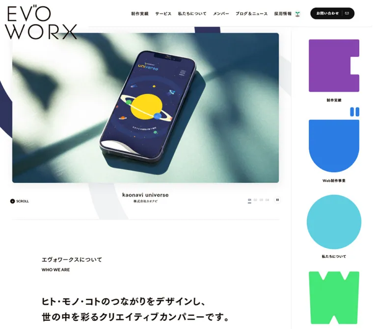
白地と広い余白に、鮮やかなレター型ナビゲーションと制作実績のモックアップを配置。筑紫ゴシック、細線のロゴ、黒いピル型ボタンが、遊び心と端正さを両立する企業サイト。
オリジナルサイトを見るA spacious creative-company website where colorful letter sculptures frame a disciplined portfolio.
Website: evoworx.co.jp Original URL: https://www.evoworx.co.jp/ Final URL: https://www.evoworx.co.jp/ Theme: light, with white and pale-gray surfaces, warm near-black text, and saturated letter graphics. Inspected: September 22, 2026, at 14:29:31 UTC / 23:29:31 JST, using the supplied browser inspection. Viewports: desktop 1440 × 1000 CSS pixels; mobile 390 × 844 CSS pixels. Scope: the current corporate homepage. Visual captures cover the desktop opening, works carousel, contact panel and footer, plus the mobile opening and contact/footer. Rendered DOM and computed styles additionally document the company introduction, services, and portions of the portfolio. News, engineering articles, and recruitment content are present in the text evidence, with more limited visual evidence.
EVOWORX gives its projects the opening image space. A large, thin, two-line wordmark overlaps the project stage, while a compact navigation row occupies the desktop header. Oversized navy and pale-gray arcs sit behind the composition. A separate right column contains brightly colored custom letter forms with small destination labels.
The rest of the homepage balances company information, service descriptions, project browsing, editorial content, recruitment, and contact. It is a corporate and portfolio homepage with several navigation goals. Its character comes from the contrast between expressive brand graphics and restrained interface components: small bilingual section headings, generous spacing, fine rules, unboxed project descriptions, and black pill buttons.
A spacious creative-company website where colorful letter sculptures frame a disciplined portfolio.
Website: evoworx.co.jp Original URL: https://www.evoworx.co.jp/ Final URL: https://www.evoworx.co.jp/ Theme: light, with white and pale-gray surfaces, warm near-black text, and saturated letter graphics. Inspected: September 22, 2026, at 14:29:31 UTC / 23:29:31 JST, using the supplied browser inspection. Viewports: desktop 1440 × 1000 CSS pixels; mobile 390 × 844 CSS pixels. Scope: the current corporate homepage. Visual captures cover the desktop opening, works carousel, contact panel and footer, plus the mobile opening and contact/footer. Rendered DOM and computed styles additionally document the company introduction, services, and portions of the portfolio. News, engineering articles, and recruitment content are present in the text evidence, with more limited visual evidence.
EVOWORX gives its projects the opening image space. A large, thin, two-line wordmark overlaps the project stage, while a compact navigation row occupies the desktop header. Oversized navy and pale-gray arcs sit behind the composition. A separate right column contains brightly colored custom letter forms with small destination labels.
The rest of the homepage balances company information, service descriptions, project browsing, editorial content, recruitment, and contact. It is a corporate and portfolio homepage with several navigation goals. Its character comes from the contrast between expressive brand graphics and restrained interface components: small bilingual section headings, generous spacing, fine rules, unboxed project descriptions, and black pill buttons.
| Name | Value | Source or implementation token | Role and evidence |
|---|---|---|---|
| White canvas | #ffffff |
Source --white |
Computed body background; also visible in header, editorial areas, and footer |
| Warm ink | #140700 |
Source --text, --border |
Computed body and heading text; a subtly brown near-black |
| Action black | #111111 |
Source --bg-dark |
Computed contact buttons and mobile menu trigger |
| Very pale gray | #f2f2f2 |
Source --bg-verypale |
Declared surface color, visually consistent with the works background and contact panel |
| Pale gray | #ebebeb |
Source --bg-pale |
Available secondary neutral; exact assignment to individual decorative elements is not established |
| Fine-rule gray | #e6e6e6 |
Source --border-verypale |
Available light border token; visually consistent with subtle separators |
| Secondary text | #7a7a7a |
Source --text-soft |
Measured project client and project-name metadata |
| Light text | #999999 |
Source --text-light |
Declared subdued-text color; footer copyright appears similarly light |
| Inactive pagination | #cccccc |
Source --text-pale |
Measured inactive hero page numbers |
| Active navy | #0c214e |
Alias --color-active |
Exact conversion of measured active pagination rgb(12, 33, 78) |
| Project-stage gray | Approximately #c2c9cb |
Suggested --color-stage |
Visual estimate for the WAIMARAMA image field; not a measured source token |
The large navy arc is visually close to the active pagination navy, but its exact fill was not recorded. Likewise, the pale contact watermark should be treated as a visual treatment rather than an independently measured color assignment.
These exact values are declared by the current page. Preserve their individual identities instead of blending them into a gradient.
| Letter token | Value | Evidence and use |
|---|---|---|
--bg-letter-e |
#8845af |
Purple E-shaped works navigation, visible in the current captures |
--bg-letter-v |
#2b7de3 |
Blue service mark, partly visible at the right edge of the mobile capture |
--bg-letter-o1 |
#60cfe0 |
Declared cyan letter color; complete glyph not visible in the supplied current-page crops |
--bg-letter-w |
#46e678 |
Declared green letter color; complete glyph not visible in the supplied current-page crops |
--bg-letter-o2 |
#eeeb48 |
Yellow circular blog/news mark, visible on desktop |
--bg-letter-r |
#ee7f2e |
Orange R-shaped recruitment mark |
--bg-letter-x |
#ed4612 |
Orange-red X-shaped contact mark |
Additional declared colors include farm brown #947f70, warm gold #bf8a2f, and pale yellow #fcf7e3. Their complete component treatments are outside the visual coverage. They should not replace the predominantly white homepage palette.
Recorded stack: "FOT-筑紫ゴシック Pr5 M", TsukuGoPr5-M, sans-serif.
The body computes to 16px / 28px, weight 400. Editorial paragraphs use a more specific 15px / 28.5px with 0.06em tracking. This combination produces comfortable Japanese reading density without making the interface feel oversized.
Recorded stack: "FOT-筑紫ゴシック Pro B", TsukuGoPro-B, sans-serif.
Navigation, project titles, section headings, and major buttons use this family. Most sampled elements still report font-weight: 400: the heavier face is selected through the family name. Do not translate every visually bold element into an additional synthetic 700 weight.
The company statement uses "FOT-筑紫ゴシック Pro E", TsukuGoPro-E, sans-serif, also with computed weight 400.
Recorded stack: TTNormsPro, Helvetica, "Century Gothic", sans-serif.
English section labels such as WHO WE ARE and WORKS use weight 600. The same family appears on SCROLL and the mobile MENU button. These labels are compact and functional, supporting the Japanese hierarchy.
Letter-navigation captions use a mixed stack beginning with TTNormsPro and the Japanese E face. Their measured weight is 600.
Treat the large EVOWORX wordmark as artwork. Its thin geometric strokes, stacked arrangement, proportions, and small paired marks are essential. The H1's computed font size does not describe the visible logo lettering, and no separate wordmark font can be identified from this evidence.
Unless marked as an estimate, values below are measured.
| Role | Desktop | Mobile | Tracking and family |
|---|---|---|---|
| Body default | 16 / 28px |
16 / 28px |
M face; normal tracking |
| Editorial paragraph | 15 / 28.5px |
15 / 28.5px |
M face; 0.06em |
| Editorial closing emphasis | 18 / 30.6px |
18 / 30.6px |
M face; 0.06em |
| Desktop navigation | 14 / 24px |
Replaced by menu trigger | B face; 0.08em |
| Hero project title | 20 / 25px |
18.72 / 23.4px |
B face; 0.06em |
| Hero client caption | 12 / 15px |
12.48 / 15.6px |
M face; 0.06em |
| Hero page number | 11 / 11px |
11.44 / 11.44px |
M face |
| Letter-navigation caption | 12 / 14px |
11 / 14px |
Mixed E stack; desktop 0.06em, mobile normal |
| Introduction/service heading | 20 / 30px |
18 / 27px |
B face; 0.06em |
| English section label | 14 / 14px |
12 / 12px |
TTNormsPro stack; weight 600 |
| Company statement | 32 / 52.8px |
22 / 36.3px |
E face; 0.06em |
| Works section heading | 32 / 48px |
22 / 33px |
B face; 0.06em |
| Work-card description | 20 / 36px |
18 / 32.4px |
B face; 0.08em |
| Work-card metadata | 12px, approximately 15px line box |
12px, wrapping within a 20px parent line |
M face; 0.08em |
| Large pill label | 15 / 22.5px |
14 / 21px |
B face; 0.06em |
| Mobile menu trigger | — | 10 / 10px |
TTNormsPro stack; weight 600 |
| Contact statement | Approximately 32px |
Approximately 22px |
Visual estimate; stronger Japanese heading treatment |
The mobile layout does not reduce every value proportionally. Body paragraphs remain 15px; hero client captions become slightly larger; major headings become substantially smaller.
Character: broad section spacing, restrained corner rounding, thin dividers, and large rounded action controls.
The page does not expose a complete named spacing system. These recurring measurements make a practical reconstruction scale.
| Use | Desktop | Mobile | Evidence |
|---|---|---|---|
| Hero side inset | 48px within the left column |
20.80px |
Measured |
| Hero image-to-title gap | 32px |
Approximately 24.96px |
Calculated from stage boundary and caption position |
| Hero title-to-client gap | 8px |
Approximately 12.48px |
Calculated from text rectangles |
| Japanese heading-to-English label | 16px |
10px |
Calculated from introduction and works headers |
| Introduction header-to-statement gap | 72px |
48px |
Calculated |
| Statement-to-body gap | 40px |
32px |
Calculated |
| Standard paragraph separation | Commonly 16px |
Commonly 16px |
Calculated |
| About-to-services separation | 120px |
80px |
Calculated |
| Works header-to-images | 64px |
40px |
Calculated |
| Work-card horizontal gap | 80px |
20px |
Calculated from adjacent card positions |
| Work image-to-metadata | Approximately 32px |
Consistent with approximately 24px |
Desktop screenshot and DOM geometry; mobile image boundary not separately recorded |
| Mobile menu bottom clearance | — | 16px |
Calculated from its rectangle and viewport |
| Element | Value | Evidence |
|---|---|---|
| Header contact button | 1440px computed |
Measured; visually a full pill |
| Large desktop pill | 1440px computed |
Measured; a reusable 999px radius is equivalent |
| Large mobile pill | 844px computed |
Measured; visually a full pill |
| Hero pause control | 50% |
Measured |
| Mobile menu trigger | 4px |
Measured |
| Recruitment banner | Desktop 8px; mobile 4px |
Measured |
| Hero stage | Approximately 8px |
Visual estimate |
| Work image field | Approximately 4px |
Visual estimate |
| Contact panel | Approximately 8px |
Visual estimate |
Large surfaces are only gently rounded. The most emphatically rounded components are buttons and circular controls.
| Element | Desktop 1440 × 1000 | Mobile 390 × 844 |
|---|---|---|
| Document height | 7091.19px measured; reported rounded height 7091px |
7119.94px measured; reported rounded height 7120px |
| Main layout | Grid columns 1146px 294px |
Block layout |
| Header-height variable | 92px |
146px |
| Visible logo bounds | 248 × 120px, at (16, 16) |
197.59 × 95.67px, at approximately (20.80, 49.91) |
| Hero section | 1146 × 760px, starting at y=92px |
390 × 649.42px, starting at y=0 |
| Hero image field | Approximately 1050 × 590.63px, at (48, 116) |
Approximately 348.39 × 348.39px, at (20.80, 133.11) |
| Hero title position | y=738.63px |
y=506.45px |
| Pause control | 28 × 28px |
29.11 × 29.11px |
| Letter-navigation item | Usually 198 × 260px; service item 276px high |
69.48 × 108.58px |
| Introduction/service width | 800px, starting at x=173px |
348.39px, starting at x=20.80px |
| Wide section heading container | 1120px, starting at x=160px |
348.39px, starting at x=20.80px |
| Work-card width | 520px |
348.39px |
| Recruitment banner link | 1280 × 430px |
Approximately 340.08 × 467.98px |
| Standard large pill | 240 × 80px |
200 × 64px |
| Contact panel | Approximately 1120 × 473px |
Approximately 348px wide; about 462px visible in the supplied crop |
The mobile contact panel meets the top edge of its screenshot, so its complete top boundary cannot be established with the same confidence as the desktop panel.
Role: company identity and primary navigation.
On desktop, place the logo at the upper-left corner independently of the navigation row. Its approximately 248px width and 120px height make it extend below the 92px header line. The hero image starts at y=116px, producing about 20px of vertical overlap with the logo bounds.
The navigation sits to the right, with compact Japanese links and a black contact pill. Recorded links include works, services, about, members, news, recruitment, and contact. The contact button measures approximately 150.64 × 40px and includes a small envelope symbol and separator in the screenshot. Recruitment has a small sprout-like accent.
The source includes additional navigation markup outside the visible opening state. This does not establish sticky-header behavior or its scroll threshold.
Role: immediate proof of the company's work.
The captured active project is WAIMARAMA, with the client caption ワイマラマジャパン株式会社. The linked project image and caption form one recorded anchor targeting the corresponding work detail page.
Desktop anatomy:
16:9 proportions.SCROLL anchor at the lower-left, linking to #about.The project artwork shows a moonlit outdoor scene inside a dark screen frame. The gray field and device shadow create depth without turning the surrounding interface into elevated cards.
On mobile, the outer stage becomes square. The device remains landscape and occupies roughly 83% of the stage width, compared with roughly 70% on desktop; these percentages are visual estimates. This is an art-direction change, not simply a smaller desktop screenshot. The title and client remain centered below it.
Role: project selection and playback affordance.
Five numbered controls, 01 through 05, are visible. The second is active in both opening captures. Active text is navy with a short underline; inactive numbers are pale gray. A small white circular control with a fine border displays a pause icon.
Desktop number buttons have approximately 23px height and 5px padding. The pause control is 28px square. Mobile equivalents scale slightly to approximately 23px and 29px.
The controls strongly suggest an automatically advancing showcase, but the supplied evidence does not document an advance interval, a tested pause action, or the slide transition itself.
Role: expressive secondary navigation and a major brand signature.
On desktop, the right column is 294px wide and separated from the hero by a fine vertical rule. Its navigation anchors are 198px wide, leaving approximately 48px on either side. Most item boxes are 260px high.
Each item consists of a large custom geometric symbol and a small centered Japanese destination label. The current desktop view shows a yellow circle for blog/news, an orange R for recruitment, an orange-red X for contact, and part of the purple works mark below.
On mobile, this becomes a horizontal strip beneath the hero. Items are approximately 69.48px wide with 32px gaps. Adjacent symbols are clipped at the viewport edges. The image silhouettes have their own internal clearspace; do not size their visible paths solely from the anchor rectangle.
Repeated sequences and displaced DOM coordinates are consistent with a looping track. Direction, speed, drag support, and the relationship between movement and scrolling were not verified.
Role: access to the compact primary navigation.
The visible closed-state trigger is centered near the viewport bottom at (135, 776), measuring 120 × 52px. It has an action-black fill, 4px corners, a small white MENU label, and two white horizontal strokes on the right.
The DOM contains menu destinations and a HOME link, but no opened-menu screenshot or activation trace was supplied. Do not treat those hidden entries as an observed open panel. Opening animation, background treatment, keyboard handling, and focus behavior remain unverified.
The trigger is absent from the supplied mobile footer capture. Its persistence and hiding conditions cannot be recovered from these two images alone.
Role: clear section organization without oversized display typography.
Stack a Japanese heading over a small English label. Introduction and service headings use 20px desktop type; the works heading uses 32px. English labels remain 14px on desktop. The vertical gap is 16px.
On mobile, the corresponding Japanese sizes become 18px and 22px, with a 12px English label and a 10px gap. The English label adds rhythm and hierarchy; it should not become a large background headline.
Role: explains the company's creative position after the portfolio opening.
This section occupies an 800px column centered inside the desktop's 1146px left region, rather than centered across the entire viewport. Its measured left edge is 173px.
The header is followed by a two-line company statement using the E face at 32px / 52.8px. Several paragraphs use 15px / 28.5px, followed by an 18px closing statement and a 240 × 80px about button.
On mobile, the section uses approximately 21px side margins. The statement becomes four lines at 22px / 36.3px; paragraph type remains 15px. The button becomes 200 × 64px.
Role: introduces the two recorded business areas.
The DOM records web production and a dog-life marketing service, each with a heading, a short description, and a detail link. Desktop headings use 20px / 30px; mobile headings use 18px / 27px. Descriptions retain 15px / 28.5px on both.
The associated ワンコnowa and store links occupy two horizontally separated blocks on desktop and vertically stacked blocks on mobile. The service section grows from approximately 693px to 1075px high.
The complete service illustrations are not visible in the supplied original-page captures. Their subject matter and animation should not be invented from the spacing or link titles.
Role: makes recruitment a distinct destination within the corporate homepage.
An image-oriented recruitment link is recorded between services and works. Its geometry changes from a wide 1280 × 430px desktop banner to approximately 340 × 468px on mobile, with radius changing from 8px to 4px. The complete banner artwork is outside the supplied visual coverage.
A later recruitment section is also present in the rendered text, with a section label, explanatory copy, and a recruitment-site link. Its exact layout is not documented by the supplied screenshots.
Role: browsable project evidence with concise editorial descriptions.
The desktop carousel sits on a very pale-gray field and spans the viewport. Two complete cards align within the 1120px content width, with 520px cards and an 80px gap. Parts of neighboring cards remain visible at both edges.
Card anatomy:
520 × 325px in the screenshot.20px / 36px.The displayed examples include WACOAL WEB Limited 2026SS and 赤城山-懐-. Their green editorial artwork and dark architectural photograph belong to the projects. They do not change the agency interface palette.
The image and text are not enclosed in a separate white card. Spacing, typography, and the project image establish the group. The underline is visible in the captured state; its hover dependence was not tested.
Two approximately 44px black circular arrows sit at the lower-left. A 240 × 80px all-works pill aligns to the right.
Mobile DOM geometry shows one approximately 348px card per view with a 20px inter-card gap. Descriptions use 18px / 32.4px. Metadata can wrap to an additional line, so equal fixed card heights should not be assumed.
Role: presents company news and engineering knowledge.
The rendered text contains BLOG & NEWS entries with category labels, dates, and titles, followed by an EvoLab. group with dated article links and its own list destination. Repeated entries occur in the DOM.
Content structure and destinations are established. Card dimensions, article-image treatments, carousel mechanics, and hover effects are not established by the provided visual crops. Retain this distinction when extending the reference.
Role: a clear, calm invitation to start a conversation.
On desktop, the panel is approximately 1120px wide and 473px high, centered with 160px side margins. Its pale-gray surface has gently rounded corners.
Center the following stack:
お問い合わせ and the smaller CONTACT label.お仕事のご依頼、ご相談はこちらから.240 × 80px contact pill.Large pale geometric letter forms sit behind the lower portion of the panel and are clipped by its boundary. This uses the solid letter artwork, distinct from the thin header wordmark. The button remains visually dominant over the watermark.
On mobile, the panel is approximately 348px wide. The statement and supporting sentence each wrap into two centered lines. The button becomes approximately 200 × 64px, while the watermark remains oversized and cropped instead of shrinking into a complete miniature word.
Role: closes the page with utility links and related identities.
A fine dark rule spans almost the full desktop width, inset approximately 40px. A black circular up-arrow interrupts it near the right side. The circle is approximately 32px in diameter, surrounded by white clearance. Its recorded link targets #top; smooth-scroll behavior was not tested.
The desktop footer uses a centered 1120px content region. The thin wordmark sits left, while a horizontal navigation row, privacy link, and social links occupy the right. Related EvoLab. and ワンコnowa marks sit lower-left; the small light copyright sits lower-right.
On mobile, the main footer navigation row is absent. The wordmark remains left, the three underlined social links stack on the right, and the privacy link sits below them. Related marks and copyright occupy the bottom area. The layout reorganizes its groups rather than scaling down the desktop row.
The following are recorded transition declarations. They establish available timing and affected properties, not a complete record of triggered behavior.
| Element | Recorded declaration | Evidence limit |
|---|---|---|
| Desktop opening logo | Opacity and translate: 1s, delay 0.5s |
Start and end states were not supplied |
| Desktop scroll cue | Opacity: 1s, delay 0.5s |
No separate entrance trace |
| Desktop contact pills | Color and background: 0.3s |
Hover target colors not recorded |
| Hero captions | Opacity: 0.3s |
Full slide transition not recorded |
| Hero number controls | Color: 0.3s |
Active navy and inactive gray states are measured |
| Desktop pause control | Border color: 0.3s |
Pause action not exercised in the supplied evidence |
| Letter links | Scale, translate, and rotate: 0.5s; some delays stagger from 0.5s to 1.1s |
Motion transforms and triggering conditions unknown |
| Content sections | Opacity and translate: 0.3s |
Reveal trigger and travel distance unknown |
| Mobile menu trigger | Bottom: 0.6s; color/background: 0.3s after 0.3s; opacity/visibility: 0.3s |
Open/close and hiding behavior not tested |
Examples declared by the source include:
| Token | Value |
|---|---|
--easeOutExpo |
cubic-bezier(0.19, 1, 0.22, 1) |
--easeInOutQuart |
cubic-bezier(0.77, 0, 0.175, 1) |
--easeOutBack |
cubic-bezier(0.175, 0.885, 0.32, 1.275) |
Their declaration does not prove that a particular sampled transition uses them. Avoid assigning a spring, bounce, continuous rotation, or autoplay interval without additional evidence.
The inspection waited for finite motion and layout stability, and temporarily paused perpetual animations during readiness checks before resuming them. Static captures therefore document settled compositions, not the complete motion experience. animation: none on sampled elements also does not rule out JavaScript-driven movement or animated descendants.
| Layer | Treatment | Purpose |
|---|---|---|
| Page canvas | White | Gives company copy and project imagery breathing room |
| Hero decoration | Cropped navy and pale-gray arcs | Connects the opening to the geometric identity |
| Project stage | Muted image-specific matte with device presentation | Frames the featured work |
| Letter rail | White, fine separator, solid colored symbols | Expressive navigation without a colored page background |
| Works region | Very pale gray with unboxed text groups | Separates portfolio browsing from editorial content |
| Contact panel | Pale gray, modest radius, clipped letter watermark | Creates a contained final invitation |
| Primary actions | Near-black fill, white label, full pill | Consistent navigation and contact emphasis |
| Footer | White, thin dark divider, muted utility text | Quiet ending with clear information groups |
Shadows are concentrated around the device mockups and hero presentation. The general interface does not use a stack of elevated cards, glass panels, or glossy gradients.
The page uses two distinct image languages: project presentations and brand geometry.
Project presentations preserve the visual identity of each client. The captured WAIMARAMA hero contains a cinematic moonlit scene inside a screen frame. The works carousel includes a bright fashion collage and a dark, calm interior photograph. Keep these as project-specific assets instead of recoloring all work into the agency palette.
Brand graphics are flat, crisp, and geometric: oversized arc fragments, solid custom letter silhouettes, and the thin stacked wordmark. Their scale is deliberately disproportionate to the small utility labels. The large pale contact lettering repeats the same solid graphic vocabulary at low contrast.
Avoid treating the photographed or rendered device interface as an interactive embedded website. In the observed homepage it functions as linked project imagery.
The supplied evidence does not expose original image file URLs. The references below identify visible assets without inventing paths.
| Asset | Evidence location | Implementation guidance |
|---|---|---|
| Thin EVOWORX wordmark | Desktop/mobile opening and footer | Use authorized artwork; preserve stroke proportions and paired marks |
| WAIMARAMA hero presentation | Both opening captures; homepage link to /works/waimarama/ |
Use separate desktop/mobile composition when available |
| Solid navigation letters | Desktop side rail and mobile horizontal strip | Preserve custom outlines and internal clearspace |
| WACOAL project mockup | Desktop works capture; link to /works/wacoal-web-limited-2026ss/ |
Retain its project-specific green collage |
| Architectural project mockup | Desktop works capture; link to /works/akagi-futokoro/ |
Preserve the dark photograph and light surrounding matte |
| Pale contact lettering | Desktop/mobile contact captures | Use clipped decorative artwork behind the CTA |
| Related-site marks | Desktop/mobile footer | Keep each mark's identity and proportions |
These case-page URLs are destinations recorded on the homepage, not separately inspected pages. Device shadows may be baked into the project artwork; verify the asset before adding another CSS shadow.
The measured opening layout divides 1440px into 1146px and 294px columns. The left column contains the hero and the narrower company/service content. The right column provides the letter navigation. Introduction and service blocks are 800px wide and centered within the left column.
Later sections use a wider system. The recruitment banner is 1280px wide with 80px outer margins. Works, contact, and footer content align to a 1120px region with 160px margins, while the works track itself extends beyond that region to expose neighboring cards.
Do not apply one uniform maximum width to every homepage section. The alternating widths are a defining part of the composition.
At 390px, the main layout changes from grid to block. Approximately 20.8px side margins recur across the hero, introduction, and works content. The logo occupies its own upper space while overlapping the hero image by roughly 12.5px.
The hero image field changes from landscape to square. Number controls remain below the project caption and align toward the right. The letter rail moves below the hero and becomes horizontal. The primary navigation becomes a compact bottom-centered menu trigger.
Service links stack vertically, the recruitment banner becomes portrait, and work cards become nearly viewport-wide. The contact copy wraps intentionally into short centered lines, and the footer removes the wide primary navigation row.
1440px and 390px widths were inspected. Exact source breakpoints are unknown.375px design base scaled to 390px: for example, 18 × 1.04 = 18.72px. This is a calculated pattern, not proof of the original formula.--vw: 14.4px on desktop and 3.9px on mobile. It does not reveal all expressions consuming that variable.146px mobile header-height variable is not the hero image's top position; that position measures approximately 133.11px. Keep those concepts separate.64rem is a reasonable implementation starting point, explicitly a recommendation. Validate intermediate widths and long Japanese labels.These are recommendations for a new implementation, not verified features of the original:
aria-expanded and aria-controls on the menu trigger. If the opened navigation behaves as a modal, implement focus management and Escape handling.#ffffff.#140700.#111111 with white text.#f2f2f2.#7a7a7a.#0c214e; inactive pagination: #cccccc.#8845af, blue #2b7de3, cyan #60cfe0, green #46e678, yellow #eeeb48, orange #ee7f2e, and orange-red #ed4612.#c2c9cb, a visual estimate.“Create a Japanese creative-company homepage inspired by the observed EVOWORX composition. Use a white canvas, warm near-black text, Japanese Gothic typography, small uppercase English section labels, fine dividers, and generous whitespace. Lead with a large linked project presentation and centered project/client captions. Place a thin stacked brand wordmark above the left edge and an oversized column of colorful custom letter symbols on the right. Follow with a narrow company introduction and services, then a wide portfolio carousel with unboxed descriptions. Finish with a pale-gray contact panel, cropped geometric lettering, black pill CTA, and a restrained footer. At mobile width, make the hero stage square, move letter navigation into a horizontal strip, show one work card at a time, and provide a bottom-centered menu trigger. Treat unspecified interaction timing as an implementation decision.”
This is a reusable adaptation, not an extracted or browser-tested rebuild. Desktop measurements target the recorded 1440px viewport. The 64rem breakpoint and capped mobile unit are recommendations; the mobile unit reproduces several recorded values at 390px without claiming to recover the original scaling formula.
Use an .opening-grid containing .hero, .letter-rail, .about.editorial, and .services.editorial. Place wide sections after this group. Project images, logo artwork, and letter SVGs must be supplied separately. The CSS gives a native horizontal-scrolling baseline; carousel controls and the mobile menu require application logic.
:root {
  /* Recorded colors, except the explicitly estimated stage gray. */
  --color-canvas: #fff;
  --color-ink: #140700;
  --color-action: #111;
  --color-surface: #f2f2f2;
  --color-rule: #e6e6e6;
  --color-muted: #7a7a7a;
  --color-inactive: #ccc;
  --color-active: #0c214e;
  --color-stage: #c2c9cb;
  --letter-e: #8845af;
  --letter-v: #2b7de3;
  --letter-o1: #60cfe0;
  --letter-w: #46e678;
  --letter-o2: #eeeb48;
  --letter-r: #ee7f2e;
  --letter-x: #ed4612;

  /* Recorded family stacks; font files are not bundled here. */
  --font-body: 'FOT-筑紫ゴシック Pr5 M', TsukuGoPr5-M, sans-serif;
  --font-strong: 'FOT-筑紫ゴシック Pro B', TsukuGoPro-B, sans-serif;
  --font-display: 'FOT-筑紫ゴシック Pro E', TsukuGoPro-E, sans-serif;
  --font-latin: TTNormsPro, Helvetica, 'Century Gothic', sans-serif;

  --header-height: 92px;
  --rail-width: 294px;
  --content-width: 1120px;
  --editorial-width: 800px;
  --page-inset: 40px;
  --radius-panel: 8px;
  --radius-small: 4px;
  --radius-pill: 999px;
  --duration-ui: 300ms;
  --ease-out-expo: cubic-bezier(0.19, 1, 0.22, 1);
}

* { box-sizing: border-box; }

body {
  margin: 0;
  color: var(--color-ink);
  background: var(--color-canvas);
  font: 400 16px / 1.75 var(--font-body);
}

img, svg { display: block; }
img { max-width: 100%; }
a { color: inherit; }
button { font: inherit; }
[hidden] { display: none !important; }

.container {
  width: min(var(--content-width), calc(100% - 2 * var(--page-inset)));
  margin-inline: auto;
}

.site-header {
  position: relative;
  height: var(--header-height);
  z-index: 10;
}

.brand {
  position: absolute;
  top: 16px;
  left: 16px;
  width: 248px;
}

.brand > img, .brand > svg { width: 100%; height: auto; }

.desktop-nav {
  height: 100%;
  margin-left: 304px;
  padding-right: 60px;
  display: flex;
  align-items: center;
  justify-content: flex-end;
  gap: 22px;
  border-bottom: 1px solid var(--color-rule);
}

.desktop-nav a {
  font: 400 14px / 24px var(--font-strong);
  letter-spacing: .08em;
  text-decoration: none;
}

.pill {
  display: inline-flex;
  align-items: center;
  justify-content: center;
  gap: 8px;
  min-width: 240px;
  min-height: 80px;
  padding-inline: 40px;
  border: 0;
  border-radius: var(--radius-pill);
  color: #fff;
  background: var(--color-action);
  font: 400 15px / 1.5 var(--font-strong);
  letter-spacing: .06em;
  text-align: center;
  text-decoration: none;
  transition: color var(--duration-ui), background-color var(--duration-ui);
}

.desktop-nav .pill {
  min-width: 0;
  min-height: 40px;
  padding-inline: 20px;
  color: #fff;
}

.opening-grid {
  display: grid;
  grid-template-columns: minmax(0, 1fr) var(--rail-width);
  grid-template-areas: 'hero rail' 'about rail' 'services rail';
}

.hero {
  grid-area: hero;
  position: relative;
  min-width: 0;
  min-height: 760px;
  padding: 24px 48px 64px;
}

.hero::after {
  content: '';
  position: absolute;
  inset: auto 40px 0;
  height: 1px;
  background: var(--color-rule);
}

.hero-link { display: block; text-decoration: none; }

.hero-media {
  display: grid;
  place-items: center;
  aspect-ratio: 16 / 9;
  overflow: hidden;
  border-radius: var(--radius-panel);
  background: var(--color-stage);
}

/* Use a full composition, or a device cutout, without doubling its matte. */
.hero-media > picture,
.hero-media > picture > img {
  display: block;
  width: 100%;
  height: 100%;
  object-fit: contain;
}

.hero-media > .hero-device { width: 69.5%; height: auto; }
.hero-caption { margin-top: 32px; text-align: center; }

.hero-title {
  margin: 0;
  font: 400 20px / 25px var(--font-strong);
  letter-spacing: .06em;
}

.hero-client {
  margin: 8px 0 0;
  font-size: 12px;
  line-height: 15px;
  letter-spacing: .06em;
}

.hero-controls {
  position: absolute;
  right: 40px;
  bottom: 64px;
  display: flex;
  align-items: center;
  gap: 12px;
}

.hero-pages { display: flex; }

.hero-pages button {
  position: relative;
  padding: 5px;
  border: 0;
  color: var(--color-inactive);
  background: transparent;
  font-size: 11px;
  line-height: 11px;
  cursor: pointer;
}

.hero-pages button[aria-current='true'] { color: var(--color-active); }
.hero-pages button[aria-current='true']::after {
  content: '';
  position: absolute;
  inset: auto 5px 0;
  height: 1px;
  background: currentColor;
}

.hero-pause {
  display: grid;
  place-items: center;
  width: 28px;
  height: 28px;
  padding: 0;
  border: 1px solid var(--color-rule);
  border-radius: 50%;
  background: #fff;
  cursor: pointer;
}

.letter-rail {
  grid-area: rail;
  align-self: start;
  max-height: calc(100svh - var(--header-height));
  overflow: auto;
  border-left: 1px solid var(--color-rule);
}

.letter-track {
  display: flex;
  flex-direction: column;
  align-items: center;
}

.letter-link {
  flex: none;
  width: 198px;
  min-height: 260px;
  display: flex;
  flex-direction: column;
  align-items: center;
  gap: 12px;
  text-decoration: none;
}

.letter-art { width: 198px; height: 234px; object-fit: contain; }
.letter-caption { margin: 0; font-size: 12px; line-height: 14px; }

.editorial {
  width: min(var(--editorial-width), calc(100% - 80px));
  margin-inline: auto;
}

.about { grid-area: about; margin-top: 136px; }
.services { grid-area: services; margin-top: 120px; }

.section-title {
  margin: 0;
  font: 400 20px / 1.5 var(--font-strong);
  letter-spacing: .06em;
}

.section-title--large { font-size: 32px; }

.section-kicker {
  margin: 16px 0 0;
  font: 600 14px / 1 var(--font-latin);
}

.statement {
  margin: 72px 0 40px;
  font: 400 32px / 1.65 var(--font-display);
  letter-spacing: .06em;
}

.editorial-copy {
  font-size: 15px;
  line-height: 1.9;
  letter-spacing: .06em;
}

.editorial-copy p { margin: 0 0 16px; }

.works { margin-top: 120px; padding-block: 80px; background: var(--color-surface); }
.works > .section-head { margin-bottom: 64px; }

.work-track {
  display: flex;
  gap: 80px;
  padding-inline: max(40px, calc((100vw - 1120px) / 2));
  overflow-x: auto;
  scroll-snap-type: x proximity;
  scroll-padding-inline: max(40px, calc((100vw - 1120px) / 2));
}

.work-card {
  flex: 0 0 520px;
  min-width: 0;
  scroll-snap-align: start;
  text-decoration: none;
}

.work-image {
  width: 100%;
  aspect-ratio: 8 / 5;
  object-fit: contain;
  border-radius: var(--radius-small);
}

.work-meta {
  display: flex;
  flex-wrap: wrap;
  gap: 0 .5em;
  margin-top: 32px;
  color: var(--color-muted);
  font-size: 12px;
  line-height: 1.25;
  letter-spacing: .08em;
}

.work-title {
  margin: 12px 0 0;
  font: 400 20px / 1.8 var(--font-strong);
  letter-spacing: .08em;
  text-decoration: underline;
  text-underline-offset: .2em;
  text-decoration-thickness: 1px;
}

.work-category { margin: 12px 0 0; font-size: 14px; }
.work-controls { display: flex; align-items: center; justify-content: space-between; margin-top: 56px; }
.work-arrows { display: flex; gap: 8px; }

.circle-button {
  display: grid;
  place-items: center;
  width: 44px;
  height: 44px;
  padding: 0;
  border: 0;
  border-radius: 50%;
  color: #fff;
  background: var(--color-action);
  cursor: pointer;
}

/* Contact proportions are reconstructed from the screenshots. */
.contact {
  position: relative;
  isolation: isolate;
  margin-block: 120px 96px;
  padding: 64px 32px 96px;
  overflow: hidden;
  border-radius: var(--radius-panel);
  background: var(--color-surface);
  text-align: center;
}

.contact-title {
  margin: 52px 0 0;
  font: 400 32px / 1.5 var(--font-display);
  letter-spacing: .06em;
}

.contact-copy { margin: 12px auto 0; font-size: 15px; line-height: 1.9; }
.contact .pill { margin-top: 32px; }

.contact-watermark {
  position: absolute;
  z-index: -1;
  left: 30px;
  bottom: -16px;
  width: calc(100% - 60px);
  max-width: none;
  color: var(--color-rule);
  pointer-events: none;
}

.mobile-menu { display: none; }

/* Recommended focus treatment; not a recorded source style. */
:where(a, button):focus-visible {
  outline: 2px solid var(--color-active);
  outline-offset: 5px;
}

@media (max-width: 64rem) {
  :root {
    --mu: clamp(.96px, .266667vw, 1.2px);
    --page-inset: calc(20 * var(--mu));
  }

  .site-header { height: 0; }
  .desktop-nav { display: none; }
  .brand { top: calc(48 * var(--mu)); left: var(--page-inset); width: calc(190 * var(--mu)); }
  .opening-grid { display: block; }

  .hero {
    min-height: 0;
    padding: calc(128 * var(--mu)) var(--page-inset) calc(88 * var(--mu));
  }

  .hero::after { inset-inline: var(--page-inset); }
  .hero-media { aspect-ratio: 1; }
  .hero-media > .hero-device { width: 83%; }
  .hero-caption { margin-top: calc(24 * var(--mu)); }
  .hero-title { font-size: calc(18 * var(--mu)); line-height: 1.25; text-decoration: underline; }
  .hero-client { margin-top: calc(12 * var(--mu)); font-size: calc(12 * var(--mu)); line-height: 1.25; }
  .hero-controls { right: var(--page-inset); bottom: calc(20 * var(--mu)); }
  .hero-pages button { font-size: calc(11 * var(--mu)); line-height: 1; padding: calc(5 * var(--mu)); }
  .hero-pause { width: calc(28 * var(--mu)); height: calc(28 * var(--mu)); }

  .letter-rail { max-height: none; padding-block: 32px; border-left: 0; border-bottom: 1px solid var(--color-rule); }
  .letter-track { width: max-content; flex-direction: row; gap: 32px; padding-inline: var(--page-inset); }
  .letter-link { width: calc(66.81 * var(--mu)); min-height: 108px; gap: calc(12 * var(--mu)); }
  .letter-art { width: 100%; height: 82px; }
  .letter-caption { font-size: 11px; white-space: nowrap; }

  .editorial { width: calc(100% - 2 * var(--page-inset)); }
  .about { margin-top: 48px; }
  .services { margin-top: 80px; }
  .section-title { font-size: 18px; }
  .section-title--large { font-size: 22px; }
  .section-kicker { margin-top: 10px; font-size: 12px; }
  .statement { margin: 48px 0 32px; font-size: 22px; }
  .pill { min-width: 200px; min-height: 64px; padding-inline: 32px; font-size: 14px; }

  .works { margin-top: 80px; padding-block: 64px; }
  .works > .section-head { margin-bottom: 40px; }
  .work-track { gap: 20px; padding-inline: var(--page-inset); scroll-padding-inline: var(--page-inset); }
  .work-card { flex-basis: calc(100vw - 2 * var(--page-inset)); }
  .work-meta { margin-top: 24px; line-height: 20px; }
  .work-title { margin-top: 10px; font-size: 18px; }
  .work-controls { gap: 24px; flex-wrap: wrap; margin-top: 40px; }

  .contact { margin-block: 80px; padding: 64px 20px; }
  .contact-title { max-width: 14em; margin: 48px auto 0; font-size: 22px; line-height: 1.65; text-wrap: balance; }
  .contact-copy { max-width: 15em; margin-top: 10px; text-wrap: balance; }
  .contact-watermark { left: -24px; width: 800px; }

  .mobile-menu {
    position: fixed;
    z-index: 100;
    left: 50%;
    bottom: calc(16px + env(safe-area-inset-bottom, 0px));
    transform: translateX(-50%);
    display: flex;
    align-items: center;
    justify-content: space-between;
    width: 120px;
    height: 52px;
    padding-inline: 20px;
    border: 0;
    border-radius: 4px;
    color: #fff;
    background: var(--color-action);
    font: 600 10px / 1 var(--font-latin);
  }
}

/* Recommended reduction; also disable automatic tracks in application logic. */
@media (prefers-reduced-motion: reduce) {
  .pill, .hero-title, .hero-client, .letter-link, .mobile-menu {
    transition: none;
    animation: none;
  }
  .work-track { scroll-behavior: auto; }
}
The background arcs and exact brand silhouettes are intentionally asset-driven. For a full-composition hero image, provide an appropriate square mobile source through picture; merely containing the desktop image will not reproduce the observed increase in relative device size. The device-cutout alternative in the CSS makes that size change explicit.
The native tracks above do not implement looping, slide visibility management, initial carousel offsets, or accessible pause behavior. Wire those behaviors separately and keep the static content usable before enhancement. No original hover colors are invented in this starter.
Optional aliases for an implementation already using Tailwind v4. This does not identify the original site's framework. Define the properties above first.
@theme inline {
  --color-canvas: var(--color-canvas);
  --color-brand-ink: var(--color-ink);
  --color-brand-action: var(--color-action);
  --color-brand-surface: var(--color-surface);
  --color-brand-rule: var(--color-rule);
  --color-brand-muted: var(--color-muted);
  --color-brand-active: var(--color-active);
  --color-letter-purple: var(--letter-e);
  --color-letter-blue: var(--letter-v);
  --color-letter-cyan: var(--letter-o1);
  --color-letter-green: var(--letter-w);
  --color-letter-yellow: var(--letter-o2);
  --color-letter-orange: var(--letter-r);
  --color-letter-red: var(--letter-x);

  --font-ja-body: var(--font-body);
  --font-ja-heading: var(--font-strong);
  --font-ja-display: var(--font-display);
  --font-utility: var(--font-latin);

  --text-meta: 12px;
  --text-copy: 15px;
  --text-project: 20px;
  --text-section: 32px;
  --radius-brand-panel: 8px;
  --radius-brand-small: 4px;
  --radius-brand-pill: 999px;
}
200.14:29:31.669Z; desktop viewport 1440 × 1000, mobile viewport 390 × 844.This reference describes the current homepage shown in the supplied browser evidence. Measured values, visual estimates, and recommended implementation choices are identified separately throughout.
# EVOWORX — Style Reference

> A spacious creative-company website where colorful letter sculptures frame a disciplined portfolio.

**Website:** [evoworx.co.jp](https://www.evoworx.co.jp/)
**Original URL:** https://www.evoworx.co.jp/
**Final URL:** https://www.evoworx.co.jp/
**Theme:** light, with white and pale-gray surfaces, warm near-black text, and saturated letter graphics.
**Inspected:** September 22, 2026, at 14:29:31 UTC / 23:29:31 JST, using the supplied browser inspection.
**Viewports:** desktop 1440 × 1000 CSS pixels; mobile 390 × 844 CSS pixels.
**Scope:** the current corporate homepage. Visual captures cover the desktop opening, works carousel, contact panel and footer, plus the mobile opening and contact/footer. Rendered DOM and computed styles additionally document the company introduction, services, and portions of the portfolio. News, engineering articles, and recruitment content are present in the text evidence, with more limited visual evidence.

EVOWORX gives its projects the opening image space. A large, thin, two-line wordmark overlaps the project stage, while a compact navigation row occupies the desktop header. Oversized navy and pale-gray arcs sit behind the composition. A separate right column contains brightly colored custom letter forms with small destination labels.

The rest of the homepage balances company information, service descriptions, project browsing, editorial content, recruitment, and contact. It is a corporate and portfolio homepage with several navigation goals. Its character comes from the contrast between expressive brand graphics and restrained interface components: small bilingual section headings, generous spacing, fine rules, unboxed project descriptions, and black pill buttons.
# EVOWORX — Style Reference

> A spacious creative-company website where colorful letter sculptures frame a disciplined portfolio.

**Website:** [evoworx.co.jp](https://www.evoworx.co.jp/)
**Original URL:** https://www.evoworx.co.jp/
**Final URL:** https://www.evoworx.co.jp/
**Theme:** light, with white and pale-gray surfaces, warm near-black text, and saturated letter graphics.
**Inspected:** September 22, 2026, at 14:29:31 UTC / 23:29:31 JST, using the supplied browser inspection.
**Viewports:** desktop 1440 × 1000 CSS pixels; mobile 390 × 844 CSS pixels.
**Scope:** the current corporate homepage. Visual captures cover the desktop opening, works carousel, contact panel and footer, plus the mobile opening and contact/footer. Rendered DOM and computed styles additionally document the company introduction, services, and portions of the portfolio. News, engineering articles, and recruitment content are present in the text evidence, with more limited visual evidence.

EVOWORX gives its projects the opening image space. A large, thin, two-line wordmark overlaps the project stage, while a compact navigation row occupies the desktop header. Oversized navy and pale-gray arcs sit behind the composition. A separate right column contains brightly colored custom letter forms with small destination labels.

The rest of the homepage balances company information, service descriptions, project browsing, editorial content, recruitment, and contact. It is a corporate and portfolio homepage with several navigation goals. Its character comes from the contrast between expressive brand graphics and restrained interface components: small bilingual section headings, generous spacing, fine rules, unboxed project descriptions, and black pill buttons.

## How to Read This Reference

- **Measured** values come from the supplied rendered element rectangles, computed styles, or CSS custom properties. Measurements are CSS pixels unless stated otherwise.
- **Visual estimates** come from the original-page screenshots. Contact-panel geometry, some image boundaries, and footer details belong to this category because their computed element records were not supplied.
- **Calculated** values are derived from recorded measurements. They do not establish the original CSS formula.
- **Recommendations** describe a reusable implementation. Proposed breakpoints, accessibility changes, and the Quick Start classes are not claims about the source implementation.
- Font stacks are recorded declarations. The evidence does not independently verify which font file rendered every glyph.
- Repeated and offscreen DOM entries include carousel or navigation copies. Their presence does not mean that every entry was simultaneously visible.

## Tokens — Colors

### Default Palette

| Name | Value | Source or implementation token | Role and evidence |
| --- | --- | --- | --- |
| White canvas | `#ffffff` | Source `--white` | Computed body background; also visible in header, editorial areas, and footer |
| Warm ink | `#140700` | Source `--text`, `--border` | Computed body and heading text; a subtly brown near-black |
| Action black | `#111111` | Source `--bg-dark` | Computed contact buttons and mobile menu trigger |
| Very pale gray | `#f2f2f2` | Source `--bg-verypale` | Declared surface color, visually consistent with the works background and contact panel |
| Pale gray | `#ebebeb` | Source `--bg-pale` | Available secondary neutral; exact assignment to individual decorative elements is not established |
| Fine-rule gray | `#e6e6e6` | Source `--border-verypale` | Available light border token; visually consistent with subtle separators |
| Secondary text | `#7a7a7a` | Source `--text-soft` | Measured project client and project-name metadata |
| Light text | `#999999` | Source `--text-light` | Declared subdued-text color; footer copyright appears similarly light |
| Inactive pagination | `#cccccc` | Source `--text-pale` | Measured inactive hero page numbers |
| Active navy | `#0c214e` | Alias `--color-active` | Exact conversion of measured active pagination `rgb(12, 33, 78)` |
| Project-stage gray | Approximately `#c2c9cb` | Suggested `--color-stage` | Visual estimate for the WAIMARAMA image field; not a measured source token |

The large navy arc is visually close to the active pagination navy, but its exact fill was not recorded. Likewise, the pale contact watermark should be treated as a visual treatment rather than an independently measured color assignment.

### Letter Palette

These exact values are declared by the current page. Preserve their individual identities instead of blending them into a gradient.

| Letter token | Value | Evidence and use |
| --- | --- | --- |
| `--bg-letter-e` | `#8845af` | Purple E-shaped works navigation, visible in the current captures |
| `--bg-letter-v` | `#2b7de3` | Blue service mark, partly visible at the right edge of the mobile capture |
| `--bg-letter-o1` | `#60cfe0` | Declared cyan letter color; complete glyph not visible in the supplied current-page crops |
| `--bg-letter-w` | `#46e678` | Declared green letter color; complete glyph not visible in the supplied current-page crops |
| `--bg-letter-o2` | `#eeeb48` | Yellow circular blog/news mark, visible on desktop |
| `--bg-letter-r` | `#ee7f2e` | Orange R-shaped recruitment mark |
| `--bg-letter-x` | `#ed4612` | Orange-red X-shaped contact mark |

Additional declared colors include farm brown `#947f70`, warm gold `#bf8a2f`, and pale yellow `#fcf7e3`. Their complete component treatments are outside the visual coverage. They should not replace the predominantly white homepage palette.

## Tokens — Typography

### Japanese Body Copy

**Recorded stack:** `"FOT-筑紫ゴシック Pr5 M", TsukuGoPr5-M, sans-serif`.

The body computes to `16px / 28px`, weight `400`. Editorial paragraphs use a more specific `15px / 28.5px` with `0.06em` tracking. This combination produces comfortable Japanese reading density without making the interface feel oversized.

### Japanese Headings and Controls

**Recorded stack:** `"FOT-筑紫ゴシック Pro B", TsukuGoPro-B, sans-serif`.

Navigation, project titles, section headings, and major buttons use this family. Most sampled elements still report `font-weight: 400`: the heavier face is selected through the family name. Do not translate every visually bold element into an additional synthetic `700` weight.

The company statement uses `"FOT-筑紫ゴシック Pro E", TsukuGoPro-E, sans-serif`, also with computed weight `400`.

### Latin Utility Labels

**Recorded stack:** `TTNormsPro, Helvetica, "Century Gothic", sans-serif`.

English section labels such as `WHO WE ARE` and `WORKS` use weight `600`. The same family appears on `SCROLL` and the mobile `MENU` button. These labels are compact and functional, supporting the Japanese hierarchy.

Letter-navigation captions use a mixed stack beginning with TTNormsPro and the Japanese E face. Their measured weight is `600`.

### Brand Wordmark

Treat the large EVOWORX wordmark as artwork. Its thin geometric strokes, stacked arrangement, proportions, and small paired marks are essential. The H1's computed font size does not describe the visible logo lettering, and no separate wordmark font can be identified from this evidence.

### Type Scale

Unless marked as an estimate, values below are measured.

| Role | Desktop | Mobile | Tracking and family |
| --- | --- | --- | --- |
| Body default | `16 / 28px` | `16 / 28px` | M face; normal tracking |
| Editorial paragraph | `15 / 28.5px` | `15 / 28.5px` | M face; `0.06em` |
| Editorial closing emphasis | `18 / 30.6px` | `18 / 30.6px` | M face; `0.06em` |
| Desktop navigation | `14 / 24px` | Replaced by menu trigger | B face; `0.08em` |
| Hero project title | `20 / 25px` | `18.72 / 23.4px` | B face; `0.06em` |
| Hero client caption | `12 / 15px` | `12.48 / 15.6px` | M face; `0.06em` |
| Hero page number | `11 / 11px` | `11.44 / 11.44px` | M face |
| Letter-navigation caption | `12 / 14px` | `11 / 14px` | Mixed E stack; desktop `0.06em`, mobile normal |
| Introduction/service heading | `20 / 30px` | `18 / 27px` | B face; `0.06em` |
| English section label | `14 / 14px` | `12 / 12px` | TTNormsPro stack; weight `600` |
| Company statement | `32 / 52.8px` | `22 / 36.3px` | E face; `0.06em` |
| Works section heading | `32 / 48px` | `22 / 33px` | B face; `0.06em` |
| Work-card description | `20 / 36px` | `18 / 32.4px` | B face; `0.08em` |
| Work-card metadata | `12px`, approximately `15px` line box | `12px`, wrapping within a `20px` parent line | M face; `0.08em` |
| Large pill label | `15 / 22.5px` | `14 / 21px` | B face; `0.06em` |
| Mobile menu trigger | — | `10 / 10px` | TTNormsPro stack; weight `600` |
| Contact statement | Approximately `32px` | Approximately `22px` | Visual estimate; stronger Japanese heading treatment |

The mobile layout does not reduce every value proportionally. Body paragraphs remain `15px`; hero client captions become slightly larger; major headings become substantially smaller.

## Tokens — Spacing & Shapes

**Character:** broad section spacing, restrained corner rounding, thin dividers, and large rounded action controls.

### Spacing Scale

The page does not expose a complete named spacing system. These recurring measurements make a practical reconstruction scale.

| Use | Desktop | Mobile | Evidence |
| --- | --- | --- | --- |
| Hero side inset | `48px` within the left column | `20.80px` | Measured |
| Hero image-to-title gap | `32px` | Approximately `24.96px` | Calculated from stage boundary and caption position |
| Hero title-to-client gap | `8px` | Approximately `12.48px` | Calculated from text rectangles |
| Japanese heading-to-English label | `16px` | `10px` | Calculated from introduction and works headers |
| Introduction header-to-statement gap | `72px` | `48px` | Calculated |
| Statement-to-body gap | `40px` | `32px` | Calculated |
| Standard paragraph separation | Commonly `16px` | Commonly `16px` | Calculated |
| About-to-services separation | `120px` | `80px` | Calculated |
| Works header-to-images | `64px` | `40px` | Calculated |
| Work-card horizontal gap | `80px` | `20px` | Calculated from adjacent card positions |
| Work image-to-metadata | Approximately `32px` | Consistent with approximately `24px` | Desktop screenshot and DOM geometry; mobile image boundary not separately recorded |
| Mobile menu bottom clearance | — | `16px` | Calculated from its rectangle and viewport |

### Border Radius

| Element | Value | Evidence |
| --- | --- | --- |
| Header contact button | `1440px` computed | Measured; visually a full pill |
| Large desktop pill | `1440px` computed | Measured; a reusable `999px` radius is equivalent |
| Large mobile pill | `844px` computed | Measured; visually a full pill |
| Hero pause control | `50%` | Measured |
| Mobile menu trigger | `4px` | Measured |
| Recruitment banner | Desktop `8px`; mobile `4px` | Measured |
| Hero stage | Approximately `8px` | Visual estimate |
| Work image field | Approximately `4px` | Visual estimate |
| Contact panel | Approximately `8px` | Visual estimate |

Large surfaces are only gently rounded. The most emphatically rounded components are buttons and circular controls.

### Layout Measurements

| Element | Desktop 1440 × 1000 | Mobile 390 × 844 |
| --- | --- | --- |
| Document height | `7091.19px` measured; reported rounded height `7091px` | `7119.94px` measured; reported rounded height `7120px` |
| Main layout | Grid columns `1146px 294px` | Block layout |
| Header-height variable | `92px` | `146px` |
| Visible logo bounds | `248 × 120px`, at `(16, 16)` | `197.59 × 95.67px`, at approximately `(20.80, 49.91)` |
| Hero section | `1146 × 760px`, starting at `y=92px` | `390 × 649.42px`, starting at `y=0` |
| Hero image field | Approximately `1050 × 590.63px`, at `(48, 116)` | Approximately `348.39 × 348.39px`, at `(20.80, 133.11)` |
| Hero title position | `y=738.63px` | `y=506.45px` |
| Pause control | `28 × 28px` | `29.11 × 29.11px` |
| Letter-navigation item | Usually `198 × 260px`; service item `276px` high | `69.48 × 108.58px` |
| Introduction/service width | `800px`, starting at `x=173px` | `348.39px`, starting at `x=20.80px` |
| Wide section heading container | `1120px`, starting at `x=160px` | `348.39px`, starting at `x=20.80px` |
| Work-card width | `520px` | `348.39px` |
| Recruitment banner link | `1280 × 430px` | Approximately `340.08 × 467.98px` |
| Standard large pill | `240 × 80px` | `200 × 64px` |
| Contact panel | Approximately `1120 × 473px` | Approximately `348px` wide; about `462px` visible in the supplied crop |

The mobile contact panel meets the top edge of its screenshot, so its complete top boundary cannot be established with the same confidence as the desktop panel.

## Components

### Brand Header

**Role:** company identity and primary navigation.

On desktop, place the logo at the upper-left corner independently of the navigation row. Its approximately `248px` width and `120px` height make it extend below the `92px` header line. The hero image starts at `y=116px`, producing about `20px` of vertical overlap with the logo bounds.

The navigation sits to the right, with compact Japanese links and a black contact pill. Recorded links include works, services, about, members, news, recruitment, and contact. The contact button measures approximately `150.64 × 40px` and includes a small envelope symbol and separator in the screenshot. Recruitment has a small sprout-like accent.

The source includes additional navigation markup outside the visible opening state. This does not establish sticky-header behavior or its scroll threshold.

### Featured Project Hero

**Role:** immediate proof of the company's work.

The captured active project is `WAIMARAMA`, with the client caption `ワイマラマジャパン株式会社`. The linked project image and caption form one recorded anchor targeting the corresponding work detail page.

Desktop anatomy:

1. A broad image field with approximately `16:9` proportions.
2. A centered website/device presentation inside a gray matte.
3. A centered project title below the image.
4. A smaller client caption.
5. A separate lower-right pagination group and circular pause control.
6. A small `SCROLL` anchor at the lower-left, linking to `#about`.

The project artwork shows a moonlit outdoor scene inside a dark screen frame. The gray field and device shadow create depth without turning the surrounding interface into elevated cards.

On mobile, the outer stage becomes square. The device remains landscape and occupies roughly `83%` of the stage width, compared with roughly `70%` on desktop; these percentages are visual estimates. This is an art-direction change, not simply a smaller desktop screenshot. The title and client remain centered below it.

### Hero Pagination

**Role:** project selection and playback affordance.

Five numbered controls, `01` through `05`, are visible. The second is active in both opening captures. Active text is navy with a short underline; inactive numbers are pale gray. A small white circular control with a fine border displays a pause icon.

Desktop number buttons have approximately `23px` height and `5px` padding. The pause control is `28px` square. Mobile equivalents scale slightly to approximately `23px` and `29px`.

The controls strongly suggest an automatically advancing showcase, but the supplied evidence does not document an advance interval, a tested pause action, or the slide transition itself.

### Letter Navigation Rail

**Role:** expressive secondary navigation and a major brand signature.

On desktop, the right column is `294px` wide and separated from the hero by a fine vertical rule. Its navigation anchors are `198px` wide, leaving approximately `48px` on either side. Most item boxes are `260px` high.

Each item consists of a large custom geometric symbol and a small centered Japanese destination label. The current desktop view shows a yellow circle for blog/news, an orange R for recruitment, an orange-red X for contact, and part of the purple works mark below.

On mobile, this becomes a horizontal strip beneath the hero. Items are approximately `69.48px` wide with `32px` gaps. Adjacent symbols are clipped at the viewport edges. The image silhouettes have their own internal clearspace; do not size their visible paths solely from the anchor rectangle.

Repeated sequences and displaced DOM coordinates are consistent with a looping track. Direction, speed, drag support, and the relationship between movement and scrolling were not verified.

### Mobile Menu Trigger

**Role:** access to the compact primary navigation.

The visible closed-state trigger is centered near the viewport bottom at `(135, 776)`, measuring `120 × 52px`. It has an action-black fill, `4px` corners, a small white `MENU` label, and two white horizontal strokes on the right.

The DOM contains menu destinations and a `HOME` link, but no opened-menu screenshot or activation trace was supplied. Do not treat those hidden entries as an observed open panel. Opening animation, background treatment, keyboard handling, and focus behavior remain unverified.

The trigger is absent from the supplied mobile footer capture. Its persistence and hiding conditions cannot be recovered from these two images alone.

### Bilingual Section Header

**Role:** clear section organization without oversized display typography.

Stack a Japanese heading over a small English label. Introduction and service headings use `20px` desktop type; the works heading uses `32px`. English labels remain `14px` on desktop. The vertical gap is `16px`.

On mobile, the corresponding Japanese sizes become `18px` and `22px`, with a `12px` English label and a `10px` gap. The English label adds rhythm and hierarchy; it should not become a large background headline.

### Company Introduction

**Role:** explains the company's creative position after the portfolio opening.

This section occupies an `800px` column centered inside the desktop's `1146px` left region, rather than centered across the entire viewport. Its measured left edge is `173px`.

The header is followed by a two-line company statement using the E face at `32px / 52.8px`. Several paragraphs use `15px / 28.5px`, followed by an `18px` closing statement and a `240 × 80px` about button.

On mobile, the section uses approximately `21px` side margins. The statement becomes four lines at `22px / 36.3px`; paragraph type remains `15px`. The button becomes `200 × 64px`.

### Service Summaries

**Role:** introduces the two recorded business areas.

The DOM records web production and a dog-life marketing service, each with a heading, a short description, and a detail link. Desktop headings use `20px / 30px`; mobile headings use `18px / 27px`. Descriptions retain `15px / 28.5px` on both.

The associated `ワンコnowa` and store links occupy two horizontally separated blocks on desktop and vertically stacked blocks on mobile. The service section grows from approximately `693px` to `1075px` high.

The complete service illustrations are not visible in the supplied original-page captures. Their subject matter and animation should not be invented from the spacing or link titles.

### Recruitment Banner and Recruitment Copy

**Role:** makes recruitment a distinct destination within the corporate homepage.

An image-oriented recruitment link is recorded between services and works. Its geometry changes from a wide `1280 × 430px` desktop banner to approximately `340 × 468px` on mobile, with radius changing from `8px` to `4px`. The complete banner artwork is outside the supplied visual coverage.

A later recruitment section is also present in the rendered text, with a section label, explanatory copy, and a recruitment-site link. Its exact layout is not documented by the supplied screenshots.

### Works Carousel

**Role:** browsable project evidence with concise editorial descriptions.

The desktop carousel sits on a very pale-gray field and spans the viewport. Two complete cards align within the `1120px` content width, with `520px` cards and an `80px` gap. Parts of neighboring cards remain visible at both edges.

Card anatomy:

1. A project mockup on a softly colored image field, approximately `520 × 325px` in the screenshot.
2. A small muted client/project line separated visually by a slash.
3. An underlined Japanese project description at `20px / 36px`.
4. A smaller site-category label.

The displayed examples include `WACOAL WEB Limited 2026SS` and `赤城山-懐-`. Their green editorial artwork and dark architectural photograph belong to the projects. They do not change the agency interface palette.

The image and text are not enclosed in a separate white card. Spacing, typography, and the project image establish the group. The underline is visible in the captured state; its hover dependence was not tested.

Two approximately `44px` black circular arrows sit at the lower-left. A `240 × 80px` all-works pill aligns to the right.

Mobile DOM geometry shows one approximately `348px` card per view with a `20px` inter-card gap. Descriptions use `18px / 32.4px`. Metadata can wrap to an additional line, so equal fixed card heights should not be assumed.

### Editorial Content Groups

**Role:** presents company news and engineering knowledge.

The rendered text contains `BLOG & NEWS` entries with category labels, dates, and titles, followed by an `EvoLab.` group with dated article links and its own list destination. Repeated entries occur in the DOM.

Content structure and destinations are established. Card dimensions, article-image treatments, carousel mechanics, and hover effects are not established by the provided visual crops. Retain this distinction when extending the reference.

### Contact Panel

**Role:** a clear, calm invitation to start a conversation.

On desktop, the panel is approximately `1120px` wide and `473px` high, centered with `160px` side margins. Its pale-gray surface has gently rounded corners.

Center the following stack:

- `お問い合わせ` and the smaller `CONTACT` label.
- The statement `お仕事のご依頼、ご相談はこちらから`.
- One short supporting sentence.
- A black `240 × 80px` contact pill.

Large pale geometric letter forms sit behind the lower portion of the panel and are clipped by its boundary. This uses the solid letter artwork, distinct from the thin header wordmark. The button remains visually dominant over the watermark.

On mobile, the panel is approximately `348px` wide. The statement and supporting sentence each wrap into two centered lines. The button becomes approximately `200 × 64px`, while the watermark remains oversized and cropped instead of shrinking into a complete miniature word.

### Back-to-Top Divider and Footer

**Role:** closes the page with utility links and related identities.

A fine dark rule spans almost the full desktop width, inset approximately `40px`. A black circular up-arrow interrupts it near the right side. The circle is approximately `32px` in diameter, surrounded by white clearance. Its recorded link targets `#top`; smooth-scroll behavior was not tested.

The desktop footer uses a centered `1120px` content region. The thin wordmark sits left, while a horizontal navigation row, privacy link, and social links occupy the right. Related `EvoLab.` and `ワンコnowa` marks sit lower-left; the small light copyright sits lower-right.

On mobile, the main footer navigation row is absent. The wordmark remains left, the three underlined social links stack on the right, and the privacy link sits below them. Related marks and copyright occupy the bottom area. The layout reorganizes its groups rather than scaling down the desktop row.

## Tokens — Motion & Interaction

The following are recorded transition declarations. They establish available timing and affected properties, not a complete record of triggered behavior.

| Element | Recorded declaration | Evidence limit |
| --- | --- | --- |
| Desktop opening logo | Opacity and translate: `1s`, delay `0.5s` | Start and end states were not supplied |
| Desktop scroll cue | Opacity: `1s`, delay `0.5s` | No separate entrance trace |
| Desktop contact pills | Color and background: `0.3s` | Hover target colors not recorded |
| Hero captions | Opacity: `0.3s` | Full slide transition not recorded |
| Hero number controls | Color: `0.3s` | Active navy and inactive gray states are measured |
| Desktop pause control | Border color: `0.3s` | Pause action not exercised in the supplied evidence |
| Letter links | Scale, translate, and rotate: `0.5s`; some delays stagger from `0.5s` to `1.1s` | Motion transforms and triggering conditions unknown |
| Content sections | Opacity and translate: `0.3s` | Reveal trigger and travel distance unknown |
| Mobile menu trigger | Bottom: `0.6s`; color/background: `0.3s` after `0.3s`; opacity/visibility: `0.3s` | Open/close and hiding behavior not tested |

### Source Easing Tokens

Examples declared by the source include:

| Token | Value |
| --- | --- |
| `--easeOutExpo` | `cubic-bezier(0.19, 1, 0.22, 1)` |
| `--easeInOutQuart` | `cubic-bezier(0.77, 0, 0.175, 1)` |
| `--easeOutBack` | `cubic-bezier(0.175, 0.885, 0.32, 1.275)` |

Their declaration does not prove that a particular sampled transition uses them. Avoid assigning a spring, bounce, continuous rotation, or autoplay interval without additional evidence.

The inspection waited for finite motion and layout stability, and temporarily paused perpetual animations during readiness checks before resuming them. Static captures therefore document settled compositions, not the complete motion experience. `animation: none` on sampled elements also does not rule out JavaScript-driven movement or animated descendants.

## Surfaces

| Layer | Treatment | Purpose |
| --- | --- | --- |
| Page canvas | White | Gives company copy and project imagery breathing room |
| Hero decoration | Cropped navy and pale-gray arcs | Connects the opening to the geometric identity |
| Project stage | Muted image-specific matte with device presentation | Frames the featured work |
| Letter rail | White, fine separator, solid colored symbols | Expressive navigation without a colored page background |
| Works region | Very pale gray with unboxed text groups | Separates portfolio browsing from editorial content |
| Contact panel | Pale gray, modest radius, clipped letter watermark | Creates a contained final invitation |
| Primary actions | Near-black fill, white label, full pill | Consistent navigation and contact emphasis |
| Footer | White, thin dark divider, muted utility text | Quiet ending with clear information groups |

Shadows are concentrated around the device mockups and hero presentation. The general interface does not use a stack of elevated cards, glass panels, or glossy gradients.

## Imagery

The page uses two distinct image languages: project presentations and brand geometry.

Project presentations preserve the visual identity of each client. The captured WAIMARAMA hero contains a cinematic moonlit scene inside a screen frame. The works carousel includes a bright fashion collage and a dark, calm interior photograph. Keep these as project-specific assets instead of recoloring all work into the agency palette.

Brand graphics are flat, crisp, and geometric: oversized arc fragments, solid custom letter silhouettes, and the thin stacked wordmark. Their scale is deliberately disproportionate to the small utility labels. The large pale contact lettering repeats the same solid graphic vocabulary at low contrast.

Avoid treating the photographed or rendered device interface as an interactive embedded website. In the observed homepage it functions as linked project imagery.

### Observed Asset References

The supplied evidence does not expose original image file URLs. The references below identify visible assets without inventing paths.

| Asset | Evidence location | Implementation guidance |
| --- | --- | --- |
| Thin EVOWORX wordmark | Desktop/mobile opening and footer | Use authorized artwork; preserve stroke proportions and paired marks |
| WAIMARAMA hero presentation | Both opening captures; homepage link to `/works/waimarama/` | Use separate desktop/mobile composition when available |
| Solid navigation letters | Desktop side rail and mobile horizontal strip | Preserve custom outlines and internal clearspace |
| WACOAL project mockup | Desktop works capture; link to `/works/wacoal-web-limited-2026ss/` | Retain its project-specific green collage |
| Architectural project mockup | Desktop works capture; link to `/works/akagi-futokoro/` | Preserve the dark photograph and light surrounding matte |
| Pale contact lettering | Desktop/mobile contact captures | Use clipped decorative artwork behind the CTA |
| Related-site marks | Desktop/mobile footer | Keep each mark's identity and proportions |

These case-page URLs are destinations recorded on the homepage, not separately inspected pages. Device shadows may be baked into the project artwork; verify the asset before adding another CSS shadow.

## Layout & Responsive Behavior

### Desktop Structure

The measured opening layout divides `1440px` into `1146px` and `294px` columns. The left column contains the hero and the narrower company/service content. The right column provides the letter navigation. Introduction and service blocks are `800px` wide and centered within the left column.

Later sections use a wider system. The recruitment banner is `1280px` wide with `80px` outer margins. Works, contact, and footer content align to a `1120px` region with `160px` margins, while the works track itself extends beyond that region to expose neighboring cards.

Do not apply one uniform maximum width to every homepage section. The alternating widths are a defining part of the composition.

### Mobile Structure

At `390px`, the main layout changes from grid to block. Approximately `20.8px` side margins recur across the hero, introduction, and works content. The logo occupies its own upper space while overlapping the hero image by roughly `12.5px`.

The hero image field changes from landscape to square. Number controls remain below the project caption and align toward the right. The letter rail moves below the hero and becomes horizontal. The primary navigation becomes a compact bottom-centered menu trigger.

Service links stack vertically, the recruitment banner becomes portrait, and work cards become nearly viewport-wide. The contact copy wraps intentionally into short centered lines, and the footer removes the wide primary navigation row.

### Responsive Limits and Reconstruction Rules

- Only the `1440px` and `390px` widths were inspected. Exact source breakpoints are unknown.
- Several mobile values are consistent with a `375px` design base scaled to `390px`: for example, `18 × 1.04 = 18.72px`. This is a calculated pattern, not proof of the original formula.
- The source exposes `--vw: 14.4px` on desktop and `3.9px` on mobile. It does not reveal all expressions consuming that variable.
- The `146px` mobile header-height variable is not the hero image's top position; that position measures approximately `133.11px`. Keep those concepts separate.
- Mobile works imagery and control placement lack a dedicated screenshot, although card widths, gaps, and typography are documented in the DOM.
- A breakpoint around `64rem` is a reasonable implementation starting point, explicitly a recommendation. Validate intermediate widths and long Japanese labels.

## Do’s and Don’ts

### Do

- Preserve the white canvas, warm ink, and near-black action buttons.
- Let project imagery lead the opening composition.
- Keep the thin wordmark distinct from the solid decorative letter forms.
- Use the exact declared letter colors for their corresponding artwork.
- Maintain separate narrow editorial and wide portfolio/contact containers.
- Keep Japanese headings paired with smaller English section labels.
- Preserve generous vertical spacing and comfortable Japanese line heights.
- Recompose the hero into a square field on mobile while retaining a landscape device image.
- Keep work descriptions visually connected to their images without adding card containers.
- Preserve neighboring-card glimpses and the horizontal mobile letter strip.
- Let the contact watermark stay oversized and clipped on small screens.
- Separate observed transitions from proposed interaction behavior.

### Don’t

- Don't replace the project opening with a generic headline-and-feature layout.
- Don't use the colorful client screenshots as global interface palette tokens.
- Don't turn every symbol into a generic circular icon or ordinary font character.
- Don't stretch the logo or approximate it with an unrelated display font.
- Don't add shadows to every section or wrap all content in rounded cards.
- Don't use the desktop hero composition unchanged inside a square mobile frame.
- Don't shrink body paragraphs just because the viewport is narrow.
- Don't preserve desktop navigation density in the mobile footer.
- Don't assume all repeated DOM links should remain accessible as duplicate controls.
- Don't infer a particular carousel library from engineering article titles.
- Don't invent hover colors, autoplay timing, menu animations, or sticky behavior.

## Recommended Implementation Additions

These are recommendations for a new implementation, not verified features of the original:

- Give the hero region an accessible name, label each slide control, and expose the selected slide with an appropriate state.
- Name the pause control explicitly and make automatic movement stop when requested. Respect reduced-motion preferences in JavaScript as well as CSS.
- Keep inactive slides and loop copies out of the keyboard focus order. Decorative duplicated letters should not create repeated announcements.
- Increase effective hit areas around the small pagination and pause controls while preserving their visible size and avoiding overlap.
- Use `aria-expanded` and `aria-controls` on the menu trigger. If the opened navigation behaves as a modal, implement focus management and Escape handling.
- Reserve bottom clearance for the mobile trigger, including safe-area insets, and ensure it does not cover focused links.
- Use descriptive alternatives for meaningful project imagery. Mark background arcs and the contact watermark as decorative.
- Keep project images at known aspect ratios to reduce layout shifts. Use responsive image sources for the different hero compositions.
- Validate small muted text for contrast. Inactive pagination should remain understandable through more than color alone.
- Load the recorded commercial fonts only through an authorized project setup; otherwise select a suitable Japanese Gothic fallback and retune its metrics.

## Agent Prompt Guide

### Quick Color Reference

- Canvas: `#ffffff`.
- Main text: `#140700`.
- Filled actions: `#111111` with white text.
- Broad pale surface: `#f2f2f2`.
- Metadata: `#7a7a7a`.
- Active pagination: `#0c214e`; inactive pagination: `#cccccc`.
- Letter palette: purple `#8845af`, blue `#2b7de3`, cyan `#60cfe0`, green `#46e678`, yellow `#eeeb48`, orange `#ee7f2e`, and orange-red `#ed4612`.
- WAIMARAMA stage gray: approximately `#c2c9cb`, a visual estimate.

### Overall Prompt

“Create a Japanese creative-company homepage inspired by the observed EVOWORX composition. Use a white canvas, warm near-black text, Japanese Gothic typography, small uppercase English section labels, fine dividers, and generous whitespace. Lead with a large linked project presentation and centered project/client captions. Place a thin stacked brand wordmark above the left edge and an oversized column of colorful custom letter symbols on the right. Follow with a narrow company introduction and services, then a wide portfolio carousel with unboxed descriptions. Finish with a pale-gray contact panel, cropped geometric lettering, black pill CTA, and a restrained footer. At mobile width, make the hero stage square, move letter navigation into a horizontal strip, show one work card at a time, and provide a bottom-centered menu trigger. Treat unspecified interaction timing as an implementation decision.”

### Example Component Prompts

1. **Featured project:** “Create a 1050px-wide landscape project stage within a 1146px desktop column, with modest rounding, centered device artwork, a 20px project title, a 12px client caption, five small numbered controls, and a circular pause button. At 390px, use an approximately 348px square stage and increase the device's relative width. Keep the title beneath the image.”
2. **Letter navigation:** “Build a white desktop navigation rail approximately 294px wide with large custom letter silhouettes and small Japanese labels. Use solid yellow, orange, orange-red, purple, and the remaining declared letter colors. Reflow it into a horizontally clipped mobile strip. Preserve original glyph artwork; make motion optional and controllable.”
3. **Work card:** “Create an unboxed portfolio card with a softly colored 8:5 mockup image, a muted 12px client/project line, an underlined Japanese description at 20px with a 36px line height, and a small category label. Desktop cards are 520px wide with 80px gaps. Mobile cards are approximately 348px wide with 20px gaps.”
4. **Contact panel:** “Create a centered pale-gray panel approximately 1120px wide with slight corner rounding, a bilingual contact label, a strong Japanese invitation, one support sentence, and a black 240 × 80px pill. Place large pale solid letter forms behind the lower portion. On mobile, use approximately 348px width, two-line copy, and a 200 × 64px button while keeping the lettering cropped.”
5. **Footer:** “Create a white footer beneath a fine dark horizontal rule interrupted by a small circular up-arrow. Place a thin stacked wordmark left, compact navigation and underlined social links right, related-site marks below, and a very small light copyright. On mobile, hide the wide navigation row and stack the social links beside the logo.”

## Quick Start

### CSS Custom Properties

This is a reusable adaptation, not an extracted or browser-tested rebuild. Desktop measurements target the recorded `1440px` viewport. The `64rem` breakpoint and capped mobile unit are recommendations; the mobile unit reproduces several recorded values at `390px` without claiming to recover the original scaling formula.

Use an `.opening-grid` containing `.hero`, `.letter-rail`, `.about.editorial`, and `.services.editorial`. Place wide sections after this group. Project images, logo artwork, and letter SVGs must be supplied separately. The CSS gives a native horizontal-scrolling baseline; carousel controls and the mobile menu require application logic.

```css
:root {
  /* Recorded colors, except the explicitly estimated stage gray. */
  --color-canvas: #fff;
  --color-ink: #140700;
  --color-action: #111;
  --color-surface: #f2f2f2;
  --color-rule: #e6e6e6;
  --color-muted: #7a7a7a;
  --color-inactive: #ccc;
  --color-active: #0c214e;
  --color-stage: #c2c9cb;
  --letter-e: #8845af;
  --letter-v: #2b7de3;
  --letter-o1: #60cfe0;
  --letter-w: #46e678;
  --letter-o2: #eeeb48;
  --letter-r: #ee7f2e;
  --letter-x: #ed4612;

  /* Recorded family stacks; font files are not bundled here. */
  --font-body: 'FOT-筑紫ゴシック Pr5 M', TsukuGoPr5-M, sans-serif;
  --font-strong: 'FOT-筑紫ゴシック Pro B', TsukuGoPro-B, sans-serif;
  --font-display: 'FOT-筑紫ゴシック Pro E', TsukuGoPro-E, sans-serif;
  --font-latin: TTNormsPro, Helvetica, 'Century Gothic', sans-serif;

  --header-height: 92px;
  --rail-width: 294px;
  --content-width: 1120px;
  --editorial-width: 800px;
  --page-inset: 40px;
  --radius-panel: 8px;
  --radius-small: 4px;
  --radius-pill: 999px;
  --duration-ui: 300ms;
  --ease-out-expo: cubic-bezier(0.19, 1, 0.22, 1);
}

* { box-sizing: border-box; }

body {
  margin: 0;
  color: var(--color-ink);
  background: var(--color-canvas);
  font: 400 16px / 1.75 var(--font-body);
}

img, svg { display: block; }
img { max-width: 100%; }
a { color: inherit; }
button { font: inherit; }
[hidden] { display: none !important; }

.container {
  width: min(var(--content-width), calc(100% - 2 * var(--page-inset)));
  margin-inline: auto;
}

.site-header {
  position: relative;
  height: var(--header-height);
  z-index: 10;
}

.brand {
  position: absolute;
  top: 16px;
  left: 16px;
  width: 248px;
}

.brand > img, .brand > svg { width: 100%; height: auto; }

.desktop-nav {
  height: 100%;
  margin-left: 304px;
  padding-right: 60px;
  display: flex;
  align-items: center;
  justify-content: flex-end;
  gap: 22px;
  border-bottom: 1px solid var(--color-rule);
}

.desktop-nav a {
  font: 400 14px / 24px var(--font-strong);
  letter-spacing: .08em;
  text-decoration: none;
}

.pill {
  display: inline-flex;
  align-items: center;
  justify-content: center;
  gap: 8px;
  min-width: 240px;
  min-height: 80px;
  padding-inline: 40px;
  border: 0;
  border-radius: var(--radius-pill);
  color: #fff;
  background: var(--color-action);
  font: 400 15px / 1.5 var(--font-strong);
  letter-spacing: .06em;
  text-align: center;
  text-decoration: none;
  transition: color var(--duration-ui), background-color var(--duration-ui);
}

.desktop-nav .pill {
  min-width: 0;
  min-height: 40px;
  padding-inline: 20px;
  color: #fff;
}

.opening-grid {
  display: grid;
  grid-template-columns: minmax(0, 1fr) var(--rail-width);
  grid-template-areas: 'hero rail' 'about rail' 'services rail';
}

.hero {
  grid-area: hero;
  position: relative;
  min-width: 0;
  min-height: 760px;
  padding: 24px 48px 64px;
}

.hero::after {
  content: '';
  position: absolute;
  inset: auto 40px 0;
  height: 1px;
  background: var(--color-rule);
}

.hero-link { display: block; text-decoration: none; }

.hero-media {
  display: grid;
  place-items: center;
  aspect-ratio: 16 / 9;
  overflow: hidden;
  border-radius: var(--radius-panel);
  background: var(--color-stage);
}

/* Use a full composition, or a device cutout, without doubling its matte. */
.hero-media > picture,
.hero-media > picture > img {
  display: block;
  width: 100%;
  height: 100%;
  object-fit: contain;
}

.hero-media > .hero-device { width: 69.5%; height: auto; }
.hero-caption { margin-top: 32px; text-align: center; }

.hero-title {
  margin: 0;
  font: 400 20px / 25px var(--font-strong);
  letter-spacing: .06em;
}

.hero-client {
  margin: 8px 0 0;
  font-size: 12px;
  line-height: 15px;
  letter-spacing: .06em;
}

.hero-controls {
  position: absolute;
  right: 40px;
  bottom: 64px;
  display: flex;
  align-items: center;
  gap: 12px;
}

.hero-pages { display: flex; }

.hero-pages button {
  position: relative;
  padding: 5px;
  border: 0;
  color: var(--color-inactive);
  background: transparent;
  font-size: 11px;
  line-height: 11px;
  cursor: pointer;
}

.hero-pages button[aria-current='true'] { color: var(--color-active); }
.hero-pages button[aria-current='true']::after {
  content: '';
  position: absolute;
  inset: auto 5px 0;
  height: 1px;
  background: currentColor;
}

.hero-pause {
  display: grid;
  place-items: center;
  width: 28px;
  height: 28px;
  padding: 0;
  border: 1px solid var(--color-rule);
  border-radius: 50%;
  background: #fff;
  cursor: pointer;
}

.letter-rail {
  grid-area: rail;
  align-self: start;
  max-height: calc(100svh - var(--header-height));
  overflow: auto;
  border-left: 1px solid var(--color-rule);
}

.letter-track {
  display: flex;
  flex-direction: column;
  align-items: center;
}

.letter-link {
  flex: none;
  width: 198px;
  min-height: 260px;
  display: flex;
  flex-direction: column;
  align-items: center;
  gap: 12px;
  text-decoration: none;
}

.letter-art { width: 198px; height: 234px; object-fit: contain; }
.letter-caption { margin: 0; font-size: 12px; line-height: 14px; }

.editorial {
  width: min(var(--editorial-width), calc(100% - 80px));
  margin-inline: auto;
}

.about { grid-area: about; margin-top: 136px; }
.services { grid-area: services; margin-top: 120px; }

.section-title {
  margin: 0;
  font: 400 20px / 1.5 var(--font-strong);
  letter-spacing: .06em;
}

.section-title--large { font-size: 32px; }

.section-kicker {
  margin: 16px 0 0;
  font: 600 14px / 1 var(--font-latin);
}

.statement {
  margin: 72px 0 40px;
  font: 400 32px / 1.65 var(--font-display);
  letter-spacing: .06em;
}

.editorial-copy {
  font-size: 15px;
  line-height: 1.9;
  letter-spacing: .06em;
}

.editorial-copy p { margin: 0 0 16px; }

.works { margin-top: 120px; padding-block: 80px; background: var(--color-surface); }
.works > .section-head { margin-bottom: 64px; }

.work-track {
  display: flex;
  gap: 80px;
  padding-inline: max(40px, calc((100vw - 1120px) / 2));
  overflow-x: auto;
  scroll-snap-type: x proximity;
  scroll-padding-inline: max(40px, calc((100vw - 1120px) / 2));
}

.work-card {
  flex: 0 0 520px;
  min-width: 0;
  scroll-snap-align: start;
  text-decoration: none;
}

.work-image {
  width: 100%;
  aspect-ratio: 8 / 5;
  object-fit: contain;
  border-radius: var(--radius-small);
}

.work-meta {
  display: flex;
  flex-wrap: wrap;
  gap: 0 .5em;
  margin-top: 32px;
  color: var(--color-muted);
  font-size: 12px;
  line-height: 1.25;
  letter-spacing: .08em;
}

.work-title {
  margin: 12px 0 0;
  font: 400 20px / 1.8 var(--font-strong);
  letter-spacing: .08em;
  text-decoration: underline;
  text-underline-offset: .2em;
  text-decoration-thickness: 1px;
}

.work-category { margin: 12px 0 0; font-size: 14px; }
.work-controls { display: flex; align-items: center; justify-content: space-between; margin-top: 56px; }
.work-arrows { display: flex; gap: 8px; }

.circle-button {
  display: grid;
  place-items: center;
  width: 44px;
  height: 44px;
  padding: 0;
  border: 0;
  border-radius: 50%;
  color: #fff;
  background: var(--color-action);
  cursor: pointer;
}

/* Contact proportions are reconstructed from the screenshots. */
.contact {
  position: relative;
  isolation: isolate;
  margin-block: 120px 96px;
  padding: 64px 32px 96px;
  overflow: hidden;
  border-radius: var(--radius-panel);
  background: var(--color-surface);
  text-align: center;
}

.contact-title {
  margin: 52px 0 0;
  font: 400 32px / 1.5 var(--font-display);
  letter-spacing: .06em;
}

.contact-copy { margin: 12px auto 0; font-size: 15px; line-height: 1.9; }
.contact .pill { margin-top: 32px; }

.contact-watermark {
  position: absolute;
  z-index: -1;
  left: 30px;
  bottom: -16px;
  width: calc(100% - 60px);
  max-width: none;
  color: var(--color-rule);
  pointer-events: none;
}

.mobile-menu { display: none; }

/* Recommended focus treatment; not a recorded source style. */
:where(a, button):focus-visible {
  outline: 2px solid var(--color-active);
  outline-offset: 5px;
}

@media (max-width: 64rem) {
  :root {
    --mu: clamp(.96px, .266667vw, 1.2px);
    --page-inset: calc(20 * var(--mu));
  }

  .site-header { height: 0; }
  .desktop-nav { display: none; }
  .brand { top: calc(48 * var(--mu)); left: var(--page-inset); width: calc(190 * var(--mu)); }
  .opening-grid { display: block; }

  .hero {
    min-height: 0;
    padding: calc(128 * var(--mu)) var(--page-inset) calc(88 * var(--mu));
  }

  .hero::after { inset-inline: var(--page-inset); }
  .hero-media { aspect-ratio: 1; }
  .hero-media > .hero-device { width: 83%; }
  .hero-caption { margin-top: calc(24 * var(--mu)); }
  .hero-title { font-size: calc(18 * var(--mu)); line-height: 1.25; text-decoration: underline; }
  .hero-client { margin-top: calc(12 * var(--mu)); font-size: calc(12 * var(--mu)); line-height: 1.25; }
  .hero-controls { right: var(--page-inset); bottom: calc(20 * var(--mu)); }
  .hero-pages button { font-size: calc(11 * var(--mu)); line-height: 1; padding: calc(5 * var(--mu)); }
  .hero-pause { width: calc(28 * var(--mu)); height: calc(28 * var(--mu)); }

  .letter-rail { max-height: none; padding-block: 32px; border-left: 0; border-bottom: 1px solid var(--color-rule); }
  .letter-track { width: max-content; flex-direction: row; gap: 32px; padding-inline: var(--page-inset); }
  .letter-link { width: calc(66.81 * var(--mu)); min-height: 108px; gap: calc(12 * var(--mu)); }
  .letter-art { width: 100%; height: 82px; }
  .letter-caption { font-size: 11px; white-space: nowrap; }

  .editorial { width: calc(100% - 2 * var(--page-inset)); }
  .about { margin-top: 48px; }
  .services { margin-top: 80px; }
  .section-title { font-size: 18px; }
  .section-title--large { font-size: 22px; }
  .section-kicker { margin-top: 10px; font-size: 12px; }
  .statement { margin: 48px 0 32px; font-size: 22px; }
  .pill { min-width: 200px; min-height: 64px; padding-inline: 32px; font-size: 14px; }

  .works { margin-top: 80px; padding-block: 64px; }
  .works > .section-head { margin-bottom: 40px; }
  .work-track { gap: 20px; padding-inline: var(--page-inset); scroll-padding-inline: var(--page-inset); }
  .work-card { flex-basis: calc(100vw - 2 * var(--page-inset)); }
  .work-meta { margin-top: 24px; line-height: 20px; }
  .work-title { margin-top: 10px; font-size: 18px; }
  .work-controls { gap: 24px; flex-wrap: wrap; margin-top: 40px; }

  .contact { margin-block: 80px; padding: 64px 20px; }
  .contact-title { max-width: 14em; margin: 48px auto 0; font-size: 22px; line-height: 1.65; text-wrap: balance; }
  .contact-copy { max-width: 15em; margin-top: 10px; text-wrap: balance; }
  .contact-watermark { left: -24px; width: 800px; }

  .mobile-menu {
    position: fixed;
    z-index: 100;
    left: 50%;
    bottom: calc(16px + env(safe-area-inset-bottom, 0px));
    transform: translateX(-50%);
    display: flex;
    align-items: center;
    justify-content: space-between;
    width: 120px;
    height: 52px;
    padding-inline: 20px;
    border: 0;
    border-radius: 4px;
    color: #fff;
    background: var(--color-action);
    font: 600 10px / 1 var(--font-latin);
  }
}

/* Recommended reduction; also disable automatic tracks in application logic. */
@media (prefers-reduced-motion: reduce) {
  .pill, .hero-title, .hero-client, .letter-link, .mobile-menu {
    transition: none;
    animation: none;
  }
  .work-track { scroll-behavior: auto; }
}
```

The background arcs and exact brand silhouettes are intentionally asset-driven. For a full-composition hero image, provide an appropriate square mobile source through `picture`; merely containing the desktop image will not reproduce the observed increase in relative device size. The device-cutout alternative in the CSS makes that size change explicit.

The native tracks above do not implement looping, slide visibility management, initial carousel offsets, or accessible pause behavior. Wire those behaviors separately and keep the static content usable before enhancement. No original hover colors are invented in this starter.

### Tailwind v4 Token Mapping

Optional aliases for an implementation already using Tailwind v4. This does not identify the original site's framework. Define the properties above first.

```css
@theme inline {
  --color-canvas: var(--color-canvas);
  --color-brand-ink: var(--color-ink);
  --color-brand-action: var(--color-action);
  --color-brand-surface: var(--color-surface);
  --color-brand-rule: var(--color-rule);
  --color-brand-muted: var(--color-muted);
  --color-brand-active: var(--color-active);
  --color-letter-purple: var(--letter-e);
  --color-letter-blue: var(--letter-v);
  --color-letter-cyan: var(--letter-o1);
  --color-letter-green: var(--letter-w);
  --color-letter-yellow: var(--letter-o2);
  --color-letter-orange: var(--letter-r);
  --color-letter-red: var(--letter-x);

  --font-ja-body: var(--font-body);
  --font-ja-heading: var(--font-strong);
  --font-ja-display: var(--font-display);
  --font-utility: var(--font-latin);

  --text-meta: 12px;
  --text-copy: 15px;
  --text-project: 20px;
  --text-section: 32px;
  --radius-brand-panel: 8px;
  --radius-brand-small: 4px;
  --radius-brand-pill: 999px;
}
```

## Sources & Evidence

- **Inspected original and final page:** [EVOWORX homepage](https://www.evoworx.co.jp/). Both supplied URLs are identical; recorded response status is HTTP `200`.
- **Capture record:** September 22, 2026, `14:29:31.669Z`; desktop viewport `1440 × 1000`, mobile viewport `390 × 844`.
- **Original-page visual evidence:** three desktop captures covering the opening, works, and contact/footer; two mobile captures covering the opening and contact/footer.
- **Rendered evidence:** page title, visible text, link destinations, element rectangles, computed font stacks and metrics, main grid columns, CSS custom properties, and transition declarations.
- **Observation procedure:** initial observation lasted at least five seconds. Capture readiness included document load, image decoding, finite-motion settling, and sampled layout/text stability. Scrolling traversed intermediate positions. SharedWorkers and service workers were disabled.
- **Interaction limits:** no supplied click trace verifies menu opening, carousel arrows, pause/resume, hover states, keyboard navigation, or smooth scrolling. Link targets and control appearances are documented independently of those behaviors.
- **Coverage limits:** no tablet viewport, complete image-source inventory, font-file verification, or full visual coverage of the services, news, engineering, and recruitment sections was supplied. Linked detail pages were not inspected.

This reference describes the current homepage shown in the supplied browser evidence. Measured values, visual estimates, and recommended implementation choices are identified separately throughout.スタイルやページの種類、ジャンルが近いデザインを集めました。