プレビュー準備中デザインリファレンスを見る
DESIGN REFERENCE
クリエイターズマッチ|幾何学と余白が印象的なコーポレートサイト
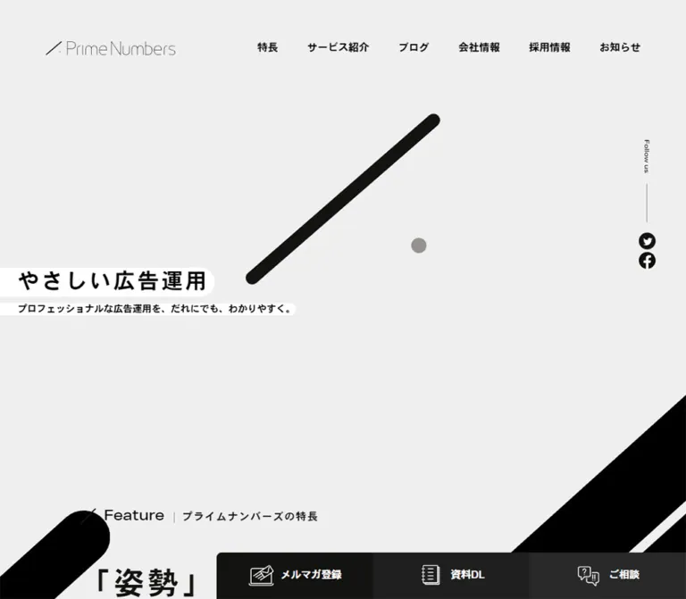
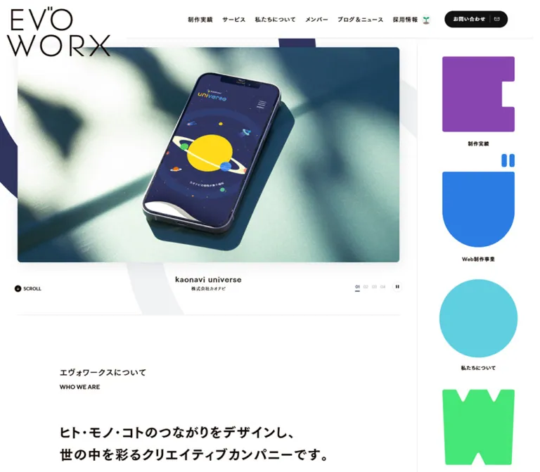
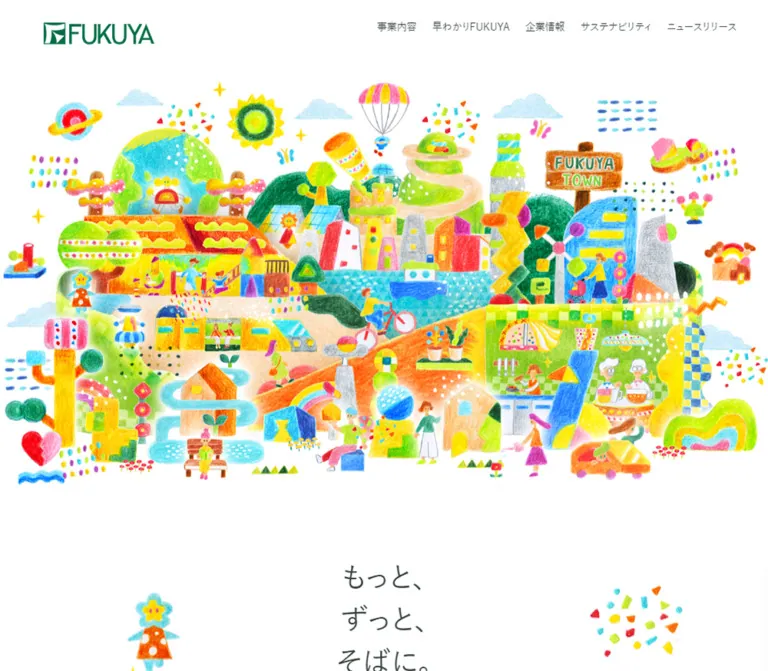
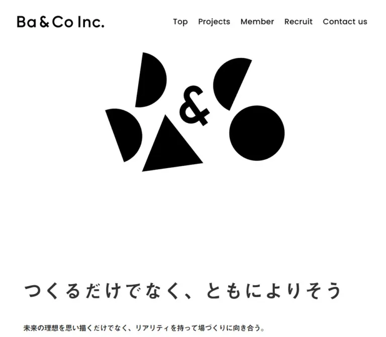
白い余白にカラフルな幾何学図形を大胆に配置。日英のタイポグラフィ、写真と文章を交互に並べた事業紹介、円形の矢印リンク、黄色いフッターが特徴です。
CREATORS MATCH — Style Reference
A spacious corporate website framed by oversized color loops, human photography, and a bright yellow closing section.
Website: CREATORS MATCH Original URL: https://c-m.co.jp/ Final URL: https://c-m.co.jp/ Theme: white and charcoal, with multicolor decorative artwork and yellow contact/footer surfaces. No selectable theme was demonstrated. Inspected: October 2, 2026, at 02:06 JST; supplied browser retrieval timestamp: October 1, 2026, at 17:06:32.939 UTC. Viewports: 1440 × 1000 and 390 × 844 CSS pixels. Scope: the current corporate homepage. Visual evidence covers the desktop hero, a desktop service section, desktop footer, mobile hero, and lower mobile footer. Rendered DOM measurements additionally cover Mission, Service, Information, Careers, the contact band, and navigation subtrees. Linked pages and the opened menu were not inspected.
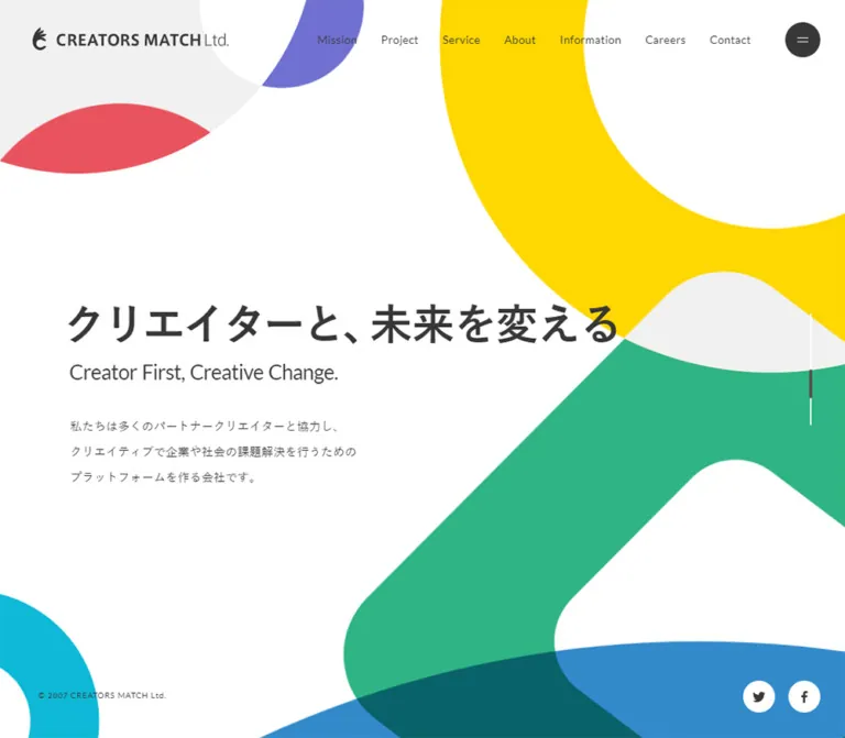
CREATORS MATCH pairs a restrained corporate reading experience with expressive geometric artwork. The opening screen has a large empty center, a bold Japanese statement, a smaller English translation, and thick colored shapes cropped by the viewport. Yellow, green, blue, cyan, coral, and violet appear as large compositional elements rather than small interface decorations. Dark gray text keeps the page grounded.
Below the opening, the design becomes editorial: small English section labels, generous vertical spacing, narrow Japanese reading columns, and rectangular workplace photographs. Service sections alternate their image and copy positions. A recurring text link beside a dark circular arrow provides continuity. The footer changes the canvas to yellow and organizes a substantial corporate and product directory without enclosing links in cards.
This is a long corporate homepage with several destinations and audiences. Its identity depends on the relationship between graphic scale, quiet typography, photography, and navigation—not on a single conversion funnel.
閉じる
CREATORS MATCH — Style Reference
A spacious corporate website framed by oversized color loops, human photography, and a bright yellow closing section.
Website: CREATORS MATCH Original URL: https://c-m.co.jp/ Final URL: https://c-m.co.jp/ Theme: white and charcoal, with multicolor decorative artwork and yellow contact/footer surfaces. No selectable theme was demonstrated. Inspected: October 2, 2026, at 02:06 JST; supplied browser retrieval timestamp: October 1, 2026, at 17:06:32.939 UTC. Viewports: 1440 × 1000 and 390 × 844 CSS pixels. Scope: the current corporate homepage. Visual evidence covers the desktop hero, a desktop service section, desktop footer, mobile hero, and lower mobile footer. Rendered DOM measurements additionally cover Mission, Service, Information, Careers, the contact band, and navigation subtrees. Linked pages and the opened menu were not inspected.
CREATORS MATCH pairs a restrained corporate reading experience with expressive geometric artwork. The opening screen has a large empty center, a bold Japanese statement, a smaller English translation, and thick colored shapes cropped by the viewport. Yellow, green, blue, cyan, coral, and violet appear as large compositional elements rather than small interface decorations. Dark gray text keeps the page grounded.
Below the opening, the design becomes editorial: small English section labels, generous vertical spacing, narrow Japanese reading columns, and rectangular workplace photographs. Service sections alternate their image and copy positions. A recurring text link beside a dark circular arrow provides continuity. The footer changes the canvas to yellow and organizes a substantial corporate and product directory without enclosing links in cards.
This is a long corporate homepage with several destinations and audiences. Its identity depends on the relationship between graphic scale, quiet typography, photography, and navigation—not on a single conversion funnel.
How to Read This Reference
- Measured means a value appears in the supplied rendered DOM or computed-style evidence. Coordinates are CSS pixels; document coordinates differ from positions within scrolled screenshots.
- Estimated means a visual approximation from the current-page captures. Decorative colors, hero text sizes, and some image dimensions fall into this category; no pixel-sampling tool was used.
- Derived means arithmetic based on supplied measurements, such as a centered container's margins.
- Recommended means an implementation choice for a new build. Breakpoints, accessible focus treatments, and the CSS artwork approximations are recommendations.
- Token names below are reusable aliases, not recovered source variable names.
- A computed font stack establishes the declared fallback order, not which font file ultimately rendered each glyph.
- The extracted DOM includes navigation content that is not visible in the closed-page captures. Its presence and computed styles do not establish an observed open-menu design.
Tokens — Colors
Default Palette
| Name | Value | Suggested token | Evidence and role |
|---|---|---|---|
| Canvas White | #ffffff |
--cm-canvas |
Measured body and service-section background; desktop hero share-button fill |
| Charcoal Ink | #373737 |
--cm-ink |
Measured body, navigation, and footer text; visually also the circular control color |
| Contact Yellow | #fbc700 |
--cm-contact |
Measured background of the full-width contact link at both viewports |
| Graphic Yellow | Approximately #ffdc00 |
--cm-yellow |
Estimated hero ring and desktop footer field; their exact declarations were not supplied |
| Ribbon Green | Approximately #2bb384 |
--cm-green |
Estimated large diagonal hero shape |
| Arc Blue | Approximately #338aca |
--cm-blue |
Estimated broad curved shape entering from the bottom |
| Ring Cyan | Approximately #0fb4ce |
--cm-cyan |
Estimated cropped lower-left ring |
| Petal Coral | Approximately #ea515d |
--cm-coral |
Estimated upper-left curved insert |
| Loop Violet | Approximately #7470cf |
--cm-violet |
Estimated upper-left loop segment |
| Pale Geometry | Approximately #f1f1f1 |
--cm-pale |
Estimated neutral shapes behind the upper-left motif and around content |
| Footer Secondary Ink | #867a37 |
--cm-footer-muted |
Measured service-group description and nested footer links |
| Menu Secondary Ink | #a4a4a4 |
--cm-menu-muted |
Measured secondary navigation text in an unexercised menu subtree |
The green and blue artwork overlap into a dark teal-looking region. The capture establishes that appearance, but not whether it comes from transparency, a blend mode, or precomposed artwork. Treat it as part of the illustration until the original asset or compositing rules are available.
Palette Behavior
The page keeps content areas predominantly white. Strong colors occupy large peripheral shapes and the closing surfaces; they do not become a rainbow of buttons or badges. The contact band's measured #fbc700 should remain distinct from the estimated brighter footer yellow.
The mobile footer capture appears slightly different in yellow tone from the desktop capture. There is insufficient style evidence to assign a separate mobile color or explain the difference as a transition state.
The exported custom properties contain many generic CMS palette, gradient, and shadow presets. Their presence does not establish their use in this design. The inspected areas show flat color, clean boundaries, and no general shadow system.
Tokens — Typography
Japanese Reading Text
Measured source stack: YuGothic, 游ゴシック体, 'Yu Gothic', 游ゴシック, 'ヒラギノ角ゴ ProN W3', 'Hiragino Kaku Gothic ProN', sans-serif.
The body uses weight 500, with weight 700 on the measured service introduction heading. Japanese paragraphs are compact in width but generous in line height. The overall effect is calm and readable rather than dense or heavily typographic.
English Navigation and Utility Text
Measured source stack: Avenir, LeagueSpartan-Medium, Lato-Regular, sans-serif.
The inspected navigation, section labels, network links, and copyright text use this stack at weight 400. Desktop primary navigation adds 0.35px tracking at 14px, equivalent to 0.025em. Service kickers use the Japanese stack with 0.08em tracking.
Do not claim that all three English fonts are loaded. The supplied evidence identifies a computed family list, not font-network requests or resolved glyph fonts.
Brand and Display Text
The wordmark has a distinctive mark, bold uppercase name, and lighter Ltd. suffix. Its link box inherits body typography, but that does not identify the typography of the visible artwork. Use an authorized brand asset when reproducing it.
The hero headline and English line are visible and represented in page text, but their individual computed styles were not included. Their sizes below are visual estimates. The thinc Project title and bold service summary also require estimated display tokens.
Type Scale
| Role | Desktop | Mobile at 390px | Status |
|---|---|---|---|
| General Japanese body | 15px / 28px, weight 500 |
13.52px / 26px, weight 500 |
Measured |
| Hero Japanese statement | Approximately 52–56px, bold, one line |
Approximately 40–42px, bold, two lines with roughly 60px line spacing |
Estimated |
| Hero English line | Approximately 26px |
Approximately 19px |
Estimated |
| Hero introductory copy | Approximately 15px / 32px |
Approximately 11–12px / 24px |
Estimated; do not substitute the general body measurement as proof |
| Primary header navigation | 14px / 14px, weight 400, 0.35px tracking |
Not visible | Measured desktop; visual mobile observation |
| Section label | 16px / 16px, weight 400 |
15.6px / 15.6px |
Measured |
| Service introduction heading | 38px / 57px, weight 700 |
28.08px / 42.12px, weight 700 |
Measured |
| Service introduction paragraphs | 16px / 36–39.3846px |
14.04px / 31.59–34.56px |
Measured; line height differs between paragraphs |
| Service kicker | 13px / 24.2667px, 1.04px tracking |
11.44px / 22px, 0.9152px tracking |
Measured |
| Service name | Approximately 32px, bold, visibly tracked |
Not individually measured | Desktop visual estimate |
| Service summary | Approximately 18px / 34px, bold |
Not individually measured | Desktop visual estimate |
| Footer network links | 15px / 15px, weight 400 |
15.6px / 15.6px, weight 400 |
Measured |
| Policy links | 11px / 11px, -0.55px tracking |
11.44px / 11.44px, -0.572px tracking |
Measured |
| Hero copyright | 10px / 10px, 0.7px tracking |
10.4px / 10.4px, 0.78px tracking |
Measured |
| Footer copyright | 12px / 12px, 0.3px tracking |
10.4px / 10.4px, 0.26px tracking |
Measured |
The HTML root computes to 10px at both viewports. The root's reported Times family is not the visible body font. The Quick Start uses explicit dimensions and does not require changing a project's conventional root size.
Tokens — Spacing & Shapes
Layout Measurements
| Element | Desktop | Mobile | Evidence |
|---|---|---|---|
| Hero | 1440 × 1000px |
390 × 844px |
Measured full viewport |
| Header box | 1440 × 100px |
Reported height 0px, with visible controls independently positioned |
Measured; zero height does not mean an absent header |
| Header brand link | 246 × 29px at (43, 34) |
228.80 × 27.03px at approximately (20.80, 38.47) |
Measured |
| Menu button box | 44 × 44px at (1364, 28) |
Approximately 62.39 × 62.39px at (306.81, 20.80) |
Measured |
| Wide content region | 1080px, from x=180 to 1260 |
Common text width approximately 338.05px, starting near x=25.97 |
Measured content bounds |
| Narrow desktop region | 920px, from x=260 to 1180 |
Information width 338px, starting at x=26 |
Measured |
| Service detail copy | 380px |
Approximately 338.05px |
Measured |
| Project photograph | Approximately 480 × 452px |
No image rectangle supplied | Desktop screenshot estimate |
| Compact View More link | Approximately 147.73 × 60px |
Approximately 146.83 × 62.39px |
Measured link bounds |
| Hero share controls | 40px circles, 17px gap |
Not visible in the mobile hero | Measured desktop and capture comparison |
| Footer share controls | 44px circles, 18px gap |
Approximately 46.80px circles, 15.59px gap |
Measured |
| Mission text region | Section label begins at x=280 |
317.22px wide, starting at x=36.39 |
Measured |
| Mobile footer inset | — | Approximately 36.39px for navigation, network links, and policies |
Measured |
A useful desktop service model is two 480px columns separated by 120px. The copy is inset 50px within its column, leaving a 380px reading width. This model is derived from measured text positions and visually estimated image bounds, rather than recovered grid declarations.
Spacing Rhythm
| Relationship | Value | Status |
|---|---|---|
| Hero to Mission section start | 80px after the hero at both viewports |
Derived from section bounds |
| Desktop header link padding | 15px 1px |
Measured |
| Desktop primary navigation gap | Approximately 28px between link boxes |
Derived |
| Section-label left padding | 30px desktop; 28.08px mobile |
Measured |
| Service body to following CTA | Approximately 27px desktop; 26px mobile in the measured rows |
Derived |
| Desktop footer network-link pitch | 40px |
Derived from successive link positions |
| Mobile footer network-link pitch | Approximately 51.97px |
Derived |
| Policy-link desktop padding | 10px 0 |
Measured |
| Policy-link mobile padding | 11.44px 0 |
Measured |
Do not force all spacing into an invented eight-point system. This page combines fixed desktop dimensions with mobile measurements that often scale by 1.04 relative to a 375px baseline.
Border Radius and Shape Language
Content images and text regions have square edges. Circles are reserved for menu, arrow, and sharing controls. The main decorative shapes have very broad curves, thick strokes, and rounded bends; their scale makes them feel like parts of a larger composition extending beyond the screen.
The menu button's extracted background is transparent and its reported radius is zero, although the screenshot clearly shows a charcoal disk. The visible styling therefore belongs to a nested or generated part not included in the element record. Reproduce the rendered circle, not the incomplete wrapper styling.
There is no evidence for rounded service cards, elevated panels, or a shared small-radius surface system.
Components
Persistent Brand Header
Role: keep identity and navigation available over the long page.
The desktop opening shows the brand at left, six English destination links toward the right, and a circular menu button at the far edge. The destinations are Mission, Service, About, Information, Careers, and Contact. The header has no visible enclosing border, shadow, or opaque panel in the supplied captures.
Brand and menu remain near the top edge in the scrolled service and footer captures. The horizontal navigation is visible in the opening capture and absent from those scrolled desktop captures. This establishes the visible states, but not the positioning declaration, scroll threshold, or transition logic.
On mobile, the horizontal links are absent and the circular menu button grows from 44px to about 62.4px. The logo remains relatively large at about 229px wide. Two fine horizontal strokes form the menu icon.
Full-Viewport Hero
Role: introduce the company through a statement and recognizable graphic composition.
The desktop headline begins around x=88–90px, below a large area of white space. It reads クリエイターと、未来をかえる, followed by Creator First, Creative Change. and a short Japanese introduction. There is no large conversion button in this opening state.
Artwork frames the text:
- A cropped neutral, coral, and violet motif enters from the upper left.
- A very large yellow ring enters from the upper right.
- A thick green rounded shape rises diagonally through the right half.
- A cyan ring is cropped at the lower left.
- A broad blue curve enters across the bottom and visually overlaps the green.
The artwork should extend beyond the hero bounds. Keep a protected white area behind the main copy rather than centering text directly over colored shapes.
At 390px, the headline becomes two lines: クリエイターと、 and 未来をかえる. Its left edge is around 24–26px; the visible text begins around y=280px. The English line remains on one line in the supplied capture. Introductory copy uses four short lines and sits above the lower green and blue shapes.
Hero Edge Utilities
Role: provide secondary information without competing with the statement.
Copyright sits at the lower left: (50, 943) on desktop and approximately (22.88, 783.69) on mobile. Desktop share buttons sit at the lower right in white circles. The bird and Facebook glyphs link to sharing endpoints, not to company-profile URLs.
A thin vertical cue appears near the right edge of the hero, with a darker segment. It is visible at both viewports. Its appearance is documented, but no progress calculation, click behavior, or animation was demonstrated.
Mission Section
Role: expand the opening statement into the company's purpose.
The rendered text establishes a small English Mission label, a Japanese statement broken into three lines, explanatory prose, and a View More link to /mission/. Desktop and mobile section heights are close: 834px and approximately 838.55px.
The desktop label has a substantial inset, while mobile uses a narrower 317.22px region with approximately 36.39px side margins. The mobile CTA is right aligned within that region.
No full Mission screenshot was supplied. Its individual display-heading size, decorative artwork, and complete composition should not be inferred from the hero or service photograph.
Service Introduction
Role: explain the relationship between the three thinc areas before their detailed sections.
The desktop introduction places a bold Japanese heading in a 480px left column and longer explanatory copy in a roughly 550px right column. The heading is measured at 38px / 57px; the paragraphs are 16px with unusually generous 36–39.38px leading.
Mobile stacks the heading above the prose in a 338px text region. The heading becomes 28.08px / 42.12px, with a measured 26px gap before the first paragraph. The introductory prose remains visibly more open in leading than ordinary service descriptions.
The three named areas are thinc Workplace, thinc Growth, and thinc Project. They are content divisions, not interchangeable feature cards.
Alternating Service Feature
Role: pair an area of work with people, a short promise, and a detailed explanation.
The visible thinc Project section has a rectangular photograph at left and a 380px copy column at right. Its anatomy is:
- A small tracked Japanese kicker:
時間をもっとクリエイティブに. - A bold, tracked English service name.
- A bold Japanese summary spanning several lines.
- A regular Japanese paragraph at
15px / 28px. - A View More label followed by a dark circular arrow.
In the desktop capture, the photograph begins around (180, 270) within the scrolled viewport and the text begins near x=830. A portion of the preceding section shows the opposite arrangement: copy at left and photograph at right. The DOM likewise places Workplace and Project copy at x=830, and Growth copy at x=230.
Mobile measurements put all three copy blocks at approximately x=25.97, width 338.05px, and their CTAs against the right edge. This verifies a common single-column text alignment. Exact mobile photograph crops and image-to-copy ordering are not visually established; image-before-copy is the recommended adaptation.
View More Link
Role: provide a consistent route into deeper corporate content.
The visible component combines an unboxed text label with a charcoal disk containing a small light arrow. The disk is approximately 60px on desktop. The label-to-disk gap is approximately 20px in the service capture.
Some link wrappers occupy the entire copy width; others are only about 148px wide. Do not mistake the wrapper width for an oversized filled button. The visible circle and label remain the recurring unit.
Destinations are ordinary links: Mission, service anchors, Information, and Careers. No arrow movement or hover-color endpoint was captured. In a new build, keep the entire label-and-circle group keyboard operable and give repeated labels a contextual accessible name.
Information List
Role: surface current announcements in a compact editorial index.
Five linked entries were present, dated from August 28 through September 25, 2026. Each includes a date, category, and Japanese title. The evidence supports a vertical list rather than a thumbnail-card grid.
Desktop link rows are 920px wide and generally 157px high, with one 131px row. Measured padding is 32px 134px 33px 0. Mobile rows are 338px wide and approximately 171–219px high, with 26px 88.4px 31.2px 0 padding. The large right reservation is measured, but its exact child decoration is not provided.
The desktop View More link is near the section heading. On mobile it follows the list. This is a structural repositioning, not merely reduced typography.
No full Information screenshot was supplied. Row-divider treatment, category-badge styling, and arrow anatomy should remain unclaimed.
Careers Section
Role: introduce recruitment as another part of the corporate story.
The DOM establishes a small Careers label, the phrase JoinOurTeam, explanatory Japanese copy, and a View More link. Mobile text evidence separates Join from OurTeam.
The section measures 956px high on desktop and approximately 801.67px on mobile. The mobile CTA wrapper starts at x=26 and is wider than the compact service CTAs. Display lettering, imagery, and the full visual composition were not included in the supplied screenshots.
Contact Band
Role: create a strong transition from editorial content to the footer directory.
A single full-width link to /contact/ contains Contact us, explanatory copy, and a View More treatment. Its measured background is #fbc700, height 410px on desktop and approximately 324.41px on mobile.
Only the lower portion of the desktop band appears above the footer capture. Large low-contrast lettering is partially visible, but a complete text layout cannot be measured from that crop. Preserve the broad yellow surface and clear contact destination without inventing a form inside it.
Yellow Footer Directory
Role: consolidate brand, product destinations, corporate navigation, policies, and sharing.
Desktop uses a wide 1080px composition. The larger brand sits at the left, followed by seven network links: thinc Agent, thinc Journal, thinc Partner, Rethink Creator PROJECT, AdFlow, thinc Test, and Task Relay. Small northeast arrows mark these destinations. Two outlined sharing circles follow below.
The right side has four navigation groups: Top/Mission; Service with its three nested thinc areas; About/Information; and Careers/Contact. Nested service text uses the measured muted olive #867a37. Copyright sits at the lower left, while four policy links form a horizontal row toward the right.
Mobile changes the ordering. Corporate navigation is positioned first in the footer, above the brand and network links. The supplied lower-footer screenshot begins after that navigation region; its absence from that crop does not mean the navigation was removed.
Below the mobile brand, network links form a generously spaced vertical list. Policies are also stacked. Copyright occupies the lower left and two outlined share circles occupy the lower right. The footer wordmark's measured link wrapper is about 356px wide, but the visible artwork is narrower; do not use the wrapper as an exact painted-logo measurement.
Menu Content — DOM Evidence Only
The extracted navigation subtree contains a second brand link, primary destinations, service sublinks, network links, and copyright. Desktop primary menu labels compute to 28px / 28px; mobile labels compute to 21.84px / 21.84px. Primary text is white and secondary text is #a4a4a4 in that subtree.
No open-menu capture or activation sequence was supplied. Its background, entrance animation, focus behavior, scrolling behavior, and close state are unverified. These computed values must not be presented as a fully observed modal specification.
Tokens — Motion & Interaction
| Treatment | Supplied computed value | What is established |
|---|---|---|
| Body and selected section backgrounds | background 0.65s cubic-bezier(0.18, 0.06, 0.23, 1) |
A background transition is declared; trigger and endpoints are not demonstrated |
| Desktop hero share backgrounds | background 0.6s cubic-bezier(0, 0.55, 0.45, 1) |
Background can transition; hover appearance was not captured |
| Contact-band background | background 0.6s cubic-bezier(0, 0.55, 0.45, 1) |
Same declared timing at both viewports |
| Desktop footer links and share controls | opacity 0.6s cubic-bezier(0, 0.55, 0.45, 1) |
Opacity transition declared; target opacity unknown |
| Several desktop menu links | color 0.5s |
Declaration in an unexercised navigation subtree |
| Many mobile links and other elements | all |
No nonzero duration supplied; this is not sufficient evidence of visible animation |
| Sampled element animation property | none |
No keyframe animation on those sampled elements at extraction time |
The supplied browser workflow waited for page readiness, visible finite animations, text/layout stability, and image decoding within bounded time limits. Perpetual animations were paused during readiness checks and then resumed. These capture procedures do not reveal a motion timeline.
Scrolling is evidenced by the service and footer captures. No menu activation, hover, keyboard navigation, or destination-page interaction was demonstrated. The images do not establish parallax, scroll-linked morphing, continuous rotation, or a particular reveal sequence. An animation: none record on sampled elements also does not rule out animation on children, generated content, or script-controlled graphics.
For a new implementation, retain the measured transition curves where useful, but introduce movement only when its behavior has been specified. A static hero composition is a more defensible starting point than an invented looping animation.
Surfaces
| Layer | Appearance | Purpose |
|---|---|---|
| Main canvas | Flat white | Supports typography and substantial negative space |
| Hero artwork | Large flat colored shapes, clipped by viewport | Brand recognition and framing |
| Service content | Unboxed white regions | Keeps image and prose in an editorial relationship |
| Photography | Square-cornered rectangles | Human context and evidence of collaboration |
| Action circle | Charcoal disk with a light arrow | Repeated navigation affordance |
| Contact band | Measured warm yellow | Strong closing invitation |
| Footer | Bright yellow field | Distinct directory area |
| Footer share control | Transparent center, fine dark circular outline | Secondary sharing action |
The page's hierarchy comes from scale, whitespace, alternating alignment, and surface color. Shadows, gradients, glass blur, and rounded cards are not part of the observed system.
Imagery
The hero uses smooth, flat, vector-like geometry. Thick loops and rounded bands are cut off by the viewport, giving the impression of a larger composition outside the frame. Curves matter more than decorative detail. Keep edges clean and colors opaque-looking, while preserving the visible overlap appearance where required.
The inspected service photograph shows two colleagues seated together, looking at a tablet or similar device, with a stylus visible. Dark and blue jackets, bright window light, and a pale interior create a credible working scene. Faces and the shared task are prominent. The crop is approximately square and contains little unrelated background.
A portion of the preceding photograph shows another collaborative scene with a pale yellow sleeve. That partial view is insufficient to describe its full subject or crop.
Observed Asset References
No image URLs, filenames, intrinsic dimensions, or asset-format records were supplied. The following references describe visible assets rather than inventing downloadable paths.
| Asset | Evidence | Implementation guidance |
|---|---|---|
| CREATORS MATCH wordmark | Current header and footer captures; linked brand label in DOM | Use authorized artwork; do not infer its font from the anchor's inherited style |
| Hero geometric composition | Desktop and mobile opening captures | Prefer responsive vector artwork or separately positioned shapes; original format is unknown |
| thinc Project photograph | Desktop service capture | Preserve the collaborative task and approximately square crop |
| Previous service photograph | Partial upper-right image in service capture | Full crop and source are unverified |
| Circular arrow | Visible View More links | Use a small simple directional arrow, centered within a dark disk |
| Sharing glyphs | Hero and footer captures plus share URLs | Preserve their sharing semantics; no icon library was identified |
Photography should remain natural and lightly colored. Avoid heavy duotone processing, dramatic dark overlays, or rounded portrait cutouts. The graphic hero supplies the abstraction; the service images supply human specificity.
Layout & Responsive Behavior
Document Structure
| Region | Desktop height | Mobile height | Evidence |
|---|---|---|---|
| Hero | 1000px |
844px |
Measured |
| Mission | 834px |
Approximately 838.55px |
Measured |
| Service | Approximately 3543.95px |
Approximately 3906.61px |
Measured |
| Information | 1053px |
Approximately 1362.70px |
Measured |
| Careers | 956px |
Approximately 801.67px |
Measured |
| Contact plus footer directory | 1222px |
Approximately 1754.22px |
Measured |
| Entire document | Approximately 9237.95px |
Approximately 9950.75px |
Measured; includes spaces between sections |
These dimensions describe this content at two captured widths. They are not recommended hardcoded section heights. Some section bounds encompass large decorative or reserved regions; the evidence does not justify reproducing every coordinate with empty spacer elements.
Desktop Composition
The hero copy uses a different alignment from the main content: approximately 90px from the left rather than the service container's 180px. Information and Careers use a narrower 920px region beginning at 260px. This layered alignment creates variety while retaining a controlled center of gravity.
Service photography is large, but prose stays at 380px. The difference is essential: expanding copy to the entire image-column width would make the page denser and weaken its pacing.
Mobile Changes
- The hero retains a full-screen composition, with repositioned and recropped geometry rather than a uniformly scaled desktop screenshot.
- The Japanese statement wraps to two lines while the English line stays compact.
- Header navigation disappears and the menu control becomes larger.
- Common body content uses approximately
26pxgutters; Mission and much of the footer use approximately36.4pxgutters. - Service introduction columns stack. Service detail text uses a common full-width column.
- Information rows become taller, and their View More link moves below the list.
- Corporate footer navigation precedes the brand/network block. Policy links stack, while copyright and sharing remain side by side near the bottom.
Several mobile values equal a plausible 375px baseline multiplied by 390 / 375 = 1.04: 13px becomes 13.52px, 60px becomes 62.4px, and 25px becomes 26px. This is a useful inference, not recovered responsive CSS. The root remains 10px; the scaling should not be explained as a changed root font size.
The supplied custom property --vh is 10px on desktop and 8.44px on mobile, equal to one percent of each captured viewport height. The hero also exactly matches that height. The property is consistent with viewport-height handling, but the consuming declaration was not supplied.
Only two widths were inspected. Exact breakpoints, tablet layouts, landscape behavior, and text-zoom behavior remain unverified.
Do’s and Don’ts
Do
- Keep white space as an active part of the composition, especially above and around the hero statement.
- Use measured charcoal
#373737instead of default pure black for normal interface text. - Preserve the warm contact yellow separately from the estimated brighter graphic yellow.
- Crop oversized loops and bands at screen edges and leave a readable white zone behind copy.
- Keep Japanese body text in narrow columns with generous leading.
- Pair small English labels with stronger Japanese headings and statements.
- Alternate desktop service images and text, while keeping the internal text hierarchy consistent.
- Use unboxed labels beside circular arrows for deeper navigation.
- Preserve square-cornered, natural workplace photography.
- Reorder the mobile footer rather than deleting navigation that lies outside the supplied crop.
- Distinguish declared transitions from interactions that were actually demonstrated.
Don’t
- Don't turn every service into a rounded, shadowed feature card.
- Don't distribute the hero colors across arbitrary badges and buttons.
- Don't center all sections on one uniform left edge; the hero, services, and information use different insets.
- Don't stretch service prose to fill large desktop columns.
- Don't replace the graphic opening with a full-bleed stock photograph.
- Don't add a prominent hero signup CTA unsupported by the current composition.
- Don't treat transparent wrapper styles as the complete appearance of the visible menu disk.
- Don't infer a dark-mode option from white text in the hidden menu subtree.
- Don't invent hero motion, menu transitions, image URLs, or exact display fonts.
- Don't assume generic CMS gradients and shadow presets are active design tokens.
- Don't shrink the desktop page uniformly to create the mobile layout.
Recommended Implementation Additions
These are recommendations for a new implementation, not verified features of the original:
- Give the menu button an accessible name,
aria-expanded, andaria-controls. If its panel is modal, implement focus containment, Escape handling, and focus restoration. - Give repeated View More links contextual accessible names, such as View more about thinc Project.
- Give icon-only sharing links explicit names and retain their distinction from company social-profile links.
- Keep decorative hero shapes out of the accessibility tree and prevent them from intercepting pointer events.
- Preserve visible keyboard focus across white and yellow surfaces.
- Consider a
14–16pxminimum for sustained mobile reading text, and enlarge policy-link hit areas without unnecessarily enlarging their visible type. - Check the measured muted footer color against the final yellow background; darken secondary text if required for readable contrast.
- Use a viewport-height fallback with content-driven expansion so enlarged text cannot collide with copyright or artwork.
- Keep fixed header controls from obscuring anchor destinations, using appropriate scroll margins and responsive spacing.
- Supply responsive photograph sources, meaningful alternative text, and explicit dimensions to limit layout shifts.
- Provide reduced-motion handling before adding optional background or arrow movement.
Agent Prompt Guide
Quick Color Reference
- Canvas: measured
#ffffff. - Main text: measured
#373737. - Contact band: measured
#fbc700. - Hero/footer yellow: estimated
#ffdc00. - Decorative green, blue, cyan: estimated
#2bb384,#338aca,#0fb4ce. - Small upper-left accents: estimated coral
#ea515d, violet#7470cf, and pale gray#f1f1f1. - Footer nested text: measured
#867a37; verify contrast in the new implementation. - Primary navigation treatment: plain text plus a charcoal circular arrow, without elevation.
Overall Prompt
“Create a Japanese corporate homepage inspired by the current CREATORS MATCH composition. Use a white canvas, charcoal text, and an opening viewport framed by oversized cropped yellow loops, green rounded bands, a cyan corner ring, and a blue lower arc. Keep the center spacious and place a bold Japanese statement left of center with a smaller English line and a short introduction. Build a long editorial sequence with small English section labels, narrow Japanese reading columns, alternating rectangular workplace photographs, and View More links beside dark circular arrows. Finish with a warm yellow contact band and a brighter yellow corporate directory. On mobile, recompose the artwork, wrap the headline into two lines, enlarge the menu disk, stack content, and place corporate footer navigation above the brand links. Treat decorative hex colors and unmeasured display sizes as approximations. Do not invent menu or hero animation.”
Example Component Prompts
- Hero: “A full-height white corporate opening with the statement
クリエイターと、未来をかえる, the English lineCreator First, Creative Change., and a short Japanese introduction. Use oversized cropped geometric loops around the edges, a protected white reading area, a small lower-left copyright, and a discreet right-edge vertical cue. No large hero CTA.” - Service feature: “A centered 1080px desktop section with an approximately 480px square-cornered collaboration photograph and a 380px text column. Stack a tracked kicker, bold service name, bold Japanese summary, regular 15px text with 28px leading, and a right-aligned View More link with a 60px charcoal arrow circle. Reverse image and copy in the next row.”
- Header: “A transparent-looking persistent header with an authorized wordmark at left, small English navigation toward the right, and a 44px charcoal circular menu button. At a narrow viewport, omit the horizontal links and enlarge the disk to approximately 62px. Specify the menu interaction separately.”
- Footer: “A flat yellow directory with a large dark wordmark, seven vertically arranged product/network links with northeast arrows, four groups of corporate navigation, muted service sublinks, outlined share circles, and small policy links. On mobile, move corporate navigation above the brand block, stack policies, and place copyright opposite the share circles.”
- Information list: “Create five full-width linked news rows containing a date, category, and Japanese title. Use a 920px desktop reading region and approximately 338px at a 390px viewport. Preserve generous vertical padding and a reserved right-side area. Move the section's View More action below the list on mobile. Do not invent thumbnail cards.”
Quick Start
CSS Custom Properties
This is a recommended implementation scaffold, not recovered source CSS. It uses measured body typography, container widths, control dimensions, and transition curves where available. Decorative colors, display typography, artwork geometry, and breakpoints are explicit approximations.
The expected structure includes a header with .brand, .site-nav, and .menu-button; a hero with .hero__content and decorative spans; alternating .service-feature articles; and a footer grid with named areas. Supply authorized logo and photograph assets separately. The hero-shape classes below create an approximation, not an exact reconstruction of the original artwork. Header scroll state and menu operation require separate application logic.
:root {
  /* Measured interface colors */
  --cm-canvas: #ffffff;
  --cm-ink: #373737;
  --cm-contact: #fbc700;
  --cm-footer-muted: #867a37;

  /* Visual approximations for decorative artwork */
  --cm-yellow: #ffdc00;
  --cm-green: #2bb384;
  --cm-blue: #338aca;
  --cm-cyan: #0fb4ce;
  --cm-coral: #ea515d;
  --cm-violet: #7470cf;
  --cm-pale: #f1f1f1;

  /* Source-declared families; resolved fonts may differ */
  --cm-font-body: YuGothic, 'Yu Gothic',
    'Hiragino Kaku Gothic ProN', sans-serif;
  --cm-font-en: Avenir, LeagueSpartan-Medium,
    Lato-Regular, sans-serif;

  --cm-body-size: 15px;
  --cm-body-leading: 28px;
  --cm-gutter: 26px;
  --cm-wide: 1080px;
  --cm-narrow: 920px;
  --cm-action-size: 60px;
  --cm-menu-size: 44px;

  /* Inferred mobile scaling, capped for this adaptation */
  --cm-mobile-unit: clamp(0.96px, calc(100vw / 375), 1.15px);

  /* Measured transition curves */
  --cm-ease-surface: cubic-bezier(0.18, 0.06, 0.23, 1);
  --cm-ease-link: cubic-bezier(0, 0.55, 0.45, 1);
}

*,
*::before,
*::after {
  box-sizing: border-box;
}

body {
  margin: 0;
  color: var(--cm-ink);
  background: var(--cm-canvas);
  font-family: var(--cm-font-body);
  font-size: var(--cm-body-size);
  font-weight: 500;
  line-height: var(--cm-body-leading);
}

img {
  display: block;
  max-width: 100%;
}

a {
  color: inherit;
}

.cm-wide,
.cm-narrow {
  width: calc(100% - 2 * var(--cm-gutter));
  margin-inline: auto;
}

.cm-wide { max-width: var(--cm-wide); }
.cm-narrow { max-width: var(--cm-narrow); }

.site-header {
  position: fixed;
  z-index: 20;
  inset: 0 0 auto;
  display: flex;
  align-items: center;
  gap: 42px;
  height: 100px;
  padding-inline: 43px 32px;
}

.brand {
  display: block;
  flex: none;
  width: 246px;
}

.brand :is(img, svg) {
  display: block;
  width: 100%;
  height: auto;
}

.site-nav {
  display: flex;
  gap: 28px;
  margin-left: auto;
  font-family: var(--cm-font-en);
  font-size: 14px;
  font-weight: 400;
  line-height: 14px;
  letter-spacing: 0.025em;
}

.site-nav a {
  padding: 15px 1px;
  text-decoration: none;
}

/* Optional state matching the supplied scrolled captures.
   The original trigger threshold is unknown. */
.site-header[data-scrolled='true'] .site-nav {
  visibility: hidden;
}

.menu-button {
  position: relative;
  flex: none;
  width: var(--cm-menu-size);
  height: var(--cm-menu-size);
  padding: 0;
  border: 0;
  border-radius: 50%;
  color: white;
  background: var(--cm-ink);
  cursor: pointer;
}

.menu-button::before,
.menu-button::after {
  content: '';
  position: absolute;
  left: 50%;
  top: 50%;
  width: 14px;
  height: 1px;
  background: currentColor;
  transform: translate(-50%, -3px);
}

.menu-button::after {
  transform: translate(-50%, 3px);
}

.hero {
  position: relative;
  isolation: isolate;
  min-height: 100vh;
  min-height: 100svh;
  overflow: hidden;
  padding: 41vh 6.25vw 180px;
  background: var(--cm-canvas);
}

.hero__content {
  position: relative;
  z-index: 2;
  max-width: 850px;
}

.hero__title {
  margin: 0;
  font-size: clamp(40px, 3.75vw, 54px);
  font-weight: 700;
  line-height: 1.3;
  letter-spacing: -0.025em;
}

.hero__english {
  margin: 8px 0 32px;
  font-family: var(--cm-font-en);
  font-size: 26px;
  font-weight: 400;
  line-height: 1.4;
}

.hero__lead {
  max-width: 480px;
  margin: 0;
  font-size: 15px;
  line-height: 32px;
}

.hero__copyright {
  position: absolute;
  z-index: 2;
  left: 50px;
  bottom: 47px;
  margin: 0;
  font-family: var(--cm-font-en);
  font-size: 10px;
  font-weight: 400;
  line-height: 1;
  letter-spacing: 0.07em;
}

.hero-art {
  position: absolute;
  z-index: 0;
  inset: 0;
  pointer-events: none;
}

.hero-art > span {
  position: absolute;
  display: block;
}

/* Approximate geometry; replace with approved artwork if available. */
.hero-art__yellow {
  top: -380px;
  right: -340px;
  width: 850px;
  height: 850px;
  border: 186px solid var(--cm-yellow);
  border-radius: 50%;
}

.hero-art__green {
  top: 46%;
  right: -210px;
  width: 700px;
  height: 700px;
  border: 180px solid var(--cm-green);
  border-radius: 120px;
  transform: rotate(43deg);
}

.hero-art__cyan {
  left: -190px;
  bottom: -195px;
  width: 380px;
  height: 380px;
  border: 100px solid var(--cm-cyan);
  border-radius: 50%;
}

.hero-art__blue {
  right: -150px;
  bottom: -400px;
  width: 1150px;
  height: 510px;
  border-radius: 50%;
  background: var(--cm-blue);
  transform: rotate(-5deg);
}

.section-label {
  margin: 0 0 40px;
  padding-left: 30px;
  font-family: var(--cm-font-en);
  font-size: 16px;
  font-weight: 400;
  line-height: 1;
}

.service-intro {
  display: grid;
  grid-template-columns: 480fr 550fr;
  gap: 50px;
  align-items: start;
}

.service-intro__title {
  margin: 0;
  font-size: 38px;
  font-weight: 700;
  line-height: 57px;
}

.service-intro__body {
  font-size: 16px;
  line-height: 36px;
}

.service-intro__body p {
  margin: 0 0 36px;
}

.service-feature {
  display: grid;
  grid-template-columns: repeat(2, minmax(0, 1fr));
  align-items: start;
  gap: clamp(32px, 8.333vw, 120px);
  margin-block: 100px;
}

.service-feature__media {
  margin: 0;
}

.service-feature__media img {
  width: 100%;
  aspect-ratio: 480 / 452;
  object-fit: cover;
  border-radius: 0;
}

.service-feature__copy {
  min-width: 0;
  padding: 20px clamp(20px, 3.472vw, 50px) 0;
}

.service-feature--reverse .service-feature__media {
  grid-column: 2;
  grid-row: 1;
}

.service-feature--reverse .service-feature__copy {
  grid-column: 1;
  grid-row: 1;
}

.service-kicker {
  margin: 0 0 6px;
  font-size: 13px;
  line-height: 24.2667px;
  letter-spacing: 0.08em;
}

.service-name {
  margin: 0 0 26px;
  font-family: var(--cm-font-en);
  font-size: 32px;
  font-weight: 700;
  line-height: 1.3;
  letter-spacing: 0.06em;
}

.service-summary {
  margin: 0 0 18px;
  font-size: 18px;
  font-weight: 700;
  line-height: 1.87;
}

.service-body {
  margin: 0;
}

.more-link {
  display: flex;
  align-items: center;
  gap: 20px;
  width: max-content;
  max-width: 100%;
  margin-top: 27px;
  margin-left: auto;
  text-decoration: none;
}

.more-link__label {
  font-family: var(--cm-font-en);
  font-size: 14px;
  font-weight: 400;
}

.more-link__circle {
  display: grid;
  flex: none;
  place-items: center;
  width: var(--cm-action-size);
  height: var(--cm-action-size);
  border-radius: 50%;
  color: white;
  background: var(--cm-ink);
}

.news-row {
  display: flex;
  padding: 32px 134px 33px 0;
  text-decoration: none;
}

.news-row__content {
  min-width: 0;
}

.contact-band {
  display: block;
  min-height: 410px;
  padding: 80px var(--cm-gutter);
  background: var(--cm-contact);
  text-decoration: none;
  transition: background 600ms var(--cm-ease-link);
}

.site-footer {
  padding-block: 129px 130px;
  background: var(--cm-yellow);
}

.footer-layout {
  display: grid;
  grid-template-columns: minmax(0, 480fr) minmax(0, 524fr);
  grid-template-areas:
    'brand nav'
    'networks nav'
    'share nav'
    'copyright legal';
  column-gap: 76px;
  row-gap: 28px;
}

.footer-brand { grid-area: brand; width: 278px; max-width: 100%; }
.footer-networks { grid-area: networks; }
.footer-nav { grid-area: nav; }
.footer-share { grid-area: share; }
.footer-copyright { grid-area: copyright; }
.footer-legal { grid-area: legal; }

.footer-nav {
  display: grid;
  grid-template-columns: auto minmax(160px, 1fr) auto auto;
  gap: 30px;
  align-content: start;
}

.footer-networks a,
.footer-nav a {
  display: block;
  width: fit-content;
  padding-block: 10px;
  font-family: var(--cm-font-en);
  font-size: 15px;
  font-weight: 400;
  line-height: 15px;
  text-decoration: none;
  transition: opacity 600ms var(--cm-ease-link);
}

.footer-networks a + a { margin-top: 5px; }
.footer-nav__secondary { color: var(--cm-footer-muted); }

.footer-share {
  display: flex;
  gap: 18px;
  margin-top: 12px;
}

.share-link {
  display: grid;
  place-items: center;
  width: 44px;
  height: 44px;
  border: 1px solid currentColor;
  border-radius: 50%;
  text-decoration: none;
}

.footer-copyright,
.footer-legal {
  margin-top: 74px;
}

.footer-copyright {
  font-family: var(--cm-font-en);
  font-size: 12px;
  font-weight: 400;
  line-height: 1;
}

.footer-legal {
  display: flex;
  justify-content: space-between;
  gap: 24px;
}

.footer-legal a {
  padding-block: 10px;
  font-size: 11px;
  line-height: 1;
  letter-spacing: -0.05em;
  text-decoration: none;
}

/* Recommended breakpoints, not recovered source values. */
@media (max-width: 1100px) {
  .site-nav { display: none; }
  .menu-button { margin-left: auto; }
  .footer-layout { column-gap: 40px; }
  .footer-nav { grid-template-columns: repeat(2, minmax(0, 1fr)); }
}

@media (max-width: 760px) {
  :root {
    --cm-gutter: calc(25 * var(--cm-mobile-unit));
    --cm-body-size: calc(13 * var(--cm-mobile-unit));
    --cm-body-leading: calc(25 * var(--cm-mobile-unit));
    --cm-action-size: calc(60 * var(--cm-mobile-unit));
    --cm-menu-size: calc(60 * var(--cm-mobile-unit));
  }

  .site-header {
    height: calc(100 * var(--cm-mobile-unit));
    padding-inline: calc(20 * var(--cm-mobile-unit));
    gap: 20px;
  }

  .brand { width: calc(220 * var(--cm-mobile-unit)); }
  .menu-button::before,
  .menu-button::after { width: 20px; }

  .hero {
    padding: 32svh var(--cm-gutter) 180px;
  }

  .hero__title {
    max-width: 100%;
    font-size: calc(40 * var(--cm-mobile-unit));
    line-height: 1.45;
  }

  /* Wrap the second phrase in a span to reproduce the observed break. */
  .hero__title span { display: block; }

  .hero__english {
    margin: 14px 0 32px;
    font-size: calc(18 * var(--cm-mobile-unit));
  }

  .hero__lead {
    max-width: 310px;
    font-size: calc(11 * var(--cm-mobile-unit));
    line-height: calc(23 * var(--cm-mobile-unit));
  }

  .hero__copyright {
    left: calc(22 * var(--cm-mobile-unit));
    bottom: 50px;
    font-size: calc(10 * var(--cm-mobile-unit));
    letter-spacing: 0.075em;
  }

  .hero-art__yellow {
    width: 450px;
    height: 450px;
    top: -240px;
    right: -335px;
    border-width: 90px;
  }

  .hero-art__green {
    width: 420px;
    height: 420px;
    top: 61%;
    right: -245px;
    border-width: 110px;
    border-radius: 70px;
    transform: rotate(35deg);
  }

  .hero-art__cyan {
    width: 160px;
    height: 160px;
    left: -85px;
    bottom: -22px;
    border-width: 43px;
  }

  .hero-art__blue {
    width: 600px;
    height: 250px;
    right: -230px;
    bottom: -185px;
  }

  .section-label {
    padding-left: calc(27 * var(--cm-mobile-unit));
    font-size: calc(15 * var(--cm-mobile-unit));
  }

  .service-intro,
  .service-feature {
    grid-template-columns: minmax(0, 1fr);
    gap: 26px;
  }

  .service-intro__title {
    font-size: calc(27 * var(--cm-mobile-unit));
    line-height: 1.5;
  }

  .service-intro__body {
    font-size: calc(13.5 * var(--cm-mobile-unit));
    line-height: 2.25;
  }

  .service-intro__body p { margin-bottom: 21px; }
  .service-feature { margin-block: 80px; }
  .service-feature__copy { padding: 0; }

  .service-feature--reverse .service-feature__media,
  .service-feature--reverse .service-feature__copy {
    grid-column: auto;
    grid-row: auto;
  }

  .service-kicker {
    font-size: calc(11 * var(--cm-mobile-unit));
    line-height: 22px;
  }

  /* Recommended mobile display sizes; not individually measured. */
  .service-name { font-size: 28px; }
  .service-summary { font-size: 17px; }

  .news-row {
    padding: 26px 88.4px 31.2px 0;
  }

  .contact-band {
    min-height: 324.4px;
    padding-block: 60px;
  }

  .site-footer { padding-block: 60px 52px; }

  .footer-layout {
    width: calc(100% - 70 * var(--cm-mobile-unit));
    grid-template-columns: minmax(0, 1fr) auto;
    grid-template-areas:
      'nav nav'
      'brand brand'
      'networks networks'
      'legal legal'
      'copyright share';
    gap: 32px 12px;
  }

  .footer-nav {
    grid-template-columns: minmax(0, 1fr);
    gap: 12px;
    margin-bottom: 70px;
  }

  .footer-brand { width: calc(310 * var(--cm-mobile-unit)); }

  .footer-networks a {
    padding-block: calc(15 * var(--cm-mobile-unit));
    font-size: calc(15 * var(--cm-mobile-unit));
    line-height: 1;
  }

  .footer-legal {
    display: grid;
    gap: 2px;
    margin-top: 0;
  }

  .footer-legal a {
    padding-block: calc(11 * var(--cm-mobile-unit));
    font-size: calc(11 * var(--cm-mobile-unit));
  }

  .footer-copyright {
    align-self: center;
    margin: 0;
    font-size: calc(10 * var(--cm-mobile-unit));
    line-height: 1.4;
  }

  .footer-share {
    align-self: center;
    gap: calc(15 * var(--cm-mobile-unit));
    margin: 0;
  }

  .share-link {
    width: calc(45 * var(--cm-mobile-unit));
    height: calc(45 * var(--cm-mobile-unit));
  }
}

/* Recommended accessibility additions */
:where(a, button):focus-visible {
  outline: 2px solid var(--cm-ink);
  outline-offset: 5px;
}

section[id] {
  scroll-margin-top: 110px;
}

@media (prefers-reduced-motion: reduce) {
  .contact-band,
  .footer-networks a,
  .footer-nav a {
    transition: none;
  }
}
The scaffold deliberately leaves the upper-left multicolor motif, precise overlap rendering, social glyphs, and right-edge cue to approved artwork or additional component markup. It does not invent an opened menu or attach an unverified animation to the hero. Keep text content-driven, and test the large mobile wordmark and footer bottom row at widths below 390px.
Tailwind v4 Token Mapping
Optional aliases for a project already using Tailwind v4. Define the custom properties above first. This mapping is not evidence that the original site uses Tailwind.
@theme inline {
  --color-canvas: var(--cm-canvas);
  --color-ink: var(--cm-ink);
  --color-contact: var(--cm-contact);
  --color-graphic-yellow: var(--cm-yellow);
  --color-ribbon-green: var(--cm-green);
  --color-arc-blue: var(--cm-blue);
  --color-ring-cyan: var(--cm-cyan);

  --font-body: var(--cm-font-body);
  --font-english: var(--cm-font-en);

  --text-body: var(--cm-body-size);
  --text-body--line-height: var(--cm-body-leading);
  --spacing-page-gutter: var(--cm-gutter);
  --spacing-action: var(--cm-action-size);
  --spacing-menu: var(--cm-menu-size);
  --radius-control: 9999px;
}
Sources & Evidence
- Inspected original website: https://c-m.co.jp/. The supplied browser record reports HTTP
200and the same final URL. Its title, brand links, service names, and current announcements establish a functioning corporate homepage. - Capture time:
2026-10-01T17:06:32.939Z, equivalent to October 2, 2026, 02:06:32.939 JST. - Desktop evidence: 1440 × 1000 viewport; opening, service, and footer captures; rendered text, link destinations, element rectangles, and computed styles. Measured document height: approximately
9237.95px. - Mobile evidence: 390 × 844 viewport; opening and lower-footer captures; rendered text, link destinations, element rectangles, and computed styles. Measured document height: approximately
9950.75px. - Observed navigation evidence: homepage links point to Mission, Service and its anchors, About, Information, Careers, Contact, product/network destinations, policies, and sharing endpoints. Destination content was not inspected.
- Interaction scope: supplied scrolling and settled captures. No demonstrated menu opening, hover state, keyboard sequence, form operation, or animation timeline.
- Inspection limitations: only selected page regions have visual captures. Asset URLs, resolved font files, full stylesheets, exact breakpoints, and many descendant or generated-element styles were not supplied. Readiness checks were time-bounded and do not prove that all delayed content or motion was exercised.
This reference describes the current homepage shown in the supplied browser evidence. Measured facts, visual approximations, and recommended implementation choices are kept separate throughout.
# CREATORS MATCH — Style Reference

> A spacious corporate website framed by oversized color loops, human photography, and a bright yellow closing section.

**Website:** [CREATORS MATCH](https://c-m.co.jp/)
**Original URL:** https://c-m.co.jp/
**Final URL:** https://c-m.co.jp/
**Theme:** white and charcoal, with multicolor decorative artwork and yellow contact/footer surfaces. No selectable theme was demonstrated.
**Inspected:** October 2, 2026, at 02:06 JST; supplied browser retrieval timestamp: October 1, 2026, at 17:06:32.939 UTC.
**Viewports:** 1440 × 1000 and 390 × 844 CSS pixels.
**Scope:** the current corporate homepage. Visual evidence covers the desktop hero, a desktop service section, desktop footer, mobile hero, and lower mobile footer. Rendered DOM measurements additionally cover Mission, Service, Information, Careers, the contact band, and navigation subtrees. Linked pages and the opened menu were not inspected.

CREATORS MATCH pairs a restrained corporate reading experience with expressive geometric artwork. The opening screen has a large empty center, a bold Japanese statement, a smaller English translation, and thick colored shapes cropped by the viewport. Yellow, green, blue, cyan, coral, and violet appear as large compositional elements rather than small interface decorations. Dark gray text keeps the page grounded.

Below the opening, the design becomes editorial: small English section labels, generous vertical spacing, narrow Japanese reading columns, and rectangular workplace photographs. Service sections alternate their image and copy positions. A recurring text link beside a dark circular arrow provides continuity. The footer changes the canvas to yellow and organizes a substantial corporate and product directory without enclosing links in cards.

This is a long corporate homepage with several destinations and audiences. Its identity depends on the relationship between graphic scale, quiet typography, photography, and navigation—not on a single conversion funnel.
閉じる
# CREATORS MATCH — Style Reference

> A spacious corporate website framed by oversized color loops, human photography, and a bright yellow closing section.

**Website:** [CREATORS MATCH](https://c-m.co.jp/)
**Original URL:** https://c-m.co.jp/
**Final URL:** https://c-m.co.jp/
**Theme:** white and charcoal, with multicolor decorative artwork and yellow contact/footer surfaces. No selectable theme was demonstrated.
**Inspected:** October 2, 2026, at 02:06 JST; supplied browser retrieval timestamp: October 1, 2026, at 17:06:32.939 UTC.
**Viewports:** 1440 × 1000 and 390 × 844 CSS pixels.
**Scope:** the current corporate homepage. Visual evidence covers the desktop hero, a desktop service section, desktop footer, mobile hero, and lower mobile footer. Rendered DOM measurements additionally cover Mission, Service, Information, Careers, the contact band, and navigation subtrees. Linked pages and the opened menu were not inspected.

CREATORS MATCH pairs a restrained corporate reading experience with expressive geometric artwork. The opening screen has a large empty center, a bold Japanese statement, a smaller English translation, and thick colored shapes cropped by the viewport. Yellow, green, blue, cyan, coral, and violet appear as large compositional elements rather than small interface decorations. Dark gray text keeps the page grounded.

Below the opening, the design becomes editorial: small English section labels, generous vertical spacing, narrow Japanese reading columns, and rectangular workplace photographs. Service sections alternate their image and copy positions. A recurring text link beside a dark circular arrow provides continuity. The footer changes the canvas to yellow and organizes a substantial corporate and product directory without enclosing links in cards.

This is a long corporate homepage with several destinations and audiences. Its identity depends on the relationship between graphic scale, quiet typography, photography, and navigation—not on a single conversion funnel.

## How to Read This Reference

- **Measured** means a value appears in the supplied rendered DOM or computed-style evidence. Coordinates are CSS pixels; document coordinates differ from positions within scrolled screenshots.
- **Estimated** means a visual approximation from the current-page captures. Decorative colors, hero text sizes, and some image dimensions fall into this category; no pixel-sampling tool was used.
- **Derived** means arithmetic based on supplied measurements, such as a centered container's margins.
- **Recommended** means an implementation choice for a new build. Breakpoints, accessible focus treatments, and the CSS artwork approximations are recommendations.
- Token names below are reusable aliases, not recovered source variable names.
- A computed font stack establishes the declared fallback order, not which font file ultimately rendered each glyph.
- The extracted DOM includes navigation content that is not visible in the closed-page captures. Its presence and computed styles do not establish an observed open-menu design.

## Tokens — Colors

### Default Palette

| Name | Value | Suggested token | Evidence and role |
| --- | --- | --- | --- |
| Canvas White | `#ffffff` | `--cm-canvas` | Measured body and service-section background; desktop hero share-button fill |
| Charcoal Ink | `#373737` | `--cm-ink` | Measured body, navigation, and footer text; visually also the circular control color |
| Contact Yellow | `#fbc700` | `--cm-contact` | Measured background of the full-width contact link at both viewports |
| Graphic Yellow | Approximately `#ffdc00` | `--cm-yellow` | Estimated hero ring and desktop footer field; their exact declarations were not supplied |
| Ribbon Green | Approximately `#2bb384` | `--cm-green` | Estimated large diagonal hero shape |
| Arc Blue | Approximately `#338aca` | `--cm-blue` | Estimated broad curved shape entering from the bottom |
| Ring Cyan | Approximately `#0fb4ce` | `--cm-cyan` | Estimated cropped lower-left ring |
| Petal Coral | Approximately `#ea515d` | `--cm-coral` | Estimated upper-left curved insert |
| Loop Violet | Approximately `#7470cf` | `--cm-violet` | Estimated upper-left loop segment |
| Pale Geometry | Approximately `#f1f1f1` | `--cm-pale` | Estimated neutral shapes behind the upper-left motif and around content |
| Footer Secondary Ink | `#867a37` | `--cm-footer-muted` | Measured service-group description and nested footer links |
| Menu Secondary Ink | `#a4a4a4` | `--cm-menu-muted` | Measured secondary navigation text in an unexercised menu subtree |

The green and blue artwork overlap into a dark teal-looking region. The capture establishes that appearance, but not whether it comes from transparency, a blend mode, or precomposed artwork. Treat it as part of the illustration until the original asset or compositing rules are available.

### Palette Behavior

The page keeps content areas predominantly white. Strong colors occupy large peripheral shapes and the closing surfaces; they do not become a rainbow of buttons or badges. The contact band's measured `#fbc700` should remain distinct from the estimated brighter footer yellow.

The mobile footer capture appears slightly different in yellow tone from the desktop capture. There is insufficient style evidence to assign a separate mobile color or explain the difference as a transition state.

The exported custom properties contain many generic CMS palette, gradient, and shadow presets. Their presence does not establish their use in this design. The inspected areas show flat color, clean boundaries, and no general shadow system.

## Tokens — Typography

### Japanese Reading Text

**Measured source stack:** `YuGothic, 游ゴシック体, 'Yu Gothic', 游ゴシック, 'ヒラギノ角ゴ ProN W3', 'Hiragino Kaku Gothic ProN', sans-serif`.

The body uses weight `500`, with weight `700` on the measured service introduction heading. Japanese paragraphs are compact in width but generous in line height. The overall effect is calm and readable rather than dense or heavily typographic.

### English Navigation and Utility Text

**Measured source stack:** `Avenir, LeagueSpartan-Medium, Lato-Regular, sans-serif`.

The inspected navigation, section labels, network links, and copyright text use this stack at weight `400`. Desktop primary navigation adds `0.35px` tracking at `14px`, equivalent to `0.025em`. Service kickers use the Japanese stack with `0.08em` tracking.

Do not claim that all three English fonts are loaded. The supplied evidence identifies a computed family list, not font-network requests or resolved glyph fonts.

### Brand and Display Text

The wordmark has a distinctive mark, bold uppercase name, and lighter `Ltd.` suffix. Its link box inherits body typography, but that does not identify the typography of the visible artwork. Use an authorized brand asset when reproducing it.

The hero headline and English line are visible and represented in page text, but their individual computed styles were not included. Their sizes below are visual estimates. The `thinc Project` title and bold service summary also require estimated display tokens.

### Type Scale

| Role | Desktop | Mobile at 390px | Status |
| --- | --- | --- | --- |
| General Japanese body | `15px / 28px`, weight `500` | `13.52px / 26px`, weight `500` | Measured |
| Hero Japanese statement | Approximately `52–56px`, bold, one line | Approximately `40–42px`, bold, two lines with roughly `60px` line spacing | Estimated |
| Hero English line | Approximately `26px` | Approximately `19px` | Estimated |
| Hero introductory copy | Approximately `15px / 32px` | Approximately `11–12px / 24px` | Estimated; do not substitute the general body measurement as proof |
| Primary header navigation | `14px / 14px`, weight `400`, `0.35px` tracking | Not visible | Measured desktop; visual mobile observation |
| Section label | `16px / 16px`, weight `400` | `15.6px / 15.6px` | Measured |
| Service introduction heading | `38px / 57px`, weight `700` | `28.08px / 42.12px`, weight `700` | Measured |
| Service introduction paragraphs | `16px / 36–39.3846px` | `14.04px / 31.59–34.56px` | Measured; line height differs between paragraphs |
| Service kicker | `13px / 24.2667px`, `1.04px` tracking | `11.44px / 22px`, `0.9152px` tracking | Measured |
| Service name | Approximately `32px`, bold, visibly tracked | Not individually measured | Desktop visual estimate |
| Service summary | Approximately `18px / 34px`, bold | Not individually measured | Desktop visual estimate |
| Footer network links | `15px / 15px`, weight `400` | `15.6px / 15.6px`, weight `400` | Measured |
| Policy links | `11px / 11px`, `-0.55px` tracking | `11.44px / 11.44px`, `-0.572px` tracking | Measured |
| Hero copyright | `10px / 10px`, `0.7px` tracking | `10.4px / 10.4px`, `0.78px` tracking | Measured |
| Footer copyright | `12px / 12px`, `0.3px` tracking | `10.4px / 10.4px`, `0.26px` tracking | Measured |

The HTML root computes to `10px` at both viewports. The root's reported Times family is not the visible body font. The Quick Start uses explicit dimensions and does not require changing a project's conventional root size.

## Tokens — Spacing & Shapes

### Layout Measurements

| Element | Desktop | Mobile | Evidence |
| --- | --- | --- | --- |
| Hero | `1440 × 1000px` | `390 × 844px` | Measured full viewport |
| Header box | `1440 × 100px` | Reported height `0px`, with visible controls independently positioned | Measured; zero height does not mean an absent header |
| Header brand link | `246 × 29px` at `(43, 34)` | `228.80 × 27.03px` at approximately `(20.80, 38.47)` | Measured |
| Menu button box | `44 × 44px` at `(1364, 28)` | Approximately `62.39 × 62.39px` at `(306.81, 20.80)` | Measured |
| Wide content region | `1080px`, from `x=180` to `1260` | Common text width approximately `338.05px`, starting near `x=25.97` | Measured content bounds |
| Narrow desktop region | `920px`, from `x=260` to `1180` | Information width `338px`, starting at `x=26` | Measured |
| Service detail copy | `380px` | Approximately `338.05px` | Measured |
| Project photograph | Approximately `480 × 452px` | No image rectangle supplied | Desktop screenshot estimate |
| Compact View More link | Approximately `147.73 × 60px` | Approximately `146.83 × 62.39px` | Measured link bounds |
| Hero share controls | `40px` circles, `17px` gap | Not visible in the mobile hero | Measured desktop and capture comparison |
| Footer share controls | `44px` circles, `18px` gap | Approximately `46.80px` circles, `15.59px` gap | Measured |
| Mission text region | Section label begins at `x=280` | `317.22px` wide, starting at `x=36.39` | Measured |
| Mobile footer inset | — | Approximately `36.39px` for navigation, network links, and policies | Measured |

A useful desktop service model is two `480px` columns separated by `120px`. The copy is inset `50px` within its column, leaving a `380px` reading width. This model is derived from measured text positions and visually estimated image bounds, rather than recovered grid declarations.

### Spacing Rhythm

| Relationship | Value | Status |
| --- | --- | --- |
| Hero to Mission section start | `80px` after the hero at both viewports | Derived from section bounds |
| Desktop header link padding | `15px 1px` | Measured |
| Desktop primary navigation gap | Approximately `28px` between link boxes | Derived |
| Section-label left padding | `30px` desktop; `28.08px` mobile | Measured |
| Service body to following CTA | Approximately `27px` desktop; `26px` mobile in the measured rows | Derived |
| Desktop footer network-link pitch | `40px` | Derived from successive link positions |
| Mobile footer network-link pitch | Approximately `51.97px` | Derived |
| Policy-link desktop padding | `10px 0` | Measured |
| Policy-link mobile padding | `11.44px 0` | Measured |

Do not force all spacing into an invented eight-point system. This page combines fixed desktop dimensions with mobile measurements that often scale by `1.04` relative to a 375px baseline.

### Border Radius and Shape Language

Content images and text regions have square edges. Circles are reserved for menu, arrow, and sharing controls. The main decorative shapes have very broad curves, thick strokes, and rounded bends; their scale makes them feel like parts of a larger composition extending beyond the screen.

The menu button's extracted background is transparent and its reported radius is zero, although the screenshot clearly shows a charcoal disk. The visible styling therefore belongs to a nested or generated part not included in the element record. Reproduce the rendered circle, not the incomplete wrapper styling.

There is no evidence for rounded service cards, elevated panels, or a shared small-radius surface system.

## Components

### Persistent Brand Header

**Role:** keep identity and navigation available over the long page.

The desktop opening shows the brand at left, six English destination links toward the right, and a circular menu button at the far edge. The destinations are Mission, Service, About, Information, Careers, and Contact. The header has no visible enclosing border, shadow, or opaque panel in the supplied captures.

Brand and menu remain near the top edge in the scrolled service and footer captures. The horizontal navigation is visible in the opening capture and absent from those scrolled desktop captures. This establishes the visible states, but not the positioning declaration, scroll threshold, or transition logic.

On mobile, the horizontal links are absent and the circular menu button grows from `44px` to about `62.4px`. The logo remains relatively large at about `229px` wide. Two fine horizontal strokes form the menu icon.

### Full-Viewport Hero

**Role:** introduce the company through a statement and recognizable graphic composition.

The desktop headline begins around `x=88–90px`, below a large area of white space. It reads `クリエイターと、未来をかえる`, followed by `Creator First, Creative Change.` and a short Japanese introduction. There is no large conversion button in this opening state.

Artwork frames the text:

- A cropped neutral, coral, and violet motif enters from the upper left.
- A very large yellow ring enters from the upper right.
- A thick green rounded shape rises diagonally through the right half.
- A cyan ring is cropped at the lower left.
- A broad blue curve enters across the bottom and visually overlaps the green.

The artwork should extend beyond the hero bounds. Keep a protected white area behind the main copy rather than centering text directly over colored shapes.

At 390px, the headline becomes two lines: `クリエイターと、` and `未来をかえる`. Its left edge is around `24–26px`; the visible text begins around `y=280px`. The English line remains on one line in the supplied capture. Introductory copy uses four short lines and sits above the lower green and blue shapes.

### Hero Edge Utilities

**Role:** provide secondary information without competing with the statement.

Copyright sits at the lower left: `(50, 943)` on desktop and approximately `(22.88, 783.69)` on mobile. Desktop share buttons sit at the lower right in white circles. The bird and Facebook glyphs link to sharing endpoints, not to company-profile URLs.

A thin vertical cue appears near the right edge of the hero, with a darker segment. It is visible at both viewports. Its appearance is documented, but no progress calculation, click behavior, or animation was demonstrated.

### Mission Section

**Role:** expand the opening statement into the company's purpose.

The rendered text establishes a small English Mission label, a Japanese statement broken into three lines, explanatory prose, and a View More link to `/mission/`. Desktop and mobile section heights are close: `834px` and approximately `838.55px`.

The desktop label has a substantial inset, while mobile uses a narrower `317.22px` region with approximately `36.39px` side margins. The mobile CTA is right aligned within that region.

No full Mission screenshot was supplied. Its individual display-heading size, decorative artwork, and complete composition should not be inferred from the hero or service photograph.

### Service Introduction

**Role:** explain the relationship between the three thinc areas before their detailed sections.

The desktop introduction places a bold Japanese heading in a `480px` left column and longer explanatory copy in a roughly `550px` right column. The heading is measured at `38px / 57px`; the paragraphs are `16px` with unusually generous `36–39.38px` leading.

Mobile stacks the heading above the prose in a `338px` text region. The heading becomes `28.08px / 42.12px`, with a measured `26px` gap before the first paragraph. The introductory prose remains visibly more open in leading than ordinary service descriptions.

The three named areas are thinc Workplace, thinc Growth, and thinc Project. They are content divisions, not interchangeable feature cards.

### Alternating Service Feature

**Role:** pair an area of work with people, a short promise, and a detailed explanation.

The visible thinc Project section has a rectangular photograph at left and a `380px` copy column at right. Its anatomy is:

1. A small tracked Japanese kicker: `時間をもっとクリエイティブに`.
2. A bold, tracked English service name.
3. A bold Japanese summary spanning several lines.
4. A regular Japanese paragraph at `15px / 28px`.
5. A View More label followed by a dark circular arrow.

In the desktop capture, the photograph begins around `(180, 270)` within the scrolled viewport and the text begins near `x=830`. A portion of the preceding section shows the opposite arrangement: copy at left and photograph at right. The DOM likewise places Workplace and Project copy at `x=830`, and Growth copy at `x=230`.

Mobile measurements put all three copy blocks at approximately `x=25.97`, width `338.05px`, and their CTAs against the right edge. This verifies a common single-column text alignment. Exact mobile photograph crops and image-to-copy ordering are not visually established; image-before-copy is the recommended adaptation.

### View More Link

**Role:** provide a consistent route into deeper corporate content.

The visible component combines an unboxed text label with a charcoal disk containing a small light arrow. The disk is approximately `60px` on desktop. The label-to-disk gap is approximately `20px` in the service capture.

Some link wrappers occupy the entire copy width; others are only about `148px` wide. Do not mistake the wrapper width for an oversized filled button. The visible circle and label remain the recurring unit.

Destinations are ordinary links: Mission, service anchors, Information, and Careers. No arrow movement or hover-color endpoint was captured. In a new build, keep the entire label-and-circle group keyboard operable and give repeated labels a contextual accessible name.

### Information List

**Role:** surface current announcements in a compact editorial index.

Five linked entries were present, dated from August 28 through September 25, 2026. Each includes a date, category, and Japanese title. The evidence supports a vertical list rather than a thumbnail-card grid.

Desktop link rows are `920px` wide and generally `157px` high, with one `131px` row. Measured padding is `32px 134px 33px 0`. Mobile rows are `338px` wide and approximately `171–219px` high, with `26px 88.4px 31.2px 0` padding. The large right reservation is measured, but its exact child decoration is not provided.

The desktop View More link is near the section heading. On mobile it follows the list. This is a structural repositioning, not merely reduced typography.

No full Information screenshot was supplied. Row-divider treatment, category-badge styling, and arrow anatomy should remain unclaimed.

### Careers Section

**Role:** introduce recruitment as another part of the corporate story.

The DOM establishes a small Careers label, the phrase `JoinOurTeam`, explanatory Japanese copy, and a View More link. Mobile text evidence separates `Join` from `OurTeam`.

The section measures `956px` high on desktop and approximately `801.67px` on mobile. The mobile CTA wrapper starts at `x=26` and is wider than the compact service CTAs. Display lettering, imagery, and the full visual composition were not included in the supplied screenshots.

### Contact Band

**Role:** create a strong transition from editorial content to the footer directory.

A single full-width link to `/contact/` contains `Contact us`, explanatory copy, and a View More treatment. Its measured background is `#fbc700`, height `410px` on desktop and approximately `324.41px` on mobile.

Only the lower portion of the desktop band appears above the footer capture. Large low-contrast lettering is partially visible, but a complete text layout cannot be measured from that crop. Preserve the broad yellow surface and clear contact destination without inventing a form inside it.

### Yellow Footer Directory

**Role:** consolidate brand, product destinations, corporate navigation, policies, and sharing.

Desktop uses a wide `1080px` composition. The larger brand sits at the left, followed by seven network links: thinc Agent, thinc Journal, thinc Partner, Rethink Creator PROJECT, AdFlow, thinc Test, and Task Relay. Small northeast arrows mark these destinations. Two outlined sharing circles follow below.

The right side has four navigation groups: Top/Mission; Service with its three nested thinc areas; About/Information; and Careers/Contact. Nested service text uses the measured muted olive `#867a37`. Copyright sits at the lower left, while four policy links form a horizontal row toward the right.

Mobile changes the ordering. Corporate navigation is positioned first in the footer, above the brand and network links. The supplied lower-footer screenshot begins after that navigation region; its absence from that crop does not mean the navigation was removed.

Below the mobile brand, network links form a generously spaced vertical list. Policies are also stacked. Copyright occupies the lower left and two outlined share circles occupy the lower right. The footer wordmark's measured link wrapper is about `356px` wide, but the visible artwork is narrower; do not use the wrapper as an exact painted-logo measurement.

### Menu Content — DOM Evidence Only

The extracted navigation subtree contains a second brand link, primary destinations, service sublinks, network links, and copyright. Desktop primary menu labels compute to `28px / 28px`; mobile labels compute to `21.84px / 21.84px`. Primary text is white and secondary text is `#a4a4a4` in that subtree.

No open-menu capture or activation sequence was supplied. Its background, entrance animation, focus behavior, scrolling behavior, and close state are unverified. These computed values must not be presented as a fully observed modal specification.

## Tokens — Motion & Interaction

| Treatment | Supplied computed value | What is established |
| --- | --- | --- |
| Body and selected section backgrounds | `background 0.65s cubic-bezier(0.18, 0.06, 0.23, 1)` | A background transition is declared; trigger and endpoints are not demonstrated |
| Desktop hero share backgrounds | `background 0.6s cubic-bezier(0, 0.55, 0.45, 1)` | Background can transition; hover appearance was not captured |
| Contact-band background | `background 0.6s cubic-bezier(0, 0.55, 0.45, 1)` | Same declared timing at both viewports |
| Desktop footer links and share controls | `opacity 0.6s cubic-bezier(0, 0.55, 0.45, 1)` | Opacity transition declared; target opacity unknown |
| Several desktop menu links | `color 0.5s` | Declaration in an unexercised navigation subtree |
| Many mobile links and other elements | `all` | No nonzero duration supplied; this is not sufficient evidence of visible animation |
| Sampled element animation property | `none` | No keyframe animation on those sampled elements at extraction time |

The supplied browser workflow waited for page readiness, visible finite animations, text/layout stability, and image decoding within bounded time limits. Perpetual animations were paused during readiness checks and then resumed. These capture procedures do not reveal a motion timeline.

Scrolling is evidenced by the service and footer captures. No menu activation, hover, keyboard navigation, or destination-page interaction was demonstrated. The images do not establish parallax, scroll-linked morphing, continuous rotation, or a particular reveal sequence. An `animation: none` record on sampled elements also does not rule out animation on children, generated content, or script-controlled graphics.

For a new implementation, retain the measured transition curves where useful, but introduce movement only when its behavior has been specified. A static hero composition is a more defensible starting point than an invented looping animation.

## Surfaces

| Layer | Appearance | Purpose |
| --- | --- | --- |
| Main canvas | Flat white | Supports typography and substantial negative space |
| Hero artwork | Large flat colored shapes, clipped by viewport | Brand recognition and framing |
| Service content | Unboxed white regions | Keeps image and prose in an editorial relationship |
| Photography | Square-cornered rectangles | Human context and evidence of collaboration |
| Action circle | Charcoal disk with a light arrow | Repeated navigation affordance |
| Contact band | Measured warm yellow | Strong closing invitation |
| Footer | Bright yellow field | Distinct directory area |
| Footer share control | Transparent center, fine dark circular outline | Secondary sharing action |

The page's hierarchy comes from scale, whitespace, alternating alignment, and surface color. Shadows, gradients, glass blur, and rounded cards are not part of the observed system.

## Imagery

The hero uses smooth, flat, vector-like geometry. Thick loops and rounded bands are cut off by the viewport, giving the impression of a larger composition outside the frame. Curves matter more than decorative detail. Keep edges clean and colors opaque-looking, while preserving the visible overlap appearance where required.

The inspected service photograph shows two colleagues seated together, looking at a tablet or similar device, with a stylus visible. Dark and blue jackets, bright window light, and a pale interior create a credible working scene. Faces and the shared task are prominent. The crop is approximately square and contains little unrelated background.

A portion of the preceding photograph shows another collaborative scene with a pale yellow sleeve. That partial view is insufficient to describe its full subject or crop.

### Observed Asset References

No image URLs, filenames, intrinsic dimensions, or asset-format records were supplied. The following references describe visible assets rather than inventing downloadable paths.

| Asset | Evidence | Implementation guidance |
| --- | --- | --- |
| CREATORS MATCH wordmark | Current header and footer captures; linked brand label in DOM | Use authorized artwork; do not infer its font from the anchor's inherited style |
| Hero geometric composition | Desktop and mobile opening captures | Prefer responsive vector artwork or separately positioned shapes; original format is unknown |
| thinc Project photograph | Desktop service capture | Preserve the collaborative task and approximately square crop |
| Previous service photograph | Partial upper-right image in service capture | Full crop and source are unverified |
| Circular arrow | Visible View More links | Use a small simple directional arrow, centered within a dark disk |
| Sharing glyphs | Hero and footer captures plus share URLs | Preserve their sharing semantics; no icon library was identified |

Photography should remain natural and lightly colored. Avoid heavy duotone processing, dramatic dark overlays, or rounded portrait cutouts. The graphic hero supplies the abstraction; the service images supply human specificity.

## Layout & Responsive Behavior

### Document Structure

| Region | Desktop height | Mobile height | Evidence |
| --- | --- | --- | --- |
| Hero | `1000px` | `844px` | Measured |
| Mission | `834px` | Approximately `838.55px` | Measured |
| Service | Approximately `3543.95px` | Approximately `3906.61px` | Measured |
| Information | `1053px` | Approximately `1362.70px` | Measured |
| Careers | `956px` | Approximately `801.67px` | Measured |
| Contact plus footer directory | `1222px` | Approximately `1754.22px` | Measured |
| Entire document | Approximately `9237.95px` | Approximately `9950.75px` | Measured; includes spaces between sections |

These dimensions describe this content at two captured widths. They are not recommended hardcoded section heights. Some section bounds encompass large decorative or reserved regions; the evidence does not justify reproducing every coordinate with empty spacer elements.

### Desktop Composition

The hero copy uses a different alignment from the main content: approximately `90px` from the left rather than the service container's `180px`. Information and Careers use a narrower `920px` region beginning at `260px`. This layered alignment creates variety while retaining a controlled center of gravity.

Service photography is large, but prose stays at `380px`. The difference is essential: expanding copy to the entire image-column width would make the page denser and weaken its pacing.

### Mobile Changes

- The hero retains a full-screen composition, with repositioned and recropped geometry rather than a uniformly scaled desktop screenshot.
- The Japanese statement wraps to two lines while the English line stays compact.
- Header navigation disappears and the menu control becomes larger.
- Common body content uses approximately `26px` gutters; Mission and much of the footer use approximately `36.4px` gutters.
- Service introduction columns stack. Service detail text uses a common full-width column.
- Information rows become taller, and their View More link moves below the list.
- Corporate footer navigation precedes the brand/network block. Policy links stack, while copyright and sharing remain side by side near the bottom.

Several mobile values equal a plausible 375px baseline multiplied by `390 / 375 = 1.04`: `13px` becomes `13.52px`, `60px` becomes `62.4px`, and `25px` becomes `26px`. This is a useful inference, not recovered responsive CSS. The root remains `10px`; the scaling should not be explained as a changed root font size.

The supplied custom property `--vh` is `10px` on desktop and `8.44px` on mobile, equal to one percent of each captured viewport height. The hero also exactly matches that height. The property is consistent with viewport-height handling, but the consuming declaration was not supplied.

Only two widths were inspected. Exact breakpoints, tablet layouts, landscape behavior, and text-zoom behavior remain unverified.

## Do’s and Don’ts

### Do

- Keep white space as an active part of the composition, especially above and around the hero statement.
- Use measured charcoal `#373737` instead of default pure black for normal interface text.
- Preserve the warm contact yellow separately from the estimated brighter graphic yellow.
- Crop oversized loops and bands at screen edges and leave a readable white zone behind copy.
- Keep Japanese body text in narrow columns with generous leading.
- Pair small English labels with stronger Japanese headings and statements.
- Alternate desktop service images and text, while keeping the internal text hierarchy consistent.
- Use unboxed labels beside circular arrows for deeper navigation.
- Preserve square-cornered, natural workplace photography.
- Reorder the mobile footer rather than deleting navigation that lies outside the supplied crop.
- Distinguish declared transitions from interactions that were actually demonstrated.

### Don’t

- Don't turn every service into a rounded, shadowed feature card.
- Don't distribute the hero colors across arbitrary badges and buttons.
- Don't center all sections on one uniform left edge; the hero, services, and information use different insets.
- Don't stretch service prose to fill large desktop columns.
- Don't replace the graphic opening with a full-bleed stock photograph.
- Don't add a prominent hero signup CTA unsupported by the current composition.
- Don't treat transparent wrapper styles as the complete appearance of the visible menu disk.
- Don't infer a dark-mode option from white text in the hidden menu subtree.
- Don't invent hero motion, menu transitions, image URLs, or exact display fonts.
- Don't assume generic CMS gradients and shadow presets are active design tokens.
- Don't shrink the desktop page uniformly to create the mobile layout.

## Recommended Implementation Additions

These are recommendations for a new implementation, not verified features of the original:

- Give the menu button an accessible name, `aria-expanded`, and `aria-controls`. If its panel is modal, implement focus containment, Escape handling, and focus restoration.
- Give repeated View More links contextual accessible names, such as View more about thinc Project.
- Give icon-only sharing links explicit names and retain their distinction from company social-profile links.
- Keep decorative hero shapes out of the accessibility tree and prevent them from intercepting pointer events.
- Preserve visible keyboard focus across white and yellow surfaces.
- Consider a `14–16px` minimum for sustained mobile reading text, and enlarge policy-link hit areas without unnecessarily enlarging their visible type.
- Check the measured muted footer color against the final yellow background; darken secondary text if required for readable contrast.
- Use a viewport-height fallback with content-driven expansion so enlarged text cannot collide with copyright or artwork.
- Keep fixed header controls from obscuring anchor destinations, using appropriate scroll margins and responsive spacing.
- Supply responsive photograph sources, meaningful alternative text, and explicit dimensions to limit layout shifts.
- Provide reduced-motion handling before adding optional background or arrow movement.

## Agent Prompt Guide

### Quick Color Reference

- Canvas: measured `#ffffff`.
- Main text: measured `#373737`.
- Contact band: measured `#fbc700`.
- Hero/footer yellow: estimated `#ffdc00`.
- Decorative green, blue, cyan: estimated `#2bb384`, `#338aca`, `#0fb4ce`.
- Small upper-left accents: estimated coral `#ea515d`, violet `#7470cf`, and pale gray `#f1f1f1`.
- Footer nested text: measured `#867a37`; verify contrast in the new implementation.
- Primary navigation treatment: plain text plus a charcoal circular arrow, without elevation.

### Overall Prompt

“Create a Japanese corporate homepage inspired by the current CREATORS MATCH composition. Use a white canvas, charcoal text, and an opening viewport framed by oversized cropped yellow loops, green rounded bands, a cyan corner ring, and a blue lower arc. Keep the center spacious and place a bold Japanese statement left of center with a smaller English line and a short introduction. Build a long editorial sequence with small English section labels, narrow Japanese reading columns, alternating rectangular workplace photographs, and View More links beside dark circular arrows. Finish with a warm yellow contact band and a brighter yellow corporate directory. On mobile, recompose the artwork, wrap the headline into two lines, enlarge the menu disk, stack content, and place corporate footer navigation above the brand links. Treat decorative hex colors and unmeasured display sizes as approximations. Do not invent menu or hero animation.”

### Example Component Prompts

1. **Hero:** “A full-height white corporate opening with the statement `クリエイターと、未来をかえる`, the English line `Creator First, Creative Change.`, and a short Japanese introduction. Use oversized cropped geometric loops around the edges, a protected white reading area, a small lower-left copyright, and a discreet right-edge vertical cue. No large hero CTA.”
2. **Service feature:** “A centered 1080px desktop section with an approximately 480px square-cornered collaboration photograph and a 380px text column. Stack a tracked kicker, bold service name, bold Japanese summary, regular 15px text with 28px leading, and a right-aligned View More link with a 60px charcoal arrow circle. Reverse image and copy in the next row.”
3. **Header:** “A transparent-looking persistent header with an authorized wordmark at left, small English navigation toward the right, and a 44px charcoal circular menu button. At a narrow viewport, omit the horizontal links and enlarge the disk to approximately 62px. Specify the menu interaction separately.”
4. **Footer:** “A flat yellow directory with a large dark wordmark, seven vertically arranged product/network links with northeast arrows, four groups of corporate navigation, muted service sublinks, outlined share circles, and small policy links. On mobile, move corporate navigation above the brand block, stack policies, and place copyright opposite the share circles.”
5. **Information list:** “Create five full-width linked news rows containing a date, category, and Japanese title. Use a 920px desktop reading region and approximately 338px at a 390px viewport. Preserve generous vertical padding and a reserved right-side area. Move the section's View More action below the list on mobile. Do not invent thumbnail cards.”

## Quick Start

### CSS Custom Properties

This is a recommended implementation scaffold, not recovered source CSS. It uses measured body typography, container widths, control dimensions, and transition curves where available. Decorative colors, display typography, artwork geometry, and breakpoints are explicit approximations.

The expected structure includes a header with `.brand`, `.site-nav`, and `.menu-button`; a hero with `.hero__content` and decorative spans; alternating `.service-feature` articles; and a footer grid with named areas. Supply authorized logo and photograph assets separately. The hero-shape classes below create an approximation, not an exact reconstruction of the original artwork. Header scroll state and menu operation require separate application logic.

```css
:root {
  /* Measured interface colors */
  --cm-canvas: #ffffff;
  --cm-ink: #373737;
  --cm-contact: #fbc700;
  --cm-footer-muted: #867a37;

  /* Visual approximations for decorative artwork */
  --cm-yellow: #ffdc00;
  --cm-green: #2bb384;
  --cm-blue: #338aca;
  --cm-cyan: #0fb4ce;
  --cm-coral: #ea515d;
  --cm-violet: #7470cf;
  --cm-pale: #f1f1f1;

  /* Source-declared families; resolved fonts may differ */
  --cm-font-body: YuGothic, 'Yu Gothic',
    'Hiragino Kaku Gothic ProN', sans-serif;
  --cm-font-en: Avenir, LeagueSpartan-Medium,
    Lato-Regular, sans-serif;

  --cm-body-size: 15px;
  --cm-body-leading: 28px;
  --cm-gutter: 26px;
  --cm-wide: 1080px;
  --cm-narrow: 920px;
  --cm-action-size: 60px;
  --cm-menu-size: 44px;

  /* Inferred mobile scaling, capped for this adaptation */
  --cm-mobile-unit: clamp(0.96px, calc(100vw / 375), 1.15px);

  /* Measured transition curves */
  --cm-ease-surface: cubic-bezier(0.18, 0.06, 0.23, 1);
  --cm-ease-link: cubic-bezier(0, 0.55, 0.45, 1);
}

*,
*::before,
*::after {
  box-sizing: border-box;
}

body {
  margin: 0;
  color: var(--cm-ink);
  background: var(--cm-canvas);
  font-family: var(--cm-font-body);
  font-size: var(--cm-body-size);
  font-weight: 500;
  line-height: var(--cm-body-leading);
}

img {
  display: block;
  max-width: 100%;
}

a {
  color: inherit;
}

.cm-wide,
.cm-narrow {
  width: calc(100% - 2 * var(--cm-gutter));
  margin-inline: auto;
}

.cm-wide { max-width: var(--cm-wide); }
.cm-narrow { max-width: var(--cm-narrow); }

.site-header {
  position: fixed;
  z-index: 20;
  inset: 0 0 auto;
  display: flex;
  align-items: center;
  gap: 42px;
  height: 100px;
  padding-inline: 43px 32px;
}

.brand {
  display: block;
  flex: none;
  width: 246px;
}

.brand :is(img, svg) {
  display: block;
  width: 100%;
  height: auto;
}

.site-nav {
  display: flex;
  gap: 28px;
  margin-left: auto;
  font-family: var(--cm-font-en);
  font-size: 14px;
  font-weight: 400;
  line-height: 14px;
  letter-spacing: 0.025em;
}

.site-nav a {
  padding: 15px 1px;
  text-decoration: none;
}

/* Optional state matching the supplied scrolled captures.
   The original trigger threshold is unknown. */
.site-header[data-scrolled='true'] .site-nav {
  visibility: hidden;
}

.menu-button {
  position: relative;
  flex: none;
  width: var(--cm-menu-size);
  height: var(--cm-menu-size);
  padding: 0;
  border: 0;
  border-radius: 50%;
  color: white;
  background: var(--cm-ink);
  cursor: pointer;
}

.menu-button::before,
.menu-button::after {
  content: '';
  position: absolute;
  left: 50%;
  top: 50%;
  width: 14px;
  height: 1px;
  background: currentColor;
  transform: translate(-50%, -3px);
}

.menu-button::after {
  transform: translate(-50%, 3px);
}

.hero {
  position: relative;
  isolation: isolate;
  min-height: 100vh;
  min-height: 100svh;
  overflow: hidden;
  padding: 41vh 6.25vw 180px;
  background: var(--cm-canvas);
}

.hero__content {
  position: relative;
  z-index: 2;
  max-width: 850px;
}

.hero__title {
  margin: 0;
  font-size: clamp(40px, 3.75vw, 54px);
  font-weight: 700;
  line-height: 1.3;
  letter-spacing: -0.025em;
}

.hero__english {
  margin: 8px 0 32px;
  font-family: var(--cm-font-en);
  font-size: 26px;
  font-weight: 400;
  line-height: 1.4;
}

.hero__lead {
  max-width: 480px;
  margin: 0;
  font-size: 15px;
  line-height: 32px;
}

.hero__copyright {
  position: absolute;
  z-index: 2;
  left: 50px;
  bottom: 47px;
  margin: 0;
  font-family: var(--cm-font-en);
  font-size: 10px;
  font-weight: 400;
  line-height: 1;
  letter-spacing: 0.07em;
}

.hero-art {
  position: absolute;
  z-index: 0;
  inset: 0;
  pointer-events: none;
}

.hero-art > span {
  position: absolute;
  display: block;
}

/* Approximate geometry; replace with approved artwork if available. */
.hero-art__yellow {
  top: -380px;
  right: -340px;
  width: 850px;
  height: 850px;
  border: 186px solid var(--cm-yellow);
  border-radius: 50%;
}

.hero-art__green {
  top: 46%;
  right: -210px;
  width: 700px;
  height: 700px;
  border: 180px solid var(--cm-green);
  border-radius: 120px;
  transform: rotate(43deg);
}

.hero-art__cyan {
  left: -190px;
  bottom: -195px;
  width: 380px;
  height: 380px;
  border: 100px solid var(--cm-cyan);
  border-radius: 50%;
}

.hero-art__blue {
  right: -150px;
  bottom: -400px;
  width: 1150px;
  height: 510px;
  border-radius: 50%;
  background: var(--cm-blue);
  transform: rotate(-5deg);
}

.section-label {
  margin: 0 0 40px;
  padding-left: 30px;
  font-family: var(--cm-font-en);
  font-size: 16px;
  font-weight: 400;
  line-height: 1;
}

.service-intro {
  display: grid;
  grid-template-columns: 480fr 550fr;
  gap: 50px;
  align-items: start;
}

.service-intro__title {
  margin: 0;
  font-size: 38px;
  font-weight: 700;
  line-height: 57px;
}

.service-intro__body {
  font-size: 16px;
  line-height: 36px;
}

.service-intro__body p {
  margin: 0 0 36px;
}

.service-feature {
  display: grid;
  grid-template-columns: repeat(2, minmax(0, 1fr));
  align-items: start;
  gap: clamp(32px, 8.333vw, 120px);
  margin-block: 100px;
}

.service-feature__media {
  margin: 0;
}

.service-feature__media img {
  width: 100%;
  aspect-ratio: 480 / 452;
  object-fit: cover;
  border-radius: 0;
}

.service-feature__copy {
  min-width: 0;
  padding: 20px clamp(20px, 3.472vw, 50px) 0;
}

.service-feature--reverse .service-feature__media {
  grid-column: 2;
  grid-row: 1;
}

.service-feature--reverse .service-feature__copy {
  grid-column: 1;
  grid-row: 1;
}

.service-kicker {
  margin: 0 0 6px;
  font-size: 13px;
  line-height: 24.2667px;
  letter-spacing: 0.08em;
}

.service-name {
  margin: 0 0 26px;
  font-family: var(--cm-font-en);
  font-size: 32px;
  font-weight: 700;
  line-height: 1.3;
  letter-spacing: 0.06em;
}

.service-summary {
  margin: 0 0 18px;
  font-size: 18px;
  font-weight: 700;
  line-height: 1.87;
}

.service-body {
  margin: 0;
}

.more-link {
  display: flex;
  align-items: center;
  gap: 20px;
  width: max-content;
  max-width: 100%;
  margin-top: 27px;
  margin-left: auto;
  text-decoration: none;
}

.more-link__label {
  font-family: var(--cm-font-en);
  font-size: 14px;
  font-weight: 400;
}

.more-link__circle {
  display: grid;
  flex: none;
  place-items: center;
  width: var(--cm-action-size);
  height: var(--cm-action-size);
  border-radius: 50%;
  color: white;
  background: var(--cm-ink);
}

.news-row {
  display: flex;
  padding: 32px 134px 33px 0;
  text-decoration: none;
}

.news-row__content {
  min-width: 0;
}

.contact-band {
  display: block;
  min-height: 410px;
  padding: 80px var(--cm-gutter);
  background: var(--cm-contact);
  text-decoration: none;
  transition: background 600ms var(--cm-ease-link);
}

.site-footer {
  padding-block: 129px 130px;
  background: var(--cm-yellow);
}

.footer-layout {
  display: grid;
  grid-template-columns: minmax(0, 480fr) minmax(0, 524fr);
  grid-template-areas:
    'brand nav'
    'networks nav'
    'share nav'
    'copyright legal';
  column-gap: 76px;
  row-gap: 28px;
}

.footer-brand { grid-area: brand; width: 278px; max-width: 100%; }
.footer-networks { grid-area: networks; }
.footer-nav { grid-area: nav; }
.footer-share { grid-area: share; }
.footer-copyright { grid-area: copyright; }
.footer-legal { grid-area: legal; }

.footer-nav {
  display: grid;
  grid-template-columns: auto minmax(160px, 1fr) auto auto;
  gap: 30px;
  align-content: start;
}

.footer-networks a,
.footer-nav a {
  display: block;
  width: fit-content;
  padding-block: 10px;
  font-family: var(--cm-font-en);
  font-size: 15px;
  font-weight: 400;
  line-height: 15px;
  text-decoration: none;
  transition: opacity 600ms var(--cm-ease-link);
}

.footer-networks a + a { margin-top: 5px; }
.footer-nav__secondary { color: var(--cm-footer-muted); }

.footer-share {
  display: flex;
  gap: 18px;
  margin-top: 12px;
}

.share-link {
  display: grid;
  place-items: center;
  width: 44px;
  height: 44px;
  border: 1px solid currentColor;
  border-radius: 50%;
  text-decoration: none;
}

.footer-copyright,
.footer-legal {
  margin-top: 74px;
}

.footer-copyright {
  font-family: var(--cm-font-en);
  font-size: 12px;
  font-weight: 400;
  line-height: 1;
}

.footer-legal {
  display: flex;
  justify-content: space-between;
  gap: 24px;
}

.footer-legal a {
  padding-block: 10px;
  font-size: 11px;
  line-height: 1;
  letter-spacing: -0.05em;
  text-decoration: none;
}

/* Recommended breakpoints, not recovered source values. */
@media (max-width: 1100px) {
  .site-nav { display: none; }
  .menu-button { margin-left: auto; }
  .footer-layout { column-gap: 40px; }
  .footer-nav { grid-template-columns: repeat(2, minmax(0, 1fr)); }
}

@media (max-width: 760px) {
  :root {
    --cm-gutter: calc(25 * var(--cm-mobile-unit));
    --cm-body-size: calc(13 * var(--cm-mobile-unit));
    --cm-body-leading: calc(25 * var(--cm-mobile-unit));
    --cm-action-size: calc(60 * var(--cm-mobile-unit));
    --cm-menu-size: calc(60 * var(--cm-mobile-unit));
  }

  .site-header {
    height: calc(100 * var(--cm-mobile-unit));
    padding-inline: calc(20 * var(--cm-mobile-unit));
    gap: 20px;
  }

  .brand { width: calc(220 * var(--cm-mobile-unit)); }
  .menu-button::before,
  .menu-button::after { width: 20px; }

  .hero {
    padding: 32svh var(--cm-gutter) 180px;
  }

  .hero__title {
    max-width: 100%;
    font-size: calc(40 * var(--cm-mobile-unit));
    line-height: 1.45;
  }

  /* Wrap the second phrase in a span to reproduce the observed break. */
  .hero__title span { display: block; }

  .hero__english {
    margin: 14px 0 32px;
    font-size: calc(18 * var(--cm-mobile-unit));
  }

  .hero__lead {
    max-width: 310px;
    font-size: calc(11 * var(--cm-mobile-unit));
    line-height: calc(23 * var(--cm-mobile-unit));
  }

  .hero__copyright {
    left: calc(22 * var(--cm-mobile-unit));
    bottom: 50px;
    font-size: calc(10 * var(--cm-mobile-unit));
    letter-spacing: 0.075em;
  }

  .hero-art__yellow {
    width: 450px;
    height: 450px;
    top: -240px;
    right: -335px;
    border-width: 90px;
  }

  .hero-art__green {
    width: 420px;
    height: 420px;
    top: 61%;
    right: -245px;
    border-width: 110px;
    border-radius: 70px;
    transform: rotate(35deg);
  }

  .hero-art__cyan {
    width: 160px;
    height: 160px;
    left: -85px;
    bottom: -22px;
    border-width: 43px;
  }

  .hero-art__blue {
    width: 600px;
    height: 250px;
    right: -230px;
    bottom: -185px;
  }

  .section-label {
    padding-left: calc(27 * var(--cm-mobile-unit));
    font-size: calc(15 * var(--cm-mobile-unit));
  }

  .service-intro,
  .service-feature {
    grid-template-columns: minmax(0, 1fr);
    gap: 26px;
  }

  .service-intro__title {
    font-size: calc(27 * var(--cm-mobile-unit));
    line-height: 1.5;
  }

  .service-intro__body {
    font-size: calc(13.5 * var(--cm-mobile-unit));
    line-height: 2.25;
  }

  .service-intro__body p { margin-bottom: 21px; }
  .service-feature { margin-block: 80px; }
  .service-feature__copy { padding: 0; }

  .service-feature--reverse .service-feature__media,
  .service-feature--reverse .service-feature__copy {
    grid-column: auto;
    grid-row: auto;
  }

  .service-kicker {
    font-size: calc(11 * var(--cm-mobile-unit));
    line-height: 22px;
  }

  /* Recommended mobile display sizes; not individually measured. */
  .service-name { font-size: 28px; }
  .service-summary { font-size: 17px; }

  .news-row {
    padding: 26px 88.4px 31.2px 0;
  }

  .contact-band {
    min-height: 324.4px;
    padding-block: 60px;
  }

  .site-footer { padding-block: 60px 52px; }

  .footer-layout {
    width: calc(100% - 70 * var(--cm-mobile-unit));
    grid-template-columns: minmax(0, 1fr) auto;
    grid-template-areas:
      'nav nav'
      'brand brand'
      'networks networks'
      'legal legal'
      'copyright share';
    gap: 32px 12px;
  }

  .footer-nav {
    grid-template-columns: minmax(0, 1fr);
    gap: 12px;
    margin-bottom: 70px;
  }

  .footer-brand { width: calc(310 * var(--cm-mobile-unit)); }

  .footer-networks a {
    padding-block: calc(15 * var(--cm-mobile-unit));
    font-size: calc(15 * var(--cm-mobile-unit));
    line-height: 1;
  }

  .footer-legal {
    display: grid;
    gap: 2px;
    margin-top: 0;
  }

  .footer-legal a {
    padding-block: calc(11 * var(--cm-mobile-unit));
    font-size: calc(11 * var(--cm-mobile-unit));
  }

  .footer-copyright {
    align-self: center;
    margin: 0;
    font-size: calc(10 * var(--cm-mobile-unit));
    line-height: 1.4;
  }

  .footer-share {
    align-self: center;
    gap: calc(15 * var(--cm-mobile-unit));
    margin: 0;
  }

  .share-link {
    width: calc(45 * var(--cm-mobile-unit));
    height: calc(45 * var(--cm-mobile-unit));
  }
}

/* Recommended accessibility additions */
:where(a, button):focus-visible {
  outline: 2px solid var(--cm-ink);
  outline-offset: 5px;
}

section[id] {
  scroll-margin-top: 110px;
}

@media (prefers-reduced-motion: reduce) {
  .contact-band,
  .footer-networks a,
  .footer-nav a {
    transition: none;
  }
}
```

The scaffold deliberately leaves the upper-left multicolor motif, precise overlap rendering, social glyphs, and right-edge cue to approved artwork or additional component markup. It does not invent an opened menu or attach an unverified animation to the hero. Keep text content-driven, and test the large mobile wordmark and footer bottom row at widths below 390px.

### Tailwind v4 Token Mapping

Optional aliases for a project already using Tailwind v4. Define the custom properties above first. This mapping is not evidence that the original site uses Tailwind.

```css
@theme inline {
  --color-canvas: var(--cm-canvas);
  --color-ink: var(--cm-ink);
  --color-contact: var(--cm-contact);
  --color-graphic-yellow: var(--cm-yellow);
  --color-ribbon-green: var(--cm-green);
  --color-arc-blue: var(--cm-blue);
  --color-ring-cyan: var(--cm-cyan);

  --font-body: var(--cm-font-body);
  --font-english: var(--cm-font-en);

  --text-body: var(--cm-body-size);
  --text-body--line-height: var(--cm-body-leading);
  --spacing-page-gutter: var(--cm-gutter);
  --spacing-action: var(--cm-action-size);
  --spacing-menu: var(--cm-menu-size);
  --radius-control: 9999px;
}
```

## Sources & Evidence

- **Inspected original website:** [https://c-m.co.jp/](https://c-m.co.jp/). The supplied browser record reports HTTP `200` and the same final URL. Its title, brand links, service names, and current announcements establish a functioning corporate homepage.
- **Capture time:** `2026-10-01T17:06:32.939Z`, equivalent to October 2, 2026, 02:06:32.939 JST.
- **Desktop evidence:** 1440 × 1000 viewport; opening, service, and footer captures; rendered text, link destinations, element rectangles, and computed styles. Measured document height: approximately `9237.95px`.
- **Mobile evidence:** 390 × 844 viewport; opening and lower-footer captures; rendered text, link destinations, element rectangles, and computed styles. Measured document height: approximately `9950.75px`.
- **Observed navigation evidence:** homepage links point to Mission, Service and its anchors, About, Information, Careers, Contact, product/network destinations, policies, and sharing endpoints. Destination content was not inspected.
- **Interaction scope:** supplied scrolling and settled captures. No demonstrated menu opening, hover state, keyboard sequence, form operation, or animation timeline.
- **Inspection limitations:** only selected page regions have visual captures. Asset URLs, resolved font files, full stylesheets, exact breakpoints, and many descendant or generated-element styles were not supplied. Readiness checks were time-bounded and do not prove that all delayed content or motion was exercised.

This reference describes the current homepage shown in the supplied browser evidence. Measured facts, visual approximations, and recommended implementation choices are kept separate throughout.関連するデザイン
スタイルやページの種類、ジャンルが近いデザインを集めました。