プレビュー準備中デザインリファレンスを見る
日本のWebデザインを、AIの制作リファレンスに。
DESIGN REFERENCE
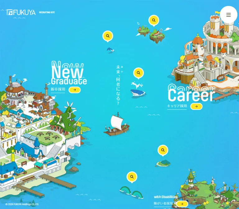
青い海に浮かぶ街や城を採用ナビゲーションにしたサイト。白い丸文字と黄色のピンが目を引き、スマートフォンでは縦に探索する構成へ切り替わります。
オリジナルサイトを見るA recruiting directory presented as a bright illustrated archipelago, with islands to explore and yellow markers to follow.
Website: FUKUYA Recruiting Original URL: https://fukuya-hd.co.jp/recruit/ Final URL: https://fukuya-hd.co.jp/recruit/ Response: HTTP 200; original and final URLs are identical. Theme: bright ocean canvas; one visual theme observed. Inspected: September 17, 2026, at 05:22:56 JST / September 16, 2026, at 20:22:56 UTC, using the supplied browser evidence. Viewports: 1440 × 1000 and 390 × 844 CSS pixels. Scope: the current recruitment index, including three desktop frames and mobile upper and lower views. The desktop document is 1000px tall; the mobile document is 1716px tall. Destination pages and the opened navigation menu were not inspected.
FUKUYA turns its recruitment index into an illustrated world. A blue-to-cyan sea surrounds a large town on the left, an orange-roofed castle on the right, a smaller green settlement, floating islands, a sailing boat, and sea creatures. White display lettering names the three recruitment routes. Bright yellow markers identify company information and practical resources.
This is a navigation hub, with eight observed destination links. The central design relationship is between geography and information: larger settlements support recruitment categories, while smaller landmarks accompany supporting topics. Desktop presents the whole map at once. Mobile rearranges the same world into a vertical journey and exposes the supporting links as readable yellow labels.
A recruiting directory presented as a bright illustrated archipelago, with islands to explore and yellow markers to follow.
Website: FUKUYA Recruiting Original URL: https://fukuya-hd.co.jp/recruit/ Final URL: https://fukuya-hd.co.jp/recruit/ Response: HTTP 200; original and final URLs are identical. Theme: bright ocean canvas; one visual theme observed. Inspected: September 17, 2026, at 05:22:56 JST / September 16, 2026, at 20:22:56 UTC, using the supplied browser evidence. Viewports: 1440 × 1000 and 390 × 844 CSS pixels. Scope: the current recruitment index, including three desktop frames and mobile upper and lower views. The desktop document is 1000px tall; the mobile document is 1716px tall. Destination pages and the opened navigation menu were not inspected.
FUKUYA turns its recruitment index into an illustrated world. A blue-to-cyan sea surrounds a large town on the left, an orange-roofed castle on the right, a smaller green settlement, floating islands, a sailing boat, and sea creatures. White display lettering names the three recruitment routes. Bright yellow markers identify company information and practical resources.
This is a navigation hub, with eight observed destination links. The central design relationship is between geography and information: larger settlements support recruitment categories, while smaller landmarks accompany supporting topics. Desktop presents the whole map at once. Mobile rearranges the same world into a vertical journey and exposes the supporting links as readable yellow labels.
| Name | Value | Suggested token | Evidence and role |
|---|---|---|---|
| Ocean Blue | #44aff6 |
--color-ocean |
Measured body background: rgb(68, 175, 246) at both viewports. Provides the base canvas. |
| Marker Yellow | #ffe622 |
--color-marker |
Measured background of the supporting-link label paragraphs. Visually shared by pins and arrow capsules. |
| Warm Brown | #4c3d15 |
--color-ink |
Measured body and supporting-label text color: rgb(76, 61, 21). Visually consistent with control glyphs. |
| White | #ffffff |
--color-white |
Measured brand-heading, supporting English-caption, and copyright text color. Inline SVG snippets also declare white fills. |
| Central Turquoise | Approximately #19c6d6 |
--color-sea-center |
Visual approximation for the cyan region of the sea. The actual background composition and color stops were not supplied. |
Use yellow as the navigation signal across the entire map. White carries identity, route titles, control outlines, and small English captions. Brown gives the yellow controls a warmer character than black would.
The illustration contributes limestone, green vegetation, blue roofs, orange roofs, and muted contour colors. These belong primarily to the artwork; they do not establish additional interface status colors.
Background limitation: the measured body background is solid blue, while the screenshots show a cyan-centered color field and subtle texture. A gradient is a useful implementation approximation, but its exact source, stops, and compositing cannot be recovered from this evidence.
The exposed WordPress and Swiper custom properties are not evidence that their default colors appear in this interface. Do not add their purple or electric blue values to the visible palette.
LINESeedJP-Regular, followed by Japanese system and sans-serif fallbacks.LINESeedJP-Bold for the Japanese text inside the yellow information labels.400 for both named families. The bold appearance is supplied through the family name; do not automatically add synthetic bold.PilcrowRounded-Semibold on 1 minute, About, News, Welfare, and Faq.400.The copyright uses PilcrowRounded-Regular. The large recruitment titles look consistent with this rounded display language, but their individual text-node font declarations were not included. Their exact font sizes and family assignment remain unverified.
New and Career appear twice in the extracted text. The screenshots explain the repetition: a white outlined word sits behind and above a filled white word. This is a deliberate typographic echo.
Graduate sits below New as a separate, smaller line. with Disabilities uses a single compact line without the same large outlined echo. Its mobile link width remains almost equal to its desktop width, so the responsive system does not uniformly shrink every heading.
The Japanese route labels and central vertical message are associated with inline SVG evidence. Do not infer their typography from the surrounding anchor's inherited body font. The brand lockup is likewise a visual mark; the H1's computed body-size value does not explain the size of the logo lettering.
| Role | Desktop measurement | Mobile measurement | Notes |
|---|---|---|---|
| Body inheritance | 15.7388px / 27.5429px |
14.0245px / 24.5429px |
Approximately 1.75 line height. This index contains very little prose. |
| Supporting English caption | 25.2163px / 25.2163px |
20.0735px / 20.0735px |
PilcrowRounded-Semibold. Desktop captions exist in the DOM but are not visibly expanded in the supplied frames. |
| Japanese information label | 13.8694px / 13.8694px |
13.0122px / 13.0122px |
LINESeedJP-Bold. |
| Copyright | 12.7388px / 12.7388px |
11.0245px / 11.0245px |
PilcrowRounded-Regular; white. |
Filled New lettering |
Approximately 90px visible glyph height | Approximately 50px visible glyph height | Screenshot estimate, not CSS font size. The outlined echo increases the total visual height. |
Graduate lettering |
Approximately 40px visible glyph height | Approximately 25px visible glyph height | Screenshot estimate. |
with Disabilities lettering |
Approximately 28px visible glyph height | Approximately 28px visible glyph height | Screenshot estimate; comparatively stable across viewports. |
No original fluid-type formula was provided. Matching two measured endpoints with a new clamp() expression would be an implementation choice, not a recovered source rule.
Spatial model: an art-directed map, with positioned navigation groups and broad open water between them.
Shape vocabulary: circles, capsules, downward-pointing marker tails, and unboxed text. There is no repeated content-card system.
| Property | Desktop | Mobile | Evidence |
|---|---|---|---|
| Japanese information-label padding | 13.8694px 20.8041px 12.4824px |
13.0122px 19.5184px 11.711px |
Measured: top, horizontal, bottom. |
| Padding relative to label font | Approximately 1em 1.5em 0.9em |
Approximately 1em 1.5em 0.9em |
Derived from the measured values. |
| Japanese label box height | 48.20px |
43.72px |
Measured paragraph rectangles; desktop visible pins have different painted geometry. |
| Caption-plus-label group height | 73.42px |
63.80px |
Measured supporting-link rectangles. |
| Label radius | 9999px |
9999px |
Measured. |
| White label outline | Approximately 4px | Approximately 3px | Visual estimate, also consistent with the remaining box height after text and padding. Border declarations were not supplied. |
Do not force these values onto an assumed 8px spacing scale. The fractional measurements indicate responsive sizing, but the source formula is unknown.
| Element | Desktop appearance | Mobile appearance | Measurement status |
|---|---|---|---|
| Menu button | White circle, approximately 86–88px across | White circle, approximately 60px across | Screenshot estimate. |
| Supporting marker | Yellow circle about 48px across, white outline, small white pointer | Yellow text capsule with white outline and pointer | Screenshot observation; label dimensions measured separately. |
| Route arrow | Yellow capsule, approximately 62 × 35px | Approximately 38 × 23px | Screenshot estimate. |
| Menu glyph | Three thin brown horizontal strokes | Same motif at smaller scale | Visual observation. |
| Route-label rule | Fine white line beneath the Japanese label | Retained at smaller size | Visual observation; may be part of the graphic label. |
| Element | Desktop | Mobile |
|---|---|---|
| Main scene | 1440 × 1000px |
390 × 1716px |
| Scene grid | One measured column of 1440px |
One measured column of 390px |
| Header flow height | 0px |
0px |
| Brand H1 rectangle | 250.97 × 38.92px, at (58.23, 47.38) |
194.38 × 31.36px, at (20.61, 30.23) |
| Copyright position | (31.73, 968.58) |
(10.30, 1694.86) in document coordinates |
The zero-height header is consistent with a floating brand and menu over the scene rather than a conventional header band.
Role: maintain identity and access to navigation without interrupting the illustrated world.
Place the white FUKUYA mark and small RECRUITING SITE descriptor near the upper-left corner. Keep them directly over the sea, without a backing panel or separator line. The brand occupies a smaller proportion of desktop width than mobile width.
The opposite corner contains a white circular menu button with a restrained brown three-line glyph. In the lower mobile capture, this control remains near the upper-right viewport corner while the initial brand lockup is no longer visible. This supports persistent mobile menu placement; the exact positioning declaration was not supplied.
Only the closed menu state is visible. Menu contents, opening motion, focus management, and dismissal behavior are unverified.
Role: the main information architecture and visual identity.
The desktop scene fills the viewport with no separate hero panel, content grid, or footer band. Large land masses enter from the left, upper-right, and lower-right edges. Their cropped silhouettes make the world feel larger than the browser window.
Leave the central water comparatively open. A small white-sailed boat sits below the central message; smaller landmarks and navigation markers punctuate the sea. The illustration is dense at the perimeter, while the central space gives large text and small controls room to remain legible.
For a new implementation, separate decorative art from semantic links. Mobile rearrangement requires either independently positionable artwork or a separately composed mobile scene.
Role: direct visitors to one of the three recruitment categories.
The observed link anatomy is:
New or Career.The routes are New Graduate / 新卒採用, Career / キャリア採用, and with Disabilities / 障がい者採用.
Use the complete group as the link target. The small arrow is a directional cue within the larger link, not the sole interactive area. Keep headings over relatively quiet sea or carefully chosen gaps in the illustration.
The disabilities route is deliberately more compact than the two large recruitment headings. Do not enlarge it to the same scale simply to impose a uniform component template.
Role: identify practical information through smaller illustrated landmarks.
| English caption | Japanese label | Observed destination | Associated landmark |
|---|---|---|---|
1 minute |
1分で分かるFUKUYA |
/recruit/1minute/ |
Floating islands |
About |
FUKUYAについて |
/recruit/about/ |
Whale |
News |
お知らせ |
/recruit/news/ |
Leaping dolphin |
Welfare |
福利厚生 |
/recruit/welfare/ |
Small green island |
Faq |
採用FAQ |
/recruit/faq/ |
Paired green sea creatures |
Desktop painted state: a yellow circular marker containing a brown magnifier, surrounded by a white ring and ending in a white downward pointer. The text captions and full Japanese label boxes exist in the DOM, but the supplied desktop frames show the compact markers.
Mobile painted state: the English caption is visible above a yellow Japanese text capsule. The capsule retains the white border and pointer. No hover is necessary to read these mobile labels.
The evidence does not establish how desktop labels become visible. Hover, focus, click, and automatic reveal behavior were not exercised. An implementation can add hover and keyboard-focus disclosure, but must label that as an added behavior.
Role: give the map an aspirational center without competing with the recruitment routes.
The desktop capture shows the white vertical message 未来、何者になる?, including small side annotations. It is narrow, approximately centered horizontally, and placed above the boat. Inline SVG evidence uses the identifier kv-title and a white fill.
This message is not visible in the supplied mobile views. Its mobile presence, replacement, or CSS visibility rule cannot be established from the excerpt alone.
Role: associate destinations with memorable visual objects and provide restrained ambient activity.
The whale, dolphin, floating islands, small island, and paired sea creatures act as landmarks near the supporting links. They are not separate content cards. Keep the marker and its landmark spatially related even when the composition changes between screen sizes.
Changing animal states are visible across the three desktop captures. The medium and rendering mechanism are unknown; do not assume GIF, video, canvas, or a particular animation library.
Role: provide a minimal legal signature at the end of the scene.
The white © 2024 FUKUYA Holdings CO.,LTD. line sits at the lower-left corner. It uses PilcrowRounded-Regular and no enclosing footer surface. On mobile it appears near the end of the 1716px document, rather than occupying a persistent bottom bar.
The displayed year is source content, not evidence of the inspection or publication date.
| Treatment | Evidence | What can be concluded |
|---|---|---|
| Recruitment and information-link transforms | transform 0.6s cubic-bezier(0.24, 0.45, 0.32, 1) |
A 600ms transform transition is declared. The trigger and transform endpoints were not captured. |
| Brand H1 | opacity 0.9s, background-color 0.3s |
Opacity and background-color transitions are declared. This does not prove a specific opening sequence. |
| Main scene section | filter 1.05s |
A filter transition is declared. The filter values and associated state are unknown. |
| Whale | Spout shape changes across desktop frames | Ambient animation is supported by visible frame differences. |
| Dolphin | Position or visibility changes across desktop frames | A changing animal state is supported; trajectory and timing are unmeasured. |
| Paired green sea creatures | Silhouette or pose changes between frames | Small ambient motion is supported. |
| Menu opening | Closed state only | Interaction and transition unverified. |
| Desktop marker expansion | Compact markers only in screenshots | Text is present in the DOM; reveal behavior is unverified. |
The sampled structural elements report animation: none. That does not rule out animated descendants, image frames, or script-driven changes. Likewise, a bare transition: all entry without a nonzero duration should not be treated as evidence of visible animation.
Recommended motion approach: preserve quiet navigation and let a few sea creatures supply activity. Keep landmarks stable enough to identify and select. If adding hover movement, use a small displacement with the observed easing rather than a large bounce or tilt. Provide a static or paused reduced-motion presentation.
| Layer | Appearance | Function |
|---|---|---|
| Ocean canvas | Blue base with visible cyan variation and fine texture | Connects the entire scene and supplies negative space. |
| Illustrated geography | Detailed outlines, colored roofs, pale walls, green terrain | Carries the world and recruitment-area identity. |
| Water shadows | Flat teal shapes beneath illustrated objects | Integrate objects into the scene; these are artwork shadows. |
| Route typography | White text directly on the scene | Establishes the primary navigation hierarchy. |
| Supporting controls | Yellow fill, white border, brown glyphs or text | Provides a consistent navigation signal. |
| Menu | Plain white disk with brown lines | A distinct utility control above the artwork. |
| Footer | Small white text without a background band | Keeps the map visually continuous. |
There is no visible glass, raised card stack, broad panel shadow, or boxed content section. Do not translate the illustrated water shadows into a general UI elevation system.
The art resembles a hand-drawn fantasy world viewed obliquely from above. Use uneven contour lines, pale masonry, clustered buildings, improbable towers, curved green roofs, small windmills, bridges, docks, vegetation, and miniature architectural detail.
The three main settlements differ in silhouette and roof color. The large left town combines blue roofs, white walls, and a green organic building. The upper-right settlement emphasizes orange roofs and a tall castle. The smaller settlement uses green structures and grassy terrain. These differences help the recruitment routes feel like distinct places within one world.
Floating islands, a white sail, a whale, dolphins, small wave marks, and birds maintain continuity across the open sea. Artwork should feel illustrated rather than photorealistic, glossy, or mechanically isometric. No photography appears in the supplied index captures.
No original image-file URLs, intrinsic image dimensions, or font-file URLs were included in the supplied evidence. The following references identify observed visual material, not downloadable files.
| Material | Evidence | Implementation implication |
|---|---|---|
| Brand lockup | White FUKUYA mark and recruiting descriptor in the screenshots | Use authorized brand artwork; avoid approximating the mark with ordinary text. |
| Vertical message | Inline SVG styling associated with kv-title |
Preserve the slender vertical composition and white fill. |
| Japanese recruitment labels | Inline SVG identifiers including new_bg, career_jp, and disabilities_jp |
Treat the lettering as supplied graphics when available. |
| Main settlements | Current desktop and mobile screenshots | Prepare compositions that tolerate intentional edge cropping. |
| Smaller landmarks | Both responsive views | Preserve the relationship between landmark and navigation label. |
| Animal motion | Differences across desktop frames | Determine the actual asset format before implementing playback or reduced motion. |
The named fonts require available, appropriately licensed font files. Declaring their family names alone will not load them.
Recommended asset preparation: retain transparent edges where objects overlap the ocean; separate decorative artwork from clickable labels; supply adequate raster resolution where needed; and avoid baking essential navigation text into a single full-page image. Smooth illustration rendering is appropriate—pixelated scaling would introduce an unsupported visual style.
At 1440 × 1000, the document height equals the viewport height. All three recruitment routes, five information markers, the brand, menu, and copyright fit into one scene.
The left town anchors the new-graduate route around the left-center of the map. The castle anchors Career on the right. The disabilities route sits near the lower-right settlement. Information markers occupy the water between these larger destinations.
The section reports a single grid column. The visible composition is spatially arranged rather than a conventional multi-column list. Exact positioning rules were not supplied.
At 390 × 844, the document is 1716px tall—about 2.03 viewport heights. The layout changes its composition rather than proportionally shrinking the desktop scene.
The upper view contains the brand, menu, sailboat, large left town, new-graduate route, and the one-minute introduction above floating islands. A castle begins entering from the right near the bottom of that view.
Farther down, Career appears beside the right-hand castle. About and News form a staggered pair across open water. The green disabilities settlement enters from the left, with its recruitment title toward the right. Welfare and Faq finish the journey above their respective landmarks and the copyright.
The lower screenshot is consistent with a scroll offset of approximately 872px, derived from the document height and footer position. No explicit scroll-offset measurement was supplied.
Coordinates are x, y; dimensions are width × height, in CSS pixels. Mobile positions are document coordinates from the initial DOM snapshot. Desktop supporting-link rectangles include text structures that are not visibly expanded in the screenshots.
| Destination | Desktop position / size | Mobile position / size |
|---|---|---|
| New Graduate | (306.00, 213.19) / 241.92 × 241.98 |
(240.77, 378.13) / 130.47 × 143.94 |
| Career | (1080.00, 403.52) / 281.78 × 156.48 |
(74.53, 863.45) / 162.81 × 98.00 |
| with Disabilities | (968.23, 880.02) / 206.73 × 79.98 |
(130.00, 1309.16) / 204.77 × 66.80 |
| 1 minute | (911.72, 30.00) / 186.28 × 73.42 |
(84.64, 564.16) / 173.33 × 63.80 |
| About | (780.30, 300.00) / 164.70 × 73.42 |
(31.19, 988.00) / 153.09 × 63.80 |
| News | (576.00, 120.00) / 102.55 × 73.42 |
(243.27, 1081.59) / 94.73 × 63.80 |
| Welfare | (902.95, 576.58) / 105.05 × 73.42 |
(36.39, 1433.81) / 97.08 × 63.80 |
| Faq | (755.47, 826.58) / 108.53 × 73.42 |
(216.84, 1512.39) / 100.36 × 63.80 |
Only two viewport widths were inspected. The actual breakpoint, tablet composition, landscape behavior, safe-area handling, and intermediate scaling functions remain unknown. The breakpoint and sizing rules in the Quick Start are recommendations.
These are improvements for a new implementation, not verified properties of the current site:
#44aff6.#19c6d6; visual approximation only.#ffe622.#4c3d15.#ffffff.“Create an illustrated recruitment navigation hub as a bright ocean archipelago. Use a sky-blue canvas, a cyan central sea, white rounded display lettering, and yellow navigation markers outlined in white with warm-brown glyphs. Place a detailed fantasy town along the left edge, an orange-roofed castle on the right, and a smaller green settlement below. Associate three recruitment routes with those places. Give New and Career an outlined word echo behind their filled white titles. Add small landmarks for company introduction, About, News, Welfare, and FAQ. Desktop shows one complete map with compact information pins; mobile recomposes it into a vertical world with readable text capsules. Keep the artwork dominant, the sea spacious, and animal motion subtle.”
This is a usable interface scaffold, not recovered source CSS. Exact measured colors, caption sizes, label padding ratios, and link easing are retained. Route-title sizes, the ocean gradient, the 767px breakpoint, hover disclosure, and stage interpolation are recommended approximations.
The mobile stage uses the observed 1716 / 390 = 4.4 aspect relationship, with a minimum height to reduce crowding at narrower widths. This is an adaptation, not evidence that the original uses 440vw. Artwork, authorized font files, the brand asset, and menu behavior must be supplied separately.
:root {
  /* Measured interface colors */
  --color-ocean: #44aff6;
  --color-marker: #ffe622;
  --color-ink: #4c3d15;
  --color-white: #fff;

  /* Estimated background accent */
  --color-sea-center: #19c6d6;

  /* Observed family names; provide licensed font files */
  --font-jp: 'LINESeedJP-Regular', 'Hiragino Sans',
    'Noto Sans JP', Meiryo, Arial, sans-serif;
  --font-jp-bold: 'LINESeedJP-Bold', 'Hiragino Sans',
    'Noto Sans JP', Meiryo, Arial, sans-serif;
  --font-rounded: 'PilcrowRounded-Semibold',
    'Arial Rounded MT Bold', 'Trebuchet MS', sans-serif;
  --font-caption: 'PilcrowRounded-Regular',
    'Trebuchet MS', sans-serif;

  --text-body: 15.7388px;
  --text-stop: 25.2163px;
  --text-label: 13.8694px;
  --text-copyright: 12.7388px;
  --label-border: 4px;
  --radius-pill: 9999px;
  --motion-link: 600ms cubic-bezier(0.24, 0.45, 0.32, 1);
}

* { box-sizing: border-box; }

body {
  margin: 0;
  color: var(--color-ink);
  background: var(--color-ocean);
  font: 400 var(--text-body) / 1.75 var(--font-jp);
}

.recruit-map {
  position: relative;
  isolation: isolate;
  height: 100svh;
  min-height: 640px; /* Recommended short-screen safeguard */
  overflow: hidden;
  background: radial-gradient(
    ellipse at 45% 48%,
    var(--color-sea-center),
    var(--color-ocean) 85%
  );
}

/* Apply to decorative scene layers; position each artwork separately. */
.scene-art {
  position: absolute;
  z-index: 0;
  pointer-events: none;
}

.map-brand {
  position: absolute;
  z-index: 3;
  top: 47.38px;
  left: 58.23px;
  width: 250.97px;
  margin: 0;
}

.map-brand img { display: block; width: 100%; height: auto; }

.map-menu {
  position: fixed;
  z-index: 10;
  top: max(28px, env(safe-area-inset-top));
  right: max(24px, env(safe-area-inset-right));
  display: grid;
  place-items: center;
  width: 88px;
  height: 88px;
  padding: 0;
  border: 0;
  border-radius: 50%;
  color: var(--color-ink);
  background: var(--color-white);
  cursor: pointer;
}

.route,
.map-stop {
  position: absolute;
  z-index: 2;
  color: var(--color-white);
  text-decoration: none;
  transition: transform var(--motion-link);
}

.route {
  display: block;
  font-family: var(--font-rounded);
  font-weight: 400;
}

/* Positions normalized from measured anchor rectangles. */
.route--graduate { left: 21.25%; top: 21.32%; width: 242px; }
.route--career { left: 75%; top: 40.35%; width: 282px; }
.route--disabilities { left: 67.24%; top: 88%; width: 207px; }

/* Display sizes are visual approximations, not measured source values. */
.route-word {
  position: relative;
  display: block;
  padding-top: 0.2em;
  font-size: 120px;
  line-height: 0.9;
}

.route-word__echo {
  position: absolute;
  top: 0;
  left: 0;
  color: transparent;
  -webkit-text-stroke: 1.5px var(--color-white);
  pointer-events: none;
}

.route-support { display: block; font-size: 54px; line-height: 1; }
.route--career .route-word { font-size: 104px; }
.route--disabilities .route-word {
  padding-top: 0;
  font-size: 32px;
  line-height: 1.1;
  white-space: nowrap;
}

.route-caption {
  display: flex;
  align-items: center;
  gap: 16px;
  margin-top: 8px;
  font: 400 22px / 1.2 var(--font-jp);
}

.route-caption > span:first-child {
  padding-bottom: 4px;
  border-bottom: 1px solid var(--color-white);
}

.route-arrow {
  display: grid;
  flex: 0 0 auto;
  place-items: center;
  width: 62px;
  height: 35px;
  border: 3px solid var(--color-white);
  border-radius: var(--radius-pill);
  color: var(--color-ink);
  background: var(--color-marker);
  font: 400 22px / 1 Arial, sans-serif;
}

.map-stop {
  display: grid;
  justify-items: center;
  width: max-content;
  translate: -50% 0;
}

.map-stop[data-stop='minute'] { left: 69.79%; top: 3%; }
.map-stop[data-stop='about'] { left: 59.91%; top: 30%; }
.map-stop[data-stop='news'] { left: 43.56%; top: 12%; }
.map-stop[data-stop='welfare'] { left: 66.35%; top: 57.66%; }
.map-stop[data-stop='faq'] { left: 56.24%; top: 82.66%; }

.stop-name {
  visibility: hidden;
  font: 400 var(--text-stop) / 1 var(--font-rounded);
}

.stop-chip {
  position: relative;
  display: inline-flex;
  align-items: center;
  justify-content: center;
  width: 48px;
  height: 48px;
  border: var(--label-border) solid var(--color-white);
  border-radius: var(--radius-pill);
  color: var(--color-ink);
  background: var(--color-marker);
  font: 400 var(--text-label) / 1 var(--font-jp-bold);
  white-space: nowrap;
}

.stop-chip::after {
  position: absolute;
  top: 100%;
  left: 50%;
  width: 0;
  height: 0;
  border: 8px solid transparent;
  border-top: 10px solid var(--color-white);
  border-bottom: 0;
  transform: translateX(-50%);
  content: '';
}

.stop-text { display: none; }

.stop-icon {
  position: relative;
  width: 13px;
  height: 13px;
  border: 2.5px solid currentColor;
  border-radius: 50%;
}

.stop-icon::after {
  position: absolute;
  right: -6px;
  bottom: -3px;
  width: 7px;
  height: 2.5px;
  border-radius: 2px;
  background: currentColor;
  transform: rotate(45deg);
  content: '';
}

/* Recommended disclosure and hover endpoints; not observed behavior. */
.map-stop:focus-visible .stop-name { visibility: visible; }
.map-stop:focus-visible .stop-text { display: inline; }
.map-stop:focus-visible .stop-icon { display: none; }
.map-stop:focus-visible .stop-chip {
  width: max-content;
  height: auto;
  padding: 1em 1.5em 0.9em;
}

@media (hover: hover) {
  .route:hover { transform: translateY(-2px); }
  .map-stop:hover .stop-name { visibility: visible; }
  .map-stop:hover .stop-text { display: inline; }
  .map-stop:hover .stop-icon { display: none; }
  .map-stop:hover .stop-chip {
    width: max-content;
    height: auto;
    padding: 1em 1.5em 0.9em;
  }
}

.map-copyright {
  position: absolute;
  z-index: 2;
  left: 31.73px;
  bottom: 18.69px;
  margin: 0;
  color: var(--color-white);
  font: 400 var(--text-copyright) / 1 var(--font-caption);
}

/* Recommended high-visibility keyboard focus treatment. */
.recruit-map :focus-visible {
  outline: 3px solid var(--color-ink);
  outline-offset: 5px;
  box-shadow: 0 0 0 5px var(--color-white);
}

/* Recommended breakpoint; the original breakpoint is unknown. */
@media (max-width: 767px) {
  :root {
    --text-body: 14.0245px;
    --text-stop: 20.0735px;
    --text-label: 13.0122px;
    --text-copyright: 11.0245px;
    --label-border: 3px;
  }

  .recruit-map { height: max(1716px, 440vw); }
  .map-brand { top: 30.23px; left: 20.61px; width: 194.38px; }
  .map-menu { top: 20px; right: 20px; width: 60px; height: 60px; }

  .route--graduate { left: 61.74%; top: 22.04%; width: 130.47px; }
  .route--career { left: 19.11%; top: 50.32%; width: 162.81px; }
  .route--disabilities { left: 33.33%; top: 76.29%; width: 204.77px; }
  .route-word { font-size: 66px; }
  .route-support { font-size: 32px; }
  .route--career .route-word { font-size: 60px; }
  .route--disabilities .route-word { font-size: 32px; }
  .route-caption { gap: 12px; margin-top: 6px; font-size: 13px; }
  .route-arrow { width: 38px; height: 23px; font-size: 16px; }

  .map-stop[data-stop='minute'] { left: 43.92%; top: 32.88%; }
  .map-stop[data-stop='about'] { left: 27.62%; top: 57.58%; }
  .map-stop[data-stop='news'] { left: 74.52%; top: 63.03%; }
  .map-stop[data-stop='welfare'] { left: 21.78%; top: 83.56%; }
  .map-stop[data-stop='faq'] { left: 68.47%; top: 88.13%; }

  .stop-name { visibility: visible; }
  .stop-text { display: inline; }
  .stop-icon { display: none; }
  .stop-chip {
    width: max-content;
    height: auto;
    min-height: 44px;
    padding: 1em 1.5em 0.9em;
  }

  .map-copyright { left: 10.3px; bottom: 10.1px; }
}

@media (prefers-reduced-motion: reduce) {
  .route,
  .map-stop { transition: none; }
  .route:hover { transform: none; }
  /* Pause or replace animated artwork through its actual playback system. */
}
This fragment demonstrates one route and one information marker. Add the remaining destinations using the position classes and data-stop values above. Decorative artwork and a functioning menu belong in separate layers. The links use observed destination URLs; their destination-page designs were not inspected.
<main class="recruit-map" aria-label="Recruitment navigation">
  <a class="route route--graduate"
     href="https://fukuya-hd.co.jp/recruit/new-graduate/"
     aria-label="新卒採用">
    <span class="route-word" aria-hidden="true">
      <span class="route-word__echo">New</span>
      <span>New</span>
    </span>
    <span class="route-support" aria-hidden="true">Graduate</span>
    <span class="route-caption">
      <span>新卒採用</span>
      <span class="route-arrow" aria-hidden="true">→</span>
    </span>
  </a>

  <a class="map-stop" data-stop="minute"
     href="https://fukuya-hd.co.jp/recruit/1minute/"
     aria-label="1分で分かるFUKUYA">
    <span class="stop-name" aria-hidden="true">1 minute</span>
    <span class="stop-chip">
      <span class="stop-icon" aria-hidden="true"></span>
      <span class="stop-text">1分で分かるFUKUYA</span>
    </span>
  </a>
</main>
Optional aliases for a project already using Tailwind v4. This does not imply that the original website uses Tailwind. Define the custom properties above first.
@theme inline {
  --color-ocean: #44aff6;
  --color-marker: #ffe622;
  --color-ink: #4c3d15;
  --color-sea-center: #19c6d6;
  --font-sans: var(--font-jp);
  --font-display: var(--font-rounded);
  --text-stop: var(--text-stop-size, 20.0735px);
  --radius-marker: 9999px;
}
株式会社福屋ホールディングス 採用情報.20:22:56.483 UTC, corresponding to September 17 at 05:22:56.483 JST.This reference describes the current recruitment index evidenced by those captures. Exact image paths, font-file resources, animation mechanisms, original responsive formulas, and unexercised interaction states remain unverified. Estimated visuals and recommended implementation behavior are labeled throughout.
# FUKUYA Recruiting — Style Reference

> A recruiting directory presented as a bright illustrated archipelago, with islands to explore and yellow markers to follow.

**Website:** [FUKUYA Recruiting](https://fukuya-hd.co.jp/recruit/)
**Original URL:** https://fukuya-hd.co.jp/recruit/
**Final URL:** https://fukuya-hd.co.jp/recruit/
**Response:** HTTP 200; original and final URLs are identical.
**Theme:** bright ocean canvas; one visual theme observed.
**Inspected:** September 17, 2026, at 05:22:56 JST / September 16, 2026, at 20:22:56 UTC, using the supplied browser evidence.
**Viewports:** 1440 × 1000 and 390 × 844 CSS pixels.
**Scope:** the current recruitment index, including three desktop frames and mobile upper and lower views. The desktop document is 1000px tall; the mobile document is 1716px tall. Destination pages and the opened navigation menu were not inspected.

FUKUYA turns its recruitment index into an illustrated world. A blue-to-cyan sea surrounds a large town on the left, an orange-roofed castle on the right, a smaller green settlement, floating islands, a sailing boat, and sea creatures. White display lettering names the three recruitment routes. Bright yellow markers identify company information and practical resources.

This is a navigation hub, with eight observed destination links. The central design relationship is between geography and information: larger settlements support recruitment categories, while smaller landmarks accompany supporting topics. Desktop presents the whole map at once. Mobile rearranges the same world into a vertical journey and exposes the supporting links as readable yellow labels.
# FUKUYA Recruiting — Style Reference

> A recruiting directory presented as a bright illustrated archipelago, with islands to explore and yellow markers to follow.

**Website:** [FUKUYA Recruiting](https://fukuya-hd.co.jp/recruit/)
**Original URL:** https://fukuya-hd.co.jp/recruit/
**Final URL:** https://fukuya-hd.co.jp/recruit/
**Response:** HTTP 200; original and final URLs are identical.
**Theme:** bright ocean canvas; one visual theme observed.
**Inspected:** September 17, 2026, at 05:22:56 JST / September 16, 2026, at 20:22:56 UTC, using the supplied browser evidence.
**Viewports:** 1440 × 1000 and 390 × 844 CSS pixels.
**Scope:** the current recruitment index, including three desktop frames and mobile upper and lower views. The desktop document is 1000px tall; the mobile document is 1716px tall. Destination pages and the opened navigation menu were not inspected.

FUKUYA turns its recruitment index into an illustrated world. A blue-to-cyan sea surrounds a large town on the left, an orange-roofed castle on the right, a smaller green settlement, floating islands, a sailing boat, and sea creatures. White display lettering names the three recruitment routes. Bright yellow markers identify company information and practical resources.

This is a navigation hub, with eight observed destination links. The central design relationship is between geography and information: larger settlements support recruitment categories, while smaller landmarks accompany supporting topics. Desktop presents the whole map at once. Mobile rearranges the same world into a vertical journey and exposes the supporting links as readable yellow labels.

## How to Read This Reference

- **Measured** values come from the supplied rendered DOM and computed styles. Tables generally round dimensions to two decimal places.
- **Visual estimates** describe painted shapes visible in the current-page screenshots. They are not pixel-sampled colors or recovered CSS declarations.
- **Derived values** are calculations from the measurements, such as padding ratios or normalized positions.
- **Recommendations** describe an implementation approach, accessibility additions, or fallback behavior. They are not claims about the original site.
- Token names below are descriptive aliases. No site-specific semantic token system was exposed in the supplied custom properties.
- A DOM rectangle does not necessarily describe the visible shape. This distinction is especially important for the desktop information markers.

## Tokens — Colors

### Default Palette

| Name | Value | Suggested token | Evidence and role |
| --- | --- | --- | --- |
| Ocean Blue | `#44aff6` | `--color-ocean` | Measured body background: `rgb(68, 175, 246)` at both viewports. Provides the base canvas. |
| Marker Yellow | `#ffe622` | `--color-marker` | Measured background of the supporting-link label paragraphs. Visually shared by pins and arrow capsules. |
| Warm Brown | `#4c3d15` | `--color-ink` | Measured body and supporting-label text color: `rgb(76, 61, 21)`. Visually consistent with control glyphs. |
| White | `#ffffff` | `--color-white` | Measured brand-heading, supporting English-caption, and copyright text color. Inline SVG snippets also declare white fills. |
| Central Turquoise | Approximately `#19c6d6` | `--color-sea-center` | Visual approximation for the cyan region of the sea. The actual background composition and color stops were not supplied. |

Use yellow as the navigation signal across the entire map. White carries identity, route titles, control outlines, and small English captions. Brown gives the yellow controls a warmer character than black would.

The illustration contributes limestone, green vegetation, blue roofs, orange roofs, and muted contour colors. These belong primarily to the artwork; they do not establish additional interface status colors.

**Background limitation:** the measured body background is solid blue, while the screenshots show a cyan-centered color field and subtle texture. A gradient is a useful implementation approximation, but its exact source, stops, and compositing cannot be recovered from this evidence.

The exposed WordPress and Swiper custom properties are not evidence that their default colors appear in this interface. Do not add their purple or electric blue values to the visible palette.

## Tokens — Typography

### Japanese Interface Text

- **Measured body family:** `LINESeedJP-Regular`, followed by Japanese system and sans-serif fallbacks.
- **Observed fallbacks include:** Hiragino Sans, Hiragino Kaku Gothic ProN, YuGothic, Noto Sans JP, BIZ UDPGothic, Meiryo, Helvetica Neue, and Arial.
- **Measured label family:** `LINESeedJP-Bold` for the Japanese text inside the yellow information labels.
- **Computed weight:** `400` for both named families. The bold appearance is supplied through the family name; do not automatically add synthetic bold.
- **Tracking:** normal on the sampled elements.

### Rounded English Captions

- **Measured family:** `PilcrowRounded-Semibold` on `1 minute`, `About`, `News`, `Welfare`, and `Faq`.
- **Measured weight:** `400`.
- **Measured line height:** equal to font size.
- **Character:** compact, rounded, and friendly, with narrow proportions that work above small markers.

The copyright uses `PilcrowRounded-Regular`. The large recruitment titles look consistent with this rounded display language, but their individual text-node font declarations were not included. Their exact font sizes and family assignment remain unverified.

### Route Titles and Graphic Lettering

`New` and `Career` appear twice in the extracted text. The screenshots explain the repetition: a white outlined word sits behind and above a filled white word. This is a deliberate typographic echo.

`Graduate` sits below `New` as a separate, smaller line. `with Disabilities` uses a single compact line without the same large outlined echo. Its mobile link width remains almost equal to its desktop width, so the responsive system does not uniformly shrink every heading.

The Japanese route labels and central vertical message are associated with inline SVG evidence. Do not infer their typography from the surrounding anchor's inherited body font. The brand lockup is likewise a visual mark; the H1's computed body-size value does not explain the size of the logo lettering.

### Type Scale

| Role | Desktop measurement | Mobile measurement | Notes |
| --- | --- | --- | --- |
| Body inheritance | `15.7388px / 27.5429px` | `14.0245px / 24.5429px` | Approximately `1.75` line height. This index contains very little prose. |
| Supporting English caption | `25.2163px / 25.2163px` | `20.0735px / 20.0735px` | PilcrowRounded-Semibold. Desktop captions exist in the DOM but are not visibly expanded in the supplied frames. |
| Japanese information label | `13.8694px / 13.8694px` | `13.0122px / 13.0122px` | LINESeedJP-Bold. |
| Copyright | `12.7388px / 12.7388px` | `11.0245px / 11.0245px` | PilcrowRounded-Regular; white. |
| Filled `New` lettering | Approximately 90px visible glyph height | Approximately 50px visible glyph height | Screenshot estimate, not CSS font size. The outlined echo increases the total visual height. |
| `Graduate` lettering | Approximately 40px visible glyph height | Approximately 25px visible glyph height | Screenshot estimate. |
| `with Disabilities` lettering | Approximately 28px visible glyph height | Approximately 28px visible glyph height | Screenshot estimate; comparatively stable across viewports. |

No original fluid-type formula was provided. Matching two measured endpoints with a new `clamp()` expression would be an implementation choice, not a recovered source rule.

## Tokens — Spacing & Shapes

**Spatial model:** an art-directed map, with positioned navigation groups and broad open water between them.

**Shape vocabulary:** circles, capsules, downward-pointing marker tails, and unboxed text. There is no repeated content-card system.

### Component Spacing

| Property | Desktop | Mobile | Evidence |
| --- | --- | --- | --- |
| Japanese information-label padding | `13.8694px 20.8041px 12.4824px` | `13.0122px 19.5184px 11.711px` | Measured: top, horizontal, bottom. |
| Padding relative to label font | Approximately `1em 1.5em 0.9em` | Approximately `1em 1.5em 0.9em` | Derived from the measured values. |
| Japanese label box height | `48.20px` | `43.72px` | Measured paragraph rectangles; desktop visible pins have different painted geometry. |
| Caption-plus-label group height | `73.42px` | `63.80px` | Measured supporting-link rectangles. |
| Label radius | `9999px` | `9999px` | Measured. |
| White label outline | Approximately 4px | Approximately 3px | Visual estimate, also consistent with the remaining box height after text and padding. Border declarations were not supplied. |

Do not force these values onto an assumed 8px spacing scale. The fractional measurements indicate responsive sizing, but the source formula is unknown.

### Control Geometry

| Element | Desktop appearance | Mobile appearance | Measurement status |
| --- | --- | --- | --- |
| Menu button | White circle, approximately 86–88px across | White circle, approximately 60px across | Screenshot estimate. |
| Supporting marker | Yellow circle about 48px across, white outline, small white pointer | Yellow text capsule with white outline and pointer | Screenshot observation; label dimensions measured separately. |
| Route arrow | Yellow capsule, approximately 62 × 35px | Approximately 38 × 23px | Screenshot estimate. |
| Menu glyph | Three thin brown horizontal strokes | Same motif at smaller scale | Visual observation. |
| Route-label rule | Fine white line beneath the Japanese label | Retained at smaller size | Visual observation; may be part of the graphic label. |

### Structural Measurements

| Element | Desktop | Mobile |
| --- | --- | --- |
| Main scene | `1440 × 1000px` | `390 × 1716px` |
| Scene grid | One measured column of `1440px` | One measured column of `390px` |
| Header flow height | `0px` | `0px` |
| Brand H1 rectangle | `250.97 × 38.92px`, at `(58.23, 47.38)` | `194.38 × 31.36px`, at `(20.61, 30.23)` |
| Copyright position | `(31.73, 968.58)` | `(10.30, 1694.86)` in document coordinates |

The zero-height header is consistent with a floating brand and menu over the scene rather than a conventional header band.

## Components

### Floating Brand and Menu

**Role:** maintain identity and access to navigation without interrupting the illustrated world.

Place the white FUKUYA mark and small `RECRUITING SITE` descriptor near the upper-left corner. Keep them directly over the sea, without a backing panel or separator line. The brand occupies a smaller proportion of desktop width than mobile width.

The opposite corner contains a white circular menu button with a restrained brown three-line glyph. In the lower mobile capture, this control remains near the upper-right viewport corner while the initial brand lockup is no longer visible. This supports persistent mobile menu placement; the exact positioning declaration was not supplied.

Only the closed menu state is visible. Menu contents, opening motion, focus management, and dismissal behavior are unverified.

### Illustrated Map Canvas

**Role:** the main information architecture and visual identity.

The desktop scene fills the viewport with no separate hero panel, content grid, or footer band. Large land masses enter from the left, upper-right, and lower-right edges. Their cropped silhouettes make the world feel larger than the browser window.

Leave the central water comparatively open. A small white-sailed boat sits below the central message; smaller landmarks and navigation markers punctuate the sea. The illustration is dense at the perimeter, while the central space gives large text and small controls room to remain legible.

For a new implementation, separate decorative art from semantic links. Mobile rearrangement requires either independently positionable artwork or a separately composed mobile scene.

### Primary Recruitment Route

**Role:** direct visitors to one of the three recruitment categories.

The observed link anatomy is:

1. A prominent white English route title.
2. An outlined duplicate behind `New` or `Career`.
3. A white Japanese route label with a fine underline.
4. A yellow, white-bordered arrow capsule beside that label.
5. A single enclosing anchor connecting the group to its destination.

The routes are `New Graduate` / `新卒採用`, `Career` / `キャリア採用`, and `with Disabilities` / `障がい者採用`.

Use the complete group as the link target. The small arrow is a directional cue within the larger link, not the sole interactive area. Keep headings over relatively quiet sea or carefully chosen gaps in the illustration.

The disabilities route is deliberately more compact than the two large recruitment headings. Do not enlarge it to the same scale simply to impose a uniform component template.

### Supporting Information Marker

**Role:** identify practical information through smaller illustrated landmarks.

| English caption | Japanese label | Observed destination | Associated landmark |
| --- | --- | --- | --- |
| `1 minute` | `1分で分かるFUKUYA` | `/recruit/1minute/` | Floating islands |
| `About` | `FUKUYAについて` | `/recruit/about/` | Whale |
| `News` | `お知らせ` | `/recruit/news/` | Leaping dolphin |
| `Welfare` | `福利厚生` | `/recruit/welfare/` | Small green island |
| `Faq` | `採用FAQ` | `/recruit/faq/` | Paired green sea creatures |

**Desktop painted state:** a yellow circular marker containing a brown magnifier, surrounded by a white ring and ending in a white downward pointer. The text captions and full Japanese label boxes exist in the DOM, but the supplied desktop frames show the compact markers.

**Mobile painted state:** the English caption is visible above a yellow Japanese text capsule. The capsule retains the white border and pointer. No hover is necessary to read these mobile labels.

The evidence does not establish how desktop labels become visible. Hover, focus, click, and automatic reveal behavior were not exercised. An implementation can add hover and keyboard-focus disclosure, but must label that as an added behavior.

### Central Vertical Message

**Role:** give the map an aspirational center without competing with the recruitment routes.

The desktop capture shows the white vertical message `未来、何者になる?`, including small side annotations. It is narrow, approximately centered horizontally, and placed above the boat. Inline SVG evidence uses the identifier `kv-title` and a white fill.

This message is not visible in the supplied mobile views. Its mobile presence, replacement, or CSS visibility rule cannot be established from the excerpt alone.

### Illustrated Landmarks and Animals

**Role:** associate destinations with memorable visual objects and provide restrained ambient activity.

The whale, dolphin, floating islands, small island, and paired sea creatures act as landmarks near the supporting links. They are not separate content cards. Keep the marker and its landmark spatially related even when the composition changes between screen sizes.

Changing animal states are visible across the three desktop captures. The medium and rendering mechanism are unknown; do not assume GIF, video, canvas, or a particular animation library.

### Copyright

**Role:** provide a minimal legal signature at the end of the scene.

The white `© 2024 FUKUYA Holdings CO.,LTD.` line sits at the lower-left corner. It uses PilcrowRounded-Regular and no enclosing footer surface. On mobile it appears near the end of the 1716px document, rather than occupying a persistent bottom bar.

The displayed year is source content, not evidence of the inspection or publication date.

## Tokens — Motion & Interaction

| Treatment | Evidence | What can be concluded |
| --- | --- | --- |
| Recruitment and information-link transforms | `transform 0.6s cubic-bezier(0.24, 0.45, 0.32, 1)` | A 600ms transform transition is declared. The trigger and transform endpoints were not captured. |
| Brand H1 | `opacity 0.9s, background-color 0.3s` | Opacity and background-color transitions are declared. This does not prove a specific opening sequence. |
| Main scene section | `filter 1.05s` | A filter transition is declared. The filter values and associated state are unknown. |
| Whale | Spout shape changes across desktop frames | Ambient animation is supported by visible frame differences. |
| Dolphin | Position or visibility changes across desktop frames | A changing animal state is supported; trajectory and timing are unmeasured. |
| Paired green sea creatures | Silhouette or pose changes between frames | Small ambient motion is supported. |
| Menu opening | Closed state only | Interaction and transition unverified. |
| Desktop marker expansion | Compact markers only in screenshots | Text is present in the DOM; reveal behavior is unverified. |

The sampled structural elements report `animation: none`. That does not rule out animated descendants, image frames, or script-driven changes. Likewise, a bare `transition: all` entry without a nonzero duration should not be treated as evidence of visible animation.

**Recommended motion approach:** preserve quiet navigation and let a few sea creatures supply activity. Keep landmarks stable enough to identify and select. If adding hover movement, use a small displacement with the observed easing rather than a large bounce or tilt. Provide a static or paused reduced-motion presentation.

## Surfaces

| Layer | Appearance | Function |
| --- | --- | --- |
| Ocean canvas | Blue base with visible cyan variation and fine texture | Connects the entire scene and supplies negative space. |
| Illustrated geography | Detailed outlines, colored roofs, pale walls, green terrain | Carries the world and recruitment-area identity. |
| Water shadows | Flat teal shapes beneath illustrated objects | Integrate objects into the scene; these are artwork shadows. |
| Route typography | White text directly on the scene | Establishes the primary navigation hierarchy. |
| Supporting controls | Yellow fill, white border, brown glyphs or text | Provides a consistent navigation signal. |
| Menu | Plain white disk with brown lines | A distinct utility control above the artwork. |
| Footer | Small white text without a background band | Keeps the map visually continuous. |

There is no visible glass, raised card stack, broad panel shadow, or boxed content section. Do not translate the illustrated water shadows into a general UI elevation system.

## Imagery

The art resembles a hand-drawn fantasy world viewed obliquely from above. Use uneven contour lines, pale masonry, clustered buildings, improbable towers, curved green roofs, small windmills, bridges, docks, vegetation, and miniature architectural detail.

The three main settlements differ in silhouette and roof color. The large left town combines blue roofs, white walls, and a green organic building. The upper-right settlement emphasizes orange roofs and a tall castle. The smaller settlement uses green structures and grassy terrain. These differences help the recruitment routes feel like distinct places within one world.

Floating islands, a white sail, a whale, dolphins, small wave marks, and birds maintain continuity across the open sea. Artwork should feel illustrated rather than photorealistic, glossy, or mechanically isometric. No photography appears in the supplied index captures.

### Observed Asset References

No original image-file URLs, intrinsic image dimensions, or font-file URLs were included in the supplied evidence. The following references identify observed visual material, not downloadable files.

| Material | Evidence | Implementation implication |
| --- | --- | --- |
| Brand lockup | White FUKUYA mark and recruiting descriptor in the screenshots | Use authorized brand artwork; avoid approximating the mark with ordinary text. |
| Vertical message | Inline SVG styling associated with `kv-title` | Preserve the slender vertical composition and white fill. |
| Japanese recruitment labels | Inline SVG identifiers including `new_bg`, `career_jp`, and `disabilities_jp` | Treat the lettering as supplied graphics when available. |
| Main settlements | Current desktop and mobile screenshots | Prepare compositions that tolerate intentional edge cropping. |
| Smaller landmarks | Both responsive views | Preserve the relationship between landmark and navigation label. |
| Animal motion | Differences across desktop frames | Determine the actual asset format before implementing playback or reduced motion. |

The named fonts require available, appropriately licensed font files. Declaring their family names alone will not load them.

**Recommended asset preparation:** retain transparent edges where objects overlap the ocean; separate decorative artwork from clickable labels; supply adequate raster resolution where needed; and avoid baking essential navigation text into a single full-page image. Smooth illustration rendering is appropriate—pixelated scaling would introduce an unsupported visual style.

## Layout & Responsive Behavior

### Desktop: One Complete Map

At 1440 × 1000, the document height equals the viewport height. All three recruitment routes, five information markers, the brand, menu, and copyright fit into one scene.

The left town anchors the new-graduate route around the left-center of the map. The castle anchors Career on the right. The disabilities route sits near the lower-right settlement. Information markers occupy the water between these larger destinations.

The section reports a single grid column. The visible composition is spatially arranged rather than a conventional multi-column list. Exact positioning rules were not supplied.

### Mobile: A Reorganized Vertical World

At 390 × 844, the document is 1716px tall—about 2.03 viewport heights. The layout changes its composition rather than proportionally shrinking the desktop scene.

The upper view contains the brand, menu, sailboat, large left town, new-graduate route, and the one-minute introduction above floating islands. A castle begins entering from the right near the bottom of that view.

Farther down, Career appears beside the right-hand castle. About and News form a staggered pair across open water. The green disabilities settlement enters from the left, with its recruitment title toward the right. Welfare and Faq finish the journey above their respective landmarks and the copyright.

The lower screenshot is consistent with a scroll offset of approximately 872px, derived from the document height and footer position. No explicit scroll-offset measurement was supplied.

### Measured Navigation Rectangles

Coordinates are `x, y`; dimensions are `width × height`, in CSS pixels. Mobile positions are document coordinates from the initial DOM snapshot. Desktop supporting-link rectangles include text structures that are not visibly expanded in the screenshots.

| Destination | Desktop position / size | Mobile position / size |
| --- | --- | --- |
| New Graduate | `(306.00, 213.19)` / `241.92 × 241.98` | `(240.77, 378.13)` / `130.47 × 143.94` |
| Career | `(1080.00, 403.52)` / `281.78 × 156.48` | `(74.53, 863.45)` / `162.81 × 98.00` |
| with Disabilities | `(968.23, 880.02)` / `206.73 × 79.98` | `(130.00, 1309.16)` / `204.77 × 66.80` |
| 1 minute | `(911.72, 30.00)` / `186.28 × 73.42` | `(84.64, 564.16)` / `173.33 × 63.80` |
| About | `(780.30, 300.00)` / `164.70 × 73.42` | `(31.19, 988.00)` / `153.09 × 63.80` |
| News | `(576.00, 120.00)` / `102.55 × 73.42` | `(243.27, 1081.59)` / `94.73 × 63.80` |
| Welfare | `(902.95, 576.58)` / `105.05 × 73.42` | `(36.39, 1433.81)` / `97.08 × 63.80` |
| Faq | `(755.47, 826.58)` / `108.53 × 73.42` | `(216.84, 1512.39)` / `100.36 × 63.80` |

### Responsive Rules to Preserve

- Recompose geography and text together. The primary route labels alternate sides in relation to their settlements.
- Keep the ocean continuous through the mobile document; avoid inserting unrelated section backgrounds.
- Expose supporting labels on touch layouts instead of relying on hover.
- Preserve the comparatively stable size of the disabilities title and readable information labels.
- Let large settlements extend beyond the viewport while keeping essential navigation reachable.
- Keep the menu available as the user moves through the mobile scene.

Only two viewport widths were inspected. The actual breakpoint, tablet composition, landscape behavior, safe-area handling, and intermediate scaling functions remain unknown. The breakpoint and sizing rules in the Quick Start are recommendations.

## Do’s and Don’ts

### Do

- Treat the index as a navigable illustrated world.
- Preserve the measured blue, yellow, white, and warm-brown interface palette.
- Give large recruitment destinations recognizable architectural settings.
- Keep substantial open water around central messaging and small navigation markers.
- Pair each secondary destination with its illustrated landmark.
- Preserve the outlined-and-filled title echo for New and Career.
- Use compact rounded English captions and clearly readable Japanese labels.
- Keep small arrow capsules inside larger clickable route groups.
- Recompose the map vertically for mobile and show the information-label text.
- Use restrained ambient animal motion without moving important targets unpredictably.

### Don’t

- Don’t replace the map with a generic hero followed by feature cards.
- Don’t uniformly scale the desktop screenshot to phone width.
- Don’t mistake hidden desktop text-box dimensions for visible circular-pin dimensions.
- Don’t invent a verified hover expansion or menu animation from the presence of transition declarations.
- Don’t use building roof colors as arbitrary UI badge colors.
- Don’t add heavy card shadows, glass panels, or glossy control gradients.
- Don’t flatten all text, links, and artwork into one inaccessible bitmap.
- Don’t label the illustration animation as GIF, canvas, or video without asset evidence.
- Don’t force every recruitment title to the same size or shape.
- Don’t infer business-sector content, subpage layouts, or production roles from the fantasy architecture.

## Recommended Implementation Additions

These are improvements for a new implementation, not verified properties of the current site:

- Give every compact marker a complete accessible destination name, even when its visible text is hidden.
- Hide outlined duplicate words from assistive technology so a route is not announced twice.
- Reveal desktop captions on keyboard focus as well as pointer hover, or offer a persistent text navigation alternative.
- Use a generous hit area for the whole route group. Retain at least a 44px target where a control would otherwise be smaller.
- Add a visible focus indicator that remains distinguishable over both yellow controls and busy illustration.
- Make the menu keyboard-operable and return focus to its trigger after closing.
- Provide reduced-motion handling for the actual animation technology, including animated image assets where CSS alone cannot pause them.
- Check white-text contrast over the final ocean artwork and retain readable labels at browser zoom.
- Test 320px widths, tablet layouts, short landscape screens, and enlarged text before treating the illustrated layout as complete.
- Keep a logical DOM reading order even when the visual map uses positioned elements.

## Agent Prompt Guide

### Quick Color Reference

- Base canvas: `#44aff6`.
- Cyan sea variation: approximately `#19c6d6`; visual approximation only.
- Navigation fill: `#ffe622`.
- Navigation text and glyphs: `#4c3d15`.
- Display text, control rings, and menu disk: `#ffffff`.
- Illustration colors: pale masonry, blue and orange roofs, and varied greens; keep these within the artwork.

### Overall Prompt

“Create an illustrated recruitment navigation hub as a bright ocean archipelago. Use a sky-blue canvas, a cyan central sea, white rounded display lettering, and yellow navigation markers outlined in white with warm-brown glyphs. Place a detailed fantasy town along the left edge, an orange-roofed castle on the right, and a smaller green settlement below. Associate three recruitment routes with those places. Give New and Career an outlined word echo behind their filled white titles. Add small landmarks for company introduction, About, News, Welfare, and FAQ. Desktop shows one complete map with compact information pins; mobile recomposes it into a vertical world with readable text capsules. Keep the artwork dominant, the sea spacious, and animal motion subtle.”

### Example Component Prompts

1. **Recruitment route:** “Create a large unboxed white recruitment link over an illustrated sea. Stack an outlined New slightly above a filled New, then Graduate beneath it. Finish with the Japanese label 新卒採用, a fine white underline, and a small yellow arrow capsule. Make the entire group one semantic link.”
2. **Information marker:** “Create a yellow map marker with a white border and pointer. Use a brown magnifier in its compact desktop state. On mobile, show a rounded English caption above a yellow capsule containing the Japanese destination label. Keep the associated illustrated landmark directly below or nearby.”
3. **Mobile map:** “Arrange a continuous ocean scene for a narrow phone. Let a town enter from the left, a castle from the right, and a green settlement from the left farther down. Alternate route labels around them and stagger smaller information links across open water. Keep a white circular menu available at the upper-right.”
4. **Illustration direction:** “Draw a whimsical oblique-view island settlement with pale stone walls, colorful curved roofs, tiny windows, docks, windmills, and irregular outlined detail. Use transparent edges for placement over a blue sea. Keep the style hand-drawn and readable at small sizes; exclude navigation text from the artwork.”
5. **Recommended interaction:** “Add a subtle transform response using a 600ms cubic-bezier(0.24, 0.45, 0.32, 1) transition. Reveal compact-marker labels on hover and keyboard focus. Treat these endpoints and disclosure rules as implementation choices, and supply a reduced-motion alternative.”

## Quick Start

### CSS Custom Properties

This is a usable interface scaffold, not recovered source CSS. Exact measured colors, caption sizes, label padding ratios, and link easing are retained. Route-title sizes, the ocean gradient, the 767px breakpoint, hover disclosure, and stage interpolation are recommended approximations.

The mobile stage uses the observed `1716 / 390 = 4.4` aspect relationship, with a minimum height to reduce crowding at narrower widths. This is an adaptation, not evidence that the original uses `440vw`. Artwork, authorized font files, the brand asset, and menu behavior must be supplied separately.

```css
:root {
  /* Measured interface colors */
  --color-ocean: #44aff6;
  --color-marker: #ffe622;
  --color-ink: #4c3d15;
  --color-white: #fff;

  /* Estimated background accent */
  --color-sea-center: #19c6d6;

  /* Observed family names; provide licensed font files */
  --font-jp: 'LINESeedJP-Regular', 'Hiragino Sans',
    'Noto Sans JP', Meiryo, Arial, sans-serif;
  --font-jp-bold: 'LINESeedJP-Bold', 'Hiragino Sans',
    'Noto Sans JP', Meiryo, Arial, sans-serif;
  --font-rounded: 'PilcrowRounded-Semibold',
    'Arial Rounded MT Bold', 'Trebuchet MS', sans-serif;
  --font-caption: 'PilcrowRounded-Regular',
    'Trebuchet MS', sans-serif;

  --text-body: 15.7388px;
  --text-stop: 25.2163px;
  --text-label: 13.8694px;
  --text-copyright: 12.7388px;
  --label-border: 4px;
  --radius-pill: 9999px;
  --motion-link: 600ms cubic-bezier(0.24, 0.45, 0.32, 1);
}

* { box-sizing: border-box; }

body {
  margin: 0;
  color: var(--color-ink);
  background: var(--color-ocean);
  font: 400 var(--text-body) / 1.75 var(--font-jp);
}

.recruit-map {
  position: relative;
  isolation: isolate;
  height: 100svh;
  min-height: 640px; /* Recommended short-screen safeguard */
  overflow: hidden;
  background: radial-gradient(
    ellipse at 45% 48%,
    var(--color-sea-center),
    var(--color-ocean) 85%
  );
}

/* Apply to decorative scene layers; position each artwork separately. */
.scene-art {
  position: absolute;
  z-index: 0;
  pointer-events: none;
}

.map-brand {
  position: absolute;
  z-index: 3;
  top: 47.38px;
  left: 58.23px;
  width: 250.97px;
  margin: 0;
}

.map-brand img { display: block; width: 100%; height: auto; }

.map-menu {
  position: fixed;
  z-index: 10;
  top: max(28px, env(safe-area-inset-top));
  right: max(24px, env(safe-area-inset-right));
  display: grid;
  place-items: center;
  width: 88px;
  height: 88px;
  padding: 0;
  border: 0;
  border-radius: 50%;
  color: var(--color-ink);
  background: var(--color-white);
  cursor: pointer;
}

.route,
.map-stop {
  position: absolute;
  z-index: 2;
  color: var(--color-white);
  text-decoration: none;
  transition: transform var(--motion-link);
}

.route {
  display: block;
  font-family: var(--font-rounded);
  font-weight: 400;
}

/* Positions normalized from measured anchor rectangles. */
.route--graduate { left: 21.25%; top: 21.32%; width: 242px; }
.route--career { left: 75%; top: 40.35%; width: 282px; }
.route--disabilities { left: 67.24%; top: 88%; width: 207px; }

/* Display sizes are visual approximations, not measured source values. */
.route-word {
  position: relative;
  display: block;
  padding-top: 0.2em;
  font-size: 120px;
  line-height: 0.9;
}

.route-word__echo {
  position: absolute;
  top: 0;
  left: 0;
  color: transparent;
  -webkit-text-stroke: 1.5px var(--color-white);
  pointer-events: none;
}

.route-support { display: block; font-size: 54px; line-height: 1; }
.route--career .route-word { font-size: 104px; }
.route--disabilities .route-word {
  padding-top: 0;
  font-size: 32px;
  line-height: 1.1;
  white-space: nowrap;
}

.route-caption {
  display: flex;
  align-items: center;
  gap: 16px;
  margin-top: 8px;
  font: 400 22px / 1.2 var(--font-jp);
}

.route-caption > span:first-child {
  padding-bottom: 4px;
  border-bottom: 1px solid var(--color-white);
}

.route-arrow {
  display: grid;
  flex: 0 0 auto;
  place-items: center;
  width: 62px;
  height: 35px;
  border: 3px solid var(--color-white);
  border-radius: var(--radius-pill);
  color: var(--color-ink);
  background: var(--color-marker);
  font: 400 22px / 1 Arial, sans-serif;
}

.map-stop {
  display: grid;
  justify-items: center;
  width: max-content;
  translate: -50% 0;
}

.map-stop[data-stop='minute'] { left: 69.79%; top: 3%; }
.map-stop[data-stop='about'] { left: 59.91%; top: 30%; }
.map-stop[data-stop='news'] { left: 43.56%; top: 12%; }
.map-stop[data-stop='welfare'] { left: 66.35%; top: 57.66%; }
.map-stop[data-stop='faq'] { left: 56.24%; top: 82.66%; }

.stop-name {
  visibility: hidden;
  font: 400 var(--text-stop) / 1 var(--font-rounded);
}

.stop-chip {
  position: relative;
  display: inline-flex;
  align-items: center;
  justify-content: center;
  width: 48px;
  height: 48px;
  border: var(--label-border) solid var(--color-white);
  border-radius: var(--radius-pill);
  color: var(--color-ink);
  background: var(--color-marker);
  font: 400 var(--text-label) / 1 var(--font-jp-bold);
  white-space: nowrap;
}

.stop-chip::after {
  position: absolute;
  top: 100%;
  left: 50%;
  width: 0;
  height: 0;
  border: 8px solid transparent;
  border-top: 10px solid var(--color-white);
  border-bottom: 0;
  transform: translateX(-50%);
  content: '';
}

.stop-text { display: none; }

.stop-icon {
  position: relative;
  width: 13px;
  height: 13px;
  border: 2.5px solid currentColor;
  border-radius: 50%;
}

.stop-icon::after {
  position: absolute;
  right: -6px;
  bottom: -3px;
  width: 7px;
  height: 2.5px;
  border-radius: 2px;
  background: currentColor;
  transform: rotate(45deg);
  content: '';
}

/* Recommended disclosure and hover endpoints; not observed behavior. */
.map-stop:focus-visible .stop-name { visibility: visible; }
.map-stop:focus-visible .stop-text { display: inline; }
.map-stop:focus-visible .stop-icon { display: none; }
.map-stop:focus-visible .stop-chip {
  width: max-content;
  height: auto;
  padding: 1em 1.5em 0.9em;
}

@media (hover: hover) {
  .route:hover { transform: translateY(-2px); }
  .map-stop:hover .stop-name { visibility: visible; }
  .map-stop:hover .stop-text { display: inline; }
  .map-stop:hover .stop-icon { display: none; }
  .map-stop:hover .stop-chip {
    width: max-content;
    height: auto;
    padding: 1em 1.5em 0.9em;
  }
}

.map-copyright {
  position: absolute;
  z-index: 2;
  left: 31.73px;
  bottom: 18.69px;
  margin: 0;
  color: var(--color-white);
  font: 400 var(--text-copyright) / 1 var(--font-caption);
}

/* Recommended high-visibility keyboard focus treatment. */
.recruit-map :focus-visible {
  outline: 3px solid var(--color-ink);
  outline-offset: 5px;
  box-shadow: 0 0 0 5px var(--color-white);
}

/* Recommended breakpoint; the original breakpoint is unknown. */
@media (max-width: 767px) {
  :root {
    --text-body: 14.0245px;
    --text-stop: 20.0735px;
    --text-label: 13.0122px;
    --text-copyright: 11.0245px;
    --label-border: 3px;
  }

  .recruit-map { height: max(1716px, 440vw); }
  .map-brand { top: 30.23px; left: 20.61px; width: 194.38px; }
  .map-menu { top: 20px; right: 20px; width: 60px; height: 60px; }

  .route--graduate { left: 61.74%; top: 22.04%; width: 130.47px; }
  .route--career { left: 19.11%; top: 50.32%; width: 162.81px; }
  .route--disabilities { left: 33.33%; top: 76.29%; width: 204.77px; }
  .route-word { font-size: 66px; }
  .route-support { font-size: 32px; }
  .route--career .route-word { font-size: 60px; }
  .route--disabilities .route-word { font-size: 32px; }
  .route-caption { gap: 12px; margin-top: 6px; font-size: 13px; }
  .route-arrow { width: 38px; height: 23px; font-size: 16px; }

  .map-stop[data-stop='minute'] { left: 43.92%; top: 32.88%; }
  .map-stop[data-stop='about'] { left: 27.62%; top: 57.58%; }
  .map-stop[data-stop='news'] { left: 74.52%; top: 63.03%; }
  .map-stop[data-stop='welfare'] { left: 21.78%; top: 83.56%; }
  .map-stop[data-stop='faq'] { left: 68.47%; top: 88.13%; }

  .stop-name { visibility: visible; }
  .stop-text { display: inline; }
  .stop-icon { display: none; }
  .stop-chip {
    width: max-content;
    height: auto;
    min-height: 44px;
    padding: 1em 1.5em 0.9em;
  }

  .map-copyright { left: 10.3px; bottom: 10.1px; }
}

@media (prefers-reduced-motion: reduce) {
  .route,
  .map-stop { transition: none; }
  .route:hover { transform: none; }
  /* Pause or replace animated artwork through its actual playback system. */
}
```

### Component Markup

This fragment demonstrates one route and one information marker. Add the remaining destinations using the position classes and `data-stop` values above. Decorative artwork and a functioning menu belong in separate layers. The links use observed destination URLs; their destination-page designs were not inspected.

```html
<main class="recruit-map" aria-label="Recruitment navigation">
  <a class="route route--graduate"
     href="https://fukuya-hd.co.jp/recruit/new-graduate/"
     aria-label="新卒採用">
    <span class="route-word" aria-hidden="true">
      <span class="route-word__echo">New</span>
      <span>New</span>
    </span>
    <span class="route-support" aria-hidden="true">Graduate</span>
    <span class="route-caption">
      <span>新卒採用</span>
      <span class="route-arrow" aria-hidden="true">→</span>
    </span>
  </a>

  <a class="map-stop" data-stop="minute"
     href="https://fukuya-hd.co.jp/recruit/1minute/"
     aria-label="1分で分かるFUKUYA">
    <span class="stop-name" aria-hidden="true">1 minute</span>
    <span class="stop-chip">
      <span class="stop-icon" aria-hidden="true"></span>
      <span class="stop-text">1分で分かるFUKUYA</span>
    </span>
  </a>
</main>
```

### Tailwind v4 Token Mapping

Optional aliases for a project already using Tailwind v4. This does not imply that the original website uses Tailwind. Define the custom properties above first.

```css
@theme inline {
  --color-ocean: #44aff6;
  --color-marker: #ffe622;
  --color-ink: #4c3d15;
  --color-sea-center: #19c6d6;
  --font-sans: var(--font-jp);
  --font-display: var(--font-rounded);
  --text-stop: var(--text-stop-size, 20.0735px);
  --radius-marker: 9999px;
}
```

## Sources & Evidence

- [FUKUYA Recruiting](https://fukuya-hd.co.jp/recruit/): the inspected original and final URL. The supplied response status is HTTP 200, and the page title is `株式会社福屋ホールディングス 採用情報`.
- **Capture timestamp:** September 16, 2026, at `20:22:56.483 UTC`, corresponding to September 17 at `05:22:56.483 JST`.
- **Desktop evidence:** three current-page screenshots at 1440 × 1000 and a rendered DOM/computed-style snapshot. Document height: 1000px.
- **Mobile evidence:** upper and lower screenshots at 390 × 844 and a rendered DOM/computed-style snapshot. Document height: 1716px.
- **Measured properties:** body colors and typography, brand bounds, navigation-link rectangles, supporting-label colors and padding, capsule radius, copyright styles, and transition declarations.
- **Observed state changes:** animal appearances differ between desktop frames. The supplied record also includes mobile scrolling through the scene. No menu opening, destination navigation, or explicit hover/focus interaction was recorded.
- **Capture limitations:** readiness checks waited for document load, finite visual motion, layout/text stability, and image decoding within bounded time limits. Perpetual animations were temporarily paused during checks and then resumed. These checks do not establish that all delayed content or interactive states were exercised. SharedWorkers and service workers were disabled.

This reference describes the current recruitment index evidenced by those captures. Exact image paths, font-file resources, animation mechanisms, original responsive formulas, and unexercised interaction states remain unverified. Estimated visuals and recommended implementation behavior are labeled throughout.スタイルやページの種類、ジャンルが近いデザインを集めました。