プレビュー準備中デザインリファレンスを見る
DESIGN REFERENCE
株式会社COTEN|気づく。変わる。
白と淡いブルーを基調に、茶色の見出し、巨大な欧文タイポグラフィ、楕円形のサービス画像、人物イラストを組み合わせたコーポレートサイト。広い余白と非対称の配置で、人文知と歴史の世界へ導きます。
COTEN — Style Reference
An expansive white canvas connecting history, blue geometry, and warm human details.
Website: coten.co.jp Original URL: https://coten.co.jp/ Final URL: https://coten.co.jp/ Theme: light; white canvas, soft blue fields, brown editorial headings Inspected: October 2, 2026, at 02:04:19 JST; supplied evidence timestamp: October 1, 2026, 17:04:19.616 UTC Viewports: desktop 1440 × 1000 CSS pixels; mobile 390 × 844 CSS pixels Scope: the current corporate homepage. Visual captures cover the desktop opening, COTEN RADIO and quote transition, desktop news/footer boundary, mobile opening, and mobile lower footer. Rendered DOM and computed-style evidence additionally cover the introductory narrative, Mission, Services, history examples, COTEN CREW, featured interview, and news list. Linked pages and activated control states were not inspected.
COTEN presents its work through a long editorial homepage. A sparse geometric opening leads into a blue narrative section, a mission statement, two substantial service presentations, membership information, a featured interview, news, and an illustrated footer. The page supports several routes into the organization rather than organizing everything around a single conversion.
The visual identity depends on contrasts of scale and character: enormous, light blue English section titles; compact rounded navigation; carefully spaced Japanese body copy; warm brown Japanese headings; and unusually large oval imagery. Small birds, a red membership flag, and illustrated people make the precise layout approachable. Large empty areas are structural: they give the geometry, words, and illustrations room to act independently.
閉じる
COTEN — Style Reference
An expansive white canvas connecting history, blue geometry, and warm human details.
Website: coten.co.jp Original URL: https://coten.co.jp/ Final URL: https://coten.co.jp/ Theme: light; white canvas, soft blue fields, brown editorial headings Inspected: October 2, 2026, at 02:04:19 JST; supplied evidence timestamp: October 1, 2026, 17:04:19.616 UTC Viewports: desktop 1440 × 1000 CSS pixels; mobile 390 × 844 CSS pixels Scope: the current corporate homepage. Visual captures cover the desktop opening, COTEN RADIO and quote transition, desktop news/footer boundary, mobile opening, and mobile lower footer. Rendered DOM and computed-style evidence additionally cover the introductory narrative, Mission, Services, history examples, COTEN CREW, featured interview, and news list. Linked pages and activated control states were not inspected.
COTEN presents its work through a long editorial homepage. A sparse geometric opening leads into a blue narrative section, a mission statement, two substantial service presentations, membership information, a featured interview, news, and an illustrated footer. The page supports several routes into the organization rather than organizing everything around a single conversion.
The visual identity depends on contrasts of scale and character: enormous, light blue English section titles; compact rounded navigation; carefully spaced Japanese body copy; warm brown Japanese headings; and unusually large oval imagery. Small birds, a red membership flag, and illustrated people make the precise layout approachable. Large empty areas are structural: they give the geometry, words, and illustrations room to act independently.
How to Read This Reference
- Measured means supplied rendered DOM bounds or computed-style values. Unless otherwise stated, dimensions are CSS pixels.
- Visually observed means visible in one of the five current-page captures. Screenshot estimates are identified explicitly and are not exact pixel samples.
- Calculated means simple arithmetic using measured values, such as content width after subtracting margins.
- Recommended means guidance for a new implementation. This includes the CSS adaptation, accessibility improvements, and proposed breakpoint.
- All token names below are implementation aliases. The supplied custom-property maps were empty; no original CSS variable names were established.
- Font-family declarations are evidence of the configured stacks, not proof that every named font downloaded or supplied every glyph.
- Two viewport samples establish different layouts, but do not reveal the original breakpoint or interpolation formulas.
- A visible button, link, or animation declaration does not establish its activated behavior. Those limits are recorded with the relevant component.
Tokens — Colors
Default Palette
| Name | Value | Suggested token | Evidence and role |
|---|---|---|---|
| COTEN Blue | #73a6e6 |
--color-blue |
Measured narrative-section background, English section titles, selected filter text, and mobile menu-button background. Visually consistent with the dominant pills and footer field. |
| White | #ffffff |
--color-white |
Measured reversed text; visually observed main canvas. Sampled body and many containers have transparent backgrounds. |
| Heading Brown | #6e4e48 |
--color-heading |
Measured Japanese section headings, service titles, and historical-person names. The hero lettering has a related brown appearance, but its asset pixels were not measured. |
| Reading Gray | #474c51 |
--color-copy |
Measured explanatory paragraphs and hero news text. |
| Navigation Ink | #2f3236 |
--color-ink |
Measured primary desktop navigation, body default, and news headlines. |
| Quiet Gray | #7c8188 |
--color-muted |
Measured inactive news filters and hero news date. |
| Date Gray | #959aa0 |
--color-date |
Measured news-list dates and desktop copyright. |
| Soft Surface | #f7f9fa |
--color-soft |
Measured COTEN CREW section background and category badges. |
| Deep Blue | #507db2 |
--color-deep-blue |
Measured text on corporate/individual membership links. |
| Footer Secondary | #d5e4f7 |
--color-footer-secondary |
Measured footer service links and mobile copyright. |
| Footer Group Label | #adcbf0 |
--color-footer-label |
Measured SNS, Podcasts, and mobile membership group labels. |
| Footer Legal | #e8f0fa |
--color-footer-legal |
Measured legal-link text. |
The visible pill fills and curved footer field should not be inferred from the sampled anchor or footer backgrounds alone: those elements often report transparent backgrounds. Their painted appearance is established by the captures; the responsible descendant, pseudo-element, or asset was not supplied.
Artwork Accents
These are visual estimates for adaptation, not measured stylesheet colors:
| Accent | Approximation | Observed use |
|---|---|---|
| Warm amber | #ffb85c |
COTEN RADIO image backdrop and a band at the top of the desktop hero capture. |
| Coral | #ff655b |
Broad horizontal band in the desktop hero frame. |
| Teal | #008b90 |
Horizontal hero elements, including a rounded end cap. |
| Flag red | #c82000 |
Small flag above support or membership controls. |
| Pale ticker gray | #eef1f4 |
Full-width background behind the mobile opening news teaser. |
Keep these accents inside illustration and geometric artwork. They do not form a competing set of primary action colors.
Theme Behavior
Only the light presentation is evidenced. No theme selector or alternate dark palette was supplied. The blue narrative and footer regions are sections within the same theme.
Tokens — Typography
Light Display Type — Section Names and Numbers
- Measured family:
NeueMachina, followed by Helvetica/Arial sans-serif fallbacks. - Weight:
300. - Roles: Mission, Services, Coten Crew, News, the featured-interview label, and service numbers
01and02. - Character: very large, thin, tightly tracked English lettering. Its scale supplies structure without the density of a bold marketing headline.
- Important distinction: section names and service numerals use different line heights and tracking even when both are 160px.
Rounded Interface Type — Navigation and Actions
- Measured leading family:
GT-Maru-Medium. - Following families:
NeueMachina, Helvetica Neue, Helvetica, Arial, Gothic MB101 Medium, and Japanese/system sans-serif fallbacks. - Weight:
500. - Roles: desktop navigation, standard blue pills, dates, major footer links, and social/podcast links.
- Typical tracking:
-0.03emfor navigation and actions; dates often use0.05eminstead.
The rounded Latin forms are an important counterweight to the thin display lettering. Do not replace both roles with one uniformly geometric font.
Japanese Editorial Copy
The measured stacks begin with Helvetica Neue, Helvetica, and Arial, followed by a role-specific Gothic MB101 family and Japanese system fallbacks.
| Role | Named Japanese family in the stack | Measured weight |
|---|---|---|
| Paragraphs | Gothic MB101 Regular |
400 |
| Section headings and narrative | Gothic MB101 Medium |
500 |
| Person names, selected labels, membership links | Gothic MB101 DemiBold |
600 |
The supplied stacks also include Yu Gothic, Hiragino families, Meiryo, and Droid Sans. Successful webfont loading and individual glyph selection were not independently verified.
Japanese headings use generous positive tracking, usually 0.10em or 0.12em. Paragraphs generally use normal tracking and unusually comfortable line spacing.
Hero and Quote Lettering
The visible hero phrase, 気づく。変わる。, is not exposed as ordinary text in the sampled H2. That H2 reports a default-sized font and an empty text value. Its computed font size must therefore not be used as the visible slogan size.
The hero lettering is visually heavy and compact. Its enclosing heading is 135px high on desktop and approximately 93.59px high on mobile. Preserve the approved artwork or supply an explicitly approximate text treatment with a semantic text equivalent.
The quote collage mixes fine Japanese serif-style lettering, heavy sans-serif lettering, horizontal passages, and vertical passages. Exact quote-lettering font families were not exposed. The enclosing button's default font is not evidence of the lettering's font.
Type Scale
All values below are measured unless marked otherwise. Size and line height are shown as size / line-height.
| Role | Desktop | Mobile | Weight and tracking |
|---|---|---|---|
| Body default | 16 / 28px |
14 / 24.5px |
400; normal |
| Major English section title | 160 / 128px |
60 / 48px |
300; -0.04em |
| Coten Crew section title | 160 / 136px |
60 / 60px |
300; -0.04em |
| Pickup Coten Crew title | 80 / 68px |
40 / 36px |
300; -0.04em |
| Service number | 160 / 160px |
84.657 / 84.657px |
300; -0.05em |
| Mission Japanese heading | 36 / 54px |
22 / 38.5px |
500; 0.12em |
| Services/Crew Japanese heading | 32 / 56px |
20 / 35px |
500; 0.12em |
| Individual service heading | 28 / 49px |
20 / 40px |
500; 0.10em |
| Narrative on blue | 18 / 45px |
15 / 37.5px |
500; 0.10em |
| Service paragraph | 14 / 28px |
13 / 26px |
400; normal |
| Mission paragraph | 14 / 31.5px |
13 / 26px |
400; normal |
| Standard pill label | 18 / 18px |
18 / 18px |
500; -0.03em |
| News headline | 16 / 28px |
14 / 24.5px |
400; normal |
| News filter | 16 / 32px |
13 / 26px |
600 selected; 400 otherwise |
| News-list date | 12 / 12px |
12 / 12px |
500; 0.05em |
| Main footer link | 24 / 24px |
16 / 16px |
500; -0.03em |
| Footer service sublink | 13 / 19.5px |
11 / 16.5px |
600; 0.06em |
| Legal link | 11 / 16.5px |
10 / 15px |
400; 0.05em |
The root font size is 16px in both samples. These dimensions do not depend on an unusually small root unit.
Tokens — Spacing & Shapes
Density: sparse at section scale, compact within controls and metadata.
Spacing system: measured values show several independent layout scales. There is no evidence of a single rigid eight-pixel grid.
Spacing Scale
| Relationship | Desktop | Mobile | Evidence |
|---|---|---|---|
| Main service-copy inset | 120px |
26px |
Copy starts at x ≈ 120 and x = 26. |
| Narrative inset | 160px |
26px |
Paragraph bounds. |
| Header logo left inset | 79.98px |
20.80px |
Logo-link bounds. |
| Service heading to paragraph | 24px |
17px |
Difference between measured block edges. |
| Service paragraph to CTA | 40px |
32px |
Difference between measured block edges. |
| Standard pill padding | 13px 70px 13px 24px |
Same | Computed style. |
| Mission section top padding | 219px |
147.68px |
Computed style. |
| Services section top padding | 259px |
174.72px |
Computed style. |
| News section top padding | 200px |
202.8px |
Computed style; mobile spacing remains substantial. |
| Main end to footer start | About 177px |
About 149.75px |
Calculated from section bounds. |
Desktop navigation items have approximately 41px between successive text-link boxes. The gap before the support pill is approximately 51px.
Shapes
| Element | Observed geometry | Reusable treatment |
|---|---|---|
| Standard action | Fully rounded, 44px-high pill | border-radius: 999px |
| Header support action | Fully rounded, 38px high | Smaller pill with projecting flag artwork |
| News category | Compact capsule | Content-sized badge; no fixed rectangular width |
| Mobile menu control | Blue oblique oval, 64 × 40px bounding box | Oval decoration surrounding two short white bars |
| Service image | Very large oval image area | Elliptical crop or approved shaped asset |
| Desktop footer | Broad curved blue field clipped by the viewport | Separate decorative background layer |
| News rows | Straight fine dividers | Approximately 1px pale rules, visually estimated |
The source reports enormous radii such as 1782px on 44px-high actions. These produce capsules; a practical implementation can use 999px. Conversely, the mobile menu button reports a zero border radius while appearing oval. Its shape cannot be reconstructed from the sampled radius alone.
Layout Measurements
| Element | At 1440 × 1000 | At 390 × 844 |
|---|---|---|
| Document height | Approximately 10464px |
Approximately 9987px |
| Opening section | 1440 × 1000px |
390 × 844px |
| Header element | 1440 × 105px |
390 × 56px |
| Logo link | 130 × 65px |
120 × 23.33px |
| Mission text region | 640px wide at x = 400 |
338px wide at x = 26 |
| Service description | 440px wide |
338px wide |
| Service media link bounds | 920 × 575px |
About 416.45 × 260.73px |
| COTEN RADIO pill | 225.02 × 44px |
Same |
| History Database pill | 257.11 × 44px |
Same |
| News content region | 880px wide at x = 440 |
338px wide at x = 26 |
| Membership split links | Two 540 × 120px links |
Stacked 338 × 54.66px links |
| Footer element | About 639.5px high |
About 907.27px high |
Rendered media bounds can include transforms. They are not necessarily the original declared image width and height.
Components
Header and Responsive Brand Lockup
Role: identify COTEN and expose its main organizational routes.
The desktop logo is a stacked arrangement: an illustrated bird above the wordmark. It occupies a 130 × 65px box beginning around x = 80, y = 40. Navigation is aligned toward the right, with Philosophy, Company, Services, News, and Career followed by the blue COTENを応援する pill.
Text links use the rounded UI stack at 13px, weight 500, with 10px vertical padding. The support action is approximately 150.72 × 38px and has a small red flag protruding above its right side. There is no visible header divider or general shadow treatment.
On mobile, the logo changes to a horizontal bird-and-wordmark lockup rather than simply shrinking the desktop asset. The 120px-wide logo sits at x ≈ 20.8, y = 19. Desktop navigation is replaced by a 64 × 40px blue oval at x ≈ 305.2, y = 16, containing two short white bars.
The mobile button exposes menu open and menu close strings in the DOM. Its expanded state, focus behavior, and transition were not supplied. Desktop Services child links exist in the DOM but are not visibly open in the capture; the reveal mechanism is unverified. Header persistence while scrolling is also unverified.
Opening Geometry and Slogan
Role: establish the brand's idea of a change in perspective before explaining the organization.
The opening section fills the measured viewport. Its visual slogan is left aligned, with no surrounding card, border, or supporting paragraph.
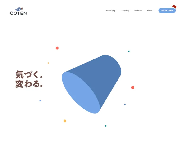
The current desktop capture shows broad horizontal amber, blue, coral, and teal elements crossing the white field. Some narrower bars have rounded end caps. The slogan sits around x = 120, y = 396.5 within a 135px-high heading region. Treat this as the captured geometric composition; it is not evidence that the bands are permanent section dividers.
The current mobile frame has a two-tone blue spherical form above the slogan. Its visible bounds are approximately x = 58–331 and y = 278–551, a visual estimate of roughly 273px square. The slogan moves below it, beginning around x = 26, y = 613, within a 93.59px-high heading region.
The two captures do not establish the sequence, duration, or implementation of the geometric presentation. Do not infer a specific animation engine, pointer interaction, or transition between these forms.
A separate H1 containing the company name is positioned at -1, -1 with a 1 × 1px box. The decorative slogan and semantic page identity are therefore separate elements in the supplied evidence.
Opening News Teaser
Role: offer one timely route without competing with the central brand composition.
The teaser is a single link containing a category capsule, a date, and a one-line headline. On desktop it occupies approximately 652.69 × 51.03px at x = 749.31, y = 927.97. On mobile it is 338px wide at x = 26, y = 780.97.
The category uses blue 12px text on a soft pale capsule. The date is rounded UI type, 13px on desktop and 12px on mobile. The headline uses 12px type with a 24px line height. Its visible end fades near the right edge; the exact masking implementation is unknown.
The mobile version sits within a pale full-width strip covering roughly the final 75px of the viewport. This is separate from the following blue narrative section.
The teaser retains the date 2023.10.12, while the lower news list includes 2026 records. These are content dates, not the inspection date.
Standard Pill Link
Role: provide a consistent route into a deeper service, philosophy, membership, interview, or news page.
An 18px rounded label sits inside a 44px-high blue capsule. The measured padding is 13px top and bottom, 24px left, and 70px right. A small white dot, visually about 6px across, sits near the right end. It is not a conventional arrow.
Width follows the label: approximately 196.44px for Philosophy, 225.02px for COTEN RADIO, 257.11px for History Database, and 173.88px for All News. These dimensions remain unchanged at the inspected mobile width.
Keep the large right-hand reserve and the simple dot. Avoid stretching every action to full width or replacing the dot with a heavy icon. Membership links have their own larger or reversed variants.
Blue Introductory Narrative
Role: explain the value of questioning assumptions before introducing products and programs.
This is a full-width #73a6e6 section with white Japanese text. Desktop paragraphs occupy a 620px-wide column at x = 160. Type is 18px with a 45px line height and 0.10em tracking. Paragraph groups are separated by approximately 59px.
On mobile, the text expands to the standard 338px content width. Type becomes 15px with a 37.5px line height; approximately 40.5px separates the measured paragraph groups.
The first paragraph begins 200px below the desktop section start and approximately 365px below the mobile section start. The supplied captures do not show the content occupying that mobile upper space, so its purpose should not be invented.
The section is approximately 924px high on desktop and 1058px high on mobile. Its broad spacing is part of the narrative pacing, rather than a compact promotional banner.
Mission and Section-Introduction Pattern
Role: establish a chapter through large English display type, followed by Japanese explanation.
Mission uses a centered 640px desktop region. The light blue 160px title is followed by a brown Japanese heading, explanatory text, and a centered Philosophy pill. The measured gap from the English title's bottom to the Japanese heading is 135px.
On mobile, the region uses 26px side margins. The English title becomes 60px, the Japanese heading becomes 22px, and the CTA aligns left. The title-to-heading gap becomes 54px.
The Services introduction shifts toward the right on desktop: its English title starts at x = 669 and the Japanese introduction at x = 679. On mobile, Services remains right aligned as a display word, while the Japanese heading and body return to the left content edge.
Repeated section-name strings appear in the extracted DOM. They are not a requirement to print the heading twice. In a new implementation, decorative duplicates should not create duplicate accessible announcements.
Alternating Service Presentation
Role: connect a concrete service with a large visual world and a concise explanation.
Each desktop service combines a 920 × 575px media region, a light blue 160px number, a 440px text column, and a standard pill. The first service places media at x = -120 and text at x ≈ 880. The second reverses the arrangement: text at x ≈ 120 and media at x = 640, extending 120px beyond the right viewport edge.
The COTEN RADIO capture shows an amber oval filled with diagonal smartphone mockups. Most screens display dark podcast interfaces and historical episode artwork; a central pale screen carries the radio logo. Device shadows belong to the image composition, not to a general UI elevation system.
Headings are brown, 28px with a 49px line height and 0.10em tracking. Paragraphs are 14/28px. The 44px action follows the paragraph after 40px.
On mobile, both service images precede their text. Media bounds extend left to approximately -52.23px and finish around x = 364.23. The number moves to the upper right, at about 84.657px. Copy uses the standard 338px width, a 20/40px heading, and a 13/26px paragraph.
The named text CTAs have service-specific destinations. The sampled media-wrapper links point to the homepage, so their destinations should not be inferred from their subject matter.
History Examples and Category Selector
Role: illustrate how historical lives can be connected through shared circumstances.
Three category buttons appear in the supplied DOM, including 途中までニート, 身分を超えた大出世, and No.2として活躍. The first is blue in the captured state; the others are reading gray. Desktop controls form a vertical group at x = 360.
The associated examples include ガンディー, ダーウィン, and 劉邦, with hashtag-style details. Their desktop name regions are 200px wide at x = 624, 872, and 1120. Names use brown 16px semibold type with 0.10em tracking.
On mobile, the category controls form one horizontal row. The 200px-wide person regions start at x = 26, 259.27, and 492.53, extending beyond the viewport. This establishes a horizontal arrangement, but not its scrolling, swiping, snapping, or filtering behavior. Those interactions were not exercised.
For an adaptation, place overflow inside an explicit, keyboard-reachable horizontal region instead of allowing the whole page to scroll sideways.
COTEN RADIO Quote Collage
Role: convey the range and personality of the program through memorable phrases.
Below the radio service, pale blue quotations form an irregular typographic composition. Some passages are horizontal and wide; others are tall and vertical. Fine serif-style Japanese lettering sits beside heavy sans-serif statements. The desktop capture shows open white space between passages rather than boxed episode cards.
The DOM exposes nine buttons with topic and episode labels, including ガンディー / #56, 世界三大宗教 / #37, and フリードリヒ大王 / #260. Their bounds vary substantially: a desktop button can be 460 × 203.69px, while a vertical one can be 200 × 464.66px.
Mobile retains a designed collage. For example, the first button is 338px wide, a vertical passage is 104px wide, and adjacent passages occupy 208px-wide regions. This is a recomposition, not a uniform one-column stack.
No click result was supplied. Do not claim that the buttons play audio, open dialogs, or navigate to episodes. Preserve meaningful topic labels when recreating quote artwork as interactive content.
COTEN CREW Section
Role: explain participation and separate corporate and individual membership paths.
A measured #f7f9fa background distinguishes this large section. On desktop, the light blue Coten Crew title occupies the left side, while a 480px explanatory column begins at x = 800. The Japanese heading uses 32/56px brown type; the body uses 14/28px.
Below are two very large capsule links, each 540 × 120px, at x = 160 and x = 740. Their labels use deep blue, 24px semibold text with 0.15em tracking. These are a different scale from the ordinary 44px pills.
Mobile places the title, introduction, and standard COTEN CREW action in one column. The two membership routes become stacked 338 × 54.66px links, with 16/28px labels and about 16.6px between them.
The membership section retains considerable space before the featured interview. Do not compress it into a small pair of utility buttons beneath a paragraph.
Featured COTEN CREW Interview
Role: turn the membership proposition into a specific example.
The feature starts with a two-line Pickup Coten Crew display heading. Desktop type is 80/68px; mobile is 40/36px.
The DOM establishes a large media region on the left and a 440px text region on the right on desktop. The text comprises an organization label, a brown headline, a participant line, and Read More. The observed participant line is 土屋梓 × COTEN; this identifies editorial content, not a production credit.
Mobile places the media above the text. Its rendered media bounds are approximately 338.37 × 211.84px. The destination of Read More is an external article link recorded in the page evidence; the article itself was not inspected. The media subject and crop are not visible in the supplied current-page captures and should not be invented.
News Filters and Rows
Role: expose organizational updates with low visual overhead.
Desktop News begins with a 160px blue display title on the left. Filters and rows occupy an 880px region starting at x = 440. The selected filter is blue and semibold; other filters are gray and regular. The buttons are text-led, without a row of filled tabs.
Most rows contain a category capsule, a date, and a headline. Desktop rows reserve 160px on the left for the category, with date and headline beginning at x = 600. Fine pale rules separate entries. The first supplied record contains an additional date line, so row height is content-dependent rather than universally fixed.
On mobile, each row uses the 338px content width. Category and date share the upper line where a category exists; the headline sits below at 14/24.5px. Filters remain on a single horizontal line and extend beyond the viewport: later button bounds reach x ≈ 555. Their actual scrolling behavior was not tested.
All News is right aligned at the bottom in both layouts. Category changes and result-update behavior remain unverified.
Illustrated Footer
Role: close the page with a complete navigation directory and a recognizable brand scene.
The desktop capture shows a large blue curved field rising behind three small illustrations: a potted arrangement, a seated wrapped figure with a bird above, and a person reading a green book while wearing red. These figures sit on or across the blue boundary. Faint bird-footprint shapes appear in the white space above.
Navigation groups begin at approximately x = 120, 347, and 720. Main site links are white rounded type at 24px. Service sublinks are smaller and pale blue. Social and podcast groups use small icons, pale group labels, and white links. The displayed social label remains Twitter in this capture.
Legal links run near the lower left. The copyright is at the lower right on the white area outside the blue curve. Preserve this distinction between the decorative field and the full footer container.
Mobile uses two initial navigation columns at x = 26 and x = 182. A Join COTEN CREW group follows with two white capsules, approximately 325 × 43.75px, using deep blue 13px labels and small blue dots. A red flag projects above the first capsule. SNS and Podcasts then stack vertically, followed by legal links and copyright.
The visible lower mobile footer is blue across the width. Its upper decorative boundary is outside the supplied crop, so its exact geometry is unverified. This blue mobile capture is the footer, not evidence of an expanded header menu.
Tokens — Motion & Interaction
| Treatment | Supplied evidence | Practical interpretation |
|---|---|---|
| Introductory mobile paragraphs | 1.2s cubic-bezier(0.165, 0.84, 0.44, 1) both fadeInUpText |
Named upward/fade entry treatment; exact displacement is not supplied. |
| Japanese headings | 1.2s with the same easing, commonly 0.2s delay and both fill |
A measured entry-animation declaration; trigger and replay rules are unverified. |
| Service media on mobile | 1.2s, same easing, 0.2s delay, named scaleDown |
Scale-based entry is declared; start scale is unknown. |
| Service numbers | 1.2s, same easing, 0.4s delay |
Part of a staggered presentation. |
| Service titles and interview headline | 1.2s, same easing, 0.6s delay |
Later stage in the observed stagger. |
| Navigation, filters, and news text | 0.4s transitions for background, border, color, fill, stroke, and font weight |
Color/weight transitions are defined; activated target values were not supplied. |
| Footer links | opacity 0.4s |
Opacity transition is defined; hover opacity itself is unknown. |
| Hero geometric artwork | Different current desktop/mobile frames | Timing, sequence, loop behavior, rendering technology, and interaction are unverified. |
| Menu, category buttons, and quote buttons | Semantic controls present | Their activated results are not evidenced. |
The recurring easing strongly decelerates toward the final state, making the declared entries feel deliberate rather than springy. Preserve the 0.2/0.4/0.6-second stagger if implementing a related entrance sequence.
A computed value of transition: all without a supplied duration is not enough to assign a meaningful animation time. Similarly, animation: none on a sampled container does not establish that its nested artwork is static.
The supplied browser process waited for document load, image decoding, and finite motion within bounded time limits. Perpetual animations were paused during readiness checks and resumed. These procedures improve capture stability but do not provide a recording of the hero or prove that delayed states were fully observed.
Surfaces
| Layer | Appearance | Function |
|---|---|---|
| Main canvas | White, largely unboxed | Supports sparse editorial composition. |
| Introductory narrative | Solid measured COTEN Blue | Creates an immersive break after the opening. |
| Service presentation | White surrounding large oval artwork | Gives imagery its own spatial role without card chrome. |
| Membership section | Soft Surface #f7f9fa |
Separates participation content from service explanations. |
| Standard action | Visually blue capsule, white label and dot | Repeated route into deeper content. |
| Category marker | Soft pale capsule, blue text | Small metadata treatment. |
| Mobile membership action | White capsule, deep-blue label | Reversed action on the blue footer field. |
| Desktop footer | Large curved blue shape over white | Combines navigation with an illustrated closing scene. |
There is no observed general-purpose shadow elevation system. Device shadows are contained inside the radio artwork. Avoid transferring that lighting to every link, panel, or news row.
Imagery
The page combines abstract geometry, friendly character illustration, product mockups, and typographic artwork. These elements have distinct jobs: geometry introduces the idea of changing perspective; phones make the radio tangible; quotations express its voice; illustrated people and birds humanize the organization.
The COTEN RADIO image is a composition of multiple phones, not a single device screenshot. Preserve the amber ground, dark interfaces, diagonal device arrangement, pale central logo screen, and oval outer silhouette. The image deliberately extends beyond the desktop viewport.
Footer illustrations have irregular human contours and small expressive details. They do not resemble a uniform stock icon pack. Keep them relatively small against the very large blue field; their placement on the boundary is more important than filling the footer with illustration.
Observed Asset References
No original image-resource URLs or font-file URLs were included in the supplied evidence. The references below identify assets by visible role and measured container, rather than inventing filenames.
| Asset reference | Evidence | Reuse guidance |
|---|---|---|
| Desktop COTEN brand lockup | Visible bird above wordmark; 130 × 65px link |
Preserve the stacked arrangement. |
| Mobile COTEN brand lockup | Visible horizontal bird and wordmark; 120 × 23.33px link |
Use a responsive variant rather than uniform scaling. |
| Opening slogan | Visible Japanese lettering; empty sampled H2 text | Preserve artwork character and provide semantic text. |
| Opening geometry | Desktop bands and mobile two-tone blue form | Use only verified frames or independently specified motion. |
| Radio service composition | Visible phones on amber oval; desktop 920 × 575px wrapper |
Preserve the full composition and overflow. |
| Quote lettering | Visible horizontal/vertical blue passages; nine button regions in DOM | Preserve varied aspect ratios and accessible topic labels. |
| Footer people, plant, bird, and footprints | Visible in desktop footer capture | Keep them integrated with the curved boundary. |
| Membership flag | Visible above desktop support and mobile footer membership controls | Treat as a projecting decorative asset. |
| History and interview media | Bounds established by DOM; pixels not supplied in current captures | Do not infer subject matter, crop, or asset paths. |
Use original artwork only when available and authorized. CSS can approximate layout and geometry, but not the identity of the bird, lettering, people, or phone composition.
Layout & Responsive Behavior
The page follows this sequence: viewport opening → blue narrative → Mission → Services introduction → history database → history examples → COTEN RADIO → quote collage → COTEN CREW → featured interview → News → footer.
Desktop composition alternates centered, right-shifted, and left-shifted regions. It is not governed by a single centered column. The recurring 120px service inset, 160px narrative/Crew inset, centered 640px Mission region, and right-aligned 880px news region each establish a different reading rhythm.
| Pattern | Desktop observation | Mobile observation |
|---|---|---|
| Header | Stacked logo and full navigation | Horizontal logo and oval menu control |
| Opening | Slogan in the left-middle area | Geometry above a lower-left slogan |
| News teaser | Lower-right floating region | Full-width pale strip with 26px content inset |
| Section names | 160px light display text | 60px display text; alignment still varies |
| Service content | Alternating text/media sides | Both media regions precede their text |
| Media overflow | Extends 120px beyond a viewport side | Extends about 52px beyond the left edge |
| Standard pills | Content-sized and 44px high | Same label size and height |
| History examples | Three 200px regions alongside a vertical selector | Horizontal selector and offscreen example regions |
| Quote field | Wide irregular collage | Narrower irregular collage with retained vertical passages |
| Membership routes | Two large side-by-side capsules | Smaller stacked capsules |
| News | Separate category column and text column | Metadata above a full-width headline |
| Footer | Three main groups over a curved field | Two initial columns followed by stacked membership/social groups |
Mobile is a recomposition, not a scaled-down desktop page. Display titles shrink sharply, body type changes only slightly, standard actions keep their dimensions, and selected content remains horizontal.
Only 1440px and 390px widths were supplied. Tablet layout, landscape behavior, safe-area handling, and the actual media-query thresholds are unknown. The 760px breakpoint in the Quick Start is a recommendation for the adaptation, not a recovered source value.
Do’s and Don’ts
Do
- Use white, measured COTEN Blue, and Heading Brown as the structural palette.
- Separate thin display lettering, rounded interface lettering, and readable Japanese copy.
- Preserve large empty areas around chapter titles and service compositions.
- Alternate service imagery and text on desktop, then place media before copy on mobile.
- Keep oval media larger than the text column and allow controlled viewport-edge cropping.
- Retain the 44px content-sized pill, right-side dot, and generous trailing padding.
- Treat the quotation area as a varied composition with horizontal and vertical passages.
- Keep the bird, flag, and footer characters small but strategically placed.
- Recompose the footer and brand lockup for mobile.
- Distinguish declared animation timing from behavior actually exercised.
Don’t
- Don't turn all homepage sections into a repeated rounded-card grid.
- Don't use the large display font for Japanese paragraphs or every control.
- Don't copy the hero H2's computed 14px or 16px font as the slogan's visible size.
- Don't interpret the desktop hero bands as verified static layout rules or a known animation sequence.
- Don't infer playback behavior from the quote buttons or smartphone mockups.
- Don't treat the mobile footer capture as an opened menu.
- Don't shrink standard action labels merely because the viewport is narrow.
- Don't apply device-image shadows to ordinary interface surfaces.
- Don't replace the small action dot with a dominant arrow or unrelated icon system.
- Don't infer missing imagery, font files, or production authorship from visual style.
Recommended Implementation Additions
These are recommendations for a new implementation, not verified features of the original page:
- Give the mobile menu an accessible name,
aria-expanded, and a controlled navigation region. Implement focus behavior appropriate to the actual menu presentation. - Provide readable semantic text for the hero slogan and meaningful alternatives for quote artwork. Decorative birds, flags, and background geometry can be hidden from assistive technology.
- Keep content visible if entrance-animation JavaScript fails. Reduced-motion mode should display settled content without waiting through the stagger.
- For continuous hero motion, offer a settled reduced-motion frame and avoid making essential text depend on an animation phase.
- Address contrast deliberately. White on
#73a6e6is approximately 2.5:1, calculated from the token colors. Darken the background behind small white labels, or use dark text on light blue, when accessibility requirements call for stronger contrast. - Increase the mobile menu's interactive height to at least 44px while retaining a roughly 40px visual oval. Small footer links should also receive usable hit areas.
- Give selected filters a programmatic state and a visible cue beyond color. Preserve keyboard access to filters and any horizontally overflowing examples.
- Confine intentional horizontal overflow to its component. Decorative cropping should not produce page-wide horizontal scrolling or clip focus indicators.
- Consider larger mobile paragraph and legal text for reading-heavy adaptations; the source's 13px body and 10px legal sizes are observations, not minimum-size recommendations.
- Verify focus styles, menu activation, category updates, quote-button results, and intermediate viewport widths before presenting them as implemented behavior.
Agent Prompt Guide
Quick Color Reference
- Main canvas: white
#ffffff. - Structural blue:
#73a6e6. - Japanese headings: brown
#6e4e48. - Explanatory copy:
#474c51. - Navigation and news headlines:
#2f3236. - Membership section and category surfaces:
#f7f9fa. - Reversed membership-link text:
#507db2. - Footer secondary links:
#d5e4f7; group labels:#adcbf0. - Amber, teal, coral, and flag red belong to artwork; exact source values were not provided.
Overall Prompt
“Create a corporate homepage inspired by the observed COTEN composition. Use a white canvas, soft blue #73a6e6, warm brown #6e4e48 headings, and dark gray explanatory copy. Give English chapter titles very large, light, tightly tracked lettering, while navigation and pill actions use a rounded interface face. Build a spacious opening, a full-width blue narrative section, a centered mission statement, alternating oversized oval service images, a varied typographic quote collage, a pale membership section, a simple news list, and an illustrated curved blue footer. Use 44px blue pills with white labels and a small dot at the right. Recompose mobile with 26px content margins, 60px chapter titles, media above service copy, a horizontal brand lockup, and stacked membership routes. Treat hero motion and untested control behavior as separate implementation requirements.”
Example Component Prompts
- Service presentation: “At a 1440px viewport, place a 440px copy column 120px from the left edge and a 920 × 575px oval media region extending 120px beyond the right edge. Use a thin blue 160px service number, a brown 28/49px title, gray 14/28px copy, and a 44px content-sized pill with a small white dot. On mobile, move the media above the copy and use 26px side margins.”
- Section introduction: “Use a light blue English section name at 160px, weight 300, with -0.04em tracking. Place a widely tracked brown Japanese heading well below it, followed by compact but generously led body text. Reduce the English title to 60px on a 390px viewport without proportionally shrinking the action button.”
- Quote collage: “Arrange pale blue Japanese quotation artwork in unequal horizontal and vertical regions on white. Mix fine serif-style passages and heavy sans-serif statements. Preserve substantial gaps and varied aspect ratios. Give interactive artwork a topic-and-episode accessible label; do not invent playback behavior.”
- News list: “Create an unboxed news list with text-only category filters, pale category capsules, small rounded-font dates, ordinary-weight headlines, and fine horizontal rules. On desktop reserve 160px for the category within an 880px list. On mobile place metadata above each headline and contain filter overflow within its own region.”
- Footer: “Place white rounded navigation over a large curved blue field, with small illustrated people and a plant crossing its upper boundary. Group services, social links, and podcasts separately. On mobile start with two navigation columns, then two white membership pills, social links, podcasts, and legal links. Keep the small red flag above the membership action.”
Quick Start
CSS Custom Properties
This is an implementation adaptation, not recovered production CSS. It preserves the measured palette, type hierarchy, action anatomy, and principal desktop/mobile relationships. The ellipse shape, intermediate sizing, border color, and breakpoint are approximations. Artwork and control behavior require separate assets and implementation.
The named fonts must be supplied through an authorized font setup. No font-resource URLs were exposed in the evidence. The stacks below retain known family names while shortening platform fallback lists.
:root {
  /* Measured palette aliases */
  --color-white: #ffffff;
  --color-blue: #73a6e6;
  --color-heading: #6e4e48;
  --color-copy: #474c51;
  --color-ink: #2f3236;
  --color-muted: #7c8188;
  --color-date: #959aa0;
  --color-soft: #f7f9fa;
  --color-deep-blue: #507db2;
  --color-footer-secondary: #d5e4f7;
  --color-footer-label: #adcbf0;
  --color-footer-legal: #e8f0fa;

  /* Estimated rule color and recommended contrast alternative */
  --color-rule: #dce3eb;
  --color-action-accessible: #315b91;

  --font-copy: 'Helvetica Neue', Helvetica, Arial,
    'Gothic MB101 Regular', 'Yu Gothic', 'Hiragino Sans',
    Meiryo, sans-serif;
  --font-heading: 'Helvetica Neue', Helvetica, Arial,
    'Gothic MB101 Medium', 'Yu Gothic', 'Hiragino Sans',
    Meiryo, sans-serif;
  --font-ui: 'GT-Maru-Medium', NeueMachina, var(--font-heading);
  --font-display: NeueMachina, 'Helvetica Neue', Helvetica,
    Arial, sans-serif;

  --gutter: clamp(26px, 8.3333vw, 120px);
  --display-size: clamp(60px, 11.1111vw, 160px);
  --copy-size: 14px;
  --copy-leading: 28px;
  --radius-pill: 999px;
  --action-height: 44px;
  --motion-ui: 400ms;
  --motion-entry: 1200ms;
  --ease-entry: cubic-bezier(0.165, 0.84, 0.44, 1);
}

* { box-sizing: border-box; }
body {
  margin: 0;
  color: var(--color-copy);
  background: var(--color-white);
  font: 400 16px/1.75 var(--font-copy);
}
img { display: block; max-width: 100%; }
button, a { -webkit-tap-highlight-color: transparent; }
button { font: inherit; }
a { color: inherit; }

.frame {
  width: min(1200px, calc(100% - var(--gutter) - var(--gutter)));
  margin-inline: auto;
}
.visually-hidden {
  position: absolute;
  width: 1px;
  height: 1px;
  padding: 0;
  overflow: hidden;
  clip-path: inset(50%);
  white-space: nowrap;
  border: 0;
}

/* One page-level clipping region for decorative media only. */
.decorative-viewport { overflow: clip; }

.section-label {
  margin: 0;
  color: var(--color-blue);
  font: 300 var(--display-size)/0.8 var(--font-display);
  letter-spacing: -0.04em;
}
.editorial-heading {
  margin: 0;
  color: var(--color-heading);
  font: 500 32px/1.75 var(--font-heading);
  letter-spacing: 0.12em;
}
.editorial-copy {
  font-size: var(--copy-size);
  line-height: var(--copy-leading);
}

.pill {
  position: relative;
  display: inline-flex;
  align-items: center;
  min-height: var(--action-height);
  padding: 13px 70px 13px 24px;
  border: 0;
  border-radius: var(--radius-pill);
  color: var(--color-white);
  background: var(--color-blue);
  font: 500 18px/18px var(--font-ui);
  letter-spacing: -0.03em;
  text-decoration: none;
}
.pill::after {
  content: '';
  position: absolute;
  right: 24px;
  top: 50%;
  width: 6px;
  height: 6px;
  border-radius: 50%;
  background: currentColor;
  transform: translateY(-50%);
}
.pill--contrast { background: var(--color-action-accessible); }
.pill--white {
  color: var(--color-deep-blue);
  background: var(--color-white);
}
.pill--white::after { background: var(--color-blue); }

.site-header {
  position: absolute;
  inset: 0 0 auto;
  z-index: 10;
  display: flex;
  align-items: center;
  justify-content: space-between;
  padding: 40px 50px 0 80px;
}
.site-brand { display: block; width: 130px; height: 65px; }
.site-brand img { width: 100%; height: 100%; object-fit: contain; }
.site-nav { display: flex; align-items: center; gap: 41px; }
.site-nav > a:not(.pill) {
  padding-block: 10px;
  color: var(--color-ink);
  font: 500 13px/13px var(--font-ui);
  letter-spacing: -0.03em;
  text-decoration: none;
  transition: color var(--motion-ui);
}
.site-nav .pill {
  min-height: 38px;
  margin-left: 10px;
  padding: 12px 20px 13px;
  font-size: 13px;
  line-height: 13px;
}
.site-nav .pill::after { display: none; }
.menu-toggle { display: none; }

/* Use approved artwork in this slot; no motion sequence is inferred. */
.hero {
  position: relative;
  isolation: isolate;
  min-height: 720px;
  height: 100svh;
}
.hero__art { position: absolute; inset: 0; z-index: -1; }
.hero__slogan {
  position: absolute;
  top: 39.65%;
  left: 0;
  margin: 0;
  padding-inline: var(--gutter);
}
.hero__slogan img { width: auto; height: 135px; }
.hero__news {
  position: absolute;
  right: 38px;
  bottom: 21px;
  width: min(652.69px, calc(100% - 52px));
  color: var(--color-copy);
  text-decoration: none;
}
.hero__news-meta { display: flex; align-items: center; gap: 7px; }
.badge {
  display: inline-block;
  width: max-content;
  padding: 5.88px 14px 7px;
  border-radius: var(--radius-pill);
  color: var(--color-blue);
  background: var(--color-soft);
  font: 500 14px/17.5px var(--font-heading);
  letter-spacing: -0.02em;
}
.hero__news .badge { padding: 5.04px 12px 6px; font-size: 12px; line-height: 12px; }
.hero__news time {
  color: var(--color-muted);
  font: 500 13px/1 var(--font-ui);
  letter-spacing: 0.05em;
}
.hero__news-title {
  margin: 4px 0 0;
  overflow: hidden;
  white-space: nowrap;
  font-size: 12px;
  line-height: 24px;
  mask-image: linear-gradient(to right, #000 88%, transparent);
}

/* Place service sections inside a decorative-viewport wrapper. */
.service {
  position: relative;
  min-height: 575px;
  margin-block: 128px 200px;
}
.service__media {
  position: absolute;
  top: 0;
  left: -120px;
  width: 920px;
  height: 575px;
  margin: 0;
  overflow: hidden;
  border-radius: 50%; /* Approximation of the observed oval. */
}
.service__media img { width: 100%; height: 100%; object-fit: cover; }
.service__copy {
  position: relative;
  width: 440px;
  margin-left: auto;
  margin-right: var(--gutter);
  padding-top: 100px;
}
.service__number {
  position: absolute;
  top: 12.8px;
  left: calc(50% - 92px);
  margin: 0;
  color: var(--color-blue);
  font: 300 160px/1 var(--font-display);
  letter-spacing: -0.05em;
}
.service__title {
  margin: 0 0 24px;
  color: var(--color-heading);
  font: 500 28px/49px var(--font-heading);
  letter-spacing: 0.1em;
}
.service__body { margin: 0 0 40px; font-size: 14px; line-height: 28px; }
.service--reverse .service__media { left: auto; right: -120px; }
.service--reverse .service__copy { margin-left: var(--gutter); margin-right: auto; }
.service--reverse .service__number { left: calc(50% - 70px); }

.news { padding-top: 200px; }
.news__body {
  width: min(880px, calc(100% - var(--gutter) - var(--gutter)));
  margin: 100px var(--gutter) 0 auto;
}
.news-tabs {
  display: flex;
  gap: 57px;
  overflow-x: auto; /* Recommended containment for offscreen filters. */
  padding-top: 4px;
}
.news-tabs button {
  flex: none;
  padding: 0 0 26px;
  border: 0;
  color: var(--color-muted);
  background: transparent;
  font-size: 16px;
  line-height: 32px;
  white-space: nowrap;
  cursor: pointer;
  transition: color var(--motion-ui);
}
.news-tabs button[aria-pressed='true'] { color: var(--color-blue); font-weight: 600; }
.news-row {
  display: grid;
  grid-template-columns: 160px minmax(0, 1fr);
  row-gap: 20px;
  padding-block: 32px;
  border-bottom: 1px solid var(--color-rule);
  text-decoration: none;
}
.news-row .badge { grid-column: 1; grid-row: 1 / 3; align-self: start; }
.news-row time {
  grid-column: 2;
  color: var(--color-date);
  font: 500 12px/12px var(--font-ui);
  letter-spacing: 0.05em;
}
.news-row h3 { grid-column: 2; margin: 0; color: var(--color-ink); font: 400 16px/28px var(--font-copy); }
.news__action { display: flex; justify-content: flex-end; margin-top: 48px; }

.site-footer {
  position: relative;
  isolation: isolate;
  margin-top: 177px;
  padding: 236px var(--gutter) 28px;
  color: var(--color-white);
}
.site-footer::before {
  content: '';
  position: absolute;
  z-index: -1;
  top: 0;
  left: -20%;
  width: 103.333%;
  height: calc(100% + 240px);
  border-radius: 50%;
  background: var(--color-blue);
  /* Approximate decorative field; clip through an outer wrapper. */
}
.footer-grid { display: grid; grid-template-columns: 227px 373px minmax(0, 1fr); }
.footer-primary { display: grid; align-content: start; gap: 21px; }
.footer-primary a { font: 500 24px/24px var(--font-ui); letter-spacing: -0.03em; }
.site-footer a { text-decoration: none; transition: opacity var(--motion-ui); }
.footer-label { margin: 0 0 14px; color: var(--color-footer-label); font: 500 13px/1 var(--font-ui); }
.footer-secondary { color: var(--color-footer-secondary); font-size: 13px; line-height: 1.5; }
.footer-join { display: none; }
.footer-legal { display: flex; flex-wrap: wrap; gap: 16px 32px; margin-top: 132px; color: var(--color-footer-legal); font-size: 11px; }
.footer-copyright { position: absolute; right: 40px; bottom: 24px; margin: 0; color: var(--color-date); font: 500 11px/1 var(--font-ui); }

/* Recommended focus treatment, not recovered source styling. */
a:focus-visible, button:focus-visible { outline: 3px solid var(--color-heading); outline-offset: 5px; }

/* Optional entry class: content remains visible without this class. */
.reveal.is-entering { animation: reference-entry var(--motion-entry) var(--ease-entry) 200ms both; }
@keyframes reference-entry {
  from { opacity: 0; transform: translateY(16px); }
  to { opacity: 1; transform: none; }
}

/* Recommended breakpoint; only the 390px and 1440px states were measured. */
@media (max-width: 760px) {
  :root { --gutter: 26px; --display-size: 60px; --copy-size: 13px; --copy-leading: 26px; }
  body { font-size: 14px; line-height: 1.75; }
  .editorial-heading { font-size: 20px; line-height: 35px; }
  .site-header { height: 60px; padding: 16px 20.8px 0; align-items: flex-start; }
  .site-brand { width: 120px; height: 23.33px; margin-top: 3px; }
  .site-nav { display: none; }
  .menu-toggle {
    position: relative;
    display: grid;
    place-content: center;
    gap: 4px;
    width: 64px;
    height: 44px; /* Recommended hit area; visual oval remains 40px. */
    padding: 0;
    border: 0;
    background: transparent;
  }
  .menu-toggle::before { content: ''; position: absolute; inset: 2px 0; border-radius: 50%; background: var(--color-blue); transform: rotate(-15deg); }
  .menu-toggle span { position: relative; width: 16px; height: 3px; border-radius: 2px; background: white; }
  .hero__slogan { top: 72.63%; }
  .hero__slogan img { height: 93.59px; }
  .hero__news { left: 26px; right: 26px; bottom: 12px; width: auto; }
  .hero__news::before { content: ''; position: absolute; z-index: -1; inset: -12px -26px; background: #eef1f4; }
  .hero__news time { font-size: 12px; }
  .service { min-height: 0; margin-block: 80px 108px; padding-top: 321px; }
  .service__media,
  .service--reverse .service__media { left: -52.23px; right: auto; top: 26.67px; width: calc(100% + 26.45px); height: auto; aspect-ratio: 1.597; }
  .service__copy,
  .service--reverse .service__copy { width: auto; margin-inline: 26px; padding-top: 0; }
  .service__number,
  .service--reverse .service__number { top: 0; left: auto; right: 26px; font-size: 84.657px; }
  .service__title { margin-bottom: 17px; font-size: 20px; line-height: 40px; }
  .service__body { margin-bottom: 32px; font-size: 13px; line-height: 26px; }
  .news { padding-top: 202.8px; }
  .news__body { width: auto; margin: 70px 26px 0; }
  .news-tabs { gap: 26px; }
  .news-tabs button { padding-bottom: 21px; font-size: 13px; line-height: 26px; }
  .news-row { grid-template-columns: max-content minmax(0, 1fr); gap: 12px; }
  .news-row .badge { grid-row: 1; padding: 5.04px 12px 6px; font-size: 12px; line-height: 15px; }
  .news-row time { align-self: center; }
  .news-row h3 { grid-column: 1 / -1; font-size: 14px; line-height: 24.5px; }
  .news-row--uncategorized time { grid-column: 1 / -1; }
  .site-footer { margin-top: 149.75px; padding: 124.8px 26px 64px; }
  .site-footer::before { inset: 0; width: auto; height: auto; border-radius: 0; }
  .footer-grid { grid-template-columns: 156px minmax(0, 1fr); }
  .footer-primary { gap: 17.3px; }
  .footer-primary a { font-size: 16px; line-height: 16px; }
  .footer-secondary { font-size: 11px; }
  .footer-join { display: grid; grid-column: 1 / -1; gap: 16px; margin-top: 44px; }
  .footer-join .pill { width: min(325px, 100%); padding: 10.5px 56px 10.5px 24px; font: 600 13px/22.75px var(--font-heading); letter-spacing: normal; }
  .footer-social { grid-column: 1 / -1; margin-top: 49px; }
  .footer-legal { gap: 10px 16px; margin-top: 48px; font-size: 10px; }
  .footer-copyright { position: static; margin-top: 12px; color: var(--color-footer-secondary); }
}

@media (prefers-reduced-motion: reduce) {
  .reveal.is-entering { animation: none; }
  .site-nav a, .site-footer a, .news-tabs button { transition: none; }
}
The desktop ellipse and mobile flat footer in this example are approximations. For closer reproduction, replace the decorative field with the approved original shape. Likewise, if a service asset already contains its oval silhouette, remove the extra CSS mask and preserve the asset's transparent edges.
A standard action needs no separate decorative-dot element:
<a class="pill" href="https://coten.co.jp/services/cotenradio/">
  COTEN RADIO
</a>
A news row can use semantic metadata without nesting interactive controls:
<a class="news-row" href="https://coten.co.jp/blog/news/3009/">
  <span class="badge">お知らせ</span>
  <time datetime="2026-02-13">2026.02.13</time>
  <h3>アニュアルレポート2025の予約販売を開始しました</h3>
</a>
Menu activation, filter updates, and quote actions are intentionally outside this CSS. Define their behavior from verified product requirements rather than interpreting appearance as a functional specification.
Tailwind v4 Token Mapping
Optional aliases for an implementation already using Tailwind v4. This does not imply the original website uses Tailwind. Define the custom properties above first.
@theme inline {
  --color-brand: var(--color-blue);
  --color-editorial: var(--color-heading);
  --color-reading: var(--color-copy);
  --color-surface-soft: var(--color-soft);
  --color-action-strong: var(--color-action-accessible);

  --font-body: var(--font-copy);
  --font-interface: var(--font-ui);
  --font-chapter: var(--font-display);

  --text-chapter: var(--display-size);
  --text-chapter--line-height: 0.8;
  --text-chapter--letter-spacing: -0.04em;
  --text-reading: var(--copy-size);
  --text-reading--line-height: var(--copy-leading);
  --text-action: 18px;
  --text-action--line-height: 18px;

  --spacing-page-gutter: var(--gutter);
  --spacing-action-height: var(--action-height);
  --radius-capsule: var(--radius-pill);
  --ease-editorial-entry: var(--ease-entry);
}
Sources & Evidence
- Inspected original and final website: https://coten.co.jp/. The supplied browser record reports HTTP 200 and the same original/final URL. Page title and hidden H1 identify
株式会社COTEN. - Capture date: October 2, 2026, 02:04:19 JST, corresponding to the supplied retrieval timestamp
2026-10-01T17:04:19.616Z. - Desktop evidence: 1440 × 1000 viewport, approximately 10464px document height; current opening capture, COTEN RADIO/quote capture, and news/footer capture.
- Mobile evidence: 390 × 844 viewport, approximately 9987px document height; current opening capture and lower-footer capture.
- Rendered evidence: element rectangles, typography stacks and metrics, colors, padding, radii, transition declarations, animation declarations, text, and link destinations. Custom-property maps were empty.
- Observation procedure: supplied capture notes describe an initial observation of at least five seconds, bounded waits for layout/text stability, image decoding and finite animation, and traversal through intermediate scroll positions. SharedWorkers and service workers were disabled.
- Interaction limits: no menu opening, hover result, filter change, quote-button activation, audio playback, or linked-page inspection was supplied. Declared animations were available as computed styles, not a complete motion recording.
- Resource limits: no original image URLs, font-file URLs, full keyframes, clipping paths, or breakpoint rules were supplied. Exact asset implementation and intermediate responsive behavior remain unverified.
This reference describes the current homepage represented by the supplied original-page evidence. Measured values, visual estimates, and recommended implementation choices are identified separately throughout.
# COTEN — Style Reference

> An expansive white canvas connecting history, blue geometry, and warm human details.

**Website:** [coten.co.jp](https://coten.co.jp/)
**Original URL:** https://coten.co.jp/
**Final URL:** https://coten.co.jp/
**Theme:** light; white canvas, soft blue fields, brown editorial headings
**Inspected:** October 2, 2026, at 02:04:19 JST; supplied evidence timestamp: October 1, 2026, 17:04:19.616 UTC
**Viewports:** desktop 1440 × 1000 CSS pixels; mobile 390 × 844 CSS pixels
**Scope:** the current corporate homepage. Visual captures cover the desktop opening, COTEN RADIO and quote transition, desktop news/footer boundary, mobile opening, and mobile lower footer. Rendered DOM and computed-style evidence additionally cover the introductory narrative, Mission, Services, history examples, COTEN CREW, featured interview, and news list. Linked pages and activated control states were not inspected.

COTEN presents its work through a long editorial homepage. A sparse geometric opening leads into a blue narrative section, a mission statement, two substantial service presentations, membership information, a featured interview, news, and an illustrated footer. The page supports several routes into the organization rather than organizing everything around a single conversion.

The visual identity depends on contrasts of scale and character: enormous, light blue English section titles; compact rounded navigation; carefully spaced Japanese body copy; warm brown Japanese headings; and unusually large oval imagery. Small birds, a red membership flag, and illustrated people make the precise layout approachable. Large empty areas are structural: they give the geometry, words, and illustrations room to act independently.
閉じる
# COTEN — Style Reference

> An expansive white canvas connecting history, blue geometry, and warm human details.

**Website:** [coten.co.jp](https://coten.co.jp/)
**Original URL:** https://coten.co.jp/
**Final URL:** https://coten.co.jp/
**Theme:** light; white canvas, soft blue fields, brown editorial headings
**Inspected:** October 2, 2026, at 02:04:19 JST; supplied evidence timestamp: October 1, 2026, 17:04:19.616 UTC
**Viewports:** desktop 1440 × 1000 CSS pixels; mobile 390 × 844 CSS pixels
**Scope:** the current corporate homepage. Visual captures cover the desktop opening, COTEN RADIO and quote transition, desktop news/footer boundary, mobile opening, and mobile lower footer. Rendered DOM and computed-style evidence additionally cover the introductory narrative, Mission, Services, history examples, COTEN CREW, featured interview, and news list. Linked pages and activated control states were not inspected.

COTEN presents its work through a long editorial homepage. A sparse geometric opening leads into a blue narrative section, a mission statement, two substantial service presentations, membership information, a featured interview, news, and an illustrated footer. The page supports several routes into the organization rather than organizing everything around a single conversion.

The visual identity depends on contrasts of scale and character: enormous, light blue English section titles; compact rounded navigation; carefully spaced Japanese body copy; warm brown Japanese headings; and unusually large oval imagery. Small birds, a red membership flag, and illustrated people make the precise layout approachable. Large empty areas are structural: they give the geometry, words, and illustrations room to act independently.

## How to Read This Reference

- **Measured** means supplied rendered DOM bounds or computed-style values. Unless otherwise stated, dimensions are CSS pixels.
- **Visually observed** means visible in one of the five current-page captures. Screenshot estimates are identified explicitly and are not exact pixel samples.
- **Calculated** means simple arithmetic using measured values, such as content width after subtracting margins.
- **Recommended** means guidance for a new implementation. This includes the CSS adaptation, accessibility improvements, and proposed breakpoint.
- All token names below are implementation aliases. The supplied custom-property maps were empty; no original CSS variable names were established.
- Font-family declarations are evidence of the configured stacks, not proof that every named font downloaded or supplied every glyph.
- Two viewport samples establish different layouts, but do not reveal the original breakpoint or interpolation formulas.
- A visible button, link, or animation declaration does not establish its activated behavior. Those limits are recorded with the relevant component.

## Tokens — Colors

### Default Palette

| Name | Value | Suggested token | Evidence and role |
| --- | --- | --- | --- |
| COTEN Blue | `#73a6e6` | `--color-blue` | Measured narrative-section background, English section titles, selected filter text, and mobile menu-button background. Visually consistent with the dominant pills and footer field. |
| White | `#ffffff` | `--color-white` | Measured reversed text; visually observed main canvas. Sampled body and many containers have transparent backgrounds. |
| Heading Brown | `#6e4e48` | `--color-heading` | Measured Japanese section headings, service titles, and historical-person names. The hero lettering has a related brown appearance, but its asset pixels were not measured. |
| Reading Gray | `#474c51` | `--color-copy` | Measured explanatory paragraphs and hero news text. |
| Navigation Ink | `#2f3236` | `--color-ink` | Measured primary desktop navigation, body default, and news headlines. |
| Quiet Gray | `#7c8188` | `--color-muted` | Measured inactive news filters and hero news date. |
| Date Gray | `#959aa0` | `--color-date` | Measured news-list dates and desktop copyright. |
| Soft Surface | `#f7f9fa` | `--color-soft` | Measured COTEN CREW section background and category badges. |
| Deep Blue | `#507db2` | `--color-deep-blue` | Measured text on corporate/individual membership links. |
| Footer Secondary | `#d5e4f7` | `--color-footer-secondary` | Measured footer service links and mobile copyright. |
| Footer Group Label | `#adcbf0` | `--color-footer-label` | Measured SNS, Podcasts, and mobile membership group labels. |
| Footer Legal | `#e8f0fa` | `--color-footer-legal` | Measured legal-link text. |

The visible pill fills and curved footer field should not be inferred from the sampled anchor or footer backgrounds alone: those elements often report transparent backgrounds. Their painted appearance is established by the captures; the responsible descendant, pseudo-element, or asset was not supplied.

### Artwork Accents

These are **visual estimates for adaptation**, not measured stylesheet colors:

| Accent | Approximation | Observed use |
| --- | --- | --- |
| Warm amber | `#ffb85c` | COTEN RADIO image backdrop and a band at the top of the desktop hero capture. |
| Coral | `#ff655b` | Broad horizontal band in the desktop hero frame. |
| Teal | `#008b90` | Horizontal hero elements, including a rounded end cap. |
| Flag red | `#c82000` | Small flag above support or membership controls. |
| Pale ticker gray | `#eef1f4` | Full-width background behind the mobile opening news teaser. |

Keep these accents inside illustration and geometric artwork. They do not form a competing set of primary action colors.

### Theme Behavior

Only the light presentation is evidenced. No theme selector or alternate dark palette was supplied. The blue narrative and footer regions are sections within the same theme.

## Tokens — Typography

### Light Display Type — Section Names and Numbers

- **Measured family:** `NeueMachina`, followed by Helvetica/Arial sans-serif fallbacks.
- **Weight:** `300`.
- **Roles:** Mission, Services, Coten Crew, News, the featured-interview label, and service numbers `01` and `02`.
- **Character:** very large, thin, tightly tracked English lettering. Its scale supplies structure without the density of a bold marketing headline.
- **Important distinction:** section names and service numerals use different line heights and tracking even when both are 160px.

### Rounded Interface Type — Navigation and Actions

- **Measured leading family:** `GT-Maru-Medium`.
- **Following families:** `NeueMachina`, Helvetica Neue, Helvetica, Arial, Gothic MB101 Medium, and Japanese/system sans-serif fallbacks.
- **Weight:** `500`.
- **Roles:** desktop navigation, standard blue pills, dates, major footer links, and social/podcast links.
- **Typical tracking:** `-0.03em` for navigation and actions; dates often use `0.05em` instead.

The rounded Latin forms are an important counterweight to the thin display lettering. Do not replace both roles with one uniformly geometric font.

### Japanese Editorial Copy

The measured stacks begin with Helvetica Neue, Helvetica, and Arial, followed by a role-specific Gothic MB101 family and Japanese system fallbacks.

| Role | Named Japanese family in the stack | Measured weight |
| --- | --- | --- |
| Paragraphs | `Gothic MB101 Regular` | `400` |
| Section headings and narrative | `Gothic MB101 Medium` | `500` |
| Person names, selected labels, membership links | `Gothic MB101 DemiBold` | `600` |

The supplied stacks also include Yu Gothic, Hiragino families, Meiryo, and Droid Sans. Successful webfont loading and individual glyph selection were not independently verified.

Japanese headings use generous positive tracking, usually `0.10em` or `0.12em`. Paragraphs generally use normal tracking and unusually comfortable line spacing.

### Hero and Quote Lettering

The visible hero phrase, `気づく。変わる。`, is not exposed as ordinary text in the sampled H2. That H2 reports a default-sized font and an empty text value. Its computed font size must therefore **not** be used as the visible slogan size.

The hero lettering is visually heavy and compact. Its enclosing heading is 135px high on desktop and approximately 93.59px high on mobile. Preserve the approved artwork or supply an explicitly approximate text treatment with a semantic text equivalent.

The quote collage mixes fine Japanese serif-style lettering, heavy sans-serif lettering, horizontal passages, and vertical passages. Exact quote-lettering font families were not exposed. The enclosing button's default font is not evidence of the lettering's font.

### Type Scale

All values below are measured unless marked otherwise. Size and line height are shown as `size / line-height`.

| Role | Desktop | Mobile | Weight and tracking |
| --- | --- | --- | --- |
| Body default | `16 / 28px` | `14 / 24.5px` | 400; normal |
| Major English section title | `160 / 128px` | `60 / 48px` | 300; `-0.04em` |
| Coten Crew section title | `160 / 136px` | `60 / 60px` | 300; `-0.04em` |
| Pickup Coten Crew title | `80 / 68px` | `40 / 36px` | 300; `-0.04em` |
| Service number | `160 / 160px` | `84.657 / 84.657px` | 300; `-0.05em` |
| Mission Japanese heading | `36 / 54px` | `22 / 38.5px` | 500; `0.12em` |
| Services/Crew Japanese heading | `32 / 56px` | `20 / 35px` | 500; `0.12em` |
| Individual service heading | `28 / 49px` | `20 / 40px` | 500; `0.10em` |
| Narrative on blue | `18 / 45px` | `15 / 37.5px` | 500; `0.10em` |
| Service paragraph | `14 / 28px` | `13 / 26px` | 400; normal |
| Mission paragraph | `14 / 31.5px` | `13 / 26px` | 400; normal |
| Standard pill label | `18 / 18px` | `18 / 18px` | 500; `-0.03em` |
| News headline | `16 / 28px` | `14 / 24.5px` | 400; normal |
| News filter | `16 / 32px` | `13 / 26px` | 600 selected; 400 otherwise |
| News-list date | `12 / 12px` | `12 / 12px` | 500; `0.05em` |
| Main footer link | `24 / 24px` | `16 / 16px` | 500; `-0.03em` |
| Footer service sublink | `13 / 19.5px` | `11 / 16.5px` | 600; `0.06em` |
| Legal link | `11 / 16.5px` | `10 / 15px` | 400; `0.05em` |

The root font size is 16px in both samples. These dimensions do not depend on an unusually small root unit.

## Tokens — Spacing & Shapes

**Density:** sparse at section scale, compact within controls and metadata.

**Spacing system:** measured values show several independent layout scales. There is no evidence of a single rigid eight-pixel grid.

### Spacing Scale

| Relationship | Desktop | Mobile | Evidence |
| --- | --- | --- | --- |
| Main service-copy inset | `120px` | `26px` | Copy starts at x ≈ 120 and x = 26. |
| Narrative inset | `160px` | `26px` | Paragraph bounds. |
| Header logo left inset | `79.98px` | `20.80px` | Logo-link bounds. |
| Service heading to paragraph | `24px` | `17px` | Difference between measured block edges. |
| Service paragraph to CTA | `40px` | `32px` | Difference between measured block edges. |
| Standard pill padding | `13px 70px 13px 24px` | Same | Computed style. |
| Mission section top padding | `219px` | `147.68px` | Computed style. |
| Services section top padding | `259px` | `174.72px` | Computed style. |
| News section top padding | `200px` | `202.8px` | Computed style; mobile spacing remains substantial. |
| Main end to footer start | About `177px` | About `149.75px` | Calculated from section bounds. |

Desktop navigation items have approximately 41px between successive text-link boxes. The gap before the support pill is approximately 51px.

### Shapes

| Element | Observed geometry | Reusable treatment |
| --- | --- | --- |
| Standard action | Fully rounded, 44px-high pill | `border-radius: 999px` |
| Header support action | Fully rounded, 38px high | Smaller pill with projecting flag artwork |
| News category | Compact capsule | Content-sized badge; no fixed rectangular width |
| Mobile menu control | Blue oblique oval, 64 × 40px bounding box | Oval decoration surrounding two short white bars |
| Service image | Very large oval image area | Elliptical crop or approved shaped asset |
| Desktop footer | Broad curved blue field clipped by the viewport | Separate decorative background layer |
| News rows | Straight fine dividers | Approximately 1px pale rules, visually estimated |

The source reports enormous radii such as 1782px on 44px-high actions. These produce capsules; a practical implementation can use 999px. Conversely, the mobile menu button reports a zero border radius while appearing oval. Its shape cannot be reconstructed from the sampled radius alone.

### Layout Measurements

| Element | At 1440 × 1000 | At 390 × 844 |
| --- | --- | --- |
| Document height | Approximately `10464px` | Approximately `9987px` |
| Opening section | `1440 × 1000px` | `390 × 844px` |
| Header element | `1440 × 105px` | `390 × 56px` |
| Logo link | `130 × 65px` | `120 × 23.33px` |
| Mission text region | `640px` wide at x = 400 | `338px` wide at x = 26 |
| Service description | `440px` wide | `338px` wide |
| Service media link bounds | `920 × 575px` | About `416.45 × 260.73px` |
| COTEN RADIO pill | `225.02 × 44px` | Same |
| History Database pill | `257.11 × 44px` | Same |
| News content region | `880px` wide at x = 440 | `338px` wide at x = 26 |
| Membership split links | Two `540 × 120px` links | Stacked `338 × 54.66px` links |
| Footer element | About `639.5px` high | About `907.27px` high |

Rendered media bounds can include transforms. They are not necessarily the original declared image width and height.

## Components

### Header and Responsive Brand Lockup

**Role:** identify COTEN and expose its main organizational routes.

The desktop logo is a stacked arrangement: an illustrated bird above the wordmark. It occupies a 130 × 65px box beginning around x = 80, y = 40. Navigation is aligned toward the right, with Philosophy, Company, Services, News, and Career followed by the blue `COTENを応援する` pill.

Text links use the rounded UI stack at 13px, weight 500, with 10px vertical padding. The support action is approximately 150.72 × 38px and has a small red flag protruding above its right side. There is no visible header divider or general shadow treatment.

On mobile, the logo changes to a horizontal bird-and-wordmark lockup rather than simply shrinking the desktop asset. The 120px-wide logo sits at x ≈ 20.8, y = 19. Desktop navigation is replaced by a 64 × 40px blue oval at x ≈ 305.2, y = 16, containing two short white bars.

The mobile button exposes `menu open` and `menu close` strings in the DOM. Its expanded state, focus behavior, and transition were not supplied. Desktop Services child links exist in the DOM but are not visibly open in the capture; the reveal mechanism is unverified. Header persistence while scrolling is also unverified.

### Opening Geometry and Slogan

**Role:** establish the brand's idea of a change in perspective before explaining the organization.

The opening section fills the measured viewport. Its visual slogan is left aligned, with no surrounding card, border, or supporting paragraph.

The current desktop capture shows broad horizontal amber, blue, coral, and teal elements crossing the white field. Some narrower bars have rounded end caps. The slogan sits around x = 120, y = 396.5 within a 135px-high heading region. Treat this as the captured geometric composition; it is not evidence that the bands are permanent section dividers.

The current mobile frame has a two-tone blue spherical form above the slogan. Its visible bounds are approximately x = 58–331 and y = 278–551, a visual estimate of roughly 273px square. The slogan moves below it, beginning around x = 26, y = 613, within a 93.59px-high heading region.

The two captures do not establish the sequence, duration, or implementation of the geometric presentation. Do not infer a specific animation engine, pointer interaction, or transition between these forms.

A separate H1 containing the company name is positioned at -1, -1 with a 1 × 1px box. The decorative slogan and semantic page identity are therefore separate elements in the supplied evidence.

### Opening News Teaser

**Role:** offer one timely route without competing with the central brand composition.

The teaser is a single link containing a category capsule, a date, and a one-line headline. On desktop it occupies approximately 652.69 × 51.03px at x = 749.31, y = 927.97. On mobile it is 338px wide at x = 26, y = 780.97.

The category uses blue 12px text on a soft pale capsule. The date is rounded UI type, 13px on desktop and 12px on mobile. The headline uses 12px type with a 24px line height. Its visible end fades near the right edge; the exact masking implementation is unknown.

The mobile version sits within a pale full-width strip covering roughly the final 75px of the viewport. This is separate from the following blue narrative section.

The teaser retains the date `2023.10.12`, while the lower news list includes 2026 records. These are content dates, not the inspection date.

### Standard Pill Link

**Role:** provide a consistent route into a deeper service, philosophy, membership, interview, or news page.

An 18px rounded label sits inside a 44px-high blue capsule. The measured padding is 13px top and bottom, 24px left, and 70px right. A small white dot, visually about 6px across, sits near the right end. It is not a conventional arrow.

Width follows the label: approximately 196.44px for Philosophy, 225.02px for COTEN RADIO, 257.11px for History Database, and 173.88px for All News. These dimensions remain unchanged at the inspected mobile width.

Keep the large right-hand reserve and the simple dot. Avoid stretching every action to full width or replacing the dot with a heavy icon. Membership links have their own larger or reversed variants.

### Blue Introductory Narrative

**Role:** explain the value of questioning assumptions before introducing products and programs.

This is a full-width `#73a6e6` section with white Japanese text. Desktop paragraphs occupy a 620px-wide column at x = 160. Type is 18px with a 45px line height and 0.10em tracking. Paragraph groups are separated by approximately 59px.

On mobile, the text expands to the standard 338px content width. Type becomes 15px with a 37.5px line height; approximately 40.5px separates the measured paragraph groups.

The first paragraph begins 200px below the desktop section start and approximately 365px below the mobile section start. The supplied captures do not show the content occupying that mobile upper space, so its purpose should not be invented.

The section is approximately 924px high on desktop and 1058px high on mobile. Its broad spacing is part of the narrative pacing, rather than a compact promotional banner.

### Mission and Section-Introduction Pattern

**Role:** establish a chapter through large English display type, followed by Japanese explanation.

Mission uses a centered 640px desktop region. The light blue 160px title is followed by a brown Japanese heading, explanatory text, and a centered Philosophy pill. The measured gap from the English title's bottom to the Japanese heading is 135px.

On mobile, the region uses 26px side margins. The English title becomes 60px, the Japanese heading becomes 22px, and the CTA aligns left. The title-to-heading gap becomes 54px.

The Services introduction shifts toward the right on desktop: its English title starts at x = 669 and the Japanese introduction at x = 679. On mobile, Services remains right aligned as a display word, while the Japanese heading and body return to the left content edge.

Repeated section-name strings appear in the extracted DOM. They are not a requirement to print the heading twice. In a new implementation, decorative duplicates should not create duplicate accessible announcements.

### Alternating Service Presentation

**Role:** connect a concrete service with a large visual world and a concise explanation.

Each desktop service combines a 920 × 575px media region, a light blue 160px number, a 440px text column, and a standard pill. The first service places media at x = -120 and text at x ≈ 880. The second reverses the arrangement: text at x ≈ 120 and media at x = 640, extending 120px beyond the right viewport edge.

The COTEN RADIO capture shows an amber oval filled with diagonal smartphone mockups. Most screens display dark podcast interfaces and historical episode artwork; a central pale screen carries the radio logo. Device shadows belong to the image composition, not to a general UI elevation system.

Headings are brown, 28px with a 49px line height and 0.10em tracking. Paragraphs are 14/28px. The 44px action follows the paragraph after 40px.

On mobile, both service images precede their text. Media bounds extend left to approximately -52.23px and finish around x = 364.23. The number moves to the upper right, at about 84.657px. Copy uses the standard 338px width, a 20/40px heading, and a 13/26px paragraph.

The named text CTAs have service-specific destinations. The sampled media-wrapper links point to the homepage, so their destinations should not be inferred from their subject matter.

### History Examples and Category Selector

**Role:** illustrate how historical lives can be connected through shared circumstances.

Three category buttons appear in the supplied DOM, including `途中までニート`, `身分を超えた大出世`, and `No.2として活躍`. The first is blue in the captured state; the others are reading gray. Desktop controls form a vertical group at x = 360.

The associated examples include `ガンディー`, `ダーウィン`, and `劉邦`, with hashtag-style details. Their desktop name regions are 200px wide at x = 624, 872, and 1120. Names use brown 16px semibold type with 0.10em tracking.

On mobile, the category controls form one horizontal row. The 200px-wide person regions start at x = 26, 259.27, and 492.53, extending beyond the viewport. This establishes a horizontal arrangement, but not its scrolling, swiping, snapping, or filtering behavior. Those interactions were not exercised.

For an adaptation, place overflow inside an explicit, keyboard-reachable horizontal region instead of allowing the whole page to scroll sideways.

### COTEN RADIO Quote Collage

**Role:** convey the range and personality of the program through memorable phrases.

Below the radio service, pale blue quotations form an irregular typographic composition. Some passages are horizontal and wide; others are tall and vertical. Fine serif-style Japanese lettering sits beside heavy sans-serif statements. The desktop capture shows open white space between passages rather than boxed episode cards.

The DOM exposes nine buttons with topic and episode labels, including `ガンディー / #56`, `世界三大宗教 / #37`, and `フリードリヒ大王 / #260`. Their bounds vary substantially: a desktop button can be 460 × 203.69px, while a vertical one can be 200 × 464.66px.

Mobile retains a designed collage. For example, the first button is 338px wide, a vertical passage is 104px wide, and adjacent passages occupy 208px-wide regions. This is a recomposition, not a uniform one-column stack.

No click result was supplied. Do not claim that the buttons play audio, open dialogs, or navigate to episodes. Preserve meaningful topic labels when recreating quote artwork as interactive content.

### COTEN CREW Section

**Role:** explain participation and separate corporate and individual membership paths.

A measured `#f7f9fa` background distinguishes this large section. On desktop, the light blue Coten Crew title occupies the left side, while a 480px explanatory column begins at x = 800. The Japanese heading uses 32/56px brown type; the body uses 14/28px.

Below are two very large capsule links, each 540 × 120px, at x = 160 and x = 740. Their labels use deep blue, 24px semibold text with 0.15em tracking. These are a different scale from the ordinary 44px pills.

Mobile places the title, introduction, and standard COTEN CREW action in one column. The two membership routes become stacked 338 × 54.66px links, with 16/28px labels and about 16.6px between them.

The membership section retains considerable space before the featured interview. Do not compress it into a small pair of utility buttons beneath a paragraph.

### Featured COTEN CREW Interview

**Role:** turn the membership proposition into a specific example.

The feature starts with a two-line Pickup Coten Crew display heading. Desktop type is 80/68px; mobile is 40/36px.

The DOM establishes a large media region on the left and a 440px text region on the right on desktop. The text comprises an organization label, a brown headline, a participant line, and Read More. The observed participant line is `土屋梓 × COTEN`; this identifies editorial content, not a production credit.

Mobile places the media above the text. Its rendered media bounds are approximately 338.37 × 211.84px. The destination of Read More is an external article link recorded in the page evidence; the article itself was not inspected. The media subject and crop are not visible in the supplied current-page captures and should not be invented.

### News Filters and Rows

**Role:** expose organizational updates with low visual overhead.

Desktop News begins with a 160px blue display title on the left. Filters and rows occupy an 880px region starting at x = 440. The selected filter is blue and semibold; other filters are gray and regular. The buttons are text-led, without a row of filled tabs.

Most rows contain a category capsule, a date, and a headline. Desktop rows reserve 160px on the left for the category, with date and headline beginning at x = 600. Fine pale rules separate entries. The first supplied record contains an additional date line, so row height is content-dependent rather than universally fixed.

On mobile, each row uses the 338px content width. Category and date share the upper line where a category exists; the headline sits below at 14/24.5px. Filters remain on a single horizontal line and extend beyond the viewport: later button bounds reach x ≈ 555. Their actual scrolling behavior was not tested.

All News is right aligned at the bottom in both layouts. Category changes and result-update behavior remain unverified.

### Illustrated Footer

**Role:** close the page with a complete navigation directory and a recognizable brand scene.

The desktop capture shows a large blue curved field rising behind three small illustrations: a potted arrangement, a seated wrapped figure with a bird above, and a person reading a green book while wearing red. These figures sit on or across the blue boundary. Faint bird-footprint shapes appear in the white space above.

Navigation groups begin at approximately x = 120, 347, and 720. Main site links are white rounded type at 24px. Service sublinks are smaller and pale blue. Social and podcast groups use small icons, pale group labels, and white links. The displayed social label remains Twitter in this capture.

Legal links run near the lower left. The copyright is at the lower right on the white area outside the blue curve. Preserve this distinction between the decorative field and the full footer container.

Mobile uses two initial navigation columns at x = 26 and x = 182. A Join COTEN CREW group follows with two white capsules, approximately 325 × 43.75px, using deep blue 13px labels and small blue dots. A red flag projects above the first capsule. SNS and Podcasts then stack vertically, followed by legal links and copyright.

The visible lower mobile footer is blue across the width. Its upper decorative boundary is outside the supplied crop, so its exact geometry is unverified. This blue mobile capture is the **footer**, not evidence of an expanded header menu.

## Tokens — Motion & Interaction

| Treatment | Supplied evidence | Practical interpretation |
| --- | --- | --- |
| Introductory mobile paragraphs | `1.2s cubic-bezier(0.165, 0.84, 0.44, 1) both fadeInUpText` | Named upward/fade entry treatment; exact displacement is not supplied. |
| Japanese headings | `1.2s` with the same easing, commonly `0.2s` delay and `both` fill | A measured entry-animation declaration; trigger and replay rules are unverified. |
| Service media on mobile | `1.2s`, same easing, `0.2s` delay, named `scaleDown` | Scale-based entry is declared; start scale is unknown. |
| Service numbers | `1.2s`, same easing, `0.4s` delay | Part of a staggered presentation. |
| Service titles and interview headline | `1.2s`, same easing, `0.6s` delay | Later stage in the observed stagger. |
| Navigation, filters, and news text | `0.4s` transitions for background, border, color, fill, stroke, and font weight | Color/weight transitions are defined; activated target values were not supplied. |
| Footer links | `opacity 0.4s` | Opacity transition is defined; hover opacity itself is unknown. |
| Hero geometric artwork | Different current desktop/mobile frames | Timing, sequence, loop behavior, rendering technology, and interaction are unverified. |
| Menu, category buttons, and quote buttons | Semantic controls present | Their activated results are not evidenced. |

The recurring easing strongly decelerates toward the final state, making the declared entries feel deliberate rather than springy. Preserve the 0.2/0.4/0.6-second stagger if implementing a related entrance sequence.

A computed value of `transition: all` without a supplied duration is not enough to assign a meaningful animation time. Similarly, `animation: none` on a sampled container does not establish that its nested artwork is static.

The supplied browser process waited for document load, image decoding, and finite motion within bounded time limits. Perpetual animations were paused during readiness checks and resumed. These procedures improve capture stability but do not provide a recording of the hero or prove that delayed states were fully observed.

## Surfaces

| Layer | Appearance | Function |
| --- | --- | --- |
| Main canvas | White, largely unboxed | Supports sparse editorial composition. |
| Introductory narrative | Solid measured COTEN Blue | Creates an immersive break after the opening. |
| Service presentation | White surrounding large oval artwork | Gives imagery its own spatial role without card chrome. |
| Membership section | Soft Surface `#f7f9fa` | Separates participation content from service explanations. |
| Standard action | Visually blue capsule, white label and dot | Repeated route into deeper content. |
| Category marker | Soft pale capsule, blue text | Small metadata treatment. |
| Mobile membership action | White capsule, deep-blue label | Reversed action on the blue footer field. |
| Desktop footer | Large curved blue shape over white | Combines navigation with an illustrated closing scene. |

There is no observed general-purpose shadow elevation system. Device shadows are contained inside the radio artwork. Avoid transferring that lighting to every link, panel, or news row.

## Imagery

The page combines abstract geometry, friendly character illustration, product mockups, and typographic artwork. These elements have distinct jobs: geometry introduces the idea of changing perspective; phones make the radio tangible; quotations express its voice; illustrated people and birds humanize the organization.

The COTEN RADIO image is a composition of multiple phones, not a single device screenshot. Preserve the amber ground, dark interfaces, diagonal device arrangement, pale central logo screen, and oval outer silhouette. The image deliberately extends beyond the desktop viewport.

Footer illustrations have irregular human contours and small expressive details. They do not resemble a uniform stock icon pack. Keep them relatively small against the very large blue field; their placement on the boundary is more important than filling the footer with illustration.

### Observed Asset References

No original image-resource URLs or font-file URLs were included in the supplied evidence. The references below identify assets by visible role and measured container, rather than inventing filenames.

| Asset reference | Evidence | Reuse guidance |
| --- | --- | --- |
| Desktop COTEN brand lockup | Visible bird above wordmark; `130 × 65px` link | Preserve the stacked arrangement. |
| Mobile COTEN brand lockup | Visible horizontal bird and wordmark; `120 × 23.33px` link | Use a responsive variant rather than uniform scaling. |
| Opening slogan | Visible Japanese lettering; empty sampled H2 text | Preserve artwork character and provide semantic text. |
| Opening geometry | Desktop bands and mobile two-tone blue form | Use only verified frames or independently specified motion. |
| Radio service composition | Visible phones on amber oval; desktop `920 × 575px` wrapper | Preserve the full composition and overflow. |
| Quote lettering | Visible horizontal/vertical blue passages; nine button regions in DOM | Preserve varied aspect ratios and accessible topic labels. |
| Footer people, plant, bird, and footprints | Visible in desktop footer capture | Keep them integrated with the curved boundary. |
| Membership flag | Visible above desktop support and mobile footer membership controls | Treat as a projecting decorative asset. |
| History and interview media | Bounds established by DOM; pixels not supplied in current captures | Do not infer subject matter, crop, or asset paths. |

Use original artwork only when available and authorized. CSS can approximate layout and geometry, but not the identity of the bird, lettering, people, or phone composition.

## Layout & Responsive Behavior

The page follows this sequence: viewport opening → blue narrative → Mission → Services introduction → history database → history examples → COTEN RADIO → quote collage → COTEN CREW → featured interview → News → footer.

Desktop composition alternates centered, right-shifted, and left-shifted regions. It is not governed by a single centered column. The recurring 120px service inset, 160px narrative/Crew inset, centered 640px Mission region, and right-aligned 880px news region each establish a different reading rhythm.

| Pattern | Desktop observation | Mobile observation |
| --- | --- | --- |
| Header | Stacked logo and full navigation | Horizontal logo and oval menu control |
| Opening | Slogan in the left-middle area | Geometry above a lower-left slogan |
| News teaser | Lower-right floating region | Full-width pale strip with 26px content inset |
| Section names | 160px light display text | 60px display text; alignment still varies |
| Service content | Alternating text/media sides | Both media regions precede their text |
| Media overflow | Extends 120px beyond a viewport side | Extends about 52px beyond the left edge |
| Standard pills | Content-sized and 44px high | Same label size and height |
| History examples | Three 200px regions alongside a vertical selector | Horizontal selector and offscreen example regions |
| Quote field | Wide irregular collage | Narrower irregular collage with retained vertical passages |
| Membership routes | Two large side-by-side capsules | Smaller stacked capsules |
| News | Separate category column and text column | Metadata above a full-width headline |
| Footer | Three main groups over a curved field | Two initial columns followed by stacked membership/social groups |

Mobile is a recomposition, not a scaled-down desktop page. Display titles shrink sharply, body type changes only slightly, standard actions keep their dimensions, and selected content remains horizontal.

Only 1440px and 390px widths were supplied. Tablet layout, landscape behavior, safe-area handling, and the actual media-query thresholds are unknown. The 760px breakpoint in the Quick Start is a recommendation for the adaptation, not a recovered source value.

## Do’s and Don’ts

### Do

- Use white, measured COTEN Blue, and Heading Brown as the structural palette.
- Separate thin display lettering, rounded interface lettering, and readable Japanese copy.
- Preserve large empty areas around chapter titles and service compositions.
- Alternate service imagery and text on desktop, then place media before copy on mobile.
- Keep oval media larger than the text column and allow controlled viewport-edge cropping.
- Retain the 44px content-sized pill, right-side dot, and generous trailing padding.
- Treat the quotation area as a varied composition with horizontal and vertical passages.
- Keep the bird, flag, and footer characters small but strategically placed.
- Recompose the footer and brand lockup for mobile.
- Distinguish declared animation timing from behavior actually exercised.

### Don’t

- Don't turn all homepage sections into a repeated rounded-card grid.
- Don't use the large display font for Japanese paragraphs or every control.
- Don't copy the hero H2's computed 14px or 16px font as the slogan's visible size.
- Don't interpret the desktop hero bands as verified static layout rules or a known animation sequence.
- Don't infer playback behavior from the quote buttons or smartphone mockups.
- Don't treat the mobile footer capture as an opened menu.
- Don't shrink standard action labels merely because the viewport is narrow.
- Don't apply device-image shadows to ordinary interface surfaces.
- Don't replace the small action dot with a dominant arrow or unrelated icon system.
- Don't infer missing imagery, font files, or production authorship from visual style.

## Recommended Implementation Additions

These are recommendations for a new implementation, not verified features of the original page:

- Give the mobile menu an accessible name, `aria-expanded`, and a controlled navigation region. Implement focus behavior appropriate to the actual menu presentation.
- Provide readable semantic text for the hero slogan and meaningful alternatives for quote artwork. Decorative birds, flags, and background geometry can be hidden from assistive technology.
- Keep content visible if entrance-animation JavaScript fails. Reduced-motion mode should display settled content without waiting through the stagger.
- For continuous hero motion, offer a settled reduced-motion frame and avoid making essential text depend on an animation phase.
- Address contrast deliberately. White on `#73a6e6` is approximately 2.5:1, calculated from the token colors. Darken the background behind small white labels, or use dark text on light blue, when accessibility requirements call for stronger contrast.
- Increase the mobile menu's interactive height to at least 44px while retaining a roughly 40px visual oval. Small footer links should also receive usable hit areas.
- Give selected filters a programmatic state and a visible cue beyond color. Preserve keyboard access to filters and any horizontally overflowing examples.
- Confine intentional horizontal overflow to its component. Decorative cropping should not produce page-wide horizontal scrolling or clip focus indicators.
- Consider larger mobile paragraph and legal text for reading-heavy adaptations; the source's 13px body and 10px legal sizes are observations, not minimum-size recommendations.
- Verify focus styles, menu activation, category updates, quote-button results, and intermediate viewport widths before presenting them as implemented behavior.

## Agent Prompt Guide

### Quick Color Reference

- Main canvas: white `#ffffff`.
- Structural blue: `#73a6e6`.
- Japanese headings: brown `#6e4e48`.
- Explanatory copy: `#474c51`.
- Navigation and news headlines: `#2f3236`.
- Membership section and category surfaces: `#f7f9fa`.
- Reversed membership-link text: `#507db2`.
- Footer secondary links: `#d5e4f7`; group labels: `#adcbf0`.
- Amber, teal, coral, and flag red belong to artwork; exact source values were not provided.

### Overall Prompt

“Create a corporate homepage inspired by the observed COTEN composition. Use a white canvas, soft blue `#73a6e6`, warm brown `#6e4e48` headings, and dark gray explanatory copy. Give English chapter titles very large, light, tightly tracked lettering, while navigation and pill actions use a rounded interface face. Build a spacious opening, a full-width blue narrative section, a centered mission statement, alternating oversized oval service images, a varied typographic quote collage, a pale membership section, a simple news list, and an illustrated curved blue footer. Use 44px blue pills with white labels and a small dot at the right. Recompose mobile with 26px content margins, 60px chapter titles, media above service copy, a horizontal brand lockup, and stacked membership routes. Treat hero motion and untested control behavior as separate implementation requirements.”

### Example Component Prompts

1. **Service presentation:** “At a 1440px viewport, place a 440px copy column 120px from the left edge and a 920 × 575px oval media region extending 120px beyond the right edge. Use a thin blue 160px service number, a brown 28/49px title, gray 14/28px copy, and a 44px content-sized pill with a small white dot. On mobile, move the media above the copy and use 26px side margins.”
2. **Section introduction:** “Use a light blue English section name at 160px, weight 300, with -0.04em tracking. Place a widely tracked brown Japanese heading well below it, followed by compact but generously led body text. Reduce the English title to 60px on a 390px viewport without proportionally shrinking the action button.”
3. **Quote collage:** “Arrange pale blue Japanese quotation artwork in unequal horizontal and vertical regions on white. Mix fine serif-style passages and heavy sans-serif statements. Preserve substantial gaps and varied aspect ratios. Give interactive artwork a topic-and-episode accessible label; do not invent playback behavior.”
4. **News list:** “Create an unboxed news list with text-only category filters, pale category capsules, small rounded-font dates, ordinary-weight headlines, and fine horizontal rules. On desktop reserve 160px for the category within an 880px list. On mobile place metadata above each headline and contain filter overflow within its own region.”
5. **Footer:** “Place white rounded navigation over a large curved blue field, with small illustrated people and a plant crossing its upper boundary. Group services, social links, and podcasts separately. On mobile start with two navigation columns, then two white membership pills, social links, podcasts, and legal links. Keep the small red flag above the membership action.”

## Quick Start

### CSS Custom Properties

This is an implementation adaptation, not recovered production CSS. It preserves the measured palette, type hierarchy, action anatomy, and principal desktop/mobile relationships. The ellipse shape, intermediate sizing, border color, and breakpoint are approximations. Artwork and control behavior require separate assets and implementation.

The named fonts must be supplied through an authorized font setup. No font-resource URLs were exposed in the evidence. The stacks below retain known family names while shortening platform fallback lists.

```css
:root {
  /* Measured palette aliases */
  --color-white: #ffffff;
  --color-blue: #73a6e6;
  --color-heading: #6e4e48;
  --color-copy: #474c51;
  --color-ink: #2f3236;
  --color-muted: #7c8188;
  --color-date: #959aa0;
  --color-soft: #f7f9fa;
  --color-deep-blue: #507db2;
  --color-footer-secondary: #d5e4f7;
  --color-footer-label: #adcbf0;
  --color-footer-legal: #e8f0fa;

  /* Estimated rule color and recommended contrast alternative */
  --color-rule: #dce3eb;
  --color-action-accessible: #315b91;

  --font-copy: 'Helvetica Neue', Helvetica, Arial,
    'Gothic MB101 Regular', 'Yu Gothic', 'Hiragino Sans',
    Meiryo, sans-serif;
  --font-heading: 'Helvetica Neue', Helvetica, Arial,
    'Gothic MB101 Medium', 'Yu Gothic', 'Hiragino Sans',
    Meiryo, sans-serif;
  --font-ui: 'GT-Maru-Medium', NeueMachina, var(--font-heading);
  --font-display: NeueMachina, 'Helvetica Neue', Helvetica,
    Arial, sans-serif;

  --gutter: clamp(26px, 8.3333vw, 120px);
  --display-size: clamp(60px, 11.1111vw, 160px);
  --copy-size: 14px;
  --copy-leading: 28px;
  --radius-pill: 999px;
  --action-height: 44px;
  --motion-ui: 400ms;
  --motion-entry: 1200ms;
  --ease-entry: cubic-bezier(0.165, 0.84, 0.44, 1);
}

* { box-sizing: border-box; }
body {
  margin: 0;
  color: var(--color-copy);
  background: var(--color-white);
  font: 400 16px/1.75 var(--font-copy);
}
img { display: block; max-width: 100%; }
button, a { -webkit-tap-highlight-color: transparent; }
button { font: inherit; }
a { color: inherit; }

.frame {
  width: min(1200px, calc(100% - var(--gutter) - var(--gutter)));
  margin-inline: auto;
}
.visually-hidden {
  position: absolute;
  width: 1px;
  height: 1px;
  padding: 0;
  overflow: hidden;
  clip-path: inset(50%);
  white-space: nowrap;
  border: 0;
}

/* One page-level clipping region for decorative media only. */
.decorative-viewport { overflow: clip; }

.section-label {
  margin: 0;
  color: var(--color-blue);
  font: 300 var(--display-size)/0.8 var(--font-display);
  letter-spacing: -0.04em;
}
.editorial-heading {
  margin: 0;
  color: var(--color-heading);
  font: 500 32px/1.75 var(--font-heading);
  letter-spacing: 0.12em;
}
.editorial-copy {
  font-size: var(--copy-size);
  line-height: var(--copy-leading);
}

.pill {
  position: relative;
  display: inline-flex;
  align-items: center;
  min-height: var(--action-height);
  padding: 13px 70px 13px 24px;
  border: 0;
  border-radius: var(--radius-pill);
  color: var(--color-white);
  background: var(--color-blue);
  font: 500 18px/18px var(--font-ui);
  letter-spacing: -0.03em;
  text-decoration: none;
}
.pill::after {
  content: '';
  position: absolute;
  right: 24px;
  top: 50%;
  width: 6px;
  height: 6px;
  border-radius: 50%;
  background: currentColor;
  transform: translateY(-50%);
}
.pill--contrast { background: var(--color-action-accessible); }
.pill--white {
  color: var(--color-deep-blue);
  background: var(--color-white);
}
.pill--white::after { background: var(--color-blue); }

.site-header {
  position: absolute;
  inset: 0 0 auto;
  z-index: 10;
  display: flex;
  align-items: center;
  justify-content: space-between;
  padding: 40px 50px 0 80px;
}
.site-brand { display: block; width: 130px; height: 65px; }
.site-brand img { width: 100%; height: 100%; object-fit: contain; }
.site-nav { display: flex; align-items: center; gap: 41px; }
.site-nav > a:not(.pill) {
  padding-block: 10px;
  color: var(--color-ink);
  font: 500 13px/13px var(--font-ui);
  letter-spacing: -0.03em;
  text-decoration: none;
  transition: color var(--motion-ui);
}
.site-nav .pill {
  min-height: 38px;
  margin-left: 10px;
  padding: 12px 20px 13px;
  font-size: 13px;
  line-height: 13px;
}
.site-nav .pill::after { display: none; }
.menu-toggle { display: none; }

/* Use approved artwork in this slot; no motion sequence is inferred. */
.hero {
  position: relative;
  isolation: isolate;
  min-height: 720px;
  height: 100svh;
}
.hero__art { position: absolute; inset: 0; z-index: -1; }
.hero__slogan {
  position: absolute;
  top: 39.65%;
  left: 0;
  margin: 0;
  padding-inline: var(--gutter);
}
.hero__slogan img { width: auto; height: 135px; }
.hero__news {
  position: absolute;
  right: 38px;
  bottom: 21px;
  width: min(652.69px, calc(100% - 52px));
  color: var(--color-copy);
  text-decoration: none;
}
.hero__news-meta { display: flex; align-items: center; gap: 7px; }
.badge {
  display: inline-block;
  width: max-content;
  padding: 5.88px 14px 7px;
  border-radius: var(--radius-pill);
  color: var(--color-blue);
  background: var(--color-soft);
  font: 500 14px/17.5px var(--font-heading);
  letter-spacing: -0.02em;
}
.hero__news .badge { padding: 5.04px 12px 6px; font-size: 12px; line-height: 12px; }
.hero__news time {
  color: var(--color-muted);
  font: 500 13px/1 var(--font-ui);
  letter-spacing: 0.05em;
}
.hero__news-title {
  margin: 4px 0 0;
  overflow: hidden;
  white-space: nowrap;
  font-size: 12px;
  line-height: 24px;
  mask-image: linear-gradient(to right, #000 88%, transparent);
}

/* Place service sections inside a decorative-viewport wrapper. */
.service {
  position: relative;
  min-height: 575px;
  margin-block: 128px 200px;
}
.service__media {
  position: absolute;
  top: 0;
  left: -120px;
  width: 920px;
  height: 575px;
  margin: 0;
  overflow: hidden;
  border-radius: 50%; /* Approximation of the observed oval. */
}
.service__media img { width: 100%; height: 100%; object-fit: cover; }
.service__copy {
  position: relative;
  width: 440px;
  margin-left: auto;
  margin-right: var(--gutter);
  padding-top: 100px;
}
.service__number {
  position: absolute;
  top: 12.8px;
  left: calc(50% - 92px);
  margin: 0;
  color: var(--color-blue);
  font: 300 160px/1 var(--font-display);
  letter-spacing: -0.05em;
}
.service__title {
  margin: 0 0 24px;
  color: var(--color-heading);
  font: 500 28px/49px var(--font-heading);
  letter-spacing: 0.1em;
}
.service__body { margin: 0 0 40px; font-size: 14px; line-height: 28px; }
.service--reverse .service__media { left: auto; right: -120px; }
.service--reverse .service__copy { margin-left: var(--gutter); margin-right: auto; }
.service--reverse .service__number { left: calc(50% - 70px); }

.news { padding-top: 200px; }
.news__body {
  width: min(880px, calc(100% - var(--gutter) - var(--gutter)));
  margin: 100px var(--gutter) 0 auto;
}
.news-tabs {
  display: flex;
  gap: 57px;
  overflow-x: auto; /* Recommended containment for offscreen filters. */
  padding-top: 4px;
}
.news-tabs button {
  flex: none;
  padding: 0 0 26px;
  border: 0;
  color: var(--color-muted);
  background: transparent;
  font-size: 16px;
  line-height: 32px;
  white-space: nowrap;
  cursor: pointer;
  transition: color var(--motion-ui);
}
.news-tabs button[aria-pressed='true'] { color: var(--color-blue); font-weight: 600; }
.news-row {
  display: grid;
  grid-template-columns: 160px minmax(0, 1fr);
  row-gap: 20px;
  padding-block: 32px;
  border-bottom: 1px solid var(--color-rule);
  text-decoration: none;
}
.news-row .badge { grid-column: 1; grid-row: 1 / 3; align-self: start; }
.news-row time {
  grid-column: 2;
  color: var(--color-date);
  font: 500 12px/12px var(--font-ui);
  letter-spacing: 0.05em;
}
.news-row h3 { grid-column: 2; margin: 0; color: var(--color-ink); font: 400 16px/28px var(--font-copy); }
.news__action { display: flex; justify-content: flex-end; margin-top: 48px; }

.site-footer {
  position: relative;
  isolation: isolate;
  margin-top: 177px;
  padding: 236px var(--gutter) 28px;
  color: var(--color-white);
}
.site-footer::before {
  content: '';
  position: absolute;
  z-index: -1;
  top: 0;
  left: -20%;
  width: 103.333%;
  height: calc(100% + 240px);
  border-radius: 50%;
  background: var(--color-blue);
  /* Approximate decorative field; clip through an outer wrapper. */
}
.footer-grid { display: grid; grid-template-columns: 227px 373px minmax(0, 1fr); }
.footer-primary { display: grid; align-content: start; gap: 21px; }
.footer-primary a { font: 500 24px/24px var(--font-ui); letter-spacing: -0.03em; }
.site-footer a { text-decoration: none; transition: opacity var(--motion-ui); }
.footer-label { margin: 0 0 14px; color: var(--color-footer-label); font: 500 13px/1 var(--font-ui); }
.footer-secondary { color: var(--color-footer-secondary); font-size: 13px; line-height: 1.5; }
.footer-join { display: none; }
.footer-legal { display: flex; flex-wrap: wrap; gap: 16px 32px; margin-top: 132px; color: var(--color-footer-legal); font-size: 11px; }
.footer-copyright { position: absolute; right: 40px; bottom: 24px; margin: 0; color: var(--color-date); font: 500 11px/1 var(--font-ui); }

/* Recommended focus treatment, not recovered source styling. */
a:focus-visible, button:focus-visible { outline: 3px solid var(--color-heading); outline-offset: 5px; }

/* Optional entry class: content remains visible without this class. */
.reveal.is-entering { animation: reference-entry var(--motion-entry) var(--ease-entry) 200ms both; }
@keyframes reference-entry {
  from { opacity: 0; transform: translateY(16px); }
  to { opacity: 1; transform: none; }
}

/* Recommended breakpoint; only the 390px and 1440px states were measured. */
@media (max-width: 760px) {
  :root { --gutter: 26px; --display-size: 60px; --copy-size: 13px; --copy-leading: 26px; }
  body { font-size: 14px; line-height: 1.75; }
  .editorial-heading { font-size: 20px; line-height: 35px; }
  .site-header { height: 60px; padding: 16px 20.8px 0; align-items: flex-start; }
  .site-brand { width: 120px; height: 23.33px; margin-top: 3px; }
  .site-nav { display: none; }
  .menu-toggle {
    position: relative;
    display: grid;
    place-content: center;
    gap: 4px;
    width: 64px;
    height: 44px; /* Recommended hit area; visual oval remains 40px. */
    padding: 0;
    border: 0;
    background: transparent;
  }
  .menu-toggle::before { content: ''; position: absolute; inset: 2px 0; border-radius: 50%; background: var(--color-blue); transform: rotate(-15deg); }
  .menu-toggle span { position: relative; width: 16px; height: 3px; border-radius: 2px; background: white; }
  .hero__slogan { top: 72.63%; }
  .hero__slogan img { height: 93.59px; }
  .hero__news { left: 26px; right: 26px; bottom: 12px; width: auto; }
  .hero__news::before { content: ''; position: absolute; z-index: -1; inset: -12px -26px; background: #eef1f4; }
  .hero__news time { font-size: 12px; }
  .service { min-height: 0; margin-block: 80px 108px; padding-top: 321px; }
  .service__media,
  .service--reverse .service__media { left: -52.23px; right: auto; top: 26.67px; width: calc(100% + 26.45px); height: auto; aspect-ratio: 1.597; }
  .service__copy,
  .service--reverse .service__copy { width: auto; margin-inline: 26px; padding-top: 0; }
  .service__number,
  .service--reverse .service__number { top: 0; left: auto; right: 26px; font-size: 84.657px; }
  .service__title { margin-bottom: 17px; font-size: 20px; line-height: 40px; }
  .service__body { margin-bottom: 32px; font-size: 13px; line-height: 26px; }
  .news { padding-top: 202.8px; }
  .news__body { width: auto; margin: 70px 26px 0; }
  .news-tabs { gap: 26px; }
  .news-tabs button { padding-bottom: 21px; font-size: 13px; line-height: 26px; }
  .news-row { grid-template-columns: max-content minmax(0, 1fr); gap: 12px; }
  .news-row .badge { grid-row: 1; padding: 5.04px 12px 6px; font-size: 12px; line-height: 15px; }
  .news-row time { align-self: center; }
  .news-row h3 { grid-column: 1 / -1; font-size: 14px; line-height: 24.5px; }
  .news-row--uncategorized time { grid-column: 1 / -1; }
  .site-footer { margin-top: 149.75px; padding: 124.8px 26px 64px; }
  .site-footer::before { inset: 0; width: auto; height: auto; border-radius: 0; }
  .footer-grid { grid-template-columns: 156px minmax(0, 1fr); }
  .footer-primary { gap: 17.3px; }
  .footer-primary a { font-size: 16px; line-height: 16px; }
  .footer-secondary { font-size: 11px; }
  .footer-join { display: grid; grid-column: 1 / -1; gap: 16px; margin-top: 44px; }
  .footer-join .pill { width: min(325px, 100%); padding: 10.5px 56px 10.5px 24px; font: 600 13px/22.75px var(--font-heading); letter-spacing: normal; }
  .footer-social { grid-column: 1 / -1; margin-top: 49px; }
  .footer-legal { gap: 10px 16px; margin-top: 48px; font-size: 10px; }
  .footer-copyright { position: static; margin-top: 12px; color: var(--color-footer-secondary); }
}

@media (prefers-reduced-motion: reduce) {
  .reveal.is-entering { animation: none; }
  .site-nav a, .site-footer a, .news-tabs button { transition: none; }
}
```

The desktop ellipse and mobile flat footer in this example are approximations. For closer reproduction, replace the decorative field with the approved original shape. Likewise, if a service asset already contains its oval silhouette, remove the extra CSS mask and preserve the asset's transparent edges.

A standard action needs no separate decorative-dot element:

```html
<a class="pill" href="https://coten.co.jp/services/cotenradio/">
  COTEN RADIO
</a>
```

A news row can use semantic metadata without nesting interactive controls:

```html
<a class="news-row" href="https://coten.co.jp/blog/news/3009/">
  <span class="badge">お知らせ</span>
  <time datetime="2026-02-13">2026.02.13</time>
  <h3>アニュアルレポート2025の予約販売を開始しました</h3>
</a>
```

Menu activation, filter updates, and quote actions are intentionally outside this CSS. Define their behavior from verified product requirements rather than interpreting appearance as a functional specification.

### Tailwind v4 Token Mapping

Optional aliases for an implementation already using Tailwind v4. This does not imply the original website uses Tailwind. Define the custom properties above first.

```css
@theme inline {
  --color-brand: var(--color-blue);
  --color-editorial: var(--color-heading);
  --color-reading: var(--color-copy);
  --color-surface-soft: var(--color-soft);
  --color-action-strong: var(--color-action-accessible);

  --font-body: var(--font-copy);
  --font-interface: var(--font-ui);
  --font-chapter: var(--font-display);

  --text-chapter: var(--display-size);
  --text-chapter--line-height: 0.8;
  --text-chapter--letter-spacing: -0.04em;
  --text-reading: var(--copy-size);
  --text-reading--line-height: var(--copy-leading);
  --text-action: 18px;
  --text-action--line-height: 18px;

  --spacing-page-gutter: var(--gutter);
  --spacing-action-height: var(--action-height);
  --radius-capsule: var(--radius-pill);
  --ease-editorial-entry: var(--ease-entry);
}
```

## Sources & Evidence

- **Inspected original and final website:** [https://coten.co.jp/](https://coten.co.jp/). The supplied browser record reports HTTP 200 and the same original/final URL. Page title and hidden H1 identify `株式会社COTEN`.
- **Capture date:** October 2, 2026, 02:04:19 JST, corresponding to the supplied retrieval timestamp `2026-10-01T17:04:19.616Z`.
- **Desktop evidence:** 1440 × 1000 viewport, approximately 10464px document height; current opening capture, COTEN RADIO/quote capture, and news/footer capture.
- **Mobile evidence:** 390 × 844 viewport, approximately 9987px document height; current opening capture and lower-footer capture.
- **Rendered evidence:** element rectangles, typography stacks and metrics, colors, padding, radii, transition declarations, animation declarations, text, and link destinations. Custom-property maps were empty.
- **Observation procedure:** supplied capture notes describe an initial observation of at least five seconds, bounded waits for layout/text stability, image decoding and finite animation, and traversal through intermediate scroll positions. SharedWorkers and service workers were disabled.
- **Interaction limits:** no menu opening, hover result, filter change, quote-button activation, audio playback, or linked-page inspection was supplied. Declared animations were available as computed styles, not a complete motion recording.
- **Resource limits:** no original image URLs, font-file URLs, full keyframes, clipping paths, or breakpoint rules were supplied. Exact asset implementation and intermediate responsive behavior remain unverified.

This reference describes the current homepage represented by the supplied original-page evidence. Measured values, visual estimates, and recommended implementation choices are identified separately throughout.関連するデザイン
スタイルやページの種類、ジャンルが近いデザインを集めました。