プレビュー準備中デザインリファレンスを見る
DESIGN REFERENCE
GLOBAL WORK|ライトウォームアウターシリーズ
大型モデル写真とオレンジのナビゲーションで、細い縦長のルックブックを挟むアウター特集。縦書きコピー、商品切り抜き、カプセル型の導線が特徴です。
GLOBAL WORK / LIGHT WARM Outerwear Series — Style Reference
A narrow fashion story framed by a full-height portrait and a vivid orange navigation wall.
Original URL: globalwork.jp/women/2023aw_lightwarm_outerseries/ Final URL: globalwork.jp/women/2023aw_lightwarm_outerseries/ — unchanged; supplied inspection reports HTTP 200. Theme: light editorial surfaces, saturated orange campaign fields, and warm studio photography. Inspected: September 23, 2026, 06:01:52 JST; supplied retrieval timestamp: September 22, 2026, 21:01:52.518 UTC. Viewports: desktop 1440 × 1000 CSS pixels; mobile 390 × 844 CSS pixels. Scope: the currently served outerwear feature, including its opening cover state, campaign portrait, product explanation, winter lookbooks, autumn/back-number entry points, persistent navigation, washing link, survey overlay, and footer. Rendered copy is predominantly English, with Japanese retained in campaign graphics. The dated URL identifies the feature; this document describes its current rendering.
The page combines a fashion campaign, a long editorial lookbook, product-care information, and outbound shopping links. Its strongest feature is the desktop composition: a 555px portrait panel at left, a 475px middle lane containing a 375px story, and a 410px orange navigation rail at right. The portrait and rail remain visually in place across the supplied scrolled captures while the central story advances.
Warm beige photographs soften the orange. Small, carefully spaced sans-serif copy provides practical detail; thin orange category headings and oversized section numbers establish rhythm. Capsule-shaped photo links, isolated garment cutouts, paired outfits, and compact rectangular CHECK links create a fashion-magazine vocabulary. On mobile, the portrait becomes the opening section and the story expands to the viewport width.
閉じる
GLOBAL WORK / LIGHT WARM Outerwear Series — Style Reference
A narrow fashion story framed by a full-height portrait and a vivid orange navigation wall.
Original URL: globalwork.jp/women/2023aw_lightwarm_outerseries/ Final URL: globalwork.jp/women/2023aw_lightwarm_outerseries/ — unchanged; supplied inspection reports HTTP 200. Theme: light editorial surfaces, saturated orange campaign fields, and warm studio photography. Inspected: September 23, 2026, 06:01:52 JST; supplied retrieval timestamp: September 22, 2026, 21:01:52.518 UTC. Viewports: desktop 1440 × 1000 CSS pixels; mobile 390 × 844 CSS pixels. Scope: the currently served outerwear feature, including its opening cover state, campaign portrait, product explanation, winter lookbooks, autumn/back-number entry points, persistent navigation, washing link, survey overlay, and footer. Rendered copy is predominantly English, with Japanese retained in campaign graphics. The dated URL identifies the feature; this document describes its current rendering.
The page combines a fashion campaign, a long editorial lookbook, product-care information, and outbound shopping links. Its strongest feature is the desktop composition: a 555px portrait panel at left, a 475px middle lane containing a 375px story, and a 410px orange navigation rail at right. The portrait and rail remain visually in place across the supplied scrolled captures while the central story advances.
Warm beige photographs soften the orange. Small, carefully spaced sans-serif copy provides practical detail; thin orange category headings and oversized section numbers establish rhythm. Capsule-shaped photo links, isolated garment cutouts, paired outfits, and compact rectangular CHECK links create a fashion-magazine vocabulary. On mobile, the portrait becomes the opening section and the story expands to the viewport width.
How to Read This Reference
- Measured means a value appears in the supplied rendered DOM, computed styles, or source custom-property values. Measurements use CSS pixels.
- Calculated means arithmetic based on those measurements, such as the 50px desktop gutters around the story.
- Estimated means a visual estimate from an original-page screenshot. This applies particularly to the navigation rail, footer typography, and graphic silhouettes that lack sampled element styles.
- Recommended means guidance for a new implementation. The CSS classes, proposed breakpoint, accessibility additions, and unrecovered animation keyframes are recommendations.
- Font-family declarations are available; individual font-file loading and glyph resolution were not independently verified.
- Static captures and element styles do not establish autoplay timing, click results, disclosure behavior, or scroll-animation triggers. Those limits are identified below.
Tokens — Colors
Default Palette
The aliases below are implementation names, not recovered source variable names.
| Name | Value | Suggested token | Evidence and role |
|---|---|---|---|
| Campaign Orange | #fe5426 |
--lw-orange |
Measured on section headings, category labels, and CHECK backgrounds; visually corresponds to the dominant campaign fields |
| Warm Editorial Paper | #f5f3ee |
--lw-paper |
Measured background of the MEN and WOMEN winter sections |
| White | #ffffff |
--lw-white |
Measured capsule-heading surfaces, tab backgrounds, and reversed text; visually used for the footer and washing controls |
| Body Ink | #333333 |
--lw-ink |
Measured body and product-description text |
| Tab Ink | #3a3a3a |
--lw-tab-ink |
Measured inactive vertical category-tab text |
| Editorial Blue | #0068b6 |
--lw-blue |
Measured explanatory subheadings; visually echoed by the selected navigation treatment and washing graphic |
| Editorial Green | #00ac87 |
--lw-green |
Measured section decks, OTHER ITEMS labels, and category shopping-link text |
| Base Gray | #ebebeb |
--lw-canvas |
Measured BODY background; distinct from the warmer lookbook paper |
Orange establishes identity and shopping emphasis. Blue marks explanatory content and care-related utility. Green marks supporting editorial hierarchy and item groupings. Preserve these roles instead of assigning a separate color to every audience category.
The beige and peach tones belong to photography, with natural variations across skin, backdrops, and clothing. No flat photographic beige token was measured.
Opening Cover Palette
One desktop capture shows a full-screen gradient running from golden yellow through orange to red-orange, with the white vertical phrase “軽くて暖かい、そして洗える。” centered over faint underlying imagery. Exact gradient stops, compositing, and opacity were not supplied. Treat this as a separately observed opening cover, not the background treatment for the entire settled page.
The survey widget introduces a dark blue symbol and a lime strip. Those colors belong to that separate overlay and should not expand the main campaign palette.
Tokens — Typography
Declared Family
The sampled page content consistently declares this stack:
font-family:
  'Hanken Grotesk',
  'Zen Kaku Gothic New',
  'Hiragino Kaku Gothic ProN',
  'Hiragino Kaku Gothic',
  'Noto Sans JP',
  YuGothicM,
  '游ゴシック Medium',
  YuGothic,
  'Yu Gothic',
  -apple-system,
  'system-ui',
  'Helvetica Neue',
  'メイリオ',
  Meiryo,
  sans-serif;
Hanken Grotesk is the first declared family, followed by Japanese sans-serif families and system fallbacks. The visual hierarchy uses weight and scale within this sans-serif system: light, large category headings; bold editorial statements; and compact regular or medium copy.
The HTML element reports Times at 16px, but the sampled visible campaign content overrides it. Similarly, BODY reports 20.8px; ordinary reading paragraphs have explicit 12px desktop styles. Neither inherited value should be treated as the visible body-copy token.
Graphic Lettering
The hero combines the GLOBAL WORK wordmark, the orange LIGHT WARM / OUTER lockup, a small white series oval, vertical Japanese copy, and curved orange Japanese lettering. Its H1 has empty extracted text despite a visible graphic footprint. This supports treating the title as a graphic composition, but does not identify its file format or prove its accessible name is missing.
Do not infer a live font size from the H1’s inherited 20.8px value. Preserve the approved title artwork or recreate its proportions deliberately.
Type Scale
Desktop values below are measured. Mobile values are measured at 390px wide and rounded for readability.
| Role | Desktop size / line height | Weight | Tracking | Mobile size / line height |
|---|---|---|---|---|
| Numbered category heading, such as 02 WOMEN | 60 / 60px |
300 | Normal | 62.4 / 62.4px |
| Intro LIGHT WARM heading | 45 / 45px |
600 | Normal | Not present as a separate visible heading in the supplied mobile opening |
| Benefit-summary LIGHT WARM line | 33 / 33px |
500 | Normal | 34.32 / 34.32px |
| WINTER CONTENT heading | 30 / 30px |
500 | Normal | 31.2 / 31.2px |
| Washing-benefit heading | 22 / 30px |
700 | Normal | 22.85 / 31.16px |
| White capsule section heading | 20 / 20px |
700 | Normal | 20.79 / 20.79px |
| Photo-category link label | 20 / 20px |
400 | Normal | 20.79 / 20.79px |
| Green category deck | 18 / 22.5px |
700 | Normal | 18.72 / 23.4px |
| Blue editorial subheading | 16 / 24px |
700 | Normal | 16.61 / 24.92px |
| Featured product title | 16 / 16px |
700 | Normal | 16.61 / 16.61px |
| Main price | 16 / 16px |
500 | 0.8px |
16.61 / 16.61px |
| Supporting item name and price | 14 / 14px |
500 | 0.7px |
14.55 / 14.55px |
| Vertical category tab | 13 / 13px |
500 | 0.65px |
13.49 / 13.49px |
| Reading paragraph | 12 / 22px |
400–500 | Usually normal | 12.48 / 22.88px |
| OTHER ITEMS / CLEAN / CASUAL | 12 / 12px |
600 | 0.6px |
12.48 / 12.48px |
| CHECK link | 11 / 11px |
500 | 0.55px |
11.43 / 11.43px |
| ITEM USED label | 10 / 10px |
400 | 0.5px |
10.37 / 10.37px |
Some introductory paragraphs use -0.6px tracking on desktop and -0.624px on mobile. Product descriptions use normal tracking and approximately 1.83 line height. Apply the tighter tracking selectively; it is not a universal paragraph rule.
The hero’s vertical Japanese line appears approximately 28–30px on desktop and 23–25px on mobile. These are screenshot estimates, not recovered typography declarations.
Tokens — Spacing & Shapes
Layout Measurements
| Element | Desktop 1440 × 1000 | Mobile 390 × 844 | Evidence |
|---|---|---|---|
| Left portrait panel | 555px wide, viewport-height appearance |
Full width; opening ends around y = 693.67px |
Desktop source variable and screenshots; mobile DOM boundary |
| Middle outer lane | 475px wide |
390px wide |
Calculated desktop remainder; measured mobile sections |
| Editorial core | 375px, beginning at x = 605px |
390px, beginning at x = 0 |
Measured section rectangles |
| Outer story gutters | 50px on each side |
Absent | Calculated desktop geometry; mobile screenshot |
| Right rail | 410px, beginning around x = 1030px |
Not displayed in the supplied mobile layout | Source variable and screenshots |
| Common reading block | 295px |
About 306.77px |
Measured |
| Narrow product description | 260–261px |
About 270.38–271.39px |
Measured |
| Photo-category link | 315 × 120px |
About 327.59 × 124.80px |
Measured |
| Vertical category tab | 25 × 80px |
About 25.97 × 83.17px |
Measured |
| CHECK link | 80 × 25px |
About 83.17 × 25.97px |
Measured |
| Category shopping link | 295 × 30px |
About 306.77 × 31.19px |
Measured MEN link |
| Hero H1 graphic box | 323.47 × 139.80px |
310.94 × 134.39px |
Measured |
| Document height | 16,365.38px |
17,240.48px |
Measured in the captured state |
At desktop, the composition is exactly explained by 555 + 475 + 410 = 1440. The central story is offset left of the viewport center; it is not a conventional centered max-width website.
Spacing Scale
| Use | Desktop value | Status |
|---|---|---|
| Border around seasonal panels | Approximately 1px |
Screenshot estimate |
| Category-tab stack gap | 15px |
Calculated from measured positions |
| Photo-category link gap | 20px |
Calculated from measured positions |
| Intro paragraph top / bottom padding | 24px / 83px |
Measured |
| Category-section top padding | 30px |
Measured |
| Category-link horizontal inset | 30px |
Measured geometry |
| Common centered copy inset | 40px within a 375px section |
Calculated for 295px copy blocks |
| Story-lane outer gutter | 50px |
Calculated |
| Category-section bottom padding | About 100–101px |
Measured |
| Back-number panel to STAFF block | About 70px |
Screenshot estimate |
The layout is not uniformly centered. Several lookbook paragraphs begin 50px into the story, while image pairs extend farther to the right. This leaves space for the vertical category tabs and gives the editorial sequence a slightly asymmetric rhythm.
Border Radius
| Element | Value or appearance | Evidence |
|---|---|---|
| CHECK link | 0 |
Measured |
| Product-photo pair | Square outside corners | Screenshot |
| Vertical category tab | 13px |
Measured |
| Category shopping link | 15px |
Measured |
| White explanatory heading | 18px |
Measured |
| Photo-category image | Fully rounded capsule silhouette | Screenshot; outer link itself reports border-radius: 0 |
| Navigation bars | Fully rounded, thin outlined capsules | Screenshot |
| Mobile washing control | Circular graphic | Screenshot |
The photo-link silhouette may come from an image or an inner clipping element. A rounded, overflow-hidden wrapper is a useful implementation recommendation, not a recovered source rule.
Components
Campaign Portrait
Role: maintain campaign identity while readers explore a very long product story.
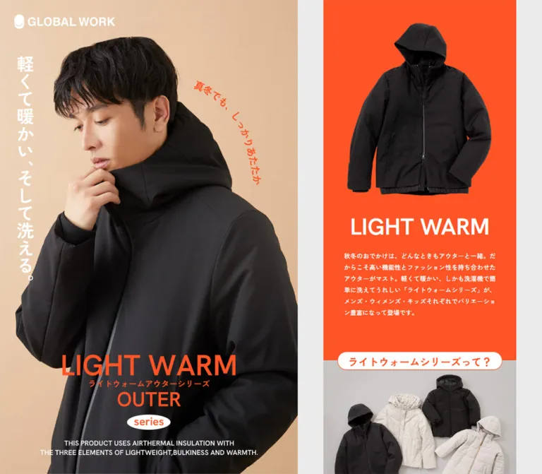
The desktop panel fills the left 555px of the viewport. A close portrait occupies nearly all of it, with a warm studio background and a jacket large enough to show fabric, quilting, zippers, and collar volume. The GLOBAL WORK wordmark sits near the upper-left corner. A white vertical Japanese promise runs down the left edge, while curved orange copy occupies open space near the model’s head.
The orange title lockup is placed low over the garment. Its measured desktop box begins near x = 115.77px, y = 777.98px; the small white product-material statement sits below it. In the mobile opening, the title begins near x = 39.53px, y = 487.53px.
The supplied desktop captures show both a man in black outerwear and a woman in light outerwear. The mobile opening shows the woman. This establishes multiple portrait states; it does not establish autoplay, sequencing, or transition duration.
Opening Cover
Role: observed introductory visual state.
A viewport-filling yellow-to-orange gradient covers the page, with one centered vertical Japanese sentence and faint fashion imagery underneath. The language selector and survey widget remain visible above it in the supplied desktop frame.
Later captures expose the complete page. The evidence does not identify the cover’s dismissal trigger, exact timing, or whether it is tied to asset loading. Do not turn its captured appearance into an assumed five-second loading requirement.
Intro and Product Explanation
Role: establish the lightweight, warm, washable product proposition.
The desktop DOM includes a 45px white LIGHT WARM heading and a 295px-wide white introductory paragraph. On mobile, the portrait ends around 694px and flows directly into an orange introduction with approximately 42px of top padding before the paragraph.
A white capsule heading, “What is the LIGHT WARM Series?”, overlaps the next section boundary. It measures 321 × 36px on desktop, with an 18px radius and orange 20px bold text. The section continues into Airthermal material information, washing guidance, a laundry-net note, and explanations of lightness, heat retention, and water repellency.
Some benefit text occupies a narrow right-hand region: the washing paragraph is 194px wide on desktop, while later feature descriptions are 222px wide. The supplied evidence does not expose enough imagery or asset data to specify the associated illustration layout precisely.
Desktop Navigation Rail
Role: keep section destinations and care information available beside the story.
An orange field fills the right 410px. The menu is approximately 220px wide and centered horizontally, with its first capsule around 206px from the top in both settled desktop captures.
Its anatomy is:
- A white filled capsule linking to the product explanation.
- A white outlined WINTER CONTENT bar with a chevron.
- Three audience entries, each pairing a small white MEN, WOMEN, or KIDS capsule with a short white description.
- A white outlined AUTUMN CONTENTS bar.
- In one capture, an isolated full-body model image below the menu.
- A full-width washing link anchored at the rail’s bottom edge.
The winter group appears expanded and the autumn group collapsed. The WOMEN entry is blue with a blue arrow in the women’s lookbook capture; the footer capture has no equivalent visible selection. These are observed visual states. Click behavior, automatic section tracking, and selection persistence were not tested.
Photo-Category Links
Role: provide visual entry points into MEN, WOMEN, and KIDS content.
Each link is a wide photographic capsule, 315 × 120px on desktop. The image places the subject mainly toward the left, while the orange audience label begins after a measured 180px left inset. A small outlined circular down-chevron sits near the right edge.
The visible autumn links use outdoor photographs: a man against the sky, a woman on paving, and a split children’s composition with greenery. Links stack vertically with 20px gaps. The winter entry links have the same measured geometry, but their exact imagery is not established by the supplied screenshots.
Winter destinations use #sec-men-winter, #sec-women-winter, and #sec-kids-winter. Autumn destinations use #sec-men, #sec-women, and #sec-kids.
Vertical Audience Tabs
Role: compact navigation alongside the lookbook.
Three white vertical capsules sit just inside the story’s left edge. Each desktop tab measures 25 × 80px, with a 13px radius, thin outline, and 13px medium lettering. Their text reads down the narrow tab. The stack uses 15px gaps.
The current WOMEN tab is outlined and lettered in orange in the supplied women’s capture; inactive tabs are dark. Mobile DOM measurements retain this component at approximately 26 × 83px, beginning about 10px from the left edge. Its mobile scrolling or pinning behavior was not visually tested.
Numbered Lookbook Sections
Role: organize styling advice by audience while keeping a continuous editorial flow.
Each audience section uses warm paper, about 30px top padding, a light-weight 60px orange numbered heading, and a green bold deck. Further down, a blue 16px editorial statement precedes narrow dark body copy.
The rendered content establishes distinct sequences:
| Sequence | Observed organization |
|---|---|
| MEN | Three styling scenarios organized by increasingly cold weather, each with a featured outerwear item and supporting products |
| WOMEN | Three outerwear stories pairing NEAT and CASUAL styling, followed by the featured garment and related items |
| KIDS | Four numbered outfit entries with a main outerwear price and supporting products |
Only the women’s scene is shown in a detailed middle-page screenshot. Do not invent the photographic arrangements of the other sequences from their text alone.
Women’s Outfit Scene
Role: demonstrate two ways to style one garment before presenting its shopping information.
The visible scene places two full-length outfit photographs side by side on matching peach studio backgrounds. The pair spans approximately 325px, starting 50px inside the 375px story and extending to its right edge. An off-white circular scene marker overlaps the upper middle seam, carrying SCENE, a large orange 01, and small Japanese scene copy.
Below the pair, orange NEAT and CASUAL captions sit toward opposite edges. A transparent-background black coat cutout overlaps the photographs’ lower edge and projects into the paper below. It is approximately 120px wide in this capture.
A bold product title follows, then a price and an orange CHECK rectangle on one row. The visible example is LIGHT WARM Quilted Long Coat at 7,920 yen. A narrow explanatory paragraph and CLEAN / CASUAL supporting-product groups continue below. These prices are captured content; destination availability was not inspected.
Keep the photo pair, scene marker, cutout, and product information as a connected composition. A boxed card around each part would break the editorial relationship.
Product and Shopping Rows
Role: turn outfit inspiration into specific shopping destinations.
The main price uses 16px medium text with 0.8px tracking. Supporting item names and prices use 14px medium text with 0.7px tracking. Repeated orange CHECK links measure 80 × 25px, have square corners, and use 11px white text with 0.55px tracking.
Supporting rows occur at approximately 45px vertical intervals in the sampled desktop content. Green uppercase sublabels introduce item groups. Category shopping links are broader white capsules with green text; the measured MEN example is 295 × 30px with a 15px radius.
The anchors lead to item and category pages on dot-st.com. The page itself is an editorial shopping guide; the supplied evidence does not show a cart, size selector, or checkout interface.
Washing Utility
Role: keep product-care information easy to reach.
Desktop uses a white strip approximately 54px high across the rail’s bottom, with a thin blue boundary, washing-machine icon, HOW TO WASH lettering, and a small outlined CHECK NOW label.
In the scrolled mobile footer capture, this becomes a roughly 104px circular white badge with a blue outline near the upper-right corner, about 10px from each edge. It overlaps a photo-category link. It is not visible in the mobile opening screenshot, so its appearance threshold is unverified.
The destination is #wash. The sampled mobile anchor rectangle is not the full circular visual footprint; use the screenshot when describing the badge’s visible size. No washing dialog or post-click state was supplied.
Autumn / Back-Number Panel
Role: offer another seasonal route after the winter lookbooks.
The rendered mobile text introduces BACK NUMBER, a short autumn statement, and a paragraph. The footer captures show three photographic audience capsules, an orange SHOW MORE pill with a down-chevron, and a thin orange rectangular section boundary.
SHOW MORE is approximately 135 × 30px on desktop and 140 × 31px on mobile. Its supplied href is #. The label and chevron suggest disclosure, but neither expansion nor additional revealed content was exercised.
Footer and Credits
Role: close the editorial feature with production information and brand identity.
A white footer follows the orange panel boundary with approximately 70px of open space before STAFF. Credits form a compact left-aligned block, inset about 50px on desktop and 52px on mobile. The text appears around 12px with roughly 17px line spacing; these are screenshot estimates.
The current original page explicitly lists photography, styling, hair and make-up, movie, model, and creative-direction credits. Its final creative-direction line names Mo-Green Co., Ltd. A centered GLOBAL WORK logo and a copyright line naming Adastria Co., Ltd. follow beneath the credits.
Language and Survey Utilities
Role: secondary controls layered over the campaign.
A small ENGLISH selector with a down triangle appears at the upper-right of the opening captures. Language switching was not tested.
The survey panel appears at the lower-left across desktop and mobile captures. Its approximate footprint is 200 × 120px on desktop and 150 × 90px on mobile, with a white body, blue brand symbol, black “アンケート実施中” text, lime bottom strip, and overlapping dark circular close affordance. Its link points to an external survey.
The overlay visibly covers parts of the hero copy and mobile footer logo. Its dismissal behavior was not tested. Treat it as an auxiliary overlay rather than a required campaign component.
Tokens — Motion & Interaction
| Treatment | Supplied evidence | What can be concluded |
|---|---|---|
| Intro and explanatory-heading reveal | Computed animation: 0.8s fadeAnime |
An 800ms named animation is assigned; keyframes, trigger, and displacement were not supplied |
| CHECK link transitions | color 0.3s, background 0.3s |
Color and background transitions last 300ms; hover endpoints were not captured |
| Category shopping-link transitions | Same 300ms color/background declaration | A matching transition duration is defined |
| Portrait changes | Male and female states in original captures | More than one portrait is used; autoplay and timing are unverified |
| Desktop side-panel persistence | Same side-panel geometry at different story positions | Visually persistent framing; exact fixed/sticky source implementation is unknown |
| Audience selection | Orange WOMEN tab; blue rail entry and arrow | Selected styling exists; its update mechanism was not tested |
| Section navigation | Explicit fragment hrefs | Destinations are known; smooth-scroll behavior is unverified |
| Seasonal bars and SHOW MORE | Chevron affordances; several hrefs are # |
Disclosure-like presentation is visible; resulting interaction is unverified |
| Opening gradient cover | One obscured desktop state and later unobscured states | Cover lifecycle and transition duration remain unknown |
Many sampled elements report transition: all without an explicit nonzero duration in the supplied summary. This is not sufficient evidence of visible animation.
The inspection process waited for load, layout/text stability, visible image decoding, and relevant finite animations within time limits. Perpetual animations were paused during readiness checks and resumed. Consequently, the captures should not be used to infer a continuous motion sequence or a complete animation inventory.
For an adaptation, short fades and restrained color changes fit the evidence. Parallax, spring motion, continuous zooming, and animated garment rotation are not established features.
Surfaces
| Layer | Appearance | Function |
|---|---|---|
| Campaign identity | Warm full-bleed portrait photography | Emotional and material presentation |
| Navigation rail / intro | Saturated orange with white details | Strong identity and persistent orientation |
| Lookbook | Warm off-white, mostly unboxed content | Comfortable background for styling and product detail |
| Footer | White with dark compact text | Quiet editorial closure |
| Section boundary | Thin orange rectangular outline | Groups seasonal entry content |
| Navigation capsule | White fill or white outline | Distinguishes compact section controls |
| Shopping action | Flat orange rectangle | Repeated product destination |
| Care utility | White with blue linework | Separates washing guidance from shopping |
| Survey | White panel with blue and lime elements | Independent floating utility |
There is no visible general-purpose elevation system. Most hierarchy comes from color fields, photography, spacing, thin outlines, and selective overlaps. Garment cutouts float through their silhouettes, without needing a shadowed card.
Imagery
The core image language is approachable studio fashion photography. Hero portraits are tightly cropped and garment-led; full-length outfit photographs make styling readable; isolated jackets explain shape and construction. Warm peach and beige backdrops maintain continuity across black, cream, and neutral garments.
The category capsules introduce outdoor contexts without changing the surrounding interface: sky, paving, and greenery sit inside a repeated rounded silhouette. The KIDS capsule joins two photographs within the same container.
Image cropping is role-specific. Crop the campaign portrait to emphasize face, collar, and garment volume. Preserve full outfits in styling comparisons. Render isolated products with containment so sleeves and hems remain visible. Smooth photographic rendering is appropriate; pixelated scaling is not.
Observed Asset References
No original image URLs, file names, font-file URLs, or video URLs were included in the supplied evidence. The following are visual asset roles, not invented paths.
| Asset role | Original-page evidence | Reuse guidance |
|---|---|---|
| Campaign portraits | Male desktop state and female desktop/mobile states | Supply approved portrait assets and tune crops separately by viewport |
| Campaign title lockup | Visible LIGHT WARM / OUTER / series composition; measured H1 footprint | Preserve its artwork proportions and accessible title |
| Wordmarks | White hero logo; dark footer logo with blue symbol | Use approved brand artwork |
| Paired women’s looks | Two full-length photographs in the women’s scene | Keep matching photographic scale and background tone |
| Garment cutout | Black quilted coat below the paired looks | Preserve transparency and use contain sizing |
| Outdoor category images | MEN, WOMEN, and split KIDS footer capsules | Prepare crops around the text and right-hand chevron |
| Washing graphic | Desktop strip and mobile circular badge | Retain blue linework and distinct responsive arrangements |
CSS can reproduce the framing, spacing, and control geometry. The campaign’s identity still depends on its photography and graphic lettering.
Layout & Responsive Behavior
Desktop: Three Persistent Visual Regions
At 1440px wide, the portrait occupies approximately 38.5% of the viewport, the middle lane 33%, and the rail 28.5%. The content itself remains only 375px wide within the middle lane. This creates the unusual effect of reading a mobile-sized fashion feature between two large campaign panels.
The sampled MAIN uses display: flex. The Quick Start uses Grid as an adaptation; it does not claim the original uses Grid. The tall document measurements support a long page, and there is no evidence requiring a separate scroll container for the middle column.
Mobile: Portrait Followed by Full-Width Story
At 390px, MAIN reports display: block. The portrait becomes an approximately 694px-tall opening section, close to a 9:16 portrait ratio. Orange introductory copy follows in normal flow. The 375px desktop core becomes a 390px story, while the desktop outer gutters and right rail disappear.
Many dimensions increase by approximately 390 / 375 = 1.04: 12px copy becomes 12.48px, 60px category headings become 62.4px, and 315px image links become about 327.6px. The page retains its narrow editorial proportions instead of shrinking all mobile text.
This proportional pattern is supported by two captured widths, not a recovered complete responsive stylesheet. The hero layout and introductory top padding have separate mobile treatment and should not be scaled mechanically from desktop.
Source Custom Properties
| Source property | Desktop | Mobile | Interpretation limit |
|---|---|---|---|
--vw |
14.4px |
3.9px |
Matches one percent of viewport width |
--kvW |
555px |
-49px |
Desktop portrait value matches the capture; negative mobile value is not a rendered panel width |
--navW |
410px |
-36px |
Desktop rail value matches the capture; mobile rail is not shown |
--kvWNarrow |
965px |
-85px |
Desktop value equals the combined side widths; full source formula is unavailable |
Do not apply the negative mobile custom-property values to visible widths. The measured mobile sections are 390px wide.
Adaptation Recommendation
Use a single-column layout by default and introduce the desktop composition only when both side panels can remain useful. The Quick Start chooses 1200px as a proposed breakpoint, not a measured source breakpoint. It preserves the 475px middle lane at desktop and allocates the remaining width in a 555:410 ratio.
For intermediate widths, a centered single story with a capped portrait is a reasonable fallback. Test this separately: no tablet or landscape capture was supplied. Allow translated product names to wrap, and keep floating controls clear of both text and safe-area insets.
Do’s and Don’ts
Do
- Preserve the desktop relationship between portrait, narrow story, and orange rail.
- Use the measured orange
#fe5426and warm paper#f5f3eeas the main structural colors. - Keep blue editorial/care accents and green supporting labels distinct.
- Combine light 60px section headings with compact, generously led reading copy.
- Retain vertical Japanese campaign copy and the low-positioned title lockup.
- Pair styled outfits with a separate garment cutout and nearby shopping information.
- Use capsule silhouettes for category routes and square rectangles for CHECK links.
- Keep the lookbook as a long, continuous editorial sequence.
- Treat mobile as a deliberate change in composition, including a different washing-control format.
- Label approximated motion, responsive formulas, and asset substitutions explicitly.
Don’t
- Don’t replace the narrow story with a full-width desktop product-card grid.
- Don’t add a conventional large navigation header above the campaign portrait.
- Don’t use one rounded-card treatment for photos, product rows, and prose.
- Don’t convert the warm paper to pure white everywhere.
- Don’t use the opening gradient as a permanent background for every section.
- Don’t copy the BODY font size as the reading-copy size.
- Don’t infer original image paths, slider timing, or hover colors from library variables.
- Don’t interpret a
#href as proof of a working disclosure. - Don’t stretch transparent product images or crop away their garment shape.
- Don’t reproduce the survey’s content obstruction as a desirable layout feature.
Recommended Implementation Additions
These are recommendations for a new implementation, not verified features of the original:
- Provide a meaningful accessible H1 even when the campaign title uses artwork. Check actual image alternatives and the accessibility tree before concluding that an empty text extraction is an error.
- Give graphic washing links and icon-only close controls accessible names.
- Use buttons with
aria-expandedandaria-controlsfor genuine disclosures, or native details elements where appropriate. Keep navigation destinations as links. - Expose the current audience with
aria-current, and retain the visible arrow or another non-color indicator. - Enlarge the effective touch area of the compact CHECK links and narrow tabs to about 44px without allowing adjacent targets to overlap.
- Offer a comfortable reading variant with larger body text. The observed 12–12.48px copy is a fidelity measurement, not a readability recommendation.
- Check small white/orange and green/white text combinations for the required contrast in the intended implementation.
- Make the survey dismissible and position floating utilities so they do not cover the footer logo, category labels, or essential copy.
- Respect reduced-motion preferences and ensure that reveals never leave content hidden when scripts fail.
- Reserve image dimensions, prioritize the opening portrait, and defer below-fold outfit images. Verify long-page performance with the actual assets.
Agent Prompt Guide
Quick Color Reference
- Campaign fields and CHECK links:
#fe5426. - Lookbook paper:
#f5f3ee. - Footer, capsule fills, and reversed text:
#ffffff. - Reading text:
#333333. - Editorial statements and washing utility:
#0068b6. - Supporting item labels and section decks:
#00ac87. - Underlying page canvas:
#ebebeb. - Photographic warmth: supplied beige/peach studio imagery, not a universal flat-color overlay.
Overall Prompt
“Create a responsive outerwear editorial feature with a warm studio portrait, a narrow continuous lookbook, and a vivid orange navigation rail. At a 1440px desktop viewport, use a 555px portrait, a 475px middle lane with 50px gutters around a 375px story, and a 410px rail. Keep the side regions visually persistent as the story scrolls. Use campaign orange #fe5426, warm paper #f5f3ee, dark ink #333333, editorial blue #0068b6, and green #00ac87. Declare Hanken Grotesk with Japanese sans-serif fallbacks. Combine thin oversized category headings, compact body copy, capsule photo links, paired outfit photographs, transparent garment cutouts, and square orange CHECK links. On a 390px phone, place the portrait first and expand the story to full width. Keep observed behavior separate from newly proposed interactions.”
Example Component Prompts
- Campaign portrait: “Compose a tall warm-beige fashion portrait with a small white brand mark at upper left, the source phrase ‘軽くて暖かい、そして洗える。’ running vertically along the left, curved orange secondary copy near the head, and an orange campaign lockup low over the garment. Preserve room for the face and jacket collar. Use approved photography.”
- Women’s scene: “Place two full-length outfits side by side on matching peach studio backgrounds. Overlap the center top edge with an off-white circular scene marker and place a transparent coat cutout across the lower edge. Follow with a bold product title, price, and an 80 × 25px orange CHECK rectangle. Use warm paper without a surrounding card shadow.”
- Category capsule: “Create a 315 × 120px photographic capsule with the subject on the left, an orange audience label starting around 180px into the container, and a small outlined circular down-chevron at the right. Stack three with 20px gaps.”
- Desktop rail: “Use a full-height orange panel containing a centered 220px navigation group. Combine a white explanation pill, white outlined seasonal bars, small white audience labels, and compact descriptions. Reserve the bottom 54px for a white and blue washing strip. Any disclosure behavior is a new implementation requirement.”
- Mobile adaptation: “At 390px, place an approximately 694px-tall portrait above the story. Remove desktop side gutters and rail. Scale the 375px editorial geometry by approximately 1.04, while using separate hero positioning. Offer the washing utility as a small circular control and prevent it from covering category labels.”
Quick Start
CSS Custom Properties
This is an implementation adaptation, not extracted source CSS. It uses a conventional document root and a local length unit: 1px at desktop and approximately 1.04px at the inspected phone width. The proposed 1200px breakpoint and 600px intermediate-width cap were not measured on the original.
Expected structure: .lw-page contains .kv, .editorial-lane with an .editorial child, and .rail. Place the desktop washing link inside the rail and the mobile washing link within the page. Supply approved image assets through markup; no asset URLs or font downloads are invented here.
:root {
  /* Measured palette, assigned new semantic aliases. */
  --lw-orange: #fe5426;
  --lw-paper: #f5f3ee;
  --lw-white: #ffffff;
  --lw-ink: #333333;
  --lw-tab-ink: #3a3a3a;
  --lw-blue: #0068b6;
  --lw-green: #00ac87;
  --lw-canvas: #ebebeb;

  --lw-font: 'Hanken Grotesk', 'Zen Kaku Gothic New',
    'Hiragino Kaku Gothic ProN', 'Hiragino Kaku Gothic',
    'Noto Sans JP', YuGothicM, '游ゴシック Medium',
    YuGothic, 'Yu Gothic', -apple-system, system-ui,
    'Helvetica Neue', 'メイリオ', Meiryo, sans-serif;

  --lw-motion-color: 300ms;
  --lw-motion-reveal: 800ms;
  --lw-radius-pill: 999px;
}

* { box-sizing: border-box; }
body { margin: 0; background: var(--lw-canvas); }

.lw-page {
  --u: calc(min(100vw, 600px) / 375);
  width: min(100%, 600px);
  margin-inline: auto;
  color: var(--lw-ink);
  font-family: var(--lw-font);
  background: var(--lw-paper);
}

.lw-page img { display: block; max-width: 100%; }
.lw-page button { font: inherit; cursor: pointer; }
.lw-page a { color: inherit; }
.lw-page :focus-visible {
  outline: 3px solid var(--lw-blue);
  outline-offset: 4px;
}

/* Portrait geometry approximates the supplied mobile opening. */
.kv {
  position: relative;
  aspect-ratio: 9 / 16;
  overflow: hidden;
  color: var(--lw-white);
}
.kv__photo {
  width: 100%;
  height: 100%;
  object-fit: cover;
  object-position: center;
}
.kv__brand {
  position: absolute;
  top: calc(16 * var(--u));
  left: calc(16 * var(--u));
  width: calc(155 * var(--u));
}
.kv__tagline {
  position: absolute;
  top: 10.4%;
  left: 5.8%;
  margin: 0;
  writing-mode: vertical-rl;
  font-size: calc(24 * var(--u));
  font-weight: 700;
  line-height: 1.15;
}
.kv__lockup {
  position: absolute;
  left: 50%;
  bottom: 10.34%;
  width: 79.73%;
  margin: 0;
  transform: translateX(-50%);
}
.kv__lockup img { width: 100%; height: auto; }
.kv__note {
  position: absolute;
  inset-inline: 4%;
  bottom: 4%;
  margin: 0;
  text-align: center;
  font-size: calc(11 * var(--u));
  line-height: 1.35;
}

.editorial-lane, .editorial { min-width: 0; }
.editorial { width: 100%; }
.intro { color: var(--lw-white); background: var(--lw-orange); }
.intro__title { display: none; }
.intro__copy {
  width: calc(295 * var(--u));
  margin: 0 auto;
  padding-block: calc(40 * var(--u)) calc(83 * var(--u));
  font-size: calc(12 * var(--u));
  font-weight: 500;
  line-height: calc(22 * var(--u));
}
.section-pill {
  position: relative;
  width: calc(321 * var(--u));
  min-height: calc(36 * var(--u));
  margin: calc(-19 * var(--u)) auto 0;
  padding: calc(8 * var(--u)) calc(10 * var(--u));
  border-radius: calc(18 * var(--u));
  color: var(--lw-orange);
  background: var(--lw-white);
  text-align: center;
  font-size: calc(20 * var(--u));
  font-weight: 700;
  line-height: 1;
}

.category-links {
  display: grid;
  gap: calc(20 * var(--u));
  padding: calc(30 * var(--u));
}
.category-card {
  position: relative;
  display: flex;
  align-items: center;
  min-width: 0;
  height: calc(120 * var(--u));
  padding-left: calc(180 * var(--u));
  overflow: hidden;
  border-radius: var(--lw-radius-pill);
  text-decoration: none;
  font-size: calc(20 * var(--u));
  line-height: 1;
}
.category-card img {
  position: absolute;
  inset: 0;
  width: 100%;
  height: 100%;
  object-fit: cover;
}
.category-card span {
  position: relative;
  color: var(--lw-orange);
}
.category-card__arrow { margin-left: calc(12 * var(--u)); }

.lookbook {
  position: relative;
  padding-block: calc(30 * var(--u)) calc(100 * var(--u));
  background: var(--lw-paper);
}
.lookbook__title {
  margin: 0 0 calc(10 * var(--u)) calc(30 * var(--u));
  color: var(--lw-orange);
  font-size: calc(60 * var(--u));
  font-weight: 300;
  line-height: 1;
}
.lookbook__deck {
  margin: 0;
  color: var(--lw-green);
  text-align: center;
  font-size: calc(18 * var(--u));
  font-weight: 700;
  line-height: 1.25;
}
.lookbook__subheading {
  color: var(--lw-blue);
  font-size: calc(16 * var(--u));
  font-weight: 700;
  line-height: 1.5;
  text-align: center;
}
.lookbook__copy {
  width: calc(295 * var(--u));
  margin-left: calc(50 * var(--u));
  font-size: calc(12 * var(--u));
  line-height: calc(22 * var(--u));
  letter-spacing: calc(-0.6 * var(--u));
}
.audience-tab {
  display: grid;
  place-items: center;
  width: calc(25 * var(--u));
  height: calc(80 * var(--u));
  border: 1px solid currentColor;
  border-radius: calc(13 * var(--u));
  color: var(--lw-tab-ink);
  background: var(--lw-white);
  writing-mode: vertical-rl;
  text-decoration: none;
  font-size: calc(13 * var(--u));
  font-weight: 500;
  letter-spacing: 0.05em;
}
.audience-tab[aria-current] { color: var(--lw-orange); }

/* Scene overlap dimensions are screenshot-based approximations. */
.scene {
  width: calc(325 * var(--u));
  margin: calc(65 * var(--u)) 0 0 calc(50 * var(--u));
}
.scene__pair {
  position: relative;
  display: grid;
  grid-template-columns: repeat(2, minmax(0, 1fr));
}
.scene__pair img { width: 100%; height: auto; }
.scene__number {
  position: absolute;
  top: calc(-30 * var(--u));
  left: 50%;
  display: grid;
  place-content: center;
  width: calc(90 * var(--u));
  aspect-ratio: 1;
  border-radius: 50%;
  color: var(--lw-orange);
  background: var(--lw-paper);
  text-align: center;
  transform: translateX(-50%);
}
.scene__cutout {
  position: relative;
  width: calc(120 * var(--u));
  height: auto;
  margin: calc(-28 * var(--u)) auto calc(22 * var(--u));
  object-fit: contain;
}
.product-title {
  margin: 0;
  text-align: center;
  font-size: calc(16 * var(--u));
  font-weight: 700;
  line-height: 1.2;
}
.product-meta {
  display: flex;
  align-items: center;
  justify-content: center;
  flex-wrap: wrap;
  gap: calc(27 * var(--u));
  margin-top: calc(20 * var(--u));
}
.product-price {
  font-size: calc(16 * var(--u));
  font-weight: 500;
  letter-spacing: 0.05em;
}
.lw-page .check {
  display: inline-flex;
  align-items: center;
  justify-content: center;
  width: calc(80 * var(--u));
  min-height: calc(25 * var(--u));
  border: 0;
  border-radius: 0;
  color: var(--lw-white);
  background: var(--lw-orange);
  text-decoration: none;
  font-size: calc(11 * var(--u));
  font-weight: 500;
  letter-spacing: 0.05em;
  transition: color var(--lw-motion-color),
    background var(--lw-motion-color);
}
.scene__copy {
  width: calc(260 * var(--u));
  margin: calc(26 * var(--u)) 0 0 calc(13 * var(--u));
  font-size: calc(12 * var(--u));
  line-height: 1.83;
}
.item-group-title {
  color: var(--lw-green);
  font-size: calc(12 * var(--u));
  font-weight: 600;
  letter-spacing: 0.05em;
}
.item-row {
  display: grid;
  grid-template-columns: minmax(0, 1fr) auto calc(80 * var(--u));
  align-items: center;
  gap: calc(8 * var(--u));
  min-height: calc(45 * var(--u));
  font-size: calc(14 * var(--u));
  line-height: 1.2;
}
.item-row > * { min-width: 0; }
.item-row__price { white-space: nowrap; }

.rail { display: none; }
.lw-footer {
  padding: calc(70 * var(--u)) calc(50 * var(--u))
    calc(48 * var(--u));
  background: var(--lw-white);
  font-size: calc(12 * var(--u));
  line-height: 1.42;
  letter-spacing: 0.04em;
}
.lw-footer__brand {
  width: calc(200 * var(--u));
  margin: calc(56 * var(--u)) auto calc(18 * var(--u));
}
.lw-footer__copyright {
  margin: 0;
  font-size: calc(10 * var(--u));
  text-align: center;
}
.wash-link--mobile {
  position: fixed;
  z-index: 20;
  top: max(10px, env(safe-area-inset-top));
  right: max(10px, env(safe-area-inset-right));
  display: grid;
  place-items: center;
  width: 104px;
  aspect-ratio: 1;
  border: 1px solid var(--lw-blue);
  border-radius: 50%;
  color: var(--lw-blue);
  background: var(--lw-white);
}
/* Application logic must choose a suitable visibility threshold. */
.wash-link--mobile[hidden] { display: none; }

/* Proposed desktop breakpoint; not recovered from the source. */
@media (min-width: 1200px) {
  .lw-page {
    --u: 1px;
    display: grid;
    grid-template-columns: minmax(0, 555fr) 475px minmax(0, 410fr);
    width: 100%;
    max-width: none;
    align-items: start;
  }
  .kv, .rail {
    position: sticky;
    top: 0;
    height: 100vh;
    height: 100svh;
    align-self: start;
  }
  .kv { aspect-ratio: auto; }
  .kv__brand { top: 27px; left: 27px; width: 190px; }
  .kv__tagline { font-size: 30px; }
  .kv__lockup { width: 58.28%; bottom: 8.22%; }
  .editorial-lane { padding-inline: 50px; }
  .intro__title {
    display: block;
    margin: 0;
    text-align: center;
    font-size: 45px;
    font-weight: 600;
    line-height: 1;
  }
  .intro__copy { padding-top: 24px; }
  .rail {
    display: block;
    padding-top: 20.6vh;
    padding-top: 20.6svh;
    color: var(--lw-white);
    background: var(--lw-orange);
  }
  .rail__menu { width: 220px; margin-inline: auto; }
  .rail__toggle {
    display: flex;
    align-items: center;
    justify-content: space-between;
    width: 100%;
    min-height: 28px;
    padding: 4px 15px;
    border: 1px solid currentColor;
    border-radius: var(--lw-radius-pill);
    color: inherit;
    background: transparent;
    font-size: 14px;
  }
  .rail__item {
    position: relative;
    display: block;
    margin-top: 15px;
    text-decoration: none;
    font-size: 12px;
    line-height: 1.1;
  }
  .rail__item[aria-current] { color: var(--lw-blue); }
  .rail__wash {
    position: absolute;
    inset-inline: 0;
    bottom: 0;
    display: flex;
    align-items: center;
    justify-content: space-evenly;
    min-height: 54px;
    padding: 8px;
    border: 1px solid var(--lw-blue);
    color: var(--lw-blue);
    background: var(--lw-white);
    text-decoration: none;
  }
  .wash-link--mobile { display: none; }
}

/* Recommended opacity-only reveal; original keyframes are unknown. */
.reveal { animation: lw-reveal var(--lw-motion-reveal) ease both; }
@keyframes lw-reveal {
  from { opacity: 0; }
  to { opacity: 1; }
}

/* Recommended touch sizing intentionally changes visual density. */
@media (pointer: coarse) {
  .lw-page .check { min-height: 44px; }
  .item-row { min-height: 52px; }
}
@media (prefers-reduced-motion: reduce) {
  .lw-page .reveal { animation: none; }
  .lw-page .check { transition: none; }
}
The snippet establishes the main composition and reusable components. It does not recreate the complete long page, the opening cover, portrait switching, disclosure logic, or proprietary artwork. Exact source tracking and line heights are documented above; the code slightly relaxes product-title line height for wrapping. Review intermediate widths and short desktop heights with real content before shipping.
Tailwind v4 Token Mapping
Optional aliases for a project already using Tailwind v4. This is not evidence that the original page uses Tailwind. Define the preceding custom properties first; unit-based utilities must be used within .lw-page.
@theme inline {
  --color-lw-orange: var(--lw-orange);
  --color-lw-paper: var(--lw-paper);
  --color-lw-white: var(--lw-white);
  --color-lw-ink: var(--lw-ink);
  --color-lw-blue: var(--lw-blue);
  --color-lw-green: var(--lw-green);
  --color-lw-canvas: var(--lw-canvas);

  --font-lw: var(--lw-font);
  --text-lw-caption: calc(11 * var(--u));
  --text-lw-body: calc(12 * var(--u));
  --text-lw-item: calc(14 * var(--u));
  --text-lw-product: calc(16 * var(--u));
  --text-lw-deck: calc(18 * var(--u));
  --text-lw-section: calc(30 * var(--u));
  --text-lw-category: calc(60 * var(--u));

  --spacing-lw-unit: var(--u);
  --spacing-lw-inset: calc(30 * var(--u));
  --spacing-lw-copy: calc(295 * var(--u));
  --radius-lw-pill: 999px;
  --radius-lw-tab: calc(13 * var(--u));
}
Sources & Evidence
- Original and final website: GLOBAL WORK — LIGHT WARM Outerwear Series. The supplied browser inspection reports HTTP 200 and no URL change.
- Capture time: September 22, 2026, 21:01:52.518 UTC, equivalent to September 23, 2026, 06:01:52.518 JST.
- Desktop evidence: 1440 × 1000 viewport; opening-cover, women’s-lookbook, and footer captures; rendered DOM, computed styles, custom properties, text, and link destinations. Captured document height: approximately 16,365.38px.
- Mobile evidence: 390 × 844 viewport; opening and footer captures; rendered DOM, computed styles, custom properties, text, and link destinations. Captured document height: approximately 17,240.48px.
- Interaction evidence: inspection traversed scrolling positions. Fragment destinations, transition declarations, animation names, and visible selected/disclosure-like states are recorded. No results were supplied for activating shopping links, seasonal controls, SHOW MORE, language selection, the washing link, or survey dismissal.
- Inspection limits: captures used bounded readiness checks; delayed content and unexercised motion may remain unverified. SharedWorkers and service workers were disabled. No tablet viewport, full accessibility tree, image-source inventory, complete stylesheet, or continuous motion recording was supplied.
All design findings above come from the supplied current-page captures and rendered evidence. No additional browsing or file inspection was performed for this reference. Estimated geometry and recommended implementation choices are explicitly separated from measured source values.
# GLOBAL WORK / LIGHT WARM Outerwear Series — Style Reference

> A narrow fashion story framed by a full-height portrait and a vivid orange navigation wall.

**Original URL:** [globalwork.jp/women/2023aw_lightwarm_outerseries/](https://www.globalwork.jp/women/2023aw_lightwarm_outerseries/)
**Final URL:** [globalwork.jp/women/2023aw_lightwarm_outerseries/](https://www.globalwork.jp/women/2023aw_lightwarm_outerseries/) — unchanged; supplied inspection reports HTTP 200.
**Theme:** light editorial surfaces, saturated orange campaign fields, and warm studio photography.
**Inspected:** September 23, 2026, 06:01:52 JST; supplied retrieval timestamp: September 22, 2026, 21:01:52.518 UTC.
**Viewports:** desktop 1440 × 1000 CSS pixels; mobile 390 × 844 CSS pixels.
**Scope:** the currently served outerwear feature, including its opening cover state, campaign portrait, product explanation, winter lookbooks, autumn/back-number entry points, persistent navigation, washing link, survey overlay, and footer. Rendered copy is predominantly English, with Japanese retained in campaign graphics. The dated URL identifies the feature; this document describes its current rendering.

The page combines a fashion campaign, a long editorial lookbook, product-care information, and outbound shopping links. Its strongest feature is the desktop composition: a 555px portrait panel at left, a 475px middle lane containing a 375px story, and a 410px orange navigation rail at right. The portrait and rail remain visually in place across the supplied scrolled captures while the central story advances.

Warm beige photographs soften the orange. Small, carefully spaced sans-serif copy provides practical detail; thin orange category headings and oversized section numbers establish rhythm. Capsule-shaped photo links, isolated garment cutouts, paired outfits, and compact rectangular CHECK links create a fashion-magazine vocabulary. On mobile, the portrait becomes the opening section and the story expands to the viewport width.
閉じる
# GLOBAL WORK / LIGHT WARM Outerwear Series — Style Reference

> A narrow fashion story framed by a full-height portrait and a vivid orange navigation wall.

**Original URL:** [globalwork.jp/women/2023aw_lightwarm_outerseries/](https://www.globalwork.jp/women/2023aw_lightwarm_outerseries/)
**Final URL:** [globalwork.jp/women/2023aw_lightwarm_outerseries/](https://www.globalwork.jp/women/2023aw_lightwarm_outerseries/) — unchanged; supplied inspection reports HTTP 200.
**Theme:** light editorial surfaces, saturated orange campaign fields, and warm studio photography.
**Inspected:** September 23, 2026, 06:01:52 JST; supplied retrieval timestamp: September 22, 2026, 21:01:52.518 UTC.
**Viewports:** desktop 1440 × 1000 CSS pixels; mobile 390 × 844 CSS pixels.
**Scope:** the currently served outerwear feature, including its opening cover state, campaign portrait, product explanation, winter lookbooks, autumn/back-number entry points, persistent navigation, washing link, survey overlay, and footer. Rendered copy is predominantly English, with Japanese retained in campaign graphics. The dated URL identifies the feature; this document describes its current rendering.

The page combines a fashion campaign, a long editorial lookbook, product-care information, and outbound shopping links. Its strongest feature is the desktop composition: a 555px portrait panel at left, a 475px middle lane containing a 375px story, and a 410px orange navigation rail at right. The portrait and rail remain visually in place across the supplied scrolled captures while the central story advances.

Warm beige photographs soften the orange. Small, carefully spaced sans-serif copy provides practical detail; thin orange category headings and oversized section numbers establish rhythm. Capsule-shaped photo links, isolated garment cutouts, paired outfits, and compact rectangular CHECK links create a fashion-magazine vocabulary. On mobile, the portrait becomes the opening section and the story expands to the viewport width.

## How to Read This Reference

- **Measured** means a value appears in the supplied rendered DOM, computed styles, or source custom-property values. Measurements use CSS pixels.
- **Calculated** means arithmetic based on those measurements, such as the 50px desktop gutters around the story.
- **Estimated** means a visual estimate from an original-page screenshot. This applies particularly to the navigation rail, footer typography, and graphic silhouettes that lack sampled element styles.
- **Recommended** means guidance for a new implementation. The CSS classes, proposed breakpoint, accessibility additions, and unrecovered animation keyframes are recommendations.
- Font-family declarations are available; individual font-file loading and glyph resolution were not independently verified.
- Static captures and element styles do not establish autoplay timing, click results, disclosure behavior, or scroll-animation triggers. Those limits are identified below.

## Tokens — Colors

### Default Palette

The aliases below are implementation names, not recovered source variable names.

| Name | Value | Suggested token | Evidence and role |
| --- | --- | --- | --- |
| Campaign Orange | `#fe5426` | `--lw-orange` | Measured on section headings, category labels, and CHECK backgrounds; visually corresponds to the dominant campaign fields |
| Warm Editorial Paper | `#f5f3ee` | `--lw-paper` | Measured background of the MEN and WOMEN winter sections |
| White | `#ffffff` | `--lw-white` | Measured capsule-heading surfaces, tab backgrounds, and reversed text; visually used for the footer and washing controls |
| Body Ink | `#333333` | `--lw-ink` | Measured body and product-description text |
| Tab Ink | `#3a3a3a` | `--lw-tab-ink` | Measured inactive vertical category-tab text |
| Editorial Blue | `#0068b6` | `--lw-blue` | Measured explanatory subheadings; visually echoed by the selected navigation treatment and washing graphic |
| Editorial Green | `#00ac87` | `--lw-green` | Measured section decks, OTHER ITEMS labels, and category shopping-link text |
| Base Gray | `#ebebeb` | `--lw-canvas` | Measured BODY background; distinct from the warmer lookbook paper |

Orange establishes identity and shopping emphasis. Blue marks explanatory content and care-related utility. Green marks supporting editorial hierarchy and item groupings. Preserve these roles instead of assigning a separate color to every audience category.

The beige and peach tones belong to photography, with natural variations across skin, backdrops, and clothing. No flat photographic beige token was measured.

### Opening Cover Palette

One desktop capture shows a full-screen gradient running from golden yellow through orange to red-orange, with the white vertical phrase “軽くて暖かい、そして洗える。” centered over faint underlying imagery. Exact gradient stops, compositing, and opacity were not supplied. Treat this as a separately observed opening cover, not the background treatment for the entire settled page.

The survey widget introduces a dark blue symbol and a lime strip. Those colors belong to that separate overlay and should not expand the main campaign palette.

## Tokens — Typography

### Declared Family

The sampled page content consistently declares this stack:

```css
font-family:
  'Hanken Grotesk',
  'Zen Kaku Gothic New',
  'Hiragino Kaku Gothic ProN',
  'Hiragino Kaku Gothic',
  'Noto Sans JP',
  YuGothicM,
  '游ゴシック Medium',
  YuGothic,
  'Yu Gothic',
  -apple-system,
  'system-ui',
  'Helvetica Neue',
  'メイリオ',
  Meiryo,
  sans-serif;
```

Hanken Grotesk is the first declared family, followed by Japanese sans-serif families and system fallbacks. The visual hierarchy uses weight and scale within this sans-serif system: light, large category headings; bold editorial statements; and compact regular or medium copy.

The HTML element reports Times at 16px, but the sampled visible campaign content overrides it. Similarly, BODY reports 20.8px; ordinary reading paragraphs have explicit 12px desktop styles. Neither inherited value should be treated as the visible body-copy token.

### Graphic Lettering

The hero combines the GLOBAL WORK wordmark, the orange LIGHT WARM / OUTER lockup, a small white series oval, vertical Japanese copy, and curved orange Japanese lettering. Its H1 has empty extracted text despite a visible graphic footprint. This supports treating the title as a graphic composition, but does not identify its file format or prove its accessible name is missing.

Do not infer a live font size from the H1’s inherited 20.8px value. Preserve the approved title artwork or recreate its proportions deliberately.

### Type Scale

Desktop values below are measured. Mobile values are measured at 390px wide and rounded for readability.

| Role | Desktop size / line height | Weight | Tracking | Mobile size / line height |
| --- | --- | --- | --- | --- |
| Numbered category heading, such as 02 WOMEN | `60 / 60px` | 300 | Normal | `62.4 / 62.4px` |
| Intro LIGHT WARM heading | `45 / 45px` | 600 | Normal | Not present as a separate visible heading in the supplied mobile opening |
| Benefit-summary LIGHT WARM line | `33 / 33px` | 500 | Normal | `34.32 / 34.32px` |
| WINTER CONTENT heading | `30 / 30px` | 500 | Normal | `31.2 / 31.2px` |
| Washing-benefit heading | `22 / 30px` | 700 | Normal | `22.85 / 31.16px` |
| White capsule section heading | `20 / 20px` | 700 | Normal | `20.79 / 20.79px` |
| Photo-category link label | `20 / 20px` | 400 | Normal | `20.79 / 20.79px` |
| Green category deck | `18 / 22.5px` | 700 | Normal | `18.72 / 23.4px` |
| Blue editorial subheading | `16 / 24px` | 700 | Normal | `16.61 / 24.92px` |
| Featured product title | `16 / 16px` | 700 | Normal | `16.61 / 16.61px` |
| Main price | `16 / 16px` | 500 | `0.8px` | `16.61 / 16.61px` |
| Supporting item name and price | `14 / 14px` | 500 | `0.7px` | `14.55 / 14.55px` |
| Vertical category tab | `13 / 13px` | 500 | `0.65px` | `13.49 / 13.49px` |
| Reading paragraph | `12 / 22px` | 400–500 | Usually normal | `12.48 / 22.88px` |
| OTHER ITEMS / CLEAN / CASUAL | `12 / 12px` | 600 | `0.6px` | `12.48 / 12.48px` |
| CHECK link | `11 / 11px` | 500 | `0.55px` | `11.43 / 11.43px` |
| ITEM USED label | `10 / 10px` | 400 | `0.5px` | `10.37 / 10.37px` |

Some introductory paragraphs use `-0.6px` tracking on desktop and `-0.624px` on mobile. Product descriptions use normal tracking and approximately `1.83` line height. Apply the tighter tracking selectively; it is not a universal paragraph rule.

The hero’s vertical Japanese line appears approximately 28–30px on desktop and 23–25px on mobile. These are screenshot estimates, not recovered typography declarations.

## Tokens — Spacing & Shapes

### Layout Measurements

| Element | Desktop 1440 × 1000 | Mobile 390 × 844 | Evidence |
| --- | --- | --- | --- |
| Left portrait panel | `555px` wide, viewport-height appearance | Full width; opening ends around `y = 693.67px` | Desktop source variable and screenshots; mobile DOM boundary |
| Middle outer lane | `475px` wide | `390px` wide | Calculated desktop remainder; measured mobile sections |
| Editorial core | `375px`, beginning at `x = 605px` | `390px`, beginning at `x = 0` | Measured section rectangles |
| Outer story gutters | `50px` on each side | Absent | Calculated desktop geometry; mobile screenshot |
| Right rail | `410px`, beginning around `x = 1030px` | Not displayed in the supplied mobile layout | Source variable and screenshots |
| Common reading block | `295px` | About `306.77px` | Measured |
| Narrow product description | `260–261px` | About `270.38–271.39px` | Measured |
| Photo-category link | `315 × 120px` | About `327.59 × 124.80px` | Measured |
| Vertical category tab | `25 × 80px` | About `25.97 × 83.17px` | Measured |
| CHECK link | `80 × 25px` | About `83.17 × 25.97px` | Measured |
| Category shopping link | `295 × 30px` | About `306.77 × 31.19px` | Measured MEN link |
| Hero H1 graphic box | `323.47 × 139.80px` | `310.94 × 134.39px` | Measured |
| Document height | `16,365.38px` | `17,240.48px` | Measured in the captured state |

At desktop, the composition is exactly explained by `555 + 475 + 410 = 1440`. The central story is offset left of the viewport center; it is not a conventional centered max-width website.

### Spacing Scale

| Use | Desktop value | Status |
| --- | --- | --- |
| Border around seasonal panels | Approximately `1px` | Screenshot estimate |
| Category-tab stack gap | `15px` | Calculated from measured positions |
| Photo-category link gap | `20px` | Calculated from measured positions |
| Intro paragraph top / bottom padding | `24px / 83px` | Measured |
| Category-section top padding | `30px` | Measured |
| Category-link horizontal inset | `30px` | Measured geometry |
| Common centered copy inset | `40px` within a 375px section | Calculated for 295px copy blocks |
| Story-lane outer gutter | `50px` | Calculated |
| Category-section bottom padding | About `100–101px` | Measured |
| Back-number panel to STAFF block | About `70px` | Screenshot estimate |

The layout is not uniformly centered. Several lookbook paragraphs begin 50px into the story, while image pairs extend farther to the right. This leaves space for the vertical category tabs and gives the editorial sequence a slightly asymmetric rhythm.

### Border Radius

| Element | Value or appearance | Evidence |
| --- | --- | --- |
| CHECK link | `0` | Measured |
| Product-photo pair | Square outside corners | Screenshot |
| Vertical category tab | `13px` | Measured |
| Category shopping link | `15px` | Measured |
| White explanatory heading | `18px` | Measured |
| Photo-category image | Fully rounded capsule silhouette | Screenshot; outer link itself reports `border-radius: 0` |
| Navigation bars | Fully rounded, thin outlined capsules | Screenshot |
| Mobile washing control | Circular graphic | Screenshot |

The photo-link silhouette may come from an image or an inner clipping element. A rounded, overflow-hidden wrapper is a useful implementation recommendation, not a recovered source rule.

## Components

### Campaign Portrait

**Role:** maintain campaign identity while readers explore a very long product story.

The desktop panel fills the left 555px of the viewport. A close portrait occupies nearly all of it, with a warm studio background and a jacket large enough to show fabric, quilting, zippers, and collar volume. The GLOBAL WORK wordmark sits near the upper-left corner. A white vertical Japanese promise runs down the left edge, while curved orange copy occupies open space near the model’s head.

The orange title lockup is placed low over the garment. Its measured desktop box begins near `x = 115.77px, y = 777.98px`; the small white product-material statement sits below it. In the mobile opening, the title begins near `x = 39.53px, y = 487.53px`.

The supplied desktop captures show both a man in black outerwear and a woman in light outerwear. The mobile opening shows the woman. This establishes multiple portrait states; it does not establish autoplay, sequencing, or transition duration.

### Opening Cover

**Role:** observed introductory visual state.

A viewport-filling yellow-to-orange gradient covers the page, with one centered vertical Japanese sentence and faint fashion imagery underneath. The language selector and survey widget remain visible above it in the supplied desktop frame.

Later captures expose the complete page. The evidence does not identify the cover’s dismissal trigger, exact timing, or whether it is tied to asset loading. Do not turn its captured appearance into an assumed five-second loading requirement.

### Intro and Product Explanation

**Role:** establish the lightweight, warm, washable product proposition.

The desktop DOM includes a 45px white LIGHT WARM heading and a 295px-wide white introductory paragraph. On mobile, the portrait ends around 694px and flows directly into an orange introduction with approximately 42px of top padding before the paragraph.

A white capsule heading, “What is the LIGHT WARM Series?”, overlaps the next section boundary. It measures `321 × 36px` on desktop, with an 18px radius and orange 20px bold text. The section continues into Airthermal material information, washing guidance, a laundry-net note, and explanations of lightness, heat retention, and water repellency.

Some benefit text occupies a narrow right-hand region: the washing paragraph is 194px wide on desktop, while later feature descriptions are 222px wide. The supplied evidence does not expose enough imagery or asset data to specify the associated illustration layout precisely.

### Desktop Navigation Rail

**Role:** keep section destinations and care information available beside the story.

An orange field fills the right 410px. The menu is approximately 220px wide and centered horizontally, with its first capsule around 206px from the top in both settled desktop captures.

Its anatomy is:

1. A white filled capsule linking to the product explanation.
2. A white outlined WINTER CONTENT bar with a chevron.
3. Three audience entries, each pairing a small white MEN, WOMEN, or KIDS capsule with a short white description.
4. A white outlined AUTUMN CONTENTS bar.
5. In one capture, an isolated full-body model image below the menu.
6. A full-width washing link anchored at the rail’s bottom edge.

The winter group appears expanded and the autumn group collapsed. The WOMEN entry is blue with a blue arrow in the women’s lookbook capture; the footer capture has no equivalent visible selection. These are observed visual states. Click behavior, automatic section tracking, and selection persistence were not tested.

### Photo-Category Links

**Role:** provide visual entry points into MEN, WOMEN, and KIDS content.

Each link is a wide photographic capsule, `315 × 120px` on desktop. The image places the subject mainly toward the left, while the orange audience label begins after a measured 180px left inset. A small outlined circular down-chevron sits near the right edge.

The visible autumn links use outdoor photographs: a man against the sky, a woman on paving, and a split children’s composition with greenery. Links stack vertically with 20px gaps. The winter entry links have the same measured geometry, but their exact imagery is not established by the supplied screenshots.

Winter destinations use `#sec-men-winter`, `#sec-women-winter`, and `#sec-kids-winter`. Autumn destinations use `#sec-men`, `#sec-women`, and `#sec-kids`.

### Vertical Audience Tabs

**Role:** compact navigation alongside the lookbook.

Three white vertical capsules sit just inside the story’s left edge. Each desktop tab measures `25 × 80px`, with a 13px radius, thin outline, and 13px medium lettering. Their text reads down the narrow tab. The stack uses 15px gaps.

The current WOMEN tab is outlined and lettered in orange in the supplied women’s capture; inactive tabs are dark. Mobile DOM measurements retain this component at approximately `26 × 83px`, beginning about 10px from the left edge. Its mobile scrolling or pinning behavior was not visually tested.

### Numbered Lookbook Sections

**Role:** organize styling advice by audience while keeping a continuous editorial flow.

Each audience section uses warm paper, about 30px top padding, a light-weight 60px orange numbered heading, and a green bold deck. Further down, a blue 16px editorial statement precedes narrow dark body copy.

The rendered content establishes distinct sequences:

| Sequence | Observed organization |
| --- | --- |
| MEN | Three styling scenarios organized by increasingly cold weather, each with a featured outerwear item and supporting products |
| WOMEN | Three outerwear stories pairing NEAT and CASUAL styling, followed by the featured garment and related items |
| KIDS | Four numbered outfit entries with a main outerwear price and supporting products |

Only the women’s scene is shown in a detailed middle-page screenshot. Do not invent the photographic arrangements of the other sequences from their text alone.

### Women’s Outfit Scene

**Role:** demonstrate two ways to style one garment before presenting its shopping information.

The visible scene places two full-length outfit photographs side by side on matching peach studio backgrounds. The pair spans approximately 325px, starting 50px inside the 375px story and extending to its right edge. An off-white circular scene marker overlaps the upper middle seam, carrying SCENE, a large orange 01, and small Japanese scene copy.

Below the pair, orange NEAT and CASUAL captions sit toward opposite edges. A transparent-background black coat cutout overlaps the photographs’ lower edge and projects into the paper below. It is approximately 120px wide in this capture.

A bold product title follows, then a price and an orange CHECK rectangle on one row. The visible example is LIGHT WARM Quilted Long Coat at 7,920 yen. A narrow explanatory paragraph and CLEAN / CASUAL supporting-product groups continue below. These prices are captured content; destination availability was not inspected.

Keep the photo pair, scene marker, cutout, and product information as a connected composition. A boxed card around each part would break the editorial relationship.

### Product and Shopping Rows

**Role:** turn outfit inspiration into specific shopping destinations.

The main price uses 16px medium text with 0.8px tracking. Supporting item names and prices use 14px medium text with 0.7px tracking. Repeated orange CHECK links measure `80 × 25px`, have square corners, and use 11px white text with 0.55px tracking.

Supporting rows occur at approximately 45px vertical intervals in the sampled desktop content. Green uppercase sublabels introduce item groups. Category shopping links are broader white capsules with green text; the measured MEN example is `295 × 30px` with a 15px radius.

The anchors lead to item and category pages on `dot-st.com`. The page itself is an editorial shopping guide; the supplied evidence does not show a cart, size selector, or checkout interface.

### Washing Utility

**Role:** keep product-care information easy to reach.

Desktop uses a white strip approximately 54px high across the rail’s bottom, with a thin blue boundary, washing-machine icon, HOW TO WASH lettering, and a small outlined CHECK NOW label.

In the scrolled mobile footer capture, this becomes a roughly 104px circular white badge with a blue outline near the upper-right corner, about 10px from each edge. It overlaps a photo-category link. It is not visible in the mobile opening screenshot, so its appearance threshold is unverified.

The destination is `#wash`. The sampled mobile anchor rectangle is not the full circular visual footprint; use the screenshot when describing the badge’s visible size. No washing dialog or post-click state was supplied.

### Autumn / Back-Number Panel

**Role:** offer another seasonal route after the winter lookbooks.

The rendered mobile text introduces BACK NUMBER, a short autumn statement, and a paragraph. The footer captures show three photographic audience capsules, an orange SHOW MORE pill with a down-chevron, and a thin orange rectangular section boundary.

SHOW MORE is approximately `135 × 30px` on desktop and `140 × 31px` on mobile. Its supplied href is `#`. The label and chevron suggest disclosure, but neither expansion nor additional revealed content was exercised.

### Footer and Credits

**Role:** close the editorial feature with production information and brand identity.

A white footer follows the orange panel boundary with approximately 70px of open space before STAFF. Credits form a compact left-aligned block, inset about 50px on desktop and 52px on mobile. The text appears around 12px with roughly 17px line spacing; these are screenshot estimates.

The current original page explicitly lists photography, styling, hair and make-up, movie, model, and creative-direction credits. Its final creative-direction line names Mo-Green Co., Ltd. A centered GLOBAL WORK logo and a copyright line naming Adastria Co., Ltd. follow beneath the credits.

### Language and Survey Utilities

**Role:** secondary controls layered over the campaign.

A small ENGLISH selector with a down triangle appears at the upper-right of the opening captures. Language switching was not tested.

The survey panel appears at the lower-left across desktop and mobile captures. Its approximate footprint is `200 × 120px` on desktop and `150 × 90px` on mobile, with a white body, blue brand symbol, black “アンケート実施中” text, lime bottom strip, and overlapping dark circular close affordance. Its link points to an external survey.

The overlay visibly covers parts of the hero copy and mobile footer logo. Its dismissal behavior was not tested. Treat it as an auxiliary overlay rather than a required campaign component.

## Tokens — Motion & Interaction

| Treatment | Supplied evidence | What can be concluded |
| --- | --- | --- |
| Intro and explanatory-heading reveal | Computed `animation: 0.8s fadeAnime` | An 800ms named animation is assigned; keyframes, trigger, and displacement were not supplied |
| CHECK link transitions | `color 0.3s, background 0.3s` | Color and background transitions last 300ms; hover endpoints were not captured |
| Category shopping-link transitions | Same 300ms color/background declaration | A matching transition duration is defined |
| Portrait changes | Male and female states in original captures | More than one portrait is used; autoplay and timing are unverified |
| Desktop side-panel persistence | Same side-panel geometry at different story positions | Visually persistent framing; exact fixed/sticky source implementation is unknown |
| Audience selection | Orange WOMEN tab; blue rail entry and arrow | Selected styling exists; its update mechanism was not tested |
| Section navigation | Explicit fragment hrefs | Destinations are known; smooth-scroll behavior is unverified |
| Seasonal bars and SHOW MORE | Chevron affordances; several hrefs are `#` | Disclosure-like presentation is visible; resulting interaction is unverified |
| Opening gradient cover | One obscured desktop state and later unobscured states | Cover lifecycle and transition duration remain unknown |

Many sampled elements report `transition: all` without an explicit nonzero duration in the supplied summary. This is not sufficient evidence of visible animation.

The inspection process waited for load, layout/text stability, visible image decoding, and relevant finite animations within time limits. Perpetual animations were paused during readiness checks and resumed. Consequently, the captures should not be used to infer a continuous motion sequence or a complete animation inventory.

For an adaptation, short fades and restrained color changes fit the evidence. Parallax, spring motion, continuous zooming, and animated garment rotation are not established features.

## Surfaces

| Layer | Appearance | Function |
| --- | --- | --- |
| Campaign identity | Warm full-bleed portrait photography | Emotional and material presentation |
| Navigation rail / intro | Saturated orange with white details | Strong identity and persistent orientation |
| Lookbook | Warm off-white, mostly unboxed content | Comfortable background for styling and product detail |
| Footer | White with dark compact text | Quiet editorial closure |
| Section boundary | Thin orange rectangular outline | Groups seasonal entry content |
| Navigation capsule | White fill or white outline | Distinguishes compact section controls |
| Shopping action | Flat orange rectangle | Repeated product destination |
| Care utility | White with blue linework | Separates washing guidance from shopping |
| Survey | White panel with blue and lime elements | Independent floating utility |

There is no visible general-purpose elevation system. Most hierarchy comes from color fields, photography, spacing, thin outlines, and selective overlaps. Garment cutouts float through their silhouettes, without needing a shadowed card.

## Imagery

The core image language is approachable studio fashion photography. Hero portraits are tightly cropped and garment-led; full-length outfit photographs make styling readable; isolated jackets explain shape and construction. Warm peach and beige backdrops maintain continuity across black, cream, and neutral garments.

The category capsules introduce outdoor contexts without changing the surrounding interface: sky, paving, and greenery sit inside a repeated rounded silhouette. The KIDS capsule joins two photographs within the same container.

Image cropping is role-specific. Crop the campaign portrait to emphasize face, collar, and garment volume. Preserve full outfits in styling comparisons. Render isolated products with containment so sleeves and hems remain visible. Smooth photographic rendering is appropriate; pixelated scaling is not.

### Observed Asset References

No original image URLs, file names, font-file URLs, or video URLs were included in the supplied evidence. The following are visual asset roles, not invented paths.

| Asset role | Original-page evidence | Reuse guidance |
| --- | --- | --- |
| Campaign portraits | Male desktop state and female desktop/mobile states | Supply approved portrait assets and tune crops separately by viewport |
| Campaign title lockup | Visible LIGHT WARM / OUTER / series composition; measured H1 footprint | Preserve its artwork proportions and accessible title |
| Wordmarks | White hero logo; dark footer logo with blue symbol | Use approved brand artwork |
| Paired women’s looks | Two full-length photographs in the women’s scene | Keep matching photographic scale and background tone |
| Garment cutout | Black quilted coat below the paired looks | Preserve transparency and use contain sizing |
| Outdoor category images | MEN, WOMEN, and split KIDS footer capsules | Prepare crops around the text and right-hand chevron |
| Washing graphic | Desktop strip and mobile circular badge | Retain blue linework and distinct responsive arrangements |

CSS can reproduce the framing, spacing, and control geometry. The campaign’s identity still depends on its photography and graphic lettering.

## Layout & Responsive Behavior

### Desktop: Three Persistent Visual Regions

At 1440px wide, the portrait occupies approximately 38.5% of the viewport, the middle lane 33%, and the rail 28.5%. The content itself remains only 375px wide within the middle lane. This creates the unusual effect of reading a mobile-sized fashion feature between two large campaign panels.

The sampled MAIN uses `display: flex`. The Quick Start uses Grid as an adaptation; it does not claim the original uses Grid. The tall document measurements support a long page, and there is no evidence requiring a separate scroll container for the middle column.

### Mobile: Portrait Followed by Full-Width Story

At 390px, MAIN reports `display: block`. The portrait becomes an approximately 694px-tall opening section, close to a 9:16 portrait ratio. Orange introductory copy follows in normal flow. The 375px desktop core becomes a 390px story, while the desktop outer gutters and right rail disappear.

Many dimensions increase by approximately `390 / 375 = 1.04`: 12px copy becomes 12.48px, 60px category headings become 62.4px, and 315px image links become about 327.6px. The page retains its narrow editorial proportions instead of shrinking all mobile text.

This proportional pattern is supported by two captured widths, not a recovered complete responsive stylesheet. The hero layout and introductory top padding have separate mobile treatment and should not be scaled mechanically from desktop.

### Source Custom Properties

| Source property | Desktop | Mobile | Interpretation limit |
| --- | --- | --- | --- |
| `--vw` | `14.4px` | `3.9px` | Matches one percent of viewport width |
| `--kvW` | `555px` | `-49px` | Desktop portrait value matches the capture; negative mobile value is not a rendered panel width |
| `--navW` | `410px` | `-36px` | Desktop rail value matches the capture; mobile rail is not shown |
| `--kvWNarrow` | `965px` | `-85px` | Desktop value equals the combined side widths; full source formula is unavailable |

Do not apply the negative mobile custom-property values to visible widths. The measured mobile sections are 390px wide.

### Adaptation Recommendation

Use a single-column layout by default and introduce the desktop composition only when both side panels can remain useful. The Quick Start chooses **1200px** as a proposed breakpoint, not a measured source breakpoint. It preserves the 475px middle lane at desktop and allocates the remaining width in a 555:410 ratio.

For intermediate widths, a centered single story with a capped portrait is a reasonable fallback. Test this separately: no tablet or landscape capture was supplied. Allow translated product names to wrap, and keep floating controls clear of both text and safe-area insets.

## Do’s and Don’ts

### Do

- Preserve the desktop relationship between portrait, narrow story, and orange rail.
- Use the measured orange `#fe5426` and warm paper `#f5f3ee` as the main structural colors.
- Keep blue editorial/care accents and green supporting labels distinct.
- Combine light 60px section headings with compact, generously led reading copy.
- Retain vertical Japanese campaign copy and the low-positioned title lockup.
- Pair styled outfits with a separate garment cutout and nearby shopping information.
- Use capsule silhouettes for category routes and square rectangles for CHECK links.
- Keep the lookbook as a long, continuous editorial sequence.
- Treat mobile as a deliberate change in composition, including a different washing-control format.
- Label approximated motion, responsive formulas, and asset substitutions explicitly.

### Don’t

- Don’t replace the narrow story with a full-width desktop product-card grid.
- Don’t add a conventional large navigation header above the campaign portrait.
- Don’t use one rounded-card treatment for photos, product rows, and prose.
- Don’t convert the warm paper to pure white everywhere.
- Don’t use the opening gradient as a permanent background for every section.
- Don’t copy the BODY font size as the reading-copy size.
- Don’t infer original image paths, slider timing, or hover colors from library variables.
- Don’t interpret a `#` href as proof of a working disclosure.
- Don’t stretch transparent product images or crop away their garment shape.
- Don’t reproduce the survey’s content obstruction as a desirable layout feature.

## Recommended Implementation Additions

These are recommendations for a new implementation, not verified features of the original:

- Provide a meaningful accessible H1 even when the campaign title uses artwork. Check actual image alternatives and the accessibility tree before concluding that an empty text extraction is an error.
- Give graphic washing links and icon-only close controls accessible names.
- Use buttons with `aria-expanded` and `aria-controls` for genuine disclosures, or native details elements where appropriate. Keep navigation destinations as links.
- Expose the current audience with `aria-current`, and retain the visible arrow or another non-color indicator.
- Enlarge the effective touch area of the compact CHECK links and narrow tabs to about 44px without allowing adjacent targets to overlap.
- Offer a comfortable reading variant with larger body text. The observed 12–12.48px copy is a fidelity measurement, not a readability recommendation.
- Check small white/orange and green/white text combinations for the required contrast in the intended implementation.
- Make the survey dismissible and position floating utilities so they do not cover the footer logo, category labels, or essential copy.
- Respect reduced-motion preferences and ensure that reveals never leave content hidden when scripts fail.
- Reserve image dimensions, prioritize the opening portrait, and defer below-fold outfit images. Verify long-page performance with the actual assets.

## Agent Prompt Guide

### Quick Color Reference

- Campaign fields and CHECK links: `#fe5426`.
- Lookbook paper: `#f5f3ee`.
- Footer, capsule fills, and reversed text: `#ffffff`.
- Reading text: `#333333`.
- Editorial statements and washing utility: `#0068b6`.
- Supporting item labels and section decks: `#00ac87`.
- Underlying page canvas: `#ebebeb`.
- Photographic warmth: supplied beige/peach studio imagery, not a universal flat-color overlay.

### Overall Prompt

“Create a responsive outerwear editorial feature with a warm studio portrait, a narrow continuous lookbook, and a vivid orange navigation rail. At a 1440px desktop viewport, use a 555px portrait, a 475px middle lane with 50px gutters around a 375px story, and a 410px rail. Keep the side regions visually persistent as the story scrolls. Use campaign orange #fe5426, warm paper #f5f3ee, dark ink #333333, editorial blue #0068b6, and green #00ac87. Declare Hanken Grotesk with Japanese sans-serif fallbacks. Combine thin oversized category headings, compact body copy, capsule photo links, paired outfit photographs, transparent garment cutouts, and square orange CHECK links. On a 390px phone, place the portrait first and expand the story to full width. Keep observed behavior separate from newly proposed interactions.”

### Example Component Prompts

1. **Campaign portrait:** “Compose a tall warm-beige fashion portrait with a small white brand mark at upper left, the source phrase ‘軽くて暖かい、そして洗える。’ running vertically along the left, curved orange secondary copy near the head, and an orange campaign lockup low over the garment. Preserve room for the face and jacket collar. Use approved photography.”
2. **Women’s scene:** “Place two full-length outfits side by side on matching peach studio backgrounds. Overlap the center top edge with an off-white circular scene marker and place a transparent coat cutout across the lower edge. Follow with a bold product title, price, and an 80 × 25px orange CHECK rectangle. Use warm paper without a surrounding card shadow.”
3. **Category capsule:** “Create a 315 × 120px photographic capsule with the subject on the left, an orange audience label starting around 180px into the container, and a small outlined circular down-chevron at the right. Stack three with 20px gaps.”
4. **Desktop rail:** “Use a full-height orange panel containing a centered 220px navigation group. Combine a white explanation pill, white outlined seasonal bars, small white audience labels, and compact descriptions. Reserve the bottom 54px for a white and blue washing strip. Any disclosure behavior is a new implementation requirement.”
5. **Mobile adaptation:** “At 390px, place an approximately 694px-tall portrait above the story. Remove desktop side gutters and rail. Scale the 375px editorial geometry by approximately 1.04, while using separate hero positioning. Offer the washing utility as a small circular control and prevent it from covering category labels.”

## Quick Start

### CSS Custom Properties

This is an implementation adaptation, not extracted source CSS. It uses a conventional document root and a local length unit: `1px` at desktop and approximately `1.04px` at the inspected phone width. The proposed 1200px breakpoint and 600px intermediate-width cap were not measured on the original.

Expected structure: `.lw-page` contains `.kv`, `.editorial-lane` with an `.editorial` child, and `.rail`. Place the desktop washing link inside the rail and the mobile washing link within the page. Supply approved image assets through markup; no asset URLs or font downloads are invented here.

```css
:root {
  /* Measured palette, assigned new semantic aliases. */
  --lw-orange: #fe5426;
  --lw-paper: #f5f3ee;
  --lw-white: #ffffff;
  --lw-ink: #333333;
  --lw-tab-ink: #3a3a3a;
  --lw-blue: #0068b6;
  --lw-green: #00ac87;
  --lw-canvas: #ebebeb;

  --lw-font: 'Hanken Grotesk', 'Zen Kaku Gothic New',
    'Hiragino Kaku Gothic ProN', 'Hiragino Kaku Gothic',
    'Noto Sans JP', YuGothicM, '游ゴシック Medium',
    YuGothic, 'Yu Gothic', -apple-system, system-ui,
    'Helvetica Neue', 'メイリオ', Meiryo, sans-serif;

  --lw-motion-color: 300ms;
  --lw-motion-reveal: 800ms;
  --lw-radius-pill: 999px;
}

* { box-sizing: border-box; }
body { margin: 0; background: var(--lw-canvas); }

.lw-page {
  --u: calc(min(100vw, 600px) / 375);
  width: min(100%, 600px);
  margin-inline: auto;
  color: var(--lw-ink);
  font-family: var(--lw-font);
  background: var(--lw-paper);
}

.lw-page img { display: block; max-width: 100%; }
.lw-page button { font: inherit; cursor: pointer; }
.lw-page a { color: inherit; }
.lw-page :focus-visible {
  outline: 3px solid var(--lw-blue);
  outline-offset: 4px;
}

/* Portrait geometry approximates the supplied mobile opening. */
.kv {
  position: relative;
  aspect-ratio: 9 / 16;
  overflow: hidden;
  color: var(--lw-white);
}
.kv__photo {
  width: 100%;
  height: 100%;
  object-fit: cover;
  object-position: center;
}
.kv__brand {
  position: absolute;
  top: calc(16 * var(--u));
  left: calc(16 * var(--u));
  width: calc(155 * var(--u));
}
.kv__tagline {
  position: absolute;
  top: 10.4%;
  left: 5.8%;
  margin: 0;
  writing-mode: vertical-rl;
  font-size: calc(24 * var(--u));
  font-weight: 700;
  line-height: 1.15;
}
.kv__lockup {
  position: absolute;
  left: 50%;
  bottom: 10.34%;
  width: 79.73%;
  margin: 0;
  transform: translateX(-50%);
}
.kv__lockup img { width: 100%; height: auto; }
.kv__note {
  position: absolute;
  inset-inline: 4%;
  bottom: 4%;
  margin: 0;
  text-align: center;
  font-size: calc(11 * var(--u));
  line-height: 1.35;
}

.editorial-lane, .editorial { min-width: 0; }
.editorial { width: 100%; }
.intro { color: var(--lw-white); background: var(--lw-orange); }
.intro__title { display: none; }
.intro__copy {
  width: calc(295 * var(--u));
  margin: 0 auto;
  padding-block: calc(40 * var(--u)) calc(83 * var(--u));
  font-size: calc(12 * var(--u));
  font-weight: 500;
  line-height: calc(22 * var(--u));
}
.section-pill {
  position: relative;
  width: calc(321 * var(--u));
  min-height: calc(36 * var(--u));
  margin: calc(-19 * var(--u)) auto 0;
  padding: calc(8 * var(--u)) calc(10 * var(--u));
  border-radius: calc(18 * var(--u));
  color: var(--lw-orange);
  background: var(--lw-white);
  text-align: center;
  font-size: calc(20 * var(--u));
  font-weight: 700;
  line-height: 1;
}

.category-links {
  display: grid;
  gap: calc(20 * var(--u));
  padding: calc(30 * var(--u));
}
.category-card {
  position: relative;
  display: flex;
  align-items: center;
  min-width: 0;
  height: calc(120 * var(--u));
  padding-left: calc(180 * var(--u));
  overflow: hidden;
  border-radius: var(--lw-radius-pill);
  text-decoration: none;
  font-size: calc(20 * var(--u));
  line-height: 1;
}
.category-card img {
  position: absolute;
  inset: 0;
  width: 100%;
  height: 100%;
  object-fit: cover;
}
.category-card span {
  position: relative;
  color: var(--lw-orange);
}
.category-card__arrow { margin-left: calc(12 * var(--u)); }

.lookbook {
  position: relative;
  padding-block: calc(30 * var(--u)) calc(100 * var(--u));
  background: var(--lw-paper);
}
.lookbook__title {
  margin: 0 0 calc(10 * var(--u)) calc(30 * var(--u));
  color: var(--lw-orange);
  font-size: calc(60 * var(--u));
  font-weight: 300;
  line-height: 1;
}
.lookbook__deck {
  margin: 0;
  color: var(--lw-green);
  text-align: center;
  font-size: calc(18 * var(--u));
  font-weight: 700;
  line-height: 1.25;
}
.lookbook__subheading {
  color: var(--lw-blue);
  font-size: calc(16 * var(--u));
  font-weight: 700;
  line-height: 1.5;
  text-align: center;
}
.lookbook__copy {
  width: calc(295 * var(--u));
  margin-left: calc(50 * var(--u));
  font-size: calc(12 * var(--u));
  line-height: calc(22 * var(--u));
  letter-spacing: calc(-0.6 * var(--u));
}
.audience-tab {
  display: grid;
  place-items: center;
  width: calc(25 * var(--u));
  height: calc(80 * var(--u));
  border: 1px solid currentColor;
  border-radius: calc(13 * var(--u));
  color: var(--lw-tab-ink);
  background: var(--lw-white);
  writing-mode: vertical-rl;
  text-decoration: none;
  font-size: calc(13 * var(--u));
  font-weight: 500;
  letter-spacing: 0.05em;
}
.audience-tab[aria-current] { color: var(--lw-orange); }

/* Scene overlap dimensions are screenshot-based approximations. */
.scene {
  width: calc(325 * var(--u));
  margin: calc(65 * var(--u)) 0 0 calc(50 * var(--u));
}
.scene__pair {
  position: relative;
  display: grid;
  grid-template-columns: repeat(2, minmax(0, 1fr));
}
.scene__pair img { width: 100%; height: auto; }
.scene__number {
  position: absolute;
  top: calc(-30 * var(--u));
  left: 50%;
  display: grid;
  place-content: center;
  width: calc(90 * var(--u));
  aspect-ratio: 1;
  border-radius: 50%;
  color: var(--lw-orange);
  background: var(--lw-paper);
  text-align: center;
  transform: translateX(-50%);
}
.scene__cutout {
  position: relative;
  width: calc(120 * var(--u));
  height: auto;
  margin: calc(-28 * var(--u)) auto calc(22 * var(--u));
  object-fit: contain;
}
.product-title {
  margin: 0;
  text-align: center;
  font-size: calc(16 * var(--u));
  font-weight: 700;
  line-height: 1.2;
}
.product-meta {
  display: flex;
  align-items: center;
  justify-content: center;
  flex-wrap: wrap;
  gap: calc(27 * var(--u));
  margin-top: calc(20 * var(--u));
}
.product-price {
  font-size: calc(16 * var(--u));
  font-weight: 500;
  letter-spacing: 0.05em;
}
.lw-page .check {
  display: inline-flex;
  align-items: center;
  justify-content: center;
  width: calc(80 * var(--u));
  min-height: calc(25 * var(--u));
  border: 0;
  border-radius: 0;
  color: var(--lw-white);
  background: var(--lw-orange);
  text-decoration: none;
  font-size: calc(11 * var(--u));
  font-weight: 500;
  letter-spacing: 0.05em;
  transition: color var(--lw-motion-color),
    background var(--lw-motion-color);
}
.scene__copy {
  width: calc(260 * var(--u));
  margin: calc(26 * var(--u)) 0 0 calc(13 * var(--u));
  font-size: calc(12 * var(--u));
  line-height: 1.83;
}
.item-group-title {
  color: var(--lw-green);
  font-size: calc(12 * var(--u));
  font-weight: 600;
  letter-spacing: 0.05em;
}
.item-row {
  display: grid;
  grid-template-columns: minmax(0, 1fr) auto calc(80 * var(--u));
  align-items: center;
  gap: calc(8 * var(--u));
  min-height: calc(45 * var(--u));
  font-size: calc(14 * var(--u));
  line-height: 1.2;
}
.item-row > * { min-width: 0; }
.item-row__price { white-space: nowrap; }

.rail { display: none; }
.lw-footer {
  padding: calc(70 * var(--u)) calc(50 * var(--u))
    calc(48 * var(--u));
  background: var(--lw-white);
  font-size: calc(12 * var(--u));
  line-height: 1.42;
  letter-spacing: 0.04em;
}
.lw-footer__brand {
  width: calc(200 * var(--u));
  margin: calc(56 * var(--u)) auto calc(18 * var(--u));
}
.lw-footer__copyright {
  margin: 0;
  font-size: calc(10 * var(--u));
  text-align: center;
}
.wash-link--mobile {
  position: fixed;
  z-index: 20;
  top: max(10px, env(safe-area-inset-top));
  right: max(10px, env(safe-area-inset-right));
  display: grid;
  place-items: center;
  width: 104px;
  aspect-ratio: 1;
  border: 1px solid var(--lw-blue);
  border-radius: 50%;
  color: var(--lw-blue);
  background: var(--lw-white);
}
/* Application logic must choose a suitable visibility threshold. */
.wash-link--mobile[hidden] { display: none; }

/* Proposed desktop breakpoint; not recovered from the source. */
@media (min-width: 1200px) {
  .lw-page {
    --u: 1px;
    display: grid;
    grid-template-columns: minmax(0, 555fr) 475px minmax(0, 410fr);
    width: 100%;
    max-width: none;
    align-items: start;
  }
  .kv, .rail {
    position: sticky;
    top: 0;
    height: 100vh;
    height: 100svh;
    align-self: start;
  }
  .kv { aspect-ratio: auto; }
  .kv__brand { top: 27px; left: 27px; width: 190px; }
  .kv__tagline { font-size: 30px; }
  .kv__lockup { width: 58.28%; bottom: 8.22%; }
  .editorial-lane { padding-inline: 50px; }
  .intro__title {
    display: block;
    margin: 0;
    text-align: center;
    font-size: 45px;
    font-weight: 600;
    line-height: 1;
  }
  .intro__copy { padding-top: 24px; }
  .rail {
    display: block;
    padding-top: 20.6vh;
    padding-top: 20.6svh;
    color: var(--lw-white);
    background: var(--lw-orange);
  }
  .rail__menu { width: 220px; margin-inline: auto; }
  .rail__toggle {
    display: flex;
    align-items: center;
    justify-content: space-between;
    width: 100%;
    min-height: 28px;
    padding: 4px 15px;
    border: 1px solid currentColor;
    border-radius: var(--lw-radius-pill);
    color: inherit;
    background: transparent;
    font-size: 14px;
  }
  .rail__item {
    position: relative;
    display: block;
    margin-top: 15px;
    text-decoration: none;
    font-size: 12px;
    line-height: 1.1;
  }
  .rail__item[aria-current] { color: var(--lw-blue); }
  .rail__wash {
    position: absolute;
    inset-inline: 0;
    bottom: 0;
    display: flex;
    align-items: center;
    justify-content: space-evenly;
    min-height: 54px;
    padding: 8px;
    border: 1px solid var(--lw-blue);
    color: var(--lw-blue);
    background: var(--lw-white);
    text-decoration: none;
  }
  .wash-link--mobile { display: none; }
}

/* Recommended opacity-only reveal; original keyframes are unknown. */
.reveal { animation: lw-reveal var(--lw-motion-reveal) ease both; }
@keyframes lw-reveal {
  from { opacity: 0; }
  to { opacity: 1; }
}

/* Recommended touch sizing intentionally changes visual density. */
@media (pointer: coarse) {
  .lw-page .check { min-height: 44px; }
  .item-row { min-height: 52px; }
}
@media (prefers-reduced-motion: reduce) {
  .lw-page .reveal { animation: none; }
  .lw-page .check { transition: none; }
}
```

The snippet establishes the main composition and reusable components. It does not recreate the complete long page, the opening cover, portrait switching, disclosure logic, or proprietary artwork. Exact source tracking and line heights are documented above; the code slightly relaxes product-title line height for wrapping. Review intermediate widths and short desktop heights with real content before shipping.

### Tailwind v4 Token Mapping

Optional aliases for a project already using Tailwind v4. This is not evidence that the original page uses Tailwind. Define the preceding custom properties first; unit-based utilities must be used within `.lw-page`.

```css
@theme inline {
  --color-lw-orange: var(--lw-orange);
  --color-lw-paper: var(--lw-paper);
  --color-lw-white: var(--lw-white);
  --color-lw-ink: var(--lw-ink);
  --color-lw-blue: var(--lw-blue);
  --color-lw-green: var(--lw-green);
  --color-lw-canvas: var(--lw-canvas);

  --font-lw: var(--lw-font);
  --text-lw-caption: calc(11 * var(--u));
  --text-lw-body: calc(12 * var(--u));
  --text-lw-item: calc(14 * var(--u));
  --text-lw-product: calc(16 * var(--u));
  --text-lw-deck: calc(18 * var(--u));
  --text-lw-section: calc(30 * var(--u));
  --text-lw-category: calc(60 * var(--u));

  --spacing-lw-unit: var(--u);
  --spacing-lw-inset: calc(30 * var(--u));
  --spacing-lw-copy: calc(295 * var(--u));
  --radius-lw-pill: 999px;
  --radius-lw-tab: calc(13 * var(--u));
}
```

## Sources & Evidence

- **Original and final website:** [GLOBAL WORK — LIGHT WARM Outerwear Series](https://www.globalwork.jp/women/2023aw_lightwarm_outerseries/). The supplied browser inspection reports HTTP 200 and no URL change.
- **Capture time:** September 22, 2026, 21:01:52.518 UTC, equivalent to September 23, 2026, 06:01:52.518 JST.
- **Desktop evidence:** 1440 × 1000 viewport; opening-cover, women’s-lookbook, and footer captures; rendered DOM, computed styles, custom properties, text, and link destinations. Captured document height: approximately 16,365.38px.
- **Mobile evidence:** 390 × 844 viewport; opening and footer captures; rendered DOM, computed styles, custom properties, text, and link destinations. Captured document height: approximately 17,240.48px.
- **Interaction evidence:** inspection traversed scrolling positions. Fragment destinations, transition declarations, animation names, and visible selected/disclosure-like states are recorded. No results were supplied for activating shopping links, seasonal controls, SHOW MORE, language selection, the washing link, or survey dismissal.
- **Inspection limits:** captures used bounded readiness checks; delayed content and unexercised motion may remain unverified. SharedWorkers and service workers were disabled. No tablet viewport, full accessibility tree, image-source inventory, complete stylesheet, or continuous motion recording was supplied.

All design findings above come from the supplied current-page captures and rendered evidence. No additional browsing or file inspection was performed for this reference. Estimated geometry and recommended implementation choices are explicitly separated from measured source values.関連するデザイン
スタイルやページの種類、ジャンルが近いデザインを集めました。