プレビュー準備中デザインリファレンスを見る
日本のWebデザインを、AIの制作リファレンスに。
DESIGN REFERENCE
海岸や星空の写真、明朝体、大きな縦向きの英字見出しを組み合わせたリゾートホテルサイト。広い余白と細い罫線、スマートフォン下部の固定ナビゲーションが特徴。
オリジナルサイトを見るAn expansive coastal resort journal, framed by fine serif lettering, white space, and a sky full of stars.
Website: themanavillage.com Original URL: https://themanavillage.com/ Final URL: https://themanavillage.com/ Theme: white editorial surfaces alternating with immersive landscape photography; no selectable color theme was verified. Inspected: September 17, 2026, 03:49 JST. Supplied capture timestamp: September 16, 2026, 18:49:36.840 UTC. Viewports: 1440 × 1000 desktop and 390 × 844 mobile, in CSS pixels. Scope: the current resort homepage, including its navigation, coastal opening, concept narrative, news, accommodation/restaurant/activity chapters, social link, renovation updates, and reservation footer. Visual evidence covers the desktop restaurant and footer, and the mobile opening and footer. Other sections are documented from supplied rendered text and element measurements. Linked pages and the external booking service were not inspected.
TheMana Village is a full resort website with several destinations and recurring editorial content. Its homepage establishes place before presenting practical information: sea and cliffs, local dining, forests, and the night sky. White panels give the photographs room to breathe. Japanese serif copy sits beside large Latin chapter titles, while thin rules and understated arrows organize navigation.
The distinctive composition is asymmetric. Desktop chapters place a vertical title rail against the left edge, a restrained text column farther inward, and a substantial photograph on the right. Mobile keeps several of these editorial relationships instead of simply stacking every element. A fixed white dock makes rooms, access, and reservations available above the scenery.
An expansive coastal resort journal, framed by fine serif lettering, white space, and a sky full of stars.
Website: themanavillage.com Original URL: https://themanavillage.com/ Final URL: https://themanavillage.com/ Theme: white editorial surfaces alternating with immersive landscape photography; no selectable color theme was verified. Inspected: September 17, 2026, 03:49 JST. Supplied capture timestamp: September 16, 2026, 18:49:36.840 UTC. Viewports: 1440 × 1000 desktop and 390 × 844 mobile, in CSS pixels. Scope: the current resort homepage, including its navigation, coastal opening, concept narrative, news, accommodation/restaurant/activity chapters, social link, renovation updates, and reservation footer. Visual evidence covers the desktop restaurant and footer, and the mobile opening and footer. Other sections are documented from supplied rendered text and element measurements. Linked pages and the external booking service were not inspected.
TheMana Village is a full resort website with several destinations and recurring editorial content. Its homepage establishes place before presenting practical information: sea and cliffs, local dining, forests, and the night sky. White panels give the photographs room to breathe. Japanese serif copy sits beside large Latin chapter titles, while thin rules and understated arrows organize navigation.
The distinctive composition is asymmetric. Desktop chapters place a vertical title rail against the left edge, a restrained text column farther inward, and a substantial photograph on the right. Mobile keeps several of these editorial relationships instead of simply stacking every element. A fixed white dock makes rooms, access, and reservations available above the scenery.
The desktop opening capture is entirely white despite a populated DOM. Its visible hero composition cannot be assessed from that image, and the reason for the blank capture is unknown. The mobile opening is visible. Desktop hero dimensions and typography below come from the DOM, not from an assumed reconstruction of the missing frame.
The supplied element inventory does not include image URLs, media configuration, complete stylesheets, or JavaScript behavior. It supports a detailed visual reference, but not exact replication of the original scroll choreography.
| Name | Value | Suggested token | Evidence and role |
|---|---|---|---|
| Editorial White | #ffffff |
--tm-paper |
Measured on reversed text and the update badge; visually present on the restaurant panel, scrolled header, and mobile dock |
| Charcoal Ink | #1f2021 |
--tm-ink |
Measured body text, chapter copy, selected pagination dots, and Instagram action background |
| Warm Update Surface | #f0ebe9 |
--tm-warm |
Measured background of the renovation-update section at both widths |
| Soft Hero Text | #d9d9d9 |
--tm-soft |
Measured hero tagline color |
| Language Gray | #666666 |
--tm-language |
Measured language-selector text |
| Metadata Gray | #727272 |
--tm-muted |
Measured renovation dates and category links |
| Half White | rgba(255,255,255,0.5) |
--tm-half-white |
Measured desktop footer pronunciation label; not a universal footer-text opacity |
| Media Foundation | #000000 |
--tm-media-base |
Measured background of the opening section beneath its media |
| Treatment | Status | Implementation guidance |
|---|---|---|
| Pale gray capsule outlines and dividers | Visually observed; exact color unavailable | Start around #cccccc, then validate against the intended surface |
| Small red language indicator | Visually observed; exact color unavailable | A recommended approximation is #e33438; confine it to the language indicator |
| Thin white footer rules | Visually observed; opacity unavailable | Use a restrained translucent white rule; the Quick Start recommends 30% opacity |
| Ocean teal, blue-hour cobalt, forest green, midnight blue | Colors within photographs | Preserve them through imagery rather than distributing them across buttons and badges |
The vivid blue restaurant photograph is a photographic subject and lighting treatment, not evidence of a cobalt interface theme. Most interface surfaces remain neutral.
The supplied custom properties include many WordPress preset gradients, colors, and shadows. Their presence does not demonstrate their use in the visible design. They are not the site's observed palette or elevation system.
Computed family: 'Noto Serif JP', serif.
Regular weight 400 dominates navigation, descriptions, dates, and Japanese headings. The typography feels deliberate because of its line spacing and placement, rather than heavy weight. Chapter paragraphs use twice their font size as line height. Japanese display copy uses a similarly open 1.9 ratio.
The mobile booking dock is an exception: its small labels use weight 700 with 1px tracking.
Computed family: Cormorant, serif.
Cormorant appears in the large chapter names, Pickup info, View all, the desktop scroll cue, Instagram lettering, and copyright. Weights range from 500 to 600. Its narrow, high-contrast letterforms allow the chapter titles to become architectural elements along the page edge.
The computed stacks identify the intended families. Font files and successful face loading were not independently inspected.
The visible wordmark and TM monogram should be treated as brand artwork. The supplied H1 has no extracted text, and its computed font size does not describe the visible logo lettering. No logo asset URL or logo font was supplied. Do not assume that setting the brand name in Cormorant reproduces the original mark.
All values below are measured CSS pixels unless stated otherwise.
| Role | Desktop | Mobile | Family / weight | Notes |
|---|---|---|---|---|
| Body default | 16 / 24px |
14 / 21px |
Noto Serif JP / 400 | Component overrides are frequent |
| Desktop primary navigation | 16 / 24px |
Replaced by mobile controls | Noto Serif JP / 400 | Links have 5px vertical padding |
| Mobile dock labels | Not applicable | 10 / 15px |
Noto Serif JP / 700 | 1px tracking |
| Header reservation label | 14 / 21px |
Separate dock action | Noto Serif JP / 400 | 0.7px tracking on desktop |
| Language label | 12px |
12px |
Noto Serif JP / 400 | Sampled line height is zero inside a flex control; do not copy that into ordinary text |
| Hero tagline | 14 / 19.6px |
14 / 19.6px |
Noto Serif JP / 400 | 2.8px, or 0.2em, tracking |
| Concept heading | 22 / 41.8px |
20 / 38px |
Noto Serif JP / 400 | Three lines in the supplied layout |
| Concept paragraphs | 14 / 28px |
14 / 28px |
Noto Serif JP / 400 | Size is retained on mobile |
| Chapter lead copy | 22 / 41.8px |
20 / 38px |
Noto Serif JP / 400 | Spacious, regular-weight display text |
| Chapter paragraphs | 14 / 28px |
12 / 24px |
Noto Serif JP / 400 | Mobile uses a narrow 180px text box |
| ROOM / ACTIVITY rail | 100 / 100px |
70 / 70px |
Cormorant / 600 | Latin words run down the page edge |
| RESTAURANT rail | 100 / 100px |
50 / 50px |
Cormorant / 600 | A specific reduction for the longer word |
| Japanese chapter rail | 16 / 16px |
14 / 14px |
Noto Serif JP / 400 | Tracking changes from 8px to 7px |
| Pickup info | 40 / 40px |
50 / 50px |
Cormorant / 500 | Deliberately larger on mobile |
| News date | 12 / 18px |
10 / 15px |
Noto Serif JP / 400 | Compact supporting information |
| News title | 14 / 21px |
12 / 18px |
Noto Serif JP / 400 | Mobile title boxes measure 36px high |
| Chapter action | 16 / 24px |
14 / 21px |
Noto Serif JP / 400 | Text sits inside a broad ruled target |
| View all | 16 / 16px |
16 / 16px |
Cormorant / 500 | Same scale at both widths |
| Instagram action | 18 / 18px |
18 / 18px |
Cormorant / 600 | Container changes shape significantly |
| Update metadata | 12 / 18px |
12 / 18px |
Noto Serif JP / 400 | Gray date/category line |
| Update title | 14 / 21px |
13 / 19.5px |
Noto Serif JP / 400 | Separate from the metadata line |
| Footer reservation action | 18 / 27px |
16 / 24px |
Noto Serif JP / 400 | Large target, modest lettering |
| Footer telephone link | 16 / 28.8px |
26 / 26px |
Noto Serif JP / 400 | Mobile prominently elevates the phone number |
| Footer copyright | 14 / 14px |
16 / 16px |
Cormorant / 600 desktop, 500 mobile | Small editorial finish |
The source root size is 10px at both widths. The Quick Start uses explicit pixel tokens and does not require changing a project's root font size.
Density: generous photographic and section-scale spacing, with compact navigation and metadata.
There is no demonstrated universal spacing scale. The following values are useful because they recur in measured component relationships.
| Use | Value | Evidence |
|---|---|---|
| Mobile dock side clearance | 10px |
Measured geometry and screenshot |
| Concept section outer padding | Desktop 20px; mobile 14px 10px |
Computed padding |
| Main mobile chapter inset | 30px |
Headings and actions start at x = 30 |
| Mobile concept text inset | 32px |
Measured text rectangle |
| Desktop navigation gap | 36px |
Calculated between successive link rectangles |
| Header capsule separation | 40px |
Calculated between final navigation link and capsule position |
| Desktop action horizontal inset | 40px |
Computed chapter-link padding |
| Heading-to-paragraph gap | 50px |
Calculated for chapter copy at both widths |
| Desktop paragraph-to-action gap | 50px |
Calculated for chapter copy |
| Mobile hero side inset | 55px |
Computed opening-section padding |
| Desktop main edge inset | 80px |
Header and footer navigation alignment |
| Gap before the room chapter | 90px |
Calculated after the news section at both widths |
| Gap between major chapters | 100px |
Calculated between section rectangles at both widths |
| Chapter top padding | Desktop 125px; mobile 53px |
Computed section padding |
| Mobile hero bottom reserve | 180px |
Computed padding; separates the brand group from the dock |
| Renovation section padding | Desktop 200px 0 248px; mobile 100px 18px 118px |
Computed values |
| Element | Value / appearance | Status |
|---|---|---|
| Restaurant white panel | Broad upper corner curves, approximately 60px |
Screenshot estimate |
| Desktop booking/language capsule | Approximately 50px high, fully rounded ends |
Screenshot estimate supported by 48px inner control height |
| Mobile language control | 160 × 36px, rounded left end, flush with right edge |
Measured bounds; shape visually observed |
| Mobile dock | Approximately 10px upper corner radius |
Screenshot estimate |
| Renovation information badge | 30px radius on a 300 × 30px box |
Measured |
| Pagination | Circular, 100% radius |
Computed |
| Photography | Straight edges, with a diagonal lower-right cut in the restaurant frame | Visually observed |
| Chapter link and footer divisions | Fine, approximately 1px rules |
Screenshot estimate |
Avoid treating every surface as a rounded card. The major white panel and navigation capsules have different purposes and different corner treatments.
| Element | Desktop: 1440 × 1000 | Mobile: 390 × 844 |
|---|---|---|
| Document height | Approximately 12,496.17px |
Approximately 8,966.72px |
| Opening section | 1440 × 1000px |
390 × 844px |
| Initial header rectangle | x 80, y 60, 1280 × 80px |
x 0, y 50, 390 × 60px |
| Hero H1 wrapper | x 80, y 823.58, 1280 × 47.83px |
x 55, y 595.61, 280 × 38.80px |
| Concept text column | x 878, width 322px |
x 32, width 326px |
| News link row | x 190, 760 × 70px |
x 31, 328 × 70px |
| Chapter lead column | x 266, width 480px |
x 30, width 330px |
| Chapter paragraph column | x 266, width 480px |
x 30, width 180px |
| Chapter action | 380 × 80px |
330 × 56px |
| Chapter section heights | 1620px each |
Room 1153px; restaurant/activity 1115px each |
| Instagram action | 280 × 280px |
330 × 120px |
| Renovation heading wrapper | 613 × 211px |
354 × 121.84px |
| Footer height | 1054px |
Approximately 878.09px |
| Footer booking target | 719 × 360px |
299 × 219px |
| Mobile dock | Not applicable | Approximately 370 × 70px, x 10, y 774 |
H1 and renovation-heading measurements describe wrappers, not verified asset dimensions. Document heights are observations, not fixed-height implementation targets.
The original --vw custom property equals 14.4px on desktop and 3.9px on mobile. Those values correspond to 1% of viewport width. Its usage formulas were not supplied, so the entire layout should not be assumed to scale proportionally with that variable.
Role: brand identity, primary destinations, booking, and language access.
The initial DOM describes a transparent header inside an 80px horizontal inset. Six navigation links cover concept, rooms, restaurant, activities, access, and news. Their measured spacing is approximately 36px. Text is white in this sampled opening state.
A separate white capsule combines 宿泊予約 and Japanese. In the footer screenshot it spans approximately x = 1080–1360 and is about 50px high. A fine central separator divides the two functions. The language half includes a small red dot and a downward chevron.
The desktop footer capture shows a second presentation: an 80px-high white header flush with the viewport top, dark navigation, and a TM monogram at the left. This establishes a scrolled header variant. The switching threshold, scroll-direction behavior, and exact positioning implementation were not supplied. The header is not visible in the restaurant capture, so do not assume it remains visible at every scroll position.
Role: persistent access to the highest-priority destinations.
A white bar sits 10px from each side and against the viewport bottom. At 390px wide it is approximately 370px across and 70px high. Its first cell is about 70px wide and contains a two-line menu symbol. Three remaining cells are approximately 100px wide, separated by fine vertical rules.
The visible labels are 客室紹介, アクセス, and 宿泊予約. They use 10px bold Japanese serif text with 1px tracking. The whole cells provide substantial targets despite the small lettering. Upper corners are softly rounded; there is no prominent elevation shadow.
The same dock appears in both the opening and footer mobile captures. Reserve bottom space so content remains reachable behind it. Safe-area handling is a recommended addition, not a verified source behavior.
Role: localization and access to the wider site structure.
The mobile language control sits at x = 230, y = 74 and measures 160 × 36px. It is white, with a rounded left edge, and meets the viewport's right edge. The opening capture shows only this utility near the top, leaving the coastline largely unobstructed.
The mobile DOM also contains menu content: a brand link, address, Instagram, reservation action, primary destinations, contact and policy links, company and recruitment links, and copyright. Primary menu rows measure 360 × 61px with 20px 40px padding. This confirms an alternate navigation structure exists in the document.
The menu was not shown open in the supplied screenshots. Its animation, overlay, focus behavior, and open/close interactions remain unverified. Likewise, language options in the document do not prove a tested language-switching flow.
Role: establish the resort's location and atmosphere.
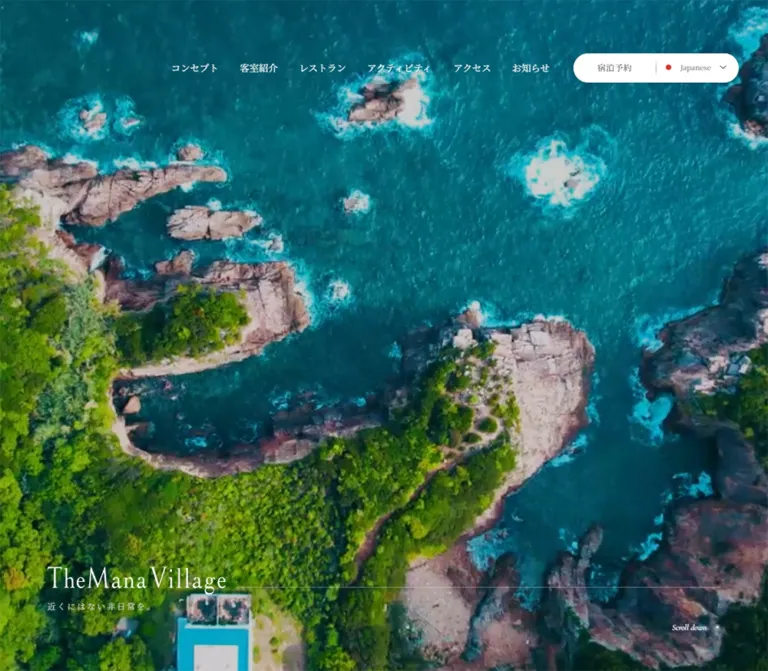
The visible mobile opening fills the 390 × 844 viewport with a coastal scene: muted sky, turquoise water, exposed rock, and a steep green cliff. The composition leaves open water behind the white wordmark and keeps the cliff toward the right. The brand group begins near x = 55, y = 596, with the tagline 近くにはない非日常を。 beneath it.
The tagline is 14px with 2.8px tracking and a 19.6px line height. The mobile layout reserves 180px beneath the brand group, placing it comfortably above the dock.
Desktop DOM measurements establish a full-height opening, an 80px brand inset, and a small Scroll down cue near the lower edge. The supplied desktop opening image provides no usable visual content. Background video, playback, looping, and camera movement cannot be established from the mobile still or the DOM excerpt.
Role: turn the landscape into a concise story about the stay.
The concept section follows the opening. Its measured heading and paragraphs are white. Desktop places a narrow 322px text column toward the right at x = 878. Mobile retains almost the same reading width, 326px, but brings it into the main flow at x = 32.
The heading uses three generous lines: 四季が紡ぐ, 原風景に佇む, and リゾートホテル. Paragraphs describe the location, sensory experiences, rooms, dining, and nature. Body size remains 14px with 28px line spacing across both widths.
The corresponding background artwork is not shown in the supplied captures or image inventory. Its subject and exact contrast treatment should remain unspecified. In a new implementation, provide a reliably dark image area or overlay behind the measured white text.
Role: timely information within the longer resort narrative.
The list contains three dated entries and a View all link. The English heading uses Cormorant, growing from 40px on desktop to 50px on mobile.
On desktop, each link begins at x = 190. A 130px leading region precedes the date at x = 320; the title begins at x = 440. On mobile, each row begins at x = 31, while both date and title begin at x = 161. The date therefore moves above the title within the right-hand text region.
The leading region's contents are not described by the supplied element inventory. Do not invent a thumbnail subject or image URL. Rows measure 70px high at both widths, with approximately 39px between desktop rows and 51px between mobile rows.
View all is aligned near the right of the desktop list and centered on mobile. For an adaptation, allow row height to grow with translated or enlarged text; measured two-line boxes do not establish the original overflow behavior.
Role: organize accommodation, dining, and activities as large editorial chapters.
Each chapter contains a Latin category title, a Japanese vertical descriptor, a lead statement, a descriptive paragraph, a destination link, and three pagination buttons. Measured desktop sections are 1620px tall, with 100px gaps between them. Their height includes scenic and content regions; it should not be reproduced as an empty spacer.
The clearest visual example is the restaurant chapter. A white panel with broad rounded upper corners spans the viewport. Large black RESTAURANT lettering runs down the extreme left edge, alongside 地元食材を味わう in vertical Japanese. The lead and body occupy a 480px column beginning at x = 266. A blue-hour dining photograph occupies the right side, aligned around x = 870–1360.
The Latin word appears turned down the page as a continuous word. The Japanese descriptor is a separate upright vertical text treatment. Do not imitate both by inserting line breaks between ordinary horizontal letters.
There are at least two observed rail-color states: sampled chapter headings are white, while the restaurant screenshot shows black lettering on the white panel. The mechanism connecting these states was not supplied. Use explicit contrast states in an adaptation rather than applying the sampled white color everywhere.
Role: explain the experience without competing with the photograph.
The restaurant lead reads 雄大な自然を前に followed by 新鮮な地元食材を味わえる贅沢。. It uses 22px regular Japanese serif with 41.8px line spacing. The paragraph begins 50px below the heading and uses 14/28px text.
The action is a broad, unfilled target with a fine bottom rule and a small rightward arrow. Desktop dimensions are 380 × 80px, with 40px horizontal padding and another 50px gap above. The visible label is 食事・レストラン.
Mobile actions widen relative to the content: 330 × 56px, with 14px text and 10px 20px 0 padding. Preserve the quiet line-and-arrow hierarchy instead of turning every destination into a filled conversion button.
Role: provide a large experiential image and compact slide selection.
The restaurant capture shows a couple seated across a small outdoor table, silhouetted against saturated evening blue. A candle supplies a small warm focal point. The visible image area is approximately 490px wide and 620px tall, but its top is at the capture boundary; this is not a verified intrinsic image ratio.
Its lower-right corner is diagonally cut. A fine diagonal line extends beyond the image, with three small pagination circles following the same direction. One circle is filled; the others are outlined. This diagonal composition is a distinctive detail worth preserving.
Mobile buttons measure 8 × 8px and sit horizontally at x = 240, 260, and 280. Desktop button rectangles are approximately 11.31px square and arranged diagonally. An 8px square rotated 45 degrees would have that bounding size, but the transform itself was not included in the evidence.
The initial desktop sample marks the second button active; mobile marks the first. That demonstrates different sampled selection states, not a proven autoplay interval or tested transition. Slide timing, swiping, looping, and keyboard support are unknown.
Role: connect the resort's editorial imagery and social presence.
The DOM contains repeated runs of resort-related hashtags around an Instagram destination. Repetition could support a ticker, but its movement, direction, and speed were not verified.
The Instagram action is measured: a square 280 × 280px charcoal block on desktop, with white 18px Cormorant lettering. On mobile it becomes a broad 330 × 120px block. This is a deliberate shape change, not uniform scaling.
No social-image inventory or complete visual composition was supplied. Avoid inventing a particular collage or grid arrangement.
Role: provide ongoing project and community news.
This section uses the measured warm neutral #f0ebe9, distinguishing it from the surrounding white and photographic regions. Desktop padding is 200px above and 248px below; mobile reduces it to 100px and 118px.
An empty-text heading wrapper measures 613 × 211px on desktop and 354 × 121.84px on mobile. Its proportions suggest a consistently scaled graphic, but the actual artwork and lettering are unavailable in the evidence.
Desktop includes a white 300 × 30px pill caption above the updates. Its equivalent was not present in the visible mobile text extraction. Entries pair gray 12px date/category metadata with darker titles. The list starts at x = 624 on desktop and x = 130 on mobile, retaining an offset composition.
Role: turn the end of the story into practical contact and booking access.
The footer uses a large photograph of a star-filled night sky above a dark forest ridge. The desktop capture leaves a substantial area of sky between the contact region and the bottom navigation. White text, fine rules, and a subtle translucent reservation surface provide structure without covering the landscape.
Desktop's upper area divides into two near-equal columns. The booking link occupies a measured 719 × 360px region on the right. Contact information occupies the left. A thin vertical rule divides them, and a horizontal rule separates the upper area from the broader image field.
On mobile the reservation layout changes substantially. A 90px left rail carries vertical ご予約. The remaining width stacks contact information above the 299 × 219px booking target. The two right-hand regions together align with a 486px-tall reservation rail. The telephone becomes 26px, accompanied by 12px reception hours and an underlined contact link.
The lower mobile footer presents the wordmark, address, and copyright at a 30px left inset. The fixed dock remains visible. The extensive desktop footer navigation is not shown in this lower mobile composition; equivalent destinations exist in the mobile menu DOM.
| Treatment | Evidence | What can be claimed |
|---|---|---|
| Header opacity | Computed opacity 1s transition |
A one-second opacity transition is declared; its trigger was not exercised |
| General links | Computed 0.3s transition |
A 300ms transition duration is declared; actual changed properties and hover appearance are unspecified |
| Pagination buttons | Computed 0.3s transition |
Buttons have a short transition declaration; slide movement is not established |
| Desktop scroll cue | Computed 1s transition |
A one-second transition is declared; no pulse or repeating animation is proven |
| Desktop header presentation | Transparent/light-text DOM state and white/dark-text footer capture | Different presentations exist; switching logic is unknown |
| Chapter pagination | Three buttons and active fills | Selection controls exist; activation was not tested |
| Hero scenery | One visible mobile frame | Video, autoplay, looping, and movement remain unverified |
| Repeated hashtags | Repeated rendered text | Continuous marquee behavior remains unverified |
| Mobile dock | Same viewport-bottom placement in opening and footer captures | Persistent bottom navigation is visually supported |
Many sampled nodes report animation: none. This does not rule out media playback, JavaScript animation, pseudo-element animation, or motion on unlisted descendants. Similarly, a generic transition: all entry alone does not establish a visible animation.
For a new implementation, subtle 300ms interface fades and an optional one-second header fade fit the measured declarations. These are recommendations. Do not invent parallax, scroll snapping, pinned scenes, or forced scroll transitions as original behavior.
| Layer | Appearance | Purpose |
|---|---|---|
| Opening | Edge-to-edge coastal media over a black foundation | Establishes place and scale |
| Editorial panel | White, broad upper curves, dark serif text | Creates calm reading space between scenic regions |
| Navigation capsule / dock | White, fine divisions, restrained rounding | Keeps practical actions legible over photography |
| Chapter action | Transparent surface, bottom rule, fine arrow | Makes the destination clear without a large filled button |
| Social action | Solid charcoal with white lettering | Distinct social destination |
| Renovation section | Warm gray-pink neutral | Separates ongoing editorial updates |
| Footer | Night-sky photograph, white rules, lightly overlaid booking region | Combines atmosphere with contact information |
No general shadow-based card hierarchy is visible in the supplied captures. Structure comes from photography, white space, rules, alignment, and selective curvature.
The verified imagery moves between three moods: a coastal opening with turquoise water and cliffs, saturated blue-hour dining, and a dark starry landscape at the end. A forest image begins beneath the white restaurant panel in the desktop capture. Together these scenes communicate location and time of day without requiring colorful interface chrome.
Use photographs with enough negative space for their assigned role. The mobile opening needs quiet water or sky behind the wordmark. The restaurant image benefits from a small human subject within a much larger blue field. The footer needs a broad sky and a low dark ridge so navigation remains legible.
Preserve photographic detail and natural tonal variation. There is no evidence for pixelation, illustrated substitutes, aggressive duotone filters, or artificial grain overlays. The restaurant's intense blue belongs to that specific image; do not impose it on every photograph.
Original asset URLs were not included in the supplied evidence. The table identifies visible roles without inventing file paths.
| Asset role | Evidence | Reuse guidance |
|---|---|---|
| Coastal opening media | Mobile opening capture | Use an authorized coastal image with a portrait-safe crop; media type is unknown |
| Wordmark and TM monogram | Mobile opening/footer and desktop header | Obtain authorized brand artwork; do not infer its font from the H1 wrapper |
| Blue-hour dining photograph | Desktop restaurant capture | Preserve the couple, table, candle, and surrounding blue negative space |
| Forest scene | Lower edge of the restaurant capture | Treat as landscape imagery; full composition is not available |
| Night-sky footer | Desktop and mobile footer captures | Retain the large sky and dark ridge relationship across crops |
| Renovation heading graphic | Empty-text heading with measured dimensions | Obtain the real artwork before attempting a faithful rendering |
The source media files are not bundled with this reference. CSS can reproduce the framing and proportions, but it cannot supply the photographs or brand artwork.
The page retains one long narrative sequence: opening, concept, pickup news, room, restaurant, activity, social content, renovation updates, and footer. It is not a fixed application shell, and the presence of a full-height opening does not make it a dedicated landing page.
| Relationship | Desktop | Mobile |
|---|---|---|
| Primary navigation | Six horizontal links and combined utility capsule | Bottom dock plus separate top language control |
| Concept narrative | Narrow column near the right edge | Nearly the same reading width, moved into the main flow |
| News heading | 40px | 50px |
| News date/title | Side-by-side regions | Date above title within the right text region |
| Latin chapter rail | 100px | 70px for ROOM/ACTIVITY, 50px for RESTAURANT |
| Japanese chapter rail | x = 114, 16px type | x = 56, or 44 for restaurant, 14px type |
| Chapter lead | 480px wide | 330px wide |
| Chapter body | 480px wide | 180px wide |
| Chapter pagination | Diagonal arrangement | Horizontal arrangement to the right of the body column |
| Chapter destination | 380 × 80px | 330 × 56px |
| Instagram destination | 280px square | 330 × 120px horizontal block |
| Footer reservation | Two columns | Vertical label rail plus stacked contact and booking areas |
All three mobile chapter paragraph boxes measure 180 × 368px despite different text lengths. The heading spans 330px, and pagination sits farther right. This supports an intentionally narrow reading column beside another visual region. It does not prove the mobile image's dimensions, its clipping, or the paragraph overflow behavior.
The actual responsive breakpoint was not supplied. The Quick Start chooses 1100px as a practical adaptation point for the wide desktop navigation. It should be tuned against real content and font loading, rather than presented as an original source value.
For unusually narrow screens, a recommended fallback is to let chapter copy and imagery stack, and to let text boxes grow. Preserve the reference's hierarchy without forcing a 180px column into a layout where it no longer fits.
These are recommendations for a new implementation, not verified features of the original:
aria-expanded, and an explicit relationship to its panel. Manage focus and Escape when the panel is open.#ffffff.#1f2021.#f0ebe9.#d9d9d9.#727272.#666666.“Create an editorial resort homepage inspired by TheMana Village's observed design. Use immersive coastal and night-sky photography, white reading panels, charcoal text, and a warm neutral section for ongoing updates. Pair Noto Serif JP for Japanese copy with Cormorant for Latin display lettering. Build large accommodation, restaurant, and activity chapters with an edge-aligned vertical title rail, a spacious text column, a substantial photograph, and an understated ruled destination link. On mobile, use a white bottom dock for menu, rooms, access, and reservations, with a separate language capsule near the upper-right edge. Preserve generous spacing and deliberate image crops. Treat motion as restrained enhancement; do not assume video, autoplay, parallax, or unverified menu behavior.”
This is a recommended implementation scaffold, not extracted source CSS. Exact colors and type sizes follow measured values. The 1100px breakpoint, estimated radii, image framing, hover treatment, and enlarged pagination targets are adaptation choices.
Suggested anatomy:
.tm-header contains .tm-header-inner, brand artwork, .tm-nav, and .tm-utilities..tm-hero contains an authorized image with .tm-hero-media, a .tm-hero-brand group, and an optional desktop scroll cue..tm-chapter-rail and .tm-chapter-kicker. Place these against the appropriate scenic or white region and assign their contrast explicitly..tm-chapter-panel contains .tm-chapter-copy with lead, body, and action, plus .tm-chapter-media with an image and pagination..tm-footer contains an authorized .tm-footer-media image, a contact/booking grid, and lower identity/navigation content.Supply authorized image and logo assets separately. Set data-scrolled='true' only through an intentional header-state implementation; the original trigger is unknown. The scaffold does not implement a menu, carousel, media playback, or scroll-driven chapter transitions.
:root {
  /* Measured interface colors */
  --tm-paper: #ffffff;
  --tm-ink: #1f2021;
  --tm-warm: #f0ebe9;
  --tm-soft: #d9d9d9;
  --tm-language: #666666;
  --tm-muted: #727272;
  --tm-half-white: rgba(255, 255, 255, 0.5);
  --tm-media-base: #000000;

  /* Recommended approximations, not measured source values */
  --tm-rule: #cccccc;
  --tm-rule-on-image: rgba(255, 255, 255, 0.3);
  --tm-language-dot: #e33438;
  --tm-panel-radius: 60px;
  --tm-dock-radius: 10px;
  --tm-photo-cut: 84px;

  /* Measured font stacks and type roles */
  --tm-font-jp: 'Noto Serif JP', serif;
  --tm-font-display: Cormorant, serif;
  --tm-body-size: 16px;
  --tm-lead-size: 22px;
  --tm-copy-size: 14px;
  --tm-rail-size: 100px;
  --tm-kicker-size: 16px;
  --tm-news-heading: 40px;

  /* Desktop proportions; fluid formulas are adaptations */
  --tm-gutter: clamp(30px, 5.5556vw, 80px);
  --tm-copy-start: min(18.4722vw, 266px);
  --tm-chapter-gap: min(8.6111vw, 124px);
  --tm-dock-height: 70px;
  --tm-safe-bottom: env(safe-area-inset-bottom, 0px);
  --tm-ui-duration: 300ms;
  --tm-header-duration: 1000ms;
}

.tm-site,
.tm-site *,
.tm-site *::before,
.tm-site *::after {
  box-sizing: border-box;
}

.tm-site {
  margin: 0;
  color: var(--tm-ink);
  background: var(--tm-paper);
  font: 400 var(--tm-body-size)/1.5 var(--tm-font-jp);
}

.tm-site img {
  display: block;
  max-width: 100%;
}

.tm-site a {
  color: inherit;
  text-decoration: none;
}

.tm-site button {
  font: inherit;
}

/* Header: an explicit state hook, not original scroll logic. */
.tm-header {
  position: absolute;
  z-index: 30;
  inset: 60px 0 auto;
  color: var(--tm-paper);
  transition: opacity var(--tm-header-duration);
}

.tm-header-inner {
  display: flex;
  align-items: flex-end;
  height: 80px;
  margin-inline: var(--tm-gutter);
}

.tm-header-brand {
  flex: 0 0 90px;
}

.tm-nav {
  display: flex;
  align-items: center;
  gap: 36px;
  height: 50px;
  margin-left: auto;
  white-space: nowrap;
}

.tm-nav a {
  padding-block: 5px;
  font-size: 16px;
  line-height: 24px;
}

.tm-utilities {
  display: flex;
  flex: 0 0 280px;
  align-items: center;
  height: 50px;
  margin-left: 40px;
  border: 1px solid var(--tm-rule);
  border-radius: 999px;
  background: var(--tm-paper);
  color: var(--tm-ink);
}

.tm-booking-link,
.tm-language {
  display: flex;
  align-items: center;
  justify-content: center;
  width: 50%;
  min-height: 100%;
}

.tm-booking-link {
  font-size: 14px;
  letter-spacing: 0.05em;
}

.tm-language {
  gap: 14px;
  border: 0;
  background: transparent;
  color: var(--tm-language);
  font-size: 12px;
  cursor: pointer;
}

.tm-language-dot {
  width: 9px;
  height: 9px;
  flex: none;
  border-radius: 50%;
  background: var(--tm-language-dot);
}

.tm-header[data-scrolled='true'] {
  position: fixed;
  top: 0;
  background: var(--tm-paper);
  color: var(--tm-ink);
}

.tm-header[data-scrolled='true'] .tm-header-inner {
  align-items: center;
}

/* Opening: provide a real image rather than an empty media layer. */
.tm-hero {
  position: relative;
  isolation: isolate;
  min-height: 600px;
  height: 100svh;
  color: var(--tm-paper);
  background: var(--tm-media-base);
}

.tm-hero-media,
.tm-footer-media {
  position: absolute;
  z-index: -1;
  inset: 0;
  width: 100%;
  height: 100%;
  object-fit: cover;
}

.tm-hero-brand {
  position: absolute;
  left: var(--tm-gutter);
  bottom: 99px;
  max-width: calc(100% - 2 * var(--tm-gutter));
}

.tm-hero-wordmark {
  width: auto;
  height: 47.83px;
  object-fit: contain;
  object-position: left center;
}

.tm-hero-tagline {
  margin: 10px 0 0;
  color: var(--tm-soft);
  font-size: 14px;
  line-height: 1.4;
  letter-spacing: 0.2em;
}

.tm-scroll-cue {
  position: absolute;
  right: var(--tm-gutter);
  bottom: 67px;
  margin: 0;
  font: 500 14px/1 var(--tm-font-display);
}

/* Rail utilities: the surrounding section establishes positioning. */
.tm-chapter {
  position: relative;
  margin-block: 100px;
}

.tm-chapter-rail {
  position: absolute;
  left: -17px;
  top: 125px;
  margin: 0;
  writing-mode: vertical-rl;
  text-orientation: sideways;
  font: 600 var(--tm-rail-size)/1 var(--tm-font-display);
}

.tm-chapter-kicker {
  position: absolute;
  left: 114px;
  top: 125px;
  margin: 0;
  writing-mode: vertical-rl;
  font-size: var(--tm-kicker-size);
  line-height: 1;
  letter-spacing: 0.5em;
}

.tm-rail-on-image {
  color: var(--tm-paper);
}

.tm-rail-on-paper {
  color: var(--tm-ink);
}

/* Approximation of the visible white restaurant panel. */
.tm-chapter-panel {
  display: grid;
  grid-template-columns: minmax(0, 48fr) minmax(0, 49fr);
  column-gap: var(--tm-chapter-gap);
  padding: 150px var(--tm-gutter) 80px var(--tm-copy-start);
  border-radius: var(--tm-panel-radius) var(--tm-panel-radius) 0 0;
  background: var(--tm-paper);
  color: var(--tm-ink);
}

.tm-chapter-lead {
  margin: 0;
  font-size: var(--tm-lead-size);
  font-weight: 400;
  line-height: 1.9;
}

.tm-chapter-body {
  margin: 50px 0 0;
  font-size: var(--tm-copy-size);
  line-height: 2;
}

.tm-rule-link {
  display: flex;
  align-items: center;
  justify-content: space-between;
  gap: 20px;
  width: min(380px, 100%);
  min-height: 80px;
  margin-top: 50px;
  padding-inline: 40px;
  border-bottom: 1px solid currentColor;
  font-size: 16px;
}

.tm-arrow {
  position: relative;
  flex: 0 0 30px;
  height: 1px;
  background: currentColor;
}

.tm-arrow::after {
  content: '';
  position: absolute;
  right: 0;
  top: -3px;
  width: 7px;
  height: 7px;
  border-top: 1px solid currentColor;
  border-right: 1px solid currentColor;
  transform: rotate(45deg);
}

.tm-chapter-media {
  position: relative;
  align-self: start;
  margin: 0;
  transform: translateY(-150px);
}

.tm-chapter-media > img {
  width: 100%;
  aspect-ratio: 49 / 62;
  object-fit: cover;
  clip-path: polygon(
    0 0, 100% 0,
    100% calc(100% - var(--tm-photo-cut)),
    calc(100% - var(--tm-photo-cut)) 100%, 0 100%
  );
}

.tm-chapter-media::after {
  content: '';
  position: absolute;
  right: -22px;
  bottom: 42px;
  width: 180px;
  border-top: 1px solid currentColor;
  transform: rotate(-45deg);
  pointer-events: none;
}

/* Larger hit targets are recommended; the visible dots remain 8px. */
.tm-pager {
  position: absolute;
  z-index: 1;
  right: -20px;
  bottom: 0;
  display: flex;
  transform: rotate(-45deg);
}

.tm-pager button {
  display: grid;
  place-items: center;
  width: 44px;
  height: 44px;
  padding: 0;
  border: 0;
  background: transparent;
  color: inherit;
  cursor: pointer;
}

.tm-pager button::before {
  content: '';
  width: 8px;
  height: 8px;
  border: 1px solid currentColor;
  border-radius: 50%;
}

.tm-pager button[aria-current='true']::before {
  background: currentColor;
}

.tm-news-heading {
  margin: 0;
  font: 500 var(--tm-news-heading)/1 var(--tm-font-display);
}

.tm-instagram {
  display: flex;
  align-items: center;
  justify-content: center;
  width: 280px;
  min-height: 280px;
  background: var(--tm-ink);
  color: var(--tm-paper);
  font: 600 18px/1 var(--tm-font-display);
}

.tm-updates {
  padding: 200px var(--tm-gutter) 248px;
  background: var(--tm-warm);
}

.tm-update-meta {
  color: var(--tm-muted);
  font-size: 12px;
  line-height: 18px;
}

/* Footer shell: photography supplies the dominant surface. */
.tm-footer {
  position: relative;
  isolation: isolate;
  display: flex;
  flex-direction: column;
  min-height: 1054px;
  padding: 0 var(--tm-gutter) 120px;
  background: var(--tm-media-base);
  color: var(--tm-paper);
}

.tm-footer-grid {
  display: grid;
  grid-template-columns: repeat(2, minmax(0, 1fr));
  margin-inline: calc(-1 * var(--tm-gutter));
  border-bottom: 1px solid var(--tm-rule-on-image);
}

.tm-footer-label {
  display: none;
}

.tm-footer-contact {
  padding: 80px var(--tm-gutter);
}

.tm-footer-booking {
  position: relative;
  display: flex;
  align-items: center;
  justify-content: space-between;
  gap: 30px;
  min-height: 360px;
  padding: 50px var(--tm-gutter);
  border-left: 1px solid var(--tm-rule-on-image);
  font-size: 18px;
}

.tm-footer-booking::before {
  content: '';
  position: absolute;
  inset: 10px;
  background: rgba(255, 255, 255, 0.05);
  pointer-events: none;
}

.tm-footer-lower {
  margin-top: auto;
  padding-top: 100px;
}

.tm-footer-nav {
  display: flex;
  flex-wrap: wrap;
  gap: 20px 28px;
  max-width: 650px;
  font-size: 14px;
}

.tm-footer-contact-link {
  text-decoration: underline !important;
  text-underline-offset: 3px;
}

.tm-mobile-dock {
  display: none;
}

/* Recommended breakpoint; the source breakpoint is unknown. */
@media (max-width: 1100px) {
  :root {
    --tm-body-size: 14px;
    --tm-lead-size: 20px;
    --tm-copy-size: 12px;
    --tm-rail-size: 70px;
    --tm-kicker-size: 14px;
    --tm-news-heading: 50px;
    --tm-gutter: 30px;
  }

  .tm-header,
  .tm-header[data-scrolled='true'] {
    position: absolute;
    top: 50px;
    background: transparent;
  }

  .tm-header-inner,
  .tm-header[data-scrolled='true'] .tm-header-inner {
    height: 60px;
    margin: 0;
    align-items: flex-end;
  }

  .tm-header-brand,
  .tm-nav,
  .tm-booking-link,
  .tm-scroll-cue {
    display: none;
  }

  .tm-utilities {
    flex-basis: 160px;
    height: 36px;
    margin-left: auto;
    border: 0;
    border-radius: 999px 0 0 999px;
  }

  .tm-language {
    width: 100%;
  }

  .tm-hero-brand {
    left: 55px;
    bottom: 180px;
    width: 280px;
    max-width: calc(100% - 110px);
  }

  .tm-hero-wordmark {
    height: 38.8px;
  }

  .tm-mobile-dock {
    position: fixed;
    z-index: 50;
    inset: auto 10px 0;
    display: grid;
    grid-template-columns: 70px repeat(3, minmax(0, 1fr));
    min-height: calc(var(--tm-dock-height) + var(--tm-safe-bottom));
    padding-bottom: var(--tm-safe-bottom);
    border-radius: var(--tm-dock-radius) var(--tm-dock-radius) 0 0;
    background: var(--tm-paper);
    color: var(--tm-ink);
  }

  .tm-mobile-dock > :is(a, button) {
    display: flex;
    align-items: center;
    justify-content: center;
    min-width: 0;
    min-height: var(--tm-dock-height);
    padding: 0;
    border: 0;
    background: transparent;
    color: inherit;
    font: 700 10px/15px var(--tm-font-jp);
    letter-spacing: 1px;
  }

  .tm-mobile-dock > * + * {
    border-left: 1px solid var(--tm-rule);
  }

  .tm-chapter-rail {
    top: 53px;
  }

  .tm-chapter-kicker {
    top: 53px;
    left: 56px;
  }

  .tm-chapter--restaurant .tm-chapter-rail {
    left: -9px;
    font-size: 50px;
  }

  .tm-chapter--restaurant .tm-chapter-kicker {
    left: 44px;
  }

  .tm-chapter-panel {
    grid-template-columns: minmax(0, 180px) minmax(0, 1fr);
    gap: 50px 30px;
    padding: 72px 30px 0;
    border-radius: 30px 30px 0 0;
  }

  .tm-chapter-copy {
    display: contents;
  }

  .tm-chapter-lead {
    grid-column: 1 / -1;
    grid-row: 1;
  }

  .tm-chapter-body {
    grid-column: 1;
    grid-row: 2;
    min-height: 368px;
    margin: 0;
  }

  .tm-chapter-media {
    grid-column: 2;
    grid-row: 2;
    transform: none;
  }

  /* Mobile image bounds were not supplied; this crop is an adaptation. */
  .tm-chapter-media > img {
    height: 300px;
    aspect-ratio: auto;
    clip-path: none;
  }

  .tm-chapter-media::after {
    display: none;
  }

  .tm-pager {
    right: auto;
    left: 50%;
    bottom: -52px;
    transform: translateX(-50%);
  }

  .tm-rule-link {
    grid-column: 1 / -1;
    grid-row: 3;
    width: 100%;
    min-height: 56px;
    margin-top: -50px;
    padding: 10px 20px 0;
    font-size: 14px;
  }

  .tm-instagram {
    width: 100%;
    min-height: 120px;
    justify-content: flex-start;
    padding-inline: 30px;
  }

  .tm-updates {
    padding: 100px 18px 118px;
  }

  .tm-footer {
    min-height: 878px;
    padding: 0 30px calc(100px + var(--tm-safe-bottom));
  }

  .tm-footer-grid {
    grid-template-columns: 90px minmax(0, 1fr);
    grid-template-rows: minmax(267px, auto) minmax(219px, auto);
    margin-inline: -30px;
  }

  .tm-footer-label {
    display: block;
    grid-column: 1;
    grid-row: 1 / 3;
    margin: 0;
    padding: 60px 34px 0 0;
    border-right: 1px solid var(--tm-rule-on-image);
    writing-mode: vertical-rl;
    font-size: 14px;
    letter-spacing: 7px;
  }

  .tm-footer-contact {
    grid-column: 2;
    grid-row: 1;
    padding: 84px 34px 30px;
    border-bottom: 1px solid var(--tm-rule-on-image);
    font-size: 12px;
  }

  .tm-footer-phone {
    font-size: 26px;
    line-height: 1;
    white-space: nowrap;
  }

  .tm-footer-booking {
    grid-column: 2;
    grid-row: 2;
    min-height: 219px;
    padding: 30px 30px 30px 74px;
    border-left: 0;
    font-size: 16px;
  }

  .tm-footer-nav {
    display: none;
  }
}

/* Recommended narrow-screen fallback, not an observed source rule. */
@media (max-width: 359px) {
  .tm-hero-brand {
    left: 30px;
    max-width: calc(100% - 60px);
  }

  .tm-chapter-panel {
    grid-template-columns: minmax(0, 1fr);
  }

  .tm-chapter-body {
    min-height: 0;
  }

  .tm-chapter-media {
    grid-column: 1;
    grid-row: 3;
    margin-bottom: 52px;
  }

  .tm-rule-link {
    grid-row: 4;
    margin-top: 0;
  }

  .tm-footer-contact {
    padding-inline: 20px;
  }

  .tm-footer-phone {
    font-size: 22px;
  }
}

/* Recommended interaction and accessibility additions. */
.tm-site :is(a, button) {
  transition: opacity var(--tm-ui-duration);
}

@media (hover: hover) {
  .tm-site :is(a, button):hover {
    opacity: 0.72;
  }
}

.tm-site :focus-visible {
  outline: 2px solid currentColor;
  outline-offset: 4px;
}

@media (prefers-reduced-motion: reduce) {
  .tm-site *,
  .tm-site *::before,
  .tm-site *::after {
    animation: none !important;
    transition: none !important;
    scroll-behavior: auto !important;
  }
}
The mobile chapter image crop and the white panel's 30px mobile radius are recommendations because those details were not visually captured. The desktop image ratio approximates the visible restaurant frame. The footer shell does not attempt to recreate the original background-image positioning exactly.
The CSS reduced-motion rule does not pause videos or JavaScript-driven slides. If those features are implemented, connect them to the same user preference separately. Also ensure that hidden mobile menu content is removed from keyboard navigation until opened.
Optional mapping for a project already using Tailwind v4. These aliases do not imply that the original website uses Tailwind. Define the custom properties above first.
@theme inline {
  --color-resort-paper: var(--tm-paper);
  --color-resort-ink: var(--tm-ink);
  --color-resort-warm: var(--tm-warm);
  --color-resort-soft: var(--tm-soft);
  --color-resort-muted: var(--tm-muted);

  --font-resort-jp: var(--tm-font-jp);
  --font-resort-display: var(--tm-font-display);

  --text-resort-body: var(--tm-body-size);
  --text-resort-copy: var(--tm-copy-size);
  --text-resort-lead: var(--tm-lead-size);
  --text-resort-rail: var(--tm-rail-size);
  --text-resort-news: var(--tm-news-heading);

  --spacing-resort-gutter: var(--tm-gutter);
  --spacing-resort-dock: var(--tm-dock-height);
  --radius-resort-panel: var(--tm-panel-radius);
  --radius-resort-dock: var(--tm-dock-radius);
}
This reference describes the supplied current homepage evidence. Measured values, visual estimates, and recommended implementation choices are identified separately throughout.
# TheMana Village — Style Reference

> An expansive coastal resort journal, framed by fine serif lettering, white space, and a sky full of stars.

**Website:** [themanavillage.com](https://themanavillage.com/)
**Original URL:** https://themanavillage.com/
**Final URL:** https://themanavillage.com/
**Theme:** white editorial surfaces alternating with immersive landscape photography; no selectable color theme was verified.
**Inspected:** September 17, 2026, 03:49 JST. Supplied capture timestamp: September 16, 2026, 18:49:36.840 UTC.
**Viewports:** 1440 × 1000 desktop and 390 × 844 mobile, in CSS pixels.
**Scope:** the current resort homepage, including its navigation, coastal opening, concept narrative, news, accommodation/restaurant/activity chapters, social link, renovation updates, and reservation footer. Visual evidence covers the desktop restaurant and footer, and the mobile opening and footer. Other sections are documented from supplied rendered text and element measurements. Linked pages and the external booking service were not inspected.

TheMana Village is a full resort website with several destinations and recurring editorial content. Its homepage establishes place before presenting practical information: sea and cliffs, local dining, forests, and the night sky. White panels give the photographs room to breathe. Japanese serif copy sits beside large Latin chapter titles, while thin rules and understated arrows organize navigation.

The distinctive composition is asymmetric. Desktop chapters place a vertical title rail against the left edge, a restrained text column farther inward, and a substantial photograph on the right. Mobile keeps several of these editorial relationships instead of simply stacking every element. A fixed white dock makes rooms, access, and reservations available above the scenery.
# TheMana Village — Style Reference

> An expansive coastal resort journal, framed by fine serif lettering, white space, and a sky full of stars.

**Website:** [themanavillage.com](https://themanavillage.com/)
**Original URL:** https://themanavillage.com/
**Final URL:** https://themanavillage.com/
**Theme:** white editorial surfaces alternating with immersive landscape photography; no selectable color theme was verified.
**Inspected:** September 17, 2026, 03:49 JST. Supplied capture timestamp: September 16, 2026, 18:49:36.840 UTC.
**Viewports:** 1440 × 1000 desktop and 390 × 844 mobile, in CSS pixels.
**Scope:** the current resort homepage, including its navigation, coastal opening, concept narrative, news, accommodation/restaurant/activity chapters, social link, renovation updates, and reservation footer. Visual evidence covers the desktop restaurant and footer, and the mobile opening and footer. Other sections are documented from supplied rendered text and element measurements. Linked pages and the external booking service were not inspected.

TheMana Village is a full resort website with several destinations and recurring editorial content. Its homepage establishes place before presenting practical information: sea and cliffs, local dining, forests, and the night sky. White panels give the photographs room to breathe. Japanese serif copy sits beside large Latin chapter titles, while thin rules and understated arrows organize navigation.

The distinctive composition is asymmetric. Desktop chapters place a vertical title rail against the left edge, a restrained text column farther inward, and a substantial photograph on the right. Mobile keeps several of these editorial relationships instead of simply stacking every element. A fixed white dock makes rooms, access, and reservations available above the scenery.

## How to Read This Reference

- **Measured** means a value appears in the supplied computed styles or element rectangles. Coordinates belong to the corresponding snapshot and are not necessarily synchronized with later scrolled screenshots.
- **Visual observation** means a feature is visible in an original-page capture. Numerical values estimated from those captures are explicitly marked as estimates.
- **Calculated** means a value follows from measured coordinates, such as the 36px desktop navigation gaps.
- **Recommended** means implementation guidance for a new build. Recommended breakpoints, accessibility changes, and CSS approximations are not claims about the original source.
- **Token names** are descriptive implementation aliases, except where an original custom property is explicitly identified.

The desktop opening capture is entirely white despite a populated DOM. Its visible hero composition cannot be assessed from that image, and the reason for the blank capture is unknown. The mobile opening is visible. Desktop hero dimensions and typography below come from the DOM, not from an assumed reconstruction of the missing frame.

The supplied element inventory does not include image URLs, media configuration, complete stylesheets, or JavaScript behavior. It supports a detailed visual reference, but not exact replication of the original scroll choreography.

## Tokens — Colors

### Default Palette

| Name | Value | Suggested token | Evidence and role |
| --- | --- | --- | --- |
| Editorial White | `#ffffff` | `--tm-paper` | Measured on reversed text and the update badge; visually present on the restaurant panel, scrolled header, and mobile dock |
| Charcoal Ink | `#1f2021` | `--tm-ink` | Measured body text, chapter copy, selected pagination dots, and Instagram action background |
| Warm Update Surface | `#f0ebe9` | `--tm-warm` | Measured background of the renovation-update section at both widths |
| Soft Hero Text | `#d9d9d9` | `--tm-soft` | Measured hero tagline color |
| Language Gray | `#666666` | `--tm-language` | Measured language-selector text |
| Metadata Gray | `#727272` | `--tm-muted` | Measured renovation dates and category links |
| Half White | `rgba(255,255,255,0.5)` | `--tm-half-white` | Measured desktop footer pronunciation label; not a universal footer-text opacity |
| Media Foundation | `#000000` | `--tm-media-base` | Measured background of the opening section beneath its media |

### Visual Accents and Image Color

| Treatment | Status | Implementation guidance |
| --- | --- | --- |
| Pale gray capsule outlines and dividers | Visually observed; exact color unavailable | Start around `#cccccc`, then validate against the intended surface |
| Small red language indicator | Visually observed; exact color unavailable | A recommended approximation is `#e33438`; confine it to the language indicator |
| Thin white footer rules | Visually observed; opacity unavailable | Use a restrained translucent white rule; the Quick Start recommends 30% opacity |
| Ocean teal, blue-hour cobalt, forest green, midnight blue | Colors within photographs | Preserve them through imagery rather than distributing them across buttons and badges |

The vivid blue restaurant photograph is a photographic subject and lighting treatment, not evidence of a cobalt interface theme. Most interface surfaces remain neutral.

The supplied custom properties include many WordPress preset gradients, colors, and shadows. Their presence does not demonstrate their use in the visible design. They are not the site's observed palette or elevation system.

## Tokens — Typography

### Japanese Serif — Main Interface and Narrative

**Computed family:** `'Noto Serif JP', serif`.

Regular weight `400` dominates navigation, descriptions, dates, and Japanese headings. The typography feels deliberate because of its line spacing and placement, rather than heavy weight. Chapter paragraphs use twice their font size as line height. Japanese display copy uses a similarly open `1.9` ratio.

The mobile booking dock is an exception: its small labels use weight `700` with `1px` tracking.

### Cormorant — Latin Editorial Display

**Computed family:** `Cormorant, serif`.

Cormorant appears in the large chapter names, `Pickup info`, `View all`, the desktop scroll cue, Instagram lettering, and copyright. Weights range from `500` to `600`. Its narrow, high-contrast letterforms allow the chapter titles to become architectural elements along the page edge.

The computed stacks identify the intended families. Font files and successful face loading were not independently inspected.

### Brand Lettering

The visible wordmark and TM monogram should be treated as brand artwork. The supplied H1 has no extracted text, and its computed font size does not describe the visible logo lettering. No logo asset URL or logo font was supplied. Do not assume that setting the brand name in Cormorant reproduces the original mark.

### Type Scale

All values below are measured CSS pixels unless stated otherwise.

| Role | Desktop | Mobile | Family / weight | Notes |
| --- | --- | --- | --- | --- |
| Body default | `16 / 24px` | `14 / 21px` | Noto Serif JP / 400 | Component overrides are frequent |
| Desktop primary navigation | `16 / 24px` | Replaced by mobile controls | Noto Serif JP / 400 | Links have 5px vertical padding |
| Mobile dock labels | Not applicable | `10 / 15px` | Noto Serif JP / 700 | `1px` tracking |
| Header reservation label | `14 / 21px` | Separate dock action | Noto Serif JP / 400 | `0.7px` tracking on desktop |
| Language label | `12px` | `12px` | Noto Serif JP / 400 | Sampled line height is zero inside a flex control; do not copy that into ordinary text |
| Hero tagline | `14 / 19.6px` | `14 / 19.6px` | Noto Serif JP / 400 | `2.8px`, or `0.2em`, tracking |
| Concept heading | `22 / 41.8px` | `20 / 38px` | Noto Serif JP / 400 | Three lines in the supplied layout |
| Concept paragraphs | `14 / 28px` | `14 / 28px` | Noto Serif JP / 400 | Size is retained on mobile |
| Chapter lead copy | `22 / 41.8px` | `20 / 38px` | Noto Serif JP / 400 | Spacious, regular-weight display text |
| Chapter paragraphs | `14 / 28px` | `12 / 24px` | Noto Serif JP / 400 | Mobile uses a narrow 180px text box |
| ROOM / ACTIVITY rail | `100 / 100px` | `70 / 70px` | Cormorant / 600 | Latin words run down the page edge |
| RESTAURANT rail | `100 / 100px` | `50 / 50px` | Cormorant / 600 | A specific reduction for the longer word |
| Japanese chapter rail | `16 / 16px` | `14 / 14px` | Noto Serif JP / 400 | Tracking changes from 8px to 7px |
| Pickup info | `40 / 40px` | `50 / 50px` | Cormorant / 500 | Deliberately larger on mobile |
| News date | `12 / 18px` | `10 / 15px` | Noto Serif JP / 400 | Compact supporting information |
| News title | `14 / 21px` | `12 / 18px` | Noto Serif JP / 400 | Mobile title boxes measure 36px high |
| Chapter action | `16 / 24px` | `14 / 21px` | Noto Serif JP / 400 | Text sits inside a broad ruled target |
| View all | `16 / 16px` | `16 / 16px` | Cormorant / 500 | Same scale at both widths |
| Instagram action | `18 / 18px` | `18 / 18px` | Cormorant / 600 | Container changes shape significantly |
| Update metadata | `12 / 18px` | `12 / 18px` | Noto Serif JP / 400 | Gray date/category line |
| Update title | `14 / 21px` | `13 / 19.5px` | Noto Serif JP / 400 | Separate from the metadata line |
| Footer reservation action | `18 / 27px` | `16 / 24px` | Noto Serif JP / 400 | Large target, modest lettering |
| Footer telephone link | `16 / 28.8px` | `26 / 26px` | Noto Serif JP / 400 | Mobile prominently elevates the phone number |
| Footer copyright | `14 / 14px` | `16 / 16px` | Cormorant / 600 desktop, 500 mobile | Small editorial finish |

The source root size is `10px` at both widths. The Quick Start uses explicit pixel tokens and does not require changing a project's root font size.

## Tokens — Spacing & Shapes

**Density:** generous photographic and section-scale spacing, with compact navigation and metadata.

There is no demonstrated universal spacing scale. The following values are useful because they recur in measured component relationships.

### Spacing Scale

| Use | Value | Evidence |
| --- | --- | --- |
| Mobile dock side clearance | `10px` | Measured geometry and screenshot |
| Concept section outer padding | Desktop `20px`; mobile `14px 10px` | Computed padding |
| Main mobile chapter inset | `30px` | Headings and actions start at x = 30 |
| Mobile concept text inset | `32px` | Measured text rectangle |
| Desktop navigation gap | `36px` | Calculated between successive link rectangles |
| Header capsule separation | `40px` | Calculated between final navigation link and capsule position |
| Desktop action horizontal inset | `40px` | Computed chapter-link padding |
| Heading-to-paragraph gap | `50px` | Calculated for chapter copy at both widths |
| Desktop paragraph-to-action gap | `50px` | Calculated for chapter copy |
| Mobile hero side inset | `55px` | Computed opening-section padding |
| Desktop main edge inset | `80px` | Header and footer navigation alignment |
| Gap before the room chapter | `90px` | Calculated after the news section at both widths |
| Gap between major chapters | `100px` | Calculated between section rectangles at both widths |
| Chapter top padding | Desktop `125px`; mobile `53px` | Computed section padding |
| Mobile hero bottom reserve | `180px` | Computed padding; separates the brand group from the dock |
| Renovation section padding | Desktop `200px 0 248px`; mobile `100px 18px 118px` | Computed values |

### Border Radius and Rules

| Element | Value / appearance | Status |
| --- | --- | --- |
| Restaurant white panel | Broad upper corner curves, approximately `60px` | Screenshot estimate |
| Desktop booking/language capsule | Approximately `50px` high, fully rounded ends | Screenshot estimate supported by 48px inner control height |
| Mobile language control | `160 × 36px`, rounded left end, flush with right edge | Measured bounds; shape visually observed |
| Mobile dock | Approximately `10px` upper corner radius | Screenshot estimate |
| Renovation information badge | `30px` radius on a `300 × 30px` box | Measured |
| Pagination | Circular, `100%` radius | Computed |
| Photography | Straight edges, with a diagonal lower-right cut in the restaurant frame | Visually observed |
| Chapter link and footer divisions | Fine, approximately `1px` rules | Screenshot estimate |

Avoid treating every surface as a rounded card. The major white panel and navigation capsules have different purposes and different corner treatments.

### Layout Measurements

| Element | Desktop: 1440 × 1000 | Mobile: 390 × 844 |
| --- | --- | --- |
| Document height | Approximately `12,496.17px` | Approximately `8,966.72px` |
| Opening section | `1440 × 1000px` | `390 × 844px` |
| Initial header rectangle | x `80`, y `60`, `1280 × 80px` | x `0`, y `50`, `390 × 60px` |
| Hero H1 wrapper | x `80`, y `823.58`, `1280 × 47.83px` | x `55`, y `595.61`, `280 × 38.80px` |
| Concept text column | x `878`, width `322px` | x `32`, width `326px` |
| News link row | x `190`, `760 × 70px` | x `31`, `328 × 70px` |
| Chapter lead column | x `266`, width `480px` | x `30`, width `330px` |
| Chapter paragraph column | x `266`, width `480px` | x `30`, width `180px` |
| Chapter action | `380 × 80px` | `330 × 56px` |
| Chapter section heights | `1620px` each | Room `1153px`; restaurant/activity `1115px` each |
| Instagram action | `280 × 280px` | `330 × 120px` |
| Renovation heading wrapper | `613 × 211px` | `354 × 121.84px` |
| Footer height | `1054px` | Approximately `878.09px` |
| Footer booking target | `719 × 360px` | `299 × 219px` |
| Mobile dock | Not applicable | Approximately `370 × 70px`, x `10`, y `774` |

H1 and renovation-heading measurements describe wrappers, not verified asset dimensions. Document heights are observations, not fixed-height implementation targets.

The original `--vw` custom property equals `14.4px` on desktop and `3.9px` on mobile. Those values correspond to 1% of viewport width. Its usage formulas were not supplied, so the entire layout should not be assumed to scale proportionally with that variable.

## Components

### Desktop Header

**Role:** brand identity, primary destinations, booking, and language access.

The initial DOM describes a transparent header inside an 80px horizontal inset. Six navigation links cover concept, rooms, restaurant, activities, access, and news. Their measured spacing is approximately 36px. Text is white in this sampled opening state.

A separate white capsule combines `宿泊予約` and `Japanese`. In the footer screenshot it spans approximately x = 1080–1360 and is about 50px high. A fine central separator divides the two functions. The language half includes a small red dot and a downward chevron.

The desktop footer capture shows a second presentation: an 80px-high white header flush with the viewport top, dark navigation, and a TM monogram at the left. This establishes a scrolled header variant. The switching threshold, scroll-direction behavior, and exact positioning implementation were not supplied. The header is not visible in the restaurant capture, so do not assume it remains visible at every scroll position.

### Mobile Booking Dock

**Role:** persistent access to the highest-priority destinations.

A white bar sits 10px from each side and against the viewport bottom. At 390px wide it is approximately 370px across and 70px high. Its first cell is about 70px wide and contains a two-line menu symbol. Three remaining cells are approximately 100px wide, separated by fine vertical rules.

The visible labels are `客室紹介`, `アクセス`, and `宿泊予約`. They use 10px bold Japanese serif text with 1px tracking. The whole cells provide substantial targets despite the small lettering. Upper corners are softly rounded; there is no prominent elevation shadow.

The same dock appears in both the opening and footer mobile captures. Reserve bottom space so content remains reachable behind it. Safe-area handling is a recommended addition, not a verified source behavior.

### Language Control and Mobile Menu Content

**Role:** localization and access to the wider site structure.

The mobile language control sits at x = 230, y = 74 and measures 160 × 36px. It is white, with a rounded left edge, and meets the viewport's right edge. The opening capture shows only this utility near the top, leaving the coastline largely unobstructed.

The mobile DOM also contains menu content: a brand link, address, Instagram, reservation action, primary destinations, contact and policy links, company and recruitment links, and copyright. Primary menu rows measure 360 × 61px with `20px 40px` padding. This confirms an alternate navigation structure exists in the document.

The menu was not shown open in the supplied screenshots. Its animation, overlay, focus behavior, and open/close interactions remain unverified. Likewise, language options in the document do not prove a tested language-switching flow.

### Coastal Opening

**Role:** establish the resort's location and atmosphere.

The visible mobile opening fills the 390 × 844 viewport with a coastal scene: muted sky, turquoise water, exposed rock, and a steep green cliff. The composition leaves open water behind the white wordmark and keeps the cliff toward the right. The brand group begins near x = 55, y = 596, with the tagline `近くにはない非日常を。` beneath it.

The tagline is 14px with 2.8px tracking and a 19.6px line height. The mobile layout reserves 180px beneath the brand group, placing it comfortably above the dock.

Desktop DOM measurements establish a full-height opening, an 80px brand inset, and a small `Scroll down` cue near the lower edge. The supplied desktop opening image provides no usable visual content. Background video, playback, looping, and camera movement cannot be established from the mobile still or the DOM excerpt.

### Concept Narrative

**Role:** turn the landscape into a concise story about the stay.

The concept section follows the opening. Its measured heading and paragraphs are white. Desktop places a narrow 322px text column toward the right at x = 878. Mobile retains almost the same reading width, 326px, but brings it into the main flow at x = 32.

The heading uses three generous lines: `四季が紡ぐ`, `原風景に佇む`, and `リゾートホテル`. Paragraphs describe the location, sensory experiences, rooms, dining, and nature. Body size remains 14px with 28px line spacing across both widths.

The corresponding background artwork is not shown in the supplied captures or image inventory. Its subject and exact contrast treatment should remain unspecified. In a new implementation, provide a reliably dark image area or overlay behind the measured white text.

### Pickup News List

**Role:** timely information within the longer resort narrative.

The list contains three dated entries and a `View all` link. The English heading uses Cormorant, growing from 40px on desktop to 50px on mobile.

On desktop, each link begins at x = 190. A 130px leading region precedes the date at x = 320; the title begins at x = 440. On mobile, each row begins at x = 31, while both date and title begin at x = 161. The date therefore moves above the title within the right-hand text region.

The leading region's contents are not described by the supplied element inventory. Do not invent a thumbnail subject or image URL. Rows measure 70px high at both widths, with approximately 39px between desktop rows and 51px between mobile rows.

`View all` is aligned near the right of the desktop list and centered on mobile. For an adaptation, allow row height to grow with translated or enlarged text; measured two-line boxes do not establish the original overflow behavior.

### Resort Chapter System

**Role:** organize accommodation, dining, and activities as large editorial chapters.

Each chapter contains a Latin category title, a Japanese vertical descriptor, a lead statement, a descriptive paragraph, a destination link, and three pagination buttons. Measured desktop sections are 1620px tall, with 100px gaps between them. Their height includes scenic and content regions; it should not be reproduced as an empty spacer.

The clearest visual example is the restaurant chapter. A white panel with broad rounded upper corners spans the viewport. Large black `RESTAURANT` lettering runs down the extreme left edge, alongside `地元食材を味わう` in vertical Japanese. The lead and body occupy a 480px column beginning at x = 266. A blue-hour dining photograph occupies the right side, aligned around x = 870–1360.

The Latin word appears turned down the page as a continuous word. The Japanese descriptor is a separate upright vertical text treatment. Do not imitate both by inserting line breaks between ordinary horizontal letters.

There are at least two observed rail-color states: sampled chapter headings are white, while the restaurant screenshot shows black lettering on the white panel. The mechanism connecting these states was not supplied. Use explicit contrast states in an adaptation rather than applying the sampled white color everywhere.

### Chapter Copy and Ruled Action

**Role:** explain the experience without competing with the photograph.

The restaurant lead reads `雄大な自然を前に` followed by `新鮮な地元食材を味わえる贅沢。`. It uses 22px regular Japanese serif with 41.8px line spacing. The paragraph begins 50px below the heading and uses 14/28px text.

The action is a broad, unfilled target with a fine bottom rule and a small rightward arrow. Desktop dimensions are 380 × 80px, with 40px horizontal padding and another 50px gap above. The visible label is `食事・レストラン`.

Mobile actions widen relative to the content: 330 × 56px, with 14px text and `10px 20px 0` padding. Preserve the quiet line-and-arrow hierarchy instead of turning every destination into a filled conversion button.

### Chapter Photography and Pagination

**Role:** provide a large experiential image and compact slide selection.

The restaurant capture shows a couple seated across a small outdoor table, silhouetted against saturated evening blue. A candle supplies a small warm focal point. The visible image area is approximately 490px wide and 620px tall, but its top is at the capture boundary; this is not a verified intrinsic image ratio.

Its lower-right corner is diagonally cut. A fine diagonal line extends beyond the image, with three small pagination circles following the same direction. One circle is filled; the others are outlined. This diagonal composition is a distinctive detail worth preserving.

Mobile buttons measure 8 × 8px and sit horizontally at x = 240, 260, and 280. Desktop button rectangles are approximately 11.31px square and arranged diagonally. An 8px square rotated 45 degrees would have that bounding size, but the transform itself was not included in the evidence.

The initial desktop sample marks the second button active; mobile marks the first. That demonstrates different sampled selection states, not a proven autoplay interval or tested transition. Slide timing, swiping, looping, and keyboard support are unknown.

### Social Section

**Role:** connect the resort's editorial imagery and social presence.

The DOM contains repeated runs of resort-related hashtags around an Instagram destination. Repetition could support a ticker, but its movement, direction, and speed were not verified.

The Instagram action is measured: a square 280 × 280px charcoal block on desktop, with white 18px Cormorant lettering. On mobile it becomes a broad 330 × 120px block. This is a deliberate shape change, not uniform scaling.

No social-image inventory or complete visual composition was supplied. Avoid inventing a particular collage or grid arrangement.

### Renovation Updates

**Role:** provide ongoing project and community news.

This section uses the measured warm neutral `#f0ebe9`, distinguishing it from the surrounding white and photographic regions. Desktop padding is 200px above and 248px below; mobile reduces it to 100px and 118px.

An empty-text heading wrapper measures 613 × 211px on desktop and 354 × 121.84px on mobile. Its proportions suggest a consistently scaled graphic, but the actual artwork and lettering are unavailable in the evidence.

Desktop includes a white 300 × 30px pill caption above the updates. Its equivalent was not present in the visible mobile text extraction. Entries pair gray 12px date/category metadata with darker titles. The list starts at x = 624 on desktop and x = 130 on mobile, retaining an offset composition.

### Reservation Footer

**Role:** turn the end of the story into practical contact and booking access.

The footer uses a large photograph of a star-filled night sky above a dark forest ridge. The desktop capture leaves a substantial area of sky between the contact region and the bottom navigation. White text, fine rules, and a subtle translucent reservation surface provide structure without covering the landscape.

Desktop's upper area divides into two near-equal columns. The booking link occupies a measured 719 × 360px region on the right. Contact information occupies the left. A thin vertical rule divides them, and a horizontal rule separates the upper area from the broader image field.

On mobile the reservation layout changes substantially. A 90px left rail carries vertical `ご予約`. The remaining width stacks contact information above the 299 × 219px booking target. The two right-hand regions together align with a 486px-tall reservation rail. The telephone becomes 26px, accompanied by 12px reception hours and an underlined contact link.

The lower mobile footer presents the wordmark, address, and copyright at a 30px left inset. The fixed dock remains visible. The extensive desktop footer navigation is not shown in this lower mobile composition; equivalent destinations exist in the mobile menu DOM.

## Tokens — Motion & Interaction

| Treatment | Evidence | What can be claimed |
| --- | --- | --- |
| Header opacity | Computed `opacity 1s` transition | A one-second opacity transition is declared; its trigger was not exercised |
| General links | Computed `0.3s` transition | A 300ms transition duration is declared; actual changed properties and hover appearance are unspecified |
| Pagination buttons | Computed `0.3s` transition | Buttons have a short transition declaration; slide movement is not established |
| Desktop scroll cue | Computed `1s` transition | A one-second transition is declared; no pulse or repeating animation is proven |
| Desktop header presentation | Transparent/light-text DOM state and white/dark-text footer capture | Different presentations exist; switching logic is unknown |
| Chapter pagination | Three buttons and active fills | Selection controls exist; activation was not tested |
| Hero scenery | One visible mobile frame | Video, autoplay, looping, and movement remain unverified |
| Repeated hashtags | Repeated rendered text | Continuous marquee behavior remains unverified |
| Mobile dock | Same viewport-bottom placement in opening and footer captures | Persistent bottom navigation is visually supported |

Many sampled nodes report `animation: none`. This does not rule out media playback, JavaScript animation, pseudo-element animation, or motion on unlisted descendants. Similarly, a generic `transition: all` entry alone does not establish a visible animation.

For a new implementation, subtle 300ms interface fades and an optional one-second header fade fit the measured declarations. These are recommendations. Do not invent parallax, scroll snapping, pinned scenes, or forced scroll transitions as original behavior.

## Surfaces

| Layer | Appearance | Purpose |
| --- | --- | --- |
| Opening | Edge-to-edge coastal media over a black foundation | Establishes place and scale |
| Editorial panel | White, broad upper curves, dark serif text | Creates calm reading space between scenic regions |
| Navigation capsule / dock | White, fine divisions, restrained rounding | Keeps practical actions legible over photography |
| Chapter action | Transparent surface, bottom rule, fine arrow | Makes the destination clear without a large filled button |
| Social action | Solid charcoal with white lettering | Distinct social destination |
| Renovation section | Warm gray-pink neutral | Separates ongoing editorial updates |
| Footer | Night-sky photograph, white rules, lightly overlaid booking region | Combines atmosphere with contact information |

No general shadow-based card hierarchy is visible in the supplied captures. Structure comes from photography, white space, rules, alignment, and selective curvature.

## Imagery

The verified imagery moves between three moods: a coastal opening with turquoise water and cliffs, saturated blue-hour dining, and a dark starry landscape at the end. A forest image begins beneath the white restaurant panel in the desktop capture. Together these scenes communicate location and time of day without requiring colorful interface chrome.

Use photographs with enough negative space for their assigned role. The mobile opening needs quiet water or sky behind the wordmark. The restaurant image benefits from a small human subject within a much larger blue field. The footer needs a broad sky and a low dark ridge so navigation remains legible.

Preserve photographic detail and natural tonal variation. There is no evidence for pixelation, illustrated substitutes, aggressive duotone filters, or artificial grain overlays. The restaurant's intense blue belongs to that specific image; do not impose it on every photograph.

### Observed Asset References

Original asset URLs were not included in the supplied evidence. The table identifies visible roles without inventing file paths.

| Asset role | Evidence | Reuse guidance |
| --- | --- | --- |
| Coastal opening media | Mobile opening capture | Use an authorized coastal image with a portrait-safe crop; media type is unknown |
| Wordmark and TM monogram | Mobile opening/footer and desktop header | Obtain authorized brand artwork; do not infer its font from the H1 wrapper |
| Blue-hour dining photograph | Desktop restaurant capture | Preserve the couple, table, candle, and surrounding blue negative space |
| Forest scene | Lower edge of the restaurant capture | Treat as landscape imagery; full composition is not available |
| Night-sky footer | Desktop and mobile footer captures | Retain the large sky and dark ridge relationship across crops |
| Renovation heading graphic | Empty-text heading with measured dimensions | Obtain the real artwork before attempting a faithful rendering |

The source media files are not bundled with this reference. CSS can reproduce the framing and proportions, but it cannot supply the photographs or brand artwork.

## Layout & Responsive Behavior

The page retains one long narrative sequence: opening, concept, pickup news, room, restaurant, activity, social content, renovation updates, and footer. It is not a fixed application shell, and the presence of a full-height opening does not make it a dedicated landing page.

### Verified Responsive Changes

| Relationship | Desktop | Mobile |
| --- | --- | --- |
| Primary navigation | Six horizontal links and combined utility capsule | Bottom dock plus separate top language control |
| Concept narrative | Narrow column near the right edge | Nearly the same reading width, moved into the main flow |
| News heading | 40px | 50px |
| News date/title | Side-by-side regions | Date above title within the right text region |
| Latin chapter rail | 100px | 70px for ROOM/ACTIVITY, 50px for RESTAURANT |
| Japanese chapter rail | x = 114, 16px type | x = 56, or 44 for restaurant, 14px type |
| Chapter lead | 480px wide | 330px wide |
| Chapter body | 480px wide | 180px wide |
| Chapter pagination | Diagonal arrangement | Horizontal arrangement to the right of the body column |
| Chapter destination | 380 × 80px | 330 × 56px |
| Instagram destination | 280px square | 330 × 120px horizontal block |
| Footer reservation | Two columns | Vertical label rail plus stacked contact and booking areas |

All three mobile chapter paragraph boxes measure 180 × 368px despite different text lengths. The heading spans 330px, and pagination sits farther right. This supports an intentionally narrow reading column beside another visual region. It does not prove the mobile image's dimensions, its clipping, or the paragraph overflow behavior.

The actual responsive breakpoint was not supplied. The Quick Start chooses 1100px as a practical adaptation point for the wide desktop navigation. It should be tuned against real content and font loading, rather than presented as an original source value.

For unusually narrow screens, a recommended fallback is to let chapter copy and imagery stack, and to let text boxes grow. Preserve the reference's hierarchy without forcing a 180px column into a layout where it no longer fits.

## Do’s and Don’ts

### Do

- Build around scenic photography, neutral interface colors, and regular Japanese serif text.
- Use the measured Noto Serif JP and Cormorant stacks in their distinct roles.
- Preserve the asymmetric desktop relationship between title rail, copy, and photograph.
- Keep broad white panels, generous chapter spacing, and fine destination rules.
- Treat the large Latin rail and upright Japanese vertical text as separate typographic systems.
- Preserve the restaurant image's diagonal corner and restrained pagination detail.
- Keep room, access, and reservation links available in the mobile dock.
- Retain the unusual responsive adjustments, including the larger mobile news heading and smaller RESTAURANT title.
- Design mobile image crops independently from desktop crops.
- Let the starry footer remain a major image field with readable contact details.

### Don't

- Don't replace the resort's chapter sequence with a generic feature-card grid.
- Don't use the blue restaurant photograph as justification for blue buttons everywhere.
- Don't make all headings heavy sans-serif text.
- Don't assign the wordmark a guessed font or invent unavailable asset paths.
- Don't turn every link into a pill; reserve capsule shapes for their observed utility roles.
- Don't reproduce the blank desktop opening as intentional design.
- Don't assume repeated hashtags prove a running marquee or that different active dots prove autoplay.
- Don't treat the mobile layout as a uniformly reduced desktop page.
- Don't hardcode total document heights or fixed paragraph heights to reproduce one capture.
- Don't copy unused WordPress gradients and shadows into the visual system.

## Recommended Implementation Additions

These are recommendations for a new implementation, not verified features of the original:

- Give the menu control an accessible name, `aria-expanded`, and an explicit relationship to its panel. Manage focus and Escape when the panel is open.
- Keep pagination dots visually small while providing larger, separated pointer targets and accessible slide labels. Expose the selected slide programmatically.
- Preserve visible keyboard focus on white surfaces and photographs. Use real links for destinations and buttons for state changes.
- Ensure the wordmark has an appropriate text alternative and the page has a meaningful H1.
- Keep critical navigation legible when fonts fail to load. Consider increasing the mobile dock's 10px labels when accessibility testing indicates a need.
- Use content-driven heights for news and chapter copy, especially under text zoom or localization.
- Add safe-area space to the mobile dock and adequate document clearance beneath it.
- Provide a reliable still image while opening media loads. If video or automatic carousels are introduced, offer reduced-motion behavior and appropriate pause controls.
- Test text contrast against each crop, particularly the opening tagline and footer contact information.
- Use responsive image sources and defer noncritical below-the-fold media without delaying the opening image.

## Agent Prompt Guide

### Quick Color Reference

- Main reading surface: `#ffffff`.
- Primary text and solid social action: `#1f2021`.
- Renovation background: `#f0ebe9`.
- Hero tagline: `#d9d9d9`.
- Supporting metadata: `#727272`.
- Language text: `#666666`.
- Small language dot: red; exact source value is unknown.
- Teal, cobalt, forest green, and midnight blue should primarily come from photographs.

### Overall Prompt

“Create an editorial resort homepage inspired by TheMana Village's observed design. Use immersive coastal and night-sky photography, white reading panels, charcoal text, and a warm neutral section for ongoing updates. Pair Noto Serif JP for Japanese copy with Cormorant for Latin display lettering. Build large accommodation, restaurant, and activity chapters with an edge-aligned vertical title rail, a spacious text column, a substantial photograph, and an understated ruled destination link. On mobile, use a white bottom dock for menu, rooms, access, and reservations, with a separate language capsule near the upper-right edge. Preserve generous spacing and deliberate image crops. Treat motion as restrained enhancement; do not assume video, autoplay, parallax, or unverified menu behavior.”

### Example Component Prompts

1. **Restaurant chapter:** “Design a white editorial panel with broad upper corner curves. Place a 100px Cormorant RESTAURANT title down the extreme left edge and a separate vertical Japanese descriptor. At a 1440px viewport, begin the 480px copy column around x = 266 and place a large blue-hour dining photograph at the right. Use 22/41.8px lead text, 14/28px paragraphs, and a 380 × 80px ruled action.”
2. **Mobile opening:** “Create a 390 × 844 coastal opening with a portrait-safe photograph of sea and cliffs. Position authorized white brand artwork around x = 55 and y = 596, followed by the actual tagline at 14px with 0.2em tracking. Place a 160 × 36px white language control at the upper-right and a 70px-high bottom navigation dock with 10px side margins.”
3. **Chapter destination:** “Create an unfilled Japanese serif link with a thin bottom rule, generous internal space, and a fine right arrow. Use an 80px desktop target and a 56px mobile target. Keep the label quiet and make the complete region clickable.”
4. **Night-sky footer:** “Use a large starry landscape with a low forest ridge. Overlay white contact details and thin rules. On desktop, divide the upper contact and booking areas into two columns. On mobile, use a 90px vertical reservation-label rail with contact and booking stacked to its right, followed by the wordmark, address, and copyright.”
5. **News list:** “Use a Cormorant Pickup info heading and three spacious dated rows. Preserve a leading visual region, then place date and title side by side on desktop and stack them within the right text column on mobile. Increase the heading from 40px desktop to 50px mobile. Let long titles expand without clipping.”

## Quick Start

### CSS Custom Properties

This is a recommended implementation scaffold, not extracted source CSS. Exact colors and type sizes follow measured values. The 1100px breakpoint, estimated radii, image framing, hover treatment, and enlarged pagination targets are adaptation choices.

Suggested anatomy:

- `.tm-header` contains `.tm-header-inner`, brand artwork, `.tm-nav`, and `.tm-utilities`.
- `.tm-hero` contains an authorized image with `.tm-hero-media`, a `.tm-hero-brand` group, and an optional desktop scroll cue.
- A positioned chapter wrapper contains `.tm-chapter-rail` and `.tm-chapter-kicker`. Place these against the appropriate scenic or white region and assign their contrast explicitly.
- `.tm-chapter-panel` contains `.tm-chapter-copy` with lead, body, and action, plus `.tm-chapter-media` with an image and pagination.
- `.tm-footer` contains an authorized `.tm-footer-media` image, a contact/booking grid, and lower identity/navigation content.

Supply authorized image and logo assets separately. Set `data-scrolled='true'` only through an intentional header-state implementation; the original trigger is unknown. The scaffold does not implement a menu, carousel, media playback, or scroll-driven chapter transitions.

```css
:root {
  /* Measured interface colors */
  --tm-paper: #ffffff;
  --tm-ink: #1f2021;
  --tm-warm: #f0ebe9;
  --tm-soft: #d9d9d9;
  --tm-language: #666666;
  --tm-muted: #727272;
  --tm-half-white: rgba(255, 255, 255, 0.5);
  --tm-media-base: #000000;

  /* Recommended approximations, not measured source values */
  --tm-rule: #cccccc;
  --tm-rule-on-image: rgba(255, 255, 255, 0.3);
  --tm-language-dot: #e33438;
  --tm-panel-radius: 60px;
  --tm-dock-radius: 10px;
  --tm-photo-cut: 84px;

  /* Measured font stacks and type roles */
  --tm-font-jp: 'Noto Serif JP', serif;
  --tm-font-display: Cormorant, serif;
  --tm-body-size: 16px;
  --tm-lead-size: 22px;
  --tm-copy-size: 14px;
  --tm-rail-size: 100px;
  --tm-kicker-size: 16px;
  --tm-news-heading: 40px;

  /* Desktop proportions; fluid formulas are adaptations */
  --tm-gutter: clamp(30px, 5.5556vw, 80px);
  --tm-copy-start: min(18.4722vw, 266px);
  --tm-chapter-gap: min(8.6111vw, 124px);
  --tm-dock-height: 70px;
  --tm-safe-bottom: env(safe-area-inset-bottom, 0px);
  --tm-ui-duration: 300ms;
  --tm-header-duration: 1000ms;
}

.tm-site,
.tm-site *,
.tm-site *::before,
.tm-site *::after {
  box-sizing: border-box;
}

.tm-site {
  margin: 0;
  color: var(--tm-ink);
  background: var(--tm-paper);
  font: 400 var(--tm-body-size)/1.5 var(--tm-font-jp);
}

.tm-site img {
  display: block;
  max-width: 100%;
}

.tm-site a {
  color: inherit;
  text-decoration: none;
}

.tm-site button {
  font: inherit;
}

/* Header: an explicit state hook, not original scroll logic. */
.tm-header {
  position: absolute;
  z-index: 30;
  inset: 60px 0 auto;
  color: var(--tm-paper);
  transition: opacity var(--tm-header-duration);
}

.tm-header-inner {
  display: flex;
  align-items: flex-end;
  height: 80px;
  margin-inline: var(--tm-gutter);
}

.tm-header-brand {
  flex: 0 0 90px;
}

.tm-nav {
  display: flex;
  align-items: center;
  gap: 36px;
  height: 50px;
  margin-left: auto;
  white-space: nowrap;
}

.tm-nav a {
  padding-block: 5px;
  font-size: 16px;
  line-height: 24px;
}

.tm-utilities {
  display: flex;
  flex: 0 0 280px;
  align-items: center;
  height: 50px;
  margin-left: 40px;
  border: 1px solid var(--tm-rule);
  border-radius: 999px;
  background: var(--tm-paper);
  color: var(--tm-ink);
}

.tm-booking-link,
.tm-language {
  display: flex;
  align-items: center;
  justify-content: center;
  width: 50%;
  min-height: 100%;
}

.tm-booking-link {
  font-size: 14px;
  letter-spacing: 0.05em;
}

.tm-language {
  gap: 14px;
  border: 0;
  background: transparent;
  color: var(--tm-language);
  font-size: 12px;
  cursor: pointer;
}

.tm-language-dot {
  width: 9px;
  height: 9px;
  flex: none;
  border-radius: 50%;
  background: var(--tm-language-dot);
}

.tm-header[data-scrolled='true'] {
  position: fixed;
  top: 0;
  background: var(--tm-paper);
  color: var(--tm-ink);
}

.tm-header[data-scrolled='true'] .tm-header-inner {
  align-items: center;
}

/* Opening: provide a real image rather than an empty media layer. */
.tm-hero {
  position: relative;
  isolation: isolate;
  min-height: 600px;
  height: 100svh;
  color: var(--tm-paper);
  background: var(--tm-media-base);
}

.tm-hero-media,
.tm-footer-media {
  position: absolute;
  z-index: -1;
  inset: 0;
  width: 100%;
  height: 100%;
  object-fit: cover;
}

.tm-hero-brand {
  position: absolute;
  left: var(--tm-gutter);
  bottom: 99px;
  max-width: calc(100% - 2 * var(--tm-gutter));
}

.tm-hero-wordmark {
  width: auto;
  height: 47.83px;
  object-fit: contain;
  object-position: left center;
}

.tm-hero-tagline {
  margin: 10px 0 0;
  color: var(--tm-soft);
  font-size: 14px;
  line-height: 1.4;
  letter-spacing: 0.2em;
}

.tm-scroll-cue {
  position: absolute;
  right: var(--tm-gutter);
  bottom: 67px;
  margin: 0;
  font: 500 14px/1 var(--tm-font-display);
}

/* Rail utilities: the surrounding section establishes positioning. */
.tm-chapter {
  position: relative;
  margin-block: 100px;
}

.tm-chapter-rail {
  position: absolute;
  left: -17px;
  top: 125px;
  margin: 0;
  writing-mode: vertical-rl;
  text-orientation: sideways;
  font: 600 var(--tm-rail-size)/1 var(--tm-font-display);
}

.tm-chapter-kicker {
  position: absolute;
  left: 114px;
  top: 125px;
  margin: 0;
  writing-mode: vertical-rl;
  font-size: var(--tm-kicker-size);
  line-height: 1;
  letter-spacing: 0.5em;
}

.tm-rail-on-image {
  color: var(--tm-paper);
}

.tm-rail-on-paper {
  color: var(--tm-ink);
}

/* Approximation of the visible white restaurant panel. */
.tm-chapter-panel {
  display: grid;
  grid-template-columns: minmax(0, 48fr) minmax(0, 49fr);
  column-gap: var(--tm-chapter-gap);
  padding: 150px var(--tm-gutter) 80px var(--tm-copy-start);
  border-radius: var(--tm-panel-radius) var(--tm-panel-radius) 0 0;
  background: var(--tm-paper);
  color: var(--tm-ink);
}

.tm-chapter-lead {
  margin: 0;
  font-size: var(--tm-lead-size);
  font-weight: 400;
  line-height: 1.9;
}

.tm-chapter-body {
  margin: 50px 0 0;
  font-size: var(--tm-copy-size);
  line-height: 2;
}

.tm-rule-link {
  display: flex;
  align-items: center;
  justify-content: space-between;
  gap: 20px;
  width: min(380px, 100%);
  min-height: 80px;
  margin-top: 50px;
  padding-inline: 40px;
  border-bottom: 1px solid currentColor;
  font-size: 16px;
}

.tm-arrow {
  position: relative;
  flex: 0 0 30px;
  height: 1px;
  background: currentColor;
}

.tm-arrow::after {
  content: '';
  position: absolute;
  right: 0;
  top: -3px;
  width: 7px;
  height: 7px;
  border-top: 1px solid currentColor;
  border-right: 1px solid currentColor;
  transform: rotate(45deg);
}

.tm-chapter-media {
  position: relative;
  align-self: start;
  margin: 0;
  transform: translateY(-150px);
}

.tm-chapter-media > img {
  width: 100%;
  aspect-ratio: 49 / 62;
  object-fit: cover;
  clip-path: polygon(
    0 0, 100% 0,
    100% calc(100% - var(--tm-photo-cut)),
    calc(100% - var(--tm-photo-cut)) 100%, 0 100%
  );
}

.tm-chapter-media::after {
  content: '';
  position: absolute;
  right: -22px;
  bottom: 42px;
  width: 180px;
  border-top: 1px solid currentColor;
  transform: rotate(-45deg);
  pointer-events: none;
}

/* Larger hit targets are recommended; the visible dots remain 8px. */
.tm-pager {
  position: absolute;
  z-index: 1;
  right: -20px;
  bottom: 0;
  display: flex;
  transform: rotate(-45deg);
}

.tm-pager button {
  display: grid;
  place-items: center;
  width: 44px;
  height: 44px;
  padding: 0;
  border: 0;
  background: transparent;
  color: inherit;
  cursor: pointer;
}

.tm-pager button::before {
  content: '';
  width: 8px;
  height: 8px;
  border: 1px solid currentColor;
  border-radius: 50%;
}

.tm-pager button[aria-current='true']::before {
  background: currentColor;
}

.tm-news-heading {
  margin: 0;
  font: 500 var(--tm-news-heading)/1 var(--tm-font-display);
}

.tm-instagram {
  display: flex;
  align-items: center;
  justify-content: center;
  width: 280px;
  min-height: 280px;
  background: var(--tm-ink);
  color: var(--tm-paper);
  font: 600 18px/1 var(--tm-font-display);
}

.tm-updates {
  padding: 200px var(--tm-gutter) 248px;
  background: var(--tm-warm);
}

.tm-update-meta {
  color: var(--tm-muted);
  font-size: 12px;
  line-height: 18px;
}

/* Footer shell: photography supplies the dominant surface. */
.tm-footer {
  position: relative;
  isolation: isolate;
  display: flex;
  flex-direction: column;
  min-height: 1054px;
  padding: 0 var(--tm-gutter) 120px;
  background: var(--tm-media-base);
  color: var(--tm-paper);
}

.tm-footer-grid {
  display: grid;
  grid-template-columns: repeat(2, minmax(0, 1fr));
  margin-inline: calc(-1 * var(--tm-gutter));
  border-bottom: 1px solid var(--tm-rule-on-image);
}

.tm-footer-label {
  display: none;
}

.tm-footer-contact {
  padding: 80px var(--tm-gutter);
}

.tm-footer-booking {
  position: relative;
  display: flex;
  align-items: center;
  justify-content: space-between;
  gap: 30px;
  min-height: 360px;
  padding: 50px var(--tm-gutter);
  border-left: 1px solid var(--tm-rule-on-image);
  font-size: 18px;
}

.tm-footer-booking::before {
  content: '';
  position: absolute;
  inset: 10px;
  background: rgba(255, 255, 255, 0.05);
  pointer-events: none;
}

.tm-footer-lower {
  margin-top: auto;
  padding-top: 100px;
}

.tm-footer-nav {
  display: flex;
  flex-wrap: wrap;
  gap: 20px 28px;
  max-width: 650px;
  font-size: 14px;
}

.tm-footer-contact-link {
  text-decoration: underline !important;
  text-underline-offset: 3px;
}

.tm-mobile-dock {
  display: none;
}

/* Recommended breakpoint; the source breakpoint is unknown. */
@media (max-width: 1100px) {
  :root {
    --tm-body-size: 14px;
    --tm-lead-size: 20px;
    --tm-copy-size: 12px;
    --tm-rail-size: 70px;
    --tm-kicker-size: 14px;
    --tm-news-heading: 50px;
    --tm-gutter: 30px;
  }

  .tm-header,
  .tm-header[data-scrolled='true'] {
    position: absolute;
    top: 50px;
    background: transparent;
  }

  .tm-header-inner,
  .tm-header[data-scrolled='true'] .tm-header-inner {
    height: 60px;
    margin: 0;
    align-items: flex-end;
  }

  .tm-header-brand,
  .tm-nav,
  .tm-booking-link,
  .tm-scroll-cue {
    display: none;
  }

  .tm-utilities {
    flex-basis: 160px;
    height: 36px;
    margin-left: auto;
    border: 0;
    border-radius: 999px 0 0 999px;
  }

  .tm-language {
    width: 100%;
  }

  .tm-hero-brand {
    left: 55px;
    bottom: 180px;
    width: 280px;
    max-width: calc(100% - 110px);
  }

  .tm-hero-wordmark {
    height: 38.8px;
  }

  .tm-mobile-dock {
    position: fixed;
    z-index: 50;
    inset: auto 10px 0;
    display: grid;
    grid-template-columns: 70px repeat(3, minmax(0, 1fr));
    min-height: calc(var(--tm-dock-height) + var(--tm-safe-bottom));
    padding-bottom: var(--tm-safe-bottom);
    border-radius: var(--tm-dock-radius) var(--tm-dock-radius) 0 0;
    background: var(--tm-paper);
    color: var(--tm-ink);
  }

  .tm-mobile-dock > :is(a, button) {
    display: flex;
    align-items: center;
    justify-content: center;
    min-width: 0;
    min-height: var(--tm-dock-height);
    padding: 0;
    border: 0;
    background: transparent;
    color: inherit;
    font: 700 10px/15px var(--tm-font-jp);
    letter-spacing: 1px;
  }

  .tm-mobile-dock > * + * {
    border-left: 1px solid var(--tm-rule);
  }

  .tm-chapter-rail {
    top: 53px;
  }

  .tm-chapter-kicker {
    top: 53px;
    left: 56px;
  }

  .tm-chapter--restaurant .tm-chapter-rail {
    left: -9px;
    font-size: 50px;
  }

  .tm-chapter--restaurant .tm-chapter-kicker {
    left: 44px;
  }

  .tm-chapter-panel {
    grid-template-columns: minmax(0, 180px) minmax(0, 1fr);
    gap: 50px 30px;
    padding: 72px 30px 0;
    border-radius: 30px 30px 0 0;
  }

  .tm-chapter-copy {
    display: contents;
  }

  .tm-chapter-lead {
    grid-column: 1 / -1;
    grid-row: 1;
  }

  .tm-chapter-body {
    grid-column: 1;
    grid-row: 2;
    min-height: 368px;
    margin: 0;
  }

  .tm-chapter-media {
    grid-column: 2;
    grid-row: 2;
    transform: none;
  }

  /* Mobile image bounds were not supplied; this crop is an adaptation. */
  .tm-chapter-media > img {
    height: 300px;
    aspect-ratio: auto;
    clip-path: none;
  }

  .tm-chapter-media::after {
    display: none;
  }

  .tm-pager {
    right: auto;
    left: 50%;
    bottom: -52px;
    transform: translateX(-50%);
  }

  .tm-rule-link {
    grid-column: 1 / -1;
    grid-row: 3;
    width: 100%;
    min-height: 56px;
    margin-top: -50px;
    padding: 10px 20px 0;
    font-size: 14px;
  }

  .tm-instagram {
    width: 100%;
    min-height: 120px;
    justify-content: flex-start;
    padding-inline: 30px;
  }

  .tm-updates {
    padding: 100px 18px 118px;
  }

  .tm-footer {
    min-height: 878px;
    padding: 0 30px calc(100px + var(--tm-safe-bottom));
  }

  .tm-footer-grid {
    grid-template-columns: 90px minmax(0, 1fr);
    grid-template-rows: minmax(267px, auto) minmax(219px, auto);
    margin-inline: -30px;
  }

  .tm-footer-label {
    display: block;
    grid-column: 1;
    grid-row: 1 / 3;
    margin: 0;
    padding: 60px 34px 0 0;
    border-right: 1px solid var(--tm-rule-on-image);
    writing-mode: vertical-rl;
    font-size: 14px;
    letter-spacing: 7px;
  }

  .tm-footer-contact {
    grid-column: 2;
    grid-row: 1;
    padding: 84px 34px 30px;
    border-bottom: 1px solid var(--tm-rule-on-image);
    font-size: 12px;
  }

  .tm-footer-phone {
    font-size: 26px;
    line-height: 1;
    white-space: nowrap;
  }

  .tm-footer-booking {
    grid-column: 2;
    grid-row: 2;
    min-height: 219px;
    padding: 30px 30px 30px 74px;
    border-left: 0;
    font-size: 16px;
  }

  .tm-footer-nav {
    display: none;
  }
}

/* Recommended narrow-screen fallback, not an observed source rule. */
@media (max-width: 359px) {
  .tm-hero-brand {
    left: 30px;
    max-width: calc(100% - 60px);
  }

  .tm-chapter-panel {
    grid-template-columns: minmax(0, 1fr);
  }

  .tm-chapter-body {
    min-height: 0;
  }

  .tm-chapter-media {
    grid-column: 1;
    grid-row: 3;
    margin-bottom: 52px;
  }

  .tm-rule-link {
    grid-row: 4;
    margin-top: 0;
  }

  .tm-footer-contact {
    padding-inline: 20px;
  }

  .tm-footer-phone {
    font-size: 22px;
  }
}

/* Recommended interaction and accessibility additions. */
.tm-site :is(a, button) {
  transition: opacity var(--tm-ui-duration);
}

@media (hover: hover) {
  .tm-site :is(a, button):hover {
    opacity: 0.72;
  }
}

.tm-site :focus-visible {
  outline: 2px solid currentColor;
  outline-offset: 4px;
}

@media (prefers-reduced-motion: reduce) {
  .tm-site *,
  .tm-site *::before,
  .tm-site *::after {
    animation: none !important;
    transition: none !important;
    scroll-behavior: auto !important;
  }
}
```

The mobile chapter image crop and the white panel's 30px mobile radius are recommendations because those details were not visually captured. The desktop image ratio approximates the visible restaurant frame. The footer shell does not attempt to recreate the original background-image positioning exactly.

The CSS reduced-motion rule does not pause videos or JavaScript-driven slides. If those features are implemented, connect them to the same user preference separately. Also ensure that hidden mobile menu content is removed from keyboard navigation until opened.

### Tailwind v4 Token Mapping

Optional mapping for a project already using Tailwind v4. These aliases do not imply that the original website uses Tailwind. Define the custom properties above first.

```css
@theme inline {
  --color-resort-paper: var(--tm-paper);
  --color-resort-ink: var(--tm-ink);
  --color-resort-warm: var(--tm-warm);
  --color-resort-soft: var(--tm-soft);
  --color-resort-muted: var(--tm-muted);

  --font-resort-jp: var(--tm-font-jp);
  --font-resort-display: var(--tm-font-display);

  --text-resort-body: var(--tm-body-size);
  --text-resort-copy: var(--tm-copy-size);
  --text-resort-lead: var(--tm-lead-size);
  --text-resort-rail: var(--tm-rail-size);
  --text-resort-news: var(--tm-news-heading);

  --spacing-resort-gutter: var(--tm-gutter);
  --spacing-resort-dock: var(--tm-dock-height);
  --radius-resort-panel: var(--tm-panel-radius);
  --radius-resort-dock: var(--tm-dock-radius);
}
```

## Sources & Evidence

- **Inspected original and final page:** [TheMana Village](https://themanavillage.com/). The supplied observation reports HTTP 200 with no URL change.
- **Capture timestamp:** September 16, 2026, 18:49:36.840 UTC, equivalent to September 17, 2026, 03:49:36.840 JST.
- **Desktop evidence:** rendered text, link destinations, computed styles, and element rectangles at 1440 × 1000; original-page screenshots of the restaurant region and footer. The opening screenshot is blank and supplies no reliable desktop hero appearance.
- **Mobile evidence:** rendered text, link destinations, computed styles, and element rectangles at 390 × 844; original-page screenshots of the coastal opening and reservation/footer region.
- **Inspection procedure supplied with the evidence:** initial observation lasted at least five seconds, followed by bounded load, animation, layout, text-stability, and image-readiness checks. Scroll capture traversed intermediate positions. These procedures do not prove that every delayed asset or interaction completed.
- **Interaction limits:** no menu activation, language selection, pagination click, swipe, hover result, booking journey, or reduced-motion mode was documented. Media type and playback were not established. No additional browsing or file inspection was performed for this reference.
- **Asset and layout limits:** the provided inventory omits original image URLs and several structural wrappers. Exact breakpoints, transforms, cropping rules, and scroll-state logic are unavailable. Computed snapshots and scrolled captures may represent different states.

This reference describes the supplied current homepage evidence. Measured values, visual estimates, and recommended implementation choices are identified separately throughout.スタイルやページの種類、ジャンルが近いデザインを集めました。