プレビュー準備中デザインリファレンスを見る
日本のWebデザインを、AIの制作リファレンスに。
DESIGN REFERENCE
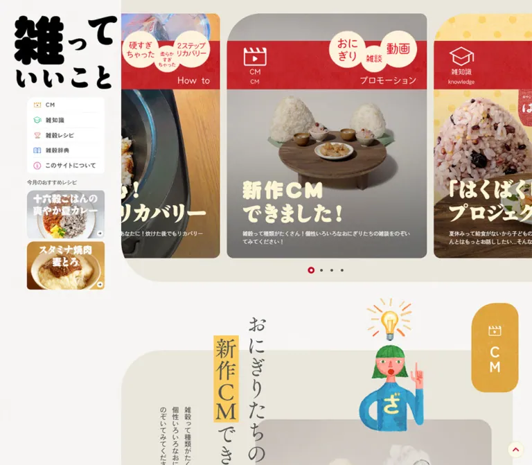
雑穀の知識やレシピを紹介するブランドサイト。生成りの質感、食品写真、手描きイラスト、非対称の角丸と赤い帯が親しみやすさを演出。
オリジナルサイトを見るA friendly food journal built from textured paper, grain photography, painted characters, and generously rounded corners.
Website: 雑っていいこと | はくばく
Original URL: https://hakubaku-zatsu.jp/
Final URL: https://hakubaku-zatsu.jp/
Theme: light, with warm neutral surfaces and distinct category accents; no theme selector was evidenced.
Inspected: supplied browser capture record retrieved September 17, 2026, at 05:26:57 JST / September 16, 2026, at 20:26:57 UTC. Exact record timestamp: 2026-09-16T20:26:57.748Z.
Viewports: desktop 1440 × 1000 CSS pixels; mobile 390 × 844 CSS pixels.
Scope: the current homepage, including its opening carousel, desktop navigation rail, closed mobile header, commercial feature, cooking guides, knowledge feature, recipe collection, dictionary entry point, shopping links, and footer. Article destinations, the opened mobile menu, video playback, and checkout were not inspected.
This is a branded editorial homepage with several routes into food knowledge and recipes. Large photographic stories provide the first impression. A bold black Japanese wordmark, small colored navigation symbols, and watercolor-like figures give the site a domestic, approachable character. The page moves between dense food photographs and broad areas of lightly textured paper.
Its most reusable decisions are structural: a persistent desktop rail, a carousel with neighboring cards visibly cropped, exaggerated rounding on the upper-left corner of major panels, illustrations that extend beyond their containers, and broad category buttons with a white corner reserved for an arrow. Mobile keeps these visual signatures while replacing the rail with a compact header and retaining horizontal browsing for recipes.
A friendly food journal built from textured paper, grain photography, painted characters, and generously rounded corners.
Website: 雑っていいこと | はくばく
Original URL: https://hakubaku-zatsu.jp/
Final URL: https://hakubaku-zatsu.jp/
Theme: light, with warm neutral surfaces and distinct category accents; no theme selector was evidenced.
Inspected: supplied browser capture record retrieved September 17, 2026, at 05:26:57 JST / September 16, 2026, at 20:26:57 UTC. Exact record timestamp: 2026-09-16T20:26:57.748Z.
Viewports: desktop 1440 × 1000 CSS pixels; mobile 390 × 844 CSS pixels.
Scope: the current homepage, including its opening carousel, desktop navigation rail, closed mobile header, commercial feature, cooking guides, knowledge feature, recipe collection, dictionary entry point, shopping links, and footer. Article destinations, the opened mobile menu, video playback, and checkout were not inspected.
This is a branded editorial homepage with several routes into food knowledge and recipes. Large photographic stories provide the first impression. A bold black Japanese wordmark, small colored navigation symbols, and watercolor-like figures give the site a domestic, approachable character. The page moves between dense food photographs and broad areas of lightly textured paper.
Its most reusable decisions are structural: a persistent desktop rail, a carousel with neighboring cards visibly cropped, exaggerated rounding on the upper-left corner of major panels, illustrations that extend beyond their containers, and broad category buttons with a white corner reserved for an arrow. Mobile keeps these visual signatures while replacing the rail with a compact header and retaining horizontal browsing for recipes.
Token names below are implementation aliases, not original source variable names.
| Name | Value | Suggested token | Evidence and role |
|---|---|---|---|
| Warm panel | #eae6dc |
--color-panel |
Computed background of the large commercial feature; the carousel surround has a visually similar neutral tone |
| White surface | #ffffff |
--color-surface |
Computed footer and dictionary-panel backgrounds; also the measured carousel excerpt color |
| Body gray | #545454 |
--color-ink |
Computed navigation, card text, and much of the main content |
| Black | #000000 |
--color-strong |
Computed section introductions and copyright; the main wordmark is visibly black |
| Shop crimson | #c30020 |
--color-shop |
Computed official-shop button background |
| Marketplace orange | #ff9900 |
--color-market |
Computed Amazon button background |
| Recipe terracotta | #d5593f |
--color-recipe |
Computed seasonal recipe heading color |
| Control cream | #fef3dd |
--color-cream |
Computed mobile menu-button foreground; useful as a starting point for cream details, but not proof of every artwork color |
| Name | Approximation | Suggested token | Use |
|---|---|---|---|
| Textured paper | #f8f7f3 |
--color-paper |
Warm, nearly white page canvas; the texture causes local variation |
| Editorial red | #d71f29 |
--color-editorial |
Textured carousel ribbons and the mobile menu disc |
| Knowledge green | #12aa7c |
--color-knowledge |
The visible knowledge-index button and related category details |
| Commercial gold | #e7ad3d |
--color-cm |
Tall commercial-section badge and small decorative highlights |
Do not collapse every red into a single exact source value. The official-shop crimson is measured; the red printed into photographic cards and the mobile menu artwork is only visually estimated here.
The site uses category color as punctuation. Navigation adds small green, terracotta, blue, and pink symbols, while text stays gray. Large photographic areas supply most of the color variation. White surfaces and warm neutral surroundings prevent the palette from feeling crowded.
Source-variable limitation: the supplied properties include --swiper-theme-color: #007aff, --swiper-navigation-size: 44px, and --windowHeight: 100svh. The blue is a library-named default, not evidence that the visible carousel uses blue controls. The supplied screenshots show gray dots with a red selected marker.
The measured body and sampled content use 'Zen Kaku Gothic Antique'. Observed weights are 400, 500, and 700.
This face handles compact explanations, navigation-related text, recipe metadata, and footer links. Its restrained appearance lets the expressive illustrations and display lettering carry the brand personality. The computed family name is verified; font-file URLs and the complete authored fallback stack were not supplied.
The HTML element reports a 16px root size at both viewports. The body reports a different size at each viewport. Do not assume all text simply scales down on mobile: the mobile body is larger than the desktop body, while several headings become smaller.
The black wordmark uses unusually heavy, irregular Japanese lettering. Carousel titles use thick cream-colored lettering with soft, uneven contours. Section introductions also include vertical, brush-like Japanese lettering and highlighted strips.
These visible letters are not adequately described by the inherited font on their surrounding elements. Several corresponding headings or anchors have empty text fields in the supplied extraction. Treat them as artwork or separately rendered lettering unless the actual asset structure becomes available. No additional display-font name is established.
Estimated visual scale: hero title lettering appears roughly 48–54px on desktop and 30–34px on mobile. These are visual size targets, not measured CSS font sizes.
| Role | Desktop size / line height | Mobile size / line height | Weight | Notes |
|---|---|---|---|---|
| Body default | 12.6 / 20.79px |
14.56 / 24.02px |
400 |
Both use approximately 1.65 leading |
| Recommended-recipes label | 14.4 / 23.76px |
15.6 / 25.74px |
400 |
Tracking -0.08em; mobile navigation visibility was not verified |
| Hero excerpt | 14.4 / 21.6px |
13.52 / 17.68px |
400 |
White; tracking -0.03em |
| Section introduction | 18 / 28.8px |
15.6 / 24.96px |
500 |
Black; 1.6 leading |
| Featured knowledge title | 18 / 28.01px |
15.6 / 20.79px |
700 |
Two lines in the measured example |
| Featured knowledge description | 14.4 / 23.4px |
13.52 / 20.79px |
500 |
Narrow editorial text measure |
| Seasonal recipe heading | 36 / 46.8px |
26 / 33.8px |
700 |
Terracotta; 1.3 leading |
| Recipe-card title | 16.2 / 25.21px |
15.6 / 20.79px |
700 |
Compact title rather than oversized display type |
| Recipe-card description | 12.6 / 21.60px |
13.52 / 20.79px |
500 |
Two or three lines depending on content |
| Footer policy link | 12.6 / 12.6px |
13.52 / 13.52px |
700 |
Link boxes can include additional layout space |
| Copyright | 10.8 / 10.8px |
10.4 / 10.4px |
700 |
Small legal line |
Keep live text and artwork lettering separate in implementation. Replacing the wordmark with bold body text would remove a major part of the identity; rendering all descriptions into images would make the editorial content difficult to maintain and access.
The page combines compact utility navigation with spacious editorial sections. Desktop measurements repeatedly use 9, 18, 27, 45, and 90px; mobile measurements repeatedly use 10.4, 20.8, 26, and 52px. These are observed repetitions, not a recovered source spacing system.
| Relationship | Desktop | Mobile | Status |
|---|---|---|---|
| Main content start | x = 324px |
x = 0px |
Measured |
| Standard section width | 1044px |
338px |
Measured |
| Standard outer right gutter | 72px |
26px |
Calculated from section bounds |
| Standard left gutter inside viewport | Rail occupies first 324px |
26px |
Measured |
| Hero card top clearance | 36px |
24.95px below header |
Measured/calculated |
| Hero card gap | 18px |
10.38px |
Calculated from neighboring card bounds |
| Sidebar recipe gap | 9px vertically |
9.36px horizontally in laid-out menu content |
Calculated; mobile menu not visually opened |
| Recipe collection gap | 18.89px |
15.59px |
Calculated |
| Repeated section separation | Often 90px |
Often 78px |
Calculated between measured sections |
| Hero-to-commercial panel gap | 181.8px |
101.91px |
Calculated; protruding artwork occupies some of this space |
| Desktop footer banner gap | 27px |
Banners stack | Calculated/observed |
The enlarged upper-left corner is a recurring brand device. It appears on photo cards, content panels, recipe cards, and footer banners, at different scales.
Values below expand the measured CSS shorthand into top-left / top-right / bottom-right / bottom-left order.
| Component | Desktop radii | Mobile radii |
|---|---|---|
| Hero card | 90 / 18 / 18 / 18px |
52 / 10.4 / 10.4 / 10.4px |
| Large feature or dictionary panel | 108 / 45 / 45 / 45px |
62.4 / 26 / 26 / 26px |
| Recipe card | 58.5 / 36 / 36 / 36px |
62.4 / 26 / 26 / 26px |
| Sidebar recipe tile | 18 / 9 / 9 / 9px |
20.8 / 10.4 / 10.4 / 10.4px |
| Category-index link | 27 / 27 / 18 / 27px |
20.8 / 20.8 / 15.6 / 20.8px |
| Store button | 27px on all corners |
20.8px on all corners |
| Footer promotional link | 27 / 9 / 9 / 9px |
20.8 / 10.4 / 10.4 / 10.4px |
The white arrow compartment adds another shape inside category and store buttons. It should not be confused with the outer border radius.
| Element | Desktop | Mobile |
|---|---|---|
| Desktop rail / mobile header | 324px wide |
390 × 83.19px header |
| Initial wordmark bounds | 275.39 × 195.69px |
113.36 × 80.55px |
| Main region | 1116px wide |
390px wide |
| Hero section | 1116 × 752.30px |
390 × 509.14px |
| Typical hero card | 533.69 × 653.30px |
300.58 × 437.39px |
| Commercial feature surface | 1044 × 614.56px |
338 × 584.20px |
| Cooking-guide banner | 1044 × 423px |
338 × 396.23px |
| Knowledge copy link | 506.69 × 387px |
317.19 × 327.36px |
| Recipe card | 320.41 × 515.77px |
312 × 572.78px |
| Category-index link | 324 × 88.94px |
265.19 × 72.78px |
| Store button | 324 × 90px |
286 × 72.80px |
One mobile recovery slide measures only 367.94px high, despite having the same 300.58px width. Do not assume that every original slide has a uniform mobile height.
The initial document heights were approximately 6458px on desktop and 7003px on mobile. These are capture-state measurements, not recommended fixed page heights.
Role: keep the brand, category routes, and selected recipes available beside the editorial page.
The rail occupies the left 324px of the desktop viewport. The first capture places the wordmark at approximately x = 37.81px, y = 41.39px. Beneath it, a white navigation panel starts around x = 72px and spans approximately 207px.
Its five rows correspond to CM, 雑知識, 雑穀レシピ, 雑穀辞典, and このサイトについて. Each combines a small colored pictogram with a gray label. Fine dotted separators provide structure without heavy borders. Measured inner links are 172.81 × 40.5px.
Below the navigation, the label 今月のおすすめレシピ introduces two photographic links. Both are 207 × 127.80px, with large white artwork lettering and a small circular arrow at the lower right. Their images show curry and salad rolls in the current capture.
The rail remains visible in the middle-page screenshot, where the wordmark is visibly more compact than at the top. Near the footer, part of the rail moves out of view. This supports a persistent, scroll-adaptive rail, but the supplied properties do not establish its exact fixed/sticky implementation or activation threshold.
Role: retain the brand while freeing the full viewport width for stories.
The mobile header is 83.19px high. A centered wordmark begins near y = 13.52px; its 80.55px artwork height extends slightly below the header boundary. The menu control occupies 56.16 × 56.16px at approximately x = 306.81px, y = 13px.
The visible control is a textured red disc with two thin cream strokes. It remains at the upper right in the supplied footer capture, while the centered wordmark is no longer visible there.
The closed screenshot does not show the desktop navigation panel. Mobile DOM rectangles nevertheless exist for five 338 × 62.39px navigation links and two side-by-side recipe tiles. This establishes laid-out menu content, not the appearance or behavior of an opened menu. Opening animation, overlay opacity, focus management, and dismissal behavior remain unverified.
Role: present several useful food stories as large visual entry points.
A warm neutral surround spans the main desktop column and has a broad rounded lower-left edge. One complete portrait card sits in the center, with substantial slices of the previous and next cards visible. On mobile, the active card begins at x = 44.71px, leaving a narrow preview on each side.
Each visible card combines:
The desktop ribbon appears approximately 129px high; the mobile ribbon is approximately 71px high. These are screenshot estimates. The exact image layering and whether individual elements are baked into a composite asset were not supplied.
The excerpt has a measured width of 450px on desktop and 260px on mobile. Its observed height accommodates approximately two desktop lines and three mobile lines. Text truncation is visible on mobile; the precise truncation technique is unknown.
Eight position markers are visible. Inactive markers are small gray dots, and the active marker is a larger red ring with a pale center. The DOM contains repeated sets of the eight story links, consistent with carousel duplication. These repeated anchors do not represent additional unique stories.
Role: introduce the commercial/video category as a large illustrated editorial destination.
Below the hero, a warm panel has the large 108 / 45 / 45 / 45px desktop corner treatment. The visible upper portion combines vertical Japanese lettering, a gold highlighted strip, a tall gold category badge, and a painted character with a lightbulb.
The category badge protrudes above the main panel, and the illustration introduces additional overlap. The panel links to a commercial detail page. A separate CM一覧 link overlaps the lower panel edge: calculated overlap is about 43.19px on desktop and 36.39px on mobile.
The full inner composition is not visible in the supplied screenshots. Its panel bounds and link destinations are measured, but video playback and any media overlay were not exercised.
Role: make practical cooking advice visually prominent between content collections.
The clearest example is the recovery banner labeled 炊飯失敗リカバリー. At desktop size, the left half is dominated by a rice-cooker pot, while the right side preserves a wooden background behind large white lettering. A small category icon, a conversational annotation, supporting text, and 詳しくみる complete the composition.
Two painted cooking characters extend beyond the lower edge, visually connecting the photographic panel to the surrounding page. The photograph is clipped to the asymmetric panel shape; the illustration is not clipped with it.
The measured desktop banner is 1044 × 423px, while its mobile link is 338 × 396.23px. This is a substantial change in proportion. A new implementation should provide a considered mobile composition; simply shrinking the wide desktop banner would not reproduce the measured layout. The mobile crop itself was not visually supplied.
Role: offer a deeper article preview within the knowledge category.
The desktop screenshot shows a large grain photograph on the right and a white copy panel to its left, with a fine dark outline and generous rounded corners. Their boundaries overlap rather than forming two identical grid cells. The photograph extends lower than the copy panel in the visible crop.
The measured copy link contains a category label, a bold two-line title, a compact description, and 詳しくみる. Its title is 18px / 28.01px, and its description is 14.4px / 23.4px. A green 雑知識一覧 button follows below.
On mobile, the copy link becomes 317.19px wide and sits later in the section. The supplied evidence does not show the complete mobile image arrangement, so its overlap direction should not be reconstructed as a verified fact.
Role: connect food inspiration to individual recipes and a larger recipe archive.
The section introduces the category with short prose, followed by the terracotta heading 秋にオススメの雑穀レシピ. Three recipe links appear side by side on desktop. Each contains a food-image region, category and hashtag information, a bold title, a short description, and a detail affordance.
Measured desktop cards are 320.41px wide, with approximately 18.89px between cards and 22.5px of inset on each side of the collection. Text sits about 28px inside each card.
On mobile, the cards remain in a horizontal row. Their measured x positions are 26, 353.59, and 681.19px; each is 312px wide. They do not become three vertically stacked cards. Touch-swipe behavior was not tested, but the horizontal layout is directly supported by the element positions.
The mobile text width is approximately 260.09px, maintaining a comfortable reading measure inside the card. Keep the category, tags, title, description, and link affordance distinct; the DOM does not establish the exact appearance of every tag or image crop.
Role: provide clear transitions from editorial previews into indexes or external shops.
The category links use broad rounded rectangles, centered labels, and a white lower-right compartment containing an arrow. The visible knowledge button uses green. The white compartment curves inward at its upper-left corner, creating a folded-page impression without a shadow.
Desktop category buttons measure 324 × 88.94px; mobile versions measure 265.19 × 72.78px. Their labels sometimes appear twice in extracted text. The screenshot shows one visible label, so a new implementation should not render duplicate visible wording merely to match the extraction.
Shopping buttons share the corner compartment but use an external-link symbol. The official-shop button is crimson with a white brand mark; Amazon is orange with black visible lettering. The anchor's inherited color does not by itself describe every child logo or label.
Role: provide background learning and a practical purchasing route after the recipe content.
The dictionary destination is a large white panel with the same exaggerated upper-left curve. Its desktop padding is visibly asymmetric in the computed styles: 88.2px 18px 92.7px 161.1px. Mobile padding also reserves substantial space, including 183.04px at the bottom. Preserve room for the graphic composition rather than replacing this component with a plain text card.
A separate diagnostic promotion precedes the purchasing panel. The latter uses a white rounded container, a centered black heading, a concise explanation, and two large shop buttons.
On desktop, the shop buttons are side by side with a calculated 27px gap. On mobile, they stack at 286px wide, inset 26px inside the standard 338px content region, with approximately 20.8px between them.
Role: connect related brand content, policy pages, commerce, and social accounts.
The footer spans the whole desktop viewport, including the area beneath the rail. Its clean white background provides a visible transition away from the textured editorial canvas.
A centered 1080px-wide desktop row contains three promotional banners, each 342px wide, separated by 27px. They lead to a grain-selection diagnostic, a branded recipe destination, and a barley research/content destination. Their artwork combines a mascot, a red fabric-sign motif, and a quiet food photograph.
Below the banners, policy links align left and shop links align right. The red corporate mark and small copyright sit toward the lower left; black social marks sit toward the lower right. The visible social set is Facebook, X, LINE, Instagram, and YouTube.
On mobile, promotional banners stack at 338px wide. Policy and shop links become separate left-aligned groups. A centered social row precedes the centered brand mark and copyright. A gap of approximately 124px separates the last promotional link box from the first policy link in the mobile DOM.
Some image-only desktop anchors report line-height-sized boxes despite visibly taller artwork. Use the screenshots for the painted banner extent and preserve the artwork's real intrinsic dimensions when implementing.
Role: provide a persistent return affordance on the long page.
A pale circular disc with a thin gold edge and a red upward chevron appears at the lower right in both viewports. The measured button hit box is approximately 61.19px square on desktop and 60.31px square on mobile; the visible disc is smaller because of internal padding.
The button's placement persists across supplied scroll captures. Its click result, scrolling duration, and show/hide threshold were not tested.
| Element or behavior | Evidence | What can be concluded |
|---|---|---|
| Desktop wordmark | 0.4s cubic-bezier(0.165, 0.84, 0.44, 1) transition on the sampled H1 |
A transition is defined; the precise changed properties and scroll threshold are not supplied |
| Primary navigation links | color 0.3s |
Color changes have a defined duration; the hover destination color was not captured |
| Shop links, footer links, promotional links | opacity 0.2s |
A short opacity transition is defined; its final opacity is unknown |
| Back-to-top button | opacity 0.2s |
Opacity feedback or visibility changes are supported by styles; click motion is unverified |
| Hero carousel | Neighboring slides, eight markers, repeated link sets | A carousel structure is evidenced; autoplay, drag handling, speed, and easing are unverified |
| Mobile menu | Closed red menu control; menu-related DOM content | The control and content exist; open-state animation and focus behavior are unverified |
| Recipe collection | Cards continue horizontally offscreen on mobile | Horizontal browsing layout is measured; swipe and snap behavior were not tested |
Most sampled elements report animation: none. This does not rule out JavaScript transitions, animated artwork, or animation on unsampled descendants. The supplied capture process also paused perpetual animations during readiness checks before resuming them, so still screenshots cannot establish continuous motion behavior.
Recommended implementation: retain brief color and opacity feedback, use restrained movement for the carousel, and avoid adding constant wobble to every illustration. If automatic slide advancement is introduced, provide a pause control and disable advancement under reduced-motion preferences. No original autoplay interval can be recommended as a measured value.
| Layer | Appearance | Function |
|---|---|---|
| Page canvas | Nearly white, fine paper-like texture | Creates continuity between editorial sections |
| Hero surround | Warm neutral field with a broad lower-left curve | Groups the photographic carousel |
| Illustrated feature | Measured warm panel, oversized asymmetric corners | Supports vertical lettering and protruding artwork |
| Article and dictionary surfaces | White, occasionally a fine outline | Separates readable text from complex imagery |
| Photograph | Full color, natural food texture, darker regions behind copy | Carries subject matter and appetite appeal |
| Category button | Saturated fill with a white corner compartment | Provides a recognizable navigation affordance |
| Footer | Clean solid white | Organizes corporate utilities and related destinations |
There is no visible general-purpose elevation system. Separation comes from surface color, image edges, fine rules, spacing, and overlapping geometry. Avoid adding a uniform soft shadow to every rounded element.
The photographic subjects are specific and tactile: individual barley grains, mixed cereals, cooked rice, rice-cooker bowls, wooden work surfaces, curry, and rolled vegetables. Close crops emphasize material and food texture. Everyday cooking tools help the content feel practical rather than ceremonial.
Illustrations have visible painted texture, irregular outlines, simple faces, bright clothing, and small narrative props such as a lightbulb or cooking spoon. They appear as independent cutouts and may cross panel boundaries. Their personality depends on the artwork; generic line icons cannot replace these figures.
Typography within the artwork is equally important. Preserve the heavy black logo, cream story lettering, vertical Japanese compositions, and small highlighted strips. Where text is an image, provide an accessible equivalent without duplicating the visible lettering.
No original image src URLs, filenames, or responsive asset definitions were included in the evidence. The following table identifies observed asset roles rather than inventing file paths.
| Asset role | Observed appearance | Implementation guidance |
|---|---|---|
| Main wordmark | Heavy irregular black Japanese lettering | Preserve the supplied artwork and transparent surround |
| Hero story composition | Food photo, red ribbon, cream bubbles, cream title | Determine whether the authorized asset is composite before adding separate overlays |
| Sidebar recipes | Compact food photographs with large white lettering | Preserve the readable crop at approximately 207 × 128px on desktop |
| Commercial illustration | Painted character with a lightbulb and vertical lettering nearby | Allow artwork to protrude above the panel |
| Recovery feature | Rice-cooker photograph with two painted cooks | Clip the photograph separately from the foreground figures |
| Navigation symbols | Small colored category pictograms | Retain category-specific color and restrained line weight |
| Related-content banners | Mascot, fabric-sign motif, and food photograph | Respect each artwork's intrinsic dimensions and mobile variant if available |
| Corporate and social marks | Red corporate logo; black social symbols | Use authorized marks rather than approximating them with ordinary text |
A replacement texture should be subtle at normal viewing distance. Do not apply pixelated rendering to photography or illustrations; no such treatment is evidenced here.
At 1440px wide, the rail occupies 22.5% of the viewport. The remaining 1116px holds the hero. Most following sections are 1044px wide, leaving a 72px right gutter. These percentages are calculated from the measured snapshot; the original sizing formula was not supplied.
The active hero card is centered within the main region, not within the whole viewport. Its neighbors extend beyond the carousel's visible bounds. Below it, sections alternate between wide photographic banners, illustrated panels, and more conventional article previews.
The rail persists through the editorial area, but the footer returns to a full-width composition. A new implementation should account for the rail's relationship to that footer rather than fixing the entire rail permanently over the lower corporate content.
At 390px, the rail is replaced by a compact header. Most sections use 26px side margins, producing a 338px content width. The hero remains edge-to-edge around a centered 300.58px card with neighboring previews.
The hero's typical aspect ratio changes from approximately 0.817 width-to-height on desktop to 0.687 on mobile. Wide cooking-guide banners change even more substantially, from approximately 2.468 to 0.853. These measurements indicate re-composition rather than uniform scale reduction.
Recipe cards remain horizontal at 312px wide. Shop buttons stack, footer promotions stack, utility links separate into vertical groups, and social icons move above the corporate logo.
The mobile menu control remains visible in the footer capture. The full logo does not. Avoid treating the complete initial header as a permanently fixed white bar unless additional evidence establishes that behavior.
Only the two supplied viewport sizes were inspected. Breakpoint locations, tablet layouts, orientation changes, browser zoom, and safe-area behavior are unknown. The Quick Start uses a recommended 900px breakpoint and proportion-based interpolation; these are adaptation choices, not recovered source CSS.
16px radius.These are recommendations for a new implementation, not verified features of the original page.
60px back-to-top hit area and prevent it from covering footer links on narrow screens.#eae6dc.#545454; strong text: #000000.#ffffff.#c30020, orange #ff9900.#d5593f.#f8f7f3; editorial red: #d71f29; knowledge green: #12aa7c; commercial gold: #e7ad3d.“Create a Japanese food-brand editorial homepage inspired by the current Hakubaku ‘雑っていいこと’ site. Use a nearly white paper texture, warm neutral panels, gray Gothic body text, a heavy black illustrated wordmark, natural grain and cooking photography, and painted character cutouts. At desktop width, reserve about 22.5% for a persistent navigation rail and place a large photographic carousel in the remaining area. Show one complete story and cropped neighbors. Use textured red story ribbons, cream title artwork, and asymmetrical corners with a much larger upper-left radius. Alternate broad cooking-guide banners with knowledge and recipe previews. Give category links a white lower-right arrow compartment. On mobile, use a centered compact logo, a red circular menu control, 26px content gutters at 390px width, horizontal recipe browsing, and a vertically reorganized white footer. Treat typography artwork and photographs as supplied assets rather than inventing additional font names.”
This is a recommended adaptation of the measured geometry. It is not copied source CSS. Desktop proportions target 1440px; mobile values target 390px. The 900px breakpoint, hover endpoint, native scroll snapping, and intermediate scaling are recommendations.
Use .site-shell for the rail and main region, with .site-footer outside that grid. Within the hero, .hero-track contains .hero-card links. This example assumes that supplied hero artwork already contains its decorative ribbon and display lettering, while .hero-excerpt remains live text. Do not duplicate those decorations over an existing composite image.
The paper texture defaults to none because no verified asset URL was supplied. Set --paper-texture to an authorized image when available. Load the observed font separately; the generic fallback below is an implementation addition.
:root {
  /* Measured colors */
  --color-panel: #eae6dc;
  --color-surface: #ffffff;
  --color-ink: #545454;
  --color-strong: #000000;
  --color-shop: #c30020;
  --color-market: #ff9900;
  --color-recipe: #d5593f;
  --color-cream: #fef3dd;

  /* Visual approximations */
  --color-paper: #f8f7f3;
  --color-editorial: #d71f29;
  --color-knowledge: #12aa7c;
  --color-cm: #e7ad3d;
  --paper-texture: none;

  --font-body: 'Zen Kaku Gothic Antique', sans-serif;
  --text-body: 12.6px;
  --text-intro: 18px;
  --text-seasonal: 36px;
  --leading-body: 1.65;

  /* Proportions calculated from the desktop snapshot */
  --rail-width: 22.5vw;
  --page-gutter: 5vw;
  --slide-width: 37.06163vw;
  --slide-gap: 18px;
  --section-gap: 90px;
  --radius-story: 90px 18px 18px 18px;
  --radius-panel: 108px 45px 45px 45px;
  --radius-recipe: 58.5px 36px 36px 36px;
  --radius-action: 27px 27px 18px 27px;

  --motion-opacity: 200ms;
  --motion-color: 300ms;
  --motion-brand: 400ms cubic-bezier(0.165, 0.84, 0.44, 1);
}

* { box-sizing: border-box; }

body {
  margin: 0;
  color: var(--color-ink);
  background-color: var(--color-paper);
  background-image: var(--paper-texture);
  font-family: var(--font-body);
  font-size: var(--text-body);
  line-height: var(--leading-body);
}

img { display: block; max-width: 100%; height: auto; }
button, input { font: inherit; }
a { color: inherit; }

.site-shell {
  display: grid;
  grid-template-columns: var(--rail-width) minmax(0, 1fr);
}

.site-main { min-width: 0; }
.site-rail { min-width: 0; }

/* Bounded sticky behavior is an implementation recommendation. */
.rail-inner {
  position: sticky;
  top: 18px;
  padding: 23.4px 3.125vw 24px 5vw;
}

.brand {
  display: block;
  width: calc(100% + 4.75vw);
  margin-inline-start: -2.375vw;
}

.primary-nav {
  margin-top: 22.5px;
  padding-inline: 17.1px;
  border-radius: 12px;
  background: var(--color-surface);
}

.primary-nav a {
  display: flex;
  align-items: center;
  gap: 12px;
  min-height: 40.5px;
  font-weight: 700;
  text-decoration: none;
  transition: color var(--motion-color);
}

.primary-nav a + a { border-top: 1px dotted #dedbd5; }

.rail-recipes { margin-top: 12.6px; }
.rail-recipes h2 {
  margin: 0 0 9px;
  font-size: 14.4px;
  font-weight: 400;
  letter-spacing: -0.08em;
}
.rail-recipes a {
  display: block;
  overflow: hidden;
  border-radius: 18px 9px 9px 9px;
}
.rail-recipes a + a { margin-top: 9px; }
.menu-toggle { display: none; }

.hero {
  padding-block: 36px 22px;
  overflow: hidden;
  background: var(--color-panel);
  border-bottom-left-radius: 108px;
}

/* Native scrolling substitutes for unverified carousel logic. */
.hero-track {
  display: flex;
  gap: var(--slide-gap);
  overflow-x: auto;
  padding-inline: max(0px, calc((100% - var(--slide-width)) / 2));
  scroll-padding-inline: max(0px, calc((100% - var(--slide-width)) / 2));
  scroll-snap-type: x mandatory;
  scrollbar-width: none;
}
.hero-track::-webkit-scrollbar { display: none; }

.hero-card {
  position: relative;
  flex: 0 0 var(--slide-width);
  aspect-ratio: 533.6875 / 653.296875;
  overflow: hidden;
  border-radius: var(--radius-story);
  scroll-snap-align: center;
  color: white;
  text-decoration: none;
}

.hero-card > picture,
.hero-card > picture > img {
  display: block;
  width: 100%;
  height: 100%;
}
.hero-card > picture > img { object-fit: cover; }

.hero-excerpt {
  position: absolute;
  inset-inline: 7.84%;
  bottom: 34px;
  margin: 0;
  display: -webkit-box;
  -webkit-box-orient: vertical;
  -webkit-line-clamp: 2;
  overflow: hidden;
  font-size: 14.4px;
  line-height: 1.5;
  letter-spacing: -0.03em;
}

.hero-pagination {
  display: flex;
  justify-content: center;
  gap: 0;
  margin-top: 16px;
}
.hero-pagination button {
  display: grid;
  place-items: center;
  width: 24px;
  height: 24px;
  padding: 0;
  border: 0;
  background: transparent;
  cursor: pointer;
}
.hero-pagination button::before {
  content: '';
  width: 6px;
  height: 6px;
  border-radius: 50%;
  background: var(--color-ink);
}
.hero-pagination button[aria-current='true']::before {
  width: 14px;
  height: 14px;
  border: 4px solid var(--color-shop);
  background: var(--color-surface);
}

.content-section {
  margin-block: var(--section-gap);
  margin-inline-end: var(--page-gutter);
}
.section-intro {
  color: var(--color-strong);
  font-size: var(--text-intro);
  font-weight: 500;
  line-height: 1.6;
}
.illustrated-panel {
  position: relative;
  border-radius: var(--radius-panel);
  background: var(--color-panel);
}

.feature-banner {
  position: relative;
  display: block;
  aspect-ratio: 1044 / 423;
}
.feature-banner__media {
  position: absolute;
  inset: 0;
  overflow: hidden;
  border-radius: var(--radius-panel);
}
.feature-banner__media img {
  width: 100%;
  height: 100%;
  object-fit: cover;
}
/* Keep character cutouts outside the clipped media wrapper. */
.feature-banner__figure { position: absolute; }

.section-action {
  --action-color: var(--color-knowledge);
  position: relative;
  display: grid;
  place-items: center;
  width: min(324px, 100%);
  min-height: 88.94px;
  margin-inline: auto;
  padding: 14px 56px;
  overflow: hidden;
  border-radius: var(--radius-action);
  color: white;
  background: var(--action-color);
  font-size: 16px;
  font-weight: 700;
  text-align: center;
  text-decoration: none;
  transition: opacity var(--motion-opacity);
}
.section-action__corner {
  position: absolute;
  right: 0;
  bottom: 0;
  display: grid;
  place-items: center;
  width: 50px;
  height: 50px;
  border-top-left-radius: 27px;
  color: var(--action-color);
  background: var(--color-surface);
}
.section-action--shop { --action-color: var(--color-shop); }
.section-action--market {
  --action-color: var(--color-market);
  color: var(--color-strong);
}

.seasonal-title {
  color: var(--color-recipe);
  font-size: var(--text-seasonal);
  font-weight: 700;
  line-height: 1.3;
}
.recipe-list {
  display: grid;
  grid-template-columns: repeat(3, minmax(0, 1fr));
  gap: 18.89px;
  padding-inline: 22.5px;
}
.recipe-card {
  min-width: 0;
  overflow: hidden;
  border-radius: var(--radius-recipe);
  text-decoration: none;
}
.recipe-card__body { padding: 24px 28px; }
.recipe-card__title {
  margin: 0 0 10px;
  font-size: 16.2px;
  line-height: 1.556;
}
.recipe-card__description {
  margin: 0;
  font-size: 12.6px;
  font-weight: 500;
  line-height: 1.714;
}

.purchase-panel {
  padding: 45px 26px;
  border-radius: var(--radius-panel);
  background: var(--color-surface);
  text-align: center;
}
.shop-actions {
  display: flex;
  justify-content: center;
  gap: 27px;
  margin-top: 32px;
}
.shop-actions .section-action { margin-inline: 0; }

.site-footer {
  padding-block: 51.3px 70.2px;
  background: var(--color-surface);
}
.footer-inner { width: 75%; margin-inline: auto; }
.footer-promos {
  display: grid;
  grid-template-columns: repeat(3, minmax(0, 1fr));
  gap: 27px;
}
.footer-promos a {
  overflow: hidden;
  border-radius: 27px 9px 9px 9px;
}
.footer-promos img { width: 100%; }
.footer-utilities,
.footer-bottom {
  display: flex;
  justify-content: space-between;
  gap: 32px;
}
.footer-utilities { margin-top: 88px; }
.footer-bottom { align-items: center; margin-top: 32px; }
.footer-policies,
.footer-shops,
.footer-social {
  display: flex;
  align-items: center;
  gap: 22px;
}
.footer-utilities a {
  font-weight: 700;
  text-decoration: none;
}
.footer-social { gap: 12px; }
.footer-social a { display: block; width: 29px; }
.footer-copyright { font-size: 10.8px; font-weight: 700; }

.back-to-top {
  position: fixed;
  right: 13px;
  bottom: 11px;
  z-index: 20;
  width: 61px;
  height: 61px;
  padding: 9px;
  border: 0;
  background: transparent;
  cursor: pointer;
}
.back-to-top__disc {
  display: grid;
  place-items: center;
  width: 100%;
  height: 100%;
  border: 1px solid var(--color-cm);
  border-radius: 50%;
  color: var(--color-shop);
  background: #fffbed;
}

/* Recommended feedback endpoints and accessible focus. */
@media (hover: hover) {
  .primary-nav a:hover { color: var(--color-shop); }
  .section-action:hover,
  .footer-promos a:hover { opacity: 0.82; }
}
:where(a, button):focus-visible {
  outline: 3px solid var(--color-shop);
  outline-offset: 4px;
}

@media (max-width: 900px) {
  :root {
    --page-gutter: 6.666667vw;
    --slide-width: 77.071314vw;
    --slide-gap: 10.4px;
    --section-gap: 78px;
    --text-body: 14.56px;
    --text-intro: 15.6px;
    --text-seasonal: 26px;
    --radius-story: 52px 10.4px 10.4px 10.4px;
    --radius-panel: 62.4px 26px 26px 26px;
    --radius-recipe: 62.4px 26px 26px 26px;
    --radius-action: 20.8px 20.8px 15.6px 20.8px;
  }

  .site-shell { display: block; }
  .site-rail { height: 83.19px; }
  .rail-inner { position: static; padding: 13.52px 0 0; }
  .brand { width: 113.36px; margin-inline: auto; }
  .primary-nav,
  .rail-recipes { display: none; }

  /* Closed-state geometry only; menu behavior needs separate code. */
  .menu-toggle {
    position: fixed;
    top: 13px;
    right: 27px;
    z-index: 30;
    display: grid;
    place-content: center;
    gap: 5.2px;
    width: 56.16px;
    height: 56.16px;
    border: 0;
    border-radius: 50%;
    color: var(--color-cream);
    background: var(--color-editorial);
  }
  .menu-toggle span {
    display: block;
    width: 27px;
    height: 1px;
    background: currentColor;
  }

  .hero { padding-top: 24.95px; border-bottom-left-radius: 52px; }
  .hero-card { aspect-ratio: 300.578125 / 437.390625; }
  .hero-excerpt {
    inset-inline: 6.75%;
    bottom: 18px;
    -webkit-line-clamp: 3;
    font-size: 13.52px;
    line-height: 1.308;
  }
  .hero-pagination button::before { width: 5px; height: 5px; }
  .hero-pagination button[aria-current='true']::before {
    width: 10px;
    height: 10px;
    border-width: 3px;
  }

  .content-section { margin-inline: var(--page-gutter); }
  .feature-banner { aspect-ratio: 338 / 396.234375; }
  .section-action { width: min(265.19px, 100%); min-height: 72.78px; }
  .section-action__corner { width: 42px; height: 42px; }

  .recipe-list {
    display: flex;
    gap: 15.6px;
    overflow-x: auto;
    margin-inline-end: calc(-1 * var(--page-gutter));
    padding-inline: 0 var(--page-gutter);
    scroll-snap-type: x proximity;
  }
  .recipe-card { flex: 0 0 80vw; scroll-snap-align: start; }
  .recipe-card__body { padding: 24px 26px; }
  .recipe-card__title { font-size: 15.6px; line-height: 1.333; }
  .recipe-card__description { font-size: 13.52px; line-height: 1.538; }

  .shop-actions { flex-direction: column; align-items: center; gap: 20.8px; }
  .shop-actions .section-action { width: 100%; max-width: 286px; }

  .site-footer { padding-block: 41.6px 29.12px; }
  .footer-inner { width: auto; margin-inline: var(--page-gutter); }
  .footer-promos { grid-template-columns: 1fr; gap: 20.8px; }
  .footer-utilities { margin-top: 124px; }
  .footer-utilities,
  .footer-policies,
  .footer-shops { flex-direction: column; align-items: flex-start; }
  .footer-policies { gap: 12px; }
  .footer-utilities a { font-size: 13.52px; }
  .footer-bottom { flex-direction: column; gap: 52px; margin-top: 48px; }
  .footer-social { order: -1; }
  .footer-social a { width: 33.27px; }
  .footer-copyright { font-size: 10.4px; text-align: center; }
  .back-to-top { right: 4px; width: 60.31px; height: 60.31px; padding: 5.2px; }
}

@media (prefers-reduced-motion: reduce) {
  *, *::before, *::after { transition: none !important; }
  .hero-track,
  .recipe-list { scroll-behavior: auto; }
}
Supply real SVG arrows, external-link symbols, category icons, and meaningful accessible names. Pagination state, menu opening, any logo compression, and back-to-top behavior require separate implementation. The CSS intentionally does not invent those original behaviors.
Optional aliases for a project already using Tailwind v4. These do not imply that the original site uses Tailwind. Define the custom properties above first.
@theme inline {
  --color-zatsu-paper: var(--color-paper);
  --color-zatsu-panel: var(--color-panel);
  --color-zatsu-surface: var(--color-surface);
  --color-zatsu-ink: var(--color-ink);
  --color-zatsu-shop: var(--color-shop);
  --color-zatsu-recipe: var(--color-recipe);
  --color-zatsu-knowledge: var(--color-knowledge);

  --font-zatsu: var(--font-body);
  --text-zatsu-body: var(--text-body);
  --text-zatsu-intro: var(--text-intro);
  --text-zatsu-seasonal: var(--text-seasonal);

  --spacing-zatsu-gutter: var(--page-gutter);
  --spacing-zatsu-section: var(--section-gap);
  --spacing-zatsu-slide: var(--slide-width);
}

/* Use component CSS for multi-corner radius values. */
200 and no URL change.2026-09-16T20:26:57.748Z, equivalent to September 17, 2026, at 05:26:57 JST. Desktop viewport: 1440 × 1000; mobile viewport: 390 × 844.Copyright © 2019 Hakubaku Co.,Ltd. All Rights Reserved. and links its corporate mark to https://www.hakubaku.co.jp/. The copyright year does not establish the date of the current design. No design or development credit is established by the inspected page evidence.The capture process waited for document load, visible image decoding, and sampled layout stability, with finite time limits. Perpetual animations were temporarily paused during readiness checks and then resumed. SharedWorkers and service workers were disabled. These conditions support analysis of the supplied rendered states but do not prove that delayed content, all animation, or every interaction was exercised.
Desktop image-only anchors sometimes expose line-box dimensions that differ from their visible artwork. Mobile menu content also has geometric bounds despite being absent from the closed screenshot. This reference therefore distinguishes measured container geometry from visible appearance and leaves uncertain behavior explicitly unverified.
# Hakubaku / 雑っていいこと — Style Reference

> A friendly food journal built from textured paper, grain photography, painted characters, and generously rounded corners.

**Website:** [雑っていいこと | はくばく](https://hakubaku-zatsu.jp/)
**Original URL:** https://hakubaku-zatsu.jp/
**Final URL:** https://hakubaku-zatsu.jp/
**Theme:** light, with warm neutral surfaces and distinct category accents; no theme selector was evidenced.
**Inspected:** supplied browser capture record retrieved September 17, 2026, at 05:26:57 JST / September 16, 2026, at 20:26:57 UTC. Exact record timestamp: `2026-09-16T20:26:57.748Z`.
**Viewports:** desktop `1440 × 1000` CSS pixels; mobile `390 × 844` CSS pixels.
**Scope:** the current homepage, including its opening carousel, desktop navigation rail, closed mobile header, commercial feature, cooking guides, knowledge feature, recipe collection, dictionary entry point, shopping links, and footer. Article destinations, the opened mobile menu, video playback, and checkout were not inspected.

This is a branded editorial homepage with several routes into food knowledge and recipes. Large photographic stories provide the first impression. A bold black Japanese wordmark, small colored navigation symbols, and watercolor-like figures give the site a domestic, approachable character. The page moves between dense food photographs and broad areas of lightly textured paper.

Its most reusable decisions are structural: a persistent desktop rail, a carousel with neighboring cards visibly cropped, exaggerated rounding on the upper-left corner of major panels, illustrations that extend beyond their containers, and broad category buttons with a white corner reserved for an arrow. Mobile keeps these visual signatures while replacing the rail with a compact header and retaining horizontal browsing for recipes.
# Hakubaku / 雑っていいこと — Style Reference

> A friendly food journal built from textured paper, grain photography, painted characters, and generously rounded corners.

**Website:** [雑っていいこと | はくばく](https://hakubaku-zatsu.jp/)
**Original URL:** https://hakubaku-zatsu.jp/
**Final URL:** https://hakubaku-zatsu.jp/
**Theme:** light, with warm neutral surfaces and distinct category accents; no theme selector was evidenced.
**Inspected:** supplied browser capture record retrieved September 17, 2026, at 05:26:57 JST / September 16, 2026, at 20:26:57 UTC. Exact record timestamp: `2026-09-16T20:26:57.748Z`.
**Viewports:** desktop `1440 × 1000` CSS pixels; mobile `390 × 844` CSS pixels.
**Scope:** the current homepage, including its opening carousel, desktop navigation rail, closed mobile header, commercial feature, cooking guides, knowledge feature, recipe collection, dictionary entry point, shopping links, and footer. Article destinations, the opened mobile menu, video playback, and checkout were not inspected.

This is a branded editorial homepage with several routes into food knowledge and recipes. Large photographic stories provide the first impression. A bold black Japanese wordmark, small colored navigation symbols, and watercolor-like figures give the site a domestic, approachable character. The page moves between dense food photographs and broad areas of lightly textured paper.

Its most reusable decisions are structural: a persistent desktop rail, a carousel with neighboring cards visibly cropped, exaggerated rounding on the upper-left corner of major panels, illustrations that extend beyond their containers, and broad category buttons with a white corner reserved for an arrow. Mobile keeps these visual signatures while replacing the rail with a compact header and retaining horizontal browsing for recipes.

## How to Read This Reference

- **Measured** means a value appears in the supplied rendered DOM or computed styles. Values are rounded to two decimals where appropriate.
- **Calculated** means arithmetic based on those measurements, such as a gap or width percentage. It does not establish the original CSS formula.
- **Estimated** means a visual approximation from the current-page screenshots. Estimated colors were not extracted through pixel sampling.
- **Recommended** means an implementation choice for a new build. Breakpoints, missing interaction details, and the Quick Start adaptation fall into this category.
- Screenshots establish visible appearance. A transparent ancestor background, an empty text field, or an image-link line box does not describe every painted descendant.
- Only the supplied current-page captures and rendered evidence support this design reference. No additional browsing, source-file inspection, or interaction testing was performed.

## Tokens — Colors

### Measured Palette

Token names below are implementation aliases, not original source variable names.

| Name | Value | Suggested token | Evidence and role |
| --- | --- | --- | --- |
| Warm panel | `#eae6dc` | `--color-panel` | Computed background of the large commercial feature; the carousel surround has a visually similar neutral tone |
| White surface | `#ffffff` | `--color-surface` | Computed footer and dictionary-panel backgrounds; also the measured carousel excerpt color |
| Body gray | `#545454` | `--color-ink` | Computed navigation, card text, and much of the main content |
| Black | `#000000` | `--color-strong` | Computed section introductions and copyright; the main wordmark is visibly black |
| Shop crimson | `#c30020` | `--color-shop` | Computed official-shop button background |
| Marketplace orange | `#ff9900` | `--color-market` | Computed Amazon button background |
| Recipe terracotta | `#d5593f` | `--color-recipe` | Computed seasonal recipe heading color |
| Control cream | `#fef3dd` | `--color-cream` | Computed mobile menu-button foreground; useful as a starting point for cream details, but not proof of every artwork color |

### Visual Estimates

| Name | Approximation | Suggested token | Use |
| --- | --- | --- | --- |
| Textured paper | `#f8f7f3` | `--color-paper` | Warm, nearly white page canvas; the texture causes local variation |
| Editorial red | `#d71f29` | `--color-editorial` | Textured carousel ribbons and the mobile menu disc |
| Knowledge green | `#12aa7c` | `--color-knowledge` | The visible knowledge-index button and related category details |
| Commercial gold | `#e7ad3d` | `--color-cm` | Tall commercial-section badge and small decorative highlights |

Do not collapse every red into a single exact source value. The official-shop crimson is measured; the red printed into photographic cards and the mobile menu artwork is only visually estimated here.

The site uses category color as punctuation. Navigation adds small green, terracotta, blue, and pink symbols, while text stays gray. Large photographic areas supply most of the color variation. White surfaces and warm neutral surroundings prevent the palette from feeling crowded.

**Source-variable limitation:** the supplied properties include `--swiper-theme-color: #007aff`, `--swiper-navigation-size: 44px`, and `--windowHeight: 100svh`. The blue is a library-named default, not evidence that the visible carousel uses blue controls. The supplied screenshots show gray dots with a red selected marker.

## Tokens — Typography

### Live Interface Text

The measured body and sampled content use **`'Zen Kaku Gothic Antique'`**. Observed weights are `400`, `500`, and `700`.

This face handles compact explanations, navigation-related text, recipe metadata, and footer links. Its restrained appearance lets the expressive illustrations and display lettering carry the brand personality. The computed family name is verified; font-file URLs and the complete authored fallback stack were not supplied.

The HTML element reports a `16px` root size at both viewports. The body reports a different size at each viewport. Do not assume all text simply scales down on mobile: the mobile body is larger than the desktop body, while several headings become smaller.

### Wordmark and Display Artwork

The black wordmark uses unusually heavy, irregular Japanese lettering. Carousel titles use thick cream-colored lettering with soft, uneven contours. Section introductions also include vertical, brush-like Japanese lettering and highlighted strips.

These visible letters are not adequately described by the inherited font on their surrounding elements. Several corresponding headings or anchors have empty text fields in the supplied extraction. Treat them as artwork or separately rendered lettering unless the actual asset structure becomes available. No additional display-font name is established.

**Estimated visual scale:** hero title lettering appears roughly `48–54px` on desktop and `30–34px` on mobile. These are visual size targets, not measured CSS font sizes.

### Measured Type Scale

| Role | Desktop size / line height | Mobile size / line height | Weight | Notes |
| --- | --- | --- | --- | --- |
| Body default | `12.6 / 20.79px` | `14.56 / 24.02px` | `400` | Both use approximately `1.65` leading |
| Recommended-recipes label | `14.4 / 23.76px` | `15.6 / 25.74px` | `400` | Tracking `-0.08em`; mobile navigation visibility was not verified |
| Hero excerpt | `14.4 / 21.6px` | `13.52 / 17.68px` | `400` | White; tracking `-0.03em` |
| Section introduction | `18 / 28.8px` | `15.6 / 24.96px` | `500` | Black; `1.6` leading |
| Featured knowledge title | `18 / 28.01px` | `15.6 / 20.79px` | `700` | Two lines in the measured example |
| Featured knowledge description | `14.4 / 23.4px` | `13.52 / 20.79px` | `500` | Narrow editorial text measure |
| Seasonal recipe heading | `36 / 46.8px` | `26 / 33.8px` | `700` | Terracotta; `1.3` leading |
| Recipe-card title | `16.2 / 25.21px` | `15.6 / 20.79px` | `700` | Compact title rather than oversized display type |
| Recipe-card description | `12.6 / 21.60px` | `13.52 / 20.79px` | `500` | Two or three lines depending on content |
| Footer policy link | `12.6 / 12.6px` | `13.52 / 13.52px` | `700` | Link boxes can include additional layout space |
| Copyright | `10.8 / 10.8px` | `10.4 / 10.4px` | `700` | Small legal line |

Keep live text and artwork lettering separate in implementation. Replacing the wordmark with bold body text would remove a major part of the identity; rendering all descriptions into images would make the editorial content difficult to maintain and access.

## Tokens — Spacing & Shapes

### Spacing Character

The page combines compact utility navigation with spacious editorial sections. Desktop measurements repeatedly use `9`, `18`, `27`, `45`, and `90px`; mobile measurements repeatedly use `10.4`, `20.8`, `26`, and `52px`. These are observed repetitions, not a recovered source spacing system.

| Relationship | Desktop | Mobile | Status |
| --- | --- | --- | --- |
| Main content start | `x = 324px` | `x = 0px` | Measured |
| Standard section width | `1044px` | `338px` | Measured |
| Standard outer right gutter | `72px` | `26px` | Calculated from section bounds |
| Standard left gutter inside viewport | Rail occupies first `324px` | `26px` | Measured |
| Hero card top clearance | `36px` | `24.95px` below header | Measured/calculated |
| Hero card gap | `18px` | `10.38px` | Calculated from neighboring card bounds |
| Sidebar recipe gap | `9px` vertically | `9.36px` horizontally in laid-out menu content | Calculated; mobile menu not visually opened |
| Recipe collection gap | `18.89px` | `15.59px` | Calculated |
| Repeated section separation | Often `90px` | Often `78px` | Calculated between measured sections |
| Hero-to-commercial panel gap | `181.8px` | `101.91px` | Calculated; protruding artwork occupies some of this space |
| Desktop footer banner gap | `27px` | Banners stack | Calculated/observed |

### Asymmetric Corners

The enlarged upper-left corner is a recurring brand device. It appears on photo cards, content panels, recipe cards, and footer banners, at different scales.

Values below expand the measured CSS shorthand into **top-left / top-right / bottom-right / bottom-left** order.

| Component | Desktop radii | Mobile radii |
| --- | --- | --- |
| Hero card | `90 / 18 / 18 / 18px` | `52 / 10.4 / 10.4 / 10.4px` |
| Large feature or dictionary panel | `108 / 45 / 45 / 45px` | `62.4 / 26 / 26 / 26px` |
| Recipe card | `58.5 / 36 / 36 / 36px` | `62.4 / 26 / 26 / 26px` |
| Sidebar recipe tile | `18 / 9 / 9 / 9px` | `20.8 / 10.4 / 10.4 / 10.4px` |
| Category-index link | `27 / 27 / 18 / 27px` | `20.8 / 20.8 / 15.6 / 20.8px` |
| Store button | `27px` on all corners | `20.8px` on all corners |
| Footer promotional link | `27 / 9 / 9 / 9px` | `20.8 / 10.4 / 10.4 / 10.4px` |

The white arrow compartment adds another shape inside category and store buttons. It should not be confused with the outer border radius.

### Layout Measurements

| Element | Desktop | Mobile |
| --- | --- | --- |
| Desktop rail / mobile header | `324px` wide | `390 × 83.19px` header |
| Initial wordmark bounds | `275.39 × 195.69px` | `113.36 × 80.55px` |
| Main region | `1116px` wide | `390px` wide |
| Hero section | `1116 × 752.30px` | `390 × 509.14px` |
| Typical hero card | `533.69 × 653.30px` | `300.58 × 437.39px` |
| Commercial feature surface | `1044 × 614.56px` | `338 × 584.20px` |
| Cooking-guide banner | `1044 × 423px` | `338 × 396.23px` |
| Knowledge copy link | `506.69 × 387px` | `317.19 × 327.36px` |
| Recipe card | `320.41 × 515.77px` | `312 × 572.78px` |
| Category-index link | `324 × 88.94px` | `265.19 × 72.78px` |
| Store button | `324 × 90px` | `286 × 72.80px` |

One mobile recovery slide measures only `367.94px` high, despite having the same `300.58px` width. Do not assume that every original slide has a uniform mobile height.

The initial document heights were approximately `6458px` on desktop and `7003px` on mobile. These are capture-state measurements, not recommended fixed page heights.

## Components

### Desktop Identity and Navigation Rail

**Role:** keep the brand, category routes, and selected recipes available beside the editorial page.

The rail occupies the left `324px` of the desktop viewport. The first capture places the wordmark at approximately `x = 37.81px`, `y = 41.39px`. Beneath it, a white navigation panel starts around `x = 72px` and spans approximately `207px`.

Its five rows correspond to `CM`, `雑知識`, `雑穀レシピ`, `雑穀辞典`, and `このサイトについて`. Each combines a small colored pictogram with a gray label. Fine dotted separators provide structure without heavy borders. Measured inner links are `172.81 × 40.5px`.

Below the navigation, the label `今月のおすすめレシピ` introduces two photographic links. Both are `207 × 127.80px`, with large white artwork lettering and a small circular arrow at the lower right. Their images show curry and salad rolls in the current capture.

The rail remains visible in the middle-page screenshot, where the wordmark is visibly more compact than at the top. Near the footer, part of the rail moves out of view. This supports a persistent, scroll-adaptive rail, but the supplied properties do not establish its exact fixed/sticky implementation or activation threshold.

### Mobile Header and Menu Control

**Role:** retain the brand while freeing the full viewport width for stories.

The mobile header is `83.19px` high. A centered wordmark begins near `y = 13.52px`; its `80.55px` artwork height extends slightly below the header boundary. The menu control occupies `56.16 × 56.16px` at approximately `x = 306.81px`, `y = 13px`.

The visible control is a textured red disc with two thin cream strokes. It remains at the upper right in the supplied footer capture, while the centered wordmark is no longer visible there.

The closed screenshot does not show the desktop navigation panel. Mobile DOM rectangles nevertheless exist for five `338 × 62.39px` navigation links and two side-by-side recipe tiles. This establishes laid-out menu content, not the appearance or behavior of an opened menu. Opening animation, overlay opacity, focus management, and dismissal behavior remain unverified.

### Editorial Hero Carousel

**Role:** present several useful food stories as large visual entry points.

A warm neutral surround spans the main desktop column and has a broad rounded lower-left edge. One complete portrait card sits in the center, with substantial slices of the previous and next cards visible. On mobile, the active card begins at `x = 44.71px`, leaving a narrow preview on each side.

Each visible card combines:

1. A full photographic composition: dry grains, a rice cooker, or portions of rice on a wooden board.
2. A textured red ribbon near the upper portion of the image.
3. A white category symbol and small category wording on the ribbon.
4. Overlapping cream circles containing short red topic labels.
5. Large cream display lettering near the bottom.
6. A live white excerpt over a darkened photographic area.

The desktop ribbon appears approximately `129px` high; the mobile ribbon is approximately `71px` high. These are screenshot estimates. The exact image layering and whether individual elements are baked into a composite asset were not supplied.

The excerpt has a measured width of `450px` on desktop and `260px` on mobile. Its observed height accommodates approximately two desktop lines and three mobile lines. Text truncation is visible on mobile; the precise truncation technique is unknown.

Eight position markers are visible. Inactive markers are small gray dots, and the active marker is a larger red ring with a pale center. The DOM contains repeated sets of the eight story links, consistent with carousel duplication. These repeated anchors do not represent additional unique stories.

### Commercial Feature Panel

**Role:** introduce the commercial/video category as a large illustrated editorial destination.

Below the hero, a warm panel has the large `108 / 45 / 45 / 45px` desktop corner treatment. The visible upper portion combines vertical Japanese lettering, a gold highlighted strip, a tall gold category badge, and a painted character with a lightbulb.

The category badge protrudes above the main panel, and the illustration introduces additional overlap. The panel links to a commercial detail page. A separate `CM一覧` link overlaps the lower panel edge: calculated overlap is about `43.19px` on desktop and `36.39px` on mobile.

The full inner composition is not visible in the supplied screenshots. Its panel bounds and link destinations are measured, but video playback and any media overlay were not exercised.

### Cooking-Guide Feature Banner

**Role:** make practical cooking advice visually prominent between content collections.

The clearest example is the recovery banner labeled `炊飯失敗リカバリー`. At desktop size, the left half is dominated by a rice-cooker pot, while the right side preserves a wooden background behind large white lettering. A small category icon, a conversational annotation, supporting text, and `詳しくみる` complete the composition.

Two painted cooking characters extend beyond the lower edge, visually connecting the photographic panel to the surrounding page. The photograph is clipped to the asymmetric panel shape; the illustration is not clipped with it.

The measured desktop banner is `1044 × 423px`, while its mobile link is `338 × 396.23px`. This is a substantial change in proportion. A new implementation should provide a considered mobile composition; simply shrinking the wide desktop banner would not reproduce the measured layout. The mobile crop itself was not visually supplied.

### Featured Knowledge Story

**Role:** offer a deeper article preview within the knowledge category.

The desktop screenshot shows a large grain photograph on the right and a white copy panel to its left, with a fine dark outline and generous rounded corners. Their boundaries overlap rather than forming two identical grid cells. The photograph extends lower than the copy panel in the visible crop.

The measured copy link contains a category label, a bold two-line title, a compact description, and `詳しくみる`. Its title is `18px / 28.01px`, and its description is `14.4px / 23.4px`. A green `雑知識一覧` button follows below.

On mobile, the copy link becomes `317.19px` wide and sits later in the section. The supplied evidence does not show the complete mobile image arrangement, so its overlap direction should not be reconstructed as a verified fact.

### Seasonal Recipe Collection

**Role:** connect food inspiration to individual recipes and a larger recipe archive.

The section introduces the category with short prose, followed by the terracotta heading `秋にオススメの雑穀レシピ`. Three recipe links appear side by side on desktop. Each contains a food-image region, category and hashtag information, a bold title, a short description, and a detail affordance.

Measured desktop cards are `320.41px` wide, with approximately `18.89px` between cards and `22.5px` of inset on each side of the collection. Text sits about `28px` inside each card.

On mobile, the cards remain in a horizontal row. Their measured x positions are `26`, `353.59`, and `681.19px`; each is `312px` wide. They do not become three vertically stacked cards. Touch-swipe behavior was not tested, but the horizontal layout is directly supported by the element positions.

The mobile text width is approximately `260.09px`, maintaining a comfortable reading measure inside the card. Keep the category, tags, title, description, and link affordance distinct; the DOM does not establish the exact appearance of every tag or image crop.

### Category and Shopping Buttons

**Role:** provide clear transitions from editorial previews into indexes or external shops.

The category links use broad rounded rectangles, centered labels, and a white lower-right compartment containing an arrow. The visible knowledge button uses green. The white compartment curves inward at its upper-left corner, creating a folded-page impression without a shadow.

Desktop category buttons measure `324 × 88.94px`; mobile versions measure `265.19 × 72.78px`. Their labels sometimes appear twice in extracted text. The screenshot shows one visible label, so a new implementation should not render duplicate visible wording merely to match the extraction.

Shopping buttons share the corner compartment but use an external-link symbol. The official-shop button is crimson with a white brand mark; Amazon is orange with black visible lettering. The anchor's inherited color does not by itself describe every child logo or label.

### Dictionary and Purchase Sections

**Role:** provide background learning and a practical purchasing route after the recipe content.

The dictionary destination is a large white panel with the same exaggerated upper-left curve. Its desktop padding is visibly asymmetric in the computed styles: `88.2px 18px 92.7px 161.1px`. Mobile padding also reserves substantial space, including `183.04px` at the bottom. Preserve room for the graphic composition rather than replacing this component with a plain text card.

A separate diagnostic promotion precedes the purchasing panel. The latter uses a white rounded container, a centered black heading, a concise explanation, and two large shop buttons.

On desktop, the shop buttons are side by side with a calculated `27px` gap. On mobile, they stack at `286px` wide, inset `26px` inside the standard `338px` content region, with approximately `20.8px` between them.

### Full-Width Footer

**Role:** connect related brand content, policy pages, commerce, and social accounts.

The footer spans the whole desktop viewport, including the area beneath the rail. Its clean white background provides a visible transition away from the textured editorial canvas.

A centered `1080px`-wide desktop row contains three promotional banners, each `342px` wide, separated by `27px`. They lead to a grain-selection diagnostic, a branded recipe destination, and a barley research/content destination. Their artwork combines a mascot, a red fabric-sign motif, and a quiet food photograph.

Below the banners, policy links align left and shop links align right. The red corporate mark and small copyright sit toward the lower left; black social marks sit toward the lower right. The visible social set is Facebook, X, LINE, Instagram, and YouTube.

On mobile, promotional banners stack at `338px` wide. Policy and shop links become separate left-aligned groups. A centered social row precedes the centered brand mark and copyright. A gap of approximately `124px` separates the last promotional link box from the first policy link in the mobile DOM.

Some image-only desktop anchors report line-height-sized boxes despite visibly taller artwork. Use the screenshots for the painted banner extent and preserve the artwork's real intrinsic dimensions when implementing.

### Back-to-Top Control

**Role:** provide a persistent return affordance on the long page.

A pale circular disc with a thin gold edge and a red upward chevron appears at the lower right in both viewports. The measured button hit box is approximately `61.19px` square on desktop and `60.31px` square on mobile; the visible disc is smaller because of internal padding.

The button's placement persists across supplied scroll captures. Its click result, scrolling duration, and show/hide threshold were not tested.

## Tokens — Motion & Interaction

| Element or behavior | Evidence | What can be concluded |
| --- | --- | --- |
| Desktop wordmark | `0.4s cubic-bezier(0.165, 0.84, 0.44, 1)` transition on the sampled H1 | A transition is defined; the precise changed properties and scroll threshold are not supplied |
| Primary navigation links | `color 0.3s` | Color changes have a defined duration; the hover destination color was not captured |
| Shop links, footer links, promotional links | `opacity 0.2s` | A short opacity transition is defined; its final opacity is unknown |
| Back-to-top button | `opacity 0.2s` | Opacity feedback or visibility changes are supported by styles; click motion is unverified |
| Hero carousel | Neighboring slides, eight markers, repeated link sets | A carousel structure is evidenced; autoplay, drag handling, speed, and easing are unverified |
| Mobile menu | Closed red menu control; menu-related DOM content | The control and content exist; open-state animation and focus behavior are unverified |
| Recipe collection | Cards continue horizontally offscreen on mobile | Horizontal browsing layout is measured; swipe and snap behavior were not tested |

Most sampled elements report `animation: none`. This does not rule out JavaScript transitions, animated artwork, or animation on unsampled descendants. The supplied capture process also paused perpetual animations during readiness checks before resuming them, so still screenshots cannot establish continuous motion behavior.

**Recommended implementation:** retain brief color and opacity feedback, use restrained movement for the carousel, and avoid adding constant wobble to every illustration. If automatic slide advancement is introduced, provide a pause control and disable advancement under reduced-motion preferences. No original autoplay interval can be recommended as a measured value.

## Surfaces

| Layer | Appearance | Function |
| --- | --- | --- |
| Page canvas | Nearly white, fine paper-like texture | Creates continuity between editorial sections |
| Hero surround | Warm neutral field with a broad lower-left curve | Groups the photographic carousel |
| Illustrated feature | Measured warm panel, oversized asymmetric corners | Supports vertical lettering and protruding artwork |
| Article and dictionary surfaces | White, occasionally a fine outline | Separates readable text from complex imagery |
| Photograph | Full color, natural food texture, darker regions behind copy | Carries subject matter and appetite appeal |
| Category button | Saturated fill with a white corner compartment | Provides a recognizable navigation affordance |
| Footer | Clean solid white | Organizes corporate utilities and related destinations |

There is no visible general-purpose elevation system. Separation comes from surface color, image edges, fine rules, spacing, and overlapping geometry. Avoid adding a uniform soft shadow to every rounded element.

## Imagery

The photographic subjects are specific and tactile: individual barley grains, mixed cereals, cooked rice, rice-cooker bowls, wooden work surfaces, curry, and rolled vegetables. Close crops emphasize material and food texture. Everyday cooking tools help the content feel practical rather than ceremonial.

Illustrations have visible painted texture, irregular outlines, simple faces, bright clothing, and small narrative props such as a lightbulb or cooking spoon. They appear as independent cutouts and may cross panel boundaries. Their personality depends on the artwork; generic line icons cannot replace these figures.

Typography within the artwork is equally important. Preserve the heavy black logo, cream story lettering, vertical Japanese compositions, and small highlighted strips. Where text is an image, provide an accessible equivalent without duplicating the visible lettering.

### Observed Asset References

No original image `src` URLs, filenames, or responsive asset definitions were included in the evidence. The following table identifies observed asset roles rather than inventing file paths.

| Asset role | Observed appearance | Implementation guidance |
| --- | --- | --- |
| Main wordmark | Heavy irregular black Japanese lettering | Preserve the supplied artwork and transparent surround |
| Hero story composition | Food photo, red ribbon, cream bubbles, cream title | Determine whether the authorized asset is composite before adding separate overlays |
| Sidebar recipes | Compact food photographs with large white lettering | Preserve the readable crop at approximately `207 × 128px` on desktop |
| Commercial illustration | Painted character with a lightbulb and vertical lettering nearby | Allow artwork to protrude above the panel |
| Recovery feature | Rice-cooker photograph with two painted cooks | Clip the photograph separately from the foreground figures |
| Navigation symbols | Small colored category pictograms | Retain category-specific color and restrained line weight |
| Related-content banners | Mascot, fabric-sign motif, and food photograph | Respect each artwork's intrinsic dimensions and mobile variant if available |
| Corporate and social marks | Red corporate logo; black social symbols | Use authorized marks rather than approximating them with ordinary text |

A replacement texture should be subtle at normal viewing distance. Do not apply pixelated rendering to photography or illustrations; no such treatment is evidenced here.

## Layout & Responsive Behavior

### Desktop

At `1440px` wide, the rail occupies `22.5%` of the viewport. The remaining `1116px` holds the hero. Most following sections are `1044px` wide, leaving a `72px` right gutter. These percentages are calculated from the measured snapshot; the original sizing formula was not supplied.

The active hero card is centered within the main region, not within the whole viewport. Its neighbors extend beyond the carousel's visible bounds. Below it, sections alternate between wide photographic banners, illustrated panels, and more conventional article previews.

The rail persists through the editorial area, but the footer returns to a full-width composition. A new implementation should account for the rail's relationship to that footer rather than fixing the entire rail permanently over the lower corporate content.

### Mobile

At `390px`, the rail is replaced by a compact header. Most sections use `26px` side margins, producing a `338px` content width. The hero remains edge-to-edge around a centered `300.58px` card with neighboring previews.

The hero's typical aspect ratio changes from approximately `0.817` width-to-height on desktop to `0.687` on mobile. Wide cooking-guide banners change even more substantially, from approximately `2.468` to `0.853`. These measurements indicate re-composition rather than uniform scale reduction.

Recipe cards remain horizontal at `312px` wide. Shop buttons stack, footer promotions stack, utility links separate into vertical groups, and social icons move above the corporate logo.

The mobile menu control remains visible in the footer capture. The full logo does not. Avoid treating the complete initial header as a permanently fixed white bar unless additional evidence establishes that behavior.

### Unverified Intermediate Behavior

Only the two supplied viewport sizes were inspected. Breakpoint locations, tablet layouts, orientation changes, browser zoom, and safe-area behavior are unknown. The Quick Start uses a recommended `900px` breakpoint and proportion-based interpolation; these are adaptation choices, not recovered source CSS.

## Do’s and Don’ts

### Do

- Preserve the large desktop wordmark and compact, persistent navigation rail.
- Keep a full central hero card with visible neighboring stories.
- Repeat the oversized upper-left corner at appropriate scales.
- Distinguish warm textured page surfaces from clean white content and footer surfaces.
- Combine food photography with independent painted character artwork.
- Keep live descriptions in the measured Gothic family and expressive lettering in its own visual layer.
- Use compact colored category icons rather than coloring every navigation label.
- Preserve the white arrow compartment in broad category and shop buttons.
- Recompose photographic banners for mobile proportions.
- Retain a horizontal mobile recipe collection.
- Reserve enough outer space for illustrations that cross panel edges.

### Don’t

- Don’t turn the homepage into a single conversion-focused hero followed by uniform feature cards.
- Don’t replace all asymmetric corners with a universal pill or `16px` radius.
- Don’t flatten the black wordmark into ordinary bold body text.
- Don’t assume inherited font sizes describe lettering embedded in artwork.
- Don’t use the library's blue custom property as the visible brand accent.
- Don’t treat repeated carousel anchors as separate editorial items.
- Don’t infer an opened mobile menu from element rectangles alone.
- Don’t introduce shadows, glass blur, or glossy gradients as a general surface system.
- Don’t crop foreground characters inside the same wrapper as the photograph.
- Don’t invent carousel timing, video behavior, or historical content to fill evidence gaps.

## Recommended Implementation Additions

These are recommendations for a new implementation, not verified features of the original page.

- Provide real text equivalents for the wordmark, story titles, image-based category labels, and promotional banners. Empty extracted text alone does not prove missing alternative text, so audit the actual accessible names.
- Keep carousel clones out of the reading and keyboard order. Expose one meaningful link per unique story.
- Give pagination controls descriptive labels, an explicit current state, and larger hit areas than their visible dots.
- Make horizontal recipe browsing usable with keyboard controls and visible focus, not touch gestures alone.
- Implement the mobile menu with an explicit expanded state, Escape dismissal, focus restoration, and appropriate background interaction handling.
- Test white text over every photographic crop. Adjust local image shading without unnecessarily darkening the entire image.
- Preserve the approximately `60px` back-to-top hit area and prevent it from covering footer links on narrow screens.
- Supply responsive image dimensions and reserve artwork space before loading, particularly for protruding illustrations and image-only banners.
- Keep essential body text readable at smaller widths rather than extrapolating every desktop dimension proportionally.
- Respect reduced motion in both CSS and carousel JavaScript.

## Agent Prompt Guide

### Quick Color Reference

- Measured warm feature panel: `#eae6dc`.
- Measured body text: `#545454`; strong text: `#000000`.
- Measured white surface: `#ffffff`.
- Measured shop buttons: crimson `#c30020`, orange `#ff9900`.
- Measured seasonal heading: terracotta `#d5593f`.
- Estimated paper: `#f8f7f3`; editorial red: `#d71f29`; knowledge green: `#12aa7c`; commercial gold: `#e7ad3d`.
- Texture and category color should support photography, not compete with it.

### Overall Prompt

“Create a Japanese food-brand editorial homepage inspired by the current Hakubaku ‘雑っていいこと’ site. Use a nearly white paper texture, warm neutral panels, gray Gothic body text, a heavy black illustrated wordmark, natural grain and cooking photography, and painted character cutouts. At desktop width, reserve about 22.5% for a persistent navigation rail and place a large photographic carousel in the remaining area. Show one complete story and cropped neighbors. Use textured red story ribbons, cream title artwork, and asymmetrical corners with a much larger upper-left radius. Alternate broad cooking-guide banners with knowledge and recipe previews. Give category links a white lower-right arrow compartment. On mobile, use a centered compact logo, a red circular menu control, 26px content gutters at 390px width, horizontal recipe browsing, and a vertically reorganized white footer. Treat typography artwork and photographs as supplied assets rather than inventing additional font names.”

### Example Component Prompts

1. **Navigation rail:** “At a 1440px viewport, create a 324px left rail with a large black Japanese wordmark, a 207px white navigation panel, five colored pictogram rows separated by dotted rules, and two compact food-photo recipe links. Keep the utility labels gray and the corners modestly asymmetric.”
2. **Hero story:** “Create a roughly 534 × 653px photographic story card with a 90px upper-left radius and 18px other corners. Use a grain photograph, textured red category ribbon, overlapping cream topic circles, expressive cream Japanese title artwork, and a two-line live white excerpt. Show adjacent cards partially outside the viewport.”
3. **Cooking guide:** “Create a wide rounded food photograph with a rice-cooker subject on the left and white instructional lettering over a wooden surface on the right. Add painted cooking characters that extend below the image boundary. Keep the image clip and character layer separate.”
4. **Category link:** “Create a 324 × 89px green index link with a centered white label and asymmetric rounded corners. Reserve a white 50px lower-right compartment with a curved upper-left corner for a green arrow. Use no drop shadow.”
5. **Mobile recipes:** “Within a 390px viewport, begin the recipe collection at x=26px. Use horizontally arranged 312px cards with about 15.6px gaps, rounded upper-left corners, food imagery, category tags, compact Gothic titles, and readable descriptions. Do not stack all cards vertically.”
6. **Footer:** “Create a full-width white footer with three illustrated promotional banners, separate policy and shopping links, a red corporate mark, and black social symbols. Stack banners and utility groups on mobile, then center the social row above the logo and copyright.”

## Quick Start

### CSS Custom Properties

This is a recommended adaptation of the measured geometry. It is not copied source CSS. Desktop proportions target `1440px`; mobile values target `390px`. The `900px` breakpoint, hover endpoint, native scroll snapping, and intermediate scaling are recommendations.

Use `.site-shell` for the rail and main region, with `.site-footer` outside that grid. Within the hero, `.hero-track` contains `.hero-card` links. This example assumes that supplied hero artwork already contains its decorative ribbon and display lettering, while `.hero-excerpt` remains live text. Do not duplicate those decorations over an existing composite image.

The paper texture defaults to none because no verified asset URL was supplied. Set `--paper-texture` to an authorized image when available. Load the observed font separately; the generic fallback below is an implementation addition.

```css
:root {
  /* Measured colors */
  --color-panel: #eae6dc;
  --color-surface: #ffffff;
  --color-ink: #545454;
  --color-strong: #000000;
  --color-shop: #c30020;
  --color-market: #ff9900;
  --color-recipe: #d5593f;
  --color-cream: #fef3dd;

  /* Visual approximations */
  --color-paper: #f8f7f3;
  --color-editorial: #d71f29;
  --color-knowledge: #12aa7c;
  --color-cm: #e7ad3d;
  --paper-texture: none;

  --font-body: 'Zen Kaku Gothic Antique', sans-serif;
  --text-body: 12.6px;
  --text-intro: 18px;
  --text-seasonal: 36px;
  --leading-body: 1.65;

  /* Proportions calculated from the desktop snapshot */
  --rail-width: 22.5vw;
  --page-gutter: 5vw;
  --slide-width: 37.06163vw;
  --slide-gap: 18px;
  --section-gap: 90px;
  --radius-story: 90px 18px 18px 18px;
  --radius-panel: 108px 45px 45px 45px;
  --radius-recipe: 58.5px 36px 36px 36px;
  --radius-action: 27px 27px 18px 27px;

  --motion-opacity: 200ms;
  --motion-color: 300ms;
  --motion-brand: 400ms cubic-bezier(0.165, 0.84, 0.44, 1);
}

* { box-sizing: border-box; }

body {
  margin: 0;
  color: var(--color-ink);
  background-color: var(--color-paper);
  background-image: var(--paper-texture);
  font-family: var(--font-body);
  font-size: var(--text-body);
  line-height: var(--leading-body);
}

img { display: block; max-width: 100%; height: auto; }
button, input { font: inherit; }
a { color: inherit; }

.site-shell {
  display: grid;
  grid-template-columns: var(--rail-width) minmax(0, 1fr);
}

.site-main { min-width: 0; }
.site-rail { min-width: 0; }

/* Bounded sticky behavior is an implementation recommendation. */
.rail-inner {
  position: sticky;
  top: 18px;
  padding: 23.4px 3.125vw 24px 5vw;
}

.brand {
  display: block;
  width: calc(100% + 4.75vw);
  margin-inline-start: -2.375vw;
}

.primary-nav {
  margin-top: 22.5px;
  padding-inline: 17.1px;
  border-radius: 12px;
  background: var(--color-surface);
}

.primary-nav a {
  display: flex;
  align-items: center;
  gap: 12px;
  min-height: 40.5px;
  font-weight: 700;
  text-decoration: none;
  transition: color var(--motion-color);
}

.primary-nav a + a { border-top: 1px dotted #dedbd5; }

.rail-recipes { margin-top: 12.6px; }
.rail-recipes h2 {
  margin: 0 0 9px;
  font-size: 14.4px;
  font-weight: 400;
  letter-spacing: -0.08em;
}
.rail-recipes a {
  display: block;
  overflow: hidden;
  border-radius: 18px 9px 9px 9px;
}
.rail-recipes a + a { margin-top: 9px; }
.menu-toggle { display: none; }

.hero {
  padding-block: 36px 22px;
  overflow: hidden;
  background: var(--color-panel);
  border-bottom-left-radius: 108px;
}

/* Native scrolling substitutes for unverified carousel logic. */
.hero-track {
  display: flex;
  gap: var(--slide-gap);
  overflow-x: auto;
  padding-inline: max(0px, calc((100% - var(--slide-width)) / 2));
  scroll-padding-inline: max(0px, calc((100% - var(--slide-width)) / 2));
  scroll-snap-type: x mandatory;
  scrollbar-width: none;
}
.hero-track::-webkit-scrollbar { display: none; }

.hero-card {
  position: relative;
  flex: 0 0 var(--slide-width);
  aspect-ratio: 533.6875 / 653.296875;
  overflow: hidden;
  border-radius: var(--radius-story);
  scroll-snap-align: center;
  color: white;
  text-decoration: none;
}

.hero-card > picture,
.hero-card > picture > img {
  display: block;
  width: 100%;
  height: 100%;
}
.hero-card > picture > img { object-fit: cover; }

.hero-excerpt {
  position: absolute;
  inset-inline: 7.84%;
  bottom: 34px;
  margin: 0;
  display: -webkit-box;
  -webkit-box-orient: vertical;
  -webkit-line-clamp: 2;
  overflow: hidden;
  font-size: 14.4px;
  line-height: 1.5;
  letter-spacing: -0.03em;
}

.hero-pagination {
  display: flex;
  justify-content: center;
  gap: 0;
  margin-top: 16px;
}
.hero-pagination button {
  display: grid;
  place-items: center;
  width: 24px;
  height: 24px;
  padding: 0;
  border: 0;
  background: transparent;
  cursor: pointer;
}
.hero-pagination button::before {
  content: '';
  width: 6px;
  height: 6px;
  border-radius: 50%;
  background: var(--color-ink);
}
.hero-pagination button[aria-current='true']::before {
  width: 14px;
  height: 14px;
  border: 4px solid var(--color-shop);
  background: var(--color-surface);
}

.content-section {
  margin-block: var(--section-gap);
  margin-inline-end: var(--page-gutter);
}
.section-intro {
  color: var(--color-strong);
  font-size: var(--text-intro);
  font-weight: 500;
  line-height: 1.6;
}
.illustrated-panel {
  position: relative;
  border-radius: var(--radius-panel);
  background: var(--color-panel);
}

.feature-banner {
  position: relative;
  display: block;
  aspect-ratio: 1044 / 423;
}
.feature-banner__media {
  position: absolute;
  inset: 0;
  overflow: hidden;
  border-radius: var(--radius-panel);
}
.feature-banner__media img {
  width: 100%;
  height: 100%;
  object-fit: cover;
}
/* Keep character cutouts outside the clipped media wrapper. */
.feature-banner__figure { position: absolute; }

.section-action {
  --action-color: var(--color-knowledge);
  position: relative;
  display: grid;
  place-items: center;
  width: min(324px, 100%);
  min-height: 88.94px;
  margin-inline: auto;
  padding: 14px 56px;
  overflow: hidden;
  border-radius: var(--radius-action);
  color: white;
  background: var(--action-color);
  font-size: 16px;
  font-weight: 700;
  text-align: center;
  text-decoration: none;
  transition: opacity var(--motion-opacity);
}
.section-action__corner {
  position: absolute;
  right: 0;
  bottom: 0;
  display: grid;
  place-items: center;
  width: 50px;
  height: 50px;
  border-top-left-radius: 27px;
  color: var(--action-color);
  background: var(--color-surface);
}
.section-action--shop { --action-color: var(--color-shop); }
.section-action--market {
  --action-color: var(--color-market);
  color: var(--color-strong);
}

.seasonal-title {
  color: var(--color-recipe);
  font-size: var(--text-seasonal);
  font-weight: 700;
  line-height: 1.3;
}
.recipe-list {
  display: grid;
  grid-template-columns: repeat(3, minmax(0, 1fr));
  gap: 18.89px;
  padding-inline: 22.5px;
}
.recipe-card {
  min-width: 0;
  overflow: hidden;
  border-radius: var(--radius-recipe);
  text-decoration: none;
}
.recipe-card__body { padding: 24px 28px; }
.recipe-card__title {
  margin: 0 0 10px;
  font-size: 16.2px;
  line-height: 1.556;
}
.recipe-card__description {
  margin: 0;
  font-size: 12.6px;
  font-weight: 500;
  line-height: 1.714;
}

.purchase-panel {
  padding: 45px 26px;
  border-radius: var(--radius-panel);
  background: var(--color-surface);
  text-align: center;
}
.shop-actions {
  display: flex;
  justify-content: center;
  gap: 27px;
  margin-top: 32px;
}
.shop-actions .section-action { margin-inline: 0; }

.site-footer {
  padding-block: 51.3px 70.2px;
  background: var(--color-surface);
}
.footer-inner { width: 75%; margin-inline: auto; }
.footer-promos {
  display: grid;
  grid-template-columns: repeat(3, minmax(0, 1fr));
  gap: 27px;
}
.footer-promos a {
  overflow: hidden;
  border-radius: 27px 9px 9px 9px;
}
.footer-promos img { width: 100%; }
.footer-utilities,
.footer-bottom {
  display: flex;
  justify-content: space-between;
  gap: 32px;
}
.footer-utilities { margin-top: 88px; }
.footer-bottom { align-items: center; margin-top: 32px; }
.footer-policies,
.footer-shops,
.footer-social {
  display: flex;
  align-items: center;
  gap: 22px;
}
.footer-utilities a {
  font-weight: 700;
  text-decoration: none;
}
.footer-social { gap: 12px; }
.footer-social a { display: block; width: 29px; }
.footer-copyright { font-size: 10.8px; font-weight: 700; }

.back-to-top {
  position: fixed;
  right: 13px;
  bottom: 11px;
  z-index: 20;
  width: 61px;
  height: 61px;
  padding: 9px;
  border: 0;
  background: transparent;
  cursor: pointer;
}
.back-to-top__disc {
  display: grid;
  place-items: center;
  width: 100%;
  height: 100%;
  border: 1px solid var(--color-cm);
  border-radius: 50%;
  color: var(--color-shop);
  background: #fffbed;
}

/* Recommended feedback endpoints and accessible focus. */
@media (hover: hover) {
  .primary-nav a:hover { color: var(--color-shop); }
  .section-action:hover,
  .footer-promos a:hover { opacity: 0.82; }
}
:where(a, button):focus-visible {
  outline: 3px solid var(--color-shop);
  outline-offset: 4px;
}

@media (max-width: 900px) {
  :root {
    --page-gutter: 6.666667vw;
    --slide-width: 77.071314vw;
    --slide-gap: 10.4px;
    --section-gap: 78px;
    --text-body: 14.56px;
    --text-intro: 15.6px;
    --text-seasonal: 26px;
    --radius-story: 52px 10.4px 10.4px 10.4px;
    --radius-panel: 62.4px 26px 26px 26px;
    --radius-recipe: 62.4px 26px 26px 26px;
    --radius-action: 20.8px 20.8px 15.6px 20.8px;
  }

  .site-shell { display: block; }
  .site-rail { height: 83.19px; }
  .rail-inner { position: static; padding: 13.52px 0 0; }
  .brand { width: 113.36px; margin-inline: auto; }
  .primary-nav,
  .rail-recipes { display: none; }

  /* Closed-state geometry only; menu behavior needs separate code. */
  .menu-toggle {
    position: fixed;
    top: 13px;
    right: 27px;
    z-index: 30;
    display: grid;
    place-content: center;
    gap: 5.2px;
    width: 56.16px;
    height: 56.16px;
    border: 0;
    border-radius: 50%;
    color: var(--color-cream);
    background: var(--color-editorial);
  }
  .menu-toggle span {
    display: block;
    width: 27px;
    height: 1px;
    background: currentColor;
  }

  .hero { padding-top: 24.95px; border-bottom-left-radius: 52px; }
  .hero-card { aspect-ratio: 300.578125 / 437.390625; }
  .hero-excerpt {
    inset-inline: 6.75%;
    bottom: 18px;
    -webkit-line-clamp: 3;
    font-size: 13.52px;
    line-height: 1.308;
  }
  .hero-pagination button::before { width: 5px; height: 5px; }
  .hero-pagination button[aria-current='true']::before {
    width: 10px;
    height: 10px;
    border-width: 3px;
  }

  .content-section { margin-inline: var(--page-gutter); }
  .feature-banner { aspect-ratio: 338 / 396.234375; }
  .section-action { width: min(265.19px, 100%); min-height: 72.78px; }
  .section-action__corner { width: 42px; height: 42px; }

  .recipe-list {
    display: flex;
    gap: 15.6px;
    overflow-x: auto;
    margin-inline-end: calc(-1 * var(--page-gutter));
    padding-inline: 0 var(--page-gutter);
    scroll-snap-type: x proximity;
  }
  .recipe-card { flex: 0 0 80vw; scroll-snap-align: start; }
  .recipe-card__body { padding: 24px 26px; }
  .recipe-card__title { font-size: 15.6px; line-height: 1.333; }
  .recipe-card__description { font-size: 13.52px; line-height: 1.538; }

  .shop-actions { flex-direction: column; align-items: center; gap: 20.8px; }
  .shop-actions .section-action { width: 100%; max-width: 286px; }

  .site-footer { padding-block: 41.6px 29.12px; }
  .footer-inner { width: auto; margin-inline: var(--page-gutter); }
  .footer-promos { grid-template-columns: 1fr; gap: 20.8px; }
  .footer-utilities { margin-top: 124px; }
  .footer-utilities,
  .footer-policies,
  .footer-shops { flex-direction: column; align-items: flex-start; }
  .footer-policies { gap: 12px; }
  .footer-utilities a { font-size: 13.52px; }
  .footer-bottom { flex-direction: column; gap: 52px; margin-top: 48px; }
  .footer-social { order: -1; }
  .footer-social a { width: 33.27px; }
  .footer-copyright { font-size: 10.4px; text-align: center; }
  .back-to-top { right: 4px; width: 60.31px; height: 60.31px; padding: 5.2px; }
}

@media (prefers-reduced-motion: reduce) {
  *, *::before, *::after { transition: none !important; }
  .hero-track,
  .recipe-list { scroll-behavior: auto; }
}
```

Supply real SVG arrows, external-link symbols, category icons, and meaningful accessible names. Pagination state, menu opening, any logo compression, and back-to-top behavior require separate implementation. The CSS intentionally does not invent those original behaviors.

### Tailwind v4 Token Mapping

Optional aliases for a project already using Tailwind v4. These do not imply that the original site uses Tailwind. Define the custom properties above first.

```css
@theme inline {
  --color-zatsu-paper: var(--color-paper);
  --color-zatsu-panel: var(--color-panel);
  --color-zatsu-surface: var(--color-surface);
  --color-zatsu-ink: var(--color-ink);
  --color-zatsu-shop: var(--color-shop);
  --color-zatsu-recipe: var(--color-recipe);
  --color-zatsu-knowledge: var(--color-knowledge);

  --font-zatsu: var(--font-body);
  --text-zatsu-body: var(--text-body);
  --text-zatsu-intro: var(--text-intro);
  --text-zatsu-seasonal: var(--text-seasonal);

  --spacing-zatsu-gutter: var(--page-gutter);
  --spacing-zatsu-section: var(--section-gap);
  --spacing-zatsu-slide: var(--slide-width);
}

/* Use component CSS for multi-corner radius values. */
```

## Sources & Evidence

- **Inspected original and final page:** [https://hakubaku-zatsu.jp/](https://hakubaku-zatsu.jp/). The supplied record reports HTTP `200` and no URL change.
- **Capture record:** `2026-09-16T20:26:57.748Z`, equivalent to September 17, 2026, at 05:26:57 JST. Desktop viewport: `1440 × 1000`; mobile viewport: `390 × 844`.
- **Visual evidence:** three current desktop captures show the opening area, a middle knowledge/recovery region, and the lower purchase/footer region. Two current mobile captures show the opening area and footer. Not every intermediate section has a corresponding visible screenshot.
- **Rendered evidence:** supplied element rectangles, computed typography, selected backgrounds and colors, border radii, transition declarations, document dimensions, text, and link destinations. No complete stylesheet, asset manifest, image-source list, or original breakpoint definitions were supplied.
- **Observed navigation destinations:** homepage links identify commercial, knowledge, recipe, dictionary, and about categories. Those linked pages were not independently inspected and are not evidence for unseen page layouts.
- **Identity evidence:** the original footer displays `Copyright © 2019 Hakubaku Co.,Ltd. All Rights Reserved.` and links its corporate mark to [https://www.hakubaku.co.jp/](https://www.hakubaku.co.jp/). The copyright year does not establish the date of the current design. No design or development credit is established by the inspected page evidence.

The capture process waited for document load, visible image decoding, and sampled layout stability, with finite time limits. Perpetual animations were temporarily paused during readiness checks and then resumed. SharedWorkers and service workers were disabled. These conditions support analysis of the supplied rendered states but do not prove that delayed content, all animation, or every interaction was exercised.

Desktop image-only anchors sometimes expose line-box dimensions that differ from their visible artwork. Mobile menu content also has geometric bounds despite being absent from the closed screenshot. This reference therefore distinguishes measured container geometry from visible appearance and leaves uncertain behavior explicitly unverified.スタイルやページの種類、ジャンルが近いデザインを集めました。