プレビュー準備中デザインリファレンスを見る
DESIGN REFERENCE
Harmonies with KUMON|子育て・働き方メディア
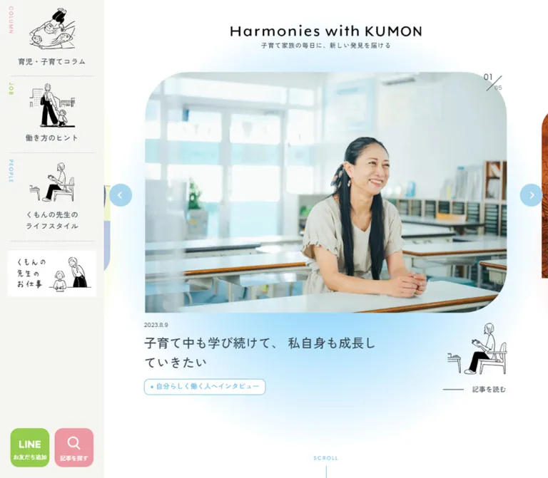
白い余白と淡い3色、手描きの人物イラストが特徴の子育てメディア。固定サイドナビ、記事カルーセル、記事種別ごとのレイアウトとモバイルでの再構成を整理。
Harmonies with KUMON — Style Reference
Everyday parenting stories framed by hand-drawn figures, pastel accents, and generous white space.
Website: harmonies.kumon.ne.jp
Original URL: https://harmonies.kumon.ne.jp/
Final URL: https://harmonies.kumon.ne.jp/
Theme: light in the supplied evidence; no alternate theme was demonstrated.
Inspected: September 23, 2026, at 06:24 JST. Supplied retrieval timestamp: September 22, 2026, 21:24:33.409 UTC.
Viewports: desktop 1440 × 1000 and mobile 390 × 844 CSS pixels.
Scope: the current editorial homepage, including featured stories, recent articles, rankings, recommendations, keyword discovery, About and news content, category navigation, footer, and visible promotional controls. Article detail pages and opened search states were not inspected.
Harmonies with KUMON is a family and work-life editorial publication. Its design combines white pages, warm gray navigation surfaces, slate-colored Japanese typography, and three recurring category accents: pink, green, and blue. Small black line drawings give the navigation a recognizable human character. Large editorial images supply most of the visual variety, while dates, tags, dotted rules, and restrained headings keep browsing orderly.
The desktop composition is anchored by a fixed 200px sidebar. The remaining page contains a centered masthead, a large featured-story carousel, and a narrower 900px editorial column. Mobile changes the composition substantially: the sidebar disappears, the featured image becomes square, recent stories form a single column, recommendations retain two columns, and search moves to a large fixed corner control. Preserve these distinct reading patterns when adapting the design.
閉じる
Harmonies with KUMON — Style Reference
Everyday parenting stories framed by hand-drawn figures, pastel accents, and generous white space.
Website: harmonies.kumon.ne.jp
Original URL: https://harmonies.kumon.ne.jp/
Final URL: https://harmonies.kumon.ne.jp/
Theme: light in the supplied evidence; no alternate theme was demonstrated.
Inspected: September 23, 2026, at 06:24 JST. Supplied retrieval timestamp: September 22, 2026, 21:24:33.409 UTC.
Viewports: desktop 1440 × 1000 and mobile 390 × 844 CSS pixels.
Scope: the current editorial homepage, including featured stories, recent articles, rankings, recommendations, keyword discovery, About and news content, category navigation, footer, and visible promotional controls. Article detail pages and opened search states were not inspected.
Harmonies with KUMON is a family and work-life editorial publication. Its design combines white pages, warm gray navigation surfaces, slate-colored Japanese typography, and three recurring category accents: pink, green, and blue. Small black line drawings give the navigation a recognizable human character. Large editorial images supply most of the visual variety, while dates, tags, dotted rules, and restrained headings keep browsing orderly.
The desktop composition is anchored by a fixed 200px sidebar. The remaining page contains a centered masthead, a large featured-story carousel, and a narrower 900px editorial column. Mobile changes the composition substantially: the sidebar disappears, the featured image becomes square, recent stories form a single column, recommendations retain two columns, and search moves to a large fixed corner control. Preserve these distinct reading patterns when adapting the design.
How to Read This Reference
- Measured means a value appears in the supplied computed styles or element rectangles. Values are CSS pixels unless otherwise stated.
- Calculated means a value is derived from measured rectangles, such as a grid gap or side margin.
- Estimated means a visual approximation from the supplied current-page screenshots. Image crops, large corner radii, shadows, and gradient recipes fall into this category when their CSS was not supplied.
- Recommended means an implementation choice for a new site. The Quick Start uses measured values where available and explicitly identified approximations elsewhere.
- Token names are descriptive aliases, not recovered source variable names.
- The computed font-family declarations establish the requested font stacks, not successful loading of every font or the identity of every rendered glyph.
- The screenshots and DOM sample do not necessarily represent the same animation instant. In particular, masthead wrapper bounds and carousel layout coordinates should not be mistaken for the complete painted bounds of their children.
The provided custom-property inventory contains many general WordPress presets. Their presence does not establish that the page uses those colors, gradients, shadows, or spacing values. The palette below comes from styled page elements. Similarly, repeated offscreen copies of the five featured stories are carousel-related content, not fifteen distinct editorial selections.
Tokens — Colors
Default Palette
All values in this table are measured computed colors, converted from RGB to hexadecimal.
| Name | Value | Suggested token | Observed role |
|---|---|---|---|
| White | #FFFFFF |
--color-paper |
Body background, category pills, and white content surfaces |
| Warm Gray | #F5F5F2 |
--color-surface |
Desktop category navigation and ranking section; visually consistent with lower navigation surfaces |
| Slate Ink | #374653 |
--color-ink |
Main Japanese text, article headings, and navigation labels |
| Parenting Pink | #ED99A3 |
--color-column |
COLUMN identity, parenting category labels, and search control |
| Work Green | #95CB4D |
--color-job |
JOB identity, work-related category labels, and desktop LINE control |
| People Blue | #70BEE6 |
--color-people |
PEOPLE identity, section subtitles, recent-article button, and NEW marker |
| Tag Gray | #8B8B87 |
--color-muted |
Article hashtag links |
| Neutral Selection | #BABAB8 |
--color-neutral |
Selected desktop ranking filter labeled “すべて” |
| Ranking Blush | #F5CED2 |
--color-rank |
Background of the sampled ranking-number markers |
| Dismiss Green | #37533C |
--color-dismiss |
Mobile LINE notice close button |
White is the dominant surface. The category colors organize navigation and metadata; they do not replace slate text across entire article cards. Black or near-black illustration strokes and wordmarks provide sharper local contrast.
Category Accents
| Category | Source UI label | Accent | Repeated applications |
|---|---|---|---|
| Parenting | “育児・子育てコラム” / COLUMN | Pink | Sidebar caption, category pill, directory edge, bullets, and arrow |
| Work | “働き方のヒント” / JOB | Green | Sidebar caption, category pill, directory edge, bullets, and arrow |
| Teacher lifestyles | “くもんの先生のライフスタイル” / PEOPLE | Blue | Sidebar caption, category pill, directory edge, bullets, and arrow |
This is a taxonomy system rather than a set of selectable themes. Search also uses pink, and the desktop LINE control uses the same measured green as JOB, so the colors are not exclusive to category links.
Soft Color Fields
The featured-story area has diffuse pastel color around the image and metadata. The desktop capture shows a blue field beneath the active teacher story and pink around a neighboring story. The mobile book story has a pink field below its image. These are broad atmospheric effects with soft edges, not sharply bounded gradient cards.
Estimated: the arrow circles are a lighter blue than the measured PEOPLE accent. The keyword panel and lower directory visually match the warm gray family, but their computed backgrounds were not included in the element sample.
Recommended approximation: use translucent radial gradients made from the three category accents, fading to transparent over white. Keep the effect behind the image and metadata. Exact stops, blur values, and any animated color changes remain unverified.
Tokens — Typography
Japanese Editorial Text
The measured body stack begins with Zen Kaku Gothic New, followed by Noto Sans, Yu Gothic, HiraKakuProN-W3, and Hiragino Kaku Gothic ProN. Further Japanese system fallbacks include Meiryo and Osaka before generic sans-serif.
The body uses 15px / 24px, weight 400, and 0.3px tracking. Most article headings and navigation labels use weight 500. This moderate weight is important: the page gains hierarchy through image size, spacing, and type size without making every heading heavy.
Use --font-body for a compatible stack. The Quick Start shortens the fallback list while retaining the leading declared families. Font delivery URLs were not supplied.
English Utility Labels
The measured family is Poppins, sans-serif, generally weight 400. Uppercase section subtitles such as NEW and RANKING use 12px / 19.2px with 2.4px tracking. Sidebar category captions and the SCROLL cue use 10px / 16px with 2px tracking.
These labels are small orientation cues. Their airy tracking contrasts with the more continuous Japanese article text.
Masthead
The visible “Harmonies with KUMON” wordmark is black, widely spaced, and centered above a small Japanese tagline. Its lettering should be treated as a brand asset. The evidence does not establish a font family for the drawn wordmark.
The measured identity wrapper is 280px wide on desktop and 240px on mobile. The visible lettering extends wider in the screenshots, approximately 375px and 305px respectively. Child asset dimensions and transforms were not supplied, so do not derive the wordmark font size from the wrapper's inherited 15px text style.
Type Scale
| Role | Desktop | Mobile | Weight | Tracking | Evidence |
|---|---|---|---|---|---|
| Body | 15px / 24px |
Same | 400 | 0.02em |
Measured |
| Featured article title | 24px / 38.4px |
19px / 30.4px |
500 | 0.02em |
Measured |
| Main section heading | 32px / 51.2px |
27px / 43.2px |
500 | 0.02em |
Measured for recent articles and rankings; mobile recommendations also measured |
| Recent article title | 17px / 27.2px |
Same | 500 | 0.02em |
Measured |
| Ranking article title | 15px / 24px |
Same | 500 | 0.02em |
Measured |
| Recommendation title | Approximately 15px / 24px |
13px / 20.8px |
500 on mobile | 0.02em on mobile |
Desktop estimate; mobile measured |
| Sidebar Japanese label | 14px / 22.4px |
Sidebar absent | 500 | 0.04em |
Measured |
| Standard category pill | 13px / 20.8px |
Same | 500 | 0.02em |
Measured |
| Ranking category pill | 10px / 16px |
Same | 500 | -0.02em |
Measured |
| Standard article tag | 13px / 20.8px |
Same in recent articles | 500 | 0.02em |
Measured; layout boxes are 24px high |
| Mobile recommendation tag | Not separately measured | 12px / 16.8px |
500 | 0.02em |
Measured; layout boxes are 21px high |
| English section subtitle | 12px / 19.2px |
Same | 400 | 0.2em |
Measured Poppins |
| Sidebar English caption / SCROLL | 10px / 16px |
SCROLL retains this style | 400 | 0.2em |
Measured Poppins |
| Tagline | 10px / 14px |
Same computed size | 500 | 0.1em |
Measured; painted bounds vary |
| Utility caption | 11px |
11px |
500 | Element-specific | Measured |
| Article date | Approximately 10–11px |
Approximately 10–11px |
Unverified | Unverified | Screenshot estimate |
The section subtitle begins 13px below the measured Japanese heading line box on desktop and 6px below it on mobile. These gaps help preserve hierarchy without increasing font weight.
Tokens — Spacing & Shapes
The HTML root is measured at 16px. There is no evidence of a special miniature rem system or a single viewport-derived spacing unit. Use explicit dimensions and ordinary responsive containers.
Spacing Scale
| Use | Value | Status |
|---|---|---|
| Desktop ranking-filter gap | 8px |
Calculated from button rectangles |
| Desktop utility-button gap | 10px |
Calculated |
| Sidebar category padding | 12px 0 18px |
Measured |
| Featured title to category pill | 13px desktop; 15px mobile |
Calculated from sampled title and pill boxes |
| Recent title to category pill | 16px desktop; 11px mobile |
Calculated from the first sampled article |
| Gap between article tags | 16px horizontally |
Calculated from adjacent links |
| Standard mobile content gutter | 24px |
Measured through heading and article positions |
| Ranking-card gap | 24px |
Calculated from 214px cards at 238px intervals |
| Desktop category-directory gap | Approximately 30px |
Screenshot estimate |
| Desktop recent-article column gap | 38px |
Calculated |
| Desktop recommendation column gap | Approximately 60px |
Screenshot estimate |
| Mobile recent-section bottom padding | 64px |
Measured |
| Desktop recent-section bottom padding | 104px |
Measured |
Border Radius
| Element | Value | Status |
|---|---|---|
| Category pill | 10px |
Measured |
| Desktop LINE and search buttons | 16px |
Measured |
| Mobile search control | 44px 44px 0px |
Measured CSS shorthand; lower-right corner is square |
| NEW marker | 100px 100px 100px 3px on a 60px square |
Measured |
| Ranking marker | 50px 50px 50px 3px on a 40px square |
Measured |
| Desktop ranking filters | 10px |
Measured |
| Recent-article “もっと見る” button | 0px |
Measured |
| Featured image | Large curves, approximately 80–90px desktop and 50–60px mobile |
Estimated; corner treatment changes with the visible crop |
| Recommendation thumbnail | Approximately 16–18px on rounded corners |
Estimated; lower-left corner appears square |
| Category-directory card | Approximately 24px on right corners |
Estimated; left edge remains straight |
| Keyword panel | Approximately 24px |
Estimated |
The asymmetry matters. Large image curves, nearly circular badges with one tight corner, straight colored card edges, and a square-cornered main browse button coexist. Applying one universal radius would remove much of the site's character.
Layout Measurements
| Element | Desktop at 1440 × 1000 | Mobile at 390 × 844 | Status |
|---|---|---|---|
| Sidebar | 200px wide |
Absent from visible layout | Measured and visually confirmed |
| Main area | 1240px, starting at x=200 |
390px, starting at x=0 |
Measured |
| Standard content column | 900px, starting at x=370 |
342px, starting at x=24 |
Measured |
| Margin inside desktop main area | 170px on each side of the 900px column |
— | Calculated |
| Featured image | Approximately 700 × 466px |
Approximately 280 × 280px |
Screenshot estimates |
| Featured title column | 450px, active title starts at x=470 |
280px, active title starts at x=55 |
Measured |
| Recent article column | Approximately 274.66px |
342px |
Measured |
| Ranking card | 214px |
214px |
Measured |
| Recommendation text column | Approximately 270px beside a thumbnail |
159px, at x=18 and x=213 |
Desktop estimate; mobile measured |
| Category-directory card | Approximately 280 × 344px |
Visible PEOPLE card approximately 342 × 210px |
Screenshot estimates |
| Desktop utility buttons | 75 × 75px |
Search becomes 90 × 90px |
Measured |
| Campaign artwork | 282 × 187.67px, x=1141, y=14 |
Same dimensions, x=54, y≈688.36 | Measured |
| Recent-article browse button | 220 × 60px |
Same | Measured |
| Document height | Approximately 6629.1px |
Approximately 7522.7px |
Measured snapshot heights |
The featured section's measured top padding is 207px on desktop and 179px on mobile. These are layout values, not the visible image's top coordinate: the screenshots show the active image beginning around y=138 and y=144. Transformed or independently positioned descendants can paint outside the layout implied by section padding.
Components
Masthead and Desktop Navigation Rail
Role: establish publication identity and provide persistent access to the three editorial categories.
The masthead is centered within the area to the right of the rail, giving it a desktop center at x=820. On mobile it centers on the full viewport at x=195. A small tagline sits directly below the wordmark.
The rail is warm gray and stays visible in the supplied desktop top, middle, and footer captures. Its first two category links are approximately 147.39px high. The PEOPLE link is approximately 169.78px high because its Japanese label wraps to two lines.
Each category link contains a vertical English caption near the left edge, a centered black line drawing, and a centered Japanese label. Fine dotted separators sit inside the rail rather than running edge to edge. A separate illustrated teacher-work banner follows the three categories; its measured link box is 174 × 92px with a 13px left inset.
Use the illustrations as recurring category identities. The parenting drawing, parent-and-child work drawing, and seated reading figure reappear elsewhere on the page.
Featured Story Carousel
Role: give selected editorial stories more visual presence than the article grids below.
The supplied rendered text contains five distinct featured stories. Desktop shows story 02 as the active center item; mobile shows story 03. Neighboring images remain partially visible, suggesting continuation beyond the current card.
The active desktop image is approximately 700px wide with prominent rounded corners. Below it, a small date precedes a 450px-wide title and a colored category pill. A line-drawn category figure occupies the open space to the right of the title, above a short rule and the label “記事を読む”. The active story sits over a diffuse category-colored field.
Two pale-blue circular arrow controls flank the image. Their visible diameter is approximately 44px. A small fraction-like counter sits near the upper-right image edge: current number, diagonal separator, and total 05.
On mobile, the image becomes approximately 280px square and aligns with the 280px title column. The category figure overlaps the lower-right image edge. The separate reading label is absent from the visible mobile state, while the title and category remain links. The sampled book title wraps across four lines at 19px / 30.4px.
Implementation guidance: keep image crop, title, date, category, and illustration associated with one logical story. Do not expose carousel copies as repeated content to assistive technology. The original transition timing, autoplay interval, swipe handling, and looping behavior were not demonstrated.
Recent Article Grid
Role: provide the primary chronological browsing surface.
The desktop preview contains six stories in three columns. Each measured column is approximately 274.66px wide, with 38px between columns. The mobile preview contains three stories in one column, each 342px wide.
The content order is image, date, linked title, category pill, and gray hashtag links. Titles use 17px / 27.2px at both inspected widths. Several desktop title boxes share a height of approximately 81.59px; this does not establish the exact truncation or height-equalization technique.
The leading story has a blue 60px NEW marker with three strongly rounded corners and one 3px corner. Below the grid, a centered blue “もっと見る” link measures 220 × 60px. Its computed radius is zero, contrasting with the rounded category labels.
The recent-article region has measured padding of 34px 0 104px on desktop and 42px 0 64px on mobile. Image styling for this region was not directly shown in the supplied screenshots; use its measured text structure without inventing additional image effects.
Category Pill and Article Tags
Role: distinguish editorial taxonomy from topical discovery.
A standard category pill has a white background, category-colored text, a thin colored outline visible in the screenshots, and a small colored dot before the label. Measured padding is 3px 11px 5px 22px, with a 10px radius. At the normal 13px text size, its measured height is approximately 30.8px.
Ranking cards use a smaller version with 10px text and a 26px height. Keep this compact variant distinct from the standard pill.
Hashtags are separate gray links beneath the category. They wrap naturally, with 16px horizontal separation in the sampled recent-article rows. The keyword panel uses white rectangular tag backgrounds instead of outlined category pills.
Do not make one large card anchor contain these independent category and tag anchors. Use separate semantic links.
Popular Article Ranking
Role: expose evergreen articles through an ordered horizontal collection.
The ranking region uses a measured warm gray background. Desktop padding is 74px 0 31px; mobile padding is 63px 0 24px.
On desktop, the heading sits to the left of four category filters arranged in a two-by-two group. Each filter measures 213 × 37.8px, with an 8px gap. The active “すべて” filter has a gray fill and white text; the other sampled filters use white backgrounds with category-colored text.
Ranked cards retain a fixed 214px width on both viewports, with a 24px gap. The mobile rectangles extend horizontally beyond the viewport, establishing a horizontal track rather than a stacked list. Ten ranked stories are present in the rendered content. The movement mechanism was not exercised.
Each card includes a 40px blush ranking marker, image content, a date, a 15px / 24px title with 16px horizontal padding, and a compact category pill. The exact size of the numeral inside the marker was not separately sampled.
The desktop filter controls are absent from the mobile visible-text/control sample. A replacement mobile filter interface was not verified. The mobile “もっと見る” link appears after the tenth item in the horizontal content, rather than as the large centered button used for recent stories.
Recommended Article Rows
Role: present a compact, curated selection without repeating the larger recent-story grid.
The desktop screenshot shows four entries in a two-column, two-row layout. Each entry pairs an approximately 130 × 86px image at left with a date, title, and hashtags at right. Dotted horizontal rules separate rows, and a short vertical dotted rule separates the two columns. The rows have no prominent enclosing card fill or heavy shadow.
The overall grid is approximately 900px wide. Each half is about 420px, separated by roughly 60px. The recommendation heading appears slightly inset from the row grid in the supplied screenshot.
Mobile retains two columns but stacks each entry's image and metadata vertically. Measured title columns are 159px wide at x=18 and x=213. Titles reduce to 13px / 20.8px, and tags reduce to 12px / 16.8px. This is a deliberate density change, not a universal one-column mobile layout.
Keyword Pickup Panel
Role: offer browsing by everyday needs and popular topics.
The desktop panel is approximately 900 × 288px, with a warm gray fill and rounded outer corners. A white outlined tab labeled “ピックアップ” overlaps its upper edge. The tab is visually about 150 × 42px.
Three horizontal groups pair a left-hand topic label with wrapping white tag chips: popular keywords, parenting concerns, and support for working life. Dotted rules divide the groups. A small “タグ一覧はこちら” link with a blue circular arrow sits beneath the panel toward the right.
The mobile DOM confirms the same groups and tags, but their full visual arrangement is not shown. A stacked label-and-tags arrangement is a recommendation for the starter CSS, not a measured reconstruction.
About and News
Role: explain the publication and communicate updates after the browsing sections.
The rendered content contains an ABOUT section headed by the publication name and explanatory family-focused copy, followed by a dated NEWS entry and a browse link. Mobile text includes shorter line breaks and an additional “もっと見る” control in the About region.
The supplied screenshots do not show these sections in full. Their content and position are established, but their complete illustration placement, background treatment, and any expansion behavior are not. Avoid inventing a modal, accordion, or scroll animation from the presence of a browse label alone.
Category Directory
Role: repeat the site's three main entry points near the end of the page.
Desktop shows three white cards on a warm gray field, each approximately 280px wide and 344px high. A thin category-colored strip forms the straight left edge. The right corners are rounded, and a very soft shadow is visible.
Each card contains a black line illustration, a centered Japanese heading, a tracked English category caption, a list of subcategory links with colored bullets, and a circular arrow near the lower-right corner. The illustration and accent match the corresponding rail item.
On mobile, cards stack and become approximately 342px wide. The visible PEOPLE card is about 210px high. Its title sits at upper left, illustration at upper right, link list toward the lower right, and arrow toward the lower left. This is a rearranged component, not a uniformly scaled desktop card.
Contents and Legal Footer
Role: provide broad navigation, related KUMON destinations, and legal information.
A dotted rule separates the directory from a warm gray CONTENTS region. Desktop displays its navigation links horizontally. Mobile places the English caption on the left and stacks the three links to the right.
A white footer below contains three related-service banners. They appear in one row on desktop, each approximately 213px wide, and in a two-column arrangement on mobile, with the third banner occupying the next row. Banner artwork retains its own colors and lettering.
The lower footer includes a small LINE mark, contact and terms links, the KUMON logo, and the observed copyright text naming Kumon Institute of Education Co., Ltd. Desktop distributes these across the content width; mobile stacks them with more vertical separation. Fixed mobile controls cover part of the lowest footer area in the supplied capture.
Persistent Utility Controls
Role: maintain access to article search and LINE registration while the page scrolls.
Desktop places two 75 × 75px controls at x=20 and x=105, 21px above the viewport bottom. The green LINE control is an anchor. The pink “記事を探す” control is a button. Both use white symbols and small captions below them.
Mobile search becomes a 90 × 90px pink corner shape at x=300, y=754, touching the right and bottom edges of the 390 × 844 viewport. Its measured radius is 44px 44px 0px.
A separate pale-green LINE notice sits near the mobile lower-left corner. Its overall visible width is approximately 255px, with a small white logo block and two lines of copy. A measured 24px circular dark-green close button overlaps its upper-right edge. The supplied evidence shows the resting state only; search opening and dismissal results were not tested.
Campaign Placement
Role: expose a current promotional offer without changing the editorial page structure.
Desktop fixes the campaign artwork near the upper-right corner. The measured artwork is 282 × 187.67px, 14px from the top and 17px from the right. A 26px close control overlaps its upper-right edge. This artwork remains visible in all three desktop captures and overlaps page content.
On mobile, the same measured artwork size appears in document flow at x=54, immediately after the featured section, around y=688.36. The recent-article section begins after it, around y=876.03. The persistent bottom LINE notice is a separate component.
The campaign's saturated promotional lettering and photographic collage belong to its artwork. Do not use them to redefine the publication's base typography or palette.
Tokens — Motion & Interaction
| Treatment | Supplied evidence | What can be concluded |
|---|---|---|
| General linked titles and promotional links | opacity 0.3s cubic-bezier(0.33, 1, 0.68, 1) |
A 300ms opacity transition is declared; the target opacity was not supplied |
| Sidebar category links | background 0.3s cubic-bezier(0.33, 1, 0.68, 1) |
Background-color transition declared; hover color unverified |
| Category pills | Color, background, and border transitions using the same 300ms easing | Coordinated color feedback is supported by the declarations; endpoint colors unverified |
| Identity wrapper and tagline | transform 0.52s cubic-bezier(0.65, 0, 0.35, 1) |
A 520ms transform transition exists; its trigger and endpoints were not supplied |
| Featured carousel | Five unique stories, repeated copies, neighboring previews, arrows, and counters | Carousel structure established; autoplay, swipe, looping, and transition duration unverified |
| Ranking track | Fixed-width cards at horizontal intervals | Horizontal arrangement established; dragging and scroll controls unverified |
| Search | Button visible on both viewports | Resting control established; opened interface unverified |
| Ranking filters | Four desktop buttons and a selected appearance | Filter affordance established; result changes unverified |
| Promotion close controls | Visible buttons | Dismissal and persistence behavior unverified |
Many sampled elements report animation: none. This does not establish that the entire page is static: the supplied element list is partial and does not capture JavaScript behavior or every pseudo-element. A serialized transition: all without a positive duration is also not evidence of a visible animation.
Recommended motion language: retain the measured easing curves for small opacity and color changes. If implementing carousel movement, keep it restrained, provide explicit controls, and define reduced-motion behavior. Do not claim a particular autoplay interval or add parallax as an observed feature.
Surfaces
| Layer | Appearance | Structural purpose |
|---|---|---|
| Main canvas | White | Gives photographs, illustrations, and long titles room to breathe |
| Desktop rail | Measured warm gray | Separates persistent navigation from editorial content |
| Featured-story atmosphere | Diffuse pastel fields | Adds category character without a hard card boundary |
| Recent and recommended articles | Mostly unboxed content | Uses image boundaries, typography, and spacing for grouping |
| Ranking section | Measured warm gray | Creates a distinct horizontal browsing zone |
| Keyword panel | Visually warm gray with white chips | Groups topic-based browsing links |
| Category directory | White cards over warm gray | Establishes three clear navigation destinations |
| Utility controls | Solid pink or green | Makes persistent actions recognizable |
| Partner and legal footer | White beneath warm gray navigation | Separates related services and legal information |
There is no broad heavy-elevation system. The directory cards and promotional overlays show modest visual separation, while editorial lists rely mainly on whitespace and dotted rules. Exact shadow declarations were not supplied.
Imagery
The current page combines natural editorial photography, colorful explanatory illustrations, and sparse black line drawings. These image families have different jobs.
Editorial photographs show people, outdoor activity, books, and handmade objects. The desktop recommendations include a person outdoors, a child in motion, a close-up of handmade name tags, and an illustrated parent carrying a child. The featured mobile story arranges several book covers on a lavender surface. The active desktop story uses a warm, textured illustration of family life and personal time.
The navigation drawings are mostly black and white, with fine irregular outlines, simplified faces, and areas of solid black clothing or hair. They should remain visually lighter than the large story images. Repeating the same category drawing in the rail, feature metadata, and directory creates continuity across otherwise varied editorial content.
Avoid applying a single color filter to every image. Photographs and full-color story illustrations retain their own palettes. Also avoid pixelated rendering: this page's artwork is intended to remain smooth at its displayed size.
Observed Asset References
No image src values, SVG file URLs, or font-file URLs were supplied. The following are visible asset roles and known page contexts, not downloadable asset paths.
| Asset role | Current-page evidence | Reuse guidance |
|---|---|---|
| Publication wordmark | Desktop and mobile mastheads | Use the authorized logo asset; do not infer its typeface from body styles |
| Parenting category drawing | Rail, mobile book feature, and category directory | Reuse consistently for the parenting category |
| Work category drawing | Rail and category directory | Preserve the parent-and-child figure and sparse linework |
| PEOPLE category drawing | Rail, desktop feature metadata, and directory | Preserve the seated reading figure |
| Featured family illustration | Story linked to /workstyle/daily-life/5551/ |
Use an editorial image with an appropriate landscape and mobile crop |
| Featured book arrangement | Story linked to /parenting-column/education/5192/ |
Preserve book-cover legibility within the square mobile presentation |
| Recommendation thumbnails | Four curated entries in the desktop screenshot | Keep subject-specific photography or illustration rather than generic decorative images |
| Campaign artwork | Top-right desktop placement and in-flow mobile placement | Treat as replaceable campaign content |
| Related-service banners | Footer screenshots | Preserve each banner's intrinsic aspect ratio and branding |
The evidence does not establish whether the square mobile feature uses a separate image file or a different crop of a shared asset. Treat art direction as an implementation decision until the actual media sources are available.
Layout & Responsive Behavior
Desktop Composition
The sidebar consumes 200px, leaving a 1240px main area. The main editorial column is 900px wide, centered inside that remaining area. Its left edge is therefore 200 + (1240 − 900) / 2 = 370px.
The featured image is narrower than the editorial column but sits within a wider carousel stage so neighboring stories can remain visible. Its metadata combines a 450px title column with an illustration and reading cue on the right.
The homepage then alternates between several browsing formats: three-column recent stories, a horizontal ranking track, compact two-column recommendation rows, a grouped keyword panel, explanatory content, news, and a three-card category directory. Preserve this variation instead of forcing every section into the same card grid.
Mobile Composition
At 390px, the rail disappears and the main area spans the viewport. Most content uses 24px side gutters, creating a 342px column. The feature remains narrower at 280px, centered with 55px margins. Recommendation columns use their own tighter geometry, with measured 159px text widths and 18px outer offsets.
| Region | Desktop behavior | Mobile behavior |
|---|---|---|
| Primary navigation | Fixed illustrated rail | Rail absent; footer category directory remains available |
| Feature | Landscape image and separate right-hand reading illustration | Square image, overlapping illustration, narrower title |
| Recent stories | Six entries in three columns | Three entries in one column |
| Ranking | Horizontal 214px cards with desktop category filters | Cards retain width and continue horizontally; filter replacement unverified |
| Recommendations | Two columns of image-left rows | Two columns with vertically stacked media and text |
| Category directory | Three upright cards | Stacked cards with rearranged internal anatomy |
| CONTENTS links | Horizontal distribution | Caption beside a vertical link list |
| Partner banners | Three in one row | Two columns, then the third banner below |
| Search | 75px rounded square in rail | 90px control fixed to lower-right corner |
| Campaign | Fixed upper-right overlay | Centered in document flow after feature |
| LINE registration | Green rail button | Separate fixed lower-left notice |
The original breakpoint values were not supplied. Only the two inspected layouts are established. The Quick Start's 64rem breakpoint is a recommended implementation threshold, not a recovered source rule.
Allow extra reachable space below mobile content so the fixed utilities do not prevent access to footer links. The supplied bottom capture shows overlap; safe-area accommodation and collision handling were not verified.
Do’s and Don’ts
Do
- Preserve the white canvas, warm gray navigation fields, and slate text.
- Keep the measured pink, green, and blue associated with the same category identities.
- Use Zen Kaku Gothic New as the leading declared Japanese family and Poppins for small English utility labels.
- Retain moderate 500-weight headings and generous 1.6 line height.
- Repeat the category drawings across navigation and editorial entry points.
- Preserve the distinction between outlined category pills, plain hashtags, and white keyword chips.
- Use dotted rules for quiet editorial separation.
- Keep recent, ranked, and recommended articles structurally different.
- Recompose directory cards on mobile and retain the two-column recommendation layout.
- Treat campaign graphics as replaceable content with their own artwork.
- Label estimated geometry and proposed interactions when extending this reference.
Don’t
- Don’t replace the publication structure with a sales funnel, pricing table, or oversized slogan.
- Don’t give every component the same rounded-card treatment.
- Don’t make the measured square browse button into a pill by default.
- Don’t use the generic WordPress preset inventory as the site's visible palette.
- Don’t infer the wordmark font from the H1's inherited text style.
- Don’t flatten the category illustrations into unrelated stock icons.
- Don’t turn every mobile section into a single-column list.
- Don’t count offscreen carousel copies as additional featured stories.
- Don’t assume autoplay, swipe, search overlays, filter results, or dismissal persistence were verified.
- Don’t let promotional colors dominate the reusable editorial design system.
- Don’t invent image paths, font delivery URLs, or production credits.
Recommended Implementation Additions
These are recommendations for a new implementation, not verified original-site features:
- Give carousel arrows, search, and close buttons explicit accessible names. Provide a readable current-slide status without repeatedly announcing automatic changes.
- Keep nonactive carousel copies out of keyboard navigation and the accessibility tree.
- Provide a pause control if adding autoplay, and disable automatic movement when reduced motion is requested.
- Use a visible slate-colored focus outline. Avoid relying on pale category color alone to communicate selection.
- Test contrast for small pastel text and white-on-pastel controls; use darker text variants where needed while preserving the category accents.
- Expand close-button hit areas beyond their visible 24–26px circles without increasing the apparent icon size.
- Keep search and registration notices clear of each other, safe-area insets, and essential footer links.
- If mobile ranking filters are needed, provide an explicit accessible selector; do not assume an existing replacement from the supplied evidence.
- Preserve image dimensions before loading and reserve space for campaign artwork to avoid layout shifts.
- Use empty alternative text for purely decorative repeated category drawings and meaningful alternatives for story images when they add information beyond the linked title.
- Keep the mobile recent-story preview short while retaining a clear route to the full archive.
Agent Prompt Guide
Quick Color Reference
- Canvas:
#FFFFFF. - Navigation and secondary section surface:
#F5F5F2. - Primary text:
#374653. - Parenting and search:
#ED99A3. - Work and desktop LINE control:
#95CB4D. - Teacher lifestyles and general editorial accents:
#70BEE6. - Hashtags:
#8B8B87. - Ranking marker:
#F5CED2. - Decorative feature atmosphere: translucent pastel fields fading into white; exact gradient recipe is an approximation.
Overall Prompt
“Create a Japanese family and work-life editorial homepage inspired by Harmonies with KUMON. Use white backgrounds, warm gray navigation surfaces, slate text, and pink, green, and blue category accents. Set Japanese content in a Zen Kaku Gothic New-led sans-serif stack with moderate 500-weight titles and 1.6 line height. Use small, widely tracked Poppins English section labels. On desktop, place a fixed 200px illustrated category rail beside a centered masthead and featured-story carousel, followed by a 900px editorial column. Combine recent-story grids, a horizontal ranking track, compact recommended rows, keyword discovery, and an illustrated category directory. Use supplied brand and illustration assets. On mobile, remove the rail, use square feature imagery, retain two recommendation columns, rearrange directory-card internals, and place search in a 90px pink bottom corner control. Treat unknown interaction details as explicit implementation decisions.”
Example Component Prompts
- Category rail: “Build a 200px warm gray desktop rail with three vertically stacked navigation entries. Each has a small vertical Poppins category caption, a centered black line drawing, a 14px Japanese label, and an inset dotted divider. Use pink, green, and blue accents in category order. Anchor separate 75px LINE and search controls near the bottom.”
- Featured story: “Create a centered editorial feature with an approximately 700 × 466px landscape image, large asymmetric corner curves, a small date, a 24px title limited to a 450px column, an outlined category pill, and a line-drawn category figure on the right. Show neighboring image previews and pale-blue arrow circles. At 390px, use a 280px square image and 19px title, with the illustration overlapping the image edge.”
- Recommended articles: “Create four recommendations in two desktop columns. Each row has a small landscape thumbnail on the left and date, title, and gray hashtags on the right. Separate entries with dotted rules and avoid heavy card fills. On mobile retain two columns, stack each thumbnail above its text, and use 13px titles.”
- Category directory: “Create three white navigation cards on warm gray. Use a straight colored left border, rounded right corners, a category illustration, Japanese heading, tracked English caption, bullet links, and a colored circular arrow. On mobile stack the cards and move the illustration upper right, links lower right, and arrow lower left.”
- Keyword panel: “Create a warm gray topic panel with a small outlined white title tab overlapping its upper edge. Divide three label-and-tag groups with dotted rules. Use simple white rectangular keyword chips and a small right-aligned link below the panel.”
Quick Start
CSS Custom Properties
This is a reusable CSS scaffold, not the original stylesheet. Colors, sampled typography, desktop rail width, common content widths, pills, utility dimensions, and several gaps are source-derived. Large image radii, image aspect-ratio defaults outside the verified feature, shadows, halos, and the breakpoint are adaptations.
Use .page-shell around content beside .side-rail. Apply .container to normal editorial sections; .container.recommend-grid receives its own mobile width. Use real image assets inside the media classes. The feature track below uses native horizontal scrolling as a recommended fallback. Carousel arrow logic, active-state management, ranking filters, search, and dismissal require separate implementation.
:root {
  /* Measured page colors */
  --color-paper: #ffffff;
  --color-surface: #f5f5f2;
  --color-ink: #374653;
  --color-muted: #8b8b87;
  --color-column: #ed99a3;
  --color-job: #95cb4d;
  --color-people: #70bee6;
  --color-neutral: #babab8;
  --color-rank: #f5ced2;
  --color-dismiss: #37533c;

  /* Leading source families; shortened fallback stack */
  --font-body: 'Zen Kaku Gothic New', 'Noto Sans', 'Yu Gothic',
    HiraKakuProN-W3, 'Hiragino Kaku Gothic ProN', Meiryo, sans-serif;
  --font-utility: Poppins, sans-serif;
  --text-section: 32px;
  --text-feature: 24px;

  /* Measured layout anchors */
  --rail-width: 200px;
  --content-width: 900px;
  --gutter: 24px;
  --article-gap: 38px;
  --radius-pill: 10px;
  --radius-utility: 16px;

  /* Estimated geometry and recommended decorative recipe */
  --feature-width: min(700px, calc(100vw - 280px));
  --radius-feature: 84px;
  --shadow-soft: 0 4px 20px rgb(55 70 83 / 0.06);

  /* Measured transition declarations */
  --motion-link: 300ms cubic-bezier(0.33, 1, 0.68, 1);
  --motion-identity: 520ms cubic-bezier(0.65, 0, 0.35, 1);
}

* { box-sizing: border-box; }
body {
  margin: 0;
  color: var(--color-ink);
  background: var(--color-paper);
  font: 400 15px/1.6 var(--font-body);
  letter-spacing: 0.02em;
}
img { display: block; max-width: 100%; }
a { color: inherit; text-decoration: none; }
button { font: inherit; cursor: pointer; }
h1, h2, h3, p { margin: 0; }

/* Recommended keyboard treatment */
:where(a, button, [tabindex]):focus-visible {
  outline: 2px solid var(--color-ink);
  outline-offset: 4px;
}

[data-category='column'] { --accent: var(--color-column); }
[data-category='job'] { --accent: var(--color-job); }
[data-category='people'] { --accent: var(--color-people); }

.page-shell { margin-left: var(--rail-width); }
.container {
  width: min(var(--content-width), calc(100% - 48px));
  margin-inline: auto;
}
.editorial-section { padding-block: 64px 104px; }
.section-title {
  font-size: var(--text-section);
  font-weight: 500;
  line-height: 1.6;
}
.section-label {
  margin-top: 13px;
  color: var(--color-people);
  font: 400 12px/1.6 var(--font-utility);
  letter-spacing: 0.2em;
}

.side-rail {
  position: fixed;
  inset: 0 auto 0 0;
  z-index: 20;
  width: var(--rail-width);
  background: var(--color-surface);
}
.rail-nav {
  max-height: calc(100dvh - 115px);
  overflow-y: auto;
}
.rail-link {
  position: relative;
  display: block;
  padding: 12px 0 18px;
  text-align: center;
  transition: background var(--motion-link);
}
.rail-link::after {
  content: '';
  position: absolute;
  inset: auto 20px 0;
  border-bottom: 1px dotted #babab8;
}
.rail-illustration {
  width: 110px;
  height: 83px;
  margin: 0 auto 12px;
  object-fit: contain;
}
.rail-caption {
  position: absolute;
  top: 12px;
  left: 13px;
  writing-mode: vertical-rl;
  color: var(--accent);
  font: 400 10px/16px var(--font-utility);
  letter-spacing: 2px;
}
.rail-title { font-size: 14px; font-weight: 500; letter-spacing: 0.04em; }

.masthead { padding: 48px 24px 40px; text-align: center; }
.masthead-logo { width: min(375px, 100%); height: auto; margin-inline: auto; }
.masthead-tagline {
  margin-top: 4px;
  font-size: 10px;
  font-weight: 500;
  line-height: 1.4;
  letter-spacing: 0.1em;
}
.feature-stage { position: relative; overflow: hidden; }
.feature-track {
  display: flex;
  gap: 64px;
  overflow-x: auto;
  padding: 0 max(24px, calc((100% - var(--feature-width)) / 2)) 90px;
  scroll-snap-type: x mandatory;
}
.feature-card {
  position: relative;
  isolation: isolate;
  flex: 0 0 var(--feature-width);
  min-width: 0;
  scroll-snap-align: center;
}
.feature-card::before {
  content: '';
  position: absolute;
  z-index: -1;
  inset: 10% -20% -8%;
  pointer-events: none;
  background: radial-gradient(ellipse, rgb(112 190 230 / 0.32), transparent 68%);
}
.feature-card[data-category='column']::before {
  background: radial-gradient(ellipse, rgb(237 153 163 / 0.28), transparent 68%);
}
.feature-card[data-category='job']::before {
  background: radial-gradient(ellipse, rgb(149 203 77 / 0.22), transparent 68%);
}
.feature-image {
  width: 100%;
  aspect-ratio: 3 / 2;
  object-fit: cover;
  border-radius: var(--radius-feature) 0 var(--radius-feature) 0;
}
.feature-meta { position: relative; padding-top: 16px; }
.feature-title {
  max-width: 450px;
  margin-top: 8px;
  font-size: var(--text-feature);
  font-weight: 500;
  line-height: 1.6;
}
.feature-illustration {
  position: absolute;
  top: 18px;
  right: 0;
  width: 120px;
}
.feature-read-label { margin-top: 8px; font-size: 13px; text-align: right; }
.carousel-button {
  width: 44px;
  height: 44px;
  padding: 0;
  border: 0;
  border-radius: 50%;
  color: white;
  background: #a5d6e9;
}
.article-date { display: block; font-size: 11px; }
.article-title { font-size: 17px; font-weight: 500; line-height: 1.6; }
.article-title a { transition: opacity var(--motion-link); }
.article-grid {
  display: grid;
  grid-template-columns: repeat(3, minmax(0, 1fr));
  gap: 48px var(--article-gap);
}
.article-image {
  width: 100%;
  aspect-ratio: 3 / 2;
  object-fit: cover;
  border-radius: 18px 18px 18px 0;
}
.article-card .article-date { margin: 14px 0 8px; }
.category-pill {
  position: relative;
  display: inline-block;
  max-width: 100%;
  margin-top: 13px;
  padding: 3px 11px 5px 22px;
  border: 1px solid var(--accent, var(--color-people));
  border-radius: var(--radius-pill);
  color: var(--accent, var(--color-people));
  background: white;
  font-size: 13px;
  font-weight: 500;
  line-height: 1.6;
  transition: color var(--motion-link), background var(--motion-link),
    border-color var(--motion-link);
}
.category-pill::before {
  content: '';
  position: absolute;
  left: 11px;
  top: 50%;
  width: 5px;
  height: 5px;
  border-radius: 50%;
  background: currentColor;
  transform: translateY(-50%);
}
.article-tags {
  display: flex;
  flex-wrap: wrap;
  gap: 0 16px;
  margin-top: 4px;
  color: var(--color-muted);
  font-size: 13px;
  font-weight: 500;
}
.article-tags a::before { content: '#'; }
.more-button {
  display: block;
  width: 220px;
  min-height: 60px;
  margin: 56px auto 0;
  padding: 17px 24px 19px;
  border-radius: 0;
  color: white;
  background: var(--color-people);
  text-align: center;
  font-weight: 500;
}

.ranking { padding: 74px 0 31px; background: var(--color-surface); }
.ranking-header { display: flex; justify-content: space-between; gap: 24px; }
.ranking-filters {
  display: grid;
  grid-template-columns: repeat(2, 213px);
  gap: 8px;
}
.ranking-filters button {
  padding: 8px 10px 9px;
  border: 0;
  border-radius: 10px;
  color: var(--accent, var(--color-ink));
  background: white;
  font-size: 13px;
  font-weight: 500;
}
.ranking-filters [aria-pressed='true'] {
  color: white;
  background: var(--color-neutral);
}
.ranking-track { display: flex; gap: 24px; overflow-x: auto; padding-block: 30px; }
.ranking-card { position: relative; flex: 0 0 214px; }
.ranking-card .article-title { padding-inline: 16px; font-size: 15px; }
.ranking-card .category-pill { margin-left: 16px; font-size: 10px; letter-spacing: -0.02em; }
.rank-marker {
  display: grid;
  place-items: center;
  width: 40px;
  height: 40px;
  border-radius: 50px 50px 50px 3px;
  background: var(--color-rank);
}
.new-marker {
  display: grid;
  place-items: center;
  width: 60px;
  height: 60px;
  border-radius: 100px 100px 100px 3px;
  color: white;
  background: var(--color-people);
  font: 400 13px/1.6 var(--font-utility);
  letter-spacing: 0.2em;
}

.recommend-grid { display: grid; grid-template-columns: repeat(2, minmax(0, 1fr)); gap: 0 60px; }
.recommend-card {
  display: grid;
  grid-template-columns: 130px minmax(0, 1fr);
  gap: 20px;
  padding-block: 24px;
  border-block: 1px dotted #babab8;
}
.recommend-card .article-title { margin-top: 8px; font-size: 15px; }
.recommend-card .article-tags { margin-top: 16px; }
.pickup {
  position: relative;
  margin-top: 74px;
  padding-block: 28px 6px;
  border-radius: 24px;
  background: var(--color-surface);
}
.pickup-label {
  position: absolute;
  top: -14px;
  left: 42px;
  padding: 8px 24px;
  border: 1px solid var(--color-ink);
  border-radius: 16px 16px 16px 0;
  background: white;
}
.pickup-row { display: grid; grid-template-columns: 200px 1fr; padding: 22px 64px; }
.pickup-row + .pickup-row { border-top: 1px dotted #babab8; }
.keyword-list { display: flex; flex-wrap: wrap; gap: 8px; }
.keyword-list a { padding: 2px 8px; background: white; color: var(--color-muted); }

.category-directory { padding-block: 64px 50px; background: var(--color-surface); }
.category-grid { display: grid; grid-template-columns: repeat(3, minmax(0, 1fr)); gap: 30px; }
.category-card {
  position: relative;
  min-height: 344px;
  padding: 16px 24px 28px;
  border-left: 3px solid var(--accent);
  border-radius: 0 24px 24px 0;
  background: white;
  box-shadow: var(--shadow-soft);
}
.category-illustration { width: 120px; height: 120px; margin-inline: auto; object-fit: contain; }
.category-title { font-size: 18px; font-weight: 500; line-height: 1.5; text-align: center; }
.category-label {
  color: var(--accent);
  font: 400 12px/1.6 var(--font-utility);
  letter-spacing: 0.15em;
  text-align: center;
}
.category-links { margin: 16px 0 0; padding-left: 14px; font-size: 12px; line-height: 25px; }
.category-links li::marker { color: var(--accent); }
.category-arrow {
  position: absolute;
  right: 8px;
  bottom: 8px;
  display: grid;
  place-items: center;
  width: 30px;
  height: 30px;
  border-radius: 50%;
  color: white;
  background: var(--accent);
}
.contents-nav { padding-block: 60px; border-top: 1px dotted #babab8; background: var(--color-surface); }
.contents-links { display: flex; flex-wrap: wrap; gap: 32px 60px; }
.site-footer { padding-block: 40px; background: white; }
.partner-grid { display: grid; grid-template-columns: repeat(3, 213px); gap: 17px; }
.partner-grid img { width: 100%; height: auto; }

.desktop-utilities { position: fixed; z-index: 30; left: 20px; bottom: 21px; display: flex; gap: 10px; }
.utility {
  display: flex;
  flex-direction: column;
  align-items: center;
  justify-content: flex-end;
  width: 75px;
  height: 75px;
  padding: 0 0 15px;
  border: 0;
  border-radius: var(--radius-utility);
  color: white;
  font-size: 11px;
  font-weight: 500;
}
.utility-line { background: var(--color-job); }
.utility-search { background: var(--color-column); }
.mobile-search, .line-notice { display: none; }
.campaign { position: fixed; z-index: 40; top: 14px; right: 17px; width: 282px; }
.campaign img { width: 100%; height: auto; }

/* Recommended breakpoint; the original threshold was not supplied. */
@media (max-width: 64rem) {
  :root {
    --rail-width: 0px;
    --text-section: 27px;
    --text-feature: 19px;
    --feature-width: min(280px, calc(100vw - 80px));
  }
  .side-rail, .desktop-utilities { display: none; }
  .editorial-section { padding-block: 62px 64px; }
  .section-label { margin-top: 6px; }
  .masthead-logo { width: min(305px, 100%); }
  .feature-track { gap: 15px; padding-bottom: 50px; }
  .feature-image { aspect-ratio: 1; border-radius: 56px 56px 0 0; }
  .feature-illustration { width: 100px; top: -56px; }
  .feature-read-label { display: none; }
  .feature-title { max-width: none; }
  .article-grid { grid-template-columns: 1fr; }
  .home-recent .article-card:nth-child(n + 4) { display: none; }
  .ranking { padding-block: 63px 24px; }
  .ranking-filters { display: none; }
  .container.recommend-grid { width: calc(100% - 36px); gap: 0 36px; }
  .recommend-card { display: block; }
  .recommend-card .article-date { margin-top: 12px; }
  .recommend-card .article-title { font-size: 13px; }
  .recommend-card .article-tags { font-size: 12px; line-height: 1.4; }
  .pickup-row { grid-template-columns: 1fr; gap: 12px; padding: 20px 24px; }
  .pickup-label { left: 24px; }
  .category-grid { grid-template-columns: 1fr; gap: 16px; }
  .category-card { min-height: 210px; padding: 22px 20px 24px; }
  .category-illustration { position: absolute; right: 16px; top: 12px; width: 96px; height: 86px; }
  .category-title { padding-right: 94px; text-align: left; }
  .category-label { text-align: left; }
  .category-links { margin-left: 88px; }
  .category-arrow { left: 22px; right: auto; bottom: 24px; }
  .contents-links { flex-direction: column; gap: 18px; }
  .partner-grid { grid-template-columns: repeat(2, minmax(0, 1fr)); gap: 16px; }
  .site-footer { padding-bottom: calc(120px + env(safe-area-inset-bottom, 0px)); }
  .campaign { position: static; margin-inline: auto; }
  .mobile-search {
    position: fixed;
    z-index: 50;
    right: 0;
    bottom: 0;
    display: flex;
    width: 90px;
    height: 90px;
    border-radius: 44px 44px 0;
  }
  .line-notice {
    position: fixed;
    z-index: 50;
    left: 10px;
    bottom: calc(10px + env(safe-area-inset-bottom, 0px));
    display: flex;
    align-items: center;
    width: min(255px, calc(100vw - 115px));
    min-height: 60px;
    padding: 8px;
    background: #cfe596;
    box-shadow: var(--shadow-soft);
  }
}

/* Recommended feedback endpoint, not a recovered source hover value. */
@media (hover: hover) {
  .article-title a:hover { opacity: 0.72; }
}

/* Pair this with reduced-motion handling in carousel JavaScript. */
@media (prefers-reduced-motion: reduce) {
  .feature-track { scroll-behavior: auto; scroll-snap-type: none; }
  .article-title a, .rail-link, .category-pill { transition: none; }
}
The scaffold intentionally leaves image selection and illustration assets to the implementation. The directory shadow, pale arrow fill, mobile LINE notice fill, and gradient recipes are visual approximations. The mobile recent-story selector reproduces the observed three-item preview only when the six desktop entries share one DOM list; keep the archive link available.
Tailwind v4 Token Mapping
Optional aliases for an implementation that already uses Tailwind v4. There is no evidence that the original website uses Tailwind. Define the custom properties above first.
@theme inline {
  --color-harmony-paper: var(--color-paper);
  --color-harmony-surface: var(--color-surface);
  --color-harmony-ink: var(--color-ink);
  --color-harmony-muted: var(--color-muted);
  --color-parenting: var(--color-column);
  --color-work: var(--color-job);
  --color-people: #70bee6;
  --color-ranking-blush: var(--color-rank);

  --font-editorial: var(--font-body);
  --font-caption: var(--font-utility);
  --text-section-heading: var(--text-section);
  --text-feature-heading: var(--text-feature);
  --text-article-heading: 17px;

  --spacing-sidebar: var(--rail-width);
  --spacing-page-gutter: var(--gutter);
  --spacing-editorial-gap: var(--article-gap);
  --radius-category-pill: var(--radius-pill);
  --radius-utility-control: var(--radius-utility);
}
Sources & Evidence
- Inspected original and final page: Harmonies with KUMON. Both supplied URLs are identical, and the recorded response status is HTTP 200.
- Capture timestamp:
2026-09-22T21:24:33.409Z, corresponding to September 23, 2026, at 06:24:33.409 JST. - Desktop evidence: three supplied
1440 × 1000captures showing the featured area, recommendations and keyword panel, and category directory/footer. The rendered DOM also provides recent-article and ranking geometry, text, link destinations, computed typography, colors, and transition declarations. - Mobile evidence: two supplied
390 × 844captures showing the featured area and bottom directory/footer. The rendered DOM establishes additional recent, ranking, and recommendation measurements and content differences. - Observed page structure: five unique featured stories, six desktop recent stories versus three in the mobile preview, ten ranking entries, four recommendations, three keyword groups, About and news content, three category directories, and footer links.
- Capture procedure: the supplied record describes an initial observation of at least five seconds, waits for document load, image decoding, finite animation readiness, and sampled layout/text stability, plus scrolling through intermediate positions. Perpetual animations were temporarily paused during readiness checks and then resumed.
- Interaction limits: no click-result, hover-result, keyboard-navigation, opened-search, filter-change, dismissal-persistence, or carousel-timing trace was supplied. Visible controls and declared transitions do not establish those behaviors.
- Asset and layout limits: image source URLs, font-file URLs, complete stylesheet rules, responsive breakpoint declarations, and exact shadow/gradient recipes were not supplied. Lower sections described only by rendered text are identified accordingly.
This reference analyzes the supplied current-page evidence. No additional browsing, command execution, or linked-page inspection was performed. The CSS and prompts are reusable adaptations with their measured anchors and implementation assumptions stated above.
# Harmonies with KUMON — Style Reference

> Everyday parenting stories framed by hand-drawn figures, pastel accents, and generous white space.

**Website:** [harmonies.kumon.ne.jp](https://harmonies.kumon.ne.jp/)
**Original URL:** https://harmonies.kumon.ne.jp/
**Final URL:** https://harmonies.kumon.ne.jp/
**Theme:** light in the supplied evidence; no alternate theme was demonstrated.
**Inspected:** September 23, 2026, at 06:24 JST. Supplied retrieval timestamp: September 22, 2026, `21:24:33.409 UTC`.
**Viewports:** desktop `1440 × 1000` and mobile `390 × 844` CSS pixels.
**Scope:** the current editorial homepage, including featured stories, recent articles, rankings, recommendations, keyword discovery, About and news content, category navigation, footer, and visible promotional controls. Article detail pages and opened search states were not inspected.

Harmonies with KUMON is a family and work-life editorial publication. Its design combines white pages, warm gray navigation surfaces, slate-colored Japanese typography, and three recurring category accents: pink, green, and blue. Small black line drawings give the navigation a recognizable human character. Large editorial images supply most of the visual variety, while dates, tags, dotted rules, and restrained headings keep browsing orderly.

The desktop composition is anchored by a fixed 200px sidebar. The remaining page contains a centered masthead, a large featured-story carousel, and a narrower 900px editorial column. Mobile changes the composition substantially: the sidebar disappears, the featured image becomes square, recent stories form a single column, recommendations retain two columns, and search moves to a large fixed corner control. Preserve these distinct reading patterns when adapting the design.
閉じる
# Harmonies with KUMON — Style Reference

> Everyday parenting stories framed by hand-drawn figures, pastel accents, and generous white space.

**Website:** [harmonies.kumon.ne.jp](https://harmonies.kumon.ne.jp/)
**Original URL:** https://harmonies.kumon.ne.jp/
**Final URL:** https://harmonies.kumon.ne.jp/
**Theme:** light in the supplied evidence; no alternate theme was demonstrated.
**Inspected:** September 23, 2026, at 06:24 JST. Supplied retrieval timestamp: September 22, 2026, `21:24:33.409 UTC`.
**Viewports:** desktop `1440 × 1000` and mobile `390 × 844` CSS pixels.
**Scope:** the current editorial homepage, including featured stories, recent articles, rankings, recommendations, keyword discovery, About and news content, category navigation, footer, and visible promotional controls. Article detail pages and opened search states were not inspected.

Harmonies with KUMON is a family and work-life editorial publication. Its design combines white pages, warm gray navigation surfaces, slate-colored Japanese typography, and three recurring category accents: pink, green, and blue. Small black line drawings give the navigation a recognizable human character. Large editorial images supply most of the visual variety, while dates, tags, dotted rules, and restrained headings keep browsing orderly.

The desktop composition is anchored by a fixed 200px sidebar. The remaining page contains a centered masthead, a large featured-story carousel, and a narrower 900px editorial column. Mobile changes the composition substantially: the sidebar disappears, the featured image becomes square, recent stories form a single column, recommendations retain two columns, and search moves to a large fixed corner control. Preserve these distinct reading patterns when adapting the design.

## How to Read This Reference

- **Measured** means a value appears in the supplied computed styles or element rectangles. Values are CSS pixels unless otherwise stated.
- **Calculated** means a value is derived from measured rectangles, such as a grid gap or side margin.
- **Estimated** means a visual approximation from the supplied current-page screenshots. Image crops, large corner radii, shadows, and gradient recipes fall into this category when their CSS was not supplied.
- **Recommended** means an implementation choice for a new site. The Quick Start uses measured values where available and explicitly identified approximations elsewhere.
- Token names are descriptive aliases, not recovered source variable names.
- The computed font-family declarations establish the requested font stacks, not successful loading of every font or the identity of every rendered glyph.
- The screenshots and DOM sample do not necessarily represent the same animation instant. In particular, masthead wrapper bounds and carousel layout coordinates should not be mistaken for the complete painted bounds of their children.

The provided custom-property inventory contains many general WordPress presets. Their presence does not establish that the page uses those colors, gradients, shadows, or spacing values. The palette below comes from styled page elements. Similarly, repeated offscreen copies of the five featured stories are carousel-related content, not fifteen distinct editorial selections.

## Tokens — Colors

### Default Palette

All values in this table are measured computed colors, converted from RGB to hexadecimal.

| Name | Value | Suggested token | Observed role |
| --- | --- | --- | --- |
| White | `#FFFFFF` | `--color-paper` | Body background, category pills, and white content surfaces |
| Warm Gray | `#F5F5F2` | `--color-surface` | Desktop category navigation and ranking section; visually consistent with lower navigation surfaces |
| Slate Ink | `#374653` | `--color-ink` | Main Japanese text, article headings, and navigation labels |
| Parenting Pink | `#ED99A3` | `--color-column` | COLUMN identity, parenting category labels, and search control |
| Work Green | `#95CB4D` | `--color-job` | JOB identity, work-related category labels, and desktop LINE control |
| People Blue | `#70BEE6` | `--color-people` | PEOPLE identity, section subtitles, recent-article button, and NEW marker |
| Tag Gray | `#8B8B87` | `--color-muted` | Article hashtag links |
| Neutral Selection | `#BABAB8` | `--color-neutral` | Selected desktop ranking filter labeled “すべて” |
| Ranking Blush | `#F5CED2` | `--color-rank` | Background of the sampled ranking-number markers |
| Dismiss Green | `#37533C` | `--color-dismiss` | Mobile LINE notice close button |

White is the dominant surface. The category colors organize navigation and metadata; they do not replace slate text across entire article cards. Black or near-black illustration strokes and wordmarks provide sharper local contrast.

### Category Accents

| Category | Source UI label | Accent | Repeated applications |
| --- | --- | --- | --- |
| Parenting | “育児・子育てコラム” / COLUMN | Pink | Sidebar caption, category pill, directory edge, bullets, and arrow |
| Work | “働き方のヒント” / JOB | Green | Sidebar caption, category pill, directory edge, bullets, and arrow |
| Teacher lifestyles | “くもんの先生のライフスタイル” / PEOPLE | Blue | Sidebar caption, category pill, directory edge, bullets, and arrow |

This is a taxonomy system rather than a set of selectable themes. Search also uses pink, and the desktop LINE control uses the same measured green as JOB, so the colors are not exclusive to category links.

### Soft Color Fields

The featured-story area has diffuse pastel color around the image and metadata. The desktop capture shows a blue field beneath the active teacher story and pink around a neighboring story. The mobile book story has a pink field below its image. These are broad atmospheric effects with soft edges, not sharply bounded gradient cards.

**Estimated:** the arrow circles are a lighter blue than the measured PEOPLE accent. The keyword panel and lower directory visually match the warm gray family, but their computed backgrounds were not included in the element sample.

**Recommended approximation:** use translucent radial gradients made from the three category accents, fading to transparent over white. Keep the effect behind the image and metadata. Exact stops, blur values, and any animated color changes remain unverified.

## Tokens — Typography

### Japanese Editorial Text

The measured body stack begins with `Zen Kaku Gothic New`, followed by `Noto Sans`, `Yu Gothic`, `HiraKakuProN-W3`, and `Hiragino Kaku Gothic ProN`. Further Japanese system fallbacks include Meiryo and Osaka before generic sans-serif.

The body uses `15px / 24px`, weight `400`, and `0.3px` tracking. Most article headings and navigation labels use weight `500`. This moderate weight is important: the page gains hierarchy through image size, spacing, and type size without making every heading heavy.

Use `--font-body` for a compatible stack. The Quick Start shortens the fallback list while retaining the leading declared families. Font delivery URLs were not supplied.

### English Utility Labels

The measured family is `Poppins, sans-serif`, generally weight `400`. Uppercase section subtitles such as NEW and RANKING use `12px / 19.2px` with `2.4px` tracking. Sidebar category captions and the SCROLL cue use `10px / 16px` with `2px` tracking.

These labels are small orientation cues. Their airy tracking contrasts with the more continuous Japanese article text.

### Masthead

The visible “Harmonies with KUMON” wordmark is black, widely spaced, and centered above a small Japanese tagline. Its lettering should be treated as a brand asset. The evidence does not establish a font family for the drawn wordmark.

The measured identity wrapper is 280px wide on desktop and 240px on mobile. The visible lettering extends wider in the screenshots, approximately 375px and 305px respectively. Child asset dimensions and transforms were not supplied, so do not derive the wordmark font size from the wrapper's inherited 15px text style.

### Type Scale

| Role | Desktop | Mobile | Weight | Tracking | Evidence |
| --- | --- | --- | --- | --- | --- |
| Body | `15px / 24px` | Same | 400 | `0.02em` | Measured |
| Featured article title | `24px / 38.4px` | `19px / 30.4px` | 500 | `0.02em` | Measured |
| Main section heading | `32px / 51.2px` | `27px / 43.2px` | 500 | `0.02em` | Measured for recent articles and rankings; mobile recommendations also measured |
| Recent article title | `17px / 27.2px` | Same | 500 | `0.02em` | Measured |
| Ranking article title | `15px / 24px` | Same | 500 | `0.02em` | Measured |
| Recommendation title | Approximately `15px / 24px` | `13px / 20.8px` | 500 on mobile | `0.02em` on mobile | Desktop estimate; mobile measured |
| Sidebar Japanese label | `14px / 22.4px` | Sidebar absent | 500 | `0.04em` | Measured |
| Standard category pill | `13px / 20.8px` | Same | 500 | `0.02em` | Measured |
| Ranking category pill | `10px / 16px` | Same | 500 | `-0.02em` | Measured |
| Standard article tag | `13px / 20.8px` | Same in recent articles | 500 | `0.02em` | Measured; layout boxes are 24px high |
| Mobile recommendation tag | Not separately measured | `12px / 16.8px` | 500 | `0.02em` | Measured; layout boxes are 21px high |
| English section subtitle | `12px / 19.2px` | Same | 400 | `0.2em` | Measured Poppins |
| Sidebar English caption / SCROLL | `10px / 16px` | SCROLL retains this style | 400 | `0.2em` | Measured Poppins |
| Tagline | `10px / 14px` | Same computed size | 500 | `0.1em` | Measured; painted bounds vary |
| Utility caption | `11px` | `11px` | 500 | Element-specific | Measured |
| Article date | Approximately `10–11px` | Approximately `10–11px` | Unverified | Unverified | Screenshot estimate |

The section subtitle begins 13px below the measured Japanese heading line box on desktop and 6px below it on mobile. These gaps help preserve hierarchy without increasing font weight.

## Tokens — Spacing & Shapes

The HTML root is measured at 16px. There is no evidence of a special miniature rem system or a single viewport-derived spacing unit. Use explicit dimensions and ordinary responsive containers.

### Spacing Scale

| Use | Value | Status |
| --- | --- | --- |
| Desktop ranking-filter gap | `8px` | Calculated from button rectangles |
| Desktop utility-button gap | `10px` | Calculated |
| Sidebar category padding | `12px 0 18px` | Measured |
| Featured title to category pill | `13px` desktop; `15px` mobile | Calculated from sampled title and pill boxes |
| Recent title to category pill | `16px` desktop; `11px` mobile | Calculated from the first sampled article |
| Gap between article tags | `16px` horizontally | Calculated from adjacent links |
| Standard mobile content gutter | `24px` | Measured through heading and article positions |
| Ranking-card gap | `24px` | Calculated from 214px cards at 238px intervals |
| Desktop category-directory gap | Approximately `30px` | Screenshot estimate |
| Desktop recent-article column gap | `38px` | Calculated |
| Desktop recommendation column gap | Approximately `60px` | Screenshot estimate |
| Mobile recent-section bottom padding | `64px` | Measured |
| Desktop recent-section bottom padding | `104px` | Measured |

### Border Radius

| Element | Value | Status |
| --- | --- | --- |
| Category pill | `10px` | Measured |
| Desktop LINE and search buttons | `16px` | Measured |
| Mobile search control | `44px 44px 0px` | Measured CSS shorthand; lower-right corner is square |
| NEW marker | `100px 100px 100px 3px` on a 60px square | Measured |
| Ranking marker | `50px 50px 50px 3px` on a 40px square | Measured |
| Desktop ranking filters | `10px` | Measured |
| Recent-article “もっと見る” button | `0px` | Measured |
| Featured image | Large curves, approximately `80–90px` desktop and `50–60px` mobile | Estimated; corner treatment changes with the visible crop |
| Recommendation thumbnail | Approximately `16–18px` on rounded corners | Estimated; lower-left corner appears square |
| Category-directory card | Approximately `24px` on right corners | Estimated; left edge remains straight |
| Keyword panel | Approximately `24px` | Estimated |

The asymmetry matters. Large image curves, nearly circular badges with one tight corner, straight colored card edges, and a square-cornered main browse button coexist. Applying one universal radius would remove much of the site's character.

### Layout Measurements

| Element | Desktop at 1440 × 1000 | Mobile at 390 × 844 | Status |
| --- | --- | --- | --- |
| Sidebar | `200px` wide | Absent from visible layout | Measured and visually confirmed |
| Main area | `1240px`, starting at x=200 | `390px`, starting at x=0 | Measured |
| Standard content column | `900px`, starting at x=370 | `342px`, starting at x=24 | Measured |
| Margin inside desktop main area | `170px` on each side of the 900px column | — | Calculated |
| Featured image | Approximately `700 × 466px` | Approximately `280 × 280px` | Screenshot estimates |
| Featured title column | `450px`, active title starts at x=470 | `280px`, active title starts at x=55 | Measured |
| Recent article column | Approximately `274.66px` | `342px` | Measured |
| Ranking card | `214px` | `214px` | Measured |
| Recommendation text column | Approximately `270px` beside a thumbnail | `159px`, at x=18 and x=213 | Desktop estimate; mobile measured |
| Category-directory card | Approximately `280 × 344px` | Visible PEOPLE card approximately `342 × 210px` | Screenshot estimates |
| Desktop utility buttons | `75 × 75px` | Search becomes `90 × 90px` | Measured |
| Campaign artwork | `282 × 187.67px`, x=1141, y=14 | Same dimensions, x=54, y≈688.36 | Measured |
| Recent-article browse button | `220 × 60px` | Same | Measured |
| Document height | Approximately `6629.1px` | Approximately `7522.7px` | Measured snapshot heights |

The featured section's measured top padding is 207px on desktop and 179px on mobile. These are layout values, not the visible image's top coordinate: the screenshots show the active image beginning around y=138 and y=144. Transformed or independently positioned descendants can paint outside the layout implied by section padding.

## Components

### Masthead and Desktop Navigation Rail

**Role:** establish publication identity and provide persistent access to the three editorial categories.

The masthead is centered within the area to the right of the rail, giving it a desktop center at x=820. On mobile it centers on the full viewport at x=195. A small tagline sits directly below the wordmark.

The rail is warm gray and stays visible in the supplied desktop top, middle, and footer captures. Its first two category links are approximately 147.39px high. The PEOPLE link is approximately 169.78px high because its Japanese label wraps to two lines.

Each category link contains a vertical English caption near the left edge, a centered black line drawing, and a centered Japanese label. Fine dotted separators sit inside the rail rather than running edge to edge. A separate illustrated teacher-work banner follows the three categories; its measured link box is `174 × 92px` with a 13px left inset.

Use the illustrations as recurring category identities. The parenting drawing, parent-and-child work drawing, and seated reading figure reappear elsewhere on the page.

### Featured Story Carousel

**Role:** give selected editorial stories more visual presence than the article grids below.

The supplied rendered text contains five distinct featured stories. Desktop shows story 02 as the active center item; mobile shows story 03. Neighboring images remain partially visible, suggesting continuation beyond the current card.

The active desktop image is approximately 700px wide with prominent rounded corners. Below it, a small date precedes a 450px-wide title and a colored category pill. A line-drawn category figure occupies the open space to the right of the title, above a short rule and the label “記事を読む”. The active story sits over a diffuse category-colored field.

Two pale-blue circular arrow controls flank the image. Their visible diameter is approximately 44px. A small fraction-like counter sits near the upper-right image edge: current number, diagonal separator, and total 05.

On mobile, the image becomes approximately 280px square and aligns with the 280px title column. The category figure overlaps the lower-right image edge. The separate reading label is absent from the visible mobile state, while the title and category remain links. The sampled book title wraps across four lines at `19px / 30.4px`.

**Implementation guidance:** keep image crop, title, date, category, and illustration associated with one logical story. Do not expose carousel copies as repeated content to assistive technology. The original transition timing, autoplay interval, swipe handling, and looping behavior were not demonstrated.

### Recent Article Grid

**Role:** provide the primary chronological browsing surface.

The desktop preview contains six stories in three columns. Each measured column is approximately 274.66px wide, with 38px between columns. The mobile preview contains three stories in one column, each 342px wide.

The content order is image, date, linked title, category pill, and gray hashtag links. Titles use `17px / 27.2px` at both inspected widths. Several desktop title boxes share a height of approximately 81.59px; this does not establish the exact truncation or height-equalization technique.

The leading story has a blue 60px NEW marker with three strongly rounded corners and one 3px corner. Below the grid, a centered blue “もっと見る” link measures `220 × 60px`. Its computed radius is zero, contrasting with the rounded category labels.

The recent-article region has measured padding of `34px 0 104px` on desktop and `42px 0 64px` on mobile. Image styling for this region was not directly shown in the supplied screenshots; use its measured text structure without inventing additional image effects.

### Category Pill and Article Tags

**Role:** distinguish editorial taxonomy from topical discovery.

A standard category pill has a white background, category-colored text, a thin colored outline visible in the screenshots, and a small colored dot before the label. Measured padding is `3px 11px 5px 22px`, with a 10px radius. At the normal 13px text size, its measured height is approximately 30.8px.

Ranking cards use a smaller version with 10px text and a 26px height. Keep this compact variant distinct from the standard pill.

Hashtags are separate gray links beneath the category. They wrap naturally, with 16px horizontal separation in the sampled recent-article rows. The keyword panel uses white rectangular tag backgrounds instead of outlined category pills.

Do not make one large card anchor contain these independent category and tag anchors. Use separate semantic links.

### Popular Article Ranking

**Role:** expose evergreen articles through an ordered horizontal collection.

The ranking region uses a measured warm gray background. Desktop padding is `74px 0 31px`; mobile padding is `63px 0 24px`.

On desktop, the heading sits to the left of four category filters arranged in a two-by-two group. Each filter measures `213 × 37.8px`, with an 8px gap. The active “すべて” filter has a gray fill and white text; the other sampled filters use white backgrounds with category-colored text.

Ranked cards retain a fixed 214px width on both viewports, with a 24px gap. The mobile rectangles extend horizontally beyond the viewport, establishing a horizontal track rather than a stacked list. Ten ranked stories are present in the rendered content. The movement mechanism was not exercised.

Each card includes a 40px blush ranking marker, image content, a date, a `15px / 24px` title with 16px horizontal padding, and a compact category pill. The exact size of the numeral inside the marker was not separately sampled.

The desktop filter controls are absent from the mobile visible-text/control sample. A replacement mobile filter interface was not verified. The mobile “もっと見る” link appears after the tenth item in the horizontal content, rather than as the large centered button used for recent stories.

### Recommended Article Rows

**Role:** present a compact, curated selection without repeating the larger recent-story grid.

The desktop screenshot shows four entries in a two-column, two-row layout. Each entry pairs an approximately `130 × 86px` image at left with a date, title, and hashtags at right. Dotted horizontal rules separate rows, and a short vertical dotted rule separates the two columns. The rows have no prominent enclosing card fill or heavy shadow.

The overall grid is approximately 900px wide. Each half is about 420px, separated by roughly 60px. The recommendation heading appears slightly inset from the row grid in the supplied screenshot.

Mobile retains two columns but stacks each entry's image and metadata vertically. Measured title columns are 159px wide at x=18 and x=213. Titles reduce to `13px / 20.8px`, and tags reduce to `12px / 16.8px`. This is a deliberate density change, not a universal one-column mobile layout.

### Keyword Pickup Panel

**Role:** offer browsing by everyday needs and popular topics.

The desktop panel is approximately `900 × 288px`, with a warm gray fill and rounded outer corners. A white outlined tab labeled “ピックアップ” overlaps its upper edge. The tab is visually about `150 × 42px`.

Three horizontal groups pair a left-hand topic label with wrapping white tag chips: popular keywords, parenting concerns, and support for working life. Dotted rules divide the groups. A small “タグ一覧はこちら” link with a blue circular arrow sits beneath the panel toward the right.

The mobile DOM confirms the same groups and tags, but their full visual arrangement is not shown. A stacked label-and-tags arrangement is a recommendation for the starter CSS, not a measured reconstruction.

### About and News

**Role:** explain the publication and communicate updates after the browsing sections.

The rendered content contains an ABOUT section headed by the publication name and explanatory family-focused copy, followed by a dated NEWS entry and a browse link. Mobile text includes shorter line breaks and an additional “もっと見る” control in the About region.

The supplied screenshots do not show these sections in full. Their content and position are established, but their complete illustration placement, background treatment, and any expansion behavior are not. Avoid inventing a modal, accordion, or scroll animation from the presence of a browse label alone.

### Category Directory

**Role:** repeat the site's three main entry points near the end of the page.

Desktop shows three white cards on a warm gray field, each approximately 280px wide and 344px high. A thin category-colored strip forms the straight left edge. The right corners are rounded, and a very soft shadow is visible.

Each card contains a black line illustration, a centered Japanese heading, a tracked English category caption, a list of subcategory links with colored bullets, and a circular arrow near the lower-right corner. The illustration and accent match the corresponding rail item.

On mobile, cards stack and become approximately 342px wide. The visible PEOPLE card is about 210px high. Its title sits at upper left, illustration at upper right, link list toward the lower right, and arrow toward the lower left. This is a rearranged component, not a uniformly scaled desktop card.

### Contents and Legal Footer

**Role:** provide broad navigation, related KUMON destinations, and legal information.

A dotted rule separates the directory from a warm gray CONTENTS region. Desktop displays its navigation links horizontally. Mobile places the English caption on the left and stacks the three links to the right.

A white footer below contains three related-service banners. They appear in one row on desktop, each approximately 213px wide, and in a two-column arrangement on mobile, with the third banner occupying the next row. Banner artwork retains its own colors and lettering.

The lower footer includes a small LINE mark, contact and terms links, the KUMON logo, and the observed copyright text naming Kumon Institute of Education Co., Ltd. Desktop distributes these across the content width; mobile stacks them with more vertical separation. Fixed mobile controls cover part of the lowest footer area in the supplied capture.

### Persistent Utility Controls

**Role:** maintain access to article search and LINE registration while the page scrolls.

Desktop places two `75 × 75px` controls at x=20 and x=105, 21px above the viewport bottom. The green LINE control is an anchor. The pink “記事を探す” control is a button. Both use white symbols and small captions below them.

Mobile search becomes a `90 × 90px` pink corner shape at x=300, y=754, touching the right and bottom edges of the 390 × 844 viewport. Its measured radius is `44px 44px 0px`.

A separate pale-green LINE notice sits near the mobile lower-left corner. Its overall visible width is approximately 255px, with a small white logo block and two lines of copy. A measured 24px circular dark-green close button overlaps its upper-right edge. The supplied evidence shows the resting state only; search opening and dismissal results were not tested.

### Campaign Placement

**Role:** expose a current promotional offer without changing the editorial page structure.

Desktop fixes the campaign artwork near the upper-right corner. The measured artwork is `282 × 187.67px`, 14px from the top and 17px from the right. A 26px close control overlaps its upper-right edge. This artwork remains visible in all three desktop captures and overlaps page content.

On mobile, the same measured artwork size appears in document flow at x=54, immediately after the featured section, around y=688.36. The recent-article section begins after it, around y=876.03. The persistent bottom LINE notice is a separate component.

The campaign's saturated promotional lettering and photographic collage belong to its artwork. Do not use them to redefine the publication's base typography or palette.

## Tokens — Motion & Interaction

| Treatment | Supplied evidence | What can be concluded |
| --- | --- | --- |
| General linked titles and promotional links | `opacity 0.3s cubic-bezier(0.33, 1, 0.68, 1)` | A 300ms opacity transition is declared; the target opacity was not supplied |
| Sidebar category links | `background 0.3s cubic-bezier(0.33, 1, 0.68, 1)` | Background-color transition declared; hover color unverified |
| Category pills | Color, background, and border transitions using the same 300ms easing | Coordinated color feedback is supported by the declarations; endpoint colors unverified |
| Identity wrapper and tagline | `transform 0.52s cubic-bezier(0.65, 0, 0.35, 1)` | A 520ms transform transition exists; its trigger and endpoints were not supplied |
| Featured carousel | Five unique stories, repeated copies, neighboring previews, arrows, and counters | Carousel structure established; autoplay, swipe, looping, and transition duration unverified |
| Ranking track | Fixed-width cards at horizontal intervals | Horizontal arrangement established; dragging and scroll controls unverified |
| Search | Button visible on both viewports | Resting control established; opened interface unverified |
| Ranking filters | Four desktop buttons and a selected appearance | Filter affordance established; result changes unverified |
| Promotion close controls | Visible buttons | Dismissal and persistence behavior unverified |

Many sampled elements report `animation: none`. This does not establish that the entire page is static: the supplied element list is partial and does not capture JavaScript behavior or every pseudo-element. A serialized `transition: all` without a positive duration is also not evidence of a visible animation.

**Recommended motion language:** retain the measured easing curves for small opacity and color changes. If implementing carousel movement, keep it restrained, provide explicit controls, and define reduced-motion behavior. Do not claim a particular autoplay interval or add parallax as an observed feature.

## Surfaces

| Layer | Appearance | Structural purpose |
| --- | --- | --- |
| Main canvas | White | Gives photographs, illustrations, and long titles room to breathe |
| Desktop rail | Measured warm gray | Separates persistent navigation from editorial content |
| Featured-story atmosphere | Diffuse pastel fields | Adds category character without a hard card boundary |
| Recent and recommended articles | Mostly unboxed content | Uses image boundaries, typography, and spacing for grouping |
| Ranking section | Measured warm gray | Creates a distinct horizontal browsing zone |
| Keyword panel | Visually warm gray with white chips | Groups topic-based browsing links |
| Category directory | White cards over warm gray | Establishes three clear navigation destinations |
| Utility controls | Solid pink or green | Makes persistent actions recognizable |
| Partner and legal footer | White beneath warm gray navigation | Separates related services and legal information |

There is no broad heavy-elevation system. The directory cards and promotional overlays show modest visual separation, while editorial lists rely mainly on whitespace and dotted rules. Exact shadow declarations were not supplied.

## Imagery

The current page combines natural editorial photography, colorful explanatory illustrations, and sparse black line drawings. These image families have different jobs.

Editorial photographs show people, outdoor activity, books, and handmade objects. The desktop recommendations include a person outdoors, a child in motion, a close-up of handmade name tags, and an illustrated parent carrying a child. The featured mobile story arranges several book covers on a lavender surface. The active desktop story uses a warm, textured illustration of family life and personal time.

The navigation drawings are mostly black and white, with fine irregular outlines, simplified faces, and areas of solid black clothing or hair. They should remain visually lighter than the large story images. Repeating the same category drawing in the rail, feature metadata, and directory creates continuity across otherwise varied editorial content.

Avoid applying a single color filter to every image. Photographs and full-color story illustrations retain their own palettes. Also avoid pixelated rendering: this page's artwork is intended to remain smooth at its displayed size.

### Observed Asset References

No image `src` values, SVG file URLs, or font-file URLs were supplied. The following are visible asset roles and known page contexts, not downloadable asset paths.

| Asset role | Current-page evidence | Reuse guidance |
| --- | --- | --- |
| Publication wordmark | Desktop and mobile mastheads | Use the authorized logo asset; do not infer its typeface from body styles |
| Parenting category drawing | Rail, mobile book feature, and category directory | Reuse consistently for the parenting category |
| Work category drawing | Rail and category directory | Preserve the parent-and-child figure and sparse linework |
| PEOPLE category drawing | Rail, desktop feature metadata, and directory | Preserve the seated reading figure |
| Featured family illustration | Story linked to `/workstyle/daily-life/5551/` | Use an editorial image with an appropriate landscape and mobile crop |
| Featured book arrangement | Story linked to `/parenting-column/education/5192/` | Preserve book-cover legibility within the square mobile presentation |
| Recommendation thumbnails | Four curated entries in the desktop screenshot | Keep subject-specific photography or illustration rather than generic decorative images |
| Campaign artwork | Top-right desktop placement and in-flow mobile placement | Treat as replaceable campaign content |
| Related-service banners | Footer screenshots | Preserve each banner's intrinsic aspect ratio and branding |

The evidence does not establish whether the square mobile feature uses a separate image file or a different crop of a shared asset. Treat art direction as an implementation decision until the actual media sources are available.

## Layout & Responsive Behavior

### Desktop Composition

The sidebar consumes 200px, leaving a 1240px main area. The main editorial column is 900px wide, centered inside that remaining area. Its left edge is therefore `200 + (1240 − 900) / 2 = 370px`.

The featured image is narrower than the editorial column but sits within a wider carousel stage so neighboring stories can remain visible. Its metadata combines a 450px title column with an illustration and reading cue on the right.

The homepage then alternates between several browsing formats: three-column recent stories, a horizontal ranking track, compact two-column recommendation rows, a grouped keyword panel, explanatory content, news, and a three-card category directory. Preserve this variation instead of forcing every section into the same card grid.

### Mobile Composition

At 390px, the rail disappears and the main area spans the viewport. Most content uses 24px side gutters, creating a 342px column. The feature remains narrower at 280px, centered with 55px margins. Recommendation columns use their own tighter geometry, with measured 159px text widths and 18px outer offsets.

| Region | Desktop behavior | Mobile behavior |
| --- | --- | --- |
| Primary navigation | Fixed illustrated rail | Rail absent; footer category directory remains available |
| Feature | Landscape image and separate right-hand reading illustration | Square image, overlapping illustration, narrower title |
| Recent stories | Six entries in three columns | Three entries in one column |
| Ranking | Horizontal 214px cards with desktop category filters | Cards retain width and continue horizontally; filter replacement unverified |
| Recommendations | Two columns of image-left rows | Two columns with vertically stacked media and text |
| Category directory | Three upright cards | Stacked cards with rearranged internal anatomy |
| CONTENTS links | Horizontal distribution | Caption beside a vertical link list |
| Partner banners | Three in one row | Two columns, then the third banner below |
| Search | 75px rounded square in rail | 90px control fixed to lower-right corner |
| Campaign | Fixed upper-right overlay | Centered in document flow after feature |
| LINE registration | Green rail button | Separate fixed lower-left notice |

The original breakpoint values were not supplied. Only the two inspected layouts are established. The Quick Start's 64rem breakpoint is a recommended implementation threshold, not a recovered source rule.

Allow extra reachable space below mobile content so the fixed utilities do not prevent access to footer links. The supplied bottom capture shows overlap; safe-area accommodation and collision handling were not verified.

## Do’s and Don’ts

### Do

- Preserve the white canvas, warm gray navigation fields, and slate text.
- Keep the measured pink, green, and blue associated with the same category identities.
- Use Zen Kaku Gothic New as the leading declared Japanese family and Poppins for small English utility labels.
- Retain moderate 500-weight headings and generous 1.6 line height.
- Repeat the category drawings across navigation and editorial entry points.
- Preserve the distinction between outlined category pills, plain hashtags, and white keyword chips.
- Use dotted rules for quiet editorial separation.
- Keep recent, ranked, and recommended articles structurally different.
- Recompose directory cards on mobile and retain the two-column recommendation layout.
- Treat campaign graphics as replaceable content with their own artwork.
- Label estimated geometry and proposed interactions when extending this reference.

### Don’t

- Don’t replace the publication structure with a sales funnel, pricing table, or oversized slogan.
- Don’t give every component the same rounded-card treatment.
- Don’t make the measured square browse button into a pill by default.
- Don’t use the generic WordPress preset inventory as the site's visible palette.
- Don’t infer the wordmark font from the H1's inherited text style.
- Don’t flatten the category illustrations into unrelated stock icons.
- Don’t turn every mobile section into a single-column list.
- Don’t count offscreen carousel copies as additional featured stories.
- Don’t assume autoplay, swipe, search overlays, filter results, or dismissal persistence were verified.
- Don’t let promotional colors dominate the reusable editorial design system.
- Don’t invent image paths, font delivery URLs, or production credits.

## Recommended Implementation Additions

These are recommendations for a new implementation, not verified original-site features:

- Give carousel arrows, search, and close buttons explicit accessible names. Provide a readable current-slide status without repeatedly announcing automatic changes.
- Keep nonactive carousel copies out of keyboard navigation and the accessibility tree.
- Provide a pause control if adding autoplay, and disable automatic movement when reduced motion is requested.
- Use a visible slate-colored focus outline. Avoid relying on pale category color alone to communicate selection.
- Test contrast for small pastel text and white-on-pastel controls; use darker text variants where needed while preserving the category accents.
- Expand close-button hit areas beyond their visible 24–26px circles without increasing the apparent icon size.
- Keep search and registration notices clear of each other, safe-area insets, and essential footer links.
- If mobile ranking filters are needed, provide an explicit accessible selector; do not assume an existing replacement from the supplied evidence.
- Preserve image dimensions before loading and reserve space for campaign artwork to avoid layout shifts.
- Use empty alternative text for purely decorative repeated category drawings and meaningful alternatives for story images when they add information beyond the linked title.
- Keep the mobile recent-story preview short while retaining a clear route to the full archive.

## Agent Prompt Guide

### Quick Color Reference

- Canvas: `#FFFFFF`.
- Navigation and secondary section surface: `#F5F5F2`.
- Primary text: `#374653`.
- Parenting and search: `#ED99A3`.
- Work and desktop LINE control: `#95CB4D`.
- Teacher lifestyles and general editorial accents: `#70BEE6`.
- Hashtags: `#8B8B87`.
- Ranking marker: `#F5CED2`.
- Decorative feature atmosphere: translucent pastel fields fading into white; exact gradient recipe is an approximation.

### Overall Prompt

“Create a Japanese family and work-life editorial homepage inspired by Harmonies with KUMON. Use white backgrounds, warm gray navigation surfaces, slate text, and pink, green, and blue category accents. Set Japanese content in a Zen Kaku Gothic New-led sans-serif stack with moderate 500-weight titles and 1.6 line height. Use small, widely tracked Poppins English section labels. On desktop, place a fixed 200px illustrated category rail beside a centered masthead and featured-story carousel, followed by a 900px editorial column. Combine recent-story grids, a horizontal ranking track, compact recommended rows, keyword discovery, and an illustrated category directory. Use supplied brand and illustration assets. On mobile, remove the rail, use square feature imagery, retain two recommendation columns, rearrange directory-card internals, and place search in a 90px pink bottom corner control. Treat unknown interaction details as explicit implementation decisions.”

### Example Component Prompts

1. **Category rail:** “Build a 200px warm gray desktop rail with three vertically stacked navigation entries. Each has a small vertical Poppins category caption, a centered black line drawing, a 14px Japanese label, and an inset dotted divider. Use pink, green, and blue accents in category order. Anchor separate 75px LINE and search controls near the bottom.”
2. **Featured story:** “Create a centered editorial feature with an approximately 700 × 466px landscape image, large asymmetric corner curves, a small date, a 24px title limited to a 450px column, an outlined category pill, and a line-drawn category figure on the right. Show neighboring image previews and pale-blue arrow circles. At 390px, use a 280px square image and 19px title, with the illustration overlapping the image edge.”
3. **Recommended articles:** “Create four recommendations in two desktop columns. Each row has a small landscape thumbnail on the left and date, title, and gray hashtags on the right. Separate entries with dotted rules and avoid heavy card fills. On mobile retain two columns, stack each thumbnail above its text, and use 13px titles.”
4. **Category directory:** “Create three white navigation cards on warm gray. Use a straight colored left border, rounded right corners, a category illustration, Japanese heading, tracked English caption, bullet links, and a colored circular arrow. On mobile stack the cards and move the illustration upper right, links lower right, and arrow lower left.”
5. **Keyword panel:** “Create a warm gray topic panel with a small outlined white title tab overlapping its upper edge. Divide three label-and-tag groups with dotted rules. Use simple white rectangular keyword chips and a small right-aligned link below the panel.”

## Quick Start

### CSS Custom Properties

This is a reusable CSS scaffold, not the original stylesheet. Colors, sampled typography, desktop rail width, common content widths, pills, utility dimensions, and several gaps are source-derived. Large image radii, image aspect-ratio defaults outside the verified feature, shadows, halos, and the breakpoint are adaptations.

Use `.page-shell` around content beside `.side-rail`. Apply `.container` to normal editorial sections; `.container.recommend-grid` receives its own mobile width. Use real image assets inside the media classes. The feature track below uses native horizontal scrolling as a recommended fallback. Carousel arrow logic, active-state management, ranking filters, search, and dismissal require separate implementation.

```css
:root {
  /* Measured page colors */
  --color-paper: #ffffff;
  --color-surface: #f5f5f2;
  --color-ink: #374653;
  --color-muted: #8b8b87;
  --color-column: #ed99a3;
  --color-job: #95cb4d;
  --color-people: #70bee6;
  --color-neutral: #babab8;
  --color-rank: #f5ced2;
  --color-dismiss: #37533c;

  /* Leading source families; shortened fallback stack */
  --font-body: 'Zen Kaku Gothic New', 'Noto Sans', 'Yu Gothic',
    HiraKakuProN-W3, 'Hiragino Kaku Gothic ProN', Meiryo, sans-serif;
  --font-utility: Poppins, sans-serif;
  --text-section: 32px;
  --text-feature: 24px;

  /* Measured layout anchors */
  --rail-width: 200px;
  --content-width: 900px;
  --gutter: 24px;
  --article-gap: 38px;
  --radius-pill: 10px;
  --radius-utility: 16px;

  /* Estimated geometry and recommended decorative recipe */
  --feature-width: min(700px, calc(100vw - 280px));
  --radius-feature: 84px;
  --shadow-soft: 0 4px 20px rgb(55 70 83 / 0.06);

  /* Measured transition declarations */
  --motion-link: 300ms cubic-bezier(0.33, 1, 0.68, 1);
  --motion-identity: 520ms cubic-bezier(0.65, 0, 0.35, 1);
}

* { box-sizing: border-box; }
body {
  margin: 0;
  color: var(--color-ink);
  background: var(--color-paper);
  font: 400 15px/1.6 var(--font-body);
  letter-spacing: 0.02em;
}
img { display: block; max-width: 100%; }
a { color: inherit; text-decoration: none; }
button { font: inherit; cursor: pointer; }
h1, h2, h3, p { margin: 0; }

/* Recommended keyboard treatment */
:where(a, button, [tabindex]):focus-visible {
  outline: 2px solid var(--color-ink);
  outline-offset: 4px;
}

[data-category='column'] { --accent: var(--color-column); }
[data-category='job'] { --accent: var(--color-job); }
[data-category='people'] { --accent: var(--color-people); }

.page-shell { margin-left: var(--rail-width); }
.container {
  width: min(var(--content-width), calc(100% - 48px));
  margin-inline: auto;
}
.editorial-section { padding-block: 64px 104px; }
.section-title {
  font-size: var(--text-section);
  font-weight: 500;
  line-height: 1.6;
}
.section-label {
  margin-top: 13px;
  color: var(--color-people);
  font: 400 12px/1.6 var(--font-utility);
  letter-spacing: 0.2em;
}

.side-rail {
  position: fixed;
  inset: 0 auto 0 0;
  z-index: 20;
  width: var(--rail-width);
  background: var(--color-surface);
}
.rail-nav {
  max-height: calc(100dvh - 115px);
  overflow-y: auto;
}
.rail-link {
  position: relative;
  display: block;
  padding: 12px 0 18px;
  text-align: center;
  transition: background var(--motion-link);
}
.rail-link::after {
  content: '';
  position: absolute;
  inset: auto 20px 0;
  border-bottom: 1px dotted #babab8;
}
.rail-illustration {
  width: 110px;
  height: 83px;
  margin: 0 auto 12px;
  object-fit: contain;
}
.rail-caption {
  position: absolute;
  top: 12px;
  left: 13px;
  writing-mode: vertical-rl;
  color: var(--accent);
  font: 400 10px/16px var(--font-utility);
  letter-spacing: 2px;
}
.rail-title { font-size: 14px; font-weight: 500; letter-spacing: 0.04em; }

.masthead { padding: 48px 24px 40px; text-align: center; }
.masthead-logo { width: min(375px, 100%); height: auto; margin-inline: auto; }
.masthead-tagline {
  margin-top: 4px;
  font-size: 10px;
  font-weight: 500;
  line-height: 1.4;
  letter-spacing: 0.1em;
}
.feature-stage { position: relative; overflow: hidden; }
.feature-track {
  display: flex;
  gap: 64px;
  overflow-x: auto;
  padding: 0 max(24px, calc((100% - var(--feature-width)) / 2)) 90px;
  scroll-snap-type: x mandatory;
}
.feature-card {
  position: relative;
  isolation: isolate;
  flex: 0 0 var(--feature-width);
  min-width: 0;
  scroll-snap-align: center;
}
.feature-card::before {
  content: '';
  position: absolute;
  z-index: -1;
  inset: 10% -20% -8%;
  pointer-events: none;
  background: radial-gradient(ellipse, rgb(112 190 230 / 0.32), transparent 68%);
}
.feature-card[data-category='column']::before {
  background: radial-gradient(ellipse, rgb(237 153 163 / 0.28), transparent 68%);
}
.feature-card[data-category='job']::before {
  background: radial-gradient(ellipse, rgb(149 203 77 / 0.22), transparent 68%);
}
.feature-image {
  width: 100%;
  aspect-ratio: 3 / 2;
  object-fit: cover;
  border-radius: var(--radius-feature) 0 var(--radius-feature) 0;
}
.feature-meta { position: relative; padding-top: 16px; }
.feature-title {
  max-width: 450px;
  margin-top: 8px;
  font-size: var(--text-feature);
  font-weight: 500;
  line-height: 1.6;
}
.feature-illustration {
  position: absolute;
  top: 18px;
  right: 0;
  width: 120px;
}
.feature-read-label { margin-top: 8px; font-size: 13px; text-align: right; }
.carousel-button {
  width: 44px;
  height: 44px;
  padding: 0;
  border: 0;
  border-radius: 50%;
  color: white;
  background: #a5d6e9;
}
.article-date { display: block; font-size: 11px; }
.article-title { font-size: 17px; font-weight: 500; line-height: 1.6; }
.article-title a { transition: opacity var(--motion-link); }
.article-grid {
  display: grid;
  grid-template-columns: repeat(3, minmax(0, 1fr));
  gap: 48px var(--article-gap);
}
.article-image {
  width: 100%;
  aspect-ratio: 3 / 2;
  object-fit: cover;
  border-radius: 18px 18px 18px 0;
}
.article-card .article-date { margin: 14px 0 8px; }
.category-pill {
  position: relative;
  display: inline-block;
  max-width: 100%;
  margin-top: 13px;
  padding: 3px 11px 5px 22px;
  border: 1px solid var(--accent, var(--color-people));
  border-radius: var(--radius-pill);
  color: var(--accent, var(--color-people));
  background: white;
  font-size: 13px;
  font-weight: 500;
  line-height: 1.6;
  transition: color var(--motion-link), background var(--motion-link),
    border-color var(--motion-link);
}
.category-pill::before {
  content: '';
  position: absolute;
  left: 11px;
  top: 50%;
  width: 5px;
  height: 5px;
  border-radius: 50%;
  background: currentColor;
  transform: translateY(-50%);
}
.article-tags {
  display: flex;
  flex-wrap: wrap;
  gap: 0 16px;
  margin-top: 4px;
  color: var(--color-muted);
  font-size: 13px;
  font-weight: 500;
}
.article-tags a::before { content: '#'; }
.more-button {
  display: block;
  width: 220px;
  min-height: 60px;
  margin: 56px auto 0;
  padding: 17px 24px 19px;
  border-radius: 0;
  color: white;
  background: var(--color-people);
  text-align: center;
  font-weight: 500;
}

.ranking { padding: 74px 0 31px; background: var(--color-surface); }
.ranking-header { display: flex; justify-content: space-between; gap: 24px; }
.ranking-filters {
  display: grid;
  grid-template-columns: repeat(2, 213px);
  gap: 8px;
}
.ranking-filters button {
  padding: 8px 10px 9px;
  border: 0;
  border-radius: 10px;
  color: var(--accent, var(--color-ink));
  background: white;
  font-size: 13px;
  font-weight: 500;
}
.ranking-filters [aria-pressed='true'] {
  color: white;
  background: var(--color-neutral);
}
.ranking-track { display: flex; gap: 24px; overflow-x: auto; padding-block: 30px; }
.ranking-card { position: relative; flex: 0 0 214px; }
.ranking-card .article-title { padding-inline: 16px; font-size: 15px; }
.ranking-card .category-pill { margin-left: 16px; font-size: 10px; letter-spacing: -0.02em; }
.rank-marker {
  display: grid;
  place-items: center;
  width: 40px;
  height: 40px;
  border-radius: 50px 50px 50px 3px;
  background: var(--color-rank);
}
.new-marker {
  display: grid;
  place-items: center;
  width: 60px;
  height: 60px;
  border-radius: 100px 100px 100px 3px;
  color: white;
  background: var(--color-people);
  font: 400 13px/1.6 var(--font-utility);
  letter-spacing: 0.2em;
}

.recommend-grid { display: grid; grid-template-columns: repeat(2, minmax(0, 1fr)); gap: 0 60px; }
.recommend-card {
  display: grid;
  grid-template-columns: 130px minmax(0, 1fr);
  gap: 20px;
  padding-block: 24px;
  border-block: 1px dotted #babab8;
}
.recommend-card .article-title { margin-top: 8px; font-size: 15px; }
.recommend-card .article-tags { margin-top: 16px; }
.pickup {
  position: relative;
  margin-top: 74px;
  padding-block: 28px 6px;
  border-radius: 24px;
  background: var(--color-surface);
}
.pickup-label {
  position: absolute;
  top: -14px;
  left: 42px;
  padding: 8px 24px;
  border: 1px solid var(--color-ink);
  border-radius: 16px 16px 16px 0;
  background: white;
}
.pickup-row { display: grid; grid-template-columns: 200px 1fr; padding: 22px 64px; }
.pickup-row + .pickup-row { border-top: 1px dotted #babab8; }
.keyword-list { display: flex; flex-wrap: wrap; gap: 8px; }
.keyword-list a { padding: 2px 8px; background: white; color: var(--color-muted); }

.category-directory { padding-block: 64px 50px; background: var(--color-surface); }
.category-grid { display: grid; grid-template-columns: repeat(3, minmax(0, 1fr)); gap: 30px; }
.category-card {
  position: relative;
  min-height: 344px;
  padding: 16px 24px 28px;
  border-left: 3px solid var(--accent);
  border-radius: 0 24px 24px 0;
  background: white;
  box-shadow: var(--shadow-soft);
}
.category-illustration { width: 120px; height: 120px; margin-inline: auto; object-fit: contain; }
.category-title { font-size: 18px; font-weight: 500; line-height: 1.5; text-align: center; }
.category-label {
  color: var(--accent);
  font: 400 12px/1.6 var(--font-utility);
  letter-spacing: 0.15em;
  text-align: center;
}
.category-links { margin: 16px 0 0; padding-left: 14px; font-size: 12px; line-height: 25px; }
.category-links li::marker { color: var(--accent); }
.category-arrow {
  position: absolute;
  right: 8px;
  bottom: 8px;
  display: grid;
  place-items: center;
  width: 30px;
  height: 30px;
  border-radius: 50%;
  color: white;
  background: var(--accent);
}
.contents-nav { padding-block: 60px; border-top: 1px dotted #babab8; background: var(--color-surface); }
.contents-links { display: flex; flex-wrap: wrap; gap: 32px 60px; }
.site-footer { padding-block: 40px; background: white; }
.partner-grid { display: grid; grid-template-columns: repeat(3, 213px); gap: 17px; }
.partner-grid img { width: 100%; height: auto; }

.desktop-utilities { position: fixed; z-index: 30; left: 20px; bottom: 21px; display: flex; gap: 10px; }
.utility {
  display: flex;
  flex-direction: column;
  align-items: center;
  justify-content: flex-end;
  width: 75px;
  height: 75px;
  padding: 0 0 15px;
  border: 0;
  border-radius: var(--radius-utility);
  color: white;
  font-size: 11px;
  font-weight: 500;
}
.utility-line { background: var(--color-job); }
.utility-search { background: var(--color-column); }
.mobile-search, .line-notice { display: none; }
.campaign { position: fixed; z-index: 40; top: 14px; right: 17px; width: 282px; }
.campaign img { width: 100%; height: auto; }

/* Recommended breakpoint; the original threshold was not supplied. */
@media (max-width: 64rem) {
  :root {
    --rail-width: 0px;
    --text-section: 27px;
    --text-feature: 19px;
    --feature-width: min(280px, calc(100vw - 80px));
  }
  .side-rail, .desktop-utilities { display: none; }
  .editorial-section { padding-block: 62px 64px; }
  .section-label { margin-top: 6px; }
  .masthead-logo { width: min(305px, 100%); }
  .feature-track { gap: 15px; padding-bottom: 50px; }
  .feature-image { aspect-ratio: 1; border-radius: 56px 56px 0 0; }
  .feature-illustration { width: 100px; top: -56px; }
  .feature-read-label { display: none; }
  .feature-title { max-width: none; }
  .article-grid { grid-template-columns: 1fr; }
  .home-recent .article-card:nth-child(n + 4) { display: none; }
  .ranking { padding-block: 63px 24px; }
  .ranking-filters { display: none; }
  .container.recommend-grid { width: calc(100% - 36px); gap: 0 36px; }
  .recommend-card { display: block; }
  .recommend-card .article-date { margin-top: 12px; }
  .recommend-card .article-title { font-size: 13px; }
  .recommend-card .article-tags { font-size: 12px; line-height: 1.4; }
  .pickup-row { grid-template-columns: 1fr; gap: 12px; padding: 20px 24px; }
  .pickup-label { left: 24px; }
  .category-grid { grid-template-columns: 1fr; gap: 16px; }
  .category-card { min-height: 210px; padding: 22px 20px 24px; }
  .category-illustration { position: absolute; right: 16px; top: 12px; width: 96px; height: 86px; }
  .category-title { padding-right: 94px; text-align: left; }
  .category-label { text-align: left; }
  .category-links { margin-left: 88px; }
  .category-arrow { left: 22px; right: auto; bottom: 24px; }
  .contents-links { flex-direction: column; gap: 18px; }
  .partner-grid { grid-template-columns: repeat(2, minmax(0, 1fr)); gap: 16px; }
  .site-footer { padding-bottom: calc(120px + env(safe-area-inset-bottom, 0px)); }
  .campaign { position: static; margin-inline: auto; }
  .mobile-search {
    position: fixed;
    z-index: 50;
    right: 0;
    bottom: 0;
    display: flex;
    width: 90px;
    height: 90px;
    border-radius: 44px 44px 0;
  }
  .line-notice {
    position: fixed;
    z-index: 50;
    left: 10px;
    bottom: calc(10px + env(safe-area-inset-bottom, 0px));
    display: flex;
    align-items: center;
    width: min(255px, calc(100vw - 115px));
    min-height: 60px;
    padding: 8px;
    background: #cfe596;
    box-shadow: var(--shadow-soft);
  }
}

/* Recommended feedback endpoint, not a recovered source hover value. */
@media (hover: hover) {
  .article-title a:hover { opacity: 0.72; }
}

/* Pair this with reduced-motion handling in carousel JavaScript. */
@media (prefers-reduced-motion: reduce) {
  .feature-track { scroll-behavior: auto; scroll-snap-type: none; }
  .article-title a, .rail-link, .category-pill { transition: none; }
}
```

The scaffold intentionally leaves image selection and illustration assets to the implementation. The directory shadow, pale arrow fill, mobile LINE notice fill, and gradient recipes are visual approximations. The mobile recent-story selector reproduces the observed three-item preview only when the six desktop entries share one DOM list; keep the archive link available.

### Tailwind v4 Token Mapping

Optional aliases for an implementation that already uses Tailwind v4. There is no evidence that the original website uses Tailwind. Define the custom properties above first.

```css
@theme inline {
  --color-harmony-paper: var(--color-paper);
  --color-harmony-surface: var(--color-surface);
  --color-harmony-ink: var(--color-ink);
  --color-harmony-muted: var(--color-muted);
  --color-parenting: var(--color-column);
  --color-work: var(--color-job);
  --color-people: #70bee6;
  --color-ranking-blush: var(--color-rank);

  --font-editorial: var(--font-body);
  --font-caption: var(--font-utility);
  --text-section-heading: var(--text-section);
  --text-feature-heading: var(--text-feature);
  --text-article-heading: 17px;

  --spacing-sidebar: var(--rail-width);
  --spacing-page-gutter: var(--gutter);
  --spacing-editorial-gap: var(--article-gap);
  --radius-category-pill: var(--radius-pill);
  --radius-utility-control: var(--radius-utility);
}
```

## Sources & Evidence

- **Inspected original and final page:** [Harmonies with KUMON](https://harmonies.kumon.ne.jp/). Both supplied URLs are identical, and the recorded response status is HTTP 200.
- **Capture timestamp:** `2026-09-22T21:24:33.409Z`, corresponding to September 23, 2026, at 06:24:33.409 JST.
- **Desktop evidence:** three supplied `1440 × 1000` captures showing the featured area, recommendations and keyword panel, and category directory/footer. The rendered DOM also provides recent-article and ranking geometry, text, link destinations, computed typography, colors, and transition declarations.
- **Mobile evidence:** two supplied `390 × 844` captures showing the featured area and bottom directory/footer. The rendered DOM establishes additional recent, ranking, and recommendation measurements and content differences.
- **Observed page structure:** five unique featured stories, six desktop recent stories versus three in the mobile preview, ten ranking entries, four recommendations, three keyword groups, About and news content, three category directories, and footer links.
- **Capture procedure:** the supplied record describes an initial observation of at least five seconds, waits for document load, image decoding, finite animation readiness, and sampled layout/text stability, plus scrolling through intermediate positions. Perpetual animations were temporarily paused during readiness checks and then resumed.
- **Interaction limits:** no click-result, hover-result, keyboard-navigation, opened-search, filter-change, dismissal-persistence, or carousel-timing trace was supplied. Visible controls and declared transitions do not establish those behaviors.
- **Asset and layout limits:** image source URLs, font-file URLs, complete stylesheet rules, responsive breakpoint declarations, and exact shadow/gradient recipes were not supplied. Lower sections described only by rendered text are identified accordingly.

This reference analyzes the supplied current-page evidence. No additional browsing, command execution, or linked-page inspection was performed. The CSS and prompts are reusable adaptations with their measured anchors and implementation assumptions stated above.関連するデザイン
スタイルやページの種類、ジャンルが近いデザインを集めました。