プレビュー準備中デザインリファレンスを見る
日本のWebデザインを、AIの制作リファレンスに。
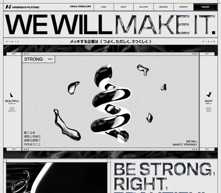
DESIGN REFERENCE
黒と淡いグレーの画面に、鏡面の立体造形、大きな英字、縦書きの見出しを組み合わせた企業サイト。技術紹介の横長構成と、モバイルでの縦積みへの変化を詳しく整理。
オリジナルサイトを見るMirror-polished metal inside a precise, monochrome industrial framework.
Website: hamaokamekki.co.jp Original URL: https://hamaokamekki.co.jp/ Final URL: https://hamaokamekki.co.jp/ Theme: light gray page frame with substantial black solution and contact regions. Inspected evidence: September 17, 2026, 04:18 JST; supplied retrieval timestamp September 16, 2026, 19:18:08.209 UTC. Viewports: desktop 1440 × 1000 and mobile 390 × 844 CSS pixels. Scope: the current corporate homepage, including its identity header, three-value introduction, About text, technical solutions, culture content, executive messages, company information, contact link, and closing statement. Visual evidence covers selected desktop and mobile positions; rendered DOM and computed styles cover additional sections.
Hamaoka Plating presents metal surface treatment through the appearance of the material itself. A pale gray canvas, black fields, thin construction lines, hatch-like separators, and small plus signs provide a disciplined framework. Inside that framework, highly reflective ribbons, droplets, cylinders, and a pointed conical form introduce volume and visual energy. Large English lettering alternates between solid black and chrome artwork, while Japanese text carries the detailed corporate story.
This is a substantial corporate website. Its content includes manufacturing capabilities, environmental practices, quality management, leadership statements, and company facts. The design gives those subjects an unusually theatrical presentation: the desktop solution area is arranged across a wide horizontal track, with tall vertical Japanese headlines and narrow paragraphs near the bottom. Mobile changes that structure into vertically stacked chapters and rearranges the contact composition.
Mirror-polished metal inside a precise, monochrome industrial framework.
Website: hamaokamekki.co.jp Original URL: https://hamaokamekki.co.jp/ Final URL: https://hamaokamekki.co.jp/ Theme: light gray page frame with substantial black solution and contact regions. Inspected evidence: September 17, 2026, 04:18 JST; supplied retrieval timestamp September 16, 2026, 19:18:08.209 UTC. Viewports: desktop 1440 × 1000 and mobile 390 × 844 CSS pixels. Scope: the current corporate homepage, including its identity header, three-value introduction, About text, technical solutions, culture content, executive messages, company information, contact link, and closing statement. Visual evidence covers selected desktop and mobile positions; rendered DOM and computed styles cover additional sections.
Hamaoka Plating presents metal surface treatment through the appearance of the material itself. A pale gray canvas, black fields, thin construction lines, hatch-like separators, and small plus signs provide a disciplined framework. Inside that framework, highly reflective ribbons, droplets, cylinders, and a pointed conical form introduce volume and visual energy. Large English lettering alternates between solid black and chrome artwork, while Japanese text carries the detailed corporate story.
This is a substantial corporate website. Its content includes manufacturing capabilities, environmental practices, quality management, leadership statements, and company facts. The design gives those subjects an unusually theatrical presentation: the desktop solution area is arranged across a wide horizontal track, with tall vertical Japanese headlines and narrow paragraphs near the bottom. Mobile changes that structure into vertically stacked chapters and rearranges the contact composition.
| Name | Value | Source property | Evidence and role |
|---|---|---|---|
| Page Gray | #e8e8e8 |
--color-bg, --color-gray |
Measured body background at both viewports; also measured text color in the dark solution section |
| Black | #000000 |
--color-black, --color-base |
Measured body text and mobile menu-button background; visually dominant in contact and solution surfaces |
| White | #ffffff |
--color-white |
Measured contact-navigation text and selected culture copy; also present as strong artwork highlights |
| Dark Gray | #2f2f2f |
--color-black-200 |
Declared neutral; a suitable approximation for the faint rules visible on black surfaces, although the exact rule-to-token mapping is not supplied |
| Mid Dark Gray | #4e4e4e |
--color-black-300 |
Declared supporting neutral; component assignment is not established |
| Medium Gray | #b0b0b0 |
--color-gray-700 |
Declared supporting neutral; do not assume it is the material color of every metallic object |
| Secondary Pale Gray | #e1e1e1 |
--color-gray-600 |
Declared alternative pale neutral; distinct surface assignment is unverified |
| Light Gray | #eeeeee |
--color-gray-200 |
Declared alternative pale neutral; distinct surface assignment is unverified |
The interface has no evidenced bright action color. Contrast, scale, material, and placement establish hierarchy. The factory photograph introduces blue clothing and other natural colors, while chrome lettering contains small colored reflections. Those details belong to imagery rather than a separate UI accent system.
Chrome is not represented by a single silver swatch. The visible objects alternate abruptly between near-black reflections, broad white highlights, and intermediate gray surfaces. Some lettering includes restrained blue or warm reflections along its edges. Preserve these changes within the artwork.
Keep the surrounding UI flat. Applying a metallic gradient to every border, paragraph, or control would weaken the distinction between the engineered frame and the polished objects displayed inside it.
Source family: Hiragino Kaku Gothic ProN, meiryo, sans-serif, exposed through --font-family-base and measured on body copy.
Most paragraphs use weight 400. The About introduction uses weight 700, increased line height, and slight tracking. Executive-message headings and the company heading also use weight 700.
The root element's font settings are not the content typography. In particular, its reported default serif family should not be copied into the design: the body explicitly establishes the Japanese sans-serif stack.
Source family: Clash Grotesk, sans-serif, exposed through --font-family-clash and measured on English mottos, solution labels, preview labels, and VIEW MEKKISURU.
Measured weights include 500 for many labels and 400 for small supporting statements. The evidence establishes the declared/computed family; it does not independently verify font-file loading.
The visible desktop footer combines solid black WE WILL with reflective MAKE IT. lettering. The contact heading also uses chrome lettering. These should be treated as graphic display treatments; a nearby element's inherited body font does not identify the face or rendering technique used by that artwork.
Several large headings have empty extracted text despite substantial measured boxes. Asset URLs and media markup were not supplied, so their exact image, SVG, or other rendering format remains unknown.
Sizes below are CSS pixels. A slash separates font size and line height.
| Role | Desktop | Mobile | Weight / tracking | Status |
|---|---|---|---|---|
| General body | 18 / 25.2 |
14.56 / 20.384 |
400, normal |
Measured |
| About introduction | 18 / 28.8 |
14.56 / 23.296 |
700, 0.02em |
Measured |
| Solution detail paragraphs | 18 / 25.2 |
12.48 / 17.472 |
400, normal |
Measured |
| Hero English motto | 18 / 21.6 |
12.48 / 14.976 |
Clash Grotesk, 500 |
Measured |
| Hero Japanese explanation | 18 / 25.2 |
14.56 / 20.384 |
400 |
Measured |
| Side-preview English labels | 18 / 18 |
14.56 / 14.56 |
Clash Grotesk, 500 |
Measured |
| Desktop side-preview Japanese labels | 10 / 10 |
Not shown in the same form | 700 |
Measured desktop |
| Solution section label | 18 / 25.2 |
16.64 / 23.296 |
Clash Grotesk, 500 |
Measured |
| Small solution motto | 12 / 15 |
11.44 / 14.3 |
Clash Grotesk, 400 |
Measured |
| Executive-message heading | 32 / 44.8 |
24.96 / 34.944 |
700 |
Measured |
| Executive-message body | 16 / 22.4 |
14.56 / 20.384 |
400 |
Measured |
| Company heading | 24 / 33.6 |
24.96 / 34.944 |
700 |
Measured |
| Company facts | 16 / 22.4 |
12.48 / 17.472 |
400 |
Measured |
VIEW MEKKISURU |
32 / 44.8 |
20.8 / 29.12 |
Clash Grotesk, 500 |
Measured |
| Header legal name | 12 / 16.8 |
10.4 / 14.56 |
700 |
Measured |
| Large vertical solution headline | Approximately 48–52px |
Corresponding appearance not pictured | Light-looking Japanese lettering | Visual estimate |
Chrome CONTACT |
Approximately 72–80px |
Approximately 48–54px |
Graphic lettering | Visual estimate |
| Closing statement | Approximately 160–176px |
Approximately 82–90px |
Heavy display treatment | Visual estimate |
The company heading is slightly larger in computed pixels on mobile than on desktop. This is a useful reminder that the responsive design changes component rules instead of shrinking every desktop dimension uniformly.
The evidence reports these values:
| Property | Desktop | Mobile |
|---|---|---|
--vw |
1440px |
390px |
--design-view-width |
1440px |
750px |
| Root font size | 10px |
5.2px |
--font-size-base |
18px |
28px |
| Computed body font size | 18px |
14.56px |
The mobile measurements are consistent with a 390 / 750 = 0.52 design-coordinate scale: 28 × 0.52 = 14.56, and 10 × 0.52 = 5.2. This is a calculation from the supplied values, not a recovered CSS formula. The full scaling behavior between viewports and beyond the observed desktop width is unverified.
Do not use the mobile 28px custom-property value directly as the final text size. Likewise, do not copy source-style rem quantities into a conventional 16px-root project without conversion.
The layout uses several local spacing systems rather than one proven universal scale.
| Use | Desktop | Mobile | Evidence |
|---|---|---|---|
| Outer page inset | 20px |
Approximately 15.6px |
Measured header/main coordinates |
| Common content inset | 20px |
15.6px |
Measured paragraph positions and padding |
| Section separator allowance | 6px |
6.24px |
Measured top padding on several sections |
| About paragraph separation | Approximately 22px |
Approximately 19.75px |
Calculated from consecutive rectangles |
| Desktop solution-group end padding | 26px |
Replaced by 15.6px bottom padding |
Measured |
| Desktop solution category padding | 50px vertically |
Different horizontal header arrangement | Measured |
| Mobile solution paragraph left edge | — | Approximately 47.83px from viewport edge |
Measured |
| Mobile company label-to-value gap | — | Approximately 7.8px |
Calculated from text rectangles |
Sampled UI elements report border-radius: 0. The visible frame, contact block, company rows, and menu trigger are square. Rounded surfaces belong to the metal imagery, not to a card or button system.
Fine rules appear approximately one pixel thick in the screenshots. Narrow hatch-like bands reinforce section joins. Small +++ marks sit along rails and near corners. Treat these as decorative registration marks; there is no evidence that they are controls.
The mobile active hero label has a double-line outline with a small notch along its lower edge. This is a distinctive label detail, unlike a conventional rounded tab.
| Element | Desktop 1440 × 1000 | Mobile 390 × 844 | Status |
|---|---|---|---|
| Main frame width | 1400px |
358.8125px |
Measured |
| Header box | 1400 × 55.1875px |
358.8125 × 72.78125px |
Measured |
| Logo heading width | 220px |
358.8125px, including inner padding |
Measured |
| Logo-link width | 220px |
327.625px |
Measured; inline height does not establish artwork height |
| Main desktop navigation cell | 130 × 50px |
Not visible as a top row | Measured |
| Desktop contact navigation cell | 160 × 50px |
Part of unexercised menu markup | Measured |
| Opening section height | 957.5625px |
692.9375px |
Measured |
| First graphic-heading box | 1400 × 167.5625px |
358.8125 × 42.96875px |
Measured; visibility limited |
| About text column | 660px |
327.625px |
Measured |
| Solution outer section height | 15000px |
6618.0625px |
Measured; different presentation models |
| Desktop solution chapter height | 933px |
Content-dependent stacked heights | Measured |
| Solution paragraph width | 280px |
294.34375px |
Measured |
| Executive-message paragraph width | 310px |
327.625px |
Measured |
| Company label/value widths | 170px / 490px |
Each 327.625px, stacked |
Measured |
| Bottom-right menu button | Not established | 62.390625 × 62.390625px |
Measured |
| Contact composition | Approximately 1360 × 491px |
Approximately 328 × 554px |
Visual estimate |
| Reported document height | 21269px |
14517px |
Browser evidence |
The desktop HTML/body rectangle is approximately 21247px tall, slightly shorter than the reported document height. The evidence does not establish the cause of that difference. Neither document height should be used as a fixed implementation target.
Role: establish the company identity and provide access to the major corporate sections.
The mobile capture clearly shows a black symbol and HAMAOKA・PLATING wordmark inside the gray frame, accompanied by the small legal name. A thin border and patterned separator finish the header.
The desktop DOM places the logo at the left and six navigation destinations across the right: HOME, ABOUT, SOLUTION, MESSAGE, COMPANY, and CONTACT. The first five measured link boxes are 130px wide; Contact is 160px wide and has white computed text.
The repeated label text in extraction represents layered content within individual navigation links. It is not evidence for five separate Home links or five visible menu rows per destination.
The first five destinations are homepage anchors. Contact points to an external Google Forms URL. The destination exists in the rendered link evidence; its form layout and submission behavior were not inspected.
Role: keep navigation available without occupying the top of the narrow layout.
A black square sits at the bottom-right corner in both supplied mobile captures. Fine light horizontal strokes form the menu icon. Its measured box is about 62.4px square and touches the right and bottom viewport edges.
The persistent placement is visible across captures. The supplied DOM also contains navigation rows about 62.4px high, but the open menu was not captured or exercised. Do not infer its opening animation, focus behavior, or final overlay composition from those rectangles alone.
Role: introduce STRONG, RIGHT, and BEAUTIFUL as the company's organizing ideas.
The visible mobile state is STRONG : つよく. Its anatomy is:
メッキする企業は《つよく、ただしく、うつくしく》.BEAUTIFUL and RIGHT states.The sculpture dominates the center without filling every available pixel. Its white highlights remain visible against pale gray because they are enclosed by strong black reflections.
Desktop DOM measurements establish narrow previous/next regions at both sides, with 119px-wide control areas, category names, small Japanese labels, and miniature English statements. The opening desktop screenshot does not reveal their finished visual state.
The three sets of content and navigation affordances support a stateful presentation. Switching behavior, autoplay, drag gestures, and the exact relationship between labels and artwork were not tested.
Role: connect the material spectacle to the company's manufacturing purpose.
Desktop text occupies a 660px column inside the right half of the page. Its heading box is 700px wide. Three bold Japanese paragraphs use 18px / 1.6 with 0.02em tracking.
On mobile, the heading box and paragraphs take the framed content width. Paragraphs have approximately 15.6px inner insets and use 14.56px / 1.6. The section grows from 741px on desktop to approximately 892px on mobile as its composition stacks.
The first visible portion beneath the mobile hero includes a dark metallic image. The complete desktop About composition is not pictured, so preserve only the measured column relationship rather than inventing its full media arrangement.
Role: orient readers within the long technical narrative.
The desktop solution capture shows SOLUTION at the left of a black top strip and the three value links at the right. RIGHT is the bright active-looking label, preceded by a plus sign; the neighboring labels are much darker.
This establishes the visible state treatment, but it does not establish whether highlighting is updated by scroll position, clicks, or another state mechanism. The DOM confirms anchors for #strong, #right, and #beautiful.
Keep the bar visually restrained. Its value comes from stable alignment, fine rules, and a small active marker rather than a large filled tab.
Role: present capabilities as a sequence of large editorial panels.
The supplied desktop DOM places the three main chapters side by side at the same vertical coordinate. Their measured widths are 3845px, 4243px, and 3955px, with a common height of 933px. The containing solution section is 15000px tall.
This geometry, together with the scrolled capture of later quality-management panels, is consistent with a scroll-driven horizontal presentation. The precise pinning logic, transform mapping, and input handling are not supplied and remain unverified.
The visible quality-management state contains:
品質管理.Two visible headlines are 不良品を見逃さないチェック体制 and ただしさを見極める技術. Their vertical setting is a core desktop characteristic. For equivalent live Japanese text, writing-mode: vertical-rl is a reasonable implementation choice; it is not a recovered declaration for the original graphic headings.
Repeated paragraph positions are separated by 575px in several groups, while the paragraphs themselves are only 280px wide. Preserve that asymmetry. Expanding the body copy to fill the panel would remove the deliberate separation between the headline and its explanation.
Role: make the same technical content readable in a conventional vertical sequence.
At 390px, all three chapter sections use display: block and share the 358.8px frame width. Their approximate heights are 2082.6px, 2386.4px, and 2101.3px.
Category heading boxes become wide horizontal regions instead of the desktop's narrow vertical strips. Supporting English statements wrap across three lines. Detail paragraphs are approximately 294.3px wide and use 12.48px / 17.472px.
This is a structural change, not a scaled horizontal desktop track. The supplied mobile screenshots do not show these chapter interiors; their stacking, dimensions, and typography are established by the DOM. Exact mobile artwork crops and headline appearance remain unverified.
Role: expand the three values into the company's working culture.
Rendered text includes WE MAKE IT STRONGLY, RIGHTLY, BEAUTIFULLY., WE BELIEVE IN THE POTENTIAL OF PLATING, a mascot reference, explanatory Japanese paragraphs, and VIEW MEKKISURU.
The measured desktop secondary link is a 629 × 70px target with 32px English text. On mobile it becomes approximately 294.4 × 62.4px with 20.8px text. Its observed destination is an external culture website; that destination was not inspected.
A pair of wide graphic strips in this section has a measured repeating animation. Their exact artwork is not shown in the supplied original-page captures. Treat this section's detailed appearance as less certain than the hero, solution frame, and contact block.
Role: present leadership statements within the same ruled corporate structure.
The DOM contains two executive messages. On desktop, their text columns begin at x=390 and x=1090 and are each 310px wide. Headings use 32px bold Japanese text; paragraphs use 16px text; signatures return to bold.
On mobile, the messages follow one another and each uses a 327.6px-wide text column. Headings are 24.96px and body text is 14.56px. Large spaces before the heading positions indicate additional composition, but the supplied screenshots do not establish the content or crops of any associated media.
Repeated MESSAGE text appears in the DOM. Its repetition does not by itself prove a specific marquee animation.
Role: provide practical company facts and contact details.
The desktop footer capture shows the bottom of a two-part company section: a factory photograph at the left and ruled information rows at the right. The photograph retains its natural color, including blue work shirts, which brings a human manufacturing context into the otherwise monochrome page.
The right-hand information region is 700px wide in the DOM. Rows use 170px label columns and 490px value columns within the padded area. Typography is 16px / 22.4px, with fine horizontal separators and no rounded containers.
On mobile, labels and values stack at the same x coordinate. Both are 327.6px wide and use 12.48px / 17.472px. The factory photograph appears immediately above the contact block in the supplied lower-page capture.
The company name is independently present in the inspected company information as 有限会社浜岡鍍金工業所. Map and telephone links are present in rendered markup; their activation was not tested.
Role: provide a prominent route for work and recruitment inquiries.
Desktop uses a black rectangle approximately 1360px wide and 491px tall, inset 20px inside the main frame. The composition divides at approximately 64% / 36%:
CONTACT, followed by the bold Japanese label お問い合わせ.The right-hand text area has extensive empty black space. Keep that space; it gives the title and lower action row distinct roles.
Mobile reorders the composition. The approximately 328px-wide block starts with the title area, then the action row, then the artwork. In the supplied capture, these regions are approximately 233px, 91px, and 230px tall. The pointed object overlaps the transition into the footer statement below.
The form invitation is an evidenced link. The separate beveled symbol is visually associated with it, but an independent clickable target for that symbol is not established.
Role: finish with the company's central phrase at architectural scale.
Desktop displays WE WILL MAKE IT. across nearly the full inner width. WE WILL is heavy black; MAKE IT. has a chrome treatment. Hatch-like separators frame the statement, and a narrow footer row carries a centered copyright line with registration marks at the edges.
Mobile changes the phrase to two large lines. In the supplied frame, both visible lines use solid black lettering. A pointed reflective object crosses in front of the first line, while the persistent menu button overlaps the lower-right viewport corner.
The mobile treatment should not automatically inherit the desktop chrome wordmark. The supplied screenshots establish a visible difference.
| Element or behavior | Supplied value | What the evidence establishes |
|---|---|---|
| Hero category label | transform 0.8s |
A transform transition exists; triggering action and complete path are unverified |
| Active mobile hero label | transform 0.8s cubic-bezier(.23, 1, .32, 1) 1.3s |
The sampled state includes an 800ms eased transition and 1300ms delay |
| Preview-label opacity | 0.2s cubic-bezier(.25, .25, .75, .75) |
A 200ms linear-equivalent opacity transition |
| Preview-label transform | 0.8s cubic-bezier(.23, 1, .32, 1) |
A strong ease-out transform transition |
| Common preview delay | 0.7s |
Present on multiple sampled labels |
| Selected mobile preview delay | 1.88s |
Present on sampled visible adjacent labels; not a universal site delay |
| Solution navigation opacity | 0.2s cubic-bezier(.25, .25, .75, .75) |
Opacity can transition; exact hover and active-state rules are not supplied |
| Culture graphic-strip loop, desktop | 57.0731s, infinite, loop-slide |
Computed repeating-animation declaration |
| Culture graphic-strip loop, mobile | 64.2483s, infinite, loop-slide |
A different sampled duration at the mobile viewport |
The graphic-strip animation was reported as paused during sampling. The capture procedure temporarily pauses perpetual animations for readiness checks, so this is not evidence of a user-facing pause control or an intentionally static design.
Scrolling was used to collect the supplied page positions. The screenshots establish a later desktop solution state and lower-page contact states, but there is no supplied interaction trace for clicking the hero controls, opening the mobile menu, or activating navigation.
Do not infer WebGL, a specific animation library, pointer-following objects, continuous 3D rotation, sound, or an autoplay interval from the reflective imagery. Its rendering technology and runtime motion are unknown.
Many sampled elements have animation: none or an unqualified transition: all. Those values do not establish that the entire page is static, and they do not provide usable timing specifications for unobserved effects.
For an adaptation, retain deliberate label movement and slow decorative loops only where they have a clear purpose. Provide reduced-motion behavior and ensure delayed visual reveals never prevent access to the underlying content.
| Surface | Appearance | Purpose |
|---|---|---|
| Page frame | Flat #e8e8e8 with black outer rules |
Unifies the long corporate page |
| Light display stage | Pale gray, subtle grain, faint curved construction lines | Displays polished objects with sufficient edge contrast |
| Dark solution field | Near-black with subdued cloudy or reflective variation | Supports large vertical headlines and light body copy |
| Contact field | Deep black with a distinct reflective image region | Makes the inquiry destination visually prominent |
| Company information | Flat gray, thin black row dividers | Presents practical facts with compact order |
| Section joins | Narrow hatch-like bands | Gives transitions an engineered, assembled character |
| Metal objects | Black-to-white specular reflections | Supplies depth and brand character |
There is no general soft-shadow elevation system in the visible interface. The depth belongs to the artwork; UI structure comes from borders, contrast, alignment, and overlap.
The defining imagery is polished metal presented as abstract sculpture. The hero's spiral ribbon has a thick, twisting silhouette and deep black reflections. Small fluid droplets surround it. The contact region introduces a cylinder and a pointed conical form, alongside a large sweeping reflective surface.
Preserve the difference between fluid and machined geometry. The droplets feel irregular and organic; the cylinder and pointed form feel precise. Their shared reflective material ties them together.
The pale hero background includes fine grain and faint arcs. The contact image instead uses flowing black reflections and broad white highlights. These are two related material settings, not interchangeable generic gradients.
The visible factory photograph is documentary and naturally colored. Do not automatically convert all photography to grayscale simply because the interface is monochrome.
No original asset URLs were supplied. The following references identify visible material without inventing filenames or formats.
| Asset or treatment | Original-page evidence | Implementation guidance |
|---|---|---|
| Company symbol and wordmark | Mobile opening capture | Use authorized brand artwork; do not typeset an approximate logo |
| Polished spiral and droplets | Mobile hero | Preserve the full central silhouette and irregular reflection pattern |
| Pale construction-line texture | Mobile hero | Keep it subtle enough for small black text to remain readable |
| Dark reflective environment | Desktop and mobile contact captures | Crop responsively; maintain the large curved highlight |
| Cylinder and pointed object | Contact/footer captures | Separate layers are useful for the observed boundary overlaps, but source layering is unverified |
Chrome CONTACT lettering |
Desktop and mobile contact captures | Prefer appropriate display artwork over a simple silver text gradient |
| Chrome closing words | Desktop footer capture | Preserve reflective detail at large scale |
| Factory photograph | Desktop company/contact transition and mobile lower-page capture | Retain natural color and relevant people/equipment context |
Artwork should use normal smooth image rendering. Nothing in these captures calls for pixelated scaling. Obtain original assets when authorized; the supplied evidence is insufficient to reconstruct their exact reflection maps or geometry.
The page occupies 1400px inside a 1440px viewport, with 20px outer margins. That frame persists through light and dark sections. There is no evidence for a separate narrow centered marketing container at this width.
The opening section measures about 958px high. About then uses a two-part arrangement, with its measured copy in the right half. The technical solution area accounts for a large portion of the document's scroll length while laying its content out horizontally. Later sections return to conventional vertical page flow.
The contact scene uses approximately a 1.77:1 ratio between its artwork and information columns. The closing statement returns to full-width typography.
At 390px, the frame has approximately 15.6px outer margins and a width of 358.8px. Common inner content starts around x=31.2px. Some solution paragraphs use an additional inset, starting around x=47.8px.
The main changes are structural:
Mobile has a shorter reported document height despite narrower text because the desktop's tall solution scroll allocation is replaced by stacked content.
Declared source breakpoints include 320px, 768px, 1024px, 1440px, and 1680px. Their presence alone does not reveal which component changes at each threshold.
Only 390px and 1440px were supplied for inspection. Tablet layouts, landscape phones, very wide screens, browser zoom, and the exact switching width of the horizontal solution presentation are unverified.
The source property --first-view-height remains 1000px in both snapshots, including the 844px-high mobile viewport. Do not treat it as a reliable live viewport-height measurement in a new implementation.
#e8e8e8 page gray.These are recommendations for a new implementation, not verified original features:
aria-expanded, and an explicit relationship to its controlled navigation. Manage focus when a modal menu is used.scroll-margin-top.pointer-events: none, and keep them separate from link hit areas.#e8e8e8.#000000.#e8e8e8; selected labels may use white.#2f2f2f, treated as an approximation.“Create a corporate website for a Japanese metal surface-treatment company. Use a pale gray #e8e8e8 page frame, pure black sections, one-pixel construction rules, narrow hatch-like section joins, and small registration crosses. Pair compact Japanese sans-serif body copy with English grotesk labels and selected large chrome display artwork. Feature a polished spiral ribbon and irregular metal droplets against a subtle pale construction-line background. Arrange desktop technical stories as wide dark editorial panels with vertical Japanese headlines and narrow paragraphs at the lower right. Stack those stories vertically on mobile. Finish with naturally colored factory photography, a black contact composition, and oversized WE WILL MAKE IT. lettering. Preserve square geometry and use depth primarily inside the imagery.”
STRONG : つよく. Place a glossy black-and-silver spiral at the center, surrounded by a few irregular reflective droplets. Add subtle curved construction lines, a notched outlined label, tiny plus-sign rails, and compact lower-left bilingual copy. On mobile, place neighboring category selectors beneath the image.”CONTACT, bold お問い合わせ, a large empty title area, and a ruled action row with a dark beveled square symbol. Place a cylinder and pointed metal object across selected boundaries. On mobile, order the title, action row, and image vertically.”WE WILL MAKE IT. at almost the full framed page width. Use solid black for the opening words and authorized chrome artwork for the desktop ending. On a narrow phone, break it into two bold black lines and allow one decorative pointed metal form to overlap the upper edge without covering actionable text.”This CSS is a reusable adaptation. It keeps a conventional root font size and uses explicit CSS-pixel values instead of reproducing the source's small root. Desktop reference dimensions are preserved where practical. The mobile detail-size minimum, breakpoint assignments, native horizontal overflow, and focus treatments are recommendations.
Supply authorized artwork through ordinary image elements. No source asset paths are assumed. The code provides layout and styling; it does not implement carousel state, menu opening, or the original scroll-to-horizontal mapping.
:root {
  /* Measured source colors and font stacks */
  --plate-paper: #e8e8e8;
  --plate-ink: #000000;
  --plate-white: #ffffff;
  --plate-dark-rule: #2f2f2f;
  --plate-jp: 'Hiragino Kaku Gothic ProN', meiryo, sans-serif;
  --plate-latin: 'Clash Grotesk', sans-serif;

  /* Desktop reference dimensions */
  --plate-outer: 20px;
  --plate-inner: 20px;
  --plate-body: 18px;
  --plate-detail: 16px;
  --plate-solution-copy: 18px;
  --plate-heading: 32px;
  --plate-rule: 1px;
  --plate-panel-width: 575px;
  --plate-copy-width: 280px;

  /* Measured timing vocabulary */
  --plate-label-time: 800ms;
  --plate-fade-time: 200ms;
  --plate-ease-out: cubic-bezier(.23, 1, .32, 1);
}

* {
  box-sizing: border-box;
}

body {
  margin: 0;
  color: var(--plate-ink);
  background: var(--plate-paper);
  font-family: var(--plate-jp);
  font-size: var(--plate-body);
  line-height: 1.4;
}

button,
input,
textarea {
  font: inherit;
}

img {
  display: block;
  max-inline-size: 100%;
}

.plating-site {
  margin: var(--plate-outer);
  border-inline: var(--plate-rule) solid var(--plate-ink);
}

.plate-section {
  position: relative;
  border-block-end: var(--plate-rule) solid currentColor;
  scroll-margin-top: 72px;
}

/* Decorative approximation of the observed hatch separators. */
.hatch-rule {
  block-size: 6px;
  border-block: 1px solid currentColor;
  background: repeating-linear-gradient(
    60deg,
    transparent 0 2px,
    currentColor 2px 2.5px,
    transparent 2.5px 4px
  );
}

.registration-rail {
  display: flex;
  justify-content: space-between;
  align-items: center;
  min-block-size: 20px;
  padding-inline: 6px;
  border-block: 1px solid currentColor;
  font: 12px/1 var(--plate-latin);
}

.plate-header {
  display: flex;
  align-items: center;
  justify-content: space-between;
  min-block-size: 55px;
  border-block: 1px solid var(--plate-ink);
}

.plate-brand {
  padding: 12px 15px;
  min-inline-size: 0;
}

.plate-brand img {
  inline-size: 220px;
  block-size: auto;
}

.plate-nav {
  display: flex;
  flex: 0 0 min(56.25vw, 810px);
}

.plate-nav a {
  display: grid;
  place-items: center;
  flex: 1;
  min-block-size: 50px;
  border-inline-start: 1px solid var(--plate-ink);
  color: inherit;
  text-decoration: none;
  font-family: var(--plate-latin);
}

.plate-nav .contact-link {
  flex: 1.23077;
  color: var(--plate-white);
  background: var(--plate-ink);
}

.hero-stage {
  position: relative;
  min-block-size: 560px;
  border-block: 1px solid var(--plate-ink);
  background: var(--plate-paper);
}

.hero-art {
  inline-size: 100%;
  block-size: 100%;
  object-fit: contain;
}

.hero-label {
  position: absolute;
  inset-block-start: 0;
  inset-inline-start: 0;
  margin: 0;
  padding: 8px 14px;
  border: 1px solid var(--plate-ink);
  background: var(--plate-paper);
  font-family: var(--plate-latin);
  transition: transform var(--plate-label-time) var(--plate-ease-out);
}

.hero-copy {
  position: absolute;
  inset-inline-start: var(--plate-inner);
  inset-block-end: var(--plate-inner);
  max-inline-size: 24ch;
}

.about-copy {
  max-inline-size: 660px;
  padding-inline: var(--plate-inner);
  font-weight: 700;
  line-height: 1.6;
  letter-spacing: .02em;
}

.solution {
  color: var(--plate-paper);
  background: var(--plate-ink);
}

.solution-bar {
  display: flex;
  align-items: center;
  justify-content: space-between;
  gap: 16px;
  min-block-size: 60px;
  padding-inline: var(--plate-inner);
  border-block-end: 1px solid var(--plate-dark-rule);
  font-family: var(--plate-latin);
}

.solution-nav {
  display: flex;
  flex-wrap: wrap;
  gap: 15px;
}

.solution-nav a {
  color: inherit;
  text-decoration: none;
  opacity: .7;
  transition: opacity var(--plate-fade-time) linear;
}

.solution-nav a[aria-current='location'] {
  opacity: 1;
}

.solution-nav a[aria-current='location']::before {
  content: '+ ';
}

/* Native overflow is a recommended fallback, not source behavior. */
.solution-viewport {
  overflow-x: auto;
  scroll-snap-type: x proximity;
}

.solution-track {
  display: flex;
  inline-size: max-content;
}

.solution-panel {
  position: relative;
  display: grid;
  grid-template-columns: minmax(0, 1fr) var(--plate-copy-width);
  gap: 20px;
  flex: 0 0 var(--plate-panel-width);
  inline-size: var(--plate-panel-width);
  min-block-size: max(620px, calc(100svh - 67px));
  padding: 46px 20px 24px;
  border-inline-end: 1px solid var(--plate-dark-rule);
  scroll-snap-align: start;
}

.solution-title {
  justify-self: start;
  margin: 0;
  writing-mode: vertical-rl;
  font-size: 50px;
  font-weight: 300;
  line-height: 1.15;
}

.solution-copy {
  align-self: end;
  margin: 0;
  font-size: var(--plate-solution-copy);
  line-height: 1.4;
}

.company-grid {
  display: grid;
  grid-template-columns: repeat(2, minmax(0, 1fr));
}

.company-photo {
  padding: var(--plate-inner);
}

.company-photo img {
  inline-size: 100%;
  block-size: 100%;
  object-fit: cover;
}

.company-facts {
  margin: 0;
  border-inline-start: 1px solid var(--plate-ink);
  font-size: var(--plate-detail);
}

.company-row {
  display: grid;
  grid-template-columns: 170px minmax(0, 1fr);
  padding: 15px var(--plate-inner);
  border-block-end: 1px solid var(--plate-ink);
}

.company-row dt,
.company-row dd {
  margin: 0;
  overflow-wrap: anywhere;
}

.contact {
  position: relative;
  isolation: isolate;
  display: grid;
  grid-template-columns: minmax(0, 1.77fr) minmax(0, 1fr);
  margin: var(--plate-inner);
  color: var(--plate-paper);
  background: var(--plate-ink);
}

.contact-art {
  position: relative;
  grid-column: 1;
  grid-row: 1;
  min-inline-size: 0;
  aspect-ratio: 869 / 491;
}

.contact-scene {
  inline-size: 100%;
  block-size: 100%;
  object-fit: cover;
}

.contact-info {
  grid-column: 2;
  grid-row: 1;
  display: grid;
  grid-template-rows: minmax(240px, 1fr) auto;
  border-inline-start: 1px solid var(--plate-dark-rule);
}

.contact-heading {
  padding: 24px 20px;
}

.contact-heading h2 {
  margin: 0;
  font: 500 clamp(48px, 5.3vw, 80px)/1 var(--plate-latin);
}

.contact-heading p {
  margin: 10px 0 0;
  font-size: 26px;
  font-weight: 700;
}

/* Use authorized artwork inside a semantic heading when available. */
.chrome-art {
  max-inline-size: 100%;
  block-size: auto;
}

.contact-action {
  display: grid;
  grid-template-columns: minmax(0, 1fr) 68px;
  align-items: center;
  gap: 20px;
  padding: 18px 20px;
  border-block-start: 1px solid var(--plate-dark-rule);
  color: inherit;
  text-decoration: none;
  font-size: 18px;
}

.contact-action p {
  margin: 0;
}

.contact-object {
  position: absolute;
  z-index: 2;
  pointer-events: none;
}

.closing-motto {
  margin: 0;
  padding: 12px;
  font-family: var(--plate-latin);
  font-size: clamp(64px, 12vw, 176px);
  font-weight: 700;
  line-height: .9;
  letter-spacing: -.04em;
}

.menu-toggle {
  display: none;
}

.plating-site :focus-visible,
.menu-toggle:focus-visible {
  outline: 2px solid currentColor;
  outline-offset: -4px;
}

/* Recommended mobile breakpoint; exact source mapping is unknown. */
@media (max-width: 767px) {
  :root {
    --plate-outer: 4vw;
    --plate-inner: 4vw;
    --plate-body: clamp(14.56px, 3.7333vw, 18px);
    --plate-detail: clamp(14px, 3.7333vw, 16px);
    --plate-solution-copy: clamp(14px, 3.7333vw, 16px);
    --plate-heading: 24.96px;
  }

  .plating-site {
    padding-block-end: calc(72px + env(safe-area-inset-bottom, 0px));
  }

  .plate-header {
    min-block-size: 72.8px;
  }

  .plate-brand {
    inline-size: 100%;
    padding-inline: var(--plate-inner);
  }

  .plate-brand img {
    inline-size: 100%;
  }

  .plate-nav {
    display: none;
  }

  .menu-toggle {
    position: fixed;
    z-index: 100;
    inset-inline-end: 0;
    inset-block-end: 0;
    display: grid;
    place-items: center;
    inline-size: 62.4px;
    min-block-size: 62.4px;
    padding-block-end: env(safe-area-inset-bottom, 0px);
    border: 0;
    color: var(--plate-paper);
    background: var(--plate-ink);
  }

  .hero-stage {
    min-block-size: 430px;
  }

  .solution-bar {
    flex-wrap: wrap;
    padding-block: 12px;
  }

  .solution-viewport {
    overflow: visible;
  }

  .solution-track {
    display: block;
    inline-size: auto;
  }

  .solution-panel {
    display: block;
    inline-size: auto;
    min-block-size: 0;
    padding: 32px;
    border-inline-end: 0;
    border-block-end: 1px solid var(--plate-dark-rule);
  }

  .solution-title {
    margin-block-end: 24px;
    writing-mode: horizontal-tb;
    font-size: 28px;
  }

  .company-grid,
  .company-row {
    display: block;
  }

  .company-facts {
    border-inline-start: 0;
  }

  .company-row dd {
    margin-block-start: 8px;
  }

  .contact {
    display: flex;
    flex-direction: column;
  }

  .contact-info {
    order: 0;
    grid-template-rows: minmax(233px, auto) auto;
    border-inline-start: 0;
  }

  .contact-heading {
    padding: 26px 16px;
  }

  .contact-heading h2 {
    font-size: 50px;
  }

  .contact-heading p {
    font-size: 25px;
  }

  .contact-action {
    grid-template-columns: minmax(0, 1fr) 60px;
    min-block-size: 91px;
    gap: 12px;
    padding: 14px 16px;
    font-size: 14px;
  }

  .contact-art {
    order: 1;
    aspect-ratio: 328 / 230;
  }

  .closing-motto {
    font-size: 22vw;
  }

  .closing-motto > span {
    display: block;
  }
}

@media (prefers-reduced-motion: reduce) {
  .plating-site *,
  .plating-site *::before,
  .plating-site *::after {
    animation: none !important;
    transition: none !important;
    scroll-behavior: auto !important;
  }
}
Give .solution-viewport an accessible region name and tabindex='0' when using the native overflow fallback. Populate each .solution-panel with a heading and its paragraph. Keep contact text before the contact artwork in document order; desktop CSS can place the artwork at the left without changing the mobile reading order.
Decorative registration marks and object images should be hidden from assistive technology. Essential chrome wording should have one accessible text equivalent. Size and position each .contact-object individually from its actual artwork bounds; the available evidence does not support universal offsets.
Optional aliases for a project already using Tailwind v4. Define the properties above first. This mapping does not imply that the inspected website uses Tailwind.
@theme inline {
  --color-plate-paper: var(--plate-paper);
  --color-plate-ink: var(--plate-ink);
  --color-plate-white: var(--plate-white);
  --color-plate-rule: var(--plate-dark-rule);

  --font-plate-jp: var(--plate-jp);
  --font-plate-latin: var(--plate-latin);

  --text-plate-body: var(--plate-body);
  --text-plate-detail: var(--plate-detail);
  --text-plate-heading: var(--plate-heading);

  --spacing-plate-outer: var(--plate-outer);
  --spacing-plate-inner: var(--plate-inner);
  --spacing-plate-panel: var(--plate-panel-width);
  --spacing-plate-copy: var(--plate-copy-width);

  --radius-plate: 0px;
}
This reference describes the supplied current-page evidence. All screenshot-based dimensions are labeled as estimates, and implementation improvements are separated from measured original behavior.
# HAMAOKA PLATING — Style Reference

> Mirror-polished metal inside a precise, monochrome industrial framework.

**Website:** [hamaokamekki.co.jp](https://hamaokamekki.co.jp/)
**Original URL:** https://hamaokamekki.co.jp/
**Final URL:** https://hamaokamekki.co.jp/
**Theme:** light gray page frame with substantial black solution and contact regions.
**Inspected evidence:** September 17, 2026, 04:18 JST; supplied retrieval timestamp September 16, 2026, 19:18:08.209 UTC.
**Viewports:** desktop 1440 × 1000 and mobile 390 × 844 CSS pixels.
**Scope:** the current corporate homepage, including its identity header, three-value introduction, About text, technical solutions, culture content, executive messages, company information, contact link, and closing statement. Visual evidence covers selected desktop and mobile positions; rendered DOM and computed styles cover additional sections.

Hamaoka Plating presents metal surface treatment through the appearance of the material itself. A pale gray canvas, black fields, thin construction lines, hatch-like separators, and small plus signs provide a disciplined framework. Inside that framework, highly reflective ribbons, droplets, cylinders, and a pointed conical form introduce volume and visual energy. Large English lettering alternates between solid black and chrome artwork, while Japanese text carries the detailed corporate story.

This is a substantial corporate website. Its content includes manufacturing capabilities, environmental practices, quality management, leadership statements, and company facts. The design gives those subjects an unusually theatrical presentation: the desktop solution area is arranged across a wide horizontal track, with tall vertical Japanese headlines and narrow paragraphs near the bottom. Mobile changes that structure into vertically stacked chapters and rearranges the contact composition.
# HAMAOKA PLATING — Style Reference

> Mirror-polished metal inside a precise, monochrome industrial framework.

**Website:** [hamaokamekki.co.jp](https://hamaokamekki.co.jp/)
**Original URL:** https://hamaokamekki.co.jp/
**Final URL:** https://hamaokamekki.co.jp/
**Theme:** light gray page frame with substantial black solution and contact regions.
**Inspected evidence:** September 17, 2026, 04:18 JST; supplied retrieval timestamp September 16, 2026, 19:18:08.209 UTC.
**Viewports:** desktop 1440 × 1000 and mobile 390 × 844 CSS pixels.
**Scope:** the current corporate homepage, including its identity header, three-value introduction, About text, technical solutions, culture content, executive messages, company information, contact link, and closing statement. Visual evidence covers selected desktop and mobile positions; rendered DOM and computed styles cover additional sections.

Hamaoka Plating presents metal surface treatment through the appearance of the material itself. A pale gray canvas, black fields, thin construction lines, hatch-like separators, and small plus signs provide a disciplined framework. Inside that framework, highly reflective ribbons, droplets, cylinders, and a pointed conical form introduce volume and visual energy. Large English lettering alternates between solid black and chrome artwork, while Japanese text carries the detailed corporate story.

This is a substantial corporate website. Its content includes manufacturing capabilities, environmental practices, quality management, leadership statements, and company facts. The design gives those subjects an unusually theatrical presentation: the desktop solution area is arranged across a wide horizontal track, with tall vertical Japanese headlines and narrow paragraphs near the bottom. Mobile changes that structure into vertically stacked chapters and rearranges the contact composition.

## How to Read This Reference

- **Measured** means a value appears in the supplied computed styles, custom properties, or element rectangles. Values refer to the stated capture viewport.
- **Visual estimate** means a dimension or treatment is inferred from the supplied original-page screenshots. These estimates are not stylesheet declarations or programmatic pixel samples.
- **Declared token** means the property exists in the supplied CSS evidence. Its presence does not establish that every possible component uses it.
- **Recommendation** means implementation guidance for a new project. The Quick Start is an adaptation, not recovered source code.
- Desktop and mobile screenshots show different portions of the page. A component outside those screenshots may have DOM measurements without a verified visual appearance.
- The first desktop capture is almost entirely black with a small white cross. The underlying DOM contains extensive page content, and later captures show the site. The black frame cannot confidently be classified as a designed splash screen, loader, or stable homepage state.
- The mobile opening capture also contains a blank heading-sized strip beneath the logo. Its underlying heading box is measurable, but its intended visible content is not established by that frame.

## Tokens — Colors

### Default Palette

| Name | Value | Source property | Evidence and role |
| --- | --- | --- | --- |
| Page Gray | `#e8e8e8` | `--color-bg`, `--color-gray` | Measured body background at both viewports; also measured text color in the dark solution section |
| Black | `#000000` | `--color-black`, `--color-base` | Measured body text and mobile menu-button background; visually dominant in contact and solution surfaces |
| White | `#ffffff` | `--color-white` | Measured contact-navigation text and selected culture copy; also present as strong artwork highlights |
| Dark Gray | `#2f2f2f` | `--color-black-200` | Declared neutral; a suitable approximation for the faint rules visible on black surfaces, although the exact rule-to-token mapping is not supplied |
| Mid Dark Gray | `#4e4e4e` | `--color-black-300` | Declared supporting neutral; component assignment is not established |
| Medium Gray | `#b0b0b0` | `--color-gray-700` | Declared supporting neutral; do not assume it is the material color of every metallic object |
| Secondary Pale Gray | `#e1e1e1` | `--color-gray-600` | Declared alternative pale neutral; distinct surface assignment is unverified |
| Light Gray | `#eeeeee` | `--color-gray-200` | Declared alternative pale neutral; distinct surface assignment is unverified |

The interface has no evidenced bright action color. Contrast, scale, material, and placement establish hierarchy. The factory photograph introduces blue clothing and other natural colors, while chrome lettering contains small colored reflections. Those details belong to imagery rather than a separate UI accent system.

### Material and Color Behavior

Chrome is not represented by a single silver swatch. The visible objects alternate abruptly between near-black reflections, broad white highlights, and intermediate gray surfaces. Some lettering includes restrained blue or warm reflections along its edges. Preserve these changes within the artwork.

Keep the surrounding UI flat. Applying a metallic gradient to every border, paragraph, or control would weaken the distinction between the engineered frame and the polished objects displayed inside it.

## Tokens — Typography

### Japanese Text — Measured Stack

**Source family:** `Hiragino Kaku Gothic ProN, meiryo, sans-serif`, exposed through `--font-family-base` and measured on body copy.

Most paragraphs use weight `400`. The About introduction uses weight `700`, increased line height, and slight tracking. Executive-message headings and the company heading also use weight `700`.

The root element's font settings are not the content typography. In particular, its reported default serif family should not be copied into the design: the body explicitly establishes the Japanese sans-serif stack.

### English Labels — Measured Stack

**Source family:** `Clash Grotesk, sans-serif`, exposed through `--font-family-clash` and measured on English mottos, solution labels, preview labels, and `VIEW MEKKISURU`.

Measured weights include `500` for many labels and `400` for small supporting statements. The evidence establishes the declared/computed family; it does not independently verify font-file loading.

### Graphic Lettering

The visible desktop footer combines solid black `WE WILL` with reflective `MAKE IT.` lettering. The contact heading also uses chrome lettering. These should be treated as graphic display treatments; a nearby element's inherited body font does not identify the face or rendering technique used by that artwork.

Several large headings have empty extracted text despite substantial measured boxes. Asset URLs and media markup were not supplied, so their exact image, SVG, or other rendering format remains unknown.

### Type Scale

Sizes below are CSS pixels. A slash separates font size and line height.

| Role | Desktop | Mobile | Weight / tracking | Status |
| --- | --- | --- | --- | --- |
| General body | `18 / 25.2` | `14.56 / 20.384` | `400`, normal | Measured |
| About introduction | `18 / 28.8` | `14.56 / 23.296` | `700`, `0.02em` | Measured |
| Solution detail paragraphs | `18 / 25.2` | `12.48 / 17.472` | `400`, normal | Measured |
| Hero English motto | `18 / 21.6` | `12.48 / 14.976` | Clash Grotesk, `500` | Measured |
| Hero Japanese explanation | `18 / 25.2` | `14.56 / 20.384` | `400` | Measured |
| Side-preview English labels | `18 / 18` | `14.56 / 14.56` | Clash Grotesk, `500` | Measured |
| Desktop side-preview Japanese labels | `10 / 10` | Not shown in the same form | `700` | Measured desktop |
| Solution section label | `18 / 25.2` | `16.64 / 23.296` | Clash Grotesk, `500` | Measured |
| Small solution motto | `12 / 15` | `11.44 / 14.3` | Clash Grotesk, `400` | Measured |
| Executive-message heading | `32 / 44.8` | `24.96 / 34.944` | `700` | Measured |
| Executive-message body | `16 / 22.4` | `14.56 / 20.384` | `400` | Measured |
| Company heading | `24 / 33.6` | `24.96 / 34.944` | `700` | Measured |
| Company facts | `16 / 22.4` | `12.48 / 17.472` | `400` | Measured |
| `VIEW MEKKISURU` | `32 / 44.8` | `20.8 / 29.12` | Clash Grotesk, `500` | Measured |
| Header legal name | `12 / 16.8` | `10.4 / 14.56` | `700` | Measured |
| Large vertical solution headline | Approximately `48–52px` | Corresponding appearance not pictured | Light-looking Japanese lettering | Visual estimate |
| Chrome `CONTACT` | Approximately `72–80px` | Approximately `48–54px` | Graphic lettering | Visual estimate |
| Closing statement | Approximately `160–176px` | Approximately `82–90px` | Heavy display treatment | Visual estimate |

The company heading is slightly larger in computed pixels on mobile than on desktop. This is a useful reminder that the responsive design changes component rules instead of shrinking every desktop dimension uniformly.

## Tokens — Spacing & Shapes

### Responsive Unit

The evidence reports these values:

| Property | Desktop | Mobile |
| --- | --- | --- |
| `--vw` | `1440px` | `390px` |
| `--design-view-width` | `1440px` | `750px` |
| Root font size | `10px` | `5.2px` |
| `--font-size-base` | `18px` | `28px` |
| Computed body font size | `18px` | `14.56px` |

The mobile measurements are consistent with a `390 / 750 = 0.52` design-coordinate scale: `28 × 0.52 = 14.56`, and `10 × 0.52 = 5.2`. This is a calculation from the supplied values, not a recovered CSS formula. The full scaling behavior between viewports and beyond the observed desktop width is unverified.

Do not use the mobile `28px` custom-property value directly as the final text size. Likewise, do not copy source-style rem quantities into a conventional 16px-root project without conversion.

### Spacing Scale

The layout uses several local spacing systems rather than one proven universal scale.

| Use | Desktop | Mobile | Evidence |
| --- | --- | --- | --- |
| Outer page inset | `20px` | Approximately `15.6px` | Measured header/main coordinates |
| Common content inset | `20px` | `15.6px` | Measured paragraph positions and padding |
| Section separator allowance | `6px` | `6.24px` | Measured top padding on several sections |
| About paragraph separation | Approximately `22px` | Approximately `19.75px` | Calculated from consecutive rectangles |
| Desktop solution-group end padding | `26px` | Replaced by `15.6px` bottom padding | Measured |
| Desktop solution category padding | `50px` vertically | Different horizontal header arrangement | Measured |
| Mobile solution paragraph left edge | — | Approximately `47.83px` from viewport edge | Measured |
| Mobile company label-to-value gap | — | Approximately `7.8px` | Calculated from text rectangles |

### Border Radius and Ornament

Sampled UI elements report `border-radius: 0`. The visible frame, contact block, company rows, and menu trigger are square. Rounded surfaces belong to the metal imagery, not to a card or button system.

Fine rules appear approximately one pixel thick in the screenshots. Narrow hatch-like bands reinforce section joins. Small `+++` marks sit along rails and near corners. Treat these as decorative registration marks; there is no evidence that they are controls.

The mobile active hero label has a double-line outline with a small notch along its lower edge. This is a distinctive label detail, unlike a conventional rounded tab.

### Layout Measurements

| Element | Desktop 1440 × 1000 | Mobile 390 × 844 | Status |
| --- | --- | --- | --- |
| Main frame width | `1400px` | `358.8125px` | Measured |
| Header box | `1400 × 55.1875px` | `358.8125 × 72.78125px` | Measured |
| Logo heading width | `220px` | `358.8125px`, including inner padding | Measured |
| Logo-link width | `220px` | `327.625px` | Measured; inline height does not establish artwork height |
| Main desktop navigation cell | `130 × 50px` | Not visible as a top row | Measured |
| Desktop contact navigation cell | `160 × 50px` | Part of unexercised menu markup | Measured |
| Opening section height | `957.5625px` | `692.9375px` | Measured |
| First graphic-heading box | `1400 × 167.5625px` | `358.8125 × 42.96875px` | Measured; visibility limited |
| About text column | `660px` | `327.625px` | Measured |
| Solution outer section height | `15000px` | `6618.0625px` | Measured; different presentation models |
| Desktop solution chapter height | `933px` | Content-dependent stacked heights | Measured |
| Solution paragraph width | `280px` | `294.34375px` | Measured |
| Executive-message paragraph width | `310px` | `327.625px` | Measured |
| Company label/value widths | `170px / 490px` | Each `327.625px`, stacked | Measured |
| Bottom-right menu button | Not established | `62.390625 × 62.390625px` | Measured |
| Contact composition | Approximately `1360 × 491px` | Approximately `328 × 554px` | Visual estimate |
| Reported document height | `21269px` | `14517px` | Browser evidence |

The desktop HTML/body rectangle is approximately `21247px` tall, slightly shorter than the reported document height. The evidence does not establish the cause of that difference. Neither document height should be used as a fixed implementation target.

## Components

### Identity Header and Primary Navigation

**Role:** establish the company identity and provide access to the major corporate sections.

The mobile capture clearly shows a black symbol and `HAMAOKA・PLATING` wordmark inside the gray frame, accompanied by the small legal name. A thin border and patterned separator finish the header.

The desktop DOM places the logo at the left and six navigation destinations across the right: `HOME`, `ABOUT`, `SOLUTION`, `MESSAGE`, `COMPANY`, and `CONTACT`. The first five measured link boxes are 130px wide; Contact is 160px wide and has white computed text.

The repeated label text in extraction represents layered content within individual navigation links. It is not evidence for five separate Home links or five visible menu rows per destination.

The first five destinations are homepage anchors. Contact points to an external Google Forms URL. The destination exists in the rendered link evidence; its form layout and submission behavior were not inspected.

### Mobile Menu Trigger

**Role:** keep navigation available without occupying the top of the narrow layout.

A black square sits at the bottom-right corner in both supplied mobile captures. Fine light horizontal strokes form the menu icon. Its measured box is about 62.4px square and touches the right and bottom viewport edges.

The persistent placement is visible across captures. The supplied DOM also contains navigation rows about 62.4px high, but the open menu was not captured or exercised. Do not infer its opening animation, focus behavior, or final overlay composition from those rectangles alone.

### Three-Value Hero

**Role:** introduce `STRONG`, `RIGHT`, and `BEAUTIFUL` as the company's organizing ideas.

The visible mobile state is `STRONG : つよく`. Its anatomy is:

1. A centered Japanese motto strip: `メッキする企業は《つよく、ただしく、うつくしく》`.
2. A black divider followed by a narrow registration-mark rail.
3. A notched, outlined active-state label at the upper left.
4. A large polished spiral ribbon surrounded by small reflective droplets.
5. A pale textured background with faint crossing curves or construction lines.
6. A small English statement and two lines of Japanese explanatory copy at the lower left.
7. A bottom selector strip showing the adjacent `BEAUTIFUL` and `RIGHT` states.

The sculpture dominates the center without filling every available pixel. Its white highlights remain visible against pale gray because they are enclosed by strong black reflections.

Desktop DOM measurements establish narrow previous/next regions at both sides, with 119px-wide control areas, category names, small Japanese labels, and miniature English statements. The opening desktop screenshot does not reveal their finished visual state.

The three sets of content and navigation affordances support a stateful presentation. Switching behavior, autoplay, drag gestures, and the exact relationship between labels and artwork were not tested.

### About Introduction

**Role:** connect the material spectacle to the company's manufacturing purpose.

Desktop text occupies a 660px column inside the right half of the page. Its heading box is 700px wide. Three bold Japanese paragraphs use `18px / 1.6` with `0.02em` tracking.

On mobile, the heading box and paragraphs take the framed content width. Paragraphs have approximately 15.6px inner insets and use `14.56px / 1.6`. The section grows from 741px on desktop to approximately 892px on mobile as its composition stacks.

The first visible portion beneath the mobile hero includes a dark metallic image. The complete desktop About composition is not pictured, so preserve only the measured column relationship rather than inventing its full media arrangement.

### Solution Section Navigation

**Role:** orient readers within the long technical narrative.

The desktop solution capture shows `SOLUTION` at the left of a black top strip and the three value links at the right. `RIGHT` is the bright active-looking label, preceded by a plus sign; the neighboring labels are much darker.

This establishes the visible state treatment, but it does not establish whether highlighting is updated by scroll position, clicks, or another state mechanism. The DOM confirms anchors for `#strong`, `#right`, and `#beautiful`.

Keep the bar visually restrained. Its value comes from stable alignment, fine rules, and a small active marker rather than a large filled tab.

### Desktop Solution Track

**Role:** present capabilities as a sequence of large editorial panels.

The supplied desktop DOM places the three main chapters side by side at the same vertical coordinate. Their measured widths are 3845px, 4243px, and 3955px, with a common height of 933px. The containing solution section is 15000px tall.

This geometry, together with the scrolled capture of later quality-management panels, is consistent with a scroll-driven horizontal presentation. The precise pinning logic, transform mapping, and input handling are not supplied and remain unverified.

The visible quality-management state contains:

- A narrow category strip with a small metallic mark and the vertical label `品質管理`.
- Large, light-looking vertical Japanese headlines near the upper left of each content panel.
- Substantial black negative space between headline and body.
- Narrow horizontal paragraphs placed toward the lower right.
- Faint vertical and horizontal rules that continue across the entire composition.
- Small registration marks at the top of panels.

Two visible headlines are `不良品を見逃さないチェック体制` and `ただしさを見極める技術`. Their vertical setting is a core desktop characteristic. For equivalent live Japanese text, `writing-mode: vertical-rl` is a reasonable implementation choice; it is not a recovered declaration for the original graphic headings.

Repeated paragraph positions are separated by 575px in several groups, while the paragraphs themselves are only 280px wide. Preserve that asymmetry. Expanding the body copy to fill the panel would remove the deliberate separation between the headline and its explanation.

### Mobile Solution Chapters

**Role:** make the same technical content readable in a conventional vertical sequence.

At 390px, all three chapter sections use `display: block` and share the 358.8px frame width. Their approximate heights are 2082.6px, 2386.4px, and 2101.3px.

Category heading boxes become wide horizontal regions instead of the desktop's narrow vertical strips. Supporting English statements wrap across three lines. Detail paragraphs are approximately 294.3px wide and use `12.48px / 17.472px`.

This is a structural change, not a scaled horizontal desktop track. The supplied mobile screenshots do not show these chapter interiors; their stacking, dimensions, and typography are established by the DOM. Exact mobile artwork crops and headline appearance remain unverified.

### Corporate Culture and Secondary Destination

**Role:** expand the three values into the company's working culture.

Rendered text includes `WE MAKE IT STRONGLY, RIGHTLY, BEAUTIFULLY.`, `WE BELIEVE IN THE POTENTIAL OF PLATING`, a mascot reference, explanatory Japanese paragraphs, and `VIEW MEKKISURU`.

The measured desktop secondary link is a 629 × 70px target with 32px English text. On mobile it becomes approximately 294.4 × 62.4px with 20.8px text. Its observed destination is an external culture website; that destination was not inspected.

A pair of wide graphic strips in this section has a measured repeating animation. Their exact artwork is not shown in the supplied original-page captures. Treat this section's detailed appearance as less certain than the hero, solution frame, and contact block.

### Executive Messages

**Role:** present leadership statements within the same ruled corporate structure.

The DOM contains two executive messages. On desktop, their text columns begin at x=390 and x=1090 and are each 310px wide. Headings use 32px bold Japanese text; paragraphs use 16px text; signatures return to bold.

On mobile, the messages follow one another and each uses a 327.6px-wide text column. Headings are 24.96px and body text is 14.56px. Large spaces before the heading positions indicate additional composition, but the supplied screenshots do not establish the content or crops of any associated media.

Repeated `MESSAGE` text appears in the DOM. Its repetition does not by itself prove a specific marquee animation.

### Company Information

**Role:** provide practical company facts and contact details.

The desktop footer capture shows the bottom of a two-part company section: a factory photograph at the left and ruled information rows at the right. The photograph retains its natural color, including blue work shirts, which brings a human manufacturing context into the otherwise monochrome page.

The right-hand information region is 700px wide in the DOM. Rows use 170px label columns and 490px value columns within the padded area. Typography is `16px / 22.4px`, with fine horizontal separators and no rounded containers.

On mobile, labels and values stack at the same x coordinate. Both are 327.6px wide and use `12.48px / 17.472px`. The factory photograph appears immediately above the contact block in the supplied lower-page capture.

The company name is independently present in the inspected company information as `有限会社浜岡鍍金工業所`. Map and telephone links are present in rendered markup; their activation was not tested.

### Contact Composition

**Role:** provide a prominent route for work and recruitment inquiries.

Desktop uses a black rectangle approximately 1360px wide and 491px tall, inset 20px inside the main frame. The composition divides at approximately 64% / 36%:

- **Left:** a broad dark reflective scene with an abstract curved surface and a small spiral form.
- **Right, upper area:** chrome `CONTACT`, followed by the bold Japanese label `お問い合わせ`.
- **Right, lower area:** a three-line invitation to use the form, separated by a fine rule, with a dark beveled square symbol at the far right.
- **Across the boundaries:** a polished cylinder protrudes above the image region, and a pointed metal form extends below the block toward the closing statement.

The right-hand text area has extensive empty black space. Keep that space; it gives the title and lower action row distinct roles.

Mobile reorders the composition. The approximately 328px-wide block starts with the title area, then the action row, then the artwork. In the supplied capture, these regions are approximately 233px, 91px, and 230px tall. The pointed object overlaps the transition into the footer statement below.

The form invitation is an evidenced link. The separate beveled symbol is visually associated with it, but an independent clickable target for that symbol is not established.

### Closing Statement and Footer

**Role:** finish with the company's central phrase at architectural scale.

Desktop displays `WE WILL MAKE IT.` across nearly the full inner width. `WE WILL` is heavy black; `MAKE IT.` has a chrome treatment. Hatch-like separators frame the statement, and a narrow footer row carries a centered copyright line with registration marks at the edges.

Mobile changes the phrase to two large lines. In the supplied frame, both visible lines use solid black lettering. A pointed reflective object crosses in front of the first line, while the persistent menu button overlaps the lower-right viewport corner.

The mobile treatment should not automatically inherit the desktop chrome wordmark. The supplied screenshots establish a visible difference.

## Tokens — Motion & Interaction

### Measured Motion

| Element or behavior | Supplied value | What the evidence establishes |
| --- | --- | --- |
| Hero category label | `transform 0.8s` | A transform transition exists; triggering action and complete path are unverified |
| Active mobile hero label | `transform 0.8s cubic-bezier(.23, 1, .32, 1) 1.3s` | The sampled state includes an 800ms eased transition and 1300ms delay |
| Preview-label opacity | `0.2s cubic-bezier(.25, .25, .75, .75)` | A 200ms linear-equivalent opacity transition |
| Preview-label transform | `0.8s cubic-bezier(.23, 1, .32, 1)` | A strong ease-out transform transition |
| Common preview delay | `0.7s` | Present on multiple sampled labels |
| Selected mobile preview delay | `1.88s` | Present on sampled visible adjacent labels; not a universal site delay |
| Solution navigation opacity | `0.2s cubic-bezier(.25, .25, .75, .75)` | Opacity can transition; exact hover and active-state rules are not supplied |
| Culture graphic-strip loop, desktop | `57.0731s`, infinite, `loop-slide` | Computed repeating-animation declaration |
| Culture graphic-strip loop, mobile | `64.2483s`, infinite, `loop-slide` | A different sampled duration at the mobile viewport |

The graphic-strip animation was reported as `paused` during sampling. The capture procedure temporarily pauses perpetual animations for readiness checks, so this is not evidence of a user-facing pause control or an intentionally static design.

### Interaction Evidence and Limits

Scrolling was used to collect the supplied page positions. The screenshots establish a later desktop solution state and lower-page contact states, but there is no supplied interaction trace for clicking the hero controls, opening the mobile menu, or activating navigation.

Do not infer WebGL, a specific animation library, pointer-following objects, continuous 3D rotation, sound, or an autoplay interval from the reflective imagery. Its rendering technology and runtime motion are unknown.

Many sampled elements have `animation: none` or an unqualified `transition: all`. Those values do not establish that the entire page is static, and they do not provide usable timing specifications for unobserved effects.

For an adaptation, retain deliberate label movement and slow decorative loops only where they have a clear purpose. Provide reduced-motion behavior and ensure delayed visual reveals never prevent access to the underlying content.

## Surfaces

| Surface | Appearance | Purpose |
| --- | --- | --- |
| Page frame | Flat `#e8e8e8` with black outer rules | Unifies the long corporate page |
| Light display stage | Pale gray, subtle grain, faint curved construction lines | Displays polished objects with sufficient edge contrast |
| Dark solution field | Near-black with subdued cloudy or reflective variation | Supports large vertical headlines and light body copy |
| Contact field | Deep black with a distinct reflective image region | Makes the inquiry destination visually prominent |
| Company information | Flat gray, thin black row dividers | Presents practical facts with compact order |
| Section joins | Narrow hatch-like bands | Gives transitions an engineered, assembled character |
| Metal objects | Black-to-white specular reflections | Supplies depth and brand character |

There is no general soft-shadow elevation system in the visible interface. The depth belongs to the artwork; UI structure comes from borders, contrast, alignment, and overlap.

## Imagery

The defining imagery is polished metal presented as abstract sculpture. The hero's spiral ribbon has a thick, twisting silhouette and deep black reflections. Small fluid droplets surround it. The contact region introduces a cylinder and a pointed conical form, alongside a large sweeping reflective surface.

Preserve the difference between fluid and machined geometry. The droplets feel irregular and organic; the cylinder and pointed form feel precise. Their shared reflective material ties them together.

The pale hero background includes fine grain and faint arcs. The contact image instead uses flowing black reflections and broad white highlights. These are two related material settings, not interchangeable generic gradients.

The visible factory photograph is documentary and naturally colored. Do not automatically convert all photography to grayscale simply because the interface is monochrome.

### Observed Asset References

No original asset URLs were supplied. The following references identify visible material without inventing filenames or formats.

| Asset or treatment | Original-page evidence | Implementation guidance |
| --- | --- | --- |
| Company symbol and wordmark | Mobile opening capture | Use authorized brand artwork; do not typeset an approximate logo |
| Polished spiral and droplets | Mobile hero | Preserve the full central silhouette and irregular reflection pattern |
| Pale construction-line texture | Mobile hero | Keep it subtle enough for small black text to remain readable |
| Dark reflective environment | Desktop and mobile contact captures | Crop responsively; maintain the large curved highlight |
| Cylinder and pointed object | Contact/footer captures | Separate layers are useful for the observed boundary overlaps, but source layering is unverified |
| Chrome `CONTACT` lettering | Desktop and mobile contact captures | Prefer appropriate display artwork over a simple silver text gradient |
| Chrome closing words | Desktop footer capture | Preserve reflective detail at large scale |
| Factory photograph | Desktop company/contact transition and mobile lower-page capture | Retain natural color and relevant people/equipment context |

Artwork should use normal smooth image rendering. Nothing in these captures calls for pixelated scaling. Obtain original assets when authorized; the supplied evidence is insufficient to reconstruct their exact reflection maps or geometry.

## Layout & Responsive Behavior

### Desktop

The page occupies 1400px inside a 1440px viewport, with 20px outer margins. That frame persists through light and dark sections. There is no evidence for a separate narrow centered marketing container at this width.

The opening section measures about 958px high. About then uses a two-part arrangement, with its measured copy in the right half. The technical solution area accounts for a large portion of the document's scroll length while laying its content out horizontally. Later sections return to conventional vertical page flow.

The contact scene uses approximately a 1.77:1 ratio between its artwork and information columns. The closing statement returns to full-width typography.

### Mobile

At 390px, the frame has approximately 15.6px outer margins and a width of 358.8px. Common inner content starts around x=31.2px. Some solution paragraphs use an additional inset, starting around x=47.8px.

The main changes are structural:

- The top navigation row is absent from the visible header, and a bottom-right menu trigger remains available.
- Hero side previews become a compact strip below the artwork.
- The hero's English statement and Japanese explanation are grouped together at the lower left.
- Solution chapters become vertically stacked blocks.
- Executive messages appear one after another.
- Company labels sit above their values instead of alongside them.
- Contact information appears above the artwork.
- The closing phrase becomes two lines with solid black lettering in the supplied frame.

Mobile has a shorter reported document height despite narrower text because the desktop's tall solution scroll allocation is replaced by stacked content.

### Breakpoints and Unverified Sizes

Declared source breakpoints include `320px`, `768px`, `1024px`, `1440px`, and `1680px`. Their presence alone does not reveal which component changes at each threshold.

Only 390px and 1440px were supplied for inspection. Tablet layouts, landscape phones, very wide screens, browser zoom, and the exact switching width of the horizontal solution presentation are unverified.

The source property `--first-view-height` remains `1000px` in both snapshots, including the 844px-high mobile viewport. Do not treat it as a reliable live viewport-height measurement in a new implementation.

## Do’s and Don’ts

### Do

- Anchor the interface in exact black and `#e8e8e8` page gray.
- Maintain a continuous ruled frame across the long corporate narrative.
- Separate flat interface surfaces from reflective display artwork.
- Use the measured Japanese sans-serif stack and the evidenced English label family where available.
- Preserve the desktop contrast between tall vertical headlines and small lower-right paragraphs.
- Keep plus marks, hatch bands, and fine construction lines restrained.
- Leave substantial negative space in the contact title area.
- Let selected metal objects cross section boundaries without covering essential copy.
- Reorder content intentionally for mobile, especially solutions and contact.
- Keep company information and leadership content as substantive parts of the site.

### Don’t

- Do not turn every section into an identical grid of rounded cards.
- Do not add a bright CTA color unsupported by this palette.
- Do not replace chrome artwork with a uniform gray fill and expect the same material effect.
- Do not apply bevels or metallic gradients to every UI element.
- Do not copy all repeated DOM labels as visible text.
- Do not interpret empty extracted heading text as permission to remove its visual space.
- Do not require mobile visitors to traverse the desktop horizontal composition.
- Do not hardcode the desktop 15000px solution height as a universal content height.
- Do not describe untested menu, carousel, or scroll behavior as verified.
- Do not recreate the unresolved black initial capture as an intentional mandatory loading screen.

## Recommended Implementation Additions

These are recommendations for a new implementation, not verified original features:

- Give the mobile menu button an accessible name, `aria-expanded`, and an explicit relationship to its controlled navigation. Manage focus when a modal menu is used.
- Keep one accessible copy of each animated navigation label; mark decorative duplicates as hidden from assistive technology.
- Use semantic headings and text alternatives for essential wording rendered as graphics.
- Make hero state controls keyboard-operable and expose the current state. Add pause controls if automatic changes are introduced.
- Provide a normal reading route through desktop solutions. Native horizontal overflow can be a fallback when a scroll-driven enhancement is unavailable.
- Retain clear section anchors and account for any sticky navigation with `scroll-margin-top`.
- Increase mobile detail text from the measured 12.48px where readability requires it. The Quick Start uses a 14px minimum for these details.
- Ensure the fixed mobile menu button does not cover the last line of content or an inquiry target; allow for device safe areas.
- Use decorative overlaps with `pointer-events: none`, and keep them separate from link hit areas.
- Serve a meaningful static frame for reduced motion and while large assets load. Avoid hiding the entire page until decorative media is ready.
- Preserve visible keyboard focus and adequate contrast for inactive section links.

## Agent Prompt Guide

### Quick Color Reference

- Page and light surfaces: `#e8e8e8`.
- Primary text and light-surface rules: `#000000`.
- Dark fields: black with subdued reflective texture.
- Reversed body text: `#e8e8e8`; selected labels may use white.
- Dark rules: a subtle neutral near `#2f2f2f`, treated as an approximation.
- Chrome: image-based black, white, and gray reflections with occasional restrained color.
- Primary action emphasis: a large black contact field, chrome title, and bordered action row.

### Overall Prompt

“Create a corporate website for a Japanese metal surface-treatment company. Use a pale gray `#e8e8e8` page frame, pure black sections, one-pixel construction rules, narrow hatch-like section joins, and small registration crosses. Pair compact Japanese sans-serif body copy with English grotesk labels and selected large chrome display artwork. Feature a polished spiral ribbon and irregular metal droplets against a subtle pale construction-line background. Arrange desktop technical stories as wide dark editorial panels with vertical Japanese headlines and narrow paragraphs at the lower right. Stack those stories vertically on mobile. Finish with naturally colored factory photography, a black contact composition, and oversized `WE WILL MAKE IT.` lettering. Preserve square geometry and use depth primarily inside the imagery.”

### Example Component Prompts

1. **Hero:** “Design a framed pale-gray material showcase for `STRONG : つよく`. Place a glossy black-and-silver spiral at the center, surrounded by a few irregular reflective droplets. Add subtle curved construction lines, a notched outlined label, tiny plus-sign rails, and compact lower-left bilingual copy. On mobile, place neighboring category selectors beneath the image.”
2. **Solution panel:** “Create a black industrial editorial panel approximately 575px wide on desktop. Place a light Japanese headline vertically near its upper-left corner and a 280px-wide paragraph near the bottom-right. Use faint gray rules and registration marks, with generous black space between the two text regions. Adapt it into a readable vertical block on phones.”
3. **Company facts:** “Build a square, pale-gray company-information region with one-pixel black row dividers. Use 170px label and 490px value columns at a wide desktop size. Stack each label above its value on mobile. Include naturally colored factory photography as a separate neighboring region.”
4. **Contact:** “Create a black contact block with a broad reflective image at the left and a narrower information panel at the right. Use chrome `CONTACT`, bold `お問い合わせ`, a large empty title area, and a ruled action row with a dark beveled square symbol. Place a cylinder and pointed metal object across selected boundaries. On mobile, order the title, action row, and image vertically.”
5. **Closing statement:** “Set `WE WILL MAKE IT.` at almost the full framed page width. Use solid black for the opening words and authorized chrome artwork for the desktop ending. On a narrow phone, break it into two bold black lines and allow one decorative pointed metal form to overlap the upper edge without covering actionable text.”

## Quick Start

### CSS Custom Properties

This CSS is a reusable adaptation. It keeps a conventional root font size and uses explicit CSS-pixel values instead of reproducing the source's small root. Desktop reference dimensions are preserved where practical. The mobile detail-size minimum, breakpoint assignments, native horizontal overflow, and focus treatments are recommendations.

Supply authorized artwork through ordinary image elements. No source asset paths are assumed. The code provides layout and styling; it does not implement carousel state, menu opening, or the original scroll-to-horizontal mapping.

```css
:root {
  /* Measured source colors and font stacks */
  --plate-paper: #e8e8e8;
  --plate-ink: #000000;
  --plate-white: #ffffff;
  --plate-dark-rule: #2f2f2f;
  --plate-jp: 'Hiragino Kaku Gothic ProN', meiryo, sans-serif;
  --plate-latin: 'Clash Grotesk', sans-serif;

  /* Desktop reference dimensions */
  --plate-outer: 20px;
  --plate-inner: 20px;
  --plate-body: 18px;
  --plate-detail: 16px;
  --plate-solution-copy: 18px;
  --plate-heading: 32px;
  --plate-rule: 1px;
  --plate-panel-width: 575px;
  --plate-copy-width: 280px;

  /* Measured timing vocabulary */
  --plate-label-time: 800ms;
  --plate-fade-time: 200ms;
  --plate-ease-out: cubic-bezier(.23, 1, .32, 1);
}

* {
  box-sizing: border-box;
}

body {
  margin: 0;
  color: var(--plate-ink);
  background: var(--plate-paper);
  font-family: var(--plate-jp);
  font-size: var(--plate-body);
  line-height: 1.4;
}

button,
input,
textarea {
  font: inherit;
}

img {
  display: block;
  max-inline-size: 100%;
}

.plating-site {
  margin: var(--plate-outer);
  border-inline: var(--plate-rule) solid var(--plate-ink);
}

.plate-section {
  position: relative;
  border-block-end: var(--plate-rule) solid currentColor;
  scroll-margin-top: 72px;
}

/* Decorative approximation of the observed hatch separators. */
.hatch-rule {
  block-size: 6px;
  border-block: 1px solid currentColor;
  background: repeating-linear-gradient(
    60deg,
    transparent 0 2px,
    currentColor 2px 2.5px,
    transparent 2.5px 4px
  );
}

.registration-rail {
  display: flex;
  justify-content: space-between;
  align-items: center;
  min-block-size: 20px;
  padding-inline: 6px;
  border-block: 1px solid currentColor;
  font: 12px/1 var(--plate-latin);
}

.plate-header {
  display: flex;
  align-items: center;
  justify-content: space-between;
  min-block-size: 55px;
  border-block: 1px solid var(--plate-ink);
}

.plate-brand {
  padding: 12px 15px;
  min-inline-size: 0;
}

.plate-brand img {
  inline-size: 220px;
  block-size: auto;
}

.plate-nav {
  display: flex;
  flex: 0 0 min(56.25vw, 810px);
}

.plate-nav a {
  display: grid;
  place-items: center;
  flex: 1;
  min-block-size: 50px;
  border-inline-start: 1px solid var(--plate-ink);
  color: inherit;
  text-decoration: none;
  font-family: var(--plate-latin);
}

.plate-nav .contact-link {
  flex: 1.23077;
  color: var(--plate-white);
  background: var(--plate-ink);
}

.hero-stage {
  position: relative;
  min-block-size: 560px;
  border-block: 1px solid var(--plate-ink);
  background: var(--plate-paper);
}

.hero-art {
  inline-size: 100%;
  block-size: 100%;
  object-fit: contain;
}

.hero-label {
  position: absolute;
  inset-block-start: 0;
  inset-inline-start: 0;
  margin: 0;
  padding: 8px 14px;
  border: 1px solid var(--plate-ink);
  background: var(--plate-paper);
  font-family: var(--plate-latin);
  transition: transform var(--plate-label-time) var(--plate-ease-out);
}

.hero-copy {
  position: absolute;
  inset-inline-start: var(--plate-inner);
  inset-block-end: var(--plate-inner);
  max-inline-size: 24ch;
}

.about-copy {
  max-inline-size: 660px;
  padding-inline: var(--plate-inner);
  font-weight: 700;
  line-height: 1.6;
  letter-spacing: .02em;
}

.solution {
  color: var(--plate-paper);
  background: var(--plate-ink);
}

.solution-bar {
  display: flex;
  align-items: center;
  justify-content: space-between;
  gap: 16px;
  min-block-size: 60px;
  padding-inline: var(--plate-inner);
  border-block-end: 1px solid var(--plate-dark-rule);
  font-family: var(--plate-latin);
}

.solution-nav {
  display: flex;
  flex-wrap: wrap;
  gap: 15px;
}

.solution-nav a {
  color: inherit;
  text-decoration: none;
  opacity: .7;
  transition: opacity var(--plate-fade-time) linear;
}

.solution-nav a[aria-current='location'] {
  opacity: 1;
}

.solution-nav a[aria-current='location']::before {
  content: '+ ';
}

/* Native overflow is a recommended fallback, not source behavior. */
.solution-viewport {
  overflow-x: auto;
  scroll-snap-type: x proximity;
}

.solution-track {
  display: flex;
  inline-size: max-content;
}

.solution-panel {
  position: relative;
  display: grid;
  grid-template-columns: minmax(0, 1fr) var(--plate-copy-width);
  gap: 20px;
  flex: 0 0 var(--plate-panel-width);
  inline-size: var(--plate-panel-width);
  min-block-size: max(620px, calc(100svh - 67px));
  padding: 46px 20px 24px;
  border-inline-end: 1px solid var(--plate-dark-rule);
  scroll-snap-align: start;
}

.solution-title {
  justify-self: start;
  margin: 0;
  writing-mode: vertical-rl;
  font-size: 50px;
  font-weight: 300;
  line-height: 1.15;
}

.solution-copy {
  align-self: end;
  margin: 0;
  font-size: var(--plate-solution-copy);
  line-height: 1.4;
}

.company-grid {
  display: grid;
  grid-template-columns: repeat(2, minmax(0, 1fr));
}

.company-photo {
  padding: var(--plate-inner);
}

.company-photo img {
  inline-size: 100%;
  block-size: 100%;
  object-fit: cover;
}

.company-facts {
  margin: 0;
  border-inline-start: 1px solid var(--plate-ink);
  font-size: var(--plate-detail);
}

.company-row {
  display: grid;
  grid-template-columns: 170px minmax(0, 1fr);
  padding: 15px var(--plate-inner);
  border-block-end: 1px solid var(--plate-ink);
}

.company-row dt,
.company-row dd {
  margin: 0;
  overflow-wrap: anywhere;
}

.contact {
  position: relative;
  isolation: isolate;
  display: grid;
  grid-template-columns: minmax(0, 1.77fr) minmax(0, 1fr);
  margin: var(--plate-inner);
  color: var(--plate-paper);
  background: var(--plate-ink);
}

.contact-art {
  position: relative;
  grid-column: 1;
  grid-row: 1;
  min-inline-size: 0;
  aspect-ratio: 869 / 491;
}

.contact-scene {
  inline-size: 100%;
  block-size: 100%;
  object-fit: cover;
}

.contact-info {
  grid-column: 2;
  grid-row: 1;
  display: grid;
  grid-template-rows: minmax(240px, 1fr) auto;
  border-inline-start: 1px solid var(--plate-dark-rule);
}

.contact-heading {
  padding: 24px 20px;
}

.contact-heading h2 {
  margin: 0;
  font: 500 clamp(48px, 5.3vw, 80px)/1 var(--plate-latin);
}

.contact-heading p {
  margin: 10px 0 0;
  font-size: 26px;
  font-weight: 700;
}

/* Use authorized artwork inside a semantic heading when available. */
.chrome-art {
  max-inline-size: 100%;
  block-size: auto;
}

.contact-action {
  display: grid;
  grid-template-columns: minmax(0, 1fr) 68px;
  align-items: center;
  gap: 20px;
  padding: 18px 20px;
  border-block-start: 1px solid var(--plate-dark-rule);
  color: inherit;
  text-decoration: none;
  font-size: 18px;
}

.contact-action p {
  margin: 0;
}

.contact-object {
  position: absolute;
  z-index: 2;
  pointer-events: none;
}

.closing-motto {
  margin: 0;
  padding: 12px;
  font-family: var(--plate-latin);
  font-size: clamp(64px, 12vw, 176px);
  font-weight: 700;
  line-height: .9;
  letter-spacing: -.04em;
}

.menu-toggle {
  display: none;
}

.plating-site :focus-visible,
.menu-toggle:focus-visible {
  outline: 2px solid currentColor;
  outline-offset: -4px;
}

/* Recommended mobile breakpoint; exact source mapping is unknown. */
@media (max-width: 767px) {
  :root {
    --plate-outer: 4vw;
    --plate-inner: 4vw;
    --plate-body: clamp(14.56px, 3.7333vw, 18px);
    --plate-detail: clamp(14px, 3.7333vw, 16px);
    --plate-solution-copy: clamp(14px, 3.7333vw, 16px);
    --plate-heading: 24.96px;
  }

  .plating-site {
    padding-block-end: calc(72px + env(safe-area-inset-bottom, 0px));
  }

  .plate-header {
    min-block-size: 72.8px;
  }

  .plate-brand {
    inline-size: 100%;
    padding-inline: var(--plate-inner);
  }

  .plate-brand img {
    inline-size: 100%;
  }

  .plate-nav {
    display: none;
  }

  .menu-toggle {
    position: fixed;
    z-index: 100;
    inset-inline-end: 0;
    inset-block-end: 0;
    display: grid;
    place-items: center;
    inline-size: 62.4px;
    min-block-size: 62.4px;
    padding-block-end: env(safe-area-inset-bottom, 0px);
    border: 0;
    color: var(--plate-paper);
    background: var(--plate-ink);
  }

  .hero-stage {
    min-block-size: 430px;
  }

  .solution-bar {
    flex-wrap: wrap;
    padding-block: 12px;
  }

  .solution-viewport {
    overflow: visible;
  }

  .solution-track {
    display: block;
    inline-size: auto;
  }

  .solution-panel {
    display: block;
    inline-size: auto;
    min-block-size: 0;
    padding: 32px;
    border-inline-end: 0;
    border-block-end: 1px solid var(--plate-dark-rule);
  }

  .solution-title {
    margin-block-end: 24px;
    writing-mode: horizontal-tb;
    font-size: 28px;
  }

  .company-grid,
  .company-row {
    display: block;
  }

  .company-facts {
    border-inline-start: 0;
  }

  .company-row dd {
    margin-block-start: 8px;
  }

  .contact {
    display: flex;
    flex-direction: column;
  }

  .contact-info {
    order: 0;
    grid-template-rows: minmax(233px, auto) auto;
    border-inline-start: 0;
  }

  .contact-heading {
    padding: 26px 16px;
  }

  .contact-heading h2 {
    font-size: 50px;
  }

  .contact-heading p {
    font-size: 25px;
  }

  .contact-action {
    grid-template-columns: minmax(0, 1fr) 60px;
    min-block-size: 91px;
    gap: 12px;
    padding: 14px 16px;
    font-size: 14px;
  }

  .contact-art {
    order: 1;
    aspect-ratio: 328 / 230;
  }

  .closing-motto {
    font-size: 22vw;
  }

  .closing-motto > span {
    display: block;
  }
}

@media (prefers-reduced-motion: reduce) {
  .plating-site *,
  .plating-site *::before,
  .plating-site *::after {
    animation: none !important;
    transition: none !important;
    scroll-behavior: auto !important;
  }
}
```

Give `.solution-viewport` an accessible region name and `tabindex='0'` when using the native overflow fallback. Populate each `.solution-panel` with a heading and its paragraph. Keep contact text before the contact artwork in document order; desktop CSS can place the artwork at the left without changing the mobile reading order.

Decorative registration marks and object images should be hidden from assistive technology. Essential chrome wording should have one accessible text equivalent. Size and position each `.contact-object` individually from its actual artwork bounds; the available evidence does not support universal offsets.

### Tailwind v4 Token Mapping

Optional aliases for a project already using Tailwind v4. Define the properties above first. This mapping does not imply that the inspected website uses Tailwind.

```css
@theme inline {
  --color-plate-paper: var(--plate-paper);
  --color-plate-ink: var(--plate-ink);
  --color-plate-white: var(--plate-white);
  --color-plate-rule: var(--plate-dark-rule);

  --font-plate-jp: var(--plate-jp);
  --font-plate-latin: var(--plate-latin);

  --text-plate-body: var(--plate-body);
  --text-plate-detail: var(--plate-detail);
  --text-plate-heading: var(--plate-heading);

  --spacing-plate-outer: var(--plate-outer);
  --spacing-plate-inner: var(--plate-inner);
  --spacing-plate-panel: var(--plate-panel-width);
  --spacing-plate-copy: var(--plate-copy-width);

  --radius-plate: 0px;
}
```

## Sources & Evidence

- [Current original homepage](https://hamaokamekki.co.jp/): supplied browser evidence reports HTTP 200 and an unchanged final URL. The rendered title identifies the company and its three-part motto.
- [Solution section](https://hamaokamekki.co.jp/#solution): supplied original-page desktop capture, chapter-anchor links, paragraph measurements, horizontal desktop geometry, and stacked mobile geometry.
- [Company section](https://hamaokamekki.co.jp/#company): rendered company identity, measured label/value structure, and the visible factory-photo/company-table transition.
- **Capture date:** September 16, 2026, 19:18:08.209 UTC, equivalent to September 17, 2026, 04:18:08.209 JST. Individual screenshot timestamps were not supplied separately.
- **Desktop evidence:** three original-page captures at 1440 × 1000: an unresolved black initial frame, a quality-management solution state, and a company/contact/footer state.
- **Mobile evidence:** two original-page captures at 390 × 844: the identity header and Strong hero state, and the lower-page contact/footer state.
- **Computed evidence:** root custom properties, element rectangles, font stacks, text sizes, line heights, tracking, selected padding, display modes, transition declarations, animation declarations, text content, and link destinations.
- **Inspection procedure:** the supplied browser waited for document readiness, sampled layout/text stability, and visible image decoding within stated time limits. Perpetual animations were paused during readiness checks and resumed afterward. Scrolling traversed intermediate positions. SharedWorkers and service workers were disabled.
- **Limitations:** no additional browsing was performed for this reference. No click, menu-opening, carousel-switching, form-submission, keyboard, or reduced-motion test results were supplied. Asset paths, rendering technology, full stylesheet rules, and scroll-controller code were unavailable. Static screenshots do not establish complete motion behavior, and the readiness checks do not prove that every delayed visual asset appeared.

This reference describes the supplied current-page evidence. All screenshot-based dimensions are labeled as estimates, and implementation improvements are separated from measured original behavior.スタイルやページの種類、ジャンルが近いデザインを集めました。